Silverlight Technology Notes
Microsoft Silverlight is a development platform for applications.
To learn more about Silverlight and how Microsoft defines and markets
the Silverlight technology, see What
Is Silverlight? document on microsoft.com.
Once an application author produces a Silverlight application, the
most common way to deploy that application is to present the Silverlight
content using a browser plug-in that end users have installed on their
computers. The Silverlight plug-in is instantiated within an HTML page
as an <object> or <embed> tag. <object> tag attributes
reference Silverlight's unique classid, and/or its MIME type, thus
invoking a plug-in instance within the browser host's HTML content.
Users request the Silverlight-containing page as a URL, and the surrounding
HTML plus the Silverlight content is viewed within a browser host such
as Firefox, Internet Explorer, Google Chrome, or Safari. There are
other means by which Silverlight-developed content can be deployed
that are NOT viewed in the plug-in or hosted by HTML; this is discussed
in the upcoming section "Browser Host Platform Considerations".
The content that is displayed within the Silverlight content area
is specified as the "source" parameter, within the Silverlight
object/embed tag. The "source" parameter value references
a URI for a package. The package is typically served by the same server
that served the HTML (and the package itself is typically requested
through http: or https: protocol). The package always contains an application
manifest, and a managed code compiled DLL. The package might also contain
other content, for example media files or image files that the application
consumes as resources. The compiled DLL typically contains two types
of information within its compiled structure: CLR runtime code that
handles dynamic operations of the application such as startup logic,
business rules, event handlers, and further resources. The resources
inside the DLL are primarily UI definitions in a markup format/language
called XAML.
Silverlight provides a combination of built-in support for accessibility
and capabilities that authors and authoring tools can take advantage
of in order to enable support for accessible content. Tools and related
technologies that are related to this include:
Microsoft Visual Studio 2010 (or Microsoft Visual Studio 2008
if still developing for version 3 of the Silverlight runtime) – Silverlight authors
can use Express versions if their development needs are fairly basic
Microsoft Expression products, in particular Microsoft Expression
Blend
Silverlight Tools – a separate package for Visual Studio that
should be installed for effective Silverlight application development
Developer tools that are specifically for verification of information
presented to either the UIA or MSAA accessibility frameworks.
Accessibility Frameworks
Silverlight support for assistive technologies is based on implementing
Silverlight for Microsoft UI Automation (often abbreviated as UIA).
In the UIA accessibility framework, Silverlight is implemented as a
UI Automation server. This means that Silverlight provides information
about the application itself and its current content through the framework.
Any subscriber to the operating system's automation can consume that
information as a UI Automation client. One such client role is typically
implemented by assistive technologies, most notably by screen readers.
By acting as a UI Automation client, an assistive technology can programmatically
determine many aspects of Silverlight content and content structure.
In addition, UIA has APIs that can change the content in a predictable
way that maintains security boundaries between applications. Reading
information from Silverlight through the UIA accessibility framework
requires no extra work on the part of a given assistive technology,
presuming that the assistive technology has already implemented UIA.
All information that Silverlight reports to UIA comes through the common
property set, and a fixed set of possible user interactions is programmatically
accessible through a discoverable set of automation patterns and techniques.
As an example of how UI Automation might provide information to an
assistive technology, consider the following scenario:
A Silverlight application author produces an application that
follows all Microsoft-documented best practices for providing accessibility
information, either by specific programming actions or by relying
on a known set of Silverlight default behaviors (many of these actions/behaviors
are also described as Silverlight WCAG techniques).
A user views a Web page that contains Silverlight content, using
a browser host that loads the HTML, and using an operating system
such as Microsoft Windows (XP, Vista or Windows 7) that supports
UI Automation.
An assistive technology that is already running on the user's
system loads the UIA representation of all Web content loaded by
the browser. Part of that representation is an automation element
that represents the Silverlight plug-in. The plug-in content area
itself is focusable in the browser host's HTML rendering and representation
model.
The user navigates elements in the Silverlight application area,
either by using the TAB sequence, or by using navigation techniques
implemented by a particular assistive technology.
By forwarding information that is pertinent to either the navigated-to
element or the application in general, the accessibility framework
provides the assistive technology with the information from Silverlight
application. As a specific example, a screen reader might read the
name and role of the currently focused control element such as a
Silverlight TextBox. In addition, the assistive
technology can provide means to enter data or otherwise interact
with elements of that application, if that element reports to UIA
that it supports such interaction.
A good introductory topic on UI Automation is available on MSDN.
UI Automation supersedes Microsoft Active Accessibility (MSAA), an
earlier Microsoft accessibility framework. UI Automation provides built-in
bridging support for MSAA, such that assistive technologies that are
implemented as clients for MSAA rather than UIA receive the expected
interface hooks for IAccessible and can call methods of the MSAA interfaces.
Also, applications that provide MSAA/ IAccessible are readable to a
UIA-client assistive technology through similar bridging.
Whether implemented as clients for UI Automation or for MSAA, support
for assistive technologies is provided for users viewing content using
combinations of:
Microsoft Internet Explorer 6 or later, in combination with Microsoft
Silverlight on Windows.
Mozilla Firefox 3 or later, in combination with Microsoft Silverlight
on Windows.
Google Chrome 4 or later, in combination with Microsoft Silverlight
on Windows
Screen reader assistive technology support for either MSAA or UIA
is provided in several assistive technologies, including but not limited
to:
JAWS
Windows-Eyes
NVDA
Microsoft Narrator
The exact level of support to assistive technologies will partially
depend on whether that assistive technology is implemented as a UIA
client or an MSAA client. This can vary depending on specific version
releases of the assistive technology. In general, the UIA architecture
is capable of reporting a richer information set to clients than is
MSAA. This is because UIA has a larger number of properties available,
and also because UIA has the patterns concept to support class extension
whereas MSAA does not (class extension is a key concept in Silverlight
programming).
Silverlight uses UI Automation support as a general system that addresses
parts or entireties of many WCAG criteria at a system/platform level,
rather than requiring each Silverlight author to build the entirety
of such support as an individually coded feature of a Silverlight application.
The following is a list of criteria where UI Automation support in
Silverlight is necessary to apply the Silverlight WCAG techniques,
and the application must be on a client and platform that also supports
UIA (or MSAA):
The following is a list of criteria where UIA Automation support in
Silverlight is helpful but not necessary:
Further notes on Name Role Value
Success
Criterion 4.1.2 (Name Role Value) directly influenced the design
of both the Microsoft UI Automation accessibility framework and its
MSAA predecessor. Many aspects of providing name, role and value
are built-in to the Silverlight UIA support, and that information
can be programmatically determined by assistive technologies that
are programmed as UI Automation clients.
Name
In most cases, the name of the control is used to identify that control
to users, as well as providing a programmatic identifier. In UI Automation
programming, any entity that can have a name is represented as an AutomationElement,
and its name is determined by reading the value of the AutomationElementInformation.Name
property. There is an intermediate "Current" property,
so an example usage is something like:
string AName = anAutomationElement.Current.Name;
Name is the most common UI Automation property
that is consumed by assistive technologies. Application authors in
general that rely on UI Automation (and Silverlight application authors
in particular) typically provide strings for Name that
can inform users of the purpose that the element serves in the application.
For example, if an application provides a button that can be activated,
the Name reported to UI Automation could best describe
its purpose by using a Name string something like "Submit
form". While there is some crossover here with the concept of
Value, what is notable about Name is that it is
controlled only by the application rather than typical means of user
input that would alter the data of Value.
Because UI Automation is also used as a framework for automation testing
of applications, UI Automation supports a parallel identification property
named AutomationId. AutomationID is
not relevant to accessibility support scenarios, although in practice Name and AutomationID sometimes
use the same string values, or are supported by parallel property-forwarding
techniques by implementing technologies. The intended design difference
between AutomationId and Name is
the following:
AutomationID is not intended to be human readable,
but is intended to be unique
Name is intended to be human readable but might
not be unique
Silverlight in particular has a property-forwarding technique whereby
the Silverlight-specific Name or x:Name properties
are promoted as the initial AutomationElementInformation.Name.
This forwarding is implemented within build procedures to provide a
fallback for testing and initial development of an application's UI
Automation representation. In many cases a forwarded Name/x:Name does
not result in a particularly human-comprehensible or user-actionable
string or phrase. Silverlight application authors should use a test-based
methodology to examine all possible AutomationElementInformation.Name values
exposed by their application, and assure that each such string is specifically
replaced by a UI-specific AutomationProperties.Name
value.
Role
Role in UI Automation can be determined through several techniques.
The most straightforward technique for determining a given AutomationElement's
role is to check the value of ControlType.
This value provides an enumeration that reports role as several known
possibilities plus an alternate role of "Custom" if no enumeration-defined
role is a good descriptor. For example, a Silverlight Button control
describes itself to UI Automation as a ControlType of Button,
and a Silverlight TreeView describes itself as Tree.
For further information on roles, UI Automation clients can query
an AutomationElement to see which UI Automation patterns that element
supports. The patterns describe expectations of the interaction model,
and the patterns themselves expose the methods that clients should
call to engage that interaction. For more information, see Get
Supported UI Automation Control Patterns on MSDN.
Value
In MSAA, the "Value" concept was addressed by the simple
property Value and had to be represented as a string.
One of the major refinements of UIA over MSAA is to expand what types
of data can be expected to exist as a value. For this reason, determining "Value" requires
a larger understanding of UI Automation and how to access UI Automation
patterns exposed by each peer, and is not discussed further in this
document. For more information, see Get
Supported UI Automation Patterns and UI
Automation Control Patterns for Clients. The most basic concept
of Value is often represented by the ValuePattern,
but UI Automation clients should be aware of the larger range of patterns
that can possibly return or provide a value. In general, the UIA Value
pattern is only relevant for setting the value directly, such as in
a text box where a user types or otherwise inputs a string or phrase.
State is also a related concept to value. UI Automation elements typically
report states that make sense given their role, and such state is reported
in the provider implementations. There are also some generalized state
properties available in any automation element. Examples of these include: HasKeyboardFocus; IsOffscreen.
Object Tree Concepts and UI Automation Tree Views
The object tree is composed of all the programming constructs that
a Silverlight application author explicitly declares by writing XAML
UI definitions (which are initially loaded by the Silverlight runtime)
and by invoking run-time code. The relationships between nodes in XAML
markup, and the declaration order of peer elements in XAML, create
identical relationships/orders in the object tree representation. In
code, order is made explicitly by using structured definitions and
APIs of various types of collections (list, dictionaries, etc.) that
are common in .NET Framework programming. For example, to get the first
child of a StackPanel named myPanel, call myPanel.Childen[0]
(.NET collections are zero-index based). Parent-child relationships
are declared by how specific properties are set. For example, to add
a "newButton" child element to myPanel as the last child,
call myPanel.Children.Add(newButton).
An object tree representation forms the basis of the Silverlight run-time
programming model, and enables programmatic access to every programming
entity or element part of a running Silverlight application. The object
tree representation is particularly useful for accessibility frameworks,
and in turn for assistive technologies that use the accessibility framework
as a client. The relationships and item order in the object tree also
define the default reading order, as well as the default tab sequence
for default Silverlight key handling. The Silverlight plug-in code
that renders Silverlight content into the plug-in display area is literally
reading the same run-time object tree that is being simultaneously
reported to the accessibility frameworks or other subsystems of Silverlight
(for example, printing APIs).
Silverlight supports UI Automation (UIA) as its primary accessibility
framework on Windows platform. Silverlight also provides accessibility
information to MSAA, by reporting information through the UIA-MSAA
bridge. By using the APIs of the relevant accessibility framework,
assistive technologies and other accessibility framework clients can
discover the information and relationships declared in a Silverlight
application's runtime object tree. The accessibility framework APIs
work against the UI automation tree in a manner that does not require
any specific knowledge of the Silverlight programming model. For example,
the UI Automation APIs use an abstraction of a UIAutomationElement to
represent any accessible Silverlight object. By calling UI Automation
APIs against this abstracted object, accessibility framework clients
can determine any child elements and their count, check parent elements,
can obtain name/role/value of that UIAutomationElement,
and so on. In fact, Silverlight accessibility support in general is
achieved without assistive technologies even being aware that Silverlight
is a distinct technology from HTML. This is because Silverlight implements
its accessibility framework support such that Silverlight dovetails
into the surrounding HTML content through the connection point of the "SilverlightControl" UIAutomationElement that
exists within the browser host's HTML content.
For more information, see UI
Automation (unmanaged) or UI
Automation (managed)
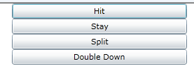
An Object Tree / UI Automation Example
In the following XAML example, a Silverlight StackPanel is
the container element for four different Button elements. In the visible
user interface, the resulting buttons are oriented vertically, with
the first declared button vertically above the others and first in
the tab sequence. (Event handling logic for each button is not shown
and is not relevant for the example.)
<StackPanel Orientation="Vertical" >
<Button>Hit</Button>
<Button>Stay</Button>
<Button>Split</Button>
<Button>Double Down</Button>
</StackPanel>
The following image shows the resulting render order. Note the first
“Hit” button has the blue border as focus indicator; focus was placed
here by traversing the default tab order, and this element was the
first Silverlight element that captured the focus.
The following is the same UI as defined in C# code rather than XAML.
The key concept here is that each call to a Silverlight collection Add method
adds that item to the end of the existing collection. Thus, to define
a collection’s order, add the intended first item with the first
call to Add, the second item in the next line of code,
and so on. This code is analogous to what a XAML parser does when it
processes the previous XAML example, and results in the same visible
UI and same default tab order.
void MakeUI()
{
StackPanel sp = new StackPanel() { Width = 300, Orientation = Orientation.Vertical };
Button hitButton = new Button() { Content = "Hit" };
Button stayButton = new Button() { Content = "Stay" };
Button splitButton = new Button() { Content = "Split" };
Button doubleDownButton = new Button() { Content = "DoubleDown" };
sp.Children.Add(hitButton);
sp.Children.Add(stayButton);
sp.Children.Add(splitButton);
sp.Children.Add(doubleDownButton);
}
The following is a screenshot of the UI Automation subtree specifically
in the area of the UI as declared by either the XAML or C# shown
previously. The tool being used in this screenshot is Inspect.exe,
which comes with the Windows SDK version 7.1
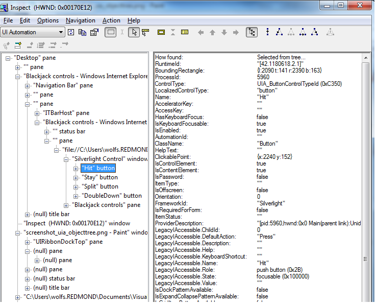
The screenshot is representative of the kind of tree structure that
a UI Automation client such as a given assistive technology is able
to program against, when a Silverlight application exists as an embedded
plug-in inside the surrounding browser host.
Input and Multimedia
Silverlight implements UI controls that support keyboard input methods
for users who do not use a mouse. Also, Silverlight provides the input
system framework such that application authors and control authors
can provide similar mouse-keyboard equivalence from their own UI, by
using the Silverlight event system and sending each event to the same
or similar handling logic. Silverlight application authors can control
the tab order of content within Silverlight content, as is demonstrated
in the WCAG 2.0 techniques for Silverlight.
Silverlight is often used to display video. Silverlight and the media
formats it supports can include embedded text tracks with timing markers.
The text tracks and timing markers enable a Silverlight technique that
can provide closed captions or subtitles in any language. Silverlight
and its media formats also support multiple tracks of audio, thereby
enabling support for video description.
Text and Color Preferences
Silverlight supports text resize through browser zoom, as described
in G142:
Using a technology that has commonly-available user agents that support
zoom. The effects of invoking browser zoom apply any resize to
the entirely of the hosted HTML (including Silverlight content). Silverlight
interaction with browser zoom is further discussed in the Silverlight
WCAG technique SL22: Supporting Browser Zoom in Silverlight.
However, not all browser hosts that are supported by Silverlight provide
browser zoom as a feature, and in the Firefox implementation the text
within the Silverlight content area is not affected if the user has
checked Zoom Text Only. As an alternative or additional technique for
text resize, the Silverlight WCAG technique SL23: Using A Style Switcher to Increase Font Size of Silverlight Text
Elements describes
how to use Silverlight APIs to resize text elements that are specifically
within the Silverlight content area.
Silverlight supports a high-contrast detection mode at the platform
level. If the user has already selected a high-contrast mode at the
platform/OS level, the Silverlight application can use various styling
and appearance techniques to select a color scheme that is appropriate
for high contrast. This concept is shown in the Silverlight WCAG technique SL13: Providing A Style Switcher To Switch To High Contrast. Silverlight and its
API do not account for any color settings that are made for default
HTML by a browser host application (settings under General / Appearance
in Internet Explorer; settings under Content / Fonts & Color in
Firefox). This information is not made available to plug-ins such as
Silverlight.
User Agents Supported
Silverlight documents its official list of supported user agents on
the Microsoft.com web site. The list is dynamic, because the vendors
that produce browsers are constantly updating versions. Also, Silverlight
might announce support for a browser in a time period that falls after
the release date of the latest Silverlight runtime; sometimes this
means that the Silverlight product team performed new testing for acceptance
of that specific user agent and can now vouch for an official level
of Microsoft support.
For convenience, a snapshot of the official Microsoft browser/user
agent support matrix from the date 13 January 2011 is reproduced here:
Windows Vista: IE 8, IE 7, Firefox 3, Chrome 4
Windows 7: IE 8, Firefox 3, Chrome 4
Windows Server 2008: IE 8, IE 7, Firefox 3, Chrome 4
Windows Server 2008 R2: IE 8, Chrome 4
Windows Server 2003, Windows XP SP2, SP3: IE 8, IE 7, IE 6, Firefox
3, Chrome 4
Windows 2000 SP4 + KB 891861: IE 6
Macintosh OS 10.4.11+ (Intel-based): Firefox 3, Safari 3, Safari
4
For the official list of supported user agents for Silverlight, see http://www.microsoft.com/getsilverlight/get-started/install/default.aspx (System
Requirements tab).
As of 13 January 2011 Silverlight does not work in 64-bit browser
hosts (64-bit platform users should use a 32-bit browser application
on their system).
Silverlight and Novell have a technical collaboration, and Novell
sponsors an open-source initiative known as the Mono Project. Part
of the Mono Project is Moonlight, which is a port of Silverlight
technology for Linux and other Unix/X11 based operating systems.
For more information, see Mono and Moonlight Supported Platforms.
Browser Host Platform Considerations
Depending on the browser host being targeted, Silverlight is implemented
as an ActiveX control or as an NPAPI plugin. When a user installs Silverlight,
they are installing both of these implementations, such that the same
Silverlight installation could be accessed by an Internet Explorer
browser host and a Firefox browser host, and could even be accessed
simultaneously by both. Differences between the program access layers
of ActiveX versus NPAPI, and also browser-specific differences in program
access layers, produce some platform differences that occasionally
relate to accessibility support. For example, there can be slight differences
in whether the program access layer will correctly forward certain
keys or key combinations, which might impact keyboard-mouse equivalence
implementations.
Silverlight also supports modes that do not rely on a browser host
at all. In previous releases of Silverlight, Silverlight was defined
as a platform for producing rich Internet applications. This is still
true, but in the current Silverlight release the deployment options
are expanded such that a Silverlight application is not necessarily
a web-based application, and Silverlight is not exclusively a Web content
technology.
Silverlight supports an out of browser deployment mode. Through UI
in an initial Web-based Silverlight application, the user is asked
to conform whether they wish to install the out-browser application.
If the user approves the installation, the Web-based Silverlight application
shuts down and the installation begins. Typically, the application
restarts itself immediately after the installation. Once installed
on the user's hard disk, a Silverlight out-of-browser functions more
as an application window under the control of the current platform
operating system. This is manifested through technical aspects such
as a change in programming security boundaries, and addition of operating-system-specific
application model features for the Silverlight out-of-browser application.
Examples of the latter include icons and presence in running-application
UI metaphors such as task bars. Out-of-browser mode is not specifically
mentioned in the Silverlight WCAG techniques, because in this mode
Silverlight is no longer a Web application. However, an out-of-browser
Silverlight application can include an embedded control that is itself
capable of displaying HTML. In this situation, Silverlight accesses
basic HTML browser frameworks provided by the platform, and any techniques
that would normally apply to HTML content and Web content could also
apply to the HTML as viewed within a Silverlight out-of-browser application.
For more information, see MSDN.
Silverlight is also a development platform that can be used to create
applications for Windows Phone. While these applications often rely
on Internet connectivity, these applications are run in the context
of an application directly under the Windows Phone operating system,
rather than being run in an intermediate Web host that serves as a
generalized Web browser for Windows Phone. Therefore the typical considerations
of Silverlight acting as a part of a larger definition of Web content
do not apply. For more information on Silverlight for Windows Phone
development, see The
Silverlight and XNA Frameworks for Windows Phone on MSDN.
The XAML Language
XAML is an abbreviation for eXtensible Application Markup Language.
In the Silverlight application model, XAML is generally used for defining
the elements that make up an application's user interface (UI). XAML
markup for UI resembles markup paradigms for HTML in that it uses angle
brackets in its syntax, has concepts of elements and attributes, and
uses a predominately text-based file editing and storage format such
that XAML is human-readable in a text editor. The UI design role typically
designs an application user interface by interacting with graphical
user interface tools such as Microsoft Expression Blend. In this case,
Expression Blend produces XAML as its output, and XAML becomes the
interchange format between the Expression Blend tool and the Visual
Studio tools. Visual Studio is more typically used by code-oriented
Web developers for Silverlight. Web developers in Visual Studio might
work with XAML at the text level, and write or change the XAML markup,
and more than one interchange between tools and/or roles of a given
XAML file might occur by the time the application is finished. The
Silverlight techniques are written from the perspective of the code-oriented
Web developer who is possibly adjusting post-design phase XAML.
One key difference between HTML and XAML is that XAML is always interpreted
by the Silverlight runtime, or preparsed at compile time within Silverlight
tools. XAML is NOT parsed by potentially different engines per browser
host. Because XAML provides UI definition, the Silverlight techniques
often include procedures or concepts that adjust the elements and attributes
of XAML markup for an application. Some of the techniques show procedures
or concepts for code-behind, scripting, deployment steps, or other
aspects of Silverlight programming in addition to or instead of XAML
examples. The runtime parsing characteristics of XAML for Silverlight
is discussed further in the Silverlight WCAG technique SL33: Using Well-Formed XAML to Define a Silverlight User Interface.
XAML attributes sometimes specify strings that are visible in UI and
reported to assistive technologies. The Silverlight WCAG techniques
typically hard-code such UI strings in XAML, so that the example code
can be kept simple and can concentrate on the immediate concept being
illustrated. However, hard-coding UI strings in XAML is not a best
practice for production code, because of localizion considerations.
To learn more about producing XAML that is localization-ready, or about
refactoring XAML to support better designer-coder-localizer workflows,
see Localizing
Silverlight-based Applications on MSDN.
Test-based Methodology for Accessibility Support
Some of the Silverlight WCAG techniques mention a concept of "test-based
methodology" - this section describes what is meant by that concept.
In typical Web application development, there are phases that are
a natural part of the workflow. First there is a specification phase,
where the basic planning is performed. The next two phases are user
interface design (often interweaved with user experience design) and
code development. For larger applications or applications that are
built on frameworks, the human role of designer is often separate from
the human role of code developer/script developer. For this reason
the UI design phase and code phase might be going on concurrently,
and/or might be iterative. At the point where the efforts of UI design
and code development are combined into a working application, many
Web developers now introduce a testing phase. It is at this point that
a test-based methodology for accessibility support becomes an appropriate
and useful strategy.
Testers for Web applications sometimes rely largely on ad hoc or experiential
tests, but increasingly there are tools available that assist with
the job of testing a Web site. Many of these tools focus on specific
aspects of testing: sub-areas such as testing under specific browser
hosts; testing with stored state or data vs. initial experience; testing
for different form factors; etc. One such sub-area of testing is testing
the existing accessibility support.
Because Silverlight supports the UI Automation accessibility framework,
the best tools for testing accessibility support in a Silverlight application
are the tools that work with UI Automation as their basis. Some of
these tools are available from Microsoft, and other such tools are
available from third parties.
In a test-based methodology, a tester should view the application
in its UIA representation. Using tools, testers can write tests for
certain conditions and determine whether the application as a whole
passes or fails. For example, a scripted test could determine whether
all the controls in a UIA view have a valid string for Name.
No Name string would potentially cause an assistive
technology to misrepresent that element, and could cause confusion
for user groups that rely on a particular assistive technology view
of an application. In cases where an application failed these kinds
of tests, the application might be sent back to the human role of developer/script
writer, so that the missing accessibility information can be committed
to the application code base. Then the application can be re-tested.
A test-based methodology for accessibility support works best because
Silverlight is such an extensive development platform. Sometimes it
is not immediately obvious to a developer that a certain property required
for accessibility remained unset. Or perhaps that developer was expecting
that the human design role would have introduced that information as
part of UI definition. Only when the integration of UI design and code
is complete is it possible to see that there is still information or
functionality missing. When the development process includes a testing
step wherein dedicated tests for accessibility support are committed
in a systematic way, it is much more likely that issues can be detected
prior to application deployment.
Running Silverlight Test Files Provided with Techniques
Most Silverlight WCAG Techniques reference one or more ZIP files from
the Test Files section of the technique. These ZIP files are linked
from the techniques and can be uploaded for testing.
To run the test files, you must have Microsoft Silverlight (the client
run-time version) installed on your computer. To install Microsoft
Silverlight, open the following URL: http://www.microsoft.com/getsilverlight/ .
Follow the instruction steps on the Web page. When you install Silverlight,
you are installing the plug-in for use by all supported browser user
agents on that computer. In order to test techniques that rely on UIA,
you should install Silverlight on a computer that is running Microsoft
Windows (XP SP2; Vista; Windows 7) as the operating system. Note that
you must be running as adminstrator in order to install Microsoft Silverlight
on the computer.
Each ZIP file contains two items: an HTML file, and a Silverlight
package file (always has a file extension of XAP). You can run any
given test file through the following procedure:
Click the link from the technique to download the ZIP file.
Extract all files within the ZIP file to a temporary location,
but use a tangible location such as C:\temp rather than temporary
Internet files. Do not attempt to open the HTML file from within
the unextracted archive; the test will only run correctly when the
test components are extracted from ZIP.
Go to the folder location where you extracted the files. To run
the test based on the current system's file associations for HTML,
open the HTML with the associated browser. Otherwise, you must open
the specific browser you want to test under, and type or copy either
a file:/// URL or a Windows folder path into that browser's address
bar.
This should open the HTML page. When the HTML page opens, it instantiates
a Silverlight plug-in within the page content, which in turn references
the other extracted file (the XAP) as local content.
Once the content is in view, follow the remaining steps that are
indicated in the specific test procedure.
Using Sample Code in Techniques to Create a New Silverlight Application
The Silverlight techniques offer pre-built test files so that you
can observe the basic operation of a technique without having to write
the code yourself, or create your own application. The salient parts
of Silverlight code or Silverlight XAML for the technique are provided
as code blocks under the Examples section. In order to experiment more
with the technique beyond running the test file, you might want to
define your own Silverlight application project, and then import the
code and XAML from the technique into your own project. This section
describes the basic information that is necessary to create a project
that incorporates sample code from a Silverlight technique.
Prerequisites
Creating a Silverlight application project requires that you have
a full Silverlight application development environment installed. Although
Silverlight applications run cross-platform, the actual development
of Silverlight applications is done on Microsoft Windows computers.
The computer must have Microsoft Visual Studio 2008 or Microsoft Visual
Studio 2010 installed. With some limitations, the Express SKUs of Visual
Studio are adequate for basic Silverlight application development.
The Express SKUs are available for 30-day evaluation from the following
URL: http://www.microsoft.com/visualstudio/en-us/products/2010-editions/express .
In addition to Visual Studio, you also should install the Silverlight
Tools, which includes the Silverlight SDK. Get Silverlight Tools from http://go.microsoft.com/fwlink/?LinkID=177428.
What to install for Silverlight development is also linked to and explained
at Silverlight.net.
Creating the Project
For general instructions, see How
to: Create a New Silverlight Project. This creates a new project
based on a default template.
The C# code or XAML shown in the Silverlight techniques is a usually
a fragment that you should integrate into an existing code file or
XAML page from the default project template. For code, you generally
open the file page.xaml.cs from Solution Explorer, and paste the entirety
of the example code into the body of the C# public partial class that
you start with (this class comes from a template). For XAML, you generally
open page.xaml from Solution Explorer and paste the entirety of the
XAML into the <Grid> element. In some cases the example XAML
is the entire XAML (you can identify this case if the example XAML
contains one or more xmlns attributes). In this case, replace the entirety
of the XAML. However, you may have to adjust the value of the x:Class
attribute to properly reference your own partial class; this name is
influenced by your own project naming in your local project and thus
cannot be anticipated by the example code. Descibing Silverlight application
development in its entirety is well beyond the scope of this document.
Use resources available from Silverlight.net or MSDN
Silverlight documentation to learn more about Silverlight application
development.
Special Considerations for WCAG 2.0 Compliance
2.4.2 Page Titled - In order to meet 2.4.2, Silverlight content must
be embedded within an HTML page that has a page title in the HTML title
element.
3.1.1 Language of Page - The language of an HTML page is established
by the Lang attribute of the containing object element in HTML. However,
Silverlight's own logic generally interprets language/culture information
using a Microsoft .NET Framework concept of the CultureInfo object.
This makes it important to align the HTML-level lang with any CultureInfo
as used by Silverlight. The reason for this is that assistive technologies
are likely to respect the top-level declaration of the Lang attribute
and to not be aware of the CultureInfo considerations of embedded Silverlight
content. Application authors can delibrately override language settings
of a client by specifying a discrete CultureInfo in the Silverlight <object> parameters;
this can be useful if the application has real-time language switching,
if users store language preferences either locally or based on server
information or cookies, etc. Aligning html-lang with CultureInfo and
adjusting the CultureInfo through various means are both discussed
in Silverlight techniques.
SL2: Changing The Visual Focus Indicator in Silverlight
Applicability
Microsoft Silverlight, versions 3 and greater
Silverlight managed programming model and Silverlight XAML
This technique relates to:
User Agent and Assistive Technology Support Notes
Description
The objective of this technique is to use the Silverlight "control
skinning" scenario and feature set to change the visible focus
indication of a control. In particular, the intent is to increase the
visibility of focus indication versus the appearance of a default-styled
control. This technique is useful both for the control sets that are
included in the Silverlight run time or SDK assemblies, as well as
for Toolkit or any third party distributed control.
The default Silverlight core controls all indicate some type of visible
focus indication, through their default templates. However, Silverlight
application authors can still use the skinning techniques to augment
or replace the visible focus indications for controls as used in their
applications. For more information on how Silverlight controls will
generally supply a default visual focus indicator, see Focus
Overview on MSDN.
Silverlight control skinning is enabled through a deliberate separation
of UI and logic in the Silverlight control model. Appearance of a control
is largely written in XAML. The logic is largely written in code (for
example C#) and is left unaffected when a Silverlight application author
provides a new control template "skin". The hooks that connect
the appearance and the logic are a Style property of the control (which
the author changes the value of, to refer to their new XAML resource)
and a contract of expected named entities in the XAML. The control
logic invokes the names of the entities/parts whenever control state
changes, and the expectation is that the named part provides the necessary
appearance as defined in XAML. Design tools such as Visual Studio or
Expression Blend generate copies of the default templates and parts,
such that Silverlight authors can modify the parts that they want to
change the appearance of, and still preserve the remainder of default
appearance and behavior of the control.
For the visible focus indicator technique, the author typically modifies
a single visual element that renders in layout as an overlay on top
of the control when it is focused, and switches the overlay to nonvisible
when the control is not focused. This element is a named element that
is typically referred to from within the XAML named state Focused,
which in turn is hooked up to changes in the visual state.
Note that this technique assumes that the original control author
provided the necessary logic event hookup, and exposed a named state
associated with keyboard focus to work with. If this is not the case,
or if the scenario is that a Silverlight author is defining their own
control, a different technique is needed. See SL7: Designing a Focused Visual State for Custom Silverlight Controls.
Focus in Silverlight
Focus in Silverlight is equivalent to the larger user interface and
application concept of keyboard focus. The element that has focus is
the element within the Silverlight object tree and programming model
that has first chance to process the Silverlight key events. As a more
tangible example that is user-centric, if a TextBox has
keyboard focus, then when the user presses keys on the keyboard, the
characters associated with the user's pressed keys will appear in the
TextBox. A user interface element in Silverlight can obtain keyboard
focus in one of three ways:
The user uses the Silverlight tab sequence to traverse into the
Silverlight content and to focus a specific control.
The Silverlight application's logic calls the Focus method
programmatically to force focus to a control.
The user performs some other action, for example uses the mouse
to click on a control. That control's specific logic handles the
Silverlight input event and uses that event as stimulus to call Focus on
that control. The difference between this case and the above case
is that the behavior is typically built-in to that control's runtime
behavior, and does not require each application author to call Focus in
application code.
Examples
Example 1: Two Button elements, one reskinned to provide new visible
focus indicator
XAML templates can be verbose; for clarity, only the parts of the
template that were changed or useful for showing the structure are
shown. Omitted portions are shown as ellipsis (...).
<UserControl x:Class="VisibleFocusTemplate.MainPage"
xmlns="http://schemas.microsoft.com/winfx/2006/xaml/presentation"
xmlns:x="http://schemas.microsoft.com/winfx/2006/xaml"
>
<UserControl.Resources>
<Style x:Key="StrongFocusIndicator" TargetType="Button">
...
<Setter Property="Template">
<Setter.Value>
<ControlTemplate TargetType="Button">
...
<VisualStateManager.VisualStateGroups>
<VisualStateGroup x:Name="FocusStates">
<VisualState x:Name="Focused">
<Storyboard>
<DoubleAnimation Duration="0" To="1"
Storyboard.TargetProperty="Opacity"
Storyboard.TargetName="FocusVisualElement"/>
<DoubleAnimation Duration="0" To="0.5"
Storyboard.TargetProperty="(UIElement.Opacity)"
Storyboard.TargetName="rectangle" d:IsOptimized="True"/>
</Storyboard>
</VisualState>
<VisualState x:Name="Unfocused"/>
</VisualStateGroup>
</VisualStateManager.VisualStateGroups>
...
<Border x:Name="FocusVisualElement"
IsHitTestVisible="false" Opacity="0"
CornerRadius="2" BorderBrush="#D0FF0000"
BorderThickness="4">
<Rectangle x:Name="rectangle"
IsHitTestVisible="false" Margin="2"
Opacity="0" RadiusY="2" RadiusX="2"
Fill="#A0FF0000"/>
</Border>
</ControlTemplate>
</Setter.Value>
</Setter>
</Style>
</UserControl.Resources>
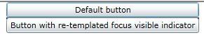
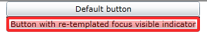
<StackPanel x:Name="LayoutRoot">
<Button Width="275">Default button</Button>
<Button Width="275"
Style="{StaticResource StrongFocusIndicator}"
>Button with re-templated focus visible indicator</Button>
</StackPanel>
</UserControl>
The most interesting aspect of this example is the change made to
the FocusVisualElement part. Here is the original (default template)
FocusVisualElement:
<Rectangle x:Name="FocusVisualElement" RadiusX="2" RadiusY="2" Margin="1" Stroke="#FF6DBDD1" StrokeThickness="1"
Opacity="0" IsHitTestVisible="false" />
Here is the changed FocusVisualElement:
<Border x:Name="FocusVisualElement" IsHitTestVisible="false"
Opacity="0" CornerRadius="2"
BorderBrush="#D0FF0000" BorderThickness="4">
<Rectangle x:Name="rectangle" IsHitTestVisible="false"
Margin="2" Opacity="0"
RadiusY="2" RadiusX="2" Fill="#A0FF0000"/>
</Border>
The following images show how each of the two buttons (default and
reskinned) appear when focused.
This example is shown in operation in the working example of Visible Focus Template.
Resources
Resources are for information purposes only, no endorsement implied.
Tests
Procedure
Note that not all Silverlight applications necessarily will start
with the keyboard focus being somewhere within the Silverlight content
area for purpose of Step #2. It may be necessary to press TAB several
times to traverse the browser's framing user interface. Also, within
the browser's display area that displays the HTML document, there might
also be other HTML elements that are keyboard focusable, which are
representative of HTML that falls lexically before the <object> tag
that instantiates the Silverlight plug-in. So it may also be necessary
to press TAB several times until these HTML elements are traversed.
Using a browser that supports Silverlight, open an HTML page that
references a Silverlight application through an object tag.
Using a keyboard, tab to the element where focus characteristics
are being examined.
Check that the background, border, or other noticable visual indicator
of the element changes color.
Check that the changes in color for the background, border, or
other noticable visual indicator are removed when the element loses
focus.
Expected Results
#3 and #4 are true.
If this is a sufficient technique for a success criterion, failing this test procedure does not necessarily mean that the success criterion has not been satisfied in some other way, only that this technique has not been successfully implemented and can not be used to claim conformance.
SL5: Defining a Focusable Image Class for Silverlight
Applicability
Microsoft Silverlight, versions 3 and greater
Silverlight managed programming model and Silverlight XAML
This technique relates to:
User Agent and Assistive Technology Support Notes
Description
The objective of this technique is to wrap the Silverlight Image class
inside a UI container class that is focusable. If the image is focusable,
users who use the TAB sequence to navigate content while the assistive
technology is active, and/or assistive technologies that construct
navigation structures that are based on the TAB sequence, can both
detect the image in navigation. The assistive technology can then associate
alternative text for that image within the navigation structure, and
report the information to the user.
Many existing assistive technologies do not construct initial navigation
views that are derived from UI Automation information if it is coming
from a non-focusable element in a Silverlight user interface. This
is particularly true if the assistive technology is in a navigation
mode that is specifically intended to help users enter information
into a form or similar interactive interface element; an example of
this situation is the Forms Mode of the JAWS screen reader.
Image is
an example of a Silverlight element that is not focusable. This technique
and the example therein are intended to circumvent the possible omission
of a nonfocusable Silverlight Image element from certain
navigation views in existing assistive technology implementations.
The Silverlight Image is wrapped with a display/viewer
control class that is focusable. This image-wrapping control is initially
presented in assistive technology representations of a Silverlight
user interface that use only focusable elements when constructing the
assistive technology's representation of the application.
The image wrapper class uses the AutomationProperties.Name property
to provide a short text alternative for the contained Image,
so that the alternative text can be read or otherwise presented by
assistive technologies. The Silverlight API AutomationProperties.Name directly
sets Name in the UI Automation tree. The properties
in the UI Automation tree are reported to assistive technologies, when
the assistive technology implements behavior that acts as a UI Automation
client. Name is one of the accessibility framework
properties that most assistive technologies present in some way, for
purposes of both name and value information, and setting Name is
the common technique for exposing text alternatives for any other Control class
(for example, for a button with an image, as shown in the technique SL18: Providing Text Equivalent for Nontext Silverlight Controls With AutomationProperties.Name).
This technique is intended for cases where application authors deliberately
do not want a visible image caption for the image to be part of the
user interface, and the image is a part of a larger interactive user
interface control or page. Otherwise, if there is a visible caption,
authors can use SL26: Using LabeledBy to Associate Labels and Targets in Silverlight.
Examples
The two examples are intended to be used together, if an application
is both defining and consuming the focusable image control.
Example 1: Defining the FocusableImage XAML template and C# code
behavior
Silverlight supports a control development model whereby the visual
appearance of a control is largely defined in XAML, and the behavior
of a control (such as its event handling and hookups to services) are
implemented in a managed code language such as C#. The following is
the XAML template, which includes a visual state that shows visually
when the control is focused in UI.
<ResourceDictionary
xmlns="http://schemas.microsoft.com/winfx/2006/xaml/presentation"
xmlns:x="http://schemas.microsoft.com/winfx/2006/xaml"
xmlns:local="clr-namespace:ImageEquivalent">
<Style TargetType="local:FocusableImage">
<Setter Property="Template">
<Setter.Value>
<ControlTemplate TargetType="local:FocusableImage">
<Grid>
<VisualStateManager.VisualStateGroups>
<VisualStateGroup x:Name="FocusStates">
<VisualState x:Name="Focused">
<Storyboard>
<ColorAnimation
Storyboard.TargetName="focusborder"
Storyboard.TargetProperty="(Border.BorderBrush).(SolidColorBrush.Color)"
Duration="0" To="Blue"/>
</Storyboard>
</VisualState>
<VisualState x:Name="Unfocused"/>
</VisualStateGroup>
</VisualStateManager.VisualStateGroups>
<Border
x:Name="focusborder"
BorderThickness="4"
BorderBrush="Transparent">
<Image
Margin="2" Opacity="10"
Source="{TemplateBinding Source}"/>
</Border>
</Grid>
</ControlTemplate>
</Setter.Value>
</Setter>
</Style>
</ResourceDictionary>
The following is the C# class definition and logic. The logic includes
invoking a default automation peer on creation, and loading the template
as defined in the previous XAML example through the Silverlight "generic.xaml" resource
convention for custom controls.
namespace ImageEquivalent
{
public class FocusableImage : Control
{
protected override System.Windows.Automation.Peers.AutomationPeer OnCreateAutomationPeer()
{
return new FrameworkElementAutomationPeer(this);
}
public FocusableImage()
{
this.DefaultStyleKey = typeof(FocusableImage);
}
public ImageSource Source
{
get { return (ImageSource)this.GetValue(SourceProperty); }
set { this.SetValue(SourceProperty,value); }
}
public static DependencyProperty SourceProperty = DependencyProperty.Register(
"Source",
typeof(ImageSource),
typeof(FocusableImage),
null);
Boolean _Focused;
void ChangeState()
{
if (_Focused)
{
VisualStateManager.GoToState(this,"Focused",false);
}
else
{
VisualStateManager.GoToState(this,"Unfocused",false);
}
}
protected override void OnGotFocus(RoutedEventArgs e)
{
base.OnGotFocus(e);
this._Focused = true;
ChangeState();
}
protected override void OnLostFocus(RoutedEventArgs e)
{
base.OnGotFocus(e);
this._Focused = false;
ChangeState();
}
}
}
This example is shown in operation in the working example of Focusable Image.
Example 2: Using the FocusableImage class in UI and applying AutomationProperties.Name
Now that the image is wrapped by a focusable control, you can instantiate
an instance of the wrapper UI inside a Silverlight layout container,
specify AutomationProperties.Name at the level of
the wrapper control’s tag, and have that text serve as the alternative
text for the referenced source image file.
<StackPanel
xmlns:local="clr-namespace:ImageEquivalent;assembly=FocusableImage"
>
<local:FocusableImage
Height="300" Width="400
AutomationProperties.Name="Diagram of secret lair"
Source="/diagram_lair.png" />
</StackPanel>
Resources
Resources are for information purposes only, no endorsement implied.
Tests
Automation Tree
Procedure
Open the test HTML page in a Silverlight-supported useragent host;
to use UI Automation, use Microsoft Windows as platform.
Use the tab sequence inside the Silverlight content area to focus
the control.
Using an accessibility framework verification tool, check that
the string content is promoted as the default Name applied
to the control.
Note: Accessibility framework verification tools typically show the
entirety of an automation tree for a given application, and in fact
will show the tree for all applications running on the Windows client
machine. Focusing the control as in #2 is thus not strictly speaking
necessary. However, manually focusing using the application interface
is often a faster way to step into the automation tree as opposed to
having to open an extensive series of nested nodes starting from the
browser host application root. Whether this functionality exists depends
on which accessibility framework verification tool is being used for
testing.
Expected Results
#3 is true.
If this is a sufficient technique for a success criterion, failing this test procedure does not necessarily mean that the success criterion has not been satisfied in some other way, only that this technique has not been successfully implemented and can not be used to claim conformance.
Tests
Screen Reader
Procedure
Using a browser that supports Silverlight, open an HTML page that
references a Silverlight application through an object tag. To use
UI Automation, use Microsoft Windows as platform.
Engage the screen reader. Move focus to the control (for example,
use the tab sequence).
Check that the Name applied to the image is read
by the screen reader.
Expected Results
#3 is true.
If this is a sufficient technique for a success criterion, failing this test procedure does not necessarily mean that the success criterion has not been satisfied in some other way, only that this technique has not been successfully implemented and can not be used to claim conformance.
SL6: Defining a UI Automation Peer for a Custom Silverlight Control
Applicability
Microsoft Silverlight, versions 3 and greater
Silverlight managed programming model and Silverlight XAML
This technique relates to:
User Agent and Assistive Technology Support Notes
Description
The objective of this technique is to create an AutomationPeer class
for a custom Silverlight control. The AutomationPeer exposes
accessibility properties of the control in a way that abstracts the
Silverlight technology specifics of the control model and maps information
to UI Automation concepts, so that these properties can be consumed
by the UI Automation accessibility framework.
The AutomationPeer concept is part of the overall architecture design
of the UI Automation system. The peer represents a deliberate abstraction
of the control, such that a client can obtain pattern-based information
about the specific purpose and capability of a control without knowing
its implementation-specific object model or having to resort to using
a framework-specific object model API. Also, the peers run in a different
process than the controls they represent, which has performance and
security advantages. For more information on UI Automation architecture,
see UI
Automation Overview on MSDN.
Creating a custom Silverlight control is one way that Silverlight
application authors can create user interface components either for
their own application, or as a packaged redistributable that provides
the control UI for third parties. Creating an automation peer for a
custom control reports control-specific information to the UI Automation
accessibility framework, and enables a custom control to participate
in all of the same techniques involving UI Automation that can be used
for a control that is distributed in the core Silverlight run time.
Assistive technologies can use the UI Automation accessibility framework
to discover the name and role of the user interface component, and
can get and set values by accessing UI Automation patterns. UI Automation
thus supports extensibility, while maintaining a discovery system for
names, roles and values of UI components.
Control authors associate a peer with a class by implementing a method
override for the class implementation. Control authors declare name
and role through properties that are general to any UI Automation peer.
Control authors expose the means to get and set values by choosing
to support one or more patterns that are usually associated with a
role. For example, a control in the role of "Button" would
typically support an "Invoke" pattern. A consumer of UI Automation
could check whether the pattern was supported and then call the pattern-based
method Invoke, which would activate the button without
any device input events being produced or required.
By convention, controls and their automation peers share a naming
pattern. For example, if a control is named Spinner, its automation
peer is named SpinnerPeer. However, the actual wiring for the class-peer
association is made in the control code by overriding OnCreateAutomationPeer.
Thus it is necessary to have access to the control code in order to
associate a new peer class implementation with that control.
In addition to properties, automation peers can also expose methods
as part of the implemented UI Automation control pattern. For example,
a peer implementing the Value pattern can provide an implementation
of the SetValue method. The SetValue method
can be called by a UI Automation client in order to programmatically
set the value of the owner control. The functionality exposed by the
implementation of a control pattern can be accessed either by automation-based
testing, or by assistive technologies.
Examples
Example 1: SimpleNumericUpDown control and its peer
The example implements a very simple Silverlight custom control named
SimpleNumericUpDown. The control is a templateable control, meaning
that the UI is defined in a XAML file that serves as the default UI,
but any consumer of the control can change the visual appearance by
applying a new template. Nevertheless, the basic accessibility characteristics
of the control can be shaped by the control author, and can apply even
for cases where the visible UI is noticably different. This separation
between design-implementation and code-behavior is one reason for the
peer-owner design in UI Automation. The majority of the example shows
the C# code, including the following :
Associating the peer with the class.
Defining the peer, and basic information such as the class name.
Reporting which patterns the peer supports. In this case the peer
supports a Value pattern.
Control definition class:
public class SimpleNumericUpDown : Control
{
public SimpleNumericUpDown()
{
this.DefaultStyleKey = typeof(SimpleNumericUpDown);
protected override System.Windows.Automation.Peers.AutomationPeer OnCreateAutomationPeer()
{
return new SimpleNumericUpDownAutomationPeer(this);
}
// templating and event handlers omitted
public static DependencyProperty NumericValueProperty = DependencyProperty.Register(
"NumericValue",
typeof(Int32),
typeof(SimpleNumericUpDown),
new PropertyMetadata(0)
);
public Int32 NumericValue
{
get { return (Int32)this.GetValue(NumericValueProperty); }
set {this.SetValue(NumericValueProperty,value);}
}
}
Automation peer definition:
public class SimpleNumericUpDownAutomationPeer : FrameworkElementAutomationPeer, IValueProvider
{
private SimpleNumericUpDown OwnerControl { get { return (SimpleNumericUpDown)Owner; } }
public SimpleNumericUpDownAutomationPeer(SimpleNumericUpDown owner)
: base(owner) {}
//peer overrides
protected override string GetClassNameCore()
{
return "SimpleNumericUpDown";
}
protected override AutomationControlType GetAutomationControlTypeCore()
{
return AutomationControlType.Spinner;
}
public override object GetPattern(PatternInterface patternInterface) {
if (patternInterface == PatternInterface.Value)
{
return this;
}
return base.GetPattern(patternInterface);
}
// Value pattern implementation
String IValueProvider.Value
{
get { return OwnerControl.NumericValue.ToString(); }
}
bool IValueProvider.IsReadOnly {get{return false;}}
void IValueProvider.SetValue(string value)
{
OwnerControl.NumericValue = Convert.ToInt32(value);
}
This example is shown in operation in the working example of Simple Numeric UpDown control.
Resources
Resources are for information purposes only, no endorsement implied.
Tests
Procedure
Using a browser that supports Silverlight, open an HTML page that
references a Silverlight application through an object tag. To see
UI Automation, use Microsoft Windows as platform.
Use a verification tool that is capable of showing the full automation
tree, and an object’s UI Automation properties and patterns as part
of the tree. (For example, use UIAVerify or Silverlight Spy; see
Resources links.) Select the item in the automation tree that is
accessing the relevant custom automation peer implementation.
Examine the set of properties exposed in the tree. Check that
name is reported by Name, that the class name is reported as ClassName,
and that there is a role as reported by the value of ControlType.
If the control is expected to report a value, check that the value
is reported in the tree somehow. (Exactly which property reports
the value varies depending on the control function and pattern; for
more information, see Windows
Automation API).
Check whether a control pattern is reported in the tree. If a
control pattern is reported, test the methods of that pattern using
facilities in the verification tool. Verify that invoking the methods
has changed the corresponding read only property values in the tree.
Expected Results
#3, #4, and #5 (if applicable) are true.
If this is a sufficient technique for a success criterion, failing this test procedure does not necessarily mean that the success criterion has not been satisfied in some other way, only that this technique has not been successfully implemented and can not be used to claim conformance.
SL9: Handling Key Events to Enable Keyboard Functionality in Silverlight
Applicability
Microsoft Silverlight, versions 3 and greater
Silverlight managed programming model and Silverlight XAML
This technique relates to:
User Agent and Assistive Technology Support Notes
Description
The objective of this technique is to handle key events in a Silverlight
application and enable application-specific keyboard functionality
in a Silverlight application. The keyboard functionality might relate
to a particular element of the Silverlight application user interface,
or might be a handler for global key events within the application,
such as an application-wide access key.
In Silverlight, application authors handle user input by attaching
event handlers for input events. The input events are implemented on
a class that is a base element in the Silverlight class hierarchy,
such that all Silverlight UI elements can be the source of an input
event if the user interacts with them. Typically, the event handler
names are specified in XAML, although it is also possible to wire events
in code. The implementation of the handlers for the Silverlight managed
code programming model is always done in C# or Visual Basic code.
The most commonly used input events are the following:
KeyUp, KeyDown - these are the
key events. Which key is pressed is determined by event parameters
passed to the handler.
MouseEnter, MouseOver, MouseLeave
MouseLeftButtonDown, MouseLeftButtonUp, MouseRightButtonDown, MouseRightButtonUp
Other forms of input that Silverlight supports include touch devices
(with mouse promotion for cases where the application runs on devices
that do not have touch input modes) and a related inking mode. For
any UI interaction that uses mouse input or these other input modes,
Silverlight application authors can write a parallel key event handler
to provide users the keyboard equivalent.
Also, the Silverlight event system and control model combine to enable
behavior whereby a mouse event and a keyboard event can be treated
as the same event and can be handled by a common event handler. Using
this technique, Silverlight authors can facilitate keyboard functionality
in custom controls or as override behavior to existing Silverlight-supplied
controls, and provide equivalence for mouse events or events that are
specific to other input devices. Silverlight authors can also use controls
that already have a keyboard equivalence as a built-in behavior.
The parallel key event handler case, and the built-in behavior case,
are each shown in one of the examples.
All input events report a specific source that is communicated to
handler code as an event parameter, so that the application author
can identify which element in their Silverlight UI was being interacted
with, and the application can perform an action that is relevant to
that user input. In the case of mouse events, the event source is the
element that the mouse pointer is over at the time. In the case of
key events, the event source is the element that has focus. The element
that has focus is visually indicated so that the user knows which element
they are interacting with (see SL2: Changing The Visual Focus Indicator in Silverlight). Assistive technologies
often have parallel conventions whereby the user is made aware of which
element is visually focused and is the current input scope presented
by the assistive technology,
Silverlight core control built-in keyboard functionality
The following is a list of the Silverlight-supplied controls that
have some level of key equivalence as a built-in behavior. In these
cases, it is not necessary to add a specific Key event handler; you
can handle the event and/or rely on the built-in key handling as listed.
Button (SPACE and ENTER) - raises Click event.
Other ButtonBase classes eg RepeatButton, HyperlinkButton (SPACE
and ENTER) - raises Click event.
TextBox (ENTER, unless in a mode where the TextBox
accepts multiple lines) - moves focus to next control, treated like
a TAB
ListBox (various keys) - see OnKeyDown
Method.
ComboBox (arrow keys ) - traverse list choices
as control UI if popup area displayed.
RichTextBox (various keys ) - enable edit mode
operations; see RichTextBox
Overview.
Slider (arrow keys ) - increment/decrement values.
Browser hosts and keyboard events
Silverlight is hosted as a plug-in inside a browser host. The Silverlight
run-time only receives the input events that the browser host forwards
to hosted plug-ins through a browser-specific program access layer.
Occasionally the browser host receives input that the browser host
itself handles in some way, and does not forward the keyboard event.
An example is that a Silverlight application hosted by an Internet
Explorer browser host on Windows operating system cannot detect a press
of the ALT key, because Internet Explorer processes this input and
performs the action of bringing keyboard focus to the Internet Explorer
menu bar. Silverlight authors might need to be aware of browser-specific
input handling models and not rely on key events for keys that are
essentially reserved for use by a browser host. For more information,
see Keyboard
Support.
Other event models
This technique specifically discusses event handling for the Silverlight
managed programming model. However, Silverlight also supports parallel
models for event handling, either through a Silverlight run-time feature
or due to Silverlight's role as a plug-in within a script-capable browser
host. For example, events from the HTML DOM can be handled by JavaScript
at HTML scope for the overall Silverlight plug-in; this uses the browser
host as script processor and the Silverlight run-time is not directly
involved. Or, HTML DOM events can be handled through an HTML bridge
that calls into Silverlight application code. These event models can
potentially be used to provide keyboard equivalence, but it is generally
more convenient to use the managed code model as described in this
technique. For more information on other event models in Silverlight,
see Events
Overview for Silverlight.
Examples
Two examples are given. The first example is for the scenario of a
Silverlight application author that is simply incorporating an existing
control into their application design, and is taking advantage of mouse-keyboard
equivalence that is already defined by certain Silverlight core controls.
The second example is from the perspective of a control author, or
at least that of a Silverlight application author that intends to encapsulate
behavior in a custom Silverlight control and use it in their own application.
For this second example, the control will handle the general Silverlight
input event KeyUp, in order to check for input from
key(s) that are designated to have a specific input meaning for that
control.
Example 1: Built-in keyboard equivalence for core Silverlight controls
This example pertains to cases where the control that handles key
events is focusable (through the tab sequence, etc.) and where an existing
Silverlight control behavior provides the keyboard equivalence In this
example, a Silverlight UI includes a Button element.
For sighted users, or users that generally use the mouse to interact
with UI, a typical way to interact with the button is to position the
mouse pointer over the element, and click the left mouse button. However,
the Button also supports a built-in key handling behavior,
whereby either the SPACE or ENTER keys are treated as an equivalent
action to clicking the button with a mouse. The requirement for this
interaction is that the Button must have keyboard
focus at the point in time that SPACE or ENTER are pressed. The Button might
gain focus because the user pressed the TAB key to move through the
tab sequence, or some equivalent action enabled by assistive technology.
In terms of the programming experience, the Silverlight application
author does not have to separately handle KeyDown for
this case. Within the Button control built-in code,
the special case of SPACE or ENTER keys pressed while a Button has
focus invokes the button’s Click event. Then the Silverlight
application author can simply handle Click without
differentiating whether the input action was a mouse click or a keyboard
equivalent. The following is the entire XAML UI.
<UserControl x:Class="BuiltInKeyEquivalence.MainPage"
xmlns="http://schemas.microsoft.com/winfx/2006/xaml/presentation"
xmlns:x="http://schemas.microsoft.com/winfx/2006/xaml"
>
<Grid x:Name="LayoutRoot" Background="White" Loaded="LayoutRoot_Loaded">
<Button Name="button1"
AutomationProperties.Name="Equivalence test"
Height="20" Width="150"
Click="button1_Click">Click me, or press SPACE!</Button>
</Grid>
</UserControl>
The following is the C# logic.
private void button1_Click(object sender, RoutedEventArgs e)
{
MessageBox.Show("You clicked a button ... or maybe you hit the space bar ... or ENTER ... it's all the same to me.");
}
private void LayoutRoot_Loaded(object sender, RoutedEventArgs e)
{
System.Windows.Browser.HtmlPage.Plugin.Focus();
}
This example is shown in operation in the working example of built-in keyboard equivalents.
Example 2: Keyboard events for a custom control, keyboard equivalence
In this example, a new Silverlight custom control named SimpleNumericUpDown
uses a control template that includes two buttons. To provide keyboard
equivalence for the buttons, an event handler is defined by the control
class code. The event handler invokes the action in response to certain
accelerator keys, where these actions are equivalent to clicking the
button composition parts of the control with a mouse. The following
is the default XAML template.
<ControlTemplate TargetType="local:SimpleNumericUpDown">
<Border Background="{TemplateBinding Background}"
BorderBrush="{TemplateBinding BorderBrush}"
BorderThickness="{TemplateBinding BorderThickness}" Name="controlFrame">
<Grid>
<Grid.ColumnDefinitions>
<ColumnDefinition Width="*"/>
<ColumnDefinition Width="30"/>
</Grid.ColumnDefinitions>
<TextBox x:Name="valueBox" Text="{Binding NumericValue, RelativeSource={RelativeSource TemplatedParent}}"/>
<StackPanel Grid.Column="1">
<Button Name="minusButton">-</Button>
<Button Name="plusButton">+</Button>
</StackPanel>
</Grid>
</Border>
</ControlTemplate>
The following C# code shows the event handlers. Also, the code includes
the event-wiring technique that is used whenever a Silverlight control
author implements a templateable control. This technique enables
the separation of UI appearance (which can be overridden) from the
input event-handling behavior (which is implemented by the control
author).
public class SimpleNumericUpDown : Control
{
public SimpleNumericUpDown()
{
this.DefaultStyleKey = typeof(SimpleNumericUpDown);
}
public override void OnApplyTemplate()
{
base.OnApplyTemplate();
Button plusButton = GetTemplateChild("plusButton") as Button;
Button minusButton = GetTemplateChild("minusButton") as Button;
Border controlFrame = GetTemplateChild("controlFrame") as Border;
plusButton.Click += new RoutedEventHandler(Increment);
minusButton.Click += new RoutedEventHandler(Decrement);
controlFrame.KeyUp += new KeyEventHandler(Handle_Accelerators);
}
private void Increment(object sender, RoutedEventArgs e)
{
this.NumericValue += 1;
}
private void Decrement(object sender, RoutedEventArgs e)
{
this.NumericValue -= 1;
}
private void Handle_Accelerators(object sender, KeyEventArgs e)
{
switch (e.Key)
{
case (Key.Left):
this.NumericValue -= 1;
e.Handled=true;
break;
case (Key.Right):
this.NumericValue += 1;
e.Handled=true;
break;
default: break;
}
}
public Int32 NumericValue //definition omitted in this example
}
This example is shown in operation in the working example of custom keyboard events.
Resources
Resources are for information purposes only, no endorsement implied.
Tests
Procedure
Using a browser that supports Silverlight, open an HTML page that
references a Silverlight application through an object tag.
Press TAB key to move keyboard focus to various element parts
of the user interface.
Verify that any user interface actions that exist for a given
element part each have a keyboard equivalent.
Expected Results
#3 is true.
If this is a sufficient technique for a success criterion, failing this test procedure does not necessarily mean that the success criterion has not been satisfied in some other way, only that this technique has not been successfully implemented and can not be used to claim conformance.
SL15: Providing Keyboard Shortcuts that Work Across the Entire Silverlight
Application
Applicability
Microsoft Silverlight, versions 3 and greater
Silverlight managed programming model and Silverlight XAML
This technique relates to:
User Agent and Assistive Technology Support Notes
Description
The objective of this technique is to introduce key handling that
exists at the application root level of a Silverlight application,
rather than per-element key handling. Event handling at the application
level as opposed to at the element level is one way to address key
equivalence. The key events provide key equivalence for particular
user interface elements that a user might otherwise interact with using
a mouse. This technique is related to events in the Silverlight programming
model, as opposed to in the HTML DOM.
Handling key events at the root level of an application rather than
only on the element that was the "source" of a key event
is possible because of a Silverlight programming model feature known
as event routing. For more information on event routing and how it
works, see Events
Overview for Silverlight.
This technique demonstrates a "menu" approach to key handling
and user interaction. This technique is presented as a companion to SL9: Handling Key Events to Enable Keyboard Functionality in Silverlight, which
can be thought of as an "accelerator key/hotkey" approach.
The "menu" approach towards keyboard equivalence is perhaps
just as common as the "hotkey" approach. It is often simpler
to document a menu's key equivalence in a user interface than it is
to document key equivalents of particular regions of an application,
or to communicate to users that where the current focus is placed is
relevant to how keyboard keys are interpreted by the application, even
if the key action is relevant to only one of the controls in an interface.
If all keys are handled at the top level, the specific focused element
is no longer relevant.
In order to originate a key event that Silverlight application code
can detect, some element in the Silverlight application must have keyboard
focus. One way to assure keyboard focus is to focus the Silverlight
plug-in as a whole, as called from within an event handler for Application.Startup.
This is shown in the examples.
If an application does handle keys at top level, care should be taken
to not interfere with specific text entry control behavior, such as
typing into a TextBox. To avoid interactions, the
design of key equivalence at the top level of an application typically
relies on combinations with key modifiers. The Control/CTRL key is
a key that is often used for this purpose. Application authors should
also be aware of the implications of browser hosts that might handle
the key event at HTML DOM level without making that event available
to the Silverlight programming surface. For more information on this
concept, see "Keyboard Events and Browser Hosts" section
of Keyboard
Support Overview for Silverlight on MSDN.
Application authors are responsible for correctly documenting the
accelerator keys that are pertinent for their application. There are
a variety of techniques for documenting user interface actions that
are not described here. One possible suggestion is to include a generalized "Help" button
that appears early in the application's reading order, which is focusable
and has an AutomationProperties.Name value available as the text content
or equivalent. Such a button can be activated without knowing any of
the application's accelerator keys, and the activation result could
be a new text element that enumerates the possible keys. For example,
the application could display a Silverlight Popup with
the following content:
Examples
Example 1: Key handling by application root UserControl
This example has only one interactive control for simplicity, but
with two possible key combinations for that control being handled as
actions. The purpose and explanation of the control is reported through
a TextBlock that is associated with the labeled control
through use of AutomationProperties.LabeledBy in
XAML. The control being illustrated is MultiScaleImage,
which supports a zoom-in metaphor for examining an image that redraws
at increasingly fine resolutions. For more information on MultiScaleImage,
see Deep
Zoom on MSDN.
The following is the startup logic at application level that sends
focus to Silverlight in the HTML DOM.
private void Application_Startup(object sender, StartupEventArgs e)
{
this.RootVisual = new MainPage();
//bring overall DOM focus to Silverlight area, so that keys are captured by Silverlight
System.Windows.Browser.HtmlPage.Plugin.Focus();
}
The following is XAML UI for the main page.
<UserControl xmlns:sdk="http://schemas.microsoft.com/winfx/2006/xaml/presentation/sdk"
x:Class="ApplicationLevelKeyHandling.MainPage"
xmlns="http://schemas.microsoft.com/winfx/2006/xaml/presentation"
xmlns:x="http://schemas.microsoft.com/winfx/2006/xaml"
xmlns:d="http://schemas.microsoft.com/expression/blend/2008"
xmlns:mc="http://schemas.openxmlformats.org/markup-compatibility/2006"
mc:Ignorable="d"
d:DesignHeight="300" d:DesignWidth="400" KeyUp="UserControl_KeyUp">
<StackPanel x:Name="LayoutRoot" Background="White">
<Button Name="bInstructions" Click="bInstructions_Click">Get Help</Button>
<Popup Name="p">
<Grid>
<Grid.RowDefinitions>
<RowDefinition/>
<RowDefinition/>
<RowDefinition/>
<RowDefinition/>
</Grid.RowDefinitions>
<Grid.ColumnDefinitions>
<ColumnDefinition/>
<ColumnDefinition/>
</Grid.ColumnDefinitions>
<TextBlock FontWeight="Bold">Key</TextBlock>
<TextBlock FontWeight="Bold" Grid.Column="1">Action</TextBlock>
<TextBlock Grid.Row="1">Ctrl + Alt + Plus</TextBlock>
<TextBlock Grid.Row="1" Grid.Column="1">Zooms in on the image</TextBlock>
<TextBlock Grid.Row="2">Ctrl + Alt + Minus</TextBlock>
<TextBlock Grid.Row="2" Grid.Column="1">Zooms out of the image</TextBlock>
<Button Grid.Row="3" Click="button1_Click">Close this Help</Button>
</Grid>
</Popup>
<MultiScaleImage x:Name="deepZoomObject"
Source="source/dzc_output.xml"
MouseLeftButtonDown="DeepZoomObject_MouseLeftButtonDown"
MouseRightButtonDown="DeepZoomObject_MouseRightButtonDown"
AutomationProperties.LabeledBy="{Binding ElementName=lblInstructions}"/>
</StackPanel>
</UserControl>
The following is the C# logic. Note how the key handlers and mouse
handlers reference the same logic function.
private void UserControl_KeyUp(object sender, KeyEventArgs e)
{
if ((Keyboard.Modifiers & ModifierKeys.Control) == ModifierKeys.Control &&
(Keyboard.Modifiers & ModifierKeys.Alt) == ModifierKeys.Alt &&
e.Key == Key.Add)
{
DZIn();
}
if ((Keyboard.Modifiers & ModifierKeys.Control) == ModifierKeys.Control &&
(Keyboard.Modifiers & ModifierKeys.Alt) == ModifierKeys.Alt &&
e.Key == Key.Subtract)
{
DZOut();
}
}
private void DeepZoomObject_MouseLeftButtonDown(object sender, MouseButtonEventArgs e)
{
DZIn();
}
private void DeepZoomObject_MouseRightButtonDown(object sender, MouseButtonEventArgs e)
{
e.Handled = true;
DZOut();
}
private void DZIn()
{
this.deepZoomObject.ZoomAboutLogicalPoint(3, .5, .5);
}
private void DZOut()
{
this.deepZoomObject.ZoomAboutLogicalPoint(.333, .5, .5);
}
private void bInstructions_Click(object sender, RoutedEventArgs e)
{
// Set where the popup will show up on the screen.
p.VerticalOffset = 25;
p.HorizontalOffset = 25;
// Open the popup.
p.IsOpen = true;
}
void button1_Click(object sender, RoutedEventArgs e)
{
// Close the popup.
p.IsOpen = false;
}
This example is shown in operation in the working example of Application Level Key Handling.
Resources
Resources are for information purposes only, no endorsement implied.
Tests
Procedure
Using a browser that supports Silverlight, open an HTML page that
references a Silverlight application through an object tag.
Verify that keyboard focus is somewhere within the Silverlight
content area, and not elsewhere in the hosting HTML or hosting browser
user interface. If necessary, use TAB key to traverse the overall
HTML tab sequence until an interface element within Silverlight displays
a visual focus indicator.
Verify that the keys to be used as keyboard equivalent action
triggers for the application as a whole are documented for users.
For example, text or long text alternative documents key / key combinations
and short descriptions of actions.
Verify that pressing the application-specific keys results in
the action as expected in the application.
Move keyboard focus throughout other areas of the Silverlight
application, and verify that the same keys continue to function application-wide.
Expected Results
#3, #4 and #5 are true.
If this is a sufficient technique for a success criterion, failing this test procedure does not necessarily mean that the success criterion has not been satisfied in some other way, only that this technique has not been successfully implemented and can not be used to claim conformance.
SL20: Relying on Silverlight AutomationPeer Behavior to Set AutomationProperties.Name
Applicability
Microsoft Silverlight, versions 3 and greater
Silverlight managed programming model and Silverlight XAML
This technique relates to:
User Agent and Assistive Technology Support Notes
Description
The objective of this technique is to illustrate how in certain cases,
the Silverlight automation peer system can provide an accessibility
framework Name based on any simple text strings that
are also presented in the visible user interface as control content.
The applicability of this technique to SC 1.3.1 is that once promoted,
the Name becomes the primary information item that
describes the user interface element to accessibiity frameworks and
assistive technologies, and the information is thus immune to any further
applications of the Silverlight style system that might change the
appearance of the visual text equivalent (styled with color, uses italic
font for rendering basis, etc.)
The applicability of this technique to SC 4.1.2 is that the default
peer promotion behavior provides the Name component of Name, Role,
Value. This is related to the description of the term label in
SC4.1.2.
A default behavior for generating Name for accessibility
frameworks is possible for certain peers of content controls. The content
controls that might support a default automation peer behavior include:
TextBlock
ButtonBase derived classes that do not change
the GetNameCore implementation. This includes the Button class.
In order for the default promotion to work, the Content of
the button must be set as a plain string or must contain only a TextBlock;
any compositing such as wrapping in a Border or
other container will disable the default promotion.
Any other ContentControl derived class where
the Content property contains either TextBlock or
a text-content-only ButtonBase implementation as
sole content.
In these cases the string that sets either Content (for ContentControl and ButtonBase)
or Text (for TextBlock) is promoted
as the AutomationProperties.Name for the control in
UI Automation, without any further attribution. The properties in the
UI Automation tree are reported to accessibility frameworks (UI Automation,
and MSAA through the bridge). The accessibility frameworks reports
this information to assistive technology clients.
Relying on default automation peer behavior is the preferred Silverlight
technique for supplying the accessibility framework "Name" information,
so long as the default peer promotion actually does produce a usable
name. Using default behavior is preferred because re-using the strings
that are already used in the general visual presentation is less likely
to result in accessibility-specific strings being forgotten by the
application author, or get decoupled from visible UI in a revision
process.
For cases where there is control compositing in a control rather than
simple text, the automation peer typically cannot provide a default
simple string, and it may be the application author's responsibility
to set AutomationProperties.Name explicitly as an
attribute in XAML, or as a property in runtime code. For details, see SL30: Using Silverlight Control Compositing and AutomationProperties.Name.
Test-based methodology
In order to use this technique effectively, application authors are
expected to be following a test-based methodology towards verifying
what information their application is reporting to any pertinent accessibility
framework. Useful tools for this purpose include SilverlightSpy and
UIAVerify. Application authors might examine their running Silverlight
application on a test machine where the accessibility framework test
viewers are also active. Initially, the application author might view
the application at a point in the application development cycle that
is prior to any effort devoted to specifically adding accessibility-related
information to the application. Silverlight applications might be in
this state because the initial user interface design was done in a
visually oriented design tool such as Microsoft Expression Blend. Using
the test-based methodology, application authors might note that certain
accessibility framework properties are already populated, as a result
of the mechanisms that are described in this technique. However, it
is rare that ALL of the necessary accessibility information for an
application can be obtained entirely from the built-in default behaviors
of the automation peers. At this point, the application author may
have to apply additional Silverlight techniques that provide accessibility
framework information, for example SL30: Using Silverlight Control Compositing and AutomationProperties.Name.
Examples
Example 1: Button is composed with direct text content only
The following example shows XAML UI only. Logic is not shown, but
would typically be added by referencing a Click handler
from the XAML.
<Button Height="20" Width="200">Fire photon torpedoes!</Button>
The following illustration shows the UIAVerify tree view of this
simple interface. Note that the internal string "Fire photon
torpedoes!" is being peer-forwarded. This is verified by the
Properties view on the right side: the Name property value is "Fire
Photon Torpedoes", even though no programmatic Name property
or AutomationProperties.Name has been applied to
that button that would otherwise have supplied an acccessibility
framework "Name".
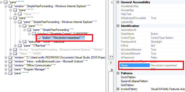
This example is shown in operation in the working example of Simple Peer Forwarding.
Resources
Resources are for information purposes only, no endorsement implied.
Tests
Procedure
Using a browser that supports Silverlight, open an HTML page that
references a Silverlight application through an object tag. To use
UI AUtomation, use Windows as the platform.
Use a verification tool that is capable of showing the full automation
tree, and an object’s name text alternative as part of the tree.
(For example, use UIAVerify or Silverlight Spy; see Resources links.)
Check that any element where default automation peer promotion
is expected is supplying a default Name in the automation tree.
Expected Results
#3 is true.
If this is a sufficient technique for a success criterion, failing this test procedure does not necessarily mean that the success criterion has not been satisfied in some other way, only that this technique has not been successfully implemented and can not be used to claim conformance.
SL27: Using Language/Culture Properties as Exposed by Silverlight Applications
and Assistive Technologies
Applicability
Microsoft Silverlight, versions 3 and greater
Silverlight managed programming model and Silverlight XAML
This technique relates to:
User Agent and Assistive Technology Support Notes
Most assistive technologies will use the HTML Lang tag value as the
determinant of the language of the page. Assistive technologies would
also use HTML Lang tag values for the language of parts. HTML Lang
is not specifically reported in accessibility frameworks, so assistive
technologies would typically be accessing the HTML DOM to get this
information.
Existing behavior on screen readers is not able to determine language
programmatically by using the CultureInfo and Language properties of
.NET and Silverlight that are referenced in the body of this technique.
For an alternative technique that specifically uses HTML Lang on two
discrete Silverlight object tags, such that language of parts can be
determined through the same principles as described in H58,
see SL4: Declaring Discrete Silverlight Objects to Specify Language Parts
in the HTML DOM.
In the case of the parts that are within Silverlight, these parts
are not HTML parts and thus do not provide the ability to specify HTML
Lang. For this reason, Silverlight application authors should be cautious
about defining extensive text regions in Silverlight that set a Silverlight Language to
be other than that declared by the hosting page HTML Lang. Any such
text regions might not be processed correctly by an assistive technology
such as a screen reader. In particular, authors should not specify
HTML Lang at all if it is uncertain that the language of the Silverlight "part" will
match, due to the "CurrentCulture" that is determined only
at run time on the client. In these cases it is best to leave HTML
Lang unspecified, so that language properties are under the control
of the user's browser settings/preferences, or operating system settings/preferences.
Description
The objective of this technique is to use the combination of HTML
Lang attribute, CultureInfo and Language to
correctly specify the language of the entirety of Silverlight content,
or of parts within the Silverlight content.
In general, Silverlight does not attempt to repurpose HTML Lang, because
Silverlight is not HTML. Instead, internally within the Silverlight
content area, Silverlight uses language definition concepts that relate
to XML (Language is a remapping of xml:lang) or .NET
Framework programming (CultureInfo). For these reasons,
HTML Lang techniques as described in [H58]
are not useful for Silverlight programming of Silverlight-specific "parts".
What becomes important in Silverlight application programming then
is to make sure that the HTML language concept of Lang and the Silverlight
language concept of CultureInfo or Lang are not at odds with one another,
or reporting misinformation. In particular, application authors should
avoid situations where an assistive technology has HTML Lang available
for programmatic determination of either page or part, but the effective
runtime language in the Silverlight part is different. The result here
might be that a screen reader that changes functionality such as phonetic
pronunciations would not correctly read the text content from the Silverlight
content. Avoiding this situation is largely a matter of due diligence
on the part of a Silverlight application author, OR on the part of
the Web page author who authors surrounding HTML, in cases where a
Web page is embedding Silverlight content or packages that the Web
page's author did not actively develop and is only consuming/embedding.
The following is a general recommendation that summarizes the detailed
discussion in subsequent subheadings:
If the Silverlight application does not have a strong emphasis
on presenting textual information with a particular language association,
HTML Lang should be left blank. This causes assistive technologies
to defer to either user agent or platform language settings. Silverlight
is able to determine these same language values at run time, and
language behavior of assistive technologies and of Silverlight is
kept synchronized through the use of the same external information
set.
If the Silverlight application DOES have a strong emphasis on
presenting textual information with A SINGLE particular language
association, HTML Lang should be assigned to report that specific
language either for whole page or at least for the Silverlight object
tag. This enables assistive technologies to pick up the value, per H57:
Using language attributes on the html element HTML. Aside from
due diligence during development and deployment, Silverlight application
code might choose to enforce that its runtime CultureInfo is really
the same. This could be addressed with a specific HTML DOM helper
function.
If the Silverlight application has MULTIPLE language associations,
the best option is to separate the Silverlight application into object
parts at the HTML level, to assure that HTML Lang and intended runtime
language do not clash. This is particularly important if the application
is actively resetting CurrentCulture away from the user settings
of platform or user agent. For more information, see SL4: Declaring Discrete Silverlight Objects to Specify Language Parts
in the HTML DOM.
HTML Lang
When Silverlight is embedded in an HTML document with the <object> element,
the value of the HTML Lang attribute of the surrounding HTML becomes
a factor. Browsers process the outer HTML, and the browser's processing
has possible influence over values reported to any DOM script that
acts, or to any accessibility framework that is reporting the browser
content. The preferred way for a Silverlight application to address SC
3.1.1 is to correctly specify the HTML Lang value in the hosting
HTML page. This technique should be used in conjunction with H57:
Using language attributes on the html element HTML. By using the
same language values with both techniques as a better practice, H57
will satisfy 3.1.1 while setting the language value of the Silverlight
content to match will assist authors in meeting SC 3.1.2.
The Silverlight runtime itself does not attempt to inherit language
settings that come from markup that is outside the Silverlight-specific
content. In particular, the HTML Lang attribute applied to the html
tag, Lang on host object tag, specific parameters of the Silverlight
object tag, all have no affect on the value of any Silverlight Language attribute.
Instead, the Silverlight Language defaults to the CultureInfo of
the Silverlight runtime as instantiated by HTML object tag invocation.
It is expected that if a Silverlight application contains extensive
text where language of text is a factor for assistive technology purposes,
developers will manually set the HTML Lang tag to match the Language value
on the Silverlight root element in XAML. Development tools might or
might not enforce or inform the relationship between HTML Lang and
Silverlight Language; that consideration is outside
the scope of Silverlight as a technology. If language is not a major
factor in the application, application authors should consider leaving
HTML Lang blank on the hosting HTML page.
You can programatically determine the value of HTML Lang of surrounding
HTML from within the Silverlight API, by using the DOM-bridging method HtmlElement.GetAttribute.
Otherwise, this can be determined by techniques other than Silverlight's
(such as scripting to the HTML DOM of the hosting browser).
Silverlight Language property
Language is an attribute that is available on all
Silverlight objects that directly represent a UI element. Language
can be queried (or set) by Silverlight managed code run time, such
that the Language value can be programatically determined
within the Silverlight programming model.
The format of the value that is used to set Language is
based on ISO-639-1, and is thus compatible with http://www.rfc-editor.org/rfc/bcp/bcp47.txt.
Language has a behavior that parallels the behavior
of xml:lang in an XML document: if Language is set on
a parent element, all child elements inherit that Language value.
An actual xml:lang attribute in XAML is also valid for this purpose.
Language can be set at the root of a XAML document,
so that the entire UI shares the same language setting. If Language is
not explicitly set at the root by application markup, Language is
inferred per running instance, based on processing the acting CultureInfo at
run time.
However, another usage is for application authors to set Language on
a specific child element, to override the root-level or client-environment-inferred Language value.
This enables consciously embedding a content part that is deliberately
in a different language than the remainder of the Silverlight content.
Exactly what happens when a Language is set on a
part is not always specified, and is largely a matter of implementation
detail of the individual Silverlight classes that might be a "part".
However, as an informative generalization, the value of Language might
affect considerations such as: how white space is processed (in particular
CR or LF); character sets for fonts; string formatting when using APIs
specifically on that part.
CultureInfo
CultureInfo is a concept that is relevant to .NET
Framework programming. This concept applies to Silverlight because
Silverlight uses a specific implementation of a CLR runtime that uses
.NET Framework principles. CultureInfo potentially
specifies both a language and a culture. This distinction becomes relevant
for advanced string formatting concepts that are provided in the .NET
Framework, such as decimal separators, dates, and currency. For example,
an application author might simply specify "en" if the author
did not care about string formatting, but might specify "en-GB" if
the application was using string formatting for currency values with
the intention of displaying Pounds Sterling as currency unit in string
formatting.
Silverlight applications often run using an inferred CultureInfo based
on the operating system where the user agent browser host exists (in
other words, the culture of the client computer where the Silverlight
application is run). This CultureInfo can be queried
by applications at run time; see CultureInfo.CurrentCulture.
Application authors can deliberately constrain the set of CultureInfo cases
that a Silverlight application can be run under, in order to verify
that necessary string resources for that culture are available in that
application. This is done by setting <SupportedCultures> in the
Silverlight project settings. If a user accesses the application on
a client that is outside the SupportedCultures, the application author
has the following choices:
Use a fallback resource set representing a neutral culture; this
is enabled automatically by the Silverlight resources lookup behavior,
so long as the project includes resources identified as being culture-neutral.
This is the preferred approach.
Use client logic to detect the culture, and initiate a client-side
redirect to request either a different XAP or a different hosting
HTML page.
Trap requests at the server level by checking lang request in
the header. This varies between server implementations, is not a
Silverlight-specific technique, and is not discussed here.
For more information, see How
to: Create a Build that Targets a Specific Culture.
CultureInfo generally applies to the Silverlight
application as a whole. There are advanced techniques whereby worker
threads can be run as separate cultures, but that is not discussed
here and is not relevant because only the main UI thread has relevance
to Web content accessibility. So, if an application author wants to
declare specific language settings for a part (component, region or
control) of the Silverlight application, a different Silverlight-specific
property Language is used.
Examples
These examples show Silverlight behaviors that are based on interpreting
the Language property value, as a way of illustrating
the programmatic determination of language values specifically in the
Silverlight application framework. To determine HTML Lang, application
authors should use the HTML DOM as enabled by browser host scripting,
rather than Silverlight APIs. HTML DOM techniques are not shown here
because they are specific to browsers or scripting frameworks, not
to Silverlight.
Example 1: Language set at root-level of Silverlight content, inherits
This example features a XAML UI and logic that reports information
to demonstrate that the information is programmatically determinable.
This example shows determination of the Language property.
<UserControl x:Class="LangProperties.MainPage"
xmlns="http://schemas.microsoft.com/winfx/2006/xaml/presentation"
xmlns:x="http://schemas.microsoft.com/winfx/2006/xaml"
Language="en-gb">
<StackPanel x:Name="LayoutRoot" Background="White">
<Border BorderBrush="Red" BorderThickness="2">
<TextBlock Language="zh-cn" Text="(()共" Name="t2" VerticalAlignment="Top" TextWrapping="Wrap" Height="100"/>
</Border>
<Border BorderBrush="Red" BorderThickness="2">
<TextBlock Text="(()共" Name="t3" VerticalAlignment="Top" TextWrapping="Wrap" Height="100"/>
</Border>
<Button Click="button1_Click">IETF Language of this app</Button>
</StackPanel>
</UserControl
private void button1_Click(object sender, RoutedEventArgs e)
{
Button b = sender as Button;
MessageBox.Show(b.Language.IetfLanguageTag);
// this will be 'en-gb' because inherits from the root
}
This example is shown in operation in the working example of Language Properties.
Example 2: Determine CurrentCulture; runtime verification that CurrentCulture and the surrounding HTML's current Lang value do not report different language settings
The following is an event handler that can be hooked to an object
lifetime event such as UserControl.Loaded on the Silverlight
XAML root. This example demonstrates property access to several of
the relevant language properties that are present in Silverlight and
shows a specific way to compare CultureInfo and Lang by a "not
equals" check after constructing a CultureInfo based on the Lang
string. To apply this test, the hosting HTML page may need to be altered
to declare a specific HTML Lang; default Silverlight aspx or html test
pages do not declare HTML Lang.
private void RunLanguageDetectLogic(object sender, RoutedEventArgs e)
{
CultureInfo thisAppCC = CultureInfo.CurrentCulture;
CultureInfo thisAppCUIC = CultureInfo.CurrentUICulture;
HtmlDocument thisPage = HtmlPage.Document;
String thisAppHTMLLang = (string) thisPage.DocumentElement.GetProperty("lang");
CultureInfo CCFromLang = new CultureInfo(thisAppHTMLLang);
if (CCFromLang != thisAppCC && CCFromLang.ToString() != "")
{
TextBlock tb = new TextBlock();
tb.Text += "Warning: the current culture for the run time (";
tb.Text += thisAppCC.ToString();
tb.Text += ") does not match the culture indicated in hosting HTML's Lang (";
tb.Text += CCFromLang.ToString();
tb.Text += ").";
tb.Inlines.Add(new LineBreak());
tb.Inlines.Add("Typical action here would be to redirect the request to an HTML page
where the Lang is correct for user's current culture as determined from the OS.");
LayoutRoot.Children.Add(tb);
//LayoutRoot refers to the default MainPage.xaml element from a VS-template Silverlight Application
}
}
Resources
Resources are for information purposes only, no endorsement implied.
Tests
Procedure
Using a browser that supports Silverlight, open an HTML page that
references a Silverlight application through an object tag.
Verify that language settings are respected by individual Silverlight
control characteristics. (Exactly what behavior manifests the language
difference varies per Silverlight class implementation. For some
testing ideas, see Creating
Globally Aware Applications).
Verify that any interaction between HTML Lang in the HTML and
the Language or CultureInfo from the Silverlight application do not
result in a clash of language information, either in terms of basic
application behavior or in how an assistive technology decides to
process language information.
Expected Results
#2 and #3 are true.
If this is a sufficient technique for a success criterion, failing this test procedure does not necessarily mean that the success criterion has not been satisfied in some other way, only that this technique has not been successfully implemented and can not be used to claim conformance.
SL29: Using Silverlight "List" Controls to Define Blocks that
can be Bypassed
Applicability
Microsoft Silverlight, versions 3 and greater
Silverlight managed programming model and Silverlight XAML
This technique relates to:
User Agent and Assistive Technology Support Notes
Description
The objective of this technique is to use some of the basic user interface
objects in Silveright to produce blocks of content that are identified
as a "List" to accessibility frameworks and to Silverlight's
own tab sequence navigation behavior.
Using the "List" technique results in a tab sequence behavior
whereby that element is treated as a single tab stop, even if that
element has consituent elements (the list items) that would otherwise
be considered additional tab stops in the main tab sequence. In the
default key handling, when the user presses the TAB key while focus
is on a List, the focus goes to the next element after the List. To
focus the items of the list, the user would press the Arrow keys rather
than TAB. In the Silverlight programming model for controls, this tab
sequence behavior is expressed by the TabNavigation property
holding the value of Once. The Silverlight ListBox is
a control that reports itself as "List" role, and that has
a default TabNavigation.Once value.
Thus ListBox as
per this technique is a lightweight technique for producing blocks
that can be bypassed. It is specifically a lightweight technique because
it can be accomplished by writing simple application-level XAML and
using only the Silverlight core libraries.
Silverlight also supports more full-featured techniques for producing
bypass blocks that are based on common user interface features such
as menus or toolbars. However, using toolbars in Silverlight is inherently
not as lightweight because the Silverlight core libraries themselves
do not include a ready-made toolbar. Silverlight provides a ContextMenu as
part of the Silverlight Toolkit extensions, but the behavior of this
particular menu does not easily address the bypass block scenario.
Silverlight includes all the infrastructure and necessary base classes
for defining a toolbar or a menu that could address the bypass block
scenario. Many third-party control implementations of menus and toolbars
exist, either as part of control packages that are sold by control
vendors, or through community mechanisms such as CodePlex or third-party
sites that provide free source code. For some examples, see the following:
If application authors use a built-in control such as ListBox where
the accessibility framework reported role is not traditionally associated
with a navigation role, it is a best practice to set AutomationProperties.Name such
that the name informs the user of the purpose of the list control.
Otherwise, the role alone leaves this ambiguous. For example, an author
might name the list control "Navigation control".
Often the List control itself is focusable. So long as the List control
has a visual focus indicator, that behavior might be acceptable. However,
it might provide a better user experience to deliberately have the
List itself non-focusable, and instead have focus fall to the first
List item when focus reaches that region. Otherwise, the List might
be perceived as an "extra" tab stop to some users. To enable
that behavior, set IsTabStop to
false on the List control. The List itself still provides the intended
tab navigation behavior, and is still reported and identified to accessibility
frameworks and assistive technologies, even when the List container
is not focusable. This is shown in Example 1, by setting IsTabStop as
part of a Style.
When an accessibility framework presents a List, assistive technologies
are generally expected to continue to support use of the same key behavior
as the default behavior, and to report to users that the item is a
List when it is focused. If assistive technologies use the accessibility
framework APIs for navigation, the items in the list are considered
child elements. Navigating either by spatial direction (e.g. NAVDIR_RIGHT
in MSAA) or sequential direction (e.g. NAVDIR_NEXT in MSAA) skips the
list items and goes to the spatial/next peer.
Examples
Example 1: Customize the behavior and appearance of a ListBox to
construct a navigation control that can be bypassed
In this example, several properties that influence the items presentation
behavior of the Silverlight core control ListBox are
adjusted to make it suitable for a navigation control. The behavior
of this control is that when the tab sequence reaches the control, "next" or
spatial navigation continues on to other controls, rather than through
the child controls of the list's items/options. This is enabled and
properly reported because ListBox reports its accessibility
framework role as "List", uses TabNavigation = Once as
default (because it is the default, TabNavigation does not have to
be set explicitly in the markup). ListBox has default
key handling for the arrow keys (to enable traversing the choices in
the menu by keyboard-only). The control could also be visually a menu
or perhaps other user interface control metaphors, depending on how
it is visually templated and composited. Regardless of appearance,
the accessibility framework and any assistive technologies based on
that framework will treat the control as a "List". This example
is templated as a horizontally oriented toolbar-type control. The items
in this example are Button controls, but could be
templated to not appear quite as button-like, or could instead use
another focusable control for the items such as a read-only TextBox.
<UserControl x:Class="TabNavigation.MainPage"
xmlns="http://schemas.microsoft.com/winfx/2006/xaml/presentation"
xmlns:x="http://schemas.microsoft.com/winfx/2006/xaml"
>
<StackPanel x:Name="LayoutRoot" Background="White">
<ListBox AutomationProperties.Name="Navigation Control">
<ListBox.ItemsPanel>
<ItemsPanelTemplate>
<StackPanel Orientation="Horizontal"/>
</ItemsPanelTemplate>
</ListBox.ItemsPanel>
<ListBox.ItemContainerStyle>
<Style TargetType="Control">
<Setter Property="IsTabStop" Value="False"/>
</Style>
</ListBox.ItemContainerStyle>
<Button>Home</Button>
<Button>Search</Button>
<Button>Tools</Button>
<Button>Help</Button>
</ListBox>
</StackPanel>
<Button>Button here to show a focusable peer control beyond the list</Button>
</UserControl>
The following is an illustration of what such a control might look
like:
This example is shown in operation in the working example of Tab Navigation.
Resources
Resources are for information purposes only, no endorsement implied.
Tests
Procedure
Using a browser that supports Silverlight, open an HTML page that
references a Silverlight application through an object tag.
Press TAB key to traverse typical tab sequence within the Silverlight
application. Verify that common areas in the user interface composition
("blocks") that are reporting the List role per this technique
can be bypassed without having to tab through each constituent part
(the "items/children" of the List).
Verify that the list children are still accessible by keyboard,
by using ARROW keys rather than TAB.
Engage an accessibility framework test tool such as UIAVerify.
Examine roles in the automation tree, and verify that the List used
for bypass behavior reports a combination of name+role that is consistent
with the behavior.
Use a screen reader to verify that name and role are reported
properly.
Expected Results
#2 and #3 are true, and either #4 OR #5 are true.
If this is a sufficient technique for a success criterion, failing this test procedure does not necessarily mean that the success criterion has not been satisfied in some other way, only that this technique has not been successfully implemented and can not be used to claim conformance.
SL30: Using Silverlight Control Compositing and AutomationProperties.Name
Applicability
Microsoft Silverlight, versions 3 and greater
Silverlight managed programming model and Silverlight XAML
This technique relates to:
User Agent and Assistive Technology Support Notes
Description
The objective of this technique is to properly apply Silverlight control
composition techniques that can present text and non-text in UI as
part of the same control. This technique explains the consequences
that using control composition has on how that control is reported
to the accessibility frameworks that Silverlight supports.
Silverlight control composition concepts are relevant either to Silverlight
developers who define and package a Silverlight control for use by
other Silverlight authors, or for Silverlight application authors that
use Silverlight controls in their UI but use the content properties
of such controls to include several other elements in a composite layout.
In Silverlight programming and UI definition, Silverlight authors can use control
composition to define a parent control that initiates an action. The
control can have component parts, such as text and non-text composition
pieces that display within the control and have equivalent meaning.
Silverlight authors can rely on the text component of the control to
provide any text alternative for purposes other than the accessibility
framework. However, Silverlight authors should declare alternative
text on the control that is specifically consumed by accessibility
frameworks, by setting AutomationProperties.Name as
an attribute in XAML. In most cases, this text can be the same as the
visible text in the control composition, per the definition of 'label'
in SC 4.1.2.
Note that this technique does not result in a duplication of text,
as explained in H2.
This is because the element parts of control composition are either
inherently not focusable separately, or can be specified by instance-specific
properties to behave as if they cannot be focused. The parts in Silverlight
composition are not promoted to the accessibility frameworks as parts
of an application-specific UI Automation tree, so that control composition
as an implementation detail does not interfere with the usage of controls
by Silverlight application authors. The primary source of accessibility-related
information is the specific AutomationProperties.Name property
as set on the parent control in the composition, which is set by the
application author rather than the control author.
The control author does specify the information that is reported to
accessibility frameworks as the "ClassName", which is often
used by assistive technologies for identification purposes and is appended
to any "Name" value. For example, if an application author
includes a "Widget" control, and gives it an AutomationProperties.Name value
of "Show Map", an assistive technology might identify the
element as "Show Map widget". The "Show Map" part
comes from the application author code, and the "widget" part
comes from the Widget control implementation code.
Examples
Example 1: Button is composed with a StackPanel that contains nontext
and text content
In this example the TextBlock that goes with the
graphic image conveys the text information for non-accessibility purposes.
The Button has internal composition that combines
text from a non-focusable TextBlock part and an image
part. Therefore the "Pause" Text is not promoted to serve
as "Name" through built-in Button automation
peer logic. The Silverlight application author is responsible for explicitly
setting AutomationProperties.Name on the Button so
that the text equivalent is available to the accessibility framework.
This example shows the XAML UI. The logic, which might be attached
to Button with a Click handler, is
not shown.
<Button
Height="20" Width="50" AutomationProperties.Name="Pause"
>
<StackPanel Orientation="Horizontal" >
<Image Height="12" Width="12" Source="/icon_pause.png"/>
<TextBlock Text="Pause"/>
</StackPanel>
</Button>
This example is shown in operation in the working example of Button Nontext Text Composition.
Example 2: Button composed, using binding and resource references
for strings
This example is similar to Example 1 and produces the same result
at run time. This example shows the preferred technique of using the
Silverlight data binding and resource features to ensure that the strings
for text content and accessibility are the same strings. Also, this
gets the strings out of the XAML source and makes them simpler to localize
or edit. For more information on using resource strings through binding,
see Localizing
XAML topic on MSDN.
<Application.Resources>
<resx:Resources x:Key="UIResourceStrings" />
</Application.Resources>
...
<Button
Height="20" Width="50"
AutomationProperties.Name="{Binding PauseUIString, Source=UIResourceStrings}" />
>
<StackPanel Orientation="Horizontal" >
<Image Height="12" Width="12" Source="/icon_pause.png"/>
<TextBlock
Text="{Binding PauseUIString, Source=UIResourceStrings}"/>
</StackPanel>
</Button>
Resources
Resources are for information purposes only, no endorsement implied.
Tests
Automation tree verifier
Procedure
Using a browser that supports Silverlight, open an HTML page that
references a Silverlight application through an object tag.
Use a verification tool that is capable of showing the full automation
tree, and an object’s name text alternative as part of the tree.
(For example, use UIAVerify or Silverlight Spy; see Resources links.)
Check that the AutomationProperties.Name appears
as the Name value for identification in the automation
tree, whenever a composite control that has both text and non-text
elements is encountered.
Expected Results
#3 is true.
If this is a sufficient technique for a success criterion, failing this test procedure does not necessarily mean that the success criterion has not been satisfied in some other way, only that this technique has not been successfully implemented and can not be used to claim conformance.
Tests
Screen reader
Procedure
Using a browser that supports Silverlight, open an HTML page that
references a Silverlight application through an object tag.
Engage the screen reader. With focus inside the Silverlight content
area, press TAB to focus to a composite control where both text and
non-text elements are present.
Check that the Name as applied to the control
instance, along with the class name of the control, is read by the
screen reader.
Expected Results
#3 is true.
If this is a sufficient technique for a success criterion, failing this test procedure does not necessarily mean that the success criterion has not been satisfied in some other way, only that this technique has not been successfully implemented and can not be used to claim conformance.
SL31: Using Silverlight Font Properties to Control Text Presentation
Applicability
Microsoft Silverlight, versions 3 and greater
Silverlight managed programming model and Silverlight XAML
This technique relates to:
User Agent and Assistive Technology Support Notes
Description
The objective of this technique is to change the presentation / visual
appearance of text, by setting several of the font-specific properties
in the Silverlight API. Changing such properties does not change the
semantic meaning of the text, nor does it alter the representation
of the text that is available to assistive technologies through the
Silverlight support of the UIA accessibility framework. By using font
properties, it is possible to introduce a wide variety of presentation
changes to fonts that do not introduce semantic elements that interfere
with an assistive technology's view of text in the Silverlight application.
In particular, adjusting font properties will make it possible to avoid
any need for use of images of text, yet still provide a wide range
of choices for text presentation.
Silverlight font properties exist on all controls, as well as on other
text elements that are not true controls. For controls, the font properties
apply in any case where the control enables a presentation mode that
has enclosed text areas in its layout. By setting Silverlight font
properties, it is possible to adjust presentation of font features
without changing the structural connotation of that control, or the
value of any control-specific property that contains plain-text. For
example, the FontSize property can be set on a Paragraph (not
a control) or on a Button (a control, and in this
case the font size changes apply to any text displayed in the button
content area). Font properties are also inheriting properties, meaning
that if applying a font property value to a container in a relationship,
those font property values can apply to child elements in the relationship.
For example, if a FontSize is applied to a RichTextBox,
that FontSize value is used by default by all the Paragraph items
displayed in the RichTextBox.
Similar to CSS, Silverlight font properties can be grouped as a Style.
That Style can be applied to all instances of a text
element type (for example to all cases of Paragraph)
or specifically referenced as a resource that is only used by certain
instances of a text element type. Either way, the Style feature
enables the separation of presentation from semantics for text elements,
and enables workflows where content authors supply the semantic text
and design-oriented authors adjust the related Silverlight styles.
For more information on the Silverlight concept of styles, see Control
Customization on MSDN.
The following Silverlight font properties are useful to style text
and avoid the need for text in images. Links in this list refer to
the Control class version of these properties.
The FontFamily property
is used to display the code aspect in a monospace font family (specifically,
FontFamily="Courier New").
The FontSize property
is used to display the text in a larger size.
The FontStyle property
is used to display text in italics.
The FontWeight property
is used to set how thick or thin characters in text should be displayed.
The FontStretch property
is used to control the spacing of letters in text.
The Foreground property
is used to display the color of text or text containers.
The Background property
can be used to display text on a non-text background.
So long as images of text are avoided, the text within a Silverlight
text element can be reported to the UI Automation accessibility framework
that Silverlight supports. That text is reported using the same basic
text content as is used for semantic text display in the UI. In other
words, exposing that text to assistive technologies that use UIA as
a framework does not require the Silverlight application author to
resort to automation-specific override properties such as AutomationProperties.HelpText;
the automation peers for text elements report all necessary text content
to automation as a built-in behavior of the text element controls.
For more information on UI Automation and text containers, see SL32: Using Silverlight Text Elements for Appropriate Accessibility Role.
CSS versus Silverlight font properties
Related CSS techniques mention that users can override any page-declared
CSS styling techniques, by invoking browser-specific features. For
example, using Internet Explorer, a user can use Tools / Internet Options,
Appearance / Accessibility to override certain classifications of CSS-controlled
font properties when displaying HTML documents, or to use a user-specific
style sheet for HTML documents. No browser-level equivalent feature
exists for user alteration of Silverlight text properties in the Silverlight
content area. Instead, application authors could supply controls that
enable similar font-property changing behavior, and include those controls
in the application-specific user interface. For more information on
this technique, see SL13: Providing A Style Switcher To Switch To High Contrast.
Glyphs
Silverlight API includes a related text presentation API Glyphs. Glyphs is
intended for specific decorative or niche language-support scenarios.
The Glyphs API does not offer as much UIA exposure
or the ability to programmatically change typical font properties;
the main scenarios for Glyphs are to package migrated
text content from document formats, or for purely decorative text in
a font that is not commonly found on a user system and only the glyphs
actually used in the Unicode string are subsetted into the Glyphs font
payload. If addressing the WCAG criteria, authors should avoid using Glyphs API
and instead use other text containers such as TextBox,
along with a font that is supplied in the application package or known
to exist on the end user system.
Examples
Example 1: Run time applied font properties, style, and template
This example illustrates applying runtime changes to a font property.
This example has UI in XAML, and logic in C#. The following is the
XAML.
<UserControl x:Class="DocumentStructure.MainPage"
xmlns="http://schemas.microsoft.com/winfx/2006/xaml/presentation"
xmlns:x="http://schemas.microsoft.com/winfx/2006/xaml"
>
<UserControl.Resources>
<Style x:Key="NewStyle" TargetType="Control">
<Setter Property="FontFamily" Value="Arial"/>
<Setter Property="FontSize" Value="30"/>
<Setter Property="Height" Value="40"/>
</Style>
</UserControl.Resources>
<StackPanel x:Name="LayoutRoot" Background="White">
<RichTextBox IsReadOnly="True" Name="rtb" FontFamily="Algerian" FontSize="20">
<Paragraph>Call me Ishmael. Some years ago--never mind how long precisely--having little or no money in my purse,
and nothing particular to interest me on shore, I thought I would sail about a little
and see the watery part of the world. It is a way I have of driving off the spleen and
regulating the circulation. Whenever I find myself growing grim about the mouth; whenever
it is a damp, drizzly November in my soul; whenever I find myself involuntarily pausing before
coffin warehouses, and bringing up the rear of every funeral I meet; and especially whenever my
<Hyperlink NavigateUri="http://en.wiktionary.org/wiki/hypo">hypos</Hyperlink>
get such an upper hand of me, that it requires a strong moral principle to prevent me from deliberately stepping into
the street, and methodically knocking people's hats off--then, I account it high time to get to sea as soon as I can.
This is my substitute for pistol and ball. With a philosophical flourish Cato throws himself
upon his sword; I quietly take to the ship. There is nothing surprising in this. If they but knew it,
almost all men in their degree, some time or other, cherish very nearly the same
feelings towards the ocean with me.
</Paragraph>
<Paragraph>There now is your
<Hyperlink
NavigateUri="http://en.wikipedia.org/wiki/New_York_Harbor">insular city of the Manhattoes</Hyperlink>
, belted round by wharves as Indian isles by coral reefs--commerce surrounds it
with her surf. Right and left, the streets take you waterward. Its extreme downtown is the
battery, where that noble mole is washed by waves, and cooled by breezes, which a few hours
previous were out of sight of land. Look at the crowds of water-gazers there.
</Paragraph>
<Paragraph>Circumambulate the city of a dreamy Sabbath afternoon.
Go from Corlears Hook to Coenties Slip, and from thence, by Whitehall, northward. What do you see?
--Posted like silent sentinels all around the town, stand thousands upon thousands of mortal men
fixed in ocean reveries. Some leaning against the spiles; some seated upon the pier-heads;
some looking over the bulwarks of ships from China; some high aloft in the rigging, as if striving
to get a still better seaward peep. But these are all landsmen; of week days pent up in lath
and plaster--tied to counters, nailed to benches, clinched to desks. How
then is this? Are the green fields gone? What do they here?
</Paragraph>
</RichTextBox>
<Button Name="swapper" Click="swapper_Click" Width="220">Swap styles</Button>
</StackPanel>
</UserControl>
The following is C# code:
private void swapper_Click(object sender, RoutedEventArgs e)
{
rtb.Style = this.Resources["NewStyle"] as Style;
}
This example is shown in operation in the working example of Document Structure.
Resources
Resources are for information purposes only, no endorsement implied.
Tests
Procedure
Using a browser that supports Silverlight, open an HTML page that
references a Silverlight application through an object tag.
Test that application of font properties as enabled in application
UI changes presentation, but does not change semantic meaning of
text.
Close the browser. Repeat the test with an accessibility framework
test tool running. There should be no difference in the structure
or relationships in the accessibility view beyond the presentation
changes.
Expected Results
#2 and #3 are true.
If this is a sufficient technique for a success criterion, failing this test procedure does not necessarily mean that the success criterion has not been satisfied in some other way, only that this technique has not been successfully implemented and can not be used to claim conformance.
SL33: Using Well-Formed XAML to Define a Silverlight User Interface
Applicability
Microsoft Silverlight, versions 3 and greater
Silverlight managed programming model and Silverlight XAML
This technique relates to:
User Agent and Assistive Technology Support Notes
Description
The objective of this technique is to use the characteristics of the
XAML language to support basic parsing requirements that both applications
and accessibility frameworks rely upon. This technique explains the
role of XAML in the overall Silverlight development and application
architecture, in particular for defining the elements that make up
a Silverlight user interface. This technique also present some basic
facts about XAML as a language; more information of this nature is
also included in Silverlight Technology Notes.
XAML is a markup language for object instantiation. XAML can be incorporated
into a technology such as Silverlight. A specific XAML vocabulary can
be defined by a technology such as Silverlight, and the vocabulary
can be extended by anyone that provides suitable backing code. For
example, a Silverlight application author can define a custom class,
and the application author or potentially other Silverlight application
authors can use XAML to instantiate instances of the custom class.
XAML has a published
language specification.
XAML does not necessarily declare the entirety of the object tree
that a Silverlight client runtime loads, but XAML typically declares
the majority of the objects/elements that represent the Silverlight
application's user interface. The objects and values that are used
for accessibility scenarios are often closely related to the standard
user interface, and thus accessibility-related properties are typically
declared in XAML rather than in code, even though setting the values
in code is technically possible.
For more information on XAML in Silverlight, see Silverlight
XAML Overview on MSDN.
XAML and XML
XAML is based on XML, and shares many of its language features. Some
of the language features that are directly relevant to the stated intent
of SC4.1.1 and to 4.1.1 related techniques include:
Well-formedness: The definition of well-formed XAML is the same
as the XML definition. XAML processors, including the Silverlight
runtime XAML parser, will block loading XAML that is not well formed.
Duplicate attributes: Unless specially configured for scenarios
such as design-time support, XAML processors will block loading XAML
where elements contain duplicate attributes.
Quote matching: mismatched quote matching for attribute values
in XAML constitutes XAML that is not well formed.
Some XAML language features that are analogous to XML but have some
technology-specific differences include:
Identifiers: XAML defines a Name directive, which
is analogous to xml:id in that Name serves
as the unique identifier of an element. However, XAML defines an
additional concept of a XAML namescope, which permits a XAML document
to contain multiple XAML namescopes as a factoring technique. Thus,
identical Name values are permitted in a XAML document
so long as each is defined in a separate XAML namescope. XAML namescopes
are associated with elements, such that the extent of each XAML namescope
is understood by XAML processors.
Schemas and vocabularies: A notable difference between XAML and
XML is that a XAML vocabulary is not typically represented in existing
XML schema definition formats such as XSD or DTD. XAML includes inheritance
and reference features that cannot adequately be expressed in XSD
or other existing XML schema representation formats. This affects
the "elements are nested according to their specifications" consideration
of SC4.1.1. XAML definitely has the ability to enforce nesting restrictions
as represented by a XAML vocabulary. However, XAML validity for a
vocabulary is deliberately fluid, in order to support extension by
user code. XAML validity is determined by a combination of a XAML
processor, a XAML concept known as a XAML schema context, and the
code that backs the XAML and defines any objects being instantiated
as a parsing result. Typically, design time tools such as Microsoft
Visual Studio can adequately duplicate the runtime validity characteristics
of a XAML vocabulary. Using these tools, application authors can
both verify XAML validity as well as receive design-time information
for how to correct any XAML validity errors.
XAML parsing and HTML parsing
In the Silverlight implementation, XAML is like HTML in that it is
loaded and parsed just-in-time. Silverlight XAML is not precompiled
to binary or MSIL (the language-neutral CLR runtime format). Instead,Silverlight
XAML is transmitted or stored as plain text, either loose or packaged
as resources in a library. Thus Silverlight XAML is human readable
as well as machine readable.
However, unlike HTML, Silverlight XAML is only intended to be loaded
and interpreted by the Silverlight runtime, rather than multiple possible
user agents that each implement an HTML engine. HTML is a language
where the behavior is also specified. In contrast, XAML is a language
for referencing constructs that are defined in runtime libraries, and
the functional specification of the XAML language itself is minimal
(intrinsics; language rules; primitive types). Layout, appearance,
type-member sets, roles, etc. are all left up to specific frameworks
and vocabularies that use XAML. Behavior associated with a given XAML
construct is based on type definitions made in a runtime library. For
Silverlight XAML, the types are from Silverlight core libraries, but
often the definitions come from libraries that are available to the
Silverlight runtime as part of an application's packaging for distribution.
XAML is generally speaking strict, and will raise parsing errors if
XAML contains elements that are not recognized. Such parsing errors
generally present the information in the XAML from resulting in any
objects being created, which in turn prevents a Silverlight application
from running. This is different from typical (non-xHTML) HTML, where
implementations are permitted to contain nonrecognized elements or
attributes and ignore them.
Examples
Example 1: XAML in design tools for Silverlight
A developer utilizes features in their Silverlight XAML authoring
tool to ensure that:
XAML is well formed
XAML is valid according to Silverlight parser and all reference
assemblies
XAML Names are unique in namescope
XAML has no duplicate attributes
More about design tools and XAML
Silverlight XAML is able to be loaded by design tools for Silverlight.
In the design tool, the XAML is interpreted much like the runtime interprets
it, in order to show the visual representation of the Silverlight application.
In addition, the design tool might implement design surfaces in which
the user interface can be changed, and typically provides a way to
save any changes made in the tool back into the loaded XAML.
At design time, tools such as Microsoft Visual Studio or Microsoft
Expression might provide opportunities to correct any XAML errors before
the Silverlight application is compiled and packaged for deployment.
This might be implemented by performing static analysis of the XAML,
by forwarding the design tool's own parser errors as it renders the
design surface, or by forwarding linking errors that are identified
by a precompile step (for example, missing event handlers raise a XAML
error from precompile). This behavior is sometimes identified as a design
mode behavior in Microsoft documentation and other documentation
about Visual Studio or specific tools.
Regardless of how a given XAML file behaves while being interacted
with in a design mode, it is the Silverlight runtime XAML parser on
each client installation that is the ultimate determinant of whether
the XAML is valid or invalid.
Example 2: Silverlight application consumer
A consumer views a Silverlight application that is hosted in an HTML
page. If the Silverlight application has valid XAML, the Silverlight
content loads, and the fact that the XAML-based UI loaded at all is
assurance that:
XAML is well formed
XAML is valid
XAML validity is partially based on correct type mapping of all
elements referenced in XAML, according to Silverlight XAML parser
and all reference assemblies included by that application
XAML Names are unique in namescope
XAML has no duplicate attributes
XAML-defined properties that are relevant for assistive technology
(for example AutomationProperties.Name as described
by other Silverlight techniques) are available
Resources
Resources are for information purposes only, no endorsement implied.
Tests
Pass case
Procedure
Using a browser that supports Silverlight, open an HTML page that
references a Silverlight application through an object tag. That
application is known to consume Silverlight XAML.
Verify that the application runs correctly and displays user interface.
Expected Results
#2 is true.
If this is a sufficient technique for a success criterion, failing this test procedure does not necessarily mean that the success criterion has not been satisfied in some other way, only that this technique has not been successfully implemented and can not be used to claim conformance.
Tests
Fail case
Procedure
Using a browser that supports Silverlight, open an HTML page that
references a Silverlight application through an object tag. That
application is known to consume Silverlight XAML, and the XAML is
known to be deliberately invalid.
Verify that the application did not run.
Expected Results
#2 is true.
Note that it is common that an error message is displayed to users
in HTML, which is implemented by handling the JavaScript OnError event
emitted by the Silverlight plugin. XAML parse errors are forwarded
to JavaScript errors and can be handled in this way. However, it is
also possible that the application is production-ready, and deliberately
does not expose any JavaScript errors, whether Silverlight managed
code errors or not. If seeing the specific error is important, the
test might need to be run against a preproduction or debug version
of the application.
If this is a sufficient technique for a success criterion, failing this test procedure does not necessarily mean that the success criterion has not been satisfied in some other way, only that this technique has not been successfully implemented and can not be used to claim conformance.


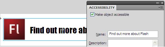
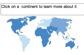
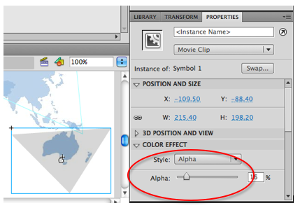
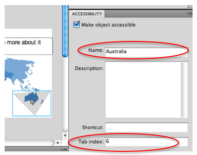
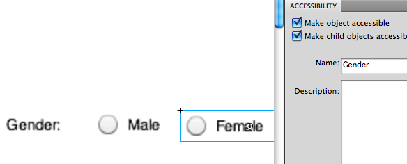
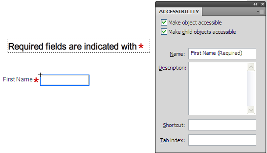
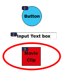
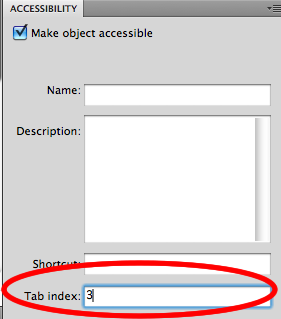
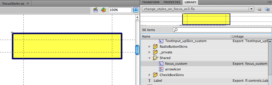
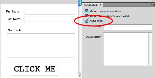
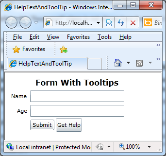
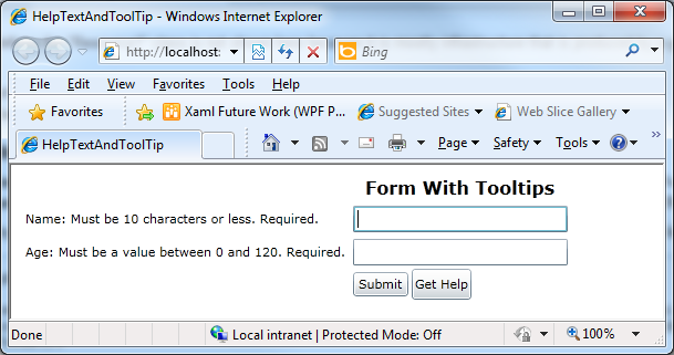
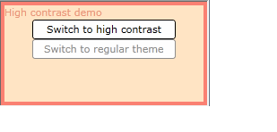
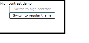
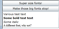
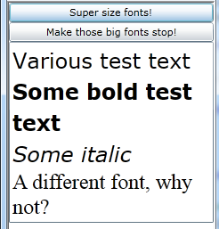
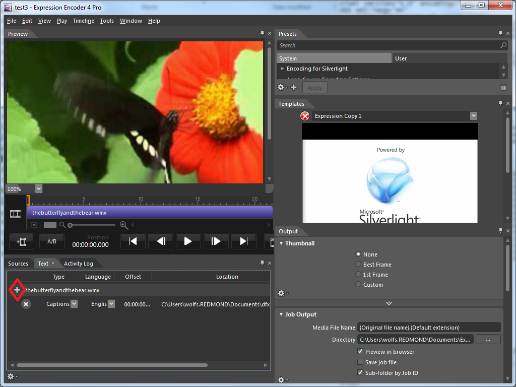
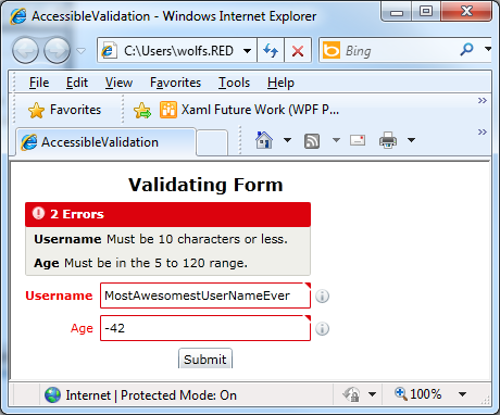
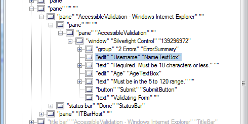
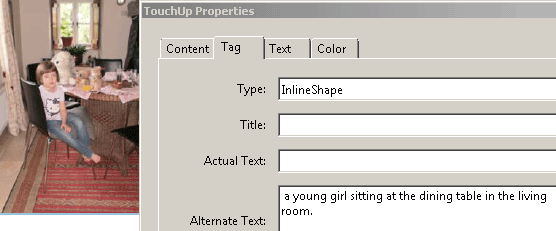
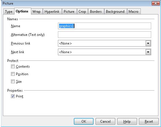
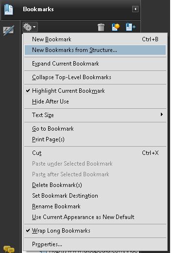
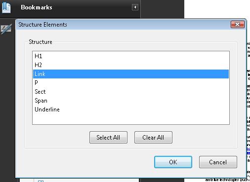
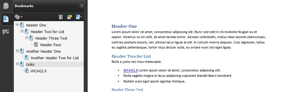
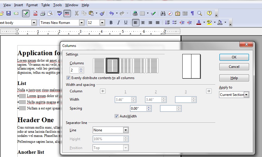
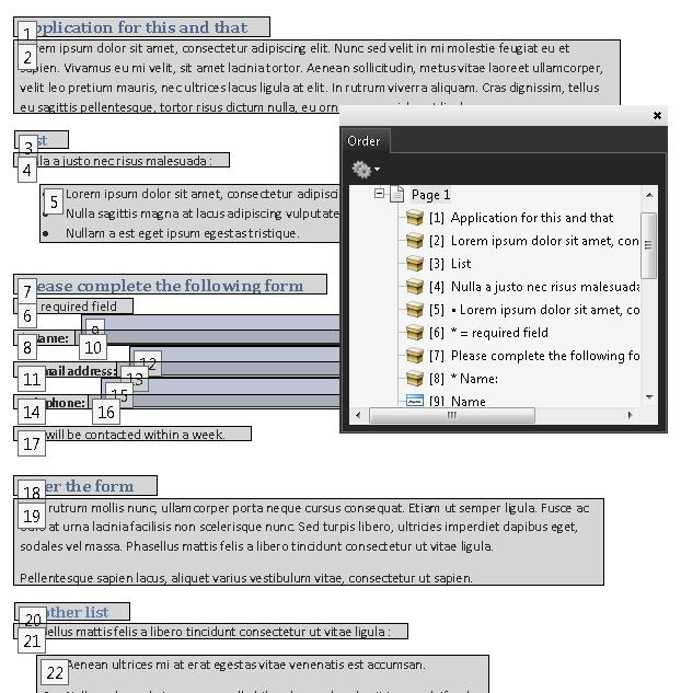
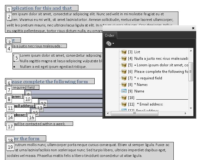
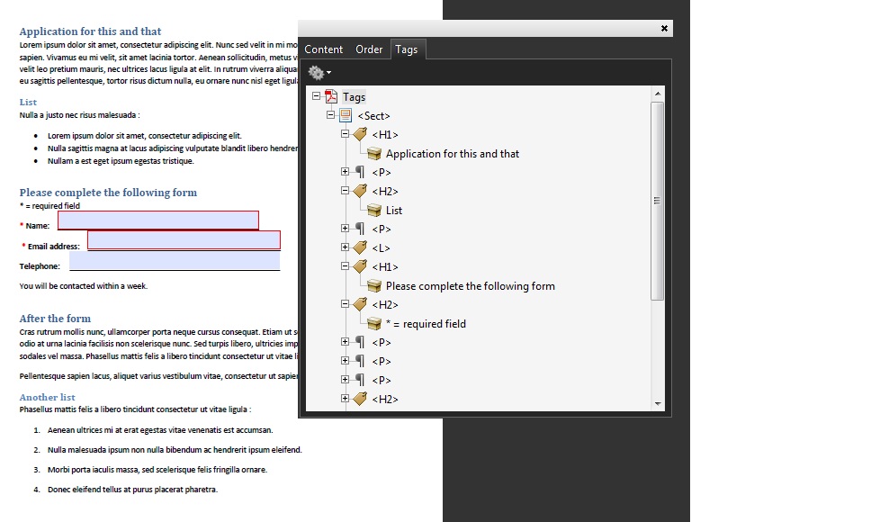
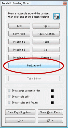
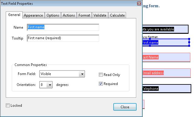
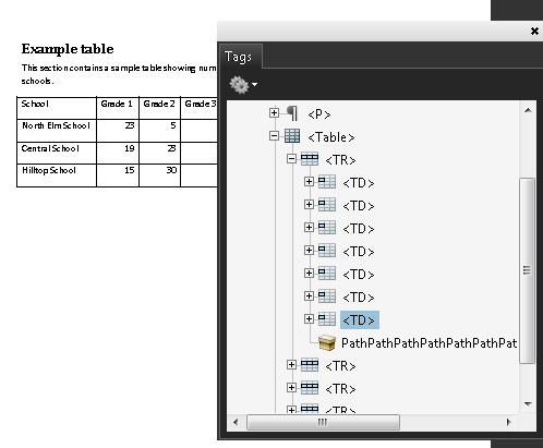
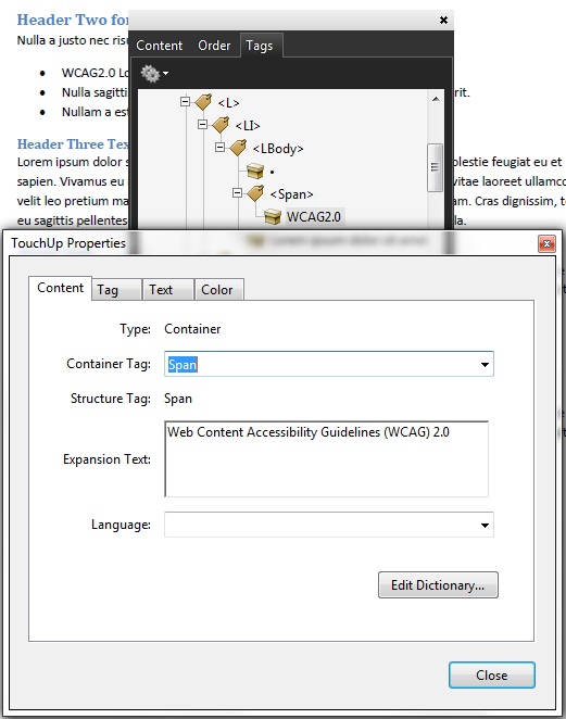
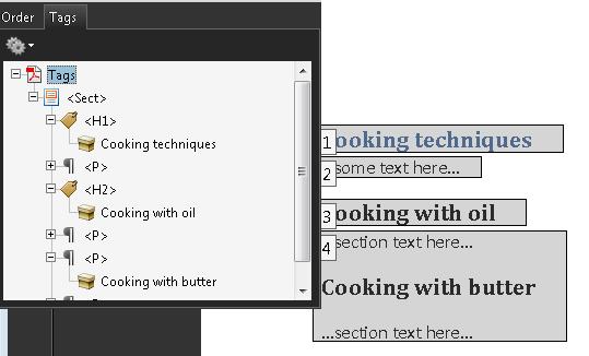
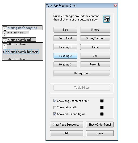
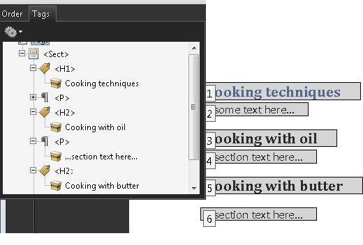
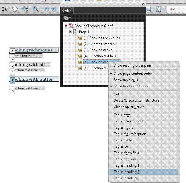
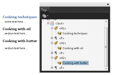
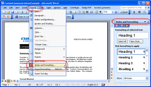
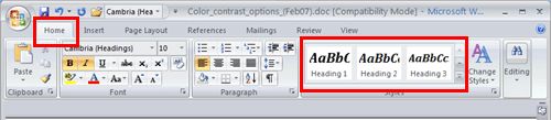
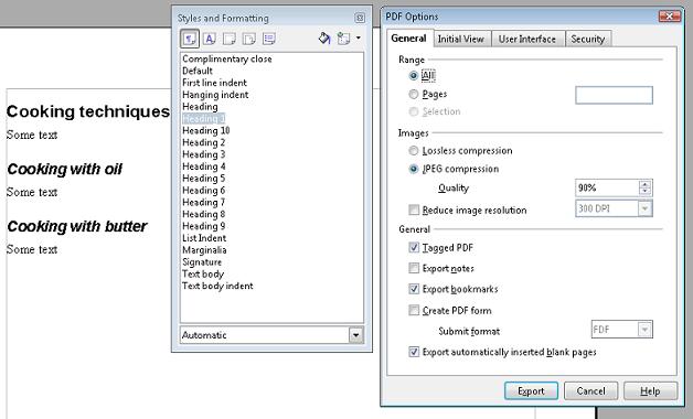

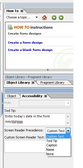
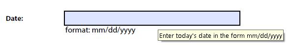
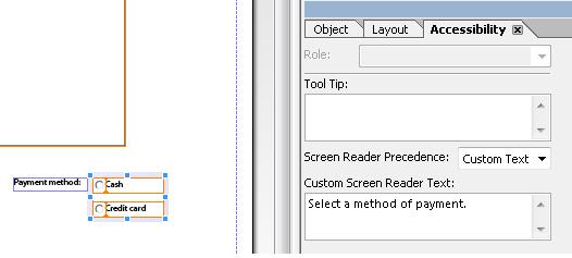
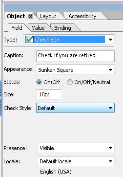
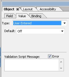
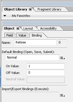
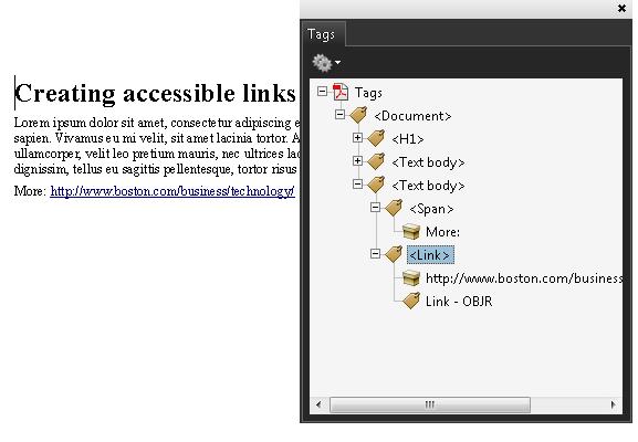
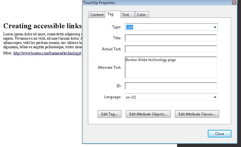
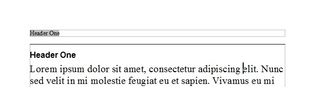
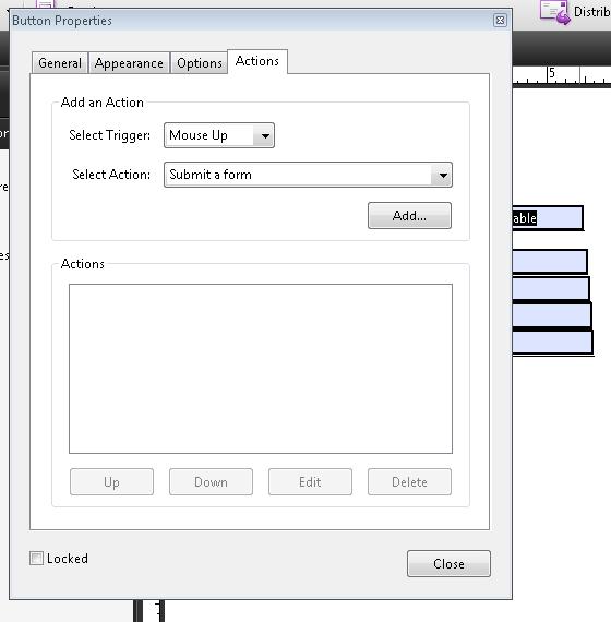
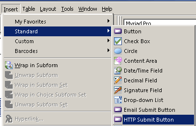
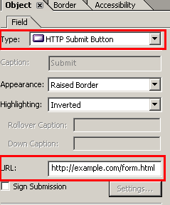
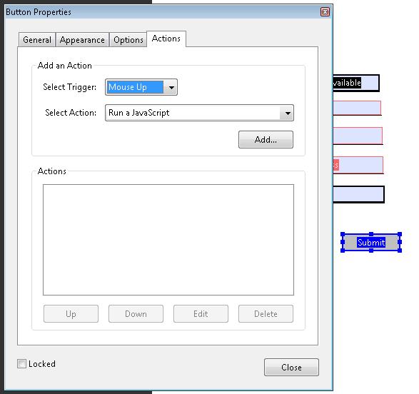
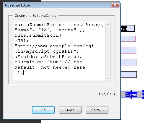
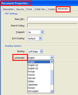
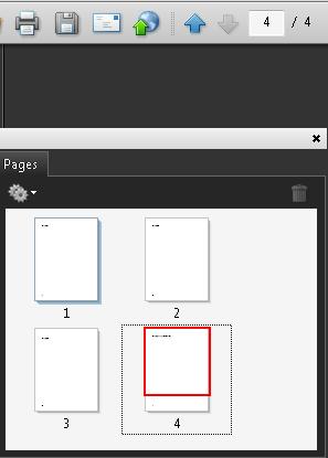
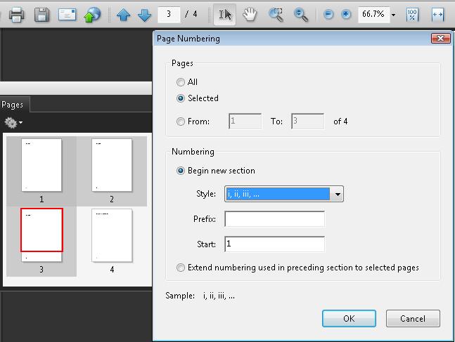
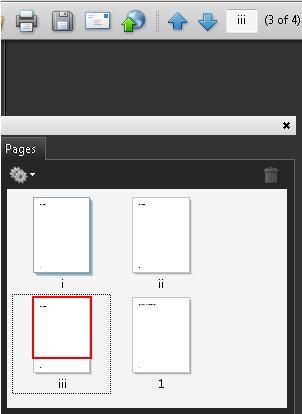
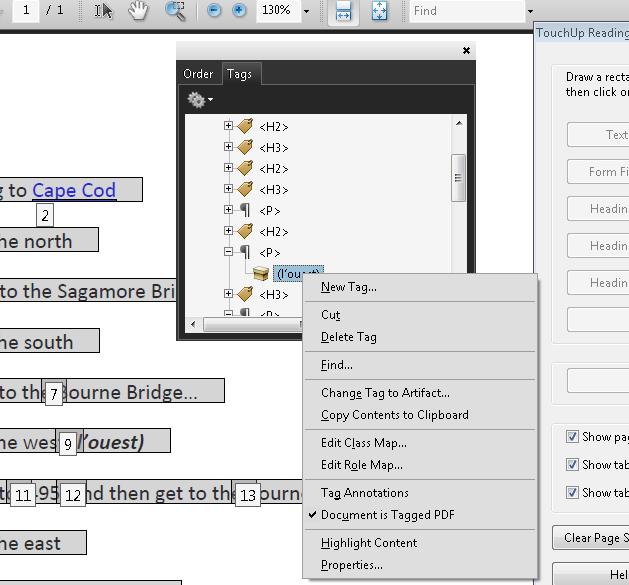
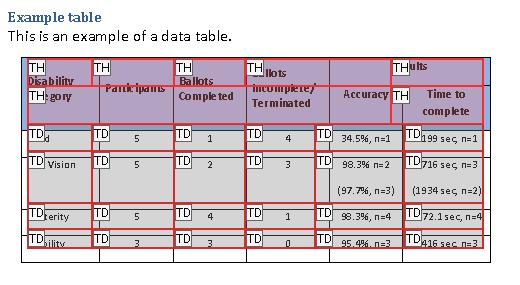
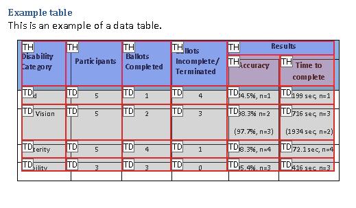
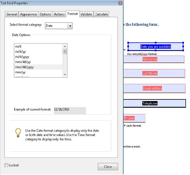
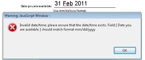
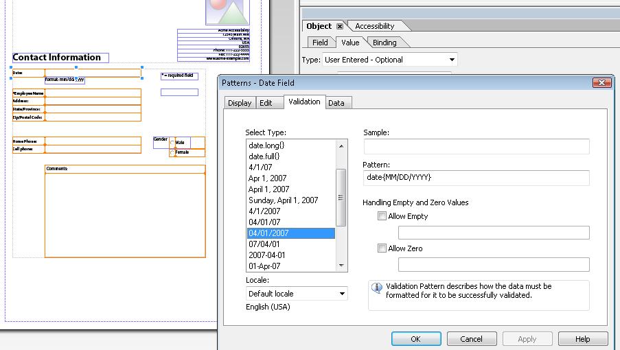
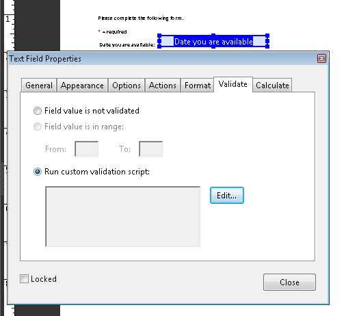
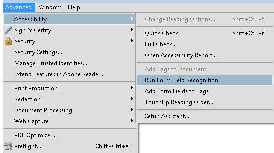
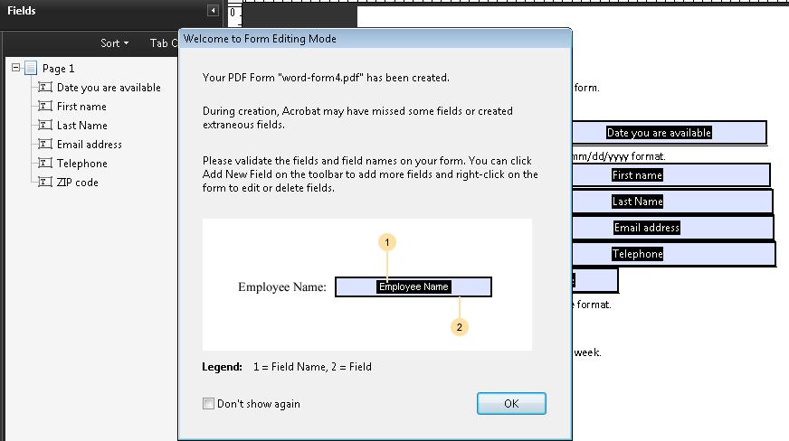
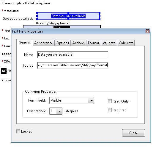
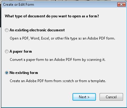
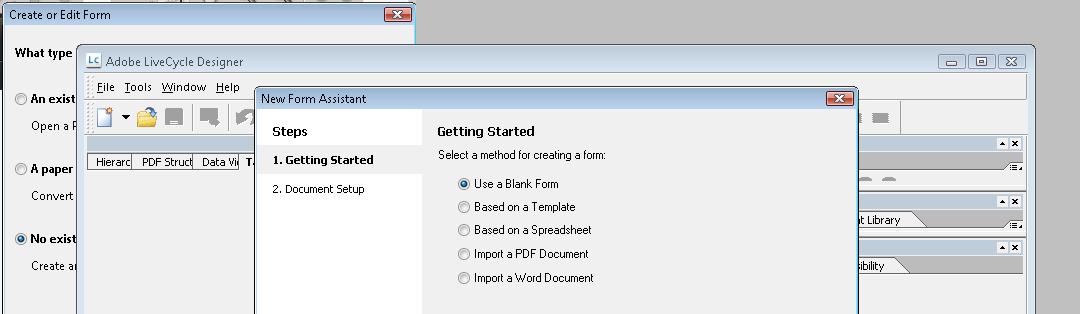
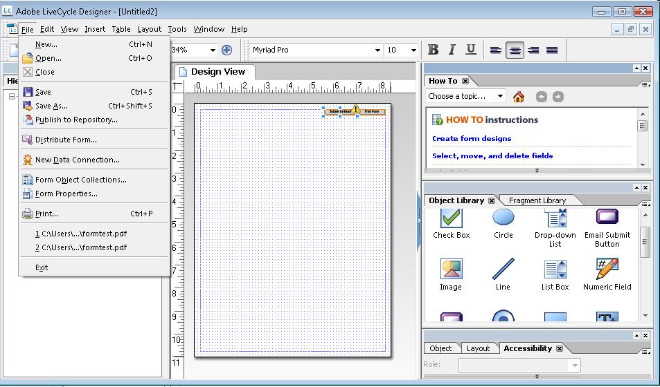
 .
.