
Scalable Vector Graphics (SVG) 2
W3C Working Draft 11 February 2014
- This version:
- http://www.w3.org/TR/2014/WD-SVG2-20140211/
- Latest version:
- http://www.w3.org/TR/SVG2/
- Latest editor's draft:
- https://svgwg.org/svg2-draft/
- Previous version:
- http://www.w3.org/TR/2013/WD-SVG2-20130618/
- Single page version:
- http://www.w3.org/TR/2014/WD-SVG2-20140211/single-page.html
- Public comments:
- www-svg@w3.org (archive)
- Editors:
- Nikos Andronikos, Canon, Inc. <nikos.andronikos@cisra.canon.com.au>
- Tavmjong Bah, Invited Expert <tavmjong@free.fr>
- Brian Birtles, Mozilla Japan <bbirtles@mozilla.com>
- Cyril Concolato, Telecom ParisTech <cyril.concolato@telecom-paristech.fr>
- Erik Dahlström, Opera Software <ed@opera.com>
- Chris Lilley, W3C <chris@w3.org>
- Cameron McCormack, Mozilla Corporation <cam@mcc.id.au>
- Doug Schepers, W3C <schepers@w3.org>
- Dirk Schulze, Adobe Systems <dschulze@adobe.com>
- Richard Schwerdtfeger, IBM <schwer@us.ibm.com>
- Satoru Takagi, KDDI Corporation <sa-takagi@kddi.com>
- Jonathan Watt, Mozilla Corporation <jwatt@jwatt.org>
Copyright © 2014 W3C® (MIT, ERCIM, Keio, Beihang), All Rights Reserved. W3C liability, trademark and document use rules apply.
Abstract
This specification defines the features and syntax for Scalable
Vector Graphics (SVG) Version 2, a language for describing
two-dimensional vector and mixed vector/raster graphics. Although
an XML serialization is given, processing is defined in terms of a
DOM.
Status of This Document
This section describes the status of this document at the time of its
publication. Other documents may supersede this document. A list of current W3C
publications and the latest revision of this technical report can be found in
the W3C technical reports index at http://www.w3.org/TR/.
This document is the 11 February 2014 Working Draft of SVG 2. This version of SVG
builds upon SVG 1.1 Second Edition
by improving the usability of the language and by adding new features commonly
requested by authors. The Changes appendix lists all
of the changes that have been made since SVG 1.1 Second Edition.
Comments on this Working Draft are welcome.
Comments can be sent to www-svg@w3.org,
the public email list for issues related to vector graphics on the Web. This list is
archived and
senders must agree to have their message publicly archived from their
first posting. To subscribe send an email to
www-svg-request@w3.org with
the word subscribe in the subject line.
The specification includes a number of annotations that the Working Group is
using to record links to meeting minutes and resolutions where specific decisions
about SVG features have been made. Different coloring is also used to mark the
maturity of different sections of the specification:
- a red background indicates a section that is either unchanged since SVG
1.1 (and which therefore still requires review and possible rewriting for
SVG 2), or a section that is new but still requires substantial work
- a yellow background indicates a section from SVG 1.1 that has been reviewed
and rewritten if necessary, or a new section that is complete and ready
for the rest of the Working Group to review
- a white background indicates a section, either from SVG 1.1 or new for
SVG 2, that has been reviewed by the Working Group and which is ready
for wider review
In this Working Draft, by default, the background colors indicating
section maturity are hidden and only annotations that record specific
requirements for SVG 2 as part of our requirements gathering exercise are
visible. To view the section maturity background colors and any additional
annotations, the "All annotations" alternate style sheet can be used.
This document has been produced by the
W3C SVG Working Group as part of
the Graphics Activity within
the W3C Interaction Domain. The
goals of the W3C SVG Working Group are discussed in the
W3C SVG Charter.
The W3C SVG Working Group maintains a public Web page,
http://www.w3.org/Graphics/SVG/,
that contains further background information. The authors of
this document are the SVG Working Group participants.
This document was produced by a group operating under the
5 February 2004 W3C Patent Policy.
W3C maintains a public list of any patent disclosures
made in connection with the deliverables of the group; that page also includes
instructions for disclosing a patent. An individual who has actual knowledge of
a patent which the individual believes contains
Essential Claim(s)
must disclose the information in accordance with
section 6 of the W3C Patent Policy.
Publication as a Working Draft does not imply endorsement by the W3C Membership.
This is a draft document and may be updated, replaced or obsoleted by other documents
at any time. It is inappropriate to cite this document as other than work in progress.
A list of current W3C Recommendations and other technical documents can be found at
http://www.w3.org/TR/. W3C publications
may be updated, replaced, or obsoleted by other documents at any time.
Acknowledgments
The SVG Working Group would like to thank the following people for
contributing to this specification by participating in discussions
that resulted in changes to the document:
David Dailey, Daniel Holbert, Paul LeBeau, Robert Longson, Philip Rogers, David Zbarsky.
In addition, the SVG Working Group would like to acknowledge the
contributions of the editors and authors of the previous versions
of SVG – as much of the text in this document derives from these
earlier specifications – including:
Finally, the SVG Working Group would like to acknowledge the
great many people outside of the SVG Working Group who help with the
process of developing the SVG specifications. These people are too
numerous to list individually. They include but are not limited to
the early implementers of the SVG 1.0 and 1.1 languages (including
viewers, authoring tools, and server-side transcoders), developers of
SVG content, people who have contributed on the www-svg@w3.org and
svg-developers@yahoogroups.com email lists, other Working Groups at the
W3C, and the W3C Team. SVG 1.1 is truly a cooperative effort between
the SVG Working Group, the rest of the W3C, and the public and benefits
greatly from the pioneering work of early implementers and content
developers, feedback from the public, and help from the W3C team.
Chapter 1: Introduction
Contents
1.1. About SVG
This specification defines the features and syntax for
Scalable Vector Graphics (SVG).
SVG is a language for describing two-dimensional graphics in
XML [XML10]. SVG
allows for three types of graphic objects: vector graphic
shapes (e.g., paths consisting of straight lines and curves),
images and text. Graphical objects can be grouped, styled,
transformed and composited into previously rendered objects.
The feature set includes nested transformations, clipping
paths, alpha masks, filter effects and template objects.
SVG drawings can be interactive
and dynamic. Animations
can be defined and triggered
either declaratively (i.e., by embedding SVG animation elements
in SVG content) or via scripting.
Sophisticated applications of SVG are possible by use of a
supplemental scripting language which accesses
SVG Document Object Model (DOM), which
provides complete access to all elements, attributes and
properties. A rich set of event handlers
such as ‘onmouseover’ and ‘onclick’ can be assigned to any SVG
graphical object.
Because of its compatibility and
leveraging of other Web standards, features like
scripting can be done on XHTML and SVG
elements simultaneously within the same Web page.
SVG is a language for rich graphical content. For
accessibility reasons, if there is an original source document
containing higher-level structure and semantics, it is
recommended that the higher-level information be made available
somehow, either by making the original source document
available, or making an alternative version available in an
alternative format which conveys the higher-level information,
or by using SVG's facilities to include the higher-level
information within the SVG content. For suggested techniques in
achieving greater accessibility, see
Accessibility.
1.2. SVG MIME type, file name extension and Macintosh file type
The MIME type for SVG is "image/svg+xml" (see
XML Media Types
[RFC3023]). The
registration of this MIME type is in progress at the W3C.
It is recommended that SVG files have the extension
".svg" (all lowercase) on all platforms. It is
recommended that gzip-compressed
[RFC1952]
SVG files have the extension ".svgz" (all
lowercase) on all platforms.
Should we mention .svg.gz?
It is recommended that SVG files stored on Macintosh HFS
file systems be given a file type of "svg "
(all lowercase, with a space character as the fourth letter).
It is recommended that gzip-compressed
SVG files stored on Macintosh HFS file systems be given a file
type of "svgz" (all lowercase).
HFS file types are probably not relevant any more.
1.3. SVG namespace and DTD
The SVG 2 namespace is http://www.w3.org/2000/svg,
which is the same as for earlier versions of SVG.
A DTD is not provided in this specification, as the use of DTDs for
validating XML documents is known to be problematic. In particular, DTDs
do not handle namespaces gracefully. It is recommended that authors
do not include a DOCTYPE declaration in SVG documents.
1.4. Compatibility with other standards efforts
This section doesn't sound like it serves any real
purpose other than self promotion for how well it utilizes other
specifications and frameworks. I think it can be dropped, or at least
condensed into a couple of sentences.
SVG leverages and integrates with other W3C specifications
and standards efforts. By leveraging and conforming to other
standards, SVG becomes more powerful and makes it easier for
users to learn how to incorporate SVG into their Web sites.
The following describes some of the ways in which SVG
maintains compatibility with, leverages and integrates with
other W3C efforts:
In environments which support
DOM4
[DOM4] for other
XML grammars (e.g., XHTML [XHTML]) and which also
support SVG and the SVG DOM, a single scripting approach can be
used simultaneously for both XML documents and SVG graphics, in
which case interactive and dynamic effects will be possible on
multiple XML namespaces using the same set of scripts.
1.5. Terminology
Within this specification, the key words "MUST", "MUST NOT",
"REQUIRED", "SHALL", "SHALL NOT", "SHOULD", "SHOULD NOT",
"RECOMMENDED", "MAY", and "OPTIONAL" are to be interpreted as
described in Key words for use in RFCs to Indicate Requirement Levels
[RFC2119].
However, for readability, these words do not appear in all
uppercase letters in this specification.
At times, this specification recommends good practice for
authors and user agents. These recommendations are not
normative and conformance with this specification does not
depend on their realization. These recommendations contain the
expression "We recommend ...", "This specification recommends
...", or some similar wording.
1.6. Definitions
Does it make sense to have a glossary here? How
useful is it compared to defining terms where they make most
sense in the body of the specification?
There should be a separate section that lists
element and attribute categories and their members.
- animation element
- An animation element is an element that can be used to animate
the attribute or property value of another element. The following elements
are animation elements: ‘animate’, ‘animateMotion’, ‘animateTransform’, ‘discard’ and ‘set’.
- animation event attribute
- An animation event attribute is an event attribute that specifies
script to run for a particular animation-related event. See
Animation event attributes.
The animation event attributes are ‘onbegin’, ‘onend’, ‘onrepeat’ and ‘onload’.
- ARIA attributes
- These are the attributes used consisting of WAI-ARIA states and properties as well as
the role attribute whose values are defined defined in WAI-ARIA. See WAI-ARIA
WAI-ARIA Definition of Roles
and WAI-ARIA Supported States and Properties.
The aria attributes are ‘aria-activedescendant’, ‘role’, ‘aria-autocomplete’, ‘aria-busy’, ‘aria-checked’, ‘aria-controls’, ‘aria-describedat’, ‘aria-describedby’, ‘aria-disabled’, ‘aria-dropeffect’, ‘aria-expanded’, ‘aria-flowto’, ‘aria-grabbed’, ‘aria-haspopup’, ‘aria-hidden’, ‘aria-invalid’, ‘aria-label’, ‘aria-labelledby’, ‘aria-atomic’, ‘aria-live’, ‘aria-multiline’, ‘aria-multiselectable’, ‘aria-orientation’, ‘aria-owns’, ‘aria-posinset’, ‘aria-pressed’, ‘aria-readonly’, ‘aria-relevant’, ‘aria-required’, ‘aria-selected’, ‘aria-setsize’, ‘aria-sort’, ‘aria-valuemax’, ‘aria-valuemin’, ‘aria-valuenow’, ‘aria-valuetext’ and ‘aria-level’.
- basic shape
- shape
- A graphics element that is defined by some combination of
straight lines and curves. Specifically:
‘circle’, ‘ellipse’, ‘line’, ‘path’, ‘polygon’, ‘polyline’ and ‘rect’.
- bounding box
-
A bounding bounding box is the tightest fitting rectangle aligned with the axes of that element's user coordinate system that entirely encloses it and its descendants.
There are three kinds of bounding boxes that can be computed
for an element: the object bounding box, the stroke bounding box
and the decorated bounding box. See
Bounding boxes for a more detailed
description of these bounding boxes and how they are computed.
- canvas
- A surface onto which graphics elements are drawn, which
can be real physical media such as a display or paper or an
abstract surface such as a allocated region of computer
memory. See the discussion of the SVG canvas in the chapter on
Coordinate Systems, Transformations and
Units.
- clipping path
- A combination of ‘path’, ‘text’
and basic shapes which serve as the
outline of a (in the absence of anti-aliasing) 1-bit mask,
where everything on the "inside" of the outline is allowed to
show through but everything on the outside is masked out. See
Clipping paths
from CSS Masking
([CSS-MASKING], section 8).
- container element
- An element which can have graphics elements and other
container elements as child elements. Specifically:
‘a’, ‘defs’, ‘g’, ‘glyph’, ‘marker’, ‘mask’, ‘missing-glyph’, ‘pattern’, ‘svg’, ‘switch’ and ‘symbol’.
- conditional processing attribute
- A conditional processing attribute is one that controls whether
or not the element on which it appears is processed. Most elements,
but not all, may have conditional processing attributes specified
on them. See Conditional processing
for details. The conditional processing attributes defined in
SVG 1.1 are ‘requiredFeatures’, ‘requiredExtensions’ and ‘systemLanguage’.
- context element
- The context element of an element is defined as follows:
- If the element is within a ‘marker’, and
is being rendered as part of that marker due to being referenced
via a marker property or with the ‘href’
attribute of a positioned marker, then the context element
is the element referencing that ‘marker’.
- If the element is within a sub-tree that is instantiated
with a ‘use’ element, then the context element is
the that ‘use’ element.
- Otherwise, there is no context element.
Should gradient elements also be
context elements?
- core attributes
- The core attributes are those attributes that can be specified
on any SVG element. See Common attributes.
The core attributes are ‘id’, ‘xml:base’, ‘xml:lang’ and ‘xml:space’.
- current innermost SVG document fragment
- The XML document sub-tree which starts with the most
immediate ancestor ‘svg’ element of a given SVG
element.
- current SVG document fragment
- The XML document sub-tree which starts with the outermost
ancestor ‘svg’ element of a given SVG
element, with the requirement that all container elements
between the outermost ‘svg’ and this element are
all elements in the SVG language.
- current transformation matrix (CTM)
- Transformation matrices define the mathematical mapping
from one coordinate system into another using a 3x3 matrix
using the equation [x' y' 1] = [x
y 1] * matrix. The current transformation
matrix (CTM) defines the mapping from the user
coordinate system into the viewport coordinate system. See Coordinate
system transformations.
- descriptive element
- An element which provides supplementary descriptive information about
its parent. Specifically, the following elements are descriptive elements:
‘desc’, ‘metadata’ and ‘title’.
- document event attribute
- A document event attribute is an event attribute that specifies
script to run for a particular document-wide event. See
Document-level event attributes.
The document event attributes are ‘onunload’, ‘onabort’, ‘onerror’, ‘onresize’, ‘onscroll’ and ‘onzoom’.
- event attribute
- An event attribute is one that specifies some script to run when
an event of a certain type is dispatched to the element on which the attribute
is specified. See Event attributes.
- fill
- The operation of painting the interior of a
shape or the interior of the
character glyphs in a text string.
- filter primitive attributes
- The filter primitive attributes is the set of attributes that are common
to all filter primitive elements. They are
‘x’, ‘y’, ‘width’, ‘height’ and ‘result’.
- filter primitive element
- A filter primitive element is one that can be used as a child of a
‘filter’ element to specify a node in the filter graph.
The following elements are the filter primitive elements defined
in SVG 1.1:
‘feBlend’, ‘feColorMatrix’, ‘feComponentTransfer’, ‘feComposite’, ‘feConvolveMatrix’, ‘feCustom’, ‘feDiffuseLighting’, ‘feDisplacementMap’, ‘feDropShadow’, ‘feFlood’, ‘feGaussianBlur’, ‘feImage’, ‘feMerge’, ‘feMorphology’, ‘feOffset’, ‘feSpecularLighting’, ‘feTile’ and ‘feTurbulence’.
- font
- A font represents an organized collection of glyphs
in which the various
glyph representations will share a common look or styling
such that, when a string of characters is rendered together,
the result is highly legible, conveys a particular artistic
style and provides consistent inter-character alignment and
spacing.
- glyph
- A glyph represents a unit of rendered content within a
font. Often, there is a
one-to-one correspondence between characters to be drawn and
corresponding glyphs (e.g., often, the character "A" is
rendered using a single glyph), but other times multiple
glyphs are used to render a single character (e.g., use of
accents) or a single glyph can be used to render multiple
characters (e.g., ligatures). Typically, a glyph is defined
by one or more shapes such
as a path, possibly with additional
information such as rendering hints that help a font engine
to produce legible text in small sizes.
- gradient element
- A gradient element is one that defines a gradient paint server.
SVG 1.1 defines the following gradient elements: ‘linearGradient’, ‘meshGradient’ and ‘radialGradient’.
- graphical event attribute
- A graphical event attribute is an event attribute that specifies
script to run for a particular user interaction event. See
Event attributes on graphics and container elements.
The graphical event attributes are ‘onfocusin’, ‘onfocusout’, ‘onclick’, ‘onmousedown’, ‘onmouseup’, ‘onmouseover’, ‘onmousemove’, ‘onmouseout’ and ‘onload’.
- graphics element
- One of the element types that can cause graphics to be
drawn onto the target canvas. Specifically:
‘audio’, ‘canvas’, ‘circle’, ‘ellipse’, ‘foreignObject’, ‘iframe’, ‘image’, ‘line’, ‘path’, ‘polygon’, ‘polyline’, ‘rect’, ‘text’, ‘use’ and ‘video’.
- graphics referencing element
- A graphics element which uses a reference to a different
document or element as the source of its graphical content.
Specifically: ‘audio’, ‘iframe’, ‘image’, ‘use’ and ‘video’.
- hit-testing
- The process of determining whether a pointer intersects a given
graphics element. Hit-testing is used in determining which element
to dispatch a mouse event to, which might be done in response to the user
moving the pointing device, or by changes in the position, shape and
other attributes of elements in the document. Hit-testing is also known
as hit detection or picking. See
hit-testing and processing
order for user interface events and the definition of the
‘
pointer-events’ property.
- IRI reference
- An IRI reference is an Internationalized Resource Identifier
with an optional fragment identifier, as defined in
Internationalized Resource Identifiers
[RFC3987].
An IRI reference serves as a reference to a resource or (with a
fragment identifier) to a secondary resource. See
References and
References and the
‘defs’ element.
- navigation attributes
- These are the collection of attributes which enable navigation.
The navigation-related attributes include ‘tabindex’.
- invalid value
- An invalid value specified for a property, either in a style sheet
or a presentation attribute, is one that is either not allowed according
to the grammar defining the property's values, or is allowed by the grammar but
subsequently disallowed in prose. A CSS declaration with an invalid value is
ignored; see Declarations
and properties ([CSS21], section 4.1.8).
- lacuna value
-
Provide an appropriate definition. This legalese sounding
term comes from SVG 1.2 Tiny. A search for "lacuna value"
results in the SVG 1.2 Tiny and the proto-SVG 2 specs (of
February 2010).
- light source element
- A light source element is one that can specify light source
information for an ‘feDiffuseLighting’ or ‘feSpecularLighting’
element. The following light source elements are defined in SVG 1.1:
‘feDistantLight’, ‘fePointLight’ and ‘feSpotLight’.
- local IRI reference
- An Internationalized Resource Identifier [RFC3987] that does
not include an <absoluteIRI> or
<relativeIRI> and thus
represents a reference to an element within the current
document. See References and the
‘defs’ element.
- markable element
- A markable element is one that can have markers
painted on it either through the use of the marker properties
or by having a ‘marker’ element as a child.
The following elements are markable elements:
‘line’, ‘path’, ‘polygon’ and ‘polyline’
- mask
- A container element
which can contain graphics elements
or other container elements which define a set of graphics
that is to be used as a semi-transparent mask for compositing
foreground objects into the current background. See
CSS Masking
[CSS-MASKING].
- non-local IRI reference
- An Internationalized Resource Identifier [RFC3987] that
includes an <absoluteIRI> or
<relativeIRI> and thus
(usually) represents a reference to a different document or
an element within a different document. See
References and the
‘defs’ element.
- outermost svg element
- The furthest ‘svg’ ancestor element that remains in the
current SVG document fragment.
- paint
- A paint represents a way of putting color values onto the
canvas. A paint might consist of both color values and
associated alpha values which control the blending of colors
against already existing color values on the canvas. SVG
supports three types of built-in paint:
color,
gradients and
patterns.
- paint server element
- An element that defines a paint server.
Specifically: ‘hatch’, ‘linearGradient’, ‘meshGradient’, ‘pattern’, ‘radialGradient’ and ‘solidColor’.
- presentation attribute
- An XML attribute on an SVG element which specifies a
value for a given property
for that element. See Styling. Note that
although any property may be specified on any element,
not all properties will apply to (affect the rendering of)
a given element. The definition of each property states to what set
of elements it applies.
- property
- A parameter that helps specify how a document should be
rendered. A complete list of SVG's properties can be found in
Property Index. Properties are
assigned to elements in the SVG language either by
presentation attributes
on elements in the SVG language or by using a styling language such as CSS
[CSS21]. See
Styling.
- rootmost ‘svg’ element
- The rootmost ‘svg’ element is the furthest
‘svg’ ancestor element that does not exit an
SVG context.
See also SVG document fragment.
- stroke
- The operation of painting the outline
of a shape or the outline of
character glyphs in a text string.
- structural element
- The structural elements are those which define the primary
structure of an SVG document. Specifically, the following
elements are structural elements:
‘defs’, ‘g’, ‘svg’, ‘symbol’ and ‘use’.
- structurally external element
- Elements that define its structure by reference to an external resource.
Specifically, the following elements are structurally external elements when
they have an ‘xlink:href’ attribute:
‘audio’, ‘foreignObject’, ‘iframe’, ‘image’, ‘script’, ‘use’ and ‘video’.
- SVG canvas
- The canvas onto which the SVG
content is rendered. See the discussion of the
SVG canvas in the chapter on
Coordinate Systems, Transformations and Units.
- SVG context
-
An SVG context is a document fragment where all elements within the
fragment must be subject to processing by an
SVG user agent according
to the rules in this specification.
If SVG content is embedded inline within parent XML (such as XHTML),
the SVG context does not include the ancestors above the rootmost ‘svg’ element.
If the SVG content contains any ‘foreignObject’
elements which in turn contain non-SVG content, the SVG context does
not include the contents of the ‘foreignObject’ elements.
- SVG document fragment
- The XML document sub-tree which starts with an ‘svg’
element. An SVG document fragment can consist of a stand-alone SVG document,
or a fragment of a parent XML document enclosed by an ‘svg’
element. When an ‘svg’ element is a descendant of another ‘svg’
element, there are two SVG document fragments, one for each ‘svg’
element. (One SVG document fragment is contained within another SVG document
fragment.)
- SVG elements
- Any element in the SVG namespace.
- SVG user agent
- An SVG user agent is a user agent that is able to retrieve and
render SVG content.
- SVG viewport
- The viewport within the
SVG canvas which defines the rectangular region
into which SVG content is rendered. See the discussion of the
SVG viewport in the chapter on
Coordinate Systems, Transformations and Units.
- text content element
- A text content element is an SVG element that causes a text string
to be rendered onto the canvas. The SVG 1.1 text content elements are the
following: ‘altGlyph’, ‘text’, ‘textPath’, ‘tref’ and ‘tspan’
- text content child element
- A text content child element is a text content element that is allowed
as a descendant of another text content element. In SVG 1.1,
the text content child elements are the following:
‘altGlyph’, ‘textPath’, ‘tref’ and ‘tspan’
- text content block element
- A text content block element is a text content element
that serves as a standalone element for a unit of text, and which may
optionally contain certain child text content elements
(e.g. ‘tspan’).
SVG 2 defines a single text content block element: ‘text’.
- transformation
- A modification of the current transformation matrix by providing a supplemental
transformation in the form of a set of simple transformations
specifications (such as scaling, rotation or translation)
and/or one or more transformation matrices.
See Coordinate system
transformations.
- transformation matrix
- Transformation matrices define the mathematical mapping
from one coordinate system into another using a 3x3 matrix
using the equation [x' y' 1] = [x y 1] * matrix.
See current transformation matrix
and Coordinate system transformations.
- user agent
-
The general definition of a user agent is an application
that retrieves and renders Web content, including text,
graphics, sounds, video, images, and other content types. A
user agent may require additional user agents that handle
some types of content. For instance, a browser may run a
separate program or plug-in to render sound or video. User
agents include graphical desktop browsers, multimedia
players, text browsers, voice browsers, and assistive
technologies such as screen readers, screen magnifiers,
speech synthesizers, onscreen keyboards, and voice input
software.
A "user agent" may or may not have the ability to retrieve
and render SVG content; however, an "SVG user agent"
retrieves and renders SVG content.
- user coordinate system
- In general, a coordinate system defines locations and
distances on the current canvas.
The current user coordinate system is the coordinate system that is currently
active and which is used to define how coordinates and
lengths are located and computed, respectively, on the
current canvas. See
initial user coordinate
system and Coordinate
system transformations.
- user space
- A synonym for user coordinate system.
- user units
- A coordinate value or length expressed in user units
represents a coordinate value or length in the current
user coordinate system.
Thus, 10 user units represents a length of 10 units in the
current user coordinate system.
- viewport
- A rectangular region within the current
canvas onto which graphics elements are to be
rendered. See the discussion of the
SVG viewport in the
chapter on Coordinate Systems,
Transformations and Units.
- viewport coordinate system
- In general, a coordinate system defines locations and
distances on the current canvas.
The viewport coordinate system is the coordinate system that is active at the
start of processing of an ‘svg’ element, before
processing the optional ‘viewBox’ attribute. In the
case of an SVG document fragment that is embedded within a
parent document which uses CSS to manage its layout, then the
viewport coordinate system will have the same orientation and
lengths as in CSS, with the origin at the top-left on the
viewport. See The initial viewport and
Establishing a
new viewport.
- viewport space
- A synonym for viewport coordinate system.
- viewport units
- A coordinate value or length expressed in viewport units
represents a coordinate value or length in the
viewport coordinate system.
Thus, 10 viewport units represents a length of 10 units in the viewport
coordinate system.
- XLink attributes
- The XLink attributes are the seven attributes defined in
the XML Linking Language
specification [XLINK], which are used
on various SVG elements that can reference resources. The most
import XLink attribute is ‘xlink:href’,
whose definition can be found on each element that allows it.
The remaining XLink attributes are ‘xlink:type’, ‘xlink:role’,
‘xlink:arcrole’, ‘xlink:title’, ‘xlink:show’ and
‘xlink:actuate’.
Chapter 2: Concepts
Contents
This chapter is a bit waffley. How much of this
do we really need to say?
2.1. Explaining the name: SVG
SVG stands for Scalable Vector Graphics, an XML
grammar for stylable graphics, usable
as an XML namespace.
Scalable
To be scalable means to increase or decrease uniformly. In
terms of graphics, scalable means not being limited to a
single, fixed, pixel size. On the Web, scalable means that a
particular technology can grow to a large number of files, a
large number of users, a wide variety of applications. SVG,
being a graphics technology for the Web, is scalable in both
senses of the word.
SVG graphics are scalable to different display resolutions,
so that for example printed output uses the full resolution of
the printer and can be displayed at the same size on screens of
different resolutions. The same SVG graphic can be placed at
different sizes on the same Web page, and re-used at different
sizes on different pages. SVG graphics can be magnified to see
fine detail, or to aid those with low vision.
SVG graphics are scalable because the same SVG content can
be a stand-alone graphic or can be referenced or included
inside other SVG graphics, thereby allowing a complex
illustration to be built up in parts, perhaps by several
people. The symbol, marker and font capabilities promote re-use of graphical
components, maximize the advantages of HTTP caching and avoid
the need for a centralized registry of approved symbols.
Vector
Vector graphics contain geometric objects such as lines and
curves. This gives greater flexibility compared to raster-only
formats (such as PNG and JPEG) which have to store information
for every pixel of the graphic. Typically, vector formats can
also integrate raster images and can combine them with vector
information such as clipping paths to produce a complete
illustration; SVG is no exception.
Since all modern displays are raster-oriented, the
difference between raster-only and vector graphics comes down
to where they are rasterized; client side in the case of vector
graphics, as opposed to already rasterized on the server. SVG
gives control over the rasterization process, for example to
allow anti-aliased artwork without the ugly aliasing typical of
low quality vector implementations. SVG also provides
client-side raster filter effects,
so that moving to a vector format does not mean the loss of
popular effects such as soft drop shadows.
Graphics
Most existing XML grammars represent either textual
information, or represent raw data such as financial
information. They typically provide only rudimentary graphical
capabilities, often less capable than the HTML 'img' element.
SVG fills a gap in the market by providing a rich, structured
description of vector and mixed vector/raster graphics; it can
be used stand-alone, or as an XML
namespace with other grammars.
XML
XML, a for
structured information exchange, has become extremely popular
and is both widely and reliably implemented. By being written
in XML, SVG builds on this strong foundation and gains many
advantages such as a sound basis for internationalization,
powerful structuring capability, an object model, and so on. By
building on existing, cleanly-implemented specifications,
XML-based grammars are open to implementation without a huge
reverse engineering effort.
Namespace
It is certainly useful to have a stand-alone, SVG-only
viewer. But SVG is also intended to be used as one component in
a multi-namespace XML application. This multiplies the power of
each of the namespaces used, to allow innovative new content to
be created. For example, SVG graphics may be included in a
document which uses any text-oriented XML namespace - including
XHTML. A scientific document, for example, might also use MathML for mathematics
in the document. The combination of SVG and SMIL leads to
interesting, time based, graphically rich presentations.
SVG is a good, general-purpose component for any
multi-namespace grammar that needs to use graphics.
Stylable
The advantages of style sheets in terms of presentational
control, flexibility, faster download and improved maintenance
are now generally accepted, certainly for use with text. SVG
extends this control to the realm of graphics.
The combination of scripting, DOM and CSS is often termed
"Dynamic HTML" and is widely used for animation, interactivity
and presentational effects. SVG allows the same script-based
manipulation of the document tree and the style sheet.
2.2. Important SVG concepts
Graphical Objects
With any XML grammar, consideration has to be given to what
exactly is being modelled. For textual formats, modelling is
typically at the level of paragraphs and phrases, rather than
individual nouns, adverbs, or phonemes. Similarly, SVG models
graphics at the level of graphical objects rather than
individual points.
SVG provides a general path element, which can be used to
create a huge variety of graphical objects, and also provides
common basic shapes
such as rectangles and ellipses. These are convenient for hand
coding and may be used in the same ways as the more general
path element. SVG provides fine control over the coordinate
system in which graphical objects are defined and the
transformations that will be applied during rendering.
Symbols
It would have been possible to define some standard symbols
that SVG would provide. But which ones? There would always be
additional symbols for electronics, cartography, flowcharts,
etc., that people would need that were not provided until the
"next version". SVG allows users to create, re-use and share
their own symbols without requiring a centralized registry.
Communities of users can create and refine the symbols that
they need, without having to ask a committee. Designers can be
sure exactly of the graphical appearance of the symbols they
use and not have to worry about unsupported symbols.
Symbols may be used at different sizes and orientations, and
can be restyled to fit in with the rest of the graphical
composition.
Raster Effects
Many existing Web graphics use the filtering operations
found in paint packages to create blurs, shadows, lighting
effects and so on. With the client-side rasterization used with
vector formats, such effects might be thought impossible. SVG
allows the declarative specification of filters, either singly
or in combination, which can be applied on the client side when
the SVG is rendered. These are specified in such a way that the
graphics are still scalable and displayable at different
resolutions.
Fonts
Graphically rich material is often highly dependent on the
particular font used and the exact spacing of the glyphs. In
many cases, designers convert text to outlines to avoid any
font substitution problems. This means that the original text
is not present and thus searchability and accessibility suffer.
In response to feedback from designers, SVG includes font
elements so that both text and graphical appearance are
preserved.
Animation
Animation can be produced via script-based manipulation of
the document, but scripts are difficult to edit and interchange
between authoring tools is harder. Again in response to
feedback from the design community, SVG includes declarative
animation elements which were designed collaboratively by the
SVG and SYMM Working Groups. This allows the animated effects
common in existing Web graphics to be expressed in SVG.
2.3. Options for using SVG in Web pages
We should reference the SVG Integration
specification here, once that has been published.
There are a variety of ways in which SVG content can be
included within a Web page. Here are some of the options:
- A stand-alone SVG Web page
- In this case, an SVG document (i.e., a Web resource whose
MIME type is "
image/svg+xml") is loaded directly
into a user agent such as a Web browser. The SVG document is
the Web page that is presented to the user.
- Embedding by reference
- In this case, a parent Web page references a separately
stored SVG document and specifies that the given SVG
document should be embedded as a component of the parent
Web page. For HTML or XHTML, here are three options:
- Embedding inline
- In this case, SVG content is embedded inline directly within
the parent Web page. An example is an XHTML Web page with an
SVG document fragment textually included within the
XHTML.
- External link, using the HTML ‘a’ element
- This allows any stand-alone SVG viewer to be used, which can
(but need not) be a different program to that used to display
HTML. This option typically is used for unusual image
formats.
- Referenced from a CSS or XSL property
- When a user agent supports CSS-styled XML content [CSS21]
or XSL [XSL] and the user agent is a Conforming SVG
Viewer, then that user agent must support the ability to
reference SVG resources wherever CSS or XSL properties allow
for the referencing of raster images, including the ability
to tile SVG graphics wherever necessary and the ability to
composite the SVG into the background if it has transparent
portions. Examples include the
‘background-image’ and
‘list-style-image’
properties ([CSS21], sections 14.2.1 and 12.5.1)
that are included in both CSS and XSL.
Chapter 3: Rendering Model
Contents
SVG 2 Requirement: Support the z-index.
Resolution: We will add Jonathan Watt's z-index proposal to SVG 2.
Auckland 2011 F2F day 5.
Purpose: Allow reordering (such as when a planet orbits the sun). Reordering without script support (e.g. CSS :hover).
Owner: Jonathan (Action 3002).
3.1. Introduction
Implementations of SVG are expected to behave as though they
implement a rendering (or imaging) model corresponding to the
one described in this chapter. A real implementation is not
required to implement the model in this way, but the result on
any device supported by the implementation shall match that
described by this model.
The appendix on conformance
requirements describes the extent to which an actual
implementation may deviate from this description. In practice
an actual implementation will deviate slightly because of
limitations of the output device (e.g. only a limited range of
colors might be supported) and because of practical limitations
in implementing a precise mathematical model (e.g. for
realistic performance curves are approximated by straight
lines, the approximation need only be sufficiently precise to
match the conformance requirements).
3.2. The painters model
SVG uses a "painters model" of rendering. paint
is applied in successive operations to the output device such
that each operation paints onto some area of the output device,
possibly obscuring paint that has previously been layed down.
After each object or group is painted, it becomes part of the background
for the next painting operation.
SVG 2 supports advanced blending modes and compositing operations that
control how each painting operation interacts with the background.
The rules governing these painting operations are outlined in the
Compositing and Blending Specification.
3.3. Rendering order
Elements in an SVG document fragment have an implicit
drawing order, with the first elements in the SVG document
fragment getting "painted" first. Subsequent elements are
painted on top of previously painted elements.
3.4. How groups are rendered
3.5. How elements are rendered
3.6. Types of graphics elements
SVG supports three fundamental types of graphics elements
that can be rendered onto the canvas:
- shapes, which represent some combination of straight line
and curves
- Text, which represents some combination of character glyphs
- Raster images, which represent an array of values that
specify the paint color and opacity (often termed alpha) at a
series of points on a rectangular grid. (SVG requires support
for specified raster image formats under
conformance requirements.)
3.6.1. Painting shapes and text
Shapes and text can be filled (i.e., apply paint to the
interior of the shape) and stroked (i.e., apply paint
along the outline of the shape). A stroke operation is centered
on the outline of the object; thus, in effect, half of the
paint falls on the interior of the shape and half of the paint
falls outside of the shape.
For certain types of shapes, marker
symbols (which themselves can consist of any combination of shapes,
text and images) can be drawn at selected vertices. Each marker symbol
is painted as if its graphical content were expanded into the
SVG document tree just after the shape object which is using
the given marker symbol. The graphical contents of a marker
symbol are rendered using the same methods as graphics
elements. Marker symbols are not applicable to text.
The fill is painted first, then the stroke, and then the
marker symbols. The marker symbols are rendered in order along
the outline of the shape, from the start of the shape to the
end of the shape.
Each fill and stroke operation has its own opacity settings;
thus, you can fill and/or stroke a shape with a
semi-transparently drawn solid color, with different opacity
values for the fill and stroke operations.
The fill and stroke operations are entirely independent
painting operations; thus, if you both fill and stroke a shape,
half of the stroke will be painted on top of part of the
fill.
SVG supports the following built-in types of paint which can
be used in fill and stroke operations:
3.6.2. Painting raster images
When a raster image is rendered, the original samples are
"resampled" using standard algorithms to produce samples at the
positions required on the output device. Resampling
requirements are discussed under
conformance requirements.
3.7. Filtering painted regions
This section needs more detail on the interaction between compositing and blending and filter effects.
Waiting on the Compositing and Blending spec to define the accumulated background removal process.
Filtering will need to fit into that process as the final step before the group buffer is composited with the page.
SVG allows any painting operation to be filtered. (See
Filter Effects.)
In this case the result must be as though the paint
operations had been applied to an intermediate canvas
initialized to transparent black, of a size determined by the
rules given in Filter Effects then
filtered by the processes defined in
Filter Effects.
3.8. Clipping, masking and object opacity
SVG allows any painting operation to be limited to a
subregion of the output device by clipping and masking. This is
described in Clipping, Masking and
Compositing.
Need to remove reference to compositing in the Clipping, Masking and Compositing chapter.
Clipping uses a path to define a region of the output device
to which paint can be applied. Any painting operation executed
within the scope of the clipping must be rendered such that
only those parts of the device that fall within the clipping
region are affected by the painting operation. A clipping path
can be thought of as a mask wherein those pixels outside the
clipping path are black with an alpha value of zero and those
pixels inside the clipping path are white with an alpha value
of one. "Within" is defined by the same rules used to determine
the interior of a path for painting. The clipping path is
typically anti-aliased on low-resolution devices (see
‘shape-rendering’. Clipping is
described in
Clipping paths
from CSS Masking
([CSS-MASKING], section 8).
Masking uses the luminance of the color channels and alpha
channel in a referenced SVG element to define a supplemental
set of alpha values which are multiplied to the alpha values
already present in the graphics to which the mask is applied.
The resulting alpha value is used as input to the Compositing
and Blending operations described in the Compositing and Blending Specification [COMPOSITING-BLENDING].
Masking is described in detail in
CSS Masking
[CSS-MASKING].
A supplemental masking operation may also be specified by
applying a "global" opacity to a set of rendering operations.
In this case the mask is infinite, with a color of white and an
alpha channel of the given opacity value. (See the ‘opacity’
property.)
3.9. Parent Compositing
SVG document fragments can be semi-opaque. In many
environments (e.g., Web browsers), the SVG document fragment
has a final compositing step where the document as a whole is
blended translucently into the background canvas.
Chapter 4: Basic Data Types and Interfaces
Contents
4.1. Syntax
The EBNF grammar is as used in the
XML specification,
with the addition of ~, a case-insensitive literal:
characters in the ASCII range (only) are declared to be case-insensitive. For
example, ~"Hello" will match (H|h)(e|E)(l|L)(l|L)(o|O). This makes the
productions much easier to read.
| ? | optional, zero or one |
| + | one or more |
| * | zero or more |
| | | alternation |
| "string" | literal |
| ~"string" | case-insensitive literal |
| [] | a character range |
| [^] | excluded character range |
| () | grouping |
4.2. Basic data types
We should reference css3-values, and not redefine a bunch of
types in this chapter.
This section defines a number of common data types used in the definitions
of SVG properties and attributes. Some data types that are not referenced by
multiple properties and attributes are defined inline in subsequent chapters.
Note that, as mentioned below, the specification of some types is different
for CSS property values in style sheets (in the ‘style’ attribute,
‘style’ element or an external style sheet) than it is for for
XML attribute values (including presentation attributes). This is due to
restrictions in the CSS grammar. For example, scientific notation is allowed in
attributes, including presentation attributes, but not in style sheets.
- <anything>
-
The basic type <anything> is a sequence of zero or more characters.
Specifically:
anything ::= Char*
where Char is the
production for a character, as defined in XML 1.0
([XML10], section 2.2).
- <child-selector>
-
A comma-separated list of compound selectors.
When used, the scope in which the selectors are evaluated is also
defined.
Typically only the first matching element in tree order (as
defined in [DOM4]) as a result of
evaluating the list of selectors is used.
child-selector ::= select(compound selector#)
- <color>
-
The basic type <color> is a CSS 2.1 compatible specification for a
color in the sRGB color space [SRGB].
<color> applies to SVG's use of the ‘color’ property and
is a component of the definitions of properties ‘fill’,
‘stroke’, ‘stop-color’, ‘flood-color’ and
‘lighting-color’, which also offer optional ICC-based color
specifications.
SVG supports all of the syntax alternatives for <color> defined in
CSS 2.1
syntax and basic data types ([CSS21],
section 4.3.6), with the exception that SVG allows an expanded list of
recognized color keywords names.
A <color> is either a keyword (see
Recognized color keyword names) or a
numerical RGB specification.
In addition to these color keywords, users may specify
keywords that correspond to the colors used by objects in the
user's environment. The normative definition of these
keywords is found in
System Colors
([CSS21], section 18.2).
The format of an RGB value in hexadecimal notation is a "#"
immediately followed by either three or six hexadecimal
characters. The three-digit RGB notation (#rgb) is converted
into six-digit form (#rrggbb) by replicating digits, not by
adding zeros. For example, #fb0
expands to #ffbb00. This
ensures that white (#ffffff) can be
specified with the short notation (#fff)
and removes any dependencies on the color depth of the display.
The format of an RGB value in the
functional notation is an RGB start-function followed by a comma-separated
list of three numerical values (either three integer values
or three percentage values) followed by ")".
An RGB start-function is the case-insensitive string "rgb(", for example "RGB(" or "rGb(".
For compatibility, the all-lowercase form "rgb(" is preferred.
The integer value 255 corresponds to 100%, and to F or FF in the
hexadecimal notation: rgb(255,255,255)
= rgb(100%,100%,100%)
= #FFF. White space characters are allowed
around the numerical values. All RGB colors are specified in the sRGB
color space [SRGB]. Using
sRGB provides an unambiguous and objectively measurable definition
of the color, which can be related to international standards
(see [COLORIMETRY]).
color    ::= "#" hexdigit hexdigit hexdigit (hexdigit hexdigit hexdigit)?
             | "rgb(" wsp* integer comma integer comma integer wsp* ")"
             | "rgb(" wsp* integer "%" comma integer "%" comma integer "%" wsp* ")"
             | color-keyword
hexdigit ::= [0-9A-Fa-f]
comma    ::= wsp* "," wsp*
where color-keyword matches (case insensitively) one of the
color keywords listed in Recognized color keyword names
below, or one of the system color keywords listed in
System Colors
([CSS21], section 18.2).
The corresponding SVG DOM interface definitions for
<color> are defined in
Document Object Model CSS;
in particular, see RGBColor
([DOM2STYLE], section 2.2).
- <frequency>
-
Frequency values are used with aural properties. As defined in
CSS 2.1, a frequency value is a <number> immediately followed
by a frequency unit identifier. The frequency unit identifiers
are:
- Hz: Hertz
- kHz: kilo Hertz
Frequency values may not be negative.
In the SVG DOM, <frequency> values are represented
using the CSSPrimitiveValue
interface defined in Document Object Model CSS
([DOM2STYLE], section 2.2).
- <FuncIRI>
- Functional notation for an IRI: "url(" <IRI> ")".
- <gradient>
-
A gradient as defined by CSS Level 3 Image
Values [CSS3IMAGES] and can be used
as paint server for the properties ‘fill’ and ‘stroke’. Percentage values get resolved
against the bounding box of the element to which the gradient is applied.
- <icccolor>
-
An <icccolor> is an ICC color specification. In SVG 1.1,
an ICC color specification is given by a name, which references
an @color-profile rule, and one or more color component
values. The grammar is as follows:
icccolor ::= "icc-color(" author-ident (comma-wsp number)+ ")"
- <image>
-
An image source (including gradients) as defined by CSS Level 4 Image
Values ([CSS4IMAGES], section 4.3).
- <integer>
-
An <integer> is specified as an optional sign character ("+" or
"-") followed by one or more digits "0" to "9":
integer ::= [+-]? [0-9]+
If the sign character is not present, the number is non-negative.
Unless stated otherwise for a particular attribute or
property, the range for an <integer> encompasses (at a
minimum) -2147483648 to 2147483647.
Within the SVG DOM, an <integer> is represented as a
long or an
SVGAnimatedInteger.
- <IRI>
-
An Internationalized Resource Identifier (see IRI).
For the specification of IRI references in SVG, see
IRI references.
- <length>
-
A length is a distance measurement, given as a number along with a unit
which may be optional. Lengths are specified in one of two ways depending
upon whether they are used in CSS property syntax or SVG
presentation attribute syntax:
-
When a <length> is used in a style sheet or with a
property in a ‘style’ attribute, the
syntax must match the following pattern:
length ::= number (~"em" | ~"ex" | ~"px" | ~"in" | ~"cm" | ~"mm" | ~"pt" | ~"pc")?
See
the CSS 2.1 specification for the meanings of the unit
identifiers. The unit identifier may be in lower (recommended)
or upper case.
For properties defined in CSS 2.1
[CSS21],
a length unit identifier must be provided (for non-zero values).
For SVG-specific properties, the length unit identifier
is optional. If a unit is not provided, the length value
represents a distance in the current user coordinate system.
-
When a <length> is used in an SVG presentation attribute,
the syntax must match the following pattern:
length ::= number ("em" | "ex" | "px" | "in" | "cm" | "mm" | "pt" | "pc" | "%")?
The unit identifier, if present, must be in lower case; if
not present, the length value represents a distance in the
current user coordinate system.
Note that the non-property <length> definition also
allows a percentage unit identifier. The meaning of a
percentage length value depends on the attribute for which the
percentage length value has been specified. Two common cases
are: (a) when a percentage length value represents a percentage
of the viewport width or height (refer to the section that discusses units in
general), and (b) when a percentage length value represents
a percentage of the bounding box width or height on a given
object (refer to the
section that describes object bounding box units).
In the SVG DOM, <length> values are represented using
SVGLength or SVGAnimatedLength objects.
We should disentangle lengths and percentages.
- <list-of-family-names>
- A <list-of-family-names> is a list of font family names using the same syntax
as the ‘font-family’
property, excluding the <generic-family> and 'inherit'
values.
- <list-of-strings>
-
A <list-of-strings> consists of a separated sequence of <string>s.
String lists are white space-separated, where white space is defined as one or more of the
following consecutive characters: "space" (U+0020), "tab" (U+0009), "line feed" (U+000A) and
"carriage return" (U+000D).
The following is an EBNF grammar describing the <list-of-strings> syntax:
list-of-strings ::= string
                    | string wsp list-of-strings
string          ::= [^#x9#xA#xD#x20]*
wsp             ::= [#x9#xA#xD#x20]+
-
<list-of-Ts>
-
(Where T is a type other than
<string> and
<family-name>.)
A list consists of a separated sequence of values. Unless explicitly described
differently, lists within SVG's XML attributes can be either
comma-separated, with optional white space before or after the comma,
or white space-separated.
White space in lists is defined as one or more of the
following consecutive characters: "space" (U+0020), "tab" (U+0009),
"line feed" (U+000A), "carriage return" (U+000D)
and "form-feed" (U+000C).
The following is a template for an EBNF grammar describing the
<list-of-Ts> syntax:
list-of-Ts ::= T
               | T comma-wsp list-of-Ts
comma-wsp  ::= (wsp+ ","? wsp*) | ("," wsp*)
wsp        ::= (#x20 | #x9 | #xD | #xA)
Within the SVG DOM, values of a <list-of-Ts>
type are represented by an interface specific for the
particular type T. For example, a <list-of-lengths>
is represented in the SVG DOM using an SVGLengthList
or SVGAnimatedLengthList object.
- <number>
-
Real numbers are specified in one of two ways. When used in a style sheet,
a <number> is defined as follows:
number ::= integer
           | [+-]? [0-9]* "." [0-9]+
This syntax is the same as the definition in CSS
([CSS21], section 4.3.1).
When used in an SVG attribute,
a <number> is defined differently, to allow numbers with large magnitudes
to be specified more concisely:
number ::= integer ([Ee] integer)?
           | [+-]? [0-9]* "." [0-9]+ ([Ee] integer)?
Within the SVG DOM, a <number> is represented as a
float, SVGNumber or a
SVGAnimatedNumber.
- <number-optional-number>
-
A pair of <number>s, where the second
<number> is optional.
number-optional-number ::= number
                           | number comma-wsp number
In the SVG DOM, a <number-optional-number> is represented
using a pair of SVGAnimatedInteger or SVGAnimatedNumber
objects.
- <paint>
-
The values for properties ‘fill’ and ‘stroke’
are specifications of the type of paint to use when filling or stroking
a given graphics element. The available options and syntax for
<paint> are described in
Specifying paint.
- <percentage>
-
Percentages are specified as a number followed by a "%" character:
percentage ::= number "%"
Note that the definition of <number> depends
on whether the percentage is specified in a style sheet or in an
attribute that is not also a presentation attribute.
Percentage values are always relative to another value, for example a
length. Each attribute or property that allows percentages also
defines the reference distance measurement to which the percentage
refers.
Within the SVG DOM, a <percentage> is
represented using an SVGNumber or SVGAnimatedNumber
object.
- <time>
-
A time value is a <number> immediately followed by a time unit
identifier. The time unit identifiers are:
- ms: milliseconds
- s: seconds
In the SVG DOM, <time> values are represented
using the CSSPrimitiveValue
interface defined in Document Object Model CSS
([DOM2STYLE], section 2.2).
- <transform-list>
-
A <transform-list> is used to specify a list of coordinate system
transformations. A detailed description of the possible values for a
<transform-list> is given in
Modifying the User Coordinate
System: the transform property.
Within the SVG DOM, a <transform-list> value is represented using
an SVGTransformList or SVGAnimatedTransformList
object.
- <XML-Name>
-
An XML name, as defined by the
Name
production in
Extensible Markup Language (XML) 1.0 ([XML10], section 2.3).
4.3. Real number precision
Unless stated otherwise for a particular attribute or property, a
<number> has the capacity
for at least a single-precision floating point number and has a range (at a
minimum) of -3.4e+38F to +3.4e+38F.
It is recommended that higher precision floating point
storage and computation be performed on operations such as
coordinate system transformations to provide the best
possible precision and to prevent round-off errors.
Conforming
High-Quality SVG Viewers are required to use at least double-precision
floating point for intermediate calculations on certain numerical operations.
4.4. Recognized color keyword names
The following is the list of recognized color keywords that
can be used as a keyword value for data type <color>:
|
aliceblue |
rgb(240, 248, 255) |
|
antiquewhite |
rgb(250, 235, 215) |
|
aqua |
rgb( 0, 255, 255) |
|
aquamarine |
rgb(127, 255, 212) |
|
azure |
rgb(240, 255, 255) |
|
beige |
rgb(245, 245, 220) |
|
bisque |
rgb(255, 228, 196) |
|
black |
rgb( 0, 0, 0) |
|
blanchedalmond |
rgb(255, 235, 205) |
|
blue |
rgb( 0, 0, 255) |
|
blueviolet |
rgb(138, 43, 226) |
|
brown |
rgb(165, 42, 42) |
|
burlywood |
rgb(222, 184, 135) |
|
cadetblue |
rgb( 95, 158, 160) |
|
chartreuse |
rgb(127, 255, 0) |
|
chocolate |
rgb(210, 105, 30) |
|
coral |
rgb(255, 127, 80) |
|
cornflowerblue |
rgb(100, 149, 237) |
|
cornsilk |
rgb(255, 248, 220) |
|
crimson |
rgb(220, 20, 60) |
|
cyan |
rgb( 0, 255, 255) |
|
darkblue |
rgb( 0, 0, 139) |
|
darkcyan |
rgb( 0, 139, 139) |
|
darkgoldenrod |
rgb(184, 134, 11) |
|
darkgray |
rgb(169, 169, 169) |
|
darkgreen |
rgb( 0, 100, 0) |
|
darkgrey |
rgb(169, 169, 169) |
|
darkkhaki |
rgb(189, 183, 107) |
|
darkmagenta |
rgb(139, 0, 139) |
|
darkolivegreen |
rgb( 85, 107, 47) |
|
darkorange |
rgb(255, 140, 0) |
|
darkorchid |
rgb(153, 50, 204) |
|
darkred |
rgb(139, 0, 0) |
|
darksalmon |
rgb(233, 150, 122) |
|
darkseagreen |
rgb(143, 188, 143) |
|
darkslateblue |
rgb( 72, 61, 139) |
|
darkslategray |
rgb( 47, 79, 79) |
|
darkslategrey |
rgb( 47, 79, 79) |
|
darkturquoise |
rgb( 0, 206, 209) |
|
darkviolet |
rgb(148, 0, 211) |
|
deeppink |
rgb(255, 20, 147) |
|
deepskyblue |
rgb( 0, 191, 255) |
|
dimgray |
rgb(105, 105, 105) |
|
dimgrey |
rgb(105, 105, 105) |
|
dodgerblue |
rgb( 30, 144, 255) |
|
firebrick |
rgb(178, 34, 34) |
|
floralwhite |
rgb(255, 250, 240) |
|
forestgreen |
rgb( 34, 139, 34) |
|
fuchsia |
rgb(255, 0, 255) |
|
gainsboro |
rgb(220, 220, 220) |
|
ghostwhite |
rgb(248, 248, 255) |
|
gold |
rgb(255, 215, 0) |
|
goldenrod |
rgb(218, 165, 32) |
|
gray |
rgb(128, 128, 128) |
|
grey |
rgb(128, 128, 128) |
|
green |
rgb( 0, 128, 0) |
|
greenyellow |
rgb(173, 255, 47) |
|
honeydew |
rgb(240, 255, 240) |
|
hotpink |
rgb(255, 105, 180) |
|
indianred |
rgb(205, 92, 92) |
|
indigo |
rgb( 75, 0, 130) |
|
ivory |
rgb(255, 255, 240) |
|
khaki |
rgb(240, 230, 140) |
|
lavender |
rgb(230, 230, 250) |
|
lavenderblush |
rgb(255, 240, 245) |
|
lawngreen |
rgb(124, 252, 0) |
|
lemonchiffon |
rgb(255, 250, 205) |
|
lightblue |
rgb(173, 216, 230) |
|
lightcoral |
rgb(240, 128, 128) |
|
lightcyan |
rgb(224, 255, 255) |
|
lightgoldenrodyellow |
rgb(250, 250, 210) |
|
lightgray |
rgb(211, 211, 211) |
|
lightgreen |
rgb(144, 238, 144) |
|
lightgrey |
rgb(211, 211, 211) |
|
|
|
lightpink |
rgb(255, 182, 193) |
|
lightsalmon |
rgb(255, 160, 122) |
|
lightseagreen |
rgb( 32, 178, 170) |
|
lightskyblue |
rgb(135, 206, 250) |
|
lightslategray |
rgb(119, 136, 153) |
|
lightslategrey |
rgb(119, 136, 153) |
|
lightsteelblue |
rgb(176, 196, 222) |
|
lightyellow |
rgb(255, 255, 224) |
|
lime |
rgb( 0, 255, 0) |
|
limegreen |
rgb( 50, 205, 50) |
|
linen |
rgb(250, 240, 230) |
|
magenta |
rgb(255, 0, 255) |
|
maroon |
rgb(128, 0, 0) |
|
mediumaquamarine |
rgb(102, 205, 170) |
|
mediumblue |
rgb( 0, 0, 205) |
|
mediumorchid |
rgb(186, 85, 211) |
|
mediumpurple |
rgb(147, 112, 219) |
|
mediumseagreen |
rgb( 60, 179, 113) |
|
mediumslateblue |
rgb(123, 104, 238) |
|
mediumspringgreen |
rgb( 0, 250, 154) |
|
mediumturquoise |
rgb( 72, 209, 204) |
|
mediumvioletred |
rgb(199, 21, 133) |
|
midnightblue |
rgb( 25, 25, 112) |
|
mintcream |
rgb(245, 255, 250) |
|
mistyrose |
rgb(255, 228, 225) |
|
moccasin |
rgb(255, 228, 181) |
|
navajowhite |
rgb(255, 222, 173) |
|
navy |
rgb( 0, 0, 128) |
|
oldlace |
rgb(253, 245, 230) |
|
olive |
rgb(128, 128, 0) |
|
olivedrab |
rgb(107, 142, 35) |
|
orange |
rgb(255, 165, 0) |
|
orangered |
rgb(255, 69, 0) |
|
orchid |
rgb(218, 112, 214) |
|
palegoldenrod |
rgb(238, 232, 170) |
|
palegreen |
rgb(152, 251, 152) |
|
paleturquoise |
rgb(175, 238, 238) |
|
palevioletred |
rgb(219, 112, 147) |
|
papayawhip |
rgb(255, 239, 213) |
|
peachpuff |
rgb(255, 218, 185) |
|
peru |
rgb(205, 133, 63) |
|
pink |
rgb(255, 192, 203) |
|
plum |
rgb(221, 160, 221) |
|
powderblue |
rgb(176, 224, 230) |
|
purple |
rgb(128, 0, 128) |
|
red |
rgb(255, 0, 0) |
|
rosybrown |
rgb(188, 143, 143) |
|
royalblue |
rgb( 65, 105, 225) |
|
saddlebrown |
rgb(139, 69, 19) |
|
salmon |
rgb(250, 128, 114) |
|
sandybrown |
rgb(244, 164, 96) |
|
seagreen |
rgb( 46, 139, 87) |
|
seashell |
rgb(255, 245, 238) |
|
sienna |
rgb(160, 82, 45) |
|
silver |
rgb(192, 192, 192) |
|
skyblue |
rgb(135, 206, 235) |
|
slateblue |
rgb(106, 90, 205) |
|
slategray |
rgb(112, 128, 144) |
|
slategrey |
rgb(112, 128, 144) |
|
snow |
rgb(255, 250, 250) |
|
springgreen |
rgb( 0, 255, 127) |
|
steelblue |
rgb( 70, 130, 180) |
|
|
tan |
rgb(210, 180, 140) |
|
teal |
rgb( 0, 128, 128) |
|
thistle |
rgb(216, 191, 216) |
|
tomato |
rgb(255, 99, 71) |
|
turquoise |
rgb( 64, 224, 208) |
|
violet |
rgb(238, 130, 238) |
|
wheat |
rgb(245, 222, 179) |
|
white |
rgb(255, 255, 255) |
|
|
whitesmoke |
rgb(245, 245, 245) |
|
|
yellow |
rgb(255, 255, 0) |
|
|
yellowgreen |
rgb(154, 205, 50) |
|
|
|
|
4.5. Basic DOM interfaces
4.5.1. Interface SVGElement
All of the SVG DOM interfaces that correspond directly to elements in the
SVG language (such as the SVGPathElement interface for the
‘path’ element) derive from the SVGElement interface.
interface SVGElement : Element {
           attribute DOMString xmlbase;

  readonly attribute SVGAnimatedString className;
  readonly attribute CSSStyleDeclaration style;

  attribute DOMString xmllang;
  attribute DOMString xmlspace;

  readonly attribute SVGSVGElement? ownerSVGElement;
  readonly attribute SVGElement? viewportElement;
  readonly attribute long tabIndex;
  void focus();
  void blur();
};

SVGElement implements GlobalEventHandlers;
-
- xmlbase (DOMString)
-
Corresponds to attribute
‘xml:base’ on the given element.
- xmllang (DOMString)
-
Corresponds to attribute
‘xml:lang’ on the given element.
- xmlspace (DOMString)
-
Corresponds to attribute
‘xml:space’ on the given element.
- className (readonly SVGAnimatedString)
-
Corresponds to attribute
‘class’ on the given element.
- style (readonly CSSStyleDeclaration)
-
Corresponds to attribute
‘style’ on the given element. If the
user agent does not support
styling
with CSS, then this attribute must always have the value of null.
- ownerSVGElement (readonly SVGSVGElement)
-
- viewportElement (readonly SVGElement)
-
The element which established the current viewport. Often, the nearest
ancestor
‘svg’ element. Null if the given element is the
outermost svg element.
- tabIndex (readonly long)
-
The tabIndex attribute must
reflect the value of the
tabindex content attribute. Its default value is 0 for elements that are directly focusable, such as through keyboard tabbing in browsers that support that functionality, and −1 for elements that are not focusable without programmatic intervention.
- Operations:
-
- void focus()
-
Focuses the element.
- void blur()
-
Unfocuses the element. Use of this method is discouraged. Focus another element instead.
Do not use this method to hide the focus ring. Do not use any other method that hides the focus ring from keyboard users,in particluar do not use a CSS rule to override the 'outline' property. Removal of the focus ring leads to serious accessibility issues for users who navigate and interact with interactive content using the keyboard.
4.5.2. Interface SVGAnimatedBoolean
Used for attributes of type boolean which can be animated.
interface SVGAnimatedBoolean {
           attribute boolean baseVal;
  readonly attribute boolean animVal;
};
-
- baseVal (boolean)
-
The base value of the given attribute before applying any animations.
- animVal (readonly boolean)
-
If the given attribute or property is being animated, contains the
current animated value of the attribute or property. If the given
attribute or property is not currently being animated, contains the
same value as
baseVal.
4.5.3. Interface SVGAnimatedString
Used for attributes of type DOMString which can be animated.
interface SVGAnimatedString {
           attribute DOMString baseVal;
  readonly attribute DOMString animVal;
};
-
- baseVal (DOMString)
-
The base value of the given attribute before applying any animations.
- animVal (readonly DOMString)
-
If the given attribute or property is being animated, contains the
current animated value of the attribute or property. If the given
attribute or property is not currently being animated, contains the
same value as
baseVal.
4.5.4. Interface SVGStringList
This interface defines a list of DOMString values.
SVGStringList has the same attributes and methods as other
SVGxxxList interfaces. Implementers may consider using a single base class
to implement the various SVGxxxList interfaces.
The supported property indices
of an SVGStringList object is all non-negative integers less than
the length of the list.
interface SVGStringList {

  readonly attribute unsigned long length;
  readonly attribute unsigned long numberOfItems;

  void clear();
  DOMString initialize(DOMString newItem);
  getter DOMString getItem(unsigned long index);
  DOMString insertItemBefore(DOMString newItem, unsigned long index);
  DOMString replaceItem(DOMString newItem, unsigned long index);
  DOMString removeItem(unsigned long index);
  DOMString appendItem(DOMString newItem);
  setter void (unsigned long index, DOMString newItem);
};
-
- length (readonly unsigned long)
The number of items in the list.
- numberOfItems (readonly unsigned long)
The number of items in the list.
-
- void clear()
-
Clears all existing current items from the list, with the result being
an empty list.
-
- DOMException, code NO_MODIFICATION_ALLOWED_ERR
- Raised when the list
cannot be modified.
- DOMString initialize(DOMString newItem)
-
Clears all existing current items from the list and re-initializes the
list to hold the single item specified by the parameter.
-
-
DOMString newItem
The item which should become the only member of the list.
-
The item being inserted into the list.
-
- DOMException, code NO_MODIFICATION_ALLOWED_ERR
- Raised when the list
cannot be modified.
- DOMString getItem(unsigned long index)
-
Returns the specified item from the list.
-
-
unsigned long index
The index of the item from the list which is to be
returned. The first item is number 0.
-
The selected item.
-
- DOMException, code INDEX_SIZE_ERR
- Raised if the index number is
greater than or equal to numberOfItems.
- DOMString insertItemBefore(DOMString newItem, unsigned long index)
-
Inserts a new item into the list at the specified position. The first
item is number 0.
-
-
DOMString newItem
The item which is to be inserted into the list.
-
unsigned long index
The index of the item before which the new item is to be
inserted. The first item is number 0. If the index is equal to 0,
then the new item is inserted at the front of the list. If the index
is greater than or equal to
numberOfItems, then the new item is
appended to the end of the list.
-
The inserted item.
-
- DOMException, code NO_MODIFICATION_ALLOWED_ERR
- Raised when the list
cannot be modified.
- DOMString replaceItem(DOMString newItem, unsigned long index)
-
Replaces an existing item in the list with a new item.
-
-
DOMString newItem
The item which is to be inserted into the list.
-
unsigned long index
The index of the item which is to be replaced. The first
item is number 0.
-
The inserted item.
-
- DOMException, code NO_MODIFICATION_ALLOWED_ERR
- Raised when the list
cannot be modified.
- DOMException, code INDEX_SIZE_ERR
- Raised if the index number is
greater than or equal to numberOfItems.
- DOMString removeItem(unsigned long index)
-
Removes an existing item from the list.
-
-
unsigned long index
The index of the item which is to be removed. The first
item is number 0.
-
The removed item.
-
- DOMException, code NO_MODIFICATION_ALLOWED_ERR
- Raised when the list
cannot be modified.
- DOMException, code INDEX_SIZE_ERR
- Raised if the index number is
greater than or equal to numberOfItems.
- DOMString appendItem(DOMString newItem)
-
Inserts a new item at the end of the list.
-
-
DOMString newItem
The item which is to be inserted. The first item is
number 0.
-
The inserted item.
-
- DOMException, code NO_MODIFICATION_ALLOWED_ERR
- Raised when the list
cannot be modified.
- setter void (unsigned long index, DOMString newItem)
Replaces the item at index index with newItem.
4.5.5. Interface SVGAnimatedEnumeration
Used for attributes whose value must be a constant from a particular
enumeration and which can be animated.
interface SVGAnimatedEnumeration {
           attribute unsigned short baseVal;
  readonly attribute unsigned short animVal;
};
-
- baseVal (unsigned short)
-
The base value of the given attribute before applying any animations.
- animVal (readonly unsigned short)
-
If the given attribute or property is being animated, contains the
current animated value of the attribute or property. If the given
attribute or property is not currently being animated, contains the
same value as
baseVal.
4.5.6. Interface SVGAnimatedInteger
Used for attributes of basic type
<integer> which can be
animated.
interface SVGAnimatedInteger {
           attribute long baseVal;
  readonly attribute long animVal;
};
-
- baseVal (long)
-
The base value of the given attribute before applying any animations.
- animVal (readonly long)
-
If the given attribute or property is being animated, contains the
current animated value of the attribute or property. If the given
attribute or property is not currently being animated, contains the
same value as
baseVal.
4.5.7. Interface SVGNumber
Used for attributes of basic type
<number>.
[Constructor,
 Constructor(float value)]
interface SVGNumber {
  attribute float value;
};
-
- SVGNumber()
- Creates a new SVGNumber object with its value attribute set to 0.
- SVGNumber(float value)
- Creates a new SVGNumber object with its value attribute set to value.
-
- value (float)
-
The value of the given attribute.
4.5.8. Interface SVGAnimatedNumber
Used for attributes of basic type
<number> which can be
animated.
interface SVGAnimatedNumber {
           attribute float baseVal;
  readonly attribute float animVal;
};
-
- baseVal (float)
-
The base value of the given attribute before applying any animations.
- animVal (readonly float)
-
If the given attribute or property is being animated, contains the
current animated value of the attribute or property. If the given
attribute or property is not currently being animated, contains the
same value as
baseVal.
4.5.9. Interface SVGNumberList
This interface defines a list of SVGNumber objects.
SVGNumberList has the same attributes and methods as other
SVGxxxList interfaces. Implementers may consider using a single base class
to implement the various SVGxxxList interfaces.
The supported property indices
of an SVGNumberList object is all non-negative integers less than
the length of the list.
An SVGNumberList object can be designated as read only,
which means that attempts to modify the object will result in an exception
being thrown, as described below.
interface SVGNumberList {

  readonly attribute unsigned long length;
  readonly attribute unsigned long numberOfItems;

  void clear();
  SVGNumber initialize(SVGNumber newItem);
  getter SVGNumber getItem(unsigned long index);
  SVGNumber insertItemBefore(SVGNumber newItem, unsigned long index);
  SVGNumber replaceItem(SVGNumber newItem, unsigned long index);
  SVGNumber removeItem(unsigned long index);
  SVGNumber appendItem(SVGNumber newItem);
  setter void (unsigned long index, SVGNumber newItem);
};
-
- length (readonly unsigned long)
-
The number of items in the list.
- numberOfItems (readonly unsigned long)
-
The number of items in the list.
-
- void clear()
-
Clears all existing current items from the list, with the result being
an empty list.
-
- DOMException, code NO_MODIFICATION_ALLOWED_ERR
- Raised when the list is
read only.
- SVGNumber initialize(SVGNumber newItem)
-
Clears all existing current items from the list and re-initializes the
list to hold the single item specified by the parameter. If the inserted
item is already in a list, it is removed from its previous list before
it is inserted into this list. The inserted item is the item itself and
not a copy.
-
-
The item which should become the only member of the list.
-
The item being inserted into the list.
-
- DOMException, code NO_MODIFICATION_ALLOWED_ERR
- Raised when the list is
read only.
- SVGNumber getItem(unsigned long index)
-
Returns the specified item from the list. The returned item is the
item itself and not a copy. Any changes made to the item are
immediately reflected in the list.
-
-
unsigned long index
The index of the item from the list which is to be
returned. The first item is number 0.
-
The selected item.
-
- DOMException, code INDEX_SIZE_ERR
- Raised if the index number is
greater than or equal to numberOfItems.
- SVGNumber insertItemBefore(SVGNumber newItem, unsigned long index)
-
Inserts a new item into the list at the specified position. The first
item is number 0. If newItem is already in a list, it is
removed from its previous list before it is inserted into this list.
The inserted item is the item itself and not a copy. If the item is
already in this list, note that the index of the item to insert
before is before the removal of the item.
-
-
The item which is to be inserted into the list.
-
unsigned long index
The index of the item before which the new item is to be
inserted. The first item is number 0. If the index is equal to 0,
then the new item is inserted at the front of the list. If the index
is greater than or equal to
numberOfItems, then the new item is
appended to the end of the list.
-
The inserted item.
-
- DOMException, code NO_MODIFICATION_ALLOWED_ERR
- Raised when the list is
read only.
- SVGNumber replaceItem(SVGNumber newItem, unsigned long index)
-
Replaces an existing item in the list with a new item. If
newItem is already in a list, it is removed from its
previous list before it is inserted into this list. The inserted item
is the item itself and not a copy. If the item is already in this
list, note that the index of the item to replace is before
the removal of the item.
-
-
The item which is to be inserted into the list.
-
unsigned long index
The index of the item which is to be replaced. The first
item is number 0.
-
The inserted item.
-
- DOMException, code NO_MODIFICATION_ALLOWED_ERR
- Raised when the list is
read only.
- DOMException, code INDEX_SIZE_ERR
- Raised if the index number is
greater than or equal to numberOfItems.
- SVGNumber removeItem(unsigned long index)
-
Removes an existing item from the list.
-
-
unsigned long index
The index of the item which is to be removed. The first
item is number 0.
-
The removed item.
-
- DOMException, code NO_MODIFICATION_ALLOWED_ERR
- Raised when the list
cannot be modified.
- DOMException, code INDEX_SIZE_ERR
- Raised if the index number is
greater than or equal to numberOfItems.
- SVGNumber appendItem(SVGNumber newItem)
-
Inserts a new item at the end of the list. If newItem is
already in a list, it is removed from its previous list before it is
inserted into this list. The inserted item is the item itself and
not a copy.
-
-
The item which is to be inserted. The first item is
number 0.
-
The inserted item.
-
- DOMException, code NO_MODIFICATION_ALLOWED_ERR
- Raised when the list
cannot be modified.
- setter void (unsigned long index, SVGNumber newItem)
4.5.10. Interface SVGAnimatedNumberList
Used for attributes which take a list of numbers and which can be animated.
interface SVGAnimatedNumberList {
  readonly attribute SVGNumberList baseVal;
  readonly attribute SVGNumberList animVal;
};
-
- baseVal (readonly SVGNumberList)
-
The base value of the given attribute before applying any animations.
- animVal (readonly SVGNumberList)
-
A
read only SVGNumberList representing the current animated value of
the given attribute. If the given attribute is not currently being
animated, then the
SVGNumberList will have the same contents
as
baseVal. The object referenced by
animVal will always
be distinct from the one referenced by
baseVal, even when
the attribute is not animated.
4.5.11. Interface SVGLength
The SVGLength interface corresponds to the
<length> and
<percentage> basic data types,
and represents a length or percentage that consists of a numerical factor and a unit,
where the unit is one of the set of units described in
Units (em, ex, px, pt, pc, cm, mm and in),
a percentage, a unitless number (user units), or "unknown".
An SVGLength object can be designated as read only,
which means that attempts to modify the object will result in an exception
being thrown, as described below.
An SVGLength object can be associated
with a particular element, as well as being designated with a directionality:
horizontal, vertical or unspecified. The associated element and the directionality of the
length are used to resolve percentage values to user units. Unless otherwise
described, an SVGLength object is not associated with any element and
has unspecified directionality.
We need to define the behavior of converting values from/to percentages
when the viewport width/height/size is zero.
[Constructor,
 Constructor(float value, optional unsigned short unitType),
 Constructor(DOMString value)]
interface SVGLength {

  // Length Unit Types
  const unsigned short SVG_LENGTHTYPE_UNKNOWN = 0;
  const unsigned short SVG_LENGTHTYPE_NUMBER = 1;
  const unsigned short SVG_LENGTHTYPE_PERCENTAGE = 2;
  const unsigned short SVG_LENGTHTYPE_EMS = 3;
  const unsigned short SVG_LENGTHTYPE_EXS = 4;
  const unsigned short SVG_LENGTHTYPE_PX = 5;
  const unsigned short SVG_LENGTHTYPE_CM = 6;
  const unsigned short SVG_LENGTHTYPE_MM = 7;
  const unsigned short SVG_LENGTHTYPE_IN = 8;
  const unsigned short SVG_LENGTHTYPE_PT = 9;
  const unsigned short SVG_LENGTHTYPE_PC = 10;

  readonly attribute unsigned short unitType;
           attribute float value;
           attribute float valueInSpecifiedUnits;
           attribute DOMString valueAsString;

  void newValueSpecifiedUnits(unsigned short unitType, float valueInSpecifiedUnits);
  void convertToSpecifiedUnits(unsigned short unitType);
};
-
- SVGLength()
- Creates a new SVGLength object whose value is zero user units.
- SVGLength(float value, optional unsigned short unitType)
- Creates a new SVGLength object whose value is value in the
units specified by unitType.
- SVGLength(DOMString value)
- Creates a new SVGLength object whose value is determined by
parsing value as a <length> or <percentage>.
If value cannot be parsed as a <length> or
<percentage>, then a
SyntaxError
is thrown.
-
- SVG_LENGTHTYPE_UNKNOWN (unsigned short)
-
The unit type is not one of predefined unit types. It is invalid to
attempt to define a new value of this type or to attempt to switch an
existing value to this type.
- SVG_LENGTHTYPE_NUMBER (unsigned short)
-
No unit type was provided (i.e., a unitless value was specified), which
indicates a value in user units.
- SVG_LENGTHTYPE_PERCENTAGE (unsigned short)
-
A percentage value was specified.
- SVG_LENGTHTYPE_EMS (unsigned short)
-
A value was specified using the em units defined in CSS 2.1.
- SVG_LENGTHTYPE_EXS (unsigned short)
-
A value was specified using the ex units defined in CSS 2.1.
- SVG_LENGTHTYPE_PX (unsigned short)
-
A value was specified using the px units defined in CSS 2.1.
- SVG_LENGTHTYPE_CM (unsigned short)
-
A value was specified using the cm units defined in CSS 2.1.
- SVG_LENGTHTYPE_MM (unsigned short)
-
A value was specified using the mm units defined in CSS 2.1.
- SVG_LENGTHTYPE_IN (unsigned short)
-
A value was specified using the in units defined in CSS 2.1.
- SVG_LENGTHTYPE_PT (unsigned short)
-
A value was specified using the pt units defined in CSS 2.1.
- SVG_LENGTHTYPE_PC (unsigned short)
-
A value was specified using the pc units defined in CSS 2.1.
-
- unitType (readonly unsigned short)
-
The type of the value as specified by one of the SVG_LENGTHTYPE_*
constants defined on this interface.
- value (float)
-
The value of the length in user units.
On getting, returns the value converted to user units. If
the type of the
SVGLength is unknown, or it is a percentage
but the object has no associated element, the numerical factor
of the length is returned. On setting, sets the numerical
factor to the assigned value and the unit type to user units.
-
- DOMException, code NO_MODIFICATION_ALLOWED_ERR
- Raised when the length is read only.
- valueInSpecifiedUnits (float)
-
The numerical factor of the length value.
-
- DOMException, code NO_MODIFICATION_ALLOWED_ERR
- Raised when the length is read only.
- valueAsString (DOMString)
-
The length value as a string. On getting, returns a
string as follows:
- If the unit type of the length is unknown or user units,
the string is simply the numeric factor converted to a string.
- If the unit type of the length is a percentage, the string
is the result of concatenating the numeric factor converted to a string
with the string "%".
- Otherwise, the string is the result of concatenating the numeric
factor converted to a string with the CSS length unit in lowercase.
On setting, updates the numeric factor and units type of the
SVGLength object according to the result of parsing the
assigned string as a <length> or <percentage>.
-
- DOMException, code SYNTAX_ERR
- Raised if the assigned string cannot be parsed as a valid <length> or <percentage>.
- DOMException, code NO_MODIFICATION_ALLOWED_ERR
- Raised when the length is read only.
-
- void newValueSpecifiedUnits(unsigned short unitType, float valueInSpecifiedUnits)
-
Sets the numeric factor of the length value to valueInSpecifiedUnits
and the unit type to unitType.
-
-
unsigned short unitType
-
float valueInSpecifiedUnits
The new value.
-
- DOMException, code NOT_SUPPORTED_ERR
- Raised if unitType is SVG_LENGTHTYPE_UNKNOWN
or not a valid unit type constant (one of the other SVG_LENGTHTYPE_* constants
defined on this interface).
- DOMException, code NO_MODIFICATION_ALLOWED_ERR
- Raised when the length is read only.
- void convertToSpecifiedUnits(unsigned short unitType)
-
Sets the unit type of the length value to the type specified by
unitType and sets the numeric factor value such that it
represents the same absolute length.
For example, if the original value were "0.5cm" and the method was
invoked to convert to millimeters, then unitType would return
SVG_LENGTHTYPE_MM and valueInSpecifiedUnits would return the
numeric value 5.
If the old or new unit type
is percentage and the SVGLength object has no associated
element, then the percentages are considered to resolve against
a length of 100 user units. For example, converting an SVGLength
whose value is 20px to a percentage will result in the value being 20%.
-
-
unsigned short unitType
-
- DOMException, code NOT_SUPPORTED_ERR
- Raised if unitType is SVG_LENGTHTYPE_UNKNOWN
or not a valid unit type constant (one of the other SVG_LENGTHTYPE_* constants
defined on this interface).
- DOMException, code NO_MODIFICATION_ALLOWED_ERR
- Raised when the length is read only.
4.5.12. Interface SVGAnimatedLength
Used for attributes of basic type
<length> which can be
animated.
interface SVGAnimatedLength {
  readonly attribute SVGLength baseVal;
  readonly attribute SVGLength animVal;

           attribute float cm;
           attribute float em;
           attribute float ex;
           attribute float in;
           attribute float mm;
           attribute float pc;
           attribute float pt;
           attribute float px;
};
We should add accessors for the ch,
rem, vw, vh, vmin
and vmax units once we support css3-values more fully.
Since SVGAnimatedLength objects can represent percentage
values too, what should we name the accessor for that unit?
Should we add a string accessor, perhaps named
asString or value, to avoid having to write for example
rect.x.baseVal.valueAsString?
-
- baseVal (readonly SVGLength)
-
The base value of the given attribute before applying any animations.
- animVal (readonly SVGLength)
-
A
read only SVGLength representing the current animated value of
the given attribute. If the given attribute is not currently being
animated, then the
SVGLength will have the same contents
as
baseVal. The object referenced by
animVal will always
be distinct from the one referenced by
baseVal, even when
the attribute is not animated.
- cm (float)
-
On getting, returns the base value of the animated length in cm.
On setting, changes the base value to be in cm and to have the specified magnitude.
- em (float)
-
On getting, returns the base value of the animated length in em.
On setting, changes the base value to be in em and to have the specified magnitude.
- ex (float)
-
On getting, returns the base value of the animated length in ex.
On setting, changes the base value to be in ex and to have the specified magnitude.
- in (float)
-
On getting, returns the base value of the animated length in in.
On setting, changes the base value to be in in and to have the specified magnitude.
- mm (float)
-
On getting, returns the base value of the animated length in mm.
On setting, changes the base value to be in mm and to have the specified magnitude.
- pc (float)
-
On getting, returns the base value of the animated length in pc.
On setting, changes the base value to be in pc and to have the specified magnitude.
- pt (float)
-
On getting, returns the base value of the animated length in pt.
On setting, changes the base value to be in pt and to have the specified magnitude.
- px (float)
-
On getting, returns the base value of the animated length in px.
On setting, changes the base value to be in px and to have the specified magnitude.
4.5.13. Interface SVGLengthList
This interface defines a list of SVGLength objects.
SVGLengthList has the same attributes and methods as other
SVGxxxList interfaces. Implementers may consider using a single base class
to implement the various SVGxxxList interfaces.
The supported property indices
of an SVGLengthList object is all non-negative integers less than
the length of the list.
An SVGLengthList object can be designated as read only,
which means that attempts to modify the object will result in an exception
being thrown, as described below.
interface SVGLengthList {

  readonly attribute unsigned long length;
  readonly attribute unsigned long numberOfItems;

  void clear();
  SVGLength initialize(SVGLength newItem);
  getter SVGLength getItem(unsigned long index);
  SVGLength insertItemBefore(SVGLength newItem, unsigned long index);
  SVGLength replaceItem(SVGLength newItem, unsigned long index);
  SVGLength removeItem(unsigned long index);
  SVGLength appendItem(SVGLength newItem);
  setter void (unsigned long index, SVGLength newItem);
};
-
- length (readonly unsigned long)
-
The number of items in the list.
- numberOfItems (readonly unsigned long)
-
The number of items in the list.
-
- void clear()
-
Clears all existing current items from the list, with the result being
an empty list.
-
- DOMException, code NO_MODIFICATION_ALLOWED_ERR
- Raised when the list is
read only.
- SVGLength initialize(SVGLength newItem)
-
Clears all existing current items from the list and re-initializes the
list to hold the single item specified by the parameter. If the inserted
item is already in a list, it is removed from its previous list before
it is inserted into this list. The inserted item is the item itself and
not a copy.
-
-
The item which should become the only member of the list.
-
The item being inserted into the list.
-
- DOMException, code NO_MODIFICATION_ALLOWED_ERR
- Raised when the list is
read only.
- SVGLength getItem(unsigned long index)
-
Returns the specified item from the list. The returned item is the
item itself and not a copy. Any changes made to the item are
immediately reflected in the list.
-
-
unsigned long index
The index of the item from the list which is to be
returned. The first item is number 0.
-
The selected item.
-
- DOMException, code NO_MODIFICATION_ALLOWED_ERR
- Raised when the list is
read only.
- SVGLength insertItemBefore(SVGLength newItem, unsigned long index)
-
Inserts a new item into the list at the specified position. The first
item is number 0. If newItem is already in a list, it is
removed from its previous list before it is inserted into this list.
The inserted item is the item itself and not a copy. If the item is
already in this list, note that the index of the item to insert
before is before the removal of the item.
-
-
The item which is to be inserted into the list.
-
unsigned long index
The index of the item before which the new item is to be
inserted. The first item is number 0. If the index is equal to 0,
then the new item is inserted at the front of the list. If the index
is greater than or equal to
numberOfItems, then the new item is
appended to the end of the list.
-
The inserted item.
-
- DOMException, code NO_MODIFICATION_ALLOWED_ERR
- Raised when the list is
read only.
- SVGLength replaceItem(SVGLength newItem, unsigned long index)
-
Replaces an existing item in the list with a new item. If
newItem is already in a list, it is removed from its
previous list before it is inserted into this list. The inserted item
is the item itself and not a copy. If the item is already in this
list, note that the index of the item to replace is before
the removal of the item.
-
-
The item which is to be inserted into the list.
-
unsigned long index
The index of the item which is to be replaced. The first
item is number 0.
-
The inserted item.
-
- DOMException, code NO_MODIFICATION_ALLOWED_ERR
- Raised when the list is
read only.
- DOMException, code INDEX_SIZE_ERR
- Raised if the index number is
greater than or equal to numberOfItems.
- SVGLength removeItem(unsigned long index)
-
Removes an existing item from the list.
-
-
unsigned long index
The index of the item which is to be removed. The first
item is number 0.
-
The removed item.
-
- DOMException, code NO_MODIFICATION_ALLOWED_ERR
- Raised when the list is
read only.
- DOMException, code INDEX_SIZE_ERR
- Raised if the index number is
greater than or equal to numberOfItems.
- SVGLength appendItem(SVGLength newItem)
-
Inserts a new item at the end of the list. If newItem is
already in a list, it is removed from its previous list before it is
inserted into this list. The inserted item is the item itself and
not a copy.
-
-
The item which is to be inserted. The first item is
number 0.
-
The inserted item.
-
- DOMException, code NO_MODIFICATION_ALLOWED_ERR
- Raised when the list is
read only.
- setter void (unsigned long index, SVGLength newItem)
4.5.14. Interface SVGAnimatedLengthList
Used for attributes of type SVGLengthList which can be animated.
interface SVGAnimatedLengthList {
  readonly attribute SVGLengthList baseVal;
  readonly attribute SVGLengthList animVal;

           attribute float cm;
           attribute float em;
           attribute float ex;
           attribute float in;
           attribute float mm;
           attribute float pc;
           attribute float pt;
           attribute float px;
};
If any changes to the unit accessors are made to SVGAnimatedLength
they should be made here too.
-
- baseVal (readonly SVGLengthList)
-
The base value of the given attribute before applying any animations.
- animVal (readonly SVGLengthList)
-
A
read only SVGLengthList representing the current animated value of
the given attribute. If the given attribute is not currently being
animated, then the
SVGLengthList will have the same contents
as
baseVal. The object referenced by
animVal will always
be distinct from the one referenced by
baseVal, even when
the attribute is not animated.
- cm (float)
-
On getting, returns the value of the first
SVGLength of the animated length's base value in
cm.
If the base value list is empty, returns 0.
On setting, changes the value of the animated length's first
SVGLength value to be in
cm and to have the specified magnitude. If the base value list is empty, it adds
a new
SVGLength object with the given
cm value.
- em (float)
-
On getting, returns the value of the first
SVGLength of the animated length's base value in
em.
If the base value list is empty, returns 0.
On setting, changes the value of the animated length's first
SVGLength value to be in
em and to have the specified magnitude. If the base value list is empty, it adds
a new
SVGLength object with the given
em value.
- ex (float)
-
On getting, returns the value of the first
SVGLength of the animated length's base value in
ex.
If the base value list is expty, returns 0.
On setting, changes the value of the animated length's first
SVGLength value to be in
ex and to have the specified magnitude. If the base value list is expty, it adds
a new
SVGLength object with the given
ex value.
- in (float)
-
On getting, returns the value of the first
SVGLength of the animated length's base value in
in.
If the base value list is inpty, returns 0.
On setting, changes the value of the animated length's first
SVGLength value to be in
in and to have the specified magnitude. If the base value list is inpty, it adds
a new
SVGLength object with the given
in value.
- mm (float)
-
On getting, returns the value of the first
SVGLength of the animated length's base value in
mm.
If the base value list is empty, returns 0.
On setting, changes the value of the animated length's first
SVGLength value to be in
mm and to have the specified magnitude. If the base value list is empty, it adds
a new
SVGLength object with the given
mm value.
- pc (float)
-
On getting, returns the value of the first
SVGLength of the animated length's base value in
pc.
If the base value list is empty, returns 0.
On setting, changes the value of the animated length's first
SVGLength value to be in
pc and to have the specified magnitude. If the base value list is empty, it adds
a new
SVGLength object with the given
pc value.
- pt (float)
-
On getting, returns the value of the first
SVGLength of the animated length's base value in
pt.
If the base value list is empty, returns 0.
On setting, changes the value of the animated length's first
SVGLength value to be in
pt and to have the specified magnitude. If the base value list is empty, it adds
a new
SVGLength object with the given
pt value.
- px (float)
-
On getting, returns the value of the first
SVGLength of the animated length's base value in
px.
If the base value list is empty, returns 0.
On setting, changes the value of the animated length's first
SVGLength value to be in
px and to have the specified magnitude. If the base value list is empty, it adds
a new
SVGLength object with the given
px value.
4.5.15. Interface SVGAngle
The SVGAngle interface corresponds to the
<angle> basic data type,
and represents an angle that consists of a numerical factor and a unit,
where the unit is degrees, radians, grads, unitless numbers or "unknown".
An SVGAngle object can be designated as read only,
which means that attempts to modify the object will result in an exception
being thrown, as described below.
[Constructor,
 Constructor(float value, optional unsigned short unitType),
 Constructor(DOMString value)]
interface SVGAngle {

  // Angle Unit Types
  const unsigned short SVG_ANGLETYPE_UNKNOWN = 0;
  const unsigned short SVG_ANGLETYPE_UNSPECIFIED = 1;
  const unsigned short SVG_ANGLETYPE_DEG = 2;
  const unsigned short SVG_ANGLETYPE_RAD = 3;
  const unsigned short SVG_ANGLETYPE_GRAD = 4;

  readonly attribute unsigned short unitType;
           attribute float value;
           attribute float valueInSpecifiedUnits;
           attribute DOMString valueAsString;

  void newValueSpecifiedUnits(unsigned short unitType, float valueInSpecifiedUnits);
  void convertToSpecifiedUnits(unsigned short unitType);
};
-
- SVGAngle()
- Creates a new SVGAngle object whose value is zero user units.
- SVGAngle(float value, optional unsigned short unitType)
- Creates a new SVGAngle object whose value is value in the
units specified by unitType.
- SVGAngle(DOMString value)
- Creates a new SVGAngle object whose value is determined by
parsing value as an <angle>.
If value cannot be parsed, then a
SyntaxError
is thrown.
-
- SVG_ANGLETYPE_UNKNOWN (unsigned short)
-
The unit type is not one of predefined unit types. It is invalid to
attempt to define a new value of this type or to attempt to switch an
existing value to this type.
- SVG_ANGLETYPE_UNSPECIFIED (unsigned short)
-
No unit type was provided (i.e., a unitless value was specified). For
angles, a unitless value is treated the same as if degrees were
specified.
- SVG_ANGLETYPE_DEG (unsigned short)
-
The unit type was explicitly set to degrees.
- SVG_ANGLETYPE_RAD (unsigned short)
-
The unit type is radians.
- SVG_ANGLETYPE_GRAD (unsigned short)
-
The unit type is radians.
-
- unitType (readonly unsigned short)
-
The type of the value as specified by one of the SVG_ANGLETYPE_*
constants defined on this interface.
- value (float)
-
The value of the angle in degrees.
On getting, returns the value converted to degrees. If
the type of the
SVGAngle is unknown, the numerical factor
of the angle is returned. On setting, sets the numerical
factor to the assigned value and the unit type to unitless numbers.
-
- DOMException, code NO_MODIFICATION_ALLOWED_ERR
- Raised when the angle is read only.
- valueInSpecifiedUnits (float)
-
The numerical factor of the angle value.
-
- DOMException, code NO_MODIFICATION_ALLOWED_ERR
- Raised when the angle is read only.
- valueAsString (DOMString)
-
The angle value as a string. On getting, returns a
string as follows:
- If the unit type of the angle is unknown or unitless numbers,
the string is simply the numeric factor converted to a string.
- Otherwise, the string is the result of concatenating the numeric
factor converted to a string with the CSS angle unit in lowercase.
On setting, updates the numeric factor and units type of the
SVGAngle object according to the result of parsing the
assigned string as an <angle>.
-
- DOMException, code SYNTAX_ERR
- Raised if the assigned string cannot be parsed as a valid <angle>.
- DOMException, code NO_MODIFICATION_ALLOWED_ERR
- Raised when the angle is read only.
-
- void newValueSpecifiedUnits(unsigned short unitType, float valueInSpecifiedUnits)
-
Sets the numeric factor of the angle value to valueInSpecifiedUnits
and the unit type to unitType.
-
-
unsigned short unitType
-
float valueInSpecifiedUnits
The new value.
-
- DOMException, code NOT_SUPPORTED_ERR
- Raised if unitType is SVG_ANGLETYPE_UNKNOWN
or not a valid unit type constant (one of the other SVG_ANGLETYPE_* constants
defined on this interface).
- DOMException, code NO_MODIFICATION_ALLOWED_ERR
- Raised when the angle is read only.
- void convertToSpecifiedUnits(unsigned short unitType)
-
Sets the unit type of the angle value to the type specified by
unitType and sets the numeric factor value such that it
represents the same absolute angle.
For example, if the original value were "180deg" and the method was
invoked to convert to radians, then unitType would return
SVG_ANGLETYPE_RAD and valueInSpecifiedUnits would return the
numeric value π.
-
-
unsigned short unitType
-
- DOMException, code NOT_SUPPORTED_ERR
- Raised if unitType is SVG_ANGLETYPE_UNKNOWN
or not a valid unit type constant (one of the other SVG_ANGLETYPE_* constants
defined on this interface).
- DOMException, code NO_MODIFICATION_ALLOWED_ERR
- Raised when the angle is read only.
4.5.16. Interface SVGAnimatedAngle
Used for attributes of basic data type <angle>
that can be animated.
interface SVGAnimatedAngle {
  readonly attribute SVGAngle baseVal;
  readonly attribute SVGAngle animVal;
};
-
- baseVal (readonly SVGAngle)
-
The base value of the given attribute before applying any animations.
- animVal (readonly SVGAngle)
-
A
read only SVGAngle representing the current animated value of
the given attribute. If the given attribute is not currently being
animated, then the
SVGAngle will have the same contents
as
baseVal. The object referenced by
animVal will always
be distinct from the one referenced by
baseVal, even when
the attribute is not animated.
4.5.17. Interface SVGRect
Represents rectangular geometry. Rectangles are defined as consisting
of a (x,y) coordinate pair identifying a minimum X value, a minimum Y
value, and a width and height, which are usually constrained to be
non-negative.
An SVGRect object can be designated as read only,
which means that attempts to modify the object will result in an exception
being thrown, as described below.
[Constructor,
 Constructor(float x, float y, float width, float height)]
interface SVGRect {
  attribute float x;
  attribute float y;
  attribute float width;
  attribute float height;
};
-
- SVGRect()
-
Creates a new
SVGRect object with its x, y, width and height attributes set to 0.
- SVGRect(float x, float y, float width, float height)
-
Creates a new
SVGRect object with its x, y, width and height attributes set to
x,
y,
width and
height, respectively.
-
- x (float)
-
The x coordinate of the rectangle, in user units.
-
- DOMException, code NO_MODIFICATION_ALLOWED_ERR
- Raised when the rectangle is
read only.
- y (float)
-
The y coordinate of the rectangle, in user units.
-
- DOMException, code NO_MODIFICATION_ALLOWED_ERR
- Raised when the rectangle is
read only.
- width (float)
-
The width coordinate of the rectangle, in user units.
-
- DOMException, code NO_MODIFICATION_ALLOWED_ERR
- Raised when the rectangle is
read only.
- height (float)
-
The height coordinate of the rectangle, in user units.
-
- DOMException, code NO_MODIFICATION_ALLOWED_ERR
- Raised when the rectangle is
read only.
4.5.18. Interface SVGAnimatedRect
Used for attributes of type SVGRect which can be animated.
interface SVGAnimatedRect {
  readonly attribute SVGRect baseVal;
  readonly attribute SVGRect animVal;
};
-
- baseVal (readonly SVGRect)
-
The base value of the given attribute before applying any animations.
- animVal (readonly SVGRect)
-
A
read only SVGRect representing the current animated value of
the given attribute. If the given attribute is not currently being
animated, then the
SVGRect will have the same contents
as
baseVal. The object referenced by
animVal will always
be distinct from the one referenced by
baseVal, even when
the attribute is not animated.
4.5.19. Interface SVGUnitTypes
The SVGUnitTypes interface defines a commonly used set of constants
and is a base interface used by SVGGradientElement,
SVGPatternElement, SVGClipPathElement, SVGMaskElement
and SVGFilterElement.
[NoInterfaceObject]
interface SVGUnitTypes {
  // Unit Types
  const unsigned short SVG_UNIT_TYPE_UNKNOWN = 0;
  const unsigned short SVG_UNIT_TYPE_USERSPACEONUSE = 1;
  const unsigned short SVG_UNIT_TYPE_OBJECTBOUNDINGBOX = 2;
};
-
- SVG_UNIT_TYPE_UNKNOWN (unsigned short)
-
The type is not one of predefined types. It is invalid to attempt to
define a new value of this type or to attempt to switch an existing
value to this type.
- SVG_UNIT_TYPE_USERSPACEONUSE (unsigned short)
-
Corresponds to value 'userSpaceOnUse'.
- SVG_UNIT_TYPE_OBJECTBOUNDINGBOX (unsigned short)
-
Corresponds to value 'objectBoundingBox'.
4.5.20. Interface SVGGraphicsElement
Interface SVGGraphicsElement represents SVG elements whose primary purpose
is to directly render graphics into a group. The
‘transform’ property applies to all SVGGraphicsElement. All SVGGraphicsElement
have a bounding box in current user space.
dictionary SVGBoundingBoxOptions {
  bool fill = true;
  bool stroke = false;
  bool markers = false;
  bool clipped = false;
};

interface SVGGraphicsElement : SVGElement {
  readonly attribute SVGAnimatedTransformList transform;

  readonly attribute SVGElement? nearestViewportElement;
  readonly attribute SVGElement? farthestViewportElement;

  SVGRect getBBox(optional SVGBoundingBoxOptions options);
  SVGMatrix? getCTM();
  SVGMatrix? getScreenCTM();
  SVGMatrix getTransformToElement(SVGGraphicsElement element);
};

SVGGraphicsElement implements SVGTests;
-
- transform (readonly SVGAnimatedTransformList)
-
Corresponds to attribute ‘
transform’ on the given element.
This needs to be updated to reflect the value of the ‘transform’
property.
- nearestViewportElement (readonly SVGElement?)
-
The element which established the current viewport. Often, the nearest
ancestor
‘svg’ element. Null if the current element is the
outermost svg element.
- farthestViewportElement (readonly SVGElement?)
-
-
- SVGRect getBBox(optional SVGBoundingBoxOptions options)
-
Returns the result of invoking the bounding box algorithm
for the element, with fill, stroke, markers
and clipped members of the options dictionary argument
used to control which parts of the element are included in the bounding box,
using the element's user space as the coordinate system to return the
bounding box in.
-
An
SVGRect object that defines the bounding box.
- SVGMatrix? getCTM()
-
Returns the transformation matrix from current user units (i.e., after
application of the ‘
transform’ property) to the viewport
coordinate system for the
nearestViewportElement. Note that null
is returned if this element is not hooked into the document tree.
-
- SVGMatrix? getScreenCTM()
-
Returns the transformation matrix from current user units (i.e., after
application of the ‘
transform’ property) to the parent
user agent's notice of a "pixel". For display devices, ideally this
represents a physical screen pixel. For other devices or environments
where physical pixel sizes are not known, then an algorithm similar to
the CSS 2.1 definition of a "pixel" can be used instead. Note that null
is returned if this element is not hooked into the document tree. This
method would have been more aptly named as
getClientCTM,
but the name
getScreenCTM is kept for historical reasons.
-
An
SVGMatrix object that defines the given
transformation matrix.
- SVGMatrix getTransformToElement(SVGGraphicsElement element)
-
Returns the transformation matrix from the user coordinate system on the
current element (after application of the ‘
transform’ property)
to the user coordinate system on parameter
element
(after application of its ‘
transform’ property).
-
-
The target element.
-
An
SVGMatrix object that defines the transformation.
-
- InvalidStateError
-
Raised if the currently
defined transformation matrices make it impossible to compute the
given matrix (e.g., because one of the transformations is singular).
4.5.21. Interface SVGGeometryElement
Interface SVGGeometryElement represents SVG elements whose rendering
is defined by geometry and which can be filled and stroked. This includes
paths, text and the basic shapes.
interface SVGGeometryElement : SVGGraphicsElement {
  bool isPointInFill(SVGPoint point);
  bool isPointInStroke(SVGPoint point);
};
-
- bool isPointInFill(SVGPoint point)
-
Returns whether the specified point is within the fill of the element.
Normal hit testing rules apply; the value of the ‘
pointer-events’
property on the element determines whether a point is considered to be
within the fill.
-
-
The point to check for intersection with the fill
of this element. The
SVGPoint is interpreted as a
as a point in the user space of this element.
- true if the point is within the fill of this shape,
or false otherwise.
- bool isPointInStroke(SVGPoint point)
-
Returns whether the specified point is within the stroke of the element.
Normal hit testing rules apply; the value of the ‘
pointer-events’
property on the element determines whether a point is considered to be
within the stroke.
-
-
The point to check for intersection with the stroke
of this element. The
SVGPoint is interpreted as a
as a point in the user space of this element.
- true if the point is within the stroke of this shape,
or false otherwise.
4.5.22. Interface SVGTests
Interface SVGTests defines an interface which applies to all
elements which have attributes ‘requiredFeatures’,
‘requiredExtensions’ and ‘systemLanguage’.
[NoInterfaceObject]
interface SVGTests {

  readonly attribute SVGStringList requiredFeatures;
  readonly attribute SVGStringList requiredExtensions;
  readonly attribute SVGStringList systemLanguage;

  boolean hasExtension(DOMString extension);
};
-
- requiredFeatures (readonly SVGStringList)
-
- requiredExtensions (readonly SVGStringList)
-
- systemLanguage (readonly SVGStringList)
-
-
- boolean hasExtension(DOMString extension)
-
Returns true if the user agent supports the given extension, specified
by a URI.
-
-
DOMString extension
The name of the extension, expressed as a URI.
-
True or false, depending on whether the given extension is
supported.
4.5.23. Interface SVGFitToViewBox
Interface SVGFitToViewBox defines DOM attributes that apply to
elements which have XML attributes ‘viewBox’ and
‘preserveAspectRatio’.
[NoInterfaceObject]
interface SVGFitToViewBox {
  readonly attribute SVGAnimatedRect viewBox;
  readonly attribute SVGAnimatedPreserveAspectRatio preserveAspectRatio;
};
-
- viewBox (readonly SVGAnimatedRect)
-
Corresponds to attribute
‘viewBox’ on the given element.
- preserveAspectRatio (readonly SVGAnimatedPreserveAspectRatio)
-
4.5.24. Interface SVGZoomAndPan
The SVGZoomAndPan interface defines attribute zoomAndPan and
associated constants.
[NoInterfaceObject]
interface SVGZoomAndPan {

  // Zoom and Pan Types
  const unsigned short SVG_ZOOMANDPAN_UNKNOWN = 0;
  const unsigned short SVG_ZOOMANDPAN_DISABLE = 1;
  const unsigned short SVG_ZOOMANDPAN_MAGNIFY = 2;

  attribute unsigned short zoomAndPan;
};
-
- SVG_ZOOMANDPAN_UNKNOWN (unsigned short)
-
The enumeration was set to a value that is not one of predefined types.
It is invalid to attempt to define a new value of this type or to
attempt to switch an existing value to this type.
- SVG_ZOOMANDPAN_DISABLE (unsigned short)
-
Corresponds to value 'disable'.
- SVG_ZOOMANDPAN_MAGNIFY (unsigned short)
-
Corresponds to value 'magnify'.
-
- zoomAndPan (unsigned short)
-
Corresponds to attribute
‘zoomAndPan’ on the given element. The
value must be one of the SVG_ZOOMANDPAN_* constants defined on this
interface.
4.5.25. Interface SVGViewSpec
The interface corresponds to an SVG View Specification.
interface SVGViewSpec {
  readonly attribute SVGTransformList transform;
  readonly attribute SVGElement viewTarget;
  readonly attribute DOMString viewBoxString;
  readonly attribute DOMString preserveAspectRatioString;
  readonly attribute DOMString transformString;
  readonly attribute DOMString viewTargetString;
};

SVGViewSpec implements SVGFitToViewBox;
SVGViewSpec implements SVGZoomAndPan;
-
- transform (readonly SVGTransformList)
-
Corresponds to the transform setting on the SVG View Specification.
- viewTarget (readonly SVGElement)
-
Corresponds to the viewTarget setting on the SVG View Specification.
- viewBoxString (readonly DOMString)
-
Corresponds to the viewBox setting on the SVG View Specification.
- preserveAspectRatioString (readonly DOMString)
-
Corresponds to the preserveAspectRatio setting on the SVG View Specification.
- transformString (readonly DOMString)
-
Corresponds to the transform setting on the SVG View Specification.
- viewTargetString (readonly DOMString)
-
Corresponds to the viewTarget setting on the SVG View Specification.
4.5.26. Interface SVGURIReference
Interface SVGURIReference defines an interface which applies to all
elements which have an ‘xlink:href’ attribute.
[NoInterfaceObject]
interface SVGURIReference {
  readonly attribute SVGAnimatedString href;
};
-
- href (readonly SVGAnimatedString)
-
Corresponds to the ‘xlink:href’ attribute.
4.5.27. Interface SVGCSSRule
SVG extends interface CSSRule with interface SVGCSSRule
by adding an SVGColorProfileRule rule to allow for specification of
ICC-based color.
It is likely that this extension will become part of a future version of
CSS and DOM.
interface SVGCSSRule : CSSRule {
  const unsigned short COLOR_PROFILE_RULE = 7;
};
-
- COLOR_PROFILE_RULE (unsigned short)
-
4.5.28. Interface SVGRenderingIntent
The SVGRenderingIntent interface defines the enumerated list of
possible values for the ‘rendering-intent’ descriptor
on an @color-profile rule.
[NoInterfaceObject]
interface SVGRenderingIntent {
  // Rendering Intent Types
  const unsigned short RENDERING_INTENT_UNKNOWN = 0;
  const unsigned short RENDERING_INTENT_AUTO = 1;
  const unsigned short RENDERING_INTENT_PERCEPTUAL = 2;
  const unsigned short RENDERING_INTENT_RELATIVE_COLORIMETRIC = 3;
  const unsigned short RENDERING_INTENT_SATURATION = 4;
  const unsigned short RENDERING_INTENT_ABSOLUTE_COLORIMETRIC = 5;
};
-
- RENDERING_INTENT_UNKNOWN (unsigned short)
-
The type is not one of predefined types. It is invalid to attempt to
define a new value of this type or to attempt to switch an existing value
to this type.
- RENDERING_INTENT_AUTO (unsigned short)
-
Corresponds to a value of 'auto'.
- RENDERING_INTENT_PERCEPTUAL (unsigned short)
-
Corresponds to a value of 'perceptual'.
- RENDERING_INTENT_RELATIVE_COLORIMETRIC (unsigned short)
-
Corresponds to a value of 'relative-colorimetric'.
- RENDERING_INTENT_SATURATION (unsigned short)
-
Corresponds to a value of 'saturation'.
- RENDERING_INTENT_ABSOLUTE_COLORIMETRIC (unsigned short)
-
Corresponds to a value of 'absolute-colorimetric'.
Chapter 5: Document Structure
Contents
5.1. Defining an SVG document fragment: the ‘svg’ element
5.1.1. Overview
An SVG document fragment consists of any number of SVG elements
contained within an ‘svg’ element.
An SVG document fragment can range from an empty fragment (i.e.,
no content inside of the ‘svg’ element), to a very simple SVG
document fragment containing a single SVG graphics element
such as a ‘rect’, to a complex, deeply nested collection of
container elements and graphics elements.
An SVG document fragment can stand by itself as a self-contained
file or resource, in which case the SVG document fragment is an SVG document, or it can be embedded inline as a fragment within a parent
XML document.
The following example shows simple SVG
content embedded inline as a fragment within a parent XML document.
Note the use of XML namespaces to indicate that the ‘svg’ and
‘ellipse’ elements belong to the SVG namespace:
<?xml version="1.0" standalone="yes"?>
<parent xmlns="http://example.org"
        xmlns:svg="http://www.w3.org/2000/svg">
   <!-- parent contents here -->
   <svg:svg width="4cm" height="8cm" version="1.1">
      <svg:ellipse cx="2cm" cy="4cm" rx="2cm" ry="1cm" />
   </svg:svg>
   <!-- ... -->
</parent>
This example shows a slightly more complex (i.e., it contains
multiple rectangles) stand-alone, self-contained SVG document:
<?xml version="1.0" standalone="no"?>
<svg width="5cm" height="4cm" version="1.1"
     xmlns="http://www.w3.org/2000/svg">
  <desc>Four separate rectangles
  </desc>
    <rect x="0.5cm" y="0.5cm" width="2cm" height="1cm"/>
    <rect x="0.5cm" y="2cm" width="1cm" height="1.5cm"/>
    <rect x="3cm" y="0.5cm" width="1.5cm" height="2cm"/>
    <rect x="3.5cm" y="3cm" width="1cm" height="0.5cm"/>

  <!-- Show outline of canvas using 'rect' element -->
  <rect x=".01cm" y=".01cm" width="4.98cm" height="3.98cm"
        fill="none" stroke="blue" stroke-width=".02cm" />

</svg>‘svg’ elements can appear in the middle of SVG content. This
is the mechanism by which SVG document fragments can be embedded within
other SVG document fragments.
Another use for ‘svg’ elements within the middle
of SVG content is to establish a new viewport. (See
Establishing a new
viewport.)
In all cases, for compliance with the
Namespaces in XML Recommendation
[XML-NS], an SVG namespace
declaration must be provided so that all SVG elements are identified
as belonging to the SVG namespace. The following are possible ways to
provide a namespace declaration. An ‘xmlns’
attribute without a namespace prefix could be specified on an
‘svg’ element, which means that SVG is the default namespace
for all elements within the scope of the element with the ‘xmlns’ attribute:
<svg xmlns="http://www.w3.org/2000/svg" …>
  <rect …/>
</svg>
If a namespace prefix is specified on the ‘xmlns’
attribute (e.g., xmlns:svg="http://www.w3.org/2000/svg"),
then the corresponding namespace is not the default namespace, so an
explicit namespace prefix must be assigned to the elements:
<svg:svg xmlns:svg="http://www.w3.org/2000/svg" …>
  <svg:rect …/>
</svg:svg>
Namespace prefixes can be specified on ancestor elements (illustrated
in the above example). For more
information, refer to the Namespaces in XML Recommendation
[XML-NS].
This section should talk about how a document's behavior
is defined in terms of the DOM, and also explain how the HTML parser can
create SVG fragments.
5.1.2. The ‘svg’ element
| SVG 2 Requirement: |
Should support the playbackOrder attribute to inform UA to not display controls to seek backwards. |
| Resolution: |
Support the playbackOrder attribute. |
| Purpose: |
To inform UA to not display controls to seek backwards. |
| Owner: |
Cyril |
| SVG 2 Requirement: |
Support a means for having SMIL animations start before their time container has fully loaded. |
| Resolution: |
Timeline control. |
| Purpose: |
To start animations before the SVG document is fully loaded (useful for large SVG documents). |
| Owner: |
Cyril |
‘svg’
- Categories:
- Container element, structural element
- Content model:
- Any number of the following elements, in any order:
- animation elements — ‘animate’, ‘animateMotion’, ‘animateTransform’, ‘discard’, ‘set’
- descriptive elements — ‘desc’, ‘title’, ‘metadata’
- paint server elements — ‘solidColor’, ‘linearGradient’, ‘radialGradient’, ‘meshGradient’, ‘pattern’, ‘hatch’
- shape elements — ‘circle’, ‘ellipse’, ‘line’, ‘path’, ‘polygon’, ‘polyline’, ‘rect’
- structural elements — ‘defs’, ‘g’, ‘svg’, ‘symbol’, ‘use’
a, altGlyphDef, clipPath, cursor, filter, font, font-face, foreignObject, image, marker, mask, script, style, switch, text, view - Attributes:
- aria attributes — ‘aria-activedescendant’, ‘aria-atomic’, ‘aria-autocomplete’, ‘aria-busy’, ‘aria-checked’, ‘aria-controls’, ‘aria-describedat’, ‘aria-describedby’, ‘aria-disabled’, ‘aria-dropeffect’, ‘aria-expanded’, ‘aria-flowto’, ‘aria-grabbed’, ‘aria-haspopup’, ‘aria-hidden’, ‘aria-invalid’, ‘aria-label’, ‘aria-labelledby’, ‘aria-level’, ‘aria-live’, ‘aria-multiline’, ‘aria-multiselectable’, ‘aria-orientation’, ‘aria-owns’, ‘aria-posinset’, ‘aria-pressed’, ‘aria-readonly’, ‘aria-relevant’, ‘aria-required’, ‘aria-selected’, ‘aria-setsize’, ‘aria-sort’, ‘aria-valuemax’, ‘aria-valuemin’, ‘aria-valuenow’, ‘aria-valuetext’, ‘role’
- navigation attributes — ‘tabindex’
- conditional processing attributes — ‘requiredFeatures’, ‘requiredExtensions’, ‘systemLanguage’
- core attributes — ‘id’, ‘xml:base’, ‘xml:lang’, ‘xml:space’
- document event attributes — ‘onunload’, ‘onabort’, ‘onerror’, ‘onresize’, ‘onscroll’, ‘onzoom’
- graphical event attributes — ‘onfocusin’, ‘onfocusout’, ‘onclick’, ‘onmousedown’, ‘onmouseup’, ‘onmouseover’, ‘onmousemove’, ‘onmouseout’, ‘onload’
- presentation attributes —
- style attributes — ‘class’, ‘style’
- ‘viewBox’
- ‘preserveAspectRatio’
- ‘zoomAndPan’
- ‘x’
- ‘y’
- ‘width’
- ‘height’
- ‘version’
- ‘baseProfile’
- ‘playbackOrder’
- ‘timelineBegin’
- DOM Interfaces:
Attribute definitions:
-
| Name |
Value |
Lacuna value |
Animatable |
| version |
<number> |
(none) |
no |
-
Indicates the SVG language version to which this
document fragment conforms.
In SVG 1.0 [SVG10],
this attribute was fixed to the value '1.0'.
For SVG 1.1, the attribute should have the value
'1.1'.
What are we doing with the ‘version’
attribute? It's not clear whether it is useful to keep.
-
| Name |
Value |
Lacuna value |
Animatable |
| baseProfile |
<anything> |
none |
no |
-
Describes the minimum SVG language profile that the
author believes is necessary to correctly render the
content. The attribute does not specify any processing
restrictions; It can be considered metadata. For example,
the value of the attribute could be used by an authoring
tool to warn the user when they are modifying the document
beyond the scope of the specified base profile. Each SVG
profile should define the text that is appropriate for this
attribute.
It's unlikely SVG 2 will have profiles as
1.0 and 1.1 did. Do we keep the attribute in case others
wish to profile SVG? (Or should we be discouraging that?)
-
| Name |
Value |
Lacuna value |
Animatable |
| x, y |
<length> |
0 |
yes |
-
The ‘x’ and ‘y’ attributes specify the
top-left corner of the rectangular region into which an
embedded ‘svg’ element is placed. On an outermost svg element,
these attributes have no effect.
-
-
For outermost svg elements,
the ‘width’ and ‘height’ attributes specify
the intrinsice size of the SVG document fragment.
For embedded ‘svg’ elements, they specify the size
of the rectangular region into which the ‘svg’ element
is placed.
A negative value is an error (see Error processing).
A value of zero disables rendering of the element.
When zero is used on an outer ‘svg’ element,
does this disable rendering too? Or does it just affect
the intrinsic size?
-
| Name |
Value |
Lacuna value |
Animatable |
| preserveAspectRatio |
defer? <align> [ meet | slice ]? |
xMidYMid meet |
yes |
-
Specifies the fitting behavior when the aspect ratio of the ‘svg’
element does not match the aspect ratio of the rectangle it is placed in.
See the definition of ‘preserveAspectRatio’ for details.
-
| Name |
Value |
Lacuna value |
Animatable |
| zoomAndPan |
disable | magnify |
magnify |
no |
-
Specifies whether the user agent should supply a means to zoom
and pan the SVG content. See the definition of ‘zoomAndPan’
for details.
-
| Name |
Value |
Lacuna value |
Animatable |
| playbackOrder |
forwardOnly | all |
all |
no |
-
This attribute may be harmonized and/or replaced with the
work done as part of the Web Animation specification.
Indicates whether it is possible to seek backwards in the document. In
earlier versions of SVG there was no need to put restrictions on the
direction of seeking but with the newly introduced facilities for
long-running documents (e.g. the
‘discard’ element) there is
sometimes a need to restrict this.
If ‘playbackOrder’ is set to
'forwardOnly', the content will probably
contain ‘discard’
elements or scripts that destroy resources, thus seeking back in the
document's timeline may result in missing content.
If ‘playbackOrder’ is
'forwardOnly', the content should not
provide a way, through hyperlinking or script, of seeking backwards in
the timeline. Similarly the UA should disable any controls it may
provide in the user interface for seeking backwards. Content with
playbackOrder="forwardOnly"
that provides a mechanism for seeking backwards in time may result in
undefined behavior or a document that is in error.
Can't we define this so that there is no undefined behavior?
Attribute values have the following meanings:
- 'forwardOnly'
- This file is intended to be played only in the forward direction, sequentially, therefore
seeking backwards should not be allowed.
- 'all'
- Indicates that the document is authored appropriately for seeking in both directions.
-
| Name |
Value |
Lacuna value |
Animatable |
| timelineBegin |
onLoad | onStart |
onLoad |
no |
-
This attribute may be harmonized and/or replaced with
the work done as part of the Web Animation specification.
Controls the initialization of the timeline for the document.
The ‘svg’ element controls the document timeline, which is the timeline of
the ‘svg’ element's time container. For progressively loaded animations, the author
would typically set this attribute to 'onStart',
thus allowing the timeline to begin as the document loads, rather than
waiting until the complete document is loaded.
Attribute values have the following meanings:
- 'onLoad'
-
The document's timeline starts the moment the
load event for the
rootmost ‘svg’ element is triggered.
- 'onStart'
-
The document's timeline starts at the moment the
rootmost ‘svg’ element's start-tag
as defined in XML 1.0
([XML10], section 3.1) is fully parsed and processed.
What about when the SVG document fragment is within
an XHTML document? Is there a single timeline for the whole document, and if so,
does it start at the parse time for the first <svg> start tag?
What about when using the HTML parser?
If an SVG document is likely to be referenced as a component
of another document, the author will often want to include a
‘viewBox’ attribute on the outermost svg element of the
referenced document. This attribute provides a convenient way to design
SVG documents to scale-to-fit into an arbitrary viewport.
The ‘svg’ element exposes as event handler content attributes a number of the event handlers of the Window object. It also mirrors their event handler IDL attributes.
The onblur, ‘onerror’, onfocus, ‘onload’, and ‘onscroll’ event handlers of the Window object, exposed on the ‘svg’ element,
replace the generic event handlers with the same names normally supported by SVG elements.
The above paragraphs feel out of place just after the list
of attributes specific to ‘svg’.
5.2. Grouping: the ‘g’ element
5.2.1. Overview
The ‘g’ element is a container element for grouping together
related graphics elements.
Grouping constructs, when used in conjunction with the ‘desc’
and ‘title’ elements, provide information about document
structure and semantics. Documents that are rich in structure may be
rendered graphically, as speech, or as braille, and thus promote
accessibility.
That generously structured content with ‘title’ and
‘desc’ is more accessible isn't necessarily true. It also seems
like a stretch to claim that documents "rich in structure" can be
rendered as speech or braille, without specific references to how
that can be achieved. More fundamental uses of grouping that should
be mentioned are (a) for specifying common styling of inherited
properties, and (b) for selecting elements to apply a group effect
like filters and group opacity.
A group of elements, as well as individual objects, can be given
a name using the ‘id’ attribute. Named groups are needed for
several purposes such as animation and re-usable objects.
An example:
<?xml version="1.0" standalone="no"?>
<svg xmlns="http://www.w3.org/2000/svg"
     version="1.1" width="5cm" height="5cm">
  <desc>Two groups, each of two rectangles</desc>
  <g id="group1" fill="red">
    <rect x="1cm" y="1cm" width="1cm" height="1cm"/>
    <rect x="3cm" y="1cm" width="1cm" height="1cm"/>
  </g>
  <g id="group2" fill="blue">
    <rect x="1cm" y="3cm" width="1cm" height="1cm"/>
    <rect x="3cm" y="3cm" width="1cm" height="1cm"/>
  </g>

  <!-- Show outline of canvas using 'rect' element -->
  <rect x=".01cm" y=".01cm" width="4.98cm" height="4.98cm"
        fill="none" stroke="blue" stroke-width=".02cm"/>
</svg>
View this example as SVG (SVG-enabled browsers only)
A ‘g’ element can contain other ‘g’ elements nested
within it, to an arbitrary depth. Thus, the following is possible:
<?xml version="1.0" standalone="no"?>
<svg xmlns="http://www.w3.org/2000/svg"
     version="1.1" width="4in" height="3in">
  <desc>Groups can nest</desc>
  <g>
     <g>
       <g>
       </g>
     </g>
   </g>
</svg>
This is not a particularly useful example.
Any element that is not contained within a ‘g’ is treated (at
least conceptually) as if it were in its own group.
It is unclear what this sentence actually means.
Does it mean that all operations that apply to groups (such as group
opacity, filter effects, etc.) can apply to single elements too?
If so, then it should say that.
5.2.2. The ‘g’ element
‘g’
- Categories:
- Container element, structural element
- Content model:
- Any number of the following elements, in any order:
- animation elements — ‘animate’, ‘animateMotion’, ‘animateTransform’, ‘discard’, ‘set’
- descriptive elements — ‘desc’, ‘title’, ‘metadata’
- paint server elements — ‘solidColor’, ‘linearGradient’, ‘radialGradient’, ‘meshGradient’, ‘pattern’, ‘hatch’
- shape elements — ‘circle’, ‘ellipse’, ‘line’, ‘path’, ‘polygon’, ‘polyline’, ‘rect’
- structural elements — ‘defs’, ‘g’, ‘svg’, ‘symbol’, ‘use’
a, altGlyphDef, clipPath, cursor, filter, font, font-face, foreignObject, image, marker, mask, script, style, switch, text, view - Attributes:
- aria attributes — ‘aria-activedescendant’, ‘aria-atomic’, ‘aria-autocomplete’, ‘aria-busy’, ‘aria-checked’, ‘aria-controls’, ‘aria-describedat’, ‘aria-describedby’, ‘aria-disabled’, ‘aria-dropeffect’, ‘aria-expanded’, ‘aria-flowto’, ‘aria-grabbed’, ‘aria-haspopup’, ‘aria-hidden’, ‘aria-invalid’, ‘aria-label’, ‘aria-labelledby’, ‘aria-level’, ‘aria-live’, ‘aria-multiline’, ‘aria-multiselectable’, ‘aria-orientation’, ‘aria-owns’, ‘aria-posinset’, ‘aria-pressed’, ‘aria-readonly’, ‘aria-relevant’, ‘aria-required’, ‘aria-selected’, ‘aria-setsize’, ‘aria-sort’, ‘aria-valuemax’, ‘aria-valuemin’, ‘aria-valuenow’, ‘aria-valuetext’, ‘role’
- navigation attributes — ‘tabindex’
- conditional processing attributes — ‘requiredFeatures’, ‘requiredExtensions’, ‘systemLanguage’
- core attributes — ‘id’, ‘xml:base’, ‘xml:lang’, ‘xml:space’
- graphical event attributes — ‘onfocusin’, ‘onfocusout’, ‘onclick’, ‘onmousedown’, ‘onmouseup’, ‘onmouseover’, ‘onmousemove’, ‘onmouseout’, ‘onload’
- presentation attributes —
- style attributes — ‘class’, ‘style’
- DOM Interfaces:
5.3. Defining content for reuse, and the ‘defs’ element
5.3.1. Overview
SVG allows graphical objects to be defined for later reuse.
To do this, it makes extensive use of IRI references
[RFC3987] to these other objects.
For example, to fill a rectangle with a linear gradient, you first
define a ‘linearGradient’ element and give it an ID, as in:
<linearGradient id="MyGradient">...</linearGradient>
You then reference the linear gradient as the value of the
‘fill’ property for the rectangle, as in:
<rect style="fill:url(#MyGradient)"/>
Some types of element, such as gradients, will not by themselves produce a graphical result. They can therefore be placed anywhere convenient. However, sometimes it is desired to define a graphical object and prevent it from being directly rendered. it is only there to be referenced elsewhere. To do this, and to allow convenient grouping defined content, SVG provides the ‘defs’ element.
It is recommended that, wherever possible, referenced elements be defined
inside of a ‘defs’ element. Among the elements that are always
referenced: ‘altGlyphDef’, ‘clipPath’, ‘cursor’,
‘filter’, ‘linearGradient’, ‘marker’,
‘mask’, ‘pattern’, ‘radialGradient’ and
‘symbol’. Defining these elements inside of a ‘defs’ element
promotes understandability of the SVG content and thus promotes
accessibility.
Again this claim about accessibility is dubious.
We should have a term for definition elements (since we
now have a corresponding IDL interface) and reference it here.
5.3.2. The ‘defs’ element
‘defs’
- Categories:
- Container element, structural element
- Content model:
- Any number of the following elements, in any order:
- animation elements — ‘animate’, ‘animateMotion’, ‘animateTransform’, ‘discard’, ‘set’
- descriptive elements — ‘desc’, ‘title’, ‘metadata’
- paint server elements — ‘solidColor’, ‘linearGradient’, ‘radialGradient’, ‘meshGradient’, ‘pattern’, ‘hatch’
- shape elements — ‘circle’, ‘ellipse’, ‘line’, ‘path’, ‘polygon’, ‘polyline’, ‘rect’
- structural elements — ‘defs’, ‘g’, ‘svg’, ‘symbol’, ‘use’
a, altGlyphDef, clipPath, cursor, filter, font, font-face, foreignObject, image, marker, mask, script, style, switch, text, view - Attributes:
- core attributes — ‘id’, ‘xml:base’, ‘xml:lang’, ‘xml:space’
- graphical event attributes — ‘onfocusin’, ‘onfocusout’, ‘onclick’, ‘onmousedown’, ‘onmouseup’, ‘onmouseover’, ‘onmousemove’, ‘onmouseout’, ‘onload’
- presentation attributes —
- style attributes — ‘class’, ‘style’
- DOM Interfaces:
The ‘defs’ element is a container element for
referenced elements. For understandability and
accessibility reasons, it is recommended
that, whenever possible, referenced elements be defined inside
of a ‘defs’.
The content model for ‘defs’ is the same as for the
‘g’ element; thus, any element that can be a child of a
‘g’ can also be a child of a ‘defs’, and vice versa.
Elements that are descendants of a ‘defs’ are not rendered directly;
they are prevented from becoming part of the rendering tree
just as if the ‘defs’ element were a ‘g’ element and the
‘display’ property were set to none.
Note, however, that the descendants of a ‘defs’ are
always present in the source tree and thus can always be
referenced by other elements; thus, the value of the ‘display’
property on the ‘defs’ element or any of its descendants does not
prevent those elements from being referenced by other elements.
To provide some SVG user agents with an opportunity to
implement efficient implementations in streaming environments,
creators of SVG content are encouraged to place all elements
which are targets of local IRI references within a ‘defs’
element which is a direct child of one of the ancestors of the
referencing element. For example:
Is this really about efficiency of implementations?
If anything, it looks like it is ensuring progressively rendered
documents don't make forward references that would otherwise
cause an incorrect rendering before the referenced element is loaded.
<?xml version="1.0" standalone="no"?>
<svg width="8cm" height="3cm"
     xmlns="http://www.w3.org/2000/svg" version="1.1">
  <desc>Local URI references within ancestor's 'defs' element.</desc>
  <defs>
    <linearGradient id="Gradient01">
      <stop offset="20%" stop-color="#39F" />
      <stop offset="90%" stop-color="#F3F" />
    </linearGradient>
  </defs>
  <rect x="1cm" y="1cm" width="6cm" height="1cm"
        fill="url(#Gradient01)"  />

  <!-- Show outline of canvas using 'rect' element -->
  <rect x=".01cm" y=".01cm" width="7.98cm" height="2.98cm"
        fill="none" stroke="blue" stroke-width=".02cm" />

</svg>
View this example as SVG (SVG-enabled browsers only)
In the document above, the linear gradient is defined within
a ‘defs’ element which is the direct child of the ‘svg’
element, which in turn is an ancestor of the ‘rect’ element which
references the linear gradient. Thus, the above document conforms to the
guideline.
5.4. The ‘discard’ element
Would this element be better as part of the Animation chapter?
It also needs to be a member of the element categories that other animation elements
are, and an IDL interface needs to be written for it.
‘discard’
- Categories:
- Animation element
- Content model:
- Any number of the following elements, in any order:script
- Attributes:
- conditional processing attributes — ‘requiredFeatures’, ‘requiredExtensions’, ‘systemLanguage’
- core attributes — ‘id’, ‘xml:base’, ‘xml:lang’, ‘xml:space’
- aria attributes — ‘aria-activedescendant’, ‘aria-atomic’, ‘aria-autocomplete’, ‘aria-busy’, ‘aria-checked’, ‘aria-controls’, ‘aria-describedat’, ‘aria-describedby’, ‘aria-disabled’, ‘aria-dropeffect’, ‘aria-expanded’, ‘aria-flowto’, ‘aria-grabbed’, ‘aria-haspopup’, ‘aria-hidden’, ‘aria-invalid’, ‘aria-label’, ‘aria-labelledby’, ‘aria-level’, ‘aria-live’, ‘aria-multiline’, ‘aria-multiselectable’, ‘aria-orientation’, ‘aria-owns’, ‘aria-posinset’, ‘aria-pressed’, ‘aria-readonly’, ‘aria-relevant’, ‘aria-required’, ‘aria-selected’, ‘aria-setsize’, ‘aria-sort’, ‘aria-valuemax’, ‘aria-valuemin’, ‘aria-valuenow’, ‘aria-valuetext’, ‘role’
- navigation attributes — ‘tabindex’
- ‘begin’
- ‘href’
- DOM Interfaces:
Need to define SVGDiscardElement DOM interface for ‘discard’ element.
The ‘discard’
element allows authors to specify the time at which particular elements are to
be discarded, thereby reducing the resources required by an SVG user agent.
This is particularly useful to help SVG viewers conserve memory while
displaying long-running documents. This element will not be processed by
static SVG viewers.
The ‘discard’
element may occur wherever the
‘animate’
element may.
Attribute definitions:
-
| Name |
Value |
Lacuna value |
Animatable |
| href |
<iri> |
(none) |
no |
-
An IRI reference
that identifies the target element
to discard. See the definition of
‘href’
on animation elements for details on identifying a target
element.
Note that if the target element is not part of the
current SVG document fragment
then whether the target element will be removed or not is defined by the
host language.
If the ‘href’ attribute is not provided, then the target element
will be the immediate parent element of the discard element.
-
-
Indicates when the target element will be discarded. See the definition
of ‘begin’
on animation elements for details.
The ‘discard’
element has an implicit
simple duration
of "indefinite". As soon as the element's
active duration
starts, the SVG user agent
discards the element identified by the
‘href’
attribute ([SMIL], section 5.4.5).
The removal operation acts as if
removeChild
were called on the parent of the target element with the target element as
parameter. [DOM4] The SVG user agent
must remove the target node as well as all of its attributes and descendants.
After removal of the target element,
the ‘discard’
element is no longer useful. It must also be discarded following the
target element removal. If the
‘href’
attribute has an invalid IRI reference
(the target element did not exist, for example),
the ‘discard’
element itself must still be removed following activation.
Seeking backwards
in the timeline ([SMIL], section 5.4.5)
must not re-insert the discarded elements. Discarded elements are intended to
be completely removed from memory. So, authors are encouraged to set the
‘playbackOrder’
attribute to "forwardOnly" when using the
‘discard’ element.
The ‘discard’
element itself can be discarded prior to its activation, in which case it will
never trigger the removal of its own target element.
SVG user agents
must allow the ‘discard’
element to be the target of another
‘discard’
element.
The following example demonstrates a simple usage of the
‘discard’
element. The list below describes relevant behavior in the document timeline
of this example:
- At time = 0:
- When the document timeline starts, the blue ellipse starts to move down the page.
- At time = 1 second:
- The red rectangle starts moving up the page.
- At time = 2 seconds:
-
The ‘animateTransform’
on the ‘ellipse’
ends. The ‘ellipse’
and its children are also discarded, as it is the
target element of a
‘discard’
with begin="2". The green
‘polygon’
starts to move across the page.
- At time = 3 seconds:
-
The animation on the red rectangle ends. The rectangle and its children are
discarded as it is the target of a
‘discard’
element with begin="3".
- At time = 4 seconds:
-
The animation on the green triangle ends. The green
‘polygon’
and its children are discarded as it is the target of a
‘discard’
element with begin="4".
<svg xmlns="http://www.w3.org/2000/svg" width="352" height="240" playbackOrder="forwardOnly">

  <ellipse cx="98.5" cy="17.5" rx="20.5" ry="17.5" fill="blue" stroke="black"
           transform="translate(9 252) translate(3 -296)">
    <animateTransform attributeName="transform" begin="0s" dur="2s" fill="remove"
                      calcMode="linear" type="translate" additive="sum"
                      from="0 0" to="-18 305"/>
    <discard begin="2s"/>
  </ellipse>

  <rect x="182" y="-39" width="39" height="30" fill="red" stroke="black"
        transform="translate(30 301)">
    <animateTransform attributeName="transform" begin="1s" dur="2s" fill="remove"
                      calcMode="linear" type="translate" additive="sum"
                      from="0 0" to="-26 -304"/>
    <discard begin="3s"/>
  </rect>

  <polygon points="-66,83.5814 -43,123.419 -89,123.419" fill="green" stroke="black"
           transform="matrix(1 0 0 1.1798 0 -18.6096)">
    <animateTransform attributeName="transform" begin="2s" dur="2s"
                      fill="remove" calcMode="linear" type="translate" additive="sum"
                      from="0 0" to="460 63.5699"/>
    <discard begin="4s"/>
  </polygon>
</svg>
View this example as SVG (SVG-enabled browsers only)
5.5. The ‘desc’
and ‘title’ elements
‘desc’
- Categories:
- Descriptive element
- Content model:
- Any elements or character data.
- Attributes:
- DOM Interfaces:
‘title’
- Categories:
- Descriptive element
- Content model:
- Any elements or character data.
- Attributes:
- DOM Interfaces:
The attribute ‘lang’ added to allow internationalization
of the ‘desc’ and ‘title’ elements.
Adding 'lang' resolved at Rigi Kaltbad face-to-face.
Removed text that limited number of 'desc' and 'title' elements.
Is there any updated wording from SVG Tiny 1.2 that we
should be using wrt tooltips?
Each container element or graphics element in an SVG drawing
can supply one or more ‘desc’ and/or one or more ‘title’ description
strings where
the description is text-only. When the current SVG document fragment is
rendered as SVG on visual media, ‘desc’ and ‘title’ elements are
not rendered as part of the graphics. User agents may, however, for example,
display the ‘title’ element as a tooltip, as the pointing device moves
over particular elements. Alternate presentations are possible, both visual and
aural, which display the ‘desc’ and ‘title’ elements but do not
display ‘path’ elements or other graphics elements. This is
readily achieved by using a different (perhaps user) style sheet. For deep
hierarchies, and for following ‘use’ element references, it is
sometimes desirable to allow the user to control how deep they drill down into
descriptive text.
I don't think it is easy to use a style sheet to cause
an element's ‘title’ to be rendered in place of its graphics.
More than one ‘desc’ or ‘title’ may be
present with different ‘lang’ attributes. The text displayed
will be the text from the element where the ‘lang’ attribute
best matches the language set by the user agent. If no match exists,
the text from the first element is used (to allow default text to be
given for legacy renderers). If multiple equally valid matches exist,
the first match is used.
'lang' should be defined here (rather than pointing to
the glyph definition).
The following is an example. In typical operation, the SVG user agent would
not render the ‘desc’ and ‘title’ elements but would render the
remaining contents of the ‘g’ element.
<?xml version="1.0" standalone="no"?>
<svg xmlns="http://www.w3.org/2000/svg"
     version="1.1" width="4in" height="3in">
  <g>
    <title>Company sales by region</title>
    <title lang="fr">Chiffre d'affaires par région</title>
    <desc>Bar chart which shows company sales by region.</desc>
    <desc lang="fr">Graphique illustrant les ventes par région.</desc>
    <!-- Bar chart defined as vector data -->
  </g>
</svg>
Description and title elements can contain marked-up text
from other namespaces. Here is an example:
<?xml version="1.0" standalone="yes"?>
<svg xmlns="http://www.w3.org/2000/svg"
     version="1.1" width="4in" height="3in">
  <desc xmlns:mydoc="http://example.org/mydoc">
    <mydoc:title>This is an example SVG file</mydoc:title>
    <mydoc:para>The global description uses markup from the
      <mydoc:emph>mydoc</mydoc:emph> namespace.</mydoc:para>
  </desc>
  <g>
    <!-- the picture goes here -->
  </g>
</svg>
We should say what purpose including other-namespaced
markup in ‘title’ and ‘desc’ has. If it is just that
these are basically metadata extension points for other profiles or
uses of SVG, then we should say that.
Authors should always provide a ‘title’ child element to the
outermost svg element within a stand-alone SVG document. The
‘title’ child element to an ‘svg’ element serves the
purposes of identifying the content of the given SVG document
fragment. Since users often consult documents out of context,
authors should provide context-rich titles. Thus, instead of a
title such as "Introduction", which doesn't provide much
contextual background, authors should supply a title such as
"Introduction to Medieval Bee-Keeping" instead. For reasons of
accessibility, user agents should always make the content of
the ‘title’ child element to the outermost svg element
available to users. The mechanism for doing so depends on the user agent
(e.g., as a caption, spoken).
We have this sentence here about tooltips
which is stronger than the earlier note that some
implementations do this. We should look at how HTML describes
the ‘title’ attribute and whether
a tooltip is required, suggested, etc., and follow that.
Once we have said how ARIA attributes can be used
in SVG, we might want to define ‘title’ and ‘desc’
in a manner consistent with them, so that it is clear what it means
for example for an element to have both a ‘desc’ element
child and an ‘aria-describedby’
attribute.
5.6. The ‘symbol’ element
‘symbol’
- Categories:
- Container element, structural element
- Content model:
- Any number of the following elements, in any order:
- animation elements — ‘animate’, ‘animateMotion’, ‘animateTransform’, ‘discard’, ‘set’
- descriptive elements — ‘desc’, ‘title’, ‘metadata’
- paint server elements — ‘solidColor’, ‘linearGradient’, ‘radialGradient’, ‘meshGradient’, ‘pattern’, ‘hatch’
- shape elements — ‘circle’, ‘ellipse’, ‘line’, ‘path’, ‘polygon’, ‘polyline’, ‘rect’
- structural elements — ‘defs’, ‘g’, ‘svg’, ‘symbol’, ‘use’
a, altGlyphDef, clipPath, cursor, filter, font, font-face, foreignObject, image, marker, mask, script, style, switch, text, view - Attributes:
- aria attributes — ‘aria-activedescendant’, ‘aria-atomic’, ‘aria-autocomplete’, ‘aria-busy’, ‘aria-checked’, ‘aria-controls’, ‘aria-describedat’, ‘aria-describedby’, ‘aria-disabled’, ‘aria-dropeffect’, ‘aria-expanded’, ‘aria-flowto’, ‘aria-grabbed’, ‘aria-haspopup’, ‘aria-hidden’, ‘aria-invalid’, ‘aria-label’, ‘aria-labelledby’, ‘aria-level’, ‘aria-live’, ‘aria-multiline’, ‘aria-multiselectable’, ‘aria-orientation’, ‘aria-owns’, ‘aria-posinset’, ‘aria-pressed’, ‘aria-readonly’, ‘aria-relevant’, ‘aria-required’, ‘aria-selected’, ‘aria-setsize’, ‘aria-sort’, ‘aria-valuemax’, ‘aria-valuemin’, ‘aria-valuenow’, ‘aria-valuetext’, ‘role’
- navigation attributes — ‘tabindex’
- core attributes — ‘id’, ‘xml:base’, ‘xml:lang’, ‘xml:space’
- graphical event attributes — ‘onfocusin’, ‘onfocusout’, ‘onclick’, ‘onmousedown’, ‘onmouseup’, ‘onmouseover’, ‘onmousemove’, ‘onmouseout’, ‘onload’
- presentation attributes —
- style attributes — ‘class’, ‘style’
- ‘preserveAspectRatio’
- ‘viewBox’
- DOM Interfaces:
The ‘symbol’ element is used to define graphical template objects
which can be instantiated by a ‘use’ element.
The use of ‘symbol’ elements for graphics that are used multiple
times in the same document adds structure and semantics. Documents that are rich
in structure may be rendered graphically, as speech, or as
braille, and thus promote accessibility.
Again this mention of accessibility through the use of
structure (this time with ‘symbol’ elements). We should include
an example here or in the Accessibility appendix that shows how this
is the case and what the actual effects of structuring content with
‘symbol’ are.
The key distinctions between a ‘symbol’ and a ‘g’ are:
- A ‘symbol’ element itself is not rendered. Only instances of a
‘symbol’ element (i.e., a reference to a ‘symbol’ by
a ‘use’ element) are rendered.
- A ‘symbol’ element has attributes ‘viewBox’ and
‘preserveAspectRatio’ which allow a ‘symbol’ to scale-to-fit
within a rectangular viewport defined by the referencing
‘use’ element.
Closely related to the ‘symbol’ element are the
‘marker’ and ‘pattern’ elements.
‘symbol’ elements are never rendered directly; their only usage is
as something that can be referenced using the
‘use’ element. The ‘display’ property does not apply
to the ‘symbol’ element; thus, ‘symbol’ elements are
not directly rendered even if the ‘display’ property is set to a
value other than none, and ‘symbol’
elements are available for referencing even when the
‘display’ property on the ‘symbol’ element or any of its
ancestors is set to none.
5.7. The ‘use’ element
‘use’
- Categories:
- Graphics element, graphics referencing element, structural element, structurally external element
- Content model:
- Any number of the following elements, in any order:
- animation elements — ‘animate’, ‘animateMotion’, ‘animateTransform’, ‘discard’, ‘set’
- descriptive elements — ‘desc’, ‘title’, ‘metadata’
- paint server elements — ‘solidColor’, ‘linearGradient’, ‘radialGradient’, ‘meshGradient’, ‘pattern’, ‘hatch’
- structurally external elements — ‘script’, ‘image’, ‘use’, ‘iframe’, ‘video’, ‘audio’, ‘foreignObject’
clipPath, marker, mask, script - Attributes:
- aria attributes — ‘aria-activedescendant’, ‘aria-atomic’, ‘aria-autocomplete’, ‘aria-busy’, ‘aria-checked’, ‘aria-controls’, ‘aria-describedat’, ‘aria-describedby’, ‘aria-disabled’, ‘aria-dropeffect’, ‘aria-expanded’, ‘aria-flowto’, ‘aria-grabbed’, ‘aria-haspopup’, ‘aria-hidden’, ‘aria-invalid’, ‘aria-label’, ‘aria-labelledby’, ‘aria-level’, ‘aria-live’, ‘aria-multiline’, ‘aria-multiselectable’, ‘aria-orientation’, ‘aria-owns’, ‘aria-posinset’, ‘aria-pressed’, ‘aria-readonly’, ‘aria-relevant’, ‘aria-required’, ‘aria-selected’, ‘aria-setsize’, ‘aria-sort’, ‘aria-valuemax’, ‘aria-valuemin’, ‘aria-valuenow’, ‘aria-valuetext’, ‘role’
- navigation attributes — ‘tabindex’
- core attributes — ‘id’, ‘xml:base’, ‘xml:lang’, ‘xml:space’
- conditional processing attributes — ‘requiredFeatures’, ‘requiredExtensions’, ‘systemLanguage’
- graphical event attributes — ‘onfocusin’, ‘onfocusout’, ‘onclick’, ‘onmousedown’, ‘onmouseup’, ‘onmouseover’, ‘onmousemove’, ‘onmouseout’, ‘onload’
- presentation attributes —
- style attributes — ‘class’, ‘style’
- xlink attributes — ‘xlink:href’, ‘xlink:show’, ‘xlink:actuate’, ‘xlink:type’, ‘xlink:role’, ‘xlink:arcrole’, ‘xlink:title’
- ‘x’
- ‘y’
- ‘width’
- ‘height’
- ‘xlink:href’
- DOM Interfaces:
Any ‘svg’, ‘symbol’, ‘g’, graphics element or
other ‘use’ is potentially a
template object that can be re-used (i.e., "instanced") in the
SVG document via a ‘use’
element. The ‘use’ element
references another element and indicates that the graphical
contents of that element is included/drawn at that given point
in the document.
‘use’ is described as referencing template
objects, but the parameters of the template are limited – just
different inherited property values.
The ‘use’ element can reference an entire SVG document
by specifying an ‘xlink:href’ value without a fragment.
Such references are taken to be referring to the root element
of the referenced document.
This allows an entire SVG document to be referenced
without having to ensure that it has an ID on its root element.
The ‘use’ element has
optional attributes ‘x’, ‘y’, ‘width’ and ‘height’ which are used to map the
graphical contents of the referenced element onto a rectangular
region within the current coordinate system.
The effect of a ‘use’
element is as if the contents of the referenced element were
deeply cloned into a separate non-exposed DOM tree which had
the ‘use’ element as its
parent and all of the ‘use’
element's ancestors as its higher-level ancestors. Because the
cloned DOM tree is non-exposed, the SVG Document Object Model
(DOM) only contains the ‘use’
element and its attributes. The SVG DOM does not show the
referenced element's contents as children of ‘use’ element.
We should define the behavior of ‘use’
in terms of Web Components.
For user agents that support Styling with CSS, the
conceptual deep cloning of the referenced element into a
non-exposed DOM tree also copies any property values resulting
from the CSS cascade
([CSS21], chapter 6)
on the referenced element and its contents. CSS2 selectors can
be applied to the original (i.e., referenced) elements because
they are part of the formal document structure. CSS2 selectors
cannot be applied to the (conceptually) cloned DOM tree because
its contents are not part of the formal document structure.
We should be requiring CSS styling in SVG 2.
Also, hopefully, how styles can apply or not to elements in the
shadow tree (and how event handling works, below) should be specified by how
we define ‘use’ to work in terms of Web Components.
Property inheritance, however, works as if the referenced
element had been textually included as a deeply cloned child of
the ‘use’ element. The
referenced element inherits properties from the ‘use’ element and the ‘use’ element's ancestors. An
instance of a referenced element does not inherit properties
from the referenced element's original parents.
If event attributes are assigned to referenced elements,
then the actual target for the event will be the
element within the "instance tree" corresponding to the given
referenced element.
Should reference Shadow DOM
for the event handling. Note that events will be retargeted to maintain the encapsulation,
ie. not to leak the original target inside a shadow tree.
The event handling for the non-exposed tree works as if the
referenced element had been textually included as a deeply
cloned child of the ‘use’
element, and events are dispatched according to the shadow tree
event dispatching algorithm [SHADOWDOM].
The event's target and currentTarget attributes are set to the
instance tree element that
corresponds to the target and current target elements in the
referenced subtree. An event propagates through the exposed and
non-exposed portions of the tree in the same manner as it would
in the regular document tree: first going from the root element
to the ‘use’ element and then
through non-exposed tree elements in the capture phase,
followed by the target phase at the target of the event, then
bubbling back through non-exposed tree to the use element and
then back through regular tree to the root element in bubbling
phase. In order to maintain encapsulation events must use the
event retargeting algorithm [SHADOWDOM]
when crossing from a non-exposed tree to the regular tree.
The behavior of the ‘visibility’ property conforms to
this model of property inheritance. Thus, specifying 'visibility:hidden' on a ‘use’ element does not guarantee
that the referenced content will not be rendered. If the ‘use’ element specifies 'visibility:hidden' and the element
it references specifies 'visibility:hidden' or 'visibility:inherit', then that one
element will be hidden. However, if the referenced element
instead specifies 'visibility:visible', then that
element will be visible even if the ‘use’ element specifies 'visibility:hidden'.
Why is ‘visibility’ called out specially? It might
be better just to include an example that shows this.
Animations on a referenced element will cause the instances
to also be animated.
A ‘use’ element has the
same visual effect as if the ‘use’ element were replaced by the
following generated content:
Except that the replaced content shouldn't affect
how styles are matched.
-
If the ‘use’ element references a ‘symbol’ element:
In the generated content, the ‘use’ will be replaced by ‘g’, where all attributes
from the ‘use’ element
except for ‘x’, ‘y’, ‘width’, ‘height’ and ‘xlink:href’ are transferred to
the generated ‘g’ element. An additional
transformation translate(x,y)
is appended to the end (i.e., right-side) of the ‘transform’ property on the
generated ‘g’, where x and y represent the values of the ‘x’ and ‘y’ attributes on the ‘use’ element. The referenced ‘symbol’ and its contents are
deep-cloned into the generated tree, with the exception that
the ‘symbol’ is replaced by an ‘svg’. This generated ‘svg’ will always have
explicit values for attributes ‘width’ and ‘height’. If attributes ‘width’ and/or ‘height’ are provided on the ‘use’ element, then these
attributes will be transferred to the generated ‘svg’. If attributes ‘width’ and/or ‘height’ are not specified, the
generated ‘svg’ element will use values
of '100%' for these attributes.
-
If the ‘use’ element references an ‘svg’ element:
In the generated content, the ‘use’ will be replaced by ‘g’, where all attributes
from the ‘use’ element
except for ‘x’, ‘y’, ‘width’, ‘height’ and ‘xlink:href’ are transferred to
the generated ‘g’ element. An additional
transformation translate(x,y)
is appended to the end (i.e., right-side) of the ‘transform’ property on the
generated ‘g’, where x and y represent the values of the ‘x’ and ‘y’ attributes on the ‘use’ element. The referenced ‘svg’ and its contents are
deep-cloned into the generated tree. If attributes ‘width’ and/or ‘height’ are provided on the ‘use’ element, then these values
will override the corresponding attributes on the ‘svg’ in the generated
tree.
-
Otherwise:
In the generated content, the ‘use’ will be replaced by ‘g’, where all attributes
from the ‘use’ element
except for ‘x’, ‘y’, ‘width’, ‘height’ and ‘xlink:href’ are transferred to
the generated ‘g’ element. An additional
transformation translate(x,y)
is appended to the end (i.e., right-side) of the ‘transform’ property on the
generated ‘g’, where x and y represent the values of the ‘x’ and ‘y’ attributes on the ‘use’ element. The referenced
object and its contents are deep-cloned into the generated
tree.
For user agents that support Styling with CSS, the
generated ‘g’ element carries along with
it the "cascaded" property values on the ‘use’ element which result from
the CSS cascade
([CSS21], chapter 6).
Additionally, the copy (deep clone) of the referenced resource
carries along with it the "cascaded" property values resulting
from the CSS cascade on the original (i.e., referenced)
elements. Thus, the result of various CSS selectors in
combination with the ‘class’ and ‘style’ attributes are, in effect,
replaced by the functional equivalent of a ‘style’ attribute in the generated
content which conveys the "cascaded" property values.
Example Use01 below has a
simple ‘use’ on a ‘rect’.
<?xml version="1.0" standalone="no"?>
<svg width="10cm" height="3cm" viewBox="0 0 100 30" version="1.1"
     xmlns="http://www.w3.org/2000/svg" xmlns:xlink="http://www.w3.org/1999/xlink">
  <desc>Example Use01 - Simple case of 'use' on a 'rect'</desc>
  <defs>
    <rect id="MyRect" width="60" height="10"/>
  </defs>
  <rect x=".1" y=".1" width="99.8" height="29.8"
        fill="none" stroke="blue" stroke-width=".2" />
  <use x="20" y="10" xlink:href="#MyRect" />
</svg>View this example as SVG (SVG-enabled browsers only)
The visual effect would be equivalent to the following document:
<?xml version="1.0" standalone="no"?>
<svg width="10cm" height="3cm" viewBox="0 0 100 30"
     xmlns="http://www.w3.org/2000/svg" version="1.1">
  <desc>Example Use01-GeneratedContent - Simple case of 'use' on a 'rect'</desc>
  <!-- 'defs' section left out -->

  <rect x=".1" y=".1" width="99.8" height="29.8"
        fill="none" stroke="blue" stroke-width=".2" />

  <!-- Start of generated content. Replaces 'use' -->
  <g transform="translate(20,10)">
    <rect width="60" height="10"/>
  </g>
  <!-- End of generated content -->

</svg>
View this example as SVG (SVG-enabled browsers only)
Example Use02 below has a
‘use’ on a ‘symbol’.
<?xml version="1.0" standalone="no"?>
<svg width="10cm" height="3cm" viewBox="0 0 100 30" version="1.1"
     xmlns="http://www.w3.org/2000/svg" xmlns:xlink="http://www.w3.org/1999/xlink">
  <desc>Example Use02 - 'use' on a 'symbol'</desc>
  <defs>
    <symbol id="MySymbol" viewBox="0 0 20 20">
      <desc>MySymbol - four rectangles in a grid</desc>
      <rect x="1" y="1" width="8" height="8"/>
      <rect x="11" y="1" width="8" height="8"/>
      <rect x="1" y="11" width="8" height="8"/>
      <rect x="11" y="11" width="8" height="8"/>
    </symbol>
  </defs>
  <rect x=".1" y=".1" width="99.8" height="29.8"
        fill="none" stroke="blue" stroke-width=".2" />
  <use x="45" y="10" width="10" height="10"
       xlink:href="#MySymbol" />
</svg>View this example as SVG (SVG-enabled browsers only)
The visual effect would be equivalent to the following document:
<?xml version="1.0" standalone="no"?>
<svg width="10cm" height="3cm" viewBox="0 0 100 30"
     xmlns="http://www.w3.org/2000/svg" version="1.1">
  <desc>Example Use02-GeneratedContent - 'use' on a 'symbol'</desc>

  <!-- 'defs' section left out -->

  <rect x=".1" y=".1" width="99.8" height="29.8"
        fill="none" stroke="blue" stroke-width=".2" />

  <!-- Start of generated content. Replaces 'use' -->
  <g transform="translate(45, 10)" >
    <!-- Start of referenced 'symbol'. 'symbol' replaced by 'svg',
         with x,y,width,height=0,0,100%,100% -->
    <svg width="10" height="10"
         viewBox="0 0 20 20">
      <rect x="1" y="1" width="8" height="8"/>
      <rect x="11" y="1" width="8" height="8"/>
      <rect x="1" y="11" width="8" height="8"/>
      <rect x="11" y="11" width="8" height="8"/>
    </svg>
    <!-- End of referenced symbol -->
  </g>
  <!-- End of generated content -->

</svg>
View this example as SVG (SVG-enabled browsers only)
Example Use03 illustrates
what happens when a ‘use’ has
a ‘transform’ property.
<?xml version="1.0" standalone="no"?>
<svg width="10cm" height="3cm" viewBox="0 0 100 30" version="1.1"
     xmlns="http://www.w3.org/2000/svg" xmlns:xlink="http://www.w3.org/1999/xlink">
  <desc>Example Use03 - 'use' with a 'transform' attribute</desc>
  <defs>
    <rect id="MyRect" x="0" y="0" width="60" height="10"/>
  </defs>
  <rect x=".1" y=".1" width="99.8" height="29.8"
        fill="none" stroke="blue" stroke-width=".2" />
  <use xlink:href="#MyRect"
       transform="translate(20,2.5) rotate(10)" />
</svg>View this example as SVG (SVG-enabled browsers only)
The visual effect would be equivalent to the following document:
<?xml version="1.0" standalone="no"?>
<svg width="10cm" height="3cm" viewBox="0 0 100 30"
     xmlns="http://www.w3.org/2000/svg" version="1.1">
  <desc>Example Use03-GeneratedContent - 'use' with a 'transform' attribute</desc>

  <!-- 'defs' section left out -->

  <rect x=".1" y=".1" width="99.8" height="29.8"
        fill="none" stroke="blue" stroke-width=".2" />

  <!-- Start of generated content. Replaces 'use' -->
  <g transform="translate(20,2.5) rotate(10)">
    <rect x="0" y="0" width="60" height="10"/>
  </g>
  <!-- End of generated content -->

</svg>
View this example as SVG (SVG-enabled browsers only)
Example Use04 illustrates a
‘use’ element with various
methods of applying CSS styling.
<?xml version="1.0" standalone="no"?>
<svg width="12cm" height="3cm" viewBox="0 0 1200 300" version="1.1"
     xmlns="http://www.w3.org/2000/svg" xmlns:xlink="http://www.w3.org/1999/xlink">
  <desc>Example Use04 - 'use' with CSS styling</desc>
  <defs style=" /* rule 9 */ stroke-miterlimit: 10" >
    <path id="MyPath" d="M300 50 L900 50 L900 250 L300 250"
                     class="MyPathClass"
                     style=" /* rule 10 */ stroke-dasharray:300,100" />
  </defs>
  <style type="text/css">
    <![CDATA[
      /* rule 1 */ #MyUse { fill: blue }
      /* rule 2 */ #MyPath { stroke: red }
      /* rule 3 */ use { fill-opacity: .5 }
      /* rule 4 */ path { stroke-opacity: .5 }
      /* rule 5 */ .MyUseClass { stroke-linecap: round }
      /* rule 6 */ .MyPathClass { stroke-linejoin: bevel }
      /* rule 7 */ use > path { shape-rendering: optimizeQuality }
      /* rule 8 */ g > path { visibility: hidden }
    ]]>
  </style>

  <rect x="0" y="0" width="1200" height="300"
         style="fill:none; stroke:blue; stroke-width:3"/>
  <g style=" /* rule 11 */ stroke-width:40">
    <use id="MyUse" xlink:href="#MyPath"
         class="MyUseClass"
         style="/* rule 12 */ stroke-dashoffset:50" />
  </g>
</svg>View this example as SVG (SVG-enabled browsers only)
The visual effect would be equivalent to the following
document. Observe that some of the style rules above apply to
the generated content (i.e., rules 1-6, 10-12), whereas others
do not (i.e., rules 7-9). The rules which do not affect the
generated content are:
- Rules 7 and 8: CSS selectors only apply to the formal
document tree, not on the generated tree; thus, these
selectors will not yield a match.
- Rule 9: The generated tree only inherits from the
ancestors of the ‘use’
element and does not inherit from the ancestors of the
referenced element; thus, this rule does not affect the
generated content.
In the generated content below, the selectors that yield a
match have been transferred into inline ‘style’ attributes for
illustrative purposes.
<?xml version="1.0" standalone="no"?>
<svg width="12cm" height="3cm" viewBox="0 0 1200 300"
     xmlns="http://www.w3.org/2000/svg" version="1.1">
  <desc>Example Use04-GeneratedContent - 'use' with a 'transform' attribute</desc>

  <!-- 'style' and 'defs' sections left out -->

  <rect x="0" y="0" width="1200" height="300"
         style="fill:none; stroke:blue; stroke-width:3"/>
  <g style="/* rule 11 */ stroke-width:40">

    <!-- Start of generated content. Replaces 'use' -->
    <g style="/* rule 1 */ fill:blue;
                 /* rule 3 */ fill-opacity:.5;
                 /* rule 5 */ stroke-linecap:round;
                 /* rule 12 */ stroke-dashoffset:50" >
      <path d="M300 50 L900 50 L900 250 L300 250"
            style="/* rule 2 */ stroke:red;
                   /* rule 4 */ stroke-opacity:.5;
                   /* rule 6 */ stroke-linejoin: bevel;
                   /* rule 10 */ stroke-dasharray:300,100" />
    </g>
    <!-- End of generated content -->

  </g>
</svg>
View this example as SVG (SVG-enabled browsers only)
When a ‘use’ references
another element which is another ‘use’ or whose content contains a
‘use’ element, then the deep
cloning approach described above is recursive. However, a set
of references that directly or indirectly reference a element
to create a circular dependency is an error, as described in References and the ‘defs’ element.
Attribute definitions:
-
| Name |
Value |
Lacuna value |
Animatable |
| x, y |
<length> |
0 |
yes |
| width, height |
<length> |
(see prose) |
yes |
-
The ‘x’, ‘y’, ‘width’ and ‘height’
attributes specify the positioning of the referenced element.
The ‘width’ and ‘height’ attributes have different
lacuna values depending on the type of the referenced element:
- ‘svg’
- The lacuna values are the ‘width’ and ‘height’
values from the referenced ‘svg’ element.
- anything else
- The lacuna values are '100%'.
A negative value for ‘width’ or ‘height’ is an error (see
Error processing). If
‘width’ or ‘height’ is zero then rendering of the
‘use’ element is disabled.
-
| Name |
Value |
Lacuna value |
Animatable |
| href |
<iri> |
(none) |
yes |
-
An IRI reference to the
element/fragment within an SVG document to be cloned for
rendering.
5.8. Conditional processing
5.8.1. Conditional processing overview
SVG contains a ‘switch’ element along with
attributes ‘requiredFeatures’, ‘requiredExtensions’ and ‘systemLanguage’ to provide an
ability to specify alternate viewing depending on the
capabilities of a given user agent or the user's language.
Attributes ‘requiredFeatures’, ‘requiredExtensions’ and ‘systemLanguage’ act as tests and
return either true or false results. The ‘switch’ renders the first of
its children for which all of these attributes test true. If
the given attribute is not specified, then a true value is
assumed.
It sounds strange to talk about attributes "returning" a value.
Similar to the ‘display’ property, conditional processing
attributes only affect the direct rendering of elements and do
not prevent elements from being successfully referenced by
other elements (such as via a ‘use’).
In consequence:
- ‘requiredFeatures’, ‘requiredExtensions’ and ‘systemLanguage’ attributes affect
‘a’, ‘altGlyph’, ‘foreignObject’, ‘textPath’, ‘tref’, and ‘tspan’ elements.
- ‘requiredFeatures’, ‘requiredExtensions’ and ‘systemLanguage’ attributes will
have no effect on the ‘clipPath’, ‘filter’, ‘marker’, ‘mask’,
‘pattern’ and ‘symbol’ elements or on gradient elements.
- ‘requiredFeatures’, ‘requiredExtensions’ and ‘systemLanguage’ attributes do not
apply to the ‘defs’, and
‘cursor’ elements because
they are not part of the rendering tree.
- ‘requiredFeatures’, ‘requiredExtensions’ and ‘systemLanguage’ attributes affect
‘animate’, ‘animateMotion’, ‘animateTransform’, and ‘set’ elements. If the
conditional statement on these animation elements fails, the
animation will never be triggered.
5.8.2. The ‘switch’ element
‘switch’
- Categories:
- Container element
- Content model:
- Any number of the following elements, in any order:
- animation elements — ‘animate’, ‘animateMotion’, ‘animateTransform’, ‘discard’, ‘set’
- descriptive elements — ‘desc’, ‘title’, ‘metadata’
- paint server elements — ‘solidColor’, ‘linearGradient’, ‘radialGradient’, ‘meshGradient’, ‘pattern’, ‘hatch’
- shape elements — ‘circle’, ‘ellipse’, ‘line’, ‘path’, ‘polygon’, ‘polyline’, ‘rect’
a, clipPath, foreignObject, g, image, marker, mask, script, svg, switch, text, use - Attributes:
- aria attributes — ‘aria-activedescendant’, ‘aria-atomic’, ‘aria-autocomplete’, ‘aria-busy’, ‘aria-checked’, ‘aria-controls’, ‘aria-describedat’, ‘aria-describedby’, ‘aria-disabled’, ‘aria-dropeffect’, ‘aria-expanded’, ‘aria-flowto’, ‘aria-grabbed’, ‘aria-haspopup’, ‘aria-hidden’, ‘aria-invalid’, ‘aria-label’, ‘aria-labelledby’, ‘aria-level’, ‘aria-live’, ‘aria-multiline’, ‘aria-multiselectable’, ‘aria-orientation’, ‘aria-owns’, ‘aria-posinset’, ‘aria-pressed’, ‘aria-readonly’, ‘aria-relevant’, ‘aria-required’, ‘aria-selected’, ‘aria-setsize’, ‘aria-sort’, ‘aria-valuemax’, ‘aria-valuemin’, ‘aria-valuenow’, ‘aria-valuetext’, ‘role’
- navigation attributes — ‘tabindex’
- conditional processing attributes — ‘requiredFeatures’, ‘requiredExtensions’, ‘systemLanguage’
- core attributes — ‘id’, ‘xml:base’, ‘xml:lang’, ‘xml:space’
- graphical event attributes — ‘onfocusin’, ‘onfocusout’, ‘onclick’, ‘onmousedown’, ‘onmouseup’, ‘onmouseover’, ‘onmousemove’, ‘onmouseout’, ‘onload’
- presentation attributes —
- style attributes — ‘class’, ‘style’
- DOM Interfaces:
The ‘switch’ element evaluates
the ‘requiredFeatures’, ‘requiredExtensions’ and
‘systemLanguage’ attributes on its direct child elements in
order, and then processes and renders the first child for which these
attributes evaluate to true. All others will be bypassed and therefore
not rendered. If the child element is a container element such as a
‘g’, then the entire subtree is either processed/rendered or
bypassed/not rendered.
Note that the values of properties ‘display’ and
‘visibility’ have no effect on ‘switch’ element
processing. In particular, setting ‘display’ to
none on a child of a ‘switch’ element
has no effect on true/false testing associated with ‘switch’
element processing.
The ‘switch’ element does not affect processing of
‘script’ elements.
For more information and an example, see
Embedding foreign
object types.
5.8.3. The ‘requiredFeatures’ attribute
-
| Name |
Value |
Lacuna value |
Animatable |
| requiredFeatures |
list-of-features |
(none) |
no |
-
Need a grammar for list-of-features.
The value is a list of feature strings, with the
individual values separated by white space. Determines
whether all of the named features are supported by
the user agent. Only feature strings defined in the Feature String appendix are
allowed. If all of the given features are supported, then
the attribute evaluates to true; otherwise, the current
element and its children are skipped and thus will not be
rendered.
If the attribute is not present, then its implicit return
value is "true". If a null string or empty string value is
given to attribute ‘requiredFeatures’, the attribute
returns "false".
‘requiredFeatures’ is often
used in conjunction with the ‘switch’ element. If the ‘requiredFeatures’ is used in other
situations, then it represents a simple switch on the given
element whether to render the element or not.
5.8.4. The ‘requiredExtensions’ attribute
The ‘requiredExtensions’
attribute defines a list of required language extensions.
Language extensions are capabilities within a user agent that
go beyond the feature set defined in this specification. Each
extension is identified by an IRI reference.
-
| Name |
Value |
Lacuna value |
Animatable |
| requiredExtensions |
list-of-extensions |
(none) |
no |
-
The value is a list of IRI references which
identify the required extensions, with the individual
values separated by white space. Determines whether all of
the named extensions are supported by the user
agent. If all of the given extensions are supported, then
the attribute evaluates to true; otherwise, the current
element and its children are skipped and thus will not be
rendered.
If a given IRI
reference contains white space within itself, that white
space must be escaped.
If the attribute is not present, then its implicit return
value is "true". If a null string or empty string value is
given to attribute ‘requiredExtensions’, the attribute
returns "false".
‘requiredExtensions’ is often
used in conjunction with the ‘switch’ element. If the ‘requiredExtensions’ is used in other
situations, then it represents a simple switch on the given
element whether to render the element or not.
The IRI names for the extension should include versioning
information, such as "http://example.org/SVGExtensionXYZ/1.0",
so that script writers can distinguish between different
versions of a given extension.
5.8.5. The ‘systemLanguage’ attribute
The attribute value is a comma-separated list of language
names as defined in BCP 47
[BCP47].
Evaluates to "true" if one of the languages indicated by
user preferences exactly equals one of the languages given in
the value of this parameter, or if one of the languages
indicated by user preferences exactly equals a prefix of one of
the languages given in the value of this parameter such that
the first tag character following the prefix is "-".
Evaluates to "false" otherwise.
Note: This use of a prefix matching rule does not imply that
language tags are assigned to languages in such a way that it
is always true that if a user understands a language with a
certain tag, then this user will also understand all languages
with tags for which this tag is a prefix.
The prefix rule simply allows the use of prefix tags if this
is the case.
Implementation note: When making the choice of linguistic
preference available to the user, implementers should take into
account the fact that users are not familiar with the details
of language matching as described above, and should provide
appropriate guidance. As an example, users may assume that on
selecting "en-gb", they will be served any kind of English
document if British English is not available. The user
interface for setting user preferences should guide the user to
add "en" to get the best matching behavior.
Multiple languages MAY be listed for content that is
intended for multiple audiences. For example, content that is
presented simultaneously in the original Maori and English
versions, would call for:
<text systemLanguage="mi, en"><!-- content goes here --></text>
However, just because multiple languages are present within
the object on which the ‘systemLanguage’ test
attribute is placed, this does not mean that it is intended for
multiple linguistic audiences. An example would be a beginner's
language primer, such as "A First Lesson in Latin," which is
clearly intended to be used by an English-literate audience. In
this case, the ‘systemLanguage’ test attribute
should only include "en".
Authoring note: Authors should realize that if several
alternative language objects are enclosed in a ‘switch’, and none of them
matches, this may lead to situations where no content is
displayed. It is thus recommended to include a "catch-all"
choice at the end of such a ‘switch’ which is acceptable in
all cases.
For the ‘systemLanguage’
attribute: Animatable: no.
If the attribute is not present, then its implicit return
value is "true". If a null string or empty string value is
given to attribute ‘systemLanguage’, the attribute returns
"false".
‘systemLanguage’ is often used
in conjunction with the ‘switch’ element. If the ‘systemLanguage’ is used in other
situations, then it represents a simple switch on the given
element whether to render the element or not.
Should have an attribute definition table in this section.
5.8.6. Applicability of test attributes
The following list describes the applicability of the test
attributes to the elements that do not directly produce
rendering.
This was already mentioned in the "Conditional processing overview"
section. We should just describe this once.
- the test attributes do not effect the
‘mask’, ‘clipPath’, ‘linearGradient’,
‘radialGradient’ and ‘pattern’ elements. The
test attributes on a referenced element do not affect the
rendering of the referencing element.
- the test attributes do not effect the ‘defs’, and ‘cursor’ elements as they are not
part of the rendering tree.
- an animation element (‘animate’, ‘animateMotion’, ‘animateTransform’ and ‘set’) will never be triggered if
it has a test attribute that evaluates to false.
5.9. Common attributes
5.9.1. Attributes common to all elements: ‘id’ and ‘xml:base’
The ‘id’ and ‘xml:base’ attributes are available on all SVG elements:
-
| Name |
Value |
Lacuna value |
Animatable |
| id |
name |
(none) |
no |
-
Need a grammar for name.
Standard XML attribute for assigning a unique
name to an element. Refer to the Extensible
Markup Language (XML) 1.0 Recommendation [XML10].
-
| Name |
Value |
Lacuna value |
Animatable |
| xml:base |
<iri> |
(none) |
no |
-
Specifies a base IRI other than the base IRI of the
document or external entity. Refer to the XML Base
specification [XML-BASE].
Are we happy to keep promoting the use of ‘xml:base’?
Is it a use case worth trying to include a more HTML-like syntax for – the ‘base’
element? We anyway need to define somewhere what effect the HTML ‘base’
element has on any SVG document fragments.
5.9.2. The ‘xml:lang’ and
‘xml:space’ attributes
Elements that might contain character data content have
attributes ‘xml:lang’ and ‘xml:space’.
Should we be moving ‘lang’ instead
of ‘xlink:lang’?
-
| Name |
Value |
Lacuna value |
Animatable |
| xml:lang |
languageID |
(none) |
no |
-
Need a grammar for languageID.
Standard XML attribute to specify the language (e.g.,
English) used in the contents and attribute values of
particular elements. Refer to the Extensible Markup
Language (XML) 1.0 Recommendation [XML10].
-
| Name |
Value |
Lacuna value |
Animatable |
| xml:space |
default | preserve |
default |
no |
-
Deprecated XML attribute to specify whether white space
is preserved in character data. The only possible values
are 'default' and 'preserve'. Refer to the
Extensible Markup Language (XML) 1.0
Recommendation [XML10] and to the
discussion white space
handling in SVG.
New content should use the ‘white-space’ property instead.
5.10. WAI-ARIA attributes
5.10.1. Role attribute
SVG elements having native semantics that are not limited to presentation (having "no role"), may have an ARIA role attribute specified. The attribute, if specified, must have a value that is a set of space-separated
tokens representing the various WAI-ARIA roles that the element belongs to.
These tokens are role values defined in
Definition of Roles
([ARIA], section 5.4).
The WAI-ARIA role that an SVG element has assigned to it is the first
non-abstract role found in the list of values generated when the role attribute
is split on spaces.
-
| Name |
Value |
Lacuna value |
Animatable |
| role |
white-space space separated tokens having values defined in Definition of Roles ([ARIA], section 5.4) |
(see prose) |
no |
-
The role value is a set of white-space separated machine-extractable semantic information used to define the purpose of the element.
The "Value" entry in the attribute definition box above should
be a grammar, not a sentence. Maybe we can define a symbol <role> by
reference to the ARIA specification, and then define the attribute as taking
"role+".
The lacuna value for the ‘role’ attribute is the corresponding
default implied ARIA semantic for SVG elements.
5.10.2. State and property attributes (all aria- attributes)
SVG elements having native semantics that are not limited to presentation (having "no role"), may have an may have WAI-ARIA state and property attributes
specified. These attributes are defined by ARIA in
Definitions of States and Properties (all aria-* attributes)
([ARIA], section 6.6).
These attributes, if specified, must have a value that is the WAI-ARIA value
type in the "Value" field of the definition for the state or property, mapped to
the appropriate SVG value type according to
Mapping WAI-ARIA Value types to langauges
using the SVG mapping ([ARIA], section 10.2).
WAI-ARIA State and Property attributes can be used on any element. They are
not always meaningful, however, and in such cases user agents might not perform
any processing aside from including them in the DOM. Unlike some other host
languages, SVG is not considered to have strong native host language semantics
in terms of the user interface, consequently state and property attributes are
processed according to the ARIA and
ARIA User Agent Implementation Guide
specifications. [ARIA] [ARIAIMPL]
5.10.3. Implicit ARIA Semantics
The following table defines the implicit native
semantics and corresponding default implicit ARIA
semantics that apply to SVG elements. Each
language feature (element) in a cell in the first
column implies the ARIA semantics (role, states, and/or properties)
given in the cell in the second column of the same row. The third column defines restrictions as to what WAI-ARIA semantic (role, state, or property) may or may not apply.
| Language feature | Default implied ARIA semantics | Restrictions |
|---|
| ‘a’ |
link role |
no restrictions |
| ‘altGlyph’ |
presentation role provide no associated ‘title’ element, ‘desc’ element, ‘aria-label’ attribute, ‘aria-labelledby’ attribute, or ‘aria-describedby’ attribute; otherwise, group role |
no restrictions |
| ‘altGlyphDef’ |
none |
no role may be applied |
| ‘altGlyphItem’ |
presentation role provide no associated ‘title’ element, ‘desc’ element, ‘aria-label’ attribute, ‘aria-labelledby’ attribute, or ‘aria-describedby’ attribute; otherwise, group role |
no restrictions |
| ‘animate’ |
none |
no role may be applied |
| ‘animateMotion’ |
none |
no role may be applied |
| ‘animateTransform’ |
none |
no role may be appplied |
| ‘audio’ |
none |
If must be specified, role must be application |
| ‘canvas’ |
group role |
no restrictions |
| ‘circle’ |
presentation role provide no associated ‘title’ element, ‘desc’ element, ‘aria-label’ attribute, ‘aria-labelledby’ attribute, or ‘aria-describedby’ attribute; otherwise, group role |
no restrictions |
| ... |
|
|
5.11. DOM interfaces
5.11.1. Interface Document
The DOM Core specification defines a Document interface, which this specification extends.
In the case where an SVG document is embedded by reference,
such as when an HTML document has an ‘object’
element whose ‘href’ attribute references an SVG
document (i.e., a document whose MIME type is "image/svg+xml"
and whose root element is thus an ‘svg’ element), there will exist
two distinct DOM hierarchies. The first DOM hierarchy will be for the
referencing document (e.g., an XHTML document). The second DOM hierarchy
will be for the referenced SVG document.
For historical reasons, Window objects must also have a writable, configurable,
non-enumerable property named SVGDocument whose value is the Document interface object.
partial interface Document {
  readonly attribute SVGSVGElement rootElement;
};
-
- rootElement (readonly SVGSVGElement)
-
The root
‘svg’ in the document hierarchy.
This attribute is deprecated, and may be removed in a future SVG specification.
Authors are encouraged to use the documentElement attribute on Document instead.
The following IDL fragment must be supported only if the SVG implementation is also a
Web browser or other interactive user agent,
and therefore implements HTML.
partial interface Document {
readonly attribute DOMString title;
readonly attribute DOMString referrer;
readonly attribute DOMString domain;
readonly attribute Element? activeElement;
};
This is because the interface members below are already defined in HTML,
and in implementations that support SVG and HTML we they cannot be duplicated.
The title, referrer, domain and activeElement IDL attributes must behave the same as
the corresponding IDL attributes defined in HTML.
Issues have been filed on HTML so that title and activeElement work
on SVG documents (by looking at ‘title’ elements in the SVG namespace,
and by defaulting to the root ‘svg’ element rather than the body
element, respectively).
5.11.2. Interface SVGSVGElement
A key interface definition is the SVGSVGElement interface,
which is the interface that corresponds to the ‘svg’ element. This
interface contains various miscellaneous commonly-used utility
methods, such as matrix operations and the ability to control the
time of redraw on visual rendering devices.
SVGSVGElement implements ViewCSS and DocumentCSS to
provide access to the computed values of properties and the override style
sheet as described in DOM Level 2 Style
[DOM2STYLE].
Does it make sense for SVGSVGElement to implement ViewCSS and DocumentCSS?
Shouldn't the former be on Window and the latter on Document or SVGDocument?
interface SVGSVGElement : SVGGraphicsElement {

  readonly attribute SVGAnimatedLength x;
  readonly attribute SVGAnimatedLength y;
  readonly attribute SVGAnimatedLength width;
  readonly attribute SVGAnimatedLength height;
  readonly attribute SVGRect viewport;
  readonly attribute float pixelUnitToMillimeterX;
  readonly attribute float pixelUnitToMillimeterY;
  readonly attribute float screenPixelToMillimeterX;
  readonly attribute float screenPixelToMillimeterY;
  readonly attribute boolean useCurrentView;
  readonly attribute SVGViewSpec currentView;
           attribute float currentScale;
  readonly attribute SVGPoint currentTranslate;

  unsigned long suspendRedraw(unsigned long maxWaitMilliseconds);
  void unsuspendRedraw(unsigned long suspendHandleID);
  void unsuspendRedrawAll();
  void forceRedraw();
  void pauseAnimations();
  void unpauseAnimations();
  boolean animationsPaused();
  float getCurrentTime();
  void setCurrentTime(float seconds);
  NodeList getIntersectionList(SVGRect rect, SVGElement referenceElement);
  NodeList getEnclosureList(SVGRect rect, SVGElement referenceElement);
  boolean checkIntersection(SVGElement element, SVGRect rect);
  boolean checkEnclosure(SVGElement element, SVGRect rect);
  void deselectAll();
  SVGNumber createSVGNumber();
  SVGLength createSVGLength();
  SVGAngle createSVGAngle();
  SVGPoint createSVGPoint();
  SVGMatrix createSVGMatrix();
  SVGRect createSVGRect();
  SVGTransform createSVGTransform();
  SVGTransform createSVGTransformFromMatrix(SVGMatrix matrix);
  Element getElementById(DOMString elementId);
};

SVGSVGElement implements ViewCSS;
SVGSVGElement implements DocumentCSS;
SVGSVGElement implements SVGFitToViewBox;
SVGSVGElement implements SVGZoomAndPan;
SVGSVGElement implements WindowEventHandlers;
-
- x (readonly SVGAnimatedLength)
-
Corresponds to attribute
‘x’ on the given
‘svg’ element.
- y (readonly SVGAnimatedLength)
-
Corresponds to attribute
‘y’ on the given
‘svg’ element.
- width (readonly SVGAnimatedLength)
-
Corresponds to attribute
‘width’ on the given
‘svg’
element.
- height (readonly SVGAnimatedLength)
-
Corresponds to attribute
‘height’ on the given
‘svg’
element.
- viewport (readonly SVGRect)
-
The position and size of the viewport (implicit or explicit) that
corresponds to this ‘svg’ element. When the user agent is actually
rendering the content, then the position and size values represent the
actual values when rendering. The position and size values are unitless
values in the coordinate system of the parent element. If no parent element
exists (i.e., ‘svg’ element represents the root of the document
tree), if this SVG document is embedded as part of another document (e.g.,
via the HTML ‘object’ element), then the
position and size are unitless values in the coordinate system of the parent
document. (If the parent uses CSS or XSL layout, then unitless values
represent pixel units for the current CSS or XSL viewport, as described in
the CSS2 specification.) If the parent element does not have a coordinate
system, then the user agent should provide reasonable default values for
this attribute.
The SVGRect object is read only.
- pixelUnitToMillimeterX (readonly float)
-
Size of a pixel units (as defined by CSS2) along the x-axis of
the viewport, which represents a unit somewhere in the range
of 70dpi to 120dpi, and, on systems that support this, might
actually match the characteristics of the target medium. On
systems where it is impossible to know the size of a pixel, a
suitable default pixel size is provided.
Should this and the next three IDL attributes be removed?
Are they implemented?
- pixelUnitToMillimeterY (readonly float)
-
Corresponding size of a pixel unit along the y-axis of the viewport.
- screenPixelToMillimeterX (readonly float)
-
User interface (UI) events in DOM Level 2 indicate the screen
positions at which the given UI event occurred. When the user
agent actually knows the physical size of a "screen unit", this
attribute will express that information; otherwise, user agents
will provide a suitable default value such as .28mm.
- screenPixelToMillimeterY (readonly float)
-
Corresponding size of a screen pixel along the y-axis of the viewport.
- useCurrentView (readonly boolean)
-
The initial view (i.e., before magnification and panning) of
the current innermost SVG document fragment can be either the
"standard" view (i.e., based on attributes on the
‘svg’
element such as
‘viewBox’) or to a "custom" view (i.e., a
hyperlink into a particular
‘view’ or other element - see
Linking into SVG content:
IRI fragments and SVG views). If the initial view is the
"standard" view, then this attribute is false. If the initial
view is a "custom" view, then this attribute is true.
- currentView (readonly SVGViewSpec)
-
The definition of the initial view (i.e., before magnification
and panning) of the current innermost SVG document fragment. The
meaning depends on the situation:
-
If the initial view was a "standard" view, then:
-
If the initial view was a link into a ‘view’ element, then:
-
If the initial view was a link into another element (i.e.,
other than a ‘view’), then:
-
If the initial view was a link into the SVG document fragment
using an SVG view specification fragment identifier (i.e.,
#svgView(...)), then:
The object itself and its contents are both read only.
- currentScale (float)
-
On an
outermost svg element, this attribute indicates the
current scale factor
relative to the initial view to take into account user
magnification and panning operations, as described under
Magnification
and panning. DOM attributes
currentScale and
currentTranslate
are equivalent to the 2x3 matrix [a b c d e f] =
[currentScale 0 0 currentScale currentTranslate.x currentTranslate.y].
If "magnification" is enabled (i.e.,
zoomAndPan="magnify"),
then the effect is as if an extra transformation were placed at the
outermost level on the SVG document fragment (i.e., outside the
outermost svg element).
The value of a transform property on the outermost svg element does not affect the value of this attribute.
When accessed on an ‘svg’ element that is not an
outermost svg element, this attribute must return 1 as scaling factor.
- currentTranslate (readonly SVGPoint)
-
On an
outermost svg element, the corresponding translation factor
that takes into account user "magnification".
The value of a transform property on the outermost svg element does not affect the value of this attribute.
When accessed on an ‘svg’ element that is not an
outermost svg element, this attribute must return an SVGPoint at the coordinates (0, 0).
-
- unsigned long suspendRedraw(unsigned long maxWaitMilliseconds)
-
This method is deprecated, and is only kept due to
compatibility with legacy content. Calling this method has no
effect on redrawing.
-
-
unsigned long maxWaitMilliseconds
This parameter is ignored.
-
The returned value is always 1.
- void unsuspendRedraw(unsigned long suspendHandleID)
-
This method is deprecated, and is only kept due to
compatibility with legacy content. Calling this method has no
effect on redrawing.
-
-
unsigned long suspendHandleID
This parameter is ignored.
- void unsuspendRedrawAll()
-
This method is deprecated, and is only kept due to
compatibility with legacy content. Calling this method has no
effect on redrawing.
- void forceRedraw()
-
In rendering environments supporting interactivity, forces the user agent
to immediately redraw all regions of the viewport that require updating.
Should this method be neutered as suspendRedraw and friends
have been? Do implementations actually support painting in the middle of
a running script by calling this method?
- void pauseAnimations()
-
Suspends (i.e., pauses) all currently running animations that are defined
within the SVG document fragment corresponding to this
‘svg’
element, causing the animation clock corresponding to this document
fragment to stand still until it is unpaused.
- void unpauseAnimations()
-
Unsuspends (i.e., unpauses) currently running animations that are defined
within the SVG document fragment, causing the animation clock to continue
from the time at which it was suspended.
- boolean animationsPaused()
-
Returns true if this SVG document fragment is in a paused state.
-
Boolean indicating whether this SVG document fragment is in a
paused state.
- float getCurrentTime()
-
Returns the current time in seconds relative to the start time for the
current SVG document fragment.
If
getCurrentTime is called before
the document timeline has begun (for example, by script running in a
‘script’ element before the document's
load event is dispatched),
then 0 is returned.
-
The current time in seconds, or 0 if the document timeline has not yet begun.
- void setCurrentTime(float seconds)
-
Adjusts the clock for this SVG document fragment, establishing a new
current time.
If
setCurrentTime is called
before the document timeline has begun (for example, by script running
in a
‘script’ element before the document's
load event is dispatched),
then the value of
seconds in the last invocation of the method
gives the time that the document will seek to once the document
timeline has begun.
-
-
float seconds
The new current time in seconds relative to the start
time for the current SVG document fragment.
- NodeList getIntersectionList(SVGRect rect, SVGElement referenceElement)
-
Returns the list of graphics elements whose rendered content intersects
the supplied rectangle. Each candidate graphics element is to
be considered a match only if the same graphics element can be a
target of pointer events
as defined in ‘
pointer-events’ processing.
-
-
-
If not null, then any intersected element that
doesn't have the referenceElement as ancestor must not be included
in the returned NodeList.
-
A list of Elements whose content intersects the supplied rectangle.
The
NodeList that is returned is
static ([
DOM4], section 5.2.7).
- NodeList getEnclosureList(SVGRect rect, SVGElement referenceElement)
-
Returns the list of graphics elements whose rendered content is entirely
contained within the supplied rectangle. Each candidate graphics element is to
be considered a match only if the same graphics element can be a
target of pointer events
as defined in ‘
pointer-events’ processing.
-
-
-
If not null, then any intersected element that
doesn't have the referenceElement as ancestor must not be included
in the returned NodeList.
-
A list of Elements whose content is enclosed by the supplied rectangle.
The
NodeList that is returned is
static ([
DOM4], section 5.2.7).
- boolean checkIntersection(SVGElement element, SVGRect rect)
-
Returns true if the rendered content of the given element intersects the
supplied rectangle. Each candidate graphics element is to
be considered a match only if the same graphics element can be a
target of pointer events
as defined in ‘
pointer-events’ processing.
-
-
The element on which to perform the given test.
-
-
True or false, depending on whether the given element intersects
the supplied rectangle.
- boolean checkEnclosure(SVGElement element, SVGRect rect)
-
Returns true if the rendered content of the given element is entirely
contained within the supplied rectangle. Each candidate graphics element is to
be considered a match only if the same graphics element can be a
target of pointer events
as defined in ‘
pointer-events’ processing.
-
-
The element on which to perform the given test.
-
-
True or false, depending on whether the given element is enclosed
by the supplied rectangle.
- void deselectAll()
-
Unselects any selected objects, including any selections of text strings
and type-in bars.
What is a type-in bar? Do we need deselectAll given
we have DOM Selection?
- SVGNumber createSVGNumber()
-
Creates an
SVGNumber object outside of any document trees. The
object is initialized to a value of zero.
-
- SVGLength createSVGLength()
-
Creates an
SVGLength object outside of any document trees. The
object is initialized to the value of 0 user units.
-
- SVGAngle createSVGAngle()
-
Creates an
SVGAngle object outside of any document trees. The
object is initialized to the value 0 degrees (unitless).
-
- SVGPoint createSVGPoint()
-
Creates an
SVGPoint object outside of any document trees. The
object is initialized to the point (0,0) in the user coordinate system.
-
- SVGMatrix createSVGMatrix()
-
Creates an
SVGMatrix object outside of any document trees. The
object is initialized to the identity matrix.
-
- SVGRect createSVGRect()
-
Creates an
SVGRect object outside of any document trees. The
object is initialized such that all values are set to 0 user units.
-
- SVGTransform createSVGTransform()
-
Creates an
SVGTransform object outside of any document trees. The
object is initialized to an identity matrix transform
(SVG_TRANSFORM_MATRIX).
-
- SVGTransform createSVGTransformFromMatrix(SVGMatrix matrix)
-
Creates an SVGTransform object outside of any document trees. The
object is initialized to the given matrix transform (i.e.,
SVG_TRANSFORM_MATRIX). The values from the parameter matrix
are copied, the matrix parameter is not adopted as
SVGTransform::matrix.
-
-
The transform matrix.
-
- Element getElementById(DOMString elementId)
-
Searches this SVG document fragment (i.e., the search is restricted to a
subset of the document tree) for an Element whose id is given by
elementId. If an Element is found, that Element is returned. If
no such element exists, returns null. Behavior is not defined if more
than one element has this id.
Do we need this? If so, can we define it in terms of
calling Document.getElementById and checking whether the returned
element is within the subtree?
-
-
DOMString elementId
The unique id value for an element.
-
The matching element.
5.11.3. Interface SVGGElement
The
SVGSVGElement interface corresponds to the
‘g’ element.
interface SVGGElement : SVGGraphicsElement {
};
5.11.4. Interface SVGDefsElement
The
SVGDefsElement interface corresponds to the
‘defs’
element.
interface SVGDefsElement : SVGGraphicsElement {
};
5.11.5. Interface SVGDescElement
The
SVGDescElement interface corresponds to the
‘desc’
element.
interface SVGDescElement : SVGElement {
};
5.11.6. Interface SVGTitleElement
The
SVGTitleElement interface corresponds to the
‘title’
element.
interface SVGTitleElement : SVGElement {
};
5.11.7. Interface SVGSymbolElement
The
SVGSymbolElement interface corresponds to the
‘symbol’
element.
interface SVGSymbolElement : SVGElement {
};

SVGSymbolElement implements SVGFitToViewBox;
5.11.8. Interface SVGUseElement
The SVGUseElement interface corresponds to the ‘use’ element.
interface SVGUseElement : SVGGraphicsElement {
  readonly attribute SVGAnimatedLength x;
  readonly attribute SVGAnimatedLength y;
  readonly attribute SVGAnimatedLength width;
  readonly attribute SVGAnimatedLength height;
};

SVGUseElement implements SVGURIReference;
-
- x (readonly SVGAnimatedLength)
-
Corresponds to attribute
‘x’ on the given
‘use’ element.
- y (readonly SVGAnimatedLength)
-
Corresponds to attribute
‘y’ on the given
‘use’ element.
- width (readonly SVGAnimatedLength)
-
Corresponds to attribute
‘width’ on the given
‘use’
element.
- height (readonly SVGAnimatedLength)
-
Corresponds to attribute
‘height’ on the given
‘use’
element.
5.11.9. Interface SVGSwitchElement
The
SVGSwitchElement interface corresponds to the
‘switch’
element.
interface SVGSwitchElement : SVGGraphicsElement {
};
5.11.10. Interface GetSVGDocument
This interface provides access to an SVG document embedded by reference
in another DOM-based language. The expectation is that the interface is
implemented on DOM objects that allow such SVG document references, such as
the DOM Element object that corresponds to an HTML
‘object’ element. Such DOM objects are
often also required to implement the EmbeddingElement defined in the
Window specification [WINDOW].
This interface is deprecated and may be dropped from future versions of
the SVG specification. Authors are suggested to use the
contentDocument attribute on the EmbeddingElement
interface to obtain a referenced SVG document, if that interface is
available.
[NoInterfaceObject]
interface GetSVGDocument {
  SVGDocument getSVGDocument();
};
-
- SVGDocument getSVGDocument()
-
This method must return the Document object embedded content
in an embedding element, or null if there is no document.
Note that this is equivalent to fetching the value of the
EmbeddingElement::contentDocument attribute of the embedding
element, if the EmbeddingElement interface is also implemented.
The author is advised to check that the document element of the returned
Document is indeed an ‘svg’ element instead of assuming
that that will always be the case.
-
The
Document object for the referenced document, or null
if there is no document.
Chapter 6: Styling
Contents
6.1. SVG's styling properties
SVG uses styling properties to
describe many of its document parameters. Styling properties
define how the graphics elements in the SVG content are to be
rendered. SVG uses styling properties for the following:
- Parameters which are clearly visual in nature and thus
lend themselves to styling. Examples include all attributes
that define how an object is "painted," such as fill and
stroke colors, linewidths and dash styles.
- Parameters having to do with text styling such as font
family and size.
- Parameters which impact the way that graphical elements
are rendered, such as specifying clipping paths, masks,
arrowheads, markers and filter effects.
SVG shares many of its styling properties with CSS
[CSS21] and XSL
[XSL]. Except for any
additional SVG-specific rules explicitly mentioned in this
specification, the normative definition of properties that are
shared with CSS and XSL is the definition of the property from
the CSS 2.1 specification
[CSS21].
The following properties are shared between CSS 2.1 and SVG.
Most of these properties are also defined in XSL:
This list needs to be updated. We should list all the properties
we normative require support for, and which specification they are defined in.
The following SVG properties are not defined in CSS 2.1. The
complete normative definitions for these properties are found in
this specification:
A table that lists and summarizes the styling properties can
be found in the Property Index.
6.2. Usage scenarios for styling
Does this section add anything?
SVG has many usage scenarios, each with different needs.
Here are three common usage scenarios:
-
SVG content used as an exchange format (style
sheet language-independent):
In some usage scenarios, reliable interoperability of
SVG content across software tools is the main goal. Since
support for a particular style sheet language is not
guaranteed across all implementations, it is a requirement
that SVG content can be fully specified without the use of
a style sheet language.
-
SVG content generated as the output from XSLT:
XSLT offers the ability to take a stream of arbitrary
XML content as input, apply potentially complex
transformations, and then generate SVG content as output
[XSLT].
XSLT can be used to transform XML data extracted from
databases into an SVG graphical representation of that
data. It is a requirement that fully specified SVG content
can be generated from XSLT.
-
SVG content styled with CSS:
CSS is a widely implemented declarative language for
assigning styling properties to XML content, including SVG
[CSS21].
It represents a combination of features, simplicity and
compactness that makes it very suitable for many
applications of SVG. It is a requirement that CSS styling
can be applied to SVG content.
6.3. Alternative ways to specify styling properties
Styling properties can be assigned to SVG elements in the
following two ways:
-
Presentation attributes
Styling properties can be assigned using SVG's
presentation attributes. For each
styling property defined in this specification, there is a
corresponding XML presentation attribute available on all
relevant SVG elements. Detailed information on the
presentation attributes can be found in Specifying
properties using the presentation attributes.
The presentation attributes are style sheet language
independent and thus are applicable to usage scenario 1
above (i.e., tool interoperability). Because it is
straightforward to assign values to XML attributes from
XSLT, the presentation attributes are well-suited to usage
scenario 2 above (i.e., SVG generation from XSLT). (See Styling with XSL
below.)
Conforming
SVG Interpreters and Conforming SVG
Viewers are required to support SVG's presentation
attributes.
-
CSS Stylesheets
To support usage scenario 3 above, SVG content can be
styled with CSS. For more information, see Styling with
CSS.
Conforming
SVG Interpreters and Conforming SVG
Viewers that support CSS styling of generic (i.e.,
text-based) XML content are required to also support CSS styling
of SVG content.
6.4. Specifying properties using the presentation attributes
For each styling property defined in this specification (see
Property Index), there is a
corresponding XML attribute (the presentation attribute) with the same
name that is available on all relevant SVG elements. For
example, SVG has a ‘fill’ property that defines how
to paint the interior of a shape. There is a corresponding
presentation attribute with the same name (i.e., ‘fill’) that can be used to specify a
value for the ‘fill’ property on a given
element.
We should state that for each property defined in
this specification, plus for each in a list here for properties in other
specifications, there exists a presentation attribute.
Do we plan to grow a presentation attribute for each
new CSS property that we support?
The following example shows how the ‘fill’ and
‘stroke’ properties can be specified on a ‘rect’ using the
‘fill’ and
‘stroke’ presentation attributes. The
rectangle will be filled with red and outlined with blue:
<?xml version="1.0" standalone="no"?>
<svg xmlns="http://www.w3.org/2000/svg" version="1.1"
     width="10cm" height="5cm" viewBox="0 0 1000 500">
  <rect x="200" y="100" width="600" height="300"
        fill="red" stroke="blue" stroke-width="3"/>
</svg>
View this example as SVG (SVG-enabled browsers only)
The presentation attributes offer the following advantages:
- Broad support. All versions of Conforming SVG
Interpreters and Conforming SVG
Viewers are required to support the presentation
attributes.
- Simplicity. Styling properties can be
attached to elements by simply providing a value for the
presentation attribute on the proper elements.
- Restyling. SVG content that uses the
presentation attributes is highly compatible with downstream
processing using XSLT [XSLT] [XSLT2] or supplemental
styling by adding CSS style rules to override some of the
presentation attributes.
- Convenient generation using XSLT. In some
cases, XSLT can be used to generate fully styled SVG content.
The presentation attributes are compatible with convenient
generation of SVG from XSLT.
In some situations, SVG content that uses the presentation
attributes has potential limitations versus SVG content that is
styled with a style sheet language such as CSS (see Styling with CSS). In
other situations, such as when an XSLT style sheet generates
SVG content from semantically rich XML source files, the
limitations below may not apply. Depending on the situation,
some of the following potential limitations may or may not
apply to the presentation attributes:
- Styling attached to content. The
presentation attributes are attached directly to particular
elements, thereby diminishing potential advantages that comes
from abstracting styling from content, such as the ability to
restyle documents for different uses and environments.
- Flattened data model. In and of
themselves, the presentation attributes do not offer the
higher level abstractions that you get with a styling system,
such as the ability to define named collections of properties
which are applied to particular categories of elements. The
result is that, in many cases, important higher level
semantic information can be lost, potentially making document
reuse and restyling more difficult.
- Potential increase in file size. Many
types of graphics use similar styling properties across
multiple elements. For example, a company organization chart
might assign one collection of styling properties to the
boxes around temporary workers (e.g., dashed outlines, red
fill), and a different collection of styling properties to
permanent workers (e.g., solid outlines, blue fill). Styling
systems such as CSS allow collections of properties to be
defined once in a file. With the styling attributes, it might
be necessary to specify presentation attributes on each
different element.
- Potential difficulty when embedded into a
CSS-styled parent document. When SVG content is
embedded in other XML, and the desire is to style all aspects
of the compound document with CSS, use of the presentation
attributes might introduce complexity and difficulty. In this
case, it is sometimes easier if the SVG content does not use
the presentation attributes and instead is styled using CSS
facilities.
For user agents that support CSS, the presentation
attributes must be translated to corresponding CSS style rules
according to rules described in
Precedence of non-CSS presentational hints
([CSS21], section 6.4.4),
with the additional
clarification that the presentation attributes are conceptually
inserted into a new author style sheet which is the first in
the author style sheet collection. The presentation attributes
thus will participate in the CSS 2.1 cascade
as if they were replaced by corresponding CSS style
rules placed at the start of the author style sheet with a
specificity of zero. In general, this means that the
presentation attributes have lower priority than other CSS
style rules specified in author style sheets or ‘style’
attributes.
User agents that do not support CSS must ignore any CSS
style rules defined in CSS style sheets and ‘style’
attributes. In this case,
the CSS cascade does not apply. (Inheritance of properties,
however, does apply. See Property inheritance.)
An !important declaration
([CSS21], section 6.4.2) within a presentation attribute definition is an invalid value.
Animation of presentation attributes is equivalent to
animating the corresponding property. Thus, the same effect
occurs from animating the presentation attribute with
attributeType="XML"
as occurs with animating the corresponding property with
attributeType="CSS" (see
‘attributeType’).
6.5. Styling with XSL
How much do we really need to mention XSLT?
Probably the only thing worth mentioning is that <?xml-stylesheet?>
can be used in an XML serialized SVG document (not that we
require support for this, though).
XSL style sheets [XSLT] [XSLT2] define how to
transform XML content into something else, usually other XML.
When XSLT is used in conjunction with SVG, sometimes SVG
content will serve as both input and output for XSL style
sheets. Other times, XSL style sheets will take non-SVG content
as input and generate SVG content as output.
The following example uses an external XSL style sheet to
transform SVG content into modified SVG content (see Referencing
external style sheets). The style sheet sets the
‘fill’ and ‘stroke’ properties on all
rectangles to red and blue, respectively:
mystyle.xsl
<?xml version="1.0" standalone="no"?>
<xsl:stylesheet version="1.0"
  xmlns:xsl="http://www.w3.org/1999/XSL/Transform"
  xmlns:svg="http://www.w3.org/2000/svg">
  <xsl:output
    method="xml"
    encoding="utf-8">
  <!-- Add version to topmost 'svg' element -->
  <xsl:template match="/svg:svg">
    <xsl:copy>
      <xsl:copy-of select="@*"/>
      <xsl:attribute name="version">1.1</xsl:attribute>
      <xsl:apply-templates/>
    </xsl:copy>
  </xsl:template>
  <!-- Add styling to all 'rect' elements -->
  <xsl:template match="svg:rect">
    <xsl:copy>
      <xsl:copy-of select="@*"/>
      <xsl:attribute name="fill">red</xsl:attribute>
      <xsl:attribute name="stroke">blue</xsl:attribute>
      <xsl:attribute name="stroke-width">3</xsl:attribute>
    </xsl:copy>
  </xsl:template>
</xsl:stylesheet>

SVG file to be transformed by mystyle.xsl
<?xml version="1.0" standalone="no"?>
<?xml-stylesheet href="mystyle.xsl" type="application/xml"?>
<svg xmlns="http://www.w3.org/2000/svg"
     width="10cm" height="5cm">
  <rect x="2cm" y="1cm" width="6cm" height="3cm"/>
</svg>

SVG content after applying mystyle.xsl
<?xml version="1.0" encoding="utf-8"?>
<svg xmlns="http://www.w3.org/2000/svg"
     width="10cm" height="5cm" version="1.1">
  <rect x="2cm" y="1cm" width="6cm" height="3cm" fill="red" stroke="blue" stroke-width="3"/>
</svg>
6.6. Styling with CSS
SVG implementations that support CSS are required to support
the following:
- External CSS style sheets referenced from the current
document (see Referencing
external style sheets)
- Internal CSS style sheets (i.e., style sheets embedded
within the current document, such as within an SVG ‘style’ element)
- Inline style (i.e., CSS property declarations within a ‘style’ attribute on a particular
SVG element)
The following example shows the use of an external CSS style
sheet to set the ‘fill’ and ‘stroke’ properties on all
rectangles to red and blue, respectively:
mystyle.css
rect {
  fill: red;
  stroke: blue;
  stroke-width: 3
}

SVG file referencing mystyle.css
<?xml version="1.0" standalone="no"?>
<?xml-stylesheet href="mystyle.css" type="text/css"?>
<svg xmlns="http://www.w3.org/2000/svg" version="1.1"
     width="10cm" height="5cm" viewBox="0 0 1000 500">
  <rect x="200" y="100" width="600" height="300"/>
</svg>
View this
example as SVG (SVG-enabled browsers only)
CSS style sheets can be embedded within SVG content inside
of a ‘style’ element. The following
example uses an internal CSS style sheet to achieve the same
result as the previous example:
<?xml version="1.0" standalone="no"?>
<svg xmlns="http://www.w3.org/2000/svg" version="1.1"
     width="10cm" height="5cm" viewBox="0 0 1000 500">
  <defs>
    <style type="text/css"><![CDATA[
      rect {
        fill: red;
        stroke: blue;
        stroke-width: 3
      }
    ]]></style>
  </defs>
  <rect x="200" y="100" width="600" height="300"/>
</svg>
View this example as SVG (SVG-enabled browsers only)
Note how the CSS style sheet is placed within a CDATA
construct (i.e., <![CDATA[ ... ]]>). Placing
internal CSS style sheets within CDATA blocks is
sometimes necessary since CSS style sheets can include
characters, such as ">", which conflict with XML parsers.
Even if a given style sheet does not use characters that
conflict with XML parsing, it is highly recommended that
internal style sheets be placed inside CDATA
blocks.
Implementations that support CSS are also required to
support CSS inline style. Similar to the ‘style’ attribute in HTML, CSS
inline style can be declared within a ‘style’ attribute in SVG by
specifying a semicolon-separated list of property declarations,
where each property declaration has the form "name: value".
Note that property declarations inside the ‘style’
attribute must follow CSS style rules, see
The 'style' attribute.
The following example shows how the
‘fill’ and ‘stroke’ properties can be specified
on a ‘rect’ using the ‘style’ attribute. Just like the
previous example, the rectangle will be filled with red and
outlined with blue:
<?xml version="1.0" standalone="no"?>
<svg xmlns="http://www.w3.org/2000/svg" version="1.1"
     width="10cm" height="5cm" viewBox="0 0 1000 500">
  <rect x="200" y="100" width="600" height="300"
        style="fill: red; stroke: blue; stroke-width: 3"/>
</svg>
View this example as SVG (SVG-enabled browsers only)
In an SVG user agent that supports CSS style sheets, the
following facilities from CSS 2.1 must be supported:
- CSS 2.1 selectors
within style sheets ([CSS21], chapter 5).
Because SVG is intended to be used as one component in a
multiple namespace XML application and CSS 2.1 is not namespace
aware, type selectors will only match against the local part
of the element's qualified name.
- External CSS style sheets
[XML-SS], CSS
style sheets within ‘style’ elements and CSS
declaration
blocks ([CSS21], section 4.1.7)
within ‘style’ attributes attached to
specific SVG elements.
- CSS 2.1 rules for assigning
property values, cascading and inheritance
([CSS21], chapter 6).
- @media,
@import
and @charset
rules within style sheets
([CSS21], sections 7.2.1, 6.3 and 4.4).
- @font-face rules
within style sheets ([CSS3FONTS], section 4.1).
- CSS 2.1's dynamic pseudo-classes
:hover, :active and :focus and pseudo-classes
:first-child, :visited, :link and :lang
([CSS21], section 5.11).
The remaining CSS2 pseudo-classes, including those having to do with
generated content
([CSS21], chapter 12),
are not part of the SVG language definition.
An SVG element gains focus when it is selected. See Text selection.
- For the purposes of aural media, SVG represents a
CSS-stylable XML grammar. In user agents that support aural
style sheets,
CSS aural style properties can be applied
as defined in CSS2 ([CSS21], chapter 19). (See
Aural style sheets.)
- CSS style sheets defined within a ‘style’
element can be immediate character data content of the ‘style’
element or can be embedded within a
CDATA section
([XML10], section 2.7).
SVG defines an @color-profile
at-rule
([CSS21], section 4.1.5)
for defining color profiles so that ICC color profiles can be
applied to CSS-styled SVG content.
Note the following about relative URIs and external CSS
style sheets: The CSS 2.1 specification
says
([CSS21], section 4.3.4)
that relative URIs (as defined in Uniform Resource Identifiers (URI): Generic Syntax
[RFC3986]) within
style sheets are resolved such that the base URI is that of the
style sheet, not that of the referencing document.
6.7. Case sensitivity of property names and values
Property declarations via presentation attributes are expressed in XML [XML10], which is
case-sensitive. CSS property declarations specified either in
CSS style sheets or in a ‘style’ attribute, on the other
hand, are generally case-insensitive with some exceptions
([CSS21], section 4.1.3).
Because presentation attributes are expressed as XML
attributes, their names are case-sensitive and must be
given exactly as they are defined.
When using a presentation attribute to specify a value for the
‘fill’ property, the presentation attribute must be
be specified as fill="…" and not
fill="…" or Fill="…". Keyword
values, such as italic in
font-style="italic",
are also case-sensitive and must be specified using the exact
case used in the specification which defines the given keyword.
For example, the keyword sRGB
must have lowercase "s" and uppercase "RGB".
Property declarations within CSS style sheets or in a
‘style’ attribute must only conform to CSS rules, which are generally
more lenient with regard to case sensitivity. However, to
promote consistency across the different ways for expressing
styling properties, it is strongly recommended that authors use
the exact property names (usually, lowercase letters and
hyphens) as defined in the relevant specification and express
all keywords using the same case as is required by presentation
attributes and not take advantage of CSS's ability to ignore
case.
6.8. Facilities from CSS and XSL used by SVG
SVG shares various relevant properties and approaches common
to CSS and XSL, plus the semantics of many of the processing
rules.
SVG shares the following facilities with CSS and XSL:
6.9. Referencing external style sheets
External style sheets are referenced using the mechanism
documented in Associating Style Sheets with XML documents Version 1.0
[XML-SS].
We should suggest @import as a means for
referencing external CSS style sheets that will also work in an HTML5
document.
Where is it defined that an HTML ‘link’
element can cause a style sheet to be loaded and applied to SVG content? Should
we allow (an SVG or HTML namespace) ‘link’ element
in an SVG document fragment?
6.10. The ‘style’ element
The ‘style’ element allows
style sheets to be embedded directly within SVG content. SVG's ‘style’ element has the same
attributes as the corresponding element in HTML (see
HTML's ‘style’ element).
‘style’
- Categories:
- None
- Content model:
- Any elements or character data.
- Attributes:
- DOM Interfaces:
Attribute definitions:
-
| Name |
Value |
Lacuna value |
Animatable |
| type |
content-type |
text/css |
no |
-
This attribute specifies the style sheet language of
the element's contents. The style sheet language is
specified as a content type (e.g., "text/css"), as per MIME Part Two: Media Types
[RFC2046].
If the attribute is not specified, then the
style sheet language is assumed to be CSS.
-
| Name |
Value |
Lacuna value |
Animatable |
| media |
media |
(none) |
no |
-
This attribute specifies the intended destination
medium for style information. It may be a single media
descriptor or a comma-separated list. The default value for
this attribute is "all". The set of recognized
media-descriptors are the list of media types recognized by CSS 2.1
([CSS21], section 7.3).
-
| Name |
Value |
Lacuna value |
Animatable |
| title |
advisory-title |
(none) |
no |
-
(For compatibility with HTML 4 [HTML4].) This
attribute specifies an advisory title for the ‘style’ element.
The syntax of style data depends on the style sheet language.
Some style sheet languages might allow a wider variety of
rules in the ‘style’ element
than in the ‘style’. For example, with
CSS, rules can be declared within a ‘style’ element that cannot be
declared within a ‘style’
attribute.
An example showing the ‘style’ element is provided above
(see example).
6.11. The ‘class’ attribute
Attribute definitions:
- class = list
- This attribute assigns a class name or set of class
names to an element. Any number of elements may be assigned
the same class name or names. Multiple class names must be
separated by white space characters.
Animatable:
yes.
The ‘class’ attribute assigns
one or more class names to an element. The element may be said
to belong to these classes. A class name may be shared by
several element instances. The ‘class’ attribute has several
roles:
- As a style sheet selector (when an author wishes to
assign style information to a set of elements).
- For general purpose processing by user agents.
In the following example, the ‘text’ element is used in
conjunction with the ‘class’
attribute to markup document messages. Messages appear in both
English and French versions.
<!-- English messages -->
<text class="info" lang="en">Variable declared twice</text>
<text class="warning" lang="en">Undeclared variable</text>
<text class="error" lang="en">Bad syntax for variable name</text>
<!-- French messages -->
<text class="info" lang="fr">Variable déclarée deux fois</text>
<text class="warning" lang="fr">Variable indéfinie</text>
<text class="error" lang="fr">Erreur de syntaxe pour variable</text>
In an SVG user agent that supports CSS styling, the following CSS style
rules would tell visual user agents to display informational
messages in green, warning messages in yellow, and error
messages in red:
text.info    { fill: green }
text.warning { fill: yellow }
text.error   { fill: red }
6.12. The ‘style’ attribute
The ‘style’ attribute allows
per-element style rules to be specified directly on a given
element. When CSS styling is used, CSS inline style is
specified by including semicolon-separated property
declarations of the form "name : value" within the ‘style’ attribute.
Property declarations must follow CSS style rules thus CSS defined
properties (e.g. 'font-size') when having a
<length> value must include a unit (for non-zero
values). See SVG's
styling properties for a list of CSS defined properties.
Attribute definitions:
- style = style
- This attribute specifies style information for the
current element. The style attribute specifies style
information for a single element. The style sheet language
of inline style rules is CSS.
Animatable:
no.
The style attribute may be used to apply a particular style
to an individual SVG element. If the style will be reused for
several elements, authors should use the ‘style’ element to regroup that
information. For optimal flexibility, authors should define
styles in external style sheets.
An example showing the ‘style’
attribute is provided above (see example).
6.13. Property inheritance
Whether or not the user agent supports CSS, property
inheritance in SVG follows the property inheritance rules
defined in the CSS 2.1 specification. The normative definition for
property inheritance is the Inheritance section
of the CSS 2.1 specification ([CSS21], section 6.2).
The definition of each property indicates whether the
property can inherit the value of its parent.
In SVG, as in CSS 2.1, most elements inherit
computed values
([CSS21], section 6.1.2).
For cases where something other than
computed values are inherited, the property definition will
describe the inheritance rules. For specified values
([CSS21], section 6.1.1)
which are expressed in user units, in
pixels (e.g., 20px) or in absolute values,
the computed value equals the specified
value. For specified values which use certain relative units
(i.e., em, ex and percentages), the computed
value will have the same units as the value to which it is
relative. Thus, if the parent element has a ‘font-size’ of
10pt and the current
element has a ‘font-size’ of 120%,
then the computed value for ‘font-size’ on the current element
will be 12pt. In cases where the referenced value for
relative units is not expressed in any of the standard SVG
units (i.e., CSS units or user units), such as when a
percentage is used relative to the current viewport or an
object bounding box, then the computed value will be in user
units.
Note that SVG has some facilities wherein a property which
is specified on an ancestor element might effect its descendant
element, even if the descendant element has a different
assigned value for that property. For example, if a ‘clip-path’
property is specified on an ancestor element, and the current element has a
‘clip-path’ of none, the
ancestor's clipping path
still applies to the current element because the semantics of
SVG state that the clipping path used on a given element is the
intersection of all clipping paths specified on itself and all
ancestor elements. The key concept is that property assignment
(with possible property inheritance) happens first. After
properties values have been assigned to the various elements,
then the user agent applies the semantics of each assigned
property, which might result in the property assignment of an
ancestor element affecting the rendering of its
descendants.
6.14. The scope/range of styles
The following define the scope/range of style sheets:
- Stand-alone SVG document
- There is one parse tree. Style sheets defined anywhere
within the SVG document (in style elements or style
attributes, or in external style sheets linked with the style
sheet processing instruction) apply across the entire SVG
document.
- Stand-alone SVG document embedded in an HTML or
XML document with the ‘img’,
‘object’ (HTML) or
‘image’ (SVG) elements
- There are two completely separate parse trees; one for
the referencing document (perhaps HTML or XHTML), and one for
the SVG document. Style sheets defined anywhere within the
referencing document (in style elements or style attributes,
or in external style sheets linked with the style sheet
processing instruction) apply across the entire referencing
document but have no effect on the referenced SVG document.
Style sheets defined anywhere within the referenced SVG
document (in style elements or style attributes, or in
external style sheets linked with the style sheet processing
instruction) apply across the entire SVG document, but do not
affect the referencing document (perhaps HTML or XHTML). To
get the same styling across both the [X]HTML document and the
SVG document, link them both to the same style sheet.
- Stand-alone SVG content textually included in an
XML document
- There is a single parse tree, using multiple namespaces;
one or more subtrees are in the SVG namespace. Style sheets
defined anywhere within the XML document (in style elements
or style attributes, or in external style sheets linked with
the style sheet processing instruction) apply across the
entire document, including those parts of it in the SVG
namespace. To get different styling for the SVG part, use the
‘style’ attribute, or put an ‘id’ on the ‘svg’ element and use
contextual CSS selectors, or use XSL selectors.
As part of unifying HTML's and SVG's
‘style’ element, we should
allow and mention scoped style sheets here.
6.15. User agent style sheet
The user agent shall maintain a
user agent style sheet
([CSS21], section 6.4)
for elements in the SVG namespace for
visual media
([CSS21], section 7.3.1).
The user agent style sheet below is expressed
using CSS syntax; however, user agents are required to support
the behavior that corresponds to this default style sheet even
if CSS style sheets are not supported in the user agent:
svg, symbol, image, marker, pattern, foreignObject { overflow: hidden }
svg { width:attr(width); height:attr(height) }
This needs to be reviewed. It should at least
use @namespace to cause the rules to match only
SVG elements. attr(width) won't do the right
thing if the ‘width’ attribute does
not use a unit. And what about when the attributes are being
animated? Presumably attr() doesn't look at animated
values.
The first line of the above user agent style sheet will
cause the initial
clipping path to be established at the bounds of the initial viewport.
Furthermore, it will cause new clipping paths to be established
at the bounds of the listed elements, all of which are elements that
establish a new viewport. (Refer to the description of
SVG's use of the ‘overflow’ property for more
information.)
The second line of the above user agent style sheet will
cause the ‘width’ and ‘height’
attributes on the ‘svg’ element to be used as the
default values for the
'width' and
'height' properties during layout
([CSS21], chapter 9).
6.16. Aural style sheets
For the purposes of aural media, SVG represents a stylable
XML grammar. In user agents that support CSS aural style
sheets, aural style properties
([CSS21], chapter 19)
can be applied as defined in CSS 2.1.
Aural style properties can be applied to any SVG element
that can contain character data content, including
‘desc’
‘title’
‘tspan’,
‘tref’,
‘altGlyph’ and
‘textPath’.
On user agents that support aural style sheets, the following CSS 2.1
properties can be applied:
The above list misses ‘a’, which can be
within a ‘text’ element. Is there a conformance class in CSS
we can link to for "user agents that support aural style sheets"?
Are aural properties still relevant?
For user agents that support aural style sheets and also
support DOM Level 2 Core, the user agent is required to
support the DOM interfaces defined in
Document Object Model CSS
([DOM2STYLE], chapter 2)
that correspond to aural properties.
(See Relationship
with DOM2 CSS object model.)
6.17. DOM interfaces
6.17.1. Interface SVGStyleElement
The
SVGStyleElement interface corresponds to the
‘style’
element.
interface SVGStyleElement : SVGElement {
  attribute DOMString type;
  attribute DOMString media;
  attribute DOMString title;
};
-
- type (DOMString)
-
Corresponds to attribute
‘type’ on the given element.
- media (DOMString)
-
Corresponds to attribute
‘media’ on the given element.
- title (DOMString)
-
Corresponds to attribute
‘title’ on the given element.
Chapter 7: Coordinate Systems, Transformations and Units
Contents
7.1. Introduction
For all media, the SVG canvas
describes "the space where the SVG content is rendered." The
canvas is infinite for each dimension of the space, but
rendering occurs relative to a finite rectangular region of the
canvas. This finite rectangular region is called the SVG viewport.
For visual media
([CSS21], section 7.3.1)
the SVG viewport is the viewing area where the user sees the SVG content.
The size of the SVG viewport (i.e., its width and height) is
determined by a negotiation process (see Establishing the size of the initial
viewport) between the SVG document fragment and its parent
(real or implicit). Once that negotiation process is completed,
the SVG user agent is provided the following information:
- a number (usually an integer) that represents the width
in "pixels" of the viewport
- a number (usually an integer) that represents the height
in "pixels" of the viewport
- (highly desirable but not required) a real number value
that indicates the size in real world units, such as
millimeters, of a "pixel" (i.e., a px unit
as defined in CSS 2.1
([CSS21], section 4.3.2)
Why are real world units relevant? Shouldn't we
just be relying on CSS' fixed ratio of mm to px units?
Using the above information, the SVG user agent determines
the viewport, an initial viewport coordinate system and an
initial user coordinate system
such that the two coordinates systems are identical. Both
coordinates systems are established such that the origin
matches the origin of the viewport (for the root viewport, the
viewport origin is at the top/left corner), and one unit in the
initial coordinate system equals one "pixel" in the viewport.
(See Initial
coordinate system.) The viewport coordinate system is also
called viewport space and the user coordinate system is also called
user space.
Lengths in SVG can be specified as:
- (if no unit identifier is provided) values in user space
— for example, "15"
- (if a unit identifier is provided) a length expressed as
an absolute or relative unit measure — for example, "15mm"
or "5em"
The supported length unit identifiers are: em, ex, px, pt,
pc, cm, mm, in, and percentages.
A new user space (i.e., a new current coordinate system) can
be established at any place within an SVG document fragment by
specifying transformations in the
form of transformation matrices
or simple transformation operations such as rotation, skewing,
scaling and translation. Establishing new user spaces via coordinate system
transformations are fundamental operations to 2D graphics
and represent the usual method of controlling the size,
position, rotation and skew of graphic objects.
New viewports also can be established. By establishing a new
viewport, you can redefine the meaning of percentages units
and provide a new reference rectangle for "fitting" a graphic
into a particular rectangular area. ("Fit" means that a given
graphic is transformed in such a way that its bounding box in
user space aligns exactly with the edges of a given
viewport.)
7.2. The initial viewport
Do we need to port over some more up-to-date
definitions of sizing from SVG Tiny 1.2?
The SVG user agent negotiates with its parent user agent to
determine the viewport into which the SVG user agent can render
the document. In some circumstances, SVG content will be
embedded (by reference or
inline) within a containing document. This containing
document might include attributes, properties and/or other
parameters (explicit or implicit) which specify or provide
hints about the dimensions of the viewport for the SVG content.
SVG content itself optionally can provide information about the
appropriate viewport region for the content via the ‘width’
and ‘height’ XML attributes on the outermost svg element.
The negotiation process uses any information provided by the
containing document and the SVG content itself to choose the
viewport location and size.
Talking about a "parent user agent" really makes
this sound like we have a separate plugin SVG implementation
communicating with a browser hosting the plugin. These days,
it's going to be the same user agent.
The ‘width’ attribute on the
outermost svg element
establishes the viewport's width, unless the following
conditions are met:
- the SVG content is a separately stored resource that is
embedded by reference (such as the ‘object’ element in XHTML [XHTML]), or the SVG
content is embedded inline within a containing document;
- and the referencing element or containing document is
styled using CSS [CSS21] or
XSL [XSL];
- and there are CSS-compatible positioning properties
([CSS21], section 9.3)
specified on the referencing element (e.g.,
the ‘object’ element) or on
the containing document's outermost svg element that are sufficient
to establish the width of the viewport.
Under these conditions, the positioning properties establish
the viewport's width.
Similarly, if there are
positioning properties
specified on the referencing element or on the
outermost svg element that are
sufficient to establish the height of the viewport, then these
positioning properties establish the viewport's height;
otherwise, the ‘height’ attribute
on the outermost svg element
establishes the viewport's height.
If the ‘width’ or ‘height’
attributes on the outermost svg element
are in user units (i.e., no unit
identifier has been provided), then the value is assumed to be
equivalent to the same number of "px" units (see Units).
In the following example, an SVG graphic is embedded inline
within a parent XML document which is formatted using CSS
layout rules. Since CSS positioning properties are not provided
on the outermost svg element,
the width="100px" and
height="200px" attributes
determine the size of the initial viewport:
<?xml version="1.0" standalone="yes"?>
<parent xmlns="http://some.url">

   <!-- SVG graphic -->
   <svg xmlns='http://www.w3.org/2000/svg'
      width="100px" height="200px" version="1.1">
      <path d="M100,100 Q200,400,300,100"/>
      <!-- rest of SVG graphic would go here -->
   </svg>

</parent>
The initial clipping path for the SVG document fragment is
established according to the rules described in The initial clipping
path.
7.3. The initial coordinate system
For the outermost svg element, the SVG user
agent determines an initial viewport coordinate system and an
initial user coordinate system such that the
two coordinates systems are identical. The origin of both
coordinate systems is at the origin of the viewport, and one
unit in the initial coordinate system equals one "pixel" (i.e.,
a px unit as defined in CSS 2.1
([CSS21], section 4.3.2)
in the viewport. In most cases, such as
stand-alone SVG documents or SVG document fragments embedded
(by reference or
inline) within XML parent documents where the parent's
layout is determined by CSS [CSS21] or
XSL [XSL], the initial viewport
coordinate system (and therefore the initial user coordinate
system) has its origin at the top/left of the viewport, with
the positive x-axis pointing towards the right, the positive
y-axis pointing down, and text rendered with an "upright"
orientation, which means glyphs are oriented such that Roman
characters and full-size ideographic characters for Asian
scripts have the top edge of the corresponding glyphs oriented
upwards and the right edge of the corresponding glyphs oriented
to the right.
If the SVG implementation is part of a user agent which
supports styling XML documents using CSS 2.1 compatible
px units, then the SVG user agent should get its
initial value for the size of a px unit in real world
units to match the value used for other XML styling operations;
otherwise, if the user agent can determine the size of a
px unit from its environment, it should use that
value; otherwise, it should choose an appropriate size for one
px unit. In all cases, the size of a px must
be in conformance with the rules described in CSS 2.1
([CSS21], section 4.3.2).
Example InitialCoords below
shows that the initial coordinate system has the origin at the
top/left with the x-axis pointing to the right and the y-axis
pointing down. The initial user coordinate system has one user
unit equal to the parent (implicit or explicit) user agent's
"pixel".
<?xml version="1.0" standalone="no"?>
<svg width="300px" height="100px" version="1.1"
     xmlns="http://www.w3.org/2000/svg">
  <desc>Example InitialCoords - SVG's initial coordinate system</desc>

  <g fill="none" stroke="black" stroke-width="3" >
    <line x1="0" y1="1.5" x2="300" y2="1.5" />
    <line x1="1.5" y1="0" x2="1.5" y2="100" />
  </g>
  <g fill="red" stroke="none" >
    <rect x="0" y="0" width="3" height="3" />
    <rect x="297" y="0" width="3" height="3" />
    <rect x="0" y="97" width="3" height="3" />
  </g>
  <g font-size="14" font-family="Verdana" >
    <text x="10" y="20">(0,0)</text>
    <text x="240" y="20">(300,0)</text>
    <text x="10" y="90">(0,100)</text>
  </g>
</svg>View this example as SVG (SVG-enabled browsers only)
7.4. Coordinate system transformations
A new user space (i.e., a new current coordinate system) can
be established by specifying transformations in the form of a ‘transform’
property on a container element or graphics element or a
‘viewBox’ attribute on an
‘svg’,
‘symbol’,
‘marker’,
‘pattern’ and the
‘view’ element.
The ‘transform’ property and ‘viewBox’ attribute transform user
space coordinates and lengths on sibling attributes on the
given element (see
effect of the ‘transform’ attribute on sibling attributes
and effect
of the ‘viewBox’ attribute on
sibling attributes) and all of its descendants.
Transformations can be nested, in which case the effect of the
transformations are cumulative.
The section "effect of the transform attribute on sibling attributes"
has been removed since we now reference the ‘transform’ property, but we probably
should still include a similar section on how the property affects attributes on the
element.
Example OrigCoordSys below
shows a document without transformations. The text string is
specified in the initial coordinate
system.
<?xml version="1.0" standalone="no"?>
<svg width="400px" height="150px"
     xmlns="http://www.w3.org/2000/svg" version="1.1">
  <desc>Example OrigCoordSys - Simple transformations: original picture</desc>
  <g fill="none" stroke="black" stroke-width="3" >
    <!-- Draw the axes of the original coordinate system -->
    <line x1="0" y1="1.5" x2="400" y2="1.5" />
    <line x1="1.5" y1="0" x2="1.5" y2="150" />
  </g>
  <g>
    <text x="30" y="30" font-size="20" font-family="Verdana" >
      ABC (orig coord system)
    </text>
  </g>
</svg>View this example as SVG (SVG-enabled browsers only)
Example NewCoordSys
establishes a new user coordinate system by specifying transform="translate(50,50)" on the
third ‘g’ element below. The
new user coordinate system has its origin at location (50,50)
in the original coordinate system. The result of this
transformation is that the coordinate (30,30) in the new user
coordinate system gets mapped to coordinate (80,80) in the
original coordinate system (i.e., the coordinates have been
translated by 50 units in X and 50 units in Y).
<?xml version="1.0" standalone="no"?>
<svg width="400px" height="150px"
     xmlns="http://www.w3.org/2000/svg" version="1.1">
  <desc>Example NewCoordSys - New user coordinate system</desc>
  <g fill="none" stroke="black" stroke-width="3" >
    <!-- Draw the axes of the original coordinate system -->
    <line x1="0" y1="1.5" x2="400" y2="1.5" />
    <line x1="1.5" y1="0" x2="1.5" y2="150" />
  </g>
  <g>
    <text x="30" y="30" font-size="20" font-family="Verdana" >
      ABC (orig coord system)
    </text>
  </g>
  <!-- Establish a new coordinate system, which is
       shifted (i.e., translated) from the initial coordinate
       system by 50 user units along each axis. -->
  <g transform="translate(50,50)">
    <g fill="none" stroke="red" stroke-width="3" >
      <!-- Draw lines of length 50 user units along
           the axes of the new coordinate system -->
      <line x1="0" y1="0" x2="50" y2="0" stroke="red" />
      <line x1="0" y1="0" x2="0" y2="50" />
    </g>
    <text x="30" y="30" font-size="20" font-family="Verdana" >
      ABC (translated coord system)
    </text>
  </g>
</svg>View this example as SVG (SVG-enabled browsers only)
Example RotateScale
illustrates simple rotate and
scale transformations. The example defines two
new coordinate systems:
- one which is the result of a translation by 50 units in X
and 30 units in Y, followed by a rotation of 30 degrees
- another which is the result of a translation by 200 units
in X and 40 units in Y, followed by a scale transformation of
1.5.
<?xml version="1.0" standalone="no"?>
<svg width="400px" height="120px" version="1.1"
     xmlns="http://www.w3.org/2000/svg">
  <desc>Example RotateScale - Rotate and scale transforms</desc>
  <g fill="none" stroke="black" stroke-width="3" >
    <!-- Draw the axes of the original coordinate system -->
    <line x1="0" y1="1.5" x2="400" y2="1.5" />
    <line x1="1.5" y1="0" x2="1.5" y2="120" />
  </g>
  <!-- Establish a new coordinate system whose origin is at (50,30)
       in the initial coord. system and which is rotated by 30 degrees. -->
  <g transform="translate(50,30)">
    <g transform="rotate(30)">
      <g fill="none" stroke="red" stroke-width="3" >
        <line x1="0" y1="0" x2="50" y2="0" />
        <line x1="0" y1="0" x2="0" y2="50" />
      </g>
      <text x="0" y="0" font-size="20" font-family="Verdana" fill="blue" >
        ABC (rotate)
      </text>
    </g>
  </g>
  <!-- Establish a new coordinate system whose origin is at (200,40)
       in the initial coord. system and which is scaled by 1.5. -->
  <g transform="translate(200,40)">
    <g transform="scale(1.5)">
      <g fill="none" stroke="red" stroke-width="3" >
        <line x1="0" y1="0" x2="50" y2="0" />
        <line x1="0" y1="0" x2="0" y2="50" />
      </g>
      <text x="0" y="0" font-size="20" font-family="Verdana" fill="blue" >
        ABC (scale)
      </text>
    </g>
  </g>
</svg>View this example as SVG (SVG-enabled browsers only)
Example Skew defines two
coordinate systems which are skewed relative
to the origin coordinate system.
<?xml version="1.0" standalone="no"?>
<svg width="400px" height="120px" version="1.1"
     xmlns="http://www.w3.org/2000/svg">
  <desc>Example Skew - Show effects of skewX and skewY</desc>
  <g fill="none" stroke="black" stroke-width="3" >
    <!-- Draw the axes of the original coordinate system -->
    <line x1="0" y1="1.5" x2="400" y2="1.5" />
    <line x1="1.5" y1="0" x2="1.5" y2="120" />
  </g>
  <!-- Establish a new coordinate system whose origin is at (30,30)
       in the initial coord. system and which is skewed in X by 30 degrees. -->
  <g transform="translate(30,30)">
    <g transform="skewX(30)">
      <g fill="none" stroke="red" stroke-width="3" >
        <line x1="0" y1="0" x2="50" y2="0" />
        <line x1="0" y1="0" x2="0" y2="50" />
      </g>
      <text x="0" y="0" font-size="20" font-family="Verdana" fill="blue" >
        ABC (skewX)
      </text>
    </g>
  </g>
  <!-- Establish a new coordinate system whose origin is at (200,30)
       in the initial coord. system and which is skewed in Y by 30 degrees. -->
  <g transform="translate(200,30)">
    <g transform="skewY(30)">
      <g fill="none" stroke="red" stroke-width="3" >
        <line x1="0" y1="0" x2="50" y2="0" />
        <line x1="0" y1="0" x2="0" y2="50" />
      </g>
      <text x="0" y="0" font-size="20" font-family="Verdana" fill="blue" >
        ABC (skewY)
      </text>
    </g>
  </g>
</svg>View this example as SVG (SVG-enabled browsers only)
Transformations can be nested to any level. The effect of
nested transformations is to post-multiply (i.e., concatenate)
the subsequent transformation matrices onto previously defined
transformations:
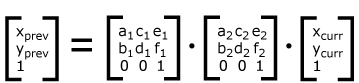
For each given element, the accumulation of all
transformations that have been defined on the given element and
all of its ancestors up to and including the element that
established the current viewport (usually, the ‘svg’
element which is the most
immediate ancestor to the given element) is called the
current transformation matrix or
CTM. The CTM thus represents the
mapping of current user coordinates to viewport
coordinates:
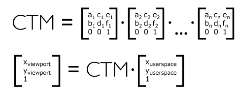
Example Nested illustrates
nested transformations.
<?xml version="1.0" standalone="no"?>
<svg width="400px" height="150px" version="1.1"
     xmlns="http://www.w3.org/2000/svg">
  <desc>Example Nested - Nested transformations</desc>
  <g fill="none" stroke="black" stroke-width="3" >
    <!-- Draw the axes of the original coordinate system -->
    <line x1="0" y1="1.5" x2="400" y2="1.5" />
    <line x1="1.5" y1="0" x2="1.5" y2="150" />
  </g>
  <!-- First, a translate -->
  <g transform="translate(50,90)">
    <g fill="none" stroke="red" stroke-width="3" >
      <line x1="0" y1="0" x2="50" y2="0" />
      <line x1="0" y1="0" x2="0" y2="50" />
    </g>
    <text x="0" y="0" font-size="16" font-family="Verdana" >
      ....Translate(1)
    </text>
    <!-- Second, a rotate -->
    <g transform="rotate(-45)">
      <g fill="none" stroke="green" stroke-width="3" >
        <line x1="0" y1="0" x2="50" y2="0" />
        <line x1="0" y1="0" x2="0" y2="50" />
      </g>
      <text x="0" y="0" font-size="16" font-family="Verdana" >
        ....Rotate(2)
      </text>
      <!-- Third, another translate -->
      <g transform="translate(130,160)">
        <g fill="none" stroke="blue" stroke-width="3" >
          <line x1="0" y1="0" x2="50" y2="0" />
          <line x1="0" y1="0" x2="0" y2="50" />
        </g>
        <text x="0" y="0" font-size="16" font-family="Verdana" >
          ....Translate(3)
        </text>
      </g>
    </g>
  </g>
</svg>View this example as SVG (SVG-enabled browsers only)
In the example above, the CTM within the third nested
transformation (i.e., the transform="translate(130,160)")
consists of the concatenation of the three transformations, as
follows:
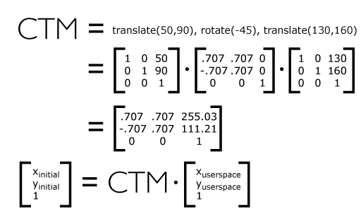
Do we need this blue box, and if so, should we expand it to
include all of the property definition information? Some sections (such as
for ‘color’) do not have the blue box.
Others, like the one for ‘white-space’, have all the information from
the CSS specification it comes from. Regardless, I think we don't need
to mention whether the property is animatable since all properties are
animatable.
The term <transform-list> used by this specification is equivalent to a list of <transform-functions>, the value of the ‘transform’
property.
See the CSS3 Transforms spec for the description of the ‘
transform’ property and the value of
<transform-functions> [
CSS3TRANSFORMS].
7.7. The ‘viewBox’ attribute
It is often desirable to specify that a given set of
graphics stretch to fit a particular container element. The
‘viewBox’ attribute provides this
capability.
All elements that establish a new viewport (see elements that
establish viewports), plus the
‘marker’,
‘pattern’ and
‘view’
elements have attribute
‘viewBox’. The value of the ‘viewBox’ attribute is a list of four
numbers <min-x>, <min-y>, <width> and <height>, separated by
whitespace and/or a comma, which specify a rectangle in user
space which should be mapped to the bounds of the viewport
established by the given element, taking into account attribute
‘preserveAspectRatio’. If specified,
an additional transformation is applied to all descendants of
the given element to achieve the specified effect.
A negative value for <width> or <height> is an error (see Error processing). A
value of zero disables rendering of the element.
Example ViewBox illustrates
the use of the ‘viewBox’ attribute
on the outermost svg element to specify that
the SVG content should stretch to fit bounds of the
viewport.
<?xml version="1.0" standalone="no"?>
<svg width="300px" height="200px" version="1.1"
     viewBox="0 0 1500 1000" preserveAspectRatio="none"
     xmlns="http://www.w3.org/2000/svg">
  <desc>Example ViewBox - uses the viewBox
   attribute to automatically create an initial user coordinate
   system which causes the graphic to scale to fit into the
   viewport no matter what size the viewport is.</desc>
  <!-- This rectangle goes from (0,0) to (1500,1000) in user space.
       Because of the viewBox attribute above,
       the rectangle will end up filling the entire area
       reserved for the SVG content. -->
  <rect x="0" y="0" width="1500" height="1000"
        fill="yellow" stroke="blue" stroke-width="12"  />
  <!-- A large, red triangle -->
  <path fill="red"  d="M 750,100 L 250,900 L 1250,900 z"/>
  <!-- A text string that spans most of the viewport -->
  <text x="100" y="600" font-size="200" font-family="Verdana" >
    Stretch to fit
  </text>
</svg>
Example ViewBox
Rendered into
viewport with
width=300px,
height=200px |
|
Rendered into
viewport with
width=150px,
height=200px |
 |
|
 |
View
this example as SVG (SVG-enabled browsers only)
The effect of the ‘viewBox’
attribute is that the user agent automatically supplies the
appropriate transformation matrix to map the specified
rectangle in user space to the bounds of a designated region
(often, the viewport). To achieve the effect of the example on
the left, with viewport dimensions of 300 by 200 pixels, the
user agent needs to automatically insert a transformation which
scales both X and Y by 0.2. The effect is equivalent to having
a viewport of size 300px by 200px and the following
supplemental transformation in the document, as follows:
<?xml version="1.0" standalone="no"?>
<svg width="300px" height="200px" version="1.1"
     xmlns="http://www.w3.org/2000/svg">
  <g transform="scale(0.2)">
    <!-- Rest of document goes here -->
  </g>
</svg>
To achieve the effect of the example on the right, with
viewport dimensions of 150 by 200 pixels, the user agent needs
to automatically insert a transformation which scales X by 0.1
and Y by 0.2. The effect is equivalent to having a viewport of
size 150px by 200px and the following supplemental
transformation in the document, as follows:
<?xml version="1.0" standalone="no"?>
<svg width="150px" height="200px" version="1.1"
     xmlns="http://www.w3.org/2000/svg">
  <g transform="scale(0.1 0.2)">
    <!-- Rest of document goes here -->
  </g>
</svg>
(Note: in some cases the user agent will need to supply a
translate transformation in addition to a
scale transformation. For example, on an
outermost svg element, a
translate transformation will be needed if the
‘viewBox’ attributes specifies
values other than zero for <min-x> or <min-y>.)
Unlike the
‘transform’ property (see
effect of the ‘transform’ attribute on sibling attributes),
the automatic transformation that is created
due to a ‘viewBox’ does not affect
the ‘x’, ‘y’, ‘width’ and ‘height’ attributes (or in the case of
the ‘marker’ element, the
‘markerWidth’ and ‘markerHeight’ attributes) on the
element with the ‘viewBox’
attribute. Thus, in the example above which shows an
‘svg’ element which has attributes
‘width’,
‘height’ and ‘viewBox’,
the ‘width’ and ‘height’ attributes
represent values in the coordinate system that exists before the
‘viewBox’ transformation is applied. On
the other hand, like the ‘transform’ property, it does
establish a new coordinate system for all other attributes and
for descendant elements.
Link to the "effect of the 'transform' attribute on sibling attributes"
in the above paragraph needs to be update.
For the ‘viewBox’ attribute:
Animatable:
yes.
7.8. The ‘preserveAspectRatio’
attribute
In some cases, typically when using the
‘viewBox’ attribute, it is desirable that the graphics stretch to
fit non-uniformly to take up the
entire viewport. In other cases, it is desirable that uniform
scaling be used for the purposes of preserving the aspect ratio
of the graphics.
Attribute preserveAspectRatio="[defer] <align>
[<meetOrSlice>]", which is available for all
elements that establish a new viewport (see elements that
establish viewports), plus the
‘image’,
‘marker’,
‘pattern’ and
‘view’ elements,
indicates whether or not to force uniform scaling.
For elements that establish a new viewport (see elements that
establish viewports), plus the
‘marker’,
‘pattern’ and
‘view’ elements,
‘preserveAspectRatio’ only applies when
a value has been provided for ‘viewBox’
on the same element. For these elements, if attribute
‘viewBox’ is not provided, then
‘preserveAspectRatio’ is ignored.
For ‘image’ elements,
‘preserveAspectRatio’ indicates how
referenced images should be fitted with respect to the
reference rectangle and whether the aspect ratio of the
referenced image should be preserved with respect to the
current user coordinate system.
If the value of ‘preserveAspectRatio’ on an
‘image’ element starts with 'defer' then the value of the
‘preserveAspectRatio’ attribute on the
referenced content if present should be used. If the
referenced content lacks a value for
‘preserveAspectRatio’ then the
‘preserveAspectRatio’ attribute should
be processed as normal (ignoring 'defer').
For ‘preserveAspectRatio’ on all other
elements the 'defer' portion of the attribute is ignored.
The <align> parameter
indicates whether to force uniform scaling and, if so, the
alignment method to use in case the aspect ratio of the ‘viewBox’
doesn't match the aspect ratio of the viewport. The <align> parameter must be one
of the following strings:
- none - Do not force
uniform scaling. Scale the graphic content of the given
element non-uniformly if necessary such that the element's
bounding box exactly matches the viewport rectangle.
(Note: if <align> is
none, then the optional <meetOrSlice> value is
ignored.)
- xMinYMin - Force uniform
scaling.
Align the <min-x> of
the element's ‘viewBox’ with the smallest X
value of the viewport.
Align the <min-y> of
the element's ‘viewBox’ with the smallest Y
value of the viewport.
- xMidYMin - Force uniform
scaling.
Align the midpoint X value of the element's
‘viewBox’ with the midpoint X value of the viewport.
Align the <min-y> of
the element's ‘viewBox’ with the smallest Y
value of the viewport.
- xMaxYMin - Force uniform
scaling.
Align the <min-x>+<width> of the
element's ‘viewBox’ with the maximum X value
of the viewport.
Align the <min-y> of
the element's ‘viewBox’ with the smallest Y
value of the viewport.
- xMinYMid - Force uniform
scaling.
Align the <min-x> of
the element's ‘viewBox’ with the smallest X
value of the viewport.
Align the midpoint Y value of the element's ‘viewBox’
with the midpoint Y
value of the viewport.
- xMidYMid (the default) -
Force uniform scaling.
Align the midpoint X value of the element's ‘viewBox’
with the midpoint X value of the viewport.
Align the midpoint Y value of the element's ‘viewBox’
with the midpoint Y value of the viewport.
- xMaxYMid - Force uniform
scaling.
Align the <min-x>+<width> of the
element's ‘viewBox’
with the maximum X value of the viewport.
Align the midpoint Y value of the element's ‘viewBox’
with the midpoint Y
value of the viewport.
- xMinYMax - Force uniform
scaling.
Align the <min-x> of
the element's ‘viewBox’ with the smallest X
value of the viewport.
Align the <min-y>+<height> of the
element's ‘viewBox’ with the maximum Y value
of the viewport.
- xMidYMax - Force uniform
scaling.
Align the midpoint X value of the element's ‘viewBox’
with the midpoint X value of the viewport.
Align the <min-y>+<height> of the
element's ‘viewBox’ with the maximum Y value
of the viewport.
- xMaxYMax - Force uniform
scaling.
Align the <min-x>+<width> of the
element's ‘viewBox’ with the maximum X value
of the viewport.
Align the <min-y>+<height> of the
element's ‘viewBox’ with the maximum Y value
of the viewport.
The <meetOrSlice>
parameter is optional and, if provided, is separated from the
<align> value by one or
more spaces and then must be one of the following strings:
-
meet (the default) - Scale
the graphic such that:
- aspect ratio is preserved
- the entire ‘viewBox’ is visible within
the viewport
- the ‘viewBox’ is scaled up as much
as possible, while still meeting the other criteria
In this case, if the aspect ratio of the graphic does not
match the viewport, some of the viewport will extend beyond
the bounds of the ‘viewBox’ (i.e., the area into
which the ‘viewBox’ will draw will be
smaller than the viewport).
-
slice - Scale the graphic
such that:
- aspect ratio is preserved
- the entire viewport is covered by the ‘viewBox’
- the ‘viewBox’ is scaled down as
much as possible, while still meeting the other
criteria
In this case, if the aspect ratio of the ‘viewBox’ does not match the
viewport, some of the ‘viewBox’ will extend beyond the
bounds of the viewport (i.e., the area into which the ‘viewBox’ will draw is larger
than the viewport).
Example PreserveAspectRatio
illustrates the various options on ‘preserveAspectRatio’. To save space,
XML entities have been defined for the three repeated graphic
objects, the rectangle with the smile inside and the outlines
of the two rectangles which have the same dimensions as the
target viewports. The example creates several new viewports by
including ‘svg’ sub-elements embedded
inside the outermost svg element (see Establishing a new
viewport).
<?xml version="1.0" encoding="UTF-8"?>
<!DOCTYPE svg [
<!ENTITY Smile "
<rect x='.5' y='.5' width='29' height='39' fill='black' stroke='red'/>
<g transform='translate(0, 5)'>
<circle cx='15' cy='15' r='10' fill='yellow'/>
<circle cx='12' cy='12' r='1.5' fill='black'/>
<circle cx='17' cy='12' r='1.5' fill='black'/>
<path d='M 10 19 A 8 8 0 0 0 20 19' stroke='black' stroke-width='2'/>
</g>
">
<!ENTITY Viewport1 "<rect x='.5' y='.5' width='49' height='29'
fill='none' stroke='blue'/>">
<!ENTITY Viewport2 "<rect x='.5' y='.5' width='29' height='59'
fill='none' stroke='blue'/>">
]>

<svg width="450px" height="300px" version="1.1"
     xmlns="http://www.w3.org/2000/svg">
  <desc>Example PreserveAspectRatio - illustrates preserveAspectRatio attribute</desc>
  <rect x="1" y="1" width="448" height="298"
        fill="none" stroke="blue"/>
  <g font-size="9">
    <text x="10" y="30">SVG to fit</text>
    <g transform="translate(20,40)">&Smile;</g>
    <text x="10" y="110">Viewport 1</text>
    <g transform="translate(10,120)">&Viewport1;</g>
    <text x="10" y="180">Viewport 2</text>
    <g transform="translate(20,190)">&Viewport2;</g>

    <g id="meet-group-1" transform="translate(100, 60)">
      <text x="0" y="-30">--------------- meet ---------------</text>
      <g><text y="-10">xMin*</text>&Viewport1;
        <svg preserveAspectRatio="xMinYMin meet" viewBox="0 0 30 40"
             width="50" height="30">&Smile;</svg></g>
      <g transform="translate(70,0)"><text y="-10">xMid*</text>&Viewport1;
        <svg preserveAspectRatio="xMidYMid meet" viewBox="0 0 30 40"
             width="50" height="30">&Smile;</svg></g>
      <g transform="translate(0,70)"><text y="-10">xMax*</text>&Viewport1;
        <svg preserveAspectRatio="xMaxYMax meet" viewBox="0 0 30 40"
             width="50" height="30">&Smile;</svg></g>
    </g>

    <g id="meet-group-2" transform="translate(250, 60)">
      <text x="0" y="-30">---------- meet ----------</text>
      <g><text y="-10">*YMin</text>&Viewport2;
        <svg preserveAspectRatio="xMinYMin meet" viewBox="0 0 30 40"
             width="30" height="60">&Smile;</svg></g>
      <g transform="translate(50, 0)"><text y="-10">*YMid</text>&Viewport2;
        <svg preserveAspectRatio="xMidYMid meet" viewBox="0 0 30 40"
             width="30" height="60">&Smile;</svg></g>
      <g transform="translate(100, 0)"><text y="-10">*YMax</text>&Viewport2;
        <svg preserveAspectRatio="xMaxYMax meet" viewBox="0 0 30 40"
             width="30" height="60">&Smile;</svg></g>
    </g>

    <g id="slice-group-1" transform="translate(100, 220)">
      <text x="0" y="-30">---------- slice ----------</text>
      <g><text y="-10">xMin*</text>&Viewport2;
        <svg preserveAspectRatio="xMinYMin slice" viewBox="0 0 30 40"
             width="30" height="60">&Smile;</svg></g>
      <g transform="translate(50,0)"><text y="-10">xMid*</text>&Viewport2;
        <svg preserveAspectRatio="xMidYMid slice" viewBox="0 0 30 40"
             width="30" height="60">&Smile;</svg></g>
      <g transform="translate(100,0)"><text y="-10">xMax*</text>&Viewport2;
        <svg preserveAspectRatio="xMaxYMax slice" viewBox="0 0 30 40"
             width="30" height="60">&Smile;</svg></g>
    </g>

    <g id="slice-group-2" transform="translate(250, 220)">
      <text x="0" y="-30">--------------- slice ---------------</text>
      <g><text y="-10">*YMin</text>&Viewport1;
        <svg preserveAspectRatio="xMinYMin slice" viewBox="0 0 30 40"
             width="50" height="30">&Smile;</svg></g>
      <g transform="translate(70,0)"><text y="-10">*YMid</text>&Viewport1;
        <svg preserveAspectRatio="xMidYMid slice" viewBox="0 0 30 40"
             width="50" height="30">&Smile;</svg></g>
      <g transform="translate(140,0)"><text y="-10">*YMax</text>&Viewport1;
        <svg preserveAspectRatio="xMaxYMax slice" viewBox="0 0 30 40"
             width="50" height="30">&Smile;</svg></g>
    </g>
  </g>
</svg>View this example as SVG (SVG-enabled browsers only)
This example should stop using DTD entities and
use ‘use’ instead.
For the ‘preserveAspectRatio’
attribute:
Animatable: yes.
7.9. Establishing a new viewport
At any point in an SVG drawing, you can establish a new
viewport into which all contained graphics is drawn by
including an ‘svg’ element
inside SVG content. By establishing a new viewport, you also
implicitly establish a new viewport coordinate system, a new
user coordinate system, and, potentially, a new clipping path
(see the definition of the ‘overflow’ property).
Additionally, there is a new meaning for percentage units
defined to be relative to the current viewport since a new
viewport has been established (see Units).
The bounds of the new viewport are defined by the ‘x’, ‘y’,
‘width’ and ‘height’ attributes on the element
establishing the new viewport, such as an ‘svg’ element. Both the new
viewport coordinate system and the new user coordinate system
have their origins at (‘x’, ‘y’), where ‘x’ and ‘y’
represent the value of the corresponding attributes on the
element establishing the viewport. The orientation of the new
viewport coordinate system and the new user coordinate system
correspond to the orientation of the current user coordinate
system for the element establishing the viewport. A single unit
in the new viewport coordinate system and the new user
coordinate system are the same size as a single unit in the
current user coordinate system for the element establishing the
viewport.
Here is an example:
<?xml version="1.0" standalone="no"?>
<svg width="4in" height="3in" version="1.1"
     xmlns="http://www.w3.org/2000/svg">
  <desc>This SVG drawing embeds another one,
    thus establishing a new viewport
  </desc>
  <!-- The following statement establishing a new viewport
       and renders SVG drawing B into that viewport -->
  <svg x="25%" y="25%" width="50%" height="50%">
     <!-- drawing B goes here -->
  </svg>
</svg>
For an extensive example of creating new viewports, see Example
PreserveAspectRatio.
The following elements establish new viewports:
- The ‘svg’ element
- A ‘symbol’ element define new
viewports whenever they are instanced by a ‘use’ element.
- An ‘image’ element that
references an SVG file will result in the establishment of a
temporary new viewport since the referenced resource by
definition will have an ‘svg’ element.
- An ‘iframe’ element that references an SVG file establishes new viewport like the situation of ‘image’ element.
- A ‘foreignObject’ element
creates a new viewport for rendering the content that is
within the element.
Whether a new viewport also establishes a new additional
clipping path is determined by the value of the ‘overflow’ property on the element
that establishes the new viewport. If a clipping path is
created to correspond to the new viewport, the clipping path's
geometry is determined by the value of the ‘clip’ property. Also, see Clip to
viewport vs. clip to ‘viewBox’.
7.10. Units
All coordinates and lengths in SVG can be specified with or
without a unit identifier.
This is misleading – path data for example takes values that look
like coordinates and lengths yet does not allow units.
When a coordinate or length value is a number without a unit
identifier (e.g., "25"), then the given coordinate or length is
assumed to be in user units (i.e., a value in the current user
coordinate system). For example:
<text font-size="50">Text size is 50 user units</text>
Alternatively, a coordinate or length value can be expressed
as a number followed by a unit identifier (e.g., "25cm" or
"15em").
(Note that CSS defined properties used in a CSS style sheet
or the ‘style’ attribute require units for
non-zero lengths, see SVG's styling
properties.)
The list of unit identifiers in SVG matches the list
of unit identifiers in CSS: em, ex, px, pt, pc, cm, mm and in.
The <length> type can also have
a percentage unit identifier. The following describes how the various unit
identifiers are processed:
- As in CSS, the em and ex unit
identifiers are relative to the current font's
font-size and x-height, respectively.
-
One px unit is defined to be equal to one user
unit. Thus, a length of "5px" is the same as a length of
"5".
Note that at initialization, a user unit in the the initial
coordinate system is equivalenced to the parent
environment's notion of a px unit. Thus, in the the initial
coordinate system, because the user coordinate system
aligns exactly with the parent's coordinate system, and
because often the parent's coordinate system aligns with
the device pixel grid, "5px" might actually map to 5
devices pixels. However, if there are any coordinate system
transformation due to the use of ‘transform’ or
‘viewBox’ attributes, because
"5px" maps to 5 user units and because the coordinate
system transformations have resulted in a revised user
coordinate system, "5px" likely will not map to 5 device
pixels. As a result, in most circumstances, "px" units will
not map to the device pixel grid.
-
The other absolute unit identifiers from CSS (i.e., pt,
pc, cm, mm, in) are all defined as an appropriate multiple
of one px unit (which, according to the previous
item, is defined to be equal to one user unit), based on
what the SVG user agent determines is the size of a
px unit (possibly passed from the parent processor
or environment at initialization time). For example,
suppose that the user agent can determine from its
environment that "1px" corresponds to "0.2822222mm" (i.e.,
90dpi). Then, for all processing of SVG content:
- "1pt" equals "1.25px" (and therefore 1.25 user units)
- "1pc" equals "15px" (and therefore 15 user units)
- "1mm" would be "3.543307px" (3.543307 user units)
- "1cm" equals "35.43307px" (and therefore 35.43307 user units)
- "1in" equals "90px" (and therefore 90 user units)
Note that use of px units or any other absolute
unit identifiers can cause inconsistent visual results on
different viewing environments since the size of "1px" may map
to a different number of user units on different systems; thus,
absolute units identifiers are only recommended for the
‘width’ and the ‘height’ on
outermost svg elements and situations
where the content contains no transformations and it is
desirable to specify values relative to the device pixel grid
or to a particular real world unit size.
That's wrong. 1px always corresponds to
one user unit, and the "absolute" units must be interpreted
as CSS says to, i.e. as fixed multiples of the CSS px, and
not anything to do with the display's resolution. The
recommendation to use the absolute units (apart from px)
only for ‘width’ and ‘height’ on
root ‘svg’ is a good one, however. Defining
the size of a document in mm and then using mm units
for shapes within it is going to give counterintuitive
results, since they'll be converted to user units to resolve
against the view box.
For percentage values that are defined to be relative to the
size of viewport:
- For any x-coordinate value or width value expressed as a
percentage of the viewport, the value to use is the specified
percentage of the actual-width in user units for the
nearest containing viewport, where actual-width is
the width dimension of the viewport element within the user
coordinate system for the viewport element.
- For any y-coordinate value or height value expressed as a
percentage of the viewport, the value to use is the specified
percentage of the actual-height in user units for
the nearest containing viewport, where actual-height
is the height dimension of the viewport element within the
user coordinate system for the viewport element.
- For any other length value expressed as a percentage of
the viewport, the percentage is calculated as the specified
percentage of
sqrt((actual-width)**2 +
  (actual-height)**2)/sqrt(2)
.
Example Units below
illustrates some of the processing rules for different types of
units.
<?xml version="1.0" standalone="no"?>
<svg width="400px" height="200px" viewBox="0 0 4000 2000"
     xmlns="http://www.w3.org/2000/svg" version="1.1">
  <title>Example Units</title>
  <desc>Illustrates various units options</desc>

  <!-- Frame the picture -->
  <rect x="5" y="5" width="3990" height="1990"
        fill="none" stroke="blue" stroke-width="10"/>

  <g fill="blue" stroke="red" font-family="Verdana" font-size="150">
    <!-- Absolute unit specifiers -->
    <g transform="translate(400,0)">
      <text x="-50" y="300" fill="black" stroke="none">Abs. units:</text>
      <rect x="0" y="400" width="4in" height="2in" stroke-width=".4in"/>
      <rect x="0" y="750" width="384" height="192" stroke-width="38.4"/>
      <g transform="scale(2)">
        <rect x="0" y="600" width="4in" height="2in" stroke-width=".4in"/>
      </g>
    </g>

    <!-- Relative unit specifiers -->
    <g transform="translate(1600,0)">
      <text x="-50" y="300" fill="black" stroke="none">Rel. units:</text>
      <rect x="0" y="400" width="2.5em" height="1.25em" stroke-width=".25em"/>
      <rect x="0" y="750" width="375" height="187.5" stroke-width="37.5"/>
      <g transform="scale(2)">
        <rect x="0" y="600" width="2.5em" height="1.25em" stroke-width=".25em"/>
      </g>
    </g>

    <!-- Percentages -->
    <g transform="translate(2800,0)">
      <text x="-50" y="300" fill="black" stroke="none">Percentages:</text>
      <rect x="0" y="400" width="10%" height="10%" stroke-width="1%"/>
      <rect x="0" y="750" width="400" height="200" stroke-width="31.62"/>
      <g transform="scale(2)">
        <rect x="0" y="600" width="10%" height="10%" stroke-width="1%"/>
      </g>
    </g>
  </g>
</svg>View this example as SVG (SVG-enabled browsers only)
The three rectangles on the left demonstrate the use of one
of the absolute unit identifiers, the "in" unit (inch). The
reference image above was generated on a 96dpi system (i.e., 1
inch = 96 pixels). Therefore, the topmost rectangle, which is
specified in inches, is exactly the same size as the middle
rectangle, which is specified in user units such that there are
96 user units for each corresponding inch in the topmost
rectangle. (Note: on systems with different screen resolutions,
the top and middle rectangles will likely be rendered at
different sizes.) The bottom rectangle of the group illustrates
what happens when values specified in inches are scaled.
The example needs to be changed in light of
the issue above about absolute units.
The three rectangles in the middle demonstrate the use of
one of the relative unit identifiers, the "em" unit. Because
the ‘font-size’ property has been set
to 150 on the outermost ‘g’ element, each "em" unit is
equal to 150 user units. The topmost rectangle, which is
specified in "em" units, is exactly the same size as the middle
rectangle, which is specified in user units such that there are
150 user units for each corresponding "em" unit in the topmost
rectangle. The bottom rectangle of the group illustrates what
happens when values specified in "em" units are scaled.
The three rectangles on the right demonstrate the use of
percentages. Note that the width and height of the viewport in
the user coordinate system for the viewport element (in this
case, the outermost svg element) are 4000 and
2000, respectively, because processing the ‘viewBox’ attribute results in a
transformed user coordinate system. The topmost rectangle,
which is specified in percentage units, is exactly the same
size as the middle rectangle, which is specified in equivalent
user units. In particular, note that the ‘stroke-width’ property in the
middle rectangle is set to 1% of the
sqrt((actual-width)**2 +
(actual-height)**2) / sqrt(2)
, which in this
case is .01*sqrt(4000*4000+2000*2000)/sqrt(2), or 31.62. The
bottom rectangle of the group illustrates what happens when
values specified in percentage units are scaled.
7.11. Bounding boxes
The bounding box (or "bbox") of an element is the tightest fitting rectangle
aligned with the axes of that element's user coordinate system that entirely
encloses it and its descendants.
Three kinds of bounding boxes can be computed for an element:
- The object bounding box is the bounding box that contains only
an element's geometric shape. For basic shapes, this is the area
that is filled. Unless otherwise specified, this is what is meant by the
unqualified term "bounding box".
- The stroke bounding box is the bounding box that contains
an element's geometric shape and its stroke shape.
- The decorated bounding box is the bounding box that contains
an element's geometric shape, its stroke shape and its markers.
Note that the values of the ‘opacity’, ‘visibility’, ‘fill’,
‘fill-opacity’, ‘fill-rule’, ‘stroke-dasharray’
and ‘stroke-dashoffset’ properties on an element have no effect on the
bounding box of an element.
For curved shapes, the bounding box must enclose all portions of the shape
along the edge, not just end points. Note that control points for a curve which
are not defined as lying along the line of the resulting curve (e.g., the second
coordinate pair of a Cubic Bézier command) must not contribute to the dimensions
of the bounding box (though those points may fall within the area of the
bounding box, if they lie within the shape itself, or along or close to the
curve). For example, control points of a curve that are at a further distance
than the curve edge, from the non-enclosing side of the curve edge, must be
excluded from the bounding box.
Even if an element is not in the rendering tree – due to it being
'display: none', within a ‘defs’
element, not usually rendered like a ‘symbol’ element or not
currently present in the document tree – it still has a bounding box.
A call to getBBox
on the element will return the same rectangle as if the element were
rendered. However, an element that is not in the rendering tree
does not contribute to the bounding box of any ancestor element.
The following example defines a number of elements. The expected
object bounding box for each element with an ID is shown below.
<svg xmlns="http://www.w3.org/2000/svg"
     xmlns:xlink="http://www.w3.org/1999/xlink">

  <title>Bounding Box Calculation</title>
  <desc>Examples of elements with different bounding box results based on context.</desc>

  <defs id="defs-1">
     <rect id="rect-1" x="20" y="20" width="40" height="40" fill="blue" />
  </defs>

  <g id="group-1">
    <use id="use-1" xlink:href="#rect-1" x="10" y="10" />

    <g id="group-2" display="none">
      <rect id="rect-2" x="10" y="10" width="100" height="100" fill="red" />
    </g>
  </g>
</svg>
| Element ID |
Bounding Box Result |
"defs-1" |
{0, 0, 0, 0} |
"rect-1" |
{20, 20, 40, 40} |
"group-1" |
{30, 30, 40, 40} |
"use-1" |
{30, 30, 40, 40} |
"group-2" |
{10, 10, 100, 100} |
"rect-2" |
{10, 10, 100, 100} |
For text content elements, for the purposes of the bounding box
calculation, each glyph must be treated as a separate graphics element.
he calculations must assume that all glyphs occupy the full glyph cell.
For example, for horizontal text, the calculations must assume that each glyph
extends vertically to the full ascent and descent values for the font.
An exception to this is when the ‘width’ or ‘height’
attribute has been specified on the ‘text’ element, in which case the
element's content area is its bounding box.
Because declarative or scripted animation can change the shape, size, and
position of an element, the bounding box is mutable. Thus, the bounding box
for an element shall reflect the current values for the element at the snapshot
in time at which the bounding box is requested, whether through a script call
or as part of a declarative or linking syntax.
Note that an element which has zero width, zero height, or both (such as a
vertical or horizontal line, or a ‘rect’ element with an unspecified
‘width’ or ‘height’) still has a bounding box, with a
positive value for the positive dimension, or with '0'
for both the width and height if no positive dimension is specified. Similarly,
subpaths segments of a ‘path’ element with zero width and height must be
included in that element's geometry for the sake of the bounding box. Note also
that elements whose DOM object does not derive from SVGGraphicsElement
(such as gradient elements) do not have a bounding box, and thus have no
interface to request a bounding box.
Elements in the rendering tree which reference unresolved resources shall
still have a bounding box, defined by the position and dimensions specified in
their attributes, or by the lacuna value for those attributes if no
values are supplied. For example, the element <use xlink:href="#bad" x="10" y="10"/>
would have a bounding box with an x and y of 10 and a width and height of 0.
The following algorithm defines how to compute a bounding box for a given
element. The inputs to the algorithm are:
- element, the element we are computing a bounding box for;
- space, a coordinate space in which the bounding box will be computed;
- fill, a boolean indicating whether the bounding box includes the geometry of the element and its descendants;
- stroke, a boolean indicating whether the bounding box includes the stroke of the element and its descendants;
- markers, a boolean indicating whether the bounding box includes the markers of the element and its descendants; and
- clipped, a boolean indicating whether the bounding box is affected by any clipping paths applied to the element and its descendants.
Need to define what the union of rectangles with no area means.
The algorithm to compute the bounding box is as follows, depending on the type of element:
- a shape
- a text content element
- an ‘a’ element within a text content element
-
- Let box be a rectangle initialized to (0, 0, 0, 0).
- Let fill-shape be the equivalent path of element
if it is a shape, or a shape that includes each of the glyph cells corresponding
to the text within the elements otherwise.
Need to update this take into account ‘width’ and ‘height’
on ‘text’.
- If fill is true, then set box to the tightest rectangle
in the coordinate system space that contains fill-shape.
The values of the ‘fill’, ‘fill-opacity’ and ‘fill-rule’
properties do not affect fill-shape.
- If stroke is true and the element's ‘
stroke’ is anything other than
none, then set box to be the union of box and the
tightest rectangle in coordinate system space that contains the stroke shape of the
element, with the assumption that the element has no dash pattern.
The values of the ‘stroke-opacity’, ‘stroke-dasharray’
and ‘stroke-dashoffset’ do not affect the calculation of the stroke shape.
- If markers is true, then for each marker marker rendered on the element:
- For each descendant graphics element child of the ‘marker’ element
that defines marker's content:
- If child has an ancestor element within the ‘marker’ that is
'display: none', has a failing conditional processing attribute,
or is not an ‘a’, ‘g’, ‘svg’ or ‘switch’ element, then
continue to the next descendant graphics element.
- Otherwise, set box to be the union of box and the result of invoking the
algorithm to compute a bounding box with child as the element,
space as the target coordinate space, true for fill,
stroke and markers, and clipped for clipped.
Need to determine whether 'display: none' on the
‘marker’ element itself has any effect here.
- If clipped is true and the value of ‘
clip-path’ on element is not
none, then set box to be the tighest rectangle
in coordinate system space that contains the intersection of box and the clipping path.
- Return box.
- a container element
- ‘use’
-
- Let box be a rectangle initialized to (0, 0, 0, 0).
- Let parent be the container element if it is one, or the
root of the ‘use’ element's shadow tree otherwise.
- For each descendant graphics element child of parent:
- If child has an ancestor element within parent that is
'display: none', has a failing conditional processing attribute,
or is not an ‘a’, ‘g’, ‘svg’ or ‘switch’ element, then
continue to the next descendant graphics element.
- Otherwise, set box to be the union of box and the result of invoking the
algorithm to compute a bounding box with child as the element
and the same values for space, fill, stroke,
markers and clipped as the corresponding algorithm input values.
- Return box.
- ‘canvas’
- ‘foreignObject’
- ‘iframe’
- ‘image’
- ‘video’
-
- Return the tightest rectangle in coordinate space space that
contains the rectangle defined by the
‘x’,
‘y’,
‘width’ and
‘height’ attributes of the element.
This returns a bounding box even if fill is false. Is this what we want?
The object bounding box, stroke bounding box or decorated bounding box
of an element is the result of invoking the bounding box computation algorithm
above with the following arguments:
element is the element itself;
space is the element's user coordinate system;
fill is true;
stroke is true if we are computing the stroke bounding box or decorated bounding box, and false othwerise;
markers is true if we are computing the decorated bounding box, and false otherwise; and
clipped is false.
7.12. Object bounding box units
The following elements offer the option of expressing
coordinate values and lengths as fractions (and, in some cases,
percentages) of the bounding box,
by setting a specified attribute to 'objectBoundingBox'
on the given element:
Need a line for ‘meshGradient’.
Need to invoke the bounding box computation algorithm from the previous
section with fill = true and the other options false.
| Element |
Attribute |
Effect |
| ‘linearGradient’ |
‘gradientUnits’ |
Indicates that the attributes which specify the
gradient vector (‘x1’, ‘y1’, ‘x2’, ‘y2’) represent fractions or
percentages of the bounding box of the element to which the
gradient is applied. |
| ‘radialGradient’ |
‘gradientUnits’ |
Indicates that the attributes which specify the center
(‘cx’, ‘cy’), the radius (‘r’) and focus
(‘fx’, ‘fy’) represent fractions or
percentages of the bounding box of the element to which the
gradient is applied. |
| ‘pattern’ |
‘patternUnits’ |
Indicates that the attributes which define how to tile the pattern
(‘x’, ‘y’, ‘width’, ‘height’) are
established using the bounding box of the element to which the pattern
is applied. |
| ‘pattern’ |
‘patternContentUnits’ |
Indicates that the user coordinate system for the
contents of the pattern is established using the bounding
box of the element to which the pattern is applied. |
| ‘clipPath’ |
‘clipPathUnits’ |
Indicates that the user coordinate system for the contents of the
‘clipPath’ element is established using the bounding box of the
element to which the clipping path is applied. |
| ‘mask’ |
‘maskUnits’ |
Indicates that the attributes which define the masking region
(‘x’, ‘y’, ‘width’, ‘height’) is
established using the bounding box of the element to which the mask
is applied. |
| ‘mask’ |
‘maskContentUnits’ |
Indicates that the user coordinate system for the contents of
the ‘mask’ element are established using the bounding box of
the element to which the mask is applied. |
| ‘filter’ |
‘filterUnits’ |
Indicates that the attributes which define the
filter effects region
(‘x’, ‘y’, ‘width’, ‘height’) represent
fractions or percentages of the bounding box of the element to which
the filter is applied. |
| ‘filter’ |
‘primitiveUnits’ |
Indicates that the various length values within the filter
primitives represent fractions or percentages of the bounding box of
the element to which the filter is applied. |
In the discussion that follows, the term applicable element
is the element to which the given effect applies. For gradients and
patterns, the applicable element is the graphics element
which has its ‘fill’ or ‘stroke’ property referencing the
given gradient or pattern. (See Inheritance
of Painting Properties. For special rules concerning text elements, see the discussion of object
bounding box units and text elements.) For clipping paths,
masks and filters, the applicable element can be either a
container element or a graphics element.
When keyword objectBoundingBox is used, then the
effect is as if a supplemental transformation matrix were
inserted into the list of nested transformation matrices to
create a new user coordinate system.
First, the (minx,miny) and
(maxx,maxy) coordinates are
determined for the applicable element and all of its
descendants. The values minx,
miny, maxx and
maxy are determined by computing the maximum
extent of the shape of the element in X and Y with respect to
the user coordinate system for the applicable element. The
bounding box is the tightest fitting rectangle aligned with the
axes of the applicable element's user coordinate system that
entirely encloses the applicable element and its descendants.
The bounding box is computed exclusive of any values for
clipping, masking, filter effects, opacity and stroke-width.
For curved shapes, the bounding box encloses all portions of
the shape, not just end points. For ‘text’ elements, for the
purposes of the bounding box calculation, each glyph is treated
as a separate graphics element. The calculations assume that
all glyphs occupy the full glyph cell. For example, for
horizontal text, the calculations assume that each glyph
extends vertically to the full ascent and descent values for
the font.
Then, coordinate (0,0) in the new user coordinate system is
mapped to the (minx,miny) corner of the tight bounding box
within the user coordinate system of the applicable element and
coordinate (1,1) in the new user coordinate system is mapped to
the (maxx,maxy) corner of the tight bounding box of the
applicable element. In most situations, the following
transformation matrix produces the correct effect:
[ (maxx-minx) 0 0 (maxy-miny) minx miny ]
When percentages are used with attributes that define the
gradient vector, the pattern tile, the filter region or the
masking region, a percentage represents the same value as the
corresponding decimal value (e.g., 50% means the same as 0.5).
If percentages are used within the content of a ‘pattern’,
‘clipPath’, ‘mask’ or ‘filter’ element, these values
are treated according to the processing rules for percentages
as defined in Units.
Any numeric value can be specified for values expressed as a
fraction or percentage of object bounding box units. In
particular, fractions less are zero or greater than one and
percentages less than 0% or greater than 100% can be
specified.
Keyword objectBoundingBox
should not be used when the geometry of the applicable element
has no width or no height, such as the case of a horizontal or
vertical line, even when the line has actual thickness when
viewed due to having a non-zero stroke width since stroke width
is ignored for bounding box calculations. When the geometry of
the applicable element has no width or height and objectBoundingBox is specified, then
the given effect (e.g., a gradient or a filter) will be
ignored.
7.13. Intrinsic sizing properties of the viewport of SVG content
SVG needs to specify how to calculate some intrinsic sizing properties to
enable inclusion within other languages. The intrinsic width and height
of the viewport of SVG content must be determined from the ‘width’
and ‘height’ attributes. If either of these are not specified, a
value of '100%' must be assumed.
Note: the ‘width’ and ‘height’
attributes are not the same as the CSS width and height properties.
Specifically, percentage values do not provide an intrinsic width or height,
and do not indicate a percentage of the containing block. Rather, once the
viewport is established, they indicate the portion of the viewport that is
actually covered by image data.
The intrinsic aspect ratio of the viewport of SVG content is necessary
for example, when including SVG from an ‘object’ element in HTML styled with
CSS. It is possible (indeed, common) for an SVG graphic to have an intrinsic aspect ratio but not to have an intrinsic width or height.
The intrinsic aspect ratio must be calculated based upon the
following rules:
- The aspect ratio is calculated by dividing a width by a height.
- If the ‘width’ and ‘height’
of the rootmost ‘svg’ element are both specified with
unit identifiers (in, mm, cm, pt, pc, px, em, ex) or in user units, then the aspect ratio is
calculated from the ‘width’ and ‘height’ attributes after resolving both values to user units.
- If either/both of the ‘width’ and ‘height’ of the rootmost ‘svg’ element are in
percentage units (or omitted), the aspect ratio is calculated from the width and
height values of the ‘viewBox’ specified for the current SVG document fragment.
If the ‘viewBox’ is not correctly specified, or set to 'none',
the intrinsic aspect ratio cannot be calculated and is considered unspecified.
Examples:
<svg xmlns="http://www.w3.org/2000/svg" version="1.2" baseProfile="tiny"
     width="10cm" height="5cm">
  ...
</svg>
In this example the intrinsic aspect ratio of the viewport is 2:1. The
intrinsic width is 10cm and the intrinsic height is 5cm.
<svg xmlns="http://www.w3.org/2000/svg" version="1.2" baseProfile="tiny"
     width="100%" height="50%" viewBox="0 0 200 200">
  ...
</svg>
In this example the intrinsic aspect ratio of the rootmost viewport is
1:1. An aspect ratio calculation in this case allows embedding in an
object within a containing block that is only constrained in one direction.
<svg xmlns="http://www.w3.org/2000/svg" version="1.2" baseProfile="tiny"
     width="10cm" viewBox="0 0 200 200">
  ...
</svg>
In this case the intrinsic aspect ratio is 1:1.
<svg xmlns="http://www.w3.org/2000/svg" version="1.2" baseProfile="tiny"
     width="75%" height="10cm" viewBox="0 0 200 200">
  ...
</svg>
In this example, the intrinsic aspect ratio is 1:1.
7.14. Geographic coordinate systems
In order to allow interoperability between SVG content generators
and user agents dealing with maps encoded in SVG, the use of a common
metadata definition for describing the coordinate system used to
generate SVG documents is encouraged.
Such metadata must be added under the ‘metadata’ element of
the topmost ‘svg’ element describing the map, consisting of an
RDF description of the Coordinate Reference System definition used to
generate the SVG map [RDF-PRIMER]. Note that
the presence of this metadata does not affect the rendering of the SVG
in any way; it merely provides added semantic value for applications
that make use of combined maps.
The definition must be conformant to the XML grammar described in
GML 3.2.1,
an OpenGIS Standard for encoding common CRS data types in XML
[GML]. In order to correctly map
the 2-dimensional data used by SVG, the CRS must be of subtype
ProjectedCRS or Geographic2dCRS. The
first axis of the described CRS maps the SVG x-axis and the
second axis maps the SVG y-axis.
The main purpose of such metadata is to indicate to the user agent
that two or more SVG documents can be overlayed or merged into a single
document. Obviously, if two maps reference the same Coordinate Reference
System definition and have the same SVG ‘transform’ property
value then they can be overlayed without reprojecting the data. If
the maps reference different Coordinate Reference Systems and/or have
different SVG ‘transform’ property values, then a specialized
cartographic user agent may choose to transform the coordinate data to
overlay the data. However, typical SVG user agents are not required
to perform these types of transformations, or even recognize the
metadata. It is described in this specification so that the connection
between geographic coordinate systems and the SVG coordinate system is
clear.
Do we need this section? Should we instead have a guide on
how other specifications should re-use specific attributes or elements?
Attribute definition:
- svg:transform = "<transform>" | "none"
-
- <transform>
-
Specifies the affine transformation that has been
applied to the map data. The syntax is identical to
that described in The ‘transform’ property
section.
- none
-
Specifies that no supplemental affine transformation has been
applied to the map data. Using this value has the same meaning as
specifying the identity matrix, which in turn is just the same as
not specifying the
‘svg:transform’
the attribute at all.
Animatable: no.
This attribute describes an optional additional affine
transformation that may have been applied during this
mapping. This attribute may be added to the OpenGIS
‘CoordinateReferenceSystem’ element. Note
that, unlike the ‘transform’ property, it does not indicate that
a transformation is to be applied to the data within the file.
Instead, it simply describes the transformation that was already
applied to the data when being encoded in SVG.
There are three typical uses for the
‘svg:transform’
global attribute. These are described below and used in the examples.
- Most ProjectedCRS have the north direction represented by
positive values of the second axis and conversely SVG has a
y-down coordinate system. That's why, in order to follow the
usual way to represent a map with the north at its top, it is
recommended for that kind of ProjectedCRS to use the
‘svg:transform’
global attribute with a 'scale(1, -1)' value as in the
third example below.
- Most Geographic2dCRS have the latitude as their first
axis rather than the longitude, which means that the
south-north axis would be represented by the x-axis in SVG
instead of the usual y-axis. That's why, in order to follow
the usual way to represent a map with the north at its top,
it is recommended for that kind of Geographic2dCRS to use the
‘svg:transform’
global attribute with a 'rotate(-90)' value as in the
first example (while also adding the 'scale(1, -1)' as for
ProjectedCRS).
- In addition, when converting for profiles which place
restrictions on precision of real number values, it may be
useful to add an additional scaling factor to retain good
precision for a specific area. When generating an SVG
document from WGS84 geographic coordinates (EPGS 4326), we
recommend the use of an additional 100 times scaling factor
corresponding to an ‘svg:transform’
global attribute with a 'rotate(-90) scale(100)'
value (shown in the second example).
Different scaling values may be required depending on the
particular CRS.
Below is a simple example of the coordinate metadata, which
describes the coordinate system used by the document via a
URI.
<?xml version="1.0"?>
<svg xmlns="http://www.w3.org/2000/svg" version="1.1"
     width="100" height="100" viewBox="0 0 1000 1000">

  <desc>An example that references coordinate data.</desc>

  <metadata>
    <rdf:RDF xmlns:rdf="http://www.w3.org/1999/02/22-rdf-syntax-ns#"
             xmlns:crs="http://www.ogc.org/crs"
             xmlns:svg="http://www.w3.org/2000/svg">
      <rdf:Description rdf:about="">
        <!-- The Coordinate Reference System is described
             through a URI. -->
        <crs:CoordinateReferenceSystem
            svg:transform="rotate(-90)"
            rdf:resource="http://www.example.org/srs/epsg.xml#4326"/>
      </rdf:Description>
    </rdf:RDF>
  </metadata>

  <!-- The actual map content -->
</svg>
The second example uses a well-known identifier to describe
the coordinate system. Note that the coordinates used in the
document have had the supplied transform applied.
<?xml version="1.0"?>
<svg xmlns="http://www.w3.org/2000/svg" version="1.1"
     width="100" height="100" viewBox="0 0 1000 1000">

  <desc>Example using a well known coordinate system.</desc>

  <metadata>
    <rdf:RDF xmlns:rdf="http://www.w3.org/1999/02/22-rdf-syntax-ns#"
             xmlns:crs="http://www.ogc.org/crs"
             xmlns:svg="http://www.w3.org/2000/svg">
      <rdf:Description rdf:about="">
        <!-- In case of a well-known Coordinate Reference System
             an 'Identifier' is enough to describe the CRS -->
        <crs:CoordinateReferenceSystem svg:transform="rotate(-90) scale(100, 100)">
          <crs:Identifier>
            <crs:code>4326</crs:code>
            <crs:codeSpace>EPSG</crs:codeSpace>
            <crs:edition>5.2</crs:edition>
          </crs:Identifier>
        </crs:CoordinateReferenceSystem>
      </rdf:Description>
    </rdf:RDF>
  </metadata>

  <!-- The actual map content -->
</svg>
The third example defines the coordinate system completely
within the SVG document.
<?xml version="1.0"?>
<svg xmlns="http://www.w3.org/2000/svg" version="1.1"
     width="100" height="100" viewBox="0 0 1000 1000">

  <desc>Coordinate metadata defined within the SVG document</desc>

  <metadata>
    <rdf:RDF xmlns:rdf="http://www.w3.org/1999/02/22-rdf-syntax-ns#"
             xmlns:crs="http://www.ogc.org/crs"
             xmlns:svg="http://www.w3.org/2000/svg">
      <rdf:Description rdf:about="">
        <!-- For other CRS it should be entirely defined -->
        <crs:CoordinateReferenceSystem svg:transform="scale(1,-1)">
          <crs:NameSet>
            <crs:name>Mercator projection of WGS84</crs:name>
          </crs:NameSet>
          <crs:ProjectedCRS>
            <!-- The actual definition of the CRS -->
            <crs:CartesianCoordinateSystem>
              <crs:dimension>2</crs:dimension>
              <crs:CoordinateAxis>
                <crs:axisDirection>north</crs:axisDirection>
                <crs:AngularUnit>
                  <crs:Identifier>
                    <crs:code>9108</crs:code>
                    <crs:codeSpace>EPSG</crs:codeSpace>
                    <crs:edition>5.2</crs:edition>
                  </crs:Identifier>
                </crs:AngularUnit>
              </crs:CoordinateAxis>
              <crs:CoordinateAxis>
                <crs:axisDirection>east</crs:axisDirection>
                <crs:AngularUnit>
                  <crs:Identifier>
                    <crs:code>9108</crs:code>
                    <crs:codeSpace>EPSG</crs:codeSpace>
                    <crs:edition>5.2</crs:edition>
                  </crs:Identifier>
                </crs:AngularUnit>
              </crs:CoordinateAxis>
            </crs:CartesianCoordinateSystem>
            <crs:CoordinateReferenceSystem>
              <!-- the reference system of that projected system is
                         WGS84 which is EPSG 4326 in EPSG codeSpace -->
              <crs:NameSet>
                <crs:name>WGS 84</crs:name>
              </crs:NameSet>
              <crs:Identifier>
                <crs:code>4326</crs:code>
                <crs:codeSpace>EPSG</crs:codeSpace>
                <crs:edition>5.2</crs:edition>
              </crs:Identifier>
            </crs:CoordinateReferenceSystem>
            <crs:CoordinateTransformationDefinition>
              <crs:sourceDimensions>2</crs:sourceDimensions>
              <crs:targetDimensions>2</crs:targetDimensions>
              <crs:ParameterizedTransformation>
                <crs:TransformationMethod>
                  <!-- the projection is a Mercator projection which is
                        EPSG 9805 in EPSG codeSpace -->
                  <crs:NameSet>
                    <crs:name>Mercator</crs:name>
                  </crs:NameSet>
                  <crs:Identifier>
                    <crs:code>9805</crs:code>
                    <crs:codeSpace>EPSG</crs:codeSpace>
                    <crs:edition>5.2</crs:edition>
                  </crs:Identifier>
                  <crs:description>Mercator (2SP)</crs:description>
                </crs:TransformationMethod>
                <crs:Parameter>
                  <crs:NameSet>
                    <crs:name>Latitude of 1st standart parallel</crs:name>
                  </crs:NameSet>
                  <crs:Identifier>
                    <crs:code>8823</crs:code>
                    <crs:codeSpace>EPSG</crs:codeSpace>
                    <crs:edition>5.2</crs:edition>
                  </crs:Identifier>
                  <crs:value>0</crs:value>
                </crs:Parameter>
                <crs:Parameter>
                  <crs:NameSet>
                    <crs:name>Longitude of natural origin</crs:name>
                  </crs:NameSet>
                  <crs:Identifier>
                    <crs:code>8802</crs:code>
                    <crs:codeSpace>EPSG</crs:codeSpace>
                    <crs:edition>5.2</crs:edition>
                  </crs:Identifier>
                  <crs:value>0</crs:value>
                </crs:Parameter>
                <crs:Parameter>
                  <crs:NameSet>
                    <crs:name>False Easting</crs:name>
                  </crs:NameSet>
                  <crs:Identifier>
                    <crs:code>8806</crs:code>
                    <crs:codeSpace>EPSG</crs:codeSpace>
                    <crs:edition>5.2</crs:edition>
                  </crs:Identifier>
                  <crs:value>0</crs:value>
                </crs:Parameter>
                <crs:Parameter>
                  <crs:NameSet>
                    <crs:name>False Northing</crs:name>
                  </crs:NameSet>
                  <crs:Identifier>
                    <crs:code>8807</crs:code>
                    <crs:codeSpace>EPSG</crs:codeSpace>
                    <crs:edition>5.2</crs:edition>
                  </crs:Identifier>
                  <crs:value>0</crs:value>
                </crs:Parameter>
              </crs:ParameterizedTransformation>
            </crs:CoordinateTransformationDefinition>
          </crs:ProjectedCRS>
        </crs:CoordinateReferenceSystem>
      </rdf:Description>
    </rdf:RDF>
  </metadata>

  <!-- the actual map content -->
</svg>
7.16. DOM interfaces
7.16.1. Interface SVGPoint
Many of the SVG DOM interfaces refer to objects of class
SVGPoint. An SVGPoint is an (x, y) coordinate pair. When
used in matrix operations, an SVGPoint is treated as a vector of
the form:
[x]
[y]
[1]
If an SVGPoint object is designated as read only,
then attempting to assign to one of its attributes will result in
an exception being thrown.
[Constructor,
 Constructor(float x, float y)]
interface SVGPoint {

  attribute float x;
  attribute float y;

  SVGPoint matrixTransform(SVGMatrix matrix);
};
-
- SVGPoint()
-
Creates a new
SVGPoint object with its x and y attributes set to 0.
- SVGPoint(float x, float y)
-
Creates a new
SVGPoint object with its x and y attributes set to
x and
y, respectively.
-
- x (float)
-
The x coordinate.
-
- DOMException, code NO_MODIFICATION_ALLOWED_ERR
- Raised if the SVGPoint object is read only.
- y (float)
-
The y coordinate.
-
- DOMException, code NO_MODIFICATION_ALLOWED_ERR
- Raised if the SVGPoint object is read only.
-
- SVGPoint matrixTransform(SVGMatrix matrix)
-
Applies a 2x3 matrix transformation on this SVGPoint object and
returns a new, transformed SVGPoint object:
newpoint = matrix * thispoint
-
-
The matrix which is to be applied to this
SVGPoint object.
-
7.16.2. Interface SVGPointList
This interface defines a list of SVGPoint objects.
SVGPointList has the same attributes and methods as other
SVGxxxList interfaces. Implementers may consider using a single base class
to implement the various SVGxxxList interfaces.
The supported property indices
of an SVGPointList object is all non-negative integers less than
the length of the list.
interface SVGPointList {

  readonly attribute unsigned long length;
  readonly attribute unsigned long numberOfItems;

  void clear();
  SVGPoint initialize(SVGPoint newItem);
  getter SVGPoint getItem(unsigned long index);
  SVGPoint insertItemBefore(SVGPoint newItem, unsigned long index);
  SVGPoint replaceItem(SVGPoint newItem, unsigned long index);
  SVGPoint removeItem(unsigned long index);
  SVGPoint appendItem(SVGPoint newItem);
  setter void (unsigned long index, SVGPoint newItem);
};
-
- length (readonly unsigned long)
-
The number of items in the list.
- numberOfItems (readonly unsigned long)
-
The number of items in the list.
-
- void clear()
-
Clears all existing current items from the list, with the result being
an empty list.
-
- DOMException, code NO_MODIFICATION_ALLOWED_ERR
- Raised when the list
cannot be modified.
- SVGPoint initialize(SVGPoint newItem)
-
Clears all existing current items from the list and re-initializes the
list to hold the single item specified by the parameter. If the inserted
item is already in a list, it is removed from its previous list before
it is inserted into this list. The inserted item is the item itself and
not a copy.
-
-
The item which should become the only member of the list.
-
The item being inserted into the list.
-
- DOMException, code NO_MODIFICATION_ALLOWED_ERR
- Raised when the list
cannot be modified.
- SVGPoint getItem(unsigned long index)
-
Returns the specified item from the list. The returned item is the
item itself and not a copy. Any changes made to the item are
immediately reflected in the list.
-
-
unsigned long index
The index of the item from the list which is to be
returned. The first item is number 0.
-
The selected item.
-
- DOMException, code INDEX_SIZE_ERR
- Raised if the index number is
greater than or equal to numberOfItems.
- SVGPoint insertItemBefore(SVGPoint newItem, unsigned long index)
-
Inserts a new item into the list at the specified position. The first
item is number 0. If newItem is already in a list, it is
removed from its previous list before it is inserted into this list.
The inserted item is the item itself and not a copy. If the item is
already in this list, note that the index of the item to insert
before is before the removal of the item.
-
-
The item which is to be inserted into the list.
-
unsigned long index
The index of the item before which the new item is to be
inserted. The first item is number 0. If the index is equal to 0,
then the new item is inserted at the front of the list. If the index
is greater than or equal to
numberOfItems, then the new item is
appended to the end of the list.
-
The inserted item.
-
- DOMException, code NO_MODIFICATION_ALLOWED_ERR
- Raised when the list
cannot be modified.
- SVGPoint replaceItem(SVGPoint newItem, unsigned long index)
-
Replaces an existing item in the list with a new item. If
newItem is already in a list, it is removed from its
previous list before it is inserted into this list. The inserted item
is the item itself and not a copy. If the item is already in this
list, note that the index of the item to replace is before
the removal of the item.
-
-
The item which is to be inserted into the list.
-
unsigned long index
The index of the item which is to be replaced. The first
item is number 0.
-
The inserted item.
-
- DOMException, code NO_MODIFICATION_ALLOWED_ERR
- Raised when the list
cannot be modified.
- DOMException, code INDEX_SIZE_ERR
- Raised if the index number is
greater than or equal to numberOfItems.
- SVGPoint removeItem(unsigned long index)
-
Removes an existing item from the list.
-
-
unsigned long index
The index of the item which is to be removed. The first
item is number 0.
-
The removed item.
-
- DOMException, code NO_MODIFICATION_ALLOWED_ERR
- Raised when the list
cannot be modified.
- DOMException, code INDEX_SIZE_ERR
- Raised if the index number is
greater than or equal to numberOfItems.
- SVGPoint appendItem(SVGPoint newItem)
-
Inserts a new item at the end of the list. If newItem is
already in a list, it is removed from its previous list before it is
inserted into this list. The inserted item is the item itself and
not a copy.
-
-
The item which is to be inserted. The first item is
number 0.
-
The inserted item.
-
- DOMException, code NO_MODIFICATION_ALLOWED_ERR
- Raised when the list
cannot be modified.
- setter void (unsigned long index, SVGPoint newItem)
Replaces the item at index index with newItem.
7.16.3. Interface SVGMatrix
Many of SVG's graphics operations utilize 2x3 matrices of the form:
[a c e]
[b d f]
which, when expanded into a 3x3 matrix for the purposes of matrix
arithmetic, become:
[a c e]
[b d f]
[0 0 1]
[Constructor,
 Constructor(float a, float b, float c, float d, float e, float f)]
interface SVGMatrix {

  attribute float a;
  attribute float b;
  attribute float c;
  attribute float d;
  attribute float e;
  attribute float f;

  SVGMatrix multiply(SVGMatrix secondMatrix);
  SVGMatrix inverse();
  SVGMatrix translate(float x, float y);
  SVGMatrix scale(float scaleFactor);
  SVGMatrix scaleNonUniform(float scaleFactorX, float scaleFactorY);
  SVGMatrix rotate(float angle);
  SVGMatrix rotateFromVector(float x, float y);
  SVGMatrix flipX();
  SVGMatrix flipY();
  SVGMatrix skewX(float angle);
  SVGMatrix skewY(float angle);
};
-
- SVGMatrix()
- Creates a new SVGMatrix object whose a, b, c, d, e and f attributes
are all set to 0.
- SVGMatrix(float a, float b, float c, float d, float e, float f)
- Creates a new SVGMatrix object whose a, b, c, d, e and f attributes
are set to the values of the respective argument passed to the constructor.
-
- a (float)
-
The a component of the matrix.
- b (float)
-
The b component of the matrix.
- c (float)
-
The c component of the matrix.
- d (float)
-
The d component of the matrix.
- e (float)
-
The e component of the matrix.
- f (float)
-
The f component of the matrix.
-
- SVGMatrix multiply(SVGMatrix secondMatrix)
-
Performs matrix multiplication. This matrix is post-multiplied by
another matrix, returning the resulting new matrix.
-
-
The matrix which is post-multiplied to this matrix.
-
The resulting matrix.
- SVGMatrix inverse()
-
Returns the inverse matrix.
-
The inverse matrix.
-
- InvalidStateError
- Raised if this matrix is
not invertible.
- SVGMatrix translate(float x, float y)
-
Post-multiplies a translation transformation on the current matrix and
returns the resulting matrix.
-
-
float x
The distance to translate along the x-axis.
-
float y
The distance to translate along the y-axis.
-
The resulting matrix.
- SVGMatrix scale(float scaleFactor)
-
Post-multiplies a uniform scale transformation on the current matrix
and returns the resulting matrix.
-
-
float scaleFactor
Scale factor in both X and Y.
-
The resulting matrix.
- SVGMatrix scaleNonUniform(float scaleFactorX, float scaleFactorY)
-
Post-multiplies a non-uniform scale transformation on the current matrix
and returns the resulting matrix.
-
-
float scaleFactorX
Scale factor in X.
-
float scaleFactorY
Scale factor in Y.
-
The resulting matrix.
- SVGMatrix rotate(float angle)
-
Post-multiplies a rotation transformation on the current matrix and
returns the resulting matrix.
-
-
float angle
Rotation angle.
-
The resulting matrix.
- SVGMatrix rotateFromVector(float x, float y)
-
Post-multiplies a rotation transformation on the current matrix and
returns the resulting matrix. The rotation angle is determined by taking
(+/-) atan(y/x). The direction of the vector (x, y) determines whether
the positive or negative angle value is used.
-
-
float x
The X coordinate of the vector (x,y). Must not be zero.
-
float y
The Y coordinate of the vector (x,y). Must not be zero.
-
The resulting matrix.
-
- InvalidAccessError
- Raised if one of the
parameters has an invalid value.
- SVGMatrix flipX()
-
Post-multiplies the transformation [-1 0 0 1 0 0] and returns the
resulting matrix.
-
The resulting matrix.
- SVGMatrix flipY()
-
Post-multiplies the transformation [1 0 0 -1 0 0] and returns the
resulting matrix.
-
The resulting matrix.
- SVGMatrix skewX(float angle)
-
Post-multiplies a skewX transformation on the current matrix and
returns the resulting matrix.
-
-
float angle
Skew angle.
-
The resulting matrix.
-
- InvalidAccessError
- Raised when (angle + 90) mod 180 = 0.
- SVGMatrix skewY(float angle)
-
Post-multiplies a skewY transformation on the current matrix and
returns the resulting matrix.
-
-
float angle
Skew angle.
-
The resulting matrix.
-
- InvalidAccessError
- Raised when (angle + 90) mod 180 = 0.
SVGTransform is the interface for one of the component
transformations within an SVGTransformList; thus, an
SVGTransform object corresponds to a single component (e.g.,
'scale(…)' or
'matrix(…)') within a ‘transform’
attribute specification.
[Constructor,
 Constructor(SVGMatrix matrix),
 Constructor(DOMString value)]
interface SVGTransform {

  // Transform Types
  const unsigned short SVG_TRANSFORM_UNKNOWN = 0;
  const unsigned short SVG_TRANSFORM_MATRIX = 1;
  const unsigned short SVG_TRANSFORM_TRANSLATE = 2;
  const unsigned short SVG_TRANSFORM_SCALE = 3;
  const unsigned short SVG_TRANSFORM_ROTATE = 4;
  const unsigned short SVG_TRANSFORM_SKEWX = 5;
  const unsigned short SVG_TRANSFORM_SKEWY = 6;

  readonly attribute unsigned short type;
  readonly attribute SVGMatrix matrix;
  readonly attribute float angle;

  void setMatrix(SVGMatrix matrix);
  void setTranslate(float tx, float ty);
  void setScale(float sx, float sy);
  void setRotate(float angle, float cx, float cy);
  void setSkewX(float angle);
  void setSkewY(float angle);
};
-
- SVGTransform()
-
Creates a new
SVGTransform object whose type attribute is
set to SVG_TRANSFORM_MATRIX and whose matrix attribute is set to an
SVGMatrix object that represents the identity matrix.
- SVGTransform(SVGMatrix matrix)
-
Creates a new
SVGTransform object whose type attribute is
set to SVG_TRANSFORM_MATRIX and whose matrix attribute is set to an
SVGMatrix object whose attributes are all initialized to be the
same as the corresponding attributes in
matrix.
- SVGTransform(DOMString value)
-
-
- SVG_TRANSFORM_UNKNOWN (unsigned short)
-
The unit type is not one of predefined types. It is invalid to attempt
to define a new value of this type or to attempt to switch an existing
value to this type.
- SVG_TRANSFORM_MATRIX (unsigned short)
-
A 'matrix(…)' transformation.
- SVG_TRANSFORM_TRANSLATE (unsigned short)
-
A 'translate(…)' transformation.
- SVG_TRANSFORM_SCALE (unsigned short)
-
A 'scale(…)' transformation.
- SVG_TRANSFORM_ROTATE (unsigned short)
-
A 'rotate(…)' transformation.
- SVG_TRANSFORM_SKEWX (unsigned short)
-
A 'skewX(…)' transformation.
- SVG_TRANSFORM_SKEWY (unsigned short)
-
A 'skewY(…)' transformation.
-
- type (readonly unsigned short)
-
The type of the value as specified by one of the SVG_TRANSFORM_*
constants defined on this interface.
- matrix (readonly SVGMatrix)
-
The matrix that represents this transformation. The matrix
object is live, meaning that any changes made to the SVGTransform
object are immediately reflected in the matrix object and vice
versa. In case the matrix object is changed directly (i.e.,
without using the methods on the SVGTransform interface itself)
then the type of the SVGTransform changes to SVG_TRANSFORM_MATRIX.
- For SVG_TRANSFORM_MATRIX, the matrix contains the
a, b, c, d, e,
f values supplied by the user.
- For SVG_TRANSFORM_TRANSLATE, e and f
represent the translation amounts (a=1, b=0,
c=0 and d=1).
- For SVG_TRANSFORM_SCALE, a and d
represent the scale amounts (b=0, c=0,
e=0 and f=0).
- For SVG_TRANSFORM_SKEWX and SVG_TRANSFORM_SKEWY,
a, b, c and d
represent the matrix which will result in the given skew
(e=0 and f=0).
- For SVG_TRANSFORM_ROTATE,
a, b, c, d,
e and f together represent the matrix
which will result in the given rotation. When the rotation is around
the center point (0, 0), e and f will be zero.
- angle (readonly float)
-
A convenience attribute for SVG_TRANSFORM_ROTATE,
SVG_TRANSFORM_SKEWX and SVG_TRANSFORM_SKEWY. It holds
the angle that was specified.
For SVG_TRANSFORM_MATRIX, SVG_TRANSFORM_TRANSLATE and
SVG_TRANSFORM_SCALE, angle will be zero.
-
- void setMatrix(SVGMatrix matrix)
-
Sets the transform type to SVG_TRANSFORM_MATRIX, with parameter
matrix defining the new transformation. The values
from the parameter matrix are copied, the matrix
parameter does not replace SVGTransform::matrix.
-
-
The new matrix for the transformation.
- void setTranslate(float tx, float ty)
-
Sets the transform type to SVG_TRANSFORM_TRANSLATE, with parameters
tx and ty defining the translation amounts.
-
-
float tx
The translation amount in X.
-
float ty
The translation amount in Y.
- void setScale(float sx, float sy)
-
Sets the transform type to SVG_TRANSFORM_SCALE, with parameters
sx and sy defining the scale amounts.
-
-
float sx
The scale amount in X.
-
float sy
The scale amount in Y.
- void setRotate(float angle, float cx, float cy)
-
Sets the transform type to SVG_TRANSFORM_ROTATE, with parameter
angle defining the rotation angle and parameters
cx and cy defining the optional center of rotation.
-
-
float angle
The rotation angle.
-
float cx
The x coordinate of center of rotation.
-
float cy
The y coordinate of center of rotation.
- void setSkewX(float angle)
-
Sets the transform type to SVG_TRANSFORM_SKEWX, with parameter
angle defining the amount of skew.
-
-
float angle
The skew angle.
- void setSkewY(float angle)
-
Sets the transform type to SVG_TRANSFORM_SKEWY, with parameter
angle defining the amount of skew.
-
-
float angle
The skew angle.
This section needs to be updated to describe
how it reflects the value of the ‘transform’ property,
or just defer to css3-tranforms if everything is defined there.
This interface defines a list of SVGTransform objects.
The SVGTransformList and SVGTransform interfaces correspond
to the various attributes which specify a set of transformations, such as
the ‘transform’ property which is available for many of SVG's elements.
SVGTransformList has the same attributes and methods as other
SVGxxxList interfaces. Implementers may consider using a single base class
to implement the various SVGxxxList interfaces.
The supported property indices
of an SVGTransformList object is all non-negative integers less than
the length of the list.
An SVGTransformList object can be designated as read only,
which means that attempts to modify the object will result in an exception
being thrown, as described below.
interface SVGTransformList {

  readonly attribute unsigned long length;
  readonly attribute unsigned long numberOfItems;

  void clear();
  SVGTransform initialize(SVGTransform newItem);
  getter SVGTransform getItem(unsigned long index);
  SVGTransform insertItemBefore(SVGTransform newItem, unsigned long index);
  SVGTransform replaceItem(SVGTransform newItem, unsigned long index);
  SVGTransform removeItem(unsigned long index);
  SVGTransform appendItem(SVGTransform newItem);
  SVGTransform createSVGTransformFromMatrix(SVGMatrix matrix);
  SVGTransform? consolidate();
  setter void (unsigned long index, SVGTransform newItem);
};
-
- length (readonly unsigned long)
-
The number of items in the list.
- numberOfItems (readonly unsigned long)
-
The number of items in the list.
-
- void clear()
-
Clears all existing current items from the list, with the result being
an empty list.
-
- DOMException, code NO_MODIFICATION_ALLOWED_ERR
- Raised when the list is
read only.
- SVGTransform initialize(SVGTransform newItem)
-
Clears all existing current items from the list and re-initializes the
list to hold the single item specified by the parameter. If the inserted
item is already in a list, it is removed from its previous list before
it is inserted into this list. The inserted item is the item itself and
not a copy.
-
-
The item which should become the only member of the list.
-
The item being inserted into the list.
-
- DOMException, code NO_MODIFICATION_ALLOWED_ERR
- Raised when the list is
read only.
- SVGTransform getItem(unsigned long index)
-
Returns the specified item from the list. The returned item is the
item itself and not a copy. Any changes made to the item are
immediately reflected in the list.
-
-
unsigned long index
The index of the item from the list which is to be
returned. The first item is number 0.
-
The selected item.
-
- DOMException, code INDEX_SIZE_ERR
- Raised if the index number is
greater than or equal to numberOfItems.
- SVGTransform insertItemBefore(SVGTransform newItem, unsigned long index)
-
Inserts a new item into the list at the specified position. The first
item is number 0. If newItem is already in a list, it is
removed from its previous list before it is inserted into this list.
The inserted item is the item itself and not a copy. If the item is
already in this list, note that the index of the item to insert
before is before the removal of the item.
-
-
The item which is to be inserted into the list.
-
unsigned long index
The index of the item before which the new item is to be
inserted. The first item is number 0. If the index is equal to 0,
then the new item is inserted at the front of the list. If the index
is greater than or equal to
numberOfItems, then the new item is
appended to the end of the list.
-
The inserted item.
-
- DOMException, code NO_MODIFICATION_ALLOWED_ERR
- Raised when the list is
read only.
- SVGTransform replaceItem(SVGTransform newItem, unsigned long index)
-
Replaces an existing item in the list with a new item. If
newItem is already in a list, it is removed from its
previous list before it is inserted into this list. The inserted item
is the item itself and not a copy. If the item is already in this
list, note that the index of the item to replace is before
the removal of the item.
-
-
The item which is to be inserted into the list.
-
unsigned long index
The index of the item which is to be replaced. The first
item is number 0.
-
The inserted item.
-
- DOMException, code NO_MODIFICATION_ALLOWED_ERR
- Raised when the list is
read only.
- DOMException, code INDEX_SIZE_ERR
- Raised if the index number is
greater than or equal to numberOfItems.
- SVGTransform removeItem(unsigned long index)
-
Removes an existing item from the list.
-
-
unsigned long index
The index of the item which is to be removed. The first
item is number 0.
-
The removed item.
-
- DOMException, code NO_MODIFICATION_ALLOWED_ERR
- Raised when the list is
read only.
- DOMException, code INDEX_SIZE_ERR
- Raised if the index number is
greater than or equal to numberOfItems.
- SVGTransform appendItem(SVGTransform newItem)
-
Inserts a new item at the end of the list. If newItem is
already in a list, it is removed from its previous list before it is
inserted into this list. The inserted item is the item itself and
not a copy.
-
-
The item which is to be inserted. The first item is
number 0.
-
The inserted item.
-
- DOMException, code NO_MODIFICATION_ALLOWED_ERR
- Raised when the list is
read only.
- SVGTransform createSVGTransformFromMatrix(SVGMatrix matrix)
-
Creates an SVGTransform object which is initialized to transform
of type SVG_TRANSFORM_MATRIX and whose values are the given matrix.
The values from the parameter matrix are copied, the
matrix parameter is not adopted as
SVGTransform::matrix.
-
-
The matrix which defines the transformation.
-
- SVGTransform consolidate()
-
Consolidates the list of separate
SVGTransform objects by
multiplying the equivalent transformation matrices together to result
in a list consisting of a single
SVGTransform object of type
SVG_TRANSFORM_MATRIX. The consolidation operation creates new
SVGTransform object as the first and only item in the list. The
returned item is the item itself and not a copy. Any changes made
to the item are immediately reflected in the list.
-
The resulting
SVGTransform object which becomes single
item in the list. If the list was empty, then a value of null is
returned.
-
- DOMException, code NO_MODIFICATION_ALLOWED_ERR
- Raised when the list is
read only.
- setter void (unsigned long index, SVGTransform newItem)
Used for the various attributes which specify a set of transformations,
such as the ‘
transform’ property which is available for many of
SVG's elements, and which can be animated.
interface SVGAnimatedTransformList {
  readonly attribute SVGTransformList baseVal;
  readonly attribute SVGTransformList animVal;
};
-
- baseVal (readonly SVGTransformList)
-
The base value of the given attribute before applying any animations.
- animVal (readonly SVGTransformList)
-
A
read only SVGTransformList representing the current animated value of
the given attribute. If the given attribute is not currently being
animated, then the
SVGTransformList will have the same contents
as
baseVal. The object referenced by
animVal will always
be distinct from the one referenced by
baseVal, even when
the attribute is not animated.
7.16.7. Interface SVGPreserveAspectRatio
The
SVGPreserveAspectRatio interface corresponds to the
‘preserveAspectRatio’ attribute, which is available for some of
SVG's elements.
An SVGPreserveAspectRatio object can be designated as read only,
which means that attempts to modify the object will result in an exception
being thrown, as described below.
interface SVGPreserveAspectRatio {

  // Alignment Types
  const unsigned short SVG_PRESERVEASPECTRATIO_UNKNOWN = 0;
  const unsigned short SVG_PRESERVEASPECTRATIO_NONE = 1;
  const unsigned short SVG_PRESERVEASPECTRATIO_XMINYMIN = 2;
  const unsigned short SVG_PRESERVEASPECTRATIO_XMIDYMIN = 3;
  const unsigned short SVG_PRESERVEASPECTRATIO_XMAXYMIN = 4;
  const unsigned short SVG_PRESERVEASPECTRATIO_XMINYMID = 5;
  const unsigned short SVG_PRESERVEASPECTRATIO_XMIDYMID = 6;
  const unsigned short SVG_PRESERVEASPECTRATIO_XMAXYMID = 7;
  const unsigned short SVG_PRESERVEASPECTRATIO_XMINYMAX = 8;
  const unsigned short SVG_PRESERVEASPECTRATIO_XMIDYMAX = 9;
  const unsigned short SVG_PRESERVEASPECTRATIO_XMAXYMAX = 10;

  // Meet-or-slice Types
  const unsigned short SVG_MEETORSLICE_UNKNOWN = 0;
  const unsigned short SVG_MEETORSLICE_MEET = 1;
  const unsigned short SVG_MEETORSLICE_SLICE = 2;

  attribute unsigned short align;
  attribute unsigned short meetOrSlice;
};
-
- SVG_PRESERVEASPECTRATIO_UNKNOWN (unsigned short)
-
The enumeration was set to a value that is not one of predefined types.
It is invalid to attempt to define a new value of this type or to
attempt to switch an existing value to this type.
- SVG_PRESERVEASPECTRATIO_NONE (unsigned short)
-
- SVG_PRESERVEASPECTRATIO_XMINYMIN (unsigned short)
-
- SVG_PRESERVEASPECTRATIO_XMIDYMIN (unsigned short)
-
- SVG_PRESERVEASPECTRATIO_XMAXYMIN (unsigned short)
-
- SVG_PRESERVEASPECTRATIO_XMINYMID (unsigned short)
-
- SVG_PRESERVEASPECTRATIO_XMIDYMID (unsigned short)
-
- SVG_PRESERVEASPECTRATIO_XMAXYMID (unsigned short)
-
- SVG_PRESERVEASPECTRATIO_XMINYMAX (unsigned short)
-
- SVG_PRESERVEASPECTRATIO_XMIDYMAX (unsigned short)
-
- SVG_PRESERVEASPECTRATIO_XMAXYMAX (unsigned short)
-
-
- SVG_MEETORSLICE_UNKNOWN (unsigned short)
-
The enumeration was set to a value that is not one of predefined types.
It is invalid to attempt to define a new value of this type or to
attempt to switch an existing value to this type.
- SVG_MEETORSLICE_MEET (unsigned short)
-
- SVG_MEETORSLICE_SLICE (unsigned short)
-
-
- align (unsigned short)
-
The type of the alignment value as specified by one of the
SVG_PRESERVEASPECTRATIO_* constants defined on this interface.
-
- DOMException, code NO_MODIFICATION_ALLOWED_ERR
- Raised when the object is read only.
- meetOrSlice (unsigned short)
-
The type of the meet-or-slice value as specified by one of the
SVG_MEETORSLICE_* constants defined on this interface.
-
- DOMException, code NO_MODIFICATION_ALLOWED_ERR
- Raised when the object is
read only.
7.16.8. Interface SVGAnimatedPreserveAspectRatio
Used for attributes of type
SVGPreserveAspectRatio which can be
animated.
interface SVGAnimatedPreserveAspectRatio {
  readonly attribute SVGPreserveAspectRatio baseVal;
  readonly attribute SVGPreserveAspectRatio animVal;
};
-
- baseVal (readonly SVGPreserveAspectRatio)
-
The base value of the given attribute before applying any animations.
- animVal (readonly SVGPreserveAspectRatio)
-
Chapter 8: Paths
Contents
8.1. Introduction
Paths represent the outline of a shape which can be filled,
stroked, used as a clipping path, or any combination of the
three. (See Filling, Stroking and Paint
Servers and Clipping, Masking and
Compositing.)
Also they can be used by ‘mpath’ and
‘textPath’.
A path is described using the concept of a current point. In
an analogy with drawing on paper, the current point can be
thought of as the location of the pen. The position of the pen
can be changed, and the outline of a shape (open or closed) can
be traced by dragging the pen in either straight lines or
curves.
Paths represent the geometry of the outline of an object,
defined in terms of moveto (set a new current point),
bearing (set a new orientation), lineto
(draw a straight line), curveto (draw
a curve using a cubic Bézier), arc (elliptical
or circular arc) and closepath (close the current
shape by drawing a line to the last moveto) commands.
Compound paths (i.e., a path with multiple subpaths) are
possible to allow effects such as "donut holes" in objects.
This chapter describes the syntax, behavior and DOM
interfaces for SVG paths. Various implementation notes for SVG
paths can be found in ‘path’ element implementation
notes and Elliptical arc
implementation notes.
A path is defined in SVG using the ‘path’ element.
The basic shapes are all described in terms of what their
equivalent path is, which is
what their shape is as a path. (The equivalent path of a
‘path’ element is simply the path itself.)
8.2. The ‘path’ element
‘path’
- Categories:
- Graphics element, markable element, shape element
- Content model:
- Any number of the following elements, in any order:
- animation elements — ‘animate’, ‘animateMotion’, ‘animateTransform’, ‘discard’, ‘set’
- descriptive elements — ‘desc’, ‘title’, ‘metadata’
- paint server elements — ‘solidColor’, ‘linearGradient’, ‘radialGradient’, ‘meshGradient’, ‘pattern’, ‘hatch’
clipPath, marker, mask, script - Attributes:
- aria attributes — ‘aria-activedescendant’, ‘aria-atomic’, ‘aria-autocomplete’, ‘aria-busy’, ‘aria-checked’, ‘aria-controls’, ‘aria-describedat’, ‘aria-describedby’, ‘aria-disabled’, ‘aria-dropeffect’, ‘aria-expanded’, ‘aria-flowto’, ‘aria-grabbed’, ‘aria-haspopup’, ‘aria-hidden’, ‘aria-invalid’, ‘aria-label’, ‘aria-labelledby’, ‘aria-level’, ‘aria-live’, ‘aria-multiline’, ‘aria-multiselectable’, ‘aria-orientation’, ‘aria-owns’, ‘aria-posinset’, ‘aria-pressed’, ‘aria-readonly’, ‘aria-relevant’, ‘aria-required’, ‘aria-selected’, ‘aria-setsize’, ‘aria-sort’, ‘aria-valuemax’, ‘aria-valuemin’, ‘aria-valuenow’, ‘aria-valuetext’, ‘role’
- navigation attributes — ‘tabindex’
- conditional processing attributes — ‘requiredFeatures’, ‘requiredExtensions’, ‘systemLanguage’
- core attributes — ‘id’, ‘xml:base’, ‘xml:lang’, ‘xml:space’
- graphical event attributes — ‘onfocusin’, ‘onfocusout’, ‘onclick’, ‘onmousedown’, ‘onmouseup’, ‘onmouseover’, ‘onmousemove’, ‘onmouseout’, ‘onload’
- presentation attributes —
- style attributes — ‘class’, ‘style’
- ‘d’
- ‘pathLength’
- DOM Interfaces:
-
| Name |
Value |
Lacuna value |
Animatable |
| d |
path data |
(none) |
yes |
-
The definition of the outline of a shape. See Path data.
Path data animation is only possible when each path data
specification within an animation specification has exactly
the same list of path data commands as the ‘d’ attribute. If an animation is
specified and the list of path data commands is not the
same, then the animation specification is in error (see
Error Processing).
The animation engine interpolates each parameter to each
path data command separately based on the attributes to the
given animation element. Flags and booleans are
interpolated as fractions between zero and one, with any
non-zero value considered to be a value of one/true.
The Value in the table above should be a link to a datatype for path data.
-
| Name |
Value |
Lacuna value |
Animatable |
| pathLength |
<number> |
(none) |
yes |
-
The author's computation of the total length of the
path, in user units. This value is used to calibrate the
user agent's own distance-along-a-path
calculations with that of the author. The user agent will
scale all distance-along-a-path computations by the ratio
of ‘pathLength’ to the user
agent's own computed value for total path length. ‘pathLength’ potentially affects
calculations for text on a path,
motion animation and
various stroke operations.
A negative value is an error (see Error processing).
8.3. Path data
| SVG 2 Requirement: |
Support turtle-graphics-like current rotation in path syntax. |
| Resolution: |
We will add a path rotation command. |
| Purpose: |
Make path rotations easier to animate and pie charts easier to draw. |
| Owner: |
Cameron (ACTION-3125) |
A path is defined by including a ‘path’
element which contains a d="(path data)"
attribute, where the ‘d’ attribute contains the
moveto, bearing, lineto, curveto (both cubic and
quadratic Béziers), arc and closepath
instructions.
Example triangle01
specifies a path in the shape of a triangle. (The
M indicates a moveto, the
Ls indicate linetos, and the
z indicates a closepath).
<?xml version="1.0" standalone="no"?>
<svg width="4cm" height="4cm" viewBox="0 0 400 400"
     xmlns="http://www.w3.org/2000/svg" version="1.1">
  <title>Example triangle01- simple example of a 'path'</title>
  <desc>A path that draws a triangle</desc>
  <rect x="1" y="1" width="398" height="398"
        fill="none" stroke="blue" />
  <path d="M 100 100 L 300 100 L 200 300 z"
        fill="red" stroke="blue" stroke-width="3" />
</svg>View this example as SVG (SVG-enabled browsers only)
Path data can contain newline characters and thus can be
broken up into multiple lines to improve readability. Because
of line length limitations with certain related tools, it is
recommended that SVG generators split long path data strings
across multiple lines, with each line not exceeding 255
characters. Also note that newline characters are only allowed
at certain places within path data.
The path data is defined to allow newline
characters, but it should be noted that newlines inside
attributes in markup will be normalized to space characters
while parsing. If you wanted to, you could write
<path d="M 100,100 L 200,150"/>
but it's not likely that you'd want to.
Are there tools that have line limits nowadays?
Do we still need to recommend generators to split up path data
at 255 characters?
The sentence about newline characters being
allowed only at certain places makes it sound like these places
are different from where white space more generally is allowed,
but that's not the case.
The syntax of path data is concise in order to allow for
minimal file size and efficient downloads, since many SVG files
will be dominated by their path data. Some of the ways that SVG
attempts to minimize the size of path data are as follows:
- All instructions are expressed as one character (e.g., a
moveto is expressed as an M).
- Superfluous white space and separators such as commas can
be eliminated (e.g., "M 100 100 L 200 200" contains
unnecessary spaces and could be expressed more compactly as
"M100 100L200 200").
- The command letter can be eliminated on subsequent
commands if the same command is used multiple times in a row
(e.g., you can drop the second "L" in "M 100 200 L 200 100 L
-100 -200" and use "M 100 200 L 200 100 -100 -200"
instead).
- For most commands there are absolute and relative
versions available (uppercase means absolute coordinates,
lowercase means relative coordinates).
- Alternate forms of lineto are available to
optimize the special cases of horizontal and vertical lines
(absolute and relative).
- Alternate forms of curve are available to
optimize the special cases where some of the control points
on the current segment can be determined automatically from
the control points on the previous segment.
The path data syntax is a prefix notation (i.e., commands
followed by parameters). The only allowable decimal point is a
Unicode
U+0046 FULL STOP (".") character (also referred to in Unicode as
PERIOD, dot and decimal point) and no other delimiter
characters are allowed [UNICODE].
(For example, the following is an
invalid numeric value in a path data stream: "13,000.56".
Instead, say: "13000.56".)
For the relative versions of the commands, all coordinate
values are relative to the current point at the start of the
command.
Relative path commands are also influenced by the
current bearing, which is an angle set by the bearing
commands. This allows for paths to be specified using a
style of "turtle graphics", where straight line and curved
path segments are placed with their starting point at a
tangent (or at some other angle) to the current bearing.
In the tables below, the following notation is used to
describe the syntax of a given path command:
- (): grouping of parameters
- +: 1 or more of the given parameter(s) is required
In the description of the path commands, cpx and
cpy represent the coordinates of the current point,
and cb represents the current bearing.
The following sections list the commands.
8.3.2. The "moveto" commands
The "moveto" commands (M or
m) establish a new current point. The effect
is as if the "pen" were lifted and moved to a new location. A
path data segment (if there is one) must begin with a "moveto"
command. Subsequent "moveto" commands (i.e., when the "moveto"
is not the first command) represent the start of a new
subpath:
| Command |
Name |
Parameters |
Description |
M (absolute)
m (relative) |
moveto |
(x y)+ |
Start a new sub-path at the given (x,y) coordinates.
M (uppercase) indicates that absolute
coordinates will follow; m (lowercase)
indicates that relative coordinates will follow. If a moveto is
followed by multiple pairs of coordinates, the subsequent pairs
are treated as implicit lineto commands. Hence, implicit lineto
commands will be relative if the moveto is relative, and
absolute if the moveto is absolute. If a relative moveto
(m) appears as the first element of the path,
then it is treated as a pair of absolute coordinates. In this
case, subsequent pairs of coordinates are treated as relative
even though the initial moveto is interpreted as an absolute moveto.
|
When a relative m command is used, the
position moved to is (cpx + x cos cb
+ y sin cb, cpy +
x sin cb + y cos cb).
8.3.3. The "closepath" command
The "closepath" (Z or z)
ends the current subpath and causes an automatic straight line
to be drawn from the current point to the initial point of the
current subpath. If a "closepath" is followed immediately by a
"moveto", then the "moveto" identifies the start point of the
next subpath. If a "closepath" is followed immediately by any
other command, then the next subpath starts at the same initial
point as the current subpath.
When a subpath ends in a "closepath," it differs in behavior
from what happens when "manually" closing a subpath via a
"lineto" command in how ‘stroke-linejoin’
and ‘stroke-linecap’ are implemented. With "closepath", the end of the final segment
of the subpath is "joined" with the start of the initial
segment of the subpath using the current value of ‘stroke-linejoin’.
If you instead "manually" close the subpath via a "lineto"
command, the start of the first segment and the end of the last
segment are not joined but instead are each capped using the
current value of ‘stroke-linecap’.
At the end of the command, the new current point is set to the
initial point of the current subpath.
The current bearing does not affect a z command.
| Command |
Name |
Parameters |
Description |
Z or
z |
closepath |
(none) |
Close the current subpath by drawing a straight line from the
current point to current subpath's initial point. Since the
Z and z
commands take no parameters, they have an identical effect. |
8.3.4. The "lineto" commands
The various "lineto" commands draw straight lines from the
current point to a new point:
| Command |
Name |
Parameters |
Description |
L (absolute)
l (relative) |
lineto |
(x y)+ |
Draw a line from the current point to the given (x,y)
coordinate which becomes the new current point.
L (uppercase) indicates that absolute
coordinates will follow; l (lowercase)
indicates that relative coordinates will follow. A number
of coordinates pairs may be specified to draw a polyline.
At the end of the command, the new current point is set to
the final set of coordinates provided. |
H (absolute)
h (relative) |
horizontal lineto |
x+ |
Draws a horizontal line from the current point.
H (uppercase) indicates
that absolute coordinates will follow; h
(lowercase) indicates that relative coordinates will
follow. Multiple x values can be provided (although usually
this doesn't make sense). An H or h
command is equivalent to an L or l
command with 0 specified for the y coordinate.
At the end of the command, the new current point is
taken from the final coordinate value. |
V (absolute)
v (relative) |
vertical lineto |
y+ |
Draws a vertical line from the current point.
V (uppercase) indicates that
absolute coordinates will follow; v
(lowercase) indicates that relative coordinates will
follow. Multiple y values can be provided (although usually
this doesn't make sense). A V or v
command is equivalent to an L or l
command with 0 specified for the x coordinate.
At the end of the command, the new current point is
taken from the final coordinate value. |
When a relative l command is used, the
end point of the line is (cpx + x cos cb
+ y sin cb, cpy +
x sin cb + y cos cb).
When a relative h command is used,
the end point of the line is (cpx + x cos cb,
cpy + x sin cb). This means
that an h command with a positive x
value draws a line in the direction of the current bearing. When
the current bearing is 0, this is a horizontal line in the direction
of the positive x-axis.
When there is a non-zero bearing, a mnemonic for the h
command could be "head this distance at the current bearing",
rather than "draw a horizontal line".
When a relative v command is used,
the end point of the line is (cpx + y sin cb,
cpy + y cos cb).
8.3.5. The curve commands
These three groups of commands draw curves:
- Cubic
Bézier commands (C,
c, S and
s). A cubic Bézier segment is defined
by a start point, an end point, and two control points.
- Quadratic
Bézier commands (Q,
q, T and
t). A quadratic Bézier segment is
defined by a start point, an end point, and one control
point.
- Elliptical
arc commands (A and a).
An elliptical arc segment draws a segment of an ellipse.
8.3.6. The cubic Bézier curve commands
The cubic Bézier commands are as follows:
| Command |
Name |
Parameters |
Description |
C (absolute)
c (relative) |
curveto |
(x1 y1 x2 y2 x y)+ |
Draws a cubic Bézier curve from the current
point to (x,y) using (x1,y1) as the control point at the
beginning of the curve and (x2,y2) as the control point at
the end of the curve. C (uppercase)
indicates that absolute coordinates will follow;
c (lowercase) indicates that relative
coordinates will follow. Multiple sets of coordinates may
be specified to draw a polybézier. At the end of the
command, the new current point becomes the final (x,y)
coordinate pair used in the polybézier. |
S (absolute)
s (relative) |
shorthand/smooth curveto |
(x2 y2 x y)+ |
Draws a cubic Bézier curve from the current
point to (x,y). The first control point is assumed to be
the reflection of the second control point on the previous
command relative to the current point. (If there is no
previous command or if the previous command was not an C,
c, S or s, assume the first control point is coincident
with the current point.) (x2,y2) is the second control
point (i.e., the control point at the end of the curve).
S (uppercase) indicates that absolute
coordinates will follow; s (lowercase)
indicates that relative coordinates will follow. Multiple
sets of coordinates may be specified to draw a
polybézier. At the end of the command, the new
current point becomes the final (x,y) coordinate pair used
in the polybézier. |
When a relative c or s
command is used, each of the relative coordinate pairs
is computed as for those in an m command.
For example, the final control point of the curve of
both commands is (cpx + x cos cb
+ y sin cb, cpy +
x sin cb + y cos cb).
Example cubic01 shows some
simple uses of cubic Bézier commands within a path. The
example uses an internal CSS style sheet to assign styling
properties. Note that the control point for the "S" command is
computed automatically as the reflection of the control point
for the previous "C" command relative to the start point of the
"S" command.
<?xml version="1.0" standalone="no"?>
<svg width="5cm" height="4cm" viewBox="0 0 500 400"
     xmlns="http://www.w3.org/2000/svg" version="1.1">
  <title>Example cubic01- cubic Bézier commands in path data</title>
  <desc>Picture showing a simple example of path data
        using both a "C" and an "S" command,
        along with annotations showing the control points
        and end points</desc>
  <style type="text/css"><![CDATA[
    .Border { fill:none; stroke:blue; stroke-width:1 }
    .Connect { fill:none; stroke:#888888; stroke-width:2 }
    .SamplePath { fill:none; stroke:red; stroke-width:5 }
    .EndPoint { fill:none; stroke:#888888; stroke-width:2 }
    .CtlPoint { fill:#888888; stroke:none }
    .AutoCtlPoint { fill:none; stroke:blue; stroke-width:4 }
    .Label { font-size:22; font-family:Verdana }
  ]]></style>

  <rect class="Border" x="1" y="1" width="498" height="398" />

  <polyline class="Connect" points="100,200 100,100" />
  <polyline class="Connect" points="250,100 250,200" />
  <polyline class="Connect" points="250,200 250,300" />
  <polyline class="Connect" points="400,300 400,200" />
  <path class="SamplePath" d="M100,200 C100,100 250,100 250,200
                                       S400,300 400,200" />
  <circle class="EndPoint" cx="100" cy="200" r="10" />
  <circle class="EndPoint" cx="250" cy="200" r="10" />
  <circle class="EndPoint" cx="400" cy="200" r="10" />
  <circle class="CtlPoint" cx="100" cy="100" r="10" />
  <circle class="CtlPoint" cx="250" cy="100" r="10" />
  <circle class="CtlPoint" cx="400" cy="300" r="10" />
  <circle class="AutoCtlPoint" cx="250" cy="300" r="9" />
  <text class="Label" x="25" y="70">M100,200 C100,100 250,100 250,200</text>
  <text class="Label" x="325" y="350"
        style="text-anchor:middle">S400,300 400,200</text>
</svg>View this example as SVG (SVG-enabled browsers only)
The following picture shows some how cubic Bézier
curves change their shape depending on the position of the
control points. The first five examples illustrate a single
cubic Bézier path segment. The example at the lower
right shows a "C" command followed by an "S" command.
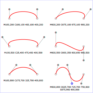
View
this example as SVG (SVG-enabled browsers only)
8.3.7. The quadratic Bézier curve commands
The quadratic Bézier commands are as follows:
| Command |
Name |
Parameters |
Description |
Q (absolute)
q (relative) |
quadratic Bézier curveto |
(x1 y1 x y)+ |
Draws a quadratic Bézier curve from the current
point to (x,y) using (x1,y1) as the control point.
Q (uppercase) indicates that absolute
coordinates will follow; q (lowercase)
indicates that relative coordinates will follow. Multiple
sets of coordinates may be specified to draw a
polybézier. At the end of the command, the new
current point becomes the final (x,y) coordinate pair used
in the polybézier. |
T (absolute)
t (relative) |
Shorthand/smooth quadratic Bézier curveto |
(x y)+ |
Draws a quadratic Bézier curve from the current
point to (x,y). The control point is assumed to be the
reflection of the control point on the previous command
relative to the current point. (If there is no previous
command or if the previous command was not a Q, q, T or t,
assume the control point is coincident with the current
point.) T (uppercase) indicates that
absolute coordinates will follow; t
(lowercase) indicates that relative coordinates will
follow. At the end of the command, the new current point
becomes the final (x,y) coordinate pair used in the
polybézier. |
When a relative q or t
command is used, each of the relative coordinate pairs
is computed as for those in an m command.
For example, the final control point of the curve of
both commands is (cpx + x cos cb
+ y sin cb, cpy +
x sin cb + y cos cb).
Example quad01 shows some
simple uses of quadratic Bézier commands within a path.
Note that the control point for the "T" command is computed
automatically as the reflection of the control point for the
previous "Q" command relative to the start point of the "T"
command.
<?xml version="1.0" standalone="no"?>
<svg width="12cm" height="6cm" viewBox="0 0 1200 600"
     xmlns="http://www.w3.org/2000/svg" version="1.1">
  <title>Example quad01 - quadratic Bézier commands in path data</title>
  <desc>Picture showing a "Q" a "T" command,
        along with annotations showing the control points
        and end points</desc>
  <rect x="1" y="1" width="1198" height="598"
        fill="none" stroke="blue" stroke-width="1" />

  <path d="M200,300 Q400,50 600,300 T1000,300"
        fill="none" stroke="red" stroke-width="5"  />
  <!-- End points -->
  <g fill="black" >
    <circle cx="200" cy="300" r="10"/>
    <circle cx="600" cy="300" r="10"/>
    <circle cx="1000" cy="300" r="10"/>
  </g>
  <!-- Control points and lines from end points to control points -->
  <g fill="#888888" >
    <circle cx="400" cy="50" r="10"/>
    <circle cx="800" cy="550" r="10"/>
  </g>
  <path d="M200,300 L400,50 L600,300
           L800,550 L1000,300"
        fill="none" stroke="#888888" stroke-width="2" />
</svg>View this example as SVG (SVG-enabled browsers only)
8.3.8. The elliptical arc curve commands
| SVG 2 Requirement: |
Make it simpler to draw arcs in SVG path syntax. |
| Resolution: |
Make arcs in paths easier. |
| Purpose: |
To make it easier for authors to write path data with arcs by hand. |
| Owner: |
Cameron (ACTION-3151) |
The elliptical arc commands are as follows:
| Command |
Name |
Parameters |
Description |
A (absolute)
a (relative) |
elliptical arc |
(rx ry x-axis-rotation large-arc-flag sweep-flag x
y)+ |
Draws an elliptical arc from the current point to
(x, y). The size and
orientation of the ellipse are defined by two radii
(rx, ry) and an
x-axis-rotation, which indicates how the
ellipse as a whole is rotated relative to the current
coordinate system. The center (cx,
cy) of the ellipse is calculated
automatically to satisfy the constraints imposed by the
other parameters. large-arc-flag and
sweep-flag contribute to the automatic
calculations and help determine how the arc is drawn. |
When a relative a command is used, the end point
of the arc is (cpx + x cos cb
+ y sin cb, cpy +
x sin cb + y cos cb).
The effective value of the x-axis-rotation parameter is
also affected by the current bearing: it is computed as
x-axis-rotation + cb.
Example arcs01 shows some
simple uses of arc commands within a path.
<?xml version="1.0" standalone="no"?>
<svg width="12cm" height="5.25cm" viewBox="0 0 1200 400"
     xmlns="http://www.w3.org/2000/svg" version="1.1">
  <title>Example arcs01 - arc commands in path data</title>
  <desc>Picture of a pie chart with two pie wedges and
        a picture of a line with arc blips</desc>
  <rect x="1" y="1" width="1198" height="398"
        fill="none" stroke="blue" stroke-width="1" />

  <path d="M300,200 h-150 a150,150 0 1,0 150,-150 z"
        fill="red" stroke="blue" stroke-width="5" />
  <path d="M275,175 v-150 a150,150 0 0,0 -150,150 z"
        fill="yellow" stroke="blue" stroke-width="5" />

  <path d="M600,350 l 50,-25
           a25,25 -30 0,1 50,-25 l 50,-25
           a25,50 -30 0,1 50,-25 l 50,-25
           a25,75 -30 0,1 50,-25 l 50,-25
           a25,100 -30 0,1 50,-25 l 50,-25"
        fill="none" stroke="red" stroke-width="5"  />
</svg>View this example as SVG (SVG-enabled browsers only)
The elliptical arc command draws a section of an ellipse
which meets the following constraints:
- the arc starts at the current point
- the arc ends at point (x,
y)
- the ellipse has the two radii (rx,
ry)
- the x-axis of the ellipse is rotated by
x-axis-rotation relative to the x-axis of
the current coordinate system.
For most situations, there are actually four different arcs
(two different ellipses, each with two different arc sweeps)
that satisfy these constraints. large-arc-flag
and sweep-flag indicate which one of the four
arcs are drawn, as follows:
- Of the four candidate arc sweeps, two will represent an
arc sweep of greater than or equal to 180 degrees (the
"large-arc"), and two will represent an arc sweep of less
than or equal to 180 degrees (the "small-arc"). If
large-arc-flag is '1', then one of the two
larger arc sweeps will be chosen; otherwise, if
large-arc-flag is '0', one of the smaller
arc sweeps will be chosen,
- If sweep-flag is '1', then the arc will
be drawn in a "positive-angle" direction (i.e., the ellipse
formula x=cx+rx*cos(theta)
and y=cy+ry*sin(theta) is
evaluated such that theta starts at an angle corresponding to
the current point and increases positively until the arc
reaches (x,y)). A value of 0 causes the arc to be drawn in a
"negative-angle" direction (i.e., theta starts at an angle
value corresponding to the current point and decreases until
the arc reaches (x,y)).
The following illustrates the four combinations of
large-arc-flag and sweep-flag
and the four different arcs that will be drawn based on the
values of these flags. For each case, the following path data
command was used:
<path d="M 125,75 a100,50 0 ?,? 100,50"
      style="fill:none; stroke:red; stroke-width:6"/>
where "?,?" is replaced by "0,0" "0,1" "1,0" and "1,1" to
generate the four possible cases.
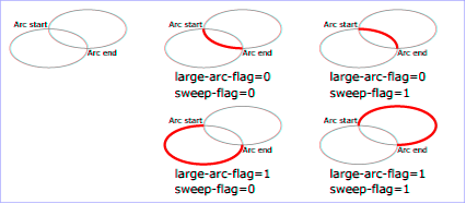
View
this example as SVG (SVG-enabled browsers only)
Refer to Elliptical arc
implementation notes for detailed implementation notes for
the path data elliptical arc commands.
8.3.9. The bearing commands
The bearing commands (B or b)
set the current bearing, which influences the orientation of
subsequent relative path commands:
| Command |
Name |
Parameters |
Description |
B (absolute)
b (relative) |
bearing |
angle+ |
Sets the current bearing. The parameter is an angle
in degrees, where 0 indicates the direction of the positive
x-axis. B (uppercase) sets
the current bearing to the specified angle; b
(lowercase) sets the current bearing to be the angle of the
tangent at the end of the preceding path command plus the
specified angle. The current point is unaffected.
Although multiple parameters may be specified, this usually
will not be useful, as they could be combined into a single
angle value. |
At the beginning of a path, the current bearing is 0, which
points in the direction of the positive x-axis. The current
bearing remains unchanged until a B or
b command is encountered. Since the relative
b command sets the current bearing relative
to the tangent at the end of the preceding path command,
it is possible to set the bearing to that tangent by using
"b 0".
The example below shows how bearing commands can be used
to draw a regular pentagon.
<svg xmlns="http://www.w3.org/2000/svg"
     width="300" height="100" viewBox="0 0 300 100">

  <path fill="#eee"
        stroke="deeppink" stroke-width="8px" stroke-linejoin="round"
        d="M 150,10
           B 36 h 47
           b 72 h 47
           b 72 h 47
           b 72 h 47 z"/>

</svg>
What should we do about the SVGPathSeg objects for these new path commands?
8.3.10. The grammar for path data
The following notation is used in the Backus-Naur Form (BNF)
description of the grammar for path data:
- *: 0 or more
- +: 1 or more
- ?: 0 or 1
- (): grouping
- |: separates alternatives
- double quotes surround literals
The following is the BNF for SVG paths.
svg-path:
    wsp* moveto-drawto-command-groups? wsp*
moveto-drawto-command-groups:
    moveto-drawto-command-group
    | moveto-drawto-command-group wsp* moveto-drawto-command-groups
moveto-drawto-command-group:
    moveto wsp* drawto-commands?
drawto-commands:
    drawto-command
    | drawto-command wsp* drawto-commands
drawto-command:
    closepath
    | lineto
    | horizontal-lineto
    | vertical-lineto
    | curveto
    | smooth-curveto
    | quadratic-bezier-curveto
    | smooth-quadratic-bezier-curveto
    | elliptical-arc
    | bearing
moveto:
    ( "M" | "m" ) wsp* moveto-argument-sequence
moveto-argument-sequence:
    coordinate-pair
    | coordinate-pair comma-wsp? lineto-argument-sequence
closepath:
    ("Z" | "z")
lineto:
    ( "L" | "l" ) wsp* lineto-argument-sequence
lineto-argument-sequence:
    coordinate-pair
    | coordinate-pair comma-wsp? lineto-argument-sequence
horizontal-lineto:
    ( "H" | "h" ) wsp* horizontal-lineto-argument-sequence
horizontal-lineto-argument-sequence:
    coordinate
    | coordinate comma-wsp? horizontal-lineto-argument-sequence
vertical-lineto:
    ( "V" | "v" ) wsp* vertical-lineto-argument-sequence
vertical-lineto-argument-sequence:
    coordinate
    | coordinate comma-wsp? vertical-lineto-argument-sequence
curveto:
    ( "C" | "c" ) wsp* curveto-argument-sequence
curveto-argument-sequence:
    curveto-argument
    | curveto-argument comma-wsp? curveto-argument-sequence
curveto-argument:
    coordinate-pair comma-wsp? coordinate-pair comma-wsp? coordinate-pair
smooth-curveto:
    ( "S" | "s" ) wsp* smooth-curveto-argument-sequence
smooth-curveto-argument-sequence:
    smooth-curveto-argument
    | smooth-curveto-argument comma-wsp? smooth-curveto-argument-sequence
smooth-curveto-argument:
    coordinate-pair comma-wsp? coordinate-pair
quadratic-bezier-curveto:
    ( "Q" | "q" ) wsp* quadratic-bezier-curveto-argument-sequence
quadratic-bezier-curveto-argument-sequence:
    quadratic-bezier-curveto-argument
    | quadratic-bezier-curveto-argument comma-wsp?
        quadratic-bezier-curveto-argument-sequence
quadratic-bezier-curveto-argument:
    coordinate-pair comma-wsp? coordinate-pair
smooth-quadratic-bezier-curveto:
    ( "T" | "t" ) wsp* smooth-quadratic-bezier-curveto-argument-sequence
smooth-quadratic-bezier-curveto-argument-sequence:
    coordinate-pair
    | coordinate-pair comma-wsp? smooth-quadratic-bezier-curveto-argument-sequence
elliptical-arc:
    ( "A" | "a" ) wsp* elliptical-arc-argument-sequence
elliptical-arc-argument-sequence:
    elliptical-arc-argument
    | elliptical-arc-argument comma-wsp? elliptical-arc-argument-sequence
elliptical-arc-argument:
    number comma-wsp? number comma-wsp?
        number comma-wsp flag comma-wsp? flag comma-wsp? coordinate-pair
bearing:
    ( "B" | "b") wsp* bearing-argument-sequence
bearing-argument-sequence:
    number
    | number comma-wsp? bearing-argument-sequence
coordinate-pair:
    coordinate comma-wsp? coordinate
coordinate:
    number
nonnegative-number:
    integer-constant
    | floating-point-constant
number:
    sign? integer-constant
    | sign? floating-point-constant
flag:
    "0" | "1"
comma-wsp:
    (wsp+ comma? wsp*) | (comma wsp*)
comma:
    ","
integer-constant:
    digit-sequence
floating-point-constant:
    fractional-constant exponent?
    | digit-sequence exponent
fractional-constant:
    digit-sequence? "." digit-sequence
    | digit-sequence "."
exponent:
    ( "e" | "E" ) sign? digit-sequence
sign:
    "+" | "-"
digit-sequence:
    digit
    | digit digit-sequence
digit:
    "0" | "1" | "2" | "3" | "4" | "5" | "6" | "7" | "8" | "9"
wsp:
    (#x20 | #x9 | #xD | #xA)
The processing of the BNF must consume as much of a given
BNF production as possible, stopping at the point when a
character is encountered which no longer satisfies the
production. Thus, in the string "M 100-200", the first
coordinate for the "moveto" consumes the characters "100" and
stops upon encountering the minus sign because the minus sign
cannot follow a digit in the production of a "coordinate". The
result is that the first coordinate will be "100" and the
second coordinate will be "-200".
Similarly, for the string "M 0.6.5", the first coordinate of
the "moveto" consumes the characters "0.6" and stops upon
encountering the second decimal point because the production of
a "coordinate" only allows one decimal point. The result is
that the first coordinate will be "0.6" and the second
coordinate will be ".5".
Note that the BNF allows the path ‘d’ attribute to be empty. This is not
an error, instead it disables rendering of the path.
8.4. Distance along a path
Various operations, including text on a path and motion animation
and various stroke
operations, require that the user agent compute the
distance along the geometry of a graphics element, such as a ‘path’.
Exact mathematics exist for computing distance along a path,
but the formulas are highly complex and require substantial
computation. It is recommended that authoring products and user
agents employ algorithms that produce as precise results as
possible; however, to accommodate implementation differences
and to help distance calculations produce results that
approximate author intent, the ‘pathLength’ attribute can be used
to provide the author's computation of the total length of the
path so that the user agent can scale distance-along-a-path
computations by the ratio of ‘pathLength’ to the user agent's own
computed value for total path length.
A "moveto" or "bearing" operation within a ‘path’ element is defined to have
zero length. Only the various "lineto", "curveto" and "arcto"
commands contribute to path length calculations.
8.5. DOM interfaces
8.5.1. Interface SVGPathSeg
The
SVGPathSeg interface is a base interface that corresponds to a
single command within a path data specification.
interface SVGPathSeg {

  // Path Segment Types
  const unsigned short PATHSEG_UNKNOWN = 0;
  const unsigned short PATHSEG_CLOSEPATH = 1;
  const unsigned short PATHSEG_MOVETO_ABS = 2;
  const unsigned short PATHSEG_MOVETO_REL = 3;
  const unsigned short PATHSEG_LINETO_ABS = 4;
  const unsigned short PATHSEG_LINETO_REL = 5;
  const unsigned short PATHSEG_CURVETO_CUBIC_ABS = 6;
  const unsigned short PATHSEG_CURVETO_CUBIC_REL = 7;
  const unsigned short PATHSEG_CURVETO_QUADRATIC_ABS = 8;
  const unsigned short PATHSEG_CURVETO_QUADRATIC_REL = 9;
  const unsigned short PATHSEG_ARC_ABS = 10;
  const unsigned short PATHSEG_ARC_REL = 11;
  const unsigned short PATHSEG_LINETO_HORIZONTAL_ABS = 12;
  const unsigned short PATHSEG_LINETO_HORIZONTAL_REL = 13;
  const unsigned short PATHSEG_LINETO_VERTICAL_ABS = 14;
  const unsigned short PATHSEG_LINETO_VERTICAL_REL = 15;
  const unsigned short PATHSEG_CURVETO_CUBIC_SMOOTH_ABS = 16;
  const unsigned short PATHSEG_CURVETO_CUBIC_SMOOTH_REL = 17;
  const unsigned short PATHSEG_CURVETO_QUADRATIC_SMOOTH_ABS = 18;
  const unsigned short PATHSEG_CURVETO_QUADRATIC_SMOOTH_REL = 19;

  readonly attribute unsigned short pathSegType;
  readonly attribute DOMString pathSegTypeAsLetter;
};
-
- PATHSEG_UNKNOWN (unsigned short)
-
The unit type is not one of predefined types. It is invalid to attempt
to define a new value of this type or to attempt to switch an existing
value to this type.
- PATHSEG_CLOSEPATH (unsigned short)
-
Corresponds to a "closepath" (z) path data command.
- PATHSEG_MOVETO_ABS (unsigned short)
-
Corresponds to a "absolute moveto" (M) path data command.
- PATHSEG_MOVETO_REL (unsigned short)
-
Corresponds to a "relative moveto" (m) path data command.
- PATHSEG_LINETO_ABS (unsigned short)
-
Corresponds to a "absolute lineto" (L) path data command.
- PATHSEG_LINETO_REL (unsigned short)
-
Corresponds to a "relative lineto" (l) path data command.
- PATHSEG_CURVETO_CUBIC_ABS (unsigned short)
-
Corresponds to a "absolute cubic Bézier curveto" (C) path data command.
- PATHSEG_CURVETO_CUBIC_REL (unsigned short)
-
Corresponds to a "relative cubic Bézier curveto" (c) path data command.
- PATHSEG_CURVETO_QUADRATIC_ABS (unsigned short)
-
Corresponds to a "absolute quadratic Bézier curveto" (Q) path data command.
- PATHSEG_CURVETO_QUADRATIC_REL (unsigned short)
-
Corresponds to a "relative quadratic Bézier curveto" (q) path data command.
- PATHSEG_ARC_ABS (unsigned short)
-
Corresponds to a "absolute arcto" (A) path data command.
- PATHSEG_ARC_REL (unsigned short)
-
Corresponds to a "relative arcto" (a) path data command.
- PATHSEG_LINETO_HORIZONTAL_ABS (unsigned short)
-
Corresponds to a "absolute horizontal lineto" (H) path data command.
- PATHSEG_LINETO_HORIZONTAL_REL (unsigned short)
-
Corresponds to a "relative horizontal lineto" (h) path data command.
- PATHSEG_LINETO_VERTICAL_ABS (unsigned short)
-
Corresponds to a "absolute vertical lineto" (V) path data command.
- PATHSEG_LINETO_VERTICAL_REL (unsigned short)
-
Corresponds to a "relative vertical lineto" (v) path data command.
- PATHSEG_CURVETO_CUBIC_SMOOTH_ABS (unsigned short)
-
Corresponds to a "absolute smooth cubic curveto" (S) path data command.
- PATHSEG_CURVETO_CUBIC_SMOOTH_REL (unsigned short)
-
Corresponds to a "relative smooth cubic curveto" (s) path data command.
- PATHSEG_CURVETO_QUADRATIC_SMOOTH_ABS (unsigned short)
-
Corresponds to a "absolute smooth quadratic curveto" (T) path data command.
- PATHSEG_CURVETO_QUADRATIC_SMOOTH_REL (unsigned short)
-
Corresponds to a "relative smooth quadratic curveto" (t) path data command.
-
- pathSegType (readonly unsigned short)
-
The type of the path segment as specified by one of the constants
defined on this interface.
- pathSegTypeAsLetter (readonly DOMString)
-
The type of the path segment, specified by the corresponding one
character command name.
8.5.2. Interface SVGPathSegClosePath
The
SVGPathSegClosePath interface corresponds to a
"closepath" (z) path data command.
interface SVGPathSegClosePath : SVGPathSeg {
};
8.5.3. Interface SVGPathSegMovetoAbs
The
SVGPathSegMovetoAbs interface corresponds to an
"absolute moveto" (M) path data command.
interface SVGPathSegMovetoAbs : SVGPathSeg {
  attribute float x;
  attribute float y;
};
-
- x (float)
-
The absolute X coordinate for the end point of this path segment.
- y (float)
-
The absolute Y coordinate for the end point of this path segment.
8.5.4. Interface SVGPathSegMovetoRel
The
SVGPathSegMovetoRel interface corresponds to a
"relative moveto" (m) path data command.
interface SVGPathSegMovetoRel : SVGPathSeg {
  attribute float x;
  attribute float y;
};
-
- x (float)
-
The relative X coordinate for the end point of this path segment.
- y (float)
-
The relative Y coordinate for the end point of this path segment.
8.5.5. Interface SVGPathSegLinetoAbs
The
SVGPathSegLinetoAbs interface corresponds to an
"absolute lineto" (L) path data command.
interface SVGPathSegLinetoAbs : SVGPathSeg {
  attribute float x;
  attribute float y;
};
-
- x (float)
-
The absolute X coordinate for the end point of this path segment.
- y (float)
-
The absolute Y coordinate for the end point of this path segment.
8.5.6. Interface SVGPathSegLinetoRel
The
SVGPathSegLinetoRel interface corresponds to a
"relative lineto" (l) path data command.
interface SVGPathSegLinetoRel : SVGPathSeg {
  attribute float x;
  attribute float y;
};
-
- x (float)
-
The relative X coordinate for the end point of this path segment.
- y (float)
-
The relative Y coordinate for the end point of this path segment.
8.5.7. Interface SVGPathSegCurvetoCubicAbs
The
SVGPathSegCurvetoCubicAbs interface corresponds to an
"absolute cubic Bézier curveto" (C) path data command.
interface SVGPathSegCurvetoCubicAbs : SVGPathSeg {
  attribute float x;
  attribute float y;
  attribute float x1;
  attribute float y1;
  attribute float x2;
  attribute float y2;
};
-
- x (float)
-
The absolute X coordinate for the end point of this path segment.
- y (float)
-
The absolute Y coordinate for the end point of this path segment.
- x1 (float)
-
The absolute X coordinate for the first control point.
- y1 (float)
-
The absolute Y coordinate for the first control point.
- x2 (float)
-
The absolute X coordinate for the second control point.
- y2 (float)
-
The absolute Y coordinate for the second control point.
8.5.8. Interface SVGPathSegCurvetoCubicRel
The
SVGPathSegCurvetoCubicRel interface corresponds to a
"relative cubic Bézier curveto" (c) path data command.
interface SVGPathSegCurvetoCubicRel : SVGPathSeg {
  attribute float x;
  attribute float y;
  attribute float x1;
  attribute float y1;
  attribute float x2;
  attribute float y2;
};
-
- x (float)
-
The relative X coordinate for the end point of this path segment.
- y (float)
-
The relative Y coordinate for the end point of this path segment.
- x1 (float)
-
The relative X coordinate for the first control point.
- y1 (float)
-
The relative Y coordinate for the first control point.
- x2 (float)
-
The relative X coordinate for the second control point.
- y2 (float)
-
The relative Y coordinate for the second control point.
8.5.9. Interface SVGPathSegCurvetoQuadraticAbs
The
SVGPathSegCurvetoQuadraticAbs interface corresponds to an
"absolute quadratic Bézier curveto" (Q) path data command.
interface SVGPathSegCurvetoQuadraticAbs : SVGPathSeg {
  attribute float x;
  attribute float y;
  attribute float x1;
  attribute float y1;
};
-
- x (float)
-
The absolute X coordinate for the end point of this path segment.
- y (float)
-
The absolute Y coordinate for the end point of this path segment.
- x1 (float)
-
The absolute X coordinate for the first control point.
- y1 (float)
-
The absolute Y coordinate for the first control point.
8.5.10. Interface SVGPathSegCurvetoQuadraticRel
The
SVGPathSegCurvetoQuadraticRel interface corresponds to a
"relative quadratic Bézier curveto" (q) path data command.
interface SVGPathSegCurvetoQuadraticRel : SVGPathSeg {
  attribute float x;
  attribute float y;
  attribute float x1;
  attribute float y1;
};
-
- x (float)
-
The relative X coordinate for the end point of this path segment.
- y (float)
-
The relative Y coordinate for the end point of this path segment.
- x1 (float)
-
The relative X coordinate for the first control point.
- y1 (float)
-
The relative Y coordinate for the first control point.
8.5.11. Interface SVGPathSegArcAbs
The
SVGPathSegArcAbs interface corresponds to an
"absolute arcto" (A) path data command.
interface SVGPathSegArcAbs : SVGPathSeg {
  attribute float x;
  attribute float y;
  attribute float r1;
  attribute float r2;
  attribute float angle;
  attribute boolean largeArcFlag;
  attribute boolean sweepFlag;
};
-
- x (float)
-
The absolute X coordinate for the end point of this path segment.
- y (float)
-
The absolute Y coordinate for the end point of this path segment.
- r1 (float)
-
The x-axis radius for the ellipse (i.e., r1).
- r2 (float)
-
The y-axis radius for the ellipse (i.e., r2).
- angle (float)
-
The rotation angle in degrees for the ellipse's x-axis relative to the x-axis of the user coordinate system.
- largeArcFlag (boolean)
-
The value of the large-arc-flag parameter.
- sweepFlag (boolean)
-
The value of the sweep-flag parameter.
8.5.12. Interface SVGPathSegArcRel
The
SVGPathSegArcRel interface corresponds to a
"relative arcto" (a) path data command.
interface SVGPathSegArcRel : SVGPathSeg {
  attribute float x;
  attribute float y;
  attribute float r1;
  attribute float r2;
  attribute float angle;
  attribute boolean largeArcFlag;
  attribute boolean sweepFlag;
};
-
- x (float)
-
The relative X coordinate for the end point of this path segment.
- y (float)
-
The relative Y coordinate for the end point of this path segment.
- r1 (float)
-
The x-axis radius for the ellipse (i.e., r1).
- r2 (float)
-
The y-axis radius for the ellipse (i.e., r2).
- angle (float)
-
The rotation angle in degrees for the ellipse's x-axis relative to the x-axis of the user coordinate system.
- largeArcFlag (boolean)
-
The value of the large-arc-flag parameter.
- sweepFlag (boolean)
-
The value of the sweep-flag parameter.
8.5.13. Interface SVGPathSegLinetoHorizontalAbs
The
SVGPathSegLinetoHorizontalAbs interface corresponds to an
"absolute horizontal lineto" (H) path data command.
interface SVGPathSegLinetoHorizontalAbs : SVGPathSeg {
  attribute float x;
};
-
- x (float)
-
The absolute X coordinate for the end point of this path segment.
8.5.14. Interface SVGPathSegLinetoHorizontalRel
The
SVGPathSegLinetoHorizontalRel interface corresponds to a
"relative horizontal lineto" (h) path data command.
interface SVGPathSegLinetoHorizontalRel : SVGPathSeg {
  attribute float x;
};
-
- x (float)
-
The relative X coordinate for the end point of this path segment.
8.5.15. Interface SVGPathSegLinetoVerticalAbs
The
SVGPathSegLinetoVerticalAbs interface corresponds to an
"absolute vertical lineto" (V) path data command.
interface SVGPathSegLinetoVerticalAbs : SVGPathSeg {
  attribute float y;
};
-
- y (float)
-
The absolute Y coordinate for the end point of this path segment.
8.5.16. Interface SVGPathSegLinetoVerticalRel
The
SVGPathSegLinetoVerticalRel interface corresponds to a
"relative vertical lineto" (v) path data command.
interface SVGPathSegLinetoVerticalRel : SVGPathSeg {
  attribute float y;
};
-
- y (float)
-
The relative Y coordinate for the end point of this path segment.
8.5.17. Interface SVGPathSegCurvetoCubicSmoothAbs
The
SVGPathSegCurvetoCubicSmoothAbs interface corresponds to an
"absolute smooth cubic curveto" (S) path data command.
interface SVGPathSegCurvetoCubicSmoothAbs : SVGPathSeg {
  attribute float x;
  attribute float y;
  attribute float x2;
  attribute float y2;
};
-
- x (float)
-
The absolute X coordinate for the end point of this path segment.
- y (float)
-
The absolute Y coordinate for the end point of this path segment.
- x2 (float)
-
The absolute X coordinate for the second control point.
- y2 (float)
-
The absolute Y coordinate for the second control point.
8.5.18. Interface SVGPathSegCurvetoCubicSmoothRel
The
SVGPathSegCurvetoCubicSmoothRel interface corresponds to a
"relative smooth cubic curveto" (s) path data command.
interface SVGPathSegCurvetoCubicSmoothRel : SVGPathSeg {
  attribute float x;
  attribute float y;
  attribute float x2;
  attribute float y2;
};
-
- x (float)
-
The relative X coordinate for the end point of this path segment.
- y (float)
-
The relative Y coordinate for the end point of this path segment.
- x2 (float)
-
The relative X coordinate for the second control point.
- y2 (float)
-
The relative Y coordinate for the second control point.
8.5.19. Interface SVGPathSegCurvetoQuadraticSmoothAbs
The
SVGPathSegCurvetoQuadraticSmoothAbs interface corresponds to an
"absolute smooth cubic curveto" (T) path data command.
interface SVGPathSegCurvetoQuadraticSmoothAbs : SVGPathSeg {
  attribute float x;
  attribute float y;
};
-
- x (float)
-
The absolute X coordinate for the end point of this path segment.
- y (float)
-
The absolute Y coordinate for the end point of this path segment.
8.5.20. Interface SVGPathSegCurvetoQuadraticSmoothRel
The
SVGPathSegCurvetoQuadraticSmoothRel interface corresponds to a
"relative smooth cubic curveto" (t) path data command.
interface SVGPathSegCurvetoQuadraticSmoothRel : SVGPathSeg {
  attribute float x;
  attribute float y;
};
-
- x (float)
-
The relative X coordinate for the end point of this path segment.
- y (float)
-
The relative Y coordinate for the end point of this path segment.
8.5.21. Interface SVGPathSegList
This interface defines a list of SVGPathSeg objects.
SVGPathSegList has the same attributes and methods as other
SVGxxxList interfaces. Implementers may consider using a single base class
to implement the various SVGxxxList interfaces.
The supported property indices
of an SVGPathSegList object is all non-negative integers less than
the length of the list.
interface SVGPathSegList {

  readonly attribute unsigned long length;
  readonly attribute unsigned long numberOfItems;

  void clear();
  SVGPathSeg initialize(SVGPathSeg newItem);
  getter SVGPathSeg getItem(unsigned long index);
  SVGPathSeg insertItemBefore(SVGPathSeg newItem, unsigned long index);
  SVGPathSeg replaceItem(SVGPathSeg newItem, unsigned long index);
  SVGPathSeg removeItem(unsigned long index);
  SVGPathSeg appendItem(SVGPathSeg newItem);
  setter void (unsigned long index, SVGPathSeg newItem);
};
-
- length (readonly unsigned long)
-
The number of items in the list.
- numberOfItems (readonly unsigned long)
-
The number of items in the list.
-
- void clear()
-
Clears all existing current items from the list, with the result being
an empty list.
-
- DOMException, code NO_MODIFICATION_ALLOWED_ERR
- Raised when the list
cannot be modified.
- SVGPathSeg initialize(SVGPathSeg newItem)
-
Clears all existing current items from the list and re-initializes the
list to hold the single item specified by the parameter. If the inserted
item is already in a list, it is removed from its previous list before
it is inserted into this list. The inserted item is the item itself and
not a copy.
-
-
The item which should become the only member of the list.
-
The item being inserted into the list.
-
- DOMException, code NO_MODIFICATION_ALLOWED_ERR
- Raised when the list
cannot be modified.
- SVGPathSeg getItem(unsigned long index)
-
Returns the specified item from the list. The returned item is the
item itself and not a copy. Any changes made to the item are
immediately reflected in the list.
-
-
unsigned long index
The index of the item from the list which is to be
returned. The first item is number 0.
-
The selected item.
-
- DOMException, code INDEX_SIZE_ERR
- Raised if the index number is
greater than or equal to numberOfItems.
- SVGPathSeg insertItemBefore(SVGPathSeg newItem, unsigned long index)
-
Inserts a new item into the list at the specified position. The first
item is number 0. If newItem is already in a list, it is
removed from its previous list before it is inserted into this list.
The inserted item is the item itself and not a copy. If the item is
already in this list, note that the index of the item to insert
before is before the removal of the item.
-
-
The item which is to be inserted into the list.
-
unsigned long index
The index of the item before which the new item is to be
inserted. The first item is number 0. If the index is equal to 0,
then the new item is inserted at the front of the list. If the index
is greater than or equal to
numberOfItems, then the new item is
appended to the end of the list.
-
The inserted item.
-
- DOMException, code NO_MODIFICATION_ALLOWED_ERR
- Raised when the list
cannot be modified.
- SVGPathSeg replaceItem(SVGPathSeg newItem, unsigned long index)
-
Replaces an existing item in the list with a new item. If
newItem is already in a list, it is removed from its
previous list before it is inserted into this list. The inserted item
is the item itself and not a copy. If the item is already in this
list, note that the index of the item to replace is before
the removal of the item.
-
-
The item which is to be inserted into the list.
-
unsigned long index
The index of the item which is to be replaced. The first
item is number 0.
-
The inserted item.
-
- DOMException, code NO_MODIFICATION_ALLOWED_ERR
- Raised when the list
cannot be modified.
- DOMException, code INDEX_SIZE_ERR
- Raised if the index number is
greater than or equal to numberOfItems.
- SVGPathSeg removeItem(unsigned long index)
-
Removes an existing item from the list.
-
-
unsigned long index
The index of the item which is to be removed. The first
item is number 0.
-
The removed item.
-
- DOMException, code NO_MODIFICATION_ALLOWED_ERR
- Raised when the list
cannot be modified.
- DOMException, code INDEX_SIZE_ERR
- Raised if the index number is
greater than or equal to numberOfItems.
- SVGPathSeg appendItem(SVGPathSeg newItem)
-
Inserts a new item at the end of the list. If newItem is
already in a list, it is removed from its previous list before it is
inserted into this list. The inserted item is the item itself and
not a copy.
-
-
The item which is to be inserted. The first item is
number 0.
-
The inserted item.
-
- DOMException, code NO_MODIFICATION_ALLOWED_ERR
- Raised when the list
cannot be modified.
- setter void (unsigned long index, SVGPathSeg newItem)
Replaces the item at index index with newItem.
8.5.22. Interface SVGAnimatedPathData
The SVGAnimatedPathData interface supports elements which have a ‘d’
attribute which holds SVG path data, and supports the ability to animate
that attribute.
The SVGAnimatedPathData interface provides two lists to access and
modify the base (i.e., static) contents of the ‘d’ attribute:
- DOM attribute pathSegList provides access to the static/base
contents of the ‘d’ attribute in a form which matches one-for-one
with SVG's syntax.
- DOM attribute normalizedPathSegList provides normalized access
to the static/base contents of the ‘d’ attribute where all path
data commands are expressed in terms of the following subset of
SVGPathSeg types:
SVG_PATHSEG_MOVETO_ABS (M),
SVG_PATHSEG_LINETO_ABS (L),
SVG_PATHSEG_CURVETO_CUBIC_ABS (C) and
SVG_PATHSEG_CLOSEPATH (z).
and two lists to access the current animated values of the ‘d’
attribute:
- DOM attribute animatedPathSegList provides access to the current
animated contents of the ‘d’ attribute in a form which matches
one-for-one with SVG's syntax.
- DOM attribute animatedNormalizedPathSegList provides
normalized access to the current animated contents of the ‘d’
attribute where all path data commands are expressed in terms of the
following subset of SVGPathSeg types:
SVG_PATHSEG_MOVETO_ABS (M),
SVG_PATHSEG_LINETO_ABS (L),
SVG_PATHSEG_CURVETO_CUBIC_ABS (C) and
SVG_PATHSEG_CLOSEPATH (z).
Each of the two lists are always kept synchronized. Modifications to one
list will immediately cause the corresponding list to be modified.
Modifications to normalizedPathSegList might cause entries in
pathSegList to be broken into a set of normalized path segments.
Additionally, the ‘d’ attribute on the ‘path’ element
accessed via the XML DOM (e.g., using the getAttribute()
method call) will reflect any changes made to pathSegList or
normalizedPathSegList.
interface SVGAnimatedPathData {
  readonly attribute SVGPathSegList pathSegList;
  readonly attribute SVGPathSegList normalizedPathSegList;
  readonly attribute SVGPathSegList animatedPathSegList;
  readonly attribute SVGPathSegList animatedNormalizedPathSegList;
};
-
- pathSegList (readonly SVGPathSegList)
-
Provides access to the base (i.e., static) contents of the
‘d’
attribute in a form which matches one-for-one with SVG's syntax.
Thus, if the
‘d’ attribute has an "absolute moveto (M)" and an
"absolute arcto (A)" command, then
pathSegList will have two
entries: a SVG_PATHSEG_MOVETO_ABS and a SVG_PATHSEG_ARC_ABS.
- normalizedPathSegList (readonly SVGPathSegList)
-
Provides access to the base (i.e., static) contents of the
‘d’ attribute in a form where all path data commands are
expressed in terms of the following subset of SVGPathSeg
types: SVG_PATHSEG_MOVETO_ABS (M), SVG_PATHSEG_LINETO_ABS (L),
SVG_PATHSEG_CURVETO_CUBIC_ABS (C) and SVG_PATHSEG_CLOSEPATH
(z). Thus, if the ‘d’ attribute has an "absolute moveto (M)"
and an "absolute arcto (A)" command, then pathSegList will
have one SVG_PATHSEG_MOVETO_ABS entry followed by a series of
SVG_PATHSEG_LINETO_ABS entries which approximate the arc. This
alternate representation is available to provide a simpler
interface to developers who would benefit from a more limited set
of commands.
The only valid SVGPathSeg types are
SVG_PATHSEG_MOVETO_ABS (M), SVG_PATHSEG_LINETO_ABS (L),
SVG_PATHSEG_CURVETO_CUBIC_ABS (C) and SVG_PATHSEG_CLOSEPATH (z).
- animatedPathSegList (readonly SVGPathSegList)
-
Provides access to the current animated contents of the
‘d’
attribute in a form which matches one-for-one with SVG's syntax.
If the given attribute or property is being animated, contains
the current animated value of the attribute or property, and both
the object itself and its contents are read only. If the given
attribute or property is not currently being animated, contains
the same value as
pathSegList.
- animatedNormalizedPathSegList (readonly SVGPathSegList)
-
Provides access to the current animated contents of the
‘d’ attribute in a form where all path data commands
are expressed in terms of the following subset of
SVGPathSeg
types: SVG_PATHSEG_MOVETO_ABS (M), SVG_PATHSEG_LINETO_ABS (L),
SVG_PATHSEG_CURVETO_CUBIC_ABS (C) and SVG_PATHSEG_CLOSEPATH (z).
If the given attribute or property is being animated, contains
the current animated value of the attribute or property, and both
the object itself and its contents are read only. If the given
attribute or property is not currently being animated, contains
the same value as
normalizedPathSegList.
8.5.23. Interface SVGPathElement
The
SVGPathElement interface corresponds to the
‘path’
element.
interface SVGPathElement : SVGGeometryElement {

  readonly attribute SVGAnimatedNumber pathLength;

  float getTotalLength();
  SVGPoint getPointAtLength(float distance);
  unsigned long getPathSegAtLength(float distance);
  SVGPathSegClosePath createSVGPathSegClosePath();
  SVGPathSegMovetoAbs createSVGPathSegMovetoAbs(float x, float y);
  SVGPathSegMovetoRel createSVGPathSegMovetoRel(float x, float y);
  SVGPathSegLinetoAbs createSVGPathSegLinetoAbs(float x, float y);
  SVGPathSegLinetoRel createSVGPathSegLinetoRel(float x, float y);
  SVGPathSegCurvetoCubicAbs createSVGPathSegCurvetoCubicAbs(float x, float y, float x1, float y1, float x2, float y2);
  SVGPathSegCurvetoCubicRel createSVGPathSegCurvetoCubicRel(float x, float y, float x1, float y1, float x2, float y2);
  SVGPathSegCurvetoQuadraticAbs createSVGPathSegCurvetoQuadraticAbs(float x, float y, float x1, float y1);
  SVGPathSegCurvetoQuadraticRel createSVGPathSegCurvetoQuadraticRel(float x, float y, float x1, float y1);
  SVGPathSegArcAbs createSVGPathSegArcAbs(float x, float y, float r1, float r2, float angle, boolean largeArcFlag, boolean sweepFlag);
  SVGPathSegArcRel createSVGPathSegArcRel(float x, float y, float r1, float r2, float angle, boolean largeArcFlag, boolean sweepFlag);
  SVGPathSegLinetoHorizontalAbs createSVGPathSegLinetoHorizontalAbs(float x);
  SVGPathSegLinetoHorizontalRel createSVGPathSegLinetoHorizontalRel(float x);
  SVGPathSegLinetoVerticalAbs createSVGPathSegLinetoVerticalAbs(float y);
  SVGPathSegLinetoVerticalRel createSVGPathSegLinetoVerticalRel(float y);
  SVGPathSegCurvetoCubicSmoothAbs createSVGPathSegCurvetoCubicSmoothAbs(float x, float y, float x2, float y2);
  SVGPathSegCurvetoCubicSmoothRel createSVGPathSegCurvetoCubicSmoothRel(float x, float y, float x2, float y2);
  SVGPathSegCurvetoQuadraticSmoothAbs createSVGPathSegCurvetoQuadraticSmoothAbs(float x, float y);
  SVGPathSegCurvetoQuadraticSmoothRel createSVGPathSegCurvetoQuadraticSmoothRel(float x, float y);
};

SVGPathElement implements SVGAnimatedPathData;
SVGPathElement implements SVGMarkableElement;
-
- pathLength (readonly SVGAnimatedNumber)
-
-
- float getTotalLength()
-
Returns the user agent's computed value for the total length of the path
using the user agent's distance-along-a-path algorithm, as a distance
in the current user coordinate system.
-
The total length of the path.
- SVGPoint getPointAtLength(float distance)
-
Returns the (x,y) coordinate in user space which is distance
units along the path, utilizing the user agent's distance-along-a-path
algorithm.
-
-
float distance
The distance along the path, relative to the start of
the path, as a distance in the current user coordinate system.
-
The returned point in user space.
- unsigned long getPathSegAtLength(float distance)
-
Returns the index into
pathSegList which is
distance
units along the path, utilizing the user agent's distance-along-a-path
algorithm.
-
-
float distance
The distance along the path, relative to the start of
the path, as a distance in the current user coordinate system.
-
The index of the path segment, where the first path segment is
number 0.
- SVGPathSegClosePath createSVGPathSegClosePath()
-
-
- SVGPathSegMovetoAbs createSVGPathSegMovetoAbs(float x, float y)
-
-
-
float x
The absolute X coordinate for the end point of this path segment.
-
float y
The absolute Y coordinate for the end point of this path segment.
-
- SVGPathSegMovetoRel createSVGPathSegMovetoRel(float x, float y)
-
-
-
float x
The relative X coordinate for the end point of this path segment.
-
float y
The relative Y coordinate for the end point of this path segment.
-
- SVGPathSegLinetoAbs createSVGPathSegLinetoAbs(float x, float y)
-
-
-
float x
The absolute X coordinate for the end point of this path segment.
-
float y
The absolute Y coordinate for the end point of this path segment.
-
- SVGPathSegLinetoRel createSVGPathSegLinetoRel(float x, float y)
-
-
-
float x
The relative X coordinate for the end point of this path segment.
-
float y
The relative Y coordinate for the end point of this path segment.
-
- SVGPathSegCurvetoCubicAbs createSVGPathSegCurvetoCubicAbs(float x, float y, float x1, float y1, float x2, float y2)
-
-
-
float x
The absolute X coordinate for the end point of this path segment.
-
float y
The absolute Y coordinate for the end point of this path segment.
-
float x1
The absolute X coordinate for the first control point.
-
float y1
The absolute Y coordinate for the first control point.
-
float x2
The absolute X coordinate for the second control point.
-
float y2
The absolute Y coordinate for the second control point.
-
- SVGPathSegCurvetoCubicRel createSVGPathSegCurvetoCubicRel(float x, float y, float x1, float y1, float x2, float y2)
-
-
-
float x
The relative X coordinate for the end point of this path segment.
-
float y
The relative Y coordinate for the end point of this path segment.
-
float x1
The relative X coordinate for the first control point.
-
float y1
The relative Y coordinate for the first control point.
-
float x2
The relative X coordinate for the second control point.
-
float y2
The relative Y coordinate for the second control point.
-
- SVGPathSegCurvetoQuadraticAbs createSVGPathSegCurvetoQuadraticAbs(float x, float y, float x1, float y1)
-
-
-
float x
The absolute X coordinate for the end point of this path segment.
-
float y
The absolute Y coordinate for the end point of this path segment.
-
float x1
The absolute X coordinate for the first control point.
-
float y1
The absolute Y coordinate for the first control point.
-
- SVGPathSegCurvetoQuadraticRel createSVGPathSegCurvetoQuadraticRel(float x, float y, float x1, float y1)
-
-
-
float x
The relative X coordinate for the end point of this path segment.
-
float y
The relative Y coordinate for the end point of this path segment.
-
float x1
The relative X coordinate for the first control point.
-
float y1
The relative Y coordinate for the first control point.
-
- SVGPathSegArcAbs createSVGPathSegArcAbs(float x, float y, float r1, float r2, float angle, boolean largeArcFlag, boolean sweepFlag)
-
-
-
float x
The absolute X coordinate for the end point of this path segment.
-
float y
The absolute Y coordinate for the end point of this path segment.
-
float r1
The x-axis radius for the ellipse (i.e., r1).
-
float r2
The y-axis radius for the ellipse (i.e., r2).
-
float angle
The rotation angle in degrees for the ellipse's x-axis relative to the x-axis of the user coordinate system.
-
boolean largeArcFlag
The value of the large-arc-flag parameter.
-
boolean sweepFlag
The value of the large-arc-flag parameter.
-
- SVGPathSegArcRel createSVGPathSegArcRel(float x, float y, float r1, float r2, float angle, boolean largeArcFlag, boolean sweepFlag)
-
-
-
float x
The relative X coordinate for the end point of this path segment.
-
float y
The relative Y coordinate for the end point of this path segment.
-
float r1
The x-axis radius for the ellipse (i.e., r1).
-
float r2
The y-axis radius for the ellipse (i.e., r2).
-
float angle
The rotation angle in degrees for the ellipse's x-axis relative to the x-axis of the user coordinate system.
-
boolean largeArcFlag
The value of the large-arc-flag parameter.
-
boolean sweepFlag
The value of the large-arc-flag parameter.
-
- SVGPathSegLinetoHorizontalAbs createSVGPathSegLinetoHorizontalAbs(float x)
-
-
-
float x
The absolute X coordinate for the end point of this path segment.
-
- SVGPathSegLinetoHorizontalRel createSVGPathSegLinetoHorizontalRel(float x)
-
-
-
float x
The relative X coordinate for the end point of this path segment.
-
- SVGPathSegLinetoVerticalAbs createSVGPathSegLinetoVerticalAbs(float y)
-
-
-
float y
The absolute Y coordinate for the end point of this path segment.
-
- SVGPathSegLinetoVerticalRel createSVGPathSegLinetoVerticalRel(float y)
-
-
-
float y
The relative Y coordinate for the end point of this path segment.
-
- SVGPathSegCurvetoCubicSmoothAbs createSVGPathSegCurvetoCubicSmoothAbs(float x, float y, float x2, float y2)
-
-
-
float x
The absolute X coordinate for the end point of this path segment.
-
float y
The absolute Y coordinate for the end point of this path segment.
-
float x2
The absolute X coordinate for the second control point.
-
float y2
The absolute Y coordinate for the second control point.
-
- SVGPathSegCurvetoCubicSmoothRel createSVGPathSegCurvetoCubicSmoothRel(float x, float y, float x2, float y2)
-
-
-
float x
The relative X coordinate for the end point of this path segment.
-
float y
The relative Y coordinate for the end point of this path segment.
-
float x2
The relative X coordinate for the second control point.
-
float y2
The relative Y coordinate for the second control point.
-
- SVGPathSegCurvetoQuadraticSmoothAbs createSVGPathSegCurvetoQuadraticSmoothAbs(float x, float y)
-
-
-
float x
The absolute X coordinate for the end point of this path segment.
-
float y
The absolute Y coordinate for the end point of this path segment.
-
- SVGPathSegCurvetoQuadraticSmoothRel createSVGPathSegCurvetoQuadraticSmoothRel(float x, float y)
-
-
-
float x
The relative X coordinate for the end point of this path segment.
-
float y
The relative Y coordinate for the end point of this path segment.
-
Chapter 9: Basic Shapes
Contents
9.1. Introduction
SVG contains the following set of basic shape elements:
- rectangles (including optional rounded corners), created with the ‘rect’ element,
- circles, created with the ‘circle’ element,
- ellipses, created with the ‘ellipse’ element,
- straight lines, created with the ‘line’ element,
- polylines, created with the ‘polyline’ element, and
- polygons, created with the ‘polygon’ element.
Mathematically, these shape elements are equivalent to a
‘path’ element that would construct the same shape. The basic
shapes may be stroked, filled and used as clip paths. All of the
properties available for ‘path’ elements also apply to the basic
shapes.
We should define the equivalent path for each shape
(and for text?). The algorithm that computes the stroke shape for
an element refers to the equivalent path for the element, so
that it is clear for example where dashing would start.
9.2. The ‘rect’ element
The ‘rect’ element defines a rectangle which is axis-aligned
with the current user coordinate system. Rounded rectangles can be achieved by setting
appropriate values for attributes ‘rx’ and ‘ry’.
‘rect’
- Categories:
- Graphics element, shape element
- Content model:
- Any number of the following elements, in any order:
- animation elements — ‘animate’, ‘animateMotion’, ‘animateTransform’, ‘discard’, ‘set’
- descriptive elements — ‘desc’, ‘title’, ‘metadata’
- paint server elements — ‘solidColor’, ‘linearGradient’, ‘radialGradient’, ‘meshGradient’, ‘pattern’, ‘hatch’
clipPath, marker, mask, script - Attributes:
- aria attributes — ‘aria-activedescendant’, ‘aria-atomic’, ‘aria-autocomplete’, ‘aria-busy’, ‘aria-checked’, ‘aria-controls’, ‘aria-describedat’, ‘aria-describedby’, ‘aria-disabled’, ‘aria-dropeffect’, ‘aria-expanded’, ‘aria-flowto’, ‘aria-grabbed’, ‘aria-haspopup’, ‘aria-hidden’, ‘aria-invalid’, ‘aria-label’, ‘aria-labelledby’, ‘aria-level’, ‘aria-live’, ‘aria-multiline’, ‘aria-multiselectable’, ‘aria-orientation’, ‘aria-owns’, ‘aria-posinset’, ‘aria-pressed’, ‘aria-readonly’, ‘aria-relevant’, ‘aria-required’, ‘aria-selected’, ‘aria-setsize’, ‘aria-sort’, ‘aria-valuemax’, ‘aria-valuemin’, ‘aria-valuenow’, ‘aria-valuetext’, ‘role’
- navigation attributes — ‘tabindex’
- conditional processing attributes — ‘requiredFeatures’, ‘requiredExtensions’, ‘systemLanguage’
- core attributes — ‘id’, ‘xml:base’, ‘xml:lang’, ‘xml:space’
- graphical event attributes — ‘onfocusin’, ‘onfocusout’, ‘onclick’, ‘onmousedown’, ‘onmouseup’, ‘onmouseover’, ‘onmousemove’, ‘onmouseout’, ‘onload’
- presentation attributes —
- style attributes — ‘class’, ‘style’
- ‘x’
- ‘y’
- ‘width’
- ‘height’
- ‘rx’
- ‘ry’
- DOM Interfaces:
Attribute definitions:
-
| Name |
Value |
Lacuna value |
Animatable |
| x, y |
<length> |
0 |
yes |
-
The coordinates of the left and top edges of the rectangle, in the current
user coordinate system.
-
| Name |
Value |
Lacuna value |
Animatable |
| width, height |
<length> |
0 |
yes |
-
The width and height of the rectangle. A negative value for either
attribute is an error (see Error processing).
A value of zero for either attribute disables rendering of the element.
-
| Name |
Value |
Lacuna value |
Animatable |
| rx, ry |
<length> |
(see below) |
yes |
-
For rounded rectangles, the x- and y-axis radii of the
ellipse used to round off the corners of the rectangle.
A negative value for either attribute is an error
(see Error processing).
The values used for the x- and y-axis rounded corner radii are
determined implicitly if the ‘rx’ or ‘ry’ attributes (or both)
are not specified, or are specified but with invalid values.
The values are also subject to clamping so that the lengths of
the straight segments of the rectangle are never negative. The
effective values for ‘rx’ and ‘ry’ are determined by following
these steps in order:
- Let rx and ry be length values.
- If neither ‘rx’ nor ‘ry’ are properly specified, then set both
rx and ry to 0. (This will result in square corners.)
- Otherwise, if a properly specified value is provided for ‘rx’, but
not for ‘ry’, then set both rx and ry to the value of ‘rx’.
- Otherwise, if a properly specified value is provided for ‘ry’, but
not for ‘rx’, then set both rx and ry to the value of ‘ry’.
- Otherwise, both ‘rx’ and ‘ry’ were specified properly. Set rx to
the value of ‘rx’ and ry to the value of ‘ry’.
- If rx is greater than half of ‘width’, then set
rx to half of ‘width’.
- If ry is greater than half of ‘height’, then set
ry to half of ‘height’.
- The effective values of ‘rx’ and ‘ry’ are rx and
ry, respectively.
Mathematically, a ‘rect’ element can be mapped to an
equivalent ‘path’ element as follows: (Note: all coordinate and
length values are first converted into user space coordinates according
to Units.)
- perform an absolute moveto operation to
location (x+rx,y), where x is the value of
the ‘rect’ element's ‘x’ attribute converted to user
space, rx is the effective value of the ‘rx’ attribute
converted to user space and y is the value of the ‘y’
attribute converted to user space
- perform an absolute horizontal lineto
operation to location (x+width-rx,y), where width
is the ‘rect’ element's ‘width’ attribute converted to user
space
- perform an absolute elliptical arc
operation to coordinate (x+width,y+ry), where the effective
values for the ‘rx’ and ‘ry’ attributes on the ‘rect’
element converted to user space are used as the rx and ry
attributes on the elliptical arc
command, respectively, the x-axis-rotation is set to zero, the
large-arc-flag is set to zero, and the sweep-flag is set
to one
- perform a absolute vertical lineto to location
(x+width,y+height-ry), where height is the
‘rect’ element's ‘height’ attribute converted to user
space
- perform an absolute elliptical arc
operation to coordinate (x+width-rx,y+height)
- perform an absolute horizontal lineto to location
(x+rx,y+height)
- perform an absolute elliptical arc
operation to coordinate (x,y+height-ry)
- perform an absolute absolute vertical lineto to location
(x,y+ry)
- perform an absolute elliptical arc
operation to coordinate (x+rx,y)
Example rect01 shows a
rectangle with sharp corners. The ‘rect’ element is filled with yellow
and stroked with navy.
<?xml version="1.0" standalone="no"?>
<svg width="12cm" height="4cm" viewBox="0 0 1200 400"
     xmlns="http://www.w3.org/2000/svg" version="1.1">
  <desc>Example rect01 - rectangle with sharp corners</desc>

  <!-- Show outline of canvas using 'rect' element -->
  <rect x="1" y="1" width="1198" height="398"
        fill="none" stroke="blue" stroke-width="2"/>

  <rect x="400" y="100" width="400" height="200"
        fill="yellow" stroke="navy" stroke-width="10"  />
</svg>View this example as SVG (SVG-enabled browsers only)
Example rect02 shows
two rounded rectangles. The ‘rx’ specifies how to round the corners of
the rectangles. Note that since no value has been specified for the ‘ry’
attribute, it will be assigned the same value as the ‘rx’ attribute.
<?xml version="1.0" standalone="no"?>
<svg width="12cm" height="4cm" viewBox="0 0 1200 400"
     xmlns="http://www.w3.org/2000/svg" version="1.1">
  <desc>Example rect02 - rounded rectangles</desc>

  <!-- Show outline of canvas using 'rect' element -->
  <rect x="1" y="1" width="1198" height="398"
        fill="none" stroke="blue" stroke-width="2"/>

  <rect x="100" y="100" width="400" height="200" rx="50"
        fill="green" />

  <g transform="translate(700 210) rotate(-30)">
    <rect x="0" y="0" width="400" height="200" rx="50"
          fill="none" stroke="purple" stroke-width="30" />
  </g>
</svg>View this example as SVG (SVG-enabled browsers only)
9.3. The ‘circle’ element
The ‘circle’ element defines a circle based on a center point and a
radius.
‘circle’
- Categories:
- Graphics element, shape element
- Content model:
- Any number of the following elements, in any order:
- animation elements — ‘animate’, ‘animateMotion’, ‘animateTransform’, ‘discard’, ‘set’
- descriptive elements — ‘desc’, ‘title’, ‘metadata’
- paint server elements — ‘solidColor’, ‘linearGradient’, ‘radialGradient’, ‘meshGradient’, ‘pattern’, ‘hatch’
clipPath, marker, mask, script - Attributes:
- aria attributes — ‘aria-activedescendant’, ‘aria-atomic’, ‘aria-autocomplete’, ‘aria-busy’, ‘aria-checked’, ‘aria-controls’, ‘aria-describedat’, ‘aria-describedby’, ‘aria-disabled’, ‘aria-dropeffect’, ‘aria-expanded’, ‘aria-flowto’, ‘aria-grabbed’, ‘aria-haspopup’, ‘aria-hidden’, ‘aria-invalid’, ‘aria-label’, ‘aria-labelledby’, ‘aria-level’, ‘aria-live’, ‘aria-multiline’, ‘aria-multiselectable’, ‘aria-orientation’, ‘aria-owns’, ‘aria-posinset’, ‘aria-pressed’, ‘aria-readonly’, ‘aria-relevant’, ‘aria-required’, ‘aria-selected’, ‘aria-setsize’, ‘aria-sort’, ‘aria-valuemax’, ‘aria-valuemin’, ‘aria-valuenow’, ‘aria-valuetext’, ‘role’
- navigation attributes — ‘tabindex’
- conditional processing attributes — ‘requiredFeatures’, ‘requiredExtensions’, ‘systemLanguage’
- core attributes — ‘id’, ‘xml:base’, ‘xml:lang’, ‘xml:space’
- graphical event attributes — ‘onfocusin’, ‘onfocusout’, ‘onclick’, ‘onmousedown’, ‘onmouseup’, ‘onmouseover’, ‘onmousemove’, ‘onmouseout’, ‘onload’
- presentation attributes —
- style attributes — ‘class’, ‘style’
- ‘cx’
- ‘cy’
- ‘r’
- DOM Interfaces:
Attribute definitions:
-
| Name |
Value |
Lacuna value |
Animatable |
| cx, cy |
<length> |
0 |
yes |
-
The coordinates of the center of the circle.
-
| Name |
Value |
Lacuna value |
Animatable |
| r |
<length> |
0 |
yes |
- The radius of the circle. A negative value is an error (see
Error processing).
A value of zero disables rendering of the element.
The arc of a ‘circle’ element begins at the "3 o'clock" point
on the radius and progresses towards the "9 o'clock" point. The starting
point and direction of the arc are affected by the user space transform
in the same manner as the geometry of the element.
Saying that it progresses towards the "9 o'clock point"
is slightly unclear, since it doesn't say whether it goes clockwise
or anti-clockwise. Maybe "progresses" implies clockwise, but it should
say either way. (There is similar wording in the ‘ellipse’ section
too.)
Example
circle01 consists of a ‘circle’ element that is filled
with red and stroked with blue.
<?xml version="1.0" standalone="no"?>
<svg width="12cm" height="4cm" viewBox="0 0 1200 400"
     xmlns="http://www.w3.org/2000/svg" version="1.1">
  <desc>Example circle01 - circle filled with red and stroked with blue</desc>

  <!-- Show outline of canvas using 'rect' element -->
  <rect x="1" y="1" width="1198" height="398"
        fill="none" stroke="blue" stroke-width="2"/>

  <circle cx="600" cy="200" r="100"
        fill="red" stroke="blue" stroke-width="10"  />
</svg>View this example as SVG (SVG-enabled browsers only)
9.4. The ‘ellipse’ element
The ‘ellipse’ element defines an ellipse which is axis-aligned
with the current user coordinate system based on a center point and two radii.
‘ellipse’
- Categories:
- Graphics element, shape element
- Content model:
- Any number of the following elements, in any order:
- animation elements — ‘animate’, ‘animateMotion’, ‘animateTransform’, ‘discard’, ‘set’
- descriptive elements — ‘desc’, ‘title’, ‘metadata’
- paint server elements — ‘solidColor’, ‘linearGradient’, ‘radialGradient’, ‘meshGradient’, ‘pattern’, ‘hatch’
clipPath, marker, mask, script - Attributes:
- aria attributes — ‘aria-activedescendant’, ‘aria-atomic’, ‘aria-autocomplete’, ‘aria-busy’, ‘aria-checked’, ‘aria-controls’, ‘aria-describedat’, ‘aria-describedby’, ‘aria-disabled’, ‘aria-dropeffect’, ‘aria-expanded’, ‘aria-flowto’, ‘aria-grabbed’, ‘aria-haspopup’, ‘aria-hidden’, ‘aria-invalid’, ‘aria-label’, ‘aria-labelledby’, ‘aria-level’, ‘aria-live’, ‘aria-multiline’, ‘aria-multiselectable’, ‘aria-orientation’, ‘aria-owns’, ‘aria-posinset’, ‘aria-pressed’, ‘aria-readonly’, ‘aria-relevant’, ‘aria-required’, ‘aria-selected’, ‘aria-setsize’, ‘aria-sort’, ‘aria-valuemax’, ‘aria-valuemin’, ‘aria-valuenow’, ‘aria-valuetext’, ‘role’
- navigation attributes — ‘tabindex’
- conditional processing attributes — ‘requiredFeatures’, ‘requiredExtensions’, ‘systemLanguage’
- core attributes — ‘id’, ‘xml:base’, ‘xml:lang’, ‘xml:space’
- graphical event attributes — ‘onfocusin’, ‘onfocusout’, ‘onclick’, ‘onmousedown’, ‘onmouseup’, ‘onmouseover’, ‘onmousemove’, ‘onmouseout’, ‘onload’
- presentation attributes —
- style attributes — ‘class’, ‘style’
- ‘cx’
- ‘cy’
- ‘rx’
- ‘ry’
- DOM Interfaces:
Attribute definitions:
-
| Name |
Value |
Lacuna value |
Animatable |
| cx, cy |
<length> |
0 |
yes |
-
The coordinates of the center of the ellipse.
-
| Name |
Value |
Lacuna value |
Animatable |
| rx, ry |
<length> |
0 |
yes |
-
The x- and y-axis radii of the ellipse. A negative value for
either attribute is an error (see
Error processing).
A value of zero disables rendering of the element.
The arc of an ‘ellipse’ element begins
at the "3 o'clock" point on the radius and progresses towards the "9
o'clock" point. The starting point and direction of the arc are affected
by the user space transform in the same manner as the geometry of the
element.
Example ellipse01 below specifies
the coordinates of the two ellipses in the user coordinate system
established by the ‘viewBox’ attribute on the ‘svg’
element and the ‘transform’ property on the ‘g’ and
‘ellipse’ elements. Both ellipses use the default values of
zero for the ‘cx’ and ‘cy’ attributes (the center of the
ellipse). The second ellipse is rotated.
<?xml version="1.0" standalone="no"?>
<svg width="12cm" height="4cm" viewBox="0 0 1200 400"
     xmlns="http://www.w3.org/2000/svg" version="1.1">
  <desc>Example ellipse01 - examples of ellipses</desc>

  <!-- Show outline of canvas using 'rect' element -->
  <rect x="1" y="1" width="1198" height="398"
        fill="none" stroke="blue" stroke-width="2" />

  <g transform="translate(300 200)">
    <ellipse rx="250" ry="100"
          fill="red"  />
  </g>

  <ellipse transform="translate(900 200) rotate(-30)"
        rx="250" ry="100"
        fill="none" stroke="blue" stroke-width="20"  />

</svg>View this example as SVG (SVG-enabled browsers only)
9.5. The ‘line’ element
The ‘line’ element defines a line segment that starts at one point
and ends at another.
‘line’
- Categories:
- Graphics element, markable element, shape element
- Content model:
- Any number of the following elements, in any order:
- animation elements — ‘animate’, ‘animateMotion’, ‘animateTransform’, ‘discard’, ‘set’
- descriptive elements — ‘desc’, ‘title’, ‘metadata’
- paint server elements — ‘solidColor’, ‘linearGradient’, ‘radialGradient’, ‘meshGradient’, ‘pattern’, ‘hatch’
clipPath, marker, mask, script - Attributes:
- aria attributes — ‘aria-activedescendant’, ‘aria-atomic’, ‘aria-autocomplete’, ‘aria-busy’, ‘aria-checked’, ‘aria-controls’, ‘aria-describedat’, ‘aria-describedby’, ‘aria-disabled’, ‘aria-dropeffect’, ‘aria-expanded’, ‘aria-flowto’, ‘aria-grabbed’, ‘aria-haspopup’, ‘aria-hidden’, ‘aria-invalid’, ‘aria-label’, ‘aria-labelledby’, ‘aria-level’, ‘aria-live’, ‘aria-multiline’, ‘aria-multiselectable’, ‘aria-orientation’, ‘aria-owns’, ‘aria-posinset’, ‘aria-pressed’, ‘aria-readonly’, ‘aria-relevant’, ‘aria-required’, ‘aria-selected’, ‘aria-setsize’, ‘aria-sort’, ‘aria-valuemax’, ‘aria-valuemin’, ‘aria-valuenow’, ‘aria-valuetext’, ‘role’
- navigation attributes — ‘tabindex’
- conditional processing attributes — ‘requiredFeatures’, ‘requiredExtensions’, ‘systemLanguage’
- core attributes — ‘id’, ‘xml:base’, ‘xml:lang’, ‘xml:space’
- graphical event attributes — ‘onfocusin’, ‘onfocusout’, ‘onclick’, ‘onmousedown’, ‘onmouseup’, ‘onmouseover’, ‘onmousemove’, ‘onmouseout’, ‘onload’
- presentation attributes —
- style attributes — ‘class’, ‘style’
- ‘x1’
- ‘y1’
- ‘x2’
- ‘y2’
- DOM Interfaces:
Attribute definitions:
-
| Name |
Value |
Lacuna value |
Animatable |
| x1, y1 |
<length> |
0 |
yes |
-
The x- and y-axis coordinates of the start of the line.
-
| Name |
Value |
Lacuna value |
Animatable |
| x2, y2 |
<length> |
0 |
yes |
-
The x- and y-axis coordinates of the end of the line.
Mathematically, a ‘line’ element can be mapped to an
equivalent ‘path’ element as follows: (Note: all coordinate and
length values are first converted into user space coordinates according
to Units.)
- perform an absolute moveto
operation to absolute location (x1,y1), where x1
and y1 are the values of the ‘line’ element's ‘x1’ and
‘y1’ attributes converted to user space, respectively
- perform an absolute lineto
operation to absolute location (x2,y2), where x2
and y2 are the values of the ‘line’ element's ‘x2’ and
‘y2’ attributes converted to user space, respectively
Because ‘line’ elements are single lines and thus are geometrically
one-dimensional, they have no interior; thus, ‘line’ elements are never
filled (see the ‘fill’ property).
Example line01 below
specifies the coordinates of the five lines in the user coordinate system
established by the ‘viewBox’ attribute on the ‘svg’ element. The
lines have different thicknesses.
<?xml version="1.0" standalone="no"?>
<svg width="12cm" height="4cm" viewBox="0 0 1200 400"
     xmlns="http://www.w3.org/2000/svg" version="1.1">
  <desc>Example line01 - lines expressed in user coordinates</desc>

  <!-- Show outline of canvas using 'rect' element -->
  <rect x="1" y="1" width="1198" height="398"
        fill="none" stroke="blue" stroke-width="2" />

  <g stroke="green" >
    <line x1="100" y1="300" x2="300" y2="100"
            stroke-width="5"  />
    <line x1="300" y1="300" x2="500" y2="100"
            stroke-width="10"  />
    <line x1="500" y1="300" x2="700" y2="100"
            stroke-width="15"  />
    <line x1="700" y1="300" x2="900" y2="100"
            stroke-width="20"  />
    <line x1="900" y1="300" x2="1100" y2="100"
            stroke-width="25"  />
  </g>
</svg>View this example as SVG (SVG-enabled browsers only)
9.6. The ‘polyline’ element
The ‘polyline’ element defines a set of connected straight
line segments. Typically, ‘polyline’ elements define open
shapes.
‘polyline’
- Categories:
- Graphics element, markable element, shape element
- Content model:
- Any number of the following elements, in any order:
- animation elements — ‘animate’, ‘animateMotion’, ‘animateTransform’, ‘discard’, ‘set’
- descriptive elements — ‘desc’, ‘title’, ‘metadata’
- paint server elements — ‘solidColor’, ‘linearGradient’, ‘radialGradient’, ‘meshGradient’, ‘pattern’, ‘hatch’
clipPath, marker, mask, script - Attributes:
- aria attributes — ‘aria-activedescendant’, ‘aria-atomic’, ‘aria-autocomplete’, ‘aria-busy’, ‘aria-checked’, ‘aria-controls’, ‘aria-describedat’, ‘aria-describedby’, ‘aria-disabled’, ‘aria-dropeffect’, ‘aria-expanded’, ‘aria-flowto’, ‘aria-grabbed’, ‘aria-haspopup’, ‘aria-hidden’, ‘aria-invalid’, ‘aria-label’, ‘aria-labelledby’, ‘aria-level’, ‘aria-live’, ‘aria-multiline’, ‘aria-multiselectable’, ‘aria-orientation’, ‘aria-owns’, ‘aria-posinset’, ‘aria-pressed’, ‘aria-readonly’, ‘aria-relevant’, ‘aria-required’, ‘aria-selected’, ‘aria-setsize’, ‘aria-sort’, ‘aria-valuemax’, ‘aria-valuemin’, ‘aria-valuenow’, ‘aria-valuetext’, ‘role’
- navigation attributes — ‘tabindex’
- conditional processing attributes — ‘requiredFeatures’, ‘requiredExtensions’, ‘systemLanguage’
- core attributes — ‘id’, ‘xml:base’, ‘xml:lang’, ‘xml:space’
- graphical event attributes — ‘onfocusin’, ‘onfocusout’, ‘onclick’, ‘onmousedown’, ‘onmouseup’, ‘onmouseover’, ‘onmousemove’, ‘onmouseout’, ‘onload’
- presentation attributes —
- style attributes — ‘class’, ‘style’
- ‘points’
- DOM Interfaces:
Attribute definitions:
-
-
The points that make up the polyline. All coordinate
values are in the user coordinate system.
If an odd number of coordinates is provided, then the element is in
error, with the same user agent behavior as occurs with an incorrectly
specified ‘path’ element.
Mathematically, a ‘polyline’ element can be mapped to an
equivalent ‘path’ element as follows:
- perform an absolute moveto
operation to the first coordinate pair in the list of points
- for each subsequent coordinate pair, perform an absolute
lineto operation to that
coordinate pair.
Example polyline01
below specifies a polyline in the user coordinate system established by the
‘viewBox’ attribute on the ‘svg’ element.
<?xml version="1.0" standalone="no"?>
<svg width="12cm" height="4cm" viewBox="0 0 1200 400"
     xmlns="http://www.w3.org/2000/svg" version="1.1">
  <desc>Example polyline01 - increasingly larger bars</desc>

  <!-- Show outline of canvas using 'rect' element -->
  <rect x="1" y="1" width="1198" height="398"
        fill="none" stroke="blue" stroke-width="2" />

  <polyline fill="none" stroke="blue" stroke-width="10"
            points="50,375
                    150,375 150,325 250,325 250,375
                    350,375 350,250 450,250 450,375
                    550,375 550,175 650,175 650,375
                    750,375 750,100 850,100 850,375
                    950,375 950,25 1050,25 1050,375
                    1150,375" />
</svg>View this example as SVG (SVG-enabled browsers only)
9.7. The ‘polygon’ element
The ‘polygon’ element defines a closed shape consisting of a
set of connected straight line segments.
‘polygon’
- Categories:
- Graphics element, markable element, shape element
- Content model:
- Any number of the following elements, in any order:
- animation elements — ‘animate’, ‘animateMotion’, ‘animateTransform’, ‘discard’, ‘set’
- descriptive elements — ‘desc’, ‘title’, ‘metadata’
- paint server elements — ‘solidColor’, ‘linearGradient’, ‘radialGradient’, ‘meshGradient’, ‘pattern’, ‘hatch’
clipPath, marker, mask, script - Attributes:
- aria attributes — ‘aria-activedescendant’, ‘aria-atomic’, ‘aria-autocomplete’, ‘aria-busy’, ‘aria-checked’, ‘aria-controls’, ‘aria-describedat’, ‘aria-describedby’, ‘aria-disabled’, ‘aria-dropeffect’, ‘aria-expanded’, ‘aria-flowto’, ‘aria-grabbed’, ‘aria-haspopup’, ‘aria-hidden’, ‘aria-invalid’, ‘aria-label’, ‘aria-labelledby’, ‘aria-level’, ‘aria-live’, ‘aria-multiline’, ‘aria-multiselectable’, ‘aria-orientation’, ‘aria-owns’, ‘aria-posinset’, ‘aria-pressed’, ‘aria-readonly’, ‘aria-relevant’, ‘aria-required’, ‘aria-selected’, ‘aria-setsize’, ‘aria-sort’, ‘aria-valuemax’, ‘aria-valuemin’, ‘aria-valuenow’, ‘aria-valuetext’, ‘role’
- navigation attributes — ‘tabindex’
- conditional processing attributes — ‘requiredFeatures’, ‘requiredExtensions’, ‘systemLanguage’
- core attributes — ‘id’, ‘xml:base’, ‘xml:lang’, ‘xml:space’
- graphical event attributes — ‘onfocusin’, ‘onfocusout’, ‘onclick’, ‘onmousedown’, ‘onmouseup’, ‘onmouseover’, ‘onmousemove’, ‘onmouseout’, ‘onload’
- presentation attributes —
- style attributes — ‘class’, ‘style’
- ‘points’
- DOM Interfaces:
Attribute definitions:
-
-
The points that make up the polygon. All coordinate
values are in the user coordinate system.
If an odd number of coordinates is provided, then the element is in
error, with the same user agent behavior as occurs with an incorrectly
specified ‘path’ element.
Mathematically, a ‘polygon’ element can be mapped to an
equivalent ‘path’ element as follows:
- perform an absolute moveto
operation to the first coordinate pair in the list of points
- for each subsequent coordinate pair, perform an absolute
lineto operation to that
coordinate pair
- perform a closepath
command
Example
polygon01 below specifies two polygons (a star and a hexagon) in
the user coordinate system established by the ‘viewBox’ attribute
on the ‘svg’ element.
<?xml version="1.0" standalone="no"?>
<svg width="12cm" height="4cm" viewBox="0 0 1200 400"
     xmlns="http://www.w3.org/2000/svg" version="1.1">
  <desc>Example polygon01 - star and hexagon</desc>

  <!-- Show outline of canvas using 'rect' element -->
  <rect x="1" y="1" width="1198" height="398"
        fill="none" stroke="blue" stroke-width="2" />

  <polygon fill="red" stroke="blue" stroke-width="10"
            points="350,75  379,161 469,161 397,215
                    423,301 350,250 277,301 303,215
                    231,161 321,161" />
  <polygon fill="lime" stroke="blue" stroke-width="10"
            points="850,75  958,137.5 958,262.5
                    850,325 742,262.6 742,137.5" />
</svg>View this example as SVG (SVG-enabled browsers only)
9.7.1. The grammar for points specifications in
‘polyline’ and
‘polygon’ elements
The following is the Extended Backus-Naur Form (EBNF) for points specifications
in ‘polyline’ and ‘polygon’ elements. The following
notation is used:
- *: 0 or more
- +: 1 or more
- ?: 0 or 1
- (): grouping
- |: separates alternatives
- double quotes surround literals
list-of-points:
    wsp* coordinate-pairs? wsp*
coordinate-pairs:
    coordinate-pair
    | coordinate-pair comma-wsp coordinate-pairs
coordinate-pair:
    coordinate comma-wsp coordinate
    | coordinate negative-coordinate
coordinate:
    number
number:
    sign? integer-constant
    | sign? floating-point-constant
negative-coordinate:
    "-" integer-constant
    | "-" floating-point-constant
comma-wsp:
    (wsp+ comma? wsp*) | (comma wsp*)
comma:
    ","
integer-constant:
    digit-sequence
floating-point-constant:
    fractional-constant exponent?
    | digit-sequence exponent
fractional-constant:
    digit-sequence? "." digit-sequence
    | digit-sequence "."
exponent:
    ( "e" | "E" ) sign? digit-sequence
sign:
    "+" | "-"
digit-sequence:
    digit
    | digit digit-sequence
digit:
    "0" | "1" | "2" | "3" | "4" | "5" | "6" | "7" | "8" | "9"
wsp:
    (#x20 | #x9 | #xD | #xA)+
9.8. DOM interfaces
9.8.1. Interface SVGRectElement
The
SVGRectElement interface corresponds to the
‘rect’
element.
interface SVGRectElement : SVGGeometryElement {
  readonly attribute SVGAnimatedLength x;
  readonly attribute SVGAnimatedLength y;
  readonly attribute SVGAnimatedLength width;
  readonly attribute SVGAnimatedLength height;
  readonly attribute SVGAnimatedLength rx;
  readonly attribute SVGAnimatedLength ry;
};
-
- x (readonly SVGAnimatedLength)
-
Corresponds to attribute
‘x’ on the given
‘rect’ element.
- y (readonly SVGAnimatedLength)
-
Corresponds to attribute
‘y’ on the given
‘rect’ element.
- width (readonly SVGAnimatedLength)
-
Corresponds to attribute
‘width’ on the given
‘rect’ element.
- height (readonly SVGAnimatedLength)
-
Corresponds to attribute
‘height’ on the given
‘rect’ element.
- rx (readonly SVGAnimatedLength)
-
Corresponds to attribute
‘rx’ on the given
‘rect’ element.
- ry (readonly SVGAnimatedLength)
-
Corresponds to attribute
‘ry’ on the given
‘rect’ element.
9.8.2. Interface SVGCircleElement
The
SVGCircleElement interface corresponds to the
‘circle’
element.
interface SVGCircleElement : SVGGeometryElement {
  readonly attribute SVGAnimatedLength cx;
  readonly attribute SVGAnimatedLength cy;
  readonly attribute SVGAnimatedLength r;
};
-
- cx (readonly SVGAnimatedLength)
-
Corresponds to attribute
‘cx’ on the given
‘circle’ element.
- cy (readonly SVGAnimatedLength)
-
Corresponds to attribute
‘cy’ on the given
‘circle’ element.
- r (readonly SVGAnimatedLength)
-
Corresponds to attribute
‘r’ on the given
‘circle’ element.
9.8.3. Interface SVGEllipseElement
The
SVGEllipseElement interface corresponds to the
‘ellipse’
element.
interface SVGEllipseElement : SVGGeometryElement {
  readonly attribute SVGAnimatedLength cx;
  readonly attribute SVGAnimatedLength cy;
  readonly attribute SVGAnimatedLength rx;
  readonly attribute SVGAnimatedLength ry;
};
-
- cx (readonly SVGAnimatedLength)
-
Corresponds to attribute
‘cx’ on the given
‘ellipse’ element.
- cy (readonly SVGAnimatedLength)
-
Corresponds to attribute
‘cy’ on the given
‘ellipse’ element.
- rx (readonly SVGAnimatedLength)
-
Corresponds to attribute
‘rx’ on the given
‘ellipse’ element.
- ry (readonly SVGAnimatedLength)
-
Corresponds to attribute
‘ry’ on the given
‘ellipse’ element.
9.8.4. Interface SVGLineElement
The
SVGLineElement interface corresponds to the
‘line’
element.
interface SVGLineElement : SVGGeometryElement {
  readonly attribute SVGAnimatedLength x1;
  readonly attribute SVGAnimatedLength y1;
  readonly attribute SVGAnimatedLength x2;
  readonly attribute SVGAnimatedLength y2;
};

SVGLineElement implements SVGMarkableElement;
-
- x1 (readonly SVGAnimatedLength)
-
Corresponds to attribute
‘x1’ on the given
‘line’ element.
- y1 (readonly SVGAnimatedLength)
-
Corresponds to attribute
‘y1’ on the given
‘line’ element.
- x2 (readonly SVGAnimatedLength)
-
Corresponds to attribute
‘x2’ on the given
‘line’ element.
- y2 (readonly SVGAnimatedLength)
-
Corresponds to attribute
‘y2’ on the given
‘line’ element.
9.8.5. Interface SVGAnimatedPoints
The SVGAnimatedPoints interface supports elements which have a
‘points’ attribute which holds a list of
coordinate values and which support the ability to animate that
attribute.
Additionally, the ‘points’ attribute on
the original element accessed via the XML DOM (e.g., using the
getAttribute() method call) will reflect any changes made to
points.
[NoInterfaceObject]
interface SVGAnimatedPoints {
  readonly attribute SVGPointList points;
  readonly attribute SVGPointList animatedPoints;
};
-
- points (readonly SVGPointList)
-
Provides access to the base (i.e., static) contents of the
‘points’ attribute.
- animatedPoints (readonly SVGPointList)
-
Provides access to the current animated contents of the
‘points’ attribute. If the given attribute
or property is being animated, contains the current animated value of
the attribute or property. If the given attribute or property is not
currently being animated, contains the same value as
points.
9.8.6. Interface SVGPolylineElement
The SVGPolylineElement interface corresponds to the ‘polyline’ element.
interface SVGPolylineElement : SVGGeometryElement {
};

SVGPolylineElement implements SVGAnimatedPoints;
SVGPolylineElement implements SVGMarkableElement;
9.8.7. Interface SVGPolygonElement
The SVGPolygonElement interface corresponds to the ‘polygon’ element.
interface SVGPolygonElement : SVGGeometryElement {
};

SVGPolygonElement implements SVGAnimatedPoints;
SVGPolygonElement implements SVGMarkableElement;
Note that this chapter is in the process of being substantially rewritten.
Chapter 10: Text
Contents
10.1. Introduction
Text that is to be rendered as part of an SVG document fragment is
specified using the ‘text’ element. The characters to be
drawn are expressed as
XML
character data ([XML10],
section 2.4) inside the ‘text’ element.
SVG's ‘text’ elements are rendered like other graphics
elements. Thus, coordinate system
transformations, painting,
clipping and
masking features apply to
‘text’ elements in the same way as they apply to
shapes such as
paths and rectangles.
Each ‘text’ element causes a section of text to be
rendered. The text can be rendered:
- pre-formatted (with limited line wrapping),
- auto-wrapped (if a content area is provided),
- on a path (if a ‘textPath’ element is provided).
SVG supports the following international text processing features for
all text:
The section Text layout gives an
introduction to text layout. It is followed by sections covering
content areas,
writing directions and
general glyph
positioning. The specialized layout rules corresponding to
text that is
pre-formatted,
auto-wrapped, and
on a path
are then addressed in individual sections.
Rules for text layout in SVG 1.1 are mostly defined within the SVG
1.1 specification. The rules mirror to a large extent those found
in CSS. In SVG 2, the dependence on CSS is more explicit. In
practice the end layout is the same. The change to directly
relying on CSS specifications simplifies the SVG specification
while making it more obvious that rendering agents can use the
same code to both render text in HTML and in SVG. It also allows
the easy extension of SVG text layout to include things like
automatic text wrapping.
Because SVG text is packaged as XML character data:
-
Text data in SVG content is readily accessible to the visually
impaired (see Accessibility
Support),
-
In many viewing scenarios, the user will be able to search for
and select text strings and copy selected text strings to the
system clipboard (see Text
selection and clipboard operations),
-
XML-compatible Web search engines will find text strings in
SVG content with no additional effort over what they need to
do to find text strings in other XML documents.
Multi-language SVG content is possible by
substituting different
text strings based on the user's preferred language.
For accessibility reasons, it is recommended that text which is
included in a document have appropriate semantic markup to
indicate its function.
See SVG
accessibility guidelines for more information.
10.2. Characters and their corresponding glyphs
In XML
[XML10],
textual content is defined in terms of a sequence of XML
characters, where each character is defined by a particular
Unicode code point [UNICODE].
Fonts, on the other hand, consist of a collection of
glyphs and other associated information, such as
font tables. A glyph is a
presentable form of one or more characters (or a part of a character
in some cases). Each glyph consists of some sort of identifier (in
some cases a string, in other cases a number) along with drawing
instructions for rendering that particular glyph.
In many cases, there is a one-to-one mapping of Unicode characters
(i.e., Unicode code points) to glyphs in a font. For example, it
is common for a font designed for Latin languages (where the
term Latin is used for European languages such as English
with alphabets similar to and/or derivative to the Latin language)
to contain a single glyph for each of the standard ASCII
characters (i.e., A-to-Z, a-to-z, 0-to-9, plus the various
punctuation characters found in ASCII). Thus, in most situations,
the string "XML", which consists of three Unicode characters,
would be rendered by the three glyphs corresponding to "X", "M"
and "L", respectively.
In various other cases, however, there is not a strict one-to-one
mapping of Unicode characters to glyphs. Some of the circumstances
when the mapping is not one-to-one:
-
Ligatures – For best looking typesetting, it is often desirable
that particular sequences of characters are rendered as a single
glyph. An example is the word "office". Many fonts will define
an "ffi" ligature. When the word "office" is rendered, sometimes
the user agent will render the glyph for the "ffi" ligature
instead of rendering distinct glyphs (i.e., "f", "f" and "i")
for each of the three characters. Thus, for ligatures, multiple
Unicode characters map to a single glyph. (Note that for proper
rendering of some languages, ligatures are required for certain
character combinations.)
-
Composite characters – In various situations, commonly used
adornments such as diacritical marks will be stored once in a
font as a particular glyph and then composed with one or more
other glyphs to result in the desired character. For example, it
is possible that a font engine might render the
é character by first
rendering the glyph for e and
then rendering the glyph for
´ (the accent mark)
such that the accent mark will appear over
the e. In this situation, a
single Unicode character maps to multiple glyphs.
-
Glyph substitution – Some typography systems examine the nature
of the textual content and utilize different glyphs in different
circumstances. For example, in Arabic, the same Unicode
character might render as any of four different glyphs,
depending on such factors as whether the character appears at
the start, the end or the middle of a sequence of cursively
joined characters. Different glyphs might be used for a
punctuation character depending on inline-progression-direction
(e.g., horizontal vs. vertical). In these situations, a single
Unicode character might map to one of several alternative
glyphs.
-
In some languages, particular sequences of characters will be
converted into multiple glyphs such that parts of a particular
character are in one glyph and the remainder of that character
is in another glyph.
-
Alternative glyph specification – SVG contains a facility for
the author to explicitly specify that a particular sequence of
Unicode characters is to be rendered using a particular
glyph. (See Alternate
glyphs.) When this facility is used, multiple Unicode
characters map to a single glyph.
In many situations, the algorithms for mapping from characters to
glyphs are system-dependent, resulting in the possibility that the
rendering of text might be (usually slightly) different when
viewed in different user environments. If the author of SVG
content requires precise selection of fonts and glyphs, then the
recommendation is that the necessary fonts (potentially subsetted
to include only the glyphs needed for the given document) be
available either as SVG
fonts embedded within the SVG content or as
downloadable
fonts ([CSS3FONTS],
section 1) posted at the same Web location as the SVG content.
Throughout this chapter, the term character shall be
equivalent to the definition of a character in XML
[XML10].
10.3. Fonts, font tables and baselines
A font consists of a collection of glyphs together with the
information (the font tables) necessary to use those glyphs to
present characters on some medium. The combination of the
collection of glyphs and the font tables is called the font
data. The font tables include the information necessary to
map characters to glyphs, to determine the size of glyph areas and
to position the glyph area. Each font table consists of one or
more font characteristics, such as the font-weight and
font-style.
The geometric font characteristics are expressed in a coordinate
system based on the EM box. (The EM is a relative measure of the
height of the glyphs in the font.) The box 1 EM high and 1 EM
wide is called the design space. This space is given a
geometric coordinates by sub-dividing the EM into a number
of units per em.
Units per em is a font characteristic. A typical value
for units per em is 1000 or 2048.
The coordinate space of the EM box is called the design space
coordinate system. For scalable fonts, the curves and lines
that are used to draw a glyph are represented using this
coordinate system.
Most often, the (0,0) point in this coordinate system is
positioned on the left edge of the EM box, but not at the bottom
left corner. The Y coordinate of the bottom of a roman capital
letter is usually zero. And the descenders on lowercase roman
letters have negative coordinate values.
Insert figure.
SVG assumes that the font tables will provide at least three font
characteristics: an ascent, a descent and a set of
baseline-tables. The ascent is the distance to the top of the EM
box from the (0,0) point of the font; the descent is the distance
to the bottom of the EM box from the (0.0) point of the font. The
baseline-table is explained below.
Within an OpenType font, for horizontal writing-modes,
the ascent and descent are given by the sTypoAscender and
sTypoDescender entries in the OS/2 table. For vertical writing-modes,
the descent (the distance, in this case from the (0,0) point to the
left edge of the glyph) is normally zero because the (0,0) point is on
the left edge. The ascent for vertical writing-modes is either 1 em or
is specified by the ideographic top baseline value in the OpenType
Base table for vertical writing-modes.
In horizontal writing-modes, the glyphs of a given script
are positioned so that a particular point on each glyph, the
alignment-point,
is aligned with the alignment-points of the other glyphs in that
script. The glyphs of different scripts, for example, Western,
Northern Indic and Far-Eastern scripts, are typically aligned at
different points on the glyph. For example, Western glyphs are
aligned on the bottoms of the capital letters, northern indic
glyphs are aligned at the top of a horizontal stroke near the top
of the glyphs and far-eastern glyphs are aligned either at the
bottom or center of the glyph. Within a script and within a line
of text having a single font-size, the sequence of
alignment-points defines, in the inline- progression-direction, a
geometric line called a baseline. Western and most other
alphabetic and syllabic glyphs are aligned to an "alphabetic"
baseline, the northern indic glyphs are aligned to a "hanging"
baseline and the far-eastern glyphs are aligned to an
"ideographic" baseline.
Insert figure.
A baseline-table specifies the position of one or more
baselines in the design space coordinate system. The function of
the baseline table is to facilitate the alignment of different
scripts with respect to each other when they are mixed on the same
text line. Because the desired relative alignments may depend on
which script is dominant in a line (or block), there may be a
different baseline table for each script. In addition, different
alignment positions are needed for horizontal and vertical writing
modes. Therefore, the font may have a set of baseline tables:
typically, one or more for horizontal writing-modes and zero or
more for vertical writing-modes.
Some fonts may not have values for the baseline tables. Heuristics
are suggested for approximating the baseline tables when a given
font does not supply baseline tables.
SVG further assumes that for each glyph in the font data for a
font, there are two width values, two alignment-baselines and two
alignment-points, one each for horizontal writing-modes and the
other for vertical writing-modes. (Even though it is specified as
a width, for vertical writing-modes the width is used in the
vertical direction.) The script to which a glyph belongs
determines an alignment-baseline to which the glyph is to be
aligned. The
inline-progression-direction
position of the alignment-point is on the start-edge of the glyph.
Properties related to baselines are described below under
Baseline alignment
properties.
In addition to the font characteristics required above, a font may
also supply substitution and positioning tables that can be used
by a formatter to re-order, combine and position a sequence of
glyphs to make one or more composite glyphs. The combination may
be as simple as a ligature, or as complex as an indic syllable
which combines, usually with some re-ordering, multiple consonants
and vowel glyphs.
The discussion of vertical text (CJK and Mongolian) is
lacking. Here are some notes:
- Some Japanese opentype fonts have different glyphs for horizontal and vertical text.
- Kanji is set in a box 1 zenkaku width x 1 zenkaku width.
- Kanji baseline divides box into 88:12 ratio.
- Japanese/Latin mixed, 1 zenkaku should be slightly smaller than 1 em (ex. 10pt: 3.25mm vs 3.51mm).
- See: pTEX and Japanese Typesetting.
- Vertical kana can have ligatures!
- At least one proportional (horizontal and vertical) Japanese font exists.
- See: Kazuraki: Adobe Systems' Groundbreaking New Japanese Typeface.
10.4. The ‘text’ element
The ‘text’ element defines a graphics element consisting of
text. The XML character data within the ‘text’ element,
along with relevant attributes and properties, and
character-to-glyph mapping tables within the font itself, define
the glyphs to be rendered. (See
Characters and their
corresponding glyphs.) The attributes and properties on
the ‘text’ element indicate such things as the writing
direction, font specification, and painting attributes which
describe how exactly to render the characters. Subsequent sections
of this chapter describe the relevant text-specific attributes and
properties, particular text
layout and
bidirectionality.
Since ‘text’ elements are rendered using the same rendering
methods as other graphics elements, all of the same
coordinate system transformations,
painting,
clipping, and
masking features that apply to
shapes such as paths and
rectangles also apply to
‘text’ elements.
It is possible to apply a gradient, pattern, clipping path, mask
or filter to text. When one of these facilities is applied to text
and keyword 'objectBoundingBox' is
used (see
Object bounding box
units) to specify a graphical effect relative to the "object
bounding box", then the object bounding box units are computed
relative to the entire ‘text’ element in all cases, even
when different effects are applied to different ‘tspan’
elements within the same ‘text’ element.
The ‘text’ element renders its first glyph (after
bidirectionality
reordering) at the initial current text position (with
possible adjustments due to the value of the
‘text-anchor’ property or the ‘text-align’ property).
For pre-formatted text and for auto-wrapped text where the
content area is determined by a ‘width’
or ‘height’ attribute, the initial current text position is determined by the ‘x’ and
‘y’ values of the ‘text’, ‘tspan’,
‘tref’, or ‘altGlyph’ element which contains the
first rendered character.
For auto-wrapped text in a shape or text on a path see
the Auto-wrapped text or
Text on a path sections,
respectively, to determine the initial current text position.
After the glyph(s) corresponding to the given character is (are)
rendered, the current text position is updated for the next
character. In the simplest case, the new current text position is
the previous current text position plus the glyphs' advance value
(horizontal or vertical). See
text layout for a description
of glyph placement and glyph advance.
‘text’
- Categories:
- Graphics element, text content element
- Content model:
- Any number of the following elements or character data, in any order:
- animation elements — ‘animate’, ‘animateMotion’, ‘animateTransform’, ‘discard’, ‘set’
- descriptive elements — ‘desc’, ‘title’, ‘metadata’
- paint server elements — ‘solidColor’, ‘linearGradient’, ‘radialGradient’, ‘meshGradient’, ‘pattern’, ‘hatch’
- text content child elements — ‘tspan’, ‘tref’, ‘textPath’, ‘altGlyph’
a, clipPath, marker, mask, script - Attributes:
- aria attributes — ‘aria-activedescendant’, ‘aria-atomic’, ‘aria-autocomplete’, ‘aria-busy’, ‘aria-checked’, ‘aria-controls’, ‘aria-describedat’, ‘aria-describedby’, ‘aria-disabled’, ‘aria-dropeffect’, ‘aria-expanded’, ‘aria-flowto’, ‘aria-grabbed’, ‘aria-haspopup’, ‘aria-hidden’, ‘aria-invalid’, ‘aria-label’, ‘aria-labelledby’, ‘aria-level’, ‘aria-live’, ‘aria-multiline’, ‘aria-multiselectable’, ‘aria-orientation’, ‘aria-owns’, ‘aria-posinset’, ‘aria-pressed’, ‘aria-readonly’, ‘aria-relevant’, ‘aria-required’, ‘aria-selected’, ‘aria-setsize’, ‘aria-sort’, ‘aria-valuemax’, ‘aria-valuemin’, ‘aria-valuenow’, ‘aria-valuetext’, ‘role’
- navigation attributes — ‘tabindex’
- conditional processing attributes — ‘requiredFeatures’, ‘requiredExtensions’, ‘systemLanguage’
- core attributes — ‘id’, ‘xml:base’, ‘xml:lang’, ‘xml:space’
- graphical event attributes — ‘onfocusin’, ‘onfocusout’, ‘onclick’, ‘onmousedown’, ‘onmouseup’, ‘onmouseover’, ‘onmousemove’, ‘onmouseout’, ‘onload’
- presentation attributes —
- style attributes — ‘class’, ‘style’
- ‘lengthAdjust’
- ‘x’
- ‘y’
- ‘dx’
- ‘dy’
- ‘rotate’
- ‘textLength’
- ‘height’
- ‘width’
- DOM Interfaces:
10.4.1. Attributes
- x
-
If a single
<length> is
provided, then the value represents the new absolute X
coordinate for the current text position for rendering
the glyphs that correspond to the first character within this
element or any of its descendants.
If a comma- or space-separated list of n
<length>s is
provided, then the values represent new absolute X coordinates
for the current text position for rendering the glyphs
corresponding to each of the first n characters
within this element or any of its descendants.
For additional processing rules, refer to the description of
the ‘x’ attribute on the ‘tspan’ element.
- Value
- <list-of-coordinates>
- lacuna value
- 0
- Animatable
- yes
- y
-
The corresponding list of absolute Y coordinates for the
glyphs corresponding to the characters within this
element. The processing rules for the ‘y’ attribute
parallel the processing rules for the ‘x’ attribute.
- Value
- <list-of-coordinates>
- lacuna value
- 0
- Animatable
- yes
- dx
-
Shifts in the current text position along the x-axis
for the characters within this element or any of its
descendants.
Refer to the description of the ‘dx’ attribute on
the ‘tspan’ element.
- Value
- <list-of-lengths>
- lacuna value
- If not specified on this element or any of its descendants, no supllemental shifts along the x-axis will occur.
- Animatable
- yes
- dy
-
Shifts in the current text position along the y-axis
for the characters within this element or any of its
descendants.
Refer to the description of the ‘dy’ attribute on
the ‘tspan’ element.
- Value
- <list-of-lengths>
- lacuna value
- If not specified on this element or any of its descendants, no supllemental shifts along the y-axis will occur.
- Animatable
- yes
- rotate
-
The supplemental rotation about the current text position that will be applied to all of the glyphs
corresponding to each character within this element.
Refer to the description of the ‘rotate’ attribute on the
‘tspan’ element.
- Value
- <list-of-numbers>
- lacuna value
- If not specified on this element or any of its descendants, no supllemental rotations will occur.
- Animatable
- yes (non-additive).
- textLength
-
The author's computation of the total sum of all of the
advance values that correspond to character data within this
element, including the advance value on the glyph (horizontal
or vertical), the effect of properties
‘letter-spacing’ and ‘word-spacing’ and
adjustments due to attributes ‘dx’ and
‘dy’ on ‘tspan’ elements. This value is
used to calibrate the user agent's own calculations with that
of the author.
The purpose of this attribute is to allow the author to
achieve exact alignment, in visual rendering order after
any bidirectional
reordering, for the first and last rendered glyphs that
correspond to this element; thus, for the last rendered
character (in visual rendering order after
any bidirectional
reordering), any supplemental inter-character spacing
beyond normal glyph advances are ignored (in most cases) when
the user agent determines the appropriate amount to
expand/compress the text string to fit within a length of
‘textLength’.
This property is not intended for use to obtain effects such
as shrinking or expanding text.
A negative value is an error
(see Error
processing).
If the attribute is not specified anywhere within a
‘text’ element, the effect is as if the author's
computation exactly matched the value calculated by the user
agent; thus, no advance adjustments are made.
- Value
- <length>
- lacuna value
- See above.
- Animatable
- yes
- lengthAdjust
-
Indicates the type of adjustments which the user agent
shall make to make the rendered length of the text match
the value specified on the ‘textLength’ attribute.
- Value
- spacing|spacingAndGlyphs
- lacuna value
- spacing
- Animatable
- yes
- spacing
-
Indicates that only the advance values are adjusted. The
glyphs themselves are not stretched or compressed.
- spacingAndGlyphs
-
Indicates that the advance values are adjusted and the
glyphs themselves stretched or compressed in one axis (i.e.,
a direction parallel to the inline-progression-direction).
The user agent is required to achieve correct start and end
positions for the text strings, but the locations of
intermediate glyphs are not predictable because user agents
might employ advanced algorithms to stretch or compress text
strings in order to balance correct start and end positioning
with optimal typography.
Note that, for a text string that contains n
characters, the adjustments to the advance values often occur
only for n−1 characters (see description of
attribute ‘textLength’), whereas stretching or
compressing of the glyphs will be applied to all n
characters.
- height
-
Added according to Resolution from June 27th, 2013.
Establishes a rectangular content area for vertical
text with the specified height. If ‘width’ is also
given, defines the height of a rectangular content area for horizontal text. It does not establish a
content area for horizontal text if ‘width’
is not also specified. See
the Content Area
section.
- Value
- <length>
- lacuna value
- As if not specified.
- Animatable
- yes
- width
-
Redefined according to Resolution from June 27th, 2013.
Establishes a rectangular content area for horizontal
text with the specified width. If ‘height’ is also
given, defines the width of a rectangular content area for vertical text. It does not establish a
content area for vertical text if ‘height’
is not also specified. See
the Content Area
section.
- Value
- <length>
- lacuna value
- As if not specified.
- Animatable
- yes
Example text01 below contains the
text string "Hello, out there" which will be rendered onto the
canvas using the Verdana font family with the glyphs filled with
the color blue.
<?xml version="1.0" standalone="no"?>
<svg width="10cm" height="3cm" viewBox="0 0 1000 300"
     xmlns="http://www.w3.org/2000/svg" version="1.1">
  <desc>Example text01 - 'Hello, out there' in blue</desc>

  <text x="250" y="150"
        font-family="Verdana" font-size="55" fill="blue" >
    Hello, out there
  </text>

  <!-- Show outline of canvas using 'rect' element -->
  <rect x="1" y="1" width="998" height="298"
        fill="none" stroke="blue" stroke-width="2" />
</svg>View this example as SVG (SVG-enabled browsers only)
10.5. The ‘tspan’ element
Within a ‘text’ element, text and font properties can be
changed by including a ‘tspan’
element.
A ‘tspan’ element can also be
used to adjust the current text position with absolute or
relative coordinate values (some restrictions apply for
auto-wrapped text and text on a path).
‘tspan’
- Categories:
- Text content element, text content child element
- Content model:
- Any number of the following elements or character data, in any order:a, altGlyph, animate, script, set, tref, tspan
- Attributes:
- aria attributes — ‘aria-activedescendant’, ‘aria-atomic’, ‘aria-autocomplete’, ‘aria-busy’, ‘aria-checked’, ‘aria-controls’, ‘aria-describedat’, ‘aria-describedby’, ‘aria-disabled’, ‘aria-dropeffect’, ‘aria-expanded’, ‘aria-flowto’, ‘aria-grabbed’, ‘aria-haspopup’, ‘aria-hidden’, ‘aria-invalid’, ‘aria-label’, ‘aria-labelledby’, ‘aria-level’, ‘aria-live’, ‘aria-multiline’, ‘aria-multiselectable’, ‘aria-orientation’, ‘aria-owns’, ‘aria-posinset’, ‘aria-pressed’, ‘aria-readonly’, ‘aria-relevant’, ‘aria-required’, ‘aria-selected’, ‘aria-setsize’, ‘aria-sort’, ‘aria-valuemax’, ‘aria-valuemin’, ‘aria-valuenow’, ‘aria-valuetext’, ‘role’
- navigation attributes — ‘tabindex’
- conditional processing attributes — ‘requiredFeatures’, ‘requiredExtensions’, ‘systemLanguage’
- core attributes — ‘id’, ‘xml:base’, ‘xml:lang’, ‘xml:space’
- graphical event attributes — ‘onfocusin’, ‘onfocusout’, ‘onclick’, ‘onmousedown’, ‘onmouseup’, ‘onmouseover’, ‘onmousemove’, ‘onmouseout’, ‘onload’
- presentation attributes —
- style attributes — ‘class’, ‘style’
- ‘x’
- ‘y’
- ‘dx’
- ‘dy’
- ‘rotate’
- ‘textLength’
- ‘lengthAdjust’
- DOM Interfaces:
10.5.1. Attributes
- x
-
If a single
<length> is
provided, then the value represents the new absolute X
coordinate for the current text position for rendering
the glyphs that correspond to the first character within this
element or any of its descendants.
If a comma- or space-separated list of n
<length>s is
provided, then the values represent new absolute X coordinates
for the current text position for rendering the glyphs
corresponding to each of the first n characters
within this element or any of its descendants.
If more
<length>s are
provided than characters, then the extra
<length>s will
have no effect on glyph positioning.
If more characters exist than
<length>s,
then for each of these extra characters:
(a) if an ancestor ‘text’ or ‘tspan’ element
specifies an absolute X coordinate for the given character via
an ‘x’ attribute, then that
absolute X coordinate is used as the starting X coordinate for
that character (nearest ancestor has precedence), else
(b) the starting X coordinate for rendering the glyphs
corresponding to the given character is the X coordinate of
the resulting current text position from the most
recently rendered glyph for the current ‘text’ element.
If the attribute is not specified:
(a) if an ancestor ‘text’ or ‘tspan’ element
specifies an absolute X coordinate for a given character via
an ‘x’ attribute, then that
absolute X coordinate is used (nearest ancestor has
precedence), else
(b) the starting X coordinate for rendering the glyphs
corresponding to a given character is the X coordinate of the
resulting current text position from the most recently
rendered glyph for the current ‘text’ element.
- Value
- <list-of-coordinates>
- lacuna value
- 0
- Animatable
- yes
- y
-
The corresponding list of absolute Y coordinates for the
glyphs corresponding to the characters within this
element. The processing rules for the ‘y’ attribute
parallel the processing rules for the ‘x’ attribute.
- Value
- <list-of-coordinates>
- lacuna value
- 0
- Animatable
- yes
- dx
-
If a single
<length> is
provided, this value represents the new relative X coordinate
for the current text position for rendering the glyphs
corresponding to the first character within this element or
any of its descendants. The current text position is
shifted along the x-axis of the current user coordinate system
by <length>
before the first character's glyphs are rendered.
If a comma- or space-separated list of
n <length>s
is provided, then the values represent incremental shifts
along the x-axis for the current text position before
rendering the glyphs corresponding to the first n
characters within this element or any of its
descendants. Thus, before the glyphs are rendered
corresponding to each character, the current text position resulting from drawing the glyphs for the
previous character within the current ‘text’ element is
shifted along the X axis of the current user coordinate system
by <length>.
If more
<length>s are
provided than characters, then any extra
<length>s will
have no effect on glyph positioning.
If more characters exist than
<length>s, then
for each of these extra characters:
(a) if an ancestor ‘text’ or ‘tspan’ element
specifies a relative X coordinate for the given character via
a ‘dx’ attribute, then
the current text position is shifted along the x-axis
of the current user coordinate system by that amount (nearest
ancestor has precedence), else
(b) no extra shift along the x-axis occurs.
If the attribute is not specified:
(a) if an ancestor ‘text’ or ‘tspan’ element
specifies a relative X coordinate for a given character via a
‘dx’ attribute, then
the current text position is shifted along the x-axis
of the current user coordinate system by that amount (nearest
ancestor has precedence), else
(b) no extra shift along the x-axis occurs.
- Value
- <list-of-lengths>
- lacuna value
- See above.
- Animatable
- yes
- dy
-
The corresponding list of relative Y coordinates for the
characters within the ‘tspan’ element. The processing
rules for the ‘dy’ attribute parallel the processing
rules for the ‘dx’ attribute.
- Value
- <list-of-lengths>
- lacuna value
- See ‘dx’ attribute above.
- Animatable
- yes
- rotate
-
The supplemental rotation about the current text position that will be applied to all of the glyphs
corresponding to each character within this element.
If a comma- or space-separated list of
<number>s is
provided, then the first
<number>
represents the supplemental rotation for the glyphs
corresponding to the first character within this element or
any of its descendants, the second
<number>
represents the supplemental rotation for the glyphs that
correspond to the second character, and so on.
If more
<number>s are
provided than there are characters, then the extra
<number>s
will be ignored.
If more characters are provided than
<number>s, then
for each of these extra characters the rotation value
specified by the last number must be used.
If the attribute is not specified and if an ancestor ‘text’ or
‘tspan’ element specifies a supplemental rotation for a
given character via a ‘rotate’ attribute, then the
given supplemental rotation is applied to the given character
(nearest ancestor has precedence). If there are more
characters than
<number>s
specified in the ancestor's ‘rotate’ attribute, then
for each of these extra characters the rotation value
specified by the last number must be used.
This supplemental rotation has no impact on the rules by
which current text position is modified as glyphs get
rendered and is supplemental to any rotation due to
text on a path and
to ‘glyph-orientation-horizontal’
or ‘glyph-orientation-vertical’.
- Value
- <list-of-numbers>
- lacuna value
- See above.
- Animatable
- yes (non-additive).
- textLength
-
The author's computation of the total sum of all of the
advance values that correspond to character data within this
element, including the advance value on the glyph (horizontal
or vertical), the effect of properties
‘letter-spacing’ and ‘word-spacing’ and
adjustments due to attributes ‘dx’ and
‘dy’ on this ‘tspan’ element or any
descendants. This value is used to calibrate the user agent's
own calculations with that of the author.
The purpose of this attribute is to allow the author to
achieve exact alignment, in visual rendering order after
any bidirectional
reordering, for the first and last rendered glyphs that
correspond to this element; thus, for the last rendered
character (in visual rendering order after
any bidirectional
reordering), any supplemental inter-character spacing
beyond normal glyph advances are ignored (in most cases) when
the user agent determines the appropriate amount to
expand/compress the text string to fit within a length of
‘textLength’.
If attribute ‘textLength’ is specified on a given
element and also specified on an ancestor, the adjustments on
all character data within this element are controlled by the
value of ‘textLength’ on this element exclusively, with
the possible side-effect that the adjustment ratio for the
contents of this element might be different than the
adjustment ratio used for other content that shares the same
ancestor. The user agent must assume that the total advance
values for the other content within that ancestor is the
difference between the advance value on that ancestor and the
advance value for this element.
A negative value is an error
(see Error
processing).
If the attribute is not specified anywhere within a
‘text’ element, the effect is as if the author's
computation exactly matched the value calculated by the user
agent; thus, no advance adjustments are made.
- Value
- <length>
- lacuna value
- See above.
- Animatable
- yes
10.5.2. Notes on 'x', 'y', 'dx', 'dy', and 'rotate'
The ‘x’, ‘y’, ‘dx’, ‘dy’, and
‘rotate’ on the ‘tspan’ element are useful in
high-end typography scenarios where individual glyphs require
exact placement. These attributes are useful for minor positioning
adjustments between characters or for major positioning
adjustments, such as moving a section of text to a new location to
achieve the visual effect of a new line of text (compatable with
SVG 1.1). Note that the ‘x’ and ‘y’ attributes are
ignored for auto-wrapped text (except for the initial current text position when the content area is specified by
a ‘width’ or ‘height’ attribute).
Are 'dx', 'dy', and 'rotate' also ignored
for auto-wrapped text? Or are they added adjustments after
the text is laid out?
In situations where micro-level positioning adjustment are
necessary for advanced typographic control, the SVG content
designer needs to ensure that the necessary font will be available
for all viewers of the document (e.g., package up the necessary
font data in the form of an SVG font or an alternative WebFont
format which is stored at the same Web site as the SVG content)
and that the viewing software will process the font in the
expected way (the capabilities, characteristics and font layout
mechanisms vary greatly from system to system). If the SVG content
contains ‘x’, ‘y’, ‘dx’, or
‘dy’ attribute values which are meant to correspond to a
particular font processed by a particular set of viewing software
and either of these requirements is not met, then the text might
display with poor quality.
The following additional rules apply to attributes ‘x’,
‘y’, ‘dx’, ‘dy’, and ‘rotate’ when they
contain a list of numbers:
The following examples show basic use of the ‘tspan’
element:
Example tspan01 uses a
‘tspan’ element to indicate that the word "not" is to use a
bold font and have red fill.
<?xml version="1.0" standalone="no"?>
<svg width="10cm" height="3cm" viewBox="0 0 1000 300"
     xmlns="http://www.w3.org/2000/svg" version="1.1">
  <desc>Example tspan01 - using tspan to change visual attributes</desc>

  <g font-family="Verdana" font-size="45" >
    <text x="200" y="150" fill="blue" >
      You are
        <tspan font-weight="bold" fill="red" >not</tspan>
      a banana.
    </text>
  </g>

  <!-- Show outline of canvas using 'rect' element -->
  <rect x="1" y="1" width="998" height="298"
        fill="none" stroke="blue" stroke-width="2" />
</svg>View this example as SVG (SVG-enabled browsers only)
Example tspan02 uses
the ‘dx’ and ‘dy’ attributes on the ‘tspan’
element to adjust the current text position horizontally
and vertically for particular text strings within a
‘text’ element.
<?xml version="1.0" standalone="no"?>
<svg width="10cm" height="3cm" viewBox="0 0 1000 300"
     xmlns="http://www.w3.org/2000/svg" version="1.1">
  <desc>Example tspan02 - using tspan's dx and dy attributes
        for incremental positioning adjustments</desc>

  <g font-family="Verdana" font-size="45" >
    <text x="200" y="150" fill="blue" >
      But you
        <tspan dx="2em" dy="-50" font-weight="bold" fill="red" >
          are
        </tspan>
        <tspan dy="100">
           a peach!
        </tspan>
    </text>
  </g>

  <!-- Show outline of canvas using 'rect' element -->
  <rect x="1" y="1" width="998" height="298"
        fill="none" stroke="blue" stroke-width="2" />
</svg>View this example as SVG (SVG-enabled browsers only)
Example tspan03 uses
the ‘x’ and ‘y’ attributes on the
‘tspan’ element to establish a new absolute
current text position for each glyph to be rendered. The
example shows two lines of text within a single
‘text’ element. Because both lines of text are within the
same ‘text’ element, the user will be able to select
through both lines of text and copy the text to the system
clipboard in user agents that support
text selection and clipboard
operations.
<?xml version="1.0" standalone="no"?>
<svg width="10cm" height="3cm" viewBox="0 0 1000 300"
     xmlns="http://www.w3.org/2000/svg" version="1.1">
  <desc>Example tspan03 - using tspan's x and y attributes
        for multiline text and precise glyph positioning</desc>

  <g font-family="Verdana" font-size="45" >
    <text fill="rgb(255,164,0)" >
      <tspan x="300 350 400 450 500 550 600 650" y="100">
        Cute and
      </tspan>
      <tspan x="375 425 475 525 575" y="200">
         fuzzy
      </tspan>
    </text>
  </g>

  <!-- Show outline of canvas using 'rect' element -->
  <rect x="1" y="1" width="998" height="298"
        fill="none" stroke="blue" stroke-width="2" />
</svg>View this example as SVG (SVG-enabled browsers only)
Example tspan04 uses the
‘rotate’ attribute on the ‘tspan’ element to rotate the
glyphs to be rendered. This example shows a single text string in a
‘tspan’ element that contains more characters than the
number of values specified in the ‘rotate’ attribute. In
this case the last value specified in the ‘rotate’
attribute of the ‘tspan’ must be applied to the remaining
characters in the string.
<?xml version="1.0" standalone="no"?>
<svg width="10cm" height="3cm" viewBox="0 0 1000 300"
  xmlns="http://www.w3.org/2000/svg" version="1.1">
  <desc>
    Example tspan04 - The number of rotate values is less than the number of
    characters in the string.
  </desc>
  <text font-family="Verdana" font-size="55" fill="blue" >
    <tspan x="250" y="150" rotate="-30,0,30">
      Hello, out there
    </tspan>
  </text>
  <!-- Show outline of canvas using 'rect' element -->
  <rect x="1" y="1" width="998" height="298"
  fill="none" stroke="blue" stroke-width="2" />
</svg>View this example as SVG (SVG-enabled browsers only)
Example tspan05 specifies the
‘rotate’ attribute on the ‘text’ element and on all
but one of the child ‘tspan’ elements to rotate the glyphs
to be rendered. The example demonstrates the propagation of the
‘rotate’ attribute.
<?xml version="1.0" standalone="no"?>
<svg width="100%" height="100%" viewBox="0 0 500 120"
  xmlns="http://www.w3.org/2000/svg" version="1.1">
  <desc>
    Example tspan05 - propagation of rotation values to nested tspan elements.
  </desc>
  <text id="parent" font-family="Arial, sans-serif" font-size="32" fill="red" x="40" y="40"
    rotate="5,15,25,35,45,55">
    Not

    <tspan id="child1" rotate="-10,-20,-30,-40" fill="orange">
      all characters

      <tspan id="child2" rotate="70,60,50,40,30,20,10" fill="yellow">
        in

        <tspan id="child3">
          the
        </tspan>
      </tspan>

      <tspan id="child4" fill="orange" x="40" y="90">
        text
      </tspan>

      have a
    </tspan>

    <tspan id="child5" rotate="-10" fill="blue">
      specified
    </tspan>

    rotation
  </text>

  <!-- Show outline of canvas using 'rect' element -->
  <rect x="1" y="1" width="498" height="118" fill="none"
        stroke="blue" stroke-width="2" />
</svg>View this example as SVG (SVG-enabled browsers only)
Rotation of red text inside the ‘text’ element:
-
The ‘rotate’ value will rotate the characters in the text
"Not " by 5, 15, 25 and 35 degrees respectively.
-
A ‘rotate’ value is applied to the space that follows the
text "Not", to the space in between the text in the
"child1" and "child5" ‘tspan’ elements, and to the space
before the text "rotation".
-
The next current ‘rotate’ value specified is 45 followed
by 55. The current ‘rotate’ value in the ‘text’
element is incremented as subsequent characters in the text of the
child ‘tspan’ elements are processed.
-
The next immediate ‘tspan’ element specifies rotate values
for the text, hence the current ‘rotate’ value will change to
the next value in the list (but is not used) as each character is
processed until the last value of 55 degrees is reached.
-
The last ‘rotate’ value of 55 degrees will be applied to all
the characters in the text "rotation".
Rotation of the orange text inside the "child1" ‘tspan’element:
-
The ‘rotate’ value will rotate the first 4 characters in the
text "all characters " by -10, -20, -30 and -40
respectively.
-
The last ‘rotate’ value of -40 becomes the current
‘rotate’ value and will be applied to all subsequent
characters in the ‘tspan’ element and to any child
‘tspan’ elements that do not specify ‘rotate’
values.
-
The "child4" ‘tspan’ element does not specify any
‘rotate’ values and thus uses the current ‘rotate’ of
its ancestor ("child1" ‘tspan’ element). All the characters
in the text "text" specified within the "child4"
‘tspan’ element will be rotated by -40 degrees.
-
The last ‘rotate’ value of -40 degrees will be applied to all
the characters in the text "have a".
-
A ‘rotate’ value is applied to the space in between the text
in the "child2" and "child4" ‘tspan’ elements, and to the
space before the text "have a".
Rotation of the yellow text inside the "child2" ‘tspan’element:
-
The ‘rotate’ value will rotate the characters in the (yellow)
text "in " by 70, 60, and 50 degrees respectively.
-
A ‘rotate’ value is applied to the space that follows the
text "in".
-
There are more ‘rotate’ values specified than characters,
thus the additional ‘rotate’ values will be applied to the
"child3" ‘tspan’ element which does not specified any
‘rotate’ values.
-
The characters in the text "the" specified within the
"child3" ‘tspan’ element will be rotated 40, 30 and 20
degrees respectively.
Rotation of the blue text inside the "child5" ‘tspan’ element:
-
The ‘rotate’ value will rotate all the characters in text
"specified" by -10 degrees.
-
Only one ‘rotate’ value is specified and is thus
applied to all characters in the ‘tspan’ element.
The following diagram illustrates how the rotation values propagate to
‘tspan’ elements nested withing a ‘text’ element:
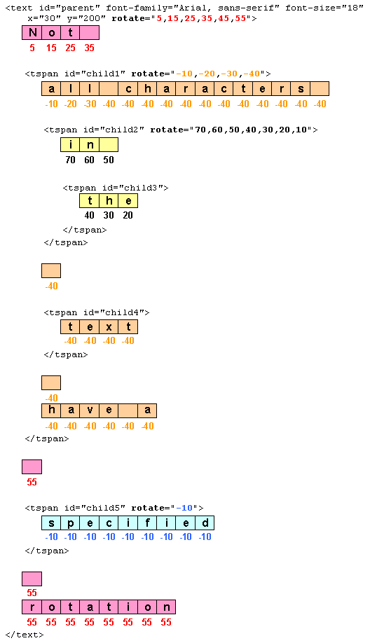
10.6. The ‘tref’ element
The textual content for a ‘text’ can be either character data
directly embedded within the ‘text’ element or the character data
content of a referenced element, where the referencing is specified with a
‘tref’ element.
‘tref’
- Categories:
- Text content element, text content child element
- Content model:
- Any number of the following elements, in any order:animate, script, set
- Attributes:
- aria attributes — ‘aria-activedescendant’, ‘aria-atomic’, ‘aria-autocomplete’, ‘aria-busy’, ‘aria-checked’, ‘aria-controls’, ‘aria-describedat’, ‘aria-describedby’, ‘aria-disabled’, ‘aria-dropeffect’, ‘aria-expanded’, ‘aria-flowto’, ‘aria-grabbed’, ‘aria-haspopup’, ‘aria-hidden’, ‘aria-invalid’, ‘aria-label’, ‘aria-labelledby’, ‘aria-level’, ‘aria-live’, ‘aria-multiline’, ‘aria-multiselectable’, ‘aria-orientation’, ‘aria-owns’, ‘aria-posinset’, ‘aria-pressed’, ‘aria-readonly’, ‘aria-relevant’, ‘aria-required’, ‘aria-selected’, ‘aria-setsize’, ‘aria-sort’, ‘aria-valuemax’, ‘aria-valuemin’, ‘aria-valuenow’, ‘aria-valuetext’, ‘role’
- navigation attributes — ‘tabindex’
- conditional processing attributes — ‘requiredFeatures’, ‘requiredExtensions’, ‘systemLanguage’
- core attributes — ‘id’, ‘xml:base’, ‘xml:lang’, ‘xml:space’
- graphical event attributes — ‘onfocusin’, ‘onfocusout’, ‘onclick’, ‘onmousedown’, ‘onmouseup’, ‘onmouseover’, ‘onmousemove’, ‘onmouseout’, ‘onload’
- presentation attributes —
- style attributes — ‘class’, ‘style’
- xlink attributes — ‘xlink:href’, ‘xlink:show’, ‘xlink:actuate’, ‘xlink:type’, ‘xlink:role’, ‘xlink:arcrole’, ‘xlink:title’
- ‘x’
- ‘y’
- ‘dx’
- ‘dy’
- ‘rotate’
- ‘textLength’
- ‘lengthAdjust’
- ‘xlink:href’
- DOM Interfaces:
10.6.1. Attributes
- xlink:href
-
An IRI reference to an element whose character data
content shall be used as character data for this ‘tref’
element.
- Value
- <iri>
- lacuna value
- As if not specified.
- Animatable
- yes
10.6.2. Notes
All character data within the referenced element, including
character data enclosed within additional markup, will be
rendered.
The ‘x’, ‘y’, ‘dx’, ‘dy’
and ‘rotate’ attributes have the same meanings as for
the ‘tspan’ element. The attributes are applied as if
the ‘tref’ element was replaced by a
‘tspan’ with the referenced character data (stripped of all
supplemental markup) embedded within the hypothetical
‘tspan’ element.
Example tref01 shows how to use
character data from a different element as the character data for
a given ‘tspan’ element. The first ‘text’ element
(with id="ReferencedText") will
not draw because it is part of a ‘defs’ element. The
second ‘text’ element draws the string "Inline character
data". The third ‘text’ element draws the string "Reference
character data" because it includes a ‘tref’ element which
is a reference to element "ReferencedText", and that element's
character data is "Referenced character data".
<?xml version="1.0" standalone="no"?>
<svg width="10cm" height="3cm" viewBox="0 0 1000 300" version="1.1"
     xmlns="http://www.w3.org/2000/svg" xmlns:xlink="http://www.w3.org/1999/xlink">
  <defs>
    <text id="ReferencedText">
      Referenced character data
    </text>
  </defs>
  <desc>Example tref01 - inline vs reference text content</desc>

  <text x="100" y="100" font-size="45" fill="blue" >
    Inline character data
  </text>
  <text x="100" y="200" font-size="45" fill="red" >
    <tref xlink:href="#ReferencedText"/>
  </text>

  <!-- Show outline of canvas using 'rect' element -->
  <rect x="1" y="1" width="998" height="298"
        fill="none" stroke="blue" stroke-width="2" />
</svg>View this example as SVG (SVG-enabled browsers only)
10.7. Text layout – Introduction
This section gives a short overview of SVG text layout. It is
followed by sections that cover different aspects of text layout
in more detail.
Text is first laid out inside a content area.
The content area may be explictly declared by setting the
‘width’ attribute (for horizontal text) or the
‘height’ attribute (for vertical text), or by setting
the ‘shape-inside’ property that defines or references an
SVG shape. If a content area is not declared, it
defaults to a rectangle of infinite width and height. The rules
for text layout within the content area are the same as for
text layout in a
CSS
content area except as noted in this chapter.
After the initial text layout, SVG transforms are applied. These
transforms may shift and/or rotate parts of or all of the
text. The rules for which transforms are allowed depend on if
the content area was explictly declared or not. If not
explicitly declared, the rules define the layout of
pre-formatted text. If declared, the rules define the
layout of auto-wrapped text. In addition, a
‘textPath’ element can convert a single line of
pre-formatted text to text on a path.
Examples of the different types of text follow:
- Pre-formatted:
- For short strings of text (e.g. labels) or where exact
placement of glyphs is required (e.g. hand-kerned titles).
An example of multi-line pre-formatted text.
<svg xmlns="http://www.w3.org/2000/svg">
     width="300" height="100" viewBox="0 0 300 100"

     <text x="20" y="45"
           font-family="sans-serif"
	   font-size="24" >
       Example of multi-line,
       <tspan x="20" y="75">pre-formatted text.</tspan>
     </text>

</svg>
- Wrapped text:
- For long strings of text where automatic text wrapping is
required.
An example of auto-wrapped text.
<svg xmlns="http://www.w3.org/2000/svg">
     width="300" height="100" viewBox="0 0 300 100"

  <text x="20" y="45"
        font-family="sans-serif"
	font-size="24"
	width="250">
    Example of text auto-wrapped.</text>

</svg>
- Text on path:
- For text that follows a specified path.
An example of text on a path.
<svg xmlns="http://www.w3.org/2000/svg">
     xmlns:xlink="http://www.w3.org/1999/xlink"
     width="300" height="100" viewBox="0 0 300 100"

  <path id="MyPath" stroke="lightblue" fill="none"
	d="M 50,50 C 100,0 200,100 250,50"/>

  <text font-family="sans-serif"
	font-size="24">
    <textPath xlink:href="#MyPath">Text on a path.</textPath>
  </text>

</svg>
SVG 2 introduces the ability to automatically wrap text inside a
rectangle or other shape by specifying a content area. The
design of SVG wrapped text is motivated by the desire that SVG
text wrapping be as compatible as possible with text wrapping in
CSS inorder that renderers that support CSS text wrapping can
implement SVG text wrapping easily (but without requiring non-HTML
compatable SVG renderers to implement HTML). There are several
differences between SVG and CSS text wrapping. The most important
is that in SVG, a content area must be explicitly provided
as SVG does not have an automatic finite (or semi-finite)
content area (provided in CSS by the box model). Another
difference is that SVG does not have the <p></p> and
<br/> elements which create line breaks. Instead, SVG relies
on the pre and
pre-line values of
‘white-space’ to provide line breaks. SVG wrapped text also
allows a content-creation tool to provide a natural fallback for
SVG 1.1 renderers that do not support wrapped text (by use of
‘x’ and ‘y’ attributes in the ‘text’ and
‘tspan’ elements, which are ignored by SVG 2 renderers for
auto-wrapped text).
SVG's text layout options are designed to cover most general use
cases. If more complex layout is required (bulleted lists, tables,
etc.), text can be rendered in another XML namespace such as XHTML
[XHTML] embedded inline within a
‘foreignObject’ element. (Note: the exact semantics of
this approach are not completely defined at this time.)
Define semantics of foriegnObject.
10.8. Text layout – Content Area
A content area is defined by specifying in
a ‘text’ element either a ‘width’ attribute
(for horizontal text), a ‘height’ attribute (for
vertical text), or a ‘shape-inside’ property that defines
or references an SVG shape. If no content area is
provided, the content area defaults to a rectangle of
infinite width and height (see the
pre-formatted text section).
An SVG content area corresponds to the content
area defined in the
CSS
box model and in
CSS
Exclusions.
Wrapped text is laid out in a wrapping area. The
wrapping area is normally the same as the content area. It is possible to exclude part of the content area by defining a wrapping context using
the ‘shape-outside’ property. The wrapping area then
is defined by subtracting the wrapping context from
the content area. When the content area is defined
using the ‘shape-inside’ property, the wrapping area
can be reduced by the value of the ‘shape-padding’
property.
The terms wrapping area and wrapping context are
defined in
CSS
Exclusions.
10.8.1. The 'width' and/or 'height' attributes
There are three possible ways to define a content area using the
‘text’ element attributes ‘width’ and
‘height’:
- ‘width’ only
-
For horizontal text, specifies a width for a
"rectangular" content area of infinite height.
For left-to-right text, the initial current text position is at the left of the rectangle. For
right-to-left text it is at the right of the rectangle.
For vertical text, it is ignored.
- ‘height’ only
-
For vertical text specifies, a height for a
"rectangular" content area of infinite width. The
initial current text position is at the top of the
rectangle.
For horizontal text, it is ignored.
- ‘height’ and ‘width’
-
For both horizontal and vertical text, specifies a height and
with for a "rectangular" content area.
This is really, really ugly due to the normal positioning of
the initial current text position. We could avoid the issue
of shifting x and y (e.g. using baseline='text-before-edge')
by not allowing this option. It is trivial to define a
rectangluar box content area using
shape-inside="rectangle(x,y,width,height)" as shown in
the example in the ‘shape-inside’ section.
In all cases, the initial current text position is taken
from the ‘x’ and ‘y’ attributes of
the ‘text’ element.
An example of using ‘width’ for wrapping horizontal text.
<svg xmlns="http://www.w3.org/2000/svg"
     width="300" height="100" viewBox="0 0 300 100">

  <text x="50" y="30" width="200"
        font-family="sans-serif"
	font-size="20px" >This text wraps at 200 pixels.</text>

</svg>
An example of using ‘width’ for wrapping right to left horizontal text.
<svg xmlns="http://www.w3.org/2000/svg"
     width="300" height="100" viewBox="0 0 300 100">

  <text x="250" y="30" width="200"
	writing-mode="rl-tb"
        font-family="PakType Naqsh"
	font-size="20px" >هذا النص يلتف في 200 بكسل.</text>

</svg>
Check Arabic text.
None of the browsers render this SVG 1.1 figure
correctly. Only Batik seems to get it right.
An example of using ‘height’ for wrapping vertical text.
<svg xmlns="http://www.w3.org/2000/svg"
     width="100" height="300" viewBox="0 0 100 300">

  <text x="62.5" y="25" height="200"
	writing-mode="tb-rl"
        font-family="IPAMincho"
	font-size="25px" >テキストは10文字後に折り返されます。</text>

</svg>
This SVG image doesn't work in Firefox, even nightly.
Check translation.
10.8.2. The ‘shape-inside’ property
The ‘shape-inside’ property allows one to set the
content area to a CSS basic shape or to an
SVG shape.
In CSS/HTML ‘shape-inside’ applies to block-level elements
and absolute and percentage values are defined relative to the
block-level element.
In SVG absolute and percentage values are defined relative to the
current user coordinate system and the ‘viewBox’.
The values 'outside-shape' and 'auto' are probably not useful in SVG.
A new value of 'none' is probably needed for SVG. This would indicate
that the text should be rendered using a 'width' and/or 'height' attribute,
or absent those attributes, as pre-formatted text.
| Name: |
shape-inside |
| Value: |
none | <basic-shape> | <uri> |
| Initial: |
none |
| Applies to: |
‘text’ elements |
| Inherited: |
no |
| Percentages: |
N/A |
| Media: |
visual |
| Computed value: |
computed lengths for <shape>, the absolute URI for <uri>, otherwise as specified |
| Animatable: |
yes, see Interpolation of Basic Shapes |
- outside-shape
-
The shape is computed based on the computed value of the ‘shape-outside’ property.
This value is probably not useful.
- auto
-
The shape is computed based on the content box of the element.
This value is probably not useful.
- <basic-shape>
-
The shape is computed based on the values of one of
‘rectangle’,‘ circle’, ‘ellipse’ or ‘polygon’.
An example of using a CSS basic-shape for wrapping horizontal text.
<svg xmlns="http://www.w3.org/2000/svg"
     width="300" height="100" viewBox="0 0 300 100">

  <text shape-inside="rectangle(50,10,200,80)"
	font-family="sans-serif"
	font-size="20px" >This text wraps in a rectangle.</text>

</svg>
Shapes also defines 'inset-rectangle'. It might be
interesting to be able to write:
<rect ...>
  <text shape-inside="inset-rectangle(20px,10px,20px,10px)">...</text>
</rect>
where the insets are based on the rectangle geometry (or
the bounding-box before any transformation).
- <uri>
-
If the <uri> references an SVG shape element,
that element defines the shape. Otherwise, if the <uri>
references an image, the shape is extracted and computed based
on the alpha channel of the specified image. If the
<uri> does not reference an SVG shape element or an
image, the effect is as if the value ‘auto’ had been
specified.
Check if we allow referencing an image. There
are security issues. If we allow it, then the
'shape-image-threshold' property is also required.
An example of using a reference to an SVG shape for wrapping horizontal text.
<svg xmlns="http://www.w3.org/2000/svg"
     width="300" height="100" viewBox="0 0 300 100">

  <defs>
    <rect id="wrap" x="50" y="10" width="200" height="80"/>
  </defs>

  <text shape-inside="url(#wrap)"
	font-family="sans-serif"
	font-size="20px" >This text wraps in a rectangle.</text>

</svg>
Except as noted, see the CSS Shapes Module Level 2 for the definition of
'shape-inside'.
[CSSXX]
'shape-inside' was removed when the CSS Exclusions and Shapes
Module was split into separate Exclusions and Shapes modules. At
the Tokyo joint SVG/CSS F2F meeting, it was agreed that it would
reappear in CSS Shapes Module Level 2.
10.8.3. The ‘shape-outside’ property
The ‘shape-outside’ property allows one to exclude part of
the content area from the wrapping area. The
exclusion can be a CSS basic shape or to an
SVG shape.
In CSS/HTML ‘shape-outside’ applies to floats and
absolute and percentage values are defined relative to the
float.
In SVG absolute and percentage values are defined relative to the
current user coordinate system and the ‘viewBox’.
We could use the content area.
The value 'auto' is probably not useful in SVG.
A new value of 'none' is probably needed in which case
the property is ignored.
| Name: |
shape-outside |
| Value: |
none | <basic-shape> | <uri> |
| Initial: |
none |
| Applies to: |
‘text’ elements |
| Inherited: |
no |
| Percentages: |
N/A |
| Media: |
visual |
| Computed value: |
computed lengths for <basic-shape>, the absolute URI for <uri>, otherwise as specified |
| Animatable: |
yes, see Interpolation of Basic Shapes |
- <basic-shape>
-
The shape is computed based on the values of one of
‘rectangle’,‘ circle’, ‘ellipse’ or ‘polygon’.
- <uri>
-
If the <uri> references an SVG shape element,
that element defines the shape. Otherwise, if the <uri>
references an image, the shape is extracted and computed based
on the alpha channel of the specified image. If the
<uri> does not reference an SVG shape element or an
image, the effect is as if the value ‘auto’ had been
specified.
Check if we allow referencing an image. There are security
issues. If we allow it, then the 'shape-image-threshold'
property is also required.
An example of using ‘shape-outside’.
.
<svg xmlns="http://www.w3.org/2000/svg"
     width="450" height="300" viewBox="0 0 450 300">

  <rect id="rect1" x="25"  y="25"  width="225" height="175" fill="white" stroke="black"/>
  <rect id="rect2" x="200" y="125" width="225" height="150" fill="white" stroke="black"/>

  <text shape-inside="url(#rect1)"
	shape-outside="url(#rect2)"
	shape-padding="25"
	shape-margin="25"
        font-family="DejaVu Sans"
	font-size="12px"
	text-align="justified"
	line-height="110%">Lorem ipsum ...</text>
  <text shape-inside="url(#rect2)"
	shape-padding="25"
        font-family="DejaVu Sans"
	font-size="12px"
	text-align="justified"
	line-height="110%">Lorem ipsum ...</text>
</svg>
Except as noted, see the CSS Shapes Module Level 1 for the definition of
'shape-outside'.
[CSSXX]
10.8.4. The ‘shape-margin’ property
The ‘shape-margin’ property adds a margin to a
‘shape-outside’. This defines a new shape where every
point is the specified distance from the shape-outside. This
property takes on positive values only.
| Name: |
shape-margin |
| Value: |
<length> |
| Initial: |
0 |
| Applies to: |
‘text’ elements |
| Inherited: |
no |
| Percentages: |
N/A |
| Media: |
visual |
| Computed value: |
the absolute length |
| Animatable: |
yes |
Except as noted, see the CSS Shapes Module Level 1 for the definition of
See 'shape-margin'.
[CSSXX]
10.8.5. The ‘shape-padding’ property
The ‘shape-padding’ property can be used to offset the
inline flow content wrapping on the inside of elements. Offsets
created by the ‘wrap-padding’ property are offset from the content
area of the element. This property takes on positive values only.
An example of using ‘shape-padding’
.
<svg xmlns="http://www.w3.org/2000/svg"
     width="300" height="300" viewBox="0 0 300 300">

  <circle id="circle" cx="150" cy="150" r="125" fill="none" stroke="black"/>
  <text shape-inside="url(#circle)"
	shape-padding="25"
        font-family="DejaVu Sans"
	font-size="18px"
	text-align="justified"
	line-height="110%">This is an example of
  wrapped text in SVG 2! There should be 25
  pixel pixel around the text. The text is
  justified on both sides. It looks good!</text>

</svg>
This image is a PNG. Figure out how to make a good SVG.
Except as noted, see the CSS Shapes Module Level 2 for the definition of
'shape-padding'
(wrap-padding renamed to shape-padding).
10.9. Text layout – Directions
This section describes the text layout rules that govern direction
of text flow inside a content area in order to support
various international writing directions, such as left-to-right
(e.g., Latin scripts) and bidirectional (e.g., Hebrew or Arabic),
and vertical (e.g., Asian scripts).
We cannot simply reference CSS 2 as it doesn't include the
‘writing-mode’ property. The
CSS Writing
Modes Module Level 3 spec does include ‘writing-mode’
but its definition is a bit different from SVG 1.1. The spec also
has a different structure, putting 'direction' and 'unicode-bidi'
before 'writing-mode'.
10.9.1. Layout Orientations
For each ‘text’ element, the SVG user agent determines the
current reference orientation. For standard horizontal
or vertical text (i.e., not text-on-a-path), the reference
orientation is the vector pointing towards negative infinity in Y
within the current user coordinate system. (Note: in
the initial coordinate system, the reference orientation is
up.) For text on a path,
the reference orientation is determined at each character's
position along the path. It is 90 degrees counter-clockwise
relative to the path direction for horizontal text and 180 degrees
relative to the path direction for vertical text.
In the model that text-on-a-path is text that is
first layed out according to CSS and then warped along a path, we
can get rid of the distinction made above.
Based on the reference orientation and the value for
property ‘writing-mode’, the SVG user agent determines the
current inline-progression-direction. For left-to-right
text, the inline-progression-direction points 90 degrees clockwise
from the reference orientation vector. For right-to-left text, the
inline progression points 90 degrees counter-clockwise from the
reference orientation vector. For top-to-bottom text, the
inline-progression-direction points 180 degrees from the reference
orientation vector.
Based on the reference orientation and the value for
property ‘writing-mode’, the SVG user agent determines the
current block-progression-direction. For left-to-right
and right-to-left text, the block-progression-direction points 180
degrees from the reference orientation vector because the only
available horizontal ‘writing-mode’s
are lr-tb
and rl-tb. For top-to-bottom text,
the block-progression-direction always points 90 degrees
counter-clockwise from the reference orientation vector because
the only available top-to-bottom ‘writing-mode’
is tb-rl.
Insert figure.
The shift direction is the
direction towards which the
baseline table moves due
to positive values for property ‘baseline-shift’. The shift
direction is such that a positive value shifts the baseline table
towards the topmost entry in the parent's
baseline table.
10.9.1.1. The inline-progression-direction: the ‘writing-mode’ property
Do we align with CSS Writing Modes Module Level 3? In CSS3,
inline progression direction is separated from block progression
direction. The CSS Writing Modes Module redefines
'writing-mode'. Note: SVG does not have tb-lr required
for Mongolian.
- SVG 1.1: lr-tb | rl-tb | tb-rl | lr | rl | tb
- CSS Writing Modes: horizontal-tb | vertical-rl | vertical-lr
See: CSS Issue-183
The ‘writing-mode’ property specifies whether the initial
inline-progression-direction for a ‘text’ element shall be
left-to-right, right-to-left, or top-to-bottom. The
‘writing-mode’ property applies only to ‘text’
elements; the property is ignored for ‘tspan’, ‘tref’,
‘altGlyph’, and ‘textPath’ sub-elements. (Note that
the inline-progression-direction can change within a ‘text’
element due to the Unicode bidirectional algorithm and
properties ‘direction’ and ‘unicode-bidi’. For more on
bidirectional text, see
Relationship
with bidirectionality.)
| Name: |
writing-mode |
| Value: |
lr-tb | rl-tb | tb-rl | lr | rl | tb |
| Initial: |
lr-tb |
| Applies to: |
‘text’ elements |
| Inherited: |
yes |
| Percentages: |
N/A |
| Media: |
visual |
| Computed value: |
|
| Animatable: |
no |
- lr-tb | lr
-
Sets the initial inline-progression-direction to left-to-right,
as is common in most Latin-based documents. For most
characters, the current text position is advanced from
left to right after each glyph is rendered. (When the character
data includes characters which are subject to the Unicode
bidirectional algorithm, the text advance rules are more
complex. See Relationship
with bidirectionality).
- rl-tb | rl
-
Sets the initial inline-progression-direction to
right-to-left, as is common in Arabic or Hebrew scripts. (See
Relationship
with bidirectionality.)
- tb-rl | tb
-
Sets the initial inline-progression-direction to top-to-bottom,
as is common in some Asian scripts, such as Chinese and
Japanese. Though hardly as frequent as horizontal, this type of
vertical layout also occurs in Latin based documents,
particularly in table column or row labels. In most cases, the
vertical baselines running through the middle of each glyph are
aligned.
10.9.2. Relationship with bidirectionality
The characters in certain scripts are written from right to
left. In some documents, in particular those written with the
Arabic or Hebrew script, and in some mixed-language contexts, text
in a single line may appear with mixed directionality. This
phenomenon is called bidirectionality, or "bidi" for short.
The Unicode standard
([UNICODE], specifically
[UAX9]) defines a complex
algorithm for determining the proper directionality of text. The
algorithm consists of an implicit part based on character
properties, as well as explicit controls for embeddings and
overrides. The SVG user agent applies this bidirectional
algorithm when determining the layout of characters within a
text content block element.
The ‘direction’ and ‘unicode-bidi’ properties allow
authors to override the inherent directionality of the content
characters and thus explicitly control how the elements and
attributes of a document language map to this algorithm. These two
properties are applicable to all characters whose glyphs are
perpendicular to the inline-progression-direction.
In many cases, the bidirectional algorithm from Unicode
[UNICODE] produces the desired
result automatically, and in such cases the author does not need
to use these properties. For other cases, such as when using
right-to-left languages, it may be sufficient to add the
‘direction’ property to the rootmost ‘svg’ element,
and allow that direction to inherit to all text elements, as in the
following example (which may be used as a template):
<svg xmlns="http://www.w3.org/2000/svg"
     width="100%" height="100%" viewBox="0 0 400 400"
     direction="rtl" xml:lang="fa">

  <title direction="ltr" xml:lang="en">Right-to-left Text</title>
  <desc direction="ltr" xml:lang="en">
    A simple example for using the 'direction' property in documents
    that predominantly use right-to-left languages.
  </desc>

  <text x="200" y="200" font-size="20">داستان SVG 1.1 SE طولا ني است.</text>

</svg>View this example as SVG (SVG-enabled browsers only)
Is the PNG image above correct? Shouldn't the period be on the
other side?
Below is another example, where where implicit bidi reordering is not sufficient:
<?xml version="1.0" encoding="utf-8"?>
<svg xmlns="http://www.w3.org/2000/svg"
width="100%" height="100%" viewBox="0 0 400 400"
direction="rtl" xml:lang="he">
<title direction="ltr" xml:lang="en">Right-to-left Text</title>
<desc direction="ltr" xml:lang="en">
An example for using the 'direction' and 'unicode-bidi' properties
in documents that predominantly use right-to-left languages.
</desc>
<text x="200" y="200" font-size="20"> כתובת
MAC:‏
<tspan direction="ltr" unicode-bidi="embed">00-24-AF-2A-55-FC</tspan>
</text>
</svg>View this example as SVG (SVG-enabled browsers only)
Within text content elements, the alignment of text with
regards to the ‘text-anchor’ property is determined by the
value of the ‘direction’ property. For example, given
a ‘text’ element with a ‘text-anchor’ value
of "end", for a ‘direction’
value of "ltr", the text will
extend to the left of the position of the ‘text’
element's ‘x’ attribute value, while for
‘direction’ value of "rtl",
the text will extend to the right of the position of the
‘text’ element's ‘x’ attribute value.
A more complete discussion of bidirectionality can be found in the
Text
direction section of CSS 2.1
([CSS21], section 9.10).
The processing model for bidirectional text is as follows. The
user agent processes the characters which are provided in
logical order (i.e., the order the characters appear in
the original document, either via direct inclusion or via indirect
reference due a ‘tref’ element). The user agent determines
the set of independent blocks within each of which it should apply
the Unicode bidirectional algorithm. Each
text chunk represents an
independent block of text. Additionally, any change in glyph
orientation due to processing of properties
‘glyph-orientation-horizontal’ or
‘glyph-orientation-vertical’ will subdivide the independent
blocks of text further. After processing the Unicode bidirectional
algorithm and properties ‘direction’ and
‘unicode-bidi’ on each of the independent text blocks, the
user agent will have a potentially re-ordered list of characters
which are now in left-to-right rendering order. Simultaneous with
re-ordering of the characters, the ‘dx’,
‘dy’, and ‘rotate’ attributes on the
‘tspan’ and ‘tref’ elements are also re-ordered to
maintain the original correspondence between characters and
attribute values. While kerning or ligature processing might be
font-specific, the preferred model is that kerning and ligature
processing occurs between combinations of characters or glyphs
after the characters have been re-ordered.
10.9.2.1. The ‘direction’ property
| Name: |
direction |
| Value: |
ltr | rtl |
| Initial: |
ltr |
| Applies to: |
text content elements |
| Inherited: |
yes |
| Percentages: |
N/A |
| Media: |
visual |
| Computed value: |
|
| Animatable: |
no |
This property specifies the base writing direction of text and the
direction of embeddings and overrides (see ‘unicode-bidi’)
for the Unicode bidirectional algorithm. For
the ‘direction’ property to have any effect on an element
that does not by itself establish a
new text chunk (such as
a ‘tspan’ element without absolute position adjustments due
to ‘x’ or ‘y’ attributes),
the ‘unicode-bidi’ property's value must
be embed
or bidi-override.
Except for any additional information provided in this
specification, the
normative
definition of the ‘direction’ property is in CSS 2.1
([CSS21], section 9.10).
The ‘direction’ property applies only to glyphs oriented
perpendicular to the
inline-progression-direction,
which includes the usual case of horizontally-oriented Latin or
Arabic text and the case of narrow-cell Latin or Arabic characters
rotated 90 degrees clockwise relative to a top-to-bottom
inline-progression-direction.
10.9.2.2. The ‘unicode-bidi’ property
| Name: |
unicode-bidi |
| Value: |
normal | embed | bidi-override |
| Initial: |
normal |
| Applies to: |
text content elements |
| Inherited: |
no |
| Percentages: |
N/A |
| Media: |
visual |
| Computed value: |
|
| Animatable: |
no |
Except for any additional information provided in this
specification, the
normative
definition of the ‘unicode-bidi’ property is in CSS 2.1
([CSS21], section 9.10).
10.9.3. Glyph orientation within a text run
CSS Writing Modes Module Level 3 replaces
'glyph-orientation-vertical' with
'text-orientation'
but does not provide a replacement for 'glyph-orientation
horizontal'. There is, however, a value 'use-glyph-orientation',
only valid for SVG, which directs an implementation to use the
values of 'glyph-orientation-veritical' and
'glyph-orientation-horizontal'. Note that this value is marked
as at risk.
In some cases, it is required to alter the orientation of a
sequence of characters relative to the
inline-progression-direction. The requirement is particularly
applicable to vertical layouts of East Asian documents, where
sometimes narrow-cell Latin text is to be displayed horizontally
and other times vertically.
Two properties control the glyph orientation relative to the
reference orientation for each of the two possible
inline-progression-directions. ‘glyph-orientation-vertical’
controls glyph orientation when the inline-progression-direction
is vertical. ‘glyph-orientation-horizontal’ controls glyph
orientation when the inline-progression-direction is horizontal.
10.9.3.1. The ‘glyph-orientation-vertical’ property
Reference CSS3 text? CSS3 has additional values: upright, inline.
- auto
-
-
Fullwidth ideographic and fullwidth Latin text will be set
with a glyph-orientation of 0-degrees.
Ideographic punctuation and other ideographic characters
having alternate horizontal and vertical forms will use
the vertical form of the glyph.
-
Text which is not fullwidth will be set with a
glyph-orientation of 90-degrees.
This reorientation rule applies only to the first-level
non-ideographic text. All further embedding of
writing-modes or bidi processing will be based on the
first-level rotation.
-
This is equivalent to having set the
non-ideographic text string horizontally honoring
the bidi-rule, then rotating the resultant
sequence of inline-areas (one area for each
change of glyph direction) 90-degrees
clockwise.
It should be noted that text set in this
"rotated" manner may contain ligatures or other
glyph combining and reordering common to the
language and script. (This "rotated" presentation
form does not disable auto-ligature formation or
similar context-driven variations.)
-
The determination of which characters should be
auto-rotated may vary across user agents. The
determination is based on a complex interaction
between country, language, script, character
properties, font, and character context. It is
suggested that one consult the Unicode TR 11 and the
various JIS or other national standards.
- <angle>
- <number>
-
The glyph orientation angle. A value specified as a
<number> is interpreted as an angle in degrees.
The value of the angle is restricted to 0, 90, 180, and 270
degrees. The user agent shall round the value of the angle to
the closest of the permitted values.
A value of 0deg indicates that
all glyphs are set with the top of the glyphs oriented towards
the reference
orientation. A value
of 90deg indicates an
orientation of 90 degrees clockwise from
the reference
orientation.
This property is applied only to text written in a vertical
‘writing-mode’.
The glyph orientation affects the amount that the current text
position advances as each glyph is rendered. When the
inline-progression-direction is vertical and the
‘glyph-orientation-vertical’ results in an orientation
angle that is a multiple of 180 degrees, then the current text
position is incremented according to the vertical metrics of the
glyph. Otherwise, if the ‘glyph-orientation-vertical’
results in an orientation angle that is not a multiple of 180
degrees, then the current text position is incremented according
to the horizontal metrics of the glyph.
The text layout diagrams in this section use the following symbols:
 |
wide-cell glyph (e.g. Han) which is the n-th glyph in the text run |
|---|
 |
narrow-cell glyph (e.g. Latin) which is the n-th glyph in the text run |
|---|
The orientation which the above symbols assume in the diagrams
corresponds to the orientation that the Unicode characters they
represent are intended to assume when rendered in the user
agent. Spacing between the glyphs in the diagrams is usually
symbolic, unless intentionally changed to make a point.
The diagrams below illustrate different uses of
‘glyph-orientation-vertical’. The diagram on the left shows
the result of the mixing of full-width ideographic glyphs with
narrow-cell Latin glyphs when ‘glyph-orientation-vertical’
for the Latin characters is either
auto or
90. The diagram on the right show
the result of mixing full-width ideographic glyphs with
narrow-cell Latin glyphs when Latin glyphs are specified to have
a ‘glyph-orientation-vertical’ of
0.


10.9.3.2. The ‘glyph-orientation-horizontal’ property
Reference CSS3 text? CSS3 has additional values: auto, inline.
- <angle>
- <number>
- The glyph orientation angle. A value specified as a
<number> is interpreted as an angle in degrees.
The value of the angle is restricted to 0, 90, 180, and
270 degrees. The user agent shall round the value of the
angle to the closest of the permitted values.
A value of 0deg indicates
that all glyphs are set with the top of the glyphs oriented
towards the reference
orientation. A value of 90deg indicates an orientation of
90 degrees clockwise from the reference
orientation.
This property is applied only to text written in a
horizontal ‘writing-mode’.
The glyph orientation affects the amount that the current text
position advances as each glyph is rendered. When the reference
orientation direction is horizontal and the
‘glyph-orientation-horizontal’ results in an orientation
angle that is a multiple of 180 degrees, then the current text
position is incremented according to the horizontal metrics of the
glyph. Otherwise, if the ‘glyph-orientation-horizontal’
results in an orientation angle that is not a multiple of 180
degrees, then the current text position is incremented according
to the vertical metrics of the glyph.
10.10. Text layout – Positioning
Current text position is referred to throughout the document
(almost 100 times!).
The idea of current text position needs to be reconciled with
CSS inline boxes. See:
CSS-Inline as
well as with the idea that text is laid out first using CSS rules
and then tranformed, if necessary, with SVG rules.
The section covers the general rules for positiong glyphs. In SVG,
the first step in positioning a glyph is to find its inline
position which is determined by the current text position. Next, the glyph is aligned relative to a particular
baseline.
Once a glyph is positioned, the current text position is
advanced and the next glyph is placed.
10.10.1. Current text position
In processing a given ‘text’ element, the SVG user agent
keeps track of the current text position. The initial
current text position is established by the ‘x’
and ‘y’ attributes on the ‘text’ element for
pre-formatted and in some cases for auto-wrapped text.
FIX FOR AUTO-WRAPPED TEXT IN SHAPE
The current text position is adjusted after each glyph to
establish a new current text position at which the next glyph
shall be rendered. The adjustment to the current text position is
based on:
If a glyph does not provide explicit advance values corresponding
to the current glyph
orientation, then an appropriate approximation should be
used. For vertical text, a suggested approximation is the sum of
the ascent and descent values for the glyph. Another suggested
approximation for an advance value for both horizontal and
vertical text is the size of an em (see
units-per-em).
For each glyph to be rendered, the SVG user agent determines an
appropriate alignment-point on the glyph which will be
placed exactly at the current text position. The alignment-point is
determined based on glyph cell metrics in the glyph itself, the
current inline-progression-direction
and the glyph orientation
relative to the inline-progression-direction. For example, in most
uses of pre-formatted Latin text (i.e.,
writing-mode:lr,
text-anchor:start, and
alignment-baseline:baseline)
the alignment-point in the glyph will be the intersection of left
edge of the glyph cell (or some other glyph-specific x-axis
coordinate indicating a left-side origin point) with the Latin
baseline of the glyph. For many cases with top-to-bottom vertical
text layout, the reference point will be either a glyph-specific
origin point based on the set of vertical baselines for the font
or the intersection of the center of the glyph with its top
line
(see
top
baseline; in
[CSS3LINEBOX], section
4.2).
If a glyph does not provide explicit origin points corresponding
to the current glyph
orientation, then an appropriate approximation should be used,
such as the intersection of the left edge of the glyph with the
appropriate horizontal baseline for the glyph or intersection of
the top edge of the glyph with the appropriate vertical
baseline. If baseline tables are not available, user agents should
establish baseline tables that reflect common practice.
The distinction between absolute and relative position adjustments
seems mostly made to define text chunks. 'x' and 'y' attributes
are ignored for wrapped text and partially ignored for text on a
path. Does this impact text chunks? How are new lines (either
manual or auto) handled?
Once all the glyphs in a ‘text’ element are laid out
according to the above rules, the position of the glyphs maybe
adjusted according to SVG specific rules.
Adjustments to the current text position are either
absolute position adjustments or
relative position
adjustments. An absolute position adjustment occurs in the
following circumstances:
- At the start of a ‘text’ element
- At the start of each ‘textPath’ element
- For each character within a ‘text’, ‘tspan’,
‘tref’ and ‘altGlyph’ element which for
pre-formatted text has an explicit
‘x’ or
‘y’ value,
or for text on a path has an explicit
‘x’ value if horizontal or
‘y’ value if vertical.
All other position adjustments to the current text position are
relative position adjustments.
Each absolute position adjustment defines a new
text chunk. Absolute position adjustments impact text
layout in the following ways:
-
Ligatures only occur when a set of characters which might map
to a ligature are all in the same text chunk.
-
Each text chunk represents a separate block of text for
alignment due to ‘
text-anchor’ property values.
-
Reordering of characters due to
bidirectionality
only occurs within a text chunk. Reordering does not
happen across text chunks.
The following additional rules apply to ligature formation:
-
As defined
in CSS 2.1, ([CSS21],
section 16.4), when the resultant space between two characters
is not the same as the default space, user agents should not
use ligatures; thus, if there is a non-default value for
‘
letter-spacing’, the user agent should not use
ligatures.
-
Ligature formation should not be enabled for the glyphs
corresponding to characters within different DOM text nodes;
thus, characters separated by markup should not use ligatures.
-
As mentioned above, ligature formation should not be
enabled for the glyphs corresponding to characters within
different text chunks.
10.10.2. White Space
New in SVG 2. Added ‘white-space’ to allow a more useful
way to control whitespace handling. Aligns SVG and HTML/CSS text
processing. ‘xml:space’ deprecated in new content, retained
for backwards compatibility.
10.10.2.1. SVG 2 Preferred white space handling, the ‘white-space’ property
Rendering of white space in SVG 2 is controlled by the ‘white-space’
property. This specifies two things:
- whether and how white space inside the element is collapsed
- whether lines may wrap at unforced soft wrap opportunities
| Name: |
white-space |
| Value: |
normal | pre | nowrap | pre-wrap | pre-line |
| Initial: |
not defined for shorthand properties |
| Applies to: |
text content elements |
| Inherited: |
yes |
| Percentages: |
N/A |
| Media: |
visual |
| Computed value: |
see individual properties |
| Animatable: |
yes |
Values and their meanings are defined in
[CSS3
Text].
An example of using the ‘white-space’
value pre-line.
<svg xmlns="http://www.w3.org/2000/svg">
     width="200" height="200" viewBox="0 0 200 200">

     <text x="150" y="30"
           font-family="IPAMincho"
	   font-size="20px"
	   writing-mode="tb-rl"
	   white-space="pre-line">千利奴流乎和加
                                  餘多連曽津祢那
                                  良牟有為能於久
                                  耶万計不己衣天
                                  阿佐伎喩女美之
                                  恵比毛勢須</text>
</svg>
10.10.2.2. Legacy whitespace handling, the ‘xml:space’ property
For compatibility, SVG 2 also supports the XML attribute
‘xml:space’ to specify the handling of white space
characters within a given ‘text’ element's character
data. New content should not use ‘xml:space’ but
instead, use the ‘white-space’ property.
Note that any child element of a ‘text’ element may also
have an ‘xml:space’ attribute which will apply to that
child element's text content. The SVG user agent has special
processing rules associated with this attribute as described
below. These are behaviors that occur subsequent to XML parsing
[XML10]
and any construction of a DOM.
‘xml:space’ is an inheritable attribute which can have one of
two values:
- 'default'
-
(The initial/default value for ‘xml:space’.) When
xml:space="default", the SVG
user agent will do the following using a copy of the original
character data content. First, it will remove all newline
characters. Then it will convert all tab characters into space
characters. Then, it will strip off all leading and trailing
space characters. Then, all contiguous space characters will be
consolidated.
- 'preserve'
-
When xml:space="preserve", the
SVG user agent will do the following using a copy of the
original character data content. It will convert all newline and
tab characters into space characters. Then, it will draw all
space characters, including leading, trailing and multiple
contiguous space characters. Thus, when drawn with
xml:space="preserve", the string
"a b" (three spaces between "a"
and "b") will produce a larger separation between "a" and "b"
than "a b" (one space between "a" and "b").
The following example illustrates that line indentation can be
important when using
xml:space="default". The fragment
below show two pairs of similar ‘text’ elements, with
both ‘text’ elements using
xml:space="default". For
these examples, there is no extra white space at the end of any of
the lines (i.e., the line break occurs immediately after the last
visible character).
[01]  <text xml:space='default'>
[02]    WS example
[03]    indented lines
[04]  </text>
[05]  <text xml:space='preserve'>WS example indented lines</text>
[06]
[07]  <text xml:space='default'>
[08]WS example
[09]non-indented lines
[10]  </text>
[11]  <text xml:space='preserve'>WS examplenon-indented lines</text>
The first pair of ‘text’ elements above show the
effect of indented character data. The attribute
xml:space="default" in the first
‘text’ element instructs the user agent to:
- convert all tabs (if any) to space characters,
- strip out all line breaks (i.e., strip out the line
breaks at the end of lines [01], [02] and [03]),
- strip out all leading space characters (i.e., strip out
space characters before "WS example" on line [02]),
- strip out all trailing space characters (i.e., strip out
space characters before "</text>" on line [04]),
- consolidate all intermediate space characters (i.e., the
space characters before "indented lines" on line [03]) into a
single space character.
The second pair of ‘text’ elements above show the
effect of non-indented character data. The attribute
xml:space="default" in the third
‘text’ element instructs the user agent to:
- convert all tabs (if any) to space characters,
- strip out all line breaks (i.e., strip out the line
breaks at the end of lines [07], [08] and [09]),
- strip out all leading space characters (there are no
leading space characters in this example),
- strip out all trailing space characters (i.e., strip out
space characters before "</text>" on line [10]),
- consolidate all intermediate space characters into a
single space character (in this example, there are no
intermediate space characters).
Note that XML parsers are required to convert the standard
representations for a newline indicator (e.g., the literal
two-character sequence "#xD#xA" or the stand-alone literals #xD or
#xA) into the single character #xA before passing character data
to the application. Thus, each newline in SVG will be represented
by the single character #xA, no matter what representation for
newlines might have been used in the original resource. (See
XML
end-of-line handling.)
Any features in the SVG language or the SVG DOM that are based
on character position number, such as the ‘x’,
‘y’, ‘dx’, ‘dy’ and
‘rotate’ attributes on the ‘text’, ‘tspan’,
‘tref’ and ‘altGlyph’ elements, are based on
character position after applying the white space handling rules
described here. In particular,
if xml:space="default", it is
often the case that white space characters are removed as part of
processing. Character position numbers index into the text string
after the white space characters have been removed per the rules
in this section.
Note that a glyph corresponding to a whitespace character should
only be displayed as a visible but blank space, even if the glyph
itself happens to be non-blank.
See display
of unsupported characters
[UNICODE].
The ‘xml:space’ attribute is:
Animatable:
no.
10.10.2.3. Duplicate whitespace directives
Older, SVG 1.1 content will use ‘xml:space’. New content,
and older content that is being reworked, will use
‘white-space’ and remove any existing
‘xml:space’. However, user agents may come across content
which uses both methods on the same element. If
the ‘white-space’ property is set on any element, then the
value of ‘xml:space’ is ignored.
10.10.2.4. Tab character size: the ‘tab-size’ property
See the CSS Text Module Level 3 specification for the definition
of 'tab-size'.
[CSSXX]
10.10.3. Line spacing, the ‘line-height’ property
New in SVG 2.
Added for multi-line pre-formatted and auto-wrapped text. Aligns SVG and HTML/CSS
text processing.
SVG uses the ‘line-height’ property to determine the amount
of leading space which is added between lines in multi-line text
(both horizontal and vertical). It is not applicable to text on a
path.
Is this correct for vertical text?
See the CSS2.1 specification for the definition of
'line-height'.
[CSS21]
See the CSS Line Layout Module 3 specification for the definition
of
'line-height'.
[CSS3LINEBOX]
CSS 3 adds the value 'none'.
10.10.4. Spacing within lines
Two properties affect the space between characters and words:
-
‘
letter-spacing’ indicates an amount of space that is
to be added between text characters.
-
‘
word-spacing’ indicates the spacing behavior between words.
Note that the ‘kerning’ property
from SVG 1.1 has been removed in favor of using
‘letter-spacing’ to add or remove spacing between glyphs
and the ‘font-kerning’ property to
disable kerning based on information from the font.
We need to require ‘font-kerning’.
10.10.4.1. The ‘letter-spacing’ property
| Name: |
'letter-spacing' |
| Value: |
normal | <length> |
| Initial: |
normal |
| Applies to: |
text content elements |
| Inherited: |
yes |
| Percentages: |
N/A |
| Media: |
visual |
| Computed value: |
'normal' or absolute length |
| Animatable: |
yes |
This property specifies spacing behavior between text characters.
For SVG, if a <length> is
provided without a unit identifier (e.g., an unqualified number
such as 128), the SVG user agent
processes the <length> as a
width value in the current user coordinate system.
If a <length> is provided
with one of the unit identifiers
(e.g., .25em
or 1%), then the SVG user agent
converts the <length> into a
corresponding value in the current user coordinate system by
applying the rules described
in Units.
Except for any additional information provided in this
specification, the
normative
definition of the property is in CSS 2.1
([CSS21], section 16.4).
10.10.4.2. The ‘word-spacing’ property
| Name: |
word-spacing |
| Value: |
normal | <length> |
| Initial: |
normal |
| Applies to: |
text content elements |
| Inherited: |
yes |
| Percentages: |
N/A |
| Media: |
visual |
| Computed value: |
for 'normal' the value '0'; otherwise the absolute length |
| Animatable: |
yes |
This property specifies spacing behavior between words. For SVG,
if a <length> is provided
without a unit identifier (e.g., an unqualified number such
as 128), the SVG user agent
processes the <length> as a
width value in the current user coordinate system.
If a <length> is provided
with one of the unit identifiers
(e.g., .25em or
1%), then the SVG user agent
converts the <length> into a
corresponding value in the current user coordinate system by
applying the rules described in Units.
Except for any additional information provided in this
specification, the
normative
definition of the property is in CSS 2.1
([CSS21], section 16.4).
10.10.5. Baseline alignment properties
'baseline-shift'
is still in CSS Line Layout Module 3. It is important for aligning
subscripts and superscripts (Inkscape relies on it for this
purpose).
'vertical-align'
is a shorthand for changing multiple properties at once,
including 'baseline-shift'.
An overview of baseline alignment and baseline tables can be
found above in Fonts,
font tables and baselines.
One of the characteristics of international text is that there are
different baselines (different alignment points) for glyphs in
different scripts. For example, in horizontal writing, ideographic
scripts, such as Han Ideographs, Katakana, Hiragana, and Hangul,
alignment occurs with a baseline near the bottoms of the glyphs;
alphabetic based scripts, such as Latin, Cyrillic, Hebrew, Arabic,
align a point that is the bottom of most glyphs, but some glyphs
descend below the baseline; and Indic based scripts are aligned at
a point that is near the top of the glyphs.
When different scripts are mixed on a line of text, an adjustment
must be made to ensure that the glyphs in the different scripts
are aligned correctly with one another. OpenType
[OPENTYPE]
fonts have a Baseline table (BASE)
[OPENTYPE-BASETABLE]
that specifies the offsets of the alternative baselines from the
current baseline.
SVG uses a similar baseline table model that assumes one script
(at one font-size) is the "dominant run" during processing of
a ‘text’ element; that is, all other baselines are defined
in relation to this dominant run. The baseline of the script with
the dominant run is called the dominant baseline. So,
for example, if the dominant baseline is the alphabetic baseline,
there will be offsets in the baseline table for the alternate
baselines, such as the ideographic baseline and the Indic
baseline. There will also be an offset for the math baseline which
is used for some math fonts. Note that there are separate baseline
tables for horizontal and vertical writing-modes. The offsets in
these tables may be different for horizontal and vertical writing.
The baseline table established at the start of processing of
a ‘text’ element is called the
dominant baseline table.
Because the value of the ‘font-family’ property is a list
of fonts, to insure a consistent choice of baseline table we
define the nominal font in a font list as the first font
in the list for which a glyph is available. This is the first font
that could contain a glyph for each character encountered. (For
this definition, glyph data is assumed to be present if a font
substitution is made or if the font is synthesized.) This
definition insures a content independent determination of the font
and baseline table that is to be used.
The value of the ‘font-size’ property on the ‘text’
element establishes the dominant baseline table font size.
The model assumes that each glyph has a 'alignment-baseline' value
which specifies the baseline with which the glyph is to be
aligned. (The 'alignment-baseline' is called the "Baseline Tag" in
the OpenType baseline table description.) The initial value of
the ‘alignment-baseline’ property uses the baseline
identifier associated with the given glyph. Alternate values
for ‘alignment-baseline’ can be useful for glyphs such as a
"*" which are ambiguous with respect to script membership.
The model assumes that the font from which the glyph is drawn also
has a baseline table, the font baseline table. This
baseline table has offsets in units-per-em from the (0,0) point to
each of the baselines the font knows about. In particular, it has
the offset from the glyph's (0,0) point to the baseline identified
by the 'alignment-baseline'.
The offset values in the baseline table are in "design units"
which means fractional units of the EM. Thus, the
current ‘font-size’ is used to determine the actual offset
from the dominant baseline to the alternate baselines.
The glyph is aligned so that its baseline identified by its
'alignment-baseline' is aligned with the baseline with the same
name from the dominant baseline table.
The offset from the dominant baseline of the parent to the
baseline identified by the 'alignment-baseline' is computed using
the dominant baseline table and dominant baseline table font
size. The font baseline table and font size applicable to the
glyph are used to compute the offset from the identified baseline
to the (0,0) point of the glyph. This second offset is subtracted
from the first offset to get the position of the (0,0) point in
the shift direction. Both
offsets are computed by multiplying the baseline value from the
baseline table times the appropriate font size value.
If the 'alignment-baseline' identifies the dominant baseline, then
the first offset is zero and the glyph is aligned with the
dominant baseline; otherwise, the glyph is aligned with the chosen
alternate baseline.
The baseline-identifiers below are used in this
specification. Some of these are determined by baseline-tables
contained in a font
as
described in XSL ([XSL],
section 7.9.1). Others are computed from other font
characteristics as described below.
- alphabetic
-
This identifies the baseline used by most alphabetic and
syllabic scripts. These include, but are not limited to, many
Western, Southern Indic, Southeast Asian (non-ideographic)
scripts.
- ideographic
-
This identifies the baseline used by ideographic scripts. For
historical reasons, this baseline is at the bottom of the
ideographic EM box and not in the center of the ideographic EM
box. See the "central" baseline. The ideographic scripts include
Chinese, Japanese, Korean, and Vietnamese Chu Nom.
- hanging
-
This identifies the baseline used by certain Indic
scripts. These scripts include Devanagari, Gurmukhi and Bengali.
- mathematical
-
This identifies the baseline used by mathematical symbols.
- central
-
This identifies a computed baseline that is at the center of the
EM box. This baseline lies halfway between the text-before-edge
and text-after-edge baselines.
For ideographic fonts, this baseline is often used to
align the glyphs; it is an alternative to the ideographic
baseline.
- middle
-
This identifies a baseline that is offset from the alphabetic
baseline in the shift-direction by 1/2 the value of the
x-height font characteristic. The position of this baseline may
be obtained from the font data or, for fonts that have a font
characteristic for "x-height", it may be computed using 1/2 the
"x-height". Lacking either of these pieces of information, the
position of this baseline may be approximated by the "central"
baseline.
- text-before-edge
-
This identifies the before-edge of the EM box. The
position of this baseline may be specified in the
baseline-table or it may be calculated.
The position of this baseline is normally around or at the top
of the ascenders, but it may not encompass all accents that
can appear above a glyph. For these fonts the value of the
"ascent" font characteristic is used. For ideographic fonts,
the position of this baseline is normally 1 EM in
the shift-direction from the "ideographic"
baseline. However, some ideographic fonts have a reduced width
in the inline-progression-direction to allow tighter
setting. When such a font, designed only for vertical
writing-modes, is used in a horizontal writing-mode, the
"text-before-edge" baseline may be less than 1 EM from the
text-after-edge.
- text-after-edge
-
This identifies the after-edge of the EM box. The position of
this baseline may be specified in the baseline-table or it may
be calculated.
For fonts with descenders, the position of this
baseline is normally around or at the bottom of the
descenders. For these fonts the value of the "descent"
font characteristic is used. For ideographic fonts, the
position of this baseline is normally at the
"ideographic" baseline.
There are, in addition, two computed baselines that are only
defined for line areas. Since SVG does not support the notion
of computations based on line areas, the two computed baselines
are mapped as follows:
- before-edge
- For SVG, this is equivalent to text-before-edge.
- after-edge
- For SVG, this is equivalent to text-after-edge.
There are also four baselines that are defined only for
horizontal writing-modes.
- top
-
This baseline is the same as the "before-edge" baseline in a
horizontal writing-mode and is undefined in a vertical writing
mode.
- text-top
-
This baseline is the same as the "text-before-edge" baseline in a
horizontal writing-mode and is undefined in a vertical writing
mode.
- bottom
-
This baseline is the same as the "after-edge" baseline in a
horizontal writing-mode and is undefined in a vertical writing
mode.
- text-bottom
-
This baseline is the same as the "text-after-edge"
baseline in a horizontal writing-mode and is undefined in a
vertical writing mode.
10.10.5.1. The ‘dominant-baseline’ property
See the CSS Line Layout Module 3 specification for the definition of
'dominant-baseline'.
[CSSXX]
| Name: |
dominant-baseline |
| Value: |
auto | use-script | no-change | reset-size |
ideographic | alphabetic | hanging |
mathematical | central | middle | text-after-edge |
text-before-edge |
| Initial: |
auto |
| Applies to: |
text content elements |
| Inherited: |
no |
| Percentages: |
N/A |
| Media: |
visual |
| Computed value: |
|
| Animatable: |
yes |
The "dominant-baseline" property is used to determine or
re-determine a scaled-baseline-table. A scaled-baseline-table is a
compound value with three components: a baseline-identifier for
the dominant-baseline, a baseline-table and a baseline-table
font-size. Some values of the property re-determine all three
values; other only re-establish the baseline-table font-size. When
the initial value, auto, would
give an undesired result, this property can be used to explicitly
set the desire scaled-baseline-table.
Values for the property have the following meaning:
- auto
-
If this property occurs on a ‘text’ element, then the
computed value depends on the value of the
‘writing-mode’ property. If the 'writing-mode' is
horizontal, then the value of the dominant-baseline component
is 'alphabetic', else if the 'writing-mode' is vertical, then
the value of the dominant-baseline component is 'central'.
If this property occurs on a ‘tspan’, ‘tref’,
‘altGlyph’ or ‘textPath’ element, then the
dominant-baseline and the baseline-table components remain the
same as those of the parent text content element. If
the computed ‘baseline-shift’ value actually shifts the
baseline, then the baseline-table font-size component is set
to the value of the ‘font-size’ property on the element
on which the ‘dominant-baseline’ property occurs,
otherwise the baseline-table font-size remains the same as
that of the element. If there is no parent text content element, the scaled-baseline-table value is constructed as
above for ‘text’ elements.
- use-script
-
The dominant-baseline and the baseline-table components are set
by determining the predominant script of the character data
content. The ‘
writing-mode’, whether horizontal or
vertical, is used to select the appropriate set of
baseline-tables and the dominant baseline is used to select the
baseline-table that corresponds to that baseline. The
baseline-table font-size component is set to the value of
the ‘font-size’ property on the element on which
the ‘dominant-baseline’ property occurs.
- no-change
-
The dominant-baseline, the baseline-table, and the
baseline-table font-size remain the same as that of the
parent text content element.
- reset-size
-
The dominant-baseline and the baseline-table remain the same,
but the baseline-table font-size is changed to the value of
the ‘
font-size’ property on this element. This re-scales
the baseline-table for the current ‘font-size’.
- ideographic
-
The baseline-identifier for the dominant-baseline is set to be
'ideographic', the derived baseline-table is constructed using
the 'ideographic' baseline-table in the nominal font, and the
baseline-table font-size is changed to the value of
the ‘
font-size’ property on this element.
- alphabetic
-
The baseline-identifier for the dominant-baseline is set to be
'alphabetic', the derived baseline-table is constructed using
the 'alphabetic' baseline-table in the nominal font, and the
baseline-table font-size is changed to the value of
the ‘
font-size’ property on this element.
- hanging
-
The baseline-identifier for the dominant-baseline is set
to be 'hanging', the derived baseline-table is constructed
using the 'hanging' baseline-table in the nominal font, and
the baseline-table font-size is changed to the value of the
‘
font-size’ property on this element.
- mathematical
-
The baseline-identifier for the dominant-baseline is set to be
'mathematical', the derived baseline-table is constructed using
the 'mathematical' baseline-table in the nominal font, and the
baseline-table font-size is changed to the value of
the ‘
font-size’ property on this element.
- central
-
The baseline-identifier for the dominant-baseline is set to be
'central'. The derived baseline-table is constructed from the
defined baselines in a baseline-table in the nominal font. That
font baseline-table is chosen using the following priority order
of baseline-table names: 'ideographic', 'alphabetic', 'hanging',
'mathematical'. The baseline-table font-size is changed to the
value of the ‘
font-size’ property on this element.
- middle
-
The baseline-identifier for the dominant-baseline is set to be
'middle'. The derived baseline-table is constructed from the
defined baselines in a baseline-table in the nominal font. That
font baseline -table is chosen using the following priority
order of baseline-table names: 'alphabetic', 'ideographic',
'hanging', 'mathematical'. The baseline-table font-size is
changed to the value of the ‘
font-size’ property on this
element.
- text-after-edge
-
The baseline-identifier for the dominant-baseline is set
to be 'text-after-edge'. The derived baseline-table is
constructed from the defined baselines in a baseline-table in
the nominal font. The choice of which font baseline-table to
use from the baseline-tables in the nominal font is
implementation defined. The baseline-table font-size is
changed to the value of the ‘
font-size’ property on this
element.
Using the following priority order of baseline-table names:
'alphabetic', 'ideographic', 'hanging', 'mathematical' is
probably a reasonable strategy for determining which font
baseline-table to use.
- text-before-edge
-
The baseline-identifier for the dominant-baseline is set
to be 'text-before-edge'. The derived baseline-table is
constructed from the defined baselines in a baseline-table in
the nominal font. The choice of which baseline-table to use
from the baseline-tables in the nominal font is
implementation defined. The baseline-table font-size is
changed to the value of the ‘
font-size’ property on this
element.
Using the following priority order of baseline-table names:
'alphabetic', 'ideographic', 'hanging', 'mathematical' is
probably a reasonable strategy for determining which font
baseline-table to use.
If there is no baseline table in the nominal font or if the
baseline table lacks an entry for the desired baseline, then the
user agent may use heuristics to determine the position of the
desired baseline.
10.10.5.2. The ‘alignment-baseline’ property
See the CSS Line Layout Module 3 specification for the definition of
'alignment-baseline'.
[CSSXX]
| Name: |
alignment-baseline |
| Value: |
auto | baseline | before-edge | text-before-edge
| middle | central | after-edge | text-after-edge |
ideographic | alphabetic | hanging | mathematical |
| Initial: |
auto |
| Applies to: |
‘tspan’, ‘tref’, ‘altGlyph’, ‘textPath’ elements |
| Inherited: |
no |
| Percentages: |
N/A |
| Media: |
visual |
| Computed value: |
|
| Animatable: |
yes |
This property specifies how an object is aligned with respect to
its parent. This property specifies which baseline of this element
is to be aligned with the corresponding baseline of the
parent. For example, this allows alphabetic baselines in Roman
text to stay aligned across font size changes. It defaults to the
baseline with the same name as the computed value of the
alignment-baseline property. That is, the position of
"ideographic" alignment-point in the
block-progression-direction is the position of the
"ideographic" baseline in the baseline-table of the object being
aligned.
Values have the following meanings:
- auto
- The value is the dominant-baseline of the script to which
the character belongs – i.e., use the dominant-baseline of
the parent.
- baseline
- The alignment-point of the object being aligned is
aligned with the dominant-baseline of the parent text content element.
- before-edge
- The alignment-point of the object being aligned is
aligned with the "before-edge" baseline of the parent text content element.
- text-before-edge
- The alignment-point of the object being aligned is
aligned with the "text-before-edge" baseline of the parent text content element.
- middle
- The alignment-point of the object being aligned is
aligned with the "middle" baseline of the parent text content element.
- central
- The alignment-point of the object being aligned is
aligned with the "central" baseline of the parent text content element.
- after-edge
- The alignment-point of the object being aligned is
aligned with the "after-edge" baseline of the parent text content element.
- text-after-edge
- The alignment-point of the object being aligned is
aligned with the "text-after-edge" baseline of the parent text content element.
- ideographic
- The alignment-point of the object being aligned is
aligned with the "ideographic" baseline of the parent text content element.
- alphabetic
- The alignment-point of the object being aligned is
aligned with the "alphabetic" baseline of the parent text content element.
- hanging
- The alignment-point of the object being aligned is
aligned with the "hanging" baseline of the parent text content element.
- mathematical
- The alignment-point of the object being aligned is
aligned with the "mathematical" baseline of the parent text content element.
10.10.5.3. The ‘baseline-shift’ property
See the CSS Line Layout Module 3 specification for the definition of
'baseline-shift'.
[CSSXX]
| Name: |
baseline-shift |
| Value: |
baseline | sub | super
| <percentage>
| <length>
|
| Initial: |
baseline |
| Applies to: |
‘tspan’, ‘tref’, ‘altGlyph’, ‘textPath’ elements |
| Inherited: |
no |
| Percentages: |
refers to the "line-height" of the ‘text’ element, which
in the case of SVG is defined to be equal to the ‘font-size’ |
| Media: |
visual |
| Computed value: |
|
| Animatable: |
yes |
The ‘baseline-shift’ property allows repositioning of the
dominant-baseline relative to the dominant-baseline of the
parent text content element. The shifted object might be a
sub- or superscript. Within the shifted object, the whole
baseline-table is offset; not just a single baseline. The amount
of the shift is determined from information from the
parent text content element, the sub- or superscript offset
from the nominal font of the parent text content element,
percent of the "line-height" of the parent text content element or an absolute value.
In SVG, the ‘baseline-shift’ property represents a
supplemental adjustment to the baseline tables. The
‘baseline-shift’ property shifts the baseline tables for
each glyph to temporary new positions, for example to lift the
glyph into superscript or subscript position, but it does not
effect the current text position. When the current text position
is adjusted after rendering a glyph to take into account glyph
advance values, the adjustment happens as if there were no
baseline shift.
‘baseline-shift’ properties can nest. Each nested
‘baseline-shift’ is added to previous baseline shift
values.
Values for the property have the following meaning:
- baseline
-
There is no baseline shift; the dominant-baseline remains in its
original position.
- sub
-
The dominant-baseline is shifted to the default position for
subscripts. The offset to this position is determined using the
font data for the nominal font. Because in most fonts the
subscript position is normally given relative to the
"alphabetic" baseline, the user agent may compute the effective
position for subscripts for superscripts when some other
baseline is dominant. The suggested computation is to subtract
the difference between the position of the dominant baseline and
the position of the "alphabetic" baseline from the position of
the subscript. The resulting offset is determined by multiplying
the effective subscript position by the dominant baseline-table
font-size. If there is no applicable font data the user agent
may use heuristics to determine the offset.
- super
-
The dominant-baseline is shifted to the default position for
superscripts. The offset to this position is determined using
the font data for the nominal font. Because in most fonts the
superscript position is normally given relative to the
"alphabetic" baseline, the user agent may compute the effective
position for superscripts when some other baseline is
dominant. The suggested computation is to subtract the
difference between the position of the dominant baseline and the
position of the "alphabetic" baseline from the position of the
superscript. The resulting offset is determined by multiplying
the effective superscript position by the dominant
baseline-table font-size. If there is no applicable font data
the user agent may use heuristics to determine the offset.
- <percentage>
-
The computed value of the property is this percentage multiplied
by the computed "line-height" of the ‘text’ element. The
dominant-baseline is shifted in the
shift direction (positive
value) or opposite to the
shift direction
(negative value) of the parent text content element by
the computed value. A value of "0%" is equivalent to
"baseline".
- <length>
-
The dominant-baseline is shifted in the
shift direction (positive
value) or opposite to the
shift direction (negative
value) of the parent text content element by the
<length> value. A value of "0cm" is equivalent to
"baseline".
10.11. Pre-formatted text
This option corresponds to basic SVG 1.1 text layout.
This is the default text layout method and is used in the absence
of an explicitly defined content area. It is also used as a
first step in laying out text on a path (with slightly
modified rules). In this layout method, no automatic line breaking
or word wrapping is done. Nominally, the text is rendered as a
single line inside a rectangular content area of infinite
width and height. Multiple lines of text can be obtained by
precomputing line breaks and using one of the following methods:
The following properties do not apply to pre-formatted text:
‘text-align’, ‘text-align-last’, ‘line-break’,
‘word-break’, ‘hyphens’, ‘word-wrap’,
and ‘overflow-wrap’.
10.11.1. Multi-line text via 'white-space'
Multi-line pre-formatted text may be created by using the
‘white-space’ values pre
or pre-line. In these cases, a
line-feed or carriage return is preserved as a forced line break. When a renderer encounters a forced line break,
the current text position is set as follows:
10.11.2. Adjusting Text Chunks
After text is laid out according to the basic CSS text layout
rules, glyphs can be repositioned using SVG specific rules. Two
types of adjustments can be made. The first uses the
‘x’, ‘y’, ‘dx’,
‘dy’, ‘rotate’ attributes to reposition
glyphs with in a ‘tspan’, ‘tref’, or
‘altGlyph’ element. The second uses the
‘text-anchor’ property to realign lines of text.
10.11.2.1. Repositioning Glyphs
Expand on how 'x' and 'y' effect characters.
10.11.2.2. Text alignment, the ‘text-anchor’ property
The ‘text-anchor’ property is used to align (start-,
middle- or end-alignment) a string of pre-formatted text
relative to a given point. It is not applicable to
auto-wrapped text, see instead ‘text-align’. For
multi-line text, the alignment takes place for each line.
This is confusing, perhaps a figure would help:
The ‘text-anchor’ property is applied to each individual
text chunk within a
given ‘text’ element. Each text chunk has an initial
current text position, which represents the point in the user
coordinate system resulting from (depending on context)
application of the ‘x’ and ‘y’ attributes
on the ‘text’ element, any ‘x’
or ‘y’ attribute values on a ‘tspan’,
‘tref’ or ‘altGlyph’ element assigned explicitly to
the first rendered character in a text chunk, or determination of
the initial current text position for a ‘textPath’ element.
| Name: |
text-anchor |
| Value: |
start | middle | end |
| Initial: |
start |
| Applies to: |
text content elements |
| Inherited: |
yes |
| Percentages: |
N/A |
| Media: |
visual |
| Computed value: |
as specified |
| Animatable: |
yes |
Values have the following meanings:
- start
-
The rendered characters are aligned such that the start of the
resulting rendered text is at the initial current text position.
For an element with a ‘
direction’ property value
of "ltr" (typical for most
European languages), the left side of the text is rendered at
the initial text position. For an element with a
‘direction’ property value of
"rtl" (typical for Arabic and
Hebrew), the right side of the text is rendered at the initial
text position. For an element with a vertical primary text
direction (often typical for Asian text), the top side of the
text is rendered at the initial text position.
- middle
-
The rendered characters are aligned such that the geometric
middle of the resulting rendered text is at the initial current
text position.
- end
-
The rendered characters are aligned such that the end of the
resulting rendered text is at the initial current text position.
For an element with a ‘
direction’ property value
of "ltr" (typical for most
European languages), the right side of the text is rendered at
the initial text position. For an element with
a ‘direction’ property value
of "rtl" (typical for Arabic and
Hebrew), the left side of the text is rendered at the initial
text position. For an element with a vertical primary text
direction (often typical for Asian text), the bottom of the text
is rendered at the initial text position.
An example of using ‘text-anchor’ on multi-line text.
<svg xmlns="http://www.w3.org/2000/svg"
     width="300" height="100" viewBox="0 0 300 100">

  <text x="150" y="30"
        font-family="sans-serif"
	font-size="20px"
	white-space="pre-line"
	text-anchor="middle">This multi-line text
        is anchored to the middle.</text>

</svg>
10.12. Auto-wrapped text
Text is automatically wrapped when a content area is
specified in the ‘text’ element. The content area
defines the outermost container for wrapping text. A wrapping context (set of exclusion areas) may also be given. The
actual wrapping area is defined by subtracting the
wrapping context from the content area. The
wrapping context may also be reduced by the value of the
‘shape-padding’ property. The effective area of an
exclusion may be enlarged by the value of the
‘shape-margin’ property.
In the case where the content area is defined by the by
the ‘height’ or ‘width’ attributes,
the ‘x’ and ‘y’ attributes
corresponding to the first rendered glyph define the
initial current text position. When the content area is inside a shape, the initial current text position is determined by FIX ME, FIND
WHERE IN CSS THIS IS SPECED..
Except when used to determine the initial current text position, all values ‘x’ and ‘y’
are ignored on ‘text’, ‘tspan’, and ‘tref’
elements.
The attributes ‘x’ and ‘y’ can provide a
natural fallback mechanism for SVG1.1 renderers for wrapped text.
Provide an example (actually, all the example
SVG's displayed in this section do this)..
How does shape-padding effect text when the content area is defined
by length or width. I am inclined to allow shape-padding only when
the content area is defined by an SVG shape.
10.12.1. Alignment
10.12.1.1. Text alignment: the ‘text-align’ property
See the CSS Text Module Level 3 specification for the definition
of 'text-align'.
[CSSXX]
10.12.1.2. Last line alignment: the ‘text-align-last’ property
See the CSS Text Module Level 3 specification for the definition
of 'text-align-last'.
[CSSXX]
10.12.2. Line Breaking
10.12.2.1. Breaking Rules for Punctuation: the ‘line-break’ property
See the CSS Text Module Level 3 specification for the definition
of 'line-break'.
[CSSXX]
10.12.2.2. Breaking Rules for Letters: the ‘word-break’ property
See the CSS Text Module Level 3 specification for the definition
of 'word-break'.
[CSSXX]
10.12.2.3. Hyphenation Control: the ‘hyphens’ property
See the CSS Text Module Level 3 specification for the definition
of 'hyphens'.
[CSSXX]
10.12.2.4. Overflow Wrapping: the ‘word-wrap’ and ‘overflow-wrap’ properties
See the CSS Text Module Level 3 specification for the definition
of 'word-wrap'.
[CSSXX]
See the CSS Text Module Level 3 specification for the definition
of 'overflow-wrap'.
[CSSXX]
10.12.3. Edge Effects
10.12.3.1. First Line Indentation: the ‘text-indent’ property
See the CSS Text Module Level 3 specification for the definition
of 'text-indent'.
[CSSXX]
This property might also be useful for preformatted text.
10.12.3.2. Hanging Punctuation: the ‘hanging-punctuation’ property
See the CSS Text Module Level 3 specification for the definition
of 'hanging-punctuation'.
[CSSXX]
This property might also be useful for preformatted text.
It is marked in the CSS spec as at risk.
10.13. Text on a path
In addition to text drawn in a straight line, SVG also includes
the ability to place text so that it follows the path in
a ‘path’ element. To specify that a block of text is to be
rendered along the shape of a ‘path’, include the given
text within a ‘textPath’ element which includes
an ‘xlink:href’ attribute with an IRI reference to
a ‘path’ element, or a ‘d’ attribute that specifies
the path data directly.
Text on a path is conceptional like a single line
of pre-formatted text that
is then transformed to follow the path. Except as indicated, all
the properties that apply to pre-formatted text apply to text on a
path.
10.13.1. The ‘textPath’ element
‘textPath’
- Categories:
- Text content element, text content child element
- Content model:
- Any number of the following elements or character data, in any order:a, altGlyph, animate, clipPath, marker, mask, script, set, tref, tspan
- Attributes:
- aria attributes — ‘aria-activedescendant’, ‘aria-atomic’, ‘aria-autocomplete’, ‘aria-busy’, ‘aria-checked’, ‘aria-controls’, ‘aria-describedat’, ‘aria-describedby’, ‘aria-disabled’, ‘aria-dropeffect’, ‘aria-expanded’, ‘aria-flowto’, ‘aria-grabbed’, ‘aria-haspopup’, ‘aria-hidden’, ‘aria-invalid’, ‘aria-label’, ‘aria-labelledby’, ‘aria-level’, ‘aria-live’, ‘aria-multiline’, ‘aria-multiselectable’, ‘aria-orientation’, ‘aria-owns’, ‘aria-posinset’, ‘aria-pressed’, ‘aria-readonly’, ‘aria-relevant’, ‘aria-required’, ‘aria-selected’, ‘aria-setsize’, ‘aria-sort’, ‘aria-valuemax’, ‘aria-valuemin’, ‘aria-valuenow’, ‘aria-valuetext’, ‘role’
- navigation attributes — ‘tabindex’
- conditional processing attributes — ‘requiredFeatures’, ‘requiredExtensions’, ‘systemLanguage’
- core attributes — ‘id’, ‘xml:base’, ‘xml:lang’, ‘xml:space’
- graphical event attributes — ‘onfocusin’, ‘onfocusout’, ‘onclick’, ‘onmousedown’, ‘onmouseup’, ‘onmouseover’, ‘onmousemove’, ‘onmouseout’, ‘onload’
- presentation attributes —
- style attributes — ‘class’, ‘style’
- xlink attributes — ‘xlink:href’, ‘xlink:show’, ‘xlink:actuate’, ‘xlink:type’, ‘xlink:role’, ‘xlink:arcrole’, ‘xlink:title’
- ‘lengthAdjust’
- ‘textLength’
- ‘d’
- ‘xlink:href’
- ‘startOffset’
- ‘method’
- ‘spacing’
- DOM Interfaces:
10.13.2. Attributes
- startOffset
-
An offset from the start of the path for the initial current
text position, calculated using the user agent's
distance along the
path algorithm.
If a <length>
other than a percentage is given, then the
‘startOffset’ represents a distance along the path
measured in the current user coordinate system.
If a
percentage is given, then the ‘startOffset’ represents
a percentage distance along the entire path. Thus,
startOffset="0%" indicates the
start point of the path and
startOffset="100%" indicates
the end point of the path.
- Value
- <length>
- lacuna value
- 0
- Animatable
- yes
- method
-
Indicates the method by which text should be rendered
along the path.
A value of align indicates
that the glyphs should be rendered using simple 2x3
transformations such that there is no stretching/warping of
the glyphs. Typically, supplemental rotation, scaling and
translation transformations are done for each glyph to be
rendered. As a result, with
align, fonts where the glyphs
are designed to be connected (e.g., cursive fonts), the
connections may not align properly when text is rendered along
a path.
A value of stretch indicates
that the glyph outlines will be converted into paths, and then
all end points and control points will be adjusted to be along
the perpendicular vectors from the path, thereby stretching
and possibly warping the glyphs. With this approach,
connected glyphs, such as in cursive scripts, will maintain
their connections.
- Value
- align | stretch
- lacuna value
- align
- Animatable
- yes
- spacing
-
Indicates how the user agent should determine the
spacing between glyphs that are to be rendered along a
path.
A value of exact indicates
that the glyphs should be rendered exactly according to the
spacing rules as specified in
Text on a path layout
rules.
A value of auto indicates that
the user agent should use text-on-a-path layout algorithms to
adjust the spacing between glyphs in order to achieve visually
appealing results.
- Value
- auto | exact
- lacuna value
- align
- Animatable
- yes
- d
-
The definition of the path onto which the glyphs will be
rendered. The handling of erroneous path data follows the
behavior specified in the
‘path’
element implementation notes.
If both the ‘d’ attribute and ‘xlink:href’
attributes are specified, it is as if the ‘xlink:href’
attribute were not specified for the purposes of rendering.
In the SVGTextPathElement interface both values will
still be reflected. Furthermore, if a value
for ‘xlink:href’ is specified in markup and path data
is subsequently specified via the
pathSegList member of the
SVGTextPathElement, then this is equivalent to specifying the
‘d’ attribute—the ‘xlink:href’ will be disregarded
for rendering and the path specified in the
pathSegList will be used instead.
- Value
- path data
- lacuna value
- See above.
- Animatable
- yes
- xlink:href
-
An IRI reference to
the ‘path’ element onto which the glyphs will be
rendered. If <iri> is an invalid reference (e.g., no
such element exists, or the referenced element is not
a ‘path’), then the ‘textPath’ element is in
error and its entire contents shall not be rendered by the
user agent.
- Value
- <iri>
- lacuna value
- See above.
- Animatable
- yes
The path data coordinates within the referenced ‘path’
element are assumed to be in the same coordinate system as the
current ‘text’ element, not in the coordinate system where
the ‘path’ element is defined. The ‘transform’
attribute on the referenced ‘path’ element represents a
supplemental transformation relative to the current user
coordinate system for the current ‘text’ element, including
any adjustments to the current user coordinate system due to a
possible ‘transform’ property on the current ‘text’
element. For example, the following fragment of SVG content:
<svg xmlns="http://www.w3.org/2000/svg"
     xmlns:xlink="http://www.w3.org/1999/xlink" version="1.1">
  <g transform="translate(25,25)">
    <defs>
      <path id="path1" transform="scale(2)" d="..." fill="none" stroke="red"/>
    </defs>
  </g>
  <text transform="rotate(45)">
    <textPath xlink:href="#path1">Text on a path1</textPath>
  </text>
</svg>
should have the same effect as the following:
<svg xmlns="http://www.w3.org/2000/svg"
     xmlns:xlink="http://www.w3.org/1999/xlink" version="1.1">
  <g transform="rotate(45)">
    <defs>
      <path id="path1" transform="scale(2)" d="..." fill="none" stroke="red"/>
    </defs>
    <text>
      <textPath xlink:href="#path1">Text on a path1</textPath>
    </text>
  </g>
</svg>
Note that the transform="translate(25,25)" has no effect on
the ‘textPath’ element, whereas the
transform="rotate(45)" applies to both
the ‘text’ and the use of the ‘path’ element as the
referenced shape for text on a path.
Example toap01 provides a
simple example of text on a path:
<?xml version="1.0" standalone="no"?>
<svg width="12cm" height="3.6cm" viewBox="0 0 1000 300" version="1.1"
     xmlns="http://www.w3.org/2000/svg" xmlns:xlink="http://www.w3.org/1999/xlink">
  <defs>
    <path id="MyPath"
          d="M 100 200
             C 200 100 300   0 400 100
             C 500 200 600 300 700 200
             C 800 100 900 100 900 100" />
  </defs>
  <desc>Example toap01 - simple text on a path</desc>

  <use xlink:href="#MyPath" fill="none" stroke="red"  />
  <text font-family="Verdana" font-size="42.5" fill="blue" >
    <textPath xlink:href="#MyPath">
      We go up, then we go down, then up again
    </textPath>
  </text>

  <!-- Show outline of canvas using 'rect' element -->
  <rect x="1" y="1" width="998" height="298"
        fill="none" stroke="blue" stroke-width="2" />
</svg>View this example as SVG (SVG-enabled browsers only)
Example toap02 shows
how ‘tspan’ elements can be included
within ‘textPath’ elements to adjust styling attributes and
adjust the current text position before rendering a particular
glyph. The first occurrence of the word "up" is filled with the
color red. Attribute ‘dy’ is used to lift the word
"up" from the baseline.
<?xml version="1.0" standalone="no"?>
<svg width="12cm" height="3.6cm" viewBox="0 0 1000 300" version="1.1"
     xmlns="http://www.w3.org/2000/svg" xmlns:xlink="http://www.w3.org/1999/xlink">
  <defs>
    <path id="MyPath"
          d="M 100 200
             C 200 100 300   0 400 100
             C 500 200 600 300 700 200
             C 800 100 900 100 900 100" />
  </defs>
  <desc>Example toap02 - tspan within textPath</desc>

  <use xlink:href="#MyPath" fill="none" stroke="red"  />
  <text font-family="Verdana" font-size="42.5" fill="blue" >
    <textPath xlink:href="#MyPath">
      We go
      <tspan dy="-30" fill="red" >
        up
      </tspan>
      <tspan dy="30">
        ,
      </tspan>
      then we go down, then up again
    </textPath>
  </text>

  <!-- Show outline of canvas using 'rect' element -->
  <rect x="1" y="1" width="998" height="298"
        fill="none" stroke="blue" stroke-width="2" />
</svg>View this example as SVG (SVG-enabled browsers only)
Example toap03 demonstrates the
use of the ‘startOffset’ attribute on the ‘textPath’
element to specify the start position of the text string as a
particular position along the path. Notice that glyphs that fall
off the end of the path are not rendered
(see text on a path layout
rules).
<?xml version="1.0" standalone="no"?>
<svg width="12cm" height="3.6cm" viewBox="0 0 1000 300" version="1.1"
     xmlns="http://www.w3.org/2000/svg" xmlns:xlink="http://www.w3.org/1999/xlink">
  <defs>
    <path id="MyPath"
          d="M 100 200
             C 200 100 300   0 400 100
             C 500 200 600 300 700 200
             C 800 100 900 100 900 100" />
  </defs>
  <desc>Example toap03 - text on a path with startOffset attribute</desc>

  <use xlink:href="#MyPath" fill="none" stroke="red"  />
  <text font-family="Verdana" font-size="42.5" fill="blue" >
    <textPath xlink:href="#MyPath" startOffset="80%">
      We go up, then we go down, then up again
    </textPath>
  </text>

  <!-- Show outline of canvas using 'rect' element -->
  <rect x="1" y="1" width="998" height="298"
        fill="none" stroke="blue" stroke-width="2" />
</svg>View this example as SVG (SVG-enabled browsers only)
10.13.3. Text on a path layout rules
Conceptually, for text on a path the target path is stretched out
into either a horizontal or vertical straight line segment. For
horizontal text layout flows, the path is stretched out into a
hypothetical horizontal line segment such that the start of the
path is mapped to the left of the line segment. For vertical text
layout flows, the path is stretched out into a hypothetical
vertical line segment such that the start of the path is mapped to
the top of the line segment. The standard
text layout rules are
applied to the hypothetical straight line segment and the result
is mapped back onto the target path. Vertical and
bidirectional text layout rules
also apply to text on a path.
The reference
orientation is determined individually for each glyph that is
rendered along the path. For horizontal text layout flows, the
reference orientation for a given glyph is the vector that starts
at the intersection point on the path to which the glyph is
attached and which points in the direction 90 degrees
counter-clockwise from the angle of the curve at the intersection
point. For vertical text layout flows, the reference orientation
for a given glyph is the vector that starts at the intersection
point on the path to which the glyph is attached and which points
in the direction 180 degrees from the angle of the curve at the
intersection point.
Example toap04 will be used
to illustrate the particular layout rules for text on a path
that supplement the basic text
layout rules for straight line horizontal or vertical
text.
<?xml version="1.0" standalone="no"?>
<svg width="12cm" height="3.6cm" viewBox="0 0 1000 300" version="1.1"
     xmlns="http://www.w3.org/2000/svg" xmlns:xlink="http://www.w3.org/1999/xlink">
  <defs>
    <path id="MyPath"
          d="M 100 125
             C 150 125 250 175 300 175
             C 350 175 450 125 500 125
             C 550 125 650 175 700 175
             C 750 175 850 125 900 125" />
  </defs>
  <desc>Example toap04 - text on a path layout rules</desc>

  <use xlink:href="#MyPath" fill="none" stroke="red"  />
  <text font-family="Verdana" font-size="60" fill="blue" letter-spacing="2" >
    <textPath xlink:href="#MyPath">
      Choose shame or get war
    </textPath>
  </text>

  <!-- Show outline of canvas using 'rect' element -->
  <rect x="1" y="1" width="998" height="298"
        fill="none" stroke="blue" stroke-width="2" />
</svg>View this example as SVG (SVG-enabled browsers only)
The following picture does an initial zoom in on the first glyph
in the ‘text’ element.
The small dot above shows the point at which the glyph is attached
to the path. The box around the glyph shows the glyph is rotated
such that its horizontal axis is parallel to the tangent of the
curve at the point at which the glyph is attached to the path. The
box also shows the glyph's charwidth
(i.e., the amount which the current text position advances
horizontally when the glyph is drawn using horizontal text
layout).
The next picture zooms in further to demonstrate the detailed
layout rules.
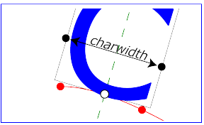
For left-to-right horizontal text layout along a path (i.e.,
when the glyph orientation is perpendicular to the
inline-progression-direction),
the layout rules are as follows:
-
Determine the
startpoint-on-the-path for the
first glyph using attribute ‘startOffset’ and property
‘
text-anchor’. For text-anchor:start,
startpoint-on-the-path is the point on the path which represents
the point on the path which is ‘startOffset’ distance
along the path from the start of the path, calculated using the
user agent's distance
along the path algorithm.
For text-anchor:middle,
startpoint-on-the-path is the point on the path which represents
the point on the path which is [ ‘startOffset’ minus half
of the total advance values for all of the glyphs in
the ‘textPath’ element ] distance along the path from the
start of the path, calculated using the user
agent's distance along
the path algorithm.
For text-anchor:end,
startpoint-on-the-path is the point on the path which represents
the point on the path which is [ ‘startOffset’ minus the
total advance values for all of the glyphs in
the ‘textPath’ element ]. Before rendering the first
glyph, the horizontal component of the startpoint-on-the-path is
adjusted to take into account various horizontal alignment text
properties and attributes, such as a ‘dx’ attribute
value on a ‘tspan’ element. (In the picture above, the
startpoint-on-the-path is the leftmost dot on the path.)
-
Determine the glyph's charwidth (i.e., the amount which
the current text position advances horizontally when the
glyph is drawn using horizontal text layout). (In the picture
above, the charwidth is the distance between the two dots at
the side of the box.)
-
Determine the point on the curve which is charwidth
distance along the path from the startpoint-on-the-path for
this glyph, calculated using the user agent's
distance along the
path algorithm. This point is the
endpoint-on-the-path for the
glyph. (In the picture above, the endpoint-on-the-path for the
glyph is the rightmost dot on the path.)
-
Determine the
midpoint-on-the-path, which is
the point on the path which is "halfway" (user agents can choose
either a distance calculation or a parametric calculation)
between the startpoint-on-the-path and the
endpoint-on-the-path. (In the picture above, the
midpoint-on-the-path is shown as a white dot.)
-
Determine the glyph-midline, which
is the vertical line in the glyph's coordinate system that goes
through the glyph's x-axis midpoint. (In the picture above, the
glyph-midline is shown as a dashed line.)
-
Position the glyph such that the glyph-midline passes
through the midpoint-on-the-path and is perpendicular to the
line through the startpoint-on-the-path and the
endpoint-on-the-path.
-
Align the glyph vertically relative to the midpoint-on-the-path
based on property ‘
alignment-baseline’ and any specified
values for attribute ‘dy’ on a ‘tspan’
element. In the example above, the ‘alignment-baseline’
property is unspecified, so the initial value
of alignment-baseline:baseline
will be used. There are no ‘tspan’ elements; thus, the
baseline of the glyph is aligned to the
midpoint-on-the-path.
-
For each subsequent glyph, set a new startpoint-on-the-path as
the previous endpoint-on-the-path, but with appropriate
adjustments taking into account horizontal kerning tables in the
font and current values of various attributes and properties,
including spacing
properties and ‘tspan’ elements with values provided
for attributes ‘dx’ and ‘dy’. All
adjustments are calculated as distance adjustments along the
path, calculated using the user
agent's distance along
the path algorithm.
-
Glyphs whose midpoint-on-the-path are off either end of the path
are not rendered.
-
Continue rendering glyphs until there are no more glyphs.
Comparable rules are used for top-to-bottom vertical text
layout along a path (i.e., when the glyph orientation is
parallel with the
inline-progression-direction),
the layout rules are as follows:
-
Determine the startpoint-on-the-path using the same method as
for horizontal text layout along a path, except that before
rendering the first glyph, the horizontal component of the
startpoint-on-the-path is adjusted to take into account various
vertical alignment text properties and attributes, such as
a ‘dy’ attribute value on a ‘tspan’ element.
-
Determine the glyph's charheight (i.e., the amount which
the current text position advances vertically when the glyph
is drawn using vertical text layout).
-
Determine the point on the curve which is charheight
distance along the path from the startpoint-on-the-path for
this glyph, calculated using the user agent's
distance along the
path algorithm. This point is the endpoint-on-the-path for
the glyph.
-
Determine the midpoint-on-the-path, which is the point on the
path which is "halfway" (user agents can choose either a
distance calculation or a parametric calculation) between the
startpoint-on-the-path and the endpoint-on-the-path.
-
Determine the glyph-midline, which is the horizontal line in the
glyph's coordinate system that goes through the glyph's y-axis
midpoint.
-
Position the glyph such that the glyph-midline passes through
the midpoint-on-the-path and is perpendicular to the line
through the startpoint-on-the-path and the endpoint-on-the-path.
-
Align the glyph horizontally (where horizontal is relative to
the glyph's coordinate system) relative to the
midpoint-on-the-path based on
property ‘
alignment-baseline’ and any specified values
for attribute ‘dx’ on a ‘tspan’ element.
-
For each subsequent glyph, set a new startpoint-on-the-path as
the previous endpoint-on-the-path, but with appropriate
adjustments taking into account vertical kerning tables in the
font and current values of various attributes and properties,
including spacing
properties and ‘tspan’ elements with values provided
for attributes ‘dx’ and ‘dy’. All
adjustments are calculated as distance adjustments along the
path, calculated using the user agent's
distance along
the path algorithm.
-
Glyphs whose midpoint-on-the-path are off either end of
the path are not rendered.
-
Continue rendering glyphs until there are no more
glyphs.
In the calculations above, if either the startpoint-on-the-path or
the endpoint-on-the-path is off the end of the path, then extend
the path beyond its end points with a straight line that is
parallel to the tangent at the path at its end point so that the
midpoint-on-the-path can still be calculated.
When the
inline-progression-direction
is horizontal, then any ‘x’
attributes on ‘text’, ‘tspan’, ‘tref’
or ‘altGlyph’ elements represent new absolute offsets along
the path, thus providing explicit new values for
startpoint-on-the-path. Any ‘y’
attributes on ‘text’, ‘tspan’, ‘tref’
or ‘altGlyph’ elements are ignored. When the
inline-progression-direction
is vertical, then any ‘y’
attributes on ‘text’, ‘tspan’, ‘tref’
or ‘altGlyph’ elements represent new absolute offsets along
the path, thus providing explicit new values for
startpoint-on-the-path. Any ‘x’
attributes on ‘text’, ‘tspan’, ‘tref’ or
‘altGlyph’ elements are ignored.
10.14. Text rendering order
The glyphs associated with the characters within a ‘text’
element are rendered in the logical order of the characters in the
original document, independent of any re-ordering necessary to
implement bidirectionality. Thus, for text that goes right-to-left
visually, the glyphs associated with the rightmost character are
rendered before the glyphs associated with the other characters.
Additionally, each distinct glyph is rendered in its entirety
(i.e., it is filled and stroked as specified by the ‘fill’
and ‘stroke’ properties) before the next glyph gets
rendered.
10.14.1. Text overflow processing:
the ‘text-overflow’ property
New in SVG 2.
Added to allow user agents to handle text strings that overflow a
predefined region in a more useful way. Aligns SVG and HTML/CSS
text processing.
See the CSS3 UI specification for the definition of
of 'text-overflow'.
[CSS3UI]
SVG uses the ‘text-overflow’ property to control
how text content block elements render when the text
overflows a specified region. In the case of wrapped text, the
region is the wrapping area. In the case of text on a path,
a region is determined by the path length. Pre-formatted text does
not create a region.
When applied to a text content block element
setting ‘text-overflow’ to
ellipsis then if the text that is
to be rendered overflows the specified region an ellipsis is
rendered such that it fits within the given region. For the
purposes of rendering, the ellipsis is treated as if it replaced
the characters at the point where it is inserted.
In SVG ‘text-overflow’ has an effect if there is a validly
specified region, regardless of the computed value of
the ‘overflow’ property on the text content block element.
Any other value for ‘text-overflow’ is treated as if it
wasn't specified.
SVG could allow the keyword 'clip' to work too. It's already
possible to do clipping with clip-path, but it's unconditional,
where this would theoretically only clip if the text
overflowed. It's mostly a convenient shorthand.
Note that the effect of ‘text-overflow’ is purely visual,
the ellipsis itself does not become part of the DOM. For all the
DOM methods it's as if ‘text-overflow’ wasn't applied, and
as if ‘width’ didn't constrain the text.
Need updated example.
The following example shows the use of ‘text-overflow’.
The top line shows text as it would normally be rendered, without any width restriction.
The middle line shows text with text-overflow=clip specified, and the bottom line shows
text with text-overflow=ellipsis.
<svg xmlns="http://www.w3.org/2000/svg"
     width="180" height="120" viewBox="0 0 180 120">
  <style>
    text { font: 16px sans-serif; }
    rect { fill: none; stroke: black; vector-effect: non-scaling-stroke; stroke-width: 1; }
  </style>

  <g>
    <rect x="19.5" y="16.5" width="100" height="20"/>
    <text x="20" y="2em" width="100">SVG is awesome</text>
  </g>

  <g transform="translate(0,30)">
    <rect x="19.5" y="16.5" width="100" height="20"/>
    <text x="20" y="2em" width="100" text-overflow="clip">SVG is awesome</text>
  </g>

  <g transform="translate(0,60)">
    <rect x="19.5" y="16.5" width="100" height="20"/>
    <text x="20" y="2em" width="100" text-overflow="ellipsis">SVG is awesome</text>
  </g>
</svg>
It has been argued that this property is useless. It
would be of more use if coupled with a mechanism that would expose
the hidden text (tool-tip on hovering over ellipses?).
10.15. Font selection properties
SVG uses the following font specification properties. Except for
any additional information provided in this specification, the
normative
definition of these properties is in CSS 2.1
([CSS21], chapter 15). Any
SVG-specific notes about these properties are contained in the
descriptions below.
Update to "CSS
Font Module Level 3. Note that 'font-variant' is completely reworked.
10.15.1. The ‘font-family’ property
| Name: |
font-family |
| Value: |
[[ <family-name> |
<generic-family> ],]* [<family-name>
|
<generic-family>] |
| Initial: |
depends on user agent |
| Applies to: |
text content elements |
| Inherited: |
yes |
| Percentages: |
N/A |
| Media: |
visual |
| Computed value: |
|
| Animatable: |
yes |
This property indicates which font family is to be used to render
the text, specified as a prioritized list of font family names
and/or generic family names. Unless the family name corresponds
to a CSS IDENT, it must be quoted. Except for any additional
information provided in this specification, the
normative
definition of the property is in CSS 2.1
([CSS21], section 15.3).
10.15.2. The ‘font-style’property
| Name: |
font-style |
| Value: |
normal | italic | oblique |
| Initial: |
normal |
| Applies to: |
text content elements |
| Inherited: |
yes |
| Percentages: |
N/A |
| Media: |
visual |
| Computed value: |
|
| Animatable: |
yes |
This property specifies whether the text is to be rendered using a
normal, italic or oblique face. Except for any additional
information provided in this specification, the
normative
definition of the property is in CSS 2.1
([CSS21], section 15.4).
10.15.3. The ‘font-variant’ property
| Name: |
font-variant |
| Value: |
normal | small-caps |
| Initial: |
normal |
| Applies to: |
text content elements |
| Inherited: |
yes |
| Percentages: |
N/A |
| Media: |
visual |
| Computed value: |
|
| Animatable: |
yes |
This property indicates whether the text is to be rendered using
the normal glyphs for lowercase characters or using small-caps
glyphs for lowercase characters. Except for any additional
information provided in this specification, the
normative
definition of the property is in CSS 2.1
([CSS21], section 15.5).
10.15.4. The ‘font-weight’ property
| Name: |
font-weight |
| Value: |
normal | bold | bolder | lighter | 100 | 200 |
300
| 400 | 500 | 600 | 700 | 800 | 900 |
| Initial: |
normal |
| Applies to: |
text content elements |
| Inherited: |
yes |
| Percentages: |
N/A |
| Media: |
visual |
| Computed value: |
|
| Animatable: |
yes |
This property refers to the boldness or lightness of the glyphs
used to render the text, relative to other fonts in the same font
family. Except for any additional information provided in this
specification, the
normative
definition of the property is in CSS 2.1
([CSS21], section 15.6).
10.15.5. The ‘font-stretch’ property
| Name: |
font-stretch |
| Value: |
normal | wider | narrower |
ultra-condensed | extra-condensed |
condensed | semi-condensed |
semi-expanded | expanded |
extra-expanded | ultra-expanded |
| Initial: |
normal |
| Applies to: |
text content elements |
| Inherited: |
yes |
| Percentages: |
N/A |
| Media: |
visual |
| Computed value: |
|
| Animatable: |
yes |
This property indicates the desired amount of condensing or
expansion in the glyphs used to render the text. Except for any
additional information provided in this specification, the
normative
definition of the property is in CSS3 Fonts
([CSS3FONTS], section 3.3).
10.15.6. The ‘font-size’ property
| Name: |
font-size |
| Value: |
<absolute-size> | <relative-size>
|
<length> | <percentage> |
| Initial: |
medium |
| Applies to: |
text content elements |
| Inherited: |
yes, the computed value is inherited |
| Percentages: |
refer to parent element's font size |
| Media: |
visual |
| Computed value: |
|
| Animatable: |
yes |
This property refers to the size of the font from baseline to
baseline when multiple lines of text are set solid in a multi-line
layout environment. For SVG, if a
<length> is provided without
a unit identifier (e.g., an unqualified number such as
128), the SVG user agent processes
the <length> as a height
value in the current user coordinate system.
If a <length> is provided
with one of the unit identifiers
(e.g., 12pt
or 10%), then the SVG user agent
converts the <length> into a
corresponding value in the current user coordinate system by
applying the rules described in
Units.
Except for any additional information provided in this
specification, the
normative
definition of the property is in CSS 2.1
([CSS21], section 15.7).
10.15.7. The ‘font-size-adjust’ property
| Name: |
font-size-adjust |
| Value: |
<number> | none |
| Initial: |
none |
| Applies to: |
text content elements |
| Inherited: |
yes |
| Percentages: |
N/A |
| Media: |
visual |
| Computed value: |
|
| Animatable: |
yes |
This property allows authors to specify an aspect value for an
element that will preserve the x-height of the first choice font
in a substitute font. Except for any additional information
provided in this specification, the
normative
definition of the property is in CSS3 Fonts
([CSS3FONTS], section 3.6).
10.15.8. The ‘font’ property
| Name: |
font |
| Value: |
[ [ <'font-style'>
|| <'font-variant'>
|| <'font-weight'>
]?
<'font-size'> [ / <'line-height'> ]?
<'font-family'> ] |
caption | icon | menu | message-box |
small-caption | status-bar |
| Initial: |
see individual properties |
| Applies to: |
text content elements |
| Inherited: |
yes |
| Percentages: |
allowed on 'font-size' and 'line-height' (Note:
for the purposes of processing the ‘font’ property in
SVG, 'line-height' is assumed to be equal the value
for property ‘font-size’) |
| Media: |
visual |
| Computed value: |
|
| Animatable: |
yes (non-additive) |
Shorthand property for setting ‘font-style’,
‘font-variant’, ‘font-weight’, ‘font-size’,
‘line-height’ and
‘font-family’. The ‘line-height’
property has no effect on text layout in SVG. For the purposes of
the ‘font’ property,
‘line-height’ is assumed to be equal
to the value of the ‘font-size’ property.
Conforming SVG
Viewers are not required to support the various system font
options (caption, icon, menu, message-box, small-caption and
status-bar) and can use a system font or one of the generic fonts
instead.
Except for any additional information provided in this
specification, the
normative
definition of the property is in CSS 2.1
([CSS21], section 15.8).
10.16. Text decoration
10.16.1. The ‘text-decoration’ property
Do we align with CSS Text Decoration Module Level 3?
| Name: |
text-decoration |
| Value: |
none | [ underline || overline || line-through ||
blink ] |
| Initial: |
none |
| Applies to: |
text content elements |
| Inherited: |
no (see prose) |
| Percentages: |
N/A |
| Media: |
visual |
| Computed value: |
|
| Animatable: |
yes |
This property describes decorations that are added to the text of
an element. Conforming
SVG Viewers are not required to support the
blink value.
Except for any additional information provided in this
specification, the
normative
definition of the property is in CSS 2.1
([CSS21], section 16.3.1).
The CSS 2.1 specification defines the behavior of
the ‘text-decoration’ property using the terminology
"block-level elements" and "inline elements". For the purposes of
the ‘text-decoration’ property and SVG, a
‘text’ element represents a block-level element and any of
the potential children of a ‘text’ element (e.g., a
‘tspan’) represent inline elements.
Also, the CSS 2.1 definition of ‘text-decoration’ specifies
that the "color of the decorations" remain the same on descendant
elements. Since SVG offers a painting model consisting of the
ability to apply various types of paint
(see Painting: Filling, Stroking and
Marker Symbols) to both the interior (i.e., the "fill") and
the outline (i.e., the "stroke") of text, for SVG
the ‘text-decoration’ property is defined such that, for an
element which has a specified value for the
‘text-decoration’ property, all decorations on its content
and that of its descendants are rendered using the same fill and
stroke properties as are present on the given element. If
the ‘text-decoration’ property is specified on a
descendant, then that overrides the ancestor.
Because SVG allows text to be both filled and stroked,
drawing order matters in some circumstances with text
decorations. Text decoration drawing order should be as
follows:
-
All text decorations except line-through should be drawn
before the text is filled and stroked; thus, the text is
rendered on top of these decorations.
-
Line-through should be drawn after the text is filled and
stroked; thus, the line-through is rendered on top of the
text.
Example textdecoration01 provides
examples for ‘text-decoration’. The first line of text has
no value for ‘text-decoration’, so the initial value
of text-decoration:none is
used. The second line shows
text-decoration:line-through. The
third line shows
text-decoration:underline. The
fourth line illustrates the rule whereby decorations are rendered
using the same fill and stroke properties as are present on the
element for which the ‘text-decoration’ is specified. Since
‘text-decoration’ is specified on the ‘text’
element, all text within the ‘text’ element has its
underline rendered with the same fill and stroke properties as
exist on the ‘text’ element (i.e., blue fill, red stroke),
even though the various words have different fill and stroke
property values. However, the word "different" explicitly
specifies a value for ‘text-decoration’; thus, its
underline is rendered using the fill and stroke properties as
the ‘tspan’ element that surrounds the word "different"
(i.e., yellow fill, darkgreen stroke):
<?xml version="1.0" standalone="no"?>
<svg width="12cm" height="4cm" viewBox="0 0 1200 400"
     xmlns="http://www.w3.org/2000/svg" version="1.1">
  <desc>Example textdecoration01 - behavior of 'text-decoration' property</desc>
  <rect x="1" y="1" width="1198" height="398" fill="none" stroke="blue" stroke-width="2" />
  <g font-size="60" fill="blue" stroke="red" stroke-width="1" >
    <text x="100" y="75">Normal text</text>
    <text x="100" y="165" text-decoration="line-through" >Text with line-through</text>
    <text x="100" y="255" text-decoration="underline" >Underlined text</text>
    <text x="100" y="345" text-decoration="underline" >
      <tspan>One </tspan>
      <tspan fill="yellow" stroke="purple" >word </tspan>
      <tspan fill="yellow" stroke="black" >has </tspan>
      <tspan fill="yellow" stroke="darkgreen" text-decoration="underline" >different </tspan>
      <tspan fill="yellow" stroke="blue" >underlining</tspan>
    </text>
  </g>
</svg>View this example as SVG (SVG-enabled browsers only)
10.17. Alternate glyphs
There are situations such as ligatures, special-purpose fonts
(e.g., a font for music symbols) or alternate glyphs for Asian
text strings where it is required that a different set of glyphs
is used than the glyph(s) which normally corresponds to the given
character data.
10.17.1. The ‘altGlyph’ element
The ‘altGlyph’ element provides control over the glyphs
used to render particular character data.
‘altGlyph’
- Categories:
- Text content element, text content child element
- Content model:
- Any elements or character data.
- Attributes:
- aria attributes — ‘aria-activedescendant’, ‘aria-atomic’, ‘aria-autocomplete’, ‘aria-busy’, ‘aria-checked’, ‘aria-controls’, ‘aria-describedat’, ‘aria-describedby’, ‘aria-disabled’, ‘aria-dropeffect’, ‘aria-expanded’, ‘aria-flowto’, ‘aria-grabbed’, ‘aria-haspopup’, ‘aria-hidden’, ‘aria-invalid’, ‘aria-label’, ‘aria-labelledby’, ‘aria-level’, ‘aria-live’, ‘aria-multiline’, ‘aria-multiselectable’, ‘aria-orientation’, ‘aria-owns’, ‘aria-posinset’, ‘aria-pressed’, ‘aria-readonly’, ‘aria-relevant’, ‘aria-required’, ‘aria-selected’, ‘aria-setsize’, ‘aria-sort’, ‘aria-valuemax’, ‘aria-valuemin’, ‘aria-valuenow’, ‘aria-valuetext’, ‘role’
- navigation attributes — ‘tabindex’
- conditional processing attributes — ‘requiredFeatures’, ‘requiredExtensions’, ‘systemLanguage’
- core attributes — ‘id’, ‘xml:base’, ‘xml:lang’, ‘xml:space’
- graphical event attributes — ‘onfocusin’, ‘onfocusout’, ‘onclick’, ‘onmousedown’, ‘onmouseup’, ‘onmouseover’, ‘onmousemove’, ‘onmouseout’, ‘onload’
- presentation attributes —
- style attributes — ‘class’, ‘style’
- xlink attributes — ‘xlink:href’, ‘xlink:show’, ‘xlink:actuate’, ‘xlink:type’, ‘xlink:role’, ‘xlink:arcrole’, ‘xlink:title’
- ‘x’
- ‘y’
- ‘dx’
- ‘dy’
- ‘glyphRef’
- ‘format’
- ‘rotate’
- ‘xlink:href’
- DOM Interfaces:
10.17.1.1. Attributes
- xlink:href
-
An IRI reference
either to a ‘glyph’ element in an SVG document fragment
or to an ‘altGlyphDef’ element.
If the reference is to a ‘glyph’ element and that glyph
is available, then that glyph is rendered instead of the
character(s) that are inside of the ‘altGlyph’ element.
If the reference is to an ‘altGlyphDef’ element, then
if an appropriate set of alternate glyphs is located from
processing the ‘altGlyphDef’ element, then those
alternate glyphs are rendered instead of the character(s) that
are inside of the ‘altGlyph’ element.
- Value
- <iri>
- lacuna value
- Animatable
- no
- glyphRef
-
The glyph identifier, the format of which is dependent on
the ‘format’ of the given font. (Same meaning as
the ‘glyphRef’ attribute on the
‘glyphRef’ element.)
- Value
- <string>
- lacuna value
- Animatable
- no
- format
-
The format of the given font. If the font is
in one
of the formats listed in CSS2, such as TrueDoc™
Portable Font Resource or Embedded OpenType,
then the <string> must contain the corresponding font
format string, such as truedoc-pfr or
embedded-opentype. (This attribute has the same meaning
as the ‘format’ attribute on the ‘glyphRef’ element.)
This refers to CSS 2; it needs to be
reviewed against the formats described by CSS3 Fonts.
- Value
- <string>
- lacuna value
- undefined
- Animatable
- no
- x
-
The <length>
values are processed in the same manner as
the ‘x’ attribute on the ‘tspan’ element,
with the following exception: If the referenced alternate
glyphs are rendered instead of the Unicode characters inside
the ‘altGlyph’ element, then any absolute X coordinates
specified via an ‘x’ attribute on this element or any
ancestor ‘text’ or ‘tspan’ elements for Unicode
characters 2 through n within the ‘altGlyph’
element are ignored. Any absolute X coordinate specified via
an ‘x’ attribute on this element or any
ancestor ‘text’ or ‘tspan’ elements for the
first Unicode character within the ‘altGlyph’ element
sets a new absolute X coordinate for the current text position before rendering the first alternate glyph.
- Value
- <list-of-coordinates>
- lacuna value
- 0
- Animatable
- yes
- y
-
The corresponding absolute Y coordinates for rendering
the ‘altGlyph’ element.
- Value
- <list-of-coordinates>
- lacuna value
- 0
- Animatable
- yes
- dx
-
The <length>
values are processed in the same manner as the ‘dx’
attribute on the ‘tspan’ element, with the following
exception: If the referenced alternate glyphs are rendered
instead of the Unicode characters inside the ‘altGlyph’
element, then any relative X coordinates specified via
an ‘dx’ attribute on this element or any ancestor
‘text’ or ‘tspan’ elements for Unicode characters
2 through n within the ‘altGlyph’ element are
ignored. Any relative X coordinate specified via an ‘dx’
attribute on this element or any ancestor ‘text’
or ‘tspan’ elements for the first Unicode character
within the ‘altGlyph’ element sets a new relative X
coordinate for the current text position before
rendering the first alternate glyph.
- Value
- <list-of-lengths>
- lacuna value
- See above.
- Animatable
- yes
- dy
-
The corresponding relative Y coordinates for rendering
the ‘altGlyph’ element.
- Value
- <list-of-lengths>
- lacuna value
- See above.
- Animatable
- yes
- rotate = ""
-
The <number>
values are processed in the same manner as
the ‘rotate’ attribute on the ‘tspan’
element, with the following exception: If the referenced
alternate glyphs are rendered instead of the Unicode characters
inside the ‘altGlyph’ element, then any supplemental
rotation values specified via an
‘rotate’ attribute on this element or any ancestor
‘text’ or ‘tspan’ elements for Unicode characters
2 through n within the ‘altGlyph’ element are
ignored. Supplemental rotation values specified via
an ‘rotate’ attribute on this element or any
ancestor ‘text’ or ‘tspan’ elements for the first
Unicode character within the ‘altGlyph’ element sets a
new supplemental rotation angle before rendering the alternate
glyphs.
- Value
- <list-of-numbers>
- lacuna value
- See above.
- Animatable
- yes (non-additive)
If the references to alternate glyphs do not result in successful
identification of alternate glyphs to use, then the character(s)
that are inside of the ‘altGlyph’ element are rendered as
if the ‘altGlyph’ element were a ‘tspan’ element
instead.
An ‘altGlyph’ element either references a
‘glyph’ element or an ‘altGlyphDef’ element via its
‘xlink:href’ attribute or identifies a glyph by means of
font selection
properties, a glyph identifier and a font format. If
the ‘xlink:href’ attribute is specified, it takes
precedence, and the other glyph identification attributes and
properties are ignored.
10.17.2. The ‘altGlyphDef’,
‘altGlyphItem’ and
‘glyphRef’ elements
The ‘altGlyphDef’ element defines a set of possible glyph
substitutions.
‘altGlyphDef’
- Categories:
- None
- Content model:
-
Any number of ‘script’ elements, and either:
- Attributes:
- DOM Interfaces:
An ‘altGlyphDef’ can contain either of the following:
-
In the simplest case, an ‘altGlyphDef’ contains one or
more ‘glyphRef’ elements. Each ‘glyphRef’ element
references a single glyph within a particular font. If all of
the referenced glyphs are available, then these glyphs are
rendered instead of the character(s) inside of the referencing
‘altGlyph’ element. If any of the referenced glyphs are
unavailable, then the character(s) that are inside of the
‘altGlyph’ element are rendered as if there were not
an ‘altGlyph’ element surrounding those characters.
-
In the more complex case, an ‘altGlyphDef’ contains one
or more ‘altGlyphItem’ elements. Each
‘altGlyphItem’ represents a candidate set of substitute
glyphs. Each ‘altGlyphItem’ contains one or more
‘glyphRef’ elements. Each ‘glyphRef’ element
references a single glyph within a particular font. The
first ‘altGlyphItem’ in which all referenced glyphs are
available is chosen. The glyphs referenced from
this ‘altGlyphItem’ are rendered instead of the
character(s) that are inside of the referencing
‘altGlyph’ element. If none of the ‘altGlyphItem’
elements result in a successful match (i.e., none of
the ‘altGlyphItem’ elements has all of its referenced
glyphs available), then the character(s) that are inside of
the ‘altGlyph’ element are rendered as if there were not
an ‘altGlyph’ element surrounding those characters.
The ‘altGlyphItem’ element defines a candidate set of
possible glyph substitutions. The first ‘altGlyphItem’
element whose referenced glyphs are all available is chosen. Its
glyphs are rendered instead of the character(s) that are inside of
the referencing ‘altGlyph’ element.
‘altGlyphItem’
- Categories:
- None
- Content model:
-
Any number of ‘script’ elements, and one or more ‘glyphRef’ elements.
- Attributes:
- aria attributes — ‘aria-activedescendant’, ‘aria-atomic’, ‘aria-autocomplete’, ‘aria-busy’, ‘aria-checked’, ‘aria-controls’, ‘aria-describedat’, ‘aria-describedby’, ‘aria-disabled’, ‘aria-dropeffect’, ‘aria-expanded’, ‘aria-flowto’, ‘aria-grabbed’, ‘aria-haspopup’, ‘aria-hidden’, ‘aria-invalid’, ‘aria-label’, ‘aria-labelledby’, ‘aria-level’, ‘aria-live’, ‘aria-multiline’, ‘aria-multiselectable’, ‘aria-orientation’, ‘aria-owns’, ‘aria-posinset’, ‘aria-pressed’, ‘aria-readonly’, ‘aria-relevant’, ‘aria-required’, ‘aria-selected’, ‘aria-setsize’, ‘aria-sort’, ‘aria-valuemax’, ‘aria-valuemin’, ‘aria-valuenow’, ‘aria-valuetext’, ‘role’
- navigation attributes — ‘tabindex’
- core attributes — ‘id’, ‘xml:base’, ‘xml:lang’, ‘xml:space’
- DOM Interfaces:
The ‘glyphRef’ element defines a possible glyph to
use.
‘glyphRef’
- Categories:
- None
- Content model:
- Any number of the following elements, in any order:clipPath, marker, mask, script
- Attributes:
- core attributes — ‘id’, ‘xml:base’, ‘xml:lang’, ‘xml:space’
- style attributes — ‘class’, ‘style’
- presentation attributes —
- xlink attributes — ‘xlink:href’, ‘xlink:show’, ‘xlink:actuate’, ‘xlink:type’, ‘xlink:role’, ‘xlink:arcrole’, ‘xlink:title’
- ‘x’
- ‘y’
- ‘dx’
- ‘dy’
- ‘glyphRef’
- ‘format’
- ‘xlink:href’
- DOM Interfaces:
10.17.2.1. Attributes
- xlink:href
-
An IRI reference to
a ‘glyph’ element in an SVG document fragment. The
referenced ‘glyph’ is rendered as an alternate
glyph.
- Value
- <iri>
- lacuna value
- Animatable
- no
- glyphRef
-
The glyph identifier, the format of which is dependent on
the ‘format’ of the given font.
- Value
- <string>
- lacuna value
- Animatable
- no
- format
-
The format of the given font. If the font is in
one
of the formats listed in CSS2, such as TrueDoc™
Portable Font Resource or Embedded OpenType,
then the <string> must contain the corresponding font
format string, such as truedoc-pfr or
embedded-opentype. This refers to
CSS 2; it needs to be reviewed against the formats described
by CSS3 Fonts.
- Value
- <string>
- lacuna value
- undefined
- Animatable
- no
- x
-
This value represents the new absolute X coordinate within the
font's coordinate system for this glyph.
The font coordinate system is based on the em square
model described in the
Fonts
chapter of CSS2. CSS3 Fonts doesn't
talk about the em square much.
If the attribute is not specified, for the first ‘glyphRef’ child element, the effect is as if the attribute
were set to "0", whereas for subsequent ‘glyphRef’ child elements, the effect is as if the attribute
were set to the end X coordinate from the previous
‘glyphRef’ element.
- Value
- <number>
- lacuna value
- See above.
- Animatable
- No
- y
-
The corresponding new absolute Y coordinate within the font's
coordinate system for this glyph.
- Value
- <number>
- lacuna value
- See above.
- Animatable
- No
- dx
-
This value represents the relative X coordinate within the
font's coordinate system for this glyph. The glyph is thus
shifted by <number>
units along the positive X axis within the font's coordinate
system supplemental to the absolute X coordinate established
by the ‘x’ attribute (either due to an
explicit ‘x’ attribute or due to default value
processing for the ‘x’ attribute).
- Value
- <number>
- lacuna value
- 0
- Animatable
- No
- dy
-
The corresponding number of units within the font's coordinate
system to shift the glyph along the positive Y axis relative
to the absolute Y coordinate established by the ‘y’
attribute.
- Value
- <number>
- lacuna value
- 0
- Animatable
- No
A ‘glyphRef’ either references a
‘glyph’ element in an SVG document fragment via its
‘xlink:href’ attribute or identifies a glyph by means
of font selection
properties, a glyph identifier and a font format. If
insufficient attributes and properties have been specified to
identify a glyph, then the ‘glyphRef’ is processed
in the same manner as when a glyph reference is fully specified,
but the given glyph is not available. If the ‘xlink:href’
attribute is specified, it takes precedence, and the other glyph
identification attributes and properties are ignored.
10.18. Text selection and clipboard operations
Conforming SVG
viewers on systems which have the capacity for text selection (e.g.,
systems which are equipped with a pointer device such as a mouse) and
which have system clipboards for copy/paste operations are required to
support:
- user selection of text strings in SVG content
- the ability to copy selected text strings to the system clipboard
A text selection operation starts when all of the following occur:
-
the user positions the pointing device over a glyph that has
been rendered as part of a ‘text’ element, initiates a
select operation (e.g., pressing the standard system
mouse button for select operations) and then moves the pointing
device while continuing the select operation (e.g.,
continuing to press the standard system mouse button for select
operations)
-
no other visible graphics element has been painted above the glyph
at the point at which the pointing device was clicked
-
no links or
events have been
assigned to the ‘text’, ‘tspan’ or
‘textPath’ element(s) (or their ancestors) associated
with the given glyph.
As the text selection operation proceeds (e.g., the user continues
to press the given mouse button), all associated events with other
graphics elements are ignored (i.e., the text selection operation
is modal) and the SVG user agent shall dynamically indicate which
characters are selected by an appropriate highlighting technique,
such as redrawing the selected glyphs with inverse colors. As the
pointer is moved during the text selection process, the end glyph
for the text selection operation is the glyph within the
same ‘text’ element whose glyph cell is closest to the
pointer. All characters within the ‘text’ element whose
position within the ‘text’ element is between the start of
selection and end of selection shall be highlighted, regardless of
position on the canvas and regardless of any graphics elements
that might be above the end of selection point.
Once the text selection operation ends (e.g., the user releases
the given mouse button), the selected text will stay highlighted
until an event occurs which cancels text selection, such as a
pointer device activation event (e.g., pressing a mouse button).
Detailed rules for determining which characters to highlight
during a text selection operation are provided in
Text
selection implementation notes.
For systems which have system clipboards, the SVG user agent is
required to provide a user interface for initiating a copy of the
currently selected text to the system clipboard. It is sufficient
for the SVG user agent to post the selected text string in the
system's appropriate clipboard format for plain text, but it is
preferable if the SVG user agent also posts a rich text
alternative which captures the various
font
properties associated with the given text string.
For bidirectional text, the user agent must support text selection
in logical order, which will result in discontinuous highlighting
of glyphs due to the bidirectional reordering of characters. User
agents can provide an alternative ability to select bidirectional
text in visual rendering order (i.e., after
bidirectional
text layout algorithms have been applied), with the result that
selected character data might be discontinuous logically. In this
case, if the user requests that bidirectional text be copied to
the clipboard, then the user agent is required to make appropriate
adjustments to copy only the visually selected characters to the
clipboard.
When feasible, it is recommended that generators of SVG attempt to
order their text strings to facilitate properly ordered text
selection within SVG viewing applications such as Web browsers.
10.19. DOM interfaces
10.19.1. Interface SVGTextContentElement
The SVGTextContentElement is inherited by various
text-related interfaces, such as SVGTextElement,
SVGTSpanElement, SVGTRefElement, SVGAltGlyphElement
and SVGTextPathElement.
For the methods on this interface that refer to an index to a
character or a number of characters, these references are to be
interpreted as an index to a UTF-16 code unit or a number of
UTF-16 code units, respectively. This is for consistency with DOM
Level 2 Core, where methods on the CharacterData interface
use UTF-16 code units as indexes and counts within the character
data. Thus for example, if the text content of a ‘text’
element is a single non-BMP character, such as U+10000, then
invoking getNumberOfChars on that
element will return 2 since there are two UTF-16 code units (the
surrogate pair) used to represent that one character.
interface SVGTextContentElement : SVGGraphicsElement {

  // lengthAdjust Types
  const unsigned short LENGTHADJUST_UNKNOWN = 0;
  const unsigned short LENGTHADJUST_SPACING = 1;
  const unsigned short LENGTHADJUST_SPACINGANDGLYPHS = 2;

  readonly attribute SVGAnimatedLength textLength;
  readonly attribute SVGAnimatedEnumeration lengthAdjust;

  long getNumberOfChars();
  float getComputedTextLength();
  float getSubStringLength(unsigned long charnum, unsigned long nchars);
  SVGPoint getStartPositionOfChar(unsigned long charnum);
  SVGPoint getEndPositionOfChar(unsigned long charnum);
  SVGRect getExtentOfChar(unsigned long charnum);
  float getRotationOfChar(unsigned long charnum);
  long getCharNumAtPosition(SVGPoint point);
  void selectSubString(unsigned long charnum, unsigned long nchars);
};
-
- LENGTHADJUST_UNKNOWN (unsigned short)
-
The enumeration was set to a value that is not one of predefined types.
It is invalid to attempt to define a new value of this type or to
attempt to switch an existing value to this type.
- LENGTHADJUST_SPACING (unsigned short)
-
Corresponds to value 'spacing'.
- LENGTHADJUST_SPACINGANDGLYPHS (unsigned short)
-
Corresponds to value 'spacingAndGlyphs'.
-
- textLength (readonly SVGAnimatedLength)
-
Corresponds to attribute ‘textLength’ on
the given element.
- lengthAdjust (readonly SVGAnimatedEnumeration)
-
Corresponds to attribute ‘lengthAdjust’ on
the given element. The value must be one of the length adjust constants
defined on this interface.
-
- long getNumberOfChars()
-
Returns the total number of characters available for rendering within
the current element, which includes referenced characters from
‘tref’ reference, regardless of whether they will be rendered.
Effectively, this is equivalent to the length of the
Node::textContent
attribute from DOM4 ([
DOM4],
section 5.4), if that attribute also expanded
‘tref’
elements.
-
Total number of characters.
- float getComputedTextLength()
-
The total sum of all of the advance values from rendering all of the
characters within this element, including the advance value on the
glyphs (horizontal or vertical), the effect of properties
‘
letter-spacing’ and ‘
word-spacing’ and
adjustments due to attributes
‘dx’ and
‘dy’ on
‘tspan’ elements. For non-rendering environments, the user agent
shall make reasonable assumptions about glyph metrics.
-
The text advance distance.
- float getSubStringLength(unsigned long charnum, unsigned long nchars)
-
The total sum of all of the advance values from rendering the specified
substring of the characters, including the advance value on the glyphs
(horizontal or vertical), the effect of properties
‘
letter-spacing’ and ‘
word-spacing’ and adjustments due to
attributes
‘dx’ and
‘dy’ on
‘tspan’ elements. For
non-rendering environments, the user agent shall make reasonable
assumptions about glyph metrics. If multiple consecutive characters are
rendered inseparably (e.g., as a single glyph or a sequence of glyphs,
or because the range encompasses half of a surrogate pair), and nchars
is greater than 0 then the measured range shall be expanded so that each
of the inseparable characters are included.
-
-
unsigned long charnum
The index of the first character in the substring, where
the first character has an index of 0.
-
unsigned long nchars
The number of characters in the substring. If nchars
specifies more characters than are available, then the substring will
consist of all characters starting with charnum until the end of the
list of characters.
-
The text advance distance.
-
- DOMException, code INDEX_SIZE_ERR
- Raised if charnum or
nchars is negative or if charnum is greater than
or equal to the number of characters at this node.
- SVGPoint getStartPositionOfChar(unsigned long charnum)
-
Returns the current text position before rendering the character in the
user coordinate system for rendering the glyph(s) that correspond to
the specified character. The current text position has already taken
into account the effects of any inter-character adjustments due to
properties ‘
letter-spacing’ and
‘
word-spacing’ and adjustments due to attributes
‘x’,
‘y’,
‘dx’ and
‘dy’. If multiple consecutive characters
are rendered inseparably (e.g., as a single glyph or a sequence of
glyphs), then each of the inseparable characters will return the start
position for the first glyph.
-
-
unsigned long charnum
The index of the character, where the first character has
an index of 0.
-
The character's start position.
-
- DOMException, code INDEX_SIZE_ERR
- Raised if the charnum is
negative or if charnum is greater than or equal to the
number of characters at this node.
- SVGPoint getEndPositionOfChar(unsigned long charnum)
-
Returns the current text position after rendering the character in the
user coordinate system for rendering the glyph(s) that correspond to
the specified character. This current text position does
not take into
account the effects of any inter-character adjustments to prepare for
the next character, such as properties
‘
letter-spacing’ and ‘
word-spacing’ and adjustments due to
attributes
‘x’,
‘y’,
‘dx’
and
‘dy’. If multiple consecutive
characters are rendered inseparably (e.g., as a single glyph or a
sequence of glyphs), then each of the inseparable characters will
return the end position for the last glyph.
-
-
unsigned long charnum
The index of the character, where the first character has
an index of 0.
-
The character's end position.
-
- DOMException, code INDEX_SIZE_ERR
- Raised if the charnum is
negative or if charnum is greater than or equal to the
number of characters at this node.
- SVGRect getExtentOfChar(unsigned long charnum)
-
Returns a tightest rectangle which defines the minimum and maximum X and
Y values in the user coordinate system for rendering the glyph(s) that
correspond to the specified character. The calculations assume that all
glyphs occupy the full standard glyph cell for the font. If multiple
consecutive characters are rendered inseparably (e.g., as a single glyph
or a sequence of glyphs), then each of the inseparable characters will
return the same extent.
-
-
unsigned long charnum
The index of the character, where the first character has
an index of 0.
-
The rectangle which encloses all of the rendered glyph(s).
-
- DOMException, code INDEX_SIZE_ERR
- Raised if the charnum is
negative or if charnum is greater than or equal to the
number of characters at this node.
- float getRotationOfChar(unsigned long charnum)
-
Returns the rotation value relative to the current user coordinate
system used to render the glyph(s) corresponding to the specified
character. If multiple glyph(s) are used to render the given character
and the glyphs each have different rotations (e.g., due to
text-on-a-path), the user agent shall return an average value (e.g., the
rotation angle at the midpoint along the path for all glyphs used to
render this character). The rotation value represents the rotation that
is supplemental to any rotation due to properties
‘
glyph-orientation-horizontal’ and
‘
glyph-orientation-vertical’; thus, any glyph rotations due to
these properties are not included into the returned rotation value. If
multiple consecutive characters are rendered inseparably (e.g., as a
single glyph or a sequence of glyphs), then each of the inseparable
characters will return the same rotation value.
-
-
unsigned long charnum
The index of the character, where the first character has
an index of 0.
-
The rotation angle.
-
- DOMException, code INDEX_SIZE_ERR
- Raised if the charnum is
negative or if charnum is greater than or equal to the
number of characters at this node.
- long getCharNumAtPosition(SVGPoint point)
-
Returns the index of the character whose corresponding glyph cell
bounding box contains the specified point. The calculations assume that
all glyphs occupy the full standard glyph cell for the font. If no such
character exists, a value of -1 is returned. If multiple such
characters exist, the character within the element whose glyphs were
rendered last (i.e., take into account any reordering such as for
bidirectional text) is used. If multiple consecutive characters are
rendered inseparably (e.g., as a single glyph or a sequence of glyphs),
then the user agent shall allocate an equal percentage of the text
advance amount to each of the contributing characters in determining
which of the characters is chosen.
-
-
A point in user space.
-
The index of the character which is at the given point, where
the first character has an index of 0.
- void selectSubString(unsigned long charnum, unsigned long nchars)
-
Causes the specified substring to be selected just as if the user
selected the substring interactively.
-
-
unsigned long charnum
The index of the start character which is at the given
point, where the first character has an index of 0.
-
unsigned long nchars
The number of characters in the substring. If nchars
specifies more characters than are available, then the substring
will consist of all characters starting with charnum until the end
of the list of characters.
-
- DOMException, code INDEX_SIZE_ERR
- Raised if charnum or
nchars is negative or if charnum is greater
than or equal to the number of characters at this node.
10.19.2. Interface SVGTextPositioningElement
The
SVGTextPositioningElement interface is inherited by text-related
interfaces:
SVGTextElement,
SVGTSpanElement,
SVGTRefElement and
SVGAltGlyphElement.
interface SVGTextPositioningElement : SVGTextContentElement {
  readonly attribute SVGAnimatedLengthList x;
  readonly attribute SVGAnimatedLengthList y;
  readonly attribute SVGAnimatedLengthList dx;
  readonly attribute SVGAnimatedLengthList dy;
  readonly attribute SVGAnimatedNumberList rotate;
};
-
- x (readonly SVGAnimatedLengthList)
-
Corresponds to attribute ‘x’ on the
given element.
- y (readonly SVGAnimatedLengthList)
-
Corresponds to attribute ‘y’ on the
given element.
- dx (readonly SVGAnimatedLengthList)
-
Corresponds to attribute ‘dx’ on the
given element.
- dy (readonly SVGAnimatedLengthList)
-
Corresponds to attribute ‘dy’ on the
given element.
- rotate (readonly SVGAnimatedNumberList)
-
Corresponds to attribute ‘rotate’ on the
given element.
10.19.3. Interface SVGTextElement
The
SVGTextElement interface corresponds to the
‘text’
element.
interface SVGTextElement : SVGTextPositioningElement {
};
10.19.4. Interface SVGTSpanElement
The
SVGTSpanElement interface corresponds to the
‘tspan’
element.
interface SVGTSpanElement : SVGTextPositioningElement {
};
10.19.5. Interface SVGTRefElement
The
SVGTRefElement interface corresponds to the
‘tref’
element.
interface SVGTRefElement : SVGTextPositioningElement {
};

SVGTRefElement implements SVGURIReference;
10.19.6. Interface SVGTextPathElement
The
SVGTextPathElement interface corresponds to the
‘textPath’
element.
interface SVGTextPathElement : SVGTextContentElement {

  // textPath Method Types
  const unsigned short TEXTPATH_METHODTYPE_UNKNOWN = 0;
  const unsigned short TEXTPATH_METHODTYPE_ALIGN = 1;
  const unsigned short TEXTPATH_METHODTYPE_STRETCH = 2;

  // textPath Spacing Types
  const unsigned short TEXTPATH_SPACINGTYPE_UNKNOWN = 0;
  const unsigned short TEXTPATH_SPACINGTYPE_AUTO = 1;
  const unsigned short TEXTPATH_SPACINGTYPE_EXACT = 2;

  readonly attribute SVGAnimatedLength startOffset;
  readonly attribute SVGAnimatedEnumeration method;
  readonly attribute SVGAnimatedEnumeration spacing;
};

SVGTextPathElement implements SVGURIReference;
SVGTextPathElement implements SVGAnimatedPathData;
-
- TEXTPATH_METHODTYPE_UNKNOWN (unsigned short)
-
The enumeration was set to a value that is not one of predefined types.
It is invalid to attempt to define a new value of this type or to
attempt to switch an existing value to this type.
- TEXTPATH_METHODTYPE_ALIGN (unsigned short)
-
Corresponds to value 'align'.
- TEXTPATH_METHODTYPE_STRETCH (unsigned short)
-
Corresponds to value 'stretch'.
-
- TEXTPATH_SPACINGTYPE_UNKNOWN (unsigned short)
-
The enumeration was set to a value that is not one of predefined types.
It is invalid to attempt to define a new value of this type or to
attempt to switch an existing value to this type.
- TEXTPATH_SPACINGTYPE_AUTO (unsigned short)
-
Corresponds to value 'auto'.
- TEXTPATH_SPACINGTYPE_EXACT (unsigned short)
-
Corresponds to value 'exact'.
-
- startOffset (readonly SVGAnimatedLength)
-
- method (readonly SVGAnimatedEnumeration)
-
- spacing (readonly SVGAnimatedEnumeration)
-
10.19.7. Interface SVGAltGlyphElement
The SVGAltGlyphElement interface corresponds to the ‘altGlyph’ element.
interface SVGAltGlyphElement : SVGTextPositioningElement {
  attribute DOMString glyphRef;
  attribute DOMString format;
};

SVGAltGlyphElement implements SVGURIReference;
-
- glyphRef (DOMString)
-
Corresponds to attribute
‘glyphRef’ on the given
element.
- format (DOMString)
-
Corresponds to attribute
‘format’ on the given element.
10.19.8. Interface SVGAltGlyphDefElement
The
SVGAltGlyphDefElement interface corresponds to the
‘altGlyphDef’ element.
interface SVGAltGlyphDefElement : SVGElement {
};
10.19.9. Interface SVGAltGlyphItemElement
The
SVGAltGlyphItemElement interface corresponds to the
‘altGlyphItem’ element.
interface SVGAltGlyphItemElement : SVGElement {
};
10.19.10. Interface SVGGlyphRefElement
The SVGGlyphRefElement interface corresponds to the ‘glyphRef’ element.
interface SVGGlyphRefElement : SVGElement {
  attribute DOMString glyphRef;
  attribute DOMString format;
  attribute float x;
  attribute float y;
  attribute float dx;
  attribute float dy;
};

SVGGlyphRefElement implements SVGURIReference;
-
- glyphRef (DOMString)
-
Corresponds to attribute
‘glyphRef’ on the given
element.
- format (DOMString)
-
Corresponds to attribute
‘format’ on the given element.
- x (float)
-
Corresponds to attribute
‘x’ on the given element.
- y (float)
-
Corresponds to attribute
‘y’ on the given element.
- dx (float)
-
Corresponds to attribute
‘dx’ on the given element.
- dy (float)
-
Corresponds to attribute
‘dy’ on the given element.
Chapter 11: Embedded Content
Contents
11.1. Overview
SVG supports embedded content similar to the HTML5's embedded content. Embedded content is content that imports another resource into the document, or content from another vocabulary that is inserted into the document.
The embedded content elements which SVG supports are ‘image’, ‘video’, ‘audio’, ‘iframe’, ‘canvas’ and ‘foreignObject’.
Except ‘canvas’ and ‘foreignObject’, embedded content supports Resource Priorities for hinting of downloading external resources. The normative reference is Resource Priorities.
Stakagi: The current Resource Priorities draft does not support embedded content elements which is going to be added by SVG2.0, such as video. Besides, the consideration for mapping and its tiling use cases may be insufficient. It may be better to describe detailed behavior of Resource Priorities in SVG at SVG specifications.
11.2. Placement and scaling of the referenced resource
Some embedding elements which refer to an external resource establish a new viewport for the referenced content as described in Establishing a new viewport. The bounds for the new viewport are defined by attributes ‘x’, ‘y’, ‘width’ and ‘height’. The placement and scaling of the referenced resource are controlled by the ‘preserveAspectRatio’ attribute on the corresponding element.
Brian: I think it's not obvious that we want to add preserveAspectRatio to these elements since CSS3 Images is trying to define similar functionality. Maybe make this an issue?
Attribute definitions:
-
| Name |
Value |
Lacuna value |
Animatable |
| x, y |
<length> |
0 |
yes |
| width, height |
<length> | auto |
0 |
yes |
-
The ‘x’, ‘y’, ‘width’ and ‘height’ attributes specify the rectangular region into which the referenced resource is placed.
A negative value for ‘width’ and ‘height’ is invalid (see Error processing). A value of zero for either attribute disables rendering of the element.
The 'auto' value for ‘width’ and ‘height’ is used to size the corresponding element automatically based on the intrinsic size or aspect ratio of the referenced resource. If the intrinsic aspect ratio of the referenced resource is unknown, it is assumed to be 2:1. If the intrinsic size of the referenced resource is unknown, it is assumed to be 300x150, just as is required for CSS replaced elements. If 'auto' is specified for just one of ‘width’ or ‘height’, then the other is determined based on the intrinsic aspect ratio. The automatically determined ‘width’ and ‘height’ values are interpreted as user units, and are reflected in the x and y IDL attributes as SVG_LENGTHTYPE_NUMBER values.
Since the pixel coordinate system which some embedded contents has is not always equivalent SVG coordinate system to embed, ‘canvas’ and ‘iframe’ have intrinsic width and height as ‘canvasWidth’ and ‘canvasHeight’ for ‘canvas’, ‘frameWidth’ and ‘frameHeight’ for ‘iframe’ to assign its intrinsic content size.
11.3. The ‘image’ element
‘image’
- Categories:
- Graphics element, graphics referencing element, structurally external element
- Content model:
- Any number of the following elements, in any order:
- animation elements — ‘animate’, ‘animateMotion’, ‘animateTransform’, ‘discard’, ‘set’
- descriptive elements — ‘desc’, ‘title’, ‘metadata’
- paint server elements — ‘solidColor’, ‘linearGradient’, ‘radialGradient’, ‘meshGradient’, ‘pattern’, ‘hatch’
- structurally external elements — ‘script’, ‘image’, ‘use’, ‘iframe’, ‘video’, ‘audio’, ‘foreignObject’
clipPath, marker, mask, script - Attributes:
- aria attributes — ‘aria-activedescendant’, ‘aria-atomic’, ‘aria-autocomplete’, ‘aria-busy’, ‘aria-checked’, ‘aria-controls’, ‘aria-describedat’, ‘aria-describedby’, ‘aria-disabled’, ‘aria-dropeffect’, ‘aria-expanded’, ‘aria-flowto’, ‘aria-grabbed’, ‘aria-haspopup’, ‘aria-hidden’, ‘aria-invalid’, ‘aria-label’, ‘aria-labelledby’, ‘aria-level’, ‘aria-live’, ‘aria-multiline’, ‘aria-multiselectable’, ‘aria-orientation’, ‘aria-owns’, ‘aria-posinset’, ‘aria-pressed’, ‘aria-readonly’, ‘aria-relevant’, ‘aria-required’, ‘aria-selected’, ‘aria-setsize’, ‘aria-sort’, ‘aria-valuemax’, ‘aria-valuemin’, ‘aria-valuenow’, ‘aria-valuetext’, ‘role’
- navigation attributes — ‘tabindex’
- core attributes — ‘id’, ‘xml:base’, ‘xml:lang’, ‘xml:space’
- conditional processing attributes — ‘requiredFeatures’, ‘requiredExtensions’, ‘systemLanguage’
- graphical event attributes — ‘onfocusin’, ‘onfocusout’, ‘onclick’, ‘onmousedown’, ‘onmouseup’, ‘onmouseover’, ‘onmousemove’, ‘onmouseout’, ‘onload’
- style attributes — ‘class’, ‘style’
- xlink attributes — ‘xlink:href’, ‘xlink:show’, ‘xlink:actuate’, ‘xlink:type’, ‘xlink:role’, ‘xlink:arcrole’, ‘xlink:title’
- presentation attributes —
- embedding placement attributes — ‘x’, ‘y’
- embedding size attributes — ‘width’, ‘height’
- ‘preserveAspectRatio’
- ‘xlink:href’
- DOM Interfaces:
The ‘image’ element
indicates that the contents of a complete file are to be
rendered into a given rectangle within the current user
coordinate system. The ‘image’ element can refer to raster
image files such as PNG or JPEG or to files with MIME type of
"image/svg+xml". Conforming SVG
viewers need to support at least PNG, JPEG and SVG format
files.
The result of processing an ‘image’ is always a four-channel
RGBA result. When an ‘image’
element references a raster image file such as PNG or JPEG
files which only has three channels (RGB), then the effect is
as if the object were converted into a 4-channel RGBA image
with the alpha channel uniformly set to 1. For a single-channel
raster image, the effect is as if the object were converted
into a 4-channel RGBA image, where the single channel from the
referenced object is used to compute the three color channels
and the alpha channel is uniformly set to 1.
When an ‘image’ element
references an SVG image, the ‘clip’ and ‘overflow’ properties on the root element in
the referenced SVG image are ignored (in the same manner as the
‘x’, ‘y’, ‘width’ and ‘height’ attributes are ignored). Unless the value of
‘preserveAspectRatio’ on the ‘image’ element starts with 'defer',
the ‘preserveAspectRatio’ attribute on the root element in
the referenced SVG image is also ignored (see ‘preserveAspectRatio’
for details). Instead, the ‘preserveAspectRatio’ attribute on
the referencing ‘image’
element defines how the SVG image content is fitted into the
viewport and the ‘clip’ and ‘overflow’ properties on the ‘image’ element define how the SVG
image content is clipped (or not) relative to the viewport.
Why does it make sense to override ‘clip’
but not ‘clip-path’?
The value of the ‘viewBox’ attribute to use when
evaluating the ‘preserveAspectRatio’ attribute is
defined by the referenced content. For content that clearly
identifies a viewBox (e.g. an SVG file with the ‘viewBox’ attribute on the
outermost svg element) that value should be used. For most
raster content (PNG, JPEG) the bounds of the image should be
used (i.e. the ‘image’
element has an implicit ‘viewBox’ of '0 0 raster-image-width
raster-image-height'). Where no value is readily available
(e.g. an SVG file with no ‘viewBox’ attribute on the
outermost svg element) the ‘preserveAspectRatio’ attribute is
ignored, and only the translation due to the ‘x’ & ‘y’ attributes of the viewport is
used to display the content.
We should say how the use of an #xywh
media fragment interacts with the the above.
For example, if the image element referenced a PNG or JPEG
and preserveAspectRatio="xMinYMin
meet", then the aspect ratio of the raster would be
preserved (which means that the scale factor from image's
coordinates to current user space coordinates would be the same
for both X and Y), the raster would be sized as large as
possible while ensuring that the entire raster fits within the
viewport, and the top/left of the raster would be aligned with
the top/left of the viewport as defined by the attributes ‘x’, ‘y’, ‘width’ and ‘height’ on the ‘image’ element. If the value
of ‘preserveAspectRatio’ was 'none'
then aspect ratio of the image would not be preserved. The
image would be fitted such that the top/left corner of the
raster exactly aligns with coordinate (‘x’, ‘y’) and the bottom/right corner of
the raster exactly aligns with coordinate (‘x’+‘width’, ‘y’+‘height’).
The resource referenced by the ‘image’ element represents a
separate document which generates its own parse tree and
document object model (if the resource is XML). Thus, there is
no inheritance of properties into the image.
Unlike ‘use’, the ‘image’ element cannot reference
elements within an SVG file.
Attribute definitions:
-
| Name |
Value |
Lacuna value |
Animatable |
| xlink:href |
<iri> |
(none) |
yes |
-
An IRI reference
identifying the image to render.
-
| Name |
Value |
Lacuna value |
Animatable |
| preserveAspectRatio |
defer? <align> [ meet | slice ]? |
xMidYMid meet |
yes |
-
Specifies the fitting behavior when the aspect ratio of the referenced image
does not match the aspect ratio of the rectangle it is placed in.
See the definition of ‘preserveAspectRatio’ for details.
An example:
<?xml version="1.0" standalone="no"?>
<svg width="4in" height="3in" version="1.1"
     xmlns="http://www.w3.org/2000/svg" xmlns:xlink="http://www.w3.org/1999/xlink">
  <desc>This graphic links to an external image
  </desc>
  <image x="200" y="200" width="100px" height="100px"
         xlink:href="myimage.png">
    <title>My image</title>
  </image>
</svg>
11.4. The ‘video’ element
‘video’
- Categories:
- Graphics element, graphics referencing element, structurally external element
- Content model:
- Any number of the following elements, in any order:
- animation elements — ‘animate’, ‘animateMotion’, ‘animateTransform’, ‘discard’, ‘set’
- descriptive elements — ‘desc’, ‘title’, ‘metadata’
- paint server elements — ‘solidColor’, ‘linearGradient’, ‘radialGradient’, ‘meshGradient’, ‘pattern’, ‘hatch’
- structurally external elements — ‘script’, ‘image’, ‘use’, ‘iframe’, ‘video’, ‘audio’, ‘foreignObject’
clipPath, marker, mask, script, source, track - Attributes:
- aria attributes — ‘aria-activedescendant’, ‘aria-atomic’, ‘aria-autocomplete’, ‘aria-busy’, ‘aria-checked’, ‘aria-controls’, ‘aria-describedat’, ‘aria-describedby’, ‘aria-disabled’, ‘aria-dropeffect’, ‘aria-expanded’, ‘aria-flowto’, ‘aria-grabbed’, ‘aria-haspopup’, ‘aria-hidden’, ‘aria-invalid’, ‘aria-label’, ‘aria-labelledby’, ‘aria-level’, ‘aria-live’, ‘aria-multiline’, ‘aria-multiselectable’, ‘aria-orientation’, ‘aria-owns’, ‘aria-posinset’, ‘aria-pressed’, ‘aria-readonly’, ‘aria-relevant’, ‘aria-required’, ‘aria-selected’, ‘aria-setsize’, ‘aria-sort’, ‘aria-valuemax’, ‘aria-valuemin’, ‘aria-valuenow’, ‘aria-valuetext’, ‘role’
- navigation attributes — ‘tabindex’
- core attributes — ‘id’, ‘xml:base’, ‘xml:lang’, ‘xml:space’
- conditional processing attributes — ‘requiredFeatures’, ‘requiredExtensions’, ‘systemLanguage’
- graphical event attributes — ‘onfocusin’, ‘onfocusout’, ‘onclick’, ‘onmousedown’, ‘onmouseup’, ‘onmouseover’, ‘onmousemove’, ‘onmouseout’, ‘onload’
- style attributes — ‘class’, ‘style’
- presentation attributes —
- embedding placement attributes — ‘x’, ‘y’
- embedding size attributes — ‘width’, ‘height’
- ‘preserveAspectRatio’
- ‘src’
- ‘title’
- ‘crossorigin’
- ‘poster’
- ‘preload’
- ‘autoplay’
- ‘mediagroup’
- ‘loop’
- ‘muted’
- ‘controls’
- DOM Interfaces:
The ‘video’ element introduces the function that is almost equivalent to 'video' element of html5.0 into svg. But, from the difference of the model of svg and html, it has some differences. This chapter describe them mainly. Therefore, except for any SVG-specific rules explicitly mentioned in this specification, the normative definition for this element is the 'video' element of html5.0.
To refer a video resource, 'video' element uses ‘src’ attribute insted of 'xlink:href'.
Placement of video resources is established in accordance with Placement and scaling of the referenced resource using ‘x’, ‘y’, ‘width’, ‘height’ and ‘preserveAspectRatio’ attributes.
11.5. The ‘audio’ element
‘audio’
- Categories:
- Graphics element, graphics referencing element, structurally external element
- Content model:
- Any number of the following elements, in any order:
- animation elements — ‘animate’, ‘animateMotion’, ‘animateTransform’, ‘discard’, ‘set’
- descriptive elements — ‘desc’, ‘title’, ‘metadata’
- paint server elements — ‘solidColor’, ‘linearGradient’, ‘radialGradient’, ‘meshGradient’, ‘pattern’, ‘hatch’
- structurally external elements — ‘script’, ‘image’, ‘use’, ‘iframe’, ‘video’, ‘audio’, ‘foreignObject’
clipPath, marker, mask, script, source, track - Attributes:
- aria attributes — ‘aria-activedescendant’, ‘aria-atomic’, ‘aria-autocomplete’, ‘aria-busy’, ‘aria-checked’, ‘aria-controls’, ‘aria-describedat’, ‘aria-describedby’, ‘aria-disabled’, ‘aria-dropeffect’, ‘aria-expanded’, ‘aria-flowto’, ‘aria-grabbed’, ‘aria-haspopup’, ‘aria-hidden’, ‘aria-invalid’, ‘aria-label’, ‘aria-labelledby’, ‘aria-level’, ‘aria-live’, ‘aria-multiline’, ‘aria-multiselectable’, ‘aria-orientation’, ‘aria-owns’, ‘aria-posinset’, ‘aria-pressed’, ‘aria-readonly’, ‘aria-relevant’, ‘aria-required’, ‘aria-selected’, ‘aria-setsize’, ‘aria-sort’, ‘aria-valuemax’, ‘aria-valuemin’, ‘aria-valuenow’, ‘aria-valuetext’, ‘role’
- navigation attributes — ‘tabindex’
- core attributes — ‘id’, ‘xml:base’, ‘xml:lang’, ‘xml:space’
- conditional processing attributes — ‘requiredFeatures’, ‘requiredExtensions’, ‘systemLanguage’
- graphical event attributes — ‘onfocusin’, ‘onfocusout’, ‘onclick’, ‘onmousedown’, ‘onmouseup’, ‘onmouseover’, ‘onmousemove’, ‘onmouseout’, ‘onload’
- style attributes — ‘class’, ‘style’
- presentation attributes —
- embedding placement attributes — ‘x’, ‘y’
- ‘src’
- ‘title’
- ‘crossorigin’
- ‘preload’
- ‘autoplay’
- ‘mediagroup’
- ‘loop’
- ‘muted’
- ‘controls’
- DOM Interfaces:
The ‘audio’ element introduces the function that is almost equivalent to 'audio' element of html5.0 into svg. Except for any SVG-specific rules explicitly mentioned in this specification, the normative definition for this element is the 'audio' element of html5.0. The 'audio' element is not rendered on screen unless it has 'controls' boolean attribute of true.
If ‘controls’ boolean attribute is present, the ‘x’, ‘y’ attributes specify the upper left corner of built-in controller. Otherwise those attributes has no effects.
11.6. The ‘iframe’ element
‘iframe’
- Categories:
- Graphics element, graphics referencing element, structurally external element
- Content model:
- Any number of the following elements, in any order:
- animation elements — ‘animate’, ‘animateMotion’, ‘animateTransform’, ‘discard’, ‘set’
- descriptive elements — ‘desc’, ‘title’, ‘metadata’
- paint server elements — ‘solidColor’, ‘linearGradient’, ‘radialGradient’, ‘meshGradient’, ‘pattern’, ‘hatch’
- structurally external elements — ‘script’, ‘image’, ‘use’, ‘iframe’, ‘video’, ‘audio’, ‘foreignObject’
clipPath, marker, mask, script - Attributes:
- aria attributes — ‘aria-activedescendant’, ‘aria-atomic’, ‘aria-autocomplete’, ‘aria-busy’, ‘aria-checked’, ‘aria-controls’, ‘aria-describedat’, ‘aria-describedby’, ‘aria-disabled’, ‘aria-dropeffect’, ‘aria-expanded’, ‘aria-flowto’, ‘aria-grabbed’, ‘aria-haspopup’, ‘aria-hidden’, ‘aria-invalid’, ‘aria-label’, ‘aria-labelledby’, ‘aria-level’, ‘aria-live’, ‘aria-multiline’, ‘aria-multiselectable’, ‘aria-orientation’, ‘aria-owns’, ‘aria-posinset’, ‘aria-pressed’, ‘aria-readonly’, ‘aria-relevant’, ‘aria-required’, ‘aria-selected’, ‘aria-setsize’, ‘aria-sort’, ‘aria-valuemax’, ‘aria-valuemin’, ‘aria-valuenow’, ‘aria-valuetext’, ‘role’
- navigation attributes — ‘tabindex’
- core attributes — ‘id’, ‘xml:base’, ‘xml:lang’, ‘xml:space’
- conditional processing attributes — ‘requiredFeatures’, ‘requiredExtensions’, ‘systemLanguage’
- graphical event attributes — ‘onfocusin’, ‘onfocusout’, ‘onclick’, ‘onmousedown’, ‘onmouseup’, ‘onmouseover’, ‘onmousemove’, ‘onmouseout’, ‘onload’
- style attributes — ‘class’, ‘style’
- presentation attributes —
- embedding placement attributes — ‘x’, ‘y’
- embedding size attributes — ‘width’, ‘height’
- ‘preserveAspectRatio’
- ‘frameWidth’
- ‘frameHeight’
- ‘title’
- ‘src’
- ‘srcdoc’
- ‘name’
- ‘sandbox’
- ‘seamless’
- DOM Interfaces:
The ‘iframe’ element introduces the function that is almost equivalent to 'iframe' element of html5.0 into svg. Except for any SVG-specific rules explicitly mentioned in this specification, the normative definition for this element is the 'iframe' element of html5.0.
The ‘iframe’ element introduces a new nested browsing context. Placement of browsing context is established in accordance with placement and scaling of the referenced resource using ‘x’, ‘y’, ‘width’, ‘height’, ‘frameWidth’, ‘frameHeight’ and ‘preserveAspectRatio’ attributes.
The ‘frameWidth’ and ‘frameHeight’ specifies the natural (intrinsic) size (dimension) of browsing context(in CSS pixel) in non negative value. Unlike from ‘canvas’, floating point values are acceptable as intrinsic width and height. (See also CSS Image Values and Replaced Content Module Level 4 #sizing)
If ‘frameWidth’ or ‘frameHeight’ attributes are not specified, values of ‘width’ or ‘height’ are assigned to corresponding DOM attributes.
Are 'frameWidth' and 'frameHeight' really required? They may only be the same as 'width' and 'height'.
Differ from ‘image’ element, even if ‘iframe’ element references an SVG document, placement and scaling is achieved toward browsing context based on its intrinsic size. After that, referred SVG document will be arranged based on initial viewport establishment process for browsing context.
Attribute definitions:
-
| Name |
Value |
Lacuna value |
Animatable |
| frameWidth |
<length> |
0 |
yes |
| frameHeight |
<length> |
0 |
yes |
11.7. The ‘canvas’ element
‘canvas’
- Categories:
- Graphics element
- Content model:
- Any number of the following elements, in any order:
- animation elements — ‘animate’, ‘animateMotion’, ‘animateTransform’, ‘discard’, ‘set’
- descriptive elements — ‘desc’, ‘title’, ‘metadata’
- paint server elements — ‘solidColor’, ‘linearGradient’, ‘radialGradient’, ‘meshGradient’, ‘pattern’, ‘hatch’
clipPath, marker, mask, script - Attributes:
- aria attributes — ‘aria-activedescendant’, ‘aria-atomic’, ‘aria-autocomplete’, ‘aria-busy’, ‘aria-checked’, ‘aria-controls’, ‘aria-describedat’, ‘aria-describedby’, ‘aria-disabled’, ‘aria-dropeffect’, ‘aria-expanded’, ‘aria-flowto’, ‘aria-grabbed’, ‘aria-haspopup’, ‘aria-hidden’, ‘aria-invalid’, ‘aria-label’, ‘aria-labelledby’, ‘aria-level’, ‘aria-live’, ‘aria-multiline’, ‘aria-multiselectable’, ‘aria-orientation’, ‘aria-owns’, ‘aria-posinset’, ‘aria-pressed’, ‘aria-readonly’, ‘aria-relevant’, ‘aria-required’, ‘aria-selected’, ‘aria-setsize’, ‘aria-sort’, ‘aria-valuemax’, ‘aria-valuemin’, ‘aria-valuenow’, ‘aria-valuetext’, ‘role’
- navigation attributes — ‘tabindex’
- core attributes — ‘id’, ‘xml:base’, ‘xml:lang’, ‘xml:space’
- conditional processing attributes — ‘requiredFeatures’, ‘requiredExtensions’, ‘systemLanguage’
- graphical event attributes — ‘onfocusin’, ‘onfocusout’, ‘onclick’, ‘onmousedown’, ‘onmouseup’, ‘onmouseover’, ‘onmousemove’, ‘onmouseout’, ‘onload’
- style attributes — ‘class’, ‘style’
- presentation attributes —
- embedding placement attributes — ‘x’, ‘y’
- embedding size attributes — ‘width’, ‘height’
- ‘preserveAspectRatio’
- ‘canvasWidth’
- ‘canvasHeight’
- DOM Interfaces:
The ‘canvas’ element introduces the function that is almost equivalent to 'canvas' element of html5.0 into svg. Except for any SVG-specific rules explicitly mentioned in this specification, the normative definition for this element is the 'canvas' element of html5.0.
The ‘canvasWidth’ and ‘canvasHeight’ specifies the natural size(dimension) of canvas object in non negative integer. Therefore it corresponds to html:canvas's 'width' and 'height'. (See also CSS Image Values and Replaced Content Module Level 4 #sizing)
On the other hand, ‘x’, ‘y’, ‘width’ and ‘height’ attributes specify the rectangular region into which the canvas object is placed considering ‘preserveAspectRatio’ attribute in accordance with Placement and scaling of the referenced resource.
If ‘canvasWidth’ or ‘canvasHeight’ are not specified, INT(‘width’) or INT(‘height’) are assigned to corresponding DOM attributes. In this case, if ‘width’ or ‘height’ is less than 1 , then the canvas object is not generated.
Are 'canvasWidth' and 'canvasHeight' really required? They may only be the same as INT('width') and INT('height').
Attribute definitions:
-
| Name |
Value |
Lacuna value |
Animatable |
| canvasWidth |
<length> |
0 |
yes |
| canvasHeight |
<length> |
0 |
yes |
11.8. The ‘foreignObject’ element
‘foreignObject’
Stakagi: Should 'foreignObject' be in an Embedded Content chapter? Or should it still be an Extensibility chapter?
11.9. The ‘source’ element
‘source’
- Categories:
- None
- Content model:
- Any number of the following elements, in any order:script
- Attributes:
- DOM Interfaces:
The source element allows authors to specify multiple alternative media resources for media elements. Except for any SVG-specific rules explicitly mentioned in this specification, the normative definition for this element is the 'source' element of html5.0.
11.10. The ‘track’ element
‘track’
- Categories:
- None
- Content model:
- Any number of the following elements, in any order:script
- Attributes:
- DOM Interfaces:
The track element allows authors to specify explicit external timed text tracks for media elements. Except for any SVG-specific rules explicitly mentioned in this specification, the normative definition for this element is the 'track' element of html5.0.
11.11. DOM interfaces
Stakagi: In this draft, elements which introduced from HTML inherits HTMLElement as a result. Does this cause problems?
11.11.1. Interface SVGImageElement
The SVGImageElement interface corresponds to the ‘image’ element.
interface SVGImageElement : SVGGraphicsElement {
  readonly attribute SVGAnimatedLength x;
  readonly attribute SVGAnimatedLength y;
  readonly attribute SVGAnimatedLength width;
  readonly attribute SVGAnimatedLength height;
  readonly attribute SVGAnimatedPreserveAspectRatio preserveAspectRatio;
};

SVGImageElement implements SVGURIReference;
-
- x (readonly SVGAnimatedLength)
-
Corresponds to attribute
‘x’ on the given
‘image’ element.
- y (readonly SVGAnimatedLength)
-
Corresponds to attribute
‘y’ on the given
‘image’ element.
- width (readonly SVGAnimatedLength)
-
Corresponds to attribute
‘width’ on the given
‘image’ element.
- height (readonly SVGAnimatedLength)
-
Corresponds to attribute
‘height’ on the given
‘image’ element.
- preserveAspectRatio (readonly SVGAnimatedPreserveAspectRatio)
-
11.11.2. Interface SVGVideoElement
The SVGVideoElement interface corresponds to the ‘video’ element.
This interface introduces the function that is almost equivalent to 'HTMLVideoElement' interface of html5.0 into svg.
interface SVGVideoElement : SVGGraphicsElement {
  readonly attribute SVGAnimatedLength x;
  readonly attribute SVGAnimatedLength y;
  readonly attribute SVGAnimatedLength width;
  readonly attribute SVGAnimatedLength height;
  readonly attribute SVGAnimatedPreserveAspectRatio preserveAspectRatio;
};
SVGVideoElement implements HTMLVideoElement;
-
- x (readonly SVGAnimatedLength)
-
Corresponds to attribute
‘x’ on the given
‘video’ element.
- y (readonly SVGAnimatedLength)
-
Corresponds to attribute
‘y’ on the given
‘video’ element.
- width (readonly SVGAnimatedLength)
-
Corresponds to attribute
‘width’ on the given
‘video’ element.
- height (readonly SVGAnimatedLength)
-
Corresponds to attribute
‘height’ on the given
‘video’ element.
- preserveAspectRatio (readonly SVGAnimatedPreserveAspectRatio)
-
11.11.3. Interface SVGAudioElement
The SVGAudioElement interface corresponds to the ‘audio’ element. This interface introduces the function that is almost equivalent to 'HTMLAudioElement' interface of html5.0 into svg.
interface SVGAudioElement : SVGGraphicsElement {
  readonly attribute SVGAnimatedLength x;
  readonly attribute SVGAnimatedLength y;
};
SVGAudioElement implements HTMLAudioElement;
-
- x (readonly SVGAnimatedLength)
-
Corresponds to attribute
‘x’ on the given
‘audio’ element.
- y (readonly SVGAnimatedLength)
-
Corresponds to attribute
‘y’ on the given
‘audio’ element.
11.11.4. Interface SVGIframeElement
The SVGIframeElement interface corresponds to the ‘iframe’ element. This interface introduces the function that is almost equivalent to 'HTMLIframeElement' interface of html5.0 into svg.
interface SVGIframeElement : SVGGraphicsElement {
  readonly attribute SVGAnimatedLength x;
  readonly attribute SVGAnimatedLength y;
  readonly attribute SVGAnimatedLength width;
  readonly attribute SVGAnimatedLength height;
  readonly attribute SVGAnimatedPreserveAspectRatio preserveAspectRatio;
  readonly attribute SVGAnimatedLength frameWidth;
  readonly attribute SVGAnimatedLength frameHeight;
};

SVGIframeElement implements HTMLIframeElement;
Brian: Is it possible to use SVGIFrameElement implements HTMLIFrameElement? (fixed)
-
- x (readonly SVGAnimatedLength)
-
Corresponds to attribute
‘x’ on the given
‘iframe’ element.
- y (readonly SVGAnimatedLength)
-
Corresponds to attribute
‘y’ on the given
‘iframe’ element.
- width (readonly SVGAnimatedLength)
-
Corresponds to attribute
‘width’ on the given
‘iframe’ element.
- height (readonly SVGAnimatedLength)
-
Corresponds to attribute
‘height’ on the given
‘iframe’ element.
- preserveAspectRatio (readonly SVGAnimatedPreserveAspectRatio)
-
- frameWidth (readonly SVGAnimatedLength)
-
- frameHeight (readonly SVGAnimatedLength)
-
11.11.5. Interface SVGCanvasElement
The SVGCanvasElement interface corresponds to the ‘canvas’ element. This interface introduces the function that is almost equivalent to 'HTMLCanvasElement' interface of html5.0 into svg.
interface SVGCanvasElement : SVGGraphicsElement {
  readonly attribute SVGAnimatedLength x;
  readonly attribute SVGAnimatedLength y;
  readonly attribute SVGAnimatedLength width;
  readonly attribute SVGAnimatedLength height;
  readonly attribute SVGAnimatedPreserveAspectRatio preserveAspectRatio;
  readonly attribute SVGAnimatedLength canvasWidth;
  readonly attribute SVGAnimatedLength canvasHeight;
};
SVGCanvasElement implements HTMLCanvasElement;
-
- x (readonly SVGAnimatedLength)
-
Corresponds to attribute
‘x’ on the given
‘canvas’ element.
- y (readonly SVGAnimatedLength)
-
Corresponds to attribute
‘y’ on the given
‘canvas’ element.
- width (readonly SVGAnimatedLength)
-
Corresponds to attribute
‘width’ on the given
‘canvas’ element.
- height (readonly SVGAnimatedLength)
-
Corresponds to attribute
‘height’ on the given
‘canvas’ element.
- preserveAspectRatio (readonly SVGAnimatedPreserveAspectRatio)
-
- canvasWidth (readonly SVGAnimatedLength)
-
- canvasHeight (readonly SVGAnimatedLength)
-
11.11.6. Interface SVGSourceElement
The SVGSourceElement interface corresponds to the ‘source’ element. This interface introduces the function that is almost equivalent to 'HTMLSourceElement' interface of html5.0 into svg.
interface SVGSourceElement : SVGElement { };
SVGSourceElement implements HTMLSourceElement;
11.11.7. Interface SVGTrackElement
The SVGTrackElement interface corresponds to the ‘track’ element. This interface introduces the function that is almost equivalent to 'HTMLTrackElement' interface of html5.0 into svg.
interface SVGTrackElement : SVGElement { };
SVGTrackElement implements HTMLTrackElement;
Chapter 12: Painting: Filling, Stroking and Marker Symbols
Contents
12.1. Introduction
Graphical elements that define a shape – ‘path’ elements, basic shapes,
and text content elements – are rendered by being filled,
which is painting the interior of the object, and stroked, which is
painting along the outline of the object. Filling and stroking are both
painting operations. SVG 2 supports a number of
different paints that the fill and stroke of a graphical element can be painted with:
- a single color,
- a gradient (linear, radial, or mesh),
- a pattern (vector or raster, possibly tiled),
- a hatch,
- other images as specified using CSS Image Value syntax [CSS3IMAGES].
The paint to use for filling and stroking an element is specified using the
‘fill’ and ‘stroke’ properties. The following section describes
the different values that can be used for these properties.
Other properties, such as ‘fill-opacity’ and ‘stroke-width’,
also have an effect on the way fill and stroke paint is applied to the
canvas. The Fill properties and Stroke properties
sections below describe these properties.
Some graphics elements – ‘path’ elements and basic shapes – can also have marker symbols
drawn at their vertices or at other positions along the path that
they describe. The Markers section below describes
how markers can be defined and used.
SVG 2 adds markers on shapes. Resolved at
Tokyo F2F.
12.2. Specifying paint
Properties ‘fill’ and ‘stroke’ take on a comma separated list of values of type <paint>. Each paint is applied to an element in reverse order. Note, only a paint server in the last position may take an optional fallback color.
The ability to apply more than one paint to an element is new in SVG 2.
The paint order follows that of CSS backgrounds.
<rect width="100" height="100" fill="url(#MyHatch1), url(#MyHatch2), powderblue">
The type <paint> is defined as:
Values have the following meaning:
- none
- Indicates that no paint is applied.
- <color>
- A solid color as defined in CSS Color Module Level 3.
[CSS3COLOR] All forms of <color>
defined by that specification are valid for use as a <paint>
value. This includes the basic color keywords,
RGB & RGBA color values, the transparent
value, HSL & HSLA color values, the extended color keywords,
the currentColor value,
and the CSS2 UI colors. Note that when currentColor
is used, it refers to the current animated value of the ‘
color’ property.
- <gradient>
- A CSS gradient value as defined in
CSS Image Values and Replaced Content Module Level 3. Percentage values
are resolved against the bounding box of the element to which the gradient is applied.
- <color>? <icccolor>
- An ICC color [ICC42] with an optional sRGB fallback color if the ICC color cannot
be used. The user agent searches the color profile description
database for a color profile description
entry whose name descriptor matches the <author-ident> part of the
<icccolor> and uses the last matching entry that is found.
If no match is found, then the sRGB fallback color is used instead,
if provided; otherwise the document is in error
(see Error processing).
The comma and/or whitespace separated list of <number>s
within the <icccolor> is a set of ICC-profile-specific color values.
(In most cases, the <number>s will be in the range 0 to 1.)
Note that color interpolation occurs in an RGB color space even if an
ICC-based color specification is provided (see ‘
color-interpolation’).
For more on ICC-based colors, refer to Color profile
descriptions.
- [ <funciri> | child | <child-selector> ] [ none | <color> | [ <color>? <icccolor> ] ]?
- A reference to a paint server element with, if
the paint server is the last paint specified, an
optional fallback color or none.
The <funciri>, child keyword,
or <child-selector> is used to identify a ‘solidColor’
element, gradient element, ‘pattern’ element, or ‘hatch’ element,
which defines the paint to use.
The child keyword in this instance matches the
last child paint server element of the element where the paint value
is specified.
If the reference is not valid (e.g., it points to an element that
does not exist, no element was matched, or the element is not a valid paint
server), then the fallback value is used (if the paint server reference is the last
paint specified and if the fallback color is provided); otherwise,
it must be treated as if none was specified.
Changed from SVG 1.1 behavior where document is in error
if paint server missing or invalid.
<rect width="100" height="100" fill="url(#MyHatch1), url(#MyHatch2) powderblue">
How should 'child' behave with allowing multiple paints?
This section needs additional examples, especially one with 'child'.
- context-fill
- context-stroke
- The same paint as the computed value of the ‘
fill’ or ‘stroke’
property, respectively, of the context element. If there
is no context element, then no paint is applied. If the referenced paint
is a gradient or a pattern, then the coordinate space to use and the
object used for any 'objectBoundingBox'-relative
values are the same as those of the context element.
12.3. Fill properties
12.3.1. Specifying fill paint: the ‘fill’ property
The ‘fill’ property paints the interior of the given graphical
element. The area to be painted consists of any areas inside the outline
of the shape. To determine the inside of the shape, all subpaths are
considered, and the interior is determined according to the rules
associated with the current value of the ‘fill-rule’ property.
The zero-width geometric outline of a shape is included in the area to
be painted.
The fill operation fills open subpaths by performing the fill
operation as if an additional "closepath" command were added to the
path to connect the last point of the subpath with the first point of
the subpath. Thus, fill operations apply to both open subpaths within
‘path’ elements (i.e., subpaths without a closepath command) and
‘polyline’ elements.
12.3.2. Winding rule: the ‘fill-rule’
property
| Name: |
fill-rule |
| Value: |
nonzero | evenodd |
| Initial: |
nonzero |
| Applies to: |
shapes and text content elements |
| Inherited: |
yes |
| Percentages: |
N/A |
| Media: |
visual |
| Computed value: |
as specified |
| Animatable: |
yes |
The ‘fill-rule’ property indicates the algorithm (or
winding rule) which is to
be used to determine what parts of the canvas are included inside the
shape. For a simple, non-intersecting path, it is intuitively clear
what region lies "inside"; however, for a more complex path, such as a
path that intersects itself or where one subpath encloses another, the
interpretation of "inside" is not so obvious.
The ‘fill-rule’ property provides two options for how the
inside of a shape is determined:
- nonzero
-
This rule determines the "insideness" of a point on the
canvas by drawing a ray from that point to infinity in any
direction and then examining the places where a segment of
the shape crosses the ray. Starting with a count of zero,
add one each time a path segment crosses the ray from left
to right and subtract one each time a path segment crosses
the ray from right to left. After counting the crossings,
if the result is zero then the point is outside
the path. Otherwise, it is inside. The following
drawing illustrates the nonzero
rule:
- evenodd
-
This rule determines the "insideness" of a point on the
canvas by drawing a ray from that point to infinity in any
direction and counting the number of path segments from the
given shape that the ray crosses. If this number is odd,
the point is inside; if even, the point is outside. The
following drawing illustrates the evenodd
rule:
The above descriptions do not specify what to do if a path
segment coincides with or is tangent to the ray. Since any ray will do,
one may simply choose a different ray that does not have such problem
intersections.
12.3.3. Fill paint opacity: the ‘fill-opacity’
property
‘fill-opacity’ specifies the
opacity of the painting operation used to paint the interior
the current object. (See Painting shapes and
text.) A value of 0 means fully transparent, and a
value of 1 means fully opaque.
See also the ‘opacity’ property, which
specifies group opacity.
12.4. Stroke properties
The following are the properties which affect how an element is stroked.
In all cases, all stroking properties which are affected by
directionality, such as those having to do with dash patterns, must be
rendered such that the stroke operation starts at the same point at
which the graphics element starts. In particular, for ‘path’
elements, the start of the path is the first point of the initial
"moveto" command.
For stroking properties such as dash patterns whose computations
are dependent on progress along the outline of the graphics element,
distance calculations are required to utilize the SVG user agent's
standard Distance along a path
algorithms.
When stroking is performed using a complex paint server, such as a
gradient or a pattern, the stroke operation must be identical to the
result that would have occurred if the geometric shape defined by the
geometry of the current graphics element and its associated stroking
properties were converted to an equivalent ‘path’ element and
then filled using the given paint server.
12.4.1. Specifying stroke paint: the ‘stroke’
property
The ‘stroke’ property paints along the outline of the given
graphical element.
A subpath (see Paths) consisting of
a single moveto
shall not be stroked. Any zero length subpath shall not be
stroked if the ‘stroke-linecap’ property has a value of
butt but shall be stroked if the
‘stroke-linecap’ property has a value of
round or square,
producing respectively a circle or a square centered at the given point.
Examples of zero length subpaths include
'M 10,10 L 10,10',
'M 20,20 h 0',
'M 30,30 z' and
'M 40,40 c 0,0 0,0 0,0'.
12.4.2. Stroke paint opacity: the ‘stroke-opacity’
property
The ‘stroke-opacity’ property specifies the opacity of the
painting operation used to stroke the current object. (See
Painting shapes and text.)
As with ‘fill-opacity’, a value of 0 means fully transparent, and a value of 1
means fully opaque.
See also the ‘opacity’ property, which specifies
group opacity.
12.4.3. Stroke width: the ‘stroke-width’
property
This property specifies the width of the stroke on the current object.
A zero value causes no stroke to be painted. A negative value
is invalid.
12.4.4. Drawing caps at the ends of strokes: the ‘stroke-linecap’
property
| Name: |
stroke-linecap |
| Value: |
butt | round | square |
| Initial: |
butt |
| Applies to: |
shapes and text content elements |
| Inherited: |
yes |
| Percentages: |
N/A |
| Media: |
visual |
| Computed value: |
as specified |
| Animatable: |
yes |
‘stroke-linecap’ specifies the shape to be used at the end of
open subpaths when they are stroked. The possible values are:
- butt
- This value indicates that the stroke for each subpath does not
extend beyond its two endpoints. A zero length subpath will therefore
not have any stroke.
- round
-
This value indicates that at each end of each subpath, the shape
representing the stroke will be extended by a half circle with a radius equal
to the stroke width. If a subpath has zero length, then the resulting
effect is that the stroke for that subpath consists solely of a full circle
centered at the subpath's point.
- square
-
This value indicates that at the end of each subpath, the shape
representing the stroke will be extended by a rectangle with the
same width as the stroke width and whose length is half of the stroke width.
If a subpath has zero length, then the resulting effect is that the
stroke for that subpath consists solely of a square with side length
equal to the stroke width, centered at the subpath's point, and oriented
such that two of its sides are parallel to the effective tangent
at that subpath's point. See
‘path’
element implementation notes for details on how to determine the tangent
at a zero-length subpath.
See the definition of the cap shape below for a more precise
description of the shape a line cap will have.
12.4.5. Controlling line joins: the ‘stroke-linejoin’
and ‘stroke-miterlimit’ properties
| Name: |
stroke-linejoin |
| Value: |
miter | round | bevel | arcs |
| Initial: |
miter |
| Applies to: |
shapes and text content elements |
| Inherited: |
yes |
| Percentages: |
N/A |
| Media: |
visual |
| Computed value: |
as specified |
| Animatable: |
yes |
‘stroke-linejoin’ specifies the shape to be used at the
corners of paths or basic shapes when they are stroked. For further details see
the path implementation notes.
- miter
- This value indicates that a sharp corner is to be used to join path segments.
The corner is formed by extending the outer edges of the stroke at the tangents
of the path segments until they intersect.
- round
- This value indicates that a round corner is to be used to join path segments.
The corner is a circular sector centered on the join point.
- bevel
- This value indicates that a bevelled corner is to be used to join path segments.
The bevel shape is a triangle that fills the area between the two stroked segments.
- arcs
- This value indicates that an arcs corner is to be used to join
path segments. The arcs shape is formed by extending the outer
edges of the stroke at the join point with arcs that have the same
curvature as the outer edges at the join point.
Is there a better name than arcs for this property value?
I (Tav) prefer talon (as in bird claw). The term arc has other uses
in SVG and in graphics in general. The term talon would be unique as well
as fit in with the existing property value names for line-join.
How does the miter limit apply? (It's hard to get really
long joins.) Do you fall back to miter or bevel? (Probably miter as it is
more in the style.)
The arcs value is new in SVG 2.
It was added to provide a better looking join when the path segments at the
join are curved.
Adding new line join was approved at Rigi Kaltbad group meeting.
When two line segments meet at a sharp angle and miter joins have been specified for
‘stroke-linejoin’, it is possible for the miter to extend
far beyond the thickness of the line stroking the path. The
‘stroke-miterlimit’ imposes a limit on the ratio of the miter
length to the ‘stroke-width’. When the limit is exceeded, the
join is converted from a miter to a bevel.
How should this apply to arcs line-joins?
- <number>
- The limit on the ratio of the miter length to the ‘
stroke-width’.
The value of <miterlimit> must be a
<number> greater than or equal to 1. Any other value is an error (see
Error processing).
The ratio of miter length (distance between the outer tip and
the inner corner of the miter) to ‘stroke-width’ is directly
related to the angle θ between the segments in user space by the
formula:
miterLength / stroke-width = 1 / sin(theta / 2)
For example, a miter limit of 1.414 converts miters to bevels for
theta less than 90 degrees, a limit of 4.0 converts them for theta less
than approximately 29 degrees, and a limit of 10.0 converts them for
theta less than approximately 11.5 degrees.
See the definition of the line join shape below for a more precise
description of the shape a line join will have.
12.4.6. Dashing strokes: the ‘stroke-dasharray’
and ‘stroke-dashoffset’ properties
where:
<dasharray> =
[ <length> | <percentage> ]#*
The ‘stroke-dasharray’ property controls
the pattern of dashes and gaps used to form the shape of
a path's stroke.
- none
- Indicates that no dashing is used.
- <dasharray>
-
Specifies a dashing pattern to use. A <dasharray> is
a list of comma and/or white space separated lengths and percentages.
Each value specifies a length along the path for which the stroke
is to be painted (a dash) and not painted (a gap).
Every second value in the list beginning with the first one specifies
the length of a dash, and every other value specifies the length of a gap
between the dashes. If the list has an odd number of values, then it is
repeated to yield an even number of values. (Thus, the rendering behavior
of stroke-dasharray: 5,3,2
is equivalent to stroke-dasharray: 5,3,2,5,3,2.)
The resulting even-length dashing pattern is repeated along each subpath.
The dashing pattern is reset and begins again at the start of each subpath.
If any value in the list is negative, the <dasharray> value is
invalid. If all of the values in the list are zero,
then the stroke is rendered as if a value of none
were specified.
The ‘stroke-dashoffset’ property specifies the distance into the repeated
dash pattern to start the stroke dashing at the beginning of the path. If the
value is negative, then the effect is the same as dash offset d:
d = s - (abs(stroke-dashoffset) mod s)
where s is the sum of the dash array values.
See the definition of dash positions below for a more precise
description of positions along a path that dashes will be placed.
12.4.7. Computing the shape of the stroke
Something in this section needs to reference
‘pathLength’ so that dash lengths are in the author's
path length space.
The stroke shape of an element is the
shape that is filled by the ‘stroke’ property. The following algorithm
describes what the stroke shape of a ‘path’ or basic shape is,
taking into account the stroking properties above:
This should include text elements too, but should we
keep stroke dashing on text?
- Let shape be an empty shape.
- Let path be the equivalent path of the element.
- For each subpath of path:
- Let positions be the dash positions for the subpath.
- For each pair <start, end> in positions:
- Let dash be the shape that includes, for all distances
between start and end along the subpath, all
points that lie on the line perpendicular to the subpath at that
distance and which are within distance ‘
stroke-width’ of
the point on the subpath at that position.
- Set dash to be the union of dash and the
starting cap shape for the subpath at position start.
- Set dash to be the union of dash and the
ending cap shape for the subpath at position end.
-
Let index and last be the indexes of the
path segments in the subpath at distance start and
end along the subpath.
It does not matter whether any zero length segments are
included when choosing index and last.
- While index < last:
- Set dash to be the union of dash and the
line join shape for the subpath at segment index index.
- Set index to index + 1.
- Set shape to be the union of shape and
stroke.
- Return shape.
The dash positions for a given subpath of
the equivalent path of a ‘path’ or basic shape is a
sequence of pairs of values, which represent the starting and ending distance
along the subpath for each of the dashes that form the subpath's stroke. It is
determined as follows:
- Let pathlength be the length of the subpath.
- Let dashes be the list of values of ‘
stroke-dasharray’
on the element, converted to user units, repeated if necessary so that it has
an even number of elements; if the property has the value
none, then the list has a single value 0.
- Let count be the number of values in dashes.
- Let sum be the sum of the values in dashes.
- If sum = 0, then return a sequence with the single pair
<0, pathlength>.
- Let positions be an empty sequence.
- Let offset be the value of the ‘
stroke-dashoffset’
property on the element.
- If offset is negative, then set offset to
sum − abs(offset).
- Set offset to offset mod sum.
- Let index be the smallest integer such that
sum(dashesi, 0 ≤ i ≤ index) ≥ offset.
- Let dashlength be
min(sum(dashesi, 0 ≤ i ≤ index) − offset, pathlength).
- If index mod 2 = 0, then append to positions the
pair <0, dashlength>.
- Let position be dashlength.
- While position < pathlength:
- Set index to (index + 1) mod count.
- Let dashlength be
min(dashesindex, pathlength − position).
- If index mod 2 = 0, then append to positions the
pair <position, position + dashlength>.
- Set position to position + dashlength.
- Return positions.
The starting and ending cap shapes at a given
position along a subpath are determined as follows:
- If ‘
stroke-linecap’ is butt, then return an empty shape.
- Otherwise, if ‘
stroke-linecap’ is round, then:
- If this is a starting cap, then return a semicircle of radius ‘
stroke-width’ positioned such that:
- Its straight edge is parallel to the line perpendicular to the subpath at distance position along it.
- The midpoint of its straight edge is at the point that is along the subpath at distance position.
- The direction from the midpoint of its arc to the midpoint of its straight edge is the same as the direction of the subpath at distance position along it.
- Otherwise, this is an ending cap. Return a semicircle of radius ‘
stroke-width’ positioned such that:
- Its straight edge is parallel to the line perpendicular to the subpath at distance position along it.
- The midpoint of its straight edge is at the point that is along the subpath at distance position.
- The direction from the midpoint of its straight edge to the midpoint of its arc is the same as the direction of the subpath at distance position along it.
- Otherwise, ‘
stroke-linecap’ is square:
- If this is a starting cap, then return a rectangle with side lengths ‘
stroke-width’ and ‘stroke-width’ / 2 positioned such that:
- Its longer edges, A and B, are parallel to the line perpendicular to the subpath at distance position along it.
- The midpoint of A is at start.
- The direction from the midpoint of B to the midpoint of A is the same as the direction of the subpath at distance position along it.
- Otherwise, this is an ending cap. Return a rectangle with side lengths ‘
stroke-width’ and ‘stroke-width’ / 2 positioned such that:
- Its longer edges, A and B, are parallel to the line perpendicular to the subpath at distance position along it.
- The midpoint of A is at end.
- The direction from the midpoint of A to the midpoint of B is the same as the direction of the subpath at distance position along it.
The line join shape for a given segment of
a subpath is determined as follows:
- Let P be the point at the end of the segment.
- Let A be the line parallel to the tangent at the end of the segment.
- Let B be the line parallel to the tangent at the start of the following segment.
- If A and B are the same line, then return an empty shape.
- Let Aleft and Aright be lines
parallel to A at a distance of ‘
stroke-width’ / 2 to the
left and to the right of A, respectively.
- Let Bleft and Bright be lines
parallel to B at a distance of ‘
stroke-width’ / 2 to the
left and to the right of B, respectively.
-
Let P1, P2 and
P3 be points determined as follows:
- If the acute angle between A and B is on the
right of these lines, considering the direction of the subpath, then
P1 and P2 are the points on
Aleft and Bleft closest to
P, and P3 is the intersection of
Aleft and Bleft.
- Otherwise, P1 and P2 are
the points on Aright and Bright
closest to P, and P3 is the intersection
of Aright and Bright.
- Let bevel be the triangle formed from the three points
P, P1 and P2.
- If ‘
stroke-linejoin’ is round, then
return the union of bevel and a circular sector of radius
‘stroke-width’, centered on P, and which has
P1 and P2 as the two endpoints of
the arc.
- If ‘
stroke-linejoin’ is arcs,
then find the circles that are tangent to the stroke edges at
P1 and P2 with the
same curvature as the edges at those points (see below). If both
curvatures are zero fall through to miter.
Extend the stroke edges using these circles (or a line, in the case
of zero curvature). If the two circles (or circle and line)
intersect, return the area inside the region defined by the lines
that connect P with P1
and P2 and the arcs defined by the circles
(or arc and line) between the closest intersection point
to P, and P1 and
P2. If the two circles (or circle and line)
do not intersect, fall through to miter.
Note that the curvatures are calculated in user-space before any
transforms are applied.
- Let θ be the angle between A and B.
- If ‘
stroke-linejoin’ is miter and
1 / sin(θ / 2) ≤ ‘stroke-miterlimit’, then return the union
of bevel and the triangle formed from the three points
P1, P2 and P3.
- Return bevel.
12.4.8. Computing the circles for the arcs
'stroke-linejoin'
The arcs ‘stroke-linejoin’
requires finding circles that are both tangent to and have the same
curvatures as the outer stroke edges at the ends of path
segments. To find one of these circles, first calculate the
curvature κ of the path segment at its end (see
below). Next, find the radius of a circle corresponding to this
curvature: r = 1/κ. Increase or
decrease the radius by one half of the stroke width to account for
the stroke: rc = r ± ½
stroke-width. The center of the circle will be on a line normal to
the path end a distance of rc away from the
outer stroke edge at the end.
For a line: the curvature is infinite. Extend the outer stroke edge by a line.
For an elliptical arc:
$$\kappa(t) = {{r_x r_y}\over{(r_x^2 \sin^2 t + r_y^2 \cos^2 t)^{3/2}}}$$
where:
$$t = \arctan ( {r_y \over r_x} \tan \theta )$$
The parameter θ at the beginning or end of an
arc segment can be found by using the formulas in
the Elliptical arc
implementation notes. (Note, some renderers convert elliptical
arcs to cubic Béziers prior to rendering so the equations here may
not be needed.)
For a quadratic Bézier:
$$\kappa(0) = {2\over3}{(P_1-P_0)\times((P_0-P_1)+(P_2-P_1))\over|P_1-P_0|^3}$$
$$\kappa(0) = {2\over3}{(P_1-P_0)\times((P_0-P_1)+(P_2-P_1))\over|P_1-P_0|^3}$$
Where κ(0) and κ(1) are the
signed curvatures at the start and end of the path segment
respectively, and the P's are the three points that
define the quadratic Bézier.
For a cubic Bézier:
$$\kappa(0) = {2\over3}{(P_1-P_0)\times((P_0-P_1)+(P_2-P_1))\over|P_1-P_0|^3}$$
$$\kappa(1) = {2\over3}{(P_3-P_2)\times((P_1-P_2)+(P_3-P_2))\over|P_3-P_2|^3}$$
Where κ(0) and κ(1) are the
signed curvatures at the start and end of the path segment
respectively, and the P's are the four points that define
the cubic Bézier. Note, if
P0 and P1, or
P2 and P3 are degenerate, the
curvature will be infinite and a line should be used in constructing the join.
12.5. Controlling visibility: the effect of the ‘display’ and ‘visibility’
properties
See the CSS 2.1 specification for the definitions
of ‘display’ and ‘visibility’.
[CSS21]
SVG uses two properties to control the visibility of
container elements, graphics elements
and text content elements:
‘display’ and ‘visibility’.
When applied to certain container elements, graphics elements
or text content elements, setting ‘display’ to
none results in the element not becoming part of
the rendering tree. Such elements and all of their descendants (regardless of
their own ‘display’ property value):
Elements that have any other ‘display’ value than
none behave normally with
respect to all of the above.
The ‘display’ property only applies to the following SVG elements:
‘svg’, ‘g’, ‘switch’, ‘a’,
‘foreignObject’, graphics elements and
text content elements. Note that ‘display’
is not an inherited property.
The ‘display’ property affects the direct processing
of a given element, but it does not prevent it from
being referenced by other elements. For example, setting
display: none on a ‘path’ element
will prevent that element from getting rendered directly onto the
canvas, but the ‘path’ element can still be referenced by a
‘textPath’ element; furthermore, its geometry will be used
in text-on-a-path processing even if the ‘path’ has
display: none.
When applied to a graphics element or text content element,
setting ‘visibility’ to hidden
or collapse
results in the element not being painted. It is, however,
still part of the rendering tree, is sensitive
to pointer events (depending on the value of ‘pointer-events’),
contributes to bounding box calculations and clipping paths,
and does affect text layout.
The ‘visibility’ property only applies to
graphics elements and text content elements.
Note that since ‘visibility’ is an inherited property,
although it has no effect on a container element itself,
its inherited value can affect descendant elements.
12.6. Non-scaling stroke
Sometimes it is of interest to let the outline of an object keep its original width no
matter which transforms are applied to it. For example, in a map with a 2px wide line representing
roads it is of interest to keep the roads 2px wide even when the user zooms into the
map. To achieve this, SVG Tiny 1.2 introduces the 'vector-effect'
property. Future versions of the SVG language will allow for more powerful vector
effects through this property but this version restricts it to being able to
specify the non-scaling stroke behavior.
| Name: |
vector-effect |
| Value: |
non-scaling-stroke | none |
| Initial: |
none |
| Applies to: |
graphics elements |
| Inherited: |
no |
| Percentages: |
N/A |
| Media: |
visual |
| Computed value: |
as specified |
| Animatable: |
yes |
- none
- Specifies that no vector effect shall be applied, i.e. the default rendering behaviour
from SVG 1.1 is used which is to first fill the geometry of a shape with a specified
paint, then stroke the outline with a specified paint.
- non-scaling-stroke
- Modifies the way an object is stroked. Normally stroking involves calculating stroke
outline of the shape's path in current user space and filling that outline with the
stroke paint (color or gradient). With the non-scaling-stroke vector effect, stroke outline
shall be calculated in the "host" coordinate space instead of user coordinate space.
More precisely: a user agent establishes a host coordinate space which in SVG Tiny 1.2 is
always the same as "screen coordinate space". The stroke outline is calculated in the
following manner: first, the shape's path is transformed into the host coordinate space.
Stroke outline is calculated in the host coordinate space. The resulting outline is
transformed back to the user coordinate system.
(Stroke outline is always filled with stroke paint in the current user space). The resulting visual effect of this
modification is that stroke width is not dependant on the transformations of the element
(including non-uniform scaling and shear transformations) and zoom level.
Note: Future versions of SVG may allow ways to control the host coordinate system.
Below is an example of the non-scaling-stroke 'vector-effect'.
<?xml version="1.0"?>
<svg xmlns="http://www.w3.org/2000/svg" version="1.2" baseProfile="tiny"
width="6cm" height="4cm" viewBox="0 0 600 400"
viewport-fill="rgb(255,150,200)">
<desc>Example non-scaling stroke</desc>
<rect x="1" y="1" width="598" height="398" fill="none" stroke="black"/>
<g transform="scale(9,1)">
<line stroke="black" stroke-width="5" x1="10" y1="50" x2="10" y2="350"/>
<line vector-effect="non-scaling-stroke" stroke="black" stroke-width="5"
x1="32" y1="50" x2="32" y2="350"/>
<line vector-effect="none" stroke="black" stroke-width="5"
x1="55" y1="50" x2="55" y2="350"/>
</g>
</svg>
12.7. Markers
A marker is a graphical object that is painted at particular positions along
a ‘path’, ‘line’, ‘polyline’ or ‘polygon’
element, together known as the markable elements. There are four ways
markers can be placed on these elements:
- The ‘
marker-start’ and ‘marker-end’ properties
can be used to place markers at the first and last vertex, and the
‘marker-mid’ property can be used to place markers at every
other vertex (aside from the first and last). The ‘marker-start’ and
‘marker-end’ can be used for example to add arrowheads to paths.
Markers placed using these properties are known as
vertex markers.
- The ‘
marker-segment’ property can be used to place markers
at the center of every path segment. These markers are known as
segment markers.
- The ‘
marker-pattern’ property can be used to define
a regular repeating pattern of markers to place along the length of the
path. Markers placed with ‘marker-pattern’ are known as
repeating markers.
- A child ‘marker’ element with a ‘position’ attribute
can be used to place a marker at a particular location along the path.
Such markers are known as positioned
markers.
There are probably better terms to use than "vertex" and
"segment" markers. At least, "vertex" would go more naturally with "edge",
but we should use more natural sounding names.
The graphics for a marker are defined by a ‘marker’ element.
The ‘marker-start’, ‘marker-end’, ‘marker-mid’,
‘marker-segment’ and ‘marker-pattern’ properties, together known
as the marker properties, reference
‘marker’ elements.
Markers can be animated, and as with ‘use’ elements, the animated
effects will show on all current uses of the markers within the document.
Markers on a given element are painted in the following order, from
bottom to top:
12.7.1. The ‘marker’ element
‘marker’
- Categories:
- Container element
- Content model:
- Any number of the following elements, in any order:
- animation elements — ‘animate’, ‘animateMotion’, ‘animateTransform’, ‘discard’, ‘set’
- descriptive elements — ‘desc’, ‘title’, ‘metadata’
- paint server elements — ‘solidColor’, ‘linearGradient’, ‘radialGradient’, ‘meshGradient’, ‘pattern’, ‘hatch’
- shape elements — ‘circle’, ‘ellipse’, ‘line’, ‘path’, ‘polygon’, ‘polyline’, ‘rect’
- structural elements — ‘defs’, ‘g’, ‘svg’, ‘symbol’, ‘use’
a, altGlyphDef, clipPath, cursor, filter, font, font-face, foreignObject, image, marker, mask, script, style, switch, text, view - Attributes:
- DOM Interfaces:
The ‘marker’ element defines the graphics that are to
be used for drawing markers on a markable element.
Attribute definitions:
-
| Name |
Value |
Lacuna value |
Animatable |
| markerUnits |
strokeWidth | userSpaceOnUse |
strokeWidth |
yes |
-
The ‘markerUnits’ attribute defines the coordinate system for
attributes ‘markerWidth’, ‘markerHeight’ and the
contents of the ‘marker’. Values have the
following meanings:
- strokeWidth
- ‘markerWidth’, ‘markerHeight’ and the contents
of the ‘marker’ represent values in a coordinate system
which has a single unit equal the size in user units of the
current stroke width (see the ‘
stroke-width’ property) in
place for the graphic object referencing the marker.
- userSpaceOnUse
- ‘markerWidth’, ‘markerHeight’ and the contents
of the ‘marker’ represent values in the current
user coordinate system in place for the graphic object
referencing the marker (i.e., the user coordinate system for
the element referencing the ‘marker’ element via a
marker property).
-
| Name |
Value |
Lacuna value |
Animatable |
| markerWidth,
markerHeight |
<length> |
3 |
yes |
-
The ‘markerWidth’ and ‘markerHeight’ attributes
represent the size of the viewport into which the marker is to
be fitted according to the ‘viewBox’ and ‘preserveAspectRatio’
attributes. A value of zero for either
attribute results in nothing being rendered for the marker. A negative value
for either attribute is an error (see
Error processing).
-
| Name |
Value |
Lacuna value |
Animatable |
| refX, refY |
<length> |
0 |
yes |
-
The ‘refX’ and ‘refY’ attributes define the reference
point of the marker which is to be placed exactly at the marker's
position on the markable element. They are interpreted as being in the
coordinate system of the marker contents, after application of the
‘viewBox’ and ‘preserveAspectRatio’ attributes.
-
| Name |
Value |
Lacuna value |
Animatable |
| orient |
auto | auto-start-reverse | <angle> | <number> |
0 |
yes (non-additive) |
-
The ‘orient’ attribute indicates how the marker
is rotated when it is placed at its position on the markable element.
Values have the following meaning:
- 'auto'
-
A value of 'auto'
indicates that the marker is oriented such that its positive
x-axis is pointing in the direction of the path at the point
it is placed.
If the marker is a segment marker, then
the direction the marker is oriented is, if considering the
incoming and outgoing directions as unit vectors, in the
direction of the sum of these two vectors. If this sum
is zero, then the marker is oriented in the incoming direction.
If the marker is on the first or last vertex of a closed subpath, then the
incoming direction taken from the final path segment and the outgoing
direction is taken from:
- the first path segment of the following subpath,
if the following subpath does not begin with a
'moveto' command, and
- the first path segment of the current subpath,
if the following subpath does begin with a
'moveto' command
or if there is no following subpath.
- 'auto-start-reverse'
-
A value of 'auto-start-reverse'
means the same as 'auto' except that
for a marker placed by ‘marker-start’, the orientation is 180°
different from the orientation as determined by 'auto'.
This allows a single arrowhead marker to be defined
that can be used for both the start and end of a path, point in the right
directions.
- <angle>
- <number>
-
An <angle> value represents the angle the marker's
positive x-axis makes with the positive x-axis in the user space
of the markable element, and a <number> value
with no unit represents an angle in degrees. For example, if a value of
'0' is given, then the marker will be drawn
such that its x-axis will align with the x-axis of the user
space of the graphic object referencing the marker.
A value of '90deg' will result in the
marker being drawn with its positive x-axis in the direction
of the positive y-axis of the markable element's user space.
The orientation occurs after the marker has been fitted into its
viewport. See the Details on how markers are rendered
section below for an illustrative example.
-
-
If the ‘marker’ element is a child of a markable element,
then the presence of a ‘position’ attribute indicates that the marker is
a positioned marker and that it will be painted at the specified
distance along the path. If the value is negative or greater than the length
of the path, then no marker will be painted. If this attribute is specified on
a ‘marker’ that is not a child of a markable element, then
it has no effect beyond being exposed in the DOM.
Should a negative or greater than path length value be
an "in error" / "unsupported" value?
-
| Name |
Value |
Lacuna value |
Animatable |
| href |
<iri> |
as if not specified |
yes |
-
When a ‘marker’ element is being used as a positioned marker,
the ‘href’ attribute indicates that the ‘marker’
referenced by the attribute is to be used as the definition of the marker. The
graphical content of the referencing ‘marker’ element and any of
its attributes that affect marker processing are ignored. Authors must not
place any child graphical content in the referencing ‘marker’ or
specify the ‘viewBox’, ‘preserveAspectRatio’, ‘refX’,
‘refY’, ‘markerUnits’, ‘markerWidth’, ‘markerHeight’
or ‘orient’ attributes on it.
We should say something about referencing ‘marker’
elements that have an ‘href’ with the marker properties.
I suspect we should just allow this. Whether we want to allow the full
element-referencing thing that you can do with gradients, with selective
overriding of attributes, I'm not sure.
The contents of the ‘marker’ are relative to a new
coordinate system. The ‘markerUnits’ attribute determines an initial
scale factor for transforming the graphics in the marker into the user
coordinate system for the referencing element. An additional set of
transformations might occur if there is a ‘viewBox’ attribute, in
which case the coordinate system for the contents of the ‘marker’
will be transformed due to the processing of attributes ‘viewBox’
and ‘preserveAspectRatio’. If there is no ‘viewBox’
attribute, then the assumed default value for the the ‘viewBox’
attribute has the origin of the viewBox coincident with the origin
of the viewport and the width/height of the viewBox the same as the
width/height of the viewport.
The user agent style sheet sets
the ‘overflow’ property for ‘marker’ elements to
hidden, which causes a rectangular clipping
path to be created at the bounds of marker's viewport. Unless the
‘overflow’ property is overridden, any graphics within the marker which
goes outside of the marker's viewport will be clipped.
Properties inherit into the
‘marker’ element from its ancestors; properties do not
inherit from the element referencing the ‘marker’ element.
Note however that by using the context-stroke
value for the ‘fill’ or ‘stroke’ on elements in its definition,
a single marker can be designed to match the style of the element referencing
the marker.
‘marker’ elements are only rendered directly
when they are used as children of a markable element
and have a ‘position’ attribute specified. This causes the
marker to be painted as a positioned marker. All other
‘marker’ elements are not rendered directly
and must be referenced by one of the marker properties
to be rendered. The ‘display’ property does not apply to the
‘marker’ element; thus, ‘marker’ elements are not
directly rendered even if the ‘display’ property is
set to a value other than none, and
‘marker’ elements are available for referencing even when the
‘display’ property on the ‘marker’ element or any of its
ancestors is set to none. ‘marker’
elements that are used as positioned markers can simultaneously be referenced
by the marker properties to be used as
segment markers and repeating markers.
Event attributes and
event listeners attached
to the contents of a ‘marker’ element are not processed;
only the rendering aspects of ‘marker’ elements are
processed.
Make interaction work on positioned markers.
The following example shows the use of positioned markers to
place symbols at particular distances along a path.
<svg xmlns="http://www.w3.org/2000/svg"
width="600" height="200" viewBox="0 0 600 200">
<defs>
<marker id="Square" markerWidth="10" markerHeight="10"
refX="5" refY="5" orient="auto">
<path d="M 5,1 L 9,5 5,9 1,5 z" fill="#6a9100"/>
</marker>
<marker id="Circle" markerWidth="10" markerHeight="10"
refX="5" refY="5" orient="auto">
<circle cx="5" cy="5" r="2" fill="dodgerblue"/>
</marker>
</defs>
<path d="M 100,50 C 100,250 500,-50 300,150"
fill="none" stroke="deeppink" stroke-width="3">
<marker href="#Square" position="0"/>
<marker href="#Square" position="100%"/>
<marker href="#Circle" position="50px"/>
<marker href="#Circle" position="calc(100% - 50px)"/>
<marker refX="5" refY="5" position="50%">
<!-- the cross -->
<path d="M 3,3 L 7,7 M 3,7 L 7,3"
fill="none" stroke="black" stroke-width="2"/>
</marker>
</path>
</svg>
12.7.2. Referencing ‘marker’ elements
A number of marker properties allow specifying a ‘marker’ using a <marker-ref> value.
Values have the following meaning
- <funciri>
- Indicates that the ‘marker’ element referenced
by the <funciri> value will be used.
If the IRI reference is not valid
(e.g., it points to an object that is undefined or the object is not
a ‘marker’ element), then the marker reference is also not
valid.
- child
- Indicates that the last child ‘marker’ element of the
element where the property is specified will be used.
If there is no such element, then the reference is not valid.
- <child-selector>
- Indicates that the first matching descendent ‘marker’
specified by the <child-selector>, applied in the context of the
element where the property is specified, will be used.
If no element matches any of the selectors contained in the
<child-selector>, or the first match is not a ‘marker’, then the reference is not valid.
12.7.3. Vertex markers: the ‘marker-start’,
‘marker-mid’ and ‘marker-end’
properties
The ‘marker-start’ and ‘marker-end’ properties are used
to specify the marker that will be drawn at the first and last vertices
of the given markable element, respectively. ‘marker-mid’
is used to specify the marker that will be drawn at all other vertices
(i.e., every vertex except the first and last).
Possible values for ‘marker-start’, ‘marker-mid’ and
‘marker-end’ are:
- none
- Indicates that no marker symbol will be drawn at the given
vertex or vertices.
- <marker-ref>
- Indicates that the ‘marker’ element referenced
by the <marker-ref> value will be drawn at the given vertex or
vertices.
If the reference is not valid, then no marker will be drawn at the given
vertex or vertices.
For ‘polygon’ elements, the last vertex is the same as the first
vertex, and for ‘path’ elements that end with a closed subpath, the last
vertex is the same as the first vertex of that final subpath.
In this case, if the value of ‘marker-end’ is not
none, then it is possible that two markers
will be rendered on that final vertex.
Note that ‘marker-start’ and ‘marker-end’
refer to the first and last vertex of the entire path, not each subpath.
The following example shows a triangular marker symbol used as a
vertex marker to form an arrowhead at the end of two paths.
<svg xmlns="http://www.w3.org/2000/svg"
width="275" height="200" viewBox="0 0 275 200">
<defs>
<marker id="Triangle" viewBox="0 0 10 10" refX="1" refY="5"
markerUnits="strokeWidth" markerWidth="4" markerHeight="3"
orient="auto">
<path d="M 0 0 L 10 5 L 0 10 z" fill="context-stroke"/>
</marker>
</defs>
<g fill="none" stroke-width="10" marker-end="url(#Triangle)">
<path stroke="crimson" d="M 100,75 C 125,50 150,50 175,75"/>
<path stroke="olivedrab" d="M 175,125 C 150,150 125,150 100,125"/>
</g>
</svg>
12.7.4. Segment markers: the ‘marker-segment’
property
New in SVG 2. Added to allow automatically placing marker symbols
on path edges, as is common in for example line graphs.
The ‘marker-segment’ property is used to specify the marker that will
be drawn at the center of each length path segment. Possible values
are:
- none
- Indicates that no marker symbol will be drawn at the given
vertex or vertices.
- <marker-ref>
- Indicates that the ‘marker’ element referenced
by the <marker-ref> value will be drawn at the center
of each path segment.
If the reference is not valid, then no marker will be drawn at the path
segment centers.
The following example shows the use of both vertex markers and
segment markers to construct a line graph.
<svg xmlns="http://www.w3.org/2000/svg" width="400" height="200">
<marker id="Circle" markerWidth="8" markerHeight="8" refX="4" refY="4"
markerUnits="userSpaceOnUse">
<circle cx="4" cy="4" r="3" fill="deeppink"/>
</marker>
<marker id="Cross" markerWidth="10" markerHeight="10" refX="0" refY="0"
viewBox="-5 -5 10 10" markerUnits="userSpaceOnUse"
fill="none">
<path d="M -4,-4 L 4,4 M -4,4 L 4,-4" stroke="white" stroke-width="4"/>
<path d="M -4,-4 L 4,4 M -4,4 L 4,-4" stroke="black" stroke-width="2"/>
</marker>
<!-- grid lines -->
<path stroke="#888" d="M 40,20 360,20 M 40,40 360,40 M 40,60 360,60
M 40,80 360,80 M 40,100 360,100 M 40,120 360,120
M 40,140 360,140 M 40,160 360,160 M 40,180 360,180"/>
<!-- the graph line -->
<polyline points="50,100 100,20 150,50 200,130 250,80 300,170 350,100"
fill="none" stroke="deeppink" stroke-width="2"
marker="url(#Circle)" marker-segment="url(#Cross)"/>
</svg>
12.7.5. Repeating markers: the ‘marker-pattern’
property
New in SVG 2. Added to allow markers to be placed along a path
at positions unrelated to the segments used to form the path.
The ‘marker-pattern’ property is used to specify a pattern
of markers and gaps to be repeated along the length of the markable element.
Values have the following meanings:
- none
- Indicates that no marker will be painted at the current
position along the path.
- <length>
- <percentage>
- Indicates the length of a gap in the repeated
pattern of markers.
- <marker-ref>
- A reference to a ‘marker’ that will be
placed at the current position along the path.
If the reference is not valid, then no marker will be drawn at the
current position.
If a value other than none is given,
and the sum of the <length>s and <percentage>s
is not positive, then it is an invalid value.
Unlike vertex markers, the orientation of an orient="auto"
repeating marker that happens to lie on a vertex does not take into
account the incoming and outgoing directions. Instead, it is simply oriented
such that its positive x-axis is aligned with the direction of the path
at its position.
The following example shows the use of the ‘marker-pattern’ property
to specify a repeating pattern of two different markers spaced along a
path.
<svg xmlns="http://www.w3.org/2000/svg" width="600" height="200">
<marker id="DoubleDash" markerWidth="8" markerHeight="12" refX="0" refY="0"
viewBox="-4 -6 8 12" markerUnits="userSpaceOnUse" orient="auto">
<rect x="-3" y="-5" width="2" height="10"/>
<rect x="1" y="-5" width="2" height="10"/>
</marker>
<marker id="SingleDash" markerWidth="4" markerHeight="12" refX="0" refY="0"
viewBox="-2 -6 4 12" markerUnits="userSpaceOnUse" orient="auto">
<rect x="-1" y="-5" width="2" height="10"/>
</marker>
<path d="M 50,100 S 100,132 150,86 200,173 250,76 300,81
350,136 400,87 450,166 500,87 550,96"
stroke="deeppink" stroke-width="2" fill="none"
marker-pattern="40 url(#DoubleDash) 40 url(#SingleDash)"/>
</svg>
12.7.6. Marker shorthand: the ‘marker’
property
| Name: |
marker |
| Value: |
|
| Initial: |
not defined for shorthand properties |
| Applies to: |
markable elements |
| Inherited: |
yes |
| Percentages: |
N/A |
| Media: |
visual |
| Computed value: |
see individual properties |
| Animatable: |
yes |
The ‘marker’ property sets values for the
‘marker-start’, ‘marker-mid’, ‘marker-end’,
‘marker-segment’ and ‘marker-pattern’ properties.
Values for have the following meanings:
- none | <marker-ref>
- Sets ‘
marker-start’, ‘marker-mid’ and ‘marker-end’
to the specified value, and sets ‘marker-segment’ and
‘marker-pattern’ to none.
- [ none | <marker-ref> ]{2}
- Sets ‘
marker-start’ and ‘marker-end’ to the two
values specified, and sets ‘marker-mid’, ‘marker-segment’ and
‘marker-pattern’ to none.
- [ none | <marker-ref> ]{3}
- Sets ‘
marker-start’, ‘marker-mid’ and ‘marker-end’ to
the three values specified, and sets ‘marker-segment’ and
‘marker-pattern’ to none.
- [ none | <marker-ref> ]{4}
- Sets ‘
marker-start’, ‘marker-segment’, ‘marker-mid’
and ‘marker-end’ to the four <marker-ref> values
specified, and sets ‘marker-pattern’ to
none.
- [ none | <marker-ref> ]{1,4} / <‘marker-pattern’>
- Sets ‘
marker-start’, ‘marker-segment’, ‘marker-mid’
and ‘marker-end’ to the four <marker-ref> values
specified before the slash, and sets ‘marker-pattern’ to
the value after the slash.
- anything else
- Sets ‘
marker-start’, ‘marker-segment’, ‘marker-mid’
and ‘marker-end’ to none,
and sets ‘marker-pattern’ to the specified value.
12.7.7. Knocking out the stroke: the
‘marker-knockout-left’ and
‘marker-knockout-right’ properties
The marker knockout properties are still under heavy development
and are subject to change. Feedback on how authors might prefer to specify marker
knockout shapes is welcome.
where:
New in SVG 2. Added to allow authors to specify
parts of a stroke that should be clipped away when a marker is
placed on a path. This helps with arrowheads, where the stroke
must not be visible behind the pointy end, and with hollow markers
as seen in metro maps, where the center of a marker is transparent
and the stroke should not show through.
When specified on a ‘marker’ element, the
‘marker-knockout-left’ and ‘marker-knockout-right’ properties
together specify a shape to clip away when when painting the stroke of an
element that uses the marker. ‘marker-knockout-left’ specifies the
left side of the shape and ‘marker-knockout-right’ the right side.
These two sides are joined together with straight lines.
The <knockout-offset> part of the value, if specified,
is the offset from the marker position, outwards, along the tangent,
that the knockout shape side is placed at. This is the knockout shape
side position. If it is omitted, then the offset is assumed to be zero.
The value can be negative. Percentage values refer to the width of the marker
contents viewport.
The <knockout-shape> part of the value, if specified,
is the left or right side of the knockout shape. Values have the
following meanings:
- [ <length> | <percentage> ]{2} inverted? ellipse
-
The knockout shape side is an arc. The lengths or percentages specified
are the x-radius and y-radius of the ellipse from which the arc is taken.
A length is interpreted as being in the marker contents coordinate system.
If the first value is a percentage, then it refers to the width of the
marker contents viewport, and if the second value is a percentage then
it refers to the height of the marker contents viewport.
If the inverted keyword is not specified,
then the arc is constructed by placing the center of the ellipse at the knockout
shape side position. First we consider only the 180° arc of the ellipse which
points in the direction of the start of the start of the path, if this is
the left knockout shape side, or the end of the path if this is the right knockout
shape side. If the y-radius is less than or equal to half of the stroke width of
the path the marker is on, then this 180° arc is the final knockout shape side.
Otherwise, we intersect the arc with the two lines that are offset, by half
of the stroke width, from the tangent to the marker orientation.
The resulting arc with its start and end points on these two lines is the
final knockout shape side.
If the inverted keyword is specified,
then the arc is constructed by placing the center of the ellipse at a distance
of two times its x-radius along the tangent to the marker orientation,
in the direction of the start of the path if this is the left knockout shape
side, or the end of the path if this is the right knockout shape side.
We consider only the 180° arc of the ellipse that is pointing in the opposite
direction. If the y-radius is less or equal to half of the stroke width
of the path the marker is on, then this 180° arc is the final knockout shape
side. Otherwise, we intersect the arc with the two lines that are offset,
by half of the stroke width, from the tangent to the marker orientation.
The resulting arc with its side and end points on these two lines
is the final knockout shape side.
- [ <length> | <percentage> ] inverted? circle
-
The knockout shape side is an arc. The shape is computed in the same
way as the ellipse shape, but with
both radii of the ellipse being the specified length or percentage,
and with a percentage referring to the size of the marker contents viewport.
- [ <length> | <percentage> ]{1,2} inverted? rectangle
-
The knockout shape side comprises one or two rectangles. These
rectangles are aligned such that their top and bottom edges are
parallel to the tangent to the marker orientation.
The length or percentage is a width and the second, if specified,
is a height. Percentage values here refer to the width and height
of the marker contents viewport, respectively.
If the inverted keyword is not specified,
then the knockout shape side is a single rectangle. The width of the
rectangle is the specified width value. The height of the rectangle is the maximum
of the stroke width of the path on which the marker exists and the specified
height value, if it is specified. If it is not specified, then the height of the
rectangle is just the stroke width.
The rectangle is posisioned such that the center of its right hand edge
is positioned at the knockout shape side position
and the extent of its width is in the direction of the start of the path,
if this is the left knockout shape side, or the end of the path if this
is the right knockout shape side.
If the inverted keyword is specified,
then the knockout shape side comprises two rectangles. If the specified
height is greater than or equal to the stroke width, then the height
of these rectangles is zero; otherwise, their heights are half of the
difference between the stroke width and the specified height. The
top edge of one of the rectangles is half of the stroke width away
from the marker orientation tangent line, with its bottom edge closer to the tangent line.
The other rectangle has its bottom edge half of the stroke width
away from the tangent line and its top edge closer to the tangent line.
The right edges of the rectangles are aligned with each other and
also with the line perpendicular to the marker orientation tangent line.
The extent of the widths of the rectangles is in the direction
of the start of the path, if this is the left knockout shape side,
or the end of the path if this is the right knockout shape side.
- [ <length> | <percentage> ]{1,2} inverted? triangle
-
...
A diagram showing the construction of these shapes
would be helpful.
Need to define how the two shape sides are joined together.
It's taking the top and bottom points from both shapes, drawing vertical
lines to the edge of the stroke shape, then drawing two horizontal lines
to join them together.
The two knockout shape sides must not intersect, although they may
touch. If they do intersect, then no knockout is performed for that
marker when painting the stroke.
For example, using 8px inverted
triangle at -4px for ‘marker-knockout-left’ and
8px triangle for ‘marker-knockout-right’
is allowed, as the two straight lines that form the left shape side do not intersect
with either of the two straight lines that form the right shape side.
However, using 8px triangle at -4px for
both properties would obviously cause an intersection, and so would not
be allowed.
While this is nice for straight line segments, if the
path is curved at the marker position then it might be preferable to
have the knockout shapes aligned with the tangent at the knockout shape
side position, rather than with the marker orientation. Especially
if the knockout is being used as a fancy dash pattern. Then we would
likely want to join the left and right sides of the shape with a curved
shape (along the stroke) and not just a rectangle. If we allow this,
then computing that shape is going to be hard, and will mean that
determining whether the left and right sides of the knockout shape
intersect, and determining what the intersections of all of the knockout shapes
on a path are, is also going to be hard. Perhaps that can be handled by
extending dashing line caps with these shapes rather than here? Regardless of
whether it is handled by marker knockouts or new line caps, it's going
to be non-trivial to compute the right shapes.
Another thing to note is that knockouts here are like setting up
a clipping path to remove parts of the stroke when it's painted. That
means that if the stroke intersects itself over the knockout areas,
it's going to be knocked out of all bits of the stroke that go
through those areas. That may or may not be fine depending on
your use cases.
12.7.8. Details on how markers are rendered
Markers are drawn after the given object is filled and stroked.
For each marker that is drawn, a temporary new user coordinate
system is established so that the marker will be positioned and sized
correctly, as follows:
- The axes of the temporary new user coordinate system are aligned
according to the ‘orient’ attribute on the
‘marker’ element and the slope of the curve at the given vertex.
(Note: if there is a discontinuity at a vertex, the slope is the
average of the slopes of the two segments of the curve that join
at the given vertex. If a slope cannot be determined, the slope is
assumed to be zero.)
- A temporary new coordinate system is established by attribute
‘markerUnits’. If ‘markerUnits’ equals
'strokeWidth', then the temporary new
user coordinate system is the result of scaling the current
user coordinate system by the current value of property
‘
stroke-width’. If ‘markerUnits’ equals
'userSpaceOnUse', then no extra scale
transformation is applied.
- An additional set of transformations might occur if the
‘marker’ element includes a ‘viewBox’ attribute, in
which case additional transformations are set up to produce the necessary
result due to attributes ‘viewBox’ and ‘preserveAspectRatio’.
- If the ‘
overflow’ property on the ‘marker’ element
indicates that the marker needs to be clipped to its viewport, then an
implicit clipping path is established at the bounds of the viewport.
The rendering effect of a marker is as if the contents of the
referenced ‘marker’ element were deeply cloned
into a separate non-exposed DOM tree for each instance of the
marker. Because the cloned DOM tree is non-exposed, the SVG DOM
does not show the cloned instance of the marker.
For user
agents that support Styling
with CSS, the conceptual deep cloning of the referenced
‘marker’ element into a non-exposed DOM tree also
copies any property values resulting from
the CSS cascade
([CSS21], chapter 6) and
property inheritance on the referenced element and its contents. CSS 2.1
selectors can be applied to the original (i.e., referenced) elements
because they are part of the formal document structure. CSS 2.1 selectors
cannot be applied to the (conceptually) cloned DOM tree because its
contents are not part of the formal document structure.
For illustrative purposes, we'll repeat the marker example shown earlier:
<?xml version="1.0" standalone="no"?>
<svg width="4in" height="2in"
viewBox="0 0 4000 2000" version="1.1"
xmlns="http://www.w3.org/2000/svg">
<defs>
<marker id="Triangle"
viewBox="0 0 10 10" refX="0" refY="5"
markerUnits="strokeWidth"
markerWidth="4" markerHeight="3"
orient="auto">
<path d="M 0 0 L 10 5 L 0 10 z" />
</marker>
</defs>
<rect x="10" y="10" width="3980" height="1980"
fill="none" stroke="blue" stroke-width="10" />
<desc>Placing an arrowhead at the end of a path.
</desc>
<path d="M 1000 750 L 2000 750 L 2500 1250"
fill="none" stroke="black" stroke-width="100"
marker-end="url(#Triangle)" />
</svg>
The rendering effect of the above file will be visually identical to
the following:
<?xml version="1.0" standalone="no"?>
<svg width="4in" height="2in"
viewBox="0 0 4000 2000" version="1.1"
xmlns="http://www.w3.org/2000/svg">
<desc>File which produces the same effect
as the marker example file, but without
using markers.
</desc>
<rect x="10" y="10" width="3980" height="1980"
fill="none" stroke="blue" stroke-width="10" />
<!-- The path draws as before, but without the marker properties -->
<path d="M 1000 750 L 2000 750 L 2500 1250"
fill="none" stroke="black" stroke-width="100" />
<!-- The following logic simulates drawing a marker
at final vertex of the path. -->
<!-- First off, move the origin of the user coordinate system
so that the origin is now aligned with the end point of the path. -->
<g transform="translate(2500,1250)" >
<!-- Rotate the coordinate system 45 degrees because
the marker specified orient="auto" and the final segment
of the path is going in the direction of 45 degrees. -->
<g transform="rotate(45)" >
<!-- Scale the coordinate system to match the coordinate system
indicated by the 'markerUnits' attributes, which in this case has
a value of 'strokeWidth'. Therefore, scale the coordinate system
by the current value of the 'stroke-width' property, which is 100. -->
<g transform="scale(100)" >
<!-- Translate the coordinate system by
(-refX*viewBoxToMarkerUnitsScaleX, -refY*viewBoxToMarkerUnitsScaleY)
in order that (refX,refY) within the marker will align with the vertex.
In this case, we use the default value for preserveAspectRatio
('xMidYMid meet'), which means find a uniform scale factor
(i.e., viewBoxToMarkerUnitsScaleX=viewBoxToMarkerUnitsScaleY)
such that the viewBox fits entirely within the viewport ('meet') and
is center-aligned ('xMidYMid'). In this case, the uniform scale factor
is markerHeight/viewBoxHeight=3/10=.3. Therefore, translate by
(-refX*.3,-refY*.3)=(0*.3,-5*.3)=(0,-1.5). -->
<g transform="translate(0,-1.5)" >
<!-- There is an implicit clipping path because the user agent style
sheet says that the 'overflow' property for markers has the value
'hidden'. To achieve this, create a clipping path at the bounds
of the viewport. Note that in this case the viewport extends
0.5 units to the left and right of the viewBox due to
a uniform scale factor, different ratios for markerWidth/viewBoxWidth
and markerHeight/viewBoxHeight, and 'xMidYMid' alignment -->
<clipPath id="cp1" >
<rect x="-0.5" y="0" width="4" height="3" />
</clipPath>
<g clip-path="url(#cp1)" >
<!-- Scale the coordinate system by the uniform scale factor
markerHeight/viewBoxHeight=3/10=.3 to set the coordinate
system to viewBox units. -->
<g transform="scale(.3)" >
<!-- This 'g' element carries all property values that result from
cascading and inheritance of properties on the original 'marker' element.
In this example, neither fill nor stroke was specified on the 'marker'
element or any ancestors of the 'marker', so the initial values of
"black" and "none" are used, respectively. -->
<g fill="black" stroke="none" >
<!-- Expand out the contents of the 'marker' element. -->
<path d="M 0 0 L 10 5 L 0 10 z" />
</g>
</g>
</g>
</g>
</g>
</g>
</g>
</svg>
View this example as SVG (SVG-enabled browsers only)
12.8. Controlling paint operation order: the
‘paint-order’ property
New in SVG 2. Added primarily to allow painting the stroke
of text below its fill without needing to duplicate the ‘text’ element.
The ‘paint-order’ property controls the order that the three
paint operations that shapes and text are rendered with:
their fill, their stroke and any markers they might have.
Is there a better name than ‘paint-order’?
When the value of this property is normal,
the element is painted with the standard order of painting operations:
the fill is painted first, then its stroke and finally its markers.
When any of the other keywords are used, the order of the paint
operations for painting the element is as given, from left to right. If any of
the three keywords are omitted, they are painted last, in the order they
would be painted with paint-order: normal.
This mean that, for example,
paint-order: stroke
has the same rendering behavior as
paint-order: stroke fill markers.
This does not affect interaction, but once the
marker children proposal
is added to the spec, it will be possible for ‘marker’ elements to
receive mouse events or not depending on the value of ‘paint-order’.
The Rendering chapter will need some changes to accommodate
‘paint-order’, and should probably gain a more precise description of
exactly how an SVG fragment is rendered.
Should there be a way of addressing the individual types
of markers – vertex & segment, repeating, positioned – given they are currently
specified to render in that order?
The following example shows how the ‘paint-order’ property can
be used to render stroked text in a more aesthetically pleasing manner.
<svg xmlns="http://www.w3.org/2000/svg"
width="600" height="150" viewBox="0 0 600 150">
<style>
text {
font: 80px bold sans-serif; stroke-linejoin: round;
text-anchor: middle; fill: peachpuff; stroke: crimson;
}
</style>
<text x="150" y="100" stroke-width="6px">pizazz</text>
<text x="450" y="100" stroke-width="12px" paint-order="stroke">pizazz</text>
</svg>
12.9. Color space for interpolation: the
‘color-interpolation’ property
The SVG user agent performs color interpolations and compositing
at various points as it processes SVG content. The ‘color-interpolation’
property controls which color space is used for the following graphics operations:
For filter effects, the
‘color-interpolation-filters’ property controls which color space is used.
[FILTERS]
The ‘color-interpolation’ property chooses between color operations
occurring in the sRGB color space or in a (light energy linear) linearized RGB
color space. Having chosen the appropriate color space, component-wise linear
interpolation is used. Possible values for ‘color-interpolation’ are:
- auto
- Indicates that the user agent can choose either the
sRGB or
linearRGB spaces for color interpolation.
This option indicates that the author doesn't require that color
interpolation occur in a particular color space.
- sRGB
- Indicates that color interpolation occurs in the sRGB
color space.
- linearRGB
- Indicates that color interpolation occurs in the
linearized RGB color space as described below.
The conversion formulas between the
sRGB color space (i.e., nonlinear with 2.2 gamma curve) and the linearized RGB
color space (i.e., color values expressed as sRGB tristimulus values without a
gamma curve) can be found in the sRGB specification
[SRGB].
For illustrative purposes, the following formula shows the conversion from
sRGB to linearized RGB, where Csrgb is one of the
three sRGB color components, Clinear is the corresponding
linearized RGB color component, and all color values are between 0 and 1:
if C_srgb <= 0.04045
C_linear = C_srgb / 12.92
else if c_srgb > 0.04045
C_linear = ((C_srgb + 0.055) / 1.055) ^ 2.4
Out-of-range color values, if supported by the user agent, also are
converted using the above formulas. (See
Clamping values which are restricted to a particular range.)
When a child element is blended into a background, the value of the
‘color-interpolation’ property on the child determines the type of
blending, not the value of the ‘color-interpolation’ on the parent.
For gradients which make use of the
‘xlink:href’ attribute to reference another
gradient, the gradient uses the ‘color-interpolation’ property value
from the gradient element which is directly referenced by the ‘fill’ or
‘stroke’ property. When animating colors, color interpolation is
performed according to the value of the ‘color-interpolation’ property
on the element being animated.
12.10. Rendering hints
12.10.1. The ‘color-rendering’ property
The creator of SVG content might want to provide a hint
to the implementation about how to make speed vs. quality
tradeoffs as it performs color interpolation and compositing. The
‘color-rendering’ property provides a hint to the SVG user
agent about how to optimize its color interpolation and compositing
operations. Possible values are:
- auto
- Indicates that the user agent shall make appropriate
tradeoffs to balance speed and quality, but quality shall be
given more importance than speed.
- optimizeSpeed
- Indicates that the user agent shall emphasize rendering
speed over quality. For RGB display devices, this option will
sometimes cause the user agent to perform color interpolation
and compositing in the device RGB color space.
- optimizeQuality
- Indicates that the user agent shall emphasize quality
over rendering speed.
‘color-rendering’ takes precedence over
‘color-interpolation-filters’. For example, assume
color-rendering: optimizeSpeed and
color-interpolation-filters: linearRGB.
In this case, the SVG user agent should perform color operations in a way that
optimizes performance, which might mean sacrificing the color interpolation
precision as specified by color-interpolation-filters: linearRGB.
12.10.2. The ‘shape-rendering’ property
| Name: |
shape-rendering |
| Value: |
auto | optimizeSpeed | crispEdges | geometricPrecision |
| Initial: |
auto |
| Applies to: |
shapes |
| Inherited: |
yes |
| Percentages: |
N/A |
| Media: |
visual |
| Computed value: |
as specified |
| Animatable: |
yes |
The creator of SVG content might want to provide a hint to the
implementation about what tradeoffs to make as it renders vector graphics
elements such as ‘path’ elements and basic shapes
such as circles and rectangles. The ‘shape-rendering’ property provides
these hints. Possible values are:
- auto
- Indicates that the user agent shall make appropriate
tradeoffs to balance speed, crisp edges and geometric
precision, but with geometric precision given more importance
than speed and crisp edges.
- optimizeSpeed
- Indicates that the user agent shall emphasize rendering
speed over geometric precision and crisp edges. This option
will sometimes cause the user agent to turn off shape
anti-aliasing.
- crispEdges
- Indicates that the user agent shall attempt to emphasize
the contrast between clean edges of artwork over rendering
speed and geometric precision. To achieve crisp edges, the
user agent might turn off anti-aliasing for all lines and
curves or possibly just for straight lines which are close to
vertical or horizontal. Also, the user agent might adjust
line positions and line widths to align edges with device
pixels.
- geometricPrecision
- Indicates that the user agent shall emphasize geometric
precision over speed and crisp edges.
12.10.3. The ‘text-rendering’ property
| Name: |
text-rendering |
| Value: |
auto | optimizeSpeed | optimizeLegibility | geometricPrecision |
| Initial: |
auto |
| Applies to: |
‘text’ |
| Inherited: |
yes |
| Percentages: |
N/A |
| Media: |
visual |
| Computed value: |
as specified |
| Animatable: |
yes |
The creator of SVG content might want to provide a hint to the
implementation about what tradeoffs to make as it renders text. The
‘text-rendering’ property provides these hints. Possible
values are:
- auto
- Indicates that the user agent shall make appropriate
tradeoffs to balance speed, legibility and geometric
precision, but with legibility given more importance than
speed and geometric precision.
- optimizeSpeed
- Indicates that the user agent shall emphasize rendering
speed over legibility and geometric precision. This option
will sometimes cause the user agent to turn off text
anti-aliasing.
- optimizeLegibility
- Indicates that the user agent shall emphasize legibility
over rendering speed and geometric precision. The user agent
will often choose whether to apply anti-aliasing techniques,
built-in font hinting or both to produce the most legible
text.
- geometricPrecision
- Indicates that the user agent shall emphasize geometric
precision over legibility and rendering speed. This option
will usually cause the user agent to suspend the use of
hinting so that glyph outlines are drawn with comparable
geometric precision to the rendering of path data.
12.10.4. The ‘image-rendering’ property
The CSS Image Values and Replacement Conent Module Level 4 may in the future redefine this property. In particular it should allow the choice between smoothing and keeping a pixelated look when upscaling.
| Name: |
image-rendering |
| Value: |
auto | optimizeQuality | optimizeSpeed |
| Initial: |
auto |
| Applies to: |
shapes |
| Inherited: |
yes |
| Percentages: |
N/A |
| Media: |
visual |
| Computed value: |
as specified |
| Animatable: |
yes |
The creator of SVG content might want to provide a hint to the
implementation about how to make speed vs. quality tradeoffs as it performs
image processing. The ‘image-rendering’ property provides a hint to the
SVG user agent about how to optimize its image rendering. Possible values are:
- auto
- Indicates that the user agent shall make appropriate
tradeoffs to balance speed and quality, but quality shall be
given more importance than speed. The user agent shall employ
a resampling algorithm at least as good as nearest neighbor
resampling, but bilinear resampling is strongly preferred.
For Conforming
High-Quality SVG Viewers, the user agent shall employ a
resampling algorithm at least as good as bilinear
resampling.
- optimizeQuality
- Indicates that the user agent shall emphasize quality
over rendering speed. The user agent shall employ a
resampling algorithm at least as good as bilinear
resampling.
- optimizeSpeed
- Indicates that the user agent shall emphasize rendering
speed over quality. The user agent should use a resampling
algorithm which achieves the goal of fast rendering, with the
requirement that the resampling algorithm shall be at least
as good as nearest neighbor resampling. If performance goals
can be achieved with higher quality algorithms, then the user
agent should use the higher quality algorithms instead of
nearest neighbor resampling.
In all cases, resampling must be done in a truecolor (e.g.,
24-bit) color space even if the original data and/or the target
device is indexed color.
High quality SVG viewers should perform the image
processing using a linear color space.
12.10.5. The ‘buffered-rendering’
property
The creator of SVG content might want to provide a hint to the implementation about how often an element is modified to make speed vs. memory tradeoffs as it performs rendering. The ‘buffered-rendering’ property provides a hint to the SVG user agent about how to buffer the rendering of elements:
- auto
- Indicates that the user agent is expected to use a reasonable compromise between speed of update and resource allocation.
- dynamic
- Indicates that the element is expected to be modified often.
- static
- Indicates that the element is not expected to be modified often. This suggests that user agent may be able to allocate resources, such as an offscreen buffer, that would allow increased performance in redraw. It does not mean that the element will never change. If an element is modified when the value is 'static', then redraw might have reduced performance.
12.11. Inheritance of painting properties
The values of any of the painting properties defined in this chapter can
be inherited from a given object's parent. Painting, however, is always done
on each graphics element
individually, never at the container element
(e.g., a ‘g’) level. Thus, for the following SVG, even though the
gradient fill is specified on the ‘g’, the gradient is simply inherited
through the ‘g’ element down into each rectangle, each of which is
rendered such that its interior is painted with the gradient.
Any painting properties defined in terms of the
object's bounding box use the
bounding box of the graphics element
to which the operation applies. Note that text elements
are defined such that any painting operations defined in terms of the
object's bounding box use the
bounding box of the entire ‘text’ element. (See the discussion of
object bounding box units and text elements.)
The following example shows how painting properties are inherited
from a ‘g’ element to its child ‘rect’ elements.
<svg xmlns="http://www.w3.org/2000/svg"
width="350" height="100" viewBox="0 0 350 100">
<defs>
<linearGradient id="OrangeYellow" gradientUnits="objectBoundingBox">
<stop offset="0%" stop-color="#F60"/>
<stop offset="100%" stop-color="#FF6"/>
</linearGradient>
</defs>
<g stroke="black" stroke-width="2px" fill="url(#OrangeYellow)">
<rect x="50" y="25" width="100" height="50"/>
<rect x="200" y="25" width="100" height="50"/>
</g>
</svg>
12.12. DOM interfaces
12.12.1. Interface SVGMarkerInstance
The SVGMarkerInstance interface is used to represent an instance
of a marker that is on a markable element. An SVGMarkerInstance
can represent any kind of marker, including positioned markers.
What should we do about liveness? If it is live, we
could have it know what index it is for, and always return information
about the marker at that index (and return null for the element if
that index is no longer valid).
interface SVGMarkerInstance {
readonly attribute SVGMarkerElement element;
readonly attribute float position;
readonly attribute SVGPoint point;
readonly attribute float angle;
};
-
- element (readonly SVGMarkerElement)
- The ‘marker’ element that defines
the marker. If the marker is a vertex marker, segment marker
or repeating marker, then this will be the ‘marker’
element that the relevant marker property referenced. If the marker is
a positioned marker, then this will be the child ‘marker’
element of the markable element.
- position (readonly float)
- The distance along the equivalent path of the
markable element that the marker is positioned at.
- point (readonly SVGPoint)
- The point, in the user space of the
markable element, that the marker is positioned at.
The SVGPoint object is read only.
- angle (readonly float)
- The orientation of the marker relative to a
vector pointing in the direction of the positive y-axis of the
markable element's user space.
12.12.2. Interface SVGMarkerList
The SVGMarkerList interface is used to expose the list of markers that
are painted on a given markable element. This list includes all
vertex markers, segment markers, repeating markers and
positioned markers. The list of SVGMarkerInstance objects
is maintained in the order that the markers are painted (see
Markers).
The supported property indices
of an SVGPathSegList object is all non-negative integers less than
the length of the list.
interface SVGMarkerList {
readonly attribute unsigned long length;
getter SVGMarkerInstance? item(unsigned long index);
};
-
- length (readonly unsigned long)
- The number of markers on this element.
-
- SVGMarkerInstance? item(unsigned long index)
-
Gets the SVGMarkerInstance at the given position in the
list of markers on this element.
-
-
unsigned long index
- Returns the SVGMarkerInstance at position index
in the list of markers on this element, or null if index
is out of range.
12.12.3. Interface SVGMarkableElement
The SVGMarkableElement interface is implemented on all
markable elements, and provides access to the markers that are placed on
the element's path.
[NoInterfaceObject]
interface SVGMarkableElement {
readonly attribute SVGMarkerList markers;
long getMarkerIndexFromPoint(SVGPoint point);
};
-
- markers (readonly SVGMarkerList)
- The list of markers on this element.
-
- long getMarkerIndexFromPoint(SVGPoint point)
-
Returns the index into the SVGMarkerList of the marker that is at
the specified point. Normal hit testing rules apply; the value of the
‘
pointer-events’ property on the elements that comprise the markers,
as well as its value on this element, is honored, and the top-most marker
is selected when there are multiple markers whose content is at the given
point.
-
-
The point to check for intersection with the markers
on this element. The
SVGPoint is interpreted as a
point in the user space of this element.
- The index into this element's SVGMarkerList of the marker
at the given point, or -1 if there is no such marker.
12.12.4. Interface SVGMarkerElement
The
SVGMarkerElement interface corresponds to the
‘marker’ element.
interface SVGMarkerElement : SVGElement {
// Marker Unit Types
const unsigned short SVG_MARKERUNITS_UNKNOWN = 0;
const unsigned short SVG_MARKERUNITS_USERSPACEONUSE = 1;
const unsigned short SVG_MARKERUNITS_STROKEWIDTH = 2;
// Marker Orientation Types
const unsigned short SVG_MARKER_ORIENT_UNKNOWN = 0;
const unsigned short SVG_MARKER_ORIENT_AUTO = 1;
const unsigned short SVG_MARKER_ORIENT_ANGLE = 2;
readonly attribute SVGAnimatedLength refX;
readonly attribute SVGAnimatedLength refY;
readonly attribute SVGAnimatedEnumeration markerUnits;
readonly attribute SVGAnimatedLength markerWidth;
readonly attribute SVGAnimatedLength markerHeight;
readonly attribute SVGAnimatedEnumeration orientType;
readonly attribute SVGAnimatedAngle orientAngle;
attribute DOMString orient;
void setOrientToAuto();
void setOrientToAngle(SVGAngle angle);
};
SVGMarkerElement implements SVGFitToViewBox;
-
- SVG_MARKERUNITS_UNKNOWN (unsigned short)
-
The marker unit type is not one of othe other predefined types. It is invalid to
attempt to define a new value of this type or to attempt to switch an
existing value to this type.
- SVG_MARKERUNITS_USERSPACEONUSE (unsigned short)
-
The value of attribute
‘markerUnits’ is
'userSpaceOnUse'.
- SVG_MARKERUNITS_STROKEWIDTH (unsigned short)
-
-
- SVG_MARKER_ORIENT_UNKNOWN (unsigned short)
-
The marker orientation is 'auto-start-rotate' or
is not one of the predefined types. It is invalid to
attempt to define a new value of this type or to attempt to switch an
existing value to this type.
- SVG_MARKER_ORIENT_AUTO (unsigned short)
-
Attribute
‘orient’ has value
'auto'.
- SVG_MARKER_ORIENT_ANGLE (unsigned short)
-
Attribute
‘orient’ has an angle value.
-
- refX (readonly SVGAnimatedLength)
-
Corresponds to attribute
‘refX’ on the given
‘marker’ element.
- refY (readonly SVGAnimatedLength)
-
Corresponds to attribute
‘refY’ on the given
‘marker’ element.
- markerUnits (readonly SVGAnimatedEnumeration)
-
Corresponds to attribute
‘markerUnits’ on the given
‘marker’ element. One of the Marker Unit Types
defined on this interface.
- markerWidth (readonly SVGAnimatedLength)
-
- markerHeight (readonly SVGAnimatedLength)
-
- orientType (readonly SVGAnimatedEnumeration)
-
Corresponds to attribute
‘orient’ on the given
‘marker’ element. One of the Marker Orientation
Types defined on this interface. If the
‘orient’
attribute is set to
'auto-start-rotate',
then the value of orientType is SVG_MARKER_ORIENT_UNKNOWN.
- orientAngle (readonly SVGAnimatedAngle)
-
Corresponds to attribute
‘orient’ on the given
‘marker’ element. If
markerUnits is
SVG_MARKER_ORIENT_ANGLE, the angle value for attribute
‘orient’;
otherwise, it will be set to zero.
- orient (DOMString)
-
Corresponds to attribute
‘orient’ on the
given
‘marker’ element. This attribute
simply reflects the value of the
‘orient’
content attribute.
-
- void setOrientToAuto()
-
Sets the value of attribute
‘orient’ to
'auto'.
- void setOrientToAngle(SVGAngle angle)
-
Sets the value of attribute
‘orient’ to the given angle.
-
-
The angle value to use for attribute
‘orient’.
Chapter 13: Color
Contents
| SVG 2 Requirement: |
Support CSS3 Color syntax. |
| Resolution: |
SVG 2 will depend on CSS3 Color. |
| Purpose: |
To align with CSS, given CSS3 Color is widely implemented. |
| Owner: |
Chris (no action) |
13.1. Introduction
This introduction is informative, not normative.
Several properties used in SVG take a color specification. Also, external media such as images or video
contain colors.
All SVG colors used as property values include a fallback specified in the sRGB color space
[SRGB].
Additionally, SVG content can specify an alternate color specification
using an ICC profile [ICC42].
If ICC-based colors are provided,
then the ICC-based color takes precedence over the sRGB color specification;
otherwise, the sRGB fallback colors will be used.
Note that, in this specification, by default color interpolation occurs in sRGB color space even if an
ICC-based color specification is provided, but this can be changed (see ‘color-interpolation’).
13.2. Color-managed images
New in SVG 2.
Implementations of SVG 2 are required to color-manage all images. The embedded profile is used. If there is no embedded profile, sRGB is assumed, for RGB images.
Define processing for untagged greyscale and CMYK images. Could be a default profile, or an 'explicitly undefined' with a warning to avoid untagged non-RGB images when authoring.
References to "SVG 2 User Agent" might need to be replaced
with one of the conformance classes listed in the Conformance
appendix.
If a referenced image
contains color profile information, a SVG 2 User Agent MUST use that profile
to render the image.
Otherwise,
if a referenced image contains no color profile information, a
SVG 2 User Agent MUST use the sRGB profile to render the image.
13.3. Color syntax
13.3.1.
sRGB colors
<color>
Example (these all represent the same color):
<circle fill="rgb(205,133,63)"/>
<circle fill="peru"/>
<circle fill="rgb(80.392%, 52.157%, 24.706%)"/>
<circle fill="#CD853F"/>
<circle fill="hsl(30, 59%, 53%)"/>
Includes all syntactic forms supported by SVG 1.1, adds hsl() from [CSS3COLOR].
See the CSS Color Module Level 3 specification for the
definition of the color type.
[CSS3COLOR]
Must add the hsla and hsl forms.
All the syntactic forms for an sRGB color, including the full set of color keywords, shall be supported by an SVG 2 User Agent.
The rendering requirements for sRGB colors are more strict than for SVG 1.1 User Agents,
where color management is optional.
When an sRGB color is used - because it is the sole color specification, or in a
permitted fallback situation - a conformant SVG 2 User Agent
shall render it in conformance with the ICC profile for sRGB, to obtain the
desired color appearance.
Define 'permitted fallback situation' and link to it.
13.3.2.
sRGB colors with alpha
rgba(r, g, b, a)
Example
<circle fill="rgba(205,133,63, 0.5)"/>
New in SVG 2, added from [CSS3COLOR].
When an sRGB color with alpha is used in a property value, an SVG 2 User Agent shall combine the alpha value with any separately specified alpha value that applies to that property, by multiplying the alpha values together.
Example (these render as the same color)
<circle fill="rgba(205,133,63, 0.25)"/>
<circle fill="rgba(205,133,63, 1.0)" fill-opacity="0.25"/>
<circle fill="rgba(205,133,63, 0.5)" fill-opacity="0.5"/>
When an sRGB color with alpha is used - because it is the sole color specification, or in a
permitted fallback situation - a conformant SVG 2 User Agent
shall render it in conformance with the ICC profile for sRGB, to obtain the
desired color appearance.
13.3.3.
ICC colors
<fallback>
icc-color(<name> [,<icccolorvalue>]*)
Example:
<style>
@color-profile {
name: acmecmyk;
src: url(http://printers.example.com/acmecorp/model1234);
}
</style>
<circle fill="#CD853F icc-color(acmecmyk, 0.11, 0.48, 0.83, 0.00)"/>
Same syntax as SVG 1.1, increased conformance requirement.
SVG 2 uses the extended ICC color specification from SVG 1.1. In SVG 1.1, parsing the syntax was required but implementing the ICC colour itself was optional, as indicated by phrases such as "If ICC-based colors are provided and the SVG user agent supports ICC color, then...". An SVG 1.1 user agent which also conforms to this specification "supports ICC color" for the purposes of conforming to SVG 1.1.
As with SVG Full 1.1, SVG 2 content may specify color using an ICC profile (see
[ICC42]); an sRGB fallback must still be provided.
An SVG 2 User Agent searches the color profile description database for
a color profile description entry whose
name descriptor matches <name> and uses the last matching entry that is found;
painting shall be done using the given ICC color, where the comma-separated list
(with optional white space) of <icccolorvalue>'s is a set
of ICC-profile-specific color values, expressed as <number>s
(see ICC colors). If no match is
found, then the fallback sRGB color is used.
If ICC-based colors are provided, an SVG 2 User Agent
MUST use the the ICC-based color in preference to the sRGB fallback color,
unless the ICC color profile cannot be used (is unavailable, malformed, or uses an unsupported profile connection
space).
When rendering, if both ICC and sRGB fallback colors are provided and the referenced ICC profile can be used, a SVG 2 User Agent MUST render using the ICC color values, using the specified ICC profile as the input profile.
13.3.4. LAB color
New in SVG 2.
<fallback>
cielab(<Lightness>, <a> <b>) |
<fallback>
cielchab(<Lightness> <Chroma>, <Hue> )
<circle fill="#CD853F cielab(62.253188, 23.950124, 48.410653)"/>
<circle fill="#CD853F cielch(62.253188, 54.011108, 63.677091)"/>
An SVG 2 User Agent directly uses the CIE LAB or CIE LCHab values, where the comma-separated list
(with optional white space) of <icccolorvalue>'s is a set
of Lightness, a and b or Lightness, Hue and Chroma values, expressed as
<number>s. A color profile is not referenced in the SVG, although profile-based implementations may
choose to implement this by providing and using an LAB profile.
The white point is D50, which is the whitepoint defined by the CIE for CIELab profile connection space and the
whitepoint used for image editors that provide LAB functionality.
LAB measurements relative to a different whitepoint should be adapted to D50 to be used in SVG 2; the linear Bradford chromatic adaptation transform [BRADFORD] is suggested for this.
If LAB-based colors are provided, an SVG 2 User Agent
MUST use the the LAB-based color in preference to the sRGB fallback color.
When rendering, if both LAB and sRGB fallback colors are provided, a SVG 2 User Agent MUST render using the ICC color values, using the specified ICC profile as the input profile.
A fallback sRGB color must still be provided, for non-color-managed user agents.
13.3.5.
ICC named color
New in SVG 2.
<fallback>
icc-named-color(<name>, <namedColor>)
Example:
<style>
@color-profile {
name: FooColors;
src: url(http://swatches.example.com/Foo);
}
</style>
<circle fill="#CD853F icc-color(FooColors, Sandy23C)"/>
SVG 2 introduces the ability to specify a color using a 'Named Color Profile'.
An SVG 2 User Agent searches the color profile description database for
a color profile description entry whose
name descriptor matches <name> and uses the last matching entry that is found;
painting shall be done using the given ICC color, where namedColor is a
<string> indicating the named color to use.
This might need to be an <ident> rather than a <string>.
ICC named color profiles provide a platform- and implementation-neutral way
to share a swatch of colors, or to use user-created names for colors.
If ICC-based named colors are provided, a conformant SVG 2 User Agent
MUST use the the ICC-based named color in preference to the sRGB fallback
color, unless the ICC named color profile is unavailable, malformed, or uses a profile
connection space other than CIE XYZ or CIE LAB.
When an ICC named color is used, a conformant SVG 2 User Agent
shall render it in conformance with the specified ICC profile to obtain the
desired color appearance.
13.4. Unmanaged colors
13.4.1.
Uncalibrated device color
New in SVG 2.
<fallback>
device-gray(<gray>) |
<fallback>
device-rgb(<red> <green> <blue>) |
<fallback>
device-cmyk(<cyan> <magenta> <yellow>
<black>) |
<fallback>
device-nchannel(<number>+) |
<circle fill="#CD853F device-cmyk(0.11, 0.48, 0.83, 0.00)"/>
SVG 2 introduces a method of specifying uncalibrated device colors. This
is sometimes useful in print workflows, for example to produce patches of known
ink density used for quality control purposes.
An SVG 2 User Agent which supports the indicated class of output device
will pass the values through without color management. If the class of output device
(for example, cmyk) is not supported, then the fallback
sRGB color is used.
As these are uncalibrated, any interpolation or compositing occurs using the fallback
sRGB color value.
13.5. The effect of the ‘color’ property
See the CSS Color Module Level 3 specification for the
definition of ‘color’.
[CSS3COLOR]
The ‘color’ property is used to provide a potential indirect value,
currentColor, for the ‘fill’,
‘stroke’, ‘solid-color’, ‘stop-color’, ‘flood-color’ and
‘lighting-color’ properties. The property has no other effect
on SVG elements.
The following example shows how the inherited value of the
‘color’ property from an HTML document can be used to
set the color of SVG text in an inline SVG fragment.
<!DOCTYPE html>
<style>
body { color: #468; font: 16px sans-serif }
svg { border: 1px solid #888; background-color: #eee }
</style>
<p>Please see the diagram below:</p>
<svg width="200" height="100">
<g fill="currentColor">
<text x="70" y="55" text-anchor="end">START</text>
<text x="130" y="55">STOP</text>
<path d="M 85,45 h 25 v -5 l 10,10 -10,10 v -5 h -25 z"/>
</g>
</svg>
13.6. Color profile descriptions
13.6.1.
Overview of color profile descriptions
The International Color Consortium has established
a standard, the ICC Profile [ICC32],
for documenting the color characteristics of input and output devices. Using these
profiles, it is possible to build a transform and correct visual data for viewing
on different devices.
A color profile description provides the bridge between
an ICC profile and references to that ICC profile within SVG content. The color
profile description is added to the user agent's list of known color profiles and
then used to select the relevant profile. The color profile description contains
descriptors for the location of the color profile on the Web, a name to reference
the profile and information about rendering intent.
13.6.2. The CSS @color-profile rule
When the document is styled using CSS, the CSS
@color-profile rule can be used to specify a color
profile description. The general form is:
@color-profile { <color-profile-description> }
where the <color-profile-description> has the form:
descriptor: value;
[...]
descriptor: value;
Each @color-profile rule specifies a value for every color
profile descriptor, either implicitly or explicitly. Those not
given explicit values in the rule take the initial value listed
with each descriptor in this specification. These descriptors
apply solely within the context of the @color-profile rule in
which they are defined, and do not apply to document language
elements. Thus, there is no notion of which elements the
descriptors apply to, or whether the values are inherited by
child elements.
The following are the descriptors for a <color-profile-description>:
- ‘src’
-
| Values: |
sRGB | <local-profile> | <iri> |
(<local-profile> <iri>) |
| Initial: |
sRGB |
| Media: |
visual |
- sRGB
- The source profile is the sRGB color space. For
consistency with
CSS lexical scanning and parsing rules
([CSS21], section G.2), the keyword "sRGB" is
case-insensitive; however, it is recommended that the mixed
capitalization "sRGB" be used for consistency with common
industry practice.
- <local-profile>
-
The source profile is a locally-stored profile. The syntax
for <local-profile> is:
"local(" + <string> + ")"
where <string> is the profile's unique ID as
specified by International
Color Consortium. (Note: Profile description fields do
not represent a profile's unique ID. With current
ICC proposals, the profile's unique ID is an MD5-encoded
value within the profile header.)
- <iri>
- The source profile is an IRI reference
to a color profile.
- (<local-profile> <iri>)
- Two profiles are specified. If <local-profile>
cannot be found on the local system, then the <iri>
is used.
- <identifier>
- The name which is used as the first parameter for icc-color specifications within
‘
fill’, ‘stroke’, ‘stop-color’,
‘flood-color’ and ‘lighting-color’ property
values to identify the color profile to use for the ICC
color specification. Note that if 'name' is not
provided, it will be impossible to reference the given @color-profile
definition.
- ‘rendering-intent’
-
| Values: |
auto | perceptual | relative-colorimetric |
saturation | absolute-colorimetric |
| Initial: |
auto |
| Media: |
visual |
| Animatable: |
no |
The ‘rendering-intent’ descriptor
permits the specification of a color profile rendering
intent other than the default. ‘rendering-intent’ is applicable
primarily to color profiles corresponding to CMYK color
spaces. The different options cause different methods to
be used for translating colors to the color gamut of the
target rendering device:
- auto
- This is the default behavior. The user agent
determines the best intent based on the content type.
For image content containing an embedded profile, the User Agent MUST use the intent
specified within the profile. Otherwise, the user agent MUST use the current profile
and force the intent, overriding any intent that might be stored in the profile
itself.
- perceptual
-
This method is often the preferred choice for images, especially when
there are substantial differences between the source and destination
(such as a CRT display image reproduced on a reflection print). It takes
the colors of the source image and re-optimizes the appearance for the
destination medium using proprietary methods. This re-optimization may
result in colors within both the source and destination gamuts being
changed, although perceptual transforms are supposed to maintain the
basic artistic intent of the original in the reproduction. They will not
attempt to correct errors in the source image.
With v2 ICC profiles there is no specified perceptual reference
medium, which can cause interoperability problems. When v2 ICC profiles
are used it may be safer to use the media-relative colorimetric
rendering intent with black point compensation, instead of the perceptual
rendering intent, unless the specific source and destination profiles to
be used have been checked to ensure the combination produces the desired
result.
This method SHOULD maintain relative color values among the pixels as they are mapped
to the target device gamut. This method MAY change pixel values that were originally
within the target device gamut, in order to avoid hue shifts and discontinuities
and to preserve as much as possible the overall appearance of the scene.
- saturation
-
This option was created to preserve the relative saturation (chroma) of
the original, and to keep solid colors pure. However, it experienced
interoperability problems like the perceptual intent, and as solid color
preservation is not amenable to a reference medium solution using v4
profiles does not solve the problem. Use of this rendering intent is not
recommended unless the specific source and destination profiles to be
used have been checked to ensure the combination produces the desired
result.
This option SHOULD preserve the relative saturation (chroma) values of the original
pixels. Out of gamut colors SHOULD be converted to colors that have the same saturation
but fall just inside the gamut.
- relative-colorimetric
-
Media-relative colorimetric
is required to leave source colors that fall inside the destination
medium gamut unchanged relative to the respective media white points.
Source colors that are out of the destination medium gamut are mapped to
colors on the gamut boundary using a variety of different methods.
Note: the media-relative colorimetric rendering intent is often used with
black point compensation, where the source medium black point is mapped
to the destination medium black point as well.
This method MUST map the source white point to the desination white point.
If black point compensation is in use, the source black point MUST also be mapped to the destination black point.
Adaptation algorithms SHOULD be used to adjust for the change in white point. Relative relationships of colors inside
both source and destination gamuts SHOULD be preserved.
Relative relationships of colors outside the destination gamut MAY be changed.
- absolute-colorimetric
ICC-absolute colorimetric is
required to leave source colors that fall inside the destination medium
gamut unchanged relative to the adopted white (a perfect reflecting
diffuser). Source colors that are out of the destination medium gamut
are mapped to colors on the gamut boundary using a variety of different
methods. This method produces the most accurate color matching of
in-gamut colors, but will result in highlight clipping if the
destination medium white point is lower than the source medium white
point. For this reason it is recommended for use only in applications
that need exact color matching and where highlight clipping is not a
concern.
This method MUST disable white point matching and black point matching when converting colors.
In general, this option is not recommended.
Fallback behaviour needs to be specified, for when the
requested rendering intent does not have a corresponding table in the profile;
or when all rendering-intents are provided using the same table.
13.7. Color syntax
The EBNF grammar syntax is as described in Syntax.
icccolor ::=
~"icc-color(" name (comma-wsp number)+ ")"
iccnamedcolor ::=
~"icc-named-color(" name comma-wsp namedColor ")"
cielabcolor ::=
~"cielab(" lightness comma-wsp a-value comma-wsp b-value ")"
cielchabcolor ::=
~"cielchab(" lightness comma-wsp chroma comma-wsp hue ")"
devicecolor ::=
device-gray | devicergb | devicecmyk | devicenchannel
devicegray ::=
~"device-gray(" gray ")"
devicergb ::=
~"device-rgb(" red green blue ")"
devicecmyk ::=
~"device-cmyk(" cyan magenta yellow black ")"
devicenchannel ::=
~"device-nchannel(" number+ ")"
name ::=
namestartchar (namechar)*
lightness ::=
number
a-value ::=
number
b-value ::=
number
chroma ::=
number
hue ::=
number
gray ::=
number
red ::=
number
green ::=
number
blue ::=
number
cyan ::=
number
magenta ::=
number
yellow ::=
number
black ::=
number
namedColor ::=
name
fallback ::=
color
color ::=
"#" hexdigit hexdigit hexdigit (hexdigit hexdigit hexdigit)?
| ~"rgb(" wsp* integer comma integer comma integer wsp* ")"
| ~"rgb(" wsp* integer "%" comma integer "%" comma integer "%" wsp* ")"
| ~"hsl(" wsp* integer comma integer comma integer wsp* ")"
| ~"hsla(" wsp* integer comma integer comma integer comma integer wsp* ")"
| color-keyword
hexdigit ::=
[0-9A-Fa-f]
number ::=
sign? digit-sequence? "." digit-sequence
sign::=
"+" | "-"
integer ::=
digit-sequence
digit-sequence ::=
[0-9]+
namestartchar ::=
":" | [A-Z] | "_" | [a-z] | [#xC0-#xD6] | [#xD8-#xF6] | [
#xF8-#x2FF] | [#x370-#x37D] | [#x37F-#x1FFF] | [#x200C-#x200D] |
[#x2070-#x218F] | [#x2C00-#x2FEF] | [#x3001-#xD7FF] |
[#xF900-#xFDCF] | [#xFDF0-#xFFFD] | [#x10000-#xEFFFF]
namechar ::=
namestartchar | "-" | "." | [0-9] | #xB7 | [#x0300-#x036F] |
[#x203F-#x2040]
comma-wsp ::=
(wsp+ comma? wsp*) | (comma wsp*)
comma ::=
","
wsp ::=
(#x20 | #x9 | #xD | #xA)
color-keyword ::=
~"aliceblue" | ~"antiquewhite" | ~"aqua" | ~"aquamarine" | ~"azure" | ~"beige" |
~"bisque" | ~"black" | ~"blanchedalmond" | ~"blue" | ~"blueviolet" | ~"brown" |
~"burlywood" |~"cadetblue" | ~"chartreuse" | ~"chocolate" | ~"coral" | ~"cornflowerblue" |
~"cornsilk" | ~"crimson" | ~"cyan" | ~"darkblue" | ~"darkcyan" | ~"darkgoldenrod" |
~"darkgray" | ~"darkgreen" | ~"darkgrey" | ~"darkkhaki" | ~"darkmagenta" | ~"darkolivegreen" |
~"darkorange" | ~"darkorchid" | ~"darkred" | ~"darksalmon" | ~"darkseagreen" | ~"darkslateblue" |
~"darkslategray" | ~"darkslategrey" | ~"darkturquoise" | ~"darkviolet" | ~"deeppink" | ~"deepskyblue" |
~"dimgray" | ~"dimgrey" | ~"dodgerblue" | ~"firebrick" | ~"floralwhite" | ~"forestgreen" |
~"fuchsia" | ~"gainsboro" | ~"ghostwhite" | ~"gold" | ~"goldenrod" | ~"gray" |
~"grey" | ~"green" | ~"greenyellow" | ~"honeydew" | ~"hotpink" | ~"indianred" |
~"indigo" | ~"ivory" | ~"khaki" | ~"lavender" | ~"lavenderblush" | ~"lawngreen" |
~"lemonchiffon" | ~"lightblue" | ~"lightcoral" | ~"lightcyan" | ~"lightgoldenrodyellow" | ~"lightgray" |
~"lightgreen" | ~"lightgrey" | ~"lightpink" | ~"lightsalmon" | ~"lightseagreen" | ~"lightskyblue" |
~"lightslategray" | ~"lightslategrey" | ~"lightsteelblue" | ~"lightyellow" | ~"lime" |
~"limegreen" | ~"linen" | ~"magenta" | ~"maroon" | ~"mediumaquamarine" | ~"mediumblue" |
~"mediumorchid" | ~"mediumpurple" | ~"mediumseagreen" | ~"mediumslateblue" | ~"mediumspringgreen" |
~"mediumturquoise" | ~"mediumvioletred" | ~"midnightblue" | ~"mintcream" | ~"mistyrose" |
~"moccasin" | ~"navajowhite" | ~"navy" | ~"oldlace" | ~"olive" | ~"olivedrab" | ~"orange" | ~"orangered" |
~"orchid" | ~"palegoldenrod" | ~"palegreen" | ~"paleturquoise" | ~"palevioletred" | ~"papayawhip" |
~"peachpuff" | ~"peru" | ~"pink" | ~"plum" | ~"powderblue" | ~"purple" |
~"red" | ~"rosybrown" | ~"royalblue" | ~"saddlebrown" | ~"salmon" | ~"sandybrown" |
~"seagreen" | ~"seashell" | ~"sienna" | ~"silver" | ~"skyblue" | ~"slateblue" |
~"slategray" | ~"slategrey" | ~"snow" | ~"springgreen" | ~"steelblue" | ~"tan" |
~"teal" | ~"thistle" | ~"tomato" | ~"turquoise" | ~"violet" | ~"wheat" |
~"white" | ~"whitesmoke" | ~"yellow" | ~"yellowgreen"
13.8. DOM interfaces
13.8.1. Interface SVGColorProfileRule
The SVGColorProfileRule interface represents an @color-profile
rule in a CSS style sheet. An @color-profile rule identifies a ICC
profile which can be referenced within a given document.
Support for the SVGColorProfileRule interface is only required
in user agents that support styling with CSS.
interface SVGColorProfileRule : SVGCSSRule {
attribute DOMString src;
attribute DOMString name;
attribute unsigned short renderingIntent;
};
SVGColorProfileRule implements SVGRenderingIntent;
-
- src (DOMString)
-
Corresponds to descriptor src within an
@color-profile rule.
- name (DOMString)
-
Corresponds to descriptor ‘name’ within an
@color-profile rule.
- renderingIntent (unsigned short)
-
Chapter 14: Paint Servers: Solid Colors, Gradients, Patterns, and Hatches
Contents
14.1. Introduction
This section covers Paint Servers, a method which
allows the ‘fill’ or ‘stroke’ of an object to be defined
by a resource found elsewhere. It allows resources to be reused
throughout a document. See the section
Painting: Filling and Stroking for a
general discussion of filling and stroking objects.
SVG defines several types of paint servers:
SVG1.1 refers to
"built-in"
paint servers. Is there any other kind?
Paint servers are used by including an IRI reference in
a ‘fill’ or ‘stroke’ property (i.e. fill="url(#MyLightPurple)").
Properties inherit
into a paintserver element from its ancestors;
properties do not inherit from the element referencing
the paintserver element.
Paintserver elements are never rendered directly (with the exception
of ‘meshGradient’ which may be rendered in a non-paintserver
mode); their only usage is as something that can be referenced using
the ‘fill’ and ‘stroke’ properties. The
‘display’ property does not apply to a paintserver element;
thus, paintserver elements are not directly rendered even if
the ‘display’ property is set to a value other
than none, and paintserver elements
are available for referencing even when the ‘display’
property on the paintserver element or any of its ancestors is set
to none.
14.2. Solid colors
Solid Colors are new in SVG 2 (ported from SVG 1.2 Tiny).
| SVG 2 Requirement: |
Support named colors. |
| Resolution: |
Will add ‘solidColor’ element to SVG 2. |
| Purpose: |
To provide an easy mechanism for creating named colors and palettes. Also useful for animation. |
| Owner: |
Tav (no action) |
The 'solidColor' element is a paint server that provides a single
color with opacity. It can be referenced any place a single color
can be used. The 'solidColor' element allows a palette to be defined
and used consistently throughout a document. It is also useful as
away of animating a palette colors. (See the chapter
Color for a more general discussion of color
in SVG.)
Solid colors are defined by a ‘solidColor’
element.
14.2.1. Properties
- ‘solid-color’
-
The ‘solid-color’ property specifies the color of
the ‘solidColor’. The keyword
currentColor and ICC colors
can be specified in the same manner as within a
<paint>
specification for the ‘fill’ and ‘stroke’
properties.
- Value
-
currentColor |
<color> <icccolor>
- Initial
- black
- Applies to
- ‘
solid-color’ elements
- Inherited
- no
- Percentages
- N/A
- Media
- visual
- Animatable
- yes
- ‘solid-opacity’
-
The ‘solid-opacity’ property defines the opacity of
the ‘solidColor’.
- Value
- <opacity-value>
- Initial
- 1
- Applies to
- ‘
solid-color’ elements
- Inherited
- no
- Percentages
- N/A
- Media
- visual
- Animatable
- yes
- <opacity-value>
-
The opacity of the 'solidColor'. Any values outside the
range 0.0 (fully transparent) to 1.0 (fully opaque) must be
clamped to this range. The value of 'solid-opacity' is
independent of the opacity used to render the paint via
‘
fill’ or ‘stroke’.
<?xml version="1.0" standalone="no"?>
<svg xmlns="http://www.w3.org/2000/svg"
version="2.0"
viewBox="0 0 300 100" >
<title>Example solidColor</title>
<desc>Fill objects using a solidColor paint server.</desc>
<defs>
<solidColor id="MyLightPurple" solid-color="#a080ff" solid-opacity="0.5"/>
</defs>
<!-- The shapes are filled using a solidColor paint server -->
<circle fill="url(#MyLightPurple)" cx="50" cy="50" r="40"/>
<rect fill="url(#MyLightPurple)" x="110" y="10" width="80" height="80"/>
<path fill="url(#MyLightPurple)" d="m 250 10 l 40 80 -80 0 z"/>
</svg>View this example as SVG (SVG-enabled browsers only)
14.3. Gradients
Gradients consist of smooth color transitions between points on a
drawing surface. SVG provides for three types of gradients:
Once a gradient is defined, a graphics element can be
filled or stroked with the gradient by setting the ‘fill’
or ‘stroke’ properties to reference the gradient.
Color transitions for linear and radial gradients are defined by a
series of color stops along a gradient
vector. A gradient normal defines how the colors in a vector are
painted to the surface. For a linear gradient, the normal
corresponds to lines with the same color. It is perpendicular to the
vector in an untransformed gradient.
When a graphics element references a gradient, conceptually the
graphics element should take a copy of the gradient vector and
gradient normal and treat it as part of its own geometry. Any transformations
applied to the graphics element geometry also apply to the copied
gradient vector and gradient normal. Any gradient transforms that are
specified on the reference gradient are applied before any graphics element
transformations are applied to the gradient.
Would it be better to just refer to the normal as the line where color is
constant. In this case, it would be a circle for an untransformed radial
gradient.
Alternative figure:
Color transitions for mesh gradients are defined by an array of
color stops. The mapping of colors to
the drawing surface in this case is done by geometric data located
in the stops. This is discussed in detail in the
mesh gradients section.
14.3.1. Linear gradients
Linear gradients are defined by a
‘linearGradient’ element.
‘linearGradient’
- Categories:
- Gradient element, paint server element
- Content model:
- Any number of the following elements, in any order:animate, animateTransform, script, set, stop
- Attributes:
- core attributes — ‘id’, ‘xml:base’, ‘xml:lang’, ‘xml:space’
- presentation attributes —
- style attributes — ‘class’, ‘style’
- xlink attributes — ‘xlink:href’, ‘xlink:show’, ‘xlink:actuate’, ‘xlink:type’, ‘xlink:role’, ‘xlink:arcrole’, ‘xlink:title’
- ‘x1’
- ‘y1’
- ‘x2’
- ‘y2’
- ‘gradientUnits’
- ‘gradientTransform’
- ‘spreadMethod’
- ‘xlink:href’
- DOM Interfaces:
14.3.1.1. Attributes
- gradientUnits
-
Defines the coordinate system for attributes ‘x1’,
‘y1’, ‘x2’ and ‘y2’.
- Value
- userSpaceOnUse | objectBoundingBox
- lacuna value
- objectBoundingBox
- Animatable
- yes
- userSpaceOnUse
-
If gradientUnits="userSpaceOnUse",
‘x1’, ‘y1’, ‘x2’, and ‘y2’
represent values in the coordinate system that results
from taking the current user coordinate system in place at
the time when the gradient element is referenced (i.e.,
the user coordinate system for the element referencing the
gradient element via a ‘fill’ or ‘stroke’
property) and then applying the transform specified by
attribute ‘gradientTransform’. Percentages
represent values relative to the current viewport.
- objectBoundingBox
-
If gradientUnits="objectBoundingBox",
the user coordinate system for attributes
‘x1’, ‘y1’, ‘x2’ and ‘y2’
is established using the bounding box of the element to
which the gradient is applied
(see Object
bounding box units) and then applying the transform
specified by attribute ‘gradientTransform’.
Percentages represent values relative to the bounding box
for the object.
When gradientUnits="objectBoundingBox"
and ‘gradientTransform’ is the identity matrix, the
normal of the linear gradient is perpendicular to the
gradient vector in object bounding box space (i.e., the
abstract coordinate system where (0,0) is at the top/left
of the object bounding box and (1,1) is at the
bottom/right of the object bounding box). When the
object's bounding box is not square, the gradient normal
which is initially perpendicular to the gradient vector
within object bounding box space may render
non-perpendicular relative to the gradient vector in user
space. If the gradient vector is parallel to one of the
axes of the bounding box, the gradient normal will remain
perpendicular. This transformation is due to application
of the non-uniform scaling transformation from bounding
box space to user space.
-
gradientTransform
-
Contains the definition of an optional additional
transformation from the gradient coordinate system onto the
target coordinate system
(i.e., 'userSpaceOnUse' or
'objectBoundingBox').
This allows for things such as skewing the gradient.
This additional transformation matrix is post-multiplied to
(i.e., inserted to the right of) any previously defined
transformations, including the implicit transformation
necessary to convert
from object bounding
box units to user space.
- Value
- <transform-list>
- lacuna value
- identity transform
- Animatable
- yes
- x1
-
‘x1’, ‘y1’, ‘x2’ and ‘y2’ define
a gradient vector for the linear
gradient. This gradient vector provides starting and
ending points onto which the gradient
stops are mapped. The values
of ‘x1’, ‘y1’, ‘x2’ and ‘y2’ can
be either numbers or percentages.
- Value
- <length>
- lacuna value
- 0%
- Animatable
- yes
- y1
-
See ‘x1’.
- Value
- <length>
- lacuna value
- 0%
- Animatable
- yes
- x2
-
See ‘x1’.
- Value
- <length>
- lacuna value
- 100%
- Animatable
- yes
- y2
-
See ‘x1’.
- Value
- <length>
- lacuna value
- 100%
- Animatable
- yes
SVG 1.1 2nd edition has lacuna value="0%".
-
spreadMethod
-
Indicates what happens if the gradient starts or ends
inside the bounds of the target rectangle.
- Value
- pad | reflect | repeat
- lacuna value
- pad
- Animatable
- yes
- pad
-
Use the terminal colors of the gradient to fill the
remainder of the target region.
- reflect
-
Reflect the gradient pattern start-to-end, end-to-start,
start-to-end, etc. continuously until the target
rectangle is filled.
- repeat
-
Repeat the gradient pattern start-to-end, start-to-end,
start-to-end, etc. continuously until the target region is
filled.
-
xlink:href
-
An IRI reference to a
different ‘linearGradient’ or
‘radialGradient’ element within the current SVG
document fragment. Any ‘linearGradient’ attributes
which are defined on the referenced element which are not
defined on this element are inherited by this element. If this
element has no defined gradient stops, and the referenced
element does (possibly due to its own ‘xlink:href’
attribute), then this element inherits the gradient stop from
the referenced element. Inheritance can be indirect to an
arbitrary level; thus, if the referenced element inherits
attribute or gradient stops due to its own ‘xlink:href’
attribute, then the current element can inherit those
attributes or gradient stops.
- Value
- <iri>
- lacuna value
- empty
- Animatable
- yes
14.3.1.2. Notes on linear gradients
If ‘x1’ = ‘x2’ and ‘y1’ =
‘y2’, then the area to be painted will be painted as a
single color using the color and opacity of the last
gradient stop.
Example lingrad01
shows how to fill a rectangle by referencing a linear gradient paint server.
<?xml version="1.0" standalone="no"?>
<svg xmlns="http://www.w3.org/2000/svg"
version="1.1"
viewBox="0 0 300 200" >
<title>Example lingrag01</title>
<desc>Fill a rectangle using a linear-gradient paint server.</desc>
<defs>
<linearGradient id="MyGradient">
<stop offset="5%" stop-color="#A8F" />
<stop offset="95%" stop-color="#FDC" />
</linearGradient>
</defs>
<!-- The rectangle is filled using a linear-gradient paint server -->
<rect fill="url(#MyGradient)"
stroke="black"
stroke-width="2"
x="25" y="25" width="250" height="150"/>
</svg>View this example as SVG (SVG-enabled browsers only)
14.3.2. Radial gradients
Radial gradients are defined by a
‘radialGradient’ element.
‘radialGradient’
- Categories:
- Gradient element, paint server element
- Content model:
- Any number of the following elements, in any order:animate, animateTransform, script, set, stop
- Attributes:
- core attributes — ‘id’, ‘xml:base’, ‘xml:lang’, ‘xml:space’
- presentation attributes —
- style attributes — ‘class’, ‘style’
- xlink attributes — ‘xlink:href’, ‘xlink:show’, ‘xlink:actuate’, ‘xlink:type’, ‘xlink:role’, ‘xlink:arcrole’, ‘xlink:title’
- ‘cx’
- ‘cy’
- ‘r’
- ‘fx’
- ‘fy’
- ‘fr’
- ‘gradientUnits’
- ‘gradientTransform’
- ‘spreadMethod’
- ‘xlink:href’
- DOM Interfaces:
14.3.2.1. Attributes
-
gradientUnits =
"userSpaceOnUse | objectBoundingBox"
-
Defines the coordinate system for attributes
‘cx’, ‘cy’, ‘r’, ‘fx’, ‘fy’, and ‘fr’.
- lacuna value
- objectBoundingBox
- Animatable
- yes
- userSpaceOnUse
-
If gradientUnits="userSpaceOnUse",
‘cx’, ‘cy’, ‘r’, ‘fx’, ‘fy’,
and ‘fr’
represent values in the coordinate system that results
from taking the current user coordinate system in place at
the time when the gradient element is referenced (i.e.,
the user coordinate system for the element referencing the
gradient element via a ‘fill’ or ‘stroke’
property) and then applying the transform specified by
attribute ‘gradientTransform’. Percentages
represent values relative to the current viewport.
- objectBoundingBox
-
If gradientUnits="objectBoundingBox",
the user coordinate system for attributes
‘cx’, ‘cy’, ‘r’, ‘fx’, ‘fr’,
and ‘fr’
is established using the bounding box of the element to
which the gradient is applied
(see Object
bounding box units) and then applying the transform
specified by attribute ‘gradientTransform’.
Percentages represent values relative to the bounding box
for the object.
When gradientUnits="objectBoundingBox"
and ‘gradientTransform’ is the identity matrix,
then the rings of the radial gradient are circular with
respect to the object bounding box space (i.e., the
abstract coordinate system where (0,0) is at the top/left
of the object bounding box and (1,1) is at the
bottom/right of the object bounding box). When the
object's bounding box is not square, the rings that are
conceptually circular within object bounding box space
will render as elliptical due to application of the
non-uniform scaling transformation from bounding box space
to user space.
-
gradientTransform =
"<transform-list>"
-
Contains the definition of an optional additional
transformation from the gradient coordinate system onto the
target coordinate system
(i.e., 'userSpaceOnUse' or
'objectBoundingBox').
This allows for things such as skewing the gradient.
This additional transformation matrix is post-multiplied to
(i.e., inserted to the right of) any previously defined
transformations, including the implicit transformation
necessary to convert
from object bounding
box units to user space.
- lacuna value
- identity transform
- Animatable
- yes
-
cx =
"<length>"
-
‘cx’, ‘cy’ and ‘r’ define the end circle for the radial gradient. The
gradient will be drawn such that the
100% gradient stop is mapped
to the perimeter of this end circle.
- lacuna value
- 50%
- Animatable
- yes
-
cy =
"<length>"
-
See ‘cx’.
- lacuna value
- 50%
- Animatable
- yes
-
r =
"<length>"
-
See ‘cx’.
A negative value is an error
(see Error
processing).
- lacuna value
- 50%
- Animatable
- yes
-
fx =
"<length>"
-
‘fx’, ‘fy’, and ‘fr’ define the start
circle for the radial gradient. The
gradient will be drawn such that the
0% gradient stop is mapped
to the perimeter of this start circle.
- lacuna value
- see below
- Animatable
- yes
If attribute ‘fx’ is not specified, ‘fx’ will coincide
with the presentational value of ‘cx’ for the element whether the
value for 'cx' was inherited or not. If the element references an
element that specifies a value for 'fx', then the value of 'fx' is
inherited from the referenced element.
-
fy =
"<length>"
-
See ‘fx’.
- lacuna value
- see below
- Animatable
- yes
If attribute ‘fy’ is not specified, ‘fy’
will coincide with the presentational value of ‘cy’
for the element whether the value for 'cy' was inherited
or not. If the element references an element that
specifies a value for 'fy', then the value of 'fy' is
inherited from the referenced element.
-
fr =
"<length>"
-
New in SVG 2. Added to align with Canvas.
‘fr’ is the radius of the focal circle. See ‘fx’.
A negative value is an error
(see Error
processing).
- lacuna value
- 0%, see below
- Animatable
- yes
If the attribute is not specified, the effect is as if a
value of '0%' were
specified. If the element references an element that
specifies a value for 'fr', then the value of 'fr' is
inherited from the referenced element.
-
spreadMethod = "pad | reflect | repeat"
-
Indicates what happens if the gradient starts or ends inside
the bounds of the object(s) being painted by the gradient. Has
the same values and meanings as the ‘spreadMethod’
attribute on ‘linearGradient’ element.
- lacuna value
- pad
- Animatable
- yes
-
xlink:href =
"<iri>"
-
An IRI reference
to a different ‘linearGradient’ or
‘radialGradient’ element within the current SVG
document fragment. Any ‘radialGradient’ attributes
which are defined on the referenced element which are not
defined on this element are inherited by this element. If this
element has no defined gradient stops, and the referenced
element does (possibly due to its own ‘xlink:href’
attribute), then this element inherits the gradient stop from
the referenced element. Inheritance can be indirect to an
arbitrary level; thus, if the referenced element inherits
attribute or gradient stops due to its own ‘xlink:href’
attribute, then the current element can inherit those
attributes or gradient stops.
- lacuna value
- empty
- Animatable
- yes
14.3.2.2. Notes on radial gradients
Changed in SVG 2. SVG 1.1 required that the focal
point, if outside the end circle, be moved to be on the end
circle. The change was made to align with Canvas.
Allowing the focal point to lie outside the end
circle was resolved at the
Rigi
Kaltbad working group meeting.
If the start circle defined by ‘fx’, ‘fy’ and ‘fr’ lies
outside the end circle defined by ‘cx’, ‘cy’, and ‘r’, effectively
a cone is created, touched by the two circles. Areas outside the cone stay untouched by
the gradient (transparent black).
If the start circle fully overlaps with the end circle, no
gradient is drawn. The area stays untouched (transparent black).
The treatment of the area to the right of the gradient
in the right-hand side of the above figure is different from that of
Canvas where the area would be transparent black. The difference is to
maintain compatibility with SVG 1.1.
The color space for the weighted average is the
same as in which the gradient is interpolated. See
Rigi
Kaltbad working group meeting.
Example radgrad01
shows how to fill a rectangle by referencing a radial gradient paint
server.
<?xml version="1.0" standalone="no"?>
<svg xmlns="http://www.w3.org/2000/svg"
version="1.1"
viewBox="0 0 300 200" >
<title>Example radgrad01</title>
<desc>Fill a rectangle by referencing a radial gradient paint server.</desc>
<defs>
<radialGradient id="MyGradient"
gradientUnits="userSpaceOnUse"
cx="150" cy="100"
r="100">
<stop offset="0%" stop-color="#A8F" />
<stop offset="50%" stop-color="#FDC" />
<stop offset="100%" stop-color="#A8F" />
</radialGradient>
</defs>
<!-- The rectangle is filled using a radial gradient paint server -->
<rect fill="url(#MyGradient)"
stroke="black"
stroke-width="2"
x="25" y="25" width="250" height="150"/>
</svg>View this example as SVG (SVG-enabled browsers only)
14.3.3. Mesh gradients
New in SVG 2. Added to allow shadings along curved lines. This
is needed, for example, in creating life-like drawings.
The mesh gradients in SVG are based on an array of Coons Patches.
A Coons Patch is a shading defined by colors place at the corners
of an area enclosed by four Bézier curves.
A Coons Patch is equivalent to a bi-cubic Ferguson patch
where the distance between a cubic Bézier end point and its nearest control
point is one-third the length of the corresponding Ferguson tangent line.
The corner colors are mapped to the patch area with a two step
process. First the colors are placed at the corners of a unit
square the area inside the square is colored using a bilinear
interpolation. Second, the points inside the square are mapped to
points inside the patch using the following formula (u, and v are
the coordinates inside the unit square):
S = SC + SD − SB, where
SC(u,v) = (1−v)×C1(u) + v×C2(u),
SD(u,v) = (1−u)×D1(v) + u×D2(v), and
SB(u,v) = (1−v)×[(1-u)×C1(0) + u×C1(1)]
+ v×[(1−u)×C2(0) + u×C2(1)].
Finish converting to MATHML.
S = S_C + S_D - S_B_
Come up with better explanation of the mapping with diagram.
The subtraction term in the above formula ensures that the boundary conditions
are met.
One method of rendering a patch is to "divide and conquer." Check
if the four corner colors of the patch are the same within a
specified tolerance. If so, paint the patch with the average color
using the normal path filling routine. If not, divide the patch
into four smaller patches and repeat the color tolerance
check. Repeat the process as many times as necessary.
Another way to render a patch is to first divide the patch
vertically or horizontally into a series of smaller patches that
are each less than one pixel high or wide. Then each resulting
patch can be rendered as a path.
For a mesh, the individual patches are placed in an array. There
are two reasons for using an array. The first is that an array of
meshes is a natural result for most content creation processes
(start with a path and then subdivide its area into rows and
columns of patches). The second is that the data can be compacted
by sharing sides and corners. The array structure is conceptual
only. The actual mesh can be distorted in any way possible. The
mesh gradient syntax is designed so that it is easy to simulate
other types of gradients such as conical gradients or triangle
meshes as shown in the examples below.
The structure of a mesh gradient is as follows:
<meshGradient x="100" y="100">
<meshRow>
<meshPatch>
<stop .../>
Up to four stops in first patch. See details below.
</meshPatch>
<meshPatch>
Any number of meshPatches in row.
</meshPatch>
</meshRow>
<meshRow>
Any number of meshRows, each with the same number of meshPatches as in the first row.
</meshRow>
</meshGradient>
Resolution: We will allow just C/c/L/l in mesh path data. We will leave out tensor control points.
We will not allow multiple colors at mesh intersections, just use zero size patches instead.
Boston 2011 F2F
Mesh gradients are defined by a ‘meshGradient’
element.
‘meshGradient’
- Categories:
- Gradient element, paint server element
- Content model:
- Any number of the following elements, in any order:animate, animateTransform, meshRow, script, set
- Attributes:
- core attributes — ‘id’, ‘xml:base’, ‘xml:lang’, ‘xml:space’
- presentation attributes —
- style attributes — ‘class’, ‘style’
- xlink attributes — ‘xlink:href’, ‘xlink:show’, ‘xlink:actuate’, ‘xlink:type’, ‘xlink:role’, ‘xlink:arcrole’, ‘xlink:title’
- ‘x’
- ‘y’
- ‘gradientUnits’
- ‘gradientTransform’
- ‘xlink:href’
- DOM Interfaces:
TODO: Define ‘x’,
‘y’,
‘gradientUnits’
‘gradientTransform’ and
‘href’
attributes.
Mesh rows are defined by a ‘meshRow’ element.
‘meshRow’
- Categories:
- None
- Content model:
- Any number of the following elements, in any order:meshPatch, script
- Attributes:
- DOM Interfaces:
Mesh patches are defined by a ‘meshPatch’
element.
‘meshPatch’
- Categories:
- None
- Content model:
- Any number of descriptive elements, ‘script’ and from one to four ‘stop’ elements, in any order.
- Attributes:
- DOM Interfaces:
14.3.4. Gradient stops
The vector (linear and radial gradients)
or array (mesh gradients) of colors to use in a gradient is
defined by the ‘stop’ elements that are child elements to a
‘linearGradient’, ‘radialGradient’, or ‘meshPatch’
element.
In SVG 1.1, the above read: "The ramp of
colors..." but "ramp" is used nowhere else in this section.
‘stop’
- Categories:
- None
- Content model:
- Any number of the following elements, in any order:animate, script, set
- Attributes:
- DOM Interfaces:
14.3.4.1. Attributes
-
offset
-
Indicates were the gradient stop is placed. For linear
gradients, the ‘offset’ attribute represents a location
along the gradient vector. For radial gradients, it
represents a fractional distance from the edge of the
innermost/smallest circle to the edge of the outermost/largest
circle. This attribute does not apply to mesh gradients.
- Value
- <number> | <percentage>
- lacuna value
- see notes below
- Animatable
- yes
- <number>
- A number usually ranging from 0 to 1.
- <percentage>
- A percentage usually ranging from 0% to 100%.
-
path
-
Gives the path for one side of a mesh gradient patch.
This attribute applies only to mesh gradients.
- Value
- mesh path data
- lacuna value
- see notes below
- Animatable
- yes
A description of mesh path data.
14.3.4.2. Properties
- ‘stop-color’
-
The ‘stop-color’ property indicates what color to use
at that gradient stop. The keyword
currentColor and ICC colors
can be specified in the same manner as within a
<paint>
specification for the ‘fill’ and ‘stroke’
properties.
- Value
-
currentColor |
<color> <icccolor>
- Initial
- black
- Applies to
- ‘stop’ elements
- Inherited
- no
- Percentages
- N/A
- Media
- visual
- Animatable
- yes
- ‘stop-opacity’
-
The ‘stop-opacity’ property defines the opacity of
a given gradient stop.
- Value
- <opacity-value>
- Initial
- 1
- Applies to
- ‘stop’ elements
- Inherited
- no
- Percentages
- N/A
- Media
- visual
- Animatable
- yes
- <opacity-value>
-
The opacity of the 'stopColor'. Any values outside the
range 0.0 (fully transparent) to 1.0 (fully opaque) must be
clamped to this range. The value of 'stop-opacity' is
independent of the opacity used to render the paint via
‘
fill’ or ‘stroke’.
14.3.4.3. Notes on gradient stops
- Gradient offset values less than 0 (or less than 0%) are
rounded up to 0%. Gradient offset values greater than 1 (or
greater than 100%) are rounded down to 100%.
- It is necessary that at least two stops defined to have a
gradient effect. If no stops are defined, then painting shall
occur as if 'none' were specified as the paint style. If one
stop is defined, then paint with the solid color fill using
the color defined for that gradient stop.
- Each gradient offset value is required to be equal to or
greater than the previous gradient stop's offset value. If a
given gradient stop's offset value is not equal to or greater
than all previous offset values, then the offset value is
adjusted to be equal to the largest of all previous offset
values.
-
If two gradient stops have the same offset value, then the
latter gradient stop controls the color value at the
overlap point. In particular:
<stop offset="0" stop-color="white"/>
<stop offset=".2" stop-color="red"/>
<stop offset=".2" stop-color="blue"/>
<stop offset="1" stop-color="black"/>
will have approximately the same effect as:
<stop offset="0" stop-color="white"/>
<stop offset=".1999999999" stop-color="red"/>
<stop offset=".2" stop-color="blue"/>
<stop offset="1" stop-color="black"/>
which is a gradient that goes smoothly from white to red,
then abruptly shifts from red to blue, and then goes
smoothly from blue to black.
14.4. Patterns
A pattern is used to ‘fill’ or ‘stroke’
an object using a pre-defined graphic object which can be replicated
("tiled") at fixed intervals in x and y to cover the
areas to be painted. Patterns are defined using a ‘pattern’
element and then referenced by properties ‘fill’ and
‘stroke’ on a given graphics element to indicate that the
given element shall be filled or stroked with the pattern.
Attributes ‘x’, ‘y’, ‘width’, ‘height’
and ‘patternUnits’ define a reference rectangle somewhere
on the infinite canvas. The reference rectangle has its top/left
at (x, y) and its bottom/right at
(x + width, y + height).
The tiling theoretically extends a series of such rectangles to infinity in X
and Y (positive and negative), with rectangles starting at
(x + m*width, y + n*
height) for each possible integer value for m
and n.
‘pattern’
- Categories:
- Container element, paint server element
- Content model:
- Any number of the following elements, in any order:
- animation elements — ‘animate’, ‘animateMotion’, ‘animateTransform’, ‘discard’, ‘set’
- descriptive elements — ‘desc’, ‘title’, ‘metadata’
- paint server elements — ‘solidColor’, ‘linearGradient’, ‘radialGradient’, ‘meshGradient’, ‘pattern’, ‘hatch’
- shape elements — ‘circle’, ‘ellipse’, ‘line’, ‘path’, ‘polygon’, ‘polyline’, ‘rect’
- structural elements — ‘defs’, ‘g’, ‘svg’, ‘symbol’, ‘use’
a, altGlyphDef, clipPath, cursor, filter, font, font-face, foreignObject, image, marker, mask, script, style, switch, text, view - Attributes:
- core attributes — ‘id’, ‘xml:base’, ‘xml:lang’, ‘xml:space’
- presentation attributes —
- style attributes — ‘class’, ‘style’
- xlink attributes — ‘xlink:href’, ‘xlink:show’, ‘xlink:actuate’, ‘xlink:type’, ‘xlink:role’, ‘xlink:arcrole’, ‘xlink:title’
- ‘viewBox’
- ‘preserveAspectRatio’
- ‘x’
- ‘y’
- ‘width’
- ‘height’
- ‘patternUnits’
- ‘patternContentUnits’
- ‘patternTransform’
- ‘xlink:href’
- DOM Interfaces:
14.4.1. Attributes
- patternUnits
-
Defines the coordinate system for attributes
‘x’, ‘y’, ‘width’ and ‘height’.
- Value
- userSpaceOnUse | objectBoundingBox
- lacuna value
- objectBoundingBox
- Animatable
- yes
- userSpaceOnUse
-
If patternUnits="userSpaceOnUse",
‘x’, ‘y’, ‘width’ and ‘height’
represent values in the coordinate system that results
from taking the current user coordinate system in place at
the time when the ‘pattern’ element is referenced
(i.e., the user coordinate system for the element
referencing the ‘pattern’ element via a
‘fill’ or ‘stroke’ property) and then
applying the transform specified by attribute
‘patternTransform’. Percentages
represent values relative to the current viewport.
- objectBoundingBox
-
If patternUnits="objectBoundingBox",
the user coordinate system for attributes
‘x’, ‘y’, ‘width’ and ‘height’
is established using the bounding box of the element to
which the pattern is applied
(see Object
bounding box units) and then applying the transform
specified by attribute ‘patternTransform’.
Percentages represent values relative to the bounding box
for the object.
-
patternContentUnits
-
Defines the coordinate system for the contents of the
‘pattern’. Note that this attribute has no effect if
attribute ‘viewBox’ is specified.
- Value
- userSpaceOnUse | objectBoundingBox
- lacuna value
- userSpaceOnUse
- Animatable
- yes
- userSpaceOnUse
-
If patternContentUnits="userSpaceOnUse",
the user coordinate system for the contents of the ‘pattern’
element is the coordinate system that results from taking
the current user coordinate system in place at the time
when the ‘pattern’ element is referenced (i.e., the
user coordinate system for the element referencing the
‘pattern’ element via a ‘fill’ or ‘stroke’
property) and then applying the transform specified by attribute
‘patternTransform’.
- objectBoundingBox
-
If patternContentUnits="objectBoundingBox",
the user coordinate system for the contents of
the ‘pattern’ element is established using the
bounding box of the element to which the pattern is
applied
(see Object
bounding box units) and then applying the transform
specified by attribute ‘patternTransform’.
-
patternTransform
-
Contains the definition of an optional additional
transformation from the pattern coordinate system onto the
target coordinate system
(i.e., 'userSpaceOnUse' or
'objectBoundingBox').
This allows for things such as skewing the pattern tiles.
This additional transformation matrix is post-multiplied to
(i.e., inserted to the right of) any previously defined
transformations, including the implicit transformation
necessary to convert
from object bounding
box units to user space.
- Value
- <transform-list>
- lacuna value
- identity transform
- Animatable
- yes
- x
-
‘x’, ‘y’, ‘width’ and ‘height’
indicate how the pattern tiles are placed and spaced. These
attributes represent coordinates and values in the coordinate
space specified by the combination of
attributes ‘patternUnits’
and ‘patternTransform’.
- Value
- <length>
- lacuna value
- 0
- Animatable
- yes
- y
-
See ‘x’.
- Value
- <length>
- lacuna value
- 0
- Animatable
- yes
- width
-
See ‘x’.
- Value
- <length>
- lacuna value
- 0
- Animatable
- yes
A negative value is an error
(see Error
processing). A value of zero disables rendering of the
element (i.e., no paint is applied).
- height
-
See ‘x’.
- Value
- <length>
- lacuna value
- 0
- Animatable
- yes
A negative value is an error (see Error processing).
A value of zero disables rendering of the element (i.e., no
paint is applied).
- xlink:href
-
An IRI reference to a
different ‘pattern’ element within the current SVG
document fragment. Any attributes which are defined on the
referenced element which are not defined on this element are
inherited by this element. If this element has no children,
and the referenced element does (possibly due to its
own ‘xlink:href’ attribute), then this element inherits
the children from the referenced element. Inheritance can be
indirect to an arbitrary level; thus, if the referenced
element inherits attributes or children due to its
own ‘xlink:href’ attribute, then the current element
can inherit those attributes or children.
- Value
- <iri>
- lacuna value
- empty
- Animatable
- yes
- preserveAspectRatio
-
See ‘preserveAspectRatio’.
- Value
-
[defer] <align>
[<meetOrSlice>]
- lacuna value
- xMidYMid meet
- Animatable
- yes
14.4.2. Notes on patterns
SVG's user agent style sheet sets
the ‘overflow’ property for ‘pattern’ elements to
hidden, which causes a rectangular clipping
path to be created at the bounds of the pattern tile. Unless the
‘overflow’ property is overridden, any graphics within the pattern
which goes outside of the pattern rectangle will be clipped. Note that if
the ‘overflow’ property is set to visible
the rendering behavior for the pattern is undefined.
Example pattern01 below shows the
effect of clipping to the pattern tile.
The contents of the ‘pattern’ are relative to a new coordinate
system. If there is a ‘viewBox’ attribute, then the new coordinate
system is fitted into the region defined by the ‘x’, ‘y’,
‘width’, ‘height’ and ‘patternUnits’ attributes on the
‘pattern’ element using the standard rules for ‘viewBox’ and
‘preserveAspectRatio’. If there is no ‘viewBox’ attribute, then
the new coordinate system has its origin at (x, y),
where x is established by the ‘x’ attribute on the
‘pattern’ element, and y is established by the ‘y’
attribute on the ‘pattern’ element. Thus, in the following example:
<pattern x="10" y="10" width="20" height="20">
<rect x="5" y="5" width="10" height="10"/>
</pattern>
the rectangle has its top/left located 5 units to the right and 5
units down from the origin of the pattern tile.
The ‘viewBox’ attribute introduces a supplemental transformation
which is applied on top of any transformations necessary to create a new
pattern coordinate system due to attributes ‘x’, ‘y’,
‘width’, ‘height’ and ‘patternUnits’.
Event attributes and
event listeners attached
to the contents of a ‘pattern’ element are not processed;
only the rendering aspects of ‘pattern’ elements are
processed.
Example pattern01
shows how to fill a rectangle by referencing a pattern paint
server. Note how the blue stroke of each triangle has been
slightly clipped at the top and the left. This is due to SVG's
user agent style sheet setting
the ‘overflow’ property for ‘pattern’ elements to
hidden, which causes the pattern to be clipped
to the bounds of the pattern tile.
<?xml version="1.0" standalone="no"?>
<svg xmlns="http://www.w3.org/2000/svg"
version="1.1"
viewBox="0 0 300 200" >
<title>Example pattern01</title>
<desc>Fill an ellipse using a pattern paint server.</desc>
<defs>
<pattern id="TrianglePattern"
patternUnits="userSpaceOnUse"
x="0" y="0" width="50" height="50"
viewBox="0 0 10 10" >
<path d="M 0 0 L 7 0 L 3.5 7 z"
fill="plum"
stroke="blue" />
</pattern>
</defs>
<!-- The ellipse is filled using a triangle pattern paint server -->
<ellipse fill="url(#TrianglePattern)"
stroke="black"
stroke-width="2"
cx="150" cy="100" rx="125" ry="75" />
</svg>View this example as SVG (SVG-enabled browsers only)
14.5. Hatches
Hatches are new in SVG 2. They were added to allow the
kinds of patterns required for mapping, engraving, etc. where continuous
lines are needed.
A hatch is used to ‘fill’ or ‘stroke’
an object using one or more pre-defined paths that are repeated
at fixed intervals in a specified direction to cover the
areas to be painted. Hatches are defined using a ‘hatch’
element and then referenced by properties ‘fill’ and
‘stroke’ on a given graphics element to indicate that the
given element shall be filled or stroked with the hatch.
Paths are defined by ‘hatchPath’ elements.
Attributes ‘x’, ‘y’, ‘pitch’, ‘rotate’,
and ‘hatchUnits’ define an infinitely long reference strip
on the infinite canvas. The strip has one edge at
(x, y) and its other edge at a distance
of pitch in the direction defined by rotate.
This one-dimension tiling theoretically extends a series of such
strips in the direction of 'rotate' to infinity (positive and
negative), with strips starting at
(x + m*pitch*cos(rotate), y + m*pitch*sin(rotate)
for each possible integer value of m.
‘hatch’
- Categories:
- Paint server element
- Content model:
- Any number of the following elements, in any order:hatchPath, script
- Attributes:
- core attributes — ‘id’, ‘xml:base’, ‘xml:lang’, ‘xml:space’
- presentation attributes —
- style attributes — ‘class’, ‘style’
- xlink attributes — ‘xlink:href’, ‘xlink:show’, ‘xlink:actuate’, ‘xlink:type’, ‘xlink:role’, ‘xlink:arcrole’, ‘xlink:title’
- ‘x’
- ‘y’
- ‘pitch’
- ‘rotate’
- ‘hatchUnits’
- ‘hatchContentUnits’
- ‘hatchTransform’
- ‘xlink:href’
- DOM Interfaces:
Review content model.
14.5.1. Attributes
- hatchUnits
-
Defines the coordinate system for attributes
‘x’, ‘y’, ‘pitch’ and ‘rotate’.
- Value
- userSpaceOnUse | objectBoundingBox
- lacuna value
- objectBoundingBox
- Animatable
- yes
- userSpaceOnUse
-
If hatchUnits="userSpaceOnUse",
‘x’, ‘y’, ‘pitch’, and ‘rotate’
represent values in the coordinate system that results
from taking the current user coordinate system in place at
the time when the ‘hatch’ element is referenced
(i.e., the user coordinate system for the element
referencing the ‘hatch’ element via a
‘fill’ or ‘stroke’ property) and then
applying the transform specified by attribute
‘hatchTransform’. Percentages
represent values relative to the current viewport.
- objectBoundingBox
-
If hatchUnits="objectBoundingBox",
the user coordinate system for attributes
‘x’, ‘y’, ‘pitch’, and ‘rotate’
is established using the bounding box of the element to
which the hatch is applied
(see Object
bounding box units) and then applying the transform
specified by attribute ‘hatchTransform’.
Percentages represent values relative to the bounding box
for the object.
-
hatchContentUnits
-
Defines the coordinate system for the contents of the
‘hatch’.
- Value
- userSpaceOnUse | objectBoundingBox
- lacuna value
- userSpaceOnUse
- Animatable
- yes
- userSpaceOnUse
-
If hatchContentUnits="userSpaceOnUse",
the user coordinate system for the contents of the ‘hatch’
element is the coordinate system that results from taking
the current user coordinate system in place at the time
when the ‘hatch’ element is referenced (i.e., the
user coordinate system for the element referencing the
‘hatch’ element via a ‘fill’ or ‘stroke’
property) and then applying the transform specified by attribute
‘hatchTransform’.
- objectBoundingBox
-
If hatchContentUnits="objectBoundingBox",
the user coordinate system for the contents of
the ‘hatch’ element is established using the
bounding box of the element to which the hatch is
applied
(see Object
bounding box units) and then applying the transform
specified by attribute ‘hatchTransform’.
-
hatchTransform
-
Contains the definition of an optional additional
transformation from the hatch coordinate system onto the
target coordinate system
(i.e., 'userSpaceOnUse' or
'objectBoundingBox').
This allows for things such as skewing the hatch strips.
This additional transformation matrix is post-multiplied to
(i.e., inserted to the right of) any previously defined
transformations, including the implicit transformation
necessary to convert
from object bounding
box units to user space.
- Value
- <transform-list>
- lacuna value
- identity transform
- Animatable
- yes
- x
-
‘x’, ‘y’, ‘pitch’ and ‘rotate’
indicate how the hatch strips are placed and spaced. These
attributes represent coordinates and values in the coordinate
space specified by the combination of
attributes ‘hatchUnits’
and ‘hatchTransform’.
- Value
- <length>
- lacuna value
- 0
- Animatable
- yes
- y
-
See ‘x’.
- Value
- <length>
- lacuna value
- 0
- Animatable
- yes
- pitch
-
See ‘x’.
- Value
- <length>
- lacuna value
- 0
- Animatable
- yes
A negative value is an error
(see Error
processing). A value of zero disables rendering of the
element (i.e., no paint is applied).
- rotate
-
See ‘x’.
- Value
- <angle>
- lacuna value
- 0
- Animatable
- yes
Changed name from 'angle' to 'rotate' at Tokyo F2F.
- xlink:href
-
An IRI reference to a
different ‘hatch’ element within the current SVG
document fragment. Any attributes which are defined on the
referenced element which are not defined on this element are
inherited by this element. If this element has no children,
and the referenced element does (possibly due to its
own ‘xlink:href’ attribute), then this element inherits
the children from the referenced element. Inheritance can be
indirect to an arbitrary level; thus, if the referenced
element inherits attributes or children due to its
own ‘xlink:href’ attribute, then the current element
can inherit those attributes or children.
- Value
- <iri>
- lacuna value
- empty
- Animatable
- yes
14.5.2. Notes on hatches
SVG's user agent style sheet sets
the ‘overflow’ property for ‘hatch’ elements to
hidden, which causes an infinite strip clipping
path to be created at the bounds of the hatch strip. Unless the
‘overflow’ property is overridden, any graphics within the
hatch which goes outside of the hatch strip will be clipped. Note that
if the ‘overflow’ property is set
to visible the area outside must be
rendered (NB this is different from a ‘pattern’
element). Strips with higher x (larger m) values
must be rendered after strips with lower x
(lower m) values.
The contents of the ‘hatch’ are relative to a new coordinate
system. The new coordinate system has its origin at
(x, y), where x is established
by the ‘x’ attribute on the ‘hatch’ element,
and y is established by the ‘y’ attribute on
the ‘hatch’ element. The coordinate system is rotated around
the origin by the angle given by the ‘rotate’ attribute.
The viewBox and preserveAspectRatio attributes are
not useful and have been removed (as compared to the pattern element).
Event attributes and
event listeners attached
to the contents of a ‘hatch’ element are not processed;
only the rendering aspects of ‘hatch’ elements are
processed.
The following illustrates a very simple ‘hatch’ fill:
<hatch pitch="5" rotate="135">
<hatchPath stroke="#a080ff" stroke-width="2"/>
</hatch>
Proper examples with links to the SVG need to be given.
14.5.3. Hatch paths
Hatch paths are defined by a ‘hatchPath’ element.
‘hatchPath’
- Categories:
- None
- Content model:
- Any number of the following elements, in any order:script
- Attributes:
- DOM Interfaces:
14.5.3.1. Attributes
- d
-
Defines a single path in the ‘hatch’.
- Value
- Path data
- lacuna value
- An infinite line, see below
- Animatable
- yes
- offset
-
Defines the point along the reference line where a path begins.
- Value
- <length>
- lacuna value
- 0
- Animatable
- yes
14.5.3.2. Notes on hatch paths
Hatch paths are defined with the same Path
data used in the ‘d’ attribute of the ‘path’
element. The path is defined relative to the origin of each strip
translated in the x direction by the ‘offset’
(the y direction is aligned along the infinite axis of the
strip).
If a ‘d’ attribute is not provided, the path defaults to an
infinitely long line aligned with the y-axis of the
reference strip and passing through a point ‘offset’ distance
in the x direction from the strip origin (see above).
If a ‘d’ attribute is given, the hatch path is constructed
by repeating the ‘d’ data, each time with an offset along the
y-axis determined by the y value of the last
path data point. (The offset must be positive, a negative or zero
offset value results in the hatch path not being rendered.) A hatch
path need not start with a "moveto" path instruction. If missing, the
first path instruction uses for its current point a value of
(x,0) where x is the x
value of the last data point given in the path. If the first path
command is not a "moveto" and the last not a "closepath", the last
point of each repeating section is joined to the first point of the
next repeating section with the current value
of ‘stroke-linejoin’.
A hatch path can have any of the stroke style properties applied to it, however only
solid color paint servers are allowed for the ‘stroke’ property.
Limiting 'stroke' to solid paint servers was resolved at the Tokyo F2F.
<hatch hatchUnits="userSpaceOnUse" pitch="6">
<hatchPath stroke-width="1" d="c 0,4 8,6 8,10 8,14 0,16 0,20"/>
</hatch>
<hatch hatchUnits="userSpaceOnUse" pitch="20">
<hatchPath stroke-width="2" d="L 0,0 10,50"/>
</hatch>
<hatch hatchUnits="userSpaceOnUse" pitch="20">
<hatchPath stroke-width="2" d="M 0,0 10,50"/>
</hatch>
<hatch hatchUnits="userSpaceOnUse" pitch="20">
<hatchPath stroke-width="2"/>
<hatchPath stroke-width="2" offset="5" stroke-dasharray="10 4 2 4"/>
</hatch>
14.6. DOM interfaces
14.6.1. Interface SVGSolidColorElement
IDL needs to be added for SVGSolidColorElement.
14.6.2. Interface SVGGradientElement
The
SVGGradientElement interface is a base interface used by
SVGLinearGradientElement and
SVGRadialGradientElement.
interface SVGGradientElement : SVGElement {
// Spread Method Types
const unsigned short SVG_SPREADMETHOD_UNKNOWN = 0;
const unsigned short SVG_SPREADMETHOD_PAD = 1;
const unsigned short SVG_SPREADMETHOD_REFLECT = 2;
const unsigned short SVG_SPREADMETHOD_REPEAT = 3;
readonly attribute SVGAnimatedEnumeration gradientUnits;
readonly attribute SVGAnimatedTransformList gradientTransform;
readonly attribute SVGAnimatedEnumeration spreadMethod;
};
SVGGradientElement implements SVGURIReference;
SVGGradientElement implements SVGUnitTypes;
-
- SVG_SPREADMETHOD_UNKNOWN (unsigned short)
-
The type is not one of predefined types. It is invalid to attempt to
define a new value of this type or to attempt to switch an existing
value to this type.
- SVG_SPREADMETHOD_PAD (unsigned short)
-
Corresponds to value 'pad'.
- SVG_SPREADMETHOD_REFLECT (unsigned short)
-
Corresponds to value 'reflect'.
- SVG_SPREADMETHOD_REPEAT (unsigned short)
-
Corresponds to value 'repeat'.
-
- gradientUnits (readonly SVGAnimatedEnumeration)
-
Corresponds to attribute
‘gradientUnits’
on the given element. Takes one of the constants defined in
SVGUnitTypes.
- gradientTransform (readonly SVGAnimatedTransformList)
-
Corresponds to attribute ‘gradientTransform’
on the given element.
- spreadMethod (readonly SVGAnimatedEnumeration)
-
Corresponds to attribute ‘spreadMethod’
on the given element. One of the Spread Method Types defined on
this interface.
14.6.3. Interface SVGLinearGradientElement
The
SVGLinearGradientElement interface corresponds to the
‘linearGradient’ element.
interface SVGLinearGradientElement : SVGGradientElement {
readonly attribute SVGAnimatedLength x1;
readonly attribute SVGAnimatedLength y1;
readonly attribute SVGAnimatedLength x2;
readonly attribute SVGAnimatedLength y2;
};
-
- x1 (readonly SVGAnimatedLength)
-
- y1 (readonly SVGAnimatedLength)
-
- x2 (readonly SVGAnimatedLength)
-
- y2 (readonly SVGAnimatedLength)
-
14.6.4. Interface SVGRadialGradientElement
The
SVGRadialGradientElement interface corresponds to the
‘radialGradient’ element.
interface SVGRadialGradientElement : SVGGradientElement {
readonly attribute SVGAnimatedLength cx;
readonly attribute SVGAnimatedLength cy;
readonly attribute SVGAnimatedLength r;
readonly attribute SVGAnimatedLength fx;
readonly attribute SVGAnimatedLength fy;
readonly attribute SVGAnimatedLength fr;
};
-
- cx (readonly SVGAnimatedLength)
-
- cy (readonly SVGAnimatedLength)
-
- r (readonly SVGAnimatedLength)
-
- fx (readonly SVGAnimatedLength)
-
- fy (readonly SVGAnimatedLength)
-
- fr (readonly SVGAnimatedLength)
-
14.6.5. Interface SVGMeshGradientElement
The
SVGMeshGradientElement interface corresponds to the
‘meshGradient’ element.
interface SVGMeshGradientElement : SVGGradientElement {
readonly attribute SVGAnimatedLength x;
readonly attribute SVGAnimatedLength y;
};
-
- x (readonly SVGAnimatedLength)
-
Corresponds to attribute
‘x’ on the given
‘meshGradient’ element.
- y (readonly SVGAnimatedLength)
-
Corresponds to attribute
‘y’ on the given
‘meshGradient’ element.
14.6.6. Interface SVGMeshRowElement
interface SVGMeshRowElement : SVGElement {
};
14.6.7. Interface SVGMeshPatchElement
interface SVGMeshPatchElement : SVGElement {
};
14.6.8. Interface SVGStopElement
The
SVGStopElement interface corresponds to the
‘stop’
element.
interface SVGStopElement : SVGElement {
readonly attribute SVGAnimatedNumber offset;
};
-
- offset (readonly SVGAnimatedNumber)
-
Corresponds to attribute
‘offset’ on the given
‘stop’
element.
14.6.9. Interface SVGPatternElement
The
SVGPatternElement interface corresponds to the
‘pattern’
element.
interface SVGPatternElement : SVGElement {
readonly attribute SVGAnimatedEnumeration patternUnits;
readonly attribute SVGAnimatedEnumeration patternContentUnits;
readonly attribute SVGAnimatedTransformList patternTransform;
readonly attribute SVGAnimatedLength x;
readonly attribute SVGAnimatedLength y;
readonly attribute SVGAnimatedLength width;
readonly attribute SVGAnimatedLength height;
};
SVGPatternElement implements SVGFitToViewBox;
SVGPatternElement implements SVGURIReference;
SVGPatternElement implements SVGUnitTypes;
-
- patternUnits (readonly SVGAnimatedEnumeration)
-
- patternContentUnits (readonly SVGAnimatedEnumeration)
-
- patternTransform (readonly SVGAnimatedTransformList)
-
- x (readonly SVGAnimatedLength)
-
Corresponds to attribute
‘x’ on the given
‘pattern’
element.
- y (readonly SVGAnimatedLength)
-
Corresponds to attribute
‘y’ on the given
‘pattern’
element.
- width (readonly SVGAnimatedLength)
-
Corresponds to attribute
‘width’ on the given
‘pattern’
element.
- height (readonly SVGAnimatedLength)
-
Corresponds to attribute
‘height’ on the given
‘pattern’
element.
14.6.10. Interface SVGSolidHatchElement
IDL needs to be added for SVGHatchElement.
14.6.11. Interface SVGSolidHatchPathElement
IDL needs to be added for SVGHatchPathElement.
Chapter 15: Clipping, Masking and Compositing
Contents
15.1. Simple alpha compositing
Graphics elements are blended into the elements already
rendered on the canvas using simple alpha compositing, in which
the resulting color and opacity at any given pixel on the
canvas is the result of the following formulas (all color
values use premultiplied alpha):
Er, Eg, Eb - Element color value
Ea - Element alpha value
Cr, Cg, Cb - Canvas color value (before blending)
Ca - Canvas alpha value (before blending)
Cr', Cg', Cb' - Canvas color value (after blending)
Ca' - Canvas alpha value (after blending)
Ca' = 1 - (1 - Ea) * (1 - Ca)
Cr' = (1 - Ea) * Cr + Er
Cg' = (1 - Ea) * Cg + Eg
Cb' = (1 - Ea) * Cb + Eb
The following rendering properties, which provide
information about the color space in which to perform the
compositing operations, apply to compositing operations:
Support for simple alpha compositing is mandatory.
A future module Compositing and Blending
will specify additional compositing and blending operations.
15.2. The ‘overflow’
property
This property definition table need to be replaced
with a link to CSS3-box.
Dirk: Probably not. It is a WD, not updated for 5 years.
The ‘overflow’ property has the same parameter values and has the
same meaning as defined in CSS 2.1
([CSS21], section 11.1.1);
however, the following additional points apply:
We need to define how 'overflow-x' and 'overflow-y' are
going to work in the furture. Sadly, these properties belong to CSS3-box.
- The ‘
overflow’ property applies to
elements that establish new viewports
(e.g., ‘svg’ elements), ‘pattern’ elements and ‘marker’
elements. For all other elements, the property has no effect (i.e., a clipping
rectangle is not created).
- For those elements to which the ‘
overflow’ property can apply, if
the ‘overflow’ property has the value hidden or scroll,
the effect is that a new clipping path in the shape of a rectangle is created.
The result is equivalent to defining a ‘clipPath’ element whose
content is a ‘rect’ element which defines the equivalent rectangle,
and then specifying the <uri> of this ‘clipPath’ element on the
‘clip-path’ property for the given element.
- If the ‘
overflow’ property has a value other than
hidden or scroll,
the property has no effect (i.e., a clipping rectangle is not created).
- Within SVG content, the value auto is
equivalent to the value visible.
- When an outermost svg element is embedded inline within a
parent XML grammar which uses CSS layout
([CSS21], chapter 9)
or XSL formatting
[XSL], if the
‘
overflow’ property has the value hidden
or scroll, then the user agent will
establish an initial clipping path equal to the bounds of the initial
viewport; otherwise, the initial
clipping path is set according to the clipping rules as defined in CSS 2.1
([CSS21], section 11.1.1).
- When an outermost svg element is stand-alone or embedded
inline within a parent XML grammar which does not use CSS layout
or XSL formatting, the
‘
overflow’ property on the outermost svg element is ignored
for the purposes of visual rendering and the initial clipping path is set to
the bounds of the initial viewport.
- The initial value for ‘
overflow’ as defined
in [CSS21-overflow]
is 'visible', and this applies also to the rootmost ‘svg’ element; however,
for child elements of an SVG document, SVG's user agent style sheet
overrides this initial value and sets the ‘overflow’ property on
elements that establish new viewports
(e.g., ‘svg’ elements), ‘pattern’ elements and
‘marker’ elements to the value 'hidden'.
As a result of the above, the default behavior of SVG user agents is to
establish a clipping path to the bounds of the initial
viewport and to establish a new clipping
path for each element which
establishes a new viewport and each ‘pattern’ and
‘marker’ element.
15.2.1. Clip to viewport vs. clip to
‘viewBox’
It is important to note that initial values for the ‘overflow’ and
‘clip’ properties and the user agent
style sheet will result in an initial clipping path that is set to the
bounds of the initial viewport. When attributes ‘viewBox’ and
‘preserveAspectRatio’ attributes are specified, it is sometime
desirable that the clipping path be set to the bounds of the ‘viewBox’
instead of the viewport (or reference rectangle, in the case of
‘marker’ and ‘pattern’ elements), particularly when
‘preserveAspectRatio’ specifies uniform scaling and the aspect ratio of
the ‘viewBox’ does not match the aspect ratio of the viewport.
To set the initial clipping path to the bounds of the ‘viewBox’, set
the bounds of ‘clip’ property to the same rectangle as specified on the
‘viewBox’ attribute. (Note that the parameters do not match.
‘clip’ takes values <top>, <right>,<bottom> and
<left>, whereas ‘viewBox’ takes values <min-x>,
<min-y>, <width> and <height>.)
15.2.2. The initial clipping path
When an ‘svg’ element is either the root element in the
document or is embedded within a document whose layout is determined
according to the layout rules of CSS or XSL, then the user agent must
establish an initial clipping path for the SVG document fragment. The
‘overflow’ property along with additional SVG
user agent processing rules determine the initial clipping path which
the user agent establishes for the SVG document fragment:
15.3. Clipping and Masking
SVG supports the following clipping/masking features:
- clipping paths, which either uses
any combination of ‘path’, ‘text’ and
basic shapes or basic shapes to serve as
the outline of a (in the absence of anti-aliasing) 1-bit
mask, where everything on the "inside" of the outline is
allowed to show through but everything on the outside is
masked out
- masks, which are
container elements
which can contain graphics elements
or other container elements which define a set of graphics
that is to be used as a semi-transparent mask for compositing
foreground objects into the current background.
Both, clipping and masking, are specified in the module CSS Masking
[CSS-MASKING].
15.4. Object and group opacity: the
effect of the ‘opacity’ property
See the CSS Color Module Level 3 for the definition
of ‘opacity’. [CSS3COLOR]
The ‘opacity’ property specifies how opaque a given
graphical element or container element will be when it is
painted to the canvas. When applied to a container element,
this is known as group opacity, and when applied to
an individual rendering element, it is known as object
opacity. The principle for these two operations however
is the same.
There are several other opacity-related properties in SVG:
- ‘
fill-opacity’, which specifies the opacity of a fill
operation;
- ‘
stroke-opacity’, which specifies the opacity of a stroking
operation;
- ‘
solid-opacity’, which specifies the opacity of a solid color
paint server; and
- ‘
stop-opacity’, which specifies the opacity of a gradient stop.
These four opacity properties are involved in intermediate rendering operations.
Object and group opacity however can be thought of as a post-processing
operation. Conceptually, the object or group to which ‘opacity’ applies
is rendered into an RGBA offscreen image. The offscreen image as whole is then blended
into the canvas with the specified ‘opacity’ value used uniformly
across the offscreen image.
An ‘opacity’ value of 0 means fully transparent and 1 means fully
opaque. Opacity values are clamped to the range [0, 1];
see Clamping values which are restricted
to a particular range for details.
The ‘opacity’ property applies to the following SVG elements:
‘svg’, ‘g’, ‘symbol’, ‘marker’,
‘a’, ‘switch’, graphics elements and
text content child elements.
The following example illustrates various usage of the ‘opacity’
property on objects and groups.
<svg xmlns="http://www.w3.org/2000/svg"
width="600" height="175" viewBox="0 0 1200 350">
<!-- Background blue rectangle -->
<rect x="100" y="100" width="1000" height="150" fill="blue"/>
<!-- Red circles going from opaque to nearly transparent -->
<circle cx="200" cy="100" r="50" fill="red" opacity="1"/>
<circle cx="400" cy="100" r="50" fill="red" opacity=".8"/>
<circle cx="600" cy="100" r="50" fill="red" opacity=".6"/>
<circle cx="800" cy="100" r="50" fill="red" opacity=".4"/>
<circle cx="1000" cy="100" r="50" fill="red" opacity=".2"/>
<!-- Opaque group, opaque circles -->
<g opacity="1">
<circle cx="182.5" cy="250" r="50" fill="red" opacity="1"/>
<circle cx="217.5" cy="250" r="50" fill="green" opacity="1"/>
</g>
<!-- Group opacity: .5, opacity circles -->
<g opacity=".5">
<circle cx="382.5" cy="250" r="50" fill="red" opacity="1"/>
<circle cx="417.5" cy="250" r="50" fill="green" opacity="1"/>
</g>
<!-- Opaque group, semi-transparent green over red -->
<g opacity="1">
<circle cx="582.5" cy="250" r="50" fill="red" opacity=".5"/>
<circle cx="617.5" cy="250" r="50" fill="green" opacity=".5"/>
</g>
<!-- Opaque group, semi-transparent red over green -->
<g opacity="1">
<circle cx="817.5" cy="250" r="50" fill="green" opacity=".5"/>
<circle cx="782.5" cy="250" r="50" fill="red" opacity=".5"/>
</g>
<!-- Group opacity .5, semi-transparent green over red -->
<g opacity=".5">
<circle cx="982.5" cy="250" r="50" fill="red" opacity=".5"/>
<circle cx="1017.5" cy="250" r="50" fill="green" opacity=".5"/>
</g>
</svg>
In the example, the top row of circles have differing opacities,
ranging from 1.0 to 0.2. The bottom row illustrates five ‘g’ elements,
each of which contains overlapping red and green circles, as follows:
- The first group shows the opaque case for reference. The group has
opacity of 1, as do the circles.
- The second group shows group opacity when the elements in the group are
opaque.
- The third and fourth group show that opacity is not commutative. In the
third group (which has opacity of 1), a semi-transparent green circle is
drawn on top of a semi-transparent red circle, whereas in the fourth group a
semi-transparent red circle is drawn on top of a semi-transparent green
circle. Note that area where the two circles intersect display different
colors. The third group shows more green color in the intersection area,
whereas the fourth group shows more red color.
- The fifth group shows the multiplicative effect of opacity settings.
Both the circles and the group itself have opacity settings of .5. The
result is that the portion of the red circle which does not overlap with the
green circle (i.e., the top/right of the red circle) will blend into the
blue rectangle with accumulative opacity of .25 (i.e., .5*.5), which, after
blending into the blue rectangle, results in a blended color which is 25%
red and 75% blue.
Chapter 16: Filter Effects
Chapter 17: Interactivity
Contents
17.1. Introduction
SVG content can be interactive (i.e., responsive to
user-initiated events) by utilizing the following features in
the SVG language:
- User-initiated actions such as button presses on the
pointing device (e.g., a mouse) can cause animations
or scripts to execute.
- The user can initiate hyperlinks to new Web pages (see
Links out of SVG content: the
‘a’ element) by actions such
as mouse clicks when the pointing device is positioned over
particular graphics elements.
- In many cases, depending on the value of the ‘zoomAndPan’
attribute on the ‘svg’ element and on the
characteristics of the user agent, users are able to zoom
into and pan around SVG content.
- User movements of the pointing device can cause changes
to the cursor that shows
the current position of the pointing device.
This chapter describes:
- information about events,
including under which circumstances events are triggered
- how to indicate whether a given document can be
zoomed and panned
- how to specify which cursors to use
Related information can be found in other chapters:
17.2. Complete list of supported events
The following aspects of SVG are affected by events:
The following table lists all of the events which are
recognized and supported in SVG. The Event name in the
first column is the name to use within SVG's animation elements to
define the events which can start or end animations. The
DOM3 Event name in the second column is the name to use when
defining DOM 3 event listeners
([DOM3EVENTS], section 4.3).
The Event attribute name in the fourth column contains the
corresponding name of the event attributes
that can be attached to elements in the SVG language.
Requirements in the table on whether an event of a given type
bubbles or is cancelable apply only to events that are created and
dispatched by the user agent. Events of those types created from script
using the createEvent method on the Document interface can be made to bubble
or be cancelable with the
initEvent
method.
Having all these SVG-specific duplicates of standard DOM events isn't
ideal. How much can we remove? SVGLoad in particular, and how it is currently
required to fire for every element.
| Event name and description |
DOM3 Event name |
Event category |
Event attribute name |
focus
Occurs when an element receives focus. The focus must be given to the element before the dispatch of this event type. |
(same) |
FocusEvent |
onfocus |
focusin
Occurs when an element is about to receive focus. |
(same) |
FocusEvent |
onfocusin |
focusout
Occurs when an element is about to lose focus. The event must be dispatched to before the element loses focus. The element must be the element which is about to lose focus |
(same) |
FocusEvent |
onfocusout |
blur Occurs when an element loses focus. The focus must be taken from the element before the dispatch of this event type. |
(same) |
FocusEvent |
onblur |
keydown
Occurs when a key is pressed down. The keydown event type is device dependent and relies on the capabilities of the input devices and how they are mapped in the operating system.
|
(same) |
KeyboardEvent |
onkeydown |
keyup
A user agent must dispatch this event when a key is released. The keyup event
type is device dependent and relies on the capabilities of the input devices and
how they are mapped in the operating system.
|
(same) |
KeyboardEvent |
onkeyup |
click
Occurs when the pointing device button is clicked over
an element or when the pointer is otherwise activated in a manner that simulates such an action. A click is defined as a mousedown and mouseup
over the same screen location. The sequence of these events
is: mousedown, mouseup,
click. If multiple clicks occur at the same
screen location, the sequence repeats with the
detail attribute incrementing with each
repetition. |
(same) |
MouseEvent |
onclick |
mousedown
Occurs when the pointing device button is pressed over
an element. |
(same) |
MouseEvent |
onmousedown |
mouseup
Occurs when the pointing device button is released over
an element. |
(same) |
MouseEvent |
onmouseup |
mouseover
Occurs when the pointing device is moved onto an
element. |
(same) |
MouseEvent |
onmouseover |
mousemove
Occurs when the pointing device is moved while it is
over an element. |
(same) |
MouseEvent |
onmousemove |
mouseout
Occurs when the pointing device is moved away from an
element. |
(same) |
MouseEvent |
onmouseout |
load
The load event is dispatched only to structurally external elements and to the
Window, when the corresponding external resources have finished loading. Note that
due to it's relationship with Window
the load event on ‘svg’ elements is only dispatched when all resources in the document
have been completely loaded.
The load event and the error event on
structurally external elements are mutually exclusive,
only one of these events must be dispatched when
processing the element in question.
load events do not bubble and are not cancelable.
In previous SVG specifications the load event
was called SVGLoad and could be dispatched immidiately after
parsing an element but before the related resource(s) were
fully loaded.
|
(same) |
none |
onload |
unload
Only applicable to outermost svg elements. The unload
event occurs when the DOM implementation removes a document
from a window or frame.
unload events do not bubble and are not cancelable.
|
(same) |
none |
onunload |
abort
The abort event occurs when page loading is stopped
before an element has been allowed to load completely.
abort events bubble but are not cancelable.
|
(same) |
none |
onabort |
error
The error event occurs when a
structurally external element does not load
properly or when an error occurs during script
execution.
error events bubble but are not cancelable.
|
(same) |
none |
onerror |
resize
Occurs when a document view is being resized. This
event is only applicable to outermost svg elements and is
dispatched after the resize operation has taken place. The
target of the event is the ‘svg’ element.
resize events do not bubble and are not cancelable.
|
(same) |
none |
onresize |
scroll
Occurs when a document view is being shifted along the
X or Y or both axis, either through a direct user
interaction or any change on the currentTranslate property
available on SVGSVGElement interface. This event is only
applicable to outermost svg elements and is
dispatched after the shift modification has taken place.
The target of the event is the ‘svg’ element.
scroll events bubble only when dispatched to the document, and are not cancelable.
|
(same) |
none |
onscroll |
SVGZoom
Occurs when the zoom level of a document view is being
changed, either through a direct user interaction or any
change to the currentScale
property available on SVGSVGElement interface. This event
is only applicable to outermost svg elements and is
dispatched after the zoom level modification has taken
place. The target of the event is the ‘svg’ element.
SVGZoom events bubble but are not cancelable.
|
none |
none |
onzoom |
beginEvent
Occurs when an animation element begins. For details,
see the description of Interface TimeEvent in the
SMIL Animation specification. |
none |
none |
onbegin |
endEvent
Occurs when an animation element ends. For details, see
the description of Interface TimeEvent in the
SMIL Animation specification. |
none |
none |
onend |
repeatEvent
Occurs when an animation element repeats. It is raised
each time the element repeats, after the first iteration.
For details, see the description of Interface TimeEvent in
the
SMIL Animation specification. |
none |
none |
onrepeat |
Details on the parameters passed to event listeners for the
event types for UI Events can be found in the ([ DOM3EVENTS]) and ([UIEVENTS]) specifications where the keybard event definition in UIEVENTS takes precedence over that in DOM3EVENTS.
For other event types, the parameters passed to event listeners
are described elsewhere in this specification.
Event listener attributes
can be specified on some elements to listen to a given event. The script in
such attributes is run only in response to "bubbling" and "at target" phase
events dispatched to the element.
Likewise, event-value timing specifiers
used in animation element ‘begin’ and ‘end’
attributes are resolved to concrete times only in response to "bubbling" and
"at target" phase events dispatched to the relevant element.
17.3. User interface events
On user agents which support interactivity, it is common for
authors to define SVG documents such that they are responsive
to user interface events. Among the set of possible user events
are pointer events,
keyboard events, and document events.
In response to user interface (UI) events, the author might
start an animation, perform a hyperlink to another Web page,
highlight part of the document (e.g., change the color of the
graphics elements which are under the pointer), initiate a
"roll-over" (e.g., cause some previously hidden graphics
elements to appear near the pointer) or launch a script which
communicates with a remote database.
17.4. Pointer events
User interface events that occur because of user actions
performed on a pointer device are called pointer events.
Many systems support pointer devices such as a mouse or
trackball. On systems which use a mouse, pointer events consist
of actions such as mouse movements and mouse clicks. On systems
with a different pointer device, the pointing device often
emulates the behavior of the mouse by providing a mechanism for
equivalent user actions, such as a button to press which is
equivalent to a mouse click.
For each pointer event, the SVG user agent determines the
target element of a given pointer event. The target
element is the topmost graphics element whose relevant
graphical content is under the pointer at the time of the
event. (See property ‘pointer-events’ for a description
of how to determine whether an element's relevant graphical
content is under the pointer, and thus in which circumstances
that graphic element can be the target element for a pointer
event.) When an element is not displayed (i.e., when the
‘display’ property on that element
or one of its ancestors has a value of none), that element cannot be the
target of pointer events.
If a target element for the pointer event exists, then
the event is dispatched to that element according to the
normal event flow
([DOM3EVENTS], section 1.2).
For shadow trees created by the ‘use’ element or via script,
the event must follow the Shadow DOM
event dispatching algorithm [SHADOWDOM]
If a target element for the pointer event does not exist,
then the event is ignored.
17.5. Hit-testing and processing order for user interface events
There are two distinct aspects of pointer-device interaction with an element or area:
- hit-testing, to determine if a pointer event (such as a mouse movement or mouse click) occurred within the interaction area of an element, and the subsequent DOM event flow;
- functional processing of actions associated with any relevant element.
17.5.1. Hit-testing
Determining whether a pointer event results in a positive hit-test
depends upon the position of the pointer, the size and shape of the
graphics element, and the computed value of the ‘pointer-events’
property on the element. The definition of the ‘pointer-events’
property below describes the exact region that is sensitive to pointer
events for a given type of graphics element.
Note that the ‘svg’ element is not a graphics element, and in
a Conforming SVG Stand-Alone File
a rootmost ‘svg’ element will never be the target of pointer events,
though events can bubble to this element.
If a pointer event does not result in a positive hit-test on a
graphics element, then it should evoke any user-agent-specific window
behavior, such as a presenting a context menu or controls to allow zooming
and panning of an SVG document fragment.
This specification does not define the behavior of pointer events on the
rootmost ‘svg’ element for SVG images which are embedded by reference
or inclusion within another document, e.g., whether the rootmost ‘svg’ element
embedded in an HTML document intercepts mouse click events; future specifications
may define this behavior, but for the purpose of this specification, the behavior
is implementation-specific.
17.5.2. Event processing
An element which is the target of a user interface event may have
particular interaction behaviors, depending upon the type of element and
whether it has explicit associated interactions, such as scripted event
listeners, CSS pseudo-classes matches, or declarative animations
with event-based timing. The algorithm and order for processing
user interface events for a given target element, after dispatching the
DOM event, is as follows:
- If an event handler registered on this element invokes the
preventDefault()
DOM method, then no further processing for this element is performed, and the
event follows the event dispatch and DOM event flow processing
as described in DOM Level 3 Events
[DOM3EVENTS] (or its successor);
- If the element has an associated title or description, such as a ‘title’
element or an ‘xlink:title’ attribute, and the user agent supports the display
of such information (e.g. via a tooltip or status-bar message), that information
should be displayed, as appropriate to the type of pointer event;
- If the element matches any relevant
dynamic pseudo-class selectors
appropriate to the type of pointer event, such as
:hover,
:active, or :focus as described in
[CSS21], section 5.11, then the relevant class
properties are applied;
- If the element and the event type are associated with the activation
or cancelation of declarative animation though the use of
event-value timing specifiers,
any corresponding instance times must be resolved, and any conseqential
actions of this instance time resolution (such as immediately starting
or stopping the animation) must be performed;
- If the element is a hyperlink (e.g., it is a descendant element of an ‘a’
element), and the pointer event is of a type that activates that hyperlink (e.g.
via a mouse click), and if the hyperlink traversal changes the context of the
content (e.g. opens a different document, or moves the pointer away from this
element by moving to another part of the same document), then no further
processing for this element is performed;
- If the element is a text content element, and the event type is one
which the user agent recognizes as part of a text-selection operation (e.g.,
a mouse click and drag, or a double-click), then the
text selection algorithm is performed;
- If the event type is one which the user agent associates with the evocation
of special user-interface controls (e.g., a right-click or command-click
evoking a context menu), the user agent should evoke such user-agent-specific
behavior, such as presenting a context menu or controls to allow zooming and
panning of an SVG document fragment.
17.6. The ‘pointer-events’ property
In different circumstances, authors may want to control
under what conditions particular graphic elements can become
the target of pointer events. For example, the author might
want a given element to receive pointer events only when the
pointer is over the stroked perimeter of a given shape. In
other cases, the author might want a given element to ignore
pointer events under all circumstances so that graphical
elements underneath the given element will become the target of
pointer events.
The effects of masking and clipping differ with respect to
pointer events. A clip path is
a geometric boundary, and a given point is clearly either inside or outside that
boundary; thus, pointer events must be captured normally over the rendered areas
of a clipped element, but must not be captured over the clipped areas, as described
in the definition of clipping paths.
By contrast, a mask is not a binary transition, but a pixel operation, and
different behavior for fully transparent and almost-but-not-fully-transparent may
be confusingly arbitrary; as a consequence, for elements with a mask applied,
pointer events must still be captured even in areas where the mask goes to zero
opacity. If an author wishes to achieve an effect where the transparent parts
of a mask allow pointer events to pass to an element below, a combination of
masking and clipping may be used.
The ‘filter’ property has no effect on pointer events
processing, and must in this context be treated as if the ‘filter’
wasn't specified.
For example, suppose a circle with a ‘stroke’ of
red (i.e., the outline is solid red) and a
‘fill’ of none (i.e., the interior is not
painted) is rendered directly on top of a rectangle with a ‘fill’ of
blue. The author might want the circle to be
the target of pointer events only when the pointer is over the perimeter of
the circle. When the pointer is over the interior of the circle, the author
might want the underlying rectangle to be the target element of pointer
events.
The ‘pointer-events’ property specifies under what circumstances a
given element can be the target element for a pointer event. It affects
the circumstances under which the following are processed:
- bounding-box
- The given element must be a target element for pointer events when the pointer is over the bounding box of the element.
- visiblePainted
- The given element can be the target element for pointer events when
the ‘
visibility’ property is set to
visible and when the pointer is over a
"painted" area. The pointer is over a painted area if it is over the
interior (i.e., fill) of the element and the ‘fill’ property has
an actual value other than none or it
is over the perimeter (i.e., stroke) of the element and the ‘stroke’
property is set to a value other than none.
- visibleFill
- The given element can be the target element for pointer events when the
‘
visibility’
property is set to visible and when the
pointer is over the interior (i.e., fill) of the element. The value of
the ‘fill’ property does not affect event processing.
- visibleStroke
- The given element can be the target element for pointer events when the
‘
visibility’ property is set to visible
and when the pointer is over the perimeter (i.e., stroke) of the element.
The value of the ‘stroke’ property does not affect event processing.
- visible
- The given element can be the target element for pointer events when the
‘
visibility’ property is set to visible
and the pointer is over either the interior (i.e., fill) or the perimeter
(i.e., stroke) of the element. The values of the ‘fill’ and
‘stroke’ do not affect event processing.
- painted
- The given element can be the target element for pointer events when the
pointer is over a "painted" area. The pointer is over a painted area if
it is over the interior (i.e., fill) of the element and the ‘
fill’
property has an actual value other than
none or it is over the perimeter (i.e.,
stroke) of the element and the ‘stroke’ property has an actual
value other than none. The value of the
‘visibility’ property does not effect event processing.
- fill
- The given element can be the target element for pointer events when the
pointer is over the interior (i.e., fill) of the element. The values of
the ‘
fill’ and ‘visibility’ properties do not affect event
processing.
- stroke
- The given element can be the target element for pointer events when the
pointer is over the perimeter (i.e., stroke) of the element. The values
of the ‘
stroke’ and ‘visibility’ properties do not affect
event processing.
- all
- The given element can be the target element for pointer events whenever
the pointer is over either the interior (i.e., fill) or the perimeter
(i.e., stroke) of the element. The values of the ‘
fill’, ‘stroke’
and ‘visibility’ properties do not affect event processing.
- none
- The given element does not receive pointer events.
For text elements, hit-testing is performed on a character cell basis:
- The value visiblePainted means that the
text string can receive events anywhere within the character cell if
either the ‘
fill’ property is set to a value other than
none or the ‘stroke’ property is set
to a value other than none, with the
additional requirement that the ‘visibility’ property is set to
visible.
- The values visibleFill,
visibleStroke and
visible are equivalent and indicate that the
text string can receive events anywhere within the character cell if the
‘
visibility’ property is set to visible.
The values of the ‘fill’ and ‘stroke’ properties do not affect
event processing.
- The value painted means that the text
string can receive events anywhere within the character cell if either
the ‘
fill’ property is set to a value other than
none or the ‘stroke’ property is set to
a value other than none. The value of the
‘visibility’ property does not affect event processing.
- The values fill,
stroke and all
are equivalent and indicate that the text string can receive events anywhere
within the character cell. The values of the ‘
fill’, ‘stroke’
and ‘visibility’ properties do not affect event processing.
- The value none indicates that the given
text does not receive pointer events.
For raster images, hit-testing is either performed on a
whole-image basis (i.e., the rectangular area for the image is
one of the determinants for whether the image receives the
event) or on a per-pixel basis (i.e., the alpha values for
pixels under the pointer help determine whether the image
receives the event):
- The value visiblePainted means that the
raster image can receive events anywhere within the bounds of the image
if any pixel from the raster image which is under the pointer is not
fully transparent, with the additional requirement that the ‘
visibility’
property is set to visible.
- The values visibleFill,
visibleStroke and
visible are equivalent and indicate
that the image can receive events anywhere within the rectangular area
for the image if the ‘
visibility’ property is set to
visible.
- The value painted means that the raster
image can receive events anywhere within the bounds of the image if any
pixel from the raster image which is under the pointer is not fully
transparent. The value of the ‘
visibility’ property does not affect
event processing.
- The values fill,
stroke and all
are equivalent and indicate that the image can receive events anywhere within
the rectangular area for the image. The value of the ‘
visibility’
property does not affect event processing.
- The value none indicates
that the image does not receive pointer events.
Note that for raster images, the values of properties ‘opacity’,
‘fill-opacity’, ‘stroke-opacity’, ‘fill’ and
‘stroke’ do not affect event processing.
17.7. Magnification and panning
Magnification represents a complete, uniform
transformation on an SVG document fragment, where the magnify operation scales
all graphical elements by the same amount. A magnify operation
has the effect of a supplemental scale and translate
transformation placed at the outermost level on the SVG
document fragment (i.e., outside the outermost svg element).
Panning represents a translation (i.e., a shift)
transformation on an SVG document fragment in response to a
user interface action.
SVG user agents that operate in interaction-capable user
environments are required to support the ability to magnify and pan.
The outermost svg element
in an SVG document fragment has attribute ‘zoomAndPan’, which takes the possible
values of disable and magnify, with the
default being magnify.
If disable, the user agent shall disable any
magnification and panning controls and not allow the user to
magnify or pan on the given document fragment.
If magnify, in environments that support user
interactivity, the user agent shall provide controls to allow
the user to perform a "magnify" operation on the document
fragment.
If a ‘zoomAndPan’ attribute is
assigned to an inner ‘svg’
element, the ‘zoomAndPan’ setting
on the inner ‘svg’ element
will have no effect on the SVG user agent.
Animatable: no.
17.8. Cursors
Some interactive display environments provide the ability to
modify the appearance of the pointer, which is also known as
the cursor. Three types of cursors are available:
- Standard built-in cursors
- Platform-specific custom cursors
- Platform-independent custom cursors
The ‘cursor’ property is used to
specify which cursor to use. The ‘cursor’ property can be used to
reference standard built-in cursors by specifying a keyword
such as crosshair or a custom cursor. Custom cursors
are referenced via a <FuncIRI> and can point to either an
external resource such as a platform-specific cursor file or to
a ‘cursor’ element, which can be
used to define a platform-independent cursor.
17.8.1. The effect of the ‘cursor’ property
See the CSS Basic User Interface Module Level 3 specification
for the definition of ‘cursor’. [CSS3UI]
SVG uses the ‘cursor’ property to specify the type of cursor to
be displayed for the pointing device when it is over a region of an
element that is sensitive to pointer events, according to the value of
the ‘pointer-events’ property. SVG extends the definition of
‘cursor’ from the CSS Basic User Interface Module Level 3
specification as follows:
- All <uri> values in the definition of the property are
instead parsed as <funciri> values.
- The SVG implementation must support an <funciri> value
being an IRI reference to an SVG ‘cursor’ element.
If the <x> and <y> values are given for a <funciri>
that refers to a ‘cursor’, they override its
‘x’ and ‘y’ attributes.
17.8.2. The ‘cursor’ element
The ‘cursor’ element can
be used to define a platform-independent custom cursor. A
recommended approach for defining a platform-independent custom
cursor is to create a PNG image [PNG]
and define a ‘cursor’ element
that references the PNG image and identifies the exact position
within the image which is the pointer position (i.e., the hot spot).
The PNG format is recommended because it supports the
ability to define a transparency mask via an alpha channel. If
a different image format is used, this format should support
the definition of a transparency mask (two options: provide an
explicit alpha channel or use a particular pixel color to
indicate transparency). If the transparency mask can be
determined, the mask defines the shape of the cursor;
otherwise, the cursor is an opaque rectangle. Typically, the
other pixel information (e.g., the R, G and B channels) defines
the colors for those parts of the cursor which are not masked
out. Note that cursors usually contain at least two colors so
that the cursor can be visible over most backgrounds.
‘cursor’
- Categories:
- None
- Content model:
- Any number of the following elements, in any order:script
- Attributes:
- aria attributes — ‘aria-activedescendant’, ‘aria-atomic’, ‘aria-autocomplete’, ‘aria-busy’, ‘aria-checked’, ‘aria-controls’, ‘aria-describedat’, ‘aria-describedby’, ‘aria-disabled’, ‘aria-dropeffect’, ‘aria-expanded’, ‘aria-flowto’, ‘aria-grabbed’, ‘aria-haspopup’, ‘aria-hidden’, ‘aria-invalid’, ‘aria-label’, ‘aria-labelledby’, ‘aria-level’, ‘aria-live’, ‘aria-multiline’, ‘aria-multiselectable’, ‘aria-orientation’, ‘aria-owns’, ‘aria-posinset’, ‘aria-pressed’, ‘aria-readonly’, ‘aria-relevant’, ‘aria-required’, ‘aria-selected’, ‘aria-setsize’, ‘aria-sort’, ‘aria-valuemax’, ‘aria-valuemin’, ‘aria-valuenow’, ‘aria-valuetext’, ‘role’
- navigation attributes — ‘tabindex’
- core attributes — ‘id’, ‘xml:base’, ‘xml:lang’, ‘xml:space’
- xlink attributes — ‘xlink:href’, ‘xlink:show’, ‘xlink:actuate’, ‘xlink:type’, ‘xlink:role’, ‘xlink:arcrole’, ‘xlink:title’
- ‘x’
- ‘y’
- ‘xlink:href’
- DOM Interfaces:
Attribute definitions:
-
| Name |
Value |
Lacuna value |
Animatable |
| x, y |
<length> |
0 |
yes |
-
The x- and y-coordinates of the position in the cursor's coordinate system
which represents the precise position that is being pointed to.
-
| Name |
Value |
Lacuna value |
Animatable |
| xlink:href |
<iri> |
(none) |
yes |
-
An IRI reference to the file or element
which provides the image of the cursor.
SVG user agents are required to support PNG format images as targets of the
‘xlink:href’ attribute.
Add an example.
17.9. Focus
This section needs to defer to HTML more rather than duplicate
the wording from that spec.
When an element is focused, key events received by the
document must be targeted at that element. There may be no element
focused; when no element is focused, key events received by the
document must be targeted at the Document's root svg element, if
there is one. If there is no root element, key events must not be
fired.
User agents may track focus for each browsing
context or Document individually, or may support
only one focused element per top-level browsing context
— user agents should follow platform conventions in this
regard.
Which elements within a top-level browsing context
currently have focus must be independent of whether or not the
top-level browsing context itself has the system
focus.
When a child browsing
context is focused, its browsing conrtext
container must also have focus.
When an element is focused, the element matches the
CSS :focus pseudo-class.
17.9.1. Sequential focus navigation and the ‘tabindex’ attribute
-
| Name |
Value |
Lacuna value |
Animatable |
| tabindex |
<number> |
(none) |
no |
-
This content attribute allows authors to control whether an element is focusable, whether it is supposed to be reachable
using sequential focus navigation, and what is to be the relative
order of the element for the purposes of sequential focus
navigation
The name "tab index" comes from the common use of the
"tab" key to navigate through the focusable elements. The term
"tabbing" refers to moving forward through the focusable elements
that can be reached using sequential focus navigation.
Each element can have a tabindex focus flag set, as defined
below. This flag is a factor that contributes towards determining whether an element is
focusable, as described in the next section.
- If the tabindex attribute is omitted or an invalid <number>
-
The user agent should follow platform conventions to determine
if the element's tabindex focus flag is set and, if
so, whether the element can be reached using sequential focus
navigation, and if so, what its relative order should be.
The a element that has an xlink:href attribute must have the tabindex focus flag set.
- If the value is a negative integer
-
The user agent must set the element's tabindex focus
flag, but should not allow the element to be reached using
sequential focus navigation.
One valid reason to ignore the requirement that
sequential focus navigation not allow the author to lead to the
element would be if the user's only mechanism for moving the focus
is sequential focus navigation. For instance, a keyboard-only user
would be unable to click on a text field with a negative tabindex, so that user's user agent
would be well justified in allowing the user to tab to the control
regardless.
- If the value is a zero
-
The user agent must set the element's tabindex focus
flag, should allow the element to be reached using
sequential focus navigation, and should follow platform
conventions to determine the element's relative order.
- If the value is greater than zero
-
The user agent must set the element's tabindex focus
flag, should allow the element to be reached using
sequential focus navigation, and should place the element in the
sequential focus navigation order so that it is:
- before any focusable element whose
tabindex attribute has been omitted
or whose value, when parsed, returns an error,
- before any focusable element whose
tabindex attribute has a value equal
to or less than zero,
- after any element whose
tabindex attribute has a value
greater than zero but less than the value of the tabindex attribute on the
element,
- after any element whose
tabindex attribute has a value equal
to the value of the tabindex
attribute on the element but that is earlier in the document in
tree order than the element,
- before any element whose
tabindex attribute has a value equal
to the value of the tabindex
attribute on the element but that is later in the document in
tree order than the element, and
- before any element whose
tabindex attribute has a value
greater than the value of the tabindex attribute on the
element.
An element that has its tabindex focus flag set but
does not otherwise have an activation behavior defined
has an activation behavior that does nothing.
This means that an element that is only focusable
because of its tabindex attribute
will fire a click event in response
to a non-mouse activation (e.g. hitting the "enter" key while the
element is focused).
The tabIndex IDL
attribute must reflect the value of the tabindex content attribute.
17.9.1.1. Focus management
Need to decide how will replace some of the links pertainig to "in a document", "Document", and "being rendered". This is dependent on Document work that needs to be added wrt. tabindex. Do we define our own definitions vs. what is in HTML5?
An element is focusable if the user agent's default
behavior allows it to be focusable or if the element has its
tabindex focus flag set, but only if the element is
either being rendered and only if
neither the element nor any of its ancestors are inert.
User agents should make the a element focusable as part of their default behavior, unless
platform conventions dictate otherwise:
Notwithstanding the above, user agents may make any element or part of an element
focusable, especially to aid with accessibility or to better match platform conventions.
The focusing steps for an element are as follows:
If the element is not in a
Document, or if the element's
Document has no browsing context, or if
the element's Document's browsing context
has no top-level browsing context, or if the element
is not focusable, then abort these steps.
If focusing the element will remove the focus from another
element, then run the unfocusing steps for that
element.
-
Make the element the currently focused element in its
top-level browsing context.
Fire a simple event named focus at the element.
User agents must synchronously run the focusing
steps for an element whenever the user moves the focus to a
focusable element.
The unfocusing steps for an element are as
follows:
Unfocus the element.
Fire a simple event named focusout at the element.
When an element that is focused stops being a
focusable element, or stops being focused without
another element being explicitly focused in its stead, the user
agent should synchronously run the unfocusing steps for
the affected element only.
For example, this might happen because the
element is removed from its Document.
An element is being rendered if it is in a
Document, either its parent node is itself
being rendered or it is the Document node,
and it is not explicitly excluded from the rendering using either:
- the CSS 'display' property's 'none' value, or
- the 'visibility' property's 'collapse' value unless it is being treated as equivalent to the 'hidden' value, or
- some equivalent in other styling languages.
Just being off-screen does not mean the element is
not being rendered.
17.10. DOM interfaces
17.10.1. Interface SVGCursorElement
The
SVGCursorElement interface corresponds to the
‘cursor’ element.
interface SVGCursorElement : SVGElement {
readonly attribute SVGAnimatedLength x;
readonly attribute SVGAnimatedLength y;
};
SVGCursorElement implements SVGURIReference;
-
- x (readonly SVGAnimatedLength)
-
Corresponds to attribute
‘x’ on the given
‘cursor’
element.
- y (readonly SVGAnimatedLength)
-
Corresponds to attribute
‘y’ on the given
‘cursor’
element.
Chapter 18: Linking
Contents
18.1. References
18.1.1. Overview
On the Internet, resources are identified using IRIs
(Internationalized Resource Identifiers). For
example, an SVG file called someDrawing.svg located at
http://example.com might have the following IRI:
http://example.com/someDrawing.svg
An IRI can also address a particular element within an XML
document by including an IRI fragment
identifier as part of the IRI. An IRI which includes an
IRI fragment identifier consists of an optional base IRI, followed by a "#" character,
followed by the IRI fragment identifier. For example, the
following IRI can be used to specify the element whose ID is
"Lamppost" within file someDrawing.svg:
http://example.com/someDrawing.svg#Lamppost
18.1.2. IRIs and URIs
Internationalized Resource Identifiers (IRIs) are a more generalized
complement to Uniform Resource Identifiers (URIs). An IRI is a sequence
of characters from the Universal Character Set [UNICODE].
A URI is constructed from a much more restricted set of characters. All URIs are
already conformant IRIs. A mapping from IRIs to URIs is defined by
the IRI specification, which means that IRIs can be used instead of URIs
in XML documents, to identify resources. IRIs can be converted to URIs
for resolution on a network, if the protocol does not support IRIs
directly.
Previous versions of SVG, following XLink, defined an IRI reference type
as a URI or as a sequence of characters which must result in an IRI after a
particular escaping procedure was applied. The escaping procedure was repeated in the
XLink 1.0 specification [XLINK], and in the
W3C XML Schema Part 2: Datatypes specification [SCHEMA2].
This copying introduced the possibility of error and divergence, but was done
because the IRI specification was not yet standardized.
In this specification, the correct term IRI is used for this "URI or sequence of characters
plus an algorithm" and the escaping method, which turns IRIs into URIs, is defined by reference to the
IRI specification [RFC3987],
which has since become an IETF Proposed Standard. Other W3C specifications are
expected to be revised over time to remove these duplicate descriptions of the
escaping procedure and to refer to IRI directly.
IRIs are used in the ‘xlink:href’ attribute. Some attributes
allow both IRIs and text strings as content. To disambiguate a text string from
a relative IRI, the functional notation
<FuncIRI> is used. This is simply
an IRI delimited with a functional notation. Note: For
historical reasons, the delimiters are "url(" and ")", for compatibility with
the CSS specifications. The FuncIRI form is used in presentation attributes.
SVG makes extensive use of IRI references, both absolute and relative,
to other objects. For example, to fill a rectangle with a linear
gradient, you first define a ‘linearGradient’ element and give
it an ID, as in:
<linearGradient xml:id="MyGradient">...</linearGradient>
You then reference the linear gradient as the value of the
‘fill’ property for the rectangle, as in the following example:
<rect fill="url(#MyGradient)"/>
SVG supports two types of IRI references:
- local IRI references, where the IRI reference does not contain an
<absoluteIRI> or
<relativeIRI> and thus only contains
a fragment identifier (i.e.,
#<elementID> or
#xpointer(id<elementID>))
- non-local IRI references, where the IRI reference does contain an
<absoluteIRI> or
<relativeIRI>
18.1.4. Processing of IRI references
The following rules apply to the processing of IRI references:
- IRI references to nodes that do not exist shall be treated as
invalid references.
- IRI references to elements which are inappropriate
targets for the given reference shall be treated as invalid
references (see list below for appropriate targets). For
example, the ‘
clip-path’ property can only refer to
‘clipPath’ elements. The property setting
clip-path:url(#MyElement) is an
invalid reference if the referenced element is not a ‘clipPath’.
- IRI references that directly or indirectly reference
themselves are treated as invalid circular references.
The following list describes the elements and properties that allow IRI
references and the valid target types for those references:
The following rules apply to the processing of invalid IRI references:
- An invalid local IRI reference (i.e., an invalid references to a node
within the current document) represents an error (see
Error processing), apart from the
‘xlink:href’ attribute on the ‘a’ element and the properties
that allow for backup values in the case where the IRI reference is invalid
(see ‘
fill’ and ‘stroke’).
- An invalid circular IRI reference represents an error (see
Error processing).
18.1.5. IRI reference attributes
IRI references are normally specified with an
‘href’ attribute in the XLink
[XLink] namespace. For example, if the
prefix of 'xlink' is used for attributes in the XLink namespace, then the
attribute is
specified as ‘xlink:href’. The value of this
attribute forms a reference for the desired resource (or secondary resource, if
there is a fragment identifier).
The value of the ‘href’
attribute must be an
Internationalized Resource Identifier.
If the protocol, such as HTTP, does not support IRIs directly,
the IRI is converted to a URI by the SVG implementation, as described
in section 3.1 of the IRI specification [RFC3987].
Because it is impractical for any application to check that
a value is an IRI reference, this specification follows the lead
of the IRI Specification
in this matter and imposes no such conformance testing
requirement on SVG applications.
If the IRI reference is relative, its absolute version must be computed by the method described in
XML Base before use [XML-BASE].
- xlink:type = "simple"
Identifies the type of XLink being used. In SVG 1.1, only
simple links are available.
Links are simple links by default,
so the attribute xlink:type="simple"
is optional and may be omitted on simple links.
Refer to the XML Linking Language (XLink) [XLINK].
Animatable:
no.
- xlink:role = "<IRI>"
An optional IRI reference that identifies some resource that describes
the intended property. The value must be an IRI reference as
defined in [RFC3987],
except that if the IRI scheme used is allowed to have
absolute and relative forms, the IRI portion must be
absolute. When no value is supplied, no particular role
value shall be inferred.
Refer to the XML Linking Language (XLink) [XLINK].
Animatable:
no.
- xlink:arcrole = "<IRI>"
An optional IRI reference that identifies some resource that describes
the intended property. The value must be an IRI reference as
defined in [RFC3987],
except that if the IRI scheme used is allowed to have
absolute and relative forms, the IRI portion must be
absolute. When no value is supplied, no particular role
value shall be inferred. The arcrole
attribute corresponds to the [RDF-PRIMER] notion
of a property, where the role can be interpreted as stating
that "starting-resource HAS arc-role ending-resource." This
contextual role can differ from the meaning of an ending
resource when taken outside the context of this particular
arc. For example, a resource might generically represent a
"person," but in the context of a particular arc it might
have the role of "mother" and in the context of a different
arc it might have the role of "daughter."
Refer to the XML Linking Language (XLink) [XLINK].
Animatable:
no.
- xlink:title = "<anything>"
The title attribute shall be used to describe the meaning of
a link or resource in a human-readable fashion, along the
same lines as the role or arcrole attribute. A value is
optional; if a value is supplied, it shall contain a
string that describes the resource. In general it is preferable
to use a ‘title’ child element
rather than a ‘title’ attribute. The use of this
information is highly dependent on the type of processing
being done. It may be used, for example, to make titles
available to applications used by visually impaired users,
or to create a table of links, or to present help text that
appears when a user lets a mouse pointer hover over a
starting resource.
Refer to the XML Linking Language (XLink) [XLINK].
Animatable:
no.
- xlink:show = "new' |
'replace' |
'embed' |
'other' |
'none'
This attribute is provided for backwards compatibility with SVG
1.1. It provides documentation to XLink-aware processors. In
case of a conflict, the target attribute has priority, since it can
express a wider range of values.
Refer to the XML Linking Language (XLink) [XLINK].
Animatable:
no.
- xlink:actuate = "onLoad'
This attribute is provided for backwards compatibility with SVG
1.1. It provides documentation to XLink-aware processors.
Refer to the XML Linking Language (XLink) [XLINK].
Animatable:
no.
In all cases, for compliance with either the "Namespaces in XML 1.0" or the "Namespaces in XML 1.1"
Recommendation [XML-NS10][XML-NS],
an explicit XLink namespace declaration must be provided whenever
one of the above XLink attributes is used within SVG content.
One simple way to provide such an XLink namespace declaration
is to include an ‘xmlns’ attribute
for the XLink namespace on the ‘svg’ element for content that uses
XLink attributes. For example:
<svg xmlns:xlink="http://www.w3.org/1999/xlink" ...>
<image xlink:href="foo.png" .../>
</svg>
18.2. Links out of SVG content: the ‘a’ element
SVG provides an ‘a’ element, to indicate links (also known
as hyperlinks or Web links). The ‘a’ element may
contain any element that its parent may contain, except itself.
SVG uses XLink ([XLink])
for all link definitions. SVG 1.1 only requires
that user agents support XLink's notion of
simple links.
Each simple link associates exactly two resources, one
local and one remote, with an arc going from the former to the latter.
A simple link is defined for each separate rendered element contained
within the ‘a’ element; thus, if the ‘a’ element contains
three ‘circle’ elements, a link is created for each circle. For
each rendered element within an ‘a’ element, the given rendered
element is the local resource (the source anchor for the link).
The remote resource (the destination for the link) is defined by
an IRI specified by the ‘xlink:href’ attribute on the ‘a’
element. The remote resource may be any Web resource (e.g., an image, a video
clip, a sound bite, a program, another SVG document, an HTML document, an
element within the current document, an element within a different document, etc.).
By activating these links (by clicking with the mouse, through keyboard
input, voice commands, etc.), users may visit these resources.
Example link01 assigns
a link to an ellipse.
<?xml version="1.0" standalone="no"?>
<svg width="5cm" height="3cm" viewBox="0 0 5 3" version="1.1"
xmlns="http://www.w3.org/2000/svg" xmlns:xlink="http://www.w3.org/1999/xlink">
<desc>Example link01 - a link on an ellipse
</desc>
<rect x=".01" y=".01" width="4.98" height="2.98"
fill="none" stroke="blue" stroke-width=".03"/>
<a xlink:href="http://www.w3.org">
<ellipse cx="2.5" cy="1.5" rx="2" ry="1"
fill="red" />
</a>
</svg>View this example as SVG (SVG-enabled browsers only)
If the above SVG file is viewed by a user agent that supports both
SVG and HTML, then clicking on the ellipse will cause the current window
or frame to be replaced by the W3C home page.
‘a’
- Categories:
- Container element
- Content model:
- Any number of the following elements or character data, in any order:
- animation elements — ‘animate’, ‘animateMotion’, ‘animateTransform’, ‘discard’, ‘set’
- descriptive elements — ‘desc’, ‘title’, ‘metadata’
- paint server elements — ‘solidColor’, ‘linearGradient’, ‘radialGradient’, ‘meshGradient’, ‘pattern’, ‘hatch’
- shape elements — ‘circle’, ‘ellipse’, ‘line’, ‘path’, ‘polygon’, ‘polyline’, ‘rect’
- structural elements — ‘defs’, ‘g’, ‘svg’, ‘symbol’, ‘use’
a, altGlyphDef, clipPath, cursor, filter, font, font-face, foreignObject, image, marker, mask, script, style, switch, text, view - Attributes:
- aria attributes — ‘aria-activedescendant’, ‘aria-atomic’, ‘aria-autocomplete’, ‘aria-busy’, ‘aria-checked’, ‘aria-controls’, ‘aria-describedat’, ‘aria-describedby’, ‘aria-disabled’, ‘aria-dropeffect’, ‘aria-expanded’, ‘aria-flowto’, ‘aria-grabbed’, ‘aria-haspopup’, ‘aria-hidden’, ‘aria-invalid’, ‘aria-label’, ‘aria-labelledby’, ‘aria-level’, ‘aria-live’, ‘aria-multiline’, ‘aria-multiselectable’, ‘aria-orientation’, ‘aria-owns’, ‘aria-posinset’, ‘aria-pressed’, ‘aria-readonly’, ‘aria-relevant’, ‘aria-required’, ‘aria-selected’, ‘aria-setsize’, ‘aria-sort’, ‘aria-valuemax’, ‘aria-valuemin’, ‘aria-valuenow’, ‘aria-valuetext’, ‘role’
- navigation attributes — ‘tabindex’
- conditional processing attributes — ‘requiredFeatures’, ‘requiredExtensions’, ‘systemLanguage’
- core attributes — ‘id’, ‘xml:base’, ‘xml:lang’, ‘xml:space’
- graphical event attributes — ‘onfocusin’, ‘onfocusout’, ‘onclick’, ‘onmousedown’, ‘onmouseup’, ‘onmouseover’, ‘onmousemove’, ‘onmouseout’, ‘onload’
- presentation attributes —
- style attributes — ‘class’, ‘style’
- xlink attributes — ‘xlink:href’, ‘xlink:show’, ‘xlink:actuate’, ‘xlink:type’, ‘xlink:role’, ‘xlink:arcrole’, ‘xlink:title’
- ‘xlink:href’
- ‘xlink:show’
- ‘xlink:actuate’
- ‘target’
- DOM Interfaces:
Attribute definitions:
-
| Name |
Value |
Lacuna value |
Animatable |
| xlink:show |
new | replace |
(none) |
no |
| xlink:actuate |
onRequest |
(none) |
no |
-
These attribute provides documentation to XLink-aware processors.
If target="_blank" then use
xlink:show="new" else use
'replace'. In
case of a conflict, the target attribute has priority, since it can
express a wider range of values.
‘xlink:actuate’ indicates that an application should traverse from
the starting resource to the ending resource only on a post-loading event
triggered for the purpose of traversal.
Refer to the XML Linking Language (XLink)
[XLINK].
-
| Name |
Value |
Lacuna value |
Animatable |
| xlink:href |
<iri> |
(none) |
yes |
-
The location of the referenced object, expressed as an IRI reference.
-
| Name |
Value |
Lacuna value |
Animatable |
| target |
_replace | _self | _parent | _top | _blank | <XML-Name> |
_self |
yes |
-
This attribute should be used when there are multiple possible targets for
the ending resource, such as when the parent document is a
multi-frame HTML or XHTML document. This attribute specifies the
name or portion of the target window, frame, pane, tab, or other
relevant presentation context (e.g., an HTML or XHTML frame, iframe, or object element) into
which a document is to be opened when the link is activated:
- _replace
- The current SVG image is replaced by the linked content in the
same rectangular area in the same frame as the current SVG image.
- _self
- The current SVG image is replaced by the linked content in the
same frame as the current SVG image.
- _parent
- The immediate frameset parent of the SVG image is replaced by the
linked content.
- _top
- The content of the full window or tab, including any frames, is
replaced by the linked content
- _blank
- A new un-named window or tab is requested for the display of the
linked content. If this fails, the result is the same as _top
- <XML-Name>
- Specifies the name of the frame, pane, or other relevant
presentation context for display of the linked content. If this
already exists, it is re-used, replacing the existing content. If
it does not exist, it is created (the same as '_blank', except that
it now has a name).
Note: The value '_new' is not a legal value for target (use '_blank').
18.3. Linking into SVG content: IRI fragments and SVG views
Because SVG content often represents a picture or drawing
of something, a common need is to link into a particular
view of the document, where a view indicates
the initial transformations so as to present a closeup of a particular
section of the document.
18.3.1. SVG fragment identifiers
| SVG 2 Requirement: |
Merge the SVG 1.1 SE text and the SVG Tiny 1.2 text on fragment identifiers link traversal and add media fragments. |
| Resolution: |
SVG 2 will media fragment identifiers. |
| Purpose: |
To align with Media Fragments URI. |
| Owner: |
Cyril (ACTION-3442) |
To link into a particular view of an SVG document, the IRI fragment
identifier needs to be a correctly formed SVG
fragment identifier. An SVG fragment identifier defines the
meaning of the "selector" or "fragment identifier" portion of IRIs that
locate resources of MIME media type "image/svg+xml".
An SVG fragment identifier can come in the following forms:
An SVG fragment identifier is defined as follows:
SVGFragmentIdentifier ::= BareName *( "&" timesegment ) |
SVGViewSpec *( "&" timesegment ) |
spacesegment *( "&" timesegment ) |
timesegment *( "&" spacesegment )
BareName ::= XML_Name
SVGViewSpec ::= 'svgView(' SVGViewAttributes ')'
SVGViewAttributes ::= SVGViewAttribute |
SVGViewAttribute ';' SVGViewAttributes
SVGViewAttribute ::= viewBoxSpec |
preserveAspectRatioSpec |
transformSpec |
zoomAndPanSpec |
viewTargetSpec
viewBoxSpec ::= 'viewBox(' ViewBoxParams ')'
preserveAspectRatioSpec = 'preserveAspectRatio(' AspectParams ')'
transformSpec ::= 'transform(' TransformParams ')'
zoomAndPanSpec ::= 'zoomAndPan(' ZoomAndPanParams ')'
viewTargetSpec ::= 'viewTarget(' ViewTargetParams ')'
where:
- ViewBoxParams corresponds to the
parameter values for the ‘viewBox’ attribute on the ‘view’
element. For example, viewBox(0,0,200,200).
- AspectParams corresponds to the
parameter values for the ‘preserveAspectRatio’ attribute on the
‘view’ element. For example,
preserveAspectRatio(xMidYMid).
- TransformParams corresponds to the
parameter values for the ‘
transform’ property that is available on
many elements. For example, transform(scale(5)).
- ZoomAndPanParams corresponds to the
parameter values for the ‘zoomAndPan’ attribute on the ‘view’
element. For example, zoomAndPan(magnify).
- ViewTargetParams corresponds to the
parameter values for the ‘viewTarget’ attribute on the ‘view’
element. For example, viewTarget(MyElementID).
Spaces are not allowed in fragment specifications; thus, commas
are used to separate numeric values within an SVG view specification
(e.g., #svgView(viewBox(0,0,200,200)))
and semicolons are used to separate attributes (e.g.,
#svgView(viewBox(0,0,200,200);preserveAspectRatio(none))).
Semicolons used to separate 'SVGViewAttribute' in SVG fragments may be url-escaped (as %3B);
this is useful when animating a (semi-colon separated) list of IRIs because
otherwise the semicolon would be interpreted as a list separator.
The five types of SVGViewAttribute may occur
in any order, but each type may only occur at most one time in a correctly
formed SVGViewSpec.
When a source document performs a link into an SVG document, for example
via an HTML anchor element
([HTML4], section 12.2; i.e.,
<a href=...> element in HTML) or an
XLink specification [XLINK], then
the SVG fragment identifier specifies the initial view into the SVG document,
as follows:
18.3.2. Predefined views: the ‘view’ element
The ‘view’ element is defined as follows:
‘view’
- Categories:
- None
- Content model:
- Any number of the following elements, in any order:script
- Attributes:
- aria attributes — ‘aria-activedescendant’, ‘aria-atomic’, ‘aria-autocomplete’, ‘aria-busy’, ‘aria-checked’, ‘aria-controls’, ‘aria-describedat’, ‘aria-describedby’, ‘aria-disabled’, ‘aria-dropeffect’, ‘aria-expanded’, ‘aria-flowto’, ‘aria-grabbed’, ‘aria-haspopup’, ‘aria-hidden’, ‘aria-invalid’, ‘aria-label’, ‘aria-labelledby’, ‘aria-level’, ‘aria-live’, ‘aria-multiline’, ‘aria-multiselectable’, ‘aria-orientation’, ‘aria-owns’, ‘aria-posinset’, ‘aria-pressed’, ‘aria-readonly’, ‘aria-relevant’, ‘aria-required’, ‘aria-selected’, ‘aria-setsize’, ‘aria-sort’, ‘aria-valuemax’, ‘aria-valuemin’, ‘aria-valuenow’, ‘aria-valuetext’, ‘role’
- navigation attributes — ‘tabindex’
- core attributes — ‘id’, ‘xml:base’, ‘xml:lang’, ‘xml:space’
- ‘viewBox’
- ‘preserveAspectRatio’
- ‘zoomAndPan’
- ‘viewTarget’
- DOM Interfaces:
Attribute definitions:
-
| Name |
Value |
Lacuna value |
Animatable |
| viewTarget |
<XML-Name> |
(none) |
no |
-
Indicates the target object associated with the view.
18.3.3. Highlighting views
It is helpful to users if the target element(s) are highlighted. The visual
styling of this highlight should be decided by the document author, because the
SVG user agent has no way to determine what changes would make the
elements more visible.
The CSS :target selector ([SELECTORS],
section 6.2.2) may be used in a stylesheet to provide alternate styling for
elements which are the target of links. For example:
<style type="text/css">
#foo:target {filter: url(#glow)}
/* when the element with id foo is linked to, use a glow filter */
.bar :target {stroke: green; fill-opacity: 0.5}
/* when any descendants of elements with class bar are linked
to, make the fill partly transparent and use a green stroke */
:target {stroke: red }
/* for everything else, just use a red stroke */
</style>18.4. DOM interfaces
18.4.1. Interface SVGAElement
The SVGAElement interface corresponds to the ‘a’ element.
interface SVGAElement : SVGGraphicsElement {
readonly attribute SVGAnimatedString target;
};
SVGAElement implements SVGURIReference;
-
- target (readonly SVGAnimatedString)
-
Corresponds to attribute
‘target’ on the given
‘a’ element.
18.4.2. Interface SVGViewElement
The SVGViewElement interface corresponds to the ‘view’ element.
interface SVGViewElement : SVGElement {
readonly attribute SVGStringList viewTarget;
};
SVGViewElement implements SVGFitToViewBox;
SVGViewElement implements SVGZoomAndPan;
-
- viewTarget (readonly SVGStringList)
-
Corresponds to attribute
‘viewTarget’ on the given
‘view’
element. A list of DOMString values which contain the names listed in
the
‘viewTarget’ attribute. Each of the DOMString values can be
associated with the corresponding element using the getElementById()
method call.
Chapter 19: Scripting
Contents
19.1. The ‘script’ element
A ‘script’ element is equivalent to the ‘script’ element in
HTML and thus is the place for scripts (e.g., ECMAScript). Any functions
defined within any ‘script’ element have a "global" scope across the
entire current document.
Example script01
defines a function circle_click which is called by the
‘onclick’ event attribute on the ‘circle’ element. The drawing
below on the left is the initial image. The drawing below on the right shows
the result after clicking on the circle.
Before attempting to execute the ‘script’
element the resolved media type value for ‘type’ must be inspected.
If the SVG user agent does not support the scripting language then the
‘script’ element must not be executed.
<?xml version="1.0" standalone="no"?>
<svg width="6cm" height="5cm" viewBox="0 0 600 500"
xmlns="http://www.w3.org/2000/svg" version="1.1">
<desc>Example script01 - invoke an ECMAScript function from an onclick event
</desc>
<!-- ECMAScript to change the radius with each click -->
<script type="application/ecmascript"> <![CDATA[
function circle_click(evt) {
var circle = evt.target;
var currentRadius = circle.getAttribute("r");
if (currentRadius == 100)
circle.setAttribute("r", currentRadius*2);
else
circle.setAttribute("r", currentRadius*0.5);
}
]]> </script>
<!-- Outline the drawing area with a blue line -->
<rect x="1" y="1" width="598" height="498" fill="none" stroke="blue"/>
<!-- Act on each click event -->
<circle onclick="circle_click(evt)" cx="300" cy="225" r="100"
fill="red"/>
<text x="300" y="480"
font-family="Verdana" font-size="35" text-anchor="middle">
Click on circle to change its size
</text>
</svg>
Example script01
  |
View this example as SVG (SVG-enabled browsers only)
Attribute definitions:
-
| Name |
Value |
Lacuna value |
Animatable |
| type |
content-type |
application/ecmascript |
no |
-
Identifies the scripting language for the given ‘script’ element. The value
content-type
specifies a media type, per
Multipurpose Internet Mail Extensions
(MIME) Part Two [RFC2046].
If a ‘type’ is not provided, then the default scripting
language assumed is ECMAScript, as if processed with the
‘application/ecmascript’ media type.
-
| Name |
Value |
Lacuna value |
Animatable |
| href |
<iri> |
(none) |
no |
-
An IRI reference to an external
resource containing the script code.
19.2. Event handling
Events can cause scripts to execute when either of the following has
occurred:
- Event attributes such as
‘onclick’ or ‘onload’ are assigned to particular elements,
where the values of the event attributes are script which is executed
when the given event occurs.
- Event listeners as described in
DOM4
[DOM4]
are defined which are invoked when a given event happens on a
given object.
Related sections of the spec:
- User interface events describes how
an SVG user agent handles events such as pointer movements events (e.g.,
mouse movement) and activation events (e.g., mouse click).
- Relationship with DOM3 events
describes what parts of DOM are supported by SVG and how to register event
listeners.
19.3. Event attributes
The following event attributes are available on many SVG elements.
The complete list of events that are part of the SVG language and SVG DOM
and descriptions of those events is provided in
Complete list of supported events.
The contents of event attributes are always interpreted as ECMAScript,
as if processed with the media type 'application/ecmascript'.
[RFC2046][RFC4329]
19.3.1. Event attribute for the load event
Below is the definition for the ‘onload’ event attribute. It
can be specified on all of the animation elements and most of the
graphics elements and container elements. The ‘onload’
event attribute is classified as both a graphical event attribute
and an animation event attribute. (See the definition for each element
to determine whether it can have a graphical event attribute
specified on it.)
Attribute definitions:
-
| Name |
Value |
Lacuna value |
Animatable |
| onload |
<anything> |
(none) |
no |
-
Specifies some script to execute when "bubbling" or "at target"
phase listeners for the load event are fired on the element
the attribute is specified on.
19.3.2. Event attributes on graphics and container elements
Below are the definitions for the graphical event attributes.
These can be specified on most graphics elements and
container elements. (See the definition for each element to
determine whether it can have a graphical event attribute
specified on it.)
Note that ‘onload’, defined above, is also classified as a
graphical event attribute.
Attribute definitions:
-
| Name |
Value |
Lacuna value |
Animatable |
|
onfocusin,
onfocusout,
onfocus,
onblur,
onclick,
onkeydown,
onkeyup,
onmousedown,
onmouseup,
onmouseover,
onmousemove,
onmouseout
|
<anything> |
(none) |
no |
-
Specifies some script to execute when "bubbling" or "at target"
phase listeners for the corresponding event are fired on the element
the attribute is specified on. See the Complete list of supported events
to determine which event each of these event attributes corresponds to.
19.3.3. Document-level event attributes
Below are the definitions for the document event attributes.
These can be specified only on ‘svg’ elements.
The conformance class for the 'only-on-<svg> elements'
criteria needs to be clarified here (this is for document validation presumably,
so perhaps Conforming SVG Document Fragments
would be appropriate to mention), the document event attributes should be
fine to specify on any element, they just don't do much in all such cases, and
it makes sense to not encourage uses where it doesn't have any real meaning.
For Conforming Dynamic SVG Viewers:
what the document event attributes should do is register an event listener
for the event in question.
'onerror' should be available on image, script and elements
that load external resources. This is related to issue
2254.
Attribute definitions:
-
| Name |
Value |
Lacuna value |
Animatable |
|
onunload,
onabort,
onerror,
onresize,
onscroll,
onzoom
|
<anything> |
(none) |
no |
-
Specifies some script to execute when "bubbling" or "at target"
phase listeners for the corresponding event are fired on the element
the attribute is specified on. See the Complete list of supported events
to determine which event each of these event attributes corresponds to.
19.3.4. Animation event attributes
Below are the definitions for the animation event attributes.
These can be specified on the animation elements.
Note that ‘onload’, defined above, is also classified as an
animation event attribute.
Attribute definitions:
-
| Name |
Value |
Lacuna value |
Animatable |
|
onbegin,
onend,
onrepeat
|
<anything> |
(none) |
no |
-
Specifies some script to execute when "bubbling" or "at target"
phase listeners for the corresponding event are fired on the element
the attribute is specified on. See the Complete list of supported events
to determine which event each of these event attributes corresponds to.
19.4. DOM interfaces
19.4.1. Interface SVGScriptElement
The SVGScriptElement interface corresponds to the ‘script’ element.
interface SVGScriptElement : SVGElement {
attribute DOMString type;
};
SVGScriptElement implements SVGURIReference;
-
- type (DOMString)
-
Corresponds to attribute
‘type’ on the given
‘script’
element.
19.4.2. Interface SVGZoomEvent
A DOM consumer can use the hasFeature of the DOMImplementation interface
to determine whether the SVG zoom event set has been implemented by a DOM
implementation. The feature string for this event set is "SVGZoomEvents".
This string is also used with the createEvent method.
The zoom event handler occurs before the zoom event is processed. The
remainder of the DOM represents the previous state of the document. The
document will be updated upon normal return from the event handler.
The UI event type for a zoom event is:
- SVGZoom
-
The zoom event occurs when the user initiates an action
which causes the current view of the SVG document fragment
to be rescaled. Event handlers are only recognized on ‘svg’ elements. See SVGZoom event.
- Bubbles: Yes
- Cancelable: No
- Context Info: zoomRectScreen, previousScale,
previousTranslate, newScale, newTranslate, screenX,
screenY, clientX, clientY, altKey, ctrlKey, shiftKey,
metaKey, relatedNode.
(screenX, screenY, clientX and clientY indicate the
center of the zoom area, with clientX and clientY in
viewport coordinates for the corresponding ‘svg’ element. relatedNode is
the corresponding ‘svg’
element.)
interface SVGZoomEvent : UIEvent {
readonly attribute SVGRect zoomRectScreen;
readonly attribute float previousScale;
readonly attribute SVGPoint previousTranslate;
readonly attribute float newScale;
readonly attribute SVGPoint newTranslate;
};
-
- zoomRectScreen (readonly SVGRect)
-
The specified zoom rectangle in screen units.
The SVGRect object is read only.
- previousScale (readonly float)
-
The scale factor from previous zoom operations that was in place before
the zoom operation occurred.
- previousTranslate (readonly SVGPoint)
-
The translation values from previous zoom operations that were in
place before the zoom operation occurred.
The SVGPoint object is read only.
- newScale (readonly float)
-
The scale factor that will be in place after the zoom operation has been processed.
- newTranslate (readonly SVGPoint)
-
The translation values that will be in place after the zoom
operation has been processed.
The SVGPoint object is read only.
Chapter 20: Animation
Contents
| SVG 2 Requirements: |
- Support for non-negative speed on time containers
- Support path-based animations of pairs of attributes
- Define all explicitly undefined parts of the SVG 1.1 spec (wrt to to-animations)
- Support motion animation of a specified speed
- Apply the changes from SVG Tiny 1.2 Animations chapter
|
| Resolutions: |
|
| Purpose: |
General improvements to the animation features of SVG 2. |
| Owner: |
Brian (no action) |
| Note: |
These will be addressed in the separate Web Animations specification,
which SVG 2 will eventually reference. |
20.1. Introduction
Because the Web is a dynamic medium, SVG supports the
ability to change vector graphics over time. SVG content can be
animated in the following ways:
- Using CSS Animations
[CSSANIMATIONS]. A CSS
module that describes a way for authors to animate the values of
CSS properties over time, using keyframes. The behavior of these
keyframe animations can be controlled by specifying their duration,
number of repeats, and repeating behavior.
- Using CSS Transitions
[CSS3TRANSITIONS]. A CSS
module that allows changes to values of CSS properties to occur
smoothly over a specified duration.
- Using SVG's animation elements.
SVG document fragments can describe time-based modifications
to the document's elements. Using the various animation
elements, you can define motion paths, fade-in or fade-out
effects, and objects that grow, shrink, spin or change color.
- Using the SVG DOM. The SVG DOM
is defined based on the DOM4 specification [DOM4].
Every attribute and style sheet setting is
accessible to scripting, and SVG offers a set of additional
DOM interfaces to support efficient animation via scripting.
As a result, virtually any kind of animation can be achieved.
The timer facilities in scripting languages such as
ECMAScript can be used to start up and control the
animations [ECMA-262].
(See example below.)
- SVG has been designed to allow
SMIL [SMIL] to use
animated or static SVG content as media components.
20.2. Animation elements
20.2.1. Overview
SVG's animation elements were developed in collaboration
with the W3C Synchronized Multimedia (SYMM) Working Group,
developers of the Synchronized Multimedia Integration Language
(SMIL) 3.0 Specification [SMIL].
The SYMM Working Group, in collaboration with the SVG
Working Group, has authored the SMIL Animation specification
[SMILANIM],
which represents a general-purpose XML animation feature set.
SVG incorporates the animation features defined in the SMIL
Animation specification and provides some SVG-specific
extensions.
For an introduction to the approach and features available
in any language that supports SMIL Animation, see
SMIL Animation overview
and SMIL Animation animation model
([SMILANIM], sections 2 and 3). For the list of animation
features which go beyond SMIL Animation, see
SVG extensions to SMIL Animation.
20.2.2. Relationship to SMIL Animation
SVG is a host language in terms of SMIL Animation and
therefore introduces additional constraints and features as
permitted by that specification. Except for any SVG-specific
rules explicitly mentioned in this specification, the normative
definition for SVG's animation elements and attributes is the
SMIL Animation
specification [SMILANIM].
SVG supports the following four animation elements which are
defined in the SMIL Animation specification:
| ‘animate’ |
allows scalar attributes and properties to be assigned
different values over time |
| ‘set’ |
a convenient shorthand for ‘animate’, which is useful for
assigning animation values to non-numeric attributes and
properties, such as the ‘visibility’ property |
| ‘animateMotion’ |
moves an element along a motion path |
Additionally, SVG includes the following compatible
extensions to SMIL Animation:
| ‘animateTransform’ |
modifies one of SVG's transformation attributes over
time, such as the ‘transform’ attribute |
| ‘path’ attribute |
SVG allows any feature from SVG's path data syntax to be
specified in a ‘path’ attribute to the ‘animateMotion’ element
(SMIL Animation only allows a subset of SVG's path data
syntax within a ‘path’ attribute) |
| ‘mpath’ element |
SVG allows an ‘animateMotion’ element to
contain a child ‘mpath’ element which
references an SVG ‘path’ element as the
definition of the motion path |
| ‘keyPoints’ attribute |
SVG adds a ‘keyPoints’ attribute to the ‘animateMotion’ to provide
precise control of the velocity of motion path
animations |
| ‘rotate’ attribute |
SVG adds a ‘rotate’ attribute to the ‘animateMotion’ to control
whether an object is automatically rotated so that its
x-axis points in the same direction (or opposite direction)
as the directional tangent vector of the motion path |
The description of ‘animateTransform’ above should
reference the ‘transform’ property.
For compatibility with other aspects of the language, SVG
uses IRI references via an ‘xlink:href’ attribute to
identify the elements which are to be targets of the animations,
as allowed in SMIL 3.0.
SMIL Animation requires that the host language define the
meaning for document begin and the
document end. Since an
‘svg’ is sometimes the root of
the XML document tree and other times can be a component of a
parent XML grammar, the document begin for a given SVG
document fragment is defined to be the exact time at which the
‘svg’ element's load event is
triggered. The document end of an SVG document
fragment is the point at which the document fragment has been
released and is no longer being processed by the user agent.
However, nested ‘svg’ elements within an SVG
document do not constitute document fragments in this sense,
and do not define a separate document begin; all times within
the nested SVG fragment are relative to the document time
defined for the root ‘svg’ element.
For SVG, the term presentation time
indicates the position in the timeline relative
to the document begin of a given document
fragment.
SVG defines more constrained error processing than is
defined in the SMIL Animation
specification [SMILANIM].
SMIL Animation defines error processing behavior
where the document continues to run in certain error
situations, whereas all animations within an SVG document
fragment will stop in the event of any error within the
document (see Error
processing).
20.2.3. Animation elements example
Example anim01 below
demonstrates each of SVG's five animation elements.
<?xml version="1.0" standalone="no"?>
<svg width="8cm" height="3cm" viewBox="0 0 800 300"
xmlns="http://www.w3.org/2000/svg" version="1.1">
<desc>Example anim01 - demonstrate animation elements</desc>
<rect x="1" y="1" width="798" height="298"
fill="none" stroke="blue" stroke-width="2" />
<!-- The following illustrates the use of the 'animate' element
to animate a rectangles x, y, and width attributes so that
the rectangle grows to ultimately fill the viewport. -->
<rect id="RectElement" x="300" y="100" width="300" height="100"
fill="rgb(255,255,0)" >
<animate attributeName="x" attributeType="XML"
begin="0s" dur="9s" fill="freeze" from="300" to="0" />
<animate attributeName="y" attributeType="XML"
begin="0s" dur="9s" fill="freeze" from="100" to="0" />
<animate attributeName="width" attributeType="XML"
begin="0s" dur="9s" fill="freeze" from="300" to="800" />
<animate attributeName="height" attributeType="XML"
begin="0s" dur="9s" fill="freeze" from="100" to="300" />
</rect>
<!-- Set up a new user coordinate system so that
the text string's origin is at (0,0), allowing
rotation and scale relative to the new origin -->
<g transform="translate(100,100)" >
<!-- The following illustrates the use of the 'set', 'animateMotion',
'animate' and 'animateTransform' elements. The 'text' element
below starts off hidden (i.e., invisible). At 3 seconds, it:
* becomes visible
* continuously moves diagonally across the viewport
* changes color from blue to dark red
* rotates from -30 to zero degrees
* scales by a factor of three. -->
<text id="TextElement" x="0" y="0"
font-family="Verdana" font-size="35.27" visibility="hidden" >
It's alive!
<set attributeName="visibility" attributeType="CSS" to="visible"
begin="3s" dur="6s" fill="freeze" />
<animateMotion path="M 0 0 L 100 100"
begin="3s" dur="6s" fill="freeze" />
<animate attributeName="fill" attributeType="CSS"
from="rgb(0,0,255)" to="rgb(128,0,0)"
begin="3s" dur="6s" fill="freeze" />
<animateTransform attributeName="transform" attributeType="XML"
type="rotate" from="-30" to="0"
begin="3s" dur="6s" fill="freeze" />
<animateTransform attributeName="transform" attributeType="XML"
type="scale" from="1" to="3" additive="sum"
begin="3s" dur="6s" fill="freeze" />
</text>
</g>
</svg>
View
this example as SVG (SVG-enabled browsers only)
The sections below describe the various animation attributes
and elements.
20.2.4. Attributes to identify the target element for an animation
The following attribute is common to all animation
elements and identifies the target element for the animation.
Attribute definitions:
-
| Name |
Value |
Lacuna value |
Animatable |
| xlink:href |
<iri> |
(none) |
no |
-
An IRI reference to the element which is the target of this
animation and which therefore will be modified over
time.
The target element must be part of the current SVG document fragment.
<iri> must point to exactly one target element which
is capable of being the target of the given animation. If
<iri> points to multiple target elements, if the
given target element is not capable of being a target of
the given animation, or if the given target element is not
part of the current SVG document fragment, then the
document is in error (see Error
processing).
If the ‘xlink:href’ attribute
is not provided, then the target element will be the
immediate parent element of the current animation
element.
Refer to the descriptions of the individual animation
elements for any restrictions on what types of elements can
be targets of particular types of animations.
Except for any SVG-specific rules explicitly mentioned in
this specification, the normative definition for this
attribute is the SMIL Animation
specification.
In particular, see
SMIL Animation: Specifying the animation target
([SMILANIM], section 3.1).
20.2.5. Attributes to identify the target attribute or property for an animation
The following attributes are the animation attribute target attributes,
which identify the target attribute or property for the given
target element whose value changes
over time.
Attribute definitions:
-
| Name |
Value |
Lacuna value |
Animatable |
| attributeName |
<XML-Name> |
(none) |
no |
-
Specifies the name of the target attribute. An XMLNS
prefix may be used to indicate the XML namespace for the
attribute. The prefix will be interpreted in the scope of
the current (i.e., the referencing) animation
element.
Except for any SVG-specific rules explicitly mentioned in
this specification, the normative definition for this
attribute is the SMIL Animation
specification.
In particular, see
SMIL Animation: Specifying the animation target
([SMILANIM], section 3.1).
-
| Name |
Value |
Lacuna value |
Animatable |
| attributeType |
CSS | XML | auto |
auto |
no |
-
Specifies the namespace in which the target attribute and
its associated values are defined. The attribute value is
one of the following (values are case-sensitive):
- CSS
- This specifies that the value of ‘attributeName’ is
the name of a CSS property defined as animatable in
this specification.
- XML
- This specifies that the value of ‘attributeName’ is
the name of an XML attribute defined in the default XML
namespace for the target element. If the value for
‘attributeName’ has an XMLNS prefix, the
implementation must use the associated namespace as
defined in the scope of the target element. The
attribute must be defined as animatable in this
specification.
- auto
- The implementation should match the
‘attributeName’ to an attribute for the
target element. The implementation must first search
through the list of CSS properties for a matching
property name, and if none is found, search the default
XML namespace for the element.
Except for any SVG-specific rules explicitly mentioned
in this specification, the normative definition for this
attribute is the SMIL Animation
specification.
In particular, see
SMIL Animation: Specifying the animation target
([SMILANIM], section 3.1).
20.2.6. Animation with namespaces
Example
animns01 below shows a namespace prefix being resolved
to a namespace name in the scope of the referencing element, and
that namespace name being used (regardless of the prefix which
happens to be used in the target scope) to identify the
attribute being animated.
<?xml version="1.0" encoding="UTF-8"?>
<svg version="1.1" xmlns="http://www.w3.org/2000/svg"
xmlns:xlink="http://www.w3.org/1999/xlink">
<title>Demonstration of the resolution of namespaces for animation</title>
<!-- at the point of definition, the QName a:href resolves to the namespace
name "http://www.w3.org/1999/xlink" and the local name "href" -->
<g xmlns:a="http://www.w3.org/1999/xlink">
<animate attributeName="a:href" xlink:href="#foo" dur="2s" to="two.png" fill="freeze"/>
</g>
<!-- at the point of use, the namespace name "http://www.w3.org/1999/xlink"
happens to be bound to the namespace prefix 'b' while the prefix
'xlink' is bound to a different namespace name -->
<g xmlns:b="http://www.w3.org/1999/xlink" xmlns:xlink="http://example.net/bar">
<image xml:id="foo" b:href="one.png" x="35" y="50" width="410" height="160"/>
</g>
</svg>View this example as SVG (SVG-enabled browsers only)
20.2.7. Paced animation and complex types
Paced animations assume a notion of distance between the various
animation values defined by the
‘to’, ‘from’, ‘by’ and ‘values’
attributes. Distance is defined only for scalar types (such as
<length>), colors
and the subset of transformation types that are supported by
‘animateTransform’.
In the list of distance functions below, Va and Vb
represent the two values the distance between which is being calculated.
Since paced animation is intended to produce an animation with an even
pace of change, it does not make sense to define distance functions
for all data types. Distance can be usefully defined for types whose
values are n-dimensional vectors (including scalars, which are
1-dimensional vectors). For example, a
<length> value is a scalar
value, and a <color> value
is a 3-dimensional vector. Thus attributes of these types can have paced
animation applied to them. On the other hand, a
<list-of-length>
(as used by ‘stroke-dasharray’)
is a list of scalars (1-dimensional vectors), and
<list-of-points> (as used by
the ‘points’
attribute on a ‘polygon’)
is a list of 2-dimensional vectors. Therefore, these types do not have a
distance function defined and cannot have paced animation applied to them.
The distance functions for types that support paced animation are as follows:
- <integer>,
<length> and
<number>
-
distance(Va, Vb) = |Va − Vb|
Examples: animating the
‘x’ attribute on a
‘rect’, or the
‘stroke-width’
property on a ‘circle’.
- <color>
-
distance(Va, Vb) = sqrt((Va.red − Vb.red)2 + (Va.green − Vb.green)2 + (Va.blue − Vb.blue)2), where:
Vi.red is the red component of the Vi color value,
Vi.green is the green component of the Vi color value, and
Vi.blue is the blue component of the Vi color value.
Each of the color component values is usually in the range [0, 1],
where 0 represents none of that color component, and 1 represents
the maximum amount of that color component, in the sRGB gamut
[SRGB]. Since
<color> values
may specify colors outside of the sRGB gamut, these component
values may lie outside the range [0, 1].
Example: animating the ‘fill’
property on an ‘ellipse’.
- Transform definitions of type 'translate'
-
distance(Va, Vb) = sqrt((Va.tx − Vb.tx)2 + (Va.ty − Vb.ty)2), where:
Vi.tx is the x component of the Vi translation transform value, and
Vi.ty is the y component of the Vi translation transform value.
Example (for all transform definition types): animating the ‘transform’
attribute on a ‘g’ using ‘animateTransform’.
- Transform definitions of type 'scale'
-
distance(Va, Vb) = sqrt((Va.sx − Vb.sx)2 + (Va.sy − Vb.sy)2), where:
Vi.sx is the x component of the Vi scale transform value, and
Vi.sy is the y component of the Vi scale transform value.
Note that, as when specifying scale transformations in a
<transform-list>, if the
y component of the scale is omitted it is implicitly equal
to the x component.
- Transform definitions of type 'rotate',
'skewX' and 'skewY'
-
distance(Va, Vb) = sqrt((Va.angle − Vb.angle)2), where:
Vi.angle is the angle component of the
Vi rotation or skew transform value.
Since the distance function for rotations is not in terms of the
rotation center point components, a paced animation that changes
the rotation center point may not appear to have a paced
movement when the animation is applied.
Distance functions for all other data types are not defined.
If calcMode="paced" is used on an
animation of an attribute or property whose type is not one of
those listed above, the animation effect is undefined.
SVG user agents may choose to
perform the animation as if calcMode="linear",
but this is not required. Authors are recommended not to specify
paced animation on types not listed above.
20.2.8. Attributes to control the timing of the animation
The following attributes are the animation timing attributes.
They are common to all animation elements and control the timing of the animation,
including what causes the animation to start and end, whether the
animation runs repeatedly, and whether to retain the end state
the animation once the animation ends.
In the syntax specifications that follow, optional white
space is indicated as "S", defined as follows:
S ::= (#x20 | #x9 | #xD | #xA)*
Attribute definitions:
-
-
Defines when the element should begin (i.e. become
active).
The attribute value is a semicolon separated list of
values.
- begin-value-list ::= begin-value (S? ";" S?
begin-value-list )?
- A semicolon separated list of begin values. The
interpretation of a list of begin times is detailed in
SMIL Animation's section on
"Evaluation of begin and end time lists".
- begin-value ::= ( offset-value | syncbase-value | event-value | repeat-value | accessKey-value | wallclock-sync-value
| "indefinite" )
- Describes the element begin.
- offset-value ::= ( S? "+" |
"-" S? )? ( Clock-value
)
- For SMIL Animation, this describes the element
begin as an offset from an implicit syncbase. For SVG,
the implicit syncbase begin is defined to be relative
to the document begin. Negative begin times are
entirely valid and easy to compute, as long as there is
a resolved document begin time.
- syncbase-value ::= (
Id-value "." ( "begin" | "end" ) ) ( S? ("+"|"-") S? Clock-value
)?
- Describes a syncbase
and an optional offset from that syncbase. The element
begin is defined relative to the begin or active end of
another animation. A syncbase consists of an ID
reference to another animation element followed by
either
begin or end to
identify whether to synchronize with the beginning or
active end of the referenced animation element.
- event-value ::= ( Id-value
"." )? ( event-ref ) ( S? ("+"|"-") S? Clock-value
)?
- Describes an event and an optional offset that
determine the element begin. The animation begin is
defined relative to the time that the event is raised.
The list of event-symbols available for a given
event-base element is the list of event attributes
available for the given element as defined in the Interactivity chapter, with the one difference
that the leading 'on' is removed from the event name
(i.e., the animation event name is 'click', not
'onclick'). A list of all events supported by SVG can
be found in Complete
list of supported events. Details of event-based
timing are described in
SMIL Animation: Unifying Event-based and Scheduled
Timing.
- repeat-value ::= ( Id-value
"." )? "repeat(" integer ")" ( S? ("+"|"-") S? Clock-value
)?
- Describes a qualified repeat event. The element
begin is defined relative to the time that the repeat
event is raised with the specified iteration
value.
- accessKey-value ::=
"accessKey(" character ")" ( S? ("+"|"-") S? Clock-value
)?
- Describes an accessKey that determines the element
begin. The element begin is defined relative to the
time that the accessKey character is input by the
user.
- wallclock-sync-value ::= "wallclock(" wallclock-value
")"
- Describes the element begin as a real-world clock
time. The wallclock time syntax is based upon syntax
defined in Representation of dates and times
[ISO8601].
- "indefinite"
The begin of the animation will be determined by a
"beginElement()" method call or a hyperlink targeted to
the element.
The animation DOM methods are described in DOM interfaces.
Hyperlink-based timing is described in
SMIL Animation: Hyperlinks and timing.
Except for any SVG-specific rules explicitly mentioned in
this specification, the normative definition for this
attribute is the SMIL Animation
specification.
In particular, see
SMIL Animation: 'begin' attribute
([SMILANIM], section 3.2.1).
-
| Name |
Value |
Lacuna value |
Animatable |
| dur |
Clock-value | "media" | "indefinite" |
indefinite |
no |
-
Specifies the simple duration.
The attribute value can be one of the following:
- Clock-value
- Specifies the length of the simple duration in presentation time. Value
must be greater than 0.
- "media"
- Specifies the simple duration as the intrinsic
media duration. This is only valid for elements that
define media.
(For SVG's animation elements, if 'media' is specified, the
attribute will be ignored.)
- "indefinite"
- Specifies the simple duration as indefinite.
If the animation does not have a ‘dur’ attribute, the simple
duration is indefinite. Note that interpolation will not
work if the simple duration is indefinite (although this
may still be useful for ‘set’ elements). Except
for any SVG-specific rules explicitly mentioned in this
specification, the normative definition for this
attribute is the SMIL Animation
specification.
In particular, see
SMIL Animation: 'dur' attribute
([SMILANIM], section 3.2.1).
-
-
Defines an end value for the animation that can constrain
the active duration. The attribute value is a semicolon
separated list of values.
- end-value-list ::= end-value (S? ";" S?
end-value-list )?
- A semicolon separated list of end values. The
interpretation of a list of end times is detailed
below.
- end-value ::= ( offset-value | syncbase-value | event-value | repeat-value | accessKey-value | wallclock-sync-value
| "indefinite" )
- Describes the active end of the animation.
A value of 'indefinite'
specifies that the end of the animation will be
determined by an endElement method call (the animation
DOM methods are described in DOM
interfaces).
Except for any SVG-specific rules explicitly mentioned
in this specification, the normative definition for this
attribute is the SMIL Animation
specification.
In particular, see
SMIL Animation: 'end' attribute
([SMILANIM], section 3.3.2).
-
-
The ‘min’ and ‘max’ attributes specify the minimum and
maximum value of the active duration, respectively.
The attribute values can be either of the following:
- Clock-value
Specifies the length of the minimum or maximum value of the
active duration, measured in local time.
Value must be greater than 0.
- "media"
- Specifies the minimum value of the active duration
as the intrinsic media duration. This is only valid for
elements that define media. (For SVG's animation elements,
if 'media' is specified, the
attribute will be ignored.)
The lacuna value for ‘min’ is '0' and
there is no lacuna value for ‘max’. In both cases, this does not
constrain the active duration at all.
Except for any SVG-specific rules explicitly mentioned
in this specification, the normative definition for these
attributes is the
SMIL Animation specification.
In particular, see SMIL Animation: The min and max attributes
([SMILANIM], section 3.3.3).
-
| Name |
Value |
Lacuna value |
Animatable |
| restart |
always | whenNotActive | never |
always |
no |
-
- always
- The animation can be restarted at any
time. This is the default value.
- whenNotActive
- The animation can only be restarted when it is not
active (i.e. after the active end). Attempts to restart
the animation during its active duration are
ignored.
- never
- The element cannot be restarted for the remainder
of the current simple duration of the parent time
container. (In the case of SVG, since the parent time
container is the SVG document fragment, then the
animation cannot be restarted for the remainder of the
document duration.)
Except for any SVG-specific rules explicitly mentioned in
this specification, the normative definition for this
attribute is the
SMIL Animation specification.
In particular, see SMIL Animation: 'restart' attribute
([SMILANIM], section 3.3.7).
-
| Name |
Value |
Lacuna value |
Animatable |
| repeatCount |
<number> | indefinite |
(none) |
no |
-
Specifies the number of iterations of the animation
function. It can have the following attribute values:
- <number>
- This is a (base 10) "floating point" numeric value
that specifies the number of iterations. It can include
partial iterations expressed as fraction values. A
fractional value describes a portion of the
simple duration. Values must be greater than
0.
- indefinite
- The animation is defined to repeat indefinitely
(i.e. until the document ends).
Except for any SVG-specific rules explicitly mentioned in
this specification, the normative definition for this
attribute is the
SMIL Animation specification.
In particular, see SMIL Animation: 'repeatCount' attribute
([SMILANIM], section 3.3.1).
-
| Name |
Value |
Lacuna value |
Animatable |
| repeatDur |
Clock-value | "indefinite" |
(none) |
no |
-
Specifies the total duration for repeat. It can have the
following attribute values:
- Clock-value
- Specifies the duration in presentation time to
repeat the animation function
f(t).
- "indefinite"
- The animation is defined to repeat indefinitely
(i.e. until the document ends).
Except for any SVG-specific rules explicitly mentioned in
this specification, the normative definition for this
attribute is the
SMIL Animation specification.
In particular, see SMIL Animation: 'repeatDur' attribute
([SMILANIM], section 3.3.1).
-
| Name |
Value |
Lacuna value |
Animatable |
| fill |
freeze | remove |
remove |
no |
-
This attribute can have the following values:
- freeze
- The animation effect
F(t) is defined to freeze the effect value at the
last value of the active duration. The animation effect
is "frozen" for the remainder of the document duration
(or until the animation is restarted - see
SMIL Animation: Restarting animation).
- remove
The animation effect is removed (no longer applied)
when the active duration of the animation is over.
After the active end of the animation, the animation no
longer affects the target (unless the animation is
restarted - see
SMIL Animation: Restarting animation).
Except for any SVG-specific rules explicitly mentioned in
this specification, the normative definition for this
attribute is the
SMIL Animation specification.
In particular, see SMIL Animation: 'fill' attribute
([SMILANIM], section 3.3.5).
The SMIL Animation
specification [SMILANIM] defines the detailed processing
rules associated with the above attributes. Except for any SVG-specific
rules explicitly mentioned in this specification, the SMIL Animation
specification is the normative definition of the processing rules for
the above attributes.
20.2.8.1. Clock values
Clock values have the same syntax as in
SMIL Animation
specification [SMILANIM]. The grammar for
clock values is repeated here:
Clock-val ::= Full-clock-val | Partial-clock-val
| Timecount-val
Full-clock-val ::= Hours ":" Minutes ":" Seconds ("." Fraction)?
Partial-clock-val ::= Minutes ":" Seconds ("." Fraction)?
Timecount-val ::= Timecount ("." Fraction)? (Metric)?
Metric ::= "h" | "min" | "s" | "ms"
Hours ::= DIGIT+; any positive number
Minutes ::= 2DIGIT; range from 00 to 59
Seconds ::= 2DIGIT; range from 00 to 59
Fraction ::= DIGIT+
Timecount ::= DIGIT+
2DIGIT ::= DIGIT DIGIT
DIGIT ::= [0-9]
For Timecount values, the default metric suffix is "s" (for
seconds). No embedded white space is allowed in clock values,
although leading and trailing white space characters will be
ignored.
Clock values describe presentation time.
The following are examples of legal clock values:
- Full clock values:
02:30:03
50:00:10.25 = 50 hours, 10 seconds and 250 milliseconds
- Partial clock value:
02:33
00:10.5 = 10.5 seconds = 10 seconds and 500 milliseconds
- Timecount values:
3.2h = 3.2 hours = 3 hours and 12 minutes
45min = 45 minutes
30s = 30 seconds
5ms = 5 milliseconds
12.467 = 12 seconds and 467 milliseconds
Fractional values are just (base 10) floating point definitions of seconds.
Thus:
00.5s = 500 milliseconds
00:00.005 = 5 milliseconds
20.2.9. Attributes that define animation values over time
The following attributes are the animation value attributes.
They are common to elements ‘animate’, ‘animateMotion’ and ‘animateTransform’. These
attributes define the values that are assigned to the target
attribute or property over time. The attributes below provide
control over the relative timing of keyframes and the
interpolation method between discrete values.
Attribute definitions:
-
| Name |
Value |
Lacuna value |
Animatable |
| calcMode |
discrete | linear | paced | spline |
(none) |
no |
-
Specifies the interpolation mode for the animation. This
can take any of the following values. The default mode is
'linear', however if the attribute does not support
linear interpolation (e.g. for strings), the
‘calcMode’ attribute is ignored and discrete
interpolation is used.
- discrete
- This specifies that the animation function will
jump from one value to the next without any
interpolation.
- linear
- Simple linear interpolation between values is used
to calculate the animation function. Except for ‘animateMotion’, this
is the default ‘calcMode’.
- paced
-
Defines interpolation to produce an even pace of
change across the animation. This is only supported for the
data types for which there is an appropriate distance function
defined, which includes only scalar numeric types plus the
types listed in Paced animation and complex types.
If 'paced' is specified, any
‘keyTimes’ or ‘keySplines’ will
be ignored. For ‘animateMotion’, this
is the default ‘calcMode’.
Authors are discouraged from using paced animation on types
that do not have a distance function defined, due to its
unpredictable behavior in some user agents.
- spline
- Interpolates from one value in the
‘values’ list to the next according to a
time function defined by a cubic Bézier spline.
The points of the spline are defined in the
‘keyTimes’ attribute, and the control points
for each interval are defined in the
‘keySplines’ attribute.
Except for any SVG-specific rules explicitly mentioned in
this specification, the normative definition for this
attribute is the
SMIL Animation specification.
In particular, see SMIL Animation: 'calcMode' attribute
([SMILANIM], section 3.2.3).
-
| Name |
Value |
Lacuna value |
Animatable |
| values |
<list> |
(none) |
no |
-
A semicolon-separated list of one or more values.
Vector-valued attributes are supported using the vector
syntax of the ‘attributeType’ domain. Per the SMIL
specification, leading and trailing white space,
and white space before and after semicolon separators,
is allowed and will be ignored. Except for
any SVG-specific rules explicitly mentioned in this
specification, the normative definition for this attribute
is the
SMIL Animation specification.
In particular, see SMIL Animation: 'values' attribute
([SMILANIM], section 3.2.2).
-
| Name |
Value |
Lacuna value |
Animatable |
| keyTimes |
<list> |
(none) |
no |
-
A semicolon-separated list of time values used to control
the pacing of the animation. Each time in the list
corresponds to a value in the ‘values’
attribute list, and defines when the value is used in the
animation function. Each time value in the
‘keyTimes’ list is specified as a floating
point value between 0 and 1 (inclusive), representing a
proportional offset into the simple duration of the
animation element.
For animations specified with a ‘values’ list, the
‘keyTimes’ attribute if specified must have exactly as many
values as there are in the ‘values’ attribute. For from/to/by
animations, the ‘keyTimes’ attribute if specified must have
two values.
Each successive time value must be greater than or equal
to the preceding time value.
The ‘keyTimes’ list semantics depends upon
the interpolation mode:
- For linear and spline animation, the first
time value in the list must be 0, and the last time
value in the list must be 1. The key time
associated with each value defines when the value is
set; values are interpolated between the key times.
- For discrete animation, the first time value in the
list must be 0. The time associated with each value
defines when the value is set; the animation function
uses that value until the next time defined in
‘keyTimes’.
If the interpolation mode is 'paced', the
‘keyTimes’ attribute is ignored.
If there are any errors in the ‘keyTimes’
specification (bad values, too many or too few values),
the document fragment is in error (see error
processing).
If the simple duration is indefinite, any
‘keyTimes’ specification will be
ignored.
Because paced animation interpolation is unspecified for some
value types, authors are encouraged to use
'linear' animation interpolation with
calculated ‘keyTimes’
to achieve particular interpolation behavior for these types.
Except for any SVG-specific rules explicitly mentioned
in this specification, the normative definition for this
attribute is the
SMIL Animation specification.
In particular, see SMIL Animation: 'keyTimes' attribute
([SMILANIM], section 3.2.3).
-
| Name |
Value |
Lacuna value |
Animatable |
| keySplines |
<list> |
(none) |
no |
-
A set of Bézier control points associated with
the ‘keyTimes’ list, defining a cubic
Bézier function that controls interval pacing. The
attribute value is a semicolon-separated list of control
point descriptions. Each control point description is a set
of four values: x1 y1 x2 y2, describing the
Bézier control points for one time segment. Note:
SMIL
allows these values to be separated either by commas with
optional whitespace, or by whitespace alone. The
‘keyTimes’ values that define the associated
segment are the Bézier "anchor points", and the
‘keySplines’ values are the control points.
Thus, there must be one fewer sets of control points than
there are ‘keyTimes’.
The values must all be in the range 0 to 1.
This attribute is ignored unless the ‘calcMode’
is set to 'spline'.
If there are any errors in the ‘keySplines’
specification (bad values, too many or too few values), the
document fragment is in error (see error
processing).
Except for any SVG-specific rules explicitly mentioned in
this specification, the normative definition for this
attribute is the
SMIL Animation specification.
In particular, see SMIL Animation: 'keySplines' attribute
([SMILANIM], section 3.2.3).
-
| Name |
Value |
Lacuna value |
Animatable |
| from,
to,
by |
<value> |
(none) |
no |
-
The ‘from’ and ‘to’ attributes specify the starting
and ending value of the animation, while the ‘by’ attribute
specifies a relative offset value for the animation.
Except for any SVG-specific rules explicitly mentioned in
this specification, the normative definition for these
attributes is the
SMIL Animation specification.
In particular, see SMIL Animation: Animation function values
([SMILANIM], section 3.2.2).
The SMIL Animation specification [SMILANIM]
defines the detailed processing
rules associated with the above attributes. Except for any
SVG-specific rules explicitly mentioned in this
specification, the SMIL Animation specification is the normative definition of
the processing rules for the above attributes.
The animation values specified in the animation element
must be legal values for the specified attribute. Leading and
trailing white space, and white space before and after
semicolon separators, will be ignored.
All values specified must be legal values for the
specified attribute (as defined in the associated namespace).
If any values are not legal, the document fragment is in
error (see error
processing).
If a list of values is used, the animation will apply the
values in order over the course of the animation. If a list
of ‘values’ is specified, any ‘from’,
‘to’ and ‘by’ attribute values are ignored.
The processing rules for the variants of
from/by/to animations are described in
Animation function values with the following exception.
In order to provide behavior that is intuitive and consistent
between discrete animations with an explicitly specified
‘from’ attribute (e.g. "from-to animation") and those
where the underlying value is used (e.g. "to animation"), the
behavior of discrete to-animation in SVG deviates from the
definition in SMIL Animation.
As with a discrete from-to animation, a discrete to animation
will set the underlying value for the first half of the simple
duration (or, if a ‘keyTimes’ list is provided, until the
simple duration specified by the second value in the ‘keyTimes’
list) and the ‘to’ value for the remainder of the simple
duration.
The following figure illustrates the interpretation of the
‘keySplines’ attribute. Each diagram illustrates
the effect of ‘keySplines’ settings for a single
interval (i.e. between the associated pairs of values in the
‘keyTimes’ and ‘values’ lists.). The
horizontal axis can be thought of as the input value for the
unit progress of interpolation within the interval -
i.e. the pace with which interpolation proceeds along the
given interval. The vertical axis is the resulting value for
the unit progress, yielded by the function that
the ‘keySplines’ attribute defines.
Another way of describing
this is that the horizontal axis is the input unit
time for the interval, and the vertical axis is the
output unit time. See also the section
Timing and real-world clock times.
For a formal definition of Bézier spline
calculation, see [FOLEY-VANDAM], pp. 488-491.
20.2.10. Attributes that control whether animations are additive
It is frequently useful to define animation as an offset or
delta to an attribute's value, rather than as absolute values.
A simple "grow" animation can increase the width of an object
by 10 pixels:
<rect width="20px" ...>
<animate attributeName="width" from="0px" to="10px" dur="10s"
additive="sum"/>
</rect>
It is frequently useful for repeated animations to build
upon the previous results, accumulating with each iteration.
The following example causes the rectangle to continue to grow
with each repeat of the animation:
<rect width="20px" ...>
<animate attributeName="width" from="0px" to="10px" dur="10s"
additive="sum" accumulate="sum" repeatCount="5"/>
</rect>
At the end of the first repetition, the rectangle has a
width of 30 pixels. At the end of the second repetition, the
rectangle has a width of 40 pixels. At the end of the fifth
repetition, the rectangle has a width of 70 pixels.
For more information about additive animations, see
SMIL Animation: Additive animation. For more information on
cumulative animations, see
SMIL Animation: Controlling behavior of repeating animation -
Cumulative animation.
The following attributes are the animation addition attributes,
which are common to elements ‘animate’, ‘animateMotion’ and ‘animateTransform’.
Attribute definitions:
-
| Name |
Value |
Lacuna value |
Animatable |
| additive |
replace | sum |
replace |
no |
-
Controls whether or not the animation is additive.
- replace
- Specifies that the animation will override the
underlying value of the attribute and other lower
priority animations. This is the default, however the
behavior is also affected by the animation value
attributes ‘by’ and ‘to’, as described in
SMIL Animation: How from, to and by attributes affect
additive behavior.
- sum
- Specifies that the animation will add to the
underlying value of the attribute and other lower
priority animations.
Except for any SVG-specific rules explicitly mentioned
in this specification, the normative definition for this
attribute is the
SMIL Animation specification.
In particular, see SMIL Animation: 'additive' attribute
([SMILANIM], section 3.3.6).
-
| Name |
Value |
Lacuna value |
Animatable |
| accumulate |
none | sum |
none |
no |
-
Controls whether or not the animation is
cumulative.
- none
- Specifies that repeat iterations are not
cumulative. This is the default.
- sum
- Specifies that each repeat iteration after the
first builds upon the last value of the previous
iteration.
This attribute is ignored if the target attribute value
does not support addition, or if the animation element
does not repeat.
Cumulative animation is not defined for "to
animation".
This attribute will be ignored if the animation function
is specified with only the ‘to’
attribute.
Except for any SVG-specific rules explicitly mentioned
in this specification, the normative definition for this
attribute is the
SMIL Animation specification.
In particular, see SMIL Animation: 'accumulate' attribute
([SMILANIM], section 3.3.1).
20.2.11. Inheritance
SVG allows both attributes and properties to be animated. If
a given attribute or property is inheritable by descendants,
then animations on a parent element such as a ‘g’ element has the effect of
propagating the attribute or property animation values to
descendant elements as the animation proceeds; thus, descendant
elements can inherit animated attributes and properties from
their ancestors.
20.2.12. The ‘animate’ element
The ‘animate’ element is
used to animate a single attribute or property over time.
This example makes a rectangle repeatedly fade away over 5 seconds:
<rect>
<animate attributeType="CSS" attributeName="opacity"
from="1" to="0" dur="5s" repeatCount="indefinite" />
</rect>
Except for any SVG-specific rules explicitly mentioned in this
specification, the normative definition for this element is the
SMIL Animation specification.
In particular, see SMIL Animation: 'animate' element
([SMILANIM], section 4.1).
‘animate’
- Categories:
- Animation element
- Content model:
- Any number of the following elements, in any order:script
- Attributes:
- conditional processing attributes — ‘requiredFeatures’, ‘requiredExtensions’, ‘systemLanguage’
- core attributes — ‘id’, ‘xml:base’, ‘xml:lang’, ‘xml:space’
- animation event attributes — ‘onbegin’, ‘onend’, ‘onrepeat’, ‘onload’
- xlink attributes — ‘xlink:href’, ‘xlink:show’, ‘xlink:actuate’, ‘xlink:type’, ‘xlink:role’, ‘xlink:arcrole’, ‘xlink:title’
- animation attribute target attributes — ‘attributeType’, ‘attributeName’
- animation timing attributes — ‘begin’, ‘dur’, ‘end’, ‘min’, ‘max’, ‘restart’, ‘repeatCount’, ‘repeatDur’, ‘fill’
- animation value attributes — ‘calcMode’, ‘values’, ‘keyTimes’, ‘keySplines’, ‘from’, ‘to’, ‘by’
- animation addition attributes — ‘additive’, ‘accumulate’
- presentation attributes —
- DOM Interfaces:
The ‘color-interpolation’ property applies to color interpolations
that result from animations using the ‘animate’ element.
For a list of attributes and properties that can be animated
using the ‘animate’ element, see
Elements,
attributes and properties that can be animated.
20.2.13. The ‘set’ element
The ‘set’ element provides
a simple means of just setting the value of an attribute for a
specified duration. It supports all attribute types, including
those that cannot reasonably be interpolated, such as string
and boolean values. The ‘set’
element is non-additive. The additive and accumulate attributes
are not allowed, and will be ignored if specified.
Except for any SVG-specific rules explicitly mentioned in this
specification, the normative definition for this element is the
SMIL Animation specification.
In particular, see SMIL Animation: 'set' element
([SMILANIM], section 4.2).
‘set’
- Categories:
- Animation element
- Content model:
- Any number of the following elements, in any order:script
- Attributes:
- conditional processing attributes — ‘requiredFeatures’, ‘requiredExtensions’, ‘systemLanguage’
- core attributes — ‘id’, ‘xml:base’, ‘xml:lang’, ‘xml:space’
- animation event attributes — ‘onbegin’, ‘onend’, ‘onrepeat’, ‘onload’
- xlink attributes — ‘xlink:href’, ‘xlink:show’, ‘xlink:actuate’, ‘xlink:type’, ‘xlink:role’, ‘xlink:arcrole’, ‘xlink:title’
- animation attribute target attributes — ‘attributeType’, ‘attributeName’
- animation timing attributes — ‘begin’, ‘dur’, ‘end’, ‘min’, ‘max’, ‘restart’, ‘repeatCount’, ‘repeatDur’, ‘fill’
- ‘to’
- DOM Interfaces:
Attribute definitions:
-
| Name |
Value |
Lacuna value |
Animatable |
| to |
<value> |
(none) |
no |
-
Specifies the value for the attribute during the
duration of the ‘set’
element. The argument value must match the attribute
type.
For a list of attributes and properties that can be animated
using the ‘set’ element, see
Elements,
attributes and properties that can be animated.
20.2.14. The ‘animateMotion’ element
The ‘animateMotion’ element causes a referenced element to
move along a motion path.
Except for any SVG-specific rules explicitly mentioned in this
specification, the normative definition for this element is the
SMIL Animation specification.
In particular, see SMIL Animation: 'animateMotion' element
([SMILANIM], section 4.3).
‘animateMotion’
- Categories:
- Animation element
- Content model:
- Any number of descriptive elements, ‘script’ and at most one ‘mpath’ element, in any order.
- Attributes:
- conditional processing attributes — ‘requiredFeatures’, ‘requiredExtensions’, ‘systemLanguage’
- core attributes — ‘id’, ‘xml:base’, ‘xml:lang’, ‘xml:space’
- animation event attributes — ‘onbegin’, ‘onend’, ‘onrepeat’, ‘onload’
- xlink attributes — ‘xlink:href’, ‘xlink:show’, ‘xlink:actuate’, ‘xlink:type’, ‘xlink:role’, ‘xlink:arcrole’, ‘xlink:title’
- animation timing attributes — ‘begin’, ‘dur’, ‘end’, ‘min’, ‘max’, ‘restart’, ‘repeatCount’, ‘repeatDur’, ‘fill’
- animation value attributes — ‘calcMode’, ‘values’, ‘keyTimes’, ‘keySplines’, ‘from’, ‘to’, ‘by’
- animation addition attributes — ‘additive’, ‘accumulate’
- ‘path’
- ‘keyPoints’
- ‘rotate’
- ‘origin’
- DOM Interfaces:
Attribute definitions:
-
| Name |
Value |
Lacuna value |
Animatable |
| calcMode |
discrete | linear | paced | spline |
paced |
no |
-
Specifies the interpolation mode for the animation.
Refer to general description of the ‘calcMode’ attribute above. The
only difference is that the default value for the ‘calcMode’
for ‘animateMotion’ is 'paced'. See
SMIL Animation: 'calcMode' attribute for
'animateMotion'.
-
| Name |
Value |
Lacuna value |
Animatable |
| path |
<path-data> |
(none) |
no |
-
The motion path, expressed in the same format and
interpreted the same way as the ‘d’ attribute on the
‘path’ element. The effect
of a motion path animation is to add a supplemental
transformation matrix onto the CTM for the referenced
object which causes a translation along the x- and y-axes
of the current user coordinate system by the computed X and
Y values computed over time.
-
| Name |
Value |
Lacuna value |
Animatable |
| keyPoints |
<list-of-numbers> |
(none) |
no |
-
‘keyPoints’ takes a
semicolon-separated list of floating point values between 0
and 1 and indicates how far along the motion path the
object shall move at the moment in time specified by
corresponding ‘keyTimes’
value. Distance calculations use the user agent's distance along the
path algorithm. Each progress value in the list
corresponds to a value in the ‘keyTimes’
attribute list.
If a list of ‘keyPoints’ is specified, there
must be exactly as many values in the
‘keyPoints’ list as in the ‘keyTimes’
list.
If there are any errors in the ‘keyPoints’
specification (bad values, too many or too few values),
then the document is in error (see Error
processing).
-
| Name |
Value |
Lacuna value |
Animatable |
| rotate |
<number> | auto | auto-reverse |
0 |
no |
-
The ‘rotate’ attribute post-multiplies a supplemental
transformation matrix onto the CTM of the target element to apply a
rotation transformation about the origin of the current user
coordinate system. The rotation transformation is applied after the
supplemental translation transformation that is computed due to the
‘path’ attribute.
- auto
- Indicates that the object is rotated over time by the angle of
the direction (i.e., directional tangent vector) of the motion path.
- auto-reverse
- Indicates that the object is rotated over time by the angle of the
direction (i.e., directional tangent vector) of the motion path plus
180 degrees.
- <number>
- Indicates that the target element has a constant rotation
transformation applied to it, where the rotation angle is the
specified number of degrees.
-
| Name |
Value |
Lacuna value |
Animatable |
| origin |
default |
default |
no |
-
The ‘origin’ attribute is defined in the SMIL Animation
specification ([SMILANIM], section 4.3).
It has no effect in SVG.
‘mpath’
- Categories:
- None
- Content model:
- Any number of the following elements, in any order:script
- Attributes:
- DOM Interfaces:
Attribute definitions:
-
| Name |
Value |
Lacuna value |
Animatable |
| xlink:href |
<iri> |
(none) |
no |
-
An IRI reference to the ‘path’ element which
defines the motion path.
For ‘animateMotion’, the specified values for ‘from’,
‘by’, ‘to’ and ‘values’ consists of x, y coordinate
pairs, with a single comma and/or white space separating the x coordinate
from the y coordinate. For example, from="33,15"
specifies an x coordinate value of 33 and
a y coordinate value of 15.
If provided, the ‘values’ attribute must consists of a list of
x, y coordinate pairs. Coordinate values are separated by at least one
white space character or a comma. Additional white space around the
separator is allowed. For example, values="10,20;30,20;30,40"
or values="10mm,20mm;30mm,20mm;30mm,40mm".
Each coordinate represents a length.
Attributes ‘from’, ‘by’, ‘to’ and ‘values’
specify a shape on the current canvas which represents the motion path.
Two options are available which allow definition of a motion
path using any of SVG's path
data commands:
- the ‘path’ attribute defines a motion path directly on
‘animateMotion’ element using any of SVG's
path data commands.
- the ‘mpath’ sub-element provides the ability to reference an
external ‘path’ element as the definition of the motion path.
Note that SVG's path data
commands can only contain values in user space, whereas ‘from’,
‘by’, ‘to’ and ‘values’ can specify coordinates in
user space or using unit identifiers. See Units.
The various (x,y) points of the shape provide a supplemental
transformation matrix onto the CTM for the referenced object
which causes a translation along the x- and y-axes of the current
user coordinate system by the (x,y) values of the shape computed
over time. Thus, the referenced object is translated over time
by the offset of the motion path relative to the origin of the
current user coordinate system. The supplemental transformation is
applied on top of any transformations due to the target element's
‘transform’ property or any animations on that attribute due
to ‘animateTransform’ elements on the target element.
The ‘additive’ and ‘accumulate’ attributes apply
to ‘animateMotion’ elements. Multiple ‘animateMotion’
elements all simultaneously referencing the same target element can
be additive with respect to each other; however, the transformations
which result from the ‘animateMotion’ elements are always
supplemental to any transformations due to the target element's
‘transform’ property or any ‘animateTransform’
elements.
The default calculation mode (‘calcMode’) for
‘animateMotion’ is "paced". This will produce constant
velocity motion along the specified path. Note that while
animateMotion elements can be additive, it is important to observe
that the addition of two or more "paced" (constant velocity)
animations might not result in a combined motion animation with
constant velocity.
When a path is combined with "discrete", "linear"
or "spline" ‘calcMode’ settings, and if attribute
‘keyPoints’ is not provided, the number of values is
defined to be the number of points defined by the path, unless
there are "move to" commands within the path. A "move to" command
within the path (i.e. other than at the beginning of
the path description) A "move to" command does not
count as an additional point when dividing up the duration, or
when associating ‘keyTimes’, ‘keySplines’
and ‘keyPoints’ values. When a path is
combined with a "paced" ‘calcMode’ setting, all "move to"
commands are considered to have 0 length (i.e. they always happen
instantaneously), and is not considered in computing the pacing.
For more flexibility in controlling the velocity along the
motion path, the ‘keyPoints’ attribute provides the
ability to specify the progress along the motion path for
each of the ‘keyTimes’ specified values. If specified,
‘keyPoints’ causes ‘keyTimes’ to apply to the values
in ‘keyPoints’ rather than the points specified in the
‘values’ attribute array or the points on the ‘path’
attribute.
The override rules for ‘animateMotion’ are as follows.
Regarding the definition of the motion path, the ‘mpath’ element
overrides the the ‘path’ attribute, which overrides ‘values’,
which overrides ‘from’, ‘by’ and ‘to’. Regarding
determining the points which correspond to the ‘keyTimes’
attributes, the ‘keyPoints’ attribute overrides ‘path’,
which overrides ‘values’, which overrides ‘from’, ‘by’
and ‘to’.
At any time t within a motion path animation of
duration dur, the computed coordinate (x,y) along the
motion path is determined by finding the point (x,y) which is
t/dur distance along the motion path using the user
agent's distance along
the path algorithm.
The following example demonstrates the supplemental
transformation matrices that are computed during a motion path
animation.
Example animMotion01 shows
a triangle moving along a motion path.
<?xml version="1.0" standalone="no"?>
<svg width="5cm" height="3cm" viewBox="0 0 500 300"
xmlns="http://www.w3.org/2000/svg" version="1.1"
xmlns:xlink="http://www.w3.org/1999/xlink" >
<desc>Example animMotion01 - demonstrate motion animation computations</desc>
<rect x="1" y="1" width="498" height="298"
fill="none" stroke="blue" stroke-width="2" />
<!-- Draw the outline of the motion path in blue, along
with three small circles at the start, middle and end. -->
<path id="path1" d="M100,250 C 100,50 400,50 400,250"
fill="none" stroke="blue" stroke-width="7.06" />
<circle cx="100" cy="250" r="17.64" fill="blue" />
<circle cx="250" cy="100" r="17.64" fill="blue" />
<circle cx="400" cy="250" r="17.64" fill="blue" />
<!-- Here is a triangle which will be moved about the motion path.
It is defined with an upright orientation with the base of
the triangle centered horizontally just above the origin. -->
<path d="M-25,-12.5 L25,-12.5 L 0,-87.5 z"
fill="yellow" stroke="red" stroke-width="7.06" >
<!-- Define the motion path animation -->
<animateMotion dur="6s" repeatCount="indefinite" rotate="auto" >
<mpath xlink:href="#path1"/>
</animateMotion>
</path>
</svg>
Example animMotion01
At zero seconds |
At three seconds |
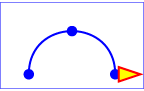
At six seconds |
View this example as SVG
(SVG-enabled browsers only)
The following table shows the supplemental transformation
matrices that are applied to achieve the effect of the motion
path animation.
Example animMotion01 time slices
|
After 0s |
After 3s |
After 6s |
| Supplemental transform
due to movement
along motion path |
translate(100,250) |
translate(250,100) |
translate(400,250) |
| Supplemental transform
due to
rotate="auto" |
rotate(-90) |
rotate(0) |
rotate(90) |
For a list of elements that can be animated using the ‘animateMotion’
element, see Elements,
attributes and properties that can be animated.
The ‘animateTransform’ element animates a transformation attribute
on a target element, thereby allowing animations to control translation,
scaling, rotation and/or skewing.
This section should talk about the ‘transform’ property.
‘animateTransform’
- Categories:
- Animation element
- Content model:
- Any number of the following elements, in any order:script
- Attributes:
- conditional processing attributes — ‘requiredFeatures’, ‘requiredExtensions’, ‘systemLanguage’
- core attributes — ‘id’, ‘xml:base’, ‘xml:lang’, ‘xml:space’
- animation event attributes — ‘onbegin’, ‘onend’, ‘onrepeat’, ‘onload’
- xlink attributes — ‘xlink:href’, ‘xlink:show’, ‘xlink:actuate’, ‘xlink:type’, ‘xlink:role’, ‘xlink:arcrole’, ‘xlink:title’
- animation attribute target attributes — ‘attributeType’, ‘attributeName’
- animation timing attributes — ‘begin’, ‘dur’, ‘end’, ‘min’, ‘max’, ‘restart’, ‘repeatCount’, ‘repeatDur’, ‘fill’
- animation value attributes — ‘calcMode’, ‘values’, ‘keyTimes’, ‘keySplines’, ‘from’, ‘to’, ‘by’
- animation addition attributes — ‘additive’, ‘accumulate’
- ‘type’
- DOM Interfaces:
Attribute definitions:
-
| Name |
Value |
Lacuna value |
Animatable |
| type |
translate | scale | rotate | skewX | skewY |
translate |
no |
-
Indicates the type of transformation which is to have its values
change over time.
The ‘from’, ‘by’ and ‘to’ attributes take a value
expressed using the same syntax that is available for the given transformation
type:
- For a type="translate", each individual
value is expressed as <tx> [,<ty>].
- For a type="scale", each individual
value is expressed as <sx> [,<sy>].
- For a type="rotate", each individual
value is expressed as <rotate-angle> [<cx> <cy>].
- For a type="skewX" and
type="skewY", each individual value is
expressed as <skew-angle>.
(See The ‘transform’ property.)
The ‘values’ attribute for the ‘animateTransform’ element
consists of a semicolon-separated list of values, where each individual value
is expressed as described above for ‘from’, ‘by’ and ‘to’.
The animation effect for ‘animateTransform’ is post-multiplied to the
underlying value for additive ‘animateTransform’ animations (see below)
instead of added to the underlying value, due to the specific behavior of
‘animateTransform’.
From-to, from-by and by animations are defined
in SMIL to be equivalent to a corresponding values animation. See
the Animation function values
section of SMIL Animation ([SMILANIM], section 3.2.2).
However, to animations are a mixture of additive and non-additive
behavior, as described in the How
from, to and by attributes affect additive behavior section of SMIL
Animation ([SMILANIM], section 3.3.6).
To animations provide specific functionality to get a smooth
change from the underlying value to the ‘to’ attribute value, which
conflicts mathematically with the requirement for additive transform
animations to be post-multiplied. As a consequence, in SVG 1.1 the behavior of
to animations for ‘animateTransform’ is undefined. Authors
are suggested to use from-to, from-by, by or
values animations to achieve any desired transform animation.
If ‘calcMode’
has the value 'paced', then the "distance" for the transformation is
calculated as further described in
Paced animations and complex types.
When an animation is active, the effect of non-additive
‘animateTransform’ (i.e., additive="replace")
is to replace the given attribute's value with the transformation defined by
the ‘animateTransform’. The effect of additive (i.e.,
additive="sum") is to post-multiply the
transformation matrix corresponding to the transformation defined by this
‘animateTransform’.
To illustrate:
<rect transform="skewX(30)"...>
<animateTransform attributeName="transform" attributeType="XML"
type="rotate" from="0" to="90" dur="5s"
additive="replace" fill="freeze"/>
<animateTransform attributeName="transform" attributeType="XML"
type="scale" from="1" to="2" dur="5s"
additive="replace" fill="freeze"/>
</rect>
In the code snippet above, because the both animations have
additive="replace", the first
animation overrides the transformation on the rectangle itself
and the second animation overrides the transformation from the
first animation; therefore, at time 5 seconds, the visual
result of the above two animations would be equivalent to the
following static rectangle:
<rect transform="scale(2)" ... />
<rect transform="skewX(30)"...>
<animateTransform attributeName="transform" attributeType="XML"
type="rotate" from="0" to="90" dur="5s"
additive="sum" fill="freeze"/>
<animateTransform attributeName="transform" attributeType="XML"
type="scale" from="1" to="2" dur="5s"
additive="sum" fill="freeze"/>
</rect>
In this code snippet, because the both animations have
additive="sum", the first animation
post-multiplies its transformation to any transformations on
the rectangle itself and the second animation post-multiplies
its transformation to any transformation from the first
animation; therefore, at time 5 seconds, the visual result of
the above two animations would be equivalent to the following
static rectangle:
<rect transform="skewX(30) rotate(90) scale(2)" ... />
The zero value used when performing a by animation
with type="scale" is indeed 0.
Thus, performing the following animation causes the rectangle to be
invisible at time 0s (since the animated transform list value is
'scale(0)'), and be scaled back
to its original size at time 5s (since the animated transform list value is
'scale(1)'):
<rect width="100" height="100">
<animateTransform attributeName="transform" attributeType="XML"
type="scale" by="1" dur="5s" fill="freeze"/>
</rect>
When a transform animation has accumulate='sum',
the accumulation that occurs for each completed repetition of the animation
is computed on the values specified in the ‘animateTransform’ element's
animation value attributes (i.e.,
‘values’, ‘from’, ‘to’ and ‘by’) and not on the
transformation matrix that these values represent.
For example, in the following
code snippet, 3 is added to the scale value at the start of each repetition:
<rect width="100" height="100">
<animateTransform attributeName="transform" attributeType="XML"
type="scale" from="2" to="3" repeatCount="3" dur="4s"
fill="freeze"/>
</rect>
The following graph and table shows the animated ‘transform’ value on
the ‘rect’ over the course of the animation:
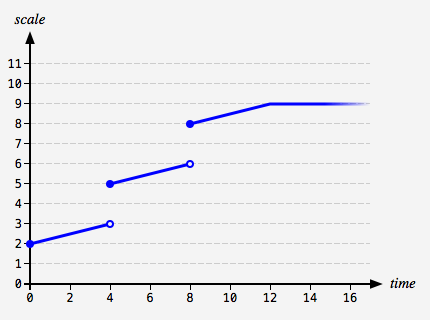 |
| Time | Value |
|---|
| 0s | scale(2) |
| 1s | scale(2.25) |
| 2s | scale(2.5) |
| 3s | scale(2.75) |
| 4s | scale(5) |
| 5s | scale(5.25) |
| 6s | scale(5.5) |
| 7s | scale(5.75) |
| 8s | scale(8) |
| 9s | scale(8.25) |
| 10s | scale(8.5) |
| 11s | scale(8.75) |
| 12s | scale(9) |
|
Transform item types that can have multiple values – 'translate',
'scale' and 'rotate' – are
treated as vectors and accumulation is performed with vector addition. Optional values that
are omitted are taken to have their usual implied value: 1 for
the <sy> component of a 'scale'
and 0 for the <tx> component
of a 'translate' and the <cx cy>
components of a 'rotate'.
For example, consider the following code snippet, which has a cumulative transform
animation of type 'rotate':
<rect width="100" height="100">
<animateTransform attributeName="transform" attributeType="XML"
type="rotate" from="0 30 40" to="10 30 40"
repeatCount="2" dur="1s" fill="freeze"/>
</rect>
At time 1 second, the animated value of ‘transform’ on the ‘rect’
will jump from 'rotate(10 30 40)' to 'rotate(10 60 80)',
because the effect of the accumulation is to take the value at the end of the first repetition,
'10 30 40', and add to it the value at simple duration t = 0s, which
is '0 30 40'.
For a list of attributes and properties that can be animated using the
‘animateTransform’ element, see
Elements, attributes and properties that can be animated.
20.2.16. Elements, attributes and properties that can be animated
The following lists all of the elements which can be animated by an
‘animateMotion’ element:
Each attribute or property within this specification
indicates whether or not it can be animated by SVG's animation
elements. Animatable attributes and properties are designated
as follows:
Animatable: yes.
whereas attributes and properties that cannot be animated are designated:
Animatable: no.
Some properties are defined as being animatable but only for non-additive animations:
Animatable: yes (non-additive).
SVG has a defined set of basic data types
for its various supported attributes and properties. For those
attributes and properties that can be animated, the following
table indicates which animation elements can be used to animate
each of the basic data types. If a given attribute or property
can take values of keywords (which are not additive) or numeric
values (which are additive), then additive animations are
possible if the subsequent animation uses a numeric value even
if the base animation uses a keyword value; however, if the
subsequent animation uses a keyword value, additive animation
is not possible.
Any deviation from the above table or other special note
about the animation capabilities of a particular attribute or
property is included in the section of the specification where
the given attribute or property is defined.
20.3. Animation using the SVG DOM
Example dom01 shows a simple animation
using the DOM.
<?xml version="1.0" standalone="no"?>
<svg width="4cm" height="2cm" viewBox="0 0 400 200"
xmlns="http://www.w3.org/2000/svg"
onload="StartAnimation(evt)" version="1.1">
<script type="application/ecmascript"><![CDATA[
var timevalue = 0;
var timer_increment = 50;
var max_time = 5000;
var text_element;
function StartAnimation(evt) {
text_element = evt.target.ownerDocument.getElementById("TextElement");
ShowAndGrowElement();
}
function ShowAndGrowElement() {
timevalue = timevalue + timer_increment;
if (timevalue > max_time)
return;
// Scale the text string gradually until it is 20 times larger
scalefactor = (timevalue * 20.) / max_time;
text_element.setAttribute("transform", "scale(" + scalefactor + ")");
// Make the string more opaque
opacityfactor = timevalue / max_time;
text_element.setAttribute("opacity", opacityfactor);
// Call ShowAndGrowElement again <timer_increment> milliseconds later.
setTimeout("ShowAndGrowElement()", timer_increment)
}
window.ShowAndGrowElement = ShowAndGrowElement
]]></script>
<rect x="1" y="1" width="398" height="198"
fill="none" stroke="blue" stroke-width="2"/>
<g transform="translate(50,150)" fill="red" font-size="7">
<text id="TextElement">SVG</text>
</g>
</svg>
View
this example as SVG (SVG-enabled browsers only)
The above SVG file contains a single graphics element, a
text string that says "SVG". The animation loops for 5 seconds.
The text string starts out small and transparent and grows to
be large and opaque. Here is an explanation of how this example
works:
- The onload="StartAnimation(evt)" attribute
indicates that, once the document has been fully loaded and
processed, invoke ECMAScript function
StartAnimation.
- The ‘script’ element defines the ECMAScript which makes
the animation happen. The
StartAnimation()
function is only called once to give a value to global
variable text_element and to make the initial
call to ShowAndGrowElement().
ShowAndGrowElement() is called every 50
milliseconds and resets the ‘transform’ and
‘style’ attributes on the text element to new
values each time it is called. At the end of
ShowAndGrowElement, the function tells the
ECMAScript engine to call itself again after 50 more
milliseconds.
- The ‘g’ element shifts the coordinate system so that the
origin is shifted toward the lower-left of the viewing area.
It also defines the fill color and font-size to use when
drawing the text string.
- The ‘text’ element contains the text string and is the
element whose attributes get changed during the
animation.
If scripts are modifying the same attributes or properties
that are being animated by SVG's
animation elements,
the scripts modify the base value for the animation. If a base
value is modified while an animation element is animating the
corresponding attribute or property, the animations are
required to adjust dynamically to the new base value.
If a script is modifying a property on the override style
sheet at the same time that an animation element is
animating that property, the result is
implementation-dependent; thus, it is recommended that this be
avoided.
20.4. DOM interfaces
Below are the DOM interfaces for the elements defined in this chapter.
In addition, TimeEvent, which is
from SMIL Animation,
is included here for easy reference.
20.4.1. Interface TimeEvent
The TimeEvent
interface, defined in
SMIL Animation: Supported interfaces, provides specific
contextual information associated with Time events.
The different types of events that can occur are:
- beginEvent
-
This event is raised when the element local timeline begins
to play. It will be raised each time the element begins the
active duration (i.e. when it restarts, but not when it
repeats). It may be raised both in the course of normal
(i.e. scheduled or interactive) timeline play, as well as
in the case that the element was begun with the
beginElement or
beginElementAt methods. Note that if an
element is restarted while it is currently playing, the
element will raise an end event and another begin event, as
the element restarts.
- Bubbles: No
- Cancelable: No
- Context Info: None
- endEvent
-
This event is raised at the active end of the element. Note
that this event is not raised at the simple end of each
repeat. This event may be raised both in the course of
normal (i.e. scheduled or interactive) timeline play, as
well as in the case that the element was ended with the
endElement or endElementAt
methods. Note that if an element is restarted while it is
currently playing, the element will raise an end event and
another begin event, as the element restarts.
- Bubbles: No
- Cancelable: No
- Context Info: None
- repeatEvent
-
This event is raised when an element local timeline
repeats. It will be raised each time the element repeats,
after the first iteration.
The event provides a numerical indication of which repeat
iteration is beginning. The value is a 0-based integer, but
the repeat event is not raised for the first iteration and
so the observed values of the detail attribute will be
>= 1.
- Bubbles: No
- Cancelable: No
- Context Info: detail (current iteration)
interface TimeEvent : Event {
readonly attribute AbstractView view;
readonly attribute long detail;
void initTimeEvent(DOMString typeArg, AbstractView viewArg, long detailArg);
};
-
- view (readonly AbstractView)
-
- detail (readonly long)
-
Specifies some detail information about the Event, depending on the type
of the event. For this event type, indicates the repeat number for the
animation.
-
- void initTimeEvent(DOMString typeArg, AbstractView viewArg, long detailArg)
-
The
initTimeEvent method is used to initialize the value of a
TimeEvent created with
document.createEvent(). This
method may only be called before the
TimeEvent has been dispatched
via the dispatchEvent method, though it may be called multiple times
during that phase if necessary. If called multiple times, the final
invocation takes precedence.
-
-
DOMString typeArg
Specifies the event type.
-
-
long detailArg
Specifies the Event's detail.
20.4.2. Interface SVGAnimationElement
The SVGAnimationElement interface is the base interface for all
of the animation element interfaces: SVGAnimateElement,
SVGSetElement,
SVGAnimateMotionElement and SVGAnimateTransformElement.
Unlike other SVG DOM interfaces, the SVG DOM does not specify
convenience DOM properties corresponding to the various language
attributes on SVG's animation elements. Specification of these
convenience properties in a way that will be compatible with future
versions of SMIL Animation is expected in a future version of SVG. The
current method for accessing and modifying the attributes on the
animation elements is to use the standard getAttribute,
setAttribute, getAttributeNS and
setAttributeNS defined in
DOM4
[DOM4].
SMIL Animation supports several methods for controlling the behavior of
animation: beginElement(), beginElementAt(),
endElement() and endElementAt(). These methods
are used to begin and end the active duration of an element. Authors can
(but are not required to) declare the timing to respond to the DOM using
the following syntax:
<animate begin="indefinite" end="indefinite" .../>
If a DOM method call is made to begin or end the element (using
beginElement(), beginElementAt(),
endElement() or endElementAt()), each method call
creates a single instance time (in the appropriate instance times list).
These times are then interpreted as part of the semantics of lists of
times, as described in
Evaluation of begin and end time lists.
- The instance time associated with a
beginElement() or
endElement() call is the current presentation time at the
time of the DOM method call.
- The instance time associated with a
beginElementAt() or
endElementAt() call is the current presentation time at the
time of the DOM method call, plus or minus the specified offset.
- Note that
beginElement() is subject to the ‘restart’
attribute in the same manner that event-based begin timing is. Refer
also to SMIL Animation: Restarting animation
([SMILANIM], section 3.3.7).
interface SVGAnimationElement : SVGElement {
readonly attribute SVGElement targetElement;
attribute EventHandler onbegin;
attribute EventHandler onend;
attribute EventHandler onrepeat;
float getStartTime();
float getCurrentTime();
float getSimpleDuration();
void beginElement();
void beginElementAt(float offset);
void endElement();
void endElementAt(float offset);
};
SVGAnimationElement implements SVGTests;
-
- targetElement (readonly SVGElement)
-
The element which is being animated.
- onbegin (EventHandler)
-
- onend (EventHandler)
-
- onrepeat (EventHandler)
-
-
- float getStartTime()
-
Returns the begin time, in seconds, for this animation element's current
interval, if it exists, regardless of whether the interval has begun yet.
If there is no current interval, then a DOMException with code
INVALID_STATE_ERR is thrown.
-
The start time, in seconds, of this animation element's current
interval.
-
- DOMException, code INVALID_STATE_ERR
- The animation element does not
have a current interval.
- float getCurrentTime()
-
Returns the current time in seconds relative to time zero for the given
time container.
-
The current time in seconds relative to time zero for the given
time container.
- float getSimpleDuration()
-
Returns the number of seconds for the simple duration for this animation.
If the simple duration is undefined (e.g., the end time is indefinite),
then an exception is raised.
-
number of seconds for the simple duration for this animation.
-
- DOMException, code NOT_SUPPORTED_ERR
- The simple duration is not
determined on the given element.
- void beginElement()
-
Creates a begin instance time for the current time. The new instance
time is added to the
begin instance times list.
The behavior of this method is equivalent to
beginElementAt(0).
- void beginElementAt(float offset)
-
Creates a begin instance time for the current time plus the specified
offset. The new instance time is added to the
begin instance times list.
-
-
float offset
The offset from the current document time, in seconds, at
which to begin the element.
- void endElement()
-
Creates an end instance time for the current time. The new instance time is added to the
end instance times list.
The behavior of this method is equivalent to
endElementAt(0).
- void endElementAt(float offset)
-
Creates a end instance time for the current time plus the specified
offset. The new instance time is added to the
end instance times list.
-
-
float offset
The offset from the current document time, in seconds, at
which to end the element.
20.4.3. Interface SVGAnimateElement
The SVGAnimateElement interface corresponds to the ‘animate’
element.
Object-oriented access to the attributes of the ‘animate’ element
via the SVG DOM is not available.
interface SVGAnimateElement : SVGAnimationElement {
};
20.4.4. Interface SVGSetElement
The SVGSetElement interface corresponds to the ‘set’
element.
Object-oriented access to the attributes of the ‘set’ element
via the SVG DOM is not available.
interface SVGSetElement : SVGAnimationElement {
};
20.4.5. Interface SVGAnimateMotionElement
The SVGAnimateMotionElement interface corresponds to the
‘animateMotion’ element.
Object-oriented access to the attributes of the ‘animateMotion’
element via the SVG DOM is not available.
interface SVGAnimateMotionElement : SVGAnimationElement {
};
20.4.6. Interface SVGMPathElement
The SVGMPathElement interface corresponds to the ‘mpath’
element.
interface SVGMPathElement : SVGElement {
};
SVGMPathElement implements SVGURIReference;
The SVGAnimateTransformElement interface corresponds to the
‘animateTransform’ element.
Object-oriented access to the attributes of the
‘animateTransform’ element via the SVG DOM is not available.
interface SVGAnimateTransformElement : SVGAnimationElement {
};
SVG Fonts and this chapter are to be removed. Any wording from
this chapter that describes how WOFF support is mandated, or how CSS Fonts
functionality like @font-face can be used to reference Web fonts is
to be moved, probably into the Text chapter. An informative reference to the
SVG-in-OpenType work will probably be added too.
Chapter 21: Fonts
Contents
| SVG 2 Requirement: |
Include explicit support for Web Open Font Format (WOFF). |
| Resolution: |
We will mandate WOFF support in SVG 2. |
| Purpose: |
To allow access to full OpenType features for internationalisation and advanced typography. |
| Owner: |
Chris (no action) |
| SVG 2 Requirement: |
Reference CSS3 Fonts. |
| Resolution: |
SVG 2 will depend on CSS3 Fonts. |
| Purpose: |
Alignment with CSS 2.1 and CSS3 for Web font functionality, and to provide
access to advanced typographic features of fonts. |
| Owner: |
Chris (ACTION-3123) |
21.1. Introduction
Reliable delivery of fonts is a requirement for SVG.
Designers need to create SVG content with arbitrary fonts and
know that the same graphical result will appear when the
content is viewed by all end users, even when end users do not
have the necessary fonts installed on their computers. This
parallels the print world, where the designer uses a given font
when authoring a drawing for print, and the graphical content
appears exactly the same in the printed version as it appeared
on the designer's authoring system.
SVG utilizes the
WebFonts
facility defined in
([CSS3 Fonts]) as a key
mechanism for reliable delivery of font data to end users. In a
common scenario, SVG authoring applications generate
compressed, subsetted WebFonts
for all text elements used by a given SVG document fragment.
One disadvantage to the WebFont
facility in the past was that specifications did not require
support of particular font formats. The result was that
different implementations supported different Web font formats,
thereby making it difficult for Web site creators to post a
single Web site using WebFonts that worked across all user
agents.
SVG 2 mandates support for Web Open Font Format [WOFF], which
is now supported in most user agents. Besides enabling compressed, subsetted WebFonts
with accompanying metadata for clear licensing, WOFF also benefits from OpenType multilingual features
and support for advanced typography. Thus, content authors can author CSS to request discretionary ligatures,
swash forms, old-style figures etc. while also ensuring that a font is provided which supports those features.
In SVG 1.1, to provide a common font format for SVG that is guaranteed
to be supported by all conforming SVG
viewers, SVG provideed a facility to define fonts in SVG.
This facility was called SVG fonts. For backwards compatibility, SVG 2 requires support for a subset
of SVG Fonts, SVG Tiny Fonts, which has been widely deployed especially for mobile content.
21.2. Describing a font
21.2.1. Overview of font descriptions
A font description provides the bridge between an author's
font specification and the font data, which is the data needed
to format text and to render the abstract glyphs to which the
characters map — the actual scalable outlines or bitmaps. Fonts
are referenced by properties, such as the ‘font-family’ property.
Each specified font description is added to the font
database and so that it can be used to select the relevant font
data. The font description contains descriptors such as the
location of the font data on the Web, and characterizations of
that font data. The font descriptors are also needed to match
the font properties to particular font data. The level of
detail of a font description can vary from just the name of the
font up to a list of glyph widths.
For more about font descriptions, refer to
CSS Fonts Module Level 3.
[CSS3FONTS]
21.2.2. Alternative ways for providing a font description
Font descriptions can be specified in either of the
following ways:
- a ‘font-face’ element
- an @font-face rule
([CSS3FONTS], section 4.1) within a CSS
style sheet (only applicable for user agents which support using CSS to
style the SVG content)
21.2.3. The ‘font-face’ element
The ‘font-face’ element
corresponds directly to the @font-face facility
in CSS3 Fonts ([CSS3FONTS], section 4.1). It can be used to describe the
characteristics of any font, SVG font or otherwise.
When used to describe the characteristics of an SVG font
contained within the same document, it is recommended that the
‘font-face’ element be a
child of the ‘font’ element it is describing
so that the ‘font’ element can be
self-contained and fully-described. In this case, any
‘font-face-src’ elements within
the ‘font-face’ element are
ignored as it is assumed that the ‘font-face’ element is describing
the characteristics of its parent ‘font’ element.
Attribute definitions:
- font-family = "<string>"
- Same syntax and semantics as the
‘font-family’ descriptor
within an @font-face rule.
Animatable:
no.
- font-style = "all | [ normal | italic | oblique] [,
[normal | italic | oblique]]*"
- Same syntax and semantics as the ‘font-style’ descriptor
within an
@font-face rule. The style of a font. Takes on the same
values as the ‘
font-style’
property, except that a comma-separated list is
permitted.
If the attribute is not specified, the effect is as if a
value of 'all' were specified.
Animatable:
no.
- font-variant = "[normal | small-caps] [,[normal |
small-caps]]*"
- Same syntax and semantics as the
‘font-variant’
descriptor within an
@font-face rule. Indication of whether this face is the
small-caps variant of a font. Takes on the same values as
the ‘
font-variant’
property, except that a comma-separated list is
permitted.
If the attribute is not specified, the effect is as if a
value of 'normal' were specified.
Animatable:
no.
- font-weight = "all | [normal | bold | 100 | 200 | 300 |
400 | 500 | 600 | 700 | 800 | 900] [, [normal | bold | 100 |
200 | 300 | 400 | 500 | 600 | 700 | 800 |
900]]*"
-
Same syntax and semantics as the
‘font-weight’
descriptor within an
@font-face rule.
The weight of a face relative to others in the same font
family. Takes on the same values as the ‘font-weight’
property with three exceptions:
- relative keywords (bolder, lighter) are not
permitted
- a comma-separated list of values is permitted, for
fonts that contain multiple weights
- an additional keyword, 'all', is permitted, which
means that the font will match for all possible
weights; either because it contains multiple weights,
or because that face only has a single weight.
If the attribute is not specified, the effect is as if a
value of 'all' were specified.
Animatable: no.
- font-stretch = "all | [ normal | ultra-condensed |
extra-condensed | condensed | semi-condensed |
semi-expanded | expanded | extra-expanded | ultra-expanded]
[, [ normal | ultra-condensed | extra-condensed | condensed
| semi-condensed | semi-expanded | expanded |
extra-expanded | ultra-expanded] ]*"
-
Same syntax and semantics as the
‘font-stretch’
descriptor within an
@font-face rule. Indication of the condensed or
expanded nature of the face relative to others in the
same font family. Takes on the same values as the ‘
font-stretch’
property except that:
- relative keywords (wider, narrower) are not
permitted
- a comma-separated list is permitted
- the keyword 'all' is permitted
If the attribute is not specified, the effect is as if a
value of 'normal' were specified.
Animatable: no.
- font-size = "<string>"
- Same syntax and semantics as the
‘font-size’ descriptor
within an
@font-face rule.
Animatable:
no.
CSS3 Fonts does not have a font-size descriptor.
- unicode-range = "<urange> [,
<urange>]*"
- Same syntax and semantics as the
‘unicode-range’
descriptor within an
@font-face rule. The range of ISO 10646 characters [UNICODE]
possibly covered by the glyphs in the font. Except for any
additional information provided in this specification, the
normative definition of the attribute
is in CSS 2.1 ([CSS21], section 4.5).
If the attribute is not specified, the effect is as if a
value of 'U+0-10FFFF' were specified.
Animatable:
no.
- units-per-em = "<number>"
- Same syntax and semantics as the
‘units-per-em’
descriptor within an
@font-face rule. The number of coordinate units on the
em square, the size of the design grid on which glyphs are
laid out.
This value is almost always necessary as nearly every
other attribute requires the definition of a design
grid.
If the attribute is not specified, the effect is as if a
value of '1000' were specified.
Animatable:
no.
CSS3 Fonts does not have a units-per-em descriptor.
- panose-1 = "[<integer>]{10}"
- Same syntax and semantics as the
‘panose-1’ descriptor
within an
@font-face rule. The Panose-1 number, consisting of ten
decimal integers, separated by whitespace. Except for any
additional information provided in this specification, the
normative definition of the attribute
is in CSS2.
If the attribute is not specified, the effect is as if a
value of '0 0 0 0 0 0 0 0 0 0' were specified.
Animatable:
no.
CSS3 Fonts does not have a panose-1 descriptor.
- stemv = "<number>"
- Same syntax and semantics as the
‘stemv’ descriptor
within an
@font-face rule.
Animatable:
no.
CSS3 Fonts does not have a stemv descriptor.
- stemh = "<number>"
- Same syntax and semantics as the
‘stemh’ descriptor
within an
@font-face rule.
Animatable:
no.
CSS3 Fonts does not have a stemh descriptor.
- slope = "<number>"
- Same syntax and semantics as the
‘slope’ descriptor
within an
@font-face rule. The vertical stroke angle of the font.
Except for any additional information provided in this
specification, the normative definition of the attribute
is in CSS2.
If the attribute is not specified, the effect is as if a
value of '0' were specified.
Animatable:
no.
CSS3 Fonts does not have a slope descriptor.
- cap-height = "<number>"
- Same syntax and semantics as the
‘cap-height’ descriptor
within an
@font-face rule. The height of uppercase glyphs in the
font within the font coordinate system.
Animatable:
no.
CSS3 Fonts does not have a cap-height descriptor.
- x-height = "<number>"
- Same syntax and semantics as the
‘x-height’ descriptor
within an
@font-face rule. The height of lowercase glyphs in the
font within the font coordinate system.
Animatable:
no.
CSS3 Fonts does not have an x-height descriptor.
- accent-height = "<number>"
- The distance from the origin to the top of accent
characters, measured by a distance within the font
coordinate system.
If the attribute is not specified, the effect is as if the
attribute were set to the value of the ‘ascent’ attribute.
Animatable:
no.
- ascent = "<number>"
- Same syntax and semantics as the
‘ascent’ descriptor
within an
@font-face rule. The maximum unaccented height of the
font within the font coordinate system.
If the attribute is not specified, the effect is as if the
attribute were set to the difference between the ‘units-per-em’
value and the ‘vert-origin-y’ value for the
corresponding font.
Animatable:
no.
CSS3 Fonts does not have an ascent descriptor.
- descent = "<number>"
- Same syntax and semantics as the
‘descent’ descriptor
within an
@font-face rule. The maximum unaccented depth of the
font within the font coordinate system.
If the attribute is not specified, the effect is as if the
attribute were set to the ‘vert-origin-y’ value for the
corresponding font.
Animatable:
no.
CSS3 Fonts does not have a descent descriptor.
- widths = "<string>"
- Same syntax and semantics as the
‘widths’ descriptor
within an
@font-face rule.
Animatable:
no.
CSS3 Fonts does not have a widths descriptor.
- bbox = "<string>"
- Same syntax and semantics as the
‘bbox’ descriptor within
an
@font-face rule.
Animatable:
no.
CSS3 Fonts does not have a bbox descriptor.
- ideographic = "<number>"
- For horizontally oriented glyph layouts, indicates the
alignment coordinate for glyphs to achieve ideographic
baseline alignment. The value is an offset in the font
coordinate system.
Animatable:
no.
- alphabetic = "<number>"
- Same syntax and semantics as the
‘baseline’ descriptor
within an
@font-face rule. For horizontally oriented glyph
layouts, indicates the alignment coordinate for glyphs to
achieve alphabetic baseline alignment. The value is an
offset in the font coordinate system.
Animatable:
no.
CSS3 Fonts does not have a baseline descriptor.
- mathematical = "<number>"
- Same syntax and semantics as the
‘mathline’ descriptor
within an
@font-face rule. For horizontally oriented glyph
layouts, indicates the alignment coordinate for glyphs to
achieve mathematical baseline alignment. The value is an
offset in the font coordinate system.
Animatable:
no.
CSS3 Fonts does not have a mathline descriptor.
- hanging = "<number>"
- For horizontally oriented glyph layouts, indicates the
alignment coordinate for glyphs to achieve hanging baseline
alignment. The value is an offset in the font coordinate
system.
Animatable:
no.
- v-ideographic = "<number>"
- For vertically oriented glyph layouts, indicates the
alignment coordinate for glyphs to achieve ideographic
baseline alignment. The value is an offset in the font
coordinate system relative to the glyph-specific ‘vert-origin-x’ attribute.
Animatable:
no.
- v-alphabetic = "<number>"
- For vertically oriented glyph layouts, indicates the
alignment coordinate for glyphs to achieve alphabetic
baseline alignment. The value is an offset in the font
coordinate system relative to the glyph-specific ‘vert-origin-x’ attribute.
Animatable:
no.
- v-mathematical = "<number>"
- For vertically oriented glyph layouts, indicates the
alignment coordinate for glyphs to achieve mathematical
baseline alignment. The value is an offset in the font
coordinate system relative to the glyph-specific ‘vert-origin-x’ attribute.
Animatable:
no.
- v-hanging = "<number>"
- For vertically oriented glyph layouts, indicates the
alignment coordinate for glyphs to achieve hanging baseline
alignment. The value is an offset in the font coordinate
system relative to the glyph-specific ‘vert-origin-x’ attribute.
Animatable:
no.
- underline-position = "<number>"
- The ideal position of an underline within the font
coordinate system.
Animatable:
no.
- underline-thickness = "<number>"
- The ideal thickness of an underline, expressed as a
length within the font coordinate system.
Animatable:
no.
- strikethrough-position = "<number>"
- The ideal position of a strike-through within the font
coordinate system.
Animatable:
no.
- strikethrough-thickness = "<number>"
- The ideal thickness of a strike-through, expressed as a
length within the font coordinate system.
Animatable:
no.
- overline-position = "<number>"
- The ideal position of an overline within the font
coordinate system.
Animatable:
no.
- overline-thickness = "<number>"
- The ideal thickness of an overline, expressed as a
length within the font coordinate system.
Animatable:
no.
The following elements and attributes correspond to the
‘src’ descriptor within an
@font-face rule. Refer to the descriptions of the
@font-face rule and
'src' descriptor
in the CSS 2.1 specification ([CSS21],
sections 4.1 and 4.3.)
21.2.4. The ‘font-face-src’ element
The ‘font-face-src’ element, together with the
‘font-face-uri’ and ‘font-face-format’ elements described in the
following sections, correspond to the ‘src’
descriptor within an @font-face rule. (Refer to the descriptions of the
@font-face rule
and 'src' descriptor
in the CSS3 Fonts specification ([CSS3FONTS], sections
4.1 and 4.3.)
A ‘font-face-src’ element contains ‘font-face-uri’ and
‘font-face-name’ elements, which are used for referencing external
and local fonts, respectively.
21.2.5. The ‘font-face-uri’ and ‘font-face-format’ elements
The ‘font-face-uri’ element is used within a ‘font-face-src’
element to reference a font defined inside or outside of the current SVG
document.
When a ‘font-face-uri’ is referencing an SVG font,
then that reference must be to an SVG ‘font’ element, therefore
requiring the use of a fragment identifier [RFC3986].
The referenced ‘font’ element can be local (i.e., within the same
document as the ‘font-face-uri’ element) or remote (i.e., within a
different document).
‘font-face-uri’
- Categories:
- None
- Content model:
- Any number of the following elements, in any order:font-face-format, script
- Attributes:
- DOM Interfaces:
Attribute definitions:
- xlink:href =
"<IRI>"
-
The ‘xlink:href’ attribute specifies the location of the referenced
font.
Animatable: no.
Child ‘font-face-format’ elements of a ‘font-face-uri’
element are used to specify the supported formats of the font referenced by that
‘font-face-uri’ element. They correspond to entries in a
format(…) clause of the
‘src’ descriptor in an @font-face rule.
Attribute definitions:
- string =
"<anything>"
-
The ‘string’ attribute is a hint to the user agent, and specifies
a list of formats that the font referenced by the parent ‘font-face-uri’
element supports. The syntax of the attribute value is a format string
as defined in CSS2,
such as 'truetype'. Refer to the description of the
'src' descriptor
in CSS2 for details on how the format hint is interpreted.
Animatable: no.
CSS3 Fonts does not have format strings.
21.2.6. The ‘font-face-name’ element
The ‘font-face-name’ element is used within a ‘font-face-src’
element to reference a local font by name. It corresponds to a local(…)
clause in an @font-face rule ‘src’ descriptor.
‘font-face-name’
- Categories:
- None
- Content model:
- Any number of the following elements, in any order:script
- Attributes:
- DOM Interfaces:
Attribute definitions:
- name =
"<anything>"
-
The ‘name’ attribute specifies the name of a local font. Unlike
the syntax allowed between the parentheses of the local(…)
clause in an @font-face rule ‘src’ descriptor,
the font name specified in this attribute is not surrounded in single or
double quotes. Refer to the description of the 'src' descriptor
in CSS3 Fonts for details on how the font name is interpreted
([CSS3FONTS], section 4.3).
Animatable: no.
21.3. Overview of SVG fonts
An SVG font is a font defined
using SVG's ‘font’ element.
The purpose of SVG fonts is to allow for delivery of glyph
outlines in display-only environments. SVG fonts that accompany
Web pages must be supported only in browsing and viewing
situations. Graphics editing applications or file translation
tools must not attempt to convert SVG fonts into system fonts.
The intent is that SVG files be interchangeable between two
content creators, but not the SVG fonts that might accompany
these SVG files. Instead, each content creator will need to
license the given font before being able to successfully edit
the SVG file. The ‘font-face-name’ element
indicates the name of licensed font to use for editing.
SVG fonts contain unhinted font outlines. Because of this,
on many implementations there will be limitations regarding the
quality and legibility of text in small font sizes. For
increased quality and legibility in small font sizes, content
creators may want to use an alternate font technology, such as
fonts that ship with operating systems or an alternate WebFont
format.
Because SVG fonts are expressed using SVG elements and
attributes, in some cases the SVG font will take up more space
than if the font were expressed in a different WebFont
format which was especially designed for compact expression of
font data. For the fastest delivery of Web pages, content
creators may want to use an alternate font technology.
A key value of SVG fonts is guaranteed availability in SVG
user agents. In some situations, it might be appropriate for an
SVG font to be the first choice for rendering some text. In
other situations, the SVG font might be an alternate, back-up
font in case the first choice font (perhaps a hinted system
font) is not available to a given user.
The characteristics and attributes of SVG fonts correspond
closely to the font characteristics and parameters described in
the CSS Fonts Modules Level 3 specification
[CSS3FONTS]. In this model,
various font metrics, such as advance values and baseline
locations, and the glyph outlines themselves, are expressed in
units that are relative to an abstract square whose height is
the intended distance between lines of type in the same type
size. This square is called the em square and
it is the design grid on which the glyph
outlines are defined. The value of the ‘units-per-em’
attribute on the ‘font-face’ element specifies how
many units the em square is divided into. Common values for
other font types are, for example, 250 (Intellifont), 1000
(Type 1) and 2048 (TrueType, TrueType GX and Open-Type). Unlike
standard graphics in SVG, where the initial coordinate system
has the y-axis pointing downward (see The initial
coordinate system), the design grid for SVG fonts, along
with the initial coordinate system for the glyphs, has the
y-axis pointing upward for consistency with accepted industry
practice for many popular font formats.
SVG fonts and their associated glyphs do not specify
bounding box information. Because the glyph outlines are
expressed as SVG graphics elements, the implementation has the
option to render the glyphs either using standard graphics
calls or by using special-purpose font rendering technology, in
which case any necessary maximum bounding box and overhang
calculations can be performed from analysis of the graphics
elements contained within the glyph outlines.
An SVG font can be either embedded within the same document
that uses the font or saved as part of an external
resource.
Here is an example of how you might embed an SVG font inside
of an SVG document.
<?xml version="1.0" standalone="yes"?>
<svg width="400px" height="300px" version="1.1"
xmlns = 'http://www.w3.org/2000/svg'>
<defs>
<font id="Font1" horiz-adv-x="1000">
<font-face font-family="Super Sans" font-weight="bold" font-style="normal"
units-per-em="1000" cap-height="600" x-height="400"
ascent="700" descent="300"
alphabetic="0" mathematical="350" ideographic="400" hanging="500">
<font-face-src>
<font-face-name name="Super Sans Bold"/>
</font-face-src>
</font-face>
<missing-glyph><path d="M0,0h200v200h-200z"/></missing-glyph>
<glyph unicode="!" horiz-adv-x="300"><!-- Outline of exclam. pt. glyph --></glyph>
<glyph unicode="@"><!-- Outline of @ glyph --></glyph>
<!-- more glyphs -->
</font>
</defs>
<text x="100" y="100"
style="font-family: 'Super Sans', Helvetica, sans-serif;
font-weight: bold; font-style: normal">Text
using embedded font</text>
</svg>
Here is an example of how you might use the
CSS @font-face facility
([CSS3FONTS], section 4.1) to reference an SVG font which is saved
in an external file. First referenced SVG font file:
<?xml version="1.0" standalone="yes"?>
<svg width="100%" height="100%" version="1.1"
xmlns = 'http://www.w3.org/2000/svg'>
<defs>
<font id="Font2" horiz-adv-x="1000">
<font-face font-family="Super Sans" font-weight="normal" font-style="italic"
units-per-em="1000" cap-height="600" x-height="400"
ascent="700" descent="300"
alphabetic="0" mathematical="350" ideographic="400" hanging="500">
<font-face-src>
<font-face-name name="Super Sans Italic"/>
</font-face-src>
</font-face>
<missing-glyph><path d="M0,0h200v200h-200z"/></missing-glyph>
<glyph unicode="!" horiz-adv-x="300"><!-- Outline of exclam. pt. glyph --></glyph>
<glyph unicode="@"><!-- Outline of @ glyph --></glyph>
<!-- more glyphs -->
</font>
</defs>
</svg>
The SVG file which uses/references the above SVG font
<?xml version="1.0" standalone="yes"?>
<svg width="400px" height="300px" version="1.1"
xmlns = 'http://www.w3.org/2000/svg'>
<defs>
<style type="text/css">
@font-face {
font-family: 'Super Sans';
font-weight: normal;
font-style: italic;
src: url("myfont.svg#Font2") format("svg")
}
</style>
</defs>
<text x="100" y="100"
style="font-family: 'Super Sans'; font-weight:normal;
font-style: italic">Text using referenced font</text>
</svg>
21.4. The ‘font’ element
The ‘font’ element defines an SVG font.
Attribute definitions:
- horiz-origin-x = "<number>"
- The X-coordinate in the font coordinate system of the
origin of a glyph to be used when drawing horizontally
oriented text. (Note that the origin applies to all glyphs
in the font.)
If the attribute is not specified, the effect is as if a
value of '0' were specified.
Animatable:
no.
- horiz-origin-y = "<number>"
- The Y-coordinate in the font coordinate system of the
origin of a glyph to be used when drawing horizontally
oriented text. (Note that the origin applies to all glyphs
in the font.)
If the attribute is not specified, the effect is as if a
value of '0' were specified.
Animatable:
no.
- horiz-adv-x = "<number>"
- The default horizontal advance after rendering a glyph
in horizontal orientation. Glyph widths are required to be
non-negative, even if the glyph is typically rendered
right-to-left, as in Hebrew and Arabic scripts.
Animatable:
no.
- vert-origin-x = "<number>"
- The default X-coordinate in the font coordinate system
of the origin of a glyph to be used when drawing vertically
oriented text.
If the attribute is not specified, the effect is as if the
attribute were set to half of the effective value of
attribute ‘horiz-adv-x’.
Animatable:
no.
- vert-origin-y = "<number>"
- The default Y-coordinate in the font coordinate system
of the origin of a glyph to be used when drawing vertically
oriented text.
If the attribute is not specified, the effect is as if the
attribute were set to the position specified by the font's
‘ascent’ attribute.
Animatable:
no.
- vert-adv-y = "<number>"
- The default vertical advance after rendering a glyph in
vertical orientation.
If the attribute is not specified, the effect is as if a
value equivalent of one em were specified (see
‘units-per-em’).
Animatable:
no.
Each ‘font’ element must have a ‘font-face’
child element which describes various characteristics of the font.
21.5. The ‘glyph’ element
The ‘glyph’ element
defines the graphics for a given glyph. The coordinate system
for the glyph is defined by the various attributes in the
‘font’ element.
The graphics that make up the ‘glyph’ can be a single
path data specification within
the ‘d’ attribute, arbitrary SVG as
content within the ‘glyph’, or both.
These two alternatives are processed differently (see
below).
‘glyph’
- Categories:
- Container element
- Content model:
- Any number of the following elements, in any order:
- animation elements — ‘animate’, ‘animateMotion’, ‘animateTransform’, ‘discard’, ‘set’
- descriptive elements — ‘desc’, ‘title’, ‘metadata’
- paint server elements — ‘solidColor’, ‘linearGradient’, ‘radialGradient’, ‘meshGradient’, ‘pattern’, ‘hatch’
- shape elements — ‘circle’, ‘ellipse’, ‘line’, ‘path’, ‘polygon’, ‘polyline’, ‘rect’
- structural elements — ‘defs’, ‘g’, ‘svg’, ‘symbol’, ‘use’
a, altGlyphDef, clipPath, cursor, filter, font, font-face, foreignObject, image, marker, mask, script, style, switch, text, view - Attributes:
- DOM Interfaces:
Attribute definitions:
- unicode = "<string>"
- One or more Unicode characters indicating the sequence
of Unicode characters which corresponds to this glyph. If a
character is provided, then this glyph corresponds to the
given Unicode character. If multiple characters are
provided, then this glyph corresponds to the given sequence
of Unicode characters. One use of a sequence of characters
is ligatures. For example, if unicode="ffl", then the given
glyph will be used to render the sequence of characters
"f", "f", and "l".
It is often useful to refer to characters using XML
character references expressed in hexadecimal notation or
decimal notation. For example, unicode="ffl" could be expressed
as XML character references in hexadecimal notation as
unicode="ffl"
or in decimal notation as unicode="ffl".
The ‘unicode’ attribute
contributes to the process for deciding which glyph(s) are
used to represent which character(s). See glyph selection
rules. If the ‘unicode’ attribute is not
provided for a given ‘glyph’, then the only way
to use this glyph is via an ‘altGlyph’ reference.
Animatable:
no.
- glyph-name = "<author-ident> [, <author-ident> ]*
"
- A name for the glyph. It is recommended that glyph
names be unique within a font. The glyph names can be used
in situations where Unicode character numbers do not
provide sufficient information to access the correct glyph,
such as when there are multiple glyphs per Unicode
character. The glyph names can be referenced in kerning
definitions.
Animatable:
no.
- d = "path
data"
- The definition of the outline of a glyph, using the
same syntax as for the ‘d’ attribute on a ‘path’
element. See Path data.
See below for a discussion of this attribute.
Animatable:
no.
- orientation = "h | v"
- Indicates that the given glyph is only to be used for a
particular inline-progression-direction (i.e., horizontal
or vertical). If the attribute is not specified, then the
glyph can be used in all cases (i.e., both horizontal and
vertical inline-progression-direction).
Animatable:
no.
- arabic-form = "initial | medial | terminal |
isolated"
- For Arabic glyphs, indicates which of the four possible
forms this glyph represents.
Animatable:
no.
- lang = "%LanguageCodes;"
- The attribute value is a comma-separated list of
language names as defined in
BCP 47
[BCP47].
The glyph can be used if the ‘xml:lang’ attribute exactly
matches one of the languages given in the value of this
parameter, or if the ‘xml:lang’ attribute exactly
equals a prefix of one of the languages given in the value
of this parameter such that the first tag character
following the prefix is "-".
Animatable:
no.
- horiz-adv-x = "<number>"
- The horizontal advance after rendering the glyph in
horizontal orientation. If the attribute is not specified,
the effect is as if the attribute were set to the value of
the font's ‘horiz-adv-x’ attribute.
Glyph widths are required to be non-negative, even if the
glyph is typically rendered right-to-left, as in Hebrew and
Arabic scripts.
Animatable:
no.
- vert-origin-x = "<number>"
- The X-coordinate in the font coordinate system of the
origin of the glyph to be used when drawing vertically
oriented text.
If the attribute is not specified, the effect is as if the
attribute were set to the value of the font's ‘vert-origin-x’
attribute.
Animatable:
no.
- vert-origin-y = "<number>"
- The Y-coordinate in the font coordinate system of the
origin of a glyph to be used when drawing vertically
oriented text.
If the attribute is not specified, the effect is as if the
attribute were set to the value of the font's ‘vert-origin-y’
attribute.
Animatable:
no.
- vert-adv-y = "<number>"
- The vertical advance after rendering a glyph in
vertical orientation.
If the attribute is not specified, the effect is as if the
attribute were set to the value of the font's ‘vert-adv-y’ attribute.
Animatable:
no.
The graphics for the ‘glyph’ can be specified using
either the ‘d’ attribute or arbitrary SVG as
content within the ‘glyph’.
If the ‘d’ attribute is specified, then the
path data within this attribute is processed as follows:
- Any relative coordinates within the path data
specification are converted into equivalent absolute
coordinates
- Each of these absolute coordinates is transformed from
the font coordinate system into the ‘text’ element's current
coordinate system such that the origin of the font coordinate
system is properly positioned and rotated to align with the
current text
position and orientation for the glyph, and scaled so
that the correct ‘
font-size’ is achieved.
- The resulting, transformed path specification is rendered
as if it were a ‘path’ element, using the
styling properties that apply to the characters which
correspond to the given glyph, and ignoring any styling
properties specified on the ‘font’ element or the
‘glyph’ element.
If the ‘glyph’ has child
elements, then those child elements are rendered in a manner
similar to how the ‘use’ element renders a
referenced symbol. The rendering effect is as if the contents
of the referenced ‘glyph’
element were deeply cloned into a separate non-exposed DOM
tree. Because the cloned DOM tree is non-exposed, the SVG DOM
does not show the cloned instance.
For user agents that support Styling with CSS, the
conceptual deep cloning of the referenced ‘glyph’ element into a non-exposed
DOM tree also copies any property values resulting from
the CSS cascade
([CSS21], chapter 6)
on the referenced ‘glyph’ and
its contents, and also applies any property values on the
‘font’ element. CSS 2.1 selectors
can be applied to the original (i.e., referenced) elements
because they are part of the formal document structure. CSS 2.1
selectors cannot be applied to the (conceptually) cloned DOM
tree because its contents are not part of the formal document
structure.
Property inheritance, however, works as if the referenced
‘glyph’ had been textually
included as a deeply cloned child within the document tree. The
referenced ‘glyph’ inherits
properties from the element that contains the characters that
correspond to the ‘glyph’.
The ‘glyph’ does not inherit
properties from the ‘font’ element's original
parents.
In the generated content, for each instance of a given ‘glyph’, a
‘g’ is created which carries
with it all property values resulting from the CSS cascade
on the ‘font’ element for the
referenced ‘glyph’. Within
this ‘g’ is another ‘g’ which carries with it all
property values resulting from the CSS cascade
on the ‘glyph’ element. The
original contents of the ‘glyph’ element are deep-cloned
within the inner ‘g’ element.
If the ‘glyph’ has both a
‘d’ attribute and child elements,
the ‘d’ attribute is rendered first, and
then the child elements.
In general, the ‘d’ attribute renders in the same
manner as system fonts. For example, a dashed pattern will
usually look the same if applied to a system font or to an SVG
font which defines its glyphs using the ‘d’ attribute. Many implementations
will be able to render glyphs defined with the ‘d’ attribute quickly and will be
able to use a font cache for further performance gains.
Defining a glyph by including child elements within the
‘glyph’ gives greater
flexibility but more complexity. Different fill and stroke
techniques can be used on different parts of the glyphs. For
example, the base of an "i" could be red, and the dot could be
blue. This approach has an inherent complexity with units. Any
properties specified on a text elements which represents a
length, such as the ‘stroke-width’ property, might
produce surprising results since the length value will be
processed in the coordinate system of the glyph.
21.6. The ‘missing-glyph’ element
The ‘missing-glyph’ element defines the graphics to use if
there is an attempt to draw a glyph from a given font and the given
glyph has not been defined. The attributes on the ‘missing-glyph’
element have the same meaning as the corresponding attributes on the
‘glyph’ element.
‘missing-glyph’
- Categories:
- Container element
- Content model:
- Any number of the following elements, in any order:
- animation elements — ‘animate’, ‘animateMotion’, ‘animateTransform’, ‘discard’, ‘set’
- descriptive elements — ‘desc’, ‘title’, ‘metadata’
- paint server elements — ‘solidColor’, ‘linearGradient’, ‘radialGradient’, ‘meshGradient’, ‘pattern’, ‘hatch’
- shape elements — ‘circle’, ‘ellipse’, ‘line’, ‘path’, ‘polygon’, ‘polyline’, ‘rect’
- structural elements — ‘defs’, ‘g’, ‘svg’, ‘symbol’, ‘use’
a, altGlyphDef, clipPath, cursor, filter, font, font-face, foreignObject, image, marker, mask, script, style, switch, text, view - Attributes:
- DOM Interfaces:
21.7. Glyph selection rules
When determining the glyph(s) to draw a given character sequence, the
‘font’ element is searched from its first ‘glyph’
element to its last in logical order to see if the upcoming sequence
of Unicode characters to be rendered matches the sequence of Unicode
characters specified in the ‘unicode’ attribute for the
given ‘glyph’ element. The first successful match is used. Thus,
the "ffl" ligature needs to be defined in the font before the "f" glyph;
otherwise, the "ffl" will never be selected.
Note that any occurrences of ‘altGlyph’ take precedence over
the above glyph selection rules within an SVG font.
21.8. The ‘hkern’ and ‘vkern’ elements
The ‘hkern’ and ‘vkern’ elements define kerning
pairs for horizontally-oriented and vertically-oriented pairs
of glyphs, respectively.
Kern pairs identify pairs of glyphs within a single font
whose inter-glyph spacing is adjusted when the pair of glyphs
are rendered next to each other. In addition to the requirement
that the pair of glyphs are from the same font, SVG font
kerning happens only when the two glyphs correspond to
characters which have the same values for properties ‘font-family’,
‘font-size’, ‘font-style’, ‘font-weight’,
‘font-variant’, ‘font-stretch’, ‘font-size-adjust’
and ‘font’.
An example of a kerning pair are the letters "Va", where the
typographic result might look better if the letters "V" and the
"a" were rendered slightly closer together.
Right-to-left and bidirectional text in SVG is laid out in a
two-step process, which is described in Relationship
with bidirectionality. If SVG fonts are used, before
kerning is applied, characters are re-ordered into
left-to-right (or top-to-bottom, for vertical text) visual
rendering order. Kerning from SVG fonts is then applied on
pairs of glyphs which are rendered contiguously. The first
glyph in the kerning pair is the left (or top) glyph in visual
rendering order. The second glyph in the kerning pair is the
right (or bottom) glyph in the pair.
For convenience to font designers and to minimize file
sizes, a single ‘hkern’ and
‘vkern’ can define a single
kerning adjustment value between one set of glyphs (e.g., a
range of Unicode characters) and another set of glyphs (e.g.,
another range of Unicode characters).
The ‘hkern’ element
defines kerning pairs and adjustment values in the horizontal
advance value when drawing pairs of glyphs which the two glyphs
are contiguous and are both rendered horizontally (i.e.,
side-by-side). The spacing between characters is reduced by the
kerning adjustment. (Negative kerning adjustments increase the
spacing between characters.)
The ‘vkern’ element
defines kerning pairs and adjustment values in the vertical
advance value when drawing pairs of glyphs together when
stacked vertically. The spacing between characters is reduced
by the kerning adjustment.
‘hkern’
- Categories:
- None
- Content model:
- Any number of the following elements, in any order:script
- Attributes:
- aria attributes — ‘aria-activedescendant’, ‘aria-atomic’, ‘aria-autocomplete’, ‘aria-busy’, ‘aria-checked’, ‘aria-controls’, ‘aria-describedat’, ‘aria-describedby’, ‘aria-disabled’, ‘aria-dropeffect’, ‘aria-expanded’, ‘aria-flowto’, ‘aria-grabbed’, ‘aria-haspopup’, ‘aria-hidden’, ‘aria-invalid’, ‘aria-label’, ‘aria-labelledby’, ‘aria-level’, ‘aria-live’, ‘aria-multiline’, ‘aria-multiselectable’, ‘aria-orientation’, ‘aria-owns’, ‘aria-posinset’, ‘aria-pressed’, ‘aria-readonly’, ‘aria-relevant’, ‘aria-required’, ‘aria-selected’, ‘aria-setsize’, ‘aria-sort’, ‘aria-valuemax’, ‘aria-valuemin’, ‘aria-valuenow’, ‘aria-valuetext’, ‘role’
- navigation attributes — ‘tabindex’
- core attributes — ‘id’, ‘xml:base’, ‘xml:lang’, ‘xml:space’
- ‘u1’
- ‘g1’
- ‘u2’
- ‘g2’
- ‘k’
- DOM Interfaces:
‘vkern’
- Categories:
- None
- Content model:
- Any number of the following elements, in any order:script
- Attributes:
- DOM Interfaces:
Attribute definitions:
- u1 = "[<character> | <urange> ] [,
[<character> | <urange>] ]* "
- A sequence (comma-separated) of Unicode characters
(refer to the description of the ‘unicode’
attribute to the ‘glyph’ element for a
description of how to express individual Unicode
characters) and/or ranges of Unicode characters (see
description of ranges of Unicode characters in CSS2;
[CSS3FONTS], section 4.5) which
identify a set of possible first glyphs in the kerning
pair. If a given Unicode character within the set has
multiple corresponding ‘glyph’ elements (i.e.,
there are multiple ‘glyph’ elements with the
same ‘unicode’ attribute value, but
different ‘glyph-name’ values), then all
such glyphs are included in the set. Comma is the separator
character; thus, to kern a comma, specify the comma as part
of a range of Unicode characters or as a glyph name using
the ‘g1’ attribute. The total set of
possible first glyphs in the kerning pair is the union of
glyphs specified by the ‘u1’ and ‘g1’ attributes.
Animatable:
no.
- g1 = "<author-ident> [, <author-ident> ]*
"
- A sequence (comma-separated) of glyph names (i.e.,
values that match ‘glyph-name’ attributes
on ‘glyph’ elements) which
identify a set of possible first glyphs in the kerning
pair. All glyphs with the given glyph name are included in
the set. The total set of possible first glyphs in the
kerning pair is the union of glyphs specified by the
‘u1’ and ‘g1’ attributes.
Animatable:
no.
- u2 = "[<character> | <urange>] [,
[<character> | <urange>] ]* "
- Same as the ‘u1’ attribute, except that ‘u2’
specifies possible second glyphs in the kerning pair.
Animatable:
no.
- g2 = "<author-ident> [, <author-ident> ]*
"
- Same as the ‘g1’ attribute, except that ‘g2’
specifies possible second
glyphs in the kerning pair.
Animatable:
no.
- k = "<number>"
- The amount to decrease the spacing between the two
glyphs in the kerning pair. The value is in the font
coordinate system. This attribute is required.
Animatable:
no.
At least one each of ‘u1’ or ‘g1’ and at least one
of ‘u2’ or ‘g2’ must be provided.
21.9. DOM interfaces
21.9.1. Interface SVGFontElement
The SVGFontElement interface corresponds to the
‘font’ element.
Object-oriented access to the attributes of the ‘font’ element
via the SVG DOM is not available.
interface SVGFontElement : SVGElement {
};
21.9.2. Interface SVGGlyphElement
The SVGGlyphElement interface corresponds to the
‘glyph’ element.
Object-oriented access to the attributes of the ‘glyph’ element
via the SVG DOM is not available.
interface SVGGlyphElement : SVGElement {
};
21.9.3. Interface SVGMissingGlyphElement
The SVGMissingGlyphElement interface corresponds to the
‘missing-glyph’ element.
Object-oriented access to the attributes of the ‘missing-glyph’ element
via the SVG DOM is not available.
interface SVGMissingGlyphElement : SVGElement {
};
21.9.4. Interface SVGHKernElement
The SVGHKernElement interface corresponds to the
‘hkern’ element.
Object-oriented access to the attributes of the ‘hkern’ element
via the SVG DOM is not available.
interface SVGHKernElement : SVGElement {
};
21.9.5. Interface SVGVKernElement
The SVGVKernElement interface corresponds to the
‘vkern’ element.
Object-oriented access to the attributes of the ‘vkern’ element
via the SVG DOM is not available.
interface SVGVKernElement : SVGElement {
};
21.9.6. Interface SVGFontFaceElement
The SVGFontFaceElement interface corresponds to the
‘font-face’ element.
Object-oriented access to the attributes of the ‘font-face’ element
via the SVG DOM is not available.
interface SVGFontFaceElement : SVGElement {
};
21.9.7. Interface SVGFontFaceSrcElement
The SVGFontFaceSrcElement interface corresponds to the
‘font-face-src’ element.
Object-oriented access to the attributes of the ‘font-face-src’ element
via the SVG DOM is not available.
interface SVGFontFaceSrcElement : SVGElement {
};
21.9.8. Interface SVGFontFaceUriElement
The SVGFontFaceUriElement interface corresponds to the
‘font-face-uri’ element.
Object-oriented access to the attributes of the ‘font-face-uri’ element
via the SVG DOM is not available.
interface SVGFontFaceUriElement : SVGElement {
};
The SVGFontFaceFormatElement interface corresponds to the
‘font-face-format’ element.
Object-oriented access to the attributes of the ‘font-face-format’ element
via the SVG DOM is not available.
interface SVGFontFaceFormatElement : SVGElement {
};
21.9.10. Interface SVGFontFaceNameElement
The SVGFontFaceNameElement interface corresponds to the
‘font-face-name’ element.
Object-oriented access to the attributes of the ‘font-face-name’ element
via the SVG DOM is not available.
interface SVGFontFaceNameElement : SVGElement {
};
Chapter 23: Backwards Compatibility
A user agent (UA) might not have the ability to process and
view SVG content. The following list outlines two of the
backwards compatibility scenarios associated with SVG
content:
-
For XML grammars with the ability to embed SVG content, it
is assumed that some sort of alternate representation
capability such as the ‘switch’ element and some sort of
feature-availability test facility (such as what is
described in the SMIL 3.0 specification
[SMIL]) will be
available.
This ‘switch’ element and feature-availability test
facility (or their equivalents) are the recommended way for
XML authors to provide an alternate representation to SVG
content, such as an image or a text string. The following
example shows how to embed an SVG drawing within a SMIL 1.0
document such that an alternate image will display in the
event the user agent doesn't support SVG. Note that the
MIME type in the ‘type’ attribute
is an important means for the user agent to decide if it can decode
the referenced media.
In this example, the SVG content is included via a URL
reference. With some parent XML grammars it will also be
possible to include an SVG document fragment inline within
the same file as its parent grammar.
<?xml version="1.0" standalone="yes"?>
<smil>
<body>
<!-- With SMIL 1.0, the first child element of 'switch'
which the SMIL 1.0 user agent is able to process
and which tests true will get processed and all other
child elements will have no visual effect. In this case,
if the SMIL 1.0 user agent can process "image/svg+xml",
then the SVG will appear; otherwise, the alternate image
(the second child element) will appear. -->
<switch>
<!-- Render the SVG if possible. -->
<ref type="image/svg+xml" src="drawing.svg" />
<!-- Else, render the alternate image. -->
<img src="alternate_image.jpg" />
</switch>
</body>
</smil>
-
For HTML 4, SVG drawings can be embedded using the
‘object’ element. An alternate
representation such as an image can be included as the content
of the ‘object’ element. In
this case, the SVG content usually will be included via a URL
reference. The following example shows how to use the
‘object’ element to include an SVG
drawing via a URL reference with an image serving as the alternate
representation in the absence of an SVG user agent:
<html>
<body>
<object type="image/svg+xml" data="drawing.svg">
<!-- The contents of the 'object' element (i.e., an alternate
image) are drawn in the event the user agent cannot process
the SVG drawing. -->
<img src="alternate_image.jpg" alt="alternate description">
</object>
</body>
</html>
Chapter 24: Extensibility
Contents
24.1. Foreign namespaces and private data
SVG allows inclusion of elements from foreign namespaces
anywhere with the SVG content. In general, the SVG user agent
will include the unknown elements in the DOM but will otherwise
ignore unknown elements. (The notable exception is described
under Embedding Foreign Object
Types.)
Additionally, SVG allows inclusion of attributes from
foreign namespaces on any SVG element. The SVG user agent will
include unknown attributes in the DOM but with otherwise ignore
unknown attributes.
SVG's ability to include foreign namespaces can be used for
the following purposes:
- Application-specific information so that authoring
applications can include model-level data in the SVG content
to serve their "roundtripping" purposes (i.e., the ability to
write, then read a file without loss of higher-level
information).
- Supplemental data for extensibility. For example, suppose
you have an extrusion extension which takes any 2D graphics
and extrudes it in three dimensions. When applying the
extrusion extension, you probably will need to set some
parameters. The parameters can be included in the SVG content
by inserting elements from an extrusion extension
namespace.
To illustrate, a business graphics authoring application
might want to include some private data within an SVG document
so that it could properly reassemble the chart (a pie chart in
this case) upon reading it back in:
<?xml version="1.0" standalone="yes"?>
<svg width="4in" height="3in" version="1.1"
xmlns = 'http://www.w3.org/2000/svg'>
<defs>
<myapp:piechart xmlns:myapp="http://example.org/myapp"
title="Sales by Region">
<myapp:pieslice label="Northern Region" value="1.23"/>
<myapp:pieslice label="Eastern Region" value="2.53"/>
<myapp:pieslice label="Southern Region" value="3.89"/>
<myapp:pieslice label="Western Region" value="2.04"/>
<!-- Other private data goes here -->
</myapp:piechart>
</defs>
<desc>This chart includes private data in another namespace
</desc>
<!-- In here would be the actual SVG graphics elements which
draw the pie chart -->
</svg>
24.2. Embedding foreign object types
One goal for SVG is to provide a mechanism by which other
XML language processors can render into an area within an SVG
drawing, with those renderings subject to the various
transformations and compositing parameters that are currently
active at a given point within the SVG content tree. One
particular example of this is to provide a frame for XML
content styled with CSS or XSL so that dynamically reflowing
text (subject to SVG transformations and compositing) could be
inserted into the middle of some SVG content. Another example
is inserting a MathML expression into
an SVG drawing [MATHML].
The ‘foreignObject’
element allows for inclusion of a foreign namespace which has
its graphical content drawn by a different user agent. The
included foreign graphical content is subject to SVG
transformations, filters, clipping, masking and compositing.
The contents of ‘foreignObject’ are assumed to be
from a different namespace. Any SVG elements within a ‘foreignObject’ will not be drawn,
except in the situation where a properly defined SVG
subdocument with a proper ‘xmlns’
(see Namespaces in XML
[XML-NS])
attribute specification is embedded recursively. One situation
where this can occur is when an SVG document fragment is
embedded within another non-SVG document fragment, which in
turn is embedded within an SVG document fragment (e.g., an SVG
document fragment contains an XHTML document fragment which in
turn contains yet another SVG document fragment).
Usually, a ‘foreignObject’
will be used in conjunction with the ‘switch’ element and
the ‘requiredExtensions’ attribute to
provide proper checking for user agent support and provide an
alternate rendering in case user agent support is not
available.
24.3. The ‘foreignObject’ element
‘foreignObject’
- Categories:
- Graphics element, structurally external element
- Content model:
- Any elements or character data.
- Attributes:
- aria attributes — ‘aria-activedescendant’, ‘aria-atomic’, ‘aria-autocomplete’, ‘aria-busy’, ‘aria-checked’, ‘aria-controls’, ‘aria-describedat’, ‘aria-describedby’, ‘aria-disabled’, ‘aria-dropeffect’, ‘aria-expanded’, ‘aria-flowto’, ‘aria-grabbed’, ‘aria-haspopup’, ‘aria-hidden’, ‘aria-invalid’, ‘aria-label’, ‘aria-labelledby’, ‘aria-level’, ‘aria-live’, ‘aria-multiline’, ‘aria-multiselectable’, ‘aria-orientation’, ‘aria-owns’, ‘aria-posinset’, ‘aria-pressed’, ‘aria-readonly’, ‘aria-relevant’, ‘aria-required’, ‘aria-selected’, ‘aria-setsize’, ‘aria-sort’, ‘aria-valuemax’, ‘aria-valuemin’, ‘aria-valuenow’, ‘aria-valuetext’, ‘role’
- navigation attributes — ‘tabindex’
- core attributes — ‘id’, ‘xml:base’, ‘xml:lang’, ‘xml:space’
- conditional processing attributes — ‘requiredFeatures’, ‘requiredExtensions’, ‘systemLanguage’
- graphical event attributes — ‘onfocusin’, ‘onfocusout’, ‘onclick’, ‘onmousedown’, ‘onmouseup’, ‘onmouseover’, ‘onmousemove’, ‘onmouseout’, ‘onload’
- presentation attributes —
- style attributes — ‘class’, ‘style’
- ‘x’
- ‘y’
- ‘width’
- ‘height’
- DOM Interfaces:
Attribute definitions:
- x = "<length>"
- The x-axis coordinate of one corner of the rectangular
region into which the graphics associated with the contents
of the ‘foreignObject’
will be rendered.
If the attribute is not specified, the effect is as if a
value of '0' were specified.
Animatable:
yes.
- y = "<length>"
- The y-axis coordinate of one corner of the rectangular
region into which the referenced document is placed.
If the attribute is not specified, the effect is as if a
value of '0' were specified.
Animatable:
yes.
- width = "<length>"
- The width of the rectangular region into which the
referenced document is placed.
A negative value is an error (see Error processing).
A value of zero disables rendering of the element.
Animatable:
yes.
- height = "<length>"
- The height of the rectangular region into which the
referenced document is placed.
A negative value is an error (see Error processing).
A value of zero disables rendering of the element.
Animatable:
yes.
24.4. An example
Here is an example:
<?xml version="1.0" standalone="yes"?>
<svg width="4in" height="3in" version="1.1"
xmlns = 'http://www.w3.org/2000/svg'>
<desc>This example uses the 'switch' element to provide a
fallback graphical representation of an paragraph, if
XMHTML is not supported.</desc>
<!-- The 'switch' element will process the first child element
whose testing attributes evaluate to true.-->
<switch>
<!-- Process the embedded XHTML if the requiredExtensions attribute
evaluates to true (i.e., the user agent supports XHTML
embedded within SVG). -->
<foreignObject width="100" height="50"
requiredExtensions="http://example.com/SVGExtensions/EmbeddedXHTML">
<!-- XHTML content goes here -->
<body xmlns="http://www.w3.org/1999/xhtml">
<p>Here is a paragraph that requires word wrap</p>
</body>
</foreignObject>
<!-- Else, process the following alternate SVG.
Note that there are no testing attributes on the 'text' element.
If no testing attributes are provided, it is as if there
were testing attributes and they evaluated to true.-->
<text font-size="10" font-family="Verdana">
<tspan x="10" y="10">Here is a paragraph that</tspan>
<tspan x="10" y="20">requires word wrap.</tspan>
</text>
</switch>
</svg>
It is not required that SVG user agent support the ability
to invoke other arbitrary user agents to handle embedded
foreign object types; however, all conforming SVG user agents
would need to support the ‘switch’ element and
must be able to render valid SVG elements when they appear as
one of the alternatives within a ‘switch’
element.
Ultimately, it is expected that commercial Web browsers will
support the ability for SVG to embed content from other XML
grammars which use CSS or XSL to format their content, with the
resulting CSS- or XSL-formatted content subject to SVG
transformations and compositing. At this time, such a
capability is not a requirement.
24.5. DOM interfaces
24.5.1. Interface SVGForeignObjectElement
The
SVGForeignObjectElement interface corresponds to the
‘foreignObject’ element.
interface SVGForeignObjectElement : SVGGraphicsElement {
readonly attribute SVGAnimatedLength x;
readonly attribute SVGAnimatedLength y;
readonly attribute SVGAnimatedLength width;
readonly attribute SVGAnimatedLength height;
};
-
- x (readonly SVGAnimatedLength)
-
- y (readonly SVGAnimatedLength)
-
- width (readonly SVGAnimatedLength)
-
- height (readonly SVGAnimatedLength)
-
Appendix A: SVG Document Object Model (DOM)
Contents
This appendix is normative.
A.1. SVG DOM overview
The SVG DOM is defined in terms of Web IDL
interfaces. All IDL fragments in this specification must be interpreted as
required for conforming IDL fragments,
as described in the Web IDL specification. [WEBIDL]
The SVG DOM builds upon a number of DOM specifications. In particular:
A DOM application can use the hasFeature method of
the DOMImplementation interface to
verify that the interfaces listed in this section are
supported. The list of available interfaces is provided in
section Feature strings
for the hasFeature method call.
All SVG DOM objects that directly correspond to an attribute, e.g.
the SVGAnimatedLength ry in an
SVGRectElement, are live.
This means that any changes made to the attribute are immediately
reflected in the corresponding SVG DOM object.
A.1.1. SVG DOM object initialization
The SVG DOM allows attributes to be accessed even though they haven't been
specified explicitly in the document markup. When this happens an appropriate object
is created, initialized and returned. This newly constructed object does not affect rendering until
it is modified for the first time. After the first modification the object
becomes live, such that any modifications made to the corresponding
attribute are immediately reflected in the object.
For example, if rectElement.x.baseVal is accessed
and the ‘x’ attribute was not specified in the document, the
returned SVG DOM object would represent the value 0 user units.
For cases where an attribute has a default value the returned SVG DOM object that must reflect that value,
and for all other cases the object is initialized as described below.
If a particular SVG DOM interface is not listed below that means
that the object initialization shall be done using the values for the
objects that the interface contains, e.g DOMString in the
case of SVGAnimatedString, or four floats in the case of SVGRect.
- SVGTextContentElement.textLength
- Initialized with the return-value of getComputedTextLength
on the same element.
- DOMString
- Initialized as the empty string ("").
- float
- long
- short
- Initialized as 0.
- boolean
- Initialized as false.
- SVGLength
- Initialized as 0 user units
(SVG_LENGTHTYPE_NUMBER).
- SVGLengthList
- SVGNumberList
- SVGPointList
- SVGStringList
- SVGTransformList
- Initialized as the empty list.
- SVGAngle
- Initialized as 0 in unspecified units
(SVG_ANGLETYPE_UNSPECIFIED).
- SVGZoomAndPan
- Initialized as 0
(SVG_ZOOMANDPAN_UNKNOWN).
- SVGPreserveAspectRatio
- Initialized as 'xMidYMid meet'.
A.2. Elements in the SVG DOM
Every Element object that corresponds to an SVG element (that is,
an element with namespace URI "http://www.w3.org/2000/svg" and a
local name that is one of the elements defined in this specification)
must also implement the DOM interface identified in element definition.
For example, in The ‘rect’ element,
the SVGRectElement interface is identified. This means that every
Element object whose namespace URI is "http://www.w3.org/2000/svg"
and whose local name is "rect" must also implement SVGRectElement.
A.3. Naming conventions
The SVG DOM follows similar naming conventions to the
Document Object Model HTML
([DOM1], chapter 2).
All names are defined as one or more English words
concatenated together to form a single string. Property or
method names start with the initial keyword in lowercase, and
each subsequent word starts with a capital letter. For example,
a property that returns document meta information such as the
date the file was created might be named "fileDateCreated". In
the ECMAScript binding, properties are exposed as properties of
a given object.
For attributes with the CDATA data type, the case of the
return value is that given in the source document.
A.4. Feature strings for the hasFeature method call
The feature strings that are available for the
hasFeature method call that is part of the SVG
DOM's support for the DOMImplementation interface
defined in
DOM4
[DOM4]
are the same features strings available for the ‘requiredFeatures’ attribute that is
available for many SVG elements.
For all features that correspond to the SVG language and are
documented in this specification (see appendix Feature Strings for a list of features
in the SVG language), the version number for
the hasFeature method call is "1.1". For
features that correspond to other languages, refer to the
relevant other specifications to determine the appropriate
version number for the given feature.
A.5. Relationship with DOM Level 3 Events
The SVG DOM supports select all interfaces defined in, and
the following event types from,
DOM Level 3 Events
[DOM3EVENTS]:
-
These Focus events
([DOM3EVENTS], section 5.2.2):
-
These keyboard events
([DOM3EVENTS], section 5.2.6):
-
These mouse events
([DOM3EVENTS], section 5.2.3):
clientX and clientY parameters for mouse
events represent the mouse coordinates at which the event
occurred relative to the DOM Implementation's client area.
relatedTarget is used to identify a secondary
EventTarget related to a UI event. Currently this attribute
is used with the mouseover event to indicate the
EventTarget which the pointing device exited and with the
mouseout event to indicate the EventTarget which the
pointing device entered.
-
The SVG DOM defines the following SVG-specific custom event
interfaces. These event interfaces are mandatory for SVG
user agents:
-
The SVG DOM defines an additional custom event interface:
-
The following event types are triggered due to state
changes in animations. (The definitions for these events
can be found in the description of the TimeEvent interface.)
While event listeners can be registered using an
addEventListener call on any element in the DOM,
the use of event attributes
on elements where those attributes are disallowed will not result in their
being invoked if the relevant event is dispatched to the element.
For example, if the ‘onclick’ attribute were specified on
a ‘title’ element, its contents would never be run in
response to a click event:
<svg xmlns="http://www.w3.org/2000/svg">
<title onclick="alert('Hello')">Invalid event attribute</title>
<script>
// Find the 'title' element.
var title = document.getElementsByTagNameNS("http://www.w3.org/2000/svg", "title")[0];
// Create and initialize a 'click' event.
var event = document.createEvent("MouseEvent");
event.initMouseEvent("click", true, false, this, 1, 0, 0, 0, 0, false,
false, false, false, 0, null);
// Dispatch the event to the 'title' element. Since onclick="" is not
// allowed on 'title', the alert will not show.
title.dispatchEvent(event);
</script>
</svg>
See the Attribute Index for details on
which elements a given event attribute is allowed to be specified on.
Implementors may view the setting of event attributes as the
creation and registration of an EventListener on the
EventTarget. Such event listeners are invoked only for
the "bubbling" and "at target" phases, as if false were specified
for the useCapture argument to addEventListener.
This EventListener behaves in the same manner as any other
which may be registered on the EventTarget.
If the attribute representing the event listener is changed,
this may be viewed as the removal of the previously registered
EventListener and the registration of a new one. Futhermore, no
specification is made as to the order in which event attributes
will receive the event with regards to the other EventListeners
on the EventTarget.
In ECMAScript, one way to establish an event listener is to
define a function and pass that function to the addEventListener method:
function myAction1(evt) {
// process the event
}
// ... later ...
myElement.addEventListener("click", myAction1, false)
In ECMAScript, the character data content of an
event attribute becomes
the definition of the ECMAScript function which gets invoked in
response to the event. As with all registered ECMAScript event
listener functions, this function receives an Event object as a
parameter, and the name of the Event object is
evt. For example, it is possible to write:
<rect onclick="MyClickHandler(evt)" .../>
which will pass the Event object evt into
function MyClickHandler.
A.6. Relationship with DOM Level 2 CSS
The section describes the facilities from
DOM Level 2 CSS
([DOM2STYLE], chapter 2)
that are part of the SVG DOM.
A.6.1. User agents that support styling with CSS
User agents that support Styling with CSS,
the SVG DOM, and aural styling
([CSS21], appendix A)
must support all of the interfaces defined in
DOM Level 2 CSS
([DOM2STYLE], chapter 2)
which apply to aural properties.
For visual media
([CSS21], section 7.3.1),
user agents must support all of the required interfaces defined in
DOM Level 2 CSS. All of the interfaces that are optional for DOM Level 2 CSS
are also optional for user agents implementing the SVG DOM.
A.7. Invalid values
If a script sets a DOM attribute to an invalid value (e.g.,
a negative number for an attribute that requires a non-negative
number or an out-of-range value for an enumeration), unless
this specification indicates otherwise, no exception shall be
raised on setting, but the given document fragment shall become
technically in error as described in
Error processing.
Appendix B: IDL Definitions
This appendix is normative.
This appendix contains the complete Web IDL for the SVG Document Object
Model definitions. The IDL is also available at:
The file containing the entire IDL is not yet generated.
All the IDL fragments from the spec will be gathered and
included here too.
Appendix C: Implementation Requirements
Contents
This appendix is normative.
C.1. Introduction
The following are notes about implementation requirements
corresponding to various features in the SVG language.
C.2. Error processing
There are various scenarios where an SVG document fragment
is technically in error:
- When the content does not conform to the XML 1.0
specification [XML10], such as the
use of incorrect XML syntax
- When an element in the SVG namespace is encountered which is not listed
as being a valid child of its parent according to the parent element's
definition
- When an attribute in no namespace is encountered on an SVG element,
and the attribute is not listed as being a valid attribute for that element
according to the element's definition
- When an element has an attribute or property value which
is not permissible according to this specification
- Other situations that are described as being in error in this
specification
A document can go in and out of error over time. For
example, document changes from the SVG DOM
or from animation can cause
a document to become in error and a further change can
cause the document to become correct again.
The following error processing shall occur when a document
is in error:
-
The document shall be rendered up to, but not including,
the first element which has an error. Exceptions:
- If a ‘path’ element is the
first element which has an error and the only errors are
in the path data
specification, then render the ‘path’ up to the point of the
path data error. For related information, see ‘path’ element implementation
notes.
- If a ‘polyline’ or ‘polygon’ element is the
first element which has an error and the only errors are
within the ‘points’ attribute, then render
the ‘polyline’ or ‘polygon’ up to the segment
with the error.
This approach will provide a visual clue to the user or
developer about where the error might be in the document.
- If the document has animations, the animations shall stop
at the point at which an error is encountered and the visual
presentation of the document shall reflect the animated
status of the document at the point the error was
encountered.
- A highly perceivable indication of error shall occur. For
visual rendering situations, an example of an indication of
error would be to render a translucent colored pattern such
as a checkerboard on top of the area where the SVG content is
rendered.
- If the user agent has access to an error reporting
capability such as status bar, it is recommended that the
user agent provide whatever additional detail it can to
enable the user or developer to quickly find the source of
the error. For example, the user agent might provide an error
message along with a line number and character number at
which the error was encountered.
Because of situations where a block of scripting changes
might cause a given SVG document fragment to go into and out of
error, error processing shall occur only at times when document
presentation (e.g., rendering to the display device) is
updated. In particular, error processing shall be disabled
whenever redraw has been suspended via DOM calls to
suspendRedraw.
C.3. Version control
Here we previously required SVG user agents to
check the PUBLIC identifier in a DOCTYPE declaration or the
"version" of the SVG language as represented by the namespace
to verify that it understands the version of SVG the document
was authored against. It also had wording about not needing
to render future specification's elements, and for a UA to
alert the user if it encounters a version it doesn't recognise.
This should all be replaced with some wording about how to
process elements the UA recognises and those that it doesn't,
without any reference to versions of the specification.
C.4. Clamping values which are restricted to a particular range
Some numeric attribute and property values have restricted
ranges, such as color component values. When out-of-range
values are provided, the user agent shall defer any error
checking until after presentation time, as composited actions
might produce intermediate values which are out-of-range but
final values which are within range.
Color values are not in error if they are out-of-range, even
if final computations produce an out-of-range color value at
presentation time. It is recommended that user agents clamp
color values to the nearest color value (possibly determined by
simple clipping) which the system can process as late as
possible (e.g., presentation time), although it is acceptable
for user agents to clamp color values as early as parse time.
Thus, implementation dependencies might preclude consistent
behavior across different systems when out-of-range color
values are used.
Opacity values out-of-range are not in error and should be
clamped to the range 0 to 1 at the time which opacity values
have to be processed (e.g., at presentation time or when it is
necessary to perform intermediate filter effect
calculations).
C.5. ‘path’ element implementation notes
We should move all of this into the relevant chapters,
rather than having it hidden here in an appendix.
A conforming SVG user agent must implement path rendering as follows:
C.6. Elliptical arc implementation notes
C.6.1. Elliptical arc syntax
An elliptical arc is a particular path command. As
such, it is described by the following parameters in order:
(x1, y1) are the absolute coordinates of the
current point on the path, obtained from the last two
parameters of the previous path command.
rx
and ry
are the radii of the ellipse (also known as its semi-major and
semi-minor axes).
φ is the angle from the x-axis of the current coordinate
system to the x-axis of the ellipse.
fA is
the large arc flag, and is 0
if an arc spanning less than or equal to 180 degrees is chosen, or 1
if an arc spanning greater than 180 degrees is chosen.
fS is
the sweep flag, and is 0 if
the line joining center to arc sweeps through decreasing
angles, or 1 if it sweeps
through increasing angles.
(x2, y2) are the absolute coordinates of the
final point of the arc.
This parameterization of elliptical arcs will be referred to
as endpoint parameterization. One of the
advantages of endpoint parameterization is that it permits a
consistent path syntax in which all path commands end in the
coordinates of the new "current point". The following
notes give rules and formulas to help implementers deal with
endpoint parameterization.
C.6.2. Out-of-range parameters
Arbitrary numerical values are permitted for all elliptical
arc parameters, but where these values are invalid or
out-of-range, an implementation must make sense of them as
follows:
If the endpoints (x1, y1)
and (x2, y2) are identical, then this is
equivalent to omitting the elliptical arc segment entirely.
If rx = 0 or
ry = 0
then this arc is treated as a straight line segment
(a "lineto") joining the endpoints.
If rx or ry
have negative signs, these are dropped; the absolute value is
used instead.
If rx, ry
and φ are such that there is no solution
(basically, the ellipse is not big enough to reach
from (x1, y1)
to (x2, y2))
then the ellipse is scaled up
uniformly until there is exactly one solution (until the
ellipse is just big enough).
φ is taken mod 360 degrees.
Any nonzero value for either of the flags fA
or fS is taken to mean the value 1.
This forgiving yet consistent treatment of out-of-range
values ensures that:
- The inevitable approximations arising from computer
arithmetic cannot cause a valid set of values written by one
SVG implementation to be treated as invalid when read by
another SVG implementation. This would otherwise be a
problem for common boundary cases such as a semicircular
arc.
- Continuous animations that cause parameters to pass
through invalid values are not a problem. The motion
remains continuous.
C.6.3. Parameterization alternatives
An arbitrary point (x, y) on the elliptical
arc can be described by the 2-dimensional matrix equation:
|
|
(F.6.3.1) |
(cx, cy) are
the coordinates of the center of the ellipse.
rx and ry
are the radii of the ellipse (also known as its semi-major and
semi-minor axes).
θ is the angle from the
x-axis of the current coordinate system to the x-axis of the
ellipse.
θ ranges from:
- θ1 which is
the start angle of the elliptical arc prior to the stretch and
rotate operations.
- θ2 which is
the end angle of the elliptical arc prior to the stretch and
rotate operations.
- Δθ which is the difference between these
two angles.
If one thinks of an ellipse as a circle that has been
stretched and then rotated, then θ1,
θ2 and Δθ
are the start angle, end angle and sweep angle, respectively
of the arc prior to the stretch and rotate operations.
This leads to an alternate parameterization which is common
among graphics APIs, which will be referred to as center
parameterization. In the next sections, formulas are
given for mapping in both directions between center
parameterization and endpoint parameterization.
C.6.4. Conversion from center to endpoint parameterization
Given the following variables:
cx
cy
rx
ry
φ
θ1
Δθ
the task is to find:
x1
y1
x2
y2
fA
fS
This can be achieved using the following formulas:
 |
(F.6.4.1) |
 |
(F.6.4.2) |
 |
(F.6.4.3) |
 |
(F.6.4.4) |
C.6.5. Conversion from endpoint to center parameterization
Given the following variables:
x1
y1
x2
y2
fA
fS
rx
ry
φ
the task is to find:
cx
cy
θ1
Δθ
The equations simplify after a translation which
places the origin at the midpoint of the line joining
(x1, y1) to
(x2, y2), followed by
a rotation to line up the coordinate axes with the axes of the ellipse.
All transformed coordinates will be written with primes. They are
computed as intermediate values on the way toward finding the required
center parameterization variables. This procedure consists of the
following steps:
-
Step 1: Compute (x1′, y1′)
 |
(F.6.5.1) |
-
Step 2: Compute (cx′, cy′)
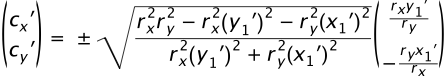 |
(F.6.5.2) |
where the + sign is chosen if fA ≠ fS, and
the − sign is chosen if fA = fS.
-
Step 3: Compute (cx, cy)
from (cx′, cy′)
 |
(F.6.5.3) |
-
Step 4: Compute θ1 and Δθ
In general, the angle between two vectors
(ux, uy)
and (vx, vy) can be computed as
 |
(F.6.5.4) |
where the ± sign appearing here is the sign of
ux vy − uy vx.
This angle function can be used to express θ1 and
Δθ as follows:
 |
(F.6.5.5) |
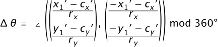 |
(F.6.5.6) |
where θ1 is fixed in the range
−360° < Δθ < 360° such that:
if fS = 0, then Δθ < 0,
else if fS = 1, then Δθ > 0.
In other words, if fS = 0 and the
right side of (F.6.5.6) is greater than 0, then subtract 360°,
whereas if fS = 1 and the right
side of (F.6.5.6) is less than 0, then add 360°. In all other cases
leave it as is.
C.6.6. Correction of out-of-range radii
This section formalizes the adjustments to out-of-range
rx and ry mentioned in
F.6.2. Algorithmically these adjustments consist of the following
steps:
-
Step 1: Ensure radii are non-zero
If rx = 0 or
ry = 0, then treat
this as a straight line from (x1, y1)
to (x2, y2) and stop. Otherwise,
-
Step 2: Ensure radii are positive
Take the absolute value of rx and
ry:
 |
(F.6.6.1) |
-
Step 3: Ensure radii are large enough
Using the primed coordinate values of equation (F.6.5.1),
compute
 |
(F.6.6.2) |
If the result of the above equation is less than or equal to
1, then no further change need be made to rx
and ry. If
the result of the above equation is greater than 1, then make
the replacements
 |
(F.6.6.3) |
-
Step 4: Proceed with computations
Proceed with the remaining elliptical arc computations, such
as those in section F.6.5. Note: As a consequence of the
radii corrections in this section, equation (F.6.5.2) for the
center of the ellipse always has at least one solution (i.e.
the radicand is never negative). In the case that the
radii are scaled up using equation (F.6.6.3), the radicand of
(F.6.5.2) is zero and there is exactly one solution for the
center of the ellipse.
C.7. Text selection implementation notes
The following implementation notes describe the algorithm
for deciding which characters are selected during a text selection
operation.
As the text selection operation occurs (e.g., while the user
clicks and drags the mouse to identify the selection), the user
agent determines a start selection position and an
end selection position, each of which represents a
position in the text string between two characters. After
determining start selection position and end selection
position, the user agent selects the appropriate characters,
where the resulting text selection consists of either:
- no selection or
- a start character, an end character
(possibly the same character), and all of the characters
within the same ‘text’ element whose position
in the DOM is logically between the start character and end
character.
On systems with pointer devices, to determine the start
selection position, the SVG user agent determines which
boundary between characters corresponding to rendered glyphs is
the best target (e.g., closest) based on the current pointer
location at the time of the event that initiates the selection
operation (e.g., the mouse down event). The user agent then
tracks the completion of the selection operation (e.g., the
mouse drag, followed ultimately by the mouse up). At the end of
the selection operation, the user agent determines which
boundary between characters is the best target (e.g., closest)
for the end selection position.
If no character reordering has occurred due to bidirectionality,
then the selection consists of all characters between the
start selection position and end selection
position. For example, if a ‘text’ element contains the
string "abcdef" and the start selection position and end
selection positions are 0 and 3 respectively (assuming the left
side of the "a" is position zero), then the selection will
consist of "abc".
When the user agent is implementing selection of
bidirectional text, and when the selection starts (or ends)
between characters which are not contiguous in logical order,
then there might be multiple potential combinations of
characters that can be considered part of the selection. The
algorithms to choose among the combinations of potential
selection options shall choose the selection option which most
closely matches the text string's visual rendering order.
When multiple characters map inseparably to a given set of
one or more glyphs, the user agent can either disallow the
selection to start in the middle of the glyph set or can
attempt to allocate portions of the area taken up by the glyph
set to the characters that correspond to the glyph.
For systems which support pointer devices such as a mouse,
the user agent is required to provide a mechanism for selecting
text even when the given text has associated event handlers or
links, which might block text selection due to event processing
precedence rules (see Pointer events).
One implementation option: For platforms which support a pointer
device such as a mouse, the user agent may provide for a small
additional region around character cells which initiates text
selection operations but does not initiate event handlers or
links.
C.8. Printing implementation notes
For user agents which support both zooming on display
devices and printing, it is recommended that the default
printing option produce printed output that reflects the
display device's current view of the current SVG document
fragment (assuming there is no media-specific styling), taking
into account any zooming and panning done by the user, the
current state of animation, and any document changes due to DOM
and scripting. Thus, if the user zooms into a particular area
of a map on the display device and then requests a hardcopy,
the hardcopy should show the same view of the map as appears on
the display device. If a user pauses an animation and prints,
the hardcopy should show the same graphics as the currently
paused picture on the display device. If scripting has added or
removed elements from the document, then the hardcopy should
reflect the same changes that would be reflected on the
display.
When an SVG document is rendered on a static-only device
such as a printer which does not support SVG's animation and
scripting and facilities, then the user agent shall ignore any
animation and scripting elements in the document and render the
remaining graphics elements according to the rules in this
specification.
Appendix D: Conformance Criteria
Contents
This appendix is normative.
In order to ensure that SVG-family documents are maximally portable
among SVG-family user agents, this specification rigidly defines
conformance requirements for both, as well as for SVG-family document
types. While the conformance definitions can be found in this appendix,
they necessarily reference normative text within this document and
within other related specifications. It is only possible to fully
comprehend the conformance requirements of SVG through a complete
reading of all normative references.
An SVG document fragment is a Conforming SVG Document Fragment if
it adheres to the specification described in this document
(Scalable Vector Graphics (SVG) Specification) and also:
We will need to have some normative requirements throughout the
spec that certain elements be allowed only as children of other elements, and
similarly for attributes. This is in place of the previous check for validity
against the DTD that used to be part of the conforming SVG Document Fragment
definition.
SVG document fragments can be included within parent XML documents using
the XML namespace facilities described in
Namespaces in XML [XML-XS].
Note, however, that since a Conforming SVG Document Fragment must have an
‘svg’ element as its root, the use of an individual non-‘svg’
element from the SVG namespace is disallowed. Thus, the SVG part of the
following document is not conforming:
<?xml version="1.0" standalone="no"?>
<!DOCTYPE SomeParentXMLGrammar PUBLIC "-//SomeParent" "http://SomeParentXMLGrammar.dtd">
<ParentXML>
<!-- Elements from ParentXML go here -->
<!-- The following is not conforming -->
<z:rect xmlns:z="http://www.w3.org/2000/svg"
x="0" y="0" width="10" height="10" />
<!-- More elements from ParentXML go here -->
</ParentXML>
Instead, for the SVG part to become a Conforming SVG Document Fragment,
the file could be modified as follows:
<?xml version="1.0" standalone="no"?>
<!DOCTYPE SomeParentXMLGrammar PUBLIC "-//SomeParent" "http://SomeParentXMLGrammar.dtd">
<ParentXML>
<!-- Elements from ParentXML go here -->
<!-- The following is conforming -->
<z:svg xmlns:z="http://www.w3.org/2000/svg"
width="100px" height="100px">
<z:rect x="0" y="0" width="10" height="10"/>
</z:svg>
<!-- More elements from ParentXML go here -->
</ParentXML>
The SVG language or these conformance criteria provide no designated
size limits on any aspect of SVG content. There are no maximum values on
the number of elements, the amount of character data, or the number of
characters in attribute values.
A file is a Conforming SVG Stand-Alone File if:
A Conforming SVG Generator is a program which:
Additionally, an authoring tool which is a Conforming SVG
Generator conforms to all of the Priority 1 accessibility
guidelines from the document Authoring Tool Accessibility
Guidelines 1.0 [ATAG] that are relevant
to generators of SVG content. (Priorities 2 and 3 are
encouraged but not required for conformance.)
SVG generators are encouraged to follow W3C developments in the
area of internationalization. Of particular interest is the
W3C Character Model and the concept of Webwide
Early Uniform Normalization, which promises to enhance the
interchangability of Unicode character data across users and
applications. Future versions of the SVG specification are
likely to require support of the W3C Character Model
in Conforming SVG Generators.
Conforming SVG Servers must meet all the requirements of a Conforming SVG
Generator. In addition, Conforming SVG Servers using HTTP or other protocols
that use Internet Media types must serve SVG stand-alone files with the media
type "image/svg+xml".
Also, if the SVG file is compressed with gzip or deflate, Conforming SVG
Servers must indicate this with the appropriate header, according to what the
protocol supports. Specifically, for content compressed by the server
immediately prior to transfer, the server must use the "Transfer-Encoding: gzip"
or "Transfer-Encoding: deflate" headers as appropriate, and for content
stored in a compressed format on the server (e.g. with the file extension "svgz"),
the server must use the "Content-Encoding: gzip" or
"Content-Encoding: deflate" headers as appropriate.
Note: Compression of stored content (the "entity," in HTTP
terms) is distinct from automatic compression of the message body, as
defined in HTTP/1.1 TE/
Transfer Encoding
([RFC2616], sections 14.39 and 14.41).
A DOM subtree rooted at a given element is a Conforming SVG DOM Subtree
if, once serialized to XML, is a Conforming SVG Document Fragment.
If the DOM subtree cannot be serialized to XML, such as when a
Comment node's data contains the substring "--", then the subtree is not
a Conforming SVG DOM Subtree.
An SVG interpreter is a program which can parse and process
SVG document fragments. Examples of SVG interpreters are
server-side transcoding tools (e.g., a tool which converts SVG
content into modified SVG content) or analysis tools (e.g., a
tool which extracts the text content from SVG content). An
SVG viewer also
satisfies the requirements of an SVG interpreter in that it can
parse and process SVG document fragments, where processing
consists of rendering the SVG content to the target medium.
In a Conforming SVG Interpreter, the XML parser
must be able to parse and process all XML constructs defined
within XML 1.0
[XML10] and
Namespaces in XML
[XML-NS].
There are two sub-categories of Conforming SVG Interpreters:
- Conforming Static SVG Interpreters must be able
to parse and process the static language features of SVG that
correspond to the feature string "http://www.w3.org/TR/SVG11/feature#SVG-static" (see
Feature strings).
- In addition to the requirements for the static category,
Conforming Dynamic SVG Interpreters must be able to
parse and process the language features of SVG that
correspond to the feature string "http://www.w3.org/TR/SVG11/feature#SVG-dynamic"
(see Feature strings) and
which support all of the required features in the
SVG DOM described in this specification.
A Conforming SVG Interpreter must parse any SVG document
correctly. It is not required to interpret the semantics of all
features correctly.
Note: A transcoder from SVG into another graphics
representation, such as an SVG-to-raster transcoder, represents
a viewer, and thus viewer conformance criteria apply. (See
Conforming SVG Viewers.)
An SVG viewer is a program which can parse and process an
SVG document fragment and render the contents of the document
onto some sort of output medium such as a display or printer;
thus, an SVG Viewer is also an SVG Interpreter.
There are two sub-categories of Conforming SVG Viewers:
- Conforming Static SVG Viewers
support the static language features of SVG that correspond to the feature
string "http://www.w3.org/TR/SVG11/feature#SVG-static" (see
Feature strings). This
category often corresponds to platforms and environments
which only render static documents, such as printers.
- Conforming Dynamic SVG Viewers
support the language features of SVG that correspond to the feature
string "http://www.w3.org/TR/SVG11/feature#SVG-dynamic" (see
Feature strings). This
category often applies to platforms and environments such as
common Web browsers which support user interaction and
dynamic document content (i.e., documents whose content can
change over time). (User interaction includes support for
hyperlinking, events [e.g., mouse clicks], text selection,
zooming and panning [see Interactivity].
Dynamic document content can be achieved via
declarative animation or by scripts
modifying the SVG DOM.)
Specific criteria that apply to both Conforming Static SVG Viewers
and Conforming Dynamic SVG Viewers:
- The program must also be a Conforming SVG Interpreter.
- For interactive user environments, facilities must exist
for zooming and panning of stand-alone SVG documents or SVG
document fragments embedded within parent XML documents.
- In environments that have appropriate user interaction
facilities, the viewer must support the ability to activate
hyperlinks.
- If printing devices are supported, SVG content must be
printable at printer resolutions with the same graphics
features available as required for display (e.g., the
specified colors must be rendered on color printers).
- On systems where this information is available, the
parent environment must provide the viewer with information
about physical device resolution. In situations where this
information is impossible to determine, the parent
environment shall pass a reasonable value for device
resolution which tends to approximate most common target
devices.
- The viewer must support JPEG and PNG
image formats [JPEG] [PNG].
- Resampling of image data must be consistent with the
specification of property ‘
image-rendering’.
- The viewer must support alpha channel blending of the
image of the SVG content onto the target canvas.
- SVG implementations must correctly support
gzip-encoded
[RFC1952] and
deflate-encoded
[RFC1951] data streams,
for any content type (including SVG, script files, images).
SVG implementations that support HTTP must support these
encodings according to the
HTTP 1.1
specification [RFC2616];
in particular, the client must specify with an "Accept-Encoding:"
request header [HTTP-ACCEPT-ENCODING]
those encodings that it accepts, including at minimum gzip
and deflate, and then decompress any
gzip-encoded and
deflate-encoded
data streams that are downloaded from the server. When an SVG
viewer retrieves compressed content (e.g., an .svgz file) over
HTTP, if the "Content-Encoding" and "Transfer-Encoding" response
headers are missing or specify a value that does not match the
compression method that has been applied to the content, then
the SVG viewer must not render the content and must treat the
document as being in error.
- The viewer must support base64 encoded content using the
"data:" URL scheme
[RFC2397]
wherever URI referencing of whole documents (such as raster images,
SVG documents, fonts and color profiles) is permitted within
SVG content. (Note: fragments of SVG content which do not
constitute an entire SVG document are not available using the
"data:" URL scheme.)
-
The viewer must support the following W3C Recommendations
with regard to SVG content:
- complete support for the XML 1.0 specification
[XML10].
- complete support for inclusion of non-SVG namespaces
within SVG content as defined in Namespaces in XML
[XML-NS].
(Note that data from non-SVG namespaces are included in
the DOM but are otherwise ignored.)
- All visual rendering must be accurate to within one
device pixel (px unit) to the mathematically correct result
at the initial 1:1 zoom ratio. It is suggested that viewers
attempt to keep a high degree of accuracy when zooming.
- On systems which support accurate sRGB
[SRGB] color, all
sRGB color computations and all resulting color values must
be accurate to within one sRGB color component value, where
sRGB color component values range from 0 to 255.
Although anti-aliasing support is not a strict requirement
for a Conforming SVG Viewer, it is highly recommended for
display devices. Lack of anti-aliasing support will generally
result in poor results on display devices.
Specific criteria that apply to only Conforming Dynamic
SVG Viewers:
- In Web browser environments, the viewer must have the
ability to search and select text strings within SVG
content.
- If display devices are supported, the viewer must have
the ability to select and copy text from SVG content to the
system clipboard.
- The viewer must be a
conforming ECMAScript implementation
of all the IDL fragments in this specification.
[WEBIDL]
The Web Accessibility Initiative
is defining User Agent Accessibility Guidelines 1.0
[UAAG]. Viewers are
encouraged to conform to the Priority 1 accessibility
guidelines defined in this document, and preferably also
Priorities 2 and 3. Once the guidelines are completed, a future
version of this specification is likely to require conformance
to the Priority 1 guidelines in Conforming SVG Viewers.
A higher order concept is that of a
Conforming High-Quality SVG Viewer, with sub-categories
Conforming High-Quality Static SVG Viewer and
Conforming High-Quality Dynamic SVG Viewer.
Both a Conforming High-Quality Static SVG Viewer
and a Conforming High-Quality Dynamic SVG Viewer must
support the following additional features:
- Professional-quality results with good processing and
rendering performance and smooth, flicker-free
animations.
- On low-resolution devices such as display devices at
150dpi or less, support for smooth edges on lines, curves and
text. (Smoothing is often accomplished using anti-aliasing
techniques.)
- Color management via ICC profile support (i.e., the
ability to support colors defined using ICC profiles).
- Resampling of image data must conform to the requirements
for Conforming High-Quality SVG Viewers as specified in the
description of property ‘
image-rendering’.
- At least double-precision floating point computation on
coordinate system transformation numerical calculations.
A Conforming High-Quality Dynamic SVG Viewer must
support the following additional features:
- Progressive rendering and animation effects (i.e., the
start of the document will start appearing and animations
will start running in parallel with downloading the rest of
the document).
- Restricted screen updates (i.e., only required areas of
the display are updated in response to redraw events).
- Background downloading of images and fonts retrieved from
a Web server, with updating of the display once the downloads
are complete.
A Conforming SVG Viewer must be able to apply
styling properties to SVG content using presentation attributes.
If the user agent supports Cascading Style Sheets, level 2 revision 1
[CSS21], a
Conforming SVG Viewer must support CSS styling of SVG
content and must support all features from
CSS 2.1 that are described in this specification as applying to SVG (see
properties shared with CSS and XSL,
Styling with CSS and
Facilities from CSS and XSL used by SVG).
The supported features from CSS 2.1 must be implemented in accordance with
the conformance
definitions from the CSS 2.1 specification
([CSS21], section 3.2).
If the user agent includes an HTML or XHTML viewing
capability or can apply CSS/XSL styling properties to XML
documents, then a Conforming SVG Viewer must support
resources of MIME type "image/svg+xml" wherever raster image
external resources can be used, such as in the HTML or XHTML
‘img’ element and in CSS/XSL
properties that can refer to raster image resources (e.g.,
‘background-image’).
Appendix E: Accessibility Support
Contents
This appendix is informative, not normative.
E.1. WAI accessibility guidelines
This appendix explains how accessibility guidelines
published by W3C's Web Accessibility Initiative (WAI) apply to SVG.
- The Web Content Accessibility Guidelines (WCAG) 2.0
[WCAG2]
explains how authors can create Web content that is
accessible to people with disabilities.
- The Authoring Tool Accessibility Guidelines 1.0
[ATAG] explains how
developers can design accessible authoring tools such as SVG
authoring tools. To conform to the
SVG specification, an SVG authoring tool must conform to
ATAG (priority 1). SVG support for element grouping
and reuse is relevant to
designing accessible SVG authoring tools.
- The User Agent Accessibility Guidelines 1.0
[UAAG] explains how
developers can design accessible user agents such as
SVG-enabled browsers. To conform to the SVG specification, an
SVG user agent should conform to UAAG. SVG support for
scaling, style sheets, the DOM, and metadata are all relevant
to designing accessible SVG user agents.
The W3C Note Accessibility Features of SVG
[SVG-ACCESS]
explains in detail how the requirements of the three guidelines
apply to SVG.
E.2. SVG content accessibility guidelines
This section explains briefly how authors can create
accessible SVG documents; it summarizes Accessibility Features of SVG
[SVG-ACCESS].
- Provide text equivalents for graphics.
-
- When the text content of a graphic (e.g., in a
‘text’ element) explains its function, no text
equivalent is required. Use the ‘title’ child element
to explain the function of ‘text’ elements whose meaning
is not clear from their text content.
- When a graphic does not include explanatory text
content, it requires a text equivalent. If the equivalent
is complex, use the ‘desc’ element, otherwise
use the ‘title’ child element.
- If a graphic is built from meaningful parts, build
the description from meaningful parts.
- Do not rely on color alone.
-
- Do not use color alone to convey information.
- Ensure adequate color contrast. Use style sheets so
that users who require certain color combinations may
apply them through user style sheets.
- Use markup and style sheets and do so properly.
-
- Represent text as character data, not as images or
curves. Style text with fonts. Authors may describe their
own fonts in SVG.
- Separate structure from presentation.
- Use the ‘g’ element and rich
descriptions to structure SVG documents. Reuse named
objects.
- Publish highly-structured documents, not just
graphical representations. Documents that are rich in
structure may be rendered graphically, as speech, or as
braille. For example, express mathematical relationships
in MathML
[MATHML] and use
SVG for explanatory graphics.
- Author documents that validate to the SVG grammar.
- Use style sheets to specify graphical and aural presentation.
- Use relative units in style sheets.
- Clarify natural language usage.
-
- Use ‘xml:lang’ to identify the
natural language of content and changes in natural
language.
- Ensure that dynamic content is accessible.
-
- Ensure that text equivalents for dynamic content are
updated when the dynamic content changes.
- Ensure that SVG documents are usable when scripts or
other programmatic objects are turned off or not
supported.
Appendix F: Internationalization Support
Contents
This appendix is informative, not normative.
F.1. Introduction
This appendix provides a brief summary of SVG's support for
internationalization. The appendix is hyperlinked to the sections of the
specification which elaborate on particular topics.
F.2. Internationalization and SVG
SVG is an application of XML
[XML10]
and thus supports Unicode
[UNICODE],
which defines a standard universal character set.
Additionally, SVG provides a mechanism for precise control of
the glyphs used to draw text strings, which is described in Alternate glyphs. This facility
provides:
- the ability to specify the rendering of particular glyphs
which might not be accessible when defining character data using
Unicode
- the ability to override the user agent's character-to-glyph
algorithms
- the ability to follow the guidelines for normalizing character
data for the purposes of enhanced interoperability (see
Character Model for the World Wide Web 1.0: Fundamentals
[CHARMOD]), while still
having precise control over the glyphs that are drawn.
SVG supports:
- Horizontal, left-to-right text found in Roman scripts (see the
‘
writing-mode’ property)
- Vertical and vertical-ideographic text (see the ‘
writing-mode’
property)
- Bidirectional text (for languages such as Arabic and Hebrew - see
the ‘
direction’ and ‘unicode-bidi’ properties)
SVG fonts
support contextual glyph selection for
Arabic and
Han text.
Multi-language SVG documents are possible
by utilizing the ‘systemLanguage’ attribute to have different
text strings appear based on the client machine's language setting.
F.3. SVG internationalization guidelines
SVG generators should follow W3C guidelines for normalizing character
data [CHARMOD]. When precise
control over glyph selection is required, use the facilities for
Alternate glyphs to override the
user agent's character-to-glyph mapping algorithms.
Appendix G: Minimizing SVG File Sizes
This appendix is informative, not normative.
Considerable effort has been made to make SVG file sizes as
small as possible while still retaining the benefits of XML and
achieving compatibility and leverage with other W3C
specifications.
Here are some of the features in SVG that promote small file sizes:
- SVG's path data definition was defined to produce a
compact data stream for vector graphics data: all commands
are one character in length; relative coordinates are
available; separator characters do not have to be supplied
when tokens can be identified implicitly; smooth curve
formulations are available (cubic Béziers, quadratic
Béziers and elliptical arcs) to prevent the need to
tesselate into polylines; and shortcut formulations exist for
common forms of cubic Bézier segments, quadratic
Bézier segments, and horizontal and vertical straight
line segments so that the minimum number of coordinates need
to be specified.
- Text can be specified using XML character data — no need
to convert to outlines.
- SVG contains a facility for defining symbols once and
referencing them multiple times using different visual
attributes and different sizing, positioning, clipping and
client-side filter effects
- User agents that support styling with CSS
can use CSS selectors and property inheritance to define commonly
used sets of attributes once as named styles.
- Filter effects allow for compelling visual results and
effects typically found only in image-authoring tools using
small amounts of vector and/or raster data
Additionally, HTTP/1.1 allows for compressed data to be
passed from server to client, which can result in significant
file size reduction. Here are some sample compression results
using gzip
compression on SVG documents [RFC1952]:
| Uncompressed
SVG |
With gzip
compression |
Compression
ratio |
| 12,912 |
2,463 |
81% |
| 12,164 |
2,553 |
79% |
| 11,613 |
2,617 |
77% |
| 18,689 |
4,077 |
78% |
| 13,024 |
2,041 |
84% |
A related issue is progressive rendering. Some SVG viewers will support:
- the ability to display the first parts of an SVG document
fragments as the remainder of the document is downloaded from
the server; thus, the user will see part of the SVG drawing
right away and interact with it, even if the SVG file size is
large.
- delayed downloading of images and fonts. Just like some
HTML browsers, some SVG viewers will download images and
downloadable fonts
([CSS3FONTS])
last, substituting a temporary image and system fonts,
respectively, until the given image and/or font is
available.
Here are techniques for minimizing SVG file sizes and
minimizing the time before the user is able to start
interacting with the SVG document fragments:
- Construct the SVG file such that any links which the user
might want to click on are included at the beginning of the
SVG file
- Use default values whenever possible rather than defining
all attributes and properties explicitly.
- Take advantage of the path
data data compaction facilities: use relative
coordinates; use h and v for horizontal and
vertical lines; use s or t for cubic and
quadratic Bézier segments whenever possible; eliminate
extraneous white space and separators.
- Utilize symbols if the same graphic appears multiple
times in the document
- For user agents that support styling with CSS,
utilize CSS property inheritance and selectors to consolidate
commonly used properties into named styles or to assign the
properties to a parent ‘g’ element.
- Utilize filter effects to help construct graphics via
client-side graphics operations.
Appendix H: References
Contents
H.1. Normative references
- [ARIA]
-
Accessible Internet Applications (WAI-ARIA) 1.1,
J. Craig, M. Cooper, eds.
World Wide Web Consortium, 26 September 2013.
This edition of WAI-ARIA 1.1 is http://www.w3.org/TR/2011/wai-aria-1.1/.
The latest edition of WAI-ARIA is available at
http://www.w3.org/TR/wai-aria-1.1/.
- [ARIAIMPL]
-
WAI-ARIA User Agent Implementation Guide,
A. Snow-Weaver, M. Cooper, A. Leventhal, J. Scheuhammer, eds.
World Wide Web Consortium, 5 November 16 2013.
This edition of the WAI-ARIA Implementation Guide is http://www.w3.org/TR/wai-aria-implementation/.
The latest edition of the WAI-ARIA Implementation Guide is available at
http://www.w3.org/TR/wai-aria-implementation/.
- [ATAG]
-
Authoring Tool Accessibility Guidelines 1.0,
J. Treviranus, J. Richards, I. Jacobs, C. McCathieNevile, eds.
World Wide Web Consortium, 03 February 2000.
This edition of ATAG 1.0 is http://www.w3.org/TR/2000/REC-ATAG10-20000203/.
The latest edition of ATAG 1.0 is available at
http://www.w3.org/TR/ATAG10/.
- [BCP47]
-
IETF BCP 47
Tags for Identifying Languages, A. Phillips and M. Davis, Editors, September 2009.
Available at http://www.rfc-editor.org/rfc/bcp/bcp47.txt.
- [COLORIMETRY]
-
Colorimetry, Third Edition,
Commission Internationale de l'Eclairage, CIE Publication 15:2004,
ISBN 3-901-906-33-9.
Available at http://www.cie.co.at/publ/abst/15-2004.html.
- [COMPOSITING-BLENDING]
-
Compositing and Blending,
N. Andronikos, R. Cabanier, eds.
World Wide Web Consortium, 16 August 2012.
This edition of Compositing and Blending is the Working Draft at http://www.w3.org/TR/2012/WD-compositing-20120816.
The latest edition of Compositing and Blending is available at
http://www.w3.org/TR/compositing/.
- [CSS21]
-
Cascading Style Sheets Level 2 Revision 1 (CSS 2.1) Specification,
B. Bos, T. Çelik, I. Hickson, H. Lie, eds.
World Wide Web Consortium, 07 June 2011.
This edition of CSS 2.1 is http://www.w3.org/TR/2011/REC-CSS2-20110607/.
The latest edition of CSS 2 is available at
http://www.w3.org/TR/CSS2/.
- [CSS3COLOR]
-
CSS Color Module Level 3,
T. Çelik, C. Lilley, L. D. Baron, eds.
World Wide Web Consoritum, 07 June 2011.
This edition of CSS3 Color is http://www.w3.org/TR/2011/REC-css3-color-20110607/.
The latest edition of CSS3 Color is available at
http://www.w3.org/TR/css3-color/.
- [CSS3FONTS]
-
CSS Fonts Module Level 3,
J. Daggett, ed
World Wide Web Consortium, 6 July 2012.
This edition of CSS3 Fonts is http://www.w3.org/TR/2011/WD-css3-fonts-20111004/
The latest editor's draft is available at
http://dev.w3.org/csswg/css3-fonts/
- [CSS3LINEBOX]
-
CSS Line Layout Module Level 3,
J. Daggett, S. Zilleds, eds.
World Wide Web Consortium, 2 March 2012.
The latest editor's draft is available at
http://dev.w3.org/csswg/css3-linebox/.
- [CSS-MASKING]
-
CSS Masking,
D. Schulze, T. Atkins, B. Birtles, eds.
World Wide Web Consortium, 21 October 2012.
This edition of CSS Masking is the Editor's Draft at http://dvcs.w3.org/hg/FXTF/raw-file/tip/css-masking-1/index.html
The latest published edition of CSS Masking is not yet available.
- [CSS3UI]
-
CSS Basic User Interface Module Level 3 (CSS3 UI),
T. Çelik, ed.
World Wide Web Consortium, 17 January 2012.
This edition of CSS3 UI is http://www.w3.org/TR/2012/WD-css3-ui-20120117/.
The latest edition of CSS3 UI is available at
http://www.w3.org/TR/css3-ui/.
- [CSS3TRANSFORMS]
-
CSS Transforms,
S. Fraser, D. Jackson, D. Hyatt, C. Marrin, E. O'Connor, D. Schulze, A. Gregor, eds.
World Wide Web Consortium, 3 April 2012. W3C Working Draft. (Work in progress.)
This edition of CSS Transforms is http://www.w3.org/TR/2012/WD-css3-transforms-20120403/.
The latest edition of CSS Transforms is available at
http://www.w3.org/TR/css3-transforms/.
- [CSS3VALUES]
-
CSS Values and Units Level 3,
H. Lie, T. Atkins, E. Etemad, eds.
World Wide Web Consortium, 8 March 2012. W3C Working Draft. (Work in progress.)
This edition of CSS3 Values and Units is http://www.w3.org/TR/2012/WD-css3-values-20120308/.
The latest edition of CSS3 Values and Units is available at
http://www.w3.org/TR/css3-values/.
- [CSS3IMAGES]
-
CSS Image
Values and Replaced Content Module Level 3,
E. Etemad, T. Atkins, eds.
World Wide Web Consortium, 17 April 2012.
The latest edition of CSS4 Images is available at
http://www.w3.org/TR/css3-images/.
- [CSS4IMAGES]
-
CSS Image
Values and Replaced Content Module Level 4,
E. Etemad, T. Atkins, eds.
World Wide Web Consortium, 21 July 2012.
The latest edition of CSS4 Images is available at
http://dev.w3.org/csswg/css4-images/.
- [DOM3EVENTS]
-
Document Object Model (DOM) Level 3 Events Specification,
Gary Kacmarcik, Travis Leithead, Jacob Rossi, Doug Schepers, Björn Höhrmann, Philippe Le Hégaret, Tom Pixley, eds.
World Wide Web Consortium, 15 November 2013.
This edition of DOM 2 Events is http://www.w3.org/TR/2000/REC-DOM-Level-2-Events-20001113/.
The latest edition of DOM 2 Events is available at
http://www.w3.org/TR/DOM-Level-3-Events/.
- [DOM2STYLE]
-
Document Object Model (DOM) Level 2 Style Specification,
C. Wilson, P. Le Hégaret, V. Apparao, eds.
World Wide Web Consortium, 13 November 2000.
This edition of DOM Level 2 Style is http://www.w3.org/TR/2000/REC-DOM-Level-2-Style-20001113/.
The latest edition of DOM Level 2 Style is available at
http://www.w3.org/TR/DOM-Level-2-Style/.
- [DOM2VIEWS]
-
Document Object Model (DOM) Level 2 Views Specification,
A. Le Hors, L. Cable, eds.
World Wide Web Consortium, 13 November 2000.
This edition of DOM 2 Views is http://www.w3.org/TR/2000/REC-DOM-Level-2-Views-20001113/.
The latest edition of DOM 2 Views is available at
http://www.w3.org/TR/DOM-Level-2-Views/.
- [DOM4]
-
DOM4,
A. van Kesteren, A. Gregor, Ms2ger, A. Russell, R. Berjon, eds.
World Wide Web Consortium, 04 February 2014.
This edition of DOM4 is http://www.w3.org/TR/2014/WD-dom-20140204/.
The latest edition of DOM4 is available at
http://www.w3.org/TR/dom/.
- [ECMA-262]
-
ECMAScript Language Specification, 5th Edition,
M. Cowlishaw, ed.
Ecma International, December 2009.
Available at http://www.ecma-international.org/publications/standards/Ecma-262.htm.
- [FILTERS]
-
Filter Effects 1.0,
V. Hardy, D. Jackson, E. Dahlström, eds.
World Wide Web Consortium, 25 October 2012. W3C Working Draft. (Work in progress.)
This edition of Filter Effects 1.0 is http://www.w3.org/TR/2012/WD-filter-effects-20121025/.
The latest edition of Filter Effects 1.0 is available at http://www.w3.org/TR/filter-effects/.
- [ICC42]
-
Specification ICC.1:2004-10, File Format for Color Profiles, Profile Version 4.2.0.0
with errata incorporated, 5/22/20006,
International Color Consortium, 2006.
Available at http://www.color.org/ICC1v42_2006-05.pdf.
This specification is substantially identical to ISO 15076-1:2005.
The ICC list some approved revisions to ICC.1:2004-10.
- [ISO8601]
-
Data elements and interchange formats - Information interchange - Representation of dates and times,
International Organization for Standardization, 2004.
Available at http://www.iso.org/iso/catalogue_detail?csnumber=40874.
- [JPEG]
-
ISO/IEC 10918-1:1994/Cor 1:2005: Information Technology — Digital Compression And Coding Of Continuous-tone Still Images,
International Organization for Standardization, September 2005.
Available at http://www.iso.org/iso/iso_catalogue/catalogue_tc/catalogue_detail.htm?csnumber=18902.
An older version is available at http://www.w3.org/Graphics/JPEG/itu-t81.pdf.
- [GML]
-
OpenGIS Geography Markup Language (GML) Encoding Standard, version 3.2.1,
C. Portele, ed.
Open GIS Consortium, 27 August 2007.
Available at http://portal.opengeospatial.org/files/?artifact_id=20509.
- [MEDIAFRAGMENTSURI]
-
Media Fragments URI 1.0 (basic),
R. Troncy, E. Mannens, S. Pfeiffer, D. Van Deursen, eds.
World Wide Web Consoritum, 25 September 2012.
This edition of Media Fragments URI is http://www.w3.org/TR/2012/REC-media-frags-20120925/.
The latest edition of Media Fragments URI is available at
http://www.w3.org/TR/media-frags/.
- [PNG]
-
Portable Network Graphics (PNG) Specification (Second Edition):
Information technology — Computer graphics and image processing — Portable Network Graphics (PNG): Functional specification, ISO/IEC 15948:2003 (E),
D. Duce, ed. World Wide Web Consortium, 10 November 2003.
This edition of PNG is http://www.w3.org/TR/2003/REC-PNG-20031110/.
The latest edition of PNG is available at
http://www.w3.org/TR/PNG/.
- [PORTERDUFF]
-
Compositing Digital Images,
T. Porter and T. Duff.
SIGGRAPH '84 Conference Proceedings, Association for Computing Machinery, Volume 18, Number 3, July 1984.
- [RFC1951]
-
DEFLATE Compressed Data Format Specification version 1.3,
P. Deutsch, May 1996.
Available at http://www.ietf.org/rfc/rfc1951.txt.
- [RFC1952]
-
GZIP file format specification version 4.3,
P. Deutsch, May 1996.
Available at http://www.ietf.org/rfc/rfc1952.txt.
- [RFC2046]
-
Multipurpose Internet Mail Extensions (MIME) Part Two: Media Types,
N. Freed and N. Borenstein, November 1996.
(Note that this RFC obsoletes RFC 1521, RFC 1522 and RFC 1590.)
Available at http://www.ietf.org/rfc/rfc2046.txt.
- [RFC2119]
-
Key words for use in RFCs to Indicate Requirement Levels,
S. Bradner, March 1997.
Available at http://www.ietf.org/rfc/rfc2119.txt.
- [RFC2318]
-
The text/css Media Type,
H. Lie, B. Bos, C. Lilley, March 1998.
Available at http://www.ietf.org/rfc/rfc2318.txt.
- [RFC2397]
-
The "data" URL scheme,
L. Masinter, August 1998.
Available at http://www.ietf.org/rfc/rfc2397.
- [RFC2616]
-
Hypertext Transfer Protocol -- HTTP/1.1,
R. Fielding, J. Gettys, J. Mogul, H. Frystyk Nielsen, L. Masinter, P. Leach and T. Berners-Lee, June 1999.
(Note that this RFC obsoletes RFC 2068.)
Available at http://www.ietf.org/rfc/rfc2616.
- [RFC2732]
-
Format for Literal IPv6 Addresses in URL's,
R. Hinden, B. Carpenter, L. Masinter, December 1999.
Available at http://www.ietf.org/rfc/rfc2732.txt.
- [RFC3023]
-
XML Media Types,
M. Murata, S. St. Laurent, D. Kohn, January 2001.
Available at http://www.ietf.org/rfc/rfc3023.
- [RFC3629]
-
UTF-8, a transformation format of ISO 10646,
F. Yergeau, November 2003.
(Note that this RFC obsoletes RFC 2044 and RFC 2279.)
Available at http://www.ietf.org/rfc/rfc3629.txt.
- [RFC3986]
-
Uniform Resource Identifiers (URI): Generic Syntax,
T. Berners-Lee, R. Fielding, L. Masinter, January 2005.
(Note that RFC 3986 updates RFC 1738 and obsoletes RFC 2732, RFC 2396 and RFC 1808.)
Available at http://tools.ietf.org/html/rfc3986.
- [RFC3987]
-
Internationalized Resource Identifiers (IRIs),
M. Dürst, M. Suignard, January 2005.
Available at http://tools.ietf.org/html/rfc3987.
- [RFC4329]
-
Scripting Media Types,
B. Höhrmann, April 2006.
Available at http://www.ietf.org/rfc/rfc4329.txt.
- [SHADOWDOM]
-
Shadow DOM,
D. Glazkov, eds. 14 May 2013.
This edition of Shadow DOM is http://www.w3.org/TR/2013/WD-shadow-dom-20130514/.
The latest edition of Shadow DOM is available at http://www.w3.org/TR/shadow-dom/.
- [SMIL]
-
Synchronized Multimedia Integration Language (SMIL 3.0),
D. Bulterman et al., eds. 01 December 2008.
This edition of SMIL is http://www.w3.org/TR/2008/REC-SMIL3-20081201/.
The latest edition of SMIL is available at http://www.w3.org/TR/smil/.
- [SMILANIM]
-
SMIL Animation,
P. Schmitz, A. Cohen.
World Wide Web Consortium, 04 September 2001.
This edition of SMIL Animation is http://www.w3.org/TR/2001/REC-smil-animation-20010904/.
The latest edition of SMIL Animation is available at
http://www.w3.org/TR/smil-animation/.
- [SRGB]
-
IEC 61966-2-1/Amd 1:2003
: Multimedia systems and equipment — Colour measurement and management — Part 2-1: Colour management — Default RGB colour space — sRGB,
International Electrotechnical Commission, 2003.
Available at http://webstore.iec.ch/webstore/webstore.nsf/artnum/025408.
See also http://www.color.org/chardata/rgb/srgb.xalter
for technical data and color profiles.
- [UAX9]
-
Unicode Bidirectional Algorithm,
The Unicode Standard Annex #9. The Unicode Consortium, 2010.
Available at http://www.unicode.org/reports/tr9/.
- [UIEVENTS]
-
UI Events,
Gary Kacmarcik, Travis Leithead, eds.
World Wide Web Consortium, 5 November 2013.
This edition of UI Events is http://www.w3.org/TR/2013/WD-uievents-20131105/.
The latest edition of UI Events is available at
http://www.w3.org/TR/uievents/.
- [UNICODE]
-
The Unicode Standard, Version 6.0.0,
The Unicode Consortium, Mountain View, CA, 2011. ISBN 978-1-936213-01-6.
Available at http://www.unicode.org/versions/Unicode6.0.0.
- [WEBIDL]
-
Web IDL,
C. McCormack, ed.
World Wide Web Consortium, 19 April 2012.
This edition of Web IDL is http://www.w3.org/TR/2012/CR-WebIDL-20120419/.
The latest edition of Web IDL is available at
http://www.w3.org/TR/WebIDL/.
- [WOFF]
-
WOFF File Format 1.0,
J. Kew, T. Leming , E. van Blokland, eds.
World Wide Web Consortium, 04 August 2011.
This edition of WOFF is http://www.w3.org/TR/2011/CR-WOFF-20110804.
The latest edition of WOFF is available at
http://www.w3.org/TR/WOFF/.
- [XLINK]
-
XML Linking Language (XLink) Version 1.1,
S. DeRose, E. Maler, D. Orchard, N. Walsh, eds.
World Wide Web Consortium, 06 May 2010.
This edition of XLink 1.1 is http://www.w3.org/TR/2010/REC-xlink11-20100506/.
The latest edition of XLink 1.1 is available at
http://www.w3.org/TR/xlink11/.
- [XML10]
-
Extensible Markup Language (XML) 1.0 (Fifth Edition),
T. Bray, J. Paoli, C. M. Sperberg-McQueen, E. Maler, F. Yergeau, eds.
World Wide Web Consortium, 26 November 2008.
This edition of XML 1.0 is http://www.w3.org/TR/2008/REC-xml-20081126/.
The latest edition of XML 1.0 is available at
http://www.w3.org/TR/xml/.
- [XML-BASE]
-
XML Base (Second Edition),
J. Marsh, R. Tobin, eds.
World Wide Web Consortium, 28 January 2009.
This edition of XML Base is http://www.w3.org/TR/2009/REC-xmlbase-20090128/.
The latest edition of XML Base is available at
http://www.w3.org/TR/xmlbase/.
- [XML-NS]
-
Namespaces in XML 1.0 (Third Edition),
T. Bray, D. Hollander, A. Layman, R. Tobin, H. Thompson, eds.
World Wide Web Consortium, 8 December 2009.
This edition of Namespaces in XML is http://www.w3.org/TR/2009/REC-xml-names-20091208/.
The latest edition of Namespaces in XML is available at
http://www.w3.org/TR/xml-names/.
- [XML-SS]
-
Associating Style Sheets with XML documents, Version 1.0,
J. Clark, ed.
World Wide Web Consortium, 29 June 1999.
This edition of XML Stylsheet is http://www.w3.org/1999/06/REC-xml-stylesheet-19990629/.
The latest edition of XML Stylesheet is available at
http://www.w3.org/TR/xml-stylesheet/.
- [XSL]
-
Extensible Stylesheet Language (XSL) Version 1.1,
A. Berglund, ed.
World Wide Web Consortium, 05 December 2006.
This edition of XSL is http://www.w3.org/TR/2006/REC-xsl11-20061205/.
The latest edition of XSL is available at
http://www.w3.org/TR/xsl/.
- [BRADFORD]
- Originally described in K.M. Lam, Metamerism and Colour Constancy,
Ph.D. Thesis, University of
Bradford, 1985.. The linearised Bradford is a simplificaton, widely used in practice, and expressible as a 3x3 matrix. See for example Lindbloom, Chromatic Adaptation.
- [CHARMOD]
-
Character Model for the World Wide Web 1.0: Fundametnals,
M. Dürst, F. Yergeau, R. Ishida, M. Wolf, T. Texin, eds.
World Wide Web Consortium, 15 February 2005.
This edition of Charmod Fundamentals is http://www.w3.org/TR/2005/REC-charmod-20050215/.
The latest edition of Charmod Fundamentals is available at
http://www.w3.org/TR/charmod/.
- [CSS3ANIMATIONS]
-
CSS Animations,
D. Jackson, D. Hyatt, C. Marrin, S. Galineau, L. D. Baron, eds.
World Wide Web Consortium, 3 April 2012. W3C Working Draft. (Work in progress.)
This edition of CSS Animations is http://www.w3.org/TR/2012/WD-css3-animations-20120403/.
The latest edition of CSS Animations is available at
http://www.w3.org/TR/css3-animations/.
- [CSS3TRANSITIONS]
-
CSS Transitions,
D. Jackson, D. Hyatt, C. Marrin, L. D. Baron, eds.
World Wide Web Consortium, 3 April 2012. W3C Working Draft. (Work in progress.)
This edition of CSS Transitions is http://www.w3.org/TR/2012/WD-css3-transitions-20120403/.
The latest edition of CSS Transitions is available at
http://www.w3.org/TR/css3-transitions/.
- [DCORE]
-
Dublin Core Metadata Initiative.
Available at http://dublincore.org/.
- [DOM1]
-
Document Object Model (DOM) Level 1 Specification,
V. Apparao, S. Byrne, M. Champion, S. Isaacs, I. Jacobs, A. Le Hors, G. Nicol, J. Robie, R. Sutor, C. Wilson, L. Wood, eds.
World Wide Web Consortium, 01 October 1998.
This edition of DOM Level 1 is http://www.w3.org/TR/1998/REC-DOM-Level-1-19981001/.
The latest edition of DOM Level 1 is available at
http://www.w3.org/TR/REC-DOM-Level-1/.
- [FOLEY-VANDAM]
-
Computer Graphics: Principles and Practice, Second Edition,
J. D. Foley, A. van Dam, S. K. Feiner, J. F. Hughes, R. L. Phillips.
Addison-Wesley, 1995.
- [HTML4]
-
HTML 4.01 Specification,
D. Raggett, A. Le Hors, I. Jacobs.
World Wide Web Consortium, 24 December 1999.
This edition of HTML 4 is http://www.w3.org/TR/1999/REC-html401-19991224/.
The latest edition of HTML 4 is available at
http://www.w3.org/TR/html4/.
- [MATHML]
-
Mathematical Markup Language (MathML) Version 3.0,
D. Carlisle, P. Ion, R. Miner, eds.
World Wide Web Consortium, 21 October 2010.
This edition of MathML 3 is http://www.w3.org/TR/2010/REC-MathML3-20101021/.
The latest edition of MathML 3 is available at
http://www.w3.org/TR/MathML3/.
- [MIMETYPES]
-
MIME Media Types,
Internet Assigned Numbers Authority.
Available at http://www.iana.org/assignments/media-types/.
- [NVDL]
-
Information Technology — Document Schema Definition Languages (DSDL) — Part 4: Namespace-based Validation Dispatching Language: ISO/IEC 19757-4:2006/Cor 1:2008,
International Organization for Standardization, December 2005.
Available at http://standards.iso.org/ittf/PubliclyAvailableStandards/c038615_ISO_IEC_19757-4_2006(E).zip.
See also http://nvdl.org/.
- [OPENTYPE]
-
OpenType Specification Version 1.6.
July 2009.
Available at http://www.microsoft.com/typography/otspec160/.
(Note that this is technically equivalent to ISO/IEC 14496-22:2009 (Second Edition) "Open Font Format",
available at http://standards.iso.org/ittf/PubliclyAvailableStandards/c052136_ISO_IEC_14496-22_2009(E).zip.)
- [RDF-PRIMER]
-
RDF Primer,
F. Manolas, E. Miller, eds.
World Wide Web Consortium, 10 February 2004.
This edition of RDF Primer is http://www.w3.org/TR/2004/REC-rdf-primer-20040210/.
The latest edition of RDF Primer is available at
http://www.w3.org/TR/rdf-primer/.
- [SCHEMA2]
-
XML Schema Part 2: Datatypes Second Edition.
P. Biron, A. Malhotra, eds.
World Wide Web Consortium, 28 October 2004.
(See also Processing XML 1.1 documents with XML Schema 1.0 processors.)
This edition of XML Schema Part 2 is http://www.w3.org/TR/2004/REC-xmlschema-2-20041028/.
The latest edition of XML Schema Part 2 is available at
http://www.w3.org/TR/xmlschema-2/.
- [SELECTORS]
-
Selectors Level 3,
T. Çelik, E. Etemad, D. Glazman, I. Hickson, P. Linss, J. Williams, eds.
World Wide Web Consortium, 15 December 2009.
This edition of Selectors Level 3 is http://www.w3.org/TR/2009/PR-css3-selectors-20091215/.
The latest edition of Selectors Level 3 is available at
http://www.w3.org/TR/css3-selectors/.
- [SVG-ACCESS]
-
Accessibility Features of SVG,
C. McCathieNevile, M. Koivunen, eds.
World Wide Web Consortium, 07 August 2000.
This edition of Accessibility Features of SVG is http://www.w3.org/TR/2000/NOTE-SVG-access-20000807/.
The latest edition of Accessibility Features of SVG is available at
http://www.w3.org/TR/SVG-access/.
- [SVG-COMPOSITING]
-
SVG Compositing Specification,
A. Grasso, ed.
World Wide Web Consortium, 30 April 2009.
This edition of SVG Compositing is http://www.w3.org/TR/2009/WD-SVGCompositing-20090430/.
The latest edition of SVG Compositing is available at
http://www.w3.org/TR/SVGCompositing/.
- [SVG10]
-
Scalable Vector Graphics (SVG) 1.0,
J. Ferraiolo, ed. 04 September 2001.
This edition of SVG 1.0 is http://www.w3.org/TR/2003/REC-SVG11-20030114/.
The latest edition of SVG 1.0 is available at
http://www.w3.org/TR/SVG10/.
- [UAAG]
-
User Agent Accessibility Guidelines 1.0,
I. Jacobs, J. Gunderson, E. Hansen, eds. 17 December 2002.
This edition of UAAG is http://www.w3.org/TR/2002/REC-UAAG10-20021217/.
The latest edition of UAAG is available at
http://www.w3.org/TR/UAAG10/.
- [WCAG2]
-
Web Content Accessibility Guidelines (WCAG) 2.0,
B. Caldwell, M. Cooper, L. Reid, G. Vanderheiden, eds.
World Wide Web Consortium, 11 December 2008.
This edition of WCAG 2.0 is http://www.w3.org/TR/2008/REC-WCAG20-20081211/.
The latest edition of WCAG 2.0 is available at
http://www.w3.org/TR/WCAG20/.
- [WINDOW]
-
Window Object 1.0,
I. Davis, M. Stachowiak, eds.
World Wide Web Consortium, work in progress, 07 April 2006.
This edition of Window Object 1.0 is http://www.w3.org/TR/2006/WD-Window-20060407/.
The latest edition of Window Object 1.0 is available at
http://www.w3.org/TR/Window/.
- [XHTML]
-
XHTML™ 1.0: The Extensible HyperText Markup Language (Second Edition),
S. Pemberton, ed.
World Wide Web Consortium, 1 August 2002.
This edition of XHTML 1 is http://www.w3.org/TR/2002/REC-xhtml1-20020801/.
The latest edition of XHTML 1 is available at
http://www.w3.org/TR/xhtml1/.
- [XHTMLplusMathMLplusSVG]
-
An XHTML + MathML + SVG Profile,
石川 雅康 (Ishikawa Masayasu), ed.
World Wide Web Consortium, work in progress, 09 August 2002.
This edition of XHTML + MathML + SVG is http://www.w3.org/TR/2002/WD-XHTMLplusMathMLplusSVG-20020809/.
The latest edition of XHTML + MathML + SVG is available at
http://www.w3.org/TR/XHTMLplusMathMLplusSVG/.
- [XSLT]
-
XSL Transformations (XSLT) Version 1.0,
J. Clark, ed.
World Wide Web Consortium, 16 November 1999.
This edition of XSLT 1.0 is http://www.w3.org/TR/1999/REC-xslt-19991116.
The latest edition of XSLT 1.0 is available at
http://www.w3.org/TR/xslt.
- [XSLT2]
-
XSL Transformations (XSLT) Version 2.0,
M. Kay, ed.
World Wide Web Consortium, 23 January 2007.
This edition of XSLT 2.0 is http://www.w3.org/TR/2007/REC-xslt20-20070123/.
The latest edition of XSLT 2.0 is available at
http://www.w3.org/TR/xslt20/.
Appendix I: Element Index
This appendix is informative, not normative.
The following are the elements in the SVG language:
This includes elements from other specifications, such as all
the filter primitives defined in Filter Effects. Should we just list the elements
defined in this document? Or perhaps identify which are defined here versus elsewhere?
Appendix J: Attribute Index
Contents
This appendix is informative, not normative.
J.1. Regular attributes
The following table lists all of the attributes defined in the SVG
language, except for the presentation attributes, which are treated
in the Presentation attributes
section below. For each attribute, the elements on which the attribute
may be specified is also given.
| Attribute | Elements on which the attribute may be specified | Anim. |
|---|
| accent-height | font-face | |
|---|
| accumulate | animate, animateMotion, animateTransform | |
|---|
| additive | animate, animateMotion, animateTransform | |
|---|
| alphabetic | font-face | |
|---|
| amplitude | feFuncA, feFuncB, feFuncG, feFuncR | ✓ |
|---|
| arabic-form | glyph | |
|---|
| aria-activedescendant | a, altGlyph, altGlyphItem, audio, canvas, circle, cursor, discard, ellipse, foreignObject, g, hkern, iframe, image, line, path, polygon, polyline, rect, svg, switch, symbol, text, textPath, tref, tspan, use, video, view | |
|---|
| aria-atomic | a, altGlyph, altGlyphItem, audio, canvas, circle, cursor, discard, ellipse, foreignObject, g, hkern, iframe, image, line, path, polygon, polyline, rect, svg, switch, symbol, text, textPath, tref, tspan, use, video, view | |
|---|
| aria-autocomplete | a, altGlyph, altGlyphItem, audio, canvas, circle, cursor, discard, ellipse, foreignObject, g, hkern, iframe, image, line, path, polygon, polyline, rect, svg, switch, symbol, text, textPath, tref, tspan, use, video, view | |
|---|
| aria-busy | a, altGlyph, altGlyphItem, audio, canvas, circle, cursor, discard, ellipse, foreignObject, g, hkern, iframe, image, line, path, polygon, polyline, rect, svg, switch, symbol, text, textPath, tref, tspan, use, video, view | |
|---|
| aria-checked | a, altGlyph, altGlyphItem, audio, canvas, circle, cursor, discard, ellipse, foreignObject, g, hkern, iframe, image, line, path, polygon, polyline, rect, svg, switch, symbol, text, textPath, tref, tspan, use, video, view | |
|---|
| aria-controls | a, altGlyph, altGlyphItem, audio, canvas, circle, cursor, discard, ellipse, foreignObject, g, hkern, iframe, image, line, path, polygon, polyline, rect, svg, switch, symbol, text, textPath, tref, tspan, use, video, view | |
|---|
| aria-describedat | a, altGlyph, altGlyphItem, audio, canvas, circle, cursor, discard, ellipse, foreignObject, g, hkern, iframe, image, line, path, polygon, polyline, rect, svg, switch, symbol, text, textPath, tref, tspan, use, video, view | |
|---|
| aria-describedby | a, altGlyph, altGlyphItem, audio, canvas, circle, cursor, discard, ellipse, foreignObject, g, hkern, iframe, image, line, path, polygon, polyline, rect, svg, switch, symbol, text, textPath, tref, tspan, use, video, view | |
|---|
| aria-disabled | a, altGlyph, altGlyphItem, audio, canvas, circle, cursor, discard, ellipse, foreignObject, g, hkern, iframe, image, line, path, polygon, polyline, rect, svg, switch, symbol, text, textPath, tref, tspan, use, video, view | |
|---|
| aria-dropeffect | a, altGlyph, altGlyphItem, audio, canvas, circle, cursor, discard, ellipse, foreignObject, g, hkern, iframe, image, line, path, polygon, polyline, rect, svg, switch, symbol, text, textPath, tref, tspan, use, video, view | |
|---|
| aria-expanded | a, altGlyph, altGlyphItem, audio, canvas, circle, cursor, discard, ellipse, foreignObject, g, hkern, iframe, image, line, path, polygon, polyline, rect, svg, switch, symbol, text, textPath, tref, tspan, use, video, view | |
|---|
| aria-flowto | a, altGlyph, altGlyphItem, audio, canvas, circle, cursor, discard, ellipse, foreignObject, g, hkern, iframe, image, line, path, polygon, polyline, rect, svg, switch, symbol, text, textPath, tref, tspan, use, video, view | |
|---|
| aria-grabbed | a, altGlyph, altGlyphItem, audio, canvas, circle, cursor, discard, ellipse, foreignObject, g, hkern, iframe, image, line, path, polygon, polyline, rect, svg, switch, symbol, text, textPath, tref, tspan, use, video, view | |
|---|
| aria-haspopup | a, altGlyph, altGlyphItem, audio, canvas, circle, cursor, discard, ellipse, foreignObject, g, hkern, iframe, image, line, path, polygon, polyline, rect, svg, switch, symbol, text, textPath, tref, tspan, use, video, view | |
|---|
| aria-hidden | a, altGlyph, altGlyphItem, audio, canvas, circle, cursor, discard, ellipse, foreignObject, g, hkern, iframe, image, line, path, polygon, polyline, rect, svg, switch, symbol, text, textPath, tref, tspan, use, video, view | |
|---|
| aria-invalid | a, altGlyph, altGlyphItem, audio, canvas, circle, cursor, discard, ellipse, foreignObject, g, hkern, iframe, image, line, path, polygon, polyline, rect, svg, switch, symbol, text, textPath, tref, tspan, use, video, view | |
|---|
| aria-label | a, altGlyph, altGlyphItem, audio, canvas, circle, cursor, discard, ellipse, foreignObject, g, hkern, iframe, image, line, path, polygon, polyline, rect, svg, switch, symbol, text, textPath, tref, tspan, use, video, view | |
|---|
| aria-labelledby | a, altGlyph, altGlyphItem, audio, canvas, circle, cursor, discard, ellipse, foreignObject, g, hkern, iframe, image, line, path, polygon, polyline, rect, svg, switch, symbol, text, textPath, tref, tspan, use, video, view | |
|---|
| aria-level | a, altGlyph, altGlyphItem, audio, canvas, circle, cursor, discard, ellipse, foreignObject, g, hkern, iframe, image, line, path, polygon, polyline, rect, svg, switch, symbol, text, textPath, tref, tspan, use, video, view | |
|---|
| aria-live | a, altGlyph, altGlyphItem, audio, canvas, circle, cursor, discard, ellipse, foreignObject, g, hkern, iframe, image, line, path, polygon, polyline, rect, svg, switch, symbol, text, textPath, tref, tspan, use, video, view | |
|---|
| aria-multiline | a, altGlyph, altGlyphItem, audio, canvas, circle, cursor, discard, ellipse, foreignObject, g, hkern, iframe, image, line, path, polygon, polyline, rect, svg, switch, symbol, text, textPath, tref, tspan, use, video, view | |
|---|
| aria-multiselectable | a, altGlyph, altGlyphItem, audio, canvas, circle, cursor, discard, ellipse, foreignObject, g, hkern, iframe, image, line, path, polygon, polyline, rect, svg, switch, symbol, text, textPath, tref, tspan, use, video, view | |
|---|
| aria-orientation | a, altGlyph, altGlyphItem, audio, canvas, circle, cursor, discard, ellipse, foreignObject, g, hkern, iframe, image, line, path, polygon, polyline, rect, svg, switch, symbol, text, textPath, tref, tspan, use, video, view | |
|---|
| aria-owns | a, altGlyph, altGlyphItem, audio, canvas, circle, cursor, discard, ellipse, foreignObject, g, hkern, iframe, image, line, path, polygon, polyline, rect, svg, switch, symbol, text, textPath, tref, tspan, use, video, view | |
|---|
| aria-posinset | a, altGlyph, altGlyphItem, audio, canvas, circle, cursor, discard, ellipse, foreignObject, g, hkern, iframe, image, line, path, polygon, polyline, rect, svg, switch, symbol, text, textPath, tref, tspan, use, video, view | |
|---|
| aria-pressed | a, altGlyph, altGlyphItem, audio, canvas, circle, cursor, discard, ellipse, foreignObject, g, hkern, iframe, image, line, path, polygon, polyline, rect, svg, switch, symbol, text, textPath, tref, tspan, use, video, view | |
|---|
| aria-readonly | a, altGlyph, altGlyphItem, audio, canvas, circle, cursor, discard, ellipse, foreignObject, g, hkern, iframe, image, line, path, polygon, polyline, rect, svg, switch, symbol, text, textPath, tref, tspan, use, video, view | |
|---|
| aria-relevant | a, altGlyph, altGlyphItem, audio, canvas, circle, cursor, discard, ellipse, foreignObject, g, hkern, iframe, image, line, path, polygon, polyline, rect, svg, switch, symbol, text, textPath, tref, tspan, use, video, view | |
|---|
| aria-required | a, altGlyph, altGlyphItem, audio, canvas, circle, cursor, discard, ellipse, foreignObject, g, hkern, iframe, image, line, path, polygon, polyline, rect, svg, switch, symbol, text, textPath, tref, tspan, use, video, view | |
|---|
| aria-selected | a, altGlyph, altGlyphItem, audio, canvas, circle, cursor, discard, ellipse, foreignObject, g, hkern, iframe, image, line, path, polygon, polyline, rect, svg, switch, symbol, text, textPath, tref, tspan, use, video, view | |
|---|
| aria-setsize | a, altGlyph, altGlyphItem, audio, canvas, circle, cursor, discard, ellipse, foreignObject, g, hkern, iframe, image, line, path, polygon, polyline, rect, svg, switch, symbol, text, textPath, tref, tspan, use, video, view | |
|---|
| aria-sort | a, altGlyph, altGlyphItem, audio, canvas, circle, cursor, discard, ellipse, foreignObject, g, hkern, iframe, image, line, path, polygon, polyline, rect, svg, switch, symbol, text, textPath, tref, tspan, use, video, view | |
|---|
| aria-valuemax | a, altGlyph, altGlyphItem, audio, canvas, circle, cursor, discard, ellipse, foreignObject, g, hkern, iframe, image, line, path, polygon, polyline, rect, svg, switch, symbol, text, textPath, tref, tspan, use, video, view | |
|---|
| aria-valuemin | a, altGlyph, altGlyphItem, audio, canvas, circle, cursor, discard, ellipse, foreignObject, g, hkern, iframe, image, line, path, polygon, polyline, rect, svg, switch, symbol, text, textPath, tref, tspan, use, video, view | |
|---|
| aria-valuenow | a, altGlyph, altGlyphItem, audio, canvas, circle, cursor, discard, ellipse, foreignObject, g, hkern, iframe, image, line, path, polygon, polyline, rect, svg, switch, symbol, text, textPath, tref, tspan, use, video, view | |
|---|
| aria-valuetext | a, altGlyph, altGlyphItem, audio, canvas, circle, cursor, discard, ellipse, foreignObject, g, hkern, iframe, image, line, path, polygon, polyline, rect, svg, switch, symbol, text, textPath, tref, tspan, use, video, view | |
|---|
| ascent | font-face | |
|---|
| attributeName | animate, animateTransform, set | |
|---|
| attributeType | animate, animateTransform, set | |
|---|
| autoplay | audio | ✓ |
|---|
| autoplay | video | ✓ |
|---|
| azimuth | feDistantLight | ✓ |
|---|
| baseFrequency | feTurbulence | ✓ |
|---|
| baseProfile | svg | |
|---|
| bbox | font-face | |
|---|
| begin | animate, animateMotion, animateTransform, set | |
|---|
| begin | discard | |
|---|
| bias | feConvolveMatrix | ✓ |
|---|
| by | animate, animateMotion, animateTransform | |
|---|
| calcMode | animate, animateMotion, animateTransform | |
|---|
| canvasHeight | canvas | ✓ |
|---|
| canvasWidth | canvas | ✓ |
|---|
| cap-height | font-face | |
|---|
| class | a, altGlyph, audio, canvas, circle, clipPath, defs, desc, ellipse, feBlend, feColorMatrix, feComponentTransfer, feComposite, feConvolveMatrix, feCustom, feDiffuseLighting, feDisplacementMap, feDropShadow, feFlood, feGaussianBlur, feImage, feMerge, feMorphology, feOffset, feSpecularLighting, feTile, feTurbulence, filter, font, foreignObject, g, glyph, glyphRef, hatch, hatchPath, iframe, image, line, linearGradient, marker, mask, meshGradient, meshPatch, meshRow, missing-glyph, path, pattern, polygon, polyline, radialGradient, rect, solidColor, source, stop, svg, switch, symbol, text, textPath, title, track, tref, tspan, use, video | ✓ |
|---|
| clipPathUnits | clipPath | ✓ |
|---|
| controls | audio | ✓ |
|---|
| controls | video | ✓ |
|---|
| crossorigin | audio | ✓ |
|---|
| crossorigin | video | ✓ |
|---|
| cx | circle | ✓ |
|---|
| cx | ellipse | ✓ |
|---|
| cx | radialGradient | ✓ |
|---|
| cy | circle | ✓ |
|---|
| cy | ellipse | ✓ |
|---|
| cy | radialGradient | ✓ |
|---|
| d | glyph, missing-glyph | |
|---|
| d | hatchPath | ✓ |
|---|
| d | path | ✓ |
|---|
| d | textPath | ✓ |
|---|
| default | track | ✓ |
|---|
| descent | font-face | |
|---|
| diffuseConstant | feDiffuseLighting | ✓ |
|---|
| divisor | feConvolveMatrix | ✓ |
|---|
| dur | animate, animateMotion, animateTransform, set | |
|---|
| dx | altGlyph | ✓ |
|---|
| dx | feDropShadow | ✓ |
|---|
| dx | feOffset | ✓ |
|---|
| dx | glyphRef | |
|---|
| dx | text | ✓ |
|---|
| dx | tref, tspan | ✓ |
|---|
| dy | altGlyph | ✓ |
|---|
| dy | feDropShadow | ✓ |
|---|
| dy | feOffset | ✓ |
|---|
| dy | glyphRef | |
|---|
| dy | text | ✓ |
|---|
| dy | tref, tspan | ✓ |
|---|
| edgeMode | feConvolveMatrix | ✓ |
|---|
| elevation | feDistantLight | ✓ |
|---|
| end | animate, animateMotion, animateTransform, set | |
|---|
| exponent | feFuncA, feFuncB, feFuncG, feFuncR | ✓ |
|---|
| fill | animate, animateMotion, animateTransform, set | |
|---|
| filterRes | filter | ✓ |
|---|
| filterUnits | filter | ✓ |
|---|
| font-family | font-face | |
|---|
| font-size | font-face | |
|---|
| font-stretch | font-face | |
|---|
| font-style | font-face | |
|---|
| font-variant | font-face | |
|---|
| font-weight | font-face | |
|---|
| format | altGlyph | |
|---|
| format | glyphRef | |
|---|
| fr | radialGradient | ✓ |
|---|
| fragmentShader | feCustom | ✓ |
|---|
| frameHeight | iframe | ✓ |
|---|
| frameWidth | iframe | ✓ |
|---|
| from | animate, animateMotion, animateTransform | |
|---|
| fx | radialGradient | ✓ |
|---|
| fy | radialGradient | ✓ |
|---|
| g1 | hkern, vkern | |
|---|
| g2 | hkern, vkern | |
|---|
| glyph-name | glyph | |
|---|
| glyphRef | altGlyph | |
|---|
| glyphRef | glyphRef | |
|---|
| gradientTransform | linearGradient | ✓ |
|---|
| gradientTransform | meshGradient | ✓ |
|---|
| gradientTransform | radialGradient | ✓ |
|---|
| gradientUnits | linearGradient | ✓ |
|---|
| gradientUnits | meshGradient | ✓ |
|---|
| gradientUnits | radialGradient | ✓ |
|---|
| hanging | font-face | |
|---|
| hatchContentUnits | hatch | ✓ |
|---|
| hatchTransform | hatch | ✓ |
|---|
| hatchUnits | hatch | ✓ |
|---|
| height | canvas, iframe, image, video | |
|---|
| height | feBlend, feColorMatrix, feComponentTransfer, feComposite, feConvolveMatrix, feCustom, feDiffuseLighting, feDisplacementMap, feDropShadow, feFlood, feGaussianBlur, feImage, feMerge, feMorphology, feOffset, feSpecularLighting, feTile, feTurbulence | ✓ |
|---|
| height | filter | ✓ |
|---|
| height | foreignObject | ✓ |
|---|
| height | mask | ✓ |
|---|
| height | pattern | ✓ |
|---|
| height | rect | ✓ |
|---|
| height | svg | ✓ |
|---|
| height | text | ✓ |
|---|
| height | use | ✓ |
|---|
| horiz-adv-x | font | |
|---|
| horiz-adv-x | glyph, missing-glyph | |
|---|
| horiz-origin-x | font | |
|---|
| horiz-origin-y | font | |
|---|
| href | discard | |
|---|
| href | marker | ✓ |
|---|
| id | a, altGlyph, altGlyphDef, altGlyphItem, animate, animateMotion, animateTransform, audio, canvas, circle, clipPath, cursor, defs, desc, discard, ellipse, feBlend, feColorMatrix, feComponentTransfer, feComposite, feConvolveMatrix, feCustom, feDiffuseLighting, feDisplacementMap, feDistantLight, feDropShadow, feFlood, feFuncA, feFuncB, feFuncG, feFuncR, feGaussianBlur, feImage, feMerge, feMergeNode, feMorphology, feOffset, fePointLight, feSpecularLighting, feSpotLight, feTile, feTurbulence, filter, font, font-face, font-face-format, font-face-name, font-face-src, font-face-uri, foreignObject, g, glyph, glyphRef, hatch, hatchPath, hkern, iframe, image, line, linearGradient, marker, mask, meshGradient, meshPatch, meshRow, metadata, missing-glyph, mpath, path, pattern, polygon, polyline, radialGradient, rect, script, set, solidColor, source, stop, style, svg, switch, symbol, text, textPath, title, track, tref, tspan, use, video, view, vkern | |
|---|
| ideographic | font-face | |
|---|
| in | feBlend, feColorMatrix, feComponentTransfer, feComposite, feConvolveMatrix, feCustom, feDiffuseLighting, feDisplacementMap, feDropShadow, feGaussianBlur, feMorphology, feOffset, feSpecularLighting, feTile | ✓ |
|---|
| in2 | feBlend | ✓ |
|---|
| in2 | feComposite | ✓ |
|---|
| in2 | feDisplacementMap | ✓ |
|---|
| intercept | feFuncA, feFuncB, feFuncG, feFuncR | ✓ |
|---|
| k | hkern, vkern | |
|---|
| k1 | feComposite | ✓ |
|---|
| k2 | feComposite | ✓ |
|---|
| k3 | feComposite | ✓ |
|---|
| k4 | feComposite | ✓ |
|---|
| kernelMatrix | feConvolveMatrix | ✓ |
|---|
| kernelUnitLength | feConvolveMatrix | ✓ |
|---|
| kernelUnitLength | feDiffuseLighting | ✓ |
|---|
| kernelUnitLength | feSpecularLighting | ✓ |
|---|
| keyPoints | animateMotion | |
|---|
| keySplines | animate, animateMotion, animateTransform | |
|---|
| keyTimes | animate, animateMotion, animateTransform | |
|---|
| kind | track | ✓ |
|---|
| label | track | ✓ |
|---|
| lang | desc, title | |
|---|
| lang | glyph | |
|---|
| lengthAdjust | text, textPath, tref, tspan | ✓ |
|---|
| limitingConeAngle | feSpotLight | ✓ |
|---|
| loop | audio | ✓ |
|---|
| loop | video | ✓ |
|---|
| markerHeight | marker | ✓ |
|---|
| markerUnits | marker | ✓ |
|---|
| markerWidth | marker | ✓ |
|---|
| maskContentUnits | mask | ✓ |
|---|
| maskUnits | mask | ✓ |
|---|
| mathematical | font-face | |
|---|
| max | animate, animateMotion, animateTransform, set | |
|---|
| media | source | ✓ |
|---|
| media | style | |
|---|
| mediagroup | audio | ✓ |
|---|
| mediagroup | video | ✓ |
|---|
| method | textPath | ✓ |
|---|
| min | animate, animateMotion, animateTransform, set | |
|---|
| mode | feBlend | ✓ |
|---|
| muted | audio | ✓ |
|---|
| muted | video | ✓ |
|---|
| name | font-face-name | |
|---|
| name | iframe | ✓ |
|---|
| numOctaves | feTurbulence | ✓ |
|---|
| offset | feFuncA, feFuncB, feFuncG, feFuncR | ✓ |
|---|
| offset | hatchPath | ✓ |
|---|
| offset | stop | ✓ |
|---|
| onabort | svg | |
|---|
| onbegin | animate, animateMotion, animateTransform, set | |
|---|
| onclick | a, altGlyph, audio, canvas, circle, defs, ellipse, foreignObject, g, iframe, image, line, path, polygon, polyline, rect, svg, switch, symbol, text, textPath, tref, tspan, use, video | |
|---|
| onend | animate, animateMotion, animateTransform, set | |
|---|
| onerror | svg | |
|---|
| onfocusin | a, altGlyph, audio, canvas, circle, defs, ellipse, foreignObject, g, iframe, image, line, path, polygon, polyline, rect, svg, switch, symbol, text, textPath, tref, tspan, use, video | |
|---|
| onfocusout | a, altGlyph, audio, canvas, circle, defs, ellipse, foreignObject, g, iframe, image, line, path, polygon, polyline, rect, svg, switch, symbol, text, textPath, tref, tspan, use, video | |
|---|
| onload | a, altGlyph, audio, canvas, circle, defs, ellipse, foreignObject, g, iframe, image, line, path, polygon, polyline, rect, svg, switch, symbol, text, textPath, tref, tspan, use, video | |
|---|
| onload | animate, animateMotion, animateTransform, set | |
|---|
| onmousedown | a, altGlyph, audio, canvas, circle, defs, ellipse, foreignObject, g, iframe, image, line, path, polygon, polyline, rect, svg, switch, symbol, text, textPath, tref, tspan, use, video | |
|---|
| onmousemove | a, altGlyph, audio, canvas, circle, defs, ellipse, foreignObject, g, iframe, image, line, path, polygon, polyline, rect, svg, switch, symbol, text, textPath, tref, tspan, use, video | |
|---|
| onmouseout | a, altGlyph, audio, canvas, circle, defs, ellipse, foreignObject, g, iframe, image, line, path, polygon, polyline, rect, svg, switch, symbol, text, textPath, tref, tspan, use, video | |
|---|
| onmouseover | a, altGlyph, audio, canvas, circle, defs, ellipse, foreignObject, g, iframe, image, line, path, polygon, polyline, rect, svg, switch, symbol, text, textPath, tref, tspan, use, video | |
|---|
| onmouseup | a, altGlyph, audio, canvas, circle, defs, ellipse, foreignObject, g, iframe, image, line, path, polygon, polyline, rect, svg, switch, symbol, text, textPath, tref, tspan, use, video | |
|---|
| onrepeat | animate, animateMotion, animateTransform, set | |
|---|
| onresize | svg | |
|---|
| onscroll | svg | |
|---|
| onunload | svg | |
|---|
| onzoom | svg | |
|---|
| operator | feComposite | ✓ |
|---|
| operator | feMorphology | ✓ |
|---|
| order | feConvolveMatrix | ✓ |
|---|
| orient | marker | ✓ |
|---|
| orientation | glyph | |
|---|
| origin | animateMotion | |
|---|
| overline-position | font-face | |
|---|
| overline-thickness | font-face | |
|---|
| panose-1 | font-face | |
|---|
| params | feCustom | ✓ |
|---|
| path | animateMotion | |
|---|
| path | stop | ✓ |
|---|
| pathLength | path | ✓ |
|---|
| patternContentUnits | pattern | ✓ |
|---|
| patternTransform | pattern | ✓ |
|---|
| patternUnits | pattern | ✓ |
|---|
| pitch | hatch | ✓ |
|---|
| playbackOrder | svg | |
|---|
| points | polygon | ✓ |
|---|
| points | polyline | ✓ |
|---|
| pointsAtX | feSpotLight | ✓ |
|---|
| pointsAtY | feSpotLight | ✓ |
|---|
| pointsAtZ | feSpotLight | ✓ |
|---|
| position | marker | ✓ |
|---|
| poster | video | ✓ |
|---|
| preload | audio | ✓ |
|---|
| preload | video | ✓ |
|---|
| preserveAlpha | feConvolveMatrix | ✓ |
|---|
| preserveAspectRatio | canvas, feImage, iframe, image, marker, pattern, svg, symbol, video, view | ✓ |
|---|
| primitiveUnits | filter | ✓ |
|---|
| r | circle | ✓ |
|---|
| r | radialGradient | ✓ |
|---|
| radius | feMorphology | ✓ |
|---|
| refX | marker | ✓ |
|---|
| refY | marker | ✓ |
|---|
| repeatCount | animate, animateMotion, animateTransform, set | |
|---|
| repeatDur | animate, animateMotion, animateTransform, set | |
|---|
| requiredExtensions | a, altGlyph, animate, animateMotion, animateTransform, audio, canvas, circle, clipPath, discard, ellipse, foreignObject, g, iframe, image, line, mask, path, polygon, polyline, rect, set, svg, switch, text, textPath, tref, tspan, use, video | |
|---|
| requiredFeatures | a, altGlyph, animate, animateMotion, animateTransform, audio, canvas, circle, clipPath, discard, ellipse, foreignObject, g, iframe, image, line, mask, path, polygon, polyline, rect, set, svg, switch, text, textPath, tref, tspan, use, video | |
|---|
| restart | animate, animateMotion, animateTransform, set | |
|---|
| result | feBlend, feColorMatrix, feComponentTransfer, feComposite, feConvolveMatrix, feCustom, feDiffuseLighting, feDisplacementMap, feDropShadow, feFlood, feGaussianBlur, feImage, feMerge, feMorphology, feOffset, feSpecularLighting, feTile, feTurbulence | ✓ |
|---|
| role | a, altGlyph, altGlyphItem, audio, canvas, circle, cursor, discard, ellipse, foreignObject, g, hkern, iframe, image, line, path, polygon, polyline, rect, svg, switch, symbol, text, textPath, tref, tspan, use, video, view | |
|---|
| rotate | altGlyph | ✓ |
|---|
| rotate | animateMotion | |
|---|
| rotate | hatch | ✓ |
|---|
| rotate | text | ✓ |
|---|
| rotate | tref, tspan | ✓ |
|---|
| rx | ellipse | ✓ |
|---|
| rx | rect | ✓ |
|---|
| ry | ellipse | ✓ |
|---|
| ry | rect | ✓ |
|---|
| sandbox | iframe | ✓ |
|---|
| scale | feDisplacementMap | ✓ |
|---|
| seamless | iframe | ✓ |
|---|
| seed | feTurbulence | ✓ |
|---|
| slope | feFuncA, feFuncB, feFuncG, feFuncR | ✓ |
|---|
| slope | font-face | |
|---|
| spacing | textPath | ✓ |
|---|
| specularConstant | feSpecularLighting | ✓ |
|---|
| specularExponent | feSpecularLighting | ✓ |
|---|
| specularExponent | feSpotLight | ✓ |
|---|
| spreadMethod | linearGradient | ✓ |
|---|
| spreadMethod | radialGradient | ✓ |
|---|
| src | audio | ✓ |
|---|
| src | iframe | ✓ |
|---|
| src | source | ✓ |
|---|
| src | track | ✓ |
|---|
| src | video | ✓ |
|---|
| srcdoc | iframe | ✓ |
|---|
| srclang | track | ✓ |
|---|
| startOffset | textPath | ✓ |
|---|
| stdDeviation | feDropShadow | ✓ |
|---|
| stdDeviation | feGaussianBlur | ✓ |
|---|
| stemh | font-face | |
|---|
| stemv | font-face | |
|---|
| stitchTiles | feTurbulence | ✓ |
|---|
| strikethrough-position | font-face | |
|---|
| strikethrough-thickness | font-face | |
|---|
| string | font-face-format | |
|---|
| style | a, altGlyph, audio, canvas, circle, clipPath, defs, desc, ellipse, feBlend, feColorMatrix, feComponentTransfer, feComposite, feConvolveMatrix, feCustom, feDiffuseLighting, feDisplacementMap, feDropShadow, feFlood, feGaussianBlur, feImage, feMerge, feMorphology, feOffset, feSpecularLighting, feTile, feTurbulence, filter, font, foreignObject, g, glyph, glyphRef, hatch, hatchPath, iframe, image, line, linearGradient, marker, mask, meshGradient, meshPatch, meshRow, missing-glyph, path, pattern, polygon, polyline, radialGradient, rect, solidColor, source, stop, svg, switch, symbol, text, textPath, title, track, tref, tspan, use, video | |
|---|
| surfaceScale | feDiffuseLighting | ✓ |
|---|
| surfaceScale | feSpecularLighting | ✓ |
|---|
| systemLanguage | a, altGlyph, animate, animateMotion, animateTransform, audio, canvas, circle, clipPath, discard, ellipse, foreignObject, g, iframe, image, line, mask, path, polygon, polyline, rect, set, svg, switch, text, textPath, tref, tspan, use, video | |
|---|
| tabindex | a, altGlyph, altGlyphItem, audio, canvas, circle, cursor, discard, ellipse, foreignObject, g, hkern, iframe, image, line, path, polygon, polyline, rect, source, svg, switch, symbol, text, textPath, track, tref, tspan, use, video, view | |
|---|
| tableValues | feFuncA, feFuncB, feFuncG, feFuncR | ✓ |
|---|
| target | a | ✓ |
|---|
| targetX | feConvolveMatrix | ✓ |
|---|
| targetY | feConvolveMatrix | ✓ |
|---|
| textLength | text | ✓ |
|---|
| textLength | textPath, tref, tspan | ✓ |
|---|
| timelineBegin | svg | |
|---|
| title | audio | |
|---|
| title | iframe | |
|---|
| title | style | |
|---|
| title | track | |
|---|
| title | video | |
|---|
| to | animate, animateMotion, animateTransform | |
|---|
| to | set | |
|---|
| type | animateTransform | |
|---|
| type | feColorMatrix | ✓ |
|---|
| type | feFuncA, feFuncB, feFuncG, feFuncR | ✓ |
|---|
| type | feTurbulence | ✓ |
|---|
| type | script | |
|---|
| type | source | ✓ |
|---|
| type | style | |
|---|
| u1 | hkern, vkern | |
|---|
| u2 | hkern, vkern | |
|---|
| underline-position | font-face | |
|---|
| underline-thickness | font-face | |
|---|
| unicode | glyph | |
|---|
| unicode-range | font-face | |
|---|
| units-per-em | font-face | |
|---|
| v-alphabetic | font-face | |
|---|
| v-hanging | font-face | |
|---|
| v-ideographic | font-face | |
|---|
| v-mathematical | font-face | |
|---|
| values | animate, animateMotion, animateTransform | |
|---|
| values | feColorMatrix | ✓ |
|---|
| version | svg | |
|---|
| vert-adv-y | font | |
|---|
| vert-adv-y | glyph, missing-glyph | |
|---|
| vert-origin-x | font | |
|---|
| vert-origin-x | glyph, missing-glyph | |
|---|
| vert-origin-y | font | |
|---|
| vert-origin-y | glyph, missing-glyph | |
|---|
| vertexMesh | feCustom | ✓ |
|---|
| vertexShader | feCustom | ✓ |
|---|
| viewBox | marker, pattern, svg, symbol, view | ✓ |
|---|
| viewTarget | view | |
|---|
| width | canvas, iframe, image, video | |
|---|
| width | feBlend, feColorMatrix, feComponentTransfer, feComposite, feConvolveMatrix, feCustom, feDiffuseLighting, feDisplacementMap, feDropShadow, feFlood, feGaussianBlur, feImage, feMerge, feMorphology, feOffset, feSpecularLighting, feTile, feTurbulence | ✓ |
|---|
| width | filter | ✓ |
|---|
| width | foreignObject | ✓ |
|---|
| width | mask | ✓ |
|---|
| width | pattern | ✓ |
|---|
| width | rect | ✓ |
|---|
| width | svg | ✓ |
|---|
| width | text | ✓ |
|---|
| width | use | ✓ |
|---|
| widths | font-face | |
|---|
| x | altGlyph | ✓ |
|---|
| x | audio, canvas, iframe, image, video | |
|---|
| x | cursor | ✓ |
|---|
| x | feBlend, feColorMatrix, feComponentTransfer, feComposite, feConvolveMatrix, feCustom, feDiffuseLighting, feDisplacementMap, feDropShadow, feFlood, feGaussianBlur, feImage, feMerge, feMorphology, feOffset, feSpecularLighting, feTile, feTurbulence | ✓ |
|---|
| x | fePointLight | ✓ |
|---|
| x | feSpotLight | ✓ |
|---|
| x | filter | ✓ |
|---|
| x | foreignObject | ✓ |
|---|
| x | glyphRef | |
|---|
| x | hatch | ✓ |
|---|
| x | mask | ✓ |
|---|
| x | meshGradient | ✓ |
|---|
| x | pattern | ✓ |
|---|
| x | rect | ✓ |
|---|
| x | svg | ✓ |
|---|
| x | text | ✓ |
|---|
| x | tref, tspan | ✓ |
|---|
| x | use | ✓ |
|---|
| x-height | font-face | |
|---|
| x1 | line | ✓ |
|---|
| x1 | linearGradient | ✓ |
|---|
| x2 | line | ✓ |
|---|
| x2 | linearGradient | ✓ |
|---|
| xChannelSelector | feDisplacementMap | ✓ |
|---|
| xlink:actuate | a | |
|---|
| xlink:actuate | altGlyph, animate, animateMotion, animateTransform, cursor, feImage, filter, font-face-uri, glyphRef, hatch, image, linearGradient, meshGradient, mpath, pattern, radialGradient, script, set, textPath, tref, use | |
|---|
| xlink:arcrole | a, altGlyph, animate, animateMotion, animateTransform, cursor, feImage, filter, font-face-uri, glyphRef, hatch, image, linearGradient, meshGradient, mpath, pattern, radialGradient, script, set, textPath, tref, use | |
|---|
| xlink:href | a | ✓ |
|---|
| xlink:href | altGlyph | |
|---|
| xlink:href | animate, animateMotion, animateTransform, set | |
|---|
| xlink:href | cursor | ✓ |
|---|
| xlink:href | feImage | ✓ |
|---|
| xlink:href | filter | ✓ |
|---|
| xlink:href | font-face-uri | |
|---|
| xlink:href | glyphRef | |
|---|
| xlink:href | hatch | ✓ |
|---|
| xlink:href | image | ✓ |
|---|
| xlink:href | linearGradient | ✓ |
|---|
| xlink:href | meshGradient | ✓ |
|---|
| xlink:href | mpath | |
|---|
| xlink:href | pattern | ✓ |
|---|
| xlink:href | radialGradient | ✓ |
|---|
| xlink:href | script | |
|---|
| xlink:href | textPath | ✓ |
|---|
| xlink:href | tref | ✓ |
|---|
| xlink:href | use | ✓ |
|---|
| xlink:role | a, altGlyph, animate, animateMotion, animateTransform, cursor, feImage, filter, font-face-uri, glyphRef, hatch, image, linearGradient, meshGradient, mpath, pattern, radialGradient, script, set, textPath, tref, use | |
|---|
| xlink:show | a | |
|---|
| xlink:show | altGlyph, animate, animateMotion, animateTransform, cursor, feImage, filter, font-face-uri, glyphRef, hatch, image, linearGradient, meshGradient, mpath, pattern, radialGradient, script, set, textPath, tref, use | |
|---|
| xlink:title | a, altGlyph, animate, animateMotion, animateTransform, cursor, feImage, filter, font-face-uri, glyphRef, hatch, image, linearGradient, meshGradient, mpath, pattern, radialGradient, script, set, textPath, tref, use | |
|---|
| xlink:title | source | |
|---|
| xlink:type | a, altGlyph, animate, animateMotion, animateTransform, cursor, feImage, filter, font-face-uri, glyphRef, hatch, image, linearGradient, meshGradient, mpath, pattern, radialGradient, script, set, textPath, tref, use | |
|---|
| xml:base | a, altGlyph, altGlyphDef, altGlyphItem, animate, animateMotion, animateTransform, audio, canvas, circle, clipPath, cursor, defs, desc, discard, ellipse, feBlend, feColorMatrix, feComponentTransfer, feComposite, feConvolveMatrix, feCustom, feDiffuseLighting, feDisplacementMap, feDistantLight, feDropShadow, feFlood, feFuncA, feFuncB, feFuncG, feFuncR, feGaussianBlur, feImage, feMerge, feMergeNode, feMorphology, feOffset, fePointLight, feSpecularLighting, feSpotLight, feTile, feTurbulence, filter, font, font-face, font-face-format, font-face-name, font-face-src, font-face-uri, foreignObject, g, glyph, glyphRef, hatch, hatchPath, hkern, iframe, image, line, linearGradient, marker, mask, meshGradient, meshPatch, meshRow, metadata, missing-glyph, mpath, path, pattern, polygon, polyline, radialGradient, rect, script, set, solidColor, source, stop, style, svg, switch, symbol, text, textPath, title, track, tref, tspan, use, video, view, vkern | |
|---|
| xml:lang | a, altGlyph, altGlyphDef, altGlyphItem, animate, animateMotion, animateTransform, audio, canvas, circle, clipPath, cursor, defs, desc, discard, ellipse, feBlend, feColorMatrix, feComponentTransfer, feComposite, feConvolveMatrix, feCustom, feDiffuseLighting, feDisplacementMap, feDistantLight, feDropShadow, feFlood, feFuncA, feFuncB, feFuncG, feFuncR, feGaussianBlur, feImage, feMerge, feMergeNode, feMorphology, feOffset, fePointLight, feSpecularLighting, feSpotLight, feTile, feTurbulence, filter, font, font-face, font-face-format, font-face-name, font-face-src, font-face-uri, foreignObject, g, glyph, glyphRef, hatch, hatchPath, hkern, iframe, image, line, linearGradient, marker, mask, meshGradient, meshPatch, meshRow, metadata, missing-glyph, mpath, path, pattern, polygon, polyline, radialGradient, rect, script, set, solidColor, source, stop, style, svg, switch, symbol, text, textPath, title, track, tref, tspan, use, video, view, vkern | |
|---|
| xml:space | a, altGlyph, altGlyphDef, altGlyphItem, animate, animateMotion, animateTransform, audio, canvas, circle, clipPath, cursor, defs, desc, discard, ellipse, feBlend, feColorMatrix, feComponentTransfer, feComposite, feConvolveMatrix, feCustom, feDiffuseLighting, feDisplacementMap, feDistantLight, feDropShadow, feFlood, feFuncA, feFuncB, feFuncG, feFuncR, feGaussianBlur, feImage, feMerge, feMergeNode, feMorphology, feOffset, fePointLight, feSpecularLighting, feSpotLight, feTile, feTurbulence, filter, font, font-face, font-face-format, font-face-name, font-face-src, font-face-uri, foreignObject, g, glyph, glyphRef, hatch, hatchPath, hkern, iframe, image, line, linearGradient, marker, mask, meshGradient, meshPatch, meshRow, metadata, missing-glyph, mpath, path, pattern, polygon, polyline, radialGradient, rect, script, set, solidColor, source, stop, style, svg, switch, symbol, text, textPath, title, track, tref, tspan, use, video, view, vkern | |
|---|
| y | altGlyph | ✓ |
|---|
| y | audio, canvas, iframe, image, video | |
|---|
| y | cursor | ✓ |
|---|
| y | feBlend, feColorMatrix, feComponentTransfer, feComposite, feConvolveMatrix, feCustom, feDiffuseLighting, feDisplacementMap, feDropShadow, feFlood, feGaussianBlur, feImage, feMerge, feMorphology, feOffset, feSpecularLighting, feTile, feTurbulence | ✓ |
|---|
| y | fePointLight | ✓ |
|---|
| y | feSpotLight | ✓ |
|---|
| y | filter | ✓ |
|---|
| y | foreignObject | ✓ |
|---|
| y | glyphRef | |
|---|
| y | hatch | ✓ |
|---|
| y | mask | ✓ |
|---|
| y | meshGradient | ✓ |
|---|
| y | pattern | ✓ |
|---|
| y | rect | ✓ |
|---|
| y | svg | ✓ |
|---|
| y | text | ✓ |
|---|
| y | tref, tspan | ✓ |
|---|
| y | use | ✓ |
|---|
| y1 | line | ✓ |
|---|
| y1 | linearGradient | ✓ |
|---|
| y2 | line | ✓ |
|---|
| y2 | linearGradient | ✓ |
|---|
| yChannelSelector | feDisplacementMap | ✓ |
|---|
| z | fePointLight | ✓ |
|---|
| z | feSpotLight | ✓ |
|---|
| zoomAndPan | svg, view | |
|---|
J.2. Presentation attributes
As described in the Styling chapter, for each
property there exists a corresponding presentation attribute.
The table below lists the presentation attributes and the elements on which
they may be specified.
Since the plan is to allow all SVG elements to be stylable,
we will likely allow all presentation attributes on all SVG elements, and this
table can then be removed.
| Presentation attributes |
Elements on which the attributes may be specified |
|
alignment-baseline, writing-mode, buffered-rendering, clip, clip-path, clip-rule, color, color-interpolation, color-interpolation-filters, color-rendering, cursor, direction, display, dominant-baseline, enable-background, fill, fill-opacity, fill-rule, filter, flood-color, flood-opacity, font-family, font-size, font-size-adjust, font-stretch, font-style, font-variant, font-weight, glyph-orientation-horizontal, glyph-orientation-vertical, hanging-punctuation, hyphens, image-rendering, letter-spacing, lighting-color, line-break, line-height, marker-end, marker-mid, marker-pattern, baseline-shift, marker-start, mask, opacity, overflow, overflow-wrap, paint-order, pointer-events, shape-inside, shape-margin, shape-padding, shape-rendering, shape-outside, solid-color, solid-opacity, stop-color, stop-opacity, stroke, stroke-dasharray, stroke-dashoffset, stroke-linecap, stroke-linejoin, stroke-miterlimit, stroke-opacity, stroke-width, tab-size, text-align, text-anchor, text-decoration, text-indent, text-overflow, text-rendering, transform, unicode-bidi, vector-effect, visibility, white-space, word-break, word-spacing, word-wrap and marker-segment
|
a, altGlyph, animate, audio, canvas, circle, clipPath, defs, ellipse, feBlend, feColorMatrix, feComponentTransfer, feComposite, feConvolveMatrix, feCustom, feDiffuseLighting, feDisplacementMap, feDropShadow, feFlood, feGaussianBlur, feImage, feMerge, feMorphology, feOffset, feSpecularLighting, feTile, feTurbulence, filter, font, foreignObject, g, glyph, glyphRef, hatch, hatchPath, iframe, image, line, linearGradient, marker, mask, meshGradient, meshPatch, meshRow, missing-glyph, path, pattern, polygon, polyline, radialGradient, rect, solidColor, stop, svg, switch, symbol, text, textPath, tref, tspan, use and video
|
Appendix K: Property Index
This appendix is informative, not normative.
This table should not list properties defined in
other specifications.
| Name |
Values |
Initial value |
Applies to |
Inh. |
Percentages |
Media |
Anim. |
alignment-baseline |
auto | baseline | before-edge | text-before-edge |
middle | central | after-edge | text-after-edge |
ideographic | alphabetic | hanging | mathematical |
see property description |
‘tspan’, ‘tref’, ‘altGlyph’, ‘textPath’ elements |
no |
N/A |
visual |
yes |
baseline-shift |
baseline | sub | super | <percentage>
| <length>
|
baseline |
‘tspan’, ‘tref’, ‘altGlyph’, ‘textPath’ elements |
no |
refer to the "line height" of the ‘text’ element, which in
the case of SVG is defined to be equal to the font size |
visual |
yes |
buffered-rendering |
auto | dynamic | static |
auto |
container elements and graphics elements |
no |
N/A |
visual |
yes |
clip |
<shape>
| auto |
auto |
elements
which establish a new viewport, ‘pattern’ elements and ‘marker’ elements |
no |
N/A |
visual |
yes |
clip-path |
<funciri> |
none |
none |
container elements and graphics elements |
no |
N/A |
visual |
yes |
clip-rule |
nonzero | evenodd |
nonzero |
graphics elements within a ‘clipPath’ element |
yes |
N/A |
visual |
yes |
color |
<color>
|
depends on user agent |
elements to which properties ‘fill’, ‘stroke’, ‘stop-color’, ‘flood-color’, ‘lighting-color’ apply |
yes |
N/A |
visual |
yes |
color-interpolation |
auto | sRGB | linearRGB |
sRGB |
container elements, graphics elements and ‘animate’ |
yes |
N/A |
visual |
yes |
color-rendering |
auto | optimizeSpeed | optimizeQuality |
auto |
container elements, graphics elements and ‘animate’ |
yes |
N/A |
visual |
yes |
cursor |
[ [<funciri>
,]* [ auto | crosshair | default | pointer | move |
e-resize | ne-resize | nw-resize | n-resize | se-resize |
sw-resize | s-resize | w-resize| text | wait | help ] ] |
auto |
container elements and graphics elements |
yes |
N/A |
visual, interactive |
yes |
direction |
ltr | rtl |
ltr |
text content elements |
yes |
N/A |
visual |
no |
display |
inline | block | list-item | run-in | compact |
marker | table | inline-table | table-row-group |
table-header-group | table-footer-group | table-row |
table-column-group | table-column | table-cell |
table-caption | none |
inline |
‘svg’, ‘g’, ‘switch’, ‘a’, ‘foreignObject’, graphics
elements (including the ‘text’ element) and text
sub-elements (i.e., ‘tspan’, ‘tref’, ‘altGlyph’, ‘textPath’) |
no |
N/A |
all |
yes |
dominant-baseline |
auto | use-script | no-change | reset-size |
ideographic | alphabetic | hanging | mathematical |
central | middle | text-after-edge | text-before-edge |
auto |
text content elements |
no |
N/A |
visual |
yes |
enable-background |
accumulate | new [ <x> <y> <width>
<height> ] |
accumulate |
container elements |
no |
N/A |
visual |
no |
fill |
<paint> (See Specifying
paint) |
black |
shapes and text content elements |
yes |
N/A |
visual |
yes |
fill-opacity |
<opacity-value> |
1 |
shapes and text content elements |
yes |
N/A |
visual |
yes |
fill-rule |
nonzero | evenodd |
nonzero |
shapes and text content elements |
yes |
N/A |
visual |
yes |
filter |
<funciri> | none |
none |
container elements and graphics elements |
no |
N/A |
visual |
yes |
flood-color |
currentColor |
<color>
[<icccolor>] |
black |
‘feFlood’ elements |
no |
N/A |
visual |
yes |
flood-opacity |
<opacity-value> |
1 |
‘feFlood’ elements |
no |
N/A |
visual |
yes |
font |
[ [ ‘font-style’
|| ‘font-variant’
|| ‘font-weight’
]? ‘font-size’
[ / 'line-height'
]? ‘font-family’
] | caption | icon | menu | message-box | small-caption |
status-bar |
see individual properties |
text content elements |
yes |
see individual properties |
visual |
yes [1] |
font-family |
[[ <family-name>
| <generic-family>
],]* [ <family-name>
| <generic-family>]
|
depends on user agent |
text content elements |
yes |
N/A |
visual |
yes |
font-size |
<absolute-size>
| <relative-size>
| <length>
| <percentage>
|
medium |
text content elements |
yes, the computed value is inherited |
refer to parent element's font size |
visual |
yes |
font-size-adjust |
<number>
| none |
none |
text content elements |
yes |
N/A |
visual |
yes [1] |
font-stretch |
normal | wider | narrower | ultra-condensed |
extra-condensed | condensed | semi-condensed |
semi-expanded | expanded | extra-expanded |
ultra-expanded |
normal |
text content elements |
yes |
N/A |
visual |
yes |
font-style |
normal | italic | oblique |
normal |
text content elements |
yes |
N/A |
visual |
yes |
font-variant |
normal | small-caps |
normal |
text content elements |
yes |
N/A |
visual |
yes |
font-weight |
normal | bold | bolder | lighter | 100 | 200 | 300 |
400 | 500 | 600 | 700 | 800 | 900 |
normal |
text content elements |
yes |
N/A |
visual |
yes |
glyph-orientation-horizontal |
<angle> | <number> |
0deg |
text content elements |
yes |
N/A |
visual |
no |
glyph-orientation-vertical |
auto | <angle> | <number> |
auto |
text content elements |
yes |
N/A |
visual |
no |
image-rendering |
auto | optimizeSpeed | optimizeQuality |
auto |
images |
yes |
N/A |
visual |
yes |
letter-spacing |
normal | <length> |
normal |
text content elements |
yes |
N/A |
visual |
yes |
lighting-color |
currentColor |
<color>
[<icccolor>] |
white |
‘feDiffuseLighting’ and
‘feSpecularLighting’
elements |
no |
N/A |
visual |
yes |
line-height |
normal |
<number> |
<length> |
<percentage> |
normal |
‘text’ elements |
yes |
refer to font size of element itself |
visual |
yes |
marker |
see individual properties |
see individual properties |
‘path’, ‘line’, ‘polyline’ and ‘polygon’ elements |
yes |
N/A |
visual |
yes |
marker-end
marker-mid
marker-start |
none | <funciri> |
none |
‘path’, ‘line’, ‘polyline’ and ‘polygon’ elements |
yes |
N/A |
visual |
yes |
mask |
<funciri> | none |
none |
container elements and graphics elements |
no |
N/A |
visual |
yes |
opacity |
<opacity-value> |
1 |
container elements and graphics elements |
no |
N/A |
visual |
yes |
overflow |
visible | hidden | scroll | auto |
see prose |
elements
which establish a new viewport, ‘pattern’ elements and ‘marker’ elements |
no |
N/A |
visual |
yes |
paint-order |
normal | [ fill || stroke || markers ] |
normal |
graphics elements and text content elements |
no |
N/A |
visual |
yes |
pointer-events |
bounding-box | visiblePainted | visibleFill | visibleStroke |
visible |
painted | fill | stroke | all | none |
visiblePainted |
container elements, graphics elements and text content child elements |
yes |
N/A |
visual |
yes |
shape-rendering |
auto | optimizeSpeed | crispEdges |
geometricPrecision |
auto |
shapes |
yes |
N/A |
visual |
yes |
stop-color |
currentColor |
<color>
[<icccolor>] |
black |
‘stop’ elements |
no |
N/A |
visual |
yes |
stop-opacity |
<opacity-value> |
1 |
‘stop’ elements |
no |
N/A |
visual |
yes |
stroke |
<paint> (See Specifying
paint) |
none |
shapes and text content elements |
yes |
N/A |
visual |
yes |
stroke-dasharray |
none | <dasharray> |
none |
shapes and text content elements |
yes |
N/A |
visual |
yes [1] |
stroke-dashoffset |
<percentage> | <length> |
0 |
shapes and text content elements |
yes |
see prose |
visual |
yes |
stroke-linecap |
butt | round | square |
butt |
shapes and text content elements |
yes |
N/A |
visual |
yes |
stroke-linejoin |
miter | round | bevel |
miter |
shapes and text content elements |
yes |
N/A |
visual |
yes |
stroke-miterlimit |
<miterlimit> |
4 |
shapes and text content elements |
yes |
N/A |
visual |
yes |
stroke-opacity |
<opacity-value> |
1 |
shapes and text content elements |
yes |
N/A |
visual |
yes |
stroke-width |
<percentage> | <length> |
1 |
shapes and text content elements |
yes |
N/A |
visual |
yes |
text-anchor |
start | middle | end |
start |
text content elements |
yes |
N/A |
visual |
yes |
text-decoration |
none | [ underline || overline || line-through ||
blink ] |
none |
text content elements |
no (see prose) |
N/A |
visual |
yes |
text-rendering |
auto | optimizeSpeed | optimizeLegibility |
geometricPrecision |
auto |
‘text’ elements |
yes |
N/A |
visual |
yes |
unicode-bidi |
normal | embed | bidi-override |
normal |
text content elements |
no |
N/A |
visual |
no |
vector-effect |
non-scaling-stroke | none |
none |
graphics elements |
no |
N/A |
visual |
yes |
visibility |
visible | hidden | collapse |
visible |
graphics elements (including the ‘text’ element) and text
sub-elements (i.e., ‘tspan’, ‘tref’, ‘altGlyph’, ‘textPath’ and ‘a’) |
yes |
N/A |
visual |
yes |
word-spacing |
normal | <length> |
normal |
text content elements |
yes |
N/A |
visual |
yes |
white-space |
normal | pre | nowrap | pre-wrap | pre-line |
normal |
text content elements |
yes |
N/A |
visual |
yes |
writing-mode |
lr-tb | rl-tb | tb-rl | lr | rl | tb |
lr-tb |
‘text’ elements |
yes |
N/A |
visual |
no |
- [1] The ‘
font’, ‘font-size-adjust’ and ‘stroke-dasharray’
properties are animatable but do not support additive animation.
Appendix L: IDL Index
This appendix is informative, not normative.
The following is a list of all IDL interfaces defined in this specification:
Appendix M: Feature Strings
Contents
This appendix is normative.
M.1. Introduction
The following are the feature strings for the ‘requiredFeatures’
attribute. These same feature strings apply to the
hasFeature method call that is part
of the SVG DOM's support for the
DOMImplementation interface defined in
DOM4
[DOM4] (see
Feature strings for the hasFeature method call).
In some cases the feature strings map directly to a set of attributes,
properties or elements, in others they represent some functionality of the
user agent (that it is a dynamic viewer for example). Note that the format and
naming for feature strings changed from
SVG 1.0
[SVG10] to SVG 1.1. The SVG 1.0 feature
strings are listed below after the SVG 1.1 feature strings and User Agents
should support all listed feature strings for compatibility reasons. However,
the SVG 1.0 feature strings can be considered deprecated.
M.3. SVG 1.1 feature strings
- Feature String:
- http://www.w3.org/TR/SVG11/feature#SVG
- User Agent Supports:
- At least one of the following (all of which are described
subsequently):
"http://www.w3.org/TR/SVG11/feature#SVG-static",
"http://www.w3.org/TR/SVG11/feature#SVG-animation",
"http://www.w3.org/TR/SVG11/feature#SVG-dynamic" or
"http://www.w3.org/TR/SVG11/feature#SVGDOM". (Because the
feature string "http://www.w3.org/TR/SVG11/feature#SVG" can
be ambiguous in some circumstances, it is recommended that
more specific feature strings be used.)
- Feature String:
- http://www.w3.org/TR/SVG11/feature#SVGDOM
- User Agent Supports:
- At least one of the following (all of which are described
subsequently):
"http://www.w3.org/TR/SVG11/feature#SVGDOM-static",
"http://www.w3.org/TR/SVG11/feature#SVGDOM-animation" or
"http://www.w3.org/TR/SVG11/feature#SVGDOM-dynamic". (Because
the feature string
"http://www.w3.org/TR/SVG11/feature#SVGDOM" can be ambiguous
in some circumstances, it is recommended that more specific
feature strings be used.)
- Feature String:
- http://www.w3.org/TR/SVG11/feature#SVG-static
- User Agent Supports:
-
The following features (described below)
- http://www.w3.org/TR/SVG11/feature#CoreAttribute
- http://www.w3.org/TR/SVG11/feature#Structure
- http://www.w3.org/TR/SVG11/feature#ContainerAttribute
- http://www.w3.org/TR/SVG11/feature#ConditionalProcessing
- http://www.w3.org/TR/SVG11/feature#Image
- http://www.w3.org/TR/SVG11/feature#Style
- http://www.w3.org/TR/SVG11/feature#ViewportAttribute
- http://www.w3.org/TR/SVG11/feature#Shape
- http://www.w3.org/TR/SVG11/feature#Text
- http://www.w3.org/TR/SVG11/feature#PaintAttribute
- http://www.w3.org/TR/SVG11/feature#OpacityAttribute
- http://www.w3.org/TR/SVG11/feature#GraphicsAttribute
- http://www.w3.org/TR/SVG11/feature#Marker
- http://www.w3.org/TR/SVG11/feature#ColorProfile
- http://www.w3.org/TR/SVG11/feature#Gradient
- http://www.w3.org/TR/SVG11/feature#Pattern
- http://www.w3.org/TR/SVG11/feature#Clip
- http://www.w3.org/TR/SVG11/feature#Mask
- http://www.w3.org/TR/SVG11/feature#Filter
- http://www.w3.org/TR/SVG11/feature#XlinkAttribute
- http://www.w3.org/TR/SVG11/feature#Font
- http://www.w3.org/TR/SVG11/feature#Extensibility
For SVG viewers,
"http://www.w3.org/TR/SVG11/feature#SVG-static" indicates
that the viewer can process and render successfully all of
the language features corresponding to the feature strings
listed above.
- Feature String:
- http://www.w3.org/TR/SVG11/feature#SVGDOM-static
- User Agent Supports:
- All of the DOM interfaces and methods that correspond to
the language features for
"http://www.w3.org/TR/SVG11/feature#SVG-static".
- Feature String:
- http://www.w3.org/TR/SVG11/feature#SVG-animation
- User Agent Supports:
- All of the language features from
"http://www.w3.org/TR/SVG11/feature#SVG-static" plus the
feature "http://www.w3.org/TR/SVG11/feature#Animation". For
SVG viewers running on media capable of rendering time-based
material, such as displays,
"http://www.w3.org/TR/SVG11/feature#SVG-animation" indicates
that the viewer can process and render successfully all of
the corresponding language features.
- Feature String:
- http://www.w3.org/TR/SVG11/feature#SVGDOM-animation
- User Agent Supports:
- All of the DOM interfaces and methods that correspond to
the language features for
"http://www.w3.org/TR/SVG11/feature#SVG-animation".
- Feature String:
- http://www.w3.org/TR/SVG11/feature#SVG-dynamic
- User Agent Supports:
-
All of the language features from
"http://www.w3.org/TR/SVG11/feature#SVG-animation" plus the
following features:
- http://www.w3.org/TR/SVG11/feature#Hyperlinking
- http://www.w3.org/TR/SVG11/feature#Script
- http://www.w3.org/TR/SVG11/feature#View
- http://www.w3.org/TR/SVG11/feature#Cursor
- http://www.w3.org/TR/SVG11/feature#GraphicalEventsAttribute
- http://www.w3.org/TR/SVG11/feature#DocumentEventsAttribute
- http://www.w3.org/TR/SVG11/feature#AnimationEventsAttribute
For SVG viewers running on media capable of rendering
time-based material, such as displays,
"http://www.w3.org/TR/SVG11/feature#SVG-dynamic" indicates
that the viewer can process and render successfully all of
the corresponding language features.
- Feature String:
- http://www.w3.org/TR/SVG11/feature#SVGDOM-dynamic
- User Agent Supports:
- All of the DOM interfaces and methods that correspond to
the language features for
"http://www.w3.org/TR/SVG11/feature#SVG-dynamic".
- Feature String:
- http://www.w3.org/TR/SVG11/feature#CoreAttribute
- User Agent Supports:
-
the ‘id’, ‘xml:base’, ‘xml:lang’ and ‘xml:space’
attributes
- Feature String:
- http://www.w3.org/TR/SVG11/feature#Structure
- User Agent Supports:
- ‘svg’, ‘g’, ‘defs’, ‘desc’, ‘title’, ‘metadata’, ‘symbol’ and ‘use’ elements
- Feature String:
- http://www.w3.org/TR/SVG11/feature#BasicStructure
- User Agent Supports:
-
‘svg’, ‘g’, ‘defs’, ‘desc’, ‘title’, ‘metadata’ and ‘use’ elements
- Feature String:
-
http://www.w3.org/TR/SVG11/feature#ContainerAttribute
- User Agent Supports:
-
the ‘
enable-background’ property
- Feature String:
-
http://www.w3.org/TR/SVG11/feature#ConditionalProcessing
- User Agent Supports:
- the ‘switch’ element, and the ‘requiredFeatures’, ‘requiredExtensions’ and ‘systemLanguage’ attributes
- Feature String:
- http://www.w3.org/TR/SVG11/feature#Image
- User Agent Supports:
- the ‘image’ element
- Feature String:
- http://www.w3.org/TR/SVG11/feature#Style
- User Agent Supports:
- the ‘style’ element
- Feature String:
- http://www.w3.org/TR/SVG11/feature#ViewportAttribute
- User Agent Supports:
- the ‘
clip’ and ‘overflow’ properties
- Feature String:
- http://www.w3.org/TR/SVG11/feature#Shape
- User Agent Supports:
- the ‘rect’, ‘circle’, ‘line’, ‘polyline’, ‘polygon’, ‘ellipse’ and ‘path’ elements
- Feature String:
- http://www.w3.org/TR/SVG11/feature#Text
- User Agent Supports:
- the ‘text’, ‘tspan’, ‘tref’, ‘textPath’, ‘altGlyph’, ‘altGlyphDef’, ‘altGlyphItem’ and ‘glyphRef’ elements
- Feature String:
- http://www.w3.org/TR/SVG11/feature#BasicText
- User Agent Supports:
- the ‘text’ element
- Feature String:
- http://www.w3.org/TR/SVG11/feature#PaintAttribute
- User Agent Supports:
-
the ‘
color’, ‘fill’, ‘fill-rule’, ‘stroke’, ‘stroke-dasharray’, ‘stroke-dashoffset’, ‘stroke-linecap’, ‘stroke-linejoin’, ‘stroke-miterlimit’, ‘stroke-width’, ‘color-interpolation’ and ‘color-rendering’ properties
- Feature String:
-
http://www.w3.org/TR/SVG11/feature#BasicPaintAttribute
- User Agent Supports:
-
the ‘
color’, ‘fill’, ‘fill-rule’, ‘stroke’, ‘stroke-dasharray’, ‘stroke-dashoffset’, ‘stroke-linecap’, ‘stroke-linejoin’, ‘stroke-miterlimit’, ‘stroke-width’ and ‘color-rendering’ properties
- Feature String:
- http://www.w3.org/TR/SVG11/feature#OpacityAttribute
- User Agent Supports:
-
the ‘
opacity’, ‘stroke-opacity’ and ‘fill-opacity’ properties
- Feature String:
- http://www.w3.org/TR/SVG11/feature#GraphicsAttribute
- User Agent Supports:
-
the ‘
display’, ‘image-rendering’, ‘pointer-events’, ‘shape-rendering’, ‘text-rendering’ and ‘visibility’ properties
- Feature String:
-
http://www.w3.org/TR/SVG11/feature#BasicGraphicsAttribute
- User Agent Supports:
-
the ‘
display’ and ‘visibility’ properties
- Feature String:
- http://www.w3.org/TR/SVG11/feature#Marker
- User Agent Supports:
- the ‘marker’ element
- Feature String:
- http://www.w3.org/TR/SVG11/feature#Gradient
- User Agent Supports:
-
the ‘linearGradient’, ‘radialGradient’ and ‘stop’ elements
- Feature String:
- http://www.w3.org/TR/SVG11/feature#Pattern
- User Agent Supports:
- the ‘pattern’ element
- Feature String:
- http://www.w3.org/TR/SVG11/feature#Clip
- User Agent Supports:
-
the ‘clipPath’ element and the ‘
clip-path’ and ‘clip-rule’ properties
- Feature String:
- http://www.w3.org/TR/SVG11/feature#BasicClip
- User Agent Supports:
-
the ‘clipPath’ element and the ‘
clip-path’ property
- Feature String:
- http://www.w3.org/TR/SVG11/feature#Mask
- User Agent Supports:
-
the ‘mask’ element
- Feature String:
- http://www.w3.org/TR/SVG11/feature#Filter
- User Agent Supports:
-
the ‘filter’, ‘feBlend’, ‘feColorMatrix’, ‘feComponentTransfer’, ‘feComposite’, ‘feConvolveMatrix’, ‘feDiffuseLighting’, ‘feDisplacementMap’, ‘feFlood’, ‘feGaussianBlur’, ‘feImage’, ‘feMerge’, ‘feMergeNode’, ‘feMorphology’, ‘feOffset’, ‘feSpecularLighting’, ‘feTile’, ‘feDistantLight’, ‘fePointLight’, ‘feSpotLight’, ‘feFuncR’, ‘feFuncG’, ‘feFuncB’ and ‘feFuncA’ elements
- Feature String:
- http://www.w3.org/TR/SVG11/feature#BasicFilter
- User Agent Supports:
-
the ‘filter’, ‘feBlend’, ‘feColorMatrix’, ‘feComponentTransfer’, ‘feComposite’, ‘feFlood’, ‘feGaussianBlur’, ‘feImage’, ‘feMerge’, ‘feMergeNode’, ‘feOffset’, ‘feTile’, ‘feFuncR’, ‘feFuncG’, ‘feFuncB’ and ‘feFuncA’ elements
- Feature String:
-
http://www.w3.org/TR/SVG11/feature#DocumentEventsAttribute
- User Agent Supports:
-
the ‘onunload’, ‘onabort’, ‘onerror’, ‘onresize’, ‘onscroll’ and ‘onzoom’ attributes
- Feature String:
-
http://www.w3.org/TR/SVG11/feature#GraphicalEventsAttribute
- User Agent Supports:
-
the ‘onfocusin’, ‘onfocusout’, ‘onclick’, ‘onmousedown’, ‘onmouseup’, ‘onmouseover’, ‘onmousemove’, ‘onmouseout’ and ‘onload’ attributes
- Feature String:
-
http://www.w3.org/TR/SVG11/feature#AnimationEventsAttribute
- User Agent Supports:
-
the ‘onbegin’, ‘onend’, ‘onrepeat’ and ‘onload’ attributes
- Feature String:
- http://www.w3.org/TR/SVG11/feature#Cursor
- User Agent Supports:
-
the ‘cursor’ element
- Feature String:
- http://www.w3.org/TR/SVG11/feature#Hyperlinking
- User Agent Supports:
-
the ‘a’ element
- Feature String:
- http://www.w3.org/TR/SVG11/feature#XlinkAttribute
- User Agent Supports:
-
the ‘xlink:type’, ‘xlink:href’, ‘xlink:role’, ‘xlink:arcrole’, ‘xlink:title’, ‘xlink:show’ and ‘xlink:actuate’ attributes
- Feature String:
- http://www.w3.org/TR/SVG11/feature#View
- User Agent Supports:
-
the ‘view’ element
- Feature String:
- http://www.w3.org/TR/SVG11/feature#Script
- User Agent Supports:
-
the ‘script’ element
- Feature String:
- http://www.w3.org/TR/SVG11/feature#Animation
- User Agent Supports:
-
the ‘animate’, ‘set’, ‘animateMotion’, ‘animateTransform’ and ‘mpath’ elements
- Feature String:
- http://www.w3.org/TR/SVG11/feature#Font
- User Agent Supports:
-
the ‘font’, ‘font-face’, ‘glyph’, ‘missing-glyph’, ‘hkern’, ‘vkern’, ‘font-face-src’, ‘font-face-uri’, ‘font-face-format’ and ‘font-face-name’ elements
- Feature String:
- http://www.w3.org/TR/SVG11/feature#BasicFont
- User Agent Supports:
-
the ‘font’, ‘font-face’, ‘glyph’, ‘missing-glyph’, ‘hkern’, ‘font-face-src’ and ‘font-face-name’ elements
- Feature String:
- http://www.w3.org/TR/SVG11/feature#Extensibility
- User Agent Supports:
-
the ‘foreignObject’ element
M.4. SVG 1.0 feature strings
All SVG 1.0 [SVG10]
feature strings referring to language
capabilities begin with "org.w3c.svg". All SVG
1.0 feature strings referring to SVG DOM
capabilities begin with
"org.w3c.dom.svg".
Appendix N: Media Type Registration for image/svg+xml
Contents
This appendix is normative.
N.1.
Introduction
This appendix registers a new MIME media type, "image/svg+xml" in conformance with BCP 13 and W3CRegMedia.
N.2.
Registration of media type image/svg+xml
-
Type name:
-
image
-
Subtype name:
-
svg+xml
-
Required parameters:
-
None.
-
Optional parameters:
-
charset
Same as application/xml media type, as specified in [RFC3023] or its successors.
-
Encoding considerations:
-
Same as for application/xml. See [RFC3023], section 3.2 or its successors.
-
Security considerations:
-
As with other XML types and as noted in [RFC3023] section 10, repeated expansion of maliciously constructed XML entities can be used to consume large amounts of memory, which may cause XML processors in constrained environments to fail.
Several SVG elements may cause arbitrary URIs to be referenced. In this case, the security issues of [RFC3986], section 7, should be considered.
In common with HTML, SVG documents may reference external media such as images, audio, video, style sheets, and scripting languages. Scripting languages are executable content. In this case, the security considerations in the Media Type registrations for those formats shall apply.
In addition, because of the extensibility features for SVG and of XML in general, it is possible that "image/svg+xml" may describe content that has security implications beyond those described here. However, if the processor follows only the normative semantics of the published specification, this content will be outside the SVG namespace and shall be ignored. Only in the case where the processor recognizes and processes the additional content, or where further processing of that content is dispatched to other processors, would security issues potentially arise. And in that case, they would fall outside the domain of this registration document.
-
Interoperability considerations:
-
The published specification describes processing semantics that dictate behavior that must be followed when dealing with, among other things, unrecognized elements and attributes, both in the SVG namespace and in other namespaces.
Because SVG is extensible, conformant "image/svg+xml" processors must expect that content received is well-formed XML, but it cannot be guaranteed that the content is valid to a particular DTD or Schema or that the processor will recognize all of the elements and attributes in the document.
SVG has a published Test Suite and associated implementation report showing which implementations passed which tests at the time of the report. This information is periodically updated as new tests are added or as implementations improve.
-
Published specification:
-
This media type registration is extracted from Appendix P of the SVG 1.1 specification.
-
Applications that use this media type:
-
SVG is used by Web browsers, often in conjunction with HTML; by mobile phones and digital cameras, as a format for interchange of graphical assets in desk top publishing, for industrial process visualization, display signage, and many other applications which require scalable static or interactive graphical capability.
-
Additional information:
- Magic number(s):
- File extension(s):
- svg
Note that the extension 'svgz' is used as an alias for 'svg.gz'
[RFC1952],
i.e. octet streams of type image/svg+xml, subsequently
compressed with gzip.
- Macintosh file type code(s):
- "svg " (all lowercase, with a space character as the
fourth letter).
Note that the Macintosh file type code 'svgz' (all lowercase) is used as an alias for GZIP
[RFC1952] compressed "svg ", i.e.
octet streams of type image/svg+xml, subsequently compressed with gzip.
- Macintosh Universal Type Identifier code:
org.w3c.svg conforms to public.image and to public.xml- Windows Clipboard Name:
- "SVG Image"
- Fragment Identifiers
- For documents labeled as application/svg+xml, the fragment identifier
notation is either Shorthand Pointers (formerly called barenames),
the SVG-specific SVG Views syntax or a Media Fragment Identifier;
all described in the fragment
identifiers section of the SVG specification.
-
Person & email address to contact for further information:
-
Chris Lilley, Doug Schepers (member-svg-media-type@w3.org).
-
Intended usage:
-
COMMON
-
Restrictions on usage:
-
None
-
Author:
-
The SVG specification is a work product of the World Wide Web Consortium's SVG Working Group.
-
Change controller:
-
The W3C has change control over this specification.
Appendix O: Changes from SVG 1.1
Contents
This appendix is informative, not normative.
This appendix summarizes the changes that have been made since the
SVG 1.1 Second Edition Recommendation.
Changes made since the last SVG 2 Working Draft are highlighted.
O.1. Editorial changes
A number of stylistic changes have been made to the specification to make it more readable. These include the following:
- A change towards using styling similar to contemporary CSS specifications.
- Annotations have been added to the specification to reflect features that the Working Group
has resolved on including and for which a member of the group has committed to drive that feature.
O.2. Substantial changes
In additional to the editorial changes listed above, the following substantial additions, changes and removals
have been made.
O.2.1. Across the whole document
- References to the SVG DTD have been removed.
- IDL has been updated to use Web IDL syntax.
- Added "length" attribute and indexed property access to all list interfaces.
- Remove definition of <angle> type and reference CSS3-values.
- Change all coordinate types to <length> in preparation for referencing css3-values..
- Add the ‘script’ element to the content model of all elements.
O.2.2. Rendering Model chapter
O.2.3. Basic Data Types and Interfaces chapter
O.2.4. Document Structure chapter
- Deprecated the
suspendRedraw, unsuspendRedraw and unsuspendRedrawAll methods in the SVGSVGElement interface.
- Removed the ‘externalResourcesRequired’ attribute.
- Added the ‘discard’ element and the ‘timelineBegin’ and ‘playbackOrder’ attributes on the ‘svg’ element, as defined in SVG Tiny 1.2.
- Added the ability to use 'auto' for the ‘width’ and ‘height’ attributes on ‘image’.
- Lifted the restriction on ‘use’ not being able to reference an entire document.
- Added ‘lang’ attribute on ‘desc’ and ‘title’ elements.
- Added section on WAI-ARIA attributes.
- Clarified that CSS transforms on an outermost svg element do not affect currentScale or currentTranslate. Defined the returned values on ‘svg’ elements that are not outermost svg element.
- Deprecated the rootElement attribute.
- Defined event handler content attributes and IDL attributes on the root ‘svg’ element to be for events fired at the Window, like HTML's event handler content attributes and IDL attribute on
body.
- Moved the ‘image’ element to the Embedded Content chapter.
- Removed the
SVGElementInstance and SVGElementInstanceList interfaces, and the corresponding attributes on the SVGUseElement interface.
- Changed the ‘use’ element event flow to follow the Shadow DOM spec.
- Clarified that the ‘switch’ element does not affect processing of ‘script’ elements.
O.2.5. Styling chapter
- Removed the ‘contentStyleType’ attribute.
O.2.6. Coordinate Systems, Transformations and Units chapter
- Added constructors to SVGPoint, SVGMatrix and SVGTransform.
- Make SVGMatrix.skew{X,Y} throw an exception on bad values.
- Added improved wording on bounding box
from SVG Tiny 1.2, and an algorithm which can compute a bounding box for an element.
O.2.7. Paths chapter
- Added new B and
b "bearing" path commands.
O.2.8. Text chapter
O.2.9. Embedded Content chapter
- Added this chapter, which includes new
‘video’, ‘audio’, ‘iframe’, ‘canvas’,
‘source’ and ‘track’ elements that behave almost identically
to the equivalent HTML elements.
O.2.10. Painting chapter
O.2.11. Color chapter
- Added requirements for images to be color managed.
- Added new color syntaxes from the SVG Color specification: RGBA colors, HSL colors,
LAB colors, ICC named colors and device colors.
- Removed the ‘color-profile’ property.
- Removed the ‘color-profile’ element.
O.2.12. Paint Servers chapter
O.2.13. Clipping, Masking and Compositing chapter
- SVG now references CSS Masking [CSS-MASKING] specification.
- Removed definition of clipping/masking properties and elements.
- Keep short introduction to clipping/masking and add reference to CSS Masking
- Added reference to Compositing and Blending spec. Simple alpha compositing it mandatory.
O.2.14. Filter Effects chapter
- Removed the body of this chapter and replaced it with a link to the
Filter Effect specification.
O.2.15. Interactivity chapter
- Added the ‘tabindex’ attribute.
- Corrected the definition of the ‘xlink:href’ attribute on
the ‘cursor’ element to take an IRI that is not in a CSS-like
functional form.
- Added the bounding-box keyword to ‘
pointer-events’.
- Replaced SVGLoad, SVGAbort, SVGError and SVGUnload with load, abort, error and unload respectively.
- Required that only structurally external elements and the rootmost svg element must fire load events.
- Replaced SVGResize and SVGScroll with resize and scroll respectively.
- Removed DOMActivate.
- Replaced DOMFocusIn and DOMFocusOut with focusin and focusout, and added the blur event.
- Added keyboard events.
- Removed mutation events.
O.2.16. Linking chapter
- Removed the restriction on ‘tref’ only being able to reference SVG elements.
- Added animation elements to the content model of ‘view’.
- Added the possibility to link to SVG resources with fragment identifiers defined by the Media Fragments specification.
O.2.17. Scripting chapter
- Removed the ‘contentScriptType’ attribute.
O.2.18. Animation chapter
O.2.19. Fonts chapter
- Added WOFF requirement, rearranged content.
O.2.20. Extensibility chapter
O.2.21. Document Type Definition appendix
- Removed this appendix, as SVG 2 is not defined in terms of a DTD.
O.2.22. SVG Document Object Model (DOM) appendix
- Added text to require IDL fragments be interpreted as Web IDL.
- Removed some unnecessary text.
- Removed mention of read only nodes in the DOM, since that concept no longer
exists in DOM4.
- Removed the table defining how properties
are exposed as specific types of CSSValue objects, since CSSValue has been
removed.
O.2.23. Java Language Binding appendix
- Removed this appendix, as language bindings are now defined by
Web IDL.
O.2.24. ECMAScript Language Binding appendix
- Removed this appendix, as language bindings are now defined by
Web IDL.
O.2.25. References appendix
- Removed normative reference to CSS2.
- Removed informative reference to DOM Level 3 Core.
- Changed normative reference to DOM Level 1 Core to be informative.
- Changed normative reference from DOM Level 2 Core to DOM4.
- Changed informative reference to SMIL 3 to be normative.
- Added normative references to CSS3 Color, CSS3 Fonts, CSS3 Line Box, CSS3 Transforms, CSS3 UI, CSS3 Values and Units, CSS4 Images, Filter Effects, WOFF, Web IDL.
- Added informative references to CSS 3 Transitions and Animations.
- Updated reference from DOM Level 2 Events to DOM Level 3 Events and added a normative reference to UI Events.
- Added normative reference to WAI-ARIA 1.1.
- Added normative reference to Shadow DOM.
O.2.26. IDL Index appendix
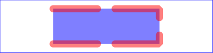
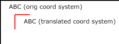
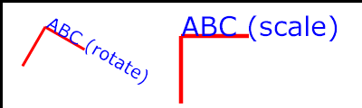
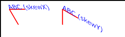
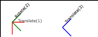
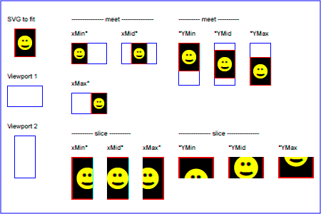
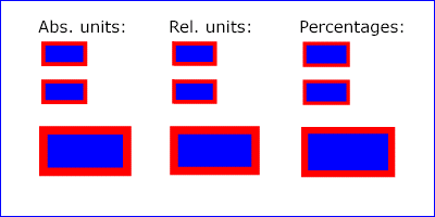

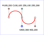
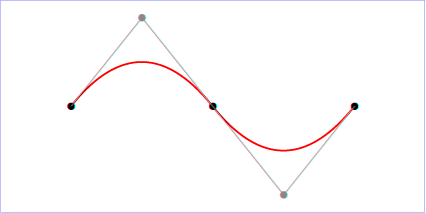


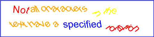
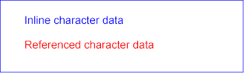


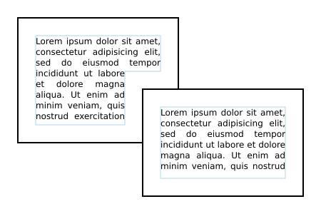
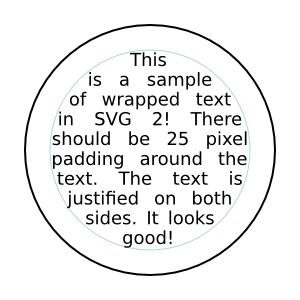


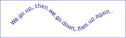
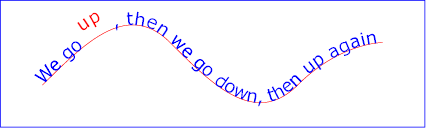
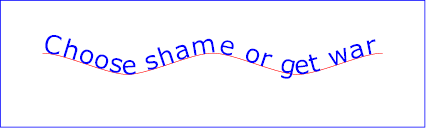

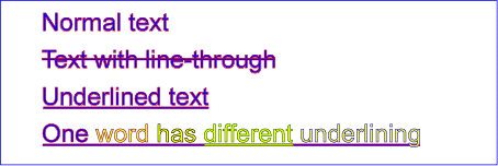


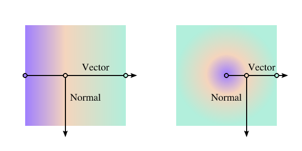
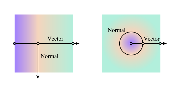
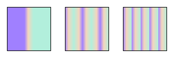
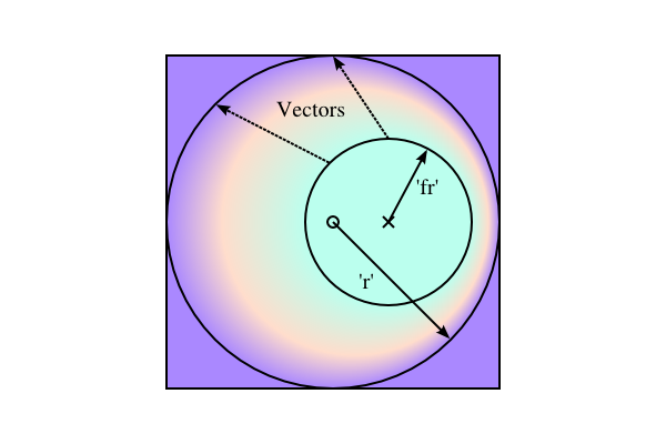


