Abstract
CSS Transitions allows property changes in CSS values to occur smoothly
over a specified duration.
Status of this document
This section describes the status of this document at the time of
its publication. Other documents may supersede this document. A list of
current W3C publications and the latest revision of this technical report
can be found in the W3C technical reports
index at http://www.w3.org/TR/.
Publication as a Working Draft does not imply endorsement by the W3C
Membership. This is a draft document and may be updated, replaced or
obsoleted by other documents at any time. It is inappropriate to cite this
document as other than work in progress.
The (archived) public
mailing list www-style@w3.org (see
instructions) is preferred
for discussion of this specification. When sending e-mail, please put the
text “css3-transitions” in the subject, preferably like this:
“[css3-transitions] …summary of
comment…”
This document was produced by the CSS Working Group (part of
the Style Activity).
This document was produced by a group operating under the 5 February
2004 W3C Patent Policy. W3C maintains a public list of any patent disclosures made in
connection with the deliverables of the group; that page also includes
instructions for disclosing a patent. An individual who has actual
knowledge of a patent which the individual believes contains Essential
Claim(s) must disclose the information in accordance with section
6 of the W3C Patent Policy.
The list of changes made to this specification is
available.
Table of contents
1. Introduction
This section is not normative.
This document introduces new CSS features to enable implicit
transitions, which describe how CSS properties can be made to change
smoothly from one value to another over a given duration.
Normally when the value of a CSS property changes, the rendered result
is instantly updated, with the affected elements immediately changing from
the old property value to the new property value. This section describes a
way to specify transitions using new CSS properties. These properties are
used to animate smoothly from the old state to the new state over time.
For example, suppose that transitions of one second have been defined
on the 'left' and 'background-color' properties. The following diagram
illustrates the effect of updating those properties on an element, in this
case moving it to the right and changing the background from red to blue.
This assumes other transition parameters still have their default values.
Transitions of 'left' and
'background-color'
Transitions are a presentational effect. The computed value of a
property transitions over time from the old value to the new value.
Therefore if a script queries the computed style of a property as it is
transitioning, it will see an intermediate value that represents the
current animated value of the property.
Only animatable CSS properties can be transitioned. See the table at
the end of this document for a list of properties that are animatable.
The transition for a property is defined using a number of new
properties. For example:
Example(s):
  div {
    transition-property: opacity;
    transition-duration: 2s;
  }
The above example defines a transition on the
'opacity' property that, when a new value is
assigned to it, will cause a smooth change between the old value and the
new value over a period of two seconds.
Each of the transition properties accepts a comma-separated list,
allowing multiple transitions to be defined, each acting on a different
property. In this case, the individual transitions take their parameters
from the same index in all the lists. For example:
Example(s):
  div {
    transition-property: opacity, left;
    transition-duration: 2s, 4s;
  }
This will cause the
'opacity' property to
transition over a period of two seconds and the left property to
transition over a period of four seconds.
In the case where the lists of values in transition
properties do not have the same length, the length of the ‘transition-property’ list determines the
number of items in each list examined when starting transitions. The lists
are matched up from the first value: excess values at the end are not
used. If one of the other properties doesn't have enough comma-separated
values to match the number of values of ‘transition-property’, the UA must
calculate its used value by repeating the list of values until there are
enough. This truncation or repetition does not affect the computed value.
Note: This is analogous to the behavior of the
‘background-*’ properties, with
‘background-image’ analogous to
‘transition-property’.
Example(s):
      div {
        transition-property: opacity, left, top, width;
        transition-duration: 2s, 1s;
      }
The above example defines a transition on the
'opacity' property of 2 seconds duration, a
transition on the
'left' property of 1 second
duration, a transition on the
'top' property
of 2 seconds duration and a transition on the
'width' property of 1 second duration.
The 'transition-property' property specifies the
name of the CSS property to which the transition is applied.
We may ultimately want to support a keypath syntax for
this property. A keypath syntax would enable different transitions to be
specified for components of a property. For example the blur of a shadow
could have a different transition than the color of a shadow.
| Name:
| transition-property
|
| Value:
| none | [ all | <IDENT> ] [ ‘,’ [ all | <IDENT> ] ]*
|
| Initial:
| all
|
| Applies to:
| all elements, :before and :after pseudo elements
|
| Inherited:
| no
|
| Percentages:
| N/A
|
| Media:
| visual
|
| Computed value:
| Same as specified value.
|
A value of ‘none’ means that no
property will transition. Otherwise, a list of properties to be
transitioned, or the keyword ‘all’
which indicates that all properties are to be transitioned, is given.
If one of the identifiers listed is not a recognized property name or
is not an animatable property, the implementation must still start
transitions on the animatable properties in the list using the duration,
delay, and timing function at their respective indices in the lists for
‘transition-duration’, ‘transition-delay’, and ‘transition-timing-function’. In other
words, unrecognized or non-animatable properties must be kept in the list
to preserve the matching of indices.
Are ‘none’,
‘inherit’, and ‘initial’ allowed as items in a list of
identifiers (of length greater than one)?
For the keyword ‘all’, or if
one of the identifiers listed is a shorthand property, implementations
must start transitions for any of its longhand sub-properties that are
animatable (or, for ‘all’, all
animatable properties), using the duration, delay, and timing function at
the index corresponding to the shorthand.
If a property is specified multiple times in the value of ‘transition-property’ (either on its own,
via a shorthand that contains it, or via the ‘all’ value), then the transition that starts
uses the duration, delay, and timing function at the index corresponding
to the last item in the value of ‘transition-property’ that calls for
animating that property.
Note: The all value and
shorthand properties work in similar ways, so the all value is just like a shorthand that covers all
properties.
The 'transition-duration' property defines the
length of time that a transition takes.
| Name:
| transition-duration
|
| Value:
| <time> [, <time>]*
|
| Initial:
| 0s
|
| Applies to:
| all elements, :before and :after pseudo elements
|
| Inherited:
| no
|
| Percentages:
| N/A
|
| Media:
| interactive
|
| Computed value:
| Same as specified value.
|
This property specifies how long the transition from the old value to
the new value should take. By default the value is ‘0s’, meaning that the transition is immediate (i.e.
there will be no animation). A negative value for transition-duration is treated as ‘0s’.
The 'transition-timing-function' property describes
how the intermediate values used during a transition will be calculated.
It allows for a transition to change speed over its duration. These
effects are commonly called easing functions. In either case, a
mathematical function that provides a smooth curve is used.
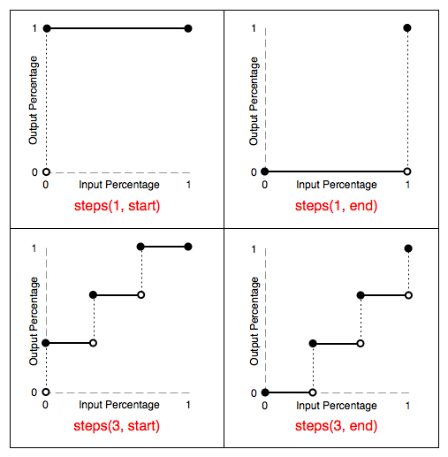
Timing functions are either defined as a stepping function or a cubic
Bézier curve. The timing function takes as its input the
current elapsed percentage of the transition duration and outputs a
percentage that determines how close the transition is to its goal state.
A stepping
function is defined by a number that divides the domain of operation into
equally sized intervals. Each subsequent interval is a equal step closer
to the goal state. The function also specifies whether the change in
output percentage happens at the start or end of the interval (in other
words, if 0% on the input percentage is the point of initial change).
Step timing functions
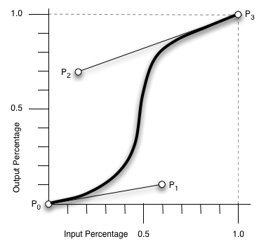
A cubic
Bézier curve is defined by four control points, P0
through P3 (see Figure 1). P0 and P3 are
always set to (0,0) and (1,1). The 'transition-timing-function' property is used to
specify the values for points P1 and P2. These can
be set to preset values using the keywords listed below, or can be set to
specific values using the 'cubic-bezier' function.
In the 'cubic-bezier' function, P1 and
P2 are each specified by both an X and Y value.
Bézier Timing Function Control Points
| Name:
| transition-timing-function
|
| Value:
| [ ease | linear | ease-in | ease-out | ease-in-out | step-start |
step-end | steps(<integer>[, [ start | end ] ]?) |
cubic-bezier(<number>, <number>, <number>,
<number>) ] [, [ ease | linear | ease-in | ease-out | ease-in-out
| step-start | step-end | steps(<number>[, [ start | end ] ]?) |
cubic-bezier(<number>, <number>, <number>,
<number>) ] ]*
|
| Initial:
| ease
|
| Applies to:
| all elements, :before and :after pseudo elements
|
| Inherited:
| no
|
| Percentages:
| N/A
|
| Media:
| interactive
|
| Computed value:
| Same as specified value.
|
The timing functions have the following definitions.
- ease
- The ease function is equivalent to cubic-bezier(0.25, 0.1, 0.25,
1.0).
- linear
- The linear function is equivalent to cubic-bezier(0.0, 0.0, 1.0,
1.0).
- ease-in
- The ease-in function is equivalent to cubic-bezier(0.42, 0, 1.0,
1.0).
- ease-out
- The ease-out function is equivalent to cubic-bezier(0, 0, 0.58, 1.0).
- ease-in-out
- The ease-in-out function is equivalent to cubic-bezier(0.42, 0, 0.58,
1.0)
- step-start
- The step-start function is equivalent to steps(1, start).
- step-end
- The step-end function is equivalent to steps(1, end).
- steps
- Specifies a stepping function, described above, taking two
parameters. The first parameter specifies the number of intervals in the
function. It must be a positive integer (greater than 0). The second
parameter, which is optional, is either the value ‘
start’ or ‘end’, and specifies the point at which the
change of values occur within the interval. If the second parameter is
omitted, it is given the value ‘end’.
- cubic-bezier
- Specifies a cubic-bezier
curve. The four values specify points P1 and P2
of the curve as (x1, y1, x2, y2). Both x values must be in the range [0,
1] or the definition is invalid. The y values can exceed this range.
The 'transition-delay' property defines when the
transition will start. It allows a transition to begin execution some some
period of time from when it is applied. A 'transition-delay' value of ‘0s’ means the transition will execute as soon as
the property is changed. Otherwise, the value specifies an offset from the
moment the property is changed, and the transition will delay execution by
that offset.
If the value for 'transition-delay' is a negative time offset
then the transition will execute the moment the property is changed, but
will appear to have begun execution at the specified offset. That is, the
transition will appear to begin part-way through its play cycle. In the
case where a transition has implied starting values and a negative 'transition-delay', the starting values are
taken from the moment the property is changed.
| Name:
| transition-delay
|
| Value:
| <time> [, <time>]*
|
| Initial:
| 0s
|
| Applies to:
| all elements, :before and :after pseudo elements
|
| Inherited:
| no
|
| Percentages:
| N/A
|
| Media:
| interactive
|
| Computed value:
| Same as specified value.
|
The 'transition'
shorthand property combines the four properties described above into a
single property.
Note that order is important in this property. The first value that can
be parsed as a time is assigned to the transition-duration. The second
value that can be parsed as a time is assigned to transition-delay.
An alternative proposal is to accept the font shorthand
approach of using a "/" character between the values of the same type.
e.g. 2s/4s would mean a duration of 2 seconds and a delay of 4 seconds.
3. Starting of transitions
When the computed value of an animatable property changes,
implementations must decide what transitions to start based on the values
of the ‘transition-property’, ‘transition-duration’, ‘transition-timing-function’, and ‘transition-delay’ properties at the time
the animatable property would first have its new computed value.
Example(s):
This provides a way for authors to specify different values of the
‘transition-*’ properties for the
“forward” and “reverse” transitions (but see below for special reversing behavior when an
incomplete transition is interrupted). Authors can specify the
value of ‘transition-duration’, ‘transition-timing-function’, or ‘transition-delay’ in the same rule where
they specify the value that triggers the transition, or can change these
properties at the same time as they change the property that triggers the
transition. Since it's the new values of these ‘transition-*’ properties that affect the
transition, these values will be used for the transitions to the
associated transitioning values. For example:
li {
  transition: background-color linear 1s;
  background: blue;
}
li:hover {
  background-color: green;
  transition-duration: 2s; /* applies to the transition *to* the :hover state */
}
When a list item with these style rules enters the :hover state, the
computed ‘transition-duration’ at the time that
‘background-color’ would have its
new value (‘green’) is
‘2s’, so the transition from
‘blue’ to ‘green’ takes 2 seconds. However, when the
list item leaves the :hover state, the transition from ‘green’ to ‘blue’ takes 1 second.
When the computed value of a property changes, implementations must
start transitions based on the relevant item (see the definition of ‘transition-property’) in the computed
value of ‘transition-property’. Corresponding to
this item there are values of ‘transition-duration’ and ‘transition-delay’ (see the rules on matching lists). Define the combined duration of the transition as the sum
of max(‘transition-duration’, ‘0s’) and ‘transition-delay’. When the combined
duration is greater than ‘0s’, then a
transition starts based on the values of ‘transition-duration’, ‘transition-delay’, and ‘transition-timing-function’; in other
cases transitions do not occur.
Since this specification does not define when computed values change,
and thus what changes to computed values are considered simultaneous,
authors should be aware that changing any of the transition properties a
small amount of time after making a change that might transition can
result in behavior that varies between implementations, since the changes
might be considered simultaneous in some implementations but not others.
Say something about simultaneity
Once the transition of a property has started, it must continue running
based on the original timing function, duration, and delay, even if the
‘transition-timing-function’, ‘transition-duration’, or ‘transition-delay’ property changes before
the transition is complete. However, if the ‘transition-property’ property changes such
that the transition would not have started, the transition must stop (and
the property must immediately change to its final value).
Implementations must not start a transition when the computed value of
a property changes as a result of declarative animation (as opposed to
scripted animation).
Implementations also must not start a transition when the computed
value changes because it is inherited (directly or indirectly) from
another element that is transitioning the same property.
4. Automatically reversing
interrupted transitions
A common type of transition effect is when a running transition is
interrupted and the property is reset to its original value. An example is
a hover effect on an element, where the pointer enters and exits the
element before the effect has completed. If the outgoing and incoming
transitions are executed using their specified durations and timing
functions, the resulting effect can be distractingly asymmetric. Instead,
the expected behavior is that the new transition should be the reverse of
what has already executed.
If a running transition with duration T, executing so far for duration
TE, from state A, to state B, is interrupted by a property change that
would start a new transition back to state A, and all the transition
attributes are the same (duration, delay and timing function), then the
new transition must reverse the effect. The new transition must:
- Use the B and A states as its "from" and "to" states respectively. It
does not use the current value as its from state, due to the rules below.
- Execute with the same duration T, but starting as if the transition
had already begun, without any transition delay, at the moment which
would cause the new transition to finish in TE from the moment of
interruption. In other words, the new transition will execute as if it
started T-TE in the past.
- Use a timing function that is the portion of the curve traversed up
to the moment of interruption, followed in the opposite direction
(towards the starting point). This will make the transition appear as if
it is playing backwards.
- Ignore any transition delay.
For example, suppose there is a transition with a duration of two
seconds. If this transition is interrupted after 0.5 seconds and the
property value assigned to the original value, then the new transition
effect will be the reverse of the original, as if it had begun 1.5 seconds
in the past.
Note that by using the defined from and to states for the reversing
transition, it is also possible that it may reverse again, if interrupted;
for example, if the transition reversing to state A was again interrupted
by a property change to state B.
Issue: This introduces the concept of reversing a timing
function, which the spec has otherwise resisted doing, and also introduces
a discontinuity between transitions that have almost completed (which get
automatically reversed and thus have their timing function reversed) and
transitions that have fully completed (where the reversal doesn't lead to
the timing function being reversed). An alternative proposal that avoids
this is to follow the normal timing function algorithm, except multiply
the duration (and also shorten any negative delay) by the (output) value
of the transition timing function of the incomplete transition at the time
it was interrupted, and, to account for multiple reverses in sequence, to
divide by the shortening applied to the transition being interrupted. For
more details see this thread: November
2009 part, December
2009 part, January
2010 part.
The completion of a CSS Transition generates a corresponding DOM Event.
An event is fired for each property that undergoes a transition. This
allows a content developer to perform actions that synchronize with the
completion of a transition.
Each event provides the name of the property the transition is
associated with as well as the duration of the transition.
- Interface TransitionEvent
-
The TransitionEvent interface provides specific
contextual information associated with transitions.
- IDL Definition
-
  interface TransitionEvent : Event {
    readonly attribute DOMString          propertyName;
    readonly attribute float              elapsedTime;
    readonly attribute DOMString          pseudoElement;
    void               initTransitionEvent(in DOMString typeArg,
                                          in boolean canBubbleArg,
                                          in boolean cancelableArg,
                                          in DOMString propertyNameArg,
                                          in float elapsedTimeArg,
                                          in DOMString pseudoElementArg);
  };
- Attributes
-
-
propertyName of
type DOMString, readonly
- The name of the CSS property associated with the transition.
-
elapsedTime of
type float, readonly
- The amount of time the transition has been running, in seconds,
when this event fired. Note that this value is not affected by the
value of
transition-delay.
-
pseudoElement of
type DOMString, readonly
- The name (beginning with two colons) of the CSS pseudo-element on
which the transition occured (in which case the target of the event
is that pseudo-element's corresponding element), or the empty string
if the transition occurred on an element (which means the target of
the event is that element).
- Methods
-
-
initTransitionEvent
-
The
initTransitionEvent method is
used to initialize the value of a
TransitionEvent
created through the
DocumentEvent
interface. This method may only be called before the
TransitionEvent has been dispatched via the
dispatchEvent method, though it may be called multiple
times during that phase if necessary. If called multiple times, the
final invocation takes precedence.
Should new events being created still have init*Event
methods?
Parameters
-
typeArg of type
DOMString
- Specifies the event type.
-
canBubbleArg of type
boolean
- Specifies whether or not the event can bubble.
-
cancelableArg of type
boolean
- Specifies whether or not the event's default action can be
prevented. Since a TransitionEvent is purely for notification,
there is no default action.
-
propertyNameArg of type
DOMString
- Specifies the name of the property associated with the
Event.
(See the propertyName
attribute.)
-
elapsedTimeArg of type
float
- Specifies the amount of time, in seconds, the transition has
been running at the time of initialization. (See the elapsedTime
attribute.)
-
pseudoElementArg of type
DOMString
- Specifies the pseudo-element on which the transition
occurred. (See the pseudoElement
attribute.) Does adding this additional
argument create any compatibility problems?
No Return Value
No Exceptions
There is one type of transition event available.
- transitionend
- The ‘
transitionend’ event
occurs at the completion of the transition. In the case where a
transition is removed before completion, such as if the
transition-property is removed, then the event will not fire.
- Bubbles: Yes
- Cancelable: Yes
- Context Info: propertyName, elapsedTime
The following describes how each property type undergoes transition or
animation.
Issue: Need to describe handling of out-of-range values that
can result from cubic-bezier(). Clamping values to the allowed range is
probably the best solution.
For properties that exist at the time this specification was developed,
this specification defines whether and how they are animated. However,
future CSS specifications may define additional properties, additional
values for existing properties, or additional animation behavior of
existing values. In order to describe new animation behaviors and to have
the definition of animation behavior in a more appropriate location,
future CSS specifications should include an "Animatable:" line in the
summary of the property's definition (in addition to the other lines
described in [CSS21],
section
1.4.2). This line should say "no" to indicate that a property cannot
be animated or should reference an animation behavior (which may be one of
the behaviors in the Animation of
property types section above, or may be a new behavior) to define how
the property animates. Such definitions override those given in this
specification.
| Property Name
| Type
|
| background-color
| color
|
| background-position
| percentage, length
|
| border-bottom-color
| color
|
| border-bottom-width
| length
|
| border-left-color
| color
|
| border-left-width
| length
|
| border-right-color
| color
|
| border-right-width
| length
|
| border-spacing
| length
|
| border-top-color
| color
|
| border-top-width
| length
|
| bottom
| length, percentage
|
| clip
| rectangle
|
| color
| color
|
| crop css3-content will likely advance slower than
this specification, in which case this definition should move
there
| rectangle
|
| font-size
| length, percentage
|
| font-weight
| font weight
|
| height
| length, percentage
|
| left
| length, percentage
|
| letter-spacing
| length
|
| line-height
| number, length, percentage
|
| margin-bottom
| length
|
| margin-left
| length
|
| margin-right
| length
|
| margin-top
| length
|
| max-height
| length, percentage
|
| max-width
| length, percentage
|
| min-height
| length, percentage
|
| min-width
| length, percentage
|
| opacity
| number
|
| outline-color
| color
|
| outline-offset
| integer
|
| outline-width
| length
|
| padding-bottom
| length
|
| padding-left
| length
|
| padding-right
| length
|
| padding-top
| length
|
| right
| length, percentage
|
| text-indent
| length, percentage
|
| text-shadow
| shadow
|
| top
| length, percentage
|
| vertical-align
| length, percentage
|
| visibility
| visibility
|
| width
| length, percentage
|
| word-spacing
| length, percentage
|
| z-index
| integer
|
This list omits the following properties that Gecko can
animate, and which likely should be included: background-size,
border-*-radius, box-shadow, column-count, column-gap, column-rule-color,
column-rule-width, column-width, font-size-adjust, font-stretch,
marker-offset, text-decoration-color, transform, transform-origin.
All properties defined as animatable in the SVG specification, provided
they are one of the property types listed above.
8. Acknowledgments
Thanks especially to the feedback from Tab Atkins, Aryeh Gregor, Vincent
Hardy, Cameron McCormack, Alex Mogilevsky, and all the rest of the www-style
community.
9. References
Normative references
-
- [CSS3-TRANSFORMS]
- Simon Fraser; et al. CSS
Transforms. 28 February 2012. W3C Working Draft. (Work in
progress.) URL: http://www.w3.org/TR/2012/WD-css3-transforms-20120228/
Other references
-
- [CSS21]
- Bert Bos; et al. Cascading Style
Sheets Level 2 Revision 1 (CSS 2.1) Specification. 7 June
2011. W3C Recommendation. URL: http://www.w3.org/TR/2011/REC-CSS2-20110607
- [CSS3-IMAGES]
- Elika J. Etemad; Tab Atkins Jr. CSS Image
Values and Replaced Content Module Level 3. 12 January 2012.
W3C Working Draft. (Work in progress.) URL: http://www.w3.org/TR/2012/WD-css3-images-20120112/
Property index
| Property
| Values
| Initial
| Applies to
| Inh.
| Percentages
| Media
|
| transition
| [<‘transition-property’> ||
<‘transition-duration’> ||
<‘transition-timing-function’> ||
<‘transition-delay’> [,
[<‘transition-property’> ||
<‘transition-duration’> ||
<‘transition-timing-function’> ||
<‘transition-delay’>]]*
| see individual properties
| all elements, :before and :after pseudo elements
| no
| N/A
| interactive
|
| transition-delay
| <time> [, <time>]*
| 0s
| all elements, :before and :after pseudo elements
| no
| N/A
| interactive
|
| transition-duration
| <time> [, <time>]*
| 0s
| all elements, :before and :after pseudo elements
| no
| N/A
| interactive
|
| transition-property
| none | [ all | <IDENT> ] [ ‘,’ [ all |
<IDENT> ] ]*
| all
| all elements, :before and :after pseudo elements
| no
| N/A
| visual
|
| transition-timing-function
| [ ease | linear | ease-in | ease-out | ease-in-out | step-start |
step-end | steps(<integer>[, [ start | end ] ]?) |
cubic-bezier(<number>, <number>, <number>,
<number>) ] [, [ ease | linear | ease-in | ease-out | ease-in-out
| step-start | step-end | steps(<number>[, [ start | end ] ]?) |
cubic-bezier(<number>, <number>, <number>,
<number>) ] ]*
| ease
| all elements, :before and :after pseudo elements
| no
| N/A
| interactive
|
Index
- combined duration, 3.
- transition, 2.5.
- transition-delay, 2.4.
- transition-duration, 2.2.
- transition-property, 2.1.
- transition-timing-function, 2.3.