W3C launches beta of its new website
Author(s) and publish date
- By:
-
-
Coralie Mercier
-
- Published:
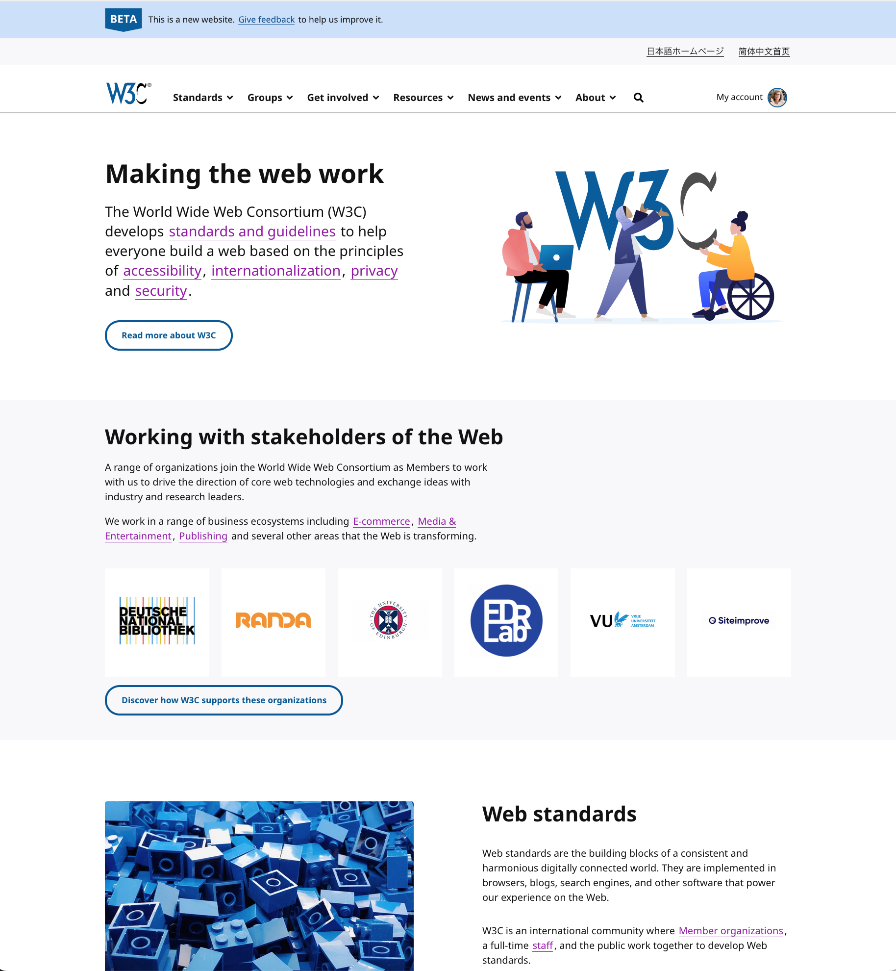
Screenshot of the beta homepage of the redesigned W3C website
Today we launched a beta version of the redesign of our website.
The goals of the redesign are to achieve a cleaner and modern look and greater usability, better accessibility, as well as ultimately simplifying how the site is managed. We also want to offer integrated Japanese and Chinese versions, which we will roll out after the beta of the English site has concluded.
For several years, W3C has worked in close partnership with Studio 24 to redesign our website. This is, as many in our community know, an enormous undertaking and one which has been of great importance to us. You can read more from Studio 24’s blog post about our collaboration (“the journey!”) and process.
The scope of the redesign is limited to most of our public pages, but we will gradually work to include the rest of the site.
We invite your feedback on the beta site, on website or content issues, we're using GitHub to manage comments.
My heartfelt thanks to the W3C Systems Team for its tremendous work for several years as well as to the many people in the WAI and i18n teams and to everyone so far and in the near future who’ve worked with Studio 24 and us on this project. We are grateful to Studio 24 for their incredible work, dedication and technical skills - our new site would not exist without them.
We’re not done, but we’ve reached a significant milestone!
Please let us know what you think.
The beta redesign is really cool, congratulations!
Disappointing! Design has much less information on a desktop screen - seems aimed at the mobile only community. Fine for them, but not for the rest of us.
In my opinion, the look is actually more modern
I (and presumably a few dozen others) will miss the current design, but I think the new one is also nice.
It would be nicer if the new one looked better when printed. As it currently is, there are large amounts of white space, and various images (such as logos on the home page) appear giant, wasting paper and toner/ink. The widths of other text elements are also inconsistent, taking up more space and leading to extra pages that would need printing.
Many redesigns also seem to come with link changes. Hopefully, this won't be a problem, especially considering that "cool URIs don't change" (https://www.w3.org/Provider/Style/URI).
Overall, this seems like a good change for the W3C, and I look forward to seeing how the beta changes and improves in the future.
Missing the principles of design on 'accessibility website'
Not a fan, it looks just like every other corporate stock photo website.
Say what you will about the old design at least I knew where I was immediately looking at it.
Didn't like it.
It looks like every other websites on the internet. I like the "old" design.
And a lot of wasted space.