Status of this Document
This section describes the status of this document at the time of its
publication. Other documents may supersede this document. A list of current
W3C publications and the latest revision of this technical report can be
found in the W3C technical reports index at http://www.w3.org/TR/.
This is a Public Working Draft by the Protocols & Formats Working
Group of the Web
Accessibility Initiative. This version incorporates changes in response to public comments received on the previous version. A history of changes to WAI-ARIA is available.
WAI-ARIA was previously published as a Last Call Working Draft. Due to substantial changes in response to these comments, PFWG decided to return to Working Draft stage to collect feedback on these changes. Refer to the summary of actions made in response to comments. The PFWG expects to publish another Last Call Working Draft in the first quarter of 2010.
Feedback on the model set out here is important to the success of the Web community in creating accessible Rich Internet Applications. The PFWG would like to know:
- Does the role ontology provide the information and operations that people with disabilities need in order to access and operate richly interactive Web applications?
- Is the usage of roles, states, and properties clear?
- Is it clear how to create Rich Internet Applications with this added capability?
- Are conformance requirements clear, and sufficient but not excessive?
When addressing these questions, please consider them in the context of the companion documents. Follow the instructions for commenting page to submit comments. Submit comments online (preferred) or by email to to public-pfwg-comments@w3.org (Archive). Comments should be made by 2 February 2010. In-progress updates to the document may be viewed in the publicly visible editors' draft.
Publication as a Working Draft does not imply endorsement by the W3C
Membership. This is a draft document and may be updated, replaced or
obsoleted by other documents at any time. It is inappropriate to cite this
document as other than work in progress.
This document was produced by a group operating under the 5 February 2004
W3C Patent Policy. W3C maintains a public list of any
patent disclosures made in connection with the deliverables of the group;
that page also includes instructions for disclosing a patent. An individual
who has actual knowledge of a patent which the individual believes contains Essential
Claim(s) must disclose the information in accordance with section
6 of the W3C Patent Policy.
The disclosure obligations of the Participants of this group are described
in the charter.
1. Introduction
This section is informative.
The goals of this specification include:
- expanding the accessibility information that may be supplied by the author;
- requiring that supporting host languages provide full keyboard support that may be implemented in a device-independent way, for example, by telephones, handheld devices, e-book readers, and televisions;
- improving the accessibility of dynamic content generated by scripts; and
- providing for interoperability with assistive technologies.
WAI-ARIA is a technical specification that provides a framework to improve the accessibility and interoperability of web content and applications. This document is primarily for developers creating custom widgets and other web application components. Please see the WAI-ARIA Overview for links to related documents for other audiences, such as the WAI-ARIA Primer that introduces developers to the accessibility problems that WAI-ARIA is intended to solve, the fundamental concepts, and the technical approach of WAI-ARIA.
This draft currently handles two aspects of roles: user interface functionality and structural relationships. For more information and use cases, see the WAI-ARIA Primer [ARIA-PRIMER] for the use of roles in making interactive content accessible.
The role taxonomy is designed in part to support the common roles found in platform accessibility APIs. Reference to roles found in this taxonomy by dynamic web content may be used to support interoperability with assistive technologies.
The schema to support this standard has been designed to be extensible so that custom roles can be created by extending base roles. This allows user agents to support at least the base role, and user agents that support the custom role can provide enhanced access. Note that much of this could be formalized in XML Schema [XSD]. However, being able to define similarities between roles, such as baseConcepts and more descriptive definitions, would not be available in XSD. While this extensibility is possible, this version of the specification does not define how this extension is to be achieved.
- WAI-ARIA Primer [ARIA-PRIMER], a planned W3C Working Group Note, introduces developers to the accessibility problems that WAI-ARIA is intended to solve, the fundamental concepts, and the technical approach of WAI-ARIA.
- WAI-ARIA Authoring Practices [ARIA-PRACTICES], a planned W3C Working Group Note, describes how web content developers can develop accessible rich internet applications using WAI-ARIA. It provides detailed advice and examples directed primarily to web application developers, yet also useful to user agent and assistive technology developers.
- WAI-ARIA User Agent Implementation Guide [ARIA-IMPLEMENTATION], a planned W3C Working Group Note, describes how browsers and other user agents should support WAI-ARIA; specifically, how to expose WAI-ARIA features to platform accessibility APIs.
- WAI-ARIA Roadmap [ARIA-ROADMAP], planned a W3C Working Group Note, defines the path to make rich web content accessible, including steps already taken, remaining future steps, and a time line.
1.1. Rich Internet Application Accessibility
The domain of web accessibility defines how to make web content usable by persons with disabilities. Persons with certain types of disabilities use assistive technologies (AT) to interact with content. Assistive technologies can transform the presentation of content into a format more suitable to the user, and can allow the user to interact in different ways. For example, a user may need to, or choose to, interact with a slider widget via arrow keys, instead of dragging and dropping with a mouse. In order to accomplish this effectively, the software needs to understand the semantics of the content. "Semantics" is the knowledge of roles, states, and properties that apply to content elements as a person would understand them. For instance, if a paragraph is semantically identified as such, assistive technologies can interact with it as a unit separable from the rest of the content, knowing the exact boundaries of that paragraph. A range slider or collapsible tree widget are more complex examples, in which various parts of the widget have semantics that need to be properly identified for the assistive technologies to support effective interaction.
New technologies often overlook the semantics required for accessibility, and new authoring practices often misuse the intended semantics of those technologies. Elements that have one defined meaning in the language are used with a different meaning intended to be understood by the user.
For example, web application developers create collapsible tree widgets in HTML using CSS and JavaScript even though HTML lacks an appropriate semantic element. To a non-disabled user, it may look and act like a collapsible tree widget, but without appropriate semantics, the tree widget may not be perceivable to or operable by a person with a disability because the assistive technologies will not recognize the role.
The incorporation of WAI-ARIA is a way for an author to provide proper semantics for custom widgets to make these widgets accessible, usable, and interoperable with assistive technologies. This specification identifies the types of widgets and structures that are commonly recognized by accessibility products, by providing an ontology of corresponding roles that can be attached to content. This allows elements with a given role to be understood as a particular widget or structural type regardless of any semantic inherited from the implementing technology. Roles are a common property of platform accessibility APIs which assistive technologies uses to provide the user with effective presentation and interaction.
This role taxonomy includes interaction widgets and elements denoting document structure. The role taxonomy describes inheritance and details the attributes each role supports. Information about mapping of roles to accessibility APIs is provided by the WAI-ARIA User Agent Implementation Guide [ARIA-IMPLEMENTATION].
Roles are element types and should not change with time or user actions. Role information is used by assistive technologies, through interaction with the user agent, to provide normal processing of the specified element type.
States and properties are used to declare important attributes of an element that affect and describe interaction. They enable the user agent and operating system to properly handle the element even when the attributes are dynamically changed by client-side scripts. For example, alternative input and output technology such as screen readers, speech dictation software, and on-screen keyboards need to be able to recognize and effectively communicate various states (disabled, checked, etc.) to the user.
While it is possible for assistive technologies to access these properties directly through the Document Object Model [DOM], the preferred mechanism is for the user agent to map the states and properties to the accessibility API of the operating system. See the WAI-ARIA User Agent Implementation Guide. [ARIA-IMPLEMENTATION]
Figure 1.0 illustrates the relationship between user agents, accessibility APIs, and assistive technologies. It describes the "contract" provided by the user agent to assistive technologies, which includes typical accessibility information found in the accessibility API for many of our accessible platforms for GUIs (role, state, selection, event notification, relationship information, and descriptions). The browser DOM, usually HTML, acts as the data model and view in a typical MVC relationship, and JavaScript acts as the controller by manipulating the style and content of the displayed data. The user agent conveys relevant information to the operating system's accessibility API, which can be used by any assistive technologies, such as a screen reader.
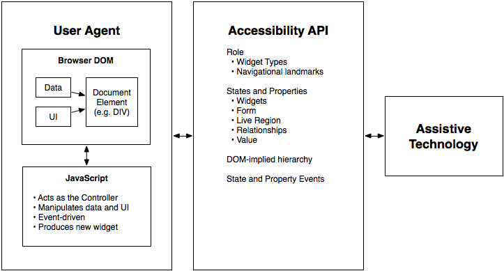
Figure 1: The contract model with accessibility APIs
For more information see the WAI-ARIA Primer [ARIA-PRIMER] for the use of roles in making interactive content accessible.
In addition to the prose documentation, the role taxonomy is provided in Web Ontology Language (OWL) [OWL], which is expressed in Resource Description Framework (RDF) [RDF]. Tools can use these to validate the implementation of roles in a given content document. For example, instances of some roles are expected to be children of a specific parent role. Also, some roles may support a specific state or property that another role does not support.
Note: The use of RDF/OWL as a formal representation of roles may be used to support future extensibility. Standard RDF/OWL mechanisms can be used to define new roles that inherit from the roles defined in this specification. The mechanism to define and use role extensions in an interoperable manner, however, is not defined by this specification. A future version of WAI-ARIA is expected to define how to extend roles.
Users of alternate input devices need keyboard accessible content. The new semantics, when combined with the recommended keyboard interactions provided in WAI-ARIA Authoring Practices [ARIA-PRACTICES], will allow alternate input solutions to facilitate command and control via an alternate input solution.
WAI-ARIA introduces navigation landmarks through its taxonomy and the XHTML role landmarks, which helps persons with dexterity and vision impairments by providing for improved keyboard navigation. WAI-ARIA may also be used to assist persons with cognitive learning disabilities. The additional semantics allow authors to restructure and substitute alternative content as needed.
Assistive technology needs the ability to support alternative inputs by getting and setting the current value of widgets. Assistive technologies also need to determine what objects are selected and manage widgets that allow multiple selections, such as list boxes and grids.
Speech-based command and control systems can benefit from WAI-ARIA semantics like the role attribute to assist in conveying audio information to a user. For example, by determining that an element has a role of menu and that it contains three elements with the role menuitem each containing text content representing a different flavor, a speech system might state to the user that, "Select one of three choices: chocolate, strawberry, or vanilla."
WAI-ARIA is intended to be used as a supplement for native language semantics, not a replacement. When the host language provides a feature that is equivalent to the WAI-ARIA feature, use the host language feature. WAI-ARIA should only be used in cases where the host language lacks the needed role, state, or property indicator. First use a host language feature that is as similar as possible to the WAI-ARIA feature, then refine the meaning by adding WAI-ARIA. For instance, a multi-selectable grid could be implemented as a table, and then WAI-ARIA used to clarify that it is a grid, not just a table. This allows for the best possible fallback for user agents that do not support WAI-ARIA and preserves the integrity of the host language semantics.
1.2. Target Audience
This specification defines the basic model for WAI-ARIA, including roles, states, properties, and values. It impacts several audiences:
- User agents that process content containing WAI-ARIA features;
- Assistive technology that presents content in special ways to user with disabilities;
- Authors who create content;
- Authoring tools that help authors create conforming content; and
- Conformance checkers that verify appropriate use of WAI-ARIA.
Each conformance requirement indicates the audience to which it applies.
Although this specification is applicable to the above audiences, it is not specifically targeted to, nor is it intended to be the sole source of information for, any of these audiences. The following documents provide important supporting information:
1.3. User Agent Support
WAI-ARIA relies on user agent support for its features in two ways:
Aside from using WAI-ARIA markup to improve what is exposed to accessibility APIs, user agents mainly behave as they would natively. Assistive technologies react to the extra information in the accessibility API as they already do for the same information on non-web content. User agents that are not assistive technologies, however, need do nothing beyond providing appropriate interaction with the accessibility API.
Some user agents might enhance native presentation and interaction behaviors on the basis of WAI-ARIA markup. This is particularly true of assistive technologies that use WAI-ARIA directly rather than reference the accessibility API. Yet even mainstream user agents might choose to do so, directly or via user-installed extensions. This is a way user agents can maximize their usefulness to users, including users without disabilities. The WAI-ARIA specification neither requires or forbids this.
User agents that are not assistive technologies are not required to enhance the user experience in this way. WAI-ARIA is intended to bridge markup to render author-modified semantics in an accessible way. Generally, authors using WAI-ARIA will provide the appropriate presentation and interaction features. Furthermore, for many user agents it may be strategically preferable to introduce native support for given WAI-ARIA features only once they become part of the host language. In this case the user agent would support the now native host language feature, but may choose to not provide parallel support for the WAI-ARIA markup (beyond continuing the accessibility API support for legacy content). Developers of host languages that include WAI-ARIA are advised to consider processing WAI-ARIA semantics when defining its host language support as WAI-ARIA semantics reflect the intent of the author when the author deems the host language feature to be inadequate to meet their need.
1.4. Co-Evolution of WAI-ARIA and Host Languages
WAI-ARIA is intended to be a bridging technology. It clarifies semantics to assistive technologies when authors create new types of objects, via style and script, that are not yet directly supported by the language of the page. This is important because the invention of new types of objects is faster than standardized support for them appears in page languages.
It is not appropriate to create objects with style and script when the page language does provide semantics for that type of object. While WAI-ARIA can improve the accessibility of these objects, accessibility is best provided by allowing the user agent to handle the object natively.
It is expected that, over time, host languages will evolve to provide semantics for objects that previously could only be declared with WAI-ARIA. This is natural and desirable, as one goal of WAI-ARIA is to help stimulate the emergence of more semantic markup. When native semantics for a given feature become available, it is appropriate for authors to use the native feature and stop using WAI-ARIA for that feature. Legacy content may continue to use WAI-ARIA, however, so the need for user agents to support WAI-ARIA remains.
While specific features of WAI-ARIA may lose importance over time, the general possibility of WAI-ARIA to add semantics to Web pages is expected to be a persistent need. Host languages may not implement all the semantics WAI-ARIA provides, and various host languages may implement different subsets of the features. Furthermore, new types of objects are continually being developed. The goal of WAI-ARIA is to provide a quick way to make such objects accessible, because host language standards tend to be slower to evolve. Thus new types of objects would generally appear first within the Web community, then WAI-ARIA would provide bridging accessibility semantics in the medium term, and finally Web languages would provide native semantics in the longer term. In this way, WAI-ARIA and host languages both evolve together but at different rates.
1.5. Authoring Practices
1.5.2. Testing Practices and Tools
The accessibility of interactive content cannot be confirmed by static checks alone. Developers of interactive content should test for device-independent access to widgets and applications, and should verify accessibility API access to all content and changes during user interaction.
1.6. Assistive Technologies
Programmatic access to accessibility semantics is essential for assistive technologies. Most assistive technology interacts with user agents, like other applications, through a recognized accessibility API. Perceivable objects in the user interface are exposed to assistive technologies as accessible objects, defined by the accessibility API interfaces. To do this properly, accessibility information – role, states, properties as well as contextual information – needs to be accurately conveyed to the assistive technology through the accessibility API. The accessibility API provides programmatic access to this information. When a state change occurs, the user agent provides the appropriate event notification to the assistive technology. Contextual information, in many host languages like HTML, can be determined from the DOM itself as it provides a contextual tree hierarchy.
While some assistive technologies interact with these accessibility APIs, others may access the content directly from the DOM. These technologies can restructure, simplify, style, or reflow the content to help a different set of users. Common use cases for these types of adaptations may be the aging population, cognitive impairments, or the situationally disabled. The availability of WAI-ARIA semantics facilitates the adaptation process. For example, the availability of regional navigational landmarks may allow for a mobile device adaptation that shows only portions of the content at any one time based on their semantics. This also reduces the amount of information a user needs to process at any one time. In other situations it may be easier to replace a user interface control with something that is easier to navigate with a keyboard, or touch screen device.
These requirements for semantic programmatic access parallel User Agent Accessibility Guidelines: Programmatic operation of user agent user interface and Programmatic notification of changes ([UAAG]) except that it applies to content, not just to the user agent.
2. Using WAI-ARIA
This section is informative.
Complex web applications become inaccessible when assistive technologies cannot determine the semantics behind portions of a document or when the user is unable to effectively navigate to all parts of it in a usable way (see the WAI-ARIA Primer [ARIA-PRIMER]). WAI-ARIA divides the semantics into roles (the type defining a user interface element) and states and properties supported by the roles.
Authors need to associate elements in the document to a WAI-ARIA role and the appropriate states and properties (aria-* attributes) during its life-cycle, unless the elements already have the appropriate implicit ARIA semantics for states and properties. In these instances the equivalent host language states and properties take precedence to avoid a conflict while the role attribute will take precedence over the implicit role of the host language element.
Authors need to associate elements in the document to a WAI-ARIA role and the appropriate states and properties (aria-*) during its life-cycle.
2.2. WAI-ARIA States and Properties
WAI-ARIA provides a collection of accessibility states and properties which are used to support platform accessibility APIs on the various operating system platforms. assistive technologies may access this information through an exposed user agent DOM or through a mapping to the platform accessibility API. When combined with roles, the user agent can supply the assistive technologies with information to render the information to the user at any instance in time. Changes in states or properties will result in a notification to assistive technologies, which may alert the user that a change has occurred.
In the following example, a list item (html:li) has been used to create a checkable menu item, and JavaScript events will capture mouse and keyboard events to toggle value of aria-checked. A role is used to make the behavior of this simple widget known to the user agent. Attributes that change with user actions (such as aria-checked) are defined in the states and properties section.
<li role="menuitemcheckbox" aria-checked="true">Sort by Last Modified</li>
Some accessibility states, called managed states, are controlled by the user agent. Examples of managed state include keyboard focus and selection. Managed states often have corresponding CSS pseudo-classes (such as :focus and ::selection) to define style changes. In contrast, the states in this specification are typically controlled by the author and are called unmanaged states. Some states managed by the user agent, such as aria-posinset and aria-setsize, can be overridden by web application authors, but the author can override them if the DOM is incomplete and would cause the user agent calculation to be incorrect. User agents map both managed and unmanaged states to the platform accessibility APIs.
Most modern user agents support CSS attribute selectors ([CSS]), and can allow the author to create UI changes based on WAI-ARIA attribute information, reducing the amount of scripts necessary to achieve equivalent functionality. In the following example, a CSS selector is used to determine whether or not the text is bold and an image of a check mark is shown, based on the value of the aria-checked attribute.
[aria-checked="true"] { font-weight: bold; }
[aria-checked="true"]:before { background-image: url(checked.gif); }
Note: At the time of this writing, this CSS example, while technically correct, will not redraw styles properly in some browsers if the attribute's value is changed dynamically. It may be necessary to toggle a class name, or otherwise force the browser to redraw the styles properly.
If CSS is not used to toggle the visual representation of the check mark, the author could include additional markup and scripts to manage an image that represents whether or not the menuitemcheckbox is checked.
<li role="menuitemcheckbox" aria-checked="true">
<img src="checked.gif" role="presentation" alt="">
Sort by Last Modified
</li>
2.3. Managing Focus
An application should always have an element with focus when in use, as applications require users to have a place to provide user input. The element with focus should not be destroyed or hidden. It should also not be scrolled off-screen unless through user intervention. All interactive objects should be focusable. All parts of composite interactive objects should either be focusable or have a documented alternative method to achieve their function, such as a keyboard shortcut. There should be an obvious, discoverable way, either through tabbing or other standard navigation techniques, for keyboard users to move the focus to any interactive element. See User Agent Accessibility Guidelines, Guideline 9 ([UAAG], Guideline 9).
When using standard HTML and basic WAI-ARIA widgets, application developers can simply manipulate the tab order or use a script to create keyboard shortcuts to elements in the document. Use of more complex widgets requires the author to manage focus within them. SVG Tiny provides a similar focus mechanism that, by default, follows document source code order and which should be implemented using system dependent input facilities (the TAB key on most desktop computers). SVG authors may place elements in the navigation order by manipulating the focusable property and they may dynamically specify the navigation order by modifying elements' navigation attributes.
WAI-ARIA includes a number of "managing container" widgets, also known as "composite" widgets. Typically, the container is responsible for tracking the last descendant which was active (the default is usually the first item in the container). When a previously focused container is refocused, the new active descendant should be the same element as the active descendant when the container was last focused. For example, if the second item of a tree group was the active descendant when the user tabbed out of the tree group, then the second item of the tree group remains the active descendant when the tree group gets focus again. The user may also activate the container by clicking on one of the descendants within it.
When something in the container has focus, the user may navigate through the container by pressing additional keys such as the arrow keys to move relative to the current item. Any additional press of the main navigation key (generally the Tab key) will move out of the container to the next widget.
For example, a grid may be used as a spreadsheet with thousands of gridcell elements, all of which may not be present in the document at one time. This requires their focus to be managed by the container using the aria-activedescendant attribute, on the managing container element, or by the container managing the tabindex of its child elements and setting focus on the appropriate child. For more information, see Providing Keyboard Focus in WAI-ARIA Authoring Practices ([ARIA-PRACTICES]).
Containers that manage focus in this way are:
More information on managing focus can be found in the Using Tabindex to Manage Focus Among Widgets section of the WAI-ARIA Authoring Practices [ARIA-PRACTICES].
3. Normative Requirements for WAI-ARIA
This section is normative.
This specification indicates whether a section is normative or informative. Classifying a section as normative or informative applies to the entire section. A statement "This section is normative" or "This section is informative" applies to all sub-sections of that section.
Normative sections provide requirements that authors, user agents, and assistive technology MUST follow for an implementation to conform to this specification. The keywords MUST, MUST NOT, REQUIRED, SHALL, SHALL NOT, SHOULD, RECOMMENDED, MAY, and OPTIONAL in this document are to be interpreted as described in Keywords for use in RFCs to indicate requirement levels [RFC2119]. RFC-2119 keywords are formatted in uppercase and contained in a strong element with class="2119". When the keywords shown above are used, but do not share this format, they do not convey formal information in the RFC 2119 sense, and should be understood as merely explanatory, i.e., informative. As much as possible such usages are avoided in this specification.
Informative sections provide information useful to understanding the specification. Such sections may contain examples of recommended practice, but it is not required to follow such recommendations in order to conform to this specification.
5. The Roles Model
This section is normative.
This section defines the WAI-ARIA role taxonomy and describes the characteristics and properties of all roles. A formal RDF/OWL representation of all the information presented here is available in Schemata Appendix.
The roles, their characteristics, the states and properties they support, and specification of how they may be used in markup, shall be considered normative. The RDF/OWL representation used to model the taxonomy shall be considered to be informative. The RDF/OWL taxonomy may be used as a vehicle to extend WAI-ARIA in the future or by tools manufacturers to validate states and properties applicable to roles per this specification.
Roles are element types and authors MUST NOT change role values over time or with user actions. Platform accessibility APIs typically do not provide a vehicle to notify assistive technologies that a role has changed. Due to this and document caching, assistive technologies are unlikely to process a change in role attribute value. In order to reflect the content in the DOM, user agents SHOULD map the role attribute to the appropriate value in the implemented accessibility API, and user agents SHOULD update the mapping when the role attribute changes. However, it is unlikely that assistive technologies will process this change, so authors wishing to change a role SHOULD do so by deleting the associated element and its children and replacing it with a new element with the appropriate role.
5.1. Relationships Between Concepts
The role taxonomy uses the following relationships to relate WAI-ARIA roles to each other and to concepts from other specifications, such as HTML and XForms.
5.1.1. Superclass Role
- RDF Property
- rdfs:subClassOf
The role that this role extends in the taxonomy. This extension causes all the properties and constraints of the superclass role to propagate to the subclass role. Other than well known stable specifications, inheritance may be restricted to items defined inside this specification so that items cannot be changed and affect inherited classes.
Inheritance is expressed in RDF using the RDF Schema subClassOf ([RDFS]) property.
5.1.2. Subclass Roles
- RDF Property
- <none>
Informative list of roles for which this role is the superclass. This is provided to facilitate reading of the specification but adds no new information.
5.1.4. Base Concept
- RDF Property
- role:baseConcept
Informative data about objects that are considered prototypes for the role. Base concept is similar to type, but without inheritance of limitations and properties. Base concepts are designed as a substitute for inheritance for external concepts. A base concept is like a relatedConcept except that base concepts are almost identical to each other.
For example, the checkbox defined in this document has similar functionality and anticipated behavior to a checkbox defined in HTML. Therefore, a checkbox has an HTML checkbox as a baseConcept. However, if the original HTML checkbox baseConcept definition is modified, the definition of a checkbox in this document will not be not affected, because there is no actual inheritance of the respective type.
5.2. Characteristics of Roles
Roles are defined and described by their characteristics. Characteristics define the structural function of a role, such as what a role is, concepts behind it, and what instances the role can or must contain. In the case of widgets this also includes how it interacts with the user agent based on mapping to HTML forms and XForms. States and properties from WAI-ARIA that are supported by the role are also indicated.
The Roles Taxonomy defines the following characteristics. These characteristics are implemented in RDF as properties of the OWL classes that describe the roles.
5.2.1. Abstract Roles
- RDF Property
- N/A
- Values
- Boolean
Abstract roles are the foundation upon which all other WAI-ARIA roles are built. Content authors MUST NOT use abstract roles because they are not implemented in the API binding. User agents MUST NOT map abstract roles to the standard role mechanism of the accessibility API. Conformance checkers SHOULD raise an error when abstract roles are used. Abstract roles are provided to help with the following:
- Organize the role taxonomy and provide roles with a meaning in the context of known concepts.
- Streamline the addition of roles that include necessary features.
5.2.2. Required States and Properties
- RDF Property
- role:requiredState
- Values
- Any valid RDF object reference, such as a URI or an RDF ID reference.
States and properties specifically required for the role and child roles. Content authors MUST provide values for required states and properties.
When an object inherits from multiple ancestors and one ancestor indicates that property is supported while another ancestor indicates that it is required, the property is required in the inheriting object.
Note: An element with the appropriate implicit ARIA semantic fulfills this requirement.
5.2.3. Supported States and Properties
- RDF Property
- role:supportedState
- Values
- Any valid RDF object reference, such as a URI or an RDF ID reference.
States and properties specifically applicable to the role and child roles. User agents MUST map all supported states and properties for the role to an accessibility API. Content authors MAY provide values for supported states and properties, but may not in all cases because default values are sufficient.
Note: An element with the appropriate implicit ARIA semantic fulfills this requirement.
5.2.4. Inherited States and Properties
Informative list of properties that are inherited onto a role from ancestor roles. States and properties are inherited from ancestor roles in the role taxonomy, not from ancestor elements in the DOM tree. These properties are not explicitly defined on the role, as the inheritance of properties is automatic. This information is provided to facilitate reading of the specification. Inherited states and properties that are required are indicated as such in this field as well. The set of supported states and properties combined with inherited states and properties forms the full set of states and properties supported by the role.
5.2.5. Required Owned Elements
- RDF Property
- role:mustContain
- Values
- Any valid RDF object reference, such as a URI or an RDF ID reference.
Any element that will be owned by the element with this role. For example, an element with the role list will own at least one element with the role group or listitem.
When multiple roles are specified as Required Owned Elements for a role, at least one instance of one required owned element is expected. This specification does not require an instance of each of the listed owned roles. For example, a menu should have at least one instance of a menuitem, menuitemcheckbox, or menuitemradio. The menu role does not require one instance of each.
There may be times that required owned elements are missing, for example, while editing or while loading a data set.
Note: A role that has 'required owned elements' does not imply the reverse relationship. While processing of a role may be incomplete without elements of given roles present as descendants, elements with roles in this list do not always have to be found within elements of the given role. See required context role for requirements about elements in which elements of a given role must be contained.
Note: An element with a subclass role of the 'required owned element' does not fulfill this requirement.
Note: An element with the appropriate implicit ARIA semantic fulfills this requirement.
5.2.6. Required Context Role
- RDF Property
- role:scope
- Values
- Any valid RDF object reference, such as a URI or an RDF ID reference.
The required context role defines the owning container where this role is allowed. If a role has a required context, authors MUST ensure that an element with the role is contained inside (or owned by) an element with the required context role. For example, an element with role listitem is only meaningful when contained inside (or owned by) an element with role list.
Note: A role that has 'required context role' does not imply the reverse relationship. While an element with the given role needs to appear within an element of the listed role(s) in order to be meaningful, elements of the listed roles do not always need descendant elements of the given role in order to be meaningful. See required owned elements for requirements about elements that require presence of a given descendant to be processed properly.
Note: An element with the appropriate implicit ARIA semantic fulfills this requirement.
5.2.7. Accessible Name Calculation
- RDF Property
- role:nameFrom
- Values
- One of the following values:
- author: name comes from values provided by the author in explicit markup features such as the
aria-label attribute, aria-labelledby attribute, or the HTML title attribute. - contents: name comes from the text value of the element node. Although this may be allowed in addition to "author" in some roles, this is used in content only if "author" features are not provided.
5.2.7.2. Description Computation
An accessible description may be computed by concatenating the text alternatives for nodes pointed to by an aria-describedby attribute on the current node.
5.2.7.3. Text Alternative Computation
The text alternative computation outlined below is a description of how user agents acquire a name or description that they then publish through the accessiblity API. User agent implementers are referred to the WAI-ARIA User Agent Implementation Guide [ARIA-IMPLEMENTATION] for a complete description of the algorithm. Authors can use the current section as a guide for creating names and descriptions in their markup. Checker tools can implement a name and/or description generator based on this algorithm such that authors can use the generated text equivalent to confirm that names and descriptions are as the author intended.
Note: Though a user agent may make efforts to compute a text alternative from CSS-generated text in the absence of text content determinable from the DOM, authors should not provide text through a style sheet, as a user agent may incorrectly determine the text alternative.
The text alternative is reused in both the name and description computation, as described above. There are different rules provided for several different types of nodes and combinations of markup. Text alternatives are built up, when appropriate, from all the relevant content contained within an element. This is accomplished via rule 2C (which is recursive), using the full set of rules to retrieve text from its own children.
The text alternative for a given node is computed as follows:
- Skip hidden elements unless the author specifies to use them via an
aria-labelledby or aria-describedby being used in the current computation. By default, users of assistive technologies won't receive the hidden information, but an author will be able to explicitly override that and include the hidden information. - For any non-skipped elements:
- Authors MAY specify an element's text alternative in content attributes, used in this order of preference:
- The
aria-label attribute, which defines an explicit text string, takes precedence as the element's text alternative. - If
aria-label is empty or undefined, the aria-labelledby attribute is used unless this computation is already occurring as the result of a recursive aria-labelledby declaration (in other words, aria-labelledby is not recursive, so it will not cause loops). The text alternatives for all the elements referenced will be computed using this same set of rules. User agents will then trim whitespace and join the substrings using a single space character. Substrings will be joined in the order specified by the author (IDREF order in the aria-labelledby attribute). - If
aria-label and aria-labelledby are empty or undefined, check for the presence of an equivalent host language attribute or element for associating a label, and use those mechanisms to determine a text alternative. For example, in HTML, the img element's alt attribute defines a label string and the label element references the form element it labels.
- Authors sometimes embed a control within the label of another widget, where the user can adjust the embedded control's value. For example, consider a check box label that contains a text input field: "Flash the screen [input] times". If the user has entered "5" for the embedded text input, the complete label is "Flash the screen 5 times". For such cases, include the value of the embedded control as part of the text alternative in the following manner:
- If the embedded control is a text field, use its value.
- If the embedded control is a menu, use the text alternative of the chosen menu item.
- If the embedded control is a select or combobox, use the chosen option.
- If the embedded control is a range (e.g. a
spinbutton or slider), use the value of the aria-valuetext attribute if available, or otherwise the value of the aria-valuenow attribute.
- Otherwise, if the attributes checked in rules A and B didn't provide results, text is collected from descendant content if the current element's role allows "Name From: contents." The text alternatives for child nodes will be concatenated, using this same set of rules. This same rule may apply to a child, which means the computation becomes recursive and can result in text being collected in all the nodes in this subtree, no matter how deep they are. However, any given descendant subtree may instead collect their part of the text alternative from the preferred markup described in A and B above. These author-specified attributes are assumed to provide the correct text alternative for the entire subtree. All in all, the node rules are applied consistently as text alternatives are collected from descendants, and each containing element in those descendants may or may not allow their contents to be used. Each node in the subtree is consulted only once. If text has been collected from a child node, and is referenced by another IDREF in some descendant node, then that second, or subsequent, reference is not followed. This is done to avoid infinite loops.
- The last resort is to use text from a tooltip attribute (such as the
title attribute in HTML). This is used only if nothing else, including subtree content, has provided results.
- Text nodes are often visited because they are children of an element that uses rule 2C to collect text from its children. However, because it is possible to specify textual content using the CSS
:before and :after pseudo-elements, it is necessary for user agents to combine such content with the text referenced by the text nodes to produce a complete text alternative.
The purpose of the flat text alternative string is to create a perceivable label in alternative presentations. At each step of the algorithm, an implementation will trim the existing text equivalent string and the string to be added, then join those two strings with a single space. For example, a space character may be inserted between the text of two elements used one after the other in a description.
5.2.7.4. Text Alternative Computation Example #1
- aria-labelledby (Rule 2A): The label of the first menuitem in the menubar example markup above is "File" based on rule 2A. The element has an
aria-labelledby attribute that picks out the span element with id="fileLabel" The span contains the label text. - Namefrom: contents (Rule 2C): The label of the first item in the file menu is "New" based on rule 2C. Since
menuitem elements can acquire their label by the "Namefrom: content" technique, the textual content of the menuitem element itself is sufficient. Note that this menuitem has no attributes such as aria-label, aria-labelledby, alt, or title from which to acquire a label.
<ul role="menubar">
<li role="menuitem" aria-haspopup="true" aria-labelledby="fileLabel"><span id="fileLabel">File</span>
<ul role="menu">
<li role="menuitem" aria-haspopup="false">New</li>
<li role="menuitem" aria-haspopup="false">Open…</li>
…
</ul>
</li>
…
</ul>
5.2.7.5. Text Alternative Computation Example #2
- native
label element (Rule 2A): Use of a native element, is illustrated in first checkbox where its label is defined by the HTML label element. - embedded input (Rule 2C): The third checkbox illustrates an embedded control adding to a larger label (Rule 2B). Here the label is "Flash the screen 3 times", where "3" is taken from the value of the embedded text
input. - aria-label (Rule 2A): Rule 2A, using aria-label, is shown for this embedded text
input. The rationale is to give a label to this element, but in a way that does not interfere with the enclosing label of the checkbox. The label is needed by a screen reader when focus is on the text input.
<fieldset>
<legend>Meeting alarms</legend>
<input type="checkbox" id="beep"> <label for="beep">Beep</label> <br>
<input type="checkbox" id="mtgTitle"> <label for="mtgTitle">Display the meeting title</label> <br>
<input type="checkbox" id="flash">
<label for="flash">
Flash the screen
<input type="text" value="3" size="2" id="numTimes" aria-label="Number of times to flash screen">
times
</label>
</fieldset>
5.2.8. Presentational Children
- RDF Property
- role:childrenArePresentational
- Values
-
Boolean (true | false)
The DOM descendants are presentational. User agents SHOULD NOT expose tdescendants of this element through the platform accessibility API. If user agents do not hide the descendant nodes, some information may be read twice.
5.3. Categorization of Roles
To support the current user scenario, this specification categorizes roles that define user interface widgets (sliders, tree controls, etc.) and those that define page structure (sections, navigation, etc.). Note that some assistive technologies provide special modes of interaction for regions marked with with role application or document.
Roles are categorized as follows:
- Abstract Roles
- Widget Roles
- Document Structure Roles
- Landmark Roles
5.3.1. Abstract Roles
The following roles are used to support the ARIA role taxonomy for the purpose of defining general role concepts.
Abstract roles are used for the ontology. Authors MUST NOT not use abstract roles in content.
5.3.3. Document Structure
The following roles describe structures that organize content in a page. Document structures are not usually interactive.
5.3.4. Landmark Roles
The following roles are regions of the page intended as navigational landmarks. All of these roles inherit from the landmark base type and, with the exception of application, all are imported from the XHTML Role Attribute Module [XHTML-ROLES]. The roles are included here in order to make them clearly part of the WAI-ARIA Role taxonomy.
5.4. Definition of Roles
Below is an alphabetical list of WAI-ARIA roles to be used by rich internet application authors.
Abstract roles are used for the ontology. Authors MUST NOT not use abstract roles in content.
alert- A message with important, and usually time-sensitive, information. Also see alertdialog and status.
alertdialog- A type of dialog that contains an alert message, where initial focus goes to the dialog or an element within it. Also see alert and dialog.
application- A region declared as a web application, as opposed to a web document.
article- A section of a page that consists of a composition that forms an independent part of a document, page, or site.
banner- A region that contains mostly site-oriented content, rather than page-specific content.
button- An input that allows for user-triggered actions when clicked or pressed.
checkbox- A checkable input that has three possible values: true, false, or mixed.
columnheader- A cell containing header information for a column.
combobox- A presentation of a select; usually similar to a textbox where users can type ahead to select an option, or type to enter arbitrary text as a new item in the list. Also see listbox.
complementary- A supporting section of the document, designed to be complementary to the main content at a similar level in the DOM hierarchy, but remains meaningful when separated from the main content.
composite (abstract role)- A widget that may contain navigable descendants or owned children.
contentinfo- A large perceivable region that contains information about the parent document.
definition- A definition of a term or concept.
dialog- A dialog is an application window that is designed to interrupt the current processing of an application in order to prompt the user to enter information or require a response. Also see alertdialog.
directory- A list of references to members of a group, such as a static table of contents.
document- A region containing related information that is declared as document content, as opposed to a web application.
form- A region of the document that represents a collection of form-associated elements, some of which can represent editable values that can be submitted to a server for processing.
grid- A grid contains cells of tabular data arranged in rows and columns, like a table.
gridcell- A cell in a grid or treegrid.
group- A set of user interface objects which are not intended be included in a page summary or table of contents by assistive technologies.
heading- A heading for a section of the page.
img- A container for a collection of elements that form an image.
input (abstract role)- A generic type of widget that allows user input.
landmark (abstract role)- A region of the page intended as a navigational landmark.
link- An interactive reference to an internal or external resource that, when activated, causes the user agent to navigate to that resource.
list- A group of non-interactive list items. Also see listbox.
listbox- A widget that allows the user to select one or more items from a list of choices. Also see combobox and list.
listitem- A single item in a list or directory.
log- A type of live region where new information is added in meaningful order and old information may disappear. Also see marquee.
main- The main content of a document.
marquee- A type of live region where non-essential information changes frequently. Also see log.
math- An element that represents a mathematical expression.
menu- A type of widget that offers a list of choices to the user.
menubar- A presentation of menu that usually remains visible and is usually presented horizontally.
menuitem- An option in a group of choices contained by a menu or menubar.
menuitemcheckbox- A checkable menuitem that has three possible values: true, false, or mixed.
menuitemradio- A checkable menuitem in a group of menuitemradio roles, only one of which can be checked at a time.
navigation- A collection of navigational elements (usually links) for navigating the document or related documents.
note- A section whose content is parenthetic or ancillary to the main content of the resource.
option- A selectable item in a select list.
presentation- An element whose implicit native role semantics will not be mapped to the accessibility API.
progressbar- An element that displays the progress status for tasks that take a long time.
radio- A checkable input in a group of radio roles, only one of which can be checked at a time.
radiogroup- A group of radio buttons.
range (abstract role)- An input representing a range of values that can be set by the user.
region- A large perceivable section of a web page or document, that the author feels is important enough to be included in a page summary or table of contents, for example, an area of the page containing live sporting event statistics.
roletype (abstract role)- The base role from which all other roles in this taxonomy inherit.
row- A row of cells in a grid.
rowgroup- A group containing one or more row elements in a grid.
rowheader- A cell containing header information for a row in a grid.
scrollbar- A graphical object that controls the scrolling of content within a viewing area, regardless of whether the content is fully displayed within the viewing area.
search- A landmark region that contains one or more widgets used to define and execute a search.
section (abstract role)- A renderable structural containment unit in a document or application.
sectionhead (abstract role)- A structure that labels or summarizes the topic of its related section.
select (abstract role)- A form widget that allows the user to make selections from a set of choices.
separator- A divider that separates and distinguishes sections of content or groups of menuitems.
slider- A user input where the user selects a value from within a given range.
spinbutton- A form of range that expects a user to select from amongst discrete choices.
status- A container whose content is advisory information for the user but is not important enough to justify an alert. Also see alert.
structure (abstract role)- A document structural element.
tab- A grouping label providing a mechanism for selecting the tab content that is to be rendered to the user.
tablist- A list of tab elements, which are references to tabpanel elements.
tabpanel- A container for the resources associated with a tab, where each tab is contained in a tablist.
textbox- Input that allows free-form text as their value.
timer- A numerical counter which indicates an amount of elapsed time from a start point, or the time remaining until an end point.
toolbar- A collection of commonly used function buttons represented in compact visual form.
tooltip- A contextual popup that displays a description for an element.
tree- A type of list that may contain sub-level nested groups that can be collapsed and expanded.
treegrid- A grid whose rows can be expanded and collapsed in the same manner as for a tree.
treeitem- An option item of a tree. This is an element within a tree that may be expanded or collapsed if it contains a sub-level group of treeitems.
widget (abstract role)- An interactive component of a graphical user interface (GUI).
window (abstract role)- A browser or application window.
alert (role)
A message with important, and usually time-sensitive, information. Also see alertdialog and status.
Alerts are used to convey messages to alert the user. In the case of audio warnings this is an accessible alternative for a hearing-impaired user. The alert role goes on the node containing the alert message. Alerts are specialized forms of the status role, which will be processed as an atomic live region.
Alerts are assertive live regions and will be processed as such by assistive technologies. Neither authors nor user agents are required to set or manage focus to them in order for them to be processed. Since alerts are not required to receive focus, content authors SHOULD NOT require users to close an alert. If the operating system allows, the user agent MAY fire a system alert event through the accessibility API when the WAI-ARIA alert is created. If an alert requires focus to close the alert, then content authors SHOULD use alertdialog instead.
Note: Elements with the role alert have an implicit aria-live value of assertive.
Characteristics of alert| Characteristic | Value |
|---|
| Superclass Role: | region |
| Subclass Roles: | |
| Related Concepts: | XForms alert |
| Inherited States and Properties: | |
| Name From: | author |
| Implicit Value for Role: | Default for aria-live is assertive. |
alertdialog (role)
A type of dialog that contains an alert message, where initial focus goes to the dialog or an element within it. Also see alert and dialog.
Alert dialogs are used to convey messages to alert the user. The alertdialog role goes on the node containing both the alert message and the rest of the dialog. Content authors SHOULD make alert dialogs modal by ensuring that, while the alertdialog is shown, keyboard and mouse interactions only operate within the dialog.
Unlike alert, alertdialog can receive a response from the user. For example, to confirm that the user understands the alert being generated. When the alert dialog is displayed, authors SHOULD set focus to an active element within the alert dialog, such as a form edit field or an OK button. The user agent MAY fire a system alert event through the accessibility API when the alert is created, provided one is specified by the intended accessibility API.
Authors SHOULD use aria-describedby on an alertdialog to point to the alert message element in the dialog. If they do not, assistive technologies will resort to their internal recovery mechanism to determine the contents of an alert message.
Note: Elements with the role alertdialog have an implicit aria-live value of assertive.
Characteristics of alertdialog| Characteristic | Value |
|---|
| Superclass Role: |
|
| Related Concepts: | XForms alert |
| Inherited States and Properties: | |
| Name From: | author |
| Accessible Name Required: | True |
| Implicit Value for Role: | Default for aria-live is assertive. |
application (role)
A region declared as a web application, as opposed to a web document.
When a user navigates an element assigned the role of application, assistive technology that typically intercepts standards keyboard events SHOULD switch to an application browsing mode, and pass keyboard events through to the web application. The intent is to hint to certain assistive technology to switch from normal browsing mode into a mode more appropriate for interacting with a web application; some user agents have a browse navigation mode where keys, such as up and down arrows, are used to browse the document, and this native behavior prevents the use of these keys by a web application.
Authors SHOULD set the role of application on the element that encompasses the entire application. If the application role applies to the entire web page, authors SHOULD set the role of application on the root node for content, such as the body element in HTML or svg element in SVG.
For example, an email application has a document and an application in it. The author would want to use typical application navigation mode to cycle through the list of emails, and much of this navigation would be defined by the application author. However, when reading an email message the content will appear in a region with a document role in order to use browsing navigation.
For all instances of non-decorative static text or image content inside an application, authors SHOULD either associate the text with a form widget or group (via aria-label, aria-labelledby, or aria-describedby) or separate the text into an element with role of document or article.
Authors SHOULD provide a title or label for applications. Authors SHOULD use label text that suitable for use as a navigation preview or table-of-contents entry for the page section. Content authors SHOULD provide the label through one of the following methods:
- If the application includes the entire contents of the web page, use the host language feature for title or label, such as the
title element in both HTML and SVG. This has the effect of labeling the entire application. - Otherwise, provide a visible label referenced by the application using
aria-labelledby.
User agents SHOULD treat elements with the role of application as navigational landmarks.
Authors MAY use the application role on the main content element of the host language (such as the body element in HTML) to define entire page as an application. However, if the main content element is defined as having a role of application, user agents MUST NOT use the element as a navigational landmark. If assistive technology uses an interaction mode that intercepts standard keyboard events, when encountering the application role, assistive technology SHOULD switch to an interaction mode that passes keyboard events through to the web application.
article (role)
A section of a page that consists of a composition that forms an independent part of a document, page, or site.
An article is not a navigational landmark, but may be nested to form a discussions where an assistive technology could pay attention to article nesting to assist the user in following the discussion. An article could be a forum post, a magazine or newspaper article, a web log entry, a user-submitted comment, or any other independent item of content. It is independent in that its contents could stand alone, for example in syndication. However, the element is still associated with its ancestors; for instance, contact information that applies to a parent body element still covers the article as well. When nesting articles, the child articles represent content that is related to the content of the parent article. For instance, a web log entry on a site that accepts user-submitted comments could represent the comments as articles nested within the article for the web log entry. Author, heading, date, or other information associated with an article does not apply to nested articles.
When a user navigates an element assigned the role of article, assistive technology that typically intercepts standards keyboard events SHOULD switch to document browsing mode, as opposed to passing keyboard events through to the web application. Assistive technologies MAY provide a feature allowing the user to navigate the hierarchy of any nested article elements.
Characteristics of article| Characteristic | Value |
|---|
| Superclass Role: |
|
| Related Concepts: | HTML 5 article |
| Inherited States and Properties: | |
| Name From: | author |
banner (role)
A region that contains mostly site-oriented content, rather than page-specific content.
Site-oriented content typically includes things such as the logo or identity of the site sponsor, and site-specific search tool. A banner usually appears at the top of the page and typically spans the full width.
User agents SHOULD treat elements with the role of banner as navigational landmarks.
Within any document or application, the author SHOULD mark no more than one element with the banner role.
Note: Because document and application elements can be nested in the DOM, they may have multiple banner elements as DOM descendants, assuming each of those is associated with different document nodes, either by a DOM nesting (e.g., document within document) or by use of the aria-owns attribute.
Characteristics of banner| Characteristic | Value |
|---|
| Superclass Role: | landmark |
| Inherited States and Properties: | |
| Name From: | author |
checkbox (role)
A checkable input that has three possible values: true, false, or mixed.
The aria-checked attribute of a checkbox indicates whether the input is checked (true), unchecked (false), or represents a group of elements that have a mixture of checked and unchecked values (mixed). Many checkboxes do not use the mixed value, and thus are effectively boolean checkboxes.
Characteristics of checkbox| Characteristic | Value |
|---|
| Superclass Role: | input |
| Subclass Roles: | |
| Related Concepts: |
|
| Required States and Properties: | aria-checked (state) |
| Inherited States and Properties: | |
| Name From: |
|
| Accessible Name Required: | True |
columnheader (role)
A cell containing header information for a column.
columnheader can be used as a column header in a table or grid. It could also be used in a pie chart to show a similar relationship in the data.
The columnheader establishes a relationship between it and all cells in the corresponding column. It is the structural equivalent to an HTML th element with a column scope.
Note: Because cells are organized into rows, there is not a single container element for the column. The column is the set of gridcell elements in a particular position within their respective row containers.
Characteristics of columnheader| Characteristic | Value |
|---|
| Superclass Role: |
|
| Base Concept: | HTML th[scope="col"] |
| Required Context Role: | row |
| Supported States and Properties: | aria-sort |
| Inherited States and Properties: | |
| Name From: |
|
| Accessible Name Required: | True |
combobox (role)
A presentation of a select; usually similar to a textbox where users can type ahead to select an option, or type to enter arbitrary text as a new item in the list. Also see listbox.
combobox is the combined presentation of a single line text box with a list box popup. The combobox may be editable. Typically editable combo boxes are used for autocomplete behavior, and the aria-autocomplete property may be used on the child textbox.
Note: In XForms [XFORMS] the same select can have one of 3 appearances: combo-box, drop-down box, or group of radio-buttons. Many browsers allow users to type ahead to existing choices in a drop-down select widget. This specification does not constrain the presentation of the combo box.
To be keyboard accessible, authors SHOULD manage focus of descendants for all instances of this role, as described in Managing Focus.
Note: Elements with the role combobox have an implicit aria-haspopup value of true.
Characteristics of combobox| Characteristic | Value |
|---|
| Superclass Role: | select |
| Related Concepts: |
|
| Required Owned Elements: |
|
| Required States and Properties: | aria-expanded (state) |
| Supported States and Properties: |
aria-required
|
| Inherited States and Properties: | |
| Name From: | author |
| Accessible Name Required: | True |
| Implicit Value for Role: | Default for aria-haspopup is true. |
complementary (role)
A supporting section of the document, designed to be complementary to the main content at a similar level in the DOM hierarchy, but remains meaningful when separated from the main content.
There are various types of content that would appropriately have this role. For example, in the case of a portal, this may include but not be limited to show times, current weather, related articles, or stocks to watch. The complementary role indicates that contained content is relevant to the main content. If the complementary content is completely separable main content, it may be appropriate to use a more general role.
User agents SHOULD treat elements with the role of complementary as navigational landmarks.
Characteristics of complementary| Characteristic | Value |
|---|
| Superclass Role: | landmark |
| Inherited States and Properties: | |
| Name From: | author |
composite (abstract role)
A widget that may contain navigable descendants or owned children.
Authors SHOULD ensure that a composite widget exist as a single navigation stop within the larger navigation system of the web page. Once the composite widget has focus, authors SHOULD provide a separate navigation mechanism for users to navigate to elements that are descendants or owned children of the composite element.
Note: composite is an abstract role used for the ontology. Authors must not use this role in content.
Characteristics of composite| Characteristic | Value |
|---|
| Is Abstract: | True |
| Superclass Role: | widget |
| Subclass Roles: | |
| Supported States and Properties: | aria-activedescendant |
| Inherited States and Properties: | |
| Name From: | author |
| Children Presentational: | False |
contentinfo (role)
A large perceivable region that contains information about the parent document.
Examples of information included in this region of the page are copyrights and links to privacy statements.
User agents SHOULD treat elements with the role of contentinfo as navigational landmarks.
Within any document or application, the author SHOULD mark no more than one element with the contentinfo role.
Note: Because document and application elements can be nested in the DOM, they may have multiple contentinfo elements as DOM descendants, assuming each of those is associated with different document nodes, either by a DOM nesting (e.g., document within document) or by use of the aria-owns attribute.
Characteristics of contentinfo| Characteristic | Value |
|---|
| Superclass Role: | landmark |
| Inherited States and Properties: | |
| Name From: | author |
definition (role)
A definition of a term or concept.
The WAI-ARIA specification does not provide a role to specify the definition term, but host languages may provide such an element. If a host language has an appropriate element for the term (e.g. dfn or dt in HTML), authors SHOULD include the term in that element. Authors SHOULD identify the definition term by using an aria-labelledby attribute on each element with a role of definition.
Characteristics of definition| Characteristic | Value |
|---|
| Superclass Role: | section |
| Inherited States and Properties: | |
| Name From: | author |
dialog (role)
A dialog is an application window that is designed to interrupt the current processing of an application in order to prompt the user to enter information or require a response. Also see alertdialog.
Authors SHOULD provide a dialog label. Labels may be provided with the aria-label or aria-labelledby attribute if other mechanisms are not available. Authors SHOULD ensure each active dialog has a focused descendant element that has keyboard focus.
Characteristics of dialog| Characteristic | Value |
|---|
| Superclass Role: | window |
| Subclass Roles: | |
| Inherited States and Properties: | |
| Name From: | author |
| Accessible Name Required: | True |
directory (role)
A list of references to members of a group, such as a static table of contents.
Authors SHOULD use this role for a static table of contents, whether linked or unlinked. This includes tables of contents built with lists, including nested lists. Dynamic tables of contents, however, might use a tree role instead.
Characteristics of directory| Characteristic | Value |
|---|
| Superclass Role: | list |
| Subclass Roles: | |
| Related Concepts: | DAISY Guide |
| Inherited States and Properties: | |
| Name From: |
|
document (role)
A region containing related information that is declared as document content, as opposed to a web application.
When a user navigates an element assigned the role of document, assistive technology that typically intercepts standards keyboard events SHOULD switch to document browsing mode, as opposed to passing keyboard events through to the web application. The document role informs user agents of the need to augment browser keyboard support in order to allow users to visit and read any content within the document region. In contrast, additional commands are not necessary for screen reader users to read text within an region with the application role, where if coded in an accessible manner, all text will be semantically associated with focusable elements. An important trait of documents is that they have text which is not associated with widgets or groups thereof.
Authors SHOULD set the role of document on the element that encompasses the entire document. If the document role applies to the entire web page, authors SHOULD set the role of document on the root node for content, such as the body element in HTML or svg element in SVG.
For example, an email application has a document and an application in it. The author would want to use typical application navigation mode to cycle through the list of emails, and much of this navigation would be defined by the application author. However, when reading an email message, the content will appear in a region with a document role in order to use browsing navigation.
Authors SHOULD provide a title or label for documents. Authors SHOULD use label text that suitable for use as a navigation preview or table-of-contents entry for the page section. Content authors SHOULD provide the label through one of the following methods:
- If the document includes the entire contents of the web page, use the host language feature for title or label, such as the
title element in both HTML and SVG. This has the effect of labeling the entire document. - Otherwise, provide a visible label referenced by the document using
aria-labelledby.
grid (role)
A grid contains cells of tabular data arranged in rows and columns, like a table.
Grids do not necessarily imply presentation. The grid construct describes relationships between data such that it may be used for different presentations. Grids allow the user to move focus between cells using two dimensional navigation. For example, grid might be used as the invisible data model (hidden with CSS but still operable by assistive technologies) for a presentational chart.
Authors MUST ensure that elements with role gridcell are owned by elements with role row, which in turn are owned by an element with role rowgroup, grid or treegrid. If the author applies any non-global WAI-ARIA states or properties to a native markup element that is acting as a row (such as the tr element in HTML), the author MUST also apply the role of row, as stated in @@Host-Language-Integration. Authors MAY make cells focusable. Authors MAY define grids that are empty, containing no rows or cells. Authors MAY provide row and column headers for grids, by using rowheader and columnheader roles.
Since WAI-ARIA can augment an element in the host language, grids can reuse existing functionality of native table grids. When WAI-ARIA grid or gridcell roles overlay host language table elements they reuse the host language semantics for that table. For instance, WAI-ARIA does not specify general attributes for gridcell elements that span multiple rows or columns. When the author needs a gridcell to span multiple rows or columns, use the host language markup, such as the colspan and rowspan attributes in HTML.
Authors MAY determine the contents of a gridcell through calculation of a mathematical formula. Authors MAY make a cell's formula editable by the user. In a spreadsheet application for example, the text alternative of a cell may be the calculated value of a formula. However, when the cell is being edited, the text alternative may be the formula itself.
gridcell elements with the aria-selected attribute set can be selected for user interaction, and if the aria-multiselectable attribute of the grid is set to true, multiple cells in the grid may be selected. Grids may be used for spreadsheets like those in desktop spreadsheet applications.
A grid is considered editable unless otherwise specified. To make a grid read-only, set the aria-readonly attribute of the grid to true. The value of the grid element's aria-readonly attribute is implicitly propagated to all of its owned gridcell elements, and will be exposed through the accessibility API. An author may override an individual gridcell element's propagated aria-readonly value by setting the aria-readonly attribute on the gridcell.
To be keyboard accessible, authors SHOULD manage focus of descendants for all instances of this role, as described in Managing Focus.
Characteristics of grid| Characteristic | Value |
|---|
| Superclass Role: |
|
| Subclass Roles: | |
| Base Concept: | HTML table |
| Required Owned Elements: |
|
| Supported States and Properties: |
|
| Inherited States and Properties: | |
| Name From: | author |
| Accessible Name Required: | True |
gridcell (role)
A cell in a grid or treegrid.
Cells may be active, editable, and selectable. Cells may have relationships such as aria-controls to address the application of functional relationships.
If headers cannot be determined from the DOM structure, authors SHOULD explicitly indicate which header cells are relevant to the cell by referencing elements with role rowheader or columnheader using the aria-describedby attribute.
In a treegrid, authors MAY define cells as expandable by using the aria-expanded attribute. If the aria-expanded attribute is provided, it applies only to the individual cell. It is not a proxy for the container row, which also can be expanded. The main use case for providing this attribute on a cell is pivot table behavior.
Characteristics of gridcell| Characteristic | Value |
|---|
| Superclass Role: |
|
| Subclass Roles: | |
| Base Concept: | HTML td |
| Required Context Role: | row |
| Supported States and Properties: |
|
| Inherited States and Properties: | |
| Name From: |
|
| Accessible Name Required: | True |
group (role)
A set of user interface objects which are not intended be included in a page summary or table of contents by assistive technologies.
Contrast with region which is a grouping of user interface objects that will be included in a page summary or table of contents.
Authors SHOULD use a group to form logical collection of items in a widget such as children in a tree widget forming a collection of siblings in a hierarchy, or a collection of items having the same container in a directory. However, when a group is used in the context of list, authors MUST limit its children to listitem elements. Therefore, proper handling of group by authors and assistive technology is determined by the context in which it is provided.
Authors MAY nest group elements. If the author believes a section is significant enough to warrant inclusion in the web page's table of contents, the author SHOULD assign the section a role of region or a standard landmark role.
Characteristics of group| Characteristic | Value |
|---|
| Superclass Role: | section |
| Subclass Roles: | |
| Related Concepts: | HTML fieldset |
| Supported States and Properties: | aria-activedescendant |
| Inherited States and Properties: | |
| Name From: | author |
heading (role)
A heading for a section of the page.
Often, heading elements will be referenced with the aria-labelledby attribute of the section for which they serve as a heading. If headings are organized into a logical outline, the aria-level attribute may be used to indicate the nesting level.
Characteristics of heading| Characteristic | Value |
|---|
| Superclass Role: | sectionhead |
| Related Concepts: |
|
| Supported States and Properties: | aria-level |
| Inherited States and Properties: | |
| Accessible Name Required: | True |
img (role)
A container for a collection of elements that form an image.
An img can contain captions and descriptive text, as well as multiple image files that when viewed together give the impression of a single image. An img represents a single graphic within a document, whether or not it is formed by a collection of drawing objects. In order for elements with a role of img be perceivable, authors SHOULD provide alternative text or a label determined by the accessible name calculation.
Characteristics of img| Characteristic | Value |
|---|
| Superclass Role: | section |
| Related Concepts: |
|
| Inherited States and Properties: | |
| Name From: | author |
| Accessible Name Required: | True |
| Children Presentational: | True |
landmark (abstract role)
A region of the page intended as a navigational landmark.
Assistive technology SHOULD allow the user to quickly navigate to landmark regions. Mainstream user agents MAY allow the user to quickly navigate to landmark regions.
Note: landmark is an abstract role used for the ontology. Authors must not use this role in content.
Characteristics of landmark| Characteristic | Value |
|---|
| Is Abstract: | True |
| Superclass Role: | region |
| Subclass Roles: | |
| Inherited States and Properties: | |
| Name From: |
|
| Accessible Name Required: | False |
link (role)
An interactive reference to an internal or external resource that, when activated, causes the user agent to navigate to that resource.
If this is a native link in the host language (such as an HTML anchor with an href value), activating the link causes the user agent to navigate to that resource. If this is a simulated link, the web application author is responsible for managing navigation.
Characteristics of link| Characteristic | Value |
|---|
| Superclass Role: | widget |
| Related Concepts: | HTML link |
| Inherited States and Properties: | |
| Name From: |
|
| Accessible Name Required: | True |
list (role)
Characteristics of list| Characteristic | Value |
|---|
| Superclass Role: | region |
| Subclass Roles: | |
| Base Concept: |
|
| Required Owned Elements: |
|
| Inherited States and Properties: | |
| Name From: | author |
listbox (role)
A widget that allows the user to select one or more items from a list of choices. Also see combobox and list.
Items within the list are static and, unlike standard HTML select elements, may contain images. List boxes contain children whose role is option.
To be keyboard accessible, authors SHOULD manage focus of descendants for all instances of this role, as described in Managing Focus.
Although listbox inherits the aria-expanded attribute, if there is a valid reason to expand the listbox, the combobox role may be more appropriate.
Characteristics of listbox| Characteristic | Value |
|---|
| Superclass Role: |
|
| Related Concepts: |
|
| Required Owned Elements: | option |
| Supported States and Properties: |
|
| Inherited States and Properties: | |
| Name From: | author |
| Accessible Name Required: | True |
listitem (role)
A single item in a list or directory.
Characteristics of listitem| Characteristic | Value |
|---|
| Superclass Role: | section |
| Subclass Roles: | |
| Base Concept: | HTML li |
| Related Concepts: | XForms item |
| Required Context Role: | list |
| Supported States and Properties: |
|
| Inherited States and Properties: | |
| Name From: |
|
| Accessible Name Required: | True |
log (role)
A type of live region where new information is added in meaningful order and old information may disappear. Also see marquee.
Examples include chat logs, messaging history, game log, or an error log. In contrast to other live regions, in this role there is a relationship between the arrival of new items in the log and the reading order. The log contains a meaningful sequence and new information is added only to the end of the log, not at arbitrary points.
Note: Elements with the role log have an implicit aria-live value of polite.
Characteristics of log| Characteristic | Value |
|---|
| Superclass Role: | region |
| Inherited States and Properties: | |
| Name From: | author |
| Accessible Name Required: | True |
| Implicit Value for Role: | Default for aria-live is polite. |
main (role)
The main content of a document.
This marks the content that is directly related to or expands upon the central topic of the document. The main role is a non-obtrusive alternative for "skip to main content" links, where the navigation option to go to the main content (or other landmarks) is provided by the user agent through a dialog or by assistive technologies.
User agents SHOULD treat elements with the role of main as navigational landmarks.
Within any document or application, the author SHOULD mark no more than one element with the main role.
Note: Because document and application elements can be nested in the DOM, they may have multiple main elements as DOM descendants, assuming each of those is associated with different document nodes, either by a DOM nesting (e.g., document within document) or by use of the aria-owns attribute.
Characteristics of main| Characteristic | Value |
|---|
| Superclass Role: | landmark |
| Inherited States and Properties: | |
| Name From: | author |
marquee (role)
A type of live region where non-essential information changes frequently. Also see log.
Common usages of marquee include stock tickers and ad banners. The primary difference between a marquee and a log is that logs usually have a meaningful order or sequence of important content changes.
Note: Elements with the role marquee maintain the default aria-live value of off.
Characteristics of marquee| Characteristic | Value |
|---|
| Superclass Role: | section |
| Inherited States and Properties: | |
| Accessible Name Required: | True |
math (role)
An element that represents a mathematical expression.
The math role is used to indicate sections that represent math. Authors SHOULD use a formal mathematical language such as MathML to express mathematical concepts. However, since there exists significant amounts of legacy content that use images and textual approximations using ASCII art or HTML tags (eg, sub and sup) to represent mathematical expressions, the math role also allows assistive technologies to deliver to the user the text alternative provided which could be converted to Braille or text-to-speech. In order for images to be perceivable, authors SHOULD label them with text that describes the math formula as it would be spoken in plain language, using the aria-label or aria-labelledby attribute. If using the aria-label attribute, authors SHOULD NOT include any special markup used to control a speech device. When providing extended descriptions, either as the contents of the element or associated by use of the aria-describedby attribute, authors SHOULD use valid MathML or TeX as the description for images.
MathML example:
<div role="math" aria-label="6 divided by 4 equals 1.5">
  <math xmlns="http://www.w3.org/1998/Math/MathML">
    <mfrac>
      <mn>6</mn>
      <mn>4</mn>
    </mfrac>
    <mo>=</mo>
    <mn>1.5</mn>
  </math>
</div>
TeX example:
<div role="math" aria-label="6 divided by 4 equals 1.5">
  \frac{6}{4}=1.5
</div>
Characteristics of math| Characteristic | Value |
|---|
| Superclass Role: | section |
| Inherited States and Properties: | |
| Name From: | author |
| Children Presentational: | True |
navigation (role)
A collection of navigational elements (usually links) for navigating the document or related documents.
User agents SHOULD treat elements with the role of navigation as navigational landmarks.
Characteristics of navigation| Characteristic | Value |
|---|
| Superclass Role: | landmark |
| Related Concepts: | nav element |
| Inherited States and Properties: | |
| Name From: | author |
note (role)
A section whose content is parenthetic or ancillary to the main content of the resource.
Characteristics of note| Characteristic | Value |
|---|
| Superclass Role: | section |
| Inherited States and Properties: | |
| Name From: | author |
option (role)
Characteristics of option| Characteristic | Value |
|---|
| Superclass Role: | input |
| Subclass Roles: | |
| Base Concept: | HTML option |
| Related Concepts: |
|
| Required Context Role: | listbox |
| Supported States and Properties: |
|
| Inherited States and Properties: | |
| Name From: |
|
| Accessible Name Required: | True |
presentation (role)
An element whose implicit native role semantics will not be mapped to the accessibility API.
The intended use is when an element is used to change the look of the page but does not have all the functional, interactive, or structural relevance implied by the element type, or may be used to provide for an accessible fallback in older browsers that do not support WAI-ARIA.
Example use cases:
- An element whose content is completely presentational (like a spacer image, decorative graphic, or clearing element);
- An image that is in a container with the
img role and where the full text alternative is available and is marked up with aria-labelledby and (if needed) aria-describedby; - An element used as an additional markup "hook" for CSS; or
- A layout table and/or any of its associated rows, cells, etc.
For any element with a role of presentation and which is not focusable, the user agent MUST NOT expose the implicit native semantics of the element (the role and its role-specific states and properties) to accessibility APIs. However, the user agent MUST expose content and descendant elements that do not have an explicit or inherited role of presentation. Thus, the presentation role causes a given element to be treated as having no role, but does not cause the content contained within the element to be removed from the accessible tree.
For example, according to an accessibility API, the following markup elements would appear to have identical role semantics (no role) and identical content.
<h1 role="presentation"> Sample Content </h1>
<span> Sample Content </span>
<span role="presentation"> Sample Content </span>
The presentation role is used on an element that has implicit native semantics, meaning that there is a default accessibility API role for the element. Some elements are only complete when additional descendant elements are provided. For example, in HTML, table elements (matching the grid role) require tr descendants (the row role), which in turn require th or td children (the gridcell, columnheader, rowheader roles). Similarly, lists require list item children. The descendant elements that complete the semantics of an element are described in WAI-ARIA as required owned elements.
When an explicit or inherited role of presentation is applied to an element with the implicit semantic of a WAI-ARIA role that has required owned elements, in addition to the element with the explicit role of presentation, the user agent MUST apply an inherited role of presentation to any owned elements that do not have an explicit role defined. For any element with an explicit or inherited role of presentation and which is not focusable, user agents MUST ignore role-specific WAI-ARIA states and properties for that element. For example, in HTML, a table element with a role of presentation will have the implicit native semantics of its tr element removed because the grid role to which the table corresponds has a required owned element of row. In turn, the implicit native semantics of the th and td elements will also be removed, because the row has required owned elements of role gridcell/columnheader/rowheader, which correspond to th and td elements. The same principle applies to list elements with required owned listitem elements: ul and ol elements with a role of presentation will have the implicit semantics of their li children removed as well.
Note: Only the implicit native semantics of elements that correspond to WAI-ARIA required owned elements are removed. All other content remains intact, including nested tables or lists, unless those elements also have a explicit role of presentation applied.
For example, according to an accessibility API, the following markup elements would appear to have identical role semantics (no roles) and identical content.
<ul role="presentation">
<li> Sample Content </li>
<li> More Sample Content </li>
</ul>
<span>
<span> Sample Content </span>
<span> More Sample Content </span>
</span>
Note: There are other WAI-ARIA roles with required children for which this situation is applicable (e.g., radiogroups and listboxes), but tables and lists are the most common real-world cases in which the presentation inheritance is likely to apply.
For any element with an explicit or inherited role of presentation, user agents MUST apply an inherited role of presentation to all host-language-specific labeling elements for the presentational element. For example, a table element with a role of presentation will have the implicit native semantics of its caption element removed, because the caption is merely a label for the presentational table.
For any element with an explicit or inherited role of presentation, user agents MUST ignore any non-global, role-specific WAI-ARIA states and properties. However, the user agent MUST always expose global WAI-ARIA states and properties to accessibility APIs, even if an element has an explicit or inherited role of presentation.
For example, aria-hidden is a global attribute and would always be applied; aria-level is not a global attribute and would therefore only apply if the element was not in a presentational state.
<h1 role="presentation" aria-hidden="true"> Sample Content </h1>
<h1 role="presentation" aria-level="2"> Sample Content </h1>
If an element with a role of presentation is focusable, user agents MUST ignore the normal effect of the role and expose the element with implicit native semantics, in order to ensure that the element is both understandable and operable.
In the following code sample, the containing div element has a WAI-ARIA role of img and is appropriately labeled by the caption paragraph. In this example the img element can be marked as presentation because the role and the text alternatives are provided by the containing element.
<div role="img" aria-labelledby="caption">
  <img src="example.png" role="presentation" alt="">
  <p id="caption">A visible text caption labeling the image.</p>
</div>
In the following code sample, because the anchor (HTML a element) is acting as the treeitem, the list item (HTML li element) is assigned an explicit WAI-ARIA role of presentation to override the user agent's implicit native semantics for list items.
<ul role="tree">
  <li role="presentation">
    <a role="treeitem" aria-expanded="true">An expanded tree node</a>
  </li>
  …
</ul>
Characteristics of presentation| Characteristic | Value |
|---|
| Superclass Role: | structure |
| Inherited States and Properties: | |
progressbar (role)
An element that displays the progress status for tasks that take a long time.
A progressbar indicates that the user's request has been received and the application is making progress toward completing the requested action. The author SHOULD supply values for aria-valuenow, aria-valuemin, and aria-valuemax, unless the value is indeterminate, in which case the author SHOULD omit the aria-valuenow attribute. Authors SHOULD update these values when the visual progress indicator is updated. If the progressbar is describing the loading progress of a particular region of a page, the author SHOULD use aria-describedby to point to the status, and set the aria-busy attribute to true on the region until it is finished loading. It is not possible for a user to alter the value of a progressbar because it is always readonly.
Characteristics of progressbar| Characteristic | Value |
|---|
| Superclass Role: | widget |
| Related Concepts: | status |
| Supported States and Properties: |
aria-valuetext |
| Inherited States and Properties: | |
| Name From: | author |
| Accessible Name Required: | True |
| Children Presentational: | True |
radio (role)
A checkable input in a group of radio roles, only one of which can be checked at a time.
Authors SHOULD ensure that elements with role radio are explicitly grouped in order to indicate which ones affect the same value. This is achieved by enclosing the radio elements in an element with role radiogroup. If it is not possible to make the radio buttons DOM children of the radiogroup, authors SHOULD use the aria-owns attribute on the radiogroup element to indicate the relationship to its children.
Characteristics of radio| Characteristic | Value |
|---|
| Superclass Role: | |
| Subclass Roles: | |
| Related Concepts: | HTML input[type="radio"] |
| Inherited States and Properties: | |
| Name From: |
|
| Accessible Name Required: | True |
radiogroup (role)
A group of radio buttons.
A radiogroup is a type of select list that can only have a single entry checked at any one time. Authors SHOULD enforce that only one radio button in a group can be checked at the same time. When one item in the group is checked, the previously checked item becomes unchecked (its aria-checked attribute becomes false).
Characteristics of radiogroup| Characteristic | Value |
|---|
| Superclass Role: | select |
| Related Concepts: | list |
| Required Owned Elements: | radio |
| Supported States and Properties: |
aria-required
|
| Inherited States and Properties: | |
| Name From: | author |
| Accessible Name Required: | True |
range (abstract role)
An input representing a range of values that can be set by the user.
Note: range is an abstract role used for the ontology. Authors must not use this role in content.
Characteristics of range| Characteristic | Value |
|---|
| Is Abstract: | True |
| Superclass Role: | input |
| Subclass Roles: | |
| Supported States and Properties: |
aria-valuetext |
| Inherited States and Properties: | |
| Name From: | author |
region (role)
A large perceivable section of a web page or document, that the author feels is important enough to be included in a page summary or table of contents, for example, an area of the page containing live sporting event statistics.
The 'page summary' summary referenced above is a structure created dynamically from the page after it is loaded as a means of quickly describing its overall organization. It may be created by the author using a script, or by assistive technology.
Authors SHOULD ensure that a region has a heading referenced by aria-labelledby. This heading is provided by an instance of the standard host language heading element or an instance of an element with role heading that contains the heading text.
When defining regions of a web page, authors are advised to consider using standard document landmark roles. If the definitions of these regions are inadequate, authors can use the region role and provide the appropriate accessible name.
Characteristics of region| Characteristic | Value |
|---|
| Superclass Role: | section |
| Subclass Roles: | |
| Related Concepts: |
|
| Inherited States and Properties: | |
| Name From: | author |
roletype (abstract role)
The base role from which all other roles in this taxonomy inherit.
Properties of this role describe the structural and functional purpose of objects that are assigned this role (known in RDF terms as "instances"). A role is a concept that can be used to understand and operate instances.
Note: roletype is an abstract role used for the ontology. Authors must not use this role in content.
Characteristics of roletype| Characteristic | Value |
|---|
| Is Abstract: | True |
| Subclass Roles: | |
| Related Concepts: |
|
| Supported States and Properties: | Placeholder for global properties |
| Inherited States and Properties: | |
row (role)
Characteristics of row| Characteristic | Value |
|---|
| Superclass Role: | group |
| Base Concept: | HTML tr |
| Required Context Role: |
|
| Required Owned Elements: |
|
| Supported States and Properties: |
|
| Inherited States and Properties: | |
| Name From: |
|
rowgroup (role)
A group containing one or more row elements in a grid.
The rowgroup role establishes a relationship between owned row elements. It is a structural equivalent to the thead, tfoot, and tbody elements in an HTML table element.
Note: This role does not differentiate between types of row groups (e.g. thead vs. tbody), but an issue has been raised for WAI-ARIA 2.0.
Characteristics of rowgroup| Characteristic | Value |
|---|
| Superclass Role: | group |
| Base Concept: | HTML thead, tfoot, and tbody |
| Required Context Role: | grid |
| Required Owned Elements: | row |
| Inherited States and Properties: | |
| Name From: |
|
search (role)
A landmark region that contains one or more widgets used to define and execute a search.
User agents SHOULD treat elements with the role of search as navigational landmarks.
Characteristics of search| Characteristic | Value |
|---|
| Superclass Role: | landmark |
| Inherited States and Properties: | |
| Name From: | author |
section (abstract role)
A renderable structural containment unit in a document or application.
Note: section is an abstract role used for the ontology. Authors must not use this role in content.
Characteristics of section| Characteristic | Value |
|---|
| Is Abstract: | True |
| Superclass Role: | structure |
| Subclass Roles: | |
| Related Concepts: |
|
| Supported States and Properties: | aria-expanded (state) |
| Inherited States and Properties: | |
| Name From: |
|
sectionhead (abstract role)
A structure that labels or summarizes the topic of its related section.
Note: sectionhead is an abstract role used for the ontology. Authors must not use this role in content.
Characteristics of sectionhead| Characteristic | Value |
|---|
| Is Abstract: | True |
| Superclass Role: | structure |
| Subclass Roles: | |
| Supported States and Properties: | aria-expanded (state) |
| Inherited States and Properties: | |
| Name From: |
|
select (abstract role)
A form widget that allows the user to make selections from a set of choices.
Authors SHOULD ensure elements with role option are contained in an element using one of the non-abstract child roles of select, such as combobox, listbox, menu, radiogroup, or tree. Selects may be empty, containing no rows or cells.
Note: select is an abstract role used for the ontology. Authors must not use this role in content.
Characteristics of select| Characteristic | Value |
|---|
| Is Abstract: | True |
| Superclass Role: |
|
| Subclass Roles: | |
| Inherited States and Properties: | |
| Name From: | author |
separator (role)
A divider that separates and distinguishes sections of content or groups of menuitems.
This is a visual separator between sections of content. For example, separators are found between groups of menu items in a menu or as the moveable separator between two regions in a split pane.
Characteristics of separator| Characteristic | Value |
|---|
| Superclass Role: | structure |
| Related Concepts: | HTML hr |
| Supported States and Properties: | aria-expanded (state) |
| Inherited States and Properties: | |
| Name From: | author |
| Children Presentational: | True |
slider (role)
A user input where the user selects a value from within a given range.
A slider represents the current value and range of possible values via the size of the slider and position of the thumb. It is typically possible to add or subtract to the value by using directional keys such as arrow keys.
Characteristics of slider| Characteristic | Value |
|---|
| Superclass Role: | range |
| Required States and Properties: |
|
| Inherited States and Properties: | |
| Name From: | author |
| Accessible Name Required: | True |
| Children Presentational: | True |
status (role)
A container whose content is advisory information for the user but is not important enough to justify an alert. Also see alert.
Authors MUST provide status information content within a status object. Authors SHOULD ensure this object does not receive focus.
Status is a form of live region. If another part of the page controls what appears in the status, authors SHOULD make the relationship explicit with the aria-controls attribute.
Assistive technologies MAY reserve some cells of a Braille display to render the status.
Note: Elements with the role status have an implicit aria-live value of polite.
Characteristics of status| Characteristic | Value |
|---|
| Superclass Role: |
|
| Subclass Roles: | |
| Inherited States and Properties: | |
| Implicit Value for Role: | Default for aria-live is polite. |
structure (abstract role)
A document structural element.
Roles for document structure support the accessibility of dynamic web content by helping assistive technologies determine active content versus static document content. Structural roles by themselves do not all map to accessibility APIs, but are used to create widget roles or assist content adaptation for assistive technologies.
Note: structure is an abstract role used for the ontology. Authors must not use this role in content.
Characteristics of structure| Characteristic | Value |
|---|
| Is Abstract: | True |
| Superclass Role: | roletype |
| Subclass Roles: | |
| Inherited States and Properties: | |
tab (role)
A grouping label providing a mechanism for selecting the tab content that is to be rendered to the user.
If a tabpanel or item in a tabpanel has focus, the associated tab is the currently active tab in the tablist, as defined in Managing Focus. tablist elements, which contain a set of associated tab elements, are typically placed near a series of tabpanel elements, usually preceding it. See the WAI-ARIA Authoring Practices Guide [ARIA-PRACTICES] for details on implementing a tab set design pattern.
Authors SHOULD ensure the tabpanel associated with the currently active tab is perceivable to the user:
- For a single-selectable
tablist, authors SHOULD hide other tabpanel elements from the user until the user selects the tab associated with that tabpanel. - For a multi-selectable
tablist, authors SHOULD ensure each visible tabpanel have its aria-expanded (state) attribute set to true, and that the remaining hidden tabpanel elements have their aria-expanded attributes are set to false.
In either case, authors SHOULD ensure that the currently active tab has its aria-selected attribute set to true, that other tab elements have their aria-selected attribute set to false, and that the currently selected tab provides a visual indication that it is selected. In the absence of an aria-selected attribute on the current tab, user agents SHOULD indicate to assistive technology through the platform accessibility API that the currently focused tab is selected.
Characteristics of tab| Characteristic | Value |
|---|
| Superclass Role: |
|
| Required Context Role: | tablist |
| Supported States and Properties: | aria-selected (state) |
| Inherited States and Properties: | |
| Name From: |
|
tablist (role)
Characteristics of tablist| Characteristic | Value |
|---|
| Superclass Role: |
|
| Related Concepts: | DAISY Guide |
| Required Owned Elements: | tab |
| Inherited States and Properties: | |
| Name From: |
|
tabpanel (role)
Characteristics of tabpanel| Characteristic | Value |
|---|
| Superclass Role: | region |
| Inherited States and Properties: | |
| Name From: | author |
| Accessible Name Required: | True |
textbox (role)
Input that allows free-form text as their value.
If the aria-multiline attribute is true, the widget accepts line breaks within the input, as in an HTML textarea. Otherwise, this is a simple text box. The intended use is for languages that do not have a text input element, or cases in which an element with different semantics is repurposed as a text field.
In most user agent implementations, the default behavior of the ENTER or RETURN key is different between the single-line and multi-line text fields in HTML. When user has focus in a single-line <input type="text"> element, the keystroke usually submits the form. When user has focus in a multi-line <textarea> element, the keystroke inserts a carriage return. The WAI-ARIA textbox role differentiates these types of boxes with the aria-multiline attribute, so authors are advised to be aware of this distinction when designing the field.
Characteristics of textbox| Characteristic | Value |
|---|
| Superclass Role: | input |
| Related Concepts: |
|
| Supported States and Properties: |
|
| Inherited States and Properties: | |
| Name From: | author |
| Accessible Name Required: | True |
timer (role)
A numerical counter which indicates an amount of elapsed time from a start point, or the time remaining until an end point.
The text contents of the timer object indicate the current time measurement, and are updated as that amount changes. The timer value is not necessarily machine parsable, but authors SHOULD update the text contents at fixed intervals, except when the timer is paused or reaches an end-point.
A timer is a form of live region. The default value of aria-live for timer is off.
Characteristics of timer| Characteristic | Value |
|---|
| Superclass Role: | status |
| Inherited States and Properties: | |
| Name From: | author |
| Accessible Name Required: | True |
tree (role)
A type of list that may contain sub-level nested groups that can be collapsed and expanded.
To be keyboard accessible, authors SHOULD manage focus of descendants for all instances of this role, as described in Managing Focus.
Characteristics of tree| Characteristic | Value |
|---|
| Superclass Role: | select |
| Subclass Roles: | |
| Required Owned Elements: |
|
| Supported States and Properties: |
|
| Inherited States and Properties: | |
| Name From: |
|
| Accessible Name Required: | True |
treegrid (role)
A grid whose rows can be expanded and collapsed in the same manner as for a tree.
A treegrid is considered editable unless otherwise specified. To make a treegrid read-only, set the aria-readonly attribute of the treegrid to true. The value of the treegrid element's aria-readonly attribute is implicitly propagated to all of its owned gridcell elements, and will be exposed through the accessibility API. An author may override an individual gridcell element's propagated aria-readonly value by setting the aria-readonly attribute on the gridcell.
To be keyboard accessible, authors SHOULD manage focus of descendants for all instances of this role, as described in Managing Focus.
Characteristics of treegrid| Characteristic | Value |
|---|
| Superclass Role: |
|
| Required Owned Elements: | row |
| Inherited States and Properties: | |
| Name From: | author |
| Accessible Name Required: | True |
treeitem (role)
An option item of a tree. This is an element within a tree that may be expanded or collapsed if it contains a sub-level group of treeitems.
A collection of treeitems to be expanded and collapsed are enclosed in an element with the group role.
Characteristics of treeitem| Characteristic | Value |
|---|
| Superclass Role: |
|
| Required Context Role: | tree |
| Inherited States and Properties: | |
| Name From: |
|
| Accessible Name Required: | True |
window (abstract role)
A browser or application window.
Elements with this role have a window-like behavior in a graphical user interface (GUI) context, regardless of whether they are implemented as a native window in the operating system, or merely as a section of the document styled to look like a window.
Note: window is an abstract role used for the ontology. Authors must not use this role in content.
Characteristics of window| Characteristic | Value |
|---|
| Is Abstract: | True |
| Superclass Role: | roletype |
| Subclass Roles: | |
| Supported States and Properties: | aria-expanded (state) |
| Inherited States and Properties: | |
| Name From: | author |
7. Implementation in Host Languages
This section is normative.
The roles, states, and properties defined in this specification do not form a complete web language or format. They are intended to be used in the context of a host language. This section discusses how host languages are to implement WAI-ARIA, to ensure that the markup specified here will integrate smoothly and effectively with the host language markup.
Although markup languages look alike superficially, they do not share language definition infrastructure. To accommodate differences in language-building approaches, the requirements are both general and modularization-specific. While allowing for differences in how the specifications are written, we believe we have maintained consistency in how the WAI-ARIA information looks to authors and how it is manipulated in the DOM by scripts.
WAI-ARIA roles, states, and properties are implemented as attributes of elements. Roles are applied by placing their names among the tokens appearing in the value of a host-language-provided role attribute. States and properties each get their own attribute, with values as defined for each particular state or property in this specification. The name of the attribute is the aria-prefixed name of the state or property.
7.1. Role Attribute
An implementing host language will provide an attribute with the following characteristics:
- The attribute name MUST be
role; - The attribute value MUST allow a token list as the value;
- The appearance of the name literal of any concrete WAI-ARIA role as one of these substrings MUST NOT in and of itself make the attribute value illegal in the host-language syntax; and
- The first name literal of a non-abstract WAI-ARIA role in the list of tokens in the role attribute defines the role according to which the user agent MUST process the element. User Agent processing for roles is defined in the WAI-ARIA User Agent Implementation Guide [ARIA-IMPLEMENTATION].
7.2. State and Property Attributes
An implementing host language MUST allow attributes with the following characteristics:
- The attribute name is the name of any state or property identified in the Supported States and Properties section, such as
aria-busy, aria-selected, aria-activedescendant, aria-valuetext; - The syntax does NOT prevent the attribute from appearing anywhere that it is applicable, as specified in this specification;
- When these attributes appear in a document instance, the attributes will be processed as defined in this specification.
Following the Namespaces Recommendation [XML-NAMES], the namespace name for these attributes has no value. The names of these attributes do not have a prefix offset by a colon; in the terms of namespaces they are unprefixed attribute names. The ECMAScript binding of the DOM interface getAttributeNS for example, treats an empty string ("") as representing this condition, so that both getAttribute("aria-busy") and getAttributeNS("", "aria-busy") access the same aria-busy attribute in the DOM.
7.3. Focus Navigation
An implementing host language MUST provide support for the author to make all interactive elements focusable, that is, any renderable or event-receiving elements. An implementing host language MUST provide a facility to allow web authors to define whether these focusable, interactive elements appear in the default tab navigation order. The tabindex attribute in HTML 5 is an example of one implementation.
7.4. Implicit WAI-ARIA Semantics
WAI-ARIA is designed to provide semantic information about objects when host languages lack native semantics for the object. WAI-ARIA is designed, however, to provide additional semantics for many host languages. Furthermore, host languages over time can evolve and provide new native features that correspond to ARIA features. Therefore, there are many situations in which WAI-ARIA semantics are redundant with host language semantics.
These host language features can be viewed as having "implict WAI-ARIA semantics". User agent processing of features with implict WAI-ARIA semantics would be similar to the processing for the WAI-ARIA feature. The processing might not be identical because of lexical differences between the host language feature and the WAI-ARIA feature, but generally the user agent would expose the same information to the accessibility API. Features with implicit WAI-ARIA semantics satisfy WAI-ARIA structural requirements such as required owned elements, required states and properties, etc. and do not require explicit WAI-ARIA semantics to be provided.
For example, if an element with the functionality already exists, such as a checkbox or radio button, use the native semantics of the host language. WAI-ARIA markup is only intended to be used to enhance the native semantics (e.g., indicating that the element is required with aria-required), or to change the semantics to a different purpose form the standard functionality of the element.
Implicit WAI-ARIA semantics affects the conflict resolution procedures in the following section, Conflicts with Host Language Semantics. Therefore, implicit WAI-ARIA semantics need to be defined in a normative specification, such as the host language specification or the WAI-ARIA User Agent Implementation Guide [ARIA-IMPLEMENTATION].
7.5. Conflicts with Host Language Semantics
WAI-ARIA is intended to add semantic information to objects when native host language elements are not available with these semantics. It is generally used on elements that have no native semantics of their own with respect to user interface objects. At times, however, it is used on elements that have similar but not identical semantics to the intended object (for instance, nested list elements might be used to represent a tree structure). This is usually done as part of a fallback strategy, or because native presentation of the repurposed element reduces the amount of style and script the author needs to use. In these cases, the user agent MUST use the WAI-ARIA semantics to define how it exposes the element to accessibility APIs, not the native semantics.
Notwithstanding these normal situations in which WAI-ARIA is expected to override native semantics, there are elements that are inappropriate to override with WAI-ARIA. This may be because native semantics already exist so WAI-ARIA is not needed, or because semantics from WAI-ARIA directly conflict with host language semantics. When features in the host language are available for a given type of object, authors SHOULD use those features rather than repurpose other elements with WAI-ARIA. Conformance checkers SHOULD issue a notification when WAI-ARIA is used to provide semantics if features with the same implicit WAI-ARIA semantic is available in the host language.
When WAI-ARIA states and properties correspond to host language features that have the same implicit WAI-ARIA semantic, it can be particularly problematic to use the WAI-ARIA feature. If the WAI-ARIA feature and the host language feature are both provided but their values are not kept in sync, it is uncertain which one is correct. Therefore, user agents MUST ignore WAI-ARIA states and properties when a host language feature with the same implicit WAI-ARIA semantic is provided on the same object. Conformance checkers SHOULD signal an error when WAI-ARIA states and properties are used on the same object as a host language feature with the same implicit WAI-ARIA semantic.
Although host languages can also have features that have implicit WAI-ARIA semantics corresponding to roles, the above rule does not apply to roles. When a WAI-ARIA role is provided, user agents MUST use the semantic of the WAI-ARIA role for processing, not the native semantic. This is because values for roles do not conflict in the same way as values for states and properties, and because authors are expected to have good reason to provide a WAI-ARIA role even on elements that would not normally be repurposed.
Host languages MAY document features that should not be overridden with WAI-ARIA (these are called "strong native semantics"). These can be features that have implicit WAI-ARIA semantics, as well as features where the processing would be uncertain if the semantics were changed with WAI-ARIA. Conformance checkers SHOULD signal an error or warning when a WAI-ARIA role is used on features with strong native semantics, even though user agents process the feature as described above.
7.6. State and Property Attribute Processing
State and property attributes are included in host languages, and therefore syntax for representation of their value types is governed by the host language. For each of the value types defined in Value, an appropriate value type from the host language is used. Recommended correspondences between WAI-ARIA value types and various host language value types are listed in Mapping WAI-ARIA Value types to languages. This is a non-normative mapping in order to accommodate new host languages supporting WAI-ARIA.
The list value types—ID reference list and token list—allow more than one value of the given type to be provided. The values are separated by delimiter characters recognized by the host language for list attributes, such as space characters, commas, etc. Some languages may require a specific, single delimiter, while others may allow various delimiters.
Global states and properties are supported on any element in the host language. However, authors MUST use a WAI-ARIA role on an element in order to use non-global states and properties on that element. When a role attribute is added to an element, the semantics and behavior of the element, including support for WAI-ARIA states and properties, are augmented or overridden by the role behavior. User agents MUST ignore non-global states and properties used on an element without a WAI-ARIA role.
When WAI-ARIA roles are used, supported states and properties that are not present in the DOM are treated according to their default value, unless they are required. For token states and properties, an attribute value that is a zero-length string ("") also corresponds to the default value. Therefore, user agents SHOULD treat token state and property attributes with a value of "" the same as they treat an absent attribute. Normally this corresponds to the default value (usually "undefined"), but if it is a required attribute, they signal an error (because a null value is the same as failing to provide the required attribute).
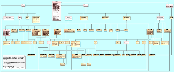
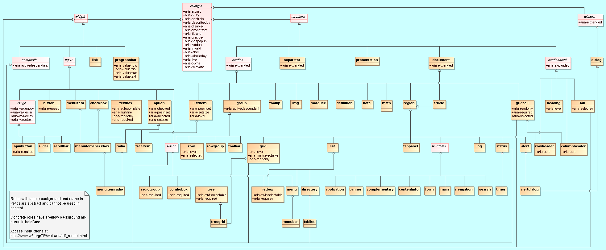