Technique G211:Matching the accessible name to the visible label
About this Technique
This technique relates to 2.5.3 Label in Name (Sufficient).
This technique applies to all web technologies that include interactive controls (such as links or form inputs).
Techniques are examples of ways to meet Web Content Accessibility Guidelines (WCAG). They are not required to meet WCAG. Content can satisfy the normative requirements of WCAG even if it does not use any of the documented techniques. See About WCAG Techniques.
Description
The objective of this technique is to ensure that speech input users can operate web content reliably while not adversely affecting other users of assistive technology.
When speech input users interact with a web page, they usually speak a command followed by the reference to some visible label (such as text beside an input field or inside a button or link). For example, they may say "click search" to activate a button labelled Search. When speech recognition software processes speech input and looks for matches, it uses the accessible name of controls. Where there is a mismatch between the text in the label and the text in the accessible name, it can cause issues for the user. The simplest way to enable speech input users and meet 2.5.3 Label in Name is to ensure that the accessible name matches the visible text label.
Determining the appropriate label
Sometimes more than one text string will be positioned in the vicinity of a control that could be considered a candidate for its label. For example, a set of inputs that each have their own labels may also be preceded by a heading, an instruction or a group label (such as an HTML legend/fieldset or an ARIA group or radiogroup). Note that the term "group label" means something different than "label", both programmatically and in regard to 2.5.3 Label in Name.
The Understanding 2.5.3 Label in Name document recommends that only the text string adjacent to or in close proximity to an input should be treated as the label when assessing a control's label for the purposes of meeting 2.5.3 (see the section "Identifying label text for components"). There are both practical and technical reasons for restricting the designation of an input's label in this way. The technical reasons are discussed in the Understanding document's section called Accessible Name and Description Computation specification.
Examples
Mapping a visible label to the accessible name is achieved in many technologies by meeting 1.3.1 Info and Relationships through the proper use of native semantics. Many controls derive accessible names by correct nesting of elements, while other elements have specific attributes which are a valid means of providing or referencing an accessible name.
The accessible name should be assigned through native elements and semantics where possible. That helps ensure an exact match between the visible label and name.
Example 1: Anchor text provides both the link's label and its accessible name
Using conventional HTML, the text between the a element's tags provides both the link's visible text and the accessible name "Code of conduct":
<p>Go to our <a href="url-to-page-about-code.html">Code of conduct</a></p>Non-working sample of anchor
Go to our Code of conduct
Example 2: Text in label element provides name for input via for attribute
The text between the label tags also serves as the checkbox input's accessible name "Notify me of delays" by using the for attribute which references the id of the input.
<input type="checkbox" id="notification" name="notify" value="delays">
<label for="notification">Notify me of delays</label>
Working sample of input
Example 3: The button text provides the accessible name
The text inside a button element becomes both its visible label and its accessible name:
<button>Send</button>Example 4: Simple Radio Button Group
Radio buttons typically appear in a group, where each button is labelled and the group of buttons is preceded by information which explains or categorizes the group.
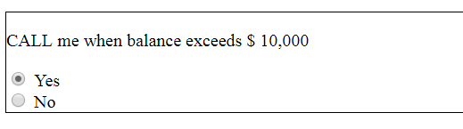
Figure 1. Figure 1 "Call me when balance exceeds $10,000 radio group, with Yes and No choices
The label for each component should be restricted to "Yes" and "No". To meet 1.3.1 Info and Relationships and 3.3.2 Labels or Instructions, the "Call me…" text can be coded to convey the relationship to ATs, in this example by using a fieldset and legend.
If the label is not restricted to the string adjacent to the radio button, multiple interpretations of what constitutes the label can result in less uniform functionality. If "Yes" alone is not the label for the first radio button, is it "Call me when balance exceeds $10,000"? Or is it a combination of text strings, in which case is the order "Call me when balance exceeds $10,000 Yes" or "Yes, Call me when balance exceeds $10,000"? Decisions to combine text strings can have negative effects on screen reader users since the order of concatenation can affect meaning. In this example, "No, call me when balance exceeds $10,000" could be very confusing to a screen reader user.
<fieldset>
  <legend>Call me when balance exceeds $10,000?</legend><br />
  <input type="radio" id="yes" name="callme" value="yes">
  <label for="yes">Yes</label>
  <input type="radio" id="no" name="callme" value="no">
  <label for="no">No</label>
</fieldset>Example 5: Checkbox Groupings
For checkbox groupings, implementations that attempt to incorporate more than just the immediate checkbox label into the accessible name can also be problematic if not isolated to the adjacent text string.
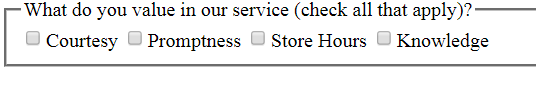
Figure 2. Figure 2 What do you value in our service? checkbox group, with 4 choices.
In Figure 2, there is a long text string that combines a group label and instruction, "What do you value in our service (check all that apply)?" Each of the checkboxes also has its own one- or two-word label. In regard to 2.5.3, the labels for the components should be restricted to "Courtesy", "Promptness", "Store Hours" and "Knowledge".
Attempting to include the preceding text as part of the accessible name can potentially make it more difficult to isolate a control by spoken commands for speech-input users. Such a construction will also negatively increase verbosity for screen reader users (with the combined text strings read out for each of the inputs before the input's state). The simplest solution is to restrict the accessible name to the text immediately beside the checkboxes, using similar techniques to those for the standard radio button group.
Example 6: Stacked Labels
Although labels for comboboxes, dropdown lists, text inputs, and other widgets are typically oriented immediately to the left of the component, there is an alternative established convention where labels are stacked above the inputs, aligned with their left edge.
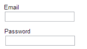
Figure 3. Figure 3 Two inputs with the labels positioned above and to the left.
In Figure 3, the inputs are stacked and left-aligned, with the labels immediately preceding each input, also left-aligned. There is additional white space between the label and the preceding input so that the label is closest to its associated text input. Stacked labels are relatively common in mobile designs, where horizontal space is constrained.
Figure 4 shows a variation on stacked labels, where hints and guidance are included between the label and the input. This design does not provide an adjacent label. However, the "New Password" label is still considered to be in close enough proximity, especially given its size and boldness relative to the smaller and lower-contrast guidance text. The associations are reinforced programmatically, where the hint text is given a role of aria-describedby and the label is properly associated with the input.
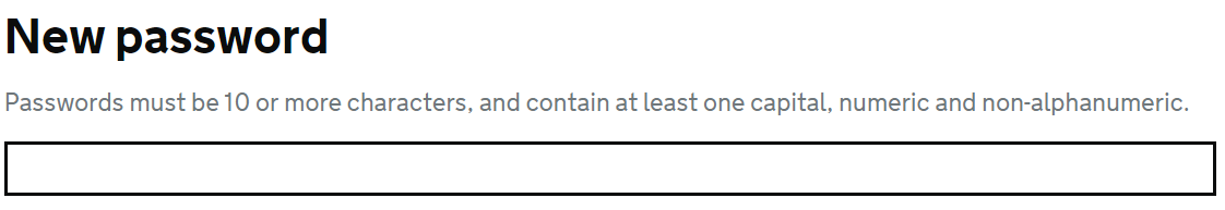
Figure 4. Figure 4 "New password" label positioned above input with a smaller-point text string about the password requirements positioned between the large label and the input.
The hint text in such implementations should be kept to a single line where possible, since accessibility issues can arise where a more lengthy hint separates the label from its input. Figure 4 illustrates that the concept of "adjacent text" is a guide for label interpretation, but cannot always serve as a hard rule.
<form>
  <label class="label" for="example-2">New password</label>
  <span id="example-2-hint" class="hint">
    Passwords must be 10 or more characters, and contain at least one capital, numeric and non-alphanumeric.
  </span>
  <input class="input" id="example-2" name="example-2" type="password"
         autocomplete="new-password" aria-describedby="example-2-hint">
</form>Example 7: Range of inputs with few labels
A less common disparity between labels and inputs can occur when a group of radio buttons is set up to elicit a choice across a range. The labels may only be located at each end of the range or may be interspersed at various points in the range.
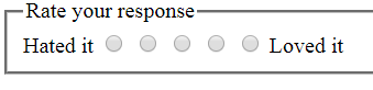
Figure 5. Figure 5 Line of 5 radio buttons with Hated it and Loved it labels at each end
The two labels, "Hated it" and "Loved it", are adjacent to the first and last radio buttons, and should be their accessible names. Speech-input users can speak either of these labels to select a radio button, and then use arrow navigation (e.g., "Press right arrow") to modify the selection. "Rate your response" is the text describing the whole widget and can be associated as the group label (here using legend). The three middle radio buttons do not have visible labels. In the code example they are given title attributes of "Disliked", "So-so" and "Liked" in order to meet 3.3.2 Labels or Instructions.
<fieldset>
  <legend>Rate your response</legend>
  <label for="hated">Hated it</label>
  <input type="radio" name="meal" id="hated" value="hated">
  <input type="radio" name="meal" id="poor" value="poor" title="Disliked">
  <input type="radio" name="meal" id="neutral" value="neutral" title="So-so">
  <input type="radio" name="meal" id="okay" value="okay" title="Liked">
  <input type="radio" name="meal" id="loved" value="loved">
  <label for="loved">Loved it</label>
</fieldset>Example 8: Text in parentheses and punctuation
Technique G211 is not intended to complicate existing conventions for the construction of accessible form inputs. As described in the Punctuation and capitalization and Text in parentheses subsections of the Understanding document, information does not always need to be included in the accessible name in an attempt to meet the Label in Name requirement, especially where the text would not normally be spoken when using speech recognition to navigate to controls. Where there are established ways of ensuring information and relationships conveyed visually are present programmatically, it is acceptable to leave text in parentheses and punctuation out of the accessible name.
The following snippet demonstrates possible techniques mentioned in the Understanding document. Since the required field is programmatically indicated, and the input restrictions on the date are surfaced through aria-describedby, the asterisk and parenthetical information has been left out of the accessible name.
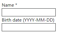
Figure 6. Figure 6 The "Name" and "Birth date" labels with additional information (and asterisk and an input formatting instruction, respectively)
<label for="name">Name</label> *
<input type="text" name="name" id="name" autocomplete="name" required>
<label for="birth">Birth date</label> (<span id="mask">YYYY-MM-DD</span>)
<input type="text" name="birth" id="birth" autocomplete="bday" aria-describedby="mask">Related Resources
No endorsement implied.
Tests
Procedure
- For input controls, examine each input that has adjacent text which serves as its label
- For each input, check that the label's entire string of text (optionally disregarding letter case, punctuation, and information in parentheses) matches the accessible name for the input, according to the accessible name computation
- For buttons, links, menus and other non-input controls, examine each control that contains text which serves as its label
- For each non-input control, check that the label's entire string of text (optionally disregarding letter case, punctuation and information in parentheses) matches the accessible name for the input
Expected Results
- Checks #2 and #4 are true.