Status of This Document
This section describes the status of this document at the time of its
publication. Other documents may supersede this document. A list of current
W3C publications and the latest revision of this technical report can be
found in the W3C technical reports index at http://www.w3.org/TR/.
This document is a First Public Working Draft by the Protocols & Formats Working
Group of the Web
Accessibility Initiative. This is a single specification that combines the two previously-published ARIA draft specifications, Roles for Accessible Rich Internet Applications (WAI-ARIA Roles) and the States and Properties Module for
Accessible Rich Internet Applications (WAI-ARIA States and Properties). The interdependencies between those two documents required familiarity with both to understand either, and combining them eliminates the redundancies that were necessary to support them as standalone specifications.
The Working Group believes that development of this specification is mostly complete. This draft is being published to allow for public review prior to entering finalization stages and to support ongoing discussion with other Working Groups about the impact of this specification on other W3C technologies. Refer to the history of changes to WAI-ARIA Roles and to the history of changes to WAI-ARIA States and Properties for more details.
The content of the WAI-ARIA specification depends on specialized knowledge of assistive technology and accessibility APIs. To facilitate understanding and implementation, there are two companion documents: WAI-ARIA Primer [ARIA-PRIMER], and WAI-ARIA Best Practices [ARIA-PRACTICES]. The WAI-ARIA Primer provides a basic introduction to the concepts behind and reason for ARIA, and the WAI-ARIA Best Practices describe recommended usage patterns for Web content developers. Please consider these documents as one of the potential places of clarification where topics appear to be unclear. Note, however, that only this specification is intended to become a W3C Recommendation and therefore is the only one that is normative for implementations.
Feedback on the model set out here is important to the success of the Web community in creating accessible Rich Internet Applications. The PFWG would like to know, in particular:
- Does the role ontology provide the information and operations that people with disabilities need in order to access and operate richly interactive Web applications?
- Is the usage of roles clear?
- Is the usage of states and properties clear?
- Is it clear how to create Rich Internet Applications with this added capability?
- Will WAI-ARIA features combine well with host languages?
- What information should be enhanced in the Best Practices or Primer, and what needs clarification within this specification?
When addressing these questions, please consider them in the context of the companion documents. Comments on this document may be sent to public-pfwg-comments@w3.org (Archive). Comments should be made by 3 March 2008. If possible, the Working Group requests that comments be made by 20 February 2008 to facilitate handling of comments at a scheduled meeting. However, comments arriving after that date will still be considered.
Publication as a Working Draft does not imply endorsement by the W3C
Membership. This is a draft document and may be updated, replaced or
obsoleted by other documents at any time. It is inappropriate to cite this
document as other than work in progress.
This document was produced by a group operating under the 5 February 2004
W3C Patent Policy. W3C maintains a public list of any
patent disclosures made in connection with the deliverables of the group;
that page also includes instructions for disclosing a patent. An individual
who has actual knowledge of a patent which the individual believes contains Essential
Claim(s) must disclose the information in accordance with section
6 of the W3C Patent Policy.
The disclosure obligations of the Participants of this group are described
in the charter.
1 Introduction
This section is informative.
The domain of Web accessibility defines how to make Web content usable by people with disabilities. People with some types of disabilities use Assistive Technology (AT) to interact with content. AT can transform the presentation of content into a format more suitable to the user, and can allow the user to interact in different ways than the author designed. In order to accomplish this, AT must understand the semantics of the content. Semantics are knowledge of roles, states, and properties, as a person would understand them, that apply to elements within the content. For instance, if a paragraph is semantically identified as such, AT can interact with it as a unit separable from the rest of the content, knowing the exact boundaries of that paragraph. A slider or tree control is a more complex example, in which various parts of a widget each have semantics that must be properly identified for the computer to support effective interaction.
Established content technologies define semantics for elements commonly used in those technologies. However, new technologies can overlook some of the semantics required for accessibility. Furthermore, new authoring practices evolve which override the intended semantics—elements that have one defined semantic meaning in the technology are used with a different semantic meaning intended to be understood by the user.
For example, Rich Internet Applications developers can create a tree control in HTML using CSS and JavaScript even though HTML lacks a semantic element for that. A different element must be used, possibly a list element with display instructions to make it look and behave like a tree control. Assistive technology, however, must re-present the element in a different modality and the display instructions may not be applicable. The AT will present it as a list, which has very different display and interaction from a tree control, and the user may be unsuccessful at understanding and operating the control.
The incorporation of Roles for Accessible Rich Internet Applications is a way for an author to provide proper type semantics on custom widgets (elements with repurposed semantics) to make these widgets accessible, usable and interoperable with assistive technologies. This specification identifies the types of widgets and structures that are recognized by accessibility products, by providing an ontology of corresponding roles that can be attached to content. This allows elements with a given role to be understood as a particular widget or structural type regardless of any semantic inherited from the implementing technology. Roles are a common property of platform Accessibility APIs which applications use to support assistive technologies. Assistive technology can then use the role information to provide effective presentation and interaction with these elements.
This role taxonomy currently includes interaction widget (user interface controls) and structural
document (content organization) objects. The role taxonomy describes inheritance
(widgets that are types of other widgets) and details what states and properties each role supports. When
possible, information is provided about mapping of roles to accessibility APIs.
Roles are element types and should not change with time or user actions.
Changing the role on an element from its initial value will confuse an
assistive technology. Platform accessibility APIs, to which the roles are
mapped by the browser, do not provide a vehicle to notify the assistive
technology of a role type changing. If the old element type is be replaced by
a new one, the corresponding element and its subtree should be removed from
the document and a new one inserted containing the new role type.
Changeable states and properties of elements are also defined in this specification. States and Properties are used to declare important properties of an
element that affect and describe interaction. These properties enable the
user agent or operating system to properly handle the element even when
these properties are altered dynamically by scripts. For example, alternative input and output technology such as screen readers, speech dictation software and on-screen keyboards must recognize the state of an element (such as: if an object is disabled, checked, focused, collapsed, hidden, etc.).
While it is possible for assistive technologies
to access these properties through the Document Object Model [DOM],
the preferred mechanism is for the user agent to map the States and
Properties to the accessibility API of the operating
system.
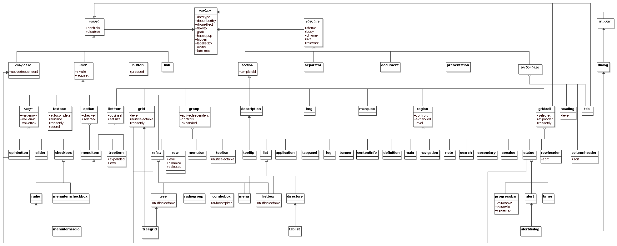
Figure 1.0 illustrates a typical Document
Object Model (DOM) [DOM] node. Placed within the
DOM node and the assistive technology is a box containing the contract
provided by the user agent to the assistive technology. This data includes
typical accessibility information found in the accessibility API for many of
our accessible platforms for GUIs (role, state, caret, selection, event
notification, parent/child information, relationship, and descriptions).
Figure 1: The contract model with accessibility APIs
For more information see the Roadmap for Accessible Rich
Internet Applications for the use of roles in making interactive
content accessible.
In addition to the prose documentation, the role taxonomy is provided in Web Ontology Language (OWL) [OWL], which is an implementation of Resource Description Framework (RDF) [RDF]. Tools can use these to validate the implementation of roles in a given content document.
Note: the use of RDF/OWL as a formal representation of roles is intended to support future extensibility. Standard RDF/OWL mechanisms can be used to define new roles that inherit from the roles defined in this specification. The mechanism to define and use role extensions in an interoperable manner, however, is not defined by this specification. A future version of ARIA Roles is expected to define how to extend roles.
1.1 About This Draft
This section is informative.
This draft currently handles two aspects of roles: GUI functionality and
structural relationships of the element. For more information see the Roadmap for Accessible Rich
Internet Applications [ARIA-ROADMAP] for the use of roles in making interactive
content accessible.
This taxonomy is designed in-part to support the common roles found in
platform accessibility APIs.
Reference to roles found in this taxonomy by dynamic Web content may be used
to support interoperability with
assistive technologies.
The schema to support this standard has been designed to be extended so
that custom roles can be created by extending base roles. This allows user agents to support at least the base role, and user agents that support the custom role can provide enhanced access. Note that much of
this could be formalized in XML
Schema [XSD]. However, being able to
define similarities between roles, such as baseConcepts and more descriptive definitions would
not be available in XSD. While this extensibility is possible, this version of the specification does not define how this extension is to be achieved.
WAI-ARIA is supported by a set of informative resources. In addition to the WAI-ARIA Roadmap, the WAI-ARIA Primer [ARIA-PRIMER] provides a basic introduction to the concepts behind and reason for ARIA, and the WAI-ARIA Best Practices [ARIA-PRACTICES] describe recommended usage patterns for Web content developers. These documents serve as important places of clarification where topics appear to be unclear.
1.2 Use Cases
This section is informative.
Alternate input devices are helped when all content is keyboard accessible. The
tabindex changes achieve this. The new semantics when combined by our style guide
work will allow alternate input solutions to facilitate command and control on
via an alternate input solution.
Low vision solutions benefit from ARIA markup in that the improved keyboard
navigation helps people with extremely low vision. Low vision solutions offer
a degree of screen reading functionality (like AI Squared's Zoom text). Furthermore,
ARIA introduces navigation landmarks both through our taxonomy and the XHTML role
landmarks which dramatically improves keyboard navigation productivity. This is a huge
benefit for alternate input solutions as well.
ARIA will also be used to assist people with cognitive impairments. The additional
semantics will allow us to restructure and substitute alternative content in adaptive
Web 2.0 solutions. We are doing this on the FLUID project. In FLUID we will be incorporating
ARIA technology into uPortal and Sakai. Support for cognitive impairment is absolutely
critical.
1.3 Design Aims
This section is informative.
The design aims of creating this specification include:
- Define what state information may be controlled by the author.
- Support device independence - new devices coming on line, such as
telephones, PDA's, tablets, televisions, etc. mean that it is imperative
to have a design that allows you to author once and render in different
ways on different devices, rather than authoring new versions of the
document for each type of device.
- Improve the accessibility of dynamic content such as that generated by
script.
- Provide for interoperability with Assistive Technologies.
2 Using WAI-ARIA
This section is informative.
Complex web applications become inaccessible when assistive technologies cannot determine the semantics behind portions of a document or when the user is unable to effectively navigate to all parts of it in a usable way (see the Roadmap for Accessible Rich Internet Applications [ARIA-ROADMAP]). ARIA divides the semantics into roles (the type defining a user interface element) and states and properties supported by the roles.
Authors must associate elements in the document to an ARIA role and the appropriate attributes (states and properties) during its lifecycle.
2.1 WAI-ARIA Roles
An ARIA role is set on an element using the a role attribute similar to the one defined in the XHTML Role Attribute
Module [XHTML-ROLES].
<div role = "checkbox">
The roles defined in this specification include a collection of document landmarks and the ARIA role taxonomy.
The Roles in this taxonomy were modeled using RDF/OWL to build rich descriptions of the expected behaviors of each role. For example:
- The roles taxonomy describes the context of a role. For example a listitem should be inside a list.
- The role taxonomy defines a hierarchy of roles with related properties. For example a directory is a type of list.
- The role taxonomy makes use of OWL to provide a type hierarchy allowing for semantic inheritance similar to a class hierarchy.
- The role taxonomy makes references to related concepts in other specifications.
- The role taxonomy provides descriptions for each role.
- The roles taxonomy describes what states are supported for each role. For example, a checkbox supports being checked.
Attaching a role from the role taxonomy to an element in the document gives assistive technology the information it needs to handle an element correctly.
2.2 WAI-ARIA States and Properties
ARIA provides a collection of accessibility states and properties which are used to support platform accessibility APIs on the various operating system platforms. Your assistive technology may access this information through an exposed user agent DOM or through a mapping to the platform accessibility API. When combined with roles your user agent can supply the assistive technology with information to render the information to the user at any instance in time. Changes in states or properties will result in a notification to an assistive technology to let them know that a change in behavior has occurred.
In the following example, a span has been used to create a checkbox which in this case has three possible states. A role is used to make the
behavior of this simple widget known to the user agent. Properties that may
change with user actions (such as checked) are defined in the States
and Properties.
  <span role="checkbox"  aria-checked="mixed"
        onkeydown="return checkBoxEvent(event);" onclick="return checkBoxEvent(event);" >
      A checkbox label
  </span>
It should be noted that some accessibility state information is managed and controlled by the user agent. These are called managed states. Often these states have corresponding CSS pseudo classes to reflect
necessary style changes. The states in this specification are typically
controlled by the author and are called unmanaged states. Both managed and unmanaged states are mapped to the platform accessibility APIs by the user agent. An example of a managed state is focus.
Finally, an added value for ARIA is that user agents that support CSS attribute selectors ([CSS], Section 5.8) can allow the author to create UI changes based on the ARIA state information, dramatically reducing the amount of script used to create the equivalent functionality, as shown in this example:
*[aria-checked=true]:before {content:   url('checked.gif')}
*[aria-checked=false]:before {content:  url('unchecked.gif')}

*[aria-checked=false]:before {content:  url('unchecked.gif')}
2.3 Building Accessible
Applications with WAI-ARIA
This section provides a brief introduction to the process of making applications accessible using ARIA. The choice and usage of roles can be complex and context dependent. It is beyond the scope of this document to explain implementations for all the possible ARIA use cases. ARIA Best Practices [ARIA-PRACTICES] will provide detailed guidance on ARIA implementation methodology as well as references to sample code.
An application becomes accessible when:
- Each element or widget has full and correct semantics that
fully describes its behavior (using element names or roles).
- The relationships between elements and groups are known
- States, properties, and container relationships are valid for each element's
behavior and are accessible via the Document
Object Model [DOM] and the platform accessibility API.
- There is an element having the correct input focus.
ARIA provides authors with the means to makes the different elements in a Web application semantically rich.
User agents use the role semantics to understand how to handle each element.
Roles conveys missing
information that the assistive technology needs to anticipate the behavior of
the elements inside the application such as how to present the corresponding ARIA states and properties to the user. The user agent will use the accessibility semantics from the host language and ARIA accessibility semantics which may override those of the host language and present them to an assistive technology through the Document Object Model or the platform accessibility API. When supporting the platform accessibility API the user agent will create accessible objects containing the accessibility semantics for each visual element on your page. It will use the chosen API to notify the assistive of changes to the semantics as well.
The following list of
- Use native
mark up when possible
Use the semantic elements that are defined in the host markup language. For example, with XHTML it is better to use the native checkbox than to use a div element with role checkbox as these should already be accessible through your browser. There may also be cases where ARIA can augment an existing element in the host language. For example, a grid and gridcells can reuse the functionality of a table when overlaying it. ARIA roles, states, and properties are best used when the markup language does not support all the semantics required. When a role attribute is added to an element, the semantics and behavior of the element are overridden by the role behavior.
- Apply the appropriate roles from ARIA
Set roles to make sure elements behave predictably and correctly describe the behavior of each element within the application (unless elements behaviors are fully described by the native markup language). Roles for interactive elements should support all the states that the element could use. Once a role attribute is set it should not be changed as this will confuse an assistive technology. This does not preclude a document element being removed which has the role attribute set. Only states and properties may be changed for a given document element.
- Preserve semantic structure
Structural information is critical to providing context to people with disabilities. This is achieved through preserving DOM hierarchy within structural elements and widgets; forming logical groups within within user interface widgets such as treeitems in a group. Look for groups within a page, and mark them using the most appropriate role that best describes their usage. For example: a region of the page that contains a group of elements that are likely to change through an Ajax application could be tagged as a region. The preservation of semantic web structure involves your entire web page such as through the use of document landmarks to facilitate keyboard navigation for screen reader and mobility impaired users as well as page restructuring and simplification for users with cognitive and learning impairments.
- Build relationships
Look for relationships between elements, and mark them using the most appropriate property or attribute. For example: If container A contains search results, and container B contains the search controls, then mark each container as a region and set the controls property in region B to reference region A. See relationships in WAI-ARIA.
Some relationships are determined automatically from the host language, such as by using the label tag in HTML.
- Set
states and properties in response to events
Once the role for an element has been set, select the appropriate states and properties for that role during the element's life cycle. This is often done in response to user input events. States are special properties for widgets that may change frequently during a widget's life cycle due to user interaction, while properties are more stable attributes of objects. User agents should notify assistive technology of state changes. Conversely, assistive technology notification of property changes depends on the method by which an assistive technology communicates with the user agent. For example, the multiline property is not something that changes frequently, whereas the checked state changes frequently in response to user input.
When setting states and properties, set them until the behavior of the element is fully defined. Only use those supported for the chosen role or document element as defined in this specification.
-
Support full, usable keyboard navigation
Usable keyboard navigation in a rich internet application is different from the tabbing paradigm in a static document. Rich internet applications behave more like desktop applications where the user tabs to significant widgets and uses the arrow keys to navigate within the widget, such as a spreadsheet or menu. The changes that ARIA introduces in keyboard navigation makes this enhanced accessibility possible. For a more in-depth understanding of keyboard navigation in ARIA, see the ARIA Best Practices [ARIA-PRACTICES]
- Synchronize the visual UI with accessibility states
and properties for supporting user agents
This will allow the state of your UI to be perceivable to the user as well as the assistive technology. There are many ways to do this using script or by using CSS attribute selectors (in conforming user agents) For example, the author should have an associated selector that responds to a form element being required or a gridcell being selected. Refer to the ARIA Best Practices [ARIA-PRACTICES] for techniques for proper UI synchronization with the accessible state of the document.
2.4 Example: building a tree widget
A basic tree view allows the user to select different list
items and expand and collapse embedded lists. Arrow keys are used to navigate
through a tree, including left/right to collapse/expand sub trees. Double
clicking with the mouse also toggles expansion.
Building this user interface element with script could leave assistive technology guessing about the role of each element. To make this feature accessible we need to:
- Inform assistive technology about the role of each element, so they know how to handle it;
- Inform assistive technology about the relationships between tree items;
- Give a clear keyboard focus that will not confuse users with disabilities;
- Expose the changing states (e.g., open and closed) of the the tree items.
We can do that by following the steps below:
- Look at the native mark up language
There is no tree element in HTML that supports our behavior including
expansion. If such an element existed, we should use that to take advantage of existing support. Since it does not, we will need to use roles.
- Finding the right roles
As we did not find a tree element in the native mark up we need to add roles that do this by referencing roles from this taxonomy that support states that we need.
Our tree will need roles that support embedded list behavior and
expandable/collapsible embedded lists. The roles that support tree behavior
for a tree are:
- tree: A tree is the main container element for our tree. It is a form of a select where subtrees can
be collapsed and expanded.
- treeitem: A treeitem is an option item of a tree. This is an element within a
tree which may be expanded or collapsed.
- Look for groups and build
relationships
Tree relationships can be made simply via the DOM and logical structure of
the page. A tree element will be the main container encompassing all other elements in
the tree. Each selectable item in the tree will be a treeitem.
When a treeitem contains an embedded list of treeitems they will be all
embedded in a group. A group should be contained inside the tree item
that is the parent item.
Tree relationships are like list relationships in HTML. Group and
tree elements act like list containers (OL and UL). A tree item acts like a
list item (li) in HTML.
Because treeitems and groups commonly both use div elements it is
recommended to add a comment next to closing treeitems that contain embedded
tree groups.
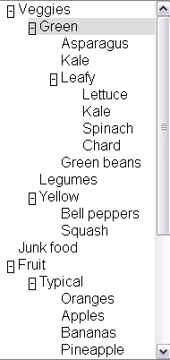
<div role="tree" >
  <div role="treeitem" >Veggies
    <div role="group">
      <div role="treeitem">Green
        <div role="group">
          <div role="treeitem">Asparagus</div>
          <div role="treeitem">Kale</div>
          <div role="treeitem" >Leafy
            <div role="group">
              <div role="treeitem">Lettuce</div>
              <div role="treeitem">Kale</div>
              <div role="treeitem">Spinach</div>
              <div role="treeitem">Chard</div>
            </div>
          </div> ---close leafy
          <div role="treeitem">Green beans</div>
        </div>
      </div> ---close green
      <div role="treeitem">Legumes</div>
      <div role="treeitem" >Yellow
        <div role="group">
          <div role="treeitem">Bell peppers</div>
          <div role="treeitem">Squash</div>
        </div>
      </div> ---close yellow
    </div>
  </div> ---close veggies
</div> ---close tree
Sometimes a tree structure is not explicit via the DOM and logical
structure of a page. In such cases the relationships must still be made
explicit using the States and Properties Module.
Example:
<div role="treeitem" aria-haschild="yellowtreegroup">Yellow<div>
…
<div id="yellowtreegroup" role="group">
<div role="treeitem">Bell peppers</div>
<div role="treeitem">Squash</div>
…
</div>
-
Use States, Properties in response to events
Control the behavior of the element in response to user in put events such as from the keyboard and the mouse as shown here:
<div tabindex="-1" role="treeitem" aria-expanded="true"
      onclick="return toggleExpansion(event)"
      onkeydown="return processArrowKeystoToggleExpansion(event);"
      onkeypress="return processArrowKeystoToggleExpansion(event);"
>Yellow</div>
And use device independent events with supporting JavaScript to
handle user interaction.
<div role="tree" tabindex="-1"
  onfocus="return treeItemFocus(event);"
  onclick="return treeItemEvent(event);"
  ondblclick="return treeItemEvent(event);"
  onkeydown="return treeItemEvent(event);"
  onkeypress="return treeItemEvent(event);">
Then create JavaScript support to control the event driven behavior of the
application.
3 The RDF Roles Model
This section is normative.This specification defines a Taxonomy called Roles. The remainder of this section describes the properties of roles in this taxonomy, and describes the characteristics of all roles. A formal RDF representation of all the information presented here is available in Appendix 6.1: Implementation.
3.1 Relationships between
concepts
This section is normative.
The role taxonomy uses the following relationships to relate ARIA roles to each other and to concepts from other specifications, such as HTML and XForms.
Relationships Supported by Role Taxonomy
| Relationship |
RDF Property |
Description |
| Parent Role |
rdfs:subClassOf |
The role that this role extends in the taxonomy. This extension causes all the properties and constraints of the parent role to propagate to the child role. Other
than well known stable specifications, inheritance may be restricted to
items defined inside this specification so that items can not be changed
and affect inherited classes.
For example: buttonundo is a subclass or type of a button. If we
change the properties and expected behavior of a button then the
properties and behavior of buttonundo will also change.
Inheritance is expressed in RDF using the RDF Schema subClassOf ([RDFS], section 3.4) property. |
| Child Roles |
|
Informative list of roles for which this role is the parent. This is provided to facilitate reading of the specification but adds no new information as the list of child roles is the list of roles for which the current role is the parent. |
| Related Concepts |
role:relatedConcept |
A
relatedConcept is a similar or related idea from other specifications.
Concepts that are related are not necessarily identical. relatedConcepts
do not inherit properties from each other. Hence if the definition of a
type changes, the properties, behavior and definition of a relatedConcept
is not affected.
For example: A grid is like a table. Therefore, a grid has a
relatedConcept of a table as defined at http://www.w3.org/TR/html4/struct/tables.html#edef-TABLE.
However if the definition of table is modified our definition of a grid
will not be affected. |
| Base Concept |
role:baseConcept |
A
baseConcept is like a "borrowed" concept. BaseConcept is similar to type,
but without inheritance of limitations and properties. baseConcepts are designed as a substitute for
inheritance for external concepts. A baseConcept is like a relatedConcept
except that baseConcepts are almost identical to each other.
For example: the checkbox defined in this document has the same
functionality and anticipated behavior as a checkbox defined in
http://www.w3.org/MarkUp/HTML#checkbox.
Therefore, a checkbox has a baseConcept of a checkbox as defined at
http://www.w3.org/MarkUp/HTML#checkbox. However, if
http://www.w3.org/MarkUp/HTML#checkbox is modified, the definition of a
checkbox in this document will not be not affected. |
3.2 Role Characteristics
This section is normative.
Roles are defined and described by their characteristics. Characteristics define the
structural function of a role, such as what a role is, concepts behind it,
what instances of the role can or must contain. In the case of widgets this also includes how it interacts with the user
agent based on mapping to HTML forms and XForms. States and properties from WAI-ARIA that are supported by the role are also indicated.
The Roles Taxonomy defines the following characteristics. These characteristics are implemented in RDF as properties of the OWL classes that describe the roles.
Characteristics Supported by Role Taxonomy
| Characteristic |
RDF Property |
Description |
Values |
| Is Abstract |
N/A |
This role is abstract and cannot be used by authors directly. It is used to create a relationship amongst descendant roles. |
Boolean |
| Supported States and Properties |
role:supportedState |
A supportedState must be supported by this
role. Typically refers to states from the aaa namespace.
Supported states and properties are inherited from ancestor roles and are shown informatively as Inherited States in this specification. States and properties are inherited from ancestor roles in the role taxonomy, not from ancestor elements in the DOM tree. |
Any valid RDF object reference, such as
a URI or RDF ID reference. |
| Inherited States and Properties |
|
Informative list of properties that are inherited onto a role from ancestor roles. These properties are not explicitly defined on the role as the inheritance of properties is automatic. This information is provided to facilitate reading of the specification. The set of supported states and properties combined with inherited states and properties forms the full set of states and properties supported by the role. |
|
| Required Child Elements |
role:mustContain |
A child element that must be contained by this role. For example
a list must contain a listitem.
When multiple required children are indicated, either of them are permitted. |
Any valid RDF object reference, such as
a URI or RDF ID reference. |
| Parent Element |
role:scope |
Context, where this role is allowed. For example a list item is
allowed inside a list. |
Any valid RDF object reference, such as a
URI or RDF ID reference. |
| Name From |
role:nameFrom |
Computational mechanism to determine the accessible name of the
object to which the role applies. This may be computed from the
children of the object or the title attribute.
Computing the accessible name:
Collect the name from the content subtrees pointed to by labelledby which contains the IDs for the label content. Use the labelledby IDs in order. For each ID use a depth-first computation of the name, appending to the currently computed name.
If labelledby is unspecified:
- For container elements which allow name from descendants, use a depth-first computation of the name.
- If a text node, append the text contents;
- If a control, append the current value for the control;
- If an image or object with a text equivalent, append the text equivalent;
- If there is a forced line break (e.g. if the current object is styled with display:block), append a space character.
- If not such a container, or the descendant computation generated an empty name, use the contents of the
title attribute, if specified.
|
One of the following values:
- "author": name comes from values provided by the author in explicit markup features such as the labelledby property or the HTML "title" attribute.
- "subtree": name comes from the text value of the element node. Although this may be allowed in addition to "author" in some roles, this is used in content only if "author" features are not provided.
|
| Children Presentational |
role:childrenArePresentational |
The children are presentational. Assistive technologies may choose to hide the children from the user, in order to avoid confusing third party APIs using accessibility APIs. If assistive technologies do not hide the children, user agents may read some information twice. |
Boolean (true | false) |
3.3 Global States and Properties
This section is normative.
Some states and properties are applicable to all roles, and most are applicable to all elements regardless of role. In addition to explicitly expressed supported states and properties, the following global states and properties are supported by all roles as well. These include:
Global states and properties are applied to the role roletype, which is the base role, and therefore inherit into all roles. To facilitate reading, they are not explicitly identified as either supported or inherited states and properties in the specification. Instead, the inheritance is indicated by a link to this section.
3.4 Roles
This section is normative.
To support the current user scenario, this specification defines roles that
A, help define Widgets (For example, a tristate Checkbox) and B, help define
page structure (for example, a section header).
Roles are categorized as follows:
- Taxonomy Roles
- User Input Controls
- User Interface Elements
- Document Structure
- Specialized Regions
Below is an alphabetical list of ARIA roles to be used by rich internet application authors (excluding abstract roles which are not used directly). A detailed definition of the taxonomy supporting these ARIA roles follows.
| Role | Definition |
|---|
| alert | A message with an alert or error information. |
| alertdialog | A separate window with an alert or error information. |
| application | A software unit executing a set of tasks for its users. |
| banner | A banner is usually defined as the advertisement at the top of a web page. The banner content typically contains the site or company logo and other key advertisements for the site. |
| button | Allows for user-triggered actions. |
| checkbox | A control that has three possible values, (true, false, mixed). |
| columnheader | A table cell containing header information for a column. |
| combobox | Combobox is a presentation of a select, where users can type to
locate a selected item. |
| contentinfo | This is information about the content on the page. For example, footnotes, copyrights, links to privacy statements, etc. would belong here. |
| definition | The contents of the associated element represent a definition (e.g., of a term or concept). If there is a dfn element within the contents, then that represents the term being defined. Todo: not sure this is clear |
| description | Descriptive content for a page element which references this element via describedby. |
| dialog | A dialog is a small application window that sits above the
application and is designed to interrupt the current processing of an
application in order to prompt the user to enter information or
require a response. |
| directory | A list of references to members of a single group. |
| document | Content that contains related information, such as a book. |
| grid | A grid contains cells of tabular data arranged in rows and
columns (e.g., a table). |
| gridcell | A gridcell is a table cell in a grid. Gridcells may be active,
editable, and selectable. Cells may have relationships such as controls to address the application of functional relationships. |
| group | A group is a section of user interface objects which would not be included in a page summary or table of contents by an assistive technology. See region for sections of user interface objects that should be included in a page summary or table of contents. |
| heading | A heading for a section of the page. |
| img | An img is a container for a collection elements that form
an image. |
| link | Interactive reference to a resource (note, that in XHTML 2.0 any element can have an href
attribute and thus be a link) |
| list | Group of non-interactive list items. Lists contain children whose role is listitem. |
| listbox | A list box is a widget that allows the user to select one or more items from a list. Items within the list are static and may contain images. List boxes contain children whose role is option. |
| listitem | A single item in a list. |
| log | A region where new information is added and old information may
disappear such as chat logs, messaging, game log or an error log. In contrast to other regions, in this role there is a relationship between the arrival of new items in the log and the reading order. The log contains a meaningful sequence and new information is added only to the end of the log, not at arbitrary points. |
| main | This defines the main content of a document. |
| marquee | A marquee is used to scroll text across the page. |
| menu | Offers a list of choices to the user. |
| menubar | A menubar is a container of menu items. Each menu item may
activate a new sub-menu. Navigation behavior should be similar to the
typical menu bar graphical user interface. |
| menuitem | A link in a menu. This is an option in a group of choices
contained in a menu. |
| menuitemcheckbox | Defines a menuitem which is checkable (tri-state). |
| menuitemradio | Indicates a menu item which is part of a group of
menuitemradio roles. |
| navigation | This is a collection of links suitable for use when navigating the document or related documents. |
| note | The content is parenthetic or ancillary to the main content of the resource. |
| option | A selectable item in a list represented by a select. |
| presentation | An element whose role is presentational does not need to be
mapped to the accessibility API. |
| progressbar | Used by applications for tasks that take a long time to execute,
to show the execution progress. |
| radio | A radio is an option in single-select list. Only one radio
control in a radiogroup can be selected at the same time. |
| radiogroup | A group of radio controls. |
| region | Region is a large perceivable section on the web page. |
| row | A row of table cells. |
| rowheader | A table cell containing header information for a row. |
| search | This is the search section of a web document. This is typically a form used to submit search requests about the site or a more general Internet wide search service. |
| secondary | This is any unique section of the document. In the case of a portal, this may include but not be limited to: show times; current weather; or stocks to watch. |
| seealso | Indicates that the element contains content that is related to the main content of the page. |
| separator | A line or bar that separates and distinguishes sections of
content. |
| slider | A user input where the user selects an input in a given range.
This form of range expects an analog keyboard interface. |
| spinbutton | A form of Range that expects a user selecting from discrete
choices. |
| status | This is a container for process advisory information to give feedback to the user. |
| tab | A header for a tabpanel. |
| tablist | A list of tabs, which are references to tabpanels. |
| tabpanel | Tabpanel is a container for the resources associated with a tab. |
| textbox | Inputs that allow free-form text as their
value. |
| timer | A numerical counter which indicates an amount of elapsed time from a start point, or the time remaining until an end point. |
| toolbar | A toolbar is a collection of commonly used functions represented
in compact visual form. |
| tooltip | A popup that displays a description for an element when a user passes over or rests on that element. Supplement to the normal tooltip processing of the user agent. |
| tree | A form of a list having groups
inside groups, where sub trees can be collapsed and expanded. |
| treegrid | A grid whose rows can be expanded and collapsed in the same manner as for a tree. |
| treeitem | An option item of a tree. This is an element within a tree that may
be expanded or collapsed |
3.4.1 Base Types
The following roles are used as base types for applied roles. Base classes are used to build a picture of the role taxonomy class hierarchy
within the taxonomy. Note that while all roles in this section are abstract, not all abstract roles are in this section. This section includes only the most high-level abstractions in the taxonomy.
Roles in this section include:
Role: roletype
Base role from which all other roles in this taxonomy inherit.
Properties of this role describe the structural and functional purpose of objects that are assigned this role (known in RDF terms as "instances"). A
Role is a concept that can be used to understand and operate instances.
Characteristics:
| Is Abstract: |
True |
| Parent Role: |
|
| Child Roles: |
|
| Base Concept: |
|
| Related Concepts: |
|
| Supported States and Properties: |
|
| Inherited States and Properties: |
|
| Name From: |
|
| Accessible Name Required: |
|
| Inherits Name Required: |
|
| Children Presentational: |
|
| Inherits Presentational: |
|
Role: widget
A component of a GUI (graphical user interface).
Widget Roles all map to accessibility APIs. Widgets are ... , see @@
Characteristics:
| Is Abstract: |
True |
| Parent Role: |
roletype |
| Child Roles: |
|
| Base Concept: |
|
| Related Concepts: |
|
| Supported States and Properties: |
|
| Inherited States and Properties: |
|
| Name From: |
|
| Accessible Name Required: |
|
| Inherits Name Required: |
|
| Children Presentational: |
|
| Inherits Presentational: |
|
Role: structure
A document structural element.
Roles for document structure are also required to support the
accessibility of dynamic Web content to assist assistive technology in
determining active content vs. static document content. Structural Roles, by
themselves do not all map to accessibility APIs, but are used to create
widget roles or assist content adaptation.
This schema is likely to evolve as new use cases are added to the scope of
this specification.
Characteristics:
| Is Abstract: |
True |
| Parent Role: |
roletype |
| Child Roles: |
|
| Base Concept: |
|
| Related Concepts: |
|
| Supported States and Properties: |
|
| Inherited States and Properties: |
|
| Name From: |
|
| Accessible Name Required: |
|
| Inherits Name Required: |
|
| Children Presentational: |
|
| Inherits Presentational: |
|
Role: composite
A widget that may contain navigable descendants.
Descendants of this role may not have the "nameFrom" value of "subtree" set.
Characteristics:
| Is Abstract: |
True |
| Parent Role: |
widget |
| Child Roles: |
|
| Base Concept: |
|
| Related Concepts: |
|
| Supported States and Properties: |
activedescendant |
| Inherited States and Properties: |
|
| Name From: |
author |
| Accessible Name Required: |
|
| Inherits Name Required: |
|
| Children Presentational: |
|
| Inherits Presentational: |
|
Role: window
Browser or application window
Characteristics:
| Is Abstract: |
True |
| Parent Role: |
roletype |
| Child Roles: |
|
| Base Concept: |
|
| Related Concepts: |
|
| Supported States and Properties: |
|
| Inherited States and Properties: |
|
| Name From: |
|
| Accessible Name Required: |
|
| Inherits Name Required: |
|
| Children Presentational: |
|
| Inherits Presentational: |
|
3.4.2 User Input Controls
Roles in this section include:
Role: input
Generic type for widgets that can have a value.
Characteristics:
| Is Abstract: |
True |
| Parent Role: |
widget |
| Child Roles: |
|
| Base Concept: |
|
| Related Concepts: |
XForms input |
| Supported States and Properties: |
|
| Inherited States and Properties: |
|
| Name From: |
author |
| Accessible Name Required: |
|
| Inherits Name Required: |
|
| Children Presentational: |
|
| Inherits Presentational: |
|
Role: select
A form control that allows the user to make selections from a
set of choices. A select must contain an option.
Characteristics:
| Is Abstract: |
True |
| Parent Role: |
|
| Child Roles: |
|
| Base Concept: |
|
| Related Concepts: |
|
| Supported States and Properties: |
|
| Inherited States and Properties: |
|
| Name From: |
author |
| Accessible Name Required: |
|
| Inherits Name Required: |
|
| Children Presentational: |
|
| Inherits Presentational: |
|
Role: listbox
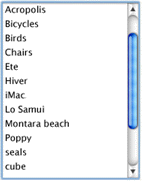
A list box is a widget that allows the user to select one or more items from a list. Items within the list are static and may contain images. List boxes contain children whose role is option.
Characteristics:
| Is Abstract: |
|
| Parent Role: |
|
| Child Roles: |
|
| Base Concept: |
|
| Related Concepts: |
|
| Parent Element: |
|
| Required Child Elements: |
option |
| Supported States and Properties: |
multiselectable |
| Inherited States and Properties: |
|
| Name From: |
author |
| Accessible Name Required: |
True |
| Inherits Name Required: |
|
| Children Presentational: |
|
| Inherits Presentational: |
|
Role: combobox
Combobox is a presentation of a select, where users can type to
locate a selected item.
Combobox is the combined presentation of a single line textbox with a drop down select widget. The combobox may be open or closed. An "open" combobox allows users to type freeform text into the textbox whereas a "closed" combobox only shows text in the textbox which can be retrieved from the select. Typically a "closed" text field will use the text entered to quickly search and fill the textfield with text from the select.
NOTE: In XForms [XFORMS] the same select can
have one of 3 appearances: combo-box, drop-down box or group of
radio-buttons. Besides, many browsers (if not all of them) allow
users to type in a drop-down select as well.
Characteristics:
| Is Abstract: |
|
| Parent Role: |
select |
| Child Roles: |
|
| Base Concept: |
|
| Related Concepts: |
|
| Parent Element: |
|
| Required Child Elements: |
option |
| Supported States and Properties: |
autocomplete |
| Inherited States and Properties: |
|
| Name From: |
author |
| Accessible Name Required: |
True |
| Inherits Name Required: |
|
| Children Presentational: |
|
| Inherits Presentational: |
|
Role: option
A selectable item in a list represented by a select.
An option
must appear inside an element with select role.
Characteristics:
| Is Abstract: |
|
| Parent Role: |
input |
| Child Roles: |
|
| Base Concept: |
HTML option |
| Related Concepts: |
|
| Parent Element: |
select |
| Required Child Elements: |
|
| Supported States and Properties: |
|
| Inherited States and Properties: |
|
| Name From: |
|
| Accessible Name Required: |
True |
| Inherits Name Required: |
|
| Children Presentational: |
|
| Inherits Presentational: |
|
Role: checkbox
A control that has three possible values, (true, false, mixed).
Many checkboxes do not use the mixed value, and thus are effectively boolean checkboxes. However, the checked state supports the "mixed" value to support cases such as installers where an option has been partially installed.
Characteristics:
| Is Abstract: |
|
| Parent Role: |
option |
| Child Roles: |
|
| Base Concept: |
|
| Related Concepts: |
HTML input (type : checkbox) |
| Parent Element: |
|
| Required Child Elements: |
|
| Supported States and Properties: |
|
| Inherited States and Properties: |
|
| Name From: |
|
| Accessible Name Required: |
True |
| Inherits Name Required: |
|
| Children Presentational: |
|
| Inherits Presentational: |
|
Role: radio
A radio is an option in single-select list. Only one radio
control in a radiogroup can be selected at the same time.
Characteristics:
| Is Abstract: |
|
| Parent Role: |
checkbox |
| Child Roles: |
|
| Base Concept: |
|
| Related Concepts: |
HTML input (type : radio) |
| Parent Element: |
|
| Required Child Elements: |
|
| Supported States and Properties: |
|
| Inherited States and Properties: |
|
| Name From: |
|
| Accessible Name Required: |
True |
| Inherits Name Required: |
|
| Children Presentational: |
|
| Inherits Presentational: |
|
Role: radiogroup
A group of radio controls.
Characteristics:
| Is Abstract: |
|
| Parent Role: |
select |
| Child Roles: |
|
| Base Concept: |
|
| Related Concepts: |
list |
| Parent Element: |
|
| Required Child Elements: |
radio |
| Supported States and Properties: |
|
| Inherited States and Properties: |
|
| Name From: |
author |
| Accessible Name Required: |
True |
| Inherits Name Required: |
|
| Children Presentational: |
|
| Inherits Presentational: |
|
Role: textbox
Inputs that allow free-form text as their
value.
If the multiline property is true, the control accepts line breaks within the input, as in a HTML textarea. Otherwise this is a simple text box.
Intended use is in languages that do not have a text input object
(such as SVG), or cases in which an element with different semantics is repurposed as an input box. The user would use this role when additional states or
properties are applied to a standard text input control. This is to
indicate to the user agent that it must process additional states and
properties such as invalid and required.
Characteristics:
| Is Abstract: |
|
| Parent Role: |
input |
| Child Roles: |
|
| Base Concept: |
|
| Related Concepts: |
|
| Supported States and Properties: |
|
| Inherited States and Properties: |
|
| Name From: |
author |
| Accessible Name Required: |
True |
| Inherits Name Required: |
|
| Children Presentational: |
|
| Inherits Presentational: |
|
Role: range
Represents a range of values that can be set by the user.
Characteristics:
| Is Abstract: |
True |
| Parent Role: |
input |
| Child Roles: |
|
| Base Concept: |
|
| Related Concepts: |
|
| Supported States and Properties: |
|
| Inherited States and Properties: |
|
| Name From: |
author |
| Accessible Name Required: |
|
| Inherits Name Required: |
|
| Children Presentational: |
|
| Inherits Presentational: |
|
Role: spinbutton
A form of Range that expects a user selecting from discrete
choices.
A spinbutton allows the user to select from the given range
through the use of an up and down button. Visibly, the current value
is incremented or decremented until a maximum or minimum value is
reached. This functionality should be accomplished programmatically
through the use of up and down arrows on the keyboard.
Characteristics:
| Is Abstract: |
|
| Parent Role: |
|
| Child Roles: |
|
| Base Concept: |
|
| Related Concepts: |
|
| Parent Element: |
|
| Required Child Elements: |
|
| Supported States and Properties: |
|
| Inherited States and Properties: |
|
| Name From: |
author |
| Accessible Name Required: |
True |
| Inherits Name Required: |
|
| Children Presentational: |
|
| Inherits Presentational: |
|
3.4.3 User Interface Elements
Roles in this section include:
Role: button
Allows for user-triggered actions.
Buttons are mostly used for
discrete, atomic actions. Its value is cognitive; the idea that this
is a user action opportunity is made very clear by making it look
like a front-panel button on a device. The animation of the button in response to indirect (by mouse)
manipulation fosters the illusion of direct manipulation and keeps
user cognition in sync with the user interface perception of user
action events. Standardizing the appearance of buttons enhances recognition as
buttons and arraying them compactly in toolbars, for example.
Buttons support the optional state pressed. Buttons with this state present are toggle buttons. When pressed is "true" the button is depressed, when pressed is "false" it is not depressed.
Characteristics:
| Is Abstract: |
|
| Parent Role: |
widget |
| Child Roles: |
|
| Base Concept: |
HTML button |
| Related Concepts: |
|
| Parent Element: |
|
| Required Child Elements: |
|
| Supported States and Properties: |
pressed |
| Inherited States and Properties: |
|
| Name From: |
|
| Accessible Name Required: |
True |
| Inherits Name Required: |
|
| Children Presentational: |
True |
| Inherits Presentational: |
|
Role: link
Interactive reference to a resource (note, that in XHTML 2.0 any element can have an href
attribute and thus be a link)
Characteristics:
| Is Abstract: |
|
| Parent Role: |
widget |
| Child Roles: |
|
| Base Concept: |
|
| Related Concepts: |
HTML link |
| Parent Element: |
|
| Required Child Elements: |
|
| Supported States and Properties: |
|
| Inherited States and Properties: |
|
| Name From: |
|
| Accessible Name Required: |
True |
| Inherits Name Required: |
|
| Children Presentational: |
|
| Inherits Presentational: |
|
Role: menu
Offers a list of choices to the user.
A menu is often a list of
links to important sections of a document or a site. The menu role is appropriate when the list of links is presented in a manner similar to a menu on a desktop application.
Characteristics:
| Is Abstract: |
|
| Parent Role: |
|
| Child Roles: |
|
| Base Concept: |
|
| Related Concepts: |
|
| Parent Element: |
|
| Required Child Elements: |
menuitem |
| Supported States and Properties: |
|
| Inherited States and Properties: |
|
| Name From: |
author |
| Accessible Name Required: |
True |
| Inherits Name Required: |
|
| Children Presentational: |
|
| Inherits Presentational: |
|
Role: menubar
A menubar is a container of menu items. Each menu item may
activate a new sub-menu. Navigation behavior should be similar to the
typical menu bar graphical user interface.
Menubar is used to create a menubar similar to those found in
Windows, the Mac, and Gnome desktops. A menubar is used to create a
consistent climate of frequently used commands.
Characteristics:
| Is Abstract: |
|
| Parent Role: |
group |
| Child Roles: |
|
| Base Concept: |
|
| Related Concepts: |
toolbar |
| Parent Element: |
|
| Required Child Elements: |
|
| Supported States and Properties: |
|
| Inherited States and Properties: |
|
| Name From: |
author |
| Accessible Name Required: |
|
| Inherits Name Required: |
|
| Children Presentational: |
|
| Inherits Presentational: |
|
Role: toolbar
A toolbar is a collection of commonly used functions represented
in compact visual form.
The toolbar is often a subset of functions found in a menubar
designed to reduced user effort in using these functions.
If this is not keyboard accessible the actions defined in the
toolbar must be reproduced in an accessible, device independent
fashion.
Characteristics:
| Is Abstract: |
|
| Parent Role: |
group |
| Child Roles: |
|
| Base Concept: |
|
| Related Concepts: |
menubar |
| Parent Element: |
|
| Required Child Elements: |
|
| Supported States and Properties: |
multiselectable |
| Inherited States and Properties: |
|
| Name From: |
author |
| Accessible Name Required: |
|
| Inherits Name Required: |
|
| Children Presentational: |
|
| Inherits Presentational: |
|
Role: menuitem
A link in a menu. This is an option in a group of choices
contained in a menu.
It may be disabled or active. It may also have a
popup.
Characteristics:
| Is Abstract: |
|
| Parent Role: |
|
| Child Roles: |
|
| Base Concept: |
|
| Related Concepts: |
JAPI MENU_ITEM |
| Parent Element: |
menu |
| Required Child Elements: |
|
| Supported States and Properties: |
|
| Inherited States and Properties: |
|
| Name From: |
|
| Accessible Name Required: |
True |
| Inherits Name Required: |
|
| Children Presentational: |
|
| Inherits Presentational: |
|
Role: menuitemcheckbox
Defines a menuitem which is checkable (tri-state).
The checked state indicates whether the menu item is checked, unchecked, or mixed.
Characteristics:
| Is Abstract: |
|
| Parent Role: |
|
| Child Roles: |
|
| Base Concept: |
|
| Related Concepts: |
menuitem |
| Parent Element: |
menu |
| Required Child Elements: |
|
| Supported States and Properties: |
|
| Inherited States and Properties: |
|
| Name From: |
|
| Accessible Name Required: |
True |
| Inherits Name Required: |
|
| Children Presentational: |
|
| Inherits Presentational: |
|
Role: menuitemradio
Indicates a menu item which is part of a group of
menuitemradio roles.
Checking of one menuitemradio in a group will unchecked the other
group members.
Menuitems should also be separated into a group by a separator.
Characteristics:
| Is Abstract: |
|
| Parent Role: |
|
| Child Roles: |
|
| Base Concept: |
|
| Related Concepts: |
menuitem |
| Parent Element: |
menu |
| Required Child Elements: |
|
| Supported States and Properties: |
|
| Inherited States and Properties: |
|
| Name From: |
|
| Accessible Name Required: |
True |
| Inherits Name Required: |
|
| Children Presentational: |
|
| Inherits Presentational: |
|
Role: slider
A user input where the user selects an input in a given range.
This form of range expects an analog keyboard interface.
A slider has the added functionality of being able to select a
value through the use of a visible slider. The slider would be
keyboard accessible and provide a visible thumb position that
represents the current position within the slider.
Characteristics:
| Is Abstract: |
|
| Parent Role: |
range |
| Child Roles: |
|
| Base Concept: |
|
| Related Concepts: |
|
| Parent Element: |
|
| Required Child Elements: |
|
| Supported States and Properties: |
|
| Inherited States and Properties: |
|
| Name From: |
author |
| Accessible Name Required: |
True |
| Inherits Name Required: |
|
| Children Presentational: |
True |
| Inherits Presentational: |
|
Role: tooltip
A popup that displays a description for an element when a user passes over or rests on that element. Supplement to the normal tooltip processing of the user agent.
Objects with this role must be referenced through the use of a describedby. If the tooltip has active elements it must be keyboard navigable.
Characteristics:
| Is Abstract: |
|
| Parent Role: |
description |
| Child Roles: |
|
| Base Concept: |
|
| Related Concepts: |
|
| Parent Element: |
|
| Required Child Elements: |
|
| Supported States and Properties: |
|
| Inherited States and Properties: |
|
| Name From: |
|
| Accessible Name Required: |
True |
| Inherits Name Required: |
|
| Children Presentational: |
|
| Inherits Presentational: |
|
Role: tabpanel
Tabpanel is a container for the resources associated with a tab.
Note: There must be a means to associate a tabpanel element with its associated tab in a tablist. Using the labelledby property on the tabpanel to reference the tab is the recommended way to achieve this.
Characteristics:
| Is Abstract: |
|
| Parent Role: |
region |
| Child Roles: |
|
| Base Concept: |
|
| Related Concepts: |
|
| Parent Element: |
|
| Required Child Elements: |
|
| Supported States and Properties: |
|
| Inherited States and Properties: |
|
| Name From: |
author |
| Accessible Name Required: |
True |
| Inherits Name Required: |
|
| Children Presentational: |
|
| Inherits Presentational: |
|
Role: tablist
Characteristics:
| Is Abstract: |
|
| Parent Role: |
directory |
| Child Roles: |
|
| Base Concept: |
|
| Related Concepts: |
DAISY Guide |
| Parent Element: |
|
| Required Child Elements: |
|
| Supported States and Properties: |
|
| Inherited States and Properties: |
|
| Name From: |
|
| Accessible Name Required: |
|
| Inherits Name Required: |
|
| Children Presentational: |
|
| Inherits Presentational: |
|
Role: tab
A header for a tabpanel.
Tab is used as a grouping label,
providing a link for selecting the tab content to be rendered to the
user. The currently active tab is determined if the tab or an object in the associated tabpanel has focus.
Tabs appear in the container tablist. Only one tab may be selected at a time. At any
time, one tab must be selected.
One of the tabs in tablist must be the current tab. The tabpanel
associated with the current tab, must be rendered to the user. Other
tabpanels are typically hidden from the user until the user selects
the tab associated with that tabpanel.
Characteristics:
| Is Abstract: |
|
| Parent Role: |
|
| Child Roles: |
|
| Base Concept: |
|
| Related Concepts: |
|
| Parent Element: |
tablist |
| Required Child Elements: |
|
| Supported States and Properties: |
|
| Inherited States and Properties: |
|
| Name From: |
|
| Accessible Name Required: |
|
| Inherits Name Required: |
|
| Children Presentational: |
|
| Inherits Presentational: |
|
Role: tree
A form of a list having groups
inside groups, where sub trees can be collapsed and expanded.
Characteristics:
| Is Abstract: |
|
| Parent Role: |
select |
| Child Roles: |
|
| Base Concept: |
|
| Related Concepts: |
|
| Parent Element: |
|
| Required Child Elements: |
treeitem |
| Supported States and Properties: |
multiselectable |
| Inherited States and Properties: |
|
| Name From: |
|
| Accessible Name Required: |
True |
| Inherits Name Required: |
|
| Children Presentational: |
|
| Inherits Presentational: |
|
Role: treeitem
An option item of a tree. This is an element within a tree that may
be expanded or collapsed
Characteristics:
| Is Abstract: |
|
| Parent Role: |
|
| Child Roles: |
|
| Base Concept: |
|
| Related Concepts: |
|
| Parent Element: |
tree |
| Required Child Elements: |
|
| Supported States and Properties: |
|
| Inherited States and Properties: |
|
| Name From: |
|
| Accessible Name Required: |
True |
| Inherits Name Required: |
|
| Children Presentational: |
|
| Inherits Presentational: |
|
3.4.4 Document Structure
These roles are similar to roles from the XHTML Roles Module [XHTML-ROLES]. See Introduction to using roles for more information.
Roles in this section include:
Role: section
A base abstract class representing a renderable structural containment unit found
in a document or application.
Characteristics:
| Is Abstract: |
True |
| Parent Role: |
structure |
| Child Roles: |
|
| Base Concept: |
|
| Related Concepts: |
|
| Supported States and Properties: |
templateid |
| Inherited States and Properties: |
|
| Name From: |
|
| Accessible Name Required: |
|
| Inherits Name Required: |
|
| Children Presentational: |
|
| Inherits Presentational: |
|
Role: sectionhead
The section head labels or summarizes the topic of its related
section
Characteristics:
| Is Abstract: |
True |
| Parent Role: |
structure |
| Child Roles: |
|
| Base Concept: |
|
| Related Concepts: |
|
| Supported States and Properties: |
|
| Inherited States and Properties: |
|
| Name From: |
|
| Accessible Name Required: |
|
| Inherits Name Required: |
|
| Children Presentational: |
|
| Inherits Presentational: |
|
Role: document
Content that contains related information, such as a book.
The
document role is used to tell the screen reader to use a document
browsing mode, because screen readers use most of the keyboard navigation
keys to provide their own keyboard user interface for this type of
navigation.
Documents must also have an labelledby attribute leading to one or
more elements with non-empty text content. This text should be
suitable for use as a navigation preview or table-of-contents entry
for the page section in question.
Exceptions: There may be a few exceptions where the host-language
provides a useful label mechanism, such as:
- The root element in an HTML document may omit the labelledby
attribute - if the title element has been used.
- Any group element in SVG may omit the labelledby attribute if
it contains a non-empty title element.
Characteristics:
| Is Abstract: |
|
| Parent Role: |
structure |
| Child Roles: |
|
| Base Concept: |
|
| Related Concepts: |
Device Independence Delivery Unit |
| Parent Element: |
|
| Required Child Elements: |
|
| Supported States and Properties: |
|
| Inherited States and Properties: |
|
| Name From: |
author |
| Accessible Name Required: |
True |
| Inherits Name Required: |
|
| Children Presentational: |
|
| Inherits Presentational: |
|
Role: region
Region is a large perceivable section on the web page.
Region defines
a group of elements that together form a large perceivable section,
that the author feels should be included in a summary of page
features. A region must have a heading, e.g., an instance of the heading role or a reference to an element with the labelledby property. A region does not necessarily
follow the logical structure of the content, but follows the
perceivable structure of the page.
When defining regions of a web page, authors should consider using standard document landmark roles defined by
the XHTML Roles Module [XHTML-ROLES]. User agents and assistive technologies may treat these
as standard navigation landmarks. If the definition of these regions
are inadequate, authors should use the ARIA region role and
provide the appropriate title text.
Characteristics:
| Is Abstract: |
|
| Parent Role: |
section |
| Child Roles: |
|
| Base Concept: |
|
| Related Concepts: |
|
| Parent Element: |
|
| Required Child Elements: |
|
| Supported States and Properties: |
|
| Inherited States and Properties: |
|
| Name From: |
author |
| Accessible Name Required: |
|
| Inherits Name Required: |
|
| Children Presentational: |
|
| Inherits Presentational: |
|
Role: heading
A heading for a section of the page.
This indicates that an object serves as a header. Often, headings will be referenced with the labelledby property of the section for which they serve as a header. If headings are organized into a logical outline, the level property can be used to indicate the nesting level.
Characteristics:
| Is Abstract: |
|
| Parent Role: |
sectionhead |
| Child Roles: |
|
| Base Concept: |
|
| Related Concepts: |
|
| Parent Element: |
|
| Required Child Elements: |
|
| Supported States and Properties: |
level |
| Inherited States and Properties: |
|
| Name From: |
|
| Accessible Name Required: |
True |
| Inherits Name Required: |
|
| Children Presentational: |
|
| Inherits Presentational: |
|
Role: list
Group of non-interactive list items. Lists contain children whose role is listitem.
Characteristics:
| Is Abstract: |
|
| Parent Role: |
region |
| Child Roles: |
|
| Base Concept: |
HTML ul |
| Related Concepts: |
|
| Parent Element: |
|
| Required Child Elements: |
|
| Supported States and Properties: |
|
| Inherited States and Properties: |
|
| Name From: |
author |
| Accessible Name Required: |
|
| Inherits Name Required: |
|
| Children Presentational: |
|
| Inherits Presentational: |
|
Role: listitem
Characteristics:
| Is Abstract: |
|
| Parent Role: |
section |
| Child Roles: |
|
| Base Concept: |
HTML li |
| Related Concepts: |
XForms item |
| Parent Element: |
list |
| Required Child Elements: |
|
| Supported States and Properties: |
|
| Inherited States and Properties: |
|
| Name From: |
|
| Accessible Name Required: |
True |
| Inherits Name Required: |
|
| Children Presentational: |
|
| Inherits Presentational: |
|
Role: group
A group is a section of user interface objects which would not be included in a page summary or table of contents by an assistive technology. See region for sections of user interface objects that should be included in a page summary or table of contents.
Authors should use a role of group to form logical collection of items in a widget such as a: row in a grid; children in a tree widget forming a collection of siblings in a hierarchy; or a collection of items having the same container in a directory. Therefore, proper handling of group by assistive technologies must be determined by the context in which it is provided. Group members that are outside the DOM subtree of the group would need to have explicit relationships assigned to participate in the group. Groups may also be nested. If the author believes a section is significant enough in terms of the entire delivery unit web page then the author should assign the section a role of region or a standard XHTML Role landmark.
Characteristics:
| Is Abstract: |
|
| Parent Role: |
section |
| Child Roles: |
|
| Base Concept: |
|
| Related Concepts: |
HTML fieldset |
| Parent Element: |
|
| Required Child Elements: |
|
| Supported States and Properties: |
|
| Inherited States and Properties: |
|
| Name From: |
author |
| Accessible Name Required: |
|
| Inherits Name Required: |
|
| Children Presentational: |
|
| Inherits Presentational: |
|
Role: grid
A grid contains cells of tabular data arranged in rows and
columns (e.g., a table).
This does not necessarily imply presentation.The table role is used as a
container for tabular data. The table construct describes
relationships between data such that it may be used for different
presentations.
Grids contain cells
that may be focusable. Grids allow the user to move focus between
grid cells with 2-D navigation. Grids may have row and column headers
which also have functional value based on the implementation. Grid
cells may have values determined by an equation.
Grids are single selectable or multiselectable. Properties for
selectable or multiselectable must be provided by the author. Grids
may be used for spreadsheets such as in Open Office, Microsoft
Office, etc.
Characteristics:
| Is Abstract: |
|
| Parent Role: |
|
| Child Roles: |
|
| Base Concept: |
HTML table |
| Related Concepts: |
|
| Parent Element: |
|
| Required Child Elements: |
row |
| Supported States and Properties: |
|
| Inherited States and Properties: |
|
| Name From: |
author |
| Accessible Name Required: |
True |
| Inherits Name Required: |
|
| Children Presentational: |
|
| Inherits Presentational: |
|
Role: row
Characteristics:
| Is Abstract: |
|
| Parent Role: |
group |
| Child Roles: |
|
| Base Concept: |
HTML tr |
| Related Concepts: |
|
| Parent Element: |
|
| Required Child Elements: |
gridcell |
| Supported States and Properties: |
|
| Inherited States and Properties: |
|
| Name From: |
|
| Accessible Name Required: |
|
| Inherits Name Required: |
|
| Children Presentational: |
|
| Inherits Presentational: |
|
Role: gridcell
A gridcell is a table cell in a grid. Gridcells may be active,
editable, and selectable. Cells may have relationships such as controls to address the application of functional relationships.
Note: If the expanded property is provided, it applies only to the individual cell. It is not a proxy for the container row, which also can be expanded. The main use case for providing this property on a cell is pivot table type behavior.
Characteristics:
| Is Abstract: |
|
| Parent Role: |
|
| Child Roles: |
|
| Base Concept: |
HTML td |
| Related Concepts: |
|
| Parent Element: |
row |
| Required Child Elements: |
|
| Supported States and Properties: |
|
| Inherited States and Properties: |
|
| Name From: |
|
| Accessible Name Required: |
True |
| Inherits Name Required: |
|
| Children Presentational: |
|
| Inherits Presentational: |
|
Role: rowheader
A table cell containing header information for a row.
Rowheader can be used as a row header in a table or grid. It also
could be used in a pie chart to show a similar relationship in the
data.
The rowheader establishes a relationship between it and all cells
in the corresponding row. It is a structural equivalent to an HTML th element with a row scope.
Characteristics:
| Is Abstract: |
|
| Parent Role: |
|
| Child Roles: |
|
| Base Concept: |
HTML th with scope=row |
| Related Concepts: |
|
| Parent Element: |
row |
| Required Child Elements: |
|
| Supported States and Properties: |
sort |
| Inherited States and Properties: |
|
| Name From: |
|
| Accessible Name Required: |
True |
| Inherits Name Required: |
|
| Children Presentational: |
|
| Inherits Presentational: |
|
Role: columnheader
A table cell containing header information for a column.
Columnheader can be used as a column header in a table or grid. It
could also be used in a pie chart to show a similar relationship in
the data.
The columnheader establishes a relationship between it and all
cells in the corresponding row. It is a structural equivalent to an HTML th element with a column scope.
Characteristics:
| Is Abstract: |
|
| Parent Role: |
|
| Child Roles: |
|
| Base Concept: |
HTML th with scope=col |
| Related Concepts: |
|
| Parent Element: |
row |
| Required Child Elements: |
|
| Supported States and Properties: |
sort |
| Inherited States and Properties: |
|
| Name From: |
|
| Accessible Name Required: |
True |
| Inherits Name Required: |
|
| Children Presentational: |
|
| Inherits Presentational: |
|
Role: treegrid
A grid whose rows can be expanded and collapsed in the same manner as for a tree.
Characteristics:
| Is Abstract: |
|
| Parent Role: |
|
| Child Roles: |
|
| Base Concept: |
|
| Related Concepts: |
|
| Parent Element: |
|
| Required Child Elements: |
row |
| Supported States and Properties: |
|
| Inherited States and Properties: |
|
| Name From: |
author |
| Accessible Name Required: |
True |
| Inherits Name Required: |
|
| Children Presentational: |
|
| Inherits Presentational: |
|
Role: description
Descriptive content for a page element which references this element via describedby.
Characteristics:
| Is Abstract: |
|
| Parent Role: |
section |
| Child Roles: |
|
| Base Concept: |
|
| Related Concepts: |
|
| Parent Element: |
|
| Required Child Elements: |
|
| Supported States and Properties: |
|
| Inherited States and Properties: |
|
| Name From: |
|
| Accessible Name Required: |
|
| Inherits Name Required: |
|
| Children Presentational: |
|
| Inherits Presentational: |
|
Role: directory
A list of references to members of a single group.
People should use this role for static tables of contents. This includes tables of contents built with lists, including nested lists. Dynamic tables of contents, however, would be a tree.
Note: directories do not have to contain links. They can have simply unlinked references.
Characteristics:
| Is Abstract: |
|
| Parent Role: |
list |
| Child Roles: |
|
| Base Concept: |
|
| Related Concepts: |
DAISY Guide |
| Parent Element: |
|
| Required Child Elements: |
link |
| Supported States and Properties: |
|
| Inherited States and Properties: |
|
| Name From: |
|
| Accessible Name Required: |
|
| Inherits Name Required: |
|
| Children Presentational: |
|
| Inherits Presentational: |
|
Role: img
An img is a container for a collection elements that form
an image.
An img can contain captions, descriptive text as well
as multiple image files that when viewed together give the impression
of a single image. An img represents a single graphic within a document whether or not it is formed by a collection of drawing objects. Elements with a role of img must have a label or alternative text.
Characteristics:
| Is Abstract: |
|
| Parent Role: |
section |
| Child Roles: |
|
| Base Concept: |
|
| Related Concepts: |
DTB imggroup |
| Parent Element: |
|
| Required Child Elements: |
|
| Supported States and Properties: |
|
| Inherited States and Properties: |
|
| Name From: |
author |
| Accessible Name Required: |
True |
| Inherits Name Required: |
|
| Children Presentational: |
True |
| Inherits Presentational: |
|
Role: presentation
An element whose role is presentational does not need to be
mapped to the accessibility API.
Intended use is when an element is used to change the look of the
page but does not have all the functional, interactive, or structural
relevance implied by the element type.
Example use cases:
- A layout table is a presentation.
- An object tag whose content is decorative like a white space
image or decorative flash object
- An image used for white space
The user agent may remove all structural aspects of the element
being repurposed. For example, a table marked as presentation would
remove the table, td, th, tr, etc. elements while preserving the
individual text elements within it. Because the user agent knows to
ignore the structural aspects implied in a table, no harm is done by
using a table for layout.
Characteristics:
| Is Abstract: |
|
| Parent Role: |
structure |
| Child Roles: |
|
| Base Concept: |
|
| Related Concepts: |
|
| Parent Element: |
|
| Required Child Elements: |
|
| Supported States and Properties: |
|
| Inherited States and Properties: |
|
| Name From: |
|
| Accessible Name Required: |
|
| Inherits Name Required: |
|
| Children Presentational: |
|
| Inherits Presentational: |
|
Role: separator
A line or bar that separates and distinguishes sections of
content.
This is a visual separator between sections of content.
For example, separators are found between lists of menu items in a menu.
Characteristics:
| Is Abstract: |
|
| Parent Role: |
structure |
| Child Roles: |
|
| Base Concept: |
|
| Related Concepts: |
HTML hr |
| Parent Element: |
|
| Required Child Elements: |
|
| Supported States and Properties: |
|
| Inherited States and Properties: |
|
| Name From: |
author |
| Accessible Name Required: |
|
| Inherits Name Required: |
|
| Children Presentational: |
True |
| Inherits Presentational: |
|
3.4.5 Specialized Regions
Roles in this section include:
Role: application
A software unit executing a set of tasks for its users.
The intent is to hint to the assistive technology to switch its
normal browsing mode functionality to one in which they would for an
application. To properly set the role of "application," an author
should set the application role on a document element which
encompasses the entirety of the web page for which assistive technology
browser navigation mode is applied. Screen readers have a browse
navigation mode where keys, such as up and down arrows, are consumed
and used to browse the document. Consumption of these keys breaks use
of these keys by the web application.
Use case: In an email application it has a document and an
application in it. The author would want to use typical application
navigation mode to cycle through the list of emails. Much of this
navigation would be defined by the application author. However, when
reading an email message the user may want to switch to a document
mode where they control browsing navigation.
Applications must also have an labelledby attribute leading to one
or more elements with non-empty text content. This text should be
suitable for use as a navigation preview or table-of-contents entry
for the page section in question.
Exceptions: There may be a few exceptions where the host-language
provides a useful label mechanism, such as:
- The root element in an HTML document may omit the labelledby
attribute - if the title element has been used.
Any group element in SVG may omit the labelledby attribute if it
contains a non-empty title element.
Characteristics:
| Is Abstract: |
|
| Parent Role: |
region |
| Child Roles: |
|
| Base Concept: |
|
| Related Concepts: |
Device Independence Delivery Unit |
| Parent Element: |
|
| Required Child Elements: |
|
| Supported States and Properties: |
|
| Inherited States and Properties: |
|
| Name From: |
author |
| Accessible Name Required: |
True |
| Inherits Name Required: |
|
| Children Presentational: |
|
| Inherits Presentational: |
|
Role: dialog
A dialog is a small application window that sits above the
application and is designed to interrupt the current processing of an
application in order to prompt the user to enter information or
require a response.
Dialog boxes should have a title. They must have a focused
item.
Characteristics:
| Is Abstract: |
|
| Parent Role: |
window |
| Child Roles: |
|
| Base Concept: |
|
| Related Concepts: |
|
| Parent Element: |
|
| Required Child Elements: |
|
| Supported States and Properties: |
|
| Inherited States and Properties: |
|
| Name From: |
author |
| Accessible Name Required: |
True |
| Inherits Name Required: |
|
| Children Presentational: |
|
| Inherits Presentational: |
|
Role: alert
A message with an alert or error information.
Alerts are used to convey messages to alert the user. In the case of audio warnings this is an accessible alternative for a hearing impaired user. The alert role goes on the container of the document subtree containing the alert message. Alerts are specialized forms of the status role which should be processed as an atomic live region. Alerts do not require user input and therefore should not receive focus. Alerts should not receive focus or require user input and therefore users should not be required to close an alert. The user agent may consider firing an accessibility alert event, when the alert is created, provided one is specified by the intended accessibility API.
If an alert requires focus to close the alert then it is suggested that an alertdialog be used.
Characteristics:
| Is Abstract: |
|
| Parent Role: |
status |
| Child Roles: |
|
| Base Concept: |
|
| Related Concepts: |
XForms alert |
| Parent Element: |
|
| Required Child Elements: |
|
| Supported States and Properties: |
|
| Inherited States and Properties: |
|
| Name From: |
author |
| Accessible Name Required: |
|
| Inherits Name Required: |
|
| Children Presentational: |
|
| Inherits Presentational: |
|
Role: alertdialog
A separate window with an alert or error information.
Alertdialogs are used to convey messages to alert the user. The alertdialog role goes on the container of the subtree containing the alert message. Unlike alert, alertdialog requires a response from the user such as to confirm that the user understands the alert being generated. It is expected that authors shall set focus to an active document element within the alertdialog such as a form edit field or an ok pushbutton. The user agent may consider firing an accessibility alert event, when the alert is created, provided one is specified by the intended accessibility API.
Characteristics:
| Is Abstract: |
|
| Parent Role: |
|
| Child Roles: |
|
| Base Concept: |
|
| Related Concepts: |
XForms alert |
| Parent Element: |
|
| Required Child Elements: |
|
| Supported States and Properties: |
|
| Inherited States and Properties: |
|
| Name From: |
author |
| Accessible Name Required: |
True |
| Inherits Name Required: |
|
| Children Presentational: |
|
| Inherits Presentational: |
|
Role: marquee
A marquee is used to scroll text across the page.
A common usage is a stock ticker. A marquee behaves like a region with an assumed default aria live property value of polite. An example of a marquee
is a stock ticker.
Characteristics:
| Is Abstract: |
|
| Parent Role: |
section |
| Child Roles: |
|
| Base Concept: |
|
| Related Concepts: |
|
| Parent Element: |
|
| Required Child Elements: |
|
| Supported States and Properties: |
|
| Inherited States and Properties: |
|
| Name From: |
|
| Accessible Name Required: |
True |
| Inherits Name Required: |
|
| Children Presentational: |
|
| Inherits Presentational: |
|
Role: log
A region where new information is added and old information may
disappear such as chat logs, messaging, game log or an error log. In contrast to other regions, in this role there is a relationship between the arrival of new items in the log and the reading order. The log contains a meaningful sequence and new information is added only to the end of the log, not at arbitrary points.
Characteristics:
| Is Abstract: |
|
| Parent Role: |
region |
| Child Roles: |
|
| Base Concept: |
|
| Related Concepts: |
|
| Parent Element: |
|
| Required Child Elements: |
|
| Supported States and Properties: |
|
| Inherited States and Properties: |
|
| Name From: |
author |
| Accessible Name Required: |
True |
| Inherits Name Required: |
|
| Children Presentational: |
|
| Inherits Presentational: |
|
Role: status
This is a container for process advisory information to give feedback to the user.
A status object must have content within it to provide the actual status information. This object typically does not receive focus.
Status is a form of live region. It's assumed default value for the live property is "polite" and that it is not controlled by another part of the page. If another part of the page does control it then that part of the page should assign a controls relationship on the object controlling the live region with an ID reference to the the live region. In this instance the role of the live region should be set to "region" and the appropriate live region properties should be set (Michael: link the live region properties phrase to the equivalent section in the adaptable states and properties module).
Some cells of a Braille display may be reserved to render the status.
Characteristics:
| Is Abstract: |
|
| Parent Role: |
|
| Child Roles: |
|
| Base Concept: |
|
| Related Concepts: |
|
| Parent Element: |
|
| Required Child Elements: |
|
| Supported States and Properties: |
|
| Inherited States and Properties: |
|
| Name From: |
|
| Accessible Name Required: |
|
| Inherits Name Required: |
|
| Children Presentational: |
|
| Inherits Presentational: |
|
Role: progressbar
Used by applications for tasks that take a long time to execute,
to show the execution progress.
This lets the user know that the user's action request has been
accepted and that the application continues (or ceases, in the case
of a static display) to make progress toward completing the requested
action.
Characteristics:
| Is Abstract: |
|
| Parent Role: |
status |
| Child Roles: |
|
| Base Concept: |
|
| Related Concepts: |
|
| Parent Element: |
|
| Required Child Elements: |
|
| Supported States and Properties: |
|
| Inherited States and Properties: |
|
| Name From: |
author |
| Accessible Name Required: |
True |
| Inherits Name Required: |
|
| Children Presentational: |
True |
| Inherits Presentational: |
|
Role: timer
A numerical counter which indicates an amount of elapsed time from a start point, or the time remaining until an end point.
The text contents of the timer object indicate the current time measurement, and are updated as that amount changes. However, unless the datatype attribute is used, the timer value is not necessarily machine parsable. The text contents are updated at fixed intervals except when the timer is paused or reaches an end-point.
A timer is a form of polite live region.
Characteristics:
| Is Abstract: |
|
| Parent Role: |
status |
| Child Roles: |
|
| Base Concept: |
|
| Related Concepts: |
|
| Parent Element: |
|
| Required Child Elements: |
|
| Supported States and Properties: |
|
| Inherited States and Properties: |
|
| Name From: |
author |
| Accessible Name Required: |
True |
| Inherits Name Required: |
|
| Children Presentational: |
|
| Inherits Presentational: |
|
3.4.6 Landmark Roles Inherited from the XHTML Role Attribute Module
This section includes roles imported from the XHTML Role Attribute Module [XHTML-ROLES, Section 4]. These roles are included here in order to make them clearly part of the ARIA Role taxonomy. Role descriptions are taken from the description provided in the XHTML Role Attribute Module.
Roles in this section include:
Role: banner
A banner is usually defined as the advertisement at the top of a web page. The banner content typically contains the site or company logo and other key advertisements for the site.
Characteristics:
| Is Abstract: |
|
| Parent Role: |
region |
| Child Roles: |
|
| Base Concept: |
|
| Related Concepts: |
|
| Parent Element: |
|
| Required Child Elements: |
|
| Supported States and Properties: |
|
| Inherited States and Properties: |
|
| Name From: |
author |
| Accessible Name Required: |
|
| Inherits Name Required: |
|
| Children Presentational: |
|
| Inherits Presentational: |
|
Role: contentinfo
This is information about the content on the page. For example, footnotes, copyrights, links to privacy statements, etc. would belong here.
Characteristics:
| Is Abstract: |
|
| Parent Role: |
region |
| Child Roles: |
|
| Base Concept: |
|
| Related Concepts: |
|
| Parent Element: |
|
| Required Child Elements: |
|
| Supported States and Properties: |
|
| Inherited States and Properties: |
|
| Name From: |
author |
| Accessible Name Required: |
|
| Inherits Name Required: |
|
| Children Presentational: |
|
| Inherits Presentational: |
|
Role: definition
The contents of the associated element represent a definition (e.g., of a term or concept). If there is a dfn element within the contents, then that represents the term being defined.
Characteristics:
| Is Abstract: |
|
| Parent Role: |
region |
| Child Roles: |
|
| Base Concept: |
|
| Related Concepts: |
|
| Parent Element: |
|
| Required Child Elements: |
|
| Supported States and Properties: |
|
| Inherited States and Properties: |
|
| Name From: |
author |
| Accessible Name Required: |
|
| Inherits Name Required: |
|
| Children Presentational: |
|
| Inherits Presentational: |
|
Role: main
This defines the main content of a document.
Characteristics:
| Is Abstract: |
|
| Parent Role: |
region |
| Child Roles: |
|
| Base Concept: |
|
| Related Concepts: |
|
| Parent Element: |
|
| Required Child Elements: |
|
| Supported States and Properties: |
|
| Inherited States and Properties: |
|
| Name From: |
author |
| Accessible Name Required: |
|
| Inherits Name Required: |
|
| Children Presentational: |
|
| Inherits Presentational: |
|
Role: navigation
This is a collection of links suitable for use when navigating the document or related documents.
Characteristics:
| Is Abstract: |
|
| Parent Role: |
region |
| Child Roles: |
|
| Base Concept: |
|
| Related Concepts: |
|
| Parent Element: |
|
| Required Child Elements: |
|
| Supported States and Properties: |
|
| Inherited States and Properties: |
|
| Name From: |
author |
| Accessible Name Required: |
|
| Inherits Name Required: |
|
| Children Presentational: |
|
| Inherits Presentational: |
|
Role: note
The content is parenthetic or ancillary to the main content of the resource.
Characteristics:
| Is Abstract: |
|
| Parent Role: |
region |
| Child Roles: |
|
| Base Concept: |
|
| Related Concepts: |
|
| Parent Element: |
|
| Required Child Elements: |
|
| Supported States and Properties: |
|
| Inherited States and Properties: |
|
| Name From: |
author |
| Accessible Name Required: |
|
| Inherits Name Required: |
|
| Children Presentational: |
|
| Inherits Presentational: |
|
Role: search
This is the search section of a web document. This is typically a form used to submit search requests about the site or a more general Internet wide search service.
Characteristics:
| Is Abstract: |
|
| Parent Role: |
region |
| Child Roles: |
|
| Base Concept: |
|
| Related Concepts: |
|
| Parent Element: |
|
| Required Child Elements: |
|
| Supported States and Properties: |
|
| Inherited States and Properties: |
|
| Name From: |
author |
| Accessible Name Required: |
|
| Inherits Name Required: |
|
| Children Presentational: |
|
| Inherits Presentational: |
|
Role: secondary
This is any unique section of the document. In the case of a portal, this may include but not be limited to: show times; current weather; or stocks to watch.
Characteristics:
| Is Abstract: |
|
| Parent Role: |
region |
| Child Roles: |
|
| Base Concept: |
|
| Related Concepts: |
|
| Parent Element: |
|
| Required Child Elements: |
|
| Supported States and Properties: |
|
| Inherited States and Properties: |
|
| Name From: |
author |
| Accessible Name Required: |
|
| Inherits Name Required: |
|
| Children Presentational: |
|
| Inherits Presentational: |
|
Role: seealso
Indicates that the element contains content that is related to the main content of the page.
Characteristics:
| Is Abstract: |
|
| Parent Role: |
region |
| Child Roles: |
|
| Base Concept: |
|
| Related Concepts: |
|
| Parent Element: |
|
| Required Child Elements: |
|
| Supported States and Properties: |
|
| Inherited States and Properties: |
|
| Name From: |
author |
| Accessible Name Required: |
|
| Inherits Name Required: |
|
| Children Presentational: |
|
| Inherits Presentational: |
|
5 Implementation in Host Languages
This section is normative.
The taxonomy of roles, states, and properties defined in ARIA is applicable to any language for Web content. This specification focuses on implementation in markup languages. There are two broad approaches to implementation, one for XML [XML] based languages that support extensions via XML namespaces [XML-NAMES], and one for markup languages, such as HTML, without the use of namespace extensions.
ARIA Roles, States, and Properties are implemented as attributes of elements. Roles use a special-purpose "role" attribute whose value is the name of the role. States and properties each use their own attribute, with values as defined for each particular state or property in this specification. The name of the attribute is based on the name of the state or property but depends on whether ARIA is used with namespace extensions, explained in further detail below.
5.1 Implementation in HTML and other markup languages without requiring namespace support
Most implementations of ARIA in content that is sent to user agents should use this approach. User agents expect to see ARIA as a de facto extension of their supported languages. The approach for implementation without namespaces may be used even in languages that support namespaces, if the language allows. For instance, SVG supports namespace extensions but it is preferred to use ARIA without namespaces in order to have an equivalent DOM as HTML.
ARIA roles are applied to an element with the "role" attribute. This attribute is derived from the XHTML Role Attribute
Module [XHTML-ROLES] but is not technically an actual usage of that specification. As in the XHTML Role Attribute Module, this attribute is in no namespace. However, values of the attribute are not CURIEs [CURIE], but simply strings.
The role attribute indicates what type of object the element represents. The value of this attribute is the name of a role in this specification (including roles defined in the XHTML Role Attribute Module that are imported into the ARIA specification - see Landmark Roles inherited from the XHTML Role Attribute Module).
To support future extensibility, and to allow for the provision of other roles than those from ARIA, the role attribute allows multiple values, separated by whitespace. From the list of values, the first role that is recognized by the user agent as an ARIA role is the one processed according to the ARIA specification. Subsequent values serve as fallbacks, either for roles defined in later versions of the ARIA specification or roles that are intended to extend the roles defined in the ARIA specification. Authors should therefore provide roles in the order of newest or most precise first, and most likely to be recognized last, so the most appropriate role recognized by the user agent will be encountered first.
Note: ARIA roles are in the namespace of the rest of the document, if defined, and do not require a namespace prefix. If other roles are provided in the role attribute, they MUST have namespace prefixes. The namespace prefixes are not processed as namespaces per se but serve to distinguish non-ARIA roles.
Each ARIA state and property is represented with its own attribute. The state and property attributes are in no namespace, meaning the attributes are implemented without namespace qualifiers like other attributes of the host language. To minimize the chance of conflict with attribute names defined in the host language, the attribute name for each state and property is the prefix "aria-" plus the name of the state or property. For example, the attribute name for the checked state is aria-checked.
Note: In most cases, the attributes required to represent the ARIA states and properties are not defined in the host language. The role attribute may also not be defined. If the host language does not provide an extensibility mechanism, documents that implement ARIA in this manner will not pass DTD-based validation. However, user agents that conform to ARIA will process such documents.
Editorial note: we are exploring mechanisms to provide automated conformance checking for documents that include ARIA. This might be provided informatively as a tool, and conformance checking with it is NOT required. Providing an unofficial version of the HTML DTD with ARIA support added to drive existing validators might be useful as well.
Allowed values of the state and property attributes are defined in this specification. These attributes must have values meeting the restriction for data type or enumerated value. These values define the specific meaning associated with the state or property.
To support compatibility with future versions of ARIA, attribute names beginning with "aria-" should be treated as reserved in host languages likely to use ARIA. This is not a conformance requirement, but a request to enhance compatibility.
Note: Some user agents process languages in namespaces, such as XHTML and HTML 5, and languages in no namespace, such as HTML 4. Such user agents should recognize ARIA state and property attributes in the namespaces of the various technologies supported by the user agent. For instance, a user agent that supports HTML, XHTML, and SVG will recognize ARIA attributes on HTML elements as well as elements in the XHTML and SVG namespaces.
5.2 Implementation using namespaces
XML languages that support namespaces
may support ARIA without specific modification of the language, by using namespaces to differentiate the ARIA attributes. This approach is mainly useful for content that will eventually be transformed before delivery to the user agent. During that transformation, the ARIA features should be converted into the non-namespace version described above. User agents are not expected to support content with ARIA in namespaces.
This implementation method requires three things:
- The availability of an attribute defined to attach ARIA roles. The "role" attribute defined in the XHTML Role Attribute
Module [XHTML-ROLES] is designed for this and may be used in its namespace,
http://www.w3.org/1999/xhtml. Alternatively, the language may provide its own role attribute, which should be used if available. The role attribute must support CURIE [CURIE] values. The XHTML Role attribute supports CURIE values.
- Values for the role attribute are a CURIE composed of the name of the appropriate ARIA role, in the ARIA Role namespace
http://www.w3.org/2005/01/wai-rdf/GUIRoleTaxonomy#. This namespace is bound to the prefix "ariarole" for examples in this document. For example, an element with a role of checkbox might be implemented as xhtml:role="ariarole:checkbox".
- States and properties are provided as attributes having the name of the state or property, in the ARIA States and Properties namespace
http://www.w3.org/2005/07/aaa. Values of these attributes are as defined by the particular state or property. This namespace is bound to the prefix "aria" for examples in this document. For example, an element that has a checked state of true might be implemented as aria:checked="true".
The start tag of a root element that includes the appropriate namespace declarations might look like:
<html xmlns="http://www.w3.org/1999/xhtml"
 xml:lang="en"
 xmlns:ariarole="http://www.w3.org/2005/01/wai-rdf/GUIRoleTaxonomy#"
    xmlns:aria="http://www.w3.org/2005/07/aaa"
>
The following example demonstrates using ARIA with SVG [SVG]:
<?xml version="1.0" encoding="UTF-8"?>
<!DOCTYPE svg PUBLIC "-//W3C//DTD SVG 1.1//EN"
    "http://www.w3.org/Graphics/SVG/1.1/DTD/svg11-flat-20030114.dtd">
<svg xmlns="http://www.w3.org/2000/svg"
    xmlns:xhtml="http://www.w3.org/1999/xhtml"
    xmlns:ariarole="http://www.w3.org/2005/01/wai-rdf/GUIRoleTaxonomy#"
    xmlns:aria="http://www.w3.org/2005/07/aaa"
    width="100% " height="100% ">

<desc>
Example of using state-attributes from Accessible Adaptable Applications Namespace:

</desc>

<!-- an expanded group of rectangles -->
<g aria:expanded="true ">
<!-- this rectangle is zoomed -->

<rect x="1cm " y="3cm " width="1cm " height="1cm " />
<rect x="3cm " y="3cm " width="1cm " height="1cm " />
</g>
</svg>
5.2.1 The States and Properties Module
Appendix A.2 provides a driver DTD which integrates a new profile for
XHTML which augments XHTML 1.1 Full with the capabilities in the new module
introduced here. This uses XHTML
Modularization [XHTMLMOD] to extend XHTML 1.1.
5.2.1.1 Using the XHTML 1.1 Module
Valid XHTML 1.1 documents that wish to use this profile must use the
following DOCTYPE declaration:
<DOCTYPE html PUBLIC "-//W3C//DTD XHTML 1.1 For Accessible Rich Internet Applications//EN"
 "http://www.w3.org/2005/07/aaa/xhtml11-aria.dtd">
Set the namespace prefix for ARIA to http://www.w3.org/2005/07/aaa. This is typically done on the root element of the document:
<html xmlns="http://www.w3.org/1999/xhtml" xmlns:aria="http://www.w3.org/2005/07/aaa">
  ...
</html>
Note
that XHTML 1.0 does not support modularization. The ARIA States and Properties attributes will be understood by user agents in XHTML 1.0 by declaring and using the appropriate namespace the same as for XHTML 1.1, but such documents will not validate to the XHTML 1.0 DTD.
5.2.1.2 Tabindex in XHTML 1.1
tabindex is not a state or property and has not been added to the http://www.w3.org/2005/07/aaa namespace. However, to help the accessibility of accessible XHTML
applications, tabindex has been added to all visible elements in the extended XHTML Doctype. The tabindex change enables support of User Agent
Accessibility Guidelines[UAAG]. tabindex should not be used with a prefix, because it is an existing XHTML attribute. The States and Properties DTD simply adds this attribute, without a prefix, to an extended set of elements. See Tabindex in XHTML 1.1 for more information.
tabindex also supports the values of "0" and "-1." See section 4.4 for details.
Tabindex is used only to provide focus support to XHTML documents and HTML 4 documents. Other content languages already provide the needed focus control features. Therefore, tabindex is not defined and not expected to be used when ARIA is used in other languages.
Editorial note: It has been proposed that tabindex be made a global attribute, which can be used on any element. The group has not fully considered the technical consequences of this but is considering making this change in a future draft.
5.2.1.3 XHTML 1.1 Example
The following example shows a role being used to make a simple widget known to the
user agent, so that the user agent can handle it correctly. In this example a div has been used with scripts to act as a tristate
checkbox. The ARIA State and Properties of checked has been set to true.
The XHTML role element gives the use agent information about the behavior
of the widget. For more information on Roles see Using Roles.
<span
    class="checkbox"
    id="chbox1"
    role="ariarole:checkbox"
    aria:checked="true"
    tabindex="0"
    onkeydown="return checkBoxEvent(event);"
    onkeyup="return checkBoxEvent(event);" >
  A checkbox label
</span>
JavaScript can then manipulate the widget via the DOM. However, because
States and Properties are mapped to the accessibility platforms, the
assistive technology and user agents can understand the widget behavior and
respond appropriately.
java script snippet :
  if ((event.type == "keyup" && event.button == 0)) {

    // Toggle checkbox

    var checkbox = event.target;

    if (checkbox.getAttributeNS("http://www.w3.org/2005/07/aaa",
      "checked") == "true") {

        checkbox.removeAttributeNS("http://www.w3.org/2005/07/aaa",
        "checked");


      return false;  // Don't continue propagating event}
    }

    return true;  // Browser can still use event

}
5.2.2 Using ARIA in other Namespace-aware XML Languages
Other languages may use ARIA, using namespaces to distinguish values of the role attribute, and state and property attributes. Because of the use of namespaces, it is not strictly necessary to extended such languages. Maintainers of such languages MAY choose to integrate the module in a way which makes this document the governing
specification for the semantics of these language features. Appropriate
methods of module integration include but are not limited to the methods as
specified in
XHTML
Modularization [
XHTMLMOD].