Our goal is to provide tools and specifications for creatives and agencies to create and distribute multi-format images. These are
images which contain metadata that lets them adjust to different sizes, depending of the format of the output device or the layout of the website it is used in. These images can be used to have a web-server automatically create the alternative versions needed for a responsive website.
universalimagesGroup's public email, repo and wiki activity over time
Note: Community Groups are proposed and run by the community. Although W3C hosts these
conversations, the groups do not necessarily represent the views of the W3C Membership or staff.
This is a followup to the previous post that suggested using a metadata standard to define the rules for art direction. The advantage of this approach is that it is independent of image formats and operating systems and can be used with existing technology. The downside of it is that its scope does not include the browser. It needs a program on the server that processes the image before delivering it. Since most web frameworks use some kind of thumbnailer, this should not be a big issue.
Although the metadata standard has been developed with the web as its primary use case, there are other areas where it could be used as well. I am thinking of desktop image viewers, digital billboards or embedded devices. Everywhere you need to show a full screen image but don’t know the shape of the screen it is viewed on.
I have created two pieces of software that use the metadata standard. The first is a plugin for Adobe Photoshop and an extension for the file info dialog that lets users add responsive information to any image. The second is a filter for a web service that interprets the standard and crops an image according to the rules if there is a need for it.
The results of such a workflow can be seen on the demo page.
I chose to create a filter for the Thumbor image server because I know Python better than PHP. Otherwise, I would have built a plugin for WordPress. The ultimate goal is that in the future most programming languages and web frameworks have a library that can read and process that metadata.
I would have preferred to have a plugin for Adobe Lightroom instead of Photoshop but this turned out to be rather difficult. I think it is not possible to access the image canvas from within the context of a plugin. Another option would have been a web interface but there is the issue of not being able to save a file to disk.
The processing of the responsive metadata turned out to be a fairly complex process. I drew an activity diagram to help figure out the decisions that have to be made when applying the art direction rules to the image.
The Responsive Images Community Group created a standard for displaying responsive images in a browser. Our goal is to create a standard for creating responsive images.
Right now there are a few cloud services which offer responsive image creation and delivery. Some of them allow art direction by letting the client specify a certain region of the image which is then cropped depending on the size of the output image. The API and the concept behind it is different for every service.
The problem with this approach is that the person who defines the rules for the art direction is usually not the creator of the image. And if an image is deleted from the website and re-uploaded then all the rules for the art direction are lost.
I therefore believe that it is better to separate the rules for the art direction from the image backend and bring the possibility to define them further up the production chain. Ideally to the creators of the images: the photographers. They can define the responsive behavior and pass it along with their image.
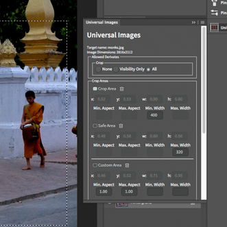
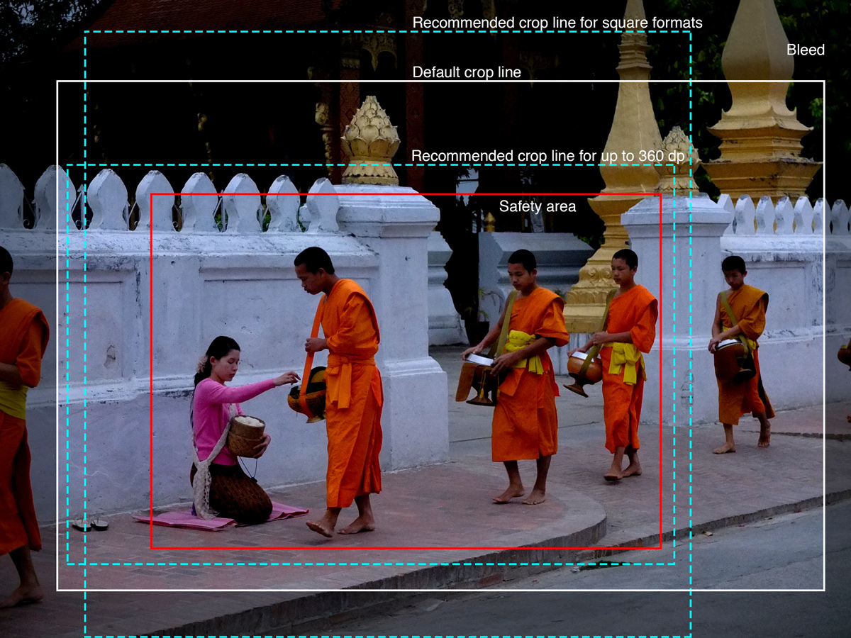
An example of this is shown in the following picture which shows a universal image with multiple format markings. The scene is a group of monks walking through the streets of Luang Prabang in Laos early in the morning to receive alms from the local people. The original can be seen here.
The source file has actually more information than what is used for the default framing. Normally this would have been cut off prior to uploading the image to the server. But instead, this makes it possible to define multiple aspect ratios that overlap each other. In the example below, the square crop would show parts of the image that are not part of the default framing which is defined by the white “Default crop line”. The red box is the “Safety area”. This part of the image contains the relevant information and should not be cropped into. The blue lines are recommended frame lines for different sizes.
Multiple crop regions within a single image source.
The information can be stored within the image file itself as part of the XMP metadata. XMP is an open ISO standard based on RDF and XML and can be read by most image processing tools. Since it was originally developed by Adobe, it is supported by all Adobe programs.
I have drafted a possible standard and published it on Github: https://github.com/universalimages/rmd. There is no XML schema since all XMP standards are defined in text form.
The standard should deal with all aspects related to responsive images. That’s why already available fields like the Exif SubjectArea field are not enough to hold the necessary information. Apart from the crop regions it also has to store information about the legal part of art direction. Unless the image license explicitly allows it, an image cannot be cropped at all due to copyright laws. Of course those laws are interpreted differently in different countries. That’s why the standard allows setting an “allowed derivates” option to be set to “no crop at all” or “crop only for small devices” where details would get lost and to prevent editorial integrity.
The standard was heavily inspired by the work of the Metadata Working Group (MWG) and uses their RegionInfo element.
When talking about responsive or universal images, size is the most important property. Unfortunately the most common unit web developers use for the size of an image, pixel, is ambiguous. It has two meanings:
A physical pixel on a screen or a single image point in a bitmap.
A unit of measure.
Usually the context of where the word “pixel” is used defines which one it is.
But how do you correctly measure the width of an image for a responsive website? There are two factors involved: The physical size of the image and the distance from the device to the viewer. Obviously an image appears larger if it is closer to the viewer. Therefore, the unit of measure for universal images should not be based on an absolute width like Millimeter but on a viewing angle.
Luckily that’s what the “Pixel” unit is based on in the CSS 2.1 specification. So a CSS pixel is resolution independent. It is 0.213° or 12.8′. The definition is: “The visual angle of one pixel on a device with a pixel density of 96dpi and a distance from the reader of an arm’s length.” Since “an arm’s length” is not an exact value, the unit is not scientifically exact, but good enough for what it is used for.
This is the reason why the viewport width of an iPhone 4 in portrait mode is still 320 pixels even though the display has twice the number of physical pixels.
In Android the unit is called “Density independent pixel” or dp, which is maybe a better way to explicitly separate the unit from the pixel unit used by all image editing programs which is based on the actual pixels in an image.
It is therefore necessary to always think about which version of the pixel unit is used in the current context. If it is not clear, it is better to explicitly specify it.
Art direction in the context of universal images means cropping and reframing an image in one or two dimensions depending on the context it is in.
Art directed responsive images start with the photographer, not just in the browser. That’s why we should come up with ways to help content producers create responsive images.
Before we start discussing technical issues, let’s recap the use cases for responsive images that require art direction:
Small devices: Smartphones, especially when held in portrait mode, simply cannot show an image the size the photographer has envisioned it. Sometimes details cannot be recognized in a small image due to their size. To keep up with editorial integrity, one has to find a balance between zooming in to show what is going on and the overall image composition.
Different layouts: Websites could use the same image in different places. For each layout the image would be displayed in the size and aspect ratio required by the layout.
Fluid images: Websites often use a fluid grid where the column with is relative to the browser width. If images have a fixed height and a dynamic width then parts of the image can get cropped in the browser.
Adaptive images: Images can be displayed full screen on mobile devices no matter if the user is holding the device in portrait or landscape mode.
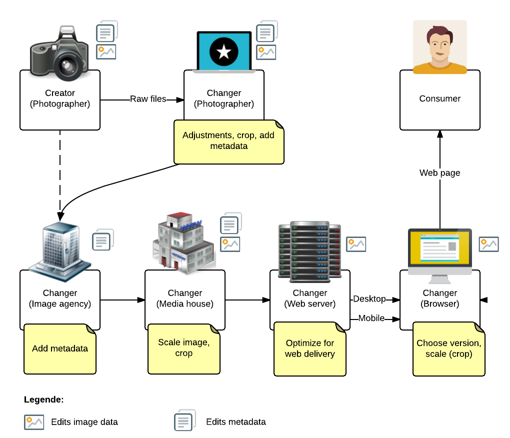
The following graphics describes the usual workflow for creating an image for a website.
Apart from the technical challenges there are also legal ones. In general, copyright prohibits to alter a work of art in any way, even cropping it (although the interpretation of this differs between countries). However, most image agencies allow it in their license agreements. Nevertheless, this is a factor that has to be taken into consideration when creating a universal images: It could just have a metadata entry that says “Don’t crop me”.
A big part of the discussions are going to be about metadata. There are quite a few different standards (Exif, IPTC, XMP) but none fulfills the needs of universal images completely.
The goal of this group is to find a way for content producers to make an image responsive in a way that it can be distributed together with the information needed so that all responsive derivates can be created automatically.
Our goal is to provide tools and specifications for creatives and agencies to create and distribute multi-format images. These are
images which contain metadata that lets them adjust to different sizes, depending of the format of the output device or the layout of the website it is used in. These images can be used to have a web-server automatically create the alternative versions needed for a responsive website.
This is a community initiative. This group was originally proposed on 2015-12-14 by Simon Bächler. The following people supported its creation: Simon Bächler, Christopher Regan, Christophe Avon, Hui Jing Chen, Mads Ulsø Østergaard. W3C’s hosting of this group does not imply endorsement of the activities.

 universalimages