Jump to Table of Contents Pop Out Sidebar

Abstract

Accessibility of web content requires semantic information about widgets, structures, and behaviors, in order to allow assistive technologies to convey appropriate information to persons with disabilities. This specification provides an ontology of roles, states, and properties that define accessible user interface elements and can be used to improve the accessibility and interoperability of web content and applications. These semantics are designed to allow an author to properly convey user interface behaviors and structural information to assistive technologies in document-level markup. This version adds features new since WAI-ARIA 1.0 [WAI-ARIA-10] to improve interoperability with assistive technologies to form a more consistent accessibility model for [HTML5] and [SVG2]. This specification complements both [HTML5] and [SVG2].

This document is part of the WAI-ARIA suite described in the WAI-ARIA Overview.

Status of This Document

This section describes the status of this document at the time of its publication. Other documents may supersede this document. A list of current W3C publications and the latest revision of this technical report can be found in the W3C technical reports index at https://www.w3.org/TR/.

This is a Candidate Recommendation of WAI-ARIA 1.1 by the Accessible Rich Internet Applications Working Group of the Web Accessibility Initiative. This is a call for implementations; the Accessible Rich Internet Applications Working Group requests that initial implementations be submitted by 16 December 2016. The Working Group targets 13 January 2017 to complete the testing process and produce the implementation report. A history of changes to WAI-ARIA 1.1 is available in the appendix.

Exit Criteria: The Accessible Rich Internet Applications Working Group intends to exit the Candidate Recommendation stage and submit this document for consideration as a W3C Proposed Recommendation after documenting interoperable implementability of each feature. For each feature, passing test results in at least two different implementations will be documented.

WAI-ARIA 1.1 defines a technology that can be used in multiple host languages and exposes features to various device platforms. Specific implementation guidance for these languages and platforms is provided in a set of Accessibility API Mappings (AAMs), including at time of publication Core AAM, Accessible Name and Description AAM, HTML AAM, Graphics AAM, SVG AAM, and Digital Publishing AAM. Testing WAI-ARIA relies on the guidance in those auxiliary specifications. For each WAI-ARIA feature, successful test results in any two implementations mapping any of the accessibility APIs referenced in any of the AAMs using any host language will be considered sufficient for the purpose of determining implementability and interoperability of WAI-ARIA. It is not as expectation that the AAMs themselves be at Candidate Recommendation or later stage in order to support WAI-ARIA testing.

WAI-ARIA 1.1 builds upon WAI-ARIA 1.0, which met its implementation requirements in February 2014. Only features that are new or changed in WAI-ARIA 1.1 need be tested, as the WAI-ARIA 1.0 implementation report provides implementatibility and interoperability evidence for the remaining features. Features that will be tested for WAI-ARIA 1.1 include:

To verify the above requirements, the Accessible Rich Internet Applications Working Group will:

  1. Define test cases: Identify a set of unit tests, feature tests, dynamic tests, and any additional tests needed to cover all ARIA normative requirements;
  2. Prepare test files: Prepare test files consisting of HTML 4 content enhanced with WAI-ARIA, to cover all the test cases;
  3. Test implementations: Perform these tests on multiple separate combinations of user agent plus operating system plus accessibility API;
  4. Evaluate test results: Examine results in accessibility APIs as defined by the WAI-ARIA User Agent Implementation Guide;
  5. Verify interoperable results: Find at least two implementations of each normative requirement where the defined behavior for the respective accessibility API is observed.

The WAI-ARIA 1.1 Implementations page contains further explanation of the terms and expectations above. It also contains up-to-date information about the test suite, test harness, user agents being examined, and interim test results in the draft implementation report. Implementers who wish to include their tools in the test process will find instructions to submit their implementation for consideration.

Features at Risk: The Accessible Rich Internet Applications Working Group has identified the following feature at risk:

  1. The aria-keyshortcuts property includes an author requirement for use of modifier keys defined in the UI Events KeyboardEvent key Values specification. If this specification is not ready to advance to Recommendation in time for ARIA to maintain this normative reference, the author requirement will be changed to non-normative guidance and the reference made informative.
  2. The aria-roledescription property describes conditions under which user agents must not expose the property. If two implementations of this restriction are not found, this requirement will be removed from the property.

Comments: The Accessible Rich Internet Applications Working Group primarily seeks feedback relation to implementation of WAI-ARIA, but feedback on any aspect of the specification is accepted. When submitting feedback, please consider issues in the context of the companion documents. To comment, file an issue in the W3C ARIA GitHub repository. If this is not feasible, send email to public-aria@w3.org (comment archive). Comments are requested by 16 December 2016. In-progress updates to the document may be viewed in the publicly visible editors' draft.

This document was published by the Accessible Rich Internet Applications Working Group as a Candidate Recommendation. This document is intended to become a W3C Recommendation. W3C publishes a Candidate Recommendation to indicate that the document is believed to be stable and to encourage implementation by the developer community. This Candidate Recommendation is expected to advance to Proposed Recommendation no earlier than 13 January 2017.

Please see the Working Group's implementation report.

Publication as a Candidate Recommendation does not imply endorsement by the W3C Membership. This is a draft document and may be updated, replaced or obsoleted by other documents at any time. It is inappropriate to cite this document as other than work in progress.

This document was produced by a group operating under the 5 February 2004 W3C Patent Policy. W3C maintains a public list of any patent disclosures made in connection with the deliverables of the group; that page also includes instructions for disclosing a patent. An individual who has actual knowledge of a patent which the individual believes contains Essential Claim(s) must disclose the information in accordance with section 6 of the W3C Patent Policy.

This document is governed by the 1 September 2015 W3C Process Document.

1. Introduction§

This section is non-normative.

The goals of this specification include:

WAI-ARIA is a technical specification that provides a framework to improve the accessibility and interoperability of web content and applications. This document is primarily for developers creating custom widgets and other web application components. Please see the WAI-ARIA Overview for links to related documents for other audiences, such as the WAI-ARIA Primer that introduces developers to the accessibility problems that WAI-ARIA is intended to solve, the fundamental concepts, and the technical approach of WAI-ARIA.

This draft currently handles two aspects of roles: user interface functionality and structural relationships. For more information and use cases, see the [WAI-ARIA-PRIMER] for the use of roles in making interactive content accessible.

The role taxonomy is designed in part to support the common roles found in platform accessibility APIs. Reference to roles found in this taxonomy by dynamic web content may be used to support interoperability with assistive technologies.

The schema to support this standard has been designed to be extensible so that custom roles can be created by extending base roles. This allows user agents to support at least the base role, and user agents that support the custom role can provide enhanced access. Note that much of this could be formalized in [XMLSCHEMA-2]. However, being able to define similarities between roles, such as baseConcepts and more descriptive definitions, would not be available in XSD.

WAI-ARIA 1.1 is a member of the WAI-ARIA 1.1 suite that defines how to expose semantics of WAI-ARIA and other web content languages to accessibility APIs.

1.1 Rich Internet Application Accessibility§

The domain of web accessibility defines how to make web content usable by persons with disabilities. Persons with certain types of disabilities use assistive technologies (AT) to interact with content. Assistive technologies can transform the presentation of content into a format more suitable to the user, and can allow the user to interact in different ways. For example, the user may need to, or choose to, interact with a slider widget via arrow keys, instead of dragging and dropping with a mouse. In order to accomplish this effectively, the software needs to understand the semantics of the content. Semantics is the science of meaning; in this case, used to assign roles, states, and properties that apply to user interface and content elements as a human would understand. For instance, if a paragraph is semantically identified as such, assistive technologies can interact with it as a unit separable from the rest of the content, knowing the exact boundaries of that paragraph. An adjustable range slider or collapsible list (a.k.a. a tree widget) are more complex examples, in which various parts of the widget have semantics that need to be properly identified for assistive technologies to support effective interaction.

New technologies often overlook semantics required for accessibility, and new authoring practices often misuse the intended semantics of those technologies. Elements that have one defined meaning in the language are used with a different meaning intended to be understood by the user.

For example, web application developers create collapsible tree widgets in HTML using CSS and JavaScript even though HTML has no semantic tree element. To a non-disabled user, it may look and act like a collapsible tree widget, but without appropriate semantics, the tree widget may not be perceivable to, or operable by, a person with a disability because assistive technologies may not recognize the role. Similarly, web application developers create interactive button widgets in SVG using JavaScript even though SVG has no semantic button element. To a non-disabled user, it may look and act like a button widget, but without appropriate semantics, the button widget may not be perceivable to, or operable by, a person with a disability because assistive technologies may not recognize the role.

The incorporation of WAI-ARIA is a way for an author to provide proper semantics for custom widgets to make these widgets accessible, usable, and interoperable with assistive technologies. This specification identifies the types of widgets and structures that are commonly recognized by accessibility products, by providing an ontology of corresponding roles that can be attached to content. This allows elements with a given role to be understood as a particular widget or structural type regardless of any semantics inherited from the implementing host language. Roles are a common property of platform accessibility APIs which assistive technologies use to provide the user with effective presentation and interaction.

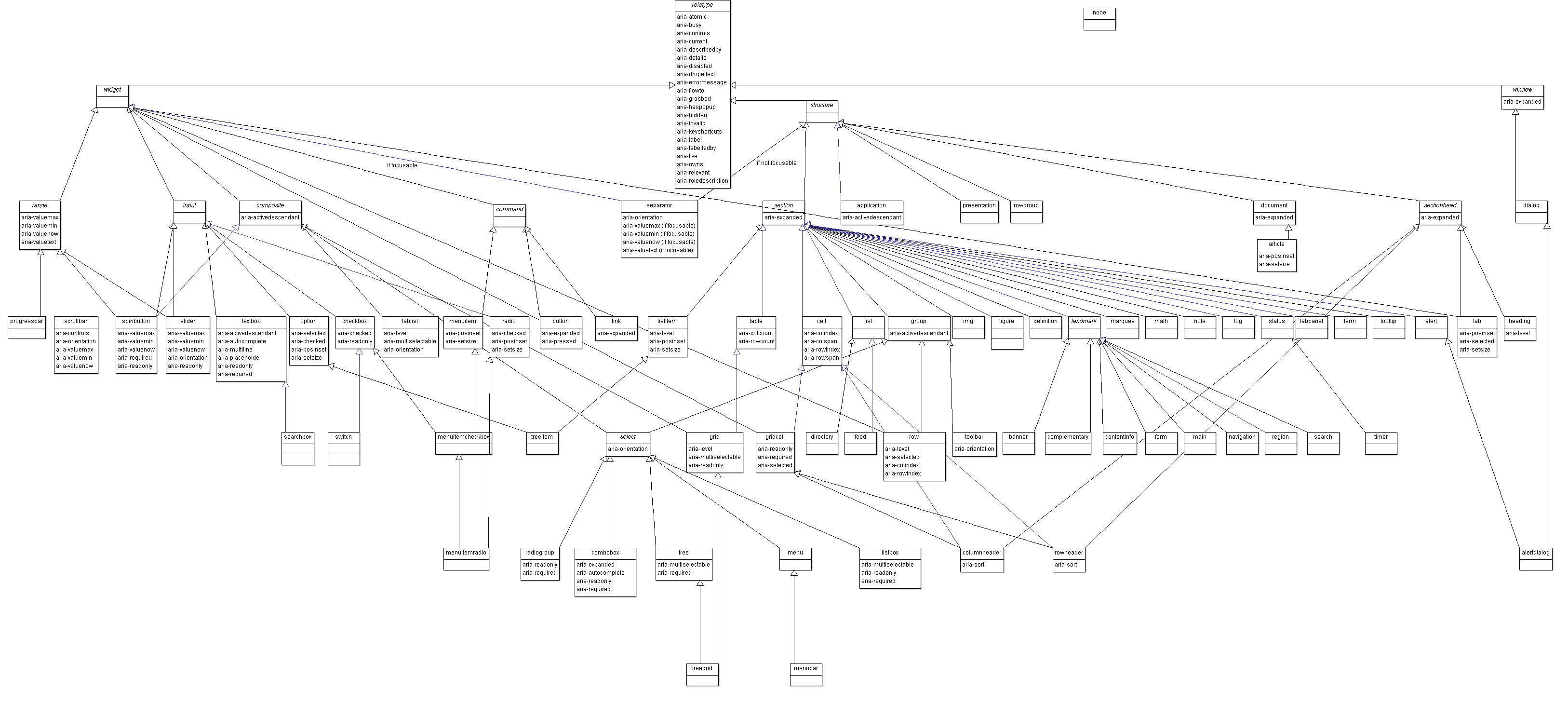
This role taxonomy includes interaction widgets and elements denoting document structure. The role taxonomy describes inheritance and details the attributes each role supports. Information about mapping of roles to accessibility APIs is provided by the Core Accessibility API Mappings 1.1 [CORE-AAM].

Roles are element types and will not change with time or user actions. Role information is used by assistive technologies, through interaction with the user agent, to provide normal processing of the specified element type.

States and properties are used to declare important attributes of an element that affect and describe interaction. They enable the user agent and operating system to properly handle the element even when the attributes are dynamically changed by client-side scripts. For example, alternative input and output technology, such as screen readers and speech dictation software, need to be able to recognize and effectively manipulate and communicate various interaction states (e.g., disabled, checked) to the user.

While it is possible for assistive technologies to access these properties directly through the Document Object Model [DOM4], the preferred mechanism is for the user agent to map the states and properties to the accessibility API of the operating system. See the Core Accessibility API Mappings 1.1 [CORE-AAM] and the Accessible Name and Description: Computation and API Mappings 1.1 [ACCNAME-AAM] for details.

Figure 1.0 illustrates the relationship between user agents (e.g., browsers), accessibility APIs, and assistive technologies. It describes the "contract" provided by the user agent to assistive technologies, which includes typical accessibility information found in the accessibility API for many of our accessible platforms for GUIs (role, state, selection, event notification, relationship information, and descriptions). The DOM, usually HTML, acts as the data model and view in a typical model-view-controller relationship, and JavaScript acts as the controller by manipulating the style and content of the displayed data. The user agent conveys relevant information to the operating system's accessibility API, which can be used by any assistive technologies, such as screen readers.

The contract model with accessibility APIs

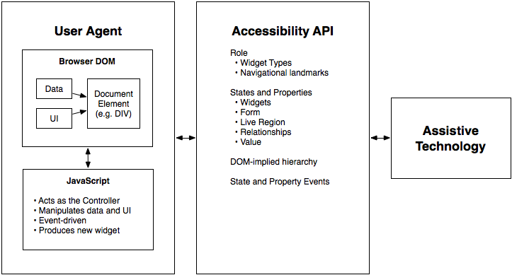
Figure 1: The contract model with accessibility APIs

For more information see the WAI-ARIA Primer [WAI-ARIA-PRIMER] for the use of roles in making interactive content accessible.

In addition to the prose documentation, the role taxonomy is provided in Web Ontology Language (OWL) [OWL-FEATURES], which is expressed in Resource Description Framework (RDF) [RDF-CONCEPTS]. Tools can use these to validate the implementation of roles in a given content document. For example, instances of some roles are expected to be children of a specific parent role. Also, some roles may support a specific state or property that another role does not support.

Note

The use of RDF/OWL as a formal representation of roles may be used to support future extensibility. Standard RDF/OWL mechanisms can be used to define new roles that inherit from the roles defined in this specification. The mechanism to define and use role extensions in an interoperable manner, however, is not defined by this specification. A future version of WAI-ARIA is expected to define how to extend roles.

Users of alternate input devices need keyboard accessible content. The new semantics, when combined with the recommended keyboard interactions provided in WAI-ARIA Authoring Practices [WAI-ARIA-PRACTICES], will allow alternate input solutions to facilitate command and control via an alternate input solution.

WAI-ARIA introduces navigational landmarks through its taxonomy and the XHTML role landmarks, which can help persons with dexterity and vision impairments by providing for improved keyboard navigation. WAI-ARIA may also be used to assist persons with cognitive learning disabilities. The additional semantics allow authors to restructure and substitute alternative content as needed.

Assistive technologies need the ability to support alternative inputs by getting and setting the current value of widget states and properties. Assistive technologies also need to determine what objects are selected and manage widgets that allow multiple selections, such as list boxes and grids.

Speech-based command and control systems can benefit from WAI-ARIA semantics like the role attribute to assist in conveying audio information to the user. For example, upon encountering an element with a role of menu with child elements of role menuitem each containing text content representing a different flavor, a speech system might state to the user, "Select one of three choices: chocolate, strawberry, or vanilla."

WAI-ARIA is intended to be used as a supplement for native language semantics, not a replacement. When the host language provides a feature that provides equivalent accessibility to the WAI-ARIA feature, use the host language feature. WAI-ARIA should only be used in cases where the host language lacks the needed role, state, and property indicators. Use a host language feature that is as similar as possible to the WAI-ARIA feature, then refine the meaning by adding WAI-ARIA. For instance, a multi-selectable grid could be implemented as a table, and then WAI-ARIA used to clarify that it is an interactive grid, not just a static data table. This allows for the best possible fallback for user agents that do not support WAI-ARIA and preserves the integrity of the host language semantics.

1.2 Target Audience§

This specification defines the basic model for WAI-ARIA, including roles, states, properties, and values. It impacts several audiences:

Each conformance requirement indicates the audience to which it applies.

Although this specification is applicable to the above audiences, it is not specifically targeted to, nor is it intended to be the sole source of information for, any of these audiences. The following documents provide important supporting information:

1.3 User Agent Support§

WAI-ARIA relies on user agent support for its features in two ways:

Aside from using WAI-ARIA markup to improve what is exposed to accessibility APIs, user agents behave as they would natively. Assistive technologies react to the extra information in the accessibility API as they already do for the same information on non-web content. User agents that are not assistive technologies, however, need do nothing beyond providing appropriate updates to the accessibility API.

The WAI-ARIA specification neither requires nor forbids user agents from enhancing native presentation and interaction behaviors on the basis of WAI-ARIA markup. Mainstream user agents might expose WAI-ARIA navigational landmarks (for example, as a dialog box or through a keyboard command) with the intention to facilitate navigation for all users. User agents are encouraged to maximize their usefulness to users, including users without disabilities.

WAI-ARIA is intended to provide missing semantics so that the intent of the author may be conveyed to assistive technologies. Generally, authors using WAI-ARIA will provide the appropriate presentation and interaction features. Over time, host languages may add WAI-ARIA equivalents, such as new form controls, that are implemented as standard accessible user interface controls by the user agent. This allows authors to use them instead of custom WAI-ARIA enabled user interface components. In this case the user agent would support the native host language feature. Developers of host languages that implement WAI-ARIA are advised to continue supporting WAI-ARIA semantics when they do not adversely conflict with implicit host language semantics, as WAI-ARIA semantics more clearly reflect the intent of the author if the host language features are inadequate to meet the author's needs.

1.4 Co-Evolution of WAI-ARIA and Host Languages§

WAI-ARIA is intended to augment semantics in supporting languages like [HTML5] and [SVG2], or to be used as an accessibility enhancement technology in other markup-based languages that do not explicitly include support for ARIA. It clarifies semantics to assistive technologies when authors create new types of objects, via style and script, that are not yet directly supported by the language of the page, because the invention of new types of objects is faster than standardized support for them appears in web languages.

It is not appropriate to create objects with style and script when the host language provides a semantic element for that type of object. While WAI-ARIA can improve the accessibility of these objects, accessibility is best provided by allowing the user agent to handle the object natively. For example, it's better to use an h1 element in HTML than to use the heading role on a div element.

It is expected that, over time, host languages will evolve to provide semantics for objects that currently can only be declared with WAI-ARIA. This is natural and desirable, as one goal of WAI-ARIA is to help stimulate the emergence of more semantic and accessible markup. When native semantics for a given feature become available, it is appropriate for authors to use the native feature and stop using WAI-ARIA for that feature. Legacy content may continue to use WAI-ARIA, however, so the need for user agents to support WAI-ARIA remains.

While specific features of WAI-ARIA may lose importance over time, the general possibility of WAI-ARIA to add semantics to web pages is expected to be a persistent need. Host languages may not implement all the semantics WAI-ARIA provides, and various host languages may implement different subsets of the features. New types of objects are continually being developed, and one goal of WAI-ARIA is to provide a way to make such objects accessible, because web authoring practices often advance faster than host language standards. In this way, WAI-ARIA and host languages both evolve together but at different rates.

Some host languages exist to create semantics for features other than the user interface. For example, SVG expresses the semantics behind production of graphical objects, not of user interface components that those objects may represent; XForms provides semantics for form controls and does not provide wider user interface features. Host languages such as these might, by design, not provide native semantics that map to WAI-ARIA features. In these cases, WAI-ARIA could be adopted as a long-term approach to add semantic information to user interface components.

1.5 Authoring Practices§

1.5.1 Authoring Tools§

Many of the requirements in the definitions of WAI-ARIA roles, states, and properties can be checked automatically during the development process, similar to other quality control processes used for validating code. To assist authors who are creating custom widgets, authoring tools may compare widget roles, states, and properties to those supported in WAI-ARIA as well as those supported in related and cross-referenced roles, states, and properties. Authoring tools may notify authors of errors in widget design patterns, and may also prompt developers for information that cannot be determined from context alone. For example, a scripting library can determine the labels for the tree items in a tree view, but would need to prompt the author to label the entire tree. To help authors visualize a logical accessibility structure, an authoring environment might provide an outline view of a web resource based on the WAI-ARIA markup.

In both HTML and SVG, tabindex is an important way browsers support keyboard focus navigation for implementations of WAI-ARIA; authoring and debugging tools may check to make sure tabindex values are properly set. For example, error conditions may include cases where more than one treeitem in a tree has a tabindex value greater than or equal to 0, where tabindex is not set on any treeitem, or where aria-activedescendant is not defined when the element with the role tree has a tabindex value of greater than or equal to 0.

1.5.2 Testing Practices and Tools§

The accessibility of interactive content cannot be confirmed by static checks alone. Developers of interactive content should test for device-independent access to widgets and applications, and should verify accessibility API access to all content and changes during user interaction.

1.6 Assistive Technologies§

Programmatic access to accessibility semantics is essential for assistive technologies. Most assistive technologies interact with user agents, like other applications, through a recognized accessibility API. Perceivable objects in the user interface are exposed to assistive technologies as accessible objects, defined by the accessibility API interfaces. To do this properly, accessibility information – role, states, properties as well as contextual information – needs to be accurately conveyed to the assistive technologies through the accessibility API. When a state change occurs, the user agent provides the appropriate event notification to the accessibility API. Contextual information, in many host languages like HTML, can be determined from the DOM itself as it provides a contextual tree hierarchy.

While some assistive technologies interact with these accessibility APIs, others may access the content directly from the DOM. These technologies can restructure, simplify, style, or reflow the content to help a different set of users. Common use cases for these types of adaptations may be the aging population, persons with cognitive impairments, or persons in environments that interfere with use of their tools. For example, the availability of regional navigational landmarks may allow for a mobile device adaptation that shows only portions of the content at any one time based on its semantics. This could reduce the amount of information the user needs to process at any one time. In other situations it may be appropriate to replace a custom user interface control with something that is easier to navigate with a keyboard, or touch screen device.

2. Using WAI-ARIA§

This section is non-normative.

Complex web applications become inaccessible when assistive technologies cannot determine the semantics behind portions of a document or when the user is unable to effectively navigate to all parts of it in a usable way (see the WAI-ARIA Primer [WAI-ARIA-PRIMER]). WAI-ARIA divides the semantics into roles (the type defining a user interface element) and states and properties supported by the roles.

Authors need to associate elements in the document to a WAI-ARIA role and the appropriate states and properties (aria-* attributes) during its life-cycle, unless the elements already have the appropriate implicit WAI-ARIA semantics for states and properties. In these instances the equivalent host language states and properties take precedence to avoid a conflict while the role attribute will take precedence over the implicit role of the host language element.

2.1 WAI-ARIA Roles§

A WAI-ARIA role is set on an element using a role attribute, similar to the role attribute defined in Role Attribute [ROLE-ATTRIBUTE].

Example 1
<li role="menuitem">Open file…</li>

The roles defined in this specification include a collection of document landmarks and the WAI-ARIA role taxonomy.

The roles in this taxonomy and their expected behaviors are modeled using RDF/OWL [OWL-FEATURES]. Features of the role taxonomy provide the following information for each role:

Attaching a role gives assistive technologies information about how to handle each element.

2.2 WAI-ARIA States and Properties§

WAI-ARIA provides a collection of accessibility states and properties which are used to support platform accessibility APIs on various operating system platforms. Assistive technologies may access this information through an exposed user agent DOM or through a mapping to the platform accessibility API. When combined with roles, the user agent can supply the assistive technologies with user interface information to convey to the user at any time. Changes in states or properties will result in a notification to assistive technologies, which could alert the user that a change has occurred.

In the following example, a list item (html:li) has been used to create a checkable menu item, and JavaScript events will capture mouse and keyboard events to toggle the value of aria-checked. A role is used to make the behavior of this simple widget known to the user agent. Attributes that change with user actions (such as aria-checked) are defined in the states and properties section.

Example 2
<li role="menuitemcheckbox" aria-checked="true">Sort by Last Modified</li>

Some accessibility states, called managed states, are controlled by the user agent. Examples of managed state include keyboard focus and selection. Managed states often have corresponding CSS pseudo-classes (such as :focus and ::selection) to define style changes. In contrast, the states in this specification are typically controlled by the author and are called unmanaged states. Some states are managed by the user agent, such as aria-posinset and aria-setsize, but the author can override them if the DOM is incomplete and would cause the user agent calculation to be incorrect. User agents map both managed and unmanaged states to the platform accessibility APIs.

Most modern user agents support CSS attribute selectors ([CSS3-SELECTORS]), and can allow the author to create UI changes based on WAI-ARIA attribute information, reducing the amount of scripts necessary to achieve equivalent functionality. In the following example, a CSS selector is used to determine whether or not the text is bold and an image of a check mark is shown, based on the value of the aria-checked attribute.

Example 3
[aria-checked="true"] { font-weight: bold; }
[aria-checked="true"]::before { background-image: url(checked.gif); }

If CSS is not used to toggle the visual representation of the check mark, the author could include additional markup and scripts to manage an image that represents whether or not the menuitemcheckbox is checked.

Example 4
<li role="menuitemcheckbox" aria-checked="true">
  <img src="checked.gif" role="presentation" alt="">
  <!-- note: additional scripts required to toggle image source -->
  Sort by Last Modified
</li>

2.3 Managing Focus§

An application should always have an element with focus when in use, as applications require users to have a place to provide user input. Authors are advised to not destroy the element with focus or scroll it off-screen unless through user intervention. All interactive objects should be focusable. All parts of composite interactive controls need to be focusable or have a documented alternative method to achieve their function, such as a keyboard shortcut. Authors are advised to maintain an obvious, discoverable way, either through tabbing or other standard navigation techniques, for keyboard users to move the focus to any interactive element. See User Agent Accessibility Guidelines, Guideline 9 ([UAAG10], Guideline 9).

When using standard HTML and basic WAI-ARIA widgets, application developers can simply manipulate the tab order or use a script to create keyboard shortcuts to elements in the document. Use of more complex widgets requires the author to manage focus within them. SVG Tiny provides a similar navigation "ring" mechanism that by default follows document order and which should be implemented using system dependent input facilities (the TAB key on most desktop computers). SVG authors may place elements in the navigation order by manipulating the focusable attribute and they may dynamically specify the navigation order by modifying elements' navigation attributes.

WAI-ARIA includes a number of "managing container" widgets, also known as "composite" widgets. When appropriate, the container is responsible for tracking the last descendant that was active (the default is usually the first item in the container). It is essential that a container maintain a usable and consistent strategy when focus leaves a container and is then later refocused. While there may be exceptions, it is recommended that when a previously focused container is refocused, the active descendant be the same element as the active descendant when the container was last focused. Exceptions include cases where the contents of a container widget have changed, and widgets like a menubar where the user expects to always return to the first item when focus leaves the menu bar. For example, if the second item of a tree group was the active descendant when the user tabbed out of the tree group, then the second item of the tree group remains the active descendant when the tree group gets focus again. The user may also activate the container by clicking on one of the descendants within it.

When the container or its active descendant has focus, the user may navigate through the container by pressing additional keys, such as the arrow keys, to change the currently active descendant. Any additional press of the main navigation key (generally the TAB key) will move out of the container to the next widget.

For example, a grid may be used as a spreadsheet with thousands of gridcell elements, all of which may not be present in the document at one time. This requires focus to be managed by the container using the aria-activedescendant attribute on the managing container element, or by the container managing the tabindex of its child elements and setting focus on the appropriate child. For more information, see Providing Keyboard Focus in WAI-ARIA Authoring Practices ([WAI-ARIA-PRACTICES]).

Content authors are required to manage focus on the following container roles:

More information on managing focus can be found in the Using Tabindex to Manage Focus Among Widgets section of the WAI-ARIA Authoring Practices [WAI-ARIA-PRACTICES].

3. Conformance§

As well as sections marked as non-normative, all authoring guidelines, diagrams, examples, and notes in this specification are non-normative. Everything else in this specification is normative.

The key words MAY, MUST, MUST NOT, SHOULD, and SHOULD NOT are to be interpreted as described in [RFC2119].

This specification indicates whether a section is normative or informative. Classifying a section as normative or informative applies to the entire section. A statement "This section is normative" or "This section is informative" applies to all sub-sections of that section.

Normative sections provide requirements that authors, user agents, and assistive technologies MUST follow for an implementation to conform to this specification.

Informative sections provide information useful to understanding the specification. Such sections may contain examples of recommended practice, but it is not required to follow such recommendations in order to conform to this specification.

3.1 Non-interference with the Host Language§

WAI-ARIA processing by the user agent MUST NOT interfere with the normal operation of the built-in features of the host language.

If a CSS selector includes a WAI-ARIA attribute (e.g., input[aria-invalid="true"]), user agents MUST update the visual display of any elements matching (or no longer matching) the selector any time the attribute is added/changed/removed in the DOM. The user agent MAY alter the mapping of the host language features into an accessibility API, but the user agent MUST NOT alter the DOM in order to remap WAI-ARIA markup into host language features.

3.2 All WAI-ARIA in DOM§

A conforming user agent which implements a document object model that does not conform to the W3C DOM specification MUST include the content attribute for role and its WAI-ARIA role values, as well as the WAI-ARIA States and Properties in the DOM as specified by the author, even though processing may affect how the elements are exposed to accessibility APIs. Doing so ensures that each role attribute and all WAI-ARIA states and properties, including their values, are in the document in an unmodified form so other tools, such as assistive technologies, can access them. A conforming W3C DOM meets this criterion.

3.3 Assistive Technology Notifications Communicated to Web Applications§

Assistive technologies, such as speech recognition systems and alternate input devices for users with mobility impairments, require the ability to control a web application in a device-independent way. WAI-ARIA states and properties reflect the current state of rich internet application components. The ability for assistive technologies to notify web applications of necessary changes is essential because it allows these alternative input solutions to control an application without being dependent on the standard input device which the user is unable to effectively control directly.

User agents MUST provide a method to notify the web application when a change occurs to states or properties in the system accessibility API. Likewise, web application authors SHOULD update the web application accordingly when notified of a change request from the user agent or assistive technology.

Note

Many state and properties can be changed by assistive technologies through existing accessibility APIs by responding to a default action event. For example, the aria-selected state of a tab in a tabpanel can be changed by triggering the default action on the element.

3.4 Conformance Checkers§

Any application or script verifying document conformance or validity SHOULD include a test for all of the normative author requirements in this specification. If testing for a given requirement, conformance checkers MUST issue an error if an author "MUST" requirement isn't met, and MUST issue a warning if an author "SHOULD" requirement isn't met.

3.5 Deprecated Requirements§

As the technology evolves, sometimes new ways to meet a use case become available, that work better than a feature that was previously defined. But because of existing implementation of the older feature, that feature cannot be removed from the conformance model without rendering formerly conforming content non-conforming. In this case, the older feature is marked as "deprecated". This indicates that the feature is allowed in the conformance model and expected to be supported by user agents, but it is recommended that authors do not use it for new content. In future versions of the specification, if the feature is no longer widely used, the feature could be removed and no longer expected to be supported by user agents.

4. Important Terms§

This section is non-normative.

While some terms are defined in place, the following definitions are used throughout this document.

Accessibility API

Operating systems and other platforms provide a set of interfaces that expose information about objects and events to assistive technologies. Assistive technologies use these interfaces to get information about and interact with those widgets. Examples of accessibility APIs are Microsoft Active Accessibility [MSAA], Microsoft User Interface Automation [UI-AUTOMATION], MSAA with UIA Express [UIA-EXPRESS], the Mac OS X Accessibility Protocol [AXAPI], the Linux/Unix Accessibility Toolkit [ATK] and Assistive Technology Service Provider Interface [AT-SPI], and IAccessible2 [IAccessible2].

Accessible Description

An accessible description provides additional information, related to an interface element, that complements the accessible name. The accessible description might or might not be visually perceivable.

Accessible Name

The accessible name is the name of a user interface element. Each platform accessibility API provides the accessible name property. The value of the accessible name may be derived from a visible (e.g., the visible text on a button) or invisible (e.g., the text alternative that describes an icon) property of the user interface element. See related accessible description.

A simple use for the accessible name property may be illustrated by an "OK" button. The text "OK" is the accessible name. When the button receives focus, assistive technologies may concatenate the platform's role description with the accessible name. For example, a screen reader may speak "push-button OK" or "OK button". The order of concatenation and specifics of the role description (e.g., "button", "push-button", "clickable button") are determined by platform accessibility APIs or assistive technologies.

Assistive Technologies

Hardware and/or software that:

  • relies on services provided by a user agent to retrieve and render Web content
  • works with a user agent or web content itself through the use of APIs, and
  • provides services beyond those offered by the user agent to facilitate user interaction with web content by people with disabilities

This definition may differ from that used in other documents.

Examples of assistive technologies that are important in the context of this document include the following:

  • screen magnifiers, which are used to enlarge and improve the visual readability of rendered text and images;
  • screen readers, which are most-often used to convey information through synthesized speech or a refreshable Braille display;
  • text-to-speech software, which is used to convert text into synthetic speech;
  • speech recognition software, which is used to allow spoken control and dictation;
  • alternate input technologies (including head pointers, on-screen keyboards, single switches, and sip/puff devices), which are used to simulate the keyboard;
  • alternate pointing devices, which are used to simulate mouse pointing and clicking.
Attribute

In this specification, attribute is used as it is in markup languages. Attributes are structural features added to elements to provide information about the states and properties of the object represented by the element.

Class

A set of instance objects that share similar characteristics.

Deprecated

A deprecated role, state, or property is one which has been outdated by newer constructs or changed circumstances, and which may be removed in future versions of the WAI-ARIA specification. User agents are encouraged to continue to support items identified as deprecated for backward compatibility. For more information, see Deprecated Requirements in the Conformance section.

Element

In this specification, element is used as it is in markup languages. Elements are the structural elements in markup language that contains the data profile for objects.

Event

A programmatic message used to communicate discrete changes in the state of an object to other objects in a computational system. User input to a web page is commonly mediated through abstract events that describe the interaction and can provide notice of changes to the state of a document object. In some programming languages, events are more commonly known as notifications.

Graphical Document

A document containing graphic representations with user-navigable parts. Charts, maps, diagrams, blueprints, and dashboards are examples of graphical documents. A graphical document is composed using any combination of symbols, images, text, and graphic primitives (shapes such as circles, points, lines, paths, rectangles, etc).

Hidden

Indicates that the element is not visible, perceivable, or interactive to any user. An element is considered hidden if it or any one of its ancestor elements is not rendered or is explicitly hidden.

Informative

Content provided for information purposes and not required for conformance. Content required for conformance is referred to as normative.

Keyboard Accessible

Accessible to the user using a keyboard or assistive technologies that mimic keyboard input, such as a sip and puff tube. References in this document relate to WCAG 2.0 Guideline 2.1: Make all functionality available from a keyboard [WCAG20].

Landmark

A type of region on a page to which the user may want quick access. Content in such a region is different from that of other regions on the page and relevant to a specific user purpose, such as navigating, searching, perusing the primary content, etc.

Live Region

Live regions are perceivable regions of a web page that are typically updated as a result of an external event when user focus may be elsewhere. These regions are not always updated as a result of a user interaction. This practice has become commonplace with the growing use of Ajax. Examples of live regions include a chat log, stock ticker, or a sport scoring section that updates periodically to reflect game statistics. Since these asynchronous areas are expected to update outside the user's area of focus, assistive technologies such as screen readers have either been unaware of their existence or unable to process them for the user. WAI-ARIA has provided a collection of properties that allow the author to identify these live regions and process them: aria-live, aria-relevant, aria-atomic, and aria-busy. Pre-defined live region roles are listed in the Choosing Between Special Case Live Regions ([WAI-ARIA-PRACTICES], Section 5.3).

Managed State

Accessibility API state that is controlled by the user agent, such as focus and selection. These are contrasted with "unmanaged states" that are typically controlled by the author. Nevertheless, authors can override some managed states, such as aria-posinset and aria-setsize. Many managed states have corresponding CSS pseudo-classes, such as :focus, and pseudo-elements, such as ::selection, that are also updated by the user agent.

Nemeth Braille

The Nemeth Braille Code for Mathematics is a braille code for encoding mathematical and scientific notation. See Nemeth Braille on Wikipedia.

Normative

Required for conformance. By contrast, content identified as informative or "non-normative" is not required for conformance.

Object

In the context of user interfaces, an item in the perceptual user experience, represented in markup languages by one or more elements, and rendered by user agents.

In the context of programming, the instantiation of one or more classes and interfaces which define the general characteristics of similar objects. An object in an accessibility API may represent one or more DOM objects. Accessibility APIs have defined interfaces that are distinct from DOM interfaces.
Ontology

A description of the characteristics of classes and how they relate to each other.

Operable

Usable by users in ways they can control. References in this document relate to WCAG 2.0 Principle 2: Content must be operable [WCAG20]. See Keyboard Accessible.

Owned Element

An 'owned element' is any DOM descendant of the element, any element specified as a child via aria-owns, or any DOM descendant of the owned child.

Perceivable

Presentable to users in ways they can sense. References in this document relate to WCAG 2.0 Principle 1: Content must be perceivable [WCAG20].

Property

Attributes that are essential to the nature of a given object, or that represent a data value associated with the object. A change of a property may significantly impact the meaning or presentation of an object. Certain properties (for example, aria-multiline) are less likely to change than states, but note that the frequency of change difference is not a rule. A few properties, such as aria-activedescendant, aria-valuenow, and aria-valuetext are expected to change often. See clarification of states versus properties.

Relationship

A connection between two distinct things. Relationships may be of various types to indicate which object labels another, controls another, etc.

Role

Main indicator of type. This semantic association allows tools to present and support interaction with the object in a manner that is consistent with user expectations about other objects of that type.

Semantics

The meaning of something as understood by a human, defined in a way that computers can process a representation of an object, such as elements and attributes, and reliably represent the object in a way that various humans will achieve a mutually consistent understanding of the object.

State

A state is a dynamic property expressing characteristics of an object that may change in response to user action or automated processes. States do not affect the essential nature of the object, but represent data associated with the object or user interaction possibilities. See clarification of states versus properties.

Taxonomy

A hierarchical definition of how the characteristics of various classes relate to each other, in which classes inherit the properties of superclasses in the hierarchy. A taxonomy can comprise part of the formal definition of an ontology.

Understandable

Presentable to users in ways they can construct an appropriate meaning. References in this document relate to WCAG 2.0 Principle 3: Information and the operation of user interface must be understandable [WCAG20].

User Agent

Any software that retrieves, renders and facilitates end user interaction with Web content. This definition may differ from that used in other documents.

Widget

Discrete user interface object with which the user can interact. Widgets range from simple objects that have one value or operation (e.g., check boxes and menu items), to complex objects that contain many managed sub-objects (e.g., trees and grids).

5. The Roles Model§

This section defines the WAI-ARIA role taxonomy and describes the characteristics and properties of all roles. A formal RDF/OWL representation of all the information presented here is available in Schemata Appendix.

The roles, their characteristics, the states and properties they support, and specification of how they may be used in markup, shall be considered normative. The RDF/OWL representation used to model the taxonomy shall be considered informative. The RDF/OWL taxonomy may be used as a vehicle to extend WAI-ARIA in the future or by tool manufacturers to validate states and properties applicable to roles per this specification.

Roles are element types and authors MUST NOT change role values over time or with user actions. Authors wishing to change a role MUST do so by deleting the associated element and its children and replacing it with a new element with the appropriate role. Typically, platform accessibility APIs do not provide a vehicle to notify assistive technologies of a role value change, and consequently, assistive technologies may not update their cache with the new role attribute value.

In order to reflect the content in the DOM, user agents SHOULD map the role attribute to the appropriate value in the implemented accessibility API, and user agents SHOULD update the mapping when the role attribute changes.

5.1 Relationships Between Concepts§

The role taxonomy uses the following relationships to relate WAI-ARIA roles to each other and to concepts from other specifications, such as HTML and XForms.

5.1.1 Superclass Role§

Inheritance is expressed in RDF using the RDF Schema 1.1 subClassOf ([RDF-SCHEMA]) property.

RDF Property
rdfs:subClassOf

The role that the current subclassed role extends in the taxonomy. This extension causes all the properties and constraints of the superclass role to propagate to the subclass role. Other than well known stable specifications, inheritance may be restricted to items defined inside this specification, so that external items cannot be changed and affect inherited classes.

5.1.2 Subclass Roles§

RDF Property
<none>

Informative list of roles for which this role is the superclass. This is provided to facilitate reading of the specification but adds no new information.

5.1.3 Related Concepts§

RDF Property
role:relatedConcept

Informative data about a similar or related idea from other specifications. Concepts that are related are not necessarily identical. Related concepts do not inherit properties from each other. Hence if the definition of one concept changes, the properties, behavior, and definition of its related concept is not affected.

For example, a progress bar is like a status indicator. Therefore, the progressbar widget has a relatedConcept value which includes status. However, if the definition of status is modified, the definition of a progressbar is not affected.

5.1.4 Base Concept§

RDF Property
role:baseConcept

Informative data about objects that are considered prototypes for the role. Base concept is similar to type, but without inheritance of limitations and properties. Base concepts are designed as a substitute for inheritance for external concepts. A base concept is like a related concept except that the base concept is almost identical to the role definition.

For example, the checkbox defined in this document has similar functionality and anticipated behavior to a checkbox defined in HTML. Therefore, a checkbox has an HTML checkbox as a baseConcept. However, if the original HTML checkbox baseConcept definition is modified, the definition of a checkbox in this document will not be affected, because there is no actual inheritance of the respective type.

5.2 Characteristics of Roles§

Roles are defined and described by their characteristics. Characteristics define the structural function of a role, such as what a role is, concepts behind it, and what instances the role can or must contain. In the case of widgets this also includes how it interacts with the user agent based on mapping to HTML forms and XForms. States and properties from WAI-ARIA that are supported by the role are also indicated.

The roles taxonomy defines the following characteristics. These characteristics are implemented in RDF as properties of the OWL classes that describe the roles.

5.2.1 Abstract Roles§

RDF Property
N/A
Values
Boolean

Abstract roles are the foundation upon which all other WAI-ARIA roles are built. Content authors MUST NOT use abstract roles because they are not implemented in the API binding. User agents MUST NOT map abstract roles to the standard role mechanism of the accessibility API. Abstract roles are provided to help with the following:

  1. Organize the role taxonomy and provide roles with a meaning in the context of known concepts.
  2. Streamline the addition of roles that include necessary features.

5.2.2 Required States and Properties§

RDF Property
role:requiredState
Values
Any valid RDF object reference, such as a URI.

States and properties specifically required for the role and subclass roles. Content authors MUST provide a non-empty value for required states and properties. Content authors MUST NOT use the value "undefined" for required states and properties.

When an object inherits from multiple ancestors and one ancestor indicates that property is supported while another ancestor indicates that it is required, the property is required in the inheriting object.

Note

A host language attribute with the appropriate implicit WAI-ARIA semantic fulfills this requirement.

5.2.3 Supported States and Properties§

RDF Property
role:supportedState
Values
Any valid RDF object reference, such as a URI.

States and properties specifically applicable to the role and child roles. User agents MUST map all supported states and properties for the role to an accessibility API. Content authors MAY provide values for supported states and properties, but need not in some cases where default values are sufficient.

Note

A host language attribute with the appropriate implicit WAI-ARIA semantic fulfills this requirement.

5.2.4 Inherited States and Properties§

Informative list of properties that are inherited onto a role from superclass roles. States and properties are inherited from superclass roles in the role taxonomy, not from ancestor elements in the DOM tree. These properties are not explicitly defined on the role, as the inheritance of properties is automatic. This information is provided to facilitate reading of the specification. The set of supported states and properties combined with inherited states and properties forms the full set of states and properties supported by the role.

5.2.5 Required Owned Elements§

RDF Property
role:mustContain
Values
Any valid RDF object reference, such as a URI.

Any element that will be owned by the element with this role. For example, an element with the role list will own at least one element with the role group or listitem.

When multiple roles are specified as required owned elements for a role, at least one instance of one required owned element is expected. This specification does not require an instance of each of the listed owned roles. For example, a menu should have at least one instance of a menuitem, menuitemcheckbox, or menuitemradio. The menu role does not require one instance of each.

There may be times that required owned elements are missing, for example, while editing or while loading a data set. When a widget is missing required owned elements due to script execution or loading, authors MUST mark a containing element with aria-busy equal to true. For example, until a page is fully initialized and complete, an author could mark the document element as busy.

Note

A role that has 'required owned elements' does not imply the reverse relationship. While processing of a role may be incomplete without elements of given roles present as descendants, elements with roles in this list do not always have to be found within elements of the given role. See required context role for requirements about the context where elements of a given role will be contained.

Note

An element with a subclass role of the 'required owned element' does not fulfill this requirement. For example, the list role requires ownership of an element using either the listitem or group role. Although the group role is the superclass of row, adding a owned element with a role of row will not fulfill the requirement that list must own a listitem or a group.

Note

An element with the appropriate implicit WAI-ARIA semantic fulfills this requirement.

5.2.6 Required Context Role§

RDF Property
role:scope
Values
Any valid RDF object reference, such as a URI.

The required context role defines the owning container where this role is allowed. If a role has a required context, authors MUST ensure that an element with the role is contained inside (or owned by) an element with the required context role. For example, an element with role listitem is only meaningful when contained inside (or owned by) an element with role list.

Note

A role that has 'required context role' does not imply the reverse relationship. While an element with the given role needs to appear within an element of the listed role(s) in order to be meaningful, elements of the listed roles do not always need descendant elements of the given role in order to be meaningful. See required owned elements for requirements about elements that require presence of a given descendant to be processed properly.

Note

An element with the appropriate implicit WAI-ARIA semantic fulfills this requirement.

5.2.7 Accessible Name Calculation§

RDF Property
role:nameFrom
Values
One of the following values:
  1. author: name comes from values provided by the author in explicit markup features such as the aria-label attribute, the aria-labelledby attribute, or the host language labeling mechanism, such as the alt or title attributes in HTML, with HTML title attribute having the lowest precedence for specifying a text alternative.
  2. contents: name comes from the text value of the element node. Although this may be allowed in addition to "author" in some roles, this is used in content only if higher priority "author" features are not provided. Priority is defined by the text alternative computation algorithm.
5.2.7.1 Name Computation§

Name Computation is defined in the Accessible Name and Description specification [ACCNAME-AAM].

5.2.7.2 Description Computation§

Description Computation is defined in the Accessible Name and Description specification [ACCNAME-AAM].

5.2.7.3 Text Alternative Computation§

Text Alternative Computation is defined in the Accessible Name and Description specification [ACCNAME-AAM].

5.2.7.4 Roles Supporting Name from Author§

All roles support name from author with two exceptions. The roles that do not support name from author are presentation and none.

5.2.7.5 Roles Supporting Name from Content§

5.2.8 Presentational Children§

RDF Property
role:childrenArePresentational
Values

Boolean (true | false)

The DOM descendants are presentational. User agents SHOULD NOT expose descendants of this element through the platform accessibility API. If user agents do not hide the descendant nodes, some information may be read twice.

5.2.9 Implicit Value for Role§

Many states and properties have default values. Occasionally, the default value when used on a given role should be different from the usual default. Roles that require a state or property to have a non-standard default value indicate this in the "Implicit Value for Role". This is expressed in the form "state or property name is new default value". Roles that define this have the new default value for the state or property if the author does not provide an explicit value.

5.3 Categorization of Roles§

To support the current user scenario, this specification categorizes roles that define user interface widgets (sliders, tree controls, etc.) and those that define page structure (sections, navigation, etc.). Note that some assistive technologies provide special modes of interaction for regions marked with role application or document.

Class diagram of the relationships described in the role data model

Class diagram of the relationships described in the role data model.

SVG class diagram | PNG class diagram | Class diagram description

Roles are categorized as follows:

  1. Abstract Roles
  2. Widget Roles
  3. Document Structure Roles
  4. Landmark Roles
  5. Live Region Roles

5.3.1 Abstract Roles§

The following roles are used to support the WAI-ARIA role taxonomy for the purpose of defining general role concepts.

Abstract roles are used for the ontology. Authors MUST NOT use abstract roles in content.

5.3.2 Widget Roles§

The following roles act as standalone user interface widgets or as part of larger, composite widgets.

The following roles act as composite user interface widgets. These roles typically act as containers that manage other, contained widgets.

5.3.3 Document Structure§

The following roles describe structures that organize content in a page. Document structures are not usually interactive.

5.3.4 Landmark Roles§

The following roles are regions of the page intended as navigational landmarks. All of these roles inherit from the landmark base type and all are imported from the Role Attribute [ROLE-ATTRIBUTE]. The roles are included here in order to make them clearly part of the WAI-ARIA Role taxonomy.

5.3.5 Live Region Roles§

The following widget roles are also live regions and may be modified by live region attributes.

5.4 Definition of Roles§

Below is an alphabetical list of WAI-ARIA roles to be used by rich internet application authors.

Abstract roles are used for the ontology. Authors MUST NOT use abstract roles in content.

alert
A type of live region with important, and usually time-sensitive, information. See related alertdialog and status.
alertdialog
A type of dialog that contains an alert message, where initial focus goes to an element within the dialog. See related alert and dialog.
application
A structure containing one or more focusable elements requiring user input, such as keyboard or gesture events, that do not follow a standard interaction pattern supported by a widget role.
article
A section of a page that consists of a composition that forms an independent part of a document, page, or site.
banner
A region that contains mostly site-oriented content, rather than page-specific content.
button
An input that allows for user-triggered actions when clicked or pressed. See related link.
cell
[ARIA 1.1] A cell in a tabular container. See related gridcell.
checkbox
A checkable input that has three possible values: true, false, or mixed.
columnheader
A cell containing header information for a column.
combobox
A composite widget containing a single-line textbox and another element, such as a listbox or grid, that can dynamically pop up to help the user set the value of the textbox.
command (abstract role)
A form of widget that performs an action but does not receive input data.
complementary
A supporting section of the document, designed to be complementary to the main content at a similar level in the DOM hierarchy, but remains meaningful when separated from the main content.
composite (abstract role)
A widget that may contain navigable descendants or owned children.
contentinfo
A large perceivable region that contains information about the parent document.
definition
A definition of a term or concept. See related term.
dialog
A dialog is a descendant window of the primary window of a web application. For HTML pages, the primary application window is the entire web document, i.e., the body element.
directory
A list of references to members of a group, such as a static table of contents.
document
An element containing content that assistive technology users may want to browse in a reading mode.
feed
[ARIA 1.1] A scrollable list of articles where scrolling may cause articles to be added to or removed from either end of the list.
figure
[ARIA 1.1] A perceivable section of content that typically contains a graphical document, images, code snippets, or example text. The parts of a figure MAY be user-navigable.
form
A landmark region that contains a collection of items and objects that, as a whole, combine to create a form. See related search.
grid
A composite widget containing a collection of one or more rows with one or more cells where some or all cells in the grid are focusable by using methods of two-dimensional navigation, such as directional arrow keys.
gridcell
A cell in a grid or treegrid.
group
A set of user interface objects which are not intended to be included in a page summary or table of contents by assistive technologies.
heading
A heading for a section of the page.
img
A container for a collection of elements that form an image.
input (abstract role)
A generic type of widget that allows user input.
landmark (abstract role)
A perceivable section containing content that is relevant to a specific, author-specified purpose and sufficiently important that users will likely want to be able to navigate to the section easily and to have it listed in a summary of the page. Such a page summary could be generated dynamically by a user agent or assistive technology.
link
An interactive reference to an internal or external resource that, when activated, causes the user agent to navigate to that resource. See related button.
list
A section containing listitem elements. See related listbox.
listbox
A widget that allows the user to select one or more items from a list of choices. See related combobox and list.
listitem
A single item in a list or directory.
log
A type of live region where new information is added in meaningful order and old information may disappear. See related marquee.
main
The main content of a document.
marquee
A type of live region where non-essential information changes frequently. See related log.
math
Content that represents a mathematical expression.
menu
A type of widget that offers a list of choices to the user.
menubar
A presentation of menu that usually remains visible and is usually presented horizontally.
menuitem
An option in a set of choices contained by a menu or menubar.
menuitemcheckbox
A menuitem with a checkable state whose possible values are true, false, or mixed.
menuitemradio
A checkable menuitem in a set of elements with the same role, only one of which can be checked at a time.
navigation
A collection of navigational elements (usually links) for navigating the document or related documents.
none
[ARIA 1.1] An element whose implicit native role semantics will not be mapped to the accessibility API. See synonym presentation [ARIA 1.0].
note
A section whose content is parenthetic or ancillary to the main content of the resource.
option
A selectable item in a select list.
presentation
An element whose implicit native role semantics will not be mapped to the accessibility API. See synonym none [ARIA 1.1].
progressbar
An element that displays the progress status for tasks that take a long time.
radio
A checkable input in a group of elements with the same role, only one of which can be checked at a time.
radiogroup
A group of radio buttons.
range (abstract role)
An input representing a range of values that can be set by the user.
region
A perceivable section containing content that is relevant to a specific, author-specified purpose and sufficiently important that users will likely want to be able to navigate to the section easily and to have it listed in a summary of the page. Such a page summary could be generated dynamically by a user agent or assistive technology.
roletype (abstract role)
The base role from which all other roles in this taxonomy inherit.
row
A row of cells in a tabular container.
rowgroup
A structure containing one or more row elements in a tabular container.
rowheader
A cell containing header information for a row in a grid.
scrollbar
A graphical object that controls the scrolling of content within a viewing area, regardless of whether the content is fully displayed within the viewing area.
search
A landmark region that contains a collection of items and objects that, as a whole, combine to create a search facility. See related form and searchbox.
searchbox
[ARIA 1.1] A type of textbox intended for specifying search criteria. See related textbox and search.
section (abstract role)
A renderable structural containment unit in a document or application.
sectionhead (abstract role)
A structure that labels or summarizes the topic of its related section.
select (abstract role)
A form widget that allows the user to make selections from a set of choices.
separator
A divider that separates and distinguishes sections of content or groups of menuitems.
slider
A user input where the user selects a value from within a given range.
spinbutton
A form of range that expects the user to select from among discrete choices.
status
A type of live region whose content is advisory information for the user but is not important enough to justify an alert, often but not necessarily presented as a status bar.
structure (abstract role)
A document structural element.
switch
[ARIA 1.1] A type of checkbox that represents on/off values, as opposed to checked/unchecked values. See related checkbox.
tab
A grouping label providing a mechanism for selecting the tab content that is to be rendered to the user.
table
[ARIA 1.1] A section containing data arranged in rows and columns. See related grid.
tablist
A list of tab elements, which are references to tabpanel elements.
tabpanel
A container for the resources associated with a tab, where each tab is contained in a tablist.
term
[ARIA 1.1] A word or phrase with a corresponding definition. See related definition.
textbox
A type of input that allows free-form text as its value.
timer
A type of live region containing a numerical counter which indicates an amount of elapsed time from a start point, or the time remaining until an end point.
toolbar
A collection of commonly used function buttons or controls represented in compact visual form.
tooltip
A contextual popup that displays a description for an element.
tree
A type of list that may contain sub-level nested groups that can be collapsed and expanded.
treegrid
A grid whose rows can be expanded and collapsed in the same manner as for a tree.
treeitem
An option item of a tree. This is an element within a tree that may be expanded or collapsed if it contains a sub-level group of tree item elements.
widget (abstract role)
An interactive component of a graphical user interface (GUI).
window (abstract role)
A browser or application window.

alert (role)§

A type of live region with important, and usually time-sensitive, information. See related alertdialog and status.

Alerts are used to convey messages to alert the user. In the case of audio warnings this is an accessible alternative for a hearing-impaired user. The alert role goes on the node containing the alert message. Alerts are specialized forms of the status role, which will be processed as an atomic live region.

Alerts are assertive live regions and will be processed as such by assistive technologies. Neither authors nor user agents are required to set or manage focus to them in order for them to be processed. Since alerts are not required to receive focus, content authors SHOULD NOT require users to close an alert. If the operating system allows, the user agent SHOULD fire a system alert event through the accessibility API when the WAI-ARIA alert is created. If an alert requires focus to close the alert, then content authors SHOULD use alertdialog instead.

Elements with the role alert have an implicit aria-live value of assertive, and an implicit aria-atomic value of true.

Characteristics:
Characteristic Value
Superclass Role: section
Subclass Roles:
Related Concepts:
Inherited States and Properties:
Name From: author
Implicit Value for Role: Default for aria-live is assertive.
Default for aria-atomic is true.

alertdialog (role)§

A type of dialog that contains an alert message, where initial focus goes to an element within the dialog. See related alert and dialog.

Alert dialogs are used to convey messages to alert the user. The alertdialog role goes on the node containing both the alert message and the rest of the dialog. Content authors SHOULD make alert dialogs modal by ensuring that, while the alertdialog is shown, keyboard and mouse interactions only operate within the dialog. See aria-modal [ARIA 1.1].

Unlike alert, alertdialog can receive a response from the user. For example, to confirm that the user understands the alert being generated. When the alert dialog is displayed, authors SHOULD set focus to an active element within the alert dialog, such as a form edit field or an OK button. The user agent SHOULD fire a system alert event through the accessibility API when the alert is created, provided one is specified by the intended accessibility API.

Authors SHOULD use aria-describedby on an alertdialog to reference the alert message element in the dialog. If they do not, an assistive technology can resort to its internal recovery mechanism to determine the contents of the alert message.

Characteristics:
Characteristic Value
Superclass Role:
Related Concepts:
Inherited States and Properties:
Name From: author
Accessible Name Required: True

application (role)§

A structure containing one or more focusable elements requiring user input, such as keyboard or gesture events, that do not follow a standard interaction pattern supported by a widget role.

Some user agents and assistive technologies have a browse mode where standard input events, such as up and down arrow key events, are intercepted and used to control a reading cursor. This browse mode behavior prevents elements that do not have a widget role from receiving and using such keyboard and gesture events to provide interactive functionality.

When there is a need to create an element with an interaction model that is not supported by any of the WAI-ARIA widget roles, authors MAY give that element role application. And, when a user navigates into an element with role application, assistive technologies that intercept standard input events SHOULD switch to a mode that passes most or all standard input events through to the web application.

For example, a presentation slide editor uses arrow keys to change the positions of textbox and image elements on the slide. There are not any WAI-ARIA widget roles that correspond to such an interaction model so an author could give the slide container role application, an aria-roledescription of "Slide Editor", and use aria-describedby to provide instructions.

Because only the focusable elements contained in an application element are accessible to users of some assistive technologies, authors MUST use one of the following techniques to ensure all non-decorative static text or image content inside an application is accessible:

  1. Associate the content with a focusable element using aria-labelledby or aria-describedby.
  2. Place the content in a focusable element that has role document or article.
  3. Manage focus of descendants as described in Managing Focus, updating the value of aria-activedescendant to reference the element containing the focused content.
Characteristics:
Characteristic Value
Superclass Role: structure
Related Concepts:
Supported States and Properties: aria-activedescendant
Inherited States and Properties:
Name From: author
Accessible Name Required: True

article (role)§

A section of a page that consists of a composition that forms an independent part of a document, page, or site.

An article is not a navigational landmark, but may be nested to form a discussion where assistive technologies could pay attention to article nesting to assist the user in following the discussion. An article could be a forum post, a magazine or newspaper article, a web log entry, a user-submitted comment, or any other independent item of content. It is independent in that its contents could stand alone, for example in syndication. However, the element is still associated with its ancestors; for instance, contact information that applies to a parent body element still covers the article as well. When nesting articles, the child articles represent content that is related to the content of the parent article. For instance, a web log entry on a site that accepts user-submitted comments could represent the comments as articles nested within the article for the web log entry. Author, heading, date, or other information associated with an article does not apply to nested articles.

When the user navigates to an element assigned the role of article, assistive technologies that typically intercept standard keyboard events SHOULD switch to document browsing mode, as opposed to passing keyboard events through to the web application. Assistive technologies MAY provide a feature allowing the user to navigate the hierarchy of any nested article elements.

When an article is in the context of a feed, the author MAY specify values for aria-posinset and aria-setsize.

Characteristics:
Characteristic Value
Superclass Role: document
Related Concepts:
Supported States and Properties:
Inherited States and Properties:
Name From: author

button (role)§

An input that allows for user-triggered actions when clicked or pressed. See related link.

Buttons are mostly used for discrete actions. Standardizing the appearance of buttons enhances the user's recognition of the widgets as buttons and allows for a more compact display in toolbars.

Buttons support the optional attribute aria-pressed. Buttons with a non-empty aria-pressed attribute are toggle buttons. When aria-pressed is true the button is in a "pressed" state, when aria-pressed is false it is not pressed. If the attribute is not present, the button is a simple command button.

Characteristics:
Characteristic Value
Superclass Role: command
Base Concept: HTML button
Related Concepts:
Supported States and Properties:
Inherited States and Properties:
Name From:
  • contents
  • author
Accessible Name Required: True
Children Presentational: True

cell (role)§

[ARIA 1.1] A cell in a tabular container. See related gridcell.

Authors MUST ensure elements with role cell are contained in, or owned by, an element with the role row.

Characteristics:
Characteristic Value
Superclass Role: section
Subclass Roles:
Base Concept: HTML td
Required Context Role: row
Supported States and Properties:
Inherited States and Properties:
Name From:
  • contents
  • author

checkbox (role)§

A checkable input that has three possible values: true, false, or mixed.

The aria-checked attribute of a checkbox indicates whether the input is checked (true), unchecked (false), or represents a group of elements that have a mixture of checked and unchecked values (mixed). Many checkboxes do not use the mixed value, and thus are effectively boolean checkboxes.

Characteristics:
Characteristic Value
Superclass Role: input
Subclass Roles:
Related Concepts:
Required States and Properties:
Supported States and Properties:
Inherited States and Properties:
Name From:
  • contents
  • author
Accessible Name Required: True
Children Presentational: True
Implicit Value for Role: Default for aria-checked is false.

columnheader (role)§

A cell containing header information for a column.

columnheader can be used as a column header in a table or grid. It could also be used in a pie chart to show a similar relationship in the data.

The columnheader establishes a relationship between it and all cells in the corresponding column. It is the structural equivalent to an HTML th element with a column scope.

Authors MUST ensure elements with role columnheader are contained in, or owned by, an element with the role row.

Applying the aria-selected state on a columnheader MUST not cause the user agent to automatically propagate the aria-selected state to all the cells in the corresponding column. An author MAY choose to propagate selection in this manner depending on the specific application.

While the columnheader role can be used in both interactive grids and non-interactive tables, the use of aria-readonly and aria-required is only applicable to interactive elements. Therefore, authors SHOULD NOT use aria-required or aria-readonly in a columnheader that descends from a table, and user agents SHOULD NOT expose either property to assistive technologies unless the columnheader descends from a grid.

Note

Because cells are organized into rows, there is not a single container element for the column. The column is the set of gridcell elements in a particular position within their respective row containers.

Characteristics:
Characteristic Value
Superclass Role:
Base Concept: HTML th[scope="col"]
Required Context Role: row
Supported States and Properties: aria-sort
Inherited States and Properties:
Name From:
  • contents
  • author
Accessible Name Required: True

combobox (role)§

A composite widget containing a single-line textbox and another element, such as a listbox or grid, that can dynamically pop up to help the user set the value of the textbox.

Authors MUST ensure an element with role combobox contains or owns a text input element with role textbox or searchbox and that the text input has aria-multiline set to false. If the combobox provides autocompletion behavior for the text input as described in aria-autocomplete, authors MUST set aria-autocomplete on the textbox element to the value that corresponds to the provided behavior.

Typically, the default state of a combobox is collapsed. In the collapsed state, only the textbox element of a combobox is visible. A combobox is said to be expanded when both the textbox and a secondary element that serves as its popup are visible. Authors MUST set aria-expanded to true on an element with role combobox when it is expanded and false when it is collapsed. Elements with the role combobox have an implicit aria-expanded value of false.

When a combobox is expanded, authors MUST ensure it contains or owns an element that has a role of listbox, tree, grid, or dialog. This element is the combobox popup. When the combobox is expanded, authors MUST set aria-controls on the textbox element to a value that refers to the combobox popup element.

Elements with the role combobox have an implicit aria-haspopup value of listbox. If the combobox popup element has a role other than listbox, authors MUST specify a value for aria-haspopup that corresponds to the type of its popup.

To be keyboard accessible, authors SHOULD manage focus of descendants for all instances of this role, as described in Managing Focus. When a combobox receives focus, authors SHOULD ensure focus is placed on the textbox element.

Authors SHOULD provide keyboard mechanisms for moving focus between the textbox element and the elements contained in the popup. For example, one common convention is that Down Arrow moves focus from the text input to the first focusable descendant of the popup element. If the popup element supports aria-activedescendant, in lieu of moving focus, such keyboard mechanisms can control the value of aria-activedescendant on the textbox element. When a descendant of the popup element is active, authors MAY set aria-activedescendant on the textbox to a value that refers to the active element within the popup while focus remains on the textbox element.

Example 5
<div aria-label="Tag" role="combobox" aria-expanded="true" aria-owns="owned_listbox" aria-haspopup="listbox">
    <input type="text" aria-autocomplete="list" aria-controls="owned_listbox" aria-activedescendant="selected_option">
</div>
<ul role="listbox" id="owned_listbox">
    <li role="option">Zebra</li>
    <li role="option" id="selected_option">Zoom</li>
</ul>

The ARIA 1.0 specification describes a combobox pattern where a text input element has the combobox role and owns a listbox element. User agents, assistive technologies, and conformance checkers SHOULD continue to support the ARIA 1.0 pattern so that existing implementations of the ARIA 1.0 pattern remain functional.

The features and behaviors of combobox implementations vary widely. Consequently, there are many important authoring considerations. See the WAI-ARIA Authoring Practices Guide [WAI-ARIA-PRACTICES] for additional details on implementing combobox design patterns.

Characteristics:
Characteristic Value
Superclass Role: select
Related Concepts:
Required Owned Elements: textbox and, when expanded, one of:
Required States and Properties:
Supported States and Properties:
Inherited States and Properties:
Name From: author
Accessible Name Required: True
Implicit Value for Role: Default for aria-expanded is false.
Default for aria-haspopup is listbox.

command (abstract role)§

A form of widget that performs an action but does not receive input data.

Note

command is an abstract role used for the ontology. Authors should not use this role in content.

Characteristics:
Characteristic Value
Is Abstract: True
Superclass Role: widget
Subclass Roles:
Related Concepts:
Inherited States and Properties:
Name From: author

complementary (role)§

A supporting section of the document, designed to be complementary to the main content at a similar level in the DOM hierarchy, but remains meaningful when separated from the main content.

There are various types of content that would appropriately have this role. For example, in the case of a portal, this may include but not be limited to show times, current weather, related articles, or stocks to watch. The complementary role indicates that contained content is relevant to the main content. If the complementary content is completely separable from the main content, it may be appropriate to use a more general role.

User agents SHOULD treat elements with the role of complementary as navigational landmarks.

Characteristics:
Characteristic Value
Superclass Role: landmark
Inherited States and Properties:
Name From: author

composite (abstract role)§

A widget that may contain navigable descendants or owned children.

Authors SHOULD ensure that a composite widget exists as a single navigation stop within the larger navigation system of the web page. Once the composite widget has focus, authors SHOULD provide a separate navigation mechanism for users to navigate to elements that are descendants or owned children of the composite element.

Note

composite is an abstract role used for the ontology. Authors should not use this role in content.

Characteristics:
Characteristic Value
Is Abstract: True
Superclass Role: widget
Subclass Roles:
Supported States and Properties: aria-activedescendant
Inherited States and Properties:
Name From: author

contentinfo (role)§

A large perceivable region that contains information about the parent document.

Examples of information included in this region of the page are copyrights and links to privacy statements.

User agents SHOULD treat elements with the role of contentinfo as navigational landmarks.

Within any document or application, the author SHOULD mark no more than one element with the contentinfo role.

Note

Because document and application elements can be nested in the DOM, they may have multiple contentinfo elements as DOM descendants, assuming each of those is associated with different document nodes, either by a DOM nesting (e.g., document within document) or by use of the aria-owns attribute.

Characteristics:
Characteristic Value
Superclass Role: landmark
Inherited States and Properties:
Name From: author

definition (role)§

A definition of a term or concept. See related term.

Authors SHOULD identify the element being defined by giving that element a role of term and referencing it with the aria-labelledby attribute.

Characteristics:
Characteristic Value
Superclass Role: section
Related Concepts:
Inherited States and Properties:
Name From: author

dialog (role)§

A dialog is a descendant window of the primary window of a web application. For HTML pages, the primary application window is the entire web document, i.e., the body element.

Dialogs are most often used to prompt the user to enter or respond to information. A dialog that is designed to interrupt workflow is usually modal. See related alertdialog.

Authors SHOULD provide a dialog label, which can be done with the aria-label or aria-labelledby attribute.

Authors SHOULD ensure that all dialogs (both modal and non-modal) have at least one focusable descendant element. Authors SHOULD focus an element in the modal dialog when it is displayed, and authors SHOULD manage focus of modal dialogs.

Note

In the description of this role, the term "web application" does not refer to the application role, which specifies specific assistive technology behaviors.

Characteristics:
Characteristic Value
Superclass Role: window
Subclass Roles:
Inherited States and Properties:
Name From: author
Accessible Name Required: True

directory (role)§

A list of references to members of a group, such as a static table of contents.

Authors SHOULD use this role for a static table of contents, whether linked or unlinked. This includes tables of contents built with lists, including nested lists. Dynamic tables of contents, however, might use a tree role instead.

Characteristics:
Characteristic Value
Superclass Role: list
Related Concepts:
Inherited States and Properties:
Name From: author

document (role)§

An element containing content that assistive technology users may want to browse in a reading mode.

When user agent focus moves to an element assigned the role of document, assistive technologies having a reading mode for browsing static content MAY switch to that reading mode and intercept standard input events, such as Up or Down arrow keyboard events, to control the reading cursor.

Because assistive technologies that have a reading mode default to that mode for all elements except for those with either a widget or application role, the only circumstance where the document role is useful for changing assistive technology behavior is when the element with role document is a focusable child element of a widget or application. For example, given an application element which contains some static rich text, the author can apply role document to the element containing the text and give it a tabindex of 0. When a screen reader user presses the Tab key and places focus on the document element, the user will be able to read the text with the screen reader's reading cursor.

Characteristics:
Characteristic Value
Superclass Role: structure
Subclass Roles:
Related Concepts:
Supported States and Properties: aria-expanded
Inherited States and Properties:
Name From: author
Accessible Name Required: False

feed (role)§

[ARIA 1.1] A scrollable list of articles where scrolling may cause articles to be added to or removed from either end of the list.

A feed enables users of assistive technologies that have a document browse mode, such as screen readers, to use the browse mode reading cursor to both read and scroll through a stream of rich content that may continue scrolling infinitely by loading more content as the user reads. In a feed, assistive technologies provide a web application with signals of the user's reading cursor movement by moving user agent focus, enabling the application to both add new content and visually position content as the user browses the page. The feed also lets authors inform assistive technologies when additions and removals are occurring so assistive technologies can more reliably update their reading view without disrupting reading or degrading performance.

For example, a feed could be used to present a stream of news stories where each article contains a story with text, links, images, and comments as well as widgets for sharing and commenting. As a screen reader user reads and interacts with each story and moves the screen reader reading cursor from story to story, each story scrolls into view and, as needed, new stories are loaded.

A feed is a container element whose children have role article. When articles are added or removed from either or both ends of a feed, authors SHOULD set aria-busy to true on the feed element before the changes are made and set it to false after the changes are complete. Authors SHOULD avoid inserting or removing articles in the middle of a feed. These requirements help assistive technologies gracefully respond to changes in the feed content that occur simultaneously with user commands to move the reading cursor within the feed.

Authors SHOULD make each article in a feed focusable and ensure that the application scrolls an article into view when user agent focus is set on the article or one of its descendant elements. For example, in HTML, each article element should have a tabindex value of either -1 or 0.

When an assistive technology reading cursor moves from one article to another, assistive technologies SHOULD set user agent focus on the article that contains the reading cursor. If the reading cursor lands on a focusable element inside the article, the assistive technology MAY set focus on that element in lieu of setting focus on the containing article.

Because the ability to scroll to another article with an assistive technology reading cursor depends on the presence of another article in the page, authors SHOULD attempt to load additional articles before user agent focus reaches an article at either end of the set of articles that has been loaded. Alternatively, authors MAY include an article at either or both ends of the loaded set of articles that includes an element, such as a button, that lets the user request more articles to be loaded.

In addition to providing a brief label, authors MAY apply aria-describedby to article elements in a feed to suggest to screen readers which elements to speak after the label when users navigate by article. Screen readers MAY provide users with a way to quickly scan feed content by speaking both the label and accessible description when navigating by article, enabling the user to ignore repetitive or less important elements, such as embedded interaction widgets, that the author has left out of the description.

Authors SHOULD provide keyboard commands for moving focus among articles in a feed so users who do not utilize an assistive technology that provides article navigation features can use the keyboard to navigate the feed.

If the number of articles available in a feed supply is static, authors MAY specify aria-setsize on article elements in that feed. However, if the total number is extremely large, indefinite, or changes often, authors MAY set aria-setsize to -1 to communicate the unknown size of the set.

See the WAI-ARIA Authoring Practices [WAI-ARIA-PRACTICES] for additional details on implementing a feed design pattern.

Characteristics:
Characteristic Value
Superclass Role: list
Required Owned Elements: article
Inherited States and Properties:
Name From: author
Accessible Name Required: False

figure (role)§

[ARIA 1.1] A perceivable section of content that typically contains a graphical document, images, code snippets, or example text. The parts of a figure MAY be user-navigable.

Authors SHOULD provide a reference to the figure from the main text, but the figure need not be displayed at the same location as the referencing element. Authors MAY reference text serving as a caption using aria-describedby. Authors MAY provide a label using aria-label or MAY reference text serving as a label using aria-labelledby.

Assistive technologies SHOULD enable users to quickly navigate to figures. Mainstream user agents MAY enable users to quickly navigate to figures.

Characteristics:
Characteristic Value
Superclass Role: section
Related Concepts:
Inherited States and Properties:
Name From: author
Accessible Name Required: False

form (role)§

A landmark region that contains a collection of items and objects that, as a whole, combine to create a form. See related search.

A form may be a mix of host language form controls, scripted controls, and hyperlinks. Authors are reminded to use native host language semantics to create form controls, whenever possible. For search facilities, authors SHOULD use the search role and not the generic form role. Authors SHOULD provide a visible label for the form referenced with aria-labelledby. If an author uses a script to submit a form based on a user action that would otherwise not trigger an onsubmit event (for example, a form submission triggered by the user changing a form element's value), the author SHOULD provide the user with advance notification of the behavior. Authors are reminded to use native host language semantics to create form controls, whenever possible.

User agents SHOULD treat elements with the role of form as navigational landmarks.

Characteristics:
Characteristic Value
Superclass Role: landmark
Base Concept: HTML form
Inherited States and Properties:
Name From: author

grid (role)§

A composite widget containing a collection of one or more rows with one or more cells where some or all cells in the grid are focusable by using methods of two-dimensional navigation, such as directional arrow keys.

The grid role does not imply a specific visual, e.g., tabular, presentation. It describes relationships among elements. It may be used for purposes as simple as grouping a collection of checkboxes or navigation links or as complex as creating a full-featured spreadsheet application.

The cell elements of a grid have role gridcell. Authors MAY designate a cell as a row or column header by using either the rowheader or columnheader role in lieu of the gridcell role. Authors MUST ensure elements with role gridcell, columnheader, or rowheader are owned by elements with role row, which are in turn owned by an element with role rowgroup, or grid.

To be keyboard accessible, authors SHOULD manage focus of descendants of a grid as described in Managing Focus. When a user is navigating the grid content with a keyboard, authors SHOULD set focus as follows:

  • If a gridcell contains a single interactive widget that will not consume arrow key presses when it receives focus, such as a checkbox, button, or link, authors MAY set focus on the interactive element contained in that cell. This allows the contained widget to be directly operable.
  • Otherwise, authors SHOULD ensure the element that receives focus is a gridcell, rowheader, or columnheader element.

Authors SHOULD provide a mechanism for changing to an interaction or edit mode that allows users to navigate and interact with content contained inside a focusable cell if that focusable cell contains any of the following:

  • a widget that requires arrow keys to operate, e.g., a combobox or radiogroup
  • multiple interactive elements
  • editable content

For example, if a cell in a spreadsheet contains a combobox or editable text, the Enter key might be used to activate a cell interaction or editing mode when that cell has focus so the directional arrow keys can be used to operate the contained combobox or textbox. Depending on the implementation, pressing Enter again, Tab, Escape, or another key may switch the application back to the grid navigation mode.

Authors MAY use a gridcell to display the result of a formula, which could be editable by the user. In a spreadsheet application, for example, a gridcell may show a value calculated from a formula until the user activates the gridcell for editing when a textbox appears in the gridcell containing the formula in an editable state.

If aria-readonly is set on an element with role grid, user agents MUST propagate the value to all gridcell elements owned by the grid and expose the value in the accessibility API. An author MAY override the propagated value of aria-readonly for an individual gridcell element.

In a grid that provides cell content editing functions, if the content of a focusable gridcell element is not editable, authors MAY set aria-readonly to true on the gridcell element. However, the value of aria-readonly, whether specified for a grid or individual cells, only indicates whether the content contained in cells is editable. It does not represent availability of functions for navigating or manipulating the grid itself.

An undefined value for aria-readonly, i.e., aria-readonly is not specified, does not imply that a grid or a gridcell contains editable content. For example, if a grid presents a collection of elements that are not editable, such as a collection of link elements representing dates in a datepicker, it is not necessary for the author to specify a value for aria-readonly.

Authors MAY indicate that a focusable gridcell is selectable as the object of an action with the aria-selected attribute. If the grid allows multiple gridcells to be selected, the author SHOULD set aria-multiselectable to true on the element with role grid.

Since WAI-ARIA can augment an element of the host language, a grid can reuse the elements and attributes of a native table, such as an HTML table element. For example, if an author applies the grid role to an HTML table element, the author does not need to apply the row and gridcell roles to the descendant HTML tr and td elements because the user agent will automatically make the appropriate translations. When the author is reusing a native host language table element and needs a gridcell element to span multiple rows or columns, the author SHOULD apply the appropriate host language attributes instead of WAI-ARIA aria-rowspan or aria-colspan properties.

See the WAI-ARIA Authoring Practices Guide [WAI-ARIA-PRACTICES] for additional details on implementing grid design patterns.

Characteristics:
Characteristic Value
Superclass Role:
Subclass Roles:
Base Concept: HTML table
Required Owned Elements:
Supported States and Properties:
Inherited States and Properties:
Name From: author
Accessible Name Required: True

gridcell (role)§

A cell in a grid or treegrid.

A gridcell may be focusable, editable, and selectable. A gridcell may have relationships such as aria-controls to address the application of functional relationships.

If an author intends a gridcell to have a row header, column header, or both, and if the relevant headers cannot be determined from the DOM structure, authors SHOULD explicitly indicate which header cells are relevant to the gridcell by applying aria-describedby on the gridcell and referencing elements with role rowheader or columnheader.

In a treegrid, authors MAY define a gridcell as expandable by using the aria-expanded attribute. If the aria-expanded attribute is provided, it applies only to the individual cell. It is not a proxy for the container row, which also can be expanded. The main use case for providing this attribute on a gridcell is pivot table behavior.

Authors MUST ensure elements with role gridcell are contained in, or owned by, an element with the role row.

Characteristics:
Characteristic Value
Superclass Role:
Subclass Roles:
Base Concept: HTML td
Required Context Role: row
Supported States and Properties:
Inherited States and Properties:
Name From:
  • contents
  • author
Accessible Name Required: True

group (role)§

A set of user interface objects which are not intended to be included in a page summary or table of contents by assistive technologies.

Contrast with region which is a grouping of user interface objects that will be included in a page summary or table of contents.

Authors SHOULD use a group to form logical collection of items in a widget such as children in a tree widget forming a collection of siblings in a hierarchy, or a collection of items having the same container in a directory. However, when a group is used in the context of list, authors MUST limit its children to listitem elements. Therefore, proper handling of group by authors and assistive technologies is determined by the context in which it is provided.

Authors MAY nest group elements. If a section is significant enough to warrant inclusion in the web page's table of contents, the author SHOULD assign the section a role of region or a standard landmark role.

Characteristics:
Characteristic Value
Superclass Role: section
Subclass Roles:
Related Concepts:
Supported States and Properties: aria-activedescendant
Inherited States and Properties:
Name From: author

heading (role)§

A heading for a section of the page.

Often, heading elements will be referenced with the aria-labelledby attribute of the section for which they serve as a heading. If headings are organized into a logical outline, the aria-level attribute is used to indicate the nesting level.

Characteristics:
Characteristic Value
Superclass Role: sectionhead
Related Concepts:
Required States and Properties: aria-level
Inherited States and Properties:
Name From:
  • contents
  • author
Accessible Name Required: True
Implicit Value for Role: Default for aria-level is 2.

img (role)§

A container for a collection of elements that form an image.

An img can contain captions and descriptive text, as well as multiple image files that when viewed together give the impression of a single image. An img represents a single graphic within a document, whether or not it is formed by a collection of drawing objects. In order for elements with a role of img be perceivable, authors MUST provide alternative text or a label determined by the accessible name calculation.

Characteristics:
Characteristic Value
Superclass Role: section
Related Concepts:
Inherited States and Properties:
Name From: author
Accessible Name Required: True
Children Presentational: True

input (abstract role)§

A generic type of widget that allows user input.

Characteristics:
Characteristic Value
Is Abstract: True
Superclass Role: widget
Subclass Roles:
Related Concepts:
Inherited States and Properties:
Name From: author

landmark (abstract role)§

A perceivable section containing content that is relevant to a specific, author-specified purpose and sufficiently important that users will likely want to be able to navigate to the section easily and to have it listed in a summary of the page. Such a page summary could be generated dynamically by a user agent or assistive technology.

Authors designate the purpose of the content by assigning a role that is a subclass of the landmark role and, when needed, by providing a brief, descriptive label.

Elements with a role that is a subclass of the landmark role are known as landmark regions or navigational landmark regions. Assistive technologies SHOULD enable users to quickly navigate to landmark regions. Mainstream user agents MAY enable users to quickly navigate to landmark regions.

Note

landmark is an abstract role used for the ontology. Authors should not use this role in content.

Characteristics:
Characteristic Value
Is Abstract: True
Superclass Role: section
Subclass Roles:
Inherited States and Properties:
Name From: author
Accessible Name Required: False

list (role)§

A section containing listitem elements. See related listbox.

Lists contain children whose role is listitem, or elements whose role is group which in turn contains children whose role is listitem.

Characteristics:
Characteristic Value
Superclass Role: section
Subclass Roles:
Base Concept:
Required Owned Elements:
Inherited States and Properties:
Name From: author

listbox (role)§

A widget that allows the user to select one or more items from a list of choices. See related combobox and list.

Items within the list are static and, unlike standard HTML select elements, may contain images. List boxes contain children whose role is option.

To be keyboard accessible, authors SHOULD manage focus of descendants for all instances of this role, as described in Managing Focus.

Elements with the role listbox have an implicit aria-orientation value of vertical.

Characteristics:
Characteristic Value
Superclass Role:
Related Concepts:
Required Owned Elements: option
Supported States and Properties:
Inherited States and Properties:
Name From: author
Accessible Name Required: True
Implicit Value for Role: Default for aria-orientation is vertical.

listitem (role)§

A single item in a list or directory.

Authors MUST ensure elements with role listitem are contained in, or owned by, an element with the role list or group.

Characteristics:
Characteristic Value
Superclass Role: section
Subclass Roles:
Base Concept: HTML li
Related Concepts:
Required Context Role:
Supported States and Properties:
Inherited States and Properties:
Name From: author

log (role)§

A type of live region where new information is added in meaningful order and old information may disappear. See related marquee.

Examples include chat logs, messaging history, game log, or an error log. In contrast to other live regions, in this role there is a relationship between the arrival of new items in the log and the reading order. The log contains a meaningful sequence and new information is added only to the end of the log, not at arbitrary points.

Elements with the role log have an implicit aria-live value of polite.

Characteristics:
Characteristic Value
Superclass Role: section
Inherited States and Properties:
Name From: author
Accessible Name Required: True
Implicit Value for Role: Default for aria-live is polite.

main (role)§

The main content of a document.

This marks the content that is directly related to or expands upon the central topic of the document. The main role is a non-obtrusive alternative for "skip to main content" links, where the navigation option to go to the main content (or other landmarks) is provided by the user agent through a dialog or by assistive technologies.

User agents SHOULD treat elements with the role of main as navigational landmarks.

Within any document or application, the author SHOULD mark no more than one element with the main role.

Note

Because document and application elements can be nested in the DOM, they may have multiple main elements as DOM descendants, assuming each of those is associated with different document nodes, either by a DOM nesting (e.g., document within document) or by use of the aria-owns attribute.

Characteristics:
Characteristic Value
Superclass Role: landmark
Inherited States and Properties:
Name From: author

marquee (role)§

A type of live region where non-essential information changes frequently. See related log.

Common usages of marquee include stock tickers and ad banners. The primary difference between a marquee and a log is that logs usually have a meaningful order or sequence of important content changes.

Elements with the role marquee have an implicit aria-live value of off.

Characteristics:
Characteristic Value
Superclass Role: section
Inherited States and Properties:
Name From: author
Accessible Name Required: True

math (role)§

Content that represents a mathematical expression.

Content with the role math is intended to be marked up in an accessible format such as MathML [MathML3], or with another type of textual representation such as TeX or LaTeX, which can be converted to an accessible format by native browser implementations or a polyfill library.

While it is not ideal to use an image of a mathematical expression, there exists a significant amount of legacy content where images are used to represent mathematical expressions. Authors SHOULD ensure that images of math are labeled by text that describes the mathematical expression as it might be spoken.

Note

Browsers that support native implementations of MathML are able to provide a more robust, accessible math experience than can be accomplished with plain text approximations of math. Some rendering engines have close integration with screen readers that allow spacial touch exploration of the formula and refreshable braille display output in the Nemeth Braille format. This level of integration is not supported with images of mathematical formulas, even if the author provides a plain text approximation.

At the time of this writing, some mainstream browsers do not support MathML natively, and must be retrofit using a JavaScript polyfill library. When authoring math content, use native MathML wherever possible, and test thoroughly. Use a polyfill library or provide a fallback image with a text alternative approximation if necessary.

MathML Example with Embedded TeX Annotation§

Example 6
<!-- Note: Use a JavaScript polyfill library to ensure
     this renders in user agents that do not support MathML. -->
<!-- The math element has an implicit role="math". -->
<math xmlns="http://www.w3.org/1998/Math/MathML">
  <mrow>
    <mi>x</mi>
    <mo>=</mo>
    <mfrac>
      <mrow>
        <mo form="prefix"></mo>
        <mi>b</mi>
        <mo>±</mo>
        <msqrt>
          <msup>
            <mi>b</mi>
            <mn>2</mn>
          </msup>
          <mo></mo>
          <mn>4</mn>
          <mo>&#x2062;<!-- &InvisibleTimes; --></mo>
          <mi>a</mi>
          <mo>&#x2062;<!-- &InvisibleTimes; --></mo>
          <mi>c</mi>
        </msqrt>
      </mrow>
      <mrow>
        <mn>2</mn>
        <mo>&#x2062;<!-- &InvisibleTimes; --></mo>
        <mi>a</mi>
      </mrow>
    </mfrac>
  </mrow>
  <annotation encoding="TeX">
    x=\frac{-b\pm\sqrt{b^2-4ac}}{2a}
  </annotation>
</math>

Plain HTML or Polyfill DOM Result of the MathML Quadratic Formula§

If a rendering engine does not support a native math format such as MathML, authors MAY use JavaScript to downgrade the content to a format the browser can display, such as this HTML image using a data URI and plain text alternative.

Example 7
<img role="math" src="..." alt="x=⟮−b±√⟮b²−4ac⟯⟯÷2a">
Editor's Note

Editor's note: Might need an RFC-2119 "should" requirement here to encourage AT to speak math approximations with high punctuation verbosity. Otherwise ambiguous characters like a forward slash (/) may not be spoken even when intended to be used interchangeably with the division sign character (÷).

Characteristics:
Characteristic Value
Superclass Role: section
Inherited States and Properties:
Name From: author
Children Presentational: True

none (role)§

[ARIA 1.1] An element whose implicit native role semantics will not be mapped to the accessibility API. See synonym presentation [ARIA 1.0].

Editor's Note

Editorial Note regarding the ARIA 1.1 none role.

In ARIA 1.1, the working group plans to introduce none as a synonym to the presentation role, due to author confusion surrounding the intended meaning of the word "presentation" or "presentational." Many individuals erroneously consider role="presentation" to be synonymous with aria-hidden="true", and we believe role="none" conveys the actual meaning more unambiguously.

Until implementations include sufficient support for role="none", web authors are advised to use the presentation role alone role="presentation" or redundantly as a fallback to the none role role="none presentation".

note (role)§

A section whose content is parenthetic or ancillary to the main content of the resource.

Characteristics:
Characteristic Value
Superclass Role: section
Inherited States and Properties:
Name From: author

option (role)§

A selectable item in a select list.

Authors MUST ensure elements with role option are contained in, or owned by, an element with the role listbox. Options not associated with a listbox might not be correctly mapped to an accessibility API.

Elements with the role option have an implicit aria-selected value of false.

Characteristics:
Characteristic Value
Superclass Role: input
Subclass Roles:
Base Concept: HTML option
Related Concepts:
Required Context Role: listbox
Required States and Properties:
Supported States and Properties:
Inherited States and Properties:
Name From:
  • contents
  • author
Accessible Name Required: True
Children Presentational: True
Implicit Value for Role: Default for aria-selected is false.

presentation (role)§

An element whose implicit native role semantics will not be mapped to the accessibility API. See synonym none [ARIA 1.1].

Editor's Note

Editorial Note regarding the ARIA 1.1 none role.

In ARIA 1.1, the working group plans to introduce none as a synonym to the presentation role, due to author confusion surrounding the intended meaning of the word "presentation" or "presentational." Many individuals erroneously consider role="presentation" to be synonymous with aria-hidden="true", and we believe role="none" conveys the actual meaning more unambiguously.

Until implementations include sufficient support for role="none", web authors are advised to use the presentation role alone role="presentation" or redundantly as a fallback to the none role role="none presentation".

The intended use is when an element is used to change the look of the page but does not have all the functional, interactive, or structural relevance implied by the element type, or may be used to provide for an accessible fallback in older browsers that do not support WAI-ARIA.

Example use cases:

  • An element whose content is completely presentational (like a spacer image, decorative graphic, or clearing element);
  • An image that is in a container with the img role and where the full text alternative is available and is marked up with aria-labelledby and (if needed) aria-describedby;
  • An element used as an additional markup "hook" for CSS; or
  • A layout table and/or any of its associated rows, cells, etc.

For any element with a role of presentation and which is not focusable, the user agent MUST NOT expose the implicit native semantics of the element (the role and its states and properties) to accessibility APIs. However, the user agent MUST expose content and descendant elements that do not have an explicit or inherited role of presentation. Thus, the presentation role causes a given element to be treated as having no role or to be removed from the accessibility tree, but does not cause the content contained within the element to be removed from the accessibility tree.

For example, according to an accessibility API, the following markup elements would appear to have identical role semantics (no role) and identical content.

Example 8
<!-- 1. [role="presentation"] negates the implicit 'heading' role semantics but does not affect the contents. -->
<h1 role="presentation"> Sample Content </h1>

<!-- 2. There is no implicit role for span, so only the contents are exposed. -->
<span> Sample Content </span>

<!-- 3. Depending on styling and other factors, this role declaration is redundant in some implementations. -->
<span role="presentation"> Sample Content </span>

<!-- 4. In all cases, the element contents are exposed to accessibility APIs without any implied role semantics. -->
<!-- <> --> Sample Content <!-- </> -->

The presentation role is used on an element that has implicit native semantics, meaning that there is a default accessibility API role for the element. Some elements are only complete when additional descendant elements are provided. For example, in HTML, table elements (matching the grid role) require tr descendants (the row role), which in turn require th or td children (the gridcell, columnheader, rowheader roles). Similarly, lists require list item children. The descendant elements that complete the semantics of an element are described in WAI-ARIA as required owned elements.

When an explicit or inherited role of presentation is applied to an element with the implicit semantic of a WAI-ARIA role that has required owned elements, in addition to the element with the explicit role of presentation, the user agent MUST apply an inherited role of presentation to any owned elements that do not have an explicit role defined. Also, when an explicit or inherited role of presentation is applied to a host language element which has required children as defined by the host language specification, in addition to the element with the explicit role of presentation, the user agent MUST apply an inherited role of presentation to any required children that do not have an explicit role defined.

In HTML, the img element is treated as a single entity regardless of the type of image file. Consequently, using role="presentation" or role="none" on an HTML img is equivalent to using aria-hidden="true". In order to make the image contents accessible, authors can embed the object using an object or iframe element, or use inline SVG code, and follow the accessibility guidelines for the image content.

For any element with an explicit or inherited role of presentation and which is not focusable, user agents MUST ignore role-specific WAI-ARIA states and properties for that element. For example, in HTML, a ul or ol element with a role of presentation will have the implicit native semantics of its li elements removed because the list role to which the ul or ol corresponds has a required owned element of listitem. Likewise, although an HTML table element does not have an implicit native semantic role corresponding directly to a WAI-ARIA role, the implicit native semantics of its thead/tbody/tfoot/tr/th/td descendants will also be removed, because the HTML specification indicates that these are required structural descendants of the table element.

Note

Only the implicit native semantics of elements that correspond to WAI-ARIA required owned elements are removed. All other content remains intact, including nested tables or lists, unless those elements also have a explicit role of presentation applied.

For example, according to an accessibility API, the following markup elements would appear to have identical role semantics (no roles) and identical content.

Example 9
<!-- 1. [role="presentation"] negates the implicit 'list' and 'listitem' role semantics but does not affect the contents. -->
<ul role="presentation">
  <li> Sample Content </li>
  <li> More Sample Content </li>
</ul>

<!-- 2. There is no implicit role for "foo", so only the contents are exposed. -->
<foo>
  <foo> Sample Content </foo>
  <foo> More Sample Content </foo>
</foo>
Note

There are other WAI-ARIA roles with required children for which this situation is applicable (e.g., radiogroups and listboxes), but tables and lists are the most common real-world cases in which the presentation inheritance is likely to apply.

For any element with an explicit or inherited role of presentation, user agents MUST apply an inherited role of presentation to all host-language-specific labeling elements for the presentational element. For example, a table element with a role of presentation will have the implicit native semantics of its caption element removed, because the caption is merely a label for the presentational table.

Authors SHOULD NOT provide meaningful alternative text (for example, use alt="" in HTML) when the presentation role is applied to an image.

In the following code sample, the containing img and is appropriately labeled by the caption paragraph. In this example the img element can be marked as presentation because the role and the text alternatives are provided by the containing element.

Example 10
<div role="img" aria-labelledby="caption">
  <img src="example.png" role="presentation" alt="">
  <p id="caption">A visible text caption labeling the image.</p>
</div>

In the following code sample, because the anchor (HTML a element) is acting as the treeitem, the list item (HTML li element) is assigned an explicit WAI-ARIA role of presentation to override the user agent's implicit native semantics for list items.

Example 11
<ul role="tree">
  <li role="presentation">
  <a role="treeitem" aria-expanded="true">An expanded tree node</a>
  </li></ul>

Presentational Roles Conflict Resolution

There are a number ways presentational role conflicts are resolved.

Host languages elements, having implicit presentational roles for which no roles, may be applied, MUST never be exposed to in the accessibility tree. With this exception, user agents MUST always expose global WAI-ARIA states and properties to accessibility APIs. In this case, the user agent ignores the presentation role and exposes the element according to its implicit native semantics. However, user agents MUST ignore any non-global, role-specific WAI-ARIA states and properties, unless it is on an inherited presentational role where an explicit role is applied.

For example, aria-haspopup is a global attribute and would always be applied; aria-level is not a global attribute and would therefore only apply if the element was not in a presentational state.

Example 12
<!-- 1. [role="presentation"] is ignored due to the global aria-haspopup property. -->
<h1 role="presentation" aria-haspopup="true"> Sample Content </h1>
<!-- 2. [role="presentation"] negates the both the implicit 'heading' and the non-global level. -->
<h1 role="presentation" aria-level="2"> Sample Content </h1>

Explicit roles on a descendant or owned element override the inherited role of presentation, and cause the owned element to behave as any other element with an explicit role. If the action of exposing the implicit role causes the accessibility tree to be malformed, the expected results are undefined and the user agent MAY resort to an internal recovery mechanism to repair the accessibility tree.

If an element with a role of presentation is focusable, or otherwise interactive, user agents MUST ignore the normal effect of the role and expose the element with implicit native semantics, in order to ensure that the element is both understandable and operable.

User agents MUST always expose global WAI-ARIA states and properties to accessibility APIs, even if an element has an explicit or inherited role of presentation. In this case, the user agent ignores the presentation role and exposes the element according to its implicit native semantics. However, user agents MUST ignore any non-global, role-specific WAI-ARIA states and properties, unless it is on an inherited presentational role where an explicit role is applied.

Characteristics:
Characteristic Value
Superclass Role: structure
Inherited States and Properties:
Name From: author (if role discarded by error conditions)

progressbar (role)§

An element that displays the progress status for tasks that take a long time.

A progressbar indicates that the user's request has been received and the application is making progress toward completing the requested action. The author SHOULD supply values for aria-valuenow, aria-valuemin, and aria-valuemax, unless the value is indeterminate, in which case the author SHOULD omit the aria-valuenow attribute. Authors SHOULD update these values when the visual progress indicator is updated. If the progressbar is describing the loading progress of a particular region of a page, the author SHOULD use aria-describedby to point to the status, and set the aria-busy attribute to true on the region until it is finished loading. It is not possible for the user to alter the value of a progressbar because it is always readonly.

Note

Assistive technologies generally will render the value of aria-valuenow as a percent of a range between the value of aria-valuemin and aria-valuemax, unless aria-valuetext is specified. It is best to set the values for aria-valuemin, aria-valuemax, and aria-valuenow in a manner that is appropriate for this calculation.

Characteristics:
Characteristic Value
Superclass Role: range
Related Concepts:
Inherited States and Properties:
Name From: author
Accessible Name Required: True
Children Presentational: True

radio (role)§

A checkable input in a group of elements with the same role, only one of which can be checked at a time.

Authors SHOULD ensure that elements with role radio are explicitly grouped in order to indicate which ones affect the same value. This is achieved by enclosing the radio elements in an element with role radiogroup. If it is not possible to make the radio buttons DOM children of the radiogroup, authors SHOULD use the aria-owns attribute on the radiogroup element to indicate the relationship to its children.

Characteristics:
Characteristic Value
Superclass Role:
Subclass Roles:
Related Concepts:
Required States and Properties:
Supported States and Properties:
Inherited States and Properties:
Name From:
  • contents
  • author
Accessible Name Required: True
Children Presentational: True
Implicit Value for Role: Default for aria-checked is false.

radiogroup (role)§

A group of radio buttons.

A radiogroup is a type of select list that can only have a single entry checked at any one time. Authors SHOULD enforce that only one radio button in a group can be checked at the same time. When one item in the group is checked, the previously checked item becomes unchecked (its aria-checked attribute becomes false).

Characteristics:
Characteristic Value
Superclass Role: select
Related Concepts: list
Required Owned Elements: radio
Supported States and Properties:
Inherited States and Properties:
Name From: author
Accessible Name Required: True

range (abstract role)§

An input representing a range of values that can be set by the user.

Note

range is an abstract role used for the ontology. Authors should not use this role in content.

Characteristics:
Characteristic Value
Is Abstract: True
Superclass Role: widget
Subclass Roles:
Supported States and Properties: aria-valuetext
Inherited States and Properties:
Name From: author

region (role)§

A perceivable section containing content that is relevant to a specific, author-specified purpose and sufficiently important that users will likely want to be able to navigate to the section easily and to have it listed in a summary of the page. Such a page summary could be generated dynamically by a user agent or assistive technology.

Authors SHOULD limit use of the region role to sections containing content with a purpose that is not accurately described by one of the other landmark roles, such as main, complementary, or navigation.

Authors MUST give each element with role region a brief label that describes the purpose of the content in the region. Authors SHOULD reference a visible label with aria-labelledby if a visible label is present. Authors SHOULD include the label inside of a heading whenever possible. The heading MAY be an instance of the standard host language heading element or an instance of an element with role heading.

Assistive technologies SHOULD enable users to quickly navigate to elements with role region. Mainstream user agents MAY enable users to quickly navigate to elements with role region.

Characteristics:
Characteristic Value
Superclass Role: landmark
Related Concepts:
Inherited States and Properties:
Name From: author
Accessible Name Required: True

roletype (abstract role)§

The base role from which all other roles in this taxonomy inherit.

Properties of this role describe the structural and functional purpose of objects that are assigned this role (known in RDF terms as "instances"). A role is a concept that can be used to understand and operate instances.

Note

roletype is an abstract role used for the ontology. Authors should not use this role in content.

Characteristics:
Characteristic Value
Is Abstract: True
Subclass Roles:
Related Concepts:
Supported States and Properties:
Name From:
  • n/a

row (role)§

A row of cells in a tabular container.

Rows contain cell or gridcell elements, and thus serve to organize the table or grid.

In a treegrid, authors MAY mark rows as expandable, using the aria-expanded attribute to indicate the present status. This is not the case for an ordinary table or grid, in which the aria-expanded attribute is not present.

Authors MUST ensure elements with role row are contained in, or owned by, an element with the role table, grid, rowgroup, or treegrid.

Characteristics:
Characteristic Value
Superclass Role:
Base Concept: HTML tr
Required Context Role:
Required Owned Elements:
Supported States and Properties:
Inherited States and Properties:
Name From:
  • contents
  • author

rowgroup (role)§

A structure containing one or more row elements in a tabular container.

The rowgroup role establishes a relationship between owned row elements. It is a structural equivalent to the thead, tfoot, and tbody elements in an HTML table element.

Authors MUST ensure elements with role rowgroup are contained in, or owned by, an element with the role table or grid.

Note

The rowgroup role exists, in part, to support role symmetry in HTML, and allows for the propagation of presentation inheritance on HTML table elements with an explicit presentation role applied.

Note

This role does not differentiate between types of row groups (e.g., thead vs. tbody), but an issue has been raised for WAI-ARIA 2.0.

Characteristics:
Characteristic Value
Superclass Role: structure
Base Concept:
Required Context Role:
Required Owned Elements: row
Inherited States and Properties:
Name From:
  • contents
  • author

rowheader (role)§

A cell containing header information for a row in a grid.

Rowheader can be used as a row header in a table or grid. The rowheader establishes a relationship between it and all cells in the corresponding row. It is a structural equivalent to setting scope="row" on an HTML th element.

Authors MUST ensure elements with role rowheader are contained in, or owned by, an element with the role grid.

Applying the aria-selected state on a rowheader MUST not cause the user agent to automatically propagate the aria-selected state to all the cells in the corresponding row. An author MAY choose to propagate selection in this manner depending on the specific application.

While the rowheader role can be used in both interactive grids and non-interactive tables, the use of aria-readonly and aria-required is only applicable to interactive elements. Therefore, authors SHOULD NOT use aria-required or aria-readonly in a rowheader that descends from a table, and user agents SHOULD NOT expose either property to assistive technologies unless the rowheader descends from a grid.

Characteristics:
Characteristic Value
Superclass Role:
Base Concept: HTML th[scope="row"]
Required Context Role: row
Supported States and Properties: aria-sort
Inherited States and Properties:
Name From:
  • contents
  • author
Accessible Name Required: True

scrollbar (role)§

A graphical object that controls the scrolling of content within a viewing area, regardless of whether the content is fully displayed within the viewing area.

A scrollbar represents the current value and range of possible values via the size of the scrollbar and position of the thumb with respect to the visible range of the orientation (horizontal or vertical) it controls. Its orientation represents the orientation of the scrollbar and the scrolling effect on the viewing area controlled by the scrollbar. It is typically possible to add or subtract to the current value by using directional keys such as arrow keys.

Authors MUST set the aria-controls attribute on the scrollbar element to reference the scrollable area it controls.

Authors MUST set the aria-valuemin, aria-valuemax, and aria-valuenow attributes. If missing, their implicit values follow the same rules as the HTML range input type:

  • If aria-valuemin is missing or not a number, it defaults to 0 (zero).
  • If aria-valuemax is missing or not a number, it defaults to 100.
  • If aria-valuenow is missing or not a number, it defaults to the value half way between aria-valuemin and aria-valuemax.
  • If aria-valuenow is present but less than aria-valuemin, it defaults to the value of aria-valuemin.
  • If aria-valuenow is present but greater than aria-valuemax, it defaults to the value of aria-valuemax.

Elements with the role scrollbar have an implicit aria-orientation value of vertical.

Note

Assistive technologies generally will render the value of aria-valuenow as a percent of a range between the value of aria-valuemin and aria-valuemax, unless aria-valuetext is specified. It is best to set the values for aria-valuemin, aria-valuemax, and aria-valuenow in a manner that is appropriate for this calculation.

Characteristics:
Characteristic Value
Superclass Role:
Required States and Properties:
Inherited States and Properties:
Name From: author
Accessible Name Required: False
Children Presentational: True
Implicit Value for Role: Default for aria-orientation is vertical.
Default for aria-valuemin is 0.
Default for aria-valuemax is 100.
Default for aria-valuenow is half way between aria-valuemax and aria-valuemin.

section (abstract role)§

A renderable structural containment unit in a document or application.

Note

section is an abstract role used for the ontology. Authors should not use this role in content.

Characteristics:
Characteristic Value
Is Abstract: True
Superclass Role: structure
Subclass Roles:
Related Concepts:
Supported States and Properties: aria-expanded
Inherited States and Properties:
Name From: n/a

sectionhead (abstract role)§

A structure that labels or summarizes the topic of its related section.

Note

sectionhead is an abstract role used for the ontology. Authors should not use this role in content.

Characteristics:
Characteristic Value
Is Abstract: True
Superclass Role: structure
Subclass Roles:
Supported States and Properties: aria-expanded
Inherited States and Properties:
Name From:
  • contents
  • author

select (abstract role)§

A form widget that allows the user to make selections from a set of choices.

Note

select is an abstract role used for the ontology. Authors should not use this role in content.

Characteristics:
Characteristic Value
Is Abstract: True
Superclass Role:
Subclass Roles:
Supported States and Properties: aria-orientation
Inherited States and Properties:
Name From: author

separator (role)§

A divider that separates and distinguishes sections of content or groups of menuitems.

There are two types of separators: a static structure that provides only a visible boundary and a focusable, interactive widget that is also moveable. If a separator is not focusable, it is revealed to assistive technologies as a static structural element. For example, a static separator can be used to help visually divide two groups of menu items in a menu or to provide a horizontal rule between two sections of a page.

Authors MAY make a separator focusable to create a widget that both provides a visible boundary between two sections of content and enables the user to change the relative size of the sections by changing the position of the separator. A variable separator widget can be moved continuously within a range, whereas a fixed separator widget supports only two discrete positions. Typically, a fixed separator widget is used to toggle one of the sections between expanded and collapsed states.

If the separator is focusable, authors MUST set the value of aria-valuenow to a number reflecting the current position of the separator and update that value when it changes. Authors SHOULD also provide the value of aria-valuemin if it is not 0 and the value of aria-valuemax if it is not 100. If missing or not a number, the implicit values of these attributes are as follows:

  • The implicit value of aria-valuemin is 0.
  • The implicit value of aria-valuemax is 100.
  • The implicit value of aria-valuenow is 50.

In applications where there is more than one focusable separator, authors SHOULD provide an accessible name for each one.

Elements with the role separator have an implicit aria-orientation value of horizontal.

Characteristics:
Characteristic Value
Superclass Role:
Related Concepts:
Required States and Properties:
Supported States and Properties:
Inherited States and Properties:
Name From: author
Children Presentational: True
Implicit Value for Role: Default for aria-orientation is horizontal.
Default for aria-valuemin is 0.
Default for aria-valuemax is 100.
Default for aria-valuenow is 50.
Implicit Value for Role: Default for aria-orientation is horizontal.

slider (role)§

A user input where the user selects a value from within a given range.

A slider represents the current value and range of possible values via the size of the slider and position of the thumb. It is typically possible to add or subtract to the value by using directional keys such as arrow keys.

Authors MUST set the aria-valuemin, aria-valuemax, and aria-valuenow attributes. If missing, their implicit values follow the same rules as the HTML range input type:

  • If aria-valuemin is missing or not a number, it defaults to 0 (zero).
  • If aria-valuemax is missing or not a number, it defaults to 100.
  • If aria-valuenow is missing or not a number, it defaults to the value half way between aria-valuemin and aria-valuemax.
  • If aria-valuenow is present but less than aria-valuemin, it defaults to the value of aria-valuemin.
  • If aria-valuenow is present but greater than aria-valuemax, it defaults to the value of aria-valuemax.

Elements with the role slider have an implicit aria-orientation value of horizontal.

Characteristics:
Characteristic Value
Superclass Role:
Required States and Properties:
Supported States and Properties:
Inherited States and Properties:
Name From: author
Accessible Name Required: True
Children Presentational: True
Implicit Value for Role: Default for aria-orientation is horizontal.
Default for aria-valuemin is 0.
Default for aria-valuemax is 100.
Default for aria-valuenow is half way between aria-valuemax and aria-valuemin.

spinbutton (role)§

A form of range that expects the user to select from among discrete choices.

A spinbutton typically allows the user to select from the given range through the use of an up and down button on the keyboard. Visibly, the current value is incremented or decremented until a maximum or minimum value is reached. Authors SHOULD ensure this functionality is accomplished programmatically through the use of up and down arrows on the keyboard.

Although a spinbutton is similar in appearance to many presentations of select, it is advisable to use spinbutton when working with known ranges (especially in the case of large ranges) as opposed to distinct options. For example, a spinbutton representing a range from 1 to 1,000,000 would provide much better performance than a select widget representing the same values.

Authors MAY create a spinbutton with children or owned elements, but MUST limit those elements to a textbox and/or two buttons.

To be keyboard accessible, authors SHOULD manage focus of descendants for all instances of this role, as described in Managing Focus. When a spinbutton receives focus, authors SHOULD ensure focus is placed on the textbox element if one is present, and on the spinbutton itself otherwise. Authors SHOULD NOT include contained button elements in the primary navigation ring, e.g., the Tab ring in HTML, because they are superfluous for people using keyboard devices.

Authors MUST set the aria-valuenow attribute. Authors SHOULD set the aria-valuemin attribute when there is a minimum value, and the aria-valuemax attribute when there is a maximum value. If missing or not a number, the implicit values of these attributes are as follows:

  • The implicit value of aria-valuemin is that there is no minimum value.
  • The implicit value of aria-valuemax is that there is no maximum value.
  • The implicit value of aria-valuenow is 0.
Characteristics:
Characteristic Value
Superclass Role:
Required States and Properties:
Supported States and Properties:
Inherited States and Properties:
Name From: author
Accessible Name Required: True
Implicit Value for Role: Default for aria-valuemin is that there is no minimum value.
Default for aria-valuemax is that there is no maximum value.
Default for aria-valuenow is 0.

status (role)§

A type of live region whose content is advisory information for the user but is not important enough to justify an alert, often but not necessarily presented as a status bar.

Authors SHOULD ensure an element with role status does not receive focus as a result of change in status.

Status is a form of live region. If another part of the page controls what appears in the status, authors SHOULD make the relationship explicit with the aria-controls attribute.

Assistive technologies MAY reserve some cells of a Braille display to render the status.

Elements with the role status have an implicit aria-live value of polite and an implicit aria-atomic value of true.

Characteristics:
Characteristic Value
Superclass Role: section
Subclass Roles:
Inherited States and Properties:
Name From: author
Implicit Value for Role: Default for aria-live is polite.
Default for aria-atomic is true.

structure (abstract role)§

A document structural element.

Roles for document structure support the accessibility of dynamic web content by helping assistive technologies determine active content versus static document content. Structural roles by themselves do not all map to accessibility APIs, but are used to create widget roles or assist content adaptation for assistive technologies.

Note

structure is an abstract role used for the ontology. Authors should not use this role in content.

Characteristics:
Characteristic Value
Is Abstract: True
Superclass Role: roletype
Subclass Roles:
Inherited States and Properties:
Name From:
  • n/a

switch (role)§

[ARIA 1.1] A type of checkbox that represents on/off values, as opposed to checked/unchecked values. See related checkbox.

The aria-checked attribute of a switch indicates whether the input is on (true) or off (false). The mixed value is invalid, and user agents MUST treat a mixed value as equivalent to false for this role.

Note

A switch provides approximately the same functionality as a checkbox and toggle button, but makes it possible for assistive technologies to present the widget in a fashion consistent with its on-screen appearance.

Characteristics:
Characteristic Value
Superclass Role: checkbox
Related Concepts:
Required States and Properties:
Inherited States and Properties:
Name From:
  • contents
  • author
Accessible Name Required: True
Children Presentational: True
Implicit Value for Role: Default for aria-checked is false.

tab (role)§

A grouping label providing a mechanism for selecting the tab content that is to be rendered to the user.

If a tabpanel or item in a tabpanel has focus, the associated tab is the currently active tab in the tablist, as defined in Managing Focus. tablist elements, which contain a set of associated tab elements, are typically placed near a series of tabpanel elements, usually preceding it. See the WAI-ARIA Authoring Practices [WAI-ARIA-PRACTICES] for details on implementing a tab set design pattern.

Authors MUST ensure elements with role tab are contained in, or owned by, an element with the role tablist.

Authors SHOULD ensure the tabpanel associated with the currently active tab is perceivable to the user.

For a single-selectable tablist, authors SHOULD hide other tabpanel elements from the user until the user selects the tab associated with that tabpanel. For a multi-selectable tablist, authors SHOULD ensure each visible tabpanel has its aria-expanded attribute set to true, and that the remaining hidden tabpanel elements have their aria-expanded attributes set to false.

In either case, authors SHOULD ensure that a selected tab has its aria-selected attribute set to true, that inactive tab elements have their aria-selected attribute set to false, and that the currently selected tab provides a visual indication that it is selected. In the absence of an aria-selected attribute on the current tab, user agents SHOULD indicate to assistive technologies through the platform accessibility API that the currently focused tab is selected.

Characteristics:
Characteristic Value
Superclass Role:
Required Context Role: tablist
Supported States and Properties:
Inherited States and Properties:
Name From:
  • contents
  • author
Children Presentational: True
Implicit Value for Role: Default for aria-selected is false.

table (role)§

[ARIA 1.1] A section containing data arranged in rows and columns. See related grid.

The table role is intended for tabular containers which are not interactive. If the tabular container maintains a selection state, provides its own two-dimensional navigation, or allows the user to rearrange or otherwise manipulate its contents or the display thereof, authors SHOULD use grid or treegrid instead.

Authors SHOULD prefer the use of the host language's semantics for table whenever possible, such as the HTML table element.

Characteristics:
Characteristic Value
Superclass Role: section
Subclass Roles:
Base Concept: HTML table
Required Owned Elements:
Supported States and Properties:
Inherited States and Properties:
Name From: author
Accessible Name Required: True

tablist (role)§

A list of tab elements, which are references to tabpanel elements.

To be keyboard accessible, authors SHOULD manage focus of descendants for all instances of this role, as described in Managing Focus.

For a single-selectable tablist, authors SHOULD hide other tabpanel elements from the user until the user selects the tab associated with that tabpanel. For a multi-selectable tablist, authors SHOULD ensure each visible tabpanel has its aria-expanded attribute set to true, and that the remaining hidden tabpanel elements have their aria-expanded attributes set to false.

tablist elements are typically placed near usually preceding, a series of tabpanel elements. See the WAI-ARIA Authoring Practices [WAI-ARIA-PRACTICES] for details on implementing a tab set design pattern.

Elements with the role tablist have an implicit aria-orientation value of horizontal.

Characteristics:
Characteristic Value
Superclass Role:
Related Concepts:
Required Owned Elements: tab
Supported States and Properties:
Inherited States and Properties:
Name From: author
Implicit Value for Role: Default for aria-orientation is horizontal.

tabpanel (role)§

A container for the resources associated with a tab, where each tab is contained in a tablist.

Authors SHOULD associate a tabpanel element with its tab, either by using the aria-controls attribute on the tab to reference the tab panel, or by using the aria-labelledby attribute on the tab panel to reference the tab.

tablist elements are typically placed near, usually preceding, a series of tabpanel elements. See the WAI-ARIA Authoring Practices [WAI-ARIA-PRACTICES] for details on implementing a tab set design pattern.

Characteristics:
Characteristic Value
Superclass Role: section
Inherited States and Properties:
Name From: author
Accessible Name Required: True

term (role)§

[ARIA 1.1] A word or phrase with a corresponding definition. See related definition.

The term role is used to explicitly identify a word or phrase for which a definition has been provided by the author or is expected to be provided by the user.

Authors SHOULD NOT use the term role on interactive elements such as links because doing so could prevent users of assistive technologies from interacting with those elements.

Characteristics:
Characteristic Value
Superclass Role: section
Related Concepts:
Inherited States and Properties:
Name From: author

textbox (role)§

A type of input that allows free-form text as its value.

If the aria-multiline attribute is true, the widget accepts line breaks within the input, as in an HTML textarea. Otherwise, this is a simple text box. The intended use is for languages that do not have a text input element, or cases in which an element with different semantics is repurposed as a text field.

Note

In most user agent implementations, the default behavior of the ENTER or RETURN key is different between the single-line and multi-line text fields in HTML. When user has focus in a single-line <input type="text"> element, the keystroke usually submits the form. When user has focus in a multi-line <textarea> element, the keystroke inserts a line break. The WAI-ARIA textbox role differentiates these types of boxes with the aria-multiline attribute, so authors are advised to be aware of this distinction when designing the field.

Characteristics:
Characteristic Value
Superclass Role: input
Subclass Roles:
Related Concepts:
Supported States and Properties:
Inherited States and Properties:
Name From: author
Accessible Name Required: True

timer (role)§

A type of live region containing a numerical counter which indicates an amount of elapsed time from a start point, or the time remaining until an end point.

The text contents of the timer object indicate the current time measurement, and are updated as that amount changes. The timer value is not necessarily machine parsable, but authors SHOULD update the text contents at fixed intervals, except when the timer is paused or reaches an end-point.

Elements with the role timer have an implicit aria-live value of off.

Characteristics:
Characteristic Value
Superclass Role: status
Inherited States and Properties:
Name From: author
Accessible Name Required: True

toolbar (role)§

A collection of commonly used function buttons or controls represented in compact visual form.

The toolbar is often a subset of functions found in a menubar, designed to reduce user effort in using these functions. Authors MUST supply a label on each toolbar when the application contains more than one toolbar.

Authors MAY manage focus of descendants for all instances of this role, as described in Managing Focus.

Elements with the role toolbar have an implicit aria-orientation value of horizontal.

Characteristics:
Characteristic Value
Superclass Role: group
Related Concepts:
Supported States and Properties: aria-orientation
Inherited States and Properties:
Name From: author
Implicit Value for Role: Default for aria-orientation is horizontal.

tooltip (role)§

A contextual popup that displays a description for an element.

The tooltip typically becomes visible in response to a mouse hover, or after the owning element receives keyboard focus. In each of these cases, authors SHOULD display the tooltip after a short delay. The use of a WAI-ARIA tooltip is a supplement to the normal tooltip behavior of the user agent.

Note

Typical tooltip delays last from one to five seconds.

Authors SHOULD ensure that elements with the role tooltip are referenced through the use of aria-describedby before or at the time the tooltip is displayed.

Characteristics:
Characteristic Value
Superclass Role: section
Inherited States and Properties:
Name From:
  • contents
  • author
Accessible Name Required: True

tree (role)§

A type of list that may contain sub-level nested groups that can be collapsed and expanded.

To be keyboard accessible, authors SHOULD manage focus of descendants for all instances of this role, as described in Managing Focus.

Elements with the role tree have an implicit aria-orientation value of vertical.

Characteristics:
Characteristic Value
Superclass Role: select
Subclass Roles:
Required Owned Elements:
Supported States and Properties:
Inherited States and Properties:
Name From:
  • author
Accessible Name Required: True
Implicit Value for Role: Default for aria-orientation is vertical.

treegrid (role)§

A grid whose rows can be expanded and collapsed in the same manner as for a tree.

If aria-readonly is set on an element with role treegrid, user agents MUST propagate the value to all gridcell elements owned by the treegrid and expose the value in the accessibility API. An author MAY override the propagated value of aria-readonly for an individual gridcell element.

When the aria-readonly attribute is applied to a focusable gridcell, it indicates whether the content contained in the gridcell is editable. The aria-readonly attribute does not represent availability of functions for navigating or manipulating the treegrid itself.

In a treegrid that provides content editing functions, if the content of a focusable gridcell element is not editable, authors MAY set aria-readonly to true on the gridcell element. However, if a treegrid presents a collection of elements that do not support aria-readonly, such as a collection of link elements, it is not necessary for the author to specify a value for aria-readonly.

To be keyboard accessible, authors SHOULD manage focus of descendants for all instances of this role, as described in Managing Focus.

Characteristics:
Characteristic Value
Superclass Role:
Required Owned Elements:
Inherited States and Properties:
Name From: author
Accessible Name Required: True

treeitem (role)§

An option item of a tree. This is an element within a tree that may be expanded or collapsed if it contains a sub-level group of tree item elements.

A collection of treeitem elements to be expanded and collapsed are enclosed in an element with the group role.

Authors MUST ensure elements with role treeitem are contained in, or owned by, an element with the role group or tree.

Characteristics:
Characteristic Value
Superclass Role:
Required Context Role:
Inherited States and Properties:
Name From:
  • contents
  • author
Accessible Name Required: True

widget (abstract role)§

An interactive component of a graphical user interface (GUI).

Widgets are discrete user interface objects with which the user can interact. Widget roles map to standard features in accessibility APIs. When the user navigates an element assigned any of the non-abstract subclass roles of widget, assistive technologies that typically intercept standard keyboard events SHOULD switch to an application browsing mode, and pass keyboard events through to the web application. The intent is to hint to certain assistive technologies to switch from normal browsing mode into a mode more appropriate for interacting with a web application; some user agents have a browse navigation mode where keys, such as up and down arrows, are used to browse the document, and this native behavior prevents the use of these keys by a web application.

Note

widget is an abstract role used for the ontology. Authors should not use this role in content.

Characteristics:
Characteristic Value
Is Abstract: True
Superclass Role: roletype
Subclass Roles:
Inherited States and Properties:
Name From:
  • n/a

window (abstract role)§

A browser or application window.

Elements with this role have a window-like behavior in a graphical user interface (GUI) context, regardless of whether they are implemented as a native window in the operating system, or merely as a section of the document styled to look like a window.

Note

In the description of this role, the term "application" does not refer to the application role, which specifies specific assistive technology behaviors.

Note

window is an abstract role used for the ontology. Authors should not use this role in content.

Characteristics:
Characteristic Value
Is Abstract: True
Superclass Role: roletype
Subclass Roles:
Supported States and Properties:
Inherited States and Properties:
Name From: author

6. Supported States and Properties§

6.1 Clarification of States versus Properties§

The terms "states" and "properties" refer to similar features. Both provide specific information about an object, and both form part of the definition of the nature of roles. In this document, states and properties are both treated as aria-prefixed markup attributes. However, they are maintained conceptually distinct to clarify subtle differences in their meaning. One major difference is that the values of properties (such as aria-labelledby) are often less likely to change throughout the application life-cycle than the values of states (such as aria-checked) which may change frequently due to user interaction. Note that the frequency of change difference is not a rule; a few properties, such as aria-valuetext are expected to change often. Because the distinction between states and properties is of little consequence to most web content authors, this specification refers to both "states" and "properties" simply as "attributes" whenever possible. See the definitions of state and property for more information.

6.2 Characteristics of States and Properties§

States and properties have the characteristics described in the following sections.

6.2.1 Related Concepts§

Advisory information about features from this or other languages that correspond to this state or property. While the correspondence may not be exact, it is useful to help understand the intent of the state or property.

6.2.2 Used in Roles§

Advisory information about roles that use this state or property. This information is provided to help understand the appropriate usage of the state or property. Use of a given state or property is not defined when used on roles other than those listed.

6.2.3 Inherits into Roles§

Advisory information about roles that inherit the state or property from an ancestor role.

6.2.4 Value§

Value type of the state or property. The value may be one of the following types:

true/false
Value representing either true or false, with a default "false" value.
tristate
Value representing true or false, with an intermediate "mixed" value. Default value is "false" unless otherwise specified.
true/false/undefined
Value representing true or false, with a default "undefined" value indicating the state or property is not relevant.
ID reference
Reference to the ID of another element in the same document
ID reference list
A list of one or more ID references.
integer
A numerical value without a fractional component.
number
Any real numerical value.
string
Unconstrained value type.
token
One of a limited set of allowed values.
token list
A list of one or more tokens.
URI
A Uniform Resource Identifier as defined by RFC 3986 [RFC3986]. It may reference a separate document, or a content fragment identifier in a separate document, or a content fragment identifier within the same document.

The "undefined" value, when allowed on a state or property, is an explicit indication that the state or property is not set. The value is used on states and properties that support tokens, and the "undefined" value is a string that is one of the allowed tokens. It is also used on some states and properties that accept true/false values, when "undefined" has a different meaning than "false".

These are generic types for states and properties, but do not define specific representation. See State and Property Attribute Processing for details on how these values are expressed and handled in host languages.

6.3 Values for States and Properties§

Many states and properties accept a specific set of tokens as values. The allowed values and explanation of their meaning is shown after the table of characteristics. The default value, if defined, is shown in strong type, followed by the parenthetical term 'default'. When a value is indicated as the default, the user agent MUST follow the behavior prescribed by this value when the state or property is empty or undefined. Some roles also define what behavior to use when certain states or properties, that do not have default values, are not provided.

6.4 Global States and Properties§

Some states and properties are applicable to all host language elements regardless of whether a role is applied. The following global states and properties are supported by all roles and by all base markup elements.

Global states and properties are applied to the role roletype, which is the base role, and therefore inherit into all roles. To facilitate reading, they are not explicitly identified as either supported or inherited states and properties in the specification. Instead, the inheritance is indicated by a link to this section.

6.5 Taxonomy of WAI-ARIA States and Properties§

States and properties are categorized as follows:

  1. Widget Attributes
  2. Live Region Attributes
  3. Drag-and-Drop Attributes
  4. Relationship Attributes

6.5.1 Widget Attributes§

This section contains attributes specific to common user interface elements found on GUI systems or in rich internet applications which receive user input and process user actions. These attributes are used to support the widget roles.

Widget attributes might be mapped by a user agent to platform accessibility API state, for access by assistive technologies, or they might be accessed directly from the DOM. User agents MUST provide a way for assistive technologies to be notified when states change, either through DOM attribute change events or platform accessibility API events.

6.5.2 Live Region Attributes§

This section contains attributes specific to live regions in rich internet applications. These attributes may be applied to any element. The purpose of these attributes is to indicate that content changes may occur without the element having focus, and to provide assistive technologies with information on how to process those content updates. Some roles specify a default value for the aria-live attribute specific to that role. An example of a live region is a ticker section that lists updating stock quotes.

6.5.3 Drag-and-Drop Attributes§

This section lists attributes which indicate information about drag-and-drop interface elements, such as draggable elements and their drop targets. Drop target information will be rendered visually by the author and provided to assistive technologies through an alternate modality.

6.5.4 Relationship Attributes§

This section lists attributes that indicate relationships or associations between elements which cannot be readily determined from the document structure.

6.6 Definitions of States and Properties (all aria-* attributes)§

Below is an alphabetical list of WAI-ARIA states and properties to be used by rich internet application authors. A detailed definition of each WAI-ARIA state and property follows this compact list.

aria-activedescendant
Identifies the currently active element when DOM focus is on a composite widget, textbox, group, or application.
aria-atomic
Indicates whether assistive technologies will present all, or only parts of, the changed region based on the change notifications defined by the aria-relevant attribute.
aria-autocomplete
Indicates whether inputting text could trigger display of one or more predictions of the user's intended value for an input and specifies how predictions would be presented if they are made.
aria-busy
Indicates an element is being modified and that assistive technologies MAY want to wait until the modifications are complete before exposing them to the user.
aria-checked
Indicates the current "checked" state of checkboxes, radio buttons, and other widgets. See related aria-pressed and aria-selected.
aria-colcount
[ARIA 1.1] Defines the total number of columns in a table, grid, or treegrid. See related aria-colindex.
aria-colindex
[ARIA 1.1] Defines an element's column index or position with respect to the total number of columns within a table, grid, or treegrid. See related aria-colcount and aria-colspan.
aria-colspan
[ARIA 1.1] Defines the number of columns spanned by a cell or gridcell within a table, grid, or treegrid. See related aria-colindex and aria-rowspan.
aria-controls
Identifies the element (or elements) whose contents or presence are controlled by the current element. See related aria-owns.
aria-current
[ARIA 1.1] Indicates the element that represents the current item within a container or set of related elements.
aria-describedby
Identifies the element (or elements) that describes the object. See related aria-labelledby.
aria-details
[ARIA 1.1] Identifies the element that provides a detailed, extended description for the object. See related aria-describedby.
aria-disabled
Indicates that the element is perceivable but disabled, so it is not editable or otherwise operable. See related aria-hidden and aria-readonly.
aria-dropeffect
[Deprecated in ARIA 1.1] Indicates what functions can be performed when a dragged object is released on the drop target.
aria-errormessage
[ARIA 1.1] Identifies the element that provides an error message for the object. See related aria-invalid and aria-describedby.
aria-expanded
Indicates whether the element, or another grouping element it controls, is currently expanded or collapsed.
aria-flowto
Identifies the next element (or elements) in an alternate reading order of content which, at the user's discretion, allows assistive technology to override the general default of reading in document source order.
aria-grabbed
[Deprecated in ARIA 1.1] Indicates an element's "grabbed" state in a drag-and-drop operation.
aria-haspopup
[ARIA 1.1] Indicates the availability and type of interactive popup element, such as menu or dialog, that can be triggered by an element.
aria-hidden
Indicates whether the element is exposed to an accessibility API. See related aria-disabled.
aria-invalid
Indicates the entered value does not conform to the format expected by the application. See related aria-errormessage.
aria-keyshortcuts
[ARIA 1.1] Indicates keyboard shortcuts that an author has implemented to activate or give focus to an element.
aria-label
Defines a string value that labels the current element. See related aria-labelledby.
aria-labelledby
Identifies the element (or elements) that labels the current element. See related aria-describedby.
aria-level
Defines the hierarchical level of an element within a structure.
aria-live
Indicates that an element will be updated, and describes the types of updates the user agents, assistive technologies, and user can expect from the live region.
aria-modal
[ARIA 1.1] Indicates whether an element is modal when displayed.
aria-multiline
Indicates whether a text box accepts multiple lines of input or only a single line.
aria-multiselectable
Indicates that the user may select more than one item from the current selectable descendants.
aria-orientation
Indicates whether the element and orientation is horizontal, vertical, or undefined.
aria-owns
Identifies an element (or elements) in order to define a visual, functional, or contextual parent/child relationship between DOM elements where the DOM hierarchy cannot be used to represent the relationship. See related aria-controls.
aria-placeholder
[ARIA 1.1] Defines a short hint (a word or short phrase) intended to aid the user with data entry when the control has no value. A hint could be a sample value or a brief description of the expected format.
aria-posinset
Defines an element's number or position in the current set of listitems or treeitems. Not required if all elements in the set are present in the DOM. See related aria-setsize.
aria-pressed
Indicates the current "pressed" state of toggle buttons. See related aria-checked and aria-selected.
aria-readonly
Indicates that the element is not editable, but is otherwise operable. See related aria-disabled.
aria-relevant
Indicates what notifications the user agent will trigger when the accessibility tree within a live region is modified. See related aria-atomic.
aria-required
Indicates that user input is required on the element before a form may be submitted.
aria-roledescription
[ARIA 1.1] Defines a human-readable, author-localized description for the role of an element.
aria-rowcount
[ARIA 1.1] Defines the total number of rows in a table, grid, or treegrid. See related aria-rowindex.
aria-rowindex
[ARIA 1.1] Defines an element's row index or position with respect to the total number of rows within a table, grid, or treegrid. See related aria-rowcount and aria-rowspan.
aria-rowspan
[ARIA 1.1] Defines the number of rows spanned by a cell or gridcell within a table, grid, or treegrid. See related aria-rowindex and aria-colspan.
aria-selected
Indicates the current "selected" state of various widgets. See related aria-checked and aria-pressed.
aria-setsize
Defines the number of items in the current set of listitems or treeitems. Not required if all elements in the set are present in the DOM. See related aria-posinset.
aria-sort
Indicates if items in a table or grid are sorted in ascending or descending order.
aria-valuemax
Defines the maximum allowed value for a range widget.
aria-valuemin
Defines the minimum allowed value for a range widget.
aria-valuenow
Defines the current value for a range widget. See related aria-valuetext.
aria-valuetext
Defines the human readable text alternative of aria-valuenow for a range widget.

aria-activedescendant (property)§

Identifies the currently active element when DOM focus is on a composite widget, textbox, group, or application.

The aria-activedescendant property provides an alternative method of managing focus for interactive elements that may contain multiple focusable descendants, such as menus, grids, and toolbars. Instead of moving DOM focus among descendant elements, authors MAY set DOM focus on an element that supports aria-activedescendant and then use aria-activedescendant to refer to the element that is active.

Authors MUST ensure that one of the following two sets of conditions is met when setting the value of aria-activedescendant on an element with DOM focus:

  1. The value of aria-activedescendant refers to an element that is either a descendant of the element with DOM focus or is a logical descendant as indicated by the aria-owns attribute.
  2. The element with DOM focus is a textbox with aria-controls referring to an element that supports aria-activedescendant, and the value of aria-activedescendant specified for the textbox refers to either a descendant of the element controlled by the textbox or is a logical descendant of that controlled element as indicated by the aria-owns attribute. For example, in a combobox, focus may remain on the textbox while the value of aria-activedescendant on the textbox element refers to a descendant of a popup listbox that is controlled by the textbox.

Authors SHOULD also ensure that the currently active descendant is visible and in view (or scrolls into view) when focused.

Characteristics:
Characteristic Value
Related Concepts:
Used in Roles:
Inherits into Roles:
Value: ID reference

aria-atomic (property)§

Indicates whether assistive technologies will present all, or only parts of, the changed region based on the change notifications defined by the aria-relevant attribute.

Both accessibility APIs and the Document Object Model [DOM4] provide events to allow the assistive technologies to determine changed areas of the document.

When the content of a live region changes, user agents SHOULD examine the changed element and traverse the ancestors to find the first element with aria-atomic set, and apply the appropriate behavior for the cases below.

  1. If none of the ancestors have explicitly set aria-atomic, the default is that aria-atomic is false, and assistive technologies will only present the changed node to the user.
  2. If aria-atomic is explicitly set to false, assistive technologies will stop searching up the ancestor chain and present only the changed node to the user.
  3. If aria-atomic is explicitly set to true, assistive technologies will present the entire contents of the element, including the author-defined live region label if one exists.

When aria-atomic is true, assistive technologies MAY choose to combine several changes and present the entire changed region at once.

Characteristics:
Characteristic Value
Used in Roles: All elements of the base markup
Value: true/false
Values:
Value Description
false (default) Assistive technologies will present only the changed node or nodes.
true Assistive technologies will present the entire changed region as a whole, including the author-defined label if one exists.

aria-autocomplete (property)§

Indicates whether inputting text could trigger display of one or more predictions of the user's intended value for an input and specifies how predictions would be presented if they are made.

The aria-autocomplete property describes the type of interaction model a textbox, searchbox, or combobox employs when dynamically helping users complete text input. It distinguishes between two models: the inline model (aria-autocomplete="inline") that presents a value completion prediction inside the text input and the list model (aria-autocomplete="list") that presents a collection of possible values in a separate element that pops up adjacent to the text input. It is possible for an input to offer both models at the same time (aria-autocomplete="both").

The aria-autocomplete property is limited to describing predictive behaviors of an input element. Authors SHOULD either omit specifying a value for aria-autocomplete or set aria-autocomplete to none if an input element provides one or more input proposals where none of the proposals are dependent on the specific input provided by the user. For instance, a combobox where the value of aria-autocomplete would be none is a search field that displays suggested values by listing the 5 most recently used search terms without any filtering of the list based on the user's input. Elements with a role that supports aria-autocomplete have a default value for aria-autocomplete of none.

When an inline suggestion is made as a user types in an input, suggested text for completing the value of the field dynamically appears in the field after the input cursor, and the suggested value is accepted as the value of the input if the user performs an action that causes focus to leave the field. When an element has aria-autocomplete set to inline or both, authors SHOULD ensure that the automatically suggested portion of the text is presented as selected text. This enables assistive technologies to distinguish between a user's input and the automatic suggestion and, in the event that the suggestion is not the desired value, enables the user to easily delete the suggestion or replace it by continuing to type.

If an element has aria-autocomplete set to list or both, authors MUST ensure both of the following conditions are met:

  1. The element has a value specified for aria-controls that refers to the element that contains the collection of suggested values.
  2. Either the element or a containing element with role combobox has a value for aria-haspopup that matches the role of the element that contains the collection of suggested values.

Some implementations of the list model require the user to perform an action, such as moving focus to the suggestion with the Down Arrow or clicking on the suggestion, in order to choose the suggestion. In such implementations, authors MAY manage focus by either using aria-activedescendant if the collection container supports it or by moving DOM focus to the suggestion. However, other implementations of the list model automatically highlight one suggestion as the selected value that will be accepted when the field loses focus, e.g., when the user presses the Tab key or clicks on a different field. If an element has aria-autocomplete set to list or both, and if a suggestion is automatically selected as the user provides input, authors MUST ensure all the following conditions are met:

  1. The collection of suggestions is presented in an element with a role that supports aria-activedescendant.
  2. The value of aria-activedescendant set on the input field is dynamically adjusted to refer to the element containing the selected suggestion as described in the definition of aria-activedescendant.
  3. DOM focus remains on the text input while the suggestions are displayed.

The aria-autocomplete property is not intended to indicate the presence of a completion suggestion, and authors SHOULD NOT dynamically change its value in order to communicate the presence of a suggestion. When an element has aria-autocomplete set to list or both, authors SHOULD use the aria-expanded state to communicate whether the element that presents the suggestion collection is displayed.

Characteristics:
Characteristic Value
Related Concepts:
Used in Roles:
Inherits into Roles:
Value: token
Values:
Value Description
inline When a user is providing input, text suggesting one way to complete the provided input may be dynamically inserted after the caret.
list When a user is providing input, an element containing a collection of values that could complete the provided input may be displayed.
both When a user is providing input, an element containing a collection of values that could complete the provided input may be displayed. If displayed, one value in the collection is automatically selected, and the text needed to complete the automatically selected value appears after the caret in the input.
none (default) When a user is providing input, an automatic suggestion that attempts to predict how the user intends to complete the input is not displayed.

aria-busy (state)§

Indicates an element is being modified and that assistive technologies MAY want to wait until the modifications are complete before exposing them to the user.

The default value of aria-busy is false for all elements. When aria-busy is true for an element, assistive technologies MAY ignore changes to content owned by that element and then process all changes made during the busy period as a single, atomic update when aria-busy becomes false.

If it is necessary to make multiple additions, modifications, or removals within a container element that is already either partially or fully rendered, authors MAY set aria-busy to true on the container element before the first change, and then set it to false when the last change is complete. For example, if multiple changes to a live region should be spoken as a single unit of speech, authors MAY set aria-busy to true while the changes are being made and then set it to false when the changes are complete and ready to be spoken.

If an element with role feed is marked busy, assistive technologies MAY defer rendering changes that occur inside the feed with the exception of user-initiated changes that occur inside the article that the user is reading during the busy period.

If changes to a rendered widget would create a state where the widget is missing required owned elements during script execution, authors MUST set aria-busy to true on the widget during the update process. For example, if a rendered tree grid required a set of simultaneous updates to multiple discontiguous branches, an alternative to replacing the complete tree element with a single update would be to mark the tree busy while each of the branches are modified.

Characteristics:
Characteristic Value
Used in Roles: All elements of the base markup
Value: true/false
Values:
Value Description
false (default): There are no expected updates for the element.
true The element is being updated.

aria-checked (state)§

Indicates the current "checked" state of checkboxes, radio buttons, and other widgets. See related aria-pressed and aria-selected.

The aria-checked attribute indicates whether the element is checked (true), unchecked (false), or represents a group of other elements that have a mixture of checked and unchecked values (mixed). Most inputs only support values of true and false, but the mixed value is supported by certain tri-state inputs such as a checkbox or menuitemcheckbox.

The mixed value is not supported on radio, menuitemradio, switch or any element that inherits from these in the taxonomy, and user agents MUST treat a mixed value as equivalent to false for those roles.

Examples using the mixed value of tri-state inputs are covered in WAI-ARIA Authoring Practices [WAI-ARIA-PRACTICES]

Characteristics:
Characteristic Value
Used in Roles:
Inherits into Roles:
Value: tristate
Values:
Value Description
false The element supports being checked but is not currently checked.
mixed Indicates a mixed mode value for a tri-state checkbox or menuitemcheckbox.
true The element is checked.
undefined (default) The element does not support being checked.

aria-colcount (property)§

[ARIA 1.1] Defines the total number of columns in a table, grid, or treegrid. See related aria-colindex.

If all of the columns are present in the DOM, it is not necessary to set this attribute as the user agent can automatically calculate the total number of columns. However, if only a portion of the columns is present in the DOM at a given moment, this attribute is needed to provide an explicit indication of the number of columns in the full table.

Authors MUST set the value of aria-colcount to an integer equal to the number of columns in the full table. If the total number of columns is unknown, authors MUST set the value of aria-colcount to -1 to indicate that the value should not be calculated by the user agent.

The following example shows a grid with 16 columns, of which columns 2, 3, 4, and 9 are displayed to the user.

Example 13
<div role="grid" aria-colcount="16">
  <div role="rowgroup">
    <div role="row">
      <span role="columnheader" aria-colindex="2">First Name</span>
      <span role="columnheader" aria-colindex="3">Last Name</span>
      <span role="columnheader" aria-colindex="4">Company</span>
      <span role="columnheader" aria-colindex="9">Phone</span>
    </div>
  </div>
  <div role="rowgroup">
    <div role="row">
      <span role="gridcell" aria-colindex="2">Fred</span>
      <span role="gridcell" aria-colindex="3">Jackson</span>
      <span role="gridcell" aria-colindex="4">Acme, Inc.</span>
      <span role="gridcell" aria-colindex="9">555-1234</span>
    </div>
    <div role="row">
      <span role="gridcell" aria-colindex="2">Sara</span>
      <span role="gridcell" aria-colindex="3">James</span>
      <span role="gridcell" aria-colindex="4">Acme, Inc.</span>
      <span role="gridcell" aria-colindex="9">555-1235</span>
    </div></div>
</div>
Characteristics:
Characteristic Value
Used in Roles:
Inherits into Roles:
Value: integer

aria-colindex (property)§

[ARIA 1.1] Defines an element's column index or position with respect to the total number of columns within a table, grid, or treegrid. See related aria-colcount and aria-colspan.

If all of the columns are present in the DOM, it is not necessary to set this attribute as the user agent can automatically calculate the column index of each cell or gridcell. However, if only a portion of the columns is present in the DOM at a given moment, this attribute is needed to provide an explicit indication of the column of each cell or gridcell with respect to the full table.

Authors MUST set the value for aria-colindex to an integer greater than or equal to 1, greater than the aria-colindex value of any previous elements within the same row, and less than or equal to the number of columns in the full table. For a cell or gridcell which spans multiple columns, authors MUST set the value of aria-colindex to the start of the span.

If the set of columns which is present in the DOM is contiguous, and if there are no cells which span more than one row or column in that set, then authors MAY place aria-colindex on each row, setting the value to the index of the first column of the set. Otherwise, authors SHOULD place aria-colindex on all of the children or owned elements of each row.

The following example shows a grid with 16 columns, of which columns 2 through 5 are displayed to the user. Because the set of columns is contiguous, aria-colindex can be placed on each row.

Example 14
<div role="grid" aria-colcount="16">
  <div role="rowgroup">
    <div role="row" aria-colindex="2">
      <span role="columnheader">First Name</span>
      <span role="columnheader">Last Name</span>
      <span role="columnheader">Company</span>
      <span role="columnheader">Address</span>
    </div>
  </div>
  <div role="rowgroup">
    <div role="row" aria-colindex="2">
      <span role="gridcell">Fred</span>
      <span role="gridcell">Jackson</span>
      <span role="gridcell">Acme, Inc.</span>
      <span role="gridcell">123 Broad St.</span>
    </div>
    <div role="row" aria-colindex="2">
      <span role="gridcell">Sara</span>
      <span role="gridcell">James</span>
      <span role="gridcell">Acme, Inc.</span>
      <span role="gridcell">123 Broad St.</span>
    </div></div>
</div>

The following example shows a grid with 16 columns, of which columns 2 through 5 are displayed to the user. While the set of columns is contiguous, some of the cells span multiple rows. As a result, aria-colindex needs to be placed on all of the owned elements of each row.

Example 15
<div role="grid" aria-colcount="16">
  <div role="rowgroup">
    <div role="row">
      <span role="columnheader" aria-colindex="2">First Name</span>
      <span role="columnheader" aria-colindex="3">Last Name</span>
      <span role="columnheader" aria-colindex="4">Company</span>
      <span role="columnheader" aria-colindex="5">Address</span>
    </div>
  </div>
  <div role="rowgroup">
    <div role="row">
      <span role="gridcell" aria-colindex="2">Fred</span>
      <span role="gridcell" aria-colindex="3">Jackson</span>
      <span role="gridcell" aria-colindex="4" aria-rowspan="2">Acme, Inc.</span>
      <span role="gridcell" aria-colindex="5" aria-rowspan="2">123 Broad St.</span>
    </div>
    <div role="row">
      <span role="gridcell" aria-colindex="2">Sara</span>
      <span role="gridcell" aria-colindex="3">James</span>
    </div></div>
</div>

The following example shows a grid with 16 columns, of which columns 2, 3, 4, and 9 are displayed to the user. Because the set of columns is non-contiguous, aria-colindex needs to be placed on all of the owned elements of each row.

Example 16
<div role="grid" aria-colcount="16">
  <div role="rowgroup">
    <div role="row">
      <span role="columnheader" aria-colindex="2">First Name</span>
      <span role="columnheader" aria-colindex="3">Last Name</span>
      <span role="columnheader" aria-colindex="4">Company</span>
      <span role="columnheader" aria-colindex="9">Phone</span>
    </div>
  </div>
  <div role="rowgroup">
    <div role="row">
      <span role="gridcell" aria-colindex="2">Fred</span>
      <span role="gridcell" aria-colindex="3">Jackson</span>
      <span role="gridcell" aria-colindex="4">Acme, Inc.</span>
      <span role="gridcell" aria-colindex="9">555-1234</span>
    </div>
    <div role="row">
      <span role="gridcell" aria-colindex="2">Sara</span>
      <span role="gridcell" aria-colindex="3">James</span>
      <span role="gridcell" aria-colindex="4">Acme, Inc.</span>
      <span role="gridcell" aria-colindex="9">555-1235</span>
    </div></div>
</div>
Characteristics:
Characteristic Value
Used in Roles:
Inherits into Roles:
Value: integer

aria-colspan (property)§

[ARIA 1.1] Defines the number of columns spanned by a cell or gridcell within a table, grid, or treegrid. See related aria-colindex and aria-rowspan.

This attribute is intended for cells and gridcells which are not contained in a native table. When defining the column span of cells or gridcells in a native table, authors SHOULD use the host language's attribute instead of aria-colspan. If aria-colspan is used on an element for which the host language provides an equivalent attribute, user agents MUST ignore the value of aria-colspan and instead expose the value of the host language's attribute to assistive technologies.

Authors MUST set the value of aria-colspan to an integer greater than or equal to 1 and less than the value which would cause the cell or gridcell to overlap the next cell or gridcell in the same row.

Characteristics:
Characteristic Value
Used in Roles:
Inherits into Roles:
Value: integer

aria-controls (property)§

Identifies the element (or elements) whose contents or presence are controlled by the current element. See related aria-owns.

For example:

  • A table of contents tree view may control the content of a neighboring document pane.
  • A group of checkboxes may control what commodity prices are tracked live in a table or graph.
  • A tab controls the display of its associated tab panel.
Characteristics:
Characteristic Value
Used in Roles: All elements of the base markup
Value: ID reference list

aria-current (state)§

[ARIA 1.1] Indicates the element that represents the current item within a container or set of related elements.

The aria-current attribute is an enumerated type. Any value not included in the list of allowed values SHOULD be treated by assistive technologies as if the value true had been provided. If the attribute is not present or its value is an empty string, the default value of false applies and the aria-current state MUST NOT be exposed by user agents or assistive technologies.

The aria-current attribute is used when an element within a set of related elements is visually styled to indicate it is the current item in the set. For example:

  • A page token used to indicate a link within a set of pagination links, where the link is visually styled to represent the currently-displayed page.
  • A step token used to indicate a link within a step indicator for a step-based process, where the link is visually styled to represent the current step.
  • A location token used to indicate the image that is visually highlighted as the current component of a flow chart.
  • A date token used to indicate the current date within a calendar.
  • A time token used to indicate the current time within a timetable.

Authors SHOULD only mark one element in a set of elements as current with aria-current.

Authors SHOULD NOT use the aria-current attribute as a substitute for aria-selected in widgets where aria-selected has the same meaning. For example, in a tablist, aria-selected is used on a tab to indicate the currently-displayed tabpanel.

Note

In some use cases for widgets that support aria-selected, current and selected can have different meanings and can both be used within the same set of elements. For example, aria-current="page" can be used in a navigation tree to indicate which page is currently displayed, while aria-selected="true" indicates which page will be displayed if the user activates the treeitem. Furthermore, the same tree may support operating on one or more selected pages (treeitems) by way of a context menu containing options such as "delete" and "move."

Characteristics:
Characteristic Value
Used in Roles: All elements of the base markup
Value: token
Values:
Value Description
page Represents the current page within a set of pages.
step Represents the current step within a process.
location Represents the current location within an environment or context.
date Represents the current date within a collection of dates.
time Represents the current time within a set of times.
true Represents the current item within a set.
false (default) Does not represent the current item within a set.

aria-describedby (property)§

Identifies the element (or elements) that describes the object. See related aria-labelledby.

The aria-labelledby attribute is similar to the aria-describedby in that both reference other elements to calculate a text alternative, but a label should be concise, where a description is intended to provide more verbose information.

The element or elements referenced by the aria-describedby comprise the entire description. Include ID references to multiple elements if necessary, or enclose a set of elements (e.g., paragraphs) with the element referenced by the ID.

Characteristics:
Characteristic Value
Related Concepts:
Used in Roles: All elements of the base markup
Value: ID reference list

aria-details (property)§

[ARIA 1.1] Identifies the element that provides a detailed, extended description for the object. See related aria-describedby.

The aria-details attribute references a single element that provides more detailed information than would normally be provided by aria-describedby. It enables assistive technologies to make users aware of the availability of an extended description as well as navigate to it. Authors SHOULD ensure the element referenced by aria-details is visible to all users.

Unlike elements referenced by aria-describedby, the element referenced by aria-details is not used in either the Accessible Name Computation or the Accessible Description Computation as defined in the Accessible Name and Description specification [ACCNAME-AAM]. Thus, the content of an element referenced by aria-details is not flattened to a string when presented to assistive technology users. This makes aria-details particularly useful when converting the information to a string would cause a loss of information or make the extended description more difficult to understand.

In some user agents, multiple reference relationships for descriptive information are not supported by the accessibility API. In such cases, if both aria-describedby and aria-details are provided on an element, aria-details takes precedence.

A common use for aria-details is in digital publishing where an extended description needs to be conveyed in a book that requires structural markup or the embedding of other technology to provide illustrative content. The following example demonstrates this scenario.

Example 17
<!-- Provision of an extended description -->
<img src="pythagorean.jpg" alt="Pythagorean Theorem" aria-details="det">
<details id="det">
  <summary>Example</summary>
  <p>
    The Pythagorean Theorem is a relationship in Euclidean Geometry between the three sides of
    a right triangle, where the square of the hypotenuse is the sum of the squares of the two
    opposing sides.
  </p>
  <p>
    The following drawing illustrates an application of the Pythagorean Theorem when used to
    construct a skateboard ramp.
  </p>
  <object data="skatebd-ramp.svg"  type="image/svg+xml"/>
  <p>
    In this example you will notice a skateboard with a base and vertical board whose width
    is the width of the ramp. To compute how long the ramp must be, simply calculate the
    base length, square it, sum it with the square of the height of the ramp, and take the
    square root of the sum.
  </p>
</details>

Alternatively, aria-details may refer to a link to a web page having the extended description, as shown in the following example.

Example 18
<!-- Provision of an extended description -->
<img src="pythagorean.jpg" alt="Pythagorean Theorem" aria-details="det">
<p>
  See an <a href="http://foo.com/pt.html" id="det">Application of the Pythagorean Theorem</a>.
</p>
Characteristics:
Characteristic Value
Used in Roles: All elements of the base markup
Value: ID reference

aria-disabled (state)§

Indicates that the element is perceivable but disabled, so it is not editable or otherwise operable. See related aria-hidden and aria-readonly.

For example, irrelevant options in a radio group may be disabled. Disabled elements might not receive focus from the tab order. For some disabled elements, applications might choose not to support navigation to descendants. In addition to setting the aria-disabled attribute, authors SHOULD change the appearance (grayed out, etc.) to indicate that the item has been disabled.

The state of being disabled applies to the current element and all focusable descendant elements of the element on which the aria-disabled attribute is applied.

Characteristics:
Characteristic Value
Used in Roles: All elements of the base markup
Value: true/false
Values:
Value Description
false (default) The element is enabled.
true The element and all focusable descendants are disabled and its value cannot be changed by the user.

aria-dropeffect (property)§

[Deprecated in ARIA 1.1] Indicates what functions can be performed when a dragged object is released on the drop target.

Note

The aria-dropeffect property is expected to be replaced by a new feature in a future version of WAI-ARIA. Authors are therefore advised to treat aria-dropeffect as deprecated.

This property allows assistive technologies to convey the possible drag options available to users, including whether a pop-up menu of choices is provided by the application. Typically, drop effect functions can only be provided once an object has been grabbed for a drag operation as the drop effect functions available are dependent on the object being dragged.

More than one drop effect may be supported for a given element. Therefore, the value of this attribute is a space-delimited set of tokens indicating the possible effects, or none if there is no supported operation. In addition to setting the aria-dropeffect attribute, authors SHOULD show a visual indication of potential drop targets.

Characteristics:
Characteristic Value
Used in Roles: All elements of the base markup
Value: token list
Values:
Value Description
copy A duplicate of the source object will be dropped into the target.
execute A function supported by the drop target is executed, using the drag source as an input.
link A reference or shortcut to the dragged object will be created in the target object.
move The source object will be removed from its current location and dropped into the target.
none (default) No operation can be performed; effectively cancels the drag operation if an attempt is made to drop on this object. Ignored if combined with any other token value. e.g., 'none copy' is equivalent to a 'copy' value.
popup There is a popup menu or dialog that allows the user to choose one of the drag operations (copy, move, link, execute) and any other drag functionality, such as cancel.

aria-errormessage (property)§

[ARIA 1.1] Identifies the element that provides an error message for the object. See related aria-invalid and aria-describedby.

The aria-errormessage attribute references another element that contains custom error message text. Authors MUST use aria-invalid in conjunction with aria-errormessage. Initially, the object is in a valid state and either has aria-invalid set to false or no aria-invalid attribute, and the element referenced by aria-errormessage is not applicable. If the user enters an invalid value for the object, aria-invalid is set to true to indicate that aria-errormessage is now pertinent. When aria-errormessage is pertinent, authors MUST ensure the content is not hidden and is included in a container that exposes the content to the user as it is expected that the assistive technology user will navigate to the content in order to access it.

Authors MAY use live regions for the error message element applying either an aria-live property or using one of the live region roles, for example, alert. A live region scenario is when an error message is displayed to users only after they have provided invalid information. The message describes what is wrong and advises users as to what is required. For example, an error message might be, "Invalid time: the time must be between 9:00 AM and 5:00 PM". The following example shows the markup for the initial valid state and for the subsequent invalid state. Note the changes to aria-invalid on the text input object, and to aria-live on the element containing the text of the error message:

Example 19
<!-- Initial valid state -->
<label for="startTime"> Please enter a start time for the meeting: </label>
<input id="startTime" type="text" aria-errormessage="msgID" value="" aria-invalid="false">
<span id="msgID" aria-live="off" style="visibility:hidden"> Invalid time:  the time must be between 9:00 AM and 5:00 PM" </span>

<!-- User has input an invalid value -->
<label for="startTime"> Please enter a start time for the meeting: </label>
<input id="startTime" type="text" aria-errormessage="msgID" aria-invalid="true" value="11:30 PM" >
<span id="msgID" aria-live="assertive" style="visibility:visible"> Invalid time:  the time must be between 9:00 AM and 5:00 PM" </span>
Characteristics:
Characteristic Value
Used in Roles: All elements of the base markup
Value: ID reference

aria-expanded (state)§

Indicates whether the element, or another grouping element it controls, is currently expanded or collapsed.

For example, this indicates whether a portion of a tree is expanded or collapsed. In other instances, this may be applied to page sections to mark expandable and collapsible regions that are flexible for managing content density. Simplifying the user interface by collapsing sections may improve usability for all, including those with cognitive or developmental disabilities.

If the element with the aria-expanded attribute controls the expansion of another grouping container that is not 'owned by' the element, the author SHOULD reference the container by using the aria-controls attribute.

Characteristics:
Characteristic Value
Related Concepts:
Used in Roles:
Inherits into Roles:
Value: true/false/undefined
Values:
Value Description
false The element, or another grouping element it controls, is collapsed.
true The element, or another grouping element it controls, is expanded.
undefined (default) The element, or another grouping element it controls, is neither expandable nor collapsible; all its child elements are shown or there are no child elements.

aria-flowto (property)§

Identifies the next element (or elements) in an alternate reading order of content which, at the user's discretion, allows assistive technology to override the general default of reading in document source order.

When aria-flowto has a single IDREF, it allows assistive technologies to, at the user's request, forego normal document reading order and go to the targeted object. However, when aria-flowto is provided with multiple IDREFS, assistive technologies SHOULD present the referenced elements as path choices.

In the case of one or more IDREFS, user agents or assistive technologies SHOULD give the user the option of navigating to any of the targeted elements. The name of the path can be determined by the name of the target element of the aria-flowto attribute. Accessibility APIs can provide named path relationships.

Characteristics:
Characteristic Value
Used in Roles: All elements of the base markup
Value: ID reference list

aria-grabbed (state)§

[Deprecated in ARIA 1.1] Indicates an element's "grabbed" state in a drag-and-drop operation.

Note

The aria-grabbed state is expected to be replaced by a new feature in a future version of WAI-ARIA. Authors are therefore advised to treat aria-grabbed as deprecated.

When it is set to true it has been selected for dragging, false indicates that the element can be grabbed for a drag-and-drop operation, but is not currently grabbed, and undefined (or no value) indicates the element cannot be grabbed (default).

When aria-grabbed is set to true, authors SHOULD update the aria-dropeffect attribute of all potential drop targets. When an element is not grabbed (the value is set to false, undefined, or the attribute is removed), authors SHOULD revert the aria-dropeffect attributes of the associated drop targets to none.

Characteristics:
Characteristic Value
Used in Roles: All elements of the base markup
Value: true/false/undefined
Values:
Value Description
false Indicates that the element supports being dragged.
true Indicates that the element has been "grabbed" for dragging.
undefined (default) Indicates that the element does not support being dragged.

aria-haspopup (property)§

[ARIA 1.1] Indicates the availability and type of interactive popup element, such as menu or dialog, that can be triggered by an element.

A popup element usually appears as a block of content that is on top of other content. Authors MUST ensure that the role of the element that serves as the container for the popup content is menu, listbox, tree, grid, or dialog, and that the value of aria-haspopup matches the role of the popup container.

For the popup element to be keyboard accessible, authors SHOULD ensure that the element that can trigger the popup is focusable, that there is a keyboard mechanism for opening the popup, and that the popup element manages focus of all its descendants as described in Managing Focus.

The aria-haspopup property is an enumerated type. User agents MUST treat any value of aria-haspopup that is not included in the list of allowed values, including an empty string, as if the value false had been provided. To provide backward compatibility with ARIA 1.0 content, user agents MUST treat an aria-haspopup value of true as equivalent to a value of menu.

Assistive technologies SHOULD NOT expose the aria-haspopup property if it has a value of false.

Note

A tooltip is not considered to be a popup in this context.

Characteristics:
Characteristic Value
Related Concepts:
Used in Roles: All elements of the base markup
Value: token
Values:
Value Description
false (default) Indicates the element does not have a popup.
true Indicates the popup is a menu.
menu Indicates the popup is a menu.
listbox Indicates the popup is a listbox.
tree Indicates the popup is a tree.
grid Indicates the popup is a grid.
dialog Indicates the popup is a dialog.

aria-hidden (state)§

Indicates whether the element is exposed to an accessibility API. See related aria-disabled.

User agents determine an element's hidden status based on whether it is rendered, and the rendering is usually controlled by CSS. For example, an element whose display property is set to none is not rendered. An element is considered hidden if it, or any of its ancestors are not rendered or have their aria-hidden attribute value set to true.

Example 20
[aria-hidden="true"] { visibility: hidden; }

Authors MAY, with caution, use aria-hidden to hide visibly rendered content from assistive technologies only if the act of hiding this content is intended to improve the experience for users of assistive technologies by removing redundant or extraneous content. Authors using aria-hidden to hide visible content from screen readers MUST ensure that identical or equivalent meaning and functionality is exposed to assistive technologies.

Note

Authors are advised to use extreme caution and consider a wide range of disabilities when hiding visibly rendered content from assistive technologies. For example, a sighted, dexterity-impaired individual may use voice-controlled assistive technologies to access a visual interface. If an author hides visible link text "Go to checkout" and exposes similar, yet non-identical link text "Check out now" to the accessibility API, the user may be unable to access the interface they perceive using voice control. Similar problems may also arise for screen reader users. For example, a sighted telephone support technician may attempt to have the blind screen reader user click the "Go to checkout" link, which they may be unable to find using a type-ahead item search ("Go to…").

Note

At the time of this writing, aria-hidden="false" is known to work inconsistently in browsers. As future implementations improve, use caution and test thoroughly before relying on this approach.

Note

It is recommended that authors key visibility of elements off this attribute, rather than change visibility and separately update this property. CSS 2 introduced a way to select on attribute values ([CSS3-SELECTORS]). The following CSS declaration makes content visible unless the aria-hidden attribute is true; scripts need only update the value of this attribute to change visibility:

Example 21
[aria-hidden="true"] { visibility: hidden; }
Characteristics:
Characteristic Value
Used in Roles: All elements of the base markup
Value: true/false/undefined
Values:
Value Description
false The element is exposed to the accessibility API as if it was rendered.
true The element is hidden from the accessibility API.
undefined (default) The element's hidden state is determined by the user agent based on whether it is rendered.

aria-invalid (state)§

Indicates the entered value does not conform to the format expected by the application. See related aria-errormessage.

If the value is computed to be invalid or out-of-range, the application author SHOULD set this attribute to true. User agents SHOULD inform the user of the error. Application authors SHOULD provide suggestions for corrections if they are known.

When the user attempts to submit data involving a field for which aria-required is true, authors MAY use the aria-invalid attribute to signal there is an error. However, if the user has not attempted to submit the form, authors SHOULD NOT set the aria-invalid attribute on required widgets simply because the user has not yet entered data.

For future expansion, the aria-invalid attribute is an enumerated type. Any value not recognized in the list of allowed values MUST be treated by user agents as if the value true had been provided. If the attribute is not present, or its value is false, or its value is an empty string, the default value of false applies.

Characteristics:
Characteristic Value
Related Concepts:
Used in Roles: All elements of the base markup
Value: token
Values:
Value Description
grammar A grammatical error was detected.
false (default) There are no detected errors in the value.
spelling A spelling error was detected.
true The value entered by the user has failed validation.

aria-keyshortcuts (property)§

[ARIA 1.1] Indicates keyboard shortcuts that an author has implemented to activate or give focus to an element.

The value of the aria-keyshortcuts attribute is a space-delimited list of keyboard shortcuts that can be pressed to activate a command or textbox widget. The keys defined in the shortcuts represent the physical keys pressed and not the actual characters generated. Each keyboard shortcut consists of one or more tokens delimited by the plus sign ("+") representing zero or more modifier keys and exactly one non-modifier key that must be pressed simultaneously to activate the given shortcut.

Authors MUST specify modifier keys exactly according to the UI Events KeyboardEvent key Values spec [uievents-key] - for example, "Alt", "Control", "Shift", "Meta", or "AltGraph". Note that Meta corresponds to the Command key, and Alt to the Option key, on Apple computers.

The valid names for non-modifier keys are any printable character such as "A", "B", "1", "2", "$", "Plus" for a plus sign, "Space" for the spacebar, or the names of any other non-modifier key specified in the UI Events KeyboardEvent key Values spec [uievents-key] - for example, "Enter", "Tab", "ArrowRight", "PageDown", "Escape", or "F1". The use of "Space" for the spacebar is an exception to the UI Events KeyboardEvent key Values spec [uievents-key] as the space or spacebar key is encoded as ' ' and would be treated as a whitespace character.

Authors MUST ensure modifier keys come first when they are part of a keyboard shortcut. Authors MUST ensure that required non-modifier keys come last when they are part of a shortcut. The order of the modifier keys is not otherwise significant, so "Alt+Shift+T" and "Shift+Alt+T" are equivalent, but "T+Shift+Alt" is not valid because all of the modifier keys don't come first, and "Alt" is not valid because it doesn't include at least one non-modifier key.

When specifying an alphabetic key, both the uppercase and lowercase variants are considered equivalent: "a" and "A" are the same.

When implementing keyboard shortcuts authors should consider the keyboards they intend to support to avoid unintended results. Keyboard designs vary significantly based on the device used and the languages supported. For example, many modifier keys are used in conjunction with other keys to create common punctuation symbols, create number characters, swap keyboard sides on bilingual keyboards to switch languages, and perform a number of other functions.

For many supported keyboards, authors can prevent conflicts by avoiding keys other than ASCII letters, as number characters and common punctuation often require modifiers. Here, the keyboard shortcut entered does not equate to the key generated. For example, in French keyboard layouts, the number characters are not available until you press the Control key, so a keyboard shortcut defined as "Control+2" would be ambiguous as this is how one would type the "2" character on a French keyboard.

If the character used is determined by a modifier key, the author MUST specify the actual key used to generate the character, that is generated by the key, and not the resulting character. This convention enables the assistive technology to accurately convey what keys must be used to generate the shortcut. For example, on most U.S. English keyboards, the percent sign "%" can be input by pressing Shift+5. The correct way to specify this shortcut is "Shift+5". It is incorrect to specify "%" or "Shift+%". However, note that on some international keyboards the percent sign may be an unmodified key, in which case "%" and "Shift+%" could be correct on those keyboards.

If the key that needs to be specified is illegal in the host language or would cause a string to be terminated, authors MUST use the string escaping sequence of the host language to specify it. For example, the double-quote character can be encoded as "Shift+&#39;" in HTML.

Examples of valid keyboard shortcuts include:

  • "A"
  • "Shift+Space"
  • "Control+Alt+."
  • "Control+Shift+&#39;"
  • "Alt+Shift+P Control+F"
  • "Meta+C Meta+Shift+C"

User agents MUST NOT change keyboard behavior in response to the aria-keyshortcuts attribute. Authors MUST handle scripted keyboard events to process aria-keyshortcuts. The aria-keyshortcuts attribute exposes the existence of these shortcuts so that assistive technologies can communicate this information to users.

Authors SHOULD provide a way to expose keyboard shortcuts so that all users may discover them, such as through the use of a tooltip. Authors MUST ensure that aria-keyshortcuts applied to disabled elements are unavailable.

Authors SHOULD avoid implementing shortcut keys that inhibit operating system, user agent, or assistive technology functionality. This requires the author to carefully consider both which keys to assign and the contexts and conditions in which the keys are available to the user. For guidance, see the keyboard shortcuts section of the WAI-ARIA Authoring Practices Guide [WAI-ARIA-PRACTICES].

Characteristics:
Characteristic Value
Related Concepts:
Used in Roles: All elements of the base markup
Value: string

aria-label (property)§

Defines a string value that labels the current element. See related aria-labelledby.

The purpose of aria-label is the same as that of aria-labelledby. It provides the user with a recognizable name of the object. The most common accessibility API mapping for a label is the accessible name property.

If the label text is visible on screen, authors SHOULD use aria-labelledby and SHOULD NOT use aria-label. There may be instances where the name of an element cannot be determined programmatically from the content of the element, and there are cases where providing a visible label is not the desired user experience. Most host languages provide an attribute that could be used to name the element (e.g., the title attribute in HTML), yet this could present a browser tooltip. In the cases where a visible label or visible tooltip is undesirable, authors MAY set the accessible name of the element using aria-label. As required by the text alternative computation, user agents give precedence to aria-labelledby over aria-label when computing the accessible name property.

Characteristics:
Characteristic Value
Related Concepts:
Used in Roles: All elements of the base markup
Value: string

aria-labelledby (property)§

Identifies the element (or elements) that labels the current element. See related aria-describedby.

The purpose of aria-labelledby is the same as that of aria-label. It provides the user with a recognizable name of the object. The most common accessibility API mapping for a label is the accessible name property.

If the interface is such that it is not possible to have a visible label on the screen, authors SHOULD use aria-label and SHOULD NOT use aria-labelledby. As required by the text alternative computation, user agents give precedence to aria-labelledby over aria-label when computing the accessible name property.

The aria-labelledby attribute is similar to aria-describedby in that both reference other elements to calculate a text alternative, but a label should be concise, where a description is intended to provide more verbose information.

Note

The expected spelling of this property in U.S. English is "labeledby." However, the accessibility API features to which this property is mapped have established the "labelledby" spelling. This property is spelled that way to match the convention and minimize the difficulty for developers.

Characteristics:
Characteristic Value
Related Concepts:
Used in Roles: All elements of the base markup
Value: ID reference list

aria-level (property)§

Defines the hierarchical level of an element within a structure.

This can be applied inside trees to tree items, to headings inside a document, to nested grids, nested tablists and to other structural items that may appear inside a container or participate in an ownership hierarchy. The value for aria-level is an integer greater than or equal to 1.

Levels increase with depth. If the DOM ancestry does not accurately represent the level, authors SHOULD explicitly define the aria-level attribute.

This attribute is applied to elements that act as leaf nodes within the orientation of the set, for example, on elements with role treeitem rather than elements with role group. This means that multiple elements in a set may have the same value for this attribute. Although it would be less repetitive to provide a single value on the container, restricting this to leaf nodes ensures that there is a single way for assistive technologies to use the attribute.

If the DOM ancestry accurately represents the level, the user agent can calculate the level of an item from the document structure. This attribute can be used to provide an explicit indication of the level when that is not possible to calculate from the document structure or the aria-owns attribute. User agent support for automatic calculation of level may vary; authors SHOULD test with user agents and assistive technologies to determine whether this attribute is needed. If the author intends for the user agent to calculate the level, the author SHOULD omit this attribute.

Note

In the case of a treegrid, aria-level is supported on elements with the role row, not elements with role gridcell. At first glance, this may seem inconsistent with the application of aria-level on treeitem elements, but it is consistent in that the row acts as the leaf node within the vertical orientation of the grid, whereas the gridcell is a leaf node within the horizontal orientation of each row. Level is not supported on sets of cells within rows, so the aria-level attribute is applied to the element with the role row.

Characteristics:
Characteristic Value
Used in Roles:
Inherits into Roles:
Value: integer

aria-live (property)§

Indicates that an element will be updated, and describes the types of updates the user agents, assistive technologies, and user can expect from the live region.

The values of this attribute are expressed in degrees of importance. When regions are specified as polite, assistive technologies will notify users of updates but generally do not interrupt the current task, and updates take low priority. When regions are specified as assertive, assistive technologies will immediately notify the user, and could potentially clear the speech queue of previous updates. Please refer to Live Region Properties and How to Use Them ([WAI-ARIA-PRACTICES], Section 5.2.1).

Politeness levels are essentially an ordering mechanism for updates and serve as a strong suggestion to user agents or assistive technologies. The value may be overridden by user agents, assistive technologies, or the user. For example, if assistive technologies can determine that a change occurred in response to a key press or a mouse click, the assistive technologies may present that change immediately even if the value of the aria-live attribute states otherwise.

Since different users have different needs, it is up to the user to tweak his or her assistive technologies' response to a live region with a certain politeness level from the commonly defined baseline. Assistive technologies may choose to implement increasing and decreasing levels of granularity so that the user can exercise control over queues and interruptions.

When the property is not set on an object that needs to send updates, the politeness level is the value of the nearest ancestor that sets the aria-live attribute.

The aria-live attribute is the primary determination for the order of presentation of changes to live regions. Implementations will also consider the default level of politeness in a role when the aria-live attribute is not set in the ancestor chain (e.g., log changes are polite by default). Items which are assertive will be presented immediately, followed by polite items. User agents or assistive technologies MAY choose to clear queued changes when an assertive change occurs. (e.g., changes in an assertive region may remove all currently queued changes)

When live regions are marked as polite, assistive technologies SHOULD announce updates at the next graceful opportunity, such as at the end of speaking the current sentence or when the user pauses typing. When live regions are marked as assertive, assistive technologies SHOULD notify the user immediately. Because an interruption may disorient users or cause them to not complete their current task, authors SHOULD NOT use the assertive value unless the interruption is imperative.

Characteristics:
Characteristic Value
Used in Roles: All elements of the base markup
Value: token
Values:
Value Description
assertive Indicates that updates to the region have the highest priority and should be presented the user immediately.
off (default) Indicates that updates to the region should not be presented to the user unless the used is currently focused on that region.
polite Indicates that updates to the region should be presented at the next graceful opportunity, such as at the end of speaking the current sentence or when the user pauses typing.

aria-modal (property)§

[ARIA 1.1] Indicates whether an element is modal when displayed.

The aria-modal attribute is used to indicate that the presence of a "modal" element precludes usage of other content on the page. For example, when a modal dialog is displayed, it is expected that the user's interaction is limited to the contents of the dialog, until the modal dialog loses focus or is no longer displayed.

When a modal element is displayed, assistive technologies SHOULD navigate to the element unless focus has explicitly been set elsewhere. Assistive technologies MAY limit navigation to the modal element's contents. If focus moves to an element outside the modal element, assistive technologies SHOULD NOT limit navigation to the modal element.

When a modal element is displayed, authors MUST ensure the interface can be controlled using only descendants of the modal element. In other words, if a modal dialog has a close button, the button should be a descendant of the dialog. When a modal element is displayed, authors SHOULD mark all other contents as inert (such as "inert subtrees" in HTML) if the ability to do so exists in the host language.

Characteristics:
Characteristic Value
Used in Roles:
Inherits into Roles:
Value: true/false
Values:
Value Description
false (default) Element is not modal.
true Element is modal.

aria-multiline (property)§

Indicates whether a text box accepts multiple lines of input or only a single line.

Note

In most user agent implementations, the default behavior of the ENTER or RETURN key is different between the single-line and multi-line text fields in HTML. When user has focus in a single-line <input type="text"> element, the keystroke usually submits the form. When user has focus in a multi-line <textarea> element, the keystroke inserts a line break. The WAI-ARIA aria-multiline attribute, so authors are advised to be aware of this distinction when designing the field.

Characteristics:
Characteristic Value
Used in Roles:
Inherits into Roles:
Value: true/false
Values:
Value Description
false (default) This is a single-line text box.
true This is a multi-line text box.

aria-multiselectable (property)§

Indicates that the user may select more than one item from the current selectable descendants.

Authors SHOULD ensure that selected descendants have the aria-selected attribute set to true, and selectable descendant have the aria-selected attribute set to false. Authors SHOULD NOT use the aria-selected attribute on descendants that are not selectable.

Note

Lists and trees are examples of roles that might allow users to select more than one item at a time.

Characteristics:
Characteristic Value
Used in Roles:
Inherits into Roles:
Value: true/false
Values:
Value Description
false (default) Only one item can be selected.
true More than one item in the widget may be selected at a time.

aria-orientation (property)§

Indicates whether the element and orientation is horizontal, vertical, or undefined.

Note

In ARIA 1.1, the default value for aria-orientation changed from horizontal to undefined. Implicit defaults are defined on some roles (e.g., slider defaults to horizontal; scrollbar defaults to vertical) but remain undefined on roles where an expected default orientation is ambiguous (e.g., radiogroup).

Characteristics:
Characteristic Value
Used in Roles:
Inherits into Roles:
Value: token
Values:
Value Description
horizontal The element is oriented horizontally.
undefined (default) The element's orientation is undefined.
vertical The element is oriented vertically.

aria-owns (property)§

Identifies an element (or elements) in order to define a visual, functional, or contextual parent/child relationship between DOM elements where the DOM hierarchy cannot be used to represent the relationship. See related aria-controls.

The value of the aria-owns attribute is a space-separated list of IDREFS that reference one or more elements in the document by ID. The reason for adding aria-owns is to expose a parent/child contextual relationship to assistive technologies that is otherwise impossible to infer from the DOM.

If an element has both aria-owns and DOM children then the order of the child elements with respect to the parent/child relationship is the DOM children first, then the elements referenced in aria-owns. If the author intends that the DOM children are not first, then list the DOM children in aria-owns in the desired order. Authors SHOULD NOT use aria-owns as a replacement for the DOM hierarchy. If the relationship is represented in the DOM, do not use aria-owns. Authors MUST ensure that an element's ID is not specified in more than one other element's aria-owns attribute at any time. In other words, an element can have only one explicit owner.

Characteristics:
Characteristic Value
Used in Roles: All elements of the base markup
Value: ID reference list

aria-placeholder (property)§

[ARIA 1.1] Defines a short hint (a word or short phrase) intended to aid the user with data entry when the control has no value. A hint could be a sample value or a brief description of the expected format.

Authors SHOULD NOT use aria-placeholder instead of a label as their purposes are different: The label indicates what kind of information is expected. The placeholder text is a hint about the expected value. See related aria-labelledby and aria-label.

Authors SHOULD present this hint to the user by displaying the hint text at any time the control's value is the empty string. This includes cases where the control first receives focus, and when users remove a previously-entered value.

Note

As is the case with the related HTML placeholder attribute, use of placeholder text as a replacement for a displayed label can reduce the accessibility and usability of the control for a range of users including older users and users with cognitive, mobility, fine motor skill or vision impairments. While the hint given by the control's label is shown at all times, the short hint given in the placeholder attribute is only shown before the user enters a value. Furthermore, placeholder text may be mistaken for a pre-filled value, and as commonly implemented the default color of the placeholder text provides insufficient contrast and the lack of a separate visible label reduces the size of the hit region available for setting focus on the control.

The following example shows a searchbox in which the user has entered a value:

Example 22
<span id="label">Birthday:</span>
<div contenteditable role="searchbox" aria-labelledby="label" aria-placeholder="MM-DD-YYYY">03-14-1879</div>

The following example shows the same searchbox in which the user has not yet entered a value or has removed a previously-entered value:

Example 23
<span id="label">Birthday:</span>
<div contenteditable role="searchbox" aria-labelledby="label" aria-placeholder="MM-DD-YYYY">MM-DD-YYYY</div>
Characteristics:
Characteristic Value
Related Concepts:
Used in Roles:
Inherits into Roles:
Value: string

aria-posinset (property)§

Defines an element's number or position in the current set of listitems or treeitems. Not required if all elements in the set are present in the DOM. See related aria-setsize.

If all items in a set are present in the document structure, it is not necessary to set this attribute, as the user agent can automatically calculate the set size and position for each item. However, if only a portion of the set is present in the document structure at a given moment, this property is needed to provide an explicit indication of an element's position.

The following example shows items 5 through 8 in a set of 16.

Example 24
<h2 id="label_fruit"> Available Fruit </h2>
<ul role="listbox" aria-labelledby="label_fruit">
  <li role="option" aria-setsize="16" aria-posinset="5"> apples </li>
  <li role="option" aria-setsize="16" aria-posinset="6"> bananas </li>
  <li role="option" aria-setsize="16" aria-posinset="7"> cantaloupes </li>
  <li role="option" aria-setsize="16" aria-posinset="8"> dates </li>
</ul>

Authors MUST set the value for aria-posinset to an integer greater than or equal to 1, and less than or equal to the size of the set when that size is known. Authors SHOULD use aria-setsize.

When exposing aria-posinset on a menuitem, menuitemcheckbox, or menuitemradio, authors SHOULD set the value of aria-posinset with respect to the total number of items in the menu, excluding any separators.

Characteristics:
Characteristic Value
Used in Roles:
Inherits into Roles:
Value: integer

aria-pressed (state)§

Indicates the current "pressed" state of toggle buttons. See related aria-checked and aria-selected.

Toggle buttons require a full press-and-release cycle to change their value. Activating it once changes the value to true, and activating it another time changes the value back to false. A value of mixed means that the values of more than one item controlled by the button do not all share the same value. Examples of mixed-state buttons are described in WAI-ARIA Authoring Practices [WAI-ARIA-PRACTICES]. If the attribute is not present, the button is not a toggle button.

The aria-pressed attribute is similar but not identical to the aria-checked attribute. Operating systems support pressed on buttons and checked on checkboxes.

Characteristics:
Characteristic Value
Used in Roles:
Value: tristate
Values:
Value Description
false The element supports being pressed but is not currently pressed.
mixed Indicates a mixed mode value for a tri-state toggle button.
true The element is pressed.
undefined (default) The element does not support being pressed.

aria-readonly (property)§

Indicates that the element is not editable, but is otherwise operable. See related aria-disabled.

This means the user can read but not set the value of the widget. Readonly elements are relevant to the user, and application authors SHOULD NOT restrict navigation to the element or its focusable descendants. Other actions such as copying the value of the element are also supported. This is in contrast to disabled elements, to which applications might not allow user navigation to descendants.

Examples include:

  • A form element which represents a constant.
  • Row or column headers in a spreadsheet grid.
  • The result of a calculation such as a shopping cart total.
Characteristics:
Characteristic Value
Related Concepts:
Used in Roles:
Inherits into Roles:
Value: true/false
Values:
Value Description
false (default) The user can set the value of the element.
true The user cannot change the value of the element.

aria-relevant (property)§

Indicates what notifications the user agent will trigger when the accessibility tree within a live region is modified. See related aria-atomic.

The attribute is represented as a space delimited list of the following values: additions, removals, text; or a single catch-all value all.

This is used to describe semantically meaningful changes, as opposed to merely presentational ones. For example, nodes that are removed from the top of a log are merely removed for purposes of creating room for other entries, and the removal of them does not have meaning. However, in the case of a buddy list, removal of a buddy name indicates that they are no longer online, and this is a meaningful event. In that case aria-relevant will be set to all. When the aria-relevant attribute is not provided, the default value, additions text, indicates that text modifications and node additions are relevant, but that node removals are irrelevant.

Note

aria-relevant values of removals or all are to be used sparingly. Assistive technologies only need to be informed of content removal when its removal represents an important change, such as a buddy leaving a chat room.

Note

Text removals should only be considered relevant if one of the specified values is 'removals' or 'all'. For example, for a text change from 'foo' to 'bar' in a live region with a default aria-relevant value, the text addition ('bar') would be spoken, but the text removal ('foo') would not.

aria-relevant is an optional attribute of live regions. This is a suggestion to assistive technologies, but assistive technologies are not required to present changes of all the relevant types.

When aria-relevant is not defined, an element's value is inherited from the nearest ancestor with a defined value. Although the value is a token list, inherited values are not additive; the value provided on a descendant element completely overrides any inherited value from an ancestor element.

When text changes are denoted as relevant, user agents MUST monitor any descendant node change that affects the text alternative computation of the live region as if the accessible name were determined from contents (nameFrom: contents). For example, a text change would be triggered if the HTML alt attribute of a contained image changed. However, no change would be triggered if there was a text change to a node outside the live region, even if that node was referenced (via aria-labelledby) by an element contained in the live region.

Characteristics:
Characteristic Value
Used in Roles: All elements of the base markup
Value: token list
Values:
Value Description
additions Element nodes are added to the accessibility tree within the live region.
additions text Equivalent to the combination of values, "additions text".
all Equivalent to the combination of all values, "additions removals text".
removals Text content, a text alternative, or an element node within the live region is removed from the accessibility tree.
text Text content or a text alternative is added to any descendant in the accessibility tree of the live region.

aria-required (property)§

Indicates that user input is required on the element before a form may be submitted.

For example, if the user needs to fill in an address field, the author will need to set the field's aria-required attribute to true.

Note

The fact that the element is required is often presented visually (such as a sign or symbol after the widget). Using the aria-required attribute allows the author to explicitly convey to assistive technologies that an element is required.

Unless an exactly equivalent native attribute is available, host languages SHOULD allow authors to use the aria-required attribute on host language form elements that require input or selection by the user.

Characteristics:
Characteristic Value
Related Concepts:
Used in Roles:
Inherits into Roles:
Value: true/false
Values:
Value Description
false (default) User input is not necessary to submit the form.
true Users need to provide input on an element before a form is submitted.

aria-roledescription (property)§

[ARIA 1.1] Defines a human-readable, author-localized description for the role of an element.

Some assistive technologies, such as screen readers, present the role of an element as part of the user experience. Such assistive technologies typically localize the name of the role, and they may customize it as well. Users of these assistive technologies depend on the presentation of the role name, such as "region," "button," or "slider," for an understanding of the purpose of the element and, if it is a widget, how to interact with it.

The aria-roledescription property gives authors the ability to override how assistive technologies localize and express the name of a role. Thus inappropriately using aria-roledescription may inhibit users' ability to understand or interact with an element. Authors SHOULD limit use of aria-roledescription to clarifying the purpose of non-interactive container roles like group or region, or to providing a more specific description of a widget.

When using aria-roledescription, authors SHOULD also ensure that:

  1. The element to which aria-roledescription is applied has a valid WAI-ARIA role or has an implicit WAI-ARIA role semantic.
  2. The value of aria-roledescription is not empty or does not contain only whitespace characters.

User agents MUST NOT expose the aria-roledescription property if any of the following conditions exist:

  1. The element to which aria-roledescription is applied does not have a valid WAI-ARIA role or does not have an implicit WAI-ARIA role semantic.
  2. The value of aria-roledescription is empty or contains only whitespace characters.

Assistive technologies SHOULD use the value of aria-roledescription when presenting the role of an element, but SHOULD NOT change other functionality based on the role of an element that has a value for aria-roledescription. For example, an assistive technology that provides functions for navigating to the next region or button SHOULD allow those functions to navigate to regions and buttons that have an aria-roledescription.

The following two examples show the use of aria-roledescription to indicate that a non-interactive container is a "slide" in a web-based presentation application.

Example 25
<div role="region" aria-roledescription="slide" id="slide42" aria-labelledby="slide42heading">
<h1 id="slide42heading">Quarterly Report</h1>
<!-- remaining slide contents -->
</div>
Example 26
<section aria-roledescription="slide" id="slide42" aria-labelledby="slide42heading">
<h1 id="slide42heading">Quarterly Report</h1>
<!-- remaining slide contents -->
</section>

In the previous examples, a screen reader user may hear "Quarterly Report, slide" rather than the more vague "Quarterly Report, region" or "Quarterly Report, group."

The following examples show the use of aria-roledescription to indicate that a button in a web-based email client is associated with an "attachment."

Example 27
<div role="button" tabindex="0" aria-roledescription="attachment button">family_reunion.jpg</div>
Example 28
<button aria-roledescription="attachment button">family_reunion.jpg</button>

In the previous two examples, because "button" is part of the localized description, a screen reader user should still understand how to interact with that control.

Characteristics:
Characteristic Value
Used in Roles: All elements of the base markup
Value: string

aria-rowcount (property)§

[ARIA 1.1] Defines the total number of rows in a table, grid, or treegrid. See related aria-rowindex.

If all of the rows are present in the DOM, it is not necessary to set this attribute as the user agent can automatically calculate the total number of rows. However, if only a portion of the rows is present in the DOM at a given moment, this attribute is needed to provide an explicit indication of the number of rows in the full table.

Authors MUST set the value of aria-rowcount to an integer equal to the number of rows in the full table. If the total number of rows is unknown, authors MUST set the value of aria-rowcount to -1 to indicate that the value should not be calculated by the user agent.

The following example shows a grid with 2000 rows, of which the first row and rows 100 through 102 are displayed to the user.

Example 29
<div role="grid" aria-rowcount="2000">
  <div role="rowgroup">
    <div role="row" aria-rowindex="1">
      <span role="columnheader">First Name</span>
      <span role="columnheader">Last Name</span>
      <span role="columnheader">Company</span>
      <span role="columnheader">Phone</span>
    </div>
  </div>
  <div role="rowgroup">
    <div role="row" aria-rowindex="100">
      <span role="gridcell">Fred</span>
      <span role="gridcell">Jackson</span>
      <span role="gridcell">Acme, Inc.</span>
      <span role="gridcell">555-1234</span>
    </div>
    <div role="row" aria-rowindex="101">
      <span role="gridcell">Sara</span>
      <span role="gridcell">James</span>
      <span role="gridcell">Acme, Inc.</span>
      <span role="gridcell">555-1235</span>
    </div>
    <div role="row" aria-rowindex="102">
      <span role="gridcell">Taylor</span>
      <span role="gridcell">Johnson</span>
      <span role="gridcell">Acme, Inc.</span>
      <span role="gridcell">555-1236</span>
    </div>
  </div>
</div>
Characteristics:
Characteristic Value
Used in Roles:
Inherits into Roles:
Value: integer

aria-rowindex (property)§

[ARIA 1.1] Defines an element's row index or position with respect to the total number of rows within a table, grid, or treegrid. See related aria-rowcount and aria-rowspan.

If all of the rows are present in the DOM, it is not necessary to set this attribute as the user agent can automatically calculate the index of each row. However, if only a portion of the rows is present in the DOM at a given moment, this attribute is needed to provide an explicit indication of each row's position with respect to the full table.

Authors MUST set the value for aria-rowindex to an integer greater than or equal to 1, greater than the aria-rowindex value of any previous rows, and less than or equal to the number of rows in the full table. For a cell or gridcell which spans multiple rows, authors MUST set the value of aria-rowindex to the start of the span.

Authors SHOULD place aria-rowindex on each row. Authors MAY also place aria-rowindex on all of the children or owned elements of each row.

The following example shows a grid with 2000 rows, of which the first row and rows 100 through 102 are displayed to the user.

Example 30
<div role="grid" aria-rowcount="2000">
  <div role="rowgroup">
    <div role="row" aria-rowindex="1">
      <span role="columnheader">First Name</span>
      <span role="columnheader">Last Name</span>
      <span role="columnheader">Company</span>
      <span role="columnheader">Phone</span>
    </div>
  </div>
  <div role="rowgroup">
    <div role="row" aria-rowindex="100">
      <span role="gridcell">Fred</span>
      <span role="gridcell">Jackson</span>
      <span role="gridcell">Acme, Inc.</span>
      <span role="gridcell">555-1234</span>
    </div>
    <div role="row" aria-rowindex="101">
      <span role="gridcell">Sara</span>
      <span role="gridcell">James</span>
      <span role="gridcell">Acme, Inc.</span>
      <span role="gridcell">555-1235</span>
    </div>
    <div role="row" aria-rowindex="102">
      <span role="gridcell">Taylor</span>
      <span role="gridcell">Johnson</span>
      <span role="gridcell">Acme, Inc.</span>
      <span role="gridcell">555-1236</span>
    </div>
  </div>
</div>

The following example shows the grid from the previous example with aria-rowindex also placed on all of the owned elements of each row.

Example 31
<div role="grid" aria-rowcount="2000">
  <div role="rowgroup">
    <div role="row" aria-rowindex="1">
      <span role="columnheader" aria-rowindex="1">First Name</span>
      <span role="columnheader" aria-rowindex="1">Last Name</span>
      <span role="columnheader" aria-rowindex="1">Company</span>
      <span role="columnheader" aria-rowindex="1">Phone</span>
    </div>
  </div>
  <div role="rowgroup">
    <div role="row" aria-rowindex="100">
      <span role="gridcell" aria-rowindex="100">Fred</span>
      <span role="gridcell" aria-rowindex="100">Jackson</span>
      <span role="gridcell" aria-rowindex="100">Acme, Inc.</span>
      <span role="gridcell" aria-rowindex="100">555-1234</span>
    </div>
    <div role="row" aria-rowindex="101">
      <span role="gridcell" aria-rowindex="101">Sara</span>
      <span role="gridcell" aria-rowindex="101">James</span>
      <span role="gridcell" aria-rowindex="101">Acme, Inc.</span>
      <span role="gridcell" aria-rowindex="101">555-1235</span>
    </div>
    <div role="row" aria-rowindex="102">
      <span role="gridcell" aria-rowindex="102">Taylor</span>
      <span role="gridcell" aria-rowindex="102">Johnson</span>
      <span role="gridcell" aria-rowindex="102">Acme, Inc.</span>
      <span role="gridcell" aria-rowindex="102">555-1236</span>
    </div>
  </div>
</div>
Characteristics:
Characteristic Value
Used in Roles:
Inherits into Roles:
Value: integer

aria-rowspan (property)§

[ARIA 1.1] Defines the number of rows spanned by a cell or gridcell within a table, grid, or treegrid. See related aria-rowindex and aria-colspan.

This attribute is intended for cells and gridcells which are not contained in a native table. When defining the row span of cells or gridcells in a native table, authors SHOULD use the host language's attribute instead of aria-rowspan. If aria-rowspan is used on an element for which the host language provides an equivalent attribute, user agents MUST ignore the value of aria-rowspan and instead expose the value of the host language's attribute to assistive technologies.

Authors MUST set the value of aria-rowspan to an integer greater than or equal to 0 and less than the value which would cause the cell or gridcell to overlap the next cell or gridcell in the same column. Setting the value to 0 indicates that the cell or gridcell is to span all the remaining rows in the row group.

Characteristics:
Characteristic Value
Used in Roles:
Inherits into Roles:
Value: integer

aria-selected (state)§

Indicates the current "selected" state of various widgets. See related aria-checked and aria-pressed.

This attribute is used with single-selection and multiple-selection widgets:

  1. Single-selection containers where the currently focused item is not selected. The selection normally follows the focus, and is managed by the user agent.
  2. Multiple-selection containers. Authors SHOULD ensure that any selectable descendant of a container in which the aria-multiselectable attribute is true specifies a value of either true or false for the aria-selected attribute.

Any explicit assignment of aria-selected takes precedence over the implicit selection based on focus. If no DOM element in the widget is explicitly marked as selected, assistive technologies MAY convey implicit selection which follows the keyboard focus of the managed focus widget. If any DOM element in the widget is explicitly marked as selected, the user agent MUST NOT convey implicit selection for the widget.

Characteristics:
Characteristic Value
Used in Roles:
Inherits into Roles:
Value: true/false/undefined
Values:
Value Description
false The selectable element is not selected.
true The selectable element is selected.
undefined (default) The element is not selectable.

aria-setsize (property)§

Defines the number of items in the current set of listitems or treeitems. Not required if all elements in the set are present in the DOM. See related aria-posinset.

This property is marked on the members of a set, not the container element that collects the members of the set. To orient the user by saying an element is "item X out of Y," the assistive technologies would use X equal to the aria-posinset attribute and Y equal to the aria-setsize attribute.

If all items in a set are present in the document structure, it is not necessary to set this property, as the user agent can automatically calculate the set size and position for each item. However, if only a portion of the set is present in the document structure at a given moment (in order to reduce document size), this property is needed to provide an explicit indication of set size.

Authors MUST set the value of aria-setsize to an integer equal to the number of items in the set. If the total number of items is unknown, authors SHOULD set the value of aria-setsize to -1.

When exposing aria-setsize on a menuitem, menuitemcheckbox, or menuitemradio, authors SHOULD set the value of aria-setsize based on the total number of items in the menu, excluding any separators.

The following example shows items 5 through 8 in a set of 16.

Example 32
<h2 id="label_fruit"> Available Fruit </h2>
<ul role="listbox" aria-labelledby="label_fruit">
  <li role="option" aria-setsize="16" aria-posinset="5"> apples </li>
  <li role="option" aria-setsize="16" aria-posinset="6"> bananas </li>
  <li role="option" aria-setsize="16" aria-posinset="7"> cantaloupes </li>
  <li role="option" aria-setsize="16" aria-posinset="8"> dates </li>
</ul>

The following example shows items 5 through 8 in a set whose total size is unknown.

Example 33
<h2 id="label_fruit"> Available Fruit </h2>
<ul role="listbox" aria-labelledby="label_fruit">
  <li role="option" aria-setsize="-1" aria-posinset="5"> apples </li>
  <li role="option" aria-setsize="-1" aria-posinset="6"> bananas </li>
  <li role="option" aria-setsize="-1" aria-posinset="7"> cantaloupes </li>
  <li role="option" aria-setsize="-1" aria-posinset="8"> dates </li>
</ul>
Characteristics:
Characteristic Value
Used in Roles:
Inherits into Roles:
Value: integer

aria-sort (property)§

Indicates if items in a table or grid are sorted in ascending or descending order.

Authors SHOULD only apply this property to table headers or grid headers. If the property is not provided, there is no defined sort order. For each table or grid, authors SHOULD apply aria-sort to only one header at a time.

Characteristics:
Characteristic Value
Used in Roles:
Value: token
Values:
Value Description
ascending Items are sorted in ascending order by this column.
descending Items are sorted in descending order by this column.
none (default) There is no defined sort applied to the column.
other A sort algorithm other than ascending or descending has been applied.

aria-valuemax (property)§

Defines the maximum allowed value for a range widget.

A range widget may start with a given value, which can be increased until a maximum value, defined by this property, is reached.

If the aria-valuenow has a known maximum and minimum, the author SHOULD provide properties for aria-valuemax and aria-valuemin. Authors MUST ensure the value of aria-valuemax is greater than or equal to the value of aria-valuemin.

Characteristics:
Characteristic Value
Related Concepts:
Used in Roles:
Inherits into Roles:
Value: number

aria-valuemin (property)§

Defines the minimum allowed value for a range widget.

A range widget may start with a given value, which can be decreased until a minimum value, defined by this property, is reached.

Declaring the minimum and maximum values allows alternate devices to react to arrow keys, validate the current value, or simply let the user know the size of the range. If the aria-valuenow has a known maximum and minimum, the author SHOULD provide properties for aria-valuemax and aria-valuemin.

Authors MUST ensure the value of aria-valuemin is less than or equal to the value of aria-valuemax.

Characteristics:
Characteristic Value
Related Concepts:
Used in Roles:
Inherits into Roles:
Value: number

aria-valuenow (property)§

Defines the current value for a range widget. See related aria-valuetext.

This property is used, for example, on a range widget such as a slider or progress bar.

If the current value is not known (for example, an indeterminate progress bar), the author SHOULD NOT set the aria-valuenow attribute. If the aria-valuenow attribute is absent, no information is implied about the current value. If the aria-valuenow has a known maximum and minimum, the author SHOULD provide properties for aria-valuemax and aria-valuemin.

The value of aria-valuenow is a decimal number. If the range is a set of numeric values, then aria-valuenow is one of those values. For example, if the range is [0, 1], a valid aria-valuenow is 0.5. A value outside the range, such as -2.5 or 1.1, is invalid.

For progressbar elements and scrollbar elements, assistive technologies SHOULD render the value to users as a percent, calculated as a position on the range from aria-valuemin to aria-valuemax if both are defined, otherwise the actual value with a percent indicator. For elements with role slider and spinbutton, assistive technologies SHOULD render the actual value to users.

When the rendered value cannot be accurately represented as a number, authors SHOULD use the aria-valuetext attribute in conjunction with aria-valuenow to provide a user-friendly representation of the range's current value. For example, a slider may have rendered values of small, medium, and large. In this case, the values of aria-valuetext would be one of the strings: small, medium, or large.

Note

If aria-valuetext is specified, assistive technologies render that instead of the value of aria-valuenow.

Characteristics:
Characteristic Value
Related Concepts:
Used in Roles:
Inherits into Roles:
Value: number

aria-valuetext (property)§

Defines the human readable text alternative of aria-valuenow for a range widget.

This property is used, for example, on a range widget such as a slider or progress bar.

If the aria-valuetext attribute is set, authors SHOULD also set the aria-valuenow attribute, unless that value is unknown (for example, on an indeterminate progressbar).

Authors SHOULD only set the aria-valuetext attribute when the rendered value cannot be meaningfully represented as a number. For example, a slider may have rendered values of small, medium, and large. In this case, the values of aria-valuenow could range from 1 through 3, which indicate the position of each value in the value space, but the aria-valuetext would be one of the strings: small, medium, or large. If the aria-valuetext attribute is absent, the assistive technologies will rely solely on the aria-valuenow attribute for the current value.

If aria-valuetext is specified, assistive technologies SHOULD render that value instead of the value of aria-valuenow.

Characteristics:
Characteristic Value
Related Concepts:
Used in Roles:
Inherits into Roles:
Value: string

7. Implementation in Host Languages§

The roles, state, and properties defined in this specification do not form a complete web language or format. They are intended to be used in the context of a host language. This section discusses how host languages are to implement WAI-ARIA, to ensure that the markup specified here will integrate smoothly and effectively with the host language markup.

Although markup languages look alike superficially, they do not share language definition infrastructure. To accommodate differences in language-building approaches, the requirements are both general and modularization-specific. While allowing for differences in how the specifications are written, the intent is to maintain consistency in how the WAI-ARIA information looks to authors and how it is manipulated in the DOM by scripts.

WAI-ARIA roles, states, and properties are implemented as attributes of elements. Roles are applied by placing their names among the tokens appearing in the value of a host-language-provided role attribute. States and properties each get their own attribute, with values as defined for each particular state or property in this specification. The name of the attribute is the aria-prefixed name of the state or property.

7.1 Role Attribute§

An implementing host language will provide an attribute with the following characteristics:

7.2 State and Property Attributes§

An implementing host language MUST allow attributes with the following characteristics:

Host languages that support XML Namespaces [XML-NAMES] MAY require that WAI-ARIA attributes be used with a namespace. In this case, the namespace for WAI-ARIA state and property attributes MUST be http://www.w3.org/ns/wai-aria/. To use WAI-ARIA in host languages that do not explicitly describe support for it, authors SHOULD use this namespace as well, if the host language supports namespaces and there is expectation that user agents will recognize the WAI-ARIA namespace. The namespace prefix is not defined by this specification but generally is expected to be "aria".

Note

The WAI-ARIA state and property attributes have a naming convention such that they all begin with the string "aria-". This is not a namespace prefix, it is a part of the state or property name. Therefore, when using WAI-ARIA states and properties with namespace prefixes, the complete attribute name will be like "aria:aria-foo".

Some host languages do not use namespaces with WAI-ARIA state and property attributes, either because the host language does not support namespaces or because the designers wish to incorporate WAI-ARIA into the core feature set. In these host languages, the namespace name for these attributes has no value. The names of these attributes do not have a prefix offset by a colon; in the terms of namespaces they are unprefixed attribute names. The ECMAScript binding of the DOM interface getAttributeNS for example, treats an empty string ("") as representing this condition, so that both getAttribute("aria-busy") and getAttributeNS("", "aria-busy") access the same aria-busy attribute in the DOM.

Note

According to the requirements of this section, some user agents recognize WAI-ARIA state and property attributes with namespaces, some without namespaces, and some might recognize both. Authors are advised to be aware of which form is supported for the host language they are using. Unless the host language and supporting user agents explicitly indicate that the namespace is required, authors are advised to use the attribute without namespaces. Even user agents that support namespaces generally do not publish namespaced WAI-ARIA states and properties to accessibility APIs. In particular, current implementations of HTML, including XHTML, do not support this namespace.

7.3 Focus Navigation§

An implementing host language MUST provide support for the author to make all interactive elements focusable, that is, any renderable or event-receiving elements. An implementing host language MUST provide a facility to allow web authors to define whether these focusable, interactive elements appear in the default tab navigation order. The tabindex attribute in HTML 5 is an example of one implementation.

7.4 Implicit WAI-ARIA Semantics§

WAI-ARIA is designed to provide semantic information about objects when host languages lack native semantics for the object. WAI-ARIA is designed, however, to provide additional semantics for many host languages. Furthermore, host languages over time can evolve and provide new native features that correspond to WAI-ARIA features. Therefore, there are many situations in which WAI-ARIA semantics are redundant with host language semantics.

These host language features can be viewed as having "implicit WAI-ARIA semantics". User agent processing of features with implicit WAI-ARIA semantics would be similar to the processing for the WAI-ARIA feature. The processing might not be identical because of lexical differences between the host language feature and the WAI-ARIA feature, but generally the user agent would expose the same information to the accessibility API. Features with implicit WAI-ARIA semantics satisfy WAI-ARIA structural requirements such as required owned elements, required states and properties, etc. and do not require explicit WAI-ARIA semantics to be provided. On elements with implicit WAI-ARIA roles, authors can also use WAI-ARIA states and properties supported by those roles without requiring explicit indication of the WAI-ARIA role.

For example, if an element with the functionality already exists, such as a checkbox or radio button, use the native semantics of the host language. WAI-ARIA markup is only intended to be used to enhance the native semantics (e.g., indicating that the element is required with aria-required), or to change the semantics to a different purpose form the standard functionality of the element.

Implicit WAI-ARIA semantics affect the conflict resolution procedures in the following section, Conflicts with Host Language Semantics. Therefore, implicit WAI-ARIA semantics need to be defined in a normative specification, such as the host language specification or the WAI-ARIA User Agent Implementation Guide [WAI-ARIA-IMPLEMENTATION].

7.5 Conflicts with Host Language Semantics§

WAI-ARIA roles, states, and properties are intended to add semantic information when native host language elements with these semantics are not available, and are generally used on elements that have no native semantics of their own. They can also be used on elements that have similar but non-identical semantics (for example, a nested list could be used to represent a tree structure). This method can be part of a fallback strategy for older browsers that have no WAI-ARIA implementation, or because native presentation of the repurposed element reduces the amount of style and/or script needed. Except for the cases outlined below, user agents MUST always use the WAI-ARIA semantics to define how it exposes the element to accessibility APIs, rather than using the host language semantics.

In addition to these normal situations in which WAI-ARIA is expected to override native semantics, there are elements that are inappropriate to override with WAI-ARIA. This could be because identical host language semantics exist, so WAI-ARIA is not needed, or because semantics from WAI-ARIA directly conflict with host language semantics. When a feature in the host language with identical role semantics and values is available, and the author has no compelling reason to avoid using the host language feature, authors SHOULD use the host language features rather than repurpose other elements with WAI-ARIA.

Host languages can have features that have implicit WAI-ARIA semantics corresponding to roles. When a WAI-ARIA role is provided, user agents MUST use the semantic of the WAI-ARIA role for processing, not the native semantic, unless the role requires WAI-ARIA states and properties whose attributes are explicitly forbidden on the native element by the host language. Values for roles do not conflict in the same way as values for states and properties (for example, the HTML 'checked' attribute and the 'aria-checked' attribute could have conflicting values), and authors are expected to have valid reason to provide a WAI-ARIA role even on elements that would not normally be repurposed.

When WAI-ARIA states and properties correspond to host language features that have the same implicit WAI-ARIA semantic, it can be particularly problematic to use the WAI-ARIA feature. If the WAI-ARIA feature and the host language feature are both provided but their values are not kept in sync, user agents and assistive technologies cannot know which value to use. Therefore, to prevent providing conflicting states and properties to assistive technologies, host languages MUST explicitly declare where the use of WAI-ARIA attributes on each host language element conflicts with native attributes for that element. When a host language declares a WAI-ARIA attribute to be in direct semantic conflict with a native attribute for a given element, user agents MUST ignore the WAI-ARIA attribute and instead use the host language attribute with the same implicit semantic.

Host languages MAY document features that cannot be overridden with WAI-ARIA (these are called "strong native semantics"). These can be features that have implicit WAI-ARIA semantics, as well as features where the processing would be uncertain if the semantics were changed with WAI-ARIA. Conformance checkers MAY signal an error or warning when a WAI-ARIA role is used on elements with strong native semantics, but as described above, user agents MUST still use the value of the semantic of the WAI-ARIA role when exposing the element to accessibility APIs unless the native host language semantic is permanently presentational.

The opportunity for host languages to create exceptions to the WAI-ARIA override of native features is meant to avoid potential author errors or problems with intrinsic processing of host language features. Author errors could happen when a host language and WAI-ARIA provide similar but not identical features, where it might not be clear how changing one but not the other affects the accessibility API. Intrinsic processing refers to the way a feature is processed, beyond simple rendering and exposure to the Accessibility API, that cannot reasonably be changed in response to a ARIA feature, and would lead to unpredictable results were ARIA allowed. In these situations, there is good reason for host languages to limit the scope of WAI-ARIA. However, this provision does not give blanket permission for host languages to forbid the use of WAI-ARIA simply by documenting, feature by feature, that it may not be used. Host languages should create restrictions on the use of ARIA only when it is critical to effective processing of content.

Certain ARIA features are critical to building a complete model in the accessibility API. Such features are not expected to conflict with native host language semantics (though they may complement them). Therefore, host languages MUST NOT declare strong native semantics that prevent use of the following ARIA features:

7.6 State and Property Attribute Processing§

State and property attributes are included in host languages, and therefore syntax for representation of their value types is governed by the host language. For each of the value types defined in Value, an appropriate value type from the host language is used. Recommended correspondences between WAI-ARIA value types and various host language value types are listed in Mapping WAI-ARIA Value types to languages. This is a non-normative mapping in order to accommodate new host languages supporting WAI-ARIA.

The list value types—ID reference list and token list—allow more than one value of the given type to be provided. The values are separated by delimiter characters recognized by the host language for list attributes, such as space characters, commas, etc. Some languages may require a specific, single delimiter, while others may allow various delimiters.

Global states and properties are supported on any element in the host language. However, authors MUST only use non-global states and properties on elements with a role supporting the state or property; either defined as an explicit WAI-ARIA role, or as defined by the host language implicit WAI-ARIA semantic matching an appropriate WAI-ARIA role. When a role attribute is added to an element, the semantics and behavior of the element, including support for WAI-ARIA states and properties, are augmented or overridden by the role behavior. User agents MUST ignore non-global states and properties used on an element without a role supporting the state or property; either defined as an explicit WAI-ARIA role, or as defined by the host language WAI-ARIA semantic matching an appropriate WAI-ARIA role. For example, the aria-valuetext attribute may be used on a progressbar.

WAI-ARIA roles have associated states and properties that are qualified as "supported" or "required". An example of a property supported by the combobox role is aria-autocomplete. The property is designated "supported" in this case because a given combobox might or might not implement auto completion. In contrast, the combobox role requires the aria-expanded state in order to indicate that it is expandable. Comboboxes have a descendant listbox that is either open or closed. If the listbox is open, the combobox is in its expanded state; otherwise it is collapsed.

When WAI-ARIA roles are used, supported states and properties that are not present in the DOM are treated according to their default value. Keeping with the combobox example, a missing aria-autocomplete attribute is equivalent to aria-autocomplete="none", meaning the combobox does not offer auto completion.

However, required states and properties that are absent are an author error. Missing required states and properties are treated as if they were present and have an implicit neutral value that is not necessarily their default value. For example, the default value of aria-expanded is undefined, meaning neither expandable nor collapsible. But that does not apply to the case of a combobox. In this case, aria-expanded is needed to convey the expandable/collapsible nature of the combobox. Thus, the implicit value of aria-expanded for the combobox role is false, meaning expandable (and currently collapsed). The characteristics table associated with each WAI-ARIA role has an "Implicit Value for Role" entry that specifies the value of a state or property to use in the context of that role when the state or property is missing.

Elements that have implicit WAI-ARIA semantics support the full set of WAI-ARIA states and properties supported by the corresponding role. Therefore, authors MAY omit the role when setting states and properties. The role is only needed when the implicit WAI-ARIA role of the element needs to be changed.

Sometimes states and properties are present in the DOM but have a zero-length string ("") as their value. This is equivalent to their absence. User agents SHOULD treat state and property attributes with a value of "" the same as they treat an absent attribute. For supported states and properties, this corresponds to the default value, but if it is a required attribute, it signals an author error, and the implicit value for the role is used.

A. Schemata§

This section is non-normative.

WAI-ARIA roles, states, and properties are available in a number of machine-readable formats to support validation of content using WAI-ARIA attributes. WAI-ARIA is not finalized, however, so these files are subject to change without notice. Todo: Remove disclaimers about not final at rec.

It is not appropriate to use these document types for live content. These are made available only for download, to support local use in development, evaluation, and validation tools. Using these versions directly from the W3C server could cause automatic blockage, preventing them from loading.

If it is necessary to use schemata in content, follow guidelines to avoid excessive DTD traffic. For instance, use caching proxies to avoid fetching the schema each time it is used, or ensure software uses a local cache, such as with XML catalogs.

A.1 Roles Implementation§

The taxonomy for WAI-ARIA expressed in RDF is available from http://www.w3.org/WAI/ARIA/schemata/aria-1.rdf.

A.2 WAI-ARIA Attributes Module§

This module declares the WAI-ARIA attributes as a module that can be included in a modularized DTD. A sample XHTML DTD using this module follows. Note the WAI-ARIA attributes are in no namespace, and the attribute name begins with "aria-" to reduce the likelihood of collision with existing attributes.

This module is available from http://www.w3.org/MarkUp/DTD/aria-attributes-1.mod.

A.3 XHTML plus WAI-ARIA DTD§

This DTD extends XHTML 1.1 and adds the WAI-ARIA state and property attributes to all its elements. In order to provide broader keyboard support and conform with the Focus Navigation section above, it also adds the tabindex attribute to a wider set of elements.

This is not a formal document type and may be obsoleted by future formal XHTML DTDs that support WAI-ARIA.

The XHTML 1.1 plus WAI-ARIA DTD is available from http://www.w3.org/WAI/ARIA/schemata/xhtml-aria-1.dtd.

Documents written using this XHTML Family markup language can be validated using the above DTD. If a document author wants to facilitate such validation, they can include the following declaration at the top of their document:

<!DOCTYPE html PUBLIC "-//W3C//DTD XHTML+ARIA 1.0//EN"
  "http://www.w3.org/WAI/ARIA/schemata/xhtml-aria-1.dtd">

However, note that when this DOCTYPE is present in a document, most user agents treat the document as generic XML rather than HTML. This causes them to be unable to support named character entities defined by the DTD (e.g., &copy;). Therefore, authors need to avoid use of named entities outside of the predefined entities in XML ([XML11], Section 4.6).

To avoid the above problem, authors can omit the above DOCTYPE statement. This causes user agents to treat the document as generic HTML with named character entity support as well as built-in ARIA support. However, it causes user agents to enter "quirks" mode which affects CSS rendering, and causes conformance checkers to fail the document due to the added ARIA attributes.

To avoid the issues of named character entity support and quirks mode, authors can instead use the following generic DOCTYPE declaration for HTML:

<!DOCTYPE html>

However, this still does not guarantee that documents will be validated by conformance checkers.

A.4 SGML Open Catalog Entry for XHTML+ARIA§

This section contains the SGML Open Catalog-format definition [SGML-CATALOG] of the public identifiers for XHTML+ARIA 1.0.

-- .......................................................................... --
-- File catalog  ............................................................ --

--  XHTML+ARIA Catalog Data File

  Revision:  $Revision: 1.8 $

  See "Entity Management", SGML Open Technical Resolution 9401 for detailed
  information on supplying and using catalog data. This document is available
  from OASIS at URL:

    <http://www.oasis-open.org/html/tr9401.html>

--

-- .......................................................................... --
-- SGML declaration associated with XHTML  .................................. --

OVERRIDE YES

SGMLDECL "xml1.dcl"

-- :::::::::::::::::::::::::::::::::::::::::::::::::::::::::::::::::::::::::: --

-- XHTML+ARIA modules          .............................................. --


PUBLIC "-//W3C//DTD XHTML+ARIA 1.0//EN" "xhtml-aria-1.dtd"


PUBLIC "-//W3C//ENTITIES XHTML ARIA Attributes 1.0//EN" "aria-attributes-1.mod"

-- End of catalog data  ..................................................... --
-- .......................................................................... --

A.5 WAI-ARIA Attributes XML Schema Module§

This module declares the WAI-ARIA attributes as an XML Schema module that can be included in a modularized schema. Note the WAI-ARIA attributes are in no namespace, and the attribute name begins with "aria-" to reduce the likelihood of collision with existing attributes.

This module is available from http://www.w3.org/MarkUp/SCHEMA/aria-attributes-1.xsd.

A.6 HTML 4.01 plus WAI-ARIA DTD§

This standalone DTD adds WAI-ARIA state and property attributes to all elements in HTML 4.01, as well as a role attribute. In order to provide broader keyboard support, it also adds the tabindex attribute to a wider set of elements.

The DTD is based on the HTML 4.01 Transitional DTD, and includes all entity references needed to make it a standalone file. This is not an official W3C DTD and should be considered a derivative work of HTML 4.01.

Documents written using this markup language can be validated using the above DTD. If a document author wants to facilitate such validation, they can include the following declaration at the top of their document:

<!DOCTYPE html PUBLIC "-//W3C//DTD HTML+ARIA 1.0//EN"
  "http://www.w3.org/WAI/ARIA/schemata/html4-aria-1.dtd">

However, note that when this DOCTYPE is present in a document, most user agents treat the document as generic XML rather than HTML. This causes them to be unable to support named character entities defined by the DTD (e.g., &copy;). Therefore, authors need to avoid use of named entities outside of the predefined entities in XML ([XML11], Section 4.6).

To avoid the above problem, authors can omit the above DOCTYPE statement. This causes user agents to treat the document as generic HTML with named character entity support as well as built-in ARIA support. However, it causes user agents to enter "quirks" mode which affects CSS rendering, and causes conformance checkers to fail the document due to the added ARIA attributes.

To avoid the issues of named character entity support and quirks mode, authors can instead use the following generic DOCTYPE declaration for HTML:

<!DOCTYPE html>

However, this still does not guarantee that documents will be validated by conformance checkers.

The HTML Working Group is incorporating WAI-ARIA into HTML5. Official support for WAI-ARIA in HTML will be provided in that specification. This DTD is made available only as a bridging solution for applications requiring DTD validation but not using HTML 5.

This module is available from http://www.w3.org/WAI/ARIA/schemata/html4-aria-1.dtd.

B. Mapping WAI-ARIA Value types to languages§

This section is non-normative.

Editor's Note

Editorial note: The HTML 5 column of the table below is expected to be moved to the HTML 5 specification and become normative for that specification. Comments about ARIA lexical processing in HTML 5 should be taken to the HTML Working Group, referencing ISSUE-129.

Editor's Note

Editorial note: The suggested mappings for true/false values in HTML 5 use Keyword and enumerated attributes with allowed values of "true" and "false", instead of using the HTML 5 boolean value type.

The table below provides recommended mappings between WAI-ARIA state and property types and attribute types from HTML 5, XML Schema Datatypes [XMLSCHEMA-2], SVG, and SGML.

Languages not listed below might have appropriate value types defined in the language. If they do not, we recommend XML Schema Datatypes for general purpose XML languages. Documents using DTDs instead of schemas will not be able to validate automatically and require additional processing on WAI-ARIA attributes.

WAI-ARIA type HTML 5 XML Schema
true/false Keyword and enumerated attributes with allowed values of "true" and "false" boolean
true/false/undefined Keyword and enumerated attributes with allowed values of "true", "false", and "undefined" NMTOKEN with an enumeration constraint allowing values of "true", "false", and "undefined"
tristate Keyword and enumerated attributes with allowed values of "true", "false", and "mixed" NMTOKEN with an enumeration constraint allowing values of "true", "false", and "mixed"
number Floating-point numbers decimal
integer Non-negative integer integer
token Keyword and enumerated attributes NMTOKEN with an enumeration constraint allowing values listed in the state or property definition
token list Space-separated tokens NMTOKENS with an enumeration constraintallowing values listed in the state or property definition
ID reference The value of a defined id attribute on another element IDREF
ID reference list The value of one or more defined id attributes on other element(s), represented as Space-separated tokens IDREFS
string No value constraints string

C. Change Log§

C.1 Substantive changes since the last public working draft§

C.2 Other substantive changes since the WAI-ARIA 1.0 Recommendation§

D. Acknowledgments§

This section is non-normative.

The following people contributed to the development of this document.

D.1 Participants active in the ARIA WG at the time of publication§

D.2 Other ARIA contributors, commenters, and previously active participants§

D.3 Enabling funders§

This publication has been funded in part with U.S. Federal funds from the Department of Education, National Institute on Disability, Independent Living, and Rehabilitation Research (NIDILRR), initially under contract number ED-OSE-10-C-0067 and currently under contract number HHSP23301500054C. The content of this publication does not necessarily reflect the views or policies of the U.S. Department of Education, nor does mention of trade names, commercial products, or organizations imply endorsement by the U.S. Government.

E. References§

E.1 Normative references§

[RFC2119]
S. Bradner. IETF. Key words for use in RFCs to Indicate Requirement Levels. March 1997. Best Current Practice. URL: https://tools.ietf.org/html/rfc2119
[WAI-ARIA-10]
James Craig; Michael Cooper et al. W3C. Accessible Rich Internet Applications (WAI-ARIA) 1.0. W3C Recommendation. URL: http://www.w3.org/TR/wai-aria/
[uievents-key]
Gary Kacmarcik; Travis Leithead. W3C. UI Events KeyboardEvent key Values. 24 October 2016. W3C Working Draft. URL: https://www.w3.org/TR/uievents-key/

E.2 Informative references§

[ACCNAME-AAM]
Joseph Scheuhammer; Michael Cooper; Andi Snow-Weaver; Aaron Leventhal et al. W3C. Accessible Name and Description: Computation and API Mappings 1.1. W3C Working Draft. URL: http://www.w3.org/TR/accname-aam-1.1/
[AT-SPI]
The GNOME Project. Assistive Technology Service Provider Interface. URL: https://developer.gnome.org/libatspi/stable/
[ATK]
The GNOME Project. ATK - Accessibility Toolkit. URL: https://developer.gnome.org/atk/stable/
[AXAPI]
Apple Corporation. The Mac OS X Accessibility Protocol Mac OS 10.10. URL: https://developer.apple.com/library/mac/documentation/Cocoa/Reference/ApplicationKit/Protocols/NSAccessibility_Protocol/index.html
[CORE-AAM]
Joseph Scheuhammer; Michael Cooper; Andi Snow-Weaver; Aaron Leventhal et al. W3C. Core Accessibility API Mappings 1.1. W3C Working Draft. URL: http://www.w3.org/TR/core-aam-1.1/
[CSS3-SELECTORS]
Tantek Çelik; Elika Etemad; Daniel Glazman; Ian Hickson; Peter Linss; John Williams et al. W3C. Selectors Level 3. 29 September 2011. W3C Recommendation. URL: https://www.w3.org/TR/css3-selectors/
[DOM4]
Anne van Kesteren; Aryeh Gregor; Ms2ger; Alex Russell; Robin Berjon. W3C. W3C DOM4. 19 November 2015. W3C Recommendation. URL: https://www.w3.org/TR/dom/
[HTML5]
Ian Hickson; Robin Berjon; Steve Faulkner; Travis Leithead; Erika Doyle Navara; Theresa O'Connor; Silvia Pfeiffer. W3C. HTML5. 28 October 2014. W3C Recommendation. URL: https://www.w3.org/TR/html5/
[HTML51]
Steve Faulkner; Arron Eicholz; Travis Leithead; Alex Danilo. W3C. HTML 5.1. 15 September 2016. W3C Proposed Recommendation. URL: https://www.w3.org/TR/html51/
[IAccessible2]
Linux Foundation. IAccessible2. URL: http://www.linuxfoundation.org/collaborate/workgroups/accessibility/iaccessible2
[MSAA]
Microsoft Corporation. Microsoft Active Accessibility (MSAA) 2.0. URL: https://msdn.microsoft.com/en-us/library/ms697707.aspx
[MathML3]
David Carlisle; Patrick D F Ion; Robert R Miner. W3C. Mathematical Markup Language (MathML) Version 3.0 2nd Edition. 10 April 2014. W3C Recommendation. URL: https://www.w3.org/TR/MathML3/
[OWL-FEATURES]
Deborah McGuinness; Frank van Harmelen. W3C. OWL Web Ontology Language Overview. 10 February 2004. W3C Recommendation. URL: https://www.w3.org/TR/owl-features/
[RDF-CONCEPTS]
Graham Klyne; Jeremy Carroll. W3C. Resource Description Framework (RDF): Concepts and Abstract Syntax. 10 February 2004. W3C Recommendation. URL: https://www.w3.org/TR/rdf-concepts/
[RDF-SCHEMA]
Dan Brickley; Ramanathan Guha. W3C. RDF Schema 1.1. 25 February 2014. W3C Recommendation. URL: https://www.w3.org/TR/rdf-schema/
[RFC3986]
T. Berners-Lee; R. Fielding; L. Masinter. IETF. Uniform Resource Identifier (URI): Generic Syntax. January 2005. Internet Standard. URL: https://tools.ietf.org/html/rfc3986
[ROLE-ATTRIBUTE]
Shane McCarron et al. W3C. Role Attribute 1.0. 28 March 2013. W3C Recommendation. URL: https://www.w3.org/TR/role-attribute/
[SGML-CATALOG]
Paul Grosso. Entity Management: OASIS Technical Resolution 9401:1997 (Amendment 2 to TR 9401) 10 september 1007. Entity Management Subcommittee, SGML Open. URL: https://www.oasis-open.org/html/a401.htm
[SMIL3]
Dick Bulterman. W3C. Synchronized Multimedia Integration Language (SMIL 3.0). 1 December 2008. W3C Recommendation. URL: https://www.w3.org/TR/SMIL3/
[SVG2]
Nikos Andronikos; Rossen Atanassov; Tavmjong Bah; Amelia Bellamy-Royds; Brian Birtles; Cyril Concolato; Erik Dahlström; Chris Lilley; Cameron McCormack; Doug Schepers; Dirk Schulze; Richard Schwerdtfeger; Satoru Takagi; Jonathan Watt et al. W3C. Scalable Vector Graphics (SVG) 2. W3C Working Draft. URL: http://www.w3.org/TR/2015/WD-SVG2-20150915/
[UAAG10]
Ian Jacobs; Jon Gunderson; Eric Hansen. W3C. User Agent Accessibility Guidelines 1.0. 17 December 2002. W3C Recommendation. URL: https://www.w3.org/TR/UAAG10/
[UI-AUTOMATION]
Microsoft Corporation. UI Automation. URL: https://msdn.microsoft.com/en-us/library/ee684009%28v=vs.85%29.aspx
[UIA-EXPRESS]
Microsoft Corporation. The IAccessibleEx Interface. URL: https://msdn.microsoft.com/en-us/library/windows/desktop/dd561898%28v=vs.85%29.aspx
[WAI-ARIA-IMPLEMENTATION]
Joseph Scheuhammer; Michael Cooper. W3C. WAI-ARIA 1.0 User Agent Implementation Guide. 20 March 2014. W3C Recommendation. URL: https://www.w3.org/TR/wai-aria-implementation/
[WAI-ARIA-PRACTICES]
Joseph Scheuhammer; Michael Cooper. W3C. WAI-ARIA 1.0 Authoring Practices. 14 July 2016. W3C Working Draft. URL: https://www.w3.org/TR/wai-aria-practices/
[WAI-ARIA-PRIMER]
Lisa Pappas; Richard Schwerdtfeger; Michael Cooper. W3C. WAI-ARIA 1.0 Primer. 14 July 2016. W3C Working Draft. URL: https://www.w3.org/TR/wai-aria-primer/
[WCAG20]
Ben Caldwell; Michael Cooper; Loretta Guarino Reid; Gregg Vanderheiden et al. W3C. Web Content Accessibility Guidelines (WCAG) 2.0. 11 December 2008. W3C Recommendation. URL: https://www.w3.org/TR/WCAG20/
[XFORMS10]
John Boyer. W3C. XForms 1.0 (Third Edition). 29 October 2007. W3C Recommendation. URL: https://www.w3.org/TR/xforms/
[XFORMS11]
John Boyer. W3C. XForms 1.1. 20 October 2009. W3C Recommendation. URL: https://www.w3.org/TR/xforms11/
[XHTML11]
Shane McCarron; Masayasu Ishikawa. W3C. XHTML™ 1.1 - Module-based XHTML - Second Edition. 23 November 2010. W3C Recommendation. URL: https://www.w3.org/TR/xhtml11/
[XML-NAMES]
Tim Bray; Dave Hollander; Andrew Layman; Richard Tobin; Henry Thompson et al. W3C. Namespaces in XML 1.0 (Third Edition). 8 December 2009. W3C Recommendation. URL: https://www.w3.org/TR/xml-names
[XML11]
Tim Bray; Jean Paoli; Michael Sperberg-McQueen; Eve Maler; François Yergeau; John Cowan et al. W3C. Extensible Markup Language (XML) 1.1 (Second Edition). 16 August 2006. W3C Recommendation. URL: https://www.w3.org/TR/xml11/
[XMLSCHEMA-2]
Paul V. Biron; Ashok Malhotra. W3C. XML Schema Part 2: Datatypes Second Edition. 28 October 2004. W3C Recommendation. URL: https://www.w3.org/TR/xmlschema-2/