This section describes the status of this document at the time of its
publication. Other documents may supersede this document. A list of current
W3C publications and the latest revision of this technical report can be
found in the W3C technical reports index at http://www.w3.org/TR/.
This document is a Working Draft by the Protocols & Formats Working
Group of the Web
Accessibility Initiative. The Working Group believes engineering is mostly complete. This draft is being published to allow for public review prior to entering finalization stages, and to support ongoing discussion with other Working Groups about the impact of this specification on other W3C technologies. There is expanded information for roles about supported properties from the States and Properties Module for
Accessible Rich Internet Applications (WAI-ARIA Roles) [ARIA_STATE]. An expanded definition section attempts to clarify the usages of particular terms used in this suite. Refer to the history of changes to WAI-ARIA Roles for more details.
The Working Group believes that a complete understanding of this document requires an in-depth understanding of the mechanics of assistive technology that most implementors would not be expected to have. Therefore the Working Group is developing a set of Best Practices, which are still only in draft form but expected to be published the next time this document is updated. Where topics appear to be unclear, please consider that document as one of the potential places of clarification.
This version of the document presents details for roles in two forms. The main form is tabular, and a version using definition lists is provided in an appendix. There are questions about the accessibility and efficacy of both these forms, and the Working Group seeks feedback, particulary from reviewers with disabilities, about which version is more successful.
Feedback on the model set out here is important to the success of the Web community in creating accessible Rich Internet Applications. The PFWG would like to know, in particular:
- Does the role ontology provide the information and operations that people with disabilities need in order to access and operate richly interactive Web applications?
- It the usage of roles clear?
- What information should be enhanced in the future Best Practices, and what needs clarification within this specification?
- Is the presentation of roles accessible?
- Are the presentational changes that could enhance understanding of this document?
When addressing these questions, please consider them in the context of the companion documents mentioned above in the abstract. Comments on this document may be sent to public-pfwg-comments@w3.org (Archive). The Working Group requests that comments be made by 16 November 2007.
To assist you in your review, refer to the history of changes to WAI-ARIA Roles.
Publication as a Working Draft does not imply endorsement by the W3C
Membership. This is a draft document and may be updated, replaced or
obsoleted by other documents at any time. It is inappropriate to cite this
document as other than work in progress.
This document was produced by a group operating under the 5 February 2004
W3C Patent Policy. W3C maintains a public list of any
patent disclosures made in connection with the deliverables of the group;
that page also includes instructions for disclosing a patent. An individual
who has actual knowledge of a patent which the individual believes contains Essential
Claim(s) must disclose the information in accordance with section
6 of the W3C Patent Policy.
The disclosure obligations of the Participants of this group are described
in the charter.
1 Introduction
This section is informative.
The domain of Web accessibility defines how to make Web content usable by people with disabilities. People with some types of disabilities use Assistive Technology (AT) to interact with content. AT can transform the presentation of content into a format more suitable to the user, and can allow the user to interact in different ways than the author designed. In order to accomplish this, AT must understand the semantics of the content. Semantics are knowledge of roles, states, and properties, as a person would understand them, that apply to elements within the content. For instance, if a paragraph is semantically identified as such, AT can interact with it as a unit separable from the rest of the content, knowing the exact boundaries of that paragraph. A slider or tree control is a more complex example, in which various parts of a widget each have semantics that must be properly identified for the computer to support effective interaction.
Established content technologies define semantics for elements commonly used in those technologies. However, new technologies can overlook some of the semantics required for accessibility. Furthermore, new authoring practices evolve which override the intended semantics—elements that have one defined semantic meaning in the technology are used with a different semantic meaning intended to be understood by the user.
For example, Rich Internet Applications developers can create a tree control in HTML using CSS and JavaScript even though HTML lacks a semantic element for that. A different element must be used, possibly a list element with display instructions to make it look and behave like a tree control. Assistive technology, however, must re-present the element in a different modality and the display instructions may not be applicable. The AT will present it as a list, which has very different display and interaction from a tree control, and the user may be unsuccessful at understanding and operating the control.
The incorporation of Roles for Accessible Rich Internet Applications is a way for an author to provide proper type semantics on custom widgets (elements with repurposed semantics) to make these widgets accessible, usable and interoperable with assistive technologies. This specification identifies the types of widgets and structures that are recognized by accessibility products, by providing an ontology of corresponding roles that can be attached to content. This allows elements with a given role to be understood as a particular widget or structural type regardless of any semantic inherited from the implementing technology. Roles are a common property of platform Accessibility APIs which applications use to support assistive technologies. Assistive technology can then use the role information to provide effective presentation and interaction with these elements.
This role taxonomy currently includes interaction widget (user interface controls) and structural
document (content organization) objects. The role taxonomy describes inheritance
(widgets that are types of other widgets) and details what states and properties each role supports. When
possible, information is provided about mapping of roles to accessibility APIs.
Roles are element types and should not change with time or user actions.
Changing the role on an element from its initial value will confuse an
assistive technology. Platform accessibility APIs, to which the roles are
mapped by the browser, do not provide a vehicle to notify the assistive
technology of a role type changing. If the old element type is be replaced by
a new one, the corresponding element and its subtree should be removed from
the document and a new one inserted containing the new role type.
Properties that change with time and events are described in States and Properties Module for
Accessible Rich Internet Applications [ARIA-STATE]. ARIA States and Properties is a complementary specification to ARIA Roles. Elements with certain roles from this specification have certain states and properties from ARIA States and Properties.
In addition to the prose documentation, the role taxonomy is provided in Web Ontology Language (OWL) [OWL], which is an implementation of Resource Description Framework (RDF) [RDF]. Tools can use these to validate the implementation of roles in a given content document.
Note: the use of RDF/OWL as a formal representation of roles is intended to support future extensibility. Standard RDF/OWL mechanisms can be used to define new roles that inherit from the roles defined in this specification. The mechanism to define and use role extensions in an interoperable manner, however, is not defined by this specification. A future version of ARIA Roles is expected to define how to extend roles.
1.1 About This Draft
This section is informative.
This draft currently handles two aspects of roles: GUI functionality and
structural relationships of the element. For more information see the Roadmap for Accessible Rich
Internet Applications for the use of roles in making interactive
content accessible.
This taxonomy is designed in-part to support the common roles found in
platform accessibility APIs.
Reference to roles found in this taxonomy by dynamic Web content may be used
to support interoperability with
assistive technologies.
The schema to support this standard has been designed to be extended so
that custom roles can be created by extending base roles. This allows user agents to support at least the base role, and user agents that support the custom role can provide enhanced access. Note that much of
this could be formalized in XML
Schema [XSD]. However, being able to
define similarities between roles, such as baseConcepts and more descriptive definitions would
not be available in XSD. While this extensibility is possible, this version of the specification does not define how this extension is to be achieved.
1.2 Terms and Definitions
This section is informative.
While some terms are defined in place, the following definitions are used
throughout this document. Familiarity with W3C XHTML 1.1
Recommendation [XHTML] and the W3C XML 1.0
Recommendation [XML] is highly
recommended to understand these definitions.
- Accessibility API
-
Operating systems and other platforms provide a set of interfaces that expose information about objects and events to assistive technology. Assistive technology uses these interfaces to get information about and interact with those controls. Examples of this
are the Java
Accessibility API [JAPI], Microsoft
Active Accessibility [MSAA], Apple
Accessibility for COCOA [AAC], the Gnome Accessibility
Toolkit (ATK) [GAP], and IAccessible2 [IA2].
- Assistive Technology
-
Hardware and/or software that acts as a user agent, or along with a mainstream user agent, to provide services to meet the requirements of users with disabilities that go beyond those offered by the mainstream user agents.
Services provided by assistive technology include alternative presentations (e.g., as synthesized speech or magnified content), alternative input methods (e.g., voice), additional navigation or orientation mechanisms, and content transformations (e.g., to make tables more accessible).
Assistive technologies often communicate data and messages with mainstream user agents by using and monitoring APIs.
The distinction between mainstream user agents and assistive technologies is not absolute. Many mainstream user agents provide some features to assist individuals with disabilities. The basic difference is that mainstream user agents target broad and diverse audiences that usually include people with and without disabilities. Assistive technologies target narrowly defined populations of users with specific disabilities. The assistance provided by an assistive technology is more specific and appropriate to the needs of its target users. The mainstream user agent may provide important services to assistive technologies like retrieving Web content from program objects or parsing markup into identifiable bundles.
Examples of assistive technologies that are important in the context of this document include the following:
- screen magnifiers, and other visual reading assistants, which are used by people with visual, perceptual and physical print disabilities to change text font, size, spacing, color, synchronization with speech, etc. in order to improve the visual readability of rendered text and images;
- screen readers, which are used by people who are blind to read textual information through synthesized speech or braille;
- text-to-speech software, which is used by some people with cognitive, language, and learning disabilities to convert text into synthetic speech;
- voice recognition software, which may be used by people who have some physical disabilities;
- alternative keyboards, which are used by people with certain physical disabilities to simulate the keyboard (including alternate keyboards that use headpointers, single switches, sip/puff and other special input devices.);
- alternative pointing devices, which are used by people with certain physical disabilities to simulate mouse pointing and button activations
- Attribute
-
In this specification, attribute is used as it is in markup languages. Attributes are structural features added to elements to provide information about the states and properties of the object represented by the element.
- Characteristic
-
An assertion which can be a constraint.
- Class
-
An abstract type of object.
- Element
-
In this specfication, element is used as it is in markup languages. Elements are the structural elements in markup language that contains the data profile for objects.
- Event
-
A
programmatic message used to communicate discrete changes in the state of an object to other objects in a computational system. User input to a web page is commonly mediated through abstract events that describe the interaction and can provide notice of changes to the state of a
document object.
- Namespace
-
A collection of related names. Qualifying a name in terms of the namespace to which it belongs allows these names to be distinguished from names in other namespaces that are spelled alike. Namespaces in this document are used in accordance with Namespaces in XML [XML-NAMES].
- Object
-
A "thing" in the perceptual user experience, instantiated in markup languages by one or more elements, and converted into the object-oriented pattern by user agents. Objects are instances of abstract classes, which defines the general characteristics of object instances. A single DOM object may or may not correspond with a single object in accessibility API. An object in accessibility API encapsulates one ore more DOM objects.
- Property
-
Attributes that are essential to the nature of a given object. As such, they are less likely to change than states; a change of a property may significantly impact the meaning or presentation of an object. Properties mainly provide limitations on objects from the most general case implied by roles without properties applied.
- Relationship
-
A fact connecting two distinct, articulable things. Relationships may be of various types to indicate which object labels another, controls another, etc.
- Role
-
An indicator of type. The object's role is the class of objects of which it is a member. This semantic association allows tools to present and support interaction with the object in a manner that is consistent with user expectations about other objects of that type.
- State
-
A state is a dynamic property expressing characteristics of an object that may change in response to user action or automated processes. States do not affect the essential nature of the object, but represent data associated with the object or user interaction possibilities.
- User Agent
-
Any software that retrieves and renders Web content for users, such as Web browsers, media players, plug-ins, and other programs
including assistive technologies that help retrieve and render Web
content.
- Value
-
A literal that concretizes the information expressed by a state or property.
1.3 Use Cases
This section is informative.
Alternate input devices are helped when all content is keyboard accessible. The
tabindex changes achieve this. The new semantics when combined by our style guide
work will allow alternate input solutions to facilitate command and control on
via an alternate input solution.
Low vision solutions benefit from ARIA markup in that the improved keyboard
navigation helps people with extremely low vision. Low vision solutions offer
a degree of screen reading functionality (like AI Squared's Zoom text). Furthermore,
ARIA introduces navigation landmarks both through our taxonomy and the XHTML role
landmarks which dramatically improves keyboard navigation productivity. This is a huge
benefit for alternate input solutions as well.
ARIA will also be used to assist people with cognitive impairments. The additional
semantics will allow us to restructure and substitute alternative content in adaptive
Web 2.0 solutions. We are doing this on the FLUID project. In FLUID we will be incorporating
ARIA technology into uPortal and Sakai. Support for cognitive impairment is absolutely
critical.
2 Using Roles
This section is informative.
2.1 Introduction to using roles
This section is informative.
Complex user interfaces become inaccessible because assistive technologies that provide alternative access, are often left guessing at the semantics behind portions of a document (see the Roadmap for Accessible Rich Internet Applications [ARIA-ROADMAP]). Associating an element in the document to a role in this taxonomy associates all the information about that role that has been defined in this specification.
Roles defined in this specification descend from and complement the roles defined in the XHTML Role Attribute
Module [XHTML-ROLES].
Roles in this specification are defined with RDF/OWL to build rich description of the expected behaviors of the role. For example:
- The roles taxonomy describes what states are supported for each role. For example, a checkbox supports being checked.
- The roles taxonomy describes the context of a role. For example a listitem should be inside a list.
- The role taxonomy defines a hierarchy of roles with related properties. For example a directory is a type of list.
- The role taxonomy makes use of OWL to provide a type hierarchy allowing for semantic inheritence similar to any class hierarchy.
- The role taxonomy makes references to related concepts in other specifications.
- The role taxonomy provides descriptions for each role.
Hence referencing a role from the role taxonomy to an element in the document gives assistive technology the information it needs to handle an element correctly.
2.1.1 The Roles Taxonomy Namespace
The Roles Taxonomy uses the XML Namespace [XMLNAMES] identifier
http://www.w3.org/2005/01/wai-rdf/GUIRoleTaxonomy#
All examples are informative. Examples in this document that use the XML Namespace prefix "wairole" all assume a valid xmlns declaration in the document involved such as:
xmlns:wairole="http://www.w3.org/2005/01/wai-rdf/GUIRoleTaxonomy#"
2.1.2 Example: Tristate Checkbox
In this example a span has been used to create a tri-state checkbox (a
checkbox control that has three possible states). A role is used to make the
behavior of this simple widget known to the user agent. Properties that may
change with user actions (such as checked) use States
and Properties Module for Accessible Rich Internet Applications ([ARIA-STATE], Section 3.1.1.1).
<html xmlns="http://www.w3.org/1999/xhtml"
    xmlns:wairole="http://www.w3.org/2005/01/wai-rdf/GUIRoleTaxonomy#"
    xmlns:aaa="http://www.w3.org/2005/07/aaa" >
  <head></head>
  <body>

    <span class="checkbox" id="chbox1" role="wairole:checkbox"  aaa:checked="mixed"
        onkeydown="return checkBoxEvent(event);" onclick="return checkBoxEvent(event);" tabindex="0" >
      A checkbox label
    </span>

  </body>
</html>
In this example the support schema will define a checkbox as a
type of option (which itself is defined as a type of input). Although it inherits all the supported states of
an option, we also expect it to support checked set to
"mixed".
2.2 Building Accessible
Applications with Roles
This section provides a brief introduction to the process of making applications accessible using the ARIA Roles specification. The choice and usage of roles can be complex and context dependent. It is beyond the scope of this document to explain all possible use cases. ARIA Best Practices will provide expanded usage recommendations.
An application becomes accessible when:
- Each element or widget has full and correct semantics that
fully describes its behavior (using element names or roles).
- The relationships between elements and groups are known
- States, properties, and container relationships are valid for each element's
behavior and are accessible via the Document Object Model [DOM] and the platform accessibility API.
- There is an element having the correct input focus.
Roles make the different elements in the application semantically rich.
User agents use the role semantics to understand how to handle each element.
Roles can be used to build accessible applications by providing any missing
information that the assistive technology needs to anticipate the behavior of
the elements inside the application.
For example, to support an accessible Web application, the browser will use the semantics from the ARIA markup in the Web application and the platform accessibility API to create accessible objects which map to native operating system widgets. In this way, the assistive technology will be able to communicate easily to the end user how to interact with each object in the Web application.
2.2.1 Step 1: Use native
mark up as well as possible
Use the semantic elements that are defined in the native markup language. For example, with XHTML it is better to use the native checkbox than to use a div element with role checkbox. Because properly used content can already be repurposed, roles are best used when the mark up language does not support all the semantics required. When a role is used the semantics and behavior of the element are overridden by the role behavior.
2.2.2 Step 2: Find the right roles
Set roles to make sure elements behave predictably and correctly describe the behavior of each element within the application (unless elements behaviors are fully described by the native markup language). Roles for interactive elements should support all the states that the element could use. Once a role attribute is set it should not be changed as this will confuse an assistive technology. This does not preclude a document element being removed which has the role attribute set. Only states and properties may be changed for a given document element.
2.2.3 Step 3: Look for groups
Look for groups within a page, and mark them using the most appropriate role that best describes their usage.
For example: a region of the page that contains a group of elements that are likely to change through an AJAX application could be tagged as a region.
2.2.4 Step 4:
Build relationships
Look for relationships between groups and elements, and mark them using the most appropriate property or attribute. See relationships in ARIA states.
Sometimes the relationships can be made clear via the native mark up language, such as the label tag in HTML.
Sometimes this can be implied via the DOM, and the relationship automatically exposed to accessibility APIs by the user agent. For example, when a well marked up list contains list items it is known that they belong to the containing list. In such cases it is not necessary to set additional properties to make that explicit.
In other cases use the States and Properties Module for Accessible Rich Internet Applications to state relationships. For example: If container A contains search results, and container B contains the search controls, then mark each container as a region and set the controls property in region B to reference region A.
2.2.5 Step 5: Set
states and properties
Once the correct role for an element has been set, select the appropriate states and properties for that role during the element's life cycle. States are special properties for widgets that may change frequently during a widget's life cycle due to user interaction, while properties are more stable attributes of objects. User agents should notify assistive technology of state changes. Conversely, assistive technology notification of property changes depends on the method by which an assistive technology communicates with the user agent. For example, the multiline property is not something that changes frequently, whereas the checked state changes frequently in response to user input.
When setting states and properties, follow these guidelines:
- Set states and properties until the behavior of the element is fully defined, but use only those supported for a given role type. This specification defines the supported states and properties, whether directly or inherited, for each ARIA role.
- Control the visual behavior for a given role based on the ARIA states and properties, and trigger CSS selectors based on ARIA markup. Assistive technologies are designed to respond to visual changes to the user interface. ARIA states and properties convey the state of the user interface without actually depending on it. This allows future personalized user interfaces to be created to meet individual needs. Storing both the semantic and the styling property information in one place facilitates this.
- Control user interface behavior based on focus changes. Focus is a state set by the developer, but managed by the user agent. Focus is associated with keyboard navigation. Focus must be perceivable to the user and applications must be keyboard accessible.
In addition to states and properties that are supported by the native markup language, it may be necessary to use additional states and properties provided by the
States and Properties Module for Accessible Rich Internet Applications [
ARIA-STATE]. These states and properties fill gaps in the accessibility of existing HTML elements. For example, if the user is required to fill in a form element, use the
required property, which is not available in HTML.
An important addition in ARIA States and Properties is the new extensions for tabindex, allowing it to be applied to any visible element, not just the limited set of elements permitted by HTML. This allows the author to give any element keyboard focus, not just form elements or anchors. This introduces a needed paradigm shift for rich internet applications to behave like their GUI counterparts in an accessible manner, allowing users to use tab or keyboard mnemonics to move focus to widgets on the Web page, and then use the arrow keys to navigate within an object. The tabindex change enables full support of User Agent Accessibility Guidelines ([UAAG]).
2.2.6 Step 6: Associate style sheet selectors with accessibility states
and properties
Associate style sheet selectors [CSS, Section 5] with accessibility states and properties so that as states change, the view of the page changes in unison. This reduces unneeded scripting and helps with accessibility. For example, the author should have an associated selector that responds to a form element being required or a gridcell being selected.
Conforming user agents will notify assistive technologies of changes in states. Synchronizing the information given to assistive technologies with changes in style rendering allows for consistency, and avoids accessibility bugs. This is a powerful use of ARIA states and properties for browsers supporting the appropriate level of style sheets.
Some platform accessibility APIs provide events for applications to notify the assistive technology when pop-ups such as menus, alerts, and dialogs come into view or go away. Rich Internet Applications can assist browsers which support these conventions by:
-
Creating an entire section and then insert it into the [DOM], as a subtree of the parent element activated to show the pop-up, and then removing the section from the inserted area when the pop-up goes away.
OR
-
Using the following style sheet properties to show and hide document sections being used to represent the pop-up items, menus or dialogs:
display:blockdisplay:nonevisibility:visiblevisibility:hidden
By monitoring these behaviors a user agent may use this information to notify assistive technology that the pop-up has occurred by generating the appropriate accessibility API event.
Some assistive technologies may use the DOM directly to determine these when pop-up occurs. In this case, the first mechanism of writing a section to the DOM would work using the DOM events.
2.3 Example: building a tree view
in XHTML 1.0
This section is informative.
A basic tree view allows the user to select different list
items and expand and collapse embedded lists. Arrow keys are used to navigate
through a tree, including left/right to collapse/expand sub trees. Double
clicking with the mouse also toggles expansion.
Building this user interface element with script could leave assistive technology guessing about the role of each element. To make this feature accessible we need to:
- Inform assistive technology about the role of each element, so they know how to handle it;
- Inform assistive technology about the relationships between tree items;
- Give a clear keyboard focus that will not confuse users with disabilities;
- Expose the changing states (e.g., open and closed) of the the tree items.
We can do that by following the steps below:
2.3.1 Step one: Look at the native mark up language
There is no tree element in XHTML 1.0 that supports our behavior including
expansion. If such an element existed, we should use that to take advantage of existing support. Since it does not, we will need to use roles. Therefore, our first step is setting
roles.
2.3.2 Step two: Finding the right roles
As we did not find the role of the elements used in our example in the native mark up we need to add roles that do this by referencing roles from this taxonomy that support states that we need.
Our tree will need roles that support embedded list behavior and
expandable/collapsible embedded lists. The roles that support tree behavior
for a tree are:
- tree: The main container element for our tree. A form of a select (or, generally, of a list having groups inside groups) where subtrees can
be collapsed and expanded.
- treeitem: An option item of a tree. This is an element within a
tree which may be expanded or collapsed.
2.3.3 Step three and four: Look for groups and build
relationships
Tree relationships can be made simply via the DOM and logical structure of
the page.
A tree element will be the main container containing all other elements in
the tree.
Each selectable item in the tree will be a treeitem.
When a treeitem contains an embedded list of treeitems they will be all
embedded in a group. A group should be contained inside the tree item
that is the parent item.
Tree relationships are like list relationships in XHTML. Group and
tree elements act like list containers (OL and UL). A tree item acts like a
list item (li) in XHTML.
Because treeitems and groups commonly both use div elements it is
recommended to add a comment next to closing treeitems that contain embedded
tree groups.
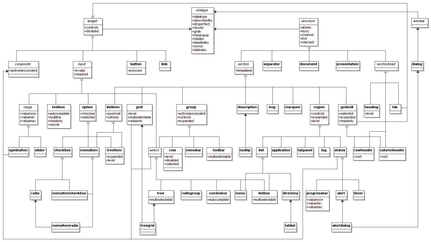
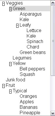
<div role="wairole:tree" >
  <div role="wairole:treeitem" >Veggies
    <div role="wairole:group">
      <div role="wairole:treeitem">Green
        <div role="wairole:group">
          <div role="wairole:treeitem">Asparagus</div>
          <div role="wairole:treeitem">Kale</div>
          <div role="wairole:treeitem" >Leafy
            <div role="wairole:group">
              <div role="wairole:treeitem">Lettuce</div>
              <div role="wairole:treeitem">Kale</div>
              <div role="wairole:treeitem">Spinach</div>
              <div role="wairole:treeitem">Chard</div>
            </div>
          </div> ---close leafy
          <div role="wairole:treeitem">Green beans</div>
        </div>
      </div> ---close green
      <div role="wairole:treeitem">Legumes</div>
      <div role="wairole:treeitem" >Yellow
        <div role="wairole:group">
          <div role="wairole:treeitem">Bell peppers</div>
          <div role="wairole:treeitem">Squash</div>
        </div>
      </div> ---close yellow
    </div>
  </div> ---close veggies
</div> ---close tree
Sometimes a tree structure is not explicit via the DOM and logical
structure of a page. In such cases the relationships must still be made
explicit using the States and Properties Module.
Example:
<div role="wairole:treeitem" aaa:haschild="yellowtreegroup">Yellow<div>
…
<div id="yellowtreegroup" role="wairole:group">
<div role="wairole:treeitem">Bell peppers</div>
<div role="wairole:treeitem">Squash</div>
…
</div>
2.3.4 Step five: Use States, Properties, and Events
Control the behavior of the element using XML Events [XML-EVENTS] and States.
For example, use the aaa Namespace [XML-NAMES] with supporting scripts to control which
tree elements are expanded
<div tabindex="-1" role="wairole:treeitem" aaa:expanded="true">Yellow</div>
And use device independent events with supporting JavaScript to
handle user interaction.
<div role="wairole:tree" tabindex="-1"
  onfocus="return treeItemFocus(event);"
  onclick="return treeItemEvent(event);"
  ondblclick="return treeItemEvent(event);"
  onkeydown="return treeItemEvent(event);"
  onkeypress="return treeItemEvent(event);">
Then create JavaScript support to control the event driven behavior of the
application.
2.4 Applying roles to documents
This section is informative.
Roles are provided in XML-based languages using an attribute designated for the purpose. Roles from this ontology are indicated as values of that role attribute. In order to indicate that the roles are used as specified in this document, the document must use the following namespace in the attribute value: http://www.w3.org/2005/01/wai-rdf/GUIRoleTaxonomy#.
Generally this namespace is declared on the root element of the document as specified in XML Namespaces [XML-NAMES]. Examples in this document use the namespace prefix “wairole” to indicate this namespace.
For example, the start tag of a root element that includes the appropriate namespace declaration might look like:
<html xmlns="http://www.w3.org/1999/xhtml"
    xml:lang="en"
    xmlns:wairole="http://www.w3.org/2005/01/wai-rdf/GUIRoleTaxonomy#"
>
2.4.1 Applying roles in XHTML
XHTML 1.1 and higher provides the XHTML Role Attribute
Module [XHTML-ROLES] to attach roles to documents. Include this module as defined in the Role Attribute specification, and then use the “role” attribute as needed. Use the namespace prefix defined in the root element, and values for the attribute from the ontology above. For example:
<html lang="en" xml:lang="en" xmlns="http://www.w3.org/1999/xhtml
"xmlns:wairole="http://www.w3.org/2005/01/wai-rdf/GUIRoleTaxonomy#"><body>

<table id="table1" role="wairole:grid">

</table>

</body></html>
XHTML 1.0 does not support DTD modularization. It is therefore necessary to provide the role attribute using its own namespace. For example:
<html lang="en" xml:lang="en" xmlns="http://www.w3.org/1999/xhtml"
xmlns:xhtml10="http://www.w3.org/1999/xhtml"
xmlns:wairole="http://www.w3.org/2005/01/wai-rdf/GUIRoleTaxonomy#"><body>

<table id="table1" xhtml10:role="wairole:grid">

</table>
</body></html>
2.4.3 Applying roles in classic HTML
There is no normative way to apply roles in HTML, but it is recommended to use the HTML implementation technique.
2.4.4 Applying roles in other languages
That is out of the scope of this specification, but we encourage creators of other technologies to support the role ontology in a compatible manner in order to provider interoperability with accessibility APIs.
3 The RDF Roles Model
This section is normative.
This specification defines a Taxonomy called Roles. The Roles Taxonomy
uses the XML
Namespace [XMLNAMES] identifier http://www.w3.org/2005/01/wai-rdf/GUIRoleTaxonomy#.
All examples are informative. Examples in this document that use the XML
Namespace prefix "wairole" all assume a valid xmlns declaration such as
xmlns:wairole="http://www.w3.org/2005/01/wai-rdf/GUIRoleTaxonomy#"
in the document involved.
The remainder of this section describes the properties of roles in this taxonomy, and describes the characteristics of all roles. A formal RDF representation of all the information presented here is available in Appendix 6.1: Implementation.
3.1 Relationships between
concepts
This section is normative.
The role taxonomy uses the following relationships to relate ARIA roles to each other and to concepts from other specifications, such as HTML and XForms.
Editorial note: The information below is presented with details arranged in a data table. Concerns about accessibility of this have been raised. An experimental alternate presentation is provided in Relationships between concepts in list form, using definition lists instead of tables to organize the details. We appreciate feedback about which form is more effective, or proposals for other forms.
Relationships Supported by Role Taxonomy
| Relationship |
RDF Property |
Description |
| Parent Role |
rdfs:subClassOf |
The role that this role extends in the taxonomy. This extension causes all the properties and constraints of the parent role to propogate to the child role. Other
than well known stable specifications, inheritance may be restricted to
items defined inside this specification so that items can not be changed
and affect inherited classes.
For example: buttonundo is a subclass or type of a button. If we
change the properties and expected behavior of a button then the
properties and behavior of buttonundo will also change.
Inheritance is expressed in RDF using the RDF Schema subClassOf [RDFS, section 3.4] property. |
| Child Roles |
|
Informative list of roles for which this role is the parent. This is provided to facilitiate reading of the specification but adds no new information as the list of child roles is the list of roles for which the current role is the parent. |
| Related Concepts |
role:relatedConcept |
A
relatedConcept is a similar or related idea from other specifications.
Concepts that are related are not necessarily identical. relatedConcepts
do not inherit properties from each other. Hence if the definition of a
type changes, the properties, behavior and definition of a relatedConcept
is not affected.
For example: A grid is like a table. Therefore, a grid has a
relatedConcept of a table as defined at http://www.w3.org/TR/html4/struct/tables.html#edef-TABLE.
However if the definition of table is modified our definition of a grid
will not be affected. |
| Base Concept |
role:baseConcept |
A
baseConcept is like a "borrowed" concept. BaseConcept is similar to type,
but without inheritance of limitations and properties. baseConcepts are designed as a substitute for
inheritance for external concepts. A baseConcept is like a relatedConcept
except that baseConcepts are almost identical to each other.
For example: the checkbox defined in this document has the same
functionality and anticipated behavior as a checkbox defined in
http://www.w3.org/MarkUp/HTML#checkbox.
Therefore, a checkbox has a baseConcept of a checkbox as defined at
http://www.w3.org/MarkUp/HTML#checkbox. However, if
http://www.w3.org/MarkUp/HTML#checkbox is modified, the definition of a
checkbox in this document will not be not affected. |
3.2 Role Characteristics
This section is normative.
Roles are defined and described by their characteristics. Characteristics define the
structural function of a role, such as what a role is, concepts behind it,
what instances of the role can or must contain. In the case of widgets this also includes how it interacts with the user
agent based on mapping to HTML forms and XForms. States and properties from ARIA States and Properties that are supported by the role are also indicated.
The Roles Taxonomy defines the following characteristics. These characteristics are implemented in RDF as properties of the OWL classes that describe the roles.
Editorial note: The information below is presented with details arranged in a data table. Concerns about accessibility of this have been raised. An experimental alternate presentation is provided in Role characteristics in list form, using definition lists instead of tables to organize the details. We appreciate feedback about which form is more effective, or proposals for other forms.
Characteristics Supported by Role Taxonomy
| Characteristic |
RDF Property |
Description |
Values |
| Is Abstract |
N/A |
This role is abstract and cannot be used by authors directly. It is used to create a relationship amongst descendant roles. |
Boolean |
| Supported States and Properties |
role:supportedState |
A supportedState must be supported by this
role. Typically refers to states from the aaa namespace.
Supported states and properties are inherited from ancestor roles and are shown informatively as Inherited States in this specification. States and properties are inherited from ancestor roles in the role taxonomy, not from ancestor elements in the DOM tree.
|
Any valid RDF object reference, such as
a URI or RDF ID reference. |
| Inherited States and Properties |
|
Informative list of properties that are inherited onto a role from ancestor roles. These properties are not explicitly defined on the role as the inheritance of properties is automatic. This information is provided to facilitate reading of the specification. The set of supported states and properties combined with inherited states and properties forms the full set of states and properties supported by the role. |
|
| Required Child Elements |
role:mustContain |
A child element that must be contained by this role. For example
a list must contain a listitem. |
Any valid RDF object reference, such as
a URI or RDF ID reference. |
| Parent Element |
role:scope |
Context, where this role is allowed. For example a list item is
allowed inside a list. |
Any valid RDF object reference, such as a
URI or RDF ID reference. |
| Name From |
role:nameFrom |
Computational mechanism to determine the accessible name of the
object to which the role applies. This may be computed from the
children of the object or the title attribute.
Computing the accessible name:
Collect the name from the content subtrees pointed to by labelledby which contains the IDs for the label content. Use the labelledby IDs in order. For each ID use a depth-first computation of the name, appending to the currently computed name.
If labelledby is unspecified:
- For container elements which allow name from descendants, use a depth-first computation of the name.
- If a text node, append the text contents;
- If a control, append the current value for the control;
- If an image or object with a text equivalent, append the text equivalent;
- If there is a forced line break (e.g if the current object is styled with display:block), append a space character.
- If not such a container, or the descendant computation generated an empty name, use the contents of the
title attribute, if specified.
|
One of the following values:
- "author": name comes from values provided by the author in explict markup features such as the labelledby property or the HTML "title" attribute.
- "subtree": name comes from the text value of the element node. Although this may be allowed in addition to "author" in some roles, this is used in content only if "author" features are not provided.
|
| Children Presentational |
role:childrenArePresentational |
The children are presentational. Assistive technologies may choose to hide the children from the user, in order to avoid confusing third party APIs using accessibility APIs. If assistive technologies do not hide the children, user agents may read some information twice. |
Boolean (true | false) |
3.3 Global States and Properties
This section is normative.
Some states and properties are applicable to all roles, and most are applicable to all elements regardless of role. In addition to explicitly expressed supported states and properties, the following global states and properties are supported by all roles as well. These include:
Global states and properties are applied to the role roletype, which is the base role, and therefore inherit into all roles. To facilitiate reading, they are not explicitly identified as either supported or inherited states and properties in the specification. Instead, the inheritance is indicated by a link to this section.
3.4 Roles
This section is normative.
To support the current user scenario, this specification defines roles that
A, help define Widgets (For example, a tristate Checkbox) and B, help define
page structure (for example, a section header).
Roles are categorized as follows:
- Taxonomy Roles
- User Input Controls
- User Interface Elements
- Document Structure
- Specialized Regions
Editorial note: The roles below are presented with details arranged in a data table. Concerns about accessibility of this have been raised. An experimental alternate presentation is provided in Role details in list form, using definition lists instead of tables to organize the details. We appreciate feedback about which form is more effective, or proposals for other forms.
Below is an alphabetical list of ARIA roles to be used by rich internet application authors (excluding abstract roles which are not used directly). A detailed definition of the taxonomy supporting these ARIA roles follows.
| Role | Definition |
|---|
| alert | A message with an alert or error information. |
| alertdialog | A separate window with an alert or error information. |
| application | A software unit executing a set of tasks for its users. |
| button | Allows for user-triggered actions. |
| checkbox | A control that has three possible values, (true, false, mixed). |
| columnheader | A table cell containing header information for a column. |
| combobox | Combobox is a presentation of a select, where users can type to
locate a selected item. |
| description | Descriptive content for a page element which references this element via describedby. |
| dialog | A dialog is a small application window that sits above the
application and is designed to interrupt the current processing of an
application in order to prompt the user to enter information or
require a response. |
| directory | A list of references to members of a single group. |
| document | Content that contains related information, such as a book. |
| grid | A grid contains cells of tabular data arranged in rows and
columns (e.g., a table). |
| gridcell | A gridcell is a table cell in a grid. Gridcells may be active,
editable, and selectable. Cells may have relationships such as controls to address the application of functional relationships. |
| group | A group is a section of user interface objects which would not be included in a page summary or table of contents by an assistive technology. See region for sections of user interface objects that should be included in a page summary or table of contents. |
| heading | A heading for a section of the page. |
| img | An img is a container for a collection elements that form
an image. |
| link | Interactive reference to a resource (note, that in [XHTML] 2.0 any element can have an href
attribute and thus be a link) |
| list | Group of small items. |
| listbox | A list box is a widget that allows the user to select one or more items from a list. Items within the list are static and may contain images. |
| listitem | A single item in a list. |
| log | A region where new information is added and old information may
disappear such as chat logs, messaging, game log or an error log. In contrast to other regions, in this role there is a relationship between the arrival of new items in the log and the reading order. The log contains a meaningful sequence and new information is added only to the end of the log, not at arbitrary points. |
| marquee | A marquee is used to scroll text across the page. |
| menu | Offers a list of choices to the user. |
| menubar | A menubar is a container of menu items. Each menu item may
activate a new sub-menu. Navigation behavior should be similar to the
typical menu bar graphical user interface. |
| menuitem | A link in a menu. This is an option in a group of choices
contained in a menu. |
| menuitemcheckbox | Defines a menuitem which is checkable (tri-state). |
| menuitemradio | Indicates a menu item which is part of a group of
menuitemradio roles. |
| option | A selectable item in a list represented by a select. |
| presentation | An element whose role is presentational does not need to be
mapped to the accessibility API. |
| progressbar | Used by applications for tasks that take a long time to execute,
to show the execution progress. |
| radio | A radio is an option in single-select list. Only one radio
control in a radiogroup can be selected at the same time. |
| radiogroup | A group of radio controls. |
| region | Region is a large perceivable section on the web page. |
| row | A row of table cells. |
| rowheader | A table cell containing header information for a row. |
| separator | A line or bar that separates and distinguishes sections of
content. |
| slider | A user input where the user selects an input in a given range.
This form of range expects an analog keyboard interface. |
| spinbutton | A form of Range that expects a user selecting from discrete
choices. |
| status | This is a container for process advisory information to give feedback to the user. |
| tab | A header for a tabpanel. |
| tablist | A list of tabs, which are references to tabpanels. |
| tabpanel | Tabpanel is a container for the resources associated with a tab. |
| textbox | Inputs that allow free-form text as their
value. |
| timer | A numerical counter which indicates an amount of elapsed time from a start point, or the time remaining until an end point. |
| toolbar | A toolbar is a collection of commonly used functions represented
in compact visual form. |
| tooltip | A popup that displays a description for an element when a user passes over or rests on that element. Supplement to the normal tooltip processing of the user agent. |
| tree | A form of a list having groups
inside groups, where sub trees can be collapsed and expanded. |
| treegrid | A grid whose rows can be expanded and collapsed in the same manner as for a tree. |
| treeitem | An option item of a tree. This is an element within a tree that may
be expanded or collapsed |
3.4.1 Taxonomy Roles
The following roles are used as base types for applied roles. Base classes are used to build a picture of the role taxonomy class hierarchy
within the taxonomy. Note that while all roles in this section are abstract, not all abstract roles are in this section. This section includes only the most high-level abstractions in the taxonomy.
Roles in this section include:
Role: roletype
Base role from which all other roles in this taxonomy inherit.
Properties of this role describe the structural and functional purpose of objects that are assigned this role (known in RDF terms as "instances"). A
Role is a concept that can be used to understand and operate instances.
Characteristics:
| Is Abstract: |
True |
| Parent Role: |
|
| Child Roles: |
|
| Base Concept: |
|
| Related Concepts: |
|
| Supported States and Properties: |
|
| Inherited States and Properties: |
|
| Name From: |
|
| Accessible Name Required: | |
|---|
| Inherits Name Required: | |
|---|
| Children Presentational: |
|
| Inherits Presentational: |
|
Role: widget
A component of a GUI (graphical user interface).
Widget Roles all map to accessibility APIs. Widgets are ... , see @@
Characteristics:
| Is Abstract: |
True |
| Parent Role: |
roletype |
| Child Roles: |
|
| Base Concept: |
|
| Related Concepts: |
|
| Supported States and Properties: |
|
| Inherited States and Properties: |
|
| Name From: |
|
| Accessible Name Required: | |
|---|
| Inherits Name Required: | |
|---|
| Children Presentational: |
|
| Inherits Presentational: |
|
Role: structure
A document structural element.
Roles for document structure are also required to support the
accessibility of dynamic Web content to assist assistive technology in
determining active content vs. static document content. Structural Roles, by
themselves do not all map to accessibility APIs, but are used to create
widget roles or assist content adaptation.
This schema is likely to evolve as new use cases are added to the scope of
this specification.
Characteristics:
| Is Abstract: |
True |
| Parent Role: |
roletype |
| Child Roles: |
|
| Base Concept: |
|
| Related Concepts: |
|
| Supported States and Properties: |
|
| Inherited States and Properties: |
|
| Name From: |
|
| Accessible Name Required: | |
|---|
| Inherits Name Required: | |
|---|
| Children Presentational: |
|
| Inherits Presentational: |
|
Role: composite
A widget that may contain navigable descendants.
Descendants of this role may not have the "nameFrom" value of "subtree" set.
Characteristics:
| Is Abstract: |
True |
| Parent Role: |
widget |
| Child Roles: |
|
| Base Concept: |
|
| Related Concepts: |
|
| Supported States and Properties: |
activedescendent |
| Inherited States and Properties: |
|
| Name From: |
author |
| Accessible Name Required: | |
|---|
| Inherits Name Required: | |
|---|
| Children Presentational: |
|
| Inherits Presentational: |
|
Role: window
Browser or application window
Characteristics:
| Is Abstract: |
True |
| Parent Role: |
roletype |
| Child Roles: |
|
| Base Concept: |
|
| Related Concepts: |
|
| Supported States and Properties: |
|
| Inherited States and Properties: |
|
| Name From: |
|
| Accessible Name Required: | |
|---|
| Inherits Name Required: | |
|---|
| Children Presentational: |
|
| Inherits Presentational: |
|
3.4.2 User Input Controls
These roles ...
Roles in this section include:
Role: input
Generic type for widgets that can have a value.
Characteristics:
| Is Abstract: |
True |
| Parent Role: |
widget |
| Child Roles: |
|
| Base Concept: |
|
| Related Concepts: |
XForms input |
| Supported States and Properties: |
|
| Inherited States and Properties: |
|
| Name From: |
author |
| Accessible Name Required: | |
|---|
| Inherits Name Required: | |
|---|
| Children Presentational: |
|
| Inherits Presentational: |
|
Role: select
A form control that allows the user to make selections from a
set of choices. A select must contain an option.
Characteristics:
| Is Abstract: |
True |
| Parent Role: |
|
| Child Roles: |
|
| Base Concept: |
|
| Related Concepts: |
|
| Supported States and Properties: |
|
| Inherited States and Properties: |
|
| Name From: |
author |
| Accessible Name Required: | |
|---|
| Inherits Name Required: | |
|---|
| Children Presentational: |
|
| Inherits Presentational: |
|
Role: listbox
A list box is a widget that allows the user to select one or more items from a list. Items within the list are static and may contain images.
Characteristics:
| Is Abstract: |
|
| Parent Role: |
|
| Child Roles: |
|
| Base Concept: |
|
| Related Concepts: |
|
| Parent Element: |
|
| Required Child Elements: |
|
| Supported States and Properties: |
multiselectable |
| Inherited States and Properties: |
|
| Name From: |
author |
| Accessible Name Required: |
True |
|---|
| Inherits Name Required: | |
|---|
| Children Presentational: |
|
| Inherits Presentational: |
|
Role: combobox
Combobox is a presentation of a select, where users can type to
locate a selected item.
Combobox is the combined presentation of a single line textbox with a drop down select widget. The combobox may be open or closed. An "open" combobox allows users to type freeform text into the textbox whereas a "closed" combobox only shows text in the textbox which can be retrieved from the select. Typically a "closed" text field will use the text entered to quickly search and fill the textfield with text from the select.
NOTE: In [XFORMS] the same select can
have one of 3 appearances: combo-box, drop-down box or group of
radio-buttons. Besides, many browsers (if not all of them) allow
users to type in a drop-down select as well.
Characteristics:
| Is Abstract: |
|
| Parent Role: |
select |
| Child Roles: |
|
| Base Concept: |
|
| Related Concepts: |
|
| Parent Element: |
|
| Required Child Elements: |
option |
| Supported States and Properties: |
autocomplete |
| Inherited States and Properties: |
|
| Name From: |
author |
| Accessible Name Required: |
True |
|---|
| Inherits Name Required: | |
|---|
| Children Presentational: |
|
| Inherits Presentational: |
|
Role: option
A selectable item in a list represented by a select.
An option
must appear inside an element with select role.
Characteristics:
| Is Abstract: |
|
| Parent Role: |
input |
| Child Roles: |
|
| Base Concept: |
HTML option |
| Related Concepts: |
|
| Parent Element: |
select |
| Required Child Elements: |
|
| Supported States and Properties: |
|
| Inherited States and Properties: |
|
| Name From: |
|
| Accessible Name Required: |
True |
|---|
| Inherits Name Required: | |
|---|
| Children Presentational: |
|
| Inherits Presentational: |
|
Role: checkbox
A control that has three possible values, (true, false, mixed).
Many checkboxes do not use the mixed value, and thus are effectively boolean checkboxes. However, the checked state supports the "mixed" value to support cases such as installers where an option has been partially installed.
Characteristics:
| Is Abstract: |
|
| Parent Role: |
option |
| Child Roles: |
|
| Base Concept: |
|
| Related Concepts: |
HTML input (type : checkbox) |
| Parent Element: |
|
| Required Child Elements: |
|
| Supported States and Properties: |
|
| Inherited States and Properties: |
|
| Name From: |
|
| Accessible Name Required: |
True |
|---|
| Inherits Name Required: |
|
|---|
| Children Presentational: |
|
| Inherits Presentational: |
|
Role: radio
A radio is an option in single-select list. Only one radio
control in a radiogroup can be selected at the same time.
Characteristics:
| Is Abstract: |
|
| Parent Role: |
checkbox |
| Child Roles: |
|
| Base Concept: |
|
| Related Concepts: |
HTML input (type : radio) |
| Parent Element: |
|
| Required Child Elements: |
|
| Supported States and Properties: |
|
| Inherited States and Properties: |
|
| Name From: |
|
| Accessible Name Required: |
True |
|---|
| Inherits Name Required: | |
|---|
| Children Presentational: |
|
| Inherits Presentational: |
|
Role: radiogroup
A group of radio controls.
Characteristics:
| Is Abstract: |
|
| Parent Role: |
select |
| Child Roles: |
|
| Base Concept: |
|
| Related Concepts: |
list |
| Parent Element: |
|
| Required Child Elements: |
radio |
| Supported States and Properties: |
|
| Inherited States and Properties: |
|
| Name From: |
author |
| Accessible Name Required: |
True |
|---|
| Inherits Name Required: | |
|---|
| Children Presentational: |
|
| Inherits Presentational: |
|
Role: textbox
Inputs that allow free-form text as their
value.
If the multiline property is true, the control accepts line breaks within the input, as in a HTML textarea. Otherwise this is a simple text box.
Intended use is in languages that do not have a text input object
(such as SVG), or cases in which an element with different semantics is repurposed as an input box. The user would use this role when additional states or
properties are applied to a standard text input control. This is to
indicate to the user agent that it must process additional states and
properties such as invalid and required.
Characteristics:
| Is Abstract: |
|
| Parent Role: |
input |
| Child Roles: |
|
| Base Concept: |
|
| Related Concepts: |
|
| Supported States and Properties: |
|
| Inherited States and Properties: |
|
| Name From: |
author |
| Accessible Name Required: |
True |
|---|
| Inherits Name Required: | |
|---|
| Children Presentational: |
|
| Inherits Presentational: |
|
Role: range
Represents a range of values that can be set by the user.
Characteristics:
| Is Abstract: |
True |
| Parent Role: |
input |
| Child Roles: |
|
| Base Concept: |
|
| Related Concepts: |
|
| Supported States and Properties: |
|
| Inherited States and Properties: |
|
| Name From: |
author |
| Accessible Name Required: | |
|---|
| Inherits Name Required: | |
|---|
| Children Presentational: |
|
| Inherits Presentational: |
|
Role: spinbutton
A form of Range that expects a user selecting from discrete
choices.
A spinbutton allows the user to select from the given range
through the use of an up and down button. Visibly, the current value
is incremented or decremented until a maximum or minimum value is
reached. This functionality should be accomplished programmatically
through the use of up and down arrows on the keyboard.
Characteristics:
| Is Abstract: |
|
| Parent Role: |
|
| Child Roles: |
|
| Base Concept: |
|
| Related Concepts: |
|
| Parent Element: |
|
| Required Child Elements: |
|
| Supported States and Properties: |
|
| Inherited States and Properties: |
|
| Name From: |
author |
| Accessible Name Required: |
True |
|---|
| Inherits Name Required: | |
|---|
| Children Presentational: |
|
| Inherits Presentational: |
|
3.4.3 User Interface Elements
These roles ...
Roles in this section include:
Role: button
Allows for user-triggered actions.
Buttons are mostly used for
discrete, atomic actions. Its value is cognitive; the idea that this
is a user action opportunity is made very clear by making it look
like a front-panel button on a device. The animation of the button in response to indirect (by mouse)
manipulation fosters the illusion of direct manipulation and keeps
user cognition in sync with the user interface perception of user
action events. Standardizing the appearance of buttons enhances recognition as
buttons and arraying them compactly in toolbars, for example.
Buttons support the optional state pressed. Buttons with this state present are toggle buttons. When pressed is "true" the button is depressed, when pressed is "false" it is not depressed.
Characteristics:
| Is Abstract: |
|
| Parent Role: |
widget |
| Child Roles: |
|
| Base Concept: |
HTML button |
| Related Concepts: |
|
| Parent Element: |
|
| Required Child Elements: |
|
| Supported States and Properties: |
pressed |
| Inherited States and Properties: |
|
| Name From: |
|
| Accessible Name Required: |
True |
|---|
| Inherits Name Required: | |
|---|
| Children Presentational: |
True |
| Inherits Presentational: |
|
Role: link
Interactive reference to a resource (note, that in [XHTML] 2.0 any element can have an href
attribute and thus be a link)
Characteristics:
| Is Abstract: |
|
| Parent Role: |
widget |
| Child Roles: |
|
| Base Concept: |
|
| Related Concepts: |
HTML link |
| Parent Element: |
|
| Required Child Elements: |
|
| Supported States and Properties: |
|
| Inherited States and Properties: |
|
| Name From: |
|
| Accessible Name Required: |
True |
|---|
| Inherits Name Required: | |
|---|
| Children Presentational: |
|
| Inherits Presentational: |
|
Role: menu
Offers a list of choices to the user.
A menu is often a list of
links to important sections of a document or a site. The menu role is appropriate when the list of links is presented in a manner similar to a menu on a desktop appication.
Characteristics:
| Is Abstract: |
|
| Parent Role: |
|
| Child Roles: |
|
| Base Concept: |
|
| Related Concepts: |
|
| Parent Element: |
|
| Required Child Elements: |
menuitem |
| Supported States and Properties: |
|
| Inherited States and Properties: |
|
| Name From: |
author |
| Accessible Name Required: |
True |
|---|
| Inherits Name Required: | |
|---|
| Children Presentational: |
|
| Inherits Presentational: |
|
Role: menubar
A menubar is a container of menu items. Each menu item may
activate a new sub-menu. Navigation behavior should be similar to the
typical menu bar graphical user interface.
Menubar is used to create a menubar similar to those found in
Windows, the Mac, and Gnome desktops. A menubar is used to create a
consistent climate of frequently used commands.
Characteristics:
| Is Abstract: |
|
| Parent Role: |
group |
| Child Roles: |
|
| Base Concept: |
|
| Related Concepts: |
toolbar |
| Parent Element: |
|
| Required Child Elements: |
|
| Supported States and Properties: |
|
| Inherited States and Properties: |
|
| Name From: |
author |
| Accessible Name Required: | |
|---|
| Inherits Name Required: | |
|---|
| Children Presentational: |
|
| Inherits Presentational: |
|
Role: toolbar
A toolbar is a collection of commonly used functions represented
in compact visual form.
The toolbar is often a subset of functions found in a menubar
designed to reduced user effort in using these functions.
If this is not keyboard accessible the actions defined in the
toolbar must be reproduced in an accessible, device independent
fashion.
Characteristics:
| Is Abstract: |
|
| Parent Role: |
group |
| Child Roles: |
|
| Base Concept: |
|
| Related Concepts: |
menubar |
| Parent Element: |
|
| Required Child Elements: |
|
| Supported States and Properties: |
multiselectable |
| Inherited States and Properties: |
|
| Name From: |
author |
| Accessible Name Required: | |
|---|
| Inherits Name Required: | |
|---|
| Children Presentational: |
|
| Inherits Presentational: |
|
Role: menuitem
A link in a menu. This is an option in a group of choices
contained in a menu.
It may be disabled or active. It may also have a
popup.
Characteristics:
| Is Abstract: |
|
| Parent Role: |
|
| Child Roles: |
|
| Base Concept: |
|
| Related Concepts: |
JAPI MENU_ITEM |
| Parent Element: |
menu |
| Required Child Elements: |
|
| Supported States and Properties: |
|
| Inherited States and Properties: |
|
| Name From: |
|
| Accessible Name Required: |
True |
|---|
| Inherits Name Required: | |
|---|
| Children Presentational: |
|
| Inherits Presentational: |
|
Role: menuitemcheckbox
Defines a menuitem which is checkable (tri-state).
The checked state indicates whether the menu item is checked, unchecked, or mixed.
Characteristics:
| Is Abstract: |
|
| Parent Role: |
|
| Child Roles: |
|
| Base Concept: |
|
| Related Concepts: |
menuitem |
| Parent Element: |
menu |
| Required Child Elements: |
|
| Supported States and Properties: |
|
| Inherited States and Properties: |
|
| Name From: |
|
| Accessible Name Required: |
True |
|---|
| Inherits Name Required: | |
|---|
| Children Presentational: |
|
| Inherits Presentational: |
|
Role: menuitemradio
Indicates a menu item which is part of a group of
menuitemradio roles.
Checking of one menuitemradio in a group will unchecked the other
group members.
Menuitems should also be separated into a group by a separator.
Characteristics:
| Is Abstract: |
|
| Parent Role: |
|
| Child Roles: |
|
| Base Concept: |
|
| Related Concepts: |
menuitem |
| Parent Element: |
menu |
| Required Child Elements: |
|
| Supported States and Properties: |
|
| Inherited States and Properties: |
|
| Name From: |
|
| Accessible Name Required: |
True |
|---|
| Inherits Name Required: | |
|---|
| Children Presentational: |
|
| Inherits Presentational: |
|
Role: slider
A user input where the user selects an input in a given range.
This form of range expects an analog keyboard interface.
A slider has the added functionality of being able to select a
value through the use of a visible slider. The slider would be
keyboard accessible and provide a visible thumb position that
represents the current position within the slider.
Characteristics:
| Is Abstract: |
|
| Parent Role: |
range |
| Child Roles: |
|
| Base Concept: |
|
| Related Concepts: |
|
| Parent Element: |
|
| Required Child Elements: |
|
| Supported States and Properties: |
|
| Inherited States and Properties: |
|
| Name From: |
author |
| Accessible Name Required: |
True |
|---|
| Inherits Name Required: | |
|---|
| Children Presentational: |
True |
| Inherits Presentational: |
|
Role: tooltip
A popup that displays a description for an element when a user passes over or rests on that element. Supplement to the normal tooltip processing of the user agent.
Objects with this role must be referenced through the use of a describedby. If the tooltip has active elements it must be keyboard navigable.
Characteristics:
| Is Abstract: |
|
| Parent Role: |
description |
| Child Roles: |
|
| Base Concept: |
|
| Related Concepts: |
|
| Parent Element: |
|
| Required Child Elements: |
|
| Supported States and Properties: |
|
| Inherited States and Properties: |
|
| Name From: |
|
| Accessible Name Required: |
True |
|---|
| Inherits Name Required: | |
|---|
| Children Presentational: |
|
| Inherits Presentational: |
|
Role: tabpanel
Tabpanel is a container for the resources associated with a tab.
Note: There must be a means to associate a tabpanel element with its associated tab in a tablist. Using the labelledby property on the tabpanel to reference the tab is the recommended way to achieve this.
Characteristics:
| Is Abstract: |
|
| Parent Role: |
region |
| Child Roles: |
|
| Base Concept: |
|
| Related Concepts: |
|
| Parent Element: |
|
| Required Child Elements: |
|
| Supported States and Properties: |
|
| Inherited States and Properties: |
|
| Name From: |
author |
| Accessible Name Required: |
True |
|---|
| Inherits Name Required: | |
|---|
| Children Presentational: |
|
| Inherits Presentational: |
|
Role: tablist
Characteristics:
| Is Abstract: |
|
| Parent Role: |
directory |
| Child Roles: |
|
| Base Concept: |
|
| Related Concepts: |
DAISY Guide |
| Parent Element: |
|
| Required Child Elements: |
|
| Supported States and Properties: |
|
| Inherited States and Properties: |
|
| Name From: |
|
| Accessible Name Required: | |
|---|
| Inherits Name Required: | |
|---|
| Children Presentational: |
|
| Inherits Presentational: |
|
Role: tab
A header for a tabpanel.
Tab is used as a grouping label,
providing a link for selecting the tab content to be rendered to the
user. The currently active tab is determined if the tab or an object in the associated tabpanel has focus.
Tabs appear in the container tablist. Only one tab may be selected at a time. At any
time, one tab must be selected.
One of the tabs in tablist must be the current tab. The tabpanel
associated with the current tab, must be rendered to the user. Other
tabpanels are typically hidden from the user until the user selects
the tab associated with that tabpanel.
Characteristics:
| Is Abstract: |
|
| Parent Role: |
|
| Child Roles: |
|
| Base Concept: |
|
| Related Concepts: |
|
| Parent Element: |
tablist |
| Required Child Elements: |
|
| Supported States and Properties: |
|
| Inherited States and Properties: |
|
| Name From: |
|
| Accessible Name Required: | |
|---|
| Inherits Name Required: | |
|---|
| Children Presentational: |
|
| Inherits Presentational: |
|
Role: tree
A form of a list having groups
inside groups, where sub trees can be collapsed and expanded.
Characteristics:
| Is Abstract: |
|
| Parent Role: |
select |
| Child Roles: |
|
| Base Concept: |
|
| Related Concepts: |
|
| Parent Element: |
|
| Required Child Elements: |
treeitem |
| Supported States and Properties: |
multiselectable |
| Inherited States and Properties: |
|
| Name From: |
|
| Accessible Name Required: |
True |
|---|
| Inherits Name Required: | |
|---|
| Children Presentational: |
|
| Inherits Presentational: |
|
Role: treeitem
An option item of a tree. This is an element within a tree that may
be expanded or collapsed
Characteristics:
| Is Abstract: |
|
| Parent Role: |
|
| Child Roles: |
|
| Base Concept: |
|
| Related Concepts: |
|
| Parent Element: |
tree |
| Required Child Elements: |
|
| Supported States and Properties: |
|
| Inherited States and Properties: |
|
| Name From: |
|
| Accessible Name Required: |
True |
|---|
| Inherits Name Required: | |
|---|
| Children Presentational: |
|
| Inherits Presentational: |
|
3.4.4 Document Structure
These roles ...
These roles are similar to roles from the XHTML Roles Module [XHTML-ROLES]. See Introduction to using roles for more information.
Roles in this section include:
Role: section
A base abstract class representing a renderable structural containment unit found
in a document or application.
Characteristics:
| Is Abstract: |
True |
| Parent Role: |
structure |
| Child Roles: |
|
| Base Concept: |
|
| Related Concepts: |
|
| Supported States and Properties: |
templateid |
| Inherited States and Properties: |
|
| Name From: |
|
| Accessible Name Required: | |
|---|
| Inherits Name Required: | |
|---|
| Children Presentational: |
|
| Inherits Presentational: |
|
Role: sectionhead
The section head labels or summarizes the topic of its related
section
Characteristics:
| Is Abstract: |
True |
| Parent Role: |
structure |
| Child Roles: |
|
| Base Concept: |
|
| Related Concepts: |
|
| Supported States and Properties: |
|
| Inherited States and Properties: |
|
| Name From: |
|
| Accessible Name Required: | |
|---|
| Inherits Name Required: | |
|---|
| Children Presentational: |
|
| Inherits Presentational: |
|
Role: document
Content that contains related information, such as a book.
The
document role is used to tell the screen reader to use a document
browsing mode, because screen readers use most of the keyboard navigation
keys to provide their own keyboard user interface for this type of
navigation.
Documents must also have an labelledby attribute leading to one or
more elements with non-empty text content. This text should be
suitable for use as a navigation preview or table-of-contents entry
for the page section in question.
Exceptions: There may be a few exceptions where the host-language
provides a useful label mechanism, such as:
- The root element in an HTML document may omit the labelledby
attribute - if the title element has been used.
- Any group element in SVG may omit the labelledby attribute if
it contains a non-empty title element.
Characteristics:
| Is Abstract: |
|
| Parent Role: |
structure |
| Child Roles: |
|
| Base Concept: |
|
| Related Concepts: |
Device Independence Delivery Unit |
| Parent Element: |
|
| Required Child Elements: |
|
| Supported States and Properties: |
|
| Inherited States and Properties: |
|
| Name From: |
author |
| Accessible Name Required: |
True |
|---|
| Inherits Name Required: | |
|---|
| Children Presentational: |
|
| Inherits Presentational: |
|
Role: region
Region is a large perceivable section on the web page.
Region defines
a group of elements that together form a large perceivable section,
that the author feels should be included in a summary of page
features. A region must have a heading, e.g., an instance of the heading role or a reference to an element with the labelledby property. A region does not necessarily
follow the logical structure of the content, but follows the
perceivable structure of the page.
When defining regions of a web page, authors should consider using standard document landmark roles defined by
the XHTML Roles Module [XHTML-ROLES]. User agents and assistive technologies may treat these
as standard navigation landmarks. If the definition of these regions
are inadequate, authors should use the ARIA region role and
provide the appropriate title text.
Characteristics:
| Is Abstract: |
|
| Parent Role: |
section |
| Child Roles: |
|
| Base Concept: |
|
| Related Concepts: |
|
| Parent Element: |
|
| Required Child Elements: |
|
| Supported States and Properties: |
|
| Inherited States and Properties: |
|
| Name From: |
author |
| Accessible Name Required: | |
|---|
| Inherits Name Required: | |
|---|
| Children Presentational: |
|
| Inherits Presentational: |
|
Role: heading
A heading for a section of the page.
This indicates that an object serves as a header. Often, headings will be referenced with the labelledby property of the section for which they serve as a header. If headings are organized into a logical outline, the level property can be used to indicate the nesting level.
Characteristics:
| Is Abstract: |
|
| Parent Role: |
sectionhead |
| Child Roles: |
|
| Base Concept: |
|
| Related Concepts: |
|
| Parent Element: |
|
| Required Child Elements: |
|
| Supported States and Properties: |
level |
| Inherited States and Properties: |
|
| Name From: |
|
| Accessible Name Required: |
True |
|---|
| Inherits Name Required: | |
|---|
| Children Presentational: |
|
| Inherits Presentational: |
|
Role: list
Characteristics:
| Is Abstract: |
|
| Parent Role: |
region |
| Child Roles: |
|
| Base Concept: |
HTML ul |
| Related Concepts: |
|
| Parent Element: |
|
| Required Child Elements: |
listitem |
| Supported States and Properties: |
|
| Inherited States and Properties: |
|
| Name From: |
author |
| Accessible Name Required: | |
|---|
| Inherits Name Required: | |
|---|
| Children Presentational: |
|
| Inherits Presentational: |
|
Role: listitem
Characteristics:
| Is Abstract: |
|
| Parent Role: |
section |
| Child Roles: |
|
| Base Concept: |
HTML li |
| Related Concepts: |
XForms item |
| Parent Element: |
list |
| Required Child Elements: |
|
| Supported States and Properties: |
|
| Inherited States and Properties: |
|
| Name From: |
|
| Accessible Name Required: |
True |
|---|
| Inherits Name Required: | |
|---|
| Children Presentational: |
|
| Inherits Presentational: |
|
Role: group
A group is a section of user interface objects which would not be included in a page summary or table of contents by an assistive technology. See region for sections of user interface objects that should be included in a page summary or table of contents.
Authors should use a role of group to form logical collection of items in a widget such as a: row in a grid; children in a tree widget forming a collection of siblings in a hierarchy; or a collection of items having the same container in a directory. Therefore, proper handling of group by assistive technologies must be determined by the context in which it is provided. Group members that are outside the [DOM] subtree of the group would need to have explicit relationships assigned to participate in the group. Groups may also be nested. If the author believes a section is significant enough in terms of the entire delivery unit web page then the author should assign the section a role of region or a standard XHTML Role landmark.
Characteristics:
| Is Abstract: |
|
| Parent Role: |
section |
| Child Roles: |
|
| Base Concept: |
|
| Related Concepts: |
HTML fieldset |
| Parent Element: |
|
| Required Child Elements: |
|
| Supported States and Properties: |
|
| Inherited States and Properties: |
|
| Name From: |
author |
| Accessible Name Required: | |
|---|
| Inherits Name Required: | |
|---|
| Children Presentational: |
|
| Inherits Presentational: |
|
Role: grid
A grid contains cells of tabular data arranged in rows and
columns (e.g., a table).
This does not necessarily imply presentation.The table role is used as a
container for tabular data. The table construct describes
relationships between data such that it may be used for different
presentations.
Grids contain cells
that may be focusable. Grids allow the user to move focus between
grid cells with 2-D navigation. Grids may have row and column headers
which also have functional value based on the implementation. Grid
cells may have values determined by an equation.
Grids are single selectable or multiselectable. Properties for
selectable or multiselectable must be provided by the author. Grids
may be used for spreadsheets such as in Open Office, Microsoft
Office, etc.
Characteristics:
| Is Abstract: |
|
| Parent Role: |
|
| Child Roles: |
|
| Base Concept: |
HTML table |
| Related Concepts: |
|
| Parent Element: |
|
| Required Child Elements: |
row |
| Supported States and Properties: |
|
| Inherited States and Properties: |
|
| Name From: |
author |
| Accessible Name Required: |
True |
|---|
| Inherits Name Required: | |
|---|
| Children Presentational: |
|
| Inherits Presentational: |
|
Role: row
Characteristics:
| Is Abstract: |
|
| Parent Role: |
group |
| Child Roles: |
|
| Base Concept: |
HTML tr |
| Related Concepts: |
|
| Parent Element: |
|
| Required Child Elements: |
gridcell |
| Supported States and Properties: |
|
| Inherited States and Properties: |
|
| Name From: |
|
| Accessible Name Required: | |
|---|
| Inherits Name Required: | |
|---|
| Children Presentational: |
|
| Inherits Presentational: |
|
Role: gridcell
A gridcell is a table cell in a grid. Gridcells may be active,
editable, and selectable. Cells may have relationships such as controls to address the application of functional relationships.
Note: If the expanded property is provided, it applies only to the individual cell. It is not a proxy for the container row, which also can be expanded. The main use case for providing this property on a cell is pivot table type behavior.
Characteristics:
| Is Abstract: |
|
| Parent Role: |
|
| Child Roles: |
|
| Base Concept: |
HTML td |
| Related Concepts: |
|
| Parent Element: |
row |
| Required Child Elements: |
|
| Supported States and Properties: |
|
| Inherited States and Properties: |
|
| Name From: |
|
| Accessible Name Required: |
True |
|---|
| Inherits Name Required: | |
|---|
| Children Presentational: |
|
| Inherits Presentational: |
|
Role: rowheader
A table cell containing header information for a row.
Rowheader can be used as a row header in a table or grid. It also
could be used in a pie chart to show a similar relationship in the
data.
The rowheader establishes a relationship between it and all cells
in the corresponding row. It is a structural equivalent to an [HTML] th element with a row scope.
Characteristics:
| Is Abstract: |
|
| Parent Role: |
|
| Child Roles: |
|
| Base Concept: |
HTML th with scope=row |
| Related Concepts: |
|
| Parent Element: |
row |
| Required Child Elements: |
|
| Supported States and Properties: |
sort |
| Inherited States and Properties: |
|
| Name From: |
|
| Accessible Name Required: |
True |
|---|
| Inherits Name Required: | |
|---|
| Children Presentational: |
|
| Inherits Presentational: |
|
Role: columnheader
A table cell containing header information for a column.
Columnheader can be used as a column header in a table or grid. It
could also be used in a pie chart to show a similar relationship in
the data.
The columnheader establishes a relationship between it and all
cells in the corresponding row. It is a structural equivalent to an
[HTML] th element with a column scope.
Characteristics:
| Is Abstract: |
|
| Parent Role: |
|
| Child Roles: |
|
| Base Concept: |
HTML th with scope=col |
| Related Concepts: |
|
| Parent Element: |
row |
| Required Child Elements: |
|
| Supported States and Properties: |
sort |
| Inherited States and Properties: |
|
| Name From: |
|
| Accessible Name Required: |
True |
|---|
| Inherits Name Required: | |
|---|
| Children Presentational: |
|
| Inherits Presentational: |
|
Role: treegrid
A grid whose rows can be expanded and collapsed in the same manner as for a tree.
Characteristics:
| Is Abstract: |
|
| Parent Role: |
|
| Child Roles: |
|
| Base Concept: |
|
| Related Concepts: |
|
| Parent Element: |
|
| Required Child Elements: |
row |
| Supported States and Properties: |
|
| Inherited States and Properties: |
|
| Name From: |
author |
| Accessible Name Required: |
True |
|---|
| Inherits Name Required: | |
|---|
| Children Presentational: |
|
| Inherits Presentational: |
|
Role: description
Descriptive content for a page element which references this element via describedby.
Characteristics:
| Is Abstract: |
|
| Parent Role: |
section |
| Child Roles: |
|
| Base Concept: |
|
| Related Concepts: |
|
| Parent Element: |
|
| Required Child Elements: |
|
| Supported States and Properties: |
|
| Inherited States and Properties: |
|
| Name From: |
|
| Accessible Name Required: | |
|---|
| Inherits Name Required: | |
|---|
| Children Presentational: |
|
| Inherits Presentational: |
|
Role: directory
A list of references to members of a single group.
People should use this role for static tables of contents. This includes tables of contents built with lists, including nested lists. Dynamic tables of contents, however, would be a tree.
Note: directories do not have to contain links. They can have simply unlinked references.
Characteristics:
| Is Abstract: |
|
| Parent Role: |
list |
| Child Roles: |
|
| Base Concept: |
|
| Related Concepts: |
DAISY Guide |
| Parent Element: |
|
| Required Child Elements: |
link |
| Supported States and Properties: |
|
| Inherited States and Properties: |
|
| Name From: |
|
| Accessible Name Required: | |
|---|
| Inherits Name Required: | |
|---|
| Children Presentational: |
|
| Inherits Presentational: |
|
Role: img
An img is a container for a collection elements that form
an image.
An img can contain captions, descriptive text as well
as multiple image files that when viewed together give the impression
of a single image. An img represents a single graphic within a document whether or not it is formed by a collection of drawing objects. Elements with a role of img must have a label or alternative text.
Characteristics:
| Is Abstract: |
|
| Parent Role: |
section |
| Child Roles: |
|
| Base Concept: |
|
| Related Concepts: |
DTB imggroup |
| Parent Element: |
|
| Required Child Elements: |
|
| Supported States and Properties: |
|
| Inherited States and Properties: |
|
| Name From: |
author |
| Accessible Name Required: |
True |
|---|
| Inherits Name Required: | |
|---|
| Children Presentational: |
True |
| Inherits Presentational: |
|
Role: presentation
An element whose role is presentational does not need to be
mapped to the accessibility API.
Intended use is when an element is used to change the look of the
page but does not have all the functional, interactive, or structural
relevance implied by the element type.
Example use cases:
- A layout table is a presentation.
- An object tag whose content is decorative like a white space
image or decorative flash object
- An image used for white space
The user agent may remove all structural aspects of the element
being repurposed. For example, a table marked as presentation would
remove the table, td, th, tr, etc. elements while preserving the
individual text elements within it. Because the user agent knows to
ignore the structural aspects implied in a table, no harm is done by
using a table for layout.
Characteristics:
| Is Abstract: |
|
| Parent Role: |
structure |
| Child Roles: |
|
| Base Concept: |
|
| Related Concepts: |
|
| Parent Element: |
|
| Required Child Elements: |
|
| Supported States and Properties: |
|
| Inherited States and Properties: |
|
| Name From: |
|
| Accessible Name Required: | |
|---|
| Inherits Name Required: | |
|---|
| Children Presentational: |
|
| Inherits Presentational: |
|
Role: separator
A line or bar that separates and distinguishes sections of
content.
This is a visual separator between sections of content.
For example, separators are found between lists of menu items in a menu.
Characteristics:
| Is Abstract: |
|
| Parent Role: |
structure |
| Child Roles: |
|
| Base Concept: |
|
| Related Concepts: |
HTML hr |
| Parent Element: |
|
| Required Child Elements: |
|
| Supported States and Properties: |
|
| Inherited States and Properties: |
|
| Name From: |
author |
| Accessible Name Required: | |
|---|
| Inherits Name Required: | |
|---|
| Children Presentational: |
True |
| Inherits Presentational: |
|
3.4.5 Specialized Regions
These roles ...
Roles in this section include:
Role: application
A software unit executing a set of tasks for its users.
The intent is to hint to the assistive technology to switch its
normal browsing mode functionality to one in which they would for an
application. To properly set the role of "application," an author
should set the application role on a document element which
encompasses the entirety of the web page for which assistive technology
browser navigation mode is applied. Screen readers have a browse
navigation mode where keys, such as up and down arrows, are consumed
and used to browse the document. Consumption of these keys breaks use
of these keys by the web application.
Use case: In an email application it has a document and an
application in it. The author would want to use typical application
navigation mode to cycle through the list of emails. Much of this
navigation would be defined by the application author. However, when
reading an email message the user may want to switch to a document
mode where they control browsing navigation.
Applications must also have an labelledby attribute leading to one
or more elements with non-empty text content. This text should be
suitable for use as a navigation preview or table-of-contents entry
for the page section in question.
Exceptions: There may be a few exceptions where the host-language
provides a useful label mechanism, such as:
- The root element in an HTML document may omit the labelledby
attribute - if the title element has been used.
Any group element in SVG may omit the labelledby attribute if it
contains a non-empty title element.
Characteristics:
| Is Abstract: |
|
| Parent Role: |
region |
| Child Roles: |
|
| Base Concept: |
|
| Related Concepts: |
Device Independence Delivery Unit |
| Parent Element: |
|
| Required Child Elements: |
|
| Supported States and Properties: |
|
| Inherited States and Properties: |
|
| Name From: |
author |
| Accessible Name Required: |
True |
|---|
| Inherits Name Required: | |
|---|
| Children Presentational: |
|
| Inherits Presentational: |
|
Role: dialog
A dialog is a small application window that sits above the
application and is designed to interrupt the current processing of an
application in order to prompt the user to enter information or
require a response.
Dialog boxes should have a title. They must have a focused
item.
Characteristics:
| Is Abstract: |
|
| Parent Role: |
window |
| Child Roles: |
|
| Base Concept: |
|
| Related Concepts: |
|
| Parent Element: |
|
| Required Child Elements: |
|
| Supported States and Properties: |
|
| Inherited States and Properties: |
|
| Name From: |
author |
| Accessible Name Required: |
True |
|---|
| Inherits Name Required: | |
|---|
| Children Presentational: |
|
| Inherits Presentational: |
|
Role: alert
A message with an alert or error information.
Alerts are used to convey messages to alert the user. In the case of audio warnings this is an accessible alternative for a hearing impaired user. The alert role goes on the container of the document subtree containing the alert message. Alerts are specialized forms of the status role which should be processed as an atomic live region. Alerts do not require user input and therefore should not receive focus. Alerts should not receive focus or require user input and therefore users should not be required to close an alert. The user agent may consider firing an accessibility alert event, when the alert is created, provided one is specified by the intended accessibility API.
If an alert requires focus to close the alert then it is suggested that an alertdialog be used.
Characteristics:
| Is Abstract: |
|
| Parent Role: |
status |
| Child Roles: |
|
| Base Concept: |
|
| Related Concepts: |
XForms alert |
| Parent Element: |
|
| Required Child Elements: |
|
| Supported States and Properties: |
|
| Inherited States and Properties: |
|
| Name From: |
author |
| Accessible Name Required: | |
|---|
| Inherits Name Required: | |
|---|
| Children Presentational: |
|
| Inherits Presentational: |
|
Role: alertdialog
A separate window with an alert or error information.
Alertdialogs are used to convey messages to alert the user. The alertdialog role goes on the container of the subtree containing the alert message. Unlike alert, alertdialog requires a response from the user such as to confirm that the user understands the alert being generated. It is expected that authors shall set focus to an active document element within the alertdialog such as a form edit field or an ok pushbutton. The user agent may consider firing an accessibility alert event, when the alert is created, provided one is specified by the intended accessibility API.
Characteristics:
| Is Abstract: |
|
| Parent Role: |
|
| Child Roles: |
|
| Base Concept: |
|
| Related Concepts: |
XForms alert |
| Parent Element: |
|
| Required Child Elements: |
|
| Supported States and Properties: |
|
| Inherited States and Properties: |
|
| Name From: |
author |
| Accessible Name Required: |
True |
|---|
| Inherits Name Required: | |
|---|
| Children Presentational: |
|
| Inherits Presentational: |
|
Role: marquee
A marquee is used to scroll text across the page.
A common usage is a stock ticker. A marquee behaves like a region with an assumed default aria live property value of polite. An example of a marquee
is a stock ticker.
Characteristics:
| Is Abstract: |
|
| Parent Role: |
section |
| Child Roles: |
|
| Base Concept: |
|
| Related Concepts: |
|
| Parent Element: |
|
| Required Child Elements: |
|
| Supported States and Properties: |
|
| Inherited States and Properties: |
|
| Name From: |
|
| Accessible Name Required: |
True |
|---|
| Inherits Name Required: | |
|---|
| Children Presentational: |
|
| Inherits Presentational: |
|
Role: log
A region where new information is added and old information may
disappear such as chat logs, messaging, game log or an error log. In contrast to other regions, in this role there is a relationship between the arrival of new items in the log and the reading order. The log contains a meaningful sequence and new information is added only to the end of the log, not at arbitrary points.
Characteristics:
| Is Abstract: |
|
| Parent Role: |
region |
| Child Roles: |
|
| Base Concept: |
|
| Related Concepts: |
|
| Parent Element: |
|
| Required Child Elements: |
|
| Supported States and Properties: |
|
| Inherited States and Properties: |
|
| Name From: |
author |
| Accessible Name Required: |
True |
|---|
| Inherits Name Required: | |
|---|
| Children Presentational: |
|
| Inherits Presentational: |
|
Role: status
This is a container for process advisory information to give feedback to the user.
A status object must have content within it to provide the actual status information. This object typically does not receive focus.
Status is a form of live region. It's assumed default value for the live property is "polite" and that it is not controlled by another part of the page. If another part of the page does control it then that part of the page should assign a controls relationship on the object controlling the live region with an ID reference to the the live region. In this instance the role of the live region should be set to "region" and the appropriate live region properties should be set (Michael: link the live region properties phrase to the equivalent section in the adaptable states and properties module).
Some cells of a Braille display may be reserved to render the status.
Characteristics:
| Is Abstract: |
|
| Parent Role: |
|
| Child Roles: |
|
| Base Concept: |
|
| Related Concepts: |
|
| Parent Element: |
|
| Required Child Elements: |
|
| Supported States and Properties: |
|
| Inherited States and Properties: |
|
| Name From: |
|
| Accessible Name Required: | |
|---|
| Inherits Name Required: | |
|---|
| Children Presentational: |
|
| Inherits Presentational: |
|
Role: progressbar
Used by applications for tasks that take a long time to execute,
to show the execution progress.
This lets the user know that the user's action request has been
accepted and that the application continues (or ceases, in the case
of a static display) to make progress toward completing the requested
action.
Characteristics:
| Is Abstract: |
|
| Parent Role: |
status |
| Child Roles: |
|
| Base Concept: |
|
| Related Concepts: |
|
| Parent Element: |
|
| Required Child Elements: |
|
| Supported States and Properties: |
|
| Inherited States and Properties: |
|
| Name From: |
author |
| Accessible Name Required: |
True |
|---|
| Inherits Name Required: | |
|---|
| Children Presentational: |
True |
| Inherits Presentational: |
|
Role: timer
A numerical counter which indicates an amount of elapsed time from a start point, or the time remaining until an end point.
The text contents of the timer object indicate the current time measurement, and are updated as that amount changes. However, unless the datatype attribute is used, the timer value is not necessarily machine parseable. The text contents are updated at fixed intervals except when the timer is paused or reaches an end-point.
A timer is a form of polite live region.
Characteristics:
| Is Abstract: |
|
| Parent Role: |
status |
| Child Roles: |
|
| Base Concept: |
|
| Related Concepts: |
|
| Parent Element: |
|
| Required Child Elements: |
|
| Supported States and Properties: |
|
| Inherited States and Properties: |
|
| Name From: |
author |
| Accessible Name Required: |
True |
|---|
| Inherits Name Required: | |
|---|
| Children Presentational: |
|
| Inherits Presentational: |
|
5 Conformance Requirements
This section is normative.
The keywords "MUST", "MUST NOT", "REQUIRED", "SHALL", "SHALL NOT",
"SHOULD", "RECOMMENDED", "MAY", and "OPTIONAL" in this document are to be
interpreted as described in [RFC2119].
5.1 XHTML 1.1 Document Conformance
Roles for Accessible Rich Internet Applications is not a stand-alone document type. It is intended
to be integrated into other host languages such as XHTML [XHTML]. A conforming document requires only the
facilities described as mandatory in this specification and the facilities
described as mandatory in its host language. Such a document must meet all
the following criteria:
-
The document must conform to the constraints expressed in Appendix A - RDF Schema combined with the
constraints expressed in its host language implementation.
-
The document must contain an xmlns declaration for the
role Namespace [XML-NAMES]. The namespace name for the
roles defined here is
http://www.w3.org/2005/01/wai-rdf/GUIRoleTaxonomy#
5.2 User Agent Conformance
User agents that conform to Roles for Accessible Rich Internet Applications expose role information provided by the author to assistive technologies, and if they are assistive technologies themselves, use role information to enhance the presentation. Conformance requirements:
-
User agents MUST make all roles provided by the author available in the DOM, using the attribute name, namespace, and values defined in this specification. This requirement parallels User Agent Accessibility Guidelines 1.0 Section 6.2: DOM access to HTML/XML content [UAAG, Section 6.2].
-
User agents SHOULD expose role information provided by the author to the platform accessibility API. Refer to Mapping States and Properties to Accessibility APIs for guidance about how to expose this information. This requirement parallels User Agent Accessibility Guidelines 1.0 Section 6.3: Programmatic Access to non-HTML/XML Content [UAAG, Section 6.3], except that it applies even to HTML and XML content.
Note: Not all platforms provide accessibility APIs, or provide interfaces that map to all the roles defined in this specification. User agents should expose those roles that are supported in order to support assistive technologies that work through the accessibility API. The remaining roles are available to assistive technologies via the DOM as per point 1 above, for those that provide explicit support for this specification.
-
User agents MUST override implicit roles of elements with roles provided by the author. This applies to elements that have particular default roles because of the semantics declared by the content technology. Processing and presentation must be appropriate to the declared role.
-
Assistive technologies that conform to this specification MUST use role information to present content to, and support interaction with, users in a manner appropriate to that role. The manner in which this is done is specific to each user agent but should be appropriate to the specified description of the role.
Note: This does not specify how assistive technology obtains role information. Assistive technologies may obtain role information directly from content, through the DOM, or through the platform accessibility API. In the latter case, only incomplete role information may be available. This point only requires that assistive technology use the roles that are actually available to it to support the user.