Accessibility is often dependent on Assistive Technology (AT), tools that
provide alternate modes of access for people with disabilities by
transforming complex user interfaces into an alternate presentation. This
transformation requires information about the role, state, and other
semantics of specific portions of a document to be able to transform them
appropriately. Rich Web applications typically rely on hybrid technologies
such as DHTML and AJAX that combine multiple technologies: SVG, HTML, CSS,
and JavaScript for example. The various technologies provide much but not all
of the information needed to support AT adequately. This specification
provides a Web-standard way to identify roles in dynamic Web content. The
result is an interoperable way to associate behaviors and structure with
existing markup.
This document and the States
and Properties Module for Accessible Rich Internet Applications (WAI-ARIA States and
Properties) [ARIA-STATE] fill information
gaps identified by the Roadmap
for Accessible Rich Internet Applications (WAI-ARIA Roadmap) [ARIA-ROADMAP]. The role attribute defined in the XHTML Role
Attribute Module [XHTML-ROLES] is the
preferred way to expose these roles in XHTML applications. This specification
provides an ontology of roles that can be used to improve the accessibility
and interoperability of Web Content and Applications.
This section describes the status of this document at the time of its
publication. Other documents may supersede this document. A list of current
W3C publications and the latest revision of this technical report can be
found in the W3C technical reports index at http://www.w3.org/TR/.
This document is a Working Draft by the Protocols & Formats Working
Group of the Web
Accessibility Initiative. This version provides better alignment with accessibility APIs, and documents applicable states and properties from States
and Properties Module for Accessible Rich Internet Applications (WAI-ARIA States and
Properties) [ARIA-STATE]. The document has also been restructured for easier comprehension, and explanatory materials expanded. Refer to the history of changes to WAI-ARIA Roles for more details.
Feedback on the model set out here is important to the success of the Web community in creating accessible Rich Internet Applications. The PFWG would like to know, in particular, if:
- Does the role ontology provide the information and operations that people with disabilities need in order to access and operate richly interactive Web applications?
- It the usage of roles clear?
- Is the extension mechanism implementable?
When addressing these questions, please consider them in the context of the companion documents mentioned above in the abstract. Comments on this document may be sent to public-pfwg-comments@w3.org (Archive).
To assist you in your review, refer to the history of changes to WAI-ARIA Roles.
Publication as a Working Draft does not imply endorsement by the W3C
Membership. This is a draft document and may be updated, replaced or
obsoleted by other documents at any time. It is inappropriate to cite this
document as other than work in progress.
This document was produced by a group operating under the 5 February 2004
W3C Patent Policy. W3C maintains a public list of any
patent disclosures made in connection with the deliverables of the group;
that page also includes instructions for disclosing a patent. An individual
who has actual knowledge of a patent which the individual believes contains Essential
Claim(s) must disclose the information in accordance with section
6 of the W3C Patent Policy.
The disclosure obligations of the Participants of this group are described
in the charter.
1 Introduction
This section is informative.
The domain of Web accessibility defines how to make Web content usable by people with disabilities. People with some types of disabilities use Assistive Technology (AT) to interact with content. AT can transform the presentation of content into a format more suitable to the user, and can allow the user to interact in different ways than the author designed. In order to accomplish this, AT must understand the semantics of the content. Semantics are knowledge of roles, states, and properties, as a person would understand them, that apply to elements within the content. For instance, if a paragraph is semantically identified as such, AT can interact with it as a unit separable from the rest of the content, knowing the exact boundaries of that paragraph. A slider or tree control is a more complex example, in which various parts of a widget each have semantics that must be properly identified for the computer to support effective interaction.
Established content technologies define semantics for elements commonly used in those technologies. However, new technologies can overlook some of the semantics required for accessibility. Furthermore, new authoring practices evolve which override the intended semantics—elements that have one defined semantic meaning in the technology are used with a different semantic meaning intended to be understood by the user.
For example, Dynamic HTML can be used to present a tree control even though HTML lacks a semantic element for that. A different element must be used, possibly a list element with display instructions to make it look and behave like a tree control. Assistive technology, however, must re-present the element in a different modality and the display instructions may not be applicable. The AT will present it as a list, which has very different display and interaction from a tree control, and the user may be unsuccessful at understanding and operating the control.
The incorporation of Roles for Accessible Rich Internet Applications is a way for an author to provide proper type semantics on custom widgets (elements with repurposed semantics) to make these widgets accessible, usable and interoperable with assistive technologies. This specification identifies the types of widgets and structures that are recognized by accessibility products, by providing an ontology of roles for these that can be attached to content. This allows elements with a given role to be understood as a particular widget or structural type regardless of any semantic inherited from the implementing technology. Roles are a common property of platform Accessibility APIs which applications use to support assistive technologies. Assistive technology can then use the role information to provide effective presentation and interaction with these elements.
This role taxonomy currently includes interaction widget (user interface controls) and structural
document (content organization) objects. The role taxonomy describes inheritance
(widgets that are types of other widgets) and details what states and properties each role supports. When
possible, information is provided about mapping of roles to accessibility APIs.
Roles are element types and should not change with time or user actions.
Changing the role on an element from its initial value will confuse an
assistive technology. Platform accessibility APIs, to which the roles are
mapped by the browser, do not provide a vehicle to notify the assistive
technology of a role type changing. If the old element type is be replaced by
a new one, the corresponding element and its subtree should be removed from
the document and a new one inserted containing the new role type.
Properties that change with time and events are described in States and Properties Module for
Accessible Rich Internet Applications [ARIA-STATE]. ARIA States and Properties is a complementary specification to ARIA Roles. Elements with certain roles from this specification have certain states and properties from ARIA States and Properties.
In addition to the prose documentation, the role taxonomy is provided in Web Ontology Language (OWL) [OWL], which is an implementation of Resource Description Framework (RDF) [RDF]. Tools can use these to validate the implementation of roles in a given content document.
1.1 About This Draft
This section is informative.
This draft currently handles two aspects of roles—GUI functionality and
structural relationships of the element. For more information see the Roadmap for Accessible Rich
Internet Applications implementation examples [ARIA-ROADMAP, section 5.11]
for the use of roles making dynamically generated
content accessible.
This taxonomy is designed in-part to support the common roles found in
platform accessibility API frameworks.
Reference to roles found in this taxonomy by dynamic Web content may be used
to support interoperability with
assistive technologies.
The schema to support this standard has been designed to be extended so
that custom roles can be created by extending base roles. This allows user agents to support at least the base role, and user agents that support the custom role can provide enhanced access. Note that much of
this could be formalized in XML
Schema [XSD]. However, being able to
define similarities between roles, such as baseConcepts and more descriptive definitions would
not be available in XSD.
At some point the working group intends to add roles for A, Adding
concepts in the type of content for adaptation to the user scenario and
B, Knowledge representation of Web content.
1.2 Terms and Definitions
This section is informative.
While some terms are defined in place, the following definitions are used
throughout this document. Familiarity with W3C XHTML 1.1
Recommendation [XHTML] and the W3C XML 1.0
Recommendation [XML] is highly
recommended to understand these definitions.
- Accessibility API
- Operating systems and other platforms provide a set of interfaces that expose information about objects and events to assistive technology. Assistive technology uses these interfaces to get information about and interact with those controls. Examples of this
are the Java
Accessibility API [JAPI], Microsoft
Active Accessibility [MSAA], Apple
Accessibility for COCOA [AAC], the Gnome Accessibility
Toolkit (ATK) [GAP], and IAccessible2 [IA2].
- Functionality
- Processes and outcomes achievable through user action
- User Agent
- Any software that retrieves and renders Web content for users, such as Web browsers, media players, plug-ins, and other programs
including assistive technologies that help retrieve and render Web
content.
- Assistive Technology
- A user agent that:
- Provides services beyond those offered by the host user agents to
meet the requirements of users with disabilities. Additional
services include alternative renderings (e.g., as synthesized
speech or magnified content), alternative input methods (e.g.,
voice), additional navigation or orientation mechanisms, and
content transformations (e.g., to make tables more accessible).
- Relies on services (such as retrieving Web content and parsing
markup) provided by one or more other "host" user agents. Assistive
technologies communicate data and messages with host user agents by
using and monitoring APIs, especially Accessibility APIs.
Examples of assistive technologies that are important in the
context of this document include the following:
- Screen magnifiers, which are used by people with visual
disabilities to enlarge and change colors on the screen to improve
the visual readability of rendered text and images;
- Screen readers, which are used by people who are blind or have
reading disabilities to read textual information through
synthesized speech or braille displays;
- Voice recognition software, which may be used by people who have
some physical disabilities;
- Alternative keyboards, which are used by people with certain
physical disabilities to simulate the keyboard;
- Alternative pointing devices, which are used by people with
certain physical disabilities to simulate mouse pointing and button
activations.
Note: This definition is based on the definition in Web Content Accessibility Guidelines
2.0 [WCAG20, Appendix A].
2 Using Roles
This section is informative.
2.1 Introduction to using roles
Complex user interfaces become inaccessible because adaptive technologies that provide alternative access, are often left guessing at the semantics behind portions of a document (see the Roadmap for Accessible Rich Internet Applications [ARIA-ROADMAP]). When you associate an element in your document to a role in this taxonomy you are associating all the information about that role that has been defined in this specification.
Roles in this specification are defined with RDF to build rich description of the expected behaviors of the role. For example:
- The roles taxonomy describes what states are supported for each role. For example, a
checkbox supports being checked.
- The roles taxonomy describes what the context of a role. For example a
tabpanel should be inside a tabcontainer, or a group would contain section.
- The role taxonomy describes the relationships between roles. For example a
directory is a type of list.
Hence referencing a role from the role taxonomy to an element in your document gives assistive technology the information it needs to handle an element correctly.
2.1.1 The Roles Taxonomy Namespace
The Roles Taxonomy uses the XML Namespace [XMLNAMES] identifier
http://www.w3.org/2005/01/wai-rdf/GUIRoleTaxonomy#
All examples are informative. Examples in this document that use the XML Namespace prefix "wairole" all assume a valid xmlns declaration in the document involved such as:
xmlns:wairole="http://www.w3.org/2005/01/wai-rdf/GUIRoleTaxonomy#"
2.1.2 Example: Tristate Checkbox
In this example a span has been used to create a tri-state checkbox (a
checkbox control that has three possible states). A role is used to make the
behavior of this simple widget known to the user agent. Properties that may
change with user actions (such as checked) use States
and Properties Module for Accessible Rich Internet Applications ([ARIA-STATE], Section 3.1.1.1).
<html xmlns="http://www.w3.org/1999/xhtml"
    xmlns:wairole="http://www.w3.org/2005/01/wai-rdf/GUIRoleTaxonomy#"
    xmlns:aaa="http://www.w3.org/2005/07/aaa" >
  <head>...</head>
  <body>
    ...
    <span class="checkboxtristate" id="chbox1" role="wairole:checkboxtristate"  aaa:checked="mixed"
        onkeydown="return checkBoxEvent(event);" onclick="return checkBoxEvent(event);" tabindex="0" >
      A checkbox label
    </span>
    ...
  </body>
</html>
In this example the support schema will define a checkboxtristate as a
type of option (which itself is defined as a type of input). Although it inherits all the supported states of
an option, we also expect it to support checked set to
"mixed".
2.2 Building Accessible
Applications with Roles
Editorial Note: the PFWG has begun development of a best practices document, to externalize some of the instruction about how to use ARIA from the technical specification. When that document is more mature, we will return to this section and reconsider it in context of available resources and optimal understandability of this document.
An application becomes accessible when:
- Each element or widget has full and correct semantics that
fully describes it's behavior (using element names or roles).
- The relationships between elements and groups are known
- States, properties, and relationships are valid for each elements
behavior and are accessible via the Document Object Model [DOM].
- There is an element having the correct input focus.
Roles make the different elements in the application semantically rich.
User agents use the role semantics to understand how to handle each element.
Roles can be used to build accessible applications by providing any missing
information that the assistive technology needs to anticipate the behavior of
the elements inside the application.
For example, to support accessibility the browser may create accessible
objects of a Web page through the Accessibility API of the operating system.
When the full semantics are provided and understood by the browser, the
application will properly map the page to accessible objects of the operating
system.
2.2.1 Step 1: Use your native
mark up as well as you can
Use the semantic elements that are defined in the native markup language. For example, if you are using XHTML it is better to use the checkbox than to use a div element with role checkbox. Because properly used content is already repurposable, roles are best used when the mark up language does not support all the semantics that you need. When a role is used the semantics and behavior of the element are overridden by the role behavior.
2.2.2 Step 2: Find the right roles
Set roles to make sure elements behave predictably and correctly describe the behavior of each element within your application (unless elements behaviors are fully described by the native markup language). Roles for interactive elements should support all the states that the element could use. Once a role attribute is set it should not be changed as this will confuse an assistive technology. This does not preclude a document element being removed which has the role attribute set. Only states and properties may be changed for a given document element.
2.2.3 Step 3: Look for groups
Look for groups within a page, and mark them using the most appropriate role that best describes their usage.
For example: a region of the page that contains a group of elements that are likely to change through an AJAX application could be tagged as a region.
2.2.4 Step 4:
Build relationships
Look for relationships between groups and mark them using the most appropriate property or attribute.
Sometimes the relationships can be made clear via the native mark up language, such as the label tag in HTML.
Sometimes this can be implied via the [DOM]. For example, when a well marked up list contains list items it is known that they belong to the containing list. In such cases you do not need to set additional properties to make that explicit.
In other cases use the States and Properties Module for Accessible Rich Internet Applications to state relationships. For example: If container A contains search results, and container B contains the search controls, then mark each container as a region and set the controls property in region B to reference region A.
2.2.5 Step 5: Set
properties
- Set properties until the behavior of the element is defined.
- Control the behavior of the element using device independent events,
states, and properties.
Extra states and properties have been provided by the States and Properties Module for
Accessible Rich Internet Applications [ARIA-STATE]. For example, if the user is required
to fill in a form element set the required property to true.
An important addition in the States and Properties Module for Accessible
Rich Internet Applications is new extensions of tabindex. Now, with the tabindex change, the author is allowed to give any element keyboard focus
(and not just form elements or anchors). In this paradigm shift, the user
experience should be to use tabbing or keyboard mnemonics to move focus to
widgets on the Web page and then use the arrow keys to navigate the object.
The tabindex change enables support of User Agent
Accessibility Guidelines ([UAAG]).
2.2.6 Step 6: Associate style sheet selectors with accessibility states
and properties
Associate style sheet selectors with accessibility states and properties so that as states change, the view of the page changes in unison. This reduces unneeded scripting and helps with accessibility. For example, the author should have an associated selector that responds to a form element being required or a gridcell being selected.
Conforming user agents will notify assistive technologies of changes in states. Synchronizing the information given to assistive technologies with changes in style rendering allows for consistency, and avoids accessibility bugs. This is a powerful use of ARIA states and properties for browsers supporting the appropriate level of style sheets.
Some platform accessibility APIs provide events for applications to notify the assistive technology when pop-ups such as menus, alerts, and dialogs come into view or go away. Rich Internet Applications can assist browsers which support these conventions by:
-
Creating an entire section and then insert it into the [DOM], as a subtree of the parent element activated to show the pop-up, to show a pop-up and then removing the section from the inserted area when the pop-up goes away.
OR
-
Using the following style sheet properties to show and hide document sections being used to represent the pop-up items, menus or dialogs:
display:blockdisplay:nonevisibility:visiblevisibility:hidden
By monitoring these behaviors a user agent may use this information to notify assistive technology that the pop-up has occurred by generating the appropriate accessibility API event.
Some assistive technologies may use the DOM directly to determine these when pop-up occurs. In this case, the first mechanism of writing a section to the DOM would work using the DOM events.
2.3 Example: building a tree view
in XHTML 1.0
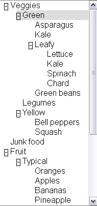
A basic tree view allows the user to select different list
items and expand and collapse embedded lists. Arrow keys are used to navigate
through a tree, including left/right to collapse/expand sub trees. Double
clicking with the mouse also toggles expansion.
2.3.1 Step one: Look at your native mark up language
There is no tree element in XHTML 1.0 that supports our behavior including
expansion, so we will need to use roles. Therefore, our first step is setting
roles.
2.3.2 Step two: Finding the right roles
Our tree will need roles that support embedded list behavior and
expandable/collapsible embedded lists. The roles that support tree behavior
for a tree are:
Tree: The main container element for our tree. A form of a select (or, generally, of a list having groups inside groups) where subtrees can
be collapsed and expanded.Treeitem: An option item of a tree. This is an element within a
tree which may be expanded or collapsed
2.3.3 Step three and four: Look for groups and build
relationships
Tree relationships can be made simply via the DOM and logical structure of
your page.
A tree element will be the main container containing all other elements in
the tree.
Each selectable item in the tree will be a treeitem.
When a treeitem contains an embedded list of treeitems they will be all
embedded in a group. A group should be contained inside the tree item
that is the parent item.
Tree relationships are like list relationships in XHTML. Group and
tree elements act like list containers (OL and UL). A tree item acts like a
list item (li) in XHTML.
Because treeitems and groups commonly both use div elements it is
recommended to add a comment next to closing treeitems that contain embedded
tree groups.
<div x2:role="wairole:tree" >
  <div role="wairole:treeitem" >Veggies
    <div role="wairole:group">
      <div role="wairole:treeitem">Green
        <div role="wairole:group">
          <div role="wairole:treeitem">Asparagus</div>
          <div role="wairole:treeitem">Kale</div>
          <div role="wairole:treeitem" >Leafy
            <div role="wairole:group">
              <div role="wairole:treeitem">Lettuce</div>
              <div role="wairole:treeitem">Kale</div>
              <div role="wairole:treeitem">Spinach</div>
              <div role="wairole:treeitem">Chard</div>
            </div>
          </div> ---close leafy
          <div role="wairole:treeitem">Green beans</div>
        </div>
      </div> ---close green
      <div role="wairole:treeitem">Legumes</div>
      <div role="wairole:treeitem" >Yellow
        <div role="wairole:group">
          <div role="wairole:treeitem">Bell peppers</div>
          <div role="wairole:treeitem">Squash</div>
        </div>
      </div> ---close yellow
    </div>
  </div> ---close veggies
</div> ---close tree
Sometimes a tree structure is not explicit via the DOM and logical
structure of a page. In such cases the relationships must still be made
explicit using the States and Properties Module.
Example:
<div x2:role="wairole:treeitem" aaa:haschild="yellowtreegroup">Yellow<div>
…
<div id="yellowtreegroup" role="wairole:group">
<div role="wairole:treeitem">Bell peppers</div>
<div role="wairole:treeitem">Squash</div>
…
</div>
Although this is allowed it may affect performance.
2.3.4 Step five: Use States and Properties
Control the behavior of the element using XML Events [XML-EVENTS] and States.
For example, use the aaa Namespace [XML-NAMES] with supporting scripts to control which
tree elements are expanded
<div tabindex="-1" role="wairole:treeitem" aaa:expanded="true">Yellow</div>
And use events to device independent events with supporting JavaScript to
handle user interaction.
<div role="wairole:tree" tabindex="-1"
  onfocus="return treeItemFocus(event);"
  onclick="return treeItemEvent(event);"
  ondblclick="return treeItemEvent(event);"
  onkeydown="return treeItemEvent(event);"
  onkeypress="return treeItemEvent(event);">
Then create JavaScript support to control the event driven behavior of the
application.
2.4 Applying roles to documents
This section is normative.
Roles are provided in XML-based languages using an attribute designated for the purpose. Roles from this ontology are indicated as values of that role attribute. In order to indicate that the roles are used as specified in this document, the document must use the following namespace in the attribute value: http://www.w3.org/2005/01/wai-rdf/GUIRoleTaxonomy#.
Generally this namespace is declared on the root element of the document as specified in XML Namespaces [XML-NAMES]. Examples in this document use the namespace prefix “wairole” to indicate this namespace.
Editorial Note: There is discussion about changing the suggested prefix to “ariarole”. There is not yet group consensus about this.
For example, the start tag of a root element that includes the appropriate namespace declaration might look like:
<html xmlns="http://www.w3.org/1999/xhtml"
    xml:lang="en"
    xmlns:wairole="http://www.w3.org/2005/01/wai-rdf/GUIRoleTaxonomy#"
>
2.4.1 Applying roles in XHTML
XHTML 1.1 and higher provides the XHTML Role Attribute
Module [XHTML-ROLES] to attach roles to documents. Include this module as defined in the Role Attribute specification, and then use the “role” attribute as needed. Use the namespace prefix defined in the root element, and values for the attribute from the ontology above. For example:
<html lang="en" xml:lang="en" xmlns="http://www.w3.org/1999/xhtml
"xmlns:wairole="http://www.w3.org/2005/01/wai-rdf/GUIRoleTaxonomy#"><body>

<table id="table1" role="wairole:grid">
...
</table>

</body></html>
XHTML 1.0 does not support DTD modularization. It is therefore necessary to provide the role attribute using its own namespace. For example:
<html lang="en" xml:lang="en" xmlns="http://www.w3.org/1999/xhtml"
xmlns:xhtml10="http://www.w3.org/1999/xhtml"
xmlns:wairole="http://www.w3.org/2005/01/wai-rdf/GUIRoleTaxonomy#"><body>

<table id="table1" xhtml10:role="wairole:grid">
...
</table>
</body></html>
2.4.3 Applying roles in classic HTML
There is no normative way to apply roles in HTML, but it is recommended to use the HTML implementation technique.
2.4.4 Applying roles in other languages
3 The RDF Roles Model
This section is normative.
This specification defines a Taxonomy called Roles. The Roles Taxonomy
uses the XML
Namespace [XMLNAMES] identifier
http://www.w3.org/2005/01/wai-rdf/GUIRoleTaxonomy#
All examples are informative. Examples in this document that use the XML
Namespace prefix "wairole" all assume a valid xmlns declaration such as
xmlns:wairole="http://www.w3.org/2005/01/wai-rdf/GUIRoleTaxonomy#"
in the document involved.
The remainder of this section describes the class's instances and
properties in this taxonomy, the semantics, and provides an RDF [RDF] Schema.
3.1 Role Properties
Roles are defined and described by their properties. Properties define the
structural function of a role, such as: What a role is, concepts behind it,
what it can contain, what it must contain.
In the case of widgets this also includes how it interacts with the user
agent based on mapping to HTML forms and XForms, allowed states and required
states.
3.2 Relationships between
concepts
The are three properties that describe the relationship between concepts.
They are:
-
Type and subclasses - (from RDF Schema [RDFS]) this implies inheritance, which means,
among other things, the inheritance of limitations and properties. Other
than well known stable specifications, inheritance may be restricted to
items defined inside this specification so that items can not be changed
and affect inherited classes.
For example: Buttonundo is a subclass or type of a button. If we
change the properties and expected behavior of a button then the
properties and behavior of buttonundo will also change.
-
relatedConcept - A
relatedConcept is a similar or related idea from other specifications.
Concepts that are related are not necessarily identical. relatedConcepts
do not inherit properties from each other. Hence if the definition of a
type changes, the properties, behavior and definition of a relatedConcept
is not affected.
For example: A grid is like a table. Therefore, a grid has a
relatedConcept of a table as defined at http://www.w3.org/TR/html4/struct/tables.html#edef-TABLE.
However if the definition of table is modified our definition of a grid
will not be affected.
-
baseConcept - A
baseConcept is like a "borrowed" concept. BaseConcept is similar to type,
but without inheritance of limitations and properties. baseConcepts are designed as a substitute for
inheritance for external concepts. A baseConcept is like a relatedConcept
except that baseConcepts are almost identical to each other.
For example: the checkbox defined in this document has the same
functionality and anticipated behavior as a checkbox defined in
http://www.w3.org/MarkUp/HTML#checkbox.
Therefore, a checkbox has a baseConcept of a checkbox as defined at
http://www.w3.org/MarkUp/HTML#checkbox. However, if
http://www.w3.org/MarkUp/HTML#checkbox is modified, the definition of a
checkbox in this document will not be not affected.
The Roles Taxonomy supports the following additional properties:
Additional Properties Supported by Role Taxonomy
Property |
Description |
Values |
supportedState |
a supportedState must be supported by this
role. Typically refers to states from the aaa namespace |
Any valid [RDF] object reference, such as
a URI. |
mustContain |
A child element that must be contained by this role. For example
a list must contain a listitem. |
Any valid [RDF] object reference, such as
a URI or [RDF] ID. |
scope |
Context, where this role is allowed. For example a list item is
allowed inside a list. |
Any valid [RDF] object reference, such as a
URI or [RDF] ID. |
media |
The media type, where the Role is allowed - a type of scope |
Any valid [RDF] object reference, such as a
URI or [RDF] ID. |
nameRef |
Computational mechanism for determine the accessible name of the
object to which the role applies. This may be computed from the
children of the object or the title attribute.
|
Any valid [RDF] object reference, such as
a URI or [RDF] Node ID.
Recommended values: Child, title, content. |
3.3 Global States and Properties
Some states and properties are applicable to all roles, and most are applicable to all elements regardless of role. In addition to explicitly expressed supported states and properties, the following global states and properties are supported by roles as well. These include:
3.4 Roles
To support the current user scenario this specification defines roles that
A, help define Widgets (For example, a tristate Checkbox) and B, help define
page structure (for example, a section header).
Graph of the data model—Picture of the
relationships described in the role data model (large)
Editorial Note: Is this image useful? Perhaps a manually generated one would be more helpful, one that's more UML-like.
Specific roles are enumerated below in Supported Roles.
3.4.1 Summary of supported roles used by Rich Internet Application authors
This section contains an alphabetical list of ARIA roles to be used by rich internet application authors. For a detailed definition of the taxonomy supporting these ARIA roles refer to section 3.4.2.
| Role |
Definition |
| alert |
A message with an alert or error information. |
| alertdialog |
A separate window with an alert or error information. |
| application |
A software unit executing a set of tasks for its users |
| breadcrumbs |
Bread crumb navigation list. |
| button |
Allows for user-triggered actions. |
| checkbox |
A control that has two possible value states (an equivalent to a
boolean). |
| checkboxtristate |
A control that has three possible values, (1 0 -1). Often found
in installer where an option has been partially installed. |
| columnheader |
A table cell containing header information for a column. |
| combobox |
Combobox is a presentation of a select, where you can type to
locate a selected item. |
| description |
Descriptive content for a page element which references this element via describedby. |
| dialog |
A dialog is a small application window that sits above the
application and is designed to interrupt the current processing of an
application in order to prompt the user to enter information or
require a response. |
| directory |
A list of references to members of a single group. |
| document |
Content that contains related information, such as a book. The
document role is used to tell the screen reader to use a document
browsing mode, because screen readers use most of the keyboard navigation
keys to provide its own keyboard user interface for this type of
navigation. |
| grid |
A grid is a table type that may be editable. |
| gridcell |
A gridcell is a table cell in a grid. Gridcells may be active,
editable, and selectable. Cells may have relationships such as controls to address the application of functional relationships. |
| group |
A group is a section of user interface objects which would not be included in a page summary or table of contents by an assistive technology. |
| imggroup |
An imggroup is a container for a collection elements that form
an image. |
| link |
Interactive reference to a resource (note, that in [XHTML] 2.0 any element can have an href
attribute and thus be a link) |
| list |
Group of small items. |
| listbox |
Todo: Created per Rich and Aaron's analysis/cleanup |
| listitem |
A single item in a list. |
| log |
A region where new information is added and old information may
disappear such as chat logs, messaging, game log or an error log. |
| marquee |
Todo: |
| menu |
Offers a list of choices to the user. A menu is often a list of
links to important sections of a Document or a Site. |
| menubar |
A menubar is a container of menu items. Each menu item may
activate a new sub-menu. Navigation behavior should be similar to the
typical menu bar graphical user interface. |
| menuitem |
A link in a menu. This is an option in a group of choices
contained in a menu. |
| menuitemcheckbox |
Defines a menuitem which is checkable (tri-state). |
| menuitemradio |
Indicates that you have a menu item which is part of a group of
menuitemradio roles. |
| option |
A selectable item in a list represented by a select. |
| presentation |
An element whose role is presentational does not need to be
mapped to the accessibility API. |
| progressbar |
Used by applications for tasks that take a long time to execute,
to show the execution progress. |
| radio |
A radio is an option in single-select list. Only one radio
control in a radiogroup can be selected at the same time. |
| radiogroup |
A group of radio controls. |
| region |
Region is a large perceivable section on your web page. |
| rowheader |
A table cell containing header information for a row. |
| secret |
Provides the user with the ability to supply information to the
system in a manner that makes it difficult for someone else (who may
be watching) to discern the value that is being supplied. |
| separator |
A line or bar that separates and distinguishes sections of
content. This is a visual separator between sections of content.
Separators are found between lists of menu items in a menu. |
| slider |
A user input where the user selects an input in a given range.
This form of range expects an analog keyboard interface. |
| spinbutton |
A form of Range that expects a user selecting from discrete
choices. |
| status |
This is a container for process
advisory information to give feedback to the user. It must have a
subtree. This object typically does not receive focus. |
| tab |
A tab is a tabpanel header. Tab is used as a grouping label,
providing a link for selecting the tabcontent to be rendered to the
user. |
| table |
A table contains cells of tabular data arranged in rows and
columns. |
| tablist |
A list of references to tabpanels of a tabcontainer. |
| tabpanel |
Tabpanel is a container for the resources associated with a tab. |
| td |
A table cell containing data. |
| textarea |
This is a multi-line editable text box. For use when no standard
form element exists with this functionality. |
| textfield |
Free-form data entry for short on-line content. |
| th |
A table cell containing header information. |
| toolbar |
A toolbar is a collection of commonly used functions represented
in compact visual form. |
| tooltip |
A popup that displays a description for an element when a user passes over or rests on that element. Supplement to the normal tooltip processing of the user agent. |
| tree |
A form of a list having groups
inside groups, where sub trees can be collapsed and expanded. |
| treeitem |
An option item of a tree. This is an element within a tree that may
be expanded or collapsed |
3.4.2 Supported Roles in detail
3.4.2.1 Abstract and Base Classes
*Note: More base types will be added as the working group adds user
cases
The following roles are used as base types for applied roles. They are not
to be used by Web Authors and would not be exposed as role definitions for
incorporation into a Web page. Base classes are referenced within the
taxonomy and are used to build a picture of the role taxonomy class hierarchy
within the taxonomy.
roletype
| Parent Role: |
|
| Related Concepts: |
|
| Supported States and Properties: |
|
| Inherited States and Properties: |
|
| Name Reference: |
|
Describes the structural and functional purpose of an element. A
Role is also a concept.
widget
| Parent Role: |
roletype |
| Related Concepts: |
|
| Supported States and Properties: |
disabled |
| Inherited States and Properties: |
|
| Name Reference: |
|
A component of a GUI (graphical user interface)
input
| Parent Role: |
widget |
| Related Concepts: |
[XFORMS] input |
| Supported States and Properties: |
|
| Inherited States and Properties: |
|
| Name Reference: |
Title |
Generic type for widgets that can have a value
textbox
| Parent Role: |
input |
| Related Concepts: |
[XFORMS] input |
| Supported States and Properties: |
readonly (default set to false) |
| Inherited States and Properties: |
|
| Name Reference: |
Title |
Generic type for the inputs that allow free-form text as their
value
select
| Parent Role: |
|
| Related Concepts: |
|
| Supported States and Properties: |
|
| Inherited States and Properties: |
|
| Name Reference: |
Title |
A form control that allows the user to make selections from a
set of choices. A select must contain an option.
range
| Parent Role: |
input |
| Related Concepts: |
|
| Supported States and Properties: |
|
| Inherited States and Properties: |
|
| Name Reference: |
Title |
Represents a range of values that can be set by the user.
section
| Parent Role: |
roletype |
| Related Concepts: |
|
| Supported States and Properties: |
|
| Inherited States and Properties: |
|
| Name Reference: |
Child content or title attribute |
A base abstract class representing a renderable structural containment unit found
in a document or application.
sectionhead
| Parent Role: |
roletype |
| Related Concepts: |
[HTML]/[DTB]/NIMAS h2, h3... |
| Supported States and Properties: |
|
| Inherited States and Properties: |
|
| Name Reference: |
- Child content
- title attribute
|
The section head labels or summarizes the topic of its related
section
window
| Parent Role: |
roletype |
| Related Concepts: |
|
| Supported States and Properties: |
|
| Inherited States and Properties: |
|
| Name Reference: |
- Child content
- title attribute
|
Browser or application window
3.4.2.2 Widget Roles
Widget Roles all map to accessibility APIs.
link
| Parent Role: |
widget |
| Related Concepts: |
[HTML] Link |
| Supported States and Properties: |
|
| Inherited States and Properties: |
|
| Name Reference: |
- Child content
- title attribute
|
Interactive reference to a resource (note, that in [XHTML] 2.0 any element can have an href
attribute and thus be a link)
combobox
| Parent Role: |
select |
| Related Concepts: |
[HTML] select |
| Supported States and Properties: |
|
| Inherited States and Properties: |
|
| Name Reference: |
Title |
Combobox is a presentation of a select, where you can type to
locate a selected item.
NOTE: In [XFORMS] the same select can
have one of 3 appearances: combo-box, drop-down box or group of
radio-buttons. Besides, many browsers (if not all of them) allow
users to type in a drop-down select as well.
listbox
| Parent Role: |
select |
| Related Concepts: |
[HTML] select |
| Supported States and Properties: |
multiselectable |
| Inherited States and Properties: |
|
| Name Reference: |
Title |
option
| Parent Role: |
|
| Related Concepts: |
- ListItem(see structure),
- [HTML] option,
- [XFORMS] item
|
| Supported States and Properties: |
selected |
| Inherited States and Properties: |
|
| Name Reference: |
- Child content
- title attribute
|
A selectable item in a list represented by a select.
An option
must appear inside an element with select role.
checkbox
| Parent Role: |
checkboxtristate |
| Related Concepts: |
[HTML] input (type : checkbox) |
| Supported States and Properties: |
|
| Inherited States and Properties: |
|
| Name Reference: |
- Child content
- title attribute
|
A control that has two possible value states (an equivalent to a
boolean).
checkboxtristate
| Parent Role: |
option |
| Related Concepts: |
|
| Supported States and Properties: |
readonly |
| Inherited States and Properties: |
|
| Name Reference: |
- Child content
- title attribute
|
A control that has three possible values, (1 0 -1). Often found
in installer where an option has been partially installed.
radio
| Parent Role: |
checkbox |
| Related Concepts: |
[HTML] input (type : radio) |
| Supported States and Properties: |
|
| Inherited States and Properties: |
|
| Name Reference: |
- Child content
- title attribute
|
A radio is an option in single-select list. Only one radio
control in a radiogroup can be selected at the same time.
radiogroup
| Parent Role: |
select |
| Related Concepts: |
|
| Supported States and Properties: |
|
| Inherited States and Properties: |
|
| Name Reference: |
Title |
A group of radio controls.
button
| Parent Role: |
|
| Related Concepts: |
[XFORMS] trigger |
| Supported States and Properties: |
pressed |
| Inherited States and Properties: |
|
| Name Reference: |
- Child content
- title attribute
|
Allows for user-triggered actions.
Buttons are mostly used for
discrete, atomic actions. Its value is cognitive; the idea that this
is a user action opportunity is made very clear by making it look
like a front-panel button on a device. The animation of the button in response to indirect (by mouse)
manipulation fosters the illusion of direct manipulation and keeps
user cognition in sync with the user interface perception of user
action events. Standardizing the appearance of buttons enhances recognition as
buttons and arraying them compactly in toolbars, for example.
Buttons support the optional state pressed . Buttons with this state present are toggle buttons. When pressed is "true" the button is depressed, when pressed is "false" it is not depressed.
menuitemradio
| Parent Role: |
|
| Related Concepts: |
|
| Supported States and Properties: |
|
| Inherited States and Properties: |
|
| Name Reference: |
- Child content
- title attribute
|
Indicates that you have a menu item which is part of a group of
menuitemradio roles.
Checking of one menuitemradio in a group will unchecked the other
group members.
Menuitems should also be separated into a group by a separator.
menuitemcheckbox
| Parent Role: |
|
| Related Concepts: |
|
| Supported States and Properties: |
|
| Inherited States and Properties: |
|
| Name Reference: |
- Child content
- title attribute
|
Defines a menuitem which is checkable (tri-state).
The checked state indicates whether the menu item is checked, unchecked, or mixed.
progressbar
| Parent Role: |
widget |
| Related Concepts: |
|
| Supported States and Properties: |
|
| Inherited States and Properties: |
|
| Name Reference: |
Title |
Used by applications for tasks that take a long time to execute,
to show the execution progress.
This lets the user know that the user's action request has been
accepted and that the application continues (or ceases, in the case
of a static display) to make progress toward completing the requested
action.
secret
| Parent Role: |
input |
| Related Concepts: |
[HTML] input (type : password) |
| Supported States and Properties: |
|
| Inherited States and Properties: |
|
| Name Reference: |
Title |
Provides the user with the ability to supply information to the
system in a manner that makes it difficult for someone else (who may
be watching) to discern the value that is being supplied.
Disadvantage: Passwords have to be typed blind without the usual
echo to the screen. Web users get used to having their input echoed,
type badly, and in particular not having people able to confirm what
is entered runs risk such as having account locked if three
non-accepted tries happen in some time window.
Disadvantage: Policy not to display is usually taken to be
absolute; whereas a user with screen blank and earphone in use can
get the typing echoed privately not subject to having a lurker
purloin the password.
separator
| Parent Role: |
widget |
| Related Concepts: |
[HTML] hr |
| Supported States and Properties: |
|
| Inherited States and Properties: |
|
| Name Reference: |
Title |
A line or bar that separates and distinguishes sections of
content. This is a visual separator between sections of content.
Separators are found between lists of menu items in a menu.
slider
| Parent Role: |
range |
| Related Concepts: |
|
| Supported States and Properties: |
|
| Inherited States and Properties: |
|
| Name Reference: |
Title |
A user input where the user selects an input in a given range.
This form of range expects an analog keyboard interface.
A slider has the added functionality of being able to select a
value through the use of a visible slider. The slider would be
keyboard accessible and provide a visible thumb position that
represents the current position within the slider.
spinbutton
| Parent Role: |
range |
| Related Concepts: |
|
| Supported States and Properties: |
readonly |
| Inherited States and Properties: |
|
| Name Reference: |
Title |
A form of Range that expects a user selecting from discrete
choices.
A spinbutton allows the user to select from the given range
through the use of an up and down button. Visibly, the current value
is incremented or decremented until a maximum or minimum value is
reached. This functionality should be accomplished programmatically
through the use of up and down arrows on the keyboard.
textarea
| Parent Role: |
textbox |
| Related Concepts: |
[HTML] textarea |
| Supported States and Properties: |
|
| Inherited States and Properties: |
|
| Name Reference: |
Title |
This is a multi-line editable text box. For use when no standard
form element exists with this functionality.
Intended use is in languages that do not have a textarea object
(such as SVG). The user would use this role when additional states or
properties are applied to a standard textarea control. This is to
indicate to the user agent that it must process additional states and
properties such as invalid and required.
textfield
| Parent Role: |
textbox |
| Related Concepts: |
[HTML] input (type : text) |
| Supported States and Properties: |
|
| Inherited States and Properties: |
|
| Name Reference: |
- Child content
- title attribute
|
Free-form data entry for short on-line content.
Intended use is in languages that do not have a textfield object
(such as SVG). The user would use this role when additional states or
properties are applied to a standard textarea control.
Textfield is used to indicate to the user agent that it must
process additional states and properties such as invalid and
required.
Editorial Note: this is not only for SVG. The inputtokenizer from SAP is an example. This uses an editable div with designmode="on". One can create an editable
textfield in the DOM in today's browsers without using an html form text field:
<div designmode="on" role="wairole:textfield" aaa:readonly="false">
  type away
</div>
tree
| Parent Role: |
select |
| Related Concepts: |
|
| Supported States and Properties: |
multiselectable |
| Inherited States and Properties: |
|
| Name Reference: |
- Child content
- title attribute
|
A form of a list having groups
inside groups, where sub trees can be collapsed and expanded.
treeitem
| Parent Role: |
option |
| Related Concepts: |
|
| Supported States and Properties: |
|
| Inherited States and Properties: |
|
| Name Reference: |
- Child content
- title attribute
|
An option item of a tree. This is an element within a tree that may
be expanded or collapsed
status
| Parent Role: |
widget |
| Related Concepts: |
|
| Supported States and Properties: |
activedescendent |
| Inherited States and Properties: |
|
| Name Reference: |
|
This is a container for process
advisory information to give feedback to the user. It must have a
subtree. This object typically does not receive focus.
Some cells of
a Braille display may be reserved to render the status.
alert
| Parent Role: |
status |
| Related Concepts: |
[XFORMS] alert |
| Supported States and Properties: |
|
| Inherited States and Properties: |
|
| Name Reference: |
Title |
A message with an alert or error information.
Alerts are used to convey messages to alert the user. In the case of audio warnings this is an accessible alternative for a hearing impaired user. The alert role goes on the container of the document subtree containing the alert message. Alerts are specialized forms of the status role which should be processed as an atomic live region. Alerts do not require user input and therefore should not receive focus. Alerts should not receive focus or require user input and therefore users should not be required to close an alert. The user agent may consider firing an accessibility alert event, when the alert is created, provided one is specified by the intended accessibility API.
alertdialog
| Parent Role: |
|
| Related Concepts: |
[XFORMS] alert |
| Supported States and Properties: |
|
| Inherited States and Properties: |
|
| Name Reference: |
Title |
A separate window with an alert or error information.
Alertdialogs are used to convey messages to alert the user. The alertdialog role goes on the container of the subtree containing the alert message. Unlike alert, alertdialog requires a response from the user such as to confirm that the user understands the alert being generated. It is expected that authors shall set focus to an active document element within the alertdialog such as a form edit field or an ok pushbutton. The user agent may consider firing an accessibility alert event, when the alert is created, provided one is specified by the intended accessibility API.
dialog
| Parent Role: |
window |
| Related Concepts: |
|
| Supported States and Properties: |
|
| Inherited States and Properties: |
|
| Name Reference: |
Title |
A dialog is a small application window that sits above the
application and is designed to interrupt the current processing of an
application in order to prompt the user to enter information or
require a response.
Dialog boxes should have a title. They must have a focused
item.
marquee
| Parent Role: |
|
| Related Concepts: |
|
| Supported States and Properties: |
|
| Inherited States and Properties: |
|
| Name Reference: |
|
3.4.2.3 Structural Roles
Roles for document structure are also required to support the
accessibility of dynamic Web content to assist adaptive technology in
determining active content vs. static document content. Structural Roles, by
themselves do not all map to accessibility APIs, but are used to create
widget roles or assist content adaptation.
This schema is likely to evolve as new use cases are added to the scope of
this specification.
application
| Parent Role: |
window |
| Related Concepts: |
[DI-GLOSS]: Task/ deliveryunit |
| Parent Element: |
|
| Required Child Elements: |
|
| Supported States and Properties: |
|
| Inherited States and Properties: |
|
| Name Reference: |
title attribute |
A software unit executing a set of tasks for its users
The intent is to hint to the assistive technology to switch its
normal browsing mode functionality to one in which they would for an
application. To properly set the role of "application," an author
should set the application role on a document element which
encompasses the entirety of the web page for which assistive technology
browser navigation mode is applied. Screen readers have a browse
navigation mode where keys, such as up and down arrows, are consumed
and used to browse the document. Consumption of these keys breaks use
of these keys by the web application.
Use case: In an email application it has a document and an
application in it. The author would want to use typical application
navigation mode to cycle through the list of emails. Much of this
navigation would be defined by the application author. However, when
reading an email message the user may want to switch to a document
mode where they control browsing navigation.
Applications must also have an labelledby attribute leading to one
or more elements with non-empty text content. This text should be
suitable for use as a navigation preview or table-of-contents entry
for the page section in question.
Exceptions: There may be a few exceptions where the host-language
provides a useful label mechanism, such as:
- The root element in an HTML document may omit the labelledby
attribute - if the title element has been used.
Any group element in SVG may omit the labelledby attribute if it
contains a non-empty title element.
document
| Parent Role: |
roletype |
| Related Concepts: |
subpageof
[DI-GLOSS]: Task/ deliveryunit |
| Parent Element: |
|
| Required Child Elements: |
|
| Supported States and Properties: |
|
| Inherited States and Properties: |
|
| Name Reference: |
title attribute |
Content that contains related information, such as a book. The
document role is used to tell the screen reader to use a document
browsing mode, because screen readers use most of the keyboard navigation
keys to provide its own keyboard user interface for this type of
navigation.
Documents must also have an labelledby attribute leading to one or
more elements with non-empty text content. This text should be
suitable for use as a navigation preview or table-of-contents entry
for the page section in question.
Exceptions: There may be a few exceptions where the host-language
provides a useful label mechanism, such as:
- The root element in an HTML document may omit the labelledby
attribute - if the title element has been used.
- Any group element in SVG may omit the labelledby attribute if
it contains a non-empty title element.
presentation
| Parent Role: |
roletype |
| Related Concepts: |
[DI-GLOSS]: Task |
| Parent Element: |
|
| Required Child Elements: |
|
| Supported States and Properties: |
|
| Inherited States and Properties: |
|
| Name Reference: |
|
An element whose role is presentational does not need to be
mapped to the accessibility API.
Intended use is when an element is used to change the look of the
page but does not have all the functional, interactive, or structural
relevance implied by the element type.
Example use cases:
- A layout table is a presentation.
- An object tag whose content is decorative like a white space
image or decorative flash object
- An image used for white space
The user agent may remove all structural aspects of the element
being repurposed. For example, a table marked as presentation would
remove the table, td, th, tr, etc. elements while preserving the
individual text elements within it. Because the user agent knows to
ignore the structural aspects implied in a table, no harm is done by
using a table for layout.
group
| Parent Role: |
section |
| Related Concepts: |
DC: Collection, Dataset |
| Parent Element: |
|
| Required Child Elements: |
|
| Supported States and Properties: |
|
| Inherited States and Properties: |
|
| Name Reference: |
title attribute |
A group is a section of user interface objects which would not be included in a page summary or table of contents by an assistive technology.
Authors should use a role of group to form logical collection of items in a widget such as a: row in a grid; children in a tree widget forming a collection of siblings in a hierarchy; or a collection of items having the same container in a directory. Therefore, proper handling of group by assistive technologies must be determined by the context in which it is provided. Group members that are outside the [DOM] subtree of the group would need to have explicit relationships assigned to participate in the group. Groups may also be nested. If the author believes a section is significant enough in terms of the entire delivery unit web page then the author should assign the section a role of region or a standard XHTML Role landmark.
imggroup
| Parent Role: |
group |
| Related Concepts: |
DAISY , [DTB]
imggroup |
| Parent Element: |
|
| Required Child Elements: |
|
| Supported States and Properties: |
|
| Inherited States and Properties: |
|
| Name Reference: |
title attribute |
An imggroup is a container for a collection elements that form
an image.
An imggroup can contain captions, descriptive text as well
as multiple image files that when viewed together give the impression
of a single image.
directory
| Parent Role: |
list |
| Related Concepts: |
DAISY [DTB]:TOC |
| Parent Element: |
|
| Required Child Elements: |
|
| Supported States and Properties: |
|
| Inherited States and Properties: |
|
| Name Reference: |
- Child content
- title attribute
|
A list of references to members of a single group.
region
| Parent Role: |
section |
| Related Concepts: |
[HTML] Frame
device independence glossary: perceivable unit.related concept: section |
| Parent Element: |
|
| Required Child Elements: |
|
| Supported States and Properties: |
expanded |
| Inherited States and Properties: |
|
| Name Reference: |
title attribute |
Region is a large perceivable section on your web page.
Region defines
a group of elements that together form a large perceivable section,
that the author feels should be included in a summary of page
features. A region must have a title. A region does not necessarily
follow the logical structure of the content, but follows the
perceivable structure of the page.
The [XHTML Roles Module] defines standard document landmark roles that
are considered regions. Each region must have a title. When defining regions of a web page, authors should consider using standard roles found in
the XHTML Roles module, which is included in the ARIA States and
Properties specification. User agents and assistive technologies may treat these
as standard navigation landmarks. If the definition of these regions
are inadequate, authors should assign the section a role of region and
with the appropriate title text.
log
| Parent Role: |
region |
| Related Concepts: |
|
| Parent Element: |
|
| Required Child Elements: |
|
| Supported States and Properties: |
|
| Inherited States and Properties: |
|
| Name Reference: |
title attribute |
A region where new information is added and old information may
disappear such as chat logs, messaging, game log or an error log.
grid
| Parent Role: |
widget |
| Related Concepts: |
[HTML] table |
| Parent Element: |
|
| Required Child Elements: |
gridcells |
| Supported States and Properties: |
|
| Inherited States and Properties: |
|
| Name Reference: |
title attribute |
A grid is a table type that may be editable.
Grids contain cells
that may be focusable. Grids allow the user to move focus between
grid cells with 2-D navigation. Grids may have row and column headers
which also have functional value based on the implementation. Grid
cells may have values determined by an equation.
Grids are single selectable or multiselectable. Properties for
selectable or multiselectable must be provided by the author. Grids
may be used for spreadsheets such as in Open Office, Microsoft
Office, etc.
gridcell
| Parent Role: |
|
| Related Concepts: |
[HTML] td |
| Parent Element: |
|
| Required Child Elements: |
|
| Supported States and Properties: |
selected |
| Inherited States and Properties: |
|
| Name Reference: |
- Child content
- title attribute
|
A gridcell is a table cell in a grid. Gridcells may be active,
editable, and selectable. Cells may have relationships such as controls to address the application of functional relationships.
tab
| Parent Role: |
|
| Related Concepts: |
|
| Parent Element: |
tabpanel |
| Required Child Elements: |
|
| Supported States and Properties: |
disabled |
| Inherited States and Properties: |
|
| Name Reference: |
- Child content
- title attribute
|
A tab is a tabpanel header. Tab is used as a grouping label,
providing a link for selecting the tabcontent to be rendered to the
user.
The currently selected tab should be marked with selected=true.
Tablist is the container role for a set of elements with the role
attribute set to tab. Only one tab may be selected at a time. At any
time, one tab must be selected.
One of the tabs in tablist must be the current tab. The tabpanel
associated with the current tab, must be rendered to the user. Other
tabpanels are typically hidden from the user until the user selects
the tab associated with that tabpanel.
tabpanel
| Parent Role: |
region |
| Related Concepts: |
|
| Parent Element: |
|
| Required Child Elements: |
|
| Supported States and Properties: |
|
| Inherited States and Properties: |
|
| Name Reference: |
title attribute |
Tabpanel is a container for the resources associated with a tab.
Note: There must be a means to associate a content container element
with its associated tab in a tablist.
tablist
| Parent Role: |
directory |
| Related Concepts: |
DAISY [DTB]:TOC |
| Parent Element: |
|
| Required Child Elements: |
|
| Supported States and Properties: |
|
| Inherited States and Properties: |
|
| Name Reference: |
- Child content
- title attribute
|
A list of references to tabpanels of a tabcontainer.
table
| Parent Role: |
group |
| Related Concepts: |
[HTML] table |
| Parent Element: |
|
| Required Child Elements: |
|
| Supported States and Properties: |
|
| Inherited States and Properties: |
|
| Name Reference: |
title attribute |
A table contains cells of tabular data arranged in rows and
columns.
This does not imply presentation.The table role is used as a
container for tabular data. The table construct describes
relationships between data such that it may be used for different
presentations. For example, the role of a table could be added to a
pie chart.
It is structural equivalent to an [XHTML]
table. In [XHTML], the author should use the
table element.
td
| Parent Role: |
section |
| Related Concepts: |
[HTML] td |
| Parent Element: |
|
| Required Child Elements: |
|
| Supported States and Properties: |
|
| Inherited States and Properties: |
|
| Name Reference: |
- Child content
- title attribute
|
A table cell containing data.
th
| Parent Role: |
|
| Related Concepts: |
[HTML] th |
| Parent Element: |
|
| Required Child Elements: |
|
| Supported States and Properties: |
|
| Inherited States and Properties: |
|
| Name Reference: |
- Child content
- title attribute
|
A table cell containing header information.
rowheader
| Parent Role: |
th |
| Related Concepts: |
[HTML] th with scope= row |
| Parent Element: |
|
| Required Child Elements: |
|
| Supported States and Properties: |
|
| Inherited States and Properties: |
|
| Name Reference: |
- Child content
- title attribute
|
A table cell containing header information for a row.
Rowheader can be used as a row header in a table or grid. It also
could be used in a pie chart to show a similar relationship in the
data.
The rowheader establishes a relationship between it and all cells
in the corresponding row. It is a structural equivalent to an [HTML] th element with a row scope.
columnheader
| Parent Role: |
th |
| Related Concepts: |
[HTML] th with scope= column |
| Parent Element: |
|
| Required Child Elements: |
|
| Supported States and Properties: |
|
| Inherited States and Properties: |
|
| Name Reference: |
- Child content
- title attribute
|
A table cell containing header information for a column.
Columnheader can be used as a column header in a table or grid. It
could also be used in a pie chart to show a similar relationship in
the data.
The columnheader establishes a relationship between it and all
cells in the corresponding row. It is a structural equivalent to an
[HTML] th element with a column scope.
list
| Parent Role: |
group |
| Related Concepts: |
[HTML] list |
| Parent Element: |
|
| Required Child Elements: |
|
| Supported States and Properties: |
readonly |
| Inherited States and Properties: |
|
| Name Reference: |
title attribute |
listitem
| Parent Role: |
section |
| Related Concepts: |
[XFORMS] item[HTML] li |
| Parent Element: |
|
| Required Child Elements: |
|
| Supported States and Properties: |
|
| Inherited States and Properties: |
|
| Name Reference: |
- Child content
- title attribute
|
menu
| Parent Role: |
|
| Related Concepts: |
|
| Parent Element: |
|
| Required Child Elements: |
menuitems |
| Supported States and Properties: |
|
| Inherited States and Properties: |
|
| Name Reference: |
title attribute |
Offers a list of choices to the user. A menu is often a list of
links to important sections of a Document or a Site.
toolbar
| Parent Role: |
menu |
| Related Concepts: |
menubar |
| Parent Element: |
|
| Required Child Elements: |
|
| Supported States and Properties: |
multiselectable |
| Inherited States and Properties: |
|
| Name Reference: |
title attribute |
A toolbar is a collection of commonly used functions represented
in compact visual form.
The toolbar is often a subset of functions found in a menubar
designed to reduced user effort in using these functions.
If this is not keyboard accessible the actions defined in the
toolbar must be reproduced in an accessible, device independent
fashion.
menubar
| Parent Role: |
menu |
| Related Concepts: |
toolbar |
| Parent Element: |
|
| Required Child Elements: |
|
| Supported States and Properties: |
|
| Inherited States and Properties: |
|
| Name Reference: |
title attribute |
A menubar is a container of menu items. Each menu item may
activate a new sub-menu. Navigation behavior should be similar to the
typical menu bar graphical user interface.
Menubar is used to create a menubar similar to those found in
Windows, the Mac, and Gnome desktops. A menubar is used to create a
consistent climate of frequently used commands.
menuitem
| Parent Role: |
listitem |
| Related Concepts: |
[XFORMS] option |
| Parent Element: |
|
| Required Child Elements: |
|
| Supported States and Properties: |
|
| Inherited States and Properties: |
|
| Name Reference: |
- Child content
- title attribute
|
A link in a menu. This is an option in a group of choices
contained in a menu.
It may be disabled or active. It may also have a
popup.
breadcrumbs
| Parent Role: |
roletype |
| Related Concepts: |
menu |
| Parent Element: |
|
| Required Child Elements: |
link |
| Supported States and Properties: |
setsize |
| Inherited States and Properties: |
|
| Name Reference: |
- Child content
- title attribute
|
Bread crumb navigation list.
Each element in the list is a
representation of the navigational hierarchy, represented linearly.
The logical order of the text begins with the root element.
description
| Parent Role: |
section |
| Related Concepts: |
|
| Parent Element: |
|
| Required Child Elements: |
|
| Supported States and Properties: |
|
| Inherited States and Properties: |
|
| Name Reference: |
|
Descriptive content for a page element which references this element via describedby.
tooltip
| Parent Role: |
description |
| Related Concepts: |
|
| Parent Element: |
|
| Required Child Elements: |
|
| Supported States and Properties: |
|
| Inherited States and Properties: |
|
| Name Reference: |
|
A popup that displays a description for an element when a user passes over or rests on that element. Supplement to the normal tooltip processing of the user agent.
Objects with this role must be referenced through the use of a describedby. If the tooltip has active elements it must be keyboard navigable.
5 Conformance Requirements
This section is normative.
The keywords "MUST", "MUST NOT", "REQUIRED", "SHALL", "SHALL NOT",
"SHOULD", "RECOMMENDED", "MAY", and "OPTIONAL" in this document are to be
interpreted as described in [RFC2119].
5.1 Document Conformance
Roles for Accessible Rich Internet Applications is not a stand-alone document type. It is intended
to be integrated into other host languages such as XHTML [XHTML]. A conforming document requires only the
facilities described as mandatory in this specification and the facilities
described as mandatory in its host language. Such a document must meet all
the following criteria:
-
The document must conform to the constraints expressed in Appendix A - RDF Schema combined with the
constraints expressed in its host language implementation.
-
The document must contain an xmlns declaration for the
role Namespace [XML-NAMES]. The namespace name for the
roles defined here is
http://www.w3.org/2005/01/wai-rdf/GUIRoleTaxonomy#
5.2 User Agent Conformance
User agents that conform to Roles for Accessible Rich Internet Applications expose role information provided by the author to assistive technologies, and if they are assistive technologies themselves, use role information to enhance the presentation. Conformance requirements:
-
User agents MUST make all roles provided by the author available in the DOM, using the attribute name, namespace, and values defined in this specification. This requirement parallels User Agent Accessibility Guidelines 1.0 Section 6.2: DOM access to HTML/XML content [UAAG, Section 6.2].
-
User agents SHOULD allow roles to be extended via RDF. When a role from a different specification extends
or inherits from a role in this specification, then that role should also be
supported, at least to the extent that the original role is supported.
-
User agents SHOULD expose role information provided by the author to the platform accessibility API. Refer to Mapping States and Properties to Accessibility APIs for guidance about how to expose this information. This requirement parallels User Agent Accessibility Guidelines 1.0 Section 6.3: Programmatic Access to non-HTML/XML Content [UAAG, Section 6.3], except that it applies even to HTML and XML content.
Note: Not all platforms provide accessibility APIs, or provide interfaces that map to all the roles defined in this specification. User agents should expose those roles that are supported in order to support assistive technologies that work through the accessibility API. The remaining roles are available to assistive technologies via the DOM as per point 1 above, for those that provide explicit support for this specification.
-
User agents MUST override implicit roles of elements with roles provided by the author. This applies to elements that have particular default roles because of the semantics declared by the content technology. Processing and presentation must be appropriate to the declared role.
-
Assistive technologies that conform to this specification MUST use role information to present content to and support interaction with users in a manner appropriate to that role. The manner in which this is done is specific to each user agent but should be appropriate to the specified description of the role.
Note: This does not specify how assistive technology obtains role information. Assistive technologies may obtain role information directly from content, through the DOM, or through the platform accessibility API. In the latter case, only incomplete role information may be available. This point only requires that assistive technology use the roles that are actually available to it to support the user.
6 Appendices
6.1 Implementation
Note: This RDF is still in draft form and changes from last draft have not
been validated. Some related concepts may be missing.
<?xml version="1.0" encoding="UTF-8"?>
<!DOCTYPE rdf:RDF [
<!ENTITY xsd "http://www.w3.org/2001/XMLSchema#">
<!ENTITY dc "http://dublincore.org/2003/03/24/dces#">
<!ENTITY owl "http://www.w3.org/2002/07/owl#">
<!ENTITY rdfs "http://www.w3.org/2000/01/rdf-schema#">
<!ENTITY rdf "http://www.w3.org/1999/02/22-rdf-syntax-ns#">
<!ENTITY states "http://www.w3.org/2005/07/aaa#">
]>
<rdf:RDF
xmlns:dc="http://purl.org/dc/elements/1.1/#"
xmlns:html="http://www.w3.org/1999/xhtml"
xmlns:owl="http://www.w3.org/2002/07/owl#"
xmlns:rdf="http://www.w3.org/1999/02/22-rdf-syntax-ns#"
xmlns:rdfs="http://www.w3.org/2000/01/rdf-schema#"
xmlns:role="http://www.w3.org/2005/01/wai-rdf/GUIRoleTaxonomy#"
xmlns:states="http://www.w3.org/2005/07/aaa#"
xmlns:xsd="http://www.w3.org/2001/XMLSchema#"
xml:base="http://www.w3.org/2005/01/wai-rdf/GUIRoleTaxonomy"
>
<!--==Objects==-->
<owl:ObjectProperty rdf:ID="relatedConcept">
<rdfs:comment xml:lang="en">The URI of similar/related types from
other specifications (See SKOS)</rdfs:comment>
<rdfs:range rdf:resource="&xsd;anyURI" />
<rdfs:domain rdf:resource="#roletype" />
</owl:ObjectProperty>
<owl:ObjectProperty rdf:ID="baseConcept">
<rdfs:comment xml:lang="en">This is similar to type but without
inheritance of limitations and properties. role:baseConcepts are designed as
a substitute for inheritance for external concepts. </rdfs:comment>
<rdfs:subpropertyOf rdf:resource="#relatedConcept" />
</owl:ObjectProperty>
<owl:ObjectProperty rdf:ID="supportedState">
<rdfs:comment xml:lang="en">A state that can be supported for this a
Role</rdfs:comment>
<rdfs:domain rdf:resource="#widget" />
</owl:ObjectProperty>
<owl:ObjectProperty rdf:ID="scope">
<rdfs:comment xml:lang="en">Context where this role is
allowed</rdfs:comment>
<rdfs:domain rdf:resource="#roletype" />
</owl:ObjectProperty>
<owl:ObjectProperty rdf:ID="mustContain">
<rdfs:comment xml:lang="en">A child that must be contained by this
role</rdfs:comment>
<rdfs:subpropertyOf rdf:resource="#scope" />
</owl:ObjectProperty>
<owl:ObjectProperty rdf:ID="media">
<rdfs:comment xml:lang="en">The media type, where the Role is
allowed - a type of role:scope, simmilar to DC: Format or media
type</rdfs:comment>
<rdfs:subpropertyOf rdf:resource="#scope" />
</owl:ObjectProperty>
<owl:ObjectProperty rdf:ID="default">
<rdfs:comment>Default value of a supported state in the context of
this role</rdfs:comment>
</owl:ObjectProperty>
<owl:ObjectProperty rdf:ID="nameRef">
<rdfs:comment>How a role type name is extracted and referenced
inside a document. For example the DOM might reference a role by it's
title.</rdfs:comment>
<rdfs:domain rdf:resource="#widget" />
</owl:ObjectProperty>
<!--== Abstract and Base Classes==-->
<owl:Class rdf:ID="roletype">
<rdfs:subClassOf>
<owl:Restriction>
<owl:onProperty rdf:resource="http://dublincore.org/2003/03/24/dces#description" />
<owl:cardinality rdf:datatype="http://www.w3.org/2001/XMLSchema#string">1</owl:cardinality>
</owl:Restriction>
</rdfs:subClassOf>
<role:supportedState rdf:resource="http://www.w3.org/2005/07/aaa#atomic" />
<role:supportedState rdf:resource="http://www.w3.org/2005/07/aaa#busy" />
<role:supportedState rdf:resource="http://www.w3.org/2005/07/aaa#controls" />
<role:supportedState rdf:resource="http://www.w3.org/2005/07/aaa#datatype" />
<role:supportedState rdf:resource="http://www.w3.org/2005/07/aaa#describedby" />
<role:supportedState rdf:resource="http://www.w3.org/2005/07/aaa#dropeffect" />
<role:supportedState rdf:resource="http://www.w3.org/2005/07/aaa#flowto" />
<role:supportedState rdf:resource="http://www.w3.org/2005/07/aaa#grab" />
<role:supportedState rdf:resource="http://www.w3.org/2005/07/aaa#haspopup" />
<role:supportedState rdf:resource="http://www.w3.org/2005/07/aaa#hidden" />
<role:supportedState rdf:resource="http://www.w3.org/2005/07/aaa#invalid" />
<role:supportedState rdf:resource="http://www.w3.org/2005/07/aaa#labelledby" />
<role:supportedState rdf:resource="http://www.w3.org/2005/07/aaa#live" />
<role:supportedState rdf:resource="http://www.w3.org/2005/07/aaa#owns" />
<role:supportedState rdf:resource="http://www.w3.org/2005/07/aaa#relevant" />
<role:supportedState rdf:resource="http://www.w3.org/2005/07/aaa#required" />
<role:supportedState rdf:resource="http://www.w3.org/2005/07/aaa#tabindex" />
<dc:description xml:lang="en">Describes the structural and functional purpose of an element. A
Role is also a concept.</dc:description>
</owl:Class>
<owl:Class rdf:ID="widget">
<rdfs:subClassOf rdf:resource="#roletype" />
<role:supportedState rdf:resource="http://www.w3.org/2005/07/aaa#disabled" />
<dc:description xml:lang="en">A component of a GUI (graphical user interface)</dc:description>
</owl:Class>
<owl:Class rdf:ID="input">
<rdfs:subClassOf rdf:resource="#widget" />
<role:nameRef>Title</role:nameRef>
<dc:description xml:lang="en">Generic type for widgets that can have a value</dc:description>
</owl:Class>
<owl:Class rdf:ID="textbox">
<rdfs:subClassOf rdf:resource="#input" />
<role:supportedState rdf:resource="http://www.w3.org/2005/07/aaa#readonly" />
<role:nameRef>Title</role:nameRef>
<dc:description xml:lang="en">Generic type for the inputs that allow free-form text as their
value</dc:description>
</owl:Class>
<owl:Class rdf:ID="select">
<rdfs:subClassOf rdf:resource="#input" />
<rdfs:subClassOf rdf:resource="#list" />
<role:nameRef>Title</role:nameRef>
<dc:description xml:lang="en">A form control that allows the user to make selections from a
set of choices. A select must contain an option.</dc:description>
</owl:Class>
<owl:Class rdf:ID="range">
<rdfs:subClassOf rdf:resource="#input" />
<role:supportedState rdf:resource="http://www.w3.org/2005/07/aaa#valuemax" />
<role:supportedState rdf:resource="http://www.w3.org/2005/07/aaa#valuemin" />
<role:supportedState rdf:resource="http://www.w3.org/2005/07/aaa#valuenow" />
<role:nameRef>Title</role:nameRef>
<dc:description xml:lang="en">Represents a range of values that can be set by the user.</dc:description>
</owl:Class>
<owl:Class rdf:ID="section">
<rdfs:subClassOf rdf:resource="#roletype" />
<role:nameRef>Child content or title attribute</role:nameRef>
<dc:description xml:lang="en"> A base abstract class representing a renderable structural
containment unit found in a document or application. </dc:description>
</owl:Class>
<owl:Class rdf:ID="sectionhead">
<rdfs:subClassOf rdf:resource="#roletype" />
<role:nameRef>Child content </role:nameRef>
<role:nameRef> title attribute</role:nameRef>
<dc:description xml:lang="en">The section head labels or summarizes the topic of its related
section</dc:description>
</owl:Class>
<owl:Class rdf:ID="window">
<rdfs:subClassOf rdf:resource="#roletype" />
<role:nameRef>Child content</role:nameRef>
<role:nameRef> title attribute</role:nameRef>
<dc:description xml:lang="en">Browser or application window</dc:description>
</owl:Class>
<!--== Widget Roles==-->
<owl:Class rdf:ID="link">
<rdfs:subClassOf rdf:resource="#widget" />
<role:nameRef>Child content</role:nameRef>
<role:nameRef> title attribute</role:nameRef>
<dc:description xml:lang="en">Interactive reference to a resource (note, that in [XHTML]
2.0 any element can have an href attribute and thus be a link)</dc:description>
</owl:Class>
<owl:Class rdf:ID="combobox">
<rdfs:subClassOf rdf:resource="#select" />
<role:nameRef>Title</role:nameRef>
<dc:description xml:lang="en">Combobox is a presentation of a select, where you can type to
locate a selected item.</dc:description>
</owl:Class>
<owl:Class rdf:ID="listbox">
<rdfs:subClassOf rdf:resource="#select" />
<role:supportedState rdf:resource="http://www.w3.org/2005/07/aaa#multiselectable" />
<role:nameRef>Title</role:nameRef>
<dc:description xml:lang="en">Todo: Created per Rich and Aaron's analysis/cleanup</dc:description>
</owl:Class>
<owl:Class rdf:ID="option">
<rdfs:subClassOf rdf:resource="#input" />
<rdfs:subClassOf rdf:resource="#listitem" />
<role:supportedState rdf:resource="http://www.w3.org/2005/07/aaa#selected" />
<role:nameRef>Child content</role:nameRef>
<role:nameRef> title attribute</role:nameRef>
<dc:description xml:lang="en">A selectable item in a list represented by a select. </dc:description>
</owl:Class>
<owl:Class rdf:ID="checkbox">
<rdfs:subClassOf rdf:resource="#checkboxtristate" />
<role:nameRef>Child content</role:nameRef>
<role:nameRef> title attribute</role:nameRef>
<dc:description xml:lang="en">A control that has two possible value states (an equivalent to a
boolean).</dc:description>
</owl:Class>
<owl:Class rdf:ID="checkboxtristate">
<rdfs:subClassOf rdf:resource="#option" />
<role:supportedState rdf:resource="http://www.w3.org/2005/07/aaa#readonly" />
<role:nameRef>Child content</role:nameRef>
<role:nameRef> title attribute</role:nameRef>
<dc:description xml:lang="en">A control that has three possible values, (1 0 -1). Often found
in installer where an option has been partially installed.</dc:description>
</owl:Class>
<owl:Class rdf:ID="radio">
<rdfs:subClassOf rdf:resource="#checkbox" />
<role:nameRef>Child content</role:nameRef>
<role:nameRef> title attribute</role:nameRef>
<dc:description xml:lang="en">A radio is an option in single-select list. Only one radio
control in a radiogroup can be selected at the same time.</dc:description>
</owl:Class>
<owl:Class rdf:ID="radiogroup">
<rdfs:subClassOf rdf:resource="#select" />
<role:nameRef>Title</role:nameRef>
<dc:description xml:lang="en">A group of radio controls.</dc:description>
</owl:Class>
<owl:Class rdf:ID="button">
<rdfs:subClassOf rdf:resource="#widget" />
<rdfs:subClassOf rdf:resource="#link" />
<role:supportedState rdf:resource="http://www.w3.org/2005/07/aaa#pressed" />
<role:nameRef>Child content</role:nameRef>
<role:nameRef> title attribute</role:nameRef>
<dc:description xml:lang="en">Allows for user-triggered actions. </dc:description>
</owl:Class>
<owl:Class rdf:ID="menuitemradio">
<rdfs:subClassOf rdf:resource="#menuitem" />
<rdfs:subClassOf rdf:resource="#radio" />
<role:nameRef>Child content</role:nameRef>
<role:nameRef> title attribute</role:nameRef>
<dc:description xml:lang="en">Indicates that you have a menu item which is part of a group of
menuitemradio roles.</dc:description>
</owl:Class>
<owl:Class rdf:ID="menuitemcheckbox">
<rdfs:subClassOf rdf:resource="#menuitem" />
<rdfs:subClassOf rdf:resource="#checkbox" />
<role:nameRef>Child content</role:nameRef>
<role:nameRef> title attribute</role:nameRef>
<dc:description xml:lang="en">Defines a menuitem which is checkable (tri-state).</dc:description>
</owl:Class>
<owl:Class rdf:ID="progressbar">
<rdfs:subClassOf rdf:resource="#widget" />
<role:supportedState rdf:resource="http://www.w3.org/2005/07/aaa#valuenow" />
<role:supportedState rdf:resource="http://www.w3.org/2005/07/aaa#valuemin" />
<role:supportedState rdf:resource="http://www.w3.org/2005/07/aaa#valuemax" />
<role:nameRef>Title</role:nameRef>
<dc:description xml:lang="en">Used by applications for tasks that take a long time to execute,
to show the execution progress.</dc:description>
</owl:Class>
<owl:Class rdf:ID="secret">
<rdfs:subClassOf rdf:resource="#input" />
<role:nameRef>Title</role:nameRef>
<dc:description xml:lang="en">Provides the user with the ability to supply information to the
system in a manner that makes it difficult for someone else (who may
be watching) to discern the value that is being supplied.</dc:description>
</owl:Class>
<owl:Class rdf:ID="separator">
<rdfs:subClassOf rdf:resource="#widget" />
<role:nameRef>Title</role:nameRef>
<dc:description xml:lang="en">A line or bar that separates and distinguishes sections of
content. This is a visual separator between sections of content.
Separators are found between lists of menu items in a menu.</dc:description>
</owl:Class>
<owl:Class rdf:ID="slider">
<rdfs:subClassOf rdf:resource="#range" />
<role:nameRef>Title</role:nameRef>
<dc:description xml:lang="en">A user input where the user selects an input in a given range.
This form of range expects an analog keyboard interface.</dc:description>
</owl:Class>
<owl:Class rdf:ID="spinbutton">
<rdfs:subClassOf rdf:resource="#range" />
<role:supportedState rdf:resource="http://www.w3.org/2005/07/aaa#readonly" />
<role:nameRef>Title</role:nameRef>
<dc:description xml:lang="en">A form of Range that expects a user selecting from discrete
choices.</dc:description>
</owl:Class>
<owl:Class rdf:ID="textarea">
<rdfs:subClassOf rdf:resource="#textbox" />
<role:nameRef>Title</role:nameRef>
<dc:description xml:lang="en">This is a multi-line editable text box. For use when no standard
form element exists with this functionality.</dc:description>
</owl:Class>
<owl:Class rdf:ID="textfield">
<rdfs:subClassOf rdf:resource="#textbox" />
<role:nameRef>Child content</role:nameRef>
<role:nameRef> title attribute</role:nameRef>
<dc:description xml:lang="en">Free-form data entry for short on-line content.</dc:description>
</owl:Class>
<owl:Class rdf:ID="tree">
<rdfs:subClassOf rdf:resource="#select" />
<role:supportedState rdf:resource="http://www.w3.org/2005/07/aaa#multiselectable" />
<role:nameRef>Child content</role:nameRef>
<role:nameRef> title attribute</role:nameRef>
<dc:description xml:lang="en">A form of a list having groups
inside groups, where sub trees can be collapsed and expanded.</dc:description>
</owl:Class>
<owl:Class rdf:ID="treeitem">
<rdfs:subClassOf rdf:resource="#option" />
<role:supportedState rdf:resource="http://www.w3.org/2005/07/aaa#expanded" />
<role:supportedState rdf:resource="http://www.w3.org/2005/07/aaa#level" />
<role:nameRef>Child content</role:nameRef>
<role:nameRef> title attribute</role:nameRef>
<dc:description xml:lang="en">An option item of a tree. This is an element within a tree that may
be expanded or collapsed</dc:description>
</owl:Class>
<owl:Class rdf:ID="status">
<rdfs:subClassOf rdf:resource="#widget" />
<role:supportedState rdf:resource="http://www.w3.org/2005/07/aaa#activedescendent" />
<dc:description xml:lang="en">This is a container for process
advisory information to give feedback to the user. It must have a
subtree. This object typically does not receive focus. </dc:description>
</owl:Class>
<owl:Class rdf:ID="alert">
<rdfs:subClassOf rdf:resource="#status" />
<role:nameRef>Title</role:nameRef>
<dc:description xml:lang="en">A message with an alert or error information.</dc:description>
</owl:Class>
<owl:Class rdf:ID="alertdialog">
<rdfs:subClassOf rdf:resource="#alert" />
<rdfs:subClassOf rdf:resource="#dialog" />
<role:nameRef>Title</role:nameRef>
<dc:description xml:lang="en">A separate window with an alert or error information.
</dc:description>
</owl:Class>
<owl:Class rdf:ID="dialog">
<rdfs:subClassOf rdf:resource="#window" />
<role:nameRef>Title</role:nameRef>
<dc:description xml:lang="en">A dialog is a small application window that sits above the
application and is designed to interrupt the current processing of an
application in order to prompt the user to enter information or
require a response.</dc:description>
</owl:Class>
<owl:Class rdf:ID="marquee">
<dc:description xml:lang="en">Todo: </dc:description>
</owl:Class>
<!--== Structural Roles==-->
<owl:Class rdf:ID="application">
<rdfs:subClassOf rdf:resource="#window" />
<role:nameRef>title attribute</role:nameRef>
<dc:description xml:lang="en">A software unit executing a set of tasks for its users
</dc:description>
</owl:Class>
<owl:Class rdf:ID="document">
<rdfs:subClassOf rdf:resource="#roletype" />
<role:nameRef> title attribute</role:nameRef>
<dc:description xml:lang="en">Content that contains related information, such as a book. The
document role is used to tell the screen reader to use a document
browsing mode, because screen readers use most of the keyboard navigation
keys to provide its own keyboard user interface for this type of
navigation.</dc:description>
</owl:Class>
<owl:Class rdf:ID="presentation">
<rdfs:subClassOf rdf:resource="#roletype" />
<dc:description xml:lang="en">An element whose role is presentational does not need to be
mapped to the accessibility API.</dc:description>
</owl:Class>
<owl:Class rdf:ID="group">
<rdfs:subClassOf rdf:resource="#section" />
<role:supportedState rdf:resource="http://www.w3.org/2005/07/aaa#expanded" />
<role:supportedState rdf:resource="http://www.w3.org/2005/07/aaa#activedescendent" />
<role:nameRef> title attribute</role:nameRef>
<dc:description xml:lang="en">A group is a section of user interface objects which would not
be included in a page summary or table of contents by an assistive technology. </dc:description>
</owl:Class>
<owl:Class rdf:ID="imggroup">
<rdfs:subClassOf rdf:resource="#group" />
<role:nameRef>title attribute</role:nameRef>
<dc:description xml:lang="en">An imggroup is a container for a collection elements that form
an image. </dc:description>
</owl:Class>
<owl:Class rdf:ID="directory">
<rdfs:subClassOf rdf:resource="#list" />
<role:nameRef>Child content</role:nameRef>
<role:nameRef> title attribute</role:nameRef>
<dc:description xml:lang="en">A list of references to members of a single group.</dc:description>
</owl:Class>
<owl:Class rdf:ID="region">
<rdfs:subClassOf rdf:resource="#section" />
<role:supportedState rdf:resource="http://www.w3.org/2005/07/aaa#expanded" />
<role:nameRef> title attribute</role:nameRef>
<dc:description xml:lang="en"> Region is a large perceivable section on your web page. </dc:description>
</owl:Class>
<owl:Class rdf:ID="log">
<rdfs:subClassOf rdf:resource="#region" />
<role:nameRef> title attribute</role:nameRef>
<dc:description xml:lang="en">A region where new information is added and old information may
disappear such as chat logs, messaging, game log or an error log.</dc:description>
</owl:Class>
<owl:Class rdf:ID="grid">
<rdfs:subClassOf rdf:resource="#widget" />
<role:mustContain rdf:resource="#gridcell" />
<role:supportedState rdf:resource="http://www.w3.org/2005/07/aaa#multiselectable" />
<role:supportedState rdf:resource="http://www.w3.org/2005/07/aaa#readonly" />
<role:supportedState rdf:resource="http://www.w3.org/2005/07/aaa#activedescendent" />
<role:nameRef>title attribute</role:nameRef>
<dc:description xml:lang="en">A grid is a table type that may be editable. </dc:description>
</owl:Class>
<owl:Class rdf:ID="gridcell">
<rdfs:subClassOf rdf:resource="#td" />
<rdfs:subClassOf rdf:resource="#textarea" />
<role:supportedState rdf:resource="http://www.w3.org/2005/07/aaa#selected" />
<role:nameRef>Child content</role:nameRef>
<role:nameRef> title attribute</role:nameRef>
<dc:description xml:lang="en">A gridcell is a table cell in a grid. Gridcells may be active,
editable, and selectable. Cells may have relationships such as controls to address the
application of functional relationships.</dc:description>
</owl:Class>
<owl:Class rdf:ID="tab">
<rdfs:subClassOf rdf:resource="#sectionhead" />
<rdfs:subClassOf rdf:resource="#widget" />
<role:scope rdf:resource="#tabcontent" />
<role:nameRef>Child content</role:nameRef>
<role:nameRef> title attribute</role:nameRef>
<dc:description xml:lang="en">A tab is a tabpanel header. Tab is used as a grouping label,
providing a link for selecting the tabcontent to be rendered to the
user.</dc:description>
</owl:Class>
<owl:Class rdf:ID="tabpanel">
<rdfs:subClassOf rdf:resource="#region" />
<role:scope rdf:resource="#tabcontainer" />
<role:nameRef>title attribute</role:nameRef>
<dc:description xml:lang="en">Tabpanel is a container for the resources associated with a tab.
</dc:description>
</owl:Class>
<owl:Class rdf:ID="tablist">
<rdfs:subClassOf rdf:resource="#directory" />
<role:scope rdf:resource="#tabcontainer" />
<role:nameRef>Child content</role:nameRef>
<role:nameRef> title attribute</role:nameRef>
<dc:description xml:lang="en">A list of references to tabpanels of a tabcontainer.</dc:description>
</owl:Class>
<owl:Class rdf:ID="table">
<rdfs:subClassOf rdf:resource="#group" />
<role:nameRef> title attribute</role:nameRef>
<dc:description xml:lang="en">A table contains cells of tabular data arranged in rows and
columns.</dc:description>
</owl:Class>
<owl:Class rdf:ID="td">
<rdfs:subClassOf rdf:resource="#section" />
<role:nameRef>Child content</role:nameRef>
<role:nameRef> title attribute</role:nameRef>
<dc:description xml:lang="en">A table cell containing data.</dc:description>
</owl:Class>
<owl:Class rdf:ID="th">
<rdfs:subClassOf rdf:resource="#sectionhead" />
<rdfs:subClassOf rdf:resource="#td" />
<role:nameRef>Child content</role:nameRef>
<role:nameRef> title attribute</role:nameRef>
<dc:description xml:lang="en">A table cell containing header information.</dc:description>
</owl:Class>
<owl:Class rdf:ID="rowheader">
<rdfs:subClassOf rdf:resource="#th" />
<role:supportedState rdf:resource="http://www.w3.org/2005/07/aaa#sort" />
<role:supportedState rdf:resource="http://www.w3.org/2005/07/aaa#readonly" />
<role:supportedState rdf:resource="http://www.w3.org/2005/07/aaa#selected" />
<role:nameRef>Child content</role:nameRef>
<role:nameRef> title attribute</role:nameRef>
<dc:description xml:lang="en">A table cell containing header information for a row.</dc:description>
</owl:Class>
<owl:Class rdf:ID="columnheader">
<rdfs:subClassOf rdf:resource="#th" />
<role:supportedState rdf:resource="http://www.w3.org/2005/07/aaa#sort" />
<role:supportedState rdf:resource="http://www.w3.org/2005/07/aaa#readonly" />
<role:supportedState rdf:resource="http://www.w3.org/2005/07/aaa#selected" />
<role:nameRef>Child content</role:nameRef>
<role:nameRef> title attribute</role:nameRef>
<dc:description xml:lang="en">A table cell containing header information for a column.</dc:description>
</owl:Class>
<owl:Class rdf:ID="list">
<rdfs:subClassOf rdf:resource="#group" />
<role:supportedState rdf:resource="http://www.w3.org/2005/07/aaa#readonly" />
<role:nameRef>title attribute</role:nameRef>
<dc:description xml:lang="en">Group of small items.</dc:description>
</owl:Class>
<owl:Class rdf:ID="listitem">
<rdfs:subClassOf rdf:resource="#section" />
<role:supportedState rdf:resource="http://www.w3.org/2005/07/aaa#checked" />
<role:supportedState rdf:resource="http://www.w3.org/2005/07/aaa#disabled" />
<role:supportedState rdf:resource="http://www.w3.org/2005/07/aaa#posinset" />
<role:supportedState rdf:resource="http://www.w3.org/2005/07/aaa#setsize" />
<role:nameRef>Child content</role:nameRef>
<role:nameRef> title attribute</role:nameRef>
<dc:description xml:lang="en">A single item in a list.</dc:description>
</owl:Class>
<owl:Class rdf:ID="menu">
<rdfs:subClassOf rdf:resource="#widget" />
<rdfs:subClassOf rdf:resource="#list" />
<role:mustContain rdf:resource="#menuitem" />
<role:nameRef>title attribute</role:nameRef>
<dc:description xml:lang="en">Offers a list of choices to the user. A menu is often a list of
links to important sections of a Document or a Site.</dc:description>
</owl:Class>
<owl:Class rdf:ID="toolbar">
<rdfs:subClassOf rdf:resource="#menu" />
<role:relatedConcept rdf:resource="#menubar" />
<role:supportedState rdf:resource="http://www.w3.org/2005/07/aaa#multiselectable" />
<role:nameRef>title attribute</role:nameRef>
<dc:description xml:lang="en">A toolbar is a collection of commonly used functions represented
in compact visual form.</dc:description>
</owl:Class>
<owl:Class rdf:ID="menubar">
<rdfs:subClassOf rdf:resource="#menu" />
<role:relatedConcept rdf:resource="#toolbar" />
<role:nameRef>title attribute</role:nameRef>
<dc:description xml:lang="en">A menubar is a container of menu items. Each menu item may
activate a new sub-menu. Navigation behavior should be similar to the
typical menu bar graphical user interface.</dc:description>
</owl:Class>
<owl:Class rdf:ID="menuitem">
<rdfs:subClassOf rdf:resource="#listitem" />
<role:nameRef>Child content</role:nameRef>
<role:nameRef> title attribute</role:nameRef>
<dc:description xml:lang="en">A link in a menu. This is an option in a group of choices
contained in a menu. </dc:description>
</owl:Class>
<owl:Class rdf:ID="breadcrumbs">
<rdfs:subClassOf rdf:resource="#roletype" />
<role:relatedConcept rdf:resource="#menu" />
<role:mustContain rdf:resource="#link" />
<role:supportedState rdf:resource="http://www.w3.org/2005/07/aaa#setsize" />
<role:nameRef>Child content</role:nameRef>
<role:nameRef> title attribute</role:nameRef>
<dc:description xml:lang="en">Bread crumb navigation list. </dc:description>
</owl:Class>
<owl:Class rdf:ID="description">
<rdfs:subClassOf rdf:resource="#section" />
<dc:description xml:lang="en">Descriptive content for a page element which references this
element via describedby. </dc:description>
</owl:Class>
<owl:Class rdf:ID="tooltip">
<rdfs:subClassOf rdf:resource="#description" />
<dc:description xml:lang="en">A popup that displays a description for an element when a user
passes over or rests on that element. Supplement to the normal tooltip processing of the
user agent. </dc:description>
</owl:Class>
</rdf:RDF>
6.2 References
- [AAC]
- Apple
Accessibility for Cocoa™. Available at:
http://developer.apple.com/documentation/Cocoa/Conceptual/Accessibility/index.html.
- [ARIA-ROADMAP]
- Roadmap
for Accessible Rich Internet Applications (WAI-ARIA Roadmap), R.
Schwerdtfeger, Editor. World Wide Web Consortium, 26 September 2006.
This version of WAI-ARIA Roadmap is
available at http://www.w3.org/TR/2006/WD-aria-roadmap-20060926/. The latest version of WAI-ARIA Roadmap is available at http://www.w3.org/TR/aria-roadmap/.
- [ARIA-STATE]
- States
and Properties Module for Accessible Rich Internet Applications
(WAI-ARIA States and Properties), L. Seeman, Editor. World Wide Web
Consortium, 26 September 2006. This version of WAI-ARIA States and
Properties is available at
http://www.w3.org/TR/2006/WD-aria-state-20060926/. The latest version of WAI-ARIA States and
Properties is available at http://www.w3.org/TR/aria-state/.
- [CSS]
- Cascading
Style Sheets, level 2 (CSS2) Specification, I. Jacobs, B. Bos, H.
Lie, C. Lilley, Editors, W3C Recommendation, 12 May 1998,
http://www.w3.org/TR/1998/REC-CSS2-19980512/. Latest
version available at http://www.w3.org/TR/REC-CSS2/.
- [DI-GLOSS]
- Glossary of
Terms for Device Independence, R. Lewis, Editor, W3C Working
Draft (work in progress), 18 January 2005,
http://www.w3.org/TR/2005/WD-di-gloss-20050118/. Latest
version available at http://www.w3.org/TR/di-gloss/.
- [DOM]
- Document
Object Model (DOM) Level 2 Core Specification, L. Wood, G. Nicol,
A. Le Hors, J. Robie, S. Byrne, P. Le Hégaret, M. Champion, Editors,
W3C Recommendation, 13 November 2000,
http://www.w3.org/TR/2000/REC-DOM-Level-2-Core-20001113/. Latest
version available at http://www.w3.org/TR/DOM-Level-2-Core/.
- [GAP]
- Gnome
Accessibility Project (GAP) State and StateSets. Available at:
http://developer.gnome.org/projects/gap/tech-docs/at-spi-docs/at-spi-cspi-state-and-statesets.html.
- [HTML]
- HTML 4.01
Specification, I. Jacobs, A. Le Hors, D. Raggett, Editors, W3C
Recommendation, 24 December 1999,
http://www.w3.org/TR/1999/REC-html401-19991224/. Latest version available at http://www.w3.org/TR/html401/.
- [IA2]
- IAccessible2. Available at http://www.linux-foundation.org/en/Accessibility/IAccessible2.
- [JAPI]
- Java
Accessibility API (JAPI). Available at:
http://java.sun.com/products/jfc/accessibility/index.jsp.
- [MSAA]
- Microsoft
Active Accessibility (MSAA). Available at:
http://msdn.microsoft.com/library/default.asp?url=/library/en-us/msaa/msaastart_9w2t.asp.
- [OWL]
- OWL Web
Ontology Language Overview, D. L. McGuinness, F. van
Harmelen, Editors, W3C Recommendation, 10 February 2004,
http://www.w3.org/TR/2004/REC-owl-features-20040210/ . Latest
version available at http://www.w3.org/TR/owl-features/ .
- [RDF]
- Resource
Description Framework (RDF): Concepts and Abstract Syntax, G.
Klyne, J. J. Carroll, Editors, W3C Recommendation, 10 February 2004,
http://www.w3.org/TR/2004/REC-rdf-concepts-20040210/. Latest
version available at http://www.w3.org/TR/rdf-concepts/.
- [RDFS]
- RDF
Vocabulary Description Language 1.0: RDF Schema, D. Brickley, R. V.
Guha, Editors, W3C Recommendation, 10 February 2004,
http://www.w3.org/TR/2004/REC-rdf-schema-20040210/. Latest
version available at http://www.w3.org/TR/rdf-schema/.
- [RFC2119]
- "Key words
for use in RFCs to indicate requirement levels ", RFC 2119,
S. Bradner, March 1997. Available at:
http://www.rfc-editor.org/rfc/rfc2119.txt.
- [SVG]
- Scalable
Vector Graphics (SVG) 1.1 Specification, D. Jackson, J. Ferraiolo,
藤沢, Editors, W3C Recommendation, 14 January 2003,
http://www.w3.org/TR/2003/REC-SVG11-20030114/. Latest
version available at http://www.w3.org/TR/SVG11/.
- [UAAG]
- User Agent
Accessibility Guidelines 1.0, I. Jacobs, J. Gunderson, E. Hansen,
Editors, W3C Recommendation, 17 December 2002,
http://www.w3.org/TR/2002/REC-UAAG10-20021217/. Latest
version available at http://www.w3.org/TR/UAAG10/.
- [WCAG20]
-
Web Content Accessibility Guidelines 2.0, M. Cooper, B. Caldwell, G. Vanderheiden, L. Guarino Reid, Editors, W3C Working Draft (work in progress), 17 May 2007, http://www.w3.org/TR/2007/WD-WCAG20-20070517/. Latest version available at http://www.w3.org/TR/WCAG20/.
- [XFORMS]
- XForms 1.0
(Second Edition), R. Merrick, M. Dubinko, T. V. Raman, J. Boyer, D.
Landwehr, L. L. Klotz, Editors, W3C Recommendation, 14 March 2006,
http://www.w3.org/TR/2006/REC-xforms-20060314/. Latest
version available at http://www.w3.org/TR/xforms/.
- [XHTML]
- XHTML™ 1.0
The Extensible HyperText Markup Language (Second Edition), S.
Pemberton, Editor, W3C Recommendation, 1 August 2002,
http://www.w3.org/TR/2002/REC-xhtml1-20020801/. Latest
version available at http://www.w3.org/TR/xhtml1/.
- [XHTMLMOD]
- XHTML™
Modularization 1.1 , M. Altheim, F. Boumphrey, S. McCarron, S.
Schnitzenbaumer, S. Dooley, T. Wugofski, Editors, W3C Working Draft
(work in progress), 5 July 2006,
http://www.w3.org/TR/2006/WD-xhtml-modularization-20060705/. Latest
version available at
http://www.w3.org/TR/xhtml-modularization/.
- [XML]
- Extensible
Markup Language (XML) 1.0 (Fourth Edition) , T. Bray, J. Paoli, E.
Maler, C. M. Sperberg-McQueen, F. Yergeau, Editors, W3C Recommendation,
16 August 2006, http://www.w3.org/TR/2006/REC-xml-20060816/. Latest
version available at http://www.w3.org/TR/xml/.
- [XML-EVENTS]
- XML
Events, S. McCarron, S. Pemberton, T. V. Raman, Editors, W3C
Recommendation, 14 October 2003,
http://www.w3.org/TR/2003/REC-xml-events-20031014/. Latest version available at
http://www.w3.org/TR/xml-events/.
- [XML-NAMES]
- Namespaces in
XML 1.0 (Second Edition) , D. Hollander, A. Layman, R. Tobin, T.
Bray, Editors, W3C Recommendation, 16 August 2006,
http://www.w3.org/TR/2006/REC-xml-names-20060816/. Latest
version available at http://www.w3.org/TR/xml-names/.
- [XHTML-ROLES]
- XHTML
Role Attribute Module, S. Pemberton, T. V. Raman, R. Schwerdtfeger,
S. McCarron, M. Birbeck, Editors, W3C Working Draft (work in progress),
25 July 2006, http://www.w3.org/TR/2006/WD-xhtml-role-20060725/. Latest
version available at http://www.w3.org/TR/xhtml-role/.
- [XSD]
- XML Schema
Part 0: Primer Second Edition, D. C. Fallside, P. Walmsley,
Editors, W3C Recommendation, 28 October 2004,
http://www.w3.org/TR/2004/REC-xmlschema-0-20041028/. Latest
version available at http://www.w3.org/TR/xmlschema-0/.
Editorial Note: The following references are included as
important resources but are not referenced from the body of the document.
- [SKOS]
- SKOS is an
area of work developing specifications and standards to support the use
of knowledge organisation systems (KOS) such as thesauri,
classification schemes, subject heading lists, taxonomies,
terminologies, glossaries and other types of controlled vocabulary
within the framework of the Semantic Web.
- [DAISY]
- DAISY denotes the
Digital Accessible Information System
- [NIMAS]
- NIMAS the
National Instructional Materials Accessibility Standard (NIMAS), is a
voluntary standard to guide the production and electronic distribution
of flexible digital instructional materials, such as textbooks, so that
they can be more easily converted to Braille, text-to-speech, and other
accessible formats.
- [DTB]
- The
DigitalDigital Talking Book standard that defines the format
and content of the electronic file set that comprises a digital talking
book (DTB) and establishes a limited set of requirements for DTB
playback devices.
6.3 Acknowledgments
(Non-Normative)
This section is informative.
The following contributed to the development of this document.
6.3.1 Participants active in the PFWG
at the time of publication
- Jim Allan (TSBVI)
- Judy Brewer (W3C/MIT)
- Michael Cooper (W3C/MIT)
- Donald Evans (AOL)
- Kentarou Fukuda (IBM)
- Alfred S. Gilman
- Andres Gonzalez (Adobe)
- Georgios Grigoriadis (SAP AG)
- Jeff Grimes (Oracle)
- Jon Gunderson (UIUC)
- Alex Li (SAP AG)
- Charles McCathieNevile (Opera)
- Dave Pawson (RNIB)
- David Poehlman (State of MD)
- Janina Sajka (FSG)
- Richard Schwerdtfeger (IBM)
- Lisa Seeman (UB Access)
- Ryan Williams (Oracle)
- Gottfried Zimmermann (Access Technologies Group)
6.3.2 Other previously active PFWG
participants and other contributors to Roles for Accessible Rich Internet
Applications
Special thanks to Aaron Leventhal for effort and insight as he implemented
a working prototype of accessibility API bindings.
Christian Cohrs, Becky Gibson, Barbara Hartel, Jael Kurz, Vitaly
Sourikov.
6.3.3 Enabling funders
This publication has been funded in part with Federal funds from the U.S.
Department of Education under contract number ED05CO0039. The content of this
publication does not necessarily reflect the views or policies of the U.S.
Department of Education, nor does mention of trade names, commercial
products, or organizations imply endorsement by the U.S. Government.