Understanding SC 1.4.13 Content on Hover or Focus (Level AA)
In Brief
- Goal
- More users can perceive and dismiss non-persistent content.
- What to do
- If hover or focus causes content changes, ensure interaction is predictable.
- Why it's important
- Unpredictable temporary content can be hard for some to consume and may disrupt others.
Success Criterion (SC)
Where receiving and then removing pointer hover or keyboard focus triggers additional content to become visible and then hidden, the following are true:
- Dismissible
- A mechanism is available to dismiss the additional content without moving pointer hover or keyboard focus, unless the additional content communicates an input error or does not obscure or replace other content;
- Hoverable
- If pointer hover can trigger the additional content, then the pointer can be moved over the additional content without the additional content disappearing;
- Persistent
- The additional content remains visible until the hover or focus trigger is removed, the user dismisses it, or its information is no longer valid.
Exception: The visual presentation of the additional content is controlled by the user agent and is not modified by the author.
Note 1
Examples of additional content controlled by the user agent include browser tooltips created through use of the HTML title attribute [HTML].
Note 2
Custom tooltips, sub-menus, and other nonmodal popups that display on hover and focus are examples of additional content covered by this criterion.
Note 3
This criterion applies to content that appears in addition to the triggering component itself. Since hidden components that are made visible on keyboard focus (such as links used to skip to another part of a page) do not present additional content they are not covered by this criterion.
Errata
- Rewording the normative preamble for clarity
Intent
Additional content that appears and disappears in coordination with keyboard focus or pointer hover often leads to accessibility issues. Reasons for such issues include:
- the user may not have intended to trigger the interaction
- the user may not know new content has appeared
- the new content may interfere with a user's ability to do a task
Examples of such interactions can include custom tooltips, sub-menus and other non-modal popups which display on hover and focus. The intent of this success criterion is to ensure that authors who cause additional content to appear and disappear in this manner must design the interaction in such a way that users can:
- perceive the additional content AND
- dismiss it without disrupting their page experience.
There are usually more predictable and accessible means of adding content to the page, which authors are recommended to employ. If an author does choose to make additional content appear and disappear in coordination with hover and keyboard focus, this success criterion specifies three conditions that must be met:
- dismissible
- hoverable
- persistent
Each of these is discussed in a separate section.
Dismissible
The intent of this condition is to ensure that the additional content does not interfere with viewing or operating the page's original content. When magnified, the portion of the page visible in the viewport can be significantly reduced. Mouse users frequently move the pointer to pan the magnified viewport and display another portion of the screen. However, almost the entire portion of the page visible in this restricted viewport may trigger the additional content, making it difficult for a user to pan without re-triggering the content. A keyboard means of dismissing the additional content provides a workaround.
Alternatively, low vision users who can only navigate via the keyboard do not want the small area of their magnified viewport cluttered with hover text. They need a keyboard method of dismissing something that is obscuring the current focal area.
Two methods may be used to satisfy this condition and prevent such interference:
- Position the additional content so that it does not obscure any other content including the trigger, with the exception of white space and purely decorative content, such as a background graphic which provides no information.
- Provide a mechanism to easily dismiss the additional content, such as by pressing Escape.
For most triggers of relatively small size, it is desirable for both methods to be implemented. If the trigger is large, noticing the additional content may be of concern if it appears away from the trigger. In those cases, only the second method may be appropriate.
The success criterion allows for input error messages to persist as there are cases that require attention, explicit confirmation or remedial action.
Hoverable
The intent of this condition is to ensure that additional content which may appear on hover of a target may also be hovered itself. Content which appears on hover can be difficult or impossible to perceive if a user is required to keep their mouse pointer over the trigger. When the added content is large, magnified views may mean that the user needs to scroll or pan to completely view it, which is impossible unless the user is able to move their pointer off the trigger without the additional content disappearing.
Another common situation is when large pointers have been selected via platform settings or assistive technology. Here, the pointer can obscure a significant area of the additional content. A technique to view the content fully in both situations is to move the mouse pointer directly from the trigger onto the new content. This capability also offers significant advantages for users who utilize screen reader feedback on mouse interactions. This condition generally implies that the additional content overlaps or is positioned adjacent to the target.
Persistent
The intent of this condition is to ensure users have adequate time to perceive the additional content after it becomes visible. Users with disabilities may require more time for many reasons, such as to change magnification, move the pointer, or simply to bring the new content into their visual field. Once it appears, the content should remain visible until:
- The user removes hover or focus from the trigger and the additional content, consistent with the typical user experience;
- The user dismisses the additional content via the mechanism provided to satisfy the Dismissible condition; or
- The information conveyed by the additional content becomes invalid, such as a 'busy' message that is no longer valid.
Additional Notes
- This criterion does not attempt to solve such issues when the appearance of the additional content is completely controlled by the user agent. A prominent example is the common behavior of browsers to display the
titleattribute in HTML as a small tooltip. - Modal dialogs are out of scope for this criterion because they must take keyboard focus and thus should not appear on hover or focus. Refer to Success Criterion 3.2.1 On Focus.
- Content which can be triggered via pointer hover should also be able to be triggered by keyboard focus. Refer to Success Criterion 2.1.1 Keyboard.
Benefits
- Users with low vision who view content under magnification will be better able to view content on hover or focus without reducing their desired magnification.
- Users who increase the size of mouse cursors via platform settings or assistive technology will be able to employ a technique to view obscured content on hover.
- Users with low vision or cognitive disabilities will have adequate time to perceive additional content appearing on hover or focus and to view the trigger content with less distraction.
- users with low pointer accuracy will be able to more easily dismiss unintentionally-triggered additional content
Examples
Example 1: Dismissible Tooltip
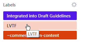
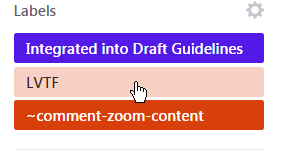
Figure 1. A tooltip is displayed below a LVTF button on hover so as not to obscure the button itself. It does however obscure content below the button (the next red button, called ~comment-zoom-content). To meet the Dismissible requirement, a user can press the Escape key to clear the tooltip without moving the mouse, as demonstrated in the second image.
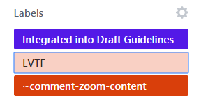
Figure 2. The button's tooltip also appears on focus and can be removed with the Escape key. The screen shot shows the same LVTF button with focus, but the tooltip has been dismissed and is no longer visible.
Example 2: Hoverable Tooltip
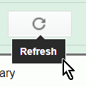
Figure 3. A button's tooltip is displayed directly below it on mouse hover which can easily be obscured by a large pointer. The tooltip itself is able to be hovered so the mouse pointer can be moved down to its bottom edge in order to view the tooltip text.
Related Resources
Resources are for information purposes only, no endorsement implied.
Techniques
Each numbered item in this section represents a technique or combination of techniques that the Accessibility Guidelines Working Group deems sufficient for meeting this success criterion. A technique may go beyond the minimum requirement of the criterion. There may be other ways of meeting the criterion not covered by these techniques. For information on using other techniques, see Understanding Techniques for WCAG Success Criteria, particularly the "Other Techniques" section.
Sufficient Techniques
- SCR39: Making content on focus or hover hoverable, dismissible, and persistent
- ARIA: Using role="tooltip" (Potential future technique)
- CSS: Using hover and focus pseudo classes (Potential future technique)
Failures
The following are common mistakes that are considered failures of this success criterion by the Accessibility Guidelines Working Group.
- F95: Failure of Success Criterion 1.4.13 due to content shown on hover not being hoverable
- Failure to make content dismissible without moving pointer hover or keyboard focus (Potential future technique)
- Failure to meet by content on hover or focus not remaining visible until dismissed or invalid (Potential future technique)
Key Terms
- assistive technology
hardware and/or software that acts as a user agent, or along with a mainstream user agent, to provide functionality to meet the requirements of users with disabilities that go beyond those offered by mainstream user agents
Note 1
Functionality provided by assistive technology includes alternative presentations (e.g., as synthesized speech or magnified content), alternative input methods (e.g., voice), additional navigation or orientation mechanisms, and content transformations (e.g., to make tables more accessible).
Note 2
Assistive technologies often communicate data and messages with mainstream user agents by using and monitoring APIs.
Note 3
The distinction between mainstream user agents and assistive technologies is not absolute. Many mainstream user agents provide some features to assist individuals with disabilities. The basic difference is that mainstream user agents target broad and diverse audiences that usually include people with and without disabilities. Assistive technologies target narrowly defined populations of users with specific disabilities. The assistance provided by an assistive technology is more specific and appropriate to the needs of its target users. The mainstream user agent may provide important functionality to assistive technologies like retrieving web content from program objects or parsing markup into identifiable bundles.
- conformance
satisfying all the requirements of a given standard, guideline or specification
- input error
information provided by the user that is not accepted
Note
This includes:
- Information that is required by the web page but omitted by the user
- Information that is provided by the user but that falls outside the required data format or values
- mechanism
process or technique for achieving a result
Note 1
The mechanism may be explicitly provided in the content, or may be relied upon to be provided by either the platform or by user agents, including assistive technologies.
Note 2
The mechanism needs to meet all success criteria for the conformance level claimed.
- process
series of user actions where each action is required in order to complete an activity
- relied upon
the content would not conform if that technology is turned off or is not supported
- technology
mechanism for encoding instructions to be rendered, played or executed by user agents
Note 1
As used in these guidelines "web technology" and the word "technology" (when used alone) both refer to web content technologies.
Note 2
Web content technologies may include markup languages, data formats, or programming languages that authors may use alone or in combination to create end-user experiences that range from static web pages to synchronized media presentations to dynamic Web applications.
- user agent
any software that retrieves and presents web content for users
- web page
a non-embedded resource obtained from a single URI using HTTP plus any other resources that are used in the rendering or intended to be rendered together with it by a user agent
Note 1
Although any "other resources" would be rendered together with the primary resource, they would not necessarily be rendered simultaneously with each other.
Note 2
For the purposes of conformance with these guidelines, a resource must be "non-embedded" within the scope of conformance to be considered a web page.