
Informational Graphic Contrast (Minimum)
Updated version: Graphics Contrast
SC Shortname
Graphic Contrast
SC Text
The visual presentation of graphical objects that are essential for understanding the content or functionality have a contrast ratio of at least 4.5:1 against the adjacent color(s), except for the following:
- Thicker: where the minimum width and height of the graphical object is at least 3 CSS pixels the graphic has a contrast ratio of at least 3:1;
- Sensory: Non-text content that is primarily intended to create a visual sensory experience has no minimum contrast requirement;
- Logotypes: Graphics that are part of a logo or brand name have no minimum contrast requirement.
Suggested Priority Level
Level AA
Related Glossary additions or changes
- essential
- WCAG 2.0's definition of essential
- graphical object
- A graphic or section of a graphic that represents a distinct object or sub-component with semantic meaning. It may be a component of a larger structured graphic such as a chart or map. There is a related concept in the ARIA graphics module for graphics with a document structure, but this applies to bitmap and vector graphics, or visual objects within them.
- CSS Pixels
- The browser-calculated value of pixels, which may be different from the physical device pixels. Browsers set the measure of
1pxin CSS as closely as possible to that of the reference pixel, which takes into account the assumed viewing distance. For example, 1px on a TV display at 3.5m away is much larger than 1px on a phone 30cm feet away. The CSS pixels on a high-resolution screen create text and objects that are the same size as a low-resolution screen if they both use CSS pixels.
What Principle and Guideline the SC falls within.
Principle 1, Guideline 1.4
Description
The intent of this success criterion is to apply the contrast requirements to important graphical elements in a similar way that it is applied to text in 1.4.3 Contrast (Minimum).
If a graphic is needed to understand the content or functionality of the webpage then it should be perceivable for people with low vision or other impairments.
The term "graphical object" is intended to apply to stand-alone icons such as a print icon (with no text), and the important parts of a more complex diagram such as each line in a graph. Not every graphical object needs to have sufficient contrast with its surroundings, only those that are required to understand what the graphic is conveying.
Graphics that are very thin are harder to perceive, therefore have a higher contrast requirement of 4.5:1. Graphics that are thicker or are solid shapes have a lower requirement of 3:1.
The term essential information is used as many graphics do not need to meet the contrast requirements. If a person needs to perceive a graphic, or part of a graphic (a graphical object) in order to understand the content it should have sufficient contrast. That is not a requirement for:
- A graphic with text embedded or overlayed that conveys the same information, such as labels and values on charts.
- The graphic is for aesthetic purposes that does not require the user to see or understand it to understand the content or use the functionality.
- The information is available in another form elsewhere on the page, or linked from the page.
- The graphic is part of a logo or brand name.
For designers developing icons that need to be perceived clearly, the following is an example of several sizes of icon having sufficient contrast at different sizes.
The thicker lines (3px or more) have 3:1 contrast (#949494 on #FFFFFF), the small lines (2px or less) need a darker grey (#777777 on #FFFFFF).
![]()
alt="Icon shown at 100px wide down to quite a small version."
Benefits
The intent of this Success Criterion is to provide enough contrast for graphics that convey important information so they can be perceived by people with moderately low vision.
People with low vision often have difficulty perceiving graphics that have insufficient contrast. This can be exacerbated if the person has a color vision deficiency that lowers the contrast even further. Providing a relative luminance (lightness) difference of 4.5:1 or greater can make these items more distinguishable when the person does not see a full range of colors and does not use assistive technology.
Examples
- Status icons on an application's dashboard (without associated text) have a 4.5:1 minimum contrast ratio.
- A pharmacy web site uses a warning image to indicate allergic reactions between medications. The image has a 4.5:1 minimum contrast ratio between the image's colors and its background.
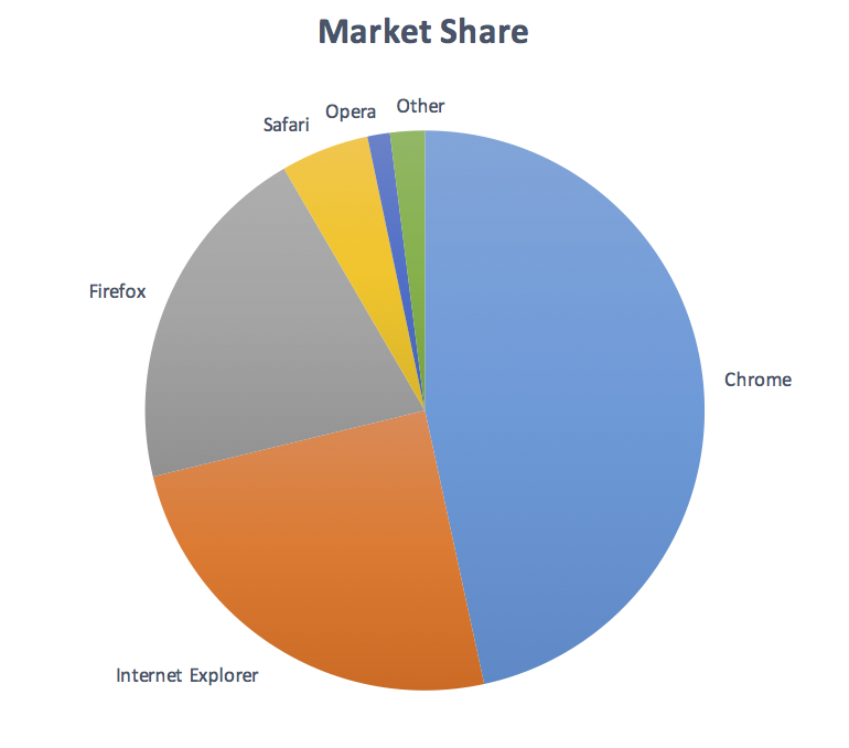
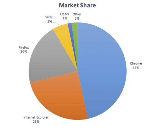
Pie Charts
Pie charts make a good case study for this success criteria, the following pie charts are intended to convey the proportion of market share each browser has. NB: The actual figures are made up, these are not actual market shares.
Fail: The following pie chart has labels for each slice (so passes 1.4.1 Use of Color), but in order to understand the proportions of the slices you must discern the edges of the slices (the graphical objects conveying essential information), and the contrast between the slices is not over 3:1.
Not applicable: The following pie chart has visible labels and values that convey equivalent information to the graphical objects (the pie slices):
Pass: The following pie chart has visible labels, and sufficient contrast around and between the slices of the pie chart (the graphical objects):
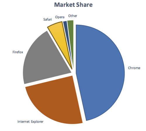
Note that on the last example, the spaces between the small slices is less than 3px wide, therefore those slices need a 4.5:1 contrast ratio against the white background.
Many other examples have been worked through on different graphic types.
Notes on how the contrast and thickness were derived
The contrast levels are transferred directly from the current 1.4.3 Contrast (Minimum).
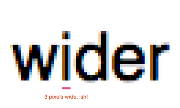
The size of 3px for 'thicker' was selected as it aligns with the large-text requirement of 1.4.3 Contrast (Minimum).
The following images show 24px (large) text, and a zoomed in view of a 24px word to show the pixels that make it up. The "i" character is 3 pixels wide.

Testability
For each graphic that conveys important information:
- Change the viewport width until the graphic is the smallest it can be at the default zoom level.
- Check whether there is an input agnostic way of showing more information (e.g. pop-overs or enhanced contrast shown with mouse, touch or keyboard interaction), if so that graphic / graphical object can be skipped.
- Check that each remaining graphical object has a contrast ratio of at least 3:1 with adjacent colors;
- If the thickness of the graphical object or its adjacent color(s) is less than 3px wide & high, check it has a contrast ratio of 4.5:1.
Expected Results
- # 3 and # 4 are true.
See Graphical element examples for specific examples.
Techniques
Existing Relevant Techniques for 1.4.3
- <a rel="nofollow" href="https://www.w3.org/TR/WCAG20-TECHS/G17.html">G17: Ensuring that a contrast ratio of at least 7:1 exists between text (and images of text) and background behind the text</a>
- <a rel="nofollow" href="https://www.w3.org/TR/WCAG20-TECHS/G18.html">G18: Ensuring that a contrast ratio of at least 4.5:1 exists between text (and images of text) and background behind the text</a>
- <a rel="nofollow" href="https://www.w3.org/TR/WCAG20-TECHS/G145.html">G145: Ensuring that a contrast ratio of at least 4.5:1 exists between text (and images of text) and background behind the text</a>
- <a rel="nofollow" href="https://www.w3.org/TR/WCAG20-TECHS/G174.html">G174: Providing a control with a sufficient contrast ratio that allows users to switch to a presentation that uses sufficient contrast</a>
- <a rel="nofollow" href="https://www.w3.org/TR/WCAG20-TECHS/G183.html">G183: Using a contrast ratio of 4.5:1 with surrounding text and providing additional visual cues on focus for links or controls where color alone is used to identify them</a>
New Techniques
- <a rel="nofollow" href="https://www.w3.org/WAI/GL/wiki/Using_sufficient_contrast_for_images_that_convey_information">Using sufficient contrast for images that convey information (Draft)</a>
- use other means of conveying information in a graphic
- include labels and values with the graphic
- contrasting differentiated pattern
- include contrasting lines between adjoining colors.
- include data within graphic (red piece of pie chart - white circle within red piece - 37% written in white circle)
- <a rel="nofollow" href="https://www.w3.org/WAI/GL/wiki/Icon_Font_with_an_On-Screen_Text_Alternative">Icon Font with an On-Screen Text Alternative</a>
Related Information
Actions
- LVTF ACTION-84: Write sc for informational graphics, color, visual pattern, etc - On Jim Allan, 8 September 2016.
- LVTF ACTION-69: to include coverage of contrast of info in graphics in the Accessibility Requirements for Low Vision Users doc - On Shawn Henry, 18 August 2016.
Articles
- Four color theorem - Wikipedia
- WCAG meeting December 6, 2016 (contrast for images data points) - Bruce Bailey, 6 December 2016
- Graphics contrast - critical principle WCAG WG Thread - Alastair Campbell, 5 December 2016
- Any Issues: Informational Graphic Contrast (Minimum) LVTF Thread - Jim Allan, 3 November 2016
- Graphics contrast LVTF Thread Alastair Campbell, 3 November 2016
- Update to Informational Graphic Contrast (Minimum) Erich Manser, 3 November 2016
- Informational Graphic Contrast (Minimum) LVTF Thread Erich Manser, 18 October 2016
- 1st draft: Informational Graphic Contrast (Minimum) - Laura Carlson, 9 September 2016
- First draft of "Contrast (Minimum) Proposed SC - Laura Carlson, 6 September 2016
- WCAG WG Thread: Icon Fonts and contrast - Jonathan Avila, 23 February 2016
- WCAG WG Thread: Color Contrast (was RE: Coming to a decision on 2.2 - which has long since been lost in this thread) - John Foliot, 22 February 2016
- Re: [LVTF] Technique volunteers needed - Laura Carlson, 8 February 2016
- [LVTF] Technique volunteers needed Technique volunteers needed - Joshue O Connor, 05 February 2016
GitHub
- WCAG WG 2.1 GitHub Issue 9 - Opened by Jim Allan, 15 September 2016
- New Low Vision SC to set baseline contrast for images & actionable icons that convey information (WCAG Issue 96) #3 - Raised by Laura Carlson, 16 June 2016
- WCAG WG GitHub Issue 96: [LowVis] graphics contrast is unmentioned (except as exceptions) - Raised by Chaals McCathie Nevile, 31 May 2015
Minutes
- 28 November 2016 WCAG WG Minutes
- 17 November 2016 LVTF Minutes
- 10 November 2016 LVTF Minutes
- 3 November 2016 LVTF Minutes
- 20 October 2016 LVTF Minutes
- 13 October 2016 LVTF Minutes
- 15 September 2016 LVTF minutes
- 08 September 2016 LVTF minutes
- 18 August 2016 LVTF minutes
- 2 March 2016 LVTF minutes
- 12 January 2016 WCAG minutes
Resolutions
- RESOLUTION: Laura and Alistair to work on an updated proposal on Informational Graphic Contrast (Minimum) - WCAG WG, 29 November 2016
- Ready for WCAG. - 17 November 2016
Surveys
- New SC proposals for November 22, 2016 - WCAG WG Survey Results
- Graphics contrast is unmentioned (except as exceptions) - WCAG Issue #96 New WCAG Technique
Tools
- Contrast Ratio Calculator
- Color Contrast Samples
- Contrast Analyser – Application
- Contrast Ratio Analyser - online service
- Colorable
- ContrastA
- Color Contrast Analyzer for Chrome
TPAC 2016
- TPAC Minutes - September 19, 2016
- Jim: Number 9, Informational graphics. We've discussed it a lot, e.g. having a pie chart how do you get 4.5:1 for 5 colours? Perhaps using a pattern, or put a key on the thing. We came up with those but thought we'd leave it in anyway. Issues with colour blindness where you can't tell one piece from another.
- MichaelC: Clarification, is this proposing a different thing to the same SC?
- Joshue: wonders if it should be called Informational charts and graphics Contrast (Minimum)
- Jim: The previous one was more interactive, this is static image that isn't interactive, but both are modifications to 1.4.3.
- shawn: LVTF not sure about separate vs. grouped points and welcomes WCAG WG guidance on that in general
- AWK: Not modifying 1.4.3, could be additional.
- Kathy: Talking about many different things, again calling out 4.5:1, but then could be 3.5:1 for slices of a pie chart. There are other ways to make things distinguishable, and don't want to stifle creativity around how people can achieve that.
- Jim: agree
- Kathy: E.g. having different slices of the pie become interactive. There are many ways to do it, and there was a lot of push back against 4.5:1, because it conveyed specific information. So we came up with other ways of doing it, which was visually apparent (tested with real users with LV). If we have something that states a minimum contrast, we need to add some exceptions, and there are other ways to achieve that from a usability point of view.
- Jim: Good feedback, we're still working on it.
- Rachael: I've run into issues where visual distinction applies, this seems like a technique to achieve something rather than the requirement itself.
- David: If we start limiting colours in the graphs, that will be a nightmare from a design perspective, I don't see how we can limit the colours without impacting other people. What is it contrasting against? The background? Each other? That needs some work.
- Rachael: Contrast is one technique to clearly distinguish borders in graphics and maps.
- AWK: In the task force, this is a slippery slope item. E.g. with an icon conveying information in a page (with alt text), it is functioning like text to convey the content, but without good contrast. E.g. a 'new' icon next to a movie in a listing. How to we make sure that sort of icon is accessible with contrast requirements, without impacting complex implementations like heat maps.
- laura: Example: Status icons on an application's dashboard.
- AWK: If you are a Christmas store with red & green icons...
- Kathy: It is largely about single colour icons conveying information. (Not a problem if also has text.)
- Jim's TPAC notes - 27 September 2016
- there are other design ways to make an informational graphic accessible besides 4.5:1. don't limit creativity.
- how is this different from you "can't use color alone"
- seems more of a technique rather than an SC.
- 4.5:1 contrast ratio with what