
User stories - use cases
@@ perhaps change title to Example Issues more accurate than user stories.
We are trying to capture problems and solutions agnostically. That is, not related to a specific technology (e.g. browser, flash, pdf, OS) or technique (e.g. using headings, responsive design)
Model: PROBLEM or DIFFICULTY with SOMETHING (software, feature, etc) = the TAGLINE. Write a one sentence SUMMARY of the use case. Then write (or keep) your DESCRIPTION of the use case. Move any proposed solutions to the Use Case Solutions page, i.e. using THIS (feature, setting, etc.) solves the problem. Or, if THIS (feature, setting, etc.) existed it would solve the problem.
Field Loss (Viewport Density)
- TAGLINE: Problems with fixed columns
- covered in http://w3c.github.io/low-vision-a11y-tf/requirements.html#proximity-of-related-information
- GROUP: The Soda Straw Problem
- SUMMARY: Content outside of the viewport is not perceivable.
- DESCRIPTION: A person has a limited field of view, which restricts vision to a small portion of the viewport and makes reading or interacting with content displayed in fixed columns time consuming and difficult. It is easy to loose context with multi-column layouts because of the need for left to right scrolling. Matching tests are nearly impossible to finish when the physical proximity between 2 sets is far apart. [Laura, UC-1]
- TAGLINE: Problems with navigation
- Is this adequately covered in the points under http://w3c.github.io/low-vision-a11y-tf/requirements.html#point-of-regard-and-proximity ? If not, What might we want to add in the User Needs document?
- GROUP: The Soda Straw Problem
- SUMMARY: When the browser back button is disabled and an application's back button (and navigation) is outside of the perceptual area, navigation is inoperable.
- DESCRIPTION: A person uses magnification software in an e-learning Web based product. He attempts to return to a landing Web page from an interior Web page by using the browser back button but it is disabled in the product. Moreover, the e-learning tool's back button (and navigation) is outside the zoomed-in field of view. No other method of navigation within the set of Web pages is provided i.e., breadcrumbs. This makes it difficult to locate previous content. [Laura, UC-3]
- TAGLINE: Difficulties with browser tabs
- covered in http://w3c.github.io/low-vision-a11y-tf/requirements.html#proximity-of-related-information
- GROUP: The Soda Straw Problem
- SUMMARY: Pages opening in new browser windows or tabs are not perceivable.
- DESCRIPTION: When zoomed in with screen magnifier software, a user loses the ability to see browser tabs. They are outside of her perceptual area. This is problematic when links, which open in a new tab or window fail to possess a link text warning of that fact. Hence she is unaware of when documents or Web pages open in a new tab and is disoriented. [Laura, UC-4]
- TAGLINE: Zoom - Point of Regard Changes
- GROUP: Point of Regard
- SUMMARY: Browser does not maintain point of regard when user zooms.
- DESCRIPTION: When a person is using zoom to enlarge content, the browser does not maintain the user place in the content (point of regard, i.e. top left corner of viewport). When the desired zoom is reached the user must find their place in content again. This happens every time the zoom is changed. [Erich, UC-1]
- TAGLINE: Programming language code in online webpages and text is published as pre formatted text.
- Is this covered by http://w3c.github.io/low-vision-a11y-tf/requirements.html#rewrap-for-one-direction-scrolling ?
- GROUP: Soda Straw Problem
- SUMMARY: Code examples are always presented as pre formatted text. This omits any chance of word wrapping and preserving indentation.
- DESCRIPTION: Indentation is a powerful visual aid to identify which blocks of code are at the same level. This convention has persisted from 1968 with ALGOL to the present day markup and object oriented languages. It is vital to reading code. Currently the conventions for publishing code on the internet force readers with low vision to choose between word-wrapping and loss of indentation structure. This inhibits education and employment in computer fields. [wayne, ?]
Size Limitations
- TAGLINE: Loosing information when base font is too large or content resized
- GROUP: Text Resize Dysfunction
- SUMMARY: When used with objects with fixed dimensions, changing the base font (and sometimes zooming) will cause information and controls to be outside the boundaries of the object.
- DESCRIPTION: When I change the base font-size beyond a certain point the content in 'alerts', DIV with overflow, and 'dialog' boxes extends beyond the boundaries of the box and is truncated. The truncated text is not readable making understanding to the content difficult. Occasionally, controls within the box are moved beyond the boundaries of the box. This results in the controls being unseen/unknown and unusable. [Jim A, UC-1]
- TAGLINE: Person wants to use mobile OS magnification.
- covered in http://w3c.github.io/low-vision-a11y-tf/requirements.html#text-size and http://w3c.github.io/low-vision-a11y-tf/requirements.html#size-of-all-elements
- GROUP: Mobile Accessibility Support
- SUMMARY: Mobile operating systems can be difficult to navigate by people who want to use magnification, not voice.
- DESCRIPTION: People with low vision may not want to rely upon screen readers. They don't want to listen. They want to read using screen magnification. This use case may not be accommodated by technologies, such as mobile operating systems, which implement a screen reader for people who are blind or who have low vision. They may not display enlargeable menus, even such as those for magnification features. They may not present error messages that are enlargeable. For people with low vision who want to read, these problems are significant barriers to using technologies that rely primarily or exclusively upon screen readers. [John Rochford, UC-1]
- TAGLINE: Horizontal + Vertical scrolling increases operational complexity and interferes with reading
- covered in http://w3c.github.io/low-vision-a11y-tf/requirements.html#rewrap-for-one-direction-scrolling
- GROUP: The Soda Straw Problem
- SUMMARY: Screen Magnification requires two dimensions of scrolling to navigate web content. Horizontal scrolling is used to read lines with screen magnifier functions and vertical scrolling with web functions is used to move from viewport to viewport.
- DESCRIPTION: When a user magnifies a page by 500% the original viewport becomes 25 screens of contant fragments. User has to scroll horizontally to the right through 5 screen to read each line. At the end of line the user must, move to the next line, then jump horizontally to the left to find the beginning of the next line. Once the user reaches the last line on the last screen of the enlarged viewport, she must use normal web navigation (keyboard or mouse) to advance to the next screen. [Wayne, UC-1]
- related resource: scrolling on TAdER
- TAGLINE: Single space text interferes with reading for many with low vision whether the print is large or small.
- GROUP: Customization
- SUMMARY: User trying to read single space document with magnification must still read single spacing. This preserves tracking problems even though the print is visible.
- DESCRIPTION: The low vision reader's focus often drifts up and down off the intended line when the text is single spaced. The user winds up reading a mishmash of words from different lines and has to reread lines slowing reading, impairing comprehension and creating fatigue. This is the tracking problem. Screen magnification does not help it. [Wayne, UC-3]
- TAGLINE: Fragmented lines cause cognitive overload
- covered http://w3c.github.io/low-vision-a11y-tf/requirements.html#rewrap-for-one-direction-scrolling
- GROUP: The Soda Straw Problem
- SUMMARY: Users sometimes forgets the exact wording of the left part of the line when they read a latter fragment. This requires re reading.
- DESCRIPTION: When a magnified line exceeds the size of the screen, the user must horizontally scroll to read all the formation. That means only part of a line is visible. If the content is difficult the reader may forget importat content in a line that is not visible. Contrast this with normal reading where the entire line is visible. Re reading is so much harder if you must scroll back to find the line segment(s) that contain the information missed. [Wayne UC-4]
- TAGLINE: Tooltips do not zoom
- GROUP: Hover Change of Context
- SUMMARY: Tooltips do not zoom
- DESCRIPTION: A user with lowvision has trouble reading "tooltips" on the page. The user scales/zooms the content on a page, but the tooltips do not change size. [Jim A, UC-2]
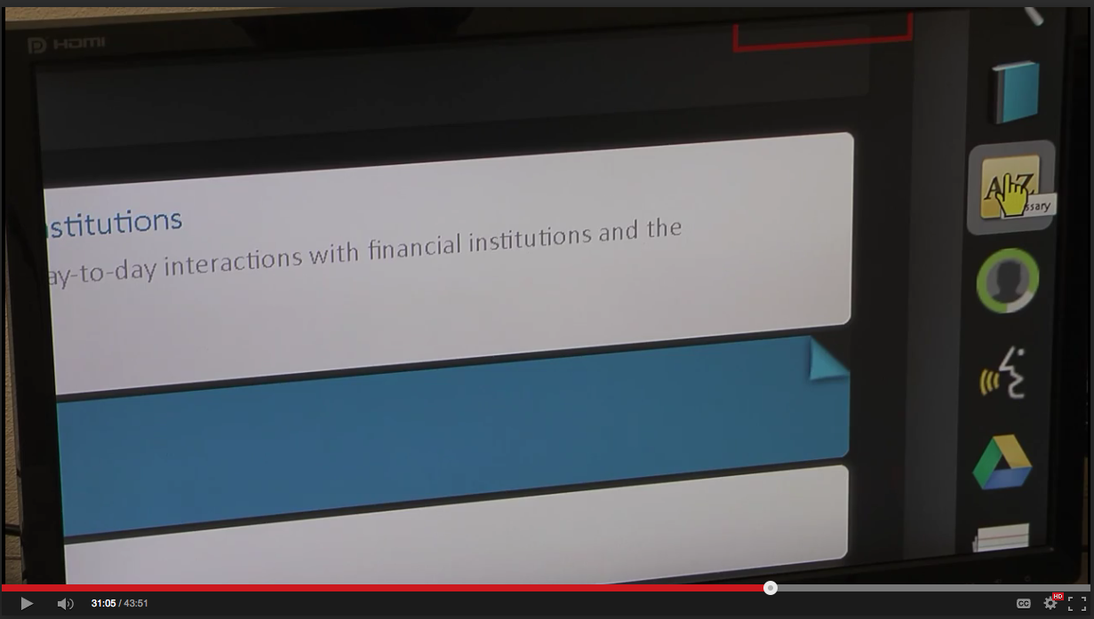
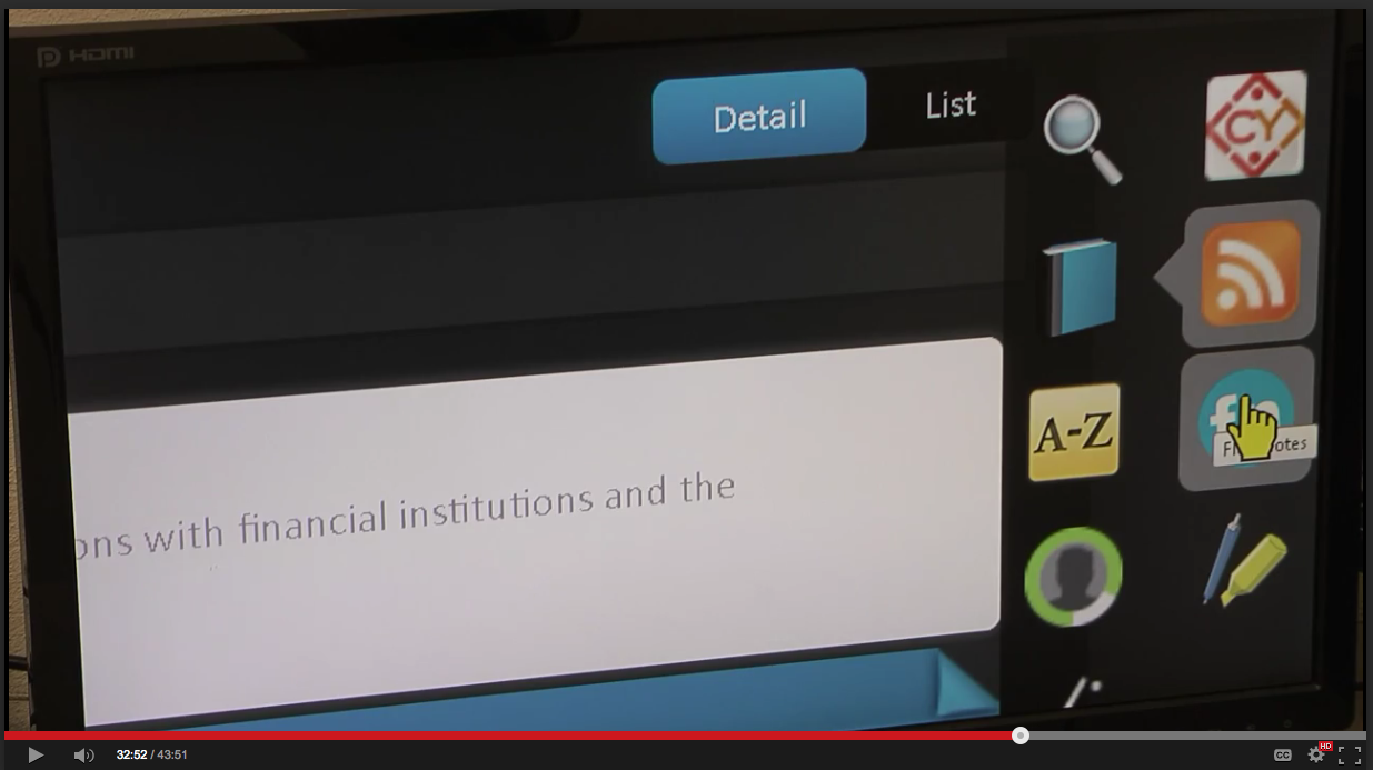
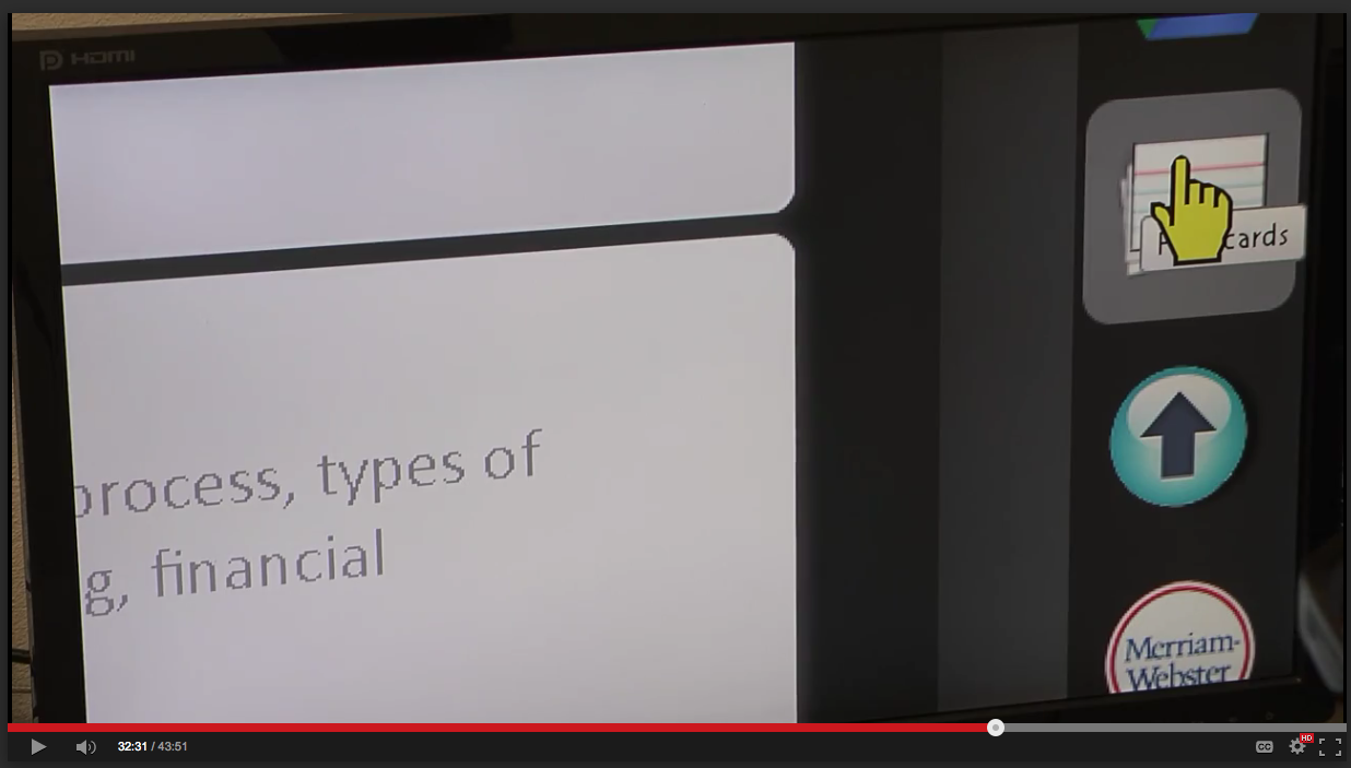
- TAGLINE: Difficulty reading tooltips for icons, which are obscured under the screen magnifier's large cursor
- GROUP: Hover Change of Context
- SUMMARY: Tooltip text is fragmented, rendering it incomprehensible or ambiguous.
- DESCRIPTION: A student using screen magnification software finds it difficult to read tooltips for icons, which are obscured under the large screen magnifier cursor. The design fails to provide static text labeling for icons, which would not require hovering. The following are links to screenshots from usability testing that illustrates the issue: 1.) Icon Hover Screenshot #1 (.png file) Hand cursor obscures tooltip. The letters "ssary" are visible in the tooltip. The first half of the word is missing. 2.) Icon Hover Screenshot #2 (.png file) Hand cursor obscures tooltip. The letters "F" and "otes" are visible in the tooltip. The middle of the word is missing. 3.) Icon Hover Screenshot #3 (.png file) The letters "cards" are visible in the tooltip. The cursor obscures the first half of the word in the tooltip. [Laura, UC-5]
- This seems to be a screen magnification (AT) issue. Is it broader or any issue beyond screen magnification? (I have larger cursor in OS and have not had that problem.) {Shawn}
- TAGLINE: Tooltips (popup objects) not persistent
- GROUP: Hover Change of Context
- SUMMARY: Tooltips (menus, other popups) do not remain visible when hover moves
- DESCRIPTION: A user of screen magnification is viewing a webpage with an acronym. when hovering over the acronym the expansion appears as a tooltip. The expansion is long and moves off the right side of viewport. The user tries to scroll to the right to read the entire tooltip, because of the scrolling the mouse pointer is no longer on the acronym and the tooltip vanishes. This hover behavior results in a change of context for your point of regard. Moving the mouse cursor to the tooltip has the same problem. This behavior also happens with graphics and call outs. When you hover on an image, new info appears - your point of regard shifts to new information. If you move the mouse into the new point of regard to read the information, the hover is no longer active and the information vanishes. See Audible.com for a pretty typical example. [Bruce Bailey, UC-1; Jim A, UC-3]
- TAGLINE: Popup objects do not vanish on Mobile
- GROUP: Loss of Content
- SUMMARY:
- TAGLINE: Text enlargement settings do not get applied to map text data
- GROUP: Mobile Accessibility Support
- SUMMARY: Mobile operating systems supplied map apps do not enlarge map labels for roads and cities for people who want to use magnification.
- DESCRIPTION: People with low vision who need to use mobile map applications need to see the road, city and other information to be able to read the map. Mobile settings for text enlargement do not get applied to map text data. [Alan Smith, UC-2]
- TAGLINE: Person wants to use PDF viewer on mobile device with text reflow.
- GROUP: Mobile Accessibility Support, Reflow
- SUMMARY: People with low vision need to be able to have text reflow applied to PDF files on mobile devices.
- DESCRIPTION: PDFs are a common format for a lot of data these days. People with low vision who need to use PDF viewers on mobile devices which offer text reflow. This is vital as a PDF file is extremely small text on a mobile device. Traditional zooming and panning makes reading a PDF file impossible for these users. [Alan Smith, UC-3]
- TAGLINE: Person wants to use the print function on their PC to print the page as a Large Print Document.
- GROUP: Reflow
- SUMMARY: People with low vision need to be able to have large format printed material.
- DESCRIPTION: User zooms page for readable font size, the page reflows. When the page is printed without zoomed (or anyother modifications). Current print functionality for printing material from the web or other applications do not support the required large format (very large fonts, reflow and placement of images on separate pages) structure required for a readable output on 8.5 x 11 or other commonly used paper sizes (A4 European) for people with low vision. Large text sizes, reflow and other page layout constructs are required for a readable printed document. Typically, this is only provided for them via specialty service companies. Note: See practices and guidelines for large print documents from (The Council of Citizens with Low Vision International, an Affiliate of the American Council of the Blind Arlington, VA). [Alan Smith, UC-4]
- related resource: Printing Customized Text on TAdER
- TAGLINE: Expanding Margins, Padding, Panels and Menus
- OPEN: Do we want to address this in a user need? If so, ideas for wording?
- Is the technical issue that spacing is defined by ems and it would be better defined as px or such?
- GROUP: Style
- SUMMARY: Text enlargement often causes margins, padding, panels and menus to enlarge. This encroaches on the space needed for the main content. A person who enlarges text by 200-400% can easily find themselves reading a little large print vertical slice down the middle of the page, or reading a tiny sliver of main text at the bottom of the page with a fixed position top panel that occupies 3/4 of the page. To see this phenomenon, just use CTL PLUS in this wiki. [Wayne Dick, [UC-4]
- OPEN: Do we want to address this in a user need? If so, ideas for wording?
Color and Contrast
- TAGLINE: Problems with content images, which have low visual contrast
- 'Do we want to address this in a user need? If so, ideas for wording? See Open Issues: Contrast as well as LowVis - GitHub Issue 96: Graphics contrast is unmentioned (except as exceptions)(remember that some people need low luminosity)
- GROUP: Image Contrast Not in WCAG thresholds WCAG Issue 96
- SUMMARY: When images fail to provide a sufficient contrast ratio, content is not perceivable.
- DESCRIPTION: A student with low vision is assigned to read a chapter in a teaching and learning Web-based product and write an essay to demonstrate his comprehension of the subject matter. The chapter contains complex diagrams with low visual contrast. It is difficult to understand much of what the images are depicting as they have insufficient contrast. [Laura, UC-6]
- TAGLINE: Problems with High Contrast Mode (HCM) and CSS background images
- Is this not a specific user need for low vision — it is also an issue for people who are blind or others who don't get the CSS image. It is basically just bad practice and is currently a WCAG failure: F3 "using CSS to include images that convey important information". We might want to put it in and "understanding" type doc, but not in the User Needs doc. @@may want to discuss see note:
- NOTE: F3 is under discussion to remove the HCM requirement so it would not be a failure. See pull request. A yet to be written technique for HCM has been proposed.
- Group: Contrast Accessibility Support
- SUMMARY: CSS background images in HCM vanish and are not perceivable.
- DESCRIPTION: Using an operating system's High Contrast Mode does not display content images included via CSS background declarations as background images are considered decorative. Therefore, important information or functionality is lost and users are not provided access to all content. [Laura, UC-7]
- Is this not a specific user need for low vision — it is also an issue for people who are blind or others who don't get the CSS image. It is basically just bad practice and is currently a WCAG failure: F3 "using CSS to include images that convey important information". We might want to put it in and "understanding" type doc, but not in the User Needs doc. @@may want to discuss see note:
- TAGLINE: Difficulties with inverted high contrast color scheme in some user agents
- GROUP: Contrast Accessibility Support
- SUMMARY: Some inverted high contrast color schemes fail to provide user customization.
- DESCRIPTION: User requires an inverted high contrast color scheme to effectively use an interface. Some user agents invert colors but fail to provide way to customize and set the inversion scheme based on user needs. They invert colors but fail to provide a customizable color scheme resulting in limited readability and content that is not perceivable. [Laura, UC-8]
- TAGLINE: HCM - Problems with photographic images
- OPEN: Do we want to address this in a user need?
- idea: "User Need - Color. When selecting HCM users can choose HCM for text only, or images only, or both text and images." {Jim in survey}
- I think that might be too specific of a user need. Maybe this becomes an example in a broader user need. {Shawn in e-mail}
- GROUP: Color Accessibility Support
- SUMMARY: Some inverted high contrast color schemes render photographic images as photo negatives.
- DESCRIPTION: A person using high contrast mode (HCM) which inverts colors is trying to view shared images of friends on social media but losing content & context because photographic images are also displayed with inverted colors. [Erich, UC-2]
- OPEN: Do we want to address this in a user need?
- TAGLINE: Fine control of colors/contrast
- DESCRIPTION: “I really need to be able to set the colours myself, presets don't work. Someone else’s idea is useless.” User Experiences on TAdER
Blur / Glare (Light Sensitivity)-- Illumination
- TAGLINE: Difficulties with large areas of white space
- GROUP: Excess Brightness
- SUMMARY: Glare from white space in large borders used a in design as a fixed framing mechanism produces discomfort.
- DESCRIPTION: White space, also known as negative space, is the open space between visual elements on a web page. The term describes the unused areas. Designers typically use it to give the eye rest. However, for a user, who is particularly sensitive to light, the white space renders brightly and causes glare in an e-learning Web based product. This in turn makes reading assignments and completing quizzes slow and difficult. [Laura, UC-9]
- TAGLINE: More brightness may not be better
- GROUP: Excess Brightness
- SUMMARY: Brightness accommodation may conflict with bright page settings.
- DESCRIPTION: A person who relies on increased brightness to be able to access most web content may experience discomfort when visiting a site with a higher brightness rating by design. [Erich, UC-3]
Light Sensitivity
- TAGLINE: Contrast not adjustable Causing Reading Fatigue
- GROUP: Excess Brightness
- SUMMARY: High Contrast Increases Both Legibility and Fatigue for Readers who are Light Sensitive:
- For some users the brightness required to create a 4.5:1 contrast irritates their light sensitivity. Over time their eyes and head hurt. The high contrast hastens fatigue. Although some sufficient level of contrast increases legibility for for some, others would prefer a larger font size over increased contrast to improve letter recognition. [Wayne, UC-2]
- TAGLINE: Clashing high contrast and bright images
- OPEN: Do we want to address this in a user need? If so, ideas for wording?
- GROUP: Excess Brightness / Color Customization
- SUMMARY: High contrast (light on dark) may clash jarringly with bright images.
- DESCRIPTION: A person using high contrast may experience difficulty accessing important content visually on a page if the content is placed near a decorative, non-essential element, like a picture or graphic, if these things render brightly in high contrast. @@ very similar to [Erich, UC-2]. [Erich, UC-4]
- When Text is Not Displayed Well
- Angelita user experience “very photophobic (bright lights hurt my eyes and make it impossible for me to see).”
Technologies
- TAGLINE: Person using TTS, not a screen reader. @@need more explanation - how is this a low vision issue?
- no relevant user need?
- GROUP: ???
- SUMMARY: Person may have limitations preventing screen-reader use, so instead uses text-to-speech (TTS).
- DESCRIPTION: A person cannot use a screen reader or a screen magnifier due to reasons such as cognitive capability or insufficient time to learn how. The person may instead use a significantly-simpler text-to-speech (TTS) technology, such as software installed on a computer, an open-source assistive-technology toolbar, or a website widget. [John Rochford, UC-2]
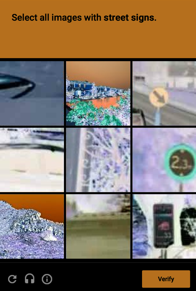
- TAGLINE: Difficulties with CAPTCHA or CAPTCHA FAIL!
- User Needs document coverage of images in general should cover CAPTCHA issues as well. We might want to add additional info in "Understanding" about CAPTCHA and low vision. (In use case below, lack of audio alternative is not specific to low vision - also blindness.)
- GROUP: Outcome Fatigue
- SUMMARY: A service fails to provide an alternative to a visual CAPTCHA (Completely Automated Public Turing Tests to Tell Computers and Humans Apart), which results in fatigue, frustration, and ultimately having to ask for assistance from another person.
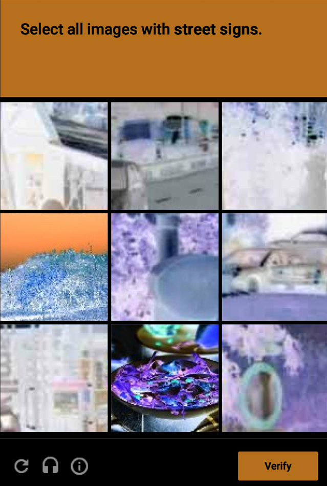
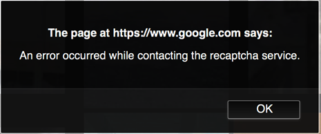
- DESCRIPTION: A person with low vision wants to write a research paper and use a scholar service to alert her of new information. When attempting to sign up she is initially presented with a check box, which says "I'm not a bot". She checks the box. Then she is presented with a modal dialog, which states "Select all images with street name signs" along with nine photographs (street sign screen capture #1 (.png file)). She has difficulty in identifying the images so she selects the "audio challenge" icon. Rather than being presented with an audio challenge another group of photos appear with the same instruction, "Select all images with street name signs" (street sign screen capture #2 (.png file)). After voluminous attempts, an error dialog box appears (error screen capture (.png file)). This experience of numerous, steadfast yet unsuccessful attempts to prove she is a human results in fatigue, frustration, being unable to sign up for the Web service independently, and ultimately having to ask for assistance from another person. [Laura, UC-10]
- TAGLINE: Problems interacting with interface components outside of the viewport
- covered in http://w3c.github.io/low-vision-a11y-tf/requirements.html#proximity-of-related-information
- GROUP: The Soda Straw Problem
- SUMMARY: When changes occur outside the perceptual area, they are not actionable.
- DESCRIPTION: Using a screen magnifier, it is difficult for a university student, who uses a magnified viewport to perceive error messages or other actions such as expanding menus when they happen outside of the usable magnified viewport area due to field loss. She tries to click around with her mouse and nothing works. The proximity of changes on the screen are not close to where the action happens e.g. inside the usable viewport area nor are they grouped together centrally. Many dialogns, messages, and alerts appear outside of the central part of the screen with no indication that anything that requires attention has appeared. [Laura, UC-2]
- TAGLINE: No reflow on mobile PDF
- covered in http://w3c.github.io/low-vision-a11y-tf/requirements.html#reflow-to-single-column and http://w3c.github.io/low-vision-a11y-tf/requirements.html#rewrap-for-one-direction-scrolling
- GROUP: Mobile Apps for Low Vision Users (see #9 Size above)
- SUMMARY: Text reflow needed for viewing PDF documents
- DESCRIPTION: People with low vision need to view PDF files on mobile devices with Reflow of text to eliminate horizontal scrolling regardless of text size settings via pinch zoom. Most of the current mobile PDF viewing apps do not support Text Reflow along with Text Resizing via pinch zooming (a common mobile device gesture). @@ developer can turn off pinch zoom in html. non-responsive design causes h-scrolling problems. [Alan Smith, UC-1]
- TAGLINE: Shadow Text and Necessary Contrast
- general user need covered in http://w3c.github.io/low-vision-a11y-tf/requirements.html#text-contrast Likely we'll want to provide specific details to address these types of cases in "Understanding".
- Group: Contrast
- SUMMARY: When text is shadowed the contrast around letters is not consistent
- DESCRIPTION: See WCAG Issue 98
- TAGLINE: Variable backgrounds such as those with gradients and background images require techniques to support the minimum contrast requirement.
- general user need covered in http://w3c.github.io/low-vision-a11y-tf/requirements.html#text-contrast Likely we'll want to provide specific details to address these types of cases in "Understanding".
- GROUP:
- DESCRIPTION: WCAG Issue 95. Given the many new background types with a variety of generating techniques full resolution of this issue may require extensions of WCAG 2.0. They may not, but the LVTF should examint this.
Uncategorized
- TAGLINE: Element-level customization
- TAGLINE: font
- TAGLINE: multiple
- covered throughout
Bibliography
- Hallett, E., Arnsdorff, B., Sweet, J., Roberts, Z., Dick, W., Jewett, T., & Vu, K.L. (2015). The usability of magnification methods: A comparative study between screen magnifiers and responsive web design. 2015,
- Hallett, E., Masters Thesis READING WITHOUT BOUNDS: HOW DIFFERENT MAGNIFICATION METHODS AFFECT THE PERFORMANCE OF STUDENTS WITH LOW VISION, 2015.
- Rosen D., Norenberg E., Carlson L., Angelos P. et. al. University of Minnesota Duluth Learning Product Usability Evaluation Summary Report, 2015.
- Rubin, G S., Legge G E. Psychophysics of Reading: VI. The Role of Contrast in Low Vision (PDF), 1989.
- Stark, Jeffrey D. The Inverting Feature On iOS & Android Doesn’t Meet The Needs Of Low Vision Users, 2015.
- TSBVI Specific Eye Conditions, Corresponding Impact on Vision, And Related Educational Considerations
- Low Vision Print Guidelines The Council of Citizens with Low Vision International, an Affiliate of the American Council of the Blind Arlington, VA