
LVTF Open Issues
Open
Contrast & Image accessibility
Text Contrast has:
User Need: Users can set the background color and the text color from the full color spectrum.
Not Relying on Color has:
User Need: Color is not used as the only visual means of conveying information, indicating an action, prompting a response, or distinguishing a visual element.
Issues and thoughts:
- Perhaps "Users can set the background color and the text color" needs to be broader. Foreground/background are two elements. There may be many other elements on the page with color that needs to be adjusted. {jim}
User Need: When differences in luminosity are used to communicate meaning including active, selection, and focus states, the difference in luminosity is sufficient between different states or additional means other than luminosity are used to communicate meaning. {Jon Avila, March 2, telco}
- Perhaps for images something broad along the lines of:
User Need: Users can perceive important information in images." {Laura}
- What about contrast in images? ("SUMMARY: When images fail to provide a sufficient contrast ratio, content is not perceivable.—[Laura UC-6 in use cases] (remember that some people need low luminosity)
- AWK: I'm very concerned about this as there is a lot of work on complex graphics where there may be many colors and the understanding is dependent on the user's ability to distinguish between any pair of colors.
Perhaps this is the right high-level user need that would address complex images but isn't too limiting:
User Need: Users can perceive all important information conveyed using color" {AWK}
- LowVis -GitHub Issue 96: Graphics contrast is unmentioned (except as exceptions)
- [LVTF] Joshue O Connor asked for a volunteer to draft a Technique for WCAG Issue 96. Laura volunteered and drafted a Using sufficient contrast for images that convey information technique. Discussion and ideas for improvement would be appreciated. Thanks, Laura.
- Related issues: Text in images – relates to other aspects of changing text, too, e.g., size, family, leading, etc.
- What about images overall?
- Possibly access to alt text and long descriptions?
- JDA: What about contrast of differences in color used to indicate selection or focus. Not related to text. Contrast of icons and emojs as well that are not indicated as text.
- what about difference in luminosity and not just color?
- JDA: allow overlay or reduction of data (relates to large number of color/patterns)
- Example, subway map that has many different colors and lines but all the user is concerned with is a few lines -- perhaps the user could remove the other lines to focus on the items that are most useful to them.
User Need: When differences in luminosity are used to communicate meaning including active, selection, and focus states, the difference in luminosity is sufficient between different states or additional means other than luminosity are used to communicate meaning.
- JDA: Emojis are used to communicate in human language and may have fine details or nuances that hard to perceive.
- JDA: Contrast on borders for form fields. Some form fields don't have borders at all. Example gofundme.com I've heard from designers that they need clear guidance on ratios for border contrast or they won't implement. Having a best practice or hearing on that users can adjust the border color means they will NOT take action.
Work with User Settings
Under Work with User Settings, we currently have "Seeing All Interface Elements". This needs more consideration and tweaking. For info and ideas, see 20 Jan 2016 minutes
<laura>
From the 25 February 2016 W3C Editor's Draft of: "Accessibility Requirements for People with Low Vision":
Some users increase the size of mouse pointers in their operating system or with screen magnification software. These should not obscure tooltip text. [Editors' Note: Possible figure to be added: hover hand obscures important tooltip text]
The following are images showing a hand cursor obscuring important tooltip text, that could be used to illustrate the issue. I created them based on UMD usability testing with students with low vision. Original samples from the video are linked on the Use case Wiki page [Laura, UC-5]). An email explaining the issue is available.
Examples: Obscured Tooltip on Hover
-
 On hover, a hand cursor obscures a tooltip that should read: "footnotes"
 -
 On hover, a hand cursor obscures a tooltip that should read: "glossary"
 -
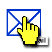 On hover, a hand cursor obscures a tooltip that should read: "mail".


These examples are also available at Obscured Tooltip on Hover.
Possible User Need Modification
User Need: From March 9, 20116 meeting.
Users can see and interact with all content and user interface controls presented visually, including when users have changed display settings such as text size, magnification, and cursor appearance.
</laura>
comments from March 2, 2016 telecon - note: the obscuring of tooltips seems to be related to screen magnifiers. It is a user need and should be called out, but not much that authors, browsers, or OS can do much about. {Jim}
<more from laura>
Tests
Obscured tooltips also occurs in OS X [tested on Yosemite and El Capitan] and FireFox when the cursor is enlarged. Check: Obscured Tooltip Test.
Possible Author Guidance
We may want to consider author guidance along the same lines as the HTML 5 spec, Joanna Briggs, Nielsen Norman Group, and Thomas Byttebier. They discourage the use of the title attribute. We could encouraged that authors use static on-screen text for information that conveys meaning.
References
Warning! Relying on the
titleattribute is currently discouraged as many user agents do not expose the attribute in an accessible manner as required by this specification...
- Title attributes - Joanna Briggs, Simply Accessible
Large mouse pointers are frequently used with screen magnification or on their own to make the mouse easier to spot. When hovering over a link that has a title attribute, the large mouse pointer covers the start of the title attribute. Longer title attributes may not fit inside the viewport with higher levels of magnification. Low vision users rely on following text with the mouse pointer – which is just not possible with a title attribute. It disappears when the mouse moves off the target. In usability testing, we’ve even observed a user who was looking for a link on the screen. She didn’t know that she stopped her mouse over a link with a title attribute. That title attribute hid the link she was trying to hunt down. How do you avoid these problems? Just avoid using title attributes.
- Icon Usability - Aurora Bedford, Nielsen Norman Group
A user’s understanding of an icon is based on previous experience. Due to the absence of a standard usage for most icons, text labels are necessary to communicate the meaning and reduce ambiguity.
- The Best Icon is a Text Label - Thomas Byttebier, UX Designer
don’t use an icon if its meaning isn’t a 100% clear to everyone. When in doubt, skip the icon. Reside to simple copy. A text label is always clearer. If you want to keep the graphical advantages of icons, you can of course combine the icon with copy. It’s an excellent solution that unites the best of both worlds.
</more from laura>
Point of Regard - Others?
Point of Regard and Proximity covers some things.
Are there other issues particularly relevant for people with low vision (as opposed to most users or other users with disabilities)? Can we generalize and group them so it’s not too much or too detailed? See UAAG Guideline 1.8 - Help users to orient within, and control, windows and viewports
Maybe others related to: For example, a user is tabbing through input fields – the content that has focus is in the view port... UAAG 1.8.2 Move Viewport to Selection and Focus: When a viewport’s selection or input focus changes, the viewport’s content moves as necessary to ensure that the new selection or input focus location is at least partially in the visible portion of the viewport.
<laura> The following images are examples which illustrate how the point of regard is impacted by the proximity of related content. They may be useful to our target audience...Perhaps in this document (or maybe not?). I'm not sure. From 3.6.2 Proximity of Related Information, "...point of regard is the area that the user is viewing. In user interface generally, proximity is about using space to group related content and separate unrelated content...in most cases, it is best if: Related information — such as labels and controls, or matching tests in two columns, or feedback — is in close proximity."
Examples of Point of Regard and Proximity
These examples are also available at Point of Regard and Proximity of Controls
1. Distant Proximity
The following is an example of distant proximity between form controls and labels. Space is not used to group related content. A large space exists between the labels 'Email', 'Phone', 'Voice', 'TTY' and their form controls.

2. Distant Proximity and the Effect on Point of Regard
When related form controls and labels are not in close proximity, they are likely to be outside of a person's point of regard. The following diagram shows point of regard as small circle. Within the point of regard the labels 'Email' and 'Phone' are visible. But not their form controls. In addition 2 radio buttons are visible without labels.

3. Close Proximity
The following is an example of closer proximity between form controls and labels. Space is reduced and used to group related content. The contact form shows close proximity of the labels 'Email', 'Phone', 'Voice', 'TTY' and their form contols.

4. Close Proximity and the Effect on Point of Regard
When related form controls and labels are in close proximity, they are more likely to be inside of a person's point of regard. The following diagram shows the point of regard is a small circle. The labels: Email, Phone, Voice, and TTY are next to their form controls inside of the point of regard.

</laura>
AWK: I think that it would be more compelling if we could make the improved image look better. Perhaps line up the two text boxes and adjust the radio labels to line up with the text boxes and shift the radios to the right?
Laura: Very good suggestion, Andrew. I lined up the two text boxes and adjusted the radio labels to line up with the text boxes and shifted the radios to the right.
Shawn: Consider also adding required field indication, per GitHub Issues #30
Misc
- Open issues in User stories - use cases
- list of functional limitations - covered as we'd like?
- Issues in GitHub
- Issues from Alastair Campbell 18 Feb 2016
- Learn more context
Script direction
Applies to: Rewrap for one direction scrolling and Reflow to single column
Note says
Script direction: Rewrap above and Reflow below are written for left-right and right-left scripts for now for simplicity. We'll edit it to make it generic to apply also vertically to top-to-bottom scripts as appropriate — if we can without complicating it too much, or change it to example only.
script vs. language reference says “Languages don't have a direction. Scripts have a writing direction”.
We probably want to check with I18N folks for guidance on this point.
Spacing Between Elements
Other requirements address users being able to change the space (element-level customization), and having related things in close proximity. Let's see how those sections pan out and if spacing between elements is a separate point or fits with another point?
Icon Fonts
Icon fonts that when combined with custom fonts are browser/AT combinations like ZoomText and Firefox change to squares and are unrecognizable. Discussed in 28 Oct telecon. Maybe issue for everyone and not sufficiently more of an issue for people with low vision?
Closed
Related info: User Stories - User Cases
Legibility and Readability and ???
Related info:
- Legibility and Readability and ??? in Research page
- Issue 31 in GitHub
- Legibility, Readability, Visibility pull request in GitHub
<shawn>Keeping in mind the audience and purpose of the document, I think we want to keep it a jargon-less as possible. Maybe we don't even try to define terms -- we just explain the concepts?</shawn>
<laura>I wonder if using the term "critical print size" would help to clarify or would it confuse our target audience? The Minnesota Laboratory for Low-Vision Research (MLLVR) (1999) defines critical print size as "the smallest print size at which patient's can read with their maximum reading speed. This is an important measure as it indicates the minimum magnification required for effortless reading." Russell-Minda (2007) et al use the same definition.
Additionally, MLLVR states normal or low vision often requires "letters that are two or three times larger than their acuity limits before they can achieve their maximum reading speeds", which supports Wayne's statement in the pull request. His proposed text is "All people, both with normal and low vision, require larger print for text to be legible as compared to being simply visible." But I'm not sure if we want to use the word "normal" to refer to people who do not have a disability as it can tend to infer that people with disabilities are not "normal".
Jakob Nielsen's 2015 article, provides definitions for Legibility, Readability, and Comprehension that use plain language and would be quite understandable to our target audience. However, they would not get across Wayne's point in the pull request.
In any event, perhaps consider acknowledging varying terminology and using qualifiers. The Gradisar, Humar, and Turk study uses the qualifier "In this paper, legibility is understood as..." </laura>
<wayne> We are not just dependent on researchers. We are the web experts. That means definitions of legibility can be useful in other contexts, but really may not serve our needs. We want to stay out of comprehension because that is cognitive. However there are gradations of legibility that are well within our preview and are very important to web accessibility. The following is on github: https://github.com/w3c/low-vision-a11y-tf/issues/31, but here it is now.
Types of Legibility
Legge[Chapter 4, Psychophysics of Reading] defines legibility as follows:
“Legibility” refers to perceptual properties of text that influence readability. Text which is hard to read because of obscure vocabulary, or complex syntax or meaning may be incomprehensible, but still highly legible. Legibility depends on both local and global properties of text. Local properties refer to characteristics of individual letters or pairs of letters such as font, print size, and letter spacing. Global properties refer to layout characteristics such as line length, line spacing, and page format.
If text is legible a person can read at an optimal speed and make few errors. However, legibility is a continuum. There is text that supports letter and word recognition minimally, but the text can only be read slowly and the reader may make many mistakes before getting a word correctly. This type of text is usually composed of the tiniest print sizes that are perceivable or may be combine close spacing, long lines, poor contrast etc. While minimally legible in a formal sense, such text could not support effective reading. The Low Vision Task Force (LVTF) will call this text “barely legible”.
It is possible to have text that is very legible, but may not supportive of reading for long periods of time. A text may be the right size, have the appropriate font, letter and line spacing, but if the page is in a multi-column format many readers with peripheral field low will have a difficult time navigating an article when they need to move from column to column. This can produce fatigue while reading a long article and result in not finishing the task. The same article formatted with the same size, font, letter and line spacing, and line length, but with only one column would enable reading with much less difficulty and sustain completing the reading task. For people with photophobia, a similar situation occurs with too much brightness. The person may be able to read rapidly with few mistakes, but sustained reading produces head aches and eye pain. Text that is very legible and supports reading long documents is denoted as sustainable by the LVTF.
Legibility thus has three states: Text that can be read rapidly with few mistakes is called legible. Text that admits recognition with extreme difficulty is barely legible, and text that is legible and can be read for extended periods of time is sustainable.
The terms “barely visible” and “sustainable” are new but are useful concepts for the LVTF. The task force is charged with prescribing effective typographic environments for people with low vision along with the content and user agent requirements necessary to produce them. The task force considers text that is barely legible and text that is legible but not sustainable to barriers to reading. A primary goal of the LVTF will be to ensure users with low vision can have access to sustainable text.
It is important to note that the terms barely visible, legible and sustainable are associated with the individual reader. Reading rapidly has a different meaning for a person with central field loss as compared to a normal reader. Numerous contrast studies have shown that contrast levels that are legible for normal readers are barely visible to most people with low vision. A primary goal of the LVTF will be to define the constraints on content and user agents that are necessary to produce sustainable text for each user of web content. </Wayne>
Sensory Characteristics
WCAG 1.3.3 Sensory Characteristics: Instructions provided for understanding and operating content do not rely solely on sensory characteristics of components such as shape, size, visual location, orientation..."
What are relevant issues particularly for low vision? Do we want to address this with a user need? If so, ideas for wording?
CLOSED: Discussed 16 March telecon (topic 6, topic 7)- didn't think of anything particular.
Survey 25 Jan 2016
Survey 25 Jan has lots on terminology.
still open:
- Contrast & Image accessibility - survey listed as open issue
resolved and implemented:
- User needs vs user requirements - survey, resolved 17 Jan
- Note title - survey, resolved 17 Jan
- Visual Acuity section heading - survey, resolved 17 Jan
- Field of Vision section heading - survey, resolved 17 Jan
- corrected terminology - survey, resolved 17 Jan
- * color vision deficiencies / color blind terminology - survey. resolved
Survey 18 Jan 2016
resolved and implemented:
- stats — WHO includes correctable & non-correctable. Do we want to include statistics in region(s) where correction is more available? Is there are stat that goes across regions, not just one country? resolved 27 Jan
- movement — Is movement notably different for people low vision versus people with “normal” vision?] resolved 27 Jan
- hyphenation — Does hyphenation best fit under tracking, or is there a better place for it? resolved 27 Jan
Proportional text increase
Potential user need not included: Users can choose whether or not all text increases proportionally.
This user need is sufficiently covered in other points:
- Zoom would provide proportional zoom.
- Text size lets the user text an overall text size.
- Element-level customization lets the user set size on headings.
For more info: 18 Jan 2016 Survey results, 20 January 2016 minutes
Contrast Adjacent
Potential user need not included: Users can distinguish between adjacent colors when needed for meaning.
Sometimes adjacent colors need to be distinguished, for example, colors next to each other in a pie chart. Such colors should have sufficient contrast and be distinguishable by people who are color blind and have reduced contrast sensitivity.
can be labeled
Covered sufficiently by "Color is not used as the only visual means of conveying information, indicating an action, prompting a response, or distinguishing a visual element."
LVTF notes:
“Therefore, in the recommendation, the contrast is calculated in such a way that color is not a key factor so that people who have a color vision deficit will also have adequate contrast between the text and the background.” Understanding 1.4.6 So we don't need to explicitly include colorblindness.