
Graphics Contrast
- Graphics Contrast GitHub Issue
- SC for viewing | SC for editing
- SC in full draft guideline
- Understanding doc for viewing | Understanding doc for editing | Understanding doc in master
SC Shortname
Graphic Contrast
The visual presentation of graphical objects that are essential for understanding the content or functionality have a contrast ratio of at least 4.5:1 against the adjacent color(s), except for the following: (Level AA)
- Thicker: Graphical objects with a minimum width and height of at least 3 CSS pixels have a contrast ratio of at least 3:1;
- Sensory: Non-text content that is primarily intended to create a visual sensory experience has no minimum contrast requirement;
- Logotypes: Graphics that are part of a logo or brand name have no minimum contrast requirement.
- Essential: A particular presentation of the graphical is essential to the information being conveyed.
Glossary additions
- graphical object
- A graphic or section of a graphic that represents a distinct object or sub-component with semantic meaning. It may be a component of a larger structured graphic such as a chart or map. There is a related concept in the ARIA graphics module for graphics with a document structure but this applies to bitmap and vector graphics, or distinct visual elements within them.
- CSS Pixels
visual angle of about 0.0213 degrees
A CSS pixel is the canonical unit of measure for all lengths and measurements in CSS. This unit is density-independent, and distinct from actual hardware pixels present in a display. User agents and operating systems should ensure that a CSS pixel is set as closely as possible to the <a href="https://www.w3.org/TR/css3-values/#reference-pixel">CSS Values and Units Module Level 3 reference pixel</a> [<a class="bibref" href="#bib-css3-values">css3-values</a>], which takes into account the physical dimensions of the display and the assumed viewing distance (factors which cannot be determined by content authors).
What Principle and Guideline the SC falls within.
Principle 1, Guideline 1.4 Distinguishable: Make it easier for users to see and hear content including separating foreground from background.
Description
The intent of this success criterion is to apply the contrast requirements to important graphical elements in a similar way that it is applied to text in 1.4.3 Contrast (Minimum).
If a graphic is needed to understand the content or functionality of the webpage then it should be perceivable for people with low vision or other impairments.
The term "graphical object" is intended to apply to stand-alone icons such as a print icon (with no text), and the important parts of a more complex diagram such as each line in a graph. Not every graphical object needs to have sufficient contrast with its surroundings, only those that are required to understand what the graphic is conveying.
Graphics that are very thin are harder to perceive, therefore have a higher contrast requirement of 4.5:1. Graphics that are thicker or are solid shapes have a lower requirement of 3:1.
The term essential information is used as many graphics do not need to meet the contrast requirements. If a person needs to perceive a graphic, or part of a graphic (a graphical object) in order to understand the content it should have sufficient contrast. That is not a requirement for:
- A graphic with text embedded or overlayed that conveys the same information, such as labels and values on charts.
- The graphic is for aesthetic purposes that does not require the user to see or understand it to understand the content or use the functionality.
- The information is available in another form elsewhere on the page, or linked from the page.
- The graphic is part of a logo or brand name.
For designers developing icons that need to be perceived clearly, the following is an example of several sizes of icon having sufficient contrast at different sizes.
The thicker lines (3px or more) have 3:1 contrast (#949494 on #FFFFFF), the small lines (2px or less) need a darker grey (#767676 on #FFFFFF).
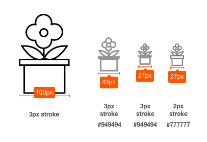
alt="Icon shown at 100px wide down to quite a small version."
Benefits
The intent of this Success Criterion is to provide enough contrast for graphics that convey important information so they can be perceived by people with moderately low vision.
People with low vision often have difficulty perceiving graphics that have insufficient contrast. This can be exacerbated if the person has a color vision deficiency that lowers the contrast even further. Providing a relative luminance (lightness) difference of 4.5:1 or greater can make these items more distinguishable when the person does not see a full range of colors and does not use assistive technology.
Examples
- Status icons on an application's dashboard (without associated text) have a 4.5:1 minimum contrast ratio.
- A pharmacy web site uses a warning image to indicate allergic reactions between medications. The image has a 4.5:1 minimum contrast ratio between the image's colors and its background.
Pie Charts
Pie charts make a good case study for this success criteria, the following pie charts are intended to convey the proportion of market share each browser has. NB: The actual figures are made up, these are not actual market shares.
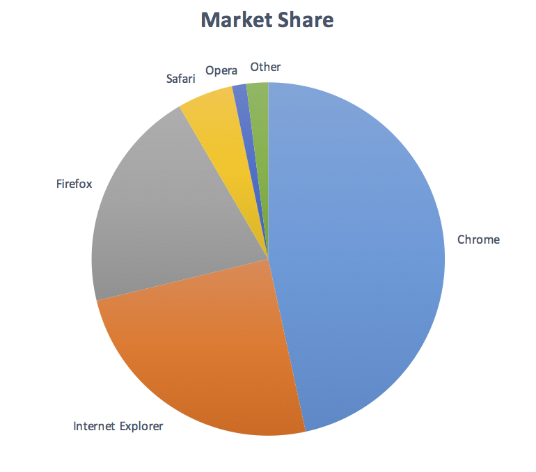
Fail: The following pie chart has labels for each slice (so passes 1.4.1 Use of Color), but in order to understand the proportions of the slices you must discern the edges of the slices (the graphical objects conveying essential information), and the contrast between the slices is not over 3:1.
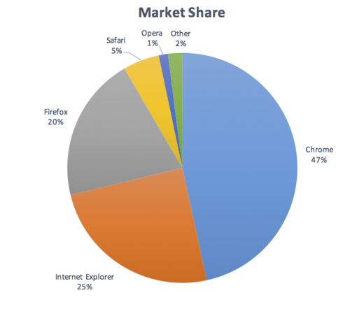
Not applicable: The following pie chart has visible labels and values that convey equivalent information to the graphical objects (the pie slices):
Pass: The following pie chart has visible labels, and sufficient contrast around and between the slices of the pie chart (the graphical objects):
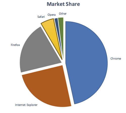
Note that on the last example, the spaces between the small slices is less than 3px wide, therefore those slices need a 4.5:1 contrast ratio against the white background.
Many other examples have been worked through on different graphic types.
Notes on how the contrast and thickness were derived
The contrast levels are transferred directly from the current 1.4.3 Contrast (Minimum).
The size of 3px for 'thicker' was selected as it aligns with the large-text requirement of 1.4.3 Contrast (Minimum).
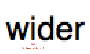
The following images show 24px (large) text, and a zoomed in view of a 24px word to show the pixels that make it up. The "i" character is 3 pixels wide.

Testability
For each graphic that is relied on to convey important information:
- Change the viewport width until the graphic is the smallest it can be at the default zoom level.
- Check whether there is an input agnostic way of showing more information (e.g. pop-overs or enhanced contrast shown with mouse, touch or keyboard interaction), if so that graphic / graphical object can be skipped.
- Check that each remaining graphical object has a contrast ratio of at least 3:1 with adjacent colors;
- If the thickness of the graphical object or its adjacent color(s) is less than 3px wide & high, check it has a contrast ratio of 4.5:1.
Expected Results
- # 3 and # 4 are true.
See Graphical element examples for specific examples.
Techniques
Existing Relevant Techniques for 1.4.3
- <a rel="nofollow" href="https://www.w3.org/TR/WCAG20-TECHS/G17.html">G17: Ensuring that a contrast ratio of at least 7:1 exists between text (and images of text) and background behind the text</a>
- <a rel="nofollow" href="https://www.w3.org/TR/WCAG20-TECHS/G18.html">G18: Ensuring that a contrast ratio of at least 4.5:1 exists between text (and images of text) and background behind the text</a>
- <a rel="nofollow" href="https://www.w3.org/TR/WCAG20-TECHS/G145.html">G145: Ensuring that a contrast ratio of at least 4.5:1 exists between text (and images of text) and background behind the text</a>
- <a rel="nofollow" href="https://www.w3.org/TR/WCAG20-TECHS/G174.html">G174: Providing a control with a sufficient contrast ratio that allows users to switch to a presentation that uses sufficient contrast</a>
- <a rel="nofollow" href="https://www.w3.org/TR/WCAG20-TECHS/G183.html">G183: Using a contrast ratio of 4.5:1 with surrounding text and providing additional visual cues on focus for links or controls where color alone is used to identify them</a>
New Techniques
- <a rel="nofollow" href="https://www.w3.org/WAI/GL/wiki/Using_sufficient_contrast_for_images_that_convey_information">Using sufficient contrast for images that convey information (Draft)</a>
- use other means of conveying information in a graphic
- include labels and values with the graphic
- contrasting differentiated pattern
- include contrasting lines between adjoining colors.
- include data within graphic (red piece of pie chart - white circle within red piece - 37% written in white circle)
- <a rel="nofollow" href="https://www.w3.org/WAI/GL/wiki/Icon_Font_with_an_On-Screen_Text_Alternative">Icon Font with an On-Screen Text Alternative</a>
Related Information
- Original Wiki page: Informational Graphic Contrast (Minimum)
- Issue on github
- Pull request for WCAG 2.1 FPWD