 WD-CSS2-971104
WD-CSS2-971104
This specification defines Cascading Style Sheet, Level 2.
This is a W3C Working Draft for review by W3C members and other interested parties. It is a draft document and may be updated, replaced or obsoleted by other documents at any time. It is inappropriate to use W3C Working Drafts as reference material or to cite them as other than "work in progress". This is work in progress and does not imply endorsement by, or the consensus of, either W3C or members of the CSS working group.
This document has been produced as part of the W3C Style Activity, and is intended as a draft of a proposed recommendation for CSS2.
If you did not get this document directly from the W3C website you may want to check whether you have the latest version of this document by looking at the list of W3C technical reports at <http://www.w3.org/TR/>.
CSS2 builds on CSS1, specified in http://www.w3.org/TR/REC-CSS1-961217. All valid CSS1 stylesheets are valid CSS2 stylesheets.
Please send detailed comments on this document to the editors. We cannot guarantee a personal response but we will try when it is appropriate. Public discussion on CSS features takes place on www-style@w3.org and messages are archived at http://lists.w3.org/Archives/Public/www-style/.
1 About the CSS2 Specification
1.1 How to read the specification
1.2 How the specification is organized
1.3 Acknowledgments
2 Introduction to CSS2
2.1 A brief CSS2 tutorial
2.2 Design principles behind CSS2
3 Definitions and document conventions
3.1 Definitions
3.1.1 Document language
3.1.2 Element
3.1.3 User agent (or UA)
3.1.4 Conforming user
agent
3.1.5 Default style sheet
3.2 Conventions
3.2.1 Document language elements and attributes
3.2.2 CSS property definitions
3.2.3 HTML conventions
4 CSS2 syntax and basic data types
4.1 Syntax
4.1.1 Tokenization
4.1.2 Characters and case
4.1.3 Statements
4.1.4 At-rules
4.1.5 Blocks
4.1.6 Rule sets, declaration blocks, and selectors
4.1.7 Declarations and properties
4.1.8 Comments
4.1.9 More examples
4.2 Values
4.2.1 Integers and numbers
4.2.2 Lengths
4.2.3 Percentages
4.2.4 URLs
4.2.5 Colors
4.2.6 Angles
4.2.7 Time
4.2.8 Frequencies
4.3 CSS embedded in HTML
4.4 CSS as a stand-alone file
4.5 Character escapes in CSS
5 CSS2 processing model
5.1 Introduction to the CSS2 processing model
5.2 The document tree
5.3 Inheritance
5.4 Rendering objects
6 Selectors
6.1 Type selectors
6.2 Grouping
6.3 Attribute selectors
6.3.1 Matching attributes, single values, and multiple values
6.3.2 The class and id attribute in HTML
6.3.3 The class attribute in other document languages: @class
6.3.4 The id attribute
6.4 Contextual selectors
6.5 Parent-child selectors
6.6 Sequential selectors
6.7 Pseudo-elements and pseudo-classes
6.7.1 The :first-line pseudo-element
6.7.2 The :first-letter pseudo-element
6.7.3 Overlapping pseudo-elements
6.7.4 Pseudo-elements with contextual selectors
6.7.5 Anchor pseudo-classes:
:link,
:active, and
:visited
6.7.6 Combining pseudo-elements with normal classes
6.7.7 Colliding attribute selectors and pseudo-classes
7 Cascade
7.1 Cascading order
7.1.1 'Important' rules
7.1.2 Cascading order in HTML
7.1.3 Precedence of non-CSS presentational hints
8 Media types
8.1 Introduction to media types
8.2 Specifying media-dependent style sheets
8.2.1 The @media rule
8.2.2 The media-dependent @import rule
8.3 Recognized media types
8.3.1 The canvas
Scrollable media
9 The box model
9.1 Introduction to the box model
9.2 Box dimensions
9.3 Margin properties:
'margin-top',
'margin-right',
'margin-bottom',
'margin-left', and
'margin'
Values for <margin-width>
9.4 Padding properties:
'padding-top',
'padding-right',
'padding-bottom',
'padding-left', and
'padding'
9.4.1 Values for <padding-width>
9.5 Border properties
9.5.1 Border width: 'border-top-width', 'border-right-width', 'border-bottom-width',
'border-left-width', and
'border-width'
Values for <border-width>
9.5.2 Border color:
'border-top-color',
'border-right-color',
'border-bottom-color',
'border-left-color', and
'border-color'
9.5.3 Border style:
'border-top-style',
'border-right-style',
'border-bottom-style',
'border-left-style', and
'border-style'
Values for <border-style>
9.6 Example of margins, padding, and borders
10 Visual rendering model
10.1 Introduction to the visual rendering model
10.2 Establishing box positions
10.2.1 Containing blocks
10.2.2 Direction of flow
10.3 Normal flow
10.3.1 Block-level layout
List-item elements
10.3.2 Inline layout
Anonymous text boxes
10.3.3 Dual-mode elements: run-in and compact
10.3.4 Relative positioning
10.3.5 Controlling layout behavior: the 'display' property
10.4 Floats: 'float' and 'clear'
10.4.1 Controlling floats
10.5 Absolute positioning
10.5.1 Properties to specify position: 'top',
'right',
'bottom',
'left'
10.5.2 Fixed positioning
10.6 Comparison of normal, relative, floating, absolute positioning
10.6.1 Normal flow
10.6.2 Relative positioning
10.6.3 Floating a box
10.6.4 Absolute positioning
10.7 Z-order: Layered presentation
10.7.1 Specifying the stack level: the 'z-index' property
10.8 Multicolumn layout
11 Visual rendering model details
11.1 Box width calculations: the 'width' property
11.1.1 Relationship of width dimensions
11.1.2 Width of floats and replaced elements
11.1.3 Width of absolutely positioned elements
11.1.4 Minimum and maximum widths: 'min-width' and 'max-width'
11.2 Box height calculations: the 'height' property
11.2.1 Height of replaced elements
11.2.2 Height of absolutely positioned elements
11.2.3 Minimum and maximum heights: 'min-height' and 'max-height'
11.2.4 Collapsing margins
11.3 Line height calculations: the 'line-height' and 'vertical-align'
properties
11.4 Floating constraints
11.5 Overflow and clipping
11.5.1 Overflow: the 'overflow' property
11.5.2 Clipping: the 'clip' property
11.6 Visibility: the 'visibility' property
11.7 Dynamic positioning
11.8 Filters
12 Paged media
12.1 Introduction to paged media
12.2 Page breaks
12.2.1 Page break properties: 'page-break-before',
'page-break-after',
'orphans', and
'widows'
12.2.2 Allowed page breaks
12.2.3 Forced page breaks
12.2.4 "Best" page breaks
12.3 Page boxes: the @page rule
12.3.1 Page margins
12.3.2 Page size: the 'size' property
Rendering page boxes that do not fit a target sheet
12.3.3 Crop marks: the 'marks
property
12.3.4 Left and right pages
12.3.5 Running headers and footers
12.3.6 Marking elements for the running headers & footers
12.3.7 Content outside the page box
12.4 Cascading in the page context
13 Colors and Backgrounds
13.1 Foreground color: the 'color' property
13.2 Background properties: 'background-color', 'background-image', 'background-repeat', ,
'background-position', and
'background'
14 Fonts
14.1 Introduction
14.2 Font specification
14.2.1 Font specification properties
14.2.2 Font family: the 'font-family'
14.2.3 Font style: the
'font-style',
'font-variant', and
'font-weight' properties
14.2.4 Font size: the 'font-size' property
14.2.5 Shorthand font property: the 'font' property
14.2.6 Generic font families
serif
sans-serif
cursive
fantasy
monospace
14.3 Font selection
14.3.1 Font Descriptions and @font-face
14.3.2 Descriptors for Selecting a Font:
'font-family',
'font-style',
'font-variant',
'font-weight', and
'font-size'
14.3.3 Descriptors for Font Data Qualification: 'unicode-range'
14.3.4 Descriptor for Numeric Values: 'units-per-em'
14.3.5 Descriptor for Referencing: 'src'
14.3.6 Descriptors for Matching: 'panose-1',
'stemv',
'stemh',
'slope',
'cap-height',
'x-height',
'ascent', and
'descent'
14.3.7 Descriptors for Synthesis: 'widths' and 'definition-src'
14.3.8 Descriptors for Alignment:
'baseline',
'centerline',
'mathline',
and 'topline'
14.4 Font Characteristics
14.4.1 Introducing Font Characteristics
14.4.2 Adorned font name
14.4.3 Central Baseline
14.4.4 Co-ordinate units on the em square
14.4.5 Font encoding tables
14.4.6 Font family name
14.4.7 Glyph Representation widths
14.4.8 Horizontal stem width
14.4.9 Height of capital glyph representations
14.4.10 Height of lowercase glyph representations
14.4.11 Lower Baseline
14.4.12 Mathematical Baseline
14.4.13 Maximal bounding box
14.4.14 Maximum unaccented height
14.4.15 Maximum unaccented depth
14.4.16 Panose-1 number
14.4.17 Range of Unicode characters
14.4.18 Top Baseline
14.4.19 Vertical stem width
14.4.20 Vertical stroke angle
14.5 Font matching algorithm
14.5.1 Examples of font matching
15 Text
15.1 Indentation: the 'text-indent' property
15.2 Alignment: the 'alignment'
property
15.3 Decoration
15.3.1 Underlining, over lining, striking, and blinking: the 'text-decoration'
property
15.3.2 Text shadows: the 'text-shadow' property
15.4 Letter and word spacing: the 'letter-spacing' and 'word-spacing' properties
15.5 Case
15.5.1 Capitalization: the 'text-transform' property
15.5.2 Special first letter/first line
15.6 White space: the 'white-space' property
15.7 Generated text
15.8 Automatic numbering
15.9 Text in HTML
15.9.1 Forcing a line break
16 Lists
16.1 Visual formatting of lists
16.1.1 List properties: 'list-style-type', 'list-style-image', 'list-style-position',
and 'list-style'
17 Tables
17.1 Table layout
17.1.1 Row and column properties: 'column-span', and
'row-span'
17.2 Computing widths and heights
17.3 Placement of the borders
17.4 Conflict resolution for borders
17.5 Properties for columns and rows
17.6 Vertical alignment of cells in a row
17.7 Horizontal alignment of cells in a column
17.8 Table captions: the 'caption-side' property
17.9 Generating speech: the 'speak-header-cell' property
17.10 Table implementation notes
18 User interface
18.1 Cursors: the 'cursor' property
18.2 User preferences for colors
18.3 Other rendering issues that depend on user agents
18.3.1 Magnification
19 Aural style sheets
19.1 Aural cascading style sheet properties
19.1.1 Volume properties: 'volume'
19.1.2 Speaking properties: 'speak'
19.1.3 Pause properties: 'pause-before', 'pause-after', and 'pause'
19.1.4 Cue properties: 'cue-before', 'cue-after', and 'cue'
19.1.5 Mixing properties: 'play-during'
19.1.6 Spatial properties: 'azimuth' and
'elevation'
19.1.7 Voice characteristic properties: 'speech-rate', 'voice-family',
'pitch',
'pitch-range',
'stress',
'richness',
'speak-punctuation',
'speak-date',
'speak-numeral', and
'speak-time'
Appendix A: A sample style sheet for HTML 4.0
Appendix B: Changes from CSS1
Appendix C: Implementation and performance
notes
Colors
Gamma Correction
Fonts
Glossary of font terms
Font retrieval
Appendix D: The grammar of CSS2
Appendix E: Aids to Web Fonts implementation
Meaning of the Panose Digits
Deducing Unicode Ranges for TrueType
This document has been written with two types of readers in mind: CSS authors and CSS implementors. We hope the specification will provide authors with the tools they need to write efficient, attractive, and accessible documents, without overexposing them to CSS's implementation details. Implementors, however, should find all they need to build user agents that interpret CSS correctly.
The specification has been written with two modes of presentation in mind: electronic and printed. Although the two presentations will no doubt be similar, readers will find some differences. For example, links will not work in the printed version (obviously), and page numbers will not appear in the electronic version. In case of a discrepancy, the electronic version is considered the authoritative version of the document.
The specification may be approached in several ways:
Read from beginning to end. The specification begins with a general presentation of CSS and becomes more and more technical and specific towards the end. This is reflected in the specification's main table of contents, which presents topical information, and the indexes, which present lower level information in alphabetical order.
This specification includes the following sections:
This specification is the product of the W3C Working Group on Cascading Style Sheets and Formatting Properties. In addition to the editors of this specification, the members of the Working Group are: Brad Chase (Bitstream), Chris Wilson (Microsoft), Daniel Glazman (Electricité de France), Dave Raggett (W3C/HP), Ed Tecot (Microsoft), Jared Sorensen (Novell), Lauren Wood (SoftQuad), Laurie Anna Kaplan (Microsoft), Mike Wexler (Adobe), Murray Maloney (Grif), Powell Smith (IBM), Robert Stevahn (HP), Steve Byrne (JavaSoft), Steven Pemberton (CWI), and Thom Phillabaum (Netscape). We thank them for their continued efforts.
A number of invited experts to the Working Group have contributed: George Kersher, Glenn Rippel (Bitstream), Jeff Veen (HotWired), Markku T. Hakkinen (The Productivity Works), Martin Dürst (Universität Zürich), Roy Platon (RAL), Todd Fahrner (Verso) and Vincent Quint (W3C).
The section on Web Fonts was strongly shaped by Brad Chase (Bitstream) David Meltzer (Microsoft Typography) and Steve Zilles (Adobe). The following people have also contributed in various ways to the section pertaining to fonts: Alex Beamon (Apple), Ashok Saxena (Adobe), Ben Bauermeister (HP), Dave Raggett (W3C/HP), David Opstad (Apple), David Goldsmith (Apple), Ed Tecot (Microsoft), Erik van Blokland (LettError), François Yergeau (Alis), Gavin Nicol (Inso), Herbert van Zijl (Elsevier), Liam Quin, Misha Wolf (Reuters), Paul Haeberli (SGI), and the late Phil Karlton (Netscape).
The section on Paged Media was in large parts authored by Robert Stevahn (HP) and Stephen Waters (Microsoft).
Robert Stevahn (HP), along with Scott Furman (Netscape) and Scott Isaacs (Microsoft) were key contributors to CSS Positioning.
Mike Wexler (Adobe) was the editor of the interim Working Draft which described many of the new features of CSS2.
T.V.Raman (Adobe) made pivotal contributions towards Aural Cascading Style Sheets and the concepts of Aural presentation.
Todd Fahrner (Verso) researched contemporary and historical browsers to develop the sample style sheet in the appendix.
Through electronic and physical encounters, the following people have contributed to the development of CSS2: James Clark, Dan Connolly, Douglas Rand, Sho Kuwamoto, Donna Converse, Scott Isaacs, Lou Montulli, Henrik Frystyk Nielsen, Jacob Nielsen, Vincent Mallet, Philippe Le Hegaret, William Perry, David Siegel, Al Gilman, Jason White, Daniel Dardailler.
The discussions on www-style@w3.org have been influential in many key issues for CSS. Especially, we would like to thank Bjorn Backlund, Todd Fahrner, MegaZone, Eric Meyer, David Perrell, Liam Quinn and Chris Wilson for their participation.
Special thanks to Arnaud Le Hors, whose engineering contributions made this document work.
Lastly, thanks to Tim Berners-Lee without whom none of this would have been possible.
In this tutorial, we show how easy it can be to design simple style sheets. For this tutorial, you will need to know a little [HTML40] and some basic desktop publishing terminology.
We begin with the following little HTML document:
<HTML>
  <TITLE>Bach's home page</TITLE>
  <BODY>
    <H1>Bach's home page</H1>
    <P>Johann Sebastian Bach was a prolific composer.
  </BODY>
</HTML>
To set the text color of the H1 elements to blue, you can write the following CSS rule:
H1 { color: blue }
The [HTML40] specification defines how style sheet rules may be included in or linked to an HTML document (in the element's start tag, in the head of the document, or linked externally). Please consult the [HTML40] specification for details and recommended usage.
In our example, we place the rule in the head of the document in a STYLE element:
<HTML>
  <TITLE>Bach's home page</TITLE>
  <STYLE TYPE="text/css">
    H1 { color: blue }
  </STYLE>
  <BODY>
    <H1>Bach's home page</H1>
    <P>Johann Sebastian Bach was a prolific composer.
  </BODY>
</HTML>
Note that what appears within the STYLE element's start and end tags has CSS syntax, not HTML syntax.
This example illustrates a simple CSS rule. A rule consists of two main parts: selector ('H1') and declaration ('color: blue'). The declaration has two parts: property ('color') and value ('blue'). While the example above tries to influence only one of the properties needed for rendering an HTML document, it qualifies as a style sheet on its own. Combined with other style sheets (one fundamental feature of CSS is that style sheets are combined) it will determine the final presentation of the document.
The selector is the link between the HTML document and the style sheet, and all HTML element types are possible selectors. HTML element types are defined in the [HTML40] specification.
The 'color' property is just one of around 100 properties defined in this specification that determine the presentation of a document.
HTML authors only need to write style sheets if they want to suggest a specific style for their documents. Each user agent (UA) will have a default style sheet that presents documents in a reasonable, but arguably mundane, manner. This specification includes a sample style sheet which describes how HTML documents typically are rendered.
This section will be expanded
Contents
In this section, we begin the formal specification of CSS2, starting with the contract between authors, documents, users, and user agents.
The key words "MUST", "MUST NOT", "REQUIRED", "SHALL", "SHALL NOT", "SHOULD", "SHOULD NOT", "RECOMMENDED", "MAY", and "OPTIONAL" in this document are to be interpreted as described in [RFC2119]. However, for readability, these words do not appear in all upper case letters in this specification.
At times, the authors of this specification recommend good practice for authors and user agents. These recommendations are not normative and conformance with this specification does not depend on their realization. These recommendations contain the expression "We recommend ...", "This specification recommends ...", or some similar wording.
Style sheets specify the presentation of a document written in another computer language (such as HTML or XML) which, in this specification, is referred to as the document language .
The primary syntactic constructs of the document language are called elements , an SGML term (see [ISO8879]). Most CSS style sheet rules refer to these elements and specify rendering information for them. Examples of elements in HTML include "P" (for structuring paragraphs), "TABLE" (for creating tables), "OL" (for creating ordered lists), etc.
Block-level elments are those elements of the document language that, by default, are formatted visually as blocks (e.g., paragraphs). Inline elments are those elements of the document language that do not cause paragraph breaks (e.g., pieces of text, inline images, etc.)
A user agent is a computer program which interprets a document written in the document language and associated style sheets by applying the terms of this specification. A user agent may display a document, read it aloud, cause it to be printed, convert it, etc.
This section defines conformance with the CSS2 specification only. There may be other levels of CSS in the future that may require a UA to implement a different set of features in order to conform.
A user agent that elects to implement a topic (e.g., fonts, colors, aural style sheets, etc.) covered by this specification must adhere to all pertinent sections of the specification in order to be considered to conform to CSS2 for that topic. In such cases, a user agent may claim to conform to part of the CSS2 specification.
A user agent that elects to implement all topics covered by this specification and that does so in accordance with the specification may claim to conform to all of CSS2. The inability of a user agent to implement a specific topic due to the limitations of a particular device (e.g., a user agent cannot render colors on a monochrome monitor or a black and white page) does not imply non-conformance.
In addition to the previous conditions, a user agent that uses CSS2 to display documents conforms to the CSS2 specification if:
A user agent that outputs CSS2 style sheets conforms to the CSS2 specification if it outputs valid CSS2 style sheets.
A user agent that uses CSS2 to display documents and outputs CSS2 style sheets conforms to the CSS2 specification if it meets both sets of conformance requirements.
This specification also recommends, but doesn't require, that a UA observe the following rules (which refer to functionality, not user interface):
Different user interface paradigms may have their own constraints: a VR browser may rescale the document based on its "distance" from the user.
UAs may offer readers additional choices on presentation. For example, the UA may provide options for readers with visual impairments or may provide the choice to disable blinking.
Conforming user agents must apply a default style sheet (or behave as if they did) prior to all other style sheets for a document. A user agent's default style sheet generally presents elements of the document language in ways that satisfy the expectations that most people have (e.g., for visual browsers, the EM element in HTML is presented using an italic font).
If a document has associated style sheets, the default style sheet is considered along with author and user style sheets when determining how rules cascade.
User agents that don't actually use style sheets to specify default rules must behave as if they did.
See "A sample style sheet for HTML 4.0" for a recommended default style sheet for HTML 4.0 documents.
Each CSS property definition begins with a summary of key information that resembles the following:
'Property-name'
| Value: | Possible constant values or value types |
|---|---|
| Initial: | The initial value |
| Applies to: | Elements this property applies to |
| Inherited: | Whether the property is inherited |
| Percentage values: | How percentage values should be interpreted |
The five categories have the following meanings:
Several things juxtaposed mean that all of them must occur, in the given order. A bar (|) separates alternatives: one of them must occur. A double bar (A || B) means that either A or B or both must occur, in any order. Brackets ([]) are for grouping. Juxtaposition is stronger than the double bar, and the double bar is stronger than the bar. Thus "a b | c || d e" is equivalent to "[ a b ] | [ c || [ d e ]]".
Every type, keyword, or bracketed group may be followed by one of the following modifiers:
The following examples illustrate different value types:
Value: N | NW | NE
Value: [ <length> | thick | thin ]{1,4}
Value: [<family-name> , ]* <family-name>
Value: <url>? <color> [ / <color> ]?
Value: <url> || <color>
In this specification, most of the examples refer to HTML. For clarity, HTML elements are written with upper case letters (e.g., HTML, BODY, EM, P) and HTML attributes are written with lower case letters (e.g., src, class, id).
This section describes a grammar common to any version of CSS (including CSS2). Future versions of CSS will adhere to this core syntax, although they may add additional syntactic constraints.
The following descriptions are normative. They are also complemented by the normative grammar rules presented in Appendix B.
All levels of CSS, level 1, level 2, but also any future levels, use the same core syntax. This allows UAs to parse (though not, of course, completely understand) style sheets written in levels of CSS that didn't exist at the time the UAs were created. Designers can use this feature to create style sheets that work with downlevel UA, while also exercising the possibilities of the latest levels of CSS.
CSS style sheets consist of a sequence of tokens. The list of tokens for CSS2 is as follows. The definitions use Lex-style regular expressions. Octal codes refer to Unicode. Like in Lex, in case of multiple matches, the longest match determines the token.
| Token | Definition |
|---|---|
| IDENT | {ident} |
| AT-KEYWORD | @{ident} |
| STRING | {string} |
| HASH | #{name} |
| NUMBER | {num} |
| PERCENTAGE | {num}% |
| DIMENSION | {num}{ident} |
| URL | url\({w}{string}{w}\)|url\({w}([^ \n\'\")]|\\\ |\\\'|\\\"|\\\))+{w}\) |
| RGB | rgb\({w}{num}%?{w}\,{w}{num}%?{w}\,{w}{num}%?{w}\) |
| UNICODE-RANGE | U\+[0-9A-F?]{1,8}(-[0-9A-F]{1,8})? |
| CDO | \<!-- |
| CDC | --> |
| DELIM | [^][;{} \t\r\n()] |
| SEMICOLON | ; |
| LBRACE | \{ |
| RBRACE | \} |
| LPAR | \( |
| RPAR | \) |
| LBRACK | \[ |
| RBRACK | \] |
| WHITESPACE | [ \t\r\n]+ |
| COMMENT | /\*([^*]|\*[^/])*\*/ |
The macros in curly braces ({}) above are defined as follows:
| Macro | Definition |
|---|---|
| ident | {nmstart}{nmchar}* |
| nmstart | [a-zA-Z]|{nonascii}|{escape} |
| nonascii | [^\0-\177] |
| escape | \\[0-9a-fA-F]{1,6} |
| nmchar | {nmstart}|[-0-9] |
| num | [0-9]+|[0-9]*\.[0-9]+ |
| string | \"({stringchar}|\')*\"|\'({stringchar}|\")*\' |
| stringchar | {escape}|{nonascii}|[\40-\176] |
Below is the core syntax for CSS. The following sections describe how to use it. Also see Appendix B, for a more restrictive grammar that is closer to the CSS level 2 language.
stylesheet  : (CDO | CDC | statement)*;
statement   : ruleset | at-rule;
at-rule     : AT-KEYWORD any* (block | ';');
block       : '{' (at-rule | any | block)* '}';
ruleset     : selector '{' declaration? (';' declaration)* '}';
selector    : any+;
declaration : property ':' value;
property    : IDENT;
value       : (any | block | AT-KEYWORD)+;
any         : IDENT | NUMBER | PERCENTAGE | DIMENSION | STRING
              | DELIM | URL | RGB | HASH | UNICODE-RANGE
              | '(' any* ')' | '[' any* ']';
WHITESPACE and COMMENT tokens do not occur in the grammar (to keep it readable), but any number of these tokens may appear anywhere. The content of these tokens (the matched text) doesn't matter, but their presence or absence may change the interpretation of some part of the style sheet. For example, in CSS2 the WHITESPACE is significant in selectors.
The following rules always hold:
A CSS style sheet, for any version of CSS, consists of a list of statements (see the grammar above). There are two kinds of statements: at-rules and rule sets. There may be whitespace (spaces, tabs, newlines) around the statements.
In this specification, the expressions "immediately before" or "immediate after" mean "with no intervening white space."
At-rules start with an at-keyword, which is an identifier with an '@' at the start (for example, '@import', '@page', etc.). An identifier consists of letters, digits, hyphens, non-ASCII, and escaped characters.
An at-rule consists of everything up to and including the next semicolon (;) or the next block (defined shortly), whichever comes first. A CSS UA that encounters an unrecognized at-rule must ignore the whole of the @-rule and continues parsing after it.
CSS2 User agents have some additional constraints, e.g., they must also ignore any '@import' rule that occurs inside a block or that doesn't preceded all rule sets.
Here is an example. Assume a CSS2 parser encounters this style sheet:
  @import "subs.css";
  H1 { color: blue }
  @import "list.css";
The second '@import' is illegal according to CSS2. The CSS2 parser skips the whole at-rule, effectively reducing the style sheet to:
  @import "subs.css";
  H1 { color: blue }
In the following example, the second '@import' rule is invalid, since it occurs inside a '@media' block.
  @import "subs.css";
  @media print {
    @import "print-main.css";
    BODY { font-size: 10pt }
  }
  H1 {color: blue}
A block starts with a left curly brace ({) and ends with the matching right curly brace (}). In between there may be any characters, except that parentheses (()), brackets ([]) and braces ({}) always occur in matching pairs and may be nested. Single (') and double quotes (") also occur in matching pairs, and characters between them are parsed as a string . See Tokenization above for the definition of a string.
Here is an example of a block. Note that the right brace between the quotes does not match the opening brace of the block, and that the second single quote is an escaped character, and thus doesn't match the opening quote:
{ causta: "}" + ({7} * '\'') }
Note that the above rule is not legal CSS2, but it is still a block as defined above.
A rule set consists of a selector followed by a declaration block.
A declaration-block (also called a {}-block in the following text) starts with a left curly brace ({) and ends with the matching right curly brace (}). In between there is a list of zero or more declarations, separated by semicolons (;).
The selector (see also the section on selectors consists of everything up to (but not including) the first left curly brace ({). A selector always goes together with a {}-block. When a UA can't parse the selector (i.e., it is not valid CSS2), it should skip (i.e., ignore) the {}-block as well.
Note that CSS2 gives a special meaning to the comma (,) in selectors. However, since it is not known if the comma may acquire other meanings in future versions of CSS, the whole statement should be ignored if there is an error anywhere in the selector, even though the rest of the selector may look reasonable in CSS2.
For example, since the "&" is not a legal token in a CSS2 selector, a CSS2 UA must ignore the whole second line, and not set the color of H3 to red:
H1, H2 {color: green}
H3, H4 & H5 {color: red}
H6 {color: black}
Here is a more complex example. The first two pairs of curly braces are inside a string, and do not mark the end of the selector. This is a legal CSS2 statement.
    P[example="public class foo
{
    private int x;

    foo(int x) {
        this.x = x;
    }

}"] {color: red}
A declaration consists of a property , a colon (:) and a value. Around each of these there may be whitespace. A property is an identifier, as defined earlier. Any character may occur in the value, but parentheses (()), brackets ([]), braces ({}), single quotes (') and double quotes (") must come in matching pairs. Parentheses, brackets, and braces may be nested. Inside the quotes, characters are parsed as a string.
To ensure that new properties and new values for existing properties can be added in the future, a UA must skip a declaration with an invalid property name or an invalid value. Every CSS2 property has its own syntactic and semantic restrictions on the values it accepts.
For example, assume a CSS2 parser encounters this style sheet:
  H1 { color: red; font-style: 12pt }  /* Invalid value: 12pt */
  P { color: blue;  font-vendor: any;  /* Invalid: font-vendor */
      font-variant: small-caps }
  EM EM { font-style: normal }
The second declaration on the first line has an invalid value '12pt'. The second declaration on the second line contains an undefined property 'font-vendor'. The CSS2 parser will skip these declarations, effectively reducing the style sheet to:
  H1 { color: red; }
  P { color: blue;  font-variant: small-caps }
  EM EM { font-style: normal }
Comments begin with the characters "/*" and end with the characters "*/". They may occur anywhere where whitespace can occur and their contents have no influence on the rendering. Comments may not be nested.
CSS also allows the SGML comment delimiters ("<!--" and "-->") in certain places, but they do not delimit comments. They are included so that style rules appearing in an HTML source document (in the STYLE element) may be hidden from pre-HTML3.2 browsers. See HTML4[ref] for more information.
Here are a few more examples of error handling by a CSS (in particular CSS2) UA.
H1 { color: red; rotation: 70minutes }
the UA will treat this as if the style sheet had been
H1 { color: red; }
  IMG { float: left }       /* CSS2 */
  IMG { float: left here }  /* "here" is not a value of 'float' */
  IMG { background: "red" } /* keywords cannot be quoted in CSS2 */
  IMG { border-width: 3 }   /* a unit must be specified for length values */
In the above example, a CSS2 parser would honor the first rule and ignore the rest, as if the style sheet had been:
  IMG { float: left }
  IMG { }
  IMG { }
  IMG { }
A UA conforming to a future CSS specification may accept one or more of the other rules as well.
  @three-dee {
    @background-lighting {
      azimuth: 30deg;
      elevation: 190deg;
    }
    H1 { color: red }
  }
  H1 { color: blue }
The '@three-dee' is illegal according to CSS2. Therefore, the whole at-rule (up to, and including, the third right curly brace) is ignored. The CSS2 UA skips it, effectively reducing the style sheet to:
H1 { color: blue }
Some value types may have integer values, denoted by <integer> in this specification.
Some value types may have number values, denoted by <number> in this specification. A number may have a decimal point.
In CSS2, numbers and integers are specified in decimal notation only. An <integer> consists of one or more digits "0" to "9". A <number> can either be an <integer>, or it can be zero of more digits followed by a dot followed by one or more digits. Both integers and numbers may be preceded by a "-" or "+" to indicate the sign.
Note that many properties that allow a number or integer as value actually restrict the value to some range, often to a non-negative value.
The format of a length value (denoted by <length> in this specification) is an optional sign character ('+' or '-', with '+' being the default) immediately followed by a number (with or without a decimal point) immediately followed by a unit identifier (an abbreviation between one and four letters). After a '0' number, the unit identifier is optional.
Some properties allow negative length units, but this may complicate the formatting model and there may be implementation-specific limits. If a negative length value cannot be supported, it should be converted to the nearest value that can be supported.
There are two types of length units: relative and absolute. Relative length units specify a length relative to another length property. Style sheets that use relative units will more easily scale from one medium to another (e.g., from a computer display to a laser printer).
Percentage units (described below) and keyword values (e.g. 'x-large') offer similar advantages.
These relative units are supported: em, ex, and px.
  H1 { margin: 0.5em }      /* ems, the height of the element's font */
  H1 { margin: 1ex }        /* x-height, the height of the letter 'x' */
  P  { font-size: 12px }    /* pixels, relative to viewing device */
The 'em' unit, as used in CSS, is equal to the font size used when rendering an element's text. It may be used for vertical or horizontal measurement. The 'ex' unit is equal to the font's x-height (the height of the letter 'x') of the element's font. A font need not contain the letter "M" to have an 'em' size or the letter "x" to have an x-height; the font should still define the two units.
Both 'em' and 'ex' refer to the font size of an element except when used in the 'font-size' property, where they are relative to the font size inherited from the parent element.
The rule:
H1 { line-height: 1.2em }
means that the line height of the H1 elements will be 20% greater than the font size of the H1 elements. On the other hand:
H1 { font-size: 1.2em }
means that the font-size of H1 elements will be 20% greater than the font size inherited by H1 elements.
Please consult the section on line height calculations for more information about line heights in the visual flow model.
Pixel units are relative to the resolution of the viewing device, i.e., most often a computer display. If the pixel density of the output device is very different from that of a typical computer display, the UA should rescale pixel values. The suggested reference pixel is the visual angle of one pixel on a device with a pixel density of 90dpi and a distance from the reader of an arm's length. For a nominal arm's length of 28 inches, the visual angle is about 0.0227 degrees.
Child elements do not inherit the relative values specified for their parent; they inherit the computed values. For example:
  BODY {
    font-size: 12pt;
    text-indent: 3em;  /* i.e. 36pt */
  }
  H1 { font-size: 15pt }
In the example above, the 'text-indent' value of H1 elements will be 36pt, not 45pt, if H1 is a child of the BODY element.
Absolute length units are only useful when the physical properties of the output medium are known. These absolute units are supported: in (inches), cm (centimeters), mm (millimeters), pt (points), and pc (picas).
For example:
  H1 { margin: 0.5in }      /* inches, 1in = 2.54cm */
  H2 { line-height: 3cm }   /* centimeters */
  H3 { word-spacing: 4mm }  /* millimeters */
  H4 { font-size: 12pt }    /* points, 1pt = 1/72 in */
  H4 { font-size: 1pc }     /* picas, 1pc = 12pt */
In cases where the specified length cannot be supported, UAs should try to approximate. For all CSS2 properties, further computations and inheritance should be based on the approximated value.
The format of a percentage value (denoted by <percentage> in this specification) is an optional sign character ('+' or '-', with '+' being the default) immediately followed by a number immediately followed by '%'.
Percentage values are always relative to another value, for example a length unit. Each property that allows percentage units also defines what value the percentage refers to.
Since child elements inherit the computed, not relative, values specified for their parent, in the following example, the children of the P element will inherit a value of 12pt for 'line-height' (i.e., 12pt), the percentage value (120%):
  P { font-size: 10pt }
  P { line-height: 120% }  /* relative to 'font-size', i.e. 12pt */
A Uniform Resource Locator, or URL (denoted by <url> in this specification) is identified with a functional notation.
For example:
BODY { background: url(http://www.bg.com/pinkish.gif) }
The format of a URL value is 'url(' followed by optional white space followed by an optional single quote (') or double quote (") character followed by the URL itself (as defined in [RFC1738]) followed by an optional single quote (') or double quote (") character followed by optional whitespace followed by ')'. Quote characters that are not part of the URL itself must be balanced.
Parentheses, commas, whitespace characters, single quotes (') and double quotes (") appearing in a URL must be escaped with a backslash: '\(', '\)', '\,'.
In order to create modular style sheets that are not dependent on the absolute location of a resource, authors may specify the location of background images with partial URLs. Partial URLs (as defined in [RFC1808]) are interpreted relative to the base URL of the style sheet, not relative to the base URL of the source document.
For example, suppose the following rule is located in a style sheet named basic.css:
BODY { background: url(yellow) }
The background of the source document's BODY will be tiled with whatever image is described by the resource named yellow in the same directory as basic.css.
User agents may vary in how they handle URLs that designate unavailable or inapplicable resources.
The suggested list of keyword color names is: aqua, black, blue, fuchsia, gray, green, lime, maroon, navy, olive, purple, red, silver, teal, white, and yellow. These 16 colors are taken from the Windows VGA palette, and their RGB values are not defined in this specification.
  BODY {color: black; background: white }
  H1 { color: maroon }
  H2 { color: olive }
The RGB color model is used in numerical color specifications. These examples all specify the same color:
  EM { color: #f00 }              /* #rgb */
  EM { color: #ff0000 }           /* #rrggbb */
  EM { color: rgb(255,0,0) }      /* integer range 0 - 255 */
  EM { color: rgb(100%, 0%, 0%) } /* float range 0.0% - 100.0% */
In addition to these color keywords, users may specify keywords that correspond to the colors used by certain objects in the user's environment. Please consult the section on system colors for more information.
The format of an RGB value in hexadecimal notation is a '#' immediately followed by either three or six hexadecimal characters. The three-digit RGB notation (#rgb) is converted into six-digit form (#rrggbb) by replicating digits, not by adding zeros. For example, #fb0 expands to #ffbb00. This makes sure that white (#ffffff) can be specified with the short notation (#fff) and removes any dependencies on the color depth of the display.
The format of an RGB value in the functional notation is 'rgb(' followed by a comma-separated list of three numerical values (either three integer values in the range of 0-255, or three percentage values, typically in the range of 0.0% to 100.0%) followed by ')'. Whitespace characters are allowed around the numerical values.
Values outside the device gamut should be clipped. For a device whose gamut is sRGB, the three rules below are equivalent:
  EM { color: rgb(255,0,0) }       /* integer range 0 - 255 */
  EM { color: rgb(300,0,0) }       /* clipped to 255 */
  EM { color: rgb(110%, 0%, 0%) }  /* clipped to 100% */
All RGB colors are specified in the sRGB color space (see [SRGB]). UAs may vary in the fidelity with which they represent these colors, but using sRGB provides an unambiguous and objectively measurable definition of what the color should be, which can be related to international standards [COLORIMETRY].
Conforming UAs may limit their color-displaying efforts to performing a gamma-correction on them. sRGB specifies a display gamma of 2.2 under specified viewing conditions. UAs adjust the colors given in CSS such that, in combination with an output device's "natural" display gamma, an effective display gamma of 2.2 is produced. See the section on gamma correction for further details. Note that only colors specified in CSS are affected; e.g., images are expected to carry their own color information.
Angle units (denoted by <angle> in the text) are used with aural cascading style sheets.
These following are legal angle units:
Values in these units may be negative. They should be normalized to the range 0-360deg by the UA. For example, -10deg and 350deg are equivalent. The angle value must be followed immediately by the angle unit without an intervening space.
The angle value must be immediately followed by the angle unit.
Time units (denoted by <time> in the text) are used with aural cascading style sheets.
These following are legal time units:
Time values may not be negative. The time value must be followed immediately by the time unit without an intervening space.
Frequency units (denoted by <frequency> in the text) are used with aural cascading style sheets.
There are two legal frequency units:
For example, 200Hz (or 200hz) is a bass sound, and 6kHz (or 6khz) is a treble sound.
The frequency value must be followed immediately by the frequency unit without an intervening space.
CSS style sheets may be embedded in HTML documents, and to be able to hide style sheets from older UAs, it is convenient put the style sheets inside HTML comments. The HTML comment tokens "<!--" and "-->" may occur before, after, and in between the statements. They may have whitespace around them.
When CSS is embedded in HTML, it shares the charset parameter used to transmit the enclosing HTML document. As with HTML, the value of the charset parameter is used to convert from the transfer encoding to the document character set, which is Unicode.
CSS style sheets may exist in files by themselves, being linked from the document. In that case the CSS files are served with the media type text/css. As with all text media types, a charset parameter may be added which is used to convert from the transfer encoding to Unicode.
CSS may need to use characters which are outside the encoding used to transmit the document. For example, the "class" attribute of HTML allows more characters in a class name than the set allowed for selectors above. In CSS2, such characters can be escaped or written as Unicode numbers:"B&W?" can be written as "B\&W\?" or "B\26W\3F". For example, a document transmitted as ISO-8859-1 (Latin-1) cannot contain Greek letters directly: "κουρος" (Greek: "kouros") has to be written as "\3BA\3BF\3C5\3C1\3BF\3C2". These escapes are thus the CSS equivalent of numeric character references in HTML or XML documents.
This section of the specification presents a model of how user agents that implement CSS2 behave. This is only a conceptual model; real implementations may vary.
In this model, a user agent processes a source document written in the document language by going through the following steps:
Step 1 lies outside the scope of this specification (see, for example, [DOM]).
Steps 2 and 3 are addressed by the bulk of this specification.
The majority of transfer issues in step 4 lie outside the scope of this specification. However, CSS2 addresses these issues:
User agents transform a document written in the document language into a document tree where every element except one has exactly one parent element. (See the SGML ([ISO8879]) and XML ([XML]) specifications for the definition of parent.) The one exception is the root element, which has no parent. An element A is called a child of an element B, if and only if B is the parent of A.
An element A is called an ancestor of an element B, if either (1) A is the parent B, or (2) A is the parent of some element C that is an ancestor of B.
An element A is called a descendant of an element B, if and only if B is an ancestor of A.
For example, the following HTML document:
<HTML>
  <TITLE>My home page</TITLE>
  <BODY>
    <H1>My home page</H1>
    <P>Welcome to my home page! Let me tell you about my favorite
		composers:
    <UL>
      <LI> Elvis Costello
      <LI> Johannes Brahms
      <LI> Georges Brassens
    </UL>
  </BODY>
</HTML>
results in the following tree:
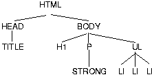
According to the definition of HTML, HEAD elements will be inferred during parsing and become part of the document tree even if the HEAD tags are not in the document source.
If a value is inherited , it means the value is the same as the value in the rendering object for the parent element.
Suppose there is an H1 element with an emphasized element inside:
<H1>The headline <EM>is</EM> important!</H1>
If no color has been assigned to the EM element, the emphasized "is" will inherit the color of the parent element, so if H1 has the color blue, the EM element will likewise be in blue.
To set a "default" style property for a document, one can set the property on the root of the document tree. In HTML, the HTML or BODY elements can serve this function. Note that this will work even if the author omits the BODY tag in the HTML source since the HTML parser will infer the missing tag.
For example, the 'color' property on the BODY element is inherited by all descendents of the BODY element:
  BODY {
    color: black;
    background: url(texture.gif) white;
  }
In this example, all descendents of the BODY element inherit the 'color' property.
Not all style properties are inherited. For example, the 'background' property is not inherited. (However, due to the initial 'tranparent' value on the 'background' property, the parent's background shines through.) All properties have an initial value. If the property is not inherited, the value will be the initial value.
Each property definition indicates whether the property is inherited by child elements, and what the initial value of the property is.
The root element obviously can't inherit values. If no value is set explicitly, the initial value will be used.
For all inherited CSS2 properties, if the value is specified as a percentage, child elements inherit the resultant value, not the percentage value.
For example, with the style sheet
BODY {font-size: 10pt}
H1 {font-size: 120%}
and the document fragment
<BODY>
<H1>A <EM>large</EM> heading</H1>
...
the H1 element will have 'font-size' 12pt (120% times 10pt), but the EM will also be 12pt, since it inherits the resultant value (12pt), not the percentage (120%).
When a percentage value is set on a property of the root element, and the percentage is defined as referring to the inherited value of some property X, the resultant value is the percentage times the initial value of property X.
For example, with and HTML document and the style sheet
HTML {font-size: 120%}
The resultant value for 'font-size' will be 120% of the initial value of the 'font-size' property. (The initial value of 'font-size' is defined to be 'medium', so the resultant value is 20% larger than 'medium'.)
Once a user agent has assigned, for every node in the document tree, a value for every property, it generates a tree of rendering objects. Each node in the document tree generates zero or more rendering objects.
A rendering object is defined by a set of CSS properties. Since the type of rendering object created depends on a specific target medium, a rendering object may not carry information for every CSS2 property (e.g., a visual rendering object may not carry aural properties).
This specification defines three types of rendering objects:
If an element A is an ancestor of an element D, all rendering objects generated for A must be above the rendering objects rendered for D in the tree of rendering objects. For box and page box rendering objects, this implies that, to find a containing box for a node, a user agent need only search upward in the tree of rendering objects (not left, right, or down).
Contents
In CSS, pattern matching rules determine which style rules apply to elements in a document. These patterns, called selectors, may range from simple element types to rich contextual patterns. If all conditions in the pattern are true for a certain element, the selector matches the element.
The simplest selector is the name of an element from the document language, called a type selector. Type selectors match all instances of the element type in the document. The case-sensitivity of element names depends on the document language. For example, in HTML, element names are case-insensitive, but in XML they are case-sensitive.
An example of a selector is the following which matches all H1 element in a document:
H1 { font-family: Helvetica }
When element selectors share the same declarations, they may be grouped into comma-separated lists.
In this example, we condense three rules with identical declarations into one. Thus,
  H1 { font-family: Helvetica }
  H2 { font-family: Helvetica }
  H3 { font-family: Helvetica }
is equivalent to:
H1, H2, H3 { font-family: Helvetica }
Furthermore, multiple declarations for the same selector may be organized into semicolon separated groups.
Thus, the following rules:
  H1 { font-weight: bold }
  H1 { font-size: 12pt }
  H1 { line-height: 14pt }
  H1 { font-family: Helvetica }
  H1 { font-variant: normal }
  H1 { font-style: normal }
are equivalent to:
  H1 {
    font-weight: bold;
    font-size: 12pt;
    line-height: 14pt;
    font-family: Helvetica;
    font-variant: normal;
    font-style: normal;
  }
In addition, some properties are shorthand rules that allow authors to specify the values of several properties with a single property. For instance, the 'font' property is a shorthand property for setting 'font-style', 'font-variant', 'font-weight', 'font-size', 'line-height', and 'font-family' all at once.
The multiple style rules of the previous example:
  H1 {
    font-weight: bold;
    font-size: 12pt;
    line-height: 14pt;
    font-family: Helvetica;
    font-variant: normal;
    font-style: normal;
  }
may be rewritten with a single shorthand property:
H1 { font: bold 12pt/14pt Helvetica }
Note that since 'font-variant' and 'font-style' take their default values of 'normal' in this example, these values have been omitted from the shorthand form.
CSS2 allows authors to specify rules that match according to attributes defined in the document language. A rule may match based on the simple presence of the attribute, or on one or more values for the attribute.
An attribute selector can select on the simple presence or absence
of an attribute, on the attribute and its value, or on the attribute
and one word in its value. The syntax is [att],
[att=val], and [att~=val] respectively.
For example, the following rule matches all H1 elements that specify the "href" attribute, whatever its value:
H1[href] { color: blue; }
In the following example, the rule matches all SPAN elements whose "class" attribute has the value "example":
SPAN[class=example] { color: blue; }
The case-sensitivity of attribute values depends on the document language. For example, in HTML, attribute values are case-insensitive, but in XML they are case-sensitive.
Attribute values must be quoted or escaped if they are not identifiers.
Document languages may allow multi-valued attributes, typically space-separated lists such as the following:
<SPAN class="fish fresh-water edible">perch</SPAN>
To accommodate value lists such as this, CSS2 defines the following two types of equality:
For the rule to apply, the value following "=" must match the whole attribute value.
For the rule to apply, the string following "~=" must match at least one member of the space-separated list of attribute values. With the "~=" operator, attribute values cannot contain spaces.
The following rules illustrate the differences between "=" and "~=":
   A[rel~="copyright"] {...} /* matches, e.g., <A rel="copyright copyleft ..." */
   td[colspan="2"] {...}   /* matches only <TD colspan="2"> ... */
The following rule hides all elements for which the value of the "lang" attribute is "fr" (i.e., the language is French).
[LANG=fr] { display : none }
Although authors may refer to any attributes with the generic syntax "[attribute=value]" and "[attribute~=value]", CSS2 defines a special syntax for two [HTML40] attributes: "class" and "id".
The HTML "class" attribute allows authors to group elements together and specify style information for the entire group. The CSS2 shortcut syntax for "[class~=value]" is a "." followed by the class value, with no intervening white space.
For example, we can assign style information to all elements with class="pastoral":
.pastoral { color: green } /* all elements with class=pastoral */
or just to H1 elements with class="pastoral":
H1.pastoral { color: green } /* H1 elements with class=pastoral */
Given these rules, the first H1 instance below would not have green text, while the second would:
  <H1>Not green</H1>
  <H1 class="pastoral">Very green</H1>
Note that "H1.pastoral" is equivalent to "H1[class~=pastoral]".
To match a subset of "class" values, each value must be preceded by a ".", in any order.
For example, the following rule matches any P element whose "class" attribute has been assigned a list of space-separated values that includes "pastoral" and "marine":
P.pastoral.marine { color: green }
This rule matches when class="pastoral blue aqua marine" but does not match for class="pastoral blue".
Similarly, the following aural style sheet rules allow a script to be read aloud in different voices for each role:
   P.role.romeo  { voice-family: romeo, male }
   P.role.juliet { voice-family: juliet, female }
Note. CSS gives so much power to the "class" attribute, that in many cases it doesn't matter what HTML element the class is set on -- you can make any element emulate almost any other. Relying on this power is not recommended, since it removes the level of structure that has a universal meaning (HTML elements). A structure based on "class" is only useful within a restricted domain, where the meaning of a class has been mutually agreed upon.
The shorthand selector syntax associated with the class attribute in HTML can also be used in other document languages. For these languages, authors must specify which attribute will be acting as the "class" attribute. This is done with the @class rule, which has the form "@class <attribute-name>;".
For instance, to specify that the "type" attribute of XML has the role of assigning class information, authors should include the following declaration in their style sheets:
@class type;
Then, a rule for XML such as:
PARA.romeo { ... }
would be equivalent to:
PARA[type~=romeo] { ... }
@class declarations must obey the following rules:
An @class declaration must appear before the first selector in the current style resource.
If it occurs more than once, only the last instance applies.
If it occurs, it only applies to the current style resource and not to any imported style sheets.
A style resource is either
The "id" attribute allows authors to assign a unique name to an element. CSS2 allows authors to specify style rules that apply to a single instance of an element, based on its "id" value.
To match an element with a given "id" value, the selector must contain "#" followed by the "id" value.
In the following example, the style rule contains no selector information and therefore matches any element that has id="z98y". The rule will thus match for the P element:
  <HEAD>
  <STYLE>
  #z98y { letter-spacing: 0.3em }
  </STYLE>
  </HEAD>
  <BODY>
  <P id=z98y>Wide text</P>
  </BODY>
In the next example, however, the style rule will only match an H1 element that has id="z98y". The rule will not match the P element in this example:
  <HEAD>
  <STYLE>
  H1#z98y { letter-spacing: 0.5em }
  </STYLE>
  </HEAD>
  <BODY>
  <P id=z98y>Wide text</P>
  </BODY>
Note. While style sheets have been designed to augment document structure, this feature will allow authors to create documents that may render well, but don't take advantage of the structural elements of HTML. This use of style sheets is discouraged.
Note that in HTML 4.0, the ID attribute is called "ID", but in XML documents it may be called something else. The name of the ID attribute is immaterial for CSS. Also note that, even in HTML, the selector #p123 is not equivalent to [ID=p123], since the former has a higher specificity.
At times, authors may want selectors to match elements that appear in a certain context, such as "only those EM elements that are contained by an H1 element". In these cases, contextual selectors add specificity. Context is defined as an ancestor/descendent/sibling relationship between elements in the document tree. Sibling relationships (one element after another) are discussed in the section on sequential selectors.
A contextual selector matches when an element is an arbitrary descendent of some ancestor element (i.e., it may be any generation below the ancestor element). A contextual selector is made up of two or more selectors separated by white space.
For example, consider the following rules:
  H1 { color: red }
  EM { color: red }
Although the intention of these rules is to add emphasis to text by changing its color, the effect will be lost in a case such as:
<H1>This headline is <EM>very</EM> important</H1>
We address this case by adding a contextual rule to the previous two that sets the text color to blue whenever an EM occurs anywhere within an H1:
  H1 { color: red }
  EM { color: red }
  H1 EM { color: blue }
The third rule will also match the following fragment:
  <H1>This
     <SPAN class="myclass">headline is <EM>very</EM>
     important</SPAN></H1>
A contextual selector may also contain attribute selectors.
For example, the following matches any element with an "href" attribute inside a P with class "myclass" inside any DIV. Note that the space after "myclass" is essential: without it the selector would match a P with both a class and an "href":
DIV P.myclass [href]
Contextual selectors may be grouped according to the rules for grouping listed above.
A parent-child selector matches when an element is the direct descendent of some parent element. A parent-child selector is made up of two or more selectors separated by a tilde (~).
The following rule sets the style of P elements that are children of BODY:
BODY ~ P { line-height: 1.3 }
A parent-child selector may also contain attribute selectors. Parent-child selectors may be grouped according to the rules for grouping listed above.
Contextual selectors and parent-child selectors can be combined.
For instance, DIV OL~LI P groups as follows (DIV (OL ~
(LI P))), i.e., it matches a P that is a descendant of an LI, that is
in turn a child of an OL, which is a descendant of a DIV.
Often, special formatting rules apply when two types of elements appear next to each other in a document. For example, when block-level elements are laid out, the vertical space between them collapses. In this case, the special formatting is handled by the rules for collapsing margins, but in other cases of sequential selectors, authors may want to specify their own special formatting rules.
Sequential selectors have the following syntax: a forward slash ("/") precedes the first selector and immediately the second selector. The sequential selector matches if the element matched by the first selector precedes the element matched by the second selector, and both have the same parent.
If, in addition, there is a tilde (~) between the selectors, then the sequential selector matches if the element matched by the first selector immediately precedes the element matched by the second selector, i.e., without any intervening elements.
Thus, the following rule states that when a P element immediately follows a MATH element, it should not be indented:
/MATH ~ P/ { text-indent: 0 }
The next example brings an H2 that follows an H1 closer to it:
/H1~H2/ { margin-top: -5mm }
Sequential selectors may be used along with other types of selectors.
Thus, for example, the following rule is similar to the one in the previous example, except that the special formatting only occurs when H1 has class="opener" (see the section on attribute selectors):
/H1.opener ~ H2/ { margin-top: -5mm }
Sequential selectors can also be used to match the first child of some element. In this case the first selector is omitted, and the first slash is doubled, e.g., //P/.
Some descriptions of SGML and XML refer to text data as a "PCDATA element" or a "character-data pseudo-element". For CSS, text is never counted as an element. E.g., the EM in <P>abc <EM>def</EM> is the first child of the P.
The following rule sets the font weight to "bold" for any EM element that is the descendent of a paragraph that is the first child in some element. Note that in this rule, the sequential selector "//P/" is the parent of "EM":
//P/ EM { font-weight : bold }
Similarly, the following rule suppresses indentation for the first paragraph (P) of a DIV:
DIV ~ //P/ { text-indent: 0 }
This example would match the P inside the DIV of the following fragment:
  <P> The last P before the note.
  <DIV class="note">
  <P> The first P inside the note.
  </DIV>
but would not match the second P in the following fragment:
  <P> The last P before the note.
  <DIV class="note">
  <H2>Note</H2>
  <P> The first P inside the note.
  </DIV>
[Do we need the functionality of /H1 P/, or only that of /H1~P/ and //P/? Also, should /P// and //P// be added?]
Sequential selectors can be combined with other kinds of selectors: type selectors and attribute selectors can occur inside the slashes, and sequential selectors themselves can be part of contextual or parent-child selectors.
In CSS2, style is normally attached to an element based on its position in the document tree. This simple model is sufficient for many cases, but some common publishing scenarios (such as changing the font size of the first letter of a paragraph) may be independent of the document tree. For instance, in [HTML40], no element refers to the first line of a paragraph, and therefore no simple CSS selector may refer to it.
CSS introduces the concepts of pseudo-elements and pseudo-classes to extend the addressing model and permit formatting based on information that lies outside the document tree.
Pseudo-classes are allowed anywhere in selectors while pseudo-elements may only appear as the last segment of a selector.
Although pseudo-elements and pseudo-classes do not exist in the document tree, their behavior is defined as if they did. Each pseudo-element and pseudo-class may be modeled by a fictional tag sequence, a fragment of document source that includes imaginary elements from the document language. The fictional tag sequence is a tool to describe the rendering effects of pseudo-elements and pseudo-classes and does not indicate how these should be implemented.
Pseudo-elements and pseudo-class names are case-insensitive.
Note. In CSS2, only one pseudo-element can be specified per selector. This may change in future versions of CSS.
Conforming UAs may ignore all rules with :first-line or :first-letter in the selector, or, alternatively, may only support a subset of the properties on these pseudo-elements. See the section on conformance for further information.
The :first-line pseudo-element is used to apply special styles to the first formatted line. For instance:
P:first-line { font-style: small-caps }
The above rule means "change the font style of the first line of every paragraph to small-caps". However, the selector "P:first-line" does not match any real HTML element. It does match a pseudo-element that conforming user agents will insert at the beginning of every paragraph.
Note that the length of the first line depends on a number of factors, including the width of the page, the font size, etc. Suppose for this example that the paragraph is broken into the lines indicated in the example. Thus, an ordinary HTML paragraph such as:
  <P>This is a somewhat long HTML paragraph that will
  be broken into several lines. The first line will be
  identified by a fictional tag sequence. The other lines will
  be treated as ordinary lines in the paragraph.</P>
will be "rewritten" by user agents to include the fictional tag sequence for :first-line.
  <P>
  <P:first-line>This is a somewhat long HTML paragraph that will</P:first-line>
  be broken into several lines. The first line will be
  identified by a fictional tag sequence. The other lines will
  be treated as ordinary lines in the paragraph.</P>
If a pseudo-element breaks up a real element, the necessary extra tags must be regenerated in the fictional tag sequence. Thus, if we mark up the previous paragraph with a SPAN element:
  <P><SPAN class="test">This is a somewhat long HTML paragraph that will
  be broken into several lines.</SPAN> The first line will be
  identified by a fictional tag sequence. The other lines will
  be treated as ordinary lines in the paragraph.</P>
The user agent must generate the appropriate start and end tags for SPAN when inserting the fictional tag sequence for :first-line.
  <P><P:first-line><SPAN class="test">This is a somewhat long HTML paragraph that will</SPAN></P:first-line>
  <SPAN>be broken into several lines.</SPAN> The first line will be
  identified by a fictional tag sequence. The other lines will
  be treated as ordinary lines in the paragraph.</P>
The :first-line pseudo-element can only be attached to a block-level element.
The :first-line pseudo-element is similar to an inline element, but with certain restrictions. Only the following properties apply to a :first-line element: font properties, color properties, background properties, 'word-spacing', 'letter-spacing', 'text-decoration', 'vertical-align', 'text-transform', 'line-height', and 'clear',
[Define better alignment of drop caps? BB]
The :first-letter pseudo-element may be used for "initial caps" and "drop caps" , which are common typographical effects. It is similar to an inline element if its 'float' property is 'none', otherwise it is similar to a floating element.
These are the properties that apply to :first-letter pseudo-elements: font properties, color properties, background properties, 'text-decoration', 'vertical-align' (only if 'float' is 'none'), 'text-transform', 'line-height', margin properties, padding properties, border properties, 'float', and 'clear'.
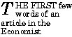
The following CSS2 will make a dropcap initial letter span two lines:
<HTML>
 <HEAD>
  <TITLE>Title</TITLE>
  <STYLE type="text/css">
   P              { font-size: 12pt; line-height: 12pt }
   P:first-letter { font-size: 200%; font-style: italic; font-weight: bold; float: left }
   SPAN           { text-transform: uppercase }
  </STYLE>
 </HEAD>
 <BODY>
  <P><SPAN>The first</SPAN> few words of an article in The Economist.</P>
 </BODY>
</HTML>
This example might be formatted as follows:
The fictional tag sequence is:
  <P>
  <SPAN>
  <P:first-letter>
  T
  </P:first-letter>he first
  </SPAN>
  few words of an article in the Economist.
  </P>
Note that the :first-letter pseudo-element tags abut the content (i.e., the initial character), while the :first-line pseudo-element start tag is inserted right after the start tag of the element to which it is attached.
The UA defines what characters are inside the :first-letter element. Quotes that precede the first letter should be included, as in:
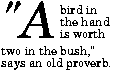
When the paragraph starts with other punctuation (e.g., parenthesis and ellipsis points) or other characters that are normally not considered letters (e.g., digits and mathematical symbols), :first-letter pseudo-elements are usually ignored.
The :first-letter pseudo-element can only be attached to a block-level element.
Note. Some languages may have specific rules about how to treat certain letter combinations. In Dutch, for example, if the letter combination "ij" appears at the beginning of a word, they should both be considered within the :first-letter pseudo-element.
Several pseudo-element rules may have an impact on the same content.
In the following example, the first letter of each P element will be green with a font size of 24pt. The rest of the first formatted line will be blue while the rest of the paragraph will be red.
  P { color: red; font-size: 12pt }
  P:first-letter { color: green; font-size: 200% }
  P:first-line { color: blue }

  <P>Some text that ends up on two lines</P>
Assuming that a line break will occur before the word "ends", the fictional tag sequence for this fragment is:
  <P>
  <P:first-line>
  <P:first-letter>
  S
  </P:first-letter>ome text that
  </P:first-line>
  ends up on two lines
  </P>
Note that the :first-letter element is inside the :first-line element. Properties set on :first-line will be inherited by :first-letter, but are overridden if the same property is set on :first-letter.
In a contextual selector, pseudo-elements are only allowed at the end of the selector.
The following example illustrates this with the :first-letter pseudo-element.
BODY P:first-letter { color: purple }
Pseudo-classes may also be used in contextual selectors.
The following example sets the border color to blue of all images that descend from A elements that have not yet been visited:
A:link IMG { border: solid blue }
User agents commonly display unvisited links differently from previously visited ones. CSS2 allows authors to specify the rendering of a link in one of several states:
The three states are mutually exclusive.
  A:link { color: red }       /* unvisited links */
  A:active { color: lime }    /* active links    */
  A:visited { color: blue }   /* visited links   */
User agents are not required to reformat a currently displayed document due to anchor pseudo-class transitions. For instance, a style sheet may legally specify that the 'font-size' of an :active link should be larger that a :visited link, but the UA is not required to dynamically reformat the document when the reader selects the :visited link.
In HTML, the following two CSS2 declarations are equivalent and select the same elements:
  A:link { color: red }
  :link { color: red }
Pseudo-classes can be combined with normal classes. In this case, the class name must precede the pseudo-class name in the selector.
If the following link:
<A class="external" href="http://out.side/">external link</A>
has been visited, this rule:
A.external:visited { color: blue }
will cause it to be blue.
Pseudo-elements can also be combined with attribute selectors.
Thus, the following rule:
P.initial:first-letter { color: red }
would make the first letter of all P elements with "class=initial" such as the following, the color red:
<P class="initial">First paragraph</A>
Pseudo-elements must be specified at the end of the selector.
CSS syntax allows the following rules to co-exist:
  A:link { color: red }      /* The :link pseudo-class */
  A.link { color: green }    /* In HTML, class=link */
  A#link { color: blue }     /* In HTML, id=link */
Since a link may have class="link", id="link", and belong to the pseudo-class :link simultaneously (i.e., be unvisited), user agents must resolve the colliding rules. User agents must do so according to the cascading order.
Contents
In CSS, more than one style sheet can simultaneously influence a the presentation of a document and rules from these style sheets may overlap in scope (e.g., two rules that apply to the same element specify a font size). CSS resolves these conflicts by assigning a weight to each style rule and when several rules apply, choosing the one with the greatest weight. This is known as the cascade .
By default, rules in a user's personal style sheets have less weight than rules in the author's documents. Thus, if there are conflicts between the style sheets of an incoming document and the reader's personal sheets, the author's rules will be used. Both reader and author rules override the UA's default style sheet.
Imported style sheets also cascade and their weight depends on their import order. Rules specified in a given style sheet override rules imported from other style sheets. Imported style sheets can themselves import and override other style sheets, recursively, and the same precedence rules apply.
Conflicting rules are intrinsic to the CSS mechanism. To find the value for an element/property combination, user agents must apply the following algorithm:
The search for the property value must be terminated when any of the above steps yields a rule that has a higher weight than the other rules that apply to the same element/property combination.
If the cascade does not yield a value, the user agent must seek an inherited value, and if no value inherits, the user agent must assign the initial value. (See the CSS2 processing model for more general information.)
This strategy gives author's style sheets considerably higher weight than those of the reader. It is therefore important that the User agent gives the user the ability to turn off the influence of a certain style sheet, e.g., through a pull-down menu.
Style sheet designers can increase the weights of their declarations by declaring them 'important' .
  H1 { color: black ! important; background: white ! important }
  P  { font-size: 12pt ! important; font-variant: italic }
In the example above, the first three declarations have increased weight, while the last declaration has normal weight.
A reader rule with an important declaration will override an author rule with a normal declaration. An author rule with an important declaration will override a reader rule with an important declaration.
Declaring a shorthand property (e.g., 'background') to be important is equivalent to declaring all of its sub-properties important.
Concatenating the three numbers (in a number system with a large base) gives the specificity.
Some examples:
  LI            {...}  /* a=0 b=0 c=1 -> specificity =   1 */
  UL LI         {...}  /* a=0 b=0 c=2 -> specificity =   2 */
  UL OL~LI      {...}  /* a=0 b=0 c=3 -> specificity =   3 */
  /H1 [REL=up]/ {...}  /* a=0 b=1 c=1 -> specificity =  11 */
  UL OL LI.red  {...}  /* a=0 b=1 c=3 -> specificity =  13 */
  LI.red.level  {...}  /* a=0 b=2 c=1 -> specificity =  21 */
  #x34y         {...}  /* a=1 b=0 c=0 -> specificity = 100 */
A declaration in the "style" attribute of an element has the same weight as a declaration with an "id"-based selector that is specified at the end of the style sheet:
<STYLE type="text/css">
  #x97z { color: blue }
</STYLE>

<P ID=x97z style="color: red">
In the above example, the color of the P element would be red. Although the specificity is the same for both declarations, the declaration in the "style" attribute will override the one in the STYLE element because of cascading rule number 5.
The UA may choose to honor presentational hints from other sources than style sheets, for example the FONT element or the "align" attribute in HTML. If so, the non-CSS presentational hints must be translated to the corresponding CSS rules with specificity equal to 1. The rules are assumed to be at the start of the author style sheet and may be overridden by subsequent style sheet rules.
Note. In a transition phase, this policy will make it easier for stylistic attributes to coexist with style sheets.
Contents
Certain CSS properties only make sense for certain media (e.g., the 'cue-before' property for aural style sheets). On occasion, however, style sheets for different media types may share a property, but require different values for that property. For example, the 'font-size' property is useful both for screen and print media. However, the two media are different enough to require different values for the common property; a document will typically need a larger font on a computer screen than on paper. Experience also shows that sans serif fonts are easier to read on screen, while fonts with serifs are easier to read on paper. For these reasons, it is necessary to express that a style sheet -- or a section of a style sheet -- applies to certain media types.
The following sections describe how authors may specify different style sheets for different media (all of which participate in the cascade).
There are currently two ways to specify media dependencies for style sheets:
  @import url(loudvoice.css) speech;
  @media print {
    /* style sheet for print goes here */
  }
  <LINK rel="stylesheet" type="text/css"
           media="print" href="foo.css">
Please consult the [HTML40] specification for information about specifying alternate style sheets according to different media types.
Since these two examples have the same media type, they are semantically equivalent.
An @media rule lists the media types (separated by commas) affected by a set of rules delimited by curly braces.
The @media construct allows style sheet rules for various media in the same style sheet:
  @media print {
    BODY { font-size: 10pt }
  }
  @media screen {
    BODY { font-size: 12pt }
  }
  @media screen, print {
    BODY { line-height: 1.2 }
  }
So that user agents can avoid retrieving resources for unsupported media types, authors may specify media-dependent @import rules. These conditional imports specify comma-separated media types after the URL.
The following rules have the same effect as if the imported style sheet were wrapped in an @media rule for the same media, but it may save the UA a fruitless download.
@import url(fineprint.css) print;
@import url(blueish.css) projection, tv;
In the absence of any media types, the import is unconditional. Specifying 'all' for the medium has the same effect.
Due to rapidly changing technologies, CSS2 does not specify a definitive list of media types that may be values for @media . However, user agents that elect to support the devices in the following list must recognize the associated media type:
Media types are case-insensitive.
For all media, the term canvas means "the space where rendering objects are rendered" (see the CSS2 process model). For a screen, the canvas is a rectangular space generally of fixed width and "infinite" length. For paged media, the canvas is a sequence of rectangular page boxes of fixed width and height. For aural media, the canvas is a three dimensional audio space.
User agents for scrolled media may implement the canvas as an "infinitely" long (or however long the rendered document is) rectangle that has a fixed width. Users see this canvas through a user agent's viewport , a window or other viewing area on the screen. The canvas may be larger or smaller than the viewport. Typically, when the canvas is larger than the viewport, the user agent will offer the user a scrolling mechanism to bring hidden parts into view.
The user agent generally determines the width of the canvas and may change the dimensions of the canvas when the viewport is resized.
In general, when a document doesn't cover the entire canvas, the User agent should "borrow" the background of the root element. Since the BODY element is often percieved as the root element in HTML, this special rules apply to HTML documents: if the 'background' value of the HTML element is different from 'transparent' then use it, else use the 'background' value of the BODY element. If the resulting value is 'transparent', the rendering is undefined.
This rule allows the following:
  <HTML style="background: url(http://style.com/marble.png)">
  <BODY style="background: red">
In the example above, the canvas will be covered with "marble". The background of the BODY element (which may or may not fully cover the canvas) will be red.
Note that no structural element of a document corresponds to the canvas. In HTML, until other means of addressing the canvas become available, we recommend that authors set canvas properties on the BODY element.
Contents
The CSS box model describes the box rendering object. This object is characterized in particular by three groups of properties: margin, padding, and border, described below.
For information on the layout of boxes, please consult the section on the visual flow model.
The page box is a special kind of box which is described in detail on the section on paged media.
Each box has a core content area (e.g., text, an image, etc.) and optional surrounding padding, border and margin areas. The following diagram illustrates how these areas relate and defines more precise terminology used to describe pieces of margin, border, and padding:
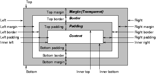
The width (resp., height) of the box is given by the sum of the content width (resp., height), the padding, the border, and the margin. The size of the margin, border and padding are set with the margin, padding, and border properties, respectively.
The width of the element is the width of the content, i.e., the distance between left inner edge and right inner edge. The height of the element is the height of the content, i.e., the distance from inner top to inner bottom.
The outer edge is the edge of an element including its padding, border, and margin. The inner edge is the edge of the content only, inside any padding, border or margin.
The top is the top of the object including any padding, border and margin; it is only defined for inline and floating elements, not for non-floating block-level elements. The inner top is the top of the content, inside any padding, border or margin. The bottom is the bottom of the element, outside any padding border and margin; it is only defined for inline and floating elements, not for non-floating block-level elements. The inner bottom is the bottom of the element, inside any padding, border and margin.
In the following sections, we define the properties that allow authors to set margins, padding, and borders. There are no properties to set the color of margins and padding; margins are always transparent and padding areas always uses the background of the element itself.
Margin properties set the margin of an element. The 'margin' property sets the border for all four sides while the other margin properties only set their respective side.
The properties defined in this section refer to the <margin-width> value type, whose possible values may be:
<length> | <percentage> | auto
Negative values for margin properties are allowed, but there may be implementation-specific limits.
Percentage values for margin properties refer to the width of the containing block.
| Property name: | 'margin-top' |
|---|---|
| Value: | <margin-width> |
| Initial: | 0 |
| Applies to: | all elements |
| Inherited: | no |
| Percentage values: | refer to parent block element's width |
This property sets the top margin of an element. It applies to replaced and block-level elements.
H1 { margin-top: 2em }
| Property name: | 'margin-right' |
|---|---|
| Value: | <margin-width> |
| Initial: | 0 |
| Applies to: | all elements |
| Inherited: | no |
| Percentage values: | refer to parent block element's width |
This property sets the right margin of an element:
H1 { margin-right: 12.3% }
| Property name: | 'margin-bottom' |
|---|---|
| Value: | <margin-width> |
| Initial: | 0 |
| Applies to: | all elements |
| Inherited: | no |
| Percentage values: | refer to parent block element's width |
This property sets the bottom margin of an element. It applies to replaced and block-level elements.
H1 { margin-bottom: 3px }
| Property name: | 'margin-left' |
|---|---|
| Value: | <margin-width> |
| Initial: | 0 |
| Applies to: | all elements |
| Inherited: | no |
| Percentage values: | refer to parent block element's width |
This property sets the left margin of an element:
H1 { margin-left: 2em }
| Property name: | 'margin' |
|---|---|
| Value: | <margin-width>{1,4} |
| Initial: | not defined for shorthand properties |
| Applies to: | all elements |
| Inherited: | no |
| Percentage values: | refer to parent block element's width |
The 'margin' property is a shorthand property for setting 'margin-top', 'margin-right' 'margin-bottom' and 'margin-left' at the same place in the style sheet.
If four length values are specified they apply to top, right, bottom and left respectively. If there is only one value, it applies to all sides, if there are two or three, the missing values are taken from the opposite side.
  BODY { margin: 2em } /* all margins set to 2em */
  BODY { margin: 1em 2em } /* top & bottom = 1em, right & left = 2em */
  BODY { margin: 1em 2em 3em } /* top=1em, right=2em, bottom=3em, left=2em */
The last rule of the example above is equivalent to the example below:
  BODY {
    margin-top: 1em;
    margin-right: 2em;
    margin-bottom: 3em;
    margin-left: 2em;        /* copied from opposite side (right) */
  }
The padding properties describe how much space to insert between the border and the content (e.g., text or image). The 'padding' property sets the padding for all four sides while the other padding properties only set their respective side.
The properties defined in this section refer to the <padding-width> value type, whose possible values may be:
Unlike margin properties, values for padding values cannot be negative.
Like margin properties, percentage values for padding properties refer to the width of the containing block.
| Property name: | 'padding-top' |
|---|---|
| Value: | <padding-width> |
| Initial: | 0 |
| Applies to: | all elements |
| Inherited: | no |
| Percentage values: | refer to parent block element's width |
This property sets the top padding of an element.
BLOCKQUOTE { padding-top: 0.3em }
| Property name: | 'padding-right' |
|---|---|
| Value: | <padding-width> |
| Initial: | 0 |
| Applies to: | all elements |
| Inherited: | no |
| Percentage values: | refer to parent block element's width |
This property sets the right padding of an element.
BLOCKQUOTE { padding-right: 10px }
| Property name: | 'padding-bottom' |
|---|---|
| Value: | <padding-width> |
| Initial: | 0 |
| Applies to: | all elements |
| Inherited: | no |
| Percentage values: | refer to parent block element's width |
This property sets the bottom padding of an element.
BLOCKQUOTE { padding-bottom: 2em }
| Property name: | 'padding-left' |
|---|---|
| Value: | <padding-width> |
| Initial: | 0 |
| Applies to: | all elements |
| Inherited: | no |
| Percentage values: | refer to parent block element's width |
This property sets the left padding of an element.
BLOCKQUOTE { padding-left: 20% }
| Property name: | 'padding' |
|---|---|
| Value: | <padding-width>{1,4} |
| Initial: | not defined for shorthand properties |
| Applies to: | all elements |
| Inherited: | no |
| Percentage values: | refer to parent element's width |
The 'padding' property is a shorthand property for setting 'padding-top', 'padding-right', 'padding-bottom', and 'padding-left' at the same place in the style sheet.
If four values are specified they apply to top, right, bottom and left respectively. If there is only one value, it applies to all sides, if there are two or three, the missing values are taken from the opposite side.
The surface of the padding area is set with the 'background' property:
  H1 {
    background: white;
    padding: 1em 2em;
  }
The example above sets a '1em' padding vertically ('padding-top' and 'padding-bottom') and a '2em' padding horizontally ('padding-right' and 'padding-left'). The 'em' unit is relative to the element's font size: '1em' is equal to the size of the font in use.
The border properties set the borders of an element. Each element has four borders, one on each side, that are defined by their width, color and style.
The properties defined in this section refer to the <border-width> value type, whose possible values may be:
The interpretation of the first three values depends on the user agent. The following must hold, however:
'thin' <='medium' <= 'thick'.
Furthermore, these widths must be constant throughout a document.
Border widths cannot be negative.
| Property name: | 'border-top-width' |
|---|---|
| Value: | <border-width> |
| Initial: | medium |
| Applies to: | all elements |
| Inherited: | no |
| Percentage values: | N/A |
This property sets the width of an element's top border.
  H1 { border: solid thick red }
  P  { border: solid thick blue }
In the example above, H1 and P elements will have the same border width regardless of font size. To achieve relative widths, the 'em' unit can be used:
H1 { border: solid 0.5em }
| Property name: | 'border-right-width' |
|---|---|
| Value: | <border-width> |
| Initial: | medium |
| Applies to: | all elements |
| Inherited: | no |
| Percentage values: | N/A |
This property sets the width of an element's right border.
| Property name: | 'border-bottom-width' |
|---|---|
| Value: | <border-width> |
| Initial: | medium |
| Applies to: | all elements |
| Inherited: | no |
| Percentage values: | N/A |
This property sets the width of an element's bottom border.
| Property name: | 'border-left-width' |
|---|---|
| Value: | <border-width> |
| Initial: | medium |
| Applies to: | all elements |
| Inherited: | no |
| Percentage values: | N/A |
This property sets the width of an element's left border.
| Property name: | 'border-width' |
|---|---|
| Value: | <border-width>{1,4} |
| Initial: | see individual properties |
| Applies to: | all elements |
| Inherited: | no |
| Percentage values: | N/A |
This property is a shorthand property for setting 'border-top-width', 'border-right-width', 'border-bottom-width', and 'border-left-width' at the same place in the style sheet.
There can be from one to four values, with the following interpretation:
In the examples below, the comments indicate the resulting widths of the top, right, bottom and left borders:
  H1 { border-width: thin }                   /* thin thin thin thin */
  H1 { border-width: thin thick }             /* thin thick thin thick */
  H1 { border-width: thin thick medium }      /* thin thick medium thick */
| Property name: | 'border-top-color' |
|---|---|
| Value: | <color> |
| Initial: | the value of the 'color' property |
| Applies to: | all elements |
| Inherited: | no |
| Percentage values: | N/A |
| Property name: | 'border-right-color' |
|---|---|
| Value: | <color> |
| Initial: | the value of the 'color' property |
| Applies to: | all elements |
| Inherited: | no |
| Percentage values: | N/A |
| Property name: | 'border-bottom-color' |
|---|---|
| Value: | <color> |
| Initial: | the value of the 'color' property |
| Applies to: | all elements |
| Inherited: | no |
| Percentage values: | N/A |
| Property name: | 'border-left-color' |
|---|---|
| Value: | <color> |
| Initial: | the value of the 'color' property |
| Applies to: | all elements |
| Inherited: | no |
| Percentage values: | N/A |
| Property name: | 'border-color' |
|---|---|
| Value: | <color>{1,4} |
| Initial: | see individual properties |
| Applies to: | all elements |
| Inherited: | no |
| Percentage values: | N/A |
The 'border-color' property sets the color of the four borders. 'border-color' can have from one to four values, and the values are set on the different sides as for 'border-width' above.
If no color value is specified, the value of the 'color' property of the element itself will take its place:
  P {
    color: black;
    background: white;
    border: solid;
  }
In the above example, the border will be a solid black line.
The border style properties refer to the <border-style> value type which is defined as follows:
| Property name: | 'border-top-style' |
|---|---|
| Value: | <border-style> |
| Initial: | none |
| Applies to: | all elements |
| Inherited: | no |
| Percentage values: | N/A |
| Property name: | 'border-right-style' |
|---|---|
| Value: | <border-style> |
| Initial: | none |
| Applies to: | all elements |
| Inherited: | no |
| Percentage values: | N/A |
| Property name: | 'border-bottom-style' |
|---|---|
| Value: | <border-style> |
| Initial: | none |
| Applies to: | all elements |
| Inherited: | no |
| Percentage values: | N/A |
| Property name: | 'border-left-style' |
|---|---|
| Value: | <border-style> |
| Initial: | none |
| Applies to: | all elements |
| Inherited: | no |
| Percentage values: | N/A |
| Property name: | 'border-style' |
|---|---|
| Value: | <border-style>{1,4} |
| Initial: | see individual properties |
| Applies to: | all elements |
| Inherited: | no |
| Percentage values: | N/A |
The 'border-style' property sets the style of the four borders. It can have from one to four values, and the values are set on the different sides as for 'border-width' above.
#xy34 { border-style: solid dotted }
In the above example, the horizontal borders will be 'solid' and the vertical borders will be 'dotted'.
Since the initial value of the border styles is 'none', no borders will be visible unless the border style is set.
The border styles mean:
UAs may interpret all of 'dotted', 'dashed', 'double', 'groove', 'ridge', 'inset' and 'outset' as 'solid'. See the section on conformance for details. 'border-top', 'border-bottom', 'border-right', 'border-left', and 'border'
| Property name: | 'border-top' |
|---|---|
| Value: | <'border-top-width'> || <'border-style'> || <color> |
| Initial: | see individual properties |
| Applies to: | all elements |
| Inherited: | no |
| Percentage values: | N/A |
This is a shorthand property for setting the width, style and color of an element's top border.
H1 { border-bottom: thick solid red }
The above rule will set the width, style and color of the border below the H1 element. Omitted values will be set to their initial values:
H1 { border-bottom: thick solid }
Since the color value is omitted in the example above, the border color will be the same as the 'color' value of the element itself.
Note that while the 'border-style' property accepts up to four values, this property only accepts one style value.
| Property name: | 'border-bottom' |
|---|---|
| Value: | <'border-bottom-width'> || <'border-style'> || <color> |
| Initial: | see individual properties |
| Applies to: | all elements |
| Inherited: | no |
| Percentage values: | N/A |
This is a shorthand property for setting the width, style and color of an element's bottom border. It behaves just like 'border-top'.
| Property name: | 'border-right' |
|---|---|
| Value: | <'border-right-width'> || <'border-style'> || <color> |
| Initial: | see individual properties |
| Applies to: | all elements |
| Inherited: | no |
| Percentage values: | N/A |
This is a shorthand property for setting the width, style and color of an element's right border. It behaves just like 'border-top'.
| Property name: | 'border-left' |
|---|---|
| Value: | <'border-left-width'> || <'border-style'> || <color> |
| Initial: | see individual properties |
| Applies to: | all elements |
| Inherited: | no |
| Percentage values: | N/A |
This is a shorthand property for setting the width, style and color of an element's left border. It behaves just like 'border-top'.
| Property name: | 'border' |
|---|---|
| Value: | <'border-width'> || <'border-style'> || <color> |
| Initial: | see individual properties |
| Applies to: | all elements |
| Inherited: | no |
| Percentage values: | N/A |
The 'border' property is a shorthand property for setting the same width, color and style on all four borders of an element.
Unlike the shorthand 'margin' and 'padding' properties, the 'border' property cannot set different values on the four borders. To do so, one or more of the other border properties must be used.
Note that while the 'border-width' property accepts up to four length values, this property only accepts one.
For example, the first rule below is equivalent to the set of four rules shown after it:
  P { border: solid red }
  P {
    border-top: solid red;
    border-right: solid red;
    border-bottom: solid red;
    border-left: solid red
  }
Since to some extent the properties have overlapping functionality, the order in which the rules are specified becomes important.
Consider this example:
  BLOCKQUOTE {
    border-color: red;
    border-left: double
    color: black;
  }
In the above example, the color of the left border will be black, while the other borders are red. This is due to 'border-left' setting the width, style and color. Since the color value is not given by the 'border-left' property, it will be taken from the 'color' property. The fact that the 'color' property is set after the 'border-left' property is not relevant.
    <STYLE type="text/css">
      UL {
        background: orange;
        margin: 12px 12px 12px 12px
        padding: 3px 3px 3px 3px
                                    /* No borders set */
      }
      LI {
        color: white;               /* text color is white */
        background: blue;           /* Content, padding will be blue */
        margin: 12px 12px 12px 12px
        padding: 12px 0px 12px 12px /* Note 0px padding right */
        list-style: none            /* no glyphs before a list item */
                                    /* No borders set */
      }
      LI.withborder {
        border-style: dashed;
        border-width: medium;       /* sets border width on all sides */
        border-color: green;
      }
    </STYLE>
    <UL>
      <LI>First element of list
      <LI class="withborder">Second element of list is longer
           to illustrate wrapping.
    </UL>
results in a document tree with (among other relationships) a UL element that has two LI children. According to the visual rendering model, the LI elements are laid out vertically (one after the other) and form the content of the UL.
The first of the following diagrams illustrates what this example would produce. The second illustrates the relationship between the margins, padding, and borders of the UL elements and those of its children LI elements.
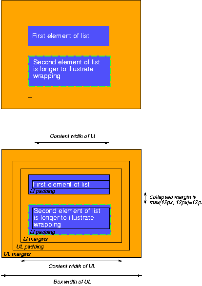
Note that:
Contents
The following sections describe how user agents construct a tree of box rendering objects.
Most elements in the document tree generate a corresponding box in the tree of rendering objects that participates in the formatting algorithms known as the visual flow model. The dimensions of each rectangular box, the relationship of the box to its parent and children in the tree of rendering objects, and other factors all affect how the user agent will lay out these boxes on the canvas.
All elements that have text content (block or inline) generate "anonymous" boxes in the tree of boxes. These anonymous boxes, which contain "chunks" of text, inherit properties (colors, fonts, etc.) from their ancestor boxes. By default, anonymous boxes are inline, i.e., text is laid out horizontally. Decisions about the construction of anonymous boxes depend on many factors (language, hyphenation, etc.) and lie outside the scope of this specification.
Elements with a value of 'none' for the 'display' property generate no box in the tree of rendering objects. Thus, those elements have no impact on the positioning of any boxes.
Finally, some elements in the document tree generate a box in the tree of rendering objects but that box is invisible. It cannot be seen, but it does participate in formatting algorithms. Please consult the section on visibility for details.
Normally, child boxes are positioned within the box of their parent. However, a child box may extend horizontally beyond the bounding box of its parent in certain situations. These are described in the section on overflow.
CSS2 does not specify all aspects of formatting (e.g., letter-spacing algorithm). Conforming user agents may format differently for situations not covered in this specification.
The visual rendering model describes how user agents generate a tree of box rendering objects. The bulk of this model involves calculating the positions of boxes based on their dimensions, their position in the rendering tree, and the dimensions of the canvas.
The value of the 'position' property determines which of the positioning models will determine a box's final position on the canvas.
| Property name: | 'position' |
|---|---|
| Value: | absolute | relative | static |
| Initial: | static |
| Applies to: | all elements |
| Inherited: | no |
| Percentage values: | N/A |
The values of this property have the following meanings:
Note. The 'static' value causes some user agents to ignore the 'left' and 'top' properties. To ensure that values of 'left' and 'top' are taken into account, authors should explicitly set the value of the 'position' property to 'relative'.
In CSS2, all box positions are calculated with respect to a rectangular box called a containing block
The containing block is defined as follows:
For example, for an inline element like EM, the containing block is typically the enclosing paragaph (P). On the other hand, the containing block of a positioned element is the element relative to which it is positioned.
| Property name: | 'direction' |
|---|---|
| Value: | ltr | rtl | ltr-override | rtl-override |
| Initial: | ltr |
| Applies to: | all elements |
| Inherited: | yes |
| Percentage values: | N/A |
This property determines the whether inline boxes are laid out left-to-right or right-to-left and how children of block-level boxes flow. It may take the following values:
[Ian: Examples here.]
This property also specifies the direction of table layout.
Block-level boxes are laid out one after the other, vertically.
The vertical distance between the top of a box and its preceding sibling (or parent if no preceding sibling exists) is determined by the 'margin' properties.
Vertical margins between adjacent block-level boxes collapses, as described in the section on collapsing margins.
For left-to-right flowing content, a block-level box flows inside the left side of its parent, at a horizontal distance specified by the 'margin' properties. For right-to-left flowing content, boxes flow inside the right side of their parent.
For information about page breaks in paged media, please consult the section on allowed page breaks.
Some block elements generate boxes that may be formatted as lists. In terms of flow, lists are formatted as other block-level elements.
For information about lists and examples of list formatting, please consult the section on lists.
Inline boxes are laid out one after the other, horizontally, within a horizontal space defined by the containing block (see the section on box width calculations for more information).
For left-to-right flow, the horizontal distance between the left side of a box and its preceding sibling's right side (or parent's right side if no preceding sibling exists) is determined by the 'margin' properties. For right-to-left flow, the horizontal distance is between the right side of a box and its preceding sibling's left side (or parent's left side if no preceding sibling exists).
Horizontally adjacent inline boxes form a line box. To form a paragraph, line boxes are stacked vertically. Note that in the same block, stacked line boxes have the same width but may vary in height.
When an inline box is less wide than the width of the line box that contains it, its horizontal alignment within the line box is determined by the 'alignment' property.
When an inline box is wider than a line box, it it may be split into several inline boxes and these boxes distributed across several lines.
Inline boxes in the same line may have different heights (e.g., an inline image surrounded by text), so the final height of each line box is determined by the rules given in the section on line height calculations. When an inline box's height is less than the line box height, the vertical alignment of the inline box within the line box is determined by the 'vertical-align' property.
When a block-level element contains text that is not the content of an inline element, the element generates one or more "anonymous" inline boxes in the tree of boxes, each of which contains a chunk of this text.
For example, the following paragraph (created by the HTML block-level element P) contains chunks of text separated by the inline elements EM and STRONG:
  <P>Several <EM>emphasized words</EM> appear
  <STRONG>in this</STRONG> sentence, dear.</P>
In terms of the document tree, P has five children elements that contain the following pieces of text:
To format the paragraph, the user agent generates an inline box for each child and lays all five of them out into successive line boxes. The width of the P element determines the width of these line boxes. If the width of P is sufficient, all the inline boxes will fit into a single line box:
  Several emphasized words appear
  in this sentence, dear.
If the inline boxes do not fit within a single line box, they will be split up and distributed across several lines. The previous paragraph might be split as follows:
  Several emphasized
  words appear
  in this
  sentence, dear.
or like this:
Several emphasized words appear in this sentence, dear.
In this last example, the EM inline box has been split into two EM boxes (call them "split1" and "split2"). If a inline box split this way has margins, borders, padding, or text decorations, these have no visible effect after split1 or before split2 (e.g., the border is not drawn and the margin and padding are not included after split1).
Consider the following example:
  <STYLE>
  EM { padding: 2px ;
       margin: 1em ;
       border-width: medium;
       border-style: dashed;
       line-height: 2.4em;
  }
  </STYLE>
  <BODY>
  <P>Several <EM>emphasized words</EM> appear here.</P>
  </BODY>
Depending on the width of the P, the boxes may be distributed as follows:
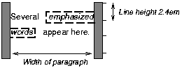
Note that with a small line height, the padding and borders around text in different lines may overlap.
There are two types of boxes that are inline or block depending on the context. A compact box is one that is put in the margin of the following block if there is enough room, otherwise, it will be rendered as a block. A run-in box is one that is rendered inline in the following block, or as a block if there is no following block. The 'display' property determines whether a box is 'compact' or 'run-in'.
The following example illustrates a compact box. This document:
<style>
DT {display: compact}
DD {margin-left: 4em}
</style>
<dl>
<dt>Short
<dd><p>Description goes here.
<dt>too long for the margin
<dd><p>Description goes here.
</dl>
may be rendered as:
short    Description goes here

too long for the margin
         Description goes here
A 'run-in' element, on the other hand, is useful for run-in headers, as in this example:
<style>
  H3 {display: run-in}
  H3:after {content: ". "}
</style>
<h3>A run-in heading</h3>
<p>And a paragraph of text that
follows it.
which may be rendered as follows:
A run-in heading. And a
paragraph of text that
follows it.
A 'run-in' element is rendered exactly like a 'block' element if the following sibling element is not of type 'block' or is floating or positioned absolutely. Otherwise the run-in element is rendered inline as if it were the first inline box of the following block.
Properties apply to a run-in element depending on whether it is rendered inline or as a block. For example, the 'white-space' property only applies if the element is rendered as a block.
For a 'compact' element to be rendered as an inline box, it must be followed by a 'block' element that doesn't float and is not positioned absolutely. That block must have a 'margin-left' (or 'margin-right' if it's 'direction' is 'rtl') that is wide enough for the compact element. That means: the compact element, when rendered as an inline box, must be a single box (no line breaks) with overall width (including margins, border and padding) that is no larger than the margin of the block.
The compact box is outside (to the left or right) of the first line box of the block, but it takes part in the calculation of that line box's height. The 'vertical-align' property of the compact box determines its vertical position relative to that line box.
The horizontal position is always in the margin of the block, as far to the outside as possible. The compact box's left margin (or right, if the block's 'direction' is 'rtl') determines the position.
Once a block-level or inline box has been assigned its position according to the flow model, it may be shifted relative to this position. This is called relative positioning and the offset is specified by the the 'top', 'bottom', 'left', and 'right' properties. Offsetting a box in this way has no effect on sibling boxes; they are not "reflowed" as a result of the offset. This implies that relative positioning may cause boxes to overlap.
Relatively positioned elements establish a new reference box that child elements can be positioned with respect to. See the section on absolutely positioned elements for more on this.
Relatively positioned elements keep their natural shape, including line breaks and the space originally reserved for them. Dynamic movement of relatively positioned elements can provide animation effects in scripting environments (see the section on dynamic positioning for details).
Elements are positioned relatively by setting the 'position' property to 'relative'.
Relative positioning could also be used as a general form of superscripting and subscripting except that line height is not automatically adjusted to take the positioning into consideration. See the description of line height calculations for more information.
Examples of relative positioning are provided in the section comparing normal, relative, floating, and absolute positioning.
An element of the document language is not inherently inline or block-level (except, perhaps in the minds of the language's designers). CSS does not assume any default layout behavior for elements. The layout behavior of every element is determined by the value of its 'display' property.
| Property name: | 'display' |
|---|---|
| Value: | block | inline | list-item | run-in | compact | none |
| Initial: | block |
| Applies to: | all elements |
| Inherited: | no |
| Percentage values: | N/A |
An element with a 'display' value of 'block' causes the generation of a block-level box.
A value of 'list-item' is similar to 'block' except that a list-item marker is added. For example, in HTML, LI will typically have this value.
An element with a 'display' value of 'inline' generates an inline box. The box is dimensioned according to the formatted size of the content. If the content is text, it may span several lines, and there will be a box on each line. The margin, border, and padding properties apply to 'inline' elements, but will not have any effect at the line breaks.
A value of 'none' turns off the display of the element (including any border around the element); 'none' completely removes the element so that it does not affect layout at all. Descendent elements will also be turned off and cannot override this by setting the 'display' property themselves.
  P { display: block }
  EM { display: inline }
  LI { display: list-item }
  IMG { display: none }
The last rule turns off the display of images.
[Add pointers to run-in and compact -IJ]
The initial value of 'display' is 'block', but a user agent will typically have default values for all document language elements.
UAs may ignore 'display' and use only the UA's default values. See the section on conformance for details.
For many document languages, and in particular for HTML, user agents may provide a default style sheet that implements the layout behavior expected of the language's elements. Please consult the sample style sheet in the appendix for information about the default layout behavior of HTML 4.0.
At times, authors may want to control the positioning of a box in a way that cannot be done within the normal flow. There are three ways to place a box outside the normal flow:
The primary difference between a floating box and one that is absolutely positioned is that absolute positioning has no impact on the flow of later siblings; later siblings are laid out as though their absolutely positioned sister did not exist at all. Later siblings of floating objects flow with respect to the final position of the floating element.
Floating and absolutely positioned boxes do affect the flow of children elements: children elements always flow relative to the position of their parent (the floater or absolutely positioned element) unless positioned absolutely themselves.
A floated box is moved to the left or right until the margin, padding, or border of another block-level element is reached.
User agents take the boundaries of floated boxes into account when flowing subsequent boxes, i.e., boxes that follow flow around the floated box. The margins, borders and padding of the floated box are honored, and the margins never collapse with the margins of adjacent elements.
To float a box, set the 'float' property for the element generating the box.
| Property name: | 'float' |
|---|---|
| Value: | left | right | none |
| Initial: | none |
| Applies to: | all elements |
| Inherited: | no |
| Percentage values: | N/A |
With the value 'none', the generated box will be displayed where it appears in the text. With a value of 'left' ('right') the element will be moved to the left ('right') and the text will wrap on the right (left) side of the element. With a value of 'left' or 'right', the element is treated as block-level (and thus the 'display' property is ignored).
This property is most often used with inline images, but also applies to text elements.
The following example will place all IMG elements with class="icon" along the left side of the parent element:
  IMG.icon {
    float: left;
    margin-left: 0;
  }
The following HTML source:
  <STYLE type="text/css">
    IMG { float: left }
    BODY, P, IMG { margin: 2em }
  </STYLE>

  <BODY>
    <P>
      <IMG src=img.gif>
      Some sample text that has no other...
  </BODY>
could be formatted as:
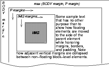
Note that the margin of the P element encloses the floating IMG element.
The 'clear' property specifies whether an element will allow floating elements on its sides.
| Property name: | 'clear' |
|---|---|
| Value: | none | left | right | both |
| Initial: | none |
| Applies to: | all elements |
| Inherited: | no |
| Percentage values: | N/A |
When set for an element E, this property indicates which sides of E may not be adjacent to sides of a floating element. A value of 'left' means that E may not be positioned next to any floating elements to its left; when flowed, E will therefore be moved to the next available line below. The value 'right' means the same thing, but on the right side of E.
A value of 'none' means that E may be placed next to floating objects to the left or right.
A value of 'both' means that E may not be placed next to floating objects on either side.
The following style rule means that no H1 element may have a floating element to its left. All H1 elements will be positioned at the current left margin.
H1 { clear: left }
Consult the section on floating constraints for more information about controlling floats.
Elements that are positioned with respect to a reference box are said to be absolutely positioned .
The default reference box is the box generated for the root element of the document tree. However, an element for which the 'position' property has been set to a value other than 'static' establishes a new reference box. Absolutely positioned descendents of the element will be positioned with regard to the inner edges of the reference box. Furthermore, an absolutely positioned element establishes a new context in which normally flowing descendents are aligned.
When the reference box is established by a block-level element, it has the same width, height, and position as the content and padding area of the block-level element. When the reference box is established by an inline element, it has the same width, height, and position as the content and padding area of the first box generated by the inline elements. In other words, if the inline element is split into several boxes on different lines, the reference box is defined by the first box.
The contents of an absolutely positioned element do not flow around any other elements. They may or may not obscure the contents of another element, depending on the z-order of the overlapping elements.
An absolutely positioned element lives inside of this reference block, as illustrated below:
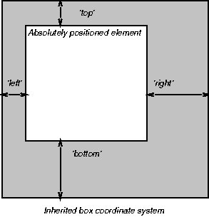
The position of an relatively, absolutely or fixed positioned (see below) element is determined from four properties:
| Property name: | 'top' |
|---|---|
| Value: | <length> | <percentage> | auto |
| Initial: | auto |
| Applies to: | all elements |
| Inherited: | no |
| Percentage values: | N/A |
| Property name: | 'right' |
|---|---|
| Value: | <length> | <percentage> | auto |
| Initial: | auto |
| Applies to: | all elements |
| Inherited: | no |
| Percentage values: | N/A |
| Property name: | 'bottom' |
|---|---|
| Value: | <length> | <percentage> | auto |
| Initial: | auto |
| Applies to: | all elements |
| Inherited: | no |
| Percentage values: | N/A |
| Property name: | 'left' |
|---|---|
| Value: | <length> | <percentage> | auto |
| Initial: | auto |
| Applies to: | all elements |
| Inherited: | no |
| Percentage values: | N/A |
Each of these four properties specifies an offset between the reference box and the element which is being positioned. More specifically, values indicate the offset between the edge of the reference box and the corresponding content+padding+border box of the element that is being positioned.
The values have the following meanings:
For absolutely positioned elements, the values of the 'left', 'right', 'top', and 'bottom' properties take over the roles of the corresponding margin properties (i.e., absolutely positioned element boxes do not have margins but do have padding and borders).
For more information about the width and height of absolutely positioned elements, please consult the sections on box width calculations and box height calculations respectively.
Fixed positioning is a variant of absolute positioning. The only difference is that absolutely positioned elements are positioned with respect to a reference box, while fixed positioned elements are positioned with respect to the canvas. Fixed positioned elements are, as the name indicates, fixed to the canvas.
For scrolled media, fixed boxes do not move when the document is scrolled. In this respect, they are similar to fixed background images.
In a paged medium, fixed positioned elements are repeated on every page. This is useful for placing, for instance, a signature at the bottom of each page.
To illustrate the relationship between normal flow, relative positioning, floats, and absolute positioning, we provide a series of examples in the following sections based on the following HTML fragment:
<BODY>
  <P>Beginning of body contents.
  <SPAN id=outer> Start of outer contents.
  <SPAN id=inner> Inner contents.</SPAN>
  End of outer contents.</SPAN>
  End of body contents.
  </P>
</BODY>
The final positioning of the outer and inner spans vary in each example. In each illustration, the numbers to the left of the illustration indicate the normal position of the double-spaced (for clarity in this example) lines.
Consider the following CSS declarations for outer and inner that don't alter the normal flow of elements:
  #outer {color: red;}
  #inner {color: blue;}
This results in something like the following:
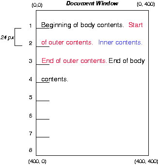
To see the effect of relative positioning, consider the following CSS rules:
  BODY {line-height: 200%}
  #outer {position: relative; top: -12px; color: red;}
  #inner {position: relative; top: 12px; color: blue;}
First, the outer text is flowed into its "normal" position and dimensions at the end of line 1. Then, the entire box (distributed over three lines) is shifted upwards by 12px.
The contents of inner, as a child of outer, would normally flow immediately after the words "of outer contents" (on line 1.5). However, the inner contents are themselves offset relative to the outer contents by 12px downwards, back to their original position on line 2.
Note that the content following outer is not affected by the relative positioning of outer.
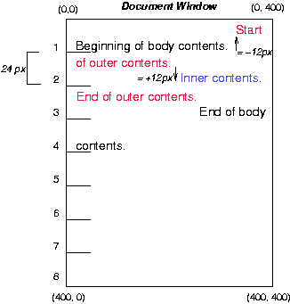
Note also that if the relative positioning of outer were -24px, the text of outer and the body text would have overlapped.
Now consider the effect of floating the inner text to the right by means of the following rules:
  #outer {color: red;}
  #inner {float: right; width: 130px; color: blue;}
First, the inner box (whose width has been set explicitly) is floated to the right margin. The text that follows flows in the space left by the inner box, and respects the new right margin imposed by the left border of inner.
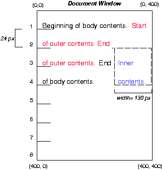
To show the effect of the 'clear' property, we add a sibling element to the example:
<BODY>
  <P>Beginning of body contents.
  <SPAN id=outer> Start of outer contents.
  <SPAN id=inner> Inner contents.</SPAN>
  <SPAN id=sibling> Sibling contents.</SPAN>
  End of outer contents.</SPAN>
  End of body contents.
  </P>
</BODY>
The following rules:
  #inner {float: right; width: 130px; color: blue;}
  #sibling {color: red;}
cause the inner box to float to the right and the sibling box to flow in the available space:
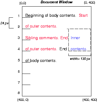
However, if the 'clear' property on the sibling box is set to 'right' (i.e., the sibling box will not accept being positioned next to floating objects to its right), the sibling box flows on the next available line below:
  #inner {float: right; width: 130px; color: blue;}
  #sibling {clear: right; color: red;}
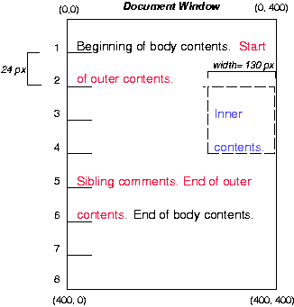
Finally, we consider the effect of absolute positioning on elements. Consider the following CSS declarations for outer and inner:
  #outer {position: absolute; top: 200px; left: 200px; width: 200px; color: red;}
  #inner {color: blue;}
which causes the top of the outer box to be positioned with respect to the reference box (which we suppose is set on the root of the document). The top side of the outer box is 200px from the top of the reference box and the left side is 200px from the left side. The child element of outer flows with respect to its parent.
Note that because outer has been absolutely positioned, it establishes a new reference box for any absolutely positioned children (there aren't any in this example).
Recall that absolutely positioned elements are positioned with respect to a reference box set on an ancestor element. The following example shows an absolutely positioned element that is a child of a relatively positioned element. Although the parent outer box is not actually offset, setting its 'position' property to 'relative' causes its box to serve as the reference box for any descendents. Since the outer box is an inline box that is split across several lines, only the first box (whose upper left-hand corner is designated by a "@" in the illustration below) establishes the reference box for the descendents.
  #outer {position: relative; color: red;}
  #inner {position: absolute; top: 200px; left: -100px; height:
     130px; width: 130px; color: blue;}
This results in something like the following:
Recall that statically positioning an element is equivalent to using the 'position' property to put an element back in the normal flow. Statically positioned elements do not establish a reference box for their children. Thus, the following rules:
  #outer {position: static; color: red;}
  #inner {position: absolute; top: 200px; left: -100px; height:
    130px; width: 130px; color: blue;}
are equivalent to:
#outer {color: red;}
#inner {position: absolute; top: 200px; left: -100px; height:
130px; width: 130px; color: blue;}
and cause the inner box to be positioned with respect to
the reference box (which we assume here is set on the root element
of the document tree).
Relative and absolute positioning may be used to implement change
bars, as shown in the following example. We use a value of 'auto' for
the value of the 'top' property,
which results in the element being placed at the "current"
location in the document window, just as if the element were being
flowed into that space. The following HTML text:
<P style="position: relative; margin-right: 10px; left: 10px;">
I used two red hyphens to serve as a change bar. They
will "float" to the left of the line containing THIS
<SPAN style="position: absolute; top: auto; left: 0px; color: red;">--</SPAN>
word.</P>
might result in something like:
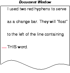
10.7 Z-order: Layered presentation
CSS allows authors to specify the position of an element in three
dimensions. The stack
level of an element refers to its position above or below
other elements. The stack level is particularly relevant to elements
that overlap visually.
10.7.1 Specifying the stack level: the 'z-index' property
In the following sections, the expression "in front of" means
closer to the user as the user faces the screen.
The stack level of an element may be determined in two ways:
| Property name: | 'z-index' |
|---|---|
| Value: | auto | <integer> |
| Initial: | auto |
| Applies to: | elements that may be positioned |
| Inherited: | no |
| Percentage values: | N/A |
The 'z-index' property is used to specify the stacking order of elements that may be positioned (i.e., element's whose 'position' property has a value of 'absolute' or 'relative').
The default ('auto') behavior is to stack elements back-to-front in the order they appear in the document tree.
An integer value for 'z-index' specifies stacking order for an element relative to its sibling and parent elements:
The relative z-order of two elements that are neither siblings nor parent/child can be determined by evaluation of the above rules for both elements' ancestors.
By default, a positioned element will be placed just above (in z-space) its parent in the document tree.
It is not possible to position an element behind a grandparent.
In the following example, the order of the elements, listed back-to-front is:
<STYLE type="text/css">
<!--
.pile { position: absolute; left: 2in; top: 2in; width: 3in; height: 3in; }
-->

<IMG src="butterfly.gif" class="pile" id="image" style="z-index: 1">

<DIV class="pile" id="text1" style="z-index: 3">
   This text will overlay the butterfly image.
</DIV>

<DIV class="pile" id="text2" style="z-index: 2">
   This text will underlay text1, but overlay the butterfly image
</DIV>
The previous example demonstrates the notion of transparency. The default behavior of an element is to allow elements below it to be visible through transparent areas in its content. In the example, each element transparently overlays the elements below it. This behavior can be overridden by utilizing one of the existing background-related properties like 'background'.
Flowing content into several columns is a common way of presenting text, especially in print. When multiple columns are use, line lengths are shorter and the font size and line height can be reduced while maintaining legibility. In CSS, columns are vertical boxes formed in the content area of an column element. In HTML, the column element will typically be of type DIV and its child elements will be flowed into the columns.
All columns in a column element have the same width. The UA should attempt to balance the content so that each column is filled to the same extent. When breaking elements over several columns, the 'widows' and 'orphans' properties should be consulted (in the section on page breaks).
In a paged medium, page breaks may occur within the column element. This can be due to lack of space, or from a page break property value for a child element. When this happens, the column element should be continued on the next page with the same number of columns.
Authors may specify a column gap and a vertical column rule between columns.
| Property name: | 'columns' |
|---|---|
| Value: | <length> | <number> | <percentage> |
| Initial: | 1 |
| Applies to: | block-level elements |
| Inherited: | no |
| Percentage values: | the width of the element itself |
The 'columns' property determines the number of columns into which the content of the element will be flowed.
By specifying a numeric value, a fixed number of columns is set. In the following example, DIV elements will have three columns:
DIV { columns: 3 }
By specifying a length value, the UA creates as many columns as possible within the available space. So, if the available space increases (for example when the user enlarges the UA window), the number of columns may increase. The number of columns (n) is a function of the width of the element (w), the desired column width (cw), the column gap (cg) and the width of the column rule (cr):
  n' = (w + cg + cr) / (cw + cg + cr)
  n = round(n')
See a description of the column gap and column rule below.
Child elements that are flowed into the columns will be "adapted" by them. Consider this example:
<STYLE>
  DIV {
    columns: 3;
    column-gap: 1em;
  }
  IMG.logo {
    width: 100%;
  }
</STYLE>
<BODY>
  <DIV>
    <IMG CLASS="logo">
    <P>Some text.<P>
    <P>Some more text.<P>
  </DIV>
</BODY>
The percentage value on the 'width' property refers to the width of the parent element, but since the IMG element appears inside a column, the width of the column will take the place of the width of the parent element.
| Property name: | 'column-gap' |
|---|---|
| Value: | <length> | <percentage> |
| Initial: | UA-specific |
| Applies to: | block-level elements |
| Inherited: | no |
| Percentage values: | the width of the element itself |
This property sets the gap between adjacent columns. The initial value is UA-specific, but should be greater than zero. Negative values are not allowed.
| Property name: | 'column-rule-width' |
|---|---|
| Value: | <border-width> |
| Initial: | medium |
| Applies to: | block-level elements |
| Inherited: | no |
| Percentage values: | the width of the element itself |
| Property name: | 'column-rule-style' |
|---|---|
| Value: | <border-style> |
| Initial: | none |
| Applies to: | block-level elements |
| Inherited: | no |
| Percentage values: | the width of the element itself |
| Property name: | 'column-rule-color' |
|---|---|
| Value: | <color> |
| Initial: | the value of the <color> property |
| Applies to: | block-level elements |
| Inherited: | no |
| Percentage values: | N/A |
These properties set the vertical column rule between adjacent columns. The rule will appear in the middle of the column gap. On each side of the rule there will be a gap equal to half the specified column gap.
Vertically, the column rule extend up to, but not including, the padding area. If there is a border, but no padding the column rule will abut the border. In this case, the UA should attempt to gracefully join the column rule and the border.
Contents
The width of a box generated by an element does not depend on the width of its children nor on its content -- it is given by the 'width' property.
| Property name: | 'width' |
|---|---|
| Value: | <length> | <percentage> | auto |
| Initial: | auto |
| Applies to: | block-level and replaced elements |
| Inherited: | no |
| Percentage values: | refer to parent element's width |
This property can be applied to text elements, but it is most useful with replaced elements such as images.
Negative values for 'width' are not allowed.
For example:
IMG.icon { width: 100px }
If the 'width' and 'height' of a replaced element are both 'auto', these properties will be set to the intrinsic dimensions of the element.
See the section on the the box model for an illustration of box rendering objects.
The width of a block-level element's box is determined by seven properties: 'margin-left', 'border-left', 'padding-left', 'width', 'padding-right', 'border-right', and 'margin-right'.
For elements in the flow, the sum of these seven is equal to the content 'width' of the parent element.
If 'auto' is set as the value for one of the seven properties in an element that is inline or floating, it will be treated as if it were set to zero.
Horizontal margins are not collapsed.
For floats and replaced elements (i.e., block-level or inline elements whose markup is replaced by other content such as the IMG element in HTML), the calculation of width is as follows:
Three of the seven properties given above can be set to 'auto': 'margin-left', 'width', and 'margin-right'. For replaced elements, a value of 'auto' on 'width' is replaced by the intrinsic width, so for them there can only be two 'auto' values.
If exactly one of 'margin-left', 'width', or 'margin-right' is 'auto', the UA will assign that property a value that will make the sum of the seven equal to the parent's width.
If none of the properties have the value 'auto', the value of 'margin-right' will be assigned 'auto'.
If more than one of the three is 'auto', and one of them is 'width', then the others ('margin-left' and/or 'margin-right') will be set to zero and 'width' will get the value needed to make the sum of the seven equal to the parent's width.
Otherwise, if both 'margin-left' and 'margin-right' are 'auto', they will be set to equal values. This will center the element inside its parent.
The width of an absolutely positioned element's box is specified with the 'width' property.
However, if the 'width' has the value 'auto', the width of the box is given by the 'left' and 'right' properties. Note that these take the place of the 'left-margin' and 'right-margin' properties, which don't apply to absolutely positioned elements.
If all three properties have the value 'auto', the box has exactly the width of the inherited reference box.
It is sometimes useful to constrain the width of elements to a certain range. Two properties offer this functionality:
| Property name: | 'min-width' |
|---|---|
| Value: | <length> | <percentage> |
| Initial: | 0 |
| Applies to: | all |
| Inherited: | no |
| Percentage values: | refer to parent's width |
| Property name: | 'max-width' |
|---|---|
| Value: | <length> | <percentage> |
| Initial: | 100% |
| Applies to: | all |
| Inherited: | no |
| Percentage values: | refer to parent's width |
This algorithm describes how the two properties influence the width calculations:
When the algorithm terminates, use the calculated width as the width of the element.
The height of a box is the minimal height necessary to include the vertical content of the element and that of all its flowed children (see also the section on minimum and maximum heights). This is the height necessary before any relative offset of children.
However, the height of an element may be set explicitly with the 'height' property.
| Property name: | 'height' |
|---|---|
| Value: | <length> | auto |
| Initial: | auto |
| Applies to: | block-level and replaced elements |
| Inherited: | no |
| Percentage values: | refer to parent element's width |
This property can be applied to text, but it is most useful with replaced elements such as images.
IMG.icon { height: 100px }
If the 'width' and 'height' of a replaced element are both 'auto', these properties will be set to the intrinsic dimensions of the element.
If applied to a textual element, the height can be enforced by the user interface (e.g., a scrollbar).
Negative values for 'height' are not allowed.
User agents may ignore the 'height' property (i.e., treat it as 'auto') if the element is not a replaced element.
The height of a replaced element is calculated in a way analogous to the calculation of the width of a replaced element.
The height of an absolutely positioned element's box is specified with the 'height' property. A percentage value for the 'height' property is computed with respect to the height of the parent element. However, specifying a percentage value for 'height' when the parent element's height is set to 'auto' results in undefined behavior.
If the 'height' has the value 'auto', the height of the box is given by the 'top' and 'bottom' properties. Note that these take the place of the 'top-margin' and 'bottom-margin' properties, which don't apply to absolutely positioned elements.
If all three properties have the value 'auto', the box has exactly the height of the inherited reference box.
It is sometimes useful to constrain the height of elements to a certain range. Two properties offer this functionality:
| Property name: | 'min-height' |
|---|---|
| Value: | <length> | <percentage> |
| Initial: | 0 |
| Applies to: | all |
| Inherited: | no |
| Percentage values: | refer to parent's height |
| Property name: | 'max-height' |
|---|---|
| Value: | <length> | <percentage> |
| Initial: | 100% |
| Applies to: | all |
| Inherited: | no |
| Percentage values: | refer to parent's height |
This algorithm describes how the two properties influence the height calculations:
When the algorithm terminates, use the calculated height as the height of the element.
Two or more adjoining vertical margins (i.e., with no border, padding or content between them) are collapsed to use the maximum of the margin values. In most cases, after collapsing the vertical margins the result is visually more pleasing and closer to what the designer expects. Please consult the examples of margin, padding, and borders for an illustration of collapsed margins.
In the case of negative margins, the absolute maximum of the negative adjoining margins is deducted from the maximum of the positive adjoining margins. If there are no positive margins, the absolute maximum of the negative adjoining margins is deducted from zero.
As described in the section on inline layout, user agents flow inline boxes horizontally into a series of line boxes. Each line box is a rectangle whose width is defined by the first enclosing block element (see the section on box width calculations)
The line box height is determined as follows. All elements have the 'line-height' property, which has the following meaning:
Since several inline elements may generate inline boxes on the same line, the final height of a given line box is the maximum of the minimal line height specified for the parent block-level element and the heights required by all inline boxes on the current line. Replaced elements that create inline boxes (e.g., inline images) also affect the line height, but via the 'height' and 'vertical-align' properties, not the 'line-height' property. Replaced elements increase the line box height if the top of the replaced element (i.e., including all of its padding, border and margin) is above the tallest text section, or if the bottom is below the lowest.
When text on a line is smaller than the line box height, space may be added above and below the text. For example, if the text is 12pt high and the current line height is '14pt', 2pts of extra space is added, namely 1pt above and 1pt below the line. Empty elements influence these calculations just like elements with content.
The difference between the font size and the line height is called the leading . Half the leading is called the half-leading . If a line of text contains inline elements with different 'line-height' values, then each inline element has its own half-leading above and below.
Note that the top and bottom of a line box do not necessarily correspond to the tallest element, since elements can be positioned vertically with the 'vertical-align' property.
Padding, borders, or margins above and below non-replaced inline elements do not influence the height of the line. In other words: if the 'line-height' is too small for the chosen padding or border, it will overlap with text on other lines.
In the normal case, when there is only one value of 'line-height' throughout a paragraph, and no tall images, the above definition will ensure that baselines of successive lines are exactly 'line-height' apart. This is important when columns of text in different fonts have to be aligned, for example in a table.
Note that this doesn't prevent text on two adjacent lines from overlapping. The 'line-height' may be smaller than the height of the text, in which case the leading will be negative. This is useful if you know that the text will contain no descenders (e.g., because it only contains uppercase), so the lines can be put closer together.
| Property name: | 'line-height' |
|---|---|
| Value: | normal | <number> | <length> | <percentage> |
| Initial: | normal |
| Applies to: | all elements |
| Inherited: | yes |
| Percentage values: | relative to the font size of the element itself |
The property sets the distance between the baselines of two adjacent lines.
When a <number>, the line height is given by the font size of the current element multiplied by the <number>. This differs from a <percentage> value in the way it inherits: when a <number> value is specified, child elements will inherit the factor itself, not the resultant value (as is the case with <percentage> and other units).
Negative values are not allowed.
The three rules in the example below have the same resultant line height:
  DIV { line-height: 1.2; font-size: 10pt }     /* number */
  DIV { line-height: 1.2em; font-size: 10pt }   /* length */
  DIV { line-height: 120%; font-size: 10pt }    /* percentage */
A value of 'normal' sets the 'line-height' to a reasonable value for the element's font. It is suggested that UAs set the 'normal' value to be a number in the range of 1.0 to 1.2.
| Property name: | 'vertical-align' |
|---|---|
| Value: | baseline | sub | super | top | text-top | middle | bottom | text-bottom | <percentage> | <length> |
| Initial: | baseline |
| Applies to: | inline elements |
| Inherited: | no |
| Percentage values: | refer to the 'line-height' of the element itself |
The property affects the vertical positioning of the element. Some of the possible values refer to the parent element:
Other possible values refer to the formatted line that the element is a part of:
Using the 'top' and 'bottom' alignment, unsolvable situations can occur where element dependencies form a loop.
Percentage values refer to the value of the 'line-height' property of the element itself. They raise the baseline of the element (or the bottom, if it has no baseline) the specified amount above the baseline of the parent. Negative values are possible, e.g., a value of '-100%' will lower the element so that the baseline of the element ends up where the baseline of the next line should have been. This allows precise control over the vertical position of elements (such as images that are used in place of letters) that don't have a baseline.
A floating element is positioned subject to the following constraints (see the section on box dimensions for an explanation of the terms):
Elements that are after the floating element will overlap.
Normally, child boxes are positioned within the box of their parent. However, a child box may extend horizontally beyond the bounding box of its parent in the following situations:
The 'overflow' property is used to specify the user agent's behavior when the contents of an absolutely positioned element exceed its declared bounds.
| Property name: | 'overflow' |
|---|---|
| Value: | visible | hidden | scroll | auto |
| Initial: | visible |
| Applies to: | elements with the <position> property set to 'absolute' |
| Inherited: | no |
| Percentage values: | N/A |
This property determines what happens when an element's rendered contents exceed its height or width.
Even if 'overflow' is set to 'visible', contents may be clipped to a UA's document window by the native operating environment. In addition, the 'clip' property can cause otherwise visible "overflowed" contents to be clipped. The examples below utilize the following stylesheet, which describes a simple 100 pixel box with a thin solid red border:
#overlay {position: absolute; top: 50px; left: 50px; height: 100px;
          width: 100px; border: thin solid red;}
Applied to an empty <DIV>, this would look something like:

First, let's consider the default value of 'overflow', which is 'visible'. This value indicates that all contents of an element should be rendered, even if these contents exceed the declared width or height of the element.
Consider a block of long, preformatted text:
<P id="overlay">
<PRE>Here is some long preformatted text.
</PRE>
<P>
With 'overflow' set to 'visible', all of the text will be visible even though it exceeds the declared width of the element. The element will be made wider than its declared width, and any padding or border will be rendered outside of this new width. The example might be rendered something like:
Similarly, the height of the element will be extended should the rendered contents exceed the declared height. Consider the following:
<DIV id="overlay">Here is a block of text that will
cause this element to exceed its declared height of 100 pixels.
</DIV>
This division should be rendered something like this:
The 'hidden' value of the 'overflow' property indicates that any content which exceeds the declared bounds of the element should not be rendered at all. The user will have no way to view this "overflowed" content. With 'overflow' set to 'hidden', the two examples above should be rendered something like this:
Another value for 'overflow' is 'auto', which indicates that the user agent should provide for a scrolling mechanism when the contents overflow the bounds of the element. Finally, a value of 'scroll' indicates that a scrolling mechanism should always be present, whether or not the contents exceed the element's bounds.
Clipping alters a document's display, though it does not affect how it is laid out. The clipping region defines what portion of the element's physical representation is visible. It is computed by the intersection of the parent's clipping region with the value of the element's 'clip' property.
| Property name: | 'clip' |
|---|---|
| Value: | <shape> | auto |
| Initial: | auto |
| Applies to: | elements with the <position> property set to 'absolute' |
| Inherited: | no |
| Percentage values: | N/A |
The value types <top> , <right> , <bottom> , and <left> may either have the values <length> or 'auto'.
Lengths are specified with respect to the element's top-left corner. Negative lengths are permitted.
The values for <top>, <bottom> <right>, and <left> are distances from the respective extents of the parent element's clipping region.
When converted to pixel coordinates, the bottom-right corner is excluded from the clipping rectangle. This rule is necessary to permit the definition of zero-width or zero-height rectangles.
Any length can be replaced by the value 'auto', which causes the respective extent of the clipping rectangle to match the element's extent in the given direction, including padding, borders and child elements. The default value for the 'clip' property causes the clip rectangle to encompass the entire element. In effect, 'auto' provides for an infinite clipping region.
Note. For now, all clipping regions are rectangular. We anticipate future extensions to permit non-rectangular clipping.
If the clipping region exceeds the bounds of the UA's document window, contents may be clipped to that window by the native operating environment.
Some elements of the document tree cause boxes to be generated that follow the normal positioning rules, but are not rendered; their presence is "felt," but they are invisible.
| Property name: | 'visibility' |
|---|---|
| Value: | inherit | visible | hidden |
| Initial: | inherit |
| Applies to: | all elements |
| Inherited: | if value is 'inherit' |
| Percentage values: | N/A |
The 'visibility' property determines whether or not an element is initially displayed. The visibility of an element does not affect its layout. Elements that are hidden still take up the same physical space as they would were they visible, they are just rendered transparently. This differs from the behavior of 'display:none', in which the element is ignored, as if it were not present in the document at all. Visibility can be used in a scripting environment to dynamically display only one of several elements which overlap one another.
In the following example, pressing either form button invokes a user-defined script function that causes the corresponding element to become visible and the other element to be hidden. Since the containers occupy the same position, and are the same size, the effect is that one replaces the other.
<HEAD>
<STYLE type="text/css">
<!--
   #container1 { position: absolute; top: 2in; left: 2in; width: 2in}
   #container2 { position: absolute; top: 2in; left: 2in; width: 2in;
                 visibility: hidden; }
-->
</STYLE>
</HEAD>
<BODY>
<P>Choose a suspect:</P>
<DIV id="container1">
   <IMG width=100 height=100 src="suspect1.jpg">
   <P>Name: Al Capone</P>
   <P>Residence: Chicago</P>
</DIV>

<DIV id="container2">
   <IMG width=100 height=100 src="suspect2.jpg">
   <P>Name: Lucky Luciano</P>
   <P>Residence: New York</P>
</DIV>

<FORM NAME="myform">
   <INPUT type="button" value="Capone" onclick='show("container1");hide("container2")'>
   <INPUT type="button" value="Luciano" onclick='show("container2");hide("container1")'>
</FORM>
Note that the 'position' property of each DIV element has the value 'relative', so the elements observe the standard flow model. A more visually appealing version of the above might be designed using overlapping 'absolute' positioned elements:
Certain dynamic aspects of managing positioned elements, such as hiding, displaying and movement can only be performed using an external scripting language.
This draft does not specify the behavior of dynamic elements in scripting environments. For example, what happens when an element having 'width: auto' is repositioned? Do the contents reflow, or do they maintain their original formatting? The answer is outside the scope of this draft, and such behavior is likely to differ in initial implementations of CSS2.
Contents
Paged media -- paper, transparencies, computer screens that display pages, etc. -- differ from scrolled media in that formatting algorithms for pages must account for page breaks.
To handle page breaks, CSS2 extends two previous models:
The page model specifies how a document is formatted within a rectangular area -- the page box -- that has a finite width and height. The page box is an abstract rectangle that does not necessarily correspond to the sheet where the document will ultimately be rendered (paper, transparency, screen, etc.).
The CSS page model specifies formatting in the page box, but it is the user agent's responsibility to transfer the page box to the sheet. Some transfer possibilities include:
This document does not specify how user agents transfer page boxes to sheets. It does allow users to provide the user agent (often through a dialog box) with information about the size of the sheet and the orientation of the transfer (see the 'size' property).
The following sections explain page formatting in CSS2. Four properties indicate where the user agent may or should break pages, and on what page (left or right) the subsequent content should resume. Each page break ends the current page box and begins the next.
These properties have been designed to support the PRINT medium, but can also be applied to other paged media, for example PROJECTOR medium.
| Property name: | 'page-break-before' |
|---|---|
| Value: | auto | always | avoid | left | right |
| Initial: | auto |
| Applies to: | block-level and inline elements except those in tables |
| Inherited: | no |
| Percentage values: | N/A |
| Property name: | 'page-break-after' |
|---|---|
| Value: | auto | always | avoid | left | right |
| Initial: | auto |
| Applies to: | block-level and inline elements except those in tables |
| Inherited: | no |
| Percentage values: | N/A |
Values for these properties have the following meanings:
When both properties apply, 'always', 'left', and 'right' take precedence over 'avoid'. See the section on allowed page breaks for the exact rules on how these values force or suppress a page break.
| Property name: | 'orphans' |
|---|---|
| Value: | <integer> |
| Initial: | 2 |
| Applies to: | block-level elements |
| Inherited: | yes |
| Percentage values: | N/A |
| Property name: | 'widows' |
|---|---|
| Value: | <integer> |
| Initial: | 2 |
| Applies to: | block-level elements |
| Inherited: | yes |
| Percentage values: | N/A |
These properties specify the minimum number of lines of a paragraph that must be left at the bottom ('orphans') and top ('widows') of a page.
In the normal flow, page breaks can occur at the following places:
These breaks are subject to the following rules:
There is an exception to both rules:
Page breaks cannot occur inside positioned elements.
A page break must occur at (1) if, among the 'break-after' and 'break-before' properties of all the elements that meet at this margin, there is at least one with the value 'always', 'left', or 'right'.
CSS does not define which of the page breaks allowed by (A), (B), or (C) should be used. In particular, CSS does not forbid a UA from breaking at every possible break point, or not to break at all. But CSS does recommend that UAs observe the following heuristics (while recognizing that they are sometimes contradictory):
Suppose, for example, that 'orphans'=4, 'widows'=2, and there are 20 lines available at the bottom of the current page:
Now suppose that 'orphans'=10, 'widows'=20, and there are 8 lines available at the bottom of the current page:
CSS2 allows authors to specify the dimensions of the page box, the margins, and several other properties relative to each page. However, since some document languages (e.g., HTML) do not define elements that represent "the page", these properties are specified for an entire document via the @page rule.
For example, the following @page rule sets the margins of the page to 2cm.
@page { margin: 2cm }
Declarations inside the curly braces of the @page rule apply to every page of a document. These declarations are said to be in the page context , and they describe the page box into which the elements of the document are flowed according to the page model.
The page context allows the 'size' property to set the size of the page box and the 'marks' property to set crop and cross marks.
In addition, the following page margin properties, defined for the box that surrounds each element, apply within the page context:
The diagram below shows the relationships between the sheet, page box, and page margins:
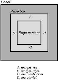
Note that the page margins are included in the page box.
Note. In the future, border properties and padding properties may also be allowed in the page context.
The CSS2 rules for collapsing vertical margins apply to page margins as well. For example, the margin of the first element box on a page will collapse with the page margin.
The page context has no notion of fonts, so 'em' and 'ex' units are not allowed. Percentage values on the margin properties are relative to the dimensions of the page box. All other units associated with the respective CSS2 properties are allowed.
Due to negative margin values (either on the page box or on elements) or absolute positioning content may end up outside the page box, but this content may be cut -- by the user agent, the printer, or ultimately the paper cutter.
| Property name: | 'size' |
|---|---|
| Value: | <length>{1,2} | auto | portrait | landscape |
| Initial: | auto |
| Applies to: | page context |
| Inherited: | N/A |
| Percentage values: | N/A |
This property specifies the size and orientation of a page box.
The size of a page box may either be "absolute" (fixed size) or "relative" (scalable, i.e., fitting available sheet sizes). Relative page boxes allow user agents to scale a document and make optimal use of the target size. Absolute page boxes ensure precise formatting when that is the author's prerogative.
Three values for the 'size' property create a relative page box:
  @page {
    size: auto;
    margin: 10%;
  }
In the above example, the outer edges of the page box will align with the target. (Since 'auto' is the initial value on 'size', it is normally not necessary to set this value.) The percentage value on the 'margin' property is relative to the target size so if the target is 21.0cm x 29.7cm (i.e., A4), the margins are 2.10cm and 2.97cm.
Explicit length values for the 'size' property create an absolute page box. If only one length value is specified, it sets both the width and height of the page box (i.e., the box is a square). Since the page box has no "parent", percentage values are not allowed on the 'size' property.
For example:
  @page {
    size: 8.5in 11in;  /* width height */
  }
The above example set the width of the page box to be 8.5in and the height to be 11in. The page box in this example requires a target size of 8.5"x11" or bigger to be printed.
User agents may allow users to control the transfer of the page box to the sheet (e.g., rotating an absolute page box that's being printed).
If page box does not fit the target sheet dimensions, the user agent may choose to:
The user agent should consult the user before performing these operations.
When the page box is smaller than the target size, the user agent is free to place the page box anywhere on the sheet. However, it is recommended that the page box be centered on the sheet since this will align double-sided pages and avoid accidental loss of information that is printed near the edge of the sheet.
Note. Typically, 8.5"x11" sheet size will be available in North America, while printers in other parts of the world are more likely to have the A4 sheet size available.
| Property name: | 'marks' |
|---|---|
| Value: | crop || cross | none |
| Initial: | none |
| Applies to: | page context |
| Inherited: | N/A |
| Percentage values: | N/A |
In high-quality printing, various marks are often added outside the page box. Crop marks indicate where the page should be cut and cross marks (also known as register marks or registration marks) are used to align sheets. This property describes what marks should be printed on the page outside the outer edges of the page box.
Marks are only visible on absolute page boxes. In relative page boxes, the page box will be aligned with the target and the marks will be outside the printable area.
The size, style, and position of cross marks depends on the user agent.
When printing double-sided documents, the page boxes on left and right pages should be different. This can be expressed through two CSS pseudo-classes that may be defined in the page context.
All pages are automatically classified by user agents into either the :left or :right pseudo-class.
  @page :left {
    margin-left: 4cm;
    margin-right: 3cm;
  }

  @page :right {
    margin-left: 3cm;
    margin-right: 4cm;
  }
If different declarations have been given for left and right pages, the user agent must honor these declarations even if the user agent does not transfer the page boxes to left and right sheets (e.g., a printer that only prints single-sided).
Whether the first page of a document is :left or :right depends on the major writing direction of the document and is outside the scope of this document. However, to force a :left or :right first page, authors may insert a page break before the element at the top of the document tree (e.g., the HTML element in HTML).
Note. Adding declarations to the :left or :right pseudo-class does not influence whether the document comes out of the printer double- or single-sided (which is outside the scope of this specification).
Note. Future versions of CSS may include other page pseudo-classes (e.g., :first).
It is customary in printed documents to put navigation aids at the top and/or bottom of the page. Often you'll find a page number, the name of the book, and the title of the current chapter there.
CSS defines two areas of the page for holding this kind of information. They are referred to as the :header and :footer pseudo-elements, since their default position is above (resp., below) the content of the page. Their content and other properties are defined inside an @page rule:
@page :footer {... footer properties... }
@page :header {... header properties... }
Since left and right pages often have different headers and footers, the following defines them individually:
@page :left :footer {...}    /* footer of the left page  */
@page :right :footer {...}   /* footer of the right page */
@page :left :header {...}    /* header of the left page  */
@page :right :header {...}   /* header of the right page */
The cascading rules determine what the values for properties are in case the same property is set on various @page rules. The specificity of @page is 0, every :left, :right, :footer, and :header adds 1 to the specificity.
The :footer and :header areas behave very similar to 'fixed' elements. The only difference is in their content: in headers and footers the content is limited to one line, and it may vary from page to page, since it can include variables. The page content is the reference box for the header and footer. See section "fixed positioning" for a description of fixed elements.
The initial values for 'top', 'bottom' and 'height' are different for :footer and :header than for normal fixed elements:
'top' in :header has a UA-dependent initial value. A suggested value is -3em.
'bottom' in :footer has a UA-dependent initial value. A suggested value is -3em.
'height' in both :header and :footer has a UA-dependent initial value. A suggested value is 1em.
The suggested values make the header and footer as wide as the page content, and about two lines above (resp., below) it.
The content of the header and footer is specified with the 'content' property. The content is always rendered as a single line. (If the content is too long, the UA should cut it off in some way.) The value is a comma-separated list of 1, 2, or 3 values. Depending on the 'direction' property, the first of these is left- or right-aligned, the second is centered, and the third is right- or left-aligned.
The content is a concatenation of fixed strings and variable parts. The following variable parts are allowed:
[Are these the right names for the variables?]
The "contents" is the text content of the element and all its children, excluding the content of elements that have 'display:none'.
This example creates two running headers, the one on the left page has a page number on the left, and the content of the first element marked as 'chapter' on the right. The right header has the content of the last element marked as 'section' on the left and the page number on the right. Both headers are in 10pt small-caps.
@page :left: header {
    content: "Page " decimal(pageno), , first(chapter);
    font-variant: small-caps
}
@page :right :header {
    content: last(section), , "Page " decimal(pageno);
    font-variant: small-caps
}
To put a copy of the content of an element in the header or footer, the element must be marked. The property 'running-head' is used for that.
| Property name: | 'running-head' |
|---|---|
| Value: | none | title | chapter | section |
| Initial: | none |
| Applies to: | all elements |
| Inherited: | no |
| Percentage values: | N/A |
This style sheet marks H2 elements as 'chapter' and DT elements as 'section'. This can be used, e.g., in combination with the running headers of the previous example.
H2 {running-head: chapter}
DT {running-head: section}
When formatting content in the page model, some content may end up outside the page box. For example, an element with 'white-space: pre' may be wider than the page box. Also, when elements are positioned outside the flow model, they may end up in inconvenient locations. For example, images may be placed on the edge of the page box or 100,000 inches below the page box.
A specification for the exact formatting of such elements lies outside the scope of this document. However, we recommend that authors and user agents observe the following general principles concerning content outside the page box:
Declarations in the page context cascade just like normal CSS2 declarations.
Consider the following example:
  @page {
    margin-left: 3cm;
  }

  @page :left {
    margin-left: 4cm;
  }
Due to the higher specificity of the pseudo-class selector (see the section on cascading order for details), the left margin on left pages will be '4cm' and all other pages (i.e., the right pages) will have a left margin of '3cm'.
Contents
CSS properties allow authors to specify the foreground color and background of an element. Backgrounds may be colors or images. Background properties allow authors to position the image, repeated it, and declare whether it should be fixed or scrolled.
See the section on color units for the syntax of legal color values.
The following property specifies the foreground color of an element's content. The 'color' property inherits normally.
| Property name: | 'color' |
|---|---|
| Value: | <color> |
| Initial: | depends on user agent |
| Applies to: | all elements |
| Inherited: | yes |
| Percentage values: | N/A |
This property describes the foreground color of an element's text content. There are different ways to specify red:
  EM { color: red }              /* natural language */
  EM { color: rgb(255,0,0) }     /* RGB range 0-255   */
Authors may specify the background of an element (i.e., its rendering surface) as either a color or an image.
Background properties do not inherit, but the parent element's background will shine through by default because of the initial 'transparent' value on 'background-color'.
In terms of the box model, "background" refers to the background of the content and the padding area. Border colors and styles are set with the border properties. Margins are always transparent so the background of the parent element always shines through.
| Property name: | 'background-color' |
|---|---|
| Value: | <color> | transparent |
| Initial: | transparent |
| Applies to: | all elements |
| Inherited: | no |
| Percentage values: | N/A |
This property sets the background color of an element.
H1 { background-color: #F00 }
| Property name: | 'background-image' |
|---|---|
| Value: | <url> | none |
| Initial: | none |
| Applies to: | all elements |
| Inherited: | no |
| Percentage values: | N/A |
This property sets the background image of an element, whose location is given by a <url>. When setting a background image, one should also set a background color that will be used when the image is unavailable. When the image is available, it is overlaid on top of the background color.
  BODY { background-image: url(marble.gif) }
  P { background-image: none }
| Property name: | 'background-repeat' |
|---|---|
| Value: | repeat | repeat-x | repeat-y | no-repeat |
| Initial: | repeat |
| Applies to: | all elements |
| Inherited: | no |
| Percentage values: | N/A |
If a background image is specified, the value of 'background-repeat' determines how/if the image is repeated.
A value of 'repeat' means that the image is repeated both horizontally and vertically. The 'repeat-x' ('repeat-y') value makes the image repeat horizontally (vertically), to create a single band of images from one side to the other. With a value of 'no-repeat', the image is not repeated.
  BODY {
    background: red url(pendant.gif);
    background-repeat: repeat-y;
  }
In the example above, the image will only be repeated vertically.
| Property name: | 'background-attachment' |
|---|---|
| Value: | scroll | fixed |
| Initial: | scroll |
| Applies to: | all elements |
| Inherited: | no |
| Percentage values: | N/A |
If a background image is specified, the value of determines if it is fixed with regard to the canvas or if it scrolls along with the content.
  BODY {
    background: red url(pendant.gif);
    background-repeat: repeat-y;
    background-attachment: fixed;
  }
UAs may treat 'fixed' as 'scroll'. However, it is recommended they interpret 'fixed' correctly, at least on the HTML and BODY elements, since there is no way for an author to provide an image only for those browsers that support 'fixed'. See the section on conformance for details.
| Property name: | 'background-position' |
|---|---|
| Value: | [<percentage> | <length> ]{1,2} | [top | center | bottom] || [left | center | right] |
| Initial: | 0% 0% |
| Applies to: | block-level and replaced elements |
| Inherited: | no |
| Percentage values: | refer to the size of the element itself |
If a background image has been specified, the value of 'background-position' specifies its initial position.
With a value pair of '0% 0%', the upper left corner of the image is placed in the upper left corner of the box that surrounds the content of the element (i.e., not the box that surrounds the padding, border or margin). A value pair of '100% 100%' places the lower right corner of the image in the lower right corner of the element. With a value pair of '14% 84%', the point 14% across and 84% down the image is to be placed at the point 14% across and 84% down the element.
With a value pair of '2cm 2cm', the upper left corner of the image is placed 2cm to the right and 2cm below the upper left corner of the element.
If only one percentage or length value is given, it sets the horizontal position only, the vertical position will be 50%. If two values are given, the horizontal position comes first. Combinations of length and percentage values are allowed, e.g. '50% 2cm'. Negative positions are allowed.
One can also use keyword values to indicate the position of the background image. Keywords cannot be combined with percentage values, or length values. The possible combinations of keywords and their interpretations are as follows:
Examples:
  BODY { background: url(banner.jpeg) right top }    /* 100%   0% */
  BODY { background: url(banner.jpeg) top center }   /*  50%   0% */
  BODY { background: url(banner.jpeg) center }       /*  50%  50% */
  BODY { background: url(banner.jpeg) bottom }       /*  50% 100% */
If the background image is fixed with regard to the canvas (see the property above), the image is placed relative to the canvas instead of the element. E.g.,
  BODY {
    background-image: url(logo.png);
    background-attachment: fixed;
    background-position: 100% 100%;
  }
In the example above, the image is placed in the lower right corner of the canvas.
| Property name: | 'background' |
|---|---|
| Value: | <'background-color'> || <'background-image'> || <'background-repeat'> || || <'background-position'> |
| Initial: | not defined for shorthand properties |
| Applies to: | all elements |
| Inherited: | no |
| Percentage values: | allowed on 'background-position' |
The 'background' property is a shorthand property for setting the individual background properties (i.e., 'background-color', 'background-image', 'background-repeat', and 'background-position') at the same place in the style sheet.
The 'background' property always sets all the individual background properties. The 'background' property helps authors remember to specify all aspects of a background which they might otherwise neglect by using the individual background properties.
In the first rule of the following example, only a value for 'background-color' has been given and the other individual properties are set to their initial value. In the second rule, all individual properties have been specified.
  BODY { background: red }
  P { background: url(chess.png) gray 50% repeat fixed }
Contents
When a document's text is to be displayed visually, each character (abstract information element) must be mapped to some representation that may be drawn on the screen, paper, etc. Each of these glyphs constitutes a graphical depiction of a character. (as opposed to, for example, an aural, textual, or numerical depiction of that character) One or more characters may be depicted by one or more glyphs, in a possibly context-dependent fashion. A glyph representation is the actual artistic representation of an abstract glyph, in some typographic style, in the form of outlines or bitmaps. A font is a set of glyph representations, all observing same basic motif according to design, size, appearance, and other attributes associated with the entire set.
A visual user agent must address the following issues before actually rendering a character:
In both CSS1 and CSS2, authors specify font characteristics via a series of font properties.
What use the user agent makes of these properties differs greatly between CSS1 and CSS2. In CSS1, all fonts were assumed to be present on the client system and were identified solely by name. Alternate fonts could be specified with the properties, but beyond that, user agents had no way to suggest any other fonts (even stylistically similar fonts that the user agent had available) other than generic default fonts.
CSS2 changes all that, and allows user agents much greater liberty in selecting a font when an author's requested font is not immediately available. CSS2 improves client-side font matching, enables font synthesis and progressive rendering, and enables fonts to be downloaded over the Web.
In the CSS font model, each user agent has a "font database" at its disposition. CSS2 allows stylesheet authors to contribute towards that database. When asked to display a character with a particular font, the user agent first identifies the font in the database that "best fits" the specified font (according to the font matching algorithm) Once it has identified a font, it retrieves the font data locally or from the Web, and may display the character using those glyph representations.
In light of this simple model, we have organized the specification into two sections. The first concerns the font specification mechanism, whereby authors specify which fonts they would like to have used. The second concerns the font selection mechanism, whereby the client's user agent identifies and loads a font that best fits the author's specification.
How the user agent constructs the font database lies outside the scope of this specification since the database's implementation depends on the operating system, the windowing system, the client, etc. Similarly, this specification does not mandate how the user agent should handle error conditions such as when none of the desired fonts are available.
The first phase of the CSS font mechanism concerns how authors specify which fonts should be used by a client user agent. Unfortunately, there exists no well-defined and universally accepted taxonomy for classifying fonts, and terms that apply to one font family may not be appropriate for others. For example, the term 'italic' is commonly used to label slanted text, but slanted text may also be labeled Oblique, Slanted, Incline, Cursive or Kursiv.
Since it is not possible to provide authors with a perfect font naming scheme, CSS has authors refer to pertinent characteristics of a font through a series of properties. The property values form the basis of the user agent's font selection.
CSS2 specifies fonts by using the following properties:
On all properties except 'font-size', 'em' and 'ex' length values refer to the font size of the current element. For 'font-size', these length units refer to the font size of the parent element. Please consult the section on length units for more information.
For information about the classification of fonts in general, please consult the section on font descriptors.
| Property name: | 'font-family' |
|---|---|
| Value: | [[ <family-name> | <generic-family> ],]* [<family-name> | <generic-family>] |
| Initial: | depends on user agent |
| Applies to: | all elements |
| Inherited: | yes |
| Percentage values: | N/A |
This property specifies a prioritized list of font family names and/or generic family names. To deal with the problem that a single font may not be enough to display all the characters in a document, or even a single element, this property allows authors to specify a list of fonts, all of the same style and size, that are tried in sequence to see if they contain a glyph for a certain character. This list is called a font set .
For example, text that contains English text mixed with mathematical symbols may need a font set of two fonts, one containing letters and digits, the other containing mathematical symbols. Here is an example of a font set suitable for a text that is expected to contain text with Latin characters, Japanese characters, and mathematical symbols:
BODY { font-family: Baskerville, "Heisi Mincho W3", Symbol, serif }
The characters available in the Baskerville font (a font with only Latin characters) will be taken from that font, Japanese will be taken from Heisi Mincho W3, and the mathematical symbols will come from Symbol. Any other characters will (hopefully) come from the generic font family 'serif'. The 'serif' font family will also be used if one or more of the other fonts is unavailable.
There are two types of list values:
Authors are encouraged to offer a generic font family as a last alternative.
Font names containing whitespace should be quoted.
For example:
  BODY { font-family: "new century schoolbook", serif }

  <BODY style="font-family: 'My own font', fantasy">
If quoting is omitted, any whitespace characters before and after the font name are ignored and any sequence of whitespace characters inside the font name is converted to a single space.
The generic font family values are considered keywords and therefore must not be quoted.
| Property name: | 'font-style' |
|---|---|
| Value: | normal | italic | oblique |
| Initial: | normal |
| Applies to: | all elements |
| Inherited: | yes |
| Percentage values: | N/A |
The 'font-style' property selects between normal (sometimes referred to as "roman" or "upright"), italic and oblique faces within a font family.
A value of 'normal' selects a font that is classified as 'normal' in the UA's font database, while 'oblique' selects a font that is labeled 'oblique'. A value of 'italic' selects a font that is labeled 'italic', or, if that is not available, one labeled 'oblique'.
The font that is labeled 'oblique' in the UA's font database may actually have been generated by electronically slanting a normal font.
Fonts with Oblique, Slanted or Incline in their names will typically be labeled 'oblique' in the font database. Fonts with Italic, Cursive or Kursiv in their names will typically be labeled 'italic'.
  H1, H2, H3 { font-style: italic }
  H1 EM { font-style: normal }
In the example above, normal text in an H1, H2, or H3 element will be displayed with an italic font. However, emphasized text within H1 will appear in a normal face.
| Property name: | 'font-variant' |
|---|---|
| Value: | normal | small-caps |
| Initial: | normal |
| Applies to: | all elements |
| Inherited: | yes |
| Percentage values: | N/A |
In a small-caps font, the lower case letters look similar to the uppercase ones, but in a smaller size and with slightly different proportions. The 'font-variant' property selects that font. This property has no visible effect for scripts which are unicameral (having only one case).
A value of 'normal' selects a font that is not labelled as a small-caps font, 'small-caps' selects a small-caps font. If a genuine small-caps font is not available, it is acceptable (but not required) in CSS2 if the small-caps font is a created by taking a normal font and replacing the lower case letters by scaled uppercase characters. As a last resort, unscaled uppercase letters will be used as replacement for a small-caps font so that the text appears in all capitals.
The following example results in an H3 element in small-caps, with emphasized words in oblique small-caps:
  H3 { font-variant: small-caps }
  EM { font-style: oblique }
There may be other variants in the font family as well, such as fonts with old-style numerals, small-caps numerals, condensed or expanded letters, etc. CSS2 has no properties that select those.
Insofar as this property causes text to be transformed to uppercase, the same considerations as for 'text-transform' apply.
| Property name: | 'font-weight' |
|---|---|
| Value: | normal | bold | bolder | lighter | 100 | 200 | 300 | 400 | 500 | 600 | 700 | 800 | 900 |
| Initial: | normal |
| Applies to: | all elements |
| Inherited: | yes |
| Percentage values: | N/A |
The 'font-weight' property selects the weight of the font. The values '100' to '900' form an ordered sequence, where each number indicates a weight that is at least as dark as its predecessor. The keyword 'normal' is synonymous with '400', and 'bold' is synonymous with '700'. Keywords other than 'normal' and 'bold' have been shown to be often confused with font names and a numerical scale was therefore chosen for the 9-value list.
  P { font-weight: normal }   /* 400 */
  H1 { font-weight: 700 }     /* bold */
The 'bolder' and 'lighter' values select font weights that are relative to the weight inherited from the parent:
STRONG { font-weight: bolder }
Child elements inherit the resultant weight, not the keyword value.
Fonts (the font data) typically have one or more properties whose values are names that are descriptive of the "weight" of a font. There is no accepted, universal meaning to these weight names. Their primary role is to distinguish faces of differing darkness within a single font family. Usage across font families is quite variant; for example a font that you might think of as being bold might be described as being Regular, Roman, Book, Medium, Semi- or DemiBold, Bold, or Black, depending on how black the "normal" face of the font is within the design. Because there is no standard usage of names, the weight property values in CSS2 are given on a numerical scale in which the value '400' (or 'normal') corresponds to the "normal" text face for that family. The weight name associated with that face will typically be Book, Regular, Roman, Normal or sometimes Medium.
The association of other weights within a family to the numerical weight values is intended only to preserve the ordering of darkness within that family. However, the following heuristics tell how the assignment is done in typical cases:
    Available faces       |  Assignments  |  Filling the holes
    ----------------------+---------------+-------------------
    "Example1 Regular"    |  400          |  100, 200, 300
    "Example1 Medium"     |  500          |
    "Example1 Bold"       |  700          |  600
    "Example1 Heavy"      |  800          |  900
    Available faces       |  Assignments  |  Filling the holes
    ----------------------+---------------+-------------------
    "Example2 Book"       |  400          |  100, 200, 300
    "Example2 Medium"     |  500          |
    "Example2 Bold"       |  700          |  600
    "Example2 Heavy"      |  800          |
    "Example2 Black"      |  900          |
    "Example2 ExtraBlack" |  (none)       |
Since the intent of the relative keywords 'bolder' and 'lighter' is to darken or lighten the face within the family and because a family may not have faces aligned with all the symbolic weight values, the matching of 'bolder' is to the next darker face available on the client within the family and the matching of 'lighter' is to the next lighter face within the family. To be precise, the meaning of the relative keywords 'bolder' and 'lighter' is as follows:
There is no guarantee that there will be a darker face for each of the 'font-weight' values; for example, some fonts may have only a normal and a bold face, others may have eight different face weights. There is no guarantee on how a UA will map font faces within a family to weight values. The only guarantee is that a face of a given value will be no less dark than the faces of lighter values.
| Property name: | 'font-size' |
|---|---|
| Value: | <absolute-size> | <relative-size> | <length> | <percentage> |
| Initial: | medium |
| Applies to: | all elements |
| Inherited: | yes |
| Percentage values: | relative to parent element's font size |
[ xx-small | x-small | small | medium | large | x-large | xx-large ]
On a computer screen a scaling factor of 1.5 is suggested between adjacent indexes; if the 'medium' font is 10pt, the 'large' font could be 15pt. Different media may need different scaling factors. Also, the UA should take the quality and availability of fonts into account when computing the table. The table may be different from one font family to another.
[ larger | smaller ]
For example, if the parent element has a font size of 'medium', a value of 'larger' will make the font size of the current element be 'large'. If the parent element's size is not close to a table entry, the UA is free to interpolate between table entries or round off to the closest one. The UA may have to extrapolate table values if the numerical value goes beyond the keywords.
Length and percentage values should not take the font size table into account when calculating the font size of the element.
Negative values are not allowed.
An application may reinterpret an explicit size, depending on the context, for example, inside a VR scene a font may get a different size because of perspective distortion.
Examples:
  P { font-size: 12pt; }
  BLOCKQUOTE { font-size: larger }
  EM { font-size: 150% }
  EM { font-size: 1.5em }
| Property name: | 'font' |
|---|---|
| Value: | [ [ <'font-style'> || <'font-variant'> || <'font-weight'> ]? <'font-size'> [ / <'line-height'> ]? <'font-family'> ] |
| Initial: | see individual properties |
| Applies to: | all elements |
| Inherited: | yes |
| Percentage values: | allowed on 'font-size' and 'line-height' |
The 'font' property is a shorthand property for setting 'font-style', 'font-variant', 'font-weight', 'font-size', 'line-height', and 'font-family', at the same place in the style sheet. The syntax of this property is based on a traditional typographical shorthand notation to set multiple properties related to fonts.
For a definition of allowed and initial values, see the previously defined properties. Properties for which no values are given are set to their initial value.
Examples:
  P { font: 12pt/14pt sans-serif }
  P { font: 80% sans-serif }
  P { font: x-large/110% "new century schoolbook", serif }
  P { font: bold italic large Palatino, serif }
  P { font: normal small-caps 120%/120% fantasy }
In the second rule, the font size percentage value ('80%') refers to the font size of the parent element. In the third rule, the line height percentage refers to the font size of the element itself.
In the first three rules above, the 'font-variant' and 'font-weight' are not explicitly mentioned, which means they are all three set to their initial value ('normal'). The fourth rule sets the 'font-weight' to 'bold', the 'font-style' to 'italic' and implicitly sets 'font-variant' to 'normal'.
The fifth rule sets the 'font-variant' ('small-caps'), the 'font-size' (120% of the parent's font), the 'line-height' (120% times the font size) and the 'font-family' ('fantasy'). It follows that the keyword 'normal' applies to the two remaining properties: 'font-style' and 'font-weight'.
Generic font families are a fallback mechanism, a means of preserving some of the style sheet writer's intent in the worst case when none of the specified fonts can be selected. For optimum typographic control, particular named fonts should be used in stylesheets.
All five generic font families may be assumed to exist in all CSS implementations (they need not necessarily map to five distict actual fonts, in all cases). UAs should provide reasonable default choices for the generic font families, which express the characteristics of each family as well as possible within the limits of the underlying technology allows.
UAs are encouraged to allow users to select alternative choices for the generic fonts.
Serif fonts, as the term is used in CSS, have the characteristic that the ends of the strokes have finishing strokes, flared or tapering ends, or have actual serifed endings (including slab serifs). Serif fonts are typically proportionately spaced. They often display a greater variation between thick and thin strokes than fonts from the 'sans-serif' generic font family. CSS uses the term 'serif' to apply to a font for any script, although other names may be more familiar for particular scripts, such as Gothic (Japanese), Kai (Chinese), Pathang (Korean) and any font which is so described may be used to represent the generic 'serif' family.
Examples of fonts which fit this description include:
Sans-serif fonts, as the term is used in CSS, have the characteristic that the ends of their strokes have abrupt or butted ends. Sans-serif fonts are typically proportionately spaced. They often have little variation between thick and thin strokes, compared to fonts from the 'serif' family. CSS uses the term 'sans-serif' to apply to a font for any script, although other names may be more familiar for particular scripts, such as Mincho (Japanese), Sung or Song (Chinese), Totum or Kodig (Korean) and any font which is so described may be used to represent the generic 'sans-serif' family.
Examples of fonts which fit this description include:
Cursive fonts, as the term is used in CSS, have the characteristic that the glyphs are partially or completely connected, and that the result looks more like handwritten pen or brush writing than printed letterwork. Fonts for some scripts, such as Arabic, are almost always cursive. CSS uses the term 'cursive' to apply to a font for any script, although other names such as Chancery, Brush, Swing and Script are also used in font names.
Examples of fonts which fit this description include:
Fantasy fonts, as used in CSS, are primarily decorative whilst still containing representations of characters (as opposed to Pi or Picture fonts, which do not represent characters).
The sole criterion of a monospace font is that all glyph representations have the same fixed width. This can make some scripts, such as Arabic, look most peculiar. The effect is similar to a manual typewriter, and is often used to simulate computer code.
Examples of fonts which fit this description include:
The second phase of the CSS2 font mechanism concerns the user agent's selection of a font based on author-specified font properties, available fonts, etc. The details of the font matching algorithm are provided below.
There are four possible font selection actions: matching, intelligent matching, synthesis, and download.
progressive rendering is a combination of download and one of the other methods; it provides a temporary substitute font (using name matching, intelligent matching, or synthesis) to allow content to be read while the requested font downloads. Once the real font has been successfully downloaded, it replaces the temporary font, hopefully without the need to reflow.
In CSS2, authors may specify which, if any, of these mechanisms should be invoked by the user agent if a particular font is not immediately available. Authors add font descriptions to style sheets for this purpose. A font description is a set of font descriptors , individual pieces of information about a font, possibly including a URL describing the font's location on the Web.
Note. Progressive rendering requires metric information about the font in order to avoid re-layout of the content when the actual font has been loaded and rendered. This metric information is sufficiently verbose that it should only be specified at most once per font in a document.
The font description provides the bridge between an author's font specification and the font data , which is the data needed to format text and to render the glyph representations to which the characters map - the actual scalable outlines or bitmaps needed to to render the glyph representations to which the characters map. Fonts are referenced by style sheet properties.
The font description is used to select the relevant font data. The font description contains descriptors that provide the location of the font data on the Web, and/or characterize that font data. The font descriptors are also needed to match the style sheet font properties to particular font data. The level of detail of a font description can vary from just the name of the font up to a list of glyph representation widths. This data is a subset of the glyph representation metrics contained in the font.
Font descriptors may be classified into three types:
All font descriptions are specified via a @font-face at-rule. The general form of this rule is:
@font-face {<font-description> }
where the <font-description> has the form:
descriptor: value;
descriptor: value;
[...]
descriptor: value;
Each @font-face rule specifies a value for every font descriptor, either implicitly or explicitly. Those not given explicit values in the rule take the initial value listed with each descriptor in this specification. These descriptors apply solely within the context of the @font-face rule in which they are defined, and do not apply to document language elements. Thus, there is no notion of which elements the descriptors apply to, or whether the values are inherited by child elements.
The available font descriptors are described in later sections of this specification.
For example, here the font 'Robson Celtic' is defined and referenced in a style sheet contained in an HTML document.
<HTML>
  <HEAD>
    <TITLE>Font test</TITLE>
    <STYLE TYPE="text/css" MEDIA="screen, print">
      @font-face {
        font-family: "Robson Celtic";
        src: url(http://site/fonts/rob-celt)
      }
      H1 {font-family: "Robson Celtic", serif}
    </STYLE>
  </HEAD>

  <BODY>
    <H1> This heading is displayed using Robson Celtic</H1>
  </BODY>
</HTML>
The style sheet (in the STYLE element) contains a CSS rule that sets all H1 elements to use the 'Robson Celtic' font family.
A CSS1 implementation will search the client for a font whose family name and other properties match "Robson Celtic" and, if it fails to find it, will use the UA-specific fallback serif font (which is defined to exist).
A user agent implementing CSS2 will first examine @font-face rules in search of a font description defining Robson Celtic. This example contains a rule which matches. Although this rule doesn't contain much font data, it does have a URL where the font can be retrieved for rendering this document. Downloaded fonts should not be made available to other applications. If no matching @font-face is found, the user agent will attempt the same match as a user agent implementing CSS1.
Note that if the font Robson Celtic had been installed on the client system, this would cause the UA to construct an @font-face rule for the installed copy as described in the section on the font matching algorithm. The installed copy would have been matched before the downloadable font in the example above.
CSS1 implementations, which do not understand the @font-face rule will encounter the opening curly brackets and will skip forward until the matching closing curly brackets. This at-rule conforms with the forward-compatible parsing requirement of CSS. Parsers may skip these rules without error.
Also, any descriptors which are not recognized or useful to the user agent should be ignored in their entirety. This allows adding in the future optional descriptors for the purpose of better font substitution, matching, or synthesis.
The following descriptors have the same names as the corresponding CSS2 font properties, and take a single value or comma-separated list of values.
The values within that list are exactly the same as those specified for CSS2. If there is a single value, that is the value that must be matched. If there is a list, any of the list items constitutes a match. If the descriptor is omitted from the @font-face, the initial value is used.
| Descriptor name: | 'font-family' |
|---|---|
| Value: | [ <family-name> | <generic-family> ] [, [<family-name> | <generic-family> ]]* |
| Initial: | depends on user agent |
This is the descriptor for the family name of a font and takes the same values as the 'font-family' property.
| Descriptor name: | 'font-style' |
|---|---|
| Value: | [ normal | italic | oblique ] [, [normal | italic | oblique] ]* |
| Initial: | normal |
This is the descriptor for the style of a font and takes the same values as the 'font-style' property except that a comma separated list is permitted. The value 'normal' indicates that this is the normal face of a font; it is either the only face in a a font, or it is the face which is intended to be used alongside other companion faces. The value 'oblique' indicates that this face is a more slanted companion face than than the normal face. The value 'italic' indicates that this is a more cursive companion face to the normal face. This avoids having to label slightly slanted normal faces as oblique, or Greek faces as italic.
This is the CSS indication whether this face is a small-caps variant of a font. It takes the same values as the 'font-variant' property except that a comma separated list is permitted. Cyrillic pryamoĭ faces may be labeled with a 'font-variant' of small-caps, which will give better consistency with Latin faces (and the companion kursiv face labeled with 'font-style' italic for the same reason).
| Descriptor name: | 'font-weight' |
|---|---|
| Value: | all | [normal | bold | 100 | 200 | 300 | 400 | 500 | 600 | 700 | 800] [, [normal | bold | 100 | 200 | 300 | 400 | 500 | 600 | 700 | 800]]* |
| Initial: | normal |
This is the descriptor for the weight of a face relative to others in the same font family. It takes the same values as the 'font-weight' property with three exceptions:
This is the descriptor for the sizes provided by this font. Only absolute length units are permitted, in contrast to the 'font-size' property, which allows both relative and absolute lengths and sizes. A comma separated list of absolute lengths is permitted.
The initial value of 'all' is suitable for scalable fonts, so this descriptor will only be useful in an @font-face for bitmap fonts, or for scalable fonts which have hand-tuned bitmaps at specific point sizes.
The following descriptor is optional within a font definition, but is used to avoid checking or downloading a font that does not have sufficient glyphs to render a particular character.
| Descriptor name: | 'unicode-range' |
|---|---|
| Value: | <urange>+ |
| Initial: | U+0-7FFFFFFF |
This is the descriptor for the range of [UNICODE] characters covered by the font. Since this is sparse (most fonts do not cover the whole of Unicode) this descriptor lists blocks or ranges which do have some coverage (no promise is made of complete coverage). This method is extensible to future allocation of characters in Unicode, without change of syntax and without invalidating existing content.
The values of <urange> are expressed using hexadecimal numbers prefixed by "U+", corresponding to character code positions in [UNICODE], which is code-for-code identical to [ISO10646] (the document character set of [HTML40]). For example, U+05D1 is the Unicode character 'Hebrew letter bet'. For values outside the Basic Multilingual Plane (BMP), additional leading digits corresponding to the plane number are added, also in hexadecimal, like this: U+A1234 which is the character on Plane 10 at hexadecimal code position 1234. At the time of writing no characters had been assigned outside the BMP. Leading zeros (for example, 0000004D) are legal, but not required.
The initial value (i.e., the value used when no value is given in the style sheet) covers not only the entire Basic Multilingual Plane (BMP), which would be expressed as U+0-FFFF, but also the whole repertoire of ISO 10646. Thus, the initial value says that the font may have glyph representations for characters anywhere in [ISO10646]. Specifying a value for 'unicode-range' provides information to make searching efficient, by declaring a constrained range in which the font may have glyph representations for characters. The font need not be searched for characters outside this range.
Values may be written with any number of digits. For single numbers, the character '?' is assumed to mean 'any value' which creates a range of character positions. Thus, using a single number:
A pair of numbers in this format can be combined with the dash character to indicate larger ranges. For example
Multiple, discontinuous ranges can be specified, separated by a comma. As with other comma-separated lists in CSS, any whitespace before or after the comma is ignored.
For example:
A more likely representation for a typical Chinese font would be:
unicode-range: U+3000-33FF, U+4E00-9FFF
The following descriptor is optional within a font definition, but is required if there are any numeric values in the 'em' space in which glyphs are defined.
| Descriptor name: | 'units-per-em' |
|---|---|
| Value: | <number> |
| Initial: | undefined |
This is the descriptor for the number of the co-ordinate units on the em square, the size of the design grid on which glyph representations are laid out.
This descriptor is required for referencing actual font data, whether downloadable or locally installed.
| Descriptor name: | 'src' |
|---|---|
| Value: | [ <url> [format [,format]*]? | <font-face-name> ] [, <url> [format [,format]*]?] | <font-face-name> ]* |
| Initial: | undefined |
This is a prioritized list of URLs and/or locally installed font face names. The URL points to the font data itself. This is required if the WebFont is to be retrieved. The font resource may be a subset of the source font. The URL may be partial, in which case it is resolved relative to the location of the style sheet containing the @font-face .
The URL may have optional hints regarding the format of font resource to be found at that URL, and this information should be used by clients in format negotiation with the server. As with any hypertext reference, there may be other formats available, or the resource may have been moved; but the client has a better idea of what is likely to be there, in a more robust way than trying to parse filename extensions in URLs.
The <font-face-name> is the adorned font name of a locally installed font. The adorned font name is the name of the font as reported by the operating system and is the name most likely to be used in reader stylesheets, or author stylesheets on an intranet. Adornments such as bold, italic, underline are usually used to select the appropriate font within a font family. For more information about adorned font names please consult the notes about fonts.
Examples:
Access to locally installed fonts is via the <font-face-name>. The font face name is not truly unique, nor is it truly platform or font format independent, but at the moment it is the best way to identify font data. The use of the font face name can be made more accurate by providing an indication of the glyph complement required. This may be done by indicating the range of Unicode character positions for which the font provides some glyph representations (see 'unicode-range').
These descriptors are optional for a CSS2 definition, but may be used if intelligent font matching is desired by the author.
| Descriptor name: | 'panose-1' |
|---|---|
| Value: | [<number>]{10} |
| Initial: | 0 0 0 0 0 0 0 0 0 0 |
This is the descriptor for the Panose-1 number and consists of ten decimal numbers, separated by whitespace. A comma separated list is not permitted for this descriptor, because the Panose-1 system can indicate that a range of values are matched. The initial value is zero for each PANOSE digit, which means "any"; all fonts will match the Panose number if this value is used.
| Descriptor name: | 'stemv' |
|---|---|
| Value: | <number> |
| Initial: | undefined |
This is the descriptor for the vertical stem width of the font. If the value is undefined, the descriptor is not used for matching. If this descriptor is used, the 'units-per-em' descriptor must also be used.
| Descriptor name: | 'stemh' |
|---|---|
| Value: | <number> |
| Initial: | undefined |
This is the descriptor for the horizontal stem width of the font. If the value is undefined, the descriptor is not used for matching. If this descriptor is used, the 'units-per-em' descriptor must also be used.
| Descriptor name: | 'slope' |
|---|---|
| Value: | <number> |
| Initial: | 0 |
This is the descriptor for the vertical stroke angle of the font.
| Descriptor name: | 'cap-height' |
|---|---|
| Value: | <number> |
| Initial: | undefined |
This is the descriptor for the number of the height of capital glyph representations of the font. If the value is undefined, the descriptor is not used for matching. If this descriptor is used, the 'units-per-em' descriptor must also be used.
| Descriptor name: | 'x-height' |
|---|---|
| Value: | <number> |
| Initial: | undefined |
This is the descriptor for the height of lowercase glyph representations of the font. If the value is undefined, the descriptor is not used for matching. If this descriptor is used, the 'units-per-em' descriptor must also be used.
| Descriptor name: | 'ascent' |
|---|---|
| Value: | <number> |
| Initial: | undefined |
This is the descriptor for the maximum unaccented height of the font. If the value is undefined, the descriptor is not used for matching. If this descriptor is used, the 'units-per-em' descriptor must also be used.
| Descriptor name: | 'descent' |
|---|---|
| Value: | <number> |
| Initial: | undefined |
This is the descriptor for the Maximum unaccented depth of the font. If the value is undefined, the descriptor is not used for matching. If this descriptor is used, the 'units-per-em' descriptor must also be used.
Synthesizing a font means, at minimum, matching the width metrics of the specified font. Therefore, for synthesis, this metric information must be available. Similarly, progressive rendering requires width metrics in order to avoid reflow of the content when the actual font has been loaded. Although the following descriptors are optional for a CSS2 definition, some are required if synthesizing (and progressive rendering) is desired by the author. Should the actual font become available, the substitution should be replaced by the actual font. Any of these descriptors which are present will be used to provide a better or faster approximation of the intended font.
Of these descriptors, the most important are the 'widths' descriptor and bbox which are used to prevent text reflow should the actual font become available. In addition, the descriptors in the set of descriptors required for matching can be used to provide a better synthesis of the actual font appearance.
| Descriptor name: | 'widths' |
|---|---|
| Value: | [<urange> ]? [<number> ]+ [,[<urange> ]? <number> ]+] |
| Initial: | undefined |
This is the descriptor for the number of the glyph representation widths. The value is a (comma separated list of) <urange> values followed by one or more glyph representation widths. If this descriptor is used, the 'units-per-em' descriptor must also be used.
For example:
widths: U+4E00-4E1F 1736 1874 1692
In this instance a range of 32 characters is given, from 4E00 to 4E1F. The glyph corresponding to the first character (4E00) has a width of 1736, the second has a width of 1874 and the third, 1692. Because not enough widths have been provided, the last width replicates to cover the rest of the specified range. If too many widths are provided, the excess are ignored.
If the <urange> is omitted, a range of U+0-7FFFFFFF is assumed which covers all characters and their glyph representations
This descriptor cannot describe multiple glyphs corresponding to a single character, or ligatures of multiple characters. Thus, this descriptor can only be used for scripts which do not have contextual forms or mandatory ligatures. It is nevertheless useful in those situations. Scripts which require a one-to-many or many-to-many mapping of characters to glyphs cannot at present use this descriptor to enable font synthesis although they can still use font downloading or intelligent matching.
| Descriptor name: | 'definition-src' |
|---|---|
| Value: | <url> |
| Initial: | undefined |
The font descriptors may either be within the font definition in the stylesheet, or may be provided within a separate font definition resource identified by a URL. The latter approach can reduce network traffic when multiple stylesheets reference the same fonts.
Having the font descriptors separate from the font data has a benefit beyond being able to do font selection and/or substitution. The data protection and replication restrictions on the font descriptors may be much weaker than on the full font data. Thus, it may be possible to locally install the font definition, or at least to have it in a local cache. This allows the abbreviated form of font definition within documents, but would not require accessing the full font definition over the Web more than once per named font.
These optional descriptors are used to align runs of different scripts with one another.
| Descriptor name: | 'baseline' |
|---|---|
| Value: | <number> |
| Initial: | 0 |
This is the descriptor for the lower baseline of a font. If this descriptor is given a non-default (non-zero) value, the 'units-per-em' descriptor must also be used.
| Descriptor name: | 'centerline' |
|---|---|
| Value: | <number> |
| Initial: | undefined |
This is the descriptor for the central baseline of a font. If the value is undefined, the UA may employ various heuristics such as the midpoint of the ascent and descent values. If this descriptor is used, the 'units-per-em' descriptor must also be used.
| Descriptor name: | 'mathline' |
|---|---|
| Value: | <number> |
| Initial: | undefined |
This is the descriptor for the mathematical baseline of a font. If undefined, the UA may use the center baseline. If this descriptor is used, the 'units-per-em' descriptor must also be used.
| Descriptor name: | 'topline' |
|---|---|
| Value: | <number> |
| Initial: | undefined |
This is the descriptor for the top baseline of a font. If undefined, the UA may use an approximate value such as the ascent. If this descriptor is used, the 'units-per-em' descriptor must also be used.
In this section are listed the font characteristics that have been found useful for client-side font matching, synthesis, and download for heterogeneous platforms accessing the Web. The data may be useful for any medium which needs to use fonts on the Web by some other means than physical embedding of the font data inside the medium.
These characteristics are used to characterize fonts. They are not specific to CSS or to style sheets. In CSS, each characteristic is described by a font descriptor. These definitions could also be mapped onto VRML nodes, or CGM Application Structures, or a Java API, or alternative stylesheet languages. Fonts retrieved by one medium and stored in a proxy cache could be re-used by another medium, saving download time and network bandwidth.
A non-exhaustive list examples of such media includes:
This is the full name of a particular face of a font family. It typically includes a variety of non-standardized textual qualifiers or adornments appended to the font family name. It may also include a foundry name or abbreviation, often prepended to the font family name. It is only used in the 'src' descriptor, to refer to locally installed fonts, because the format of the adorned name can vary from platform to platform.
The name of the font definition is important because it is the link to any locally installed fonts. It is important that the name be robust, both with respect to platform and application independence. For this reason, the name should be one which is not application or language specific.
The ideal solution would be to have a name which uniquely identifies each collection of font data. This name does not exist in current practice for font data. Fonts with the same face name can vary over of number of descriptors. Some of these descriptors, such as different complements of glyphs in the font may be insignificant if the needed glyphs are in the font. Other descriptors, such as different width metrics, make fonts with the same name incompatible. It does not seem possible to define a rule that will always identify incompatibilities, but will not prevent the use of a perfectly suitable local copy of the font data with a given name. Therefore, only the range of Unicode characters will be used to qualify matches for the font face name.
Since a prime goal of the font face name in the font definition is allow a user agent to determine when there is a local copy of the specified font data, the font face name must be a name which will be in all legitimate copies of the font data. Otherwise, unnecessary Web traffic may be generated due to missed matches for the local copy.
For TrueType and OpenType fonts, this value may be obtained from the full font name from the name table.
For Type 1 fonts, this value may be obtained from the PostScript language name; the name which, in a PostScript language program, is used as an operand of the findfont operator. It is the name associated with the font by a definefont operation. This is usually the value of the FontName entry in the font dictionary. For more information, see Section 5.2 of the PostScript Language Reference Manual, Second Edition [Ref 10].
Multiple Master Type 1 fonts allow specifying various design dimensions (e.g., weight, such as light to extra-bold, and width, such as condensed to expanded) [Ref 12]. Coordinates along these design dimensions are specified by numbers, and are appended as a suffix to the base font name. To specify the appearance of the font, numeric values must be supplied for each design dimension of the multiple master font. A completely specified multiple master font is referred to as an instance of the multiple master font.
The PostScript language name used for a Multiple Master Type 1 is the name of the instance. If the name contains spaces (such as "MinionMM 366 465 11"), these spaces are replaced with underscores. For example, the base font name here is TektonMM and the 2 dimensions specified have values of 200 and 300:
TektonMM_200_300
The full font name of the TrueType font and the PostScript Language name may differ by spacing and punctuation. For example, spaces are not allow in a PostScript Language name, but are common in full font names. The TrueType name table can also contain the PostScript name, which has no spaces.
This gives the position in the em square of the central baseline. The central baseline is used by ideographic scripts for alignment, just as the bottom baseline is used for Latin, Greek and Cyrillic scripts.
For TrueType GX fonts, this value may be obtained from the [TRUETYPEGX] bsln table. Within this table, the ideographic centered baseline may be used for stretches of predominantly ideographic characters and the ideographic low baseline is more suitable for ideographic characters in a run of predominantly Latin, Greek or Cyrillic characters.
Certain values, such as width metrics, are expressed in units that are relative to an abstract square whose height is the intended distance between lines of type in the same type size. This square is called the EM square. The value of this descriptor specifies how many units the EM square is divided into. The valid range is 16 to 16384 units per EM square. Common values are 250 (Intellifont), 1000 (Type 1) and 2048 (TrueType).
If this value is not specified, it becomes impossible to know what any font metrics mean. For example, one font has lowercase glyph representations of height 450; another has smaller ones of height 890! The numbers are actually fractions; the first font has 450/1000 and the second has 890/2048 which is indeed smaller.
For Type 1 fonts, this value may be obtained from the FontMatrix entry in the font dictionary. For TrueType fonts, this value may be obtained from the unitsPerEm entry in the head table. For Intellifont fonts, this value is contained in the font attribute file.
Either explicitly or implicitly, each font has a table associated with it, the font encoding table , that tells for each glyph what character it is a representation for. In "Type 1 fonts", the table is referred to as an encoding vector .
In fact, many fonts contain several glyphs for the same character. Which of those glyphs should be used depends either on the rules of the language, or on the preference of the designer.
In Arabic, for example, all letters have four (or two) different shapes, depending on whether the letter is used at the start of a word, in the middle, at the end, or in isolation. It is the same character in all cases, and thus there is only one character in the HTML document, but when printed, it looks differently each time.
There are also fonts that leave it to the graphic designer to choose from among various alternative shapes provided. Unfortunately, CSS2 doesn't yet provide the means to select those alternatives. Currently, it is always the default shape that is chosen from such fonts.
Specifies the family name portion of the font face name. For example, the family name for Helvetica-Bold is Helvetica and the family name of ITC Stone Serif Semibold Italic is ITC Stone Serif. Some systems treat adornments relating to condensed or expanded faces as if they were part of the family name.
For Type 1 fonts, this value may be obtained from the FamilyName entry in the FontInfo dictionary. For TrueType and OpenTypefonts, it may be obtiained from the name table.
For Type 1 fonts, this value may be obtained from the @@???. For TrueType fonts, the values are in the hmtx table.
For Type 1 fonts, this value may be obtained from the StdHW entry, in the Private dictionary or the AFM file.
The y-coordinate of the top of flat capital letters in Latin, Greek and Cyrillic scripts, measured from the baseline. This descriptor is not useful for fonts that do not contain any glyph representations from these scripts.
For Type 1 fonts, this value may be obtained from the CapHeight entry in the AFM file or from the Bluevalues entry in the Private dictionary
The y-coordinate of the top of unaccented, non-ascending lowercase
letters in Latin, Greek and Cyrillic scripts, measured from the
baseline. Flat-topped letters are used, ignoring any optical
correction zone. Usually used as a ratio of lowercase to uppercase
heights, as a means of comparison between font families. The terms
large-eye, small-eye are also used to indicate the height of lowercase
glyph representations relative to the height of uppercase.
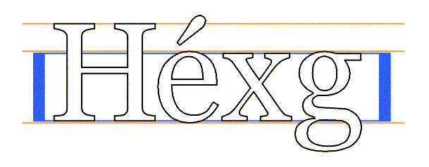
This descriptor is not useful for fonts that do not contain any glyph
representations from these scripts. Since the heights of lowercase and
uppercase letters are often formed into a ratio for comparing
different fonts, it may be useful to set both the lowercase and
uppercase heights to the same value for unicameral scripts such as
Hebrew, where for mixed Latin and Hebrew text the Hebrew characters
are typically set at a height midway between the capital and lowercase
heights of the Latin font.
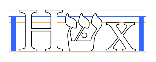
For Type 1 fonts, this value may be obtained from the Bluevalues entry in the Private dictionary.
This gives the position in the em square of the lower baseline. The lower baseline is used by Latin, Greek and Cyrillic scripts for alignment, just as the upper baseline is used for Sanscrit-derived scripts.
This gives the position in the em square of the mathematical baseline. The mathematical baseline is used by ideographic scripts for alignment, just as the lower baseline is used for Latin, Greek and Cyrillic scripts.
For TrueType GX fonts, this value may be obtained from the [TRUETYPEGX] bsln table.
For Type 1 fonts, this value may be obtained from the FontBBox entry in the font dictionary. For TrueType fonts, the four values are in the 'xMin', 'xMax', 'yMin' and 'yMax' entries of the 'head' table.
For Type 1 fonts, this value may be obtained from the 'Ascender' value in the AFM file. For TrueType and OpenType fonts, this value may be obtained from the 'Ascender' entry in the [OPENTYPE] 'hhea' table or (preferably) from the 'sTypoAscender' value in the [OPENTYPE] 'OS/2' table.
For TrueType GX fonts, the 'horizontalBefore' entry in the [TRUETYPEGX] 'fmtx' table is used, overriding Ascender values in the 'hhea' table.
For Type 1 fonts, this value may be obtained from 'descender' value in the AFM file.
Panose-1 is an industry standard TrueType font classification and matching technology. The PANOSE system consists of a set of ten numbers that categorize the key attributes of a Latin typeface, a classification procedure for creating those numbers, and Mapper software that determines the closest possible font match given a set of typefaces. The system could, with modification, also be used for Greek and Cyrillic, but is not suitable for unicameral and ideographic scripts (Hebrew, Armenian, Arabic, Chinese/Japanese/Korean). Panose-1 technology was originally developed by Elseware Corporation and is now owned by Hewlett Packard.
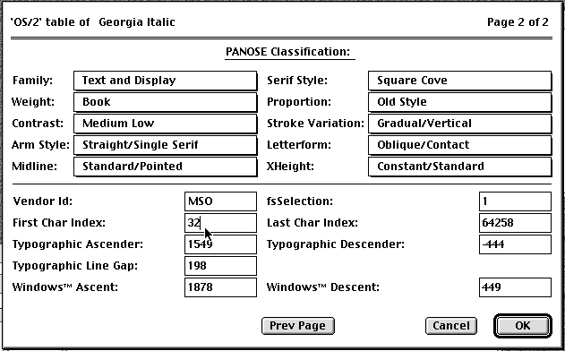
The Family, Serif Style and Proportion numbers are used by Windows95 for font selection and matching.
The meaning of the ten numbers and the allowable values (given in parentheses) are given in Appendix E for the most common case, where the "family" digit is 2, Text and Display. (If the first digit has a different value, the remaining nine digits have different meanings).
Panose-2 (see [PANOSE2]) is a specification for a more comprehensive font classification and matching technology which is not limited to Latin typefaces. For example, the serif characteristics of a Latin face may be compared with the stroke terminations of a Kanji face.
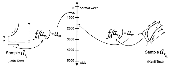
The Panose-2 value is not stored inside any known font formats, but may be measured.
This indicated the glyph repertoire of the font, relative to the Basic Multilingual Plane of Unicode, and is used to eliminate unsuitable fonts (ones that will not have the required glyphs). It does not indicate that the font definitely has the required glyphs, only that it is worth downloading and looking at the font. See [ISO10646] for information about useful documents.
Font formats that do not include this information, explicitly or indirectly, may still use this descriptor, but the value must be supplied by the document or stylesheet author, perhaps being obtained by inspection.
For Type 1 fonts, this value may be obtained from the CMap file).
For TrueType and Opentype fonts with an OS/2 table, see Appendix E.
There are other classifications into scripts, such as the [MONOTYPE] system and a proposed ISO script system.
Because of this, classification of glyph repertoires by the range of Unicode characters that may be represented with a particular font is suggested in this specification.
This gives the position in the em square of the top baseline. The top baseline is used by Sanscrit-derived scripts for alignment, just as the bottom baseline is used for Latin, Greek and Cyrillic scripts.
For TrueType GX fonts, this value may be obtained from the [TRUETYPEGX] bsln table.
The width of vertical (or near-vertical) stems of glyph representations. This information is often tied to hinting, and may not be directly accessible in some font formats. For Type 1 fonts, this may be obtained from the /StdVW entry in the Private dictionary or the AFM file. For TrueType fonts, this may be obtained from the cvt table.
Angle, in degrees counterclockwise from the vertical, of the dominant vertical strokes of the font. The value is negative for fonts that slope to the right, as almost all italic fonts do. This descriptor may also be specified for oblique fonts, slanted fonts, script fonts, and in general for any font whose vertical strokes are not precisely vertical. A non-zero value does not of itself indicate an italic font.
This specification extends the algorithm given in the CSS1 specification. This algorithm reduces down to the algorithm in the CSS1 specification when the author and reader stylesheets do not contain any @font-face rules.
Matching of descriptors to font faces must be done carefully. The descriptors are matched in a well-defined order to insure that the results of this matching process are as consistent as possible across UAs (assuming that the same library of font faces and font descriptions is presented to each of them). This algorithm may be optimized, provided that an implementation behaves as if the algorithm had been followed exactly.
Note. The above algorithm can be optimized to avoid having to revisit the CSS2 properties for each character.
The per-descriptor matching rules from (2) above are as follows:
The following example defines a specific font face, Alabama Italic. A panose font description and source URL for retrieving a truetype server font are also provided. Font-weight, and font-style descriptors are provided to describe the font. The declaration says that the weight will also match any request in the range 300 to 500). The font family is Alabama and the adorned font name is Alabama Italic.
<STYLE>
  @font-face {
    src: local(Alabama Italic),
         url(http://www.fonts.org/A/alabama-italic) format(truetype);
    panose-1: 2 4 5 2 5 4 5 9 3 3;
    font-family: Alabama, serif;
    font-weight:   300, 400, 500;
    font-style:  italic, oblique;
  }
</STYLE>
The next example defines a family of fonts. A single URL is provided for retrieving the font data. This data file will contain multiple styles and weights of the named font. Once one of these @font-face definitions has been dereferenced, the data will be in the UA cache for other faces that use the same URL.
<STYLE>
  @font-face {
    src: local(Helvetica Medium),
         url(http://www.fonts.org/sans/Helvetica_family) format(truedoc);
    font-family: "Helvetica";
    font-style: normal
  }
  @font-face {
    src: local(Helvetica Oblique),
         url(http://www.fonts.org/sans/Helvetica_family) format(truedoc);
    font-family: "Helvetica";
    font-style: oblique;
    slope: -18
  }
</STYLE>
The following example groups three physical fonts into one virtual font with extended coverage. In each case, the adorned font name is given in the src descriptor to allow locally installed versions to be preferentially used if available. A fourth rule points to a font with the same coverage, but contained in a single resource.
<STYLE>
  @font-face {
  font-family: Excelsior;
  src: local(Excelsior Roman), url(http://site/er) format(intellifont);
  unicode-range: U+?? /* Latin-1 */
  }
  @font-face {
  font-family: Excelsior;
  src: local(Excelsior EastA Roman), url(http://site/ear) format(intellifont);
  unicode-range: U+100-220 /* Latin Extended A and B */
  }
  @font-face {
  font-family: Excelsior;
  src: local(Excelsior Cyrillic Upright), url(http://site/ecr) format(intellifont);
  unicode-range: U+4?? /* Cyrillic */
  }
  @font-face {
  font-family: Excelsior;
  src: url(http://site/excels) format(truedoc);
  unicode-range: U+??,U+100-220,U+4??;

</STYLE>
This next example might be found in a UA's default style sheet. It implements the CSS2 generic font family, serif by mapping it to a wide variety of serif fonts that might exist on various platforms. No metrics are given since these vary between the possible alternatives.
<STYLE>
  @font-face {
    src: local(Palatino),
            local(Times New Roman),
            local(New York),
            local(Utopia),
            url(http://somewhere/free/font);
    font-family: serif;
    font-weight: 100, 200, 300, 400, 500;
    font-style: normal;
    font-variant: normal;
    font-size: all
  }
</STYLE>
Contents
| Property name: | 'text-indent' |
|---|---|
| Value: | <length> | <percentage> |
| Initial: | 0 |
| Applies to: | block-level elements |
| Inherited: | yes |
| Percentage values: | refer to parent element's width |
The property specifies the indentation of the first line of text relative to the horizontal edge of the element's content. The indentation forms a blank space between the edge of the content and the first character of the first line. The property does not apply directly to text in a child element, however it will apply through inheritance if the property is not explicitly declared for the child.
The value of 'text-indent' may be negative, but there may be implementation-specific limits. An indentation is not inserted when a line of text is broken by a child element (such as the BR element in HTML).
The following example causes a 3em text indent.
P { text-indent: 3em }
| Property name: | 'alignment' |
|---|---|
| Value: | left | right | center | justify |
| Initial: | depends on user agent |
| Applies to: | block-level elements |
| Inherited: | yes |
| Percentage values: | N/A |
This property describes how text is aligned within the element. The actual justification algorithm used is UA and human-language dependent.
In this example, note that since 'alignment' inherits, all block-level elements inside the DIV element with 'class=center' will be centered. Note that alignments are relative to the width of the element, not the canvas. If 'justify' is not supported, the UA will supply a replacement. Typically, this will be 'left' for western languages.
DIV.center { alignment: center }
UAs may treat 'justify' as 'left' or 'right', depending on whether the element's default writing direction is left-to-right or right-to-left, respectively.
| Property name: | 'text-decoration' |
|---|---|
| Value: | none | [ underline || overline || line-through || blink ] |
| Initial: | none |
| Applies to: | all elements |
| Inherited: | no (see clarification below) |
| Percentage values: | N/A |
This property describes decorations that are added to the text of an element. If the element has no text (e.g., the IMG element in HTML) or is an empty element (e.g., EM in HTML), this property has no effect. A value of 'blink' causes the text to blink.
The color(s) required for the text decoration should be derived from the 'color' property value.
This property is not inherited, but elements should match their parent. E.g., if an element is underlined, the line should span the child elements. The color of the underlining will remain the same even if descendant elements have different 'color' values.
In the following example, all links are underlined (i.e., all 'A' elements with a 'HREF' attribute).
A:link, A:visited, A:active { text-decoration: underline }
The value 'blink' causes the text to blink on output devices that can support blinking.
| Property name: | 'text-shadow' |
|---|---|
| Value: | none | <color> [, <color> ]* |
| Initial: | none |
| Applies to: | all |
| Inherited: | No, but see clarification below |
| Percentage values: | Indicate transparency |
CSS2 allows authors to create text shadow effects with this property.
So, for example, the following rule:
P { text-shadow: black }
creates a black text shadow down and to the right of the text.
Text shadows increase the size of an element's box.
[Editor's note: The remaining sections of the text shadow proposal were not clear enough to be translated. More explanation is required.]
| Property name: | 'letter-spacing' |
|---|---|
| Value: | normal | <length> | auto |
| Initial: | normal |
| Applies to: | all elements |
| Inherited: | yes |
| Percentage values: | N/A |
The length unit indicates an addition to the default space between characters. Values can be negative, but there may be implementation-specific limits. The UA is free to select the exact spacing algorithm. The letter spacing may also be influenced by justification (which is a value of the 'align' property).
In this example, the letter-spacing between each character in BLOCKQUOTE elements is increased by '0.1em'.
BLOCKQUOTE { letter-spacing: 0.1em }
With a value of 'normal', the UAs may change the space between letters to justify text. This will not happen if 'letter-spacing' is explicitly set to a <length> value, as in:
  BLOCKQUOTE { letter-spacing: 0 }
  BLOCKQUOTE { letter-spacing: 0cm }
When the resultant space between two letters is not the same as the default space, UAs should not use ligatures.
A value of 'auto' tells the user agent to adjust the spacing between letters so that the entire text of an element fits on one line. This value should only be used with special elements (e.g., headlines). See also the 'font-size' property for related 'auto' behavior.
UAs may interpret any value of 'letter-spacing' as 'normal'. See the section on conformance for more information.
| Property name: | 'word-spacing' |
|---|---|
| Value: | normal | <length> |
| Initial: | normal |
| Applies to: | all elements |
| Inherited: | yes |
| Percentage values: | N/A |
The length unit indicates an addition to the default space between words. Values can be negative, but there may be implementation-specific limits. The UA is free to select the exact spacing algorithm. The word spacing may also be influenced by justification (which is a value of the 'align' property).
In this example, the word-spacing between each word in H1 elements is increased by '1em'.
H1 { word-spacing: 1em }
UAs may interpret any value of 'word-spacing' as 'normal'. See the section on conformance for more information.
| Property name: | 'text-transform' |
|---|---|
| Value: | capitalize | uppercase | lowercase | none |
| Initial: | none |
| Applies to: | all elements |
| Inherited: | yes |
| Percentage values: | N/A |
The values of this property have the following meanings:
The actual transformation in each case is human language dependent. See [RFC2070] for ways to find the language of an element.
UAs may ignore 'text-transform' (i.e., treat it as 'none') for characters that are not from the Latin-1 repertoire and for elements in languages for which the transformation is different from that specified by the case-conversion tables of [UNICODE].
In this example, all text in an H1 element is transformed to uppercase text.
H1 { text-transform: uppercase }
Please consult the sections on first line and first letter for information on specially formatting the first letter or line of a paragraph.
| Property name: | 'white-space' |
|---|---|
| Value: | normal | pre | nowrap |
| Initial: | normal |
| Applies to: | block-level elements |
| Inherited: | yes |
| Percentage values: | N/A |
This property declares how whitespace inside the element is handled: the 'normal' way (where whitespace is collapsed), as 'pre' (which behaves like the PRE element in HTML) or as 'nowrap' (where wrapping is done only through elements that force line breaks such as the BR element in HTML):
The following examples show what whitespace behavior is expected from the PRE and P elements in HTML.
  PRE { white-space: pre }
  P   { white-space: normal }
The initial value of 'white-space' is 'normal', but a UA will typically have default values for each element.
UAs may ignore the 'white-space' property in author's and reader's style sheets, and use the UA's default values instead. See the section on conformance for more information.
The current CSS2 properties and values cannot describe the behavior of the BR element; the BR element specifies a line break between words. In effect, the element is replaced by a line break. Future versions of CSS may handle added and replaced content, but CSS2-based formatters must treat BR specially.
Contents
Elements with a 'display' property value of 'list-item' are formatted visually like other block-level elements, only each list item is preceded by a marker. The type of marker and its placement is determined by the list properties described below.
The following rule applies to list item (LI) elements in HTML. The 'display' property declares the presentation of the LI element to be a "list-item", and the 'list-style' property means that no marker will appear next to list items:
LI { display: list-item; list-style: none }

<UL>
<LI> This is the first list item, formatted as a block.
<LI> This is the second list item.
<LI> This is the third.
</UL>
The list might be formatted as follows:
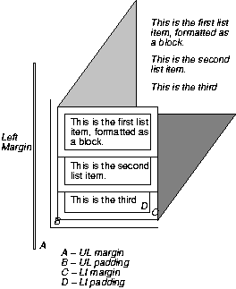
The illustration shows the relationship between the current left margin and the margins and padding of the list element (UL) and the list items (LI). (The lines delimiting the margins and padding are not rendered).
If we change the 'list-style' to "square":
LI { display: list-item; list-style: square }
each list item will be preceded by a small square. However, the placement of the square does not affect the block formatting of the list item content:
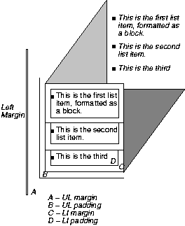
Note.
| Property name: | 'list-style-type' |
|---|---|
| Value: | disc | circle | square | decimal | lower-roman | upper-roman | lower-alpha | upper-alpha | none |
| Initial: | disc |
| Applies to: | elements with the 'display' property set to 'list-item' |
| Inherited: | yes |
| Percentage values: | N/A |
This property is used to determine the appearance of the list item marker if 'list-style-image' is 'none' or if the image pointed to by the URL cannot be displayed.
The possible values have the following meanings:
For example, the following HTML document:
<STYLE>
  OL { list-style-type: lower-roman }
</STYLE>
<BODY>
<OL>
<LI> This is the first item.
<LI> This is the second item.
<LI> This is the third item.
</OL>
</BODY>
might produce something like this:
  i This is the first item.
 ii This is the second item.
iii This is the third item.
| Property name: | 'list-style-image' |
|---|---|
| Value: | <url> | none |
| Initial: | none |
| Applies to: | elements with the 'display' property set to 'list-item' |
| Inherited: | yes |
| Percentage values: | N/A |
This property sets the image that will be used as the list item marker. When the image is available it will replace the marker set with the 'list-style-type' marker.
The following example sets the marker at the beginning of each list item to be the image "ellipse.png".
UL { list-style-image: url(http://png.com/ellipse.png) }
| Property name: | 'list-style-position' |
|---|---|
| Value: | inside | outside |
| Initial: | outside |
| Applies to: | elements with the 'display' property set to 'list-item' |
| Inherited: | yes |
| Percentage values: | N/A |
The value of 'list-style-position' determines how the list item marker is drawn with regard to the content.
In either case, the placement of the marker does not affect the relationship between the list item's box and the pertinent margin (depending on script direction).
For example:
  <STYLE type="text/css">
    UL         { list-style: outside }
    UL.compact { list-style: inside }
  </STYLE>

  <UL>
    <LI>first list item comes first
    <LI>second list item comes second
  </UL>

  <UL class=compact>
    <LI>first list item comes first
    <LI>second list item comes second
  </UL>
The above example may be formatted as:
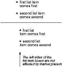
In right-to-left text, the markers would have been on the right side of the box.
| Property name: | 'list-style' |
|---|---|
| Value: | <'list-style-type'> || <'list-style-position'> || <'list-style-image'> |
| Initial: | not defined for shorthand properties |
| Applies to: | elements with the 'display' property set to 'list-item' |
| Inherited: | yes |
| Percentage values: | N/A |
The 'list-style' property is a shorthand notation for setting the three properties 'list-style-type', 'list-style-image', and 'list-style-position' at the same place in the style sheet.
  UL { list-style: upper-roman inside }  /* Any UL*/
  UL ~ UL { list-style: circle outside } /* Any UL child of a UL*/
Although authors may specify 'list-style' information directly on list item elements (e.g., LI in HTML), they should do so with care. The following rules look similar, but the first declares a contextual selector and the second a (more specific) parent-child selector.
OL.alpha LI  { list-style: lower-alpha } /* Any LI descendent of an OL */
OL.alpha ~ LI  { list-style: lower-alpha } /* Any LI child of an OL */
Authors who only use the contextual selector may not achieve the results they expect. Consider the following rules:
  <STYLE type="text/css">
    OL.alpha LI  { list-style: lower-alpha }
    UL LI        { list-style: disc }
  </STYLE>
  <BODY>
    <OL class=alpha>
      <LI>level 1
      <UL>
         <LI>level 2
      </UL>
    </OL>
  </BODY>
The desired rendering would have level 1 list items with 'lower-alpha' labels and level 2 items with 'disc' labels. However, the cascading order will cause the first style rule (which includes specific class information) to mask the second. The following rules solve the problem by employing a parent-child selector instead:
  <STYLE type="text/css">
    OL.alpha ~ LI  { list-style: lower-alpha }
    UL LI   { list-style: disc }
  </STYLE>
Another solution would be to specify 'list-style' information only on the list type elements:
  <STYLE type="text/css">
    OL.alpha  { list-style: lower-alpha }
    UL        { list-style: disc }
  </STYLE>
Inheritance will transfer the 'list-style' values from OL and UL elements to LI elements. This is the recommended way to specify list style information.
A URL value can be combined with any other value, as in:
UL { list-style: url(http://png.com/ellipse.png) disc }
In the example above, the 'disc' will be used when the image is unavailable.
Contents
Tables are used to show the relations between pieces of data, by arranging them into labeled rows and columns. CSS2 assumes that the data is already structured as a table, since its facilities for rearranging elements are very limited.
Most of the CSS properties apply to table elements in the same manner they apply to block-level elements. However, due to different constraints on the size and position of cells, some properties behave differently for tables. A few properties apply only to tables.
A table is made up of one table element, several columns possibly grouped into column groups, and several rowgroups, containing rows, which in turn contain cells. (For speech style sheets, the cells are further subdivided into header and data cells.) The spatial layout is governed by a grid. All boxes that make up the table have to align with the grid.
One can think of a table as built from six layers. Each layer hides the lower layers from view, unless it is transparent (or has transparent parts). See Figure 1.
The lowest layer is a single plane, representing the table box itself. (Note that like all boxes, it may be transparent).
The next layer contains the column groups. The columns groups are as tall as the table, but they need not cover the whole table horizontally.
On top of the column groups are the areas representing the column boxes. Like column groups, columns are as tall as the table, but need not cover the whole table horizontally.
Next is the layer containing the row groups. Each row group is as wide as the table. Together, the row groups completely cover the table from top to bottom.
The last but one layer contains the rows. The rows also cover the whole table.
The topmost layer contains the cells themselves, and the borders in between them. As the figure shows, the cells don't have to cover the whole table, but may leave "holes."
To position the table elements, we assume a hypothetical grid, consisting of an infinite number of columns and rows of "grid cells." All table elements (table box, row boxes, cell boxes, etc.) are rectangular and are aligned with the grid: they occupy a whole number of grid cells, determined according to the following rules.
Columns are placed next to each other in the order they occur. Each one occupies the number of grid columns given by its 'column-span' property. A column group occupies the same columns as the columns contained in it. The first column may be either on the left or on the right, depending on the value of the 'direction' property of the table.
Each row box occupies one row of grid cells. Together, the row boxes fill the table from top to bottom in the order they occur in the source document, or, stated differently: the table occupies exactly as many grid rows as there are row elements.
A row group occupies the same grid cells as the rows inside the row group together.
Each cell occupies a rectangle of 'column-span' grid cells wide and 'row-span' grid cells high. The top row of this rectangle of grid cells must be in the row occupied by the cell's parent. The rectangle must be as far to the left as possible, but may not overlap with any other cell, and must be to the right of all cells in the same row that are earlier in the source document. (If the 'direction' of the table is 'right-to-left', interchange "left" and "right" in the previous sentence.)
Cells are 'row-span' high only if there are enough rows: a cell cannot extend below the last row box; it is made shorter until it fits.
Note that there may be "holes" left between the cells. These holes are transparent, and the lower layers of the table are visible through them. Example:
<STYLE>
  TABLE {background: #ff0}
  TD {background: red; border: double black}
</STYLE>
...
<TABLE>
  <TR>
    <TD> 1
    <TD rowspan="2"> 2
    <TD> 3
    <TD> 4
  </TR>
  <TR>
    <TD>
    <TD colspan=2> 5
  </TR>
</TABLE>

| Property name: | 'row-span' |
|---|---|
| Value: | <integer> |
| Initial: | 1 |
| Applies to: | cell elements |
| Inherited: | no |
| Percentage values: | N/A |
How many rows a cell spans. See "Table layout" above for a discussion of how it is used to lay out cells in a table.
| Property name: | 'column-span' |
|---|---|
| Value: | <integer> |
| Initial: | 1 |
| Applies to: | cell, column, and column-group elements |
| Inherited: | no |
| Percentage values: | N/A |
How many columns a cell spans. A cell box occupies a rectangle of 'column-span' by 'row-span' grid cells in a table. An example of its use is:
[COLSPAN] {column-span: attr(COLSPAN)}
This rule is in the recommended default (UA) style sheet for HTML 4.0.
The principle for determining the width of each column is as follows:
The width is determined by the 'width' property of the column box.
However, if there is no column box, the width is given by the width requirements of the cells in the column.
If the value of 'width' for the first cell in the column is 'auto', the UA finds the "optimal" width of the column, based on some heuristics.
More details are given below.
The width of the table is given by its 'width' property. If that is 'auto', the width is the sum of the column widths. More precisely: the sum of the columns and the borders between them. See "Placement of the borders" below.
Finding the optimal width is complicated. In many cases, what is optimal is a matter of taste. CSS therefore doesn't define what the optimal width of each column is; a UA is free to use whatever heuristics is has, and is also free to prefer speed over precision. There are a few implementation hints in chapter [???].
The width computation is complicated by cells that span columns and by widths that are specified as percentages. The problem of finding the widths can be regarded as a constraint resolution system, that may be over- or under-constrained.
A percentage is relative to the table width. If the table's width is 'auto', a percentage represents a constraint on the column's width, which a UA should try to satisfy. (Obviously, this is not always possible: if the column's width is '110%', the constraint cannot be satisfied inside a table whose 'width' is 'auto'.)
A cell that spans columns, provides a constraint on the sum of the widths of the columns it spans.
If a cell's content doesn't "fit" the width of the column, the 'overflow' property determines what happens to it. Similarly, if the 'width' of the table is not 'auto', and the sum of the columns is not equal to the table's width, the 'overflow' property of the table determines what happens.
For block-level and inline elements, the position of the border relative to the content of the element is determined by the margin and the padding. But in a table, the positions of the borders are constrained by the fact that they have to line up from one row to the next and from one column to the next.
The borders are centered on the grid lines between the cells. A renderer has to find a consistent rule for rounding off in the case of an odd number of discrete units (screen pixels, printer dots).
The diagram below shows how the width of the table, the widths of the borders, the padding and the cell width interact. Their relation is given by the following equation, which holds for every row of the table:
table-width = border-width0 + padding-left1 + width1 + padding-right1 + border-width1 + padding-left2 +...+ padding-rightn + border-widthn
Here n is the number of cells in the row, and border-widthi refers to the border between cells i and i + 1.
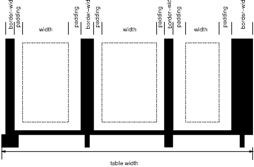
Note that for a table element, the width includes the border, and that a table doesn't have a padding. It does have a margin, however.
The style of the borders between the cells is found by comparing the border properties of all the boxes (cells, columns, the table itself, etc.) that meet at that border. Columns and rows can also have borders, but they are only drawn when they coincide with a cell border.
To find the border style at each side of a grid cell, the following properties have to be compared:
Those of the one or two cells that have an edge here. Less than two can occur at the edge of the table, but also at the edges of "holes" (unoccupied grid cells).
Those of the columns that have an edge here.
Those of the column groups that have an edge here.
Those of the rows that have an edge here.
Those of the row groups that have an edge here.
Those of the table, if this is the edge of the table.
This will give between 0 and 8 'border' values. Each value is made up of a 'border-width', 'border-color' and 'border-style'. The border with the largest width will be drawn. If there are two or more with the same width, but different style, then the one with a style near the start of the following list will be drawn:
'blank', 'double', 'solid', 'dashed', 'dotted', 'ridge', 'groove', 'none'
If the style is 'outset', it will be drawn as 'ridge' instead, and 'inset' will be drawn as 'groove'.
If the borders only differ in color, a color different from the 'color' property of the two cells on either side will be preferred over a color that only differs from one of the cells, which in turn will be chosen over a border that doesn't differ in color from the cells.
If none of these rules determine the color of the border, the UA is free to choose one of the colors.
Here is an example:
TD.blue {border: medium solid blue} TD.thick {border: thick solid red}
TD.double {border: thick double black} TR {border: medium dotted
green}
with this document:
<table>
<tr><td>1<td class="blue">2<td>2
<tr><td>4<td class="thick">5<td>6
<tr><td>7<td class="double">8<td>9
</table>
This will be the result:
Only four properties apply to a column box or column-group box: 'border', 'background', 'width', and 'column-span'. The first two are actually shorthand properties, so all the border properties and all the background properties apply.
Only 'border' and 'background' apply to a row or row-group. But note that you can set inherited properties on rows and row-groups, and they will be inherited by the cells.
The cells in a row are aligned somewhat like letters on a line. Each cell, or rather each cell's content, has a baseline, a top, a middle and a bottom, and so does the row itself. The value of the 'vertical-align' property of the cells determines on which of these lines they are aligned:
the baseline of the cell is put at the same height as the baseline of the row (see below for the definition of baselines of cells and rows)
the top of the cell is aligned with the top of the row
the bottom of the cell is aligned with the bottom of the row
the center of the cell is aligned with the center of the row
these values do not apply to cells; the cell is aligned at the baseline instead
The baseline of a cell is the baseline of the first line of text in the cell. If there is no text, the baseline is the baseline of whatever object is displayed in the cell, or, if it has none, the bottom of the cell. The maximum distance between the top of the cell and the baseline over all cells that have 'vertical-align:baseline' is used to set the baseline of the row. Here is an example:
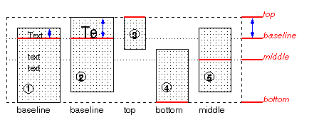
Cells 1 and 2 are aligned at their baselines. Cell 2 has the largest height above the baseline, so that determines the baseline of the row. Note that if there is no cell aligned at its baseline, the row will not have (not need) a baseline.
To avoid ambiguous situations, the alignment of cells proceeds in a certain order. First the cells that are aligned on their baseline are positioned. This will establish the baseline of the row. Next the cells with alignment 'top' are positioned.
The row now has a top, possibly a baseline, and a provisional height, which is the distance from the top to the lowest bottom of the cells positioned so far. (See conditions on the cell padding below.)
If any of the remaining cells, those aligned at the bottom or the middle, have a height that is larger than the current height of the row, the height of the row will be increased to the maximum of those cells, by lowering the bottom.
Finally the remaining cells are positioned.
The area between the cell content and the border is part of the cell's padding. The padding at the top and bottom of each cell after positioning must be at least as large as the 'padding' property specifies. The height of the row must be as small as possible without violating this rule.
A cell is similar to a block in the way its contents are rendered, that means, in particular, that 'alignment' applies to it. However, tables also allow a way of aligning text that does not apply to other blocks, and that is aligning the contents of several cells so that they all align on, e.g., a decimal point (".")
More precisely, if the value of 'alignment' for a certain cell is a string, that cell has an alignment point, which is the start of that string. The alignment point must be straight above or below the alignment points of all other cells in the same column that have an alignment point. (Note that the other cells do not need to have the same value for 'alignment'; as long as they are aligned on a string, they have an alignment point.)
Aligning text in this way is only useful if the text is short enough not to be broken over several lines. The result is undefined if the text is broken.
If the string occurs more than once in the cell's content, the alignment point is the start of the first occurrence.
If the string doesn't occur, the alignment point is the end of the content.
| Property name: | 'caption-side' |
|---|---|
| Value: | top | bottom |
| Initial: | top |
| Applies to: | caption elements |
| Inherited: | yes |
| Percentage values: | N/A |
| Property name: | 'speak-header-cell' |
|---|---|
| Value: | once | always |
| Initial: | once |
| Applies to: | header cells |
| Inherited: | yes |
| Percentage values: | N/A |
[Does 'speak-header' apply to TH or to TD?]
When a table is spoken by a speech generator, the relation between the data cells and the header cells must be expressed in a different way than by horizontal and vertical alignment. Some speech browsers may allow a user to move around in the 2-dimensional space, thus giving them the opportunity to map out the spatially represented relations. When that is not possible, the style sheet must specify at which points the headers are spoken.
CSS supports two possibilities: the headers are spoken before every cell, or only before a cell when that cell is associated with a different header than the previous cell.
[Add speak:header-cell|data-cell, and some way to mirror the axis/axes attributes? BB]
It is assumed that a speech UA analyzes the table as specified in the HTML 4.0 specification, to find for each data cell the header cells with which it is associated. In summary, the algorithm is to go up in the column and find all header cells, and to go towards the start of the row to find all header cells there. If a data cell is found above a header cell, then the search for header cells in the column stops there. Similarly, if a data cell is found in front of a header cell, the search in that row stops.
Since sometimes header cells are not put in the column or row to which they apply (see e.g., the cells "San Jose" and "Seattle" in the example below), an explicit association using the AXIS and AXES attributes must be made. The example below shows the required mark-up
This presents the money spent on meals, hotels and transport in two locations (San Jose and Seattle) for successive days. Conceptually, you can think of the table in terms of a n-dimensional space. The axes of this space are: location, day, category and subtotal. Some cells define marks along an axis while others give money spent at points within this space. The HTML markup for this table is:
<TABLE>
<CAPTION>
  Travel Expense Report
</CAPTION>
<TR>
  <TH></TH>
  <TH>Meals</TH>
  <TH>Hotels</TH>
  <TH>Transport</TH>
  <TH>subtotal</TH>
</TR>
<TR>
  <TH axis="san-jose">San Jose</TH>
</TR>
<TR>
  <TH axes="san-jose">25-Aug-97</TH>
  <TD>37.74</TD>
  <TD>112.00</TD>
  <TD>45.00</TD>
  <TD></TD>
</TR>
<TR>
  <TH axes="san-jose">26-Aug-97</TH>
  <TD>27.28</TD>
  <TD>112.00</TD>
  <TD>45.00</TD>
  <TD></TD>
</TR>
<TR>
  <TH axes="san-jose">subtotal</TH>
  <TD>65.02</TD>
  <TD>224.00</TD>
  <TD>90.00</TD>
  <TD>379.02</TD>
</TR>
<TR>
  <TH axis="seattle">Seattle</TH>
</TR>
<TR>
  <TH axes="seattle">27-Aug-97</TH>
  <TD>96.25</TD>
  <TD>109.00</TD>
  <TD>36.00</TD>
  <TD></TD>
</TR>
<TR>
  <TH axes="seattle">28-Aug-97</TH>
  <TD>35.00</TD>
  <TD>109.00</TD>
  <TD>36.00</TD>
  <TD></TD>
</TR>
<TR>
  <TH axes="seattle">subtotal</TH>
  <TD>131.25</TD>
  <TD>218.00</TD>
  <TD>72.00</TD>
  <TD>421.25</TD>
</TR>
<TR>
  <TH>Totals</TH>
  <TD>196.27</TD>
  <TD>442.00</TD>
  <TD>162.00</TD>
  <TD>800.27</TD>
</TR>
</TABLE>
By providing the data model in this way, authors make it possible for speech enabled-browsers to explore the table in rich ways, e.g. each cell could be spoken as a list, repeating the applicable headers before each data cell:
  San Jose, 25-Aug-97, Meals:  37.74
  San Jose, 25-Aug-97, Hotels:  112.00
  San Jose, 25-Aug-97, Transport:  45.00
 ...
The browser could also speak the headers only when they change:
San Jose, 25-Aug-97, Meals: 37.74
    Hotels: 112.00
    Transport: 45.00
  26-Aug-97, Meals: 27.28
    Hotels: 112.00
...
The 'speak-header-cell' property of a header cell determines when it is spoken: before every data cell, or only when the previous cell spoken wasn't associated with this header.
[Move to appendix]
[Minimum/maximum]
Contents
| Property name: | 'cursor' |
|---|---|
| Value: | auto | crosshair | default | pointer | move | e-resize | ne-resize | nw-resize | n-resize | se-resize | sw-resize | s-resize | w-resize| text | wait | help | <url> |
| Initial: | auto |
| Applies to: | all elements |
| Inherited: | yes |
| Percentage values: | N/A |
This property specifies the type of cursor to be displayed for the mouse pointer. The values have the following meanings:
CSS2 does not allow users to specify animated cursors.
In addition to being able to assign pre-defined color values to text, backgrounds, etc. CSS2 allows authors to specify colors in a manner that integrates them into the user's graphic environment. For instance, color blind users may have their environment configured to avoid specific colors. Style rules that take into account user preferences thus offer the following advantages:
The set of values defined for system colors is intended to be exhaustive. For systems that do not expose a corresponding value, it should be mapped to the nearest system attribute, or to a default color.
The following lists additional values for color related CSS attributes and their general meaning. Any color property (e.g., 'color' or 'background-color') can take one of the following names:
For example, to set the foreground and background colors of a paragraph to the same foreground and background colors of the user's window, write the following:
P { color: windowtext; background-color: window }
The CSS working group considers that the magnification of a document or portions of a document should not be specified through style sheets. User agents may support such magnification in different ways (e.g., larger images, louder sounds, etc.)
When magnifying a page, UAs should preserve the relationships between positioned elements. For example, a comic strip may be composed of images with overlaid text elements. When magnifying this page, a user agent should keep the text within the comic strip balloon.
Contents
Those of us who are sighted are accustomed to visual presentation of documents, frequently on a bitmapped display. This is not the only possible presentation method, however. Aural presentation, using a combination of speech synthesis and 'audio icons', provides an alternative presentation. This form of presentation is already in current use by the blind and print-impaired communities.
Often such aural presentation occurs by converting the document to plain text and feeding this to a 'screen reader' -- software or hardware that simply reads all the characters on the screen. This results in less effective presentation than would be the case if the document structure were retained. A benefit of separating the content (e.g., the HTML) and the visual presentation (the stylesheet) is that other types of presentation can also be offered as options (other stylesheets). Stylesheet properties for aural presentation can be used together with visual properties (mixed media) or as an aural alternative to visual presentation.
Besides the obvious accessibility issues for the blind, there are other large markets for aural presentation:
Hence, aural or mixed aural/visual presentation is likely to increase in importance over the next few years. Realizing that the aural rendering is essentially independent of the visual rendering:
| Property name: | 'volume' |
|---|---|
| Value: | <number> | silent | x-soft | soft | medium | loud | x-loud |
| Initial: | medium |
| Applies to: | all elements |
| Inherited: | yes |
| Percentage values: | relative to inherited value |
The legal range of numerical values is 0 to 100. Note that '0' does not mean the same as "silent". 0 represents the minimum audible volume level and 100 corresponds to the maximum comfortable level.
Percentage values are calculated relative to the inherited value, and are then clipped to the range 0 to 100.
There is a fixed mapping between keyword values and volumes:
Volume refers to the median volume of the waveform. In other words, a highly inflected voice at a volume of 50 might peak well above that. The overall values are likely to be human adjustable for comfort, for example with a physical volume control (which would increase both the 0 and 100 values proportionately); what this property does is adjust the dynamic range.
The UA should allow the values corresponding to 0 and 100 to be set by the listener. No one setting is universally applicable; suitable values depend on the equipment in use (speakers, headphones), the environment (in car, home theater, library) and personal preferences. Some examples:
The same authors stylesheet could be used in all cases, simply by mapping the 0 and 100 points suitably at the client side.
| Property name: | 'speak' |
|---|---|
| Value: | normal | none | spell-out |
| Initial: | normal |
| Applies to: | all elements |
| Inherited: | yes |
| Percentage values: | N/A |
This property specifies whether text will be rendered aurally and if so, in what manner (somewhat analogous to the 'display' property). The possibles values are:
Note the difference between an element whose 'volume' property has a value of 'silent' and an element whose 'speak' property has the value 'none':
The former takes up the same time as if it had been spoken, including any pause before and after the element, but no sound is generated. This may be used in language teaching applications, for example. A pause is generated for the pupil to speak the element themselves. Note that since the value of this property is inherited, child elements will also be silent. Child elements may however set the volume to a non-silent value and will then be spoken.
Elements whose 'speak' property has the value 'none' are not spoken and take no time. Child elements may however override this value and may be spoken normally.
| Property name: | 'pause-before' |
|---|---|
| Value: | <time> | <percentage> |
| Initial: | depends on user-agent |
| Applies to: | all elements |
| Inherited: | no |
| Percentage values: | see description below |
The 'pause-before' property specifies the pause before an element is spoken. It may be given in an absolute units (seconds, milliseconds) or as a relative value, in which case it is relative to the reciprocal of the 'speech-rate' property. If speech-rate is 120 words per minute (i.e., a word takes half a second, 500 milliseconds) then a 'pause-before' of 100% means a pause of 500 ms and a 'pause-before' of 20% means 100ms.
Using relative units gives more robust stylesheets in the face of large changes in speech-rate and is recommended practice.
| Property name: | 'pause-after' |
|---|---|
| Value: | <time> | <percentage> |
| Initial: | depends on user-agent |
| Applies to: | all elements |
| Inherited: | no |
| Percentage values: | see description below |
This property specifies the pause after an element is spoken. Values are specified the same way as 'pause-before'.
| Property name: | 'pause' |
|---|---|
| Value: | [<time> | <percentage>]{1,2} |
| Initial: | depends on user-agent |
| Applies to: | all elements |
| Inherited: | no |
| Percentage values: | see descriptions of 'pause-before' and 'pause-after' |
The 'pause' property is a shorthand for setting 'pause-before' and 'pause-after'. If two values are given, the first value is 'pause-before' and the second is 'pause-after'. If only one value is given, it applies to both properties.
Examples:
  H1 { pause: 20ms } /* pause-before: 20ms; pause-after: 20ms */
  H2 { pause: 30ms 40ms } /* pause-before: 30ms; pause-after: 40ms */
  H3 { pause-after: 10ms } /* pause-before: ?; pause-after: 10ms */
| Property name: | 'cue-before' |
|---|---|
| Value: | <url> | none |
| Initial: | none |
| Applies to: | all elements |
| Inherited: | no |
| Percentage values: | N/A |
| Property name: | 'cue-after' |
|---|---|
| Value: | <url> | none |
| Initial: | none |
| Applies to: | all elements |
| Inherited: | no |
| Percentage values: | N/A |
Auditory icons are another way to distinguish semantic elements. Sounds may be played before, and/or after the element to delimit it.
For example:
  A {cue-before: url(bell.aiff); cue-after: url(dong.wav) }
  H1 {cue-before: url(pop.au); cue-after: url(pop.au) }
| Property name: | 'cue' |
|---|---|
| Value: | <'cue-before'> || <'cue-after'> |
| Initial: | not defined for shorthand properties |
| Applies to: | all elements |
| Inherited: | no |
| Percentage values: | N/A |
The same sound can be used both before and after, using the shorthand 'cue' property.
The following two rules are equivalent:
  H1 {cue-before: url(pop.au); cue-after: url(pop.au) }
  H1 {cue: url(pop.au) }
| Property name: | 'play-during' |
|---|---|
| Value: | <url> | mix? repeat? | auto | none |
| Initial: | auto |
| Applies to: | all elements |
| Inherited: | no |
| Percentage values: | N/A |
Similar to the 'cue-before' and 'cue-after' properties, this indicates sound to be played during an element as a background (i.e., the sound is mixed in with the speech).
The optional 'mix' keyword means the sound inherited from the parent element's play-during property continues to play and the current element sound (pointed to by the URL) is mixed with it. If 'mix' is not specified, the sound replaces the sound of the parent element.
The optional 'repeat' keyword means the sound will repeat if it is too short to fill the entire duration of the element. Without this keyword, the sound plays once and then stops. This is similar to the background repeat properties in CSS2. If the sound is too long for the element, it is clipped once the element is spoken.
'Auto' means that the sound of the parent element continues to play (it is not restarted, which would have been the case if this property inherited)and none means that there is silence - the sound of the parent element (if any) is silent for the current element and continues after the current element.
Examples:
  BLOCKQUOTE.sad {play-during: url(violins.aiff) }
  BLOCKQUOTE Q {play-during: url(harp.wav) mix}
  SPAN.quiet {play-during: none }
If a stereo icon is dereferenced the central point of the stereo pair should be placed at the azimuth for that element and the left and right channels should be placed to either side of this position.
Spatial audio is an important stylistic property for aural presentation. It provides a natural way to tell several voices apart, the same way we use in real life (people rarely all stand in the same spot in a room). Stereo speakers produce a lateral sound stage. Binaural headphones or the increasingly popular 5-speaker home theater setups can generate full surround sound, and multi-speaker setups can create a true three-dimensional sound stage. VRML 2.0 also includes spatial audio (and uses the same azimuth and elevation terms, which originate in astronomy), which implies that in time consumer-priced spatial audio hardware will become more widely available.
| Property name: | 'azimuth' |
|---|---|
| Value: | <angle> | [[ left-side | far-left | left | center-left | center | center-right | right | far-right | right-side ] || behind ] | leftwards | rightwards |
| Initial: | center |
| Applies to: | all elements |
| Inherited: | yes |
| Percentage values: | N/A |
The value is given in the range -360deg <= x < 360deg where 0deg is interpreted as directly ahead in the center of the sound stage. 90deg is to the right, 180deg behind and 270deg (or, equivalently and more conveniently, -90deg) to the left. It may also be specified using absolute keywords:
| keyword | value | value with 'behind' |
|---|---|---|
| left-side | 270deg | 270deg |
| far-left | 300deg | 240deg |
| left | 320deg | 220deg |
| center-left | 340deg | 200deg |
| center | 0deg | 180deg |
| center-right | 20deg | 160deg |
| right | 40deg | 140deg |
| far-right | 60deg | 120deg |
| right-side | 90deg | 90deg |
or relative keywords. The value leftwards moves the sound more to the left (subtracts 20 degrees) while the value rightwards moves the sound more to the right (adds 20 degrees). Arithmetic is carried out modulo 360 degrees.
This property is most likely to be implemented by mixing the same signal into different channels at differing volumes. It might also use phase shifting, digital delay, and other such techniques to provide the illusion of a sound stage. The precise means used to achieve this effect and the number of speakers used to do so are browser dependent - this property merely identifies the desired end result.
Examples:
  H1   { azimuth: 30deg }
  TD.a { azimuth: far-right }          /*  60deg */
  #12  { azimuth: behind far-right }   /* 120deg */
  P.comment { azimuth: behind }        /* 180deg */
UAs should attempt to honor this request if they have resources to do so. If spatial-azimuth is specified and the output device cannot produce sounds behind the listening position, values in the rearwards hemisphere should be converted into forwards hemisphere values. One method is as follows:
| Property name: | 'elevation' |
|---|---|
| Value: | <angle> | below | level | above | higher | lower |
| Initial: | level |
| Applies to: | all elements |
| Inherited: | yes |
| Percentage values: | N/A |
The value is given in degrees in the range -90deg to 90deg. 0deg is interpreted as on the forward horizon, which loosely means level with the listener. 90deg is directly overhead and -90 is directly underneath. The precise means used to achieve this effect and the number of speakers used to do so are undefined. This property merely identifies the desired end result. UAs should attempt to honor this request if they have resources to do so.
The relative keywords higher and lower add and subtract 10 degrees from the elevation, respectively.
Examples:
  H1   { elevation: above }
  TR.a { elevation: 60deg }
  TR.b { elevation: 30deg }
  TR.c { elevation: level }
| Property name: | 'speech-rate' |
|---|---|
| Value: | <number> | x-slow | slow | medium | fast | x-fast | faster | slower |
| Initial: | medium |
| Applies to: | all elements |
| Inherited: | yes |
| Percentage values: | N/A |
Specifies the speaking rate. Note that both absolute and relative keyword values are allowed (compare with 'font-weight'). If a numerical value is given, it refers to words per minute, a quantity which varies somewhat by language but is nevertheless widely supported by speech synthesizers. The value 'medium' refers to the reader's preferred speech-rate setting. Relative values may be cascaded more readily.
| Property name: | 'voice-family' |
|---|---|
| Value: | [[<specific-voice> | <generic-voice> ],]* [<specific-voice> | <generic-voice> ] |
| Initial: | depends on user agent |
| Applies to: | all elements |
| Inherited: | yes |
| Percentage values: | N/A |
The value is a prioritized list of voice family names (compare with 'font-family'). Suggested generic families: male, female, child.
Examples of <specific-voice> families are: comedian, trinoids, carlos, lisa
Examples:
  H1 { voice-family: announcer, male }
  P.part.romeo  { voice-family: romeo, male }
  P.part.juliet { voice-family: juliet, female }
| Property name: | 'pitch' |
|---|---|
| Value: | <frequency> | x-low | low | medium | high | x-high |
| Initial: | medium |
| Applies to: | all elements |
| Inherited: | yes |
| Percentage values: | N/A |
Specifies the average pitch of the speaking voice in hertz (Hz).
| Property name: | 'pitch-range' |
|---|---|
| Value: | <number> |
| Initial: | 50 |
| Applies to: | all elements |
| Inherited: | yes |
| Percentage values: | N/A |
Specifies variation in average pitch. A pitch range of 0 produces a flat, monotonic voice. A pitch range of 50 produces normal inflection. Pitch ranges greater than 50 produce animated voices.
| Property name: | 'stress' |
|---|---|
| Value: | <number> |
| Initial: | 50 |
| Applies to: | all elements |
| Inherited: | yes |
| Percentage values: | N/A |
Specifies the level of stress (assertiveness or emphasis) of the speaking voice. English is a stressed language, and different parts of a sentence are assigned primary, secondary or tertiary stress. The value of 'stress' controls the amount of inflection that results from these stress markers.
Increasing the value of this property results in the speech being more strongly inflected. It is in a sense dual to the 'pitch-range' property and is provided to allow developers to exploit higher-end auditory displays.
| Property name: | 'richness' |
|---|---|
| Value: | <number> |
| Initial: | 50 |
| Applies to: | all elements |
| Inherited: | yes |
| Percentage values: | N/A |
Specifies the richness (brightness) of the speaking voice. The effect of increasing richness is to produce a voice that carries --reducing richness produces a soft, mellifluous voice.
The following four properties are very preliminary; discussion is invited:
| Property name: | 'speak-punctuation' |
|---|---|
| Value: | code | none |
| Initial: | none |
| Applies to: | all elements |
| Inherited: | yes |
| Percentage values: | N/A |
A value of 'code' indicates that punctuation such as semicolons, braces, and so on are to be spoken literally. The default value of 'none' means that punctuation is not spoken but instead is rendered naturally as various pauses.
| Property name: | 'speak-date' |
|---|---|
| Value: | myd | dmy | ymd |
| Initial: | depends on user agent |
| Applies to: | all elements |
| Inherited: | yes |
| Percentage values: | N/A |
This property controls how dates should be spoken. month-day-year is common in the USA, while day-month-year is common in Europe and year-month-day is also used.
This would be useful, for example, when combined with an XML element used to identify dates, such as:
   <para>The campaign started on <date value="1874-10-21"/>
    and finished <date value="1874-10-28/"></para%gt;
| Property name: | 'speak-numeral' |
|---|---|
| Value: | digits | continuous | none |
| Initial: | none |
| Applies to: | all elements |
| Inherited: | yes |
| Percentage values: | N/A |
This property controls whether multi-digit numerals (such as 237) are spoken as a single number (two hundred and thirty seven) or individual digits (two three seven).
| Property name: | 'speak-time' |
|---|---|
| Value: | 24 | 12 | none |
| Initial: | none |
| Applies to: | all elements |
| Inherited: | yes |
| Percentage values: | N/A |
This property controls whether times are spoken in the 24-hour time system or the 12-hour, am/pm system. When used in combination with the 'speak-date' property, this allows elements with an attribute containing an ISO 8601 format date/time attribute to be presented in a flexible manner.
An additional aural property, speak-header-cell, is described in the capter on tables
Contents
This appendix is informative, not normative.
The Base Stylesheet describes the typical rendering of all HTML 4.0 [HTML40]) elements visual UAs. The style sheet is based on extensive research on how current UAs render HTML, and developers are encouraged to use it as a default style sheet in their implementations.
/* rendered CSS1-addressable elements and all applicable non-inherited
properties set to initial values and default display types */

A, ABBR, ADDRESS, BDO, BLOCKQUOTE, BODY, BUTTON, CITE, CODE, DD, DEL, DFN,
DIV, DL, DT, EM, FIELDSET, FORM, H1, H2, H3, H4, H5, H6, IFRAME, IMG, INS, KBD,
LABEL, LI, OBJECT, OL, P, Q, SAMP, SMALL, SPAN, STRONG, SUB, SUP, UL, VAR,
APPLET, B, BIG, CENTER, DIR, FONT, HR, I, MENU, PRE, S, STRIKE, TT, U	{
	background: transparent;
	width: auto;
	height: auto;
	text-decoration: none;
	margin: 0;
	padding: 0;
	border: 0;
	float: none;
	clear: none;
	vertical-align: baseline;
	list-style-image: none;
	list-style-type: disc;
	list-style-position: outside;
	}

ADDRESS, BLOCKQUOTE, BODY, DD, DIV, DL, DT, FIELDSET, FORM, H1, H2, H3, H4, H5,
H6, IFRAME, OBJECT, OL, P, UL, APPLET, CENTER, DIR, HR, MENU, PRE	{
	display: block;
	}

A, ABBR, BDO, BUTTON, CITE, CODE, DEL, DFN, EM, IMG, INS, KBD, LABEL, Q,
SAMP, SMALL, SPAN, STRONG, SUB, SUP, VAR, B, BIG, FONT, I, S, STRIKE, TT, U	{
	display: inline;
	}

LI	{
	display: list-item;
	}


/* Begin tree of inherited properties and cascades. */

BODY	{
	font-size: 1em;
	line-height: 1.33em;
	margin: 8px;
	background-position: -8px -8px; /* flush with canvas edge */
	word-spacing: normal;
	letter-spacing: normal;
	text-transform: none;
	alignment: left;
	text-indent: 0;
	white-space: normal;
	}

H1	{
	font-size: 2em;
	margin: .67em 0;
	}

H2	{
	font-size: 1.5em;
	margin: .83em 0;
	}

H3	{
	font-size: 1.17em;
	line-height: 1.17em;
	margin: 1em 0;
	}

H4, P, BLOCKQUOTE, UL, OL, DL, DIR, MENU	{
	margin: 1.33em 0;
	}

H5	{
	font-size: .83em;
	line-height: 1.17em;
	margin: 1.67em 0;
	}

H6	{
	font-size: .67em;
	margin: 2.33em 0;
	}

H1, H2, H3, H4, H5, H6, B, STRONG	{
	font-weight: bolder;
	}

BLOCKQUOTE	{
	margin-left: 40px;
	margin-right: 40px;
	}

I, CITE, EM, VAR, ADDRESS	{
	font-style: italic;
	}

PRE, TT, CODE, KBD, SAMP	{
	font-family: monospace;
	}

PRE	{
	white-space: pre;
	}

BIG	{
	font-size: 1.17em;
	}

SMALL, SUB, SUP	{
	font-size: .83em;
	}

SUB	{
	vertical-align: sub;
	}

SUP	{
	vertical-align: super;
	}

S, STRIKE, DEL	{
	text-decoration: line-through;
	}

HR	{
	border: 1px inset;
	}

OL, UL, DIR, MENU, DD	{
	margin-left: 40px;
	}

OL LI	{
	list-style-type: decimal;
	}

OL UL	{
	margin-top: 0;
	margin-bottom: 0;
	}

UL OL	{
	margin-top: 0;
	margin-bottom: 0;
	}

UL UL	{
	margin-top: 0;
	margin-bottom: 0;
	}

OL OL	{
	margin-top: 0;
	margin-bottom: 0; /* how far to carry such contextual declarations? Exhaustive list
		could be very long. */
	}

U, INS	{
	text-decoration: underline;
	}

CENTER	{
	alignment: center;
	}


/* Table element rendering behavior cannot be described completely in CSS1,
yet the following declarations appear to apply. This section is likely to become
obsolete upon the deployment of a more comprehensive stylesheet specification
for tables. */

CAPTION, COL, COLGROUP, LEGEND, TABLE, TBODY, TD, TFOOT, TH, THEAD, TR	{
	background: transparent;
	text-decoration: none;
	margin: 1px;
	padding: 1px;
	border: none;
	float: none;
	clear: none;
	}

TABLE, TBODY, TFOOT, THEAD, TR	{
	display: block;
	background-position: top left;
	width: auto;
	height: auto;
	}

CAPTION, LEGEND, TD, TH	{
	display: inline;
	vertical-align: baseline;
	font-size: 1em;
	line-height: 1.33em;
	color: black;
	word-spacing: normal;
	letter-spacing: normal;
	text-transform: none;
	alignment: left;
	text-indent: 0;
	white-space: normal;
	}

TH	{
	font-weight: bolder;
	alignment: center;
	}

CAPTION	{
	alignment: center;
	}


/* proposed default for HTML 4.0's new ABBR element */

ABBR	{
	font-variant: small-caps;
	letter-spacing: 0.1em; /* This is almost facetious. Should ABBR not have
		any default rendering? Uppercase transform? Not all languages distinguish
		between simple abbreviations and acronyms, and not all abbrev. should be
		capped. */
	}

/* not part of the legacy browser default sheet, but an obvious enhancement */

OL OL LI	{
	list-style-type: lower-alpha;
	}

OL OL OL LI	{
	list-style-type: lower-roman
	}
Contents
The following information is informative, not normative. See the Gamma Tutorial in the PNG specification [PNG10] if you aren't familiar with gamma issues.
In the computation, UAs displaying on a CRT may assume an ideal CRT and ignore any effects on apparent gamma caused by dithering. That means the minimal handling they need to do on current platforms is:
"Applying gamma" means that each of the three R, G and B must be converted to R'=Rgamma, G'=Ggamma, B'=Bgamma, before handing to the OS.
This may rapidly be done by building a 256-element lookup table once per browser invocation thus:
  for i := 0 to 255 do
    raw := i / 255;
    corr := pow (raw, gamma);
    table[i] := trunc (0.5 + corr * 255.0)
  end
which then avoids any need to do transcendental math per color attribute, far less per pixel.
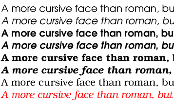
There are many different font formats in use by many different platforms. To select a preferred font format, transparent content negotiation is used (see [NEGOT]). It is always possible to tell when a font is being dereferenced, because the URL is inside a font description. Thus, only the relevant Accept headers need be sent (not headers related to images, HTML, etc).
Contents
This appendix is normative.
The grammar below defines the syntax of CSS2. It is in some sense, however, a superset of CSS2 as this specification imposes additional semantic constraints not expressed in this grammar. A conforming UA must also adhere to the forward-compatible parsing rules, the property and value notation, and the unit notation . In addition, the document language may impose restrictions, e.g. HTML imposes restrictions on the possible values of the "class" attribute.
The grammar below is LL(1) (but note that most UA's should not use it directly, since it doesn't express the parsing conventions, only the CSS2 syntax). The format of the productions is optimized for human consumption and some shorthand notation beyond [YACC] is used:
 * : 0 or more + : 1 or more ?  :
0 or 1 | : separates alternatives [] : grouping
The productions are:
stylesheet
 : [CDO|CDC]* [ import [CDO|CDC]* ]* [ [ ruleset | media ] [CDO|CDC]* ]*
 ;
import
 : IMPORT_SYM [STRING|URL] medium* ';'	/* E.g., @import url(fun.css); */
 ;
media
 : MEDIA_SYM medium+ '{' ruleset* '}'
 ;
medium                                  /* e.g., SPEECH */
 : IDENT
 ;
unary_operator
 : '-' | '+'
 ;
operator
 : '/' | ',' | /* empty */
 ;
property
 : IDENT
 ;
ruleset
 : selector [ ',' selector ]*
   '{' declaration [ ';' declaration ]* '}'
 ;
selector
 : sequential_selector [ '~'? sequential_selector ]*
   [ pseudo_element | solitary_pseudo_element ]?
 | solitary_pseudo_element
 ;
sequential_selector
 : simple_selector
 | '/' simple_selector '~'? simple_selector '/'
 | '//' simple_selector '/'
 ;
	/* An "id" is an ID that is attached to an element type
	** on its left, as in: P#p007
	** A "solitary_id" is an ID that is not so attached,
	** as in: #p007
	** Analogously for classes and pseudo-classes.
	*/
simple_selector
 : element_name [ id | class | attrib | pseudo_class ]*
 | solitary_id [ class | attrib | pseudo_class ]*              /* eg: #xyz33      */
 | solitary_class [ id | class | attrib | pseudo_class ]*           /* eg: .author     */
 | solitary_pseudo_class [ id | class | attrib | pseudo_class ]*        /* eg: :link       */
 | solitary_attrib [ id | class | attrib | pseudo_class ]*        /* eg: [ALIGN]       */
 ;
element_name
 : IDENT
 ;
attrib							/* as in: [lang=fr] */
 : LBRACK_AFTER_IDENT IDENT [ [ EQ | INCLUDES ] [ IDENT | STRING ] ]? ']'
 ;
solitary_attrib
 : '[' IDENT [ [ EQ | INCLUDES ] [ IDENT | STRING ] ]? ']'
 ;
pseudo_class					/* as in:  A:link */
 : LINK_PSCLASS_AFTER_IDENT
 | VISITED_PSCLASS_AFTER_IDENT
 | ACTIVE_PSCLASS_AFTER_IDENT
 ;
solitary_pseudo_class				/* as in:  :link */
 : LINK_PSCLASS
 | VISITED_PSCLASS
 | ACTIVE_PSCLASS
 ;
class						/* as in:  P.note */
 : CLASS_AFTER_IDENT
 ;
solitary_class					/* as in:  .note */
 : CLASS
 ;
pseudo_element					/* as in:  P:first-line */
 : FIRST_LETTER_AFTER_IDENT
 | FIRST_LINE_AFTER_IDENT
 ;
solitary_pseudo_element				/* as in:  :first-line */
 : FIRST_LETTER
 | FIRST_LINE
 ;
	/* There is a constraint on the id and solitary_id that the
	** part after the "#" must be a valid HTML ID value;
	** e.g., "#x77" is OK, but "#77" is not.
	*/
id
 : HASH_AFTER_IDENT
 ;
solitary_id
 : HASH
 ;
declaration
 : property ':' expr prio?
 | /* empty */				/* Prevents syntax errors... */
 ;
prio
 : IMPORTANT_SYM	 		/* !important */
 ;
expr
 : term [ operator term ]*
 ;
term
 : unary_operator?
   [ NUMBER | STRING | PERCENTAGE | LENGTH | EMS | EXS
   | IDENT | hexcolor | URL | RGB | UNICODERANGE
   | ANGLE | TIME | FREQ ]
 ;
	/* There is a constraint on the color that it must
	** have either 3 or 6 hex-digits (i.e., [0-9a-fA-F])
	** after the "#"; e.g., "#000" is OK, but "#abcd" is not.
	*/
hexcolor
 : HASH | HASH_AFTER_IDENT
 ;
The following is the tokenizer, written in flex [FLEX] notation. Note that this assumes an 8-bit implementation of flex. The tokenizer is case-insensitive (flex command line option -i).
unicode		\\[0-9a-f]{1,4}
latin1		[¡-ÿ]
escape		{unicode}|\\[ -~¡-ÿ]
stringchar	{escape}|{latin1}|[ !#$%&(-~]
nmstrt		[a-z]|{latin1}|{escape}
nmchar		[-a-z0-9]|{latin1}|{escape}
ident		{nmstrt}{nmchar}*
name		{nmchar}+
d		[0-9]
notnm		[^-a-z0-9\\]|{latin1}
w		[ \t\n]*
num		{d}+|{d}*\.{d}+
string		\"({stringchar}|\')*\"|\'({stringchar}|\")*\'

%x COMMENT
%s AFTER_IDENT

%%
"/*"				{BEGIN(COMMENT);}
<COMMENT>"*/"			{BEGIN(0);}
<COMMENT>\n			{/* ignore */}
<COMMENT>.			{/* ignore */}
@import				{BEGIN(0); return IMPORT_SYM;}
@media				{BEGIN(0); return MEDIA_SYM;}
"!"{w}important			{BEGIN(0); return IMPORTANT_SYM;}
{ident}				{BEGIN(AFTER_IDENT); return IDENT;}
{string}			{BEGIN(0); return STRING;}

{num}				{BEGIN(0); return NUMBER;}
{num}"%"			{BEGIN(0); return PERCENTAGE;}
{num}pt/{notnm}			{BEGIN(0); return LENGTH;}
{num}mm/{notnm}			{BEGIN(0); return LENGTH;}
{num}cm/{notnm}			{BEGIN(0); return LENGTH;}
{num}pc/{notnm}			{BEGIN(0); return LENGTH;}
{num}in/{notnm}			{BEGIN(0); return LENGTH;}
{num}px/{notnm}			{BEGIN(0); return LENGTH;}
{num}em/{notnm}			{BEGIN(0); return EMS;}
{num}ex/{notnm}			{BEGIN(0); return EXS;}
{num}deg/{notnm}		{BEGIN(0); return ANGLE;}
{num}grad/{notnm}		{BEGIN(0); return ANGLE;}
{num}rad/{notnm}			{BEGIN(0); return ANGLE;}
{num}ms/{notnm}			{BEGIN(0); return TIME;}
{num}s/{notnm}			{BEGIN(0); return TIME;}
{num}Hz/{notnm}			{BEGIN(0); return FREQ;}
{num}kHz/{notnm}		{BEGIN(0); return FREQ;}

<AFTER_IDENT>":"link		{return LINK_PSCLASS_AFTER_IDENT;}
<AFTER_IDENT>":"visited	{return VISITED_PSCLASS_AFTER_IDENT;}
<AFTER_IDENT>":"active	{return ACTIVE_PSCLASS_AFTER_IDENT;}
<AFTER_IDENT>":"first-line	{return FIRST_LINE_AFTER_IDENT;}
<AFTER_IDENT>":"first-letter	{return FIRST_LETTER_AFTER_IDENT;}
<AFTER_IDENT>"#"{name}		{return HASH_AFTER_IDENT;}
<AFTER_IDENT>"."{name}		{return CLASS_AFTER_IDENT;}

":"link				{BEGIN(AFTER_IDENT); return LINK_PSCLASS;}
":"visited			{BEGIN(AFTER_IDENT); return VISITED_PSCLASS;}
":"active			{BEGIN(AFTER_IDENT); return ACTIVE_PSCLASS;}
":"first-line			{BEGIN(AFTER_IDENT); return FIRST_LINE;}
":"first-letter			{BEGIN(AFTER_IDENT); return FIRST_LETTER;}
"#"{name}			{BEGIN(AFTER_IDENT); return HASH;}
"."{name}			{BEGIN(AFTER_IDENT); return CLASS;}

<AFTER_IDENT>'['	{BEGIN(0); return LBRACK_AFTER_IDENT;}
'['					{return LBRACK_AFTER_IDENT;}
']'					{BEGIN(AFTER_IDENT); return ']';}
'='					{return EQ;}
'~='					{return INCLUDES;}

url\({w}{string}{w}\)					|
url\({w}([^ \n\'\")]|\\\ |\\\'|\\\"|\\\))+{w}\)		{BEGIN(0); return URL;}
rgb\({w}{num}%?{w}\,{w}{num}%?{w}\,{w}{num}%?{w}\)	{BEGIN(0); return RGB;}

U\+[0-9a-f?]{1,6}(-{h}{1,6})?	{BEGIN(0); return UNICODERANGE;}

[-/+{};,#:]			{BEGIN(0); return *yytext;}
[ \t]+				{BEGIN(0); /* ignore whitespace */}
\n				{BEGIN(0); /* ignore whitespace */}
\<\!\-\-			{BEGIN(0); return CDO;}
\-\-\>				{BEGIN(0); return CDC;}
.				{fprintf(stderr, "%d: Illegal character (%d)\n",
				 lineno, *yytext);}
This appendix is informative.
For further details on Panose-1, see [PANOSE].
| Block | Add | Block name | Unicode range |
|---|---|---|---|
| 0 | 1 | Basic Latin | U+0-7F |
| 1 | 2 | Latin-1 Supplement | U+80-FF |
| 2 | 4 | Latin-1 Extended-A | U+100-17F |
| 3 | 8 | Latin Extended-B | U+180-24F |
| 4 | 1 | IPA Extensions | U+250-2AF |
| 5 | 2 | Spacing Modifier Letters | U+2B0-2FF |
| 6 | 4 | Combining Diacritical Marks | U+300-36F |
| 7 | 8 | Greek | U+370-3CF |
| 8 | 1 | Greek Symbols and Coptic | U+3D0-3EF |
| 9 | 2 | Cyrillic | U+400-4FF |
| 10 | 4 | Armenian | U+530-58F |
| 11 | 8 | Hebrew | U+590-5FF |
| 12 | 1 | Hebrew Extended-A Hebrew Extended-B | ?? what ranges ?? |
| 13 | 2 | Arabic | U+600-69F |
| 14 | 4 | Arabic Extended | U+670-6FF |
| 15 | 8 | Devanagari | U+900-97F |
| 16 | 1 | Bengali | U+980-9FF |
| 17 | 2 | Gurmukhi | U+A00-A7F |
| 18 | 4 | Gujarati | U+A80-AFF |
| 19 | 8 | Oriya | U+B00-B7F |
| 20 | 1 | Tamil | U+B80-BFF |
| 21 | 2 | Telugu | U+C00-C7F |
| 22 | 4 | Kannada | U+C80-CFF |
| 23 | 8 | Malayalam | U+D00-D7F |
| 24 | 1 | Thai | U+E00-E7F |
| 25 | 2 | Lao | U+E80-EFF |
| 26 | 4 | Georgian | U+10A0-10EF |
| 27 | 8 | Georgian Extended | U+10F0-10FF ?? |
| 28 | 1 | Hangul Jamo | U+1100-11FF |
| 29 | 2 | Latin Extended Additional | - |
| 30 | 4 | Greek Extended | U+1F00-1FFF |
| 31 | 8 | General Punctuation | U+2000-206F |
| 32 | 1 | Superscripts and Subscripts | - |
| 33 | 2 | Currency Symbols | U+20A0-20CF |
| 34 | 4 | Combining Marks for Symbols | U+20D0-20FF |
| 35 | 8 | Letterlike Symbols | U+2100-214F |
| 36 | 1 | Number Forms | U+2150-218F |
| 37 | 2 | Arrows | U+2190-21FF |
| 38 | 4 | Mathematical Operators | U+2200-22FF |
| 39 | 8 | Miscellaneous Technical | U+2300-23FF |
| 40 | 1 | Control Pictures | U+2400-243F |
| 41 | 2 | Optical Character Recognition | U+2440-245F |
| 42 | 4 | Enclosed Alphanumerics | U+2460-24FF |
| 43 | 8 | Box Drawing | U+2500-257F |
| 44 | 1 | Block Elements | U+2580-259F |
| 45 | 2 | Geometric Shapes | U+25A0-25FF |
| 46 | 4 | Miscellaneous Symbols | U+2600-26FF |
| 47 | 8 | Dingbats | U+2700-27BF |
| 48 | 1 | CJK Symbols and Punctuation | U+3000-303F |
| 49 | 2 | Hiragana | U+3040-309F |
| 50 | 4 | Katakana | U+30A0-30FF |
| 51 | 8 | Bopomofo | U+3100-312F |
| 52 | 1 | Hangul Compatibility Jamo | U+3130-318F |
| 53 | 2 | CJK Miscellaneous | ?? |
| 54 | 4 | Enclosed CJK Letters and Months | U+3200-32FF |
| 55 | 8 | CJK compatibility | U+3300-33FF |
| 56 | 1 | Hangul | U+AC00-D7FF |
| 59 | 8 | CJK Unified Ideographs | U+4E00-9FFF |
| 60 | 1 | Private Use Area | U+E000-F8FF |
| 61 | 2 | CJK Compatibility Ideographs | U+F900-FAFF |
| 62 | 4 | Alphabetic Presentation Forms | U+FB00-FB4F |
| 63 | 8 | Arabic Presentation Forms-A | U+FB50-FDFF |
| 64 | 1 | Combining Half Marks | U+FE20-FE2F |
| 65 | 2 | CJK compatibility Forms | U+FE30-FE4F |
| 66 | 4 | Small Form Variants | U+FE50-FE6F |
| 67 | 8 | Arabic Presentation Forms-B | U+FE70-FEFF |
| 68 | 1 | Halfwidth and Fullwidth Forms | U+FF00-FFEF |
| 69 | 2 | Specials | U+FFF0-FFFD |
The TrueType bitfield system has the problem that it is tied to Unicode 1.1 and is unable to cope with Unicode expansion - it is unable to represent Tibetan for example.
Panose numbers for some fonts are available online and may be queried.