Understanding SC 2.4.13 Focus Appearance (Level AAA)
In Brief
- Goal
- Make it easier to spot the keyboard focus.
- What to do
- Use a focus indicator of sufficient size and contrast.
- Why it's important
- Many people can't see small changes in visual appearance, including older people.
Success Criterion (SC)
When the keyboard focus indicator is visible, an area of the focus indicator meets all the following:
- is at least as large as the area of a 2 CSS pixel thick perimeter of the unfocused component or sub-component, and
- has a contrast ratio of at least 3:1 between the same pixels in the focused and unfocused states.
Exceptions:
- The focus indicator is determined by the user agent and cannot be adjusted by the author, or
- The focus indicator and the indicator's background color are not modified by the author.
Note 1
What is perceived as the user interface component or sub-component (to determine the perimeter) depends on its visual presentation. The visual presentation includes the component's visible content, border, and component-specific background. It does not include shadow and glow effects outside the component's content, background, or border.
Note 2
Examples of sub-components that may receive a focus indicator are menu items in an opened drop-down menu, or focusable cells in a grid.
Note 3
Contrast calculations can be based on colors defined within the technology (such as HTML, CSS, and SVG). Pixels modified by user agent resolution enhancements and anti-aliasing can be ignored.
Intent
The purpose of this success criterion is to ensure a keyboard focus indicator is clearly visible and discernible. Focus Appearance is closely related to 2.4.7 Focus Visible and 1.4.11 Non-text Contrast. Focus Visible requires that a visible focus indicator exists while a component has keyboard focus; Focus Appearance defines a minimum level of visibility. Where Non-text Contrast requires a component to have adequate contrast against the background in each of its states, Focus Appearance requires sufficient contrast for the focus indicator itself.
For sighted people with mobility impairments who use a keyboard or a device that utilizes the keyboard interface (such as a switch or voice input), knowing the current point of focus is very important. Visible focus must also meet the needs of users with low vision, who may also rely on the keyboard.
A keyboard focus indicator can take different forms. This Success Criterion encourages the use of a solid outline around the focused user interface component, but allows other types of indicators that are at least as large.
This Understanding document will elaborate on the minimum area requirement, color contrast requirements, and finally list some user agent exceptions.
Minimum area
The first part of the success criterion specifies a minimum area for the focus indicator:
This only specifies a minimum area for the focus indicator. It does not require that the focus indicator literally be a 2 CSS pixel thick outline, only that the indicator be at least that large.
However, the simplest way to meet the size requirement is to use a focus indicator which is a solid 2 CSS pixel thick perimeter.
Note
A CSS pixel is what developers use in CSS declarations like “width: 200px”. It is
device-independent and not to be confused with device pixels which vary depending on the physical pixel
density.
The rest of this document notates CSS pixels as “px”.
Using a solid outline
The easiest and most common way to meet this requirement is to use a solid outline around the component. The outline must be at least 2px thick. The following illustration shows a minimally thick focus indicator, where a 2px thick band of white pixels making up the page background around an example button have been altered to black.

Figure 1. Passes: The focus indicator is a solid 2px thick outline.
For non-rectangular components, the "perimeter" definition allows authors to use either of the following types of outline:
- a line which solidly encloses a shape, or
- a line which solidly encloses the minimum bounding box of a shape
For example, a star-shaped button may use either a focus indicator that follows the shape of the star or a focus indicator that follows the bounding box of the star. In the following examples, the same three stars have already been selected, and focus is on the third star. The first example uses a focus indicator which matches the star shape of the focused star. The second uses a rectangular indicator.

Figure 2. Passes: a solid outline indicator surrounds the third of five stars.

Figure 3. Passes: a solidly bound focus rectangle encloses the third of five stars.
Offsetting indicators slightly from the focused component, as in the examples above, is not required
to meet the minimum area requirement of the success criterion, but it can help make indicators more
visible. In CSS, the outline and outline-offset properties are commonly
used to achieve this.
The smallest possible 2 CSS pixel thick indicator that is still a "perimeter" is a solid line that
appears inside the component against the component's outer edge, for example by using a CSS
border property. Indicators that are inset further within the component (not directly
against the component's outer edge) need to be thicker than 2 CSS pixels to meet the minimum size
requirement.
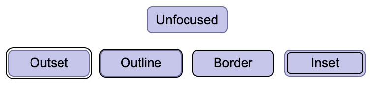
Figure 4. All four of these example focus indicators are 2px solid lines. The "outset", "outline", and "border" indicators pass. The "inset" indicator does not meet the minimum area requirement and fails; it would need to be at least 3px thick to pass.
Note that different Non-text Contrast requirements may apply depending on whether the focus indicator is offset from, inset into, or against the edge of the component. See the Relationship with Non-text Contrast section below.
Other indicator shapes
This success criterion does not require that focus indicators be solid outlines. Other shapes may be used so long as they meet the minimum area requirement.
The minimum area of the focus indicator for a control is the area of a 2 CSS pixel thick perimeter of the control (or its minimum bounding box) in the control's unfocused state. For example, if a control is a rectangle 90px wide and 30px tall, the area of a 2 CSS pixel thick perimeter is difference between the areas of:
- A 92px by 32px rectangle (1px larger on all sides), and
- A 88px by 28px rectangle (1px smaller on all sides)
This results in a minimum area of (92px * 32px) - (88px * 28px) = 480px2.
Some general formulas for 2 CSS pixel thick perimeters of common shapes are:
- Rectangle with width w and height h
- 4h + 4w
- Circle with radius r
- 4𝜋r
- Rounded rectangle with width w, height h, and border radius r
- 4h + 4w - (16 - 4𝜋)r
Note
If you need to use complex mathematics to work out if a focus indicator is large enough, it is probably a sign that you should use a larger indicator instead. The bigger the visible change when an item receives focus, the easier it is for someone to see.
The following 2 examples use a 90px wide by 30px tall button, with a minimum area requirement of 480px2:

Figure 5. Passes: the inner outline is inset slightly from the outer edge of the component, but compensates for this by being 3px thick. It has an area of 612px2, which exceeds the 480px2 minimum.

Figure 6. Passes: the indicator rectangles on either side of the focused button are each 9px wide by 28px tall. In total, they are 504px2, which just barely meets the 480px2 minimum.
Note
Prefer using focus indicator techniques that scale with both the width and height of the focused control. Otherwise, if controls change size across different variations of a page (for example, in a responsive design), the indicator might meet the area requirement in some variations but not others. For example, in the above figure, if the width of the two highlight rectangles did not scale as the button grew wider, it would stop meeting the minimum area requirement if the button needed to grow any wider to accommodate a longer button label.
Another way of achieving the area requirement is to alter the appearance of the entire component, for instance by changing its color – provided that the new color has a contrast ratio of at least 3:1 against the original color. This can be effective in a set of closely placed buttons. The following example demonstrates this with 5 rating stars; the center star is filled in with a darker color to indicate focus. However, it is much more difficult to detect such a focus indicator when components are not near each other and so cannot be easily compared. For users using magnification, even components relatively close together may be difficult to compare, so it is not considered a best practice.

Figure 7. Passes: a color change applies to the whole third star to indicate focus.
Inline links
If an inline link is broken over multiple lines, some methods of creating a focus indicator create
different results by browsers. CSS outline separately surrounds each part of a link
that breaks across multiple lines. It is by far the most common CSS technique for focus indication,
and produces a result that satisfies the minimum bounding box definition since each part is solidly
bound. CSS border will split the perimeter across the parts of the link, which results
in an unenclosed border for each line of the link. The minimum bounding box definition states that
link focus can be assessed as if the link was all on one line, so a 2px thick border is also
considered to meet the minimum area requirement. Therefore, where the contrast requirements are met,
each of these methods can produce a sufficient focus indicator.
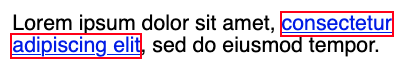
Figure 8. Passes: the CSS outline property solidly bounds each part of the link
completely, so it meets the definition of a perimeter.
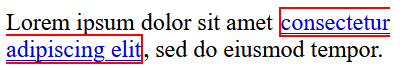
Figure 9. Passes: Although the CSS border on a multi-line link does not enclose the
separate parts of the link, the minimum bounding box definition allows it to be assessed as if
it was on a single line, so it also qualifies as a perimeter.
Change of contrast
The second part of the Success Criterion's indicator requirements states that an area of the indicator:
- has a contrast ratio of at least 3:1 between the same pixels in the focused and unfocused states
This requirement measures the change of contrast between the same pixels in different states. This is different from the Text Contrast and Non-text Contrast Success Criteria, which measure the contrast between different adjacent pixels in a single state at a time.
3:1 is the minimum allowable change-of-contrast ratio, but the greater the change of contrast between states, the easier it is for users to see the focus indicator. Authors are encouraged to make the change-of-contrast ratio as great as possible.
The following illustration shows a minimally contrasting focus indicator, where some of the white pixels making up the page background have been altered to a mid-grey that has a 3:1 contrast ratio with the original white. Authors are encouraged to exceed the minimum focus appearance. For instance, the dark blue lines in figures 2 and 3 are much more visible.

Figure 10. Passes: Two buttons in the shape of a star, with the second surrounded by a focus indicator whose pixels contrast 3:1 between focused (light grey) and unfocused (white) states.
When a component changes to include a focus indicator, that change can be measured as a change of color contrast. For example, if a yellow outline is added to a button on a blue background, the change of color is from blue to yellow. This change can be measured whether the focus indicator is on the background around the component, or the background within the component.
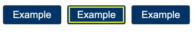
Figure 11. Passes: adding a yellow outline to a link is a change of color from blue to yellow. That change has a contrast ratio of 12:1.
If a control receiving focus changes its background (fill color) to a color that contrasts less than 3:1 with the original background, that would not pass the change of contrast.
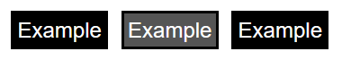
Figure 12. Fails: the second link has a dark-grey (#555) which fails this Success Criterion because the change from black-background to dark-grey background does not meet 3:1.
If the background change is sufficient, it is a method of passing the criterion.
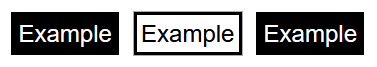
Figure 13. Passes: the second link has a white background (#fff) which passes this success criterion because the change from black-background to white-background meets 3:1.
Partially contrasting indicators
It is not necessary for the entire focus indicator to have a 3:1 change of contrast. It is sufficient for just a part of the indicator to meet the change of contrast requirement, so long as the contrasting part of the indicator meets the minimum area requirement.

Figure 14. Passes: The black part of the indicator meets 3:1 contrast with the white background, but the gray part does not. The black part is 2px thick, so it meets the minimum area requirement on its own and the gray part can be ignored.

Figure 15. Fails: The indicator as a whole is 2px thick, but the part of it that has sufficient change-of-contrast is only 1px thick. The part of the indicator with sufficient change-of-contrast does not meet the minimum area requirement.
When calculating whether a focus indicator meets the minimum area requirement, only the part of the indicator which meets the change-of-contrast requirement should be included in the calculation.
Gradients
If a focus indicator has a gradient, the principle is to measure the contrast of the changed area, and ignore any part of the gradient which has less than a 3:1 change-of-contrast ratio.
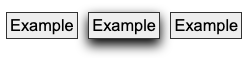
Figure 16. When a gradient is used on a focus indicator, the measure of surface area should only include the area that has changed enough to meet the 3:1 contrast ratio.
If you eliminate the area which has less than 3:1 change-of-contrast, you can calculate the area of the remaining parts of the indicator to determine whether the indicator meets the minimum area requirement.

Figure 17. Passes: the same focused button with the non-contrasting areas removed. The contrasting area is 6px thick along most of the bottom edge and 3-4px thick on the left and right edges, which is enough to meet the minimum area requirement.
Note
Some of the examples in this document are screen-captured images of elements. Due to loss of resolution in these images, the actual pixel color may not match the original. As such, they are intended to be used for illustrative purposes, and should not be inspected on a pixel-by-pixel basis for sufficient contrast.
Some designs have pages with a non-solid background image covering the whole (or part) of the page or make use of parallax scrolling effects which result in a near-infinite number of color combinations if a page is scrolled and/or changes are made to the viewport size.
If the contrast of background colors that change are close enough to need to be tested for each combination then they would likely not meet the user need of people with low vision in certain scroll combinations and would likely fail in certain combinations as well. In these cases it would be an easy solution to use a C40: Creating a two-color focus indicator to ensure sufficient contrast with all components or some other mechanism to indicate focus such as a solid box with a border to guarantee there is sufficient contrast across variations of background images or background gradients.
It is possible to use visual patterns such as strips switching places to disguise a change of focus indicator. However, this is not considered a visible indicator.
Relationship with Non-text Contrast
Focus indicators are visual information required to identify a state of a user interface component. That means that they are subject to 1.4.11 Non-text Contrast, in addition to 2.4.13 Focus Appearance.
In combination with 2.4.7 Focus Visible, 1.4.11 Non-text Contrast requires that the visual focus indicator for a component must have sufficient contrast against the adjacent colors when the component is focused, except where the appearance of the component is determined by the user agent and not modified by the author.
The difference between the contrast requirements in Focus Appearance and Non-text Contrast is:
- Focus Appearance requires that focus indicators have a change of contrast between focused and non-focused states.
- Non-text Contrast requires that focus indicators have adjacent contrast between the indicator (in the focused state) and adjacent non-indicator colors.
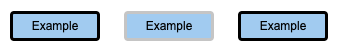
Figure 18. This example passes Focus Appearance but fails Non-text Contrast; there is insufficient adjacent contrast between the focus indicator (light gray border) and the adjacent colors (white background and light blue button).
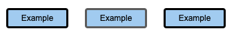
Figure 19. This example passes Non-text Contrast but fails Focus Appearance; there is insufficient change of contrast between the focused (dark gray border) and unfocused states (black border).
Additionally, Non-text Contrast does not establish any size requirement and has slightly different rules for when exceptions are allowed.
See the Relationship with Focus Visible section of Understanding 1.4.11 Non-text Contrast for more details and examples.
Component keyboard focus
The preamble to this success criterion is "When a user interface component has keyboard focus..." The keyboard focus is the point of interaction for someone using a keyboard. For environments with a keyboard-operable interface, the keyboard focus can be moved around the interface in order to interact with different components. Whichever component is being interacted with has focus.
WCAG defines user interface component as "a part of the content that is perceived by users as a single control for a distinct function." Because different users may perceive controls differently, there is a potential for some variation when interpreting what constitutes both a single control and a distinct function. This is particularly the case when something visually presents in a way that may differ from how it is programmatically created under the covers. Where there is not a native HTML component upon which to base designs, there can be great variations in how the components and their focus indicators are portrayed. Further, some components have sub-components that can take focus, such as the menu items on a menu.
Nonetheless, consistent results from different testers were obtained for this success criterion by using the focus indicator itself as the gauge of what constitutes the component being interacted with. For complex components, the three typical focus indicators are as follows:
- Focus indicator around only the whole component
- Focus indicators around both the component and subcomponent
- Focus indicator around only the subcomponent
Each of these will be discussed, using a tablist as a familiar complex component.
Focus indicator around only the whole component
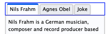
Figure 20. A tablist with a focus indicator around only the whole.
When the focus indicator is shown only around the whole tablist, the user is guided to considering the tablist as a single user component. The tab items within it are visually distinguished between selected and unselected states (and visual indicators of selection state must meet the criteria given in 1.4.11 Non-text Contrast).
Having a focus indicator only around the whole is possible where there is no need to have a selected sub-component while another sub-component has focus. For a tablist which synchronizes its tab panel content with whatever tab is active, only one tab item can be selected at a time, and since whatever tab is selected is considered active, a separate focus indicator is redundant.
Result: the group focus indicator must meet the requirements of this success criterion.
A radio button group and a star-rating widget, which each use only a whole-component focus indicator, provide working examples of different complex components that pass the primary requirements of this success criterion. In the star ratings example, users can increment the rating by 1/2 stars. Not only is a focus indicator for each 1/2 star unnecessary, but it would actually be difficult to achieve without making the interaction confusing.
Focus indicators around both the component and subcomponent
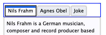
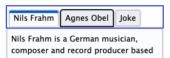
Figure 21. The same tablist in two states. In the first, focus is around both the tablist and the currently selected tab; in the second, focus is around both the tablist and an unselected tab.
For a tablist which does not keep its tab panel content synchronized with whatever tab is selected, there needs to be a focus indicator for the tab item subcomponent. This is because the tab item with focus may be different than the selected item.
The user can navigate to the tablist, which in this implementation has a focus rectangle around the whole tablist as well as one around a tab item (conventionally the item that is currently selected). The focus around the whole is helpful in cueing a keyboard user that this is a complex component that has its own interaction. The user can then move focus between the unselected and selected tab items -- each of which in turn has its own focus indicator -- before activating one, which then makes it selected as well as focused, and updates the tab panel to match.
In this scenario, either the group focus indicator or the sub-component indicator must meet the requirements of this success criterion. To avoid being overly prescriptive, the success criterion allows authors to choose which makes the most sense. Generally, if a sub-component focus is necessary, it should be assessed instead of the group indicator.
Result: the focus indicator for the tab item meets the requirements of this success criterion. The tablist focus indicator does not need to meet the requirements.
A slider to pick colors provides a working example of a different complex component that predominantly shows focus for the subcomponent. In this case, the thumb slider sub-component has a focus indicator of sufficient size and contrast to pass the sufficient area calculation. There is also a subtle focus around the whole slider component, but it does not need to be assessed to pass this success criterion.
Focus indicator around only the subcomponent
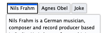
Figure 22. The same tabs as in the prior set, but the focus indicator around the whole is removed.
The same unsynchronized tablist can also be implemented as something which only shows focus on the tab items and not on the whole. The behavior is the same as in the prior example, but there is never a focus indicator placed around the tablist. This interaction is acceptable, but it is not best practice since it demands more understanding from the user with less information. For example, some visual cues for the tablist and tab items (and tab panel) may not be clear. As well, keyboard users may not initially understand the expected keyboard interaction.
Result: the focus indicator for the tab item must meet the requirements of this Success Criterion, judging focus with both selected and unselected tab items.
A functional example of sub-component-only tab focus has an indicator that is large enough (at least four times the shortest side) with sufficient contrast to pass the focus area language of this success criterion.
Where something with focus is not a user interface component
Some pages contain very large editing regions, such as web implementations of word processors and code
editors. Unlike a textarea element, which is a user interface component, these large
editing regions do not typically meet the definition of user interface components;
they are not "perceived by users as a single control for a distinct function."
Providing focus indicators around such editing regions may still be beneficial to some; however, where
the region is not perceived as a single control, it is not covered by this success criterion. The web
page will still need to provide a insertion point (caret indicator) in such editing regions in order to
meet the requirements of 2.4.7
Focus Visible.
Some non-operable elements can take focus (such as a heading element that is the target of a skip link). However, the preamble of this success criterion refers to user interface components; it is only when the element with focus is operable by keyboard that this success criterion applies.
Exceptions
There are two situations where the focus appearance does not need to be assessed:
- the focus indicator cannot be adjusted by the author
- the author has not modified the effects of the user agent default
First exception: the focus indicator cannot be adjusted by the author
The focus indicator is determined by the user agent and cannot be adjusted by the author
Some components or technologies may not allow the author to adjust the focus indicator. This is the
case with HTML select elements (both single and multi-select), where the visual
treatments for selection and focus cannot be adjusted by the author. In this case the Success
Criterion does not apply.
Figure 23. Passes: The user agent's default select element presentation cannot be
modified by the author, so it passes regardless of the quality of the focus indicator
Second exception: the default indicator and background are not modified
The focus indicator and the indicator's background color are not modified by the author
If the focus indicator and the background behind the focus indicator are not modified by the author, the success criterion does not apply.
The intent of this exception is to reduce burden on authors by allowing them to rely on the default indicators provided by user agents (browsers). If all user agents provided good focus indicators, authors would be able to concentrate efforts on other accessibility considerations. Unfortunately, browser default focus indicators vary by component, browser, and across devices and operating systems, and the default focus indicators in some browsers can be difficult to see (such as a 1px dotted outline). For this reason, most authors override browser defaults in order to overcome these deficiencies and create a more uniform user experience, regardless of browser.
Some browser makers are improving their default focus indicators to make them more visible. As more browsers adopt defaults that meet the primary bullets of this Success Criterion, authors will be able to achieve improved focus indicators without customization.
Modifying the focus indicator background
Browser default focus indicators can be made more difficult to see if the author modifies the pixels directly adjacent to the indicator (commonly referred to as its background), such as by positioning a component on top of an image or gradient background, or altering the page's default white background color, for instance using a blue background in combination with a browser's blue default indicator. For this reason, where the author alters the pixels directly adjacent to the default focus indicator, the user agent exception does not apply, and the author will need to verify they meet the size and contrast requirements of this success criterion.
Note
Altering the body element's background-color attribute
is one way of altering the pixels directly adjacent to the indicator in most
implementations. However, specifying a value of white (#FFFFFF) does not nullify this
exception since, as established in the third note of the contrast ratio definition, the
default ("unspecified") color is assumed to be white.
As well, if the browser provides an indicator within a component by default, then authors can potentially reduce the visibility by changing the component color (which in such a scenario is the background color for the focus indicator). For example, if the default indicator on a button uses a colored inner border, authors can negatively affect the focus appearance by making the button or its unfocused border color a similar-luminosity color. For this reason, this user agent exception can only be met if the author both does not modify the default focus indicator and does not modify its background.
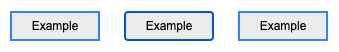
Figure 24. Fails: The middle button is focused using a browser's default focus indicator, but it is very difficult to tell which button is focused because the custom blue border on the unfocused button uses a similar color.
Benefits
- This success criterion helps anyone who relies on the keyboard to operate the page, by letting them visually determine the component on which keyboard operations will interact at any point in time.
- People with attention limitations, short term memory limitations, or limitations in executive processes benefit by being able to discover where the focus is located.
Examples
- When links receive focus, an outline is displayed around the link that contrasts with the background adjacent to the link.
- When buttons receive focus, an outline is displayed within the button (around the text) that contrasts with the button's background.
- When text fields receive focus, an outline is displayed around the field, indicating that the input has focus.
- When radio buttons receive focus, an outline is displayed around the control, indicating that the input has focus.
Related Resources
Resources are for information purposes only, no endorsement implied.
- A guide to designing accessible focus indicators by Sara Soueidan
- Focus appearance - testing version 3
- Focus visible testing (Feb 2022)
- Avoid Default Browser Focus Styles by Adrian Roselli
Techniques
Each numbered item in this section represents a technique or combination of techniques that the Accessibility Guidelines Working Group deems sufficient for meeting this success criterion. A technique may go beyond the minimum requirement of the criterion. There may be other ways of meeting the criterion not covered by these techniques. For information on using other techniques, see Understanding Techniques for WCAG Success Criteria, particularly the "Other Techniques" section.
Sufficient Techniques
Failures
The following are common mistakes that are considered failures of this success criterion by the Accessibility Guidelines Working Group.
Key Terms
- assistive technology
hardware and/or software that acts as a user agent, or along with a mainstream user agent, to provide functionality to meet the requirements of users with disabilities that go beyond those offered by mainstream user agents
Note 1
Functionality provided by assistive technology includes alternative presentations (e.g., as synthesized speech or magnified content), alternative input methods (e.g., voice), additional navigation or orientation mechanisms, and content transformations (e.g., to make tables more accessible).
Note 2
Assistive technologies often communicate data and messages with mainstream user agents by using and monitoring APIs.
Note 3
The distinction between mainstream user agents and assistive technologies is not absolute. Many mainstream user agents provide some features to assist individuals with disabilities. The basic difference is that mainstream user agents target broad and diverse audiences that usually include people with and without disabilities. Assistive technologies target narrowly defined populations of users with specific disabilities. The assistance provided by an assistive technology is more specific and appropriate to the needs of its target users. The mainstream user agent may provide important functionality to assistive technologies like retrieving web content from program objects or parsing markup into identifiable bundles.
- blocks of text
more than one sentence of text
- conformance
satisfying all the requirements of a given standard, guideline or specification
- content
information and sensory experience to be communicated to the user by means of a user agent, including code or markup that defines the content's structure, presentation, and interactions
- contrast ratio
(L1 + 0.05) / (L2 + 0.05), where
- L1 is the relative luminance of the lighter of the colors, and
- L2 is the relative luminance of the darker of the colors.
Note 1
Contrast ratios can range from 1 to 21 (commonly written 1:1 to 21:1).
Note 2
Because authors do not have control over user settings as to how text is rendered (for example font smoothing or anti-aliasing), the contrast ratio for text can be evaluated with anti-aliasing turned off.
Note 3
For the purpose of Success Criteria 1.4.3 and 1.4.6, contrast is measured with respect to the specified background over which the text is rendered in normal usage. If no background color is specified, then white is assumed.
Note 4
Background color is the specified color of content over which the text is to be rendered in normal usage. It is a failure if no background color is specified when the text color is specified, because the user's default background color is unknown and cannot be evaluated for sufficient contrast. For the same reason, it is a failure if no text color is specified when a background color is specified.
Note 5
When there is a border around the letter, the border can add contrast and would be used in calculating the contrast between the letter and its background. A narrow border around the letter would be used as the letter. A wide border around the letter that fills in the inner details of the letters acts as a halo and would be considered background.
Note 6
WCAG conformance should be evaluated for color pairs specified in the content that an author would expect to appear adjacent in typical presentation. Authors need not consider unusual presentations, such as color changes made by the user agent, except where caused by authors' code.
- CSS pixel
visual angle of about 0.0213 degrees
A CSS pixel is the canonical unit of measure for all lengths and measurements in CSS. This unit is density-independent, and distinct from actual hardware pixels present in a display. User agents and operating systems should ensure that a CSS pixel is set as closely as possible to the CSS Values and Units Module Level 3 reference pixel [css3-values], which takes into account the physical dimensions of the display and the assumed viewing distance (factors that cannot be determined by content authors).
- focus indicator
pixels that are changed to visually indicate when a user interface component is in a focused state
- keyboard interface
interface used by software to obtain keystroke input
Note 1
A keyboard interface allows users to provide keystroke input to programs even if the native technology does not contain a keyboard.
Note 2
Operation of the application (or parts of the application) through a keyboard-operated mouse emulator, such as MouseKeys, does not qualify as operation through a keyboard interface because operation of the program is through its pointing device interface, not through its keyboard interface.
- mechanism
process or technique for achieving a result
Note 1
The mechanism may be explicitly provided in the content, or may be relied upon to be provided by either the platform or by user agents, including assistive technologies.
Note 2
The mechanism needs to meet all success criteria for the conformance level claimed.
- minimum bounding box
the smallest enclosing rectangle aligned to the horizontal axis within which all the points of a shape lie. For components which wrap onto multiple lines as part of a sentence or block of text (such as hypertext links), the bounding box is based on how the component would appear on a single line.
- perimeter
continuous line forming the boundary of a shape not including shared pixels, or the minimum bounding box, whichever is shortest.
Errata:
- Removing the period incorrectly appearing at the end of the definition
- presentation
rendering of the content in a form to be perceived by users
- process
series of user actions where each action is required in order to complete an activity
- relative luminance
the relative brightness of any point in a colorspace, normalized to 0 for darkest black and 1 for lightest white
Note 1
For the sRGB colorspace, the relative luminance of a color is defined as L = 0.2126 * R + 0.7152 * G + 0.0722 * B where R, G and B are defined as:
- if RsRGB <= 0.04045 then R = RsRGB/12.92 else R = ((RsRGB+0.055)/1.055) ^ 2.4
- if GsRGB <= 0.04045 then G = GsRGB/12.92 else G = ((GsRGB+0.055)/1.055) ^ 2.4
- if BsRGB <= 0.04045 then B = BsRGB/12.92 else B = ((BsRGB+0.055)/1.055) ^ 2.4
and RsRGB, GsRGB, and BsRGB are defined as:
- RsRGB = R8bit/255
- GsRGB = G8bit/255
- BsRGB = B8bit/255
The "^" character is the exponentiation operator. (Formula taken from [SRGB].)
Note 2
Before May 2021 the value of 0.04045 in the definition was different (0.03928). It was taken from an older version of the specification and has been updated. It has no practical effect on the calculations in the context of these guidelines.
Note 3
Almost all systems used today to view web content assume sRGB encoding. Unless it is known that another color space will be used to process and display the content, authors should evaluate using sRGB colorspace. If using other color spaces, see Understanding Success Criterion 1.4.3.
Note 4
If dithering occurs after delivery, then the source color value is used. For colors that are dithered at the source, the average values of the colors that are dithered should be used (average R, average G, and average B).
Note 5
Tools are available that automatically do the calculations when testing contrast and flash.
Note 6
A separate page giving the relative luminance definition using MathML to display the formulas is available.
- relied upon
the content would not conform if that technology is turned off or is not supported
- state
dynamic property expressing characteristics of a user interface component that may change in response to user action or automated processes
States do not affect the nature of the component, but represent data associated with the component or user interaction possibilities. Examples include focus, hover, select, press, check, visited/unvisited, and expand/collapse.
- structure
- technology
mechanism for encoding instructions to be rendered, played or executed by user agents
Note 1
As used in these guidelines "web technology" and the word "technology" (when used alone) both refer to web content technologies.
Note 2
Web content technologies may include markup languages, data formats, or programming languages that authors may use alone or in combination to create end-user experiences that range from static web pages to synchronized media presentations to dynamic Web applications.
- user agent
any software that retrieves and presents web content for users
- user interface component
a part of the content that is perceived by users as a single control for a distinct function
Note 1
Multiple user interface components may be implemented as a single programmatic element. "Components" here is not tied to programming techniques, but rather to what the user perceives as separate controls.
Note 2
User interface components include form elements and links as well as components generated by scripts.
Note 3
What is meant by "component" or "user interface component" here is also sometimes called "user interface element".
- web page
a non-embedded resource obtained from a single URI using HTTP plus any other resources that are used in the rendering or intended to be rendered together with it by a user agent
Note 1
Although any "other resources" would be rendered together with the primary resource, they would not necessarily be rendered simultaneously with each other.
Note 2
For the purposes of conformance with these guidelines, a resource must be "non-embedded" within the scope of conformance to be considered a web page.