Technique G209:Provide sufficient contrast at the boundaries between adjoining colors
About this Technique
This technique relates to 1.4.11 Non-text Contrast (Sufficient when used for making graphical content understandable).
This technique applies to for graphics which use multiple colors adjacent to each other.
Techniques are examples of ways to meet Web Content Accessibility Guidelines (WCAG). They are not required to meet WCAG. Content can satisfy the normative requirements of WCAG even if it does not use any of the documented techniques. See About WCAG Techniques.
Description
The objective of this technique is to ensure people with moderately low vision can distinguish boundaries between adjoining segments of color.
The success criteria for non-text contrast uses the term "graphical object" to cover small simple graphics, and parts of larger complex graphics. This technique focuses on solid color segments where the boundaries between colors convey meaning.
When selecting colors for graphics with multiple colors, consider adjoining colors and test that the contrast ratio is at least 3:1. If adjoining colors have less than 3:1 color contrast ratio difference add a border with at least a 3:1 color contrast with each color.
Examples
Example 1: Pie chart with alternative light/dark colors
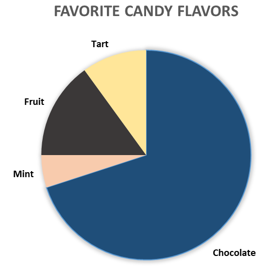
Figure 1. The contrast between adjoining segments of the pie chart range from 5.8 to 9.4.
Example 2: Pie chart with borders between segments
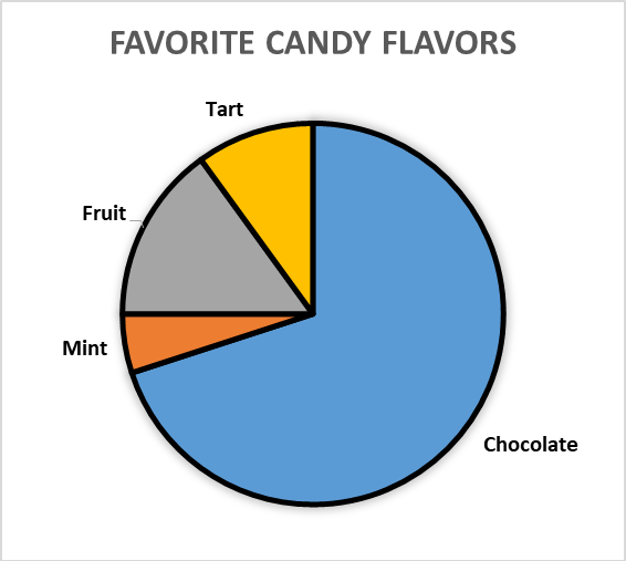
Figure 2. The contrast between the segments of the pie chart range from 1.1 to 1.8. A border has been added with at least a 3:1 contrast ratio with the colors to distinguish between segments. .
Example 3: Map with border boundaries

Figure 3. The color contrast of areas within the map range between 1.3 and 1.8. A boundary line is added with a color contrast ratio of at least 3:1 with the area colors.
Example 4: Pie chart with black and white borders
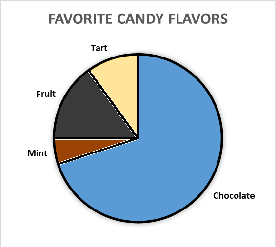
Figure 4. The colored areas in the chart are both dark and light. A black and white boundary line is added to ensure sufficient contrast between both light and dark colors.
Related Resources
No endorsement implied.
- Understanding SC 1.4.3 Contrast (Minimum) lists color contrast tools.
Tests
Procedure
For each graphical object required for understanding use a color contrast tool to:
- Measure the contrast ratio of each color compared to the adjacent color(s) or border (if present).
- Check that the contrast ratio is at least 3:1 for each adjacent color or border (if present).
Expected Results
- #2 is true