The document provides a summary of several techniques and best practices
that Web site authors and solution providers may employ when creating and
delivering content to a diverse set of access mechanisms.
This section describes the status of this document at the time of its
publication. Other documents may supersede this document. A list of current
W3C publications and the latest revision of this technical report can be
found in the W3C technical reports index
at http://www.w3.org/TR/.
This document is a W3C Working Group Note. It represents the views of the
W3C Device Independence Working Group at the time of publication. There are
currently no plans to amend this document further. Publication as a Working
Group Note does not imply endorsement by the W3C Membership. This is a draft
document and may be updated, replaced or obsoleted by other documents at any
time. It is inappropriate to cite this document as other than work in
progress.
This document is published as part of the W3C Device Independence
Activity by the Device Independence Working Group. It is a deliverable as
defined in the Charter
of that group.
Comments on this document may be sent to the public www-di@w3.org mailing list (archived at http://lists.w3.org/Archives/Public/www-di/).
Patent disclosures relevant to this document may be found on the WG patent disclosure page.
Visual Table of Contents

Brief Table of Contents
Detailed Table of Contents
List of Samples
List of Figures
1.1 Scope
Drawing on the experience of technology providers and Web
authors, this Note presents an overview of many existing techniques and best
practices that may be used to deliver tailored content and applications to a
wide variety of devices. It shows, in practical terms, how one might address
the problems of content creation, content maintenance and content adaptation.
It explores the issues associated with managing an application's interaction
with a user where different devices and modalities are present.
This Note is restricted to content and applications that
are intended for Web delivery, employing technologies that are associated
with the Web, and in particular those technologies that have been recommended
by the W3C or are being developed by the W3C. Furthermore, while the Web can
be used to deliver a wide variety of media types, this Note shall focus on
media that is represented by, or referenced through, markup languages. XHTML
and its associated technologies shall play a key role in this Note, but the
legacy of older technologies shall be recognized as an important domain of
interest.
Implementation-specific issues shall be recognized, but
not elaborated, in this Note. This includes issues such as performance and
scaling, security, resource consumption etc. It is recognized that different
implementations of the same authoring techniques, and their associated
adaptation techniques, will have different properties and that these
differences provide scope for business opportunities. These differences are
not a concern of this Note.
This Note includes discussions on the features of
authoring tools, site creation and maintenance tools, storage, delivery,
adaptation, end-user devices and software on such devices.
This is a rapidly changing area and as a consequence some
of the techniques described will be superseded or obsoleted by new
developments as well as the emergence of new techniques made possible by new
developments. Readers are encouraged to seek additional information through
the references and other sources.
1.2 Goals
1.2.1 Goals as Specified in
the Charter
This Note is one of the deliverables of the Device
Independence Working Group. According to the charter, section
3.2.2, the purpose of this document is to:
"propose some techniques for authors to achieve greater
device independence. [...]
Firstly, using existing techniques, to:
- describe how authors use current markup and adaptation techniques to
deliver to different devices
- show how separation between content and its presentation on
different devices can be achieved
- cover approaches that include adaptation on the client, the origin
server and on intermediaries
- give examples based on existing markup and adaptation
techniques
- point out where current approaches do not address all the
goals
Secondly, using techniques based on XForms, to:
- show how navigation can be described independently of target device
(e.g. for non-visual and different sizes of visual device)
- show how interaction can be expressed in a device independent
manner
- show how applications can be customized for different target
delivery contexts"
The quoted charter items lead to stipulation of the
following goals for this document:
DIAT:G-1: Authoring
Practice
Identify the current and proposed
techniques to support authoring for multiple devices, and present these as
abstractions of the process from the original authoring step up to and
including the final delivery of content to the access mechanism.
DIAT:G-2: Adaptation
Techniques
Identify the range of content
adaptation techniques and how they may be applied at the different stages of
the delivery process (from server through intermediaries to the
device).
DIAT:G-3:
Requirements
Identify the requirements that should
be satisfied by implementations of techniques identified in this document. In
particular, this relates to the technical requirements for markup languages
and other technologies offered by the W3C.
DIAT:G-4: XForms
Identify techniques, based on XForms,
to support device-independent navigation and interaction. These techniques
must support the tailoring of presentation, interaction modes and navigation
within form-based Web applications.
1.2.2 Current Practices
and Techniques
This document shall identify known (published) practices
and techniques that address the following issues:
- Creation of original, reusable and adaptable content
- Representation of author intentions and decisions
- Creating and adapting navigation features
- Design and adaptation of interactive content
- Use and management of contextual information
The focus shall be on open and accessible standards and
"best" practices, particularly those advocated by W3C Recommendations and by
respected organizations.
1.3 Audience
This Note is intended as background material for people
interested in the techniques associated with delivering content and
applications from web sites to devices with very different capabilities. It
assumes that the reader is familiar with the Authoring Challenges document
[AC] that preceded this document.
In particular, the audience for this Note includes:
- individuals from W3C Member organizations with an interest in authoring
for multiple devices
- members of W3C Working Groups who are evolving existing markup
standards
- companies engaged in developing systems that support authoring for
multiple devices
- individuals and organizations that design and develop web
applications
- device experts
The objective of authoring is to create content for an
audience. The objective of content delivery is to convey the authored content
to the audience. In general, the objective of Device Independent Authoring
Techniques is to facilitate content delivery to as wide an audience as
possible while:
- respecting the constraints of the end user devices,
- taking advantage of specific features of end user devices and
- respecting, where possible, the known preferences of the end user.
Each technique has technical and non-technical
motivations, described below. Technical motivations refer to technical issues
raised by increasing variety of devices and device features. Non-technical
motivations refer to issues raised by people (authors and end users), the way
they create and consume content, the business processes and other human
activities that form the context of the Web.
Authoring Techniques are ways in which various
technologies can be utilized to minimize the number and types of materials
that need to be created to satisfy a range of device types. The techniques
also provide mechanisms for incremental additions to the set of materials
created to support a Web Page to enable it to be better adapted to a device
(or class of devices). Most of these techniques involve the provision of
alternatives and a mechanism to choose between these alternatives at run
time. These techniques must:
- Capture suitability to particular delivery contexts
- Take account of Authoring Challenges: Variability, Scalability and
Affordability
Ultimately, the most important feature of an authoring
technique is its ability to produce a good rendering on the client of the
original content created by the author. This is a subjective assessment and
is beyond the scope of this document.
1.4.1 Technical
Motivation
In a strict sense, a Device Independent Authoring
Technique is a method of creating content that can be delivered to any
conceivable device. In practice this is impossible, so the real techniques
seek to minimize the number of materials needed to satisfy a range of device
types. There are many different types of material that are needed to satisfy
a user request for a Web Page. These include various types of media that
constitute the content of the page as well as supporting material such as
styling and layout rules that determine how the content is rendered.
The creation of these materials is what we call
Authoring and typically these materials must be adapted for delivery
to specific devices. The construction of adaptation processes may also be
regarded as a form of authoring, though more usefully regarded as a form of
programming. Authoring of raw material, styles, layouts and adaptation
processes may be performed by different individuals with different skills,
which support specialization of the various contributors. The technical
challenge is to facilitate this separation of concerns.
1.4.1.1 Variability
One of the identified Authoring Challenges is Variability,
by which is meant the ability of an authoring technique to vary the content
according to the delivery context. Technically, this requires access to
parameters defining the delivery context and a means of content selection
according to these parameters. Some authoring techniques seek to expose as
many parameters as possible, accompanied by powerful selection methods. Other
techniques seek to abstract these parameters while making the selection
process as implicit as possible. The former approach gives the author more
control but requires more effort, while the latter sacrifices control to
reduce effort.
1.4.1.2 Scalability
A technique that is suitable for a small amount of content
should also be suitable for a large amount. Ideally, the amount of additional
effort should scale with the amount of content.
1.4.2 Non-technical
Motivation
The non-technical motivation for Device Independent
Authoring Techniques is centered around the requirements and constraints
imposed by the creators of content and the audience for this content. In
simple terms: time is precious, effort is expensive, users are demanding and
consistency is desirable.
1.4.2.1 Affordability
Creating content is an expensive and time-consuming
activity. It is expensive because it consumes the time of the authors. It is
generally accepted that additional effort by authors is required for Device
Independence, and the various authoring techniques attempt to minimize this
additional effort. There are other costs, such as the investment in
adaptation mechanisms, but these tend to be less significant.
1.4.2.2 Diversity of
Devices
Authors intend their content to be accessed by as large an
audience as possible, regardless of the constraints of the delivery context.
The majority of these constraints come from the limitations of the end user
devices, though similar constraints can be imposed by the end users
themselves. An authoring technique should overcome the constraints so that
the greatest number of delivery contexts can be supported.
1.4.2.3 Branding and
Consistency
Branding is a business motivation that seeks to present a
consistent image of the business across the spectrum of delivery contexts.
Consistency also reduces end-user confusion, thereby giving the end-user more
freedom to migrate from one device to another as circumstances may dictate. A
Device Independent Authoring Technique should support the consistency of the
end-user experience.
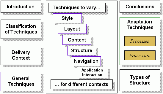
Section 2 describes a classification of Authoring
Techniques that shall be referred to in subsequent sections. Section 3
describes the Delivery Context, whose variability is the prime motivation for
Device Independent Authoring, as explained in Section 4. Section 5 introduces
some general authoring techniques whose application spans numerous
classification, and explains that most Device Independent Authoring
Techniques aim to support variability in six aspects: Style, Layout, Content,
Structure, Navigation and Interaction. Techniques specific to these aims are
covered in Sections 5 through 10. Section 11 summarizes the Authoring
Techniques Workshop, the event that marked the beginning of this document.
Section 12 draws conclusions from the document.
The focus of this document is on Device Independent
Authoring, but this is inevitably associated with Adaptation Techniques,
details of which are presented in Appendix B. The adaptation of content may
also necessitate adaptation of structure, so a brief summary of
content-related structures is presented in Appendix C. The appendices may be
read independently of the rest of the document.
The Device Independence Working Group has defined a number
of terms related to Device Independence. This Note adopts these terms as
presented in the Glossary of Terms [DIWG
Glossary].
2 Classification of
Authoring Techniques
Three broad classifications of authoring techniques are
identified in this section. In all classifications, the following features
are assumed:
- Regardless of the access mechanism, the device independence principle
[DIP-2] of having a single URI will hold.
- DIP-2 only applies to the Web Page Identifier. It does not necessarily
have to apply to resources subsequently referenced. For example, the URI
of a page will adhere to DIP-2, but the URIs of images within the page
may differ according to the device context.
- There may be one or more authors who contribute to the production of a
presentation page. In the case of multiple authors there is no
requirement that all participating authors will use the same
authoring techniques. In the classifications described below, the term
"author" shall be assumed to include the plural case.
- The current set of W3C Recommendations shall be the basis of authoring
techniques. It is recognized that the absence of a Recommendation for
Device Independent authoring means that the techniques may rely on
proprietary solutions, but that where this is the case the solutions
shall be in a manner consistent with established W3C approaches.
Significantly divergent solutions (e.g. OO-based content generation via
object serialization) are not considered here.
The Authoring Challenges [AC]
document highlighted a number of (overlapping) challenges facing content
authors. The document identified 55 implications [DIAI] of Device Independence within 10 categories (listed
in AC
Section 8.1), reproduced below.
- Provide Comprehensive Scope (diverse set of delivery options)
- Support Smooth Extensibility (new technology smoothly and easily
accommodated)
- Support Simplicity (a little effort can produce a functional
result)
- Support Abstraction (can use abstractions of devices, interaction and
other aspects of authoring/delivery)
- Support Delivery Context Variability (DC may influence the
presentation)
- Support Author Specified Variability (permit selections, aggregation,
layout and related decisions)
- Client-Side Processing (scripts, objects, browser functions etc.)
- Extensions to Existing W3C Standards (use and extend W3C
technologies)
- Context Aware (modality, language and other influencing parameters)
- Affordability (supports reuse, avoid duplication of effort and
resources, future-proof)
Some, but not all, of these features are provided by
current technology. It will be obvious to readers of this document that there
are gaps between the identified challenges of Device Independence and the
available authoring techniques. Closing these gaps is a prime motivation of
the DIWG.
The following subsections introduce the three main classifications of
authoring techniques. General descriptions are followed by concrete examples
(including markup where appropriate). All of these authoring techniques rely
on various adaptation techniques, discussed in Appendix B.
2.1 Multiple
Authoring
In the Multiple Authoring classification, the author
creates a different version of the content for each (class of) device.
Devices that have not been specifically addressed by the author may result in
lack of service for such devices, in contravention of DIP-3, which states "It
should be possible to provide a functional presentation, in response to a
request for a Web page identifier, in any given delivery context that has an
adequate access mechanism." To avoid such a contravention, a delivery
solution may select an available authored version that is functionally
compatible with the context, but there is no guarantee of such
availability.
There are certain cases where Multiple Authoring is
preferred. The production of multimedia resources may require additional
author input, such as the creation of corporate branding resources (e.g.
logos) at various sizes and resolutions. This is a case where "pixel perfect"
control is an essential feature for the author with sound business reasons
for avoiding less precise methods.
2.1.1 Associated
Adaptation Techniques
The ability to select from a set of possible versions of
content can be supported by techniques such as URL Redirection (by
server-side adaptation) or Server Selection (by an intermediate adaptation
such as a Proxy). Client-side selection-based adaptation is also supported by
various technologies.
In the Single Authoring classification, most of the
author's effort is focussed on creating a single version of the content. An
adaptation solution translates the single authored content into a form
appropriate to the device. The author may have the requirement/option to
provide additional information to assist the adaptation solution. Typically
the effort involved in creating the single version of content is greater than
any individual version created by a Multiple Authoring technique. However,
this effort is expended only once and therefore Single Authoring techniques
involve less total effort.
In some Single Authoring techniques, the author may be
required to create one or more resources for each delivery context. The
resources may take the form of styles, scripts, configurations etc. However,
these resources can be re-used and are therefore considered to be a once-off
effort. These resources are also "Single Authored".
Some Single Authoring techniques are described below.
Corresponding adaptation techniques are described in Appendix B.
2.2.1 Example: Author
Hints
Hinting is the means by which an author conveys meta-data
related to parts of the authored content. For example, an author may express
the relative importance of parts of the content through hints. Hints may be
represented within the authored content as additional markup, additional
attributes, specially formatted comments etc. These can be added to familiar
Web markup (e.g. XHTML) via an authoring-specific markup module. It is also
possible to represent hints outside of the document if parts of the authored
content can be addressed individually (e.g. using XPath).
Where custom modules or extensions to a markup language
are used in the authoring solution, it is expected that these extensions are
not visible beyond the authoring/adaptation environment.
2.2.2 Example: CSS Media
Queries
In CSS Media Queries, the
author defines rules based on contextual information. These rules are
typically captured as a class and XHTML tags in a document may be assigned a
class via the class attribute. The rules then affect the presentation
of content associated with the class. These rules may be executed by the
client, by an intermediate or by the origin server.
CSS Media Queries require that the author is familiar with
specific device features. Abstract characteristics are not generally
supported. The expression language cannot (currently) be extended. Future
versions of CSS Media Queries may address these shortcomings.
The following sample (from http://www.w3.org/TR/2002/CR-css3-mediaqueries-20020708/#color-index)
illustrates the use of Media Queries to indicate that a particular stylesheet
is appropriate to delivery contexts involving displays with at least 256
colors:
<?xml-stylesheet
  media="all and (min-color-index: 256)"
  href="http://www.example.com/..."
?>
|
2.2.3 Associated
Adaptation Techniques
Adaptation techniques associated with the authoring
techniques in this section include the following: (More details may be found
in Appendix B.)
- Transcoding
- Conversion of non-presentation (domain-specific) content to a
presentation form (e.g. News Markup Language [NewsML] to XHTML), or the conversion of one
presentation form into an alternative presentation form supported by
the client (e.g. XHTML to WML).
- Image/Binary Transcoding
- Changing the formats/resolutions of media resources (e.g. images) to
suit the delivery context (e.g. TIFF to PNG).
- Decomposition
- Dividing the original content into smaller parts to accommodate
limited display capabilities.
2.3 Flexible
Authoring
In the Flexible Authoring classification, the author has
complete freedom to combine Single and Multiple Authoring techniques. Thus
the author may create single versions of some resource(s) for subsequent
adaptation, and multiple versions of other documents when fine control or
specific features are required. This flexibility may also be applied within a
document where part of the document uses Single Authoring and the rest uses
Multiple Authoring.
2.3.1 Example: Layouts and
Portals
In a layout-based authoring technique, the author provides
separate pieces of content. Some or all of these pieces are subsequently
aggregated into a complete presentation using a layout as determined by the
context. Portal systems are examples of such an approach, where each portlet
is an individually authored piece of content that is aggregated (and possibly
adapted) into a context-appropriate layout. A detailed discussion of layout
authoring techniques is presented in Section 8.
2.3.2 Example: Alternative
Content
The alternative content authoring technique is a form of
Flexible Authoring applied within a document. It permits the author to
express a set of alternative content fragments/resources and a means of
selection within the set. An ordering may be imposed on the set to influence
the selection mechanism. Client-side methods have been available for some
time (viz. <frames> and <noframes>) but incomplete support in
clients makes this useful only in limited cases. Current technologies provide
more sophisticated solutions, such as the switch mechanism in SMIL as in section 7.2.1.
2.3.3 Associated
Adaptation Techniques
In addition to the adaptation techniques associated with
single authoring, the following adaptation techniques are prevalent among
flexible authoring solutions: (More details may be found in Appendix B.)
- Selection
- The selection of content resources from the set of available
resources under the influence of the delivery context and using
decisions determined by the author.
- Generated Navigation
- The creation of navigation aids (e.g. menus) from the adapted
content.
- Intermediate and Client Adaptation
- The adaptation of content by an intermediate process (e.g. a proxy)
or by the client itself.
The delivery context [described in DCO] is the set of all (available) parameters pertaining
to the characteristics of the delivery channel, which includes the server,
the communication media, intermediate active components, the edge device and
the rendering mechanism. It is expected that a subset of the delivery context
will influence what is delivered to the client and how it is delivered. In
solutions that provide device independence, it is typically the case that the
delivery context influences the content adaptation processes. The content
author will optionally provide additional information to affect this
adaptation within particular contexts.
3.1 Author
Awareness of Context
In practice, several technologies permit the author to
insert rules into the content whose execution is influenced by certain core
device characteristics, including the selection of layouts. This means that
the author is made aware of at least some of the delivery context parameters,
and consequently the success of the authoring process may depend on the
author's correct understanding of these parameters.
The more parameters that are offered to the author, the
more confusing the authoring process can become. For this reason, context
information can be aggregated and/or classified so that the author may apply
decisions to greater ranges of possible contexts. As an example, consider an
adaptation solution that includes the orientation of the screen (portrait,
square or landscape) as a parameter, rather than offering the exact aspect
ratio. Alternatively, the author may be provided with a library of methods to
simplify the task. For example, consider a method called "isPortrait" that
uses the specific aspect ratio to decide if the display is portrait.
CSS Media Queries are a good illustration of author
awareness of context. Only a small number of attributes are present, and the
operations on these attributes are limited. Nevertheless, this is sufficient
for the author to control styling for various classes of device. Fine control
of styling is not possible because of the limited set of attributes and
limited operations. For this the author must resort to more complex
techniques with a more complete set of presentation attributes. To this end,
the DIWG is working to create a core set of presentation characteristics [CPCReq].
3.2 Associated
Adaptation Techniques
Context is used in all adaptation techniques since the
objective of adaptation is to produce a result that is appropriate to the
context. In some techniques (e.g. Selection) the author is aware of the
context and supplies information related to the context (e.g. decision
expressions). In other techniques (e.g. Decomposition) the relevant
contextual information only plays a role after authoring.
There are two general techniques for Device Independent Authoring. They
are, in accordance with the classification introduced in Section 2, as
follows:
- Multiple Authoring with Contextual Selection (MA/CS)
- Single Authoring with Contextual Adaptation (SA/CA)
These, however, are extremes in a spectrum of techniques. MA/CS is an
extreme because it places a significant burden on the author, and SA/CA is an
extreme because it places a significant burden on the adaptation. In simple
and constrained circumstances, these techniques may be viable, but generally
they are inflexible, will not scale and are onerous to maintain.
Compromises between the two extremes can produce useful techniques, which
will be explored in detail in subsequent sections.
4.1 Aspects of
Authoring
To facilitate compromise, the objectives of authoring can
be divided into several aspects, and different authoring techniques can be
applied to the different aspects. The following (overlapping) authoring
aspects are generally recognized:
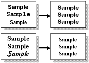
- Style
- The visual appearance of text (e.g. fonts and color) and minor layout
features such as text justification and indentation.
- Layout
- The visual or temporal relationship of parts of the delivered
content.
- Content
- The raw text (or speech) and other media resources forming part of
the delivery, intended to convey some information to the end user.
- Structure
- The relationship between parts of the delivered content and
subsequently delivered content, typically being the dominant influence
on navigation.
- Navigation
- The features offered to the user to enable the user move from the
currently perceived unit to some related perceived unit, with the
minimum of user effort.
- Application Interaction
- The manner in which the user conveys information to the origin server
via features of the delivered content, for the purpose of influencing
subsequent content delivery and/or associated applications.
Each of these aspects can be addressed by different
authoring techniques if the aspect can be sufficiently detached from the
others. For example, Style can be separated through the use of Cascading
Style Sheets (CSS), which affords the author the opportunity to use multiple
styles for the same raw content.
4.2 Authoring
Techniques for Specific Aspects
Sections 5 through 10 will explore different authoring
techniques that enable the author to vary different authoring aspects
according to the delivery context. These techniques would normally be used in
combination to achieve maximum benefit and should not be considered as
solutions in isolation. Many of these techniques rely on specific
adaptations, which are subsequently documented in Appendix B.
Changes in style will change the presentation of resources
without actually changing the resource itself. Sometimes the changes are
considerable, such as making the content invisible. Sometimes the changes are
more subtle, such as indenting by a few pixels. Since these changes
predominantly affect the appearance of content, the appropriate authoring
tools support WYSIWYG editing and/or device emulation. It is then the
author's task to determine which styles suit the various delivery
contexts.
5.1 Context-sensitive
Style Selection
The delivery context can influence the selection of
styles. In particular, this feature is provided in CSS Media Queries. The
author creates (or acquires) different style sheets appropriate to the range
of style-capable devices to be supported and then determines the conditions
under which each style will be used. These conditions are then expressed
using CSS Media Queries. The client first retrieves the resource and then
retrieves the appropriate style in accordance with the conditions.
5.2 Scripted Style
Selection
The styles associated with elements in delivered content
may be accessible (via a DOM) to scripting on the client. So, for example,
the author may include script in the content that responds to events and
changes the styles accordingly. This technique is used to provide content
that becomes highlighted when the user points to certain regions (e.g.
mouseover events) and regions of the content that "collapse" by changing the
style to invisible.
In some cases, aspects of the delivery context can be
determined by client-side scripts, which enables them to make adjustments to
the styles applied to the delivered content. For example, the font size could
be reduced when the content is rendered in a small window.
Client-side scripting tends to be the most
device-sensitive technology and consequently non-portable. Therefore the
author must resort to creating different scripts for the different devices,
and sometimes no scripted features at all when the behavior is not supported
by the device. Scripted style cannot be considered a viable device
independent style authoring technique.
5.3 Server-side
Styling
In cases where the client does not support styles, it is
still possible for the author to use styles in the original content. An
adaptation process in the origin server (or intermediate) would replace the
styling with explicit presentation features, such as <font> tags. The
WYSIWYG aspect of authoring in these circumstances needs to incorporate the
adaptation process in order to determine the effects of the adaptation.
The context-sensitive capability of technologies such as
Media Queries can be supported in server-side styling with the aid of context
carrying technologies (e.g. CC/PP and UAProf). Scripted style selection is
generally not possible, since this is a client-side function.
5.4 XForms Styling
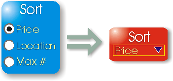
XForms provides an "appearance" attribute that can be
specified on all Form Controls. This provides an author with the ability to
provide a hint to the component responsible for rendering XForms Form
Controls. There are three pre-specified values: full; compact; minimal; and
an ability for an author to define their own value but with no pre-specified
meaning.
The attribute does not specify what exactly is to be
rendered but is merely a hint. The XForms <select1> control is a good
example to consider. The following are an explanation of how the hints should
be interpreted for this control:
- Full
- The entire set of alternatives that the user is to choose from should
be presented simultaneously to the user. On a personal computer browser
this could be represented as radio buttons.
- Minimal
- The smallest number of alternatives that the user is to choose from
should be presented simultaneously to the user and they should be
provided with a method to explore the other alternatives. On a personal
computer browser this could be represented as a drop down list.
- Compact
- A subset of alternatives that the user is to choose from should be
presented simultaneously to the user and they should be provided with a
method to explore the other alternatives. On a personal computer
browser this could be represented as a list box.
To enable support for the wide variation in the output
capability of different delivery contexts, it is necessary to be able to
provide a variety of different layouts. Variations in the size and aspect
ratio of displays, for example, can mean that a different physical layout is
required to support a harmonized user experience.
The DIWG Authoring Challenges specify the following
requirement for layout.
DIAC-4.3: Layout: Authoring techniques that support DI should
provide mechanisms that allow authors to express the layout of material
that varies between different devices with different delivery contexts. In
particular, they should support different spatial and temporal layout of
material.
Although it is possible to arrange for explicit
representations of layout using commonly available technologies, such as
XHTML and CSS, it is unusual to find such an approach being used in current
web sites. This section covers the basic principles associated with explicit
provision of layout, and examines a number of current techniques.
6.1 Principles
The basic principles of using explicit layouts are the
same as those for any properties that may vary between delivery contexts.
First, there must be an explicit representation of the properties, in this
case the layouts. Second there must be a method by which the layout can be
referenced in a manner that is independent of the delivery context.
6.1.1 Explicit
Layout Representations
The kind of information needed for an explicit layout is
information that will allow the basic differences between delivery contexts
to be taken into account. For example, one of the major differences between
delivery contexts for display devices is the number of pixels that can be
used. Another is the aspect ratio.
Layout representations typically divide the output into a
number of areas in which content can be placed. An individual area might
contain a single piece of content, such as an image, or a large amount of
content, such as several paragraphs of text. These areas are not limited to
representing spatial display. Some systems allow them to represent temporal
information allowing control over spoken output, for example.
6.1.2
Mapping Content to Layout
To make use of an explicit layout representation there
must be a way to assign content to particular areas of the layout. Current
techniques make use of direct references from the markup that defines the
content to the layout representation. These references use names. Areas in
the layout have some unique name or ID. The content to be assigned to a
particular area references it using that name or ID. Where multiple pieces of
content reference the same area, simple rules define the ordering of output
within the area. Usually this is based on the order in which the references
are encountered within the content.
6.2 Using CSS for Explicit
Layout
CSS is able to provide the basic functions referred to in
DI Principles. For example, it is possible to associate size and position
information with, for example, <div> elements, with particular IDs, in
a style sheet. By using <div> elements with those IDs when authoring
content, material can be targetted to a particular place in the layout.
6.2.1 CSS Media Queries
The ability to associate subsets of a style sheet with
particular properties associated with a device makes it possible to have
several versions of the <div> styles in a single sheet and to select
the one most appropriate.
6.2.2 Device
Dependent Stylesheets
Current capabilities for selecting different styles from
within a single CSS are rather limited for general use in device
independence. However, systems with specialist adaptation mechanisms, which
can select between different versions of entire style sheets, exist and could
be employed to give greater control. Some commercial systems are capable of
this kind of adaptation of style sheets.
6.3 Using SMIL for Explicit
Layout
SMIL 2.0 includes an explicit layout notion based on its
<layout>, <root-layout> and <region> elements. SMIL
contains a number of layout modules for specific types of rendering,
including multi-window visual display and audio display. As such, it is a
good example of the ability of layouts to represent both spatial and temporal
information.
The following example illustrates how two pieces of text
can be positioned using SMIL:
<smil xmlns="http://www.w3.org/2001/SMIL20/">
 <head>
  <layout>
   <root-layout width="320" height="480" />
   <region id="a" top="5" bottom="100" />
   <region id="b" top="200" bottom="280" />
  </layout>
 </head>
 <body>
  <text region="a" src="text.html"/>
  <text region="b" src="additional_text.html"/>
 </body>
</smil>
|
The layout defines two regions within a root-layout. The
size of the root-layout determines the physical size of the displayed
material, in this case 320 pixels in width and 480 pixels in height. Within
this root-layout two regions are defined. Both are the full width of the
root-layout. The first starts 5 pixels below the start of the root-layout.
The second starts 200 pixels below the start of the root-layout.
The <body> element within the example defines two
<text> elements. Each of these assigns text to one of the regions in
the layout.
There is a clear logical separation here between the
information in the layout and the way content is mapped to it. If the layout
is modified, the final presentation can be varied without the content being
changed. Similarly the content can be changed without affecting the layout.
Only the id of the <region> element links the content with the
layout.
Currently, it is possible for an implementation of SMIL to
have its own mechanism for allowing different versions of a layout to be
associated with some context attributes, and a mechanism to support custom
attributes, thereby providing the means to use delivery context data.
In conjunction with a server side adaptation that, for
example, constructs the SMIL markup from definitions of content and an
appropriate layout, this markup shows nearly all of the characteristics
needed for support of multiple delivery contexts.
6.4 Existing Layout
Techniques
Implementation details of several layout techniques are
outlined in an accompanying Submission document [ATSub].
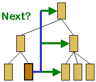
7.1 Ordered
Delivery
An author will wish to have control over the order in
which parts of the content are delivered, typically to reflect dependencies
within the content. Structures with a natural order can define a traversal of
the content. Typically these structures will have a well-defined origin,
which is important to identify the entry point. Of less importance is an exit
point in the structure, since most usage patterns do not require a specific
exit procedure.
The use of links to the next, and previous, content
relative to the most recently delivered content can facilitate navigation of
linear and hierarchical content structures. Several Web site authoring tools
will automate the creation of these navigation aids. Many browsers maintain a
navigation history that is accessible to client-side script, with which the
author may provide a "Previous/Back" linking feature.
In more complex situations (e.g. e-commerce Web sites) the
determination of the "Next" page is done by an application using session
information. The author would employ a workflow approach to enable the
application determine the order of delivery. Such techniques are beyond the
scope of this document.
7.2 Selection
Techniques
Selection techniques solve the problem of choosing from
the available fragments of content to create a presentation for the user.
Selections are typically based on matching certain characteristics of the
delivery context to features of the content fragments. Below are examples of
established selection techniques and the technologies that employ them.
7.2.1 SMIL <switch>
Element
The Synchronized Multimedia Integration Language (version
2.0) [SMIL 2.0] allows authors to create interactive
multimedia presentations. Authors can describe the temporal behavior of a
multimedia presentation, associate hyperlinks with media objects and describe
the layout of the presentation on a screen.
In SMIL, the <switch> element enables an author to
specify a list of alternative elements, selected according to Boolean tests.
The first acceptable element in the list is chosen. A default selection can
be defined as the last element in the set by having no constraints, as
illustrated below.
<smil:switch>
  <html:img
    src="bigColorImages/logo.gif"
    title="Company logo"
    alt="logo"
    smil:systemScreenSize="768X1024" />
  <html:img
    src="smallMonoImages/logo.gif"
    title="Company logo"
    alt="logo"
    smil:systemScreenSize="160X160" />
  <html:img
    src="defaultImages/logo.gif"
    title="Company logo"
    alt="logo" />
</smil:switch>
|
SMIL test attributes are permitted outside <switch>
elements, though this usage does not permit selection from a set of
alternatives, nor does it support the concept of defaults.
7.2.2 CSS Media Queries
CSS Media Queries [Media
Queries] is a W3C Working Draft to enhance the @media rules of CSS and
the "media" attribute in HTML. Using a Media Queries expression, it is
possible to select a stylesheet based on context properties. The recognized
set of properties covers a small range that includes size, resolution, type
of device and color capability. The following example illustrates the
selection of a style sheet based on the device type:
<link
  rel="stylesheet"
  type="text/css"
  media="handheld"
  href="portabledevice.css"
>
|
Here is a another expression as it would be represented in
CSS:
@media screen and (max-device-width: 300px) {
  @import url(narrowwindow.css)
}
|
Media Queries avoids the escaped versions of characters
"<", ">" and "&" in expressions by using "min-" and "max-"
prefixes. It also uses "and" for conjunctions, and "," for disjunctions. This
makes the expression syntax easier to read, which is important if the
expressions are to be hand-crafted and later read by humans (possibly for
maintenance purposes). With the increasing use of authoring tools, this
"legibility" feature of the expression language may become less important.
It is generally assumed that the Media Queries expressions
will be processed by the client. This does not preclude the processing of
Media Queries (and CSS in general) at some other point in the delivery path,
such as in an intermediate system or in the origin server itself.
Unfortunately, Media Queries is limited and inextensible
in its current form and is therefore suitable only for simple multi-device
solutions.
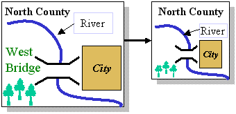
7.2.3 Layouts
A layout is a structure containing references to content
fragments. Selection of fragments based on layouts usually involves two
steps. The first step is to select the appropriate layout, based on context
information. The second step is to populate the layout with fragments of
content. This can be achieved by (indirect) references to fragments in the
layout itself, or by a separate process that maps content fragments to
portions of the layout. The process is similar to the well-established
mail-merge operations of popular office automation solutions.
7.3 Incremental
Refinement
In incremental refinement, the set of possible subsequent
"pages" of content is reduced each time the user follows a step within the
navigation structure. After a number of navigation steps, the user has
focussed on a specific subset of the content and no further refinement of the
selection is necessary or possible. Informally, this may be viewed as a Zoom
in/out feature.
8.1 Aggregation
Aggregation is the process of bringing together Authored
Units from one or more sources to form a single fragment. Aggregation may be
executed at the time of authoring, during adaption, or by the client. An
authoring solution that supports aggregation must provide the author with the
means of expressing which content fragments will be aggregated, and/or of
expressing the process by which the content fragments will be selected for
aggregation.
Since individual content fragments contain structure of
their own, the aggregation of such fragments will inevitably produce a new
structure. Any factors that influence aggregation may therefore be used to
vary the structure of content, especially if these factors are determined by
the delivery context.
Implementations of the aggregation technique include:
- Inclusion Mechanisms (XInclude, Server-side Include (SSI), JSP Include,
etc.)
- Media References (HTML <img> and <object> tags)
8.2
Decomposition
Decomposition is the act of dividing up one or more
authored units to create a set of perceivable units appropriate for a
particular delivery context. An authoring solution that supports
decomposition must provide the author with the means of expressing how the
authored units will be divided, and may necessitate a means of referencing
the individual perceivable units thereby produced.
Decomposed content has a significantly different structure
to the original content from which it was derived. This has implications for
the manner in which the content is navigated, and possibly for linking to or
within the content.
8.2.1 Pagination and
Page Numbers
One form of decomposition commonly known as "pagination"
occurs when the original content is linear in structure and is divided into
an ordered sequence according to a simple quantitative rule. The ordered
sequence permits the end user to select any page at random, though the
preferred selection is indicated by the order of the sequence. Examples of
pagination include:
- Paper pages
- Delivery of content to a printer is an instance of pagination where
the quantitative rule depends on the size of the paper and the amount
of paper required to render the content.
- Tabbed pages
- In a tabbed presentation, several pages are available to the user.
The user determines which one is visible by selecting a (named) tab in
a menu composed of tabs. This visualisation is popular because of its
similarity to tabbed pages in physical (paper) filing systems.
- "Wizards"
- A wizard is typically a form comprising sub-forms whose order of
completion is determined by dependencies within the form. The size of
any sub-form depends on the semantic relationships between the elements
of the form and the available space for presentation. The user is only
permitted to progress to the next sub-form when the input requirements
of the current sub-form are satisfied..
Each "page" of a pagination could be referred to by its
sequence number (e.g. Page 5 of 12) but the author cannot know these sequence
numbers in advance. Thus it would be inappropriate for the author to say "see
Page 5" because in different pagination contexts the same content may be
rendered on a page other than the 5th.
A solution is to permit the author to make references such
as "as mentioned X", (X being a named anchor) which may subsequently
be rendered as "as mentioned in Page 5" in pagination contexts, or
perhaps "as mentioned in Section 4.2" in a section-based decomposition
context or "as mentioned here" where the "here" is rendered as
a hyperlink in non-decomposition contexts. Ensuring the link is compatible
with the surrounding text can be achieved through simple heuristics (e.g.
deciding when to prefix the reference with the word "in"). The use of a
phrase such as "click here" would avoid this issue but would not be in
keeping with accepted Web accessibility guidelines.
Several pagination solutions are available to authors,
including the many technologies from the Desktop Publishing and Word
Processing domains, and markup technologies such as XSL Formatting Objects
(XSL-FO) [XSL chapter 6]. In the case of XSL-FO, a
"page-master" element describes the shape and orientation of the page(s), and
a "page-sequence" element contains the content that flows into the pages
defined by the page-masters. A "page-sequence-master" element determines the
order in which page-masters are chosen. A "simple-page-master" element can be
used on its own to produce a sequence of pages from a flow of content such
that each page has similar dimensions. This is the most simple approach to
pagination, and the discussion below will assume this simple approach of
using equally sized pages.
8.2.2 Author
Influenced Decomposition
Decomposition is an unavoidable necessity when the client
is incapable of rendering the entire content. Knowing that decomposition is
likely, authoring techniques exist that give the author the ability to
influence or control the decomposition. Among these techniques are:
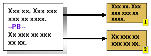
- Page Breaks
 |
This technique is common in word-processing solutions. The
author inserts a mark, typically after a paragraph of text, to
indicate that this is an appropriate place to divide the text.
The insertion of such a mark, and its position, can be made
conditional on contextual information (e.g. page length). Fixed
and optional page breaks can be supported by letting an
adaptation system interpret existing separator elements such as
<hr>. Alternatively, page breaks (such as the conditional
"before start of new chapter" break) may be indicated explicitly
by the author (e.g. XSL-FO). |
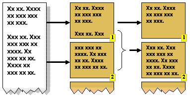
- Widow/Orphan Control
 |
This is another word-processing technique in which a style is
applied to the text such that paragraphs are divided so as to
avoid leaving a single line on a page, separate from the rest of
the paragraph. A "widow" is a division of N lines into 1 line on
one page, followed by N-1 lines on the next page. An "orphan"
occurs when the split is N-1 lines on the first page and 1 line
on the next page. Avoiding these is possible when there are more
than 3 lines in the paragraph, though it may result in a page not
being completely filled with text. |
- "Keep Together" and "Keep With Next"
Another word-processing style that requires that paragraphs
are not divided, and are not separated from their subsequent
paragraphs. "Keep Together" is applied to paragraphs. "Keep With
Next" is typically applied to headings. An adaptation system
could use custom styles, as per CSS, to support this pagination
feature. This feature is present in XSL-FO in the form of the
"keep-with-next" and "keep-with-previous" properties of the break
element.
|
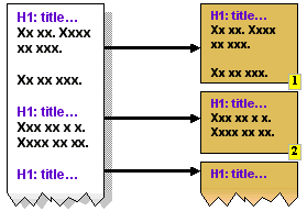
- Sectioning
 |
The author uses headings to identify sections within the
content. Decomposition can then be applied using the headings as
division points. The <hn> tags in HTML are typical
candidates for decomposition via sectioning. The (sub)section
titles also provide useful text for links to each section, for
example in a Table Of Contents. Unfortunately, this approach does
not fit with XML or DOM approaches since the identified sections
do not correspond to any identifiable sub-tree within the
document markup hierarchy.
XHTML 2.0 explicitly supports this concept through its
<section> element, and this will identify document
sub-trees. |
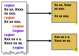
- Regions
 |
A region is a subset of the content identified by a starting
mark and an ending mark. In XHTML, the <span> and
<div> tags can be used to identify regions. Decomposition
involves extracting regions from the content. The "id" attribute
can uniquely identify fragments within a document. Since regions
may be nested, this approach permits varying sizes of region to
be selected, according to the rendering limits of the client.
|
8.3 Associated
Adaptation Techniques
Adaptation techniques associated with the authoring
techniques in this section include the following: (More details may be found
in Appendix B.)
- Decomposition
- Dividing the original content into smaller parts to accommodate
limited display capabilities.
- Navigation Generation
- The automatic creation of navigation aids to support dynamically
structured content.
Navigation is an essential part of any content delivered
to the end user. It enables the user to consume the content in the order
intended by the author, and to locate parts of the content whenever
necessary.
Navigation may be created explicitly by the author,
generated under the influence of the author, or generated completely
automatically. Typically, navigation links within raw content (e.g. paragraph
of text) are placed there by the author. Menus and "site-wide" navigation
features can be automated because the links are usually determined by the
structure of the site and not by the content of the individual resources.
Nevertheless, the author may wish to exert some influence over how much
navigation is generated (e.g. nearest-neighbor linking, or site-wide random
navigation) and how it is presented (e.g. static list of hyperlinks, or a
client-side interactive mechanism).
9.1 Linking
Links provide the user with the means of moving from one
presentation unit to another, or to positions within these presentation
units. The hyperlink is the most common form of link, typically rendered as a
highlighted part of the content that responds to an event (such as a mouse
click) by navigating to the target of the link.
Adaptation of the original content to suit the delivery
context can have considerable effects on linking. For example, links within
the same (original) page may, through decomposition, become links between
different pages.
9.2 Authored
Navigation
The easiest, though least flexible, approach to navigation
is to let the author create it. The following navigation features can be
utilized by the author:
- Hyperlinks (navigable anchors within content)
- A hyperlink is an embedded reference to a resource, or a part
thereof, that is followed in response to an event (typically
user-initiated). The problems of link maintenance are well understood
but device independent authoring of links is less understood. Consider
the simple choice of authoring a link to a help resource: one may write
"For assistance please consult our help desk" where the
consult is the anchor. In contexts where display space is at a
premium, the link may be better written as the shorter - though less
informative - "Help". Further complexities are encountered when
the targets of the links must vary according to context. For example,
links to subsections of a single document on a large browser may be
links to separate pages when presented on a small device.
- Menus (navigable anchors surrounding content)
- Menus are a structured collection of links, commonly presented as a
hierarchy. The hierarchy relates to the structure of the collection of
resources being made available to the end user. A menu is placed
outside of the main content and may be used for random access to
related resources. It is possible (and likely) that the structure of
these resources will change in response to different contexts,
necessitating the creation of different menus. Menus may be presented
as stylized (e.g. indented) lists of links, or dynamically with the aid
of client-site processing such as embedded scripting.
- Access Keys (shortcuts to navigable anchors)
- An access key is an event associated with a link within the current
presentation. The event is generated by a single action involving a
keyboard or number pad. This makes the feature very dependent on the
client hardware and possibly unsuitable for authoring. However, it may
be generated as part of an adaptation process. It is desirable for
ease-of-use (e.g. for devices with limited keyboards) and for some user
accessibility requirements (e.g. users with limited manual
dexterity).
9.3 URI
A URI should be interpreted as a reference to a resource.
It is possible that this single resource will have multiple representations,
according to the presentation capabilities of the access mechanism and other
contextual factors. It is possible that the same URI will produce different
content, though this is not the same as saying that the associated resource
has changed.
For example, a web page URL (a specific form of URI)
offering the current weather forecast will obviously offer varying content
according to when you use the URI, but there is no doubt that the URI always
refers to the same resource, as implied by "current weather
forecast".
One can extend this example to say that the URI will offer
different representations of resources, according to the device being used to
access it.
9.4 Navigation Tools
There are several tools at the disposal of the author,
some of which are described below.
9.4.1 HTML Linking
The standard HTML linking mechanism is the anchor tag,
<a href="url">...</a>, which has been a key feature of the
Web since its inception. It identifies a region of the content that, when
selected by the user, will cause the browser to load the content referenced
by the href attribute. The simplicity of this mechanism ensures that
creating webs of content is easy to achieve.
The original linking mechanism has its deficiencies. For
example, the original link did not clearly indicate the relationship to the
linked content, despite the availability of a 'rel' attribute. The lack of a
formal definition for link relationship (versus the informal proposals that
were offered) meant that the 'rel' attribute was almost never used. Links can
only be in one direction. Links can reference named anchors in the target,
but cannot reference arbitrary locations or regions within the target. There
is no provision for error handling. The type of the referenced target cannot
be identified. (This feature was subsequently introduced in HTML 4.) The
limitations of HTML linking have led to alternative linking mechanisms, some
of which are described below.
9.4.2 XLink
The XML Linking Language [XLink]
allows elements to be inserted into XML documents in order to create and
describe links between resources. It uses XML syntax to create structures
that can describe links similar to the simple unidirectional hyperlinks of
today's HTML, as well as more sophisticated links. It is a key component of
many XML technologies.
9.4.3 XPointer
The XML Pointer Language [XPointer] is the language to be used as the basis for
a fragment identifier for any URI reference that locates a resource whose
Internet media type is one of text/xml, application/xml,
text/xml-external-parsed-entity, or
application/xml-external-parsed-entity.
Note: The design described in previous versions of
XPointer has been factored into a basic framework (http://www.w3.org/TR/xptr-framework/)
which defines XPointer schemes and simple "barename" fragment identifiers,
and three additional schemes: http://www.w3.org/TR/xptr-element/,
for addressing elements by their position in the document tree, http://www.w3.org/TR/xptr-xmlns/,
for binding namespace prefixes to namespace name and http://www.w3.org/TR/xptr-xpointer/,
for full XPath-based addressing.
9.4.4 HLink
HLink provides XHTML Family Members with the ability to
specify which attributes of elements represent hyperlinks, and how those
hyperlinks should be traversed, and extends XLink use to a wider class of
languages than those restricted to the syntactic style allowed by XLink.
9.5 SMIL Interaction
SMIL supports interaction concepts that go beyond those
offered by HTML. In particular, hyperlinking has been extended to support
temporal anchors:
- Timed navigation links that are only accessible during certain periods
of the SMIL presentation.
- Ability to navigate to a "point in time" of a presentation. This is
facilitated via anchors that are placed in a presentation (e.g. a video).
The SMIL 1.0 anchor tag has been replaced by the SMIL 2.0 area tag. (See
http://www.w3.org/TR/smil20/extended-linking.html#edef-area
)
<smil:video
 src="/videos/sample"
 region="video"
 title="Sample presentation"
 alt="Just another sample video sequence"
 abstract="A 30 second two-part talking head sequence"
>
 <smil:area id="woman" begin="0s" end="15s" title="Woman talking"/>
 <smil:area id="man" begin="15s" end="30s" title="Man talking"/>
</smil:video>
|
This feature provides a new dimension for authoring and
adaptation. For example, temporal anchors open up possibilities for
decomposition so that long verbal/visual presentations can be divided into
smaller parts according to author-identified boundaries.
Timed links enable the author to present navigation
options that are relevant to the presentation context. Since only a subset of
all of the available links need to be accessible at any given moment, this
feature reduces the need for screen space (or access keys) for links, which
is an important consideration for small devices.
10.1 Forms
During the design of XForms a great deal of effort was
devoted to making the User Interface part of XForms device independent.
XForms User Interface Form Controls are abstract in nature and defer the
actual appearance to a combination of the XForms Processor (which should
depend on the device) and styling. As an example XForms defines a
<select1> form control. The control is intended to specify that the
user is to choose exactly one item from a set of alternatives. The selection
of which widget (visual representation) to render is determined by the
processor on the target device, possibly influenced by a style associated
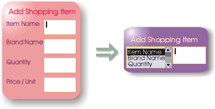
with the form control. Adaptation of form controls is illustrated in Appendix
B.2.2.5
10.1.1 Authoring a Form
A Web Page may contain more than one form. The presence of
one or more forms in a Web Page will not introduce any additional
difficulties into the adaptation process of pagination unless the need arises
to split a single form.
Forms are often complex entities that include
relationships between the various parts of the form. For example, forms that
are used for making travel arrangements often include a departure
field and a return field. A constraint is normally specified that
the departure must be earlier than return. In XForms this
would be accomplished with a model item constraint determined by the author.
With HTML forms this would have been implemented with some form of
script, requiring the author to be a skilled programmer.
10.1.2 Decomposition of a
Form
The two parts of an XForms form need to be considered
whenever decomposing a Web Page that includes XForms. In the simple case
where a form will not be split then both the <model> (which in XHTML is
part of the <head>) and the form controls (which in XHTML is part of
the <body>) need to be copied.
If the only consideration for decomposition is the user
experience then there are no particular difficulties in splitting a form such
that it spans multiple Perceivable Units within a single
Delivery Unit.
The problem gets considerably more difficult if it becomes
necessary to split a form into more than one Delivery Unit. A general
solution does not yet exist but would need to cater for the dependencies that
can exist between the different parts of a form, particularly interfield
constraints and event handling.
If a form (either XForms or HTML) cannot be automatically
adapted then changes will need to be made to the specific Web Page. This may
include the author creating alternative versions of the form which are
compatible with the constraints of the devices. Some changes may be cosmetic,
e.g. reduction of white space. Some are more fundamental and involve
redesign, e.g. removal of less important components. However, it is not
possible to "compress" a form ad infinitum, so at some point one must
consider splitting the original form into a collection of smaller forms, such
that the semantics of the collection is equivalent to the original single
form.
10.2 Interaction
Session
A session is a sequence of interactive steps that
influence an information state (context) that persists between each step in
the sequence. A session is typically initiated by an initial request from an
end-user, and each subsequent step comes from further requests from the same
end-user. These subsequent requests are a result of the responses sent to
previous requests.
Sessions play an important role in web-based applications.
They enable a service to have a dialogue with the end-user while being able
to accumulate information during the dialogue. The accumulated information
may relate to security and authentication, to user preferences and to
requests for specific services (e.g. financial transactions).
Many session mechanisms rely on cooperation from the
client application (browser) to maintain sessions. The server will create a
unique key to represent the session and will rely on the client to supply
this key in all subsequent requests. In HTTP, the key is conveyed via
cookies.
Alternative client devices must provide similar session
support mechanisms to ensure that services can be offered via these devices.
If HTTP cookies are not available in the client device, an intermediate
(proxy) may supply this functionality, as illustrated in WAP. If cookies are not supported in the delivery path,
then alternative means must be used to support the session keys. These
alternatives include URL rewriting, where the session keys are embedded into
the URLs of any links within the page delivered to the client. Selection of
such links ensures that the key is returned to the server in subsequent
requests.
Where possible, the session mechanism is hidden from the
author, who only needs to be assured of the existence of a session context in
order to proceed with subsequent stages of the service delivery. The author
can deal with the context as an abstraction. Popular technologies such as JSP
and ASP incorporate the context as a server-accessible object without
exposing the author to the details of the mechanism.
11 Authoring
Techniques Workshop
The DIWG Charter required that the DI Working Group hold a
public workshop on authoring techniques. This took place in September 2002
and the main points are summarized in this section. A detailed account of the
workshop can be viewed on-line [DIATW].
11.1 Results of the
Workshop
A number of important results were obtained from the
workshop, including insights into the following:
- The roles and importance of sub-document fragments.
- The concept of content layouts, separate from the actual content.
- The independence of URIs.
- The role of CSS in Device Independence.
These are summarized in the following subsections.
11.1.1 Fragment (Authoring
Unit)
A common theme at the workshop was that of a "fragment of
content", though this concept was expressed via many different names and
definitions. It is generally agreed that there needs to be a definition for
something that is less than a document, and there needs to be a set of
properties, structures and operations surrounding this less-than-document
concept.
Among the alternative names for "authoring units" proposed
by the attendees were "Content Block", "Pane" and "Group".
11.1.1.1 URIs for Authoring
Units
An authoring unit should be capable of direct addressing
so that it can be referenced by external documents or processes.
11.1.1.2 Recursive
Definition of Authoring Unit
An authoring unit may comprise other authoring units.
(This raises a potential nomenclature problem: the concept of "unit" does not
permit further division.)
11.1.2 Layout
Generally, a layout is a structure that determines how to
process a collection of content fragments together to present a single
document. The process can be influenced by adaptation.
11.1.3 Single URI
A resource, referenced by a single URI, should (where
possible) be independent of the device or the context in which the resource
is made available to the end-user. A resource is not to be confused with the
concept of a document. For example, a resource could be "today's weather
forecast". On some devices this would include a textual description and some
maps, while on other devices only the text might be available. Nevertheless,
the same URI is used in each case. The text fragment may in fact be the same
fragment in all cases, as may the graphic fragment, but not all fragments are
appropriate to the context.
11.1.4 Role of CSS
The assumption that CSS is processed on the client was
challenged. While it would appear that CSS was designed to be executed by the
browser, it is clear that practitioners in the mobile Web technologies feel
that server or intermediate processing is as important.
11.2 Authoring
Technology Identified by the Workshop
The following is a summary derived from position papers
submitted by workshop participants: Covigo, MobileAware, Volantis, NTT
DoCoMo, and HP. It includes conclusions for the DIWG's work on Device
Independent Markup. Presentations by some participants included knowledge
from commercially available implementations.
11. 2.1 Commonalties of
Approaches
The broad range of solutions presented and discussed at
the workshop revealed a number of common approaches to Device Independence,
some of which are incorporated into commercially available products.
11.2.1.1 Separation of
Content, Layout and Style
All the approaches provide a separation of content,
layout, and style.
This is not just a good practice even for conventional
website authoring, but offers additional benefits for DI authoring. The
separation of these three domains allows the adaptation mechanisms to combine
content, layout, and style in a flexible manner. A prerequisite for this is
that the author can express choices, at least for layout and styles. How the
combination of content with sets of layouts and sets of styles is performed,
and how much of that combining process is under the control of the author, is
an extra topic.
Two important aspects need to be associated with the units
of content to support the selection and layout of these units:
- Scope
- The adaptation mechanism needs to know the maximum scope of a content
unit. Scope in this context means the boundaries within which a content
unit can be rearranged. Examples for denoting this are <canvas>
or <head>.
- Smallest unit
- The adaptation mechanism also needs to know the content unit,
which must not be split or distributed across different cells of a
layout. One submitter expressed the concept via an attribute called
"split-ability".
11.2.1.2 Association of
Style at Top Level
Most submitters associate style (or sets of styles) with
content using a top-level element, such as <head> or <canvas>.
This is straightforward, since the author normally likes to apply a uniform
style to the entire website.
11.2.1.3 Media References to be
Replaced by Media Sets
Media are typically resources such as images, audio files,
animations, which are normally inserted in a web page by a reference
mechanism. Since the media needs to be well suited for a particular device or
class of device, most implementors offer a choice of media. The available
selection of media is however not listed directly in the content section of
the DI document, but only referenced in the content section. Regarding the
media selection list itself, implementors invented diverse constructs to
associate the individual media with properties which help the adaptation
process in choosing the most appropriate one.
A significant difference in the approaches is the type of
(meta-)data associated with the media. Some describe the media properties
(size, resolution, etc.), some describe the suitability of a particular media
for particular (classes of) devices. The latter alternative is easier to
process for the adaptation engine, but creates dependency on the
classification of devices, which may change over time. In the latter case,
the author also needs to know what media are suitable for what devices.
11.2.1.4 Layout
Hierarchy
Separated from content, all submitters provide means to
specify layout in the form of a hierarchy. In conventional HTML authored
documents, layout is most often expressed through (nested) tables. A DI
authoring system needs a similar way to arrange content on a page, but in
more flexible way, so that the adaptation process can rearrange the cells of
a table layout matching the device's display properties. Most authors choose
to invent new markup to express re-arrangeable units of content.
11.2.1.5 Inclusion and
Exclusion
All submitters mention the need for a mechanism to
conditionally include or exclude sections of content. However, they are not
very specific about how to express the conditions. Technologies to fill that
gap may be XInclude, XLink, or SMIL (Media feature sets). This can be
considered as a generalization of Media References (mentioned above). Most
implementors use different mechanisms for inclusion of media versus inclusion
of other content. The topic is also related to aggregation in the context of
portals. The adaptation mechanism needs hints when to include or exclude
content. This leads to the question of how to express conditional inclusion /
exclusion and what range of conditions is needed.
11.2.1.6 Sequence of
Adaptation Steps
Most submitters agree that adaptation should occur in the
following sequence:
- Content Assembly
- This means the inclusion or exclusion of content according to hints
given by the author matched against the actual delivery context,
followed by a proper arrangement of the content units on a screen
(voice neglected here). It could involve two separate steps.
- Decomposition (Pagination)
- If the previous step leads to oversize layout for a target screen,
splitting up into sequential pages is required. This step needs
information about the smallest units and automatic insertion of
additional navigation to allow the user to step through the fragmented
page.
- Optimization
- Optimization consists of adapting the layout generated by the two
preceding steps to the properties of a device by transforming tables
and lists into the most appropriate representation. It may also be
necessary to transform controls and links.
11.2.1.7 Use of CSS for
Styling
All submitters assume CSS for styling. This is natural
since it is the technology that is most progressed and can also include
device-dependent hints. One participant mentioned that server-side CSS
processing may be needed to feed devices which don't understand CSS. From a
consistency and technology point of view, it would be preferable to use
XSL:FO instead of CSS, but industry did not follow this route and DI
authoring systems need to be compatible with today's environment.
11.2.2 Impact on
Markup
Submitters emphasize that new markup was needed to express
the semantics sketched in the preceding subsection, but they also emphasize
that the amount of additional markup should be minor and compatible with
existing markup.
The question is one of deciding which body of markup to
use as a basis for additional markup. Most authors seem to rely on XHTML
Strict.
One view expressed at the workshop was for the DIWG to
base its work on the (then current) XHTML 2.0 Working Draft, which has the
disadvantage of being incompatible with previous XHTML versions, but the
advantage is that XHTML 2.0 contains many features which can be extended for
DI authoring.
Below is an examination of how markup used by the
submitters in their implementations could be replaced by XHTML 2.0 markup.
11.2.2.1 Association of
Styles
Since association of styles should happen at top level,
the <head> or <body> element could be extended either by
appropriate attributes or by a sub-element taken from XLink or XInclude.
11.2.2.2 Units of
Content
Consider the following possible, though not official,
enhancement to XHTML. A nestable element of XHTML 2.0 called <section>
could be the element that denotes a unit of content. Whether this unit is
permitted to be further subdivided might be expressed by a new attribute
"splittable". To assist the adaptation process, such a unit of content needs
many more attributes such as:
- Relevance (could be "optional", "mandatory", or a range of numeric
values)
- Distance (numeric value to identify how far apart the layouting process
may drag the units
- Splitability (yes or no, to indicate if the content is splittable)
- Suitability (to denote the suitability of this unit for specific
devices, device classes or modes)
- Navindex (taken from XHTML 2.0, to support navigation).
Since these enhancements would only be used during
authoring and adaptation, and not delivered directly to the client, they
would not adversely affect any devices that support XHTML 2.0.
11.2.2.3 Alternative
Inclusions and Exclusions
Regardless of whether a choice of media is needed to allow
flexible inclusion, or a choice of content units, some markup is required to
express the selection possibilities. The markup should be usable for choice
of media and choice of other content to be included. Most authors invented
their own markup, but XLink, XInclude and SMIL need to be looked at first.
XML Schema also provides elements such as <choice>.
Beyond a basic choice statement, the set of expressible
conditions need to be determined. In particular one must be clear whether the
conditions should be based on properties of the content (special case: media)
or on the delivery context or on both.
11.2.2.4 Application of
Layouts
Some authors have invented new markup to express the
application of layouts, though conventional table markup may be suitable (at
least as a base) for expressing arrangement of content units on a page. It is
likely that the table cells need additional attributes to provide hints to
the adaptation process. The same may be true for rows and columns. XHTML
offers only one table feature that may be used in adaptation: the
colgroup element, that can group related columns.
11.2.2.5 Association
of Content and Layout
Authors generally agree that content and layout should be
separately defined and associated in a most dynamic way. In current
implementations, this is done through referencing a separate section of the
DI authored document. The first question to be answered is whether layout
should reference content or whether content should reference layout, or
whether a bidirectional reference is needed. The second question to be
answered is whether XHTML 2.0 reference mechanism (which is actually HLink)
is suitable or whether XLink needs a closer look.
11.2.2.6 Passthrough of
Arbitrary Markup
One author mentioned the availability of markup that
encloses code to be passed though the adaptation process without any
modification. The primary purpose is to pass scripts to the client device.
Again, it needs to be checked whether this requires new markup or can be done
with constructs such as [CDATA]. In either case, it is a requirement that
adds some additional complexity.
11.2.2.7 Attribute
Modification
One author suggested a helper element that facilitates the
modification of any attribute of a preceding element. This is an
unconventional approach, but apparently can help avoid the redefinition of
existing markup.
11.2.2.8 Markup of
Input
One author mentioned new markup to express basic
interaction primitives. It was hoped that XForms would provide the needed
features. The necessary variation in the presentation of form input fields
(depending on delivery context) may be achieved by combining XForms with
conditional inclusion or exclusion as mentioned above. This would be
preferable to extending XForms with new attributes.
12 Conclusions
This Note has presented several techniques for device
independent authoring, all falling within a spectrum of classification
ranging from Single Authoring to Multiple Authoring, which in turn typically
serve as input to various forms of Adaptation.
Single Authoring is preferable because it improves
affordability by avoiding extra work, does not require device/modality
expertise, simplifies authoring tools, reduces maintenance overheads and
reduces storage overheads. There are cases where multiple authoring is
necessary, though the reasons for such necessity can vary and are not always
technical in nature.
Multiple Authoring techniques are generally to be avoided
because of the considerable list of disadvantages, including:
- It negatively impacts the affordability of device-independent
authoring.
- The author is required to do additional work in order to support
additional contexts. With the growing diversity of contexts this has
already become untenable.
- An author is required to be familiar with the technical requirements
(e.g. markup) of every context to which the content is offered.
- Authoring tools are required to be capable of supporting every
technology required of every supported context.
- Maintenance of content must be replicated across every version of the
content.
Several W3C Recommendations incorporate aspects of
Multiple or Flexible Authoring, such as selection in Media Queries and SMIL.
None of these features are sufficiently mature to fully support the growing
demands of device diversity, though the trend is towards supporting
independence of the device while adding contextually sensitive features.
Adaptation is equally challenging. We can already see some
of the necessary adaptation tools in XSLT (transcoding), XSL-FO (flow and
pagination) and XForms (context-aware presentation). One key to successful
adaptation is awareness of context. To this end, technologies such as CC/PP
will play a vital role.
Device Independence can be achieved through a combination
of the following intertwined features, which hopefully will be increasingly
present in future W3C Recommendations:
- Context Awareness, described through delivery/document properties.
- Independent Authoring, which is Single or Flexible as appropriate.
- Adaptation, through novel processes.
- Appendices -
- Authoring Challenges (AC)
- Device
Independence Authoring Challenges, Rhys Lewis, Oct 2002. W3C
Working Draft available at
http://www.w3.org/TR/2002/WD-acdi-20021018/
- Authoring Techniques Submissions
- Submissions to DI Public Mailing List (www-di@w3.org) relating to Authoring
Techniques. List of submissions available at
http://www.w3.org/2001/di/submission.html
- CC/PP
- Composite
Capability/Preference Profiles: Structure and Vocabularies, Graham
Klyne, Franklin Reynolds, Chris Woodrow, Hidetaka Ohto, Mark H. Butler,
Nov 2002. W3C Working Draft available at
http://www.w3.org/TR/2002/WD-CCPP-struct-vocab-20021108/
- CONSENSUS
- European Commission
funded project IST 2001 32407 to create a single authoring tool
for mobile browsers. Details at http://www.consensus-online.org/
- CPC
- Core Presentation Characteristics. At the time of publication
of this document there is no public version of the CPC. Refer to the
Requirements. [CPCReq]
- CPCReq
- Core Presentation
Characteristics: Requirements and Use Cases, Markus Lauff, Amy
Yu, May 2003. W3C Working Draft. Latest version available at
http://www.w3.org/TR/cpc-req/
- CSS2
- Cascading
Style Sheets level 2, Bert Bos, Håkon Wium Lie, Chris Lilley,
Ian Jacobs, May 1998. W3C Recommendation available at
http://www.w3.org/TR/1998/REC-CSS2-19980512/
- CSS Mobile Profile 1.0
- CSS Mobile Profile
1.0, Ted Wugofski, Doug Dominiak, Peter Stark, 2001. W3C
Recommendation available at http://www.w3.org/TR/css-mobile
- DCO
- Delivery
Context Overview for Device Independence, Roger Gimson, 2002.
W3C Working Draft available at http://www.w3.org/TR/DI-DCO/
- DIP
- Device Independence
Principles, Roger Gimson, 2001. W3C Working Draft available
at http://www.w3.org/TR/di-princ/
- DIATW
- Device Independence
Authoring Tools Workshop organised by W3C Device Independence
Working Group and held at SAP University, St. Leon-Rot, Germany, 25-25
September 2002. Details at: http://www.w3.org/2002/07/DIAT/
- DIWG Glossary
- Glossary of Terms for Device Independence, Rhys Lewis, 2003.
This document uses definitions from the following generic version: http://www.w3.org/TR/di-gloss/
The Current W3C Working Draft is available at http://www.w3.org/TR/di-gloss/
- ECMAScript
- The
ECMAScript scripting language, (ECMA-262), 3rd Edition, 1999.
Details at
http://www.ecma-international.org/publications/standards/Ecma-262.htm
- Extensible Markup Language (XML)
1.0
- Extensible Markup
Language(XML) 1.0 (Second Edition), Tim Bray, Jean Paoli, C.
M. Sperberg-McQueen, 2000. W3C Recommendation available at
http://www.w3.org/TR/REC-xml
- Extensible Stylesheet Language (XSL) 1.0
- Extensible
Stylesheet Language 1.0, Sharon Adler, Anders Berglund, Jeff
Caruso, Stephen Deach, Tony Graham, Paul Grosso, Eduardo Gutentag, Alex
Milowski, Scott Parnel, Jeremy Richman, Steve Zilles, October 2001.
Recommendation available at
http://www.w3.org/TR/2001/REC-xsl-20011015/
- HLink
- Link
recognition for the XHTML Family, Steven Pemberton, Masayasu
Ishikawa, Sept 2002. W3C Working Draft available at
http://www.w3.org/TR/2002/WD-hlink-20020913/
- Media Queries
- Media
Queries, Håkon Wium Lie, Tantek Celik, Daniel Glazman, July
2002. W3C Candidate Recommendation available at
http://www.w3.org/TR/2002/CR-css3-mediaqueries-20020708/ (Status: CR
phase ended 31 Jan 2003)
- NewsML
- News Markup Language of
the International Press Telecommunications Council, version 1.1, Oct
2002. Details at http://www.newsml.org/
- SMIL 2.0
- Synchronized Multimedia
Integration Language, J Ayars, D Bulterman, A Cohen, K Day, E
Hodge, P Hoschka, E Hyche, M Jourdan, M Kim, K Kubota, R Lanphier, N
Layaïda, T Michel, D Newman, J van Ossenbruggen, L Rutledge, B
Saccocio, P Schmitz, W ten Kate, August 2001. W3C Recommendation
available at: http://www.w3.org/TR/smil20/
- W3C-DIA
- W3C Device Independence
Activity. Details available at: http://www.w3.org/2001/DI/
- W3C-DIA-Ch
- W3C
Device Independence Activity charter. Details available at:
http://www.w3.org/2002/06/w3c-di-wg-charter-20020612.html
- WAP 2.0 Specifications
- WAP 2.0
Specifications, Open Mobile Association specifications
available at: http://www.wapforum.org/what/technical.htm
- XForms 1.0
- XForms 1.0,
Micah Dubinko, Josef Dietl, Andrew Layman, Leigh L. Klotz, Jr., Roland
Merrick, T. V. Raman, 2002. W3C Working Draft available at
http://www.w3.org/TR/xforms/
- XHTML® 1.0: The
Extensible HyperText Markup Language
- XHTML®
1.0: The Extensible Hypertext Markup Language, Steven Pemberton, Murray
Altheim, Daniel Austin, Frank Boumphrey, John Burger, Andrew W. Donoho,
Sam Dooley, Klaus Hofrichter, Philipp Hoschka, Masayasu Ishikawa,
Warner ten Kate, Peter King, Paula Klante, Shin'ichi Matsui, Shane
McCarron, Ann Navarro, Zach Nies, Dave Raggett, Patrick Schmitz,
Sebastian Schnitzenbaumer, Peter Stark, Chris Wilson, Ted Wugofski, Dan
Zigmond, 2000 W3C Recommendation available at
http://www.w3.org/TR/xhtml1
- XHTML® Basic
- XHTML®
Basic, Mark Baker, Masayasu Ishikawa, Shinichi Matsui, Peter Stark, Ted
Wugofski,Toshihiko Yamakami, 2000. W3C Recommendation available at
http://www.w3.org/TR/xhtml-basic/
- XLink
- XML Linking Language, Version
1.0, Steve DeRose, Eve Maler, David Orchard, 2001. W3C
Recommendation available at http://www.w3.org/TR/xlink/
- XML Inclusions (XInclude)
- XML Inclusions
(XInclude) Version 1.0, Jonathan Marsh, David Orchard, 2002.
W3C Candidate Recommendation available at
http://www.w3.org/TR/xinclude/
- XPath
- XML Path Language, Version
1.0, James Clark, Steve DeRose, 1999. W3C Recommendation
available at http://www.w3.org/TR/xpath
XML Path Language, Version
2.0, Anders Berglund, Scott Boag, Don Chamberlin, Mary F.
Fernandez, Michael Kay, Jonathan Robie, Jérôme Siméon, 2003. W3C
Working Draft available at http://www.w3.org/TR/xpath20/
- XPointer
- XML Pointer Language, Version
1.0, Steven DeRose, Ron Daniel Jr., Paul Grosso, Eve Maler,
Jonathan Marsh, Norman Walsh, 2002. W3C Working Draft available at
http://www.w3.org/TR/xptr/
- XQuery
- XML Query Language, Version
1.0, Scott Boag, Don Chamberlin, Mary F. Fernandez, Daniela
Florescu, Jonathan Robie, Jérôme Siméon, 2003. W3C Working Draft
available at http://www.w3.org/TR/xquery/
- XSL Transformations (XSLT)
- XSL Transformations
(XSLT), James Clark, 1999. W3C Recommendation available at
http://www.w3.org/TR/xslt
- XSL Transformations
(XSLT) Version 2.0, Michael Kay, 2002. W3C Working Draft
available at http://www.w3.org/TR/xslt20/
-
B Adaptation
Techniques
This appendix covers the adaptation techniques upon which
the various authoring techniques rely. An authoring technique may employ one
or more adaptation techniques, and each adaptation technique may be employed
by one or more authoring techniques. The details of adaptation techniques
presented in this appendix are incomplete, yet representative of the current
state of the art.
B.1 Adaptation
Processes
This subsection considers several established processes
that adapt content to its context. Where relevant, other characteristics of
the processes are described, including: efficiency, complexity, security and
position within the delivery path.
B.1.1
Select/Remove
A simple adaptation mechanism can be achieved using only
the ability to select (subsets of) available content, or to exclude subsets
of content, on the basis of a decision mechanism. Typically, decisions are
represented within the original content for execution at the time of
delivery. The authoring tools must provide the means for the author to
express such decisions.
B.1.1.1 Selection via URL
Redirection
In URL redirection, the server takes an original URL (a
Web Page Identifier) as requested by the client and supplies an alternative
URL for the client to use. The server may instruct the client to make a new
request with the new URL, or the server may make the request on behalf of the
client. In the latter case, the server is acting as a redirecting proxy. In
all cases, the end-user perceives only the initial URL as a common entry
point, and in this manner the content is adhering to DIP-2. The target of the
redirection is determined by the server through an evaluation of the context
(e.g. the type of device). URL redirection is very easy to implement (and is
the normal behavior of proxy servers) but it is insufficient as a long-term
solution to Device Independence.
Typically the advertiser of the page will require a
memorable and/or short URL, so that it is easy for humans to remember and to
enter into their browser. Translation of this "mnemonic" URL can involve
several steps. For example, many sites use "www" as the local name of the
server but do not advertise the "www." part of the FQDN, and thus the first
part of the translation is performed by the DNS server that responds with the
IP number of the machine named "www". As another example, a server may
respond with a "HTTP redirect" that is nothing more than a "Location" header
whose value is determined by the device context. However, redirecting a
client introduces a second request that delays the eventual delivery of the
content and is particularly noticed in mobile environments.
URL redirection also causes problems for bookmarking. If
the user can create the bookmark directly, the user would likely use the
mnemonic version. If the browser has a bookmarking feature, it will likely
bookmark the redirection target and not the mnemonic, which means that the
bookmark would not be device independent.
The following example shows a meta tag recognized by many
browsers. If received by the browser, it will use the information in the meta
tag to generate another request to the indicated URL after a delay of 10
seconds
<meta http-equiv="refresh" content="10;url=http://other.location.xyz">
|
B.1.1.2 In-document Decision
Tags
An in-document decision tag is one that wraps content to
be included or excluded according to contextual information. The author must
supply expressions that are evaluated to determine if the wrapped content is
selected. There are several variants:
- Conditional Selection
- A single expression is evaluated, and if true then the wrapped
content is selected.
- Switch Selection
- A list of "Conditional Selection" fragments is evaluated in sequence
until one of them is selected. To provide a default selection, the last
expression in the list can be fixed at "true".
- Non-deterministic Switch Selection
- Like the "Switch Selection" but the order of evaluation is not
predetermined.
B.1.1.3 Layout-based
Conditions
A layout, selected on the basis of the delivery context
(such as the size of the viewable area), may subsequently determine which
content resources are included in the final presentation.
B.1.1.4 Style-based
Decisions
The decision to present content, and the manner of its
presentation, can be determined on the basis of style. As an example, CSS
Media Queries [Media Queries] permits the
author to select one or more stylesheets on the basis of device
class/characteristics. The selected styles may in turn determine if and how
the styled content will be displayed. However, this is not always sufficient
because all of the content must be delivered to the device in advance,
despite the possibility of some of the content not being presented to the end
user. A server-side styling adaptation technique may be employed in this
case, where the styles are selected and applied prior to delivery to the
device. This requires that the adaptation processor has at least the same
contextual information as would be available to the client-side styling
process.
B.1.1.5 Relevance of
Content
Relevance
is an XForms concept that describes the suitability of content on the basis
of contextual information. It incorporates an expression language so that
relevance can be expressed as a Boolean. The concept of relevance may be
incorporated into content markup, as the following sample suggests:
<xhtml>
<img src="aaa" alt="bbb" DI:relevant="Context('colorDepth') < 257" />
<div DI:relevant="Context('display') = 'none'">...</div>
</xhtml>
|
If DI:relevant evaluates to true, content is included; if
it evaluates to false, content is not included. A number of presenters at the
Device Independent Authoring Techniques workshop [DIATW] demonstrated similar approaches, where a decision
expression can be embedded into the source content. On the client-side, one
can use CSS Media Queries to achieve similar results, and it is technically
possible to execute Media Queries at any point in the delivery path.
B.1.2 Navigation
Generation
Navigation generation is the process of creating a
navigation structure from the available content and/or information provided
by the author. It is particularly useful where the content is complex or
dynamic. The main influence on navigation generation is the target content,
since the purpose of the generated navigation structure is to assist the
end-user in getting to (parts of) the content. Other influences include the
intentions of the author, the relative priorities of parts of the content,
the ability of the browsing device to render navigation features, and many
other contextual influences.
It is possible, in some cases, to generate the navigation
features automatically, such as creating a table of contents from the
headings in a document, or a sitemap generated from the links between
documents. In other cases the navigation features must be created directly by
the author due to the absence of information in the content that would
determine the appropriate navigation paths. An authoring solution must
provide the author with the means to influence any automated navigation, and
the means to provide specific navigation information. It is expected that
this author-provided or derived information will be used by adaptation
processes to provide a variety of navigation features that, to the best of
the device's ability (and suitability to other contextual constraints) will
best represent the navigation paths intended by the author.
The dominant navigation structures are tables (lists) and
menus (hierarchies), which are explored in more depth below.
B.1.2.1 Table of Contents
A "table of contents" is an ordered list of headings,
possibly structured according to relative importance. The table includes the
headings and a means of navigating to the referenced portions of the content.
The order of the headings corresponds to the order of occurrence within the
content, assuming the content has an inherent order. In the absence of an
inherent order, an alternative order may be imposed (e.g. alphabetic). Where
an alternative ordering has been imposed, the table would be called an
"index".
B.1.2.2 Navigation Menus
A navigation menu is a list of links to other content. The
links may be within the current content, the current site or external. The
presentation of the menu may be fixed or dynamic (e.g. drop-down form
elements). The size and complexity of a menu is normally adapted to the
characteristics of the device. Small devices will require smaller menus.
Static menus impose less processing overheads, and are suitable for certain
mobile devices. The order of items within a menu may also be tailored to the
device, to the user preferences or even the past behavior of the user.
An author may construct one or more menus to suit the
categories of device, or may leave the construction of menus to an adaptation
process. Where adaptation is used, the author may need to indicate the
suitability of candidate links to different categories of device.
B.1.2.2.1 Nearest Neighbor
and Home
A navigation menu that indicates contextually relevant
documents in the current site, and a suitable "home page" for the site. This
form of navigation is suitable for users who will normally navigate through a
site (i.e. will probably have a long path). This form of navigation is also
suitable when the size of the navigation aid must be kept small.
Determination of the nearest neighbor can be done by the
author, or may be derived from a hierarchy representing the entire site. If a
hierarchy is used, the nearest neighbors would be the parent node and all of
the children nodes (and possibly the root node).
B.1.2.2.2 Full Site
Representation
A full site representation is a navigation aid that is not
contextually sensitive. Instead it represents the entire site regardless of
the current page that the user is viewing. This is OK for small sites or for
devices that can display large complex representations, possibly dynamically
such as collapsible navigation trees.
B.1.2.3 Next and
Previous links
 |
The purpose of Next and Previous links it to
facilitate linear navigation to adjacent content. Subtle differences
in navigation can be introduced by different definitions of
adjacent.
The concept of "next" is usually determined by the author, while
the concept of "previous" has various interpretations.
|
B.1.2.3.1 Relative to Current
Path
As an end-user navigates through a site, a path is
created. The concepts of Next and Previous can be relative to this path.
'Previous' always refers to the page (possibly a URL) that the user was
viewing prior to the current page. 'Next' applies when the user has used
'Previous' to return to a page, so that 'Next' will advance the user along
the established path.
B.1.2.3.2 Relative to Site
Structure
The concepts of Next and Previous can be defined by the
author, or derived from suitably structured documents (e.g. slide
presentations). For example, the author may structure the site according to
chapters, such that if the user is viewing Chapter N then 'Next' refers to
Chapter N+1 and 'Previous' refers to Chapter N-1. This is regardless of the
path that the user has used to reach Chapter N. For example, if a user
navigates from Chapter 6 to Chapter 3, then 'Previous' means Chapter 4 and
not Chapter 6.
B.1.2.4 Next and Back
Links
In a Next and Back system, the 'Next' page is determined
by the author while the 'Back' page is determined by the path the end user
has used to reach the current page, and refers to the page that the end user
was viewing prior to the current page.
B.1.3
Adaptation via Substitution
To avoid unnecessary repetition or to reduce text, some
content could be substituted by a reference to the full content (either at
the end or on a separate page). For example, instead of a complete copyright
notice appearing on each page, this can be substituted for a link to a
separate page containing the notice.
Note: automation of such a process can produce unwanted
results. Consider the headline: "President eats astronaut food during visit
to launch site." used as a link to the complete news item. A substitution
process may use ellipsis to shorten the link, which becomes "President eats
astronaut ...". This highlights the need to control substitutions to avoid
semantic changes.
Some devices do not support a full range of character
entities, such as currency symbols. Although the markup may support such
entities, in order to render them on the device they must be substituted. For
example, if the pound symbol is unsupported, a graphic could be substituted,
or the text "GBP".
B.1.4
Adaptation via Transformation
Adaptation that involves conversion from one format or
markup into another by web intermediaries is known as "transformation".
Technologies include XSLT and DOM manipulators (for markup transcoding) and
image filters.
B.2 Adaptation
Processors
An adaptation processor is a mechanism that takes one form
of content as input and produces an alternative form as output. Adaptation
processors would normally be expressed in software, although hardware-based
processors are also possible.
Adaptation may be as simple as minor alterations to markup
to work around minor browser differences, or they may be as complex as moving
from one modality (e.g. text with markup for visual presentation) to another
(e.g. voice synthesis and recognition). The complexity of the adaptation
depends on the difference between the authored/available content formats and
the supported/preferred content formats.
This subsection considers different levels where the
process of content adaptation could take place. Three locations are
identified on the end-to-end path from the server to the target device: the
server side, the client side and the intermediate systems. Adaptation
processors could cooperate and thus the final adapted content could be the
result of more than one adaptation task applied at different levels. The
author of the content can exploit these possible adaptations and apply
necessary techniques that make the content more adaptable and negotiable.
B.2.1 Server-side
Adaptation
Content adaptation can be performed at the server side if
the target client presents some limitations (processing power, access method,
screen size, storage capabilities, etc.) and it is not capable of receiving
or adapting the original content itself. Server-side adaptation can also be
applied to respect the delivery context of the content, for instance to
optimize the use of the network resources (e.g. if the bandwidth is limited)
or in order to reduce the delivery latency and to avoid unnecessary download
delays. The adaptation scenario can depend on the communication protocol used
in the content delivery. In some situations, especially in stateful
protocols, the server requires client feedback in order to perform the
adaptation efficiently (such as in RTP and RTCP protocols). This happens less
in stateless protocols such as HTTP where the server adaptation depends on
one client/server interaction.
B.2.1.1 Variant
Selection
This adaptation mechanism consists of choosing the best
version that exists on the server on behalf the user agent. The selection is
applied on the available set of variants. It should be based on the variants
characteristics that can be extracted directly from the alternative resource
or provided by the author who can specify some attributes concerning the
delivery context of that resource. SMIL represents an example where the
author can associate a variant with a particular context inside the Switch
element or anywhere in the document using the in-line test attributes.
Selection parameters are based on the delivery context and could concern the
language, the media type, the char-set, and other constraints. Different ways
of variant selection can be followed. A variant can be selected if it
satisfies all the specified assertions regarding the delivery context (as it
is applied in the evaluation algorithm of SMIL Switch) or if it has an
acceptable presentation value calculated using some algorithms based on the
quality values that are associated with the negotiation dimensions (as it is
applied in some implementations of HTTP/1.1 content negotiation) Instead of
storing and providing multiple variants, each matching the characteristics of
a target device (or a class of devices), the author can provide only one
variant and rely on the adaptation mechanisms to deliver the content in the
appropriate form at the destination. As we can see in the following, the
server adaptation can be applied at the structure or the media level of the
content.
B.2.1.2
Transformation
This process concerns adaptations applied on the global
document structure. An example of such applications: transforming HTML to
WML, filtering HTML documents, transforming XML to SVG, etc. XSLT is one of
the efficient technologies that can be used to reach this objective. A
structural transformation can either keep media resources used inside the
original document (images, videos, etc.), filter them or use an external
transcoding method in order to adapt the media for the target context.
Structural transformations are widely related to the characteristics of the
authored markup. In order to enable advanced transformation, such as semantic
one (content summarization, etc.), the authored markup should be enriched by
some elements and information related to the semantic of the content and not
to its presentation.
B.2.1.3 Media
Adaptation
This kind of adaptation covers all the transformation
applied on media resources like image and video adaptation (color reduction,
resizing, etc.), media transcoding, and other methods that operate directly
at the media encoding level. The application of this process at the server
side helps to avoid sending media formats that are not accepted by the target
user agent (using format conversions, e.g. JPEG to WBMP) and also to apply
further adaptations that consider the client limitations: media resizing for
small screen devices, media compression to speed up the download time, etc.
The real-time media adaptation process should be avoided if the author
provides an alternative that satisfies the delivery context.
B.2.1.4 Using
Meta-information
The server can tailor some meta-information related to the
expiration of requested resources in order to avoid frequent document
prefetching or prevalidating by clients in a poor network connection. The
server can provide some added information (for example via headers) so that
intermediaries used in poor connection networks can increase the freshness
interval for resources and apply efficient caching policies.
B.2.1.5
Decomposition
Device Independence Principles [DIP]
defines the terms Delivery Unit (DU) and Presentation Unit (PU) that are of
particular relevance to the subject of Decomposition.
There are two primary reasons that some form of
decomposition takes place:
- To overcome physical limitations of the device, for example the WML
deck size constraint associated with WAP devices.
- To give the user a more pleasing experience on a particular class of
device.
An adaptation system can make use of either or both of the
following two decomposition techniques:
- Decomposition into DUs
- Using WML 1.x as an example, it is possible to overcome the
limitation on deck size by splitting a WML resource into a number of
Delivery Units (DU) such that each DU is less than the device
limit and by inserting navigation between the DUs.
- Decomposition into PUs
- On some classes of device scrolling through content that is too large
to fit on the display is cumbersome, and in some cases unacceptable. In
these cases it is necessary to split the resource into a number of
smaller Presentation Units (PU), which are presented to the user
in a manner that is appropriate to the device. It will also be
necessary to facilitate navigation between the PUs
Continuing with WML as an example, it is possible to use a
deck of <card>s to implement a collection of Pus A similar approach
could be adopted with HTML where the adaptation process uses regions
identified by <div> to define each PU and then manipulates the set of
PUs such that only one is visible at a time.
Decomposition processors may use information provided by
the author (such as the <div> delineated regions) and/or contextual
information (e.g. available memory in the client) to determine the boundaries
of the generated DU/PUs
B.2.2 Client-side
Adaptation
To avoid sending large amount of device and user profiles
information to a proxy or a server for content adaptation, the author can
exploit client-side adaptation. The author can apply all or partial
adaptation techniques on the client-side depending on properties of the
client, such as memory size and processing speed.
B.2.2.1 Image Resizing
 |
Image resizing is useful when the author needs to fit
an image into a limited space. The author can scale down/up the image
using existing technologies such as SVG, or employ image versioning.
Scaling of image components need not be applied uniformly. For
example, when shrinking a map it may be necessary to scale the text
within the image at a different rate, or possibly remove some of it.
With image versioning, the author may create or generate a discrete
set of alternative images with various sizes and formats. At content
request time, the appropriate image would be selected based on the
client's capabilities. |
B.2.2.2 Font Substitution
 |
Not all fonts will be supported by all devices; so many devices
will substitute a similar font. This assumes that font categorization
is being used. The author should be able to influence the
substitution mechanism by offering a prioritized set of options.
Presenting information to the user that relies on being able to
distinguish between fonts is not advisable because the actual fonts
used may not be distinguishable.
|
B.2.2.3 Transcoding
Some clients are capable of content transcoding, for
example by processing XSLT client-side. This process tailors text, images,
audio, and videos based on the clients' capabilities. The transcoding process
may include content translation/conversion, content filtering, content
summarization, and content selection. To exploit transcoding, the author may
provide a set of transcoding policies such as the rules in XSLT and JSP, and
sufficient content semantics to describe the pre-transcoded content.
B.2.2.4 Dedicated Rendering
Dedicated rendering is the process of displaying
additional content types, typically those that are not normally native to the
browser. A client-side process would receive the specialized content and map
it to a suitable presentation. Browser plug-ins are a common mechanism for
providing dedicated renderers for specialized content such as Portable
Document Format (PDF), Virtual Reality Markup Language (VRML) and Flash. Even
XHTML modules (e.g. SVG) can be supported via dedicated client-side rendering
plug-ins. These client-side renderers are dedicated to a specific content
type and therefore do not need to be as powerful as generic browsers.
However, the author must consider the possibility of the absence of such
renderers when creating content. Alternatively, a server-side adaptation
system could select/create an alternative to the specialized content.
B.2.2.5 Form Resizing
A form needs to be resized when it cannot fit into a
limited space. The adaptation process can resize the form by reducing the
visualization of form controls (widgets), repositioning form controls,
transforming form controls, and/or splitting (decomposing) the form.
The adaptation process can reduce a form control's size by
reducing the font size and/or by clipping extra whitespace from text-related
form controls. When reducing the font size, the adaptation process should
choose a size that is human-readable on the client device. When clipping
extra whitespace from form controls such as <TEXTAREA> and
<TEXTFIELD>, one should ensure that the controls are long enough for
the user to view and input text.
When repositioning form controls, the adaptation process
should provide enough semantics such as relationships and proximities between
controls, so that controls can be repositioned sensibly and functionally. The
repositioned form controls should not confuse the users.
The adaptation process can also apply form control
transformation. Figure 1 shows a form control transformation from a set of
radio buttons to a drop-down box, and Figure 2) shows a form control
transformation from a set of label-textfield pairs to a list-textfield pair.
Not all form controls can be applied transformation (e.g., a label) and not
all form controls can reduce its size by a transformation rule (e.g., the
"list to drop-down box" rule can reduce the list's size, but the "list to
radio buttons" rule may not reduce the size). The adaptation process should
prioritize and select form controls and transformation rules that give the
best size reduction. After form control transformation, one should ensure
that the transformed form controls are fully functional and are recognizable
by users.
In general, form splitting is used when no other form
resizing techniques are applicable. Before splitting a form, the adaptation
process should group related controls and provide enough semantics about each
(group of) control including relationships, proximities, relative size,
priorities, etc. The form can be split based on the semantics of each control
group. After splitting a form, the adaptation process should provide
navigation among the split forms. The adaptation process should also ensure
that the split forms are fully functional.


B.2.2.6 Contextual
Selection
Several client-side markup solutions provide selection
mechanisms that support complex expressions involving contextual data. The
client must retrieve the entire markup before evaluating the expressions to
determine which (if any) of the enclosed markup will be selected. The
enclosed markup may in turn refer to external resources, which are then
retrieved. SMIL provides such a feature for selecting markup subsets, and CSS
Media Queries provides a similar feature for selecting appropriate styles.
B.2.3
Intermediate Adaptation
Intermediate adaptations are generally applied in a
proxy-based architecture. Such architecture (Figure 3) consists of adding a
third entity between the server(s) and the client(s). The proxy can be seen
as an intermediate processor that acts on behalf of a client by receiving
content from a content source, processing the content and then relaying it to
the client. This kind of architecture represents a good approach to address
the heterogeneity problem of clients and servers. Indeed, in a proxy-based
architecture the network platform is not modified and the environment
characteristics that already exist are preserved. Proxy-based architectures
can be very complex by including several intermediaries dedicated to specific
tasks such as image and video transcoding, video broadcasts, firewalls
security, etc.

B.2.3.1 Content
Adaptation
In the context of content adaptation, the proxy is the
entity responsible for retrieving client requests and contexts and performing
possible adaptation on the content received from the server. The adapted
content is then sent to the client with respect to its characteristics. The
proxy can transform the content if no alternatives are available. All the
proxy processes are designed to behave transparently to clients and content
servers. Adaptation techniques discussed in Appendix B can be applied within the proxy. Note that the
"alternatives" selection technique is more complex in the proxy case. Indeed,
variants are not stored in the proxy side so the proxy has limited control
regarding the knowledge of existing alternatives and the extraction of
variant characteristics. This can be achieved using further message exchange
between the proxy and the origin server, which can increase the content
delivery time.
B.2.3.2 Selecting a
Server
 |
One kind of adaptation that can be performed at the proxy level is
the selection and the redirection to the best server mirror (cache)
that can reply to the client request. Some content servers have a
large collection of mirrors where the content may be stored and
delivered in different ways. The proxy selection could be based on
the client connectivity, the client capabilities and preferences, the
mirror location, etc. Once the selection is done, the proxy should
apply a mapping between request URI and specific resources. |
B.2.3.3 Delivery and
Protocol Adaptation
 |
Proxy adaptation can also concern the protocol used in delivering
the adapted content. After a particular adaptation, e.g. transforming
HTML to WML, the proxy can still control the content delivery using
another protocol different than the original proxy/server exchange
protocol. This kind of proxies is called 'protocol proxies' and can
work at the network, the transport or the middleware layer. The proxy
can also control the delivery by applying compression algorithms to
reduce the size of the delivered content or by bundling embedded
objects into a single resource to avoid multiple rounds of
requests. |
C Types of Structure
A document may be stored, constructed, presented or
dissected, according to a predefined structure. This section considers the
form and application of structures comprised of pages of content and the
relationships between these pages. For the purpose of this task, pages will
be those content objects that are accessible to the end-user via URIs, and
relationships shall include hyperlinks (e.g. href attributes in HTML
anchors), frame-based adjacency (i.e. mentioned in the same frameset) and
pages reachable via an input from the end-user (e.g. via a form).
Several well-known structures are frequently found in
authored content. These are explained below, with special emphasis on how
these structures influence content navigation.
C.1 Linear

A linear structure has one start point and one end point,
and a single path from one to the other. The delivery closely matches oral
(verbal) communication where the content represents a narrative. Significant
parts of the content may be highlighted, and parts of the content may be
repeated (to avoid having to review previous parts).
The author of a linear structure must take into account
the fact that the reader may not have access to the whole document at any
point in time. For example, if the document is being delivered via voice
synthesis, the listener will only have knowledge of the document up to the
current point in the reading, Thus forward references may present problems.
Furthermore, backward references will rely on the reader's memory, which (in
the case of most humans) is unreliable, especially with large documents.
Repetition instead of references will alleviate this problem, at the expense
of increased document size and longer delivery times.
C.2 Hierarchy

A content hierarchy is a recursive/nested structure
represented by a node, where a node comprises an ordered collection of one or
more items. An item may be a piece of content or a node.
There are many variations on this definition. In some, the
node has a title and this title may be considered as a piece of content. In
others, the node is purely abstract and has no content other than that
contained in its collection of items. Writing conventions suggest that the
former definition is more useful, since it agrees with the concept of
"heading".
It is also a convention that the development of the
concept/information represented by the document (the root node) follows the
order of the collection of nodes, and that the deeper nested nodes represent
greater levels of detail.
HTML incorporates the concept of the hierarchy in its six
heading tags, <h1> to <h6>. One expects that any rendering of the
markup will reflect the importance of the headings through suitable
formatting, highlighting or similar styles.
A reader may choose to read the document in a linear
fashion. This may mean selecting a particular level of the hierarchy and
reading only the pages at that level (ignoring nested pages). A reading of
the entire document might involve a traversal of the hierarchy, typically
depth first (strictly: following links as they occur in the pages, and
returning to the parent at the end of each page).
Alternatively, the reader may navigate (quickly) to a
specific level of detail via repeated selection of sub-nodes. A "table of
contents" derived from the node titles is often used to assist such
navigation. This kind of navigation is typical when the reader explores or
has foreknowledge of the document (from a previous reading, or from
experience of a similar version) and already has some idea of which item must
be located.
C.3 Mesh

A mesh is a (potentially unordered) collection of content
containing links between the items of content in the collection. It does not
require a specific entry point. It does not require any specific reading
order (traversal). It is necessary that for each piece of content within the
collection there is at least one path from a potential entry point to the
piece of content. This ensures that all of the content is accessible.
A mesh may be random, where no traversal has preference. A
mesh may have order, such as a collection of content that can be traversed in
more than one dimension. As an example, consider a collection of poetry that
may be navigated in chronological order, in alphabetical order (according to
author's name, or title) or in any of a number of other possible orderings.
Such collections could be represented as pieces of content where each piece
can be retrieved via some unique key. In effect, the mesh is a database of
content items, and the keys represent the access and/or links to these
items.
An author of a mesh must have a means of creating the
content item and identifying the key(s) to associate with it.
C.4 Other Geospatial
Structures
There are other structures that may be used to represent
content and its interrelationships. These have limited or narrow application,
and are listed here only for completeness.
- Fractal
- A structure exhibiting self-similarity. A search page that provides a
"search within current results" feature will exhibit fractal-like
properties, at least from a human perspective. The similarity of the
"shape" of pages is often a result of the use of templates. Fractal structures are generally the result of
generated presentations rather than the result of (human)
authoring.
- Heap
- A contiguous collection of variable-sized content objects. The deck
of cards model used in WAP could be viewed as a heap, and would also be
perceived as such by the end user. There is an implied relationship
between adjacent content objects without the necessity for explicit
links. If the implied relationship is not supported by the device, the
relationships must be made explicit (e.g. by introducing links to
neighboring content objects).
- Tessellation
- A collection of content objects that completely fill a space. This
structure is particularly important for rendering, and the author
requires the ability to control the tessellation, typically through
defining adjacency and proximity of content objects. The set of frames
that fill a window in a frame-capable browser is a tessellation. A
layout in a portal page is another tessellation, whether or not frames
are used. This is a presentation-only structure and does not have a
server-side equivalent. An important feature of this structure is the
adjacency of edges to related frames/panes, where this relationship is
held in a separate frames/layout definition. Tessellations lead to
device independence problems when the characteristics of the device
limit the possibilities for representing adjacency
D Device Independence Authoring Implications
Below is a brief summary of the challenges identified in the Authoring
Challenges document. They are paraphrased for brevity. It is these challenges
that the various authoring and adaptation techniques described in this Note
hope to address. For a detailed explanation, consult the AC document.
- DIAS:I-3.1: Application Scope
Should be able to offer all existing web applications to all
devices.
- DIAS:I-3.2: Extensible Capabilities
Be able to extend authoring to encompass new technologies.
- DIAS:I-3.3: Affordability
Preferably low effort and low costs.
- DIAS:I-3.4: Simplicity
Should be easy to build simple applications, and scale up
accordingly.
- DIAS:I-3.5: Navigation Support
Minimal effort to support varied navigation methods.
- DIAS:I-3.6: Organization
Be able to select and restructure content as necessary.
- DIAS:I-3.7: Media Variety
Support different version of deliverable media.
- DIAS:I-3.8: Interaction Abstraction
Be able to devise abstractions of interaction to avoid device specific
issues.
- DIAS:I-3.9: Interaction Abstraction Scope
Cover interaction issues such as data entry, data selection, control
functions and navigation.
- DIAS:I-3.10: Interaction Organization
Control and selection of content material should include interaction
elements.
- DIAS:I-3.11: Simple Content
Be able to author using the most simple forms of content.
- DIAS:I-3.12: Text Content Variety
Be able to use different versions of text, appropriate to the
device.
- DIAS:I-3.13: Media Resource Variety
Be able to use a variety of media formats.
- DIAS:I-3.14: Media Resource Specification
Author should be able to specify which media resources are to be used
according to context.
- DIAS:I-3.15: Media Resource Selection
Support the ability to select a resource from a set of
possibilities.
- DIAS:I-3.16: Media Resource Conversion
Be able to generate alternative versions of a media resource.
- DIAS:I-3.17: Author Control of Media Resource Use
Provide the author with the ability to control which forms of a media
resource are used.
- DIAS:I-3.18: Application Data Integration
Tools should assist the author in combining data with presentation
resources, according to device limitations.
- DIAS:I-3.19 Integrating Device Independent Content
Should be able to integrate external DI content into existing
content.
- DIAS:I-3.20: Integrating Device Dependent Content
Should be able to integrate external device-specific content into
existing content (where possible).
- DIAS:I-3.21: Integrating Non-Presentation Markup
Should not prevent the integration of non-presentation markup.
- DIAS:I-3.22: Dynamic Media Resource Specification
Should be able to dynamically specify the media resources to be
used.
- DIAS:I-3.23: Use of Client-Side Function
Be able to take advantage of client-side functions
(processing).
- DIAS:I-3.24: Abstraction of Client-Side Function
Be able to exploit client-side functions without having to code
explicitly for such devices.
- DIAS:I-3.25: Independence from Client-Side Function
Be able to offer equivalent features (possibly server-side) in the
absence of client-side functions.
- DIAS:I-3.26: Explicit Use of Client-Side Function
Be able to customize for particular client-side functions.
- DIAS:I-3.27: Rich Media Interaction
Should have abstractions of rich media interaction that hide the
device-specific features.
- DIAS:I-3.28: Range of Complexity
Should be able to support simple and complex interactions.
- DIAS:I-3.29: Scalability of Complexity
Authoring techniques should scale smoothly with increasing application
complexity.
- DIAS:I-3.30: Aggregation
Should support aggregation operations to bring authoring units
together into a presentation.
- DIAS:I-3.31: Fragmentation
Should permit author to control fragmentation of a presentation into
smaller parts.
- DIAS:I-3.32: Abstract Relationships
Should support relationships between authoring units from which
navigation structure may be derived.
- DIAS:I-4.1: Device Capability
Be able to exploit the growing number of device capabilities.
- DIAS:I-4.2: Capability Abstraction
Be able to describe desired presentations while abstracting the device
capabilities.
- DIAS:I-4.3: Layout
Be able to define a variety of layouts and their association with
various devices.
- DIAS:I-4.4: Presentation Usability
Be able to create presentations where the usability is appropriate to
the device.
- DIAS:I-5.1: Presentation Personalization
Permit user preferences to influence the creation of a
presentation.
- DIAS:I-5.2: Modality
Take into account the (input) modality of the device.
- DIAS:I-5.3: Language-Dependent Presentation
Permit the (natural) language to influence the creation of the
presentation.
- DIAS:I-5.4: Influence of Language on Presentation
Permit language to influence the selection, structure, layout and
other aspects of the presentation.
- DIAS:I-5.5: Influence of Language on Media Resources
Permit language to influence the selection, structure, layout and
other aspects of media resources.
- DIAS:I-6.1: Presentation Markup
Presentation markup should be based on XHTML.
- DIAS:I-6.2: Interaction Markup
Interaction markup should be based on XForms.
- DIAS:I-6.3: Non-Presentation Markup
Non-presentation markup should be based on XML.
- DIAS:I-6.4: Transformation of Markup
Transformation should be between XML languages and executable via
XSLT.
- DIAS:I-6.5: Minimization of Effort
Authoring effort should be minimized. Device diversity should be an
advantage, not a burden.
- DIAS:I-6.6: Abstraction of Device Knowledge
Authors should not require detailed knowledge of the target
devices.
- DIAS:I-6.7: Functional Presentation
Functional presentations should not require excessive effort.
- DIAS:I-6.8: Customized Presentation
Authors should be able to customize for particular devices.
- DIAS:I-6.9: Exploitation of Device Capability
Customizations should be able to exploit specific device
capabilities.
- DIAS:I-6.10: Scalability of Effort
The quality of a presentation should be directly proportional to the
effort an author expends.
- DIAS:I-6.11: Future Device Capabilities
New devices introduced after content is authored should still be able
to access the content.
- DIAS:I-6.12: Reuse
Authoring tools should permit significant reuse of materials.
- DIAS:I-6.13: Separation
Reuse should be encouraged by separating device independent material
from device dependent material.
- DIAS:I-6.14: Reuse of Functional Presentation
Functional presentations should be accessible to new devices not
considered during authoring.
This document was produced by members of the Device Independence Working
Group. With respect to this document, the role of participating members is
noted below:
- Rotan Hanrahan, MobileAware (Editor and Principal Author)
- Roland Merrick, IBM (Author and Co-editor)
- Candy Wong, NTT DoCoMo (Contributing Author)
- Michael Wasmund, IBM (Contributing Author)
- Rhys Lewis, Volantis Systems (Contributing Author)
- Tayeb Lemlouma, INRIA (Contributing Author)
- Shlomit Ritz Finkelstein (Contributor)
The principal and active members of the Device Independence Working Group
at the time of original publication are shown below.
- Stephane Boyera, W3C
- Steve Farowich, Boeing Company
- Roger Gimson, HP (Chair)
- Yoshihisa Gonno, Sony Corporation
- Guido Grassel, Nokia Corporation
- Rotan Hanrahan, MobileAware Ltd
- Kazuhiro Kitagawa, W3C
- Markus Lauff, SAP AG
- Tayeb Lemlouma, INRIA
- Rhys Lewis, Volantis Systems Ltd
- Roland Merrick, IBM Corporation
- Franklin Reynolds, Nokia Corporation
- Andreas Schade, IBM Corporation
- Shahid Shoaib, NTT DoCoMo
- Luu Tran, Sun Microsystems, Inc.
- Cedric Ulmer, SAP AG
- Michael Wasmund, IBM Corporation
- Jason White, University of Melbourne
- Candy Wong, NTT DoCoMo
- Amy Yu, SAP AG
Last modified: $Date: 2017/10/02 10:28:32 $
