1. Introduction
This specification extends [CSS-OVERFLOW-3]. It contains several primary sections:
- Overflow Scrolling and Clipping Controls
-
This section defines relatively simple extensions to the overflow-* properties in Level 3.
- Automatic Ellipses.
-
This section defines some experimental extensions to the *-ellipsis properties in Level 3.
- Redirection of Overflow
-
This section definse a highly experimental, exploratory new model for handling overflow by redirecting it into newly-generated fragmentation containers.
Note: At the time of writing, [CSS-OVERFLOW-3] is not completely finalized yet. To avoid accidental divergences and maintenance overhead, This specification is written as a delta specification over css-overflow Level 3. Once the level 3 specification is final, its content will be integrated into this specification, which will then replace it. Until then, this specification only contains additions and extensions to level 3.
1.1. Value Definitions
This specification follows the CSS property definition conventions from [CSS2] using the value definition syntax from [CSS-VALUES-3]. Value types not defined in this specification are defined in CSS Values & Units [CSS-VALUES-3]. Combination with other CSS modules may expand the definitions of these value types.
In addition to the property-specific values listed in their definitions, all properties defined in this specification also accept the CSS-wide keywords as their property value. For readability they have not been repeated explicitly.
1.2. Module Interactions
This module extends features defined in [CSS-OVERFLOW-3].
2. Overflow Concepts and Terminology
Copy Level 3 content when final.
3. Scrolling and Clipping Overflow
Copy Level 3 content when final.
3.1. Managing Overflow: the overflow-x, overflow-y, and overflow properties
This level extends the overflow-x and overflow-y properties (and overflow shorthand) to apply to replaced elements.
On replaced elements, the used values of all computed values other than visible is clip. Host languages should define UA style sheet rules that apply a default value of clip to such elements and set their overflow-clip-margin to content-box.
Note: Application of overflow to replaced elements was added to allow images to paint effects outside their effective layout box; the recommended UA style sheet rules are to effect their original behavior as a default. See discussion in Issue 7059 and Issue 7144. This is a change from CSS2.1 and is at-risk.
Application of overflow to replaced elements is still being worked out. [Issue #7144]
3.2. Expanding Clipping Bounds: the overflow-clip-margin-* properties
| Name: | overflow-clip-margin-top, overflow-clip-margin-right, overflow-clip-margin-bottom, overflow-clip-margin-left, overflow-clip-margin-block-start, overflow-clip-margin-inline-start, overflow-clip-margin-block-end, overflow-clip-margin-inline-end |
|---|---|
| Value: | <visual-box> || <length [0,∞]> |
| Initial: | 0px |
| Applies to: | boxes to which overflow applies |
| Inherited: | no |
| Percentages: | see individual properties |
| Computed value: | the computed <length> and a <visual-box> keyword |
| Animation type: | per computed value if the <visual-box> values match; otherwise discrete |
| Canonical order: | per grammar |
| Logical property group: | overflow-clip-margin |
| Name: | overflow-clip-margin, overflow-clip-margin-inline, overflow-clip-margin-block |
|---|---|
| Value: | <visual-box> || <length [0,∞]> |
| Initial: | 0px |
| Applies to: | boxes to which overflow applies |
| Inherited: | no |
| Percentages: | see individual properties |
| Computed value: | see individual properties |
| Animation type: | see individual properties |
| Canonical order: | per grammar |
These properties and their shorthands define the overflow clip edge of the box, i.e. precisely how far outside its bounds the box’s content is allowed to paint before being clipped by effects (such as overflow: clip, above) that are defined to clip to the box’s overflow clip edge. The shorthand/longhand relationships are as for margin, but note that the shorthands have a restricted syntax.
Values are defined as follows:
- <visual-box>
-
Specifies the box edge to use as the overflow clip edge origin, i.e. when the specified offset is zero.
If omitted, defaults to padding-box on non-replaced elements, or content-box on replaced elements.
Application of overflow-clip-margin to replaced elements is still being worked out. [Issue #7144]
- <length [0,∞]>
-
The specified offset dictates how much the overflow clip edge is expanded from the specified box edge Negative values are invalid. Defaults to zero if omitted.
The overflow clip edge is shaped in the corners exactly the same way as an outer box-shadow with a spread radius of the same cumulative offset from the box’s border edge. See CSS Backgrounds 3 § 4.2 Corner Shaping and CSS Backgrounds 3 § 6.1.1 Shadow Shape, Spread, and Knockout, noting in particular the formula for outsets beyond the border edge.
Note: This property has no effect on boxes with overflow: hidden or overflow: scroll, which are not defined to use the overflow clip edge.
4. Automatic Ellipses
4.1. Inline Overflow Ellipsis: the text-overflow property
| Name: | text-overflow |
|---|---|
| Value: | [ clip | ellipsis | <string> | fade | <fade()> ]{1,2} |
| Initial: | clip |
| Applies to: | block containers |
| Inherited: | no |
| Percentages: | refer to the width of the line box |
| Computed value: | as specified, with lengths made absolute |
| Canonical order: | per grammar |
| Animation type: | by computed value type |
This section might need to be re-synced against [CSS-OVERFLOW-3].
This property specifies rendering when inline content overflows its line box edge in the inline progression direction of its block container element ("the block") that has overflow other than visible.
Even though this property is not inherited, anonymous block container boxes generated to establish the line box’s inline formatting context (see block container) are ignored, and the value of the property that applies is the one on the non anonymous box. This can be seen in the “nested paragraph” part of example 7: even though the word “NESTED” is wrapped in an anonymous block container whose text-overflow property has the initial value, it is ellipsed.
Text can overflow for example when it is prevented from wrapping
(e.g. due to
- clip
- Clip inline content that overflows its block container element. Characters may be only partially rendered.
- ellipsis
- Render an ellipsis character (U+2026) to represent clipped inline content. Implementations may substitute a more language, script, or writing-mode appropriate ellipsis character, or three dots "..." if the ellipsis character is unavailable.
- <string>
- Render the given string to represent clipped inline content. The given string is treated as an independent paragraph for bidi purposes.
- fade( [ <length> | <percentage> ] )
-
Clip inline content that overflows its line box.
Characters may be only partially rendered.
In addition, the UA must apply a fade out effect
near the edge of the line box,
reaching complete transparency at the edge.
Do we need to define the way the fade out is calculated so that the fading is identical across browsers? It should probably be something like mask-image: linear-gradient(to right, rgba(0,0,0,1), rgba(0,0,0,0)), except applied to the relevant portion of the line only.
The argument determines the distance over which the fade effect is applied. The <percentage> is resolved against the width of the line box. Values lower than 0 are clipped to 0. Values greater than the width of the line box are clipped to the width of the line box.
If the line box is too short to display the fade effect at the desired length, should we drop the effect, or shrink the distance it is applied over until it fits, or clip the end of the fade?
How should we deal with things overflowing out of the line box, or overlapping onto it? Should fade apply to the logical content of the line, or to the physical area of the line box, or the intersection of both?
- fade
- Same as fade(), but the distance over which the fading effect is applied is determined by the UA. 1em is suggested as a reasonable value.
The term "character" is used in this property definition for better readability and means "grapheme cluster" [UAX29] for implementation purposes.
If there is one value, it applies only to the end line box edge. If there are two values, the first value applies to the line-left edge, and the second value applies to the line-right edge. The terms end, line-left and line-right are defined in [CSS-WRITING-MODES-3].
Note: the use of line-left and line-right rather than start and end when there are two values is intentional, to facilitate the use of directional characters such as arrows.
For the ellipsis and string values, implementations must hide characters and atomic inline-level elements at the applicable edge(s) of the line as necessary to fit the ellipsis/string, and place the ellipsis/string immediately adjacent to the applicable edge(s) of the remaining inline content. The first character or atomic inline-level element on a line must be clipped rather than ellipsed.
Bidi ellipsis examples
These examples demonstrate which characters get hidden to make room for the ellipsis in a bidi situation: those visually at the edge of the line.Sample CSS:
div {
font-family : monospace;
white-space : pre;
overflow : hidden;
width : 9 ch ;
text-overflow : ellipsis;
}
Sample HTML fragments, renderings, and your browser:
| HTML | Reference rendering | Your Browser |
|---|---|---|
|
123456 ם…
| |
|
…456 שלום
|
ellipsing details
- Ellipsing only affects rendering and must not affect layout nor dispatching of pointer events: The UA should dispatch any pointer event on the ellipsis to the elided element, as if text-overflow had been none.
- The ellipsis is styled and baseline-aligned according to the block.
- Ellipsing occurs after relative positioning and other graphical transformations.
- If there is insufficient space for the ellipsis, then clip the rendering of the ellipsis itself (on the same side that neutral characters on the line would have otherwise been clipped with the text-overflow:clip value).
user interaction with ellipsis
- When the user is interacting with content (e.g. editing, selecting, scrolling), the user agent may treat ellipsis, string values, fade or fade() as text-overflow:clip.
- Selecting the ellipsis should select the ellipsed text. If all of the ellipsed text is selected, UAs should show selection of the ellipsis. Behavior of partially-selected ellipsed text is up to the UA.
text-overflow examples
These examples demonstrate setting the text-overflow of a block container element that has text which overflows its dimensions:
sample CSS for a div:
div {
font-family : Helvetica, sans-serif;
line-height : 1.1 ;
width : 3.1 em ;
border : solid .1 em black;
padding : 0.2 em ; margin : 1 em 0 ;
}
sample HTML fragments, renderings, and your browser:
| HTML | sample rendering | your browser |
|---|---|---|
|
CSS IS AWESOME, YES
| |
| ||
| ||
| ||
|
Note: the side of the line that the ellipsis is placed depends on the direction of the block.
E.g. an overflow hidden right-to-left
(
insert RTL example diagram here to illustrate note.
ellipsis interaction with scrolling interfaces
This section applies to elements with text-overflow other than text-overflow:clip (non-clip text-overflow) and overflow:scroll.
When an element with non-clip text-overflow has overflow of scroll in the inline progression dimension of the text, and the browser provides a mechanism for scrolling (e.g. a scrollbar on the element, or a touch interface to swipe-scroll, etc.), there are additional implementation details that provide a better user experience:
When an element is scrolled (e.g. by the user, DOM manipulation), more of the element’s content is shown. The value of text-overflow should not affect whether more of the element’s content is shown or not. If a non-clip text-overflow is set, then as more content is scrolled into view, implementations should show whatever additional content fits, only truncating content which would otherwise be clipped (or is necessary to make room for the ellipsis/string), until the element is scrolled far enough to display the edge of the content at which point that content should be displayed rather than an ellipsis/string.
sample CSS:
div.crawlbar {
text-overflow : ellipsis;
height : 2 em ;
overflow : scroll;
white-space : nowrap;
width : 15 em ;
border : 1 em solid black;
}
sample HTML fragment:
< div class = "crawlbar" >
CSS is awesome, especially when you can scroll
to see extra text instead of just
having it overlap other text by default.
</ div >
demonstration of sample CSS and HTML:
As some content is scrolled into view, it is likely that other content may scroll out of view on the other side. If that content’s block container element is the same that’s doing the scrolling, and the computed value of text-overflow has two values, with the value applying to the start edge being a non-clip value, then implementations must render an ellipsis/string in place of the clipped content, with the same details as described in the value definition above, except that the ellipsis/string is drawn in the start (rather than end) of the block’s direction (per the direction property).
While the content is being scrolled, implementations may adjust their rendering of ellipses/strings (e.g. align to the box edges rather than line edges).
text-overflow: ellipsis ellipsis, demonstrated:
If there is insufficient space for both start and end ellipses/strings, then only the end ellipsis/string should be rendered.
4.2. Indicating Block-Axis Overflow: the block-ellipsis property
| Name: | block-ellipsis |
|---|---|
| Value: | none | auto | <string> |
| Initial: | none |
| Applies to: | block containers |
| Inherited: | yes |
| Percentages: | N/A |
| Computed value: | specified value |
| Canonical order: | per grammar |
| Animation type: | discrete |
This property allows inserting content into the last line box before a (forced or unforced) region break to indicate the continuity of truncated/interrupted content. It only affects line boxes contained directly by the block container itself, but as it inherits, will have an effect on descendants’ line boxes unless overridden. If the box contains no line box immediately preceding a region break, then this property has no effect.
Note: See Appendix A: Redirection of Overflow for a way to generate boxes with such a region break.
Should this apply to other types of fragmentation breaks (e.g. pages, columns)?
The inserted content is called the block overflow ellipsis. Values have the following meanings:
- none
- The rendering is unaffected.
- auto
- Render an ellipsis character (U+2026)—
or a more typographically-appropriate equivalent— as the block overflow ellipsis at the end of the affected line box. UAs should use the conventions of the content language, writing system, and writing mode to determine the most appropriate ellipsis string. - <string>
- Render the specified string as the block overflow ellipsis at the end of the affected line box. The UA may truncate this string if it is absurdly long.
When block-ellipsis is not none, the block overflow ellipsis string is wrapped in an anonymous inline and placed at the end of the line box as a direct child of the block container’s root inline box, reducing the space in the line box available to the other contents of the line. This inline is assigned unicode-bidi: plaintext and line-height: 0 and is placed in the line box after the last soft wrap opportunity (see [CSS-TEXT-3]) that would still allow the entire block overflow ellipsis to fit on the line. For this purpose, soft wrap opportunities added by overflow-wrap are ignored. If this results in the entire contents of the line box being displaced, the line box is considered to contain a strut, as defined in CSS 2.1 § 10.8.1 Leading and half-leading. Text alignment and justification occurs after placement, and measures the inserted block overflow ellipsis together with the rest of the line’s content.
Note: Setting the block overflow ellipsis's line-height to 0 makes sure that inserting it cannot cause the line’s height to grow, which could cause further relayouts and potentially cycles. This is almost equivalent to inserting the block overflow ellipsis as a paint-time operation, except that it still participates in alignment and justification. The downside is that unusually tall / deep glyphs in the block overflow ellipsis may overflow.
The block overflow ellipsis must not be included in either the ::first-letter nor the ::first-line pseudo-elements.
If there is a subsequent fragmentation container in the fragmentation context that would receive subsequent content, then the content displaced by the block overflow ellipsis must be pushed to that fragmentation container.
The UA must treat the block overflow ellipsis as an unbreakable string, If any part of the block overflow ellipsis overflows, it is treated as scrollable overflow, and its rendering is affected by the text-overflow property.
The block overflow ellipsis does not capture events: pointer events are dispatched to whatever is underneath it.
It also has no effect on the intrinsic size of the box: its min-content and max-content sizes are calculated exactly as if block-ellipsis were none.
Note: Future specifications may extend this feature, for example by providing an ::ellipsis pseudo-element to style the text, or by allowing the selection of a child element of the block to use as either an inline-level or block-level indicator (in which case, it can capture events).
5. Fragmenting Overflow
5.1. Limiting Visible Lines: the line-clamp shorthand property
| Name: | line-clamp |
|---|---|
| Value: | none | <integer [1,∞]> <'block-ellipsis'>? |
| Initial: | none |
| Applies to: | see individual properties |
| Inherited: | see individual properties |
| Percentages: | N/A |
| Computed value: | see individual properties |
| Animation type: | see individual properties |
| Canonical order: | per grammar |
The line-clamp property is a shorthand for the max-lines, block-ellipsis, and continue properties.
For the time being, experimental implementations are encouraged to follow the full behavior defined by this shorthand and its longhands, but to only expose the shorthand to authors. This is in order to facilitate further tweaking, and in particular potential renaming, of the longhand properties and their values.
It allows limiting the contents of a block container to the specified number of lines; remaining content is fragmented away and neither rendered nor measured. Optionally, it also allows inserting content into the last line box to indicate the continuity of truncated/interrupted content.
The values have the following meaning:
- none
- Sets max-lines to none, continue to auto, and block-ellipsis to none.
- <integer [1,∞]> <block-ellipsis>?
- Sets max-lines to the specified <integer>, continue to discard, and the block-ellipsis property to second component of the value or to auto if omitted.
See the corresponding longhand properties for details about how this mechanism operates.
li{ line-clamp : 5 "… (continued on next page)" ; } strong{ display : block; text-transform : uppercase; }
< li >< a href = "cheese-is-milk" > < strong > Cheese is Actually Made of Milk!</ strong > Investigative reporters at the World Wide Web Press Corps have discovered the secret of cheese. Tracing through byzantine layers of bureaucracy and shadow corporations, our crack team of journalists have traced the source of camembert.</ a ></ li >
Sample rendering:
+---------------------------------------+
| CHEESE IS ACTUALLY MADE OF MILK!      |
| Investigative reporters at the World  |
| Wide Web Press Corps have discovered  |
| the secret of cheese. Tracing through |
| byzantine…  (continued on next page)  |
+---------------------------------------+
5.1.1. Legacy compatibility
For compatibility with legacy content, UAs that support line-clamp must also support the -webkit-line-clamp property and the additional -webkit-discard value for the continue property.
| Name: | -webkit-line-clamp |
|---|---|
| Value: | none | <integer [1,∞]> |
| Initial: | none |
| Applies to: | see individual properties |
| Inherited: | see individual properties |
| Percentages: | N/A |
| Computed value: | see individual properties |
| Animation type: | see individual properties |
| Canonical order: | per grammar |
| Name: | continue |
|---|---|
| New values: | -webkit-discard |
Like line-clamp, -webkit-line-clamp is a shorthand of max-lines, continue, and block-ellipsis, except that:
-
its syntax is none | <integer [1,∞]>
-
it sets continue to -webkit-discard instead of discard
-
it unconditionally sets block-ellipsis to auto
Additionally, for children (including anonymous children) of boxes whose display property computes to -webkit-box or -webkit-inline-box, the used values of the max-lines, continue, and block-ellipsis properties are taken from the computed values of the parent box; the computed values of these properties on the box itself are ignored.
The -webkit-discard value behaves identically to discard, except that it only takes effect if the computed value of the display property on the parent is -webkit-box or -webkit-inline-box and the computed value of the -webkit-box-orient property on the parent is vertical.
Note: Implementations of the legacy -webkit-line-clamp property have not behaved identically to what is specified here. The historical behavior is quirky and less robust, as documented for example in this blog post. The current design learns from the mistakes of that early experiment, and is intended to be sufficiently compatible with existing content that implementations can eventually be changed to follow to the specified behavior. If further adjustments are found to be necessary, they will be incorporated to this specification. In the meanwhile, authors should be aware that there may be discrepancies.
5.2. Forcing a Break After a Set Number of Lines: the max-lines property
| Name: | max-lines |
|---|---|
| Value: | none | <integer [1,∞]> |
| Initial: | none |
| Applies to: | block containers which are also fragmentation containers that capture region breaks |
| Inherited: | no |
| Percentages: | N/A |
| Computed value: | the keyword none or an integer |
| Canonical order: | per grammar |
| Animation type: | by computed value type |
This property has no effect on boxes that are not fragmentation containers that capture region breaks.
Otherwise, if the value of max-lines is not none, a region break is forced after its Nth descendant in-flow line box, where N is the specified value of max-lines. Only lines boxes in the same Block Formatting Context are counted: the contents of descendants that establish independent formatting contexts are skipped over while counting line boxes.
If fewer than N line boxes exist, then max-lines introduces no region break.
< div id = a > a: line 1< br > a: line 2< br > < div id = b > b: line 1< br > b: line 2< br > b: line 3< br > b: line 4< br > </ div > a: line 3< br > a: line 4< br > </ div >
Sample rendering given #a :
a: line 1
a: line 2
b: line 1
b: line 2…
a: line 3…
Sample rendering given #a :
a: line 1
a: line 2
b: line 1…
Note that in the second case, the maximum of 2 lines set on element #b does not take effect, since a forced break is introduced before the second line of this element.
Note: This implies that max-lines has no effect when applied to multi-column containers, since any line box they contain are nested into independent formatting contexts.
Only positive integers are accepted. Zero or negative integers are invalid and must cause the declaration to be ignored.
Note: The widows, orphans, and break-inside properties do not affect the position of the forced region break introduced by the max-lines property.
If an implementation supports neither [CSS-REGIONS-1] nor CSS Overflow 4 § 5 Redirection of Overflow, then it will have had no occasion yet to run into that kind of breaks, and this will be an addition. However the addition does not involve bringing over any of the [CSS-REGIONS-1] functionality. All that is needed is:
-
be able to fragment
-
classify these fragmentation containers as “Category 3” (i.e. not pages nor columns) for the purpose of forced breaks.
5.3. Fragmentation of Overflow: the continue property
| Name: | continue |
|---|---|
| Value: | auto | discard |
| Initial: | auto |
| Applies to: | block containers and multicol containers |
| Inherited: | no |
| Percentages: | N/A |
| Computed value: | specified keyword |
| Canonical order: | per grammar |
| Animation type: | discrete |
The continue property gives authors the ability to turn a box into a fragmentation container (see [CSS-BREAK-3]) and to specify that content after the fragmentation break must be discarded.
This property is meant to generalize and replace the region-fragment property from [CSS-REGIONS-1].
Once it is sufficiently stable in this specification, region-fragment should be removed from the regions specification in favor of this.
- auto
-
If the box has more content than can fit, the excess content is handled according to the usual rules.
- discard
-
The box becomes a fragmentation container that captures region breaks,
if it is not already. [CSS-BREAK-3] Content after the first region break is not rendered (see below).
(If the box is a multi-column container,
any overflow columns are also not rendered.)
Note: This region break might be forced (e.g. imposed by max-lines or by another mechanism, such as the break-before/break-after properties) or unforced (e.g. if the content would otherwise overflow this fragmentation container due to its size constraints). Breaks applying to other fragmentation contexts (such as pagination of this box itself) do not cause any content to be discarded.
Note: This property does not cause the box to establish an independent formatting context.

| continue: discard | continue: auto | |
|---|---|---|
| overflow: visible | 
| 
|
| overflow: hidden | 
| 
|
Content that is “not rendered” due to continue: discard is discarded, similar to display: none:
-
It is not rendered.
-
It is also not made available for speech rendering.
-
It does not allow user interaction.
-
Make sure effects on OM are well defined [Issue #2970]
-
What about positioned elements whose static position is in the discarded content are not rendered? See also discussions in the Sydney F2F meeting. [Issue #2971]
However, since intrinsic sizes are calculated across fragmentation containers, this content is taken into account for the purpose of finding the box’s min-content and max-content inline sizes (see CSS Fragmentation 3 § 5.1 Breaking into Varying-size Fragmentainers). Min-content and max-content block sizes are calculated based on the content from the start of the fragmented flow to the first forced break if any, or to the end of the fragmented flow if there is no forced break.
Note: In the case of parallel fragmentation flows, content occurring after the fragmentation break in the box tree could still be rendered, if it is laid out above the position representing the end of this fragmentation container.
Appendix A: Redirection of Overflow
This section is highly experimental. It documents current attempts at extending the capabilities of the continue property to solve additional use cases. However, it does not currently have consensus. It is presented here to encourage discussion, but non-experimental implementation is not recommended.
In CSS Level 1 [CSS1], placing more content than would fit inside an element with a specified size was generally an authoring error. Doing so caused the content to extend outside the bounds of the element, which would likely cause that content to overlap with other elements.
CSS Level 2 [CSS2] introduced the overflow property, which allows authors to have overflow be handled by scrolling, which means it is no longer an authoring error. It also allows authors to specify that overflow is handled by clipping, which makes sense when the author’s intent is that the content not be shown. This was further refined in the CSS Overflow Module Level 3 [CSS-OVERFLOW-3].
However, scrolling is not the only way to present large amounts of content, and may even not be the optimal way. After all, the codex replaced the scroll as the common format for large written works because of its advantages.
This specification introduces a mechanism for Web pages to specify that an element of a page should handle overflow through pagination rather than through scrolling.
This specification also extends the concept of overflow in another direction. Instead of requiring that authors specify a single area into which the content of an element must flow, this specification allows authors to specify multiple fragments, each with their own dimensions and styles, so that the content of the element can flow from one to the next, using as many as needed to place the content without overflowing.
In both of these cases, implementations must break the content in the block-progression dimension. Implementations must do this is described in the CSS Fragmentation Module [CSS-BREAK-3].
Channeling Overflow: the continue property
The continue property gives authors the ability to request that content that does not fit inside an element be fragmented (in the sense of [CSS-BREAK-3]), and provides alternatives for where the remaining content should continue.
Notably, this property explains traditional pagination, and extends it further.
| Name: | continue |
|---|---|
| New values: | overflow | paginate | fragments |
| Initial: | auto |
| Applies to: | block containers [CSS2], flex containers [CSS3-FLEXBOX], and grid containers [CSS3-GRID-LAYOUT] |
| Inherited: | no |
| Percentages: | N/A |
| Computed value: | see below |
| Animation type: | discrete |
The naming of this property and its values is preliminary. This was initially proposed as "fragmentation: auto | none | break | clone | page" in https://lists.w3.org/Archives/Public/www-style/2015Jan/0357.html, and there is not yet wide agreement as to which naming is better.
This property is meant to generalize and replace region-fragment. Once it is sufficiently stable in this specification, region-fragment should be removed from the regions specification in favor of this.
Note: continue: fragments replaces "overflow:fragments" from earlier versions of this specification, while continue: paginate replaces "overflow: paged-x | paged-y | paged-x-controls | paged-y-controls"
- auto
-
auto may only occur as a computed value
if the element is a CSS Region other than the last one in a region chain.
Content that doesn’t fit is pushed to the next region of the chain.
In all other cases, auto computes to one of the other values.
this is different from the definition in § 5.3 Fragmentation of Overflow: the continue property, where the specified value is the computed value. Which is model better?
- overflow
- Content that doesn’t fit overflows, according to the overflow property
- paginate
-
Content that doesn’t fit paginates.
This creates a paginated view inside the element
similar to the way that 'overflow: scroll' creates a scrollable view.
Note: Print is effectively "continue: paginate" on the root.
- fragments
-
content that doesn’t fit causes the element to copy itself and continue laying out.
See fragment overflow.
The computed value of the continue for a given element or pseudo element is determined as follow:
- On elements or pseudo elements with layout containment (see [CSS-CONTAIN-1]), if the specified value is auto or fragments then the computed value is overflow.
-
Otherwise, if the specified value is auto
- On a CSS Region other than the last one in a region chain, the computed value is auto
- On a page the computed value is paginate
- On a fragment box the computed value is fragments
- Otherwise, the computed value is overflow
-
Otherwise, if the specified value is fragments
- On a page the computed value is paginate
- Otherwise, the computed value is the specified value
- In all other cases, the computed value is the specified value
If we introduce a pseudo element that can select columns in a multicol, we would need to specify that auto computes to auto on it, or introduce a new value and have auto compute to that (but what would that value compute to on things that aren’t columns?).
Note: For background discussions leading to this property, see these threads: discussion of overflow, overflow-x, overflow-y and overflow-style and proposal for a fragmentation property
Paginated overflow
This section introduces and defines the meaning of the paginate value of the continue property.
Pages should be possible to style with @page rules. How does that work for nested pages?
@media ( overflow-block: paged), ( overflow-block: optional-paged) {
:root {
continue : paginate;
}
}
Traditional pagination (e.g. when printing) assumes that :root is contained in the page box, rather than having the page box be a pseudo element child of :root. Can we work around that using something similar to fragment boxes? Or maybe by having a fragment box (reproducing :root) inside a page box inside :root?
How does the page box model work when it is a child of a regular css box?
The initial proposal in [CSS3GCPM] and implementation from Opera used 4 values instead of paginate: "paged-x | paged-y | paged-x-controls | paged-y-controls". Should this property also include these values, or are they better handled as separate properties? (e.g.: "pagination-layout: auto | horizontal | vertical", "pagination-controls: auto | none")
Ability to display N pages at once rather than just one page at once? Could this be a value of "pagination-layout", such as: "pagination-layout: horizontal 2;"
Brad Kemper has proposed a model for combining pagination and fragment overflow, which also deals with displaying multiple pages. https://www.w3.org/mid/FF1704C5-D5C1-4D6F-A99D-0DD094036685@gmail.com
The current implementation of paginated overflow uses the overflow/overflow-x/overflow-y properties rather than the overflow-style property as proposed in the [CSS3GCPM] draft (which also matches the [CSS3-MARQUEE] proposal). or the continue property as described here.
Fragmented Overflow
This section introduces and defines the meaning of the fragments value of the continue property.
When the computed value of continue for an element is fragments, and implementations would otherwise have created a box for the element, then implementations must create a sequence of fragment boxes for that element. (It is possible for an element with continue: fragments to generate only one fragment box. However, if an element’s computed continue is not fragments, then its box is not a fragment box.) Every fragment box is a fragmentation container, and any overflow that would cause that fragmentation container to fragment causes another fragment box created as a next sibling of the previous one. Or is it as though it’s a next sibling of the element? Need to figure out exactly how this interacts with other box-level fixup. Additionally, if the fragment box is also a multi-column box (as defined in [css-multicol-1] though it defines multi-column container) any content that would lead to the creation of overflow columns [css-multicol-1] instead is flown into an additional fragment box. However, fragment boxes may themselves be broken (due to fragmentation in a fragmentation context outside of them, such as pages, columns, or other fragment boxes); such breaking leads to fragments of the same fragment box rather than multiple fragment boxes. (This matters because fragment boxes may be styled by their index; such breaking leads to multiple fragments of a fragment box with a single index. This design choice is so that breaking a fragment box across pages does not break the association of indices to particular pieces of content.) Should a forced break that breaks to an outer fragmentation context cause a new fragment of a single fragment box or a new fragment box? Should we find a term other than fragment box here to make this a little less confusing?
What if we want to be able to style the pieces of an element split within another type of fragmentation context? These rules prevent ever using ::nth-fragment() for that, despite that the name seems the most logical name for such a feature.
|
In this example, the text in the
div is broken into a series of cards. These cards all have the same style. The presence of enough content to overflow one of the cards causes another one to be created. The second
card is created just like it’s the next sibling of the first. |
|
The max-lines property allows
authors to use a larger font for the first few lines of an article. Without the max-lines property, authors
might have to use the height property instead, but that would leave a slight gap if the author miscalculated how much height a given number of lines would occupy (which might be particularly hard if the author
didn’t know what text would be filling the space, exactly what font would be used, or exactly which platform’s font rendering would be used to display the font). |
We should specify that continue: fragments does not apply to at least some table parts, and perhaps other elements as well. We need to determine exactly which ones.
This specification needs to say which type of fragmentation context is created so that it’s clear which values of the break-* properties cause breaks within this context. We probably want break-*: region to apply.
This specification needs a processing model that will apply in cases where the layout containing the fragments has characteristics that use the intrinsic size of the fragments to change the amount of space available for them, such as [CSS3-GRID-LAYOUT]. There has already been some work on such a processing model in [CSS-REGIONS-1], and the work done on a model there, and the editors of that specification, should inform what happens in this specification.
Fragment styling
The ::nth-fragment() pseudo-element
The ::nth-fragment() pseudo-element is a pseudo-element that describes some of the fragment boxes generated by an element. The argument to the pseudo-element takes the same syntax as the argument to the :nth-child() pseudo-class defined in [SELECT], and has the same meaning except that the number is relative to fragment boxes generated by the element instead of siblings of the element.
Selectors that allow addressing fragments by counting from the end rather than the start are intentionally not provided. Such selectors would interfere with determining the number of fragments.
Depending on future discussions, this ::nth-fragment(an+b) syntax may be replaced with the new ::fragment:nth(an+b) syntax.
Styling of fragments
Should this apply to continue:fragments only, or also to continue:paginate? (If it applies, then stricter property restrictions would be needed for continue:paginate.)
In the absence of rules with ::nth-fragment() pseudo-elements, the computed style for each fragment box is the computed style for the element for which the fragment box was created. However, the style for a fragment box is also influenced by rules whose selector’s subject [SELECT] has an ::nth-fragment() pseudo-element, if the 1-based number of the fragment box matches that ::nth-fragment() pseudo-element and the selector (excluding the ::nth-fragment() pseudo-element) matches the element generating the fragments.
When determining the style of the fragment box, these rules that match the fragment pseudo-element cascade together with the rules that match the element, with the fragment pseudo-element adding the specificity of a pseudo-class to the specificity calculation. Does this need to be specified in the cascading module as well?
|
In this
example, the text in the div is broken into a series of columns. The author probably intended the
text to fill two columns. But if it happens to fill three columns, the third column is still created. It just doesn’t
have any fragment-specific styling because the author didn’t give it any. |
Styling an ::nth-fragment() pseudo-element with the continue property does take effect; if a fragment box has a computed value of continue other than fragments then that fragment box is the last fragment. However, overriding continue on the first fragment does not cause the fragment box not to exist; whether there are fragment boxes at all is determined by the computed value of overflow for the element.
Styling an ::nth-fragment() pseudo-element with the content property has no effect; the computed value of content for the fragment box remains the same as the computed value of content for the element.
Specifying display: none for a fragment box causes the fragment box with that index not to be generated. However, in terms of the indices used for matching ::nth-fragment() pseudo-elements of later fragment boxes, it still counts as though it was generated. However, since it is not generated, it does not contain any content.
Specifying other values of display, position, or float is permitted, but is not allowed to change the inner display type. (Since continue only applies to block containers, flex containers, and grid containers). Need to specify exactly how this works
To match the model for other pseudo-elements where the pseudo-elements live inside their corresponding element, declarations in ::nth-fragment() pseudo-elements override declarations in rules without the pseudo-element. The relative priority within such declarations is determined by normal cascading order (see [CSS2]).
Styles specified on ::nth-fragment() pseudo-elements do affect inheritance to content within the fragment box. In other words, the content within the fragment box must inherit from the fragment box’s style (i.e., the pseudo-element style) rather than directly from the element. This means that elements split between fragment boxes may have different styles for different parts of the element.
This inheritance rule allows specifying styles indirectly (by using explicit inherit or using default inheritance on properties that don’t apply to ::first-letter) that can’t be specified directly (based on the rules in the next section). This is a problem. The restrictions that apply to styling inside fragments should also apply to inheritance from fragments.
|
The
font-size propertyspecified on the fragment is inherited into the descendants of the fragment.
This means that inherited properties can be used reliably on a fragment, as in this example. |
Styling inside fragments
Should this apply to continue:fragments only, or also to continue:paginate?
The ::nth-fragment() pseudo-element can also be used to style content inside of a fragment box. Unlike the ::first-line and ::first-letter pseudo-elements, the ::nth-fragment() pseudo-element can be applied to parts of the selector other than the subject: in particular, it can match ancestors of the subject. However, the only CSS properties applied by rules with such selectors are those that apply to the ::first-letter pseudo-element.
To be more precise, when a rule’s selector has ::nth-fragment() pseudo-elements attached to parts of the selector other than the subject, the declarations in that rule apply to a fragment (or pseudo-element thereof) when:
- the declarations are for properties that apply to the ::first-letter pseudo-element,
- the declarations would apply to that fragment (or pseudo-element thereof) had those ::nth-fragment() pseudo-elements been removed, with a particular association between each sequence of simple selectors and the element it matched, and
- for each removed ::nth-fragment() pseudo-element, the fragment lives within a fragment box of the element associated in that association with the selector that the pseudo-element was attached to, and whose index matches the pseudo-element.
|
Appendix B: Possible extensions for scrollbar-gutter
This section is non-normative.
This section documents current attempts at extending the scrollbar-gutter property to solve additional use cases. However, it does not currently have consensus. It is presented here to encourage discussion, but non-experimental implementation is not recommended.
-
scrollbar-gutter: always force on the header/toolbar
-
scrollbar-gutter: always on the scroll container
-
scrollbar-gutter: match-parent on each row inside the scroll container
| Name: | scrollbar-gutter |
|---|---|
| New values: | auto | [ [ stable | always ] && both-edges? && force? ] || match-parent |
| Applies to: | all elements |
For overlay scrollbars, the precise width of the scrollbar gutter, if present, is UA defined. However, it must not be 0, and it must not change based on user interactions with the page or the scrollbar even if the scrollbar itself changes, with the expectation that it covers the width of the overlay scrollbar in its widest form, to the extent that this is well defined.
The new values of this property have the following meaning:
- always
-
The scrollbar gutter is always present when overflow is scroll, , or auto,
regardless of the type of scrollbar or
of whether the box is overflowing.
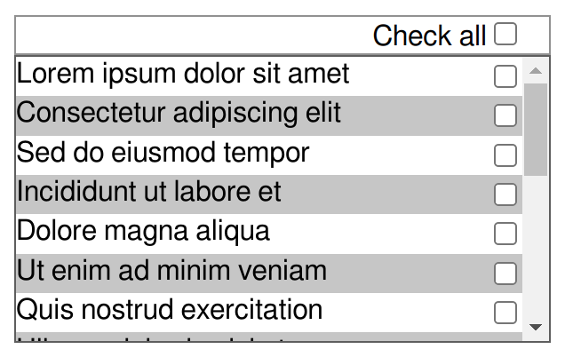
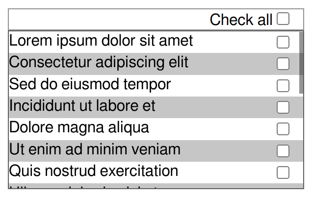
scrollbar-gutter: always can be bused to solve the problem of (small) interactive elements near the edge of the element getting covered by an appearing overlay scrollbar. A representative case would be a basic todo list, with each line starting with some text and ending with a right-aligned checkbox. With a classic scrollbar, everything is fine, but an overlay scrollbar could obscure the check boxes and make them hard to interact with.
Checkboxes adjacent to a classic scrollbar 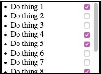
Checkboxes and an overlay scrollbar classic scrollbar 
Overlay Scrollbar are typically transient and disappear when not interacted with, so the checkboxes they cover are not impossible to use. But when the scrollbar is shown it does get in the way, and that makes for an awkward interaction. The author might try and solve the problem by adding some right padding, but (1) how much?, and (2) that padding isn’t needed in the case of classic scrollbars. scrollbar-gutter: always solves this problem, yielding an identical result in first case of classic scrollbars, but adding the desired gutter with overlay scrollbars:
Checkboxes and an overlay scrollbar and scrollbar-gutter: always 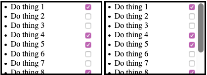 Apple is reluctant to add this value, as authors may use it too broadly, inserting gutters with overlay scrollbars even when not justified by interactive elements, defeating the space-saving advantage of overlay scrollbars.
An alternative solution has been suggested: as the focus is interactive elements, maybe we could have a property that applies to the elements that needs to avoid being under the scrollbar. When turned on, it would enlarge the right or left margin of the element as appropriate by just the right value to push it out from under an overlay scrollbar if that’s where it would end up, but would leave the element unchanged otherwise.
Possibly, an addition toggle would cause the element to enlarge both its inline-end and inline-start margins or neither, rather than just one. This could typically be useful for block-level descendants of the scroller with visible borders or background: adding space on one side to avoid collisions with the overlay scrollbar would make them look off-center when the scrollbar disapears. Increasing the margin on both sides avoids that.
Yet another possibility is to have a choice between growing the margin to protect the element, or growing the padding to protect the element’s content.
The syntax could be something like
scrollbar-avoid: none | [self | content] && both-edges?.An interesting consideration is that this may alleviate the need for scrollbar-gutter: match-parent, as it seems that situations that would have been addressed by scrollbar-gutter: stable or scrollbar-gutter: always on the parent and scrollbar-gutter: match-parent on the select children could instead be addressed by leaving the parent as scrollbar-gutter: auto and using
scrollbar-avoid: selforscrollbar-avoid: contenton the relevant children. - force
-
When the force keyword is present stable and always take effect
when overflow is visible, or clip in addition auto or scroll.
This does not cause a scrollbar to be displayed, only a scrollbar gutter.
This value enables authors to reserve the same amount of space on the edges of an element that is adjacent to a scroller as is being reserved in the scroller itself, so that their content would visually line up. The same effect could be achieved by adding padding for classic scrollbars and none for overlay scrollbars, but without this there is no reliable way for authors to know if they should be adding that padding, and if so how much.
A concrete example can be seen (at the time of writing) in the UI of Gmail: it attempts, not always successfully, to line up the controls in the toolbar above the list of mails with those in the list of mails. Here are two screenshots, one with classic scrollbars turned on (at the OS level), where Gmail correctly guesses how much padding it should be adding to the toolbar above the list, and one with overlay scrollbars turned on, where Gmail incorrectly adds padding, throwing things out of alignment (orange dotted line added manually to highlight the point under discussion).
The Gmail UI with classic scrollbars 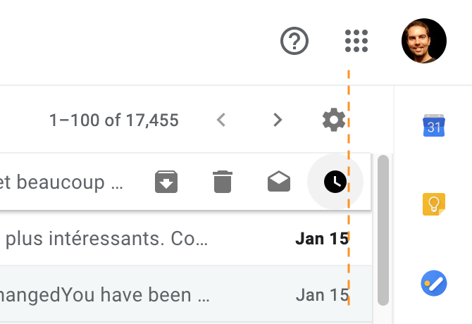
The Gmail UI with overlay scrollbars 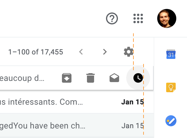
Creating this spacing in the toolbar using scrollbar-gutter: stable force rather than padding would keep icons in alignment in both cases, as well as on systems where the scrollbar has an atypical size.
It is because of this value that the property has been be made to apply to all elements, rather than merely to scroll containers, so that it can apply to overflow: visible elements as shown in the example. This could pause implementations difficulties, as user agents cannot just rely on existing code to place the gutter, since they may have to do so on elements which previously could not have one. Restricting it to all elements where overflow applies would probably have no negative effect on use cases and could make implementation easier; however, even that may still be more difficult that limiting it to scroll containers.
In addition to the implementation challenges mentioned above, it is not clear that this value solves the problem as reliably as it intends to. As the size and side of the scrollbar and its gutter are UA defined, they may vary between different elements. Since the appearance and position of scrollbars are up to the user agent, there is no limit to the list of properties that might influence them. It is probable that setting properties such as direction (via setting the HTML dir attribute) or scrollbar-width could give enough context to the user agent to know how it would create a scrollbar on that element if it were scrollable, and therefore to create a gutter of the same size at the right place, but it cannot be guaranteed.
In early iterations of the specification, this value was the only way to achieve the effect described in the example. However, since then, scrollbar-gutter: stable has been made to apply to overflow: hidden elements. While applying overflow: hidden has other effects which may be undesirable in that context, the combination of scrollbar-gutter: stable and overflow: hidden does add spacing in the same way as scrollbar-gutter: stable force, and may prove to be a sufficient workaround, particularly considering the other issues described above.
- match-parent
-
On a block-level box whose parent has a scrollbar gutter (or gutters on both edges),
this causes the box to have scrollbar gutter on the same side(s) and of the same width as its parent’s gutter(s).
Moreover,
that gutter is made to overlap that of the parent box.
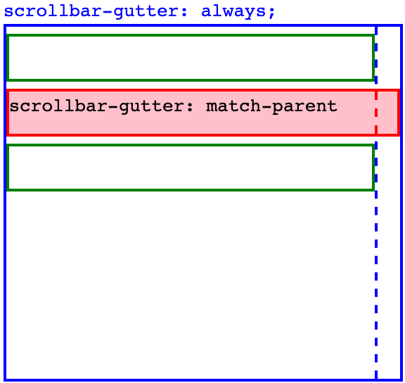
If the box with scrollbar-gutter: match-parent has a non-zero border or margin on the side where the gutter is expected, then the size of that box’s gutter is
parent.gutter - child.border - child.margin, and the gutter+border+margin is what collapses with the parent’s gutter.If the box with scrollbar-gutter/ match-parent is itself a scroll container, depending on the type of scrollbars, on its overflow property, and on the other values of the scrollbar-gutter property, it may need additional gutter for its own scrollbars. This comes in addition to the amount of gutter added for the sake of the match-parent value and does not collapse with the parent’s gutter.
A scroller with an child whose background intrudes into the gutter, thanks to match-parent 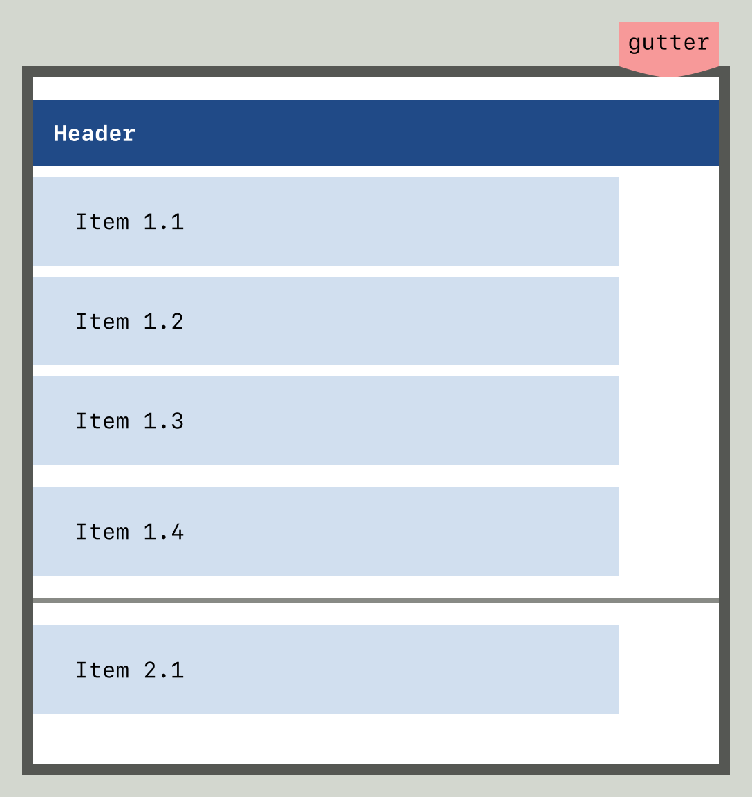
A match-parent box inside a scroll container with classic scrollbars, overflow: auto, and scrollbar-gutter: stable 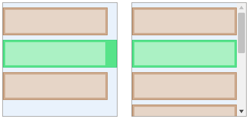
A scrollable box with match-parent inside another scroll container 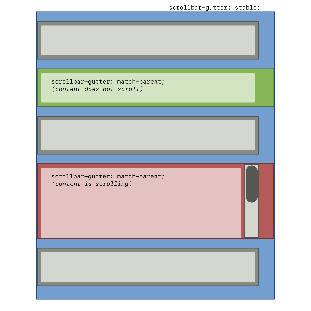
A scrollable box with match-parent inside another scroll container, with bidi 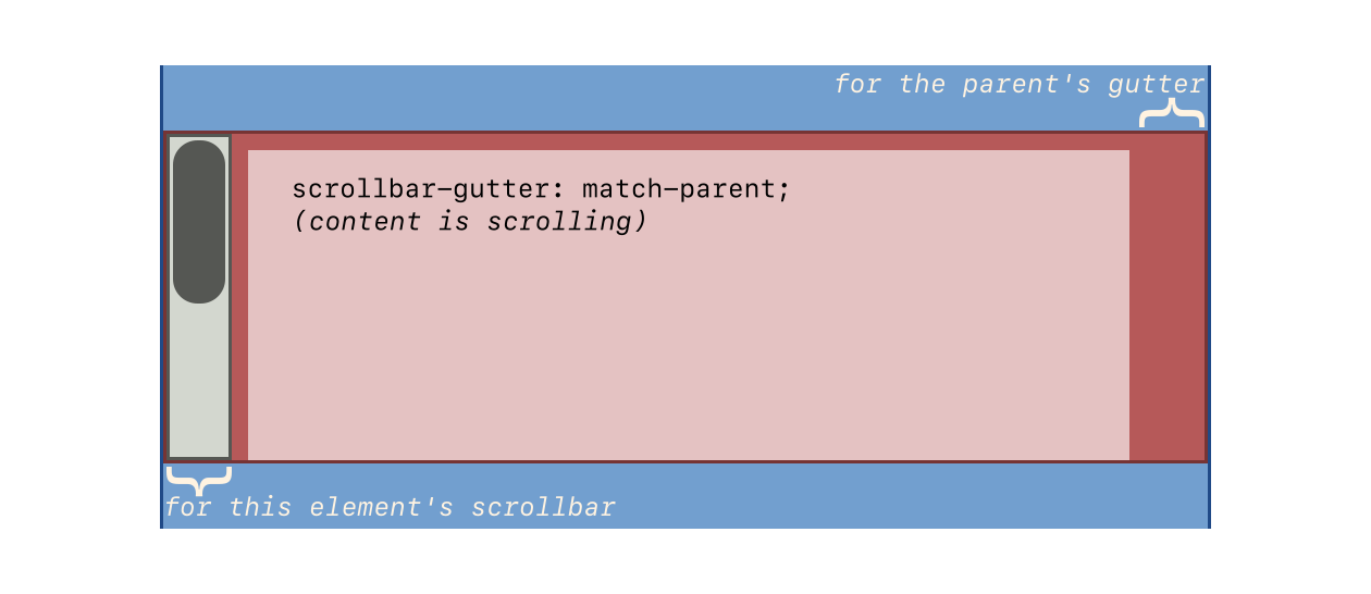
A scrollable box with scrollbar-gutter:match-parent stable inside another scroll container, with bidi 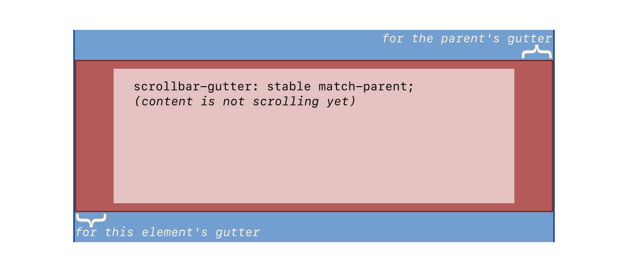
| overflow | scrollbar-gutter | Classic scrollbars | Overlay scrollbars (whether overflowing or not) | |
|---|---|---|---|---|
| Overflowing | Not overflowing | |||
| scroll | auto | yes | yes | |
| stable | yes | yes | ||
| always | yes | yes | yes | |
| auto | auto | yes | ||
| stable | yes | yes | ||
| always | yes | yes | yes | |
| auto | ||||
| stable | yes | yes | ||
| always | yes | yes | yes | |
| visible, clip | auto | |||
| stable | if force | if force | ||
| always | if force | if force | if force | |
Appendix C: Privacy Considerations
This specification introduces no new privacy considerations.
Appendix D: Security Considerations
This specification introduces no new security considerations.
Changes
Recent Changes
Significant changes since the June 2017 Working Draft include:
- Moved in the definition of text-overflow from [CSS-UI-4].
- Moved the core definition of scrollbar-gutter to [CSS-OVERFLOW-3] (it will be copied back here once this specification is undiffed) and shift exploratory scrollbar-gutter extension ideas into an appendix.
- Defined extension of overflow and overflow-clip-margin to apply to replaced elements. How exactly this works is still still under discussion. (Issue 7144)
- Defined longhands for overflow-clip-margin. (Issue 7245)
Changes Since Level 3
Acknowledgments
Thanks especially to the feedback from Rossen Atanassov, Bert Bos, Tantek Çelik, John Daggett, fantasai, Daniel Glazman, Vincent Hardy, Håkon Wium Lie, Peter Linss, Robert O’Callahan, Florian Rivoal, Alan Stearns, Steve Zilles, and all the rest of the www-style community.