1. Introduction
This section is not normative.
Authors have possibilities to position objects like boxes or containers relative to each other or absolutely in their own coordinate system. CSS Transforms extends these possibilities with a set of transform functions allowing authors to mutate the object’s local coordinate system. With CSS Animations and CSS Transitions, these static placements can change over a given period of time. Both kind of animations are powerful to express transitions in time but not suitable to describe transitions of location of an object over time.
This specification allows authors to specify a path. The object can be positioned, transitioned and animated along this path over a given period of time. The time may be static if no animation was specified.

A black plane at different positions on a blue dotted path, rotated in the direction of the path.
2. Module interactions
This specification defines a set of CSS properties that affect the visual rendering of elements to which those properties are applied. These effects are applied after boxes have been sized and positioned according to the Visual formatting model from [CSS21]. Some values of offset-path and offset-position result in the creation of a stacking context and containing block.
Some CSS properties in this specification manipulate the user coordinate system of the element by transformations. These transformations are pre-multiplied to transformations specified by the transform property or deriving properties defined in CSS Transform Module Level 1 [CSS-TRANSFORMS-1], and post-multiplied to transformations specified by the individual transform properties translate, scale, and rotate, as explained in CSS Transform Module Level 2.
3. Values
This specification follows the CSS property definition conventions from [CSS21]. Basic shapes are defined in CSS Shapes Module Level 1 [CSS-SHAPES]. Value types not defined in these specifications are defined in CSS Values and Units Module Level 3 [CSS3VAL].
In addition to the property-specific values listed in their definitions, all properties defined in this specification also accept CSS-wide keywords such as initial and inherit as their property value [CSS3VAL]. For readability it has not been repeated explicitly.
4. Motion Paths
The Motion Path module allows specifying the position of a box as the distance (offset-distance) of the box’s anchor point (offset-anchor) along a geometrical path (offset-path) defined against the coordinates (offset-position) of its containing block. The box’s orientation can optionally be specified as a rotation (offset-rotate) with respect to the direction of the path at that point.
4.1. Define a path: The offset-path property
| Name: | offset-path |
|---|---|
| Value: | none | ray() | path() | <url> | [ <basic-shape> || <geometry-box> ] |
| Initial: | none |
| Applies to: | transformable elements |
| Inherited: | no |
| Percentages: | n/a |
| Computed value: | as specified |
| Canonical order: | per grammar |
| Media: | visual |
| Animatable: | as <angle>, <basic-shape> or path() |
Specifies the offset path, a geometrical path the box gets positioned on. An offset path is either a specified path with one or multiple sub-paths or the geometry of a not styled basic shape.
A path may consist of a ray() or a <basic-shape> like <circle()>, <inset()> or <polygon()>. To allow authors to specify curves and sub-paths, this specification adds path() in addition to the existing <basic-shape> functions. The path() takes an SVG Path string as input [SVG2]. As another option, authors may reference an SVG shape element by <url> which is used as the path.
In this specification, a direction (or rotation) of 0 degree is equivalent to the direction of the negative y-axis in the object’s local coordinate system. E.g. A rotation of 0 degree points to the upper side of the UA if the object and its ancestors have no transformation applied.
Values have the following meanings:
- ray() = ray( [ <angle> && <size> && contain? ] )
-
- <angle>
-
The offset path is a line segment that starts from the position of the box and proceeds in the direction defined by the specified <angle>. As with CSS gradients, <angle> values are interpreted as bearing angles, with 0deg pointing up and positive angles representing clockwise rotation.
Note: Defining an offset path with <angle>, the box can be positioned with the used of polar coordinates. The polar coordinate system is a two-dimensional coordinate system in which each point on a plane is determined by a distance from a fixed point and an angle from a fixed line. The fixed point which is similar to the origin of a Cartesian coordinate system is called the pole, and the fixed line which is a ray from the pole is the polar axis. This coordinate system specifies the position of a point with a certain distance from the pole and a certain angle measured from the polar axis to the segment connecting the pole. In mathematical theory, the polar axis is commonly defined as the positive direction of the x axis, but we consider the polar axis as the positive direction of the y axis for consistency with other CSS specifications such as [CSS3VAL], <angle> value. (as the preceding line doesn’t have "x axis position")
- <size>
-
Decides the path length used when offset-distance is expressed as a percentage, using the distance to the containing box. For <size> values other than sides, the path length is independent of <angle>.
It is defined as:
<size> = [ closest-side | closest-corner | farthest-side | farthest-corner | sides ]
- closest-side
-
The perpendicular distance is measured between the initial position and the closest side of the box from it.
- closest-corner
-
The distance is measured between the initial position and the closest corner of the box from it.
- farthest-side
-
The perpendicular distance is measured between the initial position and the farthest side of the box from it.
- farthest-corner
-
The distance is measured between the initial position and the farthest corner of the box from it.
- sides
-
The distance is measured between the initial position and the intersection of the ray with the box. If the initial position is not within the box, the distance is 0.
Note: When the initial position is on one of the edges of the containing block, the closest side takes the edge that the initial position is on, and thus the path length used for percentage offset-distance values is 0.
Note: When closest-side or farthest-side are used, and the initial position is outside the box, the sides are considered to extend indefinitely.
- contain
-
The used value of offset-distance is clamped so that the box is entirely contained within the path.
If no offset-distance would lead to the box being enclosed by the path, the path size is minimally increased so that such an offset-distance exists.
Here are some examples. The first example shows that some parts of boxes are outside of the offset path.< style > body { transform-style : preserve-3d ; width : 200 px ; height : 200 px ; } . box { width : 50 px ; height : 50 px ; offset-position : 50 % 50 % ; offset-distance : 100 % ; offset-rotate : 0 deg ; } # redBox { background-color : red ; offset-path : ray ( 45 deg closest - side ); } # blueBox { background-color : blue ; offset-path : ray ( 180 deg closest - side ); } </ style > < body > < div class = "box" id = "redBox" ></ div > < div class = "box" id = "blueBox" ></ div > </ body > 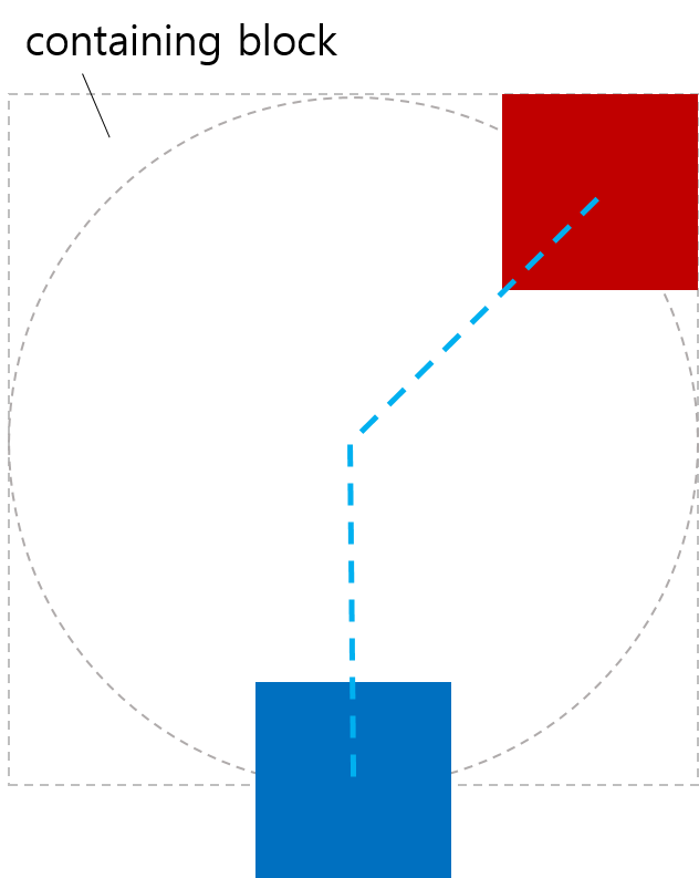
offset-path without contain In the second example, contain is given to the offset-path value of each box to avoid overflowing.
< style > body { transform-style : preserve-3d ; width : 200 px ; height : 200 px ; } . box { width : 50 px ; height : 50 px ; offset-position : 50 % 50 % ; offset-distance : 100 % ; offset-rotate : 0 deg ; } # redBox { background-color : red ; offset-path : ray ( 45 deg closest - side contain ); } # blueBox { background-color : blue ; offset-path : ray ( 180 deg closest - side contain ); } </ style > < body > < div class = "box" id = "redBox" ></ div > < div class = "box" id = "blueBox" ></ div > </ body > 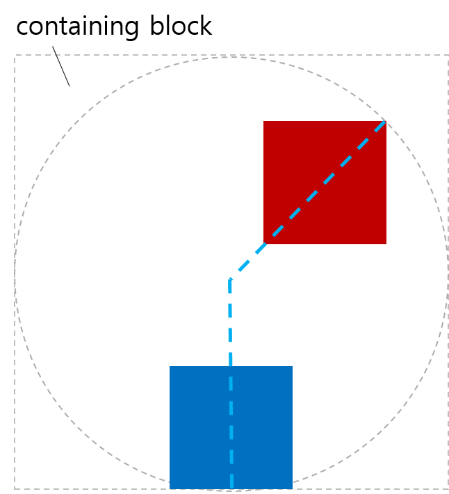
offset-path with contain In the third example, the path size is increased so that the box can be contained. The used offset distance is negative.
< style > body { transform-style : preserve-3d ; width : 250 px ; height : 250 px ; } . box { width : 60 % ; height : 10 % ; offset-position : 20 % 20 % ; offset-distance : 0 % ; offset-rotate : 0 deg ; offset-anchor : 200 % -300 % ; } # blueBox { background-color : blue ; offset-path : ray ( -90 deg closest - side contain ); } </ style > < body > < div class = "box" id = "blueBox" ></ div > </ body > 
offset-path with path size increased In the fourth example, the initial position is outside the containing block.
< style > # container { transform-style : preserve-3d ; width : 200 px ; height : 200 px ; } . box { width : 20 % ; height : 20 % ; offset-position : 140 % 70 % ; offset-distance : 100 % ; } # redBox { background-color : red ; offset-path : ray ( -90 deg sides ); } # blueBox { background-color : blue ; offset-path : ray ( 180 deg closest - side ); } </ style > < div id = "container" > < div class = "box" id = "redBox" ></ div > < div class = "box" id = "blueBox" ></ div > </ div > 
Initial position outside the containing block - <basic-shape> || <geometry-box>
-
The offset path is a basic shape as specified in CSS Shapes [CSS-SHAPES].
offset-position is ignored for circle and ellipse basic shapes with explicit center positions, and for other types of basic shapes. If a circle or ellipse basic shape has no explicit center position, the shape is centered at the initial position of the path, as described in offset-position.
The initial position and initial direction of the path describe the position of the box along the path when offset-distance begins increasing from 0%.
The initial position for basic shapes are defined as follows:
- <circle()>
- <ellipse()>
-
The initial position is defined by the point where a horizontal tangent to the circle/ellipse would reach the top vertical position.
- <inset()>
-
The initial position is the left end of the top horizontal line, immediately to the right of any border-radius arc.
- <polygon()>
-
The initial position is defined by the first coordinate pair of the polygon.
The initial direction is defined by the vector connecting.
the initial position with the next following coordinate pair that isn’t equal to the initial position.
The <geometry-box> specified in combination with a <basic-shape> provides the reference box for the <basic-shape>. If no reference box is specified, the border-box will be used as reference box.
If <geometry-box> is supplied without a <basic-shape>, the initial position is the left end of the top horizontal line, immediately to the right of any border-radius arc, and the initial direction is to the right.
Apart from polygons with non-zero length, the initial direction is 90 degrees (i.e. to the right).
Note: This gives 0deg rotation when offset-rotate is auto.
This example shows how <geometry-box> offset path works in combination with border-radius.< style > body { width : 500 px ; height : 300 px ; border-radius : 80 px ; border : dashed aqua ; margin : 0 ; } # blueBox { width : 40 px ; height : 20 px ; background-color : blue ; offset-path : margin-box ; } </ style > < body > < div id = "blueBox" ></ div > </ body > 
The initial position is the left end of the top horizontal line. This example uses a circle with implicit center position.< style > body { width : 323 px ; height : 131 px ; margin : 0 px ; border : 2 px solid black ; padding : 8 px ; transform-style : preserve-3d ; } . item { width : 90 px ; height : 40 px ; background-color : violet ; } # middle { offset-position : auto ; offset-path : circle( 60 % ) margin-box ; offset-distance : 25 % ; offset-anchor : left top ; } </ style > < body > < div class = "item" ></ div > < div class = "item" id = "middle" ></ div > < div class = "item" ></ div > </ body > 
The circle center is determined by normal flow. - <circle()>
- path() = path(<string>)
-
The <string> represents an SVG Path data string. The path data string must be conform to the grammar and parsing rules of SVG 1.1 [SVG11]. The initial position is defined by the first “move to” argument in the path string. For the initial direction follow SVG 1.1 [SVG11].
- <url>
-
References an SVG shape element and uses its geometry as offset path. See SVG 1.1 for more information about the initial position and initial direction [SVG11].
- none
-
No offset path gets created. When offset-path is none, offset-distance and offset-rotate have no effect.
A computed value of other than none results in the creation of a stacking context [CSS21] and containing block, per usual for transforms.
A reference that fails to download, is not a reference to an SVG shape element, or is non-existent, is treated as equivalent to path("m 0 0").
Note: This is a zero length path with directionality aligned with the positive x-axis.
See the section “Calculating the path transform” for how to use the offset path to compute the transform.
For SVG shape elements without associated CSS layout box, the used value for content-box, padding-box, border-box and margin-box is fill-box.
For shape elements with associated CSS layout box, the used value for fill-box, stroke-box and view-box is border-box.
4.2. Position on the path: The offset-distance property
| Name: | offset-distance |
|---|---|
| Value: | <length-percentage> |
| Initial: | 0 |
| Applies to: | transformable elements |
| Inherited: | no |
| Percentages: | refer to the total path length |
| Computed value: | For <length> the absolute value, otherwise a percentage. |
| Canonical order: | per grammar |
| Media: | visual |
| Animatable: | yes |
Specifies the position of the box as a distance along the offset path.
- <length-percentage>
-
Specifies the distance from the initial position of the offset path to the position of the box’s anchor point.
Percentages are relative to the length of the offset path-- that is, the distance between the initial position and the end position of the offset path.
4.2.1. Calculating the computed distance along a path
Processing the distance along an offset path operates differently depending upon the nature of the offset path:
-
References to <angle> offset paths with contain are unclosed intervals.
-
References to <angle> offset paths without contain are unbounded rays.
-
All basic CSS shapes are closed loops.
-
Offset paths (including references to SVG Paths) are closed loops only if the final command in the path list is a closepath command ("z" or "Z"), otherwise they are unclosed intervals.
-
References to SVG circles, ellipses, images, polygons and rects are closed loops.
-
References to SVG lines and polylines are unclosed intervals.
To determine the used offset distance for a given offset path and offset distance:
-
Let the total length be the total length of offset path with all sub-paths.
-
Convert offset distance to pixels, with 100% being converted to total length.
-
- If offset path is an unbounded ray:
-
Let used offset distance be equal to offset distance.
- Otherwise if offset path is an <angle> path with contain:
-
Let used offset distance be equal to offset distance, clamped so that the box lies entirely within the path.
- If offset path is any other unclosed interval:
-
Let used offset distance be equal to offset distance clamped by 0 and the total length of the path.
- Otherwise offset path is a closed loop:
-
Let used offset distance be equal to offset distance modulus the total length of the path. If the total length of the path is 0, used offset distance is also 0.
< style >
. item {
width : 100 px ;
height : 40 px ;
offset-position : 0 % 0 % ;
offset-path : path ( 'm 0 0 h 200 v 150' );
}
# box1 {
background-color : red ;
offset-distance : -280 % ;
}
# box2 {
background-color : green ;
offset-distance : 190 % ;
}
</ style >
< body >
< div class = "item" id = "box1" ></ div >
< div class = "item" id = "box2" ></ div >
</ body >

< style >
. item {
width : 100 px ;
height : 40 px ;
offset-position : 0 % 0 % ;
offset-path : path ( 'm 0 0 h 200 v 150 z' );
}
# box1 {
background-color : red ;
offset-distance : -280 % ;
}
# box2 {
background-color : green ;
offset-distance : 190 % ;
}
</ style >
< body >
< div class = "item" id = "box1" ></ div >
< div class = "item" id = "box2" ></ div >
</ body >

< style >
body {
transform-style : preserve-3d ;
width : 300 px ;
height : 300 px ;
border : dashed gray ;
border-radius : 50 % ;
}
. circleBox {
position : absolute ;
left : 50 % ;
top : 50 % ;
width : 40 px ;
height : 40 px ;
background-color : red ;
border-radius : 50 % ;
}
# circle1 {
offset-path : ray ( 0 deg farthest - side );
offset-distance : 50 % ;
}
# circle2 {
offset-path : ray ( 90 deg farthest - side );
offset-distance : 20 % ;
}
# circle3 {
offset-path : ray ( 225 deg farthest - side );
offset-distance : 100 % ;
}
</ style >
< body >
< div class = "circleBox" id = "circle1" ></ div >
< div class = "circleBox" id = "circle2" ></ div >
< div class = "circleBox" id = "circle3" ></ div >
</ body >
4.3. Define the starting point of the path: The offset-position property
| Name: | offset-position |
|---|---|
| Value: | auto | <position> |
| Initial: | auto |
| Applies to: | transformable elements |
| Inherited: | no |
| Percentages: | Refer to the size of containing block |
| Computed value: | For <length> the absolute value, otherwise a percentage. |
| Canonical order: | per grammar |
| Media: | visual |
| Animatable: | as position |
Specifies the initial position of the offset path. If position is specified with static, offset-position would be ignored.
Values are defined as follows:
- auto
-
Indicates the initial position is the position of the box specified with position property.
Note: When position is static and offset-position is auto (and not ignored due to offset-path), we have positioning relative to normal flow.
- <position>
-
Specifies the initial position, with the the containing block as the positioning area and a dimensionless point (zero-sized box) as the object area.
Note: This is similar to absolute positioning, except that offset-position does not prevent boxes from impacting the layout of later siblings.
A computed value of other than auto results in the creation of a stacking context [CSS21] and containing block, per usual for transforms.
offset-position is ignored if offset-path is a geometry-box, or a basic shape (other than a circle or ellipse with implicit center). In these cases, the geometry-box or basic shape specifies the initial position.
< style >
# wrap {
position : relative ;
width : 300 px ;
height : 300 px ;
border : 1 px solid black ;
}
# box {
width : 100 px ;
height : 100 px ;
background-color : green ;
position : absolute ;
top : 100 px ;
left : 80 px ;
offset-position : auto ;
offset-anchor : center ;
offset-path : ray ( 45 deg );
}
</ style >
< body >
< div id = "wrap" >
< div id = "box" ></ div >
</ div >
</ body >
< style >
# wrap {
transform-style : preserve-3d ;
width : 400 px ;
height : 350 px ;
}
. item {
position : absolute ;
left : 200 px ;
top : 0 px ;
offset-position : 200 px 100 px ; /* translates by 0px,100px */
offset-anchor : left top ;
transform-origin : left top ;
width : 130 px ;
height : 80 px ;
border-top-right-radius : 23 px ;
}
# box1 {
background-color : tomato ;
offset-position : auto ;
}
# box2 {
background-color : green ;
}
# box3 {
background-color : navy ;
rotate : 90 deg ; /* applied before motion path transform */
}
# box4 {
background-color : gold ;
transform : rotate( 90 deg ); /* applied after motion path transform */
}
</ style >
< body >
< div id = "wrap" >
< div class = "item" id = "box1" ></ div >
< div class = "item" id = "box2" ></ div >
< div class = "item" id = "box3" ></ div >
< div class = "item" id = "box4" ></ div >
</ div >
</ body >

< style >
# wrap {
transform-style : preserve-3d ;
width : 500 px ;
height : 250 px ;
line-height : 0 px ;
}
span {
position : static ;
display : inline-block ;
width : 100 px ;
height : 50 px ;
border-top-right-radius : 23 px ;
scale : 2.5 2.5 ; /* applied before motion path transform */
offset-position : center ;
transform : scale( 0.4 ); /* applied after motion path transform */
}
# box1 {
background-color : tomato ;
}
# box2 {
background-color : green ;
}
# box3 {
background-color : navy ;
}
# box4 {
background-color : gold ;
}
</ style >
< body >
< div id = "wrap" >
< div >
< span id = "box1" ></ span >< span id = "box2" ></ span >
</ div >
< div >
< span id = "box3" ></ span >< span id = "box4" ></ span >
</ div >
</ div >
</ body >

< style >
# wrap {
transform-style : preserve-3d ;
width : 540 px ;
height : 420 px ;
}
. item {
position : absolute ;
width : 90 px ;
height : 70 px ;
border-top-right-radius : 23 px ;
scale : 0.8 0.8 ; /* applied before motion path transform */
offset-path : padding-box ;
offset-distance : 50 % ;
offset-rotate : 0 deg ;
offset-anchor : right bottom ;
transform : scale( 1.25 ); /* applied after motion path transform */
}
# box1 {
background-color : tomato ;
position : static ;
offset-position : auto ; /* ignored */
}
# box2 {
background-color : green ;
right : 0 px ;
top : 0 px ;
offset-position : 23 % 45 % ; /* ignored */
}
# box3 {
background-color : navy ;
left : 0 px ;
bottom : 0 px ;
offset-position : 34 % 56 px ; /* ignored */
}
# box4 {
background-color : gold ;
right : 0 px ;
bottom : 0 px ;
offset-position : 45 px 67 px ; /* ignored */
}
</ style >
< body >
< div id = "wrap" >
< div class = "item" id = "box1" ></ div >
< div class = "item" id = "box2" ></ div >
< div class = "item" id = "box3" ></ div >
< div class = "item" id = "box4" ></ div >
</ div >
</ body >

4.4. Define an anchor point: The offset-anchor property
| Name: | offset-anchor |
|---|---|
| Value: | auto | <position> |
| Initial: | auto |
| Applies to: | transformable elements |
| Inherited: | no |
| Percentages: | Relative to the width and the height of a box |
| Computed value: | For <length> the absolute value, otherwise a percentage. |
| Canonical order: | per grammar |
| Media: | visual |
| Animatable: | as <position> |
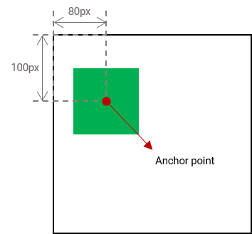
Defines an anchor point of the box positioned along the offset path. The anchor point specifies the point of the box which is to be considered as the point that is moved along the offset path.
Values have the following meanings:
- auto
-
Computes to the value from offset-position, provided offset-path is none and offset-position is not auto. Otherwise, computes to the value from transform-origin. When auto is given to offset-anchor, and offset-path is none, offset-position behaves similar to background-position.
- <position>
-
- <percentage>
-
A percentage for the horizontal offset is relative to width of content area. A percentage for the vertical offset is relative to the height of the content area. For example, with a value pair of '100%, 0%', an anchor point is on the upper right corner of the box.
- <length>
-
A length value gives a length offset from the upper left corner of the box’s content area.
#plane {
    offset-anchor: center;
}
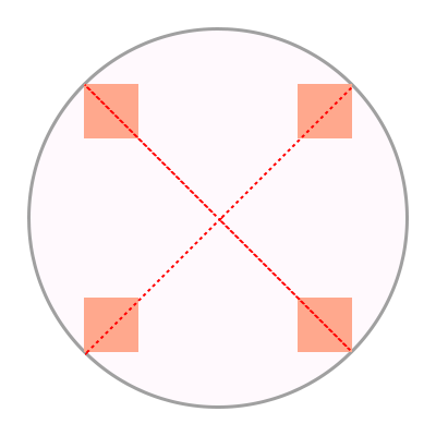
The red dot in the middle of the shape indicates the anchor point of the shape.

< style >
body {
transform-style : preserve-3d ;
width : 300 px ;
height : 300 px ;
border : 2 px solid gray ;
border-radius : 50 % ;
}
. box {
width : 50 px ;
height : 50 px ;
background-color : orange ;
offset-position : 50 % 50 % ;
offset-distance : 100 % ;
offset-rotate : 0 deg ;
}
# item1 {
offset-path : ray ( 45 deg closest - side );
offset-anchor : right top ;
}
# item2 {
offset-path : ray ( 135 deg closest - side );
offset-anchor : right bottom ;
}
# item3 {
offset-path : ray ( 225 deg closest - side );
offset-anchor : left bottom ;
}
# item4 {
offset-path : ray ( 315 deg closest - side );
offset-anchor : left top ;
}
</ style >
< body >
< div class = "box" id = "item1" ></ div >
< div class = "box" id = "item2" ></ div >
< div class = "box" id = "item3" ></ div >
< div class = "box" id = "item4" ></ div >
</ body >
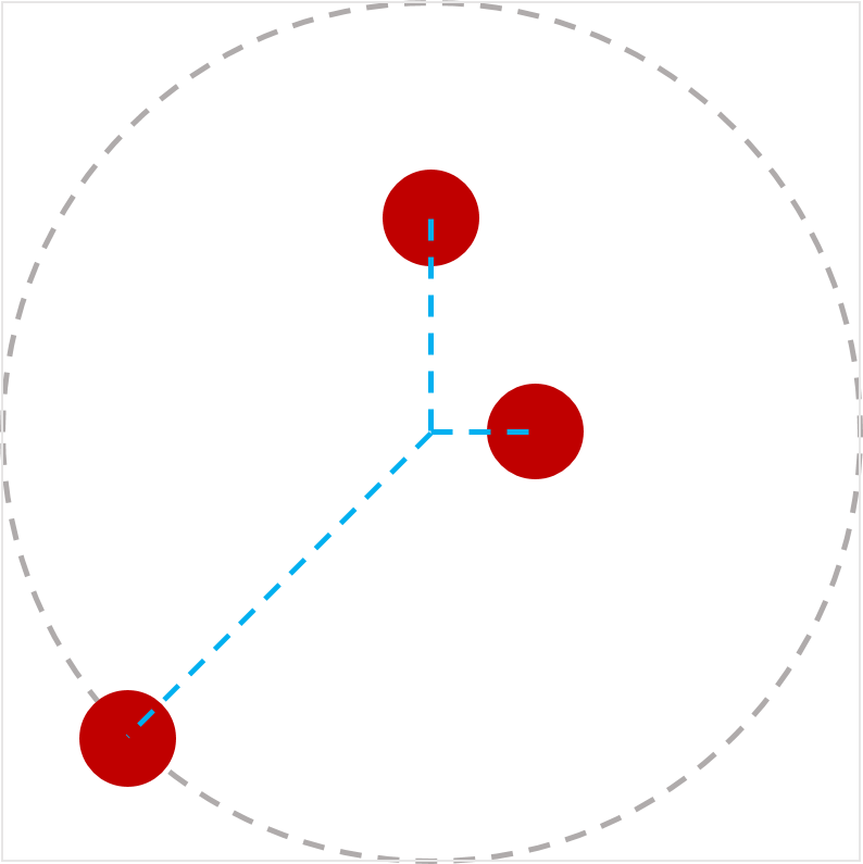
< style >
body {
width : 500 px ;
height : 500 px ;
}
. box {
background-color : mediumpurple ;
offset-path : none ;
offset-anchor : center ;
}
# item1 {
offset-position : 90 % 20 % ;
width : 60 % ;
height : 20 % ;
}
# item2 {
offset-position : 100 % 100 % ;
width : 30 % ;
height : 10 % ;
}
# item3 {
offset-position : 50 % 100 % ;
width : 20 % ;
height : 60 % ;
}
# item4 {
offset-position : 0 % 100 % ;
width : 30 % ;
height : 90 % ;
}
</ style >
< body >
< div class = "box" id = "item1" ></ div >
< div class = "box" id = "item2" ></ div >
< div class = "box" id = "item3" ></ div >
< div class = "box" id = "item4" ></ div >
</ body >

< style >
body {
width : 500 px ;
height : 500 px ;
}
. box {
background-color : mediumpurple ;
offset-path : none ;
offset-anchor : auto ;
}
# item1 {
offset-position : 90 % 20 % ;
width : 60 % ;
height : 20 % ;
}
# item2 {
offset-position : 100 % 100 % ;
width : 30 % ;
height : 10 % ;
}
# item3 {
offset-position : 50 % 100 % ;
width : 20 % ;
height : 60 % ;
}
# item4 {
offset-position : 0 % 100 % ;
width : 30 % ;
height : 90 % ;
}
</ style >
< body >
< div class = "box" id = "item1" ></ div >
< div class = "box" id = "item2" ></ div >
< div class = "box" id = "item3" ></ div >
< div class = "box" id = "item4" ></ div >
</ body >

4.5. Rotation at point: The offset-rotate property
| Name: | offset-rotate |
|---|---|
| Value: | [ auto | reverse ] || <angle> |
| Initial: | auto |
| Applies to: | transformable elements |
| Inherited: | no |
| Percentages: | n/a |
| Computed value: | computed <angle> value, optionally preceded by auto |
| Canonical order: | per grammar |
| Media: | visual |
| Animatable: | yes |
Defines the orientation of the box while positioning along the offset path.
Values have the following meanings:
- auto
-
Indicates that the object is rotated (over time if offset-distance is animated) by the angle of the direction (i.e., directional tangent vector) of the offset path, relative to the positive x-axis. If specified in combination with <angle>, the computed value of <angle> is added to the computed value of auto.
Note: For ray paths, the rotation implied by auto is 90 degrees less than the ray’s bearing <angle>.
- reverse
-
Indicates that the object is rotated (over time if offset-distance is animated) by the angle of the direction (i.e., directional tangent vector) of the offset path, relative to the positive x-axis, plus 180 degrees. If specified in combination with <angle>, the computed value of <angle> is added to the computed value of reverse.
Note: This is the same as specifying auto 180deg.
- <angle>
-
Indicates that the box has a constant clockwise rotation transformation applied to it by the specified rotation angle. See definitions of auto or reverse if specified in combination with either one of the keywords.
When the offset path is a zero length path, the value of offset-rotate is 0 degree, the direction of the positive x-axis.
If the offset path is composed of multiple line segments, the orientation at the connection between the segments is the same as the direction of the previous segment.
Note: The rotation described here does not override or replace any rotation defined by the transform property.

When the shape’s anchor point is placed at different positions along the path and offset-rotate is 0deg, the shape is not rotated.

If the offset-rotate property is set to auto, and the shape’s anchor point is placed at different positions along the path, the shape is rotated based on the gradient at the current position and faces the direction of the path at this position.

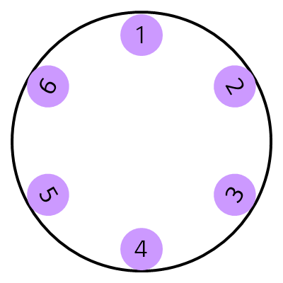
In this example, the offset-rotate property is set to reverse. The plane faces the opposite direction of the path at each position on the path.

The last example sets the offset-rotate property to -45deg. The shape is rotated anticlockwise by 45 degree once and keeps the rotation at each position on the path.

< style >
body {
width : 300 px ;
height : 300 px ;
margin : 0 px ;
border : solid gray ;
border-radius : 50 % ;
}
. circle {
offset-position : 150 px 150 px ;
offset-distance : 86 % ;
width : 42 px ;
height : 42 px ;
background-color : mediumpurple ;
border-radius : 50 % ;
display : flex ;
align-items : center ;
justify-content : center ;
}
# item1 {
offset-path : ray ( 0 deg closest - side );
offset-rotate : auto 90 deg ;
}
# item2 {
offset-path : ray ( 45 deg closest - side );
offset-rotate : auto 90 deg ;
}
# item3 {
offset-path : ray ( 135 deg closest - side );
offset-rotate : auto -90 deg ;
}
# item4 {
offset-path : ray ( 180 deg closest - side );
offset-rotate : auto -90 deg ;
}
# item5 {
offset-path : ray ( 225 deg closest - side );
offset-rotate : reverse 90 deg ;
}
# item6 {
offset-path : ray ( -45 deg closest - side );
offset-rotate : reverse -90 deg ;
}
</ style >
< body >
< div class = "circle" id = "item1" > 1</ div >
< div class = "circle" id = "item2" > 2</ div >
< div class = "circle" id = "item3" > 3</ div >
< div class = "circle" id = "item4" > 4</ div >
< div class = "circle" id = "item5" > 5</ div >
< div class = "circle" id = "item6" > 6</ div >
</ body >
4.5.1. Calculating the path transform
-
Create a supplemental transformation matrix T1 for the local coordinate system of the box.
-
Find the initial position of the offset path specified by offset-position as T2.
-
Let P be the point at the used offset distance along the offset path.
-
Find the translation of the box such that its anchor point is placed at P, and apply that to T2.
-
Post-multiply T2 by the rotation specified by offset-rotate.
-
Post-multiply T1 to the local coordinate system of the box.
Do we need to say how to get the position in more detail?
There needs to be a process for converting rotate() to an angle.
4.6. Offset shorthand: The offset property
| Name: | offset |
|---|---|
| Value: | [ offset-position? [ offset-path [ offset-distance || offset-rotate ]? ]? ]! [ / offset-anchor ]? |
| Initial: | see individual properties |
| Applies to: | transformable elements |
| Inherited: | no |
| Percentages: | see individual properties |
| Computed value: | see individual properties |
| Canonical order: | per grammar |
| Media: | visual |
| Animatable: | see individual properties |
This is a shorthand property for setting offset-position, offset-path, offset-distance, offset-rotate and offset-anchor. Omitted values are set to their initial values.
5. Privacy and Security Considerations
This specification introduces no new security or privacy considerations.
Changes
This section is non-normative.
The following changes were made since the 9 April 2015 First Public Working Draft.
-
Renamed motion-path to offset-path for integrating with polar-angle.
-
Renamed motion-offset to offset-distance for integrating with polar-distance.
-
Renamed motion-rotation to offset-rotate.
-
Added offset-position to specify the initial position of the path by merging polar-origin from [CSS-ROUND-DISPLAY-1].
-
Added offset-anchor to specify the origin point of the element by merging polar-anchor from [CSS-ROUND-DISPLAY-1].
-
Made offset-rotate specify the rotation transformation by auto or reverse in combination with <angle>.
Acknowledgments
Thanks to fantasai, Hyojin Song, and all the rest of the CSS WG members for their reviews, comments, and corrections.