Motion Path Module Level 1

W3C Working Draft,

This version:
https://www.w3.org/TR/2017/WD-motion-1-20170711/
Latest published version:
https://www.w3.org/TR/motion-1/
Editor's Draft:
https://drafts.fxtf.org/motion-1/
Previous Versions:
https://www.w3.org/TR/2015/WD-motion-1-20150409/
Issue Tracking:
Inline In Spec
GitHub Issues
Editors:
(Adobe Systems Inc.)
(Google)
(LG Electronics)

Abstract

Motion path allows authors to animate any graphical object along an author specified path.

Status of this document

This section describes the status of this document at the time of its publication. Other documents may supersede this document. A list of current W3C publications and the latest revision of this technical report can be found in the W3C technical reports index at https://www.w3.org/TR/.

Publication as a Working Draft does not imply endorsement by the W3C Membership. This is a draft document and may be updated, replaced or obsoleted by other documents at any time. It is inappropriate to cite this document as other than work in progress.

GitHub Issues are preferred for discussion of this specification. When filing an issue, please put the text “motion” in the title, preferably like this: “[motion] …summary of comment…”. All issues and comments are archived, and there is also a historical archive.

This document was published by the CSS Working Group and the SVG Working Group.

This document was produced by groups operating under the 5 February 2004 W3C Patent Policy. W3C maintains a public list of any patent disclosures (CSS) and a public list of any patent disclosures (SVG) made in connection with the deliverables of each group; these pages also include instructions for disclosing a patent. An individual who has actual knowledge of a patent which the individual believes contains Essential Claim(s) must disclose the information in accordance with section 6 of the W3C Patent Policy.

This document is governed by the 1 March 2017 W3C Process Document.

1. Introduction

This section is not normative.

Authors have possibilities to position objects like boxes or containers relative to each other or absolutely in their own coordinate system. CSS Transforms extends these possibilities with a set of transform functions allowing authors to mutate the object’s local coordinate system. With CSS Animations and CSS Transitions, these static placements can change over a given period of time. Both kind of animations are powerful to express transitions in time but not suitable to describe transitions of location of an object over time.

This specification allows authors to specify a path. The object can be positioned, transitioned and animated along this path over a given period of time. The time may be static if no animation was specified.

In the following example, a schematic of an air plane is animated along a path. The plane faces in the direction of the path at each position on the path.

Example Path

A black plane at different positions on a blue dotted path, rotated in the direction of the path.

2. Module interactions

This specification defines a set of CSS properties that affect the visual rendering of elements to which those properties are applied. These effects are applied after boxes have been sized and positioned according to the Visual formatting model from [CSS21]. Some values of offset-path and offset-position result in the creation of a stacking context and containing block.

Some CSS properties in this specification manipulate the user coordinate system of the element by transformations. These transformations are pre-multiplied to transformations specified by the transform property or deriving properties defined in CSS Transform Module Level 1 [CSS-TRANSFORMS-1], and post-multiplied to transformations specified by the individual transform properties translate, scale, and rotate, as explained in CSS Transform Module Level 2.

3. Values

This specification follows the CSS property definition conventions from [CSS21]. Basic shapes are defined in CSS Shapes Module Level 1 [CSS-SHAPES]. Value types not defined in these specifications are defined in CSS Values and Units Module Level 3 [CSS3VAL].

In addition to the property-specific values listed in their definitions, all properties defined in this specification also accept CSS-wide keywords such as initial and inherit as their property value [CSS3VAL]. For readability it has not been repeated explicitly.

4. Motion Paths

The Motion Path module allows specifying the position of a box as the distance (offset-distance) of the box’s anchor point (offset-anchor) along a geometrical path (offset-path) defined against the coordinates (offset-position) of its containing block. The box’s orientation can optionally be specified as a rotation (offset-rotate) with respect to the direction of the path at that point.

4.1. Define a path: The offset-path property

Name: offset-path
Value: none | ray( [ <angle> && <size> && contain? ] )
| <path()> | <url> | [ <basic-shape> || <geometry-box> ]
Initial: none
Applies to: transformable elements
Inherited: no
Percentages: n/a
Media: visual
Computed value: as specified
Canonical order: per grammar
Animatable: as <angle>, <basic-shape> or <path()>

Specifies the offset path, a geometrical path the box gets positioned on. An offset path is either a specified path with one or multiple sub-paths or the geometry of a not styled basic shape.

A path may consist of a ray or a <basic-shape> like <circle()>, <inset()> or <polygon()>. To allow authors to specify curves and sub-paths, this specification adds the <path()> function in addition to the existing <basic-shape> functions. The <path()> function takes an SVG Path string as input [SVG2]. As another option, authors may reference an SVG shape element by <url> which is used as the path.

In this specification, a direction (or rotation) of 0 degree is equivalent to the direction of the negative y-axis in the object’s local coordinate system. E.g. A rotation of 0 degree points to the upper side of the UA if the object and its ancestors have no transformation applied.

Values have the following meanings:

ray( [ <angle> && <size> && contain? ] )
<angle>
The offset path is a line segment that starts from the position of the box and proceeds in the direction defined by the specified <angle>. As with CSS gradients, <angle> values are interpreted as bearing angles, with 0deg pointing up and positive angles representing clockwise rotation.

Note: Defining an offset path with <angle>, the box can be positioned with the used of polar coordinates. The polar coordinate system is a two-dimensional coordinate system in which each point on a plane is determined by a distance from a fixed point and an angle from a fixed line. The fixed point which is similar to the origin of a Cartesian coordinate system is called the pole, and the fixed line which is a ray from the pole is the polar axis. This coordinate system specifies the position of a point with a certain distance from the pole and a certain angle measured from the polar axis to the segment connecting the pole. In mathematical theory, the polar axis is commonly defined as the positive direction of the x axis, but we consider the polar axis as the positive direction of the y axis for consistency with other CSS specifications such as [CSS3VAL], <angle> value. (as the preceding line doesn’t have "x axis position")

<size>
Decides the path length used when offset-distance is expressed as a percentage, using the distance to the containing box. For <size> values other than sides, the path length is independent of <angle>.

It is defined as

 <size> = [ closest-side | closest-corner | farthest-side | farthest-corner | sides ]

closest-side
The distance is measured between the initial position and the closest side of the box from it.
closest-corner
The distance is measured between the initial position and the closest corner of the box from it.
farthest-side
The distance is measured between the initial position and the farthest side of the box from it.
farthest-corner
The distance is measured between the initial position and the farthest corner of the box from it.
sides
The distance is measured between the initial position and the intersection of the ray with the box. If the initial position is not within the box, the distance is 0.

Note: When the initial position is on one of the edges of the containing block, the closest side takes the edge that the initial position is on, and thus the path length used for percentage offset-distance values is 0.
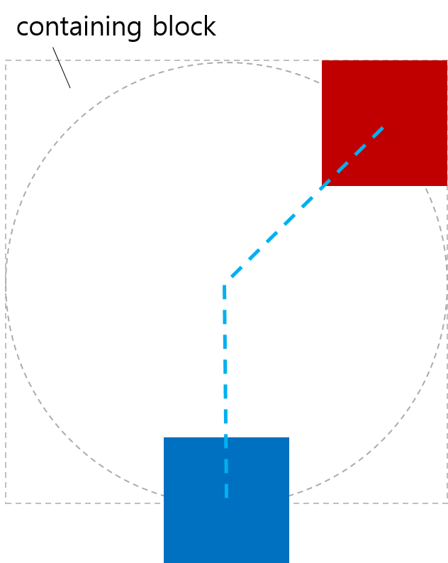
contain
The used value of offset-distance is clamped so that the box is entirely contained within the path.

If no offset-distance would lead to the box being enclosed by the path, the path size is minimally increased so that such an offset-distance exists.

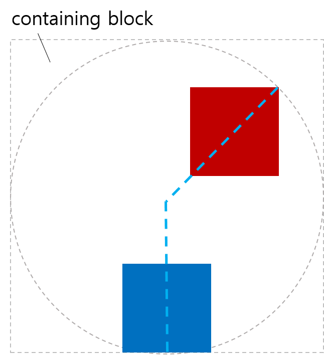
Here are some examples. The first example shows that some parts of boxes are outside of the offset path.
<style>
  body {
    transform-style: preserve-3d;
    width: 200px;
    height: 200px;
  }
  .box {
    width: 50px;
    height: 50px;
    offset-position: 50% 50%;
    offset-distance: 100%;
    offset-rotate: 0deg;
  }
  #redBox {
    background-color: red;
    offset-path: ray(45deg closest-side);
  }
  #blueBox {
    background-color: blue;
    offset-path: ray(180deg closest-side);
  }
</style>
<body>
  <div class="box" id="redBox"></div>
  <div class="box" id="blueBox"></div>
</body>
An image of boxes positioned without contain
offset-path without contain

In the second example, contain is given to the offset-path value of each box to avoid overflowing.

<style>
  body {
    transform-style: preserve-3d;
    width: 200px;
    height: 200px;
  }
  .box {
    width: 50px;
    height: 50px;
    offset-position: 50% 50%;
    offset-distance: 100%;
    offset-rotate: 0deg;
  }
  #redBox {
    background-color: red;
    offset-path: ray(45deg closest-side contain);
  }
  #blueBox {
    background-color: blue;
    offset-path: ray(180deg closest-side contain);
  }
</style>
<body>
  <div class="box" id="redBox"></div>
  <div class="box" id="blueBox"></div>
</body>
An image of boxes positioned with contain
offset-path with contain
In the third example, the path size is increased so that the box can be contained. The used offset distance is negative.
<style>
  body {
    transform-style: preserve-3d;
    width: 250px;
    height: 250px;
  }
  .box {
    width: 60%;
    height: 10%;

    offset-position: 20% 20%;
    offset-distance: 0%;
    offset-anchor: 200% -300%;
  }
  #blueBox {
    background-color: blue;
    offset-path: ray(-90deg closest-side contain);
  }
</style>
<body>
  <div class="box" id="blueBox"></div>
</body>
An image of an increased path size
offset-path with path size increased
<basic-shape> || <geometry-box>
The offset path is a basic shape as specified in CSS Shapes [CSS-SHAPES].

offset-position is ignored for circle and ellipse basic shapes with explicit center positions, and for other types of basic shapes. If a circle or ellipse basic shape has no explicit center position, the shape is centered at the initial position of the path, as described in offset-position.

The initial position and initial direction of the path describe the position of the box along the path when offset-distance begins increasing from 0%.

The initial position for basic shapes are defined as follows:

<circle()>
<ellipse()>
The initial position is defined by the point where a horizontal tangent to the circle/ellipse would reach the top vertical position.
<inset()>
The initial position is the left end of the top horizontal line, immediately to the right of any border-radius arc.
<polygon()>
The initial position is defined by the first coordinate pair of the polygon. The initial direction is defined by the vector connecting the initial position with the next following coordinate pair that isn’t equal to the initial position.

The <geometry-box> specified in combination with a <basic-shape> provides the reference box for the <basic-shape>. If no reference box is specified, the border-box will be used as reference box. If <geometry-box> is supplied without a <basic-shape>, the initial position is the left end of the top horizontal line, immediately to the right of any border-radius arc, and the initial direction is to the right.

Apart from polygons with non-zero length, the initial direction is 90 degrees (i.e. to the right).

Note: This gives 0deg rotation when offset-rotate is auto.

This example shows how <geometry-box> offset path works in combination with border-radius.
<style>
  body {
    width: 500px;
    height: 300px;
    border-radius: 80px;
    border: dashed aqua;
    margin: 0;
  }
  #blueBox {
    width: 40px;
    height: 20px;
    background-color: blue;
    offset-path: margin-box;
  }
</style>
<body>
  <div id="blueBox"></div>
</body>
An image of example for geometry-box with border-radius
The initial position is the left end of the top horizontal line.
This example uses a circle with implicit center position.
<style>
  body {
    width: 323px;
    height: 131px;
    margin: 0px;
    border: 2px solid black;
    padding: 8px;
    transform-style: preserve-3d;
  }
  .item {
    width:  90px;
    height: 40px;
    background-color: violet;
  }
  #middle {
    offset-position: auto;
    offset-path: circle(60%) margin-box;
    offset-distance: 25%;
    offset-anchor: left top;
  }
</style>
<body>
  <div class="item"></div>
  <div class="item" id="middle"></div>
  <div class="item"></div>
</body>
Normal flow determining circle center
The circle center is determined by normal flow.
path() = path(<string>)
The <string> represents an SVG Path data string. The path data string must be conform to the grammar and parsing rules of SVG 1.1 [SVG11]. The initial position is defined by the first “move to” argument in the path string. For the initial direction follow SVG 1.1 [SVG11].
<url>
References an SVG shape element and uses its geometry as offset path. See SVG 1.1 for more information about the initial position and initial direction [SVG11].
none
No offset path gets created. When offset-path is none, offset-distance and offset-rotate have no effect.

A computed value of other than none results in the creation of a stacking context [CSS21] and containing block, per usual for transforms.

A reference that fails to download, is not a reference to an SVG shape element, or is non-existent, is treated as equivalent to path("m 0 0").

Note: This is a zero length path with directionality aligned with the positive x-axis.

See the section “Calculating the path transform” for how to use the offset path to compute the transform.

For SVG shape elements without associated CSS layout box, the used value for content-box, padding-box, border-box and margin-box is fill-box.

For shape elements with associated CSS layout box, the used value for fill-box, stroke-box and view-box is border-box.

4.2. Position on the path: The offset-distance property

Name: offset-distance
Value: <length-percentage>
Initial: 0
Applies to: transformable elements
Inherited: no
Percentages: refer to the total path length
Media: visual
Computed value: For <length> the absolute value, otherwise a percentage.
Canonical order: per grammar
Animatable: yes

Specifies the position of the box as a distance along the offset path.

<length-percentage>
Specifies the distance from the initial position of the offset path to the position of the box’s anchor point.

Percentages are relative to the length of the offset paththat is, the distance between the initial position and the end position of the offset path.

4.2.1. Calculating the computed distance along a path

Processing the distance along an offset path operates differently depending upon the nature of the offset path:

To determine the used offset distance for a given offset path and offset distance:

  1. Let the total length be the total length of offset path with all sub-paths.

  2. Convert offset distance to pixels, with 100% being converted to total length.

  3. If offset path is an unbounded ray:

    Let used offset distance be equal to offset distance.

    Otherwise if offset path is an <angle> path with contain:

    Let used offset distance be equal to offset distance, clamped so that the box lies entirely within the path.

    If offset path is any other unclosed interval:

    Let used offset distance be equal to offset distance clamped by 0 and the total length of the path.

    Otherwise offset path is a closed loop:

    Let used offset distance be equal to offset distance modulus the total length of the path. If the total length of the path is 0, used offset distance is also 0.

This example shows boxes placed along an unclosed interval.
<style>
  .item {
    width: 100px;
    height: 40px;
    offset-position: 0% 0%;
    offset-path: path('m 0 0 h 200 v 150');
  }
  #box1 {
    background-color: red;
    offset-distance: -280%;
  }
  #box2 {
    background-color: green;
    offset-distance: 190%;
  }
</style>
<body>
  <div class="item" id="box1"></div>
  <div class="item" id="box2"></div>
</body>
An example of boxes placed along an unclosed interval
This example shows boxes placed along a closed interval.
<style>
  .item {
    width: 100px;
    height: 40px;
    offset-position: 0% 0%;
    offset-path: path('m 0 0 h 200 v 150 z');
  }
  #box1 {
    background-color: red;
    offset-distance: -280%;
  }
  #box2 {
    background-color: green;
    offset-distance: 190%;
  }
</style>
<body>
  <div class="item" id="box1"></div>
  <div class="item" id="box2"></div>
</body>
An example of boxes placed along a closed interval
This example shows a way to align boxes within the polar coordinate system using offset-path, offset-distance.
<style>
  body {
    transform-style: preserve-3d;
    width: 300px;
    height: 300px;
    border: dashed gray;
    border-radius: 50%;
  }
  .circleBox {
    position: absolute;
    left: 50%;
    top: 50%;
    width: 40px;
    height: 40px;
    background-color: red;
    border-radius: 50%;
  }
  #circle1 {
    offset-path: ray(0deg farthest-side);
    offset-distance: 50%;
  }
  #circle2 {
    offset-path: ray(90deg farthest-side);
    offset-distance: 20%;
  }
  #circle3 {
    offset-path: ray(225deg farthest-side);
    offset-distance: 100%;
  }
</style>
<body>
  <div class="circleBox" id="circle1"></div>
  <div class="circleBox" id="circle2"></div>
  <div class="circleBox" id="circle3"></div>
</body>
An image of three boxes positioned to polar coordinates
An example of positioning box in polar coordinates

4.3. Define the starting point of the path: The offset-position property

Name: offset-position
Value: auto | <position>
Initial: auto
Applies to: transformable elements
Inherited: no
Percentages: Refer to the size of containing block
Media: visual
Computed value: For <length> the absolute value, otherwise a percentage.
Canonical order: per grammar
Animatable: as position

Specifies the initial position of the offset path. If position is specified with static, offset-position would be ignored.

Values are defined as follows:

auto
Indicates the initial position is the position of the box specified with position property.

Note: When position is static and offset-position is auto (and not ignored due to offset-path), we have positioning relative to normal flow.

<position>
Specifies the initial position, with the the containing block as the positioning area and a dimensionless point (zero-sized box) as the object area.

Note: This is similar to absolute positioning, except that offset-position does not prevent boxes from impacting the layout of later siblings.

A computed value of other than auto results in the creation of a stacking context [CSS21] and containing block, per usual for transforms.

offset-position is ignored if offset-path is a geometry-box, or a basic shape (other than a circle or ellipse with implicit center). In these cases, the geometry-box or basic shape specifies the initial position.

This example shows positioning a box with offset-position.
<style>
  #wrap {
    position: relative;
    width: 300px;
    height: 300px;
    border: 1px solid black;
  }

  #box {
    width: 100px;
    height: 100px;
    background-color: green;
    position: absolute;
    top: 100px;
    left: 80px;
    offset-position: auto;
    offset-anchor: center;
    offset-path: ray(45deg);
  }
</style>
<body>
  <div id="wrap">
    <div id="box"></div>
  </div>
</body>
An image of offset-position: auto
An example when auto is given to offset-position
This example shows the interaction with the transform property, and with an individual transform property (rotate). The motion path transform is a vertical translation moving (left, top) to offset-position.
<style>
  #wrap {
    transform-style: preserve-3d;
    width: 400px;
    height: 350px;
  }
  .item {
    position: absolute;
    left: 200px;
    top: 0px;
    offset-position: 200px 100px; /* translates by 0px,100px */
    offset-anchor: left top;
    transform-origin: left top;
    width: 130px;
    height: 80px;
    border-top-right-radius: 23px;
  }
  #box1 {
    background-color: tomato;
    offset-position: auto;
  }
  #box2 {
    background-color: green;
  }
  #box3 {
    background-color: navy;
    rotate: 90deg; /* applied before motion path transform */
  }
  #box4 {
    background-color: gold;
    transform: rotate(90deg); /* applied after motion path transform */
  }
</style>
<body>
  <div id="wrap">
    <div class="item" id="box1"></div>
    <div class="item" id="box2"></div>
    <div class="item" id="box3"></div>
    <div class="item" id="box4"></div>
  </div>
</body>
An example when motion path and other transforms interact
This example uses position static, so offset-position generates translations from the normal flow positions. By amplifying these translations using scale, the normal flow is rotated 180 degrees around the offset-position, and the boxes are exploded away from each other.
<style>
  #wrap {
    transform-style: preserve-3d;
    width: 500px;
    height: 250px;
    line-height: 0px;
  }
  span {
    position: static;
    display: inline-block;
    width: 100px;
    height: 50px;
    border-top-right-radius: 23px;
    scale: 2.5 2.5; /* applied before motion path transform */
    offset-position: center;
    transform: scale(0.4); /* applied after motion path transform */
  }
  #box1 {
    background-color: tomato;
  }
  #box2 {
    background-color: green;
  }
  #box3 {
    background-color: navy;
  }
  #box4 {
    background-color: gold;
  }
</style>
<body>
  <div id="wrap">
    <div>
      <span id="box1"></span><span id="box2"></span>
    </div>
    <div>
      <span id="box3"></span><span id="box4"></span>
    </div>
  </div>
</body>
An example when motion path and scale interact
In this example, each offset-position value is ignored as offset-path is a <geometry-box>, but the other offset properties combine to have an effect equivalent to that for offset-position 'right bottom'.
<style>
  #wrap {
    transform-style: preserve-3d;
    width: 540px;
    height: 420px;
  }
  .item {
    position: absolute;
    width: 90px;
    height: 70px;
    border-top-right-radius: 23px;
    scale: 0.8 0.8; /* applied before motion path transform */
    offset-path: padding-box;
    offset-distance: 50%;
    offset-rotate: 0deg;
    offset-anchor: right bottom;
    transform: scale(1.25); /* applied after motion path transform */
  }
  #box1 {
    background-color: tomato;
    position: static;
    offset-position: auto; /* ignored */
  }
  #box2 {
    background-color: green;
    right: 0px;
    top: 0px;
    offset-position: 23% 45%; /* ignored */
  }
  #box3 {
    background-color: navy;
    left: 0px;
    bottom: 0px;
    offset-position: 34% 56px; /* ignored */
  }
  #box4 {
    background-color: gold;
    right: 0px;
    bottom: 0px;
    offset-position: 45px 67px; /* ignored */
  }
</style>
<body>
  <div id="wrap">
    <div class="item" id="box1"></div>
    <div class="item" id="box2"></div>
    <div class="item" id="box3"></div>
    <div class="item" id="box4"></div>
  </div>
</body>
An example when offset-position is ignored

4.4. Define an anchor point: The offset-anchor property

Name: offset-anchor
Value: auto | <position>
Initial: auto
Applies to: transformable elements
Inherited: no
Percentages: Relative to the width and the height of a box
Media: visual
Computed value: For <length> the absolute value, otherwise a percentage.
Canonical order: per grammar
Animatable: as <position>

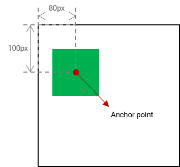
Defines an anchor point of the box positioned along the path. The anchor point specifies the point of the box which is to be considered as the point that is moved along the path.

Values have the following meanings:

auto
Computes to the value from offset-position, provided offset-path is none and offset-position is not auto. Otherwise, computes to the value from transform-origin. When auto is given to offset-anchor, and offset-path is none, offset-position behaves similar to background-position.
<position>
<percentage>
A percentage for the horizontal offset is relative to width of content area. A percentage for the vertical offset is relative to the height of the content area. For example, with a value pair of '100%, 0%', an anchor point is on the upper right corner of the box.
<length>
A length value gives a length offset from the upper left corner of the box’s content area.
The following explains how to set the anchor point of the box.
#plane {
  offset-anchor: center;
}

The red dot in the middle of the shape indicates the anchor point of the shape.

Shape with its anchor point
A red dot in the middle of a plane shape indicates the shape’s anchor point.
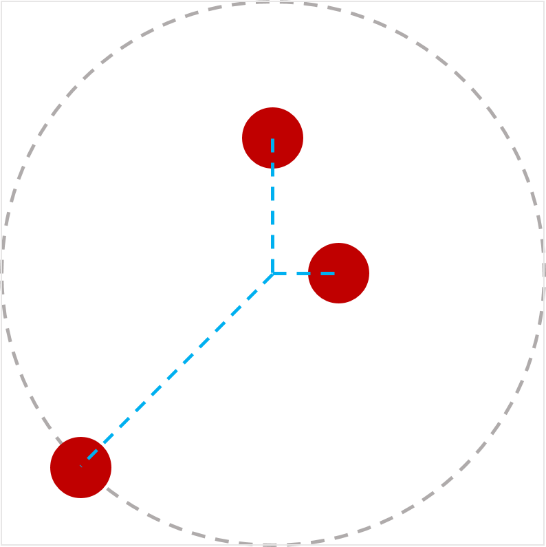
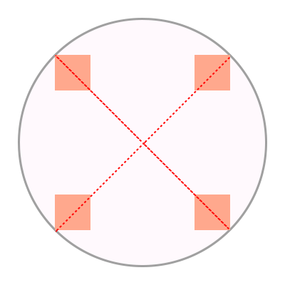
This example shows an alignment of four boxes with different anchor points.
<style>
  body {
    transform-style: preserve-3d;
    width: 300px;
    height: 300px;
    border: 2px solid gray;
    border-radius: 50%;
  }
  .box {
    width: 50px;
    height: 50px;
    background-color: orange;
    offset-position: 50% 50%;
    offset-distance: 100%;
    offset-rotate: 0deg;
  }
  #item1 {
    offset-path: ray(45deg closest-side);
    offset-anchor: right top;
  }
  #item2 {
    offset-path: ray(135deg closest-side);
    offset-anchor: right bottom;
  }
  #item3 {
    offset-path: ray(225deg closest-side);
    offset-anchor: left bottom;
  }
  #item4 {
    offset-path: ray(315deg closest-side);
    offset-anchor: left top;
  }
</style>
<body>
  <div class="box" id="item1"></div>
  <div class="box" id="item2"></div>
  <div class="box" id="item3"></div>
  <div class="box" id="item4"></div>
</body>
An example of offset-anchor
This example shows boxes centered at their offset-position.
<style>
  body {
    width: 500px;
    height: 500px;
  }
  .box {
    background-color: mediumpurple;
    offset-path: none;
    offset-anchor: center;
  }
  #item1 {
    offset-position: 90% 20%;
    width: 60;
    height: 20;
  }
  #item2 {
    offset-position: 100% 100%;
    width: 30;
    height: 10;
  }
  #item3 {
    offset-position: 50% 100%;
    width: 20;
    height: 60;
  }
  #item4 {
    offset-position: 0% 100%;
    width: 30;
    height: 90;
  }
</style>
<body>
  <div class="box" id="item1"></div>
  <div class="box" id="item2"></div>
  <div class="box" id="item3"></div>
  <div class="box" id="item4"></div>
</body>
An example of offset-anchor: center
An example of 'offset-anchor: center'
This example shows how offset-anchor computes to their offset-position.
<style>
  body {
    width: 500px;
    height: 500px;
  }
  .box {
    background-color: mediumpurple;
    offset-path: none;
    offset-anchor: auto;
  }
  #item1 {
    offset-position: 90% 20%;
    width: 60;
    height: 20;
  }
  #item2 {
    offset-position: 100% 100%;
    width: 30;
    height: 10;
  }
  #item3 {
    offset-position: 50% 100%;
    width: 20;
    height: 60;
  }
  #item4 {
    offset-position: 0% 100%;
    width: 30;
    height: 90;
  }
</style>
<body>
  <div class="box" id="item1"></div>
  <div class="box" id="item2"></div>
  <div class="box" id="item3"></div>
  <div class="box" id="item4"></div>
</body>
An example of offset-anchor: auto
An example of 'offset-anchor: auto'

4.5. Rotation at point: The offset-rotate property

Name: offset-rotate
Value: [ auto | reverse ] || <angle>
Initial: auto
Applies to: transformable elements
Inherited: no
Percentages: n/a
Media: visual
Computed value: as specified
Canonical order: per grammar
Animatable: yes

Defines the orientation of the box while positioning along the path.

Values have the following meanings:

auto
Indicates that the object is rotated (over time if offset-distance is animated) by the angle of the direction (i.e., directional tangent vector) of the path, relative to the positive x-axis. If specified in combination with <angle>, the computed value of <angle> is added to the computed value of auto.

Note: For ray paths, the rotation implied by auto is 90 degrees less than the ray’s bearing <angle>.

reverse
Indicates that the object is rotated (over time if offset-distance is animated) by the angle of the direction (i.e., directional tangent vector) of the path, relative to the positive x-axis, plus 180 degrees. If specified in combination with <angle>, the computed value of <angle> is added to the computed value of reverse.

Note: This is the same as specifying auto 180deg.

<angle>
Indicates that the box has a constant clockwise rotation transformation applied to it by the specified rotation angle. See definitions of auto or reverse if specified in combination with either one of the keywords.

When the offset path is a zero length path, the value of offset-rotate is 0 degree, the direction of the positive x-axis.

If the offset path is composed of multiple line segments, the orientation at the connection between the segments is the same as the direction of the previous segment.

Note: The rotation described here does not override or replace any rotation defined by the transform property.

The following examples use the shape of a plane. The red dot in the middle of the shape indicates the anchor point of the shape. When no offset properties are set, the shape is not translated or rotated along the path.
Path without offset
A black plane at the beginning of the path, with no offset properties set.

When the shape’s anchor point is placed at different positions along the path and offset-rotate is 0deg, the shape is not rotated.

Path without rotation
A black plane at different positions on a blue dotted path without rotation transforms.

If the offset-rotate property is set to auto, and the shape’s anchor point is placed at different positions along the path, the shape is rotated based on the gradient at the current position and faces the direction of the path at this position.

Path with auto rotation
A black plane at different positions on a blue dotted path, rotated in the direction of the path.

In this example, the offset-rotate property is set to reverse. The plane faces the opposite direction of the path at each position on the path.

Path with reverse auto rotation
A black plane at different positions on a blue dotted path, rotated in the opposite direction of the path.

The last example sets the offset-rotate property to -45deg. The shape is rotated anticlockwise by 45 degree once and keeps the rotation at each position on the path.

Path with fixed rotation
A black plane at different positions on a blue dotted path, rotated by a fixed amount of degree.
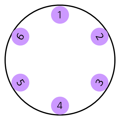
This example shows how auto or reverse work when specified in combination with <angle>. The computed value of <angle> is added to the computed value of auto or reverse.
<style>
  body {
    width: 300px;
    height: 300px;
    margin: 0px;
    border: solid gray;
    border-radius: 50%;
  }
  .circle {
    offset-position: 150px 150px;
    width: 50px;
    height: 50px;
    background-color: mediumpurple;
    border-radius: 50%;
    display: flex;
    align-items: center;
    justify-content: center;
  }
  #item1 {
    offset-path: ray(0deg closest-side);
    offset-distance: 90%;
    offset-rotate: auto 90deg;
  }
  #item2 {
    offset-path: ray(45deg closest-side);
    offset-distance: 90%;
    offset-rotate: auto 90deg;
  }
  #item3 {
    offset-path: ray(135deg closest-side);
    offset-distance: 90%;
    offset-rotate: auto -90deg;
  }
  #item4 {
    offset-path: ray(180deg closest-side);
    offset-distance: 90%;
    offset-rotate: auto -90deg;
  }
  #item5 {
    offset-path: ray(225deg closest-side);
    offset-distance: 90%;
    offset-rotate: reverse 90deg;
  }
  #item6 {
    offset-path: ray(-45deg closest-side);
    offset-distance: 90%;
    offset-rotate: reverse -90deg;
  }
</style>
<body>
  <div class="circle" id="item1">1</div>
  <div class="circle" id="item2">2</div>
  <div class="circle" id="item3">3</div>
  <div class="circle" id="item4">4</div>
  <div class="circle" id="item5">5</div>
  <div class="circle" id="item6">6</div>
</body>
An image of example for offset-rotate
The boxes are rotated by the value of auto with a fixed amount of degree.

4.5.1. Calculating the path transform

  1. Create a supplemental transformation matrix T1 for the local coordinate system of the box.

  2. Find the initial position of the offset path specified by offset-position as T2.

  3. Let P be the point at the used offset distance along the offset path.

  4. Find the translation of the box such that its anchor point is placed at P, and apply that to T2.

  5. Post-multiply T2 by the rotation specified by offset-rotate.

  6. Post-multiply T2 to T1.

  7. Post-multiply T1 to the local coordinate system of the box.

Do we need to say how to get the position in more detail?

There needs to be a process for converting rotate to an angle.

4.6. Offset shorthand: The offset property

Name: offset
Value: [ <offset-position>? [ <offset-path> [ <offset-distance> || <offset-rotate> ]? ]? ]!
[ / <offset-anchor> ]?
Initial: see individual properties
Applies to: transformable elements
Inherited: no
Percentages: see individual properties
Media: visual
Computed value: see individual properties
Canonical order: per grammar
Animatable: see individual properties

This is a shorthand property for setting offset-position, offset-path, offset-distance, offset-rotate and offset-anchor. Omitted values are set to their initial values.

Changes

This section is non-normative.

The following changes were made since the 9 April 2015 First Public Working Draft.

Acknowledgments

The editors would like to thank to Eric Willigers for contributing to this specification. Thanks to fantasai, Hyojin Song, and all the rest of the CSS WG members for their reviews, comments, and corrections.

Conformance

Document conventions

Conformance requirements are expressed with a combination of descriptive assertions and RFC 2119 terminology. The key words “MUST”, “MUST NOT”, “REQUIRED”, “SHALL”, “SHALL NOT”, “SHOULD”, “SHOULD NOT”, “RECOMMENDED”, “MAY”, and “OPTIONAL” in the normative parts of this document are to be interpreted as described in RFC 2119. However, for readability, these words do not appear in all uppercase letters in this specification.

All of the text of this specification is normative except sections explicitly marked as non-normative, examples, and notes. [RFC2119]

Examples in this specification are introduced with the words “for example” or are set apart from the normative text with class="example", like this:

This is an example of an informative example.

Informative notes begin with the word “Note” and are set apart from the normative text with class="note", like this:

Note, this is an informative note.

Advisements are normative sections styled to evoke special attention and are set apart from other normative text with <strong class="advisement">, like this: UAs MUST provide an accessible alternative.

Conformance classes

Conformance to this specification is defined for three conformance classes:

style sheet
A CSS style sheet.
renderer
A UA that interprets the semantics of a style sheet and renders documents that use them.
authoring tool
A UA that writes a style sheet.

A style sheet is conformant to this specification if all of its statements that use syntax defined in this module are valid according to the generic CSS grammar and the individual grammars of each feature defined in this module.

A renderer is conformant to this specification if, in addition to interpreting the style sheet as defined by the appropriate specifications, it supports all the features defined by this specification by parsing them correctly and rendering the document accordingly. However, the inability of a UA to correctly render a document due to limitations of the device does not make the UA non-conformant. (For example, a UA is not required to render color on a monochrome monitor.)

An authoring tool is conformant to this specification if it writes style sheets that are syntactically correct according to the generic CSS grammar and the individual grammars of each feature in this module, and meet all other conformance requirements of style sheets as described in this module.

Partial implementations

So that authors can exploit the forward-compatible parsing rules to assign fallback values, CSS renderers must treat as invalid (and ignore as appropriate) any at-rules, properties, property values, keywords, and other syntactic constructs for which they have no usable level of support. In particular, user agents must not selectively ignore unsupported component values and honor supported values in a single multi-value property declaration: if any value is considered invalid (as unsupported values must be), CSS requires that the entire declaration be ignored.

Implementations of Unstable and Proprietary Features

To avoid clashes with future stable CSS features, the CSSWG recommends following best practices for the implementation of unstable features and proprietary extensions to CSS.

Non-experimental implementations

Once a specification reaches the Candidate Recommendation stage, non-experimental implementations are possible, and implementors should release an unprefixed implementation of any CR-level feature they can demonstrate to be correctly implemented according to spec.

To establish and maintain the interoperability of CSS across implementations, the CSS Working Group requests that non-experimental CSS renderers submit an implementation report (and, if necessary, the testcases used for that implementation report) to the W3C before releasing an unprefixed implementation of any CSS features. Testcases submitted to W3C are subject to review and correction by the CSS Working Group.

Further information on submitting testcases and implementation reports can be found from on the CSS Working Group’s website at https://www.w3.org/Style/CSS/Test/. Questions should be directed to the public-css-testsuite@w3.org mailing list.

Index

Terms defined by this specification

Terms defined by reference

References

Normative References

[CSS-BACKGROUNDS-3]
CSS Backgrounds and Borders Module Level 3 URL: https://www.w3.org/TR/css3-background/
[CSS-CASCADE-4]
Elika Etemad; Tab Atkins Jr.. CSS Cascading and Inheritance Level 4. URL: https://www.w3.org/TR/css-cascade-4/
[CSS-CONTAIN-1]
Florian Rivoal. CSS Containment Module Level 1. URL: https://www.w3.org/TR/css-contain-1/
[CSS-MASKING-1]
Dirk Schulze; Brian Birtles; Tab Atkins Jr.. CSS Masking Module Level 1. URL: https://www.w3.org/TR/css-masking-1/
[CSS-POSITION-3]
Rossen Atanassov; Arron Eicholz. CSS Positioned Layout Module Level 3. URL: https://www.w3.org/TR/css-position-3/
[CSS-SHAPES]
Vincent Hardy; Rossen Atanassov; Alan Stearns. CSS Shapes Module Level 1. URL: https://www.w3.org/TR/css-shapes-1/
[CSS-TRANSFORMS-1]
Simon Fraser; et al. CSS Transforms Module Level 1. URL: https://www.w3.org/TR/css-transforms-1/
[CSS-TRANSFORMS-2]
CSS Transforms Module Level 2 URL: https://drafts.csswg.org/css-transforms-2/
[CSS21]
Bert Bos; et al. Cascading Style Sheets Level 2 Revision 1 (CSS 2.1) Specification. 7 June 2011. REC. URL: https://www.w3.org/TR/CSS2
[CSS3VAL]
Tab Atkins Jr.; Elika Etemad. CSS Values and Units Module Level 3. URL: https://www.w3.org/TR/css-values-3/
[RFC2119]
S. Bradner. Key words for use in RFCs to Indicate Requirement Levels. March 1997. Best Current Practice. URL: https://tools.ietf.org/html/rfc2119
[SVG11]
Erik Dahlström; et al. Scalable Vector Graphics (SVG) 1.1 (Second Edition). 16 August 2011. REC. URL: https://www.w3.org/TR/SVG11/
[SVG2]
Nikos Andronikos; et al. Scalable Vector Graphics (SVG) 2. URL: https://www.w3.org/TR/SVG2/
[URL]
Anne van Kesteren. URL Standard. Living Standard. URL: https://url.spec.whatwg.org/

Informative References

[CSS-ROUND-DISPLAY-1]
Jihye Hong. CSS Round Display Level 1. URL: https://www.w3.org/TR/css-round-display-1/

Property Index

Name Value Initial Applies to Inh. %ages Media Ani­mat­able Canonical order Com­puted value
offset-path none | ray( [ <angle> && <size> && contain? ] ) | <path()> | <url> | [ <basic-shape> || <geometry-box> ] none transformable elements no n/a visual as <angle>, <basic-shape> or <path()> per grammar as specified
offset-distance <length-percentage> 0 transformable elements no refer to the total path length visual yes per grammar For <length> the absolute value, otherwise a percentage.
offset-position auto | <position> auto transformable elements no Refer to the size of containing block visual as position per grammar For <length> the absolute value, otherwise a percentage.
offset-anchor auto | <position> auto transformable elements no Relative to the width and the height of a box visual as <position> per grammar For <length> the absolute value, otherwise a percentage.
offset-rotate [ auto | reverse ] || <angle> auto transformable elements no n/a visual yes per grammar as specified
offset [ <offset-position>? [ <offset-path> [ <offset-distance> || <offset-rotate> ]? ]? ]! [ / <offset-anchor> ]? see individual properties transformable elements no see individual properties visual see individual properties per grammar see individual properties

Issues Index

Do we need to say how to get the position in more detail?
There needs to be a process for converting rotate to an angle.