1. Introduction
Conventionally, web pages have been shown through a rectangular screen such as PC, tablet, and smart phone. The window content area in a web browser is a rectangle. Each HTML element follows the W3C box model and thus is also a rectangle.
Nowadays, devices come in varied shapes of the displays.
It needs to consider the shape of the display when implementing web pages on devices.
However, current web standards lack some features to support the devices as follows:
- Lack of the capability to detect the shape of a display
- Lack of layout mechanisms suitable for the shape of a display
The shape media feature is added to Media Queries.
Current user agents are not capable of detecting the shape of a display so that authors cannot apply various layouts for a round display. To resolve the issue, shape informs the web page of the property regarding the shape of the display.
To apply the shape of a display to content area, we extend the shape-inside property of CSS Shapes. The position of the element which is overflowed from the display is adjusted inside the display when using this property even if the authors don’t know the exact shape of the display.
We also add the border-boundary property to CSS Borders. The borders of the element can be drawn along the edge of the display even if the element is overflowed.
For the better web design suitable for a round display, we introduce polar positioning.
In conventional positioning method, the Cartesian coordinates, elements are positioned by offsets in x-axis and y-axis. But, we suggest a method to position elements with specifying the distance and angle from the origin point of coordinates.
This module provides features such as:
-
Detecting the rounded display
-
Aligning contents in the display’s shape
-
Drawing borders along the display’s edge
-
Positioning elements in polar coordinates
2. Terminology
This specification follows the CSS property definition conventions from [CSS21].
The detailed description of Media Queries is defined in [MEDIAQUERIES-4]
The detailed description of CSS Shapes is defined in [CSS-SHAPES-1]
The detailed description of Borders is defined in [CSS3-BORDER]
The detailed description of Positioned Layout is defined in [CSS3-POSITIONING]
3. Detecting the shape of the display
Media Queries [MEDIAQUERIES-4] define mechanisms to support media-dependent style sheets, tailored for different environments. We propose to extend Media Queries by adding the shape media feature to support various types of displays. This will allow web authors to apply different styles to a web page on the rounded display.
3.1. The shape media feature
| Name: | shape |
|---|---|
| For: | @media |
| Value: | rect | round |
| Type: | discrete |
Describes the general shape of the targeted display area of the output device. It accepts the following values:
- rect
- The shape is an axis aligned rectangle or square, or a similar shape such as rounded rectangle for which the traditional designs are appropriate.
- round
- The shape is rounded or a similar shape to the circle such as an oval, an ellipse for which distinctively rounded designs are appropriate.
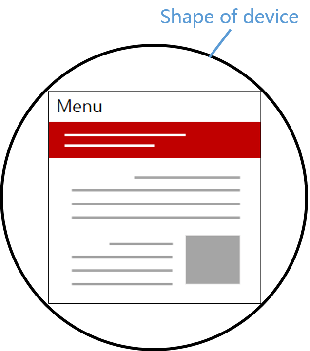
In the first example, the clock application doesn’t implemented with shape media feature, so it can’t deal with different types of displays. It only uses 'rectangle.css' which is designed for the rectangular display no matter what the type of the display is. On the round display, some parts of the clock application would be clipped.
<!DOCTYPE html>
<html>
<head>
    <link rel="stylesheet" href="rectangle.css" />
</head>
<body>
    <div id="clockLayer">
        <div id="clockLayer">
            <div id="date">2015/02/28 (SAT)</div>
            <div id="time">10:11</div>
            <div id="weather"><img src="cloudy.png" /></div>
        </div>
    </div>
</body>
</html>
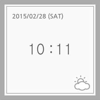
(A) Rectangle Display
(B) Round Display
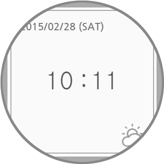
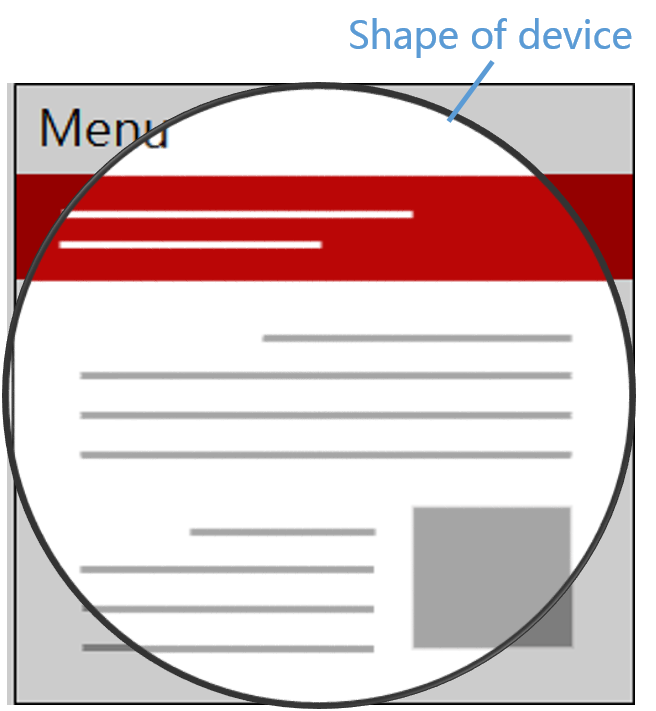
On the other hand, in the second example, the clock application uses shape media feature. The following media queries are added to the code of the clock application from the first example.
<!-- index.html -->
<head>
    <link media="screen and (shape: rect)" rel="stylesheet" href="rectangle.css" />
    <link media="screen and (shape: round)" rel="stylesheet" href="round.css" />
</head>
If the clock application is loaded in a round display, 'round.css' which is the design for the round display will be applied by the Media Queries mechanism.
(A) Rectangle Display
(when 'shape: rect' returns true)
(B) Round Display
(when 'shape: round' returns true)
Note: So far, the only standard APIs of Operating System which exposes
information about the display’s shape is isScreenRound() API in Android. isScreenRound() API returns a boolean that says round or not.
Refered the semantics of this API, when isScreenRound() returns true, shape: round should evaluate
to true and shape: rect should evaluate to false when isScreenRound() returns false.
shape is dealing with 2 shapes, but it can be extended if there are the needs about
configuring other shapes from the developers.
Note: There are cases when the UA may know the shape even in the absence of OS APIs. For example, when rendering to PDF, the shape is known to be a rectangle, so 'shape: rect' evaluates to true while shape: round to false
4. Extending the @viewport rule
4.1. The viewport-fit descriptor
viewport-fit can set the size of the visual viewport.
| Name: | viewport-fit |
|---|---|
| For: | @viewport |
| Value: | auto | contain | cover |
| Initial: | auto |
| Percentages: | N/A |
| Media: | visual, continuous |
| Computed value: | as specified |
The initial layout viewport seen through the physical screen of the device. On rounded screen, the part of the page that’s currently shown on-screen is round but the viewport is rectangular. Because of this, depending on the size of the viewport, some part of the page may be clipped.
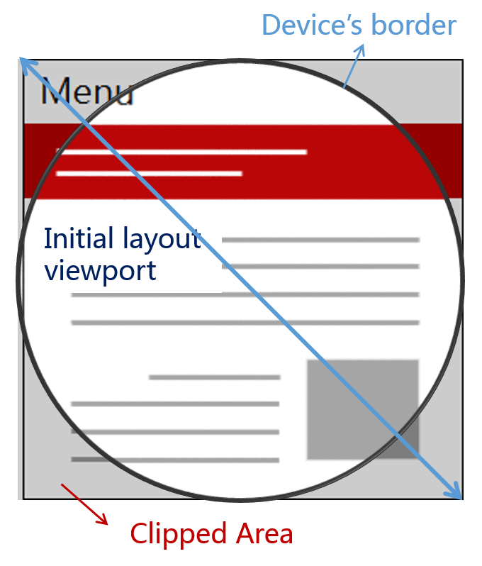
viewport-fit can control the clipped area by setting the size of the visual viewport.
Values have the following meanings:
- auto
- This value doesn’t affect the initial layout viewport, and the whole web page is viewable. What the UA paints outside of the viewport is undefined. It may be the background color of the canvas, or anything else that the UA deems appropriate.
- contain
- The initial layout viewport and the visual viewport are set to the largest rectangle
which is inscribed in the display of th
e device.
What the UA paints outside of the viewport is undefined.
It may be the background color of the canvas, or anything else that
the UA deems appropriate.
Note: With this value, 'border-boundary: display' and 'shape-inside: display' have no effect.
- cover
- The initial layout viewport and the visual viewport are set to the circumscribed rectangle of the physical screen of the device.
When setting the size of the bounding box for the viewport on the non-rectangular display, we have to consider the factors like below:
- Clipped area which is caused because the area of the viewport bounding box is larger than the area of the display
- Gap between the bounding box for the viewport and the area of the display
The author can decide which factor is more critical than another. If it have to be guaranteed that any part of the web page isn’t hidden, avoiding clipping is more important than having a gap between the bounding box of the viewport and the border of the screen. If the author doesn’t want web pages to be small for the readability, then it would be better to set viewport-fit as cover and to implement pages with considering the clipped parts.
This example shows the size of the bounding box for the viewport specified with viewport-fit on the rounded display.
When the viewport-fit is specified with contain, the initial viewport is applied to the largest inscribed rectangle of the display.
@viewport (viewport-fit: contain) {
    /* CSS for the rectangular design */
}
viewport-fit: contain' When cover is given to the viewport-fit, the initial viewport is applied to the circumscribed rectangle of the display.
@viewport {
    viewport-fit: cover;
}
@media (shape: round){
    /* styles for the round design */
}
@media (shape: rect){
    /* styles for the rectangular design */
}
viewport-fit: cover' 5. Aligning content along the display border
5.1. The shape-inside property
CSS Shapes [CSS-SHAPES-1] define the shape-inside property that aligns contents along the edge of a possibly non-rectangular wrapping area. Web authors may use this feature to fit contents inside a round display. However, it can be challenging to specify the wrapping area to be identical to the shape of a display. To address such cases, shape-inside is extended with a new value named 'display', such an element having this value will have its content (or contained elements) aligned along the display border automatically.
| Name: | shape-inside |
|---|---|
| Value: | auto | outside-shape | [ <basic-shape> || shape-box ] | <image> | display
|
| Initial: | auto |
| Applies to: | block-level elements |
| Inherited: | no |
| Percentages: | n/a |
| Media: | visual |
| Computed value: | computed lengths for <basic-shape>, the absolute URI for <uri>, otherwise as specified |
| Canonical order: | per grammar |
| Animatable: | as specified for <basic-shape>, otherwise no |
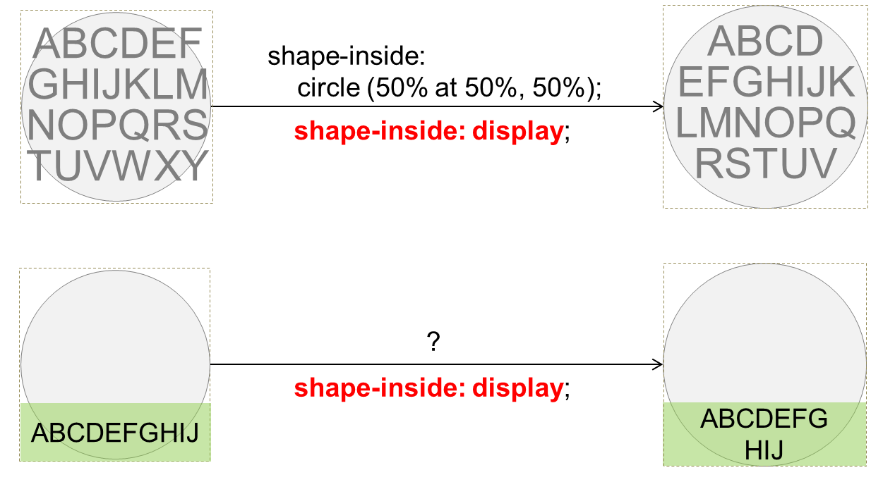
The example below shows how the shape-inside property works when it is set to 'display'.
Without using Media Queries, contents can be aligned within the display edge automatically.
<style>
    #container {
        shape-inside: display;
        // the same as circle(50% at 50%, 50%) in a regular round display
    }
    #green-box { float: left; }
    #blue-box { float: right; }
</style>
<div id="container">
    <p>
        Some inline content
        <img id="green-box" src="green-box.jpg" />
        with a float left and float right, in a
        <img id="blue-box" src="blue-box.jpg" />
        simple box with a circle shape-inside.
    </p>
</div>
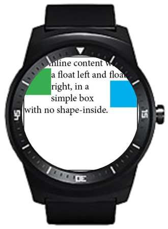
(A) Without 'shape-inside'
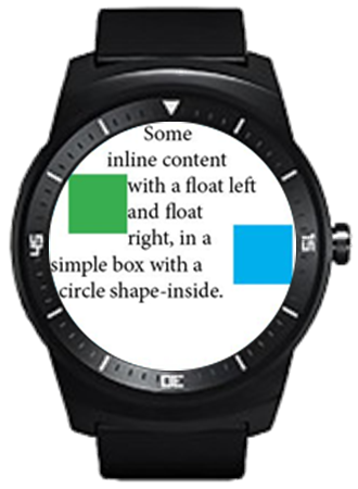
(B) With 'shape-inside: display'
This property is specially useful for complex shapes (e.g. curved, stelliform, polygonal), that wouldn’t be covered by <basic-shape> (i.e. circle() or ellipse()), allowing web authors to conveniently align contents with the display edge.
When a containing block is placed on one end of the display and the containing block has 'shape-inside: display', the descendant blocks of the containing block are basically put on the overlapping region between the containing block and the display area. The overlapping region’s shape is mostly complicated shape, so it’s difficult to define the shape using previous method like basic-shape. The figure 4 describes these circumstances as follows.
What if content overflows? Clipping or scrolling?
6. Drawing borders around the display border
6.1. The border-boundary property
We add the border-boundary property to set a boundary constraint that affects the borders of an element.
| Name: | border-boundary |
|---|---|
| Value: | none | parent | display |
| Initial: | none |
| Applies to: | all elements |
| Inherited: | yes |
| Percentages: | n/a |
| Media: | visual |
| Computed value: | as specified |
| Canonical order: | per grammar |
| Animation type: | discrete |
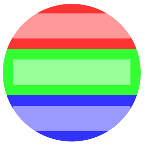
When the border-boundary property on an element is set to 'parent', additional borders of the element could be drawn where the element’s area and the borders of its parent are met. When it is set to 'display', additional borders could be drawn where the element’s area and the borders of screen are met. The default value is 'none', imposing no boundary constraint on the borders.
<style>
    #container {
        border-boundary: display;
    }
    #redBox {
        border: 5px red solid;
    }
    #greenBox {
        border: 5px green solid;
    }
    #blueBox {
        border: 5px blue solid;
    }
</style>
<div id="container">
    <div id="redBox"></div>
    <div id="greenBox"></div>
    <div id="blueBox"></div>
</div>
(A) Without 'border-boundary'
(B) With 'border-boundary: display'
Note: If the value of border-boundary is parent or display, border lines of the element are actually just a visual effect. It triggers a layout for rendering in a general way, but in the above cases (border-boundary: parent|display), the layout doesn’t occur and it only draws the border lines inward from the containing block’s borders. With this situation, the borders might hide contents around the display edge.
7. Use Cases
Use cases are described on these.
8. Changes
8.1. Changes from March 1th 2016 version
- Changed naming of the media query feature for detecting the shape of a display from device-radius to shape.
- Defined the value type of shape as round and rect.
- Added viewport-fit descriptor for @viewport rule.
- Removed polar positioning and Merged it into Motion Path [motion-1].
The element gets positioned in polar coordinate system using offset-path with the ray function, offset-distance, and offset-position.
(see issue #214)
See also previous changes.
9. Security Considerations
There are no known security issues introduced by these features.
10. Privacy Considerations
There are no known privacy issues introduced by these features.