1. Introduction
Conventionally, web pages have been shown through a rectangular screen such as PC, tablet, and smart phone. The window content area in a web browser is a rectangle. Each HTML element follows the W3C box model and thus is also a rectangle.
Nowadays, devices come in varied shapes of the displays.
It needs to consider the shape of the display when implementing web pages on devices.
However, current web standards lack some features to support the devices as follows:
- Lack of the capability to detect the shape of a display
- Lack of layout mechanisms suitable for the shape of a display
The device-radius media feature is added to Media Queries.
Current user agents are not capable of detecting the shape of a display so that authors cannot apply various layouts for a round display. To resolve the issue, device-radius informs the web page of the property regarding the shape of the display.
To apply the shape of a display to content area, we extend the shape-inside property of CSS Shapes. The position of the element which is overflowed from the display is adjusted inside the display when using this property even if the authors don’t know the exact shape of the display.
We also add the border-boundary property to CSS Borders. The borders of the element can be drawn along the edge of the display even if the element is overflowed.
For the better web design suitable for a round display, we introduce polar positioning.
In conventional positioning method, the Cartesian coordinates, elements are positioned by offsets in x-axis and y-axis. But, we suggest a method to position elements with specifying the distance and angle from the origin point of coordinates.
This module provides features such as:
-
Detecting the rounded display
-
Aligning contents in the display’s shape
-
Drawing borders along the display’s edge
-
Positioning elements in polar coordinates
2. Terminology
This specification follows the CSS property definition conventions from [CSS21].The detailed description of Media Queries is defined in [MEDIAQUERIES-4]
The detailed description of CSS Shapes is defined in [CSS-SHAPES-1]
The detailed description of Borders is defined in [CSS3-BORDER]
The detailed description of Positioned Layout is defined in [CSS3-POSITIONING]
3. Extending Media Queries for a round display
Media Queries [MEDIAQUERIES-4] define mechanisms to support media-dependent style sheets, tailored for different environments. We propose to extend Media Queries by adding the device-radius media feature to support a round display. This will allow web authors to apply different styles to a web page on the rounded display.
3.1. The device-radius media feature
To use different style sheets for a rectangle display and for a round display, media queries should support some properties to identify the display shape. The device-radius media feature describes the property of rounded borders of a display.<link media="screen and (device-radius: 0%)" rel="stylesheet" href="rectangle.css" /> <link media="screen and (device-radius: 50%)" rel="stylesheet" href="round.css" />
By the mechanism of media queries, if the value of the device-radius media feature is less than 50%, 'rectangle.css' is applied. If it is 50%, 'round.css' is applied.
As in the 'border-radius' property, the device-radius media feature can describe various round shapes of displays, such as rectangle, regular circle, ellipse, and rectangle with round corners.
| Name: | device-radius |
|---|---|
| For: | @media |
| Value: | [ <length> | <percentage> ] |
| Percentage: | Refer to corresponding dimension of the display |
| Type: | range |
Note: To define a 'range' type media feature, the feature may be written as a normal media feature, but with a 'min-' or 'max-' prefix on the feature name. 'min-' or 'max-' prefixes express 'greater or equal to' or 'smaller or equal to' constraints respectively.
The length or percentage value of the 'device-radius' property defines a radius of a quarter ellipse in terms of the shape of the corner of the outer screen edge (This is similar to the 'border-radius' property. See the border-radius description). If the length is zero, the shape of screen is a rectangle, otherwise it is a rectangle with rounded corners or a circle or an ellipse. A percentage value of the 'device-radius' is proportional to a width and a height of the screen, which have relevance to a horizontal radius and a vertical radius of the screen according to the length of width and height of the screen each. If the screen shape is the regular circle, 'device-radius': 50% has a true value since a half of the width(=height) of the regular circle is the radius of the screen shape. In case of an ellipse with 200x100, 'device-radius': 50% means that horizontal-radius of the screen is 100px and vertical-radius of the screen is 50px. It can’t be described in length, not percentage. A negative value is not allowed.
<!DOCTYPE html>
<html>
<head>
<link rel="stylesheet" href="rectangle.css" />
</head>
<body>
<div id="clockLayer">
<div id="clockLayer">
<div id="date">2015/02/28 (SAT)</div>
<div id="time">10:11</div>
<div id="weather"><img src="cloudy.png" /></div>
</div>
</div>
</body>
</html>
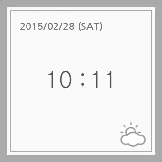
(A) Rectangle Display
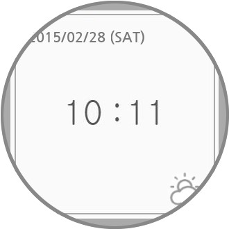
(B) Round Display
Devices where the device-radius media feature is not applicable
<!-- index.html -->
<head>
<link media="screen and (device-radius: 0%)" rel="stylesheet" href="rectangle.css" />
<link media="screen and (device-radius: 50%)" rel="stylesheet" href="round.css" />
</head>
If this example code is loaded in a regular round display, 'round.css' will be applied by the media queries mechanism. To render the clock properly, 'round.css' could be written as follows.
#clockLayer {
    border-radius: 50%;
}
#clockInset {
    border-radius: 50%;
}
#date {
    text-align: center;
}
...
(A) Rectangle Display
(w/ device-radius: 0%)
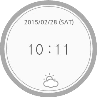
(B) Round Display
(w/ device-radius: 50%)
Devices where the device-radius media feature is applicable
Note: For other shapes, such as polygons, we need to extend the media features with additional parameters. The current features have limitations to support the diversity beyond round shapes. How can we express star-shaped polygons? (e.g. SVG syntax, etc.) Of course, there is a trade-off between simplicity and expressiveness.
The current device-radius media feature was derived from the syntax of border-radius to specify various shapes, but its usage is a little complicated with several issues. For simplicity and obviousness, device-radius would be changed with the revised syntax. (e.g. Am I round or rounded corners?)
4. Aligning content along the display border
4.1. The shape-inside property
CSS Shapes [CSS-SHAPES-1] define the shape-inside property that aligns contents along the edge of a possibly non-rectangular wrapping area. Web authors may use this feature to fit contents inside a round display. However, it can be challenging to specify the wrapping area to be identical to the shape of a display. To address such cases, shape-inside is extended with a new value named 'display', such an element having this value will have its content (or contained elements) aligned along the display border automatically.
| Name: | shape-inside |
|---|---|
| Value: | auto | outside-shape | [ <basic-shape> || shape-box ] | <image> | display
|
| Initial: | auto |
| Applies to: | block-level elements |
| Inherited: | no |
| Percentages: | n/a |
| Media: | visual |
| Computed value: | computed lengths for <basic-shape>, the absolute URI for <uri>, otherwise as specified |
| Animatable: | as specified for <basic-shape>, otherwise no |
The example below shows how the shape-inside property works when it is set to 'display'. Without using Media Queries, contents can be aligned within the display edge automatically.
<style>
    #container {
        shape-inside: display;
        // the same as circle(50% at 50%, 50%) in a regular round display
    }
    #green-box { float: left; }
    #blue-box { float: right; }
</style>
<div id="container">
    <p>
        Some inline content
        <img id="green-box" src="green-box.jpg" />
        with a float left and float right, in a
        <img id="blue-box" src="blue-box.jpg" />
        simple box with a circle shape-inside.
    </p>
</div>
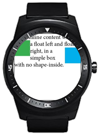
(A) Without 'shape-inside'
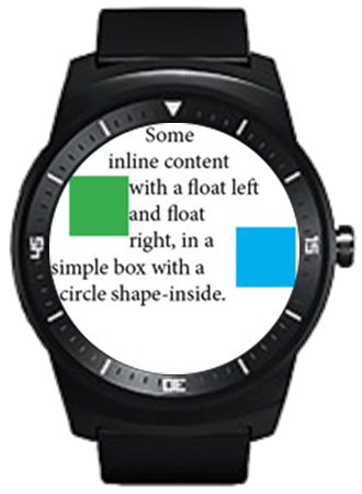
(B) With 'shape-inside: display'
Align the content along the display border
This property is specially useful for complex shapes (e.g. curved, stelliform, polygonal), that wouldn’t be covered by <basic-shape> (i.e. circle() or ellipse()), allowing web authors to conveniently align contents with the display edge.
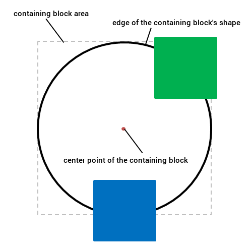
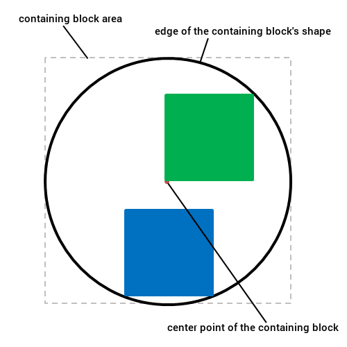
When a containing block is placed on one end of the display and the containing block has 'shape-inside: display', the descendant blocks of the containing block are basically put on the overlapping region between the containing block and the display area. The overlapping region’s shape is mostly complicated shape, so it’s difficult to define the shape using previous method like basic-shape. The figure 4 describes these circumstances as follows.
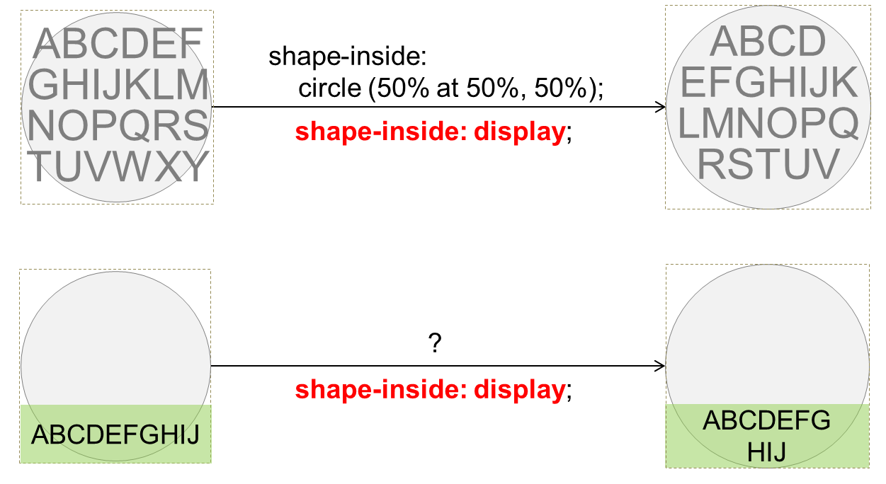
Align part of the content along the display border
What if content overflows? Clipping or scrolling?
5. Drawing borders around the display border
5.1. The border-boundary property
We add the border-boundary property to set a boundary constraint that affects the borders of an element.
| Name: | border-boundary |
|---|---|
| Value: | none | parent | display |
| Initial: | none |
| Applies to: | all elements |
| Inherited: | yes |
| Percentages: | n/a |
| Media: | visual |
| Computed value: | as specified |
| Animatable: | no |
When the border-boundary property on an element is set to 'parent', additional borders of the element could be drawn where the element’s area and the borders of its parent are met. When it is set to 'display', additional borders could be drawn where the element’s area and the borders of screen are met. The default value is 'none', imposing no boundary constraint on the borders.
<style>
    #container {
        border-boundary: display;
    }
    #redBox {
        border: 5px red solid;
    }
    #greenBox {
        border: 5px green solid;
    }
    #blueBox {
        border: 5px blue solid;
    }
</style>
<div id="container">
    <div id="redBox"></div>
    <div id="greenBox"></div>
    <div id="blueBox"></div>
</div>
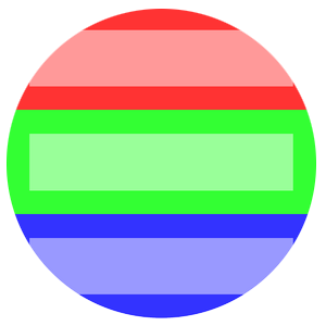
(A) Without 'border-boundary'
(B) With 'border-boundary: display'
Align the content along the display border
Note: If the value of border-boundary is parent or display, border lines of the element are actually just a visual effect. It triggers a layout for rendering in a general way, but in the above cases (border-boundary: parent|display), the layout doesn’t occur and it only draws the border lines inward from the containing block’s borders. With this situation, the borders might hide contents around the display edge.
6. Content positioning using polar coordinate system
Polar coordinate system is a two-dimensional coordinate system that describes the position of a point in a plane with a distance from a reference point and an angle from a reference direction. Elements could be placed along a circle or concentric circles, and the polar coordinate system is useful to handle such cases.
This section introduces polar positioning to support layout of elements in the polar coordinate system where the position of an element is determined by a distance from the center point within the containing element and an angle from the Y-axis.
The conventional coordinates used in web is the Cartesian coordinate system, but using polar-distance or polar-angle enables positioning an element in the polar coordinate system. The polar-angle and polar-distance properties specify the angular value and distance of an element from the origin in polar coordinates.
<body>
  <div id="circle1" style="position: polar; polar-angle: 0deg; polar-distance: 50%"></div>
  <div id="circle2" style="position: polar; polar-angle: 90deg; polar-distance: 20%"></div>
  <div id="circle3" style="position: polar; polar-angle: 225deg; polar-distance: 100%"></div>
</body>
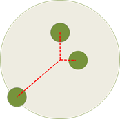
An example of polar positioning
In conventional coordinate system used for positioning an element in a containing block, the offset of the element is applied depending on the edges of the element’s containing block.
In comparison, the default origin of polar coordinates is positioned at the center point of a containing block. The position for the origin point can be set by polar-origin.
6.1. The polar-angle property
The polar-angle property specifies the angle from the Y-axis.| Name: | polar-angle |
|---|---|
| Value: | <angle> |
| Initial: | 0 |
| Applies to: | all elements |
| Inherited: | no |
| Percentages: | N/A |
| Media: | visual |
| Computed value: | as specified |
| Animatable: | as angle |
Note: In polar coordinate system, a pole is the reference point and points are described as been a certain distance from it, as also a certain angle from the polar axis. In mathematical theory, the polar axis is commonly defined as the positive direction of the x-axis, but we consider the polar axis as the positive direction of the y-axis position as other CSS specifications usually do. Therefore, when the polar-angle value of an element is 0, the element is positioned on the y-axis. If the angle value of an element increases in the positive direction from 0, the element moves clockwise. The method to determine a direction using polar-angle works the same way in [CSS-VALUES-3], <angle> value.
6.2. The polar-distance property
The polar-distance property determines how far elements are positioned from the origin of polar coordinates.| Name: | polar-distance |
|---|---|
| Value: | [ <length> | <percentage> <size>? ] && contain? |
| Initial: | 0 |
| Applies to: | all elements |
| Inherited: | no |
| Percentages: | relative to distance from the origin of polar coordinates to edge of containing block |
| Media: | visual |
| Computed value: | as specified |
| Animatable: | as length, percentage, or calc |
The polar-distance specifies the distance between the origin of polar coordinates and the anchor point of the element.
Values have the following meanings:
- <length>
- Gives a fixed length between the origin of polar coordinates and the anchor point of element.
- <percentage>
- Is relative to the distance between the origin of polar coordinates and the point of contact which is made by the edge of containing block and the gradient-line from the origin of polar coordinates. The value of the gradient of the line is polar angle value.
- <size>
-
Decides a point used for measuring the distance from the origin point.
It is defined as
<size> = [ closest-side | closest-corner | farthest-side | farthest-corner ]
If omitted it defaults to closest-corner. When the <size> is used with <percentage>, the calculated value of polar-distance is constant regardless of the value of polar-angle.
- closest-side
- The distance is measured between the origin and the closest side of the box from it.
- closest-corner
- The distance is measured between the origin and the closest corner of the box from it.
- farthest-side
- The distance is measured between the origin and the farthest side of the box from it.
- farthest-corner
- The distance is measured between the origin and the farthest corner of the box from it.
- contain
- Adjust polar-distance value of the positioned element which overflows shape of the containing block. The main purpose of this value is avoiding overflow when positioning elements. When overflowing occurs, the distance between the point of origin of polar coordinates and the anchor point of the element is reduced, until there are 2 contact points or less between edge of shape of containing block and content block of the element.
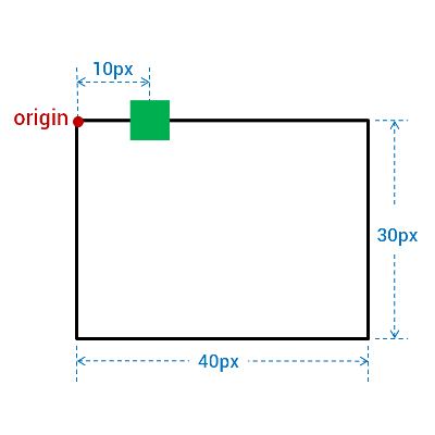
<div style="position: absolute; width: 40px; height: 30px;">
  <div id = “circle1” style="position: absolute; width: 4px; height: 4px;"></div>
  <div id = “circle2” style="position: absolute; width: 4px; height: 4px;"></div>
</div>
Specifying different <size> value for the same <percentage> value makes a difference in the positions of the elements.
The style below is for the (A),
<style>
  #circle1 {
    polar-origin: 10px 15px;
    polar-angle: 0deg;
    polar-distance: 100% closest-side;
  }
  #circle2 {
    polar-origin: 10px 15px;
    polar-angle: 90deg;
    polar-distance: 100% closest-side;
  }
</style>
And the next definition is for the (B)
<style>
  #circle1 {
    polar-origin: 10px 15px;
    polar-angle: 0deg;
    polar-distance: 100% closest-corner;
  }
  #circle2 {
    polar-origin: 10px 15px;
    polar-angle: 90deg;
    polar-distance: 100% closest-corner;
  }
</style>
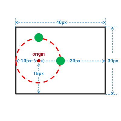
(A) With closest-side
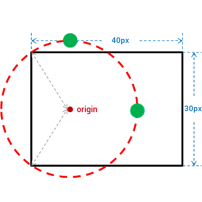
(B) With closest-corner
Using <size> with <percentage> for polar-distance
<body>
  <div style="position: absolute; polar-angle: 45deg; polar-distance: 100%"></div>
  <div style="position: absolute; polar-angle: 180deg; polar-distance: 100%"></div>
</body>
In the second example, contain, the extent keyword value is added to the polar-distance value of each element to avoid overflowing.
<body>
  <div style="position: absolute; polar-angle: 45deg; polar-distance: 100% contain"></div>
  <div style="position: absolute; polar-angle: 180deg; polar-distance: 100% contain"></div>
</body>
When the origin is at the top left corner and polar-distance is 100% shortest-side, how to get the calculated distance? In this case, the distance between the origin and the shortest side becomes 0.
6.3. The polar-origin property
The polar-origin property establishes the point of origin for coordinate system. It sets the horizontal and vertical representative point at which the offset values of the element is applied.
| Name: | polar-origin |
|---|---|
| Value: | <position> | auto |
| Initial: | auto |
| Applies to: | all elements |
| Inherited: | no |
| Percentages: | Refer to the size of containing block |
| Media: | visual |
| Computed value: | as specified |
| Animatable: | as length, percentage, or calc |
Where
<position> = [  [ left | center | right | top | bottom | <percentage> | <length> ]
|
  [ left | center | right | <percentage> | <length> ]
  [ top | center | bottom | <percentage> | <length> ]
|
  [ center | [ left | right ] [ <percentage> | <length> ]? ] &&
  [ center | [ top | bottom ] [ <percentage> | <length> ]? ]]
Values are defined as follows:
- <percentage>
- A percentage for the horizontal offset is relative to the width of the containing block. A percentage for the vertical offset is relative to height of the containing block.
- <length>
- A length value gives a fixed length as the offset. The value for the horizontal and vertical offset represent an offset from the top left corner of the containing block.
- top
- Computes to 0% for the vertical position.
- right
- Computes to 100% for the horizontal position.
- bottom
- Computes to 100% for the vertical position.
- left
- Computes to 0% for the horizontal position.
- center
- Computes to 50% (left 50%) for the horizontal position if the horizontal position is not otherwise specified, or 50% (top 50%) for the vertical position if it is.
- auto
- Computes to center if polar-origin is used in polar coordinates. But it computes as the box model layout in Cartesian coordinates.
In polar coordinates, there are many use cases specifying the position of the origin at the center point of the containing block. Therefore an element is positioned to the horizontally and vertically center in the area of the containing block when auto value is given to the polar-origin. But if it is used in conventional coordinate system, the origin of coordinate system is at the upper left corner of the containing block by default. For example, top and left are used for positioning the element, auto value makes the same result of giving 'top left' as the value of polar-origin.
#item1 {
  polar-origin: auto;
  polar-distance: 10px;
  polar-angle: 90deg;
}
"polar-origin: auto" is the same result with "polar-origin: center"
#item2 {
  polar-origin: auto;
  left: 10px;
}
"polar-origin: auto" is the same result with "polar-origin: top left"
As it’s available to specify the point of origin for polar coordinates, properties such as margin, padding would work different from the conventional coordinate system. We need different approaches to define those properties which are related to layout.
When polar-origin is not auto, it needs to be decided whether top, right, bottom, and left properties are ignored or interpreted somehow.
6.4. The polar-anchor property
The polar-anchor property sets an anchor point of the element. The anchor point specifies a position which is a representative point of the element. The anchor point could be set as any point within a content area of the element rather than being positioned to the upper left corner of the element by CSS box model.
With position: polar, the value of polar-distance is given to the distance between an anchor point and a center point of a containing block.
| Name: | polar-anchor |
|---|---|
| Value: | <position> |
| Initial: | 50% 50% |
| Applies to: | all elements |
| Inherited: | no |
| Percentages: | relative to width and height of an element |
| Media: | visual |
| Computed value: | as specified |
| Animatable: | as <position> |
Meanings of some keywords in <position> are different from those used in polar-origin property.
- <percentage>
- A percentage for the horizontal offset is relative to width of content box area of the element. A percentage for the vertical offset is relative to height of content box area of the element. For example, with a value pair of '100%, 0%', an anchor point is on the upper right corner of the element.
- <length>
- A length value gives a length offset from the upper left corner of the element’s content area.
Only with polar-angle and polar-distance to position elements, adjusting values of those properties for avoiding elements sticking out of the containing block is required. When the appropriate anchor point is given, there is no need to adjust polar-distance value to avoid overflowing when positioning elements in the containing block.
<style>
  #item1 {
    position: absolute;
    polar-angle: 45deg;
    polar-distance: 100%;
    polar-anchor: right top;
  }
  #item2 {
    position: absolute;
    polar-angle: 135deg;
    polar-distance: 100%;
    polar-anchor: right bottom;
  }
  #item3 {
    position: absolute;
    polar-angle: 225deg;
    polar-distance: 100%;
    polar-anchor: left bottom;
  }
  #item4 {
    position: absolute;
    polar-angle: 315deg;
    polar-distance: 100%;
    polar-anchor: left top;
  }
</style>
<body>
  <div id="item1"></div>
  <div id="item2"></div>
  <div id="item3"></div>
  <div id="item4"></div>
</body>
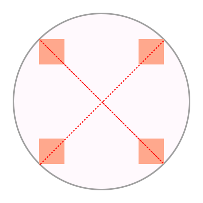
An example of polar-anchor
Is 'auto' needed for value of polar-anchor?
How to solve overflowing when an element has polar-anchor value as 'top', polar-angle value is 0deg, and polar-distance is equal to the distance from center to edge of containing block?
The alternative naming without the polar- prefix for polar-origin and polar-anchor is needed. When it becomes to use polar positioning regardless of the value of the position property, polar-origin and polar-anchor would be used independently from polar positioning.
How can the margin be applied to an element when polar-origin: 50% 50% and polar-anchor: 50% 50%?
Which would be a base point for applying it between the upper left corner or center of a containing block?
With the former, the position of the element changes when the value of the margin changes, while with the latter, the margin value doesn’t affect the position of the element.
Can polar-anchor be replaced by margin-top and margin-left?
There are several differences between polar-anchor and margin-left & margin-top.
In case of margin-left & margin-top, percentages resolve to the width of the element itself.
but in case of polar-anchor, percentage resolves to the width and height of a containing block of the element.
6.5. 2D Rotation Transform Function for self-rotating elements in polar coordinates
When elements are positioned in polar coordinates, there are many usecases which show the elements rotated toward the origin of polar coordinates. In such cases, degree of rotation has to be specified in the 2d rotation function for each element. But when using the keyword value instead of the <angle> value, the calculation of accurate rotation degree may be omitted.
The two-dimensional rotation function 'rotate(<angle>)' used in polar coordinates is extended as follows:
Values have the following meanings:
- polar-angle
- Rotate an element by the value of polar-angle property.
- polar-angle-reverse
- Rotate an element by the angle of the polar-angle property plus 180 degrees.
Note: polar-angle and polar-angle-reverse keywords resolve to angle values when determining the computed value of transform property.
It makes possible to define an animation such as transforming between rotate(0deg) and rotate(polar-angle). If there is an animation using polar-angle property, polar-angle value and polar-angle-reverse value track the changes in the value of the polar-angle property.
<style>
  #item1 {
    position: absolute;
    polar-angle: 0deg;
    polar-distance: 90%;
    transform: rotate(polar-angle);
  }
  #item2 {
    position: absolute;
    polar-angle: 45deg;
    polar-distance: 90%;
    transform: rotate(polar-angle);
  }
  #item3 {
    position: absolute;
    polar-angle: 135deg;
    polar-distance: 90%;
    transform: rotate(polar-angle-reverse);
  }
  #item4 {
    position: absolute;
    polar-angle: 180deg;
    polar-distance: 90%;
    transform: rotate(polar-angle-reverse);
  }
  #item5 {
    position: absolute;
    polar-angle: 225deg;
    polar-distance: 90%;
    transform: rotate(polar-angle-reverse);
  }
  #item6 {
    position: absolute;
    polar-angle: -45deg;
    polar-distance: 90%;
    transform: rotate(polar-angle);
  }
</style>
<body>
  <div id="item1">1</div>
  <div id="item2">2</div>
  <div id="item3">3</div>
  <div id="item4">4</div>
  <div id="item5">5</div>
  <div id="item6">6</div>
</body>
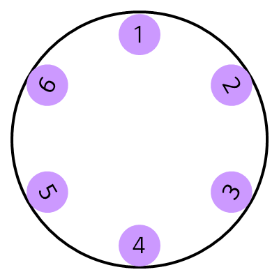
An example of the extension for 2d rotate function
7. Use Cases
Use cases are described on these.
8. Changes
8.1. Changes from September 22th 2015 version
- Added polar-anchor
- Added contain for polar-distance for avoiding the overflow issue.
- Added polar-origin
- Added extension for 2d rotation function for polar coordinates
- Changed naming of keyword values for 2d rotation function
- Removed
polarvalue of position. Polar positioning applies to absolute/fixed/sticky/relative positioned elements - Added auto value to polar-origin and make it as initial value
- Added <size> keywords to polar-distance
- Added the Acknowledgements, Use cases, and Changes
Acknowledgements
This specification is made possible by input from Dong-Young Lee, Soonbo Han, Florian Rivoal, Joone Hur, Kang-Soo Seo, Sangjo Park, Woojun Jung, Chisoon Jeong, Yunbum Sung, Alan Stearns, Brad Kemper, and the CSS Working Group members. Thanks also to Adenilson Cavalcanti for editorial input.