Strategies, standards, resources to make the Web accessible to people with disabilities
Easy Checks – A First Review of Web Accessibility
Introduction
This page helps you start to assess the accessibility of a web page. With these simple steps, you can get an idea whether or not accessibility is addressed in even the most basic way.
Even if you are new to web accessibility and not technical, you can check some aspects of accessibility yourself.
A person in front of the computer checking a website with passes and fails. The words new and non-technical are displayed. Icons around a computer: hand; eye; brain; ear and mouth with sound waves.
"Easy Checks - A First Review of Web Accessibility" gives you step-by-step instructions to get a rough idea of the accessibility of any web page.
An arrow moves from left to right to point a list of checks.
For example, a web page from your own website, from your competitor, or from suppliers you might want to work with.
3 websites with different formats.
It is not a complete evaluation of accessibility. More assessment by professionals is needed for a definitive and comprehensive evaluation.
A computer with a website shows the progress of an evaluation as items are either marked as a fail or pass.
Sometimes doing just a few of these checks can give you an indication of the overall accessibility.
Fails and passes stand out.
Some checks are simple. For example, looking at the title of the web page displayed in the browser window.
Web page title is highlighted.
You can do most of the checks using any web browser. Some checks are easier using an extension for your browser.
A browser extension is downloaded.
Start your accessibility journey right now by doing some Easy Checks.
A map with a route and an accessibility flag at the end.
Web accessibility: essential for some, useful for all.
Icons around a computer: hand; eye; brain; ear; and mouth with sound waves.
For information on easy checks for web accessibility, visit w3.o-r-g/W-A-I/evaluation.
Easy checks, W3C and Web Accessibility Initiative (WAI) logos.
Using these Easy Checks
Click headings with [+] buttons to get hidden information
Some sections of this page might not apply to your situation, for example, they are for a browser you don't have, or you only need to read them once. These sections are hidden by default so they don't clutter the page. You can expand them to see the information. The headings of hidden sections have a plus button [+] before them. Screen readers will say something like: "+ Section title, button collapsed". To get the hidden information, click the button or click anywhere on the heading.
The sections below all have hidden information under expandable headings. The first time you read this page, we recommend that you expand the headings of these five sections and read them.
Tools: WebDev Toolbar and IE WAT (optional)
You can do most of these checks with any browser, that is, you do not need to download special tools.
However, some checks are easier if you can download tools. To keep it simple, we've included instructions for just two tools: the Web Developer Toolbar for Chrome, Opera, and Firefox ("WebDev Toolbar") and the Web Accessibility Toolbar for Internet Explorer ("IE WAT"). Both are free extensions/add-ons available in different languages.
WebDev Toolbar - To do the checks that are indicated "with the WebDev Toolbar", you'll need either
(If you can't download these tools, that's OK; you can still do the checks indicated "with any browser".)
WCAG links
These checks are based on the Web Content Accessibility Guidelines (WCAG). The main points in WCAG are called "Success Criteria". In the "Learn more from" sections of this page, there are links to pages that explain the relevant success criteria in the "Understanding WCAG" document.
Please see the WCAG Overview for an introduction to WCAG.
Practicing with BAD, the Before-After Demo
The Before and After Demonstration (BAD) from W3C WAI shows an inaccessible website and a retrofitted version of this same website with the accessibility barriers fixed. You can use the BAD pages to learn how to do these checks. For example, first, do the check on an accessible version of a page to see what it should look like. Then, do the check on the corresponding inaccessible page to see what it looks like when there are accessibility barriers.
The BAD pages have annotations that are notes on what is accessible and not accessible in the demo pages. To turn on annotations, click "Show Annotations" in the yellow box near the top, middle of the page; then click a number and a box titled "Note ##" will open with the explanation.
Background
These checks are designed for anyone who can use the web. You don't need much knowledge or skill. Some of the checks require seeing the web page or hearing the audio. However, there are many things that anyone can check.
Here are some things to know that will help you understand the brief explanations throughout this page:
markup refers to web page code, called HTML. You can see the markup of a web page in most browsers by selecting from the menu: View > Source. You do not need to look at the markup to do these checks; however, it does help to understand what "markup" and "marked up" means.
assistive technologies (AT) are software or hardware that people with disabilities use to improve interaction with the web.
screen readers are software that reads aloud the information in web pages and enables keyboard navigation. They are used by people who are blind.
voice input is using speech instead of a keyboard and mouse.
Keyboard instructions: Ctrl for Windows, cmd for Mac
Some of the keyboard instructions are different for Windows and Mac; for example, "Ctrl" versus "cmd" in:
For Windows: With the keyboard: Ctrl+Alt+6, then down arrow key to "Heading structure".
For Mac: With the keyboard: cmd+Alt+6, then down arrow key to "Heading structure".
To reduce clutter, these are listed as:
With the keyboard: Ctrl/cmd+Alt+6, then down arrow key to "Heading structure".
For such instructions, Windows users press the Ctrl key, and Mac users press the cmd key.
Page title
Page titles are:
shown in the window title bar in some browsers
shown in browsers' tabs when there are multiple web pages open
shown in search engine results
used for browser bookmarks/favorites
read by screen readers
(In the web page markup they are the <title> within the <head>.)
The image below shows the page title "Easy Checks - A First Review of Web Accessibility" in the title bar, and the titles of 4 pages in the tabs. Note that in the tabs, only the first part of the page title is shown.
Figure: Firefox browser with full title in the title bar and partial titles in the tabs.
Good page titles are particularly important for orientation — to help people know where they are and move between pages open in their browser. The first thing screen readers say when the user goes to a different web page is the page title.
What to do:
Look at the page's title (or with a screen reader, listen to it).
Look at titles of other pages within the website.
What to check for:
Check that there is a title that adequately and briefly describes the content of the page.
Check that the title is different from other pages on the website, and adequately distinguishes the page from other web pages.
Tips
There is flexibility on what makes a good page title.
Best practice is for titles to be "front-loaded" with the important and unique identifying information first.
For example:
Poor titles:
Welcome to home page of Acme Web Solutions, Inc.
Acme Web Solutions, Inc. | About Us
Acme Web Solutions, Inc. | Contact Us
Acme Web Solutions, Inc. | History
Better page titles:
Acme Web Solutions home page
About Acme Web Solutions
Contact Acme Web Solutions
History of Acme Web Solutions
Page title checks
To check page title with different browsers
If you have a browser that displays the page title in the window title bar by default, use that browser. Some versions of Firefox, Safari, Opera, and older versions of IE show the title by default.
Firefox on Windows: If the title bar isn't displayed you might be able to display it by pressing: Alt+V, T, M (or right-mouse click in the empty area after the tab and select Menu Bar).
If your browser doesn't have a title bar, you can do try one of these:
With your mouse, hover over the browser tab to see the full page title, like this:
Figure: Page title in popup, displayed with mouse hover over tab.
Display the Add Bookmark dialog box, which includes the title. In some Windows browsers, press Ctrl+D. In some Mac browsers, press cmd+D to get the Add Bookmark dialog box.
To check page title with IE WAT
(Some versions of IE have the title bar so you can just look there, you don't need to do the steps below.)
Open the web page you are checking.
In the toolbar, select "Structure", then "Heading structure". Or, with the keyboard: Ctrl/cmd+Alt+6, then down arrow key to "Heading structure". A new page opens.
The page title is shown after "Title:".
Learn more about page titles
Page Titled - Understanding Success Criterion 2.4.2 for WCAG (Level A)
Image text alternatives ("alt text")
Text alternatives ("alt text") convey the purpose of an image, including pictures, illustrations, charts, etc. Text alternatives are used by people who do not see the image. (For example, people who are blind and use screen readers can hear the alt text read out; and people who have turned off images to speed download or save bandwidth can see the alt text.)
The text should be functional and provide an equivalent user experience, not necessarily describe the image. (For example, appropriate text alternative for a search button would be "search", not "magnifying glass".)
You don't usually see the alt text on a web page, it is in the web page markup (like this: <img src="pointer_to_image.png" alt="here's where the alternative text goes">).
Every image should include alt in the markup.
If an image conveys information useful for interacting with or understanding the web page content, then it needs alternative text.
If an image is just decorative and people don't need to know about the image, then it should have null alt (alt="").
Automated tests can tell you if alt is missing. To determine if the alternative text is appropriate, you need to see the image and judge it in context.
What to check for:
Every image has alt with appropriate alternative text.
Tips
Appropriate alternative text is not an exact science. Some people prefer most images to have more detailed description; and others prefer much less description.
Appropriate alt text:
The text needs to convey the same meaning as the image. That is, if someone cannot see the image, they get the important information from the image in the alternative text.
Alternative text depends on context. For example, for an image of a dog on a kennel club website, the alt text might include the breed of the dog; however, the same image on a dog park website may be there just to make the page more attractive, and the image might not need any alt text (and should have null alt). One way to help think about appropriate alt text is: if you were helping someone read and interact with the web page and they cannot see it, what would you say about the image?
Images that are functional — for example, images that initiate actions (like submit buttons) and linked images (like in navigation) — need alt text that is the functional equivalent.
If there is text in the image — for example, in a logo — that text needs to be included in the alt text.
If the image has complex information — such as charts or graphs — the image should have a short alt text to identify the image, and then the detailed description of the information should be provided elsewhere (for example, in a data table).
What is not needed in the alt text:
If the image is not important for understanding the content — for example, it is just decoration or "eye candy" — it should have null alt (alt=""). One way to help determine if an image should have null alt is to ask yourself: If the image was removed, would the user still get all the information from the page?
The alternative text does not need to include the words "button", "link", or "image of". (Screen readers automatically provide that information.)
If the image is sufficiently described in the text — for example, a simple diagram illustrating what's written in the web page text — it can have brief alt text such as "Diagram of work flow as describe above."
alt attribute in HTML (not "alt tag")
In HTML (which is web page code, called markup), alt is an attribute of the image element, and other elements. (So "alt tag" is technically incorrect; the correct terminology is "alt attribute", or you can say "alt text".) It looks like this in markup: <img alt="WAI logo" src="/wai/logo.png">
Alt text checks
There are three options to check alt text listed below. The first one is the easiest, if you have the IE WAT toolbar. If you don't have any toolbars, there is a check at the end for any browser.
To check alt text with IE WAT
Open the web page you are checking.
In the toolbar, select "Images", then "Show Images". Or, with the keyboard: Ctrl/cmd+Alt+4, then arrow down to "Show Images"
Figure: IE WAT toolbar with 'Images' drop down and 'Show Images' highlighted.If there are any images missing alt, a dialog box appears with the number of images without alt attributes.
The alt text will be displayed before the images in quotes on a light background.
To check for missing alt: Look for the text "NoAlt!" (visually, or with find-in-page). If you find it, that means the following image is missing alt.
To check if alt text is appropriate:
For each image, see if the alt text adequately conveys the information in the image it is next to, per the Tips above.
To check alt text with WebDev toolbar
Open the web page you are checking.
In the toolbar, select "Images", then "Outline Images", then "Outline Images Without Alt Attributes". Or, with the keyboard: Alt+T, W (to Web Developer Extension), I, O, A Red boxes appear around any images missing alt.
Figure: WebDev toolbar menu, and red boxes around images.
Note images without any alt text.
In the toolbar, select "Images", then "Display Alt Attributes". Or, with the keyboard: Alt+T, W (to Web Developer Extension), I, A The alt text will be displayed before the images as white letters on a red background.
Figure: WebDev toolbar menu, and alt text displayed.
For each image, see if the alt text adequately conveys the information in the image it is next to, per the Tips above.
To check alt text with any browser
Open WAVE web accessibility evaluation tool web page.
Type the website address in the box after "Enter the URL of the web site you want to evaluate:"
Click the "WAVE this page!" button. Your web page will show up in the browser with lots of little icons on it.
To check for missing alt: Look for the red alt icon (), or search for the alt text "ERROR: Missing alt text". If you find it, that means the following image is missing alt.
To check if alt text is appropriate:
Look for the green alt icon (). Next to it is text on a light blue background; the alt text is in between the asterisks (*). See if that text adequately conveys the information in the image it is next to, per the Tips above.
There are lots of images without alt text. (Many of these are just decorative and should have null alt text, per the Tips above.)
The weather image of the cloud and sun is missing alt.
Inappropriate alt text:
Near the top, left, see the long alt text starting with "Red dot with...". That description is way too detailed and includes unimportant information. The appropriate alt text in the accessible page is: "Citylights: your access to the city."
Near the bottom in the middle, see the image of text: "(1)269C-H-O-K-E". The alt is 123456789, which is not equivalent.
Appropriate alt text:
Near the top, see the W3C image; the alt text is: "W3C logo".
Web pages often have sections of information separated by visual headings, for example, heading text is bigger and bold (like "Headings" right above this sentence :-). To make these work for everyone, the headings need to be marked up. That way people can navigate to the headings — including people who cannot use a mouse and use only the keyboard, and people who use a screen reader.
Heading levels should have a meaningful hierarchy, e.g.:
Heading Level 1 <h1>
Heading Level 2 <h2>
Heading Level 3 <h3>
Heading Level 3 <h3>
Heading Level 2 <h2>
Heading Level 3 <h3>
Heading Level 4 <h4>
Heading Level 4 <h4>
Heading Level 2 <h2>
What to check for:
The page has a heading. In almost all pages there should be at least one heading.
All text that looks like a heading is marked up as a heading.
All text that is marked up as a heading is really a conceptual section heading.
The heading hierarchy is meaningful. Ideally the page starts with an "h1" — which is usually similar to the page title — and does not skip levels; however, these are not absolute requirements.
Headings checks
The checks below provide instructions with different browsers for how to get an outline from headings or headings markup in a page.
Headings outline: an outline of the headings that are marked up on page, for example:
Figure: Outline of headings.
Headings markup in page: a view of the page with the heading markup shown, for example:
Figure: Heading markup in page.
To check headings with WebDev toolbar
Headings outline:
Open the web page you are checking.
In the toolbar, select "Information", then "View Document Outline".Or, with the keyboard: Alt+T, W (to Web Developer Extension), I, M A new page opens with the outline.
Non-visual checks:
Are headings listed. If there are no headings marked up, it will say "0 headings".
Does the outline start with [H1] and follow a meaningful hierarchy? (That's not required, but strongly suggested.)
Visual checks: Compare the Document Outline to the visual rendering of the page.
Are the things that look like headings on the page listed in the Document Outline?
Are there things in the Document Outline that aren't really headings?
Heading markup in the page:
Open the web page you are checking.
In the toolbar, select "Outline", then "Show Element Tags Names When Outlining". Or, with the keyboard: Alt+T, W (to Web Developer Extension), O, S
In the toolbar, select "Outline", then "Outline Headings". Or, with the keyboard: Alt+T, W (to Web Developer Extension), O, H The headings will be outlined and <h1>, <h2>, etc. icons will be before the headings.
Anything that is a functional heading should have a heading icon before it.
Anything that is a not functional heading should not have a heading icon before it.
To check headings with IE WAT
Headings outline:
Open the web page you are checking.
In the toolbar, select "Structure", then "Heading Structure". Or, with the keyboard: Ctrl/cmd+Alt+6, then down arrow to "Heading structure". A new page opens with the outline.
Non-visual checks:
Are headings listed? If there are no headings marked up, it will say "0 headings".
Does the outline start with [H1] and follow a meaningful hierarchy? (That's not required, but strongly suggested.)
Visual checks: Compare the Document Outline to the visual rendering of the page.
Are the things that look like headings on the page listed in the Document Outline?
Are there things in the Document Outline that aren't really headings?
Heading markup in the page:
Open the web page you are checking.
In the toolbar, select "Structure", then "Headings". Or, with the keyboard: Ctrl/cmd+Alt+6, then down arrow to "Headings". Headings will be surrounded with <h1>, <h2>, etc. icons in purple text on a light background.
Anything that is a functional heading should have a heading icon before it.
Anything that is a not functional heading should not have a heading icon before it.
In the Address field, type the URI (e.g., www.w3.org).
Click the More Options link.
Select the Outline checkbox.
Click the Check button. The results page appears (with title starting either [Valid] or [Invalid]).
In the results page, near the top, at the end of the "Jump to:" line, click the Outline text link.
Non-visual checks:
Is there anything there? If there is no text between "Below is an outline for this document, automatically generated from the heading tags (<h1> through <h6>.)" and "If this does not look like a real outline..." it means there are no headings marked up on the page.
Does the outline start with [H1] and follow a meaningful hierarchy? (That's not required, but strongly suggested.)
Visual checks: Compare the Document Outline to the visual rendering of the page.
Are the things that look like headings on the page listed in the Document Outline?
Are there things in the Document Outline that aren't really headings?
Type the website address in the box after "Enter the URL of the web site you want to evaluate:"
Click the "WAVE this page!" button. Your web page will show up in the browser with lots of little icons on it.
Anything that is a functional heading should have a heading icon (, , , etc.) before it.
Anything that is a not functional heading should not have a heading icon before it.
To practice checking headings in BAD:
Headings outline:
Follow one of the instructions under "Headings outline" above and use the accessible News page: www.w3.org/WAI/demos/bad/after/news. Notice there is a nice hierarchical outline.
Next, use the inaccessible News page: www.w3.org/WAI/demos/bad/before/news. (In HTML Validator, the "Check" button might now say "Revalidate".) Notice there is just one heading.
Heading markup in the page:
Start by visually looking at the inaccessible BAD news page: www.w3.org/WAI/demos/bad/before/news. What looks like headings? (Citylights News, Heat wave linked to temperatures, Man Gets Nine Months in Violin Case, ...)
Next, see how it should look. Follow one of the instructions for "Heading markup in the page" above on the accessible News page: www.w3.org/WAI/demos/bad/after/home. Notice the headings have icons next to them.
Next, see what it looks like when headings are not marked up. Use the inaccessible News page: www.w3.org/WAI/demos/bad/before/home. Notice there is text that visually looks like headings, but does not have headings icons next to it. (With WAVE, there are yellow icons with "h?" because it thinks these might be headings.)
Some people cannot read text if there is not sufficient contrast between the text and background, for example, light gray text on a light background.
Figure: Gray text on light background.
High contrast (for example, dark text on light background or bright text on dark background) is required by some people with visual impairments, including many older people who lose contrast sensitivity from ageing.
Figure: Dark text on light background, and yellow text on black background.
While some people need high contrast, for others — including some people with reading disabilities such as dyslexia — bright colors (high luminance) are not readable. They need low luminance.
Figure: Brown text on dark background, and dark text on medium brown background.
Web browsers should allow people to change the color of text and background, and web pages need to work when people change colors.
(This accessibility requirement is sometimes called sufficient "color contrast"; however, that is incorrect — technically it's "luminance contrast". On this page we use "contrast ratio" as short for "luminance contrast ratio" because it's less jargony.) There is much more to know about contrast; we've just introduced the basics here.
What to check for:
Web pages should also have a minimum contrast by default: a contrast ratio of at least 4.5:1 for normal-size text.
There are basically three ways to check contrast, each with strengths and weaknesses.
Table with contrast ratio - The tool displays a table with all the possible contrast ratios in the web page. With some tools, you can click in the table and it will show where that color combination is in the web page.
Pro: Comprehensive.
Con: Can be inaccurate, specifically, it can show some color combinations that are not really in the displayed page.
Eye-dropper to select colors - The tool lets you select a text color and a background color, then it shows you the contrast ratio.
Pro: Accurate.
Con: Can only test one item at a time. Need to be able to see and use a mouse.
Turn off color. The tool shows the page in grayscale.
Pro: Gives you direct experience.
Con: Imprecise, does not provide contrast ratio value.
Contrast checks
Below are instructions for checking contrast with IE WAT; a list of other contrast analyzer tools is in the Related Resources section of Understanding Success Criterion 1.4.3.
To check contrast with IE WAT
Here's how to do the three checks for sufficient contrast described above.
Table with contrast ratio:
In the toolbar, select Color > Juicy Studio Luminosity Analyser.
Or, with the
keyboard: Ctrl/cmd+Alt+5, then down arrow to "Juicy Studio Luminosity Analyser". A new window opens titled Colour Contrast Analyser with the table of results. The last column is Luminosity Contrast Ratio.
Eye-dropper to select colors:
In the toolbar, select: Color > Contrast Analyser [application]. Or, with the
keyboard: Ctrl+Alt+5, then down arrow to "Contrast Analyser [application]". The Color Contrast Analyser application window opens.
Using the first eye-dropper icon from the foreground color section, pick the foreground color (usually the text) you want to analyze.
Using the second eye-dropper icon from the background color section, pick the corresponding background color.
In the bottom of the Color Contrast Analyser window, the resulting luminosity Contrast ratio will show (for example: 7.5:1), along with "Pass" or "Fail" and a visual example of the colors.
Turn off color:
In the toolbar, select Color > Grey Scale. Or, with the
keyboard: Ctrl+Alt+5, then down arrow to "Gray Scale".
Check if any information is lost or hard to see when all colors are converted to grayscale.
Checking contrast with other browsers
There is not an easy way to check contrast with the WebDev toolbar. There is a Juicy Studio Accessibility Toolbar add-on that provides the same information as IE WAT above and works with Firefox.
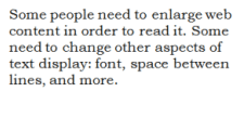
Some people need to enlarge web content in order to read it. Some need to change other aspects of text display: font, space between lines, and more.
Most browsers allow users to change text size through:
text size settings (usually through Options or Preferences)
text-only zoom
page zoom (which also zooms images, buttons, etc.)
When pages are not designed properly, they can be unusable when the text size is changed, especially when it is changed through text-only zoom or text settings. Sometimes columns and sections overlap, the space between lines disappears, lines of text become too long, or text disappears.
Figure: Two screen captures show that when text size is increased, the heading overlaps the main text, the main text overlaps the sidebar text; and the sidebar text is cut off at the bottom.
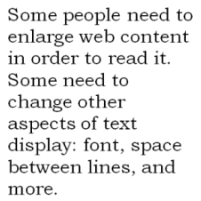
When text size is increased, sometimes part of the sentences are not visible and users have to scroll horizontally to read a sentence, as shown in the third example below. Most people cannot effectively read text that requires horizontal scrolling, and some disabilities make this impossible.
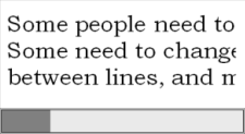
Figure: The first image shows normal-size text. In the second image, the larger text "wraps" to fit the width. In the third image, some of the larger text is not visible without scrolling horizontally.
What to do:
Increase the text size.
What to check for:
All text gets larger. (A common problem is that text is not provided as actual text format but instead the text is in an image. Text in images does not get larger when users increase text size.)
Text doesn't disappear or get cut off.
Text, images, and other content do not overlap.
All buttons, form fields, and other controls are visible and usable.
Horizontal scrolling is not required to read sentences or "blocks of text". It is best practice that when text size is increased, all the text in a sentence is visible. It is acceptable to have to scroll horizontally to get to different sections of a page. (For top-to-bottom languages, change "horizontal scrolling" to "vertical scrolling".)
Resize text checks
The instructions below are for text-only zoom. You can also change the text size settings, for example, through Tools > Options or Preferences. To keep this simple, we don't include instructions for changing those settings. We also don't include instructions for page zoom because it does not usually reveal the accessibility barriers described above.
For Chrome, you need an extention to get text-only zoom. Instructions for Firefox, Safari, and IE are below.
To check text-only zoom in Firefox
Set zoom to text only.
From the menubar, select View > Zoom > Zoom Text Only.
Or, with the keyboard: Alt+V, Z, T
Increase zoom to 200%.
To incrementally increase zoom with the keyboard:
Windows, press Ctrl+[+] (hold down the control key and press the + key at the same time).
On Mac, press command+[+] (hold down the command key and the + key at the same time).
Usually 4-6 key presses gets to 200%.
To check or set the zoom percent from the menu option:
Click the menu button.
In the customization menu, click the + button to zoom larger. The number before the + button is the current zoom percent.
To confirm that you have text-only zoom set from step 1, make sure that only the text is getting larger, not the images.
To check text-only zoom in Safari
Increase zoom to 200%.
From the menubar, select the View Menu, hold the option key, and select Make Text Bigger.
Or, with the keyboard on Mac, press option+command+[+] (hold down the option key, the command key, and the + key at the same time).
Usually 4-6 key presses gets to 200%. Confirm that only the text is getting larger, not the images.
To check text resize in IE
From the menubar, select View > Text Size > Largest.
Or, with the keyboard: Alt+V, X, G.
If you don't have a menubar, one of these may work to display it, depending on your version:
In the search box, type Internet Explorer, then in the list of results, click Internet Explorer.
To display the menus temporarily: Press the Alt key.
To display the menus permanently: Click the Tools button, point to Toolbars, and then click Menu Bar.
In the blank space at the top of the browser where menu bars usually are, right-click with the mouse. A pop-up menu appears.
Select Menu bar.
Learn more about resize text
Resize text - Understanding Success Criterion 1.4.4 for WCAG (Level AA)
Images of Text - Understanding Success Criterion 1.4.5 for WCAG (Level AA)
Keyboard access and visual focus
Many people cannot use a mouse and rely on the keyboard to interact with the Web. People who are blind and some sighted people with mobility impairments rely on the keyboard or on assistive technologies and strategies that rely on keyboard commands, such as voice input. Accessible websites enable people to access all content and functionality — links, forms, media controls, etc. — through a keyboard.
Keyboard focus should be visible and should follow a logical order through the page elements. Visible keyboard focus could be a border or highlight, as shown below, that moves as you tab through the web page.
Figure: Dotted border on middle link.
Figure: Name field is highlighted red.
What to do:
In a browser that supports keyboard navigation with the Tab key (for example, Firefox, IE, Chrome, and Safari; not Opera):
In Mac browsers, enable keyboard navigation to all controls.
In newer browsers: Select System Preferences > Keyboard > Shortcuts. Select the "All controls" option button.
In older browsers: Select System Preferences > Keyboard > Keyboard Shortcuts. In the "Full Keyboard Access" section, check "All Controls".
(In Windows browsers, you don't need to do this step.)
Click in the address bar, then put your mouse aside and do not use it.
Press the 'Tab' key to move through the elements on the page. You can press 'Shift-Tab' to go backwards.
To move within elements such as drop-down lists and menu bars, press the arrow keys.
To select a specific item within a drop-down list:
Tab to the list box,
use the arrow keys to move the focus to items,
when an item has focus, press the Enter key or Space bar to select that item.
What to check for:
Tab to all: Check that you can tab to all the elements, including links, form fields, buttons, and media player controls. (A common problem is that you cannot tab to media player controls.)
Tab away: Check that you can tab away from all elements that you can tab into. (A common problem is the keyboard focus gets caught in media controls and you cannot get out; it's called the "keyboard trap".)
Tab order: Check that the tab order follows the logical reading order (e.g., for left-to-right languages: top to bottom, left to right) in sequence.
Visual focus: Check that the focus is clearly visible as you tab through the elements, that is, you can tell which element has focus, e.g., links have a gray outline around them or are highlighted.
All functionality by keyboard: Check that you can do everything with the keyboard; that is, you don't need the mouse to activate actions, options, visible changes, and other functionality. (A common problem is that some functionality is available only with mouse hover, and is not available with keyboard focus.)
Drop-down lists: Check that after you tab into a drop-down list, you can use the arrow keys to move through all the options without triggering an action. (A common problem for drop-downs used for navigation is that as soon as you arrow down, it automatically selects the first item in the list and goes to a new page — you cannot get to other items in the list.)
Image links: Check that when images are links, they have clear visual focus and can be activated using the keyboard (usually by pressing the Enter key).
Note: This section is more complex than the others. If it's too complicated, consider skipping it for now and proceeding through the remaining checks.
Labels, keyboard access, clear instructions, and effective error handling are important for forms accessibility.
Form fields and other form controls usually have visible labels, such as "E-mail Address:" as the label for a text field.
When these labels are marked up correctly, people can interact with them using only the keyboard, using voice input, and using screen readers. Also, the label itself becomes clickable, increasing the target area and making it easier to select small radio buttons or checkboxes.
What to do:
Find any forms on the page. A form could be a single text box, such as Search, or could be a complex form with text fields, radio buttons, checkboxes, drop-down lists, and buttons.
What to check for:
Keyboard access
Check that all form controls are keyboard accessible by following the keyboard access checks above, including checking that you can get to all items in any drop-down lists.
Labels
Check that every form control has a label associated with it using 'label', 'for', and 'id', as shown in the labels checks below. (This is best practice in most cases, though not a requirement because a form control label can be associated in other ways.)
Check that the labels are positioned correctly. For left-to-right languages, labels should usually be:
Left of text boxes and drop-down lists.
Right of radio buttons and checkboxes.
Required fields and other instructions
Check that any fields that are required/mandatory are clearly indicated.
Check that the indicator does not rely on color alone, for example, if required fields were only indicated by red colored labels, they would not be accessible to people who do not see the different colors.
Check that the indicator (such as asterisks (*)) is included in the marked up field label for text boxes and drop-down lists, or legend for radio buttons and checkboxes, as shown in the labels checks below.
Check that any instructions for completing the form are before they are needed, for example,
General instructions should usually be at the top of the form or the section they relate to.
Check that required formats, such as dates (year-month-date in the format 0000-00-00), are included in the marked up label, using the labels checks below.
Error handling
Some simple forms, such as a single search field, might not have any errors. If you think the form(s) on the page you are checking might have error messages, try leaving required fields blank or entering incorrectly-formatted information (such as telephone number or e-mail address), then submitting the form. If you get errors:
Check that clear and specific guidance is provided to help people understand and fix the error. If the error concerns a format such as date, time, or address, check that the correct format is clearly explained.
Check that the errors are easily findable. Generally it is best if the error messages are before the form, rather than after the form.
Check that the fields without errors are still populated with the data you entered. (This is best practice, though not a requirement.) People should not have to re-enter all the information in the form, except for some sensitive data such as credit card numbers.
Labels checks
Note: These instructions help you check if labels are marked up with 'label', 'for', and 'id'; they do not check if form controls are identified in other ways. Therefore, even if a form does not pass these checks, it might still meet WCAG.
To check labels with IE WAT
Open the web page you are checking.
In the toolbar, select "Structure", then "FieldSet / Labels".
Or, with the keyboard: Ctrl+Alt+6, then down arrow key to "FieldSet / Labels", and select.
A dialog box appears with the number of errors and controls.
Figure: IE WAT dialog box.
The dialog box tells you the number of identified errors, the total number of form controls, and the number of controls that you need to check manually. For the rest of the steps you need to look at the text around the labels. If this is difficult, you could skip the next steps.
The form elements (labels and controls) are outlined in a red box, the markup is shown, and potential errors are indicated.
Example with no errors:
Figure: Form markup shown. Date label includes format.Example with potential errors:
Figure: Form markup shown. Date label does not include format. Fieldset missing legend.
Check that every field label has label for="x" before it and id="x" in the box with it, and that the text in quotes matches. ("x" can be anything; for example, for="park", id="park")
If the label is missing, it will indicate "Label no for".
If the for and id do not match, it will indicate "input No Match id="x" Error".
Check that the required field indicator is in the field label, or for radio button and check boxes, it is in the "legend". For example:
Correct: The asterisk (*) is included in the box around the label.
Incorrect: The asterisk (*) is outside of the box around the label.
Correct: "(required)" is in the legend.
Incorrect: "(required)" is not in the legend.
Checking labels with other browsers
There is not an easy way to check form control labels with the WebDev toolbar. There is a Form Labels favelet that provides the same information as IE WAT above and works with Firefox. It requires installation.
To check labels if you're comfortable looking at the HTML markup
Open the source HTML and find the form markup.
Check that:
Each form control has a label element with a for attribute that matches the value of the id attribute in the related control. For example: <label for="firstname">First name: </label>
<input type="text" name="firstname" id="firstname" />
Each id is unique within the web page.
To practice checking form labels and errors with BAD
Labels:
Open the Accessible Survey Page: www.w3.org/WAI/demos/bad/after/survey that has several forms. Do the label checks above.
Notice the 'label's, 'for's, and 'id's.
Open the Inaccessible Survey Page: www.w3.org/WAI/demos/bad/before/survey and do the label checks above.
In IE WAT, you get the dialog box saying there are errors and the errors are marked in the page with "<input Error>".
Errors:
Open the Accessible Survey Page: www.w3.org/WAI/demos/bad/after/survey. Leave the fields blank and Submit the form.
Notice the error messages at the top and the asterisks to indicate required fields. Also, the page title includes "Submission Failed".
Open the Inaccessible Survey Page: www.w3.org/WAI/demos/bad/before/survey. Leave the fields blank and Submit the form.
Notice errors are only indicated by the label being red, and there is no explanation of the errors.
Moving, flashing, or blinking content includes carousels (example carousel), ads, videos, auto-updating stock tickers, scrolling news feeds, and more. Users need to be able to control moving content, especially some people with attention deficit disorder or visual processing disorders.
Potential accessibility problems with moving, flashing, or blinking content include:
Understanding moving information — Some people read and process information slowly. The content may disappear before people have time to read it. Some people have difficulty tracking moving objects.
Distraction from moving content — Moving content can make focusing and reading elsewhere difficult; that is, people cannot focus on some content because the movement in another area of the web page grabs their attention.
Additionally, flashing or blinking content can cause seizures in people with photosensitive epilepsy, particularly if it:
flashes more than three times in one second,
covers a large enough area of the screen, and
is bright enough.
What to check for:
Check if there is any moving, blinking, or scrolling information that starts automatically and lasts more than five seconds. If there is, check that there is a way for the user to pause, stop, or hide the movement.
Check if there is any auto-updated information (such as stock price). If there is, check that there is a way for the user to pause, stop, or hide the updated information, or for the user to control the frequency of the update.
Check that no content flashes or blinks more than three times in one second. If it does, further evaluation is needed as explained in Three Flashes or Below Threshold.
To learn more about moving, flashing, or blinking content
Pause, Stop, Hide – Understanding Success Criterion 2.2.2 for WCAG (Level A)
Information in podcasts or other audio is not available to people who are deaf or some people who are hard of hearing, unless it is provided in an alternative format such as captions and text transcripts. Visual information in videos is not available to people who are blind or some people what have low vision, unless it is provided in an alternative format such as audio or text. (Text can be read by a screen reader or Braille display, or enlarged and reformatted for people with low vision.)
(Remember these easy checks are not comprehensive or definitive.)
What to check for:
Keyboard access
Follow the steps above for keyboard access to ensure that the media player controls are labeled and keyboard accessible.
Auto-start control
It is best if audio (including background noise and video with sound) does not start automatically when a web page opens. If it does start automatically, it should either:
Stop after 3 seconds.
Include controls to pause or stop the audio.
Include controls to turn down the volume.
Captions
(Captions are known as "subtitles" in some areas.)
Most video on the web that provides captions has "closed captions" that can be turned on and off. ("Open captions" are always shown.) For example, in YouTube, you turn on captions with the CC button (no known keyboard access). If there is not a CC button, there are no captions available for that video.
Automatic captions are not sufficient for accessibility because they are not accurate enough. For example, in YouTube, if only "automatic captions" are listed, there are no sufficient captions and the video is not accessible. Captions in the specific language need to be listed.
Figure: Captions listed: French (automatic captions), Norwegian.
If there are captions, you can check that:
The captions seem in sync with the spoken content.
The people who are speaking are identified when they speak.
Important sound other than dialogue — e.g., footsteps approaching, doors closing, glass breaking — is included.
Transcript
It is best practice to provide both captions and transcripts, although not always required; providing transcripts has many benefits — both to people with disabilities and to website owners.
Transcripts should be easy to find near the audio/video itself and any links to the audio/video.
Check that transcripts include all audio information, including dialogue with the speakers identified, and all important sound — e.g., footsteps approaching, doors closing, glass breaking.
A transcript for a video could provide all the audio and all the visual information, so that a person can get all the content of the video by reading the text.
Audio description
Audio description (sometimes known as described video, video description, or visual interpretation) is description of important visual information in a video, in order to make it accessible to people who cannot see. For example, some videos start out with a title in text, have speaker names in text, and have illustrations. That visual information needs to be provided to people who cannot see the video. It can be provided through:
Audio description - where the audio track includes someone describing the important visuals. Audio description can be included in the main video, or it can be provided in a separate video.
Text transcript - that includes description of meaningful visual information (so it's kind of like a screenplay).
While the other checks on this page focus on specific success criteria in WCAG, this check is more broad. It helps you understand how some people "see" the web page differently. For this basic structure check, you look at the web page without images, styles, and layout.
Web pages are often designed with multiple columns, sections, colors, and other visual aspects that help organize information for people who see the page in its default display. However, some people do not see the page this way. People who are blind listen to the page with a screen reader or read it from a Braille display. Some people with low vision and others change the way the page is displayed so they can read it; for example, change from multiple columns to one column, change the text size, and more.
An important issue is how the web page works when it is "linearized" into one column and the presentation is changed, as shown in the images below.
Images showing linearized and changed display (click to show images)
The images below illustrate how a web page is displayed in 3 columns by default and how it can be changed.
Figure A shows the default display of three columns, with the navigation at the left.
Figure A.
Figure B shows the page linearized into one column, with the navigation at the top. Figure C shows the page linearized, with the navigation at the bottom. The order of the sections (e.g., navigation at top or bottom or elsewhere) depends on how the web page is developed — the user usually cannot control the order.
Figure B.
Figure C.
Figure D shows the page linearized and with styles turned off. When you follow the Basic structure checks steps below, your page will look like something like this:
Figure D.
Figure E shows the page changed by a person with low vision to make it more readable, for example, the main text is big, the footer text is very small, and the headings are a different color.
Figure E.
While it is useful to have an experienced screen reader user check web pages, anyone can get an initial idea of potential accessibility barriers for screen reader users and others who change the way the page is presented. The steps below show you how to disable images, disable styles for how the page is usually displayed, and linearize the page to check the page structure.
Notes:
Data tables will not make sense when linearized — that's OK because screen readers have functionality to make data tables usable (when they are marked up correctly).
BAD provides a clear example of how the basic structure check reveals accessibility barriers. (It's also a bit funny, and we suggest you check it out, by following the BAD instructions below.)
What to do:
Get a basic structure view of the page by following the instructions under Basic structure checks below to:
Turn off images and show the text alternatives.
Turn off style sheets (CSS), which specifies how the page is displayed with layout, colors, etc.
Linearize the page or the tables (depending on the toolbar).
What to check for:
Check that the information makes sense when read in the order it is shown; for example, headings are right above the information they apply to. (Data tables do not need to make sense linearized, per the note above.)
Check that the alternative text provides adequate information for the missing images (per the Image text alternatives section above).
Check that blocks of information have clear headings (see also the Headings section above). When navigation, main content, and other sections have good headings, it's easier for people to find their way around the information.
Basic structure checks
To check basic structure with IE WAT
Open the web page you are checking.
In the toolbar, select "Images", then "Remove Images".
Or, with the keyboard: Ctrl+Alt+4, then arrow down to "Remove Images".
In the toolbar, select "CSS", then "Disable CSS".
Or, with the keyboard: Ctrl+Alt+3, then arrow down to "Disable CSS".
In the toolbar, select "Tables", then "Linearize".
Or, with the keyboard: Ctrl+Alt+7, then arrow down to "Linearize".
To check basic structure with WebDev toolbar
Open the web page you are checking.
In the toolbar, select "Images", then "Disable Images", then "Disable All Images".
Or, with the keyboard: Alt+T, W (to Web Developer Extension), I, D, D.
In the toolbar, select "CSS", then "Disable Styles", then "Disable All Styles".
Or, with the keyboard: Alt+T, W (to Web Developer Extension), S, D, D.
In the toolbar, select "Miscellaneous", then "Linearize Page".
Or, with the keyboard: Alt+T, W (to Web Developer Extension), M, I.
To check basic structure with any browser
Most browsers provide the option to turn off images and disable CSS from the menus. For example:
In Opera:
View > Images > Show Images
or, Alt+V, I, S
View > Style > User Mode
or, Alt+V, S, U
In Safari:
If the Develop menu is not shown in the menu bar, turn it on:
In Safari preferences, click Advanced.
Select the "Show Develop menu in menu bar" checkbox.
Develop > Disable Images
or, Ctrl+F2, D, down arrow to Disable Images
Develop > Disable Styles
or, Ctrl+F2, D, down arrow to Disable Styles
To practice checking basic structure with BAD
First use the Accessible Home Page www.w3.org/WAI/demos/bad/after/home with one of the checks above to turn off images, disable CSS, and linearize.
Skim down and notice that under "Welcome to CityLights" there are 3 article headlines with summary text under each headline.
Next use the Inaccessible Home Page www.w3.org/WAI/demos/bad/before/home with one of the checks above to turn off images, disable CSS, and linearize.
Skim down to find "Welcome to CityLights". Notice that it's much harder to find. That's because it's not marked up as a heading, per above.
Notice that the 3 article headings are together and the article text is together. (For fun, read the article text together.)
To check a form, use the Inaccessible Survey Page www.w3.org/WAI/demos/bad/before/survey (This example is easier to see with IE WAT.) Look at how the radio buttons are laid out. Then linearize.
Notice that that radio button labels are not with the buttons. (This is because the page uses layout tables incorrectly.)
Next steps
Now that you have an idea of the accessibility issues on a web page, two things you can do:
Share your findings with someone who can fix accessibility barriers.
Encourage thorough accessibility evaluation.
Share your findings
Contacting Organizations about Inaccessible Websites has guidance on reporting accessibility problems. It is focused for people who do not work for the organization that owns the website, yet also has some useful information if you do work for the organization — particularly the Introduction, Consider Your Approach, and Sources for More Information sections.
Encourage thorough accessibility evaluation
The checks on this page are not definitive; a web page could seem to pass these checks, yet still have significant accessibility barriers.
This page covers just a few accessibility issues. There are other accessibility issues not covered in these easy checks, for example: links, data table markup, reliance on color, and much more.
More robust assessment is needed to evaluate accessibility comprehensively. Guidance is available from:
 Video: Easy Checks Overview


 ), or search for the alt text "ERROR: Missing alt text". If you find it, that means the following image is missing alt.
 ). Next to it is text on a light blue background; the alt text is in between the asterisks (*). See if that text adequately conveys the information in the image it is next to, per the Tips above.


 ,
,  ,
,  , etc.) before it.