
 > WAI Web site
redesign project > design summary
> WAI Web site
redesign project > design summary
WAI Site Design
Workspace
Version: 2004.08.25
Note: This Web page is a working draft
and should not be referenced or quoted under any circumstances.
on this page: common page
components | visual design parameters | sketchpad
The following common components will be on every page:
- W3C and WAI logos
- "Utility" navigation:
- skip to content
- change text size or colors
- WAI Site Map
- Search [link to "W3C Search" for now. later (when functionality
is available) WAI Search label, box, button]
- Hierarchical navigation starting from W3C home page and including WAI
home page
- Footer (last updated, copyright)
The following will be only on certain pages, not on every
page:
- Contents list (in-page "anchor links") usually of the H2s on the page
[on most pages]
- back to top link (in-page "anchor links") at bottom &/or throughout
page [on about 75% of the pages]
- Related pages section [on most pages]
- Document information, such as editor acknowledgements name, sentences,
or short paragraph [probably on about 50% of the pages]
- Version number [probably on about 50% of the pages]
The following are used in WAI pages and should be considered in design:
lists (lots!), links (in-line text, bullet lists, etc.), forms (a few),
tables (very few) ...
- WAI home template
- Page template
- some without related links section
- some without in-page contents links
Absolute requirements
- Provide both a home page and a subpage:
NOTE: the wireframes are not models of good visual design, just
format for layout without any design!
- Include all content that is in the wireframe layout
and only content that is in the wireframe layout.
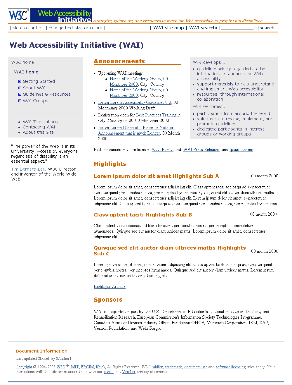
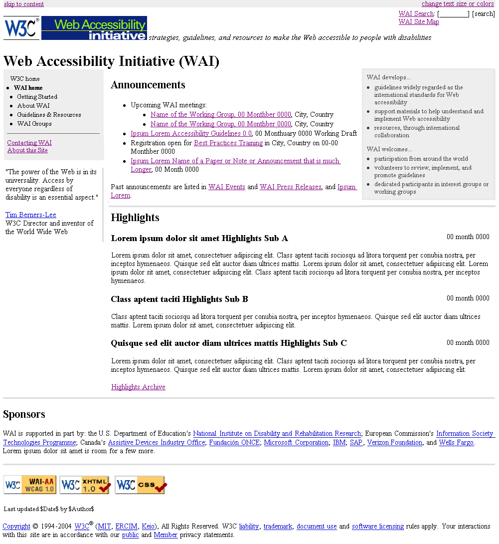
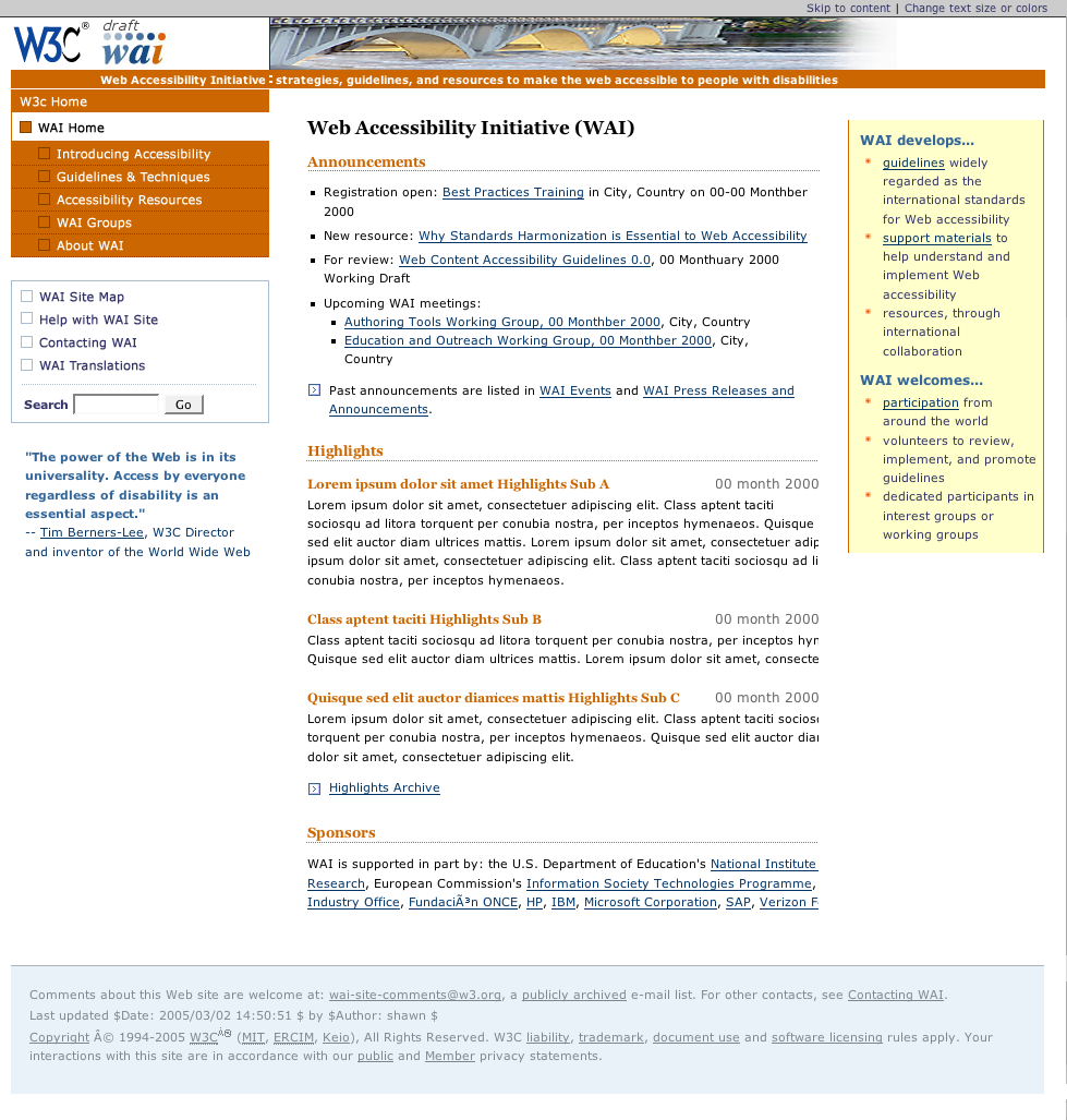
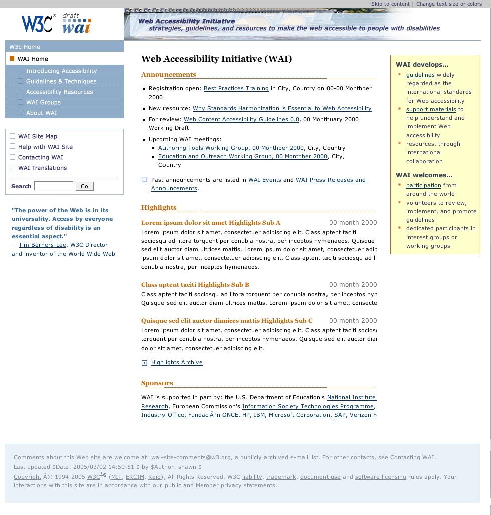
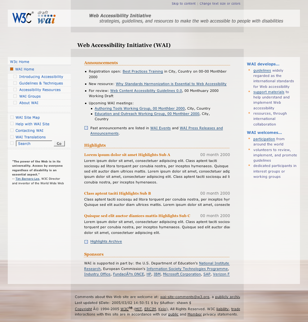
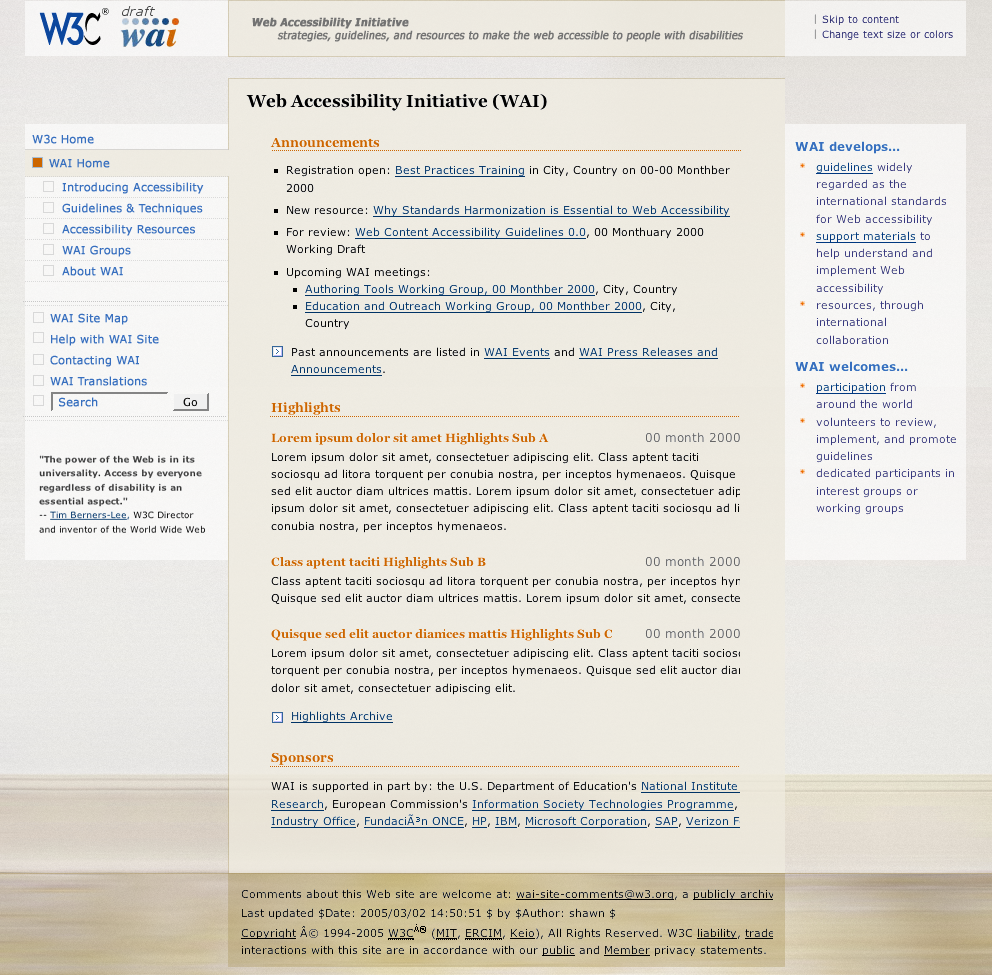
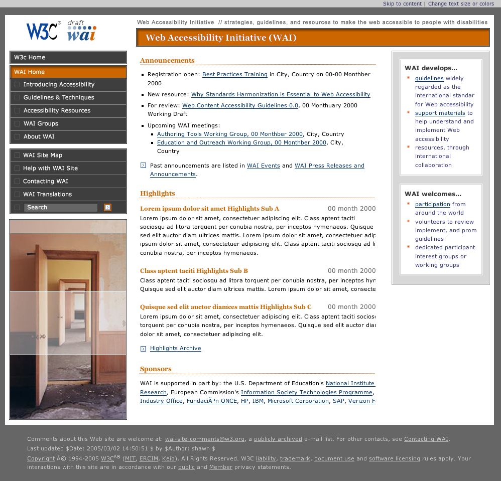
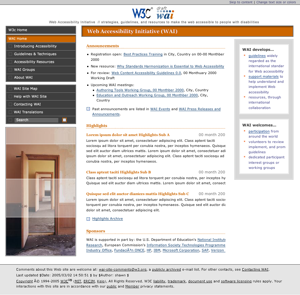
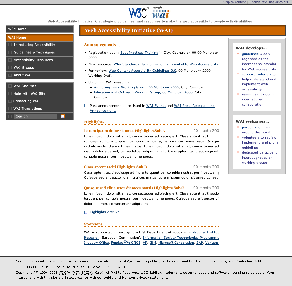
- Home page layout
Place the following elements in the position described (as is in the
wireframe layout):
- W3C logo and existing WAI logo near the top,
left
- The main navigation in a column along the left
(starting with W3C Home), followed by
the Contacting WAI and About this Site links,
followed by
the quote
- Announcements in a center column, followed by
Highlights
- The WAI develops and WAI welcomes bullets in a
right column
- The sponsors at the bottom, followed by
the WCAG, XHTML, and CSS logos, followed by
the footer (last updated, copyright)
These elements may be placed as is in the wireframe, or elsewhere
- skip to content - should probably be the very
first thing; however, want it to have very little emphasis
- change text size of colors - want it to have very
little emphasis
- WAI site map
- WAI Search box, label, button (include all
three!) - may be positioned top, right as is in the wireframe,
or elsewhere
- tag line - may be positioned after the logos as is
in the wireframe, or elsewhere
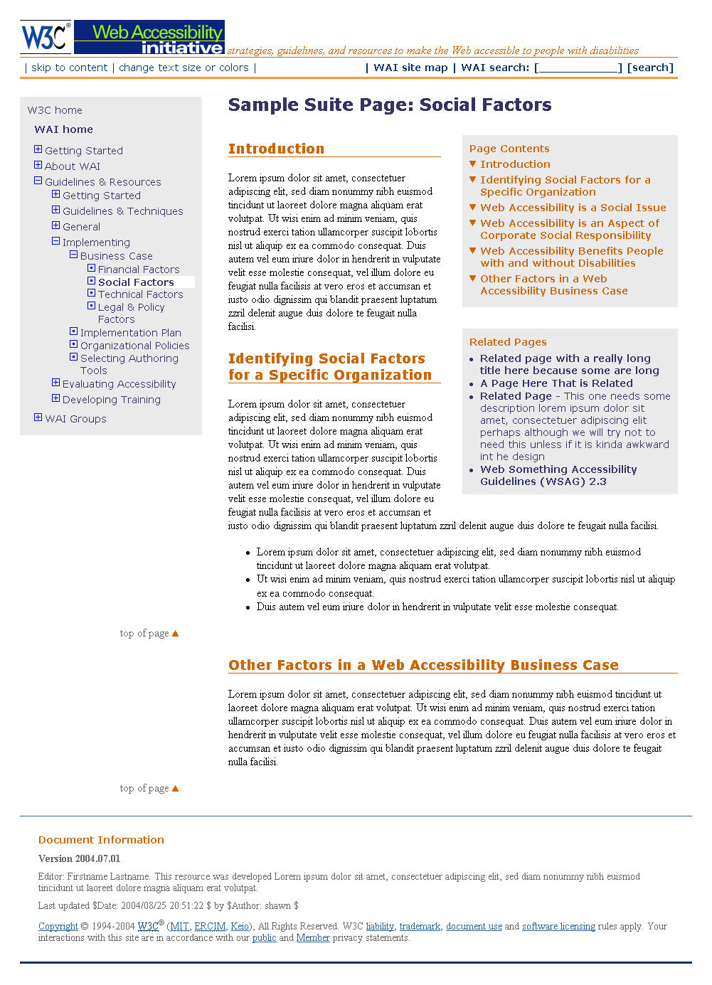
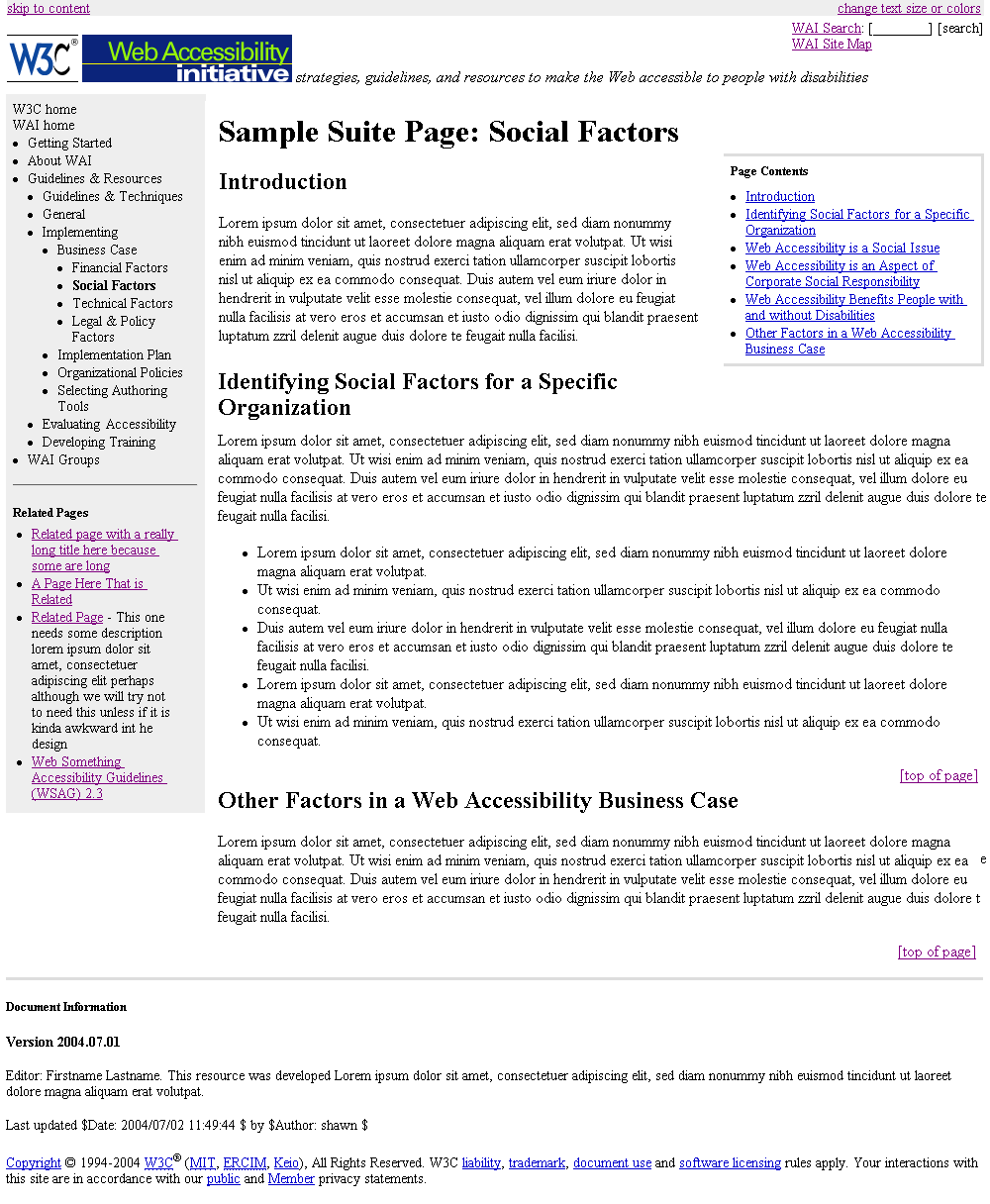
- Subpage layout
Place the following elements in the position described (as is in the
wireframe layout):
- W3C logo and existing WAI logo near the top,
left
- The main navigation in a column along the left
(starting with W3C Home)
- The main body content in a center column
- The Page Contentsin a right column, followed by
Related Pages
- The Document Information with footer at the bottom
(with less emphasis than body text)
These elements may be placed as is in the wireframe, or elsewhere
- skip to content - should probably be the very
first thing; however, want it to have very little emphasis
- change text size of colors - want it to have very
little emphasis
- WAI site map
- WAI Search box, label, button (include all
three!) - may be positioned top, right as is in the wireframe,
or elsewhere
- tag line - may be positioned after the logos as is
in the wireframe, or elsewhere
- For the main hierarchical navigation,
use icons such as below (can use different size, color, and such):
- for closed, expandable nodes:
 plus sign in a box
- for open, expandable nodes:
 minus sign in a box
- for end nodes:
 dot in a box
also:
- indent each level, with the possible exception of W3C Home and WAI
Home
- use simple background color scheme, specifically, do not use
different color or shade background for each level
- indicate the current page, e.g., with different color text or
background or such
- consider putting more leading space between the higher level items,
and less leading space between the lower level items
- All lists (such as Page Contents and Related Pages) should have bullets
- which may be standard bullets or images
Design aspects:
- different content areas are very visually distinct, e.g., probably on
the home page the WAI develops, WAI welcomes bullets are on a light
background and on the sub page the Page Contents and Related Pages are on
the same background
- feel is warm, open, inviting, uncluttered -- probably with a relatively
large amount of white space between sections
- tended to like the blues (#369, #036), which also seems to integrate
well with other W3C pages, with orange offsets (#C60)
- will use 100% width and "fluid design" so as to be most flexible for
different configurations
- ...
Reminder of other parameters:
- on the home page, have above the fold (at least in default font
settings in 1024x768 resolution, and preferably also in 800x600):
- skip to content & change text size or colors
- the logos
- the main site navigation
- the quote
- the bullets on what WAI does
- the Announcements heading (OK if the announcements themselves go
below the fold)
- the Highlights heading (OK if the highlights themselves go below
the fold)
- OK to have font a little smaller than default; however,
not too small ! (e.g., at least 0.9em/10pts for and
0.8em/9pts for navigation)
- strong (but not necessarily stark) color contrast between text and
background so text is very easy to read
- search: For now we will have only a "W3C Search" link. When we have a
good WAI specific search, we will put a search box (with label and
button), so we want a design where either works nicely.
We are looking for a visual design that creates a first impression
of: WOW! this site is professional, visually appealing, modern (yet timeless)
- and accessible - it ought to win a design award! We need a design
that breaks the myth that accessible design is dull and
boring.
For example, you might skim http://www.csszengarden.com/, which are
designs of a simple HTML page:
http://www.csszengarden.com/zengarden-sample.html. Let the designer in you go
wild!
Feel free to submit more than one design theme if you would like.
Requirements:
- Provide both a home page and a subpage in the design theme of this
content:
NOTE: the wireframes are not models of good visual design, just ideas
for layout without any design!
- Include all content that is in the HTML pages above -
with one exception: you may leave out the subheadings (such as on the
home page: Site Navigation, Quote, What WAI Does).
- Logos:
- include the current W3C logo at the top, left of all pages
- include the current WAI logo as it is in at least one design theme
(we hope to change the logo, but have not confirmed yet that we will
be able to do that with this redesign)
- (you may submit additional designs with a redesigned WAI logo)
- For the hierarchical navigation, include:
- controls for expanding and collapsing
- indicators of end nodes
- indication of current page
Strong recommendations:
- on the home page, have above the fold (at least in default font
settings in 1024x768 resolution, and preferably also in 800x600):
- skip to content & change text size or colors
- the logos
- the main site navigation
- the quote
- the bullets on what WAI does
- the Announcements heading (OK if the announcements themselves go
below the fold)
- the Highlights heading (OK if the highlights themselves go below
the fold)
- OK to have font a little smaller than default; however,
not too small ! (e.g., at least 0.9em/10pts for and
0.8em/9pts for navigation)
- strong (but not necessarily stark) color contrast between text and
background so text is very easy to read
Ideas:
- home page: we want people who are new to the home page to easily see
the "Who We Are" bullets, and for repeat visitors to be able to easily
"mask it out" - perhaps design somewhat like a banner ad or call out
- the redesign group liked a design that had the "skip to content" and
"change text or colors" links in a bar across the very top that was
visually distinct because it had them clearly visible, yet that area was
easy to "mask out"
- the redesign group liked the softer colors in one design, particularly
light blues - probably want soft edges, too, e.g., fades
- the tag line ("strategies, guidelines, and resources to make the Web
accessible to people with disabilities") is not a strong aspect
of our branding and therefore does not need lots of attention, especially
on the subpage
If you would like more background, see the first e-mail I sent you (which
is archived at the end of the agenda email at: http://lists.w3.org/Archives/Public/public-wai-eo-site/2004Jul/0030.html).
Instructions for visual designers for round 1 are after the agenda in the
email archived at: http://lists.w3.org/Archives/Public/public-wai-eo-site/2004Jul/0030.html
- read:
- some particulars:
- OK to have font a little smaller than default; however,
not too small !
- must have links in text high affordance (that is, the text is
clearly a link), probably blue and underlined (links in navigation
areas can be different)
- prefer that "skip links" is visible, yet subtly integrated
- probably want the hierarchical navigation along the left
- search: For now we will have only a "W3C Search" link. When we have a
good WAI specific search, we will probably put a search box (with label
and button), so we want a design where either works nicely.
- note on graphics: probably do not want people's faces (because of
complications with issues in cross cultural representation, diversity,
and such)
- note on logos: We are considering redesigning the WAI logo, and
possibly the conformance logos (WCAG, HTML, CSS). For now, please include
them as they are.
- implementation notes:
- design must meet WCAG 1.0 (including meeting other W3C
specifications, such as XHTML and CSS), with the possible exception
of:
- checkpoints with "until user agent" clauses that have been met
(@@ matt getting list)
- note: if the draft design does not meet a checkpoint, it must
be stated
- design must be able to meet WCAG 2.0 when it is finalized
- particular accessibility issues to pay attention to:
- resize-able, including scalable fonts and "fluid" design that
stretches (e.g., looks good in various size browsers, mobile
device displays)
- sufficient color contrast
- text as text (not in bitmap images)
- design must work well in latest few versions of major browsers on
major platforms. design must "degrade gracefully" (that is be usable,
but not maintain a really nice design) on all browsers, including
ones with little or poor CSS support, e.g., Netscape 4.7
- later prototypes: http://www.w3.org/WAI/EO/Drafts/UCD/design-space.html#sketch,
http://www.w3.org/WAI/ut2/
- from Michael Lenz:
- draft site map (not up to
date), draft site map image
- navigation design
- latest new home page (7), no style sheet
- sample subpages:
- overview pages
[formerly "intro pages"] - list of planned pages with links to the
pages
- revised pages:
- old drafts:
Document Information
@@ to do: check acronym tags, HTML & access check & validation
Editor: Shawn Lawton Henry. This Web page is is under development by the
WAI Site Task Force of EOWG. Last updated
$Date: 2005/05/30 18:50:14 $ by $Author: shawn $