Technique SL13:Providing A Style Switcher To Switch To High Contrast
About this Technique
This technique is not referenced from any Understanding document.
This technique applies to content implemented in Microsoft Silverlight.
Techniques are examples of ways to meet Web Content Accessibility Guidelines (WCAG). They are not required to meet WCAG. Content can satisfy the normative requirements of WCAG even if it does not use any of the documented techniques. See About WCAG Techniques.
Description
The objective of this technique is to incorporate high contrast color choices into a user interface visual design for Silverlight, by changing the values of styles or templates, or changing values of individual resources such as brushes or colors.
Silverlight styles and templates are produced in XAML. Silverlight event handlers (such as the ones that engage the style switch) are written in code, but are often wired through a method name reference in the XAML. For more information on how to use templates, styles and resources to change the appearance of Silverlight controls, see Control Customization topic on MSDN.
Silverlight provides a built-in property that can determine whether the hosting operating system is using a high contrast theme. This is a Boolean value only; Silverlight API cannot determine any further specifics about the theme choice, such as the colors being used or the contrast ratio between the colors. Querying this property at application startup is one possible trigger mechanism for applying high contrast themes to Silverlight content. Another mechanism is to expose a control (such as a button or text link) to the user, so that the user can engage high contrast for a Silverlight application's content by activating a control within the Silverlight application.
Silverlight Toolkit themes and System Colors
An extension to the Silverlight core deliverables known as the Silverlight Toolkit provides theming APIs and various themed styles for Silverlight controls, including the core controls. Most of these themes are intended for design purposes, but the Silverlight Toolkit also provides a System Colors theme. The System Colors theme aligns the Silverlight theme brushes or colors with those of the settings applied to the Microsoft Windows operating system display options. When the user switches the system themes to use a theme that is typically used for high contrast, the underlying system brushes are redefined. A Silverlight application that uses the System Colors theme also uses the now-redefined colors in its UI, and will effectively use the same High Contrast colors that are user-selected for all other display. How to use the Silverlight Toolkit system themes is not described in this technique. However, the Silverlight Toolkit theme system is a viable option for providing high contrast as well as other more aesthetics-oriented UI experiences. For more information about the Silverlight Toolkit, see Toolkit site. The themes feature of Silverlight Toolkit is best explained by Silverlight Toolkit release notes (from a Microsoft-related blog).
Real-time changes not supported
SystemParameters.HighContrast is an adequate trigger
for cases where high contrast is already engaged before the Silverlight
plugin is loaded into a host. However, a limitation of using SystemParameters.HighContrast as
a trigger mechanism is that Silverlight does not detect the change
if it happens after the Silverlight plugin is loaded by the host HTML.
If Silverlight authors want to support real-time changes, they should provide a user-initiated
control option for changing to high contrast in Silverlight UI rather
than solely relying on SystemParameters.HighContrast.
Silverlight and CSS
Silverlight content does not use information that comes from a CSS style as applied to the hosting HTML page. Therefore, techniques as implemented by browser user agents and described by G148: Not specifying background color, not specifying text color, and not using technology features that change those defaults or G156: Using a technology that has commonly-available user agents that can change the foreground and background of blocks of text do not work for Silverlight content, and C29 does not directly apply. For example, the Internet Explorer settings under Options / Appearance do not affect the fonts or contrast in the Silverlight content area.
Examples
Example 1: Silverlight application designed with brush resources and template resources that enable a high contrast switch
The example "application" for illustration is just text, a button and border. The concepts shown in the example can scale to any complexity of UI, including to applications that have thousands of lines of XAML. Note that the visual appearance of the button is already using a high contrast theme choice for its default state, to assure that the control is visible to anyone that requires a high contrast theme to see parts of the user interface per G174. To keep the example simple, the visual states (behaviors) associated with mouse-over, click, etc. have not been restyled for high contrast. Only the base appearance is changed. The example also shows a technique of storing original theme information and restoring it in response to user request.
<UserControl x:Class="HighContrast.MainPage"
   xmlns="http://schemas.microsoft.com/winfx/2006/xaml/presentation"
   xmlns:x="http://schemas.microsoft.com/winfx/2006/xaml"
   xmlns:d="http://schemas.microsoft.com/expression/blend/2008"
   xmlns:mc="http://schemas.openxmlformats.org/markup-compatibility/2006"
   mc:Ignorable="d"
   d:DesignHeight="300" d:DesignWidth="400">
   <UserControl.Resources>
       <SolidColorBrush x:Key="ArtsyBrush1" Color="Salmon"/>
       <SolidColorBrush x:Key="ArtsyBrush2" Color="Bisque"/>
       <SolidColorBrush x:Key="ArtsyBrush3" Color="DarkSalmon"/>
       <SolidColorBrush x:Key="ArtsyBrush4" Color="Blue"/>
       <Color x:Key="ArtsyBrush1Restore">Salmon</Color>
       <Color x:Key="ArtsyBrush2Restore">Bisque</Color>
       <Color x:Key="ArtsyBrush3Restore">DarkSalmon</Color>
       <Color x:Key="ArtsyBrush4Restore">Blue</Color>
       <RadialGradientBrush x:Key="ArtsyGradient">
           <GradientStop Color="AliceBlue" Offset="0"/>
           <GradientStop Color="LightBlue" Offset="0.4"/>
           <GradientStop Color="#D00000EE" Offset="1"/>
       </RadialGradientBrush>
       <Style x:Key="ArtsyButton" TargetType="Button">
           <Setter Property="Template">
               <Setter.Value>
                   <ControlTemplate TargetType="Button">
                       <Border CornerRadius="4"
                          BorderBrush="{StaticResource ArtsyBrush4}" BorderThickness="4">
                           <Grid>
                               <Rectangle Fill="{StaticResource ArtsyGradient}"
                                 RadiusX="2" RadiusY="2"/>
                               <ContentPresenter Content="{TemplateBinding Content}"
                               ContentTemplate="{TemplateBinding ContentTemplate}"/>
                           </Grid>

                       </Border>
                   </ControlTemplate>
               </Setter.Value>
           </Setter>
       </Style>
       <Style x:Key="HighConButton" TargetType="Button">
           <Setter Property="Control.Background" Value="White"/>
           <Setter Property="BorderBrush" Value="Black"/>
           <Setter Property="Foreground" Value="Black"/>
       </Style>
   </UserControl.Resources>
   <Border BorderBrush="{StaticResource ArtsyBrush1}" BorderThickness="4">
       <StackPanel x:Name="LayoutRoot" Background="{StaticResource ArtsyBrush2}">
           <TextBlock
             Foreground="{StaticResource ArtsyBrush3}">High contrast demo</TextBlock>
           <Button Name="Switcher" Click="Switcher_Click"
             Width="160" Style="{StaticResource HighConButton}">
              <TextBlock Text="Switch to high contrast"/>
           </Button>
           <Button Name="Switchback" Click="Switchback_Click"
             Width="160" Style="{StaticResource HighConButton}" IsEnabled="False">
               <TextBlock Text="Switch to regular theme"/>
           </Button>
       </StackPanel>
   </Border>
</UserControl>
The second listing is the C# code for the event handlers.
       private void Switcher_Click(object sender, RoutedEventArgs e)
       {
           ChangeToHighCon();
       }
       private void ChangeToHighCon()
       {
           (this.Resources["ArtsyBrush1"] as SolidColorBrush).Color = Colors.Black;
           (this.Resources["ArtsyBrush2"] as SolidColorBrush).Color = Colors.White;
           (this.Resources["ArtsyBrush3"] as SolidColorBrush).Color = Colors.Black;
           (this.Resources["ArtsyBrush4"] as SolidColorBrush).Color = Colors.Black;
           Switcher.IsEnabled = false;
           Switchback.IsEnabled = true;
       }
       private void RestoreRegularCon()
       {
           (this.Resources["ArtsyBrush1"] as SolidColorBrush).Color =
             (Color)this.Resources["ArtsyBrush1Restore"];
           (this.Resources["ArtsyBrush2"] as SolidColorBrush).Color =
             (Color)this.Resources["ArtsyBrush2Restore"];
           (this.Resources["ArtsyBrush3"] as SolidColorBrush).Color =
           (Color)this.Resources["ArtsyBrush3Restore"];
           (this.Resources["ArtsyBrush4"] as SolidColorBrush).Color =
             (Color)this.Resources["ArtsyBrush4Restore"];
           Switcher.IsEnabled = true;
           Switchback.IsEnabled = false;
       }
       private void Switchback_Click(object sender, RoutedEventArgs e)
       {
           RestoreRegularCon();
       }
   }
The following images show the original, and the applied high contrast settings.
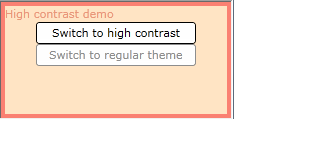
Figure 1. Low contrast image with "switch to high contrast" button enabled
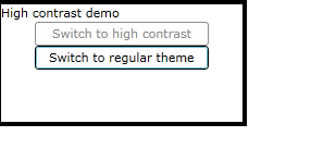
Figure 2. High contrast image with "switch to regular theme" button enabled
This example is shown in operation in the working example of High Contrast.
Example 2: Use SystemParameters.HighContrast to detect system high contrast settings at application startup
This example uses the same UI and style definitions as the previous example. The sole addition a case statement that is added to the primary page constructor of the UI (defined in C#). The added code is everything other than the InitializeComponent() call (which is part of Silverlight infrastructure). Note that the added code calls a user-defined function ChangeToHighCon(), which is the same function and behavior as shown in Example 1 for the user-initiated high contrast switch.
       public MainPage()
       {
           InitializeComponent();
           if (SystemParameters.HighContrast)
           {
               ChangeToHighCon();
           }
       }
Related Resources
No endorsement implied.
Tests
UI option for style switching
Procedure
To test a Silverlight UI option for style switching (Example 1):
- Using a browser that supports Silverlight, open an HTML page that references a Silverlight application through an object tag.
- Check for a control that indicates it will change the application's appearance to use a high-contrast theme.
- Activate the control. Check that the Silverlight application's user interface color themes change to an appearance that uses at least a 4.5:1 contrast ratio per Success Criterion 1.4.3 (Contrast (Minimum)).
Expected Results
#3 is true.
HighContrast API
Procedure
To test the HighContrast API (Example 2):
- Use operating system settings (such as Ctrl+LeftShift+PrtScn shortcut on Windows 7) to enter high contrast mode prior to opening the test page.
- Using a browser that supports Silverlight, open an HTML page that references a Silverlight application through an object tag.
- Check that the Silverlight application's user interface color themes change to an appearance that uses at least a 4.5:1 contrast ratio per Success Criterion 1.4.3 (Contrast (Minimum)).
Expected Results
#3 is true.
UI option for enhanced contrast
Procedure
To test a Silverlight UI option for style switching for enhanced contrast:
- Using a browser that supports Silverlight, open an HTML page that references a Silverlight application through an object tag.
- Check for a control that indicates it will change the application's appearance to use an enhanced contrast theme.
- Activate the control. Check that the Silverlight application's user interface color themes change to an appearance that uses at least a 7:1 contrast ratio per Success Criterion 1.4.6 Contrast (Enhanced).
Expected Results
#3 is true.