
Adapting Text
- SC for viewing | SC for editing
- Adapt definition for viewing | Adapt definition for editing
- Style Properties definition for viewing | Style Properties definition for editing
- SC in full draft guideline
- Understanding doc for viewing | Understanding doc for editing Understanding doc in master
Open Issues and Survey Results
(Links to surveys require W3C Member access)
- Open Issues
- July 6, 2017: Survey Results
- April 15, 2017: Survey Results
- April 11, 2017: Survey Results
- April 5, 2017: Survey Results
- March 14, 2017: Survey Results
- February 14, 2017: Survey Results
SC Shortname
Adapting text
Note: This SC merges 79 Font Family, 78 Spacing, and 74 Text Color as they are very similar in aim (ability to override and adapt text).
SC Text
If the technologies being used allow the user agent to adaptstyle properties of text, then no loss of essential content or functionality occurs by adapting all of the following:
- line height (line spacing) to at least 1.5 times the font size
- spacing underneath paragraphs to at least 2 times the font size
- letter spacing (tracking) to at least 0.12 times the font size
- word spacing to at least 0.16 times the font size
Note: Examples of text that are typically not affected by style properties are open captions and images of text, which are not expected to adapt.
Editor's note: The Working Group seeks to include overriding text color, background color, and font-family as part of this SC, but is not yet able to identify a way to do so that is sufficiently testable.
Suggested Priority Level
Level AA
Related Glossary additions or changes
- adapted
- Formatting being overridden by the client.
- Style Properties
- Properties whose values determine the presentation (e.g. font, color, size, location, padding, volume, synthesized speech prosody) of content elements as they are rendered (e.g. onscreen, via loudspeaker, via braille display) by user agents. Style properties can have several origins:
- user agent default styles: The default style property values applied in the absence of any author or user styles. Some web content technologies specify a default rendering; others do not.
- author styles: Style property values that are set by the author as part of the content (e.g. in-line styles, author style sheets).
- user styles: Style property values that are set by the user (e.g. via user agent interface settings, user style sheets).
What Principle and Guideline the SC falls within.
Principle 1, Guideline 1.4
Description
The intent of this Success Criterion is to help ensure that people with low vision can override font family, text colors, and spacing. People with low vision often must override author settings via user stylesheet, bookmarklet, extension or application such as VIP-PDF Reader.
This SC sets metrics for a normative testable values. Any particular user is likely to choose different values (especially font & color).
The principle is that if you override the font (with any font), the issues appear. E.g. font-icons disappear. Same for colors, the act of changing them at all will highlight most or all issues people would get from changing them to their preferred colors.
Line-height, letter-spacing, and word-spacing metrics were chosen as measures based on Research. McLeish ran from .04 to .25 em tests (Wayne E. Dick PhD analyzed the McLeish study and translated from points). McLeish found an increasing curve in reading speed of actual materials up to .25, but it really started to flatten at .20. Previous studies that reported no improvement started at .5em. Right at the flat point. Hence Wayne recommends letter spacing be 0.12em, and word spacing be 0.16em for this SC.
The plan is to start testing sites with these metrics on the various user-agent tools, primarily bookmarklets created specifically for this. See where problems surface. Adjust measures if needed. And then provide techniques.
Benefits
Font Family
Some fonts/typefaces are more readable than others. For example, some people cannot read fonts with sub-pixel rendering...
User Need: Users can change the font face (also called font family or typeface) of all text, choosing from a wide range of fonts including sans serif and serif fonts..
Source: Accessibility Requirements for People with Low Vision, Section 3.3.2
Text Color
...some people need low brightness, especially for backgrounds. Some people, who need low brightness for backgrounds, also need low brightness overall, and thus need low-brightness text.
Other people need high contrast between text and background, including many older people who lose contrast sensitivity from ageing. Some read better with dark text on a light background.
For some people, common color combinations or colors from a limited color palette work fine. For example, black text on a white background, or the inverse, with white text on a black background. Other people need to select more-specific background and text colors. For example, people, who require low brightness overall, need to select the specific background and text colors that provide sufficient contrast for them, yet not too-high brightness. Readable and optimal color combinations differ vastly among individuals, and can even vary from one individual to another, depending upon conditions such as fatigue and lighting.
Figure 8: Web page with author-defined colors with low contrast - light background, gray text, light green headings:
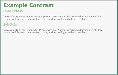
Figure 9: Web page with user style with medium contrast - brown background, tan text, headings of different dull colors:
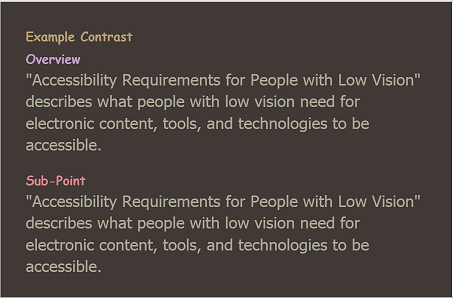
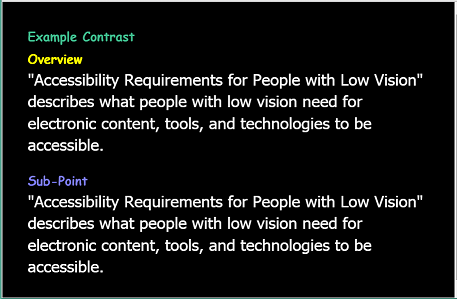
Figure 10: Web page with user style with high contrast - black background, white text, headings of different bright colors
User Need - Contrast: Users can set the background color and the text color from the full color spectrum.
Source: Accessibility Requirements for People with Low Vision, Section 3.1.2 Text Contrast


Spacing
Spacing such as space between lines and space between words impacts readability.
The space between lines in a block of text is also called leading. Some people need more space between lines to be able to read text. Line spacing also helps with tracking.
User Need: Line Spacing: Users can change the line spacing (leading) for blocks of text.
Source: Accessibility Requirements for People with Low Vision, Section 3.4.1
Some people need more space between letters to read text.
User Need: Letter Spacing: Users can change the letter spacing (space between letters/characters) of blocks of text.
Source: Accessibility Requirements for People with Low Vision, Section 3.4.2
Some people need more space between words to read text.
User Need: Word Spacing: Users can change the word spacing (space between words) of blocks of text.
Source: Accessibility Requirements for People with Low Vision, Section 3.4.3
Testability
Using a bookmarklet, user stylesheet, or VIP-PDF Reader change:
- line height (line spacing) to at least 1.5 times the font size
- spacing underneath paragraphs to at least 2 times the font size
- letter spacing (tracking) to at least 0.12 times the font size
- word spacing to at least 0.16 times the font size
- font family to a different font family (e.g. Verdana if that is not in use)
- foreground color and background color to a different foreground color and background color (e.g. white on black if that combination is not in use)
Expected Results
- No loss of content or functionality.
Techniques
Existing Related Techniques
- C22: Using CSS to control visual presentation of text
- C21: Specifying line spacing in CSS
- C14: Using em units for font sizes
- C8: Using CSS letter-spacing to control spacing within a word
- SCR34: Calculating size and position in a way that scales with text size
- G140: Separating information and structure from presentation to enable different presentations
- F3: Failure of Success Criterion 1.1.1 due to using CSS to include images that convey important information
New Techniques
- Allowing for override of font family(new technique)
- Allowing for override of text color (future technique)
- Allowing for override of spacing (draft technique)
Related Information
Articles
- Unitless line-heights - Eric A. Meyer (NB: Line height doesn't need, and probably shouldn't have, a unit because it inherits from the font size)
- How users change colours on websites - Anika Henke
Public and Member Comments
- Adapting Text is needed #153 - Scott Hollier
- Microsoft Comments on Adapting Text #186
- Oracle comment on 1.4.15 Adapting Text #222
- WebAIM Feedback - SC 1.4.15 – Adapting Text #254
- Validity Tests #276 - Wayne Dick
Research
- Rello, L., & Baeza-Yates, R. A. (2017). How to present more readable text for people with dyslexia. Universal Access in the Information Society, 16(1), 29-49.
- Sjoblom, A.M., Eaton, E. and Stagg, S.D., (2016). The effects of letter spacing and coloured overlays on reading speed and accuracy in adult dyslexia. British Journal of Educational Psychology, 86(4), pp.630-639.) where "letter spacing was increased by 2.5pt (~2 mm)" " Overall, the results suggest that for [a] dyslexic reader, larger letter spacing increases the reading speed and that this is not to the determent of reading accuracy, which is also improved."
- Marco Zorzi et, al. Extra-large letter spacing improves reading in dyslexia (2012). "Extra-large letter spacing helps reading, because dyslexics are abnormally affected by crowding, a perceptual phenomenon with detrimental effects on letter recognition that is modulated by the spacing between letters. Extra-large letter spacing may help to break the vicious circle by rendering the reading material more easily accessible."
- Spacing for Reading
- A study of the effect of letter spacing on the reading speed of young readers with low vision (PDF) - Eve Mcleish, The British Journal of Visual Impairment 25.2 (2007): 133–43. Print.
- The Effect of Letter Spacing on Reading Speed in Central and Peripheral Vision- Susana T. L. Chung, 2002, IOVS ARVO Journals.
- Letter spacing test - Alastair Campbell
- Font Family Statistics as Rendered By Chrome - Wayne Dick
- CSS !important Spacing Test - Laura Carlson
- Line Height (leading) Research - LVTF
- Letter Spacing Research - LVTF
- Word Spacing Research - LVTF
- Results of Bookmarklet Tests for Issue 78
Tools
- Font Data Analysis - Wayne Dick
- CFC Adapting Text (Thread) - Andrew Kirkpatrick
- Re: AGWG meeting July 18, 2017 (Thread) - David MacDonald
- Please Review: Final draft wording to allow Adapting Text into the Editors Draft (Thread) - Laura Carlson
- Adapting Text Units: Spaces, paragraphs, and ems(Thread) - Laura Carlson
- I solved the Adapting Text Problem (Thread) - Wayne Dick
- Objection to Adapting Text (Thread) - Joshue O Connor
- Font Family (Thread) - Wayne Dick
- Testing Tool for Font Adaptation (Thread) - Wayne Dick
- Please consider completing the adapting text survey (Thread) - Laura Carlson
- Letter and Word Spacing: Final Analysis (Thread) - Wayne Dick
- Letter Spacing- Wayne Dick (Thread) - Wayne Dick
- Calculation Error (Thread) - Wayne Dick
- Adapting text CFC (was Re: Adding a definition)(Thread) - Laura Carlson
- Addition to tomorrow's agenda? Wayne's proposal to add font family back to the Adapting Text SC (Thread) - Laura Carlson
- The request to return font family bullet to the Adapting Text SC (Thread) - Laura Carlson
- Font Width Arabic Fonts on Google Fonts(Thread) - Wayne Dick
- Add Font Family back to adaptation (Thread) - Wayne Dick
- Mean character width for 16px Google Fonts (818 Families) (Thread) - Wayne Dick
- Is Java Web Start covered by WCAG? (Thread) - Laura Carlson
- Experiment Design - Wayne Dick
- How do we distinguish between I, l and 1 and 0 and O?(Thread) - Wayne Dick
- Should we drop the color bullet for now?) (Thread) - Laura Carlson
- Can anyone not live with this sentence as the Adapting Text SC's intro? (was Must "technologies being used"…) (Thread) - Laura Carlson
- SC Must "technologies being used" be in a SC's text, if that SC has support in 2 technologies? (Thread) - Laura Carlson
- SC #78 'Adapting text', and a question regarding consensus on icon fonts (Thread) - Detlev Fischer
- A measure of element growth due to changing font family. (Thread) - Wayne Dick
- none - Wayne Dick
- Adapting Text: "narrow values" vs "wide values" how to reach consensus - Laura Carlson
- Can someone explain the therapeutic value of switching to one font family - Laura Carlson
- Adapting Text proposals for next week's survey. - Laura Carlson
- Adding Greg L's Adapting Text proposals to the Wiki in anticipation of a vote between J&K and H&I - Laura Carlson
- Adapting text question on this week's survey (Thread) - Laura Carlson
- Adapting Text SC: Addressing the main issues (Thread) - Laura Carlson
- A test for Color. Please comment. (Thread) - Wayne Dick
- Font Family failure (Thread) - Wayne Dick
- User-adaptations in SCs (Thread) - Alastair Campbell
- Combine 79, 78, and 74 SCs? (was Re: Mechanism Disclaimer) (Thread) - Laura Carlson
- Issue 78 SC text - was Re: Post-Minutes update (Thread) - Laura Carlson
Minutes
- AG minutes, 18 July 2017
- AG minutes, 11 July 2017
- AG minutes, 6 July 2017
- Low Vision Task Force minutes, 8 June 2017
- Low Vision Task Force minutes, 11 May 2017
- Low Vision Task Force minutes, 4 May 2017
- Low Vision Task Force minutes, 27 April 2017
- AG minutes, 20 April 2017
- Low Vision Task Force minutes, 20 April 2017
- AG minutes, 18 April 2017
- AG minutes, 13 April 2017
- AG minutes, 11 April 2017
- AG minutes, 6 April 2017
- Low Vision Task Force minutes, 6 April 2017
- AG minutes, 4 April 2017
- Low Vision Task Force minutes, 30 March 2017
- AG minutes, 21 March 2017
- Low Vision Task Force minutes, 9 February 2017
- Low Vision Task Force minutes, 2 February 2017
- Low Vision Task Force minutes, 26 January 2017
GitHub
Wiki Pages
- Adapting Text Issues
- Adapting text user to content requirements table
- Text adaptation user to content requirements
- Issue 78 Options
- Consensus Tally for Adapting Text SC Text - To include or not include "A mechanism is available" language
- Results of Bookmarklet Tests for Issue 78
- SC Text to Combine 79, 78, 74
- Brainstorming Short Name Ideas for Issue 78