
Reasoning behind srcN replacing srcset and picture
This post was written by John Mellor. Reposted here from our mailing list for easier sharing.
By now most of you will have seen and started discussing the alternative markup proposal Tab and I came up with, intended to replace both srcset and <picture>.
Tab’s spec write-up gives great examples of how this solves the various use cases; but I think we owe you an explanation of why srcset, <picture>, or some other simpler approach can’t solve the same use cases. Let me try to explain, and also preemptively answer some questions.
You’re all familiar with the 3 main use cases for responsive images: devicePixelRatio based resolution switching, viewport size based resolution switching, and art direction.
The key difference between viewport-based switching and art direction is that in the viewport case a bandwidth-constrained browser should be allowed to download a lower resolution version, whereas in the art direction case it’s essential that the browser strictly obey the switch, as the images may have different aspect ratios, and downloading the wrong one could break the layout.
The simple srcset syntax that WebKit recently implemented handles dpr-based switching, but neither of the other cases. The extended srcset syntax with ‘w’ and ‘h’ attempts to handle viewport-based switching, but makes no attempt to solve art direction – and in fact, it doesn’t successfully solve viewport-based switching either, for rather subtle reasons. Consider a page with a simple 1-3 column responsive grid:
.grid-column { width: 100%; }
@media (min-width: 640px) {
.grid-column { width: 50%; }
}
@media (min-width: 960px) {
.grid-column { width: 33%; }
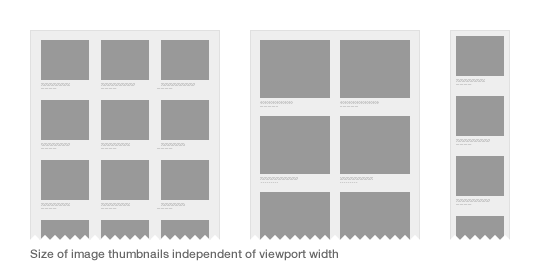
}If this grid contains images that are 100% of the width of their column, then smaller viewport sizes sometimes lead to larger images than large viewport sizes. Paul Robert Lloyd has a great illustration of this in his 2012 post:
I plotted the required image width at a range of viewport widths:
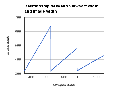
Notice how the widest image is required at a 639px wide viewport, and on wider devices smaller images are used. This is why srcset isn’t good enough for viewport-based switching. If a bandwidth-constrained browser chooses to download an image destined for narrower viewports, it might actually end up downloading a larger image file!
So what about the <picture> element? <picture> handles dpr-based switching and art direction well, but isn’t suitable for viewport-based switching, as the browser isn’t allowed to download images destined for smaller screens, even if they are in fact just different resolutions of the same image, since it has no way to know this. You can sort of support viewport-based switching if you create a lot of artificial breakpoints at different viewport widths, and provide a 0.5x, 1x, 2x and 3x image (the 0.5x image being for bandwidth constrained devices) at each; but that generally means you have to repeat every image url 4+ times, which simply isn’t practical. In addition, working out what breakpoints to use for viewport-based switching is very laborious and confusing. For the responsive grid case above, you’d have to encode it as something like:
<picture>
 <!-- This source element covers the range 320-400, so the midpoint is 360, and that's what I'm using to calculate the x values, e.g. 320/360=0.89; similarly below -->
 <source media="(max-width: 400px)"
 srcset="160.jpg 0.44x, 320.jpg 0.89x, 480.jpg 1.33x, 640.jpg 1.78x, 960.jpg 2.67x">
 <source media="(max-width: 520px)"
 srcset="160.jpg 0.35x, 320.jpg 0.7x, 480.jpg 1.04x, 640.jpg 1.39x, 960.jpg 2.09x, 1280.jpg 2.78x">
 <source media="(max-width: 639px)"
 srcset="320.jpg 0.55x, 480.jpg 0.83x, 640.jpg 1.1x, 960.jpg 1.66x, 1280 2.2x, 1920 3.31x">
 <!-- Note that in the next 2 source elements, images are only half the viewport width -->
 <source media="(max-width: 800px)"
 srcset="160.jpg 0.44x, 320.jpg 0.89x, 480.jpg 1.33x, 640.jpg 1.78x, 960.jpg 2.67x">
 <source media="(max-width: 959px)"
 srcset="160.jpg 0.36x, 320.jpg 0.73x, 480.jpg 1.09x, 640.jpg 1.45x, 960.jpg 2.18x, 1280.jpg 2.91x">
 <!-- And in the next 4, images are only 1/3 of the viewport width -->
 <source media="(max-width: 1200px)"
 srcset="160.jpg 0.44x, 320.jpg 0.89x, 480.jpg 1.33x, 640.jpg 1.78x, 960.jpg 2.67x">
 <source media="(max-width: 1440px)"
 srcset="160.jpg 0.36x, 320.jpg 0.73x, 480.jpg 1.09x, 640.jpg 1.45x, 960.jpg 2.18x, 1280.jpg 2.91x">
 <source media="(max-width: 1920px)"
 srcset="320.jpg 0.57x, 480.jpg 0.86x, 640.jpg 1.14x, 960.jpg 1.71x, 1280 2.29x, 1920 3.43x">
 <!-- This covers the range 1920-2560, but I left off the upper bound so any truly huge monitors get sensible behaviour -->
 <source srcset="320.jpg 0.43x, 480.jpg 0.64x, 640.jpg 0.86x, 960.jpg 1.29x, 1280 1.71x, 1920 2.57x"> </picture>
That’s pretty hard to read, let alone write. Notice how each image url gets repeated up to 9 times here! And in order to reuse the same set of images at the various breakpoints, I had to get out a calculator to work out all the x multipliers 🙁 It could be made slightly simpler if you’re willing to make larger jumps in viewport width, but that has the downside that users will download more unnecessary data. Ultimately, the problem is that the web developer needs to encode that graph I plotted above into the <picture>, but they are forced to approximate the lines by plotting a series of points, whereas it would be much easier if there was a “straight line” primitive.
Instead with the srcN proposal, this becomes way simpler:
<img src1="100% 640 50% 960 33%; xxs.jpg 160, xs.jpg 320, s.jpg 480, m.jpg 640, l.jpg 960, xl.jpg 1280, xxl.jpg 1920">That first part might look a little bit cryptic at first, but if you compare it to the breakpoints in the grid media queries above you’ll see how it’s actually a pretty intuitive way of expressing the column widths above. Remember that this is for the tricky case of a responsive grid; for simpler cases like a full width header image you just put “100%” (i.e. the graph is a single straight line), whereas with srcset or <picture> you’d still have been stuck giving 7+ points along the line.
And then you simply list the pixel widths of the available images, which is much easier than having to do a bunch of maths to link each image to a variety of viewport widths and devicePixelRatios; crucially you never have to repeat each image!
srcN also covers art direction by allowing you to select which set of images you want using <picture>-style media queries, but these should be used only for art direction, not for viewport switching (which is covered by the mechanism above).
FAQ
Q) This seems to focus on flexible-width images (e.g. width: 100%). What about fixed-width images?
A) For fixed-width images, srcN lets you use the familiar “s.jpg 1x, l.jpg 2x” syntax that srcset had, as for fixed-width images that works fine. If you prefer, you can also use the new syntax with a fixed width instead of a percentage width, in the form “320; s.jpg 320, l.jpg 640”, but that’s more verbose, so it only really makes sense to use that in cases where an image is sometimes flexible and sometimes fixed width, for example if you have a max-width in px set on an image whose width is set in %.
Q) Does this fully obsolete srcset and <picture>?
A) Yes, this completely replaces all functionality of both of those. Ideally, browsers that have already implemented the basic srcset syntax would remove that as soon as possible before sites start to depend on it (but if not it would be possible for such browsers to integrate srcset, just like src acts as a fallback).
Q) Why src1, src2, etc instead of child source elements like <picture> has?
A) Some implementors complained that having child elements is one of the things they regret about <video>, because it bloats the DOM tree and adds more edge cases to parsing. But this is just a detail; the same syntax could be used in a <picture> with child elements if implementors change their mind about that.
Q) But my image is neither fixed width nor a percentage of viewport width…
A) Yep, this is one thing that’s not quite perfect. Say you have a fixed 400px sidebar, then two more columns split the remaining viewport width between them. Those two columns will be calc(50vw – 200px) wide, but the <image-size> grammar only lets you specify a single integer or percentage. It would be possible to approximate this width with a series of breakpoints, e.g. “0 400px 10% 600px 23% 900px 33% 1400px 39% 2100px 41%” (at least only the first part of your srcN would be messy, and you wouldn’t have to repeat any image urls). But perhaps we should extend srcN to handle this case better, by extending the image-size grammar as follows:
<image-size> = <integer> | <percentage> | <percentage> + <integer> | <percentage> - <integer>Then you’d be able to express this case more cleanly as: “50% – 200”.
Q) What about CSS images?
A) Yes, the same problems that apply to <picture> also apply to CSS image switching using media queries and image-set. So we should extend the CSS image-set function to support the equivalent “<size-viewport-list> ; <size-based-urls>” syntax, then CSS and HTML will be consistent.
There’s also the more radical option, that we could directly allow any CSS image value in srcN (you’d use image-set, enhanced as above, to do responsive images). So amongst other things you’d be able to do image slicing (which wasn’t previously practical in HTML) using fragment identifiers. This could be pretty cool, but it would make the responsive images syntax slightly more awkward (e.g. src1=”image-set(100%; ‘s.jpg’ 320, ‘m.jpg’ 640)” instead of just src1=”100%; s.jpg 320, m.jpg 640″).
Q) Why a markup solution? Wouldn’t it be better to switch images server-side (or intercept them with a Service Worker)?
A) Either is good. But the key observation, that the relation between viewport width and image width needs to be known, applies to server-side solutions too. Also, one benefit of markup-based solutions is that the browser (which has access to user preferences, and current network conditions) can decide whether and when to download lower quality versions of images; whereas a server can’t easily second-guess the user’s preference (which may depend on whether the user is roaming, etc).
Once we have HTTP/2, I believe the long term solution to responsive images will be browser-driven parallel download of progressive images, where you just include a single high res image in your markup, and the browser stops downloading the image once it has enough detail. I owe you folks a blog post on that. But full rollout of HTTP/2 will take a very long time, and in the meantime this markup solution seems to best fit all the main use cases.
Thanks for reading this far!
— John
I’m trying to wrap my head around the reasoning behind the various proposals.
The viewport-based width definitions in src-n seem to undermine CSS’s role, no? And this is done because you want browser preloaders to be able to gander what image load by markup alone before CSS is loaded and applied?
I’m concerned that browser preloading was concieved in a mostly pre-RWD world (where it has loads of advantages) – and is now hampering responsive images – especially in the light of the proposed postpone and lazyload img attributes (which effectively disables preloading anyway).
I believe that we would be best served by CSS ruling the dimensions of a displayed image in a webpage. Upholding the seperation of concerns we have been working towards for years now.
I can see how src-n is shorter in syntax compared to previous proposals – but you still have to spell out each and every image url.
What if a url-pattern was exposed and available dimensions, devicepixelratios, image formats where exposed instead? (Client Hints is no good if you have no control over the server env – like shared webhosting)
<img src="/path/to/foo-320-240-1x.jpg" width="320" height="240"

    pattern="/path/to/foo-{width}-{height}-{dpr}.{format}"

    sizes="320, 480, 640" dpr="1x, 1.33x, 2x" formats="webp, jpg" postpone/>
I jotted down some notes on this idea:
https://gist.github.com/rasmusfl0e/6727092
This makes perfect sense as a proposal, even if the syntax is a little icky.
We have just recently implemented a solution using a <picture> polyfill and ran into the “smaller-viewports-larger-images” problem. That, added to the need of sizing the images to be somewhere in-between breakpoints (to allow for more efficient coverage of image quality) lead to a rather confusing spreadsheet to track all the images and breakpoints needed. We abandoned hope of serving 2x images due to the complexity.
Icky syntax or not, this would be a much better solution.