
Easy Checks Illustrations 17Jan14
Nav: EOWG wiki main page > Easy Checks wiki page
This page is an archive of a previous version of Easy Checks - Illustrations
Archive: Easy Checks Illustrations 17Jan14 17 Jan 2014 snapshot of this page
Example illustrations
Note:
- To see all illustrations, make sure to "expand all sections" because some of the illustrations are in collapsed sections. (however, keep in mind that most of the images will be collapsed by default)
- Make sure to evaluate the images in context, that is, read the text around it and imagine you are a user.
Questions: How is the current use of images for illustrations throughout the draft? Too much? Not enough? Mostly helpful? Too cluttering? Feel free to comment in general, and on specific images.
- comment {name}
- From 24 May teleconference:
- Generally the conceptual images are useful for contrast and zoom; simply the page title images {done 24 May}.
- Mixed perspectives on the images showing menu items and such. For some people they are just clutter, the word instructions are clear enough. For other people, the images really help.
- For now:
- Include images showing menu items and such judiciously — if in doubt, do not include an image.
- Crop or gray out all unnecessary clutter in images. (for example, page-title-image has the content of the web page grayed out.)
Strategy:
Strategy agreed on, 5 August 2013
Phase I
- Visually separate illustrations from the text flow by using a border and 10 pixel padding around them.
- Do not float illustrations that are intrinsic to the text.
- Use captions as a general rule.
- Gray out irrelevant information in the images, and avoid using arrows if possible.
- The maximum width is 700 pixels. Use CSS of max-width 100% and height auto so images shrink in narrower windows.
- Illustrations and their captions will be left-aligned -- not centered or right/left justified.
- Use PNG for the format.
- Specifically state the goal for each illustration in the wiki. This will help select the best illustration.
- The main text, not the captions, is used to convey the important information.
- Alt text should (1) briefly explain what is being illustrated and (2) reflect the browser (including the version) and operating system used for browser illustrations.
- In preparation for HTML5, embed illustrations in a div element with a class of "figure" and captions in a div with a class of "figcaption".
Phase II
- Convert to HTML5 so we can use <figure> and <figcaption> elements for illustrations.
- Add a widget to toggle illustrations on and off.
Recommendations for Illustrations:
Version 11
Differences from Version 9:
- Added 2% right margin to #main to prevent horizontal scroll bar when shrink page width.
- Reduced width of .figure from 712 to 676px so works on iPhone in portrait mode.
Question: any objections to this? If everyone is okay with this we need to update #5 in the Strategies. (Note: shrunk images in first and third figures, so they are getting ever fuzzier. Will clean images up when agree on code.) - Changed .figure img margin from 5px to 0 and.figure padding from 5px to 10px, so when shrink figure width, right padding for .figure is not lost.
- Changed .figcaption left margin from 6px to 1px (to accommodate padding increase of of .figure img).
- Reintroducing .multimg class to accommodate spacing between multiple images horizontally and, when shrunk, vertically.
- Changed images in "Multiple different size images" -- (a) removed embedded border so uses just CSS border; (b) reduced width from 302px to 217/216px so fit in 676px box.
Question: are images OK without embedded border?
Version 10
Version 10 was never posted. It used meta viewport in an attempt to improve rendering on smart phones, but did not work well enough. On 10 January 2013 we decided to postpone adding responsive until we do redesign and convert to HTML5.
Version 9
Differences from previous version
- Fixed width so has padding on right side of single image
- Added examples of different size images
- Added vertical-align: top to accommodate different size images
Version 9 markup
CSS
.figure {
	max-width: 100%; /* so image scales across various widths */
	margin: 10px 0;
	padding: 5px; /*using 5px padding here and 5px maring in .figure image creates a 10px space both vertically and horizontally between multiple impages */
	border: 1px solid #aaa;
	background: #FFFDFA; /* color that shows in padding around image -- half way between #fff and #fffaf5 */
	line-height: 115%;
}
.figure img {
	max-width: 100%; /* this may be duplicative of above max-width; however this is where height: auto is needed */
	height:auto; /* to prevent height distortion when scaling browser width down */
	margin: 5px;
	border: 1px solid #888;
	vertical-align: top;
}
.figcaption {
	margin: 5px 0 5px 6px; /* 6px left margin is to offset "img {margin: 5px;}" + 1px for border used for image*/
	font-size: 85%;
	color: #444;
}
HTML
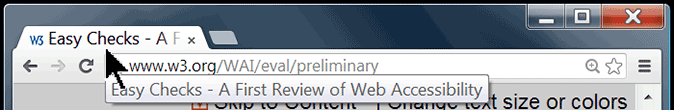
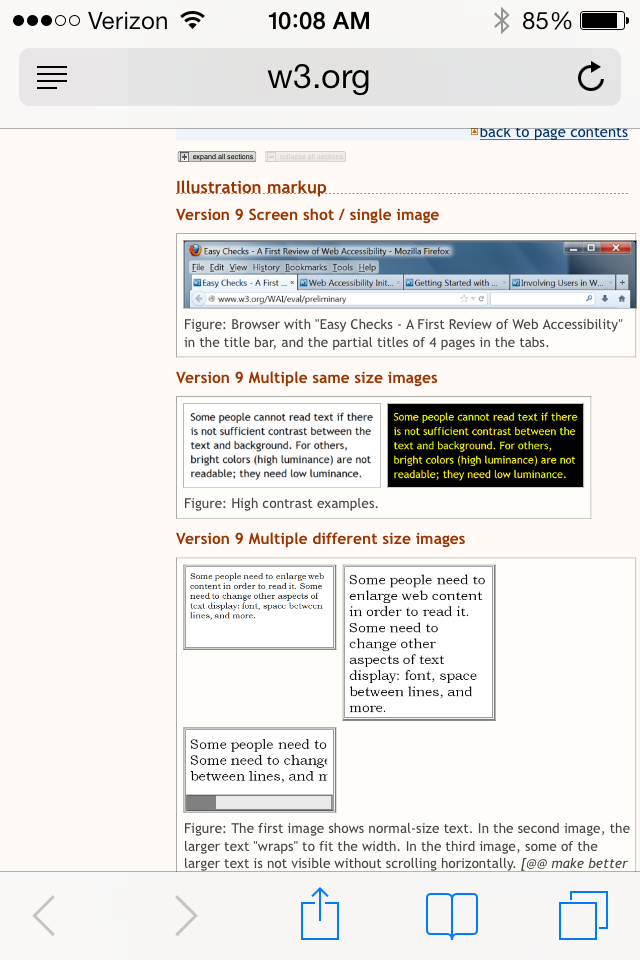
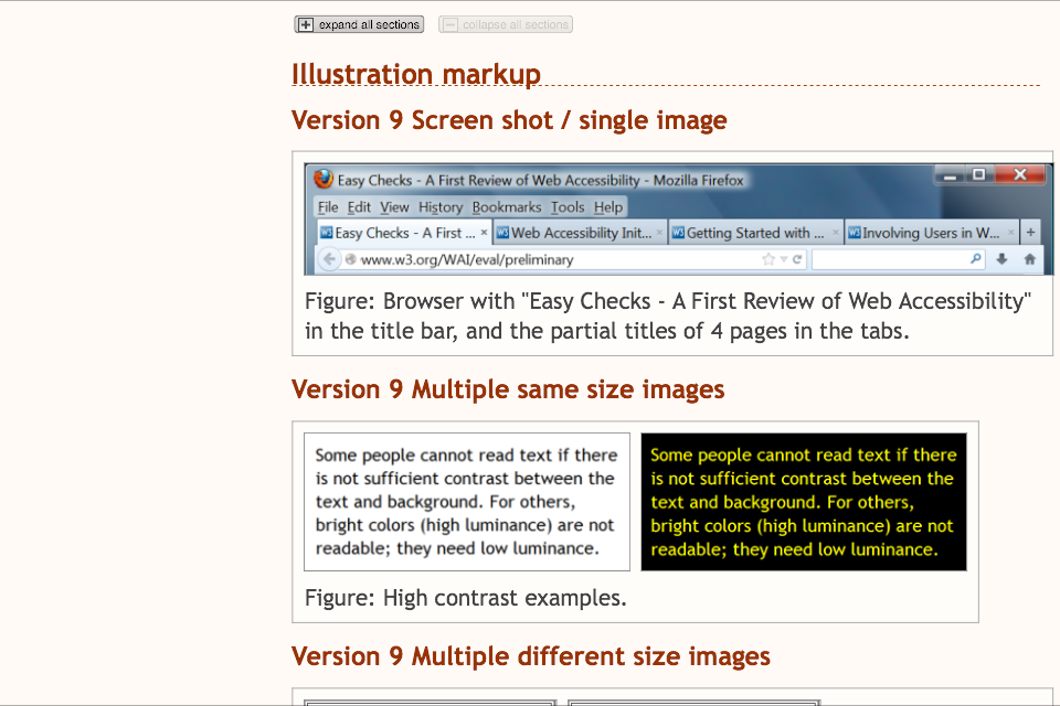
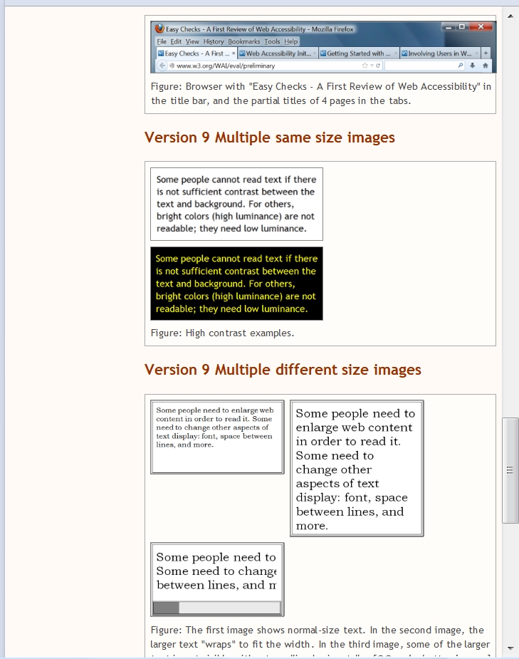
<div class="figure" style="width:712px;">
<img src="page-title.png" alt="Screen shot showing title bar and tabs in FireFox browser. Tabs have: 'Easy Checks - A First...', Web Accessibility Init...', 'Getting Started with...', 'Involving Users in W...'. (FireFox 21.0, Windows)" width="700" height="104" />
<div class="figcaption">Figure: Browser with "Easy Checks - A First Review of Web Accessibility" in the title bar, and the partial titles of 4 pages in the tabs.</div>
</div><!--.figure-->

<div class="figure" style="width:626px;">
<img src="contrast-b-on-w.png" width="301" height="127" alt="black text on white background" /><img src="contrast-yellow.png" width="301" height="127" alt="yellow text on black background" />
<div class="figcaption">Figure: High contrast examples.</div>
</div><!--.figure-->

<div class="figure" style="width:735px;"> <img src="/WAI/images/easychecks/resize-normal.png" width="233" height="129" alt=" "><img src="/WAI/images/easychecks/resize-wrap.png" width="233" height="237" alt=" "><img src="/WAI/images/easychecks/resize-scroll.png" width="233" height="129" alt=" ">
<div class="figcaption">Figure: The first image shows normal-size text. In the second image, the larger text "wraps" to fit the width. In the third image, some of the larger text is not visible without scrolling horizontally. <em>[@@ make better images]</em></div>
</div><!--.figure-->
Illustration Testing
To test: Example illustrations
What to look for:
- Is "padding" about 10px total right, top, left between figure border and image(s), plus between images?
- Are captions left aligned with leftmost image?
- is there enough (not too much space above and below captions?
- When you zoom in does anything break?
- On desktop browsers, shrink the width of of the browser to below standard "breakpoints" (of around 960px, 768px, 480px). Note: there's no need to go much below 768 in older versions of IE; the 480 breakpoint is used by developers on desktops for quick-and-dirty mobile double-checks. Look for the following:
- Do multiple images stack well?
- Does the "padding" between border and images continue to be about 10px?
- Do captions continue to work well?
- Keep your eye open for anything that looks "off" to you
EOWG: Please indicate when you've tested specific configurations and highlight potential issues, for example:
* Windows IE 6
** tested illustration Version 9 on Windows Vista - all tests look good {name}
* Mac Chrome
** tested illustration Version 9 on OS X - problem: the image overlaps the border {name}
Target browsers:
- Windows IE 7, 8, 9, 10, 11
- tested illustration Version [8?9] in IE 7, 8, 9, 10, 11 on Windows [?] - everything looks great! alignment and line height render perfectly. {Paul 21 Nov}
- Windows Chrome
- tested illustration Version 9 in Chrome 31.0.1650.57 on Windows Vista - see Behavior 1 below {Shawn}
- Windows Firefox
- tested illustration Version 9 in Firefox 24 on Windows Vista - see Behavior 1 below {Shawn}
- tested illustration Version 9 in Firefox 25 on Windows 7 - same issues as Shawn's Behavior 1 below {Andrew}
- Windows Opera
- tested illustration Version 9 in Opera 12.16 on Windows Vista - see Behavior 1 below {Shawn}
- Mac Chrome
- tested illustration Version 9 and everything is AOK {Anna Belle 22 Nov}
- Mac Firefox
- tested illustration Version 9 and everything is AOK {Anna Belle 22 Nov}
- Mac Safari
- tested illustration Version 9 and everything is AOK {Anna Belle 22 Nov}
- iOS Safari
- tested illustration Version 9; overall width is determined by widest image, making text very small and hard to read in portrait mode in particular; renders differently than when you shrink a browser {Anna Belle 26 Nov}
- Android, e.g. Samsung Galaxy
- iPhone
Behavior 1: {Shawn}
- illustrations 9 screen grab
- first image (Version 9 Screen shot / single image): with zoom OR window smaller than image, the right padding disappears. image shrinks nicely in small window.
- second images (Version 9 Multiple same size images): with zoom OR smaller window, they stack and there is a lot of padding between the right edge of the image and the overall border.
- third images (Version 9 Multiple different size images): with zoom OR with a medium size windows, the third image goes below the first image and it look weird. (although I'm not sure we need to address it overall, maybe we will end up handling this image differently?)
Illustration Goals
Plain text view:
- Visually illustrate the concept of linearize
- Simple example of how a layout can linearize in different order
- Show what they can expect when they follow the steps
- Show how people with low vision might change the display, to help show it's not just screen readers
Archived Info
Strategy Discussion: June 2013
I'd like to discuss strategy for illustrations. {Anna Belle, June 9} Here are questions to consider:
- Do we want to use captions? Always? Sometimes? If sometimes, then what distinguishes when they are needed?
- I think it is visually simplier without captions. The images are all illustrations of specific points and the images are right after the points, then I don't think they need captions. {Shawn, 12 June} Agree {Andrew, 13 June}
- If we use captions, then how? E.g. do we give a 10 pixel padding with a border that encloses both image and captions?
- Do we have images embedded in the text flow or do we separate them out (e.g. float to right)?
- I suggest embedded in the text flow. {Shawn, 12 June} Agree {Andrew, 13 June}
- In some images do we want to use embedded explanatory text and arrows? This may be necessary if we aren't using captions. And even if we do use captions, for some concepts it may illustrate the point more clearly.
- I suggest keep them simple -- both for the users reading the page and for us developing the images. I think it would be best to crop and gray out an irrelevant information in the images, and not have to use arrows. Also, if the images are embedded and they are illustrating the text right above them, then they shouldn't need explanatory text. {Shawn, 12 June}
- What is the maximum width for an image?
- We previously decided to make most images 700px wide. We can revisit that decision. {Shawn, 12 June}
- If width is narrow (e.g. 350 pixels), some images will need to be shrunk to a size where detail may be lost. Is that okay? Or do we want to offer a link to a larger version of the image in such cases?
- I vote let's try to make the images useable in the page, and not add the complexity of linking to a larger image. {Shawn, 12 June}
- Do we want to number illustrations? Thus in the text we could say, "See Figure 3" multiple times if Figure 3 is relevant multiple times.
- If we were referring to a single image multiple times, then we would need to do something like this. However, I think we don't refer to an image more than once. Also, currently the images are embedded in the text right after what they illustrate. Therefore, I think it would add unnecessary complexity (both for users and for us ;-) to number the illustrations. {Shawn, 12 June} Agree {Andrew, 13 June}
- Do we want to incorporate all illustrations into the expand sections button? Or perhaps have a separate "See illustrations" button? (I dislike both of these ideas, by the way.)
- Currently there are 3 types of images:
1. Illustrate the concept (e.g., page titles, contrast, zoom).
2. Illustrate the toolbar things to click.
3. Illustrate the results from the tool, e.g., alt text next to images.
Currently the concept images (1) are always shown, and the toolbar images (2 & 3) are shown only when that specific checks step is expanded. I think this works well. [Agree {Andrew, 13 June}]
For the checks steps, we could have the illustrations not visible by default and a button to show illustrations. That might be best for usability; however, I don't think it's a high enough priority for our time. We do not currently have such functionality developed so it would be a new thing to do. {Shawn, 12 June} [Agree - and we don't need more delays in releasing {Andrew, 13 June}]
To see how it might work, I put Images illustrating linearized and changed display (click to show images)
- Currently there are 3 types of images:
- Do we want to limit illustrations to one per concept? If the concept is tricky to illustrate (e.g. how to see titles) do we want to offer the option of clicking through to more illustrations?
- I don't think we want the complexity (for the users or for us) of adding the option to get more illusrations on a different page. Right now we have the following concept images:
- Page titles - 1. shows page title in title bar and cut off in tabs. 2. shows how to get the title from the tab when there is not a title bar. [@@ we need to redo this image with a browser that does not have a title bar :-]
- Contrast - several images that show different color combinations that are mentioned in the text.
- Zoom - 2 that show a page not zoomed and zoomed.
- I don't think we want the complexity (for the users or for us) of adding the option to get more illusrations on a different page. Right now we have the following concept images:
- Do we want to standardize the format to the image? JPG? SVG? PNG?
- I think png {Shawn, 12 June}
- Would it be helpful to specifically state the goal for each illustration in the wiki? E.g. with titles, is it to show people how to see the title at the top of a browser (whether embedded in a tab or not)?
- Yes. Please do! ;-) {Shawn, 12 June}
- What should be the alt (&/or title) for illustrations in different cases, e.g., if the images are sufficiently described in the text, then null? {Shawn, 12 June}
- For the Page Title images: Let me change the suggestion to indicating this information with a title attribute - the images look different from what I see on my setup, so hovering would show what browser & version was being illustrated {Andrew, 15/March}
Recommendations for Illustrations:
Version 9
Differences from previous version
- Fixed width so has padding on right side of single image
- Added examples of different size images
- Added vertical-align: top to accommodate different size images
Version 9 markup
CSS
.figure {
	max-width: 100%; /* so image scales across various widths */
	margin: 10px 0;
	padding: 5px; /*using 5px padding here and 5px maring in .figure image creates a 10px space both vertically and horizontally between multiple impages */
	border: 1px solid #aaa;
	background: #FFFDFA; /* color that shows in padding around image -- half way between #fff and #fffaf5 */
	line-height: 115%;
}
.figure img {
	max-width: 100%; /* this may be duplicative of above max-width; however this is where height: auto is needed */
	height:auto; /* to prevent height distortion when scaling browser width down */
	margin: 5px;
	border: 1px solid #888;
	vertical-align: top;
}
.figcaption {
	margin: 5px 0 5px 6px; /* 6px left margin is to offset "img {margin: 5px;}" + 1px for border used for image*/
	font-size: 85%;
	color: #444;
}
HTML
<div class="figure" style="width:712px;">
<img src="page-title.png" alt="Screen shot showing title bar and tabs in FireFox browser. Tabs have: 'Easy Checks - A First...', Web Accessibility Init...', 'Getting Started with...', 'Involving Users in W...'. (FireFox 21.0, Windows)" width="700" height="104" />
<div class="figcaption">Figure: Browser with "Easy Checks - A First Review of Web Accessibility" in the title bar, and the partial titles of 4 pages in the tabs.</div>
</div><!--.figure-->

<div class="figure" style="width:626px;">
<img src="contrast-b-on-w.png" width="301" height="127" alt="black text on white background" /><img src="contrast-yellow.png" width="301" height="127" alt="yellow text on black background" />
<div class="figcaption">Figure: High contrast examples.</div>
</div><!--.figure-->

<div class="figure" style="width:628px;">
<img src="resize-normal.png" width="302" height="167" alt=" "><img src="resize-wrap.png" width="302" height="308" alt=" "><img src="resize-scroll.png" width="302" height="167" alt=" ">
<div class="figcaption">Figure: The first image shows normal-size text. In the second image, the larger text "wraps" to fit the width. In the third image, some of the larger text is not visible without scrolling horizontally. <em>[@@ make better images]</em></div>
</div><!--.figure-->
Version 8
Differences from Version 7
- Eliminated "#version7" etc.
- Simplified CSS by getting rid of .multimg class (incorporating its CSS into .figure, .figure img, and .figcaption).
- Added more comments to CSS -- in lieu of separate documentation.
- Wondering about deleting .figure img {max-width: 100%;} since appears to duplicate .figure {max-width: 100%;}
Current questions (20 Nov. 2013):
- Would someone be willing to test in the IE7 to IE10?
[ DONE, looks great in IE7 - IE11, Paul 11/21 ]
- Does it continue to function as well as version 7 -- zoom, shrink, ....
[ Yes, Paul 11/21 ]
- Is the background padding color (#FFFDFA) good? (Note: it's halfway between white and the page background color.)
[ It's subtle, but I like it. Definitely better than stark white. Paul 11/21 ]
- What about alignment and line-height of captions?
[ Renders perfectly from IE7 - IE11, Paul 11/21 ]
- Will we be using multiple images where the sizes are significantly different? If so, probably need to add a test set for that too.
- Anything else about version 8?
To do
- Add more comments to code.
- Get rid of the style in the HTML.
- Document what HTML markup to use for which types of images -- e.g., when use "multimg" and anything else.
- Decide what devices to test on (e.g. what mobiles -- including OS & version)
CSS
.figure {
	max-width: 100%; /* so image scales across various widths */
	margin: 10px 0;
	padding: 5px; /*using 5px padding here and 5px maring in .figure image creates a 10px space both vertically and horizontally between multiple impages */
	border: 1px solid #aaa;
	background: #FFFDFA; /* color that shows in padding around image -- half way between #fff and #fffaf5 */
	line-height: 115%;
}
.figure img {
	max-width: 100%; /* this may be duplicative of above max-width; however this is where height: auto is needed */
	height:auto; /* to prevent height distortion when scaling browser width down */
	margin: 5px;
	border: 1px solid #888;
}
.figcaption {
	margin: 5px 0 5px 6px; /* 6px left margin is to offset "img {margin: 5px;}" + 1px for border used for image*/
	font-size: 85%;
	color: #444;
}
HTML
<div class="figure" style="width:702px;">
<img src="page-title.png" alt="Screen shot showing title bar and tabs in FireFox browser. Tabs have: 'Easy Checks - A First...', Web Accessibility Init...', 'Getting Started with...', 'Involving Users in W...'. (FireFox 21.0, Windows)" width="700" height="104" />
<div class="figcaption">Figure: Browser with "Easy Checks - A First Review of Web Accessibility" in the title bar, and the partial titles of 4 pages in the tabs.</div>
</div><!--.figure-->

<div class="figure" style="width:626px;">
<img src="contrast-b-on-w.png" width="301" height="127" alt="black text on white background" /><img src="contrast-yellow.png" width="301" height="127" alt="yellow text on black background" />
<div class="figcaption">Figure: High contrast examples.</div>
</div><!--.figure-->
Version 7
Current questions (14 Nov. 2013):
- Does this zoom well?
- Does the width shrink well?
- Is the background padding color (#FFFDFA) good? (Note: it's halfway between white and the page background color.)
- What about alignment and line-height of captions?
- Where do we do documentation for illustrations? (See To do item 3 below.)
- Anything else about version 7?
CSS:
#version7 .figure {
	max-width: 100%;
	margin: 10px 0;
	padding: 10px;
	border: 1px solid #aaa;
	background: #FFFDFA;
	line-height: 115%;
}
#version7 .figure.multimg {
	padding: 5px;
}
#version7 .figure img {
	max-width: 100%;
	height:auto;
	border: 1px solid #888;
}
#version7 .multimg img {
	margin: 5px;
}
#version7 .figcaption {
	margin: 10px 0 0 1px; /* 1px left margin relates to border used for image*/
	font-size: 85%;
	color: #444;
}
#version7 .multimg .figcaption {
	margin: 5px 0 5px 6px; /* 6px left margin is to offset ".multimg img {margin: 5px;}" + 1px for border used for image*/
}
HTML:
<div class="figure" style="width:702px;">
   <img src="page-title.png" alt="Screen shot showing title bar and tabs in FireFox browser. Tabs have: 'Easy Checks - A First...', Web Accessibility Init...', 'Getting Started with...', 'Involving Users in W...'. (FireFox 21.0, Windows)" width="700" height="104" />
   <div class="figcaption">Figure: Browser with "Easy Checks - A First Review of Web Accessibility" in the title bar, and the partial titles of 4 pages in the tabs.</div>
</div><!--.figure-->

<div class="figure multimg" style="width:626px;">
   <img src="contrast-b-on-w.png" width="301" height="127" alt="black text on white background" /><img src="contrast-yellow.png" width="301" height="127" alt="yellow text on black background" />
   <div class="figcaption">Figure: High contrast examples.</div>
</div><!--.figure-->
Version 5
Examples of multiple image with long caption under zoom, plus single image, and another double image.
Current questions:
- Does this zoom well?
- Does the width shrink well? (This is aside from the figure container overhang on the right in the multiple image example at decreased widths.)
- In other words, is this a good base for tackling the next issues?
- Anything else about version 5?
(Next step: Get rid of the style in the HTML.)
CSS:
div.figure {
  max-width: 100%;
  margin: 1em 0;
  padding: 10px;
  border: 1px solid #aaa;
  background: #fff;
}
div.figure img {
  border: 1px solid #888;
  max-width: 100%;
  height:auto;
}
   /*
   div.figure.multimg {padding: 10px 5px;}
   div.multimg img {margin: 0 5px;}
   */
.figcaption {
  margin: 7px 0 0 0;
  font-size: 85%;
  color: #444;
  line-height:115%
}
HTML:
<!-- width is the width of the image(s) + for multiple images, 11px for in between images (to keep them from stacking) -->

<div class="figure" style="width:@@px;"><img.../> <img.../>
   <div class="figcaption">Figure:....</div>
   </div>
Version 5 Comments
- ... {name}
- in CSS:
div.figure... background: #fff;
Why have a white background? This makes the figure stand out even more from the text, which I think it not s good. {shawn} - the CSS from ABL &/or Wayne included:
div.figure.multimg {padding: 10px 5px;}
div.multimg img {margin: 0 5px;}
I don't see the reason for these. {shawn} - div.multimg img {margin: 0 5px;}
That's to give horizontal space of 10px between multiple images; in combo with the "div.figure.multimg {padding: 10px 5px;}" instead of "padding 10px;" it gives same border spacing as single images. I wonder if it wouldn't be good to do the same with vertical space for then they stack? {Anna Belle}
Version 2, 5 August 2013
Phase I
- Visually separate illustrations from the text flow by using a border and 10 pixel padding around them.
- Do not float illustrations that are intrinsic to the text.
- Use captions as a general rule.
- Gray out irrelevant information in the images, and avoid using arrows if possible.
- The maximum width is 700 pixels. Use CSS of max-width 100% and height auto so images shrink in narrower windows.
- Illustrations and their captions will be left-aligned -- not centered or right/left justified.
- Use PNG for the format.
- Specifically state the goal for each illustration in the wiki. This will help select the best illustration.
- The main text, not the captions, is used to convey the important information.
- Alt text should (1) briefly explain what is being illustrated and (2) reflect the browser (including the version) and operating system used for browser illustrations.
- In preparation for HTML5, embed illustrations in a div element with a class of "figure" and captions in a div with a class of "figcaption".
Phase II
- Convert to HTML5 so we can use <figure> and <figcaption> elements for illustrations.
- Add a widget to toggle illustrations on and off.
HTML:
<div class="figure" style="width:622px;"> <!--width of images + 20px for padding -->
  <img src="contrast-b-on-w.png" width="301" height="127" alt="black text on white background" />
  <img src="contrast-yellow.png" width="301" height="127" alt="yellow text on black background" />
  <div class="figcaption">Figure: High contrast examples.</div>
</div><!--.figure-->
CSS:
div.figure {
	max-width: 100%;
	margin: 1em 0;
	border: 1px solid #aaa;
	padding: 10px;
	background: #fff;
	text-align: center;
}
div.figure img {
	border: 1px solid #888;
	max-width: 100%;
	height:auto;
}
.figcaption {
	margin: .7em 0 0 2px;
	font-size: 85%;
	color: #444;
	text-align: left;
}
Comments on Version 2
- We should think about the overall approach to the main text, captions, alt, and title — to make sure we're not unnecessarily duplicating information, esp. for screen reader users. I think we run the risk of having unnecessarily verbose captions that add visual clutter — for example, they don't need to describe the visual: people who can see, see it - and people who can't, get it from the alt. What is the goal of the captions? {Shawn}
- I think the captions serve an important purpose. I agree they shouldn't be verbose. Using the luminosity contrast illustrations as examples, captions: immediately inform the reader what the illustrations signify before reading the text; it clarifies what the text refers to. It can take a few scans between the illustrations and the surrounding text to figure out exactly what graphics are referred to by what text. Captions avoid or help to eliminate this step. {Howard, 15 August}
- Not sure why the captions should be left aligned and not centered. What's the convention? (I think it's centered captions). Also, why no arrows or circles to emphasize the key portion of the illustration?{Howard, 15 August}
- 1) Centred text is hard for some people with reading difficulties to deal with as they have difficulty finding the start of the line (see also the advisory technique at Guideline 3.1); 2) I think arrows or circles would be useful in some illustration i.e. judicious use{Andrew, 23/Aug}
- comment {name}
OLD Version 1, Andrew and Anna Belle, 6/27/13
Phase I
- Visually separate illustrations from the text flow by putting border and 10 pixel padding around them.
- Do not float illustrations. Width issues and where they fall relative to the text are too complicated.
- Use captions as a general rule. Illustrations including captions within a border are visually simpler because the reason for their inclusion is explained rather than having to be deduced.
- Gray out irrelevant information in the images, and avoid using arrows if possible.
- The maximum width is 600 pixels.
- Illustrations will not centered, not right/left justified.
- Use PNG for the format.
- Specifically state the goal for each illustration in the wiki. This will help select the best illustration.
- Alt text should (1) briefly explain what is being illustrated and (2) reflect the browser (including the version) and operating system used for browser illustrations.
- Aside: We might consider embedding illustrations in a div element with a class of "figure" in preparation for HTML5. If we do this then the captions can go in a span with a class of "figcaption."
Phase II
- Convert to HTML5 so we can use <figure> and <figcaption> elements for illustrations.
- Add a widget to toggle illustrations on and off.