
Easy Checks - Illustrations
Nav: EOWG wiki main page > Easy Checks wiki page
Example illustrations
Note:
- To see all illustrations, make sure to "expand all sections" because some of the illustrations are in collapsed sections. (however, keep in mind that most of the images will be collapsed by default)
- Make sure to evaluate the images in context, that is, read the text around it and imagine you are a user.
Questions: How is the current use of images for illustrations throughout the draft? Too much? Not enough? Mostly helpful? Too cluttering? Feel free to comment in general, and on specific images.
- comment {name}
- From 24 May teleconference:
- Generally the conceptual images are useful for contrast and zoom; simply the page title images {done 24 May}.
- Mixed perspectives on the images showing menu items and such. For some people they are just clutter, the word instructions are clear enough. For other people, the images really help.
- For now:
- Include images showing menu items and such judiciously — if in doubt, do not include an image.
- Crop or gray out all unnecessary clutter in images. (for example, page-title-image has the content of the web page grayed out.)
2015 Update
24 September 2015
Background on the illustrations is unfortunately increasingly fragmented, making tracking what needs to be done increasingly difficult. As of 8 Sept., the places were:
Live: http://www.w3.org/WAI/eval/preliminary
Internal draft1 (with Flashing content): http://www.w3.org/WAI/EO/Drafts/eval/checks
Internal draft 2: http://www.w3.org/WAI/EO/Drafts/eval/checks2
Internal draft 3 (GitHub): http://w3c.github.io/EasyChecks/
Wiki: https://www.w3.org/WAI/EO/wiki/Easy_Checks
Illustrations Wiki: http://www.w3.org/WAI/EO/wiki/Easy_Checks_-_Illustrations
GitHub repo: https://github.com/w3c/EasyChecks
Going forward I recommend using the GitHub repo for tracking this.
Anna Belle Leiserson
24 September 2015
28 August 2015
Sharron requests final sign off from me that the illustrations are OK. Shawn reported on 7 Aug. that "Nothing has been done to it since March 2014 (other than add ack to Tom)." It turns out that's not so. The page has been redone to be responsive. The illustrations were specifically designed to go with the old fixed grid.
There are two alternatives to deal with this very significant change. (1) Have the person (or people) who coded it to be responsive adjust the images and have them sign off. (2) Return it to the old fixed grid. I am fine with either, so consider this my final sign off on illustrations. Hope that helps.
Anna Belle Leiserson
8 August 2015
5 August 2015
Review of this page as part of taking Easy Checks out of Draft status
We met the goal of completing the illustrations work on this page before CSUN 2014.
Note that we made some changes to the illustrations at CSUN. These changes are not reflected in the below. My memory is the changes were minor.
My suggestion for a next steps are:
1. Determine if there have been any changes to the illustrations since CSUN 2014. If there have, review those changes in detail.
Note of 7 Aug 2015: Shawn reports "No. Nothing has been done to it since March 2014 (other than add ack to Tom)."
2. Have the Easy Checks illustrations team do a quick double check of the illustrations to be sure all is well.
Anna Belle Leiserson
5 August 2015
Strategy:
Strategy
Adopted 5 August 2013; updated 24 January 2014; 29 January 2014
Phase I
- Visually separate illustrations from the text flow by using a border and 10 pixel padding around them.
- Do not float illustrations that are intrinsic to the text.
- Use captions as a general rule.
- Gray out irrelevant information in the images, and avoid using arrows if possible.
- The maximum figure width is 676 pixels. Use CSS of max-width 100% and height auto so images shrink in narrower windows.
- Illustrations and their captions will be left-aligned -- not centered or right/left justified.
- Use PNG for the format.
- Specifically state the goal for each illustration in the wiki. This will help select the best illustration.
- The main text, not the captions, is used to convey the important information.
- Alt text should be null, since the illustrations are explained in the text preceding them and their captions.
- In preparation for HTML5, embed illustrations in a div element with a class of "figure" and captions in a div with a class of "figcaption".
- Do not add extra borders to the images. Borders are added using CSS.
Phase II
- Convert to HTML5 so we can use <figure> and <figcaption> elements for illustrations.
- Add a widget to toggle illustrations on and off.
Draft Illustration Schedule
Goal: Illustrations complete two weeks before CSUN, i.e. by March 1, 2014
- Jan. 17 to Jan. 23: code review by Denis, Eric, Ian, Paul, Wayne
- Jan. 17 to Jan. 23: browser testing by as many members as possible
- Jan. 17 to Jan. 23: AB compile list of illustrations and goals in wiki
- Jan. 24 teleconference: Wrap up code review and browser testing
- Jan. 24 teleconference: Review list of illustrations and assign volunteers to work on individual illustrations
(Would be good to have clear parameters for size, captions, alt -- maybe separate these out in the strategies section? {Shawn}) - Jan. 25 to Feb. 18 Volunteers create images and captions for illustrations
- Jan. 31 to Feb. 26 Volunteers edit images and captions as needed
- Jan. 31 teleconference: Review illustrations
- Feb. 7 teleconference: Review illustrations
- Feb. 14 teleconference: Review illustrations
- Feb 19: All illustrations due in [to Anna Belle? Shawn?]
- Feb. 21 teleconference: Review illustrations
- Feb. 28 teleconference: Finalize illustrations in time for usability tests
- March 6: Shawn goes live with all illustrations
- March 7 teleconference: Review illustrations in context on live site
For Jan. 24 teleconference
- Finalize draft schedule
- Discuss OS/browser testing results
- Anything still broken?
- Any major OS/browsers left to test?
- Code review
- Question: OK to update Strategies? In particular, for #5, reduce max width?
- Question: are images OK without embedded border?
- If they are intended to look like they are a screen grab of a browser window, then might want a border to look like a browser window border. {Shawn}
- Review list of illustrations and assign volunteers to work on individual illustrations
Illustration Testing
To test: Example illustrations
What to look for in version 11 testing:
- Is "padding" about 10px total right, top, left between figure border and image(s), plus between images?
- Are captions left aligned with leftmost image?
- Is there enough (not too much space above and below captions?
- When you zoom in does anything break?
- On desktop browsers, shrink the width of of the browser to below standard "breakpoints" (of around 960px, 768px, 480px). Look for the following:
- Do multiple images stack well?
- Does the "padding" between border and images continue to be about 10px?
- Do captions continue to work well?
- Keep your eye open for anything that looks "off" to you
Test Results for Version 11
EOWG: Please indicate when you've tested specific configurations and highlight potential issues, for example:
* Windows IE 6
** tested on Windows Vista - all tests look good {name}
* Mac Chrome
** tested on OS X - problem: the image overlaps the border {name}
Target browsers for illustrations:
- Windows IE 7, 8, 9, 10, 11
- IE 11, laptop responsive layouts also tested - fine but see "Observation" below {Vicki, Jan. 23}
- Windows Chrome
- Version 24.0.1312.56, desktop, responsive layouts also tested - fine but see "Observation" below for association of caption with row of images{Vicki, Jan. 23}
- Windows Firefox
- version 20.01.1, responsive layouts also tested - fine but see "Observation" below {Vicki, Jan. 23}
- Version 26 - laptop, responsive layouts also tested - fine but see "Observation" below {Vicki, Jan. 23}
- Windows Opera
- Version 18 - Tested at various window sizes and transformed wonderfully - no problems observed. My guess is that this would still look fine even on a mobile device. {Howard, Jan. 23}
- Windows Amaya
- Verion 11.4.7 Alert: Errors/warnings in http://www.w3.org/WAI/EO/Drafts/eval/checks: line 174, char 68: not well-formed (invalid token){Emmanuelle, Jan. 24}
- Mac Chrome
- tested on OS X - all tests look good {Anna Belle 17-Jan}
- Mac Firefox
- all looking good in FF {Eric, Jan. 24}
- all looking good in FF.next {Eric, Jan. 24}
- Mac Safari
- all looking good in Safari 7 {Eric, Jan. 24}
- Mac Opera
- all looking good in Opera 18 {Eric, Jan. 24}
- iOS Safari
- iPhone: everything’s OK {Eric, Jan. 24}
- iPad: everything’s OK {Eric, Jan. 24}
- Note: we might want to add the viewport metatag (<meta name="viewport" content="width=500, initial-scale=1">) to improve font sizes especially on smaller devices. {Eric, Jan. 24}
- Android, e.g. Samsung Galaxy
- Version 4.1.2 All fine {Emmanuelle, Jan. 24}
- Google Nexus
Tested on Chrome ver. 32 - no problems observed.{Howard, Jan. 23}
Observation:
Example of 3 images: The caption needs to be associated with the images clearly, e.g. "Example 1", "Example 2", "Example 3" which will indicate which is the “first”, “second” and “third” image, since in re-sizing to 768x1024, 800x600, the three-image layout realigns to two images in the browser width, the third image flowing to the next line. Thus, it is momentarily confusing as to which is the "second" or "third" image referred to in the caption. In brief, the caption does not reflect the visual order once re-sized. {Vicki, Jan. 23}.
Recommendations for Illustration Code
Version 11
Differences from Version 9:
- Added 2% right margin to #main to prevent horizontal scroll bar when shrink page width.
- Reduced width of .figure from 712 to 676px so works on iPhone in portrait mode.
Question: any objections to this? If everyone is okay with this we need to update #5 in the Strategies. (Note: shrunk images in first and third figures, so they are getting ever fuzzier. Will clean images up when agree on code.) - Changed .figure img margin from 5px to 0 and.figure padding from 5px to 10px, so when shrink figure width, right padding for .figure is not lost.
- Changed .figcaption left margin from 6px to 1px (to accommodate padding increase of of .figure img).
- Reintroducing .multimg class to accommodate spacing between multiple images horizontally and, when shrunk, vertically.
- Changed images in "Multiple different size images" -- (a) removed embedded border so uses just CSS border; (b) reduced width from 302px to 217/216px so fit in 676px box.
Question: are images OK without embedded border?
- Note: I’m not a fan of inline-styles (like the widths) as they are hard to maintain but I don’t have another idea how to make it work like expected – unfortunately display:table and float widen the .figure to text length. {Eric, Jan. 24}
Version 11 markup
CSS
#main {
	margin: 0 2% 0 27%;
}
.figure {
	max-width: 100%; /* so image scales across various widths */
	margin: 10px 0;
	padding: 10px;
	border: 1px solid #aaa;
	background: #FFFDFA; /* color that shows in padding around image -- half way between #fff and #fffaf5 */
	line-height: 115%;
}
.figure img {
	max-width: 100%; /* this may be duplicative of above max-width; however this is where height: auto is needed */
	height:auto; /* to prevent height distortion when scaling browser width down */
	margin: 0 0 10px 0;
	border: 1px solid #888;
	vertical-align: top;
}
.figure.multimg img {
	margin: 0 10px 10px 0;
}
.figure.multimg img:last-of-type {
	margin-right: 0px;
}
.figure.multimg img.last-of-type {
	margin-right: 0px;
} /* to accomodate IE7 & IE8. Cannot combine with , or breaks in IE8 (though not IE7) */
.figcaption {
	margin: 0 0 5px 1px; /* 1px left margin is to offset "img {margin: 5px;}" + 1px for border used for image*/
	font-size: 85%;
	color: #444;
}
HTML
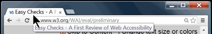
<div class="figure" style="width:676px;">
<img src="page-title.png" alt="Screen shot showing title bar and tabs in FireFox browser. Tabs have: 'Easy Checks - A First...', Web Accessibility Init...', 'Getting Started with...', 'Involving Users in W...'. (FireFox 21.0, Windows)" width="674" height="100" />
<div class="figcaption">Figure: Browser with "Easy Checks - A First Review of Web Accessibility" in the title bar, and the partial titles of 4 pages in the tabs. [@@ image quality going downhill -- probably need to redo at some point]</div>
</div><!--.figure-->

<!--To determine inline width for figure, add width of each image, plus 2px for each image border, plus 10px for each image except the last-->
<div class="figure multimg" style="width:616px;">
<img src="contrast-b-on-w.png" width="301" height="127" alt="black text on white background" /><img class="last-of-type" src="contrast-yellow.png" width="301" height="127" alt="yellow text on black background" />
<div class="figcaption">Figure: High contrast examples.</div>
</div><!--.figure-->

<div class="figure multimg" style="width:676px;">
<img src="resize-normal.png" alt=" " width="217" height="116"><img src="resize-wrap.png" width="216" height="222" alt=" "><img class="last-of-type" src="resize-scroll.png" width="216" height="118" alt=" ">
<div class="figcaption">Figure: The first image shows normal-size text. In the second image, the larger text "wraps" to fit the width. In the third image, some of the larger text is not visible without scrolling horizontally. [@@ make better images]</div>
</div><!--.figure-->
Version 10
Version 10 was never posted. It used meta viewport in an attempt to improve rendering on smart phones, but did not work well enough. On 10 January 2013 we decided to postpone adding responsive until we do redesign and convert to HTML5.
Version 9
Differences from previous version
- Fixed width so has padding on right side of single image
- Added examples of different size images
- Added vertical-align: top to accommodate different size images
Version 9 markup
CSS
.figure {
	max-width: 100%; /* so image scales across various widths */
	margin: 10px 0;
	padding: 5px; /*using 5px padding here and 5px maring in .figure image creates a 10px space both vertically and horizontally between multiple impages */
	border: 1px solid #aaa;
	background: #FFFDFA; /* color that shows in padding around image -- half way between #fff and #fffaf5 */
	line-height: 115%;
}
.figure img {
	max-width: 100%; /* this may be duplicative of above max-width; however this is where height: auto is needed */
	height:auto; /* to prevent height distortion when scaling browser width down */
	margin: 5px;
	border: 1px solid #888;
	vertical-align: top;
}
.figcaption {
	margin: 5px 0 5px 6px; /* 6px left margin is to offset "img {margin: 5px;}" + 1px for border used for image*/
	font-size: 85%;
	color: #444;
}
HTML
<div class="figure" style="width:712px;">
<img src="page-title.png" alt="Screen shot showing title bar and tabs in FireFox browser. Tabs have: 'Easy Checks - A First...', Web Accessibility Init...', 'Getting Started with...', 'Involving Users in W...'. (FireFox 21.0, Windows)" width="700" height="104" />
<div class="figcaption">Figure: Browser with "Easy Checks - A First Review of Web Accessibility" in the title bar, and the partial titles of 4 pages in the tabs.</div>
</div><!--.figure-->

<div class="figure" style="width:626px;">
<img src="contrast-b-on-w.png" width="301" height="127" alt="black text on white background" /><img src="contrast-yellow.png" width="301" height="127" alt="yellow text on black background" />
<div class="figcaption">Figure: High contrast examples.</div>
</div><!--.figure-->

<div class="figure" style="width:735px;"> <img src="/WAI/images/easychecks/resize-normal.png" width="233" height="129" alt=" "><img src="/WAI/images/easychecks/resize-wrap.png" width="233" height="237" alt=" "><img src="/WAI/images/easychecks/resize-scroll.png" width="233" height="129" alt=" ">
<div class="figcaption">Figure: The first image shows normal-size text. In the second image, the larger text "wraps" to fit the width. In the third image, some of the larger text is not visible without scrolling horizontally. <em>[@@ make better images]</em></div>
</div><!--.figure-->
Illustration Goals
Plain text view:
- Visually illustrate the concept of linearize
- Simple example of how a layout can linearize in different order
- Show what they can expect when they follow the steps
- Show how people with low vision might change the display, to help show it's not just screen readers
Illustration inventory
Key:
- Section
- C = collapsed
- E = Expanded
- Status / EOWG sign off
- Final
- Draft = under review; not yet finalized
- Holding spot = text reading "[image...] included on live site, but no image
- Add? = consider drafting
table
| Section | Goal | Status | Recommend | |
|---|---|---|---|---|
| 1 | Page title (C) | Shows a page title in a title bar and some tabs | done! | 1. Use new code 2. Tweak size and sharpness |
| 2 | Page title (E "To check page title with different browsers") | First bullet includes: "[image? or not needed because earlier in the section?]" |
done! | Delete |
| 3 | Page title (E "To check page title with different browsers") | Show hovering over a browser tab to see the full page title | done! | 1. Use new code 2. Tweak size and sharpness |
| 4 | Image text alternatives (C) | Para 2: small image of search button | done! | |
| 5 | Image text alternatives (E "To check alt text with IE WAT") | Show IE WAT toolbar (1) selecting "Images" > "Show Images"; (2) alt text display. Note: does not show dialog box with number of images without alt. | done! | 1. Use new code 2. Tweak size and sharpness |
| 6 | Image text alternatives (E "To check alt text with FF toolbar") | Bullet 2: "[image] Red boxes appear around any images missing alt" | OK for now | minor for ABL: this image is width="676" and I think we're making them max 674 |
| 7 | Image text alternatives (E "To check alt text with FF toolbar") | Show FF toolbar (1) selecting "Images" > "Display Alt Attributes"; (2) alt text display. | done! | 1. Use new code 2. Tweak size and sharpness |
| 8 | Image text alternatives (E "To check alt text with any browser") | Bullet 4: "Look for the red icon [image]" | done! | Draft |
| 9 | Image text alternatives (E "To check alt text with any browser") | Bullet 5 (just above large WAVE image): "Look for the green alt icon [image]" | done! | Draft |
| 10 | Image text alternatives (E "To check alt text with any browser") | Show (1) WAVE web page; (2) Green alt icon [image] and alt text display. | OK for now | status 5 March: OK for now. |
| 11 | Headings (C) | Under "Headings checks: "a view of the page with the heading markup shown, for example: [image]" | done! |
|
| 12 | Headings (E "To check headings with FF toolbar") | Bullet 2: "[image] A new page opens with the outline" | done! |
|
| 13 | Headings (E "To check headings with IE WAT") | Heading markup in the page, Bullet 2: "Headings will be surrounded with <h1>, <h2>, etc. icons in purple text on a light background. [image]" | not doing | not needed since we have the two examples always shown above |
| 14 | Headings (E "To check headings in any browser") | Heading markup in the page, Bullet 4: "Anything that is a functional heading should have a heading icon ([image], [image], ...) before it." | done! | Priority 2 |
| 15 | Contrast Ratio (C) | Example of insufficient contrast between the text and background (using light gray text on a light background. | done! | (1) Delete added border in png (2) Use new code |
| 16 | Contrast Ratio (C) | Group of two images showing high contrast using (1) black text on white background and (2) yellow text on black background | done! | (1) Delete added border in png (2) Use new code |
| 17 | Contrast Ratio (C) | Group of two images showing low luminance using (1) taupe text on black background and (2) black text on taupe background | done! | (1) Delete added border in png (2) Use new code |
| 18 | Contrast Ratio (E "To check contrast with IE WAT") | Show IE WAT toolbar selecting Juicy Studio Luminosity Analyser | on hold for now | ABL: why? Delete. SLH: To help people easily find where the icon is on the toolbar. But I don't feel strongly about this. There are many such possibilities for images throughout -- including the #5 & #7 in this table. We could check during UT if we think there should be more or less...(/me adds to UT notes) I'd like to be consistent in whether or not we provide such images, or at least have a method to our madness. ;-) |
| 19 | Resize text (C) | Group of two screen captures (one before, one after zooming) to show an example problem (in this case the heading and sidebar overlaping the main text and sidebar text being cut off). | done! | 1. Use new code |
| 20 | Resize text (C) | Group of three images showing (1) normal-size text, (2) larger text re-wrapping to fit the width, (3) larger text creating horizontal scrolling. [@@ make better images] | OK for now | 1. Delete borders in png 2. Use new code NOTE: Status 15 March: need to check how these and others are layed out in different browsers (stacking in some of shawn's :/) |
| 21 | Keyboard access and visual focus | Note: No images | [listed below] | (oops, there are actually a lot but they are marked with "[add image]" instead of "[image]" so they must have missed your search. sorry!) |
| 22 | Forms, Labels, and Errors (C) | Small image of email address form field | done! | |
| 23 | Forms, Labels, and Errors (C Labels sections) | Small image of email address form field (same as above) | done! | |
| 24 | Forms, Labels, and Errors (C Labels sections) | Small image of radio buttons | done! | |
| 25 | Multimedia (video, audio) alternatives (C) | Captions section, para. 2: add small image of CC button? | done! | |
| 26 | Multimedia (video, audio) alternatives (C) | Captions section, para. 2: "[image] with only auto captions listed" | OK for now | Draft commented it out |
| 27 | Multimedia (video, audio) alternatives (C) | Captions section, para. 3: "e.g.: [image] with one language NOT English! listed" | done! | done |
| 28 | Basic Structure Check (E "Images illustrating linearized and changed display") | Group of five images showing (1) a 3 column display; (2) same text linearized into 1 column; (3) same text linearized into 1 column in a different order from image #2; (4) same text linearized into 1 column with styles off; (5) same text with CSS changed by person who is good at CSS and has low vision. | done for now | AB:" Love this series. Consider re-doing as five stacked figures. Wonder if helpful enough if then pull into collapsed view? SLH:old table layout. draft stacked -- although, I'd prefer if B & C were side-by-side when there's room. :) I think they are very helpful, but I'm hesitant to have them show all the time just because they take up so much space... let's see if anyone else in EO has opinions. status: done for now later: CSS for side-by-side |
| 29 | Basic Structure Check (E "To check basic structure with FF..." | Bullet 4: Add image of end result? | Add later? | Add as priority 2? status/later: consider when time |
| 30 | Keyboard access and visual focus (C) | Add 2 illustrations of focus indication - one border, one highlight - maybe one on a link and one on a field label | done! | First one with dotted border: I think it would look better of the first one was smaller -- the text in it is bigger than the main body text and way bigger than the other illustration. {slh} Second one with red field: Unfortunately that BAD example has the option button labels on the worng side. :( I'm not sure why. We should ask them. Also, I do not like that there are only those two options (think about it)!!! I started to comment to them, but didn't finish it. :( status 5 March: Anna Belle to re-consider point above. First one: good idea for later iteration, not now {abl 10 March} Second: I'm not understanding. Looks fine to me and thought we agreed on phone 4 March this was done {abl 10 March} SLH: I think this is a high priority to fix. later: CSS for side-by-side |
| 31 | Forms: Labels checks (E To check labels with IE WAT | In the toolbar, select "Structure", then "FieldSet / Labels". A dialog box appears with the number of errors and elements. | done! | status: Vicki started, but it needs tweaking should we have it show no errors or errors? differnt types of errors? |
| 32 | Forms: Labels checks (E To check labels with IE WAT | Add two images for the form elements are outlined, the markup is shown, and potential errors are indicated. (1) Example with no errors; (2) Example with potential errors | done! | Suzette's comments this will take a lot of work to do well -- to show different types of errors |
| 33 | Forms: Labels checks (E To check labels with IE WAT | Add 4 images for check that the required field indicator is in the field label, or for radio button and check boxes, it is in the "legend". (1) Correct: asterisk (*) in label box; (2) Incorrect: asterisk (*) outside label box; (3) Correct: "(required)"; (4) Incorrect: "(required)". | OK for now | commented out |
| 34 | Images | (For example, appropriate text alternative for a search button ( |
done |
Archived Info
Easy Checks Illustrations 17Jan14 is a snapshot of this page on 17 January 2014
...