1. Introduction
This section is not normative.CSS assumes the document layout is modeled as a tree of elements. The unique element that has no parent is called the root element. This module describes how any of the elements from the tree of elements can be arranged independent of document order (i.e. taken out of "flow"). With a positioned element the element may be placed anywhere within the content not specifically respecting the tree of elements order.
In [CSS21], the visual formatting model explained how each element in the document tree generates zero or more boxes according to the box model. This module further explains and extends the positioning scheme. The layout of these boxes is governed by:
- box dimensions and type.
- positioning scheme (normal flow, float, and absolute positioning).
- relationships between elements in the document tree.
- external information (e.g., viewport size, intrinsic dimensions of images, etc.).
The properties defined in this module apply to both continuous media and paged media.
1.1. Module Interactions
This module replaced and extends the positioning scheme features defined in [CSS21] sections:
- 9.1.1 The viewport
- 9.1.2 Containing blocks
- 9.3 Positioning schemes
- 9.4.3 Relative positioning
- 9.6 Absolute positioning
- 9.7 Relationships between display, position, and float
- 9.8 Comparison of normal flow, floats, and absolute positioning
- 9.9 Layered presentation
- 10.1 Definition of "containing block"
- 10.3.7 Absolutely positioned, non-replaced elements
- 10.3.8 Absolutely positioned, replaced elements
- 10.6.4 Absolutely positioned, non-replaced elements
- 10.6.5 Absolutely positioned replaced elements
- 10.6.7 Auto heights for block formatting context roots
- Appendix E. Elaborate description of Stacking Contexts
1.2. Values
This specification follows the CSS property definition conventions from [CSS21].
Value types not defined in this specification are defined in CSS Level 2 Revision 1 [CSS21]. Other CSS modules may expand the definitions of these value types: for example [CSS3VAL], when combined with this module, expands the definition of the <length> value type as used in this specification.
In addition to the property-specific values listed in their definitions, all properties defined in this specification also accept the inherit keyword as their property value. For readability it has not been repeated explicitly.
2. The Viewport#viewportReferenced in:3.1. Definition of containing block6.4. Fixed positioning6.5. Choosing a positioning scheme: position property (2) (3)6.6. Box offsets: top, right, bottom, left6.7. Logical box offsets: offset-before, offset-end, offset-after and offset-start12.2. Painting order
User agents for continuous media generally offer users a viewport (a window or other viewing area on the screen) through which users consult a document. User agents may change the document’s layout when the viewport is resized (see the initial containing block).
When the viewport is smaller than the area of the canvas on which the document is rendered, the user agent may offer a scrolling mechanism. There is at most one viewport per canvas, but user agents may render to more than one canvas (i.e., provide different views of the same document).
3. Containing Blocks
In CSS, many box positions and sizes are calculated with respect to the edges of a rectangular box called a containing block. In general, generated boxes act as containing blocks for descendant boxes; we say that a box "establishes" the containing block for its descendants. The phrase "a box’s containing block" means "the containing block in which the box lives," not the one it generates.
Each box is given a position with respect to its containing block, but it is not confined by this containing block; it may overflow.
3.1. Definition of containing block#containing-blockReferenced in:6. Positioning schemes6.1. Relative positioning (2) (3) (4)6.2. Sticky positioning (2) (3)6.3. Absolute positioning (2)6.4. Fixed positioning6.5. Choosing a positioning scheme: position property6.6. Box offsets: top, right, bottom, left (2) (3) (4) (5) (6) (7) (8) (9) (10) (11) (12) (13)6.7. Logical box offsets: offset-before, offset-end, offset-after and offset-start (2) (3) (4)8.1. The width of absolute or fixed positioned, non-replaced elements (2) (3)8.2. The width of absolute or fixed positioned, replaced elements (2) (3) (4)9. Relationships between display, position, and float10.1. Normal flow10.4. Absolute positioning (2) (3) (4) (5) (6)
The position and size of an element’s box(es) are sometimes computed relative to a certain rectangle, called the containing block of the element. The containing block of a static or relative element is defined in the Box Model [CSS3BOX]. The containing block of a sticky element is the same as for a relative element. For fixed and absolute, it is defined as follows:
- If the element has position: fixed, the containing block is established by the viewport in the case of continuous media or the page area in the case of paged media.
-
If the element has position: absolute,
the containing block is established by the nearest ancestor with a position other than static, in the following way:
- In the case that the ancestor is block-level, the containing block is formed by the padding edge of the ancestor.
-
In the case that the ancestor is inline-level, the containing block depends
on the direction property of the ancestor:
- If the direction is ltr, the top and left of the containing block are the top and left content edges of the first box generated by the ancestor, and the bottom and right are the bottom and right content edges of the last box of the ancestor.
-
If the direction is rtl, the top and right are the
top and right edges of the first box generated by the ancestor, and
the bottom and left are the bottom and left content edges of the
last box of the ancestor.
Note, in some cases when a line wraps it may seem as if the left and right positions are swapped.
- If there is no such ancestor, the containing block is the initial containing block.
In paged media, an absolutely positioned element is positioned relative to its containing block ignoring any page breaks (as if the document were continuous). The element may subsequently be broken over several pages.
For absolutely positioned content that resolves to a position on a page other than the page being laid out (the current page), or resolves to a position on the current page which has already been rendered for printing, printers may place the content:
- on the current page,
- on a subsequent page, or
- may omit it altogether.
Note, a block-level element that is split over several pages may have a different width on each page and that there may be device-specific limits.
With no positioning, the containing blocks (C.B.) in the following document:
<!DOCTYPE html>
<html>
    <head>
        <title>Illustration of containing blocks</title>
    </head>
    <body id="body">
        <div id="div1">
        <p id="p1">This is text in the first paragraph...</p>
        <p id="p2">This is text <em id="em1"> in the
        <strong id="strong1">second</strong> paragraph.</em></p>
        </div>
    </body>
</html>
are established as follows:
| For box generated by | C.B. is established by |
|---|---|
| html | initial C.B. (UA-dependent) |
| body | html |
| div1 | body |
| p1 | div1 |
| p2 | div1 |
| em1 | p2 |
| strong1 | p2 |
If we position "div1":
#div1 { position: absolute; left: 50px; top: 50px }
its containing block is no longer "body"; it becomes the initial containing block (since there are no other positioned ancestor boxes).
If we position "em1" as well:
#div1 { position: absolute; left: 50px; top: 50px }
#em1  { position: absolute; left: 100px; top: 100px }
the table of containing blocks becomes:
| For box generated by | C.B. is established by |
|---|---|
| html | initial C.B. (UA-dependent) |
| body | html |
| div1 | initial C.B. |
| p1 | div1 |
| p2 | div1 |
| em1 | div1 |
| strong1 | em1 |
By positioning "em1", its containing block becomes the nearest positioned ancestor box (i.e., that generated by "div1").
4. Normal Flow#normal-flowReferenced in:1. Introduction6. Positioning schemes (2)6.1. Relative positioning (2) (3)6.2. Sticky positioning (2)6.3. Absolute positioning6.5. Choosing a positioning scheme: position property (2) (3) (4) (5)6.6. Box offsets: top, right, bottom, left (2) (3) (4)6.7. Logical box offsets: offset-before, offset-end, offset-after and offset-start8.2. The width of absolute or fixed positioned, replaced elements10. Comparison of normal flow, floats, and positioning (2)10.1. Normal flow10.2. Relative positioning
Boxes in the normal flow belong to a formatting context, which may be block or inline, but not both simultaneously. See the CSS Basic Box Model module [CSS3BOX] for further details about normal flow.
5. Floats#floatReferenced in:6. Positioning schemes (2) (3)6.1. Relative positioning (2)6.2. Sticky positioning8.5. Auto heights for block formatting context roots (2) (3)9. Relationships between display, position, and float10. Comparison of normal flow, floats, and positioning10.3. Floating a box (2)12.2. Painting order
A float is a box that is positioned within content, often left or right on the current line. The most interesting characteristic of a float (or "floated" or "floating" box) is that inline-level content may flow along its side (or be prohibited from doing so by the clear property) or around the floated box. See the CSS 2.1 [CSS21] for details about floating boxes.
6. Positioning schemes#positioning-schemesReferenced in:10. Comparison of normal flow, floats, and positioning
In CSS, a box may be laid out according to three positioning schemes:
- Normal flow
In CSS, normal flow includes block formatting of block-level boxes, inline formatting of inline-level boxes, and relative and sticky positioning of block-level and inline-level boxes. - Floats
In the float model, a box is first laid out according to the normal flow, then taken out of the flow and positioned, typically to the left or right. Content may flow along the side of a float. - Absolute positioning
In the absolute positioning model, a box is removed from the normal flow entirely (it has no impact on later siblings) and assigned a position with respect to a containing block.
An element is called out-of-flow if it is floated, absolutely positioned, or is the root element. An element is called in-flow if it is not out-of-flow. The flow of an element A is the set consisting of A and all in-flow elements whose nearest out-of-flow ancestor is A.
6.1. Relative positioning
Once a box has been laid out according to the normal flow or floated, it may be offset relative to this position. This is called relative positioning#relative-positionReferenced in:6.2. Sticky positioning6.5. Choosing a positioning scheme: position property10. Comparison of normal flow, floats, and positioning10.2. Relative positioning. Offsetting a box (B1) in this way has no effect on the box (B2) that follows: B2 is given a position as if B1 were not offset and B2 is not re-positioned after B1’s offset is applied. This implies that relative positioning may cause boxes to overlap. However, if relative positioning causes an overflow: auto or overflow: scroll box to have overflow, the user agent must allow the user to access this content (at its offset position), which, through the creation of a scrolling mechanism, may affect layout.
A relatively positioned box keeps its normal flow size, including line breaks and the space originally reserved for it.
A relatively positioned box establishes a new a new containing block for absolutely positioned descendants. (This is a common use of relatively positioned boxes.) The section on containing blocks explains when a relatively positioned box establishes a new containing block.
For relatively positioned elements, left and right move the box(es) horizontally, without changing their size. Left moves the boxes to the right, and right moves them to the left. Since boxes are not split or stretched as a result of left or right, the used values are always: left = -right.
If both left and right are auto (their initial values), the used values are 0 (i.e., the boxes stay in their original position).
If left is auto, its used value is minus the value of right (i.e., the boxes move to the left by the value of right).
If right is specified as auto, its used value is minus the value of left.
If neither left nor right is auto, the position is over-constrained, and one of them has to be ignored. If the direction property of the containing block is ltr, the value of left wins and right becomes -left. If direction of the containing block is rtl, right wins and left is ignored.
The following three rules are equivalent:
div.a8 { position: relative; direction: ltr; left: -1em; right: auto }
div.a8 { position: relative; direction: ltr; left: auto; right: 1em }
div.a8 { position: relative; direction: ltr; left: -1em; right: 5em }
The top and bottom properties move relatively positioned element(s) up or down without changing their size. Top moves the boxes down, and bottom moves them up. Since boxes are not split or stretched as a result of top or bottom, the used values are always: top = -bottom.
If top and bottom are auto, their used values are both 0.
If one of them, top or bottom, is auto, the auto value becomes the negative of the other.
If neither top and bottom is auto, bottom is ignored (i.e., the used value of bottom will be minus the value of top).
Note, Although relative positioning could be used as a form of superscripting and subscripting, the line height is not automatically adjusted to take the positioning into consideration. See the description of line height calculations for more information.
Examples of relative positioning are provided in the section comparing normal flow, floats, and absolute positioning.
6.2. Sticky positioning
A stickily positioned#sticky-positionReferenced in:6. Positioning schemes box is positioned similarly to a relatively positioned box, but the offset is computed with reference to the nearest ancestor with a scrolling box, or the viewport if no ancestor has a scrolling box.
Specifically, once a box has been laid out according to the normal flow or floated, its sticky offset is computed as described below. Offsetting a box (B1) in this way has no effect on the box (B2) that follows: B2 is given a position as if B1 were not offset and B2 is not re-positioned after B1’s offset is applied. This implies that sticky positioning may cause boxes to overlap. However, if sticky positioning causes an overflow: auto or overflow: scroll box to have overflow, the user agent must allow the user to access this content (at its offset position), which, through the creation of a scrolling mechanism, may affect layout.
A stickily positioned box keeps its normal flow size, including line breaks and the space originally reserved for it.
A stickily positioned box establishes a new a new containing block for absolutely positioned descendants, just as relative positioning does. The section on containing blocks explains when a stickily positioned box establishes a new containing block.
For stickily positioned elements, left, right, top and bottom are offsets from the respective edges of its flow box which are used to constrain the element’s offset. Percentage values of left and right refer to the width of its flow box; percentage values of top and bottom refer to the height of its flow box.
Describe which element font-size-relative units are resolved against
The offset of a stickily positioned box is computed as follows:
- A rectangle is computed relative to the containing block of the stickily positioned element, by insetting its flow box rectangle on each side by offsets computed from the left, right, top and bottom properties of the stickily positioned element.
- The intersection is taken between the resulting rectangle, and the containing block of the stickily positioned element. The result, termed the the sticky-constraint rectangle, is a rectangle used to constrain the location of the stickily positioned element.
- If the stickily positioned element’s top style is not auto, and the stickily positioned element projects above the top of the sticky-constraint rectangle, the stickily positioned element is moved down until it is fully contained in the sticky-constraint rectangle.
- If the stickily positioned element’s bottom style is not auto, and the stickily positioned element projects below the bottom of the sticky-constraint rectangle, the stickily positioned element is moved up until it is fully contained in the sticky-constraint rectangle.
- If the stickily positioned element’s left style is not auto, and the stickily positioned element projects outside the left of the sticky-constraint rectangle, the stickily positioned element is moved right until it is fully contained in the sticky-constraint rectangle.
- If the stickily positioned element’s right style is not auto, and the stickily positioned element projects outside the right of the sticky-constraint rectangle, the stickily positioned element is moved left until it is fully contained in the sticky-constraint rectangle.
When computing containement of the stickily positioned element within its containing block, margins on the stickily positioned element are taken into account.
Say what happens if it already overflows the containing block
Do marins collapse between the stickily positioned element and its containing block element?
Intersection between the stickily positioned element and the bottom of the sticky-constraint rectangle limits movement in any direction, so the offset never pushes the stickily positioned element outside of its containing block. However, when the element is free to move within its containing block as the page is scrolled, it appears to be pinned to the relevant flow root edges, similarly to a fixed position element.
Note that a stickily positioned element with non-auto top style and auto bottom style will only ever be pushed down by sticky positioning; it will never be offset upwards.
Multiple stickily positioned elements in the same container are offset independently. Sticky position offsets may cause them to overlap.
Does the margin on the stickily positioned element affect its distance from the flow root edge?
Sticky positioning should really be defined in terms of the nearest scrollable ancestor, but there is currently no such term defined elsewhere in CSS. CSSOM View refers to "scrolling boxes." CSS Overflow has yet to pull in the relevant text from CSS Box, and CSS Box has an old, confusing definition of "flow root" which is almost (but probably not quite) what we want here. This spec refers to "flow root," since that’s the closest thing currently specced somewhere, but this is not optimal.
EM { font-style: italic }
6.3. Absolute positioning
In the absolute positioning model, a box is explicitly offset with respect to its containing block. It is removed from the normal flow entirely (it has no impact on later siblings). An absolutely positioned box establishes a new containing block for normal flow children and absolutely (but not fixed) positioned descendants. However, the contents of an absolutely positioned element do not flow around any other boxes. They may obscure the contents of another box (or be obscured themselves), depending on the stack levels of the overlapping boxes.
References in this specification to an absolutely positioned element (or its box) imply that the element’s position property has the value absolute or fixed.
6.4. Fixed positioning
Fixed positioning is similar to absolute positioning. The only difference is that for a fixed positioned box, the containing block is established by the viewport. For continuous media, fixed boxes do not move when the document is scrolled. In this respect, they are similar to fixed background images. For paged media, boxes with fixed positions are repeated on every page. This is useful for placing, for instance, a signature at the bottom of each page. Boxes with fixed position that are larger than the page area are clipped. Parts of the fixed position box that are not visible in the initial containing block will not print.
Authors may use fixed positioning to create the following presentation:
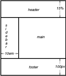
This might be achieved with the following HTML document and style rules:
<!DOCTYPE html>
<html>
  <head>
    <title>A frame document with CSS</title>
    <style type="text/css" media="screen">
      body { height: 8.5in } /* Required for percentage heights below */
      #header {
        position: fixed;
        width: 100%;
        height: 15%;
        top: 0;
        right: 0;
        bottom: auto;
        left: 0;
      }
      #sidebar {
        position: fixed;
        width: 10em;
        height: auto;
        top: 15%;
        right: auto;
        bottom: 100px;
        left: 0;
      }
      #main {
        position: fixed;
        width: auto;
        height: auto;
        top: 15%;
        right: 0;
        bottom: 100px;
        left: 10em;
      }
      #footer {
        position: fixed;
        width: 100%;
        height: 100px;
        top: auto;
        right: 0;
        bottom: 0;
        left: 0;
      }
    </style>
  </head>
  <body>
    <div id="header"> ...  </div>
    <div id="sidebar"> ...  </div>
    <div id="main"> ...  </div>
    <div id="footer"> ...  </div>
  </body>
</html>
6.5. Choosing a positioning scheme: position property
The position property determines which of the positioning algorithms is used to calculate the position of a box.
| Name: | position#propdef-positionReferenced in:3.1. Definition of containing block (2) (3)6.3. Absolute positioning6.5. Choosing a positioning scheme: position property (2) (3) (4) (5) (6)6.6. Box offsets: top, right, bottom, left (2) (3) (4) (5) (6) (7) (8) (9) (10) (11) (12) (13)6.7. Logical box offsets: offset-before, offset-end, offset-after and offset-start (2) (3)9. Relationships between display, position, and float (2) (3) (4)10.4. Absolute positioning |
|---|---|
| Value: | static | relative | absolute | sticky | fixed |
| Initial: | static |
| Applies to: | all elements except table-column-group and table-column |
| Inherited: | no |
| Percentages: | N/A |
| Media: | visual |
| Computed value: | specified value |
| Animatable: | no |
The values of this property have the following meanings:
- static#valdef-position-staticReferenced in:3.1. Definition of containing block (2)6.5. Choosing a positioning scheme: position property6.6. Box offsets: top, right, bottom, left (2) (3) (4) (5)
- The box is a normal box, laid out according to the normal flow. The top, right, bottom, and left properties do not apply.
- relative#valdef-position-relativeReferenced in:3.1. Definition of containing block (2)6.5. Choosing a positioning scheme: position property (2)6.6. Box offsets: top, right, bottom, left (2) (3) (4)10.4. Absolute positioning
-
The box’s position is calculated according to the normal flow (this
is called the position in normal flow). Then the box is offset relative
to its normal position and in all cases, including table elements, does not affect
the position of any following boxes. When a box B is relatively positioned, the
position of the following box is calculated as though B were not offset. The effect
of position: relative on table elements is defined as follows:
- table-row-group, table-header-group, table-footer-group and table-row offset relative to its normal position within the table. If table-cells span multiple rows, only the cells originating in the relative positioned row is offset.
- table-column-group, table-column do not offset the respective column and has no visual affect when position: relative is applied.
- table-caption and table-cell offset relative to its normal position within the table. If a table cell spans multiple columns or rows the full spanned cell is offset.
- absolute#valdef-position-absoluteReferenced in:3.1. Definition of containing block6.3. Absolute positioning9. Relationships between display, position, and float
- The box’s position (and possibly size) is specified with the top, right, bottom, and left properties. These properties specify offsets with respect to the box’s containing block. Absolutely positioned boxes are taken out of the normal flow. This means they have no impact on the layout of later siblings. Though absolutely positioned boxes may have margins, those margins do not collapse with any other margins.
- sticky#valdef-position-stickyReferenced in:3.1. Definition of containing block6.5. Choosing a positioning scheme: position property6.6. Box offsets: top, right, bottom, left (2) (3) (4)
- The box’s position is calculated according to the normal flow (this is called the position in normal flow). Then the box is offset relative to its flow root and containing block and in all cases, including table elements, does not affect the position of any following boxes. When a box B is stickily positioned, the position of the following box is calculated as though B were not offset. The effect of position: sticky on table elements is the same as for position: relative
- fixed#valdef-position-fixedReferenced in:3.1. Definition of containing block6.3. Absolute positioning6.5. Choosing a positioning scheme: position property (2) (3)9. Relationships between display, position, and float
-
The box’s position is calculated according to the "absolute" model, but
in addition, the box is fixed with respect to some reference. As with the
"absolute" model, the box’s margins do not collapse with any other margins.
In the case of handheld, projection, screen, tty, and tv media types, the box
is fixed with respect to the viewport and does not move when scrolled.
In the case of the print media type, the box is rendered on every page, and
is fixed with respect to the page box, even if the page is seen through a viewport (in the case of a print-preview, for example). For other media
types, the presentation is undefined. Authors may wish to specify fixed in a media-dependent way. For instance, an author may want a box to remain at
the top of the viewport on the screen, but not at the top of each printed
page. The two specifications may be separated by using an '@media' rule, as in:
User agents must not paginate the content of fixed boxes.
Note that user agents may print invisible content in other ways. See "Content outside the page box".
In previous versions of CSS user agents may treat position fixed as static on the root element. This specification removes that option and it is now required that newer user agents treat fixed value on the root element as defined for all other elements.
6.6. Box offsets: top, right, bottom, left
An element is said to be positioned if its position property has a value other than static. Positioned elements generate positioned boxes, and may be laid out according to the following four physical properties:
| Name: | top#propdef-topReferenced in:6.1. Relative positioning (2) (3) (4) (5) (6) (7)6.2. Sticky positioning (2) (3) (4) (5)6.5. Choosing a positioning scheme: position property (2)6.6. Box offsets: top, right, bottom, left (2) (3) (4) (5) (6)8.3. The height of absolute or fixed positioned, non-replaced elements (2) (3) (4) (5) (6) (7) (8) (9) (10) (11) (12)8.4. The height of absolute or fixed positioned, replaced elements (2)9. Relationships between display, position, and float10.4. Absolute positioning |
|---|---|
| Value: | auto | <length> | <percentage> |
| Initial: | auto |
| Applies to: | positioned elements |
| Inherited: | no |
| Percentages: | refer to height of containing block |
| Media: | visual |
| Computed value: | For position: relative, see Relative positioning. For position: sticky, see Sticky positioning. For position: static, auto. Otherwise: if specified as a '<length>', the corresponding absolute length; if specified as a '<percentage>', the specified value; otherwise, auto. |
| Animatable: | <length>, <percentage> |
This property specifies how far an absolutely positioned box’s top margin edge is offset below the top edge of the box’s containing block.
For relatively positioned boxes, the offset is with respect to the top edge of the box itself (i.e., the box is given a position in the normal flow, and then offset from that position according to this property).
For stickily positioned boxes, the value is used to compute the sticky-constraint rectangle as described in Sticky positioning.
For absolutely positioned elements whose containing block is based on a block-level element, this property is an offset from the padding edge of that element.
Similar to top, but specifies how far a box’s right margin edge is offset to the left of the right edge of the box’s containing block.
For relatively positioned boxes, the offset is with respect to the right edge of the box itself (i.e., the box is given a position in the normal flow, and then offset from that position according to this property).
For stickily positioned boxes, the value is used to compute the sticky-constraint rectangle as described in Sticky positioning.
For absolutely positioned elements whose containing block is based on a block-level element, this property is an offset from the padding edge of that element.
| Name: | bottom#propdef-bottomReferenced in:6.1. Relative positioning (2) (3) (4) (5) (6) (7) (8)6.2. Sticky positioning (2) (3) (4) (5)6.5. Choosing a positioning scheme: position property (2)6.6. Box offsets: top, right, bottom, left (2) (3)8.3. The height of absolute or fixed positioned, non-replaced elements (2) (3) (4) (5) (6) (7) (8) (9) (10) (11) (12)8.4. The height of absolute or fixed positioned, replaced elements (2) (3)9. Relationships between display, position, and float |
|---|---|
| Value: | auto | <length> | <percentage> |
| Initial: | auto |
| Applies to: | positioned elements |
| Inherited: | no |
| Percentages: | refer to height of containing block |
| Media: | visual |
| Computed value: | For position: relative, see Relative positioning. For position: sticky, see Sticky positioning. For position: static, auto. Otherwise: if specified as a '<length>', the corresponding absolute length; if specified as a '<percentage>', the specified value; otherwise, auto. |
| Animatable: | <length>, <percentage> |
Similar to top, but specifies how far a box’s bottom margin edge is offset above the bottom edge of the box’s containing block.
For relatively positioned boxes, the offset is with respect to the bottom edge of the box itself (i.e., the box is given a position in the normal flow, and then offset from that position according to this property).
For stickily positioned boxes, the value is used to compute the sticky-constraint rectangle as described in Sticky positioning.
For absolutely positioned elements whose containing block is based on a block-level element, this property is an offset from the padding edge of that element.
Similar to top, but specifies how far a box’s left margin edge is offset to the right of the left edge of the box’s containing block.
For relatively positioned boxes, the offset is with respect to the left edge of the box itself (i.e., the box is given a position in the normal flow, and then offset from that position according to this property).
For stickily positioned boxes, the value is used to compute the sticky-constraint rectangle as described in Sticky positioning.
For absolutely positioned elements whose containing block is based on a block-level element, this property is an offset from the padding edge of that element.
The values for the four properties have the following meanings:
- <length>
- The offset is a fixed distance from the reference edge. Negative values are allowed.
- <percentage>
- The offset is a percentage of the containing block’s width (for left or right) or height (for top and bottom). For stickily positioned elements, the offset is a percentage of the flow root’s width (for left or right) or height (for top or bottom). Negative values are allowed.
- auto#valdef-top-autoReferenced in:6.6. Box offsets: top, right, bottom, left (2) (3) (4) (5) (6) (7) (8) (9)6.7. Logical box offsets: offset-before, offset-end, offset-after and offset-start (2)8.1. The width of absolute or fixed positioned, non-replaced elements (2) (3) (4) (5) (6) (7) (8) (9) (10) (11)
- For non-replaced elements, the effect of this value depends on which of related properties have the value auto as well. See the sections on the width and height of absolutely positioned, non-replaced elements for details. For replaced elements, the effect of this value depends only on the intrinsic dimensions of the replaced content. See the sections on the width and height of absolutely positioned, replaced elements for details.
Note, for fixed positioned elements using large values or negative values may easily move elements outside the viewport and make the contents unreachable through scrolling or other means. Authors should be aware that fixed position elements are always relative to the initial containing block.
6.7. Logical box offsets: offset-before, offset-end, offset-after and offset-start
Logical offset properties allow for offseting positioned boxes based on the writing-mode and direction properties. When both the physical property and equivalent logical property (based on writing-mode and direction) are specified the physical property computes to the computed value of the coresponding logical property.
Positioned elements generate positioned boxes, and may be laid out according to the following four logical properties taking into account the writing-mode and direction of the containing block:
For an absolutely positioned box this property specifies how far the coresponding margin edge is offset from the coresponding physical reference edge of the box’s containing block.
The partiucular physical reference edge that is used when offsetting is based on the writing-mode and direction properties.
The combination of the writing-mode and direction properties determine the appropriate physical reference edge for offsetting.
The table below shows logical offset properties (per writing-mode and direction) and the physical reference edge from which the offset will occur.
| writing-mode / direction | |||||||
| horizontal-tb / ltr | horizontal-tb / rtl | vertical-rl / ltr | vertical-rl / rtl | vertical-lr / ltr | vertical-lr / rtl | ||
|
Edge
| top | offset-before | offset-before | offset-start | offset-end | offset-start | offset-end |
| right | offset-end | offset-start | offset-before | offset-before | offset-after | offset-after | |
| bottom | offset-after | offset-after | offset-end | offset-start | offset-end | offset-start | |
| left | offset-start | offset-end | offset-after | offset-after | offset-before | offset-before | |
Relationship of physical offset edges and the logical properties per writing-mode and direction.
The logical property definitions should move to the Logical Properties module.
For relatively positioned boxes, the offset is with respect to the property’s coresponding physical reference edge of the box itself (i.e., the box is given a position in the normal flow, and then offset from that position according to the property).
This needs to be defined for sticky positioning.
For absolutely positioned elements whose containing block is based on a block-level element, this property is an offset from the coresponding padding edge of that element.
Note, for fixed positioned elements using large values or negative values may easily move elements outside the viewport and make the contents unreachable through scrolling or other means. Authors should be aware that fixed position elements are always relative to the initial containing block.
7. Choosing a different containing block for positioning
7.1. Attachment properties: attachment-type, attachment-top, attachment-right, attachment-bottom, attachment-left, and attachment
Ideas have been raised to allow changing the positioning containing block or allowing positioning and sizing to use different containing blocks.
8. Sizing and positioning details
8.1. The width of absolute or fixed positioned, non-replaced elements
The constraint that determines the used values for these elements is:
left + margin-left + border-left-width + padding-left + width + padding-right + border-right-width + margin-right + right = width of containing block
If all three of left, width, and right are auto: First set any auto values for margin-left and margin-right to 0. Then, if the direction property of the element establishing the static-position containing block is ltr set left to the static position and apply rule number three below; otherwise, set right to the static-position and apply rule number one below.
If none of the three is auto: If both margin-left and margin-right are auto, solve the equation under the extra constraint that the two margins get equal values, unless this would make them negative, in which case when direction of the containing block is ltr (rtl), set margin-left (margin-right) to 0 and solve for margin-right (margin-left). If one of margin-left or margin-right is auto, solve the equation for that value. If the values are over-constrained, ignore the value for left (in case the direction property of the containing block is rtl) or right (in case direction is ltr) and solve for that value.
Otherwise, set auto values for margin-left and margin-right to 0, and pick one of the following six rules that apply.
- If left and width are auto and right is not auto, then the width is shrink-to-fit. Then solve for left.
- If left and right are auto and width is not auto, then if the direction property of the element establishing the static-position containing block is ltr set left to the static-position, otherwise set right to the static-position. Then solve for left (if 'direction is rtl) or right (if direction is ltr).
- If width and right are auto and left is not auto, then the width is shrink-to-fit. Then solve for right.
- If left is auto, width and right are not auto, then solve for left.
- If width is auto, left and right are not auto, then solve for width.
- If right is auto, left and width are not auto, then solve for right.
| Is auto? | Result | ||||
|---|---|---|---|---|---|
| left | width | right | margin-left | margin-right | |
| ✔ | ✔ | ✔ | any |
| |
| ✘ | ✘ | ✘ | ✔ | ✘ | auto margin → free space |
| ✘ | ✔ | ||||
| ✔ | ✔ |
| |||
| ✘ | ✘ | treat right as auto | |||
| ✔ | ✘ | ✔ | any |
| |
| ✔ | ✔ | ✘ | any |
| |
| ✘ | ✔ | ✔ | any |
| |
| ✔ | ✘ | ✘ | any |
| |
| ✘ | ✘ | ✔ | |||
| ✘ | ✔ | ✘ | |||
8.2. The width of absolute or fixed positioned, replaced elements
If height and width both have computed values of auto and the element also has an intrinsic width, then that intrinsic width is the used value of width.
If height and width both have computed values of auto and the element has no intrinsic width, but does have an intrinsic height and intrinsic ratio; or if width has a computed value of auto, height has some other computed value, and the element does have an intrinsic ratio; then the used value of width is:
(used height) * (intrinsic ratio)
If height and width both have computed values of auto, the element has an intrinsic ratio but no intrinsic height or width, and the containing block’s width does not itself depend on the replaced element’s width, then the used value of width is calculated from the constraint equation used for block-level, non-replaced elements in normal flow.
Otherwise, if width has a computed value of auto, and the element has an intrinsic width, then that intrinsic width is the used value of width.
Otherwise, if width has a computed value of auto, but none of the conditions above are met, and then the used value of width becomes 300px. If 300px is too wide to fit the device, user agents should use the width of the largest rectangle that has a 2:1 ratio and fits the device instead.
After establishing the width, in order to position the replaced element, apply the following rules as appropriate.
- If both left and right have the value auto, and if the direction property of the element establishing the static-position containing block is ltr, set left to the static position and solve for right; else if direction is rtl, set right to the static position and solve for left.
- If left is auto and right is not auto, replace any auto on margin-left or margin-right with 0, then solve for left.
- If right is auto and left is not auto, replace any auto on margin-left or margin-right with 0, then solve for right.
- If at this point both margin-left and margin-right are still auto, solve the equation under the extra constraint that the two margins must get equal values, unless this would make them negative, in which case when the direction of the containing block is ltr (rtl), set margin-left (margin-right) to 0 and solve for margin-right (margin-left).
- If at this point there is an auto remaining, solve the equation for that value.
- If at this point the values are over-constrained, ignore the value for either left (in case the direction property of the containing block is rtl) or right (in case direction is ltr) and solve for that value.
8.3. The height of absolute or fixed positioned, non-replaced elements
For absolutely positioned elements, the used values of the vertical dimensions must satisfy this constraint:
top + margin-top + border-top-width + padding-top + height + padding-bottom + border-bottom-width + margin-bottom + bottom = height of containing block
If all three of top, height, and bottom are auto: First set any auto values for margin-top and margin-bottom to 0, then set top to the static position, and finally apply rule number three below.
If none of the three are auto: If both margin-top and margin-bottom are auto, solve the equation under the extra constraint that the two margins get equal values. If one of margin-top or margin-bottom is auto, solve the equation for that value. If the values are over-constrained, ignore the value for bottom and solve for that value.
Otherwise, set auto values for margin-top and margin-bottom to 0, and pick one of the following six rules that apply.
- If top and height are auto and bottom is not auto, then the height is based on the Auto heights for block formatting context roots, and solve for top.
- If top and bottom are auto and height is not auto, then set top to the static position, then solve for bottom.
- If height and bottom are auto and top is not auto, then the height is based on the Auto heights for block formatting context roots, and solve for bottom.
- If top is auto, height and bottom are not auto, then solve for top.
- If height is auto, top and bottom are not auto, then solve for height.
- If bottom is auto, top and height are not auto, then solve for bottom.
8.4. The height of absolute or fixed positioned, replaced elements
If height and width both have computed values of auto and the element also has an intrinsic height, then that intrinsic height is the used value of height.
Otherwise, if height has a computed value of auto and the element has an intrinsic ratio then the used value of height is:
(used width) / (intrinsic ratio)
Otherwise, if height has a computed value of auto and the element has an intrinsic height, then that intrinsic height is the used value of height.
Otherwise, if height has a computed value of auto, but none of the conditions above are met, then the used value of height must be set to the height of the largest rectangle that has a 2:1 ratio, has a height not greater than 150px, and has a width not greater than the device width.
After establishing the height, in order to position the replaced element, apply the following rules as appropriate.
- If both top and bottom have the value auto, replace top with the element’s static position.
- If bottom is auto, replace any auto on margin-top or margin-bottom with 0.
- If at this point both margin-top and margin-bottom are still auto, solve the equation under the extra constraint that the two margins must get equal values.
- If at this point there is only one auto remaining, solve the equation for that value.
- If at this point the values are over-constrained, ignore the value for bottom and solve for that value.
8.5. Auto heights for block formatting context roots
In certain cases (see, e.g., The height of absolute or fixed positioned, non-replaced element above), the height of an element that establishes a block formatting context is computed as follows:
If it only has inline-level children, the height is the distance between the top of the topmost line box and the bottom of the bottommost line box.
If it has block-level children, the height is the distance between the top margin-edge of the topmost block-level child box and the bottom margin-edge of the bottommost block-level child box.
Absolutely positioned children are ignored, and relatively positioned boxes are considered without their offset. Note that the child box may be an anonymous block box.
In addition, if the element has any floating descendants whose bottom margin edge is below the element’s bottom content edge, then the height is increased to include those edges. Only non-positioned floats that participate in this block formatting context are taken into account, e.g., floats inside absolutely positioned descendants or other floats are not.
9. Relationships between display, position, and float
The three properties that affect box generation and layout — display, position, and float — interact as follows:
- If display has the value none, then position and float do not apply. In this case, the element generates no box.
- Otherwise, if position has the value absolute or fixed, and the value of float is left or right, the box is absolutely positioned and the computed value of float is none. The display is set according to the table below. Positioning of the box will determined by the top, right, bottom and left properties and the box’s containing block.
- Otherwise, if float is other than none, the box is floated and display is set according to the table below.
- Otherwise, if the element is the root element, display is set according to the table below.
- Otherwise, the remaining display property values apply as specified.
| Specified value | Computed value |
|---|---|
| inline-table | table |
| inline, table-row-group, table-column, table-column-group, table-header-group, table-footer-group, table-row, table-cell, table-caption, inline-block | block |
| others | same as specified |
For new values defined for the display property, the respective modules that define a new value also define the handling of the relationship with positioning and floats.
10. Comparison of normal flow, floats, and positioning
This section is not normative.
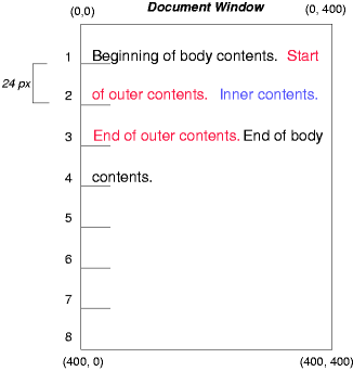
To illustrate the differences between normal flow, relative positioning, floats, and absolute positioning, we provide a series of examples based on the following HTML:
<!DOCTYPE html>
<html>
    <head>
        <title>Comparison of positioning schemes</title>
        <style>
          body { display: block; font-size:12px; line-height: 200%;
                  width: 400px; height: 400px }
          p    { display: block }
          span { display: inline }
        </style>
    </head>
    <body>
    <p>
        Beginning of p contents.
        <span id="outer"> Start of outer contents.
        <span id="inner"> Inner contents.</span>
        End of outer contents.</span>
        End of p contents.
    </p>
    </body>
</html>
The final positions of boxes generated by the outer and inner elements vary in each example. In each illustration, the numbers to the left of the illustration indicate the normal flow position of the double-spaced (for clarity) lines.
Note: The diagrams in this section are illustrative and not to scale. They are meant to highlight the differences between the various positioning schemes, and are not intended to be reference renderings of the examples given.
10.1. Normal flow
Consider the following CSS declarations for outer and inner that do not alter the normal flow of boxes:
The P element contains all inline content: anonymous inline text and two SPAN elements. Therefore, all of the content will be laid out in an inline formatting context, within a containing block established by the P element, producing something like:
10.2. Relative positioning
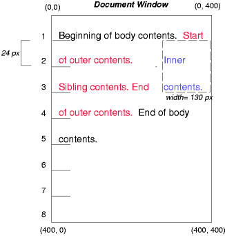
To see the effect of relative positioning, we specify:
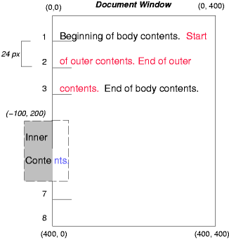
#outer { position: relative; top: -12px; color: red }
#inner { position: relative; top: 12px; color: blue }
Text flows normally up to the outer element. The outer text is then flowed into its normal flow position and dimensions at the end of line 1. Then, the inline boxes containing the text (distributed over three lines) are shifted as a unit by -12px (upwards).
The contents of inner, as a child of outer, would normally flow immediately after the words "of outer contents" (on line 1.5). However, the inner contents are themselves offset relative to the outer contents by 12px (downwards), back to their original position on line 2.
Note that the content following outer is not affected by the relative positioning of outer.
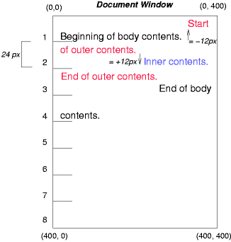
Note also that had the offset of outer been -24px, the text of outer and the body text would have overlapped.
10.3. Floating a box
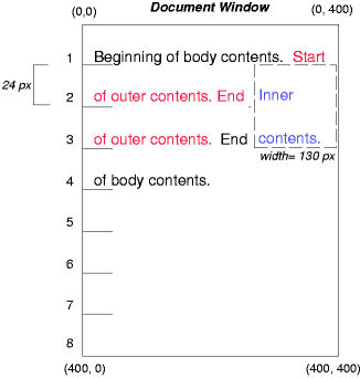
Now consider the effect of floating the inner element’s text to the right by means of the following rules:
Text flows normally up to the inner box, which is pulled out of the flow and floated to the right margin (its width has been assigned explicitly). Line boxes to the left of the float are shortened, and the document’s remaining text flows into them.
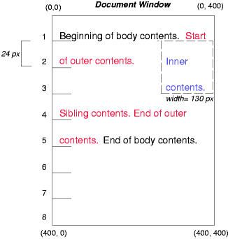
To show the effect of the clear property, we add a sibling element to the example:
<!DOCTYPE html>
<html>
    <head>
        <title>Comparison of positioning schemes II</title>
        <style>
          #inner { float: right; width: 130px; color: blue }
          #sibling { color: red }
        </style>
    </head>
    <body>
    <p>
        Beginning of p contents.
        <span id="outer"> Start of outer contents.
        <span id="inner"> Inner contents.</span>
        <span id="sibling"> Sibling contents.</span>
        End of outer contents.</span>
        End of p contents.
    </p>
    </body>
</html>
These styles cause the inner box to float to the right, as before, and the document’s remaining text to flow into the vacated space:
However, if the clear property on the sibling element is set to right (i.e., the generated sibling box will not accept a position next to floating boxes to its right), the sibling content begins to flow below the float:
10.4. Absolute positioning
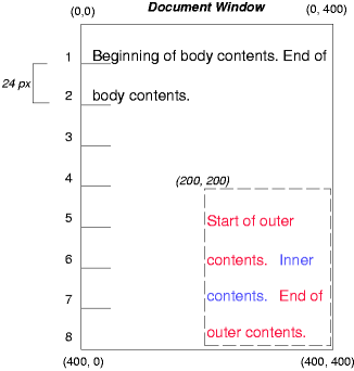
Next, we consider the effect of absolute positioning. Consider the following CSS declarations for outer and inner:
#outer {
    position: absolute;
    top: 200px; left: 200px;
    width: 200px;
    color: red;
}
#inner { color: blue }
which cause the top of the outer box to be positioned with respect to its containing block. The containing block for a positioned box is established by the nearest positioned ancestor (or, if none exists, the initial containing block, as in our example). The top side of the outer box is 200px below the top of the containing block and the left side is 200px from the left side. The child box of outer is flowed normally with respect to its parent.
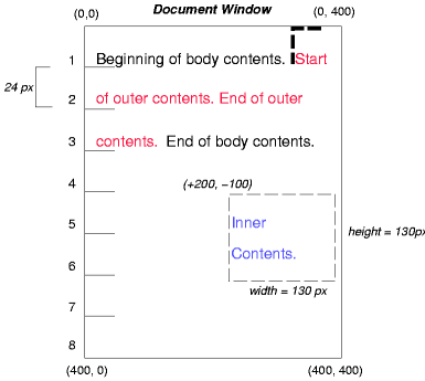
The following example shows an absolutely positioned box that is a child of a relatively positioned box. Although the parent outer box is not actually offset, setting its position property to relative means that its box may serve as the containing block for positioned descendants. Since the outer box is an inline box that is split across several lines, the first inline box’s top and left edges (depicted by thick dashed lines in the illustration below) serve as references for top and left offsets.
#outer {
    position: relative;
    color: red
}
#inner {
    position: absolute;
    top: 200px; left: -100px;
    height: 130px; width: 130px;
    color: blue;
}
This results in something like the following:
If we do not position the outer box:
#outer { color: red }
#inner {
    position: absolute;
    top: 200px; left: -100px;
    height: 130px; width: 130px;
    color: blue;
}
the containing block for inner becomes the initial containing block (in our example). The following illustration shows where the inner box would end up in this case.
Relative and absolute positioning may be used to implement change bars, as shown in the following example. The following fragment:
<p style="position: relative; margin-right: 10px; left: 10px;">
  I used two red hyphens to serve as a change bar. They
  will "float" to the left of the line containing THIS
  <span style="position: absolute; top: auto; left: -1em; color: red;">--</span>
  word.
</p>
might result in something like:
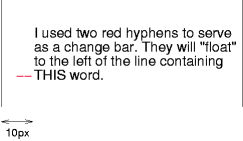
First, the paragraph (whose containing block sides are shown in the illustration) is flowed normally. Then it is offset 10px from the left edge of the containing block (thus, a right margin of 10px has been reserved in anticipation of the offset). The two hyphens acting as change bars are taken out of the flow and positioned at the current line (due to 'top: auto'), -1em from the left edge of its containing block (established by the P in its final position). The result is that the change bars seem to "float" to the left of the current line.
11. Layered presentation
In the following sections, the expression "in front of" means closer to the user as the user faces the screen.
In CSS, each box has a position in three dimensions. In addition to their horizontal and vertical positions, boxes lie along a "z-axis" and are formatted one on top of the other. Z-axis positions are particularly relevant when boxes overlap visually. This section discusses how boxes may be positioned along the z-axis.
Each box belongs to one stacking context. Each box in a given stacking context has an integer stack level, which is its position on the z-axis relative to other boxes in the same stacking context. Boxes with greater stack levels are always formatted in front of boxes with lower stack levels. Boxes may have negative stack levels. Boxes with the same stack level in a stacking context are stacked bottom-to-top according to document tree order.
The root element creates a root stacking context, but other elements may establish local stacking contexts. Stacking contexts are inherited. A local stacking context is atomic; boxes in other stacking contexts may not come between any of its boxes.
An element that establishes a local stacking context generates a box that has two stack levels: one for the stacking context it creates (always 0) and one for the stacking context to which it belongs (given by the z-index property).
An element’s box has the same stack level as its parent’s box unless given a different stack level with the z-index property.
| Name: | z-index#propdef-z-indexReferenced in:11. Layered presentation (2) (3) (4)12.2. Painting order |
|---|---|
| Value: | auto | <integer> |
| Initial: | auto |
| Applies to: | positioned elements |
| Inherited: | no |
| Percentages: | N/A |
| Media: | visual |
| Computed value: | as specified |
| Animatable: | <integer> |
For a positioned box, the z-index property specifies:
- The stack level of the box in the current stacking context.
- Whether the box establishes a stacking context.
Values have the following meanings:
- <integer>
- This integer is the stack level of the generated box in the current stacking context. The box also establishes a new stacking context.
- auto
- The stack level of the generated box in the current stacking context is 0. The box does not establish a new stacking context unless it is the root element.
In the following example, the stack levels of the boxes (named with their "id" attributes) are: "text2"=0, "image"=1, "text3"=2, and "text1"=3. The "text2" stack level is inherited from the root box. The others are specified with the z-index property.
<!DOCTYPE html>
<html>
    <head>
        <title>Z-order positioning</title>
        <style type="text/css">
            .pile {
            position: absolute;
            left: 2in;
            top: 2in;
            width: 3in;
            height: 3in;
            }
        </style>
    </head>
    <body>
        <p>
            <img id="image" class="pile"
                src="butterfly.png" alt="A butterfly image"
                style="z-index: 1">
        <div id="text1" class="pile"
                style="z-index: 3">
            This text will overlay the butterfly image.
        </div>
        <div id="text2">
            This text will be beneath everything.
        </div>
        <div id="text3" class="pile"
                style="z-index: 2">
            This text will underlay text1, but overlay the butterfly image
        </div>
    </body>
</html>
This example demonstrates the notion of transparency. The default behavior of the background is to allow boxes behind it to be visible. In the example, each box transparently overlays the boxes below it. This behavior can be overridden by using one of the existing background properties.
12. Detailed stacking context
12.1. Definitions
- Tree Order
- The preorder depth-first traversal of the rendering tree, in logical (not visual) order for bidirectional content, after taking into account properties that move boxes around.
- Element
- In this description, "element" refers to actual elements, pseudo-elements, and anonymous boxes. Pseudo-elements and anonymous boxes are treated as descendants in the appropriate places. For example, an outside list marker comes before an adjoining '::before' box in the line box, which comes before the content of the box, and so forth.
12.2. Painting order
The bottom of the stack is the furthest from the user, the top of the stack is the nearest to the user:
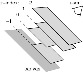
The stacking context background and most negative positioned stacking contexts are at the bottom of the stack, while the most positive positioned stacking contexts are at the top of the stack.
The canvas is transparent if contained within another, and given a UA-defined color if it is not. It is infinite in extent and contains the root element. Initially, the viewport is anchored with its top left corner at the canvas origin.
The painting order for the descendants of an element generating a stacking context (see the z-index property) is:
-
If the element is a root element:
- background color of element over the entire canvas.
- background image of element, over the entire canvas, anchored at the origin that would be used if it was painted for the root element.
-
If the element is a block, list-item, or other block equivalent:
- background color of element unless it is the root element.
- background image of element unless it is the root element.
- column rule of the element.
- border of element.
- table backgrounds (color then image) unless it is the root element.
- column group backgrounds (color then image).
- column backgrounds (color then image).
- row group backgrounds (color then image).
- row backgrounds (color then image).
- cell backgrounds (color then image).
- cell column rule for multi-column.
- all table borders (in tree order for separated borders).
- Stacking contexts formed by positioned descendants with negative z-indices (excluding 0) in z-index order (most negative first) then tree order.
-
For all its in-flow, non-positioned, block-level descendants in tree order: If the
element is a block, list-item, or other block equivalent:
- background color of element.
- background image of element.
- column rule of the element.
- border of element.
- table backgrounds (color then image).
- column group backgrounds (color then image).
- column backgrounds (color then image).
- row group backgrounds (color then image).
- row backgrounds (color then image).
- cell backgrounds (color then image).
- cell column rule (multi-column).
- all table borders (in tree order for separated borders).
- All non-positioned floating descendants, in tree order. For each one of these, treat the element as if it created a new stacking context, but any positioned descendants and descendants which actually create a new stacking context are considered part of the parent stacking context, not this new one.
-
If the element is an inline element that generates a stacking context, then:
-
For each line box that the element is in:
- Jump to 7.2.1 for the box(es) of the element in that line box (in tree order).
-
For each line box that the element is in:
-
Otherwise: first for the element, then for all its in-flow, non-positioned,
block-level descendants in tree order:
- If the element is a block-level replaced element, then: the replaced content, atomically.
-
Otherwise, for each line box of that element:
-
For each box that is a child of that element, in that line box, in
tree order:
- background color of element.
- background image of element.
- column rule of the element.
- border of element.
-
For inline elements:
-
For all the elements in-flow, non-positioned,
inline-level children that are in this line box, and
all runs of text inside the element that is on this
line box, in tree order:
-
If this is a run of text, then:
- any underlining affecting the text of the element, in tree order of the elements applying the underlining (such that the deepest element’s underlining, if any, is painted topmost and the root element’s underlining, if any, is drawn bottommost).
- any overlining affecting the text of the element, in tree order of the elements applying the overlining (such that the deepest element’s overlining, if any, is painted topmost and the root element’s overlining, if any, is drawn bottommost).
- the text
- any line-through affecting the text of the element, in tree order of the elements applying the line-through (such that the deepest element’s line-through, if any, is painted topmost and the root element’s line-through, if any, is drawn bottommost).
- Otherwise, jump to 7.2.1 for that element
-
If this is a run of text, then:
-
For all the elements in-flow, non-positioned,
inline-level children that are in this line box, and
all runs of text inside the element that is on this
line box, in tree order:
-
For inline-block and inline-table elements:
- For each one of these, treat the element as if it created a new stacking context, but any positioned descendants and descendants which actually create a new stacking context are considered part of the parent stacking context, not this new one.
-
For inline-level replaced elements:
- the replaced content, atomically.
- Optionally, the outline of the element (see 10 below).
Note, some of the boxes may have been generated by line splitting or the Unicode bidirectional algorithm.
-
For each box that is a child of that element, in that line box, in
tree order:
- Optionally, if the element is block-level, the outline of the element (see 10 below).
-
All positioned, opacity or transform descendants, in tree order that fall
into the following categories:
-
All positioned descendants with 'z-index: auto' or 'z-index: 0', in tree order.
For those with 'z-index: auto', treat the element as if it created a new stacking context, but any positioned descendants and descendants which actually create a new stacking context should be considered part of the parent stacking context, not this new one.
For those with 'z-index: 0' treat the stacking context generated atomically.
- All opacity descendants with opacity less than 1, in tree order, create a stacking context generated atomically.
- All transform descendants with transform other than none, in tree order, create a stacking context generated atomically.
-
All positioned descendants with 'z-index: auto' or 'z-index: 0', in tree order.
- Stacking contexts formed by positioned descendants with z-indices greater than or equal to 1 in z-index order (smallest first) then tree order.
- Finally, implementations that do not draw outlines in steps above must draw outlines from this stacking context at this stage. (It is recommended to draw outlines in this step and not in the steps above.)
12.3. Notes
The background of the root element is only painted once, over the whole canvas.
While the backgrounds of bidirectional inlines are painted in tree order, they are positioned in visual order. Since the positioning of inline backgrounds is unspecified in CSS, the exact result of these two requirements is UA-defined. A future version of CSS may define this in more detail.
13. Acknowledgments
This module would not have been possible without input and support from many helpful people. Thanks to Bert Bos, Tantek Çelik, Anton Prowse, Rossen Atanassov, Chris Jones, John Jansen, Sylvain Galineau.
Changes
Changes since the 3 February 2015 WD
The following significant changes were made since the 5 February 2015 Working Draft
- Added informative table to clarify positioning calculations.
- Removed “page” and “center” positioning schemes, which had not in fact been approved by the CSSWG and should not have been published in the first place.