Abstract
CSS is a language for describing the rendering of structured documents
(such as HTML and XML) on screen, on paper, in speech, etc. This module
contains the features of CSS level 3 relating to positioning and
stacking of elements. It includes and extends the functionality of CSS
level 2 [CSS21], which builds on CSS
level 1 [CSS1].
The main extensions compared to level 2 are the ability to position
elements based on CSS Region boxes, and the ability to specify a different
containing blocks for elements.
Other kinds of layout, such as tables, "floating" boxes, ruby
annotations, grid layouts, columns and basic handling of normal "flow"
content, are described in other modules. Also, the layout of text inside
each line is defined elsewhere.
Status of this document
This section describes the status of this document at the time of
its publication. Other documents may supersede this document. A list of
current W3C publications and the latest revision of this technical report
can be found in the W3C technical reports
index at http://www.w3.org/TR/.
Publication as a Working Draft does not imply endorsement by the W3C
Membership. This is a draft document and may be updated, replaced or
obsoleted by other documents at any time. It is inappropriate to cite this
document as other than work in progress.
The (archived) public
mailing list www-style@w3.org (see
instructions) is preferred
for discussion of this specification. When sending e-mail, please put the
text “css3-positioning” in the subject, preferably like this:
“[css3-positioning] …summary of
comment…”
This document was produced by the CSS Working Group (part of
the Style Activity).
This document was produced by a group operating under the 5 February
2004 W3C Patent Policy. W3C maintains a public list of any patent disclosures made in
connection with the deliverables of the group; that page also includes
instructions for disclosing a patent. An individual who has actual
knowledge of a patent which the individual believes contains Essential
Claim(s) must disclose the information in accordance with section
6 of the W3C Patent Policy.
This is the First Public Working Draft of css3-positioning.
Table of contents
- 1. Introduction
- 2. The Viewport
- 3. Containing
Blocks
- 4. Normal Flow
- 5. Floats
- 6. Positioning
schemes
- 7.
Sizing and positioning details
- 7.1. The
width of absolute, page or fixed positioned, non-replaced elements
- 7.2.
The width of a center positioned, non-replaced elements
- 7.3. The
width of absolute, page or fixed positioned, replaced elements
- 7.4. The
width of a center positioned, replaced elements
- 7.5. The
height of absolute, page or fixed positioned, non-replaced elements
- 7.6.
The height of a center positioned, non-replaced elements
- 7.7. The
height of absolute, page or fixed positioned, replaced elements
- 7.8. The
height of a center positioned, replaced elements
- 7.9. ‘
Auto’ heights for block formatting context
roots
- 8. Relationships
between ‘
display’, ‘position’, and ‘float’
- 9. Comparison of normal
flow, floats, and positioning
- 10. Clipping: the
‘
clip’ property
- 11. Layered
presentation
- 12. Detailed
stacking context
- 13. Conformance
- Acknowledgments
- References
- Index
- Property index
1. Introduction
This section is not normative.
CSS assumes the document layout is modeled as a tree of elements. The
unique element that has no parent is called the root element. This module
describes how any of the elements from the tree of elements can be
arranged independent of document order (i.e. taken out of "flow"). With a
positioned element the element may be placed anywhere within the content
not specifically respecting the tree of elements order.
In [CSS21], the
visual formatting model explained how each element in the document tree
generates zero or more boxes according to the box model. This module
further explains and extends the positioning scheme. The layout of these
boxes is governed by:
- box
dimensions and type.
- positioning scheme (normal flow, float,
and absolute positioning).
- relationships between elements in the document tree.
- external information (e.g., viewport size, intrinsic dimensions of
images, etc.).
The properties defined in this module apply to both continuous media and
paged media.
1.1. Module Interactions
This module replaced and extends the positioning scheme features defined
in [CSS21] sections:
1.2. Values
This specification follows the CSS property definition conventions from
[CSS21].
Value types not defined in this specification are defined in CSS Level
2 Revision 1 [CSS21]. Other CSS modules may expand
the definitions of these value types: for example [CSS3VAL], when combined with this
module, expands the definition of the <length> value type as used in
this specification.
In addition to the property-specific values listed in their
definitions, all properties defined in this specification also accept the
inherit
keyword as their property value. For readability it has not been repeated
explicitly.
2. The Viewport
User agents for continuous
media generally offer users a viewport (a window or other viewing area
on the screen) through which users consult a document. User agents may
change the document's layout when the viewport is resized (see the
initial containing block).
When the viewport is smaller than the area of the canvas on which the
document is rendered, the user agent may offer a scrolling mechanism.
There is at most one viewport per canvas, but user
agents may render to more than one canvas (i.e., provide different views
of the same document).
3. Containing Blocks
In CSS, many box positions and sizes are calculated with respect to the
edges of a rectangular box called a containing block. In general,
generated boxes act as containing blocks for descendant boxes; we say that
a box "establishes" the containing block for its descendants. The phrase
"a box's containing block" means "the containing block in which the
box lives," not the one it generates.
Each box is given a position with respect to its containing block, but
it is not confined by this containing block; it may overflow.
3.1. Definition of
containing block
The position and size of an element's box(es) are sometimes
computed relative to a certain rectangle, called the containing block of
the element. The containing block of a ‘static’ or ‘relative’ element is defined in the Box Model [CSS3BOX]; for
‘fixed’, ‘absolute’, ‘center’ and ‘page’, it is defined as follows:
- If the element has ‘
positioned:
fixed’, the containing block is established by the viewport in the case of continuous media or the
page area in the case of paged media.
- If the element has ‘
position:
absolute’, the containing block is established by the
nearest ancestor with a ‘position’ other than ‘static’, in the following way:
- In the case that the ancestor is block-level, the containing block
is formed by the padding edge of the ancestor.
- In the case that the ancestor is inline-level, the containing block
depends on the ‘
direction’
property of the ancestor:
- If the ‘
direction’ is
‘ltr’, the top and left of the
containing block are the top and left content edges of the first box
generated by the ancestor, and the bottom and right are the bottom
and right content edges of the last box of the ancestor.
- If the ‘
direction’ is
‘rtl’, the top and right are the
top and right edges of the first box generated by the ancestor, and
the bottom and left are the bottom and left content edges of the last
box of the ancestor.
Note, in some cases when a line wraps it may seem as
if the left and right positions are swapped.
- I the element has ‘
position:
center’, the containing block is established by the
nearest ancestor with a ‘position’ other than ‘static’, in the following way:
- In the case that the ancestor is block-level, the containing block
is formed by the padding edge of the ancestor.
- In the case that the ancestor is inline-level, the containing block
depends on the content edges of the boxes generated by the ancestor.
The top most, right most, bottom most and left most content edges of
all the boxes generated by the ancestor determine the edges for the
containing block.
- If the element has ‘
position:
    page
’ and the element is within paged media or within a
rerion, the containing block is the initial containing
block. This is the viewport or the page
area when in paged media. In the case of CSS Regions [CSS3-REGIONS] this is the
individual region. When a page positioned element is not in paged media
or a region the containing block is determined per the absolute
positioning model.
- If there is no such ancestor, the containing block is the
initial containing block.
In paged media, an absolutely positioned element is positioned relative
to its containing block ignoring any page breaks (as if the document were
continuous). The element may subsequently be broken over several pages.
For absolutely positioned content that resolves to a position on a page
other than the page being laid out (the current page), or resolves to a
position on the current page which has already been rendered for printing,
printers may place the content:
- on the current page,
- on a subsequent page, or
- may omit it altogether.
Note, a block-level element that is split over several pages
may have a different width on each page and that there may be
device-specific limits.
With no positioning, the containing blocks (C.B.) in the following
document:
<!DOCTYPE html>
<html>
    <head>
        <title>Illustration of containing blocks</title>
    </head>
    <body id="body">
        <div id="div1">
        <p id="p1">This is text in the first paragraph...</p>
        <p id="p2">This is text <em id="em1"> in the
        <strong id="strong1">second</strong> paragraph.</em></p>
        </div>
    </body>
</html>
are established as follows:
| For box generated by
| C.B. is established by
|
| html
| initial C.B. (UA-dependent)
|
| body
| html
|
| div1
| body
|
| p1
| div1
|
| p2
| div1
|
| em1
| p2
|
| strong1
| p2
|
If we position "div1":
#div1 { position: absolute; left: 50px; top: 50px }
its containing block is no longer "body"; it becomes the initial
containing block (since there are no other positioned ancestor
boxes).
If we position "em1" as well:
#div1 { position: absolute; left: 50px; top: 50px }
#em1  { position: absolute; left: 100px; top: 100px }
the table of containing blocks becomes:
| For box generated by
| C.B. is established by
|
| html
| initial C.B. (UA-dependent)
|
| body
| html
|
| div1
| initial C.B.
|
| p1
| div1
|
| p2
| div1
|
| em1
| div1
|
| strong1
| em1
|
By positioning "em1", its containing block becomes the nearest
positioned ancestor box (i.e., that generated by "div1").
4. Normal Flow
Boxes in the normal flow belong to a formatting context, which may be
block or inline, but not both simultaneously. See the CSS Basic Box Model
module [CSS3BOX]
for further details about normal flow.
5. Floats
A float is a box that is positioned within content, often left or right
on the current line. The most interesting characteristic of a float (or
"floated" or "floating" box") is that inline-level content may flow along
its side (or be prohibited from doing so by the ‘clear’ property) or around the floated box.
See the CSS 2.1 [CSS21]
for details about floating boxes.
6. Positioning
schemes
In CSS, a box may be laid out according to three positioning schemes:
- Normal flow
In CSS, normal flow includes block
formatting of block-level boxes, inline
formatting of inline-level boxes, and relative
positioning of block-level and inline-level boxes.
- Floats
In the float model, a box is first laid out
according to the normal flow, then taken out
of the flow and positioned, typically to the left or right. Content may
flow along the side of a float.
- Absolute positioning
In the absolute positioning model, a box is removed from the normal flow entirely (it has no impact on later
siblings) and assigned a position with respect to a containing block.
An element is called out-of-flow if it is floated, absolutely positioned, or is the root
element. An element is called in-flow if it is not out-of-flow.
The flow of an element A is the set consisting of A and all
in-flow elements whose nearest out-of-flow ancestor is A.
6.1. Relative
Positioning
Once a box has been laid out according to the normal flow or floated,
it may be offset relative to this position. This is called relative
positioning. Offsetting a box (B1) in this way has no effect on the box
(B2) that follows: B2 is given a position as if B1 were not offset and B2
is not re-positioned after B1's offset is applied. This implies that
relative positioning may cause boxes to overlap. However, if relative
positioning causes an ‘overflow: auto’
or ‘overflow: scroll’ box to have
overflow, the user agent must allow the user to access this content (at
its offset position), which, through the creation of a scrolling
mechanism, may affect layout.
A relatively positioned box keeps its normal
flow size, including line breaks and the space originally reserved for
it.
A relatively positioned box establishes a new a new containing block for absolutely positioned
descendants. (This is a common use of relatively positioned boxes.) The
section on containing blocks explains when a relatively
positioned box establishes a new containing
block.
For relatively positioned elements, ‘left’ and ‘right’ move the box(es) horizontally,
without changing their size. ‘Left’ moves the boxes to the right, and
‘right’ moves
them to the left. Since boxes are not split or stretched as a result of
‘left’ or
‘right’, the
used values are always: left = -right.
If both ‘left’ and ‘right’ are ‘auto’ (their initial values), the used values are
‘0’ (i.e., the boxes stay in their
original position).
If ‘left’
is ‘auto’, its used value is minus the
value of ‘right’ (i.e., the boxes move to the left
by the value of ‘right’).
If ‘right’
is specified as ‘auto’, its used value
is minus the value of ‘left’.
If neither ‘left’ nor ‘right’ is ‘auto’, the position is over-constrained, and one of
them has to be ignored. If the ‘direction’ property of the containing block is ‘ltr’, the value of ‘left’ wins and ‘right’ becomes
-‘left’. If
‘direction’ of the containing
block is ‘rtl’, ‘right’ wins and
‘left’ is
ignored.
The following three rules are equivalent:
div.a8 { position: relative; direction: ltr; left: -1em; right: auto }
div.a8 { position: relative; direction: ltr; left: auto; right: 1em }
div.a8 { position: relative; direction: ltr; left: -1em; right: 5em }
The ‘top’
and ‘bottom’
properties move relatively positioned element(s) up or down without
changing their size. ‘Top’ moves the boxes down, and ‘bottom’ moves them
up. Since boxes are not split or stretched as a result of ‘top’ or ‘bottom’, the used
values are always: top = -bottom.
If ‘top’ and
‘bottom’ are
‘auto’, their used values are both
‘0’.
If one of them, ‘top’ or ‘bottom’, is ‘auto’, the ‘auto’ value becomes the negative of the other.
If neither ‘top’ and ‘bottom’ is ‘auto’, ‘bottom’ is ignored (i.e., the used value
of ‘bottom’
will be minus the value of ‘top’).
Note, Although relative positioning could be used as a form
of superscripting and subscripting, the line height is not automatically
adjusted to take the positioning into consideration. See the description
of line
height calculations for more information.
Examples of relative positioning are provided in the section comparing
normal flow, floats,
and absolute positioning.
6.2. Absolute
positioning
In the absolute positioning model, a box is explicitly offset with
respect to its containing block. It is
removed from the normal flow entirely (it has
no impact on later siblings). An absolutely positioned box establishes a
new containing block for normal flow
children and absolutely (but not fixed or page) positioned descendants.
However, the contents of an absolutely positioned element do not flow
around any other boxes. They may obscure the contents of another box (or
be obscured themselves), depending on the stack levels of the overlapping
boxes.
References in this specification to an absolutely positioned
element (or its box) imply that the element's ‘position’ property
has the value ‘absolute’ or ‘fixed’.
6.3. Center
positioning
In the center positioning model, a box is explicitly centered with
respect to its containing block. It is
removed from the normal flow entirely (it has
no impact on later siblings). A center positioned box establishes a new containing block for normal flow children and absolutely (but not
fixed or page) positioned descendants. However, the contents of an center
positioned element do not flow around any other boxes. They may obscure
the contents of another box (or be obscured themselves), depending on the
stack levels of the overlapping boxes.
References in this specification to an center
positioned element (or its box) imply that the element's
‘position’
property has the value ‘center’.
6.4. Page
positioning
In the page positioning model, a box is explicitly offset with respect
to its containing block. It is removed
from the normal flow entirely (it has no
impact on later siblings). A page positioned box establishes a new containing block for normal flow children and absolutely (but not
fixed or other page) positioned descendants. However, the contents of a
page positioned element do not flow around any other boxes. They may
obscure the contents of another box (or be obscured themselves), depending
on the stack levels of the overlapping boxes.
For paged media,
boxes with page positions are only generated on the initial page where the
page position element exists. Boxes with page position that are larger
than the page area are clipped and the remaining part of the box is placed
on the following page.
References in this specification to a page
positioned element (or its box) imply that the element's
‘position’
property has the value ‘page’.
6.5. Fixed
positioning
Fixed positioning is similar to absolute positioning. The only
difference is that for a fixed positioned box, the containing block is established by the viewport. For continuous
media, fixed boxes do not move when the document is scrolled. In this
respect, they are similar to fixed
background images. For paged
media, boxes with fixed positions are repeated on every page. This is
useful for placing, for instance, a signature at the bottom of each page.
Boxes with fixed position that are larger than the page area are clipped.
Parts of the fixed position box that are not visible in the initial
containing block will not print.
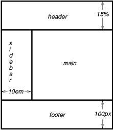
Authors may use fixed positioning to create the following
presentation:
This might be achieved with the following HTML document and style
rules:
<!DOCTYPE html>
<html>
  <head>
    <title>A frame document with CSS</title>
    <style type="text/css" media="screen">
      body { height: 8.5in } /* Required for percentage heights below */
      #header {
        position: fixed;
        width: 100%;
        height: 15%;
        top: 0;
        right: 0;
        bottom: auto;
        left: 0;
      }
      #sidebar {
        position: fixed;
        width: 10em;
        height: auto;
        top: 15%;
        right: auto;
        bottom: 100px;
        left: 0;
      }
      #main {
        position: fixed;
        width: auto;
        height: auto;
        top: 15%;
        right: 0;
        bottom: 100px;
        left: 10em;
      }
      #footer {
        position: fixed;
        width: 100%;
        height: 100px;
        top: auto;
        right: 0;
        bottom: 0;
        left: 0;
      }
    </style>
  </head>
  <body>
    <div id="header"> ...  </div>
    <div id="sidebar"> ...  </div>
    <div id="main"> ...  </div>
    <div id="footer"> ...  </div>
  </body>
</html>
6.6. Choosing a
positioning scheme: ‘position’ property
The ‘position’ property determines which of the
positioning algorithms is used to calculate the position of a box.
| Name:
| position
|
| Value:
| static | relative | absolute |
center | page | fixed
|
| Initial:
| static
|
| Applies to:
| all elements except table-column-group and table-column
|
| Inherited:
| no
|
| Animatable:
| no
|
| Percentages:
| N/A
|
| Media:
| visual
|
| Computed value:
| specified value
|
| Canonical order:
| per
grammar
|
The values of this property have the following meanings:
- static
- The box is a normal box, laid out according to the normal flow. The ‘
top’, ‘right’, ‘bottom’, and ‘left’ properties do not apply.
- relative
- The box's position is calculated according to the normal flow (this is called the position in normal flow). Then the box is offset relative to
its normal position and in all cases, including table elements, does not
affect the position of any following boxes. When a box B is relatively
positioned, the position of the following box is calculated as though B
were not offset. The effect of ‘
position:
    relative
’ on table elements is defined as follows:
- table-row-group, table-header-group, table-footer-group and
table-row offset relative to its normal position within the table. If
table-cells span multiple rows, only the cells originating in the relative
positioned row is offset.
- table-column-group, table-column do not offset the respective
column and has no visual affect when ‘
position:
      relative
’ is applied.
- table-caption and table-cell offset relative to its normal position
within the table. If a table cell spans multiple columns or rows the
full spanned cell is offset.
- absolute
- The box's position (and possibly size) is specified with the
‘
top’,
‘right’,
‘bottom’,
and ‘left’
properties. These properties specify offsets with respect to the
box's containing block. Absolutely
positioned boxes are taken out of the normal flow. This means they have
no impact on the layout of later siblings. Though absolutely positioned
boxes may have margins, those margins do not collapse
with any other margins.
- center
- The box's position (and possibly size) is specified with the
‘
top’,
‘right’,
‘bottom’,
and ‘left’
properties. The box is vertically and horizontally centered within its containing block and these properties
specify offsets with respect to the box's centered position within
its containing block. Center positioned
boxes are taken out of the normal flow. This means they have no impact on
the layout of later siblings. Though center positioned boxes may have
margins, those margins do not collapse
with any other margins.
- page
-
The box's position is calculated according to the "absolute"
model.
- In the case of paged media or when inside a region box the
box's containing block is always
the initial containing block.
- Otherwise, the containing block is
determined per the "absolute" model.
As with the "absolute" model, the box's margins do not collapse
with any other margins. In the case of the print media type, the box is
rendered only on the initial page or region where the page positioned
element originated. User agents may paginate the content of paged boxes.
Note, that CSS Regions are also initial containing blocks, in
accordance with ‘flow-into’ property of the CSS Regions
Module [CSS3-REGIONS].
- fixed
- The box's position is calculated according to the "absolute"
model, but in addition, the box is fixed with respect to some reference.
As with the "absolute" model, the box's margins do not collapse with
any other margins. In the case of handheld, projection, screen, tty, and
tv media types, the box is fixed with respect to the viewport and does not move when scrolled. In the
case of the print media type, the box is rendered on every page, and is
fixed with respect to the page box, even if the page is seen through a viewport (in the case of a print-preview, for
example). For other media types, the presentation is undefined. Authors
may wish to specify ‘
fixed’ in a media-dependent way. For instance,
an author may want a box to remain at the top of the viewport on the screen, but not at the top of each
printed page. The two specifications may be separated by using an ‘@media’ rule, as in:
@media screen {
    h1#first { position: fixed }
}
@media print {
    h1#first { position: static }
}
User agents must not paginate the content of fixed boxes.
Note that user agents may print invisible content in other
ways. See "Content
outside the page box".
In previous versions of CSS user agents may treat position ‘fixed’ as ‘static’ on the root element. This specification
removes that option and it is now required that newer user agents treat ‘fixed’ value on the root element as defined for
all other elements.
Ideas have been raised to allow changing the positioning
containing block or allowing positioning and sizing to use different
containing blocks.
An element is said to be positioned if its ‘position’ property
has a value other than ‘static’. Positioned elements generate
positioned boxes, laid out according to four properties:
| Name:
| top
|
| Value:
| auto | <length> |
<percentage>
|
| Initial:
| auto
|
| Applies to:
| positioned elements
|
| Inherited:
| no
|
| Animatable:
| <length>, <percentage>
|
| Percentages:
| refer to height of containing block
|
| Media:
| visual
|
| Computed value:
| for ‘position:
relative’, see Relative Positioning. For ‘position: static’, ‘auto’. Otherwise: if specified as a ‘<length>’, the corresponding absolute
length; if specified as a ‘<percentage>’, the specified value;
otherwise, ‘auto’.
|
| Canonical order:
| per
grammar
|
This property specifies how far an absolutely positioned box's top
margin edge is offset below the top edge of the box's containing block. For relatively positioned
boxes, the offset is with respect to the top edges of the box itself
(i.e., the box is given a position in the normal
flow, and then offset from that position according to these
properties). For absolutely positioned and center positioned elements
whose containing block is based on a block-level element, these properties
are an offset from the padding edge of that element. For page positioned
boxes, within paged media or regions, the offset is with respect to the
top edge of the initial containing block; otherwise for page
positioned boxes same as for absolutely positioned boxes.
| Name:
| right
|
| Value:
| auto | <length> |
<percentage>
|
| Initial:
| auto
|
| Applies to:
| positioned elements
|
| Inherited:
| no
|
| Animatable:
| <length>, <percentage>
|
| Percentages:
| refer to height of containing block
|
| Media:
| visual
|
| Computed value:
| for ‘position:
relative’, see Relative Positioning. For ‘position: static’, ‘auto’. Otherwise: if specified as a ‘<length>’, the corresponding absolute
length; if specified as a ‘<percentage>’, the specified value;
otherwise, ‘auto’.
|
| Canonical order:
| per
grammar
|
Like ‘top’,
but specifies how far a box's right margin edge is offset to the left
of the right edge of the box's containing
block. For relatively positioned boxes, the offset is with respect to
the right edge of the box itself (i.e., the box is given a position in the
normal flow, and then offset from that
position according to these properties). For absolutely positioned and
center positioned elements whose containing block is based on a
block-level element, these properties are an offset from the padding edge
of that element. For page positioned boxes, within paged media or regions,
the offset is with respect to the right edge of the initial
containing block; otherwise for page positioned boxes same as for
absolutely positioned boxes.
| Name:
| bottom
|
| Value:
| auto | <length> |
<percentage>
|
| Initial:
| auto
|
| Applies to:
| positioned elements
|
| Inherited:
| no
|
| Animatable:
| <length>, <percentage>
|
| Percentages:
| refer to height of containing block
|
| Media:
| visual
|
| Computed value:
| for ‘position:
relative’, see Relative Positioning. For ‘position: static’, ‘auto’. Otherwise: if specified as a ‘<length>’, the corresponding absolute
length; if specified as a ‘<percentage>’, the specified value;
otherwise, ‘auto’.
|
| Canonical order:
| per
grammar
|
Like ‘top’,
but specifies how far a box's bottom margin edge is offset above the
bottom edge of the box's containing
block. For relatively positioned boxes, the offset is with respect to
the bottom edge of the box itself (i.e., the box is given a position in
the normal flow, and then offset from that
position according to these properties). For absolutely positioned and
center positioned elements whose containing block is based on a
block-level element, these properties are an offset from the padding edge
of that element. For page positioned boxes, within paged media or regions,
the offset is with respect to the bottom edge of the initial
containing block; otherwise for page positioned boxes same as for
absolutely positioned boxes.
| Name:
| left
|
| Value:
| auto | <length> |
<percentage>
|
| Initial:
| auto
|
| Applies to:
| positioned elements
|
| Inherited:
| no
|
| Animatable:
| <length>, <percentage>
|
| Percentages:
| refer to height of containing block
|
| Media:
| visual
|
| Computed value:
| for ‘position:
relative’, see Relative Positioning. For ‘position: static’, ‘auto’. Otherwise: if specified as a ‘<length>’, the corresponding absolute
length; if specified as a ‘<percentage>’, the specified value;
otherwise, ‘auto’.
|
| Canonical order:
| per
grammar
|
Like ‘top’,
but specifies how far a box's left margin edge is offset to the right
of the left edge of the box's containing
block. For relatively positioned boxes, the offset is with respect to
the left edge of the box itself (i.e., the box is given a position in the
normal flow, and then offset from that
position according to these properties). For absolutely positioned and
center positioned elements whose containing block is based on a
block-level element, these properties are an offset from the padding edge
of that element. For page positioned boxes, within paged media or regions,
the offset is with respect to the left edge of the initial
containing block; otherwise for page positioned boxes same as for
absolutely positioned boxes.
The values for the four properties have the following meanings:
- <length>
- The offset is a fixed distance from the reference edge. Negative
values are allowed.
- <percentage>
- The offset is a percentage of the containing block's width (for ‘
left’ or ‘right’) or height
(for ‘top’ and
‘bottom’).
Negative values are allowed.
- auto
- For non-replaced elements, the effect of this value depends on which
of related properties have the value ‘
auto’ as well. See the sections on the width and height of absolutely positioned,
non-replaced elements for details. For replaced elements, the effect of
this value depends only on the intrinsic dimensions of the replaced
content. See the sections on the width
and height of absolutely positioned,
replaced elements for details.
Note, for page positioned elements and fixed positioned
elements using large values or negative values may easily move elements
outside the viewport and make the contents
unreachable through scrolling or other means. Authors should be aware that
page postion and fixed position elements are always relative to the
initial containing block.
7. Sizing and
positioning details
7.1. The width of
absolute, page or fixed positioned, non-replaced elements
The constraint that determines the used values for these elements is:
'left' + 'margin-left' +
'border-left-width' + 'padding-left' + 'width' +
'padding-right' + 'border-right-width' +
'margin-right' + 'right' = width of containing
block
If all three of ‘left’, ‘width’, and ‘right’ are ‘auto’: First set any ‘auto’ values for ‘margin-left’ and ‘margin-right’ to ‘0’. Then, if the ‘direction’ property of the element
establishing the static-position containing
block is ‘ltr’ set ‘left’ to the static
position and apply rule number three below; otherwise, set
‘right’ to
the static-position and apply rule number one below.
If none of the three is ‘auto’: If
both ‘margin-left’ and
‘margin-right’ are ‘auto’, solve the equation under the extra
constraint that the two margins get equal values, unless this would make
them negative, in which case when direction of the containing block is
‘ltr’ (‘rtl’), set ‘margin-left’ (‘margin-right’) to ‘0’ and solve for ‘margin-right’ (‘margin-left’). If one of ‘margin-left’ or ‘margin-right’ is ‘auto’, solve the equation for that value. If the
values are over-constrained, ignore the value for ‘left’ (in case the
‘direction’ property of the containing block is ‘rtl’) or ‘right’ (in case ‘direction’ is ‘ltr’) and solve for that value.
Otherwise, set ‘auto’ values for
‘margin-left’ and ‘margin-right’ to ‘0’, and pick one of the following six rules that
apply.
- If ‘
left’
and ‘width’ are ‘auto’ and ‘right’ is not ‘auto’, then the width is shrink-to-fit. Then solve
for ‘left’.
- If ‘
left’
and ‘right’
are ‘auto’ and ‘width’ is not ‘auto’, then if the ‘direction’ property of the element
establishing the static-position containing
block is ‘ltr’ set ‘left’ to the
static-position, otherwise set ‘right’ to the static-position. Then solve
for ‘left’
(if ‘direction is ’‘rtl’‘) or
’right' (if ‘direction’ is ‘ltr’).
- If ‘
width’ and ‘right’ are
‘auto’ and ‘left’ is not
‘auto’, then the width is
shrink-to-fit. Then solve for ‘right’.
- If ‘
left’
is ‘auto’, ‘width’ and ‘right’ are not ‘auto’, then solve for ‘left’.
- If ‘
width’ is ‘auto’, ‘left’ and ‘right’ are not ‘auto’, then solve for ‘width’.
- If ‘
right’ is ‘auto’, ‘left’ and ‘width’ are not ‘auto’, then solve for ‘right’.
7.2. The width of
a center positioned, non-replaced elements
The following constraints must hold among the used values of the other
properties:
'left' + 'margin-left' +
'border-left-width' + 'padding-left' + 'width' +
'padding-right' + 'border-right-width' +
'margin-right' + 'right' = width of containing
block
If all three of ‘left’, ‘width’, and ‘right’ are ‘auto’: First set any ‘auto’ values for ‘margin-left’ and ‘margin-right’ to ‘0’, then the ‘width’ calculated as shrink-to-fit, and
finally apply rule number two below.
If none of the three is ‘auto’: If
both ‘margin-left’ and
‘margin-right’ are ‘auto’, solve the equation under the extra
constraint that the two margins get equal values, unless this would make
them negative, in which case when direction of the containing block is
‘ltr’ (‘rtl’), set ‘margin-left’ (‘margin-right’) to ‘0’ and solve for ‘margin-right’ (‘margin-left’). If one of ‘margin-left’ or ‘margin-right’ is ‘auto’, solve the equation for that value. If the
values are over-constrained, ignore the values for ‘left’ and ‘right’ and solve the
equation so both propeties get equal values. This horizontally centers the
element with respect to the edges of the containing block.
Otherwise, set ‘auto’ values for
‘margin-left’ and ‘margin-right’ to ‘0’, and pick one of the following six rules that
apply.
- If ‘
left’
and ‘width’ are ‘auto’ and ‘right’ is not ‘auto’, then the width is shrink-to-fit. Then solve
for ‘left’.
- If both ‘
left’ and ‘right’ are ‘auto’, their used values are equal. This
horizontally centers the element with respect to the edges of the containing block.
- If ‘
width’ and ‘right’ are
‘auto’ and ‘left’ is not
‘auto’, then the width is
shrink-to-fit. Then solve for ‘right’.
- If ‘
left’
is ‘auto’, ‘width’ and ‘right’ are not ‘auto’, then solve for ‘left’.
- If ‘
width’ is ‘auto’, ‘left’ and ‘right’ are not ‘auto’, then solve for ‘width’.
- If ‘
right’ is ‘auto’, ‘left’ and ‘width’ are not ‘auto’, then solve for ‘right’.
7.3. The width of
absolute, page or fixed positioned, replaced elements
If ‘height’ and ‘width’ both have computed values of
‘auto’ and the element also has an
intrinsic width, then that intrinsic width is the used value of
‘width’.
If ‘height’ and ‘width’ both have computed values of
‘auto’ and the element has no intrinsic
width, but does have an intrinsic height and intrinsic ratio; or if
‘width’ has a computed value of
‘auto’, ‘height’ has some other computed value, and the
element does have an intrinsic ratio; then the used value of ‘width’ is:
(used height) * (intrinsic ratio)
If ‘height’ and ‘width’ both have computed values of
‘auto’, the element has an intrinsic
ratio but no intrinsic height or width, and the containing
block's width does not itself depend on the replaced element's
width, then the used value of ‘width’ is calculated from the constraint
equation used for block-level,
non-replaced elements in normal flow.
Otherwise, if ‘width’ has a
computed value of ‘auto’, and the
element has an intrinsic width, then that intrinsic width is the used
value of ‘width’.
Otherwise, if ‘width’ has a
computed value of ‘auto’, but none of
the conditions above are met, and then the used value of ‘width’ becomes ‘300px’. If ‘300px’ is too wide to fit the device, user agents
should use the width of the largest rectangle that has a 2:1 ratio and
fits the device instead.
After establishing the ‘width’,
in order to position the replaced element, apply the following rules as
appropriate.
- If both ‘
left’ and ‘right’ have the value ‘auto’, and if the ‘direction’ property of the element
establishing the static-position containing
block is ‘ltr’, set ‘left’ to the static
position and solve for ‘right’; else if ‘direction’ is ‘rtl’, set ‘right’ to the static position and solve
for ‘left’.
- If ‘
left’
is ‘auto’ and ‘right’ is not
‘auto’, replace any ‘auto’ on ‘margin-left’ or ‘margin-right’ with ‘0’, then solve for ‘left’.
- If ‘
right’ is ‘auto’ and ‘left’ is not ‘auto’, replace any ‘auto’ on ‘margin-left’ or ‘margin-right’ with ‘0’, then solve for ‘right’.
- If at this point both ‘
margin-left’ and ‘margin-right’ are still ‘auto’, solve the equation under the extra
constraint that the two margins must get equal values, unless this would
make them negative, in which case when the direction of the containing block is ‘ltr’ (‘rtl’),
set ‘margin-left’ (‘margin-right’) to ‘0’ and solve for ‘margin-right’ (‘margin-left’).
- If at this point there is an ‘
auto’
remaining, solve the equation for that value.
- If at this point the values are over-constrained, ignore the value
for either ‘
left’ (in case the ‘direction’ property of the containing block is ‘rtl’) or ‘right’ (in case ‘direction’ is ‘ltr’) and solve for that value.
7.4. The width of a
center positioned, replaced elements
The used value for ‘width’ is
determined as for "The width of absolute,
page or fixed positioned, replaced elements".
Then the rules for "The width of a
center positioned, non-replaced elements" are applied to determine the
centering.
7.5. The height of
absolute, page or fixed positioned, non-replaced elements
For absolutely positioned elements, the used values of the vertical
dimensions must satisfy this constraint:
'top' + 'margin-top' +
'border-top-width' + 'padding-top' + 'height' +
'padding-bottom' + 'border-bottom-width' +
'margin-bottom' + 'bottom' = height of containing
block
If all three of ‘top’, ‘height’, and ‘bottom’ are ‘auto’: First set any ‘auto’ values for ‘margin-top’ and ‘margin-bottom’ to ‘0’, then set ‘top’ to the static position, and finally
apply rule number three below.
If none of the three are ‘auto’: If
both ‘margin-top’ and ‘margin-bottom’ are ‘auto’, solve the equation under the extra
constraint that the two margins get equal values. If one of ‘margin-top’ or ‘margin-bottom’ is ‘auto’, solve the equation for that value. If the
values are over-constrained, ignore the value for ‘bottom’ and solve for
that value.
Otherwise, set ‘auto’ values for
‘margin-top’ and ‘margin-bottom’ to ‘0’, and pick one of the following six rules that
apply.
- If ‘
top’
and ‘height’ are ‘auto’ and ‘bottom’ is not ‘auto’, then the height is based on the ‘Auto’ heights for
block formatting context roots, and solve for ‘top’.
- If ‘
top’
and ‘bottom’ are ‘auto’ and ‘height’ is not ‘auto’, then set ‘top’ to the static position, then solve
for ‘bottom’.
- If ‘
height’ and ‘bottom’ are
‘auto’ and ‘top’ is not ‘auto’, then the height is based on the ‘Auto’ heights for
block formatting context roots, and solve for ‘bottom’.
- If ‘
top’ is
‘auto’, ‘height’ and ‘bottom’ are not ‘auto’, then solve for ‘top’.
- If ‘
height’ is ‘auto’, ‘top’ and ‘bottom’ are not ‘auto’, then solve for ‘height’.
- If ‘
bottom’ is ‘auto’, ‘top’ and ‘height’ are not ‘auto’, then solve for ‘bottom’.
7.6. The height
of a center positioned, non-replaced elements
The following constraints must hold among the used values of the other
properties:
'top' + 'margin-top' +
'border-top-width' + 'padding-top' + 'height' +
'padding-bottom' + 'border-bottom-width' +
'margin-bottom' + 'bottom' = height of containing
block
If all three of ‘top’, ‘height’, and ‘bottom’ are ‘auto’: First set any ‘auto’ values for ‘margin-top’ and ‘margin-bottom’ to ‘0’, then the height is based on the ‘Auto’ heights for
block formatting context roots, and finally apply rule number
two below.
If none of the three are ‘auto’: If
both ‘margin-top’ and ‘margin-bottom’ are ‘auto’, solve the equation under the extra
constraint that the two margins get equal values. If one of ‘margin-top’ or ‘margin-bottom’ is ‘auto’, solve the equation for that value. If the
values are over-constrained, ignore the values for ‘top’ and ‘bottom’ and solve the
equation so both propeties get equal values. This vertically centers the
element with respect to the edges of the containing block.
Otherwise, set ‘auto’ values for
‘margin-top’ and ‘margin-bottom’ to ‘0’, and pick one of the following six rules that
apply.
- If ‘
top’
and ‘height’ are ‘auto’ and ‘bottom’ is not ‘auto’, then the height is based on the ‘Auto’ heights for
block formatting context roots, and solve for ‘top’.
- If ‘
top’
and ‘bottom’ are ‘auto’ and ‘height’ is not ‘auto’, then set ‘top’ and ‘bottom’ to the have equal values. This
vertically centers the element with respect to the edges of the containing block.
- If ‘
height’ and ‘bottom’ are
‘auto’ and ‘top’ is not ‘auto’, then the height is based on the ‘Auto’ heights for
block formatting context roots, and solve for ‘bottom’.
- If ‘
top’ is
‘auto’, ‘height’ and ‘bottom’ are not ‘auto’, then solve for ‘top’.
- If ‘
height’ is ‘auto’, ‘top’ and ‘bottom’ are not ‘auto’, then solve for ‘height’.
- If ‘
bottom’ is ‘auto’, ‘top’ and ‘height’ are not ‘auto’, then solve for ‘bottom’.
7.7. The height of
absolute, page or fixed positioned, replaced elements
If ‘height’ and ‘width’ both have computed values of
‘auto’ and the element also has an
intrinsic height, then that intrinsic height is the used value of
‘height’.
Otherwise, if ‘height’ has a
computed value of ‘auto’ and the
element has an intrinsic ratio then the used value of ‘height’ is:
(used width) / (intrinsic ratio)
Otherwise, if ‘height’ has a
computed value of ‘auto’ and the
element has an intrinsic height, then that intrinsic height is the used
value of ‘height’.
Otherwise, if ‘height’ has a
computed value of ‘auto’, but none of
the conditions above are met, then the used value of ‘height’ must be set to the height of the
largest rectangle that has a 2:1 ratio, has a height not greater than
‘150px’, and has a width not greater
than the device width.
After establishing the ‘height’, in order to position the replaced
element, apply the following rules as appropriate.
- If both ‘
top’ and ‘bottom’ have the value ‘auto’, replace ‘top’ with the element's static
position.
- If ‘
bottom’ is ‘auto’, replace any ‘auto’ on ‘margin-top’ or ‘margin-bottom’ with ‘0’.
- If at this point both ‘
margin-top’ and ‘margin-bottom’ are still ‘auto’, solve the equation under the extra
constraint that the two margins must get equal values.
- If at this point there is only one ‘
auto’ remaining, solve the equation for that
value.
- If at this point the values are over-constrained, ignore the value
for ‘
bottom’ and solve for that value.
7.8. The height of a
center positioned, replaced elements
The used value for ‘height’ is
determined as for "The height of absolute,
page or fixed positioned, replaced elements".
Then the rules for "The height of
a center positioned, non-replaced elements" are applied to determine
the centering.
7.9. ‘Auto’ heights for block formatting context
roots
In certain cases (see, e.g., The
height of absolute, page or fixed positioned, non-replaced element
above), the height of an element that establishes a block formatting
context is computed as follows:
If it only has inline-level children, the height is the distance
between the top of the topmost line box and the bottom of the bottommost
line box.
If it has block-level children, the height is the distance between the
top margin-edge of the topmost block-level child box and the bottom
margin-edge of the bottommost block-level child box.
Absolutely positioned children are ignored, and relatively positioned
boxes are considered without their offset. Note that the child box may be
an anonymous
block box.
In addition, if the element has any floating descendants whose bottom
margin edge is below the element's bottom content edge, then the
height is increased to include those edges. Only non-positioned floats that participate in this block formatting
context are taken into account, e.g., floats
inside absolutely positioned descendants or other floats are not.
8. Relationships between
‘display’, ‘position’, and
‘float’
The three properties that affect box generation and layout —
‘display’, ‘position’, and
‘float’
— interact as follows:
- If ‘
display’ has the value
‘none’, then ‘position’ and
‘float’ do
not apply. In this case, the element generates no box.
- Otherwise, if ‘
position’ has the value ‘absolute’, ‘page’ or ‘fixed’, and the value of ‘float’ is ‘left’ or ‘right’, the box is
absolutely positioned and the computed value of ‘float’ is
‘none’. The ‘display’ is set according to the table below.
Positioning of the box will determined by the ‘top’, ‘right’, ‘bottom’ and ‘left’ properties and the box's containing block.
- Otherwise, if ‘
float’ is other than ‘none’, the box is floated and ‘display’ is set according to the table below.
- Otherwise, if the element is the root element, ‘
display’ is set according to the table below.
- Otherwise, the remaining ‘
display’ property values apply as specified.
| Specified value
| Computed value
|
| inline-table
| table
|
| inline, table-row-group, table-column,
table-column-group, table-header-group,
table-footer-group, table-row,
table-cell, table-caption,
inline-block
| block
|
| others
| same as specified
|
For new values defined for the ‘display’ property, the respective modules that
define a new value also define the handling of the relationship with
positioning and floats.
9. Comparison of normal flow,
floats, and positioning
This section is not normative.
To illustrate the differences between normal
flow, relative positioning,
floats, and absolute positioning, we provide a series of
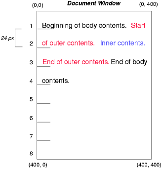
examples based on the following HTML:
<!DOCTYPE html>
<html>
<head>
<title>Comparison of positioning schemes</title>
</head>
<body>
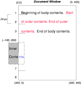
<p>
Beginning of p contents.
<span id="outer"> Start of outer contents.
<span id="inner"> Inner contents.</span>
End of outer contents.</span>
End of p contents.
</p>
</body>
</html>
In this document, we assume the following rules:
body { display: block; font-size:12px; line-height: 200%;
width: 400px; height: 400px }
p { display: block }
span { display: inline }
The final positions of boxes generated by the outer and
inner elements vary in each example. In each illustration, the
numbers to the left of the illustration indicate the normal flow position of the double-spaced (for
clarity) lines.
Note. The diagrams in this section are illustrative and not
to scale. They are meant to highlight the differences between the various
positioning schemes, and are not
intended to be reference renderings of the examples given.
9.1. Normal flow
Consider the following CSS declarations for outer and
inner that do not alter the normal
flow of boxes:
#outer { color: red }
#inner { color: blue }
The P element contains all inline content: anonymous inline
text and two SPAN elements. Therefore, all of the content will be laid
out in an inline formatting context, within a containing block established by the P
element, producing something like:
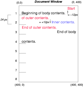
9.2. Relative positioning
To see the effect of relative positioning, we specify:
#outer { position: relative; top: -12px; color: red }
#inner { position: relative; top: 12px; color: blue }
Text flows normally up to the outer element. The
outer text is then flowed into its normal
flow position and dimensions at the end of line 1. Then, the inline
boxes containing the text (distributed over three lines) are shifted as a
unit by ‘-12px’ (upwards).
The contents of inner, as a child of outer, would
normally flow immediately after the words "of outer contents" (on line
1.5). However, the inner contents are themselves offset relative
to the outer contents by ‘12px’ (downwards), back to their original position
on line 2.
Note that the content following outer is not
affected by the relative positioning of outer.
Note also that had the offset of outer been
‘-24px’, the text of outer and
the body text would have overlapped.
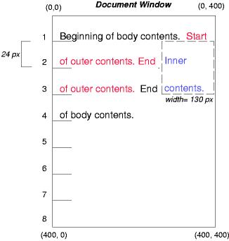
9.3. Floating a box
Now consider the effect of floating the
inner element's text to the right by means of the following
rules:
#outer { color: red }
#inner { float: right; width: 130px; color: blue }
Text flows normally up to the inner box, which is pulled out
of the flow and floated to the right margin (its
‘width’ has been assigned
explicitly). Line boxes to the left of the float are shortened, and the
document's remaining text flows into them.
To show the effect of the ‘clear’ property, we add a sibling
element to the example:
<!DOCTYPE html>
<html>
<head>
<title>Comparison of positioning schemes II</title>
</head>
<body>
<p>
Beginning of p contents.
<span id="outer"> Start of outer contents.
<span id="inner"> Inner contents.</span>
<span id="sibling"> Sibling contents.</span>
End of outer contents.</span>
End of p contents.
</p>
</body>
</html>
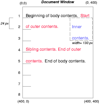
The following rules:
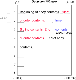
#inner { float: right; width: 130px; color: blue }
#sibling { color: red }
cause the inner box to float to the right as before and the
document's remaining text to flow into the vacated space:
However, if the ‘clear’
property on the sibling element is set to ‘right’ (i.e., the
generated sibling box will not accept a position next to floating boxes to its right), the sibling
content begins to flow below the float:
#inner { float: right; width: 130px; color: blue }
#sibling { clear: right; color: red }
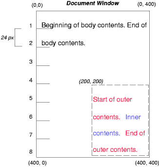
9.4. Absolute positioning
Next, we consider the effect of absolute positioning. Consider the
following CSS declarations for outer and inner:
#outer {
position: absolute;
top: 200px; left: 200px;
width: 200px;
color: red;
}
#inner { color: blue }
which cause the top of the outer box to be positioned with
respect to its containing block. The containing block for a positioned box is
established by the nearest positioned ancestor (or, if none exists, the
initial containing block, as in our example). The top side of
the outer box is ‘200px’ below
the top of the containing block and the
left side is ‘200px’ from the left
side. The child box of outer is flowed normally with respect to
its parent.
The following example shows an absolutely positioned box that is a
child of a relatively positioned box. Although the parent outer
box is not actually offset, setting its ‘position’ property to ‘relative’ means that its box may serve as the
containing block for positioned descendants. Since the outer box
is an inline box that is split across several lines, the first inline
box's top and left edges (depicted by thick dashed lines in the
illustration below) serve as references for ‘top’ and ‘left’ offsets.
#outer {
position: relative;
color: red
}
#inner {
position: absolute;
top: 200px; left: -100px;
height: 130px; width: 130px;
color: blue;
}
This results in something like the following:
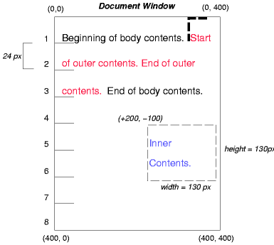
If we do not position the outer box:
#outer { color: red }
#inner {
position: absolute;
top: 200px; left: -100px;
height: 130px; width: 130px;
color: blue;
}
the containing block for
inner becomes the initial containing block (in our
example). The following illustration shows where the inner box
would end up in this case.
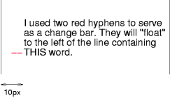
Relative and absolute positioning may be used to implement change bars,
as shown in the following example. The following fragment:
<p style="position: relative; margin-right: 10px; left: 10px;">
I used two red hyphens to serve as a change bar. They
will "float" to the left of the line containing THIS
<span style="position: absolute; top: auto; left: -1em; color: red;">--</span>
word.</p>
might result in something like:
First, the paragraph (whose containing
block sides are shown in the illustration) is flowed normally. Then it
is offset ‘10px’ from the left edge of
the containing block (thus, a right
margin of ‘10px’ has been reserved in
anticipation of the offset). The two hyphens acting as change bars are
taken out of the flow and positioned at the current line (due to
‘top: auto’), ‘-1em’ from the left edge of its containing block
(established by the P in its final position). The result is that the
change bars seem to "float" to the left of the current line.
9.5. Page positioning
Finally, we consider the effect of page positioning. Consider the
following CSS declarations for outer and inner:
#outer {
position: page;
top: 200px; left: 200px;
width: 200px;
color: red;
}
#inner { color: blue }
which cause the top of the outer box to be positioned with
respect to its containing block. The containing block for a page positioned box
is always established by the initial containing block. The
top side of the outer box is ‘200px’ below the top of the initial
containing block and the left side is ‘200px’ from the left side. The child box of
outer is flowed normally with respect to its parent.
The following example shows a page positioned box that is a child of a
relatively positioned box. Although the parent outer box is
setting its ‘position’ property to ‘relative’ this outer box does not
serve as the containing block for page positioned descendants. Since the
inner box is a page positioned element its containing block is not the relative
positioned outer box, page positioned elements are positioned
from the initial containing block, in this case the top and
left edges of the illustration itself.
#outer {
position: relative;
color: red
}
#inner {
position: page;
top: 200px; left: -100px;
height: 130px; width: 130px;
color: blue;
}
This results in something like the following:
Need to add example for center positioning.
10. Clipping: the ‘clip’ property
A clipping region
defines what portion of an element's border box is visible. By
default, the element is not clipped. However, the clipping region may be
explicitly set with the ‘clip’ property.
| Name:
| clip
|
| Value:
| auto | <shape>
|
| Initial:
| auto
|
| Applies to:
| absolutely positioned elements
|
| Inherited:
| no
|
| Animatable:
| <shape>
|
| Percentages:
| N/A
|
| Media:
| visual
|
| Computed value:
| ‘auto’ if specified as
‘auto’, otherwise a rectangle with
four values, each of which is ‘auto’
if specified as ‘auto’ and the
computed length otherwise
|
| Canonical order:
| per
grammar
|
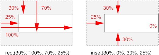
The ‘clip’
property applies only to absolutely positioned elements. Values have the
following meanings:
- auto
- The element does not clip.
- <shape>
-
- rect(<top>, <right>,
<bottom>, <left>)
-
Each of the arguments <top> and <bottom> specify
offsets from the top border edge of the box, and <right>, and
<left> specify offsets from the left border edge of the box.
Authors should separate offset values with commas. User agents must
support separation with commas, but may also support separation
without commas (but not a combination), because a previous revision of
this specification was ambiguous in this respect.
<top>, <right>,<bottom>, and <left> may
either have a <length> value or ‘auto’. Negative lengths are permitted. The
value ‘auto’ means that a given
edge of the clipping region will be the same as the edge of the
element's generated border box (i.e., ‘auto’ means the same as ‘0’ for <top> and <left>, the same
as the used value of the height plus the sum of vertical padding and
border widths for <bottom>, and the same as the used value of
the width plus the sum of the horizontal padding and border widths for
<right>, such that four ‘auto’ values result in the clipping region
being the same as the element's border box).
When coordinates are rounded to pixel coordinates, care should be
taken that no pixels remain visible when <left> and
<right> have the same value (or <top> and <bottom>
have the same value), and conversely that no pixels within the
element's border box remain hidden when these values are
‘auto’.
- inset(<top>, <right>,
<bottom>, <left>)
-
Similar to ‘rect()’, except that
the values are offsets relative to the respective edges of the
element.
An element's clipping region clips out any aspect of the element
(e.g., content, children, background, borders, text decoration, outline
and visible scrolling mechanism – if any) that is outside the
clipping region. Content that has been clipped does not cause overflow.
The element's ancestors may also clip portions of their content
(e.g., via their own ‘clip’ property and/or if their
‘overflow’ property is not
‘visible’); what is rendered is the
cumulative intersection.
If the clipping region exceeds the bounds of the user agent's
document window, content may be clipped to that window by the native
operating environment.
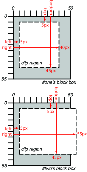
The following two rules:
p#one { clip: rect(5px, 40px, 45px, 5px); }
p#two { clip: rect(5px, 55px, 45px, 5px); }
and assuming both Ps are 50 by 55 px, will create, respectively, the
rectangular clipping regions delimited by the dashed lines in the
following illustrations:
Note in CSS, all clipping regions are rectangular. We
anticipate future extensions to permit non-rectangular clipping.
11. Layered
presentation
In the following sections, the expression "in front of" means
closer to the user as the user faces the screen.
In CSS, each box has a position in three dimensions. In addition to
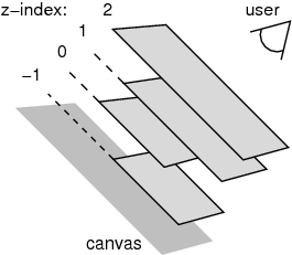
their horizontal and vertical positions, boxes lie along a "z-axis" and
are formatted one on top of the other. Z-axis positions are particularly
relevant when boxes overlap visually. This section discusses how boxes may
be positioned along the z-axis.
Each box belongs to one stacking
context. Each box in a given stacking context has an integer stack level, which is its position on the z-axis
relative to other boxes in the same stacking context. Boxes with greater
stack levels are always formatted in front of boxes with lower stack
levels. Boxes may have negative stack levels. Boxes with the same stack
level in a stacking context are stacked bottom-to-top according to
document tree order.
The root element creates a root stacking
context, but other elements may establish local stacking contexts. Stacking
contexts are inherited. A local stacking context is atomic; boxes in other
stacking contexts may not come between any of its boxes.
An element that establishes a local stacking context generates a box
that has two stack levels: one for the stacking context it creates (always
‘0’) and one for the stacking context
to which it belongs (given by the ‘z-index’ property).
An element's box has the same stack level as its parent's box
unless given a different stack level with the ‘z-index’ property.
| Name:
| z-index
|
| Value:
| auto | <integer>
|
| Initial:
| auto
|
| Applies to:
| positioned elements
|
| Inherited:
| no
|
| Animatable:
| <integer>
|
| Percentages:
| N/A
|
| Media:
| visual
|
| Computed value:
| as specified
|
| Canonical order:
| per
grammar
|
For a positioned box, the ‘z-index’ property specifies:
- The stack level of the box in the current stacking context.
- Whether the box establishes a stacking context.
Values have the following meanings:
- <integer>
- This integer is the stack level of the generated box in the current
stacking context. The box also establishes a new stacking context.
- auto
- The stack level of the generated box in the current stacking context
is 0. The box does not establish a new stacking context unless it is the
root element.
In the following example, the stack levels of the boxes (named with
their "id" attributes) are: "text2"=0, "image"=1, "text3"=2, and
"text1"=3. The "text2" stack level is inherited from the root box. The
others are specified with the ‘z-index’ property.
<!DOCTYPE html>
<html>
    <head>
        <title>Z-order positioning</title>
        <style type="text/css">
            .pile {
            position: absolute;
            left: 2in;
            top: 2in;
            width: 3in;
            height: 3in;
            }
        </style>
    </head>
    <body>
        <p>
            <img id="image" class="pile"
                src="butterfly.png" alt="A butterfly image"
                style="z-index: 1">
        <div id="text1" class="pile"
                style="z-index: 3">
            This text will overlay the butterfly image.
        </div>
        <div id="text2">
            This text will be beneath everything.
        </div>
        <div id="text3" class="pile"
                style="z-index: 2">
            This text will underlay text1, but overlay the butterfly image
        </div>
    </body>
</html>
This example demonstrates the notion of transparency. The
default behavior of the background is to allow boxes behind it to be
visible. In the example, each box transparently overlays the boxes below
it. This behavior can be overridden by using one of the existing background
properties.
12. Detailed stacking
context
12.1. Definitions
- Tree Order
- The preorder depth-first traversal of the rendering tree, in
logical (not visual) order for bidirectional content, after taking into
account properties that move boxes around.
- Element
- In this description, "element" refers to actual elements,
pseudo-elements, and anonymous boxes. Pseudo-elements and anonymous boxes
are treated as descendants in the appropriate places. For example, an
outside list marker comes before an adjoining ‘
::before’ box in the line box, which comes before
the content of the box, and so forth.
12.2. Painting order
The bottom of the stack is the furthest from the user, the top of the
stack is the nearest to the user:
The stacking context background and most negative positioned stacking
contexts are at the bottom of the stack, while the most positive
positioned stacking contexts are at the top of the stack.
The canvas is transparent if contained within another, and given a
UA-defined color if it is not. It is infinite in extent and contains the
root element. Initially, the viewport is anchored
with its top left corner at the canvas origin.
The painting order for the descendants of an element generating a
stacking context (see the ‘z-index’ property) is:
- If the element is a root element:
- background color of element over the entire canvas.
- background image of element, over the entire canvas, anchored at
the origin that would be used if it was painted for the root element.
- If the element is a block, list-item, or other block equivalent:
- background color of element unless it is the root element.
- background image of element unless it is the root element.
- border of element.
Otherwise, if the element is a block-level table:
- table backgrounds (color then image) unless it is the root element.
- column group backgrounds (color then image).
- column backgrounds (color then image).
- row group backgrounds (color then image).
- row backgrounds (color then image).
- cell backgrounds (color then image).
- all table borders (in tree order for separated borders).
- Stacking contexts formed by positioned descendants with negative
z-indices (excluding 0) in z-index order (most negative first) then tree
order.
- For all its in-flow, non-positioned, block-level descendants in tree
order: If the element is a block, list-item, or other block equivalent:
- background color of element.
- background image of element.
- border of element.
Otherwise, the element is a table:
- table backgrounds (color then image).
- column group backgrounds (color then image).
- column backgrounds (color then image).
- row group backgrounds (color then image).
- row backgrounds (color then image).
- cell backgrounds (color then image).
- all table borders (in tree order for separated borders).
- All non-positioned floating descendants, in
tree order. For each one of these, treat the element as if it created a
new stacking context, but any positioned descendants and descendants
which actually create a new stacking context are considered part of the
parent stacking context, not this new one.
- If the element is an inline element that generates a stacking context,
then:
- For each line box that the element is in:
- Jump to 7.2.1 for the box(es) of the
element in that line box (in tree order).
- Otherwise: first for the element, then for all its in-flow,
non-positioned, block-level descendants in tree order:
- If the element is a block-level replaced element, then: the
replaced content, atomically.
- Otherwise, for each line box of that element:
- For each box that is a child of that element, in that
line box, in tree order:
- background color of element.
- background image of element
- border of element.
- For inline elements:
- For all the elements in-flow, non-positioned, inline-level
children that are in this line box, and all runs of text inside
the element that is on this line box, in tree order:
- If this is a run of text, then:
- any underlining affecting the text of the element, in
tree order of the elements applying the underlining (such
that the deepest element's underlining, if any, is
painted topmost and the root element's underlining, if
any, is drawn bottommost).
- any overlining affecting the text of the element, in tree
order of the elements applying the overlining (such that the
deepest element's overlining, if any, is painted topmost
and the root element's overlining, if any, is drawn
bottommost).
- the text
- any line-through affecting the text of the element, in
tree order of the elements applying the line-through (such
that the deepest element's line-through, if any, is
painted topmost and the root element's line-through, if
any, is drawn bottommost).
- Otherwise, jump to 7.2.1 for that
element
- For inline-block and inline-table elements:
- For each one of these, treat the element as if it created a
new stacking context, but any positioned descendants and
descendants which actually create a new stacking context are
considered part of the parent stacking context, not this new one.
- For inline-level replaced elements:
- the replaced content, atomically.
- Optionally, the outline of the element (see 10 below).
Note, some of the boxes may have been generated by
line splitting or the Unicode bidirectional algorithm.
- Optionally, if the element is block-level, the outline of the
element (see 10 below).
- All positioned, opacity or transform descendants, in tree order that
fall into the following categories:
- All positioned descendants with ‘
z-index:
      auto
’ or ‘z-index: 0’,
in tree order. For those with ‘z-index:
auto’, treat the element as if it created a new stacking
context, but any positioned descendants and descendants which actually
create a new stacking context should be considered part of the parent
stacking context, not this new one. For those with ‘z-index: 0’ treat the stacking context generated
atomically.
- All opacity descendants with ‘
opacity’ less than ‘1’, in tree order, create a stacking context
generated atomically.
- All transform descendants with ‘
transform’ other than ‘none’, in tree order, create a stacking context
generated atomically.
- Stacking contexts formed by positioned descendants with z-indices
greater than or equal to 1 in z-index order (smallest first) then tree
order.
- Finally, implementations that do not draw
outlines in steps above must draw outlines from this stacking context at
this stage. (It is recommended to draw outlines in this step and not in
the steps above.)
12.3. Notes
The background of the root element is only painted once, over the whole
canvas.
While the backgrounds of bidirectional inlines are painted in tree
order, they are positioned in visual order. Since the positioning of
inline backgrounds is unspecified in CSS, the exact result of these two
requirements is UA-defined. A future version of CSS may define this in
more detail.
13.1. Document Conventions
Conformance requirements are expressed with a combination of
descriptive assertions and RFC 2119 terminology. The key words "MUST",
"MUST NOT", "REQUIRED", "SHALL", "SHALL NOT", "SHOULD", "SHOULD NOT",
"RECOMMENDED", "MAY", and "OPTIONAL" in the normative parts of this
document are to be interpreted as described in RFC 2119. However, for
readability, these words do not appear in all uppercase letters in this
specification.
All of the text of this specification is normative except sections
explicitly marked as non-normative, examples, and notes. [RFC2119]
Examples in this specification are introduced with the words “for
example” or are set apart from the normative text like this:
This is an example of an informative example.
Informative notes begin with the word “Note” and are set apart from
the normative text like this:
Note, this is an informative note.
Conformance to CSS Positioned Layout Module Level 3 is defined for three
conformance classes:
- style
sheet
- A CSS
style sheet.
- renderer
- A UA
that interprets the semantics of a style sheet and renders documents that
use them.
- authoring tool
- A UA
that writes a style sheet.
A style sheet is conformant to CSS Positioned Layout Module Level 3 if
all of its declarations that use properties defined in this module have
values that are valid according to the generic CSS grammar and the
individual grammars of each property as given in this module.
A renderer is conformant to CSS Positioned Layout Module Level 3 if, in
addition to interpreting the style sheet as defined by the appropriate
specifications, it supports all the features defined by CSS Positioned
Layout Module Level 3 by parsing them correctly and rendering the document
accordingly. However, the inability of a UA to correctly render a document
due to limitations of the device does not make the UA non-conformant. (For
example, a UA is not required to render color on a monochrome monitor.)
An authoring tool is conformant to CSS Positioned Layout Module Level 3
if it writes style sheets that are syntactically correct according to the
generic CSS grammar and the individual grammars of each feature in this
module, and meet all other conformance requirements of style sheets as
described in this module.
13.3. Partial Implementations
So that authors can exploit the forward-compatible parsing rules to
assign fallback values, CSS renderers must treat as
invalid (and ignore as
appropriate) any at-rules, properties, property values, keywords, and
other syntactic constructs for which they have no usable level of support.
In particular, user agents must not selectively ignore
unsupported component values and honor supported values in a single
multi-value property declaration: if any value is considered invalid (as
unsupported values must be), CSS requires that the entire declaration be
ignored.
13.4. Experimental
Implementations
To avoid clashes with future CSS features, the CSS2.1 specification
reserves a prefixed
syntax for proprietary and experimental extensions to CSS.
Prior to a specification reaching the Candidate Recommendation stage in
the W3C process, all implementations of a CSS feature are considered
experimental. The CSS Working Group recommends that implementations use a
vendor-prefixed syntax for such features, including those in W3C Working
Drafts. This avoids incompatibilities with future changes in the draft.
13.5. Non-Experimental
Implementations
Once a specification reaches the Candidate Recommendation stage,
non-experimental implementations are possible, and implementors should
release an unprefixed implementation of any CR-level feature they can
demonstrate to be correctly implemented according to spec.
To establish and maintain the interoperability of CSS across
implementations, the CSS Working Group requests that non-experimental CSS
renderers submit an implementation report (and, if necessary, the
testcases used for that implementation report) to the W3C before releasing
an unprefixed implementation of any CSS features. Testcases submitted to
W3C are subject to review and correction by the CSS Working Group.
Further information on submitting testcases and implementation reports
can be found from on the CSS Working Group's website at http://www.w3.org/Style/CSS/Test/.
Questions should be directed to the public-css-testsuite@w3.org
mailing list.
13.6. CR Exit Criteria
For this specification to be advanced to Proposed Recommendation, there
must be at least two independent, interoperable implementations of each
feature. Each feature may be implemented by a different set of products,
there is no requirement that all features be implemented by a single
product. For the purposes of this criterion, we define the following
terms:
- independent
- each implementation must be developed by a different party and cannot
share, reuse, or derive from code used by another qualifying
implementation. Sections of code that have no bearing on the
implementation of this specification are exempt from this requirement.
- interoperable
- passing the respective test case(s) in the official CSS test suite,
or, if the implementation is not a Web browser, an equivalent test. Every
relevant test in the test suite should have an equivalent test created if
such a user agent (UA) is to be used to claim interoperability. In
addition if such a UA is to be used to claim interoperability, then there
must one or more additional UAs which can also pass those equivalent
tests in the same way for the purpose of interoperability. The equivalent
tests must be made publicly available for the purposes of peer review.
- implementation
- a user agent which:
- implements the specification.
- is available to the general public. The implementation may be a
shipping product or other publicly available version (i.e., beta
version, preview release, or “nightly build”). Non-shipping product
releases must have implemented the feature(s) for a period of at least
one month in order to demonstrate stability.
- is not experimental (i.e., a version specifically designed to pass
the test suite and is not intended for normal usage going forward).
The specification will remain Candidate Recommendation for at least six
months.
Acknowledgments
This module would not have been possible without input and support from
many helpful people. Thanks to Bert Bos, Tantek Çelik, Anton
Prowse, Rossen Atanassov, Chris Jones, John Jansen, Sylvain Galineau.
References
Normative references
-
- [CSS21]
- Bert Bos; et al. Cascading Style
Sheets Level 2 Revision 1 (CSS 2.1) Specification. 7 June
2011. W3C Recommendation. URL: http://www.w3.org/TR/2011/REC-CSS2-20110607
- [CSS3-REGIONS]
- Vincent Hardy; Alex Mogilevsky. CSS
Regions Module Level 3. 29 November 2011. W3C Working Draft.
(Work in progress.) URL: http://www.w3.org/TR/2011/WD-css3-regions-20111129/
- [CSS3BOX]
- Bert Bos. CSS basic box
model. 9 August 2007. W3C Working Draft. (Work in progress.)
URL: http://www.w3.org/TR/2007/WD-css3-box-20070809
- [CSS3VAL]
- Håkon Wium Lie; Tab Atkins; Elika J. Etemad. CSS
Values and Units Module Level 3. 6 September 2011. W3C Working
Draft. (Work in progress.) URL: http://www.w3.org/TR/2011/WD-css3-values-20110906/
- [RFC2119]
- S. Bradner. Key
words for use in RFCs to Indicate Requirement Levels. Internet
RFC 2119. URL: http://www.ietf.org/rfc/rfc2119.txt
Other references
-
- [CSS1]
- Håkon Wium Lie; Bert Bos. Cascading Style
Sheets (CSS1) Level 1 Specification. 11 April 2008. W3C
Recommendation. URL: http://www.w3.org/TR/2008/REC-CSS1-20080411
Index
- absolutely positioned, 6.2., 6.2.
- absolute position, 6.2., 6.2.
- absolute positioned element/box, 6.2.
- absolute positioning, 6.2., 6.2.
- authoring tool, 13.2.
- ‘
bottom’, 6.7.
- center position, 6.3., 6.3.
- center positioned, 6.3., 6.3.
- center positioned element/box, 6.3.
- center positioning, 6.3., 6.3.
- ‘
clip’, 10.
- clipping region, 10.
- containing block, 3.1.
- fixed position, 6.5., 6.5.
- fixed positioned, 6.5., 6.5.
- fixed positioning, 6.5., 6.5.
- float, 5.
- floated box, 5.
- floating box, 5.
- ‘
left’, 6.7.
- local stacking contexts, 11.
- normal flow, 4.
- page position, 6.4., 6.4.
- page positioned, 6.4., 6.4.
- page positioned element/box, 6.4.
- page positioning, 6.4., 6.4.
- ‘
position’, 6.6.
- positioned element/box, 6.7.
- positioning schemes, 6.
- relatively positioned, 6.1.
- relative position, 6.1.
- relative positioning, 6.1.
- renderer, 13.2.
- ‘
right’,
6.7.
- root stacking context, 11.
- stacking context, 11.
- stack level, 11.
- style sheet
- as conformance class, 13.2.
- ‘
top’, 6.7.
- viewport, 2.
- ‘
z-index’, 11.
Property index
| Property
| Values
| Initial
| Applies to
| Inh.
| Percentages
| Media
|
| bottom
| auto | <length> | <percentage>
| auto
| positioned elements
| no
| <length>, <percentage>
| refer to height of containing block
|
| clip
| auto | <shape>
| auto
| absolutely positioned elements
| no
| <shape>
| N/A
|
| left
| auto | <length> | <percentage>
| auto
| positioned elements
| no
| <length>, <percentage>
| refer to height of containing block
|
| position
| static | relative | absolute | center | page | fixed
| static
| all elements except table-column-group and table-column
| no
| no
| N/A
|
| right
| auto | <length> | <percentage>
| auto
| positioned elements
| no
| <length>, <percentage>
| refer to height of containing block
|
| top
| auto | <length> | <percentage>
| auto
| positioned elements
| no
| <length>, <percentage>
| refer to height of containing block
|
| z-index
| auto | <integer>
| auto
| positioned elements
| no
| <integer>
| N/A
|