Abstract
CSS transforms allows elements styled with CSS to be transformed in two-dimensional or three-dimensional space. This specification is the convergence of the CSS 2D transforms, CSS 3D transforms and SVG transforms specifications.
CSS is a language for describing the rendering of structured documents
(such as HTML and XML)
on screen, on paper, in speech, etc.
Status of this document
This section describes the status of this document at the time of
its publication. Other documents may supersede this document. A list of
current W3C publications and the latest revision of this technical report
can be found in the W3C technical reports
index at http://www.w3.org/TR/.
Publication as a Working Draft does not imply endorsement by the W3C
Membership. This is a draft document and may be updated, replaced or
obsoleted by other documents at any time. It is inappropriate to cite this
document as other than work in progress.
The (archived) public mailing list
public-fx@w3.org
(see instructions)
is preferred for discussion of this specification.
When sending e-mail,
please put the text “css-transforms” in the subject,
preferably like this:
“[css-transforms] …summary of comment…”
This document was produced by the CSS Working Group
(part of the Style Activity) and the SVG Working Group (part of the
Graphics Activity).
This document was produced by groups operating under
the 5 February 2004 W3C Patent Policy.
W3C maintains a public list of any patent disclosures (CSS)
and a public list of any patent disclosures (SVG)
made in connection with the deliverables of each group;
these pages also includes instructions for disclosing a patent.
An individual who has actual knowledge of a patent which the individual believes contains
Essential Claim(s)
must disclose the information in accordance with section 6 of the W3C Patent Policy.
Compared to the previous version, this draft makes changes to the
syntax of 'transform-origin' and 'perspective-origin', adds some
definitions of keywords, adds pseudo-code to define the decomposing of
2D and 3D matrices and describes some known open issues. Several
editorial changes and some new notes increase clarity.
Table of contents
1 Introduction
This section is not normative.
The CSS visual formatting model describes a coordinate system within each element is positioned. Positions and sizes in this coordinate space can be thought of as being expressed in pixels, starting in the origin of point with positive values proceeding to the right and down.
This coordinate space can be modified with the transform property. Using transform, elements can be translated, rotated and scaled in two or three dimensional space.
Additional properties make working with transforms easier, and allow the author to control how nested three-dimensional transforms interact.
-
The transform-origin property provides a convenient way to control the origin about which transforms on an element are applied.
-
The perspective property allows the author to make child elements with three-dimensional transforms appear as if they live in a common three-dimensional space. The perspective-origin property provides control over the origin at which perspective is applied, effectively changing the location of the "vanishing point".
-
The transform-style property allows 3D-transformed elements and their 3D-transformed descendants to share a common three-dimensional space, allowing the construction of hierarchies of three-dimensional objects.
-
The backface-visibility property comes into play when an element is flipped around via three-dimensional transforms such that its reverse side is visible to the viewer. In some situations it is desirable to hide the element in this situation, which is possible using the value of hidden for this property.
Note: While some values of the transform property allow an element to be transformed in a three-dimensional coordinate system, the elements themselves are not three-dimensional objects. Instead, they exist on a two-dimensional plane (a flat surface) and have no depth.
2 Module Interactions
This module defines a set of CSS properties that affect the visual rendering of elements to which those properties are applied; these effects are applied after elements have been sized and positioned according to the Visual formatting model from [CSS21]. Some values of these properties result in the creation of a containing block, and/or the creation of a stacking context.
Three-dimensional transforms can also affect the visual layering of elements, and thus override the back-to-front painting order described in Appendix E of [CSS21].
Transforms affect the rendering of backgrounds on elements with a value of fixed for the background-attachment property, which is specified in [CSS3BG].
3 CSS Values
This specification follows the CSS property definition conventions from [CSS21]. Value types not defined in these specifications are defined in CSS Values and Units Module Level 3 [CSS3VAL].
In addition to the property-specific values listed in their definitions, all properties defined in this specification also accept the inherit keyword as their property value. For readability it has not been repeated explicitly.
4 Terminology
When used in this specification, terms have the meanings assigned in this section.
- bounding box
-
A bounding box is the object bounding box for all SVG elements without an associated CSS layout box and the border box for all other elements. The bounding box of a table is the border box of its table wrapper box, not its table box.
- transformable element
-
A transformable element is an element in one of these categories:
- user coordinate system
- local coordinate system
-
In general, a coordinate system defines locations and distances on the current canvas. The current local coordinate system (also user coordinate system) is the coordinate system that is currently active and which is used to define how coordinates and lengths are located and computed, respectively, on the current canvas.
- perspective matrix
-
A matrix computed from the values of the perspective and perspective-origin properties as described below.
- transformation matrix
-
A matrix that defines the mathematical mapping from one coordinate system into another. It is computed from the values of the transform and transform-origin properties as described below.
- current transformation matrix (CTM)
-
A matrix that defines the mapping from the local coordinate system into the viewport coordinate system.
- accumulated 3D transformation matrix
-
A matrix computed for elements in a 3D rendering context, as described below.
- 2D matrix
-
A 3x2 transformation matrix with 6 items or a 4x4 matrix with 16 items, where the items m31, m32, m13, m23, m43, m14, m24, m34 are equal to 0 and m33, m44 are equal to 1.
- 3D matrix
-
A 4x4 matrix which does not fulfill the requirements of an 2D matrix.
- identity transform function
-
A transform function that is equivalent to a identity 4x4 matrix (see Mathematical Description of Transform Functions). Examples for identity transform functions are translate(0), translate3d(0, 0, 0), translateX(0), translateY(0), translateZ(0), scale(1), scaleX(1), scaleY(1), scaleZ(1), rotate(0), rotate3d(1, 1, 1, 0), rotateX(0), rotateY(0), rotateZ(0), skew(0, 0), skewX(0), skewY(0), matrix(1, 0, 0, 1, 0, 0) and matrix3d(1, 0, 0, 0, 0, 1, 0, 0, 0, 0, 1, 0, 0, 0, 0, 1). A special case is perspective: perspective(infinity). The value of m34 becomes infinitesimal small and the transform function is therefore assumed to be equal to the identity matrix.
- 3D rendering context
-
A containing block hierarchy of one or more levels, instantiated by elements with a computed value for the transform-style property of preserve-3d, whose elements share a common three-dimensional coordinate system.
5 Two Dimensional Subset
UAs may not always be able to render three-dimensional transforms and then just support a two-dimensional subset of this specification. In this case three-dimensional transforms and the properties transform-style, perspective, perspective-origin and backface-visibility must not be supported. Section 3D Transform Rendering does not apply. Matrix decomposing uses the technique taken from the "unmatrix" method in "Graphics Gems II, edited by Jim Arvo", simplified for the 2D case. Section Mathematical Description of Transform Functions is still effective but can be reduced by using a 3x3 transformation matrix where a equals m11, b equals m12, c equals m21, d equals m22, e equals m41 and f equals m42 (see A 2D 3x2 matrix with six parameter).
Authors can easily provide a fallback if UAs do not provide support for three-dimensional transforms. The following example has two property definitions for transform. The first one consists of two two-dimensional transform functions. The second one has a two-dimensional and a three-dimensional transform function.
div {
  transform: scale(2) rotate(45deg);
  transform: scale(2) rotate3d(0, 0, 1, 45deg);
}
With 3D support, the second definition will override the first one. Without 3D support, the second definition is invalid and a UA falls back to the first definition.
This section is normative.
Specifying a value other than none for the transform property establishes a new local coordinate system at the element that it is applied to. The mapping from where the element would have rendered into that local coordinate system is given by the element’s transformation matrix. Transformations are cumulative. That is, elements establish their local coordinate system within the coordinate system of their parent. From the perspective of the user, an element effectively accumulates all the transform properties of its ancestors as well as any local transform applied to it. The accumulation of these transforms defines a current transformation matrix (CTM) for the element.
The coordinate space is a coordinate system with two axes: the X axis increases horizontally to the right; the Y axis increases vertically downwards. Three-dimensional transform functions extend this coordinate space into three dimensions, adding a Z axis perpendicular to the plane of the screen, that increases towards the viewer.
The transformation matrix is computed from the transform and transform-origin properties as follows:
- Start with the identity matrix.
- Translate by the computed X, Y and Z values of transform-origin
- Multiply by each of the transform functions in transform property from left to right
- Translate by the negated computed X, Y and Z values of transform-origin
Transforms apply to transformable elements.
Note: Transformations do affect the visual layout on the canvas, but have no affect on the CSS layout itself. This also means transforms do not affect results of the Element Interface Extensions getClientRects() and getBoundingClientRect(), which are specified in [CSSOM-VIEW].
div {
  transform: translate(100px, 100px);
}
This transform moves the element by 100 pixels in both the X and Y directions.
div {
  height: 100px; width: 100px;
  transform-origin: 50px 50px;
  transform: rotate(45deg);
}
The transform-origin property moves the point of origin by 50 pixels in both the X and Y directions. The transform rotates the element clockwise by 45° about the point of origin. After all transform functions were applied, the translation of the origin gets translated back by -50 pixels in both the X and Y directions.
div {
  height: 100px; width: 100px;
  transform: translate(80px, 80px) scale(1.5, 1.5) rotate(45deg);
}
This transform moves the element by 80 pixels in both the X and Y directions, then scales the element by 150%, then rotates it 45° clockwise about the Z axis. Note that the scale and rotation operate about the center of the element, since the element has the default transform-origin of 50% 50%.
Note that an identical rendering can be obtained by nesting elements with the equivalent transforms:
<div style="transform: translate(80px, 80px)">
  <div style="transform: scale(1.5, 1.5)">
      <div style="transform: rotate(45deg)"></div>
  </div>
</div>
For elements whose layout is governed by the CSS box model, the transform property does not affect the flow of the content surrounding the transformed element. However, the extent of the overflow area takes into account transformed elements. This behavior is similar to what happens when elements are offset via relative positioning. Therefore, if the value of the overflow property is scroll or auto, scrollbars will appear as needed to see content that is transformed outside the visible area.
For elements whose layout is governed by the CSS box model, any value other than none for the transform results in the creation of both a stacking context and a containing block. The object acts as a containing block for fixed positioned descendants.
Is this effect on position: fixed necessary? If so, need to go into more detail here about why fixed positioned objects should do this, i.e., that it’s much harder to implement otherwise. See Bug 16328.
Fixed backgrounds on the root element are affected by any transform specified for that element. For all other elements that are effected by a transform (i.e. have a transform applied to them, or to any of their ancestor elements), a value of fixed for the background-attachment property is treated as if it had a value of scroll. The computed value of background-attachment is not affected.
Note: If the root element is transformed, the transformation applies to the entire canvas, including any background specified for the root element. Since the background painting area for the root element is the entire canvas, which is infinite, the transformation might cause parts of the background that were originally off-screen to appear. For example, if the root element’s background were repeating dots, and a transformation of scale(0.5) were specified on the root element, the dots would shrink to half their size, but there will be twice as many, so they still cover the whole viewport.
Normally, elements render as flat planes, and are rendered into the same plane as their containing block. Often this is the plane shared by the rest of the page. Two-dimensional transform functions can alter the appearance of an element, but that element is still rendered into the same plane as its containing block.
Three-dimensional transforms can result in transformation matrices with a non-zero Z component (where the Z axis projects out of the plane of the screen). This can result in an element rendering on a different plane than that of its containing block. This may affect the front-to-back rendering order of that element relative to other elements, as well as causing it to intersect with other elements. This behavior depends on whether the element is a member of a 3D rendering context, as described below.
This description does not exactly match what WebKit implements. Perhaps it should be changed to match current implementations? See Bug 19637.
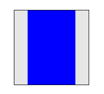
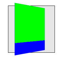
This example shows the effect of three-dimensional transform applied to an element.
<style>
div {
  height: 150px;
  width: 150px;
}
.container {
  border: 1px solid black;
}
.transformed {
  transform: rotateY(50deg);
}
</style>

<div class="container">
  <div class="transformed"></div>
</div>
The transform is a 50° rotation about the vertical, Y axis. Note how this makes the blue box appear narrower, but not three-dimensional.
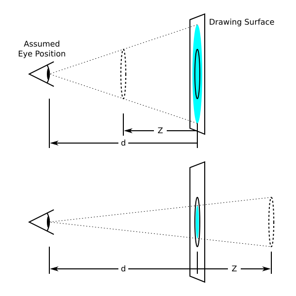
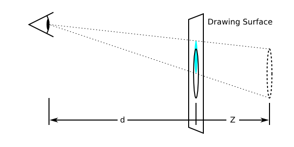
The perspective and perspective-origin properties can be used to add a feeling of depth to a scene by making elements higher on the Z axis (closer to the viewer) appear larger, and those further away to appear smaller. The scaling is proportional to d/(d − Z) where d, the value of perspective, is the distance from the drawing plane to the the assumed position of the viewer’s eye.
Normally the assumed position of the viewer’s eye is centered on a drawing. This position can be moved if desired – for example, if a web page contains multiple drawings that should share a common perspective – by setting perspective-origin.
The perspective matrix is computed as follows:
- Start with the identity matrix.
- Translate by the computed X and Y values of perspective-origin
- Multiply by the matrix that would be obtained from the perspective() transform function, where the length is provided by the value of the perspective property
- Translate by the negated computed X and Y values of perspective-origin
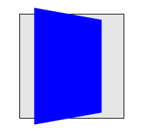
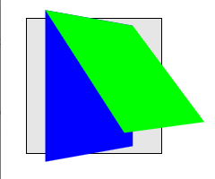
This example shows how perspective can be used to cause three-dimensional transforms to appear more realistic.
<style>
div {
  height: 150px;
  width: 150px;
}
.container {
  perspective: 500px;
  border: 1px solid black;
}
.transformed {
  transform: rotateY(50deg);
}
</style>

<div class="container">
  <div class="transformed"></div>
</div>
The inner element has the same transform as in the previous example, but its rendering is now influenced by the perspective property on its parent element. Perspective causes vertices that have positive Z coordinates (closer to the viewer) to be scaled up in X and Y, and those further away (negative Z coordinates) to be scaled down, giving an appearance of depth.
An element with a three-dimensional transform that is not contained in a 3D rendering context renders with the appropriate transform applied, but does not intersect with any other elements. The three-dimensional transform in this case can be considered just as a painting effect, like two-dimensional transforms. Similarly, the transform does not affect painting order. For example, a transform with a positive Z translation may make an element look larger, but does not cause that element to render in front of elements with no translation in Z.
An element with a three-dimensional transform that is contained in a 3D rendering context can visibly interact with other elements in that same 3D rendering context; the set of elements participating in the same 3D rendering context may obscure each other or intersect, based on their computed transforms. They are rendered as if they are all siblings, positioned in a common 3D coordinate space. The position of each element in that three-dimensional space is determined by accumulating the transformation matrices up from the element that establishes the 3D rendering context through each element that is a containing block for the given element, as described below.
<style>
div {
  height: 150px;
  width: 150px;
}
.container {
  perspective: 500px;
  border: 1px solid black;
}
.transformed {
  transform: rotateY(50deg);
  background-color: blue;
}
.child {
  transform-origin: top left;
  transform: rotateX(40deg);
  background-color: lime;
}
</style>

<div class="container">
  <div class="transformed">
      <div class="child"></div>
  </div>
</div>
This example shows how nested 3D transforms are rendered in the absence of transform-style: preserve-3d. The blue div is transformed as in the previous example, with its rendering influenced by the perspective on its parent element. The lime element also has a 3D transform, which is a rotation about the X axis (anchored at the top, by virtue of the transform-origin). However, the lime element is being rendered into the plane of its parent because it is not a member of a 3D rendering context; the parent is "flattening".
Elements establish and participate in 3D rendering contexts as follows:
The final value of the transform used to render an element in a 3D rendering context is computed by accumulating an accumulated 3D transformation matrix as follows:
- Start with the identity matrix.
- For each containing block between the root of the 3D rendering context and the element in question:
- multiply the accumulated matrix with the perspective matrix on the element’s containing block (if any). That containing block is not necessarily a member of the 3D rendering context.
- apply to the accumulated matrix a translation equivalent to the horizontal and vertical offset of the element relative to its containing block as specified by the CSS visual formatting model.
- multiply the accumulated matrix with the transformation matrix.
<style>
div {
  height: 150px;
  width: 150px;
}
.container {
  perspective: 500px;
  border: 1px solid black;
}
.transformed {
  transform-style: preserve-3d;
  transform: rotateY(50deg);
  background-color: blue;
}
.child {
  transform-origin: top left;
  transform: rotateX(40deg);
  background-color: lime;
}
</style>
This example is identical to the previous example, with the addition of transform-style: preserve-3d on the blue element. The blue element now establishes a 3D rendering context, of which the lime element is a member. Now both blue and lime elements share a common three-dimensional space, so the lime element renders as tilting out from its parent, influenced by the perspective on the container.
Elements in the same 3D rendering context may intersect with each other. User agents must render intersection by subdividing the planes of intersecting elements as described by Newell’s algorithm.
Untransformed elements in a 3D rendering context render on the Z=0 plane, yet may still intersect with transformed elements.
Within a 3D rendering context, the rendering order of non-intersecting elements is based on their position on the Z axis after the application of the accumulated transform. Elements at the same Z position render in stacking context order.
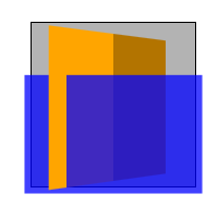
<style>
.container {
  background-color: rgba(0, 0, 0, 0.3);
  transform-style: preserve-3d;
  perspective: 500px;
}
.container > div {
  position: absolute;
  left: 0;
}
.container > :first-child {
  transform: rotateY(45deg);
  background-color: orange;
  top: 10px;
  height: 135px;
}
.container > :last-child {
  transform: translateZ(40px);
  background-color: rgba(0, 0, 255, 0.75);
  top: 50px;
  height: 100px;
}
</style>

<div class="container">
  <div></div>
  <div></div>
</div>
This example shows show elements in a 3D rendering context can intersect. The container element establishes a 3D rendering context for itself and its two children. The children intersect with each other, and the orange element also intersects with the container.
Using three-dimensional transforms, it’s possible to transform an element such that its reverse side is towards the viewer. 3D-transformed elements show the same content on both sides, so the reverse side looks like a mirror-image of the front side (as if the element were projected onto a sheet of glass). Normally, elements whose reverse side is towards the viewer remain visible. However, the backface-visibility property allows the author to make an element invisible when its reverse side is towards the viewer. This behavior is "live"; if an element with backface-visibility: hidden were animating, such that its front and reverse sides were alternately visible, then it would only be visible when the front side were towards the viewer.
This wording needs clarification; backface-visibility works per-3D rendering context, not relative to the root.
This is a first pass at an attempt to precisely specify how exactly to transform elements using the provided matrices. It might not be ideal, and implementer feedback is encouraged. See bug 15605.
The accumulated 3D transformation matrix is a 4×4 matrix, while the objects to be transformed are two-dimensional boxes. To transform each corner (a, b) of a box, the matrix must first be applied to (a, b, 0, 1), which will result in a four-dimensional point (x, y, z, w). This is transformed back to a three-dimensional point (x′, y′, z′) as follows:
If w > 0, (x′, y′, z′) = (x/w, y/w, z/w).
If w = 0, (x′, y′, z′) = (x ⋅ n, y ⋅ n, z ⋅ n). n is an implementation-dependent value that should be chosen so that x′ or y′ is much larger than the viewport size, if possible. For example, (5px, 22px, 0px, 0) might become (5000px, 22000px, 0px), with n = 1000, but this value of n would be too small for (0.1px, 0.05px, 0px, 0). This specification does not define the value of n exactly. Conceptually, (x′, y′, z′) is infinitely far in the direction (x, y, z).
If w < 0 for all four corners of the transformed box, the box is not rendered.
If w < 0 for one to three corners of the transformed box, the box must be replaced by a polygon that has any parts with w < 0 cut out. This will in general be a polygon with three to five vertices, of which exactly two will have w = 0 and the rest w > 0. These vertices are then transformed to three-dimensional points using the rules just stated. Conceptually, a point with w < 0 is "behind" the viewer, so should not be visible.
<style>
.transformed {
  height: 100px;
  width: 100px;
  background: lime;
  transform: perspective(50px) translateZ(100px);
}
</style>
All of the box’s corners have z-coordinates greater than the perspective. This means that the box is behind the viewer and will not display. Mathematically, the point (x, y) first becomes (x, y, 0, 1), then is translated to (x, y, 100, 1), and then applying the perspective results in (x, y, 100, −1). The w-coordinate is negative, so it does not display. An implementation that doesn’t handle the w < 0 case separately might incorrectly display this point as (−x, −y, −100), dividing by −1 and mirroring the box.
<style>
.transformed {
  height: 100px;
  width: 100px;
  background: radial-gradient(yellow, blue);
  transform: perspective(50px) translateZ(50px);
}
</style>
Here, the box is translated upward so that it sits at the same place the viewer is looking from. This is like bringing the box closer and closer to one’s eye until it fills the entire field of vision. Since the default transform-origin is at the center of the box, which is yellow, the screen will be filled with yellow.
Mathematically, the point (x, y) first becomes (x, y, 0, 1), then is translated to (x, y, 50, 1), then becomes (x, y, 50, 0) after applying perspective. Relative to the transform-origin at the center, the upper-left corner was (−50, −50), so it becomes (−50,
−50, 50, 0). This is transformed to something very far to the upper left, such as (−5000, −5000, 5000). Likewise the other corners are sent very far away. The radial gradient is stretched over the whole box, now enormous, so the part that’s visible without scrolling should be the color of the middle pixel: yellow. However, since the box is not actually infinite, the user can still scroll to the edges to see the blue parts.
WebKit doesn’t render this box unless the translateZ() is < 50px.
<style>
.transformed {
  height: 50px;
  width: 50px;
  background: lime;
  border: 25px solid blue;
  transform-origin: left;
  transform: perspective(50px) rotateY(-45deg);
}
</style>
The box will be rotated toward the viewer, with the left edge staying fixed while the right edge swings closer. The right edge will be at about z = 70.7px, which is closer than the perspective of 50px. Therefore, the rightmost edge will vanish ("behind" the viewer), and the visible part will stretch out infinitely far to the right.
Mathematically, the top right vertex of the box was originally (100, −50), relative to the transform-origin. It is first expanded to (100, −50, 0, 1). After applying the transform specified, this will get mapped to about (70.71, −50, 70.71, −0.4142). This has w = −0.4142 < 0, so we need to slice away the part of the box with w < 0. This results in the new top-right vertex being (50, −50, 50, 0). This is then mapped to some faraway point in the same direction, such as (5000, −5000, 5000), which is up and to the right from the transform-origin. Something similar is done to the lower right corner, which gets mapped far down and to the right. The resulting box stretches far past the edge of the screen.
Again, the rendered box is still finite, so the user can scroll to see the whole thing if he or she chooses. However, the right part has been chopped off. No matter how far the user scrolls, the rightmost 30px or so of the original box will not be visible. The blue border was only 25px wide, so it will be visible on the left, top, and bottom, but not the right.
The same basic procedure would apply if one or three vertices had w < 0. However, in that case the result of truncating the w < 0 part would be a triangle or pentagon instead of a quadrilateral.
A transformation is applied to the coordinate system an element renders in through the transform property. This property contains a list of transform functions. The final transformation value for a coordinate system is obtained by converting each function in the list to its corresponding matrix like defined in Mathematical Description of Transform Functions, then multiplying the matrices.
Any computed value other than none for the transform results in the creation of both a stacking context and a containing block. The object acts as a containing block for fixed positioned descendants.
<transform-list> = <transform-function>+
The default value for SVG elements without associated CSS layout box is 0 0.
The values of the transform and transform-origin properties are used to compute the transformation matrix, as described above.
If only one value is specified, the second value is assumed to be center. If one or two values are specified, the third value is assumed to be 0px.
If two or more values are defined and either no value is a keyword, or the only used keyword is center, then the first value represents the horizontal position (or offset) and the second represents the vertical position (or offset). A third value always represents the Z position (or offset) and must be of type <length>.
- <percentage>
-
A percentage for the horizontal offset is relative to the width of the bounding box. A percentage for the vertical offset is relative to height of the bounding box. The value for the horizontal and vertical offset represent an offset from the top left corner of the bounding box.
- <length>
-
A length value gives a fixed length as the offset. The value for the horizontal and vertical offset represent an offset from the top left corner of the bounding box.
For SVG elements without an associated CSS layout box the horizontal and vertical offset represent an offset from the point of origin of the element’s local coordinate space.
- top
- Computes to 0% for the vertical position.
- right
- Computes to 100% for the horizontal position.
- bottom
- Computes to 100% for the vertical position.
- left
- Computes to 0% for the horizontal position.
- center
-
Computes to 50% (left 50%) for the horizontal position if the horizontal position is not otherwise specified, or 50% (top 50%) for the vertical position if it is.
The resolved value of transform-origin is the used value (i.e., percentages are resolved to absolute lengths).
| Name: | transform-style |
|---|
| Value: | flat | preserve-3d |
|---|
| Initial: | flat |
|---|
| Applies to: | transformable elements |
|---|
| Inherited: | no |
|---|
| Media: | visual |
|---|
| Computed value: | Same as specified value. |
|---|
| Percentages: | N/A |
|---|
| Animatable: | no |
|---|
A value of preserve-3d for transform-style establishes a stacking context.
Keyword description missing. Description of flattening behavior is missing. Does rendering operate in z-index order? Do we still create a 3D context and let planes intersect? See Bug 22427 Bug 23015.
The following CSS property values require the user agent to create a flattened representation of the descendant elements before they can be applied, and therefore override the behavior of transform-style: preserve-3d:
The computed value of transform-style is not affected.
The values of the transform and transform-origin properties are used to compute the transformation matrix, as described above.
| Name: | perspective |
|---|
| Value: | none | <length> |
|---|
| Initial: | none |
|---|
| Applies to: | transformable elements |
|---|
| Inherited: | no |
|---|
| Media: | visual |
|---|
| Computed value: | Absolute length or "none". |
|---|
| Percentages: | N/A |
|---|
| Animatable: | as length |
|---|
Where <length> values must be positive.
- <length>
-
Distance to the center of projection.
Verify that projection is the distance to the center of projection.
- none
-
No perspective transform is applied. The effect is mathematically similar to an infinite <length> value. All objects appear to be flat on the canvas.
The use of this property with any value other than none establishes a stacking context. It also establishes a containing block (somewhat similar to position: relative), just like the transform property does.
The values of the perspective and perspective-origin properties are used to compute the perspective matrix, as described above.
Note: While the bounding box for SVG elements without an associated CSS layout box incorporate the result of the transform and transform-origin properties on descendants, the results of the perspective and perspective-origin properties are not taken into account.
The perspective-origin property establishes the origin for the perspective property. It effectively sets the X and Y position at which the viewer appears to be looking at the children of the element.
The values of the perspective and perspective-origin properties are used to compute the perspective matrix, as described above.
If only one value is specified, the second value is assumed to be center.
If at least one of the two values is not a keyword, then the first value represents the horizontal position (or offset) and the second represents the vertical position (or offset).
The values for perspective-origin represent an offset of the perspective origin from the top left corner of the bounding box.
- <percentage>
A percentage for the horizontal perspctive offset is relative to the width of the
bounding box.
A percentage for the vertical offset is relative to height of the
bounding box. The value for the horizontal
and vertical offset represent an offset from the top left corner of the
bounding box.
- <length>
-
A length value gives a fixed length as the offset. The value for the horizontal
and vertical offset represent an offset from the top left corner of the
bounding box.
- top
- Computes to 0% for the vertical position.
- right
- Computes to 100% for the horizontal position.
- bottom
- Computes to 100% for the vertical position.
- left
- Computes to 0% for the horizontal position.
- center
-
Computes to 50% (left 50%) for the horizontal position if the horizontal position is not otherwise specified, or 50% (top 50%) for the vertical position if it is.
The resolved value of perspective-origin is the used value (i.e., percentages are resolved to absolute lengths).
The backface-visibility property determines whether or not the "back" side of a transformed element is visible when facing the viewer. With an identity transform, the front side of an element faces the viewer. Applying a rotation about Y of 180° (for instance) would cause the back side of the element to face the viewer.
Note: This property is useful when you place two elements back-to-back, as you would to create a playing card. Without this property, the front and back elements could switch places at times during an animation to flip the card. Another example is creating a box out of 6 elements, but where you want to see the inside faces of the box. This is useful when creating the backdrop for a 3 dimensional stage.
| Name: | backface-visibility |
|---|
| Value: | visible | hidden |
|---|
| Initial: | visible |
|---|
| Applies to: | transformable elements |
|---|
| Inherited: | no |
|---|
| Media: | visual |
|---|
| Computed value: | Same as specified value. |
|---|
| Percentages: | N/A |
|---|
| Animatable: | no |
|---|
The visibility of an element with backface-visibility: hidden is determined as follows:
-
For an element in a 3D rendering context, compute its accumulated 3D transformation matrix. For an element not in a 3D rendering context, compute its transformation matrix.
-
If the component of the matrix in row 3, column 3 is negative, then the element should be hidden. Otherwise it is visible.
Backface-visibility cannot be tested by only looking at m33. See Bug 23014.
Note: The reasoning for this definition is as follows. Assume elements are rectangles in the x–y plane with infinitesimal thickness. The front of the untransformed element has coordinates like (x, y, ε), and the back is (x, y, −ε), for some very small ε. We want to know if after the transformation, the front of the element is closer to the viewer than the back (higher z-value) or further away. The z-coordinate of the front will be m13x + m23y + m33ε + m43, before accounting for perspective, and the back will be m13x + m23y − m33ε + m43. The first quantity is greater than the second if and only if m33 > 0. (If it equals zero, the front and back are equally close to the viewer. This probably means something like a 90-degree rotation, which makes the element invisible anyway, so we don’t really care whether it vanishes.)
The SVG 1.1 specification did not specify the attributes transform, gradientTransform or ‘patternTransform‘ as presentation attributes [SVG11]. In order to improve the integration of SVG and HTML, this specification makes these SVG attributes presentation attributes and makes the transform property one that applies to transformable elements in the SVG namespace.
This specification will also introduce the new presentation attributes transform-origin, perspective, perspective-origin, transform-style and backface-visibility.
Values on new introduced presentation attributes get parsed following the syntax rules on SVG Data Types [SVG11].
Since the previously named SVG attributes become presentation attributes, their participation in the CSS cascade is determined by the specificity of presentation attributes in the SVG specification.
This example shows the combination of the transform style property and the transform presentation attribute.
<svg xmlns="http://www.w3.org/2000/svg">
  <style>
  .container {
      transform: translate(100px, 100px);
  }
  </style>

  <g class="container" transform="translate(200 200)">
      <rect width="100" height="100" fill="blue" />
  </g>
</svg>
Because of the participation to the CSS cascade, the transform style property overrides the transform presentation attribute. Therefore the container gets translated by 100px in both the horizontal and the vertical directions, instead of 200px.
13.2 Syntax of the SVG transform attribute
To provide backwards compatibility, the syntax of the transform presentation attribute differs from the syntax of the transform style property as shown in the example above. However, the syntax used for the transform style property can be used for a transform presentation attribute value. Authors are advised to follow the rules of CSS Values and Units Module [CSS3VAL]. Therefore an author should write ''transform="translate(200px, 200px)" instead of transform="translate (200 200)" because the second example with the spaces before the ('', the missing comma between the arguments and the values without the explicit unit notation would be valid for the attribute only.
The value for the transform attribute consists of a transform list with zero or more transform functions using functional notation. If the transform list consists of more than one transform function, these functions are separated by optional whitespace, an optional comma (,) and optional whitespace. The transform list can have optional whitespace characters before and after the list.
13.2.2 Functional Notation
The syntax starts with the name of the function followed by optional whitespace characters followed by a left parenthesis followed by optional whitespace followed by the argument(s) to the notation followed by optional whitespace followed by a right parenthesis. If a function takes more than one argument, the arguments are either separated by a comma (,) with optional whitespace characters before and after the comma, or by one or more whitespace characters.
13.2.3 SVG Data Types
Arguments on all new introduced presentation attributes consist of data types in the sense of CSS Values and Units Module [CSS3VAL]. The definitions of data types in CSS Values and Units Module are enhanced as follows:
A <translation-value> or <length> can be a <number> without an unit identifier. In this case the number gets interpreted as "user unit". A user unit in the the initial coordinate system is equivalent to the parent environment’s notion of a pixel unit.
13.2.3.2 The <angle> type
An angle can be a <number> without an unit identifier. In this case the number gets interpreted as a value in degrees.
13.2.3.3 The <number> type
SVG supports scientific notations for numbers. Therefore a number gets parsed like described in SVG Basic data types for SVG attributes.
SVG specifies the attributes gradientTransform and ‘patternTransform‘. This specification makes both attributes presentation attributes. Both attributes use the same syntax as the SVG transform attribute. This specification does not introduce corresponding CSS style properties. Both, the gradientTransform and the ‘patternTransform‘ attribute, are presentation attributes for the transform property.
For backwards compatibility with existing SVG content, this specification supports all transform functions defined by The ‘transform’ attribute in [SVG11]. Therefore the two-dimensional transform function rotate(<angle>) is extended as follows:
-
rotate() = rotate( <angle> [, <translation-value>, <translation-value>]? )
-
specifies a 2D rotation by the angle specified in the parameter about the origin of the element, as defined by the transform-origin property. If the optional translation values are specified, the transform origin is translated by that amount (using the current transformation matrix) for the duration of the rotate operation. For example rotate(90deg, 100px, 100px) would cause elements to appear rotated one-quarter of a turn in the clockwise direction after a translation of the transform-origin of 100 pixel in the horizontal and vertical directions.
User agents are just required to support the two optional arguments for translation on elements in the SVG namespace.
13.5 SVG and 3D transform functions
This specification explicitly requires three-dimensional transform functions to apply to the container elements: <a>, <g>, <svg>, all graphics elements, all graphics referencing elements and the SVG <foreignObject> element.
Three-dimensional transform functions and the properties perspective, perspective-origin, transform-style and backface-visibility can not be used for the elements: <clipPath>, <linearGradient>, <radialGradient> and <pattern>. If a transform list includes a three-dimensional transform function, the complete transform list must be ignored. The values of every previously named property must be ignored. Transformable elements that are contained by one of these elements can have three-dimensional transform functions. The <clipPath>, <mask>, <pattern> elements require the user agent to create a flattened representation of the descendant elements before they can be applied, and therefore override the behavior of transform-style: preserve-3d.
If the vector-effect property is set to non-scaling-stroke and an object is within a 3D rendering context the property has no affect on stroking the object.
13.6 User coordinate space
For the <pattern>, <linearGradient>, <radialGradient> and <clipPath> elements the transform, patternTransform, gradientTransform presentation attributes represents values in the current user coordinate system in place at the time when these elements are referenced (i.e., the user coordinate system for the element referencing the <pattern> element via a fill or stroke property). Percentage values are relative to the bounding box of the referencing element.
In particular the patternUnits, gradientUnits and maskUnits attributes don’t affect the user coordinate system used for transformations [SVG11].
For all other transformable elements the transform presentation attribute represents values in the current user coordinate system of the parent. All percentage values of the transform presentation attribute are relative to the element’s bounding box.
The transform-origin property on the pattern in the following example specifies a 50% translation of the origin in the horizontal and vertical dimension. The transform property specifies a translation as well, but in absolute lengths.
<svg xmlns="http://www.w3.org/2000/svg">
  <style>
  pattern {
      transform: rotate(45deg);
      transform-origin: 50% 50%;
  }
  </style>

  <defs>
  <pattern id="pattern-1">
      <rect id="rect1" width="100" height="100" fill="blue" />
  </pattern>
  </defs>

  <rect width="200" height="200" fill="url(#pattern-1)" />
</svg>
An SVG <pattern> element doesn’t have a bounding box. The bounding box of the referencing <rect> element is used instead to solve the relative values of the transform-origin property. Therefore the point of origin will get translated by 100 pixels temporarily to rotate the user space of the <pattern> elements content.
The SVG specification defines the 'SVGAnimatedTransformList' interface in the SVG DOM to provide access to the animated and the base value of the SVG transform, gradientTransform and ‘patternTransform‘ attributes. To ensure backwards compatibility, this API must still be supported by user agents.
The transform property contributes to the CSS cascade. According to SVG 1.1 user agents conceptually insert a new author style sheet for presentation attributes, which is the first in the author style sheet collection. baseVal gives the author the possibility to access and modify the values of the SVG transform attribute. To provide the necessary backwards compatibility to the SVG DOM, baseVal must reflect the values of this author style sheet. All modifications to SVG DOM objects of baseVal must affect this author style sheet immediately.
animVal represents the computed style of the transform property. Therefore it includes all applied CSS3 Transitions, CSS3 Animations or SVG Animations if any of those are underway. The computed style and SVG DOM objects of animVal can not be modified.
The attribute 'type' of 'SVGTransform' must return 'SVG_TRANSFORM_UNKNOWN' for Transform Functions or unit types that are not supported by this interface. If a two-dimensional transform function is not supported, the attribute 'matrix' must return a 3x2 'SVGMatrix' with the corresponding values as described in the section Mathematical Description of Transform Functions.
14 SVG Animation
With this specification, the <animate> element and the <set> element can animate the data type <transform-list>.
The animation effect is post-multiplied to the underlying value for additive <animate> animations (see below) instead of added to the underlying value, due to the specific behavior of <transform-list> animations.
From-to, from-by and by animations are defined in SMIL to be equivalent to a corresponding values animation. However, to animations are a mixture of additive and non-additive behavior [SMIL3].
To animations on <animate> provide specific functionality to get a smooth change from the underlying value to the to attribute value, which conflicts mathematically with the requirement for additive transform animations to be post-multiplied. As a consequence, the behavior of to animations for <animate> is undefined. Authors are suggested to use from-to, from-by, by or values animations to achieve any desired transform animation.
The value paced is undefined for the attribute calcMode on <animate> for animations of the data type <transform-list>. If specified, UAs may choose the value linear instead. Future versions of this specification may define how paced animations can be performed on <transform-list>.
Note: The following paragraphs extend Elements, attributes and properties that can be animated [SVG11].
The introduce presentation attributes transform, transform-origin, perspective, perspective-origin, transform-style and backface-visibility are animatable. transform-style and backface-visibility are non-additive.
With this specification the SVG basic data type <transform-list> is equivalent to a list of <transform-function>s. <transform-list> is animatable and additive. The data type can be animated using the SVG <animate> element and the SVG <set> element. SVG animations must run the same animation steps as described in section Transitions and Animations between Transform Values.
The set of animatable data types gets extended by <translation-value>. The new data type is animatable and additive.
14.2 Neutral element for addition
Some animations require a neutral element for addition. For transform functions this is a scalar or a list of scalars of 0. Examples of neutral elements for transform functions are translate(0), translate3d(0, 0, 0), translateX(0), translateY(0), translateZ(0), scale(0), scaleX(0), scaleY(0), scaleZ(0), rotate(0), rotate3d(vx, vy, vz, 0) (where v is a context dependent vector), rotateX(0), rotateY(0), rotateZ(0), skew(0, 0), skewX(0), skewY(0), matrix(0, 0, 0, 0, 0, 0), matrix3d(0, 0, 0, 0, 0, 0, 0, 0, 0, 0, 0, 0, 0, 0, 0, 0) and perspective(0).
Note: Animations to or from the neutral element of additions matrix(), matrix3d() and perspective() fall back to discrete animations (See Interpolation of Matrices).
A by animation with a by value vb is equivalent to the same animation with a values list with 2 values, the neutral element for addition for the domain of the target attribute (denoted 0) and vb, and ''additive="sum"''. [SMIL3]
<rect width="100" height="100">
<animateTransform attributeName="transform" attributeType="XML"
type="scale" by="1" dur="5s" fill="freeze"/>
</rect>
The neutral element for addition when performing a by animation with ''type="scale" is the value 0. Thus, performing the animation of the example above causes the rectangle to be invisible at time 0s (since the animated transform list value is scale(0)), and be scaled back to its original size at time 5s (since the animated transform list value is scale(1)'').
SVG 1.1 Animation defines the 'attributeName' attribute to specify the name of the target attribute. For the presentation attributes gradientTransform and ‘patternTransform‘ it will also be possible to use the value transform. The same transform property will get animated.
In this example the gradient transformation of the linear gradient gets animated.
<linearGradient gradientTransform="scale(2)">
<animate attributeName="gradientTransform" from="scale(2)" to="scale(4)"
dur="3s" additive="sum"/>
<animate attributeName="transform" from="translate(0, 0)" to="translate(100px, 100px)"
dur="3s" additive="sum"/>
</linearGradient>
The <linearGradient> element specifies the gradientTransform presentation attribute. The two <animate> elements address the target attribute gradientTransform and transform. Even so all animations apply to the same gradient transformation by taking the value of the gradientTransform presentation attribute, applying the scaling of the first animation and applying the translation of the second animation one after the other.
The value of the transform property is a list of <transform-function>. The set of allowed transform functions is given below. Wherever <angle> is used in this specification, a <number> that is equal to zero is also allowed, which is treated the same as an angle of zero degrees.
-
matrix() = matrix( <number> [, <number> ]{5,5} )
-
specifies a 2D transformation in the form of a transformation matrix of the six values a-f.
-
translate() = translate( <translation-value> [, <translation-value> ]? )
-
specifies a 2D translation by the vector [tx, ty], where tx is the first translation-value parameter and ty is the optional second translation-value parameter. If <ty> is not provided, ty has zero as a value.
-
translateX() = translateX( <translation-value> )
-
specifies a translation by the given amount in the X direction.
-
translateY() = translateX( <translation-value> )
-
specifies a translation by the given amount in the Y direction.
-
scale() = scale( <number> [, <number> ]? )
-
specifies a 2D scale operation by the [sx,sy] scaling vector described by the 2 parameters. If the second parameter is not provided, it takes a value equal to the first. For example, scale(1, 1) would leave an element unchanged, while scale(2, 2) would cause it to appear twice as long in both the X and Y axes, or four times its typical geometric size.
-
scaleX() = scaleX( <number> )
-
specifies a 2D scale operation using the [sx,1] scaling vector, where sx is given as the parameter.
-
scaleY() = scaleY( <number> )
-
specifies a 2D scale operation using the [1,sy] scaling vector, where sy is given as the parameter.
-
rotate() = rotate( <angle> )
-
specifies a 2D rotation by the angle specified in the parameter about the origin of the element, as
defined by the transform-origin property. For example, rotate(90deg)
would cause elements to appear rotated one-quarter of a turn in the clockwise direction.
-
skew() = skew( <angle> [, <angle> ]? )
-
specifies a 2D skew by [ax,ay] for X and Y. If the second parameter is not provided, it has a zero value.
Note that the behavior of skew() is different from multiplying skewX() with skewY(). Implementations must support this function for compatibility with legacy content.
-
skewX() = skewX( <angle> )
-
specifies a 2D skew transformation along the X axis by the given angle.
-
skewY() = skewY( <angle> )
-
specifies a 2D skew transformation along the Y axis by the given angle.
-
matrix3d() = matrix3d( <number> [, <number> ]{15,15} )
-
specifies a 3D transformation as a 4x4 homogeneous matrix of 16 values in column-major order.
-
translate3d() = translate3d( <translation-value> , <translation-value> , <length> )
-
specifies a 3D translation by the vector [tx,ty,tz], with tx, ty and tz being the first, second and third translation-value parameters respectively.
-
translateZ() = translateZ( <length> )
-
specifies a 3D translation by the vector [0,0,tz] with the given amount in the Z direction.
-
scale3d() = scale3d( <number> , <number>, <number> )
-
specifies a 3D scale operation by the [sx,sy,sz] scaling vector described by the 3 parameters.
-
scaleZ() = scaleZ( <number> )
-
specifies a 3D scale operation using the [1,1,sz] scaling vector, where sz is given as the parameter.
-
rotate3d() = rotate3d( <number> , <number> , <number> , <angle> )
-
specifies a 3D rotation by the angle specified in last parameter about the [x,y,z] direction vector described by the first three parameters. A direction vector that cannot be normalized, such as [0,0,0], will cause the rotation to not be applied.
Note that the rotation is clockwise as one looks from the end of the vector toward the origin.
-
rotateX() = rotateX( <angle> )
-
same as rotate3d(1, 0, 0, <angle>).
-
rotateY() = rotateY( <angle> )
-
same as rotate3d(0, 1, 0, <angle>).
-
rotateZ() = rotateZ( <angle> )
-
same as rotate3d(0, 0, 1, <angle>), which is also the same as rotate(<angle>).
-
perspective() = perspective( <length> )
-
specifies a perspective projection matrix. This matrix scales points in X and Y based on their Z value, scaling points with positive Z values away from the origin, and those with negative Z values towards the origin. Points on the z=0 plane are unchanged. The parameter represents the distance of the z=0 plane from the viewer. Lower values give a more flattened pyramid and therefore a more pronounced perspective effect. For example, a value of 1000px gives a moderate amount of foreshortening and a value of 200px gives an extreme amount. The value for depth must be greater than zero, otherwise the function is invalid.
If a list of <transform-function> is provided, then the net effect is as if each transform function had been specified separately in the order provided. For example,
<div style="transform:translate(-10px,-20px) scale(2) rotate(45deg) translate(5px,10px)"/>
is functionally equivalent to:
<div style="transform:translate(-10px,-20px)">
  <div style="transform:scale(2)">
    <div style="transform:rotate(45deg)">
      <div style="transform:translate(5px,10px)">
      </div>
    </div>
  </div>
</div>
That is, in the absence of other styling that affects position and dimensions, a nested set of transforms is equivalent to a single list of transform functions, applied from the outside in. The resulting transform is the matrix multiplication of the list of transforms.
If a transform function causes the current transformation matrix (CTM) of an object to be non-invertible, the object and its content do not get displayed.
The object in the following example gets scaled by 0.
<style>
.box {
transform: scale(0);
}
</style>

<div class="box">
Not visible
</div>
The scaling causes a non-invertible CTM for the coordinate space of the div box. Therefore neither the div box, nor the text in it get displayed.
When animating or transitioning transforms, the transform function lists must be interpolated. For interpolation between one transform from-transform and a second transforms to-transform, the rules described below are applied.
-
If both the from- and to-transform are none:
-
There is no interpolation necessary. The computed value stays none.
-
If one of the from- or to-transforms is none.
-
The value none is replaced by an equivalent identity transform function list for the corresponding transform function list. Both transform function lists get interpolated following the next rule.
For example, if from-transform is scale(2) and to-transform is none then the value scale(1) will be used for to-transform and animation will proceed using the next rule. Similarly, if from-transform is none and to-transform is scale(2) rotate(50deg) then the animation will execute as if from-transform is scale(1) rotate(0).
-
If from- and to-transform have the same number of transform functions, each transform function pair has either the same name, or is a derivative of the same primitive.
For example, if from-transform is scale(1) translate(0) and to-transform is translate(100px) scale(2) then scale(1) and translate(100px) as well as translate(0) and scale(2) don’t share a common primitive and therefore can not get interpolated following this rule.
-
In all other cases:
-
The transform functions of each transform function list on the from- and to-transform get post multiplied and converted into 4x4 matrices. Each of the matrices gets interpolated following the instructions in Interpolation of matrices. The computed value is the transform function matrix if both initial matrices can be represented by a correlating 3x2 matrix and matrix3d otherwise.
In some cases, an animation might cause a transformation matrix to be singular or non-invertible. For example, an animation in which scale moves from 1 to -1. At the time when the matrix is in such a state, the transformed element is not rendered.
Some transform functions can be represented by more generic transform functions. These transform functions are called derived transform functions, the generic transform functions primitives. Primitives for two-dimensional and three-dimensional transform functions are listed below.
Two-dimensional primitives with derived transform functions are:
-
translate()
-
for translateX(), translateY() and translate().
-
rotate() with three arguments
-
for rotate() with one or three arguments if rotate with three arguments is supported.
-
scale()
-
for scaleX(), scaleY() and scale().
Three-dimensional primitives with derived transform functions are:
-
translate3d()
-
for translateX(), translateY(), translateZ() and translate().
-
scale3d()
-
for scaleX(), scaleY(), scaleZ() and scale().
-
rotate3d()
-
for rotate(), rotateX(), rotateY() and rotateZ().
For derived transform functions that have a two-dimensional primitive and a three-dimensional primitive, the context decides about the used primitive. See Interpolation of primitives and derived transform functions.
Two transform functions with the same name and the same number of arguments are interpolated numerically without a former conversion. The calculated value will be of the same transform function type with the same number of arguments. Special rules apply to rotate3d(), matrix(), matrix3d() and perspective().
The two transform functions translate(0) and translate(100px) are of the same type, have the same number of arguments and therefore can get interpolated numerically. translateX(100px) is not of the same type and translate(100px, 0) does not have the same number of arguments, therefore these transform functions can not get interpolated without a former conversion step.
Two different types of transform functions that share the same primitive, or transform functions of the same type with different number of arguments can be interpolated. Both transform functions need a former conversion to the common primitive first and get interpolated numerically afterwards. The computed value will be the primitive with the resulting interpolated arguments.
The following example describes a transition from translateX(100px) to translateY(100px) in 3 seconds on hovering over the div box. Both transform functions derive from the same primitive translate()
and therefore can be interpolated.
div {
  transform: translateX(100px);
}

div:hover {
  transform: translateY(100px);
  transition: transform 3s;
}
For the time of the transition both transform functions get transformed to the common primitive. translateX(100px) gets converted to translate(100px, 0) and translateY(100px) gets converted to translate(0, 100px). Both transform functions can then get interpolated numerically.
If both transform functions share a primitive in the two-dimensional space, both transform functions get converted to the two-dimensional primitive. If one or both transform functions are three-dimensional transform functions, the common three-dimensional primitive is used.
In this example a two-dimensional transform function gets animated to a three-dimensional transform function. The common primitive is translate3d().
div {
  transform: translateX(100px);
}

div:hover {
  transform: translateZ(100px);
  transition: transform 3s;
}
First translateX(100px) gets converted to translate3d(100px, 0, 0) and translateZ(100px) to translate3d(0, 0, 100px) respectively. Then both converted transform functions get interpolated numerically.
The transform functions matrix(), matrix3d() and perspective() get converted into 4x4 matrices first and interpolated as defined in section Interpolation of Matrices afterwards.
For interpolations with the primitive rotate3d(), the direction vectors of the transform functions get normalized first. If the normalized vectors are equal, the rotation angle gets interpolated numerically. Otherwise the transform functions get converted into 4x4 matrices first and interpolated as defined in section Interpolation of Matrices afterwards.
20 Interpolation of Matrices
When interpolating between two matrices, each matrix is decomposed into the corresponding translation, rotation, scale, skew and (for a 3D matrix) perspective values. Each corresponding component of the decomposed matrices gets interpolated numerically and recomposed back to a matrix in a final step.
In the following example the element gets translated by 100 pixel in both the X and Y directions and rotated by 1170° on hovering. The initial transformation is 45°. With the usage of transition, an author might expect a animated, clockwise rotation by three and a quarter turns (1170°).
<style>
div {
  transform: rotate(45deg);
}
div:hover {
  transform: translate(100px, 100px) rotate(1215deg);
  transition: transform 3s;
}
</style>

<div></div>
The number of transform functions on the source transform rotate(45deg) differs from the number of transform functions on the destination transform translate(100px, 100px) rotate(1125deg). According to the last rule of Interpolation of Transforms, both transforms must be interpolated by matrix interpolation. With converting the transformation functions to matrices, the information about the three turns gets lost and the element gets rotated by just a quarter turn (90°).
To achieve the three and a quarter turns for the example above, source and destination transforms must fulfill the third rule of Interpolation of Transforms. Source transform could look like translate(0, 0) rotate(45deg) for a linear interpolation of the transform functions.
In the following we differ between the interpolation of two 2D matrices and the interpolation of two matrices where at least one matrix is not a 2D matrix.
If one of the matrices for interpolation is non-invertible, the used animation function must fall-back to a discrete animation according to the rules of the respective animation specification.
20.1 Supporting functions
The pseudo code in the next subsections make use of the following supporting functions:
Supporting functions (point is a 3 component vector, matrix is a 4x4 matrix, vector is a 4 component vector):
  double  determinant(matrix)          returns the 4x4 determinant of the matrix
  matrix  inverse(matrix)              returns the inverse of the passed matrix
  matrix  transpose(matrix)            returns the transpose of the passed matrix
  point   multVecMatrix(point, matrix) multiplies the passed point by the passed matrix
                                       and returns the transformed point
  double  length(point)                returns the length of the passed vector
  point   normalize(point)             normalizes the length of the passed point to 1
  double  dot(point, point)            returns the dot product of the passed points
  double  sqrt(double)                 returns the root square of passed value
  double  max(double y, double x)      returns the bigger value of the two passed values
  double  dot(vector, vector)         returns the dot product of the passed vectors
  vector  multVector(vector, vector)  multiplies the passed vectors
  double  sqrt(double)                returns the root square of passed value
  double  max(double y, double x)     returns the bigger value of the two passed values
  double  min(double y, double x)     returns the smaller value of the two passed values
  double  cos(double)                 returns the cosines of passed value
  double  sin(double)                 returns the sine of passed value
  double  acos(double)                returns the inverse cosine of passed value
  double  abs(double)                  returns the absolute value of the passed value
  double  rad2deg(double)              transforms a value in radian to degree and returns it
  double  deg2rad(double)              transforms a value in degree to radian and returns it

Decomposition also makes use of the following function:
  point combine(point a, point b, double ascl, double bscl)
      result[0] = (ascl * a[0]) + (bscl * b[0])
      result[1] = (ascl * a[1]) + (bscl * b[1])
      result[2] = (ascl * a[2]) + (bscl * b[2])
      return result
20.2 Interpolation of 2D matrices
20.2.1 Decomposing a 2D matrix
The pseudo code below is based upon the "unmatrix" method in "Graphics Gems II, edited by Jim Arvo".
Input:  matrix      ; a 4x4 matrix
Output: translation ; a 2 component vector
        scale       ; a 2 component vector
        angle       ; rotation
        m11         ; 1,1 coordinate of 2x2 matrix
        m12         ; 1,2 coordinate of 2x2 matrix
        m21         ; 2,1 coordinate of 2x2 matrix
        m22         ; 2,2 coordinate of 2x2 matrix
Returns false if the matrix cannot be decomposed, true if it can


double row0x = matrix[0][0]
double row0y = matrix[0][1]
double row1x = matrix[1][0]
double row1y = matrix[1][1]

translate[0] = matrix[3][0]
translate[1] = matrix[3][1]

scale[0] = sqrt(row0x * row0x + row0y * row0y)
scale[1] = sqrt(row1x * row1x + row1y * row1y)

// If determinant is negative, one axis was flipped.
double determinant = row0x * row1y - row0y * row1x
if (determinant < 0)
    // Flip axis with minimum unit vector dot product.
    if (row0x < row1y)
        scale[0] = -scale[0]
    else
        scale[1] = -scale[1]

// Renormalize matrix to remove scale.
if (scale[0])
    row0x *= 1 / scale[0]
    row0y *= 1 / scale[0]
if (scale[1])
    row1x *= 1 / scale[1]
    row1y *= 1 / scale[1]

// Compute rotation and renormalize matrix.
angle = atan2(row0y, row0x);

if (angle)
    // Rotate(-angle) = [cos(angle), sin(angle), -sin(angle), cos(angle)]
    //                = [row0x, -row0y, row0y, row0x]
    // Thanks to the normalization above.
    double sn = -row0y
    double cs = row0x
    double m11 = row0x
    double m12 = row0y
    double m21 = row1x
    double m22 = row1y
    row0x = cs * m11 + sn * m21
    row0y = cs * m12 + sn * m22
    row1x = -sn * m11 + cs * m21
    row1y = -sn * m12 + cs * m22

m11 = row0x
m12 = row0y
m21 = row1x
m22 = row1y

// Convert into degrees because our rotation functions expect it.
angle = rad2deg(angle)

return true
20.2.2
Interpolation of decomposed 2D matrix values
Before two decomposed 2D matrix values can be interpolated, the following
Input: translationA ; a 2 component vector
       scaleA       ; a 2 component vector
       angleA       ; rotation
       m11A         ; 1,1 coordinate of 2x2 matrix
       m12A         ; 1,2 coordinate of 2x2 matrix
       m21A         ; 2,1 coordinate of 2x2 matrix
       m22A         ; 2,2 coordinate of 2x2 matrix
       translationB ; a 2 component vector
       scaleB       ; a 2 component vector
       angleB       ; rotation
       m11B         ; 1,1 coordinate of 2x2 matrix
       m12B         ; 1,2 coordinate of 2x2 matrix
       m21B         ; 2,1 coordinate of 2x2 matrix
       m22B         ; 2,2 coordinate of 2x2 matrix


// If x-axis of one is flipped, and y-axis of the other,
// convert to an unflipped rotation.
if ((scaleA[0] < 0 && scaleB[1] < 0) || (scaleA[1] < 0 && scaleB[0] < 0))
    scaleA[0] = -scaleA[0]
    scaleA[1] = -scaleA[1]
    angleA += angleA < 0 ? 180 : -180

// Don’t rotate the long way around.
if (!angleA)
    angleA = 360
if (!angleB)
    angleB = 360

if (abs(angleA - angleB) > 180)
    if (angleA > angleB)
        angleA -= 360
    else
        angleB -= 360
Afterwards, each component of the decomposed values translation, scale, angle, m11 to m22 of the source matrix get linearly interpolated with each corresponding component of the destination matrix.
20.2.3 Recomposing to a 2D matrix
After interpolation, the resulting values are used to transform the elements user space. One way to use these values is to recompose them into a 4x4 matrix. This can be done following the pseudo code below:
Input:  translation ; a 2 component vector
        scale       ; a 2 component vector
        angle       ; rotation
        m11         ; 1,1 coordinate of 2x2 matrix
        m12         ; 1,2 coordinate of 2x2 matrix
        m21         ; 2,1 coordinate of 2x2 matrix
        m22         ; 2,2 coordinate of 2x2 matrix
Output: matrix      ; a 4x4 matrix initialized to identity matrix


matrix[0][0] = m11
matrix[0][1] = m12
matrix[1][0] = m21
matrix[1][1] = m22

// Translate matrix.
matrix[3][0] = translate[0] * m11 + translate[1] * m21
matrix[3][1] = translate[0] * m12 + translate[1] * m22

// Rotate matrix.
angle = deg2rad(angle);
double cosAngle = cos(angle);
double sinAngle = sin(angle);

// New temporary, identity initialized, 4x4 matrix rotateMatrix
rotateMatrix[0][0] = cosAngle
rotateMatrix[0][1] = sinAngle
rotateMatrix[1][0] = -sinAngle
rotateMatrix[1][1] = cosAngle

matrix = multiply(matrix, rotateMatrix)

// Scale matrix.
matrix[0][0] *= scale[0]
matrix[0][1] *= scale[0]
matrix[1][0] *= scale[1]
matrix[1][1] *= scale[1]
20.3 Interpolation of 3D matrices
20.3.1 Decomposing a 3D matrix
The pseudo code below is based upon the "unmatrix" method in "Graphics Gems II, edited by Jim Arvo", but modified to use Quaternions instead of Euler angles to avoid the problem of Gimbal Locks.
The following pseudocode works on a 4x4 homogeneous matrix:
Input:  matrix      ; a 4x4 matrix
Output: translation ; a 3 component vector
        scale       ; a 3 component vector
        skew        ; skew factors XY,XZ,YZ represented as a 3 component vector
        perspective ; a 4 component vector
        quaternion  ; a 4 component vector
Returns false if the matrix cannot be decomposed, true if it can


// Normalize the matrix.
if (matrix[3][3] == 0)
    return false

for (i = 0; i < 4; i++)
    for (j = 0; j < 4; j++)
        matrix[i][j] /= matrix[3][3]

// perspectiveMatrix is used to solve for perspective, but it also provides
// an easy way to test for singularity of the upper 3x3 component.
perspectiveMatrix = matrix

for (i = 0; i < 3; i++)
    perspectiveMatrix[i][3] = 0

perspectiveMatrix[3][3] = 1

if (determinant(perspectiveMatrix) == 0)
    return false

// First, isolate perspective.
if (matrix[0][3] != 0 || matrix[1][3] != 0 || matrix[2][3] != 0)
    // rightHandSide is the right hand side of the equation.
    rightHandSide[0] = matrix[0][3]
    rightHandSide[1] = matrix[1][3]
    rightHandSide[2] = matrix[2][3]
    rightHandSide[3] = matrix[3][3]

    // Solve the equation by inverting perspectiveMatrix and multiplying
    // rightHandSide by the inverse.
    inversePerspectiveMatrix = inverse(perspectiveMatrix)
    transposedInversePerspectiveMatrix = transposeMatrix4(inversePerspectiveMatrix)
    perspective = multVecMatrix(rightHandSide, transposedInversePerspectiveMatrix)
else
    // No perspective.
    perspective[0] = perspective[1] = perspective[2] = 0
    perspective[3] = 1

// Next take care of translation
for (i = 0; i < 3; i++)
    translate[i] = matrix[3][i]

// Now get scale and shear. 'row' is a 3 element array of 3 component vectors
for (i = 0; i < 3; i++)
    row[i][0] = matrix[i][0]
    row[i][1] = matrix[i][1]
    row[i][2] = matrix[i][2]

// Compute X scale factor and normalize first row.
scale[0] = length(row[0])
row[0] = normalize(row[0])

// Compute XY shear factor and make 2nd row orthogonal to 1st.
skew[0] = dot(row[0], row[1])
row[1] = combine(row[1], row[0], 1.0, -skew[0])

// Now, compute Y scale and normalize 2nd row.
scale[1] = length(row[1])
row[1] = normalize(row[1])
skew[0] /= scale[1];

// Compute XZ and YZ shears, orthogonalize 3rd row
skew[1] = dot(row[0], row[2])
row[2] = combine(row[2], row[0], 1.0, -skew[1])
skew[2] = dot(row[1], row[2])
row[2] = combine(row[2], row[1], 1.0, -skew[2])

// Next, get Z scale and normalize 3rd row.
scale[2] = length(row[2])
row[2] = normalize(row[2])
skew[1] /= scale[2]
skew[2] /= scale[2]

// At this point, the matrix (in rows) is orthonormal.
// Check for a coordinate system flip.  If the determinant
// is -1, then negate the matrix and the scaling factors.
pdum3 = cross(row[1], row[2])
if (dot(row[0], pdum3) < 0)
    for (i = 0; i < 3; i++)
        scale[i] *= -1;
        row[i][0] *= -1
        row[i][1] *= -1
        row[i][2] *= -1

// Now, get the rotations out
quaternion[0] = 0.5 * sqrt(max(1 + row[0][0] - row[1][1] - row[2][2], 0))
quaternion[1] = 0.5 * sqrt(max(1 - row[0][0] + row[1][1] - row[2][2], 0))
quaternion[2] = 0.5 * sqrt(max(1 - row[0][0] - row[1][1] + row[2][2], 0))
quaternion[3] = 0.5 * sqrt(max(1 + row[0][0] + row[1][1] + row[2][2], 0))

if (row[2][1] > row[1][2])
    quaternion[0] = -quaternion[0]
if (row[0][2] > row[2][0])
    quaternion[1] = -quaternion[1]
if (row[1][0] > row[0][1])
    quaternion[2] = -quaternion[2]

return true
20.3.2
Interpolation of decomposed 3D matrix values
Each component of the decomposed values translation, scale, skew and perspective of the source matrix get linearly interpolated with each corresponding component of the destination matrix.
Note: For instance, translate[0] of the source matrix and translate[0] of the destination matrix are interpolated numerically, and the result is used to set the translation of the animating element.
Quaternions of the decomposed source matrix are interpolated with quaternions of the decomposed destination matrix using the spherical linear interpolation (Slerp) as described by the pseudo code below:
Input:  quaternionA   ; a 4 component vector
        quaternionB   ; a 4 component vector
        t             ; interpolation parameter with 0 <= t <= 1
Output: quaternionDst ; a 4 component vector


product = dot(quaternionA, quaternionB)

// Clamp product to -1.0 <= product <= 1.0
product = max(product, 1.0)
product = min(product, -1.0)

if (product == 1.0)
   quaternionDst = quaternionA
   return

theta = acos(dot)
w = sin(t * theta) * 1 / sqrt(1 - product * product)

for (i = 0; i < 4; i++)
  quaternionA[i] *= cos(t * theta) - product * w
  quaternionB[i] *= w
  quaternionDst[i] = quaternionA[i] + quaternionB[i]

return
20.3.3 Recomposing to a 3D matrix
After interpolation, the resulting values are used to transform the elements user space. One way to use these values is to recompose them into a 4x4 matrix. This can be done following the pseudo code below:
Input:  translation ; a 3 component vector
        scale       ; a 3 component vector
        skew        ; skew factors XY,XZ,YZ represented as a 3 component vector
        perspective ; a 4 component vector
        quaternion  ; a 4 component vector
Output: matrix      ; a 4x4 matrix

Supporting functions (matrix is a 4x4 matrix):
  matrix  multiply(matrix a, matrix b)   returns the 4x4 matrix product of a * b

// apply perspective
for (i = 0; i < 4; i++)
  matrix[i][3] = perspective[i]

// apply translation
for (i = 0; i < 3; i++)
  for (j = 0; j < 3; j++)
    matrix[3][i] += translation[j] * matrix[j][i]

// apply rotation
x = quaternion[0]
y = quaternion[1]
z = quaternion[2]
w = quaternion[3]

// Construct a composite rotation matrix from the quaternion values
// rotationMatrix is a identity 4x4 matrix initially
rotationMatrix[0][0] = 1 - 2 * (y * y + z * z)
rotationMatrix[0][1] = 2 * (x * y - z * w)
rotationMatrix[0][2] = 2 * (x * z + y * w)
rotationMatrix[1][0] = 2 * (x * y + z * w)
rotationMatrix[1][1] = 1 - 2 * (x * x + z * z)
rotationMatrix[1][2] = 2 * (y * z - x * w)
rotationMatrix[2][0] = 2 * (x * z - y * w)
rotationMatrix[2][1] = 2 * (y * z + x * w)
rotationMatrix[2][2] = 1 - 2 * (x * x + y * y)

matrix = multiply(matrix, rotationMatrix)

// apply skew
// temp is a identity 4x4 matrix initially
if (skew[2])
    temp[2][1] = skew[2]
    matrix = multiply(matrix, temp)

if (skew[1])
    temp[2][1] = 0
    temp[2][0] = skew[1]
    matrix = multiply(matrix, temp)

if (skew[0])
    temp[2][0] = 0
    temp[1][0] = skew[0]
    matrix = multiply(matrix, temp)

// apply scale
for (i = 0; i < 3; i++)
  for (j = 0; j < 3; j++)
    matrix[i][j] *= scale[i]

return
21
Mathematical Description of Transform Functions
Mathematically, all transform functions can be represented as 4x4 transformation matrices of the following form:
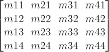
One translation unit on a matrix is equivalent to 1 pixel in the local coordinate system of the element.
-
A 2D 3x2 matrix with six parameters a, b, c, d, e and f is equivalent to the matrix:
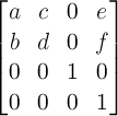
-
A 2D translation with the parameters tx and ty is equivalent to a 3D translation where tz has zero as a value.
-
A 2D scaling with the parameters sx and sy is equivalent to a 3D scale where sz has one as a value.
-
A 2D rotation with the parameter alpha is
equivalent to a 3D rotation
with vector [0,0,1] and parameter alpha.
-
A 2D skew like transformation with the parameters alpha and beta is equivalent to the matrix:
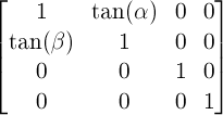
-
A 2D skew transformation along the X axis with the parameter alpha is equivalent to the matrix:
-
A 2D skew transformation along the Y axis with the parameter beta is equivalent to the matrix:
-
A 3D translation with the parameters tx, ty and tz is equivalent to the matrix:
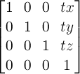
-
A 3D scaling with the parameters sx, sy and sz is equivalent to the matrix:
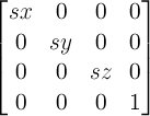
-
A 3D rotation with the vector [x,y,z] and the parameter alpha is equivalent to the matrix:
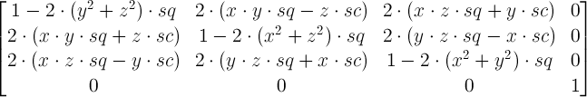
where:
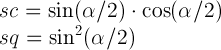
-
A perspective projection matrix with the parameter d is equivalent to the matrix:
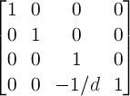
Document conventions
Conformance requirements are expressed with a combination of
descriptive assertions and RFC 2119 terminology. The key words "MUST",
"MUST NOT", "REQUIRED", "SHALL", "SHALL NOT", "SHOULD", "SHOULD NOT",
"RECOMMENDED", "MAY", and "OPTIONAL" in the normative parts of this
document are to be interpreted as described in RFC 2119.
However, for readability, these words do not appear in all uppercase
letters in this specification.
All of the text of this specification is normative except sections
explicitly marked as non-normative, examples, and notes. [RFC2119]
Examples in this specification are introduced with the words "for example"
or are set apart from the normative text with class="example",
like this:
This is an example of an informative example.
Informative notes begin with the word "Note" and are set apart from the
normative text with class="note", like this:
Note, this is an informative note.
Conformance to this specification
is defined for three conformance classes:
- style sheet
- A CSS
style sheet.
- renderer
- A UA
that interprets the semantics of a style sheet and renders
documents that use them.
- authoring tool
- A UA
that writes a style sheet.
A style sheet is conformant to this specification
if all of its statements that use syntax defined in this module are valid
according to the generic CSS grammar and the individual grammars of each
feature defined in this module.
A renderer is conformant to this specification
if, in addition to interpreting the style sheet as defined by the
appropriate specifications, it supports all the features defined
by this specification by parsing them correctly
and rendering the document accordingly. However, the inability of a
UA to correctly render a document due to limitations of the device
does not make the UA non-conformant. (For example, a UA is not
required to render color on a monochrome monitor.)
An authoring tool is conformant to this specification
if it writes style sheets that are syntactically correct according to the
generic CSS grammar and the individual grammars of each feature in
this module, and meet all other conformance requirements of style sheets
as described in this module.
Partial implementations
So that authors can exploit the forward-compatible parsing rules to
assign fallback values, CSS renderers must
treat as invalid (and ignore
as appropriate) any at-rules, properties, property values, keywords,
and other syntactic constructs for which they have no usable level of
support. In particular, user agents must not selectively
ignore unsupported component values and honor supported values in a single
multi-value property declaration: if any value is considered invalid
(as unsupported values must be), CSS requires that the entire declaration
be ignored.
Experimental implementations
To avoid clashes with future CSS features, the CSS2.1 specification
reserves a prefixed
syntax for proprietary and experimental extensions to CSS.
Prior to a specification reaching the Candidate Recommendation stage
in the W3C process, all implementations of a CSS feature are considered
experimental. The CSS Working Group recommends that implementations
use a vendor-prefixed syntax for such features, including those in
W3C Working Drafts. This avoids incompatibilities with future changes
in the draft.
Non-experimental implementations
Once a specification reaches the Candidate Recommendation stage,
non-experimental implementations are possible, and implementors should
release an unprefixed implementation of any CR-level feature they
can demonstrate to be correctly implemented according to spec.
To establish and maintain the interoperability of CSS across
implementations, the CSS Working Group requests that non-experimental
CSS renderers submit an implementation report (and, if necessary, the
testcases used for that implementation report) to the W3C before
releasing an unprefixed implementation of any CSS features. Testcases
submitted to W3C are subject to review and correction by the CSS
Working Group.
Further information on submitting testcases and implementation reports
can be found from on the CSS Working Group’s website at
http://www.w3.org/Style/CSS/Test/.
Questions should be directed to the
public-css-testsuite@w3.org
mailing list.
References
Normative References
Index
- 2D matrix, 4
- 3D matrix, 4
- 3D rendering context, 4
- accumulated 3D transformation matrix, 4
- backface-visibility, 12
- bottom
- value for transform-origin, 8
- value for perspective-origin, 11
- bounding box, 4
- center
- value for transform-origin, 8
- value for perspective-origin, 11
- current transformation matrix (CTM), 4
- identity transform function, 4
- left
- value for transform-origin, 8
- value for perspective-origin, 11
- local coordinate system, 4
- matrix(), 15.1
- matrix3d(), 15.2
- none, 10
- perspective, 10
- perspective(), 15.2
- perspective matrix, 4
- perspective-origin, 11
- right
- value for transform-origin, 8
- value for perspective-origin, 11
- rotate(), 15.1
- rotate3d(), 15.2
- rotatex(), 15.2
- rotatey(), 15.2
- rotatez(), 15.2
- scale(), 15.1
- scale3d(), 15.2
- scalex(), 15.1
- scaley(), 15.1
- scalez(), 15.2
- skew(), 15.1
- skewx(), 15.1
- skewy(), 15.1
- top
- value for transform-origin, 8
- value for perspective-origin, 11
- transform, 7
- transformable element, 4
- transformation matrix, 4
- <transform-function>, 15
- <transform-list>, 7
- transform-origin, 8
- transform-style, 9
- translate(), 15.1
- translate3d(), 15.2
- translatex(), 15.1
- translatey(), 15.1
- translatez(), 15.2
- <translation-value>, 13.2.3.1
- user coordinate system, 4
Property index
| Name | Value | Initial | Applies to | Inh. | %ages | Media | Animatable | Computed value |
|---|
| transform | none | <transform-list> | none | transformable elements | no | refer to the size of bounding box | visual | as transform | As specified, but with relative lengths converted into absolute lengths.
|
|---|
| transform-origin | [ left | center | right | top | bottom | <percentage> | <length> ] | [ left | center | right | <percentage> | <length> ] [ top | center | bottom | <percentage> | <length> ] <length>? | [ center | [ left | right ] ] && [ center | [ top | bottom ] ] <length>? | 50% 50% | transformable elements | no | refer to the size of bounding box | visual | as simple list of length, percentage, or calc | For <length> the absolute value, otherwise a percentage
|
|---|
| transform-style | flat | preserve-3d | flat | transformable elements | no | N/A | visual | no | Same as specified value.
|
|---|
| perspective | none | <length> | none | transformable elements | no | N/A | visual | as length | Absolute length or "none".
|
|---|
| perspective-origin | [ left | center | right | top | bottom | <percentage> | <length> ] | [ left | center | right | <percentage> | <length> ] [ top | center | bottom | <percentage> | <length> ] | [ center | [ left | right ] ] && [ center | [ top | bottom ] ] | 50% 50% | transformable elements | no | refer to the size of the bounding box | visual | as simple list of length, percentage, or calc | For <length> the absolute value, otherwise a percentage.
|
|---|
| backface-visibility | visible | hidden | visible | transformable elements | no | N/A | visual | no | Same as specified value. |
|---|
Issues Index
Is this effect on
position: fixed necessary? If so, need to go into more detail here about why fixed positioned objects should do this, i.e., that it’s much harder to implement otherwise. See
Bug 16328.
↵
This description does not exactly match what WebKit implements. Perhaps it should be changed to match current implementations? See Bug 19637.
↵
This wording needs clarification; backface-visibility works per-3D rendering context, not relative to the root.
↵
This is a first pass at an attempt to precisely specify how exactly to transform elements using the provided matrices. It might not be ideal, and implementer feedback is encouraged. See bug 15605.
↵
WebKit doesn’t render this box unless the translateZ() is < 50px.
↵
Keyword description missing. Description of flattening behavior is missing. Does rendering operate in
z-index order? Do we still create a 3D context and let planes intersect? See
Bug 22427 Bug 23015.
↵ Verify that projection is the distance to the center of projection.
↵ Backface-visibility cannot be tested by only looking at m33. See
Bug 23014.
↵