1. Introduction
This specification provides features to control sizes of CSS objects according to the rules desired by use cases.
Controlling sizes of CSS objects to be multiple of a step unit is desired in many cases. This level of the specification focuses on following cases.
-
Adjust heights of block-level boxes to multiples of the specified length.
-
Adjust heights of line boxes to multiples of the specified length.
By stacking blocks at multiples, authors can align content across columns, pages, scroll-snapped bocks or multiple blocks placed absolutely to maintain vertical rhythm.
Also by controlling heights of line boxes, lines of text in different fonts can create consistent visuals to help readability.
1.1. East Asian Casual Vertical Rhythms
In East Asia, a casual variant of vertical rhythm is widely used.
Vertical rhythm is typically used in professional typography. While it improves readability, its spacing constraints require careful and well-thought design of spaces.
The East Asian casual variant was originally a product of technical constraints of traditional word processors in '80s. But when the technical constraints were lifted in more modern technologies, with the help of square-like visual of ideographic characters, East Asian authors preferred to keep parts of the characteristics.
In this variant of vertical rhythm, the requirement is loosened for the ease of use for non-professional authors. Text is still on the rhythm, so that the majority of ideographic characters are mostly on grid, but when author specifies borders, margins, or some other objects that may break the rhythm, the rhythm is shifted rather than forced. The strict vertical rhythm often surprises non-professional authors by forced jumps in such cases, while this variant combines rhythm on text and the ease of use for non-professional authors.
This variant was very widely accepted in East Asia since the middle of '90s, such that most major word processors used in East Asia provided similar features by default.
In East Asian publishing typography, the vertical rhythm is one of important properties, but its priority compared to other properties varies by types of documents. In single column documents, the priority is weaker than that of multi-column documents. Text should be on the vertical rhythm, but it is often preferred for borders, margins, or other properties to win over the rhythm. In such cases, the rhythm is shifted, similar to the casual variant.
In this specification, when the line-height-step property is used without combination of the block-step property or the line-grid property, it produces the similar effect as the East Asian casual vertical rhythm.
It may also serve good for East Asian publishing typography, depends on the desired strength of the vertical rhythm.
For other cases of vertical rhythm, it is expected that the block-step property or the line-grid property are used, or that the line-height-step property is used together with them.
1.2. Value Definitions
This specification follows the CSS property definition conventions from [CSS2] using the value definition syntax from [CSS-VALUES-3]. Value types not defined in this specification are defined in CSS Values & Units [CSS-VALUES-3]. Combination with other CSS modules may expand the definitions of these value types.
In addition to the property-specific values listed in their definitions, all properties defined in this specification also accept the CSS-wide keywords as their property value. For readability they have not been repeated explicitly.
2. Adjusting Block-level Box Heights
The most common typographic rhythm problems are block-level intrusions: when continuous paragraph-level text is interrupted by differently-sized content such as illustrations and headings, then the line-to-line rhythm can be thrown off. The block step properties allow such elements to be fitted to the rhythmic interval by constraining their height to a multiple of a specified step size. This allows content before and after the interruption to maintain a continuous rhythm.


While consistent use of the block step properties can produce the strictly gridded layout needed for parallel content flows, per-element specification of the step size also allows some interruptions to take their natural size in the flow, restarting the vertical rhythm afterwards. This can be useful in single-column layouts where the vertical rhythm is important to maintain visual continuity, but there is nothing alongside to align to. In these cases, large interruptions which visually disconnect the flow before and after can prioritize optimal spacing around the item over strict adherence to a continuous grid (by specifying block-step: none, the initial value).
This proposal can be simplified down to just the block-step-size property, represented solely through its shortened form as block-step. This level will likely at most contain block-step-size and block-step-insert, leaving block-step-align and block-step-round to be added if the future demands. The full design is described herein for current discussion and future reference.
This proposal is currently defined to apply only to block-level boxes. This limitation is solely to simplify the first iteration; it should eventually be extended to all layout modes that honor specified heights.
2.1. Specifying the Step Size: the block-step-size property
| Name: | block-step-size |
|---|---|
| Value: | none | <length [0,∞]> |
| Initial: | none |
| Applies to: | block-level boxes |
| Inherited: | no |
| Percentages: | N/A |
| Computed value: | specified keyword or absolute length |
| Canonical order: | per grammar |
| Animation type: | by computed value type |
Tests
- block-step-size-establishes-block-formatting-context-list-item.html (live test) (source)
- block-step-size-establishes-block-formatting-context.html (live test) (source)
- block-step-size-establishes-independent-formatting-context-list-item.html (live test) (source)
- block-step-size-establishes-independent-formatting-context.html (live test) (source)
- block-step-size-none-does-not-establish-block-formatting-context.html (live test) (source)
- block-step-size-none-does-not-establish-indepdendent-formatting-context.html (live test) (source)
- block-level-replaced-elements-affected-by-block-step-size.html (live test) (source)
- inline-level-replaced-elements-not-affected-by-block-step-size.html (live test) (source)
- content-based-height-rounds-up-to-step-unit.html (live test) (source)
- definite-height-rounds-up-to-next-multiple-of-step-unit.html (live test) (source)
- definite-height-rounds-up-to-step-unit.html (live test) (source)
- definite-height-same-as-step-unit.html (live test) (source)
- block-step-size-computed.html (live test) (source)
- block-step-size-invalid.html (live test) (source)
- block-step-size-valid.html (live test) (source)
- block-level-canvas-margins-affected-by-block-step-size.html (live test) (source)
- block-level-canvas-margins-affected-by-block-step-size.html (live test) (source)
- block-level-embed-margins-affected-by-block-step-size.html (live test) (source)
- block-level-iframe-margins-affected-by-block-step-size.html (live test) (source)
- block-level-img-margins-affected-by-block-step-size.html (live test) (source)
- block-level-object-margins-affected-by-block-step-size.html (live test) (source)
- block-level-svg-margins-affected-by-block-step-size.html (live test) (source)
- block-level-video-margins-affected-by-block-step-size.html (live test) (source)
- zero-outer-size-rounded-up-to-block-step-size.html (live test) (source)
This property defines the step unit for a block-level box’s block size. When the step unit is set to a positive <length>, the box’s outer height is rounded (see block-step-round) to the closest multiple of the unit. Negative <length> values are invalid.
Values other than none cause the box to establish an independent formatting context.
Note: This is to avoid complications from an ancestor’s float protruding into the box: changing its effective top margin or padding could change which content is impacted by the float and by how much, requiring relayout (and potentially creating a cycle, if the box’s height depends on its contents).
Is this the best way to break such cycles? [Issue #1901]
In situations where margins collapse, only the box’s own margin is considered in calculating its outer size.
When a box fragments, step sizing is applied per fragment.
Should we align this with the text-box-edge/text-box-trim model of inheritance and application? [Issue #1902]
2.2. Specifying the Spacing Type: the block-step-insert property
| Name: | block-step-insert |
|---|---|
| Value: | margin-box | padding-box | content-box |
| Initial: | margin-box |
| Applies to: | block-level boxes |
| Inherited: | no |
| Percentages: | N/A |
| Computed value: | specified keyword |
| Canonical order: | per grammar |
| Animation type: | discrete |
Tests
This property specifies whether extra spacing derived from applying block-step-size is inserted as extra space inside (like padding) or outside (like margin) the box’s border, or changes the height available to content (like min-height or max-height).
Values have the following meanings:
- margin-box
- Any extra space resulting from a block-step-size-induced adjustment is inserted outside the box’s border, as extra margin.
- padding-box
- Any extra space resulting from a block-step-size-induced adjustment is inserted inside the box’s border, as extra padding.
- content-box
- Any extra space resulting from a block-step-size-induced adjustment is inserted inside the box’s border by increasing the height of the content area.
2.3. Specifying Alignment: the block-step-align property
| Name: | block-step-align |
|---|---|
| Value: | auto | center | start | end |
| Initial: | auto |
| Applies to: | block-level boxes |
| Inherited: | no |
| Percentages: | N/A |
| Computed value: | specified keyword |
| Canonical order: | per grammar |
| Animation type: | discrete |
Tests
This property specifies whether extra spacing derived from applying block-step-size is inserted before, inserted after, or split between both sides of the box.
Values have the following meanings:
- auto
- If block-step-insert is margin-box: if align-self is start, end, or center, treat as that value, otherwise treat as center.
- center
- Any extra space resulting from a block-step-size-induced adjustment is split, and applied half on either side of the box.
- start
- Any extra space resulting from a block-step-size-induced adjustment is inserted on the end side of the box.
- end
- Any extra space resulting from a block-step-size-induced adjustment is inserted on the start side of the box.
Define interaction with align-content. [Issue #11206]
In all cases, additional spacing cannot be added to margins that are truncated or omitted due to unforced fragmentation breaks (see [CSS3-PAGE] and [CSS-BREAK-3]); therefore if block-step-insert is margin-box, all extra space derived from applying block-step-size must be inserted on the opposite side of the fragment (regardless of block-step-align).
Is this rule correct? Or should we honor block-step-align even at fragmentation boundaries? [Issue #1260]
2.4. Rounding Method: the block-step-round property
| Name: | block-step-round |
|---|---|
| Value: | up | down | nearest |
| Initial: | up |
| Applies to: | block-level boxes |
| Inherited: | no |
| Percentages: | N/A |
| Computed value: | specified keyword |
| Canonical order: | per grammar |
| Animation type: | discrete |
Tests
This property specifies whether adjustments due to block-step-size insert positive or negative space.
Values have the following meanings:
- up
- The outer size of the box is increased (positive space is inserted) to fulfill the block-step-size constraint.
- down
- The outer size of the box is decreased (negative space is inserted) to fulfill the block-step-size constraint.
- nearest
- The outer size of the box is either increased (as for up) or decreased (as for down—whichever results in the smallest absolute change—to fulfill the block-step-size constraint. If both options would result in the same amount of change, the size is increased.
2.5. Block Step Adjustment Shorthand: the block-step shorthand
| Name: | block-step |
|---|---|
| Value: | <'block-step-size'> || <'block-step-insert'> || <'block-step-align'> || <'block-step-round'> |
| Initial: | see individual properties |
| Applies to: | block-level boxes |
| Inherited: | no |
| Percentages: | N/A |
| Computed value: | see individual properties |
| Animation type: | see individual properties |
| Canonical order: | per grammar |
Tests
This shorthand property allows for setting block-step-size, block-step-insert, block-step-align, and block-step-round in one declaration. Omitted values are set to the property’s initial value.
Authors are advised to use this shorthand rather than the longhands unless there is a specific need for its individual longhands to cascade independently.
3. Adjusting Line Box Heights: the line-height-step property
| Name: | line-height-step |
|---|---|
| Value: | <length [0,∞]> |
| Initial: | 0 |
| Applies to: | block containers |
| Inherited: | yes |
| Percentages: | N/A |
| Computed value: | absolute length |
| Canonical order: | per grammar |
| Animation type: | by computed value type |
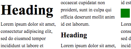
This property defines the step unit for line box heights. A step unit is the length of the vertical rhythm, usually the distance from one baseline to the next baseline of the body text. Body text should fit into one step unit, and taller lines such as headings should have heights of two or more step units. Vertical rhythm is created by making heights of all lines an integer multiple of the step unit.
When the step unit is set to a positive <length>, the line box heights are rounded up to the closest multiple of the unit. Negative <length> values are invalid.
[CSS2] §10.8 Line height calculations defines how to compute the height of a line box from its inline-level content. The rounding is applied to the resulting height of the line box, and the additional space is distributed to over-side and under-side of the line box equally, so that the original line box appears at the center of the multiple of step unit. This adjustment is done by assuming that there is an inline-level box that has adjusted A' and D' in the line box. This inline-level box does not affect alignment points of the vertical-align property, except values that align relative to the line box.


In the following example, the height of line box in each paragraph is rounded up to the step unit.
:root{ font-size : 12 pt ; --my-grid : 18 pt ; line-height-step : var ( --my-grid); } h1{ font-size : 20 pt ; margin-top : calc ( 2 *var ( --my-grid)); } p{ margin : 0 ; }
The line box in <h1> does not fit into one step unit and thus occupies two,
but it is still centered within the two step unit.
If author prefers, tools like Sass can make such declarations shorter.
$gu:18 px ; @function gu ( $n) { @return $n * $gu; } h1{ font-size : 20 pt ; margin : gu ( 1.2 ) autogu ( 1.8 ); }
4. Privacy Considerations
This specification introduces no new privacy leaks beyond "implement it correctly".
5. Security Considerations
This specification introduces no new security considerations beyond "implement it correctly".
6. Acknowledgments
This specification would not have been possible without the help from: Masaharu Akutsu, Yoko Aoki, Takao Baba, Chris Eppstein, Ichiro Inaba, Jxck, Noriko Kase, Motoya Kinoshita, Shinyu Murakami, Tsutomu Nanjo, Kiyoshi Narishima, Charlie Neely, Takuya Nishimura, Katsuhiro Osumi, Florian Rivoal, Hiroshi Sakakibara, Alan Stearns, Masataka Yakura, KADOKAWA Corporation, PixelGrid Inc., and the CSS Working Group members.
7. Changes
Changes since the First Public Working Draft include:
-
Added interaction with East Asian casual vertical rhythms to introduction.
-
Defined handling of truncated margins. (Issue 1260)
-
Added margin-box to block-step-insert and renamed other values to match the *-box pattern. (Issue 10486)
-
Dropped none value from line-height-step. (Issue 1151)
-
Defined block-step interaction with fragmentation.
-
Aligned property metadata with latest practices.
-
Added Web Platform Tests coverage.
-
Editorial improvements and bugfixes.