
Low Vision User Requirements prose
This is an old page.
Here is the Published draft
Do not edit here! Contents moved to GitHub
To edit, fork and submit pull request from: GitHub editable
Notes
Status: incomplete rough draft
In the "User Requirement", section, "Users can..." generally indicates that a user change change a setting.
Sources with [name UC-0] are from https://www.w3.org/WAI/GL/low-vision-a11y-tf/wiki/User_stories_-_use_cases
Luminance and Color
[breif section intro]
Luminance Overall
Bright light from a screen or other sources prevents some people with low vision (including those with photophobia and with reading disabilities such as dyslexia) from reading and causes pain for some people. Some people turn down the brightness of their screen or use an overlay.
User Requirement:
Users can set the luminance overall.
LVTF notes
How much is this a hardware issue verses an O/S issues versus a content and/or user agent issue? It's important enough that we probably want to include it as a user requirement, even if it doesn't turn out to be a SC for content or user agent.
Source: several, TAdER When Text is Not Displayed Well, Angelita user experience "very photophobic (bright lights hurt my eyes and make it impossible for me to see)."
Text Contrast
As mentioned in the [Luminance Overall] section, some people need low luminance, especially for backgrounds. Some people who need low luminance for backgrounds also need low luminance overall and thus need low luminance text.
Other people need high contrast between text and background, including many older people who lose contrast sensitivity from ageing. Some read better with dark text on light background.
For some people, common color combinations or colors from a limited color palette work fine, for example, black text on white background or the inverse with white text on black background. Other people need to select more specific background and text colors. For example, people who need low luminance overall, need to select the specific background and text colors that provide sufficient contrast for them yet not too high luminance. Readable and optimal color combinations differs vastly among individuals and can even vary for one individual depending on conditions such as fatigue and lighting.
[images of color example color settings, e.g., middle of css paper
User Requirement:
Users can set the background color and the text color from the full color spectrum.
LVTF notes
Related issues: Text in images – relates to other aspects of changing text, too, e.g., size, family, leading, etc.
UAAG 1.4 Provide text configuration
Understanding WCAG 1.4.6 Contrast (Enhanced): The visual presentation of text and images of text has a contrast ratio of at least 7:1…
"Therefore, in the recommendation, the contrast is calculated in such a way that color is not a key factor so that people who have a color vision deficit will also have adequate contrast between the text and the background." Understanding 1.4.6
So we don't need to explicitly include colorblindness.
Source: [Erich UC-3], [Laura UC-8], [Laura UC-9], [Wayne UC-2], TAdER User Experiences ("I really need to be able to set the colours myself, presets don't work. Someone else's idea is useless.")
comment: perhaps this needs to be broader. Foreground/background are two elements. There may be many other elements on the page with color that needs to be adjusted.
Users can set the background color and the text color from the full color spectrum on all elements.{jim}
Contrast Adjacent
Sometimes adjacent colors need to be distinguished, for example, colors next to each other in a pie chart. Such colors should have sufficient contrast and be distinguishable by people who are color blind and have reduced contrast sensitivity.
User Requirement:
Users can distinguish between adjacent colors when needed for meaning.
LVTF notes
"Therefore, in the recommendation, the contrast is calculated in such a way that color is not a key factor so that people who have a color vision deficit will also have adequate contrast between the text and the background." Understanding 1.4.6
So we don't need to explicitly include colorblindness.
Source: [Laura UC-6], TAdER
Tracking
[breif section intro]
Rewrap for one direction scrolling
For many people, with and without disabilities, it is difficult to read when they have to scroll back and forth to read a line of text. When people with low vision increase the text size and the text doesn't "reflow", they sometimes have to scroll horizontally several screens to read a single line of text. Additionally, the scrollbar and cursor is harder to find for some. Getting from the end of a line of text, scrolling back left, and then finding the beginning of the next line can take considerable attention. This degrades reading flow and comprehension, sometimes significantly enough that effective reading is not possible when horizontal scrolling is required.
User Requirement:
Blocks of text rewrap so that only one direction of scrolling is needed, e.g., for left-right and right-left scripts [languages], usually vertical scrolling and not horizontal scrolling.
LVTF notes
Script direction: Above and below is written for left-right and right-left scripts for now for simplicity. We should check with I18N folks on making this generic to apply also to vertically top-to-bottom scripts. Although we don't want to complicate it unnecessarily. reference for background says "Languages don't have a direction. Scripts have a writing direction".
Horizontal only: Interestingly, if *only* horizontal scrolling is needed to read a block of text, that is usually OK. But in practice, that's rarely a viable option in user interfaces.
Source: [Wayne UC-1], [Wayne UC-4], TAdER scrolling
Reflow to single column
For many people, with and without disabilities, it is more difficult to read when they have to scroll from the bottom of a column of text to the top of another column. For some people with low vision, with multiple columns, they have to scroll up several screens to get from the bottom of one column to the top of the next. Additionally, the scrollbar and cursor is harder to find for some. Getting from the bottom of a column and finding the top of the next column can take considerable attention. This degrades reading flow and comprehension, sometimes significantly.
User Requirement:
Users can set blocks of text in one continuous block, instead of in multiple columns.
LVTF notes
UAAG 1.8.13 Multi-Column Text Reflow: The user can specify that recognized multi-column text blocks each be reflowed into a single column. (Level AA)
UAAG 1.8.15: Linearize Content: The user can have recognized content rendered as a single column, overriding author-specified formatting of columns, tables, and positioning. (Level AA)
Source: [Alan Smith UC-1], TAdER
Flexible text areas
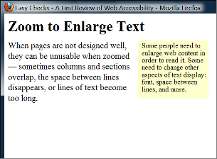
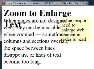
When people increase text size, increase leading, or change other text display aspects, content that is poorly designed can become unusable. For example, in web pages (especially when text is changed through text-only zoom or text settings) sometimes columns and sections overlap, the space between lines disappears, lines of text become too long, or text disappears.
[Figure: Two screen captures show that when text size is increased, the heading overlaps the main text, the main text overlaps the sidebar text; and the sidebar text is cut off at the bottom. non-zoomed, zoomed ]
See also [scroll bars].
User Requirement:
Text areas resize to accommodate text. Often it is best for the text are to automatically resize, and for user to be able to change the text area size. When the areas cannot be resized to accommodate all content, a scrollbar is available. See also Rewrap for one direction scrolling.
LVTF notes
Resize text in Easy Checks has images
UAAG 1.8.14 Ignore Fixed Unit Dimensions: The user can have the user agent override author-specified unit dimensions. (Level AA)
Source: TAdER
Line length
For many people, with and without disabilities, it is harder to read very long lines of text than shorter lines. For people with a small field of vision, it can be even more difficult to read long lines of text, and from the end of a line of text, to find the beginning of the next line.
People with good visual acuity yet small field of vision might want to set the text size small and the text area narrow so they can get more characters in their field of vision.
User Requirement:
Users can set the line length for blocks of text. Often the easiest way to do this (for developers, designers, and users) is for users to resize text areas and the text rewraps to change the line length.
LVTF notes
UAAG 1.8.8 Allow Viewport Resize: The user can resize viewports within restrictions imposed by the platform, overriding any values specified by the author. (Level AA)
Source: TAdER
Justification
Justification or alignment options usually include: left, right, full/both, centered.
Sometimes full justification makes reading more difficult because extra space between words causes "[ http://en.wikipedia.org/wiki/River_(typography) http://en.wikipedia.org/wiki/River_(typography)] rivers of white]" making it difficult to track along a line of text, or less space between words makes it difficult to distinguish separate words. Some people find it easier to track from the end of one line to the next with full justification, and others prefer left justification (for left-to-right scripts [languages]).
User Requirement:
Users can change the justification / alignment (left, right, full/both, centered) of blocks of text.
LVTF notes
Justification also relates to Reading (Spacing), and from there we should point to here.
UAAG 1.4 Provide text configuration
Source: TAdER
Hyphenation
For some people it is especially difficult to understand words that are hyphenated. While primarily a cognitive issue, it becomes more of an issue when text size is increased, thus it is also related to low vision. Some people with very large text may prefer hyphenation so there is less wasted space at the end of lines.
User Requirement:
Users can turn hyphenation on or off.
LVTF notes
This doesn't fit great under tracking, but I'm not sure it fits better elsewhere, so I just put it here for now.
UAAG 1.4 Provide text configuration
Source: TAdER
Leading
Leading (also called line space and line height) is also related to tracking. It is addressed in the @@ section.
Perceiving (Letter Characteristics)
[breif section intro]
Text Size
Some people need larger text in order to perceive letters. @@text only vs. zoom
Example issues:
- Text settings don't increase the text in tool-tip text and other pop-up text
- Text settings don't increase the text in maps
- Text settings don't increase the text in images
User Requirement:
Users can change the text size (font size) of all text.
Font
Some fonts/typefaces are more readable than others. For example, some people cannot read fonts with sub-pixel rendering.
User Requirement:
Users can change the font face (also called font family or typeface) of all text, choosing from a wide range of fonts including serif and san serif fonts.
LVTF notes
UAAG 1.4 Provide text configuration
Note to tool developers: When providing users a list of fonts to choose from, present the font name in the font itself — e.g., Times, Veranda, Courier — so users can tell what each font looks like before choosing it.
Source: TAdER, sub-pixel rendering
Style
For some people, bold text is easier to read. For some people, it is difficult to read blocks of text that is all underlined or italicized.
User Requirement:
Users can change the text style (underline, italic, bold) of blocks of text.
Capitalization
Text in all capital letters is more difficult to read for most people, with and without disabilities.
User Requirement:
Users can change the capitalization (all capital letters, small capital letters, sentence style) of blocks of text.
Spacing for Reading
[breif section intro]
Leading
Leading is the space between lines in a block of text. It is also called line spacing and line height. Some people need more space between lines to be able to read text. Leading also helps with tracking.
User Requirement:
Users can change the leading (line spacing, line height) of blocks of text.
Letter spacing
Some people need more space between letters to read text.
User Requirement:
Users can change the letter spacing (space between letters/characters) of blocks of text.
Word spacing
Some people need more space between words to read text.
User Requirement:
Users can change the word spacing (space between words) of blocks of text.
Element spacing
Having additional space between elements helps people group related information. For example, having more space above a heading and less space below it, helps associate the heading with the text below.
User Requirement:
Users can change the space between elements (e.g., space between paragraphs, or space above headings) for blocks of text.
LVTF notes
@@question: Is this the same as element-level customization, or separate?
Source: TAdER element
Margins
Having wide margins around blocks of text helps focus on the text and not get distracted by surround text, images, etc.
User Requirement:
Users can change the margins (blank space around blocks of text) around blocks of text.
LVTF notes
UAAG 1.4 Provide text configuration
Source: TAdER, [there was one in UC about text against the left margin in GitHub, but I don't see it there anymore]
Distinguishing
[breif section intro]
Element-level customization
Some people change the way certain elements are displayed to make it easier to distinguish types of text. For example, some people who need large text make headings smaller so that they take up less space and because they are usually shorter and easier to read than blocks of text.
[example of element-level customization has headings in a different font, indented, with borders, a different color, and dots preceding them based on the heading level]
User Requirement:
Users can customize text differently for specific elements, such as headings, lists, and paragraph text.
LVTF notes
UAAG 1.4.2 Basic text formatting (by Element): The user can set all of the following characteristics of visually rendered text content for text element types including at least headings, input fields, and links … (Level AA)
Source: TAdER element
Proportional text increase
Often text size is used to indicate heading levels. Often people want to increase text size and preserve the distinctions conveyed through different text size. However, sometimes headings become too big if they are increased proportionally.
User Requirement:
Users can choose whether or not all text increases proportionally.
Borders
Some people use borders to indicate headings, sections, and other elements. This takes up less space than increasing text size and spacing.
[examples borders has different level headings with different color borders]
User Requirement:
Users can set borders around blocks of text — including border line color, width, style.
Indentation
Some people use indentation to indicate headings, sections, and other elements. This takes up less space than increasing text size and spacing. Some people increase the indentation of paragraphs and lists to make them easier to distinguish.
User Requirement:
Users can change the indentation of blocks of text and of specific elements.
LVTF notes
Source: TAdER
Point of Regard and Proximity
As discussed in the [overview section], some people with low vision see only a small amount of content and/or the user interface at a time.
For understanding user requirements, we use the term "point of regard" for the position in content that the user is presumed to be viewing. The dimensions of the point of regard can vary; for example, it can be a two-dimensional area such as a block of text, or a point such as a cursor position, or a range of text that is highlighted.
LVTF notes
Maintain Point of Regard
Sometimes people will be viewing content and need to change the display to read it better, for example, make the text larger. If the place where they are reading (called "point of regard") changes much, they lose their place and, especially with a small visible area and large text, it can be very difficult to find their place again.
Example issues:
- Mouse hover changes point of regard, but is lost. Screen magnification user hovers over image, acronym, or other thing with pop-up. The pop-up is larger than their view. When the user scrolls to read it, it loses focus and disappears.
User Requirement:
The point of regard remains visible within the viewport when the viewport is resized, when content is zoomed or scaled, or when content formatting is changed.
LVTF notes
UAAG 1.8.6 Maintain Point of Regard
Source: [Erich UC-1], [Bruce Bailey UC-1], [JimA UC-33]
[Others ?]
LVTF notes
Are others particularly issues for people with low vision (as opposed to most users or other users with disabilities)? Can we generalize and group them so it's not too much or too detailed? See UAGG Guideline 1.8 - Help users to orient within, and control, windows and viewports
@@ maybe others related to:
- For example, a user is tabbing through input fields – the content that has focus is in the view port… [http://w3c.github.io/UAAG/UAAG20/#sc_182 UAAG 1.8.2 Move Viewport to Selection and Focus: When a viewport's selection or input focus changes, the viewport's content moves as necessary to ensure that the new selection or input focus location is at least partially in the visible portion of the viewport. (Level A)
User experience: People with limited field of vision or screen magnification have little in their field of view at one time. They have difficulty if related information -- such as labels and controls, or matching tests in two columns, or feedback -- is not close together.
User Requirement:
Related information is in close proximity.
Feedback is in close proximity to the user's visual focus.
LVTF notes
@@ expand to dialog boxes?
[is this covered sufficiently?: Fleeting messages that appear and then disappear that may appear outside the user's zoomed or magnified viewport. Currently would likely fail SC 2.2.1]
Source: [Laura1], [Laura 2]
Scrollbars
@@
[in which category would this best fit?]
Related issue is dialog boxes having scrollbars when needed, but that's not a tracking issue, so let's see where it fits… There we might also want to mention that some users set lower screen resolution. source: [JimA UC-1]
UAAG 1.8.3 Provide Viewport Scrollbars: When the rendered content extends beyond the viewport dimensions, users can have graphical viewports include scrollbars, overriding any values specified by the author. (Level A)
Printing
Printing customized text
It is difficult for some people to read text on the computer; they need to be able to print electronic text on paper in order to read it. [say more here – could pull from printing]
User Requirement:
Users can print content after customizing how the text is displayed.
LVTF notes
uaag 1.4.4 Configured and Reflowed Text Printing... (Level AA)
Source: [Alan Smith UC-4], TAdER printing
[LVTF Notes Overall]
Issues not specific to low vision (and adequately covered by WCAG)
Captcha
Understanding SC 1.1.1 … CAPTCHA: If the purpose of non-text content is to confirm that content is being accessed by a person rather than a computer, then text alternatives that identify and describe the purpose of the non-text content are provided, and alternative forms of CAPTCHA using output modes for different types of sensory perception are provided to accommodate different disabilities. …
Source: [Laura UC-10]
Background images
WCAG Technique F3 Failure of Success Criterion 1.1.1 due to using CSS to include images that convey important information
Sources: [Laura7], [1]
Specific issues – not sure best way to address?
Users agent functionality
User experience: @@A person uses magnification software attempts to return to a landing Web page from an interior Web page by using the browser back button but it is disabled in the product. Moreover, the tool's back button (and navigation) is outside the zoomed-in field of view. No other method of navigation within the set of Web pages is provided i.e., breadcrumbs. This makes it difficult to locate previous content.
User requirement: Browser or other user agent functionality is not disabled.
Source: [Laura3]
Large Cursor and tool tip text
User experience: Some people set their cursor to be large so they can see it.
User requirement: User's cursor does not obscure tool-tip text.
Source: [Laura5]
Links in new tab
User experience: People with limited field of vision or screen magnification may not see if a new tab is opened.
User requirement: Users are informed of links that open in a new browser tab.
Source: [Laura4]
Icon fonts
Icon fonts that when combined with custom fonts are browser/AT combinations like ZoomText and Firefox change to squares and are unrecognizable. Discussed in 28 Oct telecon. Maybe issue for everyone and not sufficiently more of an issue for people with low vision?
Inverted colors render images as negatives
Use experience: Some inverted high contrast color schemes render photographic images as photo negatives.
Source: [Erich2]
Bright images
User experience: A person using high contrast may experience difficulty accessing important content visually on a page if the content is placed near a decorative, non-essential element, like a picture or graphic, if these things render brightly in high contrast.
Source: [Erich4]
Misc Notes
- Not for this secion, but for understanding low vision users: Person wants to use mobile OS magnification. [John Rochford1], Person using TTS, not a screen reader. [John Rochford2]