| abbreviation |
اِخْتِزَالْ |
ikhtizāl |
|
|
|
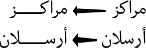
| alignment |
مُحَاذَاةْ، تَرصِيف |
muḥādhāt, tarṣīf |
همترازی |
hmtrāzi |
|
| alphanumeric |
أَبجَدِي عَدَدِي |
abjadī ʻadadī |
الفبایی عددی |
ālfbāiy addi |
|
| appendix |
مُلحَق |
mulḥaq |
ضمیمه |
zmimh |
|
| arabic numerals |
أَرْقَامْ عَرَبِيَّة، أَرْقَامْ أُورُوبِيَّة |
arqām ʻarabīyah, arqām ūrūbīyah |
ارقام عربی |
ārqām arbi |
Refer to "European numerals". Use "European numerals" or "ASCII numerals" to avoid
confusion. |
| ascender |
جُزْءُ الحَرْفِ العُلْوِي، الصَّاعِدْ |
juz’u al-ḥarfi al-ʻulwī, al-ṣṣāʻid |
خط صعود، کرسی بالا |
xt s’ud, krsi bālā |
|
| asterisk |
نَجْمَة |
najmah |
ستاره |
stārh |
|
| auto spacing |
تَبَاعُدْ ذَاتِي، فَرَاغْ آلِي |
tabāʻud dhātī, farāgh ālī |
فاصلهگذاری خودکار |
fāslhɡzāri xudkār |
|
| back margin |
الهَامِشْ الخَلْفِي |
al-hāmish al-khalfī |
حاشیهٔ داخلی |
hāšihٔ dāxli |
|
| back matter |
بَيَانَاتْ نِهَايَةْ الكِتَابْ |
bayānāt nihāyat al-kitāb |
واحدهای پس از متن |
uāhdhāy ps aoez mtn |
Appendices, supplements, glossary of terms, index and/or bibliography, and so on,
appended at the end of a book. |
| bad break |
قَطْعْ سَيِّئْ |
qaṭʻ sayyi’ |
شکستن بد، سطرشکنی بد |
škstn bd, strškni bd |
|
| baseline |
خَطْ قَاعِدِي، خَطْ الاِرْتِكَازْ، سَطْرُ الأَسَاسْ |
khaṭ qāʻidī, khaṭ al-irtikāz, satru al-’asās |
خط کرسی |
xt krsi |
A virtual line on which almost all glyphs in Western fonts are designed to be
aligned. |
| bibliography |
المَرَاجِعْ |
al-marājiʻ |
کتابنامه |
ktābnāmh |
A list of works and papers related to the subjects in the text. |
| blank page |
صَفْحَة فَارِغَة |
ṣafḥah fārighah |
صفحهٔ خالی |
sfhhٔ xāli |
An empty page. |
| bleed |
خَارِجْ إِطَارْ الصَّفْحَة |
khārij iṭār al-ṣafḥah |
تصویرْ تا بُرِش |
tsuyrْ tā boreš |
To print a picture or a tint to run off the edge of a trimmed page. |
| block direction |
اِتِّجَاهْ المَقْطَعْ، اِتِّجَاهْ الكُتْلَة |
ittijāh al-maqṭaʻ, ittijāh al-kutlah |
جهت نوشتار |
jht nuštār |
The progression direction of lines, one after the other. |
| block quotation |
كُتْلَة اِقْتِبَاسْ، مُرَبَّعْ اِقْتِبَاسْ |
kutlat iqtibās, murabbaʻ iqtibās |
نقلقول پاراگرافی |
nqlqul pārāɡrāfi |
|
| body type |
الخَطْ الرَّئِيسِي |
al-khaṭ al-rra’īsī |
حروف بدنه |
hruf bdnh |
|
| bold |
غَلِيظْ |
ghalīẓ |
حرف سیاه |
hrf siāh |
A kind of font style. Similar to bold in Western typography. |
| boldface |
خَطْ غَلِيظْ |
khaṭ ghalīẓ |
حرف سیاه |
hrf siāh |
|
| bound on the left-hand side |
مُلْزِمَة عَلَى الجَانِبْ الأَيْسَرْ |
mulzimah ʻalá al-jānib al-’aysar |
صحافی چپبهراست |
shāfi čpbhrāst |
Binding of a book to be opened from the left. |
| bound on the right-hand side |
مُلْزِمَة عَلَى الجَانِبْ الأَيْمَنْ |
mulzimah ʻalá al-jānib al-’ayman |
صحافی راستبهچپ |
shāfi rāstbhčp |
Binding of a book to be opened from the right. |
| bounding box |
المُرَبَّعْ المُحِيطْ |
al-murabbaʻ al-muḥīṭ |
کادر محیطی |
kādr mhiti |
|
| box |
مُرَبَّعْ |
murabbaʻ |
کادر، جعبه |
kādr, j’bh |
|
| braces |
قَوْسَيْنْ |
qawsayn |
آکولاد |
ākulād |
{ and } |
| brackets |
قوسين قَوْسَيْنْ مُرَبَّعَيْنْ |
qawsayn murabbaʻayn |
کروشه |
krušh |
[ and ] |
| break (a line) |
فَصْلْ السَّطْرْ، قَطْعْ (سَطْرْ) |
faṣl al-saṭr, qaṭʻ (saṭr) |
شکستن (خط)، سطرشکنی |
škstn (xt), strškni |
To place the first of two adjacent characters at the end of a line and the second at
the head of a new line. |
| broadside |
وَرَقَة عَلَى صَفْحَة عَرِيضَة |
waraqah ʻalá ṣafḥah ʻarīḍah |
یکرو |
ikru |
In book typography, a sheet of paper printed as one page. |
| bullet |
رَمْزْ نَقْطِي |
ramz naqṭī |
|
|
centered dot |
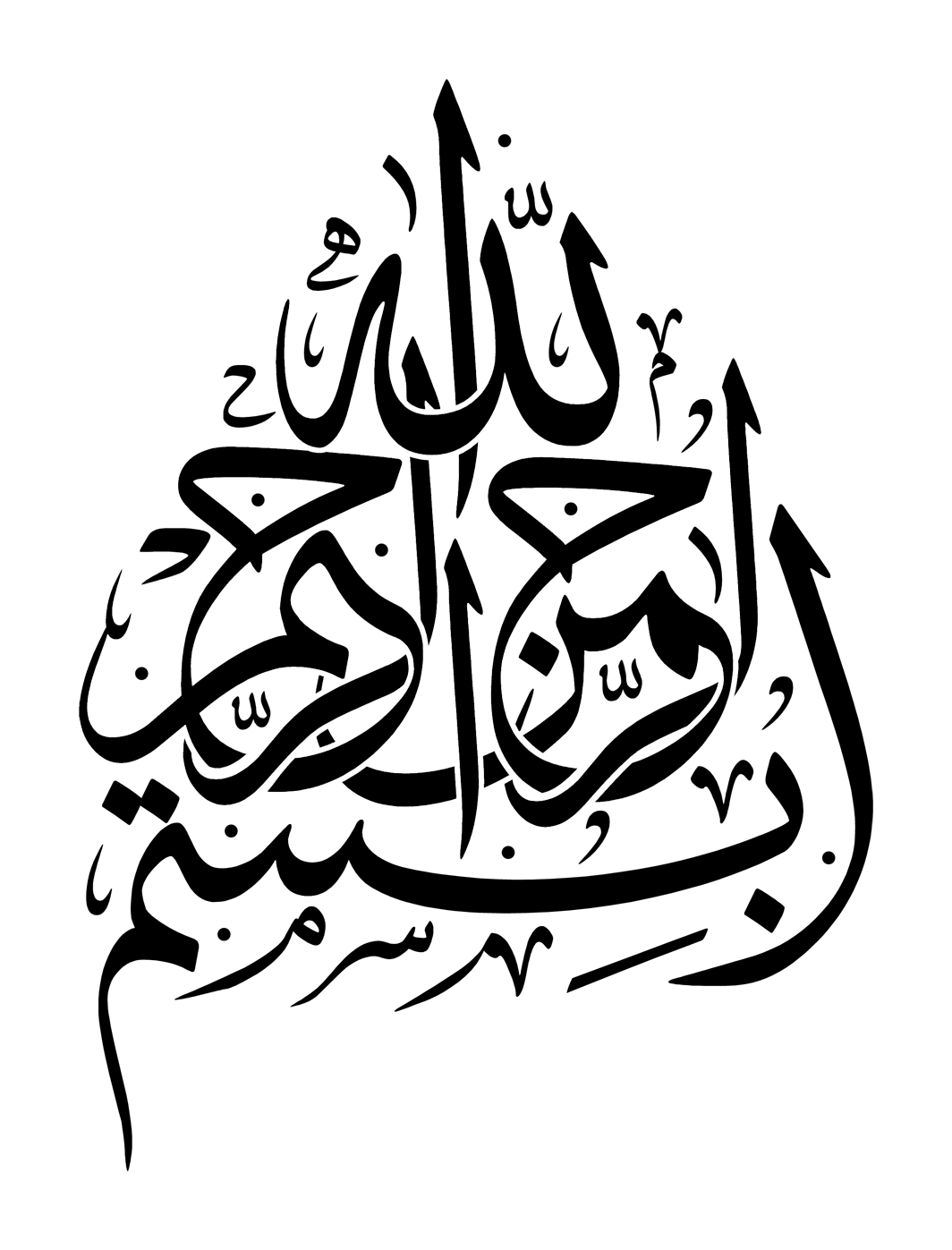
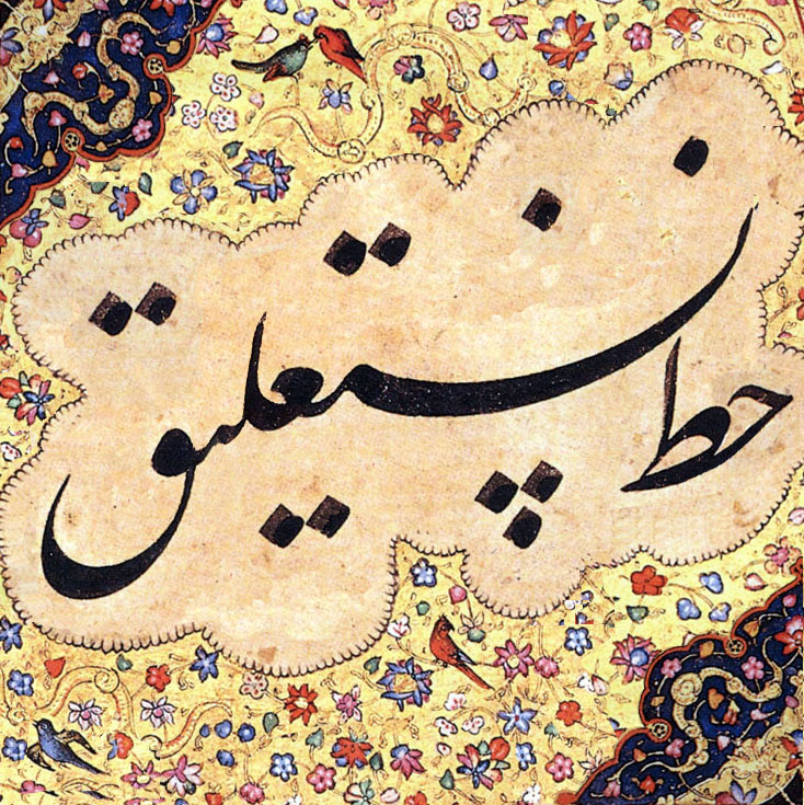
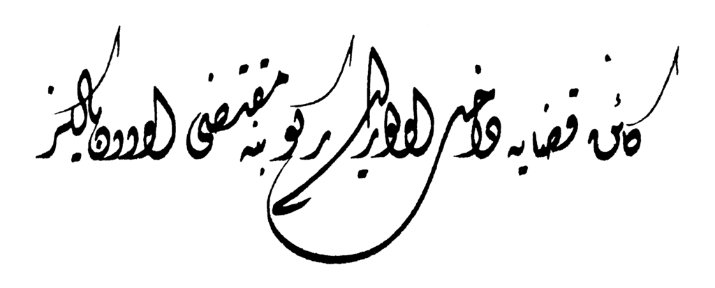
| calligraphy |
فَنُّ الخَطِّ، الخَطُّ (فَنْ الخَطْ، الخَطْ) |
fannu al-khaṭṭi, al-khaṭṭu (fan al-khaṭ,
al-khaṭ) |
خوشنویسی |
xušnuysi |
|
| caption |
تَسْمِيَة، عُنْوَانْ |
tasmīah, ʻunwān |
عنوان، شرح |
’nuān, šrh |
A title or a short description accompanying a picture, an illustration, or a
table. |
| cell |
خَلِيَة |
khalīah |
سلول |
slul |
Each element area of tables, cell. |
| cell contents |
مُحْتَوَى الخَلِيَة |
muḥtawá al-khalīah |
محتوای سلول |
mhtuāy slul |
The content of each cell in tables. |
| cell padding |
حَشْوْ الخَلِيَة |
ḥashw al-khalīah |
|
|
Spaces between line and cell in tables. |
| centered alignment |
تَوْسِيطْ |
tawsīṭ |
ترازبندی وسطچین |
trāzbndi vstčin |
|
| centered dot |
نُقْطَة مُوَسَّطَة |
nuqṭah mūassaṭah |
|
|
|
| centering |
تَوْسِيطْ |
tawsīṭ |
وسطچین کردن |
ustčin krdn |
To align the center of a run of text that is shorter than a given line length to the
center of a line. |
| chapter |
فَصْلْ، بَابْ |
faṣl, bāb |
فصل |
fsl |
|
| character |
حَرْفْ |
ḥarf |
حرف |
hrf |
|
| character count |
عَدَدْ الحُرُوفْ |
ʻadad al-ḥurūf |
تعداد حروف |
t’dād hruf |
|
| character frame |
إِطَارْ الحَرْفْ |
iṭār al-ḥarf |
|
|
Rectangular area occupied by a character when it is set solid. |
| character set |
مَجْمُوعَةْ حُرُوفْ |
majmūʻat ḥurūf |
مجموعهٔ حروف |
mjmu’hٔ hruf |
|
| character shape |
شَكْلُ الحَرْفْ |
shaklu al-ḥarf |
شکل حرف |
škl hrf |
Incarnation of a character by handwriting, printing or rendering to a computer
screen. |
| character size |
حَجْمُ الحَرْفْ |
ḥajmu al-ḥarf |
اندازهٔ حرف |
āndāzhٔ hrf |
Dimensions of a character. Unless otherwise noted, it refers to the size of a
character frame in the block direction. |
| closing bracket |
قَوْسْ إِغْلَاقْ |
qaws ighlāq |
کروشه بسته |
kruše bsth |
|
| code point |
نُقْطة تَرْمِيزْ |
nuqṭat tarmīz |
|
|
|
| color |
لَوْنْ |
lawn |
|
|
Characteristics like darkness, contrast, texture that give the an overall
impression of how dense or heavy the text appears on the page. |
| colon |
نُقْطَتَيْنْ |
nuqṭatayn |
دونقطه |
dunqth |
|
| column |
عَمُودْ |
ʻamūd |
ستون |
stun |
A partition on a page in multi-column format. |
| column gap |
تَبَاعُدْ الأَعْمِدَة |
tabāʻud al-’aʻmidah |
فاصلهٔ ستون |
fāslhٔ stun |
Amount of space between columns on a page. |
| column spanning |
عَبْرُ الأَعْمدَة |
ʻabr al-’aʻmidah |
|
|
A setting style of illustrations, tables, etc., over hanging to multiple
columns. |
| column spanning heading |
رَأْسْ عَبْرْ الأَعْمدَة |
ra’s ʻabr al-’aʻmidah |
|
|
Headings using multiple columns. |
| comma |
فَاصِلَة |
fāṣilah |
ویرگول |
uyrɡul |
|
| composition |
تَرْكِيبْ |
tarkīb |
حروفچینی و صفحهبندی |
hrufčini v sfhhbndi |
Process of arrangement of text, figures and/or pictures, etc on a page in a desired
layout (design) in preparation for printing. |
| compound word |
كَلِمَة مُرَكَّبَة |
kalimah murakkabah |
کلمهٔ مرکب |
klmhٔ mrkb |
|
| connection |
وَصْلْ |
waṣl |
|
|
|
| control characters |
حُرُوفْ تَحَكُّمْ |
ḥurūf taḥakkum |
حروف کنترلی |
hruf kntrli |
|
| copy |
نُسْخَة |
nuskhah |
نسخه |
nsxh |
|
| cover |
غِلَافْ |
ghilāf |
جلد |
jld |
|
| cut-in heading |
|
|
|
|
A style of headings. Headings do not occupy the full lines, but share lines area with
following main text lines. |
| dash |
وَاصِلَة |
wāṣilah |
|
|
|
| dedication |
إِهْدَاءْ |
ihdā’ |
اهدائیه |
āhdā’ih |
|
| descender line |
مَا تَحْتَ السَّطْرْ |
mā taḥta al-ssaṭr |
|
|
A descender is the part of a letter extending below the base line, as in 'g', 'j',
'p', 'q', or 'y'. A descender line is a virtual line drawn at the bottom of descender
parallel to base line. |
| diacritical marks |
علامات التشكيل |
ʻalāmāt al-ttashkīl |
اِعراب، نشانههای حروف |
āe’rāb, nšānhhāy hruf |
|
| diagonal fraction |
جُزْءْ قُطْرِي |
juz’ quṭrī |
|
|
|
| diagram |
رَسْمْ بَيَانِي، رَسْمْ تَخْطِيطِي |
rasm bayānī, rasm takhṭīṭī |
نمودار |
nmudār |
|
| disconnection |
فَصْلْ |
faṣl |
|
|
|
| discretionary hyphen |
وَاصِلَة لَيِّنَة |
wāṣilah layyinah |
|
|
See soft hyphen. |
| display |
عَرْضْ |
ʻarḍ |
نمایش |
nmāyš |
|
| display type |
نَوْعْ العَرْضْ |
nawʻ al-ʻarḍ |
|
|
|
| document |
وَثِيقَة، مُسْتَنَدْ |
wathīqah, mustanad |
سند |
snd |
|
| dpi |
نُقْطَة فِي البُوصَة |
nuqṭah fī al-būṣah |
نقطه در اینچ |
nqte dr ieynč |
Dots per inch (DPI, or dpi) is a measure of spatial printing. |
| eastern arabic numerals |
الأَرقَامْ العَرَبِيَّة المَشْرِقِيَّة |
al-’arqām al-ʻarabīyah al-mashriqīyah |
|
|
٠ ١ ٢ ٣ ٤ ٥ ٦ ٧ ٨ ٩ |
| ellipsis |
عَلَامَة القَطْع، القَطْعْ |
ʻalāmat al-qaṭʻ, al-qaṭʻ |
سهنقطه |
shnqth |
|
| Elongation |
التَّطْوِيلْ |
al-ttaṭwīl |
|
|
|
| EM |
(وَحَدَةْ قِيَاسْ) إِمْ، وَحَدَةْ قِيَاسْ النُقْطَة |
(waḥadah qīās) im, waḥadat qīās al-nuqṭah |
اِم، ضربه |
āem, zrbh |
Unit in the field of typography, equal to the currently specified point size. A
reference to the width of the capital "M" |
| em dash |
خَطْ فاصِلْ مِنْ حَجْمْ اِمْ، وَصْلَة طَوِيلَة |
khaṭ fṣil min ḥajm im, waṣlah ṭawīlah |
خط |
xt |
A wide dash, usually of size EM |
| em space |
فَرَاغْ مِنْ حَجْمْ اِمْ، فَرَاغْ طَوِيلْ |
farāgh min ḥajm im, farāgh ṭawīl |
فاصلهٔ اِم |
fāslhٔ em |
A wide space, usually of size EM |
| EN |
نصف وحدة قياس النقطة |
niṣf waḥadat qīās al-nuqṭah |
اِن |
āen |
??? |
| en dash |
وَصْلَة مُتَوَسِّطَة |
waṣlah mutawassiṭah |
خط اِن |
xt en |
A not-so-wide dash, usually of size EN |
| en space |
مَسَافَة مُتَوَسِّطَة |
masāfah mutawassiṭah |
فاصلهٔ اِن |
fāslhٔ en |
A not-so-wide space, usually of size EN |
| encoding |
تَرْمِيزْ |
tarmīz |
کدنگاری |
kdnɡāri |
|
| endnote |
التَّعْلِيقْ الخِتَامِي، حَاشِيَة |
al-ttaʻlīq al-khitāmī, ḥāshīah |
|
|
A set of notes placed at the end of a part, chapter, section, paragraph and so on, or
at the end of a book. |
| epigraph |
اِقْتِبَاسْ، مَقُولَة قَصِيرَة |
iqtibās, maqūlah qaṣīrah |
سرلوحه |
srluhh |
|
| European numerals |
أَرْقَامْ أُورُوبِيَّة |
arqām ūrūbīyah |
ارقام اروپایی |
ārqām aoerupāiy |
Any of the symbols in [0-9] used to represent numbers. Sometimes called Arabic
numerals or ASCII numerals. |
| exception dictionary |
قَامُوسْ الإِسْتِثْنَاءَاتْ |
qāmūs al-’istithnā’āt |
|
|
|
| exclamation marks |
عَلَامَاتْ التَّعَجُّبْ |
ʻalāmāt al-ttaʻajjub |
علامت تعجب |
’lāmt t’jb |
|
| figure |
شَكْلْ |
shakl |
تصویر |
tsuyr |
|
| first-line indent |
مَسَافَة السَّطْرْ الأَوَّلْ |
masāfat al-ssaṭr al-’awwal |
تورفتگی خط اول |
turftɡi xt uowl |
|
| fixed-width |
ثَابِتْ العَرْضْ |
thābit al-ʻarḍ |
|
|
A characteristic of a font where the same character advance is assigned for all
glyphs. |
| flush left alignment |
مُحَاذَاة إِلَى اليَمِينْ |
muḥādhāt ilá al-yamīn |
|
|
|
| flush right alignment |
مُحَاذَاة إِلَى اليَسَارْ |
muḥādhāt ilá al-yasār |
|
|
|
| folio |
وَرَقَة، صَفْحَة |
waraqah, ṣafḥah |
شمارهٔ صفحه |
šmārhٔ sfhh |
|
| font |
الخَطْ |
al-khaṭ |
فونت، قلم |
funt, qlm |
A set of character glyphs of a given typeface. |
| font family/typeface family |
أُسْرَة مِحْرَفْ، أُسْرَة خُطُوطْ |
usrat miḥraf, usrat khuṭūṭ |
خانوادهٔ فونت |
xānuādhٔ funt |
|
| font metrics |
مَقَايِيسْ الخَطْ |
maqāyīs al-khaṭ |
|
|
|
| fore-edge |
الحَافة العَمودِيَّة الخَارِجِيَّة |
al-ḥāfh al-ʻamwdīyah al-khārijīyah |
حاشیهٔ بیرونی |
hāšihٔ biruni |
a) The three front trimmed edges of pages in a book. b) The opposite sides of the
gutter in a book. |
| format |
تنْسِيقْ، هَيْئَة |
tansīq, hay’ah |
شکلبندی، شکل |
šklbndi, škl |
|
| fraction |
كَسْرْ |
Kasr |
|
|
|
| front matter |
المَادَّة الأَمَامِيَّة |
al-māddah al-’amāmīyah |
واحدهای پیش از متن |
uāhdhāy piš aoez mtn |
The first part of a book followed by the text, usually consisting of a forward,
preface, table of contents, list of illustrations, acknowledgement and so on. |
| full-width |
تَامْ العَرْضْ |
tām al-ʻarḍ |
|
|
a) Relative index for the length which is equal to a given character size. b)
Character frame which character advance is equal to the amount referred to as a). A
full-width character frame is square in shape by definition. |
| glyph |
صُورَةْ الرَّمْزْ |
ṣūrah al-rramz |
|
|
|
| golden rectangle |
|
|
مستطیل طلایی |
msttil tlāiy |
|
| golden section |
|
|
بخش طلایی |
bxš tlāiy |
|
| Greek letters |
حُرُوفْ يُونَانِيَّة |
ḥurūf yūnānīyah |
حروف یونانی |
hruf yvnāni |
|
| grid alignment |
|
|
همترازی شطرنجی |
hmtrāzi štrnji |
|
| gutter |
حَاشِیَة |
ḥāshīah |
حاشیه |
hāših |
a) The binding side of a spread of a book. b) the margin between the binding edge of
a book and the hanmen (text area). c) The part of a book where all pages are bound
together to the book spine. |
| half em |
نِصْفْ اِمْ |
niṣf im |
نیم اِم |
nim em |
Half of the full-width size. |
| half em space |
فَرَاغْ نِصْفْ اِمْ |
farāgh niṣf im |
فاصلهٔ نیم اِم |
fāslhٔ nim em |
Amount of space that is half size of em space. |
| hang line |
سَطْرْ مُعَلَّقْ |
saṭr muʻallaq |
|
|
|
| hanging indentation |
تعليق المسافة البادئة |
|
|
|
|
| hanging punctuation |
تعليق علامات الترقيم |
|
|
|
|
| harakat |
حَرَكَاتْ |
ḥarakāt |
|
|
Tashkil marks representing short vowel sounds. |
| head |
رَأْسْ |
ra’s |
سَر |
sar |
a) The top part of a book or a page. b) The top margin between the top edge of a
trimmed page and the hanmen (text area) |
| head/top margin |
هَامِشْ عُلْوِي |
hāmish ʻulwī |
حاشیهٔ بالا |
hāšihٔ bālā |
|
| heading |
عُنْوَانْ |
ʻunwān |
عنوان |
’nuān |
a) A title of a paper or an article. b) A title for each section of a book, paper or
article. |
| headline |
عُنْوَانْ رَئِيسِي |
ʻunwān ra’īsī |
|
|
|
| headnote |
تَقْدِمَة |
taqdimah |
|
|
A kind of notes in vertical writing style, head area in kihon-hanmen is kept
beforehand, and notes are set with smaller size font than main text. |
| hierarchy |
تسلسل هرمي، ترتيب هرمي |
|
سلسلهمراتب |
slslhmrātb |
|
| horizontal writing mode |
صِيغَة الكِتَابَة الأُفُقِيَّة |
ṣīghat al-kitābah al-’ufuqīyah |
حالت نوشتار افقی |
hālt nuštār aoefqi |
The process or the result of arranging characters on a line from left to right, of
lines on a page from top to bottom, and/or of columns on a page from left to right. |
| hyphen |
وَاصِلَة |
wāṣilah |
نیمخط |
nimxt |
|
| hyphenation |
اِسْتِخْدَامْ الوَاصِلَة |
istikhdām al-wāṣilah |
|
|
A method of breaking a line by dividing a Western word at the end of a line and
adding a hyphen at the end of the first half of the syllable. |
| hyphenation and justification |
الوَاصِلَة وَالمُحَاذَاةْ |
al-wāṣilah wālmuḥādhāt |
|
|
Also abbreviated as H&J |
| hyphenation routine |
إِجْرَاءْ الوَاصِلَة |
ijrā’ al-wāṣilah |
|
|
|
| ihmal |
إِهْمَالْ |
ihmāl |
|
|
See tashkil |
| ijam |
إِعْجَامْ |
iʻjām |
|
|
Diacritical marks applied to a basic letter shape (or skeleton) to derive a new
letter. For example a dot under a "curve" to get the letter Beh. In Unicode each letter
plus ijam combination is encoded as a separate, atomic character. |
| illustrations |
رَسْمْ تَوْضِيحِي، صُورَة إِيضَاحِيَّة |
rasm tawḍīḥī, ṣūrahīḍāḥīyah |
تصویر |
tsuyr |
A general term referring to a diagram, chart, cut, figure, picture and the like, to
be used for printed materials. |
| indentation |
إِزَاحَة، مَسَافَة بَادِئَة |
izāḥah, masāfah bādi’ah |
فاصلهٔ سرِ سطر، تورفتگی سرِ سطر |
fāslhٔ sre str, turftɡi sre str |
|
| index |
فِهْرِسْ |
fihris |
فهرست راهنما |
fhrst rāhnmā |
A list of terms or subjects with page numbers for where they are referred to in a
single or multiple volumes of a book. |
| initial |
أَوَّلِي |
awwalī |
آغازین |
āqāzin |
|
| inline direction |
الاِتِّجَاهْ السَّطْرِي |
al-ittijāh al-ssaṭrī |
|
|
Text direction in a line. |
| input |
إِدْخَالْ |
idkhāl |
ورودی |
urudi |
|
| inseparable characters rule |
قَاعِدَة مَحَارِفْ لَا تَنْفَصِلْ |
qāʻidat maḥārif lā tanfaṣil |
|
|
A line adjustment rule that prohibits inserting any space between specific
combinations of characters. |
| interpunct |
|
|
|
|
|
| italics |
مَائِلْ |
mā’il |
ایتالیک |
āytālik |
|
| itemization |
وَضْعْ بُنُودْ، تَبْوِيبْ، عَنَاصِرْ |
waḍʻ bunūd, tabwīb, ʻanāṣir |
|
|
To list ordered or unordered items one under the other. |
| justified alignment |
مُحَاذَاةْ مَضْبُوطَة |
muḥādhāt maḍbūṭah |
همترازی میزان |
hmtrāzi mizān |
|
| kashida |
الْكَشِيدَة، التَّطْوِيلْ |
al-kashīdah, al-ttaṭwīl |
کشیده |
kšidh |
|
| label name |
اِسْمْ بِطَاقَةْ العَنْوَنَة |
ism biṭāqat al-ʻanwanah |
|
|
Text following or followed by numbers for illustrations, tables, headings and running
headings. |
| Latin letters |
حُرُوف لَاتِينِيَّة |
ḥurūf lātīnīyah |
حروف لاتین |
hruf lātin |
|
| layout |
نَسْقْ، تَصْمِيمْ |
nasq, taṣmīm |
قالببندی |
qālbbndi |
|
| leading |
قِيَادِي |
qīādī |
|
|
|
| letter face |
صُورَةْ الحَرْفْ |
ṣūrat al-ḥarf |
|
|
Area in which glyph is drawn. |
| lettering |
تَرْقِينْ، كِتَابَة |
tarqīn, kitābah |
طراحی حروف |
trāhi hruf |
|
| letterpress printing |
طِبَاعَةْ الحُرُوفْ |
ṭibāʻat al-ḥurūf |
چاپ برجسته |
čāp brjsth |
The traditional printing method using movable type. |
| letterspacing |
تَبَاعُدْ الحُرُوفْ |
tabāʻud al-ḥurūf |
فاصلهٔ حروف |
fāslhٔ hruf |
|
| ligature |
رَبْطْ بَيْنَ الحُرُوفْ، تَرْكِيبْ، حَرْفْ مُرَكَّبْ |
rabṭ bayna al-ḥurūf, tarkīb, ḥarf murakkab |
|
|
|
| line |
سَطْرْ |
saṭr |
خط |
xt |
|
| line adjustment |
مُحَاذَاةْ السَّطْرْ |
muḥādhāt al-ssaṭr |
تنظیم خط |
tnzim xt |
A method of aligning both edges of all lines to be the same given length by removing
or adding adjustable spaces. |
| line adjustment by hanging punctuation |
مُحَاذَاة السَّطْرْ بِتَعْلِيقْ عَلَامَاتْ التَّرْقِيمْ |
muḥādhāt al-ssaṭr bitaʻlīq ʻalāmāt al-ttarqīm |
|
|
A line breaking rule to avoid commas or full stops at a line head (which is
prohibited in Japanese typography) by taking them back to the end of the previous line
beyond the specified line length. |
| line adjustment by inter-character space expansion |
مُحَاذَاة السَّطْرْ بِتَوسِيع الفَرَاغْ بَيْنَ المَحَارِفْ |
muḥādhāt al-ssaṭr bitawsīʻ al-farāgh bayna
al-maḥārif |
|
|
A line breaking rule that aligns both edges of a line by expanding inter-character
spaces. . |
| line breaking rules |
قَوَاعِد كَسْرْ السَّطْرْ |
qawāʻid kasr al-ssaṭr |
|
|
A set of rules to avoid prohibited layout in Japanese typography, such as "line-start
prohibition rule", "line-end prohibition rule", inseparable or unbreakable character
sequences and so on. |
| line end |
نِهَايَة السَّطْرْ |
nihāyat al-ssaṭr |
انتهای خط |
ānthāy xt |
The position at which a line ends. |
| line end alignment |
مُحَاذَاة نِهَايَة السَّطْرْ |
muḥādhāt nihāyat al-ssaṭr |
همترازی انتهای خط |
hmtrāzi aoenthāy xt |
To align a run of text to the line end. |
| line end indent |
مَسَافَة بَدْئْ نِهَايَة السَّطْرْ |
masāfat bad’ nihāyat al-ssaṭr |
تورفتگی انتهای خط |
turftɡi aoenthāy xt |
To reserve a certain amount of space before the default position of a line end. |
| line feed |
تَغْذِيَة السَّطْرْ |
taghdhīat al-ssaṭr |
|
|
The distance between two adjacent lines measured by their reference points. |
| line gap |
فَجْوَة السَّطْرْ |
fajwat al-ssaṭr |
فاصلهٔ بین خطوط |
fāslhٔ bin xtut |
The smallest amount of space between adjacent lines. |
| line head |
رَأْسْ السَّطْرْ |
ra’s al-ssaṭr |
سرِ سطر |
sre str |
The position at which a line starts. |
| line head alignment |
مُحَاذَاة رَأْسْ السَّطْرْ |
muḥādhāt ra’s al-ssaṭr |
همترازیِ سر سطر |
hmtrāzie sr str |
To align a run of text to the line head. |
| line head indent |
مَسَافَة بَدْئْ رَأْسْ السَّطْرْ |
masāfat bad’ ra’s al-ssaṭr |
فاصلهٔ سر سطر، تو رفتگی سر سطر |
fāslhٔ sr str, tu rftɡi sr str |
To reserve a certain amount of space after the default position of a line head. |
| line height |
اِرْتِفَاعْ الخَطْ |
irtifāʻ al-khaṭ |
ارتفاع خط |
ārtfā’ xt |
|
| line length |
طُولُ السَطْرْ |
ṭūlu al-saṭr |
طول خط |
tul xt |
Length of a line with a pre-defined number of characters. When the line is indented
at the line head or the line end, it is length of the line from the specified amount of
line head indent to the specified amount of line end indent. |
| line spacing |
تَبَاعُدْ الأَسْطُرْ |
tabāʻud al-’asṭur |
|
|
|
| line-end prohibition rule |
قَاعِدَة حَظْرْ نِهَايَة السَّطْرْ |
qāʻidat ḥaẓr nihāyat al-ssaṭr |
|
|
A line breaking rule that prohibits specific characters at a line end. |
| line-start prohibition rule |
قَاعِدَة حَظْرْ بِدَايَة السَّطْرْ |
qāʻidat ḥaẓr bidāyat al-ssaṭr |
|
|
A line breaking rule that prohibits specific characters at a line head. |
| list |
قَائِمَة، لَائِحَة |
qā’imah, lā’iḥah |
فهرست |
fhrst |
|
| long dash |
شَرْطَة طَوِيلَة |
sharṭah ṭawīlah |
|
|
|
| mabsut |
مَبْسُوطْ |
mabsūṭ |
|
|
Kind of writing style that tends to rigidity and firmness with pronounced
angularity. |
| main text |
نَصْ رَئِيسِي |
naṣ ra’īsī |
متن اصلی |
mtn aoesli |
a) The principal part of a book, usually preceded by the front matter, followed by
the back matter. b) The principal part of an article excluding figures, tables, heading,
notes, leads and so on. c) The content of a page excluding running heads and page
numbers. d) The net contents of a book excluding covers, end papers, insets and so
on. |
| margin |
هَامِشْ |
hāmish |
حاشیه |
hāših |
|
| measure |
قِيَاسْ |
qīās |
مقیاس، اندازه |
mqiās, aoendāzh |
|
| measurement |
قِيَاسْ |
qīās |
اندازهگیری |
āndāzhɡiri |
|
| mixed text composition |
تَرْكِيبَة النَّصْ المُخْتَلِطْ |
tarkībah al-nnaṣ al-mukhtaliṭ |
|
|
a) To interleave Japanese text with Western text in a line (Japanese and Western
mixed text composition). b) To compose text with different sizes of characters (mixed
size composition). c) To compose text with different typefaces (mixed typeface
composition). |
| mixing typefaces |
خَلْطْ أنْمَاطْ الخُطُوطْ |
khalṭ anmāṭ al-khuṭūṭ |
ترکیب قلمها |
trkib qlmhā |
|
| modular grid |
شَبَكَة وَحَدَاتْ، شَبَكَة مُرَكَّبَة مِنْ وَحَدَاتْ |
shabakah waḥadāt, shabakah murakkabat min
waḥadāt |
شطرنجی مُدولی |
štrnji moduli |
|
| multi-column format |
تَنْسِيقْ مُتَعَدِّدْ الأَعْمِدَة |
tansīq mutaʻaddid al-’aʻmidah |
شکلبندی چندستونی |
šklbndi čndstuni |
A format of text on a page where text is divided into two or more sections (columns)
in the inline direction and each column is separated by a certain amount of space (column
space). |
| multi-column grid |
شَبَكَة مُتَعَدِّدَة الأَعْمِدَة |
shabakah mutaʻaddidat al-’aʻmidah |
شطرنجی چندستونی |
štrnji čndstuni |
|
| multivolume work |
عَمَلْ مُتَعَدِّدْ الأَجْزاءْ |
ʻamal mutaʻaddid al-’ajz’ |
اثر چند جلدی |
āsr čnd jldi |
A set of work published in two or more volumes, as in the complete work or the
first/last half volumes. |
| mukawwar |
مُكَوَّرْ |
mukawwar |
|
|
Kind of writing style, generally opposed to mabsut, that is more flexible and
rounded. |
| new column |
عَمُودْ جَدِيدْ |
ʻamūd jadīd |
ستون جدید |
stun jdid |
In multi-column setting, to change to new column before the end of current
column. |
| new recto |
صَفْحَة يُمْنَى جَدِيدَة |
ṣafḥah yumná jadīdah |
آغاز در صفحهٔ فرد |
āqāz dr sfhhٔ frd |
To start a new heading or something on a odd page. |
| no-break text |
عَدَمْ تَفَكُّكْ النَّصْ، نَصْ دُونَ اِنْفِكَاكْ |
ʻadam tafakkuk al-nnaṣ, naṣ dūna infikāk |
|
|
|
| nonbreaking hyphen |
وَاصِلَة غَيْرْ قَاسِمَة |
wāṣilah ghayr qāsimah |
|
|
|
| nonbreaking word space |
فَضَاءْ كَلِمَة غَيْرْ قَاسِمْ |
faḍā’ kalimah ghayr qāsim |
|
|
|
| note |
مُلَاحَظَة |
mulāḥaẓah |
یادداشت |
iāddāšt |
Explanatory information added to terms, figures or tables. |
| number of characters per line |
عَدَدْ الأَحْرُف فِي كُلِّ سَطْرْ |
ʻadad al-’aḥruf fī kulli saṭr |
تعداد حروف در خط |
t’dād hruf dr xt |
Number of characters in a line to specify the length of lines. |
| number of columns |
عَدَدْ الأَعْمِدَة |
ʻadad al-’aʻmidah |
تعداد ستونها |
t’dād stunhā |
Number of columns on a page. |
| numerals |
الأَعْدَادْ، الأَرْقَامْ |
al-’aʻdād, al-’arqām |
اعداد |
ā’dād |
|
| one em space |
مَسَافَة اِمْ وَاحِدَة |
masāfat im wāḥidah |
فاصلهٔ اِم |
fāslhٔ em |
Amount of space that is full-width size. |
| one third em |
ثُلُثْ اِمْ |
thuluth im |
یکسوم اِم |
iksum em |
One third of the full-width size. |
| one third em space |
مَسَافَة ثُلُثْ اِمْ |
masāfat thuluth im |
فاصلهٔ یکسوم اِم |
fāslhٔ yksum em |
Amount of space that is one third size of em space. |
| opening brackets |
فَتْحْ قَوْسَيْنْ |
fatḥ qawsayn |
کروشه باز |
kruše bāz |
|
| optical size |
حَجْمْ بَصَرِي |
ḥajm baṣarī |
|
|
|
| optical spacing |
تَبَاعُدْ بَصَرِي |
tabāʻud baṣarī |
|
|
|
| orientation |
تَوَجُّهْ |
tawajjuh |
جهت |
jht |
|
| ornament |
زَخْرَفَة |
zakhrafah |
تزئینی |
tz’ini |
|
| outdent |
إِلْغَاءْ التَّأخِيرْ، إِلْغَاءْ الإِزَاحَة |
ilghā’ al-tta’khīr, ilghā’ al-’izāḥah |
|
|
|
| overhang |
عبء |
ʻib’ |
|
|
|
| overrun |
تَجَاوُزْ، اِجْتِيَاحْ |
tajāwuz, ijtīāḥ |
|
|
|
| page |
صَفْحَة |
ṣafḥah |
صفحه |
sfhh |
A side of a sheet of paper in a written work such as a book. |
| page break |
فَاصِلْ صَفْحَة |
fāṣil ṣafḥah |
|
|
To end a page even if it is not full and to start a new page with the next paragraph,
a new heading and so on. |
| page format |
شَكْلْ الصَّفْحَة |
shakl al-ṣṣafḥah |
شکلبندی صفحه |
šklbndi sfhh |
The layout and presentation of a page with text, graphics and other elements for a
publication such as a book. |
| page number |
رَقْمْ الصَّفْحَة |
raqm al-ṣṣafḥah |
شمارهٔ صفحه |
šmārhٔ sfhh |
A sequential number to indicate the order of pages in a publication. |
| paragraph |
فَقْرَة |
faqrah |
پاراگراف |
pārāɡrāf |
A group of sentences to be processed for line composition. A paragraph consists of
one or more lines. |
| paragraph break |
اِنْقِطَاعْ الفَقْرَة، كَسْرْ الفَقْرَة |
inqiṭāʻ al-faqrah, kasr al-faqrah |
شکستن پاراگراف |
škstn pārāɡrāf |
To start a new line to indicate a new paragraph. |
| paragraph format |
تَنْسِيقْ الفَقْرَة |
tansīq al-faqrah |
شکلبندی پاراگراف |
šklbndi pārāɡrāf |
A format of a paragraph, as in line head indent or line end indent. |
| paragraph indent |
هَامِشْ الفَقْرَة، المَسَافَة البَادِئَة لِلْفَقْرَة |
hāmish al-faqrah, al-masāfah al-bādi’ah
lilfaqrah |
تورفتگی پاراگراف |
turftɡi pārāɡrāf |
|
| parenthesis |
أَقْوَاسْ |
aqwās |
پرانتز |
prāntz |
|
| period |
نُقْطَة |
nuqṭah |
نقطه |
nqth |
|
| pixel |
بكسل، بيكسل |
biksl, bīksil |
پیکسل |
piksl |
|
| point |
نُقْطَة |
nuqṭah |
نقطه |
nqth |
A measurement unit of character size. 1 point is equal to 0.3514mm (see JIS Z 8305).
There is another unit to measure character sizes called Q, where 1Q is equivalent to
0.25mm. |
| polyglot |
مُتَعَدِّدْ اللُغَاتْ |
mutaʻaddid al-lughāt |
|
|
|
| printing types |
أَنْوَاعْ الطِّبَاعَة |
anwāʻ al-ṭṭibāʻah |
|
|
Movable type used for letterpress printing. |
| proportional |
مُتَنَاسِبٌ |
mutanāsibun |
|
|
A characteristic of a font where character advance is different per glyph. |
| proportional fonts |
الخُطُوطْ المُتَنَاسِبَة |
al-khuṭūṭ al-mutanāsibah |
|
|
|
| punctuation marks |
عَلَامَاتْ التَّرْقِيمْ |
ʻalāmāt al-ttarqīm |
|
|
A general term referring to the symbols used in text composition to help make the
meaning of text clearer, as in commas, full stops, question marks, brackets, diereses and
so on. |
| quad |
رُبَاعِيَّة |
rubāʻīyah |
|
|
|
| quarter em |
رُبْعْ اِمْ |
rubʻ im |
رُبع اِم |
rob’ em |
Quarter size of full-width. |
| quarter em space |
مَسَافَة رُبْعْ اِمْ |
masāfat rubʻ im |
فاصلهٔ رُبع اِم |
fāslhٔ rob’ em |
Amount of space that is a quarter of an em space in size. |
| quarter em width |
عُرْضْ رُبْعْ اِمْ |
ʻurḍ rubʻ im |
پهنای رُبع اِم |
phnāy rob’ em |
Character frame which has a character advance of a quarter em. |
| question mark |
عَلَامَة اِسْتِفْهَامْ |
ʻalāmat istifhām |
علامت سوال |
’lāmt suāl |
|
| quotation |
اِقْتِبَاسْ |
iqtibās |
|
|
Excerps from other published works. |
| rag |
خَرَقَة؟ |
kharaqah |
|
|
|
| reference marks |
العَلَامَاتْ المَرْجِعِيَّة |
al-ʻalāmāt al-marjiʻīyah |
|
|
A symbol or short run of text attached to a specific part of text, to which notes are
provided followed by the corresponding marks. |
| reference number |
الرَّقْمْ المَرْجِعِي |
al-rraqm al-marjiʻī |
|
|
|
| reversed type |
نَوْعٌ عَكْسْ |
nawʻun ʻaks |
|
|
|
| river |
نَهْرْ |
nahr |
|
|
Optical path of white space that sometimes occurs when word spaces in successive
lines of type occur immediately below each other and continue for several lines. |
| river of white |
|
|
|
|
|
| Roman numerals |
الأَرْقَامْ الرُّومَانِيَّة |
al-’arqām al-rrūmānīyah |
اعداد رومی |
ā’dād rumi |
Numerals represented by upper case or lower case of Latin letters. |
| romanization |
الكِتَابَة بِالحُرُوفِ اللَاتِينِيَّة |
al-kitābah bilḥurūfi al-lātīnīyah |
لاتیننویسی |
lātinnuysi |
|
| rule |
قَاعِدَة |
qāʻidah |
|
|
|
| run back |
تشغيل مرة أخرى |
|
|
|
|
| title mark |
عَلَامَةْ عُنْوَانْ |
ʻalāmat ʻunwān |
|
|
|
| run down |
الخُطوُطْ العَرِيضَة لِلْمُحْتَوَيَاتْ |
al-khuṭwuṭ al-ʻarīḍah lilmuḥtawayāt |
|
|
In video production, an outline of the contents of a program, |
| run in |
فِي نَفْسِ الخَطْ |
fī nafsi al-khaṭ |
|
|
In typography, any copy—specifically a head—designed to be set in the same line as
the text. |
| run-in heading |
عُنْوَانْ بِدُونِ اِنْقِطَاعْ |
ʻunwān bidūni inqiṭāʻ |
|
|
A kind of heading style to continue main text just after the heading without line
break. |
| runaround |
فَرَاغْ نَائِبْ عَنْ صُورَة إِيضَاحِيَّة |
farāgh nā’ib ʻan ṣūrah īḍāḥīyah |
|
|
In typography, copy typeset so that it will create a "hole" on the page to fit an
illustration |
| running feet |
عُنْوَانْ فِي الجُزْءِ السَّفْلِي مِنْ صَفَحَاتْ
مُتَتَالِيَّة |
ʻunwān fī al-juz’i al-ssaflī min ṣafaḥāt
mutatālīyah |
|
|
A "heading"—such as a book title, chapter title, or author—that is located at the
bottom of consecutive page |
| running heads |
عُنْوَانْ فِي الجُزْءِ العُلْوِي مِنْ صَفَحَاتْ
مُتَتَالِيَّة |
ʻunwān fī al-juz’i al-ʻulwī min ṣafaḥāt
mutatālīyah |
|
|
A heading—such as a book title, chapter title, or author—that is located at the top
of consecutive pages, |
| runover |
تَشْغِيلْ أَكْثَرْ |
tashghīlakthar |
|
|
|
| scale |
مِقْيَاسْ، نِطَاقْ |
miqyās, niṭāq |
|
|
|
| script |
النَّصْ، الكِتَابَة |
al-nnaṣ, al-kitābah |
|
|
|
| second indenetation |
المَسَافَة البَادِئَة الثَّانِيَّة |
al-masāfah al-bādi’ah al-ththānīyah |
|
|
|
| second level heading |
عُنْوَانْ المُسْتَوَى الثَّانِي |
ʻunwān al-mustawá al-ththānī |
|
|
Second level and middle size heading between first level heading and third level
heading. |
| semicolon |
فَاصِلَة مَنْقُوطَة |
fāṣilah manqūṭah |
نقطهویرگول |
nqthuyrɡul |
|
| sentence |
جُمْلَة |
jumlah |
جمله |
jmlh |
|
| shadda |
شَدَّة |
shaddah |
|
|
A tashkil mark indicating gemination of the base consonant. |
| sideheads |
رُؤُوسْ الجَانِبْ |
ru’ūs al-jānib |
|
|
|
| single line alignment method |
طَرِيقَة المُحَاذَاة لِسَطْرٍ وَاحِدْ |
ṭarīqat al-muḥādhāt lisaṭrin wāḥid |
|
|
To align a run of text that is shorter than a given line length to designated
positions. |
| single running head method |
طَرِيقَة الرَأْسْ بِتَشْغِيلْ وَاحِدْ |
ṭarīqat al-ra’s bitashghīl wāḥid |
|
|
A method that puts running heads only on odd pages. |
| sinkage |
فَرَاغْ عَمُودِي إضَافِي |
farāgh ʻamūdī iḍāfī |
|
|
|
| soft hyphen |
وَاصِلَة لَيِّنَة |
wāṣilah layyinah |
|
|
|
| solidus |
العَلَامَة المَائِلَة |
al-ʻalāmah al-mā’ilah |
|
|
|
| sorting |
التَّرْتِيبْ |
al-ttartīb |
ترتیب |
trtib |
|
| space |
فَرَاغْ |
farāgh |
فاصله |
fāslh |
Amount of space between adjacent characters or lines. It also refers to the blank
area between the edges of a hanmen or an illustration and text or other hanmen
elements. |
| spacing |
التَّبَاعُدْ |
al-ttabāʻud |
فاصلهگذاری |
fāslhɡzāri |
|
| spine |
العَمُودْ |
al-ʻamūd |
|
|
|
| spread |
اِنْتِشَارْ |
|
|
|
Any two facing pages when opening a book and the like. |
| stem |
جذع |
|
|
|
|
| style |
أسلوب، النمط |
intishār |
شیوه |
šivh |
|
| style guide |
دَلِيلْ النَّمَطْ |
dalīl al-nnamaṭ |
شیوهنامه |
šivhnāmh |
|
| subheads |
العَنَاوِينْ الفَرْعِيَّة |
al-ʻanāwīn al-farʻīyah |
|
|
|
| subscript (inferior) |
نَصْ مُنْخَفِضْ (أَسْفَلْ) |
naṣṣ munkhafiḍ (’asfal) |
|
|
Smaller face of characters, attached to the lower right or the lower left of a normal
size character. |
| subtitle |
عُنْوَانْ فَرْعِي |
ʻunwān farʻī |
زیرنویس |
zirnuys |
Secondary title for headings, subtile. |
| sukun |
سُكُونْ |
sukūn |
|
|
A tashkil mark indicating the lack of a vowel after the consonant to which it is
attached. |
| superior numeral |
الرَّقْمْ العُلْوِي |
al-rraqm al-ʻulwī |
|
|
|
| superscript (superior) |
نَصْ مُرْتَفِعْ (أَعْلَى) |
naṣṣ murtafiʻ (’aʻlá) |
|
|
Smaller face of characters, attached to the upper right or the upper left of a normal
size character. |
| symbol |
رَمْزْ |
ramz |
|
|
|
| tab |
عَلَامَة التَّبْوِيبْ |
ʻalāmat al-ttabwīb |
|
|
|
| tab setting |
وَضْعْ عَلَامَة التَّبْوِيبْ |
waḍʻ ʻalāmat al-ttabwīb |
|
|
A method of line composition to align one or more runs of text to designated
positions on a line. |
| table |
جَدْوَلْ |
jadwal |
جدول |
jdul |
Formatted data consisting of characters or numbers, arranged in cells and sometimes
divided by lines, in order to present the data in a way that is easier to
understand. |
| table of contents |
جَدْوَلْ المُحْتَوَيَاتْ، الفِهْرِسْ |
jadwal al-muḥtawayāt, al-fihris |
فهرست مطالب |
fhrst mtālb |
A list of headings of contents of a book in page order or arranged by subjects, with
page numbers on which each section begins. |
| tail margin |
الهاَمِشْ الأَسْفَلْ |
al-hamish al-’asfal |
|
|
|
| tanwin |
تَنْوِينْ |
tanwīn |
|
|
(Derived from Noon). Tashkil marks indicating postnasalized or long vowels at the end
of a word, and indicated by doubling the sign of one of the harakat diacritics. |
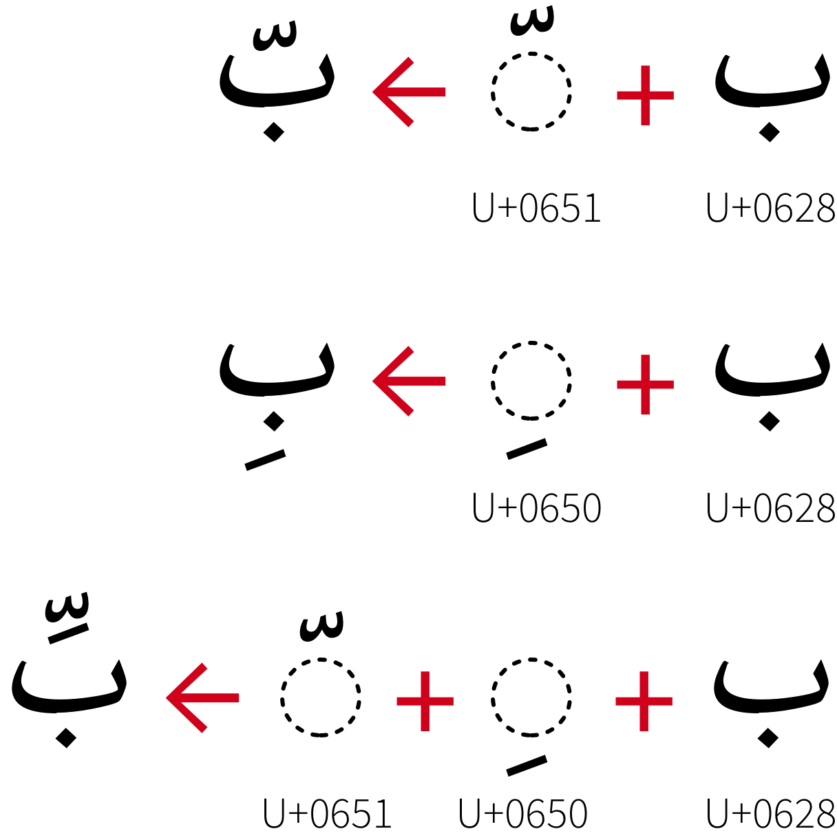
| tashkil |
تَشْكِيلْ |
tashkīl |
|
|
Marks that are added to letters to indicate vocalisation of text or to correct
pronunciation. In Unicode these are all combining characters applied to a base
character. |
| text |
نَصْ |
naṣṣ |
متن |
|
|
| text direction |
اِتِّجَاهْ النَّصْ |
ittijāh al-nnaṣ |
جهت متن |
jht mtn |
Horizontal setting or vertical setting. |
| thin space |
فَرَاغْ رَقِيقْ |
farāgh raqīq |
|
|
|
| third level heading |
عُنْوَانْ المُسْتَوَى الثَّالِثْ |
ʻunwān al-mustawá al-ththālith |
|
|
Headings for smallest or minimum unit of main text in books. |
| top level heading |
عُنْوَانْ المُسْتَوَى الأَعْلَى |
ʻunwān al-mustawá al-’aʻlá |
|
|
Headings for largest or muximum unit of main text in books. |
| tracking |
ضَبْطْ تَبَاعُدْ الحُرُوفْ |
ḍabṭ tabāʻud al-ḥurūf |
|
|
|
| transliteration |
التَّرْجَمَة الصَّوْتِيَّة |
al-ttarjamah al-ṣṣawtīyah |
حرفنویسی |
hrfnuysi |
|
| trim size |
حَجْمْ التَّقْلِيمْ، حَجْمْ القَصْ |
ḥajm al-ttaqlīm, ḥajm al-qaṣṣi |
|
|
Dimensions of a full page in a publication, including margins. |
| type page |
جُزْءُ الصَّفْحَة الخَاصْ بِالكِتَابَة |
juz’u al-ṣṣafḥah al-khāṣ bilkitābah |
|
|
The portion of a page within the prescribed margins where type, graphics, and other
page elements can be added |
| type size |
حَجْمْ الحَرْفْ بِالنُّقْطَة |
ḥajm al-ḥarf bilnnuqṭahu |
|
|
|
| type styles |
أنماط الكتابة |
|
|
|
The measure of the height of the characters of a font, measured in points. |
| type-picking |
نوع قطف |
|
انتخاب فونت |
āntxāb funt |
To select metal type for characters needed to print a manuscript. (Metal type is
stored in a type case, but because the number of Japanese characters is very large, an
extra operation was invented that involves collecting type in a so-called 'bunsen box'
before typesetting a manuscript using a composing stick.) |
| typeface |
مِحْرَفْ |
miḥraf |
فونت، قلم |
funt, qlm |
A set of letters or symbols, which are designed to have coherent patterns to be used
for printing or rendering to a computer screen. |
| typesetting |
تَنْضِيدْ، تَنْضِيدْ الحُرُوفْ الْمَطْبَعِيَّة |
tanḍīd, tanḍīd al-ḥurūf al-maṭbaʻīyah |
حروفچینی |
hrufčini |
|
| typography |
طِبَاعَة الحُرُوفْ، أُسْلُوبْ الطِّبَاعَة |
ṭibāʻat al-ḥurūf,uslūb al-ṭṭibāʻah |
تایپوگرافی |
tāypuɡrāfi |
|
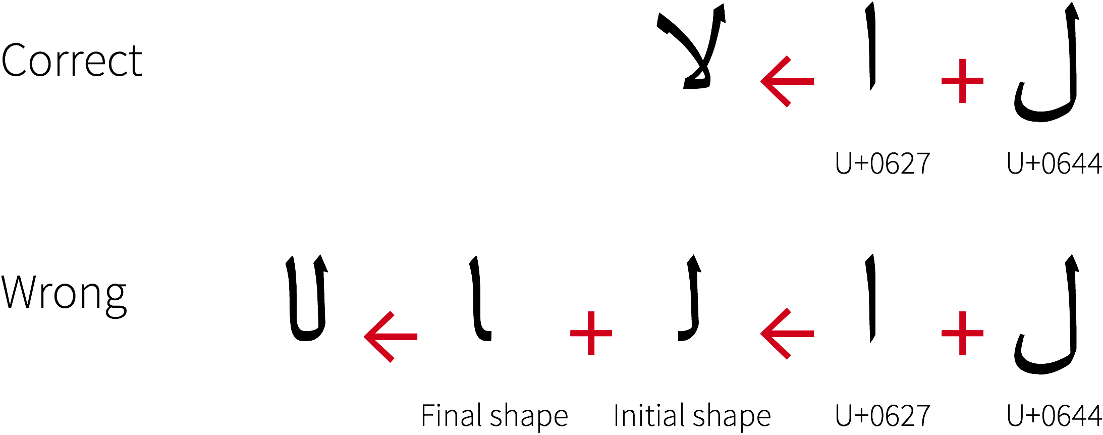
| unbreakable characters rule |
قَاعِدَة أَحْرُفْ غَيْرْ قَابِلَة لِلْكسْرْ |
qāʻidat aḥruf ghayr qābilah lilksr |
|
|
A line breaking rule that prohibits breaking a line between consecutive dashes or
leaders, or between other specific combinations of characters. |
| underline |
تَسْطِيرْ مِنْ تَحْتْ |
tasṭīr min taḥt |
|
|
A line drawn under a character or a run of text in horizontal writing mode. |
| unicameral |
أُحَادِى المَجْلِسْ |
uḥādī al-majlis |
|
|
|
| Unicode |
يُونِيكُودْ |
yūnīkūd |
یونیکُد |
ivnikod |
|
| vertical writing mode |
وَضْعْ الكِتَابَة العَمُودِي |
waḍʻ al-kitābah al-ʻamūdī |
حالت نوشتار عمودی |
hālt nuštār amudi |
The process or the result of arranging characters on a line from top to bottom, of
lines on a page from right to left, and/or of columns on a page from top to bottom. |
| volume |
حَجْمْ |
ḥajm |
جلد |
jld |
|
| weight |
ثِقَلْ |
thiqal |
|
|
A measurement of the thickness of fonts. |
| Western alphabet |
الأَبَجَدِيَّة الغَرْبِيَّة |
al-’abajadīyah al-gharbīyah |
|
|
|
| Western languages |
اللُغَاتْ الغَرْبِيَّة |
al-lughāt al-gharbīyah |
|
|
|
| widow |
أَرْمَلَة |
armalah |
|
|
The term in Western text layout to describe that the last line of a paragraph with
only a few words appears at the top of a new page or a column. |
| widow adjustment |
تَعْدِيلْ أَرْمَلَة |
taʻdīl armalah |
|
|
A method of line composition to adjust lines in a paragraph so that the last line
consists of more than a given number of characters. |
| word division |
قِسْمْ كَلِمَة |
qism kalimah |
|
|
|
| word space |
فَرَاغْ بَيْنَ الكَلِمَاتْ |
farāgh bayna al-kalimāt |
|
|
|
| x-height |
اِرْتِفَاعْ الحَرْفْ إِكْسْ |
irtifāʻ al-ḥarf iks |
|
|
|