This document is for people who make Web content (Web pages) and Web
applications. It gives advice on how to make content usable for people
with learning and cognitive disabilities.
This document has content about:
people with learning and cognitive disabilities,
user needs,
user testing,
design patterns (ways) to make content usable, and
This section describes the status of this document at the time of its publication. Other documents may supersede this document. A list of current W3C publications and the latest revision of this technical report can be found in the W3C technical reports index at https://www.w3.org/TR/.
This document was published by
the Accessible Platform Architectures Working Group and the Accessibility Guidelines Working Group as a
First Public Working Draft. This document is for people who make Web content (Web pages) and Web applications. It gives advice on how to make websites and applications that are friendly for people with cognitive impairments by providing guidance for your designs, and design process. This working draft adds Design Guide to appendix section.
Publication as a Working Draft does not imply endorsement by the
W3C Membership. This is a draft document and may be updated, replaced or
obsoleted by other documents at any time. It is inappropriate to cite this
document as other than work in progress.
Making websites and applications that are friendly for people with
cognitive impairments affects every part of design and development.
Traditionally accessibility has been most focused on the interface, and
making that usable for people with sensory and physical impairments in
vision, hearing and/or mobility. Some accessibility features will help
people with cognitive impairments, but often the issues are about
context, language, usability, and other more general factors that impact
everyone to some degree.
This document aims to provide guidance on how to make websites and
applications that are friendly for people with cognitive impairments by
providing guidance for your designs, and design process.
1.1 Process
Some aspects of making web content and applications friendly for
people with cognitive impairments are best dealt with as part of the
overall design process. For most organizations there should be scope
included for a
user-centred design process.
Key parts of this process for people with cognitive impairments should
be:
Including the needs of users with cognitive impairments in the
context of use and requirements;
Including people with cognitive impairments in research methods such
as usability testing.
If people with cognitive impairments are included in the usability
testing and their feedback is accounted for, you can be sure that the
website will be easier to use for everyone. (See
Usability testing, below)
1.2 Applicability Across Websites
The amount of effort an organization should expend on making a website
friendly for people with cognitive impairments will vary. For
organizations that provide public services, or are national (or
international) private service providers and already conduct
user-research, they should:
Organizations that conduct user research should include people with
learning and cognitive disabilities as part of user research such as
usability-testing. This is particularly important for public service
providers as well as national and international private service
providers.
All organizations, regardless of user research conducted, should
review designs and early stage development with the design objectives
in this document.
1.3
Background about People with Learning and Cognitive Disabilities and the Web
People with cognitive and learning disabilities may not be able to
effectively use web content because of the design and content choices
of the author. Examples may include:
People with impaired short term memory may be unable to recall
passwords or copy access codes. They may have trouble or be unable
to remember new symbols and interface paradigms;
People with different processing speed capabilities may need
additional time to understand the design relationships and volume of
information on screen;
People with language related disabilities may need simple clear
language and instructions. Some may rely on supporting graphics and
familiar symbols to understand content;
People with social and/or communication disabilities may need clear
literal language and may not understand metaphors or non-literal
text and symbols;
People with dyscalculia may not understand or confuse numerical
references such as percentages;
People who have issues with keeping or regaining focus, may be have
difficulty completing a simple task if there are lots of
distractions and interruptions. They may need headers and signposts
to help them regain the context after their attention has been lost
(including in multimedia);
Many groups will need support to minimize errors and complete their
task. They will struggle with complex, multi-stage processes such as
filling out forms or entering data correctly or finding the content
or feature that they need.
These difficulties may sometimes also be experienced by users in the
general population due to environmental or situational barriers, such
as when they are trying to use a website when they are distracted. For
example working on a mobile device while in an unfamiliar or noisy
situations can demand place addition cognitive load on all users by
splitting their attention. However, for users with cognitive and
learning disabilities, these difficulties are likely to be persistent
and significant, so that they are unable to access content and abandon
tasks.
Cognitive and learning disabilities include long-term and short-term
and and sometimes permanent difficulties relating to cognitive
functions, such as:
perception, memory and attention;
learning and orientation;
visual, verbal and numerical thinking.
These are usually hidden difficulties and may be age related. The
terminology and definitions used for cognitive disabilities varies
between countries and users are less likely to have a formal diagnosis
of a disability than individuals with physical and sensory
difficulties. Cognitive disabilities may include intellectual
impairments affecting comprehension alongside written and spoken
expression. People may also experience a co-occurrence of difficulties
such as dyspraxia / developmental coordination difficulties and ADHD
should also be taken into account.
It should be noted that by addressing barriers to accessibility for
users with cognitive and learning disabilities, improvements to
digital technologies can be achieved and there is the potential to
improve user experience for everyone.
2. User Needs
User needs for people with learning and cognitive disabilities (COGA)
are often important for other users. However for COGA groups they often
make the difference between being able to use the site or not be able to
use it at all.
Authentication and Safety
secure website authentication that is easy to use
safe way to interact online.
Context and Distractions
consume content or complete a task without unnecessary
distractions
know the context (where I am, what I just did, or what just
happened)
restore context
when I forget where I am or get distracted
in multimedia. ability to go back to what I just missed, or
reorient myself if I get lost
reminders of important information
turn off distractions by default and be a trivial option in real
time
Entering Data, Error Prevention, & Recovery
help avoiding mistakes, and minimizing the mistakes I might make
know what mistake were made and how to correct a mistake. Do no
cause undue alarm a mistake happens
enough time, and do not lose work
use applications or APIs that remember a lot of my information so
I do not need to enter it again, and to otherwise help me, such as
with spelling.
know where I am in a process, including what I have done and what
my next step is.
able to check my work and go back without losing the work I have
just done
Help and support
more explanations, such as context sensitive help and short tips.
know how to get more information.
easily get human help.
symbols that help me understand content.
contextually-relevant graphs and pictures to supplement text so I
can understand a point without a lot of reading.
speech support, with synchronized highlighting, so I can follow as
I go.
rapid feedback.
highlight section of image, chart, or math, while the section is
read.
more space between letters, words, sentences, and/or lines of
text.
reminders, or I will forget appointments, and when I was meant to
do things
not too many reminders, as I will be distracted.
confident that I can manage my tasks.
Simple and Clear Interface
controls are clear
understand the menu terms so I know where to find things
find the controls that I need
a structure that is easy follow
can easily find content I need
signposts so I can find information I need
Multimedia - understandable structure. Easy to find the content
needed
easily separate what I need, and do not need, and find what I need
know what an advertisement is, or one from a different website
know where to find things on a page
know the design patterns
unambiguous affordances - I know what things are and what they do
Familiar Interface
familiar with the UI, and I know how to work it and what will
happen when I work it
symbols I understand immediately
different types of messages to be consistent in different parts of
the screen
controls to be consistently positioned on the screen
Clear and understandable content and text.
clear language - Understandable use of vocabulary, syntax, and
other aspects of language
clarify implied information and provide unambiguous information
reduction of dependence on understanding math concepts
support for slow readers
understand (familiar) symbols
understand images and multi-media
Navigating the system
find information I need without deciphering a lot of words or
symbols
quickly identify options I need.
simple-to-navigate menu systems
simple-to-navigate voice-menu systems
find a human help
Navigation and GPS
option for simplicity - let me balance complexity and speed
understandable terms, which make sense to users, and do not depend
on knowing left and right, or on number dependence
no automatic rerouting without user consent
understandable symbols
no change of context
no change to orientation
3. Use Cases / Persona
Any time there is a 'target audience', there will be people with with
learning and cognitive disabilities in that audience. Cognitive
impairments are often invisible in day-to-day life until people
encounter particular challenges. To provide some context and
understanding, eight personas have been created which outline fictional
people with various cognitive impairments and the challenges they face.
Usability testing is the best way to know if your content and
functionality works for real people with cognitive and learning
disabilities.
Usability is important for everyone. If web content and applications are
difficult to use, they cannot be accessible for people with cognitive
disabilities. Automated testing for accessibility focuses on more
technical areas of accessibility, and cannot assess ease of use. It is
vital for people with cognitive disabilities that development teams do
not rely solely on automated accessibility testing, but incorporate
Design Patterns as described in the Appendix, and if possible test with
people who have cognitive disabilities.
Finding people to include in usability testing who have different
learning and cognitive disabilities can be relatively easy, such as
friends, colleagues, relatives or neighbors who:
Are older and struggle to use computers, or have age-related
forgetfulness;
Are at an early stage of dementia
Have dyslexia, dyscalculia or ADHD
Have a learning or intellectual disability
People with acquired cognitive issues (for example, due to
neurological trauma) who have the same challenges as people with other
disabilities such as:
having difficulty (asking a family member to help) with booking
travel booking or hotel booking online
being unable to use online banking
coping with content forms and pop up windows when errors occur
It is beyond the scope of this document to provide a guide to usability
testing and user-research, however, there are many resources available
such as:
4.1 Differences from Usability Testing with the General Population
There are some differences when testing for accessibility, and that
includes when testing with people who have cognitive impairments:
Ensure that the participation forms are easy to understand, send
them to the participant in advance, and allow plenty of time for
the participant to ask questions and fill in forms;
Allow the participant to bring a carer, family member or friend to
attend with them. If your tester has a guardian you should get
informed consent from both the tester and their guardian;
It helps to provide easy methods of assessing mood, rather than
asking for the participant to verbalize, try asking them to select
a smiley face, such as:
Figure 1 A simple mood selector
Ensure the person does not feel like they are at fault for making
mistakes. While this is always important during usability testing,
this scenario is even more likely for people with cognitive
impairments.
Some brief guidance on usability testing:
Can your users ( people with learning and cognitive disabilities)
manage each task reasonably easily and fast. You can time the task
taken to complete, and note any parts that where the users are
slowed down or seem to struggle. Also note any errors that they
making including clicking on the wrong thing.
Is completing the task frustrating or upsetting?
You can ask the users how they are feeling before and after the
tasks (or rate their mode such as selecting the smiley which
represents how they feel, such as:
ask them if anything was annoying.
How can you make it better for your users ( people with learning
and cognitive disabilities)
You can analyze the data collected above
ask them how they feel about the system and if anything was
annoying.
If the user if failing blame the designer and not the user. Such
as “ it is so helpful that you are doing this because our
designers are not very good, or are always playing computer games
so they think everyone is good at this stuff” or “you are really
helping us make this useable by real people and not just
engineers” . Stop the process if users are getting distressed
despite this.
As a short overview, usability could be measured based on efficacy,
efficiency and satisfaction. This can be done by measuring or
tracking:
successes and noting any errors to measure efficacy,
time taken per task to measure efficiency, note that the relative
time between tasks is often more useful than absolute numbers. and
user’s mood and comments to measure satisfaction.
At the end of the evaluation you should be able to answer:
What prevents the user from completing a task?
What creates confusion? When and why do they misinterpret the
interface?
What produces an error and an incorrect action?
When does the user get frustrated or upset
When does the user misunderstand navigation, menus and controls?
How can these problems be avoided?
Note you will need to get informed consent from the tester before
testing. Explain what they will be doing and why it is helping you. If
there are any risks they need to be explained and understood. If your
tester has a guardian you should get informed consent from both the
tester and their guardian. Make sure potential participants are aware
they can withdraw from the testing situation at any time and that
their comments will be anonymised before being used in any report.
(With thanks to Smart4MD for this overview. I SMART4MD is co-financed
by the European Union under an EU Framework Programme for Research and
Innovation – Horizon 2020, with grant agreement number 643399.and the
European commission for this contribution.)
5. Design Objectives
To help web content providers meet the needs of people with cognitive
and learning disabilities we have identified the following objectives:
Design so that as many users as possible understand the site and
know how to use it. This often involves using things that are clear and familiar to the
user so that they do not have to learn new symbols, terms or design
patterns. Personalization and good use of semantics can help make
the symbols and design as familiar to the user as possible. People
with cognitive disabilities rely upon predictable behavior in
digital content. For example, many websites do not follow the
standard convention for hyperlinks: blue = unvisited; purple =
visited; and underlined. See the
design guide.
Help the user find what they need. Navigating the
system should be easy. See the
design guide for navigation.
Use clear and understandable content This includes
clear text, clear images, speech, and easy to understand video. See
the
design guide for understandable content.
Prevent the user from making mistakes and make it easy to correct
mistakes when they do occur.
A good design and use of scripts will make errors less likely, but
when they do occur the user should know how to correct them, without
having to render other data or start from the beginning. See the
design guide for errors.
Help the user focus and restore context if attention is
lost.
Items like breadcrumbs can help orientate the user and help the user
restore the context when it is lost. (Making breadcrumbs clickable
can also help the user undo mistakes.) See the
design guide for focus.
Minimize the cognitive skills required to use the content and
avoid barriers
that stop people with cognitive disabilities from using content,
such as hard to use security mechanisms. When possible, provide more
accessible options. See the
design guide for barriers.
Provide help and support. Graphics, summaries of
long documents, adding icons to headings and links are all examples
of extra help and support. See the
design guide for support.
Feedback is usable by everyone. If users have
difficulty sending feedback then you will not know if they are able
to use the content or when they are experiencing problems.
Therefore, it is essential that all the feedback mechanisms are
tested by people with cognitive disabilities. See the
design guide for feedback.
Note that most of the design patterns in the guide were originally
created as recommendations for WCAG, the
full list of potential requirements
is available.
5.1 Mapping design patterns to user groups
The table of design patterns and user groups maps patterns from the
design guide such as "User safety" and "Task
completion" with the groups of users who benefit, such as those
with "Memory impairments" and "Reduced focus and
context".
This section provides guidance for policy makers on how to use the
design patterns to build a policy. This includes:
Defining the scenarios included in your policy
Looking at the different criteria and deciding if they are important
for the scenarios in your policy
Building a policy that include the important criteria for the
scenarios included in your policy.
Table of design patterns and policy criteria
Number
Name
Testable
Requires user testing
Can be applied to all content
Important for conversational interfaces
Important for IOT
User need level
1
Clear purpose
yes
no
yes
yes
yes
high
2
Support personalization
yes
no
yes
yes
yes
high
3
Support simplification
yes
no
yes
yes
yes
high
4
Familiar design
yes
sometimes
yes
no
yes
high
Example recommendations for policies:
A policy for critical services might include any item with a high or
medium level need
A policy for emergency services might include all items
A policy for legislation for wide adoption for all web sites might
include any item that are testable, does not require human testing
and have a high user need level.
A policy for legislation for content needed in the workplace might
include any item that are testable, and have a high or medium level
user need level.
The following are example scenarios that may be included in a
policy:
Critical services - such as water, health care, phone and internet
services, government services
Emergency services - such as police, fire, etc
Content needed in the workplace, including professional sites
Content that helps autonomy such as apps and interfaces to run home
devices, book a cab, write an email etc.
The following are example user considerations:
Safety
Autonomy and savings in care-giving
Cost associated with people leaving the work place earlier than
necessary.
Other considerations include:
Does this item require user testing to conform, and is this too
expensive for the scope of sites that might be required to comply
See the issue paper on user testing for more information
A. Appendix - Design Guide
A.1 Introduction
Making websites and applications that are friendly for people with
cognitive impairments affects every part of design and development.
Traditionally accessibility has focused on the making the user interface
usable for people with sensory and physical impairments in vision,
hearing and/or mobility. Some accessibility features also help people
with cognitive impairments, but often the issues that help people with
cognitive impairments are about context, language, usability, and other
more general factors that impact everyone to some degree. As a result
they do not fit well into traditional accessibility standards.
This document aims to provide guidance on how to make websites and
applications that are friendly for people with cognitive impairments by
providing guidance for your designs and design process.
This Design Guide is Organised into design Objectives, each of which is
a 'theme' for design that is inclusive of Cognitive Accessibility. Each
Objective also includes user stories which outline user requirements.
Finally, the Objective contains a number of detailed Design Patterns
which describe steps that can be taken to make an improvement to
cognitive accessibility.
Understanding the Objectives, user stories and Patterns will help you
create content that is more accessible to users with cognitive and
learning disabilities. Please see the section on user testing for
guidance on how to perform COGA user testing.
Editor's note
Please note this document is not the final draft. We are still working
on harmonizing the content and the internal consistency of the terms
and style. The task force also intends to redo the tables to make them
consistent with the design patterns (such as in 5.1 and 6.1). In
addition, design patterns 2.8, 2.9, 2.6 and 2.10 2.13 and 5.3 and 5.6
need to be checked for overlap. In addition we are exploring the
addition of these sections:
Items for further research;
Data driven systems - gathering and analyzing user feedback and
data;
Special applications such as sections on GPS systems, conversational
interfaces.
Comments and feedback are most welcome.
A.2
Objective: Help users understand what things are and how to use them
To be able to use a site or application, people need to know what all
controls and element are on your page and how to use them.
Not everyone finds learning new things easy, and not everyone can
remember new designs.
The more people need to figure things out, the less people can use your
site.
Many users cannot easily learn new design metaphors, or remember things
they learned, such as users with mild cognitive impairment or dementia.
Without these skills, it can be much harder or impossible to find what
they need, work out what the items do and how to use them.
Many users can be overwhelmed by too many options, or too much
information. If the individual's reading is slow, then too much
information mixed together will make it difficult or impossible to use
the site.
Using familiar design, familiar terms and familiar symbols are key to
being able to use the web for users who will struggle to remember new
symbols and design. Users need the following to be familiar:
Element location: Place elements in expected locations. For example,
people may look for the search on the top right hand corner of a page.
If it is somewhere else it will be hard to find.
Symbols: Use familiar symbols. For example, people may look for a
question mark for help. If you use a different symbol fewer people
will find help.
Text: Use familiar terms. For example, some people have a limited
vocabulary. Uncommon terms may cause them difficulty.
Getting help: Always make it easy to find the help.
Personalization can be extremely useful for designers who want to offer
familiarity and flexibility. Familiarity helpsusers with cognitive and
learning disabilities but is often based on the needs of the individual
user. Personalization allows users to customize their interface, which
is important as what is familiar for one user may not be familiar to
another.
A.2.1 User testing
Make sure your user testing includes individuals with a range of
cognitive disabilities. Do not just ask questions, but ask the user to
do an action that demonstrates usability.
Test for the following but set up the tests so that the user
demonstrates their knowledge and understanding rather than answers a
simple question::
Does the user know what the page is about?
Does the user know what actions they can take on a page?
Does the user know where they are in a website, an application or a
multi-step process?
Can the user easily find the different sections of content?
Identify the different activities that the user may want to complete
on the page:
Can they achieve the activities without asking for help?
Does the user make errors trying to achieve the activities?
Does they user find them easy to achieve?
A.2.2 User stories
This leads to the following user stories:
I am familiar with the user interface (such as menus, buttons and
design components) where everything happens, and I know how to work
it and what will happen when I work it;
I know what to click to make things happen;
I like content delivered in an easy-to-understand mode;
I like simple content with few options and consistent text;
I know what this page does;
I know how to do each task.
A.2.3 Pattern: Make the purpose of your page clear
Use a clear title or heading that summarizes the purpose of a page, or
other clear signposts that have been tested by users with cognitive
disabilities.
A.2.3.1 How it helps
This helps many people, including those with poor memory and
attention as well as anyone who is easily distracted due to
age-appropriate forgetfulness and Attention-Deficit/Hyperactivity
Disorder.
For example,someone with mild dementia is using online shopping.
They get distracted and then when they look at the screen again they
have forgotten what they were doing. A clear heading at the top of
each page shows clearly
what the page is about and what they are doing.
A.2.3.2 More details
Headings need to clarify the purpose of this specific page.
A.2.3.3 Examples
Success example: Headings tell me exactly where I
am.
Failure example:
Headings do not clarify the steps in a form;
Service not available... what service? I have to remember what I
was doing to know what service this is about.
A.2.3.4 Technical details
The following are proposals for WCAG. They experiment with more
testable language.
In a multi-step process, clearly indicate the steps completed, the
current step and the steps pending.
Make sure the current location and progress within a sequence is
clear.
A.2.4.1 How it helps
Clearly indicating the current location and progress helps a user
who loses focus or gets distracted reorient to their current
activity without reading a great deal of content or restarting.
Providing information about the steps that need to be completed
ensures that a user who may find a process difficult to complete can
determine if they can successfully finish.
Examples include:
someone with dementia loses focus and then cannot remember what
they were doing;
someone with an attention disability gets distracted and then
needs to pick up were they left off;
someone with a learning disability is not sure if this application
has too many steps and if they will manage. By seeing they are
half-way through they can gauge if they can cope with the entire
process.
A.2.4.2 Examples
Success example: Using breadcrumbs to indicate the
current step in the process as well as past and future steps.
A.2.4.3 Technical details
The following are proposals for WCAG. They experiment with more
testable language.
A.2.5
Pattern: Use Graphical indicators to group and highlight information
Use graphical indicators to help people identify:
items that are associated with each other;
items that have a different purpose to surrounding information; or
key terms and critical information.
A.2.5.1 How it helps
Visual of grouping of information is based on the psychological
principle of
Common Regions. It has been found that the grouping information using a border or
color shading makes it easier for people to identify groups, even if
the content of the group is not similar.
Figures: Example of the Common Regions grouping principle.
These graphical indicators allow people to identify structure and
information types without reading text or have problems
distinguishing groups of information. Using the graphical indicators
consistently to indicate similar types of items aids with navigating
content and reduces the cognitive load.
People who have difficulty with recognizing or comprehending written
language, having difficulties with concentration or memory can find
it easier to process graphical cues.
People on the autism spectrum are more likely to identify graphical
indicators and the use of color for grouping content than other
approaches.
A.2.5.2 More details
Graphical indicators should also be presented programmatically to
enable assistive technologies to interpret the graphical indicators.
It is also important the graphical indicators do not clutter the
interface and are used consistently as that can add an additional
cognitive load for users to process.
A.2.5.3 Examples
Examples of common graphical indicators are:
Group summaries of content with images, such as using a card
design;
Flag importing important information, such as using call out
boxes;
Indicate different types as information, such as placing quotes in
speech bubbles.
A.2.5.4 Technical details
ISO/FDIS 9241-112 [i.23]
ETSI 203 350 Guidelines for the design of mobile ICT devices and
their related applications for people with cognitive disabilities:
12.4.2, 12.4.16, 12.4.16, 12.4.18, 12.4.21
A.2.6 Pattern: Chunk Media
Long pieces of media are divided into logical segments that are:
short,
labeled, and
easy to reach or jump to.
A.2.6.1 How it helps
Providing shorter logical segments allows a person to find and
review a specific topic. If that person loses concentration or steps
away, clear segmentation allows them to easily find their place in
the material and start again. This is especially important for
educational style content where review is often necessary.
Chunking media also allows for each segment to be given a unique URL
and so easily referenced and shared.
For example:
Some videos can be naturally organized into chapters or segments
A podcast can be split into segments rather than a single one hour
recording
A.2.6.2 More details
Six minutes or less: Media should typically be
divided into segments that are 6 minutes or less in duration.
Navigable: Navigation to each media segment, and
a unique, descriptive label must be provided.
Logical order: Navigation to media segments are
presented in a logical order.
Exception: Media that has no logical breaking
points, do not need to be subdivided.
A.2.6.3 Examples
Success example: A 30 minute video is divided
into 5 sections, each with a descriptive link to play from that
point onwards.
Failure example: A 30 minute video contains no
subdivisions or descriptions of sections, forcing the user to play
it from the beginning or guess starting locations within the
video.
A.2.6.4 Technical details
The following are proposals for WCAG. They experiment with more
testable language.
A.2.7 Pattern: Make the purpose of each section clear
Make the purpose of each section clear. Often this involves providing
clear headings that briefly defines the purpose of each section.
Content that is not directly relevant to the main purpose of a page
should be distinctly separated and programmatically determinable.
A.2.7.1 How it helps
Each page or section of content should be organized and marked so
that its purpose is obvious. This might be through the use of
headings or labels or even a pyramid style of writing or even non
textual markers (with suitable alternatives). A clear organization
of content into pages and sections with obvious purpose allows users
to more easily locate relevant sections and to be confident that
those they read in detail will match their purposes. There will also
be no need to read all the content in case something important is
missed. For example, Ads that appear in-line in a section of content
are rarely related to the purpose of a section and can be placed in
a separate delimited section. Sometimes symbols (with alt text) can
be used to make the sections purpose clear.
Here are some examples of how this will help people:
A person with memory issues may need a clear heading structure to
stay focused.
Someone with an attention disability gets distracted and then
needs to pick up where they left off and headings help
A slow reader may depend on a heading structure to find important
information they need without forcing them to read the whole
document.
Someone with dementia loses focus and then can not remember what
they were doing
Someone with a learning disability is not sure if this application
has too many steps and if they will manage. By seeing they are
halfway though they can gauge if they can cope with the entire
process.
For example, an elementary school publishes a weekly newsletter with
interesting stories about activities and important announcements.
Important announcements include early school dismissal. If the
newsletter has a good heading structure, it will be easier for a
parent who is a slow reader to find the important announcements
about early school dismissal. Without a good heading structure, the
important early dismissal information can be easily missed.
A.2.7.2 More details
The heading structure should create an outline of the document
that could serve as an abstract of the whole document.
Heading structure makes the content easier to scan and find more
detailed information that a person needs at a moment.
A.2.8
Pattern: Make it clear what are controls and how they should be used
Use a clear design for controls by:
Using a common style on controls (for example: links being
underlined);
Using common design pattern on links and controls (for example:
clicking on a link takes you to the page);
Making all the borders of controls clear other than textual links
(for example: a help icon has a border);
Ensuring items that are not clickable do not look like links or
controls.
When this is not possible, provide instructions that explain their
use. Instructions should be on the same page or one click away and
written in plain language.
A.2.8.1 How It Helps
Using common style and design pattern on controls makes it easier to
recognize and understand how to use it. Controls are parts of web
pages that do something, e.g. a link, button, checkbox. The goal of
these controls is to have someone use them. For example, an older
user with age appropriate forgetfulness takes longer to learn new
designs. They go to an eCommerce site has boxes around the headers
(such as "womens" or "sale") and simple large text for the "add to
cart" button. They click on the headings and not on the add to cart.
After a few failures they assume they cannot manage it and leave the
site.
Some users have trouble when controls have a different look, color
or shape than they have used before. For example, when links do not
have underlines and blue or purple text (even if this appears with
focus) some users will not know there is a link.
If you have difficulty with memory, it can be harder to use unique
controls. It may be slower to find them on the page. And even if
they work just a little differently than similar ones, some may need
to relearn how to use them each time they need to use them.
Using typical controls on the page will help people know how to use
them. When using more unique controls, include easy to follow
instructions and make them easy to find. Regardless of how a user
uses the page (vision, auditory, voice input) it should be easy to
identify, understand and use the controls.
If you are designing a new control, make them easy to identify (I
know they are there), understand (I know what they do), and use (I
know how to use them). Test with people with different cognitive and
learning disabilities. Use a simple style or have easy to follow
instructions that explain their use.
A.2.8.2 Examples
Good Examples:
Links with an underline and/or blue text color (or purple for
already visited links), or both clearly identify links. Once a color
is selected to be the primary link text color, other text on the
page does not use this.
Poor Examples
Links without an underline or usual blue text color (or purple for
already visited links), even those that become clear when they
receive focus are more difficult to use. Some users may not know
they are there.
A.2.8.3 Technical details
The following are proposals for WCAG. They experiment with more
testable language.
Link purpose. "The purpose of each link can be determined from the
link text alone or..."
Difference: how do I know it is a link?
E.g. can I ask all links to be underlined and blue if this
is not their automatic state?
I know something is a link because:
Underlined and blue (or purple if a visited link) – if
I have vision.
Announces as link – if using text-to-speech tool.
Cursor change.
Consistent Identification. Components that have the same
functionality within a set of content are identified consistently.
If unusual, even if consistent, this does not make it easy to
identify.
Labels or instructions are provided when content requires user
input.
If style selected requires instructions, slows down person
using them.
A.2.9 Pattern: Each region and its controls can be clearly recognized
Make the relationship between different parts of the page clear:
Use clear dividers between different sections in a page that may
have separate controls or a scroll bar;
Use clear dividers around areas in a page with different functions,
such as call out boxes, navigation bars, and advertisements;
Avoiding multiple scrolling areas/regions in a page will also help.
A.2.9.1 More details
Examples of clear dividers include high contrast borders or white
space. A change in background color can be a clear divider if the
contrast is strong enough.
Sometimes the structure and relationships can be made clear
through personalization or user agents and good use of semantics
in the code (see WCAG 2.0 SC 1.3.1).
A.2.9.2 How it helps
Controls that affect only one section of a page can be confusing.
Having a border around the controls and the relevant page section is
helpful. If the controls cannot be next to the area they affect,
check with user testing that the users find all the page
relationships clear and immediately know how to use the controls.
For example, consider someone with dementia trying to work out which
scrollbar to use if there are more than one embedded in scrollable
regions. When users try the wrong scrollbar, they do not get the
effect they desire. Many users will look again at the content, try
and work out what they are supposed to do, and discover the correct
scrollbar. However, many people with cognitive disabilities will not
be able to work out what they did incorrectly. Others will feel
cognitive overload, and will give up before they try. They may
assume the application is broken, or that it is just too complicated
for them. For all of these users, the application will not be
usable.
A.2.9.3 Examples
Failures Examples
When scrollbars are embedded in scrollable regions, and it is
unclear which scrollbar to use;
The search box relates to one area of a page, and not for another
area. It is unclear which area the search is for;
Controls act on one region and t is not clear which areas are
acted on;
Avoiding multiple scrolling areas/regions in a page will also
help.
Structure, content and controls must be easy to identify and
understand.
The user should not experience difficulty identifying which control to
use with specific parts of the content, or how to use the controls.
The user should be provided visual cues and text that communicate the
structure and layout of the page.
A.2.10.1 How It Helps
This helps people with cognitive disabilities that impact problem
solving skills, those that get overwhelmed when presented with a lot
of text, and those with difficulties with more complicated tasks.
This can include some individuals with early stages of dementia,
people who have had a concussion or a stroke, people with
intellectual disabilities, and others. Those impacted may not
complete tasks, miss key information, and not return to pages that
are complicated to use and understand.
By creating clear layouts, with easy to use controls, a greater
number of individuals can focus on the task instead of spending time
figuring out how to use the controls and information. They easily
find key information, and are more likely to return to the page.
For example, do not have two scroll bars close together. Some users
may find it difficult to determine which one to use with a
particular section of content. Instead, use clear visual layout and
placement of the scroll bars, break the content into two separate
pages, or consider removing unnecessary information from the page.
Some people with disabilities need a clear layout to help them know
how to use the information. When structure and relationships are
unclear, end users may need to experiment with different layouts and
structures until they work out how to use them. However, people with
cognitive disabilities may not be able to do so, and may not be able
to use the content or application.
Example 1: A website has 2 scroll bars, each
operates a different section. When users try the wrong scroll bar,
they do not get the effect they desire. Many users will look again
at the content; try and work out what they are supposed to do; and
discover the correct scroll bar. However, many people with cognitive
disabilities will not be able to work out what they did incorrectly.
Others will feel cognitive overload, and will give up before they
try. They may assume the application is broken, or that it is just
too complicated for them. For all of these users, the application
will not be usable.
Example 2: Chunks of content run into each other
with a "flat design". Whereas some users can work out which chunks
belong together, many users with cognitive disabilities will find it
challenging or impossible. Thus, all the benefits of chunking
content are lost.
A.2.10.2 Examples
Success examples include:
Using Summary Content - Placing an outline of
content at the top of the page, and/or key information and
elements “above the fold” will provide greater access. For
example, in an email application, the send button should be near
the top so it is easy to find and use;
Separating Content - White space, call outs, and
other methods should be used in addition to headings to help
define sections of content. This organizes the information on the
page so it is easier to determine layout and find specific
information;
Separating Interactive Elements - Place
interactive elements like scroll bars and buttons close to the
content they can impact. Also, keep interactive elements further
from content to which they do not apply. This makes it easier to
identify which elements will impact each section of content.
Failure examples include:
Users may not be easily able to find features that do not display
in their initial view of the page (items “under the fold”). For
example, in an email application, the send button being located
under the email’s body text;
Dense text, with little white space, no call outs, and a lack of
visually differentiated headings to define sections;
Pages with scroll bars close together that impact different
content areas.
A.2.10.3 Technical details
The following are proposals for WCAG. They experiment with more
testable language.
A.2.11 Pattern: Sub-menu items are able to easily identify
It is easy to know that sub-menu items are there and how to get to
them. Users should be able to easily identify:
That there are sub-menus and;
How to reach sub-menu items.
A.2.11.1 How it helps
When opening a web page for the first time, the sub-menus are
typically collapsed and their design may make it difficult to even
know that they are there. Some users with cognitive disabilities may
not guess that they are present, or after seeing one expand by
accident, may not generalize that this structure may be present for
other items in a menu. Making it easy to notice that there are
sub-menu items ensures the user can use this part of your site. An
example is a menu without any visual indication that there are
sub-menu items.
There are times where how to open the sub-menu item may not be easy
for some with cognitive disabilities. If the control to expand a
menu item relies on a particular gesture or way of rolling over the
area with a mouse, for example, the end user may not figure out how
to expand the sub-menu and may abandon the task. An example would be
a menu that expands only after moving the mouse over a particular
side of the menu text.
A.2.11.2 Getting started
All menu items which have a sub-menu have a clear visual indicator
that they are present. This can include (but is not limited to):
an arrow, a plus sign, or a triangle;
All menu items with sub-menu items, when accessed with a mouse
(note: because keyboard operation is already part of a SC) expand
using standard mouse movements and clicks. If a particular area of
the menu requires the interaction, or a separate control (e.g. a
triangle requires the click) this is visually easy to identify.
A.2.11.3 Examples
An example of consistent “+” sign to show that additional
information will be shown when pressed.
Success example:
The presence of sub-menu items is easy to find because there are
triangles next to their menu items.
Failure example:
No visual indication of sub-menu items is next to the menu item.
The only way to discover the presence of the sub-menu item if
using a mouse is to move the mouse over the location of the
sub-menu item;
Expanding to view the sub-menu items requires interaction by mouse
with a specific area of the menu item, and this area is not
visually distinguished.
A.2.11.4 Technical details
The following are proposals for WCAG. They experiment with more
testable language.
Sub-menu items are clearly associated with the main menu items under
which they fall.
A.2.12.1 How it helps
Confusion can occur when visual hierarchy of information is not
immediately apparent to the user. Distinction between levels in
content hierarchy may be difficult to understand or perceive due to
minimal type size or type weight differences or color differences
that are not easily perceived or understood. Furthermore hierarchy
solely dependent on small unique design elements may create
confusion.
For example a drop down accordion menu of additional sub-menu items
may not be viewable without understanding it needs to be clicked (or
‘rolled over’) as indicated by a small unique design element.
A.2.12.2 More details
Small design elements that indicate sub-menu items will be presented
that aren’t always readily apparent or meaningful to the user and
not universally adopted.
Examples include a chevron (triangle). In different designs it can
be either left facing right facing, up facing or down facing
depending on state and the unique design standard affecting
interpretation of state.
Confusion can occur when a right facing chevron can indicate that
more information will be presented on the current page when clicked
or it may mean that information is currently being presented, or it
may indicate that it takes the user to a new page. Consistent and
general best practices should be used to make it understandable to
the user.
Furthermore a series of these nested elements on a long page can
create visual hierarchy confusion if dependent solely on
interpretation of design elements.
A.2.12.3 Getting started
Create a visually clear hierarchy of in-line information in either a
revealed or hidden state. Clearly indicate when text is hidden or
when it can be hidden or revealed.
A.2.12.4 Examples
An example of consistent “+” sign to show that additional
information will be shown when pressed.
Success example: “+”.
Failure example: “<”.
If there is no clear indication that more information will or will
not be revealed when clicked on. Inconsistent styles or left right
arrow directions can confuse user to differentiate between revealed
state and hidden state.
A.2.12.5 Technical details
The following are proposals for WCAG. They experiment with more
testable language.
A.2.13
Pattern: Use a design that the user is likely to recognize and
understand
Use common design elements, affordances, and patterns that are
familiar to most users.
A.2.13.1 How it helps
Many users, such as those with mild cognitive impairment or
dementia, cannot easily learn and remember new design metaphors.
Without these skills, it can be much harder or impossible to locate
desired items to interact with, and to know what interactions may
do. Users can feel lost or overwhelmed.
Because common design elements are repeated often over a long period
of use across many sites, users are more likely to recognize the
interactions needed.
A.2.13.2 More details
Common design elements, affordances and patterns include:
Links that look like links and buttons look and act like buttons:
For example, underline links with a standard style throughout
a page;
Links general navigate to a new page;
Buttons general perform an action;
Uses common design patterns, such as are documented in the ARIA
authoring best practices or are used in the most popular sites:
Very common navigation design patterns and common icons;
A platform specific user interface design for navigation
mechanisms and icons;
An adaptive user interface design that can be personalized
(see above);
Create a standard Visual Hierarchy - Place elements where the user
is expecting them, such as:
Putting the search in the top right hand corner in a website;
The link to the home page is in the top left hand corner;
Link to ‘contact us’ is in the top navigation;
Link to the site map is in the footer area;
Submit button is at the bottom right for a form;
User interface (design) from a prior version: Allow users to
revert back to a prior version of the application that they are
familiar with.
A.2.13.3 Getting started
When deciding pages, select standard components that look and behave
the way users expect. Use standard conventions for layout such as
the home link in the upper left corner, navigation at the top,
search in the upper right, etc. and create an obvious visual
hierarchy in the page.
A.2.13.4 Technical details
The following are proposals for WCAG. They experiment with more
testable language.
Use a consistent visual design across groups of pages.
A.2.14.1 How it helps
Those with difficulty understanding how to interact with information
need to use cues like color, layout and other visual information to
help them know where to look, what they should do and how they
should complete that task.
For example, an older user with age appropriate forgetfulness takes
a long time to learn new designs. When they come to a site, the
first page takes time to understand, but then they know what to do
on the next page. If the next page is different from the first and
also difficult to learn, they become tired and make more mistakes,
as they move to a third page the cognitive load becomes too much and
they cannot complete the task. This pattern helps by:
Ensuring a consistent user experience by providing familiarity and
building confidence;
Making it possible to easily use and interact with content;
Aiding the completion of tasks.
A.2.14.2 More details
This includes:
Design themes, including heading styles, font choices, symbols,
colors, visual appearance of controls, buttons and links should be
consistent.
Headings with the same structural level have the same font and
visual style.
Icons, controls and menu items that have same function and role
have the same look and style
State and focus for elements with similar function and roles have
the same style used consistently across a site.
Layout should be consistent, including position of interactive
elements and navigational controls.
Structure of content and style of presenting information should be
consistent throughout, such as organization of block text, images
and bullet points.
A.2.14.3 Getting started
Plan the design for your information before adding content. Think
about the colors, font choices and areas where text and images will
appear.
A.2.14.4 Examples
Success examples:
A web page has two submit buttons, both should visually look and
function the same way.
All selected radio buttons on the site look the same.
When all links on a page have keyboard focus the focus indicator
looks the same.
Failure examples:
3 pages have a submit button, but each one is located in a different
place on the page.
There are 6 heading level 2s on a page. 4 are styled using Times New
Roman, and 2 use Helvetica.
A.2.14.5 Technical details
The following are proposals for WCAG. They experiment with more
testable language.
On coga github: consistent-identification-and-styles.html
Add familiar images and pictographs to you page to aid understanding.
Images should convey a single meaning.
A.2.15.1 How it helps
People who have language comprehension difficulties who may be able
to mechanically read but not understand the content or those who
have learning and/or reading difficulties may rely on symbols to
understand content and navigate to content they need.
For example, a person with aphasia, has the intellectual ability to
understand concepts, but struggles with language. They may be
dependent on the use of symbols to browse pages for information.
It can also help the elderly population who can find cluttered pages
with dense text hard to read on a screen. Clear symbols and images
that act as signposts to the text content can be very helpful.
Make sure your user testing includes individuals with a range of
cognitive disabilities. Do not just ask questions, but ask the user to
do an action that demonstrates usability.
Can the user easily identify any important information or interactive feature on
the site or on a specific page?
Can the user use both browse and search approaches to finding
things?
Can the user revert or correct any action they take when
interacting? Does it use a familiar and consistent action?
A.3.2 User Stories
This leads to the following user stories: "As a user who has memory
impairments, weak executive function and/or weak language processing
skills:..."
I want to know what important information and functions are on a
page, quickly and easily.
I want to find the content I am looking for, without looking in the
wrong places.
I can easily understand, navigate and browse both the site structure
and individual pages;
I do not get lost in a complex information architecture when I want
to find something;
I can easily work out how to get to what I want when it requires
navigation from where I am;
I can see all important features without them being hidden off
screen and requiring scrolling;
I can easily search for anything I want or have searched for before.
I often touch or click on the wrong item. I want to go back or undo
so I'm exactly where I previously was easily. I'd like a simple
familiar action that I can use every time it is needed.
A.3.3
Pattern: Make it easy to find the most important things on the page
Key content must visually stand out and be visible to users without
needing to scroll the page. This includes:
Interactions for critical features (e.g login forms, send buttons)
Important information (e.g health warnings or information that can
affect safety)
A.3.3.1 How it helps
People with low executive function, impaired memory, and other
cognitive and learning disabilities may not be able to find features
that require the use of the scroll bar.
Users who are unfamiliar with the page (or common design patterns)
rely on prominent visual styling aids to locate important
information.
A.3.3.2 More Details
The amount of page visible before scrolling is dependent on a wide
range of factors such as physical device size, resolution, pixel
density and device setup.
The size of the visible region will be site specific. Where
possible, use site statistics to understand the technology users are
using and keep this in mind when designing the page.
For example, an elementary school publishes a weekly newsletter with
interesting stories about activities and important announcements.
Important announcements include early school dismissal. If the
newsletter has a good heading structure, it will be easier for a
parent who is a slow reader to find the important announcements
about early school dismissal. This important information about early
dismissal information can be easily missed.
In another example, a user is writing a comment, but the send button
is not visible when the view focuses on the text area. As a result
she cannot see how to send her feedback. The company will then not
receive any feedback from groups who are not able to find the
feedback button.
A.3.3.3 Getting Started
Make it easy to find the most important things on the page. Identify
key content and its placement early in the design process.
Space at the top of the document is most likely to be visible to
users without scrolling. Placing key content at the top of the page
will give the best experience to the widest range of users.
Consider the most constrained user experience first (e.g., a 240px
wide mobile phone) and then design upwards from there in order to
encounter the widest range of scenarios.
Conducting user testing can identify common user cases and barriers.
Adopting responsive development practices can improve the
flexibility of the page to a range of different devices and
stations.
A.3.3.4 Examples
A login form is visible without the need to scroll the page.
A login form submit button stands out from other links and buttons
on the page.
Critical health and safety information regarding medication is
highlighted is visible without scrolling.
Critical health and safety information regarding medication
visually stands out from other less important information on the
page due to the use of color, boldness and layout.
A.3.3.5 Technical details
The following are proposals for WCAG. They experiment with more
testable language:
On coga github: critical-features.html and
wcag issue 39
A.3.4 Pattern: Add search
Provide a search capability.
A.3.4.1 How it helps
Having a search capability allows users to find the content they
need even if they cannot manage to find content via the site menus
or other browsing mechanisms. A user can learn how to use search and
reuse that skill on many sites.
User studies have shown the aging population tend to rely on search
to locate information rather than navigating menus or surfing.
Menu systems, and most site navigation require the user to
understand the categories of the pages that the content provider has
created for general use. Users with impaired executive function may
be unable to identify the correct categories.
In some cases, users know the correct category via memory, rather
than logic. For example, most users remember that the print function
is often found under the file menu. Users with impaired memory may
not be able to find these menu items based on recall.
Navigating a site and going to many pages to look for content, is
also difficult for people with impaired short-term memory or for
people who are easily distracted, as they may lose focus and forget
what they are looking for.
Search is most useful when it corrects misspellings, finds
appropriate or related content or provides suggested auto-corrected
versions of the search terms that the user can choose from.
A.3.4.2 More details
This is less important on small sites if every page is a maximum of
two clicks away from the main page.
A.3.4.3 Examples
A site has a search.
A.3.4.4 Technical details
The following are proposals for WCAG. They experiment with more
testable language.
The standard back button is the best way to do this as it is familiar
to the user and this might be the way they will try first.
The user should never lose their work if they press back.
A.3.5.1 How it helps
This helps prevent users from making mistakes and makes it easy to
correct mistakes when they happen.
Examples of mistakes include:
Touching a control by accident;
Opening a new link by accident;
Closing a window that you intended to keep open.
If a person easily makes mistakes or makes them often, it is
important that they can go back and make changes without having
their work or previous choices deleted.
For example, a user is watching a video. They try to increase the
volume but touch a different link instead. A new video now loads.
The user can press the back button and return to the video they were
watching before. They now know they can try and increase the volume
and if they make a mistake, they can easily go back and try again.
In another example, the back button did not worked as expected, but
took them somewhere else (such as the home page). When they try to
change the volume or add a comment they often lose the video they
were watching and cannot find the way to get back to it. They now
feel they cannot use any of the features of the website in case they
lose their main content again. They do not use larger screen, change
the volume, or leave comments.
In forms, each time the user has to re-enter data there is a new
chance for mistakes to occur. Entering and re-entering data can be
stressful and tiring from some people with learning and cognitive
disabilities. This increases the likelihood of mistakes and may make
it impossible to submit correct data and complete the intended task.
For those with anxiety, memory challenges, and difficulty following
directions, the ability to go back and review information they have
entered is very important. For example, for some people the task of
following directions and reviewing their answers works best as two
separate tasks. Being able to enter information with their focus
being on following the directions, and later going back to review
their answers, helps them be more effective.
When the user has an opportunity to go back and review the data they
entered, even if submitted by mistake, it is easier to correct the
information.
A.3.5.2 More details
A user can go back steps in a user journey via a clearly labeled
action.
Clickable breadcrumbs are provided with clickable previous steps
and no loss of data.
Providing back and undo features without unwanted data loss.
Using semantics and personalization to log the steps and return to
a step in the process.
A user can go back to a closed window or option.
A.3.5.3 Examples
Success example:
Completing an online form when applying for a job. The user is able
to go back through all the screens to be sure they did not
misunderstand a section, skip an answer, and can edit any data they
mistyped.
Failure example:
Completing an online form when applying for a job. The user goes
back a screen because they realize they may have forgotten to answer
a question. When they use the back button all data previously
entered has been cleared/deleted.
A.3.5.4 Technical details
The following are proposals for WCAG. They experiment with more
testable language:
wacg issue 38
and
WCAG issue 53
A.4 Objective: Use clear and understandable content and text
A.4.1 User testing
Make sure your user testing includes individuals with a range of
cognitive disabilities. Do not just ask questions, but ask the user to
do an action that demonstrates usability.
Test for the following:
Does the user understandable use of text?
Does the user understand text immediately?
Does the user know unambiguous language?
Is there any content usable without understanding math concepts?
Is there any representation of math by words instead of numbers?
Is there any support for slow readers?
Does the user understand use of (familiar) symbols?
Does the user understand use of images and multi-media?
A.4.2 User stories
This leads to the following user stories:
I want the language used to be clear and easy for me to understand;
I want no unexplained, implied or ambiguous information;
I want no complex math concepts and I find words easier to
understand than digits;
I want content written and structured for slower readers;
I want the text to be supported by symbols that are familiar to me;
I want help with understanding images and multi-media.
A.4.3 Pattern: Use clear words
Use common and clear words. Look at the most common 1500 words or
phrases. These are the terms that people with severe language
impairments are most likely to know.
Remove unnecessary words
Do not invent new words or give words new meanings in your
application. Do not expect people to learn new meanings for words
just to use your content. If you must make a new terms make sure the
user has access to an explanation within one click or event.
A.4.3.1 Getting started
Start by putting clear words on headings labels, navigational
elements, instructions, and error messages. This will increase the
usability a lot without taking so long.
A.4.3.2 How it helps
This benefits many people including those with language impairments,
learning disabilities or a poor memory.
People with language impairments often have a reduced vocabulary and
learning new terms is a very slow difficult process. For other
groups, such as people living with dementia, learning new terms is
not realistic or possible. Using uncommon words, that they do not
already know, will make the content understandable and unusable.
For example, someone with mild dementia is trying to turn on an ICT
heating and air conditioning unit. The menu item for selecting heat
or air conditioning is labeled "mode". The user cannot use the whole
unit because of this one term. This has caused emergencies such as
hypothermia.
A.4.3.3 More details
When different people find different abbreviations or terms easier
to understand:
Add an simple language term in brackets next to it;
Success example: Plain text with clear words and
definition of term.
Your landlord must follow the law.
Your landlord can only use your
security deposit (promise money), only for
certain things, such as unpaid rent (rent that you owe) and to fix
things that you damaged.
Your landlord must return your
security deposit (promise money)
to you by a clear date. This is usually 30 days after you leave
the apartment.
Failure example: Not plain text
A Landlord's Right to Deduct. When a tenant moves into a rental
property, he or she will pay the landlord a security deposit.
Depending on the jurisdiction, this deposit will be returned to the
tenant within a specific time period at the cessation of the lease
term, as long as the tenant follows all the terms and tenants of the
lease agreement or contract. Select links below to read the laws
that pertain to your situation.
A.4.3.5 Technical details
The following are proposals for WCAG. They experiment with more
testable language.
A.4.4 Pattern: Use a simple tense and written language
Use the tense and the voice is easiest to understand. In English this
is usually the present tense and active voice. Speak directly to the
user, and use the simplest form of verbs.
A.4.4.1 How it helps
This benefits many people including those with language impairments,
learning disabilities or a poor memory. For example, more people
will understand “press the on button” (present tense and active
voice) then “the on button should be pressed”.
Active voice makes it clear who is supposed to do what. For example
“It must be done.” (passive voice) does not say who has to do what.
“You must do it.” is active voice and is more clear.
A.4.4.2 More details
Other voices or tenses can be used when it has been shown to be
easier to understand or friendlier.
In languages where present tense and active voice do not exist, or
are not clearer, use the tense and the voice that are easiest to
understand.
If you are writing about past or future events, do not use the
present tense. It will just be confusing.
A.4.4.3 Examples
Success example: Plain text with clear words and
definition of term.
Your landlord must follow the law.
Your landlord can only use your
security deposit (promise money), only for
certain things, such as unpaid rent (rent that you owe) and to fix
things that you damaged.
Your landlord must return your
security deposit (promise money)
to you by a clear date. This is usually 30 days after you leave
the apartment.
Failure example: Not plain text
A Landlord's Right to Deduct. When a tenant moves into a rental
property, he or she will pay the landlord a security deposit.
Depending on the jurisdiction, this deposit will be returned to the
tenant within a specific time period at the cessation of the lease
term, as long as the tenant follows all the terms and tenants of the
lease agreement or contract. Select links below to read the laws
that pertain to your situation.
A.4.4.4 Technical details
The following are proposals for WCAG. They experiment with more
testable language.
A.4.5 Pattern: Do not use double negatives or clauses inside clauses
Use a simple sentence structure. Do not use a double negative to
express a positive. Do not use clauses inside clauses that can be
confusing.
A.4.5.1 How it helps
This benefits many people including those with language impairments,
learning disabilities or a poor memory. For example, a person with
early stage dementia can manage their own appointments and affairs
because the language is clear and understandable.
For example, more people will understand “You must get the agency’s
approval before we can answer your claim”: rather than “No approval
of any claims can be achieved without the agency’s approval”.
A.4.5.2 Examples
Success Example:
“You must get the agency’s approval before we can answer your
claim”.
Failure Example:
“No approval of any claims can be achieved without the agency’s
approval”.
A.4.5.3 Technical details
The following are proposals for WCAG. They experiment with more
testable language.
Use literal and concrete language. When possible, use concrete terms
and examples that refer to objects or events that you can see, hear or
touch.
Metaphors and similes should not be used unless they are explained.
A.4.6.1 How it helps
Many people do not understand non literal content. For example, a
programmer with autism spectrum disorder may not understand jokes
and similes. Sometime instructions have jokes and similes to make
their content more friendly. However this confuses the programmer
who now cannot do her job as needed.
You can explain any non-literal language:
In simple language in brackets next to any non-literal text (such
as a Metaphors and similes);
Start by putting clear literal text on headings, labels,
navigational elements, instructions, error messages and any content
that may affect the user’s rights or wellbeing. This will increase
the usability in critical places without changing your writing
style.
A.4.6.3 More details
The meaning must still be completely clear when non literal text is
replaced by literal text. This needs to check when literal text
provided in a popup or other alternative.
A.4.6.4 Example
Success example: literal text and concrete language
If you are experiencing anxiety before starting take a deep breath,
tell yourself you can do it and get started. Anxiety can include
nervousness, fear, dizziness or shortness of breath.
Failure example: non-literal text
If you are experiencing cold feet before starting take a deep breath
and jump in.
A.4.6.5 Technical details
The following are proposals for WCAG. They experiment with more
testable language.
In Instructions, separate each step. Separate steps make instructions
much easier to follow.
Using numbers and lists can also help;
Sometimes complex instructions can be easier to follow in an If/Then
table;
Using a friendly graphics can help make instructions less scary;
A.4.7.1 How it helps
This benefits many people including those with language impairments,
learning disabilities or a poor memory.
For example, a person with a low working memory cannot hold onto
many pieces of information at the same time. If they need to
remember what they are doing, divide the steps and track what they
have done they are much more likely to make mistakes. When
instructions are clearly separated and clearly laid they can follow
them without making mistakes.
A.4.7.2 Examples
Success example: do not separate each step -
IF/Then Table
If
Then
If you want to work in programing:
Make a resume.
Get some sample code that you wrote.
Send them to programing@example.com.
If you want to work in design:
Make a resume.
Get some sample pages that you designed.
Send them to design@example.com.
Failure example: separate each step
If you want to work in programing, write to programing@example.com
with a resume and sample code that you wrote. If you want to work in
design write to design@example.com with a resume and sample pages.
A.4.7.3 Technical details
The following are proposals for WCAG. They experiment with more
testable language.
Keep paragraphs short. Have only one topic in each paragraph.
Use short sentences. Have only one point per sentence.
Use bulleted or numbered lists.
Use bullets or numbered lists.
A.4.8.1 How It Helps
Chunking
text content makes it easier to read and understand. People with
poor memory or anyone who is easily distracted will benefit too.
This also helps people with learning disabilities related to
processing speed or language. Chunking is helpful to anyone who is
multitasking.
Example: a graduate student with ADD may need to teach themselves a
new software skill. The software documentation is broken up into
short paragraphs and lists by topic. The student finds the
documentation easy to read and understand.
A.4.8.2 More Details
What is a short paragraph? In English, if you
have a paragraph of more than 50 words, see if it could be broken
up into two paragraphs.
How can I avoid writing a sentence with more than one point? Sentences that have more than one point usually have more than
one linking word such as ‘and’ or ‘but’.
Can a long sentence ever be clearer than two short sentences? Double-check if a long sentence is clearer than two short
sentences. Do usability testing to see if people with cognitive
disabilities find the long sentence easier to understand.
When should I use lists? Lists are great when you
have three or more things in a row. Think about using an unordered
list (with bullet points) for items, requirements, and exceptions.
A series of three or more steps is easier to follow as a numbered
list.
A.4.8.3 Examples
Success Example
Calgary will have a lot of snow and hail this weekend. Try not to
drive. If you must drive:
Use the rules for driving in winter to keep safe.
Before you leave, check what roads are safe at the Traveler’s
Information Website.
Failure Example
DOTD Issues Winter Weather Travel Advisory for Calgary. With the
possibility of snow and rain in the forecast throughout the holiday
weekend, the Department of Transportation and Development (DOTD)
announced that department staff is prepared to deal with winter
weather. Maintenance forces will be on standby to apply sand and
salt over any affected bridges and roadways, to remove fallen trees
from the roadway, and to close any roads as needed. Interim
Secretary Jane Doe urges motorists to take the threat of winter
weather seriously. "In the event of adverse weather conditions, the
department will strive to maintain access to highways and
interstates; however, we encourage the motoring public to avoid
traveling during snow and ice, if at all possible," said Doe. During
winter weather conditions, the best thing motorists can do is drive
slowly and carefully, and avoid driving while distracted. Always
allow for extra driving time, reduce speeds when visibility is low,
and make sure there is plenty of room between vehicles. Also, look
out for black ice, which can form on bridges, overpasses, off- ramps
and in shady spots. As always, DOTD reminds motorists to buckle up
and refrain from drinking and driving. Citizens can get the latest
updates on real-time traffic and road conditions by using the
Traveler Information System simply by dialing ### from their
telephone and saying the route or region about which they are
seeking information. Travelers can also access this information by
visiting the Traveler Information Website. Motorists can also obtain
information regarding road closures by contacting DOTD’s Customer
Service Center at (1-###-###-####). The center is open 7:30 a.m.- 5
p.m. Monday through Friday.
A.4.8.4 Technical details
The following are proposals for WCAG. They experiment with more
testable language.
Put white space around objects and text, including boxes, paragraph
headings, and content, so that each section is clearly separated.
A.4.9.1 How it helps
White space (also called negative space or the background color)
reduces clutter and provides definition to content. This gives the
viewer a clear overview of a web page. It is used by designers to
enhance text and the position of objects on a page.
Use of white space aids navigation through a page and helps people
read it. It can help the user find important elements on a page. For
those with cognitive impairments, it has been shown to ease reading
difficulties and improves understanding of content.
Make sure the user can also adjust the amount of white space around
objects and text via a web extension or user setting. This supports
the ability to identify important elements in the content of a web
page.
A.4.9.2 More details
Use clear spacing between letters, words, sentences lines,
paragraphs and blocks of text.
Allow for the ability to easily adjust white space around objects
and text, including boxes, paragraph headings, and content, to a
degree that suits the user and does not disrupt the overall
integrity of a web page.
Note that “white space” is a term that means the background color.
It does not always need to be always white!
A.4.9.3 Technical details
The following are proposals for WCAG. They experiment with more
testable language.
Use clear spacing between letters, words, sentences, lines,
paragraphs and blocks of text.
Text is not fully justified and on coga github:
visual-presentation.html,
wcag issue 51 and PR number 113.
A.4.10 Pattern: Use clear and accurate text formatting and punctuation
Use the correct punctuation for text, numbers and symbols to improve
readability and comprehension.
A.4.10.1 How it helps
For some readers, decoding words, numbers and symbols is not an
automatic task and can be demanding on working memory and executive
functions. If they find content too demanding they are at risk of
losing its meaning and the overall context of the message that is
being conveyed. Some users may use assistive technology or
personalization tools to reduce the cognitive demands of decoding
content. An example would be text-to-speech that reads aloud content
allowing for the use of auditory and visual channels.
Users should not need to be distracted from their task in order to
decipher letters, numbers, and words. They should be able to focus
on understanding the meaning of the content, especially when they
are using assistive technology or personalizing content. It is
important that the content is created with these adaptations in
mind, to ensure that all users gain the experience you want them to
achieve. Content creators should ensure that information is provided
in a way that can be read accurately by assistive technology. It may
have to be personalized to suit certain users, but this can be
achieved when all the elements are accessible.
Use cases:
“I listen to content so I need it to be announced and phrased
correctly so I can understand it.”
“I listen to content and I hear content read incorrectly or
skipped, particularly numbers and symbols.”
“If text, numbers or symbols are in an unfamiliar layout, I get
really confused.”
A.4.10.2 More details
Use punctuation correctly for the language you are
writing in, as it will affect how the stress and intonation (known
as prosody) patterns from the text are heard, when converted into
speech. For example, in English, commas and semicolons will result
in a short pause in the speech, whereas a hyphen – will generally be
ignored. Question marks, exclamation marks and speech marks can
result in changes in intonation, such as a rise in the pitch of the
voice.
Avoid the use of Roman Numerals and unfamiliar symbols
in text were possible. These can confuse readers and are likely to
be read incorrectly by text-to-speech tools. If these symbols are
necessary then ensure they are marked up correctly, using techniques
such as MathML and abbreviation expansions to provide additional
support. Roman Numerals should be presented in upper case if used in
isolation as they are likely to be read as individual letters
Be aware that long numbers may be read as single digits or phrased
as a single number. This is a particular problem for phone numbers
or zip codes. While it is difficult to control exactly how these
numbers are read aloud, content creators can help by:
Displaying the content of the number and using HTML semantics to
ensure users and assistive technologies are aware of the number’s
purpose. In addition the following recommendations can assist with
improving text-to-speech rendering:
For phone numbers, using the correct layout for the locality of
the phone number and ensure users can select the whole phone
number (including area code), so that text-to-speech voices can
recognize the format and phrase it correctly.
For Zip / Postal codes, including state or address information
close to the number so that speech voices can expand known
abbreviations (such as state names) and listeners can perceive the
context.
When writing long numbers, considering what separators will be
familiar to your readers and how it will be read aloud. In
general, English speaking countries will use commas between
thousands and a period as the decimal separator whereas German and
other European countries do the opposite. For example, 1,245 would
represent one thousand two hundred and forty five in English, but
one point two four five in German. Text-to-speech output will
assume the separators are being used in the format of the language
of its voice. If this does not match the content then listeners
can become easily confused. While replacing thousand separators
with a space has become a common convention to avoid confusion, it
leads to difficulties with text-to-speech with long numbers being
read out in a disjointed fashion. For example, 120 034 943 can be
read as one hundred and twenty, zero three four, nine hundred and
forty three.
A.4.10.3 Examples
Consider how you write dates, because once again the text-to-speech
will use the format associated with the language of the voice. A
date such as 04/03/2019 will be read as “April 3rd 2019” by a US
English voice and “4th of March 2019” by a British English voice.
Writing out the month in words can avoid confusion.
A.4.10.4 Technical details
The following are proposals for WCAG. They experiment with more
testable language.
Provide a brief summary for a long document and emphasize any import
keywords to help people understand the purpose and contents of the
document, and if it might contain information they need.
Summaries should use common words, short sentences and be written in
an easy to understand style and tense.
A.4.11.1 How it helps
Making the summary easy to understand helps many people to quickly
decide if the document is relevant to them and their current goal.
In this case, a very high level outline in a few sentences or bullet
points is most effective. Abstracts and executive summaries are
usually much longer and more detailed as they are designed to
summarize the entire document.
A.4.11.2 More details
Long Documents have 300 words or more.
In general headings are used to break the information down into a
more manageable size and provide structure to the information being
presented. This particularly benefits users of Assistive Technology.
The first section should be a text summary of the document. It may
include links to other sections if appropriate.
Providing a text summary that can be understood by people with lower
secondary education level reading ability. For pieces of content
with less than 300 words the heading may act as an abstract.
See the theme in understandable text for the minimum on how to write
an understandable summary. User testing is recommended.
Provide alternatives for numbers and numerical concepts.
A.4.12.1 How it helps
Not all people can understand numbers and numerical concepts.
For example, some people have dyscalculia, a learning disability
specifically-related to mathematics. People with dyscalculia have
significant problems with numbers and mathematical concepts, but
often have a normal or above-normal IQ.
For example, a user with dyscalculia may have difficulty processing
temperature data when presented only in a numeric format. However,
if non-numeric alternatives are provided (cold, warm, hot etc.) then
they are able to understand the content.
Numeracy issues can occur due to a range of disabilities, the most
severe being the inability to read or understand numbers. Other
people have challenges with any calculations such as relative sizes
or times. When reading measurement an individual with cognitive
impairment may understand the concept of 90cms as a length but find
it hard to cope with the fact that 0.9m and 900mm are the same
length.
For example, a train schedule has a long list of relative times that
they train leaves for different zones on the hour. The user can not
calculate when the next train leaves from their location.
A.4.12.2 More details
Where an understanding of mathematics is not a primary requirement
for using this content use one of the following:
Reinforce numbers with non-numerical concepts, e.g., Very Cold,
Cold, Cool, Mild, Warm, Hot, Very Hot
A.5
Objective: Prevent the user from making mistakes and make it easy to
correct mistakes when they do occur.
A good design and use of scripts will make errors less likely, but when
they do occur the user should know how to correct them easily without
stress or extra steps.
Completing forms and similar tasks is often overwhelming for most users
with cognitive and learning disabilities. This includes relatively minor
learning disabilities, such as Dyslexia, or attention related
disabilities.
Many users with learning disabilities cannot remember numbers, such as
those for their post/zip code, Social Security, or credit card. Many
users even need to check their phone numbers. This makes entering
information slow, and they may need to leave their desks or take breaks.
Also many users have short term memory issues that can make copying text
difficult or impossible. For example, if you can remember 7 letters in
your head at the same time. They may be able to remember one or two.
This makes them much more likely to make mistakes copying as it requires
you to remember the numbers or letter accurately.
Note that a lot can be achieved through supporting personalization.
A.5.1 User testing
Make sure your user testing includes individuals with a range of
cognitive disabilities. Do not just ask questions, but ask the user to
do an action that demonstrates usability.
Test for the following:
Can the user easily fill in the form without making mistakes?
Was it pleasant to fill out the form? How is their mood changed?
Ask the users if they would find this easy to do if under stress or
tired.
Ask the user if anything was hard.
Ask the user how the form could be easier to fill out. Suggest some
of the relevant design techniques bellow and ask if it would help
them with this form.
A.5.2 User stories
This leads to the following user stories:
As a user who needs to look up my postal/zip code, I do not want a
session to time out while I try to find the information needed.
As a user who needs to take breaks during tasks, such as completing
a form, I want to be sure all my work is saved automatically if my
computer crashes. I do not want to have to start over again, which
can create a cycle of reentering my data; and making me more tired
and more likely to make mistakes.
As a user with difficulty typing numbers in the right order, I want
an interface that makes mistakes less likely.
As a user who finds entering information stressful, I want to enter
as little information as I can so the task is more manageable.
A.5.3 Pattern: Design forms so that people make less mistakes
Choose a form design that reduces the chance that the user will make a
mistake. This includes:
In a text field, accept as many formats as possible. For example
accept different formats of phone numbers and correct
Input errors
automatically;
Use an interface were only valid input can be selected;
Use autocomplete and personalization of form controls;
Accept voice prompts when supported by the operating system;
When possible input errors should be automatic corrected (where the
correction is reliable);
If suggestions for corrections are known, the suggestions are
provided to the user.
A.5.3.1 How it helps
People with cognitive or learning disabilities and aging users often
abandon tasks and believe they cannot complete them if they receive
too many errors. Error messages may be confusing. Correcting errors
is often difficult and frustrating for the user. Many users give up
when they get successive errors
For example, while registering for an online banking account a form
requires the input of the user's birthdate. The required input
format is xx/xx/xxxx with a leading zero for single digits. If a
single input field with no input correction is presented, a user
with a cognitive disability may enter 1/3/1996 thus triggering an
error notification. It may not be clear to the user that the
required format is 01/03/1996 even if an example for instance,
xx/xx/xxxx, is shown below the input field or in the error
notification.
However a well-designed form will make it easier to fill in the
information and prevent the user from making mistakes.
Minimizing user generated errors by automatically correcting them
will also minimize error notifications. Error notifications may be
distracting taking focus away from tasks and task completion.
A.5.3.2 More details
Only correct errors if the correction is reliable. Otherwise, if
suggestions for corrections are known, give the suggestions to the
user;
For example, “did you mean the first of February (01/02) or
the second of January (02/01).
Calendars and dates;
Calendars should default to the first relevant day. Work
calendars should default to first working day of a user's
locale;
Calendar based booking systems must avoid ability to book
return date before departure date.
Temperature.
Use the default temperature format of location.
A.5.3.3 Examples
Success Example:
Correct errors of the post code being written in the text field
with the city or state information;
User is unable to select inappropriate dates and a simple
explanation provided should he/she try to do so.
Failure Examples:
The booking form provides two calendars without clear labels and
instruction and user is able to select dates without warning as to
whether they are possible e.g. flight out on June 1st - flight
return May 30th;
User can select inappropriate dates without warning. Calendar
merely grays out inappropriate dates which may not be noticed. No
warnings are provided.
A.5.3.4 Technical details
The following are proposals for WCAG. They experiment with more
testable language.
Always allow the user to check their work and correct any mistakes.
Once the user has fixed their mistake it should be easy to get back to
the place they were at without redoing additional steps.
For financial transactions and important information: Allow the user
to easily cancel the transactions and provide clear information and
simple instructions for important information including the amount of
time the user has to cancel a transaction.
A.5.4.1 How it helps
People with cognitive and learning impairments make many more
mistakes in filling out forms than the general population. When
mistakes cannot be easily corrected they cannot complete the task.
This helps people with cognitive disabilities for safely using forms
and reduces the consequences that are the result of a mistake.
For example, a user with a memory impairment may not remember that
they have already added an item to their shopping cart and may add
the item a second time. They may confused the dates when booking a
trip, and many other mistakes.
It is essential that people with cognitive impairments have the
opportunity to check their work AND can fix their mistakes easily.
For people with cognitive disabilities, mistakes being theoretically
reversible is not enough. Often the process of reversing a
transaction is too complex for them to manage without help. They may
not have access to that help meaning they have to live with all the
mistakes they have made. For example, when inputting credit card
information incorrectly these mistakes can be devastating. In
addition if the process of correcting mistakes is too difficult,
users may give up, either losing the transaction or buying unwanted
items because of the one required item.
The effect of this happening multiple times is devastating and can
result in a large number of users with disabilities stopping to use
the Internet for many tasks.
Allowing the user to change the number of items in the shopping cart
at any time can significantly reduce the chances of these mistakes.
A summary of the order, including product quantities and other costs
before the final submission, gives the user the chance to identify
any errors and make changes to the order. In this example given, a
summary of the purchase helps the user see the error in quantity as
well as a higher than expected order total.
In some cases a user may realize that a mistake has been made after
the final submission of data. Simple language instructions on how to
cancel transactions and helping the user understanding the amount of
time the user has to cancel a transaction and makes them less
susceptible to scams
In another example, a user with Attention-Deficit/Hyperactivity
Disorder purchasing a travel ticket on a website may struggle with
details and may have a low attention span. The successful completion
of the order relies on the information provided at multiple steps in
the process. An error due to lack of accuracy or attention to detail
such as an incorrect street number or zip code in the billing
address will result in the order not going though. If a summary is
not provided before submitting the final order or is not clear the
user may not understand the reason for the declined payment and give
up on the order. The user may also give up if there is not an easy
way to make correction, and all the order needs to be redone.
A.5.4.2 More details
This typically includes:
Change: It is simple for the user to review all the data and
correct mistakes, including mistakes that might not be
automatically identified. The user can change information via
clearly labeled actions and get back to the place they were at, in
one clearly labeled action without unwanted loss of data. (Some
data may need to be entered if it is dependent on the item that
was changed.)
Confirmed: A summary is provided before submitting important
information and the user is told when they are about to submit the
final information.
Time frames and instruction for canceling transactions are clear
and easy to follow.
A.5.4.3 Getting started
Start with forms were a mistake can have serious consequences such
as financial loss or vulnerability.
A.5.4.4 Examples
Success examples:
Provide a summary before submitting important information. Make it
clearly labeled to repair information and one click to return to
the summary.
Provide clickable breadcrumbs that allow users to see the previous
steps, go back, and change them.
Failure examples:
Provide a summary before submitting important information. But it
is hard to repair the information.
Provide a summary before submitting important information. But
then you have to redo a lot of other non-dependent information.
A.5.4.5 Technical details
The following are proposals for WCAG. They experiment with more
testable language.
Clear instructions help prevent user errors. This reduces
frustration and enhances the user’s autonomy and independence
because they can avoid asking for help. This helps anybody with
memory issues, people from a different culture, and people on autism
spectrum who may miss cultural context.
A.5.5.2 More details
Provide instructions at the start of the process, not simply in an
error message.
A.5.5.3 Getting started
In a system with common errors, tackle the most impaction errors
first and add additional guidance.
A.5.5.4 Examples
Success examples
Provide an image of a passport with the number highlighted to
indicate where the number is that the user should enter.
Explicitly say which day of the week is the start (e.g., Sunday or
Monday) in calendar control when booking a hotel.
Failure examples
Request a passport number, but the passport may have several
numbers and the user is uncertain which is requested.
Site does not clarify start of week, and user reads calendar
control wrong and books hotel for wrong day.
A.5.5.5 Technical details
The following are proposals for WCAG. They experiment with more
testable language.
Accept contextual variations in user input such as currency, time
zone, and locale.
A.5.6.1 How it helps
Forgiving form entry processes help prevent user errors up front.
This reduces frustration and enhances the user’s autonomy and
independence because they can avoid asking for help. This helps
anybody with memory issues, people new to culture, and people on the
autism spectrum who may miss cultural context.
A.5.6.2 Getting started
For inputs that collect known data types, such as credit card or
telephone numbers or geography names, accept common variations on
the input format so users don’t have to convert or receive avoidable
error messages.
A.5.6.3 Examples
Success examples
User inputting a financial value can specify the currency used,
even if different from the site’s;
User inputs a credit card number with or without spaces, and the
information is accepted;
User inputs telephone number as written including country code,
region code, and number using brackets.
Failure examples
User inputs value thinking it is US dollars, but the web site
processes in Euros;
User inputs credit number with spaces only to be told it must
include numbers only;
User inputs telephone number but is told it must include numbers
only.
A.5.6.4 Technical details
The following are proposals for WCAG. They experiment with more
testable language.
Avoid timeouts. When this is not possible, inform user of the amount
of time required to complete the process (before timeout) and if user
will lose entered data if a timeout occurs.
A.5.7.1 How it helps
The use of timed events can present significant barriers for users
with cognitive disabilities, as these users may require more time to
read content or to perform functions, such as completing an online
form.
During the completion of an online process for reserving a hotel
room and purchasing a plane ticket, a user with a cognitive
impairment may become overwhelmed with the amount of instruction and
data input required to complete the process. The user may not be
able to complete the process in one sitting, and may need to take a
break. Users should be able to leave a process without losing their
current place within the process, and without losing data that have
already been entered. If users cannot take a break and check their
work, many will often be unable to complete a task correctly.
While making a purchase on an e-commerce Web site, a user with a
cognitive disability may not remember required information (e.g., a
phone number or a zip code) that may seem easy to remember for users
without a cognitive impairment. Users with cognitive disabilities
may need additional time to look up the information required to
complete a transaction, without losing their place in the process,
and without losing data that have already been entered.
In another example, users’ cognitive skills may temporarily diminish
as they get tired. They then must stop the task for that day, and
continue it when they are feeling better, and when their reading or
processing skills are back to their higher levels.
A Web site uses a client-side time limit to help protect users who
may step away from their computers. After a period of inactivity,
the Web page asks if the user needs more time. If the user does
not respond within 120 seconds, a timeout occurs. The user is able
to request more time at least 10 times.
A Web page has a section that automatically updates with the
latest headlines in a rotating fashion. There is an interactive
control that is easy to activate and is labeled with simple text.
It allows the user to extend the length of time, between each
update, to as much as ten times the default. The control can be
operated by mouse, keyboard, or touch.
A ticket-purchasing web site allows users two minutes to confirm
purchase of selected seats, but warns users when their time is
almost out. It allows users to extend this time limit at least 10
times using a simple action, which is labeled with simple text,
such as a button labeled "Extend time limit."
In an auction, there is a time limit on the amount of time a user
has to submit a bid. Because the time limit applies to all users
who want to bid on an item, it would be unfair to extend the time
limit for one user. Therefore, a time limit is required for this
type of activity. No extension, adjustment, or deactivation of
such a time limit is required by this design requirement.
This pattern helps people with a variety of disabilities including
the following:
People with physical disabilities, who often need more time to
react, to type, and to complete activities. - People with low
vision need more time to locate things on screen, and to read.
People who are blind, and who use screen readers, may need more
time to understand screen layouts, to find information, and to
operate controls. People, who have cognitive or language
limitations, need more time to read and to understand. People who
are deaf, and who communicate in sign language, may need more time
to read textual information (which may be a second language for
some).
In circumstances where a sign-language interpreter may be relating
audio content to a user who is deaf, control over time limits is
also important.
People with reading disabilities, cognitive limitations, and
learning disabilities, who may need more time to read or to
comprehend information, can pause content to have additional time
to read it.
A.5.7.2 More details
For situations where the absence of a timed event would
significantly change the intended functionality of an application
(e.g., an auction or another real-time event), it is important to
ensure that users with disabilities are properly notified.
A website only times out when sensitive information is given (such
as the users credit card information). The sensitive information is
asked for at the last stage of the process. The user is warned that
once they give the credit card information they should complete the
process quickly as the session can time out. After a period of
inactivity, the Web page asks the user to press any key for more
time. If the user does not respond within 120 seconds, a timeout
occurs. However when the user comes back and logs-in again all the
content is back.
A.5.7.3 Examples
Success example
A Web site with sensitive information uses a client-side time limit
to help protect users who may step away from their computers. After
a period of inactivity, the Web page asks if the user needs more
time. If the user does not respond within 120 seconds, a timeout
occurs. However when the user logs in again all the work is back.
A.5.7.4 Technical details
The following are proposals for WCAG. They experiment with more
testable language.
For each step in a process let the user know of its status and if it
was successfully completed.
A.5.8.1 How it helps
Making the result of each user action clear helps people with a
variety of cognitive disabilities:
Understand that their actions were processed (e.g., the click did
something);
Prevent uncertainty or doubt regarding the outcome;
Remember what they just did.
For example, a user with age appropriate forgetfulness, may have
difficulty remembering how the interface worked. So when they press
the send button that may not feel confident that the form was
submitted. Feedback, such as a thank you message, will tell them and
make them feel confident in the process.
During a multi-step task this feedback (user-action feedback) can
also assist people, with attention or short-term cognitive
disabilities remember what they are doing. For example, a user with
early dementia may get distracted and then forget exactly where they
were in the task. This user-action feedback helps re-orientate them.
It also helps avoid them leaving a task by reminding them that they
are in a process, and where in the process they currently are.
Provide easily-recognizable success or failure feedback with every
user action. When possible the feedback should use a consistent and
familiar design patterns. For example:
After a step in a multi-step task is completed, breadcrumbs
display a tick or a checkmark next to that step's name; and, if
applicable, the title or the name of the next step is readily
apparent.
After a button is clicked, it should look depressed. (Note that if
it is a toggle button, the state should also be programmatically
determinable).
After a form is submitted or an email message is sent, feedback
communicating what just happened, such as "Your application was
submitted, thank you" or "Your email message was sent" is
provided.
A.5.8.2 More details
The success or failure of every user initiated action is clearly
indicated to the user by visual, programmatically-determinable,
rapid feedback in the primary modalities of the content. Audio
feedback is supported.
A.5.8.3 Examples
Success examples
WAI-ARIA states are used to provide state feedback for a toggle
button with an animation showing the state (such as a button was
pushed).
Use ARIA-pressed with a visual or a checkbox is checked/unchecked.
Provide a confirmation message when an email message is
successfully sent, or a form is successfully submitted.
Provide visible and programmatically-determinable information to
indicate a new password satisfies security requirements.
Failure examples
There is no progress-indicator (e.g., breadcrumbs) to communicate
completed and current steps in a multi-step process.
A.5.8.4 Technical details
The following are proposals for WCAG. They experiment with more
testable language.
A.5.9
Pattern: Tell the users about fees and charges at the beginning of a
task
Tell the user about all charges at the start of a transaction
including typical values. Any conditions and terms should also be
available at the start of the transaction in easy language.
A.5.9.1 How it helps
Users with cognitive disabilities who have trouble with memory,
attention to detail or reading comprehension may not be aware of
charges unless they are explicitly noted at the start of a
transaction task. Terms and conditions can be under a link but
charges must be clearly displayed and available in plain language.
Clearly identifying charges at the start of a sale benefits all
users. Those with cognitive disabilities will particularly benefit
because some groups are less likely to have inferred or guessed the
charges would be included. They may not know to look in other
locations in the user flow or in another location, for example on
the homepage, or on a rates page.
People with impaired Executive Function or memory need to have all
the consequences presented in an orderly form to be able to make an
informed decision. When charges are not clear, the consent of the
transaction is unclear.
It also can take much longer for users with disabilities to go
through the process of making a purchase. If a person has spent
hours making an online purchase, it is much more difficult and
upsetting to find out that they cannot afford it. They will often
blame themselves for not understanding the price and may experience
a loss of confidence. They may stop trusting themselves for
day-to-day activities.
For example a person with Executive Function challenges may be
trying to order a plane ticket, and not realize that there are extra
fees not quoted in the original price, such as taxes, international
fees, baggage fees, etc. They may spend hours booking a holiday only
to find that they can’t afford it. Alternatively, sometimes they end
up purchasing something they cannot afford. And even if they have
completed this process in the past, they are not able to bring their
experience into future purchases to anticipate the final price. The
result is the user loses confidence in their ability to
independently purchase a holiday online, may have incurred a debt
they are unable to pay, may not attempt again, or only with the help
of a hired professional (e.g. travel agent or assistant).
A.5.9.2 Examples
Success examples
There are no surprise charges or conditions.
Users are aware of all charges (including hidden fees) and can
make an informed decision when they decide to purchase an item and
put it in a shopping cart.
For items that shipping charges vary, the range of shipping
charges and the issues that change the rate would be listed, along
with a link to where more details can be found. For example,
weight and speed of shipping my impact your shipping fees which
can be between $4 and $400 depending on location.
Failure examples
Final transaction includes unknown charges that result in
higher-than-expected total charges.
Final transactions include conditions of purchase that are not
clear to users from the beginning of the task.
Transactions contain charges or conditions that the user did not
know about until they have invested a lot of effort into the sale.
Final transaction is completed and users are surprised by the
total they receive.
A.5.9.3 Technical details
The following are proposals for WCAG. They experiment with more
testable language.
A.5.10 Pattern: The user knows when the content changes
Ensure that changes of context, functionality, settings, route and
orientation are initiated only by user request or an easily available
mechanism is available to turn off such changes. An easily available
mechanism is also available to go to previous context, functionality,
settings, route and orientation.
A.5.10.1 How it helps
Any content, settings or functionality which changes unexpectedly,
without user initiation can result in significant barriers for users
with cognitive disabilities. Unexpected changes in any of these
areas can result in loss of focus, anxiety, or confusion in
understanding or using a user interface (such as menus, buttons and
design components). Examples include but are not limited to:
Automatic launching of new windows or pop-ups;
Submission of forms through mechanisms other than a button that is
clearly labeled using simple language to submit the form;
Rerouting automatically by a GPS;
Changing the direction of a map in a GPS.
For example, a user may not have a sense of direction or know their
left and right. Before using a GPS they may study the route so that
they know approximately what they are doing and can augment the
directions of the GPS with their own context, using the GPS for
cues. The GPS automatically reroutes them because of a small traffic
delay. They become completely lost and disorientated and can no
longer use the application.
This give users with cognitive disabilities more control over how
Websites and applications behave and display information giving them
the opportunity to make choices that enable them to use the content
and complete the task.
A.5.10.2 More details
Exception: The changes are part of an activity where it is essential
(e.g. a game).
Route: Directions and flow such as a GPS route.
Orientation: perspective or view such as map direction.
Easily available (or easily available mode or setting), one or more
of the following is true:
Can be set one time with as a wide a scope as possible (such as
using the standards of the OS, From ISO 9241-112 or GPII when
available);
With the option to save or to change the setting, where available
interoperably, but also for the scope of the set of web pages;
Is reachable from each screen where it may be needed, and the path
and the control conforms to all of this document;
A.5.10.3 Examples
Success examples
The user can set to change the route if more than a specific amount
of time is saved. They can add more information such as how many
extra turns are acceptable for saving 5 minutes. When a new rout is
find that save time the user is asked if they want to change rout,
how many extra turns re added and how much time will be saved. The
user can go back to the original rout in one touch or command.
A.5.10.4 Technical details
The following are proposals for WCAG. They experiment with more
testable language.
Checking how safety and security techniques work with a wide range
of customized profile including aging users and users with learning
and cognitive disabilities.
Using known techniques to keep sensitive user information safe.
Helping all users understand any relevant known risks.
A.5.11.1 How it helps
It is vital that users stay safe on the Internet. Information which
suggests a user has Dementia or an intellectual disability allows
predatory companies and individuals to target that user for scams or
other risky activity. For example, a predatory company could send
requests for money, saying “you haven’t made your donation” despite
the user having made one. Avoid storing information that implies
this or, if you do store it, provide strong security for that
information.
Users with weak executive functioning are less likely to identify
risks correctly so clearly identifying potential risks helps the
user stay safe. Add helpful tips for staying safe while using your
content and provide help in case of problems.
To help identify risks, we suggest holding research and focus groups
with people with cognitive and learning disabilities and to work
with people with disabilities to solve potential and existing
problems.
For example, many people who cannot copy and paste passwords or use
two-step authorization codes ask a caregiver to help them. As
caregivers are often just temporary employees, this leaves the user
completely exposed. Making passwords longer or requiring users
change them regularly increases these unsafe practices and actually
makes the application less secure for many people. This type of
design error is common because people with cognitive and learning
disabilities are left out of the user research and analysis.
A.5.11.2 Examples
Success examples
Providing alternative login options that have been tested with
people who have learning or cognitive disabilities that are
approved security techniques, in your jurisdiction, for sensitive
data;
Working with a wide range of people with learning and cognitive
disabilities;
Using industry best practices for storing and securing user
information;
Using consent forms in plain language that have been tested with
people with learning and cognitive disabilities to ensure they
understand the risks.
A.5.11.3 Technical details
The following are proposals for WCAG. They experiment with more
testable language.
A.6
Objective: Help the user focus and restore context if attention is lost.
Distractions can cause users with cognitive disabilities problems such
as:
They can lose focus on the current action;
draw attention away from the task they are trying to do; and
can be difficult for some users to know how to understand, avoid,
and/or stop them.
Once users become distracted, it can be
difficult for them to remember what they were doing.
Then they can no longer complete their task at all. This is especially
problematic for users with both low attention and impaired memory, such
as users with dementia.
Items like bread crumbs can help orientate the user and help the user
restore the context when it is lost. (Making breadcrumbs clickable can
also help the user undo mistakes.)
A.6.1 User testing
Make sure your user testing includes individuals with a range of
cognitive disabilities. Do not just ask questions, but ask the user to
do an action that demonstrates usability.
Identify the different tasks:
Can they achieve the activities easily without losing focus?
Distract the user for a minute so that they lose focus. Can they get
easily back to the task?
Ask the users if they would find this easy to do if under stress or
tired?
Ask the user what would help them remember what they are doing such
as headers or breadcrumbs.
Ask the user if anything was distracting.
A.6.2 User stories
This leads to the following user stories:
As a user who is easily distracted I need less distractions from my
task.
As a user with a poor memory I need easy sign posts about what is on
the screen, where I am in a process and what I am doing, in case I get
distracted in the middle of a task.
A.6.3 Pattern: Avoid interruptions
Avoid interruptions. If you cannot avoid them, make an easy way to
control interruptions and changes in content, unless they are started
by the user or involve an emergency.
A.6.3.1 How it helps
For people with memory or attention challenges, interruptions can
make completing a task very difficult or impossible. This can
include individuals with Dementia, those that have had a stroke or
brain injury, and those taking medications with side effects
impacting memory and/or attention. Certain types of interruptions or
a certain number may cause them to give up, even if the task is very
important. Interruptions can include sounds, content that visually
appears or changes (e.g. ads on a page). It can be as simple as text
notifications about the presence of new changes while working in a
shared online document.
A site will work best for those with memory or attention challenges
if they:
Have no interruptions at all,
Have an easy to use pause option so interruptions can be viewed
later, or
Have a setting where users can select which types of interruptions
they prefer.
Many news websites have a lot of interruptions that can cause
challenges for people needing to read important information, such as
school closures due to bad weather. They may encounter breaking news
text, advertisements, and pop-up windows. For those with difficulty
focusing and sifting through the school names, or have two or three
they need to check, these distractions may make the task impossible.
By letting the user pause these distractions, and ideally
temporarily remove them from the page, they will better be able to
complete the task.
Where standard techniques exists for the above, they should be used.
A.6.3.2 Examples
Success examples
Microsoft Office 365 lets the user decide how they want to be
notified about reminders and emails. Users can choose visual
reminders and/or sounds, or none. For some users, not having any
notifications enables them to focus on a task and then go to their
emails or calendar when the task is completed.
Failure examples
There are advertisements on a Magazine article pages that
interrupt a reader’s focus. In the example below, the ad just
under the banner changes (black oval) and the ad below the first
article photo (navy rectangle) change every 20 seconds.
A.6.3.3 Technical details
The following are proposals for WCAG. They experiment with more
testable language.
A.6.4 Pattern: Avoid too much content on the page.
Provide users with five or less choices on each screen and remove
unnecessary content. This can be provided via a simplified version
alternative that is generated in real time from the same code base as
the main content.
Extra links that do not relate to the main purpose of the page should
be limited to the footer section. Extra choices can also be provided
using clear and descriptive titles.
This can be provided via a simplified version alternative that is
generated in real time from the same code base as the main content.
A.6.4.1 How it helps
Too much text, too many images and too much other content can cause
cognitive overload, anxiety and loss of focus. Keeping content down
to a small number of important points reduces the clutter, calms the
mind and allows for better understanding whilst aiding memory. In
particular, it helps those with a short attention span who may leave
the page if it appears complex.
A.6.4.2 More details
Avoiding long paragraphs and non-meaningful imagery ensures those
with cognitive impairments can concentrate on the important points
being made.
Keeping to a few short bullet points and limiting to one or two
images related to the main subject areas of a website or service
allows the user to choose whether to explore the site further.
The intent of this Pattern is not to clutter the page with
unnecessary information but to provide important cues and
instructions that will benefit people with disabilities. Too much
information or instruction can be just as much of a hindrance as too
little. The goal is to make certain that enough information is
provided for the user to accomplish the task without undue confusion
or navigation.
A.6.4.3 Examples
Success examples
Google has one of the simplest yet easiest sites to use and this
has been copied by companies such as trivago with a simple search
box and some clear statements followed by some meaningful images
as links to other pages.
Failure examples
A page with too much content, long menus and images set around
long paragraphs of dense text does not help anyone but more
importantly the message is lost in an overload of information.
A.6.4.4 Technical details
The following are proposals for WCAG. They experiment with more
testable language.
Do not put barriers that stop people with cognitive disabilities from
using or getting to content.
Many users have memory issues and/or language issues that can make
remembering passwords or remembering numbers, while processing words,
difficult or impossible. That can make transcribing text or remembering
passwords difficult or impossible.
Sometimes security and authentication put a barrier between users and
the tasks they are doing. For example, requiring remembering and/or
transcribing passwords often blocks users with cognitive disabilities
from accessing content or using a service.
Sometimes developers put a menu barrier between users and the task they
are doing so users cannot use the content or service.
Voice XML enables voice dialog systems and voice browsers. An example
might be a phone menu system that ask you "dial 1 for internal services,
dial 2 for external services, dial 9 for billing services." Sometimes
users need to hold multiple pieces of transitory information in their
minds, such as a number being presented as an option, while processing
terms that follow. Many people with impaired short term memory cannot
hold more than two or three pieces of information in their at the same
time so they cannot do this task and cannot get to the place they need
to be.
When possible, provide easy-to-use options.
Note that a lot can be achieved through supporting personalization.
A.7.1 User testing
Make sure your user testing includes individuals with a range of
cognitive disabilities. Do not just ask questions, but ask the user to
do an action that demonstrates usability.
Identify the different activities that the user may want to complete
on the page:
Can they achieve the activities without asking for help?
Does the user make errors trying to achieve the activities?
Does the user find the activities easy to achieve?
Can the user do the same thing later (the password may have been
forgotten)?
Ask the users if they would find this easy to do if under stress or
tired.
Ask the user were they might have trouble if they are under stress.
A.7.2 User stories
This leads to the following user stories:
As a user who has memory impairments and often forgets passwords, I
need to be able to use a site, without remembering or transcribing
passwords and user names, so I can use its service.
As a user who has impairments, I need to use a site without being
required to transcribe items in the correct sequence.
As a user who has weak executive function, I need the login process
to be simple, and not multi-step, so I can use it.
As a symbol user, I need a login process I can use.
This leads to the following user stories for voice menus:
As a user who has memory impairments and weak language processing
skills, I want to get help, without going through a Voice-ML menu
system, so I can set an appointment or find out some information.
As a user who has weak executive function, I need a process to get
help to be simple, and not multi-step, so I can use it.
Users can have trouble identifying the right words to say in a voice
menu.
A.7.3
Pattern: Logging in does not rely on good memory or other cognitive
skills
Users can login and register without having more cognitive abilities
then they need to use a simple web page. This includes:
Memorizing character strings;
Performing calculations;
Coping;
Answering puzzles;
reliably producing gestures; or
recognizing characters presented on screen, and then entering them
into an input field.
A.7.3.1 How it helps
Many people with week memory often lose the password and not be able
to login and use their applications. Their solutions often are only
sometimes helpful and have security risks:
They may have to look at or listen to text several times to copy
or type it into a form field;
They may reuse a single passwords; or a simple-to-remember
passwords, which they can remember. This is a security risk;
If they need to change their password or use a complicated
password they may keep passwords insecurely, such as written on
pieces of paper which people can see.
They may also struggle with other steps of login, such as:
Enter characters in the correct order;
Enter characters correctly on the first try (resulting in being
locked out).Some people with cognitive disabilities may not be
able to;
Find a PIN;
Work out puzzles or distorted letters;
They can also give up after getting frustrated with time-limited
procedures or presentations of digital security tokens.
Without this design requirement, many people cannot use an
application or content at all. See
Security and Privacy Technologies
issue paper for the full description of this issue, and how it stops
people from using web services that are often critical. Many people
cannot make doctors’ appointments, etc., by themselves. This may be
partly responsible for the reduced life expectancy of people with
learning and cognitive disabilities.
A.7.3.2 More details
There are many ways to meet this design guidance item.
Automatic user authentication based upon the use of a trusted
device (to which the user has already logged in with their own
identity);
Biometrics;
Being already logged in to third-party authentication services
(e.g., OAuth, Facebook, etc.);
Methods of meeting requirements for alternative user
authentication would include:
Clicking a link sent to an email address or a phone number;
(Note that this is easy to implement and may be useful for
minimal security, such as allowing comments on a blog);
Logging in by using information present in users' personal
documentation, such as the total number of a current account
balance, with explanation on how to find this information.
A.7.4 Pattern: Let people avoid navigating voice menus.
Let people easily reach an operator without:
Memorizing character strings, including remembering digits to select
for a short time, or pin numbers;
Performing calculations;
Coping;
Using their executive function to work out the category of the
service they need;
Going through multiple steps.
A.7.4.1 How it helps
Many people cannot use voice menu systems and other complex systems.
This often stops people from critical tasks by themselves. Often
this can include: making doctors' appointments, getting health
insurance, reaching social services, get their water turned back on,
etc..
If people can ]not manage menus by themselves they have to ask
someone else to help them. For example they may delay making a
doctor’s appointment or other critical task as not to bother their
helper. This is a huge problem and means people often do not get the
help they need or get it too late. This may be partly responsible
for the lower life expectancy of people with learning and cognitive
disabilities.
A good short term memory (several seconds) is essential so that the
user can remember the number or the term for the menu. Without these
functions the user is likely to select the wrong number.
Many users have a small short term memory. For example, if you can
remember 7 letters or items in your head at the same time they may
be able to remember one or two. This makes them less likely to
manage a menu system correctly.
For example a phone menu system (voice ML system) may have an
option:
May have an option "Press 3 for internal services" To use this
option the user must remember a digit 3 whilst figuring out if they
need an internal service. Many people cannot do this. It also
requires them to press the correct digit.
When a lot of irrelevant information is given before the correct
option the user may give up, especially if they did not understand
all the earlier options and information
The 0 digit should be reserved for reaching a person. Consistently
set the first option for each menu to: "to weight for a person who
can help you press 0". This can help everyone reach the support they
need.
A.7.4.2 More Details
Considerations for Speech Recognition
For speech recognition based systems, an existing ETSI standard
for voice commands for many European languages exists and should
be used where possible [ETSI 202 076], keeping in mind that
expecting people to learn more than a few commands places a burden
on the user.
Natural language understanding systems allow users to state their
requests in their own words, and can be useful for users who have
difficulty remembering menu options, or who have difficulty
mapping the offered menu options to their goals. However, natural
language interfaces can be difficult to use for users who have
difficulty producing speech or language. Directed dialog
(menu-based) fallback or transfer to an agent should be provided.
Follow requirements of legislation
For example, the U.S. Telecommunications Act Section 255
Accessibility Guidelines [Section255] paragraph 1193.41 Input,
control, and mechanical functions, clauses (g), (h) and (i) apply to
cognitive disabilities and require that equipment should be operable
without time-dependent controls, the ability to speak, and should be
operable by persons with limited cognitive skills.
A.7.4.3 Getting started
This is essential for critical systems such as health, finance,
communication, water and government services.
Unimportant systems, that do not affect the users' health, safety,
money or rights, could use pattern 7.5
A.7.4.4 Examples
Success examples
Using user interaction dialogs in which the first option "to
weight for a person who can help you press 0”;
Using a user-interaction dialog, such as the standard "0" from any
point, where there is easy access to a human operator who can help
users achieve their goals;
Advisory technique: Cue users to write something that may be
useful at a later point, and give them time to do so.
Failure examples
Long menu systems that make it hard to find a person.
A.7.4.5 Technical details
The following are proposals for WCAG. They experiment with more
testable language.
A.7.5 Pattern: Do not rely on users memorizing information.
Each step in a sequential process must contain the information
necessary to allow a user to proceed. They must rely on memory from
prior steps. When useful, provide a summary of information from
previous steps, and a mechanism for traversing the process.
Labels are before the activation mechanism.
A.7.5.1 How it helps
Often content has barrier which prevent users with learning
disability from completing a step, and as a result, prevents them
from achieving whatever they wished to achieve.
This often happens in multi-step user-interaction dialogs, such as
voice-menu systems, but it can happen in any task including online
shopping or forms.
Some systems assume that all users have a good working memory.
They present several choices to the user and ask them to select
one choice, whether by speaking or through a key press. The user
needs hold multiple pieces of transitory information in the mind.
For example many users have a small short term memory. For example
a phone menu system (voice ML system) may have an option: "press 3
for internal services" To use this option the user must remember a
digit 3 whilst figuring out if they need an internal service. Many
people cannot do this. It also requires them to press the correct
digit.
Reduced executive function may also cause problems. Sometime the
user needs more time to complete a task. But she can be problems
also if when the system response is too slow. The user may not
know whether their input has registered with the system, and
consequently may press the key or speak again.
The use needs may need to compare similar options such as
"billing", "accounts", "sales" and decide which is the service
that is best suited to solve the issue at hand. Without strong
reasoning skills the user is likely to select the wrong menu
option.
Advertisements and additional, unrequested information also
increase the amount of processing required.
The use needs to focus on the different options and select the
correct one. A person with impaired attention may have not be able
to focus for a long or multi-level menu. Advertising and
additional, unrequested information also make it harder to retain
attention.
The user needs to interpret the correct terms and match them to
their needs within a certain time limit. This involves speech
perception and language understanding: sounds of language are
heard, interpreted and understood, within a given time.
The user needs to understand the terms used in the menu, even if
they are not relevant to the service options required.
When a lot of irrelevant information is given before the correct
option the user may give up, especially if they did not understand
all the earlier options and information.
Allowing the 0 digit to get to a person, or having the first option
"to weight for a person who can help you press 0" can consistently
help.
Each step in a sequential process must contain the information
necessary to allow a user to proceed. They must NOT rely on memory
from prior steps. When useful, provide a summary of information from
previous steps, and an easy mechanism for traversing the process is
available.
A.7.5.2 More Details
Follow best practices in general
VUI design
Standard best practices in voice user interface apply to users with
cognitive disabilities, and should be followed. A good reference is
published by The Association for Voice Interaction Design Wiki
[AVIxD]. Another good reference is [ETSI ETR 096]. Some examples of
generally accepted best practices in voice user interface design:
Pauses are important between phrases in order to allow processing
time of language and options.
Options in text should be given before the digit to select, or the
instruction to select that option. This will mean that the user
does not need to remember the digit or instruction whilst
processing the term. For example: The prompt "press 1 for the
secretary," requires the user to remember the digit 1 while
interpreting the term "secretary". A better prompt is "for the
secretary (pause): press 1" or " for the secretary (pause) or for
more help (pause): press 1"
Error recovery should be simple, and take the user to a human
operator if the error persists. Error responses should not end the
call or send the user to a more complex menu.
Advertisements and other extraneous information should not be read
as it can confuse the user and can make it harder to retain
attention.
Terms used should be as simple and jargon-free as possible.
Tapered prompts should be used to increase the level of prompt
detail when the user does not respond as expected.
See the AVIxD wiki cited above for additional recommendation and
detail.
User settings
User-specific settings can be used to customize the voice user
interface (such as menus, and options), keeping in mind that the
available mechanisms for invoking user-specific settings are minimal
in a voice interface (speech or DTMF tones). If it is difficult to
set user preferences, they won't be used. Setting preferences by
natural language is the most natural ("slow down!") but is not
currently very common.
Extra time should be a user setting for both the speed of speech
and ability for the user to define if they need a slower speech or
more input time etc.
Timed text should be adjustable (as with all accessible media).
The user should be able to extend or disable time out as a system
default on their device
Error recovery should be simple, and take you to a human operator.
Error response should not though the user off the line or send
them to a more complex menu. Preferably they should use a reserved
digit.
Timed text should be adjustable (as with all accessible media).
Advertisement and other information should not be read as it can
confuse the user and can make it harder to retain attention.
Terms used should be as simple as possible.
Examples and advice should be given on how to build a prompt that
reduces the cognitive load
Example 1: Reducing cognitive load: The prompt "press 1 for
the secretary," requires the user to remember the digit 1
while interpreting the term secretary. It is less good then
the prompt "for the secretary (pause): press 1" or " for the
secretary (pause) or for more help (pause): press 1"
Example 2: Setting a default for a human operator as the
number 0
Considerations for Speech Recognition
For speech recognition based systems, an existing ETSI standard
for voice commands for many European languages exists and should
be used where possible [ETSI 202 076], keeping in mind that
expecting people to learn more than a few commands places a burden
on the user.
Natural language understanding systems allow users to state their
requests in their own words, and can be useful for users who have
difficulty remembering menu options, or who have difficulty
mapping the offered menu options to their goals. However, natural
language interfaces can be difficult to use for users who have
difficulty producing speech or language. Directed dialog
(menu-based) fallback or transfer to an agent should be provided.
Follow requirements of legislation
For example, the U.S. Telecommunications Act Section 255
Accessibility Guidelines [Section255] paragraph 1193.41 Input,
control, and mechanical functions, clauses (g), (h) and (i) apply to
cognitive disabilities and require that equipment should be operable
without time-dependent controls, the ability to speak, and should be
operable by persons with limited cognitive skills.
A.7.5.3 Getting started
This is essential for critical systems such as health, finance,
communication, water and government services.
A.7.5.4 Examples
Success examples
Using user interaction dialogs in which the first option "to
weight for a person who can help you press 0”.
Using a user-interaction dialog, such as the standard "0" from any
point, where there is easy access to a human operator who can help
users achieve their goals.
Advisory technique: Cue users to write something that may be
useful at a later point, and give them time to do so.
Failure examples
Long menu systems that make it hard to find a person more
requirement. The user can figure it out and then hears the digit
they need
A.7.5.5 Technical details
The following are proposals for WCAG. They experiment with more
testable language.
Make sure your user testing includes individuals with a range of
cognitive disabilities. Do not just ask questions, but ask the user to
do an action that demonstrates usability.
Test for the following:
Are enough user groups represented?
For example a typical project may wish to include: People living
with early stage dementia, age appropriate forgetfulness,
intellectual disabilities, different specific learning disabilities
and communication disorders.
Identify the different ways a user may “Report Issues and Problems.”
Can the user find a way to submit their feedback without asking for
help?
Can the user submit their feedback at each stage of the process
including from the home page and any place they may get stuck?
Does the user make errors trying to submit their feedback?
Does the user find it easy to submit their feedback?
Does the user’s mood deteriorate when submitting feedback? (A sign
of frustration)
Ask the users if they would find this easy to do if under stress or
tired.
Ask the user where they might have trouble if they were under
stress.
Does the user understand the feedback process and are they able to
complete the task? Use concrete ways to check that the user
understands. For example: Is the user able to identify if/when they
will receive a response back? The method a response back may come
(e.g. email, phone). Where the feedback goes/what happens to the
feedback?
Make sure it is simple to use and does not require a lot of
information that will prevent !people from giving feedback.
Confirm it is available at different stages in the process and is
one click away.
Confirm that when feedback is given and a process is in place for
acting on it!
A.8.2 User stories
This leads to the following user stories.
I want to be able to give feedback easily.
I want to be able to give feedback as soon as I get stuck from any
part in the process.
I want to be able to give feedback in any form that other people
can. When I try and give feedback and cannot manage I feel excluded
and think the organization does not care about me.
A.8.3 Pattern: Provide help for complex information and tasks
Content is provided that helps users understand complex information
A.8.3.1 How it helps
The use of complex information, long documents and data in a
particular format can present significant barriers to users with
cognitive accessibility needs. Users should be able to understand
the information and successfully complete described tasks without
requiring further external assistance as much as possible. If
content is sufficiently complex to cause barrier, it may be
inaccessible and then additional supporting help should be provided.
The complexity of information may be inherent in the information
itself, for example the language used, the quantity of information,
or the subject matter. In this case, it is likely to need careful
explanation, organization and presentation for all users to be able
to understand without any mistakes, confusion or need of assistance.
In addition, the presentation mode of information, such as a graph,
diagram or table, may obscure its meaning through complexity. Here,
a supporting description and guided interpretation will highlight
the key features the user needs to understand.
Help may be provided in various forms, for example:
Text "asides" providing explanation and help for diagrams.
A supporting chart or graph to illuminate text content.
A supplemental table – as long as it is not itself complex.
Popup on hover explanations of keywords - possibly linked to a
glossary.
A flow chart of steps in a process.
A.8.3.2 More Details
Sufficient techniques for content relating to numbers and complex
information. (use whichever apply)
Charts or graphics are provided where they aid the comprehension
of complex information. (COGA Techniques 2.7.3)
Tables are provided where they aid the comprehension of
information.
Where an understanding of mathematics is not a primary requirement
for using this content use one of the following:
Reinforce numbers with non-numerical concepts, e.g., Very
Cold, Cold, Cool, Mild, Warm, Hot, Very Hot
Using COGA semantics to supply a non-numerical concepts
For content with sections use one of the following:
Using enable semantics to add symbols to sections
Adding symbols as an addition to headings, key short sentences
and phrases to aid understanding.
However as some people have difficulty remembering symbols,
use text with the symbol.
Use clear symbols that can easily be seen and expanded.
Use images understood by different users.
In left to right languages place the image to the left of
the text.
Sufficient techniques for content with more than 300 words
Semantic headings are used to break the information down into
a more manageable size and provide structure to the
information being presented. This particularly benefits users
of Assistive Technology.
The content owner identifies at least two keywords that aid
comprehension for the user and these keywords are programmatic
determinable and emphasized in the modality of the user.
Using Personalization semantics to identify keywords
Using Personalization semantics to supply a summary
Using a plugin to supply a summary
A.8.3.3 Getting started
Provide explanatory content for complex information that is
important for successful completion of a task including tasks in the
real world.
A.8.3.4 Examples
Success examples
The explanation of a medical procedure and success rate statistics
is amplified through the use of an additional text aside, a
diagram and a graph.
The multi-step process for applying for a visa is made easier to
use by adding flow chart of all the steps that is always visible.
Each step in the flowchart has links to extra help and the current
step is clearly highlighted
Failure examples
A graph and data table of sales figures is shown without any
explanation of the key features that relate to the content.
A.8.3.5 Technical details
The following are proposals for WCAG. They experiment with more
testable language.
Content is provided that helps users understand directions and
navigational systems.
A.8.4.1 How it helps
Some people confuse their left with their right and so will may be
unable will be unable to use navigation systems. Others may
experience difficulty recognizing relative and cardinal directions
such as North, South, East, and West,
Providing alternative terms relative and cardinal directions if
possible, for example “the driver's side”. This is helped with
personalization.
Consider using any standard mechanism for the platform or
technologies that provide for personalization of relative and
cardinal directions and terms.
A.8.4.2 Examples
Success examples
Simple personalized disambiguation of left and right is always
available
Failure examples
Consistent reference to points of the compass including less well
known ones (e.g. N by NE)
A.8.4.3 Technical details
The following are proposals for WCAG. They experiment with more
testable language.
A.8.5 Pattern: Provide help for forms and non-standard controls
Provide help for any complex forms, particularly when there are
multiple steps, unusual interactions, non-standard controls and
required fields that do not support autocomplete.
A.8.5.1 How it helps
Users often find forms and related tasks to be the most complex
experience with web sites and can easily become confused, unsure, or
even completely lost. Providing extra help can make the difference
between being able to successfully complete a task and giving up.
This is especially true if any part of the form is complex or
provides nonstandard interactions.
Many standard forms controls provide support automatically. For
example, many fields can be automatically fill it all in the
information using autocomplete or personalization semantics. Then
the user will not make mistakes filling it out.
When you require additional fields and nonstandard controls many
users will have difficulty filling it in. Many users with
disabilities will get the information incorrect or be unable to work
out how to complete the task. Often this results in the task being
completely abandoned. In other cases the user asks a care giver for
help to complete the form or work the control. In either case they
have not been able to complete the task because of their disability.
A.8.5.2 More Details
The standard HTML forms and controls have been carefully specified
for maximum usability and accessibility. They are usually understood
by users, especially if they are familiar with web interactions.
However, users are likely to experience difficulties if the standard
form behavior has been altered or completely new controls are
provided. Assuming the new behaviors have been carefully designed
and user tested, users may still require help in order to
successfully use them.
Examples of forms and controls that are likely to require additional
help:
New behaviors like bank sort code fields where there is auto
tabbing between the 3 boxes as digits are entered;
Password fields that require certain character types of characters
to be entered;
Surveys with complex interactions, for example where buttons only
appear depending on previous answers;
Date entry where there could be some ambiguity about the required
format;
custom controls like date pickers.
Help can be provided via various mechanisms, perhaps with an
accessible help button next to a nonstandard control.
Sufficient techniques for forms
Using a standard mechanism for the platform or technologies exists
for context sensitive help;
Using COGA semantics for context sensitive help;
Semantic headings are used to provide a logical structure to a
form adding both the understanding of the form layout and the
information required. This will also benefit users of Assistive
Technology.
Sufficient techniques for non-standard controls
Clear and non-ambiguous instructions should be available for
non-standard controls.
Using Personalization semantics for instructions should be
available for non-standard controls.
A.8.5.3 Examples
Success examples
A help button next to date picker provides accessible pop-up help
for using the control.
A form has multiple steps. Users are informed on their progress
through the stages.
Failure examples
A form has complex mechanism for enabling and disabling sections
as you scroll or tab between them but no help is provided.
A.8.5.4 Technical details
The following are proposals for WCAG. They experiment with more
testable language.
Ensure easy access to a human who can provide help and support.
Support can be on accessibility, technical, process or domain based.
Access to human help should never require the user to manage complex
menu systems such as voice menus with different options.
A.8.6.1 How it helps
In cases where the user gets stuck or confused for any reason,
contact with a human is usually the most effective and suitable
solution. Otherwise the user may abandon the process and be left
with negative attitude towards the service or supplier.
One or more contact mechanisms should be easy to locate and use from
any page or any step in a process.
A.8.6.2 More details
Examples include
An option for live chat or video call help. Note: It must be full
accessible and easy to close new windows that open as part of live
help functionality;
A phone number, ideally with a feature to automatically call via
an interoperable Voice over IP specification;
A simple site contact form;
An email link using the ‘mailto’ protocol with prefilled “to” and
“subject” fields. Note will not work on all platforms or depending
of the user's mail client;
Use available standards to get human help for example, using the 0
digit on voice menu systems;
It is important that voice communication is easy and this implies
the person providing help can both be easily understood and is able
to understand others, allowing for a range of vocal and verbal
characteristics. Sensitivity to the requirements of people with
learning cognitive disabilities is also important.
A.8.6.3 Examples
Success example:
A phone number, ideally with a feature to automatically call via
an interoperable Voice over IP specification;
An email link using the ‘mailto’ protocol with prefilled “to” and
“subject” fields. Note will not work on all platforms or depending
of the users mail client.
A.8.6.4 Technical details
The following are proposals for WCAG. They experiment with more
testable language.
Make it easy for the user to set a reminder for date and time
sensitive events. Use standard API’s when possible.
Reminders must be set only at the user’s request and the user must be
able to personalize the reminder method.
A.8.7.1 How it helps
People with cognitive and learning difficulties often have
challenges managing events and time. In fact, being unable to
correctly manage events and time without support is a diagnostic
criteria for some groups of disabilities. This results in missing
meetings, not submitting a request by a certain date or a form
within a specified time period.
Using calendar APIs (or task manager) that allow the user to
automatically add events and deadlines to their own calendar can
help in many cases, for example:
When the user copies information into a calendar they often copy
the day or time incorrectly.
The user is challenged processing and retaining time based
information.
The user is challenged in sequencing time bound events.
The user's skills decrease when tired to such an extent that they
have to stop a task. They may wish to reschedule the task.
For example, a user with a learning disability set a doctor's
appointment online. Often they copy the detailing incorrectly onto
their calendar. However, the website gives them an option to add the
appointment to the calendar and sets a reminder an hour before. The
user now comes to the correct place at the correct time.
The benefit to users with cognitive accessibility needs is that they
can independently manage appointments, deadlines and schedules. The
ability to set reminders can reduce the cognitive load associated
when processing time bound tasks. Time dependent activities may be
monitored and tracked by the user to ensure that they are completed
in a timely manner.
Always give the option to set a reminder at the end of the task so
that the user does not get interrupted.
It is essential not to add unwanted reminders as this makes the
user's calendar too full. This can even prevent them from being able
to use their calendar at all. The user is the best person to know
how many reminders, and which type, will best meet their needs.
A.8.7.2 More Details
Where a standard mechanism exists for the platform or technologies,
it must be used. See:
Date and time sensitive events are any event that has to be
completed by a certain time. The time constraints on such an event
may be defined by a calendar date and time or by the total elapsed
time.
Variables that could be considered on 'when to supply a reminder'
include:
Time - at a logical time
Location - prompted when at an appropriate location
Context - on computer vs. mobile, on specific site, etc.
This design pattern addresses two broad classes of issues associated
with this type of information:
If the user perceives the activity to be too complex the user may
decide to abandon the activity and therefore be excluded from the
information and/or services derived from the completion of the
activity.
If the activity relies on a number of distinct events being
carried out sequentially over an extended period of time or if a
single event must be completed by a specified date and time then
the likelihood of errors being made during the activity increases,
particularly for users with cognitive accessibility needs.
Activities are often missed because the date and time is confused.
A.8.7.3 Examples
Success examples
A health care site allows you to set a local medical appointment.
Once the appointment is set the user is given the option to add it
to their calendar (automatically) with a reminder three hours
before. They are also given the option to add or edit the
reminder.
A.8.7.4 Technical details
The following are proposals for WCAG. They experiment with more
testable language.
A.8.8 Pattern: Make it easy to find help and feedback channels
Make it easy for the user to ask for help or report issues. This
includes:
Easy to Use: Feedback information and forms are simple and clear.
(User testing with different user groups is highly recommended.)
Easy to Find: Available from any place where the user may get stuck
The option to provide feedback should never require the user to manage
complex menu systems such as Integrated Voice Menus (IVR) with many
different options.
A.8.8.1 How it helps
Providing an easy way for users to give feedback will help people be
able to share problems, ask for help, make suggestions and positive
comments. If users cannot give feedback easily, problems will
continue to exist without the site owner being aware of the
problems. Ideas for improvements and positive feedback will also be
missed.
A.8.8.2 More Details
Make sure the feedback option is:
Simple to use;
Available in all stages of the process;
Has a process in place to respond helpfully to any feedback
submitted;
Does not make the user provide unnecessary information;
Does not rely on complex menu systems.
Providing multiple methods for gathering feedback is recommended.
For example, on a website, consider providing all 4 options for
feedback including live chat, a phone number, a web form and a
feedback email address.
Note that chat bots may not be appropriate for this particular type
of feedback other than to start the feedback process. These can be
extremely frustrating if you cannot easily get to the area you are
trying to reach.
A.8.8.3 Examples
Success examples
A banking website had a major accessibility problem. This problem
blocked some customers from paying their bills online. One of these
customers found a feedback form on the page where they got stuck.
The customer was able to report the problem. A help desk employee
reached out to the customer and helped them complete their bill
payment successfully. That help desk employee also reported the
accessibility problem to the software team. The software team
corrected the problem in the next software release. The new design
was easier for all users and resulted in more customers successfully
paying their bills on time.
Web Chat or Web Call - An option to provide feedback using live
chat or a video call. Note: The live chat or video call feature
must be fully accessible. Web chat should not be a distraction and
easy to close. Check usability with user testing.
Phone - A feedback phone number, ideally with a feature to
automatically call via Voice over IP. Make sure there are no
complex voice menus.
Web Form - A simple site contact form with no more than 3 required
fields
Email - An email link using the "mailto" protocol with prefilled
“to” and “subject” fields. Note will not work on all platforms or
all mail clients.
Interactive Voice Response (IVR) - Provide an automatic option at
the end of an IVR to give feedback by pressing a specific digit on
the phone.
A.8.8.4 Technical details
The following are proposals for WCAG. They experiment with more
testable language.
Personalization can enable us to really meet the individual user’s
needs. Some users need extra support which we can provide with minimal
effort from the user via personalization. Personalization allows the
user to select preferred options from a set of alternatives. Some
alternatives may be provided by the content author or app developer and
others may be semi automated. This can include:
Familiar symbols and graphics that the user knows;
Tool tips;
Language they understand such as literal language or common terms;
Less features and options to the optimum number for the individual
user;
Keyboard short cuts that are familiar to the user;
Widgets for help.
Personalization also helps with the following:
Sometimes user needs conflict;
Learning new designs, patterns and widgets can be confusing - we want
to allow users use widgets they already know;
Extra support can be annoying to people who do not need it;
Making content predictable is necessary for accessibility for some
people but can often be considered boring design for other users;
Ability to change levels of complexity and simplify the content is
important as people skills improve or decrease over time or context.
One use-case we would like to see is providing interoperable symbol set
codes for non-verbal users. Products for people who are non-vocal often
use symbols to help users communicate. These symbols are in fact peoples
language. Unfortunately, many of these symbols are both subject to copy
write and are not interoperable. That means end-users can only use one
device, and can-not use apps or AT from a different company. An open set
of references for symbol codes for these symbol sets however, could be
interoperable. That means the end user could use an open source symbol
set or buy the symbols and use them across different devices or
applications. Symbols could still be proprietary but they would also be
interoperable.
A.9.1 User testing
Make sure your user testing includes individuals with a range of
cognitive disabilities. Do not just ask questions, but ask the user to
do an action that demonstrates usability.
Test to ensure that:
Personalized versions of the content are supplied if possible.
Content modifications match declared user preferences such as less
content, adding and changing symbols or simplified text;
Content variations such as text simplification do do not incorrectly
change the meaning, that content is not lost, and that critical
paths still work;
Forms autofill works correctly with all content versions.
A.9.2 User stories
This leads to the following user stories:
I am able to select a version of the content that is easier for me
to understand;
I am able to display the main content only with extra options and
features removed;
I am able to have the main content presented in easy to understand
language;
I am able to view the content supported by symbols that I find help
understanding;
I can enable additional support features such as widgets or keyboard
shortcuts.
A.9.3 Pattern: Enable APIs and extensions
Allow supporting APIs and extensions to work with your content.
A.9.3.1 How it helps
People with cognitive disabilities are often using add-ons or
extensions as assistive technology. This includes:
Reading of the long form of acronyms;
Support for text-to-speech with synchronized highlighting of the
phrase being read;
Content simplification;
Creating mind maps out of the heading structure;
Support for retaining content that has already been entered;
Password management;
Spell checking;
Changing the symbols or the interface.
If these functions are not supported, the author should provide all
support all the functions of the add-ons in use as assistive
technology.
For example, a user with traumatic brain injury has executive
function and memory impairments impacting their ability to remember
details such as:
The Internet of Things (IoT) interface
Their user name and password
What an acronym stands for
A phone number
The meaning of uncommon words
Supporting the use of an add-on that simplifies content and adds
help (such as the long form of acronyms, and a popup dictionary)
enables them to understand most content.
Supporting password management tools enables him to successfully
login and avoid being locked out of secure sites.
Storing non-sensitive information and auto complete helps them fill
out a form. This suggests common information, like a person's phone
number or address. It also helps them avoid making mistakes. It
eliminates the need for accurately recalling this information from
memory or having to copy and paste it, which is a task that often
prevent them from successfully using a form.
When overwhelmed by textual content, they have an extension that
inserts symbols that they are familiar with that helps them find the
content they need.
However, sometimes a web site stops their extensions and API’s from
working. The result is that the use cannot use this web site.
Another example is a person that has a language related disability
(e.g. Dyslexia) which may cause them to read at a slower rate. They
often miss objects and information that they did not know they
needed to read. While high-literacy readers scan text, low-literacy
users may read the text “word-for-word.” This means they only know
what is written when they have intentionally read out. This is
similar to having a narrow field of view and they can be unaware of
other items not directly in the flow of text that they are reading.
They may also miss things on the page that help them understand what
to do. For example, there may be a side bar or call out box which
helps make decisions about which link to go to that matches their
particular needs. These readers may select the earlier option they
encounter, because they may not have noticed (or prioritized)
reading that side bar content. They also might miss information that
is essential for successfully completing an interaction.
Too many options may add to the complexity of interacting with IoT
devices. Additional options should be easy to ignore and not require
a lot of reading to understand that they are additional, as well as
how to skip them.
Sometimes IoT interfaces may confuse the user, such as a default
"reading" on a meter being set to “2” and not “1.” The user would
then need to reset it to “1.”
It is important in any proposed solution to make operational tasks,
such as interacting with the IoT, as transparent as possible so that
users can focus their attention on the functional aspects, such as
relating to content.
A.9.3.2 More Details
Support compatibility with assistive technology and standardized
personalization. The definition of standardized API's are identified
in the native platform's documentation or in a WCAG technique. This
is important as the design requirement is not open ended.
People with cognitive disabilities are often using add-ons as
assistive technology. It is essential that add-ons and similar tools
work. Otherwise, we need to make the author support all the
functions of the add-ons in use as assistive technology.
Exceptions:
When there is a security or safety requirement, these API's may be
disabled for the relevant field
If it breaks the main function of the site, such as evaluation and
testing applications
A.9.3.3 Getting started
Content can be used with APIs and extensions that support those with
cognitive disabilities.
Testing verified through the use of some of the APIs appropriate for
the content. For example:
Testing with spell checker and password storage apps or
extensions.
Test with an extension that add to the left click.
Test with a toolbar that enables simplification or personalization
and is designed for people with cognitive disabilities.
A.9.3.4 Examples
Success examples
Browser extension and personalization tool bars work. User is able
to apply their settings from a personalization toolbar to improve
the usability for them of the page.
Failure examples
Password storage applications do not work;
Distraction removing extension does not work;
Spell checker extension does not add options to the right click
menu, or does not underline mistakes made by the user;
The correct symbols cannot be added by a simplification toolbar.
A.9.3.5 Technical details
The following are proposals for WCAG. They experiment with more
testable language.
Support simplification of your content. Often this includes:
Allowing the user to remove or hide features that most users do not
use or that are not essential;
Allowing the user to get less test or more simple text.
A.9.4.1 How it helps
A user who has difficulty reading or using Web content can be easily
overwhelmed with too much information on a web page. They need to
simplify the page to just the critical information that they need
and not spend all their energy reading and understanding other
content and features. This is also true for users who are easily
distracted.
For example, an email program has lots of features and formatting
options when drafting an email. This makes it too complex for a lot
of people. With personalization the user can have a simple options
with only send and cancel options. There is a “to” and subject line
but no cc or bcc options. In this setting there is a clear heading
(write an email) and they have icons that the user understands.
A.9.4.2 More Details
Note that:
Typically a simple application has 3 to 6 functions;
Make sure it is easy to get back to the full featured version;
You can meet this design pattern by;
Use aui-simplification on regions and controls;
Use other attributes in personalization semantics;
Add a simplification toolbar;
Provide an alternative version.
A.9.4.3 Getting started
Add aui-simplification=”critical” on content that is in any critical
user testing paths
A.9.4.4 Examples
Success examples
Simplified “reading” view is available and easy to close.
Failure examples
A busy email program with lots of regions with different controls
bars and features such as tagging, group tagging, start a new
thread etc. There is no easy way to simplify the page.
A.9.4.5 Technical details
The following are proposals for WCAG. They experiment with more
testable language.
A.9.5 Pattern: Support personalization of symbols and controls
Add semantics on control links and symbols that allows extra support
that is appropriate for each user. For example:
Html 5 autocomplete on common fields;
Adding a toolbar that adds personalized images;
Use attributes in personalization semantics.
Personalization technology is still young and is developing rapidly.
At the time of publication HTML autocorrect on fields was the best
supported.
A.9.5.1 How it helps
Personalization changes the interface to meet the needs of the user.
Having familiar terms and symbols is key to many users being able to
use the web. However, what is familiar for one user may be
unfamiliar to another requiring them to learn new symbols. Adding
semantics allow symbols and support to be added by an extension or
browser that is familiar to the individual user.
A stronger example is people using Alternative and Augmentative
Communication (AAC) systems. AAC systems designed for people who are
non-verbal often use symbols with or without text.
These users usually only learn one symbol set. They cannot easily
communicate with other symbol users in a written format or may
struggle to understand different symbols used in different
applications. Some symbols are subject to copyright and cannot be
shared across applications.
If users' symbols are mapped to the same concepts, then user agents
can load the symbols that are understandable by the user and they
user can access the web and other applications.
Other support include autocomplete and extension that help the user
fill out forms and understand the content. Many users with memory or
executive functions impairments could not fill in forms without
asking someone to help copy over information or check their work.
Autocomplete, many more users to manage forms by themselves.
A.9.5.2 Getting started
Use Html 5 autocomplete on all common fields;
Add a toolbar that adds personalized images or;
Add the semantics that can work with a toolbar for personalized
images.
C.1
Participants active in the Cognitive and Learning Disabilities Task Force
at the time of publication
Alastair Campbell (Nomensa)
Michael Cooper (W3C/MIT)
Jennifer Delisi (Invited expert)
E.A. Draffan (University of Southampton)
David Fazio (Invited expert)
John Kirkwood (NYC Department of Education)
Steve Lee (W3C/ERCIM)
Rachael Montgomery (Invited expert)
Abi James (University of Southampton)
Justine Pascalides (Educational Testing Service)
Ruoxi Ran (W3C/Beihang)
John Rochford (Invited expert)
Janina Sajka (Invited expert)
Lisa Seeman-Kestenbaum (Invited expert)
Glenda Sims (Deque Systems, Inc.)
C.2
Other Cognitive and Learning Disabilities Task Force contributors,
commenters, and previously active participants
Renaldo Bernard (University of Southampton)
Shari Butler (Pearson plc)
Pietro Cirrincione (Invited expert)
Deborah Dahl (Invited expert)
Katherine Diebel (Invited expert)
Chaohai Ding (University of Southampton)
Anthony Doran (Invited expert)
Michel Fitos (Invited expert)
John Foliot (Invited expert)
Andy Heath (Invited expert)
Dr Kinshuk (Invited expert)
Barry Johnson (Deque Systems, Inc.)
Katherine Mancuso (Invited expert)
Jan McSorley (Pearson plc)
Neil Milliken (Unify Software and Solutions)
Mary Jo Mueller (IBM Corporation)
Liddy Nevile (Invited expert)
Joseph Karr O'Connor (Invited expert)
Mike Pluke (Invited expert)
Debra Ruh (Invited expert)
Ayelet Seeman (Invited expert)
Richard Schwerdtfeger (IBM Corporation)
Suzanne Taylor (Pearson plc)
Elle Waters (Invited expert)
Mark Wilcock (Unify Software and Solutions)
C.3 Enabling funders
This publication has been funded in part with Federal funds from the U.S.
Department of Health and Human Services, National Institute on Disability
Independent Living and Rehabilitation Research (NIDILRR) under contract
HHSP23301500054. The content of this publication does not necessarily
reflect the views or official policies of the U.S. Department of Health
and Human Services, nor does mention of trade names, commercial products,
or organizations imply endorsement by the U.S. Government. Some of the
work on this project has also received funding from the European Union’s
Horizon 2020 research and innovation programme under grant agreement
No.780529 and 643399.
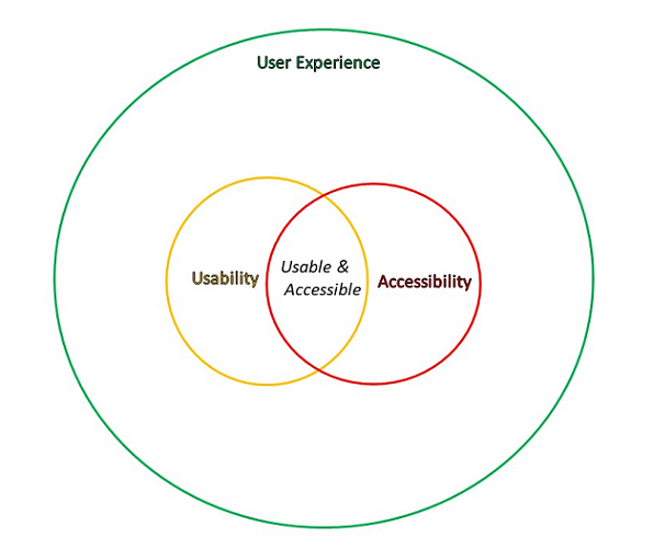

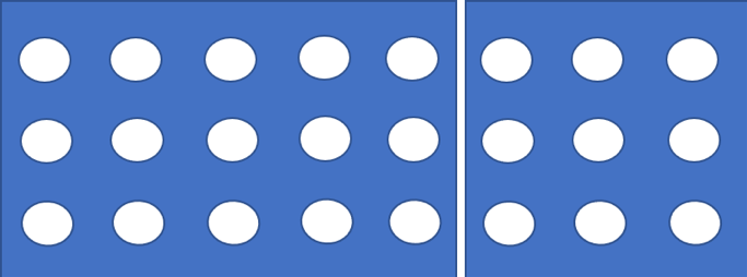
