1. Introduction
This section is not normative.
This module introduces additional ways of representing 2D images, for example as a URL with color fallback, as conic gradients, or as the rendering of another element in the document.
2. Image Values: the <image> type
The <image> value type denotes a 2D image. It can be a url reference, image notation, or gradient notation. Its syntax is:
<image> = <url> | <image()> | <image-set()> | <cross-fade()> | <gradient>
An <image> can be used in many CSS properties, including the background-image, list-style-image, cursor properties [CSS21] (where it replaces the <url> component in the property’s value).
In some cases, an image is invalid, such as a <url> pointing to a resource that is not a valid image format. An invalid image is rendered as a solid-color transparent image with no intrinsic dimensions. However, invalid images have special behavior in some contexts, such as the image() notation.
2.1. Image File Formats
At minimum, the UA must support the following image file formats when referenced from an <image> value, for all the properties in which using <image> is valid:
- PNG, as specified in [PNG]
- SVG, as specified in [SVG11], using the secure static mode (See [SVG-INTEGRATION])
- If the UA supports animated <image>s, SVG, as specified in [SVG11], using the secure animated mode (See [SVG-INTEGRATION])
The UA may support other file formats as well.
2.2. Image References: the url() notation
Note: No change from [css3-images].
2.3. Image Fallbacks and Annotations: the image() notation
The image() function allows an author to:
-
use media fragments to clip out a portion of an image
-
use a solid color as an image
-
fallback to a solid-color image, when the image at the specified url can’t be downloaded or decoded
-
automatically respect the image orientation specified in the image’s metadata
The image() notation is defined as:
image() = image( <image-tags>? [ <image-src>? , <color>? ]! )
<image-tags> = [ ltr | rtl ]
<image-src> = [ <url> | <string> ]
A <string> used in image() represents a <url>. As usual for URLs in CSS, relative URLs are resolved to an absolute URL (as described in Values & Units [css-values-3]) when a specified image() value is computed.
If the image has an orientation specified in its metadata, such as EXIF, the UA must rotate or flip the image to correctly orient it as the metadata specifies.
2.3.1. Image Fallbacks
If both a URL and a <color> are specified in image(), then whenever the URL represents an invalid image, the image() function renders as if the URL were not specified at all; it generates a solid-color image as specified in §2.3.3 Solid-color Images.
body      { color: black; background: white; }
p.special { color: white; background: url("dark.png") black; }
When the image doesn’t load, the background color is still there to ensure that the white text is readable. However, if the image has some transparency, the black will be visible behind it, which is probably not desired. The image() function addresses this:
body      { color: black; background: white; }
p.special { color: white; background: image("dark.png", black); }
Now, the black won’t show at all if the image loads, but if for whatever reason the image fails, it’ll pop in and prevent the white text from being set against a white background.
2.3.2. Image Fragments
When a URL specified in image() represents a portion of a resource (e.g. by the use of media fragment identifiers) that portion is clipped out of its context and used as a standalone image.
![[9 circles, with 0 to 8 eighths filled in]](images/sprites.svg)
background-image: image('sprites.svg#xywh=40,0,20,20')
...the background of the element will be the portion of the image that starts at (40px,0px) and is 20px wide and tall, which is just the circle with a quarter filled in.
So that authors can take advantage of CSS’s forwards-compatible parsing rules to provide a fallback for image slices,
implementations that support the image() notation must support the xywh=#,#,#,# form of media fragment identifiers
for images specified via image(). [MEDIA-FRAGS]
Since the image() notation requires UAs to support media fragments, authors can take advantage of CSS’s forward-compatible parsing rules to provide a fallback when using an image fragment URL:
background-image: url('swirl.png'); /* old UAs */
background-image: image('sprites.png#xywh=10,30,60,20'); /* new UAs */
If a URL uses a fragment identifier syntax that the implementation does not understand, or does not consider valid for that type of image, the URL must be treated as representing an invalid image.
Note: This error-handling is limited to image(), and not in the definition of URL, for legacy compat reasons.
2.3.3. Solid-color Images
If the image() function is specified with only a <color> argument (no URL), it represents a solid-color image of the specified color with no intrinsic dimensions.
background-image: image(rgba(0,0,255,.5)), url("bg-image.png");
background-color does not work for this, as the solid color it generates always lies beneath all the background images.
2.3.4. Bidi-sensitive Images
Before listing any <image-src>s,
the author may specify a directionality for the image,
similar to adding a dir attribute to an element in HTML.
If a directional image is used on or in an element with opposite direction,
the image must be flipped in the inline direction
(as if it was transformed by, e.g., scaleX(-1), if the inline direction is the X axis).
Note: Absent this declaration, images default to no directionality at all, and thus don’t care about the directionality of the surrounding element.
<ul style="list-style-image: image(ltr 'arrow.png');">
  <li dir='ltr'>My bullet is on the left!</li>
  <li dir='rtl'>MY BULLET IS ON THE RIGHT!</li>
</ul>
This should render something like:
⇒ My bullet is on the left!
  !THGIR EHT NO SI TELLUB YM ⇐
In LTR list items, the image will be used as-is. In the RTL list items, however, it will be flipped in the inline direction, so it still points into the content.
2.4. Resolution Negotiation: the image-set() notation
Note: No change from [css3-images].
2.5. Combining images: the cross-fade() notation
Note: No change from [css3-images].
2.6. Using Elements as Images: the element() notation
The element() function allows an author to use an element in the document as an image. As the referenced element changes appearance, the image changes as well. This can be used, for example, to create live previews of the next/previous slide in a slideshow, or to reference a canvas element for a fancy generated gradient or even an animated background.
Note: The element() function only reproduces the appearance of the referenced element, not the actual content and its structure. Authors should only use this for decorative purposes, and must not use element() to reproduce an element with significant content across the page. Instead, just insert multiple copies of the element into the document.
The syntax for element() is:
element() = element( <id-selector> )
where <id-selector> is an ID selector [SELECT].
Do we need to be able to refer to elements in external documents (such as SVG paint servers)? Or is it enough to just use url() for this?
This name conflicts with a somewhat similar function in GCPM. This needs to be resolved somehow.
Want the ability to do "reflections" of an element, either as a background-image on the element or in a pseudo-element. This needs to be specially-handled to avoid triggering the cycle-detection.
When we have overflow:paged, how can we address a single page in the view?
The element() function references the element matched by its argument. The ID is first looked up in the elementSources map, as described in that section. If it’s not found, it’s then matched against the document. If multiple elements are matched, the function references the first such element.
The image represented by the element() function can vary based on whether the element is visible in the document:
- an element that is rendered, is not a descendant of a replaced element, and generates a stacking context
-
The function represents an image with its intrinsic size equal to the decorated bounding box of the referenced element:
- for an element rendered using a CSS rendering model, the decorated bounding box is the smallest axis-aligned rectangle that contains the border image areas of all the fragments of the principal box
- for an element rendered using the SVG rendering model, the decorated bounding box is defined by SVG
Note: Because images clip anything outside their bounds by default, this means that decorations that extend outside the decorated bounding box, like box shadows, may be clipped.
The image is constructed by rendering the referenced element and its descendants (at the same size that they would be in the document) over an infinite transparent canvas, positioned so that the edges of the decorated bounding box are flush with the edges of the image.
Requiring some degree of stacking context on the element appears to be required for an efficient implementation. Do we need a full stacking context, or just a pseudo-stacking context? Should it need to be a stacking context normally, or can we just render it as a stacking context when rendering it to element()?
If the referenced element has a transform applied to it or an ancestor, the transform must be ignored when rendering the element as an image. [CSS3-TRANSFORMS]
If the referenced element is broken across pages, the element is displayed as if the page content areas were joined flush in the pagination direction, with pages' edges corresponding to the initial containing block’s start edge aligned. Elements broken across lines or columns are just rendered with their decorated bounding box.
Implementations may either re-use existing bitmap data generated for the referenced element or regenerate the display of the element to maximize quality at the image’s size (for example, if the implementation detects that the referenced element is an SVG fragment); in the latter case, the layout of the referenced element in the image must not be changed by the regeneration process. That is, the image must look identical to the referenced element, modulo rasterization quality.
As a somewhat silly example, a
<p>element can be reused as a background elsewhere in the document:<style> #src { color: white; background: lime; width: 300px; height: 40px; position: relative; } #dst { color: black; background: element(#src); padding: 20px; margin: 20px 0; } </style> <p id='src'>I’m an ordinary element!</p> <p id='dst'>I’m using the previous element as my background!</p>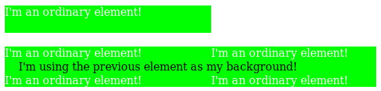
- an element that is not rendered, but which provides a paint source
-
The function represents an image with the intrinsic size and appearance of the paint source.
The host language defines the size and appearance of paint sources.
For example, the element() function can reference an SVG
<pattern>element in an HTML document:<!DOCTYPE html> <svg> <defs> <pattern id='pattern1'> <path d='...'> </pattern> </defs> </svg> <p style="background: element(#pattern1)"> I’m using the pattern as a background! If the pattern is changed or animated, my background will be updated too! </p>HTML also defines that a handful of elements, such as
<canvas>,<img>, and<video>, provide a paint source. This means that CSS can, for example, reference a canvas that’s being drawn into, but not displayed in the page:<!DOCTYPE html> <script> var canvas = document.querySelector('#animated-bullet'); canvas.width = 20; canvas.height = 20; drawAnimation(canvas); </script> <canvas id='animated-bullet' style='display:none'></canvas> <ul style="list-style-image: element(#animated-bullet);"> <li>I’m using the canvas as a bullet!</li> <li>So am I!</li> <li>As the canvas is changed over time with Javascript, we’ll all update our bullet image with it!</li> </ul> - anything else
-
The function represents an invalid image.
For example, all of the following element() uses will result in a transparent background:
<!DOCTYPE html>
<p id='one' style="display:none; position: relative;">one</p>
<iframe src="http://example.com">
  <p id='two' style="position: relative;">I’m fallback content!</p>
</iframe>
<ul>
  <li style="background: element(#one);">
    A display:none element isn’t rendered, and a P element
    doesn’t provide a paint source.
  </li>
  <li style="background: element(#two);">
    The descendants of a replaced element like an IFRAME
    can’t be used in element() either.
  </li>
  <li style="background: element(#three);">
    There’s no element with an id of "three", so this also
    gets rendered as a transparent image.
  </li>
</ul>
An element is not rendered if it does not have an associated box.
This can happen, for example,
if the element or an ancestor is display:none.
Host languages may define additional ways in which an element can be considered not rendered;
for example, in SVG,
any descendant of a <defs> element is considered to be not rendered.
The element() function can be put to many uses. For example, it can be used to show a preview of the previous or next slide in a slideshow:
<!DOCTYPE html>
<script>
function navigateSlides() {
  var currentSlide = ...;
  document.querySelector('#prev-slide').id = '';
  document.querySelector('#next-slide').id = '';
  currentSlide.previousElementSibling.id = 'prev-slide';
  currentSlide.nextElementSibling.id = 'next-slide';
}
</script>
<style>
.slide {
  /* Need to be a stacking context to be element()-able. */
  position: relative;
}
#prev-preview, #next-preview {
  position: fixed;
  ...
}
#prev-preview { background: element(#prev-slide); }
#next-preview { background: element(#next-slide); }
</style>
<a id='prev-preview'>Previous Slide</a>
<a id='next-preview'>Next Slide</a>
<section class='slide'>...</section>
<section class='slide current-slide'>...</section>
...
In this example, the navigateSlides function updates the ids of the next and previous slides,
which are then displayed in small floating boxes alongside the slides.
Since you can’t interact with the slides through the element() function (it’s just an image),
you could even use click handlers on the preview boxes to help navigate through the page.
2.6.1. Paint Sources
Host languages may define that some elements provide a paint source. Paint sources have an intrinsic appearance and can obtain a concrete object size without having to do layout or rendering, and so may be used as images even when they’re not rendered.
In HTML, the <img>, <video>, and <canvas> elements provide paint sources
(defined in each element’s section in HTML5).
In SVG, any element that provides a paint server provides a paint source. Note: In SVG1.1,
the <linearGradient>, <radialGradient>,
and <pattern> elements
provide paint sources. They are drawn as described in the spec,
with the coordinate systems defined as follows:
- objectBoundingBox
- The coordinate system has its origin at the top left corner of the rectangle defined by the concrete object size that it’s being drawn into, and the same width and height as the concrete object size. A single user coordinate is the width and height of the concrete object size.
- userSpaceOnUse
- The coordinate system has its origin at the top left corner of the rectangle defined by the concrete object size that it’s being drawn into, and the same width and height as the concrete object size. User coordinates are sized equivalently to the CSS px unit.
Note: It is expected that a future version of this module will define ways to refer to paint sources in external documents, or ones that are created solely by script and never inserted into a document at all.
2.6.2. Using Out-Of-Document Sources: the ElementSources interface
The element() function normally selects elements within a document,
but elements that provide a paint source don’t necessarily need to be in-document.
For example, an HTML <canvas> element can be created, maintained, and drawn into entirely in script,
with no need for it to be inserted into the document directly.
All that’s needed is a way to refer to the element, as an ID selector cannot select elements outside of the document. The elementSources Map object provides this.
partial interface CSS {
  [SameObject] readonly attribute Map elementSources;
};
Any entries in the elementSources map with a string key and a value that is an object providing a paint source are made available to the element() function.
Whenever element() uses an <id-selector>,
the ID’s value (without the leading # character)
is first looked up in the elementSources map:
- If it’s found, and the object associated with it provides a paint source, the element() function represents that paint source.
- If it’s found, but the object associated with it doesn’t provide a paint source, the element() function represent an invalid image.
- If the ID isn’t found in the map at all, it’s then looked for in the document as normal.
This reuse of the ID selector matches Moz behavior. I’m trying to avoid slapping a <custom-ident> right in the beginning of the grammar, as that eats too much syntax-space. Another possibility, though, is to start the value with a language-defined keyword followed by a <custom-ident>, like element(external fancy) or something. Naming suggestions welcome.
<script>
var bg = document.createElement('canvas');
bg.height = 200;
bg.width = 1000;
drawFancyBackground(bg);
CSS.elementSources.set('fancy', bg);
</script>
<style>
h1 {
  background-image: element(#fancy);
}
</style>
As the "fancy" canvas is drawn into and animated, the backgrounds of all the H1 elements will automatically update in tandem.
Note that the elementSources map is consulted before the document to match the ID selector, so even if there’s an element in the document that would match #fancy, the backgrounds will still predictably come from the elementSources value instead.
2.6.3. Cycle Detection
The element() function can produce nonsensical circular relationships, such as an element using itself as its own background. These relationships can be easily and reliably detected and resolved, however, by keeping track of a dependency graph and using common cycle-detection algorithms.
The dependency graph consists of edges such that:
- every element depends on its children
- for any element A with a property using the element() function pointing to an element B, A depends on B
- if a host language defines a way for elements to refer to the rendering of other elements,
the referencing element depends on the referenced element.
For example, in SVG,
a
<use>element depends on the element it referenced.
If the graph contains a cycle, any element() functions participating in the cycle are invalid images.
3. Gradients
A gradient is an image that smoothly fades from one color to another. These are commonly used for subtle shading in background images, buttons, and many other things. The gradient notations described in this section allow an author to specify such an image in a terse syntax, so that the UA can generate the image automatically when rendering the page. The syntax of a <gradient> is:
<gradient> = [
  <linear-gradient()> | <repeating-linear-gradient()> |
  <radial-gradient()> | <repeating-radial-gradient()> |
  <conic-gradient()>  | <repeating-conic-gradient()> ]
As with the other <image> types defined in this specification, gradients can be used in any property that accepts images. For example:
background: linear-gradient(white, gray);list-style-image: radial-gradient(circle, #006, #00a 90%, #0000af 100%, white 100%)
A gradient is drawn into a box with the dimensions of the concrete object size, referred to as the gradient box. However, the gradient itself has no intrinsic dimensions.
Gradients are specified by defining the starting point and ending point of a gradient line (which, depending on the type of gradient, may be technically a line, or a ray, or a spiral), and then specifying colors at points along this line. The colors are smoothly blended to fill in the rest of the line, and then each type of gradient defines how to use the color of the gradient line to produce the actual gradient.
3.1. Linear Gradients: the linear-gradient() notation
Note: No change from [css3-images].
3.2. Radial Gradients: the radial-gradient() notation
Note: No change from [css3-images].
3.3. Conic Gradients: the conic-gradient() notation
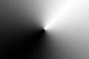
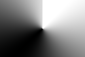
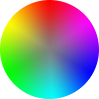
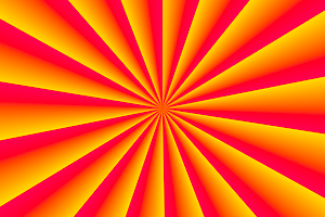
A conic gradient starts by specifying the center of a circle, similar to radial gradients, except that conic gradient color-stops are placed around the circumference of the circle, rather than on a line emerging from the center, causing the color to smoothly transition as you spin around the center, rather than as you progress outward from the center.
A conic gradient is specified by indicating a rotation angle, the center of the gradient, and then specifying a list of color-stops. Unlike linear and radial gradients, whose color-stops are placed by specifying a <length>, the color-stops of a conic gradient are specified with an <angle>. Rays are then drawn emerging from the center and pointing in all directions, with the color of each ray equal to the color of the gradient-line where they intersect it.
Note: These gradients are called "conic" or "conical" because, if the color stops are chosen to be significantly lighter on one side than the other, it produces a pattern that looks like a cone observed from above. They are also known as "angle" gradients in some contexts, since they are produced by varying the rotation angle of a ray.
![[An image showing a box with a background shading gradually clockwise from white to black, starting from the top. A gradient circle is shown, and the colors at 0 and 216 degrees respectively.]](images/conic-diagram.png)
3.3.1. conic-gradient() Syntax
The syntax for a conic gradient is:
conic-gradient() = conic-gradient(
  [ from <angle> ]? [ at <position> ]?,
  <angular-color-stop-list>
)
The arguments are defined as follows:
- <angle>
- The entire gradient is rotated by this angle. If omitted, defaults to 0deg.
- <position>
- Determines the gradient center of the gradient. The <position> value type (which is also used for background-position) is defined in [css-values-3], and is resolved using the center-point as the object area and the gradient box as the positioning area. If this argument is omitted, it defaults to center.
Usually in conic gradients the sharp transition at 0deg is undesirable, which is typically avoided by making sure the first and last color stops are the same color. Perhaps it would be useful to have a keyword for automatically achieving this.
Would a radius (inner & outer) for clipping the gradient be useful? If so, we could also support lengths in color stop positions, since we now have a specific radius.
Are elliptical conic gradients useful? Do graphics libraries support them?
3.3.2. Placing Color Stops
Color stops are placed on a gradient line that curves around the center in a circle, with both the 0% and 100% locations at 0deg. Just like linear gradients, 0deg points to the top of the page, and increasing angles correspond to clockwise movement around the circle.
Note: It may be more helpful to think of the gradient line as forming a spiral, where only the segment from 0deg to 360deg is rendered. This avoids any confusion about "overlap" when you have angles outside of the rendered region.
A color-stop can be placed at a location before 0% or after 100%; though these regions are never directly consulted for rendering, color stops placed there can affect the color of color-stops within the rendered region through interpolation or repetition (see repeating gradients). For example, conic-gradient(red -50%, yellow 150%) produces a conic gradient that starts with a reddish-orange color at 0deg (specifically, #f50), and transitions to an orangish-yellow color at 360deg (specifically, #fa0).
The color of the gradient at any point is determined by first finding the unique ray anchored at the center of the gradient that passes through the given point. The point’s color is then the color of the gradient line at the location where this ray intersects it.
3.3.3. Conic Gradient Examples
All of the following conic-gradient() examples are presumed to be applied to a box that is 300px wide and 200px tall, unless otherwise specified.
background: conic-gradient(#f06, gold);
background: conic-gradient(at 50% 50%, #f06, gold);
background: conic-gradient(from 0deg, #f06, gold);
background: conic-gradient(from 0deg at center, #f06, gold);
background: conic-gradient(#f06 0%, gold 100%);
background: conic-gradient(#f06 0deg, gold 1turn);
background: conic-gradient(white -50%, black 150%);
background: conic-gradient(white -180deg, black 540deg);
background: conic-gradient(hsl(0,0%,75%), hsl(0,0%,25%));
background: conic-gradient(from 45deg, white, black, white);
background: conic-gradient(hsl(0,0%,87.5%), white 45deg, black 225deg, hsl(0,0%,87.5%));
Note that offsetting every color stop by the rotation angle instead would not work and produces an entirely different gradient:
background: conic-gradient(white 45deg, black 225deg, white 405deg);
background: radial-gradient(gray, transparent),
            conic-gradient(red, yellow, lime, aqua, blue, magenta, red);
border-radius: 50%;
width: 200px; height: 200px;
background: conic-gradient(yellowgreen 40%, gold 0deg 75%, #f06 0deg);
border-radius: 50%;
width: 200px; height: 200px;

3.4. Repeating Gradients: the repeating-linear-gradient(), repeating-radial-gradient(), and repeating-conic-gradient() notations
In addition to linear-gradient(), radial-gradient(), and conic-gradient(), this specification defines repeating-linear-gradient(), repeating-radial-gradient(), and repeating-conic-gradient() values. These notations take the same values and are interpreted the same as their respective non-repeating siblings defined previously.
background: repeating-conic-gradient(
                  hsla(0,0%,100%,.2) 0deg 15deg,
                  hsla(0,0%,100%,0) 0deg 30deg
              ) #0ac;

background: repeating-conic-gradient(black 0deg 25%, white 0deg 50%);
background-size: 60px 60px;
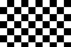
The same checkerboard can be created via non-repeating conic gradients:
background: conic-gradient(black 25%, white 0deg 50%, black 0deg 75%, white 0deg);
background-size: 60px 60px;
3.5. Gradient Color-Stops
<color-stop-list> =
  [ <linear-color-stop> [, <linear-color-hint>]? ]# , <linear-color-stop>
<linear-color-stop> = <color> && <color-stop-length>
<linear-color-hint> = <length-percentage>
<color-stop-length> = <length-percentage>{1,2}

<angular-color-stop-list> =
  [ <angular-color-stop> [, <angular-color-hint>]? ]# , <angular-color-stop>
<angular-color-stop> = <color> && <color-stop-angle>?
<angular-color-hint> = <angle-percentage>
<color-stop-angle> = <angle-percentage>{1,2}

<color-stop> = <color-stop-length> | <color-stop-angle>
Are lengths useful in <angular-color-stop>, for a given gradient circle?
This is past the complexity point where it can be easily understood with just prose. Add a diagram illustrating the possibilities, preferably for all three kinds of gradients (to show off the three shapes of gradient lines).
The colors in gradients are specified using color stops. A color stop is a combination of a color and one or two positions. (Depending on the type of gradient, that position can be a length, angle, or percentage.) While every color stop conceptually has at least one position, the position can be omitted in the syntax. (It gets automatically filled in by the user agent; see below for details.)
Between two color stops there can be a color interpolation hint, which specifies how the colors of the two color stops on either side should be interpolated in the space between them (by default, they interpolate linearly). There can only be at most one color interpolation hint between any two given color stops; using more than that makes the function invalid.
Color stops are organized into a color stop list, which is a list of one or more color stops. The first and last color stops in the list must have a color (though their position can be omitted).
Color stops and color hints are placed on a gradient line, which defines the colors at every point of a gradient. The gradient function defines the shape and length of the gradient line, along with its starting point and ending point.
Color stops and color hints must be specified in order. Percentages refer to the length of the gradient line between the starting point and ending point, with 0% being at the starting point and 100% being at the ending point. Lengths are measured from the starting point in the direction of the ending point along the gradient line. Angles are measured with 0deg pointing up, and positive angles corresponding to clockwise rotations from there.
Color stops and color hints are usually placed between the starting point and ending point, but that’s not required; the gradient line extends infinitely in both directions, and a color stop or color hint can be placed at any position on the gradient line.
A color stop with two locations is mostly equivalent to specifying two color stops with the same color, one for each position. Specifying two locations makes it easier to create solid-color "stripes" in a gradient, without having to repeat the color twice.
The position of a color stop can be omitted. This causes the color stop to position itself automatically between the two surrounding stops. If multiple stops in a row lack a position, they space themselves out equally.
The following steps must be applied in order to process the <color-stop-list>. After applying these rules, all color stops and color hints will have a definite position and color (if appropriate) and they will be in ascending order:
- If the first color stop does not have a position, set its position to 0%. If the last color stop does not have a position, set its position to 100%.
- If a color stop or color hint has a position that is less than the specified position of any color stop or color hint before it in the list, set its position to be equal to the largest specified position of any color stop or color hint before it.
- If any color stop still does not have a position, then, for each run of adjacent color stops without positions, set their positions so that they are evenly spaced between the preceding and following color stops with positions.
This requires us to wait until after layout to do fix-up, because implied-position stops (set by step 3) may depend on stops that need layout information to place, and which may be corrected by step 2. Swapping steps 2 and 3 would let us interpolate color stops purely at computed-value time, which is a nice plus, at the cost of changing behavior from level 3 for some edge cases that triggered fixup. Make sure this is handled well in the serialization rules.
At each color stop position, the line is the color of the color stop. Between two color stops, the line’s color is interpolated between the colors of the two color stops, with the interpolation taking place in premultiplied RGBA space.
By default,
this interpolation is linear—
However, if a color hint was provided between two color stops, the interpolation is non-linear, and controlled by the hint:
- Determine the location of the color hint as a percentage of the distance between the two color stops, denoted as a number between 0 and 1, where 0 indicates the hint is placed right on the first color stop, and 1 indicates the hint is placed right on the second color stop. Let this percentage be H.
- For any given point between the two color stops, determine the point’s location as a percentage of the distance between the two color stops, in the same way as the previous step. Let this percentage be P.
- Let C, the color weighting at that point,
be equal to
PlogH(.5). - The color at that point is then a linear blend between the colors of the two color stops,
blending
(1 - C)of the first stop and C of the second stop.
Note: If the hint is placed halfway between the two stops, this is thus the ordinary linear interpolation. If the hint is placed anywhere else, it dictates the position of the "halfway point", where the color is an equal blend between the two color stops, and produces smooth, even blends between the color stops and the "halfway point".
Before the first color stop, the line is the color of the first color stop. After the last color stop, the line is the color of the last color stop.
If multiple color stops have the same position, they produce an infinitesimal transition from the one specified first in the rule to the one specified last. In effect, the color suddenly changes at that position rather than smoothly transitioning.
1. linear-gradient(red, white 20%, blue)
   =1=>
   linear-gradient(red 0%, white 20%, blue 100%)

2. linear-gradient(red 40%, white, black, blue)
   =13=>
   linear-gradient(red 40%, white 60%, black 80%, blue 100%)

3. linear-gradient(red -50%, white, blue)
   =13=>
   linear-gradient(red -50%, white 25%, blue 100%)

4. linear-gradient(red -50px, white, blue)
   =13=>
   linear-gradient(red -50px, white calc(-25px + 50%), blue 100%)

5. linear-gradient(red 20px, white 0px, blue 40px)
   =2=>
   linear-gradient(red 20px, white 20px, blue 40px)

6. linear-gradient(red, white -50%, black 150%, blue)
   =12=>
   linear-gradient(red 0%, white 0%, black 150%, blue 150%)

7. linear-gradient(red 80px, white 0px, black, blue 100px)
   =23=>
   linear-gradient(red 80px, white 80px, black 90px, blue 100px)

8. linear-gradient(red, 25%, white)
   =14=>
   linear-gradient(red 0%, rgb(100%,50%,50%) 25%, white 100%)
linear-gradient(90deg, red, transparent, blue)
In premultiplied space, transitions to or from "transparent" always look nice:
On the other hand, if a gradient were to incorrectly transition in non-premultiplied space, the colors near "transparent" would noticeably darken to a grayish color, because "transparent" is actually a shorthand for rgba(0,0,0,0), or transparent black:
Note: It is recommended that authors not mix different types of units, such as px, em, or %, in a single rule, as this can cause a color stop to unintentionally try to move before an earlier one. For example, the rule background-image: linear-gradient(yellow 100px, blue 50%) wouldn’t require any fix-up as long as the background area is at least 200px tall. If it was 150px tall, however, the blue color stop’s position would be equivalent to "75px", which precedes the yellow color stop, and would be corrected to a position of 100px.
Note: The definition and implications of "premultiplied" color spaces are given elsewhere in the technical literature, but a quick primer is given here to illuminate the process. Given a color expressed as an rgba() 4-tuple, one can convert this to a premultiplied representation by multiplying the red, green, and blue components by the alpha component. For example, a partially-transparent blue may be given as rgba(0,0,255,.5), which would then be expressed as [0, 0, 127.5, .5] in its premultiplied representation. Interpolating colors using the premultiplied representations rather than the plain rgba representations tends to produce more attractive transitions, particularly when transitioning from a fully opaque color to fully transparent. Note that transitions where either the transparency or the color are held constant (for example, transitioning between rgba(255,0,0,100%) and rgba(0,0,255,100%), or rgba(255,0,0,100%) and rgba(255,0,0,0%)) have identical results whether the color interpolation is done in premultiplied or non-premultiplied color-space. Differences only arise when both the color and transparency differ between the two endpoints.
4. Sizing Images and Objects in CSS
Note: No change from [css3-images].
5. Image Processing
5.1. Overriding Image Resolutions: the image-resolution property
The image resolution is defined as the number of image pixels per unit length, e.g., pixels per inch. Some image formats can record information about the resolution of images. This information can be helpful when determining the actual size of the image in the formatting process. However, the information can also be wrong, in which case it should be ignored. By default, CSS assumes a resolution of one image pixel per CSS px unit; however, the image-resolution property allows using some other resolution.
| Name: | image-resolution |
|---|---|
| Value: | [ from-image || <resolution> ] && snap? |
| Initial: | 1dppx |
| Applies to: | all elements |
| Inherited: | yes |
| Percentages: | n/a |
| Media: | visual |
| Computed value: | as specified, except with <resolution> possibly altered by computed for snap (see below) |
| Canonical order: | per grammar |
| Animatable: | no |
The image-set() notation can alter the intrinsic resolution of an image, which ideally would be automatically honored without having to set this property. How should we best address this? Change the initial value to auto, meaning "1dppx, unless CSS says otherwise"? Say that image-resolution has no effect on images whose resolution was set by something else in CSS? Or somehow wordsmithing image-set() in some way such that it always produces 1dppx images somehow?
The image-resolution property specifies the intrinsic resolution of all raster images used in or on the element. It affects both content images (e.g. replaced elements and generated content) and decorative images (such as background-image). The intrinsic resolution of an image is used to determine the image’s intrinsic dimensions. Values have the following meanings:
- <resolution>
- Specifies the intrinsic resolution explicitly. A "dot" in this case corresponds to a single image pixel.
- from-image
- The image’s intrinsic resolution is taken as that specified by the image format. If the image does not specify its own resolution, the explicitly specified resolution is used (if given), else it defaults to 1dppx.
- snap
- If the "snap" keyword is provided, the computed <resolution> (if any) is the specified resolution rounded to the nearest value that would map one image pixel to an integer number of device pixels. If the resolution is taken from the image, then the used intrinsic resolution is the image’s native resolution similarly adjusted.
As vector formats such as SVG do not have an intrinsic resolution, this property has no effect on vector images.
img.high-res {
  image-resolution: 300dpi;
}
With this set, an image meant to be 5 inches wide at 300dpi will actually display as 5in wide; without this set, the image would display as approximately 15.6in wide since the image is 15000 image pixels across, and by default CSS displays 96 image pixels per inch.
img { image-resolution: from-image }
These rules both specify that the UA should use the image resolution found in the image itself, but if the image has no resolution, the resolution is set to 300dpi instead of the default 1dppx.
img { image-resolution: from-image 300dpi }
img { image-resolution: 300dpi from-image }
img { image-resolution: 300dpi }
This rule, on the other hand, if used when the screen’s resolution is 96dpi, would instead render the image at 288dpi (so that 3 image pixels map to 1 device pixel):
img { image-resolution: 300dpi snap; }
The snap keyword can also be used when the resolution is taken from the image:
img { image-resolution: snap from-image; }
An image declaring itself as 300dpi will, in the situation above, display at 288dpi (3 image pixels per device pixel) whereas an image declaring 72dpi will render at 96dpi (1 image pixel per device pixel).
6. Interpolation
Note: No change from [css3-images].
7. Serialization
Note: No change from [css3-images].
8. Privacy and Security Considerations
Note: No change from [css3-images].
9. Changes
Changes Since the 11 September 2012 Working Draft
-
Added the two location syntax for gradient color stops
-
Added start angles to conic gradients
-
The position(s) of a color stop can now come before the color
-
Text that is identical to [css3-images] has been replaced with a reference to [css3-images].
Changes Since Level 3
-
Added the image() notation (deferred from Level 3)
-
Added the image-resolution property (deferred from Level 3)
-
Added the element() notation (deferred from Level 3)
-
Added conic gradients