Abstract
CSS is a simple, declarative language for creating style sheets that
specify the rendering of HTML and other structured documents. This Note
contains experimental ideas for layout templates and alternative
layout models in CSS.
At the moment, it defines a typographic grid for CSS. It has
features to set up a grid-based template, to style the slots of the template and to flow content into
them.
A grid template can be seen as a cross between table layout (align
blocks of text automatically in two-dimensions) and absolute positioning
(position elements in arbitrary order), but it also has unique features of
its own.
Grid templates can also be associated with pages in paged media (via
‘@page’), to create page templates.
Slots can form chains, to create
non-rectangular regions. A chain of slots is like a series of small pages:
content is broken at possible page breaks and distributed over the slots.
Region-based styling allows
content to be styled not only based on its position in the document tree,
but also based on the slot it finds itself in. This is achieved by
allowing slot names to appear in selectors.
Status of this document
This section describes the status of this document at the time of
its publication. Other documents may supersede this document. A list of
current W3C publications and the latest revision of this technical report
can be found in the W3C technical reports
index at http://www.w3.org/TR/.
Publication as a Working Group Note does not imply endorsement by the
W3C Membership. This is a draft document and may be updated, replaced or
obsoleted by other documents at any time. It is inappropriate to cite this
document as other than work in progress.
This document was produced by the CSS Working Group (part of
the Style Activity).
The (archived) public
mailing list www-style@w3.org
(see instructions) is
preferred for discussion of this document. When sending e-mail, please put
the text “css-template-3” in the subject, preferably like this:
“[css-template-3] …summary of comment…”
This document was produced by a group operating under the 5 February
2004 W3C Patent Policy. W3C maintains a public list of any patent disclosures made in
connection with the deliverables of the group; that page also includes
instructions for disclosing a patent. An individual who has actual
knowledge of a patent which the individual believes contains Essential
Claim(s) must disclose the information in accordance with section
6 of the W3C Patent Policy.
This document is governed by the 1 August 2014 W3C Process Document.
This draft combines ideas from earlier drafts on Template Layout, Grid
Positioning [CSS3GRID] and Grid Layout [CSS-GRID-1].
Issues on this draft are mentioned in the text itself and/or in the
on-line Tracker under “Details on
Product CSS3 Template Layout.”
This document currently serves as a repository for ideas around
using templates for laying out elements, regions or pages; and for various
alternative layout models. It is expected to be updated, but it is not
expected to become a W3C Recommendation in this form. Instead, ideas may
migrate to other modules of CSS.
Table of contents
1. Introduction
(This section is not normative.)
1.1. Summary and use
cases
The styling of a Web page, a form or a graphical user
interface can roughly be divided into two parts: (1) defining the overall
“grid” of the page or window and (2) specifying the fonts, indents,
colors, etc., of the text and other objects. The two are not completely
separate, of course, because indenting or coloring a text influences the
perceived grid as well. Nevertheless, when one separates the parts of a
style that should change when the window gets bigger from the parts that
stay the same, one often finds that the grid changes (different number of
columns and rows, different order for the blocks of content, less or more
open space between those blocks, etc.), while fonts, colors, indents,
numbering styles, and many other things don't have to change, until the
size of the window becomes extreme.
The properties in this specification associate a layout grid with an
element (or with a page, see below). Rather than rendering all descendants
of an element in a single flow, they give an element multiple flows,
called slots, placed on an invisible grid by means of
a grid template. The descendants are given a ‘flow’ property to
designate the slot into which they flow.
Because layouts on the Web have to adapt to different window and paper
sizes, the rows and columns of the grid can be made fixed or flexible in
size.
In some typographical traditions, the slots are called
“fields” or “spatial
zones.” Traditionally, also, all columns have the same width,
called the “module” or “unit.”
The horizontal lines of a grid that define the rows are sometimes called
“flow
lines.” Some traditions make the space between pieces of content
an explicit part of the grid, some consider the space part of the content:
Both styles are possible in CSS, the latter by using the ‘margin’ property, the
former by using the ‘.’ symbol in a grid
template.
The typical use cases for these properties include:
-
Complex Web pages, with multiple navigation bars in fixed positions,
areas for advertisements, etc.
-
Complex forms, where the alignment of labels and form fields may be
easier with the properties of this module than with the properties for
tables, floats and margins.
-
GUIs, where buttons, toolbars, labels, icons, etc., are aligned in
complex ways and have to stay aligned (and not wrap, for example) when
the window is resized.
-
Paged displays (e.g., printed media) where each page is divided into
fixed areas for different kinds of content.
-
Complex pages with multiple regions, where the style of the text does
not only depend on the type of element it comes from, but also on the
region it is displayed in (region-based styling).
- Paged displays with complex running headers and footers, e.g., running
headers that are in between parts of the page content, rather than at the
edge of the page.
Once a grid template has been defined, it can also be used to position
elements without adding them to a flow. Setting ‘display: grid’ on a grid element makes all children
into separate flows and automatically distributes them over the grid. This
is explained in CSS Grid Layout [CSS-GRID-1].
Template-based positioning makes many traditional uses of absolute
positioning unnecessary. Like absolute positioning, grid templates are
especially useful for aligning elements that don't have simple
relationships in the source (parent-child, ancestor-descendant, immediate
sibling). But in contrast to absolute positioning, the elements are not
positioned with the help of horizontal and vertical coordinates, but by
flowing them into a template that is very much like a table: The size and
alignment of elements are governed implicitly by the rows and columns of
the template, and can automatically adapt to the overall size of the
element and to the content in each row and column.
In this example, the four children of an element are assigned to four
slots (called a, b, c and d) in a 2×2 template. (All mark-up examples in
this specification are HTML fragments, unless otherwise stated.)
<style type="text/css">
  dl { grid: "a b"
             "c d" }
  #sym1 { flow: a }
  #lab1 { flow: b }
  #sym2 { flow: c }
  #lab2 { flow: d }
</style>
<dl>
  <dt id=sym1>A
  <dd id=lab1>A is een aapje
  <dt id=sym2>B
  <dd id=lab2>B is de bakker
</dl>
Try it out! (Uses a JavaScript emulation in
browsers that do not implement grid templates natively.)
Templates can also help with device-independence. This example uses
Media Queries [MEDIAQ] to change the overall
layout of a page from 3-column layout for a wide screen to a 1-column
layout for a narrow screen. It assumes the page has been marked-up with
logical sections with IDs.
@media all
{
  body { grid: "a a a"
               "b c d" }
  #head { flow: a }
  #nav { flow: b }
  #adv { flow: c }
  #body { flow: d }
}
@media all and (max-width: 500px)
{
  body { grid: "a"
               "b"
               "c" }
  #head { flow: a }
  #nav { flow: b }
  #adv { display: none }
  #body { flow: c }
}
The slots in a grid do not overlap, unless with negative margins. Here
is how the
“zunflower” design of the CSS Zen Garden could be done:
#container {grid: "A B C"}
#container::slot(A) {box-shadow: 0.5em 0.5em 0.5em; z-index: 1}
#container::slot(B) {box-shadow: 0.5em 0.5em 0.5em; margin-left: -2em}
#intro {flow: A}
#supportingText {flow: B}
#linkList {flow: C}
Template-based positioning borrows some concepts from table layout, in
particular the idea of aligning elements in rows and columns, so that
they constrain one another's size. But there are also differences. This
example shows some of them. Assume this document fragment:
<div class=group>
 <div>aa aa aa aa aa aa</div>
 <div>bbb</div>
 <div class=menu>ccccc</div>
</div>
We can lay it out as three columns, as the following illustrations
show. The style sheet would contain the following.
.group {display: table}
.group > div {display: table-cell}
We can also use a template, in which case the style sheet would contain
this:
.group {grid: "a b c"}
.group > div {flow: a}
.group > div + div {flow: b}
.group > div + div + div {flow: c}
By default, the table is as wide as needed to fit its contents. To make
sure it is as wide as its containing block, we need to add
.group {display: table; width: 100%}
That is not needed for the grid template, but, on the other hand, if we
want the template to fit its contents, we would need to say so:
.group {grid: "a b c"; width: fit-content}
(See [CSS3BOX] for the definition of
the ‘width’
property.) The columns of the template are by default all the same size.
The columns of the table satisfy certain constraints, but their sizes may
differ. We can make them all the same by adding a rule (see [CSS3TBL]):
.group {display: table; width: 100%; table-layout: fixed}
In both styles, we can set a column to a certain size:
div:nth-child(3) {width: 3em}
resp.,
.group {grid: * * 3em "a b c"}
If there is an unknown number of columns (children of the div.group
element), the style sheet for the table model will automatically take
them into account. The style sheet for the template model, however,
creates a template of exactly three columns and can't handle tables with
an unknown number of columns. The extra elements will be added into the
default slot (in this case the ‘a’ slot).
(However, setting ‘display’ to ‘grid’ on the grid element creates a different
kind of grid, that does grow, see “Comparison with ‘display:
grid’ and ‘display:
inline-grid’” below.)
In both models, elements can have borders, but only in the table model
can borders be collapsed, which makes setting borders easier in the table
model:
.group {display: table; border-collapse: collapse}
.group > div {border: solid}
resp.,
.group > div {border: solid; border-left: none}
.group > div:first-child {border-left: solid}
In the template model, the order of the elements is explicit, and thus
it is possible to reverse the order of the columns:
.group > div {flow: c}
.group > div + div {flow: b}
.group > div + div + div {flow: a}
In the table model, the order of the rows and columns is given by the
document source and thus cannot be changed.
[Editorial note: Remove this example if the ‘content’ property will
not be allowed on elements, as it is currently expected to be.]
This example shows a way to move notes to the end of a section.
“Notes” in this example refers to elements in HTML with a class of
“note”. A fragment of HTML such as
<div class=section>
  <p>The balubious coster of the fifth secter<span
    class=note> The sixth secter coster is a difter
    manon.</span> of The Rollow Carpug mentizes a costernica.
  <p>…
</div>
with this style sheet
div.section {
    grid: "*"
          "F"}
.note {
    flow: F;
    content: counter(note) ".\A0" contents;
    counter-increment: note;
    font-size: smaller}
.note::before {
    content: counter(note);
    vertical-align: super;
    font-size: larger}
results in a rendering similar to this:
The “Generated content for paged media” module [CSS3GCPM] is
expected to define specific features for footnotes that are both easier
and more powerful than this example.
This example shows the use of chained regions: text from region 1
continues in region 2, 3 and 4. And it shows how to use pseudo-elements
to style text in a particular region: text in region 1 is bigger than in
other regions.
We assume a document fragment similar to this:
<div id=article>
  <h1>Introduction</h1>
  <p><img src="sunset" alt="">
  <p>This is an example…

  <h1>More Details</h1>
  <p>This illustrates…
  <p>Then, the example…
  <p>Finally, this…
</div>
The style sheet makes the DIV into a grid element with five regions,
called A, *, b, c and d. The regions are grouped into two chains: region
A on its own, and the chain consisting of *, b, c and d.
#article {
  grid: "A A c"
        "A A c"
        "* * c"
        "a b c";
  chains: * a b c }
The ‘*’ is a special name. It indicates the
default slot, the slot where
content goes if it doesn't have an explicit ‘flow’ property. We could have used a normal
letter and added an explicit ‘flow’ property to the children of the DIV,
but by using * we don't have to. All children thus go into region * (and
continue in a, b and c as needed). The IMG element goes into region A. We
assume for simplicity that there is only one IMG element:
#article img { flow: A }
The text in region * is bolder, larger and a different color than in
the other regions. Also, an H1 that falls into this region is rendered
differently from other H1s:
@region ::slot(*)
{
  * {
    font-weight: bold;
    color: #0C3D5F;
    font-size: larger }
  h1 {
    color: crimson;
    display: run-in }
}
(For brevity, the example doesn't show the style rules to set the color
and background, to make the text justified, add the left border to the
second H1, etc.)
As the image shows, the text of the last paragraph isn't complete and
presumably continues somewhere else, but that part is outside the scope
of this example. In paged media, we could attach the grid template to a
page instead of an element and let the text continue on the next page; we
could also make slot c into a multi-column element so that the text forms
additional columns to the right of current image (see [CSS3GCPM]
for some ideas), or there could be a scrollbar on slot c.
This example shows three ways to align the contents of a fixed-height
paragraph to the bottom of the box:
- Method 1
-
P {height: 20em; grid: "." "*" fit-content}
- Method 2
-
P {height: 20em; grid: "*"}
P::slot(*) {vertical-align: bottom}
- Method 3
- [Editorial note: Remove method 3 if vertical-align will
not be generalized to apply to all blocks.]
P {height: 20em; vertical-align: bottom}
However, the styles differ in case the content is taller than 20 em
and overflows: the first style has a baseline-aligned content which will
thus overflow below the element's box; the second example has
bottom-aligned content, which will thus overflow above the
element's box.
This example (based on a challenge by Andrew Fedoniouk) shows how a
grid template can be used to display six items in two rows of three.
Assume the following document:
<p>
  <span>...</span>
  <span>...</span>
  <span>...</span>
  <span>...</span>
  <span>...</span>
  <span>...</span>
</p>
The simplest way to break this into two lines (or more) is to add a
hard line break after the third SPAN: ‘span:nth-child(3)::after {content: "\A"; white-space:
pre}’. That works fine, unless the SPANs are inline blocks
(‘span {display: inline-block}’). Another way
is to float all SPANs and add a ‘clear’
property on the fourth: ‘span {float: left}
span:nth-child(4) {clear: left}’. But if the SPANs have
different heights or baselines, their vertical alignment will be
different than if they were on the same line.
With a grid template, we can say that the P has not one, but two flows,
a and b, the second one positioned below the first; and then we assign
the fourth and subsequent SPANs to the “b” flow. (The others
automatically go into the default, first flow.)
p {grid: "a" "b"}
span:nth-child(n+4) {flow: b}
This almost works. There is just a subtle issue with the spaces between
the SPANs. We moved the last three SPANs to flow b, but we have no way to
move the spaces between them. They remain in the default (first) slot.
(They collapse, as there is nothing left between them, so we don't
actually see them anymore.) To get spaces between the SPANs in slot b, we
need to generate new spaces:
span:nth-child(n+4)::after {content: " "}
This space handling is not very intuitive. One might expect
there to be a way to say “select everything from this element onward”
or maybe a pseudo-element selector for the text between elements. Or a
new property to specify different ways to handle the anonymous text
inside a grid element. For the moment, there is no such thing.
Suggestions are welcome.
If, on the other hand, we don't want spaces between the SPANs,
then the question becomes how to get rid of the spaces between the SPANs
in the first row. There are several ways of doing that. One way is to
explicitly flow the three first SPANs to slot “a”:
span {flow: a}
The SPANs are thus taken out of the P, causing the P's spaces to end up
next to each other at the start of flow “a” and collapse away.
Another, maybe more intuitive way is to set the spaces to zero width in
the P, and then back to normal in the SPANs (see ‘word-spacing’ in
[CSS-TEXT-3]):
p {word-spacing: -100%}
span {word-spacing: normal}
[Editorial note: Remove this last method if percentage values on ‘word-spacing’ will
not be allowed. They currently (March 2015) have Working Draft status.]
This example uses a page-based
template to create a running header that is not at the top of
the page, but exactly in the middle. We need to define our own page
template for this, because the predefined page template of [CSS3PAGE]
only has margin boxes along the edge of the page.
@page {
  grid:
    "top-half"
    "running-header" 3em
    "bottom-half";
  chains: top-half bottom-half
}
::slot(running-header) {
  content: "My Magazine - page " counter(page) " - February 2013";
  text-align: center;
  vertical-align: middle;
  border: solid;
  margin: 1em 0;
}
1.2. Dependencies on other
modules
This CSS3 module depends on the following other CSS3 modules:
- CSS 2.1 [CSS21] – block container, the property content, and the concept of stacking context.
- CSS syntax module [CSS3SYN] – interactive vs non-interactive media.
- CSS values and Units module [CSS3VAL] – <string> and <length>.
- CSS box module [CSS3BOX] – properties margin, margin-right, margin-left, width, height, float, display and overflow;
definitions of the terms intrinsic
minimum and intrinsic preferred
(as in the phrases “intrinsic preferred width” and “intrinsic
minimum width,” referring roughly to the width of the content without
breaking any lines and the width with as many line breaks as possible.)
- CSS text layout [CSS-WRITING-MODES-3]
– defines block flow direction and
the properties direction and writing-mode. The latter defines when an element
has a vertical writing mode (text
lines are vertical) or a horizontal
writing mode (text lines are horizontal). For brevity, we refer to
the former as a vertical element and to the
latter as a horizontal element.
- CSS positioning [CSS3POS] – properties z-index, position, top, right, bottom,
left.
- CSS fragmentation [CSS3-BREAK] – properties break-before, break-after
and break-inside; the definition of fragmenter.
- CSS paged media [CSS3PAGE] – definition of page area (in particular its width & height).
- CSS background and borders [CSS3BG] – properties background, background-image, background-size, box-decoration-break and
box-shadow?
- CSS tables [CSS3TBL] – property vertical-align. [or Box
Module?]
- CSS Multi-column Layout Module [CSS3COL] – property columns.
- CSS Generated and replaced content module level 3 [CSS3GENCON] – property content.
- CSS regions [CSS-REGIONS-1] – at-rule
@region and the term region.
- CSS Grid Layout [CSS-GRID-1] – the term grid container and the properties grid-auto-flow, grid-auto-columns and grid-auto-rows. (Note: A grid container is an
element with a ‘
display’ of ‘grid’ or ‘grid-inline’.)
- CSS Cascading and Inheritance Level 3 [CSS3CASCADE] – keywords
inherit, initial and unset.
Add to the above all the properties that are allowed on
slots (see “Styling slots: the ‘::slot()’ pseudo-element”).
It has non-normative (informative) references to the following other
CSS3 modules:
See section 1.4.2
of CSS level 2 [CSS21] for the grammar and other
notations that this specification uses in property definitions.
1.3. Values
This specification follows the CSS property
definition conventions from [CSS21]. Value types not defined in
this specification are defined in CSS Level 2 Revision 1 [CSS21]. Other CSS
modules may expand the definitions of these value types: for example [CSS3COLOR],
when combined with this module, expands the definition of the
<color> value type as used in this specification.
In addition to the property-specific values listed in their definitions,
all properties defined in this specification also accept the ‘inherit’, ‘initial’, and ‘unset’ keywords as their
property value.
1.4. A note about
accessibility
(This section is not normative.)
The facilities in this specification allow elements from a document to
be displayed in a visual order that is to a large extent independent of
the order in the document. That may have both positive and negative
effects on accessibility. The positive aspect is that it allows the
content in the document to be kept in logical order, so that the document
is as functional as possible without the style sheet and on media where
the style sheet doesn't apply. A negative aspect is that a document that
has a defined tab order (the order in which elements get the focus when
the tab-key is pressed) will show on the screen with a tab order unrelated
to the visual order. It may be necessary to use the keyboard control
features of the CSS Basic User Interface module [CSS3UI] to ensure that the tab
navigation follows the visual order, or to refrain from positioning
semantically related elements in different parts of a template.
The following two requirements from the Web Content Accessibility
Guidelines (WCAG) 2.0 [WCAG20] are particularly relevant.
See that specification for more information.
1.3.2
Meaningful Sequence: When the sequence in which content is
presented affects its meaning, a correct
reading sequence can be programmatically
determined. (Level A)
2.4.3
Focus Order: If a Web
page can be navigated
sequentially and the navigation sequences affect meaning or
operation, focusable components receive focus in an order that preserves
meaning and operability. (Level A)
2. Stack of cards
layout
This is a placeholder.
A stack is a layout model based on the metaphor of a stack of index
cards: sibling elements are formatted as boxes (“cards”) of the same size at the same position with a
tab sticking out at one side that contains a title for
that card. All tabs are visible (and automatically positioned so they
overlap as little as possible), but only one box is visible at a time. In
an interactive UA, the user can activate a card (e.g., by clicking on a
tab, or by pressing page-down), which displays that card and hides all the
others in the stack. E.g., a rule ‘display:
stack’ could make an element into a stack of cards (all children
become cards, sized to the largest among them) and ‘display: tab’ could make their descendants into titles
for the cards. Maybe other properties determine the style of the tabs and
on which side they display (top, bottom, left or right).
3. Declaring templates
Grid templates are declared with the ‘grid-template-areas’, ‘grid-template-rows’, ‘grid-template-columns’ and ‘grid’ properties, defined
below.
An element that has a grid template is called a grid element. More precisely: an element is a grid
element if (1) it generates a block
container box [CSS21] and (2) at least one of ‘grid-template-areas’, ‘grid-template-rows’ or ‘grid-template-columns’ has a value other than
the initial value.
Block containers are, informally, elements that can have
block elements as children, such as blocks, inline blocks or table cells,
but not inline elements or replaced elements.
An element's grid ancestor is the nearest
ancestor that is a grid element.
Note that not all elements have a grid ancestor. E.g., the
root element has none.
The number of columns of a grid element
is the number of <col-width>
values in ‘grid-template-columns’ or the number of
columns in ‘grid-template-areas’, whichever is larger.
The number of rows is the number of <row-height> values in ‘grid-template-rows’ or the number of rows in
‘grid-template-areas’, whichever is larger.
Note that a grid element always has at least one row and one
column. Those may, however, have zero size.
The ‘grid-template-areas’ property implicitly
assigns a grid to an element and defines named slots in the grid. It can
also designate a slot as the default
slot for content without an explicit flow.
Each string consist of one or more asterisks (“*”), identifiers,
periods (“.”), spaces and tabs. Each string represents one row in the
template, each symbol other than a space or tab represents one column in
that row. Spaces and tabs have no meaning. They separate identifiers and
may also be added for readability.
The symbols in the template have the following meaning
- <identifier>
- Named slot for content.
- *
- (Asterisk.) Default slot for content (explained below).
- .
- (Period.) Blank space.
Multiple identical identifiers in adjacent rows or columns form a single
slot that spans those rows and columns. Ditto for
multiple “*”s. Slot names are case-sensitive, so uppercase and
lowercase letters are considered to be different letters.
Case-sensitivity should instead be defined by reference to
the definition of identifiers, probably in css3-values.
Non-rectangular slots and multiple slots with the same name are illegal.
A template without any slot name or “*” is illegal. A template with
more than one “*” slot is illegal. Strings with different numbers of
columns (before padding with “.”, see the next paragraph) are
illegal. These errors cause the declaration to be ignored.
Note: non-rectangular and
disconnected regions may be permitted in a future update of CSS.
If there are fewer symbols in a string than the number of columns in the element, the string
is implicitly padded with “.” (period) symbols. Likewise, if there are
fewer strings than the number of rows in the
element, additional strings consisting of “.” (period) symbols are
implicitly added.
Each slot (identifier or “*”) acts as a block element for its
contents.
If the value is ‘none’,
then no explicit slots are defined. If the element is a grid element, then the element instead
has an implicit template consisting of a
single ‘*’ slot.
Note that an element is a grid element in this case if ‘grid-template-columns’ and ‘grid-template-rows’ are not both ‘auto’.
For example, the following two sets of style rules are equivalent:
DIV {
  grid-template-areas: none;
  grid-template-rows: 10em 10em 10em;
  grid-template-columns: * * * * }
and
DIV {
  grid-template-areas: "****" "****" "****";
  grid-template-rows: 10em 10em 10em;
  grid=columns: * * * * }
Authors should be aware that naming slots with Hebrew or
Arabic letters may cause some text editors to display the CSS rule with
the slot name of the string on the right. However, the first symbol in
each string corresponds to the first value in ‘grid-template-columns’ and thus represents the
leftmost column in the rendering of the document.
Only a block container element can be a
grid element. E.g., in the following
document, the elements with ID “one,” “three” and “five” are
grid elements, but the ‘grid’ property on “two” and “four”
has no effect.
<html>
  <style>
   #one {grid: "a b c"}
   #two {grid: "a" "b"}
   #three {display: inline-block; grid: "a b" "c d"}
   #four {grid: "a @"}
   #five {grid: "a b"}
  </style>
  <table>
   <tr id=four><td>... <td id=five>...
  </table>
  <ol>
   <li id=one>
    ... <span id=three>... </span>...
   <li>
    ... <em id=two>... </em>...
  </ol>
| Name:
| grid-template-columns
|
| Value:
| auto | <col-width>+
|
| Initial:
| auto
|
| Applies to:
| block container elements and grid container elements
|
| Inherited:
| no
|
| Animatable:
| yes, between grids with the same number of tracks
|
| Percentages:
| N/A
|
| Media:
| visual
|
| Computed value:
| specified value
|
| Canonical order:
| per
grammar
|
The ‘grid-template-columns’ property specifies the
sizes of the columns of a grid.
Where
<col-width> = <length> | <percentage> | * | <fraction> |
  <minmax> | min-content | max-content | fit-content
<minmax> = minmax( <col-width> , <col-width> )
The definition of minmax isn't correct, it should only
accepts certain values.
Each <col-width> sets the
width of a column, the first value for the leftmost column, the second for
the second column, etc.
If there are fewer <col-width> values than the number of columns in the element, or if the
value is ‘auto’, the missing columns widths are
all ‘*’.
Each <col-width> can be
one of the following:
- <length>
- An explicit width for that column. Negative values are illegal.
- <fraction>
- (A non-negative number followed by ‘
fr’.)
A fraction of the remaining space. ‘1fr’ means
the same as ‘*’
- *
- (Asterisk.) All columns with a width of ‘
*’ have the same width.
- <percentage>
- Expresses a size as a percentage of the element's a-priori content
width. When the width of the grid element is dependent on content, the
result is undefined.
- max-content
- min-content
- The column's width is determined by its contents. See the algorithm below.
- minmax(p,q)
- The column's width is constrained to be greater than or equal to
p and less than or equal to q. p and
q stand for [ <length> | max-content |
min-content | * ]. There may be white space around the p and
q. If q < p, then q is
ignored and ‘
minmax(p,q)’ is treated as
‘minmax(p,p)’.
- fit-content
- Equivalent to ‘
minmax(min-content,
    max-content)
’.
3.3. Specifying the
height of rows: ‘grid-template-rows’
| Name:
| grid-template-rows
|
| Value:
| auto | <row-height>+
|
| Initial:
| auto
|
| Applies to:
| block container elements and grid container elements
|
| Inherited:
| no
|
| Animatable:
| yes, between grids with the same number of tracks
|
| Percentages:
| N/A
|
| Media:
| visual
|
| Computed value:
| specified value
|
| Canonical order:
| per
grammar
|
The ‘grid-template-rows’ property specifies the
heights of the rows of a grid.
<row-height> = <length> | <percentage> | * | <fraction> |
  <minmax> | min-content | max-content | fit-content
<minmax> = minmax( <row-height> , <row-height> )
The definition of minmax isn't correct, it should only
accepts certain values.
Note that the syntax is the same syntax as for ‘grid-template-columns’
Each <row-height> sets
the height of a row, the first value for the topmost row, the second for
the second row, etc.
If there are fewer <row-height> values than the
number of rows in the element, or if the
value is ‘auto’, the missing row heights are
all ‘fit-content’.
Each <row-height> can be
one of the following:
- <length>
- An explicit height for that row. Negative values are illegal.
- <fraction>
- (A non-negative number followed by ‘
fr’.)
A fraction of the remaining space. ‘1fr’ means
the same as ‘*’
- * (asterisk)
- All rows with a height of ‘
*’ have the
same height.
- <percentage>
- Expresses a size as a percentage of the element's a-priori content
height.
When the height of the grid
element is dependent on content, the result is undefined.
- max-content
- min-content
- The row's height is determined by its contents. See the algorithm below.
- minmax(p,q)
- The row's height is constrained to be greater than or equal to
p and less than or equal to q. p and
q stand for [ <length> | max-content |
min-content | * ]. There may be white space around the p and
q. If q < p, then q is
ignored and ‘
minmax(p,q)’ is treated as
‘minmax(p,p)’.
- fit-content
- Equivalent to ‘
minmax(min-content,
    max-content)
’.
3.4. The ‘grid’ and ‘grid-template’
shorthand properties
The ‘grid-template’ property is a shorthand for
‘grid-template-areas’, ‘grid-template-columns’ and ‘grid-template-rows’ and is equivalent to
setting those properties as follows:
The ‘grid’ property
is a shorthand for setting ‘grid-template-areas’, ‘grid-template-rows’, ‘grid-template’columns', ‘grid-auto-rows’,
‘grid-auto-columns’, and ‘grid-auto-flow’
in a single declaration. See [CSS-GRID-1].
Note that ‘grid-auto-rows’, ‘grid-auto-columns’, and ‘grid-auto-flow’
only apply if ‘display’ is ‘grid’ or ‘inline-grid’.
For example, the rule
grid: * 10em "a b c" "a b d" 4em
is the same as
grid-template-columns: * 10em;
grid-template-areas: "a b c" "a b d";
grid-template-rows: auto 4em;
… and the values for ‘grid-auto-rows’, ‘grid-auto-columns’, and ‘grid-auto-flow’
are set to their default values. (Omitted for clarity.)
Note the ‘auto’ keyword that was implied in
the shorthand, but must be made explicit in the ‘grid-template-rows’ property. Also note that
the width of the third column is specified neither in the shorthand nor
in ‘grid-template-columns’, which means it is
implicitly set to ‘*’.
For example, the rule
grid: * 10em / 4em 5em
is the same as
grid-template-columns: * 10em;
grid-template-areas: "* *" "* *";
grid-template-rows: 4em 5em;
(And ‘grid-auto-rows’, ‘grid-auto-columns’, and ‘grid-auto-flow’
are set to their default values.)
3.5. Default slots
Every grid element has a default slot. If there is an asterisk (“*”) in
the template, then that slot is the default. If there is no asterisk, then
the first name in the template defines the default slot.
Note that a grid always has at least one slot, see ‘grid-template-areas’.
For example, if the template is defined by ‘grid-template-areas: "..." "..c" "a b b" "a b b"’,
then “c” is the default slot.
If the grid has an implicit
template (i.e., ‘grid-template-areas’ is ‘none’), then its single slot is
the default slot.
All content of a grid element that is not inside another flow (i.e., not
inside a float, not absolutely positioned, etc.) is flowed into the
default slot. In particular, any text content of the grid element itself
is in that default flow.
For example, in this document fragment
<DIV STYLE="grid: 'a b *'">
 <IMG STYLE="flow: a" SRC="image.png" ALT="Foo">
 This is an
 <EM STYLE="flow: *">emphasized</EM>
 <EM STYLE="flow: b">(note well!)</EM>
 sentence.
 <
</DIV>
The three slots of the grid contain:
- Slot a
- The image
- Slot b
- The text “(note well!)”
- Default slot
- The text “This is an emphasized sentence.”
(The ‘flow’
property is defined below.)
3.6. Interaction of ‘grid’ and ‘columns’
The ‘columns’
property of a grid element applies to the
default slot of the template.
For example, with this style:
BODY {grid: "a @ b" "c c c"; columns: 2}
The @-slot will have two columns.
Note that this is the same as setting columns on the default
slot: ‘BODY::slot(*) {columns: 2}’ apart from
differences in the specificity of the selector.
3.7. Calculating the size of the
grid
For the purpose of the calculations below, each slot (identifier or
“*”) in a grid has four dimensions associated with it, called MINW (“minimum width”), PREFW (“preferred width”), MINH (“minimum height”) and PREFH (“preferred height”). We can think
of them as the minimum and preferred dimensions of the slot in isolation,
i.e., if it wasn't constrained by other slots in the same row or column.
They are defined as follows:
- MINW
-
- If the slot spans only columns whose width does not depend on the
contents of the column (i.e., the column widths are specified with only
<length> values, ‘
*’, <fraction> values, or any
combination of those), then MINW is is
the sum of the slot's left and right margin, border and paddding (i.e.,
any ‘margin-left’, ‘margin-right’,
‘padding-left’ etc., that is set on it
by means of the ‘::slot()’
pseudo-element). Any ‘auto’ margins
are counted as 0 for this purpose. (Note that <length> values can be
specified with ‘calc()’ as well, see
[CSS3VALUES]].)
- Otherwise, if the slot is vertical, then MINW is the width that the slot would have
if its height were set to its intrinsic preferred height [CSS3BOX],
plus its left and right padding, border and margin. Any ‘
auto’ margins are counted as 0 for this purpose.
- Otherwise, if the slot spans at least one column whose width is
specified as ‘
max-content’ (or ‘minmax()’ with a first argument of ‘max-content’), then MINW is the intrinsic preferred width of
the slot plus its left and right margin, border and padding. Any
‘auto’ margins are counted as 0 for this
purpose.
- Otherwise (i.e., the slot spans at least one column whose width is
specified as ‘
min-content’ or ‘minmax()’ with a first argument of ‘min-content’, but no ‘max-content’) MINW is
the intrinsic minimum width
of the slot, plus its left and right padding, border and margin. Any
‘auto’ margins are counted as 0 for this
purpose.
- PREFW
-
- If the slot spans only columns whose width does not depend on the
contents of the column (i.e., the column widths are specified with only
<length> values, ‘
*’, <fraction> values, or any
combination of those), then PREFW is
infinite.
- Otherwise, if the slot is vertical, then PREFW is the width that the slot would
have if its height were set to its intrinsic preferred height,
plus the plus its left and right padding, border and margin. Any
‘
auto’ margins are counted as 0 for this
purpose.
- Otherwise, if the slot spans at least one column whose width is
specified as ‘
max-content’ (or ‘minmax()’ with a first argument of ‘max-content’), then PREFW is the intrinsic preferred width of
the slot plus its left and right margin, border and padding. Any
‘auto’ margins are counted as 0 for this
purpose.
- Otherwise PREFW is the intrinsic minimum width of the
slot, plus its left and right padding, border and margin. Any ‘
auto’ margins are counted as 0 for this purpose.
- MINH
-
- If the slot spans only rows whose height does not depend on the
contents of the column (i.e., the row heights are specified with only
<length> values, ‘
*’, <fraction> values, or any
combination of those), then MINH is the
sum of the slot's top and bottom margin, border and padding. Any
‘auto’ margins are counted as 0 for this
purpose.
- Otherwise, if the slot is horizontal, then MINH is the height the slot would have if
its width were set to its intrinsic
preferred width, plus its top and bottom margin, border and
padding. Any ‘
auto’ margins are counted as 0
for this purpose.
- Otherwise, if the slot spans at least one row whose height is
specified as ‘
max-content’ (or ‘minmax()’ with a first argument of ‘max-content’), then MINH is the intrinsic preferred height of
the slot plus its top and bottom margin, border and padding. Any
‘auto’ margins are counted as 0 for this
purpose.
- Otherwise MINH is the intrinsic minimum height of the
slot, plus its top and bottom padding, border and margin. Any ‘
auto’ margins are counted as 0 for this purpose.
- PREFH
-
- If the slot spans only rows whose height does not depend on the
contents of the column (i.e., the row heights are specified with only
<length> values, ‘
*’, <fraction> values, or any
combination of those), then PREFH is
infinite.
- Otherwise, if the slot is horizontal, then PREFH is the height the slot would have if
its width were set to its preferred minimum width, plus its
top and bottom padding, border and margin. Any ‘
auto’ margins are counted as 0 for this purpose.
- Otherwise, if the slot spans at least one row whose height is
specified as ‘
max-content’ (or ‘minmax()’ with a first argument of ‘max-content’), then PREFH is the intrinsic preferred height of
the slot plus its top and bottom margin, border and padding. Any
‘auto’ margins are counted as 0 for this
purpose.
- Otherwise PREFH is the intrinsic preferred height of
the slot, plus its top and bottom padding, border and margin. Any
‘
auto’ margins are counted as 0 for this
purpose.
For example, the MINW values of the
slots in this grid
grid:  auto * 10em
      "  a  a  .  "
      "  b  .  c  "
are as follows:
- a
- ‘
min-content’ (because the slot spans at
least one column with a width specified as ‘min-content’ or ‘auto’).
- b
- ‘
min-content’ (ditto).
- c
- 0 (because the slot spans only columns with a width that is
independent of the content).
The UA must choose the widths and heights of all columns and rows such
that the following constraints are satisfied.
-
If the element has an a-priori known content height, then the sum of
the heights of all rows must be equal to the element's height.
For example, the two rows in this grid must be 8em each so that the
total height matches the height of the element:
div {
  height: 16em;
  grid: "a . b"  *
        "a c ."  *
-
If the grid element has an a-priori known content width, then the sum
of the widths of all columns must be equal to the element's width.
For example, the three columns in this grid must be 20em each:
div {width: 60em; grid: "a b c"}
- Each row with a height specified as a <length> must have exactly that
height.
- Each column with a width specified as a <length> must have exactly that
width.
- All rows with a height specified as ‘
*’
must have the same height.
If we have both ‘*’ and
‘fr’, then ‘*’
will be defined as ‘1fr’ and we can drop this
rule and the next. Otherwise either these two rules or the next two must
be removed.
- All columns with a width specified as ‘
*’
must have the same width.
- For any pair (i,j) of rows whose <row-height> values
hi and hj are both specified in ‘
fr’, the computed heights Hi and
Hj must be such that Hi * hj =
Hj * hi. (I.e., their heights are proportional to
their number of ‘fr’ units.)
- For any pair (i,j) of columns whose <col-width> values
wi and wj are both specified in ‘
fr’, the computed width Wi and
Wj must be such that Wi * wj =
Wj * Wi. (I.e., their widths are proportional to
their number of ‘fr’ units.)
-
Each row that contains slots that span only one row and no slots that
span more than one row, must not be higher than the largest PREFH of all slots in the row plus the
amount needed to vertically align the horizontal slots that have a ‘vertical-align’
of ‘baseline’.
For example, the second row in this grid
grid: "a . c . ."  5em
      ". . . . b"  auto
must not be taller than the height (block dimension) of
slot b. The first row contains a slot that spans two rows (slot a), so
this rule does not apply to that row.
-
Each column that contains slots that span only one column and no slots
that span more than one column, must not be wider than the largest PREFW of all slots in the column plus the
amount needed to align the vertical
slots that have a ‘vertical-align’ of ‘baseline’.
For example, in this grid
grid: "a c"
      "a b"
      auto *
the first column must not be wider than the PREFW of slot a. Both slots in the second
column have an infinite PREFW, so this
rule effectively puts no constraint on that column.
- Each slot must be at least as wide as its MINW.
- Each slot must be at least as high as its MINH.
If it is impossible to choose such widths and heights, then try without
constraint 1. If it is still impossible, try without constraint 2 instead.
And, finally, try with both 1 and 2 dropped.
For example, the sum of the row heights in this example can never be
the same as the height of the element:
div {
  height: 20em;
  grid: "a b c"  7em
        "a . c"  7em }
The first constraint is therefore ignored, the rows are 7em each and
6em of space below the grid remains empty.
If there are multiple solutions, and constraint 1 was dropped or did not
apply, then the sizes must additionally be chosen such that the sum of the
heights of the rows is minimized.
If there are still multiple solutions, and constraint 2 was dropped or
did not apply, then the sizes must additionally be chosen such that the
sum of the widths of the columns is minimized.
The calculation is intended to be symmetric in width and
height (except for the case when both width and height are fixed and the
grid is over-constrained, when a solution that ignores the height is tried
before trying one that ignores the width).
For example, there would be multiple solutions for this grid:
<DIV STYLE="float: left; grid: 'a . b'">
 <P STYLE="flow: a">Two words
 <P STYLE="flow: b">Only three words
</DIV>
The columns must have equal width, but there is no other constraint on
the width. They could be narrow:
Two

     words
Only

     three

     words
or wider:
Two words Only three words
or even wider still, e.g.:
Two words Only three words
The rule to minimize height excludes the first, narrow solution. The
rule to minimize width excludes the third and all wider solutions. So the
second layout, the narrowest that has all words on one line, is the
correct one.
(This example assumes the width of the floating DIV's containing block
is large enough. The default width of a float is actually ‘fit-content’, and thus if the containing block is too
narrow, the result will be narrower, too, because the calculation will
have to be redone using that width as the a-priori width for the DIV.)
The width isn't known a-priori, if, e.g., ‘width’ is ‘auto’ and the element is floating, absolutely
positioned, inline-block or a child of a block with vertical writing mode.
An extra step may be necessary in paged media if a page break occurs
inside a template (only in the case of an element-based template see below). If the template, after computing the width
and height, is too big to fit on the current page, and if a suitable break
point exists, the part of the template after that break point is put on
the next page. The width of the containing block on that page may be different
if that page has different margins from the current page (see [CSS3PAGE])
and thus the width and height of that part of the template must be
recalculated in the new context.
Note that the widths of the columns can be completely
determined before laying out any of the contents as long as there are no
columns with a <col-width>
of ‘min-content’ or ‘max-content’.
Do we define restrictions or approximations for slots that
are part of a chain to avoid complicated
optimization algorithms?
Note: In a future update of CSS, rows might get a property to
specify how the height of that row is adjusted in case the above
calculation yields a template that is less tall than the element itself.
The height of a slot is measured as if the slot had one anonymous block
as a child that contains all the slot's contents and the anonymous block
is a flow root (see [CSS3BOX]).
This example divides the window in three rows and three columns,
separated by 1em of white space. The middle row and the middle column are
flexible, the others are fixed at a specific size. The first column is
5em wide, the last one 10em.
<style type="text/css">
  body {
    height: 100%;
    grid: 5em 1em  *  1em 10em
          "a   .   b   .   c"  2em
          ".   .   .   .   ."  1em
          "d   .   e   .   f"
          ".   .   .   .   ."  1em
          "g   .   h   .   i"  2em}
  #logo {flow: a}
  #motto {flow: b}
  #date {flow: c}
  #main {flow: e}
  #adv {flow: f}
  #copy {flow: g}
  #about {flow: h}
</style>
<p id=logo><img src=...
<p id=motto>Making Web pages since 1862
<p id=date>August 2, 2004
...
[Add example with three columns, first two as narrow as
possible, third one taking up all remaining space.]
4. Flowing content into slots: ‘flow’
The ‘flow’ property
adds an element to a slot.
| Name:
| flow
|
| Value:
| auto | <identifier> | <string> | ‘*’ | same
|
| Initial:
| auto
|
| Applies to:
| elements that have a grid ancestor and
whose ‘position’ is ‘static’ or ‘relative’
|
| Inherited:
| no
|
| Animatable:
| no
|
| Percentages:
| N/A
|
| Media:
| visual
|
| Computed value:
| specified value
|
| Canonical order:
| per
grammar
|
If the value is not ‘auto’, the element is
added to the flow of the given slot, instead of to the flow of its parent.
Note that the content of a slot depends on its ‘content’ property.
Content flowed into the slot is thus not necessarily rendered. See “Slots and the ‘content’
property.”
The name of the slot may be quoted (<string>) or unquoted
(<identifier>), but if the name is equal to one of the
following, it must be quoted: ‘initial’, ‘inherit’, ‘default’ or
‘same’. This is to avoid ambiguity with the
keywords of the same name.
For example, the following two style sheets are the same:
div {grid: "p1 p2"}
h2 {flow: p1}
and
div {grid: "p1 p2"}
h2 {flow: "p1"}
But the following two are not:
div {grid: "initial final"}
h2 {flow: "initial"}
and
div {grid: "initial final"}
h2 {flow: initial}
The last ‘initial’ is
interpreted as a reserved keyword and not as the name of the first slot
in the grid.
If the element has no grid ancestor, or
that grid ancestor has no slot of the given name, the property is treated
as if it were ‘auto’.
A value of ‘same’ means the element is put
into the same slot as the nearest preceding element in document order that
(1) has the same grid ancestor, (2) to which
the ‘flow’ property
applies and (3) whose ‘flow’ property is not ‘auto’.
If the name refers to a slot that doesn't exist in the element's grid ancestor (or there is no grid
ancestor) there are several possibilities:
- The element is not positioned (i.e., it is positioned in the current
flow).
- The letter is looked for in the grid ancestor's own grid ancestor,
etc., recursively. If no slot of that name is found in any of them, then
the element is not positioned.
- The element is positioned in the default slot (i.e., as if ‘
flow: *’ had been specified);
or not positioned at all, in case there is no grid ancestor.
- The name is looked for in the grid ancestor's own grid ancestor,
etc., recursively. If no slot of that name is found in any of them, then
the element is positioned in the default slot.
All content flowed into the same slot, whether explicitly with ‘flow’ or implicitly by
flowing into the default slot, forms a single flow, with content in
document order. The slot establishes a block formatting context and
becomes the containing block of
the resulting content flow. The boxes of elements flowed into the same
slot explicitly (by means of ‘flow’) are each other's siblings in the slot.
For example, the style sheet
BODY {grid: "a ." ". b"}
.paris {flow: a}
.london {flow: b}
with this document
<DIV CLASS=london>
 <P>The...
 <DIV CLASS=paris>
  <P>The...
  <DIV CLASS=london>
   <P>The...
  </DIV>
 </DIV>
</DIV>
causes the second and third DIVs to be taken out of their parents. The
second DIV becomes the first child of slot a (i.e., of the pseudo-element
called ‘::slot(a)’). The third DIV becomes the
sibling of the first DIV, because both are added to slot b independently.
Here is another example. In this document
<P STYLE="grid: 'a b'">
 <SPAN STYLE="flow: a">First text <SPAN
  STYLE="flow: a">Second text</SPAN> Third
  text</SPAN>
 <SPAN STYLE="flow: b">Fourth text <SPAN
  STYLE="flow: auto">Fifth text</SPAN> Sixth
  text</SPAN>
</P>
the second SPAN has a non-auto ‘flow’ and is thus taken out of its parent's
flow and added at the end of slot ‘a’. As a
result, slot ‘a’ contains text in this order:
“First text Third Text Second text.” This is in contrast to the
fourth SPAN, which has ‘flow: auto’ and thus
remains inside its parent's flow. Slot ‘b’ has
this text: “Fourth text Fifth text Sixth text.”
The content flowed into a slot does not inherit properties from the
slot.
Note that ‘flow’ applies to floating elements: they are
floated relative to their containing block, and if their ‘flow’ property indicates a
slot in a grid, that slot is their containing block. See also “Floating elements inside templates” below.
A common markup in HTML for illustrations with captions is as follows:
<div class=figure>
 <p><img src="paul.jpg" alt="...">
 <p class=caption>A pond in a playground in Amsterdam
</div>
The caption can be put above the image by using a template as follows:
div.figure {grid: * min-content *
                  "a a a"
                  ". b ."}

div.figure p {flow: b}
div.figure p.caption {flow: a; text-align: center}
The caption can be wider than the image and the image will be centered.
When the figure is floating, it is probably better to not let the
caption become wider than the image (unless the caption cannot be made
narrow enough):
div.figure {float: right; grid: "a" "b" min-content}
div.figure p {flow: b}
div.figure p.caption {flow: a; text-align: center}
In this example, a form is laid out on a grid, with two labels and two
input boxes and a submit and a reset button:
form {
  border: thin solid;
  grid: "a a a a . b b b b"
        ". . . . . . . . ." 1em
        "c c c c . d d d d"
        ". . . . . . . . ." 1em
        ". . . e e . . f f" }
label[for=minv] { flow: a }
input#minv { flow: b; display: block }
label[for=maxv] { flow: c }
input#maxv { flow: d; display: block }
input[type=submit] { flow: e; display: block }
input[type=reset] { flow: f; display: block }
Here is the fragment of HTML that the style is applied to:
<form action="./">
  <label for=minv>Enter minimum value:</label>
  <input id=minv name=minv>
  <label for=maxv>Enter maximum value:</label>
  <input id=maxv name=maxv>
  <input type=submit value="OK">
  <input type=reset value="Reset">
</form>
The addition of ‘display: block’ causes the
form controls to use the width computation of blocks, in other words:
they will be as wide as their containing block, which in this case means
that they will be as wide as the slot they are assigned to. Without it,
they would be inline elements and just be left-aligned in their slots.
This example shows that templates can be nested. The body has two
columns. The #content element that goes into the second column has itself
another template, into which the various “modules” are placed.
For clarity, the inner template uses different letters for the slots
than the outer template. This is not required.
<style type="text/css">
body {
     grid: 10em *
           "a   b";
}
#nav {
     flow: a;
}
#content {
     flow: b;
     grid:  *  1em  *  1em  *
           "c   .   d   .   e"
           ".   .   .   .   ." 1em
           ".   .   f   .   .";
}
.module.news {
     flow: c;
}
.module.sports {
     flow: d;
}
.module.personal {
     flow: e;
}
#foot {
     flow: f;
}
</style>
<body>
<ul id="nav">
     <li>navigation</li>
</ul>
<div id="content">
    <div class="module news">
         <h3>Weather</h3>
         <p>There will be weather</p>
    </div>
    <div class="module sports">
         <h3>Football</h3>
         <p>People like football.</p>
    </div>
    <div class="module sports">
         <h3>Chess</h3>
         <p>There was a brawl at the chess tournament</p>
    </div>
    <div class="module personal">
         <h3>Your Horoscope</h3>
         <p>You're going to die (eventually).</p>
    </div>
    <p id="foot">Copyright some folks</p>
</div>

</body>
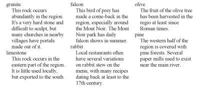
This example shows the use of ‘same’ to put
DD elements in the same slot as the preceding
DT.
...
DL {grid: * 2em * 2em * "a . b . c"}
DT.mineral {flow: a}
DT.animal {flow: b}
DT.plant {flow: c}
DD {flow: same; margin-left: 1em}
...
<DL>
 <DT class=animal>falcon
 <DD>This bird of prey...
 <DT class=animal>rabbit
 <DD>Local restaurants...
 <DT class=mineral>granite
 <DD>This rock occurs...
 <DT class=plant>olive
 <DD>The fruit of...
 <DT class=mineral>limestone
 <DD>A rock composed of...
 <DT class=plant>pine
 <DD>The western half...
</DL>
An alternative to ‘same’ may be
to create selectors with regular-expression-like capabilities: ‘DT.plant + DD* + DD {flow: c}’ selects a DD that
follows zero or more DDs that follow DT.plant.
Does a percentage ‘height’ work on an element that is flowed into
a slot? If the grid template assigns a fixed height to the slot, it is
obvious what a percentage means, but if the slot's height is ‘max-content’ and an element in the slot has ‘height: 110%’, there is a conflict…
Allowing multiple values on ‘flow’ could be an easy way to duplicate
elements. E.g., this style
BODY {grid: "a . b . c ."}
H1 {flow: a, b, c}
#art1 {flow: a}
#art2 {flow: b}
#art3 {flow: c}
with a document like
...
<H1>Local news</H1>
<DIV ID=art1>...</DIV>
<DIV ID=art2>...</DIV>
<DIV ID=art3>...</DIV>
would repeat the H1 at the top of all three columns. With region-based styling, the three
instances could even be styled differently, e.g., with generated content:
‘@region ::slot(b) { H1::before {content: "cont'd "}
}’
ISSUE-201: Terra
Informatica's HTMLayout program
proposes an interesting shortcut: if a slot's name is a number (instead of
an identifier), it refers directly to the child with that number. That
child is positioned in that slot and doesn't need ‘flow’ to be set. See the
documentation by Andrew Fedoniouk and Ivan Goroun. E.g., <ul
style="grid: '2 1'"><li>one <li>two </ul> puts “two”
on the left and “one” on the right. It is thus also a shortcut for
some applications Flexbox's of ‘order’ property.
5. Comparison with ‘display: grid’ and ‘display:
inline-grid’
This section is not normative
The ‘grid’ and ‘inline-grid’ values of the ‘display’ property make an element into a grid container, (see [CSS-GRID-1]), which is an
element that uses the ‘grid’ properties to define a grid, just like a
grid element, but its chidren ignore
the ‘flow’ property
and are instead automatically made into separate flows and positioned in
subsequent slots of the grid. (Although there are also properties to set
their positions explicitly.)
‘Grid’ and ‘inline-grid’ also cause the template to grow
automatically with either extra rows or extra columns, if there are more
children than predefined slots.
Note that the template of a grid container is also mirrored and/or
rotated depending on the ‘writing-mode’ and ‘direction’ of the grid
container, unlike the template of a grid element.
6. Styling slots
Slots have certain properties of their own, as defined below. If those
properties are inherited, they inherit from the grid element. To set properties on the slots,
two kinds of selectors are available: ‘::slot()’ and ‘::blank()’.
6.1. The ‘::slot()’ pseudo-element
The slots of a grid element can be
individually addressed with the ‘slot()’
pseudo-element.
For example, the following sets the background and vertical alignment
of some of the slots in a template:
body { grid: "a a a"
             "b c d" }
body::slot(b) { background: #FF0 }
body::slot(c), body::slot(d) { vertical-align: bottom }
Only the following properties apply to the ‘slot()’ pseudo-element.
The following properties also apply to ‘::slot()’ pseudo elements, but only affect content
inserted with the ‘content’ property other than what corresponds
to the ‘contents’
keyword. (I.e., not to the content that is flowed into the slot via the
‘flow’ property or
because the slot is the default slot. See “Styling the contents of slots” for how to
style that part of the content.)
- ‘
color’
- font properties
- ‘
text-decoration’
- ‘
text-transform’
- counter properties not needed?
- ‘
image-orientation’
- ‘
image-resolution’
- ‘
letter-spacing’
- ‘
object-fit’
- ‘
object-position’
- ‘
text-align’
- ‘
text-align-last’
- ‘
text-indent’
- ‘
visibility’
- ‘
white-space’
- ‘
word-spacing’
ISSUE-37: Can a
slot have a border and if so, where is it drawn?
The background of a slot is drawn immediately on top of the background
of the element itself. E.g., the background set on ‘P::slot(a)’ is immediately in front of the background
set on ‘P’.
Margins on slots do not collapse, neither with other slots, nor with
elements inside the slot.
6.2. The ‘::blank()’ pseudo-element
The naming/syntax is an issue, because there is a ‘:blank’ pseudo-class in [CSS3PAGE] and
a ‘:empty’ pseudo-class in [SELECT]. But
‘::slot(a):empty’ and ‘:slot(a):blank' are invalid syntax…
The 'blank()'
pseudo-element selects named slots that have no content flowed into
them. ’::slot(a)‘ and ’::blank(a)‘ select the same slot, but the latter matches only if the slot
has no content flowed into it. Whether ’::blank()‘ matches is independent of the slot's 'content' property. (In
other words: a “blank” slot is not necessarily empty and a slot that
looks empty is not necessarily “blank,” although that is usually the
case, given the initial value of 'content'.)
For example, slots a, b and c in the following document are blank, but
slot * is not, even though slots b and c do not look empty, (because they
have generated content) and slot d does look empty (because its 'content'
property doesn't include the keyword ’contents'‘):
<style>
body { grid: "a b"
             "c *" }
body::slot(b) { content: "This is slot b" }
body::slot(c) { content: "Page " counter(page) }
body::slot(*) { content: "No content" }
</style>
<h1>The heading</h1>
<p>The first paragraph.
All content in this document is flowed into the default slot (*), so
all other slots are blank.
This example shows how to put a border only on slots that have content:
div {grid: "a ."
           ". d"}
div::slot(a), div::slot(d) {border: solid}
div::blank(a), div::blank(d) {border: none}
An element that has no content, no background, no border, no padding, no
margin and no fixed positive width or height has no influence on whether
the slot it flows into is blank or not. In this case, the content of the
element is the content that results from applying the ’content' property
and also includes generated content of its ‘::before’ and ‘:after’
pseudo-elements.
For example, even though there is an address element flowed into slot
a, slot a is still blank, because the address element happens to have no
printable content:
<style>
body { grid: "a ."
             ". *" }
body::blank(a) { content: "No address defined" }
address { flow: a }
</style>
<h1>The heading</h1>
<p>The first paragraph.
<address></address>
A slot that is part of a chain (see ‘chains’) is blank if all content flowed into
that chain fits into slots earlier in the chain.
For example, this document has very little content that easily fits
into the first slot. Slot b, which is part of the same chain, thus
remains blank.
<style>
body { grid: "a . b"; chains: a b; width: 60em }
body::blank(b) { background: silver }
</style>
<p>Very little content.
6.3. Slots and the ‘content’ property
The ‘content’
property applies to slot pseudo elements in a similar way as it applies to
normal elements and other pseudo-elements. When applied to slots, values
have the following meaning:
- ‘
normal’
- Same as ‘
contents’
(Note that ‘contents’ is also the computed value in this
case.)
- ‘
none’
- The content that is flowed into the slot (with the ‘
flow’ property, or
because the slot is the default slot) is not
rendered.
- ‘
inhibit’
- Same as ‘
none’.
- ‘
contents’
- Renders as the content that is flowed into the slot (with the ‘
flow’ property, or
because the slot is the default slot).
Other values are as defined in [CSS3GENCON] and in [CSS3PAGE].
See “Page-based grid templates” for an
example of the use of ‘string()’ in the value
of ‘content’.
[This should be moved to [CSS3GENCON].] Even if the value
of ‘content’ does
not include ‘contents’
and the content that is flowed into a slot is thus not rendered, any
counters associated with that content are incremented normally.
Note: as defined in [CSS3GENCON], the keyword ‘contents’ may appear
multiple times in the value of ‘content’, but the second and subsequent
occurrences are ignored. (Those occurrences are still part of the computed
value.)
7. Styling the contents of
slots
Region-based styling refers to style
rules that are attached to parts of a document that do not correspond to
an element, but to an area of the canvas. In level 2, there were only two
such regions, the pseudo-elements ‘first-line’
and ‘first-letter.’ This module adds slots.
A slot may contain parts of multiple elements and the style rules for
those elements and for the slot are cascaded together in a specific way,
defined below.
For example, with a style sheet like this
BODY { grid: "a ." 10em ". b"; chains: a b }
P { flow: a; color: blue }
BODY::slot(b) P { color: orange }
and a document fragment like this:
<BODY>
 <P>The text of the first paragraph...
 <P>The text of the second paragraph...
 <P>The text of the third paragraph...
</BODY>
The three paragraphs will be rendered inside slot a and, if there is
more content than fits in that slot, the rest will be rendered in
slot b. Ps are blue by the second line in the style sheet, but the third
line says that any part of a P that is inside slot b will be orange.
In CSS level 2, pseudo-elements could only occur at the end of a
selector. Thus an attempt to select ‘P::first-line
EM’ fails. That restriction does not apply to the ‘::slot()’ pseudo-element, as shown in the example
above.
To resolve which style rules apply to an element or part of an element
that is inside a slot…
Fix. Can we use a fictional tag sequence as in level 2?
Only for inherited properties, maybe. Or only for a restricted set of
properties, e.g., only those that apply to first-letter.
See “Style the contents of
slots (region-based styling)” below for a discussion of alternatives
to ‘@region’.
8. Rendering of
grid elements
Grid elements influence the stacking order, page breaks, the position of
floats, etc. of the content inside them.
8.1. Vertical alignment
of the contents of slots
‘Vertical-align’ applies to slots in
a similar way as it applies to table cells [CSS3TBL] and margin boxes [CSS3PAGE].
‘Align-content’ in [CSS3-FLEXBOX] has ‘flex-start’, ‘flex-end’ and
‘center’, which are a bit similar to ‘top’, ‘bottom’ and ‘middle’.
But it also has ‘space-between’ and ‘stretch’, which make little sense in a flow, and it
lacks ‘baseline’. The similarity of slots to
table cells and margin boxes argues for sticking with ‘vertical-align’.
For the purpose of this section we define the A
edge and C edge of a box as a
writing-mode-dependent edge as follows:
Value of ‘writing-mode’
| Meaning of “A”
| Meaning of “C”
|
‘horizontal-tb’
| top
| bottom
|
‘vertical-rl’
| right
| left
|
‘vertical-lr’
| left
| right
|
E.g., if a box is horizontal, the
“A edge” is the top edge.
The ‘vertical-align’ property of a ‘::slot()’ pseudo-element can be used to align elements
vertically in a slot (or horizontally, if the slot is vertical). The effect is as if the hypothetical
anonymous block that contains the slot's contents is positioned
as defined below.
- bottom
- The content of the slot is aligned to the C
edge of the slot: the C margin edge of the anonymous block coincides
with the C margin edge of the slot.
- middle
- The content of the slot is centered in the slot: the distance between
the A margin edge of the anonymous
block and the A margin edge of the
slot is equal to the distance between the C margin edge of the anonymous block and the C margin edge of the slot.
(Note that if the content overflows the slot, it will
overflow at both edges.)
- baseline
- The anonymous block that encloses the content is placed as far as
possible in the direction against the block flow direction under two
constraints:
- The A margin edge of the
anonymous block may not be beyond the A margin edge of the slot.
- If the content has a relevant first line (see below), then the
baseline of that line must align with the baselines of the relevant
first lines in all other slots with the same ‘
writing-mode’
and the same ‘vertical-align’ in the same row (if the
slot is horizontal) or the same
column (if the slot is vertical). A
slot has a relevant first line, if the content has a first line
(ignoring any lines inside floats) and that first line has the same
‘writing-mode’ as the slot itself.
For example, for a horizontal slot, this means that the
first baseline must be aligned with the first baselines of all other
horizontal slots in the row that also have ‘vertical-align: baseline’.
- <percentage>
- ‘
0%’ means the same as ‘bottom’, ‘100%’ means the same as ‘top’, other values are linear interpolations of
these. Negative values and values over 100% are interpreted as 0% and
100% respectively.
Note that 100% minus the percentage corresponds to the
initial position of the scrolling mechanism (if any) in case the content
overflows.
For all other values, the content is aligned as for ‘baseline’.
Note that baseline alignment may cause a slot to overflow (if
the slot is the last in a ‘chain’) or to remain empty (because the first
line box is put in the next chained slot instead).
Example: Given a document like this
<BODY>
<P>...</P>
<FIGURE>...</FIGURE>
<P>...</P>
<FIGURE>...</FIGURE>
<P>...</P>
<FIGURE>...</FIGURE>
<P>...</P>
<FIGURE>...</FIGURE>
</BODY>
and a style like this:
BODY { grid: "a b" }
P { flow: a }
FIGURE { flow: b }
the paragraphs will be in the first slot (a) and the figures in the
second (b). There are two ways to align the contents of the two slots to
the bottom. One is with ‘vertical-align’:
BODY::slot(a), BODY::slot(b) { vertical-align: bottom }
The other is with flexible margins:
P:first-of-type, FIGURE:first-of-type { margin-top: fill }
Example: There is no value for ‘vertical-align’ to distribute elements
vertically over the available space (similar to how ‘text-align: justify’ distributes words over the
available space). But the effect can be achieved with stretchable
margins. Assume the same document as in the previous example and this
style sheet:
BODY { grid: "a b" }
P { flow: a; margin-top: fill; margin-bottom: fill }
FIGURE { flow: b }
Because there are stretchable margins between the Ps, the Ps will be
equally distributed over the height of the slot (assuming the slot is
taller than its contents, i.e., assuming the contents of slot b is taller
than the contents of slot a).
Note that, if there are one or more margins in the contents
of the slot with a ‘fill’ value (see [CSS3BOX]), the
height of the content fits the height of the slot and thus the ‘top’, ‘middle’ and ‘bottom’ values are indistinguishable.
8.2. Breaking grid elements across
pages or columns
Grid elements may be broken across pages,
columns or similar regions (including chained slots of another grid
element), subject to the ‘break-before’, ‘break-after’ and ‘break-inside’
properties. In addition to the break points listed in the Fragmentation
module [CSS3-BREAK], a page break may
occur between two rows in a template, if there is a possible break point
at the same height or higher in all slots that span those two rows; and a
page break may occur inside a row if there is a possible break point in
all slots in that row.
Try to be more precise?
In the terminology of [CSS3-BREAK], a slot is a fragmenter of type ‘region’.
A forced break on an element in a slot causes the rest of the flow of
that slot to continue in another page, column or slot (depending on the
type of break). The following cases are special:
-
A forced page break causes all elements after the break (in document
order) to be on a new page. On which subsequent page they fall depends
on any page templates: there may not be a slot with the right name on
the next page.
-
A forced column break only has effect if the element's multicol
ancestor is a descendant (is “inside”) the element's grid ancestor.
For example, this document fragment has a column element inside a grid
element. Column breaks affect the content of a single slot, but do not
affect the other slots of the grid element:
<DIV STYLE="grid: 'a b' 'c d'">
 <DIV STYLE="flow: a">
  I'm in slot a.
 </DIV>
 <DIV STYLE="flow: b; columns: 20em">
  <P>This text is in columns.
  <H2 STYLE="break-before: column">Heading at top of column</H2>
  <P>...
 </DIV
</DIV>
For example, this document fragment has a grid element inside a column
element and thus the column break on the H2 is ignored:
<DIV STYLE="columns: 20em">
 <DIV STYLE="grid: 'a b' 'c d'">
  <P>I'm inside slot a inside some columns.
  <H2 STYLE="break-before: column">No break</H2>
  <P>...
 </DIV>
</DIV>
A slide presentation can be made with a template for each page (i.e.,
slide) and forced page break between the slides:
@page	{ grid: "a"  5em
	        "@"  *
	        "b"  auto }
h1	{ page-break-before: always;
	  flow: a }
p.note	{ flow: b }
With a document similar to this: (fragment)
<h1>Slide 1 title</h1>
<ul>
 <li>Topic one
</ul>
<h1>Slide 2 title</h1>
<ul>
 <li>More topics
</ul>
<p class=note>Note the note
The document in the example above doesn't have an element that
corresponds to a slide; a slide simply starts at an H1 and ends before
the next H1. But if there is a DIV around each slide (as is the case in
many slide formats in practice), the same effect can also be achieved
without page-based templates, by using the ‘vh’ unit [CSS3VAL]:
div.slide {height: 100vh; grid: "a" 5em "*" "b" intrinsic;
    page-break-before: always}
h1 {flow: a}
p.note {flow: b}
With a document similar to this: (fragment)
<div class=slide>
 <h1>Slide 1 title</h1>
 <ul>
  <li>Topic one
 </ul>
</div>
<div class=slide>
 <h1>Slide 2 title</h1>
 <ul>
  <li>More topics
 </ul>
 <p class=note>Note the note
</div>
8.3. Stacking order
Each slot generates a separate stacking
context. The stacking order of these stacking contexts is given
by their ‘z-index’
property, with ‘auto’ treated as ‘0’. Slots with the same ‘z-index’ are stacked in the order in which
they are defined in the ‘grid-template-areas’ property, looking only at
the first occurrence of the slot's name (i.e., the top left corner if the
slot spans several rows or columns).
A slot thus has a very similar behavior in the stacking order
as an element with ‘position: relative’ and
‘z-index: 0’ (or another value of ‘z-index’ other than
‘auto’).
For example, the stacking order of the slots in the following template
is, from back to front, a, x, c, d, e, p, g.
grid: "a x x c"
      "d x x e"
      "p p g g"
The stacking order can be made visible, e.g., by giving slots opaque
backgrounds and negative margins, so that they overlap. See the next
example.
This example uses ‘z-index’ and negative margins to make the
middle slot partly overlap the other slots:
body { grid: "a . b"
             ". c ."
             "d . e";
       height: 240px;
       width: 240px }
::slot(a) { background: #0C0 }
::slot(b) { background: #C00 }
::slot(c) { background: #FD0; margin: -20px; z-index: 1 }
::slot(d) { background: #00C }
::slot(e) { background: #A0A }
This example has a heading (H1) that is wider than its slot and
overlaps the image in the slot next to it:
body {grid: "a b"}
::slot(a) {z-index: 1}
h1 {flow: a; width: 200%}
p {flow: a}
img {flow: b}
The ‘z-index’ is
necessary, because the ‘a’ slot comes before
the ‘b’ slot in the template and all its
content would thus be rendered behind the ‘b’
slot with default ‘z-index’ values.
8.4.
Floating elements inside templates
An element may be flowed into a slot and be a floating element at the
same time. The following cases must be distinguished:
- Page-based floats – In paged media (see [CSS3PAGE]), if the value of
‘
float’ specifies
that the element floats to the top or bottom of the page (in a horizontal
writing mode) or the left or right of the page (in a vertical writing
mode), the slot act as the page. (I.e., the element floats to the top,
bottom, etc. of the slot, not of the page.
- Footnotes – Likewise, the footnote area for elements with ‘
float: footnote’ is at the bottom of the slot, not of
the page. The @footnote at-rule can position the footnote area at other
places, such as the top, but always inside the slot.
- Normal floats – In other cases, the element floats normally within
its containing block, which
in this case is its slot in the template.
The ‘@footnote’ at-rule from [CSS3GCPM]
needs to be extended to apply to slots: ‘@footnote
:first::slot(a)’ is the footnote area of slot a on the first
page.
9. Page-based grid templates
A template can also be attached to a page, rather than an element. Such
a template is called a page-based
template as opposed to an element-based template.
Here is an example of a template used to position two centered running
headers with different styles. (This would be impossible to do with the
predefined page template of [CSS3GCPM], because it has only
one centered margin box at the top.)
@page {
 grid: "t1" 1.2em    /* space for 1st running header */
       "t2" 1.2em    /* space for 2nd running header */
       "." 2em
       "*"           /* page body */
}
::slot(t1) { content: string(chapter); color: red; text-align: center }
::slot(t2) { content: string(section); color: green; text-align: center }

h1 { string-set: chapter contents }
h2 { string-set: section contents }
See “Slots and the ‘content’ property” for the definition of
the ‘content’
property on slots.
The syntax of a page-based template is the same as that of an element-based one, but the declaration
appears in an ‘@page’ rule.
In a page-based template, the height and width are typically known
(defined by the output media and the margin boxes, see [CSS3PAGE]).
And content that overflows a slot typically is not clipped (or hidden
behind a scrolling mechanism), but is continued on a subsequent page.
Because the grid template is not attached to an element but to a page,
the slot names have global scope. But they can be hidden to elements that
have a grid ancestor that uses the same slot names.
This modifies the rules for ‘flow’: if the property refers to a slot that
is not found in a grid ancestor, it refers
instead to a slot in a page template (if there is one and it has a slot of
that name).
Should we simplify page-based templates to only allow <length> and * as row heights and
column widths? (And treat illegal sizes as ‘*’?)
@page :first {grid: "a b c" "d e f"}
@page {grid: "d e f"}

body {flow: e}
h1 {flow: b}
A page that has a grid template does not have a footnote area [CSS3GCPM].
Instead each slot in the grid template has its own footnote area.
If a slot of a page-based template on non-interactive media has an ‘overflow’ property of
‘visible’, then content that overflows that
slot in the block progression direction (i.e., below the slot in the case
of horizontal text) causes a page break and is continued on the next page.
What happens in non-interactive media with an ‘overflow’ of ‘scroll’ or ‘auto’?
For page breaking purposes, each slot is considered as a page and the
page break properties on the elements in that slot determine where the
content for that slot is broken [CSS3-BREAK]. Content after the
page break is put in the slot of the same name on the next page that has
such a slot. If there is no such page, the UA should display the content
on a separate page.
Or: the content after the page break is not displayed?
displayed in the default slot?
Note that this may happen if the template for the first page
(‘@page :first’) uses a slot name that occurs
in no other @page rule. Possibly also if a page template is bound to a
“named page” [CSS3GCPM] and that named page is
not allowed to repeat. (At the time of writing, this is only a proposal in
the GCPM Module.)
Note that an element A that appears later in the
document than an element B may thus be displayed on an earlier
page than element B, because their respective slots are broken
across pages in different ways.
Because of limitations of a device (e.g., limited memory), it may be
that a UA has to print a page (force page breaks) even though some slots
aren't filled yet.
This example shows a document with text in two languages, which are to
be shown side by side:
@page {grid: "a b"}
:lang(en) {flow: a}
:lang(fr) {flow: b}
This works with a document where the languages are separated like this:
<BODY>
 <DIV LANG=en>
  <H1>The blue house</H1>
  ...
 </DIV>
 <DIV LANG=fr>
  <H1>La maison bleue</H1>
  ...
 </DIV>
</BODY>
But also with a document where the languages are interleaved:
<BODY>
 <H1 LANG=en>
 <H1 LANG=fr>
 <P LANG=en>...
 <P LANG=fr>...
 ...
</BODY>
This example shows how the first page may have a different layout from
the other pages. The slot ‘a’ only occurs on
the first page. If the content for that slot (in this case: all H1
elements) is too long, the remaining content of that slot will not be displayed. The slot ‘@’ occurs on normal pages and all its content can thus
be displayed by adding additional pages.
@page :first {grid: "a" "*"}
@page {grid: "*"}
h1 {flow: a}
Note that “page masters” (sequences of different
templates for sequences of pages) can be made with the selectors defined
in [not yet decided].
Both page-based and element-based templates can be used in the same
document.
@page {grid: "a*"}
:lang(fr} {flow: a}
div.special {grid: "a b c" "a b d"}
Here is a page as one might find in a newspaper. It combines a layout
template with multicolumn layout.
@page :first {
  grid:  * 3em * 3em * 3em * 3em *
        "A  A  A  A  A  A  A  A  A"  5cm
	".  .  .  .  .  .  .  .  ."  0.25cm
	"B  .  C  C  C  C  C  C  C"  *
	"B  .  C  C  C  C  C  C  C"  *
	"B  .  C  C  C  C  C  C  C"  *
	"B  .  C  C  C  C  C  C  C"  *
	"B  .  C  C  C  C  C  C  C"  *
	"B  .  D  D  D  D  D  D  D"  *
	"B  .  D  D  D  D  D  D  D"  *
	"B  .  E  E  E  .  F  F  F"  *
	"B  .  E  E  E  .  F  F  F"  *
	"B  .  E  E  E  .  F  F  F"  *
}
h1 {flow: a; border-bottom: thick; margin-bottom: 1.5em}
#toc {flow: b; margin-right: -1.5em; border-right: thin;
  padding-right: 1.5em}
#leader {flow: c; columns: 4; column-gap: 3em}
#art1 {flow: d; columns: 4; column-gap: 3em; border-top: thin}
#art2 {flow: e; columns: 2; column-gap: 3em}
#art3 {flow: f; columns: 2; column-gap: 3em}
If a slot on a page is full and the content
continues on the next page, it may be useful to insert something like
“continued on page X.” This is useful at any page break, but more
important if there are multiple “flows” of content on each page. Maybe
a break-content property? ‘break-content: "▶ continued
on p. " targetcounter(???, page)’ or extend text-overflow from [CSS-TEXT-3]?
How do you style the slots of page-based template? E.g., with
@page :first {
  grid: "a b"
        "c d" }
@page {
  grid: "a a a"
        "b c d" }

::slot(a) {background: silver}
the background could be set on all “a” slots on all pages. But how
do you set a background only on the “a” slot of the first
page? Maybe we need to extend the page selectors and allow something like
this:
@page :first::slot(a) {background: silver}
A space between the pseudo-class and the pseudo-element could be
optional.
10. Chaining slots: the ‘chains’ property
Slots must be rectangular, but the appearance of non-rectangular slots
can be achieved to some extent by chaining slots together. Content that is
positioned in the first slot of a chain is automatically continued in the
second slot if the first slot is full, and then the third, etc.
| Name:
| chains
|
| Value:
| none | <identifier>+ [ ,
<identifier>+ ]*
|
| Initial:
| none
|
| Applies to:
| grid elements
|
| Inherited:
| no
|
| Animatable:
| no
|
| Percentages:
| N/A
|
| Media:
| visual
|
| Computed value:
| specified value
|
| Canonical order:
| per
grammar
|
A value of ‘none’ means
the element's template has no chains. Otherwise the value consists of one
or more comma-separated lists of identifiers. No identifier may appear
more than once in the value. Identifiers that do not occur in the
template are ignored, but do not make the value invalid. A list
with only ignored identifiers is itself ignored.
All the non-ignored identifiers in a list, except for the last one, must
refer to slots whose size does not depend on their contents, otherwise the
list is ignored. The size of a slot does not depend on its content if all
the columns and all the rows that the slot spans have a width,
respectively height, that is a <length> or ‘*’.
Each non-ignored list defines one chain.
Each chain is filled with content in an analogous way to the pages in
paged media: all the content that is positioned to the first slot in the
chain is flowed, in document order, into the first slot in the chain until
the slot is full, the rest is flowed into the second slot until it is
full, etc.
Content must only be split between slots at an allowed page break [CSS3PAGE].
As for page breaks, if a break occurs in the margin between blocks, all
adjoining margins are set to zero.
CSS3 does not define what is the best break point to split content over
slots. However, it is recommended to use the last possible break point
that does not cause overflow. (If such a break point exists.)
Note: It is the author's responsibility to make the height of
relevant slots an integral number of lines if he wants to ensure that the
lines in chained slots are aligned. The height does not automatically
“snap” to a multiple of the line height.
The following template creates a double-staircase layout. In case the
content is too long for the staircase, a slot of flexible height is added
at the bottom.
div { grid:    "@ @ . . f f . . . ."  3.6em
               ". a a . . g g . . ."  3.6em
               ". . b b . . h h . ."  3.6em
               ". . . c c . . i i ."  3.6em
               ". . . . d d . . j j"  3.6em
               ". . . . . . . . . ."  0.6em
               "e e e e . . k k k k"  auto;
   chains: @ a b c d e, f g h i j k}
#first { position: @ }
#second { position: f }
This could be applied to a document fragment such as
<DIV>
  <P ID=first>...
  <P ID=second>...
</DIV>
Here is a paragraph shaped as a circle:
p { width: 12em;
    grid: ". . . . * * . . . ."  1.2em
	  ". . a a a a a a . ."  1.2em
	  ". b b b b b b b b ."  1.2em
	  ". b b b b b b b b ."  1.2em
	  "c c c c c c c c c c"  1.2em
	  "c c c c c c c c c c"  1.2em
	  ". d d d d d d d d ."  1.2em
	  ". d d d d d d d d ."  1.2em
	  ". . e e e e e e . ."  1.2em
	  ". . . . f f . . . ."  1.2em
	  "g g g g g g g g g g"  auto;
   chains: * a b c d e f g }
Here is a page-based template that creates a two-column layout with a
“hole” in the center:
@page:first {
    grid:
    "a a a a a a a . d d d d d d d"
    "a a a a a a a . d d d d d d d"
    "a a a a a a a . d d d d d d d"
    "a a a a a a a . d d d d d d d"
    "b b b b . . . . . . . e e e e"
    "b b b b . g g g g g . e e e e"
    "b b b b . g g g g g . e e e e"
    "b b b b . g g g g g . e e e e"
    "b b b b . . . . . . . e e e e"
    "c c c c c c c . f f f f f f f"
    "c c c c c c c . f f f f f f f"
    "c c c c c c c . f f f f f f f"
    "c c c c c c c . f f f f f f f";
    chains: a b c d e f }
@page::slot(g) {
    vertical-align: middle }

body { flow: a }
h1 { flow: g }
Note: For more anaylysis of the possibilities and limits of
non-rectangular slots, see the PhD thesis of César Acebal [ACEBAL2010].
Chaining of rectangular slots is not enough to create layouts with
holes, e.g., an image in the middle of a text. Allowing non-rectangular,
connected regions (in addition to chaining) would allow an
example such as this:
grid: "A A A . . ."
      "A . A . . ."
      "A A A . . ."
      ". . . B B B"
      ". . . B . B"
      ". . . B B B";
chains: a b;
Such cutouts in the middle of text usually create text that is
difficult to read, and that is why there is no ‘float:
center’, e.g. But the CSS WG is considering a new property
‘wrap-flow’ for absolutely positioned
elements that would allow, e.g.: ‘p {position:
absolute; top: 1fr; left: 1fr; width: 1fr; height: 1fr; wrap-flow:
both}’ to absolutely position a P element on top of a grid
element and cause the content of the element under it to wrap around it
as if it were a float [CSS3-EXCLUSIONS].
Note that a slot can have overflowing content even if it is
part of a chain: it can have content that is too
wide but cannot be broken.
The ‘break-before’, ‘break-after’ and ‘break-inside’
properties have values that control breaking of content between slots in a
chain (in particular ‘region’ and ‘avoid-region’, see [CSS3-BREAK]).
Note that, as defined in “Breaking grid
elements across pages or columns” above, a slot is a fragmenter of
type region in the terminology of [CSS3-BREAK].
11. History and discussion
The following sections contain some of the use cases and design decision
that led to this module and influenced its evolution.
11.1.
Developing a model of declaring, using, styling and resizing grids
(This section is not normative.)
The following types of use cases were considered for
template-based layout.
-
Standard Web pages.
-
Grids and other table-like layouts. This includes grid layouts, frame
layouts and table-like subdivision of a rectangular area.
-
A layout structure with “flex”ing information. The flexing is
represented by constraints that specify how the cells are to relate to
one another: which cells are to be allowed to grow or shrink and how
much. There may also be a priority ordering, which determines, based on
the size of the allowed display window, which cells shrink, which grow
and under which conditions.
-
Layout structures with absolutely positioned (fixed-size) elements;
for example a block of text into which several illustrations intrude at
fixed positions within the block. This is like a float with respect to
tightly wrapping the text around the intrusion, but the position of the
intrusion is determined by the layout structure, not the content flowed
into that structure.
An example of this is a multicolumn layout with one or more
“absolutely positioned floats” that intrude on the columns (see figure).
-
Multiple, disconnected, fixed-size areas on a page that are chained
together, each one receiving the content that doesn't fit in the
previous slot. In combination with page breaks, this may give a layout
as often seen in newspapers: the first few lines of each story on the
first page, the rest of the story in other areas on subsequent pages.
(It will probably need a way to conditionally insert “continued on
page 7” or similar text.)
For comparing proposals for template-based layouts, the working group
identified four important aspects of each proposal:
-
the physical layout structures – the way of structuring the
“cells” (slots) into which content is flowed. This includes a way to
identify the various layout containers.
-
the binding mechanism – the way to specify that a given element (and
its descendants) are to be placed in a given layout cell.
-
the property distribution mechanism – the way to put properties onto
the layout structure and the cells within it.
-
the flexing mechanism – the way to describe how the layout structure
should adapt itself to the higher level container (window) in which it
is placed. This includes statements about which cells should grow and
when they should grow.
In this specification, these aspects are as follows:
-
A character matrix is used to show the layout structure and the cells
are named by the character used to show where they are positioned.
-
The binding of content to cells is handled by the ‘flow’ property which
identifies a cell to which the content is bound.
-
The shape, size and flexibility of the layout are specified with the
character matrix. Some properties (background, border and vertical
alignment) are attached to individual slots.
-
There is limited “flexing” information. The choice is between
fixed size, a fraction of the available size or the content's intrinsic
size. (The latter is further subject to min/max sizes specified on that
content.) It is not possible to say, e.g., that some column can only
become wider if all other columns are at their maximum size.
11.2. Syntax,
features and levels
(This section is not normative.)
The following is a partial list of design decisions and some arguments
for and against each choice:
11.2.1. Named vs
numbered slots
Named slots are very easy to understand and use. Experience with the
draft showed that everybody who sees an example immediately understands
what it means. Moreover, there is no need to use numbers or to count.
But it is different for absolutely positioned elements that use the
grid. Those elements do not belong to a slot, they are merely placed on
top of it, overlapping what is already there and each other.
Also, if grids are automatically extended with extra
rows and columns (see below) based on content, then those extra rows
and columns cannot have names and must (probably, see below) be referred
to by number.
In this specification, named slots are used to create flows of content,
while numbers are used for absolute positioning, although names can be
used there too, if the author prefers.
11.2.2.
Single letter names vs identifiers
The set of single letters is finite. And even if Unicode has many
symbols, typing them may not be easy. Letters also do not permit to give a
hint as to a slot's function (“heading,” “footer,”
“advertisement”…).
On the other hand, any Unicode character can be typed as an escape, so
if you run out of letters on the keyboard, you can always make a template
like this:
DIV {grid: "\1001\1002\1003\1006"
           "\1001\1004\1005\1006"}
DIV H1 {flow: \1001}
In practice, it is also hard to come up with meaningful identifiers and
so single letters require less thinking. And if you always have single
letters, you don't need spaces between them either, which makes big
templates easier to read.
This specification defines that a template consists of (space-separated)
identifiers, but many examples use single-letter identifiers.
11.2.3. Quote marks to delimit
rows or slot names
The current syntax for ‘grid’ (and ‘grid-template-areas’) groups the slots into
rows with quote marks:
grid: "a b c"
      "d * e"
Or with some explicit column widths and row heights added:
grid: 10em * 10em
      "a   b   c" 7em
      "d   *   e" *
Instead of using quote marks, other means could be used to delimit the
rows, e.g., commas:
grid: 10em * 10em
       a   b   c  7em,
       d   @   e  *
Because the ‘*’ would then be ambiguous (it
could either be a length or a slot name), it has been replaced here by
‘@’ (see “Indicating the default slot”).
When quotes are not needed to delimit rows, they can be used to delimit
slot names, which then no longer have to be restricted to identifiers.
Like the quotes around font family names, the quotes around slot names are
optional, unless the slot names would be ambiguous without them:
div {grid: a  "middle top"  c,
           d       @        " -=- "}
p {flow: c}                 /* quotes optional */
p.intro {flow: middle top}  /* quotes optional */
img.one {flow: "d"}         /* quotes optional */
img.two {flow: " -=- "}     /* quotes required */
11.2.4. Extend ‘display’ or add a grid
property
Grids can be defined on elements such as table cells, blocks, inline
blocks or list items, but not on elements such as tables or, inline
elements. That can be expressed in the syntax by adding the grid to the
‘display’
property: ‘display: inline-block "a b c" "a b
d"’ would be valid, but ‘display: inline "a b
c" "a b d"’ would not be. Or it can be expressed by an implicit
dependency between properties: ‘display: inline-block;
grid: "a b c" "a b d"’ has a grid, but ‘display: inline; grid: "a b c" "a b d"’ ignores the
grid. (In this case it is actually the computed value of ‘display’ that applies,
so, e.g., if the element floats, it would be a block and thus have a
grid.)
The Multicol specification [CSS3COL] uses the latter model:
‘columns’ is a
separate property and only applies if the element is a block container. Given that
precedent, it seemed reasonable to do the same here.
11.2.5.
Combining columns and grids
Style rules can specify both a grid and columns for the same element:
DIV {columns: 20em; grid: "a a b c c c"}
The specification could say that grids don't apply to column elements,
or vice versa, or it could say that the columns apply to contents of the
DIV, after it has been flowed into the default slot. This last option seemed
the most useful. It is consistent with other elements that flow into a
slots: they, too, can have columns.
11.2.6.
Shorthand vs single property
It is convenient to specify the grid as the value of a single property.
It puts the column and row sizes immediately next to the rows and columns
they apply to. The typical column widths can either be omitted or are
short values like ‘*’ and ‘1em’, and they fit easily in one line.
But if a grid has very many columns, or their sizes are complex (with
many ‘minmax()’ and ‘calc()’ values, e.g.), it may be more readable to
separate the slot names from the column sizes.
Also, separable properties for row and column sizes makes is easier to
specify a transition/animation on them,, because you don't have to repeat
the slot names (which cannot animate).
For those reasons, this specification defines the ‘grid’ property as a
shorthand, at the cost for authors of having to learn four new properties
instead of one (or even zero, if the grid were added to display (see above).
11.2.7. The
number of rows and columns
If the grid template can also be specified with individual properties,
how many columns & rows does it have if those properties contradict
each other? Does the template (if not ‘none’) determine the number of columns or the
maximum of the template and the list of sizes? E.g.:
| Specified values
| Meaning if the template prevails
| Meaning if the maximum value is used
|
grid-template-areas: "a b c";
grid-template-columns: * * * * *
|
grid-template-areas: "a b c";
grid-template-columns: * * *
|
grid-template-areas: "a b c . .";
grid-template-columns: * * * *
|
The former is consistent with the model for ‘background-image’ and ‘background-size’. However, unlike for
backgrounds, where a size without an image makes no sense, in this case a
size without a slot name can make sense: it can represent empty
space (‘.’) of that size.
What is more likely: that people consciously specify empty rows and
columns without putting dots in the template (to save typing or to avoid
typing too many dots), or that people mistakenly add a size too many?
The specification currently sets the number of rows and columns to the
maximum of the three properties.
11.2.8. ‘*’ vs ‘fr’
ISSUE-127:
It is very common for the columns of a grid to have all the same width.
Or, if they do not, to at least be small multiples of a fundamental
measure. And thus equal columns is the default in the current syntax. And
if it needs to be specified explicitly which columns have the same width
(e.g., because there are also other columns in the grid) then the symbol
for it is short: ‘*’. This also works very well
for slots whose widths are small multiples of the fundamental measure.
E.g., the widths of slots a, b and c in the following grid relate to each
other as 1:3:2:
grid: "a b b b c c"
      "a . . . c c"
However, if the ratios of the slots are ratios of larger numbers, the
notation may become long. E.g., to make slots a and b with ratio 10:11,
you would have to make 21 columns:
grid: "a a a a a a a a a a b b b b b b b b b b b"
It needs to be investigated if such ratios are frequent. (They don't
seem to occur in printed magazines.) And if among the ratios that do
occur, even if infrequently, there are some that would be impractical to
write in this way.
Assuming another notation is needed, it could be made by prefixing a
number (e.g., ‘7* 10*’) or, to make the
notation look more like a dimension, by means of a special unit ‘fr’ (“fraction”). E.g., ‘3.5fr
5fr’ would be the same as 7 + 10 stars).
If ‘fr’ is added, it could either be in
addition to ‘*’ or instead of ‘*’. In the former case, ‘*’
= ‘1fr’.
Unless it is shown that the notation with only ‘*’ is not practical in real cases, it seems better to
neither introduce numbers (‘7*’) nor units
(‘3.5fr’). It would give too many different
ways to write the same grid, causing authors and readers of style sheets
to have to think longer about each grid. (E.g., ‘grid:
"a b b b c c"’ could then also be written as ‘grid: 1* 3* 2* "a b c"’ or ‘grid:
0.5fr 0.5fr 0.5fr 0.5fr 1fr "a b b b c"’, etc.)
For the moment, the specification allows both the ‘fr’ and * notations.
11.2.9. Automatically add rows and
columns
The main purpose of grids is to improve on absolute positioning for
displaying elements in a different visual order. You typically know how
many positions you need in advance.
If you don't need to change the visual order, then table layout can
often align the elements sufficiently.
However, if table layout isn't possible (there are not enough elements
in the source to create the necessary table rows, the control over the
size of table cells is too limited, or you want a column-major table), it
may be useful to use a grid in a similar manner to a table: the number of
rows and columns is not specified in the style, but depends on the number
of elements that are put in the grid.
E.g., you could transpose a table with an unknown number or rows like
this:
<TABLE>
 <TR><TD>A1 <TD>A2 <TD>A3
 <TR><TD>B1 <TD>B2 <TD>B3
 ...
 <TR><TD>K1 <TD>K2 <TD>K3
 ...
</TABLE>
into a tabular display with an unknown number of columns somewhat like
this:
A1 B1... K1...
A2 B2... K2...
A3 B3... K3...
with style rules like this:
TABLE {grid-template-columns: auto; grid-template-rows: auto}
TD:first-child {grid-area: next 1}
TD {position: grid; grid-area: same next}
This uses keywords instead of numbers, as described in “Automatic placement of elements” below.
What is the size of the added rows and columns? The example above
assumes the size of the single, specified grid cell is simply repeated.
There could also be a marker in the list of sizes to indicate which set of
sizes is repeated. Or there could be a separate property with the list of
sizes that is repeated for all added rows and columns.
It would probably be difficult to specify that any number of columns of
size A can be added, but that the last column must have size
B…
The current specification specifies that extra rows and columns are
added when needed for absolute positioning (‘grid-area’). It is not possible to automatically
create new, anonymous flows. (But sometimes you can use multi-column
elements to do that, and possibly grid templates can be attached to
columns, via a ‘::column’) pseudo-element, see
[CSS3GCPM].)
11.2.10.
Rectangular slots vs non-rectangular slots
Non-rectangular slots, such as
grid: "a a a"
      "a a ."
      "a . ."
are probably something for level 4. Or maybe the Exclusions module can
be used instead.
11.2.11. Page grids
Typically in magazines, each page has a slightly different layout of
slots, although they are all based on the same set of columns, usually
between 3 and 6. It is difficult to specify the grids of all pages as a
single long grid on the BODY element; and indeed impossible if you don't
know how many pages use each kind of layout.
Applying grids to ‘@page’ is an alternative.
That is what is specified in this module,
but it has a few issues:
- We need named paged (‘
@page news {…}’), a
way for an element to say it needs to start on a specific kind of page
(‘break-before: page(news)’ or ‘break-before; always; page: news’), and a way to say
which style follows which (‘@page news-odd {next:
news-even}’).
- What happens to footnotes [CSS3GCPM]? Each slot probably has
its own footnote area.
- How are slots on different pages connected? Probably by having the
same name.
11.2.12.
Style the slots (pseudo-elements)
Slots can have properties of their own: background, overflow,
writing-mode, direction, box-shadow, margin, border, padding. What else?
For ‘vertical-align’, see “Vertical alignment inside slots” below.
‘Wrap-flow’ (from CSS Exclusions and
Shapes) could be useful for slots with negative margins, too.
11.2.13. Style the
contents of slots (region-based styling)
By means of a new pseudo-element, style could be applied to only the
part of an element that is inside a certain slot (similar to how ‘::first-line’ applies style only to the part of an
element in the first line of a paragraph):
P::flow(a) {font-size: large}
would be an alternative to
@region ::slot(a) { P {font-size: large} }
The notation with ‘::flow()’ is shorter, and
more similar to ‘::first-line’ at first sight.
However, ‘EM::first-line’ does not
select the part of the EM inside a first line, while ‘EM::flow(a)’ would select the part of the EM
inside slot a. Also, the existence of two pseudo-elements, ‘::slot()’ and ‘:flow()’ is
confusing.
An alternative is to allow simple selectors after pseudo-elements:
::slot(a) P {font-size: large}
could select the parts of a P that are rendered inside slot a. That
would mean that ‘P::first-line EM’ is also
valid and selects the parts of an EM that are rendered on the first line
of a P.
Another possibility might be to set styles on ‘::slot()’ itself and only rely on inheritance. (This is
what is proposed by David Baron in [CSS-OVERFLOW-3].) Elements
inside a grid element then inherit from the slot inside which they are,
before they inherit from the grid element itself.
Yet another possibility is a generic ‘region()’ pseudo-element:
P::region(slot(c)) { color: yellow }
EM::region(first-line) { font-weight: normal }
Or without the nested parentheses:
P::region(slot c) { color: yellow }
EM::region(first-line) { font-weight: normal }
The name “region” may not be the best. Some alternatives are:
EM::part(first-line) { font-weight: normal }
EM::inside(first-line) { font-weight: normal }
EM::overlap(first-line) { font-weight: normal }
And [CSS-REGIONS-1] proposes an
at-rule, ‘@region’:
@region ::slot(a) {
 P {font-size: large}
}
Note that the specificity of the different alternative selectors would
not be the same. [CSS-REGIONS-1] defines that
the selector immediately after ‘@region’ does not add specificity. In other words,
‘@region div::first-line { em {…} }’ has
specificity 1, while ‘div::first-line em {...}’
has specificity 2. ‘em::region(div::first-line)’ would have specificity 1
as well.
Because the specificity of the selector after ‘@region’ is not taken into
account (see Bug 15734),
often only the order of the rules determines which rule is used. With a
document like this:
<ul class="menu nav">
 <li>…
 <li>…
</ul>
<ul class="menu">
 <li>…
 <li>…
</ul>
and a style sheet like this:
ul.menu {grid: ...}
@region ul.menu.nav::slot(a) { li { color: green } }
@region ul.menu::slot(a) { li { color: orange } }
the two color rules apply to the same LIs, but the first, seemingly more
specific, ‘@region’
rule has no effect. Is this a problem? Authors would have to remember to
write the above like this instead:
@region ul.menu::slot(a) { ul.nav li { color: green } } /* spec = 12 */
@region ul.menu::slot(a) { li { color: orange } }       /* spec = 1 */
or
@region ul.menu::slot(a) {
  ul.nav li { color: green }  /* spec = 12 */
  li { color: orange }        /* spec = 1 */
}
or
@region ::slot(a) {
  ul.menu.nav li { color: green }  /* spec = 22 */
  ul.menu li { color: orange }     /* spec = 12 */
}
11.2.14.
Orient the grid with writing mode vs orient the slots
A grid can contain vertical text, but the grid itself doesn't need to be
rotated or flipped. Indeed, it would be confusing if it did. In other
words, the following element has vertical text in the top right slot and
an image in the bottom right slot:
<DIV STYLE="grid: "a *" "a b"; writing-mode: vertical-rl">
 Some text here...
 <IMG STYLE="flow: b"...>
 ...
</DIV>
In this specification, a grid template is always laid out with the first
row at the top and the first column on the left. But the slots themselves
can have a writing mode (by default the one “inherited” from the grid
element).
This is different for container elements, i.e., elements with a
‘display’ of ‘grid’ or ‘inline-grid’, as those are designed for graphical user
interfaces, where it is sometimes useful to swap a row of buttons, e.g.,
in a different language. Grids inside other elements (‘block’, ‘list-item’,
‘inline-block’, ‘table-cell’, etc.) are more likely to depend on the
orientation of the page (landscape/portrait, recto/verso); but that has to
be handled explicitly by the designer by means of media queries and
selectors.
11.2.15. Indicating the
default slot (‘*’ vs ‘@’)
The symbol ‘*’ seems a good choice, as the
concept of default is somewhat similar to the concept of wildcard. The
‘*’ is also used to set the size of rows and
columns, but the context is probably enough to avoid confusion. (But see
“Quote marks to delimit rows or slot
names” for a syntax where ‘@’ would be
better.)
11.2.16. Flowing vs absolutely
positioning content in a grid
The most flexible model for positioning content in a grid is to consider
the slot as a flow, which can contain zero, one or more elements and even
anonymous content. This is the same concept as a table cell: the cell also
is a separate flow that can contain several elements as well as anonymous
content.
An element inside a slot thus has its size determined as an element in
normal flow. E.g., if you set a background on it, the background covers
the element only, not the whole slot. (But the slot has its own background
property for that.)
But you may also want to use the grid as a coordinate system for
absolutely positioned elements, which then overlap with the contents of
the grid (above or below it, depending on ‘z-index’).
And, as “Automatically add rows and columns”
above explains, you may want a table-like display of elements that are
neither absolutely positioned nor flowed, but the table properties aren't
powerful enough.
Those two ideas can be added to the grid template model: the declaration
of the grid is reused, but instead of using ‘flow’ to position an element into it, the
element is absolutely positioned on top of it. But unlike the absolute
positioning in level 2, this positioning is allowed to influence the size
of the grid element on which it is positioned.
There are two ideas for how to do this. One idea is to define a special
kind of unit, ‘gr’, which is only defined for
elements that have a grid ancestor,
and which can be used on the ‘top’, ‘right’, ‘bottom’ and ‘left’, properties of absolutely positioned
elements. ‘left: 2.25gr’ means the position is
in the third column, one quarter of the way towards the fourth column.
Another way is to define a new property ‘grid-area’, which, if set, overrides ‘top’, ‘left’, etc. and which takes
numbers or names of slots (up to four of them, to set the four sides).
Yet another way is to extend ‘top’, ‘left’, etc., with unitless values (meaning the
n'th grid column or row) and letters (meaning the appropriate edge of the
slot of that name).
11.2.17.
Use the pseudo-class to create additional slots
If you want a flow that overlaps with a grid element (i.e., absolutely
positioned on top of it), but that flow doesn't correspond to an element
in the document you could create a pseudo-element that is like an
“absolutely positioned slot:”
DIV::slot(z) {position: grid; grid-area: 2 2}
Like other ‘::slot()’ pseudo-elements, it
applies to grid elements only (the DIV in
this example must be a grid element), but unlike other ‘::slot()’ pseudo-elements it doesn't style an existing
slot, but implicitly creates a new one. (It is some kind of error if the
name ‘z’ already exists in the grid template.)
Then you can flow other elements into this slot:
.note {flow: z}
This mechanism is difficult to understand. Experience shows it is also
difficult to explain and in a style sheet it is difficult to recognize.
What are the use cases (that can't be done with negative margins, absolute
positioning, etc.)? This specification does not allow the creation of
arbitrary, absolutely positioned pseudo-elements. If needed, it could be
added in level 4.
11.2.18. Names for edges
If you position elements absolutely (with ‘top’, ‘left’, etc. or with ‘grid-area’, see “Flowing vs
absolutely positioning content in a grid” above), you can use
numbers to refer to grid lines: from ‘1’ (the
left edge of the first column) to N+1 (the right edge of the
last column) and ditto for rows. You can also refer to the edges of slots,
for an extra level of indirection and to avoid the need for numbers.
It has been suggested to create a mechanism to assign arbitrary names to
grid lines, even multiple aliases for the same grid line. You could then
absolutely position an element at grid line ‘foo’ (e.g., ‘grid-area: foo
1’) and later assign that alias ‘foo’
to a different grid line without having to change the style rules that use
it. E.g., the following could make the name ‘a-line’ an alias for the number 2 and ‘b-line’ an alias for the number 4:
/* Create a 7x2 grid template */
DIV {grid-template-columns: * a-line * * b-line * *; grid-template-rows: * *}
/* Put H2 at cell x=4, y=2 */
DIV H2 {position: grid; grid-area: b-line 2}
(This could also use strings instead of identifiers, for even more
flexible names.)
This turns out to be very difficult to explain to users, partly because
of the syntax, partly because of the indirection, which comes on top of
the inherent indirection that CSS already requires (the style rules are in
a style sheet, not on the elements they apply to) and the indirection of
specifying a position by referring to an abstract grid.
Also, the number of usages of ‘grid-area’ (for a given grid) is not likely to be
so big that a symbolic name for a grid line is necessary. Moreover, this
is easy to handle with a macro processor.
This specification does not include a mechanism to assign aliases to
grid lines.
11.2.19.
Position from the right and bottom
If elements are absolutely positioned relative to a grid (with ‘top’, ‘left’ or ‘grid-area’, see “Flowing vs
absolutely positioning content in a grid” above), and especially if
the grid can automatically grow (see “Automatically
add rows and columns”) it might be useful to position elements
relative to the last row or column, independent of how many rows or
columns the grid element has. That could be done with negative numbers:
grid-area: 1 -1
This specification does not allow positioning from the end. If uses
cases are found, it could be added in level 4.
11.2.20.
Syntax features to shorten long grid specifications
Grids are typically very regular (see also ‘*’ vs ‘fr’ above). E.g.,
if you specify the margins between slots in the template (rather then with
a ‘margin’ property
on the slots), you often end up with a grid similar to this:
grid-template-areas: "a.b.c.d.e.f";
grid-template-columns: * 1em * 1em * 1em * 1em * 1em *
Even for the columns of broadsheet newspapers (6–8 columns), that
still fits easily on one line, even with margins between the columns. But
if the grid gets even longer, there may be a need for abbreviations, e.g.:
grid-template-columns: * repeat(1em *, 5)
or
grid-template-columns: * (1em *)[5]
or
grid-template-columns: * (1em *){5}
or
grid-template-columns: * 5//1em *//
This makes the syntax harder to learn and read, though. So it needs some
good use cases first. This can be postponed to level 4.
11.2.21.
‘fit-content’ vs ‘auto’ vs…
Column sizes can have an exact size or a minimum and maximum size, by
means of ‘minmax()’. A common case is probably
‘minmax(min-content, max-content)’. (Is that
really true?) Should that common case have its own keyword? If so, should
that keyword be ‘fit-content’?
‘fit-content’ in the Box Module is defined as
something else, viz., min(max(available width, ‘min-content’), ‘max-content’)).
An alternative name could be ‘auto’.
11.2.22. Vertical alignment
inside slots
The content of a slot can be vertically aligned with ‘vertical-align’,
exactly like the content in table cells. (Despite the name, it would, of
course, be horizontal alignment if the slot's writing mode was vertical.)
There could also be a property that applies exclusively to grids
(grid-slot-align?), or the Flexbox property ‘align-content’ can be re-used.
Looking beyond tables, flex boxes and grids, there is also a need for
vertical alignment of content in normal blocks (when those blocks have a
height that does not depend on their contents). There might thus also be a
new property that applies uniformly to all cases. E.g.: ‘block-align: top | bottom | middle | baseline |
<percentage> | <length>’, where ‘baseline’ simply means ‘top’ everywhere outside grids and tables. (A
separate question is if it would override ‘vertical-align’
in tables). Or ‘vertical-align’ itself could be generalized to
apply to all block container boxes
(although the meaning would be ambiguous on ‘inline-block’).
And instead of aligning all the slot's content together as a single
block by means of ‘vertical-align’, it may also be necessary to
spread the contents out, e.g., aligning the first paragraph on the
baseline of the row, but the last paragraph against the bottom of the
slot. The Box Module [CSS3BOX] proposes elastic margins
for that (‘margin-top: fill’). Elastic line
heights may also be possible.
The present specification just reuses ‘vertical-align’. If a differently named
property is developed, or other ways to distribute and align contents,
then whatever interaction they have with ‘vertical-align’
in tables would apply to slots, too.
11.2.23.
Horizontal alignment inside slots
Elements can be centered in, or aligned to a side of, their parent with
‘auto’ margins. But this doesn't always work:
for many combinations of ‘width’ and ‘direction’, the auto margins are ignored.
There may thus be a new property (‘justify-content:
center’?) or value (‘margin: fill’?)
in the future for correct alignment and centering.
Or should there be an alignment property that only applies to grid
slots? ‘grid-slot-align’?
This specification defines nothing, in the expectation of a general
solution in the future.
11.2.24. Auto margins
on slots
Do ‘auto’ margins on slots (e.g., ‘::slot(a) {margin: auto}’) do anything? Or are they
simply 0?
11.2.25. Page floats
[CSS-PAGE-FLOATS] defines
“page floats” (which are slightly misnamed, because they cause floats
to float not just to the top or bottom of a page, but also to the top or
bottom of a column in certain contexts). What do they do in slots?
This specification treats a slot similar to a column, e.g., ‘float: top’ means the top of the slot, not of the page.
Similarly, if slots are chained, then the float modifiers (‘float-defer-page’) select the next slot, not the
next page.
11.2.26. Break-*
properties
The ‘break-before’, ‘break-after’ and ‘break-inside’
properties in the draft of February 2012 (see [CSS3-BREAK]) have keywords ‘region’ and ‘avoid-region’. Should they be called ‘slot’ and ‘avoid-slot’ instead?
11.2.27. Automatic placement of
elements
There may be cases where elements are to be placed based on where the
previous elements was placed, which isn't always expressible with a clever
selector. An example is placing DD elements in the same slot as the
preceding DT element. (Note that there may be more than one DD associated
with a single DT, so a selector such as ‘DT +
DD’ doesn't work. The selector ‘DT ~
DD’ doesn't work either, because it selects DDs that belong to
the next DT, too.).
A keyword may help: ‘flow: same’.
In some cases, elements may need to be placed in the next column or row
after the previous element. If there are cases where rows or columns need
to be added automatically based on content, those
are probably also the cases where element are to be placed in the
“next” row or column w.r.t. to the preceding element.
E.g., with a keyword: ‘grid-area: next same’
(for “next column, same row”).
11.2.28. The
names of the properties
Where this draft has ‘flow’ for flowing content into a region, the
Regions draft [CSS-REGIONS-1] (version of
August 2012) proposes ‘flow-into’. It's
more descriptive, but longer.
Document conventions
Conformance requirements are expressed with a combination of descriptive
assertions and RFC 2119 terminology. The key words “MUST”, “MUST
NOT”, “REQUIRED”, “SHALL”, “SHALL NOT”, “SHOULD”,
“SHOULD NOT”, “RECOMMENDED”, “MAY”, and “OPTIONAL” in the
normative parts of this document are to be interpreted as described in RFC
2119. However, for readability, these words do not appear in all uppercase
letters in this specification.
All of the text of this specification is normative except sections
explicitly marked as non-normative, examples, and notes. [RFC2119]
Examples in this specification are introduced with the words “for
example” or are set apart from the normative text with
class="example", like this:
This is an example of an informative example.
Informative notes begin with the word “Note” and are set apart from
the normative text with class="note", like this:
Note, this is an informative note.
Conformance to this specification is defined for three conformance
classes:
- style
sheet
- A CSS
style sheet.
- renderer
- A UA
that interprets the semantics of a style sheet and renders documents that
use them.
- authoring tool
- A UA
that writes a style sheet.
A style sheet is conformant to this specification if all of its
statements that use syntax defined in this module are valid according to
the generic CSS grammar and the individual grammars of each feature
defined in this module.
A renderer is conformant to this specification if, in addition to
interpreting the style sheet as defined by the appropriate specifications,
it supports all the features defined by this specification by parsing them
correctly and rendering the document accordingly. However, the inability
of a UA to correctly render a document due to limitations of the device
does not make the UA non-conformant. (For example, a UA is not required to
render color on a monochrome monitor.)
An authoring tool is conformant to this specification if it writes style
sheets that are syntactically correct according to the generic CSS grammar
and the individual grammars of each feature in this module, and meet all
other conformance requirements of style sheets as described in this
module.
Partial implementations
So that authors can exploit the forward-compatible parsing rules to
assign fallback values, CSS renderers must treat as
invalid (and ignore as
appropriate) any at-rules, properties, property values, keywords, and
other syntactic constructs for which they have no usable level of support.
In particular, user agents must not selectively ignore
unsupported component values and honor supported values in a single
multi-value property declaration: if any value is considered invalid (as
unsupported values must be), CSS requires that the entire declaration be
ignored.
Experimental implementations
To avoid clashes with future CSS features, the CSS 2.1 specification
reserves a prefixed
syntax for proprietary and experimental extensions to CSS.
Prior to a specification reaching the Candidate Recommendation stage in
the W3C process, all implementations of a CSS feature are considered
experimental. The CSS Working Group recommends that implementations use a
vendor-prefixed syntax for such features, including those in W3C Working
Drafts. This avoids incompatibilities with future changes in the draft.
Non-experimental implementations
Once a specification reaches the Candidate Recommendation stage,
non-experimental implementations are possible, and implementors should
release an unprefixed implementation of any CR-level feature they can
demonstrate to be correctly implemented according to spec.
To establish and maintain the interoperability of CSS across
implementations, the CSS Working Group requests that non-experimental CSS
renderers submit an implementation report (and, if necessary, the
testcases used for that implementation report) to the W3C before releasing
an unprefixed implementation of any CSS features. Testcases submitted to
W3C are subject to review and correction by the CSS Working Group.
Further information on submitting testcases and implementation reports
can be found from on the CSS Working Group's website at http://www.w3.org/Style/CSS/Test/.
Questions should be directed to the public-css-testsuite@w3.org
mailing list.
13. Changes
Summary of major changes since the 29 November
2011 draft:
- Added a note about accessibility.
- Instead of directly on ‘
display’, the grid template is now specified
with a new property, ‘grid’, to be consistent with ‘columns’ in the
multi-column specification [CSS3COL], and also to allow the
grid to be a shorthand for more primitive properties: ‘grid-template-areas’, ‘grid-template-rows’ and ‘grid-template-columns’.
- Similarly, the flow that an element goes into is now specified with a
separate ‘
flow’
property, rather than the ‘position’ property, which retains its
character as specifying the kind of positioning, rather than the position
itself.
- Replaced @ by * to indicate the default slot. The asterisk looks
better and may also be easier to remember, because of its association
with the notion of “wild card.”
- Slot names are not restricted to single letters, but may be
identifiers.
- Removed the ‘
fr’ unit as a means to
absolutely position elements on a grid.
- Added a different kind of ‘
fr’ unit as an
alternative to * on row and column sizes, borrowed from [CSS-GRID-1].
- The ‘
content’
property is now allowed on slots analogously to how it is allowed on
‘before’ and ‘after’ pseudo-elements and on margin boxes. One effect
of this is that slots in page-based templates can be used for running
headers.
- The margin properties are now allowed on slots. This allows, e.g.,
slots to overlap by means of negative margins.
- Different set of constraints and a different function to optimize when
calculating the size of rows and columns: the row heights and column
widths are now considered together, which should guarantee that the
overall size of the grid element is as small as possible in all cases and
also makes the handling of width and height symmetric.
- References to ‘
page-break-*’ properties and
to [CSS3PAGE] have been replaced with
references to ‘break-*’ properties and the new
[CSS3-BREAK] module.
- Now allows <percentage> on ‘
vertical-align’.
- Generalized the text for ‘
vertical-align’ to apply to all writing
modes.
- Added the blank() pseudo-element to be able to select and
style slots that, for whatever reason, have nothing flowed into them.
- Added a placeholder section for a stack-of-cards layout model.
- Added an (incomplete) section on region-based
styling.
- Expanded the History section with discussions of alternative syntaxes,
models and names.
Acknowledgments
The first ideas for describing a template in CSS date from 1996 and are
described in Frame-based
layout via Style Sheets by Bert Bos, Dave Raggett and Håkon
Wium Lie. The idea was revived in 2005 on the request of W3C's Device
Independence Working Group and benefited especially from discussions with
Rhys Lewis and Rotan Hanrahan from that group.
This specification was further influenced by ideas about form layout by
Dave Raggett [member-only link] and an early write-up of the features
of
XUL by
Ian Hickson [member-only link].
Andy Clarke, Jina Bolton and Kevin Lawver provided use cases, examples
and requirements. The analysis in the History
section is a slightly shortened version of work by Steve Zilles.
César Acebal built the first prototype, see [ACEBAL2012]. Andrew Fedoniouk
built the
second. A third
prototype was made by Alexis Deveria. The fourth prototype, ALMcss3, was
again made by César Acebal.
References
Normative references:
-
- [CSS-GRID-1]
- Tab Atkins Jr.; fantasai; Rossen Atanassov. CSS Grid
Layout Module Level 1. 13 May 2014. W3C Working Draft. (Work
in progress.) URL: http://www.w3.org/TR/2014/WD-css-grid-1-20140513/
- [CSS-REGIONS-1]
- Rossen Atanassov; Alan Stearns. CSS
Regions Module Level 1. 9 October 2014. W3C Working Draft.
(Work in progress.) URL: http://www.w3.org/TR/2014/WD-css-regions-1-20141009/
- [CSS-TEXT-3]
- Elika J. Etemad; Koji Ishii. CSS Text
Module Level 3. 10 October 2013. W3C Last Call Working Draft.
(Work in progress.) URL: http://www.w3.org/TR/2013/WD-css-text-3-20131010/
- [CSS-WRITING-MODES-3]
- fantasai; Koji Ishii. CSS
Writing Modes Level 3. 20 March 2014. W3C Candidate
Recommendation. (Work in progress.) URL: http://www.w3.org/TR/2014/CR-css-writing-modes-3-20140320/
- [CSS21]
- Bert Bos; et al. Cascading Style
Sheets Level 2 Revision 1 (CSS 2.1) Specification. 7 June
2011. W3C Recommendation. URL: http://www.w3.org/TR/2011/REC-CSS2-20110607
- [CSS3-BREAK]
- Rossen Atanassov; Elika J. Etemad. CSS
Fragmentation Module Level 3. 29 January 2015. W3C Working
Draft. (Work in progress.) URL: http://www.w3.org/TR/2015/WD-css3-break-20150129/
- [CSS3BOX]
- Bert Bos. CSS basic box
model. 9 August 2007. W3C Working Draft. (Work in progress.)
URL: http://www.w3.org/TR/2007/WD-css3-box-20070809
- [CSS3CASCADE]
- Håkon Wium Lie; fantasai; Tab Atkins Jr. CSS
Cascading and Inheritance Level 3. 3 October 2013. W3C
Candidate Recommendation. (Work in progress.) URL: http://www.w3.org/TR/2013/CR-css-cascade-3-20131003/
- [CSS3GENCON]
- Ian Hickson. CSS3
Generated and Replaced Content Module. 14 May 2003. W3C
Working Draft. (Work in progress.) URL: http://www.w3.org/TR/2003/WD-css3-content-20030514
- [CSS3PAGE]
- Melinda Grant; et al. CSS Paged
Media Module Level 3. 14 March 2013. W3C Working Draft. (Work
in progress.) URL: http://www.w3.org/TR/2013/WD-css3-page-20130314/
- [CSS3POS]
- Bert Bos. CSS3 Positioning Module. (forthcoming). W3C
Working Draft. (Work in progress.)
- [CSS3SYN]
- Tab Atkins Jr.; Simon Sapin. CSS
Syntax Module Level 3. 20 February 2014. W3C Candidate
Recommendation. (Work in progress.) URL: http://www.w3.org/TR/2014/CR-css-syntax-3-20140220/
- [CSS3TBL]
- Bert Bos; David Hyatt. CSS3 Tables Module. (forthcoming).
W3C Working Draft. (Work in progress.)
- [CSS3VAL]
- Håkon Wium Lie; Tab Atkins; Elika J. Etemad. CSS
Values and Units Module Level 3. 30 July 2013. W3C Candidate
Recommendation. (Work in progress.) URL: http://www.w3.org/TR/2013/CR-css3-values-20130730/
- [RFC2119]
- S. Bradner. Key
words for use in RFCs to Indicate Requirement Levels. RFC
2119. URL: http://www.ietf.org/rfc/rfc2119.txt
Other references:
-
- [ACEBAL2010]
- César Fernández Acebal. ALMcss:
Separación de estructura y presentación en la web mediante
posicionamiento avanzado en CSS. 2010. Oviedo, Spain. PhD
thesis URL: http://di002.edv.uniovi.es/~acebal/phd/dissertation.pdf
- [ACEBAL2012]
- César Acebal; et al. “ALMcss: a Javascript implementation of the
CSS template layout module” in: Proceedings of the 2012 ACM
symposium on Document Engineering. ACM. September 2012. New York,
NY, USA. ISBN 978-1-4503-1116-8
- [CSS-OVERFLOW-3]
- L. David Baron. CSS
Overflow Module Level 3. 18 April 2013. W3C First Public
Working Draft. (Work in progress.) URL: http://www.w3.org/TR/2013/WD-css-overflow-3-20130418/
- [CSS-PAGE-FLOATS]
- Håkon Wium Lie. CSS Page Floats. (forthcoming). W3C
Working Draft. (Work in progress)
- [CSS3-EXCLUSIONS]
- Rossen Atanassov; Vincent Hardy; Alan Stearns. CSS
Exclusions Module Level 1. 15 January 2015. W3C Working Draft.
(Work in progress.) URL: http://www.w3.org/TR/2015/WD-css3-exclusions-20150115/
- [CSS3-FLEXBOX]
- Tab Atkins Jr.; fantasai; Rossen Atanassov. CSS
Flexible Box Layout Module Level 1. 25 September 2014. W3C
Last Call Working Draft. (Work in progress.) URL: http://www.w3.org/TR/2014/WD-css-flexbox-1-20140925/
- [CSS3BG]
- Bert Bos; Elika J. Etemad; Brad Kemper. CSS
Backgrounds and Borders Module Level 3. 9 September 2014. W3C
Candidate Recommendation. (Work in progress.) URL: http://www.w3.org/TR/2014/CR-css3-background-20140909/
- [CSS3COL]
- Håkon Wium Lie. CSS
Multi-column Layout Module. 12 April 2011. W3C Candidate
Recommendation. (Work in progress.) URL: http://www.w3.org/TR/2011/CR-css3-multicol-20110412
- [CSS3COLOR]
- Tantek Çelik; Chris Lilley; L. David Baron. CSS Color
Module Level 3. 7 June 2011. W3C Recommendation. URL: http://www.w3.org/TR/2011/REC-css3-color-20110607
- [CSS3GCPM]
- Dave Cramer. CSS
Generated Content for Paged Media Module. 13 May 2014. W3C
Working Draft. (Work in progress.) URL: http://www.w3.org/TR/2014/WD-css-gcpm-3-20140513/
- [CSS3GRID]
- Alex Mogilevsky; Markus Mielke. CSS Grid
Positioning Module Level 3. 5 September 2007. W3C Working
Draft. (Work in progress.) URL: http://www.w3.org/TR/2007/WD-css3-grid-20070905
- [CSS3UI]
- Tantek Çelik. CSS Basic
User Interface Module Level 3 (CSS3 UI). 10 March 2015. W3C
Working Draft. (Work in progress.) URL: http://www.w3.org/TR/2015/WD-css3-ui-20150310/
- [MEDIAQ]
- Florian Rivoal. Media
Queries. 19 June 2012. W3C Recommendation. URL: http://www.w3.org/TR/2012/REC-css3-mediaqueries-20120619/
- [SELECT]
- Tantek Çelik; et al. Selectors
Level 3. 29 September 2011. W3C Recommendation. URL: http://www.w3.org/TR/2011/REC-css3-selectors-20110929/
- [WCAG20]
- Ben Caldwell; et al. Web Content
Accessibility Guidelines (WCAG) 2.0. 11 December 2008. W3C
Recommendation. URL: http://www.w3.org/TR/2008/REC-WCAG20-20081211/
Index
- A edge, 8.1.
- anonymous block of a slot, 3.7.
- authoring tool, 12.
- background, 1.2.
- background-image, 1.2.
- background-size, 1.2.
- blank
- block container,, 1.2.
- block flow direction, 1.2.
- bottom, 1.2.
- box-decoration-break, 1.2.
- box-shadow, 1.2.
- break-after, 1.2.
- break-before, 1.2.
- break-inside, 1.2.
- card, 2.
- C edge, 8.1.
- chain., 10., 1.1.
- chains, 10., 1.1.
- columns, 1.2.
- <col-width>, 3.2.
- containing block, 3.7., 4., 4., 8.4.
- content,, 1.2., 1.2.
- ‘
contents’, 6.3.
- default slot., 3.5.
- direction, 1.2.
- display, 1.2.
- element-based template., 9.
- field (of a typographical grid), 1.1.
- float, 1.2.
- flow, 4.
- flow line, 1.1.
- fragmenter, 1.2., 8.2., 10.
- grid, 3.4.,
1.1.
- grid ancestor, 3.
- grid-auto-columns, 1.2.
- grid-auto-flow, 1.2.
- grid-auto-rows, 1.2.
- grid container, 1.2.
- grid element., 3.
- grid-template, 3.4.
- grid-template-areas, 3.1.
- grid-template-columns, 3.2.
- grid-template-rows, 3.3.
- height, 1.2.
- horizontal, 1.2.
- horizontal element, 1.2.
- horizontal writing mode, 1.2.
- implicit template, 3.1.
- inherit,, 1.2.
- ‘
inhibit’, 6.3.
- initial, 1.2.
- interactive, 1.2.
- intrinsic minimum, 1.2.
- intrinsic preferred, 1.2.
- left, 1.2.
- <length>, 1.2.
- margin, 1.2.
- margin-left, 1.2.
- margin-right, 1.2.
- MINH, 3.7.
- <minmax>, 3.2., 3.3.
- MINW, 3.7.
- module (of a typographical grid), 1.1.
- ‘
none’, 6.3.
- non-interactive, 1.2.
- ‘
normal’, 6.3.
- number of columns, 3.
- number of rows, 3.
- overflow, 1.2.
- page area, 1.2.
- page-based template, 9.
- position, 1.2.
- PREFH, 3.7.
- PREFW, 3.7.
- region., 1.2.
- disconnected, 3.1.
- non-rectangular, 3.1.
- @region, 1.2., 1.1., 11.2.13.
- Region-based styling, 7.
- renderer, 12.
- right, 1.2.
- <row-height>, 3.3.
- slot, 3.1.
- slots., 7.
- spatial zone, 1.1.
- stacking context., 1.2.
- <string>, 1.2.
- style sheet
- as conformance class, 12.
- tab, 2.
- top, 1.2.
- unit (of a typographical grid), 1.1.
- unset., 1.2.
- vertical, 1.2.
- vertical-align, 1.2., 1.1., 1.1., 8.1., 10., 3.7.
- vertical element, 1.2.
- vertical writing mode, 1.2.
- width, 1.2.
- word-spacing, 1.2.
- writing-mode, 1.2.
- z-index, 1.2.
Property index
| Property
| Values
| Initial
| Applies to
| Inh.
| Percentages
| Media
|
| chains
| none | <identifier>+ [ , <identifier>+ ]*
| none
| grid elements
| no
| N/A
| visual
|
| flow
| auto | <identifier> | <string> | ‘*’ | same
| auto
| elements that have a grid ancestor and whose ‘position’ is
‘static’ or ‘relative’
| no
| N/A
| visual
|
| grid
| <‘grid-template’> | <‘grid-auto-flow’> [
<‘grid-auto-columns’> [ / <‘grid-auto-rows’> ]? ]
| See individual properties
| block container elements and grid container elements
| no
| see individual properties
| visual
|
| grid-template
| none | <col-width>* [ [ <string> <row-height>? ]+
| ‘/’ <row-height>+ ]
| none
| block container elements and grid container elements
| no
| see individual properties
| visual
|
| grid-template-areas
| none | <string>+
| none
| block container elements [CSS21] and grid container elements
[CSS-GRID-1]
| no
| N/A
| visual
|
| grid-template-columns
| auto | <col-width>+
| auto
| block container elements and grid container elements
| no
| N/A
| visual
|
| grid-template-rows
| auto | <row-height>+
| auto
| block container elements and grid container elements
| no
| N/A
| visual
|
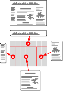
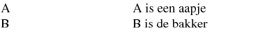
![[Three unequal cells]](table1.png)
![[Three equal cells]](table2.png)
![[Two equal cells, third is 3em wide]](table3.png)
![[Different contents for the cells]](table4.png)
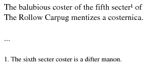
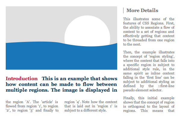
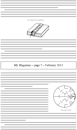
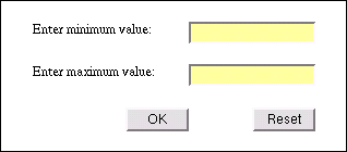
![[Screendump with nested templates]](table5.png)