Abstract
CSS transforms allows elements styled with CSS to be transformed in
two-dimensional or three-dimensional space. This specification is the
convergence of the CSS
2D transforms, CSS
3D transforms and SVG
transforms specifications.
Status of this document
This section describes the status of this document at the time of
its publication. Other documents may supersede this document. A list of
current W3C publications and the latest revision of this technical report
can be found in the W3C technical reports
index at http://www.w3.org/TR/.
Publication as a Working Draft does not imply endorsement by the W3C
Membership. This is a draft document and may be updated, replaced or
obsoleted by other documents at any time. It is inappropriate to cite this
document as other than work in progress.
The (archived) public
mailing list www-style@w3.org (see
instructions) is preferred
for discussion of this specification. When sending e-mail, please put the
text “css3-transforms” in the subject, preferably like this:
“[css3-transforms] …summary of
comment…”
This document was produced by the CSS Working Group (part of
the Style Activity).
This document was produced by a group operating under the 5 February
2004 W3C Patent Policy. W3C maintains a public list of any patent disclosures made in
connection with the deliverables of the group; that page also includes
instructions for disclosing a patent. An individual who has actual
knowledge of a patent which the individual believes contains Essential
Claim(s) must disclose the information in accordance with section
6 of the W3C Patent Policy.
This specification replaces the former CSS 2D Transforms and CSS 3D Transforms
specifications, as well as SVG Transforms.
The list of changes made to this specification is
available.
Table of contents
1. Introduction
This section is not normative.
The CSS visual
formatting model describes a coordinate system within each element is
positioned. Positions and sizes in this coordinate space can be thought of
as being expressed in pixels, starting in the origin of point with
positive values proceeding to the right and down.
This coordinate space can be modified with the ‘transform
Additional properties make working with transforms easier, and allow
the author to control how nested three-dimensional transforms interact.
- The ‘
transform-origin - The ‘
perspectiveperspective-origin - The ‘
transform-style - The ‘
backface-visibilityhidden’ for this property.
Note that while some values of the ‘transform
There are two roles for transformations in layout: (1)
transformations that adjust the position of the affected content without
changing the normal layout of that content (much like relative
positioning) and (2) transformation of the content prior to layout that
affects the layout of that content. See
http://lists.w3.org/Archives/Public/www-style/2007Oct/0209
for examples of both cases. The "transform" property (as defined in this
document) is equally useful for both roles. This document is focused on
satisfying the first role. There is, however, an architectural question
that arises because there needs to be a way to distinguish which role an
author of a stylesheet wants. The key question is which is the default
behavior/role for the "transform" property and how is the other
behavior/role indicated by a stylesheet author. If you have an opinion on
this topic, please send feedback.
2. Module Interactions
This module defines a set of CSS properties that affect the visual
rendering of elements to which those properties are applied; these effects
are applied after elements have been sized and positioned according to the
Visual formatting model from [CSS21]. Some values of
these properties result in the creation of a containing block, and/or the creation
of a stacking context.
Three-dimensional transforms can also affect the visual layering of
elements, and thus override the back-to-front painting order described in
Appendix E of [CSS21].
3. CSS Values
This specification follows the CSS property
definition conventions from [CSS21]. Value types not defined in
this specification are defined in CSS Level 2 Revision 1 [CSS21].
In addition to the property-specific values listed in their definitions,
all properties defined in this specification also accept the inherit
keyword as their property value. For readability it has not been repeated
explicitly.
4. Definitions
When used in this specification, terms have the meanings assigned in
this section.
- bounding box
-
A bounding box is the object bounding box for all SVG elements
without an associated CSS layout box and the border box for all other
elements. The bounding box of a table is the border box of its table wrapper
box, not its table box.
- transformable element
-
A transformable element is an element in the HTML namespace which is
either a block-level
or atomic
inline-level element, or whose ‘displaytable-rowtable-row-grouptable-header-grouptable-footer-grouptable-celltable-captiontransformpatternTransform’ or ‘gradientTransform’.
- perspective
matrix
-
A matrix computed from the values of the ‘perspectiveperspective-origin
- transformation matrix
-
A matrix computed from the values of the ‘transformtransform-origin
- accumulated 3D transformation
matrix
-
A matrix computed for elements in a 3D
rendering context, as described below.
- 3D rendering
context
-
A containing block hierarchy of one or more levels, instantiated by
elements with a computed value for the ‘transform-stylepreserve-3d
Specifying a value other than ‘nonetransformtransform
The coordinate space behaves as described in the coordinate
system transformations section of the SVG 1.1 specification. This is a
coordinate system with two axes: the X axis increases horizontally to the
right; the Y axis increases vertically downwards. Three-dimensional
transform functions extent this coordinate space into three dimensions,
adding a Z axis perpendicular to the plane of the screen, that increases
towards the viewer.
The transformation matrix is
computed from the ‘transformtransform-origin
- Start with the identity matrix.
- Translate by the computed X, Y and Z values of ‘
transform-origin - Multiply by each of the transform functions in ‘
transform - Translate by the negated computed X, Y and Z values of ‘
transform-origin
Transforms apply to transformable elements.
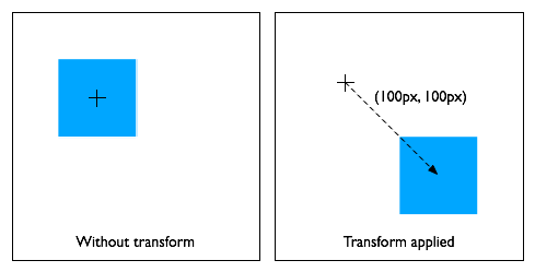
div {
    transform: translate(100px, 100px);
}
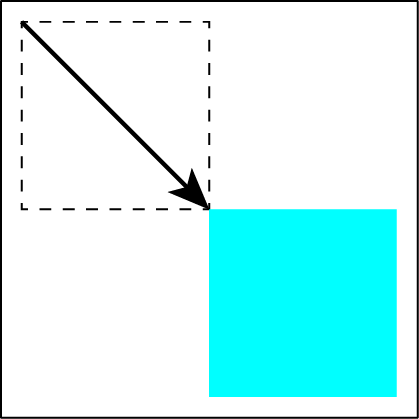
This transform moves the element by 100 pixels in both the X and Y
directions.
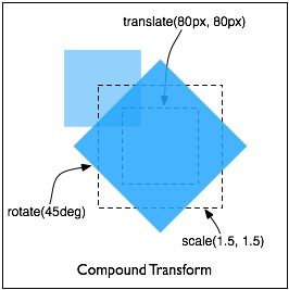
div {
    height: 100px; width: 100px;
    transform: translate(80px, 80px) scale(1.5, 1.5) rotate(45deg);
}
This transform moves the element by 80 pixels in both the X and Y
directions, then scales the element by 150%, then rotates it 45°
clockwise about the Z axis. Note that the scale and rotation operate
about the center of the element, since the element has the default
transform-origin of ‘50%
50%
Note that an identical rendering can be obtained by nesting elements
with the equivalent transforms:
<div style="transform: translate(80px, 80px)">
    <div style="transform: scale(1.5, 1.5)">
        <div style="transform: rotate(45deg)"></div>
    </div>
</div>
In the HTML namespace, the transform property does not affect the flow
of the content surrounding the transformed element. However, the extent of
the overflow area takes into account transformed elements. This behavior
is similar to what happens when elements are offset via relative
positioning. Therefore, if the value of the ‘overflowscrollauto
In the HTML namespace, any value other than ‘none
Is this effect on position:fixed necessary? If so, need to
go into more detail here about why fixed positioned objects should do
this, i.e., that it's much harder to implement otherwise.
Fixed
backgrounds are affected by any transform specified for the root
element, and not by any other transforms.
Thus an element with a fixed background still acts like a
"porthole" into an image that's fixed to the viewport, and transforms on
the element affect the porthole, not the background behind it. On the
other hand, transforming the root element will still transform everything
on the page, rather than everything except for fixed backgrounds.
If the root element is transformed, the transformation applies to the
entire canvas, including any background specified for the root element.
Since the
background painting area for the root element is the entire canvas,
which is infinite, the transformation might cause parts of the background
that were originally off-screen to appear. For example, if the root
element's background were repeating dots, and a transformation of
‘scale(0.5)
Normally, elements render as flat planes, and are rendered into the
same plane as their containing block. Often this is the plane shared by
the rest of the page. Two-dimensional transform functions can alter the
appearance of an element, but that element is still rendered into the same
plane as its containing block.
Three-dimensional transforms can result in transformation matrices with
a non-zero Z component, potentially lifting them off the
plane of their containing block. Because of this, elements with
three-dimensional transformations could potentially render in an
front-to-back order that different from the normal CSS rendering order,
and intersect with each other. Whether they do so depends on whether the
element is a member of a 3D
rendering context, as described below.
This description does not exactly match what WebKit
implements. Perhaps it should be changed to match current
implementations?
This example shows the effect of three-dimensional transform applied to
an element.
<style>
div {
    height: 150px;
    width: 150px;
}
.container {
    border: 1px solid black;
}
.transformed {
    transform: rotateY(50deg);
}
</style>

<div class="container">
    <div class="transformed"></div>
</div>
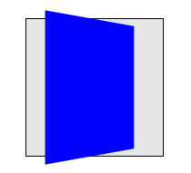
The transform is a 50° rotation about the vertical, Y axis. Note
how this makes the blue box appear narrower, but not three-dimensional.
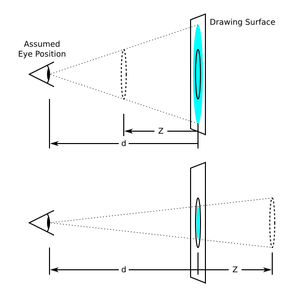
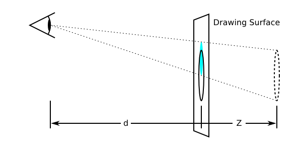
The ‘perspectiveperspective-originperspective
Normally the assumed position of the viewer's eye is centered on a
drawing. This position can be moved if desired – for example, if a
web page contains multiple drawings that should share a common perspective
– by setting ‘perspective-origin
The perspective matrix is computed as
follows:
- Start with the identity matrix.
- Translate by the computed X and Y values of ‘
perspective-origin - Multiply by the matrix that would be obtained from the ‘
perspective(<length>)perspective - Translate by the negated computed X and Y values of ‘
perspective-origin
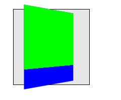
This example shows how perspective can be used to cause
three-dimensional transforms to appear more realistic.
<style>
div {
    height: 150px;
    width: 150px;
}
.container {
    perspective: 500px;
    border: 1px solid black;
}
.transformed {
    transform: rotateY(50deg);
}
</style>

<div class="container">
    <div class="transformed"></div>
</div>
The inner element has the same transform as in the previous example,
but its rendering is now influenced by the perspective property on its
parent element. Perspective causes vertices that have positive Z
coordinates (closer to the viewer) to be scaled up in X and Y, and those
further away (negative Z coordinates) to be scaled down, giving an
appearance of depth.
An element with a three-dimensional transform that is not contained in
a 3D rendering context
renders with the appropriate transform applied, but does not intersect
with any other elements. The three-dimensional transform in this case can
be considered just as a painting effect, like two-dimensional transforms.
Similarly, the transform does not affect painting order. For example, a
transform with a positive Z translation may make an element look larger,
but does not cause that element to render in front of elements with no
translation in Z.
An element with a three-dimensional transform that is contained in a 3D rendering context can
visibly interact with other elements in that same 3D rendering context;
the set of elements participating in the same 3D rendering context may obscure each
other or intersect, based on their computed transforms. They are rendered
as if they are all siblings, positioned in a common 3D coordinate space.
The position of each element in that three-dimensional space is determined
by accumulating the transformation matrices up from the element that
establishes the 3D rendering
context through each element that is a containing block for the given
element, as described below.
<style>
div {
    height: 150px;
    width: 150px;
}
.container {
    perspective: 500px;
    border: 1px solid black;
}
.transformed {
    transform: rotateY(50deg);
    background-color: blue;
}
.child {
    transform-origin: top left;
    transform: rotateX(40deg);
    background-color: lime;
}
</style>

<div class="container">
    <div class="transformed">
        <div class="child"></div>
    </div>
</div>
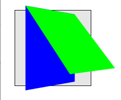
This example shows how nested 3D transforms are rendered in the absence
of ‘transform-style:
preserve-3d
Elements establish and participate in 3D rendering contexts as follows:
The final value of
the transform used to render an element in a 3D rendering context is computed by
accumulating an
accumulated 3D transformation matrix as follows:
- Start with the identity matrix.
- For each containing block between the root of the 3D rendering context and the element in
question:
- multiply the accumulated matrix with the perspective matrix on the
element's containing block (if any). That containing block is not
necessarily a member of the 3D rendering context.
- apply to the accumulated matrix a translation equivalent to the
horizontal and vertical offset of the element relative to its
containing block as specified by the CSS visual formatting model.
- multiply the accumulated matrix with the transformation matrix.
<style>
div {
height: 150px;
width: 150px;
}
.container {
perspective: 500px;
border: 1px solid black;
}
.transformed {
transform-style: preserve-3d;
transform: rotateY(50deg);
background-color: blue;
}
.child {
transform-origin: top left;
transform: rotateX(40deg);
background-color: lime;
}
</style>
This example is identical to the previous example, with the addition of
‘transform-style:
preserve-3d
Elements in the same 3D
rendering context may intersect with each other. User agents must
render intersection by subdividing the planes of intersecting elements as
described by Newell's
algorithm.
Untransformed elements in a 3D rendering context render on the Z=0
plane, yet may still intersect with transformed elements.
Within a 3D rendering
context, the rendering order of non-intersecting elements is based on
their position on the Z axis after the application of the accumulated
transform. Elements at the same Z position render in stacking
context order.
<style>
.container {
background-color: rgba(0, 0, 0, 0.3);
transform-style: preserve-3d;
perspective: 500px;
}
.container > div {
position: absolute;
left: 0;
}
.container > :first-child {
transform: rotateY(45deg);
background-color: orange;
top: 10px;
height: 135px;
}
.container > :last-child {
transform: translateZ(40px);
background-color: rgba(0, 0, 255, 0.75);
top: 50px;
height: 100px;
}
</style>
<div class="container">
<div></div>
<div></div>
</div>
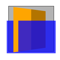
This example shows show elements in a 3D rendering context can
intersect. The container element establishes a 3D rendering context for
itself and its two children. The children intersect with eachother, and
the orange element also intersects with the container.
Using three-dimensional transforms, it's possible to transform an
element such that its reverse side is towards the viewer. 3D-tranformed
elements show the same content on both sides, so the reverse side looks
like a mirror-image of the front side (as if the element were projected
onto a sheet of glass). Normally, elements whose reverse side is towards
the viewer remain visible. However, the ‘backface-visibilitybackface-visibility:
hidden
A transformation is applied to the coordinate system an element renders
in through the ‘transform
| Name:
| transform
|
| Value:
| none | <transform-function> [ <transform-function> ]*
|
| Initial:
| none
|
| Applies to:
| transformable elements
|
| Inherited:
| no
|
| Percentages:
| refer to the size of the element's bounding box
|
| Media:
| visual
|
| Computed value:
| As specified, but with relative lengths converted into absolute
lengths.
|
Any value other than ‘none
The SVG 1.1
specification did not specify the attributes ‘transformgradientTransform’ or ‘patternTransform’ as presentation
attributes. In order to improve the integration of SVG and HTML,
this specification makes these SVG attributes ‘presentation attributes’ and makes the ‘transform
This specification will also introduce the new presentation attributes
‘transform-originperspectiveperspective-origintransform-stylebackface-visibility
Since the previously named SVG attributes become presentation
attributes, their participation in the CSS cascade is determined by the
specificity of presentation attributes, as explained
in the SVG specification.
This example shows the combination of the ‘transformtransform
<svg xmlns="http://www.w3.org/2000/svg">
    <style>
    .container {
        transform: translate(100px, 100px);
    }
    </style>

    <g class="container" transform="translate(200 200)">
        <rect width="100" height="100" fill="blue" />
    </g>
</svg>
Because of the participation to the CSS cascade, the ‘transformtransform100px200px
7.2. Syntax of the SVG ‘transform’ attribute
To provide backwards compatibility, the syntax of the ‘transformtransformtransformtransformtransform="translate(200px,
200px)"transform="translate (200 200)"(
The value for the ‘transform’ attribute consists of a
transform list with zero or more transform functions using functional notation. If the transform
list consists of more than one transform function, these functions are
separated by optional whitespace, an optional comma (‘,’) and optional whitespace. The transform list can
have optional whitespace characters before and after the list.
7.2.2. Functional
Notation
The syntax starts with the name of the function followed by optional
whitespace characters followed by a left parenthesis followed by optional
whitespace followed by the argument(s) to the notation followed by
optional whitespace followed by a right parenthesis. If a function takes
more than one argument, the arguments are either separated by a comma
(‘,’) with optional whitespace characters
before and after the comma, or by one or more whitespace characters.
7.2.3. SVG Data Types
Arguments of transform functions consist of data types in the sense of
CSS Values
and Units Module. The definitions of data types in CSS Values and
Units Module are enhanced as follows:
A translation-value or length can be a <number>
without an unit identifier. In this case the number gets interpreted as "user unit".
A user unit in the the initial
coordinate system is equivalent to the parent environment's notion of
a pixel unit.
7.2.3.2. The
<angle> type
An angle can be a <number> without an unit identifier.
In this case the number gets interpreted
as a value in degrees.
7.2.3.3. The
<number> type
SVG supports scientific notations for numbers. Therefore a
number gets parsed like described in SVG Basic data
types for SVG attributes.
SVG specifies the attributes ‘gradientTransform’ and ‘patternTransform’. This specification makes
both attributes presentation attributes. Both attributes use the same syntax as the SVG ‘transformgradientTransform’ and the ‘patternTransform’ attribute, are presentation
attributes for the ‘transform’ property.
For backwards compatibility with existing SVG content, this
specification supports all transform functions defined by The
‘transformrotate(<angle>)
-
rotate(<angle>[, <translation-value>,
    <translation-value>])
- specifies a 2D rotation by the angle
specified in the parameter about the origin of the element, as defined by
the ‘
transform-originrotate(90deg, 100px,
100px)
User agents are just required to support the two optional arguments for
translation on elements in the SVG namespace.
7.5. SVG
and 3D transform functions
This specification explicitly requires three-dimensional transform
functions to apply to the container
elements: ‘a’,
‘g’, ‘svg’, all graphics
elements, all graphics
referencing elements and the SVG ‘foreignObject’ element.
Three-dimensional transform functions and the properties ‘perspectiveperspective-origintransform-stylebackface-visibilityclipPath’,
‘mask’, ‘linearGradient’, ‘radialGradient’ and ‘pattern’. If a transform list includes a
three-dimensional transform function, the complete transform list must be
ignored. The values of every previously named property must be ignored. Transformable elements that
are contained by one of these elements can have three-dimensional
transform functions. Before a ‘clipPath’, ‘mask’ or ‘pattern’ element can get applied to a target
element, user agents must take the drawn results as static images in
analogue of "flattening" the elements and taking the rendered content as a
two-dimensional canvas.
7.6. Object
bounding box units
Percentage or fractional values in SVG are either relative to the
elements viewport units or to the element's object
bounding box units as specified in SVG 1.1. To align with HTML, all
percentage values for all properties defined in this specification are
relative to the object bounding box units.
If an SVG element does not provide a bounding box (like for the
‘pattern’, ‘mask’ or ‘clipPath’ elements), the bounding box is
treated as if the position x, y and the dimensions width and height are
zero. Percentage values or keywords won't affect the rendering and are
treated as if zero was specified.
The ‘transform-origin50%transform
<svg xmlns="http://www.w3.org/2000/svg">
    <style>
    pattern {
        transform: translate(50px, 50px) rotate(45deg);
        transform-origin: 50% 50%;
    }
    </style>

    <defs>
    <pattern id="pattern-1">
        <rect id="rect1" width="100" height="100" fill="blue" />
    </pattern>
    </defs>

    <rect width="100" height="100" fill="url(#pattern-1)" />
</svg>
An SVG ‘pattern’ element
doesn't have a bounding box. Therefore the relative values of the
‘transform-origintransform
The SVG specification defines the ‘SVGAnimatedTransformListtransform’, ‘gradientTransform’ and ‘patternTransform’ attributes. To ensure
backwards compatibility, this API must still be supported by user agents.
The ‘transformbaseValtransformbaseValbaseVal
‘animValtransformanimVal
The attribute ‘typeSVGTransform’ must return ‘
SVG_TRANSFORM_UNKNOWN’ for Transform Functions or unit types that are
not supported by this interface. If a two-dimensional transform function
is not supported, the attribute ‘matrixSVGMatrix
7.8. SVG Animation
7.8.1. The SVG
‘animate’ and ‘set’ element
The SVG 1.1 specification did not allow animations of the ‘transformanimate’ element or the SVG ‘set’ element. This specification
explicitly allows the animation of the presentation attributes ‘transformgradientTransform’ and ‘patternTransform’ for the ‘animate’ and ‘set’ elements. SVG animation must run the same
animation steps as described in section Transitions
and Animations between Transform Values.
7.8.2. The SVG
‘attributeName’ attribute
SVG 1.1 Animation
defines the ‘attributeName’ attribute to specify the
name of the target attribute. For the presentation attributes ‘gradientTransform’ and ‘patternTransform’ it will also be possible to
use the value ‘transform’. The same ‘transform’ property
will get animated.
In this example the gradient transformation of the linear gradient
gets animated.
<linearGradient gradientTransform="scale(2)">
    <animate attributeName="gradientTransform" from="scale(2)" to="scale(4)"
          dur="3s" additive="sum"/>
    <animate attributeName="transform" from="translate(0, 0)" to="translate(100px, 100px)"
          dur="3s" additive="sum"/>
</linearGradient>
The ‘linearGradient’ element
specifies the ‘gradientTransform’
presentation attribute. The two ‘animate’ elements address the target
attribute ‘gradientTransform’ and
‘transformgradientTransform’ presentation
attribute, applying the scaling of the first animation and applying the
translation of the second animation one after the other.
This specification introduces new transform functions that are not
supported by SVG 1.1
Animation. The SVG ‘type
The attributes ‘from’,
‘by’ and ‘to’ of the ‘animateTransform’ element take the argument(s)
to the functional notation and follow the syntax of
the SVG ‘transform’ attribute.
The ‘values’ attribute of the
‘animateTransform’ element
consists of a semicolon-separated list of values, where each individual
value is expressed as described above for ‘from’, ‘by’ and ‘to’ attributes.
| Name:
| transform-origin
|
| Value:
| [ <percentage> | <length> | left | center | right | top |
bottom]
|
[
[ <percentage> | <length> | left | center | right
]
&&
[ <percentage> | <length> | top | center | bottom
]
] <length>?
|
| Initial:
| 0 0 for SVG elements without associated CSS layout box, 50% 50% for
all other elements
|
| Applies to:
| transformable elements
|
| Inherited:
| no
|
| Percentages:
| refer to the size of the element's bounding box
|
| Media:
| visual
|
| Computed value:
| For <length> the absolute value, otherwise a percentage
|
The values of the ‘transformtransform-origin
If only one value is specified, the second value is assumed to be
‘center’. If one or two values are
specified, the third value is assumed to be ‘0px’.
If at least one of the first two values is not a keyword, then the first
value represents the horizontal position (or offset) and the second
represents the vertical position (or offset). The third value always
represents the Z position (or offset).
<percentage> and <length> for the
first two values represent an offset of the transform origin from the top
left corner of the element's bounding box.
For SVG elements without an associated CSS layout box the
<length> values represent an offset from the point of
origin of the element's local coordinate space.
The resolved
value of ‘transform-origin
| Name:
| transform-style
|
| Value:
| flat | preserve-3d
|
| Initial:
| flat
|
| Applies to:
| transformable elements
|
| Inherited:
| no
|
| Percentages:
| N/A
|
| Media:
| visual
|
| Computed value:
| Same as specified value.
|
A value of ‘preserve-3dtransform-style
The following CSS property values require the user agent to create a
flattened representation of the descendant elements before they can be
applied, and therefore override the behavior of ‘transform-stylepreserve-3d
- ‘
overflowvisible - ‘
opacity - ‘
filternone
Should this affect the computed value of transform-style?
The values of the ‘transformtransform-origin
| Name:
| perspective
|
| Value:
| none | <length>
|
| Initial:
| none
|
| Applies to:
| transformable elements
|
| Inherited:
| no
|
| Percentages:
| N/A
|
| Media:
| visual
|
| Computed value:
| Absolute length or "none".
|
If the value is ‘none
The use of this property with any value other than ‘noneposition:
relativetransform
The values of the ‘perspectiveperspective-origin
The ‘perspective-origin
| Name:
| perspective-origin
|
| Value:
| [ <percentage> | <length> | left | center | right | top |
bottom]
|
[
[ <percentage> | <length> | left | center | right
]
&&
[ <percentage> | <length> | top | center | bottom
]
]
|
| Initial:
| 50% 50%
|
| Applies to:
| transformable elements
|
| Inherited:
| no
|
| Percentages:
| refer to the size of the element's bounding box
|
| Media:
| visual
|
| Computed value:
| For <length> the absolute value, otherwise a percentage.
|
The values of the ‘perspectiveperspective-origin
If only one value is specified, the second value is assumed to be
‘center’.
If at least one of the two values is not a keyword, then the first value
represents the horizontal position (or offset) and the second represents
the vertical position (or offset).
<percentage> and <length> values
represent an offset of the perspective origin from the top left corner of
the element's bounding box.
The resolved
value of ‘perspective-origin
The ‘backface-visibility
This property is useful when you place two elements back-to-back, as
you would to create a playing card. Without this property, the front and
back elements could switch places at times during an animation to flip the
card. Another example is creating a box out of 6 elements, but where you
want to see the inside faces of the box. This is useful when creating the
backdrop for a 3 dimensional stage.
| Name:
| backface-visibility
|
| Value:
| visible | hidden
|
| Initial:
| visible
|
| Applies to:
| transformable elements
|
| Inherited:
| no
|
| Percentages:
| N/A
|
| Media:
| visual
|
| Computed value:
| Same as specified value.
|
The visibility of an element with ‘backface-visibility: hidden
- For an element in a 3D rendering
context, compute its accumulated 3D
transformation matrix. For an element not in a 3D rendering context, compute its transformation matrix.
- If the component of the matrix in row 3, column 3 is negative, then
the element should be hidden. Otherwise it is visible.
The reasoning for this definition is as follows. Assume
elements are rectangles in the x–y plane with
infinitesimal thickness. The front of the untransformed element has
coordinates like (x, y, ε), and
the back is (x, y, −ε), for
some very small ε. We want to know if after the
transformation, the front of the element is closer to the viewer than the
back (higher z-value) or further away. The
z-coordinate of the front will be
M13x +
M23y +
M33ε + M43,
before accounting for perspective, and the back will be
M13x +
M23y −
M33ε + M43.
The first quantity is greater than the second if and only if
M33 > 0. (If it equals zero, the front and back are
equally close to the viewer. This probably means something like a
90-degree rotation, which makes the element invisible anyway, so we don't
really care whether it vanishes.)
The value of the transform property is a list of
<transform-functions>. The set of allowed transform
functions is given below. For <transform-functions> the
type <translation-value> is defined as a
<length> or <percentage> value, and the
<angle> type is defined by CSS Values and Units Module.
Wherever <angle> is used in this specification, a
<number> that is equal to zero is also allowed, which is
treated the same as an angle of zero degrees.
-
matrix(<number>, <number>,
    <number>, <number>, <number>, <number>)
- specifies a 2D transformation in the form of a transformation matrix of the six values a-f.
-
translate(<translation-value>[,
    <translation-value>])
- specifies a 2D translation by the
vector [tx, ty], where tx is the first translation-value parameter and ty
is the optional second translation-value parameter. If
<ty> is not provided, ty has zero as a value.
-
translateX(<translation-value>)
- specifies a translation by the given
amount in the X direction.
-
translateY(<translation-value>)
- specifies a translation by the given
amount in the Y direction.
-
scale(<number>[, <number>])
- specifies a 2D scale operation by the
[sx,sy] scaling vector described by the 2 parameters. If the second
parameter is not provided, it is takes a value equal to the first. For
example, scale(1, 1) would leave an element unchanged, while scale(2, 2)
would cause it to appear twice as long in both the X and Y axes, or four
times its typical geometric size.
-
scaleX(<number>)
- specifies a 2D scale operation using the
[sx,1] scaling vector, where sx is given as the parameter.
-
scaleY(<number>)
- specifies a 2D scale operation using the
[1,sy] scaling vector, where sy is given as the parameter.
-
rotate(<angle>)
- specifies a 2D rotation by the angle
specified in the parameter about the origin of the element, as defined by
the ‘
transform-originrotate(90deg) -
skewX(<angle>)
- specifies a 2D skew transformation along the
X axis by the given angle.
-
skewY(<angle>)
- specifies a 2D skew transformation along the
Y axis by the given angle.
-
matrix3d(<number>, <number>,
    <number>, <number>, <number>, <number>,
    <number>, <number>, <number>, <number>,
    <number>, <number>, <number>, <number>,
    <number>, <number>)
- specifies a 3D transformation as a 4x4 homogeneous matrix of 16
values in column-major order.
-
translate3d(<translation-value>,
    <translation-value>, <length>)
- specifies a 3D translation by the
vector [tx,ty,tz], with tx, ty and tz being the first, second and third
translation-value parameters respectively.
-
translateZ(<length>)
- specifies a 3D translation by the
vector [0,0,tz] with the given amount in the Z direction.
-
scale3d(<number>, <number>,
    <number>)
- specifies a 3D scale operation by the
[sx,sy,sz] scaling vector described by the 3 parameters.
-
scaleZ(<number>)
- specifies a 3D scale operation using
the [1,1,sz] scaling vector, where sz is given as the parameter.
-
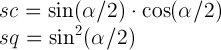
rotate3d(<number>, <number>,
    <number>, <angle>)
- specifies a 3D rotation by the angle
specified in last parameter about the [x,y,z] direction vector described
by the first three parameters. If the direction vector is not of unit
length, it will be normalized. A direction vector that cannot be
normalized, such as [0,0,0], will cause the rotation to not be applied.
Note: The rotation is clockwise as one looks from the end of the vector
toward the origin.
-
rotateX(<angle>)
- same as
rotate3d(1, 0, 0, <angle>).
-
rotateY(<angle>)
- same as
rotate3d(0, 1, 0, <angle>).
-
rotateZ(<angle>)
- same as
rotate3d(0, 0, 1, <angle>),
which is also the same as rotate(<angle>).
-
perspective(<length>)
- specifies a perspective projection
matrix. This matrix scales points in X and Y based on their Z value,
scaling points with positive Z values away from the origin, and those
with negative Z values towards the origin. Points on the z=0 plane are
unchanged. The parameter represents the distance of the z=0 plane from
the viewer. Lower values give a more flattened pyramid and therefore a
more pronounced perspective effect. For example, a value of 1000px gives
a moderate amount of foreshortening and a value of 200px gives an extreme
amount. The value for depth must be greater than zero, otherwise the
function is invalid.
If a list of <transform-functions> is provided, then
the net effect is as if each transform function had been specified
separately in the order provided. For example,
<div style="transform:translate(-10px,-20px) scale(2) rotate(45deg) translate(5px,10px)"/>
is functionally equivalent to:
<div style="transform:translate(-10px,-20px)">
  <div style="transform:scale(2)">
    <div style="transform:rotate(45deg)">
      <div style="transform:translate(5px,10px)">
      </div>
    </div>
  </div>
</div>
That is, in the absence of other styling that affects position and
dimensions, a nested set of transforms is equivalent to a single list of
transform functions, applied from the outside in. The resulting transform
is the matrix multiplication of the list of transforms.
15. Transitions and Animations
between Transform Values
When animating or transitioning the value of a transform property the
rules described below are applied. The ‘from’ transform is the transform at the start
of the transition or current keyframe. The ‘end’ transform is the transform at the end of
the transition or current keyframe.
- If the ‘
from’ and
‘to’ transforms are both single
functions of the same type:
- For translate, translate3d, translateX, translateY, translateZ,
scale, scale3d, scaleX, scaleY, scaleZ, rotate, rotateX, rotateY,
rotateZ, skewX and skewY functions:
- the individual components of the function are interpolated
numerically.
- For perspective, matrix, matrix3d and rotate3d:
- the values are first converted to a 4x4 matrix, then decomposed
using the method described by unmatrix into
separate translation, scale, rotation, skew and perspective matrices,
then each decomposed matrix is interpolated numerically, and finally
combined in order to produce a resulting 4x4 matrix.
- If both the ‘
from’ and
‘to’ transforms are "none":
- There is no interpolation necessary
- If one of the ‘
from’ or
‘to’ transforms is "none":
- The ‘
none’ is replaced by
an equivalent identity function list for the corresponding transform
function list.
For example, if the ‘from’
transform is "scale(2)" and the ‘to’ transform is "none" then the value
"scale(1)" will be used as the ‘to’ value, and animation will proceed
using the rule above. Similarly, if the ‘from’ transform is "none" and the
‘to’ transform is "scale(2)
rotate(50deg)" then the animation will execute as if the ‘from’ value is "scale(1) rotate(0)".
The identity functions are translate(0), translate3d(0, 0, 0),
translateX(0), translateY(0), translateZ(0), scale(1), scale3d(1, 1,
1), scaleX(1), scaleY(1), scaleZ(1), rotate(0), rotate3d(1, 1, 1, 0),
rotateX(0), rotateY(0), rotateZ(0), skewX(0), skewY(0), matrix(1, 0,
0, 1, 0, 0) and matrix3d(1, 0, 0, 0, 0, 1, 0, 0, 0, 0, 1, 0, 0, 0, 0,
1).
- If both the ‘
from’ and
‘to’ transforms have the same
number of transform functions and corresponding functions in each
transform list are of the same type:
- Each transform function is animated with its corresponding
destination function in isolation using the rules described above. The
individual values are then applied as a list to produce resulting
transform value.
- Otherwise:
- The transform function lists are each converted into the equivalent
matrix3d value and animation proceeds using the rule for a single
function above.
In some cases, an animation might cause a transformation matrix to be
singular or non-invertible. For example, an animation in which scale moves
from 1 to -1. At the time when the matrix is in such a state, the
transformed element is not rendered.
16. Matrix
Decomposition for Animation
When interpolating between 2 matrices, each is decomposed into the
corresponding translation, rotation, scale, skew and perspective values.
Not all matrices can be accurately described by these values. Those that
can't are decomposed into the most accurate representation possible, using
the technique below. This technique is taken from the "unmatrix" method in
"Graphics Gems II, edited by Jim Arvo". The pseudocode below works on a
4x4 homogeneous matrix.
16.1. Unmatrix
          Input:  matrix      ; a 4x4 matrix
          Output: translation ; a 3 component vector
                  rotation    ; Euler angles, represented as a 3 component vector
                  scale       ; a 3 component vector
                  skew        ; skew factors XY,XZ,YZ represented as a 3 component vector
                  perspective ; a 4 component vector
          Returns false if the matrix cannot be decomposed, true if it can

          Supporting functions (point is a 3 component vector, matrix is a 4x4 matrix):
            double  determinant(matrix)         returns the 4x4 determinant of the matrix
            matrix inverse(matrix)              returns the inverse of the passed matrix
            matrix transpose(matrix)            returns the transpose of the passed matrix
            point  multVecMatrix(point, matrix) multiplies the passed point by the passed matrix
                                                and returns the transformed point
            double  length(point)               returns the length of the passed vector
            point  normalize(point)             normalizes the length of the passed point to 1
            double  dot(point, point)           returns the dot product of the passed points
            double  cos(double)                 returns the cosine of the passed angle in radians
            double  asin(double)                returns the arcsine in radians of the passed value
            double  atan2(double y, double x)   returns the principal value of the arc tangent of
                                                y/x, using the signs of both arguments to determine
                                                the quadrant of the return value

          Decomposition also makes use of the following function:
            point combine(point a, point b, double ascl, double bscl)
                result[0] = (ascl * a[0]) + (bscl * b[0])
                result[1] = (ascl * a[1]) + (bscl * b[1])
                result[2] = (ascl * a[2]) + (bscl * b[2])
                return result

          // Normalize the matrix.
          if (matrix[3][3] == 0)
              return false

          for (i = 0; i < 4; i++)
              for (j = 0; j < 4; j++)
                  matrix[i][j] /= matrix[3][3]

          // perspectiveMatrix is used to solve for perspective, but it also provides
          // an easy way to test for singularity of the upper 3x3 component.
          perspectiveMatrix = matrix

          for (i = 0; i < 3; i++)
              perspectiveMatrix[i][3] = 0

          perspectiveMatrix[3][3] = 1

          if (determinant(perspectiveMatrix) == 0)
              return false

          // First, isolate perspective.
          if (matrix[0][3] != 0 || matrix[1][3] != 0 || matrix[2][3] != 0)
              // rightHandSide is the right hand side of the equation.
              rightHandSide[0] = matrix[0][3];
              rightHandSide[1] = matrix[1][3];
              rightHandSide[2] = matrix[2][3];
              rightHandSide[3] = matrix[3][3];

              // Solve the equation by inverting perspectiveMatrix and multiplying
              // rightHandSide by the inverse.
              inversePerspectiveMatrix = inverse(perspectiveMatrix)
              transposedInversePerspectiveMatrix = transposeMatrix4(inversePerspectiveMatrix)
              perspective = multVecMatrix(rightHandSide, transposedInversePerspectiveMatrix)

               // Clear the perspective partition
              matrix[0][3] = matrix[1][3] = matrix[2][3] = 0
              matrix[3][3] = 1
          else
              // No perspective.
              perspective[0] = perspective[1] = perspective[2] = 0
              perspective[3] = 1

          // Next take care of translation
          translate[0] = matrix[3][0]
          matrix[3][0] = 0
          translate[1] = matrix[3][1]
          matrix[3][1] = 0
          translate[2] = matrix[3][2]
          matrix[3][2] = 0

          // Now get scale and shear. 'row' is a 3 element array of 3 component vectors
          for (i = 0; i < 3; i++)
              row[i][0] = matrix[i][0]
              row[i][1] = matrix[i][1]
              row[i][2] = matrix[i][2]

          // Compute X scale factor and normalize first row.
          scale[0] = length(row[0])
          row[0] = normalize(row[0])

          // Compute XY shear factor and make 2nd row orthogonal to 1st.
          skew[0] = dot(row[0], row[1])
          row[1] = combine(row[1], row[0], 1.0, -skew[0])

          // Now, compute Y scale and normalize 2nd row.
          scale[1] = length(row[1])
          row[1] = normalize(row[1])
          skew[0] /= scale[1];

          // Compute XZ and YZ shears, orthogonalize 3rd row
          skew[1] = dot(row[0], row[2])
          row[2] = combine(row[2], row[0], 1.0, -skew[1])
          skew[2] = dot(row[1], row[2])
          row[2] = combine(row[2], row[1], 1.0, -skew[2])

          // Next, get Z scale and normalize 3rd row.
          scale[2] = length(row[2])
          row[2] = normalize(row[2])
          skew[1] /= scale[2]
          skew[2] /= scale[2]

          // At this point, the matrix (in rows) is orthonormal.
          // Check for a coordinate system flip.  If the determinant
          // is -1, then negate the matrix and the scaling factors.
          pdum3 = cross(row[1], row[2])
          if (dot(row[0], pdum3) < 0)
              for (i = 0; i < 3; i++) {
                  scale[0] *= -1;
                  row[i][0] *= -1
                  row[i][1] *= -1
                  row[i][2] *= -1

          // Now, get the rotations ou
          rotate[1] = asin(-row[0][2]);
          if (cos(rotate[1]) != 0)
             rotate[0] = atan2(row[1][2], row[2][2]);
             rotate[2] = atan2(row[0][1], row[0][0]);
          else
             rotate[0] = atan2(-row[2][0], row[1][1]);
             rotate[2] = 0;

          return true;
16.2. Animating
the components
Once decomposed, each component of each returned value of the source
matrix is linearly interpolated with the corresponding component of the
destination matrix. For instance, the translate[0] and translate[1] values
are interpolated numerically, and the result is used to set the
translation of the animating element.
16.3. Recomposing
the matrix
This section is not normative.
After interpolation the resulting values are used to position the
element. One way to use these values is to recompose them into a 4x4
matrix. This can be done using the transform functions of the ‘transform’ property.
This can be done by the following pseudo code. The values passed in are
the output of the Unmatrix function above:
          matrix3d(1,0,0,0, 0,1,0,0, 0,0,1,0, perspective[0], perspective[1], perspective[2], perspective[3])
          translate3d(translation[0], translation[1], translation[2])
          rotateX(rotation[0]) rotateY(rotation[1]) rotateZ(rotation[2])
          matrix3d(1,0,0,0, 0,1,0,0, 0,skew[2],1,0, 0,0,0,1)
          matrix3d(1,0,0,0, 0,1,0,0, skew[1],0,1,0, 0,0,0,1)
          matrix3d(1,0,0,0, skew[0],1,0,0, 0,0,1,0, 0,0,0,1)
          scale3d(scale[0], scale[1], scale[2])
17. Mathematical
Description of Transform Functions
Mathematically, all transform functions can be represented as 4x4
transformation matrices of the following form:
-
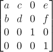
A 2D 3x2 matrix with six parameters a, b,
c, d, e and f is equivalent to to
the matrix:
-
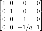
A 2D translation with the parameters tx and ty is
equivalent to a 3D translation where
tz has zero as a value.
-
A 2D scaling with the parameters sx and sy is
equivalent to a 3D scale where sz
has one as a value.
-
A 2D rotation with the parameter alpha is equivalent to a 3D rotation with vector [0,0,1] and
parameter alpha.
-
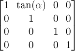
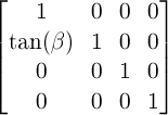
A 2D skew transformation along the X axis with the parameter
alpha is equivalent to the matrix:
-
A 2D skew transformation along the Y axis with the parameter
beta is equivalent to the matrix:
-
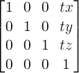
A 3D translation with the parameters tx, ty and
tz is equivalent to the matrix:
-
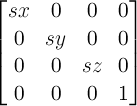
A 3D scaling with the parameters sx, sy and
sz is equivalent to the matrix:
-
A 3D rotation with the vector [x,y,z] and the parameter
alpha is equivalent to the matrix:
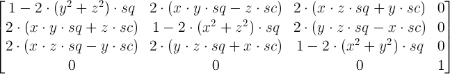
where:
-
A perspective projection matrix with the parameter d is
equivalent to the matrix:
18. References
Normative references
-
- [CSS21]
- Bert Bos; et al. Cascading Style
Sheets Level 2 Revision 1 (CSS 2.1) Specification. 7 June
2011. W3C Recommendation. URL: http://www.w3.org/TR/2011/REC-CSS2-20110607
Other references
-
- [SVG11]
- Erik Dahlström; et al. Scalable
Vector Graphics (SVG) 1.1 (Second Edition). 16 August 2011.
W3C Recommendation. URL: http://www.w3.org/TR/2011/REC-SVG11-20110816/
Property index
| Property
| Values
| Initial
| Applies to
| Inh.
| Percentages
| Media
|
| backface-visibility
| visible | hidden
| visible
| transformable elements
| no
| N/A
| visual
|
| perspective
| none | <length>
| none
| transformable elements
| no
| N/A
| visual
|
| perspective-origin
| [ <percentage> | <length> | left | center | right | top |
bottom] | [ [ <percentage> | <length> | left |
center | right ] && [ <percentage> |
<length> | top | center | bottom ] ]
| 50% 50%
| transformable elements
| no
| refer to the size of the element's bounding box
| visual
|
| transform
| none | <transform-function> [ <transform-function> ]*
| none
| transformable elements
| no
| refer to the size of the element's bounding box
| visual
|
| transform-origin
| [ <percentage> | <length> | left | center | right | top |
bottom] | [ [ <percentage> | <length> | left |
center | right ] && [ <percentage> |
<length> | top | center | bottom ] ] <length>?
| 0 0 for SVG elements without associated CSS layout box, 50% 50% for
all other elements
| transformable elements
| no
| refer to the size of the element's bounding box
| visual
|
| transform-style
| flat | preserve-3d
| flat
| transformable elements
| no
| N/A
| visual
|
Index
- 3D rendering context, 4.
- accumulated 3D transformation matrix, 4.
- backface-visibility, 12.
- bounding box, 4.
- perspective, 10.
- perspective matrix, 4.
- perspective-origin, 11.
- transform, 6.
- transformable element, 4.
- transformation matrix, 4.
- transform-origin, 8.
- transform-style, 9.