The specification describes a CSS box model optimized for user
interface design. In the flex layout model, the children of a flex
container can be laid out in any direction, and can "flex" their sizes,
either growing to fill unused space or shrinking to avoid overflowing the
parent. Both horizontal and vertical alignment of the children can be
easily manipulated. Nesting of these boxes (horizontal inside vertical, or
vertical inside horizontal) can be used to build layouts in two
dimensions.
Status of this document
This section describes the status of this document at the time of
its publication. Other documents may supersede this document. A list of
current W3C publications and the latest revision of this technical report
can be found in the W3C technical reports
index at http://www.w3.org/TR/.
Publication as a Working Draft does not imply endorsement by the W3C
Membership. This is a draft document and may be updated, replaced or
obsoleted by other documents at any time. It is inappropriate to cite this
document as other than work in progress.
The (archived) public
mailing list www-style@w3.org (see
instructions) is preferred
for discussion of this specification. When sending e-mail, please put the
text “css3-flexbox” in the subject, preferably like this:
“[css3-flexbox] …summary of comment…”
This specification is a Last Call Working Draft. All
persons are encouraged to review this document and send comments
to the www-style
mailing list as described above. The deadline for
comments is 3 July 2012.
CSS 2.1 defined four layout modes — algorithms which determine the
size and position of boxes based on their relationships with their sibling
and ancestor boxes: block layout, designed for laying out documents;
inline layout, designed for laying out text; table layout, designed for
laying out information in a tabular format; and positioned layout,
designed for very explicit positioning without much regard for other
elements in the document. This module introduces a new layout mode, flex
layout, which is designed for laying out more complex applications and
webpages.
Flex layout is superficially similar to block layout. It lacks many of
the more complex text or document-formatting properties that can be used
in block layout, such as ‘float’ and ‘columns’, but
in return it gains more simple and powerful tools for aligning its
contents in ways that webapps and complex web pages often need.
The contents of a flex container can be laid out in any direction (left,
right, down, or even up!), can have their order swapped around dynamically
(i.e., display order is independent of source order), and can "flex" their
sizes and positions to respond to the available space. If a flex container
is multi-line, the flex items flow in two
dimensions, wrapping into separate lines in a fashion similar to how text
is wrapped into multiple lines.
For example, the following HTML snippet uses a flex container to create
a toolbar with icons. The flex container is horizontal, and the
children's widths don't fill the flex container's width, so the
additional space is distributed around and between the children. As the
flex container grows (perhaps because the user is viewing the page on a
wider screen), the children spread out evenly and automatically:
<ul>
  <li><button><img src='new.svg' alt="New"></button></li>
  <li><button><img src='upload.svg' alt="Upload"></button></li>
  <li><button><img src='save.svg' alt="Save"></button></li>
  <li><button><img src='trash.svg' alt="trash"></button></li>
</ul>
<style>
ul { display: flex; justify-content: space-around; }
/* Irrelevant styling for this example removed. */
</style>
Example rendering of the above code snippet, at two
different flex container widths.
1.1. Module interactions
This module extends the definition of the ‘display’ property.
1.2. Values
This specification follows the CSS property
definition conventions from [CSS21]. Value types not defined in
this specification are defined in CSS Level 2 Revision 1 [CSS21]. Other CSS
modules may expand the definitions of these value types: for example
[[CSS3VALUES]], when combined with this module, expands the definition of
the <length> value type as used in this specification.
In addition to the property-specific values listed in their definitions,
all properties defined in this specification also accept the ‘inherit’ keyword as their property value. For
readability it has not been repeated explicitly.
2. Flex Layout Box Model
An element with ‘display:flex’ or ‘display:inline-flex’ is a flex container. Children of a flex
container are called flex items and are
laid out using the flex layout model.
Unlike block layout, which is normally biased towards laying things out
vertically, and inline layout, which is normally biased toward laying
things out horizontally, the flex layout algorithm is agnostic as to the
direction the flex container happens to be laid out in. To make it easier
to talk about flex layout in a general way, we will define several
direction-agnostic terms here to make the rest of the spec easier to read
and understand.
An illustration of the various directions and sizing
terms used in this specification, respectively for ‘row’ and ‘column’ flex
containers.
The main axis of a flex container is the axis
along which flex items are laid out. The
flex items are ordered such that they
start on the main-start side of the flex
container, and go toward the main-end side. A flex item's width or height, whichever is in
the main dimension, is the item's main
size. The flex item's main size property is either the ‘width’ or ‘height’
property, whichever is in the main dimension.
The axis perpendicular to the main axis
is called the cross axis, and similarly has cross-start and cross-end
sides defined. The width or height of a flex
item, whichever is in the cross dimension, is the item's
cross size, and similarly the cross size property is whichever of ‘width’ or ‘height’
that is in the cross dimension.
The contents of a flex container can be easily and powerfully
manipulated with a handful of properties. Most significantly, flex items can "flex" their main size by using the ‘flex’ property. This
"flexing" allows the items to get bigger or smaller based on the available
space in the page. If there is leftover space in the flex container after
all of the flex items have finished
flexing, the items can be aligned, centered, or distributed with the ‘justify-content’
property. Flex items can also be
completely rearranged within the flex container with the ‘order’ property.
In the cross axis, flex items can either "stretch" to fill the
available space or be aligned within the space with the ‘align-items’
property. If a flex container is multi-line, new lines are added in the cross-end direction, and can similarly be
aligned, centered, or distributed within the flex container with the ‘align-content’
property.
3. Flex Containers: the
‘flex’ and ‘inline-flex’
‘display’ values
An element whose computed ‘display’ is
either ‘flex’ or ‘inline-flex’ is a
flex container, and establishes a new flex formatting context for its contents.
This is the same as establishing a block formatting context, except that
flex layout is used instead of block layout: floats do not intrude into
the flex container, and the flex container's margins do not collapse with
the margins of its contents. Additionally, each of the flex items establishes a new formatting
context for its contents.
The ‘flex’ value makes
the flex container a block-level element. The ‘inline-flex’
value makes the flex container an atomic inline-level element.
Flex containers are not block containers, and so some properties that
were designed with the assumption of block layout don't apply in the
context of flex layout. In particular:
all of the ‘column-*’ properties in the
Multicol module have no effect on a flex container.
‘float’ and ‘clear’ have no effect on a flex item. Using ‘float’ on an element still causes that element's
‘display’ property to compute to ‘block’, and thus ‘float’ may affect whether an element becomes a
flex item or is wrapped in one. (See CSS 2.1 Chapter
9.7.)
‘vertical-align’ has no effect on a
flex item.
If an element's specified value for ‘display’ is ‘inline-flex’ and
the element is floated or absolutely positioned, the computed value of
‘display’ is ‘flex’. The table in CSS 2.1 Chapter
9.7 is thus amended to contain an additional row, with ‘inline-flex’ in
the "Specified Value" column and ‘flex’ in the "Computed Value" column.
The baseline of a flex container is determined as follows:
If any of the flex items on the flex
container's first line (after reordering with ‘order’) have a computed value of ‘baseline’ for
‘align-self’,
the flex container's baseline is the baseline of those flex items.
Otherwise, if the flex container has at least one flex item, and the baseline of its first flex item (after reordering with ‘order’) is parallel to
the flex container's main-axis, the flex container's baseline is
the baseline of its first flex item.
Otherwise, the flex container's baseline is the "after" edge of its
content box.
4. Flex Items
The flex layout algorithm operates on boxes generated by flex items. Each of the
following becomes a flex item:
A block-level child of a flex container
An atomic inline-level child of a flex container
An HTML <img>, <canvas>,
<svg>, <math>, <audio>,
<video>, <iframe>,
<object>, <embed>,
<applet>, <progress>,
<meter>, <input>,
<button>, <select>, or
<textarea> element. Note: In other
words, any element that is "intended to be" a replaced element, even if
it becomes non-replaced (like an <object> that doesn't
load and is replaced by its contents).
An anonymous block wrapped around a contiguous run of non-replaced
inline child elements. However, if the anonymous block would contain
solely an anonymous inline containing only whitespace, the box is not
generated, as if it had ‘display:none’.
Some values of ‘display’ trigger the
generation of anonymous boxes. For example, a ‘table-cell’ child of a block container is fixed up by
generating ‘table’ and ‘table-row’ elements around it. This fixup must occur
before a flex container's contents are checked to see if it's
necessary to generate anonymous flex items.
The computed value for ‘display’ for
elements that are flex items must be
determined by applying the table in CSS 2.1 Chapter
9.7. This is expected to be superseded by a future
specification that defines a new ‘display’
value for flex items.
Examples of flex items:
<div style="display:flex">

    <!-- flex item: block-level child -->
    <div id="item1">block</div>

    <!-- not a flex item, because it's out-of-flow -->
    <!-- however, the placeholder it leaves behind is -->
    <div id="not-an-item-A" style="position: absolute;">block</div>

    <!-- flex item: block-level child -->
    <div id="item3" style="display:table">table</div>

    <!-- flex item: anonymous table wrapped around table-cell -->
    <div id="item4" style="display:table-cell">table-cell</div>

    <!-- flex item: anonymous block box around inline content -->
    anonymous item 5

    <!-- flex item: block-level child -->
    <div id="item6">block</div>

    <!-- flex item: anonymous block around inline content -->
    item 7
    <span>
        item 7
        <div id="not-an-item-B">item 7</div>
        item 7
    </span>

    <!-- flex item: block-level replaced element -->
    <iframe id="item8" style="display:block;"></iframe>

    <!-- flex item: inline-level replaced element -->
    <img id="item9">

    <!-- flex item: atomic inline-level element -->
    <button id="item10">button</button>

    <!-- flex item: inline-table -->
    <div id="item11" style="display:inline-table">table</div>

    <!-- flex item: floated inline, which changes to a block -->
    <span id="item12" style="float: left;">span</span>
</div>
Notice that block element "not-an-item-B" is not a flex item, because
it's not a child element of the flex container, even though the inline
<span> is eventually broken around it by Block Layout. Similarly, the
block element "not-an-item-A" is not a flex item, because absolutely
positioned children have special treatment.
Future display types may generate anonymous containers (e.g.
ruby) or otherwise mangle the box tree (e.g. run-ins). It is intended that
flex item determination run after these operations.
4.1. Flex Item Margins
The margins of adjacent flex items do
not collapse. Auto margins absorb extra space in that dimension and can be
used for alignment and to push adjacent flex items apart; see Aligning with ‘auto’
margins.
4.2. Out-of-flow Items
Absolutely positioned children of a flex container are not themselves
flex items, but they leave behind
"placeholders" in their normal position in the box tree. These
placeholders are anonymous inline boxes with a width, height, and
line-height of ‘0’, and they interact normally
with the flexbox layout algorithm. In particular, they'll trigger the
creation of anonymous flex items, or join neighboring inline elements in
their anonymous flex items.
The static position of an absolutely positioned child of a flex
container (the position when the ‘top’/‘right’/‘bottom’/‘left’
properties are ‘auto’), then, is the final position of its
corresponding placeholder, after flex layout has been performed.
Note: In most cases, this means that absolutely-positioned
items have no effect on flex layout. However, when the flex container has
‘justify-content: space-between’ or ‘justify-content: space-around’, the anonymous flex
items wrapping a placeholder will cause there to be two packing spaces
where there would otherwise be only one, possibly resulting in increased
space between two "real" items.
Note that any lineboxes generated solely due to placeholders
will be phantom
line boxes.
4.3. Collapsed Items
Specifying ‘visibility:collapse’ on a flex
item causes it to become a collapsed flex item, producing
an effect similar to ‘visibility:collapse’ on a
table-row or table-column: the collapsed element is removed from rendering
entirely, but leaves behind a "strut" that keeps the flex line's
cross-size stable. Thus, if a flex container has only one flex line,
dynamically collapsing or uncollapsing items is guaranteed to have no
effect on the flex container's cross size
and won't cause the rest of the page's layout to "wobble". Flex line
wrapping is re-done after collapsing, however, so the cross-size
of a flex container with multiple lines might or might not change.
Though collapsed flex items aren't rendered, they do appear in the formatting
struture. Therefore, unlike on ‘display:none’ items [CSS21], effects that depend on an
element appearing in the formatting structure (like incrementing counters
or running animations and transitions) still operate on collapsed items.
To compute the size of the strut, flex layout is first performed with
all items uncollapsed, and then re-run with each collapsed item replaced
by a strut that maintains the original cross-size of the item's original
line. See the Flex Layout Algorithm for
the normative definition of how ‘visibility:collapse’ interacts with flex layout.
Note that using ‘visibility:collapse’ on any flex items will cause the
flex layout algorithm to repeat partway through, re-running the most
expensive steps. It's recommended that authors continue to use ‘display:none’ to hide items if the items will not be
dynamically collapsed and uncollapsed, as that is more efficient for the
layout engine.
4.4. Implied Minimum Size of
Flex Items
To provide a more reasonable default minimum size for flex containers,
this specification introduces a new ‘auto’ value as the initial value of the ‘min-width’ and ‘min-height’ properties defined in CSS 2.1. [CSS21]
the percentage as specified or the absolute length or a keyword
auto
On a flex item, this keyword indicates a minimum size of the
min-content size.
It is intended that this will compute to the ‘min-content’ keyword when the specification defining
it (Writing
Modes Appendix D) is sufficiently mature.
On any other element, this keyword computes to ‘0’ (unless otherwise defined by a future
specification).
5. Ordering and
Orientation
The contents of a flex container can be laid out in any direction and
in any order. This allows an author to trivially achieve effects that
would previously have required complex or fragile methods, such as hacks
using the ‘float’ and ‘clear’ properties. This functionality is exposed
through the ‘flex-direction’, ‘flex-wrap’, and ‘order’ properties.
The ‘flex-direction’ property specifies how flex items are placed in the flex container,
by setting the direction of the flex container's main axis. This determines the direction that
flex items are laid out in.
‘row’
The flex container's main axis has
the same orientation as the inline axis of the current writing
mode (the primary direction that text is laid out in). The main-start and main-end directions are equivalent to the start and end directions,
respectively, of the current writing
mode.
The flex container's main axis has
the same orientation as the block axis of the current writing
mode (the primary direction that blocks are laid out in). The main-start and main-end directions are equivalent to the before and after
directions, respectively, of the current writing
mode.
The ‘flex-wrap’ property controls whether the flex
container is single-line or multi-line, and the direction of the
cross-axis, which determines the direction new lines are stacked
in.
div { flex-flow: row; }
/* Initial value. Main-axis is
   inline, no wrap. */
div { flex-flow: column wrap; }
/* Main-axis is block-direction and lines
   wrap in the inline direction.  For an
   English page, the main-axis is top-to-bottom
   and lines wrap to the right. */
div { writing-mode: vertical-rl;
      flex-flow: column wrap-reverse; }
/* Main-axis is block direction (right to
   left). New lines wrap upwards. */
Flex items are, by default, displayed
and laid out in the same order as they appear in the source document. The
‘order’ property may
be used to change this ordering.
The ‘order’
property controls the order in which elements appear, by assigning them to
ordinal groups. Within flex layout, it controls the order of flex items in their flex container.
A flex container will lay out its content starting from the lowest
numbered ordinal group and going up. Items with the same ordinal group are
laid out in the order they appear in the source document. ‘order’ has no effect on
stacking/layering; elements must still be drawn over/under each other
based on document order, ‘z-index’, and
other relevant means.
Unless otherwise specified, this property has no effect on elements
that are not flex items.
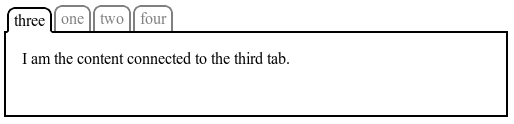
The following figure shows a simple tabbed interface, where the tab for
the active pane is always in front:
This could be implemented with the following CSS (showing only the
relevant code):
.tabs {
	display: flex;
}
.tabs > .current {
	order: -1; /* Lower than the default of 0 */
}
Many web pages have a similar shape in the markup, with a header on
top, a footer on bottom, and then a content area and one or two
additional columns in the middle. Generally, it's desirable that the
content come first in the page's source code, before the additional
columns. However, this makes many common designs, such as simply having
the additional columns on the left and the content area on the right,
difficult to achieve. This has been addressed in many ways over the
years, often going by the name "Holy Grail Layout" when there are two
additional columns. ‘order’ makes this trivial. For example, take
the following sketch of a page's code and desired layout:
As an added bonus, the columns will all be equal-height by default, and the main
content will be as wide as necessary to fill the screen. Additionally,
this can then be combined with media queries to switch to an all-vertical
layout on narrow screens:
@media all and (max-width: 600px) {
	/* Too narrow to support three columns */
	#main { flex-flow: column; }
	#main > article, #main > nav, #main > aside {
		/* Return them to document order */
		order: 0; width: auto;
	}
}
(Further use of multiline flex containers to achieve even more
intelligent wrapping left as an exercise for the reader.)
It is expected that future layout modes like Grid Layout
will also use ‘order’
for similar purposes.
A single-line flex container lays out all
of its children in a single line, even if that would cause its contents
to overflow.
A multi-line flex container breaks its flex items across multiple lines to avoid
overflowing, similar to how text is broken onto a new line when it gets
too wide to fit on the existing line. When additional lines are created,
they are stacked in the flex container along the cross axis according to the ‘flex-wrap’ property.
Every line contains at least one flex
item, unless the flex container itself is completely empty.
Once content is broken into lines, each line is laid out independently;
flexible lengths and the ‘justify-content’ and ‘align-self’
properties only consider the items on a single line at a time.
When a flex container has multiple lines, the cross size of each line is the minimum size
necessary to contain the flex items on the
line (after aligment due to ‘align-self’), and the lines are aligned within
the flex container with the ‘align-content’ property. When a flex container
(even a multi-line one) has only one
line, the cross size of the line is the
cross size of the flex container, and
‘align-content’ has no effect. The main size of a line is always the same as the
main size of the flex container's content
box.
This example shows four buttons that do not fit horizontally.
The buttons are first set to their preferred widths, in this case 80
pixels. This will allow the first three buttons to fit in 240 pixels with
60 pixels left over of remaining space. Because the ‘flex-flow’ property
specifies a multi-line flex container (due to the ‘wrap’ keyword
appearing in its value), the flex container will create an additional
line to contain the last button.
Flexibility is applied to each element, separately for each line. The
first line has 60 pixels of remaining space and all of the buttons have
the same flexibility, so each of the three buttons on that line will
receive 20 pixels of extra width, ending up 100px wide. The remaining
button is on a line of its own and will stretch to the entire width of
the line, or 300 pixels.
If the box were resized, the buttons would rearrange onto different
lines as necessary.
If the style rules in the example above were changed to the following:
Similar to the previous example, the first three buttons will fit on
the first line, and the last button will wrap onto a new line. However,
when the buttons attempt to flex they can only grow to 90px each, due to
their ‘max-width’ property. This leaves
30px of free space on the first line and 210px of free space on the
second line. Because ‘justify-content’ is set to ‘center’, the
buttons will be centered on each line, with the free space split equally
on either side.
7. Flexibility
The defining aspect of flex layout is the ability to make the flex items "flex", altering their width or
height to fill the available space. This is done with the ‘flex’ property. A flex
container distributes free space to its items proportional to their flex grow ratio, or shrinks them to
prevent overflow proportional to their flex shrink ratio.
The <'flex-basis'> component sets the flex basis, which is the initial main size of the flex
item, before free space is distributed according to the flex
ratios. If omitted, the flex basis
defaults to ‘0%’. Note that
this is different from the initial value of ‘flex-basis’, which
is ‘auto’. Zero values for the
<'flex-basis'> component must be specified with a
unit. Unitless zero will either be interpreted as one of the flex ratios,
or will make the declaration invalid.
The <'flex-grow'> and
<'flex-shrink'> components set the flex grow ratio and flex shrink ratio, which determine how much the
flex item will grow or shrink relative to
the rest of the flex items in the flex
container when free space is distributed. When omitted, they are set to
‘1’. Note that this is
different from the initial value of ‘flex-grow’, which is ‘0’.
The list below summarizes the effects of the most common ‘flex’ values:
‘flex: initial’
Equivalent to ‘flex: 0 1 auto’. The value
sets the size of the item according to the ‘width’/‘height’
properties and makes the flex item inflexible when there is positive free
space, but allows it to shrink to its minimum when there is insufficient space. (If
the ‘width’/‘height’ used as the flex
basis computes to ‘auto’, this will size the flex item based on its
contents.) The alignment properties or ‘auto’ margins may be
used to align flex items within the flex container.
‘flex: auto’
Equivalent to ‘flex: 1 1 auto’. This value
makes the flex item flexible, and sets the flex
basis according to the ‘width’/‘height’
properties. If all items are either ‘flex:
auto’ or ‘flex: none’, any free space
after the items have been sized will be distributed evenly to the items
with ‘flex: auto’.
‘flex: none’
Equivalent to ‘flex: 0 0 auto’. This value
makes the flex item inflexible, and sets the size of the item according
to the ‘width’/‘height’ properties. To size things normally but
still use the alignment abilities of flex
layout, set all the flex items to ‘flex: none’
and then use ‘auto’ margins or the alignment properties. This is
similar to ‘initial’, except that flex items
are not allowed to shrink, even in overflow situations.
‘flex: <positive-number>’
Equivalent to ‘flex: <positive-number> 1
0%’. This value makes the flex item flexible, and sets the flex basis to zero, resulting in an item
that receives the specified proportion of the free space in the flex
container. If all items in the flex container use this pattern, their
sizes will be proportional to the specified flex ratio.
Flexibility allows elements to respond directly to the available
space, optionally taking into account size of content:
<!DOCTYPE html>
<style>
	div { display:flex; outline:1px solid silver; }
	p { flex:auto; margin:1em; background:gold; }
</style>
<div>
	<p>"flexing"</p>
	<p>allows the items to get bigger</p>
	<p>or</p>
	<p>smaller</p>
</div>
Here, all four paragraphs have a flex
basis equal to the length of their text. The leftover space
(after subtracting their flex bases and margins from the width of the
flex container) is distributed evenly to the four paragraphs, because
they all have have flex grow ratio
of ‘1’. This shows how elements with the same
flexibility may still end up different sizes, if their flex bases are
different.
By default, flex items won't shrink below their minimum content size
(the length of the longest word or fixed-size element). To change this,
set the ‘min-width’ or ‘min-height’ property.
7.3. Components of
Flexibility
Individual components of flexibility can be controlled by separate
properties.
Authors are encouraged to control flexibility using the
‘flex’ shorthand
rather than with component properties, as the shorthand correctly resets
any unspecified components to accommodate common uses.
Like the ‘width’ and ‘height’ properties, ‘flex-basis’
determines the size of the content box, unless otherwise specified such as
by ‘box-sizing’ [CSS3UI].
8. Alignment
After a flex container's contents have finished their flexing and the
dimensions of all flex items are finalized, they can then be aligned
within the flex container.
The ‘margin’ properties can be used to
align items in a manner similar to, but more powerful than, what margins
can do in block layout. Flex items also
respect the alignment properties from the Box Alignment spec, which allow
easy keyword-based alignment of items in both the main axis and cross
axis. These properties make many common types of alignment
trivial, including some things that were very difficult in CSS 2.1, like
horizontal and vertical centering.
While the alignment properties are defined in the Box
Alignment spec, Flexbox reproduces the definitions of the relevant ones
here so as to not create a normative dependency that may slow down
advancement of the spec. These properties apply only to flex layout until
Box Alignment is finished and defines their effect for other layout modes.
This section is non-normative. The normative definition of how
margins affect flex items is in the Flex
Layout Algorithm section.
Margins on flex items that are ‘auto’ have an effect very similar to auto margins
in normal flow:
During calculations of flex bases and flexible lengths, auto
margins are treated as ‘0’.
Prior to alignment via ‘justify-content’ and ‘align-self’, any
positive free space is distributed to auto margins in that dimension.
Margin-based alignment has no effect on overflowing elements.
Note that, if free space is distributed to auto margins, the
alignment properties will have no effect in that dimension because the
margins will have stolen all the free space left over after flexing.
Auto margins can be used for simple alignment or for fine control.
Note that auto margins work consistently in both dimensions, so a
simple markup like this
div {
	display: flex;
	width: 4em;
	height: 4em;
	background:silver;
}
p { margin:auto; }
<div><p>OK</p></div>
flex-start | flex-end | center | space-between | space-around
Initial:
flex-start
Applies to:
flex containers
Inherited:
no
Computed Value:
specified value
Media:
visual
Animatable:
no
Canonical Order:
per
grammar
The ‘justify-content’ property aligns flex items along the main axis of the current line of the flex
container. This is done after any flexible lengths and
any auto margins have been resolved. Typically
it helps distribute extra free space leftover when either all the flex items on a line are inflexible, or are
flexible but have reached their maximum size. It also exerts some control
over the alignment of items when they overflow the line.
‘flex-start’
Flex items are packed toward the
start of the line. The main-start margin
edge of the first flex item on the line
is placed flush with the main-start edge
of the line, and each subsequent flex
item is placed flush with the preceding item.
‘flex-end’
Flex items are packed toward the end
of the line. The main-end margin edge of
the last flex item is placed flush with
the main-end edge of the line, and each
preceding flex item is placed flush with
the subsequent item.
‘center’
Flex items are packed toward the
center of the line. The flex items on the
line are placed flush with each other and aligned in the center of the
line, with equal amounts of empty space between the main-start edge of the line and the first
item on the line and between the main-end
edge of the line and the last item on the line. (If the leftover
free-space is negative, the flex items
will overflow equally in both directions.)
‘space-between’
Flex items are evenly distributed in
the line. If the leftover free-space is negative or there is only a
single flex item on the line, this value
is identical to ‘flex-start’. Otherwise, the main-start margin edge of the first flex item on the line is placed flush with
the main-start edge of the line, the main-end margin edge of the last flex item on the line is placed flush with
the main-end edge of the line, and the
remaining flex items on the line are
distributed so that the empty space between any two adjacent items is the
same.
‘space-around’
Flex items are evenly distributed in
the line, with half-size spaces on either end. If the leftover free-space
is negative o r there is only a single flex
item on the line, this value is identical to ‘center’.
Otherwise, the flex items on the line are
distributed such that the empty space between any two adjacent flex items on the line is the same, and the
empty space before the first and after the last flex items on the line are half the size of
the other empty spaces.
An illustration of the five ‘justify-content’ keywords and their effects
on a flex container with three colored items.
‘auto’
computes to parent's ‘align-items’; otherwise as specified
Media:
visual
Animatable:
no
Canonical Order:
per
grammar
Flex items can be aligned in the cross axis of the current line of the flex
container, similar to ‘justify-content’ but in the perpendicular
direction. ‘align-items’ sets the default alignment for
all of the flex container's items, including anonymous flex items. ‘align-self’ allows this default alignment to
be overridden for individual flex items.
(For anonymous flex items, ‘align-self’ always matches the value of ‘align-items’ on
their associated flex container.)
A value of ‘auto’ for ‘align-self’ computes to the value of ‘align-items’ on the
element's parent, or ‘stretch’ if the element has no parent. The
alignments are defined as:
The flex item's margin box is
centered in the cross axis within the
line. (If the cross size of the flex
line is less than that of the flex item,
it will overflow equally in both directions.)
Otherwise, it participates in baseline alignment: all participating
flex items on the line are aligned such
that their baselines align, and the item with the largest distance
between its baseline and its cross-start margin edge is placed flush
against the cross-start edge of the
line.
‘stretch’
If the cross size property
of the flex item is ‘auto’, its used
value is the length necessary to make the cross
size of the item's margin box as close to the same size as the
line as possible, while still respecting the constraints imposed by
‘min/max-width/height’.
Note that if the flex container's height is constrained
this value may cause the contents of the flex
item to overflow the item.
The ‘align-content’ property aligns a flex
container's lines within the flex container when there is extra space in
the cross-axis, similar to how ‘justify-content’ aligns individual items
within the main-axis:
‘flex-start’
Lines are packed toward the start of the flex container. The cross-start edge of the first line in the
flex container is placed flush with the cross-start edge of the flex container,
and each subsequent line is placed flush with the preceding line.
‘flex-end’
Lines are packed toward the end of the flex container. The cross-end edge of the last line is placed
flush with the cross-end edge of the flex
container, and each preceding line is placed flush with the subsequent
line.
‘center’
Lines are packed toward the center of the flex container. The lines
in the flex container are placed flush with each other and aligned in the
center of the flex container, with equal amounts of empty space between
the cross-start content edge of the
flex container and the first line in the flex container, and between the
cross-end content edge of the flex
container and the last line in the flex container. (If the leftover
free-space is negative, the lines will overflow equally in both
directions.)
‘space-between’
Lines are evenly distributed in the flex container. If the leftover
free-space is negative or there is only a single line in the flex
container, this value is identical to ‘flex-start’. Otherwise, the cross-start edge of the first line in the
flex container is placed flush with the cross-start content edge of the flex
container, the cross-end edge of the last
line in the flex container is placed flush with the cross-end content edge of the flex
container, and the remaining lines in the flex container are distributed
so that the empty space between any two adjacent lines is the same.
‘space-around’
Lines are evenly distributed in the flex container, with half-size
spaces on either end. If the leftover free-space is negative or there is
only a single line in the flex container, this value is identical to
‘center’.
Otherwise, the lines in the flex container are distributed such that the
empty space between any two adjacent lines is the same, and the empty
space before the first and after the last lines in the flex container are
half the size of the other empty spaces.
‘stretch’
Lines stretch to take up the remaining space. If the leftover
free-space is negative, this value is identical to ‘flex-start’. Otherwise, the free-space is split
equally between all of the lines, increasing their cross size.
Note: Only flex containers with multiple lines ever have
free space in the cross-axis for lines to be aligned in, because in
a flex container with a single line the sole line automatically stretches
to fill the space.
An illustration of the ‘align-content’ keywords and their effects on
a multi-line flex container.
9. Flex Layout Algorithm
This section contains normative algorithms detailing the exact layout
behavior of a flex container and its contents. The algorithms here are
written to optimize readability and theoretical simplicity, and may not
necessarily be the most efficient. Implementations may use whatever actual
algorithms they wish, but must produce the same results as the algorithms
described here.
This section is mainly intended for implementors. Authors
writing web pages should generally be served well by the individual
property descriptions, and do not need to read this section unless they
have a deep-seated urge to understand arcane details of CSS layout.
For the purposes of these definitions, a definite size is one that can be
determined without measuring content, i.e. is a <length>, a size of the
initial containing block, or a <percentage> that is resolved against a
definite size. An indefinite size is one that is
not definite.
The following sections define the algorithm for laying out a flex
container and its contents.
9.1. Initial Setup
Generate anonymous flex items
around runs of contiguous inline content in the flex container, as
described in the Flex Items section.
Re-order the flex items according to their
‘order’.
The items with the lowest (most negative) ‘order’ values are first in the ordering. If
multiple items share a ‘order’ value, they're ordered by document
order. This affects the order in which the flex items generate boxes in
the box-tree, and how the rest of this algorithm deals with the items.
9.2. Line Length Determination
Determine the available main and cross
space for the flex items. For each dimension, if that dimension
of the flex container is a definite
size, use that; otherwise, subtract the flex container's margin,
border, and padding from the space available to the flex container in
that dimension and use that value. This might result in
an infinite value.
Determine the flex
base size and hypothetical main
size of each item:
Otherwise, if the flex container's main-axis is parallel to the
item's inline-axis, lay out the item using the available space and its
flex basis if the item is inflexible, or ‘auto’ otherwise,
treating ‘auto’ as ‘max-content’ unless the item's writing mode is
perpendicular to the flex container's writing mode (in which case the
rules for a box in an orthogonal flow[CSS3-WRITING-MODES]
are in effect). If the flex basis is ‘fill-available’, or ‘fit-content’, and the flex container is being sized
under a min-content or max-content main-size constraint, size the item
under that constraint instead. The flex
base size is the item's resulting measure.
Otherwise, lay out the item using the available space and its flex
basis if the item is inflexible, or ‘auto’ otherwise, treating ‘auto’ as ‘max-content’ unless the item's writing mode is
perpendicular to the flex container's writing mode (in which case the
rules for a box in an orthogonal flow[CSS3-WRITING-MODES]
are in effect). If the flex basis is ‘auto’, ‘fill-available’, or ‘fit-content’, and the flex container is being sized
under a min-content or max-content cross-size constraint, size the item
under that constraint instead. The flex
base size is the item's resulting max-content extent.
Determine the main size of the flex
container using its main size
property. In this calculation, the min content main size
of the flex container is the maximum of the flex container's items'
min-content size contributions, and the max content main
size of the flex container is the sum of the flex container's items'
max-content size contributions. The min-content/max-content main
size contribution of an item is its outer hypothetical main size when
sized under a min-content/max-content constraint (respectively). For this
computation, ‘auto’ margins are treated as ‘0’.
9.3. Main Size Determination
Collect flex items into flex
lines:
If the flex container is single-line, collect all the flex items
into a single flex line.
Otherwise, starting from the first uncollected item, collect as
many consecutive flex items as will fit or until a forced break is
encountered (but collect at least one) into the flex container's inner
main size into a flex line. A break is forced wherever the CSS2.1
‘page-break-before/after’ [CSS21] or the CSS3 ‘break-before/after’ [CSS3-BREAK] properties
specify a fragmentation break.
Repeat until all flex items have been collected into flex lines.
Note that items with zero main size will never start a
line unless they're the very first items in the flex container, or
they're preceded by a forced break. The "collect as many" line will
collect them onto the end of the previous line even if the last
non-zero item exactly "filled up" the line.
Resolve the
flexible lengths of all the flex items to find their used
main size, and determine their hypothetical cross size from
this main size.
9.4. Cross size determination
Calculate the cross size of each flex
line.
If the flex container has only a single line (even if it's a multi-line flex container), the cross size
of the flex line is the flex container's inner cross size.
Otherwise, for each flex line:
Collect all the flex items whose inline-axis is parallel to the
main-axis, whose ‘align-self’ is ‘baseline’,
and whose cross-axis margins are both non-‘auto’. Find the
largest of the distances between each item's baseline and its
hypothetical outer cross-start edge, and the largest of the distances
between each item's baseline and its hypothetical outer cross-end edge,
and sum these two values.
Among all the items not collected by the previous step, find the
largest outer hypothetical cross
size.
The used cross-size of the flex line is the larger of the numbers
found in the previous two steps.
Handle ‘align-content:
stretch’. If the flex container has a definite cross size, ‘align-content’ is
‘stretch’, and the sum of the flex lines' cross
sizes is less than the flex container's inner cross size, increase the
cross size of each flex line by equal amounts such that the sum of their
cross sizes exactly equals the flex container's inner cross size.
Collapse ‘visibility:collapse’ items. If any flex items
have ‘visibility: collapse’, note the cross
size of the line they're in as the item's strut
size, and restart layout from the beginning.
In this second layout round, when collecting items into lines, treat the
collapsed items as having zero main size. For the rest of the algorithm
following that step, ignore the collapsed items entirely (as if they
were ‘display:none’) except that after calculating the cross size of the lines, if
any line's cross size is less than the largest strut size among all the collapsed
items in the line, set its cross size to that strut size.
Skip this step in the second layout round.
Determine the used cross size of each flex
item. If a flex item has ‘align-self:
stretch’, its cross size property is ‘auto’, and neither
of its cross-axis margins are ‘auto’, the used outer cross size is the used cross
size of its flex line, clamped according to the item's min and max cross
size properties. Otherwise, the used cross size is the item's hypothetical cross size.
9.5. Main-Axis Alignment
Distribute any remaining free
space. For each flex line:
If the remaining free space is positive and at least one main-axis
margin on this line is ‘auto’, distribute the free space equally among
these margins. Otherwise, set all ‘auto’ margins to zero.
Resolve cross-axis ‘auto’
margins. If a flex item has ‘auto’ cross-axis margins, and its outer cross size
(treating those ‘auto’ margins as zero) is less than the cross size
of its flex line, distribute the difference in those sizes equally to the
‘auto’ margins.
Align all flex items along the
cross-axis per ‘align-self’, if neither of the item's
cross-axis margins are ‘auto’.
Determine the flex container's used
cross size:
If the cross size property is a definite size, use that.
Otherwise, use the sum of the flex lines' cross sizes.
To resolve the flexible lengths of the items within a flex line:
Determine the used flex ratio. Sum the outer hypothetical main sizes of all
items on the line. If the sum is less than the flex container's inner
main size, use the flex grow ratio
for the rest of this algorithm; otherwise, use the flex shrink ratio.
Check that you can distribute any space. If all the
flex items on the line are either frozen or have a flex ratio of zero,
exit the algorithm.
Calculate free space. Sum the outer flex base sizes of all items on the
line, and subtract this from the flex container's inner main size. This
is the free space.
Distribute free space proportional to the flex
ratios. If the sign of the free space matches the sign choosing
the flex ratio, distribute the free space to each flexible item's main
size in proportion to the item's flex ratio:
If the free space is positive
Find the ratio of the item's flex
grow ratio to the sum of the flex
grow ratios of all items on the line. Set the item's main size
to its flex base size plus a
fraction of the free space proportional to the ratio.
If the free space is negative
For every item on the line, multiply its flex shrink ratio by its outer flex base size, and note this as its
scaled flex shrink ratio. Find
the ratio of the item's scaled
flex shrink ratio to the sum of the scaled flex shrink ratios
of all items on the line. Set the item's main size to its flex base size minus a fraction of
the free space proportional to the ratio. Note this
may result in a negative inner main size; it will be corrected in the
next step.
Fix min/max violations. Clamp each item's main size
by its min and max main size properties. If the item's main size was made
smaller by this, it's a max violation. If the item's main size was made
larger by this, it's a min violation.
The total violation is the sum of the adjustments from the previous
step (clamped size - unclamped size).
If the total violation is:
Zero
Exit the algorithm.
Positive
Freeze all the items with min violations, reset all other items to
their size upon entering this algorithm, and return to step 2 of this
algorithm.
Negative
Freeze all the items with max violations, reset all other items to
their size upon entering this algorithm, and return to step 2 of this
algorithm.
10. Fragmenting Flex Layout
Flex containers can break across pages between items, between lines of
items (in multi-line mode), and inside items. The ‘break-*’ properties apply to flex containers as normal
for block-level or inline-level boxes. This section defines how they apply
to flex items and elements inside flex items.
The following breaking rules refer to the fragmentation container as
the “page”. The same rules apply to any other fragmenters. (Substitute
“page” with the appropriate fragmenter type as needed.) See the CSS3
Fragmentation Module [CSS3-BREAK]. For readability,
in this section the terms "row" and "column" refer to the relative
orientation of the flex container with respect to the block flow direction
of the fragmentation context, rather than to the writing mode of the flex
container itself.
The exact layout of a fragmented flex container is not defined in this
level of Flexible Box Layout. However, breaks inside a flex container are
subject to the following rules:
In a row flex container, the ‘break-before’ and ‘break-after’ properties on flex items are
propagated to the flex line. The ‘break-before’ property on the first line and the
‘break-after’ property on the last line
are propagated to the flex container.
In a column flex container, the ‘break-before’ property on the first item and the
‘break-after’ property on the last item
are propagated to the flex container. Forced breaks on other items are
applied to the item itself.
A forced break inside a flex item effectively increases the size of
its contents; it does not trigger a forced break inside sibling items.
When a flex container is continued after a break, the space available
to its flex items (in the block flow
direction of the fragmentation context) is reduced by the space consumed
by flex container fragments on previous pages. The space consumed by a
flex container fragment is the size of its content box on that page. If
as a result of this adjustment the available space becomes negative, it
is set to zero.
If the first fragment of the flex container is not at the top of the
page, and some of its flex items don't fit in the remaining space on the
page, the entire fragment is moved to the next page.
When a multi-line colum flex
container breaks, each fragment has its own "stack" of flex lines, just
like each fragment of a multi-column element has its own row of column
boxes.
Aside from the rearrangement of items imposed by the previous point,
UAs should attempt to minimize distortation of the flex container with
respect to unfragmented flow.
10.1. Sample Flex
Fragmentation Algorithm
This informative section presents a possible fragmentation algorithm
for flex containers. UAs are encouraged to improve on this algorithm and
provide feedback to the CSS Working Group.
This algorithm assumes that pagination always proceeds only
in the forward direction; therefore, in the algorithms below, alignment
is mostly ignored prior to pagination. Advanced layout engines may be
able to honor alignment across fragments.
Lay out as many consecutive flex items or item fragments as
possible (but at least one or a fragment thereof), starting from the
first, until there is no more room on the page or a forced break is
encountered.
If the previous step ran out of room and the free space is
positive, the UA may reduce the distributed free space on this page
(down to, but not past, zero) in order to make room for the next
unbreakable flex item or fragment. Otherwise, the item or fragment
that does not fit is pushed to the next page. The UA should pull up if
more than 50% of the fragment would have fit in the remaining space
and should push otherwise.
If there are any flex items or fragments not laid out by the
previous steps, rerun the flex layout algorithm from Line Length Determination through Cross Sizing Determination with the next
page's size and all the contents (including those already
laid out), and return to the previous step, but starting from the
first item or fragment not already laid out.
For each fragment of the flex container, continue the flex layout
algorithm from Main-Axis Alignment to
its finish.
It is the intent of this algorithm that column-direction
single-line flex containers paginate very similarly to block flow. As a
test of the intent, a flex container with ‘justify-content:start’ and no flexible items should
paginate identically to a block with in-flow children with same
content, same used size and same used margins.
Multi-line column flex container
Run the flex layout algorithm with regards to pagination
(limiting the flex container's maximum line length to the space left
on the page) through Cross Sizing
Determination.
Lay out as many flex lines as possible (but at least one) until
there is no more room in the flex container in the cross dimension or
a forced break is encountered:
Lay out as many consecutive flex items as possible (but at least
one), starting from the first, until there is no more room on the
page or a forced break is encountered. Forced breaks within
flex items are ignored.
If this is the first flex container fragment, this line contains
only a single flex item that is larger than the space left on the
page, and the flex container is not at the top of the page already,
move the flex container to the next page and restart flex container
layout entirely.
If there are any flex items not laid out by the first step,
rerun the flex layout algorithm from Main
Sizing Determination through Cross
Sizing Determination using only the items not laid out on a
previous line, and return to the previous step, starting from the
first item not already laid out.
If there are any flex items not laid out by the previous step,
rerun the flex layout algorithm from Line
Sizing Determination through Cross Sizing
Determination with the next page's size and only the items not
already laid out, and return to the previous step, but starting from
the first item not already laid out.
For each fragment of the flex container, continue the flex layout
algorithm from Main-Axis Alignment to
its finish.
If a flex item does not entirely fit on a single page, it
will not be paginated in multi-line column flex containers.
Single-line row flex container
Run the entire flex layout algorithm (without regards to
pagination), except treat any ‘align-self’ other than ‘start’ or ‘baseline’ as ‘start’.
If an unbreakable item doesn't fit within the space left on the
page, and the flex container is not at the top of the page, move the
flex container to the next page and restart flex container layout
entirely.
For each item, lay out as much of its contents as will fit in the
space left on the page, and fragment the remaining content onto the
next page, rerunning the flex layout algorithm from Line Length Determination through Main-Axis Alignment into the new page size
using all the contents (including items completed on previous
pages).
Any flex items that fit entirely into previous
fragments still take up space in the main axis in later fragments.
For each fragment of the flex container, rerun the flex layout
algorithm from Cross-Axis Alignment to
its finish. For all fragments besides the first, treat ‘align-self’ and
‘align-content’ as being ‘start’ for all item fragments and lines.
If any item, when aligned according to its original ‘align-self’ value
into the combined cross size of all the flex container fragments,
would fit entirely within a single flex container fragment, it may be
shifted into that fragment and aligned appropriately.
Lay out as many flex lines as possible (but at least one),
starting from the first, until there is no more room on the page or a
forced break is encountered.
If a line doesn't fit on the page, and the line is not at the top
of the page, move the line to the next page and restart the flex
layout algorithm entirely, using only the items in and following this
line.
If a flex item itself causes a forced break, rerun the flex layout
algorithm from Main Sizing Determination
through Main-Axis Alignment, using only
the items on this and following lines, but with the item causing the
break automatically starting a new line in the line breaking step, then continue with
this step. Forced breaks within flex items are ignored.
If there are any flex items not laid out by the previous step,
rerun the flex layout algorithm from Line
Length Determination through Main-Axis
Alignment with the next page's size and only the items not already
laid out. Return to the previous step, but starting from the first
line not already laid out.
For each fragment of the flex container, continue the flex layout
algorithm from Cross Axis Alignment to
its finish.
11. Conformance
11.1. Document conventions
Conformance requirements are expressed with a combination of descriptive
assertions and RFC 2119 terminology. The key words “MUST”, “MUST
NOT”, “REQUIRED”, “SHALL”, “SHALL NOT”, “SHOULD”,
“SHOULD NOT”, “RECOMMENDED”, “MAY”, and “OPTIONAL” in the
normative parts of this document are to be interpreted as described in RFC
2119. However, for readability, these words do not appear in all uppercase
letters in this specification.
All of the text of this specification is normative except sections
explicitly marked as non-normative, examples, and notes. [RFC2119]
Examples in this specification are introduced with the words “for
example” or are set apart from the normative text with
class="example", like this:
This is an example of an informative example.
Informative notes begin with the word “Note” and are set apart from
the normative text with class="note", like this:
Note, this is an informative note.
11.2. Conformance
classes
Conformance to CSS Flexible Box Layout Module is defined for three
conformance classes:
A style sheet is conformant to CSS Flexible Box Layout Module if all of
its statements that use syntax defined in this module are valid according
to the generic CSS grammar and the individual grammars of each feature
defined in this module.
A renderer is conformant to CSS Flexible Box Layout Module if, in
addition to interpreting the style sheet as defined by the appropriate
specifications, it supports all the features defined by CSS Flexible Box
Layout Module by parsing them correctly and rendering the document
accordingly. However, the inability of a UA to correctly render a document
due to limitations of the device does not make the UA non-conformant. (For
example, a UA is not required to render color on a monochrome monitor.)
An authoring tool is conformant to CSS Flexible Box Layout Module if it
writes style sheets that are syntactically correct according to the
generic CSS grammar and the individual grammars of each feature in this
module, and meet all other conformance requirements of style sheets as
described in this module.
11.3. Partial implementations
So that authors can exploit the forward-compatible parsing rules to
assign fallback values, CSS renderers must treat as
invalid (and ignore as
appropriate) any at-rules, properties, property values, keywords, and
other syntactic constructs for which they have no usable level of support.
In particular, user agents must not selectively ignore
unsupported component values and honor supported values in a single
multi-value property declaration: if any value is considered invalid (as
unsupported values must be), CSS requires that the entire declaration be
ignored.
11.4. Experimental
implementations
To avoid clashes with future CSS features, the CSS2.1 specification
reserves a prefixed
syntax for proprietary and experimental extensions to CSS.
Prior to a specification reaching the Candidate Recommendation stage in
the W3C process, all implementations of a CSS feature are considered
experimental. The CSS Working Group recommends that implementations use a
vendor-prefixed syntax for such features, including those in W3C Working
Drafts. This avoids incompatibilities with future changes in the draft.
11.5. Non-experimental
implementations
Once a specification reaches the Candidate Recommendation stage,
non-experimental implementations are possible, and implementers should
release an unprefixed implementation of any CR-level feature they can
demonstrate to be correctly implemented according to spec.
To establish and maintain the interoperability of CSS across
implementations, the CSS Working Group requests that non-experimental CSS
renderers submit an implementation report (and, if necessary, the
testcases used for that implementation report) to the W3C before releasing
an unprefixed implementation of any CSS features. Testcases submitted to
W3C are subject to review and correction by the CSS Working Group.
For this specification to be advanced to Proposed Recommendation, there
must be at least two independent, interoperable implementations of each
feature. Each feature may be implemented by a different set of products,
there is no requirement that all features be implemented by a single
product. For the purposes of this criterion, we define the following
terms:
independent
each implementation must be developed by a different party and cannot
share, reuse, or derive from code used by another qualifying
implementation. Sections of code that have no bearing on the
implementation of this specification are exempt from this requirement.
interoperable
passing the respective test case(s) in the official CSS test suite,
or, if the implementation is not a Web browser, an equivalent test. Every
relevant test in the test suite should have an equivalent test created if
such a user agent (UA) is to be used to claim interoperability. In
addition if such a UA is to be used to claim interoperability, then there
must one or more additional UAs which can also pass those equivalent
tests in the same way for the purpose of interoperability. The equivalent
tests must be made publicly available for the purposes of peer review.
implementation
a user agent which:
implements the specification.
is available to the general public. The implementation may be a
shipping product or other publicly available version (i.e., beta
version, preview release, or “nightly build”). Non-shipping product
releases must have implemented the feature(s) for a period of at least
one month in order to demonstrate stability.
is not experimental (i.e., a version specifically designed to pass
the test suite and is not intended for normal usage going forward).
The specification will remain Candidate Recommendation for at least six
months.
Acknowledgments
Thanks for feedback and contributions to Andrew Fedoniouk, Arron
Eicholz, James Elmore, Ben Horst, Boris Zbarsky, Brad Kemper, Brian
Heuston, Christian Stockwell, Christoph Päper, Daniel Holbert, Erik
Anderson, Eugene Veselov, Fantasai, John Jansen, Markus Mielke, Ning
Rogers, Ojan Vafai, Peter Salas, Phil Cupp, Robert O'Callahan, Rossen
Atanassov, Shinichiro Hamaji, Tony Chang.
Inline replaced elements are no longer promoted to flex items;
instead certain HTML elements intended to be replaced elements are
promoted to flex items. This produces a consistent layout model
regardless of whether the replaced content can be loaded.
For pagination, the effect and propagation
of page-breaking controls has been tweaked and clarified, and most of the
details of fragmentation are now informative, allowing UAs to do better.
The flex layout algorithm has received an editorial overhaul, and
many error fixes and clarifications were made.
A lot of terminology has been updated to make it less confusing: