
Flexible Box Layout Module
W3C Working Draft, 22 March 2011
- This version:
- http://www.w3.org/TR/2011/WD-css3-flexbox-20110322/
- Latest version:
- http://www.w3.org/TR/css3-flexbox/
- Previous version:
- http://www.w3.org/TR/2009/WD-css3-flexbox-20090723/
- Editors:
- Tab Atkins Jr., jackalmage@gmail.com
- Alex Mogilevsky, alexmog@microsoft.com
- L. David Baron, Mozilla Corporation, dbaron@dbaron.org
- Authors and former editors:
- Neil Deakin, Mozilla Corporation, enndeakin@gmail.com
- Ian Hickson, formerly of Opera Software, ian@hixie.ch
- David Hyatt, Apple, hyatt@apple.com
Copyright © 2011 W3C® (MIT, ERCIM, Keio), All Rights Reserved. W3C liability,
trademark
and document
use rules apply.
Abstract
The draft describes a CSS box model optimized for interface design. It
provides an additional layout system alongside the ones already in CSS. [CSS21] In this new box
model, the children of a box are laid out either horizontally or
vertically, and unused space can be assigned to a particular child or
distributed among the children by assignment of "flex" to the children
that should expand. Nesting of these boxes (horizontal inside vertical, or
vertical inside horizontal) can be used to build layouts in two
dimensions. This model is based on the box model in the XUL user-interface
language used for the user interface of many Mozilla-based applications
(such as Firefox).
Status of this document
This section describes the status of this document at the time of
its publication. Other documents may supersede this document. A list of
current W3C publications and the latest revision of this technical report
can be found in the W3C technical reports
index at http://www.w3.org/TR/.
Publication as a Working Draft does not imply endorsement by the W3C
Membership. This is a draft document and may be updated, replaced or
obsoleted by other documents at any time. It is inappropriate to cite this
document as other than work in progress.
The (archived) public
mailing list www-style@w3.org (see
instructions) is preferred
for discussion of this specification. When sending e-mail, please put the
text “css3-flexbox” in the subject, preferably like this:
“[css3-flexbox] …summary of
comment…”
This document was produced by the CSS Working Group (part of
the Style Activity).
This document was produced by a group operating under the 5 February
2004 W3C Patent Policy. W3C maintains a public list of any patent disclosures made in
connection with the deliverables of the group; that page also includes
instructions for disclosing a patent. An individual who has actual
knowledge of a patent which the individual believes contains Essential
Claim(s) must disclose the information in accordance with section
6 of the W3C Patent Policy.
Compared to the previous draft, the underlying model has changed
considerably. In particular, flexibity is no longer a separate property,
but is expressed in the value of various properties that accept lengths.
Table of contents
1. Overview
CSS 2.1 defined four layout modes, algorithms which determine the size
and position of boxes based on their relationships with their sibling and
ancestor boxes: block layout, designed for laying out documents and simple
applications, inline layout, designed for laying out text, table layout,
designed for laying out information in a tabular format, and positioned
layout, designed for very explicit positioning without much regard for
other elements in the document. This module introduces a new layout mode,
flexbox layout, which is designed for laying out more complex applications
and webpages.
Flexbox layout is superficially similar to block layout. It lacks many
of the more complex text or document-formatting properties that can be
used in block layout, such as ‘float’ and ‘columns’, but in return it gains more simple
and powerful tools for aligning its contents in ways that webapps and
complex web pages often need. The contents of a flexbox can be laid out in
any direction, can have their order swapped around dynamically, and can
"flex" their sizes and positions to respond to the available space.
Similar to other layout modes such as table layout, a flexbox acts like
a block when placed into other layout modes. Inline flexboxes can also be
declared, which act like inline-blocks.
Block-level and atomic inline-level children of the flexbox are referred
to as flexbox items in this specification.
Inline children are wrapped in anonymous blocks, and these anonymous
blocks are also flexbox items.
For example:
<p style="width: 400px; display: flexbox;">
	<button style="width: 200px;">Child 1</button>
	<button style="width: 100px;">Child 2</button>
</p>
In this example, the first button is 200 pixels wide and the second
button is 100 pixels wide. As the flexbox is 400 pixels wide, there is
extra space left over which is placed after the two buttons but inside
the flexbox. The placement of this extra space may be modified using the
various flex properties described in the next sections. Neither the
height of the buttons nor the height of the flexbox are specified, so the
height is computed intrinsically from the content. In this case, the
buttons will be the height needed to display the label and button border,
and the flexbox will also be this height plus any margins around the
buttons.
2. New values for
‘display’ property
| Name:
| display
|
| New value:
| flexbox | inline-flexbox
|
ISSUE: The proliferation of "inline-*" display values is
untenable and restrictive. Table cells should be able to use the flexbox
layout mode for their contents, for example, rather than being forced to
use block layout. It's expected that this will be fixed by splitting the
‘display’ property into
subproperties controlling how the element formats its contents
(‘display-inside’) and how it
reacts to its surroundings (‘display-outside’). Once that occurs, this
section will instead describe a single new ‘display-inside’ value that triggers flexbox
layout.
You can declare that an element is a flexbox, and thus should use
flexbox layout, by setting the ‘display’ property on the element to the value
‘flexbox’.
The special behaviors of a flexbox, such as flexing and reordering
children, only apply to flexbox items.
All block-level or atomic inline-level children of the flexbox are flexbox items. Contiguous runs of
non-replaced inline children are wrapped in an anonymous block-level box,
which is itself a flexbox item.
Note that out-of-flow elements like absolutely positioned
elements leave behind a ‘placeholder’ inline element in their original
position in the document (ISSUE: This will be defined in
Positioned Layout.) Floats are also out-of-flow, but children of
flexboxes can't float. (ISSUE: Should this restriction
exist, or should I just wrap floats in the anonymous boxes like other
inlines?) It is recommended that authors avoid creating inline
flexbox children, as the anonymous block that is generated can't be
targetted and controlled by the various flexbox properties.
ISSUE: Need to reword how flexbox items are determined. The algorithm
clearly operates on the box tree, as it creates anonymous boxes, but it
needs to operate kinda on elements. In particular, an inline child
element that contains a block should be wrapped in a single flexbox item,
rather than wrapping the pre-block and post-block parts in separate
anonymous blocks and then the block inside being a flexbot item on its
own.
Whatever wording is used here should be shared with the table-fixup
algorithm, because it's essentially the identical problem. Perhaps we can
have it operate on the element-tree and create anonymous pseudo-elements,
similar to how ::outside would work? Pseudoelements don't interfere with
normal selectors, so this would let us insert wrappers that work
correctly without screwing up the way selectors work.
A flexbox item creates a new BFC. The margins of a flexbox item do not
collapse with any other margin. Flexboxes "shrinkwrap" their contents by
default (when their ‘width’ or
‘height’ properties are
‘auto’), similar to tables or floats.
Setting ‘display:flexbox’ on an
element forces it to use a new layout algorithm, and so some properties
that were designed with the assumption of block layout don't make sense in
a flexbox context. In particular:
- all of the ‘
column-*’ properties in
the Multicol module compute to their initial values on a flexbox
(‘break-before’, ‘break-inside’, and ‘break-after’ are still valid on a flexbox).
- ‘
float’ and ‘clear’ compute to their initial values on a
flexbox item
- ‘
vertical-align’ has no effect
on a flexbox item
- [Others?]
3. Flexbox Direction: the
‘flex-direction’ property
| Name:
| flex-direction
|
| Values:
| lr | rl | tb | bt | inline | inline-reverse | block | block-reverse
|
| Initial:
| inline
|
| Applies To:
| flexboxes
|
| Inherited:
| no
|
| Computed Value:
| lr | rl | tb | bt (See text)
|
| Media:
| visual
|
The ‘flexbox-direction’ property
specifies how flexbox items are placed
in the flexbox. A value of ‘lr’ means
that the first flexbox item is placed against the left edge of the
flexbox, with later children placed immediately to the right of the
preceding flexbox item. A value of ‘rl’
is the same, but with the initial flexbox item placed against the right
edge of the flexbox and later children placed to the left. Both of these
values mean that the flexbox is a horizontal
flexbox. A value of ‘tb’ means
that the first flexbox child is placed against the top edge of the
flexbox, with later children placed immediately below it, while
‘bt’ means the first child is placed
against the bottom edge of the flexbox, with later children placed
immediately above it. Both of these values mean that the flexbox is a vertical flexbox.
A value of ‘inline’ computes to one
of ‘lr’, ‘rl’, ‘tb’, or
‘bt’, depending on the direction and
block-flow of the flexbox: if the start side of the flexbox is the left
side, ‘inline’ must compute to
‘lr’; similarly, if the start side of
the flexbox is the right, top, or bottom side, ‘inline’ must compute to ‘rl’, ‘tb’, or
‘bt’ respectively. ‘inline-reverse’, ‘block’, and ‘block-reverse’ determine their computed value
identically to ‘inline’, but use the
location of the end side, before side, and after side of the flexbox,
respectively.
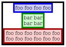
A vertical flexbox can be used to emulate the functionality of HTML's
‘<center>’ element:
<div>
	<span>foo foo foo foo</span>
	<span>bar bar<br>bar bar</span>
	<span>foo foo foo foo foo foo foo foo foo foo foo foo</span>
</div>
<style>
	div {
		display: flexbox;
		flex-direction: tb;
		width: 200px;
	}
	span {
		margin: 0 auto;
	}
</style>
In the rest of this specification, the direction in which new flexbox items are laid out will be
referred to as the measure direction (if a
precise direction is required) or the measure
axis (if only the axis orientiation is required).
The axis perpendicular to the ‘measure axis’ will be refered to as the length axis, with the length
direction being either a line extending from the ‘before’ side of the flexbox to the ‘after’ side, or from the ‘start’ side of
the flexbox to the ‘end’ side, whichever would produce a direction
parallel to the ‘length
axis’.
Similarly, the inner measure is the width of
the flexbox item in a horizontal flexbox, or the height in a vertical
flexbox. The inner length is the height of the
flexbox item in a horizontal flexbox, or the width in a vertical flexbox.
4. Display Order: the ‘flex-order’
property
flexbox items are, by default,
displayed and laid out in the same order as they appear in the source
document. The ‘flex-order’ property may be used to change
this ordering.
| Name:
| flex-order
|
| Value:
| <integer>
|
| Initial:
| 1
|
| Applies to:
| flexbox items
|
| Inherited:
| no
|
| Computed value:
| specified value
|
| Media:
| visual
|
Maybe name this ‘flex-index’ instead, to be consistent with
‘z-index’.
flexbox items may be assigned to
ordinal groups using the ‘flex-order’ property. This property is an
integer with an initial value of 1.
Ordinal groups control the order in which flexbox items appear. A flexbox will lay
out its children starting from the lowest numbered ordinal group and going
up. Elements with the same ordinal group are laid out in the order they
appear in the source document.
This example shows how ordinal groups might be used.
	div { display: flexbox; }
	#span1 { flex-order: 2; }
	#span3 { flex-order: 2; }
	#span4 { flex-order: 1; }

	<div>
		<span id="span1">span1</span>
		<span id="span2">span2</span>
		<span id="span3">span3</span>
		<span id="span4">span4</span>
	</div>
The first ordinal group, 1, contains span2 and span4. As span2 does not
specify an ordinal group, it will default to 1. The elements will be
displayed in document order, so span2 will be displayed before span4. The
second ordinal group, 2, contains the remaining two spans. The resulting
display order will be:
span2 span4 span1 span3
5. Flexibility
The defining aspect of flexbox layout is the ability to make various
lengths of the flexbox items flexible.
Flexible lengths can be used for the ‘width’, ‘height’, ‘padding’, and ‘margin’ properties of flexbox items. A flexible length can grow if the flexbox has extra
space available, or shrink if the flexbox would otherwise overflow. The
‘flex()’ function is used to specify a
flexible length and it's parameters.
5.1. Resolving
Flexible Lengths
CSS resolves a flexible length
into a definite length by first collecting all the lengths, flexible or
inflexible, that will share some space. For example, for a horizontal
flexbox, the lengths of the left and right margins, left and right
borders, left and right paddings, and widths of all flexbox items share the width of the
flexbox itself. Conversely, each flexbox
item's vertical margins, borders, padding, and height individually
share the height of the flexbox.
CSS then sums the preflex size of the lengths
in each set. The preflex size of an
inflexible length is just the length itself. The preflex size of a flexible length is its
preferred size. The preferred size defaults to ‘0’, and can be set to a different value with the
optional third argument to the ‘flex()’
function (defined below).
If the sum of all the preflex sizes is less than the available width/height of the
flexbox, then the difference is split up among all the flexible
lengths with positive
flexibility (a non-zero value for the first argument to the
‘flex()’ function), with the space
divvied up proportionally to the flexibility of each length. If the sum is
greater than the available width/height, then all the flexible
lengths with negative
flexibility (a non-zero value for the second argument to the
‘flex()’ function) shrink in proportion
to their flexibility to try and make the sum equal the available
width/height.
The ‘flex-pack’ and ‘flex-align’
properties offer more complex control over free-space distribution. The
precise details of how free space is determined and assigned to flexible
lengths is detailed in a later chapter.
5.2. The ‘flex()’ function
The ‘flex()’ function is used to
specify the parameters of a flexible
length: the positive and negative flexibility, and the preferred size. The syntax of the
‘flex()’ function is:
flex( <pos-flex> [, <neg-flex> [, <preferred-size> ]? ]? )
The first argument sets the positive
flexibility of the length. It must be a non-negative <number> -
anything else is a syntax error.
The second argument sets the negative
flexibility of the length. It must also be a non-negative
<number>, with anything else being a syntax error. This argument is
optional; if omitted, it defaults to ‘0’.
The third and final argument sets the preferred size of the length. It must be
a <length> or a <percentage>, or the keyword ‘auto’ - anything else is a syntax error. This
argument is also optional; if omitted, it defaults to ‘0’.
The precise syntax of the flex() function is still under
discussion.
| Name:
| flex-pack
|
| Value:
| start | end | center | justify
|
| Initial:
| start
|
| Applies to:
| flexboxes
|
| Inherited:
| no
|
| Computed Value:
| specified value
|
| Media:
| visual
|
Between and around the margins of flexbox
items there are additional flexible lengths, called packing space. Packing space can absorb leftover
free space in a flexbox if there aren't any other flexible lengths, or if all the flexible lengths have reached their
maximum size. The ‘flex-pack’ property defines the
flexibility of these packing spaces:
- start
- flexbox items are packed toward the
start of the flexbox. The last packing space (between the margin of the
last flexbox item and the edge of the flexbox) must absorb all leftover
free space; all other packing spaces must have a length of ‘
0’.
- end
- flexbox items are packed toward the
end of the flexbox. The first packing space (between the edge of the
flexbox and the margin of the first flexbox item ) must absorb all
leftover free space; all other packing spaces must have a length of
‘
0’.
- center
- flexbox items are packed toward the
center of the flexbox. The first and last packing spaces must equally
split all leftover free space; all other packing spaces must have a
length of ‘
0’.
- justify
- flexbox items are evenly
distributed through the flexbox. The first and last packing spaces must
have a length of ‘
0’; all other
packing spaces must equally split all leftover free space.
TODO: Examples showing the four values.
| Name:
| flex-align
|
| Value:
| auto | baseline
|
| Initial:
| auto
|
| Applies to:
| flexboxes
|
| Inherited:
| no
|
| Computed Value:
| specified value
|
| Media:
| visual
|
By default, laying out flexbox items
in the length axis is a simple matter of
determining free space and then splitting it between any flexible lengths in that axis. This is
not always sufficient, however; in particular, it is often useful to align
flexbox items by their baseline. The
‘flex-align’ property changes the way free
space is allocated in the length axis.
- auto
- Allocate free space in the length
axis as normal, by distributing it proportionally between flexible lengths in that axis.
- baseline
-
Align all flexbox items so that
their baselines line up, then distribute free space above and below the
content.
This only has an effect on flexbox
items with a horizontal baseline in a horizontal flexbox, or flexbox items with a vertical baseline
in a vertical flexbox. Otherwise, alignment for that flexbox item
proceeds as if ‘flex-align:auto’ had
been specified.
The precise effects that ‘flex-align’ has on alignment and free
space distribution are detailed in a later chapter.
8. Free Space
Calculation and Distribution
The following algorithms detail precisely how to determine the
dimensions and positions of a flexbox and its contents, and how to resolve
flexible lengths used on flexbox items
into definite lengths.
The algorithm described here is designed to be clear, but not
necessarily efficient. Implementations may use different algorithms, but
they must generate the same results as this algorithm.
This section defines several terms to clarify the operation of the
algorithms described within:
- relevant length
- The width, height, margin, border, or padding of a flexbox item. Also,
the packing spaces of a flexbox.
- flex tuple
- A 5-tuple of information about a flexible length, containing a minimum
size, a maximum size, a preferred size, a positive flexibility, and a
negative flexibility.
- available free space
- The inner width/height of the flexbox minus the sum of the preflex
sizes of all the relevant lengths.
8.1. Initial
Computation
This step computes necessary information required to run the free-space
distribution algorithms.
- Determine the measure of the flexbox. Flexboxes are sized like
shrinkwrapped blocks (if ‘
display:flexbox’ is used) or inline-blocks (if
‘display:inline-flexbox’ is used). A
horizontal flexbox's measure is its width, while a vertical flexbox's
measure is its height. ISSUE: Do I need to explicitly
define the sizing algorithm? I think I should be able to rely on the
generic multi-directional block sizing algorithm, perhaps with a
specification of the inputs, like what size to use for flexible
lengths.
-
Resolve all relevant lengths on
the flexbox and its flexbox items
into flex tuples of [preferred size, minimum
size, maximum size, positive flex, negative flex].
- For margins and padding:
-
Set the minimum size to 0 and the maximum size to infinity.
If the length is inflexible, set the preferred size to the length
itself and both positive and negative flexibility to 0.
Otherwise, if the length was specified with the ‘flex()’ function, set the positive flexibility,
negative flexibility, and preferred size to the values specified in
the function.
If the length is a margin with the value ‘auto’, set the preferred size to 0, the
positive flexibility to 1, and the negative flexibility to 0.
- For borders:
-
Borders are always inflexible. Set the minimum size to 0, the
maximum size to infinity, the preferred size to the border-width, and
the positive and negative flexibility to 0.
- For width and height:
-
Set the minimum size to the value of the ‘min-width’ or ‘min-height’, as appropriate. Set the
maximum size to the value of the ‘max-width’ or ‘max-height’ property, as appropriate,
unless the value is ‘none’, in
which case set the maximum size to infinity.
If the length is inflexible, set the preferred size to the length
itself and both positive and negative flexibility to 0.
Otherwise, if the length was specified with the ‘flex()’ function, set the positive and negative
flexibility to the values specified in the function. If the preferred
size argument specified in the function is a <length>, set the
preferred size to that length. If the argment is a <percentage>,
resolve it relative to the width or height of the flexbox, as
appropriate, and set the preferred size to the resultant length. If
the argument is ‘auto’, set the
preferred size to the item's intrinsic dimension in the appropriate
axis.
Otherwise, if the length was ‘auto’, set the preferred size to the item's
intrinsic dimension in the appropriate axis, the positive flexibility
to 1, and the negative flexibility to 0.
If the preferred size is now less than the minimum size, set it
equal to the minimum size. If the preferred size is now greater than
the maximum size, set it equal to the maximum size.
- For packing spaces:
-
If the flexbox's ‘flex-pack’ is start, the last packing space (between the final flexbox item, after reordering by
‘flex-order’, and the end of the
flexbox) has a minimum size of 0, a maximum size of infinity, a
preferred size of 0, a positive flexibility of 1, and a negative
flexibility of 0. All other packing
spaces have minimum size, maximum size, preferred size,
positive flexibility, and negative flexibility of 0.
If the flexbox's ‘flex-pack’ is end, the first packing space (between the first flexbox item, after reordering by
‘flex-order’, and the start of the
flexbox) has a minimum size of 0, a maximum size of infinity, a
preferred size of 0, a positive flexibility of 1, and a negative
flexibility of 0. All other packing
spaces have minimum size, maximum size, preferred size,
positive flexibility, and negative flexibility of 0.
If the flexbox's ‘flex-pack’ is center, the first and last packing spaces (as defined above)
have a minimum size of 0, a maximum size of infinity, a preferred size
of 0, a positive flexibility of 1, and a negative flexibility of 0.
All other packing spaces have
minimum size, maximum size, preferred size, positive flexibility, and
negative flexibility of 0.
If the flexbox's ‘flex-pack’ is justify, the first and last packing spaces (as defined above)
have a minimum size, maximum size, preferred size, positive
flexibility, and negative flexibility of 0. All other packing spaces have a minimum size of
0, a maximum size of infinity, a preferred size of 0, a positive
flexibility of 1, and a negative flexibility of 0.
8.2. First
Distribution Round
This step distributes free space to the flexible lengths of the flexbox
in the measure axis.
Collect the set of flex tuples that can
participate in this step:
- If the flexbox is horizontal, collect the widths of every flexbox item. If the flexbox is vertical,
instead collect the heights of every flexbox
item.
- Collect the margins of every flexbox
item that are in the flexbox's measure axis.
- Collect the borders of every flexbox
item that are in the flexbox's measure axis, if the flexbox item has a ‘
box-sizing’ value of ‘content-box’ or ‘padding-box’.
- Collect the paddings of every flexbox
item that are in the flexbox's measure axis, if the flexbox item has a ‘
box-sizing’ value of ‘content-box’.
Invoke the free space allocation algorithm with the set of flex tuples collected above, and an available free space equal to the
flexbox's inner measure.
8.3. Second
Distribution Round
This step distributes any leftover available space to the packing space, so that the flexbox items
are arranged within the flexbox as desired.
Collect the same set of flex tuples as
in the first distribution round (now inflexible lengths), and additionally
collect the flexbox's packing spaces.
Invoke the free space allocation algorithm with the set of flex tuples collected above, and an available free space equal to the
flexbox's inner measure.
Determine the length of the flexbox, given the sizes that have already
been determined.
8.5. Third
Distribution Round
This step distributes free space to the flexible lengths of each flexbox
item in the length axis. It is
run for each flexbox item
independently.
ISSUE: This step doesn't yet take ‘flex-align’ into
account. I need to decide whether to always default to stretching or
shrinking when doing baseline-alignment, or coming up with some heuristic
for it. Perhaps specify the behavior in the ‘flex-align’
values instead? Once this decision is made, the behavior is relatively
simple - either adjust margin (if shrunk) or padding (if stretched)
Collect the set of flex tuples from the
current flexbox item that can
participate in this step:
- If the flexbox is horizontal, collect the height of the flexbox item. If the flexbox is vertical,
instead collect the width of the flexbox
item.
- Collect the margins of the flexbox
item that are in the flexbox's length axis.
- Collect the borders of the flexbox
item that are in the flexbox's length axis, if the flexbox item has a ‘
box-sizing’ value of ‘content-box’ or ‘padding-box’.
- Collect the padding lengths of the flexbox
item that are in the flexbox's length axis, if the flexbox item has a ‘
box-sizing’ value of ‘content-box’.
Invoke the free space allocation algorithm with the set of flex tuples collected above, and an available free space equal to the
flexbox's inner length.
8.6. Free
Space Allocation Algorithm
This section describes the algorithm used to allocate free space to a
set of flexible lengths. The inputs to this algorithm are a set of flex tuples and a length representing the available free space, which may be
positive or negative. The output is a set of inflexible lengths.
If the available free space
is 0, transform all the flex tuples into
inflexible lengths equal to their preferred size and return them.
If the available free space
is a positive length, it will be distributed between all the flex tuples with positive flexibility:
- Sum the positive
flexibility of all the flex
tuples. This is the total flexibility.
- If the total flexibility is 0, transform all the flex tuples into inflexible lengths equal
to their preferred size and return them.
-
For each flex tuple with non-zero positive flexibility, set its
preferred size to:
[preferred size] + ( [available free space] * [positive flexibility] / [total flexibility] )
- If any flex tuples now have a
preferred size greater than their maximum size, set their preferred size
to their maximum size, set their positive flexibility to 0, and restart
this algorithm.
- Transform all the flex tuples into
inflexible lengths equal to their preferred size, and return them.
If the available free space
is a negative length, all the flex tuples
with negative flexibility will shrink to attemp to fit the set of flex tuples into the available space:
- Sum the negative
flexibility of all the flex
tuples. This is the total flexibility.
- If the total flexibility is 0, transform all the flex tuples into inflexible lengths equal
to their preferred size and return them.
-
For each flex tuple with non-zero negative flexibility, set its
preferred size to:
[preferred size] + ( [available free space] * [negative flexibility] / [total flexibility] )
Note that the available
free space is a negative length here, so the sum will result in
a smaller length.
- If any flex tuples now have a
preferred size lesser than their minimum size, set their preferred size
to their minimum size, set their negative flexibility to 0, and restart
this algorithm.
- Transform all the flex tuples into
inflexible lengths equal to their preferred size, and return them.
9. Interface With Other
Layout Algorithms
This section seems necessary, but not the precise way it's written. I
need to identify precisely what data needs to be exposed both by the
containing measure model (for the flexbox to use) and by the flexbox (for
the containing measure model to use), and then write that up. Then the
other measure models we produce can re-use the same template.
Need to define:
- The min/max/fit-content widths and heights of flexboxes in block
contents
- Other stuff?
Acknowledgments
[This section will contain further acknowledgments.]
Thanks for feedback from James Elmore and Shinichiro Hamaji.
References
Normative references
-
- [CSS21]
- Bert Bos; et al. Cascading Style
Sheets Level 2 Revision 1 (CSS 2.1) Specification. 7 December
2010. W3C Working Draft. (Work in progress.) URL: http://www.w3.org/TR/2010/WD-CSS2-20101207
Index
- available free space, 8.
- center, 6.
- end, 6.
- flex-align, 7.
- flexbox item, 1.
- flex-direction, 3.
- flexible length, 5.
- flex-order, 4.
- flex-pack, 6.
- flex tuple, 8.
- flex tuples, 8.1.
- horizontal flexbox, 3.
- inner length, 3.
- inner measure, 3.
- justify, 6.
- length axis, 3.
- length direction, 3.
- measure axis, 3.
- measure direction, 3.
- negative flexibility, 5.1.
- packing space, 6.
- positive flexibility, 5.1.
- preferred size, 5.1.
- preflex size, 5.1.
- relevant length, 8.
- start, 6.
- vertical flexbox, 3.
Property index
| Property
| Values
| Initial
| Applies to
| Inh.
| Percentages
| Media
|
| display
| flexbox | inline-flexbox
|
| flex-align
| auto | baseline
| auto
| flexboxes
| no
| specified value
| visual
|
| flex-direction
| lr | rl | tb | bt | inline | inline-reverse | block | block-reverse
| inline
| flexboxes
| no
| lr | rl | tb | bt (See text)
| visual
|
| flex-order
| <integer>
| 1
| flexbox items
| no
| specified value
| visual
|
| flex-pack
| start | end | center | justify
| start
| flexboxes
| no
| specified value
| visual
|