The specification describes a CSS box model optimized for user interface
design. In flexbox layout model, the children of a box are laid out either
horizontally or vertically, and unused space can be assigned to a
particular child or distributed among the children by assignment of "flex"
to the children that should expand. Nesting of these boxes (horizontal
inside vertical, or vertical inside horizontal) can be used to build
layouts in two dimensions.
Status of this document
This section describes the status of this document at the time of
its publication. Other documents may supersede this document. A list of
current W3C publications and the latest revision of this technical report
can be found in the W3C technical reports
index at http://www.w3.org/TR/.
Publication as a Working Draft does not imply endorsement by the W3C
Membership. This is a draft document and may be updated, replaced or
obsoleted by other documents at any time. It is inappropriate to cite this
document as other than work in progress.
The (archived) public
mailing list www-style@w3.org (see
instructions) is preferred
for discussion of this specification. When sending e-mail, please put the
text “css3-flexbox” in the subject, preferably like this:
“[css3-flexbox] …summary of
comment…”
CSS 2.1 defined four layout modes — algorithms which determine the
size and position of boxes based on their relationships with their sibling
and ancestor boxes: block layout, designed for laying out documents and
simple applications; inline layout, designed for laying out text; table
layout, designed for laying out information in a tabular format; and
positioned layout, designed for very explicit positioning without much
regard for other elements in the document. This module introduces a new
layout mode, flexbox layout, which is designed for laying out more complex
applications and webpages.
Flexbox layout is superficially similar to block layout. It lacks many
of the more complex text or document-formatting properties that can be
used in block layout, such as ‘float’ and ‘columns’, but in return it gains more simple
and powerful tools for aligning its contents in ways that webapps and
complex web pages often need.
The contents of a flexbox can be laid out in any direction, can have
their order swapped around dynamically, and can "flex" their sizes and
positions to respond to the available space. If a flexbox is multi-line, the flexbox items flow in two
dimensions, wrapping into separate lines in a fashion similar to how text
is wrapped into multiple lines. The direction that these lines are stacked
in can also be controlled explicitly, relative either to the current
writing mode (logical directions) or explicit physical directions.
2. The Flexbox Box Model
An element with ‘display:flexbox’ or
‘display:inline-flexbox’ is a flexbox. Block-level children of a flexbox, and some
other types of children, are called flexbox items and
are laid out using the flexbox box model. (See the Flexbox Items chapter, below, for specifics on
which children are flexbox items
directly and which children are instead wrapped in anonymous boxes which
are then flexbox items)
The flexbox layout algorithm is agnostic as to the physical direction
the flexbox happens to be laid out in, so we will define several
direction-agnostic terms here to make the rest of the spec easier to read
and understand. The main axis of a flexbox is the
axis on which flexbox items are laid
out along. The flexbox items are
ordered such that they start on the main-start
side of the flexbox, and go toward the main-end
side. A flexbox item's width or height,
whichever is in the main axis, is the
item's main size. The flexbox item's ‘width’ or ‘height’ property, specifically, that is in the
main axis is the item's main size property. These terms are mapped to
physical directions based on the first keyword in the ‘flex-flow’
property.
The axis perpendicular to the main axis
is called the cross axis, and similarly has cross-start and cross-end
directions and sides defined. The width or height of a flexbox item, whichever is in the cross axis, is the item's cross size, and similarly the actual ‘width’ or ‘height’ property, whichever is in the cross axis, is the item's cross size property. These terms are mapped
to physical directions based on the orientation of the main axis and the second keyword in the
‘flex-flow’ property.
The contents of a flexbox can be easily and powerfully manipulated with
a handful of properties. Most significantly, flexbox items can "flex" their main size by using the ‘flex()’ function in the ‘width’ or ‘height’ property. This "flexing" allows the
items to get bigger or smaller based on the available space in the page.
If there is leftover space in the flexbox after all of the flexbox items have finished flexing, the
items can be aligned, centered, or distributed with the ‘flex-pack’
property. Flexbox items can also be
completely rearranged within the flexbox with the ‘flex-order’
property.
In the cross axis, flexbox items can either "flex" to fill
the available space or be aligned within the space with the ‘flex-align’
property. If a flexbox is multi-line, new
lines are added in the cross-end
direction, and can similarly be aligned, centered, or distributed within
the flexbox with the ‘flex-line-pack’ property.
Similar to other layout modes such as table layout, a flexbox acts like
a block when placed into elements using other layout modes. Inline
flexboxes act like inline-blocks.
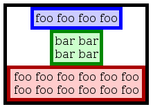
For example, the following HTML snippet declares a flexbox with a few
children. The flexbox is horizontal, and the children's widths don't fill
the flexbox's width, so the additional space is distributed between the
children. The flexbox's height isn't explicitly specified, so it shrinks
to the height of its tallest child and centers the other children within
it:
This will render approximately like the following:
2.1. New values for
‘display’ property
Name:
display
New value:
flexbox | inline-flexbox
You can declare that an element is a flexbox, and thus should use
flexbox layout for its contents, by setting the ‘display’ property on the element to the value
‘flexbox’
or ‘inline-flexbox’.
The ‘flexbox’
value makes the flexbox act like a block in other layout modes. The
‘inline-flexbox’ value makes the
flexbox act like an inline-block in other layout modes.
Flexboxes use a new layout algorithm, and so some properties that were
designed with the assumption of block layout don't make sense in a flexbox
context. In particular:
all of the ‘column-*’ properties in
the Multicol module compute to their initial values on a flexbox
(‘break-before’, ‘break-inside’, and ‘break-after’ are still valid on a flexbox).
‘float’ and ‘clear’ compute to their initial values on a
flexbox item
‘vertical-align’ has no effect
on a flexbox item
A flexbox creates a new flexbox formatting context for its contents.
This is similar to a block formatting context: floats must not intrude
into the flexbox, and the flexbox's margins do not collapse with the
margins of its contents. Additionally, all of the flexbox items establish new block
formatting contexts for their contents.
Figure out the right terms to use here.
2.2. Flexbox Items
Flexbox layout algorithm operates on flexbox
items, which are boxes that satisfy at least one of the following
criteria:
Immediate block-level children of flexbox
Atomic inline-level children of flexbox
Contiguous run of non-replaced inline children, wrapped into an
anonymous block
Notice that block element "not-an-item6.3" is not a separate flexbox
item, because it is contained inside an inline element which is being
wrapped into an anonymous flex item. Similarly, the block element
"not-an-item1.5" is not a flexbox item, because it's absolutely
positioned and thus out of flow.
Similar to table cells, flexbox items respond specially to the
‘collapse’ value of the ‘visibility’ property. When a flexbox item is
set to ‘visibility: collapse;’, the
item does not generate a box at all (identical to setting ‘display: none;’).
Absolutely positioned children of a flexbox are not flexbox items, but their "static position"
(their position when the ‘top’/‘right’/‘bottom’/‘left’ properties are ‘auto’) responds somewhat to the flexbox's various
properties. The element's static position in the flexbox's cross axis is on the cross-start edge of the flexbox's content
box. The static position in the flexbox's main
axis is slightly more complex to compute:
First, find the element's hypothetical
neighbors by assuming that the element is a normal flexbox item with ‘flex-order:0’, and reorder the flexbox's contents
as mandated by ‘flex-order’. The flexbox items immediately preceding and
following the element in the flexbox's direction (if any) are the
element's hypothetical
neighbors.
If the element has two neighbors, its static position in the main axis is exactly in the center of the
packing space between them when the flexbox is actually laid out. If the
element has only a preceding neighbor, its static position in the main axis is flush with the main-end edge of the margin box of the
neighbor. If the element has only a following neighbor, its static
position in the main axis is flush with
the main-start edge of the margin box of
the neighbor. Finally, if the element has no neighbors (the flexbox has no
in-flow children at all), the static position in the main axis is based on the value of ‘flex-pack’: if
the value is ‘start’ or ‘distribute’, it's flush with the main-start edge of the flexbox's content
box; if the value is ‘end’, it's flush with the main-end edge of the flexbox's content box; if
the value is ‘center’, it's centered within the flexbox's
content box.
3. Ordering and
Orientation
The first level of flexbox functionality is the ability to lay out a
flexbox's contents in any direction and in any order. This allows an
author to trivially achieve effects that would previously have required
complex or fragile methods, such as using the ‘float’ property to lay out a horizontal
navigation bar (which then requires further effort with the ‘clear’ property or others to make the elements
interact nicely with the rest of the page). This functionality is exposed
through the ‘flex-flow’ and ‘flex-order’
properties.
3.1. Flexbox Flow Direction: the
‘flex-flow’ property
The ‘flex-flow’ property specifies how flexbox items are placed in the flexbox.
The value consists of one or two keywords: the first sets the orientation
and direction of the flexbox's main axis,
which affects the direction that flexbox items are laid out in, and the
meaning of the ‘flex-pack’ properties; the second, if
specified, marks the flexbox as being multiline and sets the direction of
the cross axis, which affects the
direction new lines are stacked in, and the meaning of the ‘flex-align’ and
‘flex-line-pack’ properties.
row
The flexbox's main axis has the same
orientation as the inline axis of the current writing mode (the direction
that text is laid out in). The main-start and main-end directions are equivalent to the
"start" and "end" directions, respectively, of the current writing mode.
The flexbox's main axis has the same
orientation as the block axis of the current writing mode (the direction
that blocks are laid out in). The main-start and main-end directions are equivalent to the
"before" and "after" directions, respectively, of the current writing
mode.
The flexbox is multi-line. The cross-start direction is equivalent to
either the "start" or "before" direction of the current writing mode,
whichever is in the cross-axis, and the cross-end direction is the opposite
direction of cross-start.
If the second keyword is omitted, the flexbox is single-line, and the cross-start and cross-end directions are set as described
above for the ‘wrap’ keyword.
Some examples of valid flows:
div { flex-flow: row; }                 /* Initial value. Main axis is inline,
                                           no wrap. */
div { flex-flow: column wrap; }         /* Main axis is block-direction and lines
                                           wrap in the inline direction.  For an
                                           English page, the main axis is top-to-bottom
                                           and lines wrap to the right. */
div { writing-mode: tb-rl;              /* Main axis is block direction (right to left).
      flex-flow: column wrap-reverse; } /* New lines wrap upwards. */
Is there a good, shorter way to refer to the reversed
physical directions than the 8-character "-reverse" suffix?
Flexbox items are, by default,
displayed and laid out in the same order as they appear in the source
document. The ‘flex-order’ property may be used to change
this ordering.
Ordinal groups control the order in which flexbox items appear. A flexbox will lay
out its content starting from the lowest numbered ordinal group and going
up. Items with the same ordinal group are laid out in the order they
appear in the source document.
This example shows how ordinal groups might be used.
Items 2 and 4 are both in ordinal group 0 (item 2 defaults to
‘0’ because it doesn't specify one
explicitly). This is the lowest ordinal group, so they'll be displayed
first, and in document order, with Item 2 displayed before Item 4. The
remaining items are both in ordinal group 1, so the resulting display
order will be:
Add a realistic example of tab reordering.
Add an example of reordering columns in a page.
4. Flexibility
The defining aspect of flexbox layout is the ability to make the flexbox items "flex", altering their width
or height to fill the available space. This is done by declaring a flexible length with the ‘flex()’ function, defined below.
4.1. The ‘flex()’ function
The ‘flex()’ function is used to
specify the parameters of a flexible
length: the positive and negative flexibility, and the preferred size. The syntax of the ‘flex()’ function is:
<pos-flex> and <neg-flex> are
non-negative <numbers>s, while
<preferred-size> is any value (other than another
‘flex()’ function) that would be valid
in the ‘width’ or ‘height’ property in which the function is
used, except that zero lengths must not omit their unit.
The <pos-flex> component sets the length's positive flexibility; if omitted,
the positive flexibility
defaults to ‘1’. The
<neg-flex> component sets the length's negative flexibility; if omitted,
it defaults to ‘0’. The
<preferred-size> component sets the length's preferred size; if omitted, it defaults
to ‘0px’.
Examples!
4.2. Resolving
Flexible Lengths
Note: This section is non-normative.
Flexible lengths are resolved
into normal, inflexible lengths by figuring out how large all of the flexible lengths in the flexbox
want to be, then either growing or shrinking that preferred size so that the flexbox items exactly fill the flexbox,
neither overflowing nor leaving extra unfilled space.
Flexible lengths are resolved
into normal inflexible lengths based on their preferred size, their flexibility, and
the amount of free space in the flexbox. The exact algorithm is described
in a later section of this spec, but in
general, it works like this:
If there's free space and any flexible
lengths are violating a max width or height constraint, change
them into the largest inflexible length that doesn't violate their
constraint and return to step 2. If the flexbox is overflowing and any flexible lengths are violating a min
width or height constraint, change them into the smallest inflexible
length that doesn't violate their constraint and return to step 2.
If there's free space and any flexible
lengths are violating a min width or height constraint, change
them into the smallest inflexible length that doesn't violate their
constraint and return to step 2. If the flexbox is overflowing and any flexible lengths are violating a max
width or height constraint, change them into the largest inflexible
length that doesn't violate their constraint and return to step 2.
This is too much detail for a non-normative section. This is
living here only until I flesh out the layout algorithm section. Then this
can return to being a fairly simple explanation of what goes on.
If a flexible length is used in a context where it is not allowed (for
example, on the ‘width’ property
of an element that is not a flexbox
item), it represents its preferred
size. Authors must not use flexible lengths in contexts where they
are not allowed.
Examples!
5. Alignment
After a flexbox's contents have finished their flexing, they can be
aligned in both the main axis with
‘flex-pack’ and the cross axis with ‘flex-align’.
These properties make many common types of alignment trivial, including
some things that were very difficult in CSS 2.1, like horizontal and
vertical centering.
5.1. Main Axis Alignment: the
‘flex-pack’ property
Name:
flex-pack
Value:
start | end | center | justify
Initial:
start
Applies to:
flexboxes
Inherited:
no
Computed Value:
specified value
Media:
visual
The ‘flex-pack’ property aligns flexbox items in the main axis of the current line of the flexbox.
This is done after any flexible lengths have been
resolved. Typically it helps distribute extra free space leftover when
either all the flexbox items on a line
are inflexible, or are flexible but have reach their maximum size, but it
also exerts some control over the alignment of items when they overflow
the line.
start
Flexbox items are packed toward the
start of the line. The main-start margin
edge of the first flexbox item on the
line is placed flush with the main-start
edge of the line, and each subsequent flexbox
item is placed flush with the preceding item.
end
Flexbox items are packed toward the
end of the line. The main-end margin edge
of the last flexbox item is placed
flush with the main-end edge of the line,
and each preceding flexbox item is
placed flush with the subsequent item.
center
Flexbox items are packed toward the
center of the line. The flexbox items
on the line are placed flush with each other and aligned in the center of
the line, with equal amounts of empty space between the main-start edge of the line and the first
item on the line and between the main-end
edge of the line and the last item on the line. (If the leftover
free-space is negative, the flexbox
items will overflow equally in both directions.)
justify
Flexbox items are evenly
distributed in the line. If the leftover free-space is negative or there
is only a single flexbox item on the
line, this value is identical to ‘start’.
Otherwise, the main-start margin edge of
the first flexbox item on the line is
placed flush with the main-start edge of
the line, the main-end margin edge of the
last flexbox item on the line is
placed flush with the main-end edge of the
line, and the remaining flexbox items
on the line are distributed so that the empty space between any two
adjacent items is the same.
TODO: Examples showing the four values.
A previous revision of this spec allowed margins to flex
directly, which allowed an effect similar to ‘flex-pack’. In
particular, it allowed an author to, for example, split a flexbox in half,
with some of the items pushed toward the start and the rest pushed toward
the end, by flexing exactly one margin. This sort of effect is no longer
possible without either using the ::before or ::after pseudoelements or
adding additional elements to the document, to act as an empty item that
can then flex. It's expected that we will develop something in the future
to make this easier, such as a more general pseudoelement or perhaps the
ability to explicitly control individual spaces between flexbox items.
5.2. Cross Axis Alignment: the
‘flex-align’ property
Otherwise, all flexbox items on the
line with ‘flex-align:baseline’ that
don't run afoul of the previous paragraph are aligned such that their
baselines align, and the item with the largest distance between its
baseline and its cross-start margin
edge is placed flush against the cross-start edge of the line.
Otherwise, this value causes the cross size property of the flexbox item to resolve to the length
necessary to make the cross size of the
item's margin box the same size as the line.
By using a vertical flexbox and ‘flex-align’, we can emulate the
functionality of HTML's <center> element:
The precise effects of this property are articulated in the Layout Algorithm section.
6. Multi-line Flexbox
A flexbox can be either single-line or multi-line, depending on the
‘flex-flow’ property. A single-line flexbox lays out all of its children in a
single line, even if that would cause the flexbox to overflow its bounds.
A multi-line flexbox breaks its flexbox items across multiple lines to
avoid overflowing, similar to how text is broken onto a new line when it
gets too wide to fit on the existing line. Every line contains at least
one flexbox item, unless the flexbox
itself is completely empty.
When additional lines are created, they are stacked in the flexbox in
the cross axis. Each line is completely
independent; flexible lengths and the ‘flex-pack’ and ‘flex-align’
properties only pay attention to the items on a single line at a time. The
main size of a line is the same as the main size of the flexbox's content box. The
cross size of a line depends on whether
the flexbox is single-line or multi-line: the cross size of the sole line in a single-line flexbox is the same as the cross size of the flexbox's content box,
while the cross size of a line in a multi-line flexbox is the minimum size
necessary to contain the flexbox items
on the line, after aligning them with ‘flex-align’. The lines themselves are then
aligned within a flexbox with the ‘flex-line-pack’ property.
This example shows four buttons that do not fit horizontally.
The buttons are first set to their preferred widths, in this case 80
pixels. This will allow the first three buttons to fit in 240 pixels with
60 pixels left over of remaining space. Because the ‘flex-flow’
property specifies a multiline flexbox (due to the ‘wrap’ keyword
appearing in its value), the flexbox will create an additional line to
contain the last button.
Flexibility is applied to each element, separately for each line. The
first line has 60 pixels of remaining space and all of the buttons have
the same flexibility, so each of the three buttons on that line will
receive 20 pixels of extra width, ending up 100px wide. The remaining
button is on a line of its own and will stretch to the entire width of
the line, or 300 pixels.
If the box was resized, the buttons may rearrange onto different lines
as necessary.
If the style rules in the example above were changed to the following:
Similar to the previous example, the first three buttons will fit on
the first line, and the last button will wrap onto a new line. However,
when the buttons attempt to flex they can only grow to 90px each, due to
their ‘max-width’ property. This
leaves 30px of free space on the first line and 210px of free space on
the second line. Because ‘flex-pack’ is set to ‘center’,
the buttons will be centered on each line, with the free space split
equally on either side.
The ‘flex-line-pack’ property aligns a
flexbox's lines within the flexbox when there is extra space in the cross axis, similar to how ‘flex-pack’ aligns
individual items within the main axis:
start
Lines are packed toward the start of the flexbox. The cross-start edge of the first line in the
flexbox is placed flush with the cross-start edge of the flexbox, and each
subsequent line is placed flush with the preceding line.
end
Lines are packed toward the end of the flexbox. The cross-end edge of the last line is placed
flush with the cross-end edge of the
flexbox, and each preceding line is placed flush with the subsequent
line.
center
Lines are packed toward the center of the flexbox. The lines in the
flexbox are placed flush with each other and aligned in the center of the
flexbox, with equal amounts of empty space between the cross-start content edge of the flexbox
and the first line in the flexbox and between the cross-end content edge of the flexbox and
the last line in the flexbox. (If the leftover free-space is negative,
the lines will overflow equally in both directions.)
justify
Lines are evenly distributed in the flexbox. If the leftover
free-space is negative or there is only a single line in the flexbox,
this value is identical to ‘start’. Otherwise, the cross-start edge of the first line in the
flexbox is placed flush with the cross-start content edge of the flexbox,
the cross-end edge of the last line in
the flexbox is placed flush with the cross-end content edge of the flexbox, and
the remaining lines in the flexbox are distributed so that the empty
space between any two adjacent lines is the same.
Note: Only multi-line
flexboxes ever have free space in the cross
axis for lines to be aligned in, because in a single-line flexbox the sole line
automatically stretches to fill the space.
TODO: examples
7. Flexbox Layout
Algorithm
This section contains normative algorithms detailing the exact layout
behavior of a flexbox and its contents. The algorithms here were designed
to optimize readability and theoretical simplicity, and may not
necessarily be the most efficient. Implementations may use whatever actual
algorithms they wish, but must produce the same results as the algorithms
described here.
Here I'll outline the general structure of the layout algorithm, before
I go into the ugly details below.
Find the "hypothetical size" of every flexbox item.
Pretend that the flexbox is display:block, and still establishes a
BFC. Pretend that the flexbox item is the only child of the flexbox
(and also establishes a BFC). Resolve flexible widths/heights into
their preferred sizes. Resolve ‘auto’ widths/heights by shrinkwrapping
them. Using all this pretend knowledge, resolve the width and height.
Based on the hypothetical sizes of the items, find the real main size
of the flexbox and the hypothetical cross size.
Based on both of these, linebreak the flexbox if it's multiline. (Or
does the possibility of linebreaking affect the main size of the
flexbox, in a shrinkwrapping way?)
Resolve any flexible lengths. All items now have a real main size.
Note that if any "hypothetical" size is a definite length or
percentage, it's actually a real size immediately and won't change (well,
aside from flexing). The hypothetical calculations are meant to give
intermediate results in the presence of ‘auto’ values (and others?), so I can do other
calculations that depend on those lengths.
8. Page breaks in flexbox
TODO: define how flexbox should break on pages, columns,
etc. This may or may not be normative until there is more than one
implementation.
Very roughly:
Flexboxes can beak across pages between items, between rows of items
(in multi-line mode) and inside items, as long as ‘break-’ property allow that. All ‘break-’ properties are supported on flexbox,
on flexbox items and inside flexbox items.
Breaking behavior of a single-line vertical flexbox should be
identical to a block in normal flow where children have same sizes and
positions (e.g. explicitly set to match computed values in flexbox), same
content and same breaking properties. This is good goal
or guidance, but not necessarily good normative definition. Get
specific.
Breaking behavior of a horizontal single-line flexbox should be
similar (not necessarily identical) to that of a single-row table with
same sizing.
In horizontal flexbox, a forced break within an items causes
subsequent content of that item to go to next container, but it doesn't
affect sibling items or their content.
In horizontal multi-line flexbox, values of ‘break-before’ and ‘break-after’ for each line are computed from
combinatoin of properties on children that fit in that line (or would
have fit, given available width and infinite height)
TODO: define breaking of vertical multi-line flexbox
TODO: add more detail: how breaking affect sizing (for
broken boxes and boxes after the break) and alignment
9. Box Properties and
Sizing
Define how flexboxes are sized, paying attention to
width/height keywords on both the flexbox and flexbox items, the writing
modes of both the flexbox and flexbox items, and the flexbox direction.
Acknowledgments
[This section will contain further acknowledgments.]
Thanks for feedback from James Elmore and Shinichiro Hamaji.