Scalable Vector Graphics (SVG) is a Web graphics language. SVG defines markup and APIs for creating static or dynamic images, capable of interactivity and animation, including various graphical effects. It can be styled with CSS, and combined with HTML. This document provides an introduction to SVG, with examples and explanations.
Status of this document
This section describes the status of this document at the time of its publication. Other documents may supersede this document. A list of current W3C publications and the latest revision of this technical report can be found in the W3C technical reports index at http://www.w3.org/TR/.
This is a Public Working Draft, designed to aid discussion and solicit feedback. It was developed by the
SVG Interest Group, which expects to advance this Working
Draft to become an Interest Group Note.
Publication as a Working Draft does not imply endorsement by the W3C Membership. This is a draft document and may be updated, replaced or obsoleted by other documents at any time. It is inappropriate to cite this document as other than work in progress.
This document was produced by a group operating under the 5 February 2004 W3C Patent Policy. The group does not expect this document to become a W3C Recommendation. W3C maintains a public list of any patent disclosures made in connection with the deliverables of the group; that page also includes instructions for disclosing a patent. An individual who has actual knowledge of a patent which the individual believes contains Essential Claim(s) must disclose the information in accordance with section 6 of the W3C Patent Policy.
This document is a work in progress, and is still under review. It is based on material from 2006, and some portions may be out of date. Please report any errors to the SVG Interest Group or to the editor.
This is neither an introductory text book, nor a reference manual. Instead, it is aimed so that any of these people:
an upper division undergraduate student with a few semesters under her belt of computing coursework;
a professional web programmer;
a graphic designer with a strong technical bent;
or
a science teacher who wants to build graphical presentations
might be able to pick it up and then do any or all of the following:
work through it over the course of a few days, developing a basic understanding;
be able, in a week or two, to make a decent graphical front-end to a web site that demands innovative and interactive graphics;
at any time during the next year or two of work with SVG, be able to pick up the book, look up a new topic, and with little effort, find an illustration of what they'd like to know about and with a minimum of reading, to be able to make sense of the examples provided.
Over the past 35 years of my involvement with computing, I have had the occasion to use, as both learner and teacher, a wide variety of books on computing and computing languages. I have gained much from many sources, but at the same time my preferences have, no doubt, congealed somewhat. Perhaps some of my preferences will coincide with those of the reader.
While this book is not intended for the beginning computer user, I would hope it is approachable by any of these sorts of people:
Someone with a good deal of HTML and JavaScript experience, but little or no SVG experience.
Someone who has done some work with SVG but little with HTML or JavaScript.
Someone who has programmed in other languages, is conversant with XML, and wishes to learn about SVG.
That is, it aims to provide some of the purpose of an introduction to the topic, and some of the purposes of a reference. At the same time, though, it is not a comprehensive guide to SVG. In fact, in the time following completion of the first draft, new topics that really should be included have arisen, new browsers have come onto the scene, the SVG specification itself has started to grow. In the Afterword I offer suggestions for directions I would hope to see this document grow, over time. The SVG Interest Group, I am hoping, will provide help in bringing these efforts forward.
The book attempts to discuss SVG in broader terms, but at the same time to illustrate how one can write JavaScript programs that use and manipulate SVG. It is not as broad in its coverage of stand-alone SVG as some existing books, though I believe it goes deeper into scripting than many.
Several goals helped to guide the development of this book.
It should be hands-on and practical rather than theoretical.
It should illustrate existing technologies rather than future ones.
In addition to saying what should work (according to the standards) it should illustrate what does or does not work.
Individual sections should be, to every extent possible, self-contained. A reader should be able to skip to chapters relevant to a current concern without having to read all chapters leading up to a particular topic.
Examples should be brief. So long as one is familiar with the basic elements being used, then no one should have to read more than a page or two to figure out what is going on with a particular example.
In short, I'd like it to be the book that did not seem to exist when I started learning SVG.
Chapter I - Overview
Laconism
SVG or Scalable Vector Graphics is a relatively new World Wide Web Consortium (W3C) standard, used by a host of
companies and organizations, for the creation and display of vector graphic material. SVG is an XML language that
allows dynamic creation of content using JavaScript within or outside the context of the World Wide Web.
Polemic
If you ever close your eyes and see pictures that have never been drawn or movies that have not yet been made, then
SVG might be for you. Just as typing or drawing or playing a musical instrument, developing hypertexts or carving stone
can help you to express a part of what is inside you, so might SVG expand your expressive ability. Think of SVG as an
expressive medium. With it you can let your readers' browser build your vector graphics, animate them, and let your
readers interact with and change the evolution of those graphics dynamically. Users can draw over them, append to
them, or use them to plot user-selected sources of data. And you can do it in an open-standards environment that is
rapidly growing in popularity and cross-browser acceptance. It is good for less fanciful endeavors, like business
and science, too. It is sort of like HTML, only graphical.
Brief History
The first public draft of SVG was released by the World Wide Web consortium in February of
1999 1.
During the preceding years, interest in the use of vector graphics had grown. The PostScript
page description language developed
by Adobe Systems Inc. during the 1980s had given the print-based community a way of describing images in ways which
could be rescaled to adapt to the resolution of the display device, usually a printer. It was natural to seek a similar
vector-based approach to web-based presentation.
In 1998 an XML-based language, Vector Markup Language (VML) was introduced by Microsoft. It contains
many of the same sorts
of features, though few programmers adopted VML as a medium of expression and Microsoft seems to have abandoned development of VML.
By the end of 1999, development of SVG had begun in earnest. Within two years, six subsequent working drafts appeared. IBM
and Corel each released software that exported SVG. IBM released an SVG viewer and several software initiatives released
SVG drawing packages for a variety of operating systems. Since that time support and endorsement has grown. By 2005, A
Google search for "SVG" returned over 3.7 million links on the
WWW. Table 1 compares these results with other technologies. By February 2009, all these numbers had increased considerably
(HTML itself rose almost eightfold), but SVG had risen to 11.9 million web documents moving well ahead of Fortran which
had risen to 8.6 million.
Query
Number of documents found
"HTML"
1,610,000,000
"PHP"
454,000,000
"Java" (includes island)
150,000,000
"Linux"
86,400,000
"Perl"
51,600,000
"JavaScript"
49,900,000
"Unix"
35,200,000
"C++"
28,900,000
"SQL"
21,200,000
"MySQL"
20,300,000
"Pascal" (includes Blaise)
14,500,000
"Visual Basic"
8,330,000
"Fortran"
5,350,000
"SVG"
3,750,000
"COBOL"
2,630,000
"Lisp" (includes stuttering)
2,300,000
SMIL
1,600,000
"awk"
912,000
"VML"
497,000
"ALGOL"
489,000
"SNOBOL"
40,900
Table 1: Number of documents found by search at www.google.com 2
Advantages of SVG
SVG has some advantages over conventional bitmapped graphics, such as JPEG, GIF, and PNG, used in the browser environment, because of several reasons:
The files are generally much smaller than bitmaps, resulting in quicker download times.
The graphics can be scaled to fit different display devices without the pixelation associated with enlarging bitmaps.
The graphics are constructed within the browser, reducing the server load and network response time generally associated with web imagery. That is, a typically small formulaic description is sent from the server to the client. The client then reconstructs the imagery based on the formulas it receives.
The end-user can interact with and change the graphics without need for complex and costly client-server communications.
It provides native support for SMIL (Synchronized Media Integration Language) meaning that animations, for example, are supported with a more analog notion of timing, hence freeing the programmer from timed loops typically used in JavaScript-based animations.
It responds to JavaScript: the same scripting language used in the HTML environment. This means the two types of documents may converse, share information and modify one another.
SVG is an XML language. This is important for at least three reasons. First, the code tends to adhere to agreed upon standards of how SVG should be written and how client software should respond. Second, like all XML, it is written in text, and can generally be read not only by machines but also by humans. Third, and perhaps most importantly, JavaScript can be used to manipulate both the objects and the Document Object Model, in ways quite similar to how JavaScript is used in conjunction with HTML. If you already know how to use JavaScript and HTML for web-programming, the learning curve will be pretty gentle, particularly in view of the benefits to be gained.
Brief examples
Examples are illustrated briefly, just to give an idea of what SVG looks like. In subsequent chapters, we will explain in detail what is actually going on. If you wish to see actual "live" examples on the web of the following, they can be viewed at this location which is a part of the author's web site where many hundreds of examples (sometimes in varying states of disrepair) can be seen.
The object primitives defined by the W3C's current recommendation 1.13 are the line, rect(angle), circle, ellipse, polyline, polygon, text, and the path. Each is described with an XML tag such as the following example:
The above draws a black line (typically anti-aliased when drawn in the browser) of thickness 2 from the point (100, 200) to the point (200, 100).
Different browsers have different mechanisms for zooming on SVG, but if one zooms, the visitor will notice that, unlike bitmapped graphics, the line
does not become grainy as one zooms in.
This example draws a rectangle with its upper left corner at (0,0) its lower right corner at (200, 150) with a
blue boundary that is 5 units thick and which is filled with yellow (the familiar RGB hexadecimal is used here).
The above draws the string "some text" in large red letters and positions the string on the screen.
Other objects are similarly defined and can be appended, one after another into the display window,
with the most recently defined element appearing in front of or on top of earlier-defined shapes.
The above code specifies a red oval inscribed in a yellow rectangle.
One of the most flexible of SVG's primitive objects is the path. <path> uses a series of lines, splines
(either cubic or quadratic), and elliptical arcs to define arbitrarily complex curves that combine smooth or jagged transitions.
<path d="M 100 100 L 200 200" stroke="black" stroke-width="12"/>
defines a simple line equivalent to the line defined by
Likewise, the above defines two crossing lines: one thicker than the other. We use, in one case, a line, in the other a path
to accomplish much the same thing.
SVG code
Illustration
<path d="M 20 40 C 100 -30 180 90 20 160 L 120 160" stroke="black" fill="none" stroke-width="5" />
more complex path
A more complex path, above, resembles the numeral 2. The "C" portion of the path describes a cubic spline — the
path begins at (20, 40) and heads toward (100, -30), based on the tangent at the start point. The curve then
heads down to the right toward (180, 90) but with a final destination of (20, 160). To adjoin multiple splines together into
a single complex curve in VML, a predecessor to SVG, required a good deal more effort than in SVG.
Getting started
There are several different ways of putting SVG content in a web page. Let's get started without a lot of tedium about why this or why not that. Later in the book, we will look into some of the advantages and disadvantages of various approaches, but for now let's just talk about two major approaches: standalone SVG documents, and HTML documents with SVG in them. Both of these approaches require a common set of preparatory steps.
Getting an SVG viewer (web browser).
There are many ways of seeing and generating SVG content that do not involve web (HTML) browsers. Just as there are HTML browsers that do not recognize SVG, there are SVG browsers that do not comprehend HTML. But among current web browsers that support both HTML and SVG, we are, as of this writing, talking about one of the following five browsers (hereafter referred to as "the five browsers"):
Microsoft Internet Explorer (IE) version 9 or greater, or Internet Explorer version 4 or greater with an SVG plugin:
As of this writing, IE9 Beta has native support for much of SVG.
For IE versions 4.0 to 8.0, you will need a plugin created and distributed by Adobe Systems Inc.®. The plugin is an easy and fast install, and
can be accomplished by pointing your browser at http://www.adobe.com/svg/viewer/install/main.html.
The plugin is for Adobe SVG Viewer 3.03, referred to in this document as ASV, ASV+IE, or ASV+Internet Explorer. Other SVG plugins for
early versions of IE have been under development and showing steady progress for several years.
Firefox (FF) version 1.5 or greater: Since version 1.5 Firefox has offered support for much of the SVG 1.1 specification,
though is currently behind ASV+IE and Opera (but ahead of Chrome and Safari) with regard to support for filters. Unlike Opera, ASV+IE and
Safari, in early 2009, Firefox does not yet support animation, though nightly builds of the software apparently do.
Opera version 9 or greater: (Version 8 introduced limited support.) Users who are interested in SVG might well consider experimenting with Opera as a browser, since its performance has received considerable praise in the web community.
Safari 3 or greater: Apple's browser, running either in the Mac OS or under Windows is based, in large part, on the WebKit open source project. Entering the SVG market relatively late (circa 2007), Safari has made very rapid strides in its SVG support, currently supporting some animation, but not yet masks or filters.
Chrome: Like Safari, Google's Chrome is based upon the Webkit open source project. Also like Safari, its push into the SVG arena has been both steady and fast - roughly matching Safari in terms of SVG capabilities.
Mention should be made of additional contexts in which SVG can be viewed and or created:
Other (Amaya, Camino, Konqueror, Netscape, Sea Monkey). Support for some of these is native, others rely on same the plugin from Adobe (mentioned above under a.). Most of these others have, as of this writing, limited SVG support, though given Konqueror's historic affiliation with WebKit, this may have changed.
The Batik environment, developed within Apache.org, provides a very sophisticated level of SVG support. The interested reader is advised that the Squiggle browser may already convey more of that sophistication than the author is aware of.
Special mention: KDE. Not a browser, but a desktop environment for Linux, it should be mentioned that the K Desktop environment (KDE) provides native SVG support at the level of the operating system.
Special mention: Inkscape and Illustrator. Inkscape is a free, open-source editor for vector graphics. Both Inkscape and the well-known Illustrator® from Adobe® can read and write SVG files, allowing their modification or creation with a WYSIWYG editor..
Opera, Firefox, Safari, and
Chrome users will enjoy SVG support that is native to the browser, while many of the others, including
Internet Explorer require a plug-in. Many web browsers and SVG viewers with some HTML capability are able to interpret differing degrees of
SVG, JavaScript and HTML, so it is best to check your local supermarket for availability and freshness.
Once you have downloaded, plugged in, or otherwise installed a likely candidate for SVG viewing, it is good to test your browser to make sure it is able to actually interpret SVG. For this you might either
Do a search for the string "svg" in your favorite search engine and then find a few of the early links. Look for a document ending with a .svg extension. If your browser can see any of them, it is a valid browser. If it fails to see certain .svg pages, it could mean either that the page you found is invalid or that your browser doesn't yet support some of the features used in the SVG page.
Go to the SVG Wiki, a set of pages maintained by people who know what they are doing, located at http://wiki.svg.org.
Look at the images shown so far. If you see the text Your browser appears not to support SVG. The image shown is a png version then, well, your
browser appears not to support SVG. If you don't see this messager then you're already seeing SVG in your browser!
In writing a book (which even though it is electronic, I hope does not grow stale too quickly), I am reluctant to point the reader to many of the 12 million web pages that either include or discuss SVG, since the average lifespan of a web page (44 days according to the best estimate4 I can find) is considerably less than the time it takes a project of this size to appear in print. But I suspect strongly that wiki.svg, wikipedia and I will all still be living by the time your eyes reach this book. That's why I will bank on the above URLs as being worth mentioning.
Write and test a small SVG file
Once you have web software installed that is able to see SVG, then it is time to write a bit of your own. For this there
are a number of editors that allow SVG markup to be written. The developer can use a simple text editor, although numerous good, and
sometimes free, graphical editing packages are available as well. Oxygen and
XMLSpy are two commercial SVG text editors. Among the open source or shareware
alternatives, Batik seems to have accumulated a fair-sized user community. I myself use an HTML editor/viewer that does not
understand SVG (in terms of tag completion or highlighting) but is at least able to view it. Many folks recommend the
Firebug plug-in, associated with Firefox, and Opera's tabbed browsing allows one to go back and forth from source code
to view quite easily. Ultimately all you need is a text editor that can save files in plain ASCII or Unicode. Save your
file with a .svg filename extension.
As a sample file, try the following simple example5 :
Save it as "simplest.svg." Point your web browser at it to make sure you can see part of a black circle. If so, you are ready to start creating SVG content.
Test it on your web server
If you already have a place on the Web, then put your file in that place. If you can see your file when you point your web browser
at it, then congratulations; others can most likely see it too. If you can't see it, it is most likely a server configuration problem.
The Web server should send an HTTP header for the svg file type that looks like:
Content-Type: image/svg+xml
If you are your own systems administrator, then it is likely you know where to edit your server's configuration so as to effect such a
change. If not, talk to your systems administrator and he or she probably will. If not, please encourage them, ever so respectfully, to have a look at what the SVG server configuration page says about the topic.
Stir up your imagination and finish reading this book.
Let me know if you have any problems!
Chapter II - SVG Basics
The coordinate system
The default coordinate system in SVG is much the same as in HTML. It works as a two-dimensional x-y plane. The origin (where x=0 and y=0) is the
upper left-hand corner. As we move right from there, x increases. As we move downward, y increases. Generally, units are measured in pixels.
That is, if our browser window has a rectangle of 343 pixels high by 501 pixels wide then the lower right corner of that window will be the point (501,343).
Illustration of cartesian grid
Now, to be sure, things are not always this simple. Sometimes, we have scaling and zoom effects in place which can be affected by a number of
considerations, foremost among which might be the viewBox, a rectangle which resets the scale of the units associated with the viewing rectangle.
Also, the dimensions of the HTML window may interact with the SVG object if it is embedded in HTML. These considerations will be discussed in
more detail later in the book.
Other than that, we can generally assume that when we refer to a point with coordinates (100,100), it will be a point diagonally downward
(100√2 pixels) from the upper left corner of the browser's viewable window.
These are the primitives, so to speak, and form an appropriate starting point for our discussion. The <polyline> and <polygon>
objects don't add anything that the more flexible path cannot do, so those will not be considered in this treatment. It makes sense to
discuss <use> along with grouping and transformations (once we have something worth <use>-ing), so I will present the
others starting with the simpler objects first.
I offer three recommendations on how one might learn all of this:
Don't just read this book; try the examples. You have my permission and the permission of the publishers to do so.
This sort of subject does not enter a passive brain as well as it enters an active one. It will help if you engage yourself actively.
Don't just copy these examples; experiment. Try
changing an attribute here and there. Imagine some picture, and see if you can draw it.
For those fairly comfortable with learning new technologies, skip ahead and read, at the same time, the chapter on SMIL animation.
As you are experimenting with a tag and its attributes, try animating the attributes so you can see what they affect and to what degree.
It can give you a quicker and clearer understanding.
Colors and drawing order
Before discussing the basic drawing objects, let's first consider the use of color values in SVG and the order in which drawn objects appear on the page.
Colors may be specified in much the same way that they are in HTML/CSS:
color names: any of the HTML name space color terms, including such terms as "aqua", "lightgreen", "salmon", "tomato" and "papayawhip";
6-digit hex RGB values: "#ff0a8f";
3-digit hex RGB values: "#fd2"="#ffdd22";
functional values: either decimal (in the range 0 to 255), such as rgb(255,12,560); or percentage, such as rgb(100%, 50%, 20%).
Accordingly, the color "red" may be defined alternately as "red", "#f00", "#ff0000", "rgb(255,0,0)", or as "rgb(100%,0%,0%)".
Objects appear from back to front in the order they are defined, with objects defined later appearing in front of or above (and
occluding if they overlap) those defined earlier. More concerning overlaying objects will be found in the next section "operations: grouping,
reusing, scaling, translation and rotation."
<line>
The <line> object draws a line between two specified points: (x1,y1) and (x2,y2). In order to see the line, it must have a
stroke (i.e., a color).
The code <line x1="10" y1="10" x2="100" y2="100"> draws an invisible line in most browsers, while in ASV+Internet Explorer, a faint hint of a grey line might be seen (which, curiously, does not expand in size when we zoom in on it).
Hence, a sort of minimal line consists of code such as the following:
The stroke-dasharray gives a flexible way of making dashed lines, shape borders, and paths. In the above illustration, we
have made two pairs each consisting of two identical lines (except for the stroke and its dasharray) one on top of the other. The top
line of each pair has had its stroke-dasharray applied which takes a sequence of numeric values S=(v1,v2,v3,...,vn) and turns
the stroke on and off: on for the first value v1 pixels along the length of the line; off for the next v2 pixels and so forth. If the
sum of the values vi in S is less than the length of the line, then the values are repeated again as needed. In the case
of the first line, the value of stroke-dasharray="8,3,2,18" has an even number of values so the blue and aqua colored bands repeat
aqua 8 pixels, clear 3 pixels, aqua 2 pixels and clear 18 pixels, starting over again with 8 more pixels of aqua. Since the underlying
but identically shaped line is blue, the blue of the underlying line is what shows. In the case of the second line, the value of
stroke-dasharray="8,3,2" has an odd number of values so the repeating sequence goes like this:
The first of the two pairs of lines has two lines; both use stroke-linecap, having stroke-linecap="round". This makes the
end of the line rounded instead of flat, as in the second example which uses the default or flat value of stroke-linecap.
Another useful aspect of lines involves the <marker> tag which can be used to define arrow or other shapes appropriate for
attaching to the beginning or ends of lines. The W3C gives a clear example7
for those so interested, though it is a bit verbose for our treatment here. Another example can be seen at
http://srufaculty.sru.edu/david.dailey/svg/newstuff/simpleshapes.svg.
<rect>
The <line>, <rect>-angle, <circle> and <ellipse> elements can all be seen as special cases of what could
instead be done with the <path> object. But these are such familiar geometric objects that it is natural to define them separately.
A rectangle is drawn using the <rect> tag, which, by default, produces a rectangle with sides parallel to the edges of the browser
window. We will see how to rotate rectangles later on so that they might be parallel to something other than the ground, without having
to lift and tilt our monitors. We may also skew them so that they cease to be rectangles at all, but rather become parallelograms.
A <rect> receives a starting point (x,y) a width and a height attribute. If no fill color or pattern is specified, by default,
the rectangle will be filled with black.
<rect x="60" y="95" height="30" width="50" />
Common attributes that are used in conjunction with the rectangle include the fill, which specifies its color (or pattern),
its stroke and stroke-width (which determine aspects of its border or edge). Here are some rectangles that exemplify these attributes
as well as the use of various color reference schemes and the partial overlay and occlusion of objects.
Note in the above example that the first rectangle defined, the tall thin one, appears under all subsequent rectangles. Note also, that the
colors "#f88" #ff8888" are equivalent and that "rgb(100%,50%,50%)" while visibly similar, is actually a bit darker since half of "ff" is
actually "7f" rather than "88".
The fill of a <rect> can also be a more complex. Gradients, masks, patterns, and various filters are all available to alter the
way a rectangle appears in SVG. These are more advanced topics and are dealt with later in this book. For something analogous to the
stroke-dasharray seen above for the <line> element, consider the <gradient> as discussed in the next chapter.
<circle>
A circle is indeed a special case of an ellipse, so if you prefer parsimony in the amount of syntax you have to learn, please feel free
to skip right ahead to the ellipse. The <circle> does have a slightly simpler syntax, so if you prefer keeping your keystrokes
few, or if the ellipse's eccentricity troubles you in some fundamental way, then <circle> may be worth your while to learn.
The simplest circle requires only a center point (cx,cy) and a radius, r:
<circle cx="80" cy="50" r="40"/>
This produces a circle of radius 40 pixels filled (by default) with black.
Just as with rectangles, we might play with the stroke, the stroke-width and the stroke-dasharray to create various interesting effects.
Note that if we wish a circle to appear to have an empty center, we define some stroke color and then set fill="none" to make it hollow.
The illustration below shows the effects of adjusting several of these attributes.
The ellipse is just like the circle but has two radii instead of one. rx represents half the distance from the leftmost to the
rightmost sides, while ry is the distance from top to center of the ellipse. The ellipse is always aligned with its horizontal
axis parallel to the bottom of the window, unless one applies a rotation transform (as discussed later in this chapter). The ellipse
can be a considerably more evocative shape than a circle, and given that it is a circle when rx=ry, it is more flexible as well.
Identical clusters of ellipses except for stroke-dasharray. The ellipses on the left use dash array, those on the right do not.
The code of the two illustrations is identical except that the figure on the left has had the attribute-value pair stroke-dasharray="3,6"added to four of its seven ellipses.
<path>
If one wanted to learn only one drawing primitive, then the <path> would probably be it. It can be used to replace <rect>,
<ellipse>, and <circle>, though it would not be advised unless your mental arithmetic skills are quite good (e.g.
simultaneous differential equations). <path> is a very flexible drawing option. It renders the movement of a stylus through
two dimensions, with both pen-up and pen-down options, including straight and curved segments joined together at vertices which are either
smooth or sharp.
There are many aspects of the <path> that we will not discuss here. Fortunately, the W3C's chapter on paths is thorough and has plenty
of illustrations of most of its numerous facets. Here, we cover only absolute rather than relative coordinates, and only the raw path
elements rather than their simplified forms (such as "S" as a special case of "C"). We will deal with pen-down, linear, quadratic and cubic forms, and arcs.
Like <rect>, <line> and the other elements, we've seen, <path> has attributes like stroke, stroke-width, stroke-dasharray,
and fill. But while the other elements we've looked at have special meanings given to particular coordinates (like "rx" or "x2"), the
path has a sequence of such coordinates held in an attribute named "d". This string of coordinates can be of arbitrary length.
Paths: M and L
We begin by specifying where the drawing will begin by inserting as the first element of "d" a notation such as "M x y" for
numbers x and y. We might think of "M x y" as meaning "move pen to the coordinate x y." From there, we have options of moving
(with pen still down on the canvas) linearly (L), quadratically (Q), cubically (C) or through an elliptic arc (A). For example,
d="M 100 100 L 200 200" would succeed in drawing a diagonal line from the point (100,100) to the point (200,200), as shown.
SVG code
Illustration
<path stroke="black"

              d="M 100 100 L 200 200"/>
A diagonal line from (100,00) to (200,200)
The pen-down and line modes stay in effect until turned off, so we might concatenate yet other pairs of coordinates into the path.
SVG code
Illustration
<path d="M 100 100

              L 200 200 100 150"/>
Concatenated pairs of coordinates
A couple of things should be noted. First, in the above example, we did not specify a stroke since, by default, the figure is filled with
black. Second, if we specify that a path has no fill (using fill="none") then the path will not appear to loop back to the beginning.
Third, we might, for sake of legibility, be tempted to add commas, between pairs of coordinates. This is just fine, in the general
case, though a few cases have been reported in which certain browsers seem to be troubled by large numbers of commas as coordinate
delimiters. Fourth, we may assume that L (or line) is the default way of moving to the next point, and it need not be specifed.
That is d="M 100 100 L 200 200 100 150" should be equivalent to d="M 100,100 200,200 100,150" . These observations are illustrated
as follows. Note that once we specify fill="none" the figure will be invisible, unless we specify a stroke.
The path will also be unclosed — that is, the two endpoints will not be connected unless we specify that they should be.
If we wish a path to be closed, we modify it with the z flag at the end of the path as follows:
Since paths are, by default, filled with black, it is natural to wonder what happens when the path crosses itself. By default, the
union of the regions traversed by the path is filled, unless we specify otherwise.
SVG code
Illustration
<path d="M 70,290 L 150,150 200,250 40,250 100,150 170,290"/>
<path d="M 70,290 L 150,150 200,250 40,250 100,150 170,290"
              fill-rule="evenodd"/>
An example to show the difference between the default and "even-odd" fill rules
Here we show the default fill technique as well as the "even-odd" fill rule on a shape which intersects itself on more than one
occasion. The points are labeled just to make it easier to read what might seem a long list of six coordinate pairs.
Another interesting aspect of <path> is that we might combine multiple path segments into a common path definition.
That is, a path may have multiple components by having more than one pen-down operation. Note in the figure below that
the two path segments are indeed treated as one since the orange fill is applied to the entire figure rather than
to the two separate triangular components. The interior of the figure is also transparent, as illustrated by the rotated and
reduced version of the image appearing partly inside and partly outside the foreground figure.
SVG code
Illustration
<path fill="orange"

              d="M 10,215 210,215 110, 42 z

              M 10,100 210,100 110,273 z"

              stroke="purple" stroke-width="3"/>
A <path> with fill="green" et cetera... is also included in the drawing.
Paths: Q — Quadratic Bézier curves.
I became aware of Bézier curves in the mid 1980s when I discovered that Adobe Illustrator had the ability to draw amazing
curves quickly. I did not know what sort of crazy-fast mathematics would be able to solve all those equations so quickly.
A good treatment of the subject may be found at Wikipedia8.
Here's basically how a quadratic Bézier works in SVG. We define an initial point (say 100,200) with a pen-down. From there, we
set a course heading toward the next point. Instead of going to the next point, we just aim that direction. So, for example, while
"M 100 200 L 200 400" actually arrives at the point "200,400", "M 100 200 Q 200 400 … " merely heads that way. Ultimately, in addition to a
"heading" we also have a final "destination" and that is the final coordinate pair required of the quadratic Bézier. In the illustration we see that.
"M 100,200 L 200,400 300,200"
draws a red path between (and reaching each of) the three points indicated. Simply replacing the "L" with a "Q" to draw
"M 100,200 Q 200,400 300,200"
produces a curve passing through both endpoints, and becoming tangent to the associated lines of the allied line-path at the endpoints to the segments.
While there is an infinite family of curves tangent both to the line "M 100 200 L 200 300" at (100, 200) and to "M 200 400 L 300 200" at (300,200),
there is only one quadratic that shares these properties, even if we allow for rotations (in the sense of parametric equations) of the quadratic.
That is, the curve is uniquely defined by those three points in the plane. Likewise, any three non-collinear points in the plane determine one
quadratic Bézier curve.
Revisiting the earlier example in which the fill-rule was modified to produce an empty space in the middle of the curve, we
may draw the same curve with quadratic splines instead of lines to see the effect.
SVG code
Illustration
<path fill-rule="evenodd
d="M 70 140 L 150,0 200,100 L 40,100 100,0 L 170,140 70 140"/>
We can imagine raising the degree of the polynomial to allow the satisfaction of increasingly more constraints on a curve.
With a cubic Bézier, we are able to change the skewness and kurtosis of a curve tangent to the inscribing polygon at
the specified endpoint, because instead of a single "control point" affecting the direction of the curve, we now have two control points.
A family of cubic curves sharing endpoints and tangents
In the above figure, we see the effect of allowing the two control points to move symmetrically along the edges of the triangle in the
direction of the vertex at (200,400). All four cubic Béziers are like the quadratic Bézier (in blue) in that they have
the same starting and end points and are all tangent to the same lines at those points. Each curve as we move down from the red curve
to the sharp red angle has control points which are along the lines, but progressively closer to the vertex.
A sort of limiting case can be seen in the following diagram in which the two control points converge to either the end points of the
curve or to the vertex. The lower of the two green curves never gets any lower than what is shown, though the higher green curve will
be equivalent to the line when d="M 0,0 C 0,0 400,0 400,0". Effectively then the kurtosis, or peakedness, of the curve can be adjusted
anywhere between the ranges shown.
Limiting case for a family of curves
While the above examples adjust the two control points symmetrically, we may adjust the skewness or asymmetry of the curve by adjusting
the two control points asymmetrically.
Ultimately, the power of cubic Béziers can be seen in this ability to bend flexibly in 2D. Additionally, they may be stitched
together piecewise and smoothly so as to make cubic splines that can approximate any 2D curve with what is usually acceptable accuracy.
The following illustrates a collection of curves each tangent to the same pair of lines at the same pair of endpoints:
Cubic beziers sharing tangents and endpoints
The following demonstrates how Bézier curves may be stitched together smoothly. For this to happen, it is necessary that the
slopes of the lines at either side of a segment's endpoint be the same.
Observe that the two paths "brown" and "blue" share beginning and end points, initial and final control points, as well as midpoints (150,200).
They differ only in terms of the control points surrounding the midpoint. The blue path aims toward (100,100) and then changes direction toward (200,300)
passing through the midpoint on its way and there tangent to the line as shown. Because the three relevant points (100,100), (150,200) and (200,300)
are collinear, the slopes of both segments are the same at the point where they meet, implying that the curve is smooth (continuously differentiable) at
that point. The principle is applied repeatedly in the following illustration in which each labeled endpoint of a cubic Bézier is surrounded by two
points collinear with it.
SVG code
Illustration
<path stroke="black"

stroke-width="3" fill="#eec1c2"

d="M 99 192

  C 137 160 204 133 141 124

  C  78 115  34 167  47 129

  C  60  91  20  65  77  71

  C 134  77 206  43 196 101

  C 186 159 118 368 119 299

  C 120 230 201 169 138 206

  C  75 243  53 231  99 192" />
Several smoothly stitched Bézier segments
Paths: A — Elliptical arc.
One other aspect of the <path> deserves mention. That is the elliptical arc. It might seem that an arc would be a very simple topic, but
when we realize that given any two points in the plane and two elliptical radii, there often are two ellipses that traverse those points with
specified radii and those points specify two different arcs for each ellipse. The arc subcommand of the <path> has the following
syntax: A rx ry XAR large-arc-flag sweep-flag x y. The arc begins at the current point (determined by the last coordinate specified, e.g.
by the M subcommand), and ends at (x,y). The ellipse will have radii of rx and ry, with the x-axis of the ellipse being rotated by
XAR degrees. The particular ellipse (of the two possible) is specified by the large-arc-flag (0 or 1) and the particular segment of the
ellipse is specified by the sweep-flag. (0 or 1). The following illustration shows two different ellipses passing through (100,100) and
(200,150) each with different choices for its sweep-flag. The yellow arc is identical to the red one, and the blue to the green, except
for the sweep-flag. Both ellipses have had zero rotation applied.
Ordinarily all of our drawn objects are completely opaque. That is, opacity is, by default, 100%. If we wish to make things partly
transparent, it is very easy: we simply add opacity=p for some number 0<p<1 as an (attribute, value) pair into the tag we wish to modify.
A simple example is the preceding illustration of arc segments in which each of the four arc segments is given an opacity of 0.5, allowing
any underlying objects to shine through:
The <image> tag in SVG is much like the <img> tag in HTML: a way of putting the contents of an image file (PNG, JPEG, or SVG
formats) into a rectangle on a page. I am not quite sure why a vector graphics language came to have methods for inserting bitmaps. It makes
sense, though, since most vector drawing packages give ready access to bitmaps. It certainly expands our graphics repertoire. Additionally,
numerous interesting filters exist within SVG which give us considerable power at manipulating bitmapped as well as vector graphics.
Generally we include a tag much like a <rect>. We specify the upper left corner of the rectangle (x,y) we specify its width and
height, and we specify the file or URL from which the material will be loaded.
Images may overlap. Each of the instances of the "path6b.svg" file overlaps with other images.
Transparency, if it exists in the file, is preserved.
By default a bitmapped image stretches to fill the rectangle provided.
We may preserve the aspect ratio of an image.
It is also important to note that as of this writing, Firefox does not appear to support .svg file types in the <image> tag and both Chrome and Safari seem to have some oddities associated with aspect ratios in this context. (Similar issues can be observed vis á vis browser support for the <img> tag in HTML.) SMIL animation (discussed later) does not seem to be supported by content in the <image> tag — that is, a .svg file containing SMIL will not currently be animated when
imported via <image>. It is also worth noting that if and when the other browsers do offer support for .svg file types,
syntax of the following sort may be preferred since it is namespace-aware:
in the opening <svg> tag. This allows the XML definition of all such compound attributes beginning with "xlink" as
in xlink:href="url(#r)" to be interpreted properly throughout the document.
<text>
Putting text on a page is a natural thing to do. Future versions of SVG are likely to offer more possibilities than we have at the
moment and browser support for text seems to be poised for improvement. Right now one should be aware that there are some problems
associated with the appearance of text across browsers.
Nevertheless a few simpler things may be done reliably, simply and consistently. Here's a sort of simplest case:
The dimensions of the text (obtained by using the method getBBox(), discussed in later chapters) varies a bit between browsers as
shown in table 2 below. Interestingly, similar differences remain in effect even when font-family="monospace" is specified (which was unsupported in
FF1.5).
Browser
Left
Top
Bottom
Right
ASV+IE
6.15
42.72
115.79
359.48
FF1.5
6
42
117
358
Opera 9
-0.14
28.47
118.53
337.37
Table 2: Results returned by different browsers for the getBBox() function
Similar results would be observed for HTML since a fundamental premise of the web has been that font support and layout is a choice left to
the browser software.
The W3C SVG specification reveals that SVG fonts should be equivalent to those of CSS-2, but it may
be important to specify generic font families (specifically serif, sans-serif, cursive, fantasy or monospace) to increase the probability
that your visitors' browsers can see them. Even so, as the following illustrates, current browser support for font-families is
lagging behind the specifications.
Appearance of fonts in different browsers: ASV+IE, FF1.5 and Opera 9 respectively
The specification also provides dozens of other ways of controlling the appearance of text, some of which have been implemented in existing
browsers. Below is a sampling of some effects that are possible in at least some browsers already:
<textPath xlink:href="curve">Hello, here is some text lying along a bezier curve.</textPath>
</text>
Text along a Bézier curve
The path above is defined inside a <defs> tag which serves to define the path but without rendering it. Various flags exist
which adjust the positioning of the text along the path, many of which seem not yet to be supported by browsers. One exception is the
startOffset attribute of the <textPath> which provides a distance in pixels from the beginning of the curve, where
the text will actually begin. When animated with SMIL (see Chapter 4), this attribute makes the text appear to crawl along the
curve with speed determined by the SMIL.
The rate at which browser improvement is bringing new features forward would render quite out-of-date any attempt to state a
list of currently supported features, but suffice it to say, there are major browser differences here at the current time.
Operations: Grouping, Reusing, Scaling, Translation and Rotation
Thus far we have had the opportunity to see much similarity between SVG and HTML: two markup languages with tags and attributes that
modify the way those tags look. Where SVG starts to look less like a markup language and more like a programming environment is in its
ability to reuse and modify its own content (within its own system). That is, elements can be contained in other elements in such a way
that containers modify the appearance of the elements inside them. Specifically we can group and reuse elements in ways that simplify
maintenance of code and which shorten the overall length of our documents. The <use> (reuse) and <g> (or group) tags bear
similarity to the variables and objects encountered in programming languages. And while those tags can be exemplified with examples
drawing just on the "simple objects" discussed earlier in this chapter, their utility becomes, perhaps more pronounced once we have
the abilities to transform objects using the isometric planar primitive operations of translation, rotation (including reflection), and scaling.
Transform/translate:
The three easiet ways to move things around in SVG are rotation, scaling and translation. All are considered to be special cases of
the transform attribute of a tag. Suppose we have an object, like a complex path, which we have drawn (either by typing
coordinates, or with a graphical editor) and once we bring it into our SVG document, we discover, that while we like the shape, it
needs to be moved around a bit. That's what transform=translate is for. The syntax looks like this:
transform=translate(dx,dy)
where dx and dy represent the change in the current position on the x and y axes. Using transform=translate(0,0) would leave an object at
its current position. Here's a simple example in which a complex path is drawn near a simple ellipse, before and after the application of a
translation 100 pixels leftward and 100 pixels up:
<path id = "P2" stroke = "black" stroke-width ="2"
opacity = ".6" fill = "#c77"

d = "M 150 220
C 145 244 146 251 135 260 C 124 269 114 287 134 282
C 154 277 162 279 159 288 C 156 297 135 305 148 308
C 161 311 185 315 172 315 C 159 315 150 309 147 314
C 144 319 159 322 156 327 C 153 332 141 348 153 354
C 165 360 185 361 194 354 C 203 347 214 357 212 368
C 210 379 196 400 204 400 C 212 400 237 396 250 394
C 263 392 279 374 276 353 C 273 332 276 308 286 289
C 296 270 325 240 321 215 C 317 190 304 179 286 158
C 268 137 253 111 216 120 C 179 129 163 144 150 170
C 137 196 150 210 160 212 C 170 214 160 222 150 220
" />
<path id = "P2" stroke = "black" stroke-width = "2"
opacity = ".6" fill = "#c77"
transform="translate(-100,-100)"
d = "M 150 220
C 145 244 146 251 135 260 C 124 269 114 287 134 282
C 154 277 162 279 159 288 C 156 297 135 305 148 308
C 161 311 185 315 172 315 C 159 315 150 309 147 314
C 144 319 159 322 156 327 C 153 332 141 348 153 354
C 165 360 185 361 194 354 C 203 347 214 357 212 368
C 210 379 196 400 204 400 C 212 400 237 396 250 394
C 263 392 279 374 276 353 C 273 332 276 308 286 289
C 296 270 325 240 321 215 C 317 190 304 179 286 158
C 268 137 253 111 216 120 C 179 129 163 144 150 170
C 137 196 150 210 160 212 C 170 214 160 222 150 220
" />
Transform/rotate
If we have drawn an object like an ellipse, centered at (cx,cy) and we wish to rotate it clockwise by r degrees,
then transform=rotate(r, cx, cy) is the attribute for us. Following is an example of a figure before and after
rotation of 120 degrees. The operation is performed via:
transform="rotate(120,219.5,241)"
The point (219.5, 241) is chosen as the center of rotation, since it represents the midpoint of the bounding rectangle enclosing
the un-rotated shape. (Again this point is determined through a JavaScript calculation involving getBBox(), a method
that will be discussed later.)
Scaling or resizing an object is a wee bit tricky. The syntax of the command is straightforward but since the scaling operation
multiplies all (x,y) coordinates by scaling coefficients, objects will typically appear to move away from or toward the origin as
they expand or shrink. In order to keep an object more or less "in place" as it is rescaled, we must combine the scale operation
with a translation. Another side effect of scaling is that when negative numbers are multiplied by all the coordinates, the object
will appear to flip or reflect about one or both axes.
The illustration below shows an ellipse centered at (100,50) (as well as an accompanying text label), before and after a
rescale by a factor of 2.5. Note that the ellipse's center (like all the points on the ellipse) has each of its coordinates rescaled by the same factor.
Note that the scale command resizes not only the object, but also its border or stroke.
If we wish to expand a figure differently in one direction than the other, we simply add a second parameter to the transform
as shown in the following in which we rescale by a factor of three horizontally, but only x 1.2 vertically.
Note here that the hash marks associated with the dasharray remain no longer perpendicular to the path.
Below is an example in which we scale differentially in the x and y directions, preserving the height by
multiplying it by 1.0, but flipping and shrinking horizontally by multiplying by -0.5.
Differential, negative and fractional scaling
To see how we might scale something while keeping it centered about the same point, we use multiple transformations: a
scale and a translation, as demonstrated in the next section.
multiple transformations and more
We may combine transformations by simply concatenating as follows:
transform="translate(-100,-50),scale(1.5)"
The operations are performed in the order right to left, so in the above case, the scale is applied first, moving
all points 1.5 times further from the origin. Then the figure is moved upward to the left.
In the following, we see how rescaling followed by a translation produces the desired effect of expanding an ellipse
but keeping it centered about the same location.
Scale then translate
The original ellipse is centered at (200,100). When we simply rescale it, by a factor of 1.5, the center moves accordingly to
(300,150), namely to 1.5 x (200,100). To move the ellipse back to its original center, we then apply a translation: translate (-100,-50),
since (300,150) + (-100,-50) = (200,100). This sort of arithmetic is easily automated, if need be, through the use of JavaScript.
There are two other things about transformations that your author would like you to be aware of.
We may skew objects (deform from their rectangle to an arbitrary parallelogram having two sides parallel
to the original) in SVG using SkewX and SkewY tranformations9.
We may perform combinations of skew, rotate, translate, and scale using something called the CTM or current transformation
matrix. It comes in handy should a whole collection of transforms be applied to an object and we wish to figure out, where
at last, it has ended up. This topic is discussed a bit more when we talk about scripting in a later chapter.
Grouping
Once we start taking the things we have built and moving them around on the screen, it is natural to want
some of them to move together as a unit. The group tag, or <g>, is a tag that merely serves to put
elements together, so that they might share a common set of transformations or other attributes.
Consider the simple figure drawn below with its code as shown:
If we wanted to make three copies of it all side by side as in the following illustration, then we could perform
two editing replacements: first change all the x="100" statements to x="-20" and the cx="150" to cx="30", then, in the
next copy, change the x="100" to x="220"and cx="150" to cx="270". The four statements turn into 12 statements, 8 of
which have simple editing applied to effect the change.
If the object being replicated were a complex path, the amount of arithmetic we would have to do might become annoying.
Fortunately, the <g> tag saves us some work, since instead we might just duplicate the code twice, placing each
copy inside groups: <g>copy1</g>, <g>copy2</g> and then apply a separate transform to each as shown:
Using <g> groups to replicate code with transforms
Transform group 120 pixels to the left
Original Code
Transform group 120 pixels to the right
<g transform = translate(-120,0)>
[place a copy of the same code here] </g>
<g transform = translate(120,0)>
[place another copy of the same code here] </g>
We end up with a few more characters, but considerably less cognitive effort and time will be expended.
Inheriting attributes from the group
The group tag may also be used to define other attributes of elements within the group, such as the color used
to fill some or all objects. If an object has an attribute defined as
someNamedAttribute="inherit"
then it will take whatever value of that attribute its containing group has been assigned.
In the following illustration, code is reused more effectively than manually editing each of the
six rectangles, by letting the rectangles inherit their fill color from their groups.
In the next section we accomplish the same result but with considerably less code, using the <use> tag.
<use>
One more important way to reuse code, and, hence, simplify the process of adjusting it later on, is the <use>
tag. This allows us to define an object, give it an identifier (an "id" attribute) and then to reuse
that object later on, without having to copy all of its code. Working again with the example used earlier, we will
show one more way to not only reuse code, but to simplify it and reduce the overall number of characters.
Above we have built the three rectangles and the oval, with the fill color of the rectangles left undefined: that
is, to be inherited from their group. We then put all four objects inside a group with id="G". That group can
then be referred to within a <use> tag, by simply typing:
xlink:href="G"
This (a hypertext link to the object in this document known as "G")10
takes all the code within the object "G" and, as a part of the <use>, builds another instance. In this case
we have applied a transform to the new instance to slide it to the left, but we have also defined fill="#bbb" so that
all objects having the fill="inherit" property (in this case, just the three rectangles) are colored light grey.
In the meantime, we must still assign a color to the rectangles of the first instance, so I've wrapped the group "G" in
yet another container and given that container its own fill color (black).
Another example may help illustrate the compactness and utility that <use> can bring to our code.
Step 1: We begin with an ellipse and two copies of it, rotated either 30 or 60 degrees.
Step 2: We then take the three ellipses, put them in a group, with id="g2"; and then reuse that group,
with a new rotation of 90 degrees applied to the whole group. This means we will now have a whole flower
consisting of six ellipses (each with different rotations: 0,30,60,90,120 and 150 degrees). Since we intend
to also reuse this flower, we'll wrap it together in its own group with id="g3" and let the stroke and fill
properties go up to the outermost container, since all things inside share those attribute values.
Step 3. Having grouped the six ellipses together into the object "g3", we will now reuse that object three more
times, each with a different color and position. To do this we let the stroke property move up to a new top
level that contains the first flower, allowing the inner object "g3" to have its own stroke undefined. Each of
the <use> tags which reuse "g3" can then impart its own stroke color.
Chapter 6 discusses the issue of various HTML containers that can be used to display SVG
content in an HTML web page. We might use <iframe>, <embed> <object> or even <img> and
each will work to some extent in modern versions of the five browsers: Firefox, ASV+Internet Explorer,
Opera, Chrome, and Safari. While <object> would be the preferred approach from the perspective of compliance with
W3C standards, some problems exist with both it and the <iframe> that make "<embed>" a persistent practical
recommendation from some experts11.
Others point out that this is only for consistency with IE and the ASV plugin and that <object> is preferable.
Later, in Chapter 6, concerning SVG and HTML, ways of using the more "standards-compliant" <object> tag for
SVG content in HTML, as well as "in-line" SVG will be discussed. My own experiments (see, for example,
here and
here) together with certain
other factors, lead me to use <embed> as the vehicle of choice, though this issue will be discussed in more detail later.
Given an SVG document, saved with a .svg extension, it may be placed in a web page using an <embed> as follows:
<html><body><strong>

              Here is a web page with an <br> SVG file embedded in it</strong><br>

              <embed src="/somefileA.svg" height="50"></body></html>
This is much as it should appear in any of Firefox, ASV+Internet Explorer, Safari, Opera or Chrome. It is a sort of simplest case,
in that fewer keystrokes in the SVG file will probably not do anything in at least one of the browsers.
Notes:
The xmlns variable, which in essence instructs the browser how to interpret the dialect of
XML known as SVG is required by the standard though some browsers may allow us to leave out
those 34 characters. Some browsers do require it so it is best to get accustomed to including it.
The height="50" attribute in the HTML document may be required in some browsers for the <embed> to be visible.
That the circle appears as a quarter-circle rather than a whole circle derives from the fact that no cx or cy is
specified; by default, both are assumed to be zero.
An additional variable should be set if one uses any xlink:href attributes in one's document. This
was mentioned in this chapter when discussed the <image> tag, but many SVG authors include an
attribute value which reads xmlns:xlink="http://www.w3.org/1999/xlink" in their opening <svg>
tag. This allows the XML definition of compound attributes (beginning with "xlink" as in xlink:href="url(#r)")
to be interpreted properly by the browser.
A natural question emerges at this point: how might we adjust the <embed> so that the SVG content fits properly?
There are several issues associated with this question.
If we as programmers know how big the content in the SVG file is (a sort of smallest rectangle starting at the origin
which contains all the drawn objects), then we simply find that amount of real estate in our web page and allocate
it to the SVG object through setting attributes on the <embed>. In the example below, we fail to allocate
enough space for the <embed> and it appears truncated on the page.
The effect of specifying different dimensions for the embed element
<html><body><strong>

			Here is a web page with an <br> SVG

			file embedded in it</strong><br>

			<embed src="/somefileB.svg" height="100"

			width="100"style="border:solid #999 1">

			And more <br>just for good measure.

			</body></html>
Increasing the size of the <embed> allows the graphic to fit in the viewing area.
But in this case we had to take what we knew of the radius of the circle and add that to
its center to calculate an appropriate size for the <embed>. We might prefer a
technique which adjusts to the graphic more automatically. The following accomplishes this
by establishing a "viewBox": a relativized coordinate system within the SVG. By centering the circle
relative to the SVG space through the viewBox (which is, in this case, a 200 x 200 pixel
rectangle) and then letting the height and width attributes of the SVG expand to 100% of
the available space, then, the SVG will expand or contract as needed to fit the <embed>. More
on the viewBox attribute will be discussed in the section on zooming and panning in a later chapter.
<html><body><b>

	  	Here is a web page with an <br> SVG

		file embedded in it</b><br>

		<embed src="/somefileC.svg"

		height="100" width="100" style="border:solid #999 1">

		And more <br>just for good measure.

		</body></html>
The above solution scales nicely, in the sense that if we define the size of the embed as a percentage of the
browser window then the SVG will expand or contract in a more customized way.
HTML Code
Appearance in the browser
<html><body><strong>
		Here is a web page with an <br> SVG file embedded in it</strong>


		<embed src="/somefileC.svg" width="100%" height="30%" style="border:solid #999 1">

		And more <br>just for good measure.


		</body></html>
SVG scaled to a proportion of size of web page
If we wish to use JavaScript to interact with the SVG document (though these topics are the subject of
much to come in later chapters), then we may wish to know the size of the SVG object (if it is
specified in absolute terms). To determine its width and height we might use
Since users of Internet Explorer and some older browsers will need the Adobe SVG Viewer plugin, it
makes good sense to include the following attribute in one's embed tag:
This allows the user to find out what they need in order to actually see the SVG should the browser not be SVG capable.
If one is interested in compliance even with very old browsers (e.g. Netscape Navigator 4 or older)
the SVG Wiki12 suggests
wrapping an <object> around an <embed> as follows:
Again, while it seems that the browser developers are beginning to converge on workable solutions to these
things, the future may see the use of <embed> decline as support for <object> becomes stronger, consistent
with published standards. However, with the HTML standard under current revision (<embed> is in the current HTML5
draft) and with alternatives to the Adobe plugin likely to emerge it is difficult to see how this particular microfuture may develop.
Using events within either HTML or SVG to send messages to the other's scripts and DOM is covered in detail later.
Chapter III - Fancier SVG Effects
As a graphics language, SVG is not limited to just a set of graphic primitives (albeit ones with a rich set of attributes). There are other ways of filling, cropping and distorting objects that greatly enhance our arsenal of tools.
Gradients
The term "gradient" refers to a gradual change of colors, blending from one into the next, generally with the small local changes in color values being imperceptible. It is fairly easy to define a gradient in SVG. First we build a gradient object, then we use it as the fill (or stroke) of another object or set of objects. The gradient object consists of a series of colors (called stop-colors) and the ways those colors will be faded into one another. There are two primary types of gradient: radial, in which the colors surround some central point in concentric bands, and linear in which the transitions all take place perpendicular to some basic line or direction.
The object to which the gradient will be applied uses a local url (similar to the xlink:href we saw earlier with the <use> object) as the attribute value of the "fill" attribute, hence demonstrating that an object may have a color or a gradient as its fill, but not both.
Note that in the linear gradient above, two "stops" have been built. This means the gradient has two colors applied to it, one for each stop. Those colors are determined by the stop-color attribute. The offset attribute determines where between 0% and 1=100% of the way from left to right, the associated color (in this case black or white) should be applied. That is, white is applied at the leftmost part of the triangle, while black is applied to the rightmost part. Shades of grey gradually darken as we move to the right, with a grayscale value of 128/256 or 50% occurring halfway across the image or along the line where x=150. For the radial gradient, the midpoint of the bounding rectangle around the path is chosen as the center. From there we apply our first stop-color (zero percent of the way out toward the corners of the bounding box). Black will be applied to the four corners of the bounding rectangle, with shades of grey gradually lightening as we move toward the center.
More <stop>s
The number of stops in a gradient need not be limited to two. The rectangles below are 200 pixels wide. That means the linear gradient is white at 0 pixels and 150 pixels from the left, and black at 50 and 200 pixels.
Four stops apiece for linear and radial gradients applied to <rect>
Next, we observe that we can change the angle that a linear gradient traverses its fill, or the center point from which the waves of the radial gradient ripple outward.
The linear gradient in the underlying layer has several stops in black, white and grey. Ordinarily the color-bands would run vertically. We have rotated their angle 30 degrees though with a gradientTransform, rotated about the center (50%,50%) of the <rect>.
The radial gradient in the foreground has had its fx (the x position of its focus) changed to 95% meaning that instead of concentric rings being centered about the middle of the <rect>, they are now offset to its extreme right side.
In addition to specifying the color of a <stop> within a gradient, we may also specify its opacity through
an attribute known as stop-opacity. We may thus make gradients act like differential masks, gradually allowing
an image underneath to fade in to view.
Stop-opacity (like regular opacity of drawn objects) takes on values between 0 (transparent) and 1.0 (opaque).
Here are some examples in which stop-opacity has been used with gradients to allow differing amounts of what is
underneath to be visible along a partly transparent gradient.
Various applications of stop-opacity within gradients
Superimposition of three copied but rotated linear gradients.
Changing tonalities with a radial gradient over an <image>
Two radial gradients superimposed
Two radial gradients with spreadMethod="repeat" (see below)
The spreadMethod determines how the gradient will fill a shape if it happens to "run out" before the image is filled.
Suppose, as in the example below left, we have a radial gradient which fills an ellipse but the stops of which are
so close to the center that its effect is constrained to a small portion of the ellipse. We might choose to replicate
that fill pattern replicating the color transitions multiplicative outward as shown in the example on the right. The two
examples are the same except that the latter one has an attribute of spreadMethod="repeat" defined. In order for this
method to work, the attribute gradientUnits="userSpaceOnUse" must also be assigned.
Like a gradient, a pattern defines a fill method that may be applied to a given shape. In the case of a
pattern though, we may specify some graphics that fill a given rectangle within a pattern, and then allow
the pattern to replicate across the region being filled. An example should make it fairly clear.
We define three identical ellipses in close proximity to one another:
Note that these ellipses all fit inside the rectangle (0,0) to (22,15) without any of the ellipses extending past
the edges. Now, we will build a pattern-space: a rectangle of size 22 by 15, in which the three ovals are placed.
(We use the patternUnits attribute to make sure the coordinates of the pattern conform to the absolute viewing window
rather than to fractions of the object being filled.)
In the above example, note that another ellipse (the blue one) has been placed under the pattern just to help see how
the pattern, when not completely filled, is actually transparent.
The objects we place inside a pattern can be numerous and complex, as shown in the following example, where the objects
are ellipses filled with reflected gradients.
A pattern space filled with reflected gradients in ovals.
Masks and clip-paths
While using the stop-opacity of a gradient can allow us to appear to clip or crop an underlying image down to a smaller region in the shape of either a rectangle (in the case of linear gradients) or ellipse (in the case of radial gradients), this technique gives us no easy way to clip down to an arbitrary polygon13.
Masks and clip-paths are a more realistic approach to cutting a shape out of an underlying picture.
The <mask> and <clipPath> tags provide similar sets of capabilities. We may think of a <clipPath> as a special case of a <mask> which is slightly simpler to use, but not quite so powerful. As such, we will introduce it first.
the <clipPath>
We use a <clipPath> to carve a shape into another graphic element.
That is, a <clipPath> is a container for a set of graphic elements (any combination of
'path', 'text',
'rect', 'circle',
'ellipse', 'line',
'polyline', 'polygon',
'image' and 'use'),
which when applied to another graphic element, through its clip-path attribute, results in the restriction of the visible part of
that graphic element to the defined clipPath.
In the example below, an <image> tag is defined with a clip-path attribute referring to to a simple <clipPath>
containing an ellipse. The rendered portion of the image is limited to those pixels that are within the ellipse. As with
gradients and other SVG items containing references to things defined elsewhere in the document, the clipPath is given
an id and then the thing to be clipped by it refers to that id within its clip-path attribute.
We may insert more than one graphic element inside a clipPath, and the graphic element may itself be complex (in
the sense that a fill-method="evenodd" assignment would render the region with more than one contiguous sub-region).
If an element is complex in this way, then it must have its clip-method (rather than its fill-method) set to "evenodd."
The example below shows a clipPath containing three shapes inside it: two simple ellipses and a complex path with two
distinct subregions. A single rectangle has been placed "behind" the image, so that we may observe that the regions
cropped away from the rendered image are indeed invisible.
<clipPath> containing three graphic elements and applied to an <image>
Two <clipPath>s may be intersected. The following demonstrates a picture being clipped first to
a star-shaped region "ST". The result, "I", is then reused (being reflected and translated) with a new clip-path
applied — one that happens to coincide with a rectangle, "R", that passes beneath it and is reused to form
the second clipping path, "C2" . The example is an interesting one since it illustrates some of the complex ways in
which SVG objects can be combined with one another.
Repeated clippings of an <image>: first to a star, then to a rectangular subregion of the star.
Above, we have taken the result "I" of a clipping operation and applied another clip to that. We might accomplish a
similar result, following from the above code by applying the "ST" clipPath as a clipping path to
another clipPath containing the rectangle "R" as shown in the following code.
It should also be noted that the major SVG browsers show some inconsistent behavior regarding clipPaths at the
current point in time. While all browsers seem to agree on the handling of the earlier example involving two <image>
tags above, the addition of additional complexity in the URL cited as viewed in different browsers is markedly different, with
some, but not all of the differences being attributable to the presence of SMIL. Neither Firefox, Safari, nor Chrome seems to
appreciate the application of a clip-path directly to a clipPath, though Opera and ASV+IE behave as one might expect on
the basis of intuition alone.
Because of the expressive power of SVG, there are often multiple ways to accomplish the same end. As demonstrated below, we might
clip an image to a shape using the clipPath, as we have investigated in this section, but we might also use the <mask>,
a composite filter (covered in the next chapter), or simply overlay a rectangle with a hole in it (the least elegant of the
approaches). All but the last approach actually remove unwanted parts of the picture as is illustrated by the rectangle which
appears behind the first three images, but is interrupted by the overlaid region in the fourth.
Clipping to a shape using clipPath, mask, composite, and overlay.
<image xlink:href='p76.jpg' y="380" x="300" width="300" height="155"/>
<path d="M 300 380 L 600 380 600 535 300 535 M
320 457 A 120 60 0 1 1 320 458" fill="white" fill-rule="evenodd"/>
The <mask>
As can be seen from the above illustration, the mask and the clipPath have much in common. The fundamental difference is that while the clipPath provides an all-or-none clipping function, the mask can provide partial occlusion of the underlying object based on color values provided within the mask.
In a sort of simplest case (see the figure "Clipping to a shape using clipPath, mask, composite, and overlay" above), a mask, just like a clipPath, provides a region that divides the object to be clipped into two parts: the visible (black or opaque) part and the invisible (white or transparent) part. A mask also allows, however, for this division to provide an alpha channel to an object based on color or transparency values of the mask. That is, suppose instead of merely clipping a bitmap or other graphic we wish to make parts of it invisible or partly visible, while we might see a gradual transition from invisible to visible in other parts.
To illustrate the difference between a clipPath and a Mask, consider the following example.
A simple linear gradient is defined ranging from black to white as we move from left to right. The gradient is applied to a rectangle starting at (x,y)=(300,300) and ending at (x+w,y+h)=(700,400). The rectangle is not actually visible since it is part of a mask that has id="Ma". The mask is then applied to a text object, the bounds of which extend well beyond the rectangle of the mask, in both horizontal directions. Since black, at the left side of the mask, is equivalent (at least in the case of RGB images) to "opaque," the text is hidden at that side. As we move toward the right (which in this case coincides with white and hence "transparent") the text becomes more visible (since its mask is more transparent).
In the next example, we look a bit closer at the mask, this time using four different transparency levels (also known as alpha values) within the mask, applied through four separate rectangles.
In this case we have, within the mask, a group of four rectangles with transparency ranging from 25% to 100%, arranged from left to right. The words "unmasked values" appear without any mask applied, while the words "Masked values" have had the mask applied. The bottom two thirds of the image, in fact, all have had the same mask applied (as members of a group to which the mask is actually applied), so that we may see exactly where the 25% mask (and the other values) actually kick in.
The above example serves to demonstrate that masks may have discretely defined regions with discrete transparency levels. The next example is a closer look at the continuous case of gradient, or continuous, levels of change, this time, applied radially, rather than linearly.
Application of a radial gradient <mask> to an <image>
The three dashed lines are all significant here: the outermost coincides with the outer edge of the ellipse. Note that moving from this edge outward, the underlying rectangular image ceases to be visible since it is effectively clipped by the mask. At the very centermost point, (50%,39%), the image again becomes invisible, since at offset=0, the center of the ellipse, the value is black which corresponds to opacity in the mask. The second ellipse, corresponding roughly to the contours of the face, represents an ellipse with rx="25%" and ry="19.5%". That is it is an ellipse that coincides with the middle stop of the gradient. It is at that contour level, where the opacity of the mask is zero, meaning that it is there where the image is most visible. The reader may benefit, also, from observing how the grid lines (to which the mask has also been applied), disappear and then reappear as we move outward from the center. The mask is hiding them in exactly the same way as it hides the face.
Through the application of richer masks, the effects can become more striking. The following represents two applications to underlying bitmapped images of masks that contain reflected gradients. In the first case the focal point of the gradient has been set to be determined by mouse movement, in the second, a series of underlying colored stripes interact visually with the image at the points of its transparency, as determined by the mask.
Reflected radial gradients as masks applied to <image> tags
Filters: blurring, distortion, etc.
SVG has a wealthy set of options for manipulating pictures (either drawn or bitmapped). These are options attached to the <filter> object: a bag of tricks both diverse and, in some cases, complex. Unfortunately, the filters are apparently difficult to implement by the browser developers, and so as of this writing all of the features seem to have been implemented in Opera, some of the features are not implemented in ASV+Internet Explorer, several more are not yet implemented in Firefox. None, I think have yet been implemented in Safari or Chrome. The development of SVG has split into two tracks — those trying to implement an acceptable subset of SVG (called "SVG Tiny") on small-display mobile devices, and those working toward compliance with the superset, sometimes called "SVG Full". Fortunately SVG Full and SVG Tiny are consistent with one another, so it is just a matter of making sure that the features you desire reach the audience you seek to reach, which has been the same fundamental problem with cross-platform computing since it got started in the 1950's.
Another note that one of my reviewers recommends, is that I warn you, the reader, that you may want to skip ahead to other sections. As he puts it: "people will likely get bogged down" in this chapter. The good news is that you don't need to know it for what comes later!
SVG's filtering options are called filter primitives14. As primitives they are probably not semantically complete in the sense of allowing us to form all possible expressions (whatever that might mean in the language of imagery). They also lack the irreducibility that one often associates with semantic primitives: many equivalent results can be expressed in several different ways15.
Filters can be computationally quite time consuming. The larger the region they are applied to, the slower they may take to render. This is particularly relevant when one considers animating any of the attributes of these filter effects.
This treatment of SVG's filters will not be exhaustive. Let us examine a few of the filter primitives to give a basic sense of how they work and what they do.
The basic <filter>
A <filter> is applied to another object much as a clipPath or gradient — namely through a filter="url(#filtername)" attribute defined within the object to which the filter will be applied. The <filter> tag itself must have one or more filter primitives inside it; those primitive operations will be conducted in the order they are defined, from top to bottom.
Some filters are composite filters in the sense that they require the prior definition of other filters. Others are a bit simpler, in that they may be applied directly to graphic objects without advance buildup. We'll begin the study of filters with the simpler ones: feGaussianBlur, feColorMatrix, and feSpecularLighting. Later we'll cover the more complex ones. Now, let's get right on to some real examples.
This filter blurs an image. The parameter associated with this filter is the standard deviation (stdDeviation) which controls the distance from which neighboring pixels will be allowed to influence a pixel and hence, the amount of blurring.
First, a filter is set up with an <feGaussianBlur> inside:
Observe that the blurred object expands beyond its original bounds and that values outside its boundary are considered to be transparent so that any background present (in this case, monochromatic black) will be visible inside the edges of the image itself. To restrict the image so it does not bleed beyond its boundaries, one can either set the x, y, height and width attributes of the filter itself (the easiest way), or use another filter primitive, the feOffset, discussed later in this chapter.
Restricting the extent of a filter to the size of the source image.
It is also worth noting that if <feGaussianBlur> takes two parameters, rather than one, for its stdDeviationattribute, then the first will represent horizontal blurring, while the second represents vertical blurring. The statement
<feGaussianBlur id="fGB" stdDeviation="25, 0" />
will blur the object only horizontally, in ways that, for a monochromatic rectangle might resemble a linear gradient with three equidistant stops.
feColorMatrix
The feColorMatrix primitive allows the redefinition of colors within an image, based on the ability to multiply each pixel's RGB and alpha levels by numeric coefficients. In the more complex situation, users may specify an entire matrix of twenty coefficients (4 by 5) to be multiplied by the one-by-four vector representing the color value of a given pixel. In simpler situations, predefined matrices have been associated with special flags (such as "saturate", "hueRotate", or "luminanceToAlpha") meaning one may simply specify one of the flags to perform the indicated operation.
Below are the results of several experiments with type="matrix" in which we may specify our own matrix to be multiplied by the pixel values of the image. We begin by observing that multiplying the identity matrix (in which values [i,i]=1):
1 0 0 0 0
0 1 0 0 0
0 0 1 0 0
0 0 0 1 0
by an image would result in no change whatever to it.
The rows of the matrix represent respectively R,G,B, and alpha, so for example, in the second image we see that the alpha channel is being positively influenced by red, blue and green, while each of those colors negatively influences itself. The result is much like a black and white negative with transparency being maximized where the original image is brightest. The range of effects presented should allow the reader, with some experimentation of her own, to get a feel for how these matrix transformations work.
The values of the matrix above do not need to be typeset as they are. They could be specified simply as a space delimited string. The above format helps with legibility for both author and reader.
feConvolveMatrix
This filter allows what in image processing is known as a convolution filter. It allows us to define a square matrix (typically n by n for some odd number n) in which the center cell of the matrix refers to the pixel itself, and the cells above, left, below and right of it within the matrix, refer to the pixels above, left, below, and to the right of that pixel in the source image. The numeric coefficients in the matrix define the weight that each neighboring pixel will have in the calculation of the new color value of that pixel. In the simplest case, the matrix
0 0 0
0 1 0
0 0 0
leaves any image unaffected, since the new value of a pixel will be equal to 1 times its current value plus the sum of zero times the values of its eight nearest neighbors (those immediately N, NE, E, SE, S, SW, W, and NW of it).
A convolution matrix is defined as the value of the attributes kernelMatrix within an <feConvolveMatrix> as follows:
We might expect the above to exaggerate those pixels that are very different from their neighbors, since each pixels neighboring pixels are weighted negatively.
will have the effect of striping an image horizontally (akin to applying a horizontal blur). That is because a pixel is averaged with all the pixels, within radius two, that are at the same height. The pixel itself has only a bit more weight than its horizontal neighbors. Likewise the fact that we have chosen to degrade pixels based on similarity to those some vertical distance away, means that we will tend to sharpen our horizontal edges, a bit, since those are where differences between regions are most pronounced and where pixel values will tend to be exaggerated relative to neighbors. To see the effect of these striping convolutions, let us apply both a predominantly horizontal and a predominantly vertical striping effect to the small grained fill pattern, url(#Oval), developed in the last section.
Lastly, are a series of other matrices performing a variety of image manipulations, to show not only some of the sorts of manipulations possible, but also to give some insights into how these convolutions work.
Different kernel matrices for the feConvolveMatrix primitive
The National Institute of Health has for many years provided a freeware package known as NIH Image which does a variety of interesting image analytic operations including convolutions. The National Institute of Standards provides some informative reading on convolution filters and image processing in general17.
Additionally, a goodly collection of actual convolution filters that the reader may find useful can be found at OpenGL.org.
feComponentTransfer
The <feComponentTransfer> primitive allows the independent redefinition of each of the four color channels: R,G, B, and A (alpha). It allows the adjustment of brightness and contrast through application of any of a variety of different functions to any or all channels of an image. The types of adjustment allowed include identity, table, discrete, linear, and gamma. discrete can be used to posterize an image (that is to reduce it to fewer color values). linear is used for simple brightening and darkening (or contrast adjustment) while table can be used to remap the function (like discrete) only continuously.
Here, with type='table' we invert the chromatic range. We take the normal range from 0 to 1 and map to a new distribution: 0→1 and 1→0, and all in between, for each of the three channels of the image.
This option maps the red values in the interval [0,1] to one of the three values as follows:
(0 to .25) →0; (.25 to .50) →.5; (.50 to .75 and.75 to 1.0) →1.
The green channel is mapped to either 0%, 50% or 100% green with the threshold between these levels being chosen halfway between the endpoints. The blue channel (relatively insignificant in this particular image) is dampened to black (removing its effect altogether). The source image has no alpha channel (i.e., it is everywhere opaque), hence there is no need to modify that channel.
An example of type="linear" is displayed in the section on <feTurbulence> a bit later in this chapter.
feMorphology
Among these filter primitives that take a simple input from a drawn object and produce a visible result effect is <feMorphology>. It is a rather simple effect, having just two parameters controlling the type and magnitude of the effect. The W3C has this to say about <feMorphology>: "This filter primitive performs 'fattening' or 'thinning' of artwork. It is particularly useful for fattening or thinning an alpha channel."18
Filter primitives that stand alone
A few interesting filters exist which do not necessarily receive input, per se, but rather can create imagery by themselves. They are most commonly used in conjunction with other filters but can be most handy when it comes to building imagery or in processing of other images. The most important of these are feFlood, feTile, feTurbulence, feDiffuseLighting and feSpecularLighting.
feFlood
<feFlood> gives a new way of drawing a rectangle on the screen. The difference between it and other rectangles is that it can easily be combined on-the-fly with a variety of other filters as will be demonstrated shortly. In the following example, an <feFlood> primitive is applied to each of three objects: two rectangles and an ellipse. The geometry here is worth describing in some detail so that we might be able to make some sense of the relative versus absolute coordinates so often used within SVG.
Observe, in the figure above, that the <feFlood> consists of a small grey rectangle. The "x" attribute is set as 50% while the other attributes are all in absolute coordinates. When the filter is applied to each of three shapes, the rectangle begins halfway from the left edge of each. Note that the filter's rectangle is not clipped to the shape of the ellipse it is applied to. In fact, like other stand-alone operators, <feFlood> is applied to a rectangle that coincides with the filter space — either inherited from the object (as in this case), or as applied through the attributes, x, y, width, and height in the filter tag itself.
The feFlood becomes considerably more interesting when combined with feTile — a process by which patterns (much like the <pattern> object but without actually being rendered) may be created and stored away for subsequent use by other filters.
The feFlood filter primitive was one of the later ones implemented in browsers. Currently though (spring 2009) it is available in Opera, FF and ASV+IE.
feImage
Just as feFlood allows the introduction of a colored rectangle into a filter, feImage allows the introduction of a rectangular bitmap into a filter. If for example, we wished to let each of several rectangles overlay the same bitmapped graphic, then we might filter each of those rectangles with a filter that contains the feImage primitive. <feImage> involves no parameters; it simply inserts an external image file into a filter processing stream.
Because it is difficult to use the <feImage> construct without the use of multiple inputs to a filter, an example will be given under our discussion of <feMerge> later in this chapter.
feTurbulence
<feTurbulence> is used to create textures. It creates patterns of smooth visual noise that fill a rectangle with rather pleasant swirls of pastel coloration. From the W3C's SVG 1.1 specification, we find that it
"creates an image using the Perlin turbulence function. It allows the synthesis of artificial textures like clouds or marble." 19
Like <feFlood>, <feTurbulence> fills a rectangle with new content. It has one required parameter baseFrequency and a variety of optional parameters as well. In the simplest case the primitive is used as follows:
By varying the values of the parameters baseFrequency,numOctaves (which by default is 1.0), type (which by default is "turbulence"), stitchTiles ("noStitch" by default) and seed("0" by default), we can produce numerous interesting types of pattern as shown in the following diagram.
Various stand-alone uses of <feTurbulence>
Effects of seed and numOctaves
Effects of numOctaves and baseFrequency
Effects of
type and baseFrequency
A.
<feTurbulence baseFrequency
= ".04"/>
B.
<feTurbulence baseFrequency
= ".04"
numOctaves="2"/>
C.
<feTurbulence baseFrequency = ".04"
numOctaves="2" seed="201"/>
D.
<feTurbulence baseFrequency
= ".04"
numOctaves="5"
seed="201"/>
E.
<feTurbulence baseFrequency
= ".04"/>
F.
<feTurbulence baseFrequency
= ".01"/>
G.
<feTurbulence baseFrequency
= ".1" numOctaves="1"
H.
<feTurbulence baseFrequency
= ".1" numOctaves="3" />
I.
<feTurbulence baseFrequency
= ".04"
type = "fractalNoise"/>
J.
<feTurbulence baseFrequency
= ".01"
type = "fractalNoise" numOctaves = "3"/>
K.
<feTurbulence baseFrequency
= ".04,.1" />
L.
<feTurbulence baseFrequency
= ".1,.01" />
numOctaves
In the above examples, note that as we move across the first row from A through D, we vary the numOctaves and also the seed. As numOctaves grows from the default value of 1.0 to 2, and finally to 5, the grain of the pattern becomes tighter and its fractal complexity appears to increase.
seed
The purpose of seedis to provide a different start position for the random number generator underlying the function. Note that as we move from cell A to either cell B or cell E, the transition is gradual across the cell boundary. That is, the function is continuous across these areas of the table seeded with the same random number. As we move across the boundary from B to C, where the seed changes, the function no longer appears to be continuous, though continuity is preserved (even despite the octave change) across the boundary between C and D.
baseFrequency
The second row investigates changes in baseFrequency, which is sort of like a scaling variable affecting the size of the associated patterns. If we were to change baseFrequency through a SMIL animation (discussed later) we would see the overall pattern remain intact as it expands and moves away from the origin. Cell F has the largest grained pattern of these shown, with a baseFrequency value less than the others. baseFrequency controls, primarily, the size of the grain of the distortion map. Notice that cells G and H which share seedand baseFrequency values, but differ in numOctaves still appear to be continuous across the G/H boundary.
In cells K and L, we observe that we may specify different values of baseFrequency for the horizontal and vertical directions,
baseFrequency= ".1,.01"
imparting a directional grain to the pattern. This can come in quite handy in uses of feTurbulence in conjunction with other effects, in creating striation as part of our textures.
type
There are two values of type in the SVG 1.1 specification: type="turbulence" (the default) and type="fractalNoise". In cells I and J we look at the effect of type="fractalNoise". The other ten cells all use the default value.
<feTurbulence> used in conjunction with other filters can yield a broad range of quite interesting effects. We will discuss the chaining together and composition of multiple filters shortly, but here are the combined effects of turbulence with saturation (using feColorMatrix) and sharpening (using feConvolveMatrix).
Effects of sharpening with or without color adjustment
Here we start with turbulence and then use a linear function to exaggerate the slope of the color values for all three channels, other than alpha, which we dampen out by letting opacity become 1.0 everywhere.
Herewith two more samplings of various combined effects that involve feTurbulence.
Various effects involving feTurbulence
Text and oval distorted using feDisplacement applied to feTurbulence.
Several copies of an image distorted using feDisplacement applied to feTurbulence.
Application of feTurbulence to an image, through a mask.
Various textural effects
A —
baseFrequency = ".23" with radialGradient overlay
B —
baseFrequency = ".007,.25" with feFlood (to add light brown) and feColorMatrix (to add red tones
C —
baseFrequency = ".15" with feDisplacementMap
Base rectangle with black stroke is heavily perturbed. Decorative overlays of other rectangles are also used.
D —
baseFrequency = ".2" streaked with <feConvolveMatrix> and with radialGradient overlay
E. —
Same as B, but with slightly different colors and secondary feTurbulence for finer-grained distortion
F —
baseFrequency=".2,.4"
with feFlood and feColorMatrix and secondary turbulence
feDiffuseLighting and feSpecularLighting
Numerous techniques exist within SVG for designing and controlling the placement of light sources. Many of these effects can be simulated through the overlay of partly transparent gradients, but the effects are powerful and quite useful for those who already know something of the landscape of lighting effects. Usually one will want to combine these effects using the various methods for combining multiple filter effects discussed later, but here is one example of the use of feSpecularLighting to create an image.
Two filter primitives which neither operate on raw objects, nor produce stand-alone imagery are discussed a bit separately since they can sometime provide useful results.
feTile
<feFlood> is to <rect> as <feImage> is to <image>. Likewise, <feTile> is directly akin to <pattern>. It allows us to bring repeating patterns of imagery into the filter apparatus, so that we might then use it to create effects. Herewith is a simple use of the <feTile> primitive:
Building tiled layers within a filter using <feTile>
As can be seen from the above, <feTile> merely takes the imagery that exists within the filter and fills the filter space with it.
feOffset
This is used to move a chunk of imagery, typically the SourceGraphic or the BackgroundImage, around a bit within a filter for purposes of slight realignment. The following drop shadow result is accomplished with <feOffset>. We proceed by taking in an image and applying a blur filter. That blurred image is then offset (20 pixels to the right and 15 pixels down) and stored as result "B". Result B is then merged under the original SourceGraphic to create the effect.
There are a variety of ways of combining filter primitives. One way is to apply one filter to an object, then nest the object within a <g> which has its own filter applied.
In the above, we assume that filterPrimitive1 was the essence of #F1, while filterPrimitive2 was the essence of #F2. The latter approach is likely to be more efficient time-wise because it withholds any rendering while processing is still taking place. The run-time behavior of these filters can be a serious consideration, since some of the filters we have discussed in this section take on the order of seconds, rather than milliseconds to perform, at least on contemporary machines.
In addition to being able to sequentially chain together the results of different filter primitives, where each successive filter takes the output of the preceding filter (known as its "result") as its input (known as its "in") it is also possible to combine filters in more complex orders.
First, consider the default way in which filters handle multiple effects. Ordinarily, the first primitive within a <filter> receives, as input, the "SourceGraphic" — the element to which the filter has been applied. For example, if we define
<rect filter="url(#Fs)" ... />
then it is that rectangle that is considered to be the SourceGraphic of the filter "Fs." Each primitive in succession (FP1, FP2, ...FPk), takes the output or "result" from the previous filter as if it were its input. We show two equivalent approaches the first which just uses default values of the in and result of successive filters, while the second makes all those default values explicit. There would be no reason to specify the values of inor resultin the following example, but the example may help make it clear what is meant by the inand the result of a filter. In both cases, it is the final filter, from which the output is rendered into the affected graphical objects.
Two equivalent approaches to sequential multi-filter processing
<filter id="Fs">
 <FP1 in="SourceGraphic" result="A"/>
 <FP2 in="A" result ="B" />
 <FP3 in="B" result ="C" />
 <FP4 in="C" result ="D" />
 <FP5 in="D" />
</filter>
In the above, FPx refers to any filter primitive (such as feGaussianBlur, etc.)
Once we know where the SourceGraphic enters into the computations and how results are named and reused, then we are in a position to start varying the order and using those more complex filter primitives that combine results of two or more primitives, hence chaining filter primitives together in more complex and interesting ways.
SVG also gives access to the graphical content underneath a given image. That is, the state of the rendered imagery in the layer below the filtered object may itself be used as a part of the filter. This allows combinations of an image with its background using techniques for combining two images: feMerge, feBlend, feComposite, and feDisplacementMap. The use of BackgroundImage to do this will be revisited shortly.
The following are filters which operate on two or more images, or which utilize as input, the output of other filters. We'll start with the simpler ones and move on from there.
feMerge
The feMerge filter allows the combination of filters concurrently, rather than serially (as in the earlier examples). Rather than each filter being applied to the output of the preceding filter, feMerge gives us a way to temporarily store the output of each filter. Once several layers have been created and stored as the results of different primitives, then they may be placed on the canvas in order from bottom to top. Topmost layers should have some transparency (or incompleteness) in the fill area, so as to allow those layers underneath to be visible20.
In the following example, we are interested in converting an image from standard RGB to partial transparency, in this case using the darkest parts of the image, so that an underlying color shines through. In this case, 'yellow' created as a part of the filter, is used.
Using <feMerge> to combine <feFlood> with <feColorMatrix> applied to <image>
What we have done above, is to create a yellow rectangle with the <feFlood>. We then store it temporarily in the variable "A". Next we use the <feColorMatrix> to operate on the SourceGraphic (the JPEG image). In the top three rows of the color matrix, we preserve the RG and B channels but in the last, or alpha, row, we let positive values in any of the three channels contribute positively to the alpha channel, hence creating transparency in the darker parts of the image. This interim result is labeled "B." We then rebuild the image by laying down the interim results: first A, then atop that B. Since B is now partially transparent we may see the yellow, underneath.
<feMerge> allows for any number of <feMergeNode>s to be inserted into the filter, so that we may build rather complex objects with it.
The reader may realize that there are at least two other ways of accomplishing the above effect. One is to simply build a yellow <rect>, under the <image>.
The advantage of the <feMerge> approach shown earlier, is that it is portable. We may apply this filter to any image we wish to without having to build a <rect> underneath it. If we wish to add or withdraw such an effect dynamically, it will be much cleaner since the effect (including its color) is entirely self-contained.
Another approach is to build a <rect> on top of the image and then using the BackgroundImage (as discussed momentarily) to "swap" the order of the two images within the filter.
Here's another example of the use of <feMerge>, this time in conjunction with <feImage>.
In the above, a particular image is brought in through an <feImage> and laid down at the beginning of the <feMerge>.While effects such as seen above could probably be accomplished through other means (such as <mask> with transparency), the ability to bring an image directly into the processing stream is certainly convenient.
Filtering graphics along with their backgrounds
By increasing the transparency of all or part of an SVG graphic, we allow whatever is underneath it (its background) to become at least partly visible. However the opacity of the top layer does not really allow what is underneath it to interact with it in any substantial way. Though background content may be visible, it is not available for modification or use within the current filter when it is viewed only through the transparency of what is atop it. Just as we may refer to the SourceGraphic as the object to which the filter has been applied, we may also refer to the BackgroundImage as whatever happens to be behind it.
In order to allow the content of BackgroundImage to be made available to a filter, a container (a <g> or a <use>) that contains both the SourceGraphic and any underlying elements desired to be filtered with it must be instructed to make that background content available to the filter through setting its enable-background attribute to "new":
<g enable-background="new">
An illustration using <feMerge> may demonstrate how this can prove useful. We will apply a Gaussian blur to a source image, and a slightly different blur to its background to see how this allows filters to simultaneous manipulate two images with a single filter.
Accessing and using BackgroundImage in a filter
Left: making use of BackgroundImage within a filter with feMerge
Right: the same filter without merging of BackgroundImage
In the above illustration, the three vertical stripes, though lying below the SourceGraphic (the blurred white rectangle) have not been included in the <g> that has enable-background turned on, hence they are not affected by the filter #BI. Note how the three horizontal stripes in the left image (constituting BackgroundImage) have been horizontally blurred and have been layered atop the SourceGraphic. At right, though the BackgroundImage has been made accessible to the filter and a temporary image of it after horizontal blurring has been made, that result has not been shared with the feMerge and hence is discarded prior to rendering.
feBlend
<feBlend> is used to blend, or mix two images together with a variety of simple methods (i.e., values of the mode attribute): "normal","screen","multiply","lighten", and "darken."
FeBlend applied to BackgroundImage using, from left to right, modes "normal","screen","multiply","lighten", and "darken."
<feBlend> receives input from two sources rather than just one, allowing it to take results from other filters as well as SourceGraphic (the default21 ) or BackgroundImage. As such it can combine quite sophisticated processes.
The values of its mode attribute are as they would be in a photo editing program like Adobe Photoshop�. Stated informally, these modes work as follows:
normal — allows BackgroundImage (or other in2) to be visible only if SourceGraphic (or other in) contains transparency.
screen — allows each image's values to add brightness to the other.
example:
white screen black = white and
red (#FF0000) screen grey (#808080) = #ff8080 ("rose" or a rose-like color)
multiply — allows values of the images to subtract brightness from one another
example:
white mult black = black and
red (#FF0000) mult grey (#808080) = #800000 (a shade of red darker than "darkred")
lighten — takes the brighter value of the two images at each pixel
example:
white lighten black = white and
red (#FF0000) lighten grey (#808080) = #ff8080 ("rose")
darken — takes the darker value of the two images at each pixel.
example:
white darken black = black and
red (#FF0000) darken grey (#808080) = #800000 ("darker red")
feComposite
Neither <feMerge> nor <feBlend> presents us with a way to either average or intersect two images.<feComposite> can be used for that work. It allows the superimposition of the footprints of images as well as the relative blending of their pixel values. Like <feMerge> it takes two inputs in and in2. By default, in is the SourceGraphic.
The operator attribute takes values of "in", "over","out","atop","xor", and "arithmetic". All of these except "arithmetic" are simple attributes, but when "arithmetic" is specified, four other parameters are invoked: k1, k2, k3, and k4. These assign weights respectively to: a component representing the multiple of the two images, the linear effect of the first image, the linear effect of the second image, and an intercept or brightness adjustment. In the following illustration, when operator is arithmetic, then k1="0" k2="1" k3="-1" and k4="1", meaning that the SourceGraphic(in) contributes positively, the BackgroundImage(in2) contributes negatively and brightness has been boosted.
Illustration of four values of operator in<feComposite>
Of the various operator values, "arithmetic" and "in", probably are most useful. "Arithmetic" is useful since it allows percentage-based blending of two images (much like opacity) as well as more complex effects as shown above. "In" is useful since it constrains the presence of one image to the footprint of another, much like a clipPath, but done as a part of a filter stream.
feDisplacementMap
This effect is a bit different from others in the sense that it converts pixel color values in one image into geometric distortions of another image.
<feDisplacmentMap> takes in(SourceGraphic by default) and in2, and uses a specified channel (R,G,B, or A) of in2to serve as displacement values which determine the direction and distance each pixel of in will be moved in either the x or y (or both) direction.
For example, if we chose to use the Red channel of in2to horizontally distort in, and if the underlying image represented by in2is say, a red and black checkerboard (high on Red on the red squares and low on Red on the black squares) then those pixels of in which lie above red squares will be moved to the right, while those above black squares will be moved to the left.
Using a checkerboard to displace parts of an image.
In the illustration above, we signify that we wish to use the Red channel and that we wish it to be used for horizontal distortion, when we specify
xChannelSelector="R" .
The scale attribute (100 in this case) determines the magnitude of the distortion (100 pixels). A value of zero would mean that no displacement of pixels will occur.
In the above example, slight discoloration of the warped image occurs in ASV+IE, though the Opera browser keeps the image as we would expect it. Firefox, as of this writing, does not manage <feDisplacementMap>. One suggestion as to how to circumvent the discoloration would be to adjust the colorspace-interpolation-filters to "linearRGB." Another way would be to bring the image into the filter through an <feImage> as shown in the following:
<feDisplacementMap> as a part of a more complex filter
The fact that we used both red squares and the red channel is really unimportant. We are restricting to just the red channel, so that "red" "white" "yellow" or "magenta" squares, all of which are 100% on their red channel would all have had the same result. That is, had we used white squares instead of red, the result would have been the same, since white, restricted to the Red channel is "#FF" which translates to 100%.
Clearly this filter primitive has lots of potential for creating interesting effects with various warping gradients. The following example uses an underlying reflected gradient.
A reflected radial gradient (left) and its use in <feDisplacementMap> (right)
We may use <feDisplacementMap> to define distortions that go beyond those allowed by the isometric spatial transformations: translate, rotate, scale, and skew. Based on continuous radial, and linear gradients, particularly as enhanced by <feTurbulence> it should be possible to build warps of almost any kind desired.
A few distortions (random and customized)
Some text and an ellipse warped through <feDisplacement> by <feTurbulence>
Some text and an ellipse warped through <feDisplacement> by a rotated linear gradient.
Synchronized Multimedia Integration Language, or SMIL, is a language separate from, but closely integrated with SVG. It allows for various animation effects to be used in conjunction with SVG.
SMIL has been a W3C recommendation since 1998 when version 1.0 was adopted22. The SMIL working group has remained active since then with version 2.1 becoming a recommendation in December 2005.
SMIL's applications are not limited to the SVG environment, being appropriate for multimedia developments in a variety of other contexts, including HTML. The W3C has this to say about SMIL23 :
"The Synchronized Multimedia Activity designed the Synchronized Multimedia Integration Language (SMIL, pronounced "smile") for choreographing multimedia presentations where audio, video, text and graphics are combined in real time. SMIL is a W3C Recommendation that enables authors to specify and control the precise time a sentence is spoken and make it coincide with the display of a given image."
This discussion of SMIL will be limited to its application within SVG, and even then, will cover only a fraction of this rather vast landscape24. For a broader consideration, there are numerous references available on the web, and several books including one by two members of the SMIL Working Group25.
SMIL is an example of what is known as declarative animation (related to declarative programming). Rather than specifying the details of how to do something (as in an imperative language), a declarative approach specifies what the end result is supposed to be and leaves the details of implementation up to the client software. Other examples of declarative approaches include HTML, PostScript, and SVG. With each, the programmer/developer describes something like a <circle> and lets the device implement it to the best of its ability. The developer does not need to worry about kerning of characters, placement of pixels, anti-aliasing, dithering and fill-region algorithms. In fact the entire field of vector graphics is sort of a case in point: one describes the thing to be drawn and then different devices (like a screen or a printer) will render the underlying concept in, perhaps, very different ways. 26
Above, we have two rectangles each inside <g>s named either "G" (for "GO") or "S" (for "STOP"). Unlike in HTML, neither "button" has an event handler directly associated with its code. Instead, the "arming" of the button is done by any of the things that will respond to it. The ellipse has had a special tag, <animate>, inserted into it. That's where the SMIL takes place.
Let's take a closer look:
The animate tag in SVG/SMIL
The code
The meaning
<animate
The tag is embedded in the middle of the SVG object to be animated, in this case an ellipse.
attributeName="rx"
This identifies which attribute of the parent object (ellipse) will be modified by the animation.
begin="G.click"
This says that the animation will begin when the object with id="G" is clicked upon.
end="S.click
This says that the animation will finish when the object with id="S" is clicked upon.
dur="4s"
This says the animation will last 4 seconds.
values="10;110; 10"
This establishes the values of the animated attribute (rx), which will begin at 10 (pixels) increase incrementally to 110 (pixels) and finish back at 10 again. By default, 110 will be reached halfway between the beginning and end of the animation: namely after 2.0 seconds have elapsed.
repeatCount="indefinite"
This means the animation will keep going indefinitely. That it will continue repeating until "S" is clicked.
/>
This terminates the <animate> tag.
An important observation from the above, is that we do not tell this infinite loop how often it is to refresh the screen; we trust the browser to figure that out for us based on the description of what we want to have happen. Again the emphasis is on what is done rather than how to do it.
Another thing to note is that in this case we wish to have the ellipse grow and then shrink again (gradually in both directions). To do this, we specify the maximum value (110), place it in the middle of the two minima (10) at either end of the values list, and let the browser figure out that 110 will occur halfway through the 4 second animation.
Comparison with JavaScript animation
Before plunging into SMIL's capabilities and exploring the syntax of the <animate> and allied tags, we'll make a brief comparison to another prevalent approach to web-based animation. If you are not familiar with JavaScript-based animation, then you may wish to skip this section. For those with prior knowledge of JavaScript animation, it may help to put SMIL animation in a helpful cognitive framework. This section is not required for an understanding of SMIL; rather it is a justification for why you should learn SMIL! It is easier.
While this book discusses the ASV+IE, Firefox, Opera, Safari and Chrome browsers, only ASV+IE and Opera support most of SMIL at the current time, while Safari's support is somewhat fledgling, having just been introduced in Safari 4 beta in early 2009. JavaScript is supported in all five environments. Some might view this as reason to dismiss SMIL right here and now, but by the time this book reaches your hands, it is quite possible that Firefox and other browsers will be quite close to having SMIL implemented within their SVG suite.
In JavaScript, animation is usually created using the methods setTimeout() or setInterval() (associated with the window object). These methods allow repeated updates of the screen after changing certain attributes of the objects on the screen.
Suppose, for example, we wish to move an object around on the screen by changing the values of its x and y coordinates of a <div> that contains it. (Typically, the object will be a child of an absolutely positioned <div> tag.) With every refresh of the screen (happening every dt units of time) we move the <div> dx pixels horizontally and dy pixels vertically. The author of such an animation must guess the screen refresh rate of a typical visitor's client software and then adjust dt, dx, and dy accordingly so that dx and dy are kept as small as possible subject to the constraint that the browser must do all that it needs to in dt units of time. That is, the author must engage in guesswork and experimentation to determine what will produce a smooth animation. If we make dt too small then the CPU and screen of the user's machine may not be able to perform all the calculations that we require of it. If dt is too large, the object will appear to move very slowly, implying that we may wish to increase dx and dy to increase the speed. This however, is fraught with problems since values of dx and dy that are too large will result in apparent large jerking leaps across the screen.
Another complexity is involved in setting up multiple independent animations running in parallel. This has been rather notorious for the difficulty of managing the timing. Typically, one sets up a large central timing loop in which all animated objects are updated every dt units of time — the problem is that not all animations will look quite right if they are all running in integer multiples of the same dt, which is what happens with the central timing loop. Alternatively, one may try to set up multiple setTimeout loops, but the problem here (as oft reported) is that any synchrony associated with the separate loops tends to dissipate over time, particularly when the JavaScript application is taxing the CPU to begin with.
In contrast, the declarative animation of SMIL lets the browser software handle all these decisions since the locus of the animation is kept directly affiliated with the animated object.
Herewith, a side-by-side comparison of the two different approaches to setting up an oscillating ellipse as in the above example.
Oscillating ellipse — two approaches with similar results
<svg xmlns="http://www.w3.org/2000/svg"
 onload="startup(evt)">
  <script>
  <![CDATA[
  var xmlns="http://www.w3.org/2000/svg"
  var E;
  function startup(evt){
   E=document.getElementById("E");
   oscillate(10,110,10,1);
  }
  function oscillate(thin,wide,curx,dir){
   E.setAttributeNS(null,"rx",curx);
   curx+=dir;
   if (curx>wide||curx<thin ) {
    s="oscillate(" window.settimeout(s,10);
    dir=-dir;
   }
  }
</script>
<ellipse id="E" cx="150" cy="75" rx="10" ry="40" fill="blue"/>
</svg>
Note that there is considerably less code to maintain, and considerably less complexity in the code with SMIL for this sort of animation27. It should also be stated that the behavior of these two approaches is not completely equivalent. On the Windows machine I am using today, the JavaScript approach runs slightly faster in ASV+Internet Explorer. An older machine will run it slower. This can be changed by adjusting the timing — currently it changes the radius of the ellipse one pixel every 10 milliseconds. In Opera, the JavaScript animation is not smooth (appearing to jerk just a bit), though the SMIL animation is quite smooth.
One pleasant feature about the SMIL approach is the close integration of the animation with the object itself. Note that the <animate> tag is nested directly within the <ellipse> rather than in a function located elsewhere and relying on at least some global variables.
Not all animated effects are best in SMIL. Many types of animation (like setting a variety of objects bouncing off of one another) are simply not feasible in SMIL. However, both SMIL and JavaScript-based animations are possible in SVG, so that the developer has both sets of capabilities at his or her disposal.
Most simple SMIL animations appear at least as smooth if not smoother than their JavaScript counterparts. At first glance, some SMIL animations may seem more sluggish than their JavaScript counterparts. In general, it seems that so long as the attributes being animated and the objects to which they belong remain relatively simple, SMIL animations will be just as robust and often smoother than JavaScript animations for the same purpose. There are examples28 , however where the JavaScript animation will appear smoother than its SMIL counterpart. Many of these differences are likely to be browser-dependent.
In some tests of the relative priorities given to SMIL and JavaScript animation, when both are running and when the calculations or screen I/O overwhelm the processor, it was found that both the ASV+IE and Opera browsers give first priority to the SMIL animation, attempting to accomplish those tasks first before any JavaScript is attempted29. This means, on occasion, that applications which rely on both may end up with the JavaScript completely stalled.
Basic SMIL animation
Let's start with a sort of simplest case: a rectangle that moves across the screen from left to right.
In this case we've specified exactly three attributes: the attribute being changed (attributeName), the duration of the effect (dur) and the starting and ending values of the animated attribute. This results in a blue rectangle that starts moving when the page is loaded, moves across the window (until it is 90% of the way across), stops for a moment's hesitation30 , and then resets itself to its original, pre-animated, position. If we had begun with the assignment x="50%" instead of x="10%" we would see no difference in the appearance of the animation from beginning throughout its duration (since by the time the screen is rendered the animation has already begun), but at the end of the animation, the rectangle will reset to x="50%": hence a difference in how it terminates.
We may also make all these measures not in terms of relative screen coordinates like 95%, but in absolute pixel amounts like 120, if we so prefer.
If we wished to have the animation stop at its last position, instead of reverting to its first, we could add the attribute
fill="freeze"
If we wished for the animation to move smoothly rightward (until 90% of the way across the screen) and then return smoothly to the beginning, we simply add another value to the values list.
This succeeds in moving the rectangle all the way across the screen and back in the same four seconds used to move it just one direction in the earlier example. If we wished the last two animations to move at the same speed, then we would double the duration, since the distance to be traveled is twice what it was.
We note also that the animation will reach its maximum value of x (90%) exactly halfway through the four seconds, since 90% is at the midpoint (the median position) of the three values contained in the values list. That is to say:
values="10%;90%;10%"
and values="10%;50%;90%;50%;10%"
are equivalent (since 50% is halfway between 10% and 90%), while
values="10%;90%;10%"
and values="10%;30%;90%;30%;10%"
are not. The latter values list will cause the rectangle to move faster during its middle half (the second and third of the four intervals determined by the five endpoints) than during its beginning or end.
If we wish the animation not to stop but to run itself three times (at four seconds apiece), then we add an attribute:
repeatCount="3"
If we wish it not to stop but to keep going, then
repeatCount="indefinite"
will do the trick. It will keep going either until the page is closed, or the animation is stopped through some event, as discussed shortly.
Multiple animations and timing
It is important to realize that we may animate more than one element at a time:
This code succeeds in moving the rectangle back and forth diagonally across the screen, from upper left to lower right.
In this example, the timing of both the x and y attributes are the same, meaning that both values reach their maxima and minima at the same time (as in a typical single loop JavaScript animation). This need not be the case however. The following code creates an animation in which the circle bounces about the screen like a billiard ball:
This particular animation will repeat itself every 27 seconds, since 27 is the smallest number that is evenly divisible by both 3 and 2.7 — a necessary condition for the periodicities of cx and cy to synchronize. Observe, also that the angles involved in the bouncing of this billiard ball are all in the neighborhood of 45 degrees (assuming a square screen) since the values 2.7 and 3.0 are close in magnitude. If we wanted the bouncing to be more vertical than horizontal, then we could merely decrease the duration of the cy variable to something like:
It is well worth pointing out that the types of the values should match. For example, if we were to try to interpolate between the value "0" and the value "50%", the browsers can be expected to use discrete animation in such a case. There are good reasons for this. I will leave finding those reasons as an exercise for the reader. ☺
keyTimes
In such animations, though we have succeeded in varying the horizontal and vertical components of the velocity independently, the apparent overall speed of the movement remains constant. We may vary the apparent speed through the use of the keyTimes attribute.
What keyTimes does for us is to allow the values to provide an uneven distribution over the time interval. Ordinarily, when we specify something like values="5%; 95%; 5%", those values for the animated variable correspond to the times 0%, 50% and 100% (as a percent of the way through the animation). The statement values="5%; 10%; 95%; 10%; 5%" would, by default, correspond to the times (0%; 25%; 50%; 75%; 100%) — that is, five "key times" associated with the four intervals between the beginning and end of the animation. Accordingly, the animation given by
The keyTimes attribute, by default, breaks the animation duration into N equal intervals, where N is the number of values in the values attribute. keyTimes, like values, is a semi-colon delimited list that serves to determine when, in the course of the animation each of the values should be attained by the animated object. We may change the time at which the animation will reach intermediate values, by making unequal the intervals specified within keyTimes. The animation
will make the attribute cy take on its value of 95% after one second (the duration, 10 seconds, multiplied by the second key time: 0.1). The ellipse will, however, take nine seconds to get back to the starting position, meaning that it moves considerably faster in the first second than in the remaining time.
keySplines
Thus far each of the animations we have considered (changing x and y coordinates) will result in animations for which both a) the paths traversed by the objects will be piecewise linear and b) the derivative of the velocity curve will be either constant or discontinuous. That is if there is to be any change of direction, speeding up or slowing down, then these changes will be sudden or discrete rather than gradual and continuous. There is, however, another timing control mechanism, known as keySplines which allows us to change the curve governing the rate of change over the keyTimes interval from 0 to 1 and thus produce gradual rates of change to an object's attributes.
If we specify that
calcMode="spline"
then we are in a position to be able to use keySplines to make transitions among the keyTimes follow cubic splines rather than simple component-wise linear chunks.
This topic is a bit complex, and since it is not crucial to one's understanding of SMIL animation, one might wish to skip ahead. Nevertheless, herewith is some discussion and examples of the use of keySplines.
A series of points traversed by a moving object using keySplines.
Here, the path followed during the first half of the animation is the path on which points 1,2,3,4,5, and 6 lie. After the midpoint of the animation, the blue circle returns to its initial position via the line 6, 7, 8, 9, 10. If calcMode="spline" were not invoked, the animation would follow the path (10,9,8,7,6,7,8,9,10) repeatedly. The keySplines attribute contains a series of two control points in the (timein, timeout) plane, or four integers for every inter-keyTimes interval: in other words, we will have 4(n-1) integers for n keyTimes. Each pair of control points defines an approach gradient between the associated pair of key values. In this example, we will begin at (t=0, y=5%) and follow the spline attracted first by (t=1, y=5%) (all the while x is increasing linearly); then attracted by (t=0, y=95%) and finally ending up (at the end of the first transition) at (t=1, y=95%) namely halfway through the animation at position #6. (since x with half the duration has already been reset to its endpoint, 5%). The animation will speed up considerably between positions #3 and #4 since that is when the time deformation is greatest. The animation continues back along the two lines, since the keySplines path "0 0 1 1" does not alter the time sequence in the second half of the animation.
In the above the blue circle will follow the path given, more simply, by the ellipse
<ellipse cx="50%" cy="50%" rx="45%" ry="45%" />
Were it not for the keySplines, the animation would follow a diamond connecting the four midpoints of the bounding rectangle of the screen. However since time runs linearly in the x direction while warped in the y direction and vice versa, the path ends up being bowed. The other thing about the above animation is that it speeds up considerably at the position of the key values; since that is where the time gradient changes most rapidly.
In case this seems a bit complex, it is. The W3C has this31 to say on the subject:
When a keySplines attribute is used to adjust the pacing between values in an animation, the semantics can be thought of as changing the pace of time in the given interval. An equivalent model is that keySplines simply changes the pace at which interpolation progresses through the given interval. The two interpretations are equivalent mathematically, and the significant point is that the notion of "time" as defined for the animation function f(t) should not be construed as real world clock time. For the purposes of animation, "time" can behave quite differently from real world clock time.
The reader will perhaps be relieved to discover that there are simpler ways to get an object to travel along a particular path during animation than by warping the time-space continuum. We will turn to other varieties of animation very shortly.
Varieties of animation
Before moving to other aspects of SMIL, a couple of observations should be made. The author of an SVG document is not limited to one animated object, nor just a few per page. I have tested the embedding of several thousand independent objects each with independent SMIL animations, and generally (depending on the complexity of the features being animated), the browsers keep up fairly well.
We might also encourage ourselves to remember that almost anything can be animated. In reading the W3C recommendation, finding something that cannot be animated is rather rare32. Animation is a most interesting aspect of SVG. It also can be quite instructive to the learner: by animating an attribute, one can gain a very concrete sense of what exactly it is that that attribute controls. Here is a brief listing of some of the types of effects one can create — some with rather stunning results:
Various animatable attributes of objects
The cx, cy, rx and ry of an ellipse
The height of an image
The opacity of an image
The scale of an feDisplacementMap
The focal points and radius of a reflected radial gradient
The offset and stop-opacity of a stop in a radial gradient
The baseFrequency or seed of an feTurbulence
The height of a rectangle contained in a pattern
The values of an feColorMatrix
We also have the capability to animate features which are multi-valued, path-based, transformational, non-numeric, or chromatic. We will discuss examples of each, in turn.
animation of multi-valued attributes
Thus far, all the animated effects we have investigated for SMIL have involved single-valued (or scalar) attributes: such things as the height of a rectangle, the radius of a circle. However in some cases, the value of an attribute may be a list (or vector) with multiple values in it. An obvious example is the d attribute of a path: a space delimited list of x and y coordinates. Well, it so turns out, that we can animate these sorts of things as well, provided the number of items in the lists associated with the animated attributes matches up. If a path has 17 points at the beginning of the animation it should have 17 points throughout the animation.
Then, (provided that the lists match up in quantity and are numeric), SMIL interpolates by generating intermediate frames. It's great for animating Bézier curves to give character to a contour or allow a complex shape to mutate gradually. Here's a simple example:
Gradually changing one control point in the "d" attribute of a cubic spline curve
Beginning (0 seconds)
C2=(100,400)
Middle of first half
(about 0.5 sec)
C2 ≈(100,250)
End of first half (1 sec) C2=(100,100)
<animate attributeName="d" dur="2s" repeatCount="indefinite" values=
"M 100 200
  C 100 150 250 150 100 100
 C 0 50 100 400 100 200
;
M 100 200
 C 100 150 250 150 100 100
 C 0 50 100 100 100 200
;
M 100 200
 C 100 150 250 150 100 100
 C 0 50 100 400 100 200
" />
In this example, only one point has been changed, to make the example simple enough to read. But that is not at all a requirement. I've created animations of Béziers that contain several hundred points, and the animations appear to transition quite smoothly.
Following paths
One of the most convenient and pleasant aspects of SVG is the fact that we may build a path, and let an object follow it over time. Given the complexity of Bézier curves for example, being able to instruct an object "follow this path" without having to calculate, in your code, where the path actually is in (x,y) coordinates, is remarkably handy and user-friendly. It is not too tricky, so here's an example.
Using <animateMotion> to follow a <path>. Five stages of a repeating animation.
In the above, the path (with id="curve") describes a smooth curve using two cubic transitions. It begins and ends at the same (x,y) coordinate, (110,200). The <ellipse> is instructed to follow "curve" through the use of an <animateMotion> containing an embedded reference to the path by its id. We specified rotate="auto" so that the ellipse will actually rotate as it moves around the path so that its orientation parallels that of the path. Another matter worth noting is the initial position of the ellipse. Observe that ellipse #2 is just slightly above the curve. This is because its initial position cy=-5 becomes translated into an offset relative to its ultimate position on the curve33.
Timing of the motion is uniform relative to the length of the curve. If we wish to vary the timing, and make it differential over the path, then we can apply keySplines as discussed above in the case of the <animate> tag. The following can be inserted into the above example, replacing the earlier <animateMotion> to change the motion so that it appears to hesitate twice in each traversal of its path
Not all SVG objects share the same collection of attributes. A rectangle and an image share the attributes x, y, height and width, but an ellipse has cx, cy, rx, and ry to control its placement on the screen. A common way of moving all these objects about on the screen is a natural thing for a developer to want. Likewise we might wish to be able to change the size and rotation of objects without having to calculate the new coordinates and replot a new curve. We have seen (in Chapter 2) how to use the transform tag to rotate, translate, and scale objects, so it might appear obvious to try something like:
It doesn't work quite that way, but that's actually close to how it does work. You may recall then when we wanted to rotate a linearGradient we used something called <gradientTransform>. Likewise, to rotate an animation we use <animateTransform>. An example:
This succeeds in drawing a blue ellipse and then rotating it 360 degrees counterclockwise every 2.5 seconds.
We discussed the impact that one transform will have on the next in Chapter 2 (section 4: "Multiple transformations and more"). Likewise during animation, we may be interested in, for example, keeping an object in the same relative screen location while changing its scale and rotating it, hence in applying more than one <animateTransform> to a given object.
Just as we had to adjust for the effect that one transform had on the object when applying another with static images, we likewise must do so with moving images. The above example will both rotate and resize an ellipse, but preserve its center.
In order to do this, we require that the attribute
additive="sum"
be set to prevent the previous animations from being ignored.
Animation of non-numeric attributes
While SMIL provides for smooth transitions between attributes with numeric values, these are not the only sorts of attributes that can be animated. A couple of examples are provided to encourage the reader to think broadly about SMIL's utility.
Various non-numeric but useful animations.
The xlink:href of an <image>. It creates an image "rollover" transitioning between 3 images, and showing each for 2 seconds apiece
If values of an attribute cannot be interpolated between, that is not a problem for SMIL. If intermediate values (as in the modes of an <feBlend> or the files associated with an <image> are the values chosen, then each value is simply kept for an appropriate fraction of the duration of the animation.
On the other hand, since the values of colors associated with the "fill" attribute can be interpolated, the browser will actually do so (at least ASV+IE and Opera where these effects can be observed).
SVG actually contains an <animateColor> tag, though it appears to offer little, if anything, that cannot be done with the animation of the fill, stroke, or flood-color attributes as in the above examples.
Starting an animation, with time or events, and using <set> to set the value of an attribute
A given SVG page may combine textual information with interesting graphics. That is clearly part of the appeal of SVG and the web in general (else we'd still all be using gopher34 ). Suppose that we would like our visitors to be able to read our information for a few seconds before certain animations begin — perhaps we fear that our graphics might be so compelling that they might overwhelm the message. We could tell our marketing division that if they are really worried then they should tone down the graphics a bit, or we could simply delay their onset.
Another scenario that makes more sense to this academic fellow is this: suppose I wish to have several objects following one another around a path — spaced out at equal intervals around the path. I that case, I can animate each but delay when it is that they begin. Each earlier one can be given a head start along the path. We may do that by specifying a begin attribute of, say begin="1.0s" to delay the onset of the animation of one of the things we wish to hold back.
Two ellipses following the same path; one is halfway behind the other
In the above, the two ellipses are identical except for the "begin='1'" assignment in the second. Since "1" = "1.0s" is half of dur="2s", the second animation will begin halfway through the other's traversal of the path.
The only problem with this approach is that during that first second while it is waiting to start, the second ellipse is rendered, but at its origin (0,0) (since neither cx or cy is specified, their default values are each zero). That may be undesirable, or, at best, odd. How might we keep the image invisible while it is waiting to start?
Before the second animation gets started.
(Note the ellipse waiting in the corner.)
Well, like many things in SVG, there is more than one way, and each is instructive in its own way.
First, we might proceed as follows: instead of positioning the ellipse-in-waiting at (0,0) why don't we just place it on the curve? We know, for example, that the point (450,100) lies on the curve (it is the last of a cubic triplet in the d attribute) and it would seem to be about halfway along the curve. So, let's try the following:
There are three problems with this. The first, possibly minor issue, is that the second ellipse will appear in its initial and unrotated orientation. It will not be pointing in the same direction as the curve. The second is that the point (450,100) is probably not the exact midpoint of the curve. This is perhaps not a major issue either. The biggest problem, though, is that the positioning of the thing will be done relative not just to the curve but to its own offset relative to (0,0). Ultimately the underlying transformations (rotation, scale, and translation) will be amplified by its now large distance from the origin (and hence the curve itself). The second ellipse will not in fact follow the curve but some strangely distorted and amplified shadow of it (most of which exists off-screen in this case).
Alternatively, we could animate the opacity of the second ellipse, having it wait until after it has moved from its initial position (0,0) onto the curve, thereupon to become visible.
We had to remember to set the initial value of its opacity to zero, since the onset of the animation is delayed by a second, meaning that its initial value of zero under the animation will not be encountered until the animation stops. We also have to set fill="freeze" so that the opacity retains its final value and does not reset to the initial value.
The above succeeds in bringing the second ellipse onto the curve at 1.0 seconds, but at zero opacity. It then begins moving and gradually fading into view over the next second. This works just fine and is a somewhat pleasant effect.
This approach with fading an object in by adjusting its opacity is, however, a bit fancier than we may have intended for this relatively simple problem. The goal was to prevent the object from becoming visible until its animation started.
It turns out there is a simpler way to control such a thing in SVG — the <set>. In the above example, instead of the <animate attributeName="opacity" ...> tag, use this:
<set attributeName="opacity" to=".8" begin="1" />
It keeps the second ellipse invisible until one second after the animations begin (which is just at the time it is introduced onto the path).
A more modular solution which lets the onset of the <set> coincide directly with the beginning of the <animateMotion> (rather than having both rely on the same unit of measured time: 1.0s) is given by the following:
We give the <animateMotion> an id ("M") and then let the "begin" of the <set> be triggered by the "begin" of "M." My wife would call this a "puckish solution."
begin="M.begin"
The above is an example of an animation (in this case a set — a sort of a degenerate case of an animation) being triggered by an event. We'll discuss this in just a bit more detail now, since it is popular and natural to use a mouse-click to start an animation.
When we click on the text object (the parent of the <animate> and hence, the target of the click), the animation begins, looping from a size 8 font to a size 50 font every 6 seconds.
What is noteworthy about this (and may seem different from what the JavaScript programmer may be familiar with) is that the event handler is assigned to the object receiving the click by some other object, in this case the <animate>. This is interesting since we may have multiple objects whose animations are all triggered by a click on the <text> though their identities are more or less unknown to the developer who looks only at the source code associated with the <text> itself.
Let's extrapolate a bit and make the example above have a bit more behavior. It is common in the world of the web and in user-interface practice in general, to have things which act like buttons (by triggering events) also feel like buttons. That is, in the real world, a button tends to have a bit of give to it: brushing your hand against the toaster accidentally does not turn it on (either the toaster or the hand). We often make our virtual buttons responsive, in somewhat the same way, to let the user know that it is a button, and hence, that it may do something when clicked. A common trick for this is to give it a rollover effect. This can be achieved quite easily in SVG.
The above text will still expand and shrink as before but we note that we have also affiliated with the text the ability to respond to two new events: the event of when the mouse moves over it and then another when the mouse departs.
As we saw in an earlier example in this section (where we transitioned the opacity of ellipses to follow a curve), objects need not be triggered by events on nearby objects (in the sense of proximity in the document). We saw how
relied on an event associated with an object named M. We can also delay the onset of the second to follow the onset of the first by one second:
begin="M.begin+1"
Suddenly SMIL's timing starts to take on a richer character altogether! Likewise we may start an animation of object A with a mouse-click on object B.
begin="B.click"
And we might also use something of the following type:
begin="0s;B.click"
This means begin (the <animation> or <set>) either at zero seconds (when the page loads) or when a button is clicked. Using either of two ways to start an animation doesn't make sense, though, until we first can figure out how to stop an animation.
Stopping an animation
There are several fairly straightforward ways to stop an animation35.
We might:
Let it stop of its own accord, on the completion of its duration or its repeatCount;
Put a statement of the form end="S.click" in the <animate> tag and then build a "stop button" whose id="S". Clearly end="S.mouseover" end="otherAnim.begin" etc. would all do the trick as well;
Intervene with it through JavaScript (by removing the <animate> from the DOM, by modifying the time of its end attribute, or by issuing an animateId.endElement() statement);
Use a JavaScript statement, pauseAnimations( ) to halt all SMIL animations in the entire SVG document.
For now, approaches 1 and 2 are relevant to SMIL, while the others await our discussion of scripting.
While approaches 1 and 2 above, should follow fairly directly from the above section (on starting an animation), an interesting problem emerges if we try to create an on/off button which both starts and stops a given animation. The problem and its solution are just instructive enough, that it may prove useful to examine it in some detail.
To have a single button on a page which both starts and stops an animation seems like a natural thing. To have two buttons, one that starts something and another that stops it is fairly straightforward:
First we build a couple of buttons. We'll put text ("go" or "stop") on top of rectangles and put the text and its rectangle in a group with an id (so that clicks on either the text or the rectangle behind it are responded to by the group):
above is that without it, the ellipse would revert to its initial position at cx=0; cy=0. This keeps it at its last position when the animation stops.
This works just fine. Now how do we get the "go" button to work as well? It would seem natural to use
begin="go.click"
inserted into the <animateMotion> tag. The problem is that then the animation never starts, until we push the "go" button. We wanted the animation to start when the page loads or when the go button is clicked. A solution:
begin="0s;go.click"
This means start the animation either at zero seconds (i.e., when the page loads), or when the "go" button is clicked. This does the trick.
As long as we're concentrating on what is becoming a rather lengthy piece of code, let's work a bit further in this direction. Let's get two ovals following one another around the curve, and have them both start and stop when the buttons are clicked. But let us still have the second one start a second later than the first. Here's how to get the second animation to start a second after the first.
Just like the first, animation, we stop this one based on a click on "stop." But instead of trying to have the animation begin at 1s (which indeed delays its beginning to one second after the loading of the page) we set its onset to
begin="One.begin+1"
The onset is, hence, relative to the beginning of the first animation, but delayed one second. That way, whether the first animation begins through loading of the page, or through a mouse click, the second animation follows a second behind.
But how might we make it so that one button does both starting and stopping. It is quite easy in JavaScript, but that topic awaits a later chapter. How to use SMIL to do this is the question.
The first way we'll consider is to actually put two buttons in the same location (mimicking one button) and letting a click on either hide itself and reveal the other.
Then it is simply a matter of affiliating the cessation of the animation with the stop button (when it is visible) and the animation's begin with the start button.
Clearly, the key here is to make it look as though the state of the button is changing, when in fact the entire button is being replaced by another.
To actually have one button that serves as both a start and stop button, here is a solution that does the trick (though the activity is triggered by mousedown and mouseup events rather than successive clicks):
The mouse events change not only the fill attributes of the <text> and the <rect>, begin and stop the animation of the <ellipse> but also change the text displayed on the button. This last result is accomplished through the use of a <tref>, a child of a <text> node that allows the text itself to be animated.
In the following chapter (under SMIL to JavaScript event passing), we will find that SMIL events can be used to trigger JavaScript functions, extending its capabilities even further.
In conclusion, SMIL is a very compact and efficient way of directing complex events with minimal script. It is accessible to script, and hence, compatible with it. It is a type of choreography that seems to be commanding the attention of influential people. It is quite likely that we will see more of it and allied technologies popping up here and there in web development during the foreseeable future.
Chapter V - Dynamic SVG and JavaScript
Why scripting?
Some of the readers of this book may have programmed extensively in many languages. Others may never have written serious programs. Others still may have dabbled, through a perhaps inspired process of trial and error, with minor modifications to a JavaScript program that they found attached to an HTML document developed by someone else. Still others may be unaware of the difference between a programming language and a markup language.
To those who know programming beyond a cursory introduction, the scope of what programming might add to SVG is immediately obvious. To the others, it is recommended that you read carefully through Appendix II in which JavaScript is introduced in a rather abbreviated way, focusing on those aspects most likely to help with one's SVG development.
Regardless of the reader's vantage point, an explanation of "why scripting?" is probably in order. Given how flexible SVG is, with its compound filters and its SMIL animation that enables message passing between objects, what can scripting do for us that we cannot do already?
Traditionally, we distinguish between programming languages and simple sets of commands (like batch files) by virtue of three important constructs: the ability to define variables which store information for later use, conditional logic (if some condition is met, then perform some specific action, otherwise don't), and looping (keep doing something again and again until some condition is met). Once one has those three constructs in a language then one can do pretty much whatever can be specifically defined36. Let's look at SVG in these terms.
We can store information in objects (though it isn't clear how we might later use that information without programming):
So, what is programming going to do for us that SVG with SMIL can't? The concept is probably a hard one to characterize completely. A course in Theory of Computing would probably give the reader a good idea, but absent that I will attempt to illustrate the concept with a few examples:
Without programming in SVG we cannot
Create a new object wherever the user clicks the mouse;
Build objects with random values for their attributes;
Allow objects to have their attributes modified (nontrivially) by users;
Allow moving objects to have their directions or velocities adjusted (nontrivially) by the user;
Detect the distance between moving objects on the screen ;
Build a 3D rendering of a cylinder tumbling about in space;
Build something which acts like a <select> object in HTML;
Simulate the movement of armies of grasshoppers over an infinite meringue pie.
From my experience as a college teacher, I have discovered that not all people would share all of the above as personal interests. However, one can take some comfort, perhaps, in realizing that, if one wanted to, one could do any of the above with the right program. I would venture to suggest that not all of these programs, though, have yet been written. You might have to do it yourself.
Another note that I should mention in this context: there have been a variety of good "libraries" developed to help with the deployment of scripting in the context of SVG. Several have large and useful open-source components. I would love it if one of the readers would volunteer a chapter on this topic, as I haven't frankly followed these developments at all closely. The Dojo Toolkit (see http://www.dojotoolkit.org/) and Gemi (http://www.dotuscomus.com/svg/) are two of those that I know enough about to recommend exploring further.
Getting started
Let us start rather modestly, with figuring out how to activate simple scripts based on actions done by our users37 or visitors. I'll try to follow the goal of keeping examples simple, brief and crisp, in hopes that the material will make sense to programmers and non-programmers alike. But toward the end of this chapter and to some extent in the next chapter (on SVG and HTML), a few longer examples will be included. This is, in part, since the nature of this book has changed from its original conception as a print document to a web-based version. Longer examples can be comprehended more fully by interacting with them on the web, and at least one of the book's reviewers recommended that a few more complex examples be included. The authorial intent, though of keeping the examples brief and self-contained, is nonetheless, reiterated. If you are one of those readers who is a non-programmer, then please be comforted to know that a sincere attempt has been made to keep things simple when possible!
Let's see if we can do a very simple thing: activate an "alert box"38 as soon as our SVG page loads. If we are familiar with launching scripts from HTML we might be tempted to try something like the following:
A first (but partially unsuccessful) attempt to launch a JavaScript function when a page loads
When we do this, we'll discover that when the page is viewed in either Opera 9.0 or ASV+Internet Explorer, then an "alert()" actually appears as desired. But, it is worth noting, ASV+IE does not render the image until after the alert is dispatched while Opera 9.0 does. And to our dismay, Firefox, or for that matter, Opera 9.6, Safari 3.2.2 and Chrome 1.0, don't render the page at all, instead revealing an error message.
It turns out that this is not these other browsers' fault. Their behavior is consistent with the W3C standards on being "namespace aware." In Chapter 2 we discovered that the <svg> tag needed a bit more to be proper. Specifically, W3C recommends (and most browsers require) that for an SVG document to be properly formed the <svg> tag must contain a namespace declaration.
would suffice for this purpose since, Firefox reading the document as XML now knows what XML namespace to use to interpret the file. But so long as we're at it we might as well add an additional namespace declarations:
This allows us to use xlink (as in <use xlink:href="OBJ" />) if we like. Most authors recommend that both namespace declarations be used in all SVG documents if for no other reason than to avoid potential problems later on. There are times at which we might like to add in additional xml namespaces, particularly in dealing with compound documents which intermingle different XML languages. We might for example wish to add such things as
xmlns:ev="http://www.w3.org/2001/xml-events" or xmlns:math="http://www.w3.org/1998/Math/MathML" or even xmlns:html="http://www.w3.org/TR/xhtml1/strict"
So, throughout this treatment, we will assume that our opening <svg> tag looks like this:
Unfortunately, we also saw that ASV+Internet Explorer differs from the other browsers in its definition of "onload," since in the above code, ASV+IE fires the alert before the ellipse is drawn, while in FF and Opera the ellipse is visible while the alert box is displayed. In ASV+Internet Explorer, and at times in the other browsers, the load is viewed as having taken place before any actual rendering has taken place; other times it is assumed to take place afterwards. More on this topic will be seen later, but let us turn now to launching small programs from other kinds of events, like mouse clicks.
In the following example, a SMIL animation is triggered by a mouse click, but in turn, the beginning or end of the animation triggers a JavaScript function:
We might be tempted to use the beginning of a small SMIL animation (of infinitesimal duration) as an alternative to an onload statement, were it not for the fact that certain browsers (most notably Chrome and Firefox) have not yet implemented SMIL.
At any rate, the above example shows that we are indeed able to launch a small JavaScript program based on a mouseclick.
It is worth pointing out that "onactivate" is considered slightly more general than "onclick" since the former can refer to activation caused by viewers that do not have a mouse connected, but instead have other input devices.
also results in launching of an "alert()" based on a mouseclick, without the intervening animation. The event onactivate, however, appears not to be widely deployed, yet, across browsers, so the reader is encouraged to test it in the contexts where it is expected to be used before deploying.
Those readers familiar with JavaScript in the context of HTML are probably aware that it is common to put longer programs (than a simple "alert()") inside a <script> tag. That is where we turn our attention next.
CDATA and <script>
We will typically place our programs (scripts) inside a <script> tag:
<script>alert('hello')</script>
For this to work, in the general case, however, a CDATA section is needed to keep our scripts from being parsed as XML. Although the CDATA looks like a bit of an abomination, to the eye that is familiar with reading HTML, its ancestry can be traced back to a common progenitor: Standard Generalized Markup Language or SGML.
In parsing an XML document, the beginnings of tags are signaled by the occurrence of the less than sign "<". Programming languages, such as those in the C family (like JavaScript, Java, C++, and Perl) tend to use less-than signs frequently, either in conditional statements or as characters in strings. This, however, can wreak havoc with a naïve parser that attempts to read an XML document with scripting in it. Hence, we use a CDATA section to hide the <script> from the interpreter39. We do this by placing
<![CDATA[
after our script tag, but before any JavaScript statements, and placing the string
]]>
after all JavaScript but before the </script> tag. Following is a simple example:
In the above example, a click on the rectangle results in activation of the function Here() and thence an alert() box is displayed.
It so turns out that (at least in FF, ASV+IE and Opera), the use of CDATA in this particular example is not strictly required. That is, a shortened version of the <script>, without CDATA will work just fine in ASV+IE, FF and Opera.
<script> function Here(){ alert("hello") } </script>
However, in the following example, browsers will not respond the way we might hope, since the less than sign in the code disrupts the XML parsing of the SVG.
<script> function Here(){ alert("<html>") } </script>
ASV+Internet Explorer responds with an "unterminated string constant" message; Firefox explains that there is an "XML Parsing Error: mismatched tag. Expected: </html>"; while Opera reveals a "mismatched end tag" affiliated with the <HTML> tag. Placing the CDATA section around the contents of the text, succeeds in hiding the JavaScript from the parser and does so successfully in all five browsers. The alert() properly displays the string "<html>".
<script><![CDATA[ function Here(){ alert("<html>") } ]]> </script>
Hereafter, we will simply assume that we always place a CDATA section around the material inside a <script> tag.
getElementById, id, nodeName, and other properties of SVG nodes.
Having figured out how to run JavaScript programs, it now makes sense to see if we can use JavaScript to somehow change our SVG document. In particular, we might be interested in changing a document in ways beyond what SMIL allows. First, let's use JavaScript to find known objects within an SVG document and then answer questions about the properties of those objects40.
If the reader is familiar with JavaScript in the HTML environment, she is probably aware that one often uses the object named document to refer to the entire HTML document, namely a container of the elements associated with a web page. Likewise in SVG, we may refer to document as the entity containing all the nodes of the SVG (including the root node itself).
Therefore, the following page results in an alert displaying the string "R" in all five of the major browsers:
What we have done in the above code is to first use document to find the entire SVG document, then, within that, we look for any element that has an id of "R" by using
document.getElementById("R")
We then display the id property of that node:
document.getElementById("R").id
which, not surprisingly, ends up being "R".
Of all the properties associated with a node, we may note that most attributes cannot be referenced in this manner. For example, the expression
As discussed at SVG Document Object Model, the SVG DOM methods allow alternative ways, beyond what is typically available in generic XML for interrogating DOM. Given the nature of differences between the rendered page and mark-up, in part, due to animation, these methods are frequently recommended. As Erik Dahlstrom (a co-chair of the SVG Working Group of the W3C) has explained the difference:
The difference is that getAttribute returns a DOMString, and height.baseVal.value returns a float. Now, the conversion between string and float may not be such an issue in most cases, but if you do it often then those extra float <-> string conversions can become costly.
Before we look further into attributes of nodes, let us look a bit further into some of the other methods and properties associated directly with a node.
Methods and properties associated with an SVG node
Most of these are discussed later in this chapter. Most are included here just to illustrate how once we locate an SVG object (a node), we can not only find out about it, but we can also use it as a starting point for exploring the SVG hierarchy of nodes, both nearby and far away.
For now, we should point out that
document.getElementById("R").nodeName
(which in this case is "rect" since that's what "R" is) provides a useful way of confirming that a node we have found indeed is a node of the variety or type that we suspect it is. This can prove to be an important capability as documents get large and as nodes and node naming become complex.
getAttribute and getAttributeNS
Once we have found a node by its "id" as in the above examples, we may also interrogate any particular attribute of that node using the "getAttribute" method associated with SVG nodes. This can be useful if we have objects whose attributes change over time, since we may not have independently stored that information in a data structure (though for various reasons, it is often better to, as discussed subsequently.) Also if we inherit SVG objects as parts of other documents, then we may have need to parse those documents, in which case getAttribute() may prove most handy.
All five major browsers, as of this writing, are each successful in interpreting, without problem, the DOM1 command:
node.getAttribute(attributeName)
However, the reader should be aware that as web documents start to, in coming years, to contain potentially multiple XML markup languages, the notation:
node.getAttributeNS(null, attributeName)
may become necessary. It works currently in most browsers, so in fact, it is generally recommended that we use this bulkier format. Some have suggested the standards could specify that in an SVG document, for example, namespace declarations could default to contextually appropriate settings, but this suggestion seems not to have met with widespread support in the standards community. (As of Spring 2009, discussions within the HTML5 working group of the W3C, have been discussing possibilities of making the SVG grammar, possibly a bit less formal.)
In short, O.getAttributeNS() is used to find the value of any particular named attribute associated with the object O. If one is interested in exploring all attributes of a node, in circumstances that we may not know what to expect a priori, see the section on "XML and the SVG DOM" later in this chapter. O.getAttributeNS (as well as O.getAttribute) assumes that we already know what attribute(s) we are looking for.
setAttribute and setAttributeNS
In order to make SVG documents dynamic, we must provide some ways for the documents to change in response to events (either user-generated events like mouse clicks, browser events like images finishing the download process or AJAX-like HTTP events, or time-based events, like the passage of 20 seconds). Some of these events can be captured using SMIL and many attributes of objects (including whether or not they are visible) can be manipulated with SMIL. But certain kinds of activities, conditions, and calculations require a full-fledged programming environment under the hood, and hence, JavaScript has the ability to change attributes of any object drawn in the SVG canvas.
If O is a variable referring to an SVG object (and to ensure that this method will be XML namespace compliant) we will typically use
O.setAttributeNS(null, attributename, value)
to accomplish the same thing that, although deprecated42 , O.setAttribute(attribute, value) also accomplishes in all three browsers.
We may use setAttribute to reset any attribute (that is an attributeName=attributeValue pair) appearing within an SVG tag. Consider the following examples:
a. Resetting the "fill" of an <ellipse>.
In the following example, clicking on an ellipse changes its color from grey to black.
The ellipse, having id="C" has an "onclick" event handler. Clicking the ellipse activates the function changeFill(). First that function finds the ellipse by referencing its id, then it modifies its "fill" attribute to the new value "black."
b. Resetting the position ("cx" and "cy") of an <ellipse>:
In the example below, the entire <svg> tag is made to call a function whenever the mouse moves. The function then repositions one of the two ellipses by resetting its "cx" and "cy" attributes.
When the page loads, the function startup() is run, assigning the variable C to the grey ellipse. The <svg> element itself (also known as the documentElement) is armed to listen for mouse movement. Specifically, whenever the mouse moves, the function moveIt() is invoked. The moveIt() function receives as a parameter, the event itself (namely the mousemove event), including the coordinates of the mouse event. Those coordinates, clientX and clientY, are then used to set the appropriate attributes of the ellipse being "dragged".
c. Dragging and dropping by resetting the onmousemove of an entire <svg>:
The ellipse (having id="C") has an onmousedown to initiate movement by activating startMove(). The onmouseup event calls drop() which terminates movement. The function startMove() arms the entire SVG document space (the documentElement or document.firstChild) to listen to mouse movement. It does this by assigning the onmousemove attribute to the function moveIt(evt) :
moveIt() in turn, resets the center coordinates of the ellipse, cx and cy, based on the mouse coordinates of evt, the triggering event.
Thus upon clicking the ellipse, the entire canvas will listen to mouse movement. The listening remains in effect until withdrawn by a mouseup event occurring on the ellipse.
A few things should be noted here. First, we assign the onmousemove listener to the entire document space43. We could assign it, instead, only to the ellipse and it would still drag and drop. The problem though would be that if the mouse movement would happen to, as it often will, get ahead of the screen updating, then the ellipse will no longer receive mouse events and will be dropped at its present location. By arming the entire space to listen to mouse movement, we avoid that possibility, even if the mouse gets ahead of the ellipse. Second, the document itself contains a white rectangle which spans the entire browser window. This is useful since it allows the mouse activity to be captured even when the mouse moves outside the space defined when the document loads. Without this, we might again, "lose" the ellipse if the mouse is moved too rapidly. Third, the withdrawal of the onmousemove listening is done by a mouseup on the ellipse. It might be better to have this listener withdrawn by a mouseup anywhere in the documentElement. The code would be a bit more complex to beginning eyes, and it is relatively unlikely that someone will release the mouse while it is still moving rapidly (the circumstance under which the mouse gets ahead of the thing it is dragging).
Resetting a color band of a gradient.
As one last example of the use of setAttribute to change things, following is an example in which clicking a button (a group with a <rect> and a <text>) modifies the stop-color of each of three <stop> tags in a <linearGradient>.
Resetting the stop-colors within the <stop> of a gradient.
The loop inside the function modify() finds all three <stop> tags, and modifies their "stop-color" attribute, replacing the value with a color randomly constructed by the function color(). The color() function merely constructs a string of the form "#xxx" where the three values of "x" represent hexadecimal digits in the range 0 to F. This slightly more complex example is given to illustrate how broadly setAttributeNS() might be applied to our SVG content.
Changing xlink attributes
If we attempt to change the "xlink:href" attribute of an <image> tag, we may be a bit surprised. If "I" refers to an <image> tag then the expression
I.setAttributeNS(null,"xlink:href","newone.jpg")
does not work. However, the simpler syntax,
I.setAttribute("xlink:href","newone.jpg")
does not work in Opera or Firefox, though it does in ASV+IE.
To make it work properly across browsers, we must declare the namespace associated with the xlink module of SVG, namely "http://www.w3.org/1999/xlink". That is, the statement should look like:
To handle this in the general case, we frequently will establish a global JavaScript variable such as
var xlinkns = "http://www.w3.org/1999/xlink";
at the beginning of our <script> tag to avoid the typing of this lengthy string.
While on the topic, another approach should be mentioned: using the SVGURIReference interface. That allows us to access the xlink:href through SVG 1.1 DOM by imageElement.href.baseVal
In summary:
Modifying the xlink:href of an <image> tag
wrong
I.setAttributeNS(null,"xlink:href","newone.jpg")
wrong
I.setAttribute("xlink:href","newone.jpg")
right
var xlinkns = "http://www.w3.org/1999/xlink"; I.setAttributeNS(xlinkns, "xlink:href","newone.jpg")
alternative
I.href.baseVal="newone.jpg"
evt.target and evt.currentTarget
In the preceding examples, we used the event object (evt) to determine the current mouse coordinates. It may also be
used to determine the target of an event: for example, to find which object has been clicked upon.
evt.target
In the examples below, we contrast two methods of changing attributes of an object that has been activated. In the
first approach, we pass a string identifying the object to the functions. That identifier is then used to find the
object within the DOM (using getElementById) and thence to modify certain of its attributes. The alternative approach is
to examine the event object (in this case, either a mouseover or a mouseout) and to determine what object generated the
event — namely to find the target of the event. This approach is a bit tidier, code-wise (having slightly fewer
keystrokes). It is likely also a bit more efficient in terms of implementation since no need to re-enter the DOM is
presented; the object has already been referenced by the event. In applications where speed of processing is a consideration,
the latter is likely to be preferable.
Using mouseover and mouseout effects to signal that an object has received focus.
By passing the event object as a parameter to the receiving function we might also gain a tiny bit more parsimony
(and modularity as well) by examining the type of event which triggered the function. That is, we might replace the two functions:
function change(evt){ C=evt.target C.setAttributeNS(null,"fill","red")
}
function back(evt){ C=evt.target C.setAttributeNS(null,"fill","grey") }
with one function that is equivalent in the context of this rollover effect:
function change(evt){ C=evt.target if (evt.type=="mouseover") C.setAttributeNS(null,"fill","red") else C.setAttributeNS(null,"fill","grey") }
When the object being activated is simple (like an ellipse or rectangle), evt.target works quite well to prepare it for subsequent manipulation. Now, let us turn to the more complicated situation of the group, <g> containing two or more simple objects inside it.
In the following page, a <rect> and a <text> are both nestled inside a <g>. A click on either of the two simple elements activates a function which identifies the nodeName (either "rect" or "text") of the object clicked upon.
Displaying the nodeName of the
element clicked upon.
One thing about evt.target that is perhaps worth mentioning is that if we establish an event handler for onload in the <svg> tag itself and ask for evt.target.nodeName, then the target will, in fact, be seen to be the <svg> tag. This is as we would expect, but some early versions of SVG players seem to have used this as a method for finding the object known as document. That is, document and evt.target.ownerDocument refer to the same thing, when the event is fired from the <svg>.
evt.currentTarget
In our discussion of the <g> tag in Chapter 1, we saw that frequently we use a group as a place to consolidate attributes common to several of its member elements. We saw the use of <g transform="translate(100,0)">, for example, to reposition an entire group. Likewise, we may assign an event handler to the entire group as in <g onclick="doIt()">. This generally works well, unless we try to identify the group itself that was clicked on. That is because even though an event handler is assigned to the group, the target of the event ends up being the specific element within the group that actually received the event. Specifically, in the following example, it is either the <rect> or the <text> which is identified as evt.target, despite the event handler belonging to the <g> element.
Depending on where in the group we click, we find either the <rect> or the <text> but not the <g>.
This can create problems, if, for example, we wished to allow the dragging and dropping of various buttons labeled with text around the screen. One way to solve this problem would be to use evt.target.parentNode to find the parent (namely the <g> tag) of whichever node receives the event. This does not generalize well, however, to more complex groups (for example where groups might be found inside groups).
The answer to the above issue lies with evt.currentTarget. Its purpose, as illustrated below, is to find the superordinate object containing evt.target, specifically the group or other container to which the event listener has been assigned.
This succeeds in displaying "MyGroup" whenever either the "rect" or the "text" within the group is clicked upon. That this also works for <use> can be seen in the following example:
In the world of dynamic web pages, we frequently use text messages as a way of communicating with our visitors. In the HTML environment, scripts as these:
Some common HTML approaches to changing text
function g(){ f=document.forms[0] f.elements[0].value="hi" }
function rewrite(id,s){ D=document O=D.getElementById(id) O.innerHTML=s }
function rewrite(s){ document.write(s) }
are commonly used to customize messages in HTML documents so as to respond to the activities of our web visitors.
Text tags in SVG are a bit like <div> tags in HTML. The material between the <text> and the </text> is a string of characters. Unlike <div> tags, however the string inside a <text> usually does not contain additional markup, but typically consists of plain ASCII (or Unicode) characters. That content may not be addressed in SVG by using innerHTML as is frequently done in HTML, since in SVG there is no innerHTML content associated with anything44.
Instead, we must use DOM techniques to find and modify material within a <text> tag.
Consider a somewhat generic SVG text object:
<text id="T" x="50" y="63" font-size="18pt" fill="black"> Here is a simple message </text>
Here the object T=document.getElementById("T") is the text tag. That is, T.nodeName is "text" and T.id is "T".
The string "Here is a simple message" is, in fact, not an attribute of T, but a child of T. That is: T.firstChild.nodeName is "#text"
More to the point, T.firstChild.nodeValue is "Here is a simple message"
Hence, to change the nodeValue appearing within a <text> we use an approach such as illustrated below.
It should be noted that in addition to nodeValue as a way of setting the value of text node (T.firstChild.nodeValue=string), we also have data and textContent (T.firstChild.data=string or T.textContent.data=string). The latter of these destroys any sub-elements that may be under the element T.
Creating new SVG objects
In the preceding sections, we considered several aspects of interactivity including techniques for interrogating and modifying SVG elements. To make an SVG document, truly "application-like," we will wish to allow not just the modification of existing elements, but the creation of new ones.
This involves essentially three steps:
The creation of a new element
Assigning attributes to that element
Inserting the new element into the SVG DOM
Fortunately, the most tedious of these steps, the second step, has already been discussed, so in this section we may concentrate on creation of new elements and inserting those into the DOM.
Creation of new elements is typically done with either a createElementNS statement (or the short lived, and now largely obsolete, createElement). We will also consider briefly the createTextNode as well as the cloneNode method.
After an element has been created it is then (in the typical case) added to our SVG document using the appendChild method.
createElementNS and appendChild
Let us begin with the canonical simple case. You may recall from the first chapter, we found a candidate simplest case for an SVG document as shown here:
Here is the apparatus allowing a function to create just such a circle in response to the loading of the SVG document.
<svg xmlns="http://www.w3.org/2000/svg" xmlns:xlink="http://www.w3.org/1999/xlink" onload="create()"> <script><![CDATA[ var xmlns="http://www.w3.org/2000/svg" function create(){ var C=document.createElementNS(xmlns,"circle") C.setAttributeNS(null,"r",50) document.documentElement.appendChild(C) } ]]></script> </svg>
The onload event activates the function "create()." That function in turn, does three things. First it creates a new <circle> using the createElementNS method. Note that we must use an XML namespace definition in this method, so the variable xmlns has been declared globally. We use the temporary variable "C" so that we may refer to this object in subsequent statements. Secondly, we define the only truly essential attribute of the <circle>: its radius, using setAttributeNS. Finally, we append the new element, with its one attribute to the document space. For this we use the appendChild method associated with any XML node. Actually we wish to append it to the root of the <svg> itself, which in the DOM is equivalent to document.documentElement. In future examples, I will typically use a global variable "Root" to refer to document.documentElement.
The above example is rather contrived since we would clearly not use a script to create what could so much more easily be created with markup. But it sets the stage for more complex things. Typically, consistent with our concept of "dynamic content," we might like our new content to arrive at new locations and to have new properties.
We now demonstrate the use of a function to create a new rectangle, assign it a random color, position it just below the preceding <rect> and then to embed it in the document.
New <rect>'s with new positions and colors
Code
Annotations
<svg xmlns="http://www.w3.org/2000/svg" xmlns:xlink="http://www.w3.org/1999/xlink"> <script><![CDATA[ var xmlns="http://www.w3.org/2000/svg" var y=70 var Root=document.documentElement
—An SVG document with namespace declarations. —Script and CDATA block. —A variable for the namespace. —This is used to lower the rects. —A pointer to the <svg> root.
—We terminate the <script> and present a button (group with <rect> and <text>) that will activate the function "create()" when it is called.
Illustration
One might be tempted to observe that the use of six calls to setAttributeNS() to populate the element R with properties seems a bit cumbersome, particularly in relation to the relatively concise markup associated with a <rect> tag. We will shortly demonstrate the use of the cloneNode method which in many cases may simplify our coding considerably, by allowing new objects to inherit properties of objects that already exist. One could also use CSS (Cascading Style Sheet) styles to define classes of objects that will inherit certain properties from a style. This is discussed briefly in this book, but is more useful for setting properties like opacity and stroke that are really styling attributes, rather than things like x and y. Cloning turns out to be a bit more robust.
createTextNode
Text is slightly different from other things in SVG. A <text> tag has a child consisting of a string which appears without a tag of its own: <text>string</text>. A <script> tag is similar, but the vast majority of SVG appears through attributes of tags, rather than through relatively unstructured material which dangles inside them. So while we may use the createElementNS method to create a <text> node, we must turn to a different method to put a string inside the node. For this, we use the createTextNodeNS method, in conjunction with createElementNS to create the text node, create a node containing our string and append our string (in this case the string "4321" of numeric digits) as a child of the text node:
We illustrate with a short example, in which new text nodes are created and populated with single integers (uninteresting, as strings go, but illustrative). I believe the reader should be able to unpack the following code without detailed annotation based on the annotation of the preceding example "New <rect>'s with new positions and colors" in the section on createElementNS.
Here each new <text> node is given a child ("Msg", a string) consisting of an integer representing the vertical positioning of the node.
cloneNode.
The cloneNode method allows us to duplicate or clone existing nodes such that the newly created object contains all of the properties (except id) associated with the original (including or not, as we wish, the children inside it).
The use of cloneNode is typically as follows:
var R=document.getElementById("R") var NewR=R.cloneNode(false) document.documentElement.appendChild(NewR)
That is, an existing object within the DOM is located. Once found it is then cloned. The resultant object is then appended to the DOM. Note that the cloneNode method receives a single parameter: a Boolean value representing whether or not we wish to duplicate all descendants of the node to be cloned. If the object has no children or if we do not wish to invite the children to the party, then we simply specify "false" as the value of that parameter.
Here is an example of its use to create new rectangles. It accomplishes the same as the more lengthy code presented " in the section on createElementNS in the example "New <rect>'s with new positions and colors."
Using cloneNode to make new <rect>'s with new positions and colors
<svg xmlns="http://www.w3.org/2000/svg" xmlns:xlink="http://www.w3.org/1999/xlink"> <script><![CDATA[ var xmlns="http://www.w3.org/2000/svg" var y=70 var Root=document.documentElement function clone(){ var R=document.getElementById("R") var NewR=R.cloneNode(false) NewR.setAttributeNS(null,"y",y) NewR.setAttributeNS(null,"fill",color()) y=y+30 Root.appendChild(NewR) } function color(){ r=Math.random()*4096 return "#"+Math.floor(r).toString(16) } ]]></script> <g onclick="clone()"> <rect id="R" x="30" y="40" width="180" height="30" fill="#ddd" stroke="black" /> <text id="T" x="50" y="63" font-size="18pt" fill="black"> Clone Rect</text> </g> </svg>
In the above example, we see that each of the attributes, "x", "y", "width", "height", "fill" and "stroke" are replicated in the new object NewR. Then instead of issuing statements to set all six of these attributes, we have changed just two of them, the "y" and the "fill". It tidies up the code a good deal, though we would might suspect some minimal degradation of runtime performance, due to retrieving a node from the document before creating it.
In the case of cloning a composite object (with children) like a group, we use cloneNode(true) to duplicate the subordinate node structure inside the object. In the following example, we are interested in duplicating a <g> containing both a <rect> and a <text>, but in putting each new object below the preceding on the screen. We have seen, earlier in working with groups, that it is sometimes easier to move groups around using a transform attribute, rather than manipulating attributes of all the children separately. Accordingly, this is the approach we use here:
Using cloneNode to make new <g>'s at new locations
<svg xmlns="http://www.w3.org/2000/svg" xmlns:xlink="http://www.w3.org/1999/xlink"> <script><![CDATA[ var xmlns="http://www.w3.org/2000/svg" var y=0 var Root=document.documentElement function clone(){ var G=document.getElementById("G") var NewG=G.cloneNode(true) var move="translate("+0+","+(y+=30)+")" NewG.setAttributeNS(null,"transform",move) Root.appendChild(NewG) } ]]></script> <g onclick="clone()" id="G"> <rect x="30" y="40" width="180" id="R" height="30" fill="#ddd" stroke="black" /> <text x="50" y="63" font-size="18pt" fill="black"> Clone Group</text> </g> </svg>
The value of the transform attribute is actually a string looking like "translate(0,90)." In order to incorporate new values of the vertical displacement, y, into the string, the literal and variable parts are broken out separately and concatenated together.
If one actually runs the above code, not only is the group created, with its subordinate elements, but each new group also contains an onclick event-handler and hence is itself enabled to activate the clone() function.
Other methods for managing new content
In addition to these techniques which can do most of what one might need to do with an SVG document, two which are part of the SVG 1.1 specification (and hence standard in most browsers) are worth mentioning: replaceChild() and insertBefore(). Both can be useful in changing the stacking order of elements within the SVG DOM.
A simple use of the replaceChild() method may be seen here:
In this example, an object named "C" is replaced by a newly created circle named "F".
Here is an example of the usage of insertBefore(). Instead of appending new elements to the DOM we clone an existing object and then insert new content before it in the DOM. The result will be that the first object (CL) will remain at the top of the DOM tree as the last child.
var CL=document.getElementById("C") NC=CL.cloneNode(false) NC.setAttributeNS(n,"cx",evt.clientX) NC.setAttributeNS(n,"cy",evt.clientY) NC.setAttributeNS(n,"fill",color()) NC.setAttributeNS(n,"id",null) R.insertBefore(NC,CL)
Such proves useful when we would like some element like a menu to remain above all dynamically added content.
More about events and .stopPropogation()
In our previous discussion of dragging and dropping45 , we assigned and withdrew event handlers from the Root document to move a single element around. Armed, now, with evt.target we may easily generalize to the dragging and dropping of multiple independent objects.
Dragging and dropping any of three objects
<svg xmlns="http://www.w3.org/2000/svg" xmlns:xlink="http://www.w3.org/1999/xlink"> <script><![CDATA[ var Root=document.documentElement var C //currently selected object function startMove(evt){ C=evt.target Root.setAttribute("onmousemove","moveIt(evt)") Root.setAttribute("onmouseup","drop()") } function moveIt(evt){ C.setAttributeNS(null,"cx",evt.clientX) C.setAttributeNS(null,"cy",evt.clientY) } function drop(){ Root.setAttributeNS(null, "onmousemove",null) } ]]></script> <rect x="0" y="0" width="100%" height="100%" fill="white"/> <circle cx="60" cy="60" r="22" fill="lightgrey" stroke="black" stroke-width="8" onmousedown="startMove(evt)"/> <circle cx="100" cy="60" r="22" fill="lightgrey" stroke="black" stroke-width="8" onmousedown="startMove(evt)"/> <circle cx="140" cy="60" r="22" fill="lightgrey" stroke="black" stroke-width="8" onmousedown="startMove(evt)"/> </svg>
Note from the above, that we simply use the event object to determine the source of the event (namely which of three circles was clicked on) to allow it to be the one we reposition as a result of mousemove events anywhere in the <svg>,
We might additionally, wish to be able to create new objects which themselves are draggable and droppable. Herewith is a demonstration of one way46 to do that. It should be remarked that some attempt to streamline the code by minimizing keystrokes has been made. For example, instead of typing the lengthy line
var R=document.documentElement var o="onmouse" var n=null R.setAttributeNS(n,o+"move","move(evt)")
This allows for a side-by-side presentation of both code and annotation,
Using mouse clicks to create circles than can be dragged and dropped.
Code
Annotation
<svg xmlns="http://www.w3.org/2000/svg" xmlns:xlink="http://www.w3.org/1999/xlink" onmousedown="clone(evt)"> <script><![CDATA[ var xmlns="http://www.w3.org/2000/svg" var R=document.documentElement var C var o="onmouse" var n=null
The usual beginnings.
the Root will listen to mousedown events.
R: the SVG Root
C: currently selected object
o: a shortcut for mouse events
n: saves three keystrokes from typing "null"
function startMove(evt){ C=evt.target R.appendChild(C) R.setAttributeNS(n,o+"move","move(evt)") R.setAttributeNS(n,o+"up","drop()") evt.stopPropagation() }
Which ever object has been clicked is remembered as"C."
The selected object is re-appended to the end of the DOM, so it will slide over rather than under objects created later.
Root is prepared to listen to mousemove and mouseup.
The selected object moves with the mouse until the mouse is released.
Root is instructed to ignore the mousedown event which would still fire despite being handled by the <circle>
function move(evt){ C.setAttributeNS(n,"cx",evt.clientX) C.setAttributeNS(n,"cy",evt.clientY) }
So long as the mouse remains down, the selected object is repositioned to the mouse coordinates.
function drop(){ R.setAttributeNS(n, o+"move",n) }
When the function is invoked (as a result of mouseup), Root is instructed to respond no longer to mouse movements. That is, move(evt) is "turned off."
function clone(evt){ var CL=document.getElementById("Z") NC=CL.cloneNode(false) NC.setAttributeNS(n,"cx",evt.clientX) NC.setAttributeNS(n,"cy",evt.clientY) NC.setAttributeNS(n,"fill",color()) R.appendChild(NC) }
The prototype circle, with id is used for the cloning. All attributes are preserved except for its coordinates (given by the mousedown coordinates) and the color (randomly assigned). The clone is appended to the SVG Root node.
function color(){
 var r=Math.random()*4096
 return "#"+Math.floor(r).toString(16)
}
One of 4096=16x16x16 color values is randomly returned.
A large <rect> is placed to make the SVG document element fill the available screen. A generic circle is displayed for subsequent cloning. If we do not wish it to be visible we can simply locate it off-screen by setting cx="-100" for example.
Perhaps the two trickiest parts of the above are in the startMove() function. In startMove() we cancel the event bubbling associated with the mousedown event. When we click on a <circle> both it and the SVG Root would ordinarily receive the mousedown event, unless we cancel its continued propagation which would ultimately reach Root. This could done with a statement equivalent to
SVGRoot.setAttributeNS(null,"onmousedown",null)
This would however, withdraw the listener from the Root, and after our dragging of the object is done (onmouseup) we would then have to reassign the listener for the mousedown event to the Root. Both of these would entail modifications of the DOM.
Another way of handling this is as we have done it here: by stopping event propagation with the .stopPropagation() method of the event.
e.stopPropagation()
simply prevents a given event, "e", from bubbling or trickling (depending on the browser's event model) beyond the first target (with objects further from the root being those which are activate first). This may be a bit advanced for the casual reader, but if one tries the startMove() function without the call to stopPropagation(), he or she will be able to see exactly what we are talking about.
The function startMove() also re-appends the selected element to the Root. This succeeds in making the selected object the element last created, hence making it appear on top of the other elements. It is not strictly needed for functionality, but may add to one's sense of aesthetics in user-interface, since it may be a bit disconcerting to see the object you are dragging disappear behind other content.
Similar effects with changing the stacking order of objects can be accomplished using the replaceChild() and insertBefore() methods as mentioned earlier.
Deleting or removing objects
The removeChild method is what is used to delete content from an SVG document. It is applied as a method of a given node and accepts a node as its single parameter.
For example, let G=document.getElementById("G") be a node representing a group (<g>)somewhere in an SVG tree.
If we wish to remove an object, but are not certain what node it is a child of, then we may use the parentNode method discussed in the next section and then apply the removeChild method to the parentNode of the node in question.
Removing children of an unknown parent
<svg xmlns="http://www.w3.org/2000/svg" width="100%"
 xmlns:xlink="http://www.w3.org/1999/xlink" >
<script><![CDATA[
function remove(evt){
 var Node=evt.target
  Node.parentNode.removeChild(Node)
}
]]></script>
<g id="G" fill="red" onclick="remove(evt)">
  <text font-size="12" x="50" y="20" >
 Click on any child of G to remove it.</text>
 <text font-size="12" fill="black" x="50" y="60" >
  Here is another child node.</text>
 <text font-size="12" x="50" y="100" >
  Here is a third node of type "text".</text>
  <circle r="50"/>
</g>
</svg>
To remove all child elements from a particular element, it is important to realize that the obvious approach of cycling through all children of that element may not work in quite the way that we might expect. Examples will be included in the forthcoming section on parentNode.
XML and The SVG DOM
We have already, in passing, made reference to the SVG DOM in many places. SVG content is placed into a tree-like structure, the root node of which is the <svg> tag. While we may retrieve elements based on their id, or append them as children to the root element, we may also retrieve all elements of the tree (or any subtree) or the attributes of these elements by various DOM methods that SVG shares with the broader XML specification. Though the XML specifications mention numerous methods applicable in certain circumstances48 , and which may save steps in our programming, the following six methods provide sufficient flexibility that one can accomplish most of what one seeks to by an understanding of what they are and when to use them.
First we should point out that a node refers to any object (i.e., anything that has a tag, and hence a nodeName) in the SVG DOM. For example, the <svg> tag itself is generally known as the node serving as the root of the tree. It is the container in which all other tags are placed.
As we have pointed out document.documentElement is generally49 , the same as <svg> the root SVG node. We may explore the DOM tree starting with it.
If, when the SVG document loads, we call a script which displays
document.documentElement.nodeName
we will see that it is "svg". In contrast,
document.nodeName
is simply "#document". Items which are merely strings, which is what the entire document ultimately is, are assigned these pseudo-nodeNames, beginning with "#" to indicate that they are simply strings.
We'll begin our discussion of DOM methods relative to this root node:
Root=document.documentElement.
firstChild
The firstChild method receives one parameter, a node, and returns an object as output. It represents the first item (tagged node or otherwise) found inside a node.
document.firstChild finds the first tag in the document itself: namely the <svg> tag. That is, document.documentElement and document.firstChild refer to exactly the same thing. Again, document.firstChild.nodeName is "svg". We may then repeat this method on the retrieved object:
document.firstChild.firstChild retrieves the first object inside the <svg>
For sake of understanding, let us work with the following rather simple document. Note that all the tags abut, with no space or text between them, making matters a bit simpler and more convenient.
A document with two children of Root
<svg xmlns="http://www.w3.org/2000/svg"
xmlns:xlink="http://www.w3.org/1999/xlink"
onload="startup()"><script><![CDATA[
var xmlns="http://www.w3.org/2000/svg"
var Root=document.documentElement
function startup(){
 //various statements
}
]]></script><g id="G"><rect x="0" y="0" width="50" height="50"
 fill="green"/><rect x="9" y="9" width="50"
 height="50" fill="red"/></g></svg>
If the function startup() contains the following code:
then the resulting string displayed is "svgscript#cdata-section". The reasons are fairly straightforward: the first tag in the document, as we have noted, is the <SVG> tag. Its first child is the <script> tag. The first (and only) child of the <script> tag is the <CDATA> section (handled somewhat specially within XML languages, which explains its somewhat mutant nodeName). We could not, in this case, take the analysis any further since the <CDATA> rather like a <text> has no children, per se, but rather has an untagged string inside it50. While the cdata-section could be examined through its nodeValue, it is important to realize that this only works because its child is a string rather than a node. For example,
document.getElementById("G").nodeValue
produces nothing useful (its value is null).
Suppose we wished to explore, from a little deeper in the tree, say, starting with the <g> tag:
Not surprisingly, we find that a <rect> is the first child of the group. Since that <rect> is, itself, childless, an attempt to retrieve G.firstChild.firstChild produces an error.
The above discussion perhaps motivates the question: how to find the second child of a node? We might imagine having a large but countable set of methods, each associated with an ordinal number: secondChild, thirdChild, etc. Alas, we never run out of ordinal numbers, and a language with a countable but infinite set of commands would be unwieldy to implement on computers built with molecules, so we take a hint from set theory and borrow a variant of the successor function: the nextSibling method. Before turning to nextSibling, however, the reader should be aware of one more aspect of the firstChild method which can, at times, be perplexing.
An important thing to note about firstChild, is that it may pick up different object than what we might expect. Consider the difference between these two document fragments:
Two almost equivalent (except for white space) SVG groups
then in ASV+Internet Explorer, G.firstChild is the green rectangle, but H.firstChild is the carriage return/tab sequence used to make the code presentable for human eyes.
In HTML, different browsers resolve the issue of white space differently, but my experiments with different browsers in SVG suggest that all three of the major browsers all view the text between tags as a separate child.
We might use nodeName in conjunction with nextSibling (as discussed next) to be certain that we are pointing to a real tag, rather than white space51. Alternatively, we might use the getElementsByTagName (discussed a bit later) method to retrieve only those elements of a particular type (if we know what we are looking for).
nextSibling
Like the firstChild method, nextSibling accepts a node as a parameter and returns a node as output. It returns the next child of the parent of the current node. For example, if the first child of a parent is passed to nextSibling, then what is returned will be the second child of the parent. Consider our example of a simple group:
then G.firstChild will be the green rectangle and G.firstChild.nextSibling will be the red rectangle.
As with firstChild, nextSibling sees the white space (like carriage returns and tabs) between tags as #text nodes, so we may end up with different results than we expect based on our typesetting preferences.
childNodes
Often we may be uncertain what sort of a DOM an SVG document contains. This may be true either when we allow the user to create and remove content repeatedly, or when we embed or otherwise import external SVG content into a document or its script. If, for example, we hope to recursively expand all nodes of a given DOM, then being able to deal with all children of a given branch rather than one at a time can be most convenient. This is done with the childNodes method of a given node.
.childNodes receives an SVG node as its single parameter and returns a "node list," a collection (much like an array) of objects.
O.childNodes.length represents the number of children of the object O.
O.childNodes.item(0) represents the 1st child of the object O.
O.childNodes.item(i) represents the i-1st child of the object O.
Consider the following SVG document containing a small amount of markup.
then Root.childNodes.length is 5 (Namely, <script>,<rect>,<text>,#text,and <g>).
The #text node is simply the white space between the <text> and the <g>.
Root.childNodes.item[0] is the same as the <script>,
Root.childNodes.item[1] is the same as the first <rect>,
Root.childNodes.item[2] is the same as the <text>,
Root.childNodes.item[3] is the same as the carriage return, and
Root.childNodes.item[4] is the same as the <g>.
Likewise, if
H=document.getElementById("H")
then
H.childNodes.item[0] is the same as the green <rect> and
H.childNodes.item[1] is the same as the red <rect>
If one were forced to get by without the use of childNodes, one could, using just firstChild and nextSibling, and continuing until O.nextSibling becomes null. The use of childNodes saves us from the need to interrogate nodes to see if they are null or not, and provides a handy way of referencing them without multiple entries in the DOM.
Under the section concerning parentNode we will see how to remove all childNodes of a given node.
getElementsByTagNameNS
Another method of objects which, though not strictly essential for our survival, is nevertheless helpful. Like childNodes, if O is a node, xmlns is our XML namespace, and tagname is a type of tag (like "rect" or "g") then
O.getElementsByTagNameNS(xmlns, tagname)
returns a nodelist, with the elements of this nodelist consisting of all descendents of the node O (not just its immediate children, but all nodes in its subtree) of a given nodeName. In the above example A document with five children of Root:
Root.getElementsByTagNameNS(xmlns, "rect")
returns a nodelist of three items representing the three <rect> tags in the entire document, even though only one of them is a direct child of Root. As with childNodes, the nodelist returned by getElementsByTagNameNS is manipulated not as an array but through its item list:
Root.getElementsByTagNameNS(xmlns, "rect").length is 3.
Root.getElementsByTagNameNS(xmlns, "rect").item(0) is the white <rect>,
Root.getElementsByTagNameNS(xmlns, "rect").item(1) is the green <rect>,
Root.getElementsByTagNameNS(xmlns, "rect").item(2) is the red <rect>.
For a more extensive demonstration of the use of getElementsByTagName, the following succeeds in allowing each tagged node in the document to, when clicked upon, to find and change the colors of all other nodes of the same type.
Using getElementsByTag name to modify all elements of a kind.
Markup and code
Explanation
<svg xmlns="http://www.w3.org/2000/svg" xmlns:xlink="http://www.w3.org/1999/xlink" onload="startup()"><script><![CDATA[ var xmlns="http://www.w3.org/2000/svg" var O=document.documentElement
The standard beginnings.
var CO=new Array("aqua","red","green","blue") var c=0 var status function startup(){ status=document.getElementById("stat") for (var i=0;i<O.childNodes.length;i++){ Oi=O.childNodes.item(i) if (Oi.nodeName!="#text"){ var f="doIt('"+ Oi.nodeName +"')" Oi.setAttribute("onclick",f) } } }
An array of colors a counter, and a status field.
To each tagged node of the document we assign an onclick handler and send it the nodeName.
function doIt(s){ status.firstChild.nodeValue=s T=document.getElementsByTagNameNS(xmlns,s) for (var j=0;j<T.length;j++){ var c1= CO[(c+j)% CO.length] var c2= CO[(c+j+1)% CO.length] T.item(j).setAttribute("fill",c1) T.item(j).setAttribute("stroke",c2) } c++ } ]]></script>
Display the type of the node clicked.
Find all nodes of the same kind and change their colors.
<text x="200" y="20" font-size="18"> getElementsByTagNameNS</text> <text x="170" y="40" font-family="courier" font-size="10"> Each tag is given a handler that allows it to modify all elements sharing its nodeName</text> <text id="stat" x="450" y="99" font-size="18">status</text> <ellipse cx="190" cy="90" rx="30" ry="20" fill="purple"/> <rect width="50" x="100" y="0" height="50" fill="green"/> <rect x="99" y="9" width="50" height="50" fill="red"/> <ellipse cx="290" cy="90" rx="30" ry="20" fill="purple"/> <path d="M 0 100 C 100 0 200 300 300 100" fill="lightblue" stroke="black"/> <path d="M 0 200 C 100 0 200 300 300 200" fill="lightgreen" stroke="black"/> </svg>
A collection of nodes: <text>, <rect>,<ellipse>, and <path>
As a special note to the more advanced programmer: the list returned by getElementsByTagName represents an active list of nodes present in the SVG document. As such, it may be better, from the perspective of the performance of the program, to maintain a separate data structure containing a virtual list, so that large-scale manipulations of a DOM that contains a very large number of nodes may be done more effectively. Also, in this case of the above example, we could have used CSS to change attributes of classes so that a collection of nodes could be changed in one place instead of changing attributes of every element.
parentNode
On occasion we might need to retrieve the SVG element directly superordinate to a given node. In the following example
If, for example, we wished to find all text nodes whose first child contain a certain substring and then to translate the groups containing those, so that those nodes are all collected together into a particular part of the screen, then parentNode can prove most convenient.
It is common in scripting SVG documents to wish to develop a script which removes all children of a given node. However, it is important to realize that the following, seemingly, natural approach will not work:
Removing child nodes
The SVG code common to both approaches
<svg xmlns="http://www.w3.org/2000/svg" width="100%" xmlns:xlink="http://www.w3.org/1999/xlink" > <script><![CDATA[ /* function to delete all nodes */ ]]></script> <g id="G" fill="red" onclick="remove(evt)"> <text font-size="12" x="50" y="20" > Click on any child of G to remove it.</text> <text font-size="12" fill="black" x="50" y="60" > Here is another child node.</text> <text font-size="12" x="50" y="100" > Here is a third node of type "text".</text> <circle r="50"/> </g> </svg>
How not to do it
A successful approach
function remove(evt){ var GChildren=evt.target.parentNode.childNodes alert(GChildren.length) for (var i=0;i<GChildren.length;i++){ var anyChild=GChildren.item(i) Group.removeChild(anyChild) } }
function remove(evt){ var GChildren=evt.target.parentNode.childNodes for (var i=GChildren.length-1;i>=0;i—){ var anyChild=GChildren.item(i) Group.removeChild(anyChild) } }
The key here is that the list childNodes is live, meaning that as soon as we've deleted a node from the list and attempt to re-enter the looping statement, the node list has changed, meaning that the number i will now have skipped beyond the next node. If the reader actually implements the illustrated code, he will find that the value of GChildren.length begins at 9 and through a succession of mouseclicks works its way down to 4, then to 2, and finally to 1 before removing all children of the group. Instead, the second process which works backward from the end of the list will properly succeed in finding
node.attributes
We have seen how to retrieve a particular attribute value of a given node when we know which attribute, Q, (e.g., Q="x" or Q="fill") we are interested in examining:
document.getElementById("T").getAttributeNS(Q)
But suppose we encounter a node for which (for whatever reason) we do not know what attributes may have been defined. attributes gives us the way to explore the attributes of a given node. If the variable N points to the node in question, then
N.attributes
returns a nodelist of attribute name and attribute value pairs. Those pairs may be interrogated through nodeName and nodeValue, respectively, as follows:
In the above examples, we may instead examine all of the attribute (name, value) pairs similarly through the use of a simple loop.
As a part of code that serializes (or converts an SVG DOM back into a textual representation), I have frequently used code of the following sort to find and display all the attributes of a given node n:
function listAttributes(n){ var s="" for (j=0;j<n.attributes.length;j++){ s+=" "+n.attributes.item(j).nodeName+"=\"" s+=n.attributes.item(j).nodeValue+"\"" } return s }
Special functions
Available to us in SVG, are a few delightful functions that allow us to interrogate properties of object that have been drawn in our canvas. While one might argue that if we have drawn them then we most certainly should know where they are52 , not all programmers are as fastidious as others, and not all those who think they are fastidious are always as omniscient as they might wish themselves to believe.
These special functions allow us to determine the bounding box (or minimal enclosing rectangle) of a shape, determine the length of a path or the position of a point p% of the way along that path. We may determine the size of a string as rendered, and we may determine what transformation has finally been applied to an object after a series of transformations have been applied. All useful things these can be, even to the programmer who has never misplaced a sock.
getBBox
The getBBox method of object drawn in SVG allows us to determine the coordinates of the smallest rectangle (with
sides parallel to the screen) in which the object fits. Specifically, getBBox accepts, as input, any SVG graphics
element or group and returns a rectangle containing four attributes (the x and y of its upper leftmost corner,
its height and its width).
For certain elements like <rect> or <ellipse> the properties of the bounding rectangle are trivial
and obvious. For more complex entities like Bézier curves and text objects (where knowing how wide all the
characters and the inter-character kerning would be rather complex to calculate), the getBBox method can save
the programmer extensive effort.
As a simple example consider the following tag:
<text id="T" x="20" y="20" font-family="garamond" font-size="18"> Here is some text </text>
The getBBox method is used as follows:
var Box=document.getElementById("T").getBBox()
After the above has been defined then the properties of the object variable "Box" are as follows in three different browsers:
Applying getBBox to a <text> in different browsers
var Box=document.getElementById("T").getBBox()
<text id="T" x="20px" y="20px" font-family="garamond"
font-size="18pt">Here is some text</text>
Firefox 1.5
ASV+IE
Opera 9
Box.x
20
20
20
Box.y
4
4.64
-1
Box.width
164
162.6
164
Box.height
17
15.76
27
The fact that getBBox returns different values for the same object in the different browsers is one very compelling reason for using it.
Here is another example, in which we may see the results of drawing a bounding box around a <text> object.
Applying getBBox to a <text>
<text x="0" y="100" font-size="60" fill="red">Doing text - Click</text>
illustration
O.getBBox.x is 0
O.getBBox.y is 46
O.getBBox.width is 435
O.getBBox.height is 68
It is worth noting that getBBox responds to original untransformed values of a drawn object. If an
object has transformations applied (scale, rotate, or translate) then one must take those transforms into effect and apply
them to the bounding box as well. See the example under getCTM later in this section.
A related function which should be used when viewports differ (e.g., when viewBox is used) is getScreenBBox.
getTotalLength() and getPointAtLength
Given a path (consisting of linear, elliptical, and/or Bézier segments) we might sometimes wish to be able to place markers of some kind at intervals along that path. The special methods of path elements, getTotalLength and getPointAtLength, allow us to do exactly this.
To understand how they work, let us start with a simple example, and follow it through algebraically.
The midpoint of the path will be the point halfway around the circuit starting at (200,100) passing through (350,50) and (400,100) and returning to the beginning. The three line segments have length, respectively of sqrt(1502 +502 ), sqrt(502 +502 ), and 200, for a total distance around the triangle of about 428.8 (=70.7+158.1+200). The halfway point, then will be at a distance, along the path, of 214.4 from the starting node, or about (214.4-70.7)/158.1 = 90.88% of the distance from (350,50) to (400,100). That is, the midpoint will be at about (389.8,89.8).
We may retrieve similar results (with far less conceptual work) by invoking the getTotalLength and getPointAtLength as in the following.
Path=document.getElementById("P");
var Length=Path.getTotalLength();
var halfLength=Length/2;
Mid=Path.getPointAtLength(halfLength);
plotPoint(Mid.x,Mid.y);
//where plotPoint draws, say, an ellipse at (P.x, P.y)
getTotalLength is a method applied to a <path> (in this case the path named by the variable Path). It returns a floating point number equal to (or at least a good estimate of) the length of the path from beginning to end. In the case of the above triangle it is about 428.8.
.getPointAtLength(r) is, likewise, a method applied to a path, but it accepts a parameter between 0 and 1 which specifies the proportion of the distance from the beginning to the end of the path, at which we would like to find the coordinates of a point. What getPointAtLength returns is actually an SVG virtual point object. Mid, in the above code, has the properties Mid.x=389.8 and Mid.y=89.8. Because SVG Point objects also include a transformMatrix method in their class definition, the manipulation of a path by transform commands will not confuse the getPointAtLength method of a path.
If we consider the more general case of an arbitrary path (instead of the simpler case where all components are linear), these two methods can prove even handier. In the following case the path is composed of linear segments except for one portion (which happens to contain the midpoint) which is an elliptic arc.
The problem here is that computing the length of an elliptic arc (or even the "simpler" problem of the circumference of an ellipse) cannot be done in closed algebraic form since the integral resulting from putting the ellipse in parametric form can only be approximated through infinite series. Both functions getTotalLength and getPointAtLength use fast and reasonably accurate estimates for calculations involving both elliptic arcs and Bézier curves.
We conclude with the following example gives a general method for interrogating any path in an SVG document, and at the same time gives us some insight into the accuracy of the calculations involved.
We observe that the green curve should, in fact, be centered at (150,125) instead of the coordinates shown above that are off by a tiny fraction of a percent.
Various text methods.
A variety of specialized methods exist for <text> objects. Rather than presenting examples of the use of each, we merely excerpt from the W3C's SVG 1.1 recommendation about these methods, and afterward show an example using a few of these to do some interesting work.
getNumberOfChars
Returns the total number of characters to be rendered within the current element. Includes characters which are included via a 'tref' reference.
getComputedTextLength
The total sum of all of the advance values from rendering all of the characters within this element, including the advance value on the glyphs (horizontal or vertical), the effect of properties 'kerning', 'letter-spacing' and 'word-spacing' and adjustments due to attributes dx and dy on 'tspan' elements. For non-rendering environments, the user agent shall make reasonable assumptions about glyph metrics.
getSubStringLength
The total sum of all of the advance values from rendering the specified substring of the characters, including the advance value on the glyphs (horizontal or vertical), the effect of properties 'kerning', 'letter-spacing' and 'word-spacing' and adjustments due to attributes dx and dy on 'tspan' elements. For non-rendering environments, the user agent shall make reasonable assumptions about glyph metrics.
getStartPositionOfChar
Returns the current text position before rendering the character in the user coordinate system for rendering the glyph(s) that correspond to the specified character. The current text position has already taken into account the effects of any inter-character adjustments due to properties 'kerning', 'letter-spacing' and 'word-spacing' and adjustments due to attributes x, y, dx and dy. If multiple consecutive characters are rendered inseparably (e.g., as a single glyph or a sequence of glyphs), then each of the inseparable characters will return the start position for the first glyph.
getEndPositionOfChar
Returns the current text position after rendering the character in the user coordinate system for rendering the glyph(s) that correspond to the specified character. This current text position does not take into account the effects of any inter-character adjustments to prepare for the next character, such as properties 'kerning', 'letter-spacing' and 'word-spacing' and adjustments due to attributes x, y, dx and dy. If multiple consecutive characters are rendered inseparably (e.g., as a single glyph or a sequence of glyphs), then each of the inseparable characters will return the end position for the last glyph.
getExtentOfChar
Returns a tightest rectangle which defines the minimum and maximum X and Y values in the user coordinate system for rendering the glyph(s) that correspond to the specified character. The calculations assume that all glyphs occupy the full standard glyph cell for the font. If multiple consecutive characters are rendered inseparably (e.g., as a single glyph or a sequence of glyphs), then each of the inseparable characters will return the same extent.
getRotationOfChar
Returns the rotation value relative to the current user coordinate system used to render the glyph(s) corresponding to the specified character. If multiple glyph(s) are used to render the given character and the glyphs each have different rotations (e.g., due to text-on-a-path), the user agent shall return an average value (e.g., the rotation angle at the midpoint along the path for all glyphs used to render this character). The rotation value represents the rotation that is supplemental to any rotation due to properties 'glyph-orientation-horizontal' and 'glyph-orientation-vertical'; thus, any glyph rotations due to these properties are not included into the returned rotation value. If multiple consecutive characters are rendered inseparably (e.g., as a single glyph or a sequence of glyphs), then each of the inseparable characters will return the same rotation value.
getCharNumAtPosition
Returns the index of the character whose corresponding glyph cell bounding box contains the specified point. The calculations assume that all glyphs occupy the full standard glyph cell for the font. If no such character exists, a value of -1 is returned. If multiple such characters exist, the character within the element whose glyphs were rendered last (i.e., take into account any reordering such as for bidirectional text) is used. If multiple consecutive characters are rendered inseparably (e.g., as a single glyph or a sequence of glyphs), then the user agent shall allocate an equal percentage of the text advance amount to each of the contributing characters in determining which of the characters is chosen.
selectSubString
Causes the specified substring to be selected just as if the user selected the substring interactively53.
Many of these would appear to be useful in quite specialized circumstances, For example if we wished to do some graphical markup of text which was typeset on a curve, then getRotationOfChar, might come in handy. Following is an example of something which might prove useful in circumstances where we wished to interrogate user-events relative to text typeset on a page.
Some text handling methods for interrogating user-selected substring.
The code
explanation
<svg xmlns="http://www.w3.org/2000/svg" xmlns:xlink="http://www.w3.org/1999/xlink" > <script><![CDATA[ var Root=document.documentElement
The standard beginnings.
function hilite(evt) { T=evt.target point=Root.createSVGPoint(); point.x=evt.clientX point.y=evt.clientY
This function (activated by mousemove over text) creates a point object at the mouse position.
s — the string itself p — the ordinal position of the char closest to the mouse. —a message containing p and the character at that position —display msg in document —select or highlight char closest to mouse
]]></script> <text onmousemove="hilite(evt)" font-size="16pt" x="50" y="20">getCharNumAtPosition and selectSubString</text> <text id="status" onmousemove="hilite(evt)" x="75" y="60" font-size="12pt">status:</text> <text id="m" font-family="helvetica" x="150" y="60" font-size="28pt" fill="red"> </text> <text onmousemove="hilite(evt)" x="50" y="100" font-size="18pt" fill="darkblue">Try moving the mouse over a text object</text> </svg>
Three strings with onmousemove event handlers and one, "m", for displaying results.
It should be noted that the above example works fine in ASV+IE, Chrome, Safari, and Opera, but in Firefox 3.0.8, the characters are properly retrieved at the mouse position, but the text does not appear highlighted.
getCTM()
We have observed earlier in this book that transformations (scale, rotate, translate, skew) can be applied repeatedly to a given object. Once an object has been transformed by a collection of multiple effects, it can be difficult to determine quite where on (or off) the screen a drawn object has been moved. getCTM is a method of an object which returns the Current Transformation Matrix, a composite matrix representing the cumulative result of each of the simpler transformations. The subject is treated quite thoroughly within the SVG 1.1 specifications, and the reader may wish to find more on it there. Let it suffice for our purposes to say that each of the transform primitives (scale, rotate, translate, skew) can be viewed as the multiplication of a matrix by a collection of vectors, each representing the points making up an object. By combining several transformations, we are in effect concatenating matrix multiplications. The resultant matrix (representing these affine and rotational transformations) ends up being a three-by-three matrix with the last row being the identity row (0 0 1). Effectively, then each such composite transformation can be specified by the six remaining unconstrained cells of this three-by-three matrix. That is what is meant by the Current Transformation Matrix returned by the getCTM method of any drawn object54.
We observed earlier in this chapter, that the getBBox method of an object is not sensitive to, and hence will be misled by the transform attribute being applied to that object. We show how to overcome that problem, with the use of getCTM().
Use of getCTM to reattach a bounding box to the element that built it.
<svg xmlns="http://www.w3.org/2000/svg" xmlns:xlink="http://www.w3.org/1999/xlink" onload="startup()"> <script><![CDATA[ var xmlns= "http://www.w3.org/2000/svg" var O=document.documentElement var BB var CTM
A standard beginning.
function startup(){ BB=document.getElementById("BB") TE=document.getElementsByTagName("text") for (var i=0;i<TE.length;i++){ Ti=TE.item(i) Ti.setAttribute("onmouseover","draw(evt)") Ti.setAttribute("onmousedown","snug(evt)") } }
We add event handlers to all <text> tags.
function draw(evt){ var O=evt.target var Box=O.getBBox() BB.setAttributeNS(null,"x",Box.x) BB.setAttributeNS(null,"y",Box.y) BB.setAttributeNS(null,"width",Box.width) BB.setAttributeNS(null,"height",Box.height) CTM=O.getCTM() }
When the mouse passes over a <text>, this function draws the bounding box over the location where the object appears to be (prior to examining its transforms).
When the <text> is actually clicked on, this function takes the six free parameters of the Current Transformation Matrix, builds a new string out of them, and applies the resulting string as a new matrix-transform to the bounding box.
We can observe from the preceding example that by applying a given CTM to any object, it inherits the cumulative effects of whatever transforms had been applied to the original object.
It should probably be mentioned that some authors have reported that the .getCTM method can be unreliable in more complex situations. Some authors have addressed this with the development of custom methods that extend the utility of this particular function. (See http://svg.jibbering.com/svg/2006-12-08.html by way of discussion.)
SMIL to JavaScript event passing
In a number of instances we may wish to have scripting and SMIL animation combined in the same document. Sometimes, it may even prove fruitful to have both JavaScript and SMIL based animation in the same document. For example, if certain objects have relatively simple oscillating behavior while others respond dynamically to distances from edges or mouse actions, then we may want to intermingle our varieties of animation.
Certain methods exist for instigating JavaScript functions from SMIL events and from activating SMIL animations from JavaScript functions. We conclude this chapter with some explanation and illustration of two such methods that can handle most of our needs in this area. We may use onend (or onbegin) associated with the end of SMIL animation to trigger a JavaScript function. From JavaScript we may use Animation.beginElement() (or endElement()) to start a SMIL animation.
onend (onbegin)
Within a SMIL animation the attribute onend="doIt()" will cause the JavaScript function doIt() to be performed as soon as the animation ends. A simple usage:
function stuff(evt){ O=evt.target.parentNode O.setAttribute("fill","red") }
Here, the ellipse moves back and forth across the screen once horizontally. After completing its mission, the function is activated. The function determines what triggered it (the animation object), finds the parent of that object (the ellipse) and resets the fill pattern of the parent. This particular example, though illustrative of using SMIL to activate JavaScript, could, as seen in the chapter on SMIL, be performed without JavaScript using the <set> element of SMIL.
A small note about the use of onend is in order. If we attempt to build an animation dynamically using document.createElementNS(xmlns,"animate"), then attempts to create the onend attribute for that object seem to fail in ASV+IE. It appears to be a bug in the browser.
Additional notes
Two other things worth mentioning in this context: onrepeat can be used to with a counter to allow a function to be triggered after an animation has been repeated a certain number of times. This could be useful in allowing the animation to keep going, but to nevertheless spawn a new activity before it has actually ended.
Also, one may use script to synthesize events such as clicks on SVG elements, hence triggering associated animations. I'm hoping that a reader may provide a useful example of such a use.
beginElement() (and endElement())
The beginElement() function in SVG/JavaScript is a method applied to an animation object (<animate>, <animateTransform>, <animateMotion>, etc.). It can be used by a script to activate a SMIL animation. A simple usage is shown here.
function start(id){ D.getElementById(id).beginElement() }
Note that the begin attribute of the animate tag has a value of "indefinite." This is necessary to allow the script to be able to determine the time at which the animation begins.
Likewise if an animation tag A contains the attribute end="indefinite" then A.endElement() will succeed in terminating that animation.
Combining beginElement() together in a script with the use of the onend attribute of a SMIL animation can yield some worthwhile results. In the following, we allow objects (<g> tags) to move across the screen following SMIL animation. When the animation is complete (onend) we trigger a JavaScript function which rewrites the text inside the animated group (adding one to a counter inside each object). The JavaScript then restarts the animation, apparently seamlessly.
In the example below, we allow the moving objects to follow an oscillating Bézier curve, which is itself animated. The process of doing this animation with JavaScript rather than SMIL would be quite painful, hence strongly motivating this use of SMIL.
Allowing uniquely numbered ovals to march across a Bézier curve.
<svg xmlns="http://www.w3.org/2000/svg" xmlns:xlink="http://www.w3.org/1999/xlink" onload="startup(evt)"> <script><![CDATA[ xmlns="http://www.w3.org/2000/svg" xlinkns="http://www.w3.org/1999/xlink" var D=document; var count=3
The standard beginning with a shortcut name for document and a counter.
function startup(evt){ B=D.getElementById("B") D.getElementById("A").beginElement() var t=2000 window.setTimeout("B.beginElement()",t) }
We start the animation 'A' and wait 2 seconds to start the animation 'B'.
function rebuild(evt){ var Q=evt.target T=document.getElementById(Q.id+"T") T.firstChild.nodeValue=count++ Q.beginElement(); }
Whenever either animation ends, we figure out which one it is. We then find the <text> tag inside its group and rewrite the text with the current value of the counter. We then restart that particular animation.
]]> </script> <rect x="0" y="0" height="100%" id="Canvas" width="100%" fill="#147"/> <path id="P" d="M 0 200 C 100 0 200 400 300 200" fill="none" stroke="#804" stroke-width="3"> <animate attributeName="d" dur="1s" repeatCount="indefinite" values=" M -10 200 C 150 100 300 300 450 200; M -10 200 C 150 300 300 100 450 200; M -10 200 C 150 100 300 300 450 200"/> </path>
A Bézier curve is defined as a path for the animation to follow with its <mpath>. The Bézier curve is itself animated so as to oscillate.
Two groups are defined, each containing an ellipse, a text, and an animateMotion allowing the group to follow our oscillating path #P (as defined above). Whenever either animation reaches its end state, it triggers the rebuild function, which ultimately restarts the animation.
The second group has its opacity assigned and removed to avoid its phantom appearance in the upper left of the screen at those moments following the end of its animation but preceding its restart.
A JavaScript call to document.documentElement.pauseAnimations() will stop all SMIL animations within an SVG document, freezing objects at their current position. Likewise document.documentElement.unpauseAnimations() resumes those SMIL animations from whatever position they were paused. One technical note is that the Adobe SVG viewer in Internet Explorer sometimes seems to throw an uncaught exception causing the browser to crash occasionally when using these methods.
Mixing SMIL and scripted animation
This section (recommended by Erik Dahlstrom) needs still to be written. In the meantime, I point to a few examples of code that does this:
With graphics, text, hyperlinks, JavaScript, SMIL and DOM available to SVG, and with SVG accessible to the most important browsers, one could ask "who needs HTML?" Indeed the majority of SVG documents on the web at the current time are probably implemented without any HTML.
From the viewpoint of the SVG developer, what does HTML offer that SVG can benefit from? Two categories of explanation come to mind: inertia and functionality.
Inertia
HTML is big and ubiquitous. It has mammoth inertia55. With its large presence, HTML brings several important things:
1. Browser support
A good browser these days pretty much has to support JavaScript, CSS, and DOM56. This all works well to SVG's advantage. It means that most people use fairly mature browsers that handle almost all of what a coder can throw at it. Browser inconsistencies have become the exception rather than the rule in recent years. Perhaps the main contribution of HTML to the future of SVG is that nearly everyone with a computer has a browser, and to the extent that those browsers can see SVG so can all those people.
2. Audience expectation
The de facto user interface "standards" that people have come to expect when they traverse the web will continue to influence web interface in the worlds beyond HTML for many years. The use of single clicks instead of double clicks, the notion that the left side of a page might contain navigational assistance of some form, the way that <select>s and other objects respond to onmouseover and onmousedown — these are all examples of the sorts of interface that audiences expect to interact with. Like the QWERTY keyboard, the consumer has come to expect keys to be in certain places, and even if, by sophisticated perceptual-motor engineering work, we may design a better configuration of the keys of a keyboard, this does not mean that better will happen. The expected behavior of certain HTML form elements (widgets) has been stumbled into through historical accident rather than through careful human factors research. Sometimes, it seems to have lacked even the consistent architecture which we might expect of our highways or schools. The SVG designer may be tempted to reinvent some of this baggage with inspired awareness of the shortcomings of business as usual, but does so at some peril of being washed ashore by the substantial momentum of the status quo.
3. Coding habits
Like the behavioral and cognitive habits of the audience, the habits of the developer will shape any table at which both SVG and HTML hope to sit. HTML/JavaScript coders tend to like (despite its absence from W3C standards) the innerHTML property of screen objects. There is a momentum in place (from document.write to O.getElementById(id).innerHTML) for developers to view content as a string of characters. The DOM2 methods have been available for some years in HTML through ECMAScript, though a random perusal of typical web pages will likely reveal few authors that are actually using them. Google reports that over half of the billion web pages they have surveyed use JavaScript57 but their study does not go beyond the <script> tag itself and its attributes. The typical JavaScript is relatively short (under a hundred lines in most cases) and is often used less to customize the Graphical User Interface (GUI) or to rebuild DOM than to process form information and other user data. The purposes and nature, thus, of coding in HTML may be substantially different than in SVG.
4. JavaScript expertise
While the coding habits of HTML web developers may be slightly askew from the job description for SVG developers, the applicant pool is enormous. As argued in Appendix II, because of the web, there have probably been more programs written in JavaScript than in all other languages combined. Adopting JavaScript/ECMAScript as a scripting companion to SVG instantly certifies (with some degree of dubiousness to the "diploma") programmers numbered in the millions. Compare this to the thousands of programmers with expertise in .Net/XAML or in Lingo/ActionScript or in OpenGL or in VML/JavaScript or any of the other approaches to dynamic "content-rich web browsing" and suddenly SVG/JavaScript looks not only sensible, but canonical.
5. Content
Let us recall, once more, how large and useful the web is. Two anecdotes are worthy of note, each taking place at different institutions of higher learning. At one, about twenty years ago and before that institution had Arpanet/Internet connectivity, I gave a talk hosted by its library about "Libraries of the Future." In it I talked about the vast "web" of information and presented diagrams of interconnected, graph-theoretic, multi-dimensional repositories of huge amounts of information available at the desktop, and being "surfed" by bleary-eyed adolescents with tongues hanging out. In 1986 these concepts were viewed with skepticism by most in the library community, and as heresy by others. In 1996 at another institution, working on a particularly odious task, I had occasion to need to know the name of a local mountain where prominent authors had sometimes met to discuss their work and gain inspiration. I had visited the place but could not remember the names of the authors or the mountain. The college was on holiday so I thought I would call the library's reference desk with the question. The reference librarian on duty said it had been a slow day and she would work on it and get back with me. An hour went by and I reached a pause in my other work, so I thought "let me see what I can find." In fifteen minutes of poking around on the web in the pre-Google world, I found that it was Hawthorne and Melville (along with Oliver Wendell Holmes) who met on Monument Mountain. Two hours later the library called back having finally found the same information in a reference book. No wonder those 20th century librarians thought those ideas were heretical.
Nowadays much of people's astonishment about how big the web is, and some of their skepticism about how authoritative it can be, has started to dwindle. Most folks realize it is an enormous resource. The search engines have realized this for over a decade now. If we think of the web's content as a backdrop for our interface designs then the natural landscape in which we craft our shelters and way stations would inspire not only Melville but Frank Lloyd Wright as well. With AJAX providing a conduit between client and server, SVG with JavaScript has access to the entire watermelon, seeds and rind included. The SVG developer may need to continue parsing HTML that is not well-formed (according to XML rules) in order to digest the sometimes healthy content inside.
Functionality
In terms of HTML's functionality, it comes with a historical mindset that is missing in SVG — the notion that the browser will decide how to manage content on the screen. SVG elements must be positioned (albeit relative to the visible area) by the author. Historically one could argue that the development of styles and DOM scripting in HTML have both allowed, and somewhat through zeitgeist, necessitated, authors to take more control of layout of their elements. And while CSS and its advocates have pushed against the use of the HTML table as a way of laying out content, there is a generation of HTML authors who learned their fledgling HTML who author by hand and who use the <table> as a way to position elements on the web page.
SVG has not had the sophistication of control of layout that the HTML table brings (with its cols, colspan, and rowspan features) nor of the apparently more popular, but less powerful58 use of CSS for the same thing.
The ways that SVG typically interleaves with HTML offers little opportunity for us to leverage whatever power tables could offer, since multiple <embed>, <object>, and <frame> elements containing SVG will prove a bit bulky and slow to be scattering numerously throughout our web pages.
Apparently, in recognition of this shortcoming, in mid 2008, the SVG Working Group began working on a set of modules to extend the specification, including one module specifically charged with addressing layout issues. It has recently (spring 2009) released notes for public comment on the subject. It appears to offer a dramatic extension of SVG's layout capabilities through customized extensions of CSS. Cameron McCormack, one of the co-chairs of the working group, has written that it is comprised of a set of rectilinear constructs (like CSS and HTML tables). The topic is revisited briefly in Chapter Seven, Directions for Development.
So it may seem that SVG is not well-poised for borrowing from HTML's layout flexibility. As such, what other functions does HTML perform well? Much of its utility, at least for SVG, stems from its form elements: <input type="text">, <input type="radio">, <input type="checkbox">, <input type="password">, <input type="file">, <select> and <textarea>. Some of these like <radio> buttons are not profoundly difficult to make in SVG, nor are they crucial in most of our web development. But in HTML, all these widgets are there already. We don't have to build them. Some like the <select> object usually prove non-trivial for my students when I given the task to them of building them in SVG. Others like <textarea> and <input type=file> end up being major programming projects, with icebergs hidden here and there only partially exposed. The final chapter of this book mentions another approach to the desired interactivity that is on the horizon: Xforms. This approach may give us similar functionality without having to rely on HTML form elements with their default appearance and behavior.
For now, we will discuss the sorts of code involved in building some of the common HTML widgets in SVG. This will also all serve to expand the reader's familiarity with the relationship between scripting and SVG to solve commonly encountered types of problems.
1. <input type="radio"> and <input type="checkbox">
Code to make text and graphics perform like radio buttons will be quite similar to that for checkboxes: click events change the graphic of the clicked object, and either the others or not.
To make it so the user sees something that looks and acts like a collection of radio buttons is not too difficult: a series of carefully positioned ellipses next to some text. When an ellipse is clicked, its fill pattern changes. The script involved is relatively simple, and in truth, radio buttons are of little use in HTML without some scripting. However the amount of markup we ask the author to do in creating radio buttons in SVG could be rather lengthy — an implementation I have shown to my students involving little scripting but a lot of markup looks something like this for one radio button:
<g id="radio"> <g id="D1" onclick="choose('D1')" visibility="inherit"> <g id="G" style="visibility:inherit"> <rect x="90" y="40" height="20" width="20" fill="white" style="visibility:visible"/> <ellipse cx="100" cy="50" rx="5" ry="5" id="B1" stroke="black" fill="black" style="visibility:visible"/> <ellipse cx="101" cy="51" rx="5" ry="5" id="R1" stroke="black" fill="white" style="visibility:visible"/> <ellipse cx="101" cy="51" rx="2" ry="2" stroke="black" style="visibility:inherit" fill="black"/> </g> <text x="115" y="55" font-size="12" visibility="visible" fill="black">happy </g> [...more groups like the above to make more radio buttons] </g>
Such an approach also requires an author to manage a lot of screen coordinates. We might instead prefer our authors to be able to simply declare something considerably more terse like
The standard beginning. A style to simplify the markup of the text and radio circles.
var D, Root var Dots=new Array var v="visibility" function startup(evt){ D=document Root=D.documentElement radio=D.getElementById("radio") xpos=100 ypos=45 yoff=25 makeRadios(radio,xpos,ypos,yoff) }
An array for the innermost circles, the visibility of which will be changed.
We establish the position of the radio group and the vertical offset between the items.
We send the author's group of texts together with positioning to a function.
function makeRadios(O,x,y,yo){ var C = O.childNodes; G=D.getElementById("G") for (var i = 0; i < C.length; i++) { var CI=C.item(i) if (CI.nodeName!="text") continue var NG=G.cloneNode(true) s="translate("+x+","+(y+yo*i-5)+")" NG.setAttribute("transform",s) E=NG.getElementsByTagName("circle") var dot=E.item(2) dot.setAttribute(v,"hidden") Dots.push(dot) O.appendChild(NG) O.removeChild(CI) NG.appendChild(CI) CI.setAttribute("x",15) CI.setAttribute("y",5) NG.setAttribute("onclick","choose(evt)") } }
This function does all the work.
Each <text> node is found and given a radio button (a clone of G).
The radio graphic is then positioned.
The dot inside each graphic is made invisible to start with.
The text is removed from the top group and added into its own radio group along with the graphic.
The text is then positioned.
Each radio group is made clickable.
function choose(evt){ for (i in Dots) Dots[i].setAttribute(v,"hidden") chosen=evt.currentTarget E=chosen.getElementsByTagName("circle") E.item(2).setAttribute(v,"visible") } ]]>
We may note in the above, that both the text and the graphic respond to the onmousedown event, rather like using the <label> tag in conjunction with radio buttons (see Appendix I), perhaps alleviating some of the difficulty in clicking on so small a target predicted by Fitts' Law59.
Further discussion of separating the behavior of widgets from their presentation will be found in the final chapter of this text, where some promising approaches to this objective are discussed.
2. <select>
A <select> object in HTML is a drop down list of text strings, each string affiliated with some value which can then be accessed by JavaScript. Additionally, the <select> has behavior associated with onclick— the list becomes visible; with onmouseover — any item on the list becomes highlighted; and with onmouseup — an item which receives mouseup is selected.
To build a script of this sort, we may begin with the prototype, id="G", of a group of buttons (a text and rect combo containing no white space between elements) such as
We will need an array of strings from which to build the select options:
var Bs=new Array("select","rebuild","reconnect","retort","refuel","refire")
The first item of the array Bs is special since it will serve as the selection heading, or title of the drop down. All items other than it will be invisible to begin with and will be given new mousedown event handlers. The first item should be able to toggle the visibility of the others. Then, we make a script (oneB) that clones several of the above G's and populates the <text> nodes with our strings and assigns to each cloned button (other than the first) a new event handler (for now, we've just stubbed in an alert), and a new color (chosen modularly) from an array C of colors (say C=new Array("grey", "red", "blue"); ) to allow the designer to have some chromatic flexibility:
function oneB(i,C){ var G=document.getElementById("G") var g=G.cloneNode(true) Bi[i]=g var r=g.firstChild var t=r.nextSibling tv=document.createTextNode(Bs[i]); g.setAttribute("id","b"+i) if (i!=0) { g.setAttribute("visibility","hidden") g.setAttribute("onclick","alert('"+Bs[i]+"')") } t.setAttribute("y",i*barheight+15) t.appendChild(tv) r.setAttribute("y", i*barheight); r.setAttribute("width",bwidth) r.setAttribute("height", barheight); r.setAttribute("fill", C[i%C.length]); document.documentElement.appendChild(g) }
Then we need to define the function hilight as referred to by the onmouseover and onmouseout handlers of G (the clone prototype) to give each button a rollover effect such that its appearance will change (color intensifies and text changes from black to white) as the mouse moves over it.
function hilight(evt){ var r=evt.currentTarget.firstChild var t=r.nextSibling if(evt.type=="mouseover") { r.setAttribute("opacity",.6) t.setAttribute("fill","white") } else { r.setAttribute("opacity",.2) t.setAttribute("fill","black") } }
Lastly a small function to remove visibility from all items in the submenu should be added so that removing focus from the selection will "fold up" all the open objects. I will assume the reader can imagine such a function. We might also wish to have a rectangle bounding the selections to give some visual identity to the collection.
The resultant "select-like-object" will appear like this
It would be easy to add in an associative array which affiliates option names with function names so that instead of alerts appearing, functions would be launched. JavaScript's eval function makes such work exceptionally easy (see Appendix II).
3. <input type="text"> and <input type="password"> <textarea>
Despite the numerous methods for dealing with text in SVG, including such things as wrapping text to a curve and extensive filter effects, the handling of text input from users is, as yet, a bit medieval60.
The next version (1.2) of SVG, when implemented (probably in a few years) will give us access to text flow within shapes, as well as to an editable text object having much of the behavior we might expect. In the meantime we face the following problems with scripting text-management.
As of the current writing, only Opera (9.5 or higher) implements the SVG <textArea> object, and also offers an "edittable" attribute on <text>. Some of the other browsers seem to be starting with implementations of SVG1.2 which has recently moved to "candidate recommendation" status.
Different browsers handle keystroke events differently;
Different browsers map keys to browser responses differently; and
The number of types of interactions users expect to have with text is large.
Among the behaviors that we expect of text regions:
the value of successive keystrokes are concatenated into a large string;
when the shift key and another key are held down at the same time, we get an uppercase version of the second key;
when the return key is hit we get a carriage return line-feed sequence;
words typed at the end of lines should be wrapped onto the following line;
when the backspace key is hit we remove the character before the cursor;
when arrow keys are used the cursor is moved back, left, up or down as appropriate;
mouse clicks in the text region should reposition the cursor;
text when dragged over should become selected and highlighted;
selected text should be copyable or deletable.
The list of assumptions we make about "simple word processors" is fairly large as anyone who worked with computers in the days before WYSIWIG can most likely remember from the days of line-editors. Absent an editable text object in SVG1.1, all of these behaviors should be implemented if the user is to feel at home. Regrettably, all of these behaviors must be scripted with JavaScript. As of this writing (early 2007), Andreas Neumann and colleagues61 at the Institute of Cartography of the Swiss Federal Institute of Technology have probably made the most progress with SVG text objects, but have yet to handle a handful of small but nasty little issues. Their code, for text objects, including some functions shared across projects, is well more than 1000 lines of JavaScript at present.
A much less ambitious presentation is made below in hopes of illustrating both some of the complexities and some of the keystroke handling methods and issue
Code providing minimal functionality for a textarea-like-object
<svg xmlns="http://www.w3.org/2000/svg" xmlns:xlink="http://www.w3.org/1999/xlink" width="100%" height="100%" onload="startup(evt)"> <script> <![CDATA[ var xmlns="http://www.w3.org/2000/svg" var D=document var Root=D.documentElement
Standard beginnings
var s="" var TArea function startup(evt) { E=D.getElementById("E"); Root.addEventListener("keypress", function(evt){keyP(evt)}, false); TArea=D.getElementById("TArea") fsize=E.getAttribute("font-size") fsize=fsize.substring(0,2) }
E is the <text> that will hold the content.
In order for FF and Opera to listen to "keypress" it is assigned this way rather than through the more obvious setAttribute.
TArea is the rectangle that will constrain the textflow
function keyP(evt){ if (evt.keyCode) var key= evt.keyCode else var key = evt.charCode var i = String.fromCharCode(key) if (key==8||key==46){ s=s.substring(0,s.length-1)} else if (key==13) {s="";E=newline(s,E)} else {s+=i} margin=TArea.getBBox().width E.firstChild.nodeValue=s stringwidth=E.getBBox().width if (stringwidth>margin - 50) { var W=s.split(" ") s=W.pop() E.firstChild.nodeValue=W.join(" ") E=newline(s,E) } }
Opera 9 uses keyCode rather than charCode (yielding some ambiguous mapping of keys to system events). We take ASCII codes and convert back to characters.
The backspace key is ASCII 8 in some systems ASCII 46 in others.
Return key is ASCII 13. Add a new line.
We append a character and see if the bounding box of the associated text is too large. If so we add a newline by removing the last word from the present line and shipping it to the newline function.
function newline(s,O){ var NL = O.cloneNode(false); ypose=NL.getAttribute("y") NL.setAttribute("y",eval(ypose)+fsize*2.2); tv=D.createTextNode(s); NL.appendChild(tv) Root.appendChild(NL); return NL } ]]>
This function is a bit tricky. It clones the present line, changes its content to whatever word spilled over from the previous line and appends the newly cloned line to Root.
The clone now becomes the active cell to receive new keystrokes.
The "TArea" <rect> will provide the bounding box for the flow of text. When clicked upon, it is given the appearance of a cursor.
Status of above code in three browsers
Of the stated objectives a) through i) above, the code presented above succeeds only partially at fulfilling a) through d) in ASV+IE and Firefox, only partially handles backspace (not enabling backspace to travel across line breaks) and fails even to perform a) for some characters in Opera. It should be mentioned however, that Opera has been quick to implement methods recommended from SVG 1.2 including the text "editable" attribute and the more advance <textArea> tag, making these apparent problems solvable with more modern methods, which will, presumably, be implemented soon in other browsers. In the meantime, consistent cross-browser handling of text remains a concern.
4. <input type="file">
In the W3C's working draft for SVG1.2, section 17.9 covers the file upload capability, citing that
"It is desirable for Web applications to have the ability to manipulate as wide as possible a range of user input, including files that a user may wish to upload to a remote server or manipulate inside a rich application. This interface provides application writers with the means to trigger a file selection prompt with which the user can select one or more files. Unlike the file upload forms control available to HTML, this API can be used for more than simply inserting a file into the content of a form being submitted but also allows client-side manipulation of the content, for instance to display an image or parse an XML document. "
In truth, most other browsers (including Firefox, Opera, and ASV+Internet Explorer) used to (as of 2006) support the ability to use <input type="file"> to insert a user-selected image into an HTML page, though this functionality is apparently beyond what the specification requires.
In fact, as of 2009, most browsers seem to have back-peddled on this functionality, in response to some emergent security concerns that began to appear as early as 2003 regarding client-side access through file upload. The HTML5 Working Group seems to have brought the issue under advisement, though I am unsure of the status of that progress. Some have argued that no one would ever want to do such a thing, but they clearly haven't taken any of my classes!
We may take this as indication that in the future we will have this ability available directly within SVG. For now, how might we accomplish this without relying on HTML to SVG communication? For several semesters running, I have posed the problem in a variety of contexts and have yet to see so much as the outline of a workable approach. Some have suggested compound document formats, including the use of the <foreignObject> tag, and dispatchEvent() to generate a click. Since one cannot generate a click to launch a file upload in HTML, for security reasons, it seems unlikely to work in the context of SVG where a prototype file upload is being borrowed through XHTML. Many of the approaches people have suggested have very limited availability in mainstream browsers at the moment, so I sincerely doubt that anyone has made much progress on this at this point in time.
As an update since last I wrote this section: all browsers (including even ASV+IE) seem to have broken the ability to use file upload to incorporate local images into a web page, apparently as a corollary to the HTML5 Design Principle of "Don't break the Web!". I understand that HTML5 has broken this small part of the web, as a part of its long-range vision of fixing it, but how it intends to do this, in what time frame, and why it was necessary to do it in the first place (given that at least eight years of cross-browser functionality was allowed for scripts I used to do exactly this) is currently most mysterious to me, despite numerous queries I've posed concerning this in various fora. I, rather bemusedly, conclude that one way to get an answer to these questions is, in fact, and with a bit of mischief in mind, to write exactly this little update.
In conclusion, it will be some years until SVG 1.2 with its improved text objects (including <flowroot> and <flowregion> and editable text regions) becomes implemented by most browsers. Opera 9.5 and beyond seem to have offered several approaches inclucing the "editable='true'" attribute and a robust implementation of foreignObject. The SVG Tiny 1.2 document is still a working draft, and, in theory, I suppose, subject to change (though it has entered final status as of Fall 2008 meaning, I gather, that the document is very close to a stable form). Alternatively, while the approach of XForms (discussed in the final chapter), shows promise, it would take, so far as I can tell, a substantial development effort to bootstrap that approach into productivity. As of IE7, XPATH support is not yet there (even though it is in Opera and Firefox) and none of the browsers yet have native support for Xforms. Hence, the HTML <textarea> which not only flows text into a rectangle handling line wrap, but also manages the user events, is likely to be our easiest way of importing text from the user into our document. Likewise, given the as yet unrealized theoretical difficulty of implementing something like <input type=file> in SVG 1.1, we are likely to rely on HTML for at least these widgets for some time to come.
In the meantime, all of these widgets are available in current browsers through HTML and can be used successfully through two-way communication between HTML and SVG documents.
Embedding SVG in HTML documents
There are a variety of ways that one can imagine using HTML to "contain" SVG documents. We'll discuss several of them. The first thing to say is that all of these techniques (with the exception of <image src="file.svg"> work relatively seamlessly for both the Firefox and Opera browsers, but only <embed> works as we would expect and enables cross document scripting in ASV+Internet Explorer. Secondly, it is worth pointing out that only <object> works consistently with the W3C standards, meaning at this time one must choose between standards consistency, or browser consistency. Faced with the choice, most developers will tend to choose <embed> though the question, whenever posed, seems to foment passion among partisans.
1. <embed>
The <embed> tag, though never standardized by the W3C has become a sort of de facto "standard" for the introduction of non-HTML content (such as audio) into HTML documents. It is used so frequently on web sites, that browsers pretty much have to support it. In fact the W3C has formed a new working group to form a recommended standard for HTML5 and it currently appears likely that <embed> will find its way into the new standard. (See the current working draft where <embed> appears in the specification.) The problem with it is that the way one controls material inside an <embed>, tends to be browser specific, and oftentimes, format and vendor specific. <object> has been chosen for standardization by the W3C, in part because of how fragmented the world surrounding the use of <embed> has become, largely because of its uncoordinated development.
To retrieve an SVG document inside an <embed>, the following works in all five browsers:
<embed id="E" src="myfile.svg"/>
To open the SVG document from a script in HTML, one need only retrieve the <embed> by its id name, and then use getSVGDocument() to find the document within the embed.
Demonstrating the perusal of an SVG document from HTML
Frames and iframes are very similar except that iframes can be placed in the body of an HTML document while frames must be in a frameset. Additionally, scripting iframes tends to be a lot trickier, in part, perhaps, because iframes are a more recent addition to the W3C recommendation, having burbled into prominence from the Internet Explorer realm.
Either is currently able to receive, as its "src" attribute, an SVG file and to display that file in any of the three major browser environments this book considers. However, when we attempt to script from HTML to SVG, a security restriction in Internet Explorer with the Adobe plugin, apparently restricts direct access to the SVG document. Using the same methods (document.frames('frameid')or document.getElementById('frameid')) that one would to access the contents of a frame or an iframe with HTML content, that browser complains of an "access is denied" error when SVG lives inside.
As a result, the only way I have found to access all SVG content through frames, uses a trick. The trick is to have the framed SVG document contain a script which passes its own document object as a parameter to a script located in the top level object (the frameset in the case of frames or in the case of an iframe, the HTML document containing it.)
The following minimal SVG document proves sufficient, when placed in a frame, to allow the subsequent modification of that document from its HTML parent (or top):
A minimal SVG shell enabling a parent frame to access it
This document will be referred to as simpleShell.svg in the example below.
We illustrate how this works in the following HTML document and script.
Accessing SVG DOM through an <iframe>
<html><head><script> xmlns="http://www.w3.org/2000/svg" var SVGdoc,SVGRoot,I
Variables for the SVG namespace, the SVG document and root, and the iframe itself.
function receive(D){ SVGdoc=D SVGRoot=SVGdoc.documentElement var s="top.MakeC(evt.clientX,evt.clientY)" SVGRoot.setAttributeNS(null,"onclick",s) var R=SVGdoc.createElementNS(xmlns,"rect") R.setAttributeNS(null,"fill","#edb") R.setAttributeNS(null,"width","100%") R.setAttributeNS(null,"height","100%") SVGRoot.appendChild(R) I=document.getElementById("B") }
When the SVG document loads it is instructed to activate receive() and send it a pointer to its document object. See SVG above.
We make the SVG clickable and fill the SVG with a light grey rectangle so clicks anywhere in the iframe will be noticed. The click coordinates will be sent to MakeC().
function prepCircle(){ var h=I.height*Math.random() var w=I.width*Math.random() MakeC(w,h) }
When the HTML button is clicked we generate a pair of random points and send to MakeC().
function MakeC(x,y){ var R=SVGdoc.createElementNS(xmlns,"circle") R.setAttributeNS(null,"fill","#9c3") R.setAttributeNS(null,"stroke","black") s="top.SVGRoot.removeChild(evt.target)" R.setAttributeNS(null,"onclick",s) R.setAttributeNS(null,"cx",x) R.setAttributeNS(null,"cy",y) r=12+Math.random()*25 R.setAttributeNS(null,"r",r) SVGRoot.appendChild(R) }
MakeC(), activated either from the HTML button or from clicks inside SVGRoot, creates a circle R which self-destructs when clicked.
</script></head><body> <form><input type=button onclick="prepCircle()" value="make a circle or click below"> <iframe id="B" src="simpleShell.svg" width="250" height="150"/> </form></body></html>
The iframe is labeled with an id rather than a name. It seems to work more smoothly this way.
It should also be mentioned that some SVG experts do recommend <iframe> as the way to import SVG content into HTML (see for example discussion here) and one can certainly script interactively between the SVG and HTML as seen here. Because this author has yet to find a way to access the SVG DOM from HTML using <iframe> when the SVG itself contains no script at all, <embed> still seems more robust to me.
3. <object>
Though <object> is the container recommended by the W3C for holding non-HTML content, the Adobe plugin for the most popular browser Internet Explorer, discovered a security issue in their implementation which forced them to disable it in version 3.01 (and later) of the plugin. From Adobe's description:
"Adobe SVG Viewer 3.01 addresses one potential security risk by disabling SVG scripts if you disable ActiveScripting in Internet Explorer. This security risk only affects customers who browse the Web on Windows computers in Internet Explorer with ActiveScripting disabled. By default, ActiveScripting is enabled, so most users are not currently at risk. Because of the way that the HTML OBJECT tag is implemented in Internet Explorer, Adobe SVG Viewer 3.01 cannot determine the URL of a file embedded with the OBJECT tag. The URL is required to determine the security zone, which is required to determine the state of the ActiveScripting setting. Therefore, to fail safe against this potential security flaw Adobe SVG Viewer 3.01 always disables scripting when it determines that the SVG file is embedded using the OBJECT tag. When authoring in SVG, Adobe recommends that you not use the OBJECT tag and instead use the EMBED tag when embedding SVG in HTML pages."62
However, given that Adobe no longer supports the SVG plugin (with support having been officially withdrawn in January 2009, one may view this caution as overguarded. Alternative plugins for Internet Explorer may obviate the problem, allowing <object> to work consistently in all major platforms.
There is, however, a workaround that enables < to work: that is to use a nested <param> statement to declare the source of the <object>
The above appears to work fine, enabling full scripting capabilities in all five browsers: ASV+IE, FF, Safari, Chrome, and Opera.
One lingering oddity associated with <object> however, is that accessing SVG DOM from within HTML script, in some versions of Firefox, seems to require a small bit of sleight of hand:
The alternative approach to finding the content is appears (from my experiments) to be necessitated by Firefox's approach to looking inside the <object> tag63.
4. <img>: SVG as an image format
At the current time, of the five browsers, only Opera, Safari and Chrome support svg as an image format in HTML:
though it would clearly be an advance if they all did. None supports scripting in this context, though the Opera browser supports SVG as animated by SMIL.
A relatively new approach that shows a lot of promise involves the "inline" incorporation of SVG content into HTML. This involves interleaving HTML and SVG tags in the same HTML document. All of the five browsers except IE treat HTML as though it is XHTML, a dialect of XML, but with relaxed syntax requirements. This means that inlining of SVG should just be a matter of resolving different namespaces. HTML and SVG should coexist rather peaceably in those browsers. But IE is not intrinsically an XML environment, and the compound document approach is not workable, in its current incarnation, in IE. So for non-IE browsers, we can do something like this:
Unfortunately, the above code works (in FF, Safari, Chrome and Opera) but only if we save the document in .xhtml format, in which case IE will display it as XML source code rather than as HTML.
Scripting does work across parts of these compound XML documents however. The following XHTML document works fine, allowing user events to modify the SVG DOM from within either Opera, Firefox, Chrome or Safari64.
An XHTML document allowing dynamic SVG elements to be added by mouse clicks.
<html xmlns="http://www.w3.org/1999/xhtml"> <head><script> xmlns="http://www.w3.org/2000/svg" var SVGRoot function receive(evt){ SVGRoot=evt.target var s="MakeC(evt.clientX,evt.clientY)" SVGRoot.setAttributeNS(null,"onclick",s) } function MakeC(x,y){ var R=document.createElementNS(xmlns,"circle") R.setAttributeNS(null,"fill","#9c3") R.setAttributeNS(null,"stroke","black") s="top.SVGRoot.removeChild(evt.target)" R.setAttributeNS(null,"onclick",s) R.setAttributeNS(null,"cx",x) R.setAttributeNS(null,"cy",y) r=12+Math.random()*25 R.setAttributeNS(null,"r",r) SVGRoot.appendChild(R) } </script></head><body> <b>scriptable SVG in XHTML</b><br/> <svg id="SVG" xmlns="http://www.w3.org/2000/svg" onload="receive(evt)" width="600" height="200"> <circle cx="100" cy="100" r="100" fill="green" /> </svg></body></html>
It should also be noted that considerable discussion has occurred in recent months (that is, the early parts of 2009) suggesting that for HTML5, when it becomes a W3C recommendation, SVG in text/html will be allowed, even without requiring the document to be served as XHTML. Some difficulties reconciling the looser syntax of HTML with the more rigorous syntax of SVG exist, but the hope seems to be that an HTML author should be able to copy and paste (most) SVG source code into HTML and have it work in situ and in vivo.
Scripting between HTML and SVG
Given the nature of HTML and SVG and the typical reasons for combining them, we are more likely to use HTML to modify SVG than vice versa. The following are the sorts of things we are likely to wish to accomplish. Brief explanations of how to do these are provided, with one larger example presented at the end of this discussion which puts both of these techniques together in one small application.
In each of the following, we will assume that the SVG has been embedded in HTML using the <embed> tag with its content made available to HTML through commands equivalent to
We could, if we wished to, do it the other way around: use functions in SVG to create or modify attributes of HTML objects. But given that SVG is embedded in HTML rather than otherwise, and given that a good part of why we might wish to use HTML in the context of SVG stems from its advanced I/O capabilities, it seems more likely that if we wish to modify attributes of an HTML document, then we will be doing so by calling functions within HTML to do that, activating those functions from within SVG as illustrated in the previous section.
An illustration of the joint use of HTML and SVG.
This is a lengthy example, but hopefully serves to illustrate how HTML and SVG can benefit from playing and working well with each other. It also serves as a sort of case study for how the development of a more complex SVG project might proceed.
Suppose we are interested in developing some sort of graphical interface for users to be able to create "collapsing text boxes." By that I mean text boxes that are editable in the ways users expect, but which can also be collapsed into small icons, and subsequently reopened. Given SVG's current difficulties with handling all the events associated with text entry, we might like to use HTML's <textarea> objects to gather and display the text from the user, but use SVG with its rich graphical capabilities to handle most of the presentation layer. Both markup languages speak JavaScript, so we may use that as the glue to hold the pieces together. First we'll make the SVG component. It should have the ability for users to click on the screen to create a new "node": a labeled box that is clickable. So long as we are making a series of buttons, let us go ahead and assign to each new button a color and a label (from among a random collection of six letter words) just to make the button somewhat distinctive and to save the user the steps of having to provide those attributes himself.
We begin with code that should be relatively readable by now:
SVG code for creating new labeled buttons
SVG + JavaScript
Explanation
<svg xmlns="http://www.w3.org/2000/svg" xmlns:xlink="http://www.w3.org/1999/xlink" width="100%" onload="start(evt)"> <script><![CDATA[ var xmlns = 'http://www.w3.org/2000/svg'; var xlinkns ='http://www.w3.org/1999/xlink'; var Root, Canvas var nodenum=0 var Nodes=new Array() var Colors=new Array("#faa","#faf","#aaf", "#aff", "#afa","#ffa","#fa8") var nodeW=65 var nodeH=20 //var threshold=0 //for determining lexical proximity of nodes
—Standard beginning, with a call to a startup function onload. We also allow the SVG to fill all of the space allocated to it (by the window, or the HTML).
—Global variables, including namespace, node dimensions, an array to store the node data, and some pretty colors.
function start(evt){ Root=document.documentElement var T=document.getElementById("T") var Canvas=document.getElementById("Canvas") Words=T.firstChild.nodeValue.split(",") omd="onmousedown" Canvas.setAttribute(omd,"newNode(evt)") }
—When the SVG loads, we locate the Root element, the drawing canvas, and an array of six letter words to use as node labels.
—We prepare the canvas to make new nodes whenever it is clicked.
function newNode(evt){ var x= evt.clientX;y= evt.clientY; var r=Math.floor(Math.random()*Words.length) var w=Words[r] Words.splice(r,1) var NB=new Node(x,y ,nodenum,w) Nodes.push(NB) buildOne(nodenum) nodenum++ }
—We store the coordinates of the mousedown event.
—select, without replacement, a random word.
—create a new Node object and add it to our array of nodes.
— We build a logical representation of each node including its coordinates (centered about the mouse click),and id, its color and six word label, and another field which will ultimately contain its textual content.
function buildOne(i){ var NB=Nodes[i] var id=NB.id var label=NB.label var P=document.getElementById("prototype") var G=P.cloneNode(true) G.setAttribute("id",id) var s="translate("+NB.x+","+NB.y+")" G.setAttribute("transform",s) var r = G.firstChild r.nextSibling.firstChild.nodeValue=label r.setAttribute("fill", NB.col); G.setAttribute("onmousedown","NClick(evt)"); Root.appendChild(G); //s="node "+i+" created: "+label+"\n" //top.f.t.value+=s }]]> </script>
— This builds the physical representation of the node in SVG. It clones an existing button ("prototype," a group with a text and a rect) and assigns attributes to those based on attributes of the previously created logical representation.
— We'll build the Nclick function shortly — it will be responsible for creating the HTML textareas.
<g id="prototype"><rect width="65" height="20" stroke="red"/><text font-size="18" font-family="garamond" x="10" y="15" pointer-events="none"> <rect id="Canvas" x="0%" y="0%" width="100%" height="100%" fill="white"/> <text font-size="14" x="100" y="20" id="hint">Click to make a button</text>
Here we have a prototype "node", a drawing canvas, and a tiny morsel of instruction for the user.
A <text> with a random collection of six letter words to be used as labels for the nodes — to give them some initial distinctiveness. This is a fairly easy way of bringing text data into JavaScript which has the .split method for strings.
The reason for making both a logical and physical representation of each node is twofold:
In communicating about attributes of SVG nodes to HTML, HTML will have to receive this information as strings since it has no knowledge of SVG objects per se.
It is less expensive computationally to store a parallel representation of the SVG or HTML DOM, since it avoids sometimes time-consuming exploration of the DOM by JavaScript. So long as this information has been created, why not make it directly accessible?
Thus far our code succeeds in allowing the user to create new buttons (with colors and labels) at the position of the mouse click:
We make the Words array global so that we may sample without replacement from it and guarantee that no two words have the same label.
Next we develop a function (in this case Nclick) that responds to the click event on a box. It should identify which box has been clicked and then initiate the creation of an HTML <textarea> object in general proximity to the SVG node that was clicked.
function NClick(evt){ var n=evt.currentTarget.id top.textbox(n) }
Since all important aspects of the physical node are stored in its JavaScript representation as an object, we need only send the id of the node to our script in HTML. We will develop the function textbox inside whatever HTML page we ultimately develop.
Now it is time to consider what sort of an HTML document we'd like to have as a container for our text box builder. Actually, the HTML need not have any visible presence for our overall purpose, other than its <textarea>s that we'd like to have floating above our SVG. For purposes of exposition, here, I chose to build another HTML component: an event log — namely a <textarea> into which the unfolding of the history of events may be recorded. This serves a dual purpose of providing ease of exposition here, and of aiding debugging during development. Textareas as event logs can be very convenient for purposes of code development.
The first problem to be solved is how to get an HTML textarea tag to hover above an SVG document. This is terrain that has perhaps not been charted very well, to date. On the basis of several hours of experimentation and poking about on the web to see what might be known, I can report the following:
Experiments on the web with both HTML and SVG seem to be rather conventional. I saw nothing quite of the sort we are discussing here.
There are large (and annoying) browser differences between how one can get content to hover above an <embed> that contains SVG.
Some relatively straightforward approaches work with Opera and Firefox that do not translate at all well to ASV+IE.
z-index does not seem to control <embed> tags (at least those with SVG) the way one would expect them to.
The only successful way I've discovered to do this is to build a new <iframe> and append it to the DOM of the HTML. It then appears "above", the SVG. Once constructed, our text box may be inserted into the base document, appearing above the iframe which has floated above the embed because of its status as a frame. This solves the problem in ASV+IE, FF, and Opera.
On folding up the box, merely changing its visibility does not seem to work. One must delete and then rebuild the iframe, though this works a bit differently in the different browsers.
Cloning <iframes> appears to be difficult across browsers. Instead of cloning them we'll just build them with createElement and add the attributes, one by one.
One way we might do this in a more modern era (once a newer and standards-compliant way to do SVG in IE comes along) would be to use the <foreignObject> tag (see Afterword for a brief mention of that and its status relative to this document.
Another way would be to use the SVG 1.2 <textArea> tag.
So we'll be creating new <embed> tags and putting into them a <textarea>. While we're at it, we might as well add a <div> tag at the top of the textarea (like a title bar) containing the node's label, and at the right side of that, why not add a close box — a rectangle with a clickable "X" in it so that users will know how to fold the box up again when done? This can be done with cloning, and a lot less code will be involved that way.
Later, we'll add some styles to make our divs, inputs and textareas nicely shaped, arranged, and color-coordinated.
An explanation of the "close box" is probably in order. Since the <div> "DQ" will be cloned, we'd like the widget that we use to close the text box to be aware of which box is being closed. This is a bit of a kludge, perhaps, but it succeeds. We allow this box and all like it to rewrite its own id, so that it sends just the id number (which happens to coincide with the id of its parent iframe) to the box closing function. It saves a bit of work.
When we load the page, we'll want to do a few things:
Resize the SVG to fit an appropriate proportion of the available screen size.
Make sure the SVG has been loaded before we start attempting to access objects or events inside it.
These preliminaries can be handled as follows:
Waiting for the SVG to arrive before resizing it.
<html xmlns="http://www.w3.org/1999/xhtml"> <head><title>Textareas over SVG</title> <script>
A relatively straightforward beginning to an HTML doc.
function prestart(){ WSI=window.setInterval("startup()",100) } function startup(){ clearInterval(WSI) try{S=document.sv.getSVGDocument().documentElement;} catch(e){prestart()} try{ bodwide=document.body.clientWidth bodhi=document.body.clientHeight } catch(e){ bodwide=document.body.innerWidth bodhi=document.body.innerHeight } document.sv.style.width=bodwide/1.7 document.sv.style.height=bodhi-30 }
We do not want to resize our embed, until the SVG has actually loaded, but the onload event passed from it may be misleading, due to browser differences. One way to know for sure is to test to see if the SVG DOM is available. If it is we're happy and can proceed. We put the test in a try — catch, and if the SVG is not yet there, we try again in 100 milliseconds.
Once it has arrived, we may safely resize the embed.
The idea of nesting the load inside a setTimeout or setInterval is perhaps unappealing, but is a trick that appears sometimes to be necessary given the divergent ways the various events are handled in the browsers.
Next we will want two functions: one to create the floating text box and the other to close it up . We will have to be sure the information that the user has entered is bundled up and stored in the object structure back in the SVG's JavaScript. We will also wish to make sure that any variables or functions needed from the SVG (like the Nodes array) are available to the HTML, either passed as parameters or "globalized" from SVG to HTML.
To create the floating text box, remember that we will be creating a new iframe and then appending to the HTML document a text area.
Creating an editable textbox above an SVG button.
function textbox(n){ var D=document ewide=215 var Nn=Nodes[n] var x=Nn.x var y=Nn.y var I=D.createElement("iframe") I.style.width=ewide I.style.height=110 I.style.position="absolute" I.style.left=x-50 I.style.top=y I.id="I"+n D.body.appendChild(I)
We'll be appending the iframe into the HTML, but we'll need access to the Nodes array from SVG. This is done by placing the statement top.Nodes=Nodes somewhere in the JavaScript in SVG. We create, size, position and append the iframe. It is temporary and used merely to affect the stacking order of things that come later.
We clone the "DQ" div tag together with the three objects inside it. We adjust properties of all of these, even going so far as to borrow the color of the SVG node to use as the color of the close box in our text box.
We also make a note in the log that the node has been opened.
Now for the function that "closes" the node back up. Recall that we'll actually be destroying the HTML instance of it instead of just making it invisible (my experiments with that latter approach were not fruitful across browsers). So basically, we'll be interested in finding what the user has added or changed about the node, shipping that information back to our data object (Nodes) in the SVG, and then discarding the physical node (the embed, the divs and the textarea).
function closeBox(id){ var I=document.getElementById("I"+id) var A=document.getElementById("D"+id) var t=A.getElementsByTagName("textarea")[0].value var i=A.getElementsByTagName("input")[0].value
Find the iframe and the div within it. Read the contents of the textarea and the input (containing the node label).
var mb="node "+id+" " if (Nodes[id].info==t&&Nodes[id].label==i) mf="closed unchanged." else mf="("+i+") closed; new text\n\t'"+t+"'." f.t.value+=mb+mf+"\n"
If changes have not been made merely make a note in the log.
If changes have been made, make a note in the log.
Sreceive(i,t,id) }
Finally, let's send this data back to a function in the SVG scripts where the data objects are maintained. See discussion below.
Above, you will see that we have accessed the Nodes array (enabled through a top.Nodes=Nodes statement in SVG — we'll address this shortly) by comparing current and stored values of the label and text (.info) parts of the node. We might then modify the contents of the data object (Nodes) in SVG, but since ultimately, we may wish to use the text content in some way within the SVG, let us send the information back to a function in SVG for further processing:
Sreceive(i,t,id)
We send the label (i) the text content (t) and the node id (id). This requires us to activate a function living in the SVG from our HTML event, and this is done in much the same way that we access the Nodes array: namely, by making Sreceive in HTML equivalent to some function in SVG. Both can be handled in the startup function of the SVG by adding the boldfaced statements as follows:
Making SVG functions callable from HTML
function start(evt){ Root=document.documentElement var T=document.getElementById("T") var Canvas=document.getElementById("Canvas") Words=T.firstChild.nodeValue.split(",") Canvas.setAttribute("onmousedown","newNode(evt)") top.Sreceive=receive top.Nodes=Nodes }
That is, we have effectively aliased the term Sreceive in the HTML document to mean receive within the SVG document and the term Nodes in HTML to mean Nodes in SVG.
Meanwhile back in SVG, we can develop a function that updates the data based on incoming parameters.
SVG receiving the text from HTML
function receive(m,t,n){ Nodes[n].info=t Nodes[n].label=m var b=document.getElementById(Nodes[n].id) b.firstChild.nextSibling.firstChild.nodeValue=m //checkcontent(n) //to be developed next }
What it looks like so far
To truly round out this example, let's add one more little feature: a bit of graph theory. Thus far, there is really no reason to have used SVG in this example. We could have done it all with DHTML and JavaScript: clickable div tags inserted into the DOM upon clicks on the body. Divs popping up with textareas, etc. What does SVG bring to this garden party, after all?
Well, suppose we think of these nodes as little sticky notes representing ideas in a multi-user discussion. We might like some way for these discussions to be threaded or hooked together. In particular, suppose we allow links to develop between boxes based upon some criterion for having similar ideas or meanings (semantic proximity) inside. Then instead of mere boxes in space, the nodes could become nodes of a network-like-object (mathematically known as a symmetric antireflexive binary relation on a countable set, or a graph). Let's use the simplest of ways of determining semantic proximity: does the vocabulary used in two boxes overlap?65 To simplify even further, if two nodes share more than k words, for some integer k, then let's connect the nodes. The script to do this can be articulated as follows:
If node n shares enough words with another node, then link the two.
function checkcontent(n){ if (Nodes[n].info=="") return var s=Nodes[n].info.toLowerCase()
var wordsN=noDup(s.split(/\s+/))
This does the work, with the aid of the two functions noDup and makeLine below.
—We split the text of node n into an array of words, and then remove any duplicates from the array.
for (var i=0;i<nodenum;i++){ if (i==n) continue if (Nodes[n][i]) continue if (Nodes[i][n]) alert("we should not be here"+n+"+"+i)
—We work with any pair of distinct nodes that are not already connected.
var s=Nodes[i].info.toLowerCase() var wordsI=noDup(s.split(/\s+/g)) var wordsT=wordsI.concat(wordsN) var len=wordsT.length noDup(wordsT) if (wordsT.length<len) makeLine(i,n) } }
— We take the unique words in node i and join them to the unique words in node n. If this set has duplicates, it means the two sets have a nonempty intersection. Whence we join the two nodes.
function noDup(A){ A.sort() for (var i=0;i<A.length-1;i++) if (A[i]==A[i+1]) A.splice(i,1) return A }
This modifies an array by removing any duplicates from it.
function makeLine(m,n){ var L=document.createElementNS(xmlns,"path"); x1=Nodes[m].x+nodeW/2 x2=Nodes[n].x+nodeW/2 y1=Nodes[m].y+nodeH/2 y2=Nodes[n].y+nodeH/2 var p="M "+x1+" "+y1+" "+x2+" "+y2 L.setAttribute("d",p) L.setAttribute("stroke","black") L.setAttribute("stroke-width",1) Nodes[m][n]=true Nodes[n][m]=true var T=document.getElementById("T") Root.insertBefore(L,T) }
This function draws a line from node m to node n.
This makes a reference to the line in the objects representing each node. Its easier than searching to see if the line exists.
Illustration of the creation of a semantic graph using above
And there we have it: a fully functioning mini-application allowing the representation of ideas as pop up boxes with links established by ideational overlap. It has fully editable textareas from HTML, graphics from SVG, and communication between the two worlds provided by JavaScript.
Chapter VII — Directions for Development
When I started writing this book, a publisher asked for an outline. I included a line in that outline for this particular chapter. It's funny how during the year I did the bulk of the writing, my concept of what the future might hold migrated a lot. During that year, Firefox and Opera came to provide very good native support for SVG. That forced me to rewrite numerous examples I had developed66. Also during that time, IE lost about 10% of its "market-share," with big gains being made by Firefox, Safari and Opera. My efforts at cross-platform consistency were rewarded! Adobe purchased Macromedia and then abandoned and then reconsidered its support for what had been, for a couple of years, the only way to see SVG on the web. Microsoft released its new operating system, Windows Vista, containing a technology called Silverlight that apparently has many things in common with SVG.
Two more years have passed following my completion of the book in Microsoft Word format. During that time the book was adopted for publication by the W3C (the first book ever published by them, I am told). I finally have gotten around to taking the text that Doug Schepers kindly converted from MS Word to HTML and made the much needed completion of that conversion to HTML, including fixing /most/ of the idiosyncratic formatting conversion errors (several thousand of those!). In the meantime, new sets of reviews have arrived, meaning more errors to correct.
More importantly though, the political world surrounding SVG has expanded in those next two years. Google has introduced its Chrome browser that provides native SVG support; Apple Safari now supports SVG natively, including some SMIL. Mozilla has renewed its efforts in SVG development by hiring new staff to support that effort. Two radically different open source projects intrinsically associated with SVG: Apache Batik and Inkscape have both grown in power, stability and size of their user communities. Google has agreed to hold the SVG Open 2009 Conference at its headquarters in Mountain View and even Microsoft made an offer to host that particular conference in Boston!
As such I have gone "to press" without substantially revising the comments which follow. I will, in time. In the meantime, the reader is encouraged to read so long as they keep the knowledge firmly in mind that this information is now at least two years out of date, and probably more. In that time I have also learned things that suggest that some of these directions are more important and others may have become less so. It would take considerable effort for me to refresh the accuracy of these statements, and so I will, for the time, leave them with whatever flaws the reader may find.
I had originally planned, in this chapter, to scribble a few brief notes about what I saw as some of the limitations of SVG 1.1 and how SVG 1.2 might address some of those. The scope of this chapter has expanded a bit into some areas I'm uncertain about. There are lots of people working with the W3C who have a far better idea than I of the numerous projects in which that organization is involved. For many of those people, standards that were agreed upon in 1999 are considered old, whereas for the world beyond, things like XPATH are only now, ten years later, starting to burble out into the general awareness of many web developers. One person's future is another's past. Most of the working groups and invited experts collected under the umbrella of the W3C, I believe, have a clearer and broader sense of how these various pieces all fit together and of the trends one should be tracking to keep one's head above water in coming years. Likewise there are many in the corporate world of technology whose livelihood depends on reading the tea-leaves of future technology, and who are, I suspect, far more aware of industry trends than I. On the other hand, some of my friends in the world of higher education have sometimes told me that my own sense of future technologies has generally been good — yes, I may have taken a few wrong turns by building projects in VAX Pascal, HyperTalk, cT, Java applets, and VML but I've made some good guesses as well67. So this chapter may turn out to be a bit short sighted, a bit off-base, and probably not nearly as visionary as some of my past and present students might have hoped. But one can hardly talk about SVG without wondering a bit about the future. To that end, I'll add what I can.
SVG's acceptance.
Among my friends who are not computing professionals, none has heard of SVG (unless I have talked about it to them), and though most have heard of HTML, I would guess that less than half of them have ever written any of it. Is SVG likely to take off, or is it likely to dwindle? What is going to happened with IE support? What of the alternative technologies in the arena of the Rich Internet Applications (or "Web Applications"): XAML, Flash, Java Applets, XUL?
It seems clear that graphically enriched browser experiences involving client-side interaction with graphics, and most likely, client-side vector generation and filter effects will be happening on people's desktops within a few years. The number of Google pages responding to SVG as a search term has expanded 30 fold within a year or so (see Chapter 1: Overview). Google hits for SVG, Flash and Silverlight have all been growing. The "Rich Internet" will happen; how it happens and how soon are the questions.
A big key to this will be the degree of browser support, but this is not the only factor that will influence things. The mobile market68 appears to like vector graphics, for obvious reasons. For example, it was previously announced that Nintendo's next generation Wii gaming system will include an engine from Opera.com using native SVG 1.1. Within the past month Google announced that Googledocs will contain an SVG-based drawing pad for collaborative drawing (serving VML for Windows users).
Right now we have Opera, Apple Safari, Google Chrome, and Mozilla Firefox all providing native support. Inkscape, as an open source free-to-use graphics editor supporting SVG as its native file format, has won the hearts of the open source community.
SVG is an open standard — one of its main selling points. But not all of the W3C's endorsed recommendations have made it big. Their work on standards for 3D graphics seems to have fizzled, leaving a vacuum of sorts between several large fiefdoms of 3D development. Is the momentum behind SVG sufficient to survive the proprietary initiatives of Microsoft (with XAML, Silverlight and .net) and Adobe (now owning Macromedia and Flash and overlaying the relatively new Flex)? Both of these corporations were involved in the drafting of the current SVG standards, and both have indicated that SVG has a continued warm place in their corporate hearts. Firefox, Safari, Chrome and Opera represent (depending on sources) a growing 15% to 25% share of web browser usage. Those browsers can do something, natively, that is very cool that ASV+IE cannot do. That fact will pressure Microsoft's browser, in the short or long run, to support SVG in one way or another.
Kurt Cagle, a respected expert on XML and SVG has written, that XAML may be too "heavyweight" for the browser arena, having the bulk of its mission tied to other things:
"XAML is a considerably larger and more complex effort, dealing with pieces of UI far removed from the province of SVG in addition to its obvious graphical domain. The problem with this approach is that XAML is also a compilation oriented language that necessitates having a fairly robust run-time available."69
Many developers simply reject the idea of doing mainstream XML data integration into RIA using Flash, because a) it is bound, upon creation, into a black box, b) it's programming environment is nonstandard, and c) it is proprietary. But Adobe is launching a large effort at RIA, with asynchronous data exchange from servers to browsers, XML (albeit corporate), and separations between presentation and data (with binding language) through Adobe Flex (originally developed at Macromedia) that could help to re-infatuate certain disaffected developers. At the bottom line, though, how many individuals or small companies want to pay $N per seat to program in a nonstandard language these days, unless, perhaps, it comes from Microsoft? In the history of the web it has usually been the small companies that have made the earth move, and not the enterprises all bogged down by stockholders. Interestingly, IBM, a previously stodgy, but now charmingly lightfooted company seems to be quite fond of SVG, with numerous informative articles on SVG development hosted in its august libraries on the web.
SVG with its standards compliance and browser support is pretty compelling. Right now, the big uncertainty is Microsoft. That company seems not, at the moment, to be aiming to challenge Adobe in areas of graphics and animation — so long an area of excellence of that company and the leaves of its acquisition tree: Aldus, Allaire, Frame Technology, FutureWave, Macromedia and a dozen others. Perhaps in withdrawing some of their corporate efforts behind SVG, Adobe and Microsoft have achieved some unspoken agreement not to step on one another's toes.
Perhaps on the other hand, as many currently expect, the water is just about to boil. If SVG were publicly traded, and if I had money, I'd invest.
SVG's progress.
What is in store for SVG? Some of this is quite easy to say. SVG1.2 (Full) had its first working draft published in 2002. Since it was agreed in late 2004/early2005 that SVG1.2 would be a strict superset of SVG Tiny (a version of SVG tailored to the mobile device development community), the Working Group has focused on bringing SVG Tiny 1.270 to completion and finishing up its test suites (collections of examples that allow developers to see how the browser is supposed to work). SVG Full 1.2 then, in its current form, will become the basis of what SVG will be for several years to come.
The SVG Working Group is starting on SVG 2.0 including a set of modules that should allow for progress on several independent areas (like 3D transforms, layout and filters) to progress more rapidly.
So what does SVG 1.2 (Full or Tiny) have to offer that 1.1 doesn't have? Furthermore what doesn't 1.2 have that a good web based client-side graphics language should have?
A proper place to begin would be reading the SVG 1.2 recommendation71 , though I think its authors would probably agree that this is a rather formal document, not generally accessible to a casual reading72. A quick glance at the outline of that document (see table below) will indicate that a majority of SVG's aspects (including even basic shapes) have been touched by the newer recommendation. Additionally, SVG Tiny1.2 does contain
Outline of W3C's working draft for SVG1.2 (Full)
1 Introduction
2 Profiling SVG
3 XML Binding Language for SVG
4 Flowing text and graphics
5 Multiple pages
6 Text enhancements
7 Streaming
8 Progressive rendering
9 Vector effects
10 Rendering model
11 Painting enhancements
12 Media
13 Animation
14 Extended links
15 Application development
16 Events and Scripting
17 Non-graphical enhancements
Appendix A: DOM enhancements
Appendix B: API enhancements
Appendix C: SVG DOM Subset
Appendix D: Feature strings
Appendix E: List of events
Appendix F: RelaxNG schema for SVG 1.2
Appendix G: Media Type registration for image/svg+xml
Appendix H: References
Appendix I: Change log
Overall, I think it is fair to characterize many of the changes in this next version as consistent with an overall direction of the W3C. The W3C's long term vision for SVG and the web at large would seem to include
reducing the developer's reliance on script by making more things declarative like SMIL;
enhanced modularity (separation of layout, content, appearance, semantics, etc.);
allowing greater integration with the multiple XML environments.
I'll touch on what seem to me to be some of the highlights of these changes:
Textflow into shapes and editable text. The combination of these will allow users to enter text into an SVG <textarea>. This in fact, is part of the recommendation of SVG Tiny 1.2, so may in fact, begin to appear in browsers, sooner than some of the other changes. SVG 1.2 Full will offer considerably more control over the shape and layout of those objects. The specification also allows for the flow of text and graphics into a given shape, just to make things interesting.
Paths and Vectors. These new effects appear to allow the union and intersecting of shapes without requiring step by step parsing of their attributes through script. I would suspect the implications for SMIL animation are quite compelling since we may imagine animating the subpaths of a larger path, individually, in ways that might support cartoon-like animation in which arms and legs might be independently controlled by local SMIL effects. I am told that this is indeed, a part of the intent, of the new vector effects. The interested reader is referred to the W3C's SVG Vector Effects 1.2 Part 1: Primer. The interested author is directed to the Afterword (where plans for expansion of this manuscript are planned).
Incorporation of audio and video that are synchronized with other time frames through SMIL in SVG 1.2 Tiny. So far as I can tell, no specification is offered for the processing of those media by ECMA Script, or through native SVG effects (e.g, applying filters to video clips), though provisions are made for the application of some simple SMIL2.0 transition effects (like wipes and fades).
Extensions to SVG's clipping and compositing. This should allow for greater ease in utilizing both alpha channel information in 32 bit images and composite opacity as well as greater access to background images in various filters.
Under the category of "Paint" are a host of relatively small enhancements including the ability to define a background color for an entire document, improved inheritance capabilities, some text- related things, and greater control over the stacking order of objects.
For application development, the ability to assign focus to objects programmatically, as well as access to tooltips have been defined in SVG Tiny 1.2.
Access to URI's and sockets. Enhanced abilities to connect SVG both to a server and to other machines, provide some fascinating directions for future expansions, particularly in areas of web application development and gaming.
Limited access to client-side disk space including file upload and persistent data. Until these become implemented, we will have to rely on HTML, in one incarnation or another, to provide this functionality.
Hooks into XML Binding Language (XBL). SVG was chosen by the W3C as a sort of test case (sXBL) from which XBL2.0 would be designed as a superset. We'll talk more about this in the next section.
Nice, but not yet
What don't we see yet in SVG 1.1 or SVG1.2 that would be nice?
Well, the obvious answer for me, as someone who doesn't read (or write) specs very well, would be "more examples that illustrate just what all the various features actually do!" I believe that those involved in the writing of specs (much as as is the case with mathematicians working on a theorem together) the intial discussion is carried on in English, but by the time the spec (or theorem) comes together, it requires such precision that a good deal of its appeal to the broader audience is lost.
So, let me preface the following with some back-story to explain a bit of my own curious vantage point.
I discovered SVG in around 2002. I was poking around on the web and discovered a link to what seemed to be the unique book on the market at the time: Andrew Watt's Designing SVG Web Graphics73. I bought it, looked through it, got an idea what SVG could do, thought it all looked promising but realized that there was at the time no way to really see or try the stuff without downloading applications. I didn't really feel like hooking up with a technology that didn't work in the courses I was teaching, and despite some of my interests in graphical computing, I decided to wait 'til I could do it in the browser74. In the meantime I discovered VML, in which I could do graphics (and hence some graph theory that I had been itching to do for more than a decade) in the browser. This was right about the time that Internet Explorer had come to almost completely dominate the browser market, having nudged Netscape into practical oblivion. I played quite happily with VML until SVG matured a bit.
That said, I may have been an early settler in SVG Land, but am certainly not one of its pioneers. I waited until the explorers came and built a few settlements and widened some of the trails so that a wagon could roll through.
When I did discover that SVG could be run in the browser with a plug-in75 and found that VML had virtually no future, I decided to give SVG a try. I was annoyed about some things — the programming was all DOM2-ish (no innerHTML) and unlike VML it couldn't be nicely interleaved and overlaid with HTML in a web page. It needed to live in a separate page where it stood relatively alone without so much as Java awt or swing or HTML forms to mediate user interaction. These seemed like clear oversights on the part of the designers, but lo and behold, there were some pretty cool things (like filters and access to bitmaps) that I had not quite anticipated in a vector graphics standard. "Hey!" thought I "This could lead somewhere."
So while I am grateful for the bitmap capabilities we do have in SVG, they are exactly, a source of some of what I am discontent with since I would like to see more of that capability. In truth, my wish list of features to see in SVG may overlap with some of what SVG 1.2 has to offer76.
Knowing the color of a particular pixel on the screen. I understand that there are potential security issues associated with giving scripts the ability to take pictures of the user's screen, but as of version 9, Opera seems to have implemented a getPixel and setPixel method that allows interrogating and setting pixel values for arbitrary pixels within a <canvas> object in the HTML environment.
If we had client-side access to pixel values (for example, from local files) then we could not only apply convolution filters to bitmaps to display high contrast edges, but then we could convert the edges back to vectors. This could enable large amounts of data reduction to be done client-side which has clear applicability in distributed data gathering projects as might be done in scientific and military applications.
A perhaps allied issue would be to have bitcopying capabilities, at least temporarily. This would, among other things, give the ability to slice a bitmap into subregions where each subregion is not merely the clip of the entirety — If we wish to make large scale jigsaw puzzles, and then scramble the resulting pieces, then numerous copies of the bitmap would likely need to be created using either <clipPath> or <mask>. Either is highly RAM intensive and would require, enormous allocations of memory to perform a fine-grained relocation of small chunks of imagery. At this location one may see a simple instance of what I mean.
If we wished to enable desktop image analysis to be done in the browser, then access to pixels will be pretty important. The <canvas> tag is something that has been agreed upon by the HTML Working Group to be a part of the new HTML5 standard, and several browsers have begun implementing it. It is possible that some combination of its use and SVG may give the sort of functionality we are discussing here, but it appears that the proposed <canvas> may be limited in its analysis to images that are created using it.
As I have experimented more with SVG, my wish list has grown a bit. In fact, I have gone so far as to propose a variety of extensions to its layout functionality, its filters, its transformations, its drawing primitives and its gradient options. Many of these, I am pleased to see, were already or are now under some form of consideration by the SVG Working Group. The newly formed SVG Interest Group has helped to allow ideas in various states of formulation to be expounded upon and reflected upon in ways that help to refine one another's thinking before bringing new ideas to the Working Group.
Herewith several items from my personal wish list as well as some comments about their status as I see it:
The ability to deform an arbitrary quadrilateral into another arbitrary quadrilateral (as with the distort tool in Adobe Photoshop). The affine transformations allowed within SVG 1.1 and 1.2 allow scaling, translation, rotation and skew, which together offer mappings between arbitrary pairs of parallelograms. If we wished to be able to do the morphing of one bitmapped image into another, quadrilateral distortion would seem to be handy. To build something like the "liquefy" filter in Photoshop would likely rely on something like mesh-based distortions that fall outside the affine transformations in SVG1.x.
On this front, the past two years have seen considerable progress. The SVG Working Group has advanced a set of 3D transforms that allow perspective and more general transformations of the sort that some of us in the user community have been asking for. Take a look at this example of simulated image warping to get an idea of why these non-affine transforms could be handy.
Gradients of varieties other than just linear and radial To create smooth transitions of fill patterns across a variety of shapes or with more than two colors is likely to involve a more complex specification for gradients (such as mesh gradients). To piece together segments of linear and radial gradients to approximate omni-directional gradients has been compared by some to making smooth curves out of line segments — possible, but tedious. In the examples here that pertain to gradients that are neither linear nor radial a variety of desired effects are explored through script. A recent paper by researchers from Adobe and INRIA has approached this topic through "diffusion curves", explores a very promising approach to this, while a more lightweight approach to the issue could be taken through the use of something like a <contour> tag that allows morphing between a series of <path>s.
Enabling concepts of adjacency, contiguity, and proximity. Some who have explored SVG as an option for cartographic and geographic information systems have reported the shortcomings that SVG 1.1 makes some things difficult
for regions to share borders. Why, for example, should we have to specify a complex bezier curve twice, if it is in fact shared by each of two adjacent <path> objects?
for labels of objects to belong with objects. As object either animate or zoom, we may wish their labels to follow with some "sense" of not being occluded by surrounding content.
for borders not to rescale as regions are zoomed. E.g. the border between Mongolia and China does not need to become 100 pixels thick when we are at 100X magnification.
for more labels to become visible at increased levels of zoom (as in the way that a map viewed at one level of resolution might not show a smaller city like Harrisburg PA, or Nuremberg, but that at a closer level of zoom might show labels for small villages.
Given the fundamentally two-dimensional nature of SVG, the concepts of adjacency (as for maps, flowcharts, diagrams, and simulations) are intrinsically more crucial and potentially far richer than what HTML (with its intrinsic textual metaphor) can be expected to deal with. I believe that the vectorEffects module of SVG1.2 solves a part of these problems but not all. Ultimately, a sense of 2D physics together with concepts of local gravity and magnetism may be in line with binding objects together in a functional sense that would support their co-evolution under declarative animation and replication.
Declarative drawing and replication. What I have in mind here is allowing a simple statement of a few pieces of markup to allow the declarative iteration of a family of related curves. The SVG Working Group to date has discussed at least three such notions: the concept of a <fractal> was discussed as early as 2002, while allied proposals for a <doodle> and a <replicate> tag have been proposed. The basic premise is that the non-programming SVG author may, in some way, be able to issue primitive commands that allow recursive or at least iterative operations to occur, without necessitating the inclusion of a full-fledged programming environment. Just as the <animate> tag from SMIL can be used to enable animation over time without programming, so might a <replicate> tag be be used to duplicate over space without programming. As such it is rather like an extrapolation of the <use> tag, with velocity and angular acceleration applied over a series of time-lapse photos.
Some types of random noise other than what is provided through feTurbulence could be useful in allowing the class of natural textures that we can construct to expand.
Additional filters (such as one can purchase as add-ons to Adobe Photoshop for example) would be handy. The convolution filters allowed are flexible, but for the average user, things like "plasticize" or "chromatize" might be more straightforward.
Extension of the declarative animation model to include occasional imperative constructs: for example, might we not benefit from having the ability to define random durations or random x-y loci in our declarative markup without having to rely upon script? Likewise, a construct that allows us to specify that a certain object might move in such and such a direction until it encounters an edge or another object, might be quite a powerful extension to the quality of declarative code within SVG.
Non rectangular <pattern> spaces. It's clear that most of this can be simulated through rectangular ones. And it is also quite likely that nondeterministic tilings will require script rather than markup for quite some time to come. But SVG could enable the non-programmer to produce interesting visual effects by simply enabling the choice of any of the uniform tilings. Some of these might actually prove to be practical since the hexagonal tiling for example is often used in simulation of battlefield scenarios since distance in that graph is slightly more similar to Euclidean than is distance in square grids.
And of course, we have the simple request that the offset of a text should be expressible as a negative number — it seems rather inconsequential in contrast to some of the rest of this wish list.
Changes in the world around SVG.
SVG is one of numerous XML languages. As Doug Schepers, a member of the W3C's SVG Working Group has written
This raises a number of questions about how SVG relates not just to other XML languages but to the web, as a whole. Many of those thinking about and building the future of the web appear to be aiming toward considerably more integration of the information it contains than is currently possible. In 1998 Tim Berners-Lee, the same fellow who developed HTML and thence the World Wide Web, wrote an influential paper "The Semantic Web Roadmap" describing a vision for the future of the web, that has very much shaped many people's thinking about what should come next78. A whole bevy of projects within the W3C seem at least to be consistent with, if not motivated by, that vision.
I think there are really two major issues being addressed by a majority of the W3C's activities in areas affecting SVG: making different document types interoperable (so that we may, for example, borrow chunks of an HTML document and embed them into an SVG graphical presentation), and making documents understandable (by machines) for ease of finding, parsing, understanding and reusing. The latter of these initiatives is what generally constitutes the "semantic web".
1. The Semantic Web
The primary principle here is that the web will become far more usable if the machines filtering the information have access to meta-tags that somehow describe what the information pertains to in some broad sense, and to the sorts of assertions that the information makes, expressed in some simplified grammar. If we know that the columns of a spreadsheet located at web site A are directly related to a particular assertion made at website B in relationship to a user's query, then the relevance of the data in the spreadsheet to the assertion may very well, help to answer the query with considerably more precision than the presentation of a set of matches that happens to contain both A and B (interspersed with a dozen other sites). How might we design a system of meanings so that this type of inference might be made automatically? Several things are required: the ability of the machines to be able to parse and read documents of many types, consistent meta-descriptions which transcend content areas, the ability of content to be tagged within the web framework so that such data once retrieved can be easily interleaved into new document formats appropriate to the query. A simplified statement of what the semantic web is is offered by Berners-Lee in his document about what the semantic web is not:
"The Semantic Web is what we will get if we perform the same globalization process to Knowledge Representation that the Web initially did to Hypertext"79
Having had personal conversations during the 1980's with both with Marvin Minsky and Ted Nelson80, the above statement brings the whole rationale for the Semantic Web into focus for me, though it might be a bit terse for those without a background in Cognitive Science. I suspect there could be several distinct instantiations of the above analogy, though I must confess not to have done enough reading on the topic to convince myself that the W3C's instantiation of it is the unique solution to the equation. What it necessitates, though, is extreme extensibility: lots of domains of semantic richness and plenty of grammatical glue to interconnect the domains, and plenty of flexibility in finding various nuggets within a domain that may be relevant to our concerns. The W3C has been working on all of those issues.
2. XPath
The XPATH recommendation from the W3C gives an abbreviated and simplified way of accessing nodes in an XML DOM tree that resembles directory paths (a ala UNIX) together with a wildcard-empowered, regular expression-like apparatus for gathering collections of nodes that match a given pattern. Terse, but powerful, the XPATH recommendation allows us to quickly assemble nodes matching any of a flexible set of criteria.
Within an SVG DOM we might, instead of opening all group tags to see if they have rectangles colored yellow inside them, we might instead, using XPATH, issue a find statement that returns a list of all nodes matching
//svg/g/rect[@fill=yellow]
The above code serves basically the same purpose as the following
var G=document.getElementByTagName("g") var A=new Array() for (i in G){ if (G.item(i).nodeName=="rect") if (G.item(i).getAttribute("fill")=="yellow") A.push(G.item(i)) }
Some of the readers, may question our inclusion of XPATH in a chapter on "directions for development" since XPATH has, indeed, been around for a good long while, by web standards. But consistent with one of the goals of this book — to present relatively stable technology — XPATH implementations in the browser have yet to reach that criterion. Though many examples can be found that work in both Opera and Firefox, Internet Explorer does not yet have a viable XPATH implementation. In fact, several aspects of the Opera and Firefox implementations are enough different that this is as yet not a technology I would wish to try to convey to a practical-minded audience.
It is, however, a very nice technology, and is considered prerequisite for another nice technology that will probably be exploding in ubiquity within the next few years:
3. XSLT
XSLT or Extensible Stylesheet Language Transformations is another web consortium recommendation that has begun, in recent years, to become fairly widely deployed. It enables us to take one XML description for a set of data (typically numeric and textual with some sort of semantic descriptors provided by the tagged markup of that data) and to transform the data into some other format, typically for presentation (like XHTML or SVG). It provides a relatively clean way of separating content from presentation — a long-standing objective of the web development community at large for several years now. XSLT is actually a programming language (a Turing-complete one at that), and is generally not recommended for the skittish.
As an idea of how XSLT works, suppose we have an XML data file such as the following (only larger):
If we wish to plot those data in an SVG page with rectangles drawn to the heights of the data points, we would apply an XSLT style-sheet transformation somewhat like the following:
According to Wikipedia, "XForms 1.0 (Second Edition) was made an official W3C Recommendation on 14th March 2006." It appears to be an integral part of the soon-to-arrive XHTML 2 recommendation, and is broad enough to be useful across the XML spectrum. XForms will provide access to form-like elements across multiple presentation models. That is, whether one uses SVG or HTML, XHTML, or something else entirely, one should be able to interface with general descriptions, or schema, of what a <select> object, for example, does, in some HTML-independent way. A brief and informative treatment of the subject has been provided by Antoine Quint81. The integration of Xforms with SVG has not yet been completely reconciled82, though it appears to have been given considerable thought by the relevant working groups.
As noted above, SVG 1.2 is poised to provide the functionality of editable textareas natively without extensions into the realm of XForms. This fact suggests that the world of XForms (despite its obvious appeal) may be a bit distant from native browser functionality, at this point in time, since the urgency of need for editable text seems to have outstripped the working group's patience for the implementation of XForms. However, various applications, particularly involving AJAX have already been used, with XForms, allowing for ease of integration of server-side data and client-side presentation. It is another of those technologies that will be essential reading for the web practitioner of the near future.
5. AJAX
AJAX is an emerging technology that is already in widespread use. With just a little bit of browser detection, one can get into AJAX across platforms today. While AJAX technically stands for Asynchronous JavaScript with XML, it has come to mean a much broader collection of methods (sometimes allowing the terser JSON format) for communicating between client and server without forcing a redraw of the entire page (historically accomplished through window.location=URL).
I recall experimenting with allied techniques many years ago, developing multi-person dialogues in the browser, using hidden frames refreshed with a window.setTimeout. Others seem to have been experimenting with more sophisticated approaches considerably earlier. The reason this topic is not considered in greater detail in this book, is that AJAX is not a stand-alone client-side technology. One needs a server running programs to do AJAX. Those programs might be UNIX shell, C++, Java, server-side JavaScript, Microsoft's language-du-jour, PHP, Perl, Ruby, or a dozen other technologies, each with considerable idiosyncracy of installation, look and feel, and access to another dozen database schemes of varying complexity and price. A proper chapter on AJAX, I feel, should be written for each such implementation since one cannot really discuss the matter without addressing what happens on the server. In acknowledgment, however, of the sheer coolness of AJAX and allied technologies, I present a completely stripped down version with a very simple server-side UNIX shell script (entailing one line of actual script — plus associated Job Control Language aka "magic hoopla"83 ).
The above has the property that it takes whatever string is passed to it, looks it up in a dictionary (in this case a file named "words" containing a simple listing of English words without definitions — one line per word) and returns the first three lines of text (in this case English words).
Finding three words that start with user's keystrokes.
<html><head> <title>Finishing your word for you</title> <script> function createRequestObject() { var RQ var B=navigator.appName if(B=="Microsoft Internet Explorer"){ MSX="Microsoft.XMLHTTP" RQ=new ActiveXObject(MSX) } else RQ=new XMLHttpRequest() return RQ } var H=createRequestObject(); function send(d) { H.open('get',"http://myserver.edu/guess?"+d); H.onreadystatechange=doSomething; H.send(null); }
function doSomething() { if(H.readyState == 4){ var E=document.getElementById("response") E.innerHTML=H.responseText } } </script></head><body> finishing a word for you <form name="f"> type something in here: <input name="s" onkeyup="send(s.value)"> </form> <div id="response"> </body></html>
This creates and returns an XML request object for either IE or other browsers.
The results of this function will be stored in a global variable H.
Each keystroke initiates a new request for data using H. When the ready state of H changes, then we will doSomething().
If H is appropriately ready (state is 4) then we'll scribble the server's reply into a div tag.
HTML to trap and send keystrokes. Also a div tag in which to display our results.
The above works surprisingly fast — so fast in fact that when Google used similar technology is some of its experimental web sites (prior to the unveiling of its Google maps) interest was rapidly fanned.
6. XBL, sXBL, XUL, RDF, OWL
A host of other technologies are available to add flavor and texture to our alphabet soup. I have not begun to experiment with any of these so am not the proper person to explain them. I have, however, an awareness of their importance to where the web seems to be going. Accordingly, I would encourage the reader to cultivate a conversational knowledge of the vocabulary. To those energetic enough to learn and write more about them, I, for one, will welcome simplified explanations of how these things fit into our future web development projects.
XBL is extensible binding language. It is one more way of making our web projects modular. Just as CSS and XSLT provide ways of separating content from presentation, XBL is a way of separating both from interface, behavior, and script. The various widgets that one expects in a user interface: scrollbars, color pickers, sliders, and even radio buttons are the domain of the "widget specifications": XUL and competing specifications (XAML, Laszlo XML, etc.). The idea is to come up with generalized definitions of commonly used widgets that include look and feel of how those things should react to the user and the data they should capture. Once we have a stable description of what a color picker is, then is when we use XBL to apply a different flavor (or "skin") to that particular element. The Mozilla project seems to have made considerable exploration into this frontier, though Microsoft's new XAML, which shares some aspects in common with SVG, apparently offers great and extensible functionality in this arena. The Open Laszlo project touts a good deal of progress in the area of usability for the web, leveraging its own approach to widget extensibility. Since the various developers seem to be moving in slightly different directions here, it is difficult to see how future standards might emerge, but the same pressures toward interoperability which in time led to ASCII and HTML, will undoubtedly serve to homogenize the domain over time.
Where XBL and XUL come into relevance for SVG is in sXBL — an attempt to consolidate the XBL recommendation within a particular domain: SVG. The strategy is thus: let us first build a real XBL specification for one interesting XML language: SVG. Then after we see how the specification emerges and examine the sorts of problems encountered in approaching one very rich domain, let us proceed to generalize to the broader XML environment. The working sXBL working draft has this to say:
"sXBL is intended to be an SVG-specific first version of a more general-purpose XBL specification (e.g., "XBL 2.0"). The intent is that, in the future, a general-purpose and modularly-defined XBL specification will be developed which will replace this specification and will define additional features that are necessary to support scenarios beyond SVG, such as integration into web browsers that support CSS. Once a general-purpose XBL is defined, sXBL would just become an SVG-specific subset (i.e., a profile) of the larger XBL specification."84
SVG is, thus, being used as a sort of test case by the W3C for the development of their next generation XBL. An example provided in the draft is that of a flow-chart. Suppose, we have a semantically rich XML description of flow charts (in general) that we would like to render at the lower level of SVG, complete with possible animation and interactivity. How might we provide extensions into such common realms of graphical presentation? Numerous other content areas that come to mind: taxonomies and family trees, buildings, chemical markup, feedback loops, wiring diagrams, as well as things that are clearly simpler, such as sliders and content panes or windows. Examples provided within the draft include the flowchart, an example using geographic markup language (involving a city and a river), a credit card transaction form, a menubar, and a magazine layout.
The concept that domain specific knowledge might be developed (within the appropriate content area) and that relatively simplified hooks will exist for rendering that content in SVG (or other presentation languages) is a compelling one. It seems, from what has emerged on the web in the past few years, that it will, indeed, happen.
RDF stands for Resource Description Framework — a collection of simple declarative statements that label a link (predicate) between a subject and an object. A collection of such declarations forms a directed labeled graph representing a series of interrelated semantic assertions. The purpose of RDF is to represent information about resources on the web. An excellent place to start is the RDF Primer85. RDF is a somewhat central component of activity in the development of the semantic web. It is intended to make machine processable statements so that information relevant to a query might more accurately be found than would be the case relying on a purely lexical analysis of the natural language associated with a particular narrative.
OWL stands for Web Ontology Language and is, to my way of thinking, RDF augmented with predicate logic and set theory. That is, it comes with the semantics of unions and intersections, deduction, instantiation, and generalization. Not included are the semantics of time, modality, causality, uncertainty, similarity or some of the richer domains of semantic expression lying in what one might call the near-periphery of mathematics. It is nevertheless likely to be an important addition to automated deduction in the semantic web, as we seek to expand our information gathering resources.
7. Other developments
In addition to the activities of the W3C, others have been making and continue to build the world wide web, sometimes with an impatience about the pace at which any standards body is likely to move. Microsoft's XAML and Silverlight and Adobe's FLEX and MARS projects have similar goals to much of what the Web consortium has undertaken. A big strong surge of interest in "fat-clients" or web application development has led development into new directions. The W3C has recently convened a new HTML Working group, devloping HTML5 with an interest in supporting such growth. 86
The future at large.
The world of the web is a big place. This statement is so apparent that it is almost trite. As a truism, however, its certainty expands as our depth of understanding of the web expands. In the constellation of technologies that relate to SVG are included all those endeavors which seek to affiliate meaning with visual reality. At the same time SVG provides a way for the individual to express ideas more subtle and complex and to broader audiences than HTML (even as enriched by JavaScript) was able to do. It is this arena where meaning meets the technology of expression where SVG's future lies.
Since the early 1970's, researchers in the various fields of cognitive science have been writing about the vast semantic network which is human knowledge. The web has given that network a physical instantiation. One of its major problems, though, has been its extraordinary success. It has grown so fast that humans cannot classify, or catalog its content. There are just not enough librarians to go around. Certainly, in the early days of the web, there was a hope by web architects that authors of pages would include metatags that provide classification data (rather like MARC records in the library world). That is, each author should provide not just an ISBN (namely a unique identifier for the work — a URI in webspace) but a proper LC classification and other fields pertinent to the cataloging of the work. Predictably, most authors of important texts that came to populate the web didn't take time to fill out the various rubrics thrust at them by the bureaucrats and bean-counters. In the world of print publishing, a scientist was not asked to say on which shelf her books should be stacked in the library, so why would we expect the web author to do any more?
The undersupply of humans available to catalog the web gave rise to the search engines (Yahoo, Lycos, AltaVista, Google and the rest). Search engines are built around processes which scour the net robotically, looking for things and connections between things. The meanings of those things, though, have been generally unknown to the machines doing the searching — those processes have had to rely on the words of the utterances themselves — the raw text of the expression. Words, however, tend to be ambiguous having multiple definitions, senses, and implications. We humans disambiguate through the context of a word's appearance, using our intelligence. Lacking that intelligence, machines are likely to make mistakes if they attempt to disambiguate the subtleties of words. The "post-Chomskian" linguistics of the 1970's and 1980's was replete with examples of how thorny the problems of semantic disambiguation actually are. A first generation approach to the problem was to ask authors to provide the metadata. They refused.
A second generation approach is to minimize the amount of natural language processing required of our robots and to look merely at the words in use. Purely lexicographic approaches to document retrieval have been studied since the early days of computing87. Documents that use similar vocabulary are likely to be semantically related, though some false positives are likely to be encountered if that is our only criterion for evaluating document proximity. Approaches which might not have been computationally possible in 1957, suddenly are fifty years later. Specifically, we might associate two documents not just based on their lexical similarity, but on other considerations as well. We might examine their internal lexical structures of documents, such as revealed by co-occurrences of words within documents, or the degree to which their lexical parse-trees coincide. We might analyze behavioral responses to them made by humans. If the response patterns evoked by two documents coincide — if two documents are strongly correlated in terms of who uses them, based on library checkouts, web hypertext references or bibliographic citation — then they are likely to be related. Both provide means for semantic disambiguation on the basis of context, though with far less intelligence than a human would bring to bear on the situation. Modern search engines use a multitude of approaches of this second generation variety.
A third-generation approach seems to be to continue building artificial intelligence engines that will be able to reason through the problems of content classification and shelve all the books of the human library appropriately. Hope that such projects might succeed has not been abandoned. Federal funding for research in artificial intelligence appears to have been mercurial, but seems to be on the rebound in recent years88. The boundary between sophisticated lexico-grammatical (second generation) approaches and truly semantic approaches becomes blurred, but it is clear that the major search engines are not oblivious to the past fifty years of research in AI. When quizzed by members of the media about their project to digitize books, one Google researcher acknowledged that some of the readers of those books would not be human89.
The Semantic Web seems to be a sort of hybridized variant of these approaches: meaningful tags that carry semantics simple enough to be retrievable by machines are embedded as, to use Chomsky's term, deep structures associated with the presentation itself. Then, rather than relying on the surface structure, that is the utterance or presentation markup text (carried by SVG or HTML) itself, the semantic tags associated with the XML at the semantic level are used as the retrieval tags.
Numerous questions arise. What makes this approach different from reliance on authors to create metatags (albeit using a more structured metalanguage)? Why should authors of 2010 be less lazy than authors of 1995? How will the multiple, nonstandardized, and ever-evolving realms of semantic expression ever find sufficient standardization to glue various related expressions together? Suppose we have two expressions (i.e., utterances, or web-pages) both discussing a common topic. Further, suppose that the topics they discuss have yet to be codified by a standardized semantic vocabulary. Then how might we expect the Semantic Web to help in the cataloging, classification and ultimate retrieval of such information? Might the Semantic Web become a prescriptive rather than a descriptive form of expression, forcing our thoughts in some ways to conform to the mold lest be disallowed from presence in the web of the future? How powerful and/or applicable ultimately is the class of inference motivated by our standardized ontology? Since it assumes, as axiomatic, only that subclass of semantics essentially involving standard first order logic, set theory, quantifiers and arithmetic, its scope of inference is no more nor less than the language of conventional mathematics. Inferences associated with causality, possibility, and even time, are not axiomatized. Nor is it attempted to create an all-encompassing set of semantic primitives. Hence the set of inferences automated within the Semantic Web as currently conceptualized will be relatively small compared to the vastness of human experience. Even if we did extend the set of semantic primitives to include a richer vocabulary, would this still suffice to allow the vision of a machine-parseable representation of human knowledge? If we agree with the plausible hypothesis that the collective scope of human experience broadens over time through emergent and non-reductionist properties, then a theorem I once proved on semantic reduction kicks in, suggesting some sort of computational unfeasibility of the grand endeavor90.
The arguments on these topics are broad, deep and multifaceted, but two things can be said in favor of the Semantic Web. First, much of the knowledge that will be encoded with our text will have its semantic undernet constructed automatically by the word-processors, spreadsheets, and drawing packages of the not-so-distant future. Such software will proofread our documents not only for spelling and grammatical consistency but for inferential consistency, allowing us to verify the inferential implications of our work with a minimum of manual tagging. That is, the author's laziness will, to large extent, be overcome by a new generation of authoring tools that have at least a primitive semantic awareness built in. Second, it is clear that by augmenting the textual and graphical narratives of the raw hypertext with inferential tags, albeit shallow ones, the web will become a richer environment in which enormous numbers of connections, classifications and cataloguings will be able to be made robotically. Augmentation of the current web with the second order predicate calculus (even without concepts of time, causality, need, possibility, gravity, mass, desire, and imagination) will be a large leap forward. Perhaps from there, the steps into a larger semantic domain will be less daunting than they appear to many at the current point in time.
The extrapolation from discussion of SVG to the entirety of the web and its semantics may seem a bit far-fetched. But given the W3C's track record with helping to guide the pulse of the web (HTML, CSS, XML, MathML), together with the endorsements of several very influential projects and corporations, SVG appears to have a good deal of promise. Its extensibility through a well-reasoned and open source pathway to connectivity with rich widgets, and standardized semantic realms makes this extrapolation quite natural.
So long as our display devices (paper, cell phones, PDA's, gaming boxes, and computer screens) remain two-dimensional, then the ability to enrich the graphical presentation as well as the user's interface with that presentation — exactly SVG's purview — will compel artists, scientists, consumers and developers to innovate. We may choose either proprietary solutions, or standardized ones. I rather prefer the latter — but then I prefer to live in a society where the constitution may be read without paying royalties to royalty.
A few years back someone on the SVG-developers discussion group posed the question of what it would take to infuse SVG with the vitality needed to bring the technology into the degree of public awareness it deserves. I replied:
"...what SVG needs is a "killer app." Something that runs in the browser (so everybody can use it without any download), is very GUI, generates SVG with SMIL and or JavaScript as output, has good coding and markup support under the hood, and takes the concept of the user-interface and ease-of-use a bit further than the now 20-year old user-interfaces associated with the Adobe/Macromedia/Microsoft/etc product lines. It should allow drop in data-spigots (which can fuel individual objects), gradient and texture designers (including fractal generators), filter feedback networks, and should use mouse-event streams (perhaps with chording) to choreograph events (instead of story boards), magnetic deformers (with multiple flavors of magnetism), web awareness, lexical and semantic parsing (with thesauri), concurrent multiple authorship, etc. That oughta ensure SVG's vitality and preserve human dignity at the same time."91
In retrospect, maybe all it really needed was native support in a couple of important and vigorous web browsers. After all, that's what it now has, and I get the sense that people are starting to take notice.
Appendix I:HTML basics
Originally, this manuscript was intended as a print publication: self-contained and all. As such, a simple chapter that reviewed the parts of HTML relevant to SVG seemed appropriate. But since it was adopted by the W3C's SVG Interest Group in the summer of 2008, I have become increasingly aware that this particular Appendix has the wrong author. I point you to Dave Raggett's excellent primer here Getting Started with HTML .
The reader is also reminded of some of the comments in the preceding section about HTML5. This emerging specification will both loosen the syntax of the existing language and broaden it. Several browser manufacturers are already implementing parts of HTML5, and one should also be aware of those developments, as the landscape of HTML is in the midst of rather rapid evolution.
Nevertheless, I leave these comments in, since there are places in the book proper, that I believe may make reference to some of this material. I have not, however, extended the effort to clean up all the formatting problems associated with conversion from MS Word to HTML.
Please read tentatively under the assumption that this appendix is likely to go away.
While numerous introductory guides to HTML exist92 this section addresses the concerns of three possibly overlapping groups:
those who have already authored web pages and have a basic understanding of HTML
those who are interested in SVG but who have not already worked with HTML
those who merely want HTML as a vehicle for presenting and interacting with SVG content.
As such, this section will present a bare bones subset of HTML, emphasizing just those aspects of the language appropriate for getting started with SVG.
HTML defined: HTML or Hyper Text Markup Language is a collection of notations that an author places into a web document. Those notations instruct web browser software how to display the information in that document in the browser's window on the computer screen. The notations of HTML consist mainly of tags, words or other codes, written inside less than ("<") and greater than (">") brackets: <tag>.
For a time, HTML came to be used almost interchangeably with XHTML, a more structured version of HTML which is consistent with XML, the superfamily of languages of which both SVG and XHTML are subsets. (With the recent opening of discussions about HTML5, that interchangeability within the popular culture at large, shows signs of weakining, as the advocates for the distinctiveness of HTML from XHTML seem to have won a battle of some sort for control of the future of the HTML specification.)
Grammar in html: Generally speaking, each tag marks the beginning of an activity intended to be interpreted by the web browser software93. That activity remains in effect until the tag is turned off by notation such as </tag>.
For example to begin boldfacing a word, like "artichoke," one writes something like this:
<b> artichoke </b>
The two tags involved are the <b> and the </b>. The first begins boldfacing; the second turns it off.
Each tag has a tagname or nodeName (<b> has a tagname of "b"; <i> has a tagname of "i"). Some tags also have a series of attributes consisting of pairs of attribute names and attribute values.
In the above example the tagname is "img" and there are four attributes defined within the tag: the src, the width, the height, and the alt. The value of the attribute src is the string "happy.jpg"
The basic structure of a document:
DOCTYPE declaration:
Oftentimes HTML documents begin with a DOCTYPE declaration (DTD) which declares the variety or version of HTML we wish to have the browser interpret. For cross-browser consistency, a generic DOCTYPE declaration, such as the following, may be most practical.
<!DOCTYPE HTML PUBLIC "-//W3C//DTD HTML 4.01 Transitional//EN">94
HTML identifier:
An HTML document typically begins with <html>, and ends with </html>— these bracket or enclose the entire document.
A "head" with information about the document.
<head> material describing the document </head>
Among things which appear in the header, a title is considered necessary, while other things like <meta> keywords are viewed as useful for providing hint about content to various Internet search engines.
<title> The title of the document </title>
A body with information to appear in the document
<body> materials constituting the document itself </body>
An example:
<html>
<head>
<title> Simple example</title>
</head>
<body>
This is a simple web
page.
</body></html>
The HTML
What it looks like in a browser
The above text ("The HTML") represents a web page including the basic parts: head, title and body. Note that carriage returns are relatively unimportant in HTML: both the end-body and end-html tags appear on the same line above. Also note that one tag, like <head></head> may have another nested inside it (the title tag is inside the head tag). It is considered bad grammar to allow tags to "straddle" one another as in the example that follows.
Bad example:
<html> <head> <title> Simple example </head></title> <body>
Here the title tag straddles the head tag.
And the body tag is never terminated.
</html>
The bad example above displays just fine in most web browsers, though it does not parse properly under strict XHTML conventions95.
Basic HTML tags for use with SVG:
Perhaps the <FORM> with its arsenal of form elements, or "widgets," provides the most obvious reason for using HTML in conjunction with SVG. Radio buttons, selects, and especially textareas can all be built using SVG with JavaScript, but the ready-made event-handling behavior of the family of HTML widgets make HTML a distinctly convenient companion to SVG when it comes to handling input from the user. The amount of JavaScript programming required to provide (with cross-browser consistency) the interface associated with the HTML <textarea> or the <input type="file"> would be, at the current time, quite extensive. Plans for developing these capabilities natively within SVG are under active consideration.
Since the early days of the World Wide Web, forms have been a central part of the document object model. Each form within an HTML document may be referred to either by its name, its id or by its position within the document.
Form elements
Discussed and illustrated below are standard form elements each of which may have some utility in working with SVG. Generally, all form elements respond to standard mouse and keyboard events: onclick, onmouseover, onblur, and the like, and where appropriate, onchange. Most respond to CSS techniques for adjusting their appearances.
<input>
The <input> is represented by a small rectangle that can have up to one line of text entered by the user. The data in the <input> is determined by its value. The value of an input can be set or read by a script. Commonly used attributes include size which adjusts the width of the input and maxlength that restricts the number of characters that can be entered into the rectangle. maxlength is particularly useful in handling data that will be submitted to server-side scripts, since it prevents the inadvertent or malicious sending of enormous amounts of data to one's server.
Description
HTML
appearance
input:
default
<input>
input:
text
<input type="text">
input:
narrower
appearance
<input size="5">
input:
less data than
could fit
<input size="2" value="llll">
input:
more data
than fits
<input size="2" value="mmmm">
input:
restricted
length
<input maxlength="6" value="6chars">
Common uses of text inputs and their appearance.
<input type="button"> <input type="submit"> and <button>
The <input> of type button (along with the closely related <button>) is generally used to allow the user to activate a script. An <input> of type button typically has a string of text displayed on it through assignment of the value attribute. The <input> of type submit is typically used to submit all data from a form to a server-side program. The <button> allows for more complex material (such as multiline text, tables, etc.) to be displayed on the button, than the simple value of an <input> of type button.
Various kinds of buttons.
<input type="radio">
The "radio box" or radio input is simply a series of visible options, for which usually only one at a time can be selected. Clicking on any unselected choice results in unselecting any previously selected choice, and making visible the newly selected choice. Scripting a radio input can vary a good deal between different versions of older browsers, but the versions shown below appear to be fairly robust across most modern browsers.
The checkbox is much like the radio input, except that more than one option may be selected. It is typically used to allow the user to make a series of independent binary choices, where no pair is mutually exclusive.
The password field behaves just as the input of type text, except that the characters typed by the user are hidden from view in the browser. The W3Coffers the following advisory concerning password inputs:
"Application designers should note that this mechanism affords only light security protection. Although the password is masked by user agents from casual observers, it is transmitted to the server in clear text, and may be read by anyone with low-level access to the network."96
<input type="file">
The input of type file is the only W3C standard that allows a user to peruse local drive space. It is typically intended to allow users to upload files (typically images) to a web server. Historically it could be modified to allow visitors to incorporate local files into a web page, thence to use scripts on that page to work with that image in various ways. This particularly useful aspect of HTML seems to have become broken in both Opera and ASV+IE since about 2007 (when the HTML5 initiative adopted its Design Principles) apparently in response to security concerns. Since the file input can be particularly appropriate for the SVG developer, the SVG WG has discussed ways of implementing something like it directly in SVG.
Some uses of the input of type file.
In the examples above, note that certain browsers handle the returned pathname of an image slightly differently, meaning that in certain cases we may need to use JavaScript to get the image to appear on a certain web page. The cross-browser inconsistency in handling pathnames dates to an early time in web history.
<select>
The <select> provides a menu of options from which the user may select one. Typically more options exist than are readily visible on the screen, hence affording the opportunity to conserve screen real estate. The <select> differs from other form elements in that it is the only one which has other tags (<option>s) inside it, hence making the DOM tree one level deeper. In newer browsers the select options may be grouped into <optgroup> tags, allowing the DOM to be deeper still. In older browsers, considerably more JavaScript was sometimes required to read the chosen value of a select, so authors should be aware of the potential need for further complications if this applies to the intended audience.
The <textarea>is in essence a small word-processing window, inserted into a web page. It supports backspacing, cursor-based mouse events (including select, copy and paste), word-wrap and a variety of editing conventions popularized with the original Macintosh GUI dating from 1984. Various SVG authors have replicated parts of the <textarea>'s text and event handling, but to my knowledge none has yet made a completely functional substitute for the HTML <textarea>. New developments in the SVG standard will likely see a <textarea> like object native to SVG web browsers within the next few years.
Description
HTML
appearance
textarea:
—-—-—-—
simplest
<textarea rows="5" cols="36">
"Retort! Refuel! Refire!"
shouts the glucose general,
snickering on his shoelaces
with feathergrease.
</textarea>
A simple <textarea> with 5 lines of up to 36 characters each.
The table
A convenient device for arranging content on the web without needing to rely on sometimes complex issues of differing screen sizes and relative coordinate systems is the <table>. Tables consist of cells arranged in rows and columns. Two important aspects make tables useful and flexible: the content of a cell may be any collection of HTML; secondly, not all rows or columns must have the same number of cells.
This treatment of SVG has focused on the one container that allows scripting across the majority of popular web browsers: the <embed>. Unfortunately, the <embed> is not standardized as a part of official (W3C) HTML, though it appears to be slated for inclusion in HTML5. At some point in the future we may see that either new versions of browsers begin to conform to standards or that standards expand to include common practices. Hence a consideration of alternative approaches is appropriate:
In the above examples, <embed>, <object> and <iframe> all display properly (and allow at least primitive SVG to HTML JavaScript calls) in ASV+Internet Explorer (IE 6.0 or 7.0 with ASV 3), Opera (9) and FireFox (1.5). However, the <object> tag works in ASV+IE only if the material is served locally. As soon as we place the content on a server, then the <object> tag will not work in ASV+Internet Explorer. Likewise some troubles seem to exist with <iframe> in certain other contexts.
For consistency with future browsers, and with current standards, <object> seems to be the most promising, though you will want to be careful to investigate your intended audience browsers to be certain that <object> renders properly. <object> has the additional benefit that content such as an <img> may be inserted as a child of the tag so that browsers which cannot view the SVG content may see an alternative image instead. It should be noted for the approach using <object>, may require the attribute: type="image/svg+xml" to be assigned.
The SVG Wiki recommends using an <embed> redundantly inside an object to reach the largest number of browsers as follows97 :
may work most easily. It is the method recommended by the current edition of this book, with an awareness by the reader encouraged that the standardization of <object> is likely to bring the issue into clearer focus in the future.
Appendix II:JavaScript basics
This book assumes only minimal familiarity with JavaScript, but some familiarity with programming in some language. At the same time, I hope that, in the spirit of the World Wide Web (the web) and of JavaScript itself, the reader need not be a sophisticated programmer in order to find the material useful. This section attempts to encapsulate, in brief, the more important and current aspects of JavaScript typically used or likely to be used in SVG development. While certain advanced constructs like lambda functions or regular expressions can be quite useful to the web programmer (using HTML or SVG), developers who need these sorts of constructs will be better served by any of the advanced treatments of JavaScript available on the market.
JavaScript as a programming language: JavaScript was introduced by Netscape Corporation in 1996 to meet a widely felt interest in the web community to be able to make dynamic content as well as to assist in the pre-processing of forms. Its syntax bore such strong similarity to the Java language from Sun Microsystems Inc., that Netscape and Sun jointly announced the new language. While the control structures of the two languages are quite similar, JavaScript is not so strictly typed: a variable's type is determined by the value assigned to it, and that value, as well as its type, may be redefined later without hoopla.
Example: var a="happy"; a=3;
Additionally, JavaScript allows functions to be constructed on the fly and for existing functions to be read as strings, modified and then run in their modified form, much as in functional language such as LISP.
Because of its ubiquity on the web, it may be, depending on how we measure, the most widely deployed programming language of all time. That more "authors" have written programs (or perhaps reused existing ones) in it seems evident. A December 2005 study by Google of over one billion web sites found scripting (read "JavaScript") present in over half. From there, and following some simple calculations we may conclude that almost all programs written by humankind have been written in JavaScript with the others representing some infinitesimal proportion98.
The above argument admittedly exaggerates the unimportance of those lesser languages (C, Java, etc.)99. Another, perhaps more reasoned approach places JavaScript's popularity (a different thing to be sure than the scope of its influence) at ninth100.
Whether these estimates are plausible or not, the sheer ubiquity of JavaScript is unprecedented. For a good, quick, but authoritative read on the history of JavaScript I would recommend Steve Champion's JavaScript: How did we get here?101
JavaScript is also being used in a growing variety of non-web contexts particularly mobile devices of various sorts and has become a fundamental tool in the client-side processing of XML of various flavors beyond XHTML.
Common misconceptions about JavaScript.
In part because JavaScript has changed rapidly in the ten years since its introduction, and because of its reputation as "a language for the masses" it has been quick to generate considerable folklore both among the programming and non-programming communities. Herewith are some common misconceptions:
1. JavaScript is the same as Java.
Despite considerable similarity in syntax, and a common heritage of ancestral languages (e.g., C, C++, Perl) the languages are in fact, different. As mentioned earlier, JavaScript is much less strongly typed. It has functional aspects. As Douglas Crawford) writes,
"JavaScript's C-like syntax, including curly braces and the clunky for statement, makes it appear to be an ordinary procedural language. This is misleading because JavaScript has more in common with functional languages like Lisp or Scheme than with C or Java." 102
2. JavaScript is a "toy language."
Perhaps some computer scientists were alarmed by a language that was tractable to the masses. If someone who does not have an advanced degree can use it, how can it possibly be serious? However, JavaScript has the full expressive power of a Universal Turing machine. It has global and local variables, conditionals, loops, arrays, hashes, functions, recursion, objects, user-defined classes of objects, strings, regular expressions, and even lambda functions. Much of what it does is done much easier than in languages like C and Java. It comes with a full set of modern array and string methods and functions (like push, pop, split, splice, join, match, replace, and sort). Its code can be concise and elegant and is typically smaller as well as quicker and easier to write, maintain and understand than these other languages103.
What strikes many learners of JavaScript is that almost all programs in it are event-driven. Many procedural languages have a program flow initiated by and controlled by the programmer. In JavaScript, events come from a variety of sources: users click buttons; an XMLHttpRequest is satisfied; an image loads from the server. Learning to respond to dynamic events can be a conceptual challenge for those unfamiliar with event-driven programming.
3. JavaScript requires HTML and complex DOM for I/O.
Readers of this book already realize JavaScript lives independently of HTML when used with SVG. A number of interesting projects are ongoing which use JavaScript independent of the DOM or HTML, SVG, or XML. With ECMA Script's facility for binding data to presentation (e.g. XML with GUI), JavaScript is expanding rather rapidly into other arenas: Ruby on Rails, Yahoo Widgets, SVG for mobile devices (in which SVG rather than HTML is the presentation layer), Adobe Apollo, and OpenLaszlo, are all pretty interesting developments using ECMA Script outside the web . We will, I think start seeing more JavaScript in more contexts over time. AJAX (Asynchronous JavaScript with XML), while relying on HTTP is being carried into non-browser but networked environments since any program that outputs HTTP (with or without wires) can be received by JavaScript and presented on your favorite refrigerator, wristwatch, bumper sticker or cerebral cortex.
Microsoft's dialect: JScript has been available on the desktop at least as early as Windows 98. Apparently JScript figures into the .NET environment with a JScript compiler that can produce a .dll or .exe from .js files.
4. JavaScript cannot read or write files.
Most languages involve a bit of transcendental mysticism when it comes to dealing with files. Those who remember the heyday of the Fortran years remember the curious folklore associated with the numbers 105, 106, and other devices. Many a beginning programming student learning to program in Pascal or C has practiced their first curse words in learning to deal with file i/o and the magical incantations associated with such. That C uses something as alien to its native syntax as #include <stdio.h> is a hint that a world of strange forces exists outside our little realm.
Accessing files is generally a question of where one is authorized to access files. It is true that strong security steps were taken to prevent a malicious web site from reading or writing files on the client's machine. Such security precautions are clearly warranted. But if a web author wishes to open a space in which visitors may scribble graffiti or otherwise leave notes, this is relatively easy to do, though under the province of server-side scripting rather than client-side. Microsoft has enabled certain techniques through ActiveX for clients to write files to local drive space using JavaScript, and the W3C appears to be contemplating limited access to local file space, though I am unaware if any other browsers actively considering any similar functionality.
As the recent popularization of AJAX has indicated, JavaScript may receive streams of data from any host on the Internet. Whether through the XMLHttpRequest() method used in most browsers or the XML data islands used in Internet Explorer, data streams may be read. These techniques also can be made to work with local file space, and there is the <input type="file"> object in HTML which also gives the user access to certain client-side files.
5. JavaScript is not standardized.
The standard known as ECMAScript has been in existence since 1999. Most, but not all browsers, attempt to conform to the standards. It is not unlike the various flavors of UNIX which evolved during the 1980's: Solaris, Ultrix, AIX, etc.: a goodly set of shared underlying core utilities, with various proprietary extensions. One could argue that the only reason we notice the flavors of JavaScript so much is that the web is by far the largest experiment to date in cross-platform programming and the existing idiosyncrasies just happen to be more noticeable than the earlier experiments involving far fewer people.
The early days of JavaScript with the ensuing browser wars left a bad taste in the mouths of many. The problem of browser incompatibilities, is, I think, becoming less of a problem over time. If one writes code in ECMA 262 (the JavaScript standard), it will generally run in most places. ECMA 262 seems to have brought things together particularly with DOM2 in the browser, since a lot the browser differences had to do not with the core language, but with JavaScript's relationship to the DOM and the inconsistencies there. DOM2 has solved a lot of problems and it appears that DOM3 is helping also since it seems to make HTML more XML-like. I've found it easier (by an order of magnitude or more) to port code from one OS to another using JavaScript than the half dozen other languages I've tried to do that with.
6. JavaScript is dangerous from a security perspective.
The best advice from the Computer Emergency Response Team to avoid all security problems is to disconnect from the Internet. E-mail has most certainly been responsible for more worms, viruses, Trojan horses, spam, spyware (including web beacons), and intrusions than JavaScript by a huge factor. Most of the malicious scripts run through JavaScript tend to be more annoying than dangerous. Thomas Powell and Fritz Schneider discuss the issue at some length with some of the more dangerous scripts using Trojan horses to distribute cookie information to third party sites in a way that could possibly compromise username password protections. 104 It appears that far more harm and malice, however, requiring comparably less expertise, can be caused through a user's out-of-the-box use of e-mail software, by an average user's setup of a wireless network using default configurations, or by subscription to a non-encrypted cable Internet service.
7. JavaScript is only a scripting language.
If by this, we mean it is not compiled, then this is usually true, though if one really misses the extra step of compilation one can get a JavaScript compiler — such does exist. Java (probably the most important programming language for professional programmers currently) is also not truly compiled. When the claim that something is only a "scripting language" is made, I am not sure what one really means. What exactly does one wish to do and what is it they think they cannot do with a "scripting language?" Perhaps JavaScript is just too modern for certain programmers who prefer to relive the good-old-days of punch-cards before the Internet came along to muddy the waters.
As a college teacher, the list of my annoyances about the language includes the facts that "+" is ambiguous, meaning "concatenate" in one context and "add" in another; that semicolons may be used instead of, or in addition to, newline characters as command delimiters. That source code is difficult to hide (I might, for example, like to build a working example of an exercise for my students without showing them the solution) has annoyed me at times105. For me JavaScript's interoperability with server-side scripts, the simplicity of its syntax, its unprecedented success with cross-platform computing, and its sheer webbishness, make it a strong contender as the best computing language of the past century.
Features of the language:
We give a brief overview of the language, first, for those somewhat comfortable with programming in general. Afterwards, topics will be revisited with meatier examples.
Constants:
Constants in JavaScript consist of numbers, strings, the Boolean values true and false, regular expressions106 , and a few specialized predefined values (like null, infinity and Math.Pi) . Examples of constants would be
The precedence of operators is consistent with other languages: * and / are performed before + and - . Whenever the order of operation must be carefully controlled, parentheses are used to stipulate the order:
(7+3)/5 = 2 whereas 7+3/5 = 7.6 .
variables:
We might think of a variable as a device for naming something we wish to remember. In human languages, nouns serve much the same function107.
We may think of a variable as being like a temporary name associating that name with a value, where the value is, in the simplest case, a constant. The statement
X = "hamburger"
associates the value "hamburger" with the variable named "X." The value of X remains "hamburger" until we redefine the value of X.
Variables in JavaScript can be of several types, the most important of which are Boolean, number, string, and object (of which Array and Image are frequently used varieties).
The names of variables are strings of alphanumeric characters (or even Unicode in \uHHHH format) together with $ (dollar sign) and _ (underscore). JavaScript is case sensitive so a9 and A9 refer to different variables. Variable names should not begin with numeric characters.
Names of variables
properly named variables:
improperly named variables:
a Happy i_Q$ $\u03b1_Q
1a (it begins with a number)
Sad# ('#' is not a valid character)
Various types of JavaScript variables
(Arrays, Images and Objects are discussed later)
Types of variables
Description
JavaScript
final
value
type of
variable
variable:
—-—-—-—
number
a=3.14159
3.14159
number
variable:
—-—-—-—
redefined
b=42
b=4/5
0.8
number
variable:
—-—-—-—
string
s="wobble"
wobble
string
variable:
—-—-—-—
array
R=Array("hello",2)
hello,2
object
variable:
—-—-—-—
image
W=Image
[object]
object
variable:
—-—-—-—
image src
W=Image;
W.src="h.jpg"
h.jpg
string
variable:
—-—-—-—
boolean
b=false
false
boolean
variable:
—-—-—-—
boolean
compound
b=false||true
true
boolean
The declaration of variables is sometimes a source of confusion to those familiar with other languages. If the value of a variable is available everywhere in the program it can be called a global variable. If a variable's value is known only in a certain context (in a particular function) then it is defined locally. For sake of programming simplicity, we often seek to keep the scope of variables small, so that differing uses of the same variable do not contaminate one another. Passing variables into a function and receiving values that those functions return is another way to preserve this modularity. 108
Global vs. local scope
a=7
Value of a will be global.
var b=8
Value of b will be local to function in which it is defined.
var c=9
If made in the body of the program (outside any function), c's value will be global
Variables may be given initial values either through an assignment statement like
x=20
or through a function call as follows:
function square( v){return v*v}
x=square(5)
in which the two statements succeed in initializing the variable x with a value of 25.
Statements:
each JavaScript statement, like an English sentence, consists of something resembling a verb together with optional direct and indirect objects.
a=b; — the verb "=" (read 'becomes equal to') assigns the value of the variable on the right to the item on the left.
verb(object) — the verb in this case "verb" corresponds with the name of a function, either defined by JavaScript (such as the verb alert). The object (or parameter) is a list (possibly empty) of values to be sent to the verb, called a function. In the function they may be used as local variables without changing their values elsewhere.
Statements may also consist of conditionals or loops as discussed shortly.
Statements are terminated either by a semicolon or a carriage return, or both.
program flow:
Statements in a JavaScript program (or within a function) are performed in the order they appear, from top to bottom. Statements within a function are not performed until that function is invoked or called.
Example of a small program (statements following the "//" are explanations
or comments and are not a part of the program itself):
var a=3; //a becomes 3 var b=a+7; //b becomes 3+7, or 10 function c(v){ //these statements (between the {curly braces}) define the //function c - which is used later - as a function of the //variable v. var d=v+v //d becomes twice whatever v was return d //the value of t is provided as "output" from the function. } // the function is closed by a final curly brace. e=c(b) //here we use the function c by sending it the value b //(which is currently 10). The value of e, in this case // would be 10 plus 10 = 20.
Comments:
JavaScript comments follow the approach of the C language which is consistent with many modern languages:
Any characters between double slashes (//) and the end of a line are comments and do not affect the execution of the program. Longer comments, that straddle multiple lines, may be made placing text inside /* and */ .
Conditionals:
Conditionals are used in programming to provide options or choices for how the program may perform based on situations encountered as it runs. For example, we may wish that a program continue performing some repeated calculation (for example to approximate the value of pi) until the user clicks a button. A conditional can be used to tell the program to do one thing if the button is pushed and another if not.
A JavaScript conditional looks much like its counterpart in C, Java, or PHP:
if(condition) action
in which condition is a Boolean statement or Boolean variable, and action is a JavaScript statement. We should note that the English expression
x is equal to 7
is written as a Boolean expression in JavaScript as
(x == 7)
While the JavaScript
x=7;
has the quite distinct meaning in English:
let x become equal to 7.
When more than one statement is to take place if condition is true we have:
if(condition) {action1;action2;...;action}
which is equivalent to
if(condition) verb()
where verb is a function defined by
function verb(){action1;action2;...;action}
There is also the compound conditional:
if(condition) action1
else action2
And the somewhat bulky switch statement used in many programming languages:
switch (expression){ case value1: action1; break; case value2: action2; break; default : action3; }
The above would be equivalent to
if (value == value1) action1; else if (value == value2) action2; else action3;
There is also the sometimes perplexingly terse conditional operator:
x=y<0?-y:y;
This example lets x become either y or negative y. If y<0 then x becomes —y, otherwise, x becomes y. Accordingly, the above example fills x with the absolute value of y. The same thing could be accomplished by if(y<0)x=-y; else x=y .
Functions:
A function is a block of code that can be activated or called from within another block of code. The code which calls the function is momentarily exited, the function is performed and the code resumes right where it was
function addseven(){A=A+7} A=1 A=A+1 addseven() addseven() b=A
After these statements are performed the value of b will be 16. The function addseven() adds 7 to the current value of A, whenever the function is used and is performed just after A had become 2. After the function is finished the first time, then b is given an initial value equal to 9. Upon its second invocation, the function adds another 7 to A.
Functions also have the property that they are capable of receiving input and producing output. In the above example, the global variable A is affected whenever the function addseven() is called.
DOM:
Unlike most programming languages, JavaScript generally lives within the World Wide Web: a context broader than the CRT or the card-reader / line-printer combination early languages were familiar with. It may live within a browser in the context of HTML or SVG or it may live in mobile devices controlling events in real time hooked up via SMIL and AJAX to some large interactive system. Usually though there is a Document Object Model or DOM to be dealt with. In the most general case we are dealing with the HTML DOM, or DOM2 as standardized by W3C in 2003.
The HTML DOM is a tree with several branches (nodes) which are programming objects that may contain data (typically strings) as well as methods (much like functions) for using them. The most important of these, from the perspective of most JavaScript programmers are nodes known as the window, the document, and a collection of arrays containing respectively, the frames within the browser window, and the images, links, and forms within the document. Other less frequently used objects consist of the event, the history, and the navigator, including its plugins, and mimetypes. Different browsers, still present a very different DOM for the same simple page. We will address those parts of the HTML DOM which tend to be consistent across browsers and which are most often used by the web programmer, in an order which may reflect the level of utility associated with those predefined objects. Attention will then be turned to techniques of traversing a DOM which are independent of the variety of XML being explored (e.g., XHTML, SVG, or MathML).
1. document
As with SVG, the HTML object named document can be thought of as a top level container for the HTML code itself. That is the HTML tag itself represents the document.
Many aspects of the browser environment are retrieved as elements of document. Inside the document are important arrays of objects: document.forms, document.images, and document.links containing respectively, all the forms, image tags, and anchor tags (links) associated with the web page. The <body> is an important element of the document, since it also serves as a container for most of the actual HTML. Also within document may be the title, cookies, the referrer (the page, if any, from which the visitor was referred via a link to the present page), and a variety of other sometimes useful tidbits.
Elements of document may typically be accessed (and examined or changed) through either their name, if they have one, their id if they have one, or by traversing the DOM using various methods of document. All three approaches are illustrated in the following example.
HTML
<html><body onload="doIt()" id="GG"> <img src="p44.jpg" name="me" id="HH" width="60" height="70" alt="see here"> <p id="happy">A simple paragraph</p> <div>The position of this div?</div> </body></html>
Accessing elements of DOM
document.me.alt is "see here" document.me.width is60
Let H=document.getElementById("happy")
then H.innerHTML is "A simple paragraph"
Let C=document.body.childNodes
then ... C[0].id is "HH" (Internet Explorer)
is undefined (FireFox or Opera)
and ... C[3].innerHTML is <"position of this div?"/code>
Let Q=document.getElementsByTagName("div")
then... Q[0].innerHTML is "position of this div?"
Note that the attempt to access nodes by their ordinal position within the document may lead to browser inconsistencies. Firefox and Opera will interpret the white space between the <body> and <img> tags above as a node, while IE does not. Firefox and Opera do not themselves behave the same way in all cases in this regard, however. This suggests a more prudent practice is to access elements by their tagnames (in the above example, "div"), or at least to examine the nodeName of each node before assuming it is what one expects it to be.
Nodes which are given names show up in the DOM hierarchy only if they are part of the forms, images, links, or anchors arrays. That is, a simple <p name="happy">, for example, cannot be accessed as document.happy. Nor might <p id="happy"> be accessed in that way.
[Technical Note]: If we wish to think of the document as a node with children then we retrieve its documentElement or the object representing the root node of the document. The following explorations of a simple HTML document may provide some sense of the distinction between the document and its documentElement.
—-—-—-—-—-—-—-—-—-—-—-—-—-—-—-—-—-—-- Let D refer to document.documentElement then... D.id is 'ROOT'; D.body.id is 'BODY Let 'b' refer to document.body then... b.id is 'BODY'. b.parentNode.id is 'ROOT'. b.parentNode.parentNode.id is 'undefined. ...alternatively,' Let 'Q' refer to document.getElementsByTagName("body") then... Q[0].id is 'BODY' —-—-—-—-—-—-—-—-—-—-—-—-—-—-—-—-—-—--
The following advice from the Mozilla Foundation is worth heeding for the SVG/HTML author since it promotes a more robust approach to JavaScript in a broadened context:
"HTML documents typically contain a single child node, HTML, while XML documents can contain multiple child nodes, the root node and processing instructions. This is why it's recommended that you use document.documentElement rather than document.firstChild."109
2. document.forms
Much of the user interface in the WWW is handled through forms and the form elements within them (see Appendix I for a discussion of these). Typically, these are handled by JavaScript in ways that have remained in effect since the beginnings of the language (prior to the standardization of DOM1, DOM2 and DOM3), through their immediate presence in the browser's object hierarchy.
whatever our visitor types into the input can be accessed in a variety of ways. In this particular case (with only one input in the only form on the page), the following are all equivalent ways of referring to the contents of the input:
document.f.i.value
document.f.elements[0].value
document.forms[0].i.value
document.forms[0].elements[0].value
LetF=document.getElementsByTagName("form") LetI=F[0].getElementsByTagName("input")
then consider [0].getAttribute("value")I
The last of these approaches (in which the word "Let" appears only for explication) is most consistent with XML techniques and works in ASV+IE, FF, and Opera, though is clearly a bit cumbersome compared to the others. Again, the different browsers differ in terms of how text nodes consisting of white space are handled, so we may not assume that document.f.firstChild is the same as document.f.i.
We might, alternatively, assign an id to a form or its elements and use getElementById to access it as follows:
<html><form id="f"><input id="i"></form></html>
document.getElementById("f").i.value
or more simply,
document.getElementById("i").value
In the case that we have multiple form elements within a form, we might access them via their names or by their ordinal position in the document.forms array as follows:
From the perspective of DOM, images are handled within JavaScript in much the same way as forms. They can be referenced either by name or by their position within the document.images array.
In the above example document.p is the same as document.images[0].
Attributes of images may be likewise, similarly retrieved.
Document.p.width is same as document.images[0].width
is same as document.images[0].getAttribute("width")
is same as 100.
A detailed analysis of the situation may be helpful:
Alternative views of images.
hi
function for looking at <img>'s
function look(){ I=D.getElementsByTagName("img") msg=I[0].getAttribute("alt")+"\n" A=D.images msg+=A[0].src msg+="\nChildren of I and A:" for (i in I) msg+="\t"+(I[i]==A[i])+"\n" msg+="I==A:"+(I==A)+"\n" msg+="D.images[1]==D.bye:" msg+=(D.images[1]==D.bye) D.f.u.value=msg J=new Image() J.src="p11.jpg" compareAttributes(I[0], A[0]) D.f.v.value=eval(look) }
Various properties
hi file:///C:/My%20Documents/p11.jpg Children of I and A: true true true I==A:false D.images[1]==D.bye:true
bye
Side-by-side comparison of attributes of I[0] and A[0]
start="fileopen" fileopen height="90" 90 alt="hi" hi isMap="false" false hspace="0" 0 loop="1" 1 src="file:///C:My%20Documents/p11.jpg" file:///C:/My%20Documents/p11.jpg width="70" 70 vspace="0" 0 border="0" 0 name="hi" hi —-—-—-—-—-—-—-—-—-—- function compareAttributes(node1, node2){ for (j=0;j<node1.attributes.length;j++){ var v=node1.attributes[j].nodeValue var n=node1.attributes[j].nodeName var i=node2.getAttribute(n) if ((!IEVals[v])&&(!IENames[n])){ D.f.t.value+=" "+n+"=\""+v+"\"" D.f.t.value+="\t"+i+"\n" } } D.f.t.value+=sp+eval(compareAttributes) }
The objects I and A are node lists consisting of ultimately the same nodes. Hence investigation of the equality of the individual nodes gives equality, while comparison of the objects I and A results in inequality110.
Observe also, that we might use the attribute object associated with an image to retrieve all its attributes. Different browsers assign different default attributes to objects, which is why the above investigation ignores certain attributes which have null or empty values. Specifically the objects alluded to in the compareAttributes function are IEVals={"null":true, "":true} and IENames={"hideFocus":true, "contentEditable":true, "disabled": true, "tabIndex":true}, which basically allow us to avoid listing such attributes by either name or value.
4. traversing DOM
Since the early days of JavaScript, the need to extend and modify documents based on user actions was felt clearly by most authors. Being able to modify only the primary enumerated elements of DOM (document.images, document.forms, etc.) meant that a lot of what authors might like to change was either inaccessible or cumbersome because of browser inconsistencies.
The first new DOMs offered by the two primary browsers of the day (Netscape and IE) gave substantively different approaches to the creation of dynamic content. IE used document.all; Netscape used document.layers. The techniques for manipulating these approaches to content were so different that the author had to, in effect, write two programs, with a fork for browser detection. As pointed out by Jeremy Keith, developers became frustrated with DOM scripting and turned their attention, instead, to CSS, just at a time that the major browsers finally adopted a W3C recommendation which would have solved the problem in the first place: getElementById111.
This method of the document object allows us to find, and thence either examine or modify, any node in the document whose id is known. In the following example, a <div id="p"> has its background color modified by a script:
P = document.getElementById('p').
P.style.background = "red"
Unfortunately, the superficially equivalent technique using more of an XML-like and less of an HTML-like approach:
P.setAttribute("style","background:red")
is not successful, since setAttribute for styles appears to be unpredictable in ASV+Internet Explorer. The following, though does work in ASV+IE, FF and Opera:
P.style.setAttribute("background","red")
This approach is shown in a more natural setting in the following example in which the user selection (from a <select>) is used to determine the color
If we know the id of the element we wish to modify, then getElementById will work well in HTML, SVG and XML in general. In many contexts, an HTML author does know the id's of her objects since not she, but scripts under her control, created them.
The situation becomes more complex though in the case of using JavaScript to parse external XML documents, or of using .JS scripts in the contexts of multiple web pages. The ability to explore a document and discover what objects are in it requires a bit more sophistication than getElementById provides.
For this sort of exploration of a document, fortunately, there are a variety of techniques for finding out about nodes:
nodeName — What sort of a node is this? What is the name of this tag?
childNodes — Find all the branches below (contained in) this node.
parentNode — What node is this one contained in?
innerHTML — What is the HTML (represented as a string) contained inside this node?
getElementsByTagName — Find all the nodes of a given variety (tagname).
attributes — List all attributes of a given node.
getAttribute — Find the value of a specified attribute for a given node.
In addition to innerHTML, Microsoft IE supports some other methods, including outerHTML, insertAdjacentHTML, and so forth, but these are non-standard and should be avoided.
All these properties are illustrated in the following example. The individual statements are numbered for more detailed discussion which follows.
Here is an HTML document with some DOM methods
HTML
<body><div id="D" class="h" style="color:green"> <b>Here is an HTML document <br> <i>with some DOM methods</i></b> </div><blockquote> <div id="Q" class="d"></div> </blockquote> </body>
DOM Methods
0 document.getElementById("D") value is: [object]
1 document.getElementById("D").id value is: D
2 document.getElementById("D").nodeName value is: DIV
3 DQ=document.getElementById("Q") value is: [object]
4 DQ.id value is: Q
5 DQ.nodeName value is: DIV
6 D=document.getElementById("D") value is: [object]
7 D.childNodes.length value is: 2
8 D.childNodes[0].nodeName value is: B
9 D.childNodes[1].nodeName value is: #text
10 DZero=D.childNodes.item(0) value is: [object]
11 DZero.childNodes.length value is: 3
12 D.getAttribute("style") value is: [object]
13 DC = D.getAttribute("class"); value is: null
14 DC = DC ? DC : D.getAttribute("className"); value is: h
15 P=document.getElementById("D").parentNode value is: [object]
16 P.nodeName value is: BODY
17 P.innerHTML.length value is: 163
18 P.getElementsByTagName("div").length value is: 2
19 DIVS=P.getElementsByTagName("div") value is: [object]
20 DIVS[0].nodeName value is: DIV
21 DIVS[0].id value is: D
22 DIVS[1].nodeName value is: DIV
23 DIVS[1].id value is: Q
24 DIVS[1].attributes.length value is: 82
25 DIVS[1].getAttribute("id") value is: Q
Statements 1-6 — using getElementById to retrieve nodes and particular properties: Once an object has been located by getElementById, it may then have a variable name assigned to it, and properties may subsequently be retrieved with less typing and without the need to reopen or search the DOM (to save time, depending on the way the browser accesses DOM).
Statements 7-11 — childNodes and browser differences: It is important to know that the different browsers may return differing numbers of children for the same document. In ASV+IE the return value is 1, while in Opera and Firefox this number is 3. In IE D.childNodes[0].nodeName is 'B' and D.childNodes[1].nodeName is "#text" (the notation for the text node inside a given tag. In FF and Opera, D.childNodes[0].nodeName is "#text" and D.childNodes[1].nodeName is "B". The reason for this discrepancy is that FF and Opera view the carriage return following the opening <div> as a text node. IE ignores it. This means that we may not just assume that a given tag will be in the position where we expect it to be. This is particularly relevant if we then attempt to burrow further into an object which might have no children, since a browser error can result. Care should be given to examining the tags once found. Another important thing to note, particularly as we adapt DOM techniques to SVG, is the example in statement 10. In the context of HTML we may refer to D.childNodes[0] while the equivalent D.childNodes.item(0) is required in other environments. The difference is that D.childNodes is technically not an array, but a "node list" (a different sort of object than an actual array) and it needs to be referenced differently.
Statements 12-14 — browser differences in class and style attributes: In ASV+Internet Explorer, D.getAttribute("style") returns an object, which must be further explored, if we wish to find out what is associated with the styles assigned to a given tag. In Firefox D.getAttribute("style") returns the string "color: green;" while in Opera it returns the string "color: #008000." In Opera and FF, to retrieve the class of a tag, one uses D.getAttribute("class"), while in ASV+IE one uses D.getAttribute("classname"). Generally, in modern cross-browser scripting, it is preferable to interrogate the DOM to see if a given mechanism is supported, rather than trying to fork one's code based on browser-detects. Sometimes users will change the identification their browser presents so that less popular browsers will not be blocked from certain web sites; more importantly, perhaps, some features of older versions of browsers may behave more like a different brand of browser than like their own updated versions.
Statements 15-16 — moving up the tree with parentNode: Sometimes we may wish to retrieve a node's parent. For example, in writing a <table> in HTML, the browser may insert a <TBODY> as the first child, even though the source code does not contain it. If we wished to insert a new row into an existing table, inserting it into the <table> object might prove to be a mistake. If we find a given row and then insert a new row into the parent of that row, then whether this parent is a <table> or a <tbody> will not matter, the new row will be inserted as a sibling to the existing row.
Statements 17 — browser differences in HTML as rendered: Because of different ways of resolving whitespace, color names, internal referents, and the like, the HTML you write is likely to be modified by the browser, and differently by different browsers. The <body> as represented in the above example by any of:
document.body
document.getElementsByTagName("body")[0]
(the first element of the list of <body>s in the document.
document.getElementById("D").parentNode
(the parent of the first <div>)
contains a string of innerHTML of length either 163, 173, or 185 in the browser IE, FF, or Opera, respectively.
Statements 18-23 — using getElementsByTagName to retrieve a list of all tags of a specified variety within a node: Because of browser differences alluded to above, the getElementsByTagName will generally behave more predictably than trying to retrieve nodes based on their assumed position within the DOM. Within the body in all five browsers, there are, in our example, exactly two divs. In all cases the first of these is the one with id='d' and the second has id='Q'. The getElementsByTagName method returns a list which may either be referenced by OBJ.getElementsByTagName[k] for some integer k, or byOBJ.getElementsByTagName.items(k), the latter notation proving useful in certain contexts for dealing with nodelists, that do not always behave like arrays.
Statements 24-25 — retrieving attributes of nodes using .attributes and getAttribute( ): Node.attributes returns a nodelist of all the attributes (attributename, attributevalue) pairs in a given tag. This list of attributes varies considerably across browsers, with IE declaring a large host of default values of miscellaneous attributes for most tags. In IE DIVS[1].attributes.length is 82, while in FF and Opera the number is exactly 2 (the same number that appear overtly in the author's HTML). In IE DIVS[1].attributes[18] happens to equal 'id'. IE DIVS[1].attributes[18] happens to equal 'onreadystatechange'. If we are interested only in particular attributes whose name is known, then node.getAttribute(attributename) works consistently across modern browsers.
A variety of other techniques for traversing the DOM exist including getFirstChild, getNextSibling and so forth (and the reader is encouraged to find out more about them), but the majority of one's needs can be handled more reliably with the techniques described above.
Strings and string handling: Borrowing a good deal from UNIX, JavaScript has modern and convenient methods associated with objects of type string. A string is a sequence of characters, in the case of ECMA script, chosen from Unicode (which is equivalent to ASCII for its first 128 characters). We may build strings through JavaScript or HTML. HTML form elements may be used to allow the user to define the value of strings.
Examples:
JavaScript:
a="happy"
The variable named 'a' is given the string
'happy' as its value.
HTML:
<div id="D">Here is some text</div>
The object document.getElementById("D")has,
as its value, the string 'Here is some text'.
User-defined:
<form name="f"><input name="i"></form>
The object document.f.i.value
has a value equal to whatever
the user types into the input field.
Two strings are concatenated using the "+" operator.
Example:
a="bird"; b="house";
then a+b has value "birdhouse"
Basic string methods include :
charAt for retrieving a character at a specific ordinal position within the string;
indexOf for finding the position of a substring;
substring for finding the characters within a string between two ordinal positions; and
length for determining the number of characters within a string.
These basic constructs are sufficient to do most of the string manipulation typically required in programming and are illustrated in the following table:
string1.charAt(num1)
returns character at position num1 within string1
If string1 is "a string" and number is 3,
then string1.charAt(3) is "t".
number
string
string.charAt(number)
string1.indexOf(string2)
returns first character position of string2 within string1
If string1 is "a string" and substring is "str",
then string.indexOf(substring) is 2.
If string1 is "a string" and substring is "stX",
then string.indexOf(substring) is -1.
substring
string
string.indexOf(substring)
string.substring(from,to)
returns the substring within string starting at the fromth char
up to the th char
If zz is "happy" then zz.substring(3,5)="py"
from to
string
string.substring(from,to)
string.length
If string="hamburger"
then string.length=9
string
string.length
A variety of specialized methods and function provide for common conversions:
eval — useful for converting from strings to numbers (e.g., when reading user provided numeric input from a form's <input>, since that, by default, is read as a string of numeric digits rather than as a number). The eval function is actually far more powerful and is explained later in more detail;
toString — used for converting certain simple objects to strings, or with a parameter, for converting to, say, hexadecimal or base two;
String.fromCharCode — to convert from numeric to ASCII;
charCodeAt — for converting from ASCII to numeric; and
escape — to encode certain meta-characters which might otherwise render as HTML or interfere with transmission protocols.
These specialized methods and functions are illustrated below:
eval(string)
converts string of digits (or an expression) to number
Useful for reading form elements on a page (which by default are read as strings).
if string="12345" then eval(string)=12345.
if string+1=123451,then eval(string)+1=12346.
string
eval(string)
eval(numberstring).toString(16)
converts number to hexadecimal
if numberstring=255
then numberstringtoString(16) is "ff"
number
number.toString(16)
Numeric to ASCII
number
String.fromCharCode(number)
ASCII to Numeric
ASCIIchar
number=ASCIIchar.charCodeAt(0)
escape(string)
replaces special characters by escape sequences
escape(string)
For using the expressive power of regular expressions several useful techniques exist in JavaScript including, replace, match, split and join.
replace — allows any or all occurrences of a regular expression within a string to be replaced by another string.
Example: Here we define a regular expression r that matches any vowel. We use the g (global) flag to perform the replacement throughout the string.
Ifvar r=/[aeiou]/g and var s="happy ever after in the marketplace"
Then,s.replace(r,"Q")returns "hQppy QvQr QftQr Qn the mQrkQtplQcQ"
match — determines whether or not a string contains (matches) a given regular expression. We build a regular expression that looks for any word ending with "t". Note: [^\s] means any character which is not white space (spaces, tabs or returns), while \s+ means any nonempty sequence of white space.
Example:
Ifstring="Do it and think." andre=/[^\s]*t\s+/ thenstring.match(re)returns "it"
split — a most useful utility coming to JavaScript from Perl and awk, split uses any delimiter (a string or regular expression) to split a string into an array.
Ifs="function f(){a();b();c()}"andre=/[{}]g
thenstatements=s.split(re)[1]will be equal to "a();b();c()".
that is, we have a string consisting of all the statements in a JavaScript function.
We can then further break statements into individual lines using:
var L=statements.split(/\s*[;\n]+\s*/g)with the effect that L[0]isa();
andL[2]is c();
Note: the regular expression used, /\s*[;\n]+\s*/g, allows for statements to be delimited by either semicolons or returns or both, together with arbitrary amounts of white space on either side of the crucial delimiter.
join — a sort of inverse of split, join combines elements of an array into a string.
Example:
Let the array A be defined byA[0]="here"; A[1]="is"; A[2]="an"; A[3]="example." .
Thens=A.join(" ")assigns to
s the value"here is an example."
Arrays:
I have heard the story that my friend Dr. Winifred Asprey, a mathematician, actually invented arrays, as we know them, when she persuaded the designers of FORTRAN to include a proper "DIMENSION" statement in the language. In my attempt to verify the story112 , Dr. Asprey tells me that she persuaded them to put the elements of matrices in proper order, since "they had been doing it backwards until then." That a mathematician would recognize the utility of multidimensional objects, makes sense in retrospect, but it is difficult to imagine programming, as we know, it without arrays.
Basically, an array is an ordered list of variables, used so that each of them may be dealt with (initialized, changed, evaluated) in some similar way (usually through a loop, as discussed shortly).
In JavaScript, arrays are usually declared before they are initialized through statements like:
A=new Array;
or A=new Array( )
or A=new Array(3) //though the size of the array may later be overwritten sans hoopla.
or A=[]
As in C, Java, PHP, Perl and others of these allied languages, JavaScript allows arrays to be initialized in a variety of ways. The statements
are equivalent. It is also important to realize that arrays are evaluated by reference rather than by value. This concept, if new to the reader, is discussed a bit more below under objects, but in brief one may realize that attempting to compare arrays may yield results that appear odd. For example, the statement
[1,1]==[1,1]
evaluates as false, since each refers to a distinct JavaScript object.
In JavaScript, array indexes need not be consecutive. That is, we might define A by A=new Array; A[7]="groundhog", without ever filling in the other elements of the array. If we do so, however, A.length will be 7, the number of the highest numerical index that has been assigned. Thus such a usage resembles associative arrays.
Associative arrays:
A mechanism that shares a lot of superficial similarity to the array is the associative array or hash, which in JavaScript is actually a class of object rather different than real arrays in that they can be indexed by non-numeric objects (like strings) C=new Array; C["ham"]="eggs"; C[4]=document The above is equivalent to C={"ham":"eggs",4:document}
in which the resemblance to objects becomes more obvious. It is also, perhaps surprisingly, the same as
C=new String; C["ham"]="eggs"; C[4]=document
This is because strings and arrays in JavaScript are both objects and because, objects, like hashes in other languages, may have properties of any sort assigned to them. In JavaScript A["a"] is notationally equivalent to A.a, which provides convenience in referring to arbitrary properties of objects, but also promotes a bit of confusion about the difference between "true" arrays and associative ones in the language.
To avoid the confusion with specialized objects which may have no particular relevance to the associative array one wished to define, it may be best to use the notation
C=new Object; C["ham"]="eggs"; C[4]=document
Associative arrays differ from ordinary consecutive numeric arrays in that length returns only the value of the highest numerical index. Likewise array operators like join and pop will work only with the portion of the hash that is numerically indexed, returning results which may be confusing at times.
Another approach for building associative arrays involves the use of an object constructor function. Though a bit cumbersome for this purpose, it does illustrate some of the richness of the language:
A=new Klingon(5,"hi",3)
in which the function Klingon creates new objects based on its array of incoming arguments.
function Klingon(){ for (i=0;i<arguments.length;i++) this[i]=arguments[i] }
The above creates an object quite similar to B=[5,"hi",3] in that a pairwise comparison of their elements will suggest identity, though array methods and properties such as length and pop are unavailable to this associative object.
Loops:
If a language has variables, loops and conditionals, it is, in some sense, able to do whatever can be done with a computing language. A loop allows us to do some similar set of steps repeatedly, as a way of conserving code.
when completed, result in values of 13, 21, and 21 for a, b, and c respectively. The same can be accomplished by
a=2;b=3; for (i=0;i<4;i++) { c=a+b;a=b;b=c; }
Basically, a loop allows us to do something (or a collection of very similar somethings) over and over, until some condition for stopping is achieved. JavaScript has several types of loops, the most important of which are enumerated for loops, non-enumerated forloops, and whileloops.
the enumerated for loop
This loop, apparently borrowed from C, has slightly awkward syntax. The loop index (a variable used temporarily to guide the steps through the loop) is given an initial value, a condition for termination, and an amount by which the loop index increments each time.
Example:
s=""; for (i=5;i<10;i=i+1){s+=" ")
In the above, the loop index, x, is assigned a starting value of 5; the instructions inside the loop are to be repeated until the loop index takes on a value greater than 10, and the loop index increases by 1 each time. After this loop is finished the value of s will have become " "
Such a loop could prove useful in building up a large string of one form or another. An example of a more practical (and typical) application is shown below, where one loop (with index j) is nested inside another (with index i).
a function which builds the source code of the table
function doIt(){ var s="<table cellspacing=0 cellpadding=0 rules='rows'>\n" for (i=1;i<4;i++){ s+="<tr><td>"+i+"|</td>" for (j=1;j<4;j++) s+="<td>"+(i*j)+"</td>" s+="</tr>\n" } s+="</table>" return s }
the non-enumerated for loop (for...in).
When the programmer seeks to explore some sort of complex object or associative array in which the indices are either non-contiguous or unknown, a very important utility is the for...in loop.
Example:
A=new Object("a":1,"b":"banana")for (i in A) alert(A[i])
The program will popup exactly two alert boxes displaying first the numeral 1, then the string "banana."
The value of the for...in loop becomes perhaps clearer when we examine the behavior of the enumerated loop over an array which has non-contiguous elements:
Program
output
function doIt(){ A=new Array(0,1,2,3) A[6]="hamburger" s="" for(i=0;i<7;i++){s+=i+":"+A[i]+"\n"} return s }
The above program outputs two intermediate but undefined values, indicating the superiority of the for...inapproach in such situations. Merely, replacing the
"for(i=0;i<7;i++)"statement with "for (i in A)"produces a report containing all and only the values of the array A.
Program
output
function doIt(){ A=new Array(0,1,2,3) A[6]="hamburger" s="" for(i in A){s+=i+":"+A[i]+"\n"} return s }
0:0 1:1 2:2 3:3 6:hamburger
the while loop.
Oftentimes, in programming, we are not so certain how many iterations we wish our loop to run, but, instead, we know the condition under which we wish it to stop. In such a situation, a while loop may simplify our cognitive effort a wee bit.
Example:
a=2;b=3;c=a+b; while (c<1000000) { c=a+b;a=b;b=c; }
This example calculates Fibonacci numbers until one becomes bigger than one million, with the loop being exited on what turns to be the 23rd iteration when c becomes 1346269. Before we actually run the process, we might not realize that it will take 23 iterations.
Array techniques:
In JavaScript, a true array (one with consecutive numeric indexes beginning with 0), there are a variety of properties and methods available for finding out about and manipulating arrays. In addition to the techniques split and join that allow converting strings to arrays and vice-versa discussed above under strings, the following techniques may simplify our lives: push, pop, shift, unshift, concat, slice, splice and sort.
Array indexing is performed using square braces. If A=[2,3,"go",6,7], then A[0]=2, A[1]=3, A[2]="go", A[3]=6 and A[4]=7.
length — returns an integer representing the number of elements in the array (provided the elements are indexed consecutively starting with zero). If A=[3,4,5,2,"happy",8] then A.length is 6.
push — appends a new element to the end of an array. If A=[4,5,3], and we issue the A.push(9) command, A will now be equal to [4,5,3,9].
pop — removes the last element from an array, and if called for, returns that last element. If A=[4,5,3], and we issue the A.pop() command, A will now be equal to [4,5]. If, instead, we issue the command Q=A.pop(), then Q will equal 3, and A will equal [4,5].
shift — just like pop, shift removes the first element of an array.
unshift — like, push, unshift inserts the argument into the array as its first element.
concat — allows the combining of two arrays. If A=[2,3] and B=[5,6,7] then A.concat(B) produces a new array equal to [2,3,5,6,7] while leaving A and B unchanged.
slice — produces a subarray of a contiguous array between specified index numbers. If A=[2,3,5,6,7], then A.slice(1,3) returns the array [3,5,6] since those are the elements with indices 1 through 3. Like concat, slice does not affect the value of A.
splice — useful for sampling without replacement, splice allows the removal of a specified number of elements from an array starting at a specified position. If A=[2,3,5,6,7] and the command A.splice(3,1) is issued A becomes [2,3,5,7] since the previous A[3] (namely the value 6) is removed from A.
sort — returns an array sorted according to some criterion. By default, sort performs an ordering based on increasing ASCII values, but we may change the sort criterion by specifying our own comparison function. This rather interesting and flexible function will be analyzed in more detail briefly.
Examples of the use of these array methods is illustrated here:
Contents of array named A:
eval This function takes strings as input and returns, as output, the evaluation of those strings seen as JavaScript programs. In its simplest use it performs the useful, but simple, task of converting strings received from the user to their numeric values:
numbervalue=eval(forms[0].elements[0].value).
Given its ability to perform any JavaScript program, however, eval can do much more as illustrated below:
string:
eval(string):
1+1
2
1+1/2
1.5
Math.PI
3.141592653589793
(23+16)/Math.sqrt(8)
13.788582233137676
x=7;y=8;x+y
15
function f(x){return x/3};f(6)
2
Modifying documents: The de facto approach to self-modifying documents has undergone considerable change since the early years of JavaScript. The first approaches involved
modifying attributes of images or form elements; and
document.write.
As time passed, a successful cross-browser approach emerged using
innerHTML.
With the arrival of DOM methods that are consistent between XML and HTML, more modern approaches have come into include such techniques as
document.createElement( );
setAttribute(attr,value);
appendChild( ); and
removeChild( ).
A bit of review of each of these techniques may be in order to understand the strengths and weaknesses of each.
The simple modification of attributes of images or form elements, is still a mainstay of much web programming. The JavaScript statements:
document.images[0].src = "someNewImage.jpg"
or
document.forms[0].elements[0].value="Here is some simple feedback"
are important ways of making documents "dynamic" with little code and cognitive simplicity.
document.write — This method of the document object allows an entire document space to be overwritten, by JavaScript with new HTML. In conjunction with frames, or multiple windows, it allows us to take user input into account in rendering a web page.
Example:
<html><script> function doIt(n){ s="" for (i=0;i<n;i++) s+=Math.ceil(Math.random()*10)+"<br>" IFR=document.getElementById("IFR") IFR.document.write(s) IFR.document.close() } </script><body>How many random numbers do you need? <form name="f" action="javascript:doIt(eval(f.i.value))"> <input size="4" name="i" value=6><input type="submit"></form> <iframe id="IFR"></iframe> </body></html>
The above code is probably just about as terse an example as one can write using document.write that allows one to repeatedly ask the user for input and then to rewrite HTML based on that input113.
The biggest problem associated with document.write is that it rewrites the entire document space, including any functions and variables that were previously defined. If we wish to rewrite a page more than once, then it can become quite difficult to export enough relevant content into the rewritten page to be able to preserve its primarily functionality. Associated with this is the fact that different browsers preserve differing amounts of context from a page while in the midst of a rewrite, making cross-browser scripting mildly agonizing.
innerHTML — I remember when I first discovered this relatively new technique for creating dynamic content. I was rather appalled by its cumbersome verbosity and the quirky case sensitivity of its inevitable companion: getElementById. I was distrustful of anything using id's, since my experience in getting things to work with both Netscape and Internet Explorer had made me skeptical of anything that looked too modern. The method looked rather like VisualBasic to me. On the other hand, I was plenty tired of making my students jump through hoops to preserve enough context from a page to be able to dynamically rewrite it with document.write. So, when I found it actually worked in both browsers (there were two mainstream browsers in those days), I was quite willing to forgive some of its aesthetic clumsiness.
It turns out that innerHTML is not actually supported in the most recent W3C standard (HTML4.01) and some authors strongly discourage its use. On the other hand, it is a de facto standard, being supported by all the major browsers. The emergence of the new HTML5 Working Group (consistitued in 2007 after the majority of writing of this book had been done) signals a shift in the wind: de facto practices are generally becoming a part of the W3C standard. It also works well, and is ultimately quite easy to use. An interesting debate on the subject, well worth a read, can be seen at Jeremy Keith's DOM Scripting Blog114. We will visit some of the pros and cons of this approach after introducing the primary alternative: the DOM2 methods of inserting new nodes into the document hierarchy.
The way it works is this: find an element (either by traversing the DOM, using named elements, or by getElementById), let the innerHTML of that element be set equal to any string of HTML:
With two lines of code (easily reduced to one long line), an image and a caption is inserted into an HTML document without modifying anything other than placing material below the element known as Q.
For comparison with the example where we used document.write to insert random numbers into a page, we do it this time by resetting the innerHTML of a <div>:
<html><script> function doIt(n){ s="" for (i=0;i<n;i++) s+=Math.ceil(Math.random()*10)+"<br>" IFR=document.getElementById("Q") Q.innerHTML=s } </script><body>How many random numbers do you need? <form name="f" action="javascript:doIt(eval(f.i.value))"> <input size="4" name="i" value=6><input type="submit"> <div id="Q"></div> </body></html>
document.createElement and associated DOM2 methods
These approaches find a node within the document tree and then add or remove child nodes from that superordinate container.
To remove a node is relatively straightforward:
<html><script> function begone(){ PN=document.getElementById("P") PN.parentNode.removeChild(PN) } </script><body><div id="P" onclick="begone()"> This node will disappear for good when clicked upon </div></body></html>
We remove a node from its parentNode, so in the above we first find the node and and then remove it from its parentNode.
Adding a node is a bit more complex: we have to
using document.createElement, create the node as a member of the document (paying proper attention, if needed, to the XML namespace)
using setAttribute and/or appendChild, flesh out the node by adding attributes and/or its own children.
using appendChild, add it, as a child, to some appropriate parent.
The following simplified example inserts a <br> tag at the end of a particular <div> to increase the spacing between it and the <div> which follows.
<html><script> function grow(){ PN=document.getElementById("P") B=document.createElement("br") PN.appendChild(B) } </script><body><div id="P" onclick="grow()"> This node will grow when clicked upon </div><div>Observe!</div></body></html>
In HTML as in XML we not only have tags (nodes), but free-floating text that sometimes appears inside the tag. This text is itself treated as a node and has its own method for being created: createTextNode() (or createTextNodeNS, for XML, including SVG).
The following example builds a new <div>, assigns a simple attribute, populates it with some text and then inserts it into the DOM.
<html><script> function docplay(){ D=document.createElement("div") D.setAttribute("align","center") T=document.createTextNode("more text") D.appendChild(T) document.body.appendChild(D) } </script><body onclick="docplay()"> Click to add text. </form></body></html>
Realistically, document.write has rather disappeared from the web programmer's arsenal of useful tools. It causes a lot more problems than it solves, while the other techniques have largely replaced it.
Herewith is a brief comparison (from this author's perspective) of some of the pros and cons of the other two approaches. The reader may already be aware that some programmers are zealous in their opinions and that some will, as a matter of principle, refuse to use one or another approach and will sometimes offer articulate explanations as to why.
document.write
innerHTML
add/remove nodes
W3C standard
no
no
yes
Works in almost all browsers
sort of
yes
no
Human-readable code
rarely
sometimes
yes
Terse code
occasionally
usually
occasionally
Modular code
no
partly
yes
Robust code
no
depends
usually
To explain my own perspective in the above comparisons would take numerous words and would probably not convince anyone whose mind is already made up on some of these controversial issues, so the table is offered merely as one person's opinion. On another front, Peter Paul Koch reports that using innerHTML is generally quite faster computationally than using DOM methods based on a series of tests in several browsers115.
A couple of objective comparisons might be made as well. Consider the two examples used to illustrate innerHTML — a) the repeated generation and display of n random numbers and b) the insertion of an image and its caption into an HTML document. Assuming that the <HTML> setup is pretty much the same (with an <iframe> rather than a <div> being used for document.write), and that we have function which return an appropriate collection of random number, the JavaScript for these three approaches is illustrated here.
Three methods of repeatedly generating a user-specified number of random numbers
document.write
innerHTML
DOM2 methods
function docwrite(n){ s=buildstring(n) //a <br>-delimited string // of n random integers D=document I=D.getElementById("I") I.document.write(s) I.document.close() }
function IHTML(n){ s=buildstring(n) //a <br>-delimited string // of n random integers D=document Q=D.getElementById("Q") Q.innerHTML=s }
function DOM(n){ R=buildArray(n) //an array of n random //integers D=Document DV=D.getElementById("Q") if (X)DV.removeChild(X) X=D.createElement("div") for (i in R){ T=D.createTextNode(R[i]) Temp.appendChild(T) B=D.createElement("br") X.appendChild(B) } DV.appendChild(X) }
In the DOM2 example above, it should be explained that if we had merely used the string s (as returned by buildstring(n)) as is done in the innerHTML and document.write examples, that string is inserted literally into the DOM such that the <br> tags actually appear as source markup rather than as text (i.e., DV.innerHTML becomes "8<br>5<br>6<br>3<br>8<br>2<br>" and the tag appears in the browser as "8<br>5<br>6<br>3<br>8<br>2<br>"). The temporary node is created, since we must remove any previous results before adding new material116.
Perhaps the easiest way to understand the utility of objects in programming is to write some sort of animated scene in which different pictures or "sprites" move about with different speeds, directions and behavioral quirks. Oftentimes one builds a series of arrays, with each array representing one aspect: current speed or the current position on the x axis or the current facet, glyph, or sprite instances, associated with the sprite. Each time we update the appearance of each sprite, we loop through each of the arrays associated with it. In programming with objects, we would keep all the various aspects of an individual sprites associated with the sprite instead of with the particular attribute array. Such makes good sense from the perspective of cognitive ease, since we tend to think about what sprites do rather than of checklists of attributes across numerous objects. Proponents of object oriented programming since the late 1960's have made plenty of good arguments for the use of objects. If the reader is already a strong programmer, she already knows these arguments; if not, she may find the arguments a bit too abstract for ready consumption.
As mentioned at the outset, objects in JavaScript are a bit different than in C++ or Java, owing to JavaScript's affiliation with the functional rather than procedural class of languages. The mechanisms for constructing new classes of objects are refreshingly terse (depending on one's tolerance for what may appear as 'loose' to some), being closely integrated with JavaScript's first-order functions.
There are several approaches to defining an object. Three techniques with equivalent results are shown as follows:
Different approaches to creating the same object
O=new Object O.x=70 O.y=30 O.col="red"
O={x:70,y:30,col:"red"}
O=new Bird(70,30,"red") function Bird(x,y,c){ this.x=x this.y=y this.col=c }
After executing any of the above blocks of code, the object O will exist and have properties O.x, O.y and O.col equal to 70, 30 and "red" respectively. The third approach has the additional result of defining a "constructor" function which can be used to create other instances of Birds, should such be desired.
In addition to having properties or attributes, JavaScript objects may also have methods associated with them.
Example1:
R=new Rect(20,20,40,40,"blue") function Rect(x,y,w,h,c){ this.x=x; this.y=y; this.width=w; this.height=h; this.col=c; this.area=Area; } function Area(){ return this.h*this.w; }
In Example1, the function Area() is defined outside the object constructor function, since we might wish to use such a function to also compute areas of other shapes (such as a parallelogram which might use the same method). In this case R.width would equal 40 while R.Area( ) would be 1600. The code of Example 2 defines a perim method, internally within the constructor function. Such might be appropriate if there is no need for that method to be used with any other classes of objects.
Like many languages, objects are referred to by reference rather than by value. Let us illustrate by defining three objects f, g, and h as follows:
f={x:6;y:7} and g={x:6;y:7} and h=g.
In the above, f.x is a simple number as is g.x, so the two are evaluated by value, so that (f.x==g.x) and (f.x==h.x) are both true. However, f and g are objects and hence the question is "do they refer to the same object or not?" rather than "do these objects have equivalent definitions?" Hence f is not equivalent to g, so the statement (f==g), is false. Since g and h point to the same object, (g==h) is true.
The number of things one can do with objects in JavaScript is fairly impressive. Together with the lambda functions, one can make curried functions, and with the prototype method of all objects one can extend inheritance and polymorphism into quite interesting directions. I suggest the reader may wish to pay the language more than a casual glance.
Afterword
Having originally intended this book as a printed document, I have many times regretted having ever thought that would be an appropriate medium for this particular message. SVG is visual, dynamic and interactive. All of these, due to limitations of the printed page: the cost of printing color, or the fact that you can't point at a page and expect its content to change, would have made the web forum the appropriate one. In time, I'd like to see this manuscript become less "Dailey's book" and more the W3C's book. It would be nice to have multiple contributors to help keep the content current and accurate.
Apologies already, for the inaccuracies and for all the things that are out of date. The world of SVG has changed quicker than one person with a full time job and family can possibly keep up with.
While thanking the reviewers (Doug Schepers, Jerry Maddox, Domenico Strazzullo, Erik Dahlstrom and Ruud Steltenpool) whose careful comments have found numerous errors of various types, I also wish to forgive them (especially my friend Erik) for pointing out all of its shortcomings. More seriously, each has been flattering and encouraging, and their patience with my writing style (often more flamboyent than accurate) has been a source of comfort over several years of experimentation with various edges of the specification.
Several topics have not been covered in enough detail. My sincere hope is that, as a web document, under the purview of the W3C, other hands and eyes may be put to the task of improving this document. Among those things that I and others have discovered should be covered in more detail some time are the following topics:
A nice clean treatment of the interaction between scripted animation and SMIL;
A good section on XSLT used with SVG;
A small Appendix on HTML that actually reflects the state of HTML as it begins its transition into HTML5;
Better treatment of SVG in HTML and XHTML (in-line SVG, SVG in text/HTML) etc.;
A more extensive treatment of Ajax;
use of the SVG 1.1 DOM methods (including such things as element.href.baseVal="http:..." instead of the more cumbersome setAttributeNS(). Perhaps a treatment of "shadow trees" would belong here;
explanation of getScreenCTM
A knowledgeable account of Apache Batik;
illustration of drag and drop.(e.g., as at this example)
CSS and JavaScript (this stuff is now available in more than one browser and the SVG WG is extending its functionality in many important ways).
The use of foreignObject (to put HTML inside SVG).
A section on Vector Effects. For the short term, there is just a link to the W3C SVG Vector Effects 1.2 Part 1: Primer appearing in a couple of places.
A more thorough treatment of script libraries appropriate to SVG (e.g. Dojo);
Code optimization (for example see http://www.treebuilder.de/default.asp?file=978374.xml)
Accessibility issues in SVG. (A first step would be to make this book, itself more accessible, starting with reasonable values of the alt attribute for all images.)
Other?
These and other topics are topics waiting for an author. If you feel as though you can contribute some text and examples that generally fit with the authorial flavor and intentions represented here, and if you don't mind me mangling your prose a bit to fit with my own concept of the flavor and intentions, please! do get in touch. You can Google me. I'm certain that the W3C, the SVG Interest Group, the SVG Working Group, the SVG community at large, and I will all be happy to receive your contributions.
2 Note: "ADA", "C", and "ASP" contain too many false hits to be interpretable. For example, the top three hits on ADA are to "Americans with Disabilities Act", "American Diabetes Association", and "American Dental Association". Among the top hits for "ASP" are included "Association of Shareware Professionals" and "Astronomical Society of the Pacific."
3Scalable Vector Graphics (SVG) 1.1 Specification, W3C Recommendation 14 January 2003, available at http://www.w3.org/TR/SVG/.
5 I wished to make a sort of "simplest" example that would work consistently across browsers. The opening tag <svg xmlns="http://www.w3.org/2000/svg"> could be simplified to read simply <svg>, but that would only work in ASV+Internet Explorer and Opera. Firefox requires that the XML namespace (the xmlns attribute) be established for any XML language. We may think of the xmlns attribute as instructing the browser where it might find the variety of XML (in this case, SVG) defined. We will see namespaces again in several contexts, so it is good to get accustomed to seeing what may otherwise look to the eyes as an inelegant exercise in Job Control Language. As the experienced programmer will recall, there are those involved in our loose confederation of professions who glue our software together using their hardware, their protocols and other chewing gum, and while we might not always appreciate the strange incantations they require us to use, we have perhaps accustomed ourselves to unquestioning compliance when it is required of us.
6W3C Recommendation (SVG) 14 January 2003 seen at http://www.w3.org/TR/SVG/intro.html.
7 "Painting: Filling, Stroking and Marker Symbols" Chapter 11 in W3C Recommendation (SVG) 14 January 2003 seen at http://www.w3.org/TR/SVG/painting.html.
8 Bézier curve, from Wikipedia (the free encyclopedia), July 2006, at http://en.wikipedia.org/wiki/Bezier_curve.
9 The W3C recommendation provides ample explanation (seen at http://www.w3.org/TR/SVG/intro.html).
10Again I remind you that you may wish to put the assignment
in your opening <svg> tag. This allows the xlink:href="url(#r)" to be interpreted properly by the browser.
11 See for example SVG and HTML at the SVG Wiki, Dec. 2006 at http://wiki.svg.org/SVG_and_HTML.
12 "SVG and HTML" from SVG Wiki, December 22, 2005 at http://wiki.svg.org/SVG_and_HTML.
13 We could define a series of linear gradients each of which defines stop-opacity on either side of a particular line that maps to one edge of the slicing polygon as either 0 or 1. Overlaying a series of rectangles associated with those gradients could indeed simulate a polygonal clipping region. The approach would be painstaking (though it could be scripted) and would not generalize well to paths containing Bezier curves, for example.
14 The W3C standards use the term filter primitives to refer to what many in the graphics community label "filters." It is understandable why the distinction was made: to keep the <filter> tag separate from its children (the primitives). However, given the preexisting common parlance meaning of the term, I will sometimes use the term filter to refer to what is more technically speaking, a filter primitive. I do this since I think readers will be more comfortable with the meanings they may already associate with "filter."
15 A perhaps tighter use of the term primitive may be seen here "The extraction of a minimum set of semantic primitives from a monolingual dictionary is NP-complete." David P. Dailey. To appear in Readings in the Lexicon, edited by Yorick Wilks, MIT Press, in press 2009.
16 The filter gets its name from the mathematician Carl Friedrich Gauss (1777-1855) who contributed much to the understanding of parametric statistics. The normal curve or bell curve is sometimes called a Gaussian distribution. Specifically it lets each pixel value in the new image, be determined not only by its own value, but by the value of its neighboring pixels with weights determined by a Gaussian curve.
17 "Digital Image Processing with NIH Image (Mac) / Scion Image (PC) / ImageJ" by David S. Bright, National Institute of Standards and Technology, May 2004 available at http://www.nist.gov/lispix/imlab/labs.html
18Scalable Vector Graphics (SVG) 1.1 Specification W3C Recommendation 14 January 2003; Chapter 15Filter Effects, at http://www.w3.org/TR/SVG/filters.html
19Scalable Vector Graphics (SVG) 1.1 Specification W3C Recommendation 14 January 2003; Chapter 15Filter Effects, at http://www.w3.org/TR/SVG/filters.html
20 Should we wish for the layers to be combined not only concurrently, but also within the same layer, then we may consider either feBlend or feComposite, which offer richer ranges of possibilities.
21 In the above example, the statement in="SourceGraphic"can be removed without changing the results.
22 Synchronized Multimedia Integration Language (SMIL) 1.0 Specification W3C Recommendation 15-June-1998, available at http://www.w3.org/TR/REC-smil/.
23 Synchronized Multimedia Activity Statement, May 2006, Thierry Michel, Synchronized Multimedia Activity Lead (W3C), available at http://www.w3.org/AudioVideo/Activity.html,
24 The reader may be pleased to know that the author has taken some effort to present only the best stuff. You need only to worry about things that might be useful to a typical developer. On the other hand, a reader already experienced with SMIL may be annoyed that some favorite things aren't mentioned. But then this chapter wasn't written for such a reader was it?
25 SMIL 2.0: Interactive Multimedia for Web and Mobile Devices; (X.media.publishing) Dick C.A. Bulterman, Lloyd Rutledge, Springer-Verlag, Berlin, Heidelberg, 2004.
26 Observe the difference between a diagonal line drawn on a screen versus one printed on high-resolution printer. The printer, with far greater dpi is able to eliminate any stairstep effects simply trough spatial resolution. The monitor, with rather grainy spatial resolution (100 dpi or so) relies on anti-aliasing (the offsetting of well-placed intermediate color values) into tricking the eye into not seeing the relatively large pixels.
27Also it is not claimed that the JavaScript code offered here is the shortest or most effect possible approach. I passed a long argument list into the timing function to avoid the use of several global variables, and I am not sure if this is as effective time-wise, because of the associated string concatenation. It also could be rewritten without any global variables, though the repeated redefinition of the SVG document every 10 milliseconds and the location of the <ellipse> within it is likely to slow things down a good deal (at least so I suspect, somewhat superstitiously). However, the results are similar to what one is likely to see even if the JavaScript is written a bit differently. The presentation is made to give the reader a sense of why SMIL is nice.
30 I assume moments to be infinitesimal, the objections of those rare mathematicians who consider themselves to be intuitionists, notwithstanding.
31 "Timing and real world clock times" in SMIL Animation, W3C Recommendation September 4, 2001., available at http://www.w3.org/TR/2001/REC-smil-animation-20010904/#TimingAndRealWorldClockTime.
32 And on doing so, one generally gets the feeling that "of course, you would not expect to animate that!"
33This can sometimes lead to unanticipated results, but we will revisit the issue again when we talk about starting and stopping animations.
34 In the years 1988 to 1992 or so, before NCSA Mosaic convinced everyone that HTML was viable, the University of Minnesota had unleashed a wildly popular internet protocol known as gopher. Within a year of its introduction every major university and research lab in the world, the majority of major libraries, and even a few companies (the corporate sector is generally notorious for being slow-moving when it comes to innovation) had gopher sites.
35There is, of course, the null solution of never starting it in the first place.
36 If we can define specificallythe process involved in, for example, "thinking," then we may program a computer to "think." The trick, as it turns out, is that pinning down just what is involved in thinking ends up being so formidable a task that no one has yet succeeded in doing it with the precision required by a program.
37 I believe it was Edward Tufte who remarked how very odd it was that only two professions referred to customers as users: computer scientists and drug dealers. Some would prefer the term visitors. (See http://www.peterme.com/archives/000467.html for corroboration of my suspicion that the observation is due to Tufte.)
38 An "alert box" is a message that appears based on the JavaScript function alert(string). The message appears as text inside a rectangle with an "ok" button also inside the rectangle.
39 This is much like (in the early days of HTML) how we used the <head> of an HTML document as a place to hide our scripts from the primitive browsers. Perhaps as XML matures, and its parents have a chance to mellow out during its adolescence, the hoopla and ceremony involved in hiding our scripts from the children, may become relaxed a wee bit.
40 For discovering which objects are in an SVG document, that is, for exploring nodes whose identity is unknown, see the section on "XML and the SVG DOM" later in this chapter.
41 Actually, as shown, shortly we will use getAttributeNS rather than getAttribute, since the former is name-space aware and is likely to be more robust in more complex contexts (such as documents with multiple XML languages in them).
42 The term "deprecated" is used to refer to features which are no longer supported, but not yet obsolete. It is assumed that future versions of software may cease to support such features.
43 Oftentimes authors will use the variable SVGRoot to refer to document.documentElement.
44 As pointed out in the JavaScript Appendix, innerHTML is not standards-compliant even within HTML, despite being quite handy and generally more universal than many things that are standards-compliant.
45 See "Dragging and dropping an ellipse" in the section on setAttributeNS.
46 I should note that I have probably written drag and drop code for SVG a score of different times. It always turns out a little different, and probably will the next time I write code for this again.
47The tricks are somewhat similar to the use of the with statement in JavaScript: purely done to save keystrokes
48 One of the most powerful and promising of ways to traverse and explore XML documents is provided by XPATH — another W3C recommendation. Unfortunately, XPATH is not supported, without substantial histrionic effort in Internet Explorer at the current time. This topic is revisited in the final chapter of this book.
49 Although there are conceivable exceptions, for example, with <svg> tags nested inside <svg> tags.
50 Accordingly, we might display C3.nodevalue, to see the content of that string, and we will see precisely this:
var xmlns="http://www.w3.org/2000/svg" var Root=document.documentElement function startup(){ C1=document.firstChild s=C1.nodeName C2=C1.firstChild s+=C2.nodeName C3=C2.firstChild s+=C3.nodeName alert(s) alert(C3.nodeValue) }
That is, the nodeValue of the CDATA consists of all characters between the innermost square braces defining the CDATA.
51 By white space, we mean any nonempty sequence of space characters, tabs and returns.
52 It is 8:00 pm, parents, do you know where your children are?
54 In addition to the W3C's discussion of getCTM, the reader is also referred to Wikipedia's excellent treatment at http://en.wikipedia.org/wiki/Rasterisation.
55 This is not a bad thing any more than the mass of the Sun (and hence its inertia) is bad. Rather, the Sun's mass makes it a good candidate for putting planets in orbit about it.
56 DOM stands for Document Object Model, namely, the hierarchy of objects in an HTML document, but it also has come to refer to a collection of methods for modifying the content of web pages through traversal of that hierarchy.
57 Web Authoring Statistics from Google.com December 2005, as seen under "scripting" at http://code.google.com/webstats/index.html.
58 It is perhaps a funny concept to a typical SVG developer: the idea of putting one's carefully crafted SVG picture and smushing its pieces into the cells of a pseudo-table. In fact, many HTML developers these days have acted as though the HTML table is somehow passé, because, no doubt, of the increased interest in precise control (like one expects from SVG) over the minutia of layout. Hence the notion of building <table> elements into SVG may seem like a step backwards. Having taught a senior level course called Interface Design in a computer science department which uses SVG however, I would have to disagree with this notion. The value of the <table> in mocking up control panels for testing user interfaces is very valuable indeed, and I suspect if those who built web pages for a living did more coding, or if those who did more coding paid more attention to interface, then more people might agree with me.
59 "In ergonomics, Fitts' law is a model of human movement, predicting the time required to rapidly move from a starting position to a final target area, as a function of the distance to the target and the size of the target. Fitts' law is used to model the act of pointing, both in the real world, for example, with a hand or finger and on computers, for example, with a mouse. It was published by Paul Fitts in 1954." — From Wikipedia Dec. 2006, at http://en.wikipedia.org/wiki/Fitts'_law.
60 Not that the middle ages were completely bad, mind you, but one who is accustomed to air travel finds the oxcart a little slow.
61 See "SVG Textbox, Version 1.1.2, 2006-10-04", by Olaf Schnabel, Volker Gersabeck, David Boyd, André M. Winter & Andreas Neumann. in Carto:Net at http://www.carto.net/papers/svg/gui/textbox/
62 Scalable Vector Graphics, Adobe Systems Incorporated, December 2006, at http://www.adobe.com/svg/viewer/install/.
63It may be observed that the above approach will work with documents served within a LAN. As soon as the domain changes, that is when the scripting becomes disabled. This topic will be revisited briefly in the concluding chapter on "Future Directions."
64For a more thorough treatment of the subject I recommend the treatment here: SVG Wiki 26 July 2006, http://wiki.svg.org/Inline_SVG.
65 Clearly this idea of semantic proximity of two texts is painfully simplistic, but the reader may fill in her favorite algorithms for calculating semantic proximity and if the two nodes distance is less than an acceptable threshold according to that, then we may join them.
66 Having had only one environment in which to test my code, I had not paid nearly as much attention to standards as I should have.
67 I was lecturing about how something like Google was coming before its inventors were even born, and I did have the good sense to abandon my early efforts on GUI development when the Macintosh came out (I had been building a GUI Paint program for DOS in those days). As early as 1980, I had phoned people at Kodak and Texas Instruments and Disney to tell them they might want to invest in development of digital cameras and computer based animation (none of them were interested at that time) and to tell Safeway its customer transactions from its newfangled product scanners might have some data that would be valuable for consumer research: "nope — we only use it for inventory control." Funny how playing the game Enterprise on the international Plato network in the 1970's in grad school (I logged in as a member of the Federation starfleet and was third ranked in the nation ) can get one thinking about the future.
68 By this I mean all those funny little gadgets that the people on the TV show 24 carry around.
71Scalable Vector Graphics (SVG) Full 1.2 Specification W3C Working Draft 13 April 2005,Editors: Dean Jackson and Craig Northway, W3C, visible at http://www.w3.org/TR/SVG12/
72 I've been looking at the document intermittently since its early versions in 2004 and will confess to not having a complete grasp of several of its parts.
73 Designing SVG Web Graphics by Andrew H. Watt New Riders Press; 1st edition (September 15, 2001)
74 I was an untenured associate professor of computer science teaching user-interface and client and server-side web development at the undergraduate level.
75 Another bit of foresight on my part: I had always told my students not to develop content that needed plug-ins, since people don't take the time to install them. Shortly thereafter the need to download plug-ins for Flash disappeared, and I was making content that required plug-ins.
76 I find that the draft recommendations can be a bit difficult to digest at times, absent the test suites that show how things are supposed to look.
77SVG Text, Semantics, and Accessibility by Doug Schepers, November 7th, 2006; available at http://schepers.cc/?p=11.
78The Semantic Web Roadmap by Tim Berners-Lee Date: September 1998; available at http://www.w3.org/DesignIssues/Semantic.html
79What the Semantic Web can Represent by Tim Berners-Lee Date: September 1998; available at http://www.w3.org/DesignIssues/RDFnot.html
80 Minsky is a prime architect of Knowledge Representation through his pioneering work in Artificial Intelligence, and Nelson is the inventor of the term "Hypertext."
81SVG and XForms: A primer, by Antoine Quint, November 2003, available at http://www-128.ibm.com/developerworks/xml/library/x-svgxf1.html.
82 "G.3 Survey Using XForms and SVG": in XForms 1.0 (Second Edition) W3C Recommendation 14 March 2006; available at http://www.w3.org/TR/xforms/sliceG.html.
83 All in all, UNIX shell requires very little magic hoopla. On the one end of the spectrum PHP requires a minimal amount "<?" and "?"; while at the other end of the spectrum, server-side Java seems to require six pages of incantation with three semesters of practice.
84SVG's XML Binding Language (sXBL); W3C Working Draft 15 August 2005 available at http://www.w3.org/TR/sXBL/.
85RDF Primer — W3C Recommendation 10 February 2004, available at http://www.w3.org/TR/rdf-primer/.
86 W3C HTML Working Group, available at http://www.w3.org/html/wg/.
87 A Statistical Approach to Mechanized Encoding and Searching of Literary Information, Luhn HY. (1957). IBM Journal of Research and Development, 1(4), 309-317.
88 "Timelines: Turing maturing: the separation of artificial intelligence and human-computer interaction" Jonathan Grudin ACM: interactions Volume 13, Number 5 (2006), Pages 54-57.
89 "Google side-steps AI rumours" by Andrew Donoghue ZDNet UK Published: 15 Nov 2005. available at http://news.zdnet.co.uk/software/0,1000000121,39237225,00.htm
90 "The Extraction of a Minimum Set of Semantic Primitives from a Monolingual Dictionary is NP-Complete," David P. Dailey, Computational Linguistics, volume 12, Issue 4 (October-December 1986) MIT Press. Reprinted in Readings in the Lexicon, ed. Yorick Wilks, MIT Press, in press.
91 What does SVG need? was [Is Adobe abandoning SVG?] —David Dailey Friday, December 16, 2005 11:02 AM — on svg-developers@yahoogroups.com.
92 See, for example, HTML & XHTML: The Definitive Guide by Chuck Musciano and Bill Kennedy O'Reilly Media; 6 edition (2006) and Web Wizard's Guide to HTML by Wendy Lehnert, Prentice Hall; 2001.
93There are some exceptions: a few tags like <br> and <img> do not require end tags (though this luxury may disappear in XHTML), but generally a tag requires an ending tag.
94 The World Wide Web Consortium recommends the following for documents which might intermingle SVG and HTML (or the more formal XHTML).
<!DOCTYPE html PUBLIC "-//W3C//DTD XHTML 1.1 plus MathML 2.0 plus SVG 1.1//EN" "http://www.w3.org/2002/04/xhtml-math-svg/xhtml-math-svg.dtd">
95 That is, the grammar error is not too bad for HTML to understand it, though the more high-brow XHTML will feign ignorance in the presence of such abomination.
98 Extrapolating from Google's data to the more than eleven billion sites currently estimated to be on the web, we can surmise that about 5.5 billion JavaScript programs are currently in use by the world's 6.5 billion people (estimated for July 1 2006 by the US Census Bureau at http://www.census.gov/ipc/www/popclockworld.html). The US Department of Labor estimates, as of 2004, (see http://www.bls.gov/oco/ocos110.htm) that about 450,000 programmers were employed in the United States. Given that traditional application and operating systems programming projects consume more than one thousand person-years of effort, our 106 programmers over the fifty years from 1956 to 2006, having careers typically less than 50 years apiece, we might estimate the number of large scale programs written in that time at fewer than 50,000 for all languages combined. We might assume some 25% of that workforce was engaged in creating small programs at a rate of 10 per year for another 2.5 million programs.
99 The argument is intended to be provocative out of fun, rather than seriousness. This is an appendix, after all.
100TIOBE Programming Community Index for February 2007 — http://www.tiobe.com/tpci.htm
"The ratings are based on the world-wide availability of skilled engineers, courses and third party vendors."
103 at least from my own experiences over the past 35 years with Fortran, Pascal, cT, C, C++, Hypertalk, Java, Perl, PHP, UNIX shell, and a few others I've forgotten about.
104JavaScript: The Complete Reference, second edition, by Thomas Powell and Fritz Schneider, McGraw-Hill/Osborne, ISBN: 0072253576).
105 I have played with a few techniques involving multiple frames that show good promise, and I have had students who have suggested approaches which appear promising, though, some experts in the field seem willing to conclude that it cannot truly be done. Placing scripts in a hidden iframe which refuses to let (self==top) is the best I've done to date, but this seems overridable by interrupting the script which checks to see if self is the same as top before it loads.
106 For those unfamiliar with regular expressions, do not despair. Their use is relatively specialized and while your life may better if you learn about them, happiness can still be attained without them.
107 We might get along perfectly well in some anthropological prelinguistic nuclear family without abstract references (names) for our family members, simply by pointing to whomever we wish to instantiate, command, or praise. But so long as we wish to refer to something or someone who is not immediately visible, names (or their functional equivalents) come in rather handy.
108 See more on programming modularity under functions (below).
109 DOM: document.documentElement by Mozilla Developer Center (Beta), April 2006, at http://developer.mozilla.org/en/docs/DOM:document.documentElement
110 since the methods associated with the two different DOM techniques are different, hence making the referents of those two objects different. See more on value vs reference in the section on objects, below.
111 "A Brief History of JavaScript" in Adactio by Jeremy Keith, October 3rd, 2005, http://adactio.com/articles/1113/.
113 Clearly, this could also be done by using just a textarea, though what was desired here was a relatively simple, self-contained, but plausible page using document.write.
114 "The InnerHTML Dilemma" in DOMScripting Blog by Jeremy Keith, December 2005. Available at http://domscripting.com/blog/display/35.
115 "Benchmark - W3C DOM vs. innerHTML" in QuirksMode Peter Paul Koch, 2005, available at http://www.quirksmode.org/dom/innerhtml.html.
116 If it appears that the examples here may use a few more variables and lines of script than necessary, this is true. It was done this way so everything could fit in the boxes, but while keeping the overall number of characters in the scripts about the same, in a relative sense.
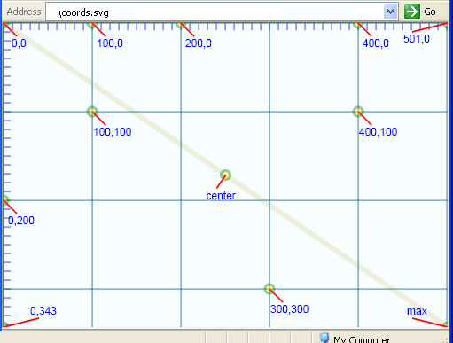
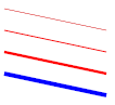

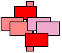

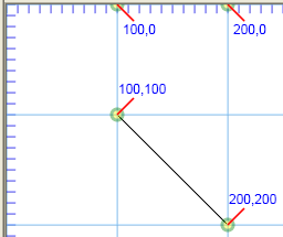
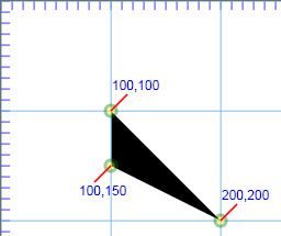
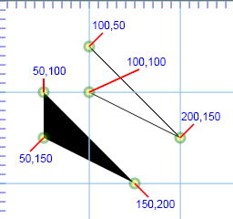

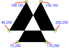

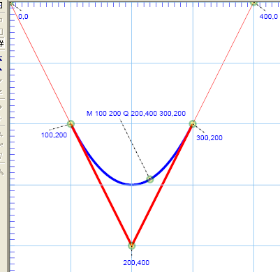
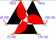
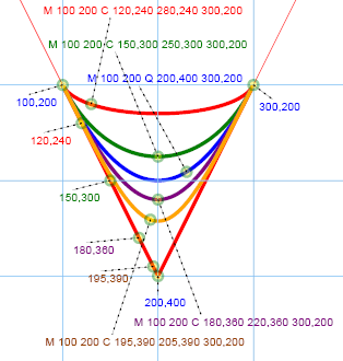
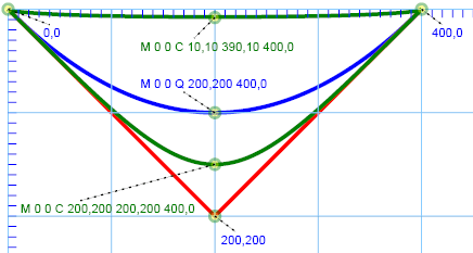
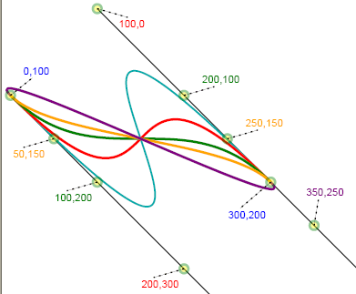

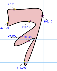
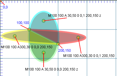
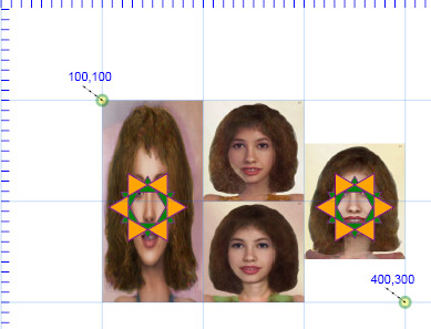
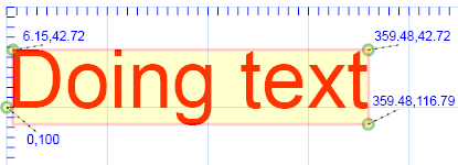
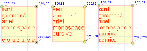

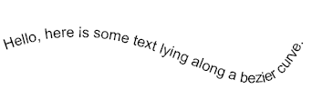
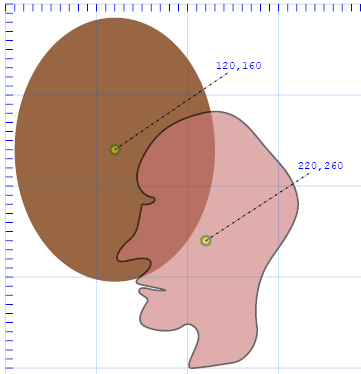
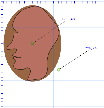
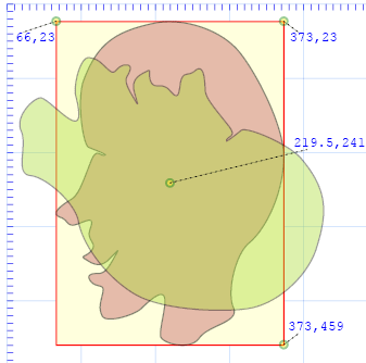
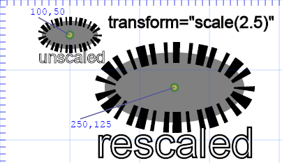
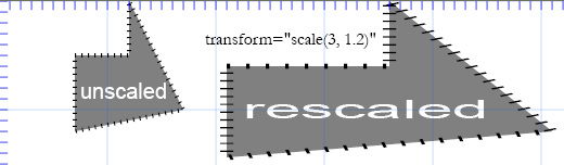
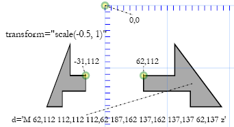
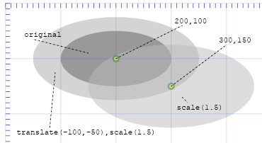
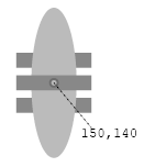
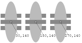
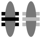
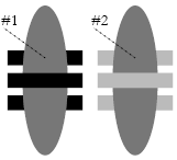
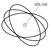
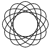
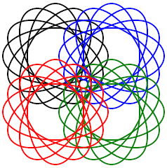
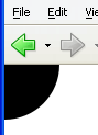
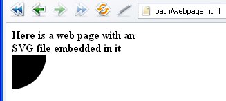
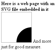
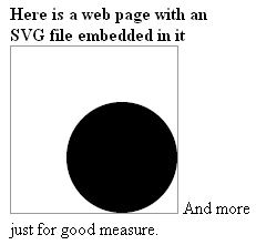
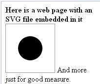
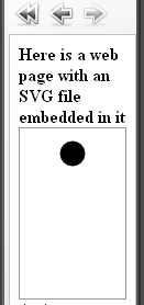
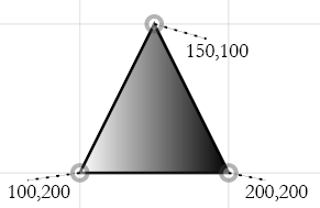
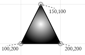
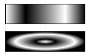
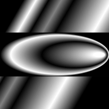
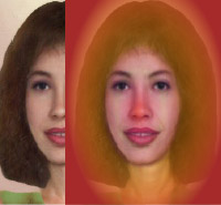
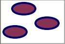
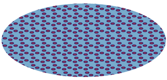
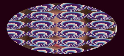
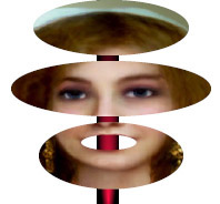
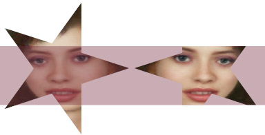
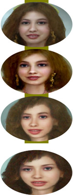
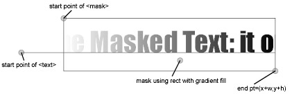
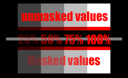
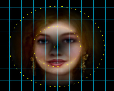
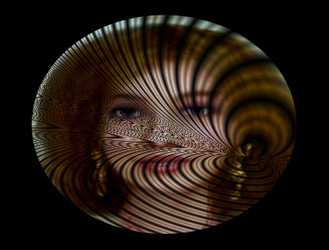
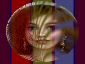


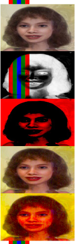
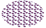
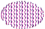
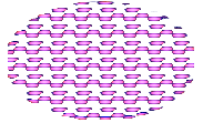
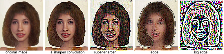


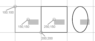


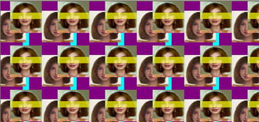
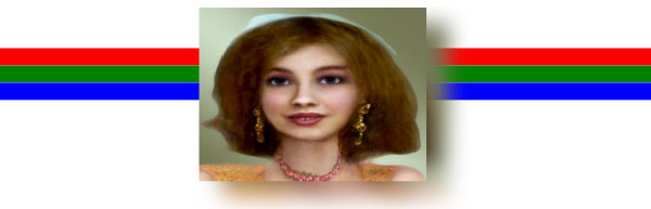
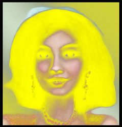
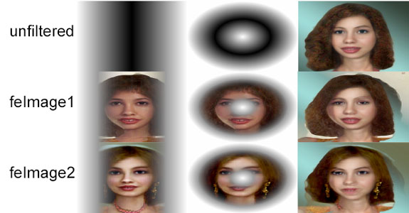

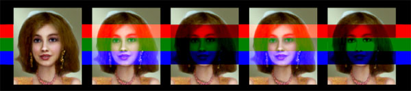
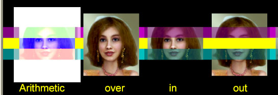
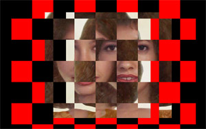
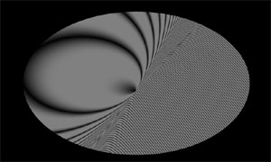
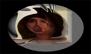


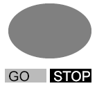
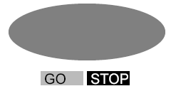
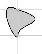
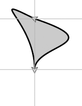
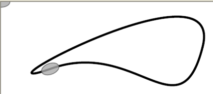


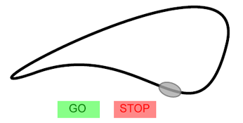
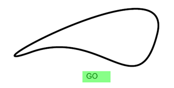
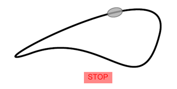

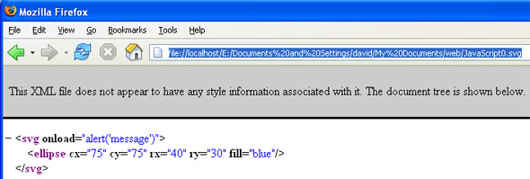

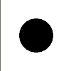

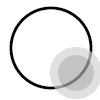
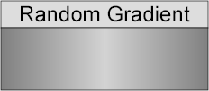
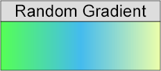
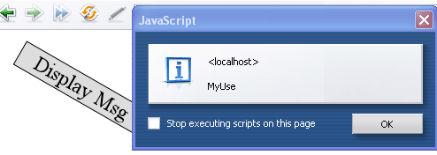
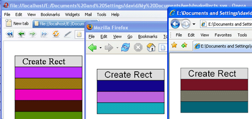
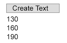
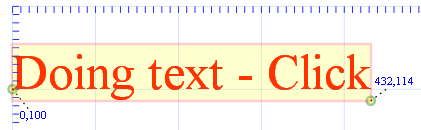
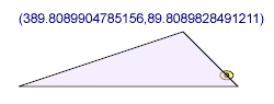
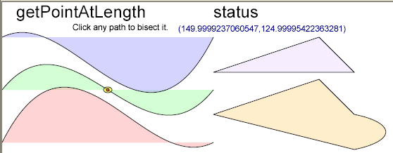
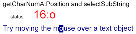
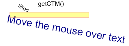
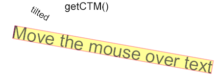
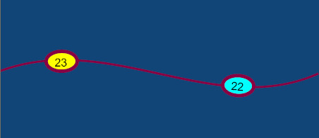


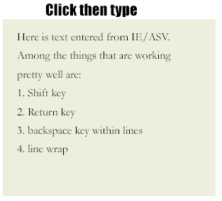
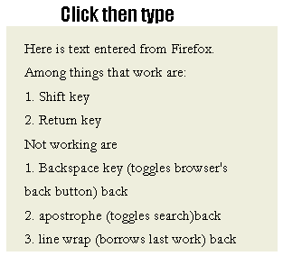
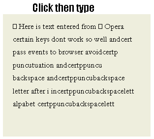
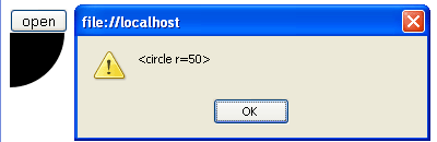
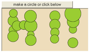
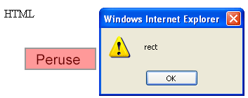
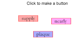
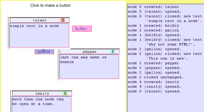
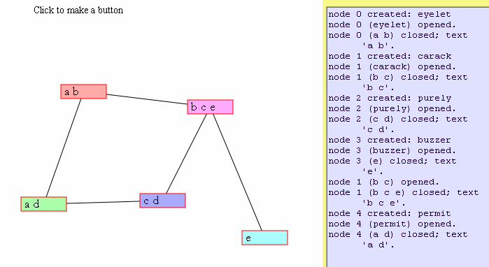
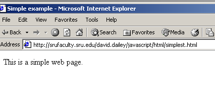
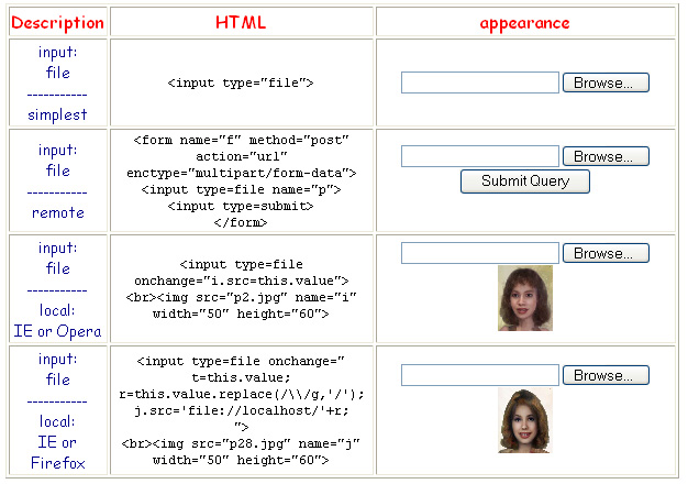


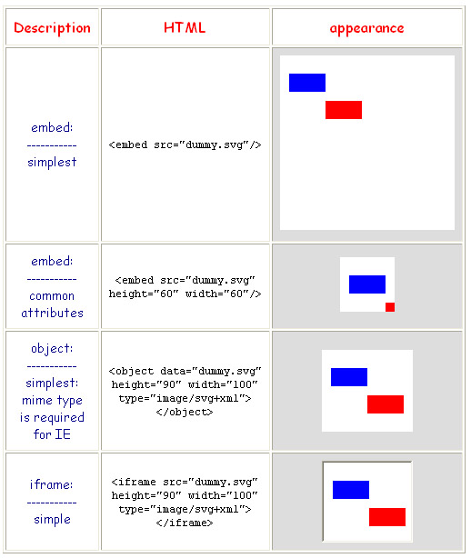
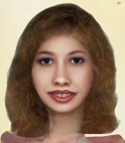
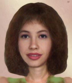
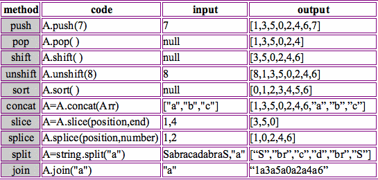