
WAI-images
Social images update
Background: We created images for social media mostly ad-hoc. Now we are designing a new template to be used for most images.
Final drafts:


Tweaks to be made:
- tweak spacing of icons, e.g., seems too much space around the ear, especially to the right of it
- balance weight of text with acronym and document name without acronym; probably make one without acronym heavier text
- confirm yellow is #eed009 on blue #005A9C (so we have contrast ratio >4.5:1)
- confirm icons have appropriate line width
- consider solid body icon...
Note: Contrast of yellow #eed009 on blue #005A9C is 4.6:1. With the new algorithm, it is just a tad below threshold. We will leave it for now.
Template notes:
- Some will have an acronym and that can be prominent, e.g., WCAG 3 = W3C Accessibility Guidelines
- Some will have a resource name and no acronym, e.g., People Use Web resource
- Font: Noto Sans
- WAI site colors
Priorities:
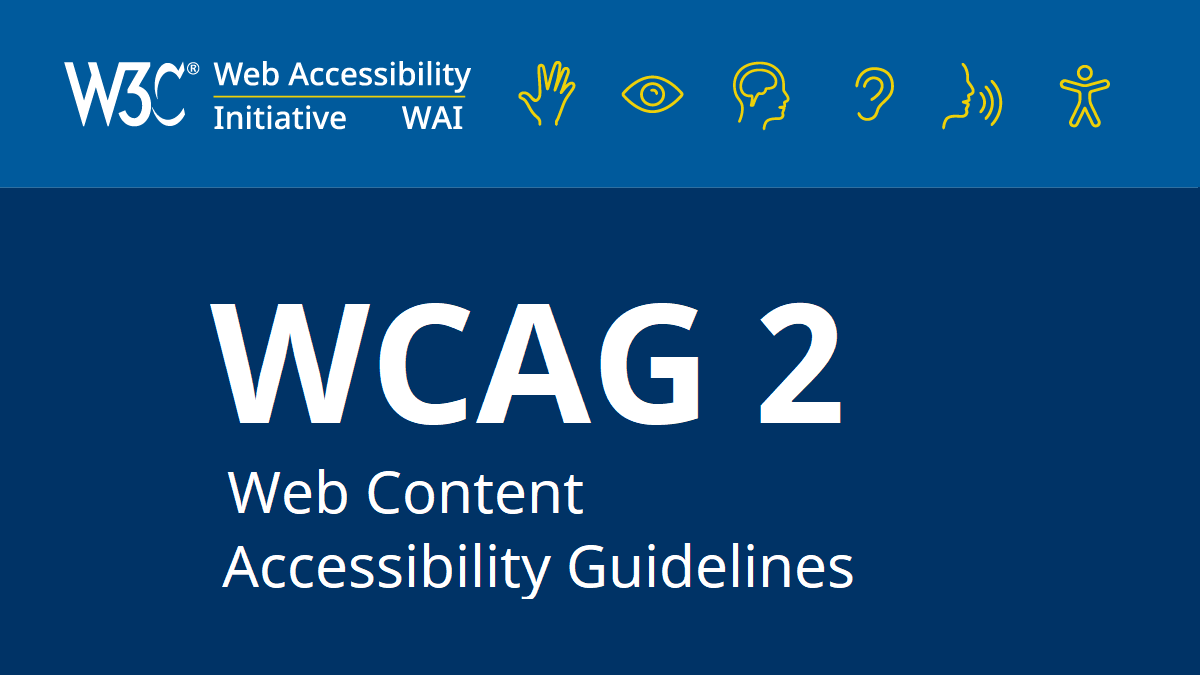
- WCAG 3 — note that WCAG 3 = W3C Accessibility Guidelines 3 (*not* "web content" like wcag 2)
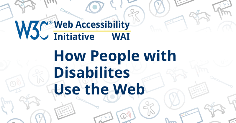
- new People Use Web resource (since there is a typo!)
Existing images that we probably would like to update using the new template:
- WCAG
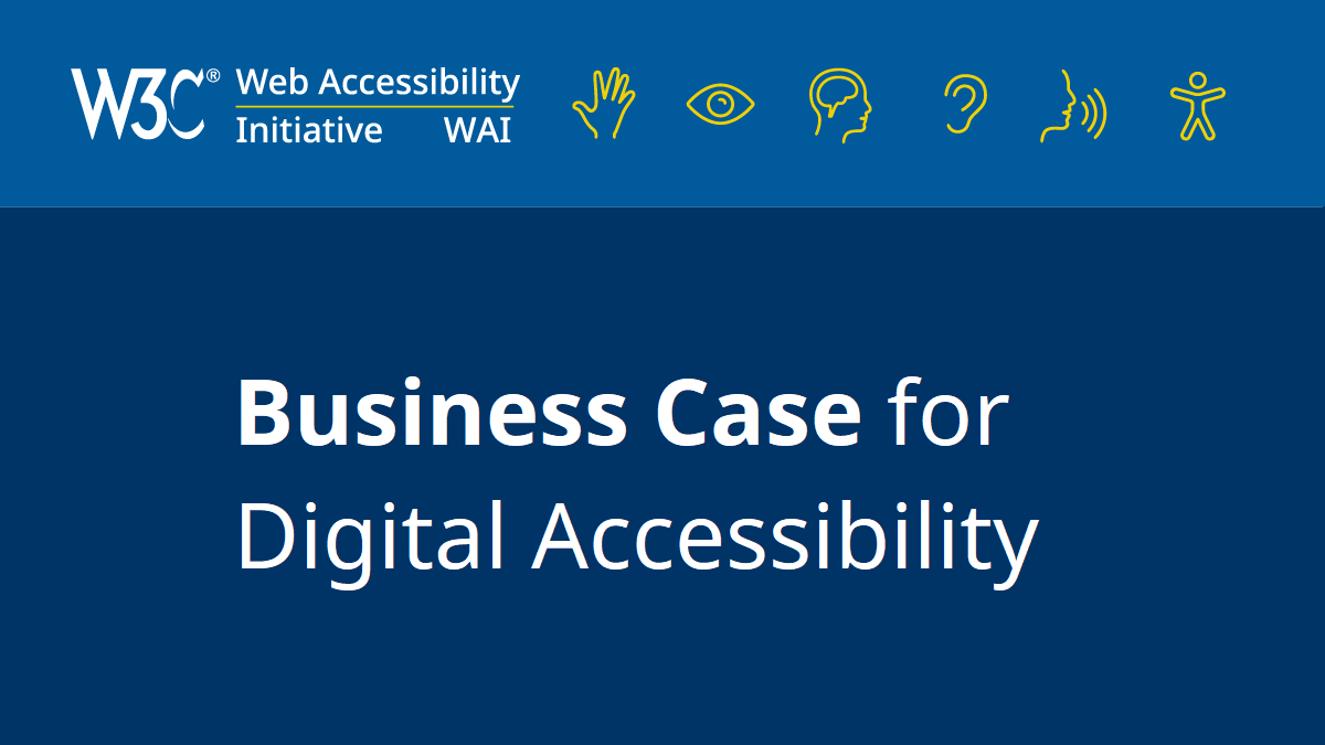
- business case
- People Use Web resource
- several here
- tutorials - ?
- others - ?
And some that we might want to keep their different background and icons/imagery, yet update with a more consistent presentation of W3C and WAI):
Other icons and images
Existing polished, vetted icons:
- Accessibility Icon Set from W3C WAI (this draft page will be updated to make it easier for others to use these images, and then we will promote it), example of icons used in User Experiences and Benefits to Organizations in Making Audio and Video Media Accessible
- WAI Site Design Components - Icons
- In The Business Case for Digital Accessibility
- In Making Audio and Video Media Accessible and little ones in Planning page
- In Planning and Managing Web Accessibility
- In Making Content Usable for People with Cognitive and Learning Disabilities
Draft icons:
- Throughout WCAG 3 Working Draft