Text Colors
SC Shortname
Text Colors
SC Text
Users must be able to change foreground and background colors chosen from the full range of color choices provided by the user agent, without loss of important information.
Suggested Priority Level
Level A
Related Glossary additions or changes
Use COGA's important information definition:
Important information:
- information the user may need to complete any action or task including an offline task; and
- information the user may need to know related to safety, risks, privacy, health, or opportunities.
What Principle and Guideline the SC falls within.
Principle 1, Guideline 1.4
Description
Simply Put: Users can choose any colors available from the user agent's pallet, and information on the web page must still be perceivable. If the user needs high contrast, the user can set high contrast. If the user needs high contrast with minimal brightness, that can be done if that lies within the capability of the user agent. If a color pattern makes the user just feel comfortable when reading, a significant challenge for most people with low vision, then that is possible, within the capabilities of the user agent.
Attaching the limits of the user agent to color choices available to the user enables authors to support full-color choice on devices with user agents that support full color choice. However, if the user agent can support only a limited pallet, the author is not responsible for writing special code to extend the color choices. For full color, the user must choose a device and a user agent that support full color. The only limit this places on content authors is to not go out of their way to create color patterns that cannot be changed by mechanisms that are available to user agents.
The things that a website can do to prevent this from working are the following.
- Prevent application of custom style sheets or user-agent extensions applied by users to provide custom color choices.
- Rely on background images to provide contrast for foreground text.
- Use text within images.
- Use background images to contain important information.
Note: The barrier created by placing important information in background images works as follows: The user may need to remove the background image to achieve color accommodation, such as high contrast. Important information will be lost when the background image is removed. That will prevent necessary color accommodation. This barrier prevents many operating system color contrast mechanisms from working properly.
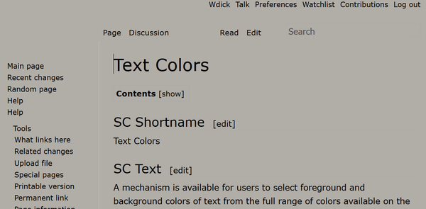
The images below give examples of custom color settings in HTML and PDF respectively. Most browsers on desktops and laptops enable custom style sheets, meaning that the color pallet available to HTML is 16M on laptops and desktops. The portable document format (PDF) also has user agents that enable 16M on similar platforms. Thus, the author must do nothing to prevent the choice of 16M colors for HTML or PDF where the user agent supports 16M colors.
The figure above shows the W3 Wiki page with custom colors to meet this Success Criterion. The color is optimized for a user with contrast insensitivity and photo-sensitivity (a common combination that is missed by most high contrast color schemes). Note that all controls remain visible and operational.
The figure above is a PDF file with a custom color. It too was drawn from a pallet of 16M colors.
Benefits
...some people need low brightness, especially for backgrounds. Some people, who need low brightness for backgrounds, also need low brightness overall, and thus need low-brightness text.
Other people need high contrast between text and background, including many older people who lose contrast sensitivity from ageing. Some read better with dark text on a light background.
For some people, common color combinations or colors from a limited color palette work fine. For example, black text on a white background, or the inverse, with white text on a black background. Other people need to select more-specific background and text colors. For example, people, who require low brightness overall, need to select the specific background and text colors that provide sufficient contrast for them, yet not too-high brightness. Readable and optimal color combinations differ vastly among individuals, and can even vary from one individual to another, depending upon conditions such as fatigue and lighting.
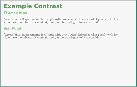
Figure 8: Web page with author-defined colors with low contrast - light background, gray text, light green headings:
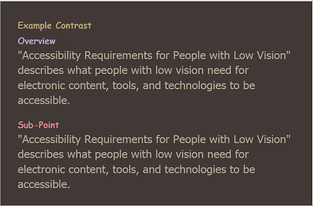
Figure 9: Web page with user style with medium contrast - brown background, tan text, headings of different dull colors:
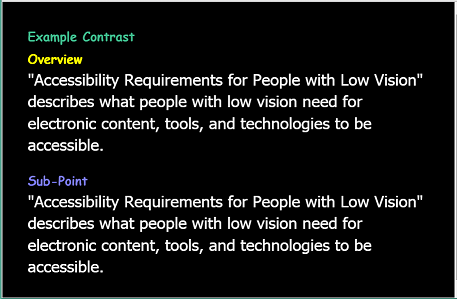
Figure 10: Web page with user style with high contrast - black background, white text, headings of different bright colors
User Need - Contrast: Users can set the background color and the text color from the full color spectrum.
Source: Accessibility Requirements for People with Low Vision, Section 3.1.2 Text Contrast
Testability
HTML / CSS
When browsers include a mechanism to apply user style sheets, use one of these mechanisms, and apply the following CSS:
- body * {
- background-image: none !important;
- color: #222222 !important;
- background-color: #B1ADA7 !important;
- }
If the page loses important information because of the loss of background images, then the test fails. If, for some reason the colors are not changed, then the test fails. Of course, this will work with any choice of 16M colors available; just change the HEX values. Note: HTML with CSS enable element-by-element color changes that may not be available for other formats. To pass, only a global change in foreground and background color needs to be allowed.
Choose a user agent that has a color picker that allows a 16M color choice. Choose a foreground color and a background color that are different from the author's choice. If the page fails to change color, the test fails. At least one vendor provides a user agent with this capability.
Techniques
Existing Relevant Techniques
- C 22: Using CSS to control visual presentation of text
- G140: Separating information and structure from presentation to enable different presentations
- F3: Failure of Success Criterion 1.1.1 due to using CSS to include images that convey important information
New Techniques
- Fxx: Failure of Success Criteria [Text Colors] and [Reflow to Single Column] due to inserting important information using the background-image property of CSS.
- Fxx: Failure of success Criterion [Text Colors] due to a user agent providing a method to change foreground and background colors, and the content prevents adoption of this change.
- Using foreground images to display images (rather than background images)
Example: HTML - The Test Case above uses CSS in a form that will override color preferences on a page. This transformation will fail if the author uses embedded style for each element, and sets it to !important.
Related Information
- Text Color is Ready. - Wayne Dick, 15 November 2016
- Text Colors - Wayne Dick, 8 November 2016
GitHub
- WCAG WG 2.1 GitHub Issue 74 - Opened by Jim Allan, 1 December 2016
- User Need 3.1.2 Text Contrast LVTF GitHub SC Issue #2
- WCAG 1.4.8 item 1 foreground/background LVTF GitHub SC Issue #4


