
Overview of Low Vision
This info is now being developed through GitHub:
http://w3c.github.io/low-vision-a11y-tf/requirements.html#overview-of-low-vision
To create a new issue: https://github.com/w3c/low-vision-a11y-tf/issues/new
This wiki page has rough drafts of information to go into the first section of the "Accessibility Requirements for Low Vision Users" document at http://w3c.github.io/low-vision-a11y-tf/requirements.html#overview-of-low-vision
This info is now being developed through GitHub:
http://w3c.github.io/low-vision-a11y-tf/requirements.html#overview-of-low-vision
To create a cew issue: https://github.com/w3c/low-vision-a11y-tf/issues/new
Introduction
This document describes what people with low vision need for web content, tools, and technologies to be accessible. It includes an overview of low vision, describes specific user requirements, and includes an appendix with details on visual conditions and their impact on web use.
This document is intended to provide the background for developing guidelines and techniques for making content, tools, and technologies accessible to people with low vision.
Overview of Low Vision
Definition of Low Vision
Low vision generally refers to people who can see but have an impairment that impacts their vision. Levels of low vision are usually categorized by a person's visual acuity and visual field. Visual acuity is the sharpness or clarity of vision, as explained in the [Clarity@@] section. Visual field is area a person can see when their eyes are fixed in one position, as explained in the [Perceptual Area@@] section.
In many contexts, low vision only includes impairments that are not mitigated with regular glasses, contact lenses, medicine, or surgery. For example, inability to focus on near objects that is common with aging yet is over-come-able with reading glasses, is not considered low vision in some disability rights contexts. In these contexts, low vision is often defined as visual impairment that interferes with a person's ability to perform everyday activities.
In some contexts, such as social benefits, people are classified as having low vision or being "legally blind". Many people who are legally blind have some usable vision, and can read some text that is displayed optimally for them.
In considering user needs, this document uses a broad scope of low vision to include all visual impairments except significant blindness — including impairments from aging, color perception impairments (often called "color blindness"), and impairments that are often categorized as legally blind yet with sufficient vision to see user interfaces in some situations.
Incidence
The World Health Organization (WHO) estimated that there are 246 million people worldwide who have low vision. WHO estimated that 39 million people are blind, thus 86% of the people with visual impairments have low vision. [references: http://www.who.int/mediacentre/factsheets/fs282/en/ , http://www.who.int/blindness/data_maps/VIFACTSHEETGLODAT2010full.pdf]
{lvtf note: WHO includes correctable & non-correctable. perhaps want to include #s in region(s) where correction more available?}
Causes and Effects of Low Vision
Most low vision is caused by eye diseases and health conditions such as cataracts, glaucoma, and diabetes. These are more prevalent in older people, yet affect all ages. Some low vision is from birth defects or injuries. Appendix [X@@] provides information on specific causes of low vision. The Functional Limitations section below describes issues of Clarity; Perceptual Field, Light and Contrast Sensitivity; and Color Perception.
Starting around age 40, most people have "normal" declining vision that is not caused by disease, including decreasing ability to focus on text that is close, decreasing color perception, decreasing contrast sensitivity, and more. Many people with decreased vision due to aging do not consider themselves as having a disability.
Low vision includes a vast and variable range of issues across people, and even for an individual. Many eye diseases cause progressively worsening vision, and it is not uncommon for a person's vision to deteriorate over several years from good vision to blindness. Some causes of low vision can be improved through surgery or medication, and it is not uncommon for someone to have deteriorating vision over several months, and then improved vision after treatment.
Many factors influence a person's effective vision, such as inflammation, medication, and fatigue — in addition to the environmental factors and task factors addressed below. It is not uncommon for one person's needs to be different from day-to-day or even throughout one day; for example, when they are more fatigued, they might need larger text or a different background color.
Fatigue is a significant issue for some people with low vision, particularly when they read text that is not displayed in an optimum way for their visual situation. Generally, the more a person needs to strain to read, the worse their fatigue will become. Some people can read for only a short time and then need a break.
For all these reasons, people need to be able to easily change the way that text and information is displayed.
Environment and Task Factors
Specific user needs in any given situation are influenced by environment and task.
Environmental factors include:
- Clarity of the device, for example, dots-per-inch (dpi)
- Brightness of the device
- Ambient light [explain]
- Glare
- Distance and angle, for example, sometimes people can position a tablet however they want but sometimes they are forced to read a fixed kiosk from limited positions
- Movement, for example, reading on a train [@@question: Is this notably different for people low vision versus people with "normal" vision?]
Task and the amount of information influences user needs. For example, when a person is typing an e-mail, they may be able to have smaller font because they know what is being written and are just skimming for typos; whereas when that same person is reading an e-mail, they need larger font because they do not already know the content.
Legibility vs Readability
Another example: A person may be able to read small bits of text at 12pt, but if they are reading long paragraphs, they need 18pt. This is the difference between legibility and readability. Legibility is related to perceiving text by distinguishing letters. Readability is related to reading and comprehending textual information. Thus text could be somewhat legible to a user, yet not functionally readable. That is, with effort a user could distinguish one letter from another, but could not effectively read sentences because of the text formatting.
{lvtf note: "the smaller the print, the less willing my eyes are to READ. So, for example, I can read small print on a map (labels) but not small print in a news story." — comment in user research survey}
Legibility and readability are influenced by many inter-related factors. For example, an older person with diminished contrast sensitivity might be able to read text with a contrast ratio of 5:1 when it is 18pt, but cannot read text at that contrast ratio when it is 12pt. With some fonts, a person does not need to increase the letter spacing, but with other fonts they do.
Functional Limitations
The functional limitations can be grouped in to four areas: @@ Define the term "functional limitations"? Perhaps something such as: "Functional limitations are restrictions in performing actions or activities, such as reading or interacting with Web content due to physical or environmental factors". Or maybe better yet find and link to an official definition. {Laura}
- Visual acuity
- Perceptual area (field loss)
- Luminance and contrast [or Light Sensitivity and Contrast Sensitivity]
- Color perception
Each of these areas is discussed below.
Clarity (Visual acuity)
Clarity is measured against an agreed standard under the best conditions. The measurement is called visual acuity. Seeing details clearly is generally defined as 20/20 (6/6) vision. Maximum clarity (20/20) only occurs in the central 5 degrees of the visual field (see [#Perceptual_Area Perceptual Area]). Outside of the central part of the visual field, acuity falls off sharply to 20/200 (6/60).
Three factors contribute to clarity
- the users visual system
- the environment
- the visual task
The visual system includes the parts of the eye and the visual/perceptual regions of the brain. The eyes function to focus light/images on the retina. In order for the image to resolve light must pass through a smoothly curved cornea, pass through a clear fluid, the pupil must let in the right amount of light, pass through a clear lens that can flex to adjust focus, pass through more clear fluid, and arrive at the proper place on the retina that has functioning nerve cells. The light is converted to nerve impulses that travel through various structures in the brain. We "see" when the brain decodes/interprets the signals providing perception and meaning to the light passing through the eye. Anomalies/malfunctions in any or all of these components of the visual system can reduce clarity. Some anomalies can be fully corrected by lenses, surgery, or other means. Others cannot be corrected.
The environment plays an important part in clarity. It includes illumination/lighting, glare, distance, visual field, viewing angle, and time. Illumination may be too high or low, there may be glare, illumination changes - in brightness, in angle, in color. The environment may be dynamic/moving, or the user is moving through a static environment, regardless, the visual task also moves. The object may be too far away or too close. The user wants an environment that adds to clarity.
The final factor is the visual task. What is the user trying to "see". The shape and size of the object, spacing in relation to other objects, color of the object, and contrast with the environmental background are all parts of the visual task. As an example, we will use a common visual task on the web - reading. Given the current functioning of the user's visual system, the current environment, are the letters the "right" size, font, color. Are the letters the "right" distance apart to clearly see each letter, are the lines of text the "right" distance apart so they don't merge and are easy to track. Is there the"right" amount of contrast between the letters and the background. Is the background too bright/dim or too busy or cluttered?
Clarity problems as with all vision problems exist on a continuum. The user wants to achieve maximum clarity within the dynamics of the visual system, the environment, and the visual task. Each of these are fluid. The visual system changes with time of day, energy level, and other physiological parameters. The environment changes with the range of illumination, type of device, the location of the task, time of day, motion of the task and/or user, and more. The user will change the environment to maximize clarity. The visual task changes with size, color, contrast and other factors. The user will change the illumination, magnification, viewing angle, distance to the object, color, etc. to improve clarity. Note, as the user increases the apparent size of content through magnification or zooming the perceptual area is reduced proportionally. (@@ originally had "by the square of magnification (2x magnification results in a 4x reduction in perceptual area" but seemed too detailed).
User needs related to visual acuity are addressed in the following sections:
- 2.3 Perceiving (Letter Characteristics) - text size, font, style, capitalization
- 2.4 Spacing for Reading - leading, letter spacing, word spacing
- 2.5 Distinguishing\Identifying Elements - element-level customization, proportional text increase, margins, borders, indentation (@@SLH to change grouping and order of those things)
Perceptual Area (Field Loss)
People generally have a visual field of approximately 180 degrees from left to right, with the sharpest vision in the central 5 degrees and color vision in the central 20 degrees. The area, or visual field, from which a person’s eye is able to gather visual information is referred to as the perceptual area. Some low vision users experience field loss - a reduction in their perceptual area.
Field loss can take many forms and does not result in the same experience for all users, as some users may have good vision in a part of their overall perceptual area that may be poor for a different user. Different users have different types of field loss, generally grouped into the following categories:
- Central field loss: People with a central field loss have an area in the middle of their visual field where their vision is reduced or absent. The size of this area depends on the individual’s condition.
- Peripheral field loss: People with peripheral field loss only see in the central portion of their field. The size of the usable visual area may be very restricted, depending on the individual’s condition.
- Other field loss: People with other field losses can have many variations of field loss that include but not limited to donut (having a ring of vision), seeing only the left or right side of both eyes, scattered patches of obscured vision, etc. All restrict a portion of what the individual is able to view. Like other types of field loss, the amount of field loss depends on the individual’s condition.
Simulated examples of loss of perceptual area:
-
 Example of central field loss
 -
 Example of peripheral field loss
 -
 Example of other field loss


Many conditions which cause field loss progress over time, increasing the loss of field. Users may find the size of the area of impaired vision increasing in size over time. This may mean that an individual's small peripheral field loss eventually results in a narrow “tunnel” of usable vision, or that an individual finds a few small areas with poor vision in her field progressing to larger and connected areas with poor vision.
Field loss results in many challenges for users. Field loss is closely related to size limitations, or what will fit within the size of a user's visual field so a user with field loss may require small text in order to view the characters full height. Users with field loss may also have difficulty tracking text as it wraps from one long line to another and can have difficulty detecting relationships between any two items which cannot be viewed at the same time due to a field loss.
For examples of conditions which result in reductions in perceptual area, see Appendix [X@@].
As mentioned in the clarity section, people with low visual acuity often increase the text size. This produces some of the same issues as a person with field loss — they see few words at a time. If content does not wrap and users are forced to scroll two ways to read content, e.g., horizontally to read a line of text, that causes additional problems that may be considered developer-induced field loss.
User needs related to perceptual field are addressed in the following sections:
- 2.2 Tracking - rewrap for one direction scrolling, reflow to single column, flexible text areas, line length, justification, hyphenation
- 2.6 Point of Regard and Proximity - maintain point to regard, proximity of related information, scrollbars
Contrast and Light Sensitivity
Contrast Sensitivity
Contrast is the visual effect caused by the difference between the brightness (luminosity) of adjacent foreground and background regions of a display. If either region (foreground or background) is bright and the other is dark then we have high contrast. If the levels of brightness are close like light grey on white, or black on navy blue then the contrast is low.
Contrast can be computed using many metrics. The one that is used for accessibility is the contrast ratio L1/L2 where L1 is the luminance (luminosity per pixel) of the brightest region and L2 is the luminance of the darker region. The precise formula for contrast ratio L1/L2 is complex (WCAG Contrast Ratio Definition), but the concept of how contrast ratio is used is easy. The higher the contrast ratio, the easier it is to distinguish the boundary of the adjacent region visually.
The contrast ratio needed to distinguish objects varies from person to person. This ability is called the person's contrast sensitivity. A person who can distinguish between objects that have a low contrast ratio is very contrast sensitive. A person who requires high contrast to distinguish between objects has a low sensitivity. The Peli Robson Contrast Sensitivity Chart measures contrast sensitivity by keeping font size constant and varying contrast ratio. This differs from acuity testing that keeps contrast ratio constant and varies size (The design of a new letter chart for measuring contrast sensitivity). The image below demonstrates how the contrast sensitivity chart works.

Figure CL-1 Each row has lower contrast than its predecessor and as we move from left to right contrast ratio decreases. The full Peli-Robson Chart has many rows and at some point perception becomes impossible for each person.
A person can see with perfect clarity and still have low contrast sensitivity. People with poor night vision generally have low contrast sensitivity. Low visual acuity (clarity) is almost always accompanied by low contrast sensitivity (PSYCHOPHYSICS OF READING: VI. THE ROLE OF CONTRAST IN LOW VISION), (PSYCHOPHYSICS OF READING: VI. THE ROLE OF CONTRAST IN LOW VISION).
Contrast plays an important role in how well people can perceive text. If the contrast ratio of text and background are at the limits of a person's contrast sensitivity then the text is not legible (easy to perceive) for that person. If the contrast is well within the person's visible range then the text is legible . The impact of contrast sensitivity on people with low vision is similar to the impact on people with normal sight. The difference is that the people with low vision tend to have a much lower contrast sensitivity than fully sighted people. A contrast ratio that supports perfect legibility for a normally sighted reader will leave many people with low vision unable to read. That is why the WCAG 2.0 success criteria include 1.4.3 Contrast (Minimum) and 1.4.6 Contrast (Enhanced). For people with low vision these constraints enhance legibility of text, and for many people with low vision the constraints improve readability.
Light Sensitivity
The brightness (luminosity) of a video display is an issue for almost everyone with low vision. The luminosity of a display is the total amount of light energy emitted by the display. If the display is too bright or too dim someone with low vision will have a problem.
Many people with low vision have photophobia, an extreme sensitivity to light. Too much light is accompanied by eye pain and headaches. It is well known that people with albinism have this problem, but few realize that this issue is widespread across the low vision population including people with macular degeneration (TBVI, Eye Conditions).
People with blurred or hazy vision often experience difficulty recognizing text (reduced legibility) with too much light. Brightness also exacerbates glare, an additional distraction for this group. Often reversed polarity (inverting light and dark) will help.
Too little brightness is also a problem. People with peripheral field loss cannot see well without enough light. The person may have perfect clarity with sufficient light and be blind with low light.
Interactions between Contrast and Light Sensitivity
Contrast and brightness are related. Without sufficient brightness we cannot have the contrast needed for legibility when we read. This is because contrast results from the differences in brightness between foreground and background. WCAG Contrast Ratio Definition.
Most people with low vision have low contrast sensitivity. Thus, elevated contrast ratio is necessary for legibility. This means that reading may be impossible without sufficient brightness to ensure the contrast.
For people who need more brightness to function at all this is no problem, but for people with special sensitivity to light the light needed for sufficient contrast may be a serious issue. In the case of blurred and hazy vision, some problems caused by brightness can be mitigated by reversed polarity. This means sufficient contrast is possible without impacting reading.
For those who have an stressful response to bright light (photophobia), sufficient brightness to enable the necessary contrast may produce eye pain or headaches. That is a serious impediment to reading. Reducing the brightness will reduce discomfort, but it will also reduced contrast and legibility. This creates an impasse.
The obvious solutions that aid photophobia (low light) and low contrast sensitivity (more light) are contradictory. Unfortunately, in many cases the physical conditions that produce low vision, such as Albinism and macular degeneration, also produce photophobia and low contrast sensitivity together.
Any strategy for remediation of the functional limitations caused by low vision must employ a multi-treatment approach to address sets of functional limitations that have contradictory treatments when addressed singularly.
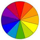
Color Perception
Specialized cells, known as cones that are located in the retina of the eye allow a person to see color. When these cells are absent or malfunctioning it can result in a decreased ability to see certain colors or a decreased ability to tell colors apart.
Color Perception Impact on Low Vision
Certain colors can be difficult to perceive by people with low vision. However, loss of color perception alone does not mean a person has low vision.
Incidence of Color Disabilities
Globally, 1 in 12 men (8%) and 1 in 200 women have color disabilities. Source: [colourblindawareness.org] Red-green disability is the most common form. It affects 7 to 10% of men and virtually no women. Source: [colour-blindness.com] Blue-yellow disability affects males and females equally. It occurs in fewer than 1 in 10,000 people. Source: [nhs.uk]
Types of Color Disabilities
Generally, 4 types of color disabilities exist due to the inability to see red, green, blue, or all color.
Red
Protanopia is the inability to see red light. People with protanopia have difficulty distinguishing green and red as they have an absence of L (red) cones. Red, orange and yellow brightness is reduced. While protanopia is the inability to see red, protanomaly is reduced red sensitivity.
Green
Deuteranopia is the inability to see green light. People with deuteranopia have an absence of (green) M-cones. Protanopia and deuteranopia are similar in that red and green are confused. While deuteranopia is the inability to see green, deuteranomaly is reduced green sensitivity.
Blue
Tritanopia is an inability to see blue light. People with tritanopia have an absence of S-blue cones. They have difficulty distinguishing blue-green and yellow-violet. While tritanopia is the inability to see blue, tritanomaly is reduced blue sensitivity.
No Color
Achromatopsia or monochromacy is the inability to see any color because of cones that do not work. People with these disabilities can only distinguish light, dark, and some shades of grey. This is rare.
Simulated Examples
-
 Full color perception (no disability)
 -
 Complete red-green disability (protanopia)
 -
 Complete green-red disability (deuteranopia)
 -
 Complete blue-yellow disability (tritanopia)
 -
 Complete color disability (achromatopsia)


Color Simulators
- Color Oracle
- Colour Blindness Simulator
- NoCoffee Vision Simulator (Chrome extension)
- Sim Daltonism
- Vischeck
User Needs
User needs related to color perception are addressed in the following section:
- 2.1 Luminance and Color - contrast adjacent, [color blindness needs?] Note: The term "colorblind" is frequently misleading as it seldom means a person sees in grey scale.
Old Notes
"In general, a good working definition of low vision is not being able to read a newspaper from 16in (40 cm)." (Legge)
Document Overview
Many technology users around the world experience challenges accessing and interacting with electronic content and experiences due to low vision. Users with low vision include a wide range of users with many different type of limitations, from users with difficulty seeing certain colors to users with only a small portion of the average level of visual capability. Whether a user has low vision may not be apparent to people around him, but low vision users are quite common in the population - the World Health Organization (WHO) estimated that there are 246 million users globally who experience low vision. WHO's Visual Impairment Fact Sheet (PDF) reports that of all people with visual disabilities 86% have low vision. According to the National Eye Institute, low vision means that "even with regular glasses, contact lenses, medicine, or surgery, people find everyday tasks difficult to do".
Technology has tremendous potential to enable users with low vision to successfully learn, work, and find enjoyment, but too often issues which create unexpected barriers for people with low vision are introduced, limiting access for low vision individuals. The W3C Web Content Accessibility Guidelines (WCAG) version 2.0 contains advice that helps authors create content that is accessible to people with various disabilities, including low vision users, but it is clear that users with low vision require additional support beyond what WCAG 2.0 provides. This document is designed to clearly specify a complete set of user requirements for low vision users in order to help the Low Vision Task Force develop an extension to WCAG 2.0. This extension will provide additional information to help authors ensure that low vision users can more easily access their content.
Add some sort of note in the overview that indicates that specific medical terms for conditions are provided in the appendix.. Trying to keep this at a layperson level...
Causes and Effects of Low Vision
@@ should mention eye injuries and birth defects as other causes
Low vision is a continuum.
There are many medical conditions that cause vision problems. Some degrees of vision loss have legal implications. Low vision runs the gamut from near perfect vision to near blindness. This includes being near-sighted and far-sighted. This document discusses the functional limitations of people with non-correctable impaired vision accessing content visually on the web. A functional limitation is not the diagnosis of some condition that one would find on medical chart. Rather, the varied diagnosis manifest themselves by limiting aspects of visual functioning. Main task improve clarity reduce fatigue. pull stuff from bottom.
increased clarity@@ - foreground/background, crowded busy content, sharper edges on fonts, opposite of blur. line spacing, letter spacing. lack of clarity is a combination of above issues. "increasing clarity and fatigue avoidance are the ultimate objectives"
reducing Fatigue - Another factor present in all areas mentioned above is Fatigue / Stamina. All people with low vision experience some degree of fatigue. Others may be able to read for only a short time (< 30 minutes) and then may need a several hour rest from visual activity. Poor reading conditions exacerbate fatigue and stamina. Poor reading conditions vary by individual, the environment, the task, and time of day. These conditions may include font too small, poor contrast, screen too bright, scrolling right and left, etc. Reducing fatigue and increasing stamina calls for the most flexible and comfortable reading environment possible. Most people will confide after knowing you a while that they have started many more books then they have finished.
vision issues versus environmental impacts.
Needs vs solutions overview of low vision issues - broad strokes, general. set up a framework/categories requirements of specific user needs based on framework solutions - techniques
Light and Contrast Sensitivity
[describe functional limitation in this section, not user needs]
old notes:
- the degree to which light is present. Illumination includes light sensitivity, glare, and contrast. The amount of light and contrast needed to see varies by individual and the environment where they are working. Some people need low indirect lighting. They might adjust the foreground/background colors to mute the contrast. They might also lower the brightness and / or contrast settings of their monitor. Others require bright direct lighting and high contrast. "contrast is calculated in such a way that color is not a key factor so that people who have a color vision deficit will also have adequate contrast between the text and the background”
color sensitivity and light sensitivity...stated in terms of physical limitations.
- @@variable - just enough light, a bit more is too much and you can't see
User needs related to light sensitivity and contrast sensitivity are addressed in the following section:
- 2.1 Luminance and Color - luminance overall, text contrast, contrast adjacent
Color Perception
Laura's original Color Perception notes are on the Discussion Page.
Outcome
Marsha is aging. She no longer sees well enough to drive or read effectively. She loved reading periodicals that kept her informed on world issues and politics. Her favorite magazine has an online edition with an award winning user web interface. To Marsha's eyes, however, format is ugly. It might as well be dark green on flashing pink as far as she is concerned. Nobody like an ugly web page, but to Marsha the conservative black on white articles with 13:1 contrast look terrible, even though readers with normal vision find them attractive and inviting. There are many things wrong that Marsha cannot articulate. She cannot distinguish the letters in the middle of long words. They are so close together they blur together mid word. She has to squint to read the bright screen. The line spacing is just too small. The experience is too exhausting and she rarely finishes an article. She knows what she likes, her e-book reader uses beige background. She can spread out letters and lines. She can choose a fixed width font that is sans serif. On the website she gets fatigued after reading 50 words. On her book reader she can read 20 pages. Marsha can stand a line of italics, but when a quote is very long, like an entire page of italic text, the italics really try her stamina. The abstracts in her favorite magazine are italicized. Sometimes she won't even start an article with a long abstract.
finding visual balance.
Comingling / combinatorics example
Size: Size can be a function of acuity or other interference like haze / glare that reduces clarity that can be enhanced by high contrast thus requiring increased size. Field loss without acuity loss can require limited line length.