“La Gira de los Estándares
W3C”
10 November 2004
Barcelona, Spain
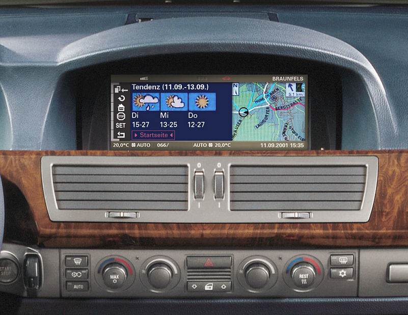
Imagine you're in a car…
![[genie]](MMI-car-genie.png)
![[genie]](MMI-car-genie.png)
![[genie]](MMI-car-genie.png)
![[genie]](MMI-car-genie.png)
 Input | → | Speech | → | grammars | → | interpretation | → | EMMA | → | integration | → | Interaction Manager | ←→ | application functions | 
|
| → | Handwriting | → | → | → | EMMA | → | |||||||||
| → | Keyboard | → | → | → | EMMA | → | |||||||||
| → | Mouse | → | → | → | EMMA | → | ←→ | session component | |||||||
| → | Etc. | → | → | → | EMMA | → | |||||||||
| → | System-generated | → | EMMA | → | ←→ | system & environment | |||||||||
| ← | (output) | ← | |||||||||||||
 Output | → | (input) | → | Interaction Manager | ←→ | application functions | 
| ||||
| ← | Audio | ← | styling (CSS) (XSL) | ← | adaptation (DISelect) (Media Queries) | ← | |||||
| ← | Voice | ← | ← | ||||||||
| ← | Graphics | ← | ← | ←→ | session component | ||||||
| ← | Text | ← | ← | ||||||||
| ← | ← | ← | ←→ | system & environment | |||||||
| ← | Etc. | ← | ← | ||||||||
Under "etc." you can think of media like print, braille, force feedback, and other physical effects, such as movement, heat and coffee…
Most steps can be either on a server or on a client.
Usually, diagram of Web technology include some "cloud" that represents the Web. Where is the Web in this schema?
Case-by-case. Some factors:
The network can be in various places. It is good to offload calculations to clients, to free up the server to handle more connections at the same time. That puts the Web "cloud" on some of the arrows far to the right side of the diagrams. But some client devices are only small and slow, and they can only handle contents that needs very little processing. Which puts the Web nearer to the left side.
And there are other reasons for doing more or less of the processing on the client side:

Imagine browsing on a cell phone
But printer is different from phone.
("Best viewed with…"!?)
The layout should probably be changed (multiple columns?), the images resized or replaced with other ones, interactive parts such as a tabbed display should now be displayed without requiring interaction.
The phone may already have received all the information the printer needs (text, images, style sheets) and it may thus be a matter of recalculating the rendering in a different context.
On the other hand, the server may have indicated to the phone that in case of printing, it has alternative content, that is better adapted. In that case, the phone, or the printer itself, may request that adapted content from the server.
Extensible MultiModal Annotation markup language
<one-of id="r1">
  <interpretation id="int1" confidence="0.75">
    <x:origin>Boston</x:origin>
    <x:destination>Denver</x:destination>
  </interpretation>
  <interpretation id="int2" confidence="0.68">
    <x:origin>Austin</x:origin>
    <x:destination>Denver</x:destination>
  </interpretation>
</one-of>
Ink Markup Language

<ink>
  <trace>
     10 0 9 14 8 28 7 42 6 56 6 70
     8 84 8 98 8 112 9 126 10 140
     13 154 14 168 17 182 18 188
     23 174 30 160 38 147 49 135
     58 124 72 121 77 135 80 149
     82 163 84 177 87 191 93 205
   </trace>
<ink>
Should be well-known…
<h2>Title</h2>
<p><img src="foo.png" alt="foo">
img { max-width: 100% }
body { margin-left: 3em }
(P.S. CSS was 10 years old on October 10!)
http://www.w3.org/TR/css3-mediaqueries
HTML:
<link href="style1.css"
  media="handheld and (color)
         and (min-width: 400px)">
CSS:
@import "s1.css" handheld and (color);
@media screen and (max-width: 800px) {…}
Content Selection for Device Independence
http://www.w3.org/TR/cselection
<s:if sel:expr="dc:cssmq-width('px')
> 200">
<object data="image1"/>
</s:select>
Scalable Vector Graphics
Speech Synthesis Markup Language
http://www.w3.org/TR/speech-synthesis
Composite Capabilities/Preference Profiles
| Device | → | CC/PP | → | adaptation | ← | DISelect, Media Query | ← | App. |
MMI isn't the same as "input," (the "I" means "Interaction") but it fits nicely in my talk this way.